Vienna’s Weirdest Street Objects Are Secretly Genius

wim

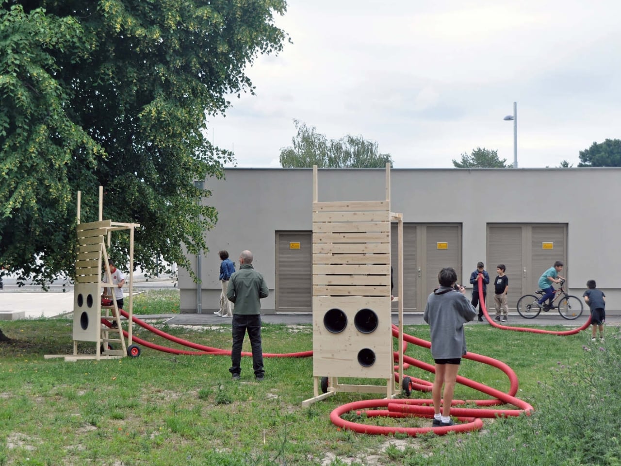
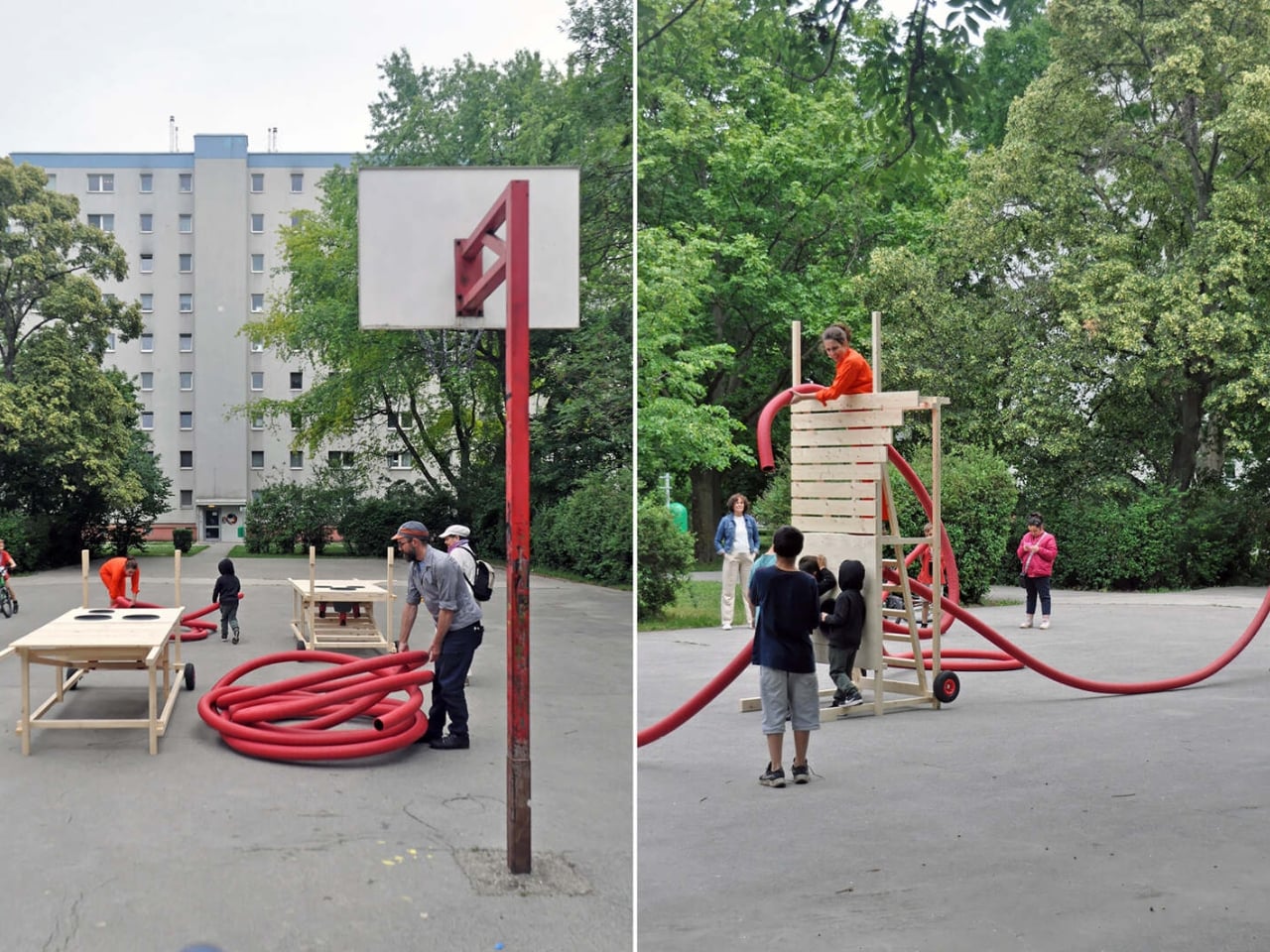
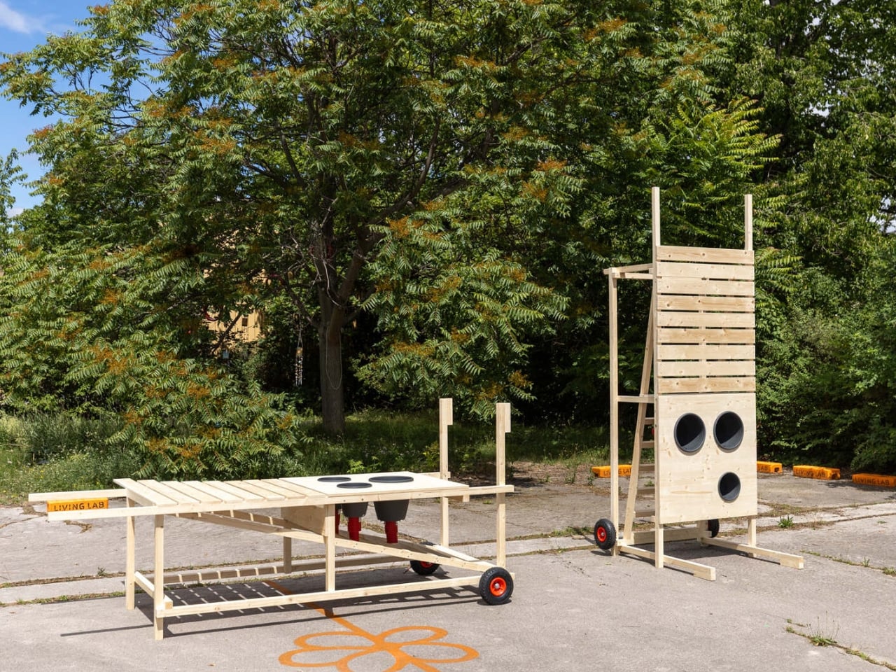
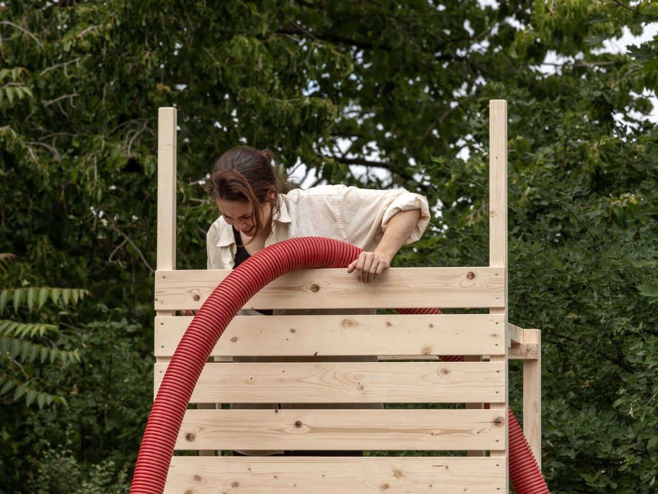
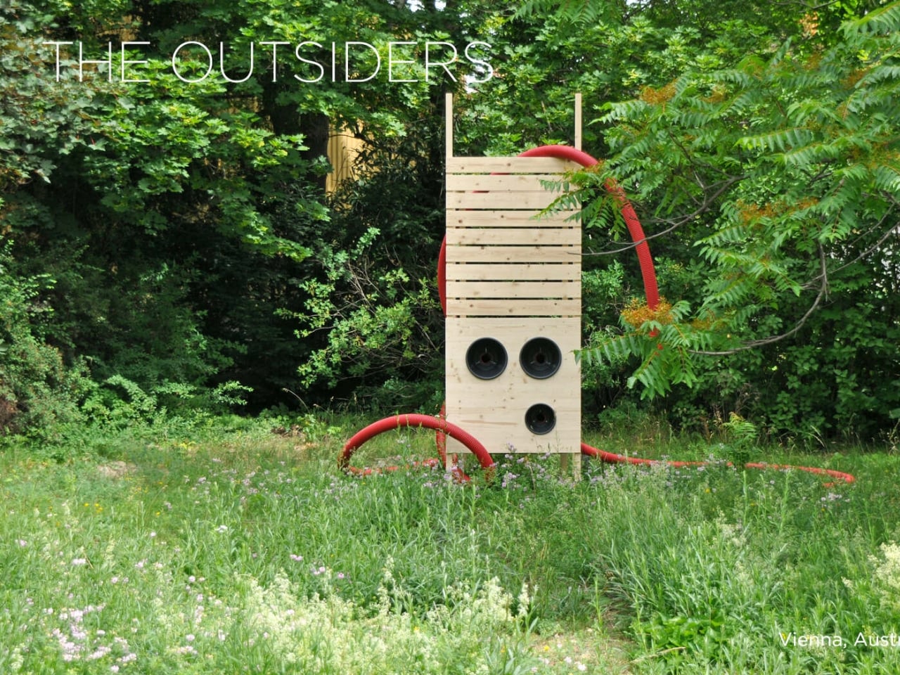
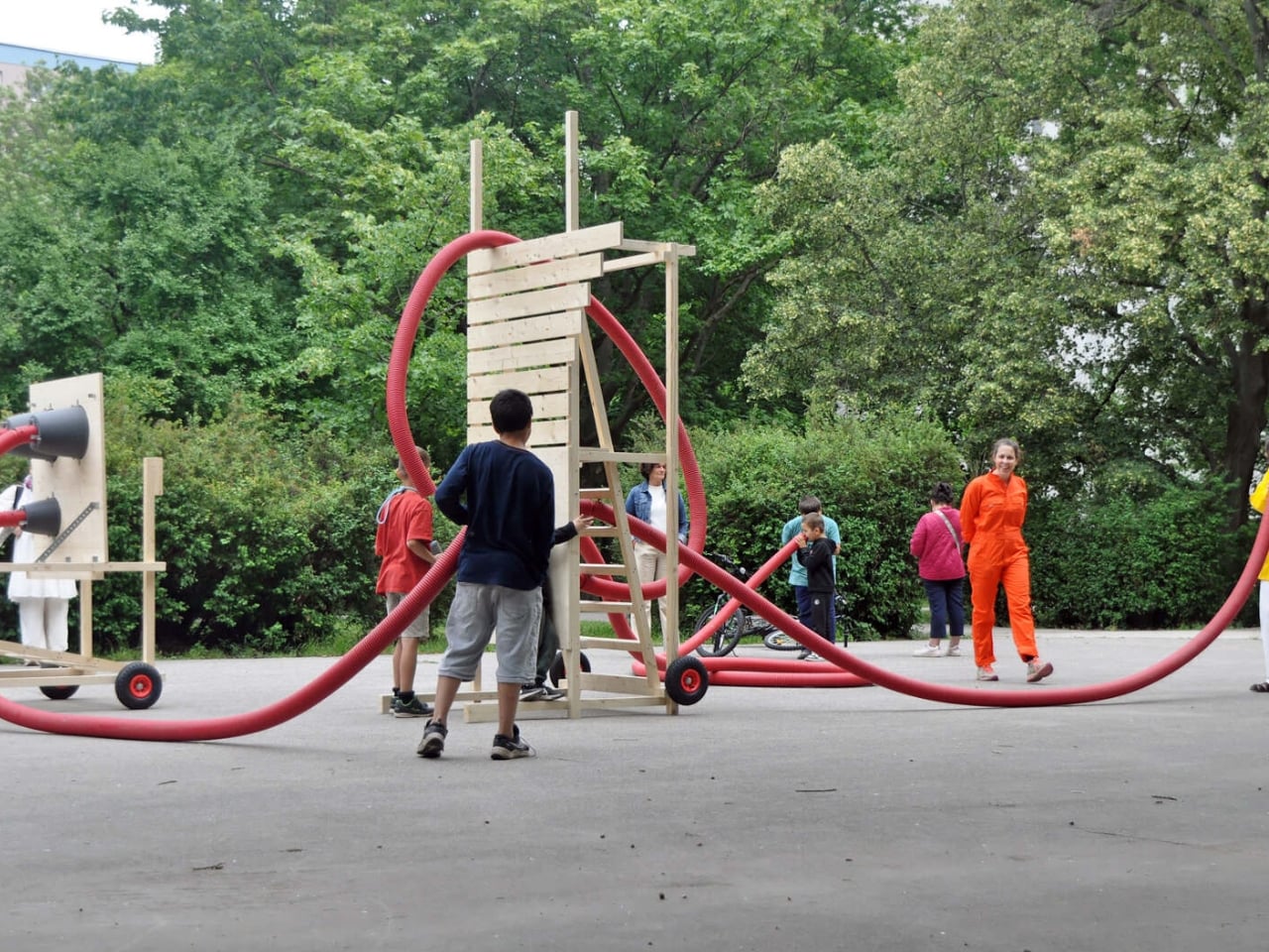
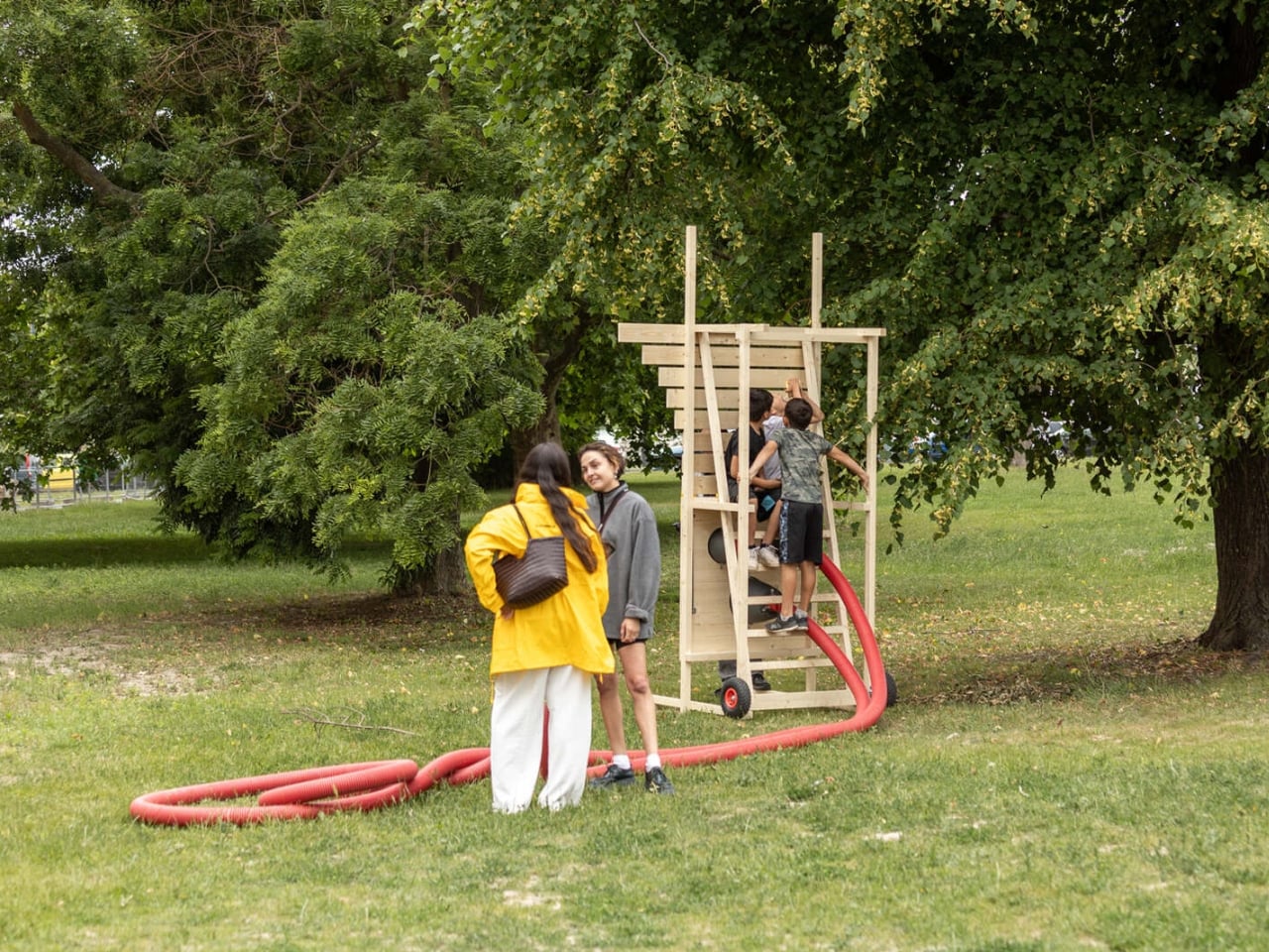
The first thing you notice is the red. A thick, corrugated red hose loops and curls its way through the Hirschstetten neighborhood of Vienna like something that escaped from a construction site and decided to stay. It pools on the ground. It arcs overhead. It feeds into wooden towers and snakes between them, connecting whoever happens to be on either end. That hose is the heart of The Outsiders, a set of mobile urban objects designed by collective Moradavaga for ROOMING INN’s neighborhood Living Lab, and it’s a smarter piece of design thinking than it initially looks.

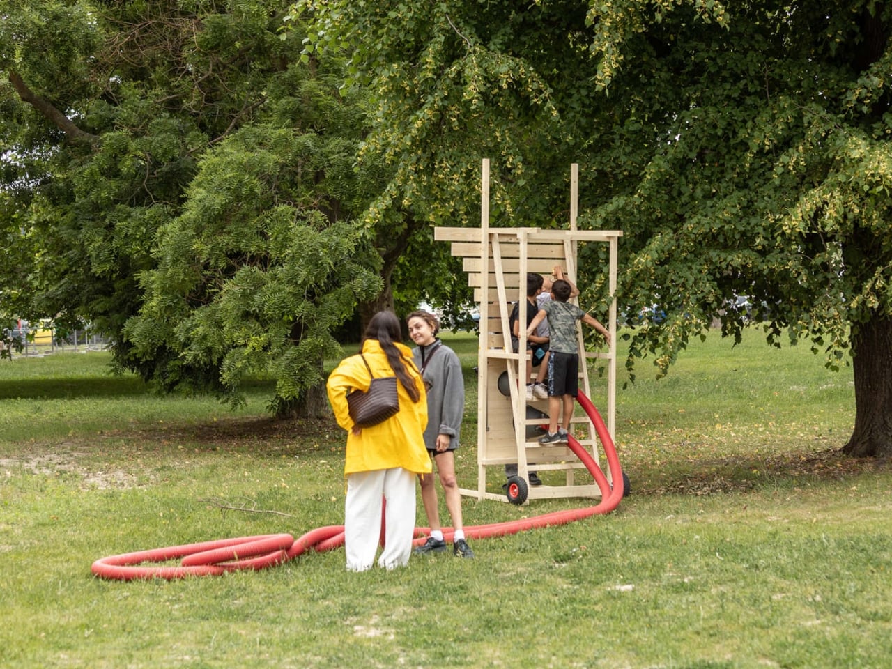
The objects themselves are built from pale, knot-studded pine, cut into wide slatted panels and assembled into structures that sit somewhere between a flatpack bookshelf and a scaffolding tower. The tallest units reach well above head height, with ladders built into their frames and enough structural openness to feel climbable and explorable. These are not delicate objects. They’re chunky, honest, and built to be handled. The wheels at their base, red-rimmed and pneumatic, reinforce that utility. Nothing here is trying to look expensive.

Designer: Moradavaga for Rooming Inn
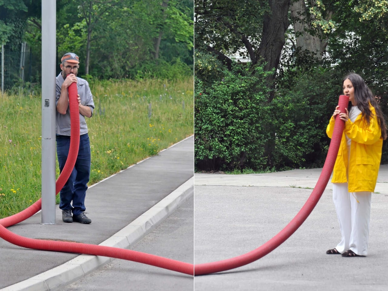
The circular openings punched into the wooden panels are where the design gets genuinely interesting. Each unit features two or three large black-rimmed circles, set at different heights, designed to accept the ends of those red corrugated tubes. From a distance, they give the structures an almost face-like quality, a pair of eyes staring out from a slatted wooden body. Up close, they’re speaking and listening ports, the endpoints of an acoustic communication system that requires no electricity, no app, no screen. You put the tube to your mouth and talk. Someone at the other end hears you. It’s as low-tech as design gets, and precisely because of that, it works on everyone instantly.
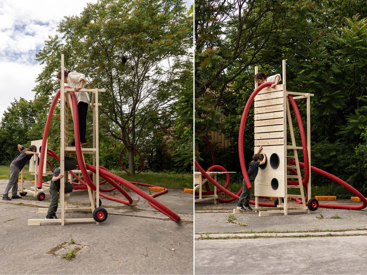
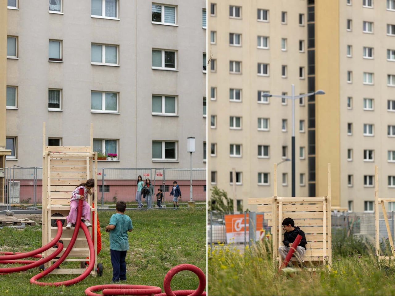
The corrugated hose itself deserves more attention than it typically gets. It’s a standard drainage pipe, the kind you’d find buried in a road trench, and that material choice is a deliberate design statement. Moradavaga didn’t reach for something beautiful or engineered-looking. They reached for something recognizable and repurposable, something that reads as industrial but behaves as playful. When the tube is stretched across a courtyard, held at arm’s length by one person while another crouches at the opposite end, it becomes a choreographic object, shaping how bodies move and position themselves in space.
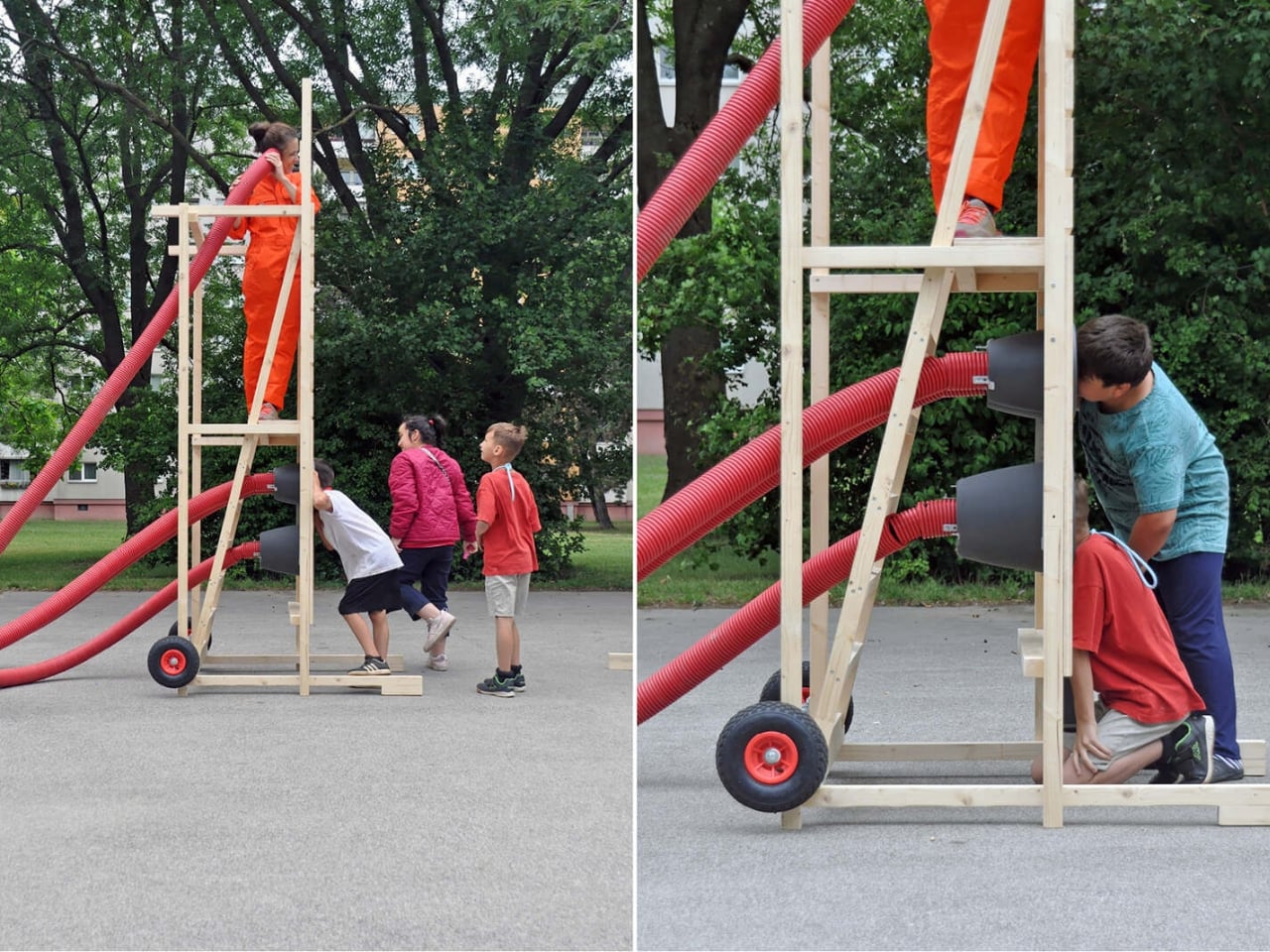
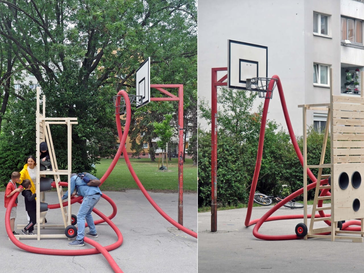
Each unit in the collection has a different scale and configuration. The lower, table-like structure with its speaking horns angled upward operates differently from the tall tower with its ladder and elevated panels. Set together, they create a small temporary landscape. Separated, each one holds its own presence in a street or park. The modularity isn’t just functional. It’s part of the visual language of the project, the sense that these objects are always mid-arrangement, never quite finished, always open to being moved somewhere new.
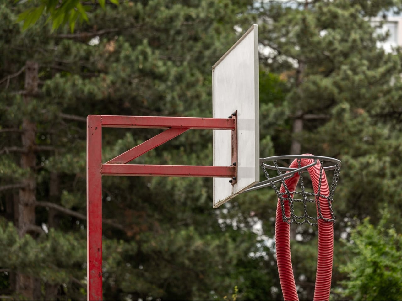
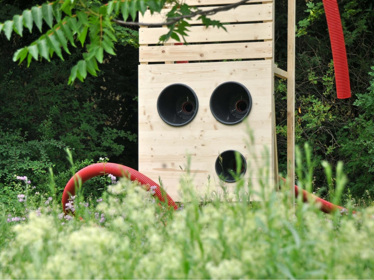
That mobility is embedded in the design from the ground up, literally. The red-wheeled casters aren’t an afterthought. They signal that these objects are not meant to settle. They belong to the ROOMING INN Living Lab, based in a former kindergarten, but the design brief was always for them to travel through the surrounding Hirschstetten neighborhood, showing up at workshops, events, and public squares. A piece of street furniture on wheels is a small act of formal rebellion against the logic of permanence that governs most urban infrastructure, and I think that’s worth appreciating on its own terms, separate from any community design agenda.
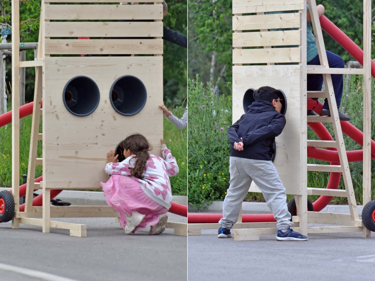
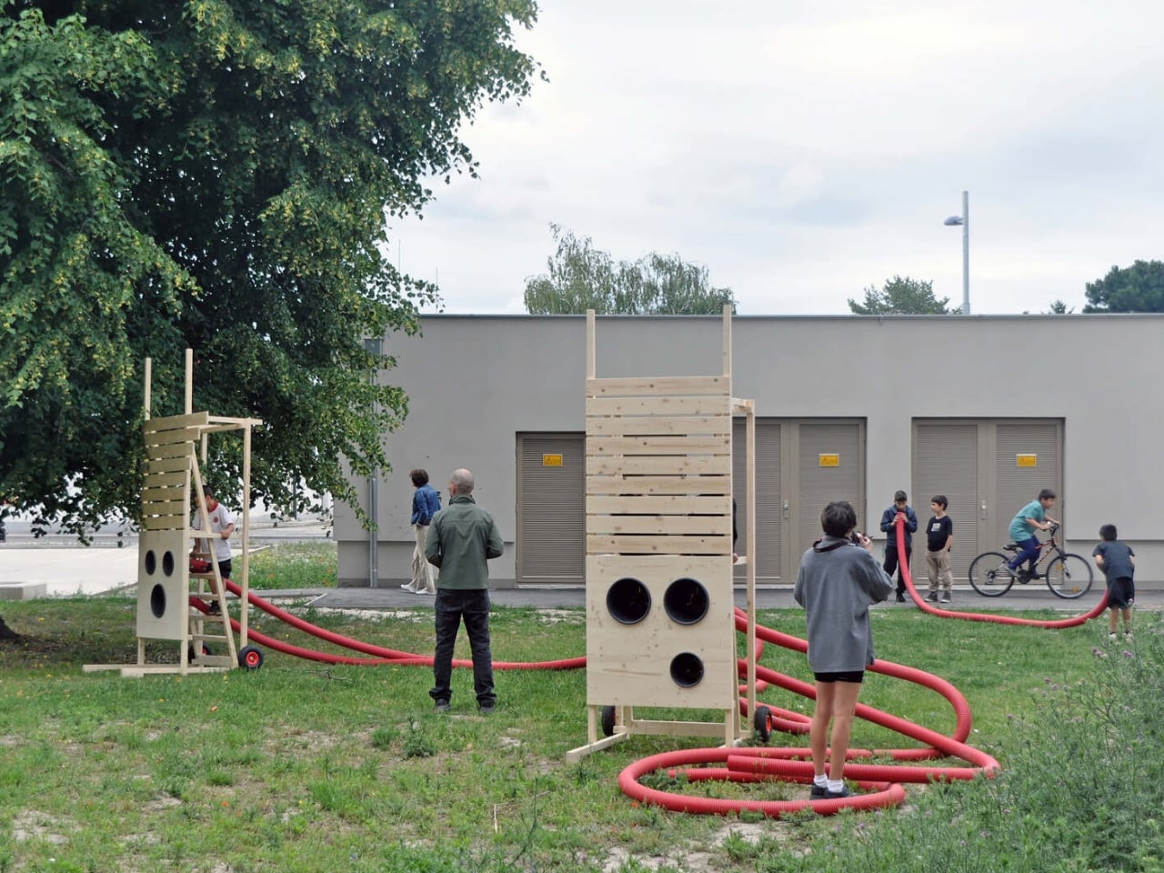
Moradavaga describes their goal as bringing “a little bit of surprise into people’s everyday life, making them look at space from different perspectives.” The Outsiders achieves this through form before it achieves it through function. The pale wood, the red tube, the circular eyes, the wheels at the feet: the objects read as characters before they read as furniture. They look like they arrived somewhere and are still deciding whether to stay. That tension, between object and presence, between furniture and installation, is exactly where the most interesting design tends to live.

The post Vienna’s Weirdest Street Objects Are Secretly Genius first appeared on Yanko Design.
CRA-Carlo Ratti Associati’s Hospital of the Future Puts Nature at the Center of Healing

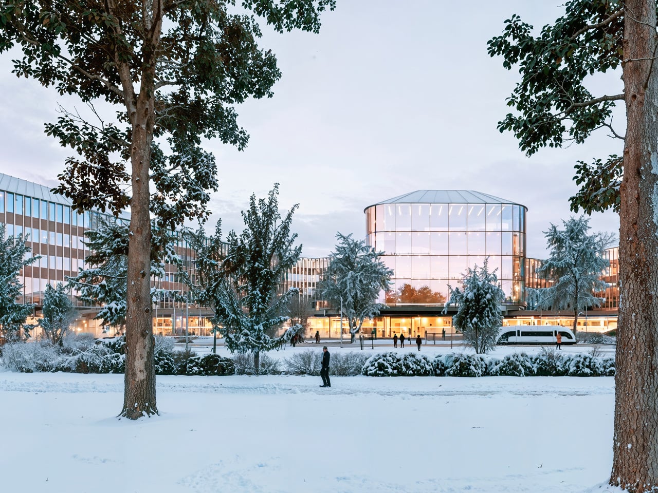
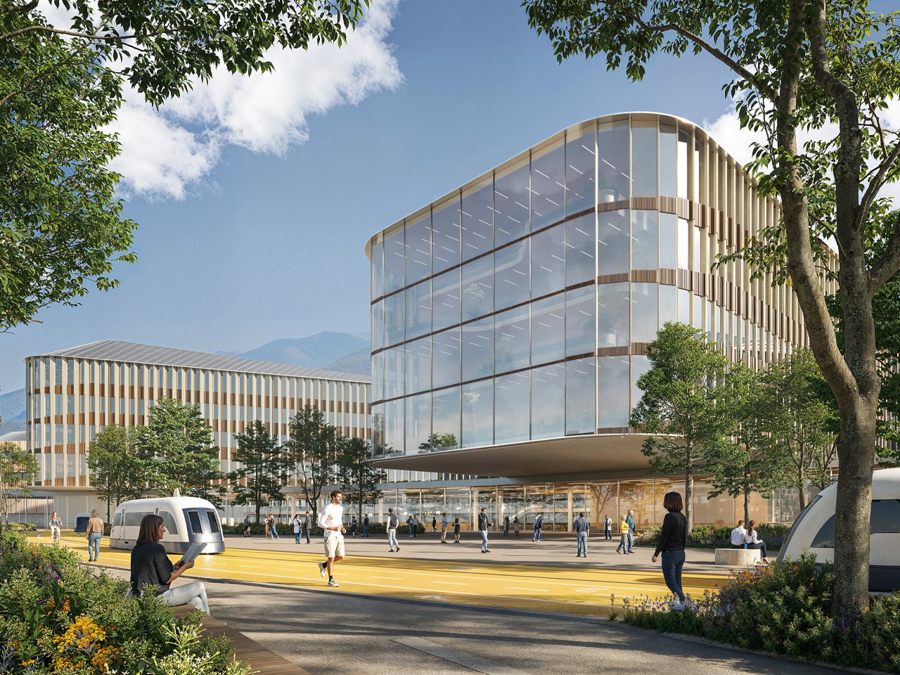
What if a hospital felt less like a clinical institution and more like a campus you actually wanted to spend time in? That’s the central idea behind the winning proposal for the Hospital of the Future in Brescia, developed by CRA-Carlo Ratti Associati, Park Associati, and Politecnica Building for Humans, alongside a multidisciplinary team including Openfabric, Dotdotdot, Eckersley O’Callaghan, and Studio Mattioli. Unveiled at Teatro Grande in Brescia and attended by regional government officials including the President of Lombardy, Attilio Fontana, the project carries significant institutional weight.

It’s designed around the principles of One Health — the idea that human health, environmental systems, and social infrastructure are fundamentally inseparable — and translates that philosophy directly into architecture. With construction set to begin in 2028 and an investment of approximately $300 million USD, with additional funding expected from the Lombardy Region, it is one of the most ambitious healthcare redesigns in Italy’s recent history.

Designer: CRA- Carlo Ratti Associati, Park Associati & Politecnica Building for Humans

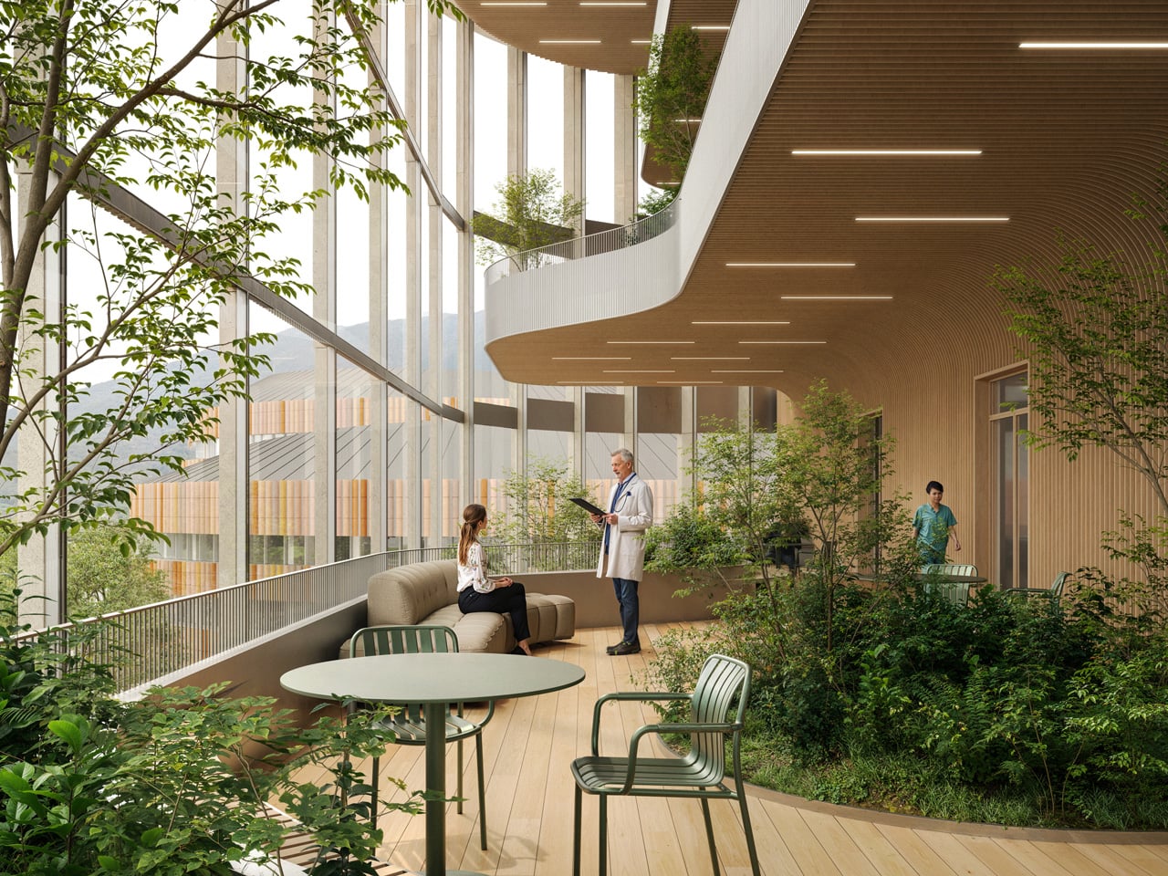
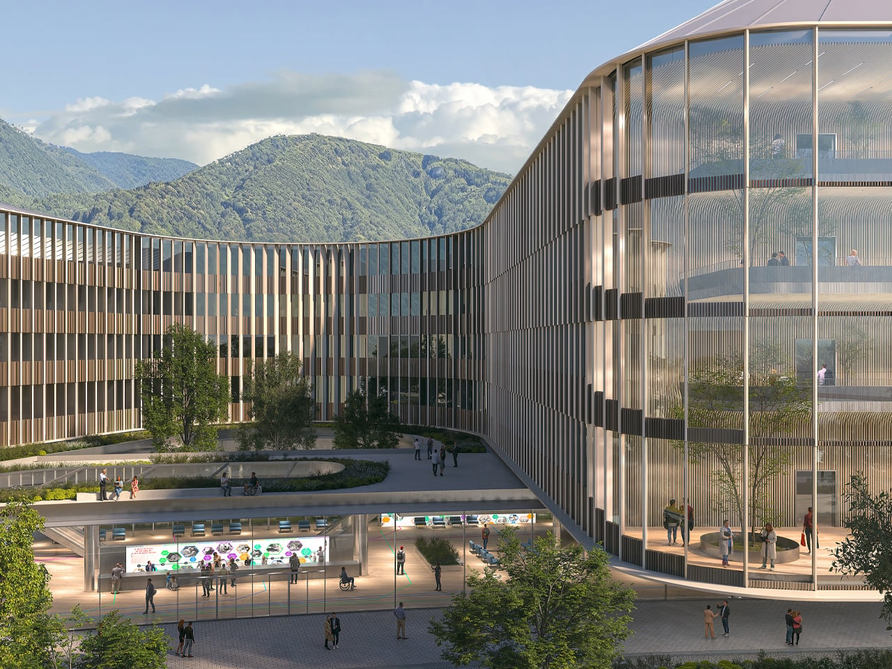
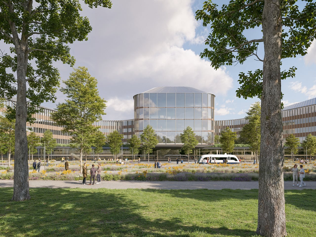
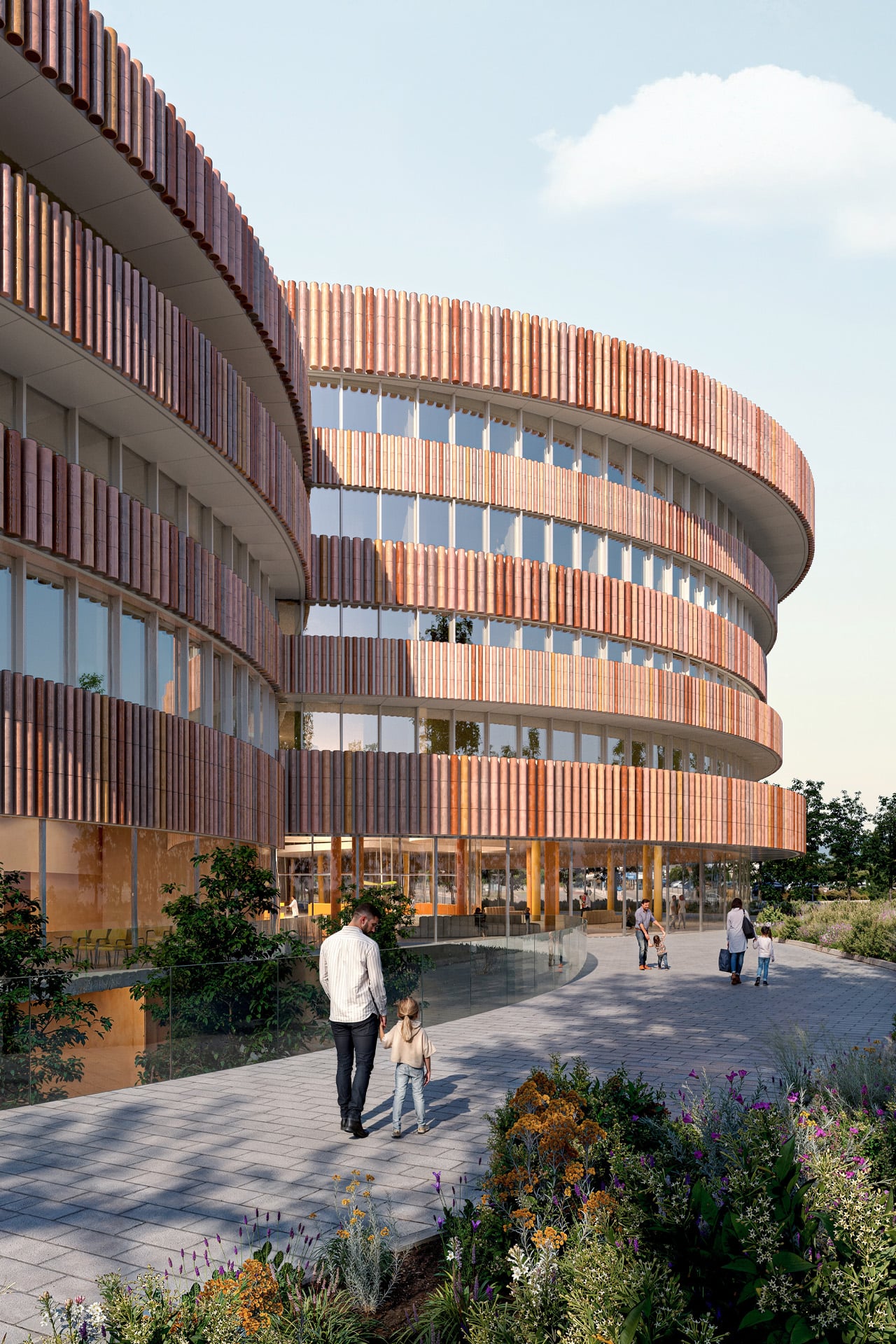
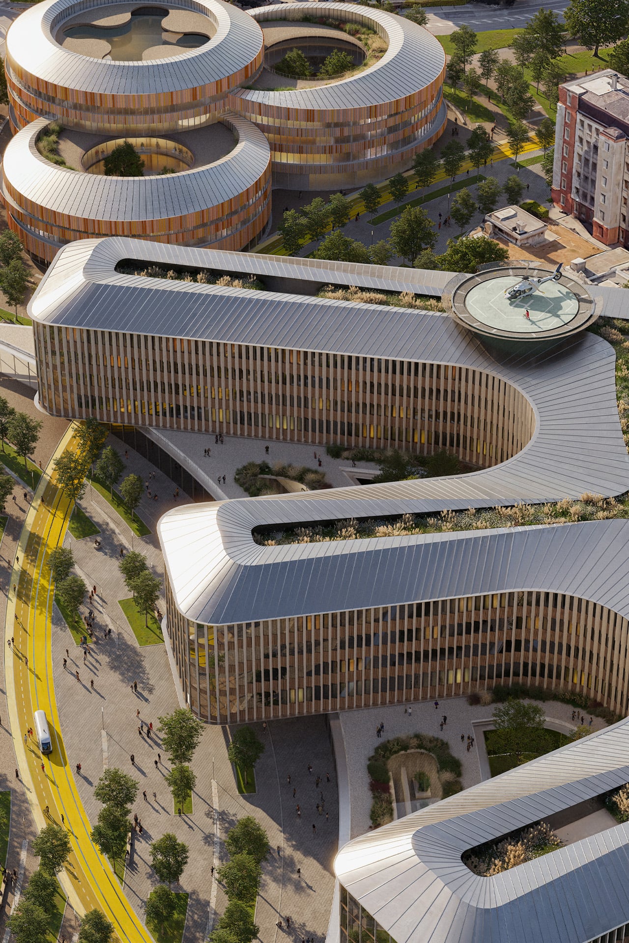
The design takes its structural cues from engineer Angelo Bordoni’s early twentieth-century masterplan — specifically its hexagonal core and radial layout — and reinterprets them as the foundation for something far more porous and alive. Nature doesn’t decorate the edges here; it runs through the entire campus. Patients, staff, and visitors move through landscape as much as through architecture, with views of the Brescia Prealps framed from patient rooms and natural light pulled deep into the building’s core.

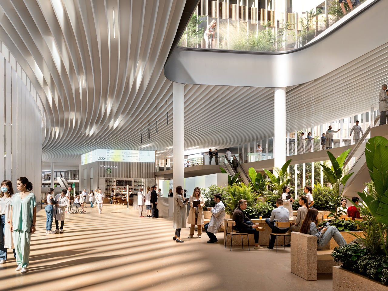
The Main Hospital organizes itself around three interconnected wings that open the complex toward the city. At street level, a continuous glazed lobby creates an urban threshold overlooking a new public square — the kind of civic gesture that signals the building belongs to its city, not just its institution. Inside, the logic is deliberately legible: clear circulation, acoustic comfort, calibrated daylight, and spatial proportions that reduce the psychological weight of being in a hospital. Each patient room is treated as a space of recovery first, with landscape connection as a measurable design strategy rather than an afterthought.

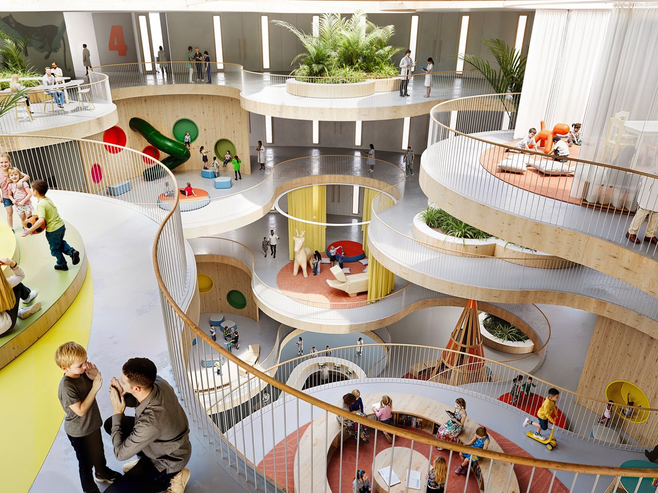
The Children’s Hospital takes a different formal approach — three cylindrical volumes of varying heights arranged around terraces and internal courtyards that function as therapeutic gardens. A full-height atrium anchors the entrance, housing play areas and consultation zones within a bright, protected space that reads more like a community building than a ward.

Connecting everything is the CareRing, a continuous ring stretching over one kilometre that separates operational and logistics flows below ground from a tree-lined public landscape above. It’s the project’s most conceptually elegant move: infrastructure that doubles as a park, connecting the campus to the city while embodying the One Health principle that human health and environmental health are the same conversation.

The structure itself uses hybrid timber-and-steel construction with dry assembly techniques, reducing embodied carbon and shortening build time. The modularity is intentional — the building is designed to reconfigure as medical technology and models of care evolve, which at this scale and investment horizon, they inevitably will. The new hospital delivers 60,500 square metres of clinical space and more than 745 beds, with historic pavilions repurposed for academic and research use in partnership with the University of Brescia’s Faculty of Medicine.

The post CRA-Carlo Ratti Associati’s Hospital of the Future Puts Nature at the Center of Healing first appeared on Yanko Design.
This Belgian Brutalist Villa Doesn’t Sit on the Dunes — It Grew Out of Them

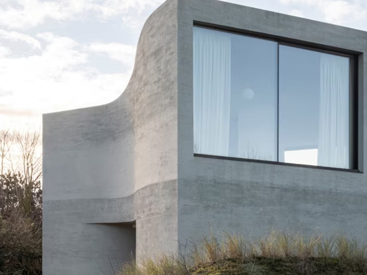
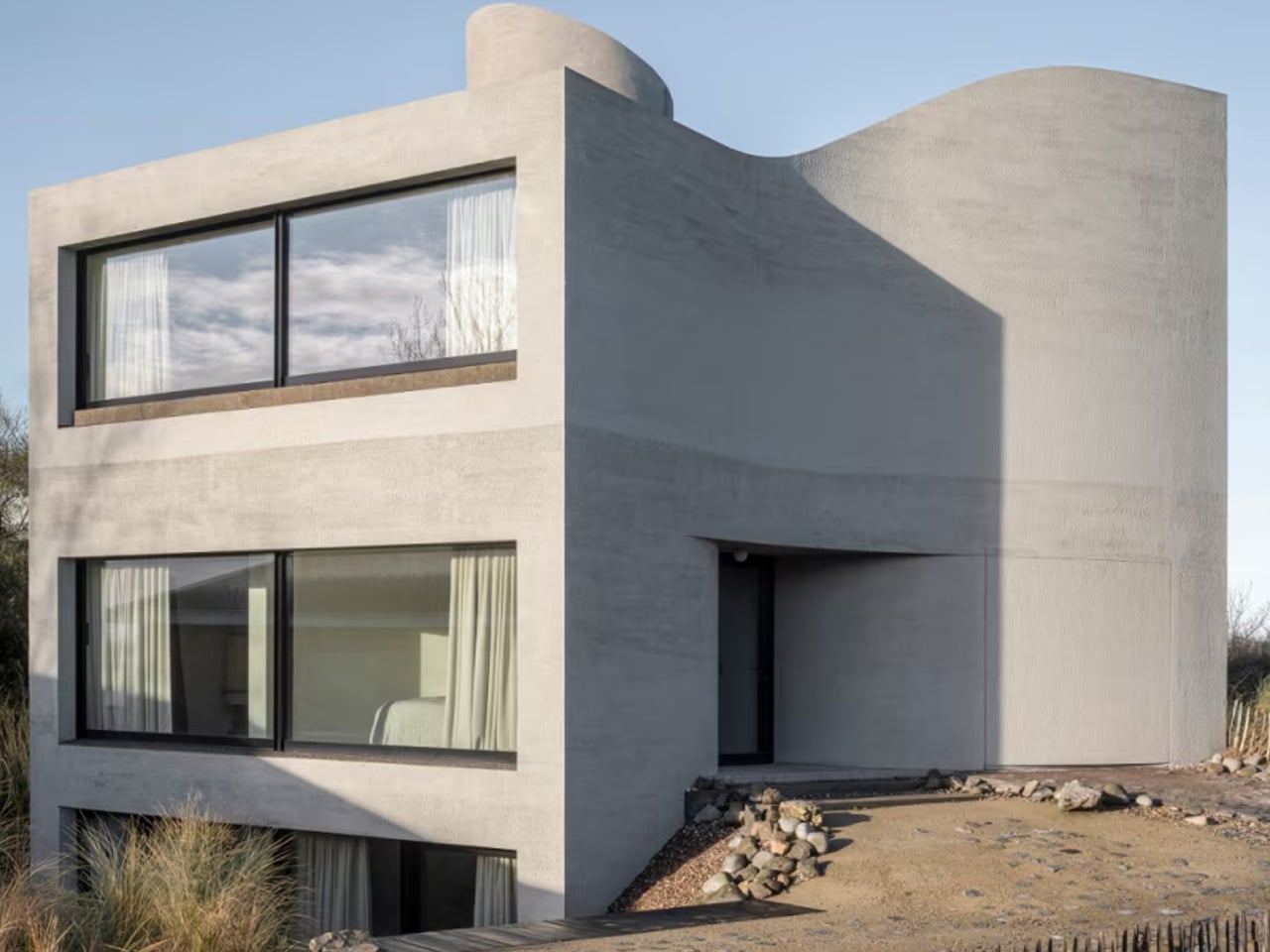
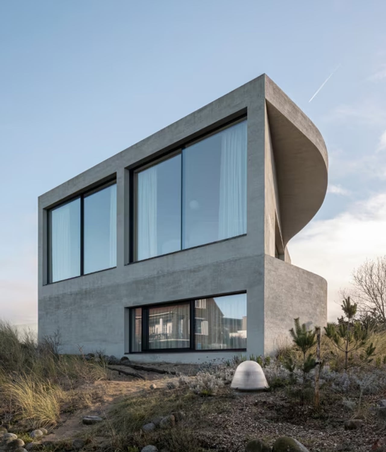
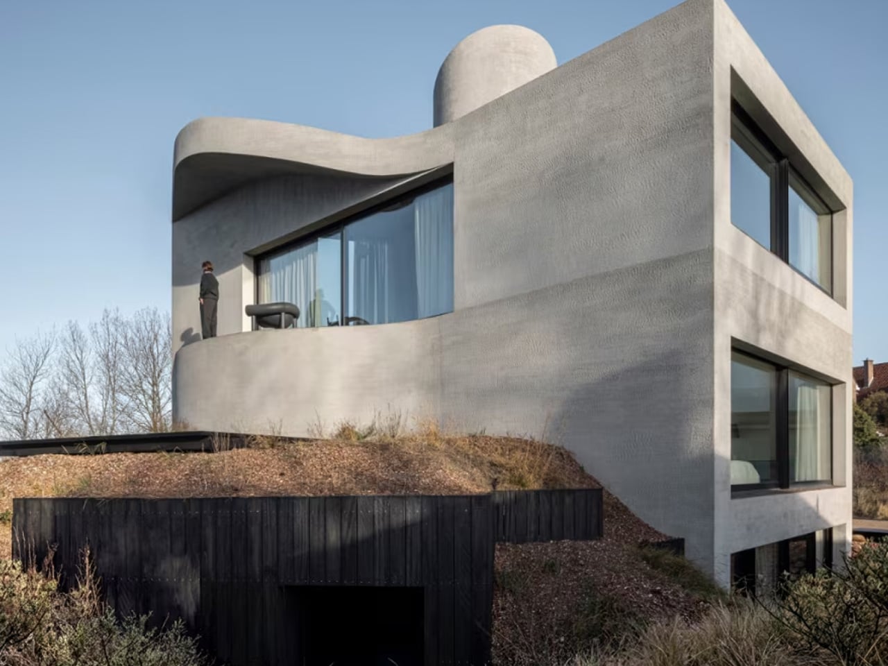
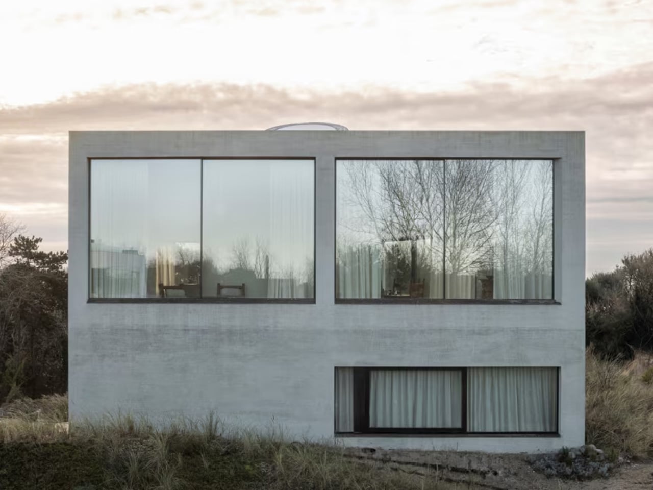
The Belgian coast has always attracted the slightly surreal — fishermen on horseback, a ship-shaped restaurant, and now, a concrete villa that looks like it was carved out of the dune rather than built on top of it. In Oostduinkerke, on a corner plot at the edge of a protected dune reserve along Belgium’s North Sea coast, architect Magalie Munters has built a home that appears to have emerged from the ground rather than been placed upon it. Completed in 2025, Villa Nouvelle Vague is 330 square metres of sculpted concrete — shaped by terrain, wind, and light rather than by facade composition.

The name borrows from the French New Wave cinema movement, and the reference earns its place. There is something filmic in how the house builds narrative as you move through it — compressed thresholds that open into volume, light sweeping across curved walls, deeply set openings that frame the dune landscape like a held shot. This is architecture with a point of view.

Designer: Magalie Munters Architecture

From the street, the facade reads as a protective shell. Munters gave the concrete surface a horizontal grain that recalls the striations left in wet sand when the North Sea withdraws at low tide. The texture is not decorative. It is a structural character — the surface behaves as if it has been sedimented rather than cast. The volume tapers toward the rear of the plot, a subtle geometric decision that creates a generous garden while allowing sunlight to reach both the southern and western facades simultaneously. In a compact building, that kind of continuous light is earned, not given.

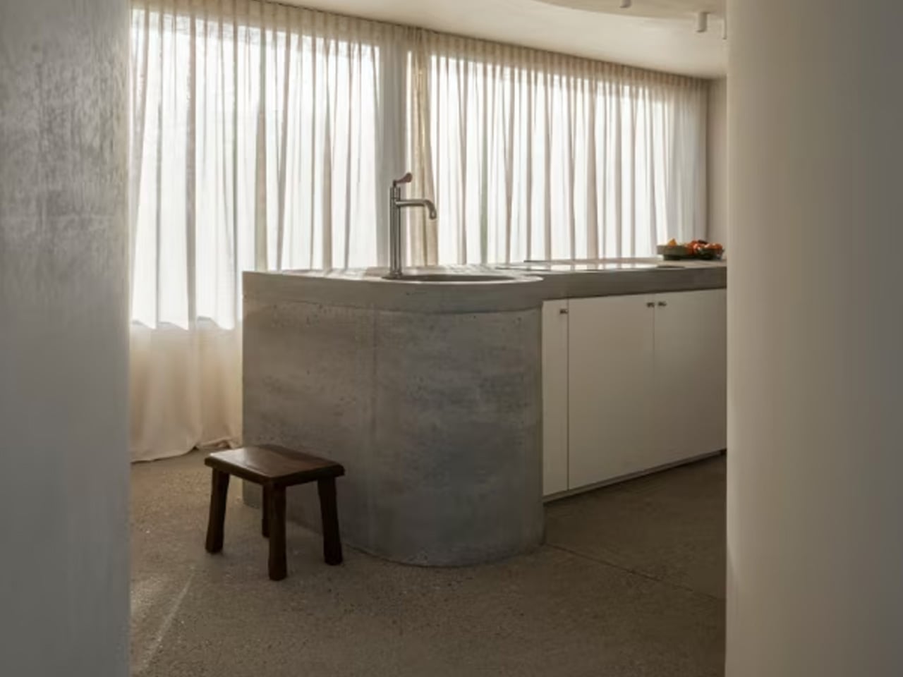
The bedrooms sit half-buried in the dunes, anchored and sheltered. Above them, the living space rises toward the horizon — a vertical shaft cuts through the mass toward the roof, organizing movement and pulling light down through the interior. Munters cites Le Corbusier as a touchstone, specifically in how spaces contract and expand, and in the logic of a rooftop solarium that turns the roof into usable terrain. The ceiling is not incidental. It descends toward the kitchen, which sits lower and more intimate, and rises again over the main living space, where the curved walls catch the evening light with near-tactile presence.

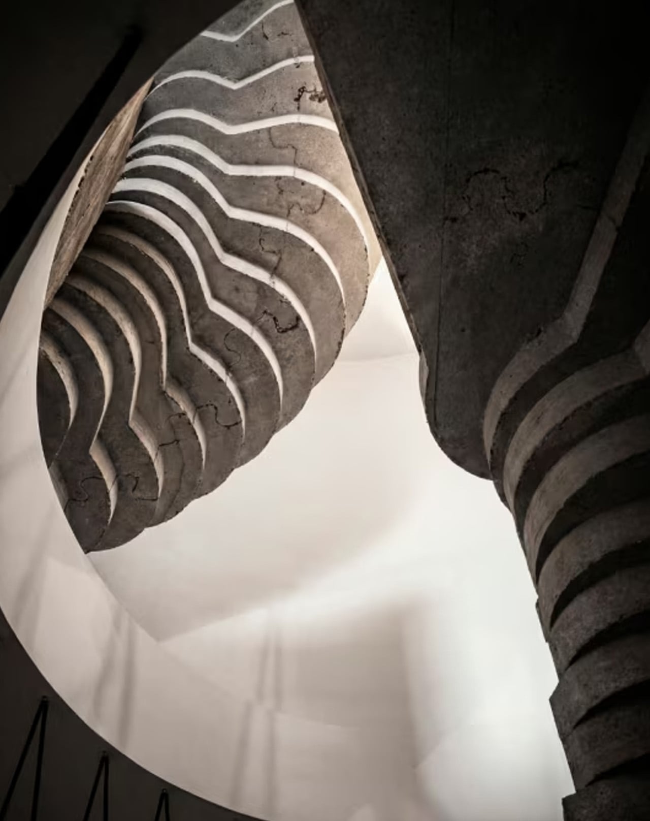
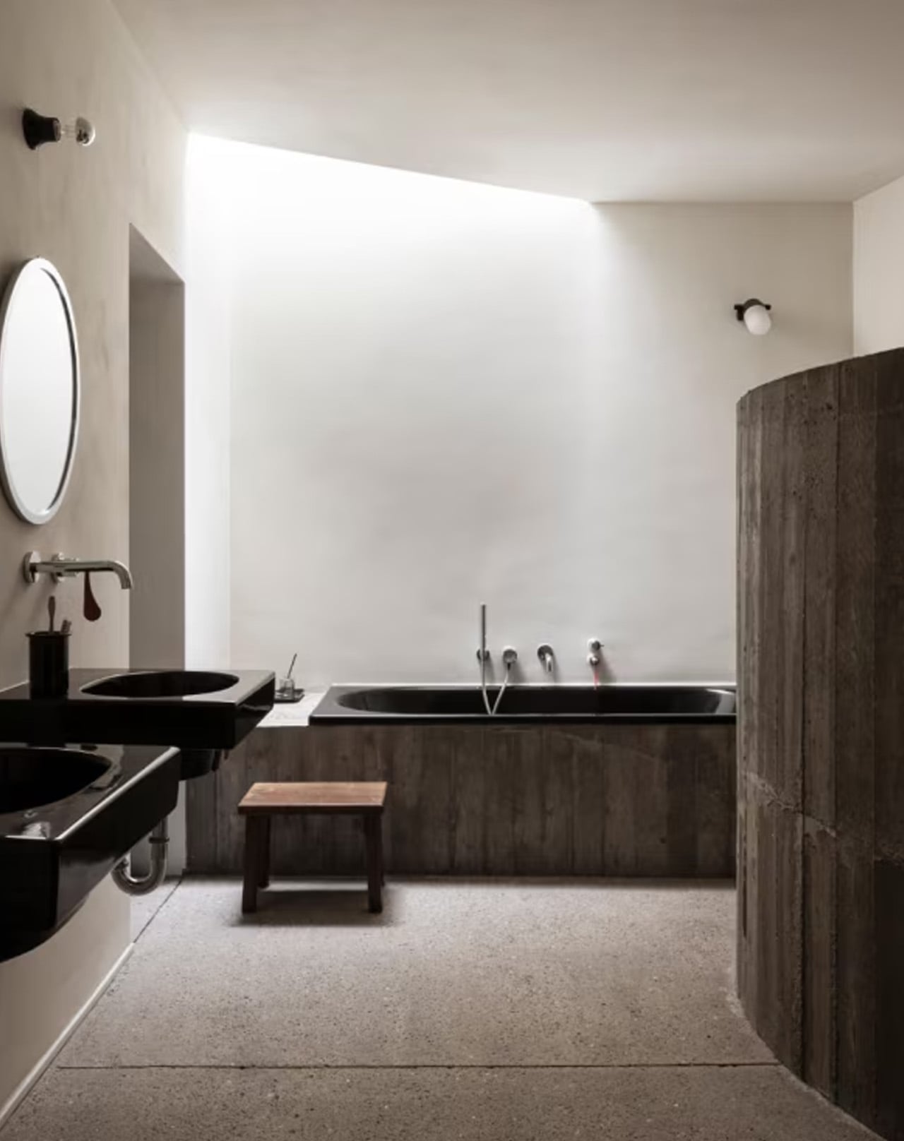
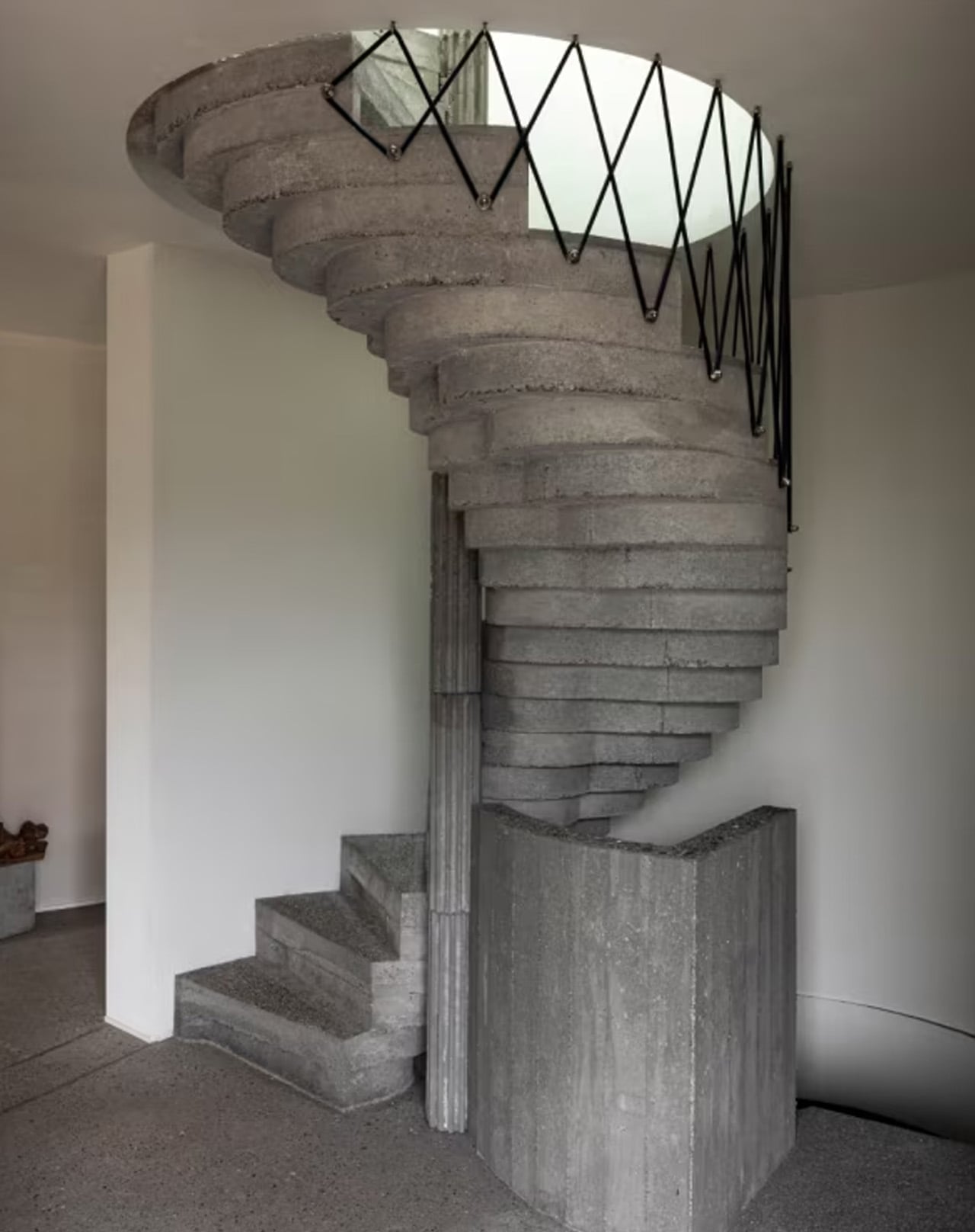
Inside, concrete is a spatial substance, not cladding. The staircase, bathrooms, built-in seating, and kitchen are each conceived as carved elements within the monolithic body — robust and unadorned. Lime-washed surfaces and sandblasted oak furniture soften the mineral presence without undermining it. The rooms feel less like interiors and more like the inside of a shell: enclosed, resonant, precise.

Munters describes the tension at the heart of the project as one between a hidden, highly controlled building logic and a more archaic material expression. That tension, held rather than resolved, is exactly what makes Villa Nouvelle Vague worth studying.

The post This Belgian Brutalist Villa Doesn’t Sit on the Dunes — It Grew Out of Them first appeared on Yanko Design.
Get Ready for the Pavilion That Was Designed by the Sun Itself

Architecture has always had to reckon with the sun. Buildings are oriented, shaded, and glazed in response to it, and solar panels are bolted onto them afterward. In most cases, the sun’s behavior is accommodated rather than consulted. The resulting forms come from a designer’s intentions and a structural engineer’s calculations, with sunlight as something to manage rather than the thing that generates the shape itself.

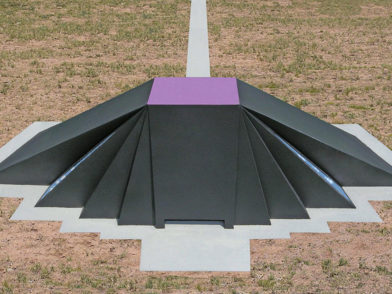
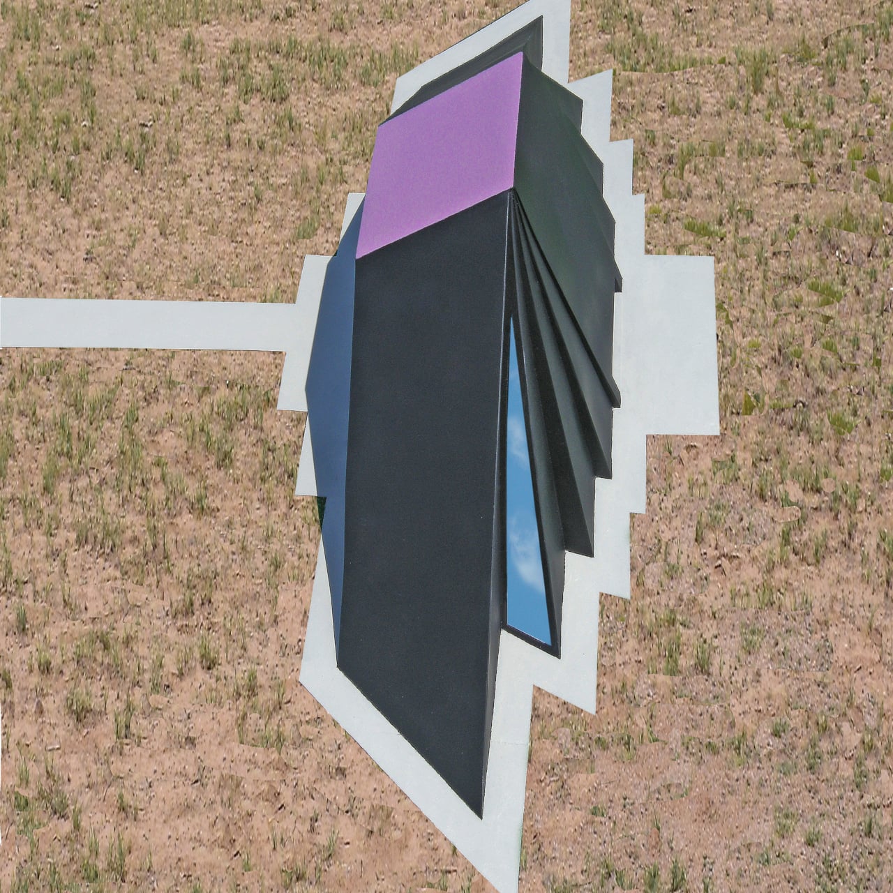
The Sun Shadow Pavilion starts from a different premise. Before any walls were drawn or a floor plan drafted, a scale model of a large square array of photovoltaic solar panels was placed above a flat white surface facing south. The sun then did the rest. The shadows it cast on that surface, traced every hour for eight hours as it crossed the sky, became the raw material for the entire structure.

Designer: Michael Jantzen

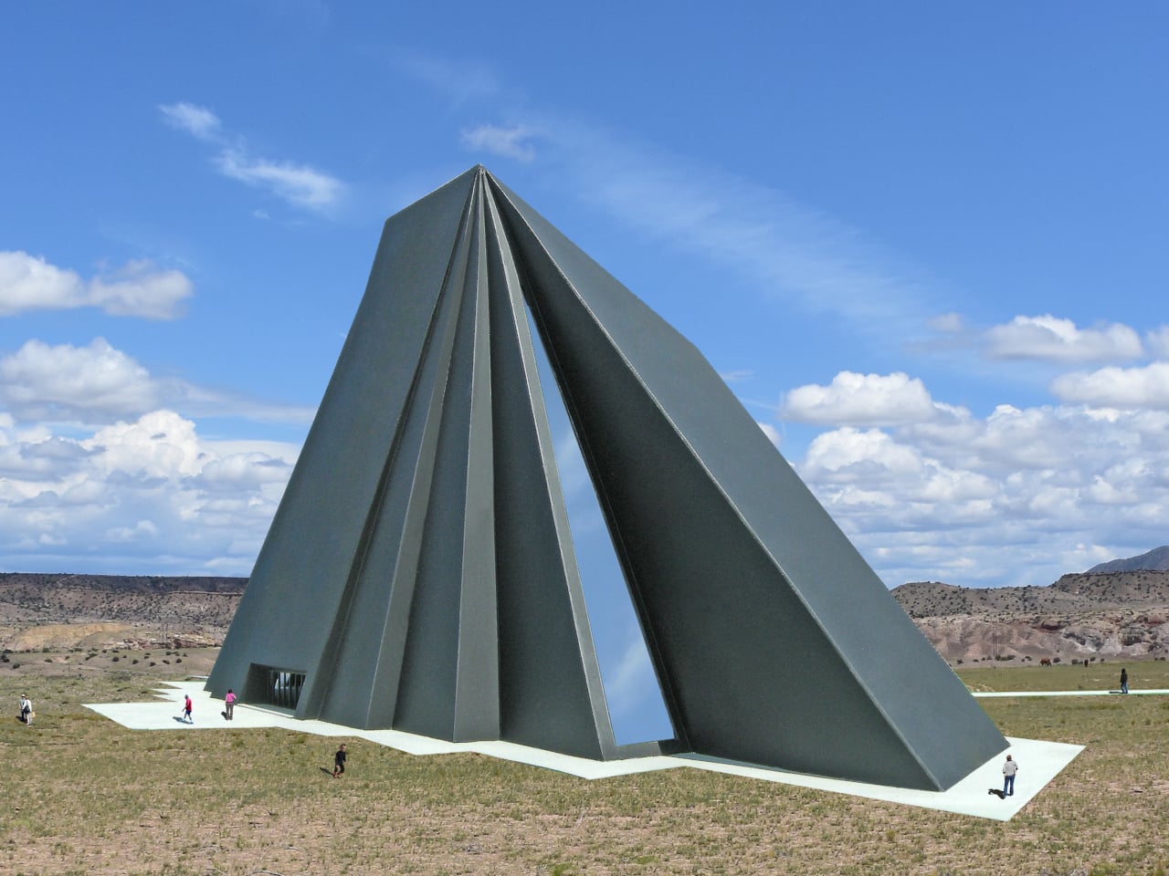
Eight shadow outlines, each representing a different hour of the day, were converted into three-dimensional forms. Solid planes were inserted from the edges of each shadow up to the edges of the solar panels above, creating a set of inclined surfaces that defined the interior volume. That enclosed space, shaped by accumulated light and time rather than a stylist’s instinct, became the pavilion.

The design is also inherently site-specific and date-specific. If built, the shadows used to generate its form would be traced on the actual opening day, at the exact build location. A pavilion in the American Southwest, traced on a different opening date, would look different from one in northern Europe, or from the same structure inaugurated a decade earlier or later. Each built version would be unrepeatable.

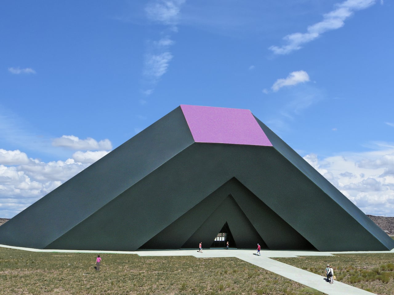
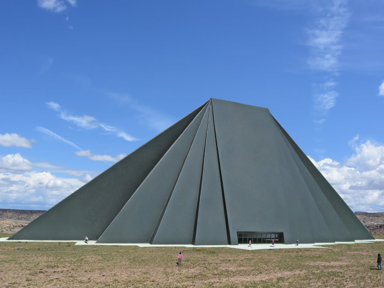
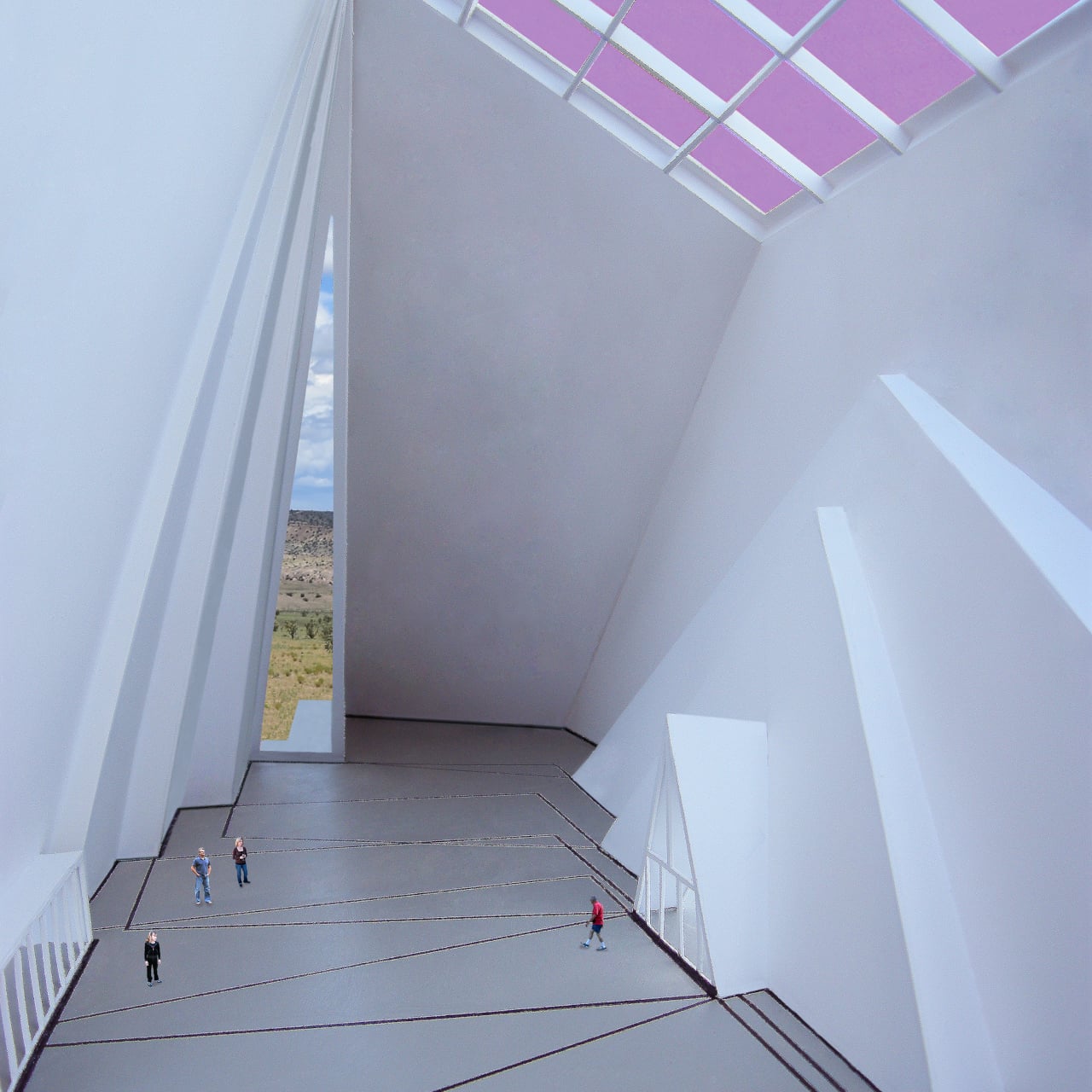
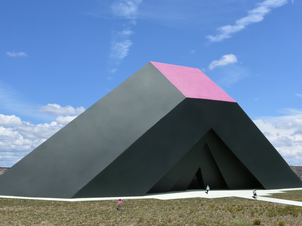
The exterior form that results from this particular study is dramatic and unmistakably asymmetric, a cluster of dark, angled, sloping planes radiating outward from the flat solar array at the top. The interior is a complete reversal. The translucent solar cells that generate all of the pavilion’s power also filter light through the roof, keeping the space naturally bright during the public hours the shadow tracings were drawn to represent.

Walking through, the floor carries painted outlines of all eight shadow positions, so the exact geometry that produced the walls above can be read directly underfoot. The building’s origin story isn’t hidden in a design brief or a notebook; it’s painted on the ground you’re standing on. The structure explains itself to anyone willing to look down as well as up.

Beyond the solar panels, the structure handles its own climate without mechanical systems. The dark outer surface absorbs heat, and a double-skin wall construction moves warm or cool air into and away from the interior as needed. Rainwater collected from the exterior surfaces feeds underground storage tanks for use on-site. The pavilion’s stated purpose, to display advances in alternative energy technology, is also its operating model.

There’s an honesty to the whole approach that’s relatively rare in landmark building design. Most structures acquire their form through aesthetic decisions, historical references, or personal sensibility. This one derived its shape from a physical process that would have happened regardless of any design intention. The sun was going to cast those shadows anyway. The design simply had the sense to use them.

The post Get Ready for the Pavilion That Was Designed by the Sun Itself first appeared on Yanko Design.
This 24-Foot Tiny Home From Australia Proves Small Space Design Is All About Intention

Most tiny homes ask you to sacrifice. The Springbrook 7.2 doesn’t. The Springbrook 7.2 from Gold Coast–based Removed Tiny Homes is the opposite of that. Named for its 7.2-meter length (23.7 feet), it’s a build that makes a convincing case for intentional design over raw square footage.

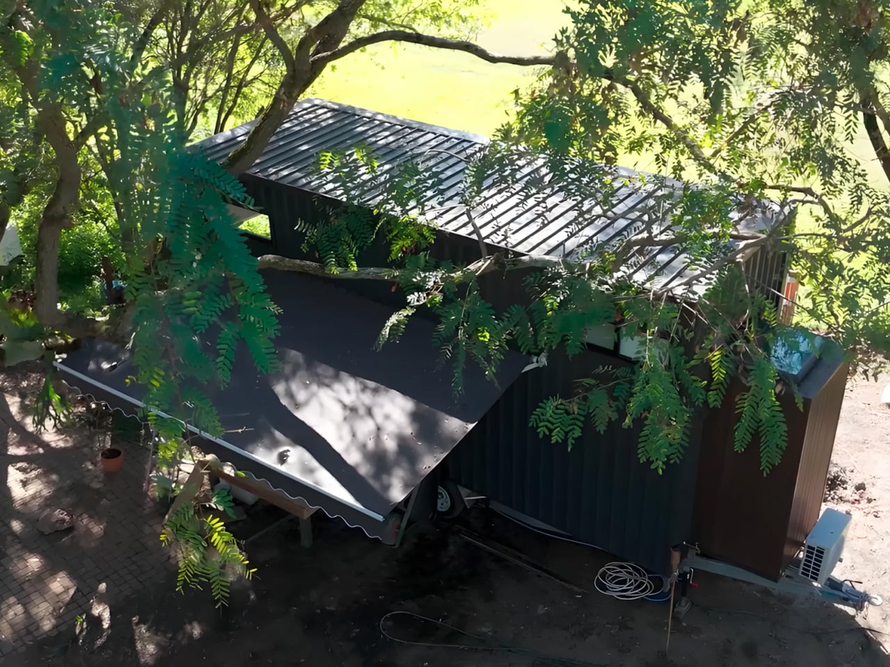
Built on a standard trailer and clad in Colorbond steel, the home’s exterior is durable and weatherproof — Colorbond is a popular choice across Australia precisely because it holds up in extreme climates without losing its clean, contemporary finish. An awning runs along the exterior, extending the home’s livable edge and softening its profile against the surrounding landscape.

Designer: Removed Tiny Homes

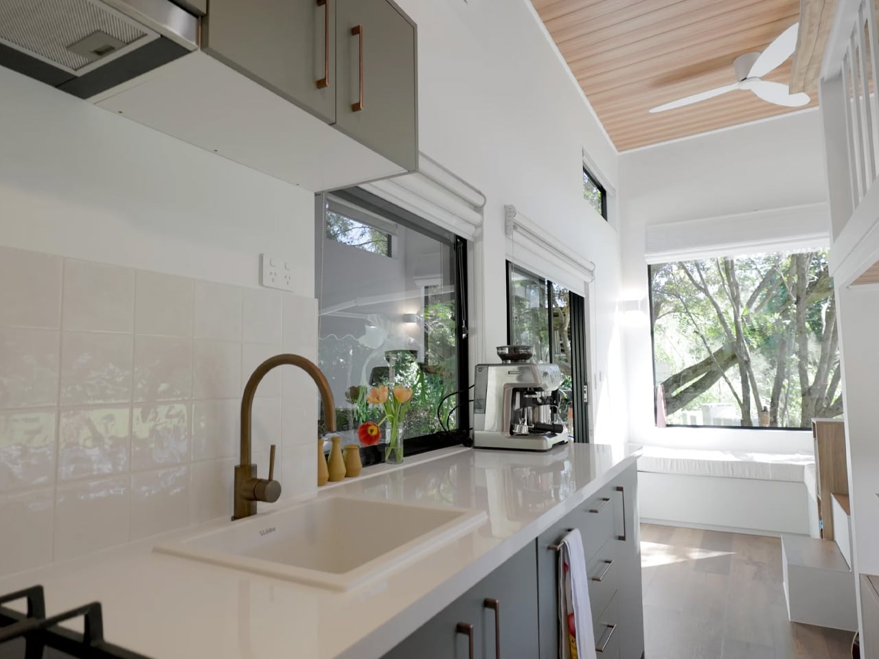
The interior greets you through double glass doors that open into a living area anchored by an L-shaped sofa. The ceiling reads high, and generous glazing keeps the space from contracting inward the way so many compact homes do. Light fills the room freely, which is less a given than it sounds in a build this size. Removed’s design instinct here is to borrow volume from the outside rather than manufacture it through material trickery alone.

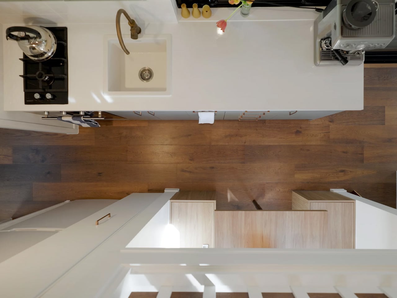
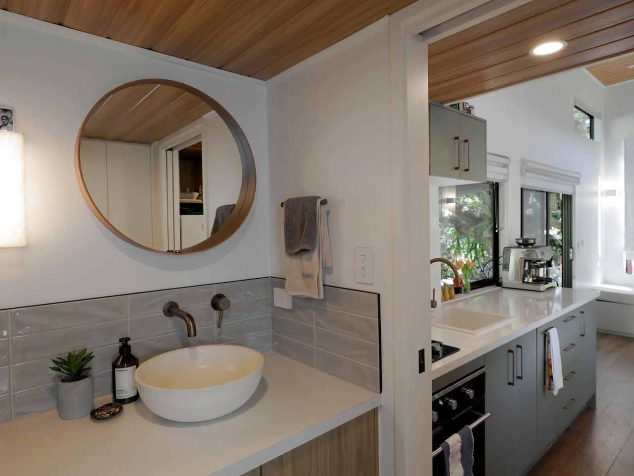
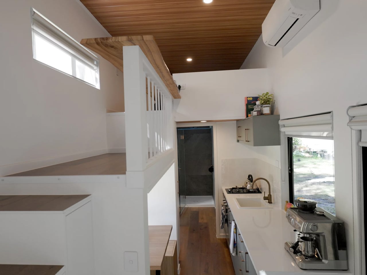
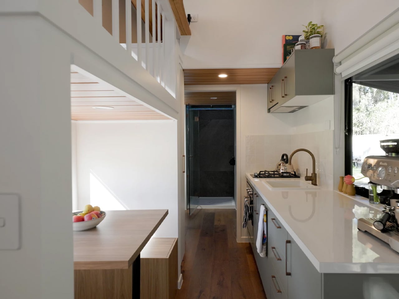
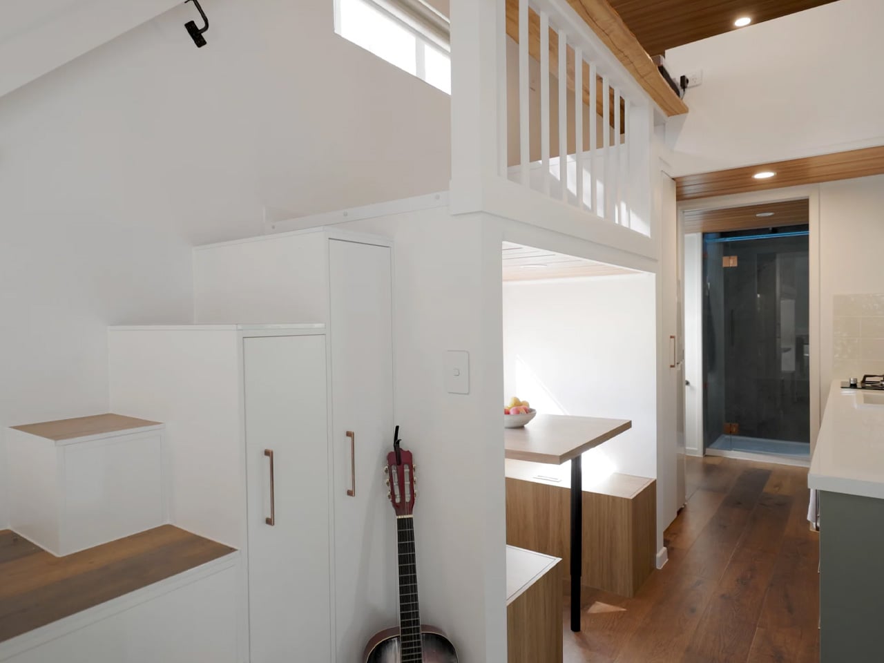
The kitchen, positioned deeper into the plan, is remarkably complete. There’s a sink, an oven, a two-burner propane stove, a fridge and freezer, and a full complement of upper and lower cabinetry. Beside it sits a booth-style dining nook with bench seating and a table — the kind of tucked-away setup that feels more intimate than cramped, more considered than squeezed in.

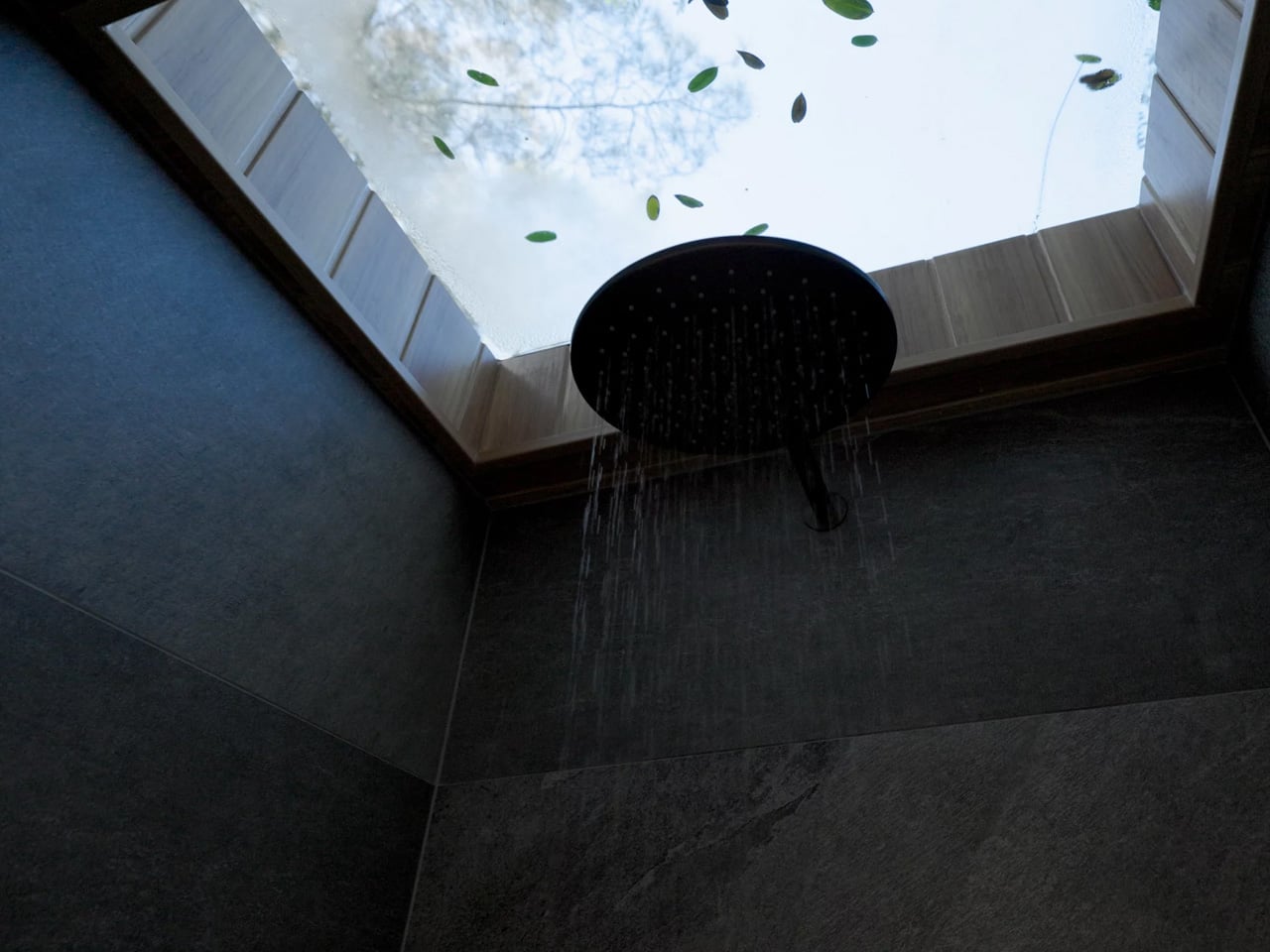
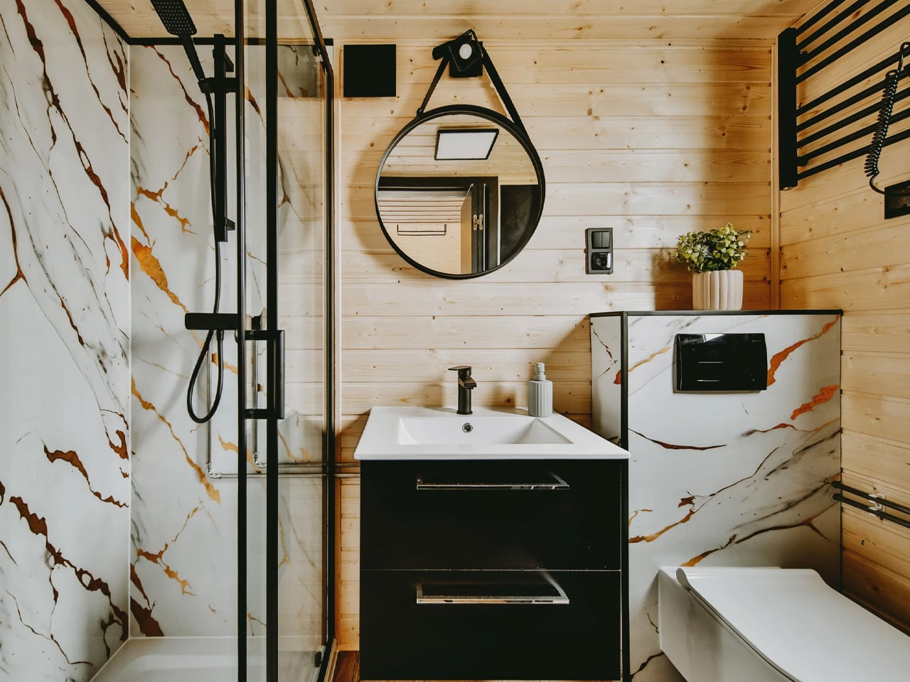
The bathroom sits at the far end of the home. A composting toilet, a vanity sink, and a walk-in shower occupy the space with no sense of conflict. The shower is topped by a skylight, a small detail that does a lot of work — it draws natural light straight down into what could easily have been the home’s darkest corner, and keeps it private without compromising that openness.

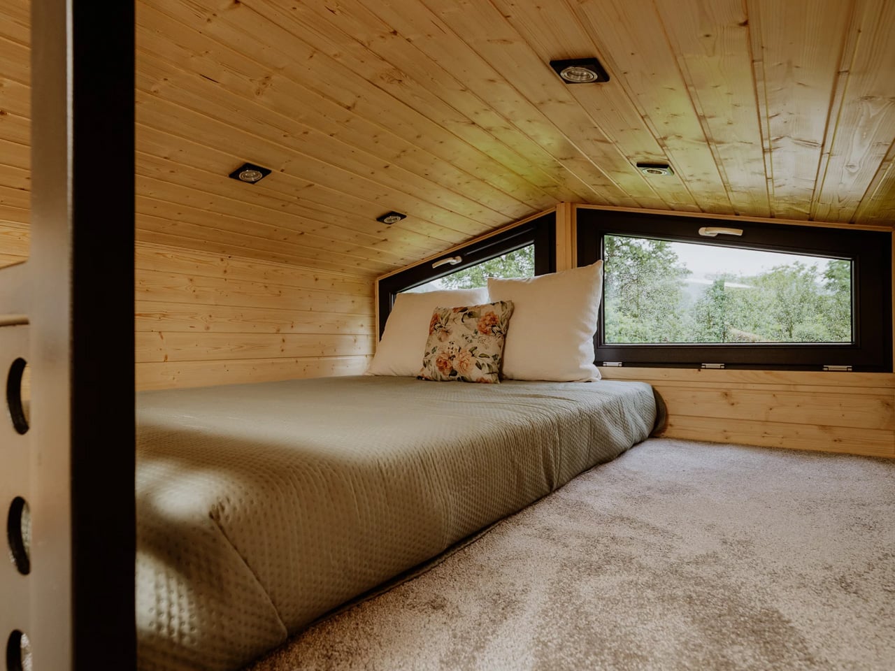
Circulation between levels is handled by a corner staircase that integrates storage into its structure, winding up to the loft bedroom above. The loft holds a queen-sized bed and a desk built directly into the balustrade, converting the sleeping area into a workspace without any additional furniture. The ceiling sits low up here, but the resolution is smart: it makes the space feel cocooning rather than confined.

The Springbrook 7.2 was designed and delivered as a custom commission. Pricing is available on request directly through Removed Tiny Homes.

The post This 24-Foot Tiny Home From Australia Proves Small Space Design Is All About Intention first appeared on Yanko Design.
This 24-Foot Tiny Home From Australia Proves Small Space Design Is All About Intention

Most tiny homes ask you to sacrifice. The Springbrook 7.2 doesn’t. The Springbrook 7.2 from Gold Coast–based Removed Tiny Homes is the opposite of that. Named for its 7.2-meter length (23.7 feet), it’s a build that makes a convincing case for intentional design over raw square footage.

Built on a standard trailer and clad in Colorbond steel, the home’s exterior is durable and weatherproof — Colorbond is a popular choice across Australia precisely because it holds up in extreme climates without losing its clean, contemporary finish. An awning runs along the exterior, extending the home’s livable edge and softening its profile against the surrounding landscape.

Designer: Removed Tiny Homes

The interior greets you through double glass doors that open into a living area anchored by an L-shaped sofa. The ceiling reads high, and generous glazing keeps the space from contracting inward the way so many compact homes do. Light fills the room freely, which is less a given than it sounds in a build this size. Removed’s design instinct here is to borrow volume from the outside rather than manufacture it through material trickery alone.

The kitchen, positioned deeper into the plan, is remarkably complete. There’s a sink, an oven, a two-burner propane stove, a fridge and freezer, and a full complement of upper and lower cabinetry. Beside it sits a booth-style dining nook with bench seating and a table — the kind of tucked-away setup that feels more intimate than cramped, more considered than squeezed in.

The bathroom sits at the far end of the home. A composting toilet, a vanity sink, and a walk-in shower occupy the space with no sense of conflict. The shower is topped by a skylight, a small detail that does a lot of work — it draws natural light straight down into what could easily have been the home’s darkest corner, and keeps it private without compromising that openness.

Circulation between levels is handled by a corner staircase that integrates storage into its structure, winding up to the loft bedroom above. The loft holds a queen-sized bed and a desk built directly into the balustrade, converting the sleeping area into a workspace without any additional furniture. The ceiling sits low up here, but the resolution is smart: it makes the space feel cocooning rather than confined.

The Springbrook 7.2 was designed and delivered as a custom commission. Pricing is available on request directly through Removed Tiny Homes.

The post This 24-Foot Tiny Home From Australia Proves Small Space Design Is All About Intention first appeared on Yanko Design.
A 28m² Bamboo Tower in China Makes You Bow to Get In

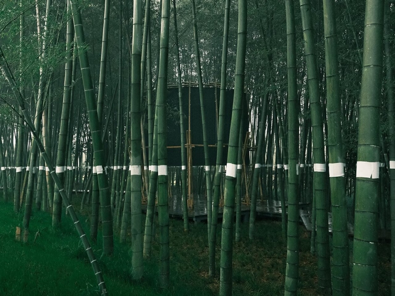
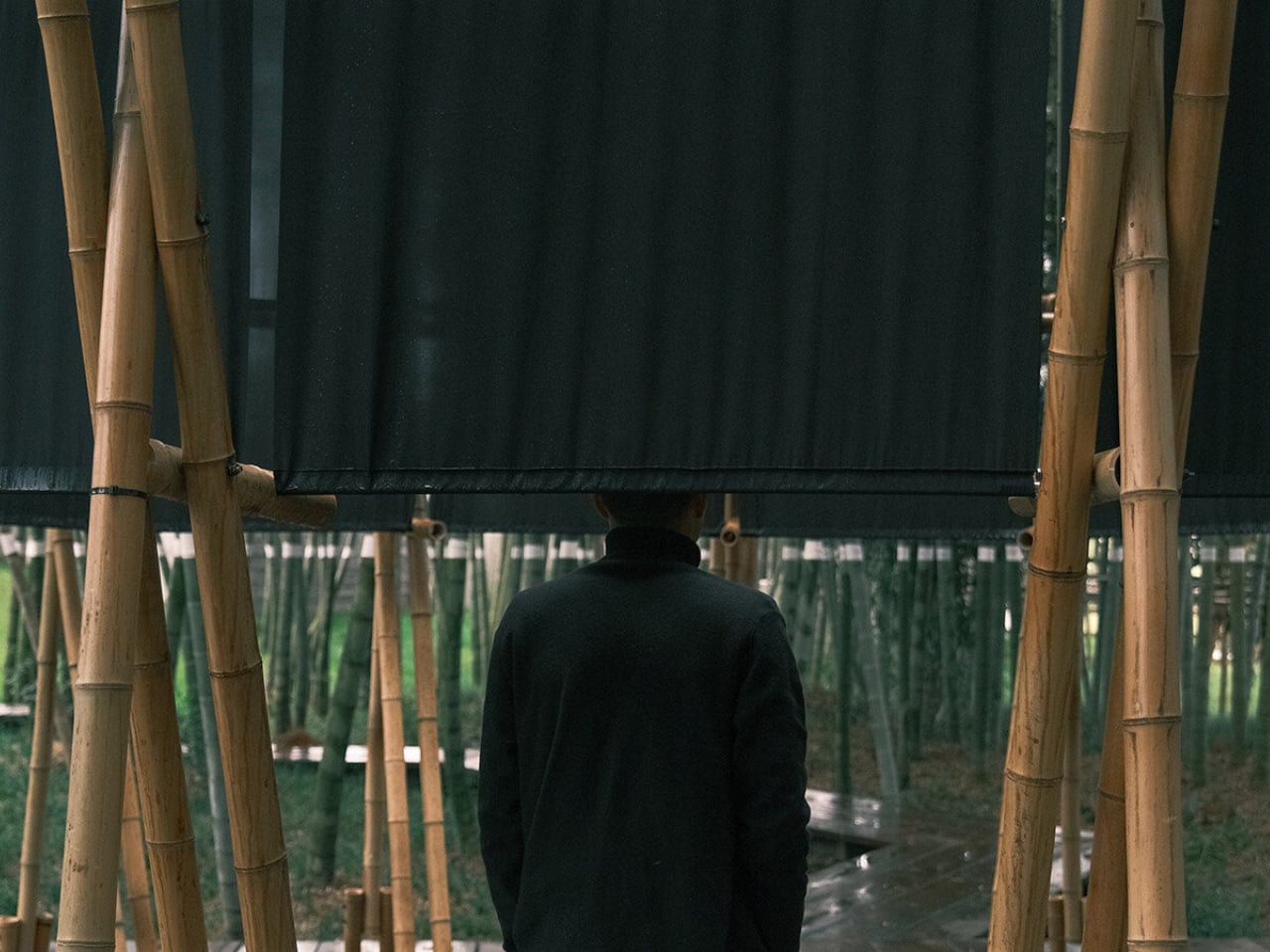
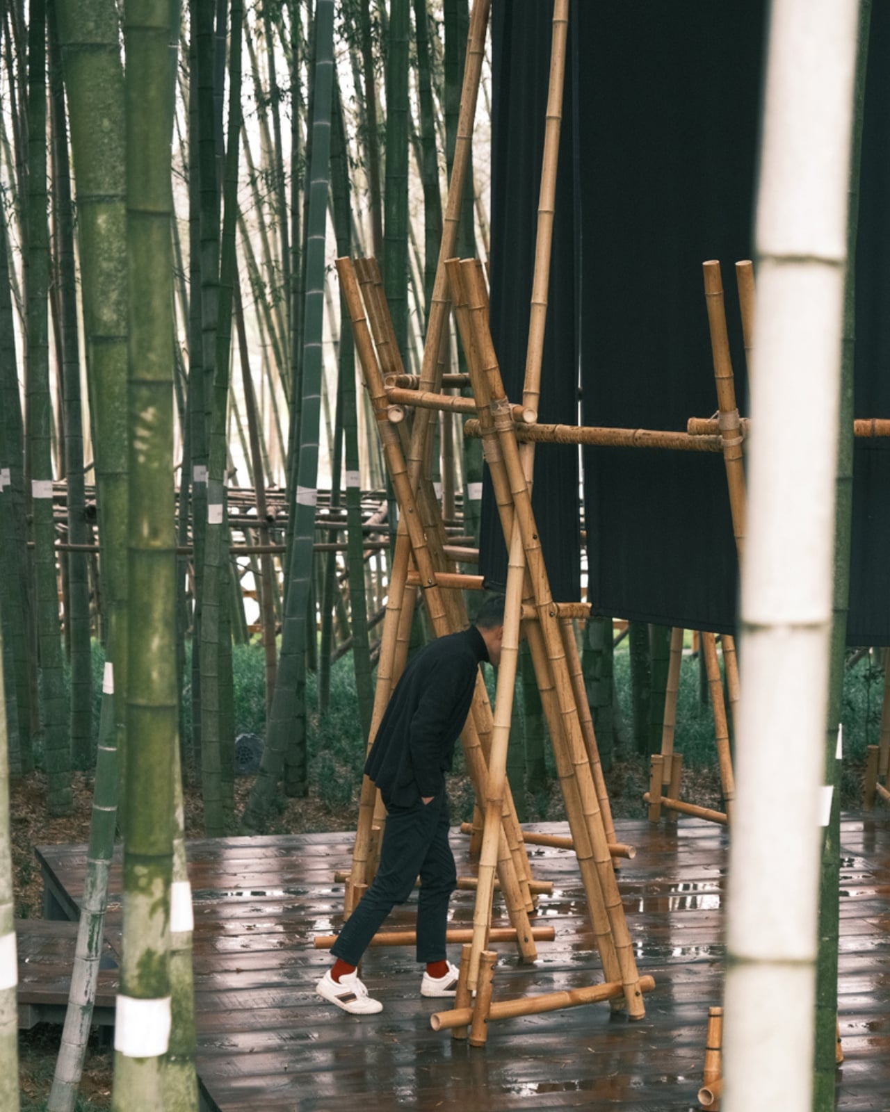
Not every piece of architecture asks something of you before you step inside. Most buildings are passive that way. You walk through a door, and that’s that. But the Veil Tower, a temporary bamboo pavilion tucked into a moso bamboo grove in Xianning, Hubei, opens with a demand: lower your head and bow your body to cross the threshold. It’s a small, deliberate act, and it sets the tone for everything that follows.

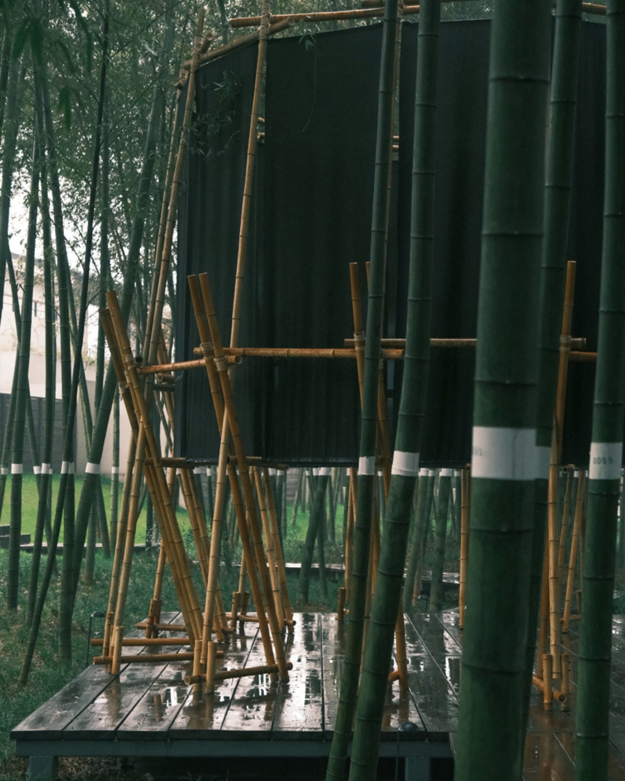
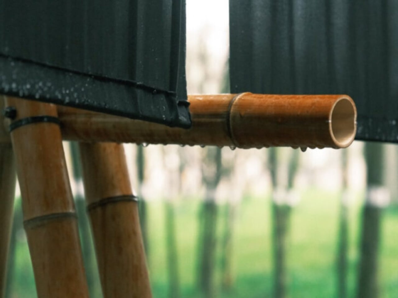
Designed by gèngjin Architecture Office and completed in March 2026, the Veil Tower is a 28.3-square-meter ephemeral structure built from local raw bamboo, black cotton-linen fabric, coarse hemp rope, and steel components. The materials are humble by any measure. The result is anything but.

Designer: gèngjin Architecture Office

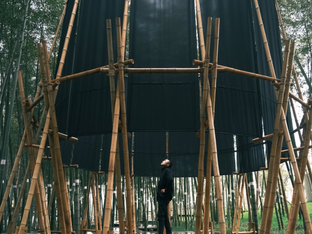
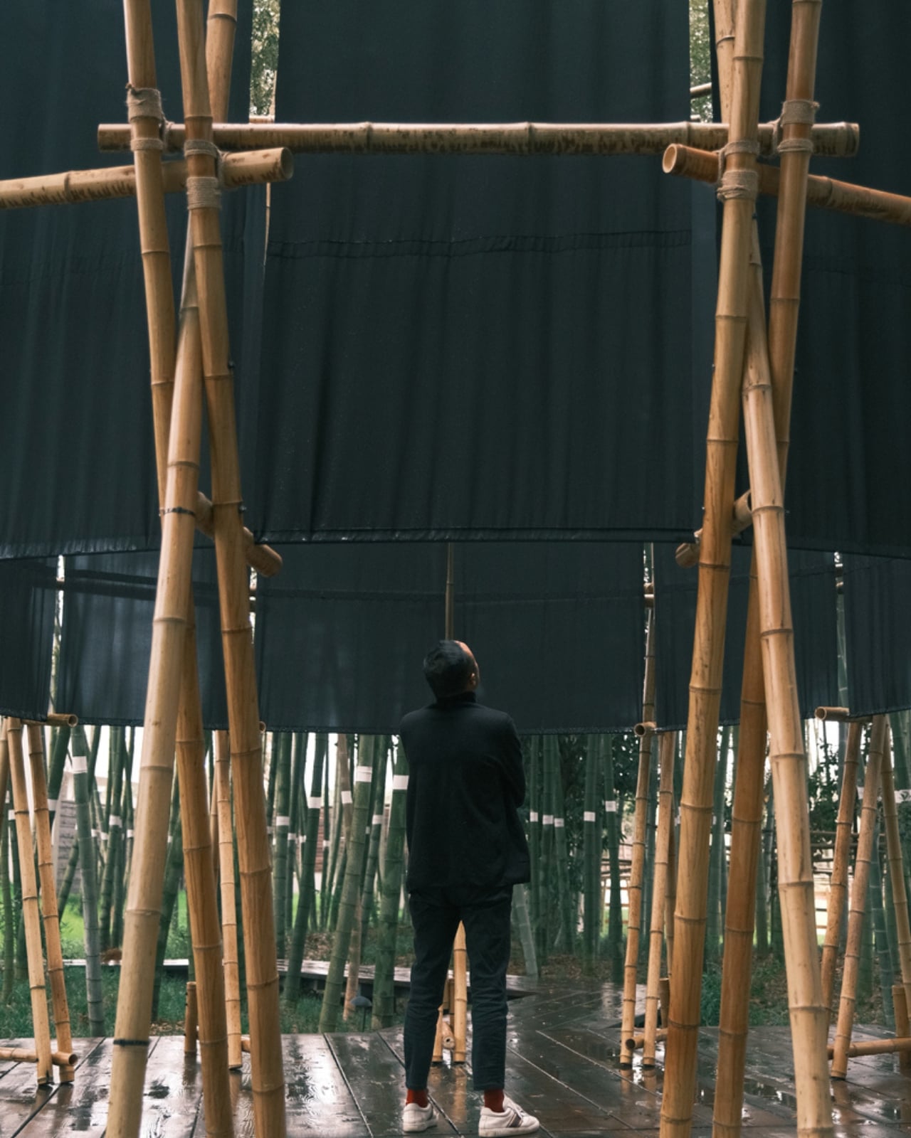
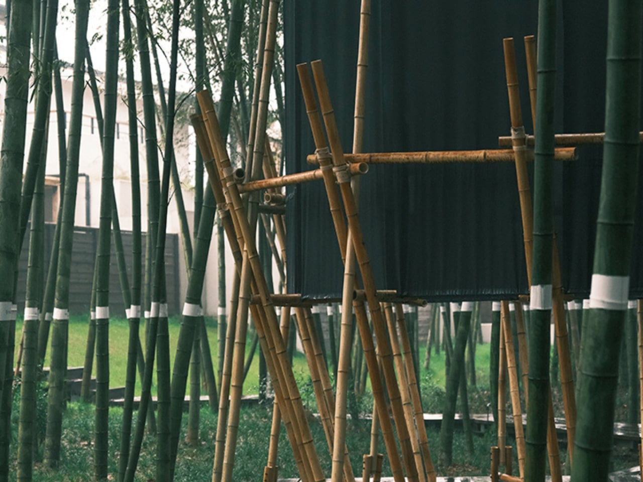
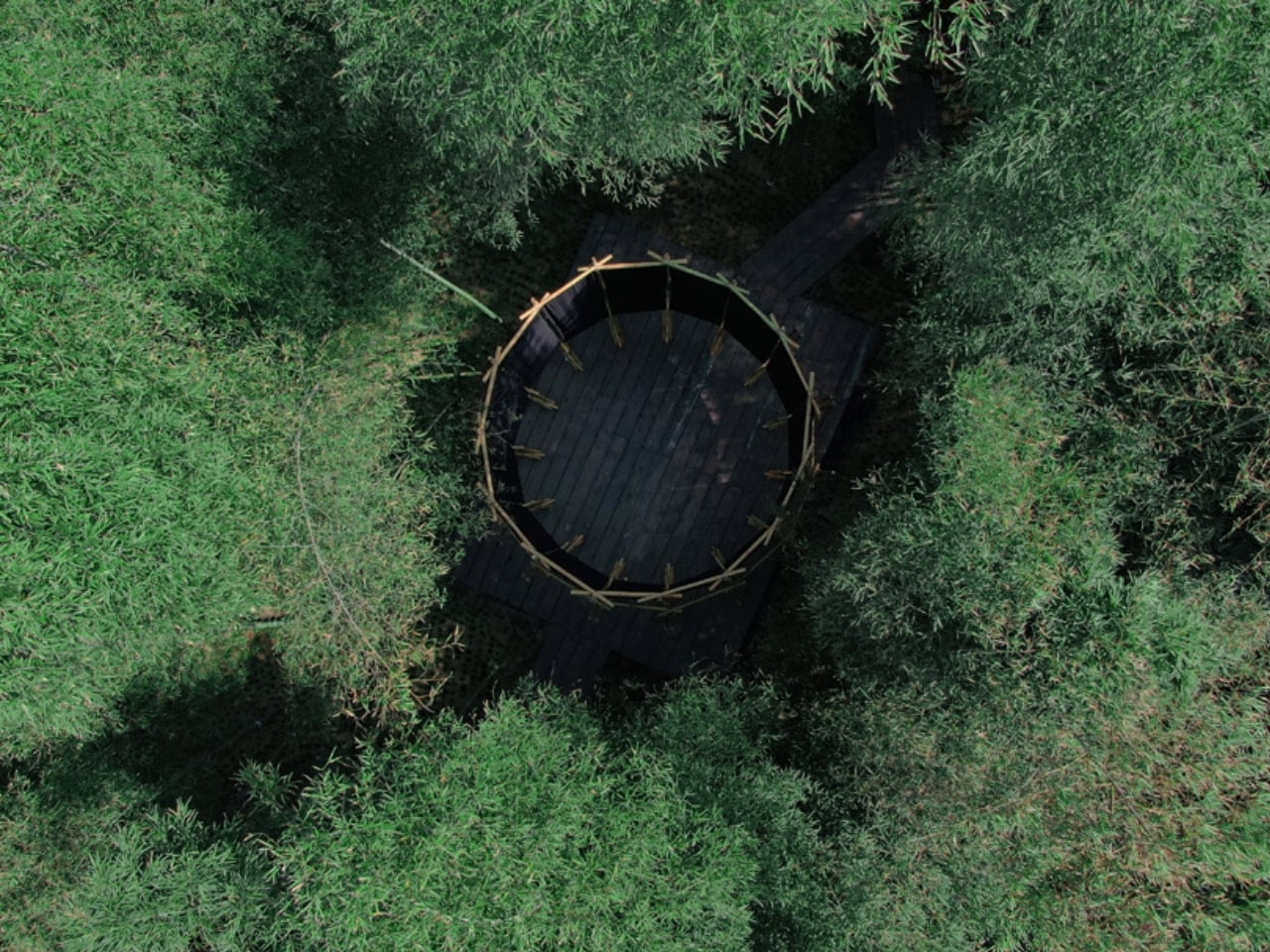
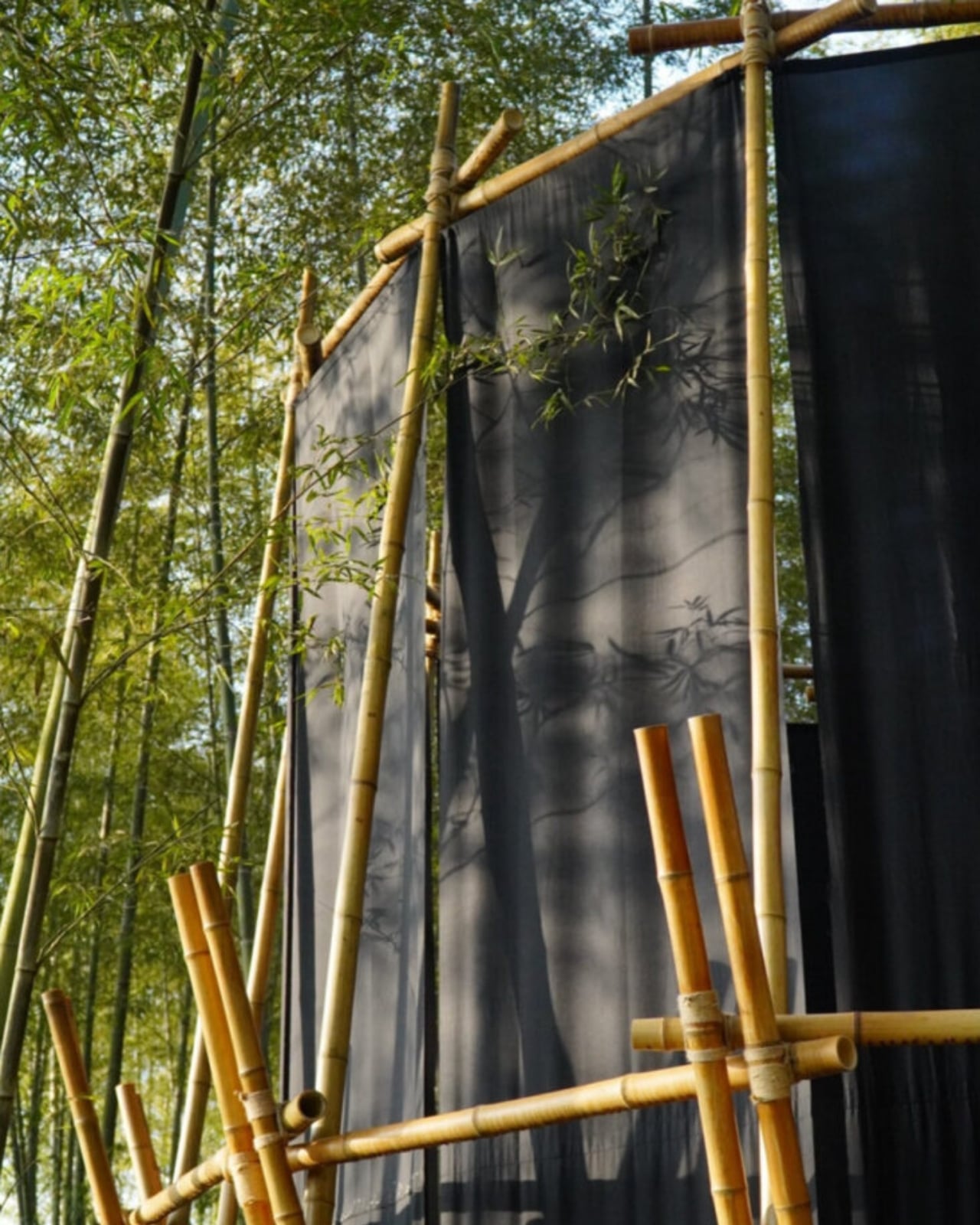
The concept originated from an imagined gesture: peeling bamboo to reveal its inner skin. That idea became the structural and poetic foundation of the whole project. Fifteen bamboo frames were assembled into a pentadecagonal (15-sided) matrix, and from that frame, 15 panels of black fabric were suspended to form what the designers call the “Bamboo Inner Pith Membrane.” The fabric sits at roughly 60 percent light transmittance, which is a technical way of saying that under dappled sunlight, it produces something that looks like an ink-wash painting in motion.

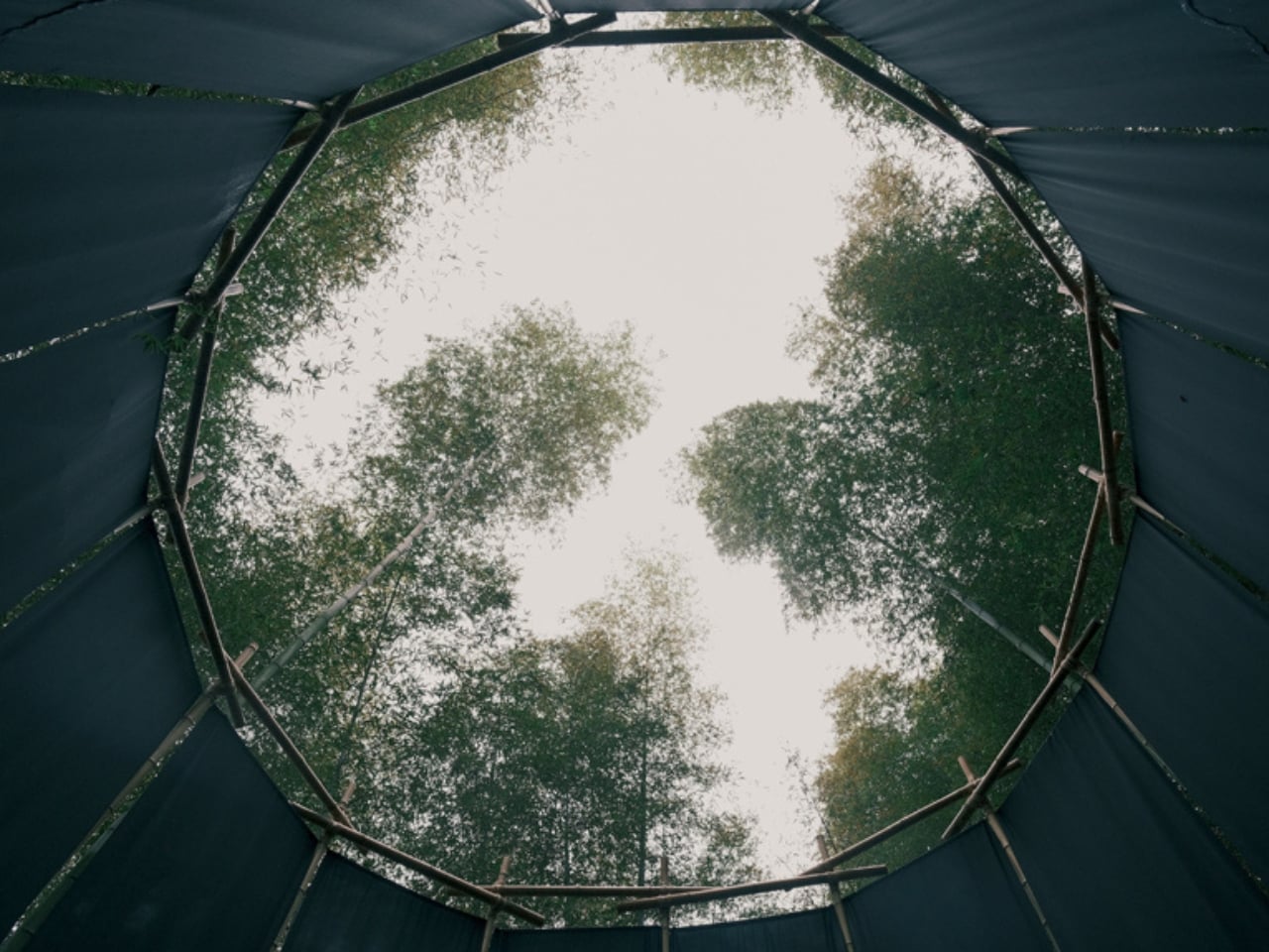
The design draws from the ceremonial spatial archetypes of Chu culture, one of the ancient civilizations of southern China, particularly its collective ritual platforms. You feel that centripetal pull the moment you’re inside. The black curtain cuts off horizontal sightlines to the rest of the forest, so the only direction left to look is up. At the top, the structure’s open crown frames the sky, the clouds, and the swaying bamboo canopy above. Wind moves the fabric. Light shifts. The effect is contemplative in a way that feels earned rather than forced.

Architecture that demands quiet from you is increasingly rare. Most contemporary public installations seem designed for the five-second photo and nothing more. The Veil Tower doesn’t court the camera. Or rather, it doesn’t need to. The photographs you’ll find of it are genuinely striking, but they’re a byproduct of good design thinking rather than its purpose. The designers built something meant to be experienced physically, built collaboratively with local volunteers using traditional cross-lashing hemp rope and reversible joints, and built to leave no permanent mark on the land once it comes down. Every bamboo pole and every length of fabric is fully recoverable.

That last point matters more than it might sound. The conversation around sustainable architecture often gets bogged down in grand claims and complex certification systems. What gèngjin did here is quieter and more convincing: they used materials that were already there, built with methods that can be undone, and created something that asks nothing from the earth it stands on. The Veil Tower is part of a larger series called “Calibrations within the Bamboo Grove,” alongside two other site-specific installations at the same location. The name alone tells you a lot about the mindset. Not impositions within the bamboo grove. Calibrations.

Xianning is known across China as the “Land of Moso Bamboo,” and the bamboo grove at ANNSO, a boutique hotel on the site, is the kind of place where dense canopies filter sunlight into fragmented patches and the vertical repetition of culms creates a slight, disorienting sense of being enclosed by nature itself. The designers describe it as a place you can see through but never fully penetrate. The Veil Tower takes that sensation and deepens it intentionally. Inside the structure, the enclosure is complete, until you look up and the whole sky opens.

Temporary architecture often carries an apologetic quality, as if impermanence is a limitation to be explained away. The Veil Tower flips that entirely. The fact that it will eventually come down, leaving no trace, is part of what makes it feel significant. It doesn’t try to outlast its moment. It just asks you to bow at the door, step inside, and look up.

The post A 28m² Bamboo Tower in China Makes You Bow to Get In first appeared on Yanko Design.
Craft House’s Latest Model Fits Two Bedrooms Into a Tiny Home You Can Actually Tow

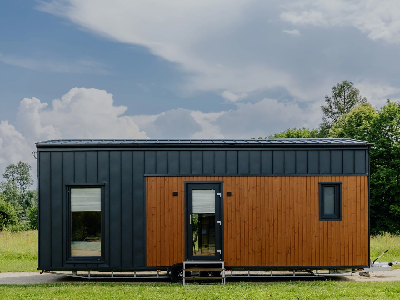
Two bedrooms in a tiny home that fits on a double-axle trailer sounds like a promise that usually ends in compromise. Craft House’s latest model, the Alan, makes a compelling case that it doesn’t have to. Measuring 8.4 meters long, the Polish builder has packed a full master suite, a mezzanine loft, a proper kitchen, and a bathroom into a towable frame with enough practicality to work as a full-time residence.

The exterior sets the tone without making a fuss. Engineered wood cladding meets metal paneling beneath a metal roof, giving the Alan a quiet, modern character that sits closer to a Scandinavian cabin than a trailer. Two separate glass-door entrances open along either side, flooding the interior with natural light and softening the line between indoors and out. Pair each entrance with a deck, and the sense of space expands considerably.

Designer: The Craft House

Inside, Scandinavian spruce lines every surface, warm and tactile against the structure’s harder geometry. The center of the home is a combined dining and living area, anchored by a wall-mounted TV and a table that seats four. A mirrored wall and a high ceiling work together convincingly to make the space feel larger than it is, while underfloor heating and a mini-split keep it comfortable year-round.

The kitchen is compact but genuinely functional, with an induction cooktop, oven, fridge/freezer, and sink, plus upper and lower cabinetry that provides ample storage for daily living. The bathroom, meanwhile, is clean and well-considered, with a glass-enclosed shower, vanity sink, and a flushing toilet. Craft House has kept both spaces tight without letting them feel like afterthoughts.

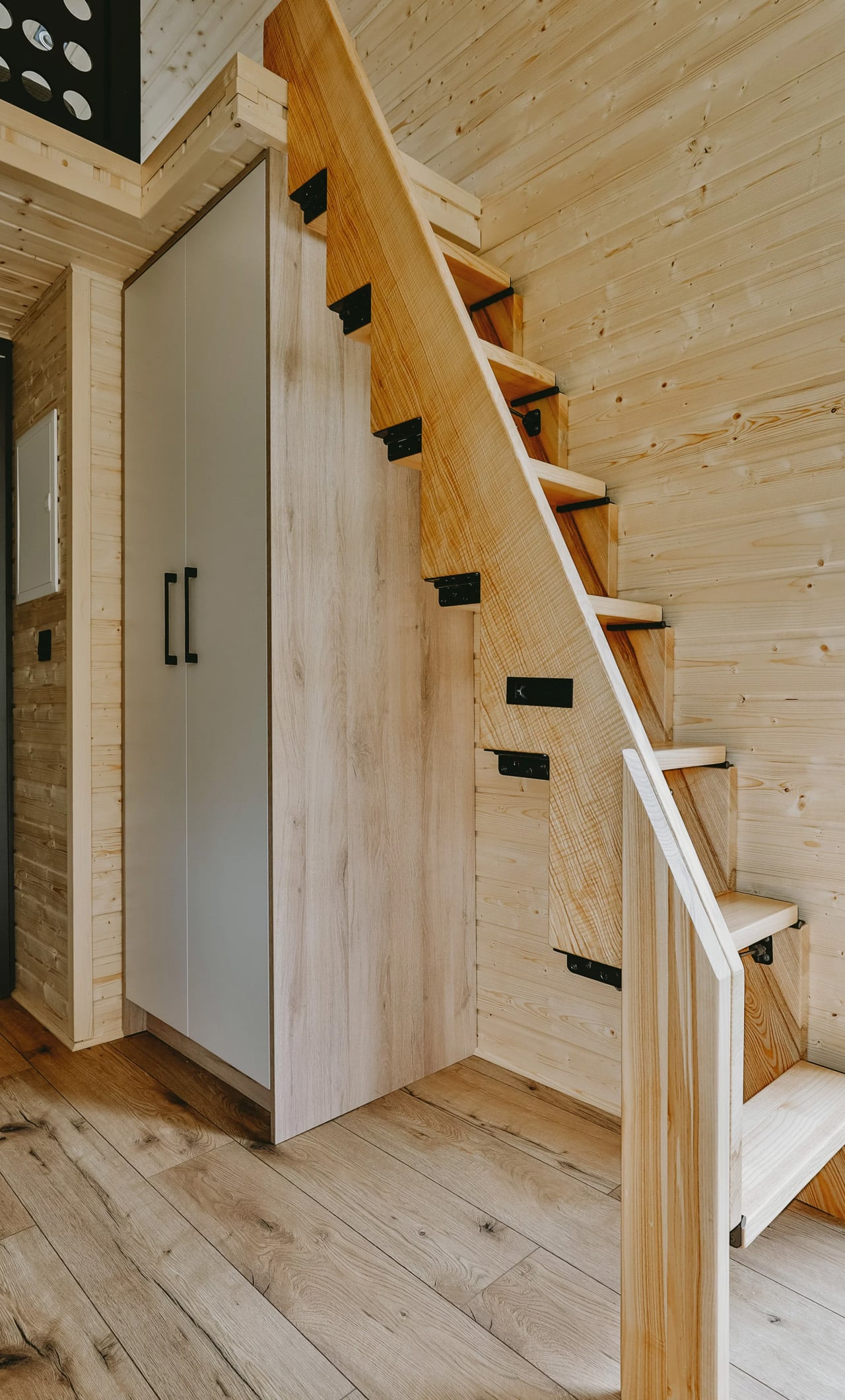
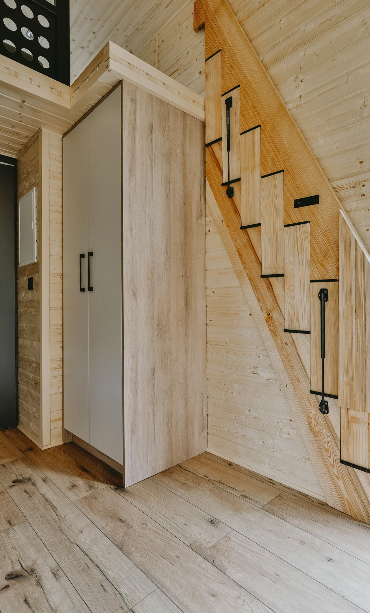
The standout detail is the folding staircase. It leads to the mezzanine loft bedroom, and when not in use, it folds away entirely, reclaiming the downstairs floor space it would otherwise occupy. The master bedroom sits below with full standing headroom, a double bed, a large window, and a second mini-split for independent climate control. It’s a small mechanical solution with a disproportionately large effect on how the home actually lives.

Craft House offers the Alan with a range of optional upgrades: full off-grid capability, deck areas, and flexibility on both materials and layout configuration. For those who want to live untethered, the off-grid option in particular makes the package worth considering seriously. The base price starts at roughly $57,500 USD, with delivery details available directly from the builder.

For a two-bedroom towable home that doesn’t demand too many trade-offs, the Alan earns its attention. The folding stair, dual entrances, and spruce-wrapped interior give it a livability that most homes this size struggle to reach. It’s the kind of build that makes downsizing feel like a choice, not a concession.

The post Craft House’s Latest Model Fits Two Bedrooms Into a Tiny Home You Can Actually Tow first appeared on Yanko Design.
Public Art Stands Still, This Steel House Lets You Slide It Apart

Public art installations in parks have a familiar relationship with the people passing through them. They hold a fixed position, a fixed meaning, and a fixed form. You walk around them, read a plaque if there is one, and that’s usually the end of the conversation. The ones designed to provoke a genuine reaction tend to depend on scale or spectacle rather than something the visitor can actually change.

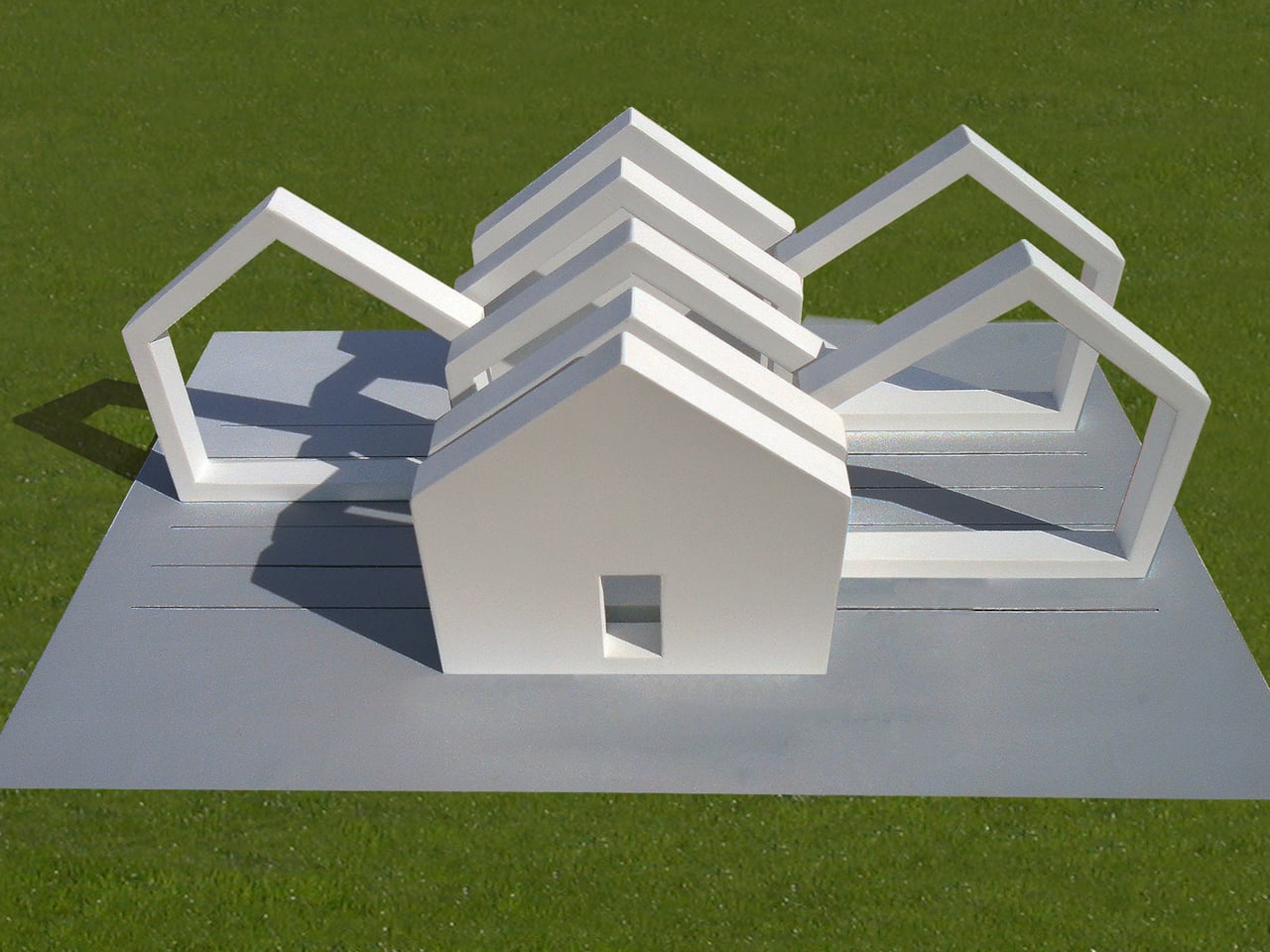
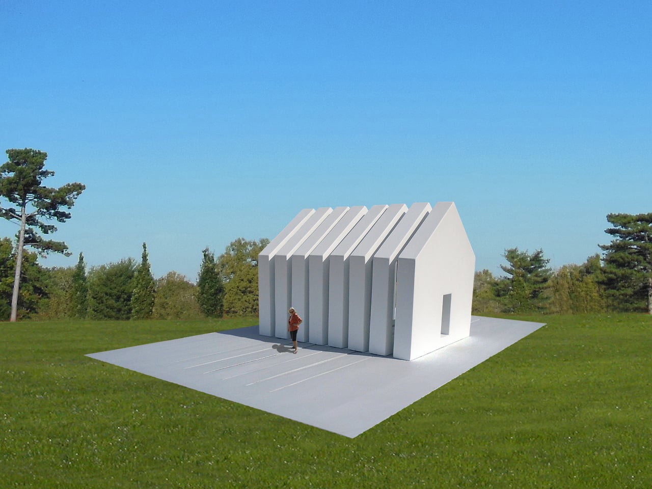
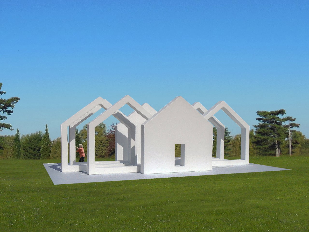
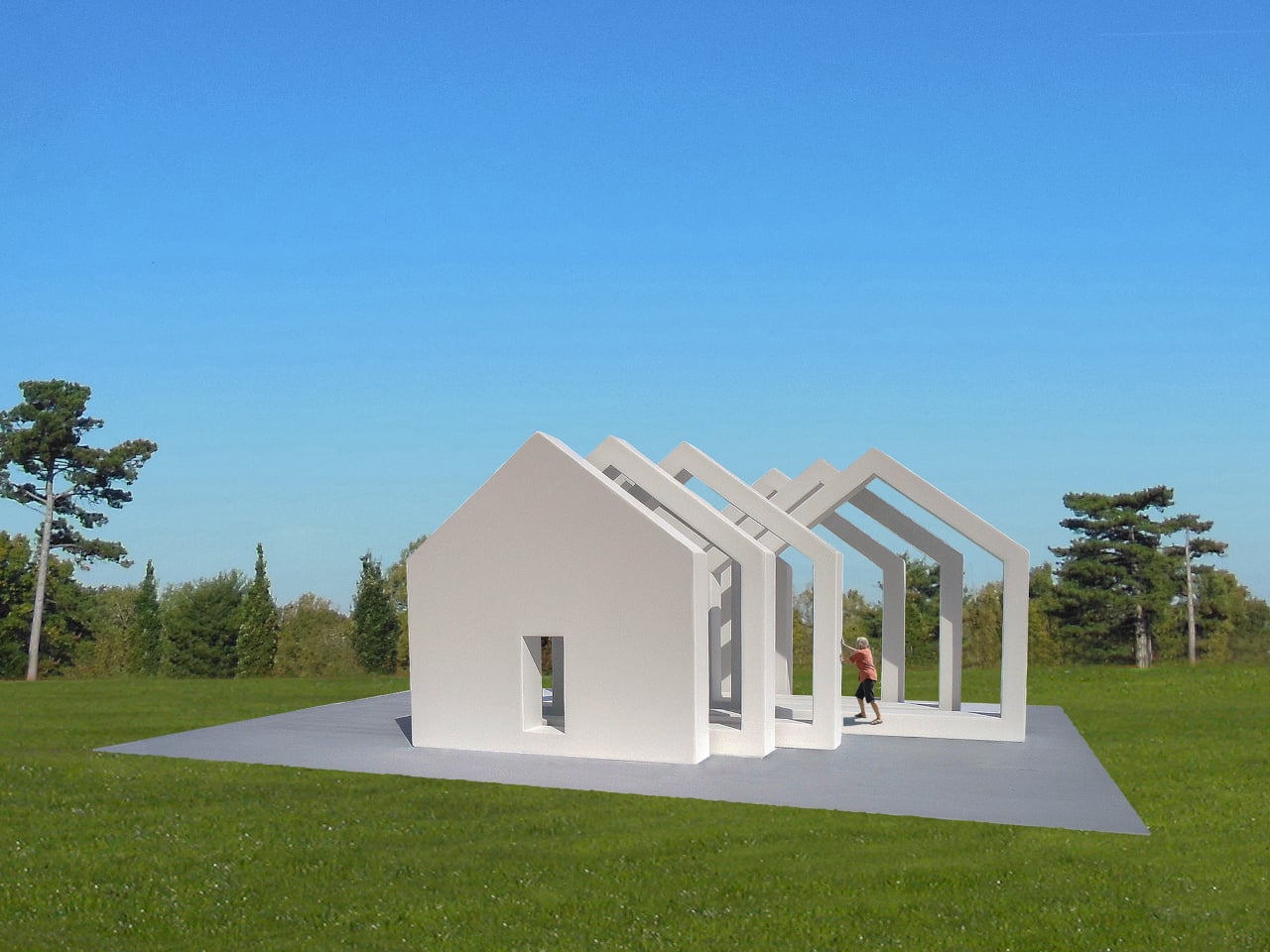
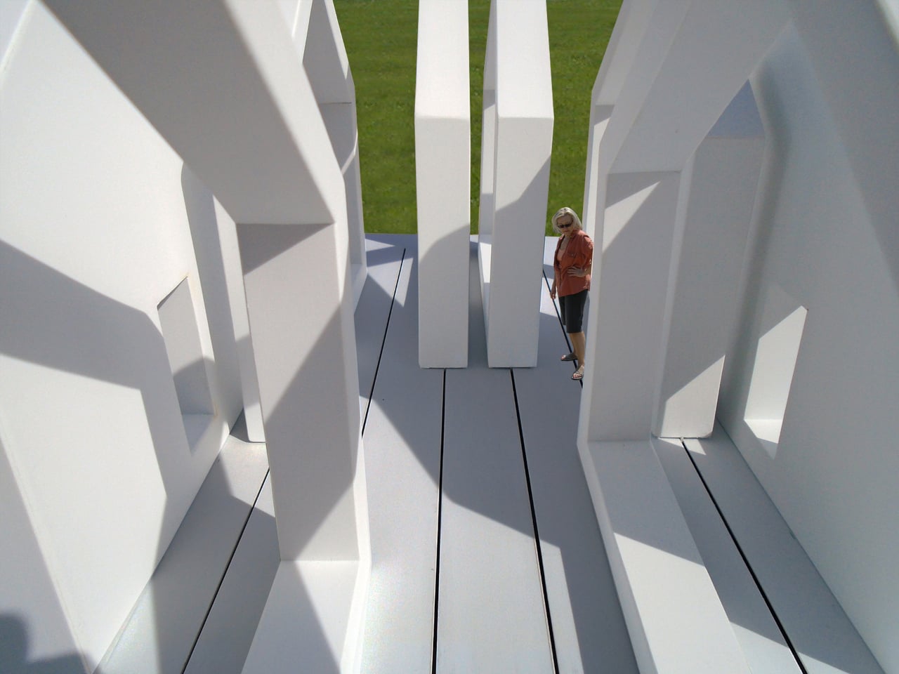
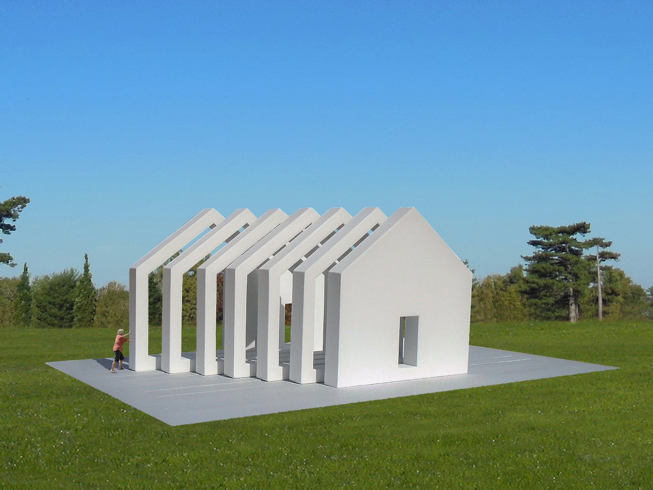
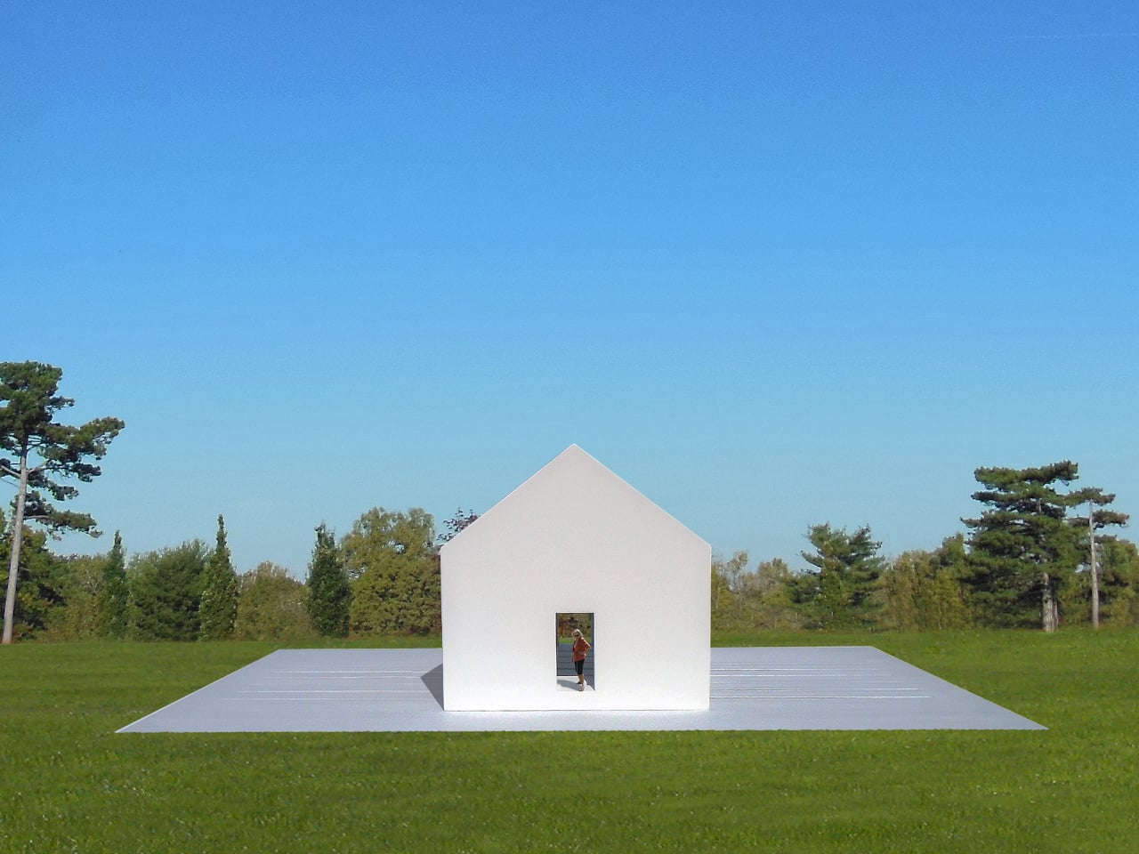
The Interactive Sliced House is part of a series that uses the most recognizable architectural shape there is as raw material. The house silhouette, walls, a pitched roof, and a doorway centered in front, is so deeply familiar that it functions almost like a word. This installation doesn’t just reference that shape. It cuts the whole thing into eight vertical slices and puts visitors in charge of what happens next.

Designer: Michael Jantzen

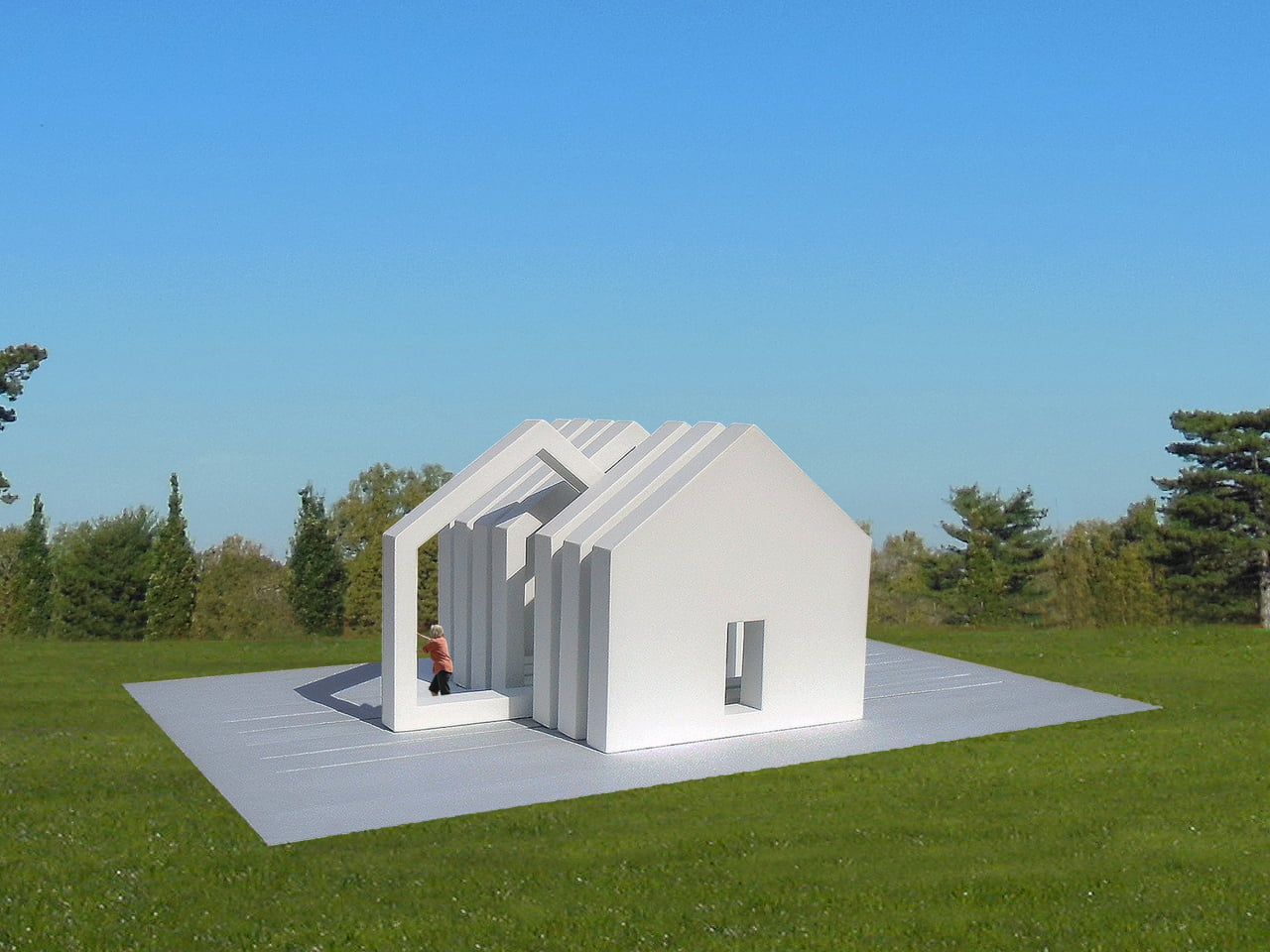
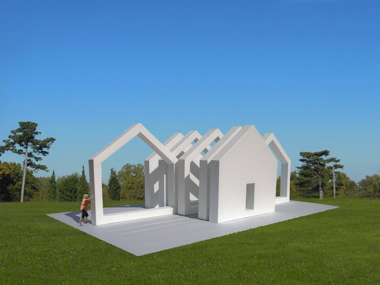
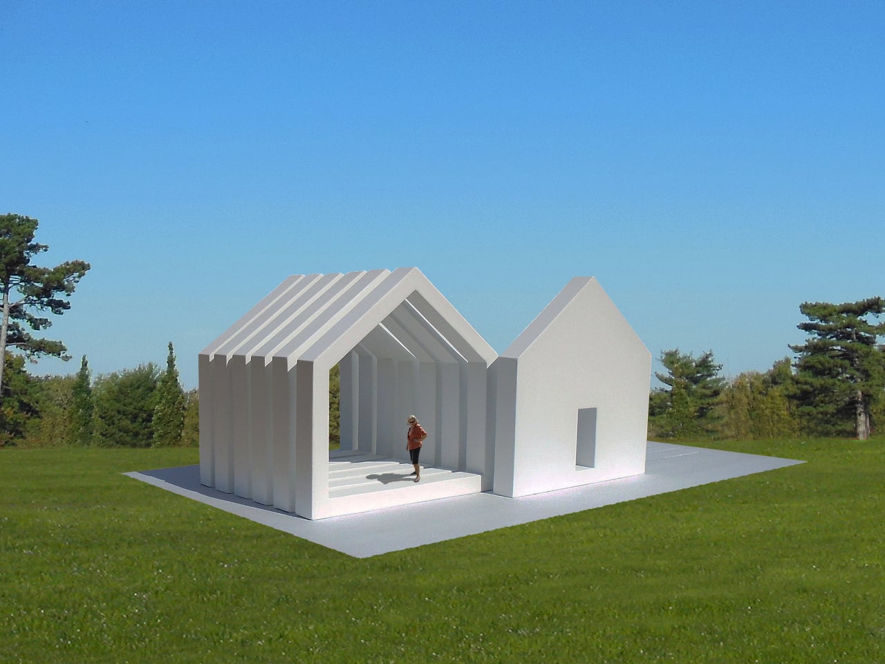
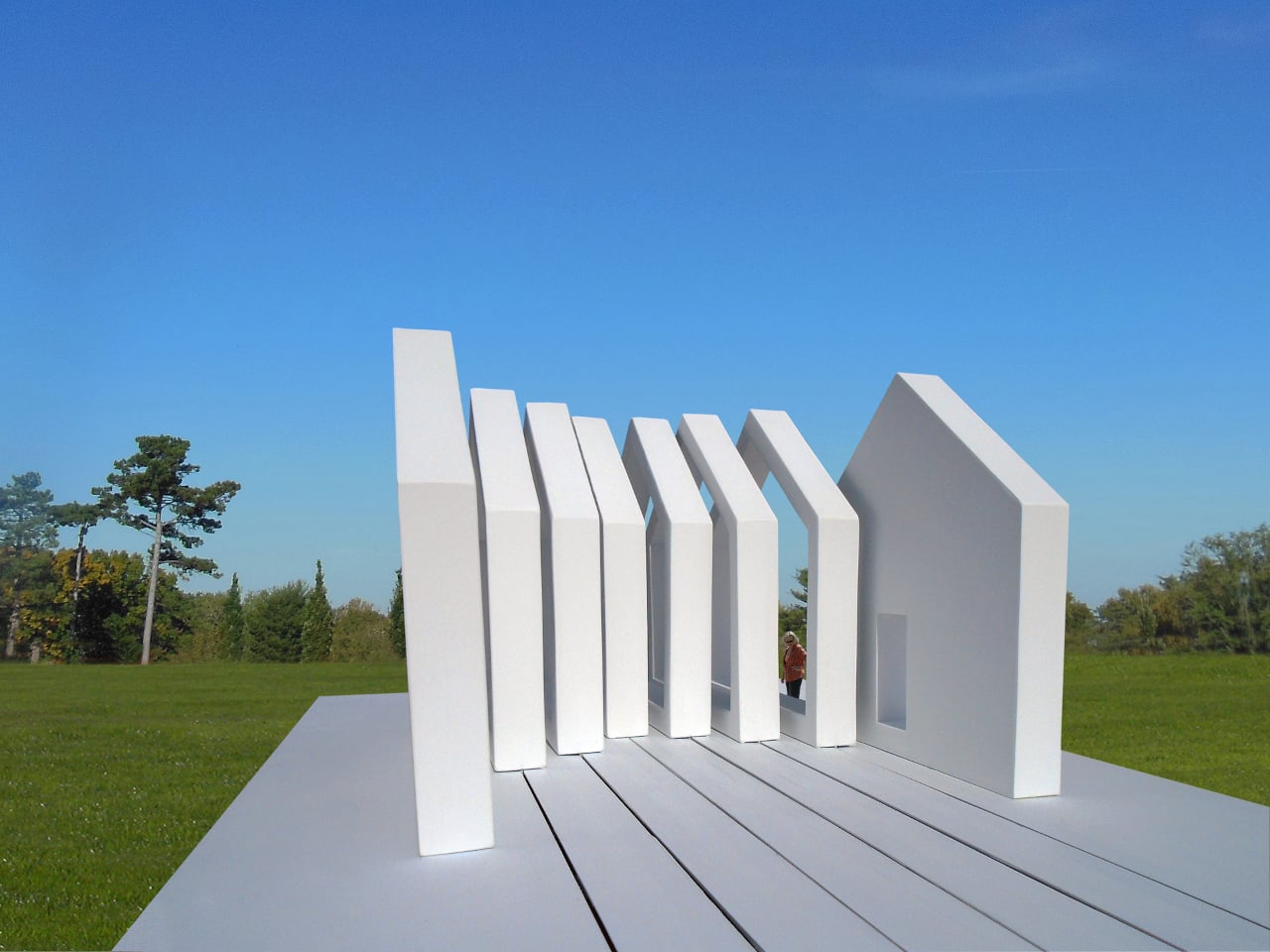
Two of the eight slices are solid white steel panels, one anchoring each end of the structure, both fixed permanently to a concrete pad on the ground. Each solid end has a doorway cut into its center. The six slices between them are open frames, the same house shape rendered as a hollow silhouette, and these slide freely along tracks set into the concrete beneath them.

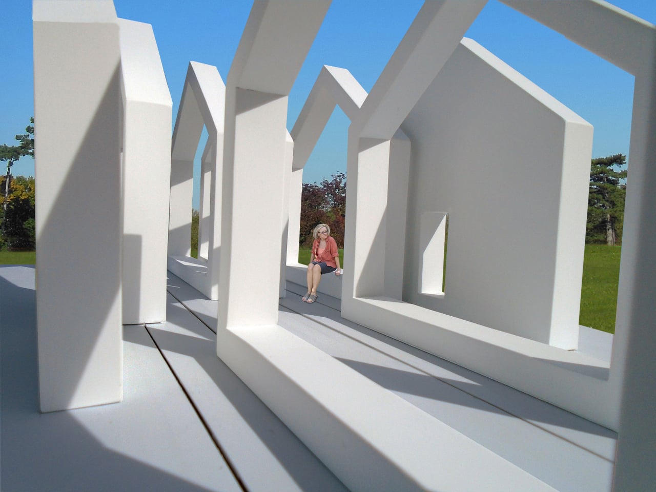
Slide those six frames to one end, and the house snaps back into something close to its recognizable form, dense and legible from a distance. Pull them apart, and they scatter across the pad, creating a sequence of house-shaped thresholds that repeat across the concrete like the same word written over and over with increasing space between each letter. The structure stays the same; the space it makes changes completely.

Someone walking through the installation when the frames are spread out passes through threshold after threshold, each one framing a slightly different view of the park, the sky, and anyone else nearby. The frames create enclosed corridors between them when pushed together, and open, almost ceremonial passageways when pulled apart. Moving through the structure is different every visit, depending on how previous visitors left it.

The house shape is the installation’s real subject. It’s one of the first symbols children learn to draw, and one of the most loaded in the human symbolic vocabulary: shelter, family, belonging, property. Breaking it apart and handing the fragments to strangers in a public park is a way of asking what it means without having to say the question out loud, and without prescribing the answer.

The white painted steel keeps everything visually consistent regardless of how the slices are arranged, meaning no single configuration reads as more “correct” than another. There isn’t a right answer built into the materials. The installation can also be deployed as multiples, several units placed across a park at once, which would multiply its questions the same way the frames multiply the house shape when pulled apart.

The post Public Art Stands Still, This Steel House Lets You Slide It Apart first appeared on Yanko Design.
Snøhetta’s Shanghai Grand Opera House Is the Most Dramatic Building of 2026

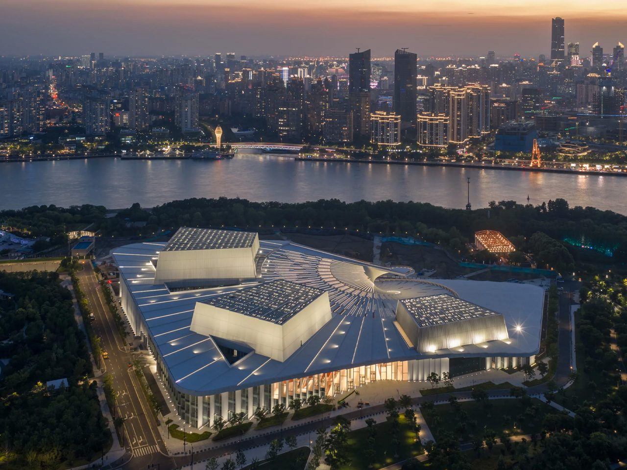
Some buildings house culture, and there are buildings that ‘become’ it. The Shanghai Grand Opera House, designed by Snøhetta in collaboration with East China Architectural Design & Research Institute (ECADI), Theatre Projects, and Nagata Acoustics, belongs firmly to the second category. Completed in June 2026 on the convex banks of the Huangpu River, it is set to open to the public in the second half of the year — and it is already one of the most talked-about architectural completions on the planet.

The project began with an international competition win in 2017 and was formally commissioned in 2019. What Snøhetta has delivered since is a building that doesn’t just occupy its site — it reshapes your relationship with it. Positioned in Shanghai’s Houtan neighborhood, a district that has been steadily rebuilt around an ecological and low-carbon vision since the 2010 World Expo, the opera house was always meant to function as a cultural anchor. The radial landscape surrounding it was designed to harmonize with the building’s geometry, pulling the eye toward the river and the skyline with deliberate, unhurried intention.
Designer: Snøhetta

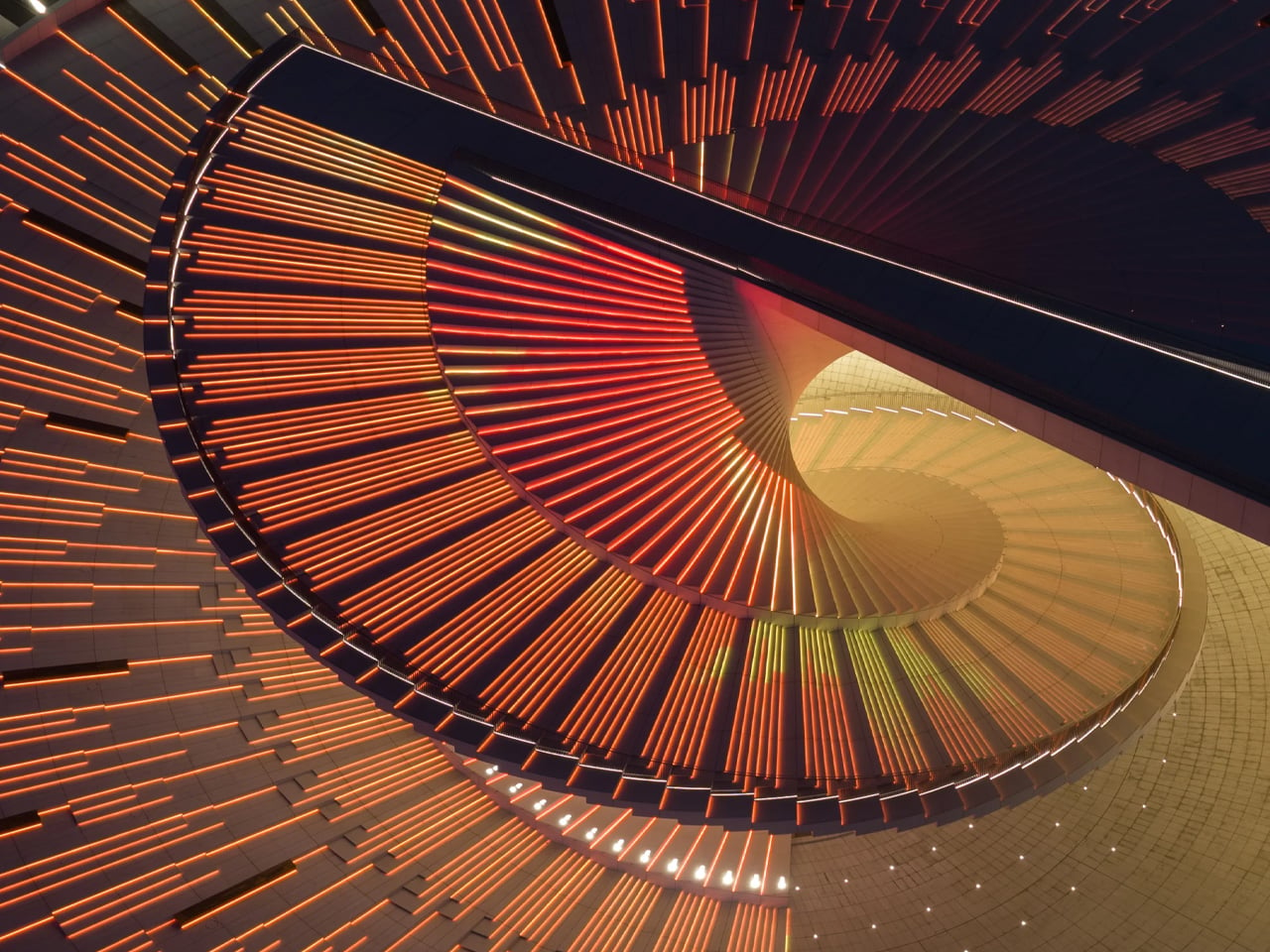
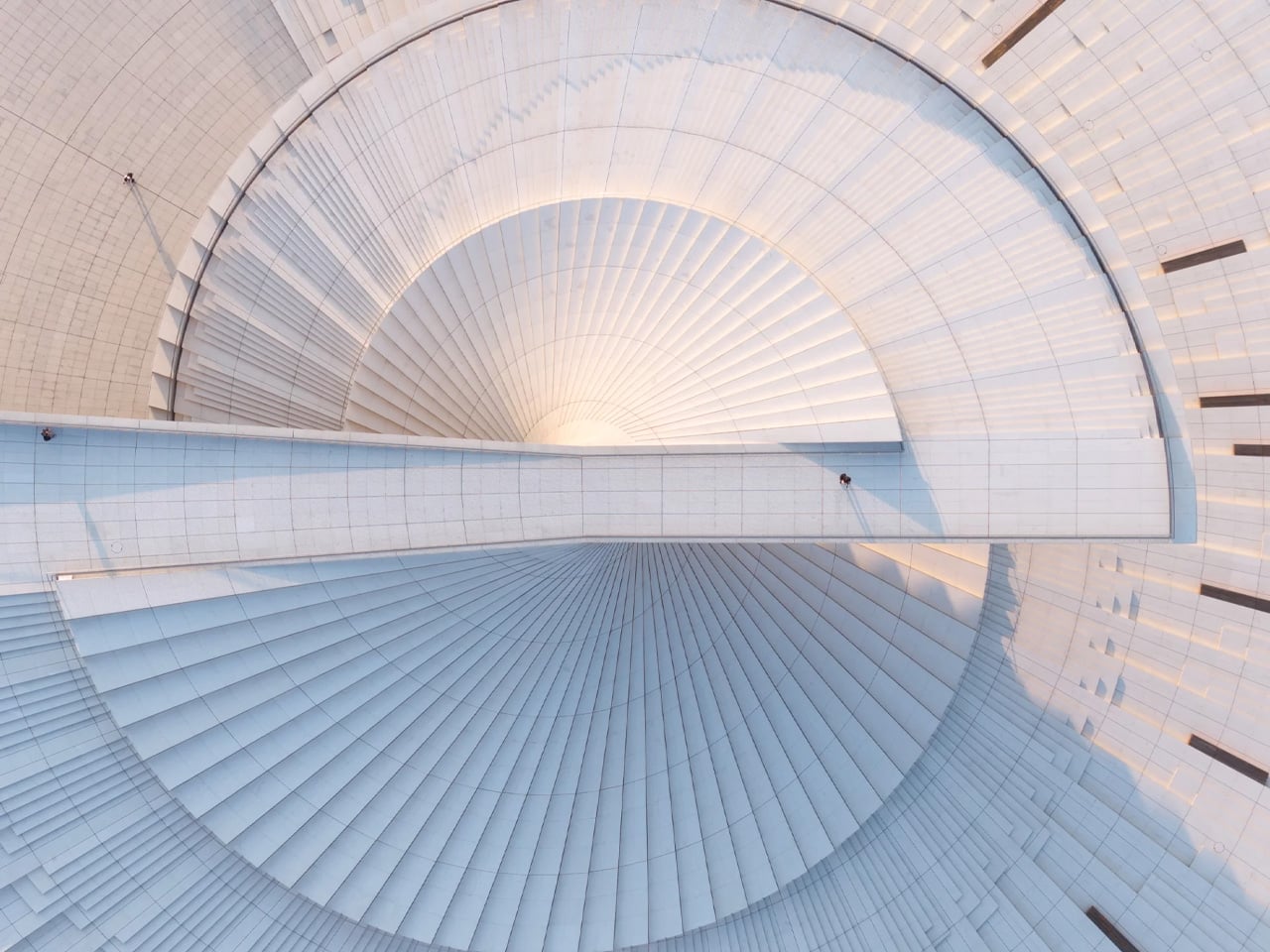
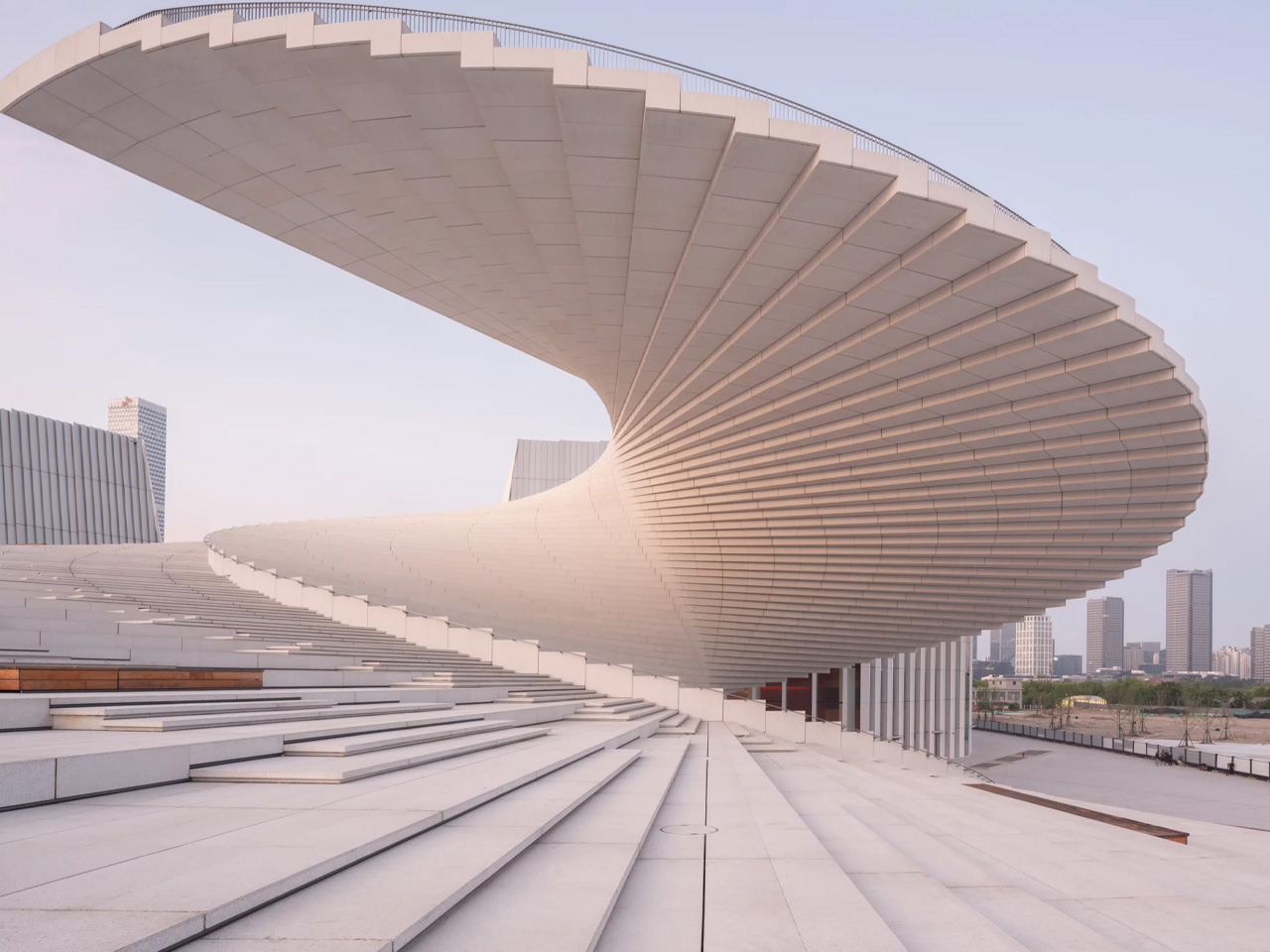
The architecture is defined by its helical roof — a sweeping, continuous surface that unspools like an opening fan. The reference is not decorative. The form draws from the dynamism of dance and the fluid articulation of the human body, and it does so with conviction. A spiraling staircase rises through the structure, connecting the ground to an observation deck that sits open to the public 24 hours a day, every day of the year. Snøhetta has always argued that civic buildings should belong to everyone, not just ticket-holders. Here, that argument is built into the architecture itself.
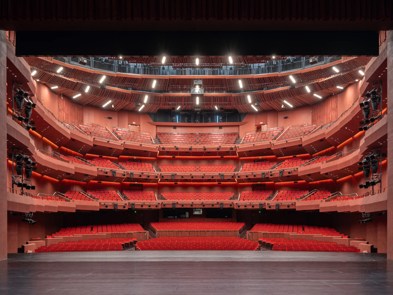
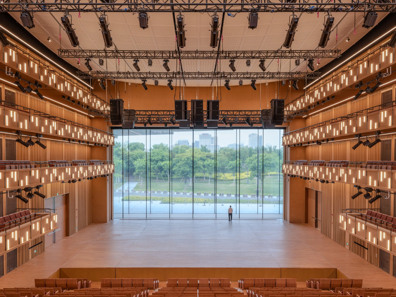
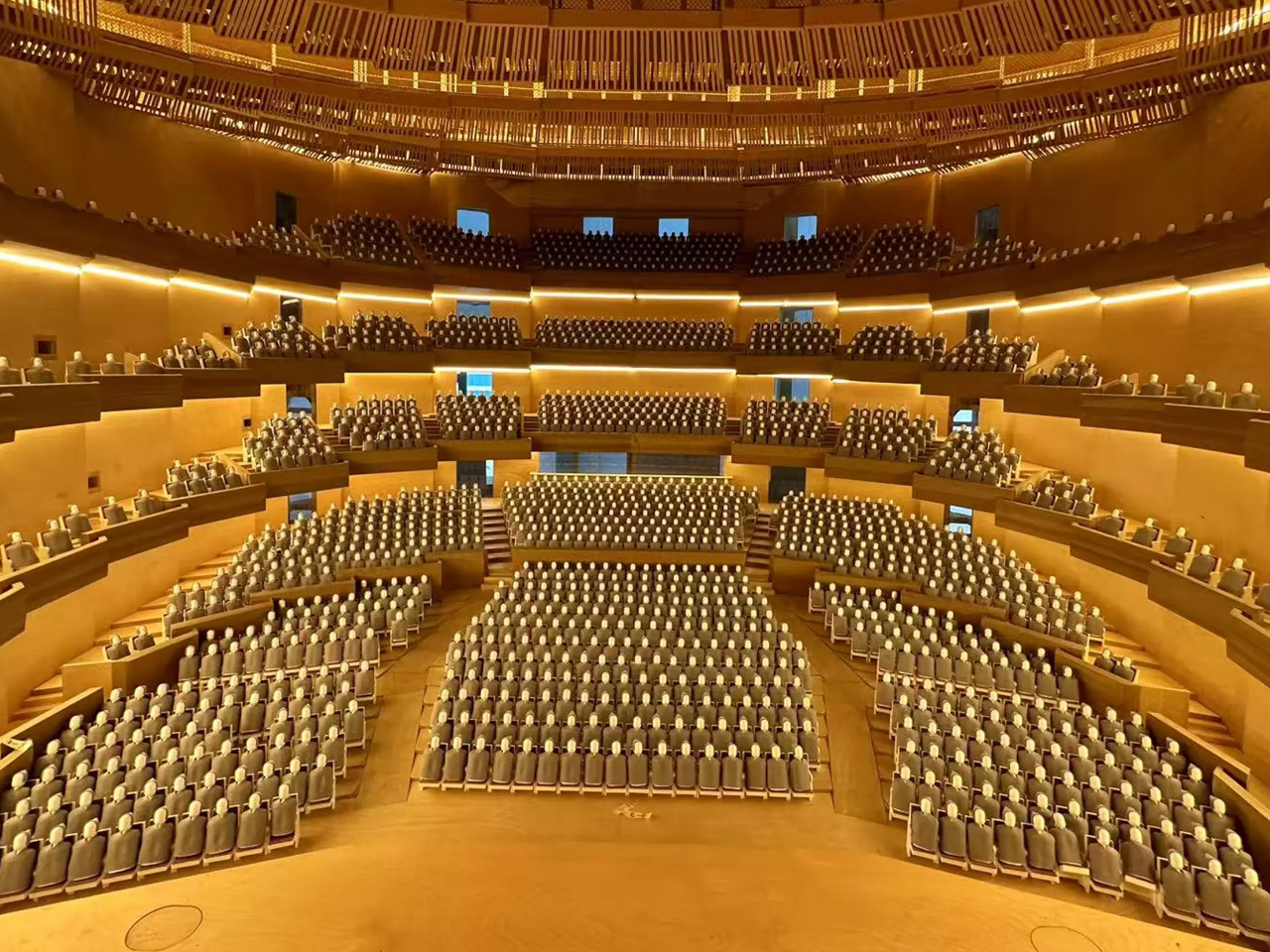
Inside, three performance venues sit beneath that roof. The main auditorium holds 2,000 seats and was developed with Nagata Acoustics to meet international acoustic standards for opera and large-scale productions. A 1,200-seat secondary hall offers a more intimate context for mid-scale work, while a 1,000-seat flexible theater can be reconfigured for experimental staging. The interior material language contrasts sharply with the white exterior — oak floors and dark-stained wood line the halls, warm and resonant, designed as much for the ear as for the eye. Expansive glass facades shift the lobby atmosphere across the hours, and at night the stage towers illuminate the riverfront like lanterns.

Snøhetta founder Kjetil Trædal Thorsen has described the project as a culmination of the firm’s performing arts work — from the Norwegian National Opera and Ballet to the Busan Opera House in South Korea. Looking at what has risen on the Huangpu River, that lineage is visible. So is the ambition to go further.

The post Snøhetta’s Shanghai Grand Opera House Is the Most Dramatic Building of 2026 first appeared on Yanko Design.