This palm-sized desktop vacuum combo keeps your setup squeaky clean

Believe you me, desk setups look amazing when you have all the gadgets and accessories in place. Some days down the line, that squeaky clean look fades away as dust settles in, food crumbs scatter around, water spots look ugly, and human skin and hair shed. That isn’t a very pretty sight when you kick off your work in the morning. Not for me atleast, as I like to clean my desk first thing before starting off my creative journey.

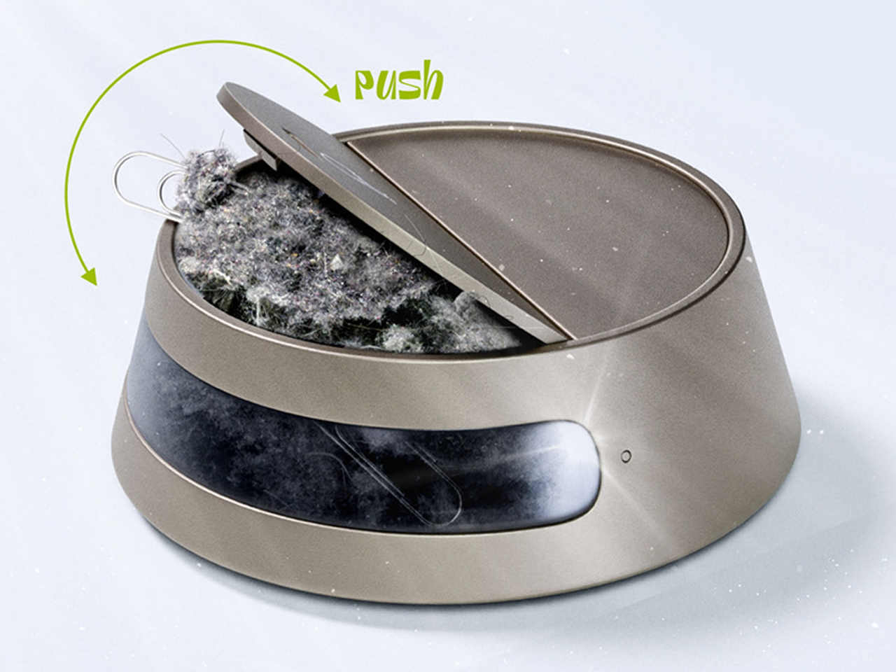
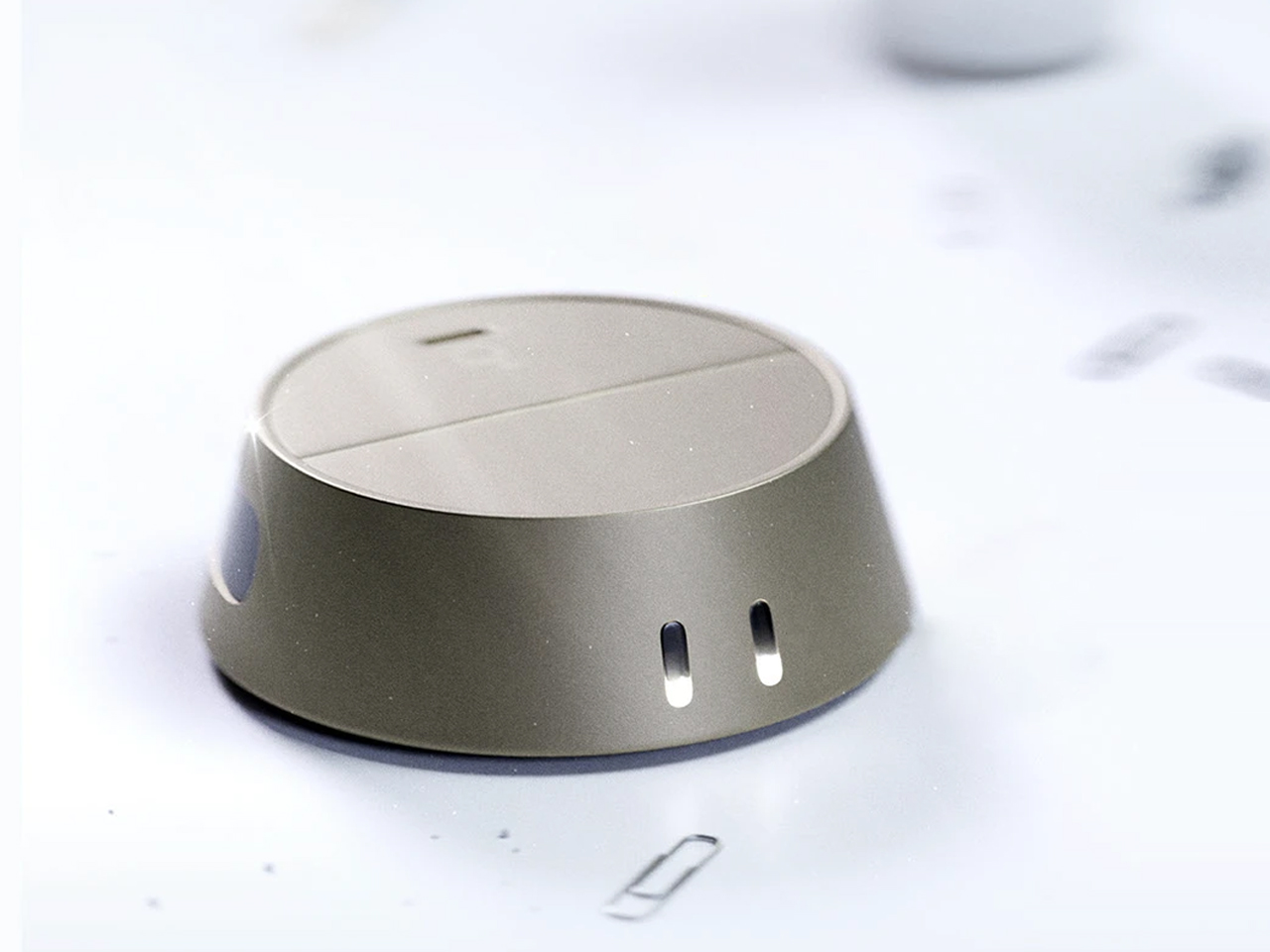
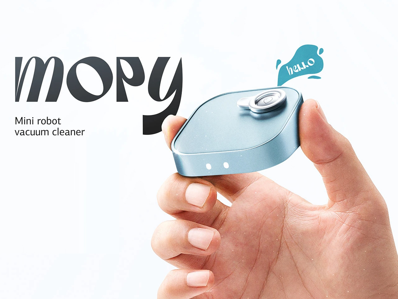
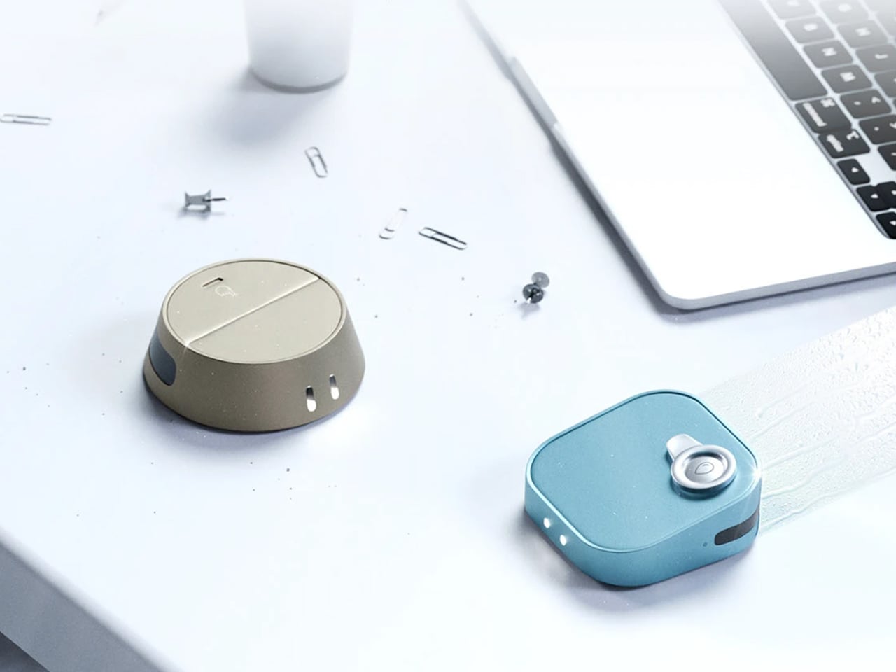
A small gadget that can automate that cleaning regime is a welcome addition, getting things ready even before you get up in the morning. Meet Vacy, a desktop vacuum cleaner designed to be a palm-sized accessory, working in stealth mode to get your desktop setup in pristine condition every single day without any fails. If that’s not enough, the Mopy mini robot washer gives a second treatment of cleaning, just like your home floors do each day.

Designer: Aleksandr Misiukevich

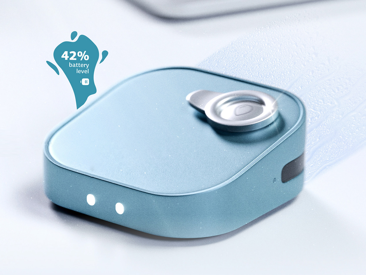
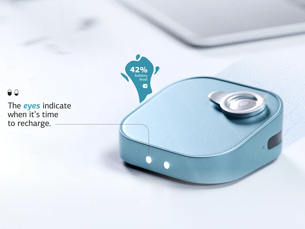
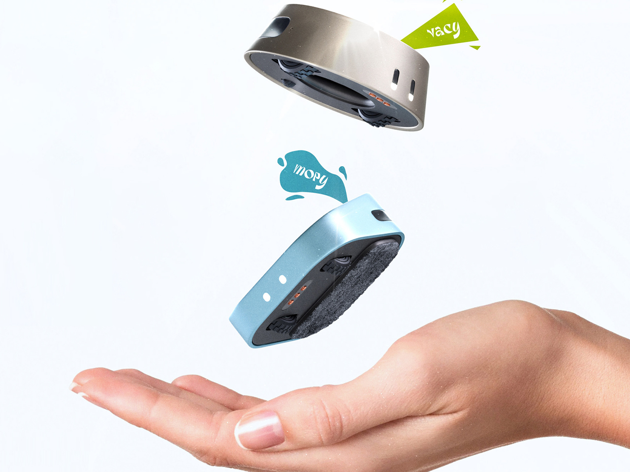
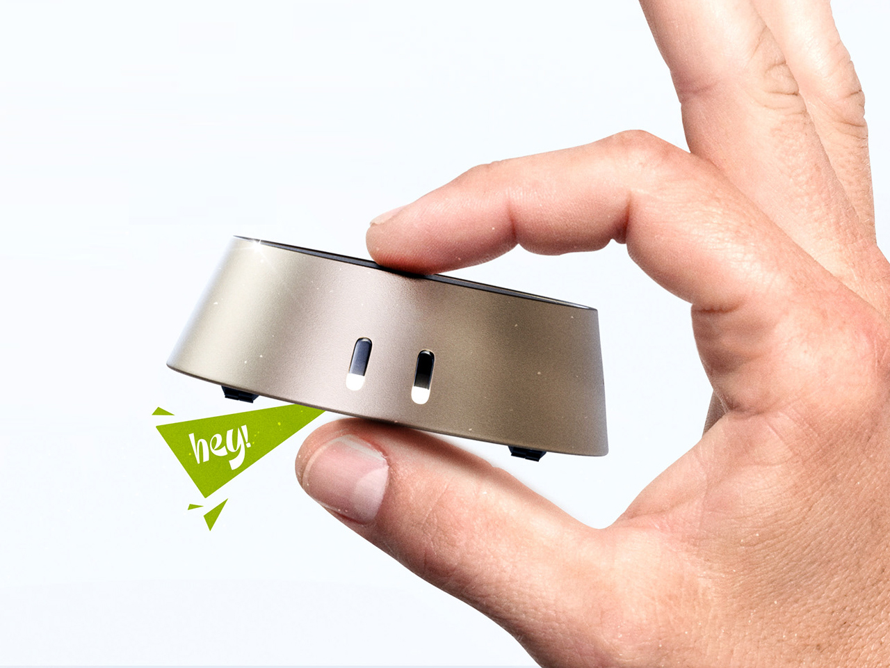
Both pocketable accessories can be carried along easily for portability and deployed on demand. For a guy like me who works in multiple work setups, that is a good feature to have. The Vacy vacuum cleaner sucks debris from the bottom and collects it inside the safe compartment. Once full, you can push the lid to take out all the trash. The indicators on the top show the current battery level, and once the battery level drops below 20 percent, the palm-sized vac returns to the charging dock. The edges of the desk are no problem, as the robo vac comes with a Cliff sensor to stop and turn in the other direction. Vacy can suck objects smaller than 2 cm; meaning hair, crumbs, pet fur, and office stationery like pins get sucked right in.

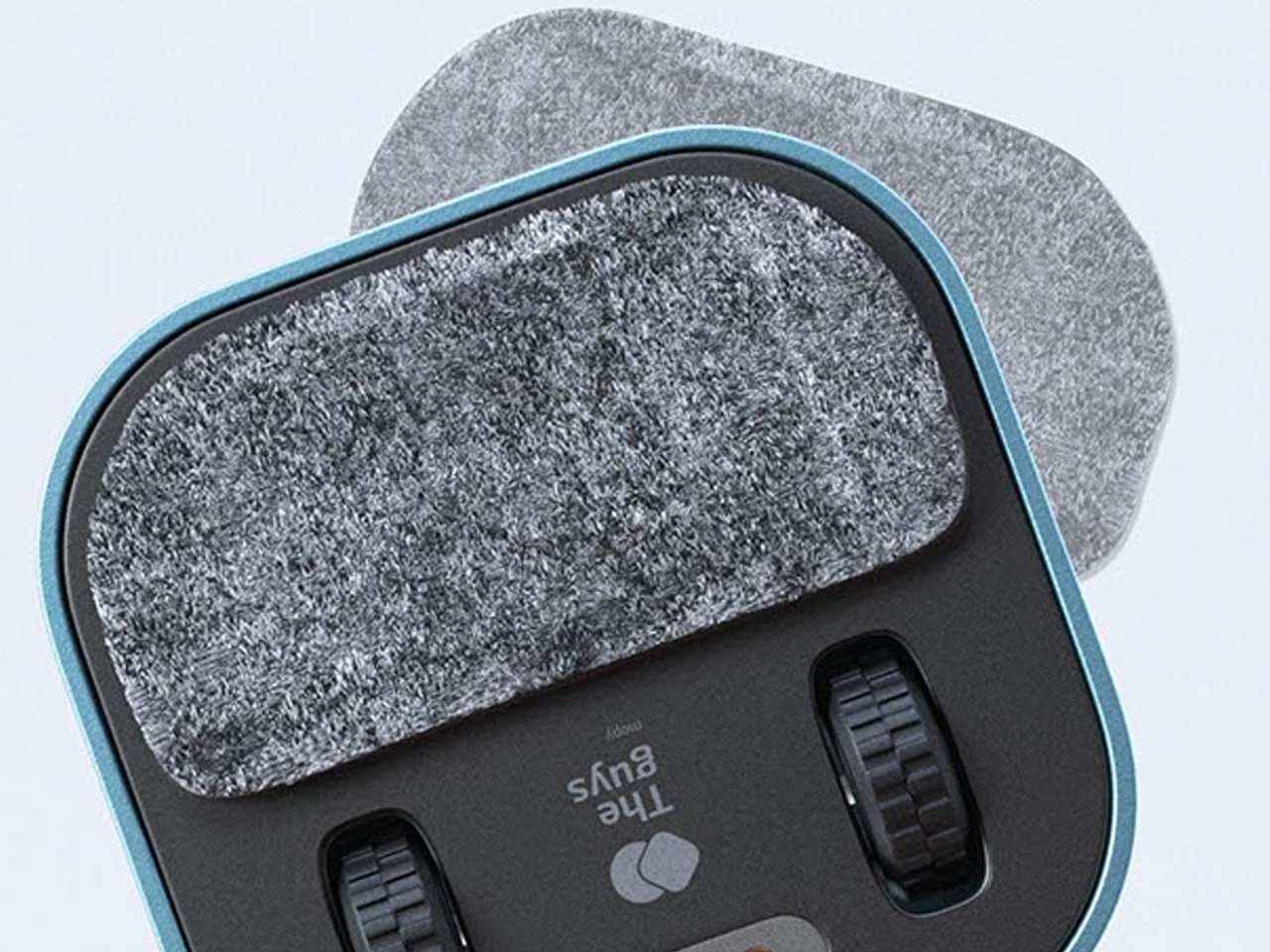
The second one is my favorite, just because of the unique idea. Mopy mini robot vacuum cleaner gets rid of all those pesky spots on the surface for an instant fresh look. It has an opening on top to fill the water compartment and a long-pile cleaning replaceable pad at the bottom to get the job done. Just like its brother Vacy, the mopping vac returns to its charging dock once the charge levels drop below 20 percent. Be it water droplets, coffee stains, sugary liquids, or fine dust crumbs; the vac makes quick work of everything.

In tandem, the robot vacs clean the nooks and corners of your desk, normally left unattended by the normal cleaning. The concept sounds interesting, but would it have many takers? I’m not sure everyone has an obsessive-compulsive disorder for cleanliness.

The post This palm-sized desktop vacuum combo keeps your setup squeaky clean first appeared on Yanko Design.

This Museum Was Designed for 25,000 Birds, Not Humans

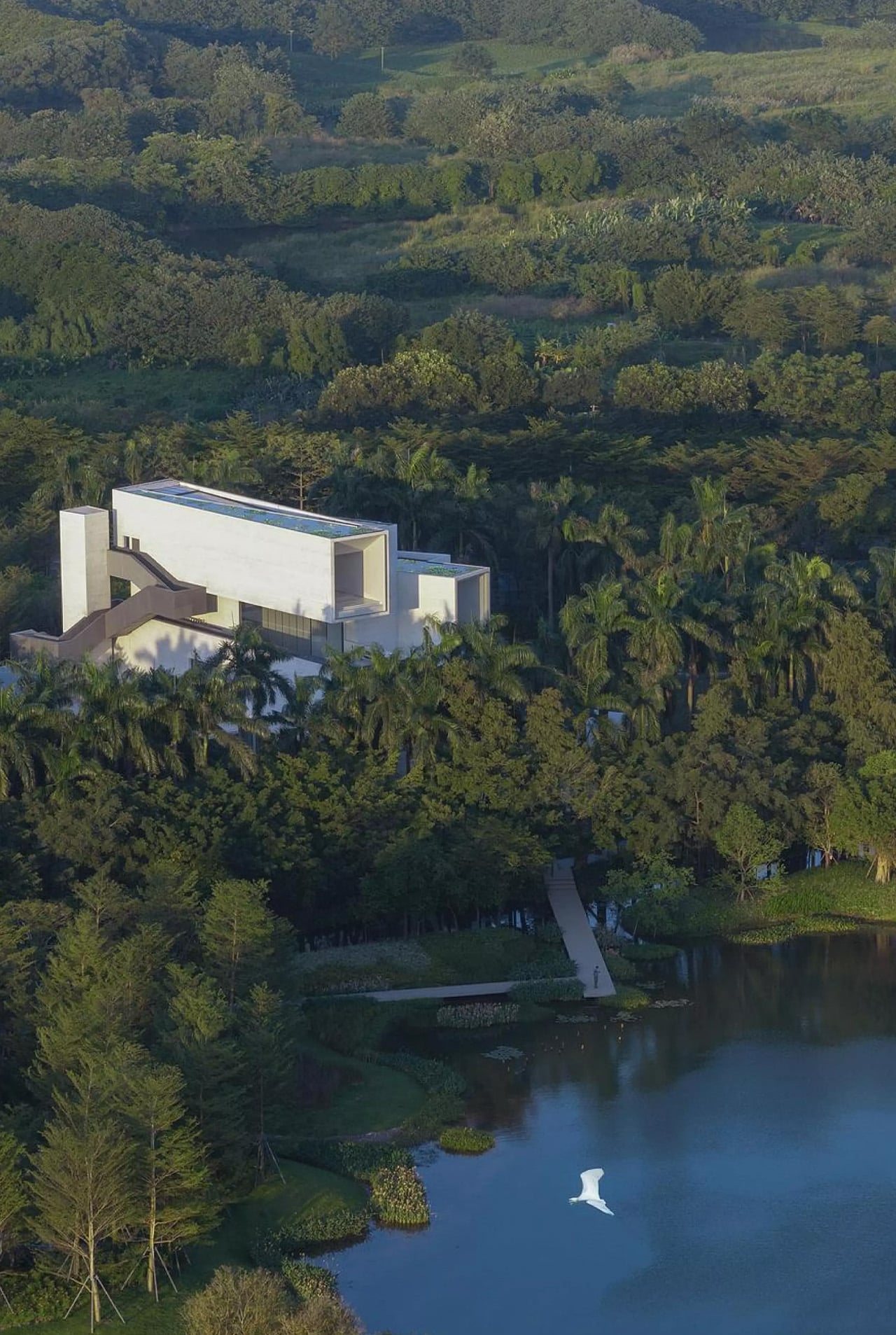
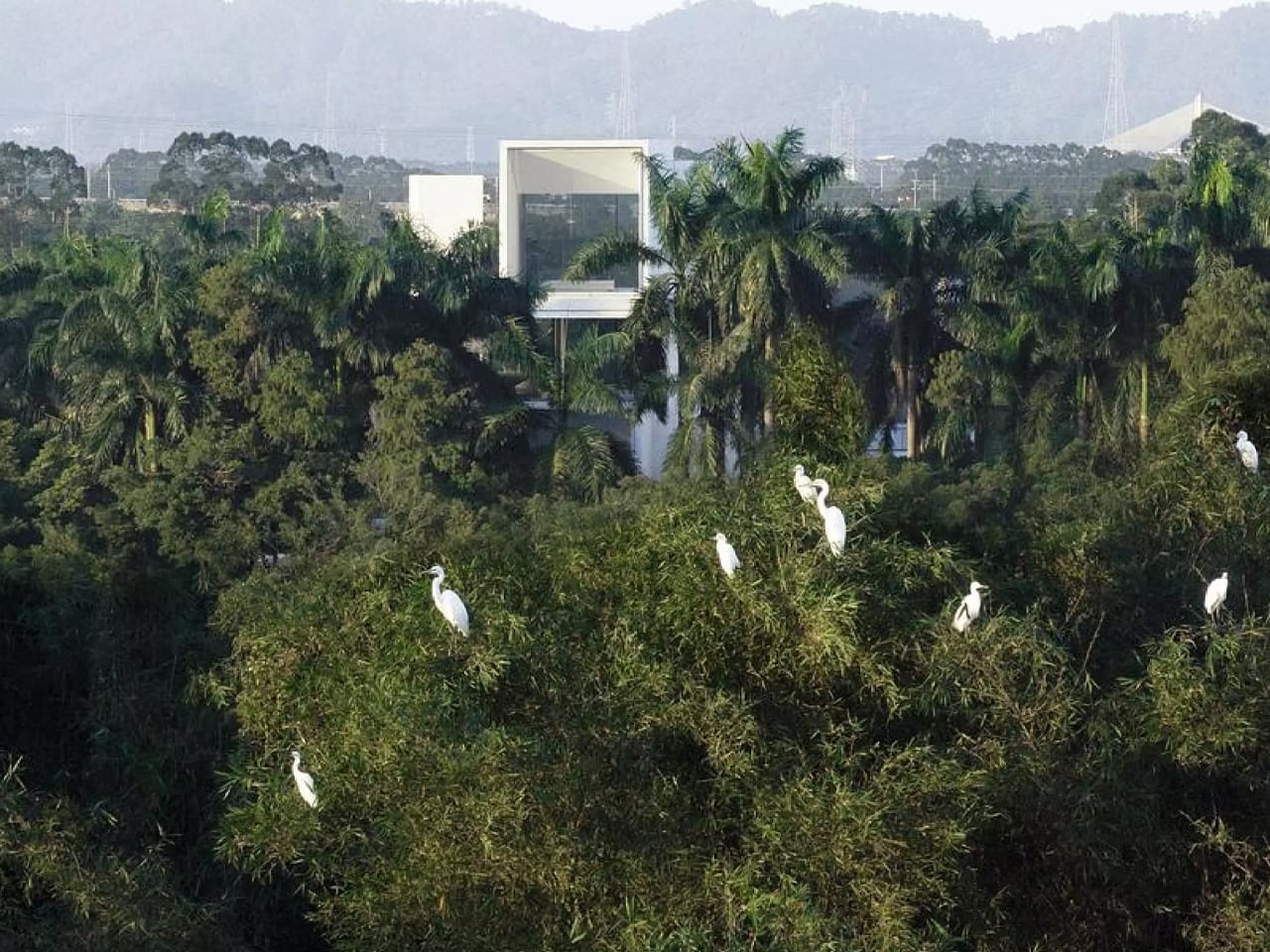
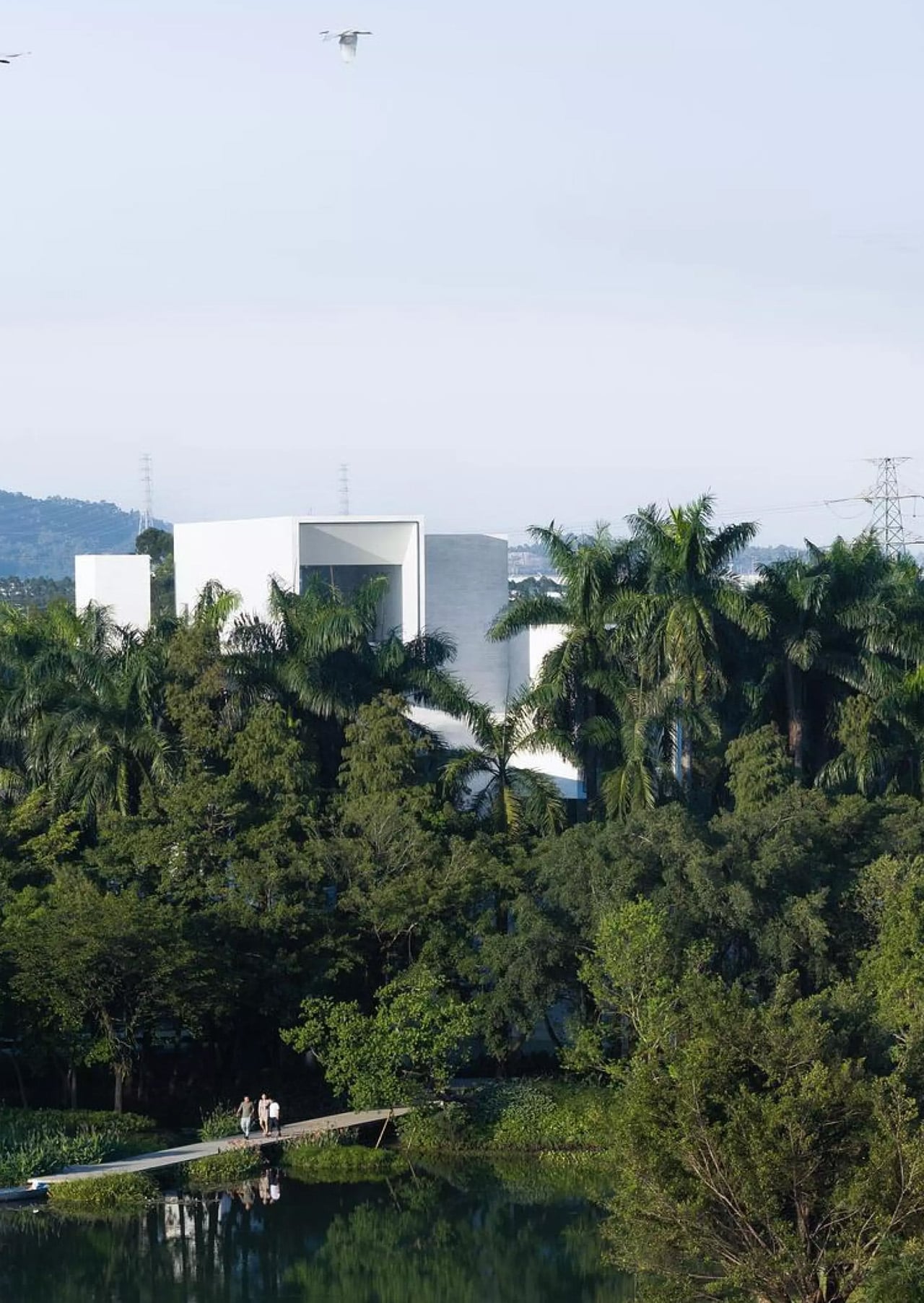
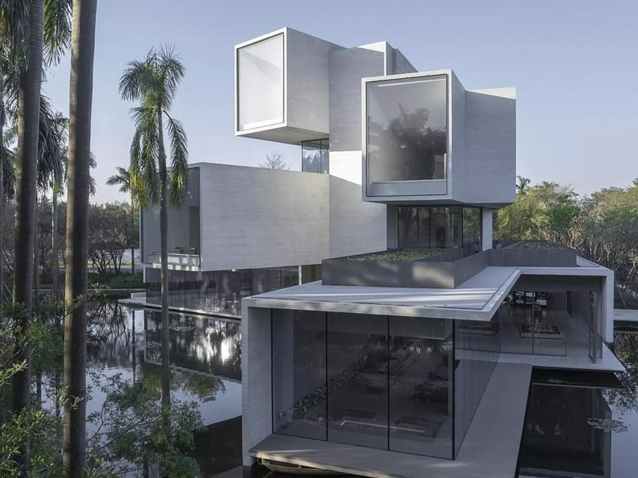
Nestled within the lush landscape of Yunlu Wetland Park in China’s Pearl River Delta, Studio Link-Arc’s latest project redefines what it means to design for wildlife. The Shunde Yunlu Wetland Museum sits quietly behind a row of cedar trees, deliberately concealing itself from view. This isn’t a building seeking attention. It’s architecture that understands its place in an ecosystem where 25,000 egrets take center stage.

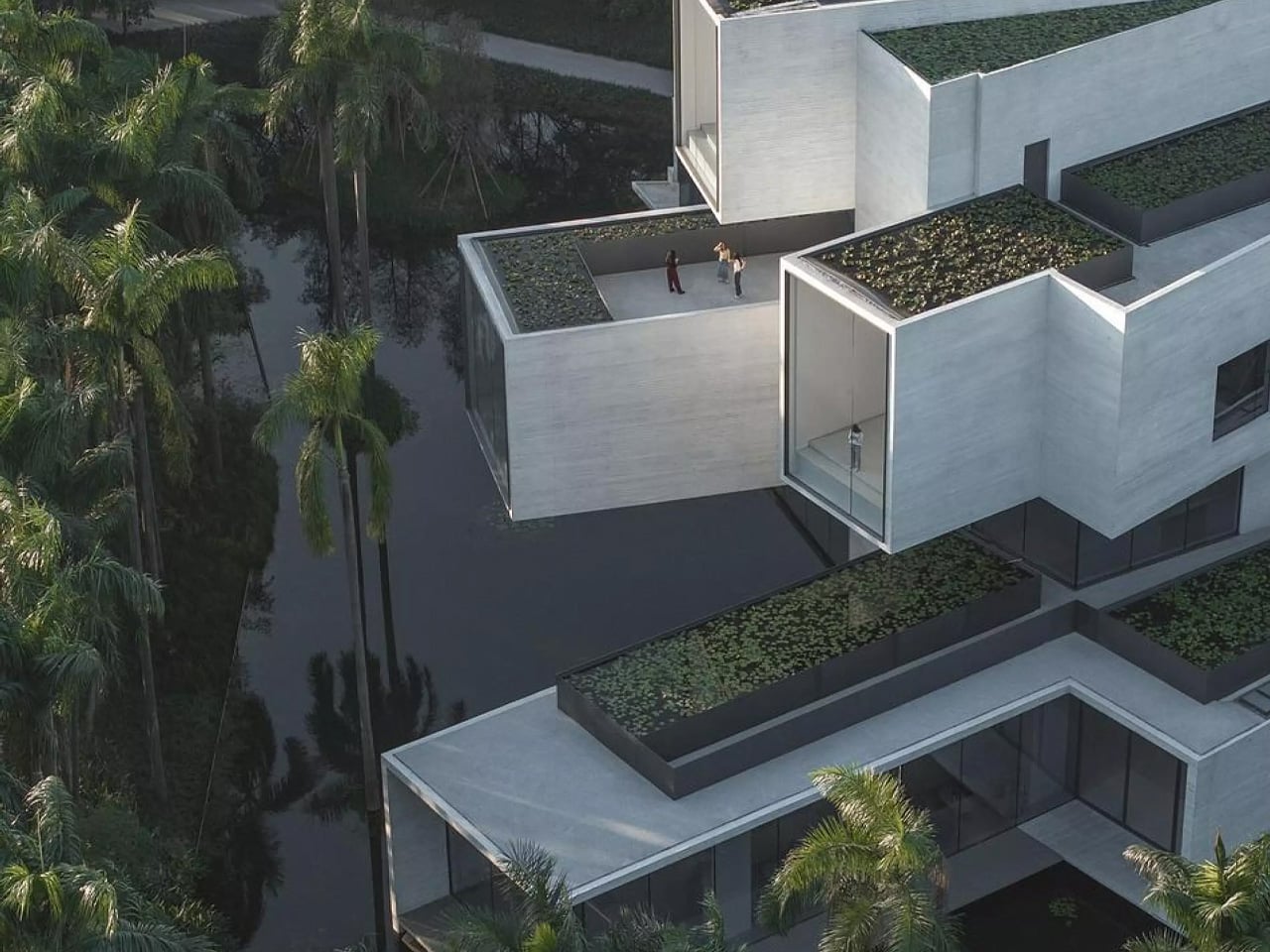
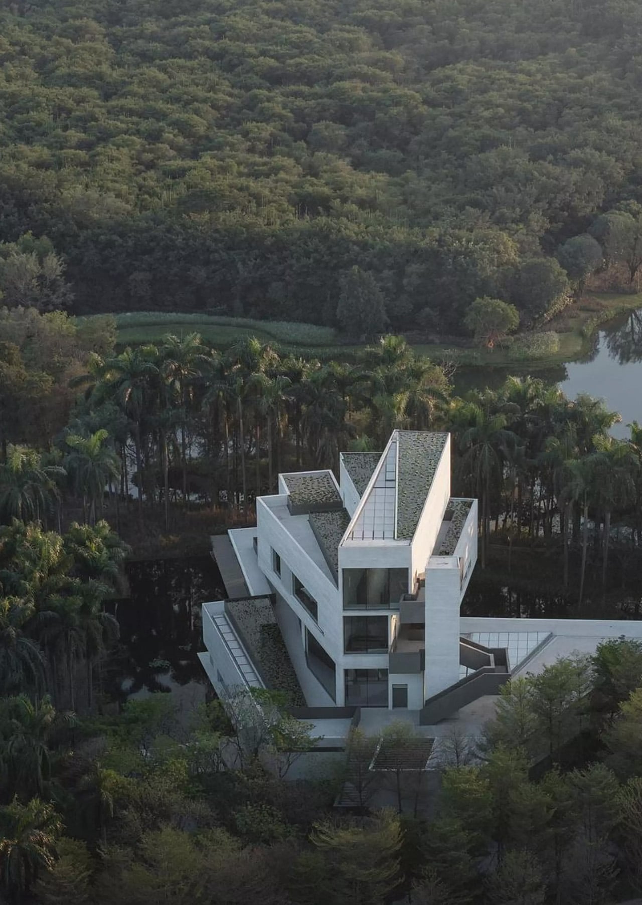
The design challenges conventional architectural thinking. Where most museums position themselves as cultural landmarks, this one retreats. The New York-based firm conceived the structure as four concrete tubes stacked vertically, each rotated to frame a different layer of the forest. The first floor gazes at tree roots. The second captures trunks. The third finds the crowns. The fourth reaches the treetops. Each level acts as a rotating lens, offering visitors perspectives that mirror the egrets’ own experience of their habitat.

Designer: Studio Link-Arc

This rotation creates something beyond visual interest. The cantilevered volumes give the building a sense of kinetic energy, as though the structure itself is adjusting to follow the birds’ movements across the water. The stepped form settles into the wetland’s natural density, absorbed by tall vegetation and reflective water surfaces that blur the boundary between built and natural environments. Each tube functions as a box structure, with sidewalls, roofs, and floors working together to support these dramatic projections.

Inside, a triangular atrium slices through all four floors, connecting the scattered perspectives into a single spatial experience. Sunlight filters through high skylights, softened by deep concrete beams before reaching the interior. Standing in this vertical space, visitors can simultaneously look through multiple tubes, each framing a different view of the wetland. The traditional hierarchy of architectural viewpoints dissolves into something more democratic, more aligned with the rhythms of the landscape itself.

The roof carries a lotus pond, adding another water layer to the composition. This gesture proves essential when viewing the building from paths and bridges throughout the park. The rooftop water merges visually with the wetland below, reducing the structure’s vertical impact and allowing it to read as part of the continuous water system rather than an interruption.

The project emerges from decades of conservation efforts. A local resident known as Uncle Bird spent years transforming this site into an urban sanctuary for egrets. The Shunde government later expanded the protected area thirteenfold, partnering with scientists and designers to restore water systems and bamboo forests. Studio Link-Arc’s museum completes this vision, offering a space where human visitors can observe and learn while remaining secondary to the site’s true inhabitants. The building asks a question rarely posed in contemporary architecture: What happens when we design for the birds first?

The post This Museum Was Designed for 25,000 Birds, Not Humans first appeared on Yanko Design.

This Anti-Gravity Humidifier Makes Water Flow Upwards So It Isn’t ‘Another Boring Appliance’

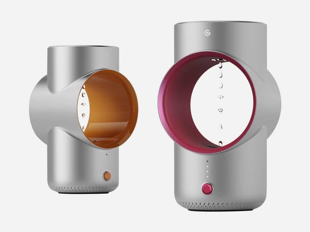
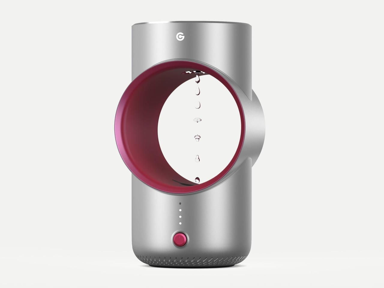
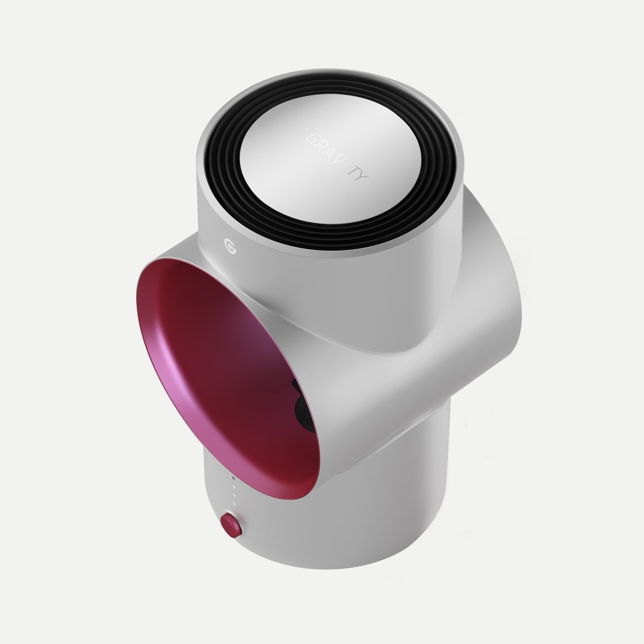
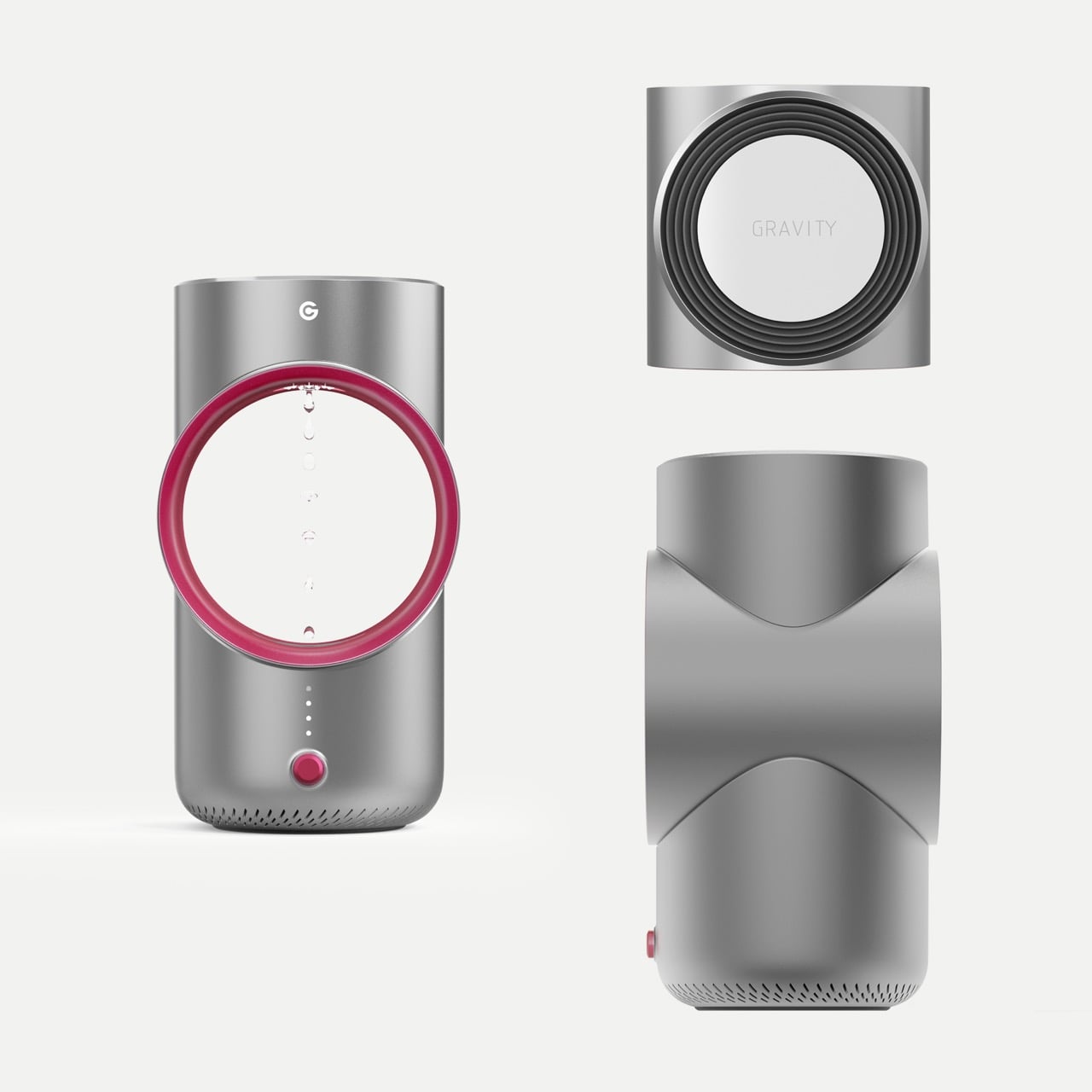
Remember that jaw-dropping scene in “Now You See Me 2” where rain seemingly reverses direction? The Serena Anti-Gravity Humidifier turns that cinematic spectacle into everyday home decor. The device actually uses visual persistence technology to create a convincing illusion of water droplets climbing upward, defying gravity with every pulse of its synchronized LED system.

Designer Kexin Su and the team at LuXun Academy of Fine Arts spent months perfecting the synchronization between water flow and light timing. The challenge was maintaining the illusion while delivering practical humidification for modern living spaces. Their solution borrows liberally from Dyson’s design vocabulary: a circular aperture, minimal controls, premium metallic finishes. But where Dyson multiplies air, Serena bends perception. The transparent colored ring frames the ascending droplets like a gallery piece, while the compact base houses the miniature pump and strobe system that make the whole spectacle possible.

Designer: Kexin Su

The tech here hinges on visual persistence, which is basically your brain holding onto an image for about 1/16th of a second after seeing it. LED strobes flash in sync with falling water droplets, catching each one in nearly the same position as the last. Your brain stitches these snapshots together and interprets the result as water flowing upward or hanging motionless in air. Think about how movie projectors work at 24 frames per second, except here the timing tolerance is even tighter. If the strobe drifts even slightly out of phase with the droplet release, the whole illusion falls apart and you’re just watching normal gravity do its thing. The miniature pump has to maintain ridiculously consistent droplet size and timing while the LED controller stays locked within millisecond precision.

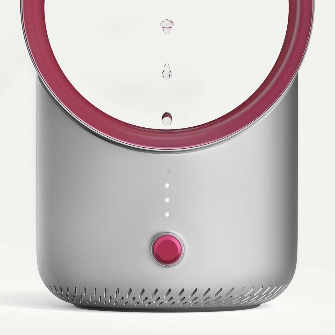
At 478mm tall and 260mm across, this thing commands attention. You’re not tucking it behind a bookshelf. The whole point is putting it somewhere visible where the illusion can do its work. You get burgundy or amber options for the transparent ring, and honestly, the color choice matters more than you’d think because it completely changes the mood when backlit. The control scheme strips down to a single button and four indicator dots, probably for different intensity modes or timing presets. Touch controls let you tweak both strobe speed and brightness, which means you can dial in how fast the water appears to climb or how subtle you want the effect. Slower intervals make for dreamier upward motion, while cranking the brightness turns it into more of a statement piece.

What might feel like an optical gimmick actually does something pretty remarkable – it makes the humidifier way more interesting. Most of us shove these things into corners or bedrooms where they can do their job without being seen. Serena flips that equation entirely. It wants to be your living room centerpiece, which takes real conviction in the concept. I’ve seen similar strobe effects at science museums and in art installations, but domesticating that technology into something you’d actually plug in at home represents a different kind of design challenge. The Dyson influence is unmistakable, from the bladeless aperture aesthetic to the premium metallic finish, but they’re applying that visual language to something genuinely novel rather than just iterating on existing fan technology… and the A’ Design Award given to this humidifier is just proof that it’s a clever idea with brilliant visual execution.

The post This Anti-Gravity Humidifier Makes Water Flow Upwards So It Isn’t ‘Another Boring Appliance’ first appeared on Yanko Design.

Nothing Phone 4 Delayed: How RAM Prices and ‘Meaningful Upgrades’ Pushed the Release to 2027

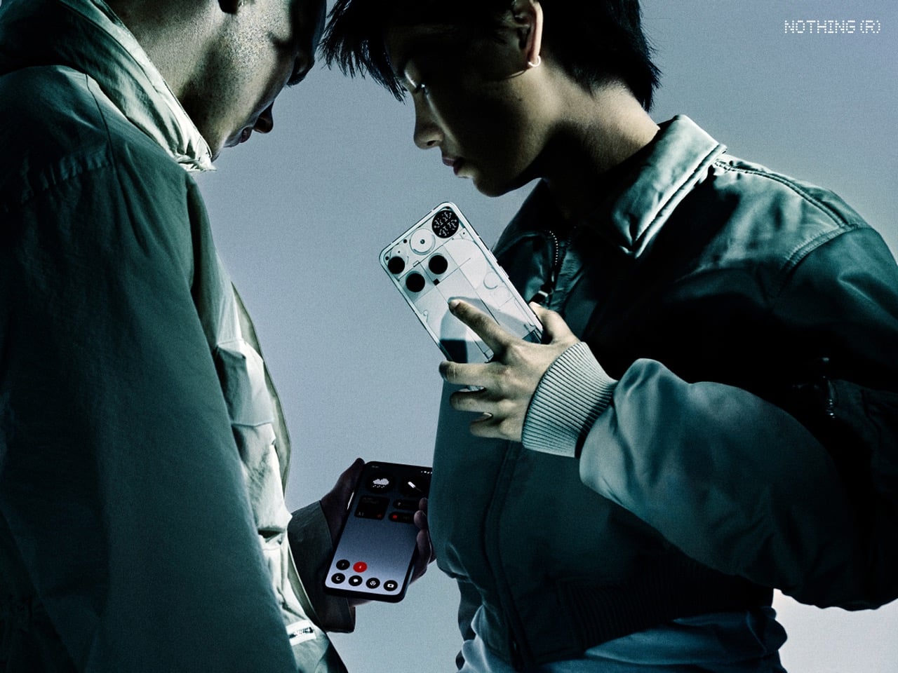
Nothing is skipping the Phone (4) entirely this year. Not delaying it, not soft-launching it later, just straight up not making one. The Phone (3) holds down the flagship spot through all of 2026, which Carl Pei spins as a refusal to follow industry conventions for their own sake. He’s got a point about meaningful upgrades mattering more than arbitrary annual cycles, but the timing feels less like strategic patience and more like acknowledging that last year’s flagship push didn’t quite land the way they hoped. The Phone (3)’s pricing crept higher than fans expected, and Nothing even experimented with discounts to move units.

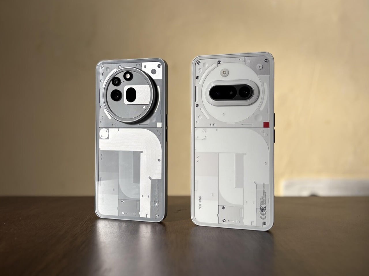
The Phone (4a) picks up the slack as Nothing’s solo 2026 release. Pei describes a “complete evolution” that pushes the A-series toward flagship experiences through premium materials, upgraded displays, enhanced cameras following the 3A Pro’s periscope success, and better overall performance. Design-wise, expect new colors and continued polish on Nothing’s transparent aesthetic, aiming to stay distinctive while appealing broader. But here’s where things get complicated: RAM prices have gone absolutely wild thanks to AI demand, forcing Nothing to raise prices across their smartphone portfolio. The (4a) was already their bestselling series partly because of competitive pricing. Now it needs to absorb component cost increases, justify premium positioning, and deliver enough differentiation to matter in a crowded mid-range field, all while being Nothing’s only new phone for the year. That’s a lot riding on one device.

Designer: Nothing

And I get it… The whole “we only upgrade when there’s something meaningful to say” pitch sounds refreshingly anti-corporate, but it’s also a somewhat tacit admission that the Phone (3) didn’t make the splash they hoped. They pushed pricing into the $600-700 range depending on region, which immediately put them against devices from brands with way deeper pockets and established reputations. Then they started running promotions to move inventory. That’s not the behavior of a company confidently sitting on a hit product. So yeah, taking 2026 off from flagship releases makes sense, even if the official messaging talks about meaningful innovation.

The 4A becomes the entire story by necessity. Pei promised a complete evolution across materials, display, camera, and performance, which sounds great until you remember the 3A series already delivered solid specs for the money. The 3A Pro brought a periscope camera to the mid-range, decent build quality, and respectable performance. Upgrading to UFS 3.1 storage is nice, but that’s table stakes at this point. Premium materials could mean anything from metal frames to glass backs, and new color experiments might freshen things up visually. But here’s the fundamental problem: all of this costs more to produce right when RAM prices are spiking hard enough that Pei called it unprecedented in his 20 years in the industry.

AI demand has component suppliers laughing all the way to the bank while phone makers scramble to absorb costs or pass them along. Nothing chose the latter. Price increases across the entire smartphone portfolio means the 4A’s value proposition takes a direct hit. The A-series worked because it offered flagship-adjacent experiences at mid-range prices. Now it’s offering mid-range experiences at mid-range-plus prices while the flagship sits idle for a year. You can see the squeeze happening in real time. Nothing needs the 4A to justify higher costs through tangible improvements, maintain enough distinctiveness to feel like a Nothing product, and somehow convince people it’s worth paying more for when every other mid-range phone is also getting more expensive.

The design question looms large here too. YouTube comments are already asking for glyph lights to return, which makes sense given that’s Nothing’s most recognizable feature. But adding glyph interfaces costs money, and if the A-series never had them before, suddenly including them now while also raising prices feels like asking for trouble. You either keep the transparent aesthetic without the lights and risk looking like any other glass-backed phone, or you add them and watch your margins evaporate. Neither option is great when you’re already dealing with component cost inflation and no flagship to absorb the premium features.

What Nothing built its reputation on was being the scrappy alternative that delivered distinctive design and solid performance without asking flagship money. The Phone 4A needs to thread an impossible needle: cost more but feel worth it, look different but stay affordable, deliver flagship experiences but remember it’s still mid-range. All while being the only new Nothing phone anyone can buy in 2026. That’s a tough spot for any device, let alone one from a company still finding its footing in a brutally competitive market.

The post Nothing Phone 4 Delayed: How RAM Prices and ‘Meaningful Upgrades’ Pushed the Release to 2027 first appeared on Yanko Design.

NASA used Claude to plot a route for its Perseverance rover on Mars

Since 2021, NASA's Perseverance rover has achieved a number of historic milestones, including sending back the first audio recordings from Mars. Now, nearly five years after landing on the Red Planet, it just achieved another feat. This past December, Perseverance successfully completed a route through a section of the Jezero crater plotted by Anthropic's Claude chatbot, marking the first time NASA has used a large language model to pilot the car-sized robot.    

Between December 8 and 10, Perseverance drove approximately 400 meters (about 437 yards) through a field of rocks on the Martian surface mapped out by Claude. As you might imagine, using an AI model to plot a course for Perseverance wasn't as simple as inputting a single prompt. 

As NASA explains, routing Perseverance is no easy task, even for a human. "Every rover drive needs to be carefully planned, lest the machine slide, tip, spin its wheels, or get beached," NASA said. "So ever since the rover landed, its human operators have painstakingly laid out waypoints — they call it a 'breadcrumb trail' — for it to follow, using a combination of images taken from space and the rover’s onboard cameras." 

To get Claude to complete the task, NASA had to first provide Claude Code, Anthropic's programming agent, with the "years" of contextual data from the rover before the model could begin writing a route for Perseverance. Claude then went about the mapping process methodically, stringing together waypoints from ten-meter segments it would later critique and iterate on.  

This being NASA we're talking about, engineers from the agency's Jet Propulsion Laboratory (JPL) made sure to double check the model's work before sending it to Perseverance. The JPL team ran Claude's waypoints through a simulation they use every day to confirm the accuracy of commands sent to the rover. In the end, NASA says it only had to make "minor changes" to Claude's route, with one tweak coming as a result of the fact the team had access to ground-level images Claude hadn't seen in its planning process.  

"The engineers estimate that using Claude in this way will cut the route-planning time in half, and make the journeys more consistent," NASA said. "Less time spent doing tedious manual planning — and less time spent training — allows the rover’s operators to fit in even more drives, collect even more scientific data, and do even more analysis. It means, in short, that we’ll learn much more about Mars."

While the productivity gains offered by AI are often overstated, in the case of NASA, any tool that could allow its scientists to be more efficient is sure to be welcome. Over the summer, the agency lost about 4,000 employees – accounting for about 20 percent of its workforce – due to Trump administration cuts. Going into 2026, the president had proposed gutting the agency's science budget by nearly half before Congress ultimately rejected that plan in early January. Still, even with its funding preserved just below 2025 levels, the agency has a tough road ahead. It's being asked to return to the Moon with less than half the workforce it had during the height of the Apollo program.     

For Anthropic, meanwhile, this is a major feat. You may recall last spring Claude couldn't even beat Pokémon Red. In less than a year, the company's models have gone from struggling to navigate a simple 8-bit Game Boy game to successfully plotting a course for a rover on a distant planet. NASA is excited about the possibility of future collaborations, saying "autonomous AI systems could help probes explore ever more distant parts of the solar system."

This article originally appeared on Engadget at https://www.engadget.com/ai/nasa-used-claude-to-plot-a-route-for-its-perseverance-rover-on-mars-203150701.html?src=rss

This $50 Smart Ring Has a Screen (And Works Like A Tiny Smartwatch)

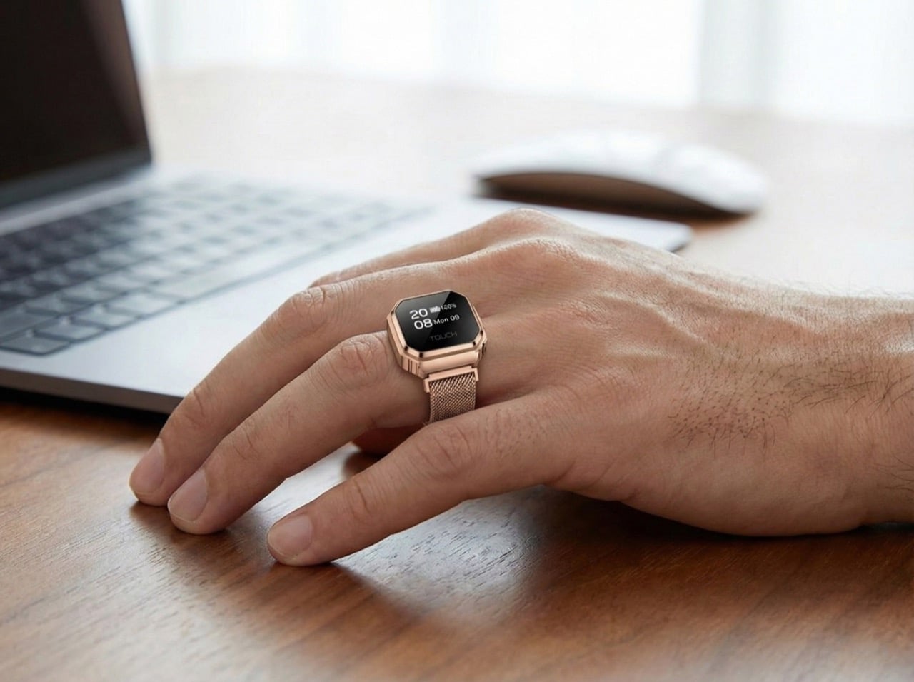
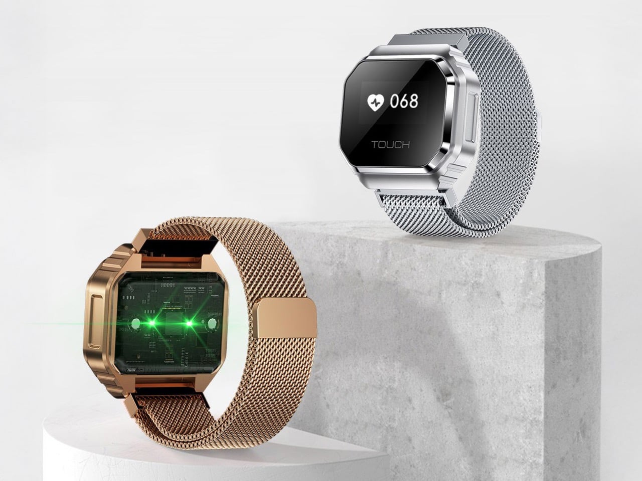
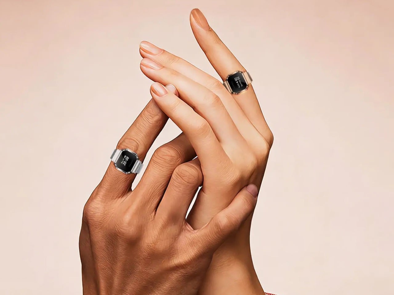
The smartwatch got smaller. Then the smart ring arrived. Now Rogbid has released something that splits the difference and costs less than a nice dinner: the Fusion, a hybrid device that looks like someone shrunk a fitness tracker and stuck it on a ring band. For fifty dollars, you get a legitimate OLED display, actual health sensors, and the ability to wear your technology on whichever body part feels right that day.

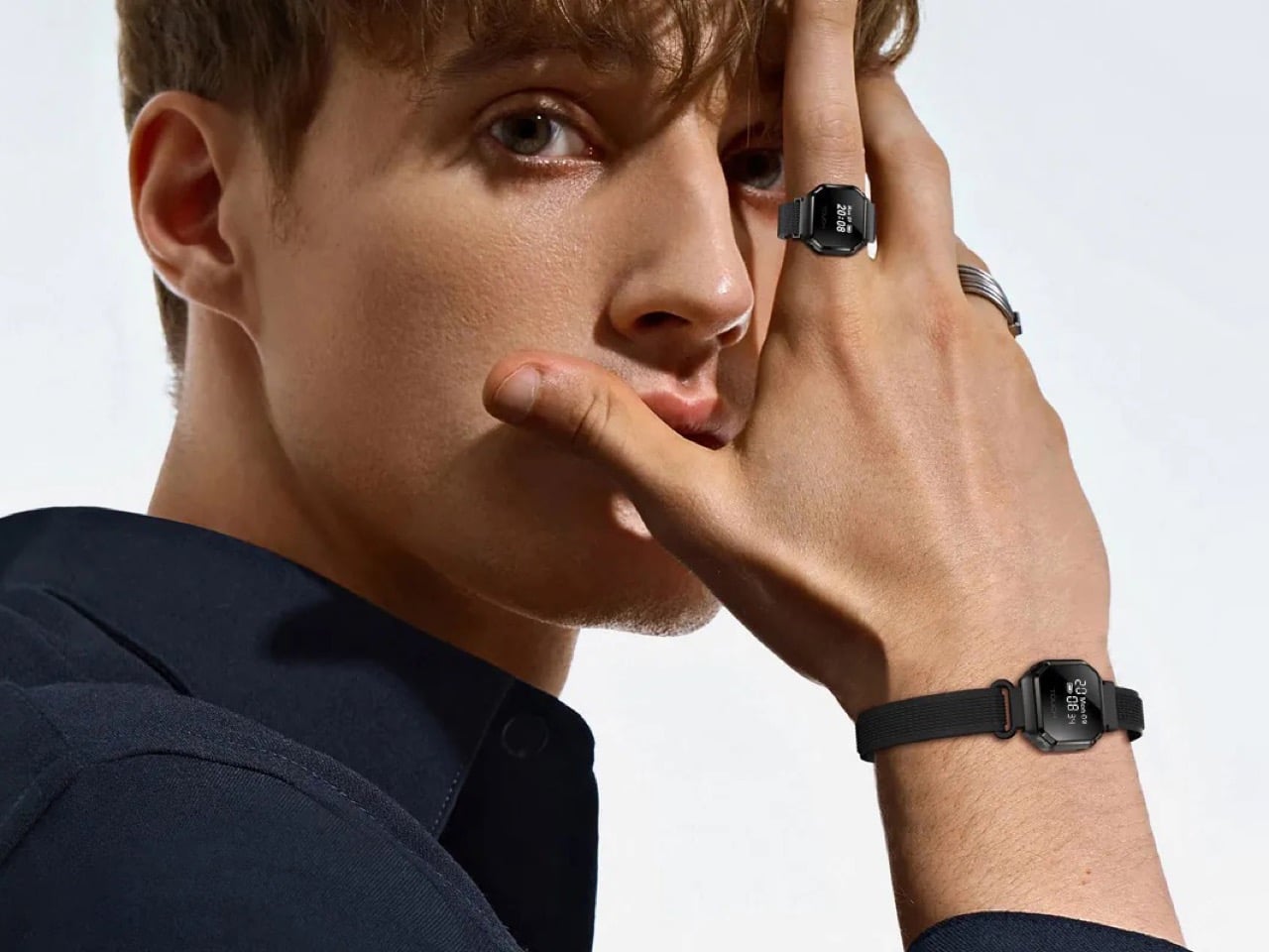
This is more than just miniaturization for the sake of novelty. The Fusion measures 20.6 x 21 x 8.2mm and weighs about as much as three quarters stacked together, yet it monitors heart rate, tracks sleep, measures blood oxygen levels, and survives underwater thanks to 5ATM water resistance. Rogbid includes both a finger-sized adjustable strap and a wrist band, turning the device into whatever you need depending on your outfit, activity, or tolerance for questions from strangers. Battery life hits five days with regular use, which means this tiny screen actually pulls its weight between charges.

Designer: Rogbid

You have to give Rogbid credit for seeing Casio’s G-Shock ring sell out and thinking, “we can do that, but with actual tech inside.” That Casio piece was pure nostalgia, a fun gimmick that proved a market existed for finger-watches. Rogbid’s move feels like the logical, if slightly unhinged, next step: taking the novelty and injecting actual utility.

We’re talking over 100 sports modes, which is a software problem I don’t even want to think about navigating on a half-inch screen. But the hardware is there: an optical heart rate sensor, blood oxygen monitoring, and all the usual motion tracking. They even added prayer time reminders and a “couple interaction mode” for sharing codes, which feels like they just kept adding features from a hat until they ran out of room. It’s the kind of feature creep that’s almost admirable in its audacity, especially when most competitors are still trying to get basic step counting right in the ring form factor.

This whole thing is a fascinating gamble on what people want from a smart ring. The entire appeal of the Oura and its competitors is their subtlety; they disappear into your daily life. The Fusion, however, plants a glowing OLED screen right on your knuckle and demands attention. It’s a complete rejection of the minimalist aesthetic that defined the category. Maybe that’s the point. For fifty bucks, Rogbid isn’t trying to compete with the thousand-dollar jewelry pieces. They’re creating an entirely new, wonderfully weird sub-category of wearable that’s too cheap and too interesting to ignore.

The post This $50 Smart Ring Has a Screen (And Works Like A Tiny Smartwatch) first appeared on Yanko Design.

Rivian made an electric ambulance for Grey’s Anatomy

America’s once-promising EV transition may have taken a U-turn, but at least some in Hollywood are trying to do their part. Rivian partnered with Grey’s Anatomy to make a custom electric ambulance for the long-running series.

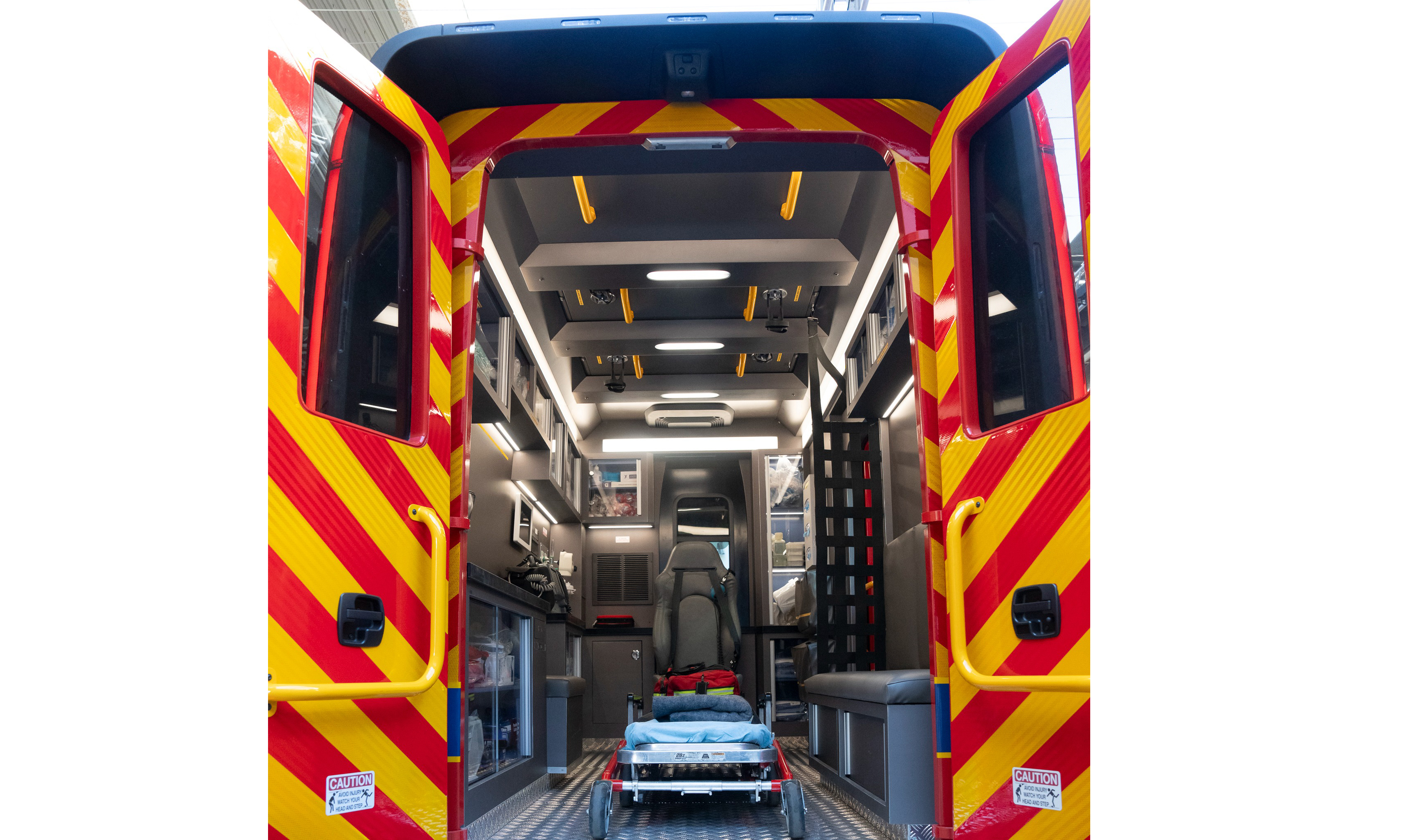
The ambulance is a modified version of Rivian’s Commercial Van. The custom “vanbulance” serves a dual purpose: preventing on-set exhaust fumes (which could harm the cast and crew) and integrating a green storyline. “As an added benefit, the elimination of engine noise brought a welcome quiet while cameras were rolling,” Rivan wrote in a blog post.

View of an ambulance interior for a Hollywood set
Among other modifications, it has rear double doors instead of a roll-up one.
Rivian

The vehicle includes some production-specific touches. Its walls and roof panels are removable, allowing cameras to reach angles required for interior shots. In addition, Rivian replaced the standard van’s rear roll-up door with double doors while adding a side entry to the cargo area. The company also added custom lighting and an exterior wrap reading “Seattle Emergency Response Services.”

The team consulted with the Huntington Beach Fire Department and the Los Angeles Fire Department to inform the interior layout. “Their feedback was invaluable to understand how first responders actually use their vehicles,” Rivian wrote.

An electric ambulance used on a Hollywood set
At least Hollywood's fictional worlds are transitioning to electric.
Rivian

The Hollywood Reporter notes that the electric ambulance debuted in the November 13, 2025, episode of Grey’s Anatomy. However, it was featured more prominently in Thursday’s episode — hence Rivian choosing this week to highlight it.

This article originally appeared on Engadget at https://www.engadget.com/transportation/evs/rivian-made-an-electric-ambulance-for-greys-anatomy-194358967.html?src=rss

Naoto Fukasawa on Poetic Observation and Designing the realme 16 Pro Urban Wild

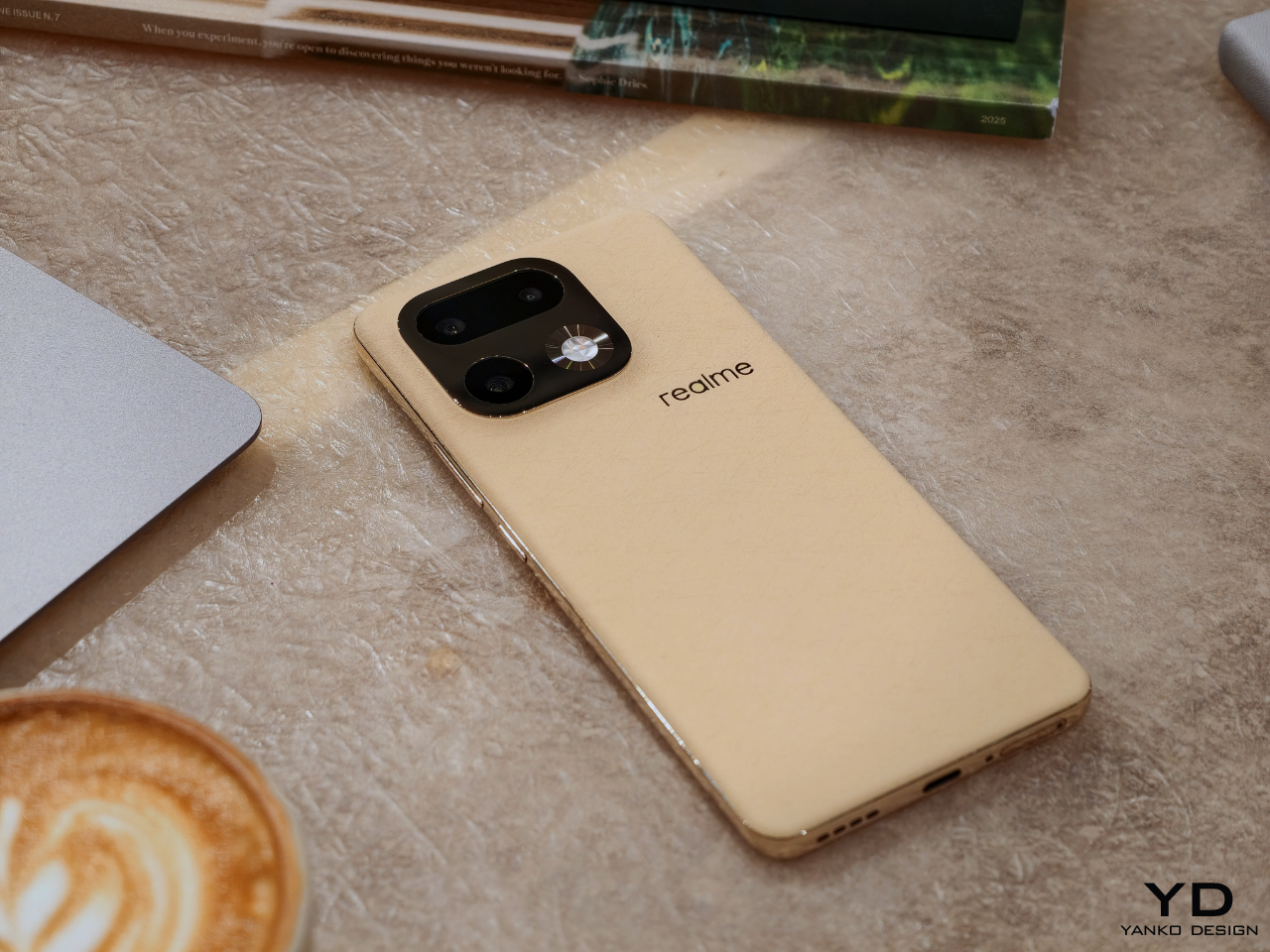
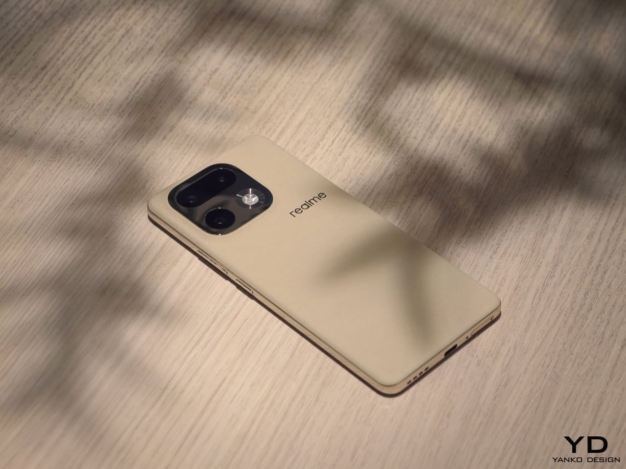
With the realme 16 Pro series, Naoto Fukasawa and realme reunite for their fifth collaboration. Past Master Edition phones have been anchored in concrete metaphors such as onion and garlic for food, concrete and brick for architecture, a suitcase for exploration, and paper for sustainability. This time, the theme is Urban Wild Design, which combines a softly textured, bio-based back with a mirror-polished camera island and frame so that the phone feels less like a gadget and more like something between a pebble, a wheat field, and a piece of jewelry.

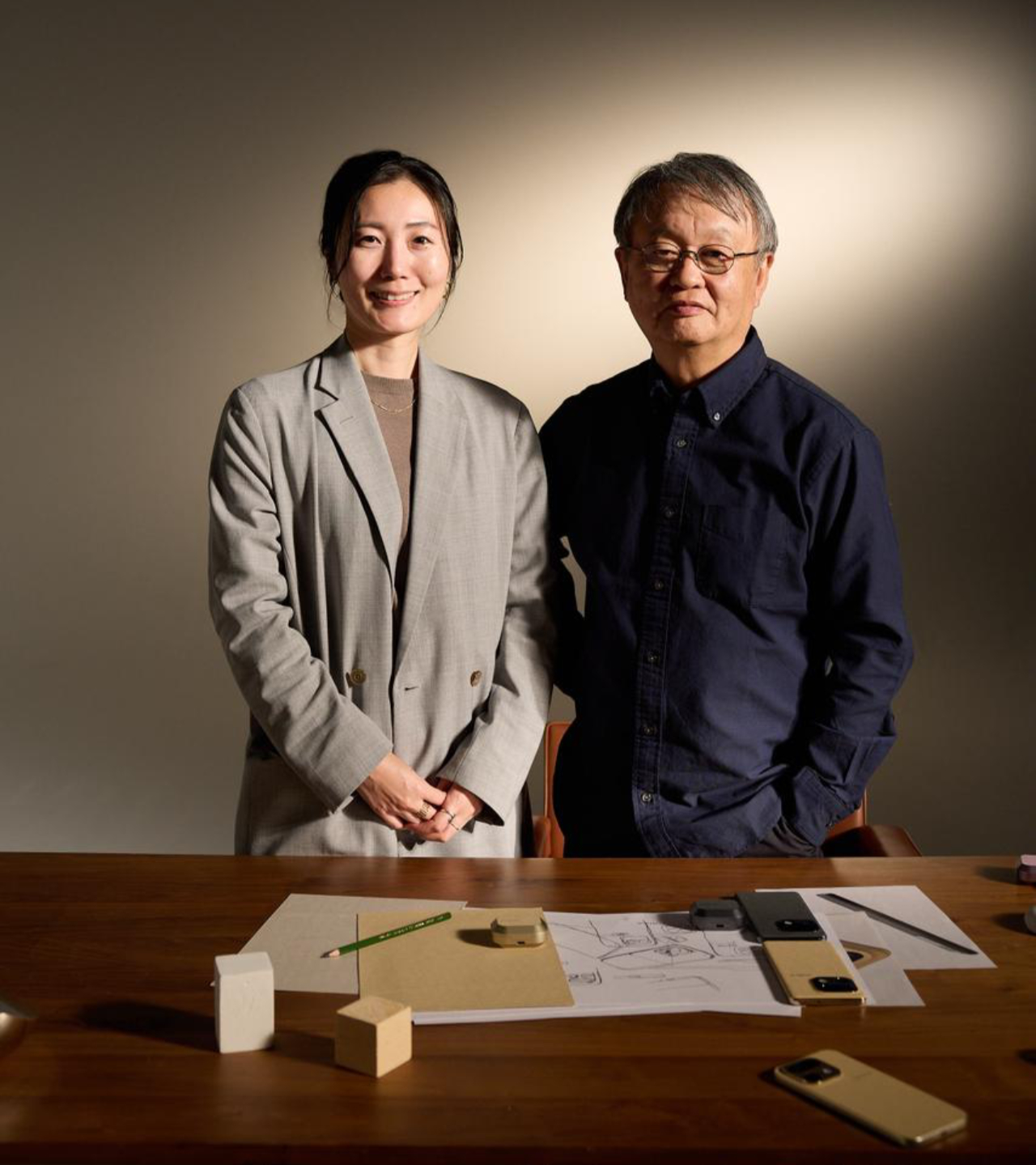
To understand the thinking behind Urban Wild and where smartphones sit in his larger body of work, we spoke with Fukasawa in Tokyo. What emerged was a conversation about optimal solutions, poetic observation, and the slow transformation of phones from tools into objects we might someday find in a jewelry boutique.

Smartphones after the “optimal size”

Designer: Naoto Fukusawa
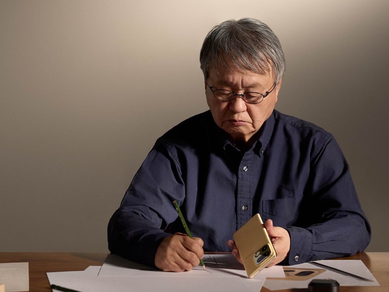
Fukasawa has designed furniture, appliances, and a wide range of everyday objects. When we ask how he now sees the smartphone in our lives, and whether it feels closer to a tool or to a companion, he does not answer with a metaphor about friendship or dependence. He goes straight to something more concrete, which is size, and explains that mobile phones kept shrinking until they reached the smallest form that people could still use comfortably, then stopped. For him, that point, where going any smaller would make them difficult to handle, is roughly where the smartphone’s footprint settled, and in terms of size, we have already reached something close to an optimal answer.

Once that size is fixed, the phone stops being just an efficient tool and, because we always carry it, becomes part of daily life. As new functions and applications accumulate, the phone becomes more than a neutral object. It starts to feel like something that responds to you, and something you relate to on an emotional level as well as a functional one. In that sense, the smartphone has moved closer to a partner than a simple instrument.

From gadget to accessory
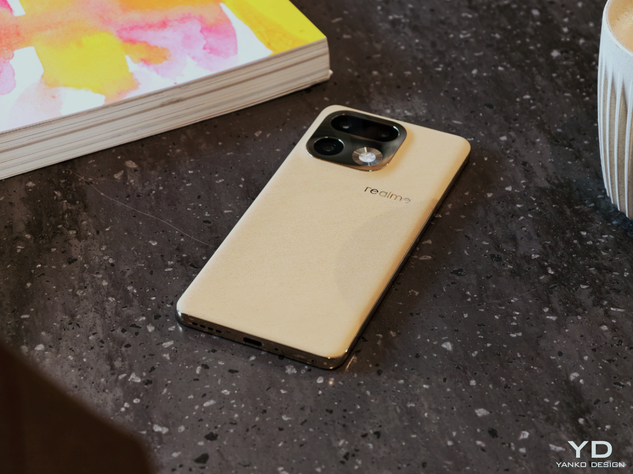
Over the last several years, Fukasawa has watched both the devices and the surrounding market change. For a long time, selling more products meant multiplying variations, and that approach helped companies grow, yet also made everyday life feel crowded with choices. “People used to believe that the more options you had, the happier you would be,” he says. “Now, with so many choices, life has become overwhelming and even a little painful.”

From his perspective, the next step is not to say here is another option, but to say this is the object that suits you best. If designers can get closer to a true optimum, there may be less need for endless variations, and in the extreme case, one type might actually be enough. For him, the smartphone is already close to a final archetype, and the real work now lies in how it feels in the hand and how it lives with us each day.

Once the basic form and functions have settled in this way, what separates one phone from another is less about what is inside and more about how it is expressed on the outside. That is where collaboration and brand character start to matter. realme is a relatively young brand, its identity closely tied to youth, and that youthfulness was part of the attraction for Fukasawa when the collaboration began in 2019 with the realme X Master Edition.
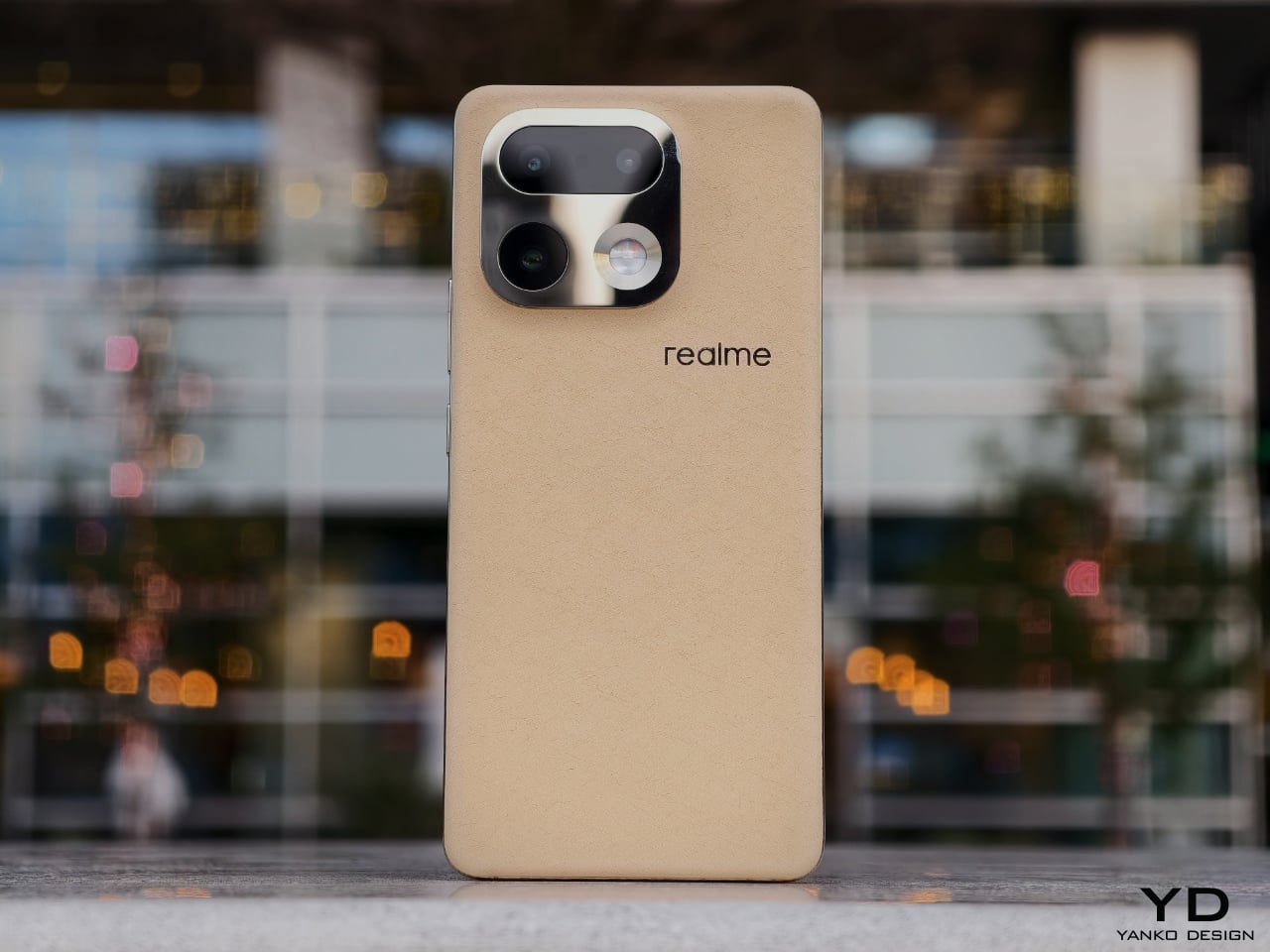
Smartphone hardware has almost converged, and most major brands now work with similar capabilities, which means the design, appearance, and feel of the device become more important. In that context, the 16 Pro series became a way to explore something he feels is still rare, a sense of quiet luxury for a young audience. Youth and luxury are not usually linked, and young users are often expected to settle for things that look cheap or temporary, but with realme he wanted to offer something more refined without losing accessibility.

“We had not really thought about it from that side before,” he says. He wanted to treat the phone not only as a gadget, but also as something closer to an accessory that people might choose in the same way they choose a watch or a piece of jewelry. He thinks smartphones are now heading in that direction. The hardware inside will keep evolving, yet the design on the outside will increasingly be judged like something you adorn yourself with and show in public.

realme’s target is young users, but he did not want to make something throwaway. Instead, he aimed for a slightly more grown-up kind of elegance, the kind of subtle sparkle a young person might want when walking through the city. That balance between youth and a touch of luxury is, for him, a key part of what makes the 16 Pro feel different.

Urban Wild, bringing nature into the city
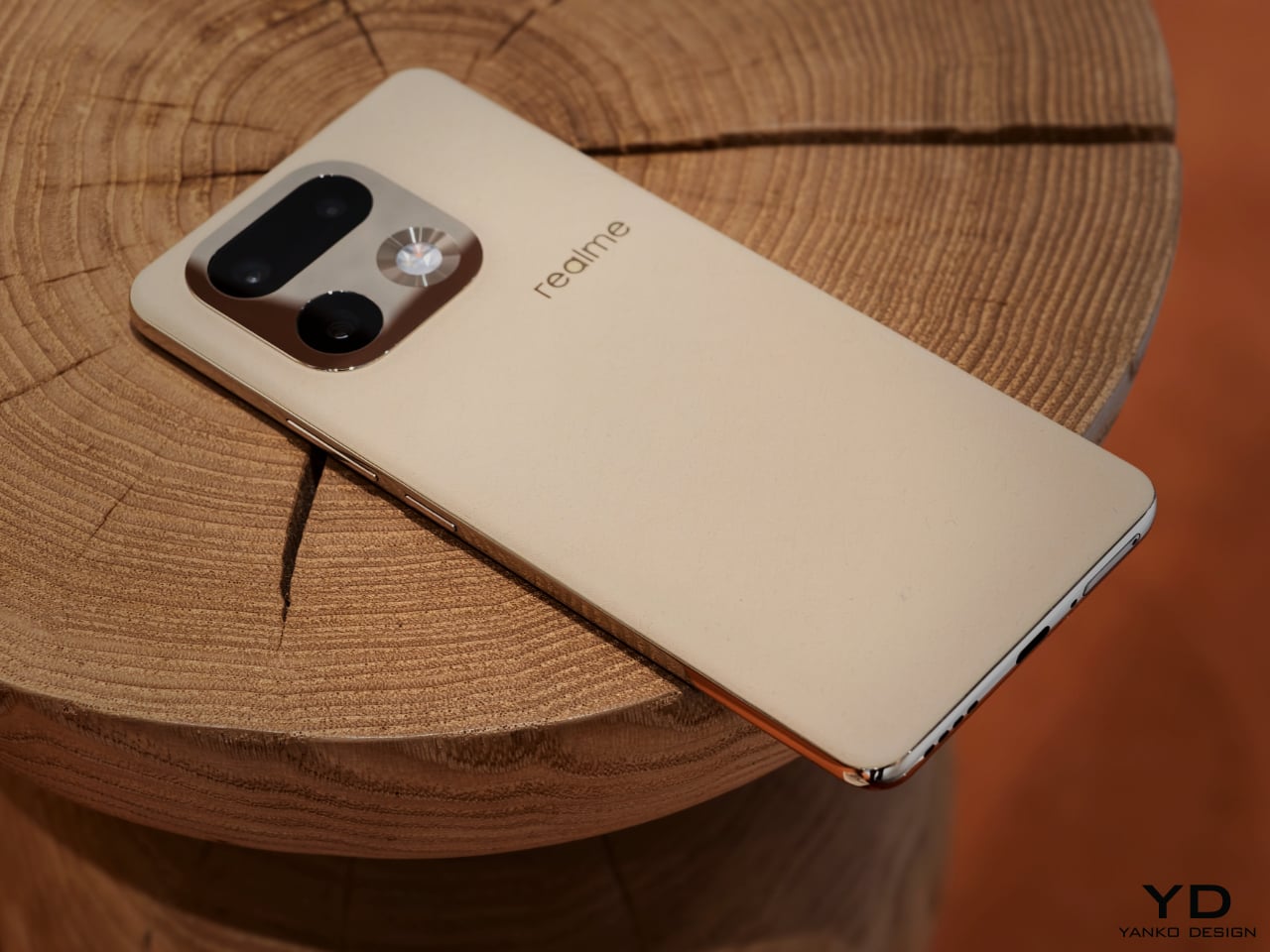
For Fukasawa, the starting point for the 16 Pro was a human wish to bring nature into urban life. He feels that wish has grown stronger after decades of rapid growth and increasingly inhuman city environments. More people now seem drawn to things that feel closer to natural phenomena or handmade objects, and to smaller quantities of more considered products. He senses a shift in what people value, away from volume and speed and toward calm and presence.

He wanted the phone to carry that feeling in a direct, physical way. The first idea was a touch that did not feel cold, and a back surface that felt slightly soft and warm in the hand, almost like paper or fabric rather than hard plastic or rubber. At the same time, he knew the design would include accents that could take on a mirror finish, so it became a deliberate contrast, with a soft and quiet body paired with shiny, jewelry-inspired highlights.
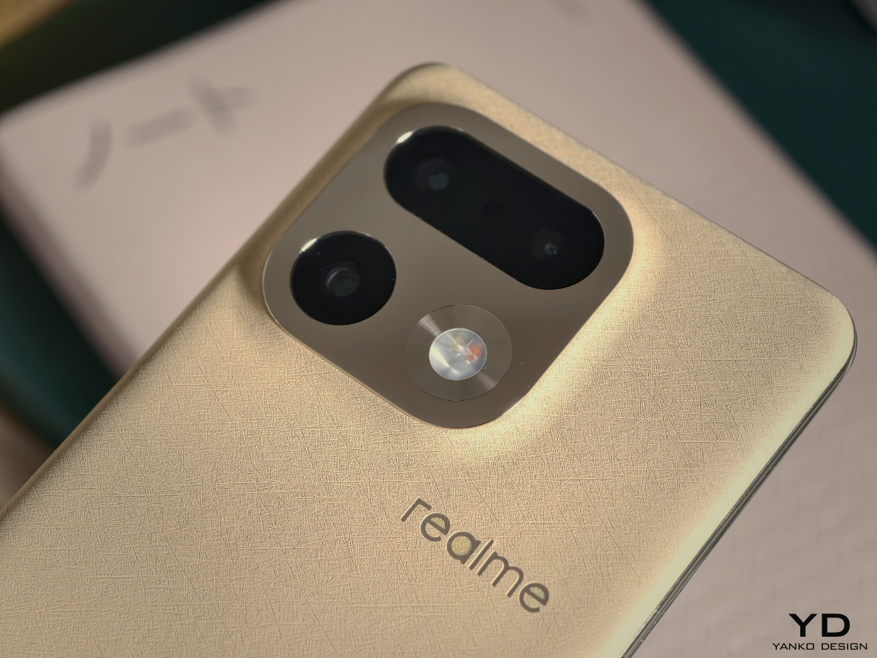
To him, this mix of natural warmth and precise shine points to where value is moving. “That is where value will be,” he says. For Fukasawa, what feels valuable now is not more noise, but a calm presence that still has intensity. In that sense, his idea of wildness is broader than the way the word is often used in marketing.

The word wild is usually attached to something loud and extreme, but for him, it can just as well describe a kind of clarity and simplicity that stands out in the middle of a noisy world. “In a very noisy environment, when something is extremely simple, that can also be wild,” he suggests. In the same way that Super Normal objects are, in his words, super special, Urban Wild is less about spectacle and more about a stripped-back intensity where quietness itself becomes the bold statement. The phrase Urban Wild came later, after the design already existed and had made people quietly say “wow,” so it was a name that followed a feeling rather than the other way around.

True to nature color and texture
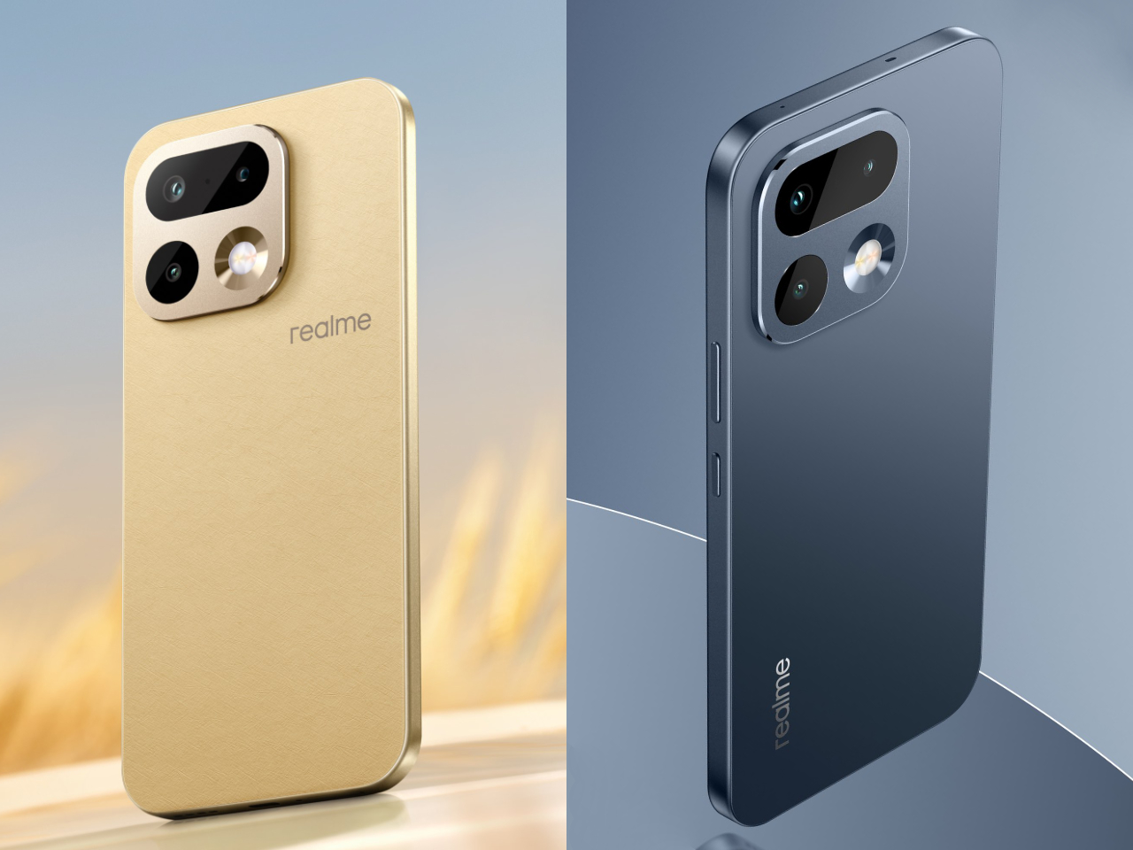

The 16 Pro series launches in Master Gold and Master Gray. Both are positioned as True to Nature colors, but Fukasawa is careful not to treat nature as something that simply appears without human choice. He points out that in both fashion and product design, there are always people and organizations thinking about what colors the world needs next.

Trends do not appear from nowhere. They only succeed if they resonate with a mood that is already forming around the world. Right now, that mood is moving away from aggressive, saturated hues toward quieter tones you might find in a landscape. Beige, for example, might be a slightly yellow beige or a sand beige with a hint of warm brown, and those small shifts are where design happens.

For the 16 Pro, Fukasawa worked with that global sense of “this is the color of now,” but tuned it toward natural calm rather than toward fashion drama. Texture plays an equal role in the experience. A fabric-like grain on the surface can make the same color feel much softer and more approachable, and that combination of controlled hue and subtle texture is what gives Master Gold and Master Gray their understated presence.

A back that feels closer to skin than rubber
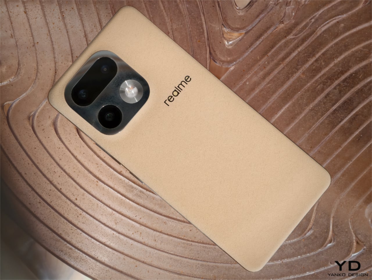

The most radical part of the 16 Pro hardware is the back material, a bio-based organic silicone made from plant-derived straw. It is soft, faintly elastic, and subtly leather-like, and Fukasawa sums it up by saying that it has moved closer to human skin, not just to soft rubber. For him, this is not only about one smartphone, but part of a wider change in how technology touches the body.

He connects it to a broader shift in robotics, where early humanoid robots were metal blocks and newer soft robotics explores flexible, cushiony structures that can interact more gently with people. The 16 Pro is still a highly precise gadget, but introducing a genuinely soft and skin-like element into that precision feels to him like one step up in the evolution of devices. It hints at a future where high technology does not have to feel hard or distant from the body.

On sustainability, he is clear that recyclability alone is not the end goal. “Sustainable means able to be sustained,” he points out, and recycling discarded materials is only an intermediate step in a longer journey. If people feel that a material truly suits them, and it continues to be used across generations of products, then it does not become obsolete or unwanted, and in his words, that is the strongest form of sustainability.

Curves decided by human experience
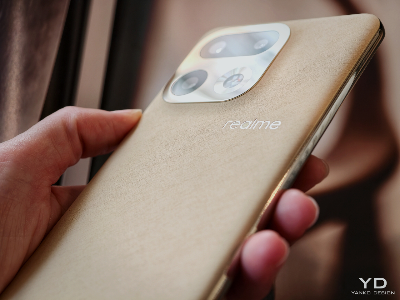

realme describes the overall silhouette as an All Nature Curve Design, with continuous curves linking the back, mid frame, and screen. Within the rigid rectangle of a smartphone, it is not obvious where there is room to change the feeling in the hand, yet for Fukasawa, the answer lies less in formal theory and more in accumulated human experience. Over time, our hands learn what feels right and what feels wrong, and those memories build a shared sense of which shapes are comfortable and which ones look natural.

He gives the simple example of a table edge, and as he talks, he runs his fingers along the corner in front of him, which we expect to be neither too sharp nor too rounded. Sharp corners can look cool but feel harsh, while very rounded edges can look sloppy or tired, and the sweet spot sits somewhere in between. Once the size and thickness of the phone are fixed, the gentle line that naturally fits those dimensions almost decides itself, and he describes the final curves as something that emerged rather than something he forced into place. “I was not trying to think up a shape,” he says. “It formed naturally,” and that naturalness is part of what makes the phone feel calm in the hand.

A phone that belongs in a jewelry boutique
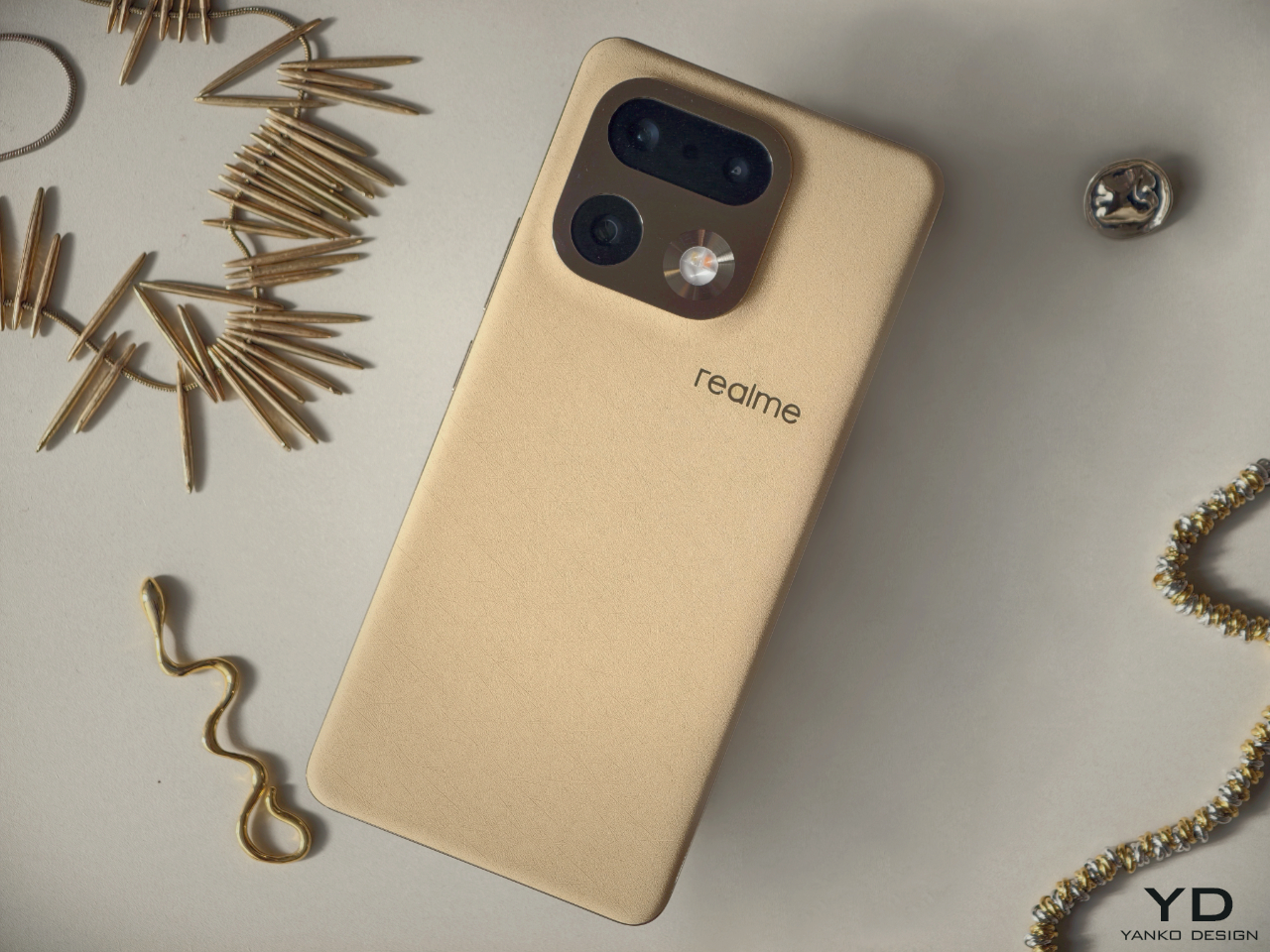
He imagines taking the phone out of the electronics aisle and placing it in a boutique that sells luxury bags and jewelry, and he wanted a smartphone that could sit there without feeling out of place. “If we always stay in the gadget section, we will always be seen as gadgets,” he says, and that is precisely what he wants to move beyond.

With the 16 Pro, he wanted people to feel drawn to it in the same way they are drawn to a beautiful accessory, and not through spectacle or aggressive styling. Instead, he aims for a sense of calm quality and high sensibility that invites people closer and rewards touch. The ideal first reaction is not a shout, but a soft “wow, this feels nice” that might never be spoken aloud.

Poetic observation and advice for young designers
Toward the end of our conversation, we moved from smartphones to design education. Fukasawa believes that design has grown up alongside industry, but that not all of that growth was right. He feels that today, technology has finally caught up enough that designers can aim closer to the essence of human life. What is needed now, he says, is not only observation in the marketing sense, which means staring at the market, but a different kind of observation directed at people and environments.

The problem is that simply telling young designers to observe often leads nowhere, because they open their eyes and still see nothing. To make the idea more concrete, he and a cognitive psychologist friend began using the term poetic observation instead. He likens it to writing a short poem, a haiku, about what you see, and when you look at the world with that mindset, things start to appear more human and more connected, and small scenes begin to feel like stories.
“It is like listening to a song whose lyrics suddenly turn the whole scene into a story and make everyone in it a kind of main character,” he says, and he believes poetic observation can do the same for everyday life. When I suggest that this sounds less like looking with the eyes and more like seeing with the heart, he nods and says, “Yes, exactly. Poetic means bringing in emotion. That is how you should look at the world.”

It is not only for designers, but he adds, because if everyone could see the world that way, the world would become better. Urban Wild is therefore not just a styling exercise for a mid-range smartphone, but one expression of Fukasawa’s larger project to make the tools we live with calmer, more human, and a little more poetic, even in the middle of the city.

The post Naoto Fukasawa on Poetic Observation and Designing the realme 16 Pro Urban Wild first appeared on Yanko Design.
Sundance doc ‘Ghost in the Machine’ draws a damning line between AI and eugenics

The Sundance documentary Ghost in the Machine boldly declares that the pursuit of artificial intelligence, and Silicon Valley itself, is rooted in eugenics. 

Director Valerie Veatch makes the case that the rise of techno-fascism from the likes of Elon Musk and Peter Thiel is a feature, not a bug. That may sound hyperbolic, but Ghost in the Machine, which is built around interviews with philosophers, AI researchers, historians and computer scientists, leaves little room for doubt.

If you've been following the meteoric rise of AI, or Silicon Valley in general, Veatch's methodical deconstruction of the technology doesn't really unearth anything new. The film begins with the utter failure of Microsoft's Tay chatbot, which wasted no time in becoming a Hitler-loving white supremacist. It retreads the environmental impacts of AI datacenters, as well as the ways tech companies have relied on low-wage workers from Africa and elsewhere to improve their algorithms. 

But even I was surprised to learn that we can trace the impact of eugenics in tech all the way back to Karl Pearson, the mathematician who pioneered the field of statistics, and who also spent his life trying to quantify the differences between races. (Guess who he believed was superior.) His legacy was continued by William Shockley, a co-creator of the transistor, an avowed white supremacist who spent his later years espousing (now debunked) theories around IQ and racial differences.

An early robot toy.
An early robot toy.
Valerie Veatch for "Ghost in the Machine"

As a Stanford engineering professor, Shockley fostered a culture of prioritizing white men over women and minorities, which ultimately shaped the way Silicon Valley looks today. His line of thinking could have had an influence on John McCarthy, the Stanford researcher who coined the term “artificial intelligence” in 1955,  

With roots like that, Elon Musk — known to spout bigotry online,  foster a reportedly racist work environment at Tesla and  throw the occasionaly few Nazi salute — looks less like an anomaly than part of a pattern. Ghost in the Machine asks a simple question: How can we trust men like this (and it's almost always men that look like Musk) with our future?

Through its many interviews, which include the likes of AI researcher Dr. Emily Bender, historian Becca Lewis and media theorist Douglass Rushkoff, Ghost in the Machine paints the rise of AI as a fascistic project that aims to demean humans and establish the techno-elite as our de facto rulers. Given how much our lives are already dominated by gadgets and social networks from companies that have pioneered addictive engagement over user safety, it's easy to imagine history repeating itself with AI. 

Ghost in the Machine doesn't leave any room for considering potential benefits around AI, which could lead proponents of the technology to dismiss it as a hit-job. But we're currently at the apex of the AI hype cycle, after Big Tech has invested hundreds of billions of dollars on this technology, and after it has spent years shoving it down our throats without proving why it’s actually useful to many people. AI should be able to withstand a bit of criticism.

Ghost in the Machine is available to view at the Sundance Film Festival’s website and streaming apps from today through the end of Sunday, February 1st.  


This article originally appeared on Engadget at https://www.engadget.com/entertainment/tv-movies/sundance-doc-ghost-in-the-machine-draws-a-damning-line-between-ai-and-eugenics-180613367.html?src=rss

Sonos soundbars and home theater gear are up to 20 percent off right now

It's big-game season, which means it's a good time to look for home theater gear on sale ahead of Super Bowl 2026. There are plenty of Super Bowl TV deals to consider, but if you have arguably the most important piece of the puzzle down, you may want to upgrade your sound system instead. Sonos' latest sale may have just what you need; a bunch of the company's home theater gear is up to 20 percent off right now. You can save $130 on the Beam (Gen 2) soundbar, bringing its price down to $369, and you'll also find deals on the flagship Arc Ultra soundbar, subwoofers, and more.

The Sonos Beam is the company's sub-$500 soundbar. Engadget's pick for the best midrange model, the compact speaker has impressive sound for its size. Part of that is its Dolby Atmos support. Although the soundbar lacks upward-firing speakers, it uses software tricks to compensate. Audio timing and frequency adjustments make sound seem to come from the side or slightly above.

One of the biggest drawbacks is that the Beam only has one HDMI port. Regardless, that compromise may be easier to accept at Beam's current $369 than at its usual $499.

Several more home theater speakers are included in Sonos's sale. If you have a loftier budget for a soundbar, there's the Arc Ultra. Typically $1,099, it's now $899. The company's pair of subwoofers is included as well. You can get the Sub Mini for $399 (down from $499) or the Sub 4 for $759 (from $899).

Although they aren't explicitly sold as home theater products, the Era 100 ($179) and Era 300 ($379) are also included in the sale. The portable Move 2 isn't discounted individually, but you will find it in a couple of bundles. You can check out the sale page for the complete list.

Follow @EngadgetDeals on X for the latest tech deals and buying advice.

This article originally appeared on Engadget at https://www.engadget.com/deals/sonos-soundbars-and-home-theater-gear-is-up-to-20-percent-off-right-now-174053415.html?src=rss