Clear-Shell Game Boys Never Made the Screen Transparent, Arduview Did

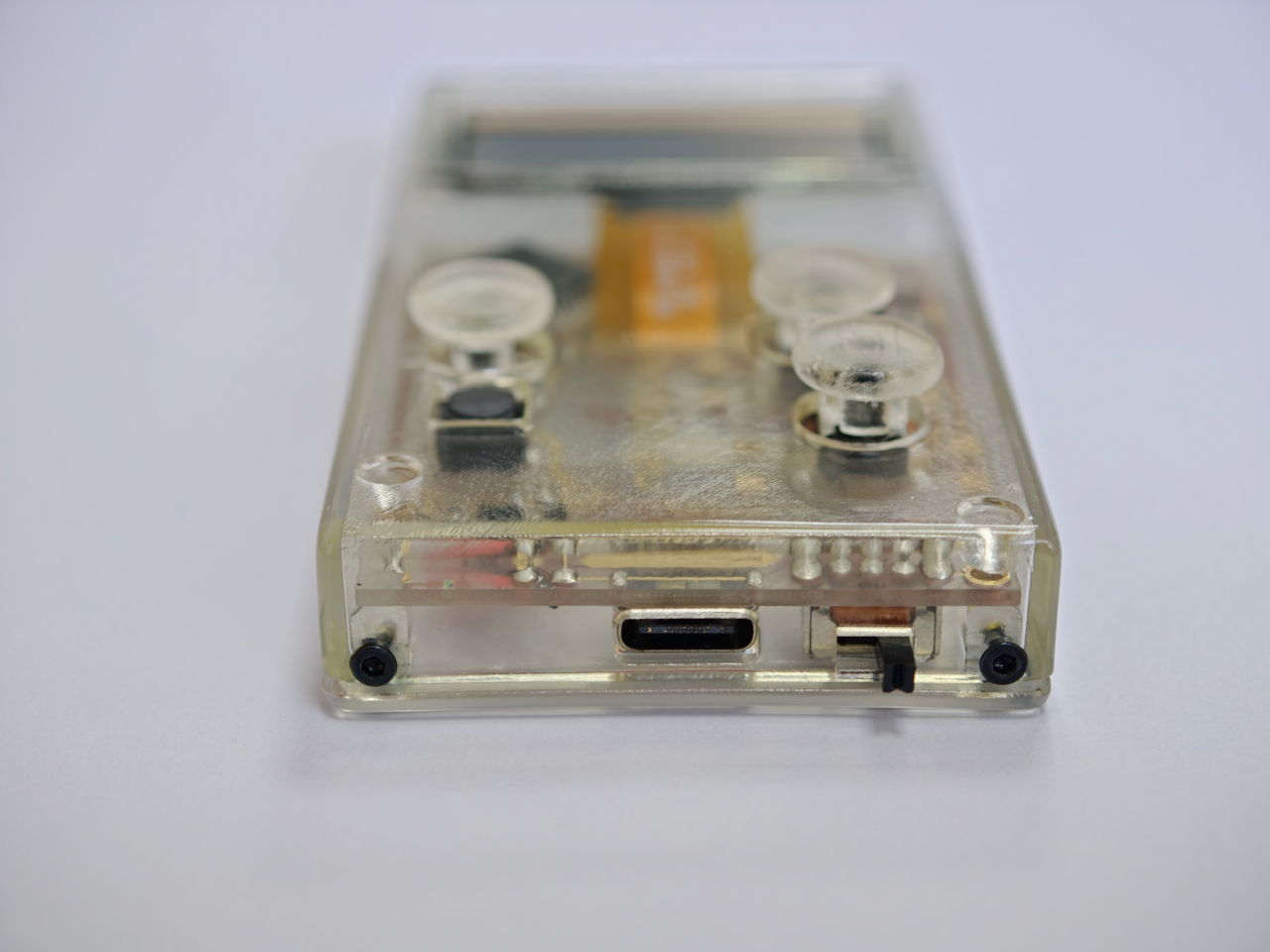
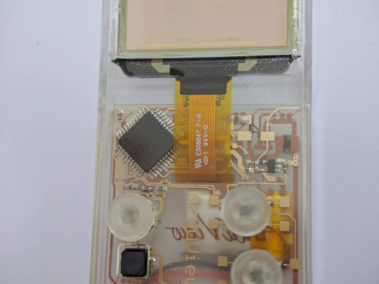
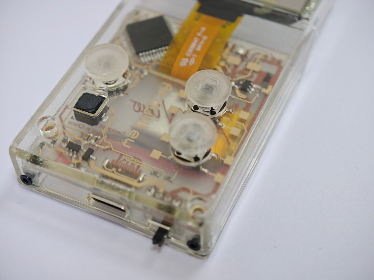
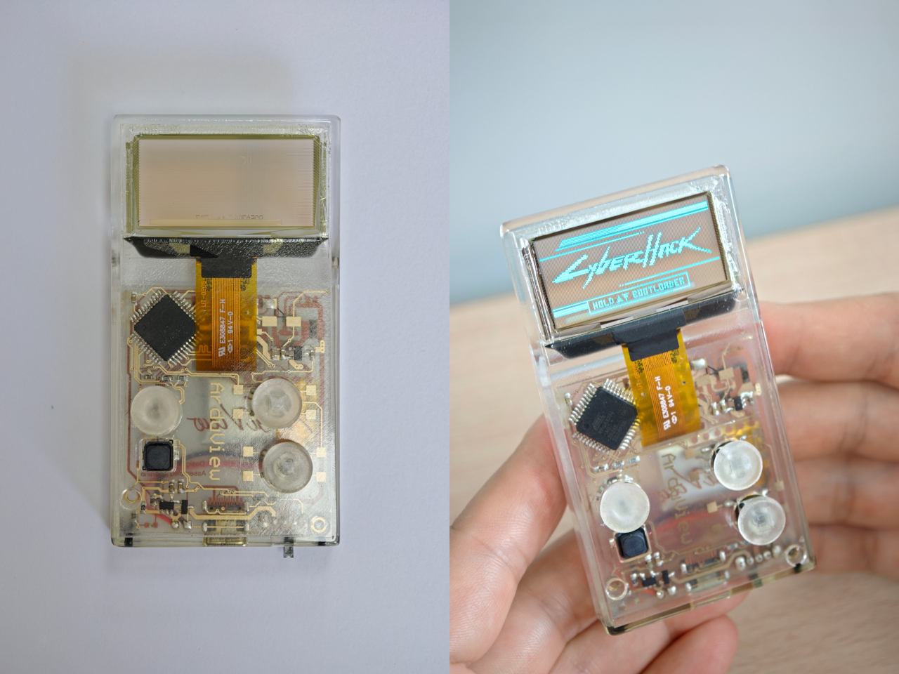
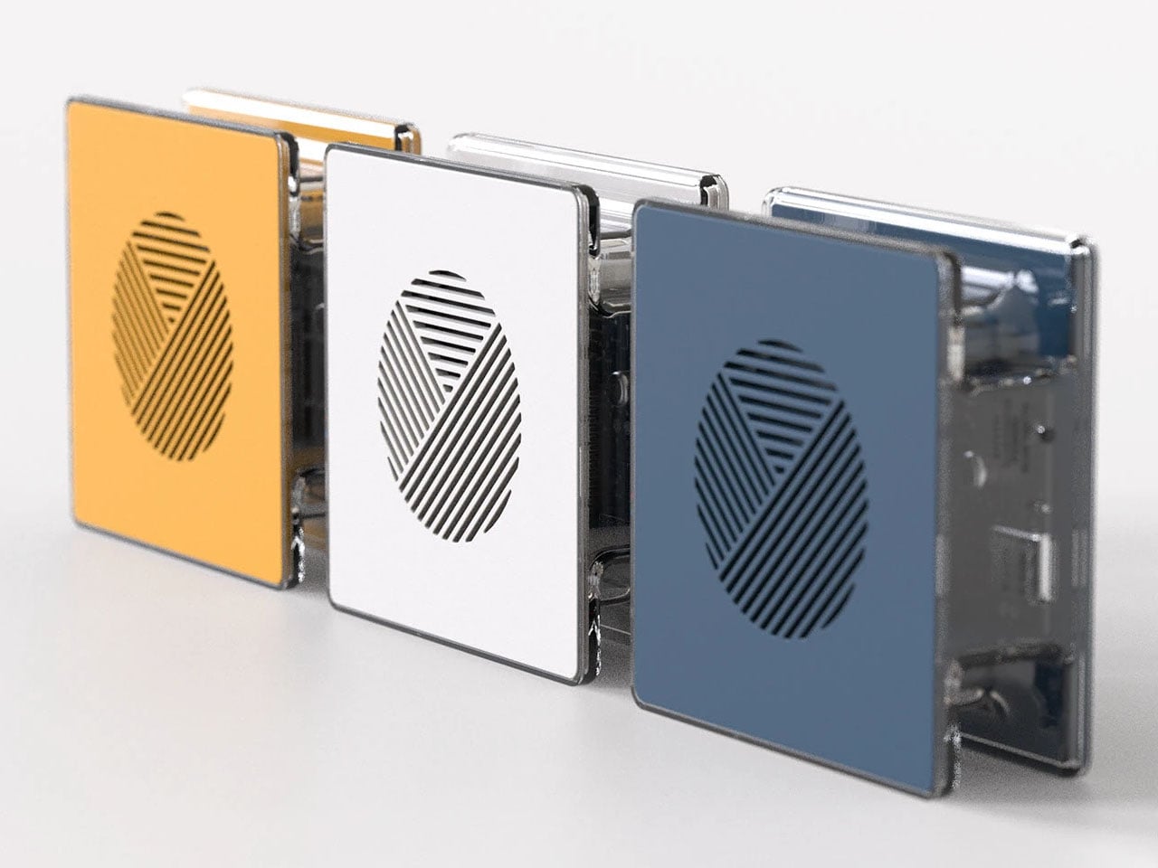
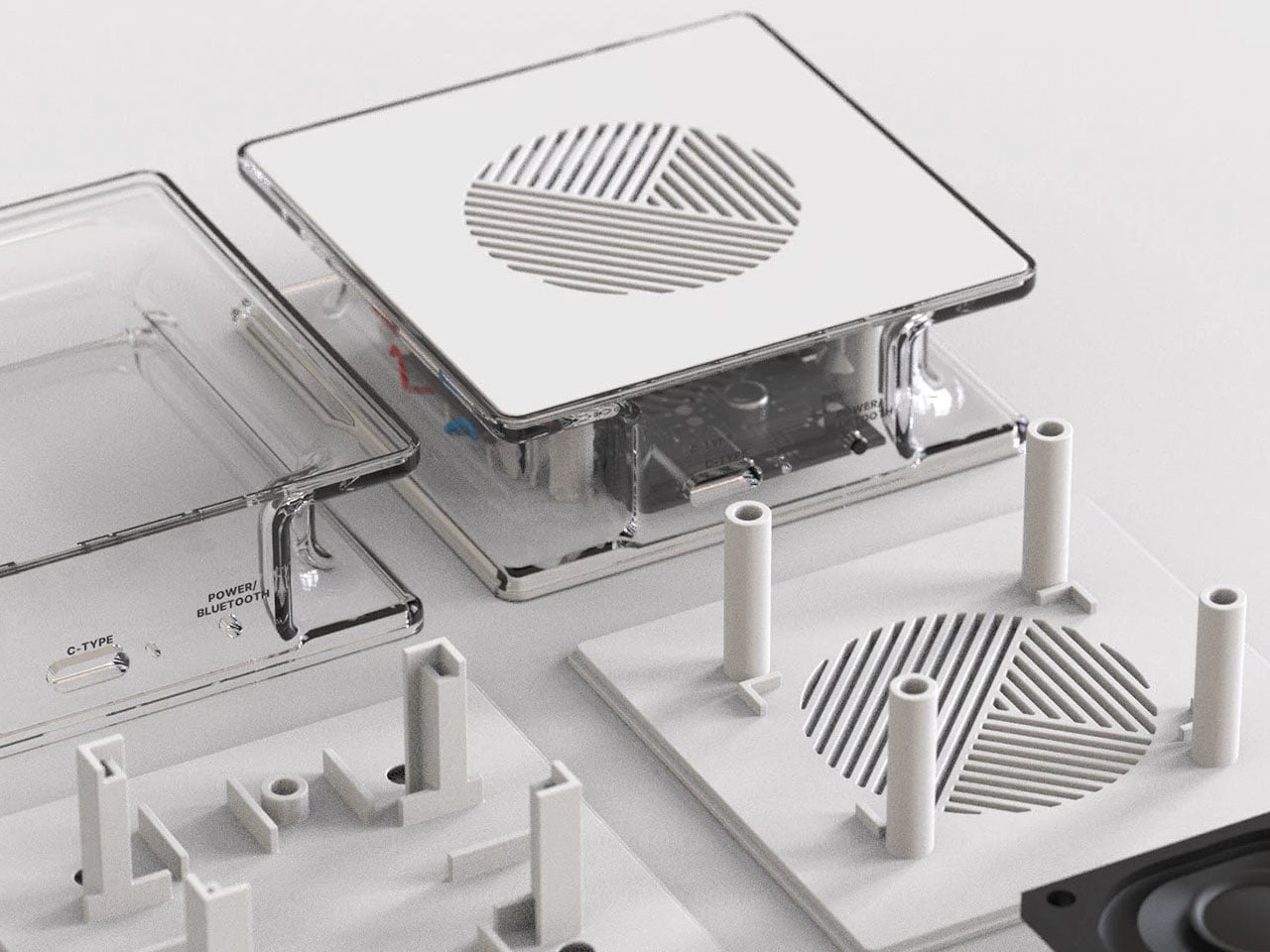
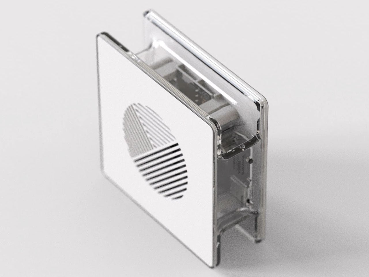
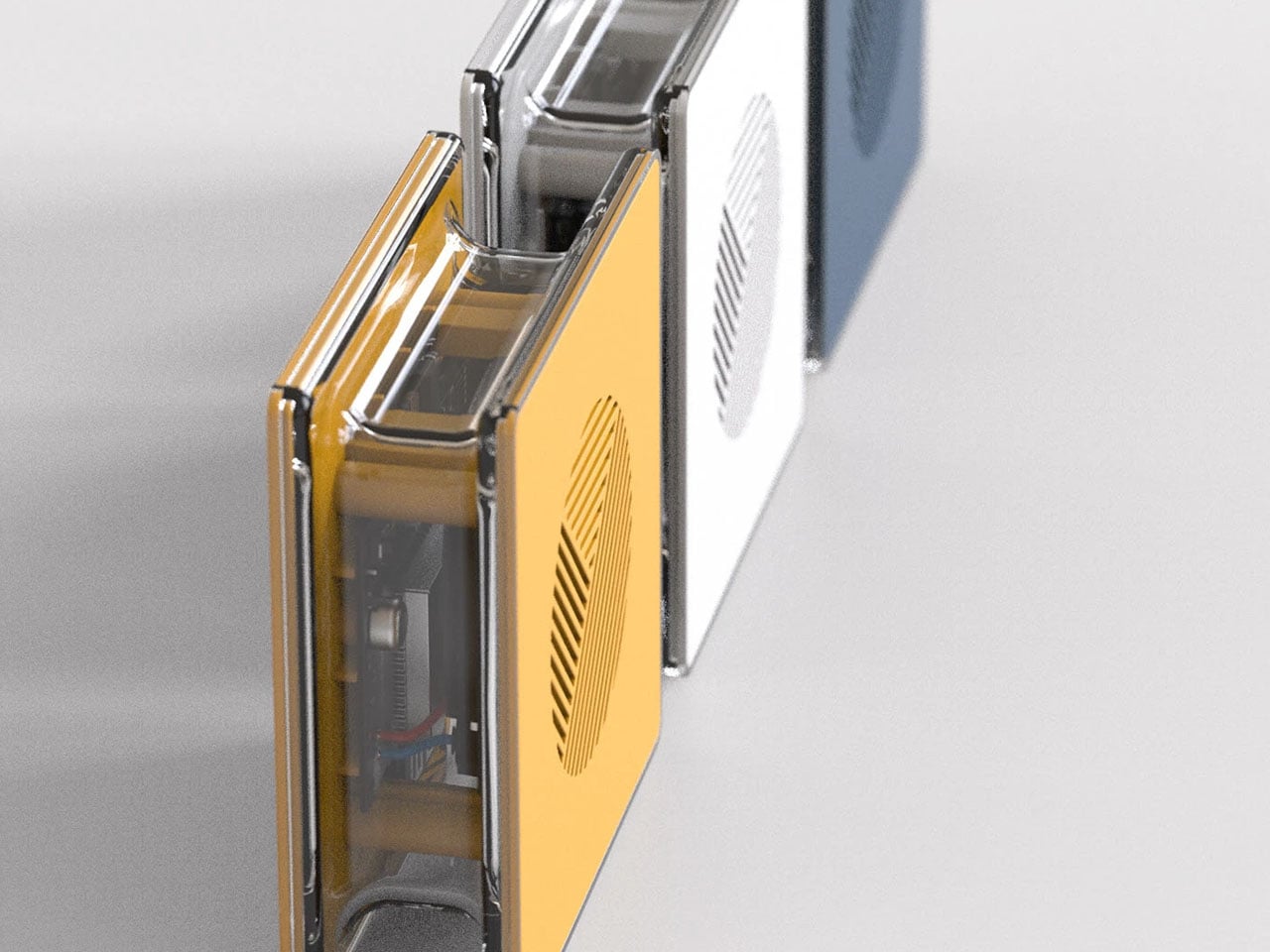
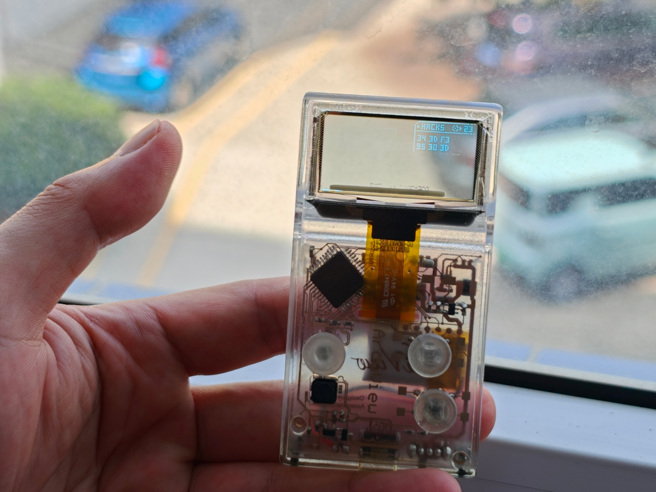
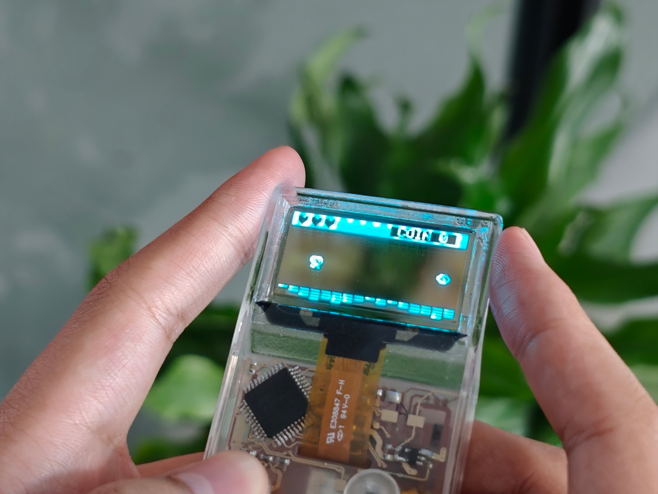
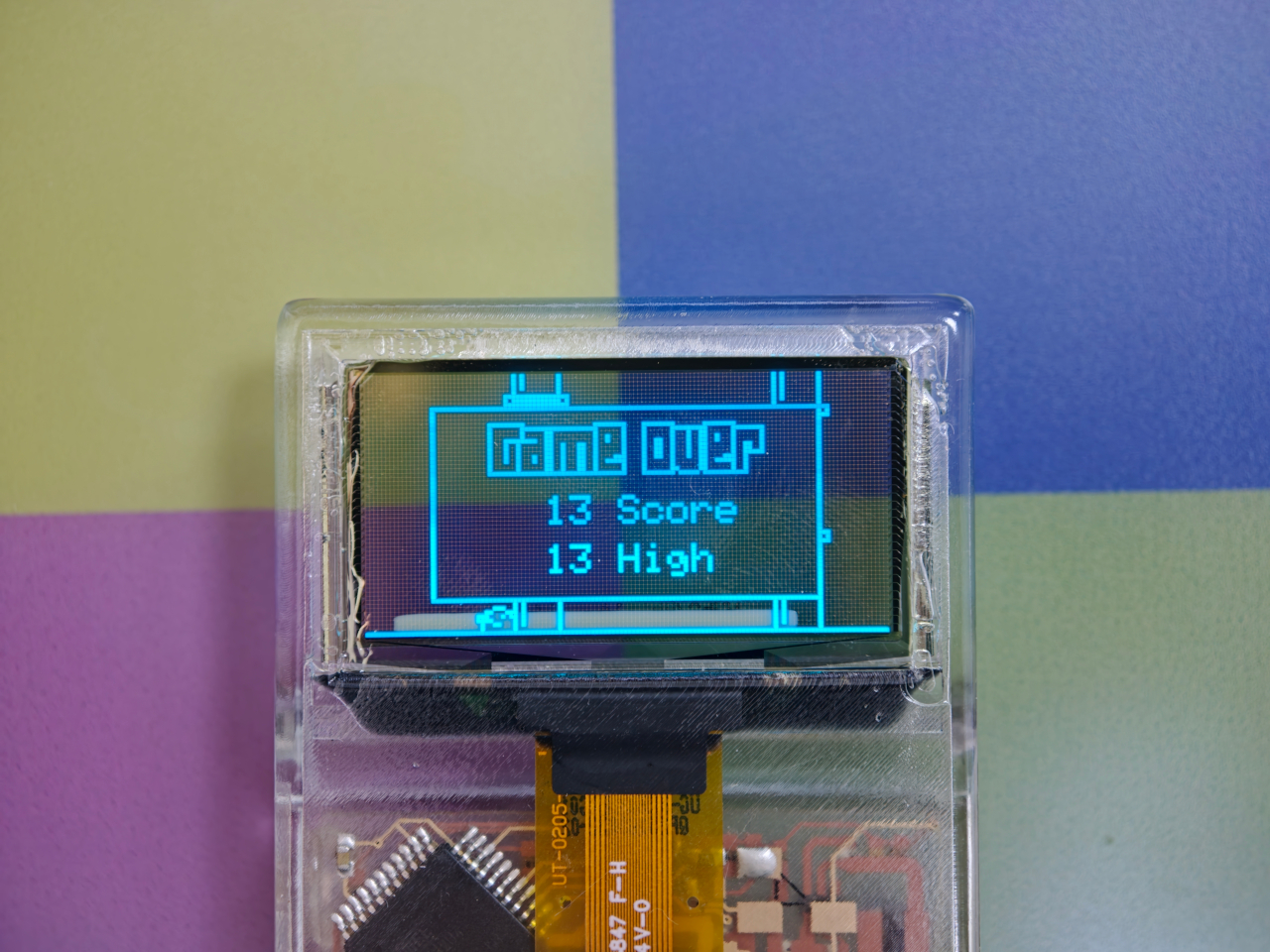
Every gadget on a desk is built to hide what makes it work. Phones, consoles, controllers, they’re all sealed slabs designed to keep the copper and silicon out of sight. Arduview refuses that logic entirely. Its shell is clear, its circuit board is clear, and its OLED display lets you watch pixels light up while seeing straight through to the components producing them.

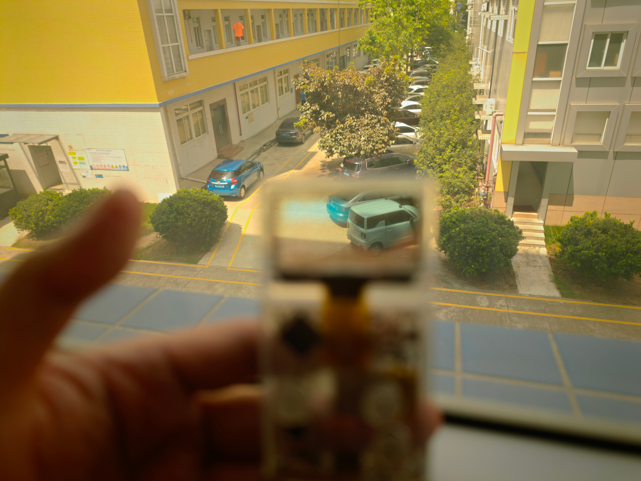
Retro handhelds have flirted with transparency before. Clear-shell Game Boys and modded Miyoo units let you glimpse a shadow of the board through tinted plastic, but the display itself stayed opaque, a black rectangle sitting in an otherwise see-through frame. Arduview closes that gap by making the screen itself transparent, so nothing on the device breaks the illusion of looking clean through it.

Designer: Louis Huang

Peer through the front and the internals aren’t just visible; they’re the entire visual identity. The board, the chip, an orange copper flex cable, the button domes, and the USB-C port all sit in plain view, arranged the way a watchmaker might arrange gears behind sapphire crystal. Nothing here was designed to be hidden later. It was designed to be looked at from day one.

That philosophy extends to how the thing works, not just how it looks. Built on Arduboy, an open-source handheld platform, Arduview skips the layers that usually complicate small electronics. There’s no app store hunting, no Wi-Fi pairing, no account setup standing between you and 400 preloaded games. Power it on and it plays, the same instant gratification that made simple handhelds addictive in the first place.

At 50 grams and roughly the footprint of a credit card, the size does real work here. A device this small and this light stops being a dedicated gaming session and starts being something you carry the way you’d carry a keychain or a pocketknife, small enough to disappear until the moment you want it. Pull it out on a train platform or set it on a desk between meetings, and it reads less like a toy and more like a curiosity someone can’t resist picking up.

That reaction seems to be the entire point. A transparent gadget invites touching in a way an opaque one never does, because there’s an implicit dare in showing your internals: come look closer. Arduview leans into that dare completely, treating the space usually reserved for a case as prime real estate for the very thing most companies spend their design budgets concealing.

Retro gaming has always had a strong current of nostalgia running through it: chunky buttons, pixel art, low-resolution charm. Arduview borrows all of that while adding something genuinely new to the mix: a device that looks like it belongs in a display case at a design museum as much as it belongs in a pocket.

The post Clear-Shell Game Boys Never Made the Screen Transparent, Arduview Did first appeared on Yanko Design.

This Clear Acrylic CD Player Turns Your Music Collection Into Kinetic Art

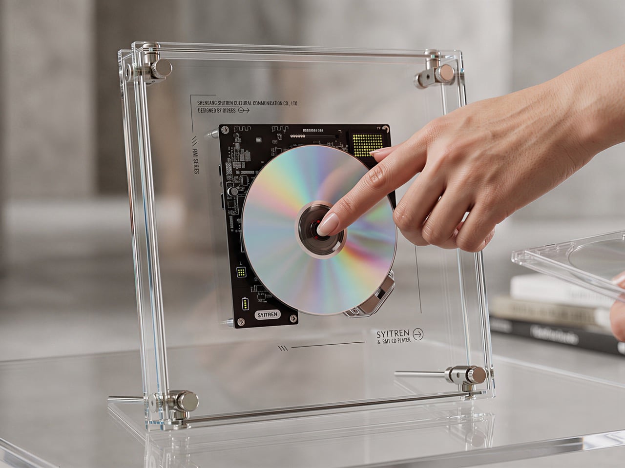
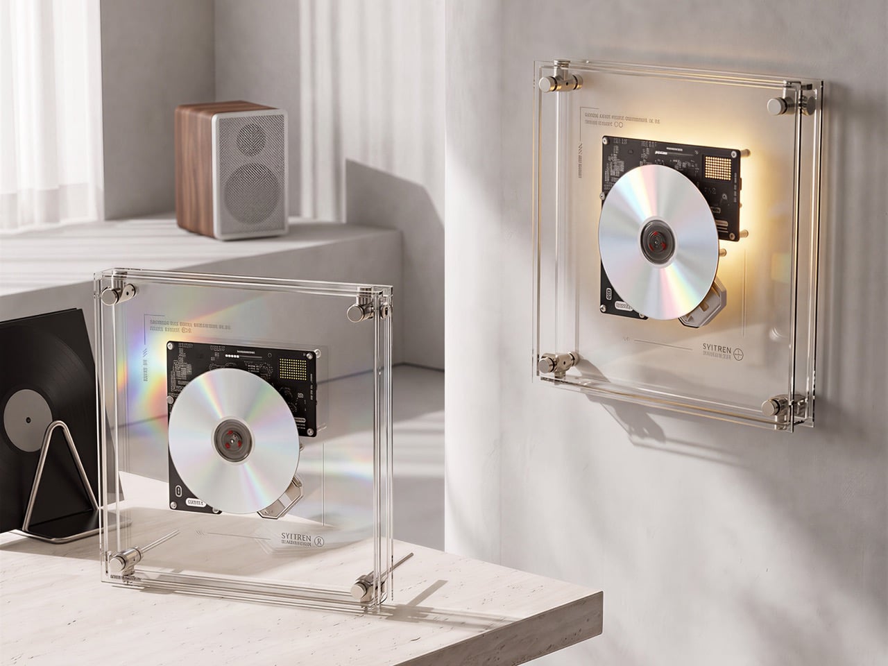
The iMac G3’s translucent Bondi Blue shell sold 800,000 units in its first five months, which was Apple’s way of proving that exposing a computer’s internal geometry could be its single most compelling feature. Nothing put a transparent back on a phone in 2022 and made every other Android’s solid slab look like it had something to hide. Skeleton mechanical watches have been charging a premium for visible gear trains for centuries. Teenage Engineering turned exposed PCBs into a full aesthetic identity. The pattern is clear enough: when mechanisms are beautiful, hiding them is just a waste. CD sales have been quietly growing for four years now, physical music is back in force, and the SYITREN RM1 arrives to give CD players the transparent treatment they probably always deserved.

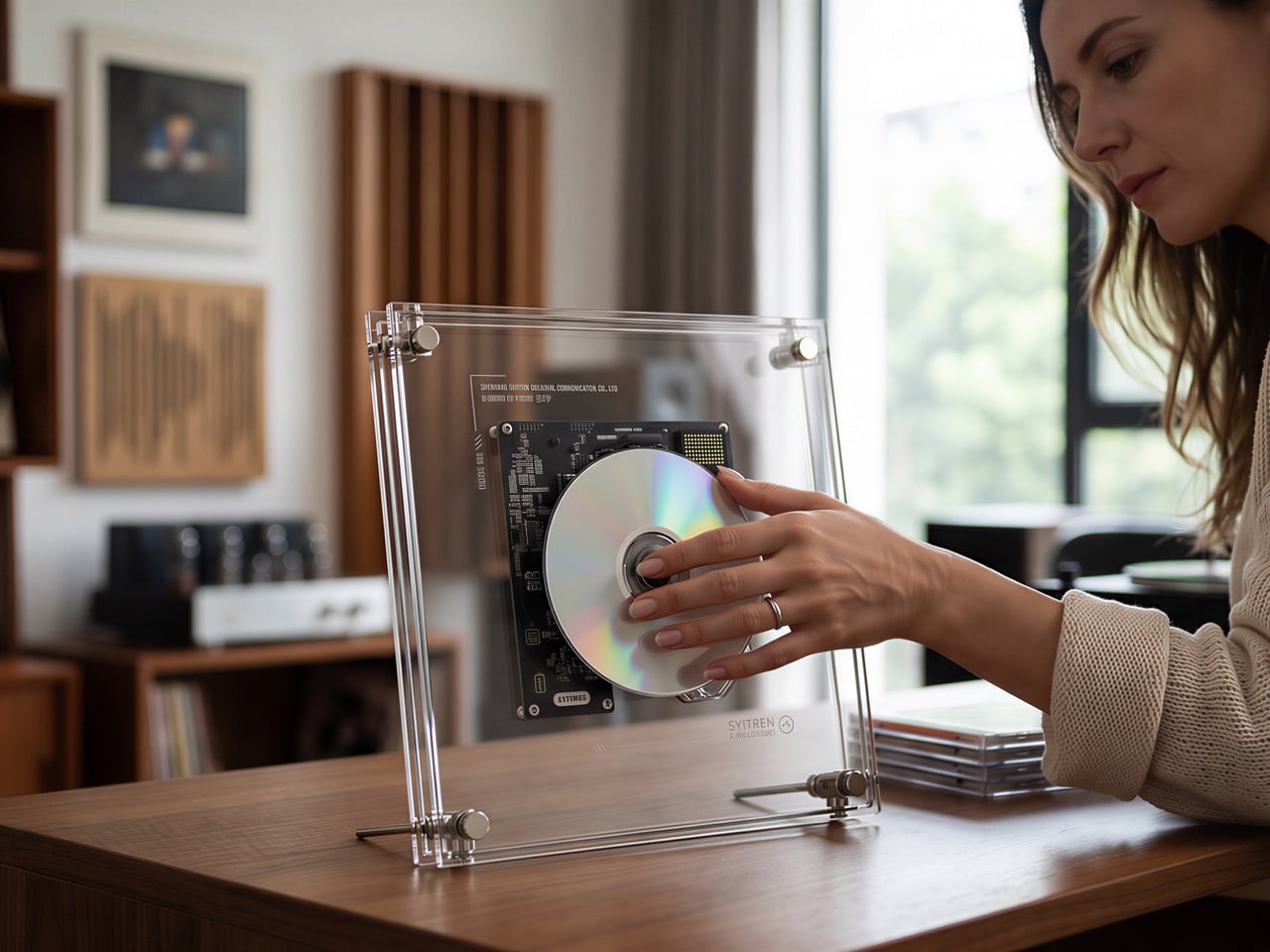
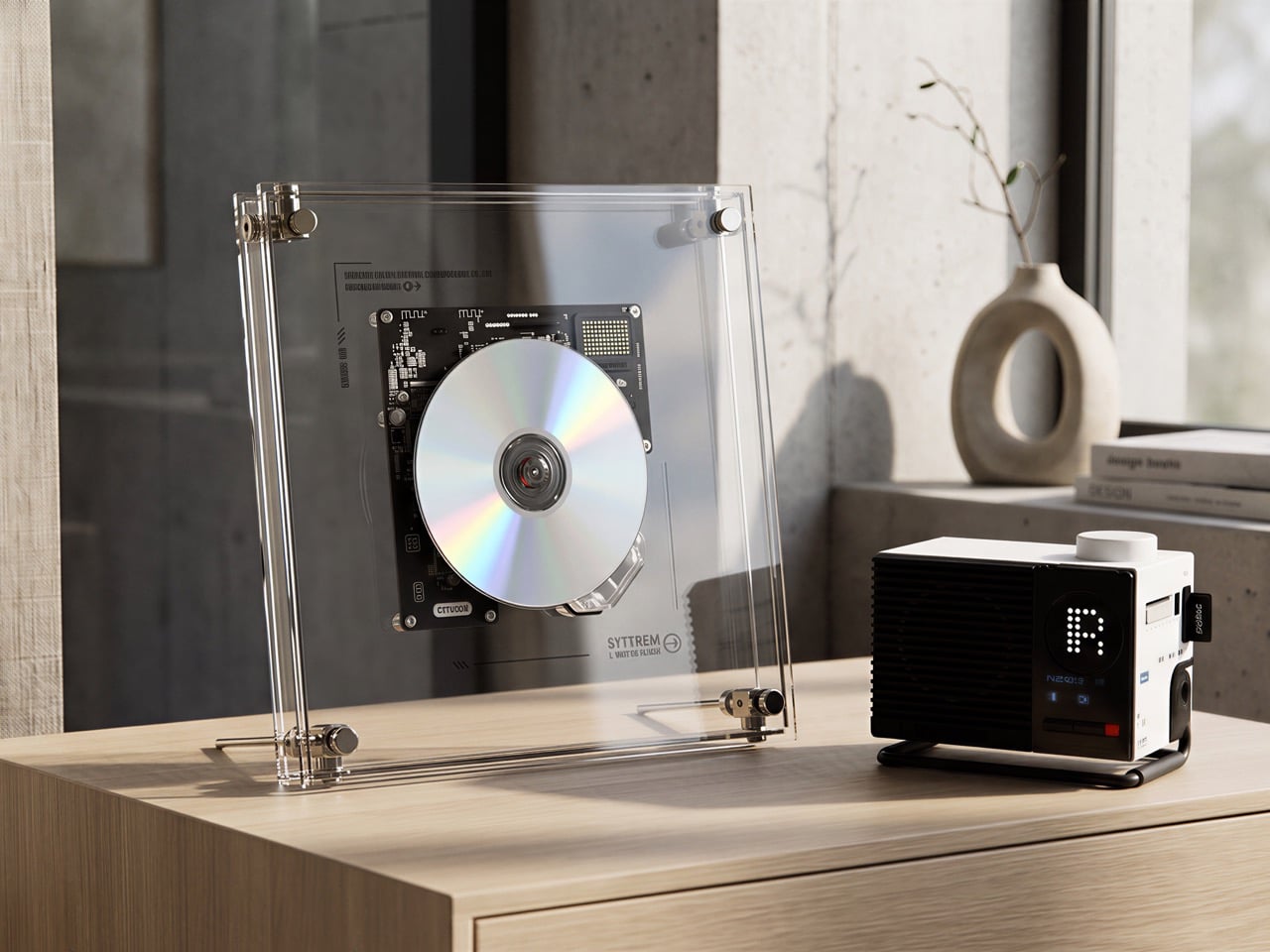
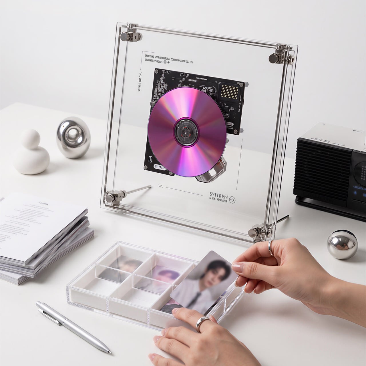
The RM1 houses its full CD mechanism inside a dual-layer ultra-clear acrylic frame, with precision metal corner pillars and the disc, optical pickup, and PCB all visible from the front. SYITREN, founded in 2017 and recognized by the MUSE, London, French, IDA, and A’ Design Awards, designed it with the CD’s own iridescence as a feature rather than a side effect. You press a disc onto the transport and suddenly there’s a spinning, light-catching object on your desk or wall that is also playing music. Audio routes out via Bluetooth 5.3 or 3.5mm AUX, with SYITREN leaving the speaker out entirely and trusting you to own one already. It measures 260 x 260 x 42mm, weighs 0.9kg, and starts at $89.

Designer: SYITREN

Click Here to Buy Now: $99 $179 (45% off) Hurry, 62 of 1200 units left!
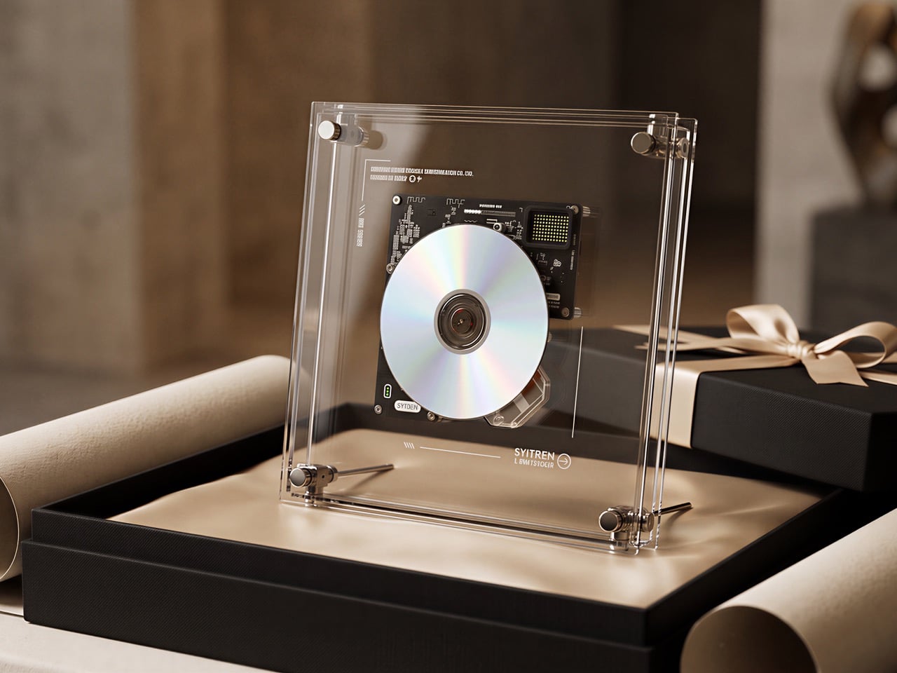
Dual-layer acrylic panels sandwich the CD mechanism between them, and the precision metal corner pillars at each corner read as structural jewelry rather than hardware fasteners. As the disc spins, its iridescent surface catches ambient light through the panels and scatters it differently depending on the label design, the printing, and the reflective surface underneath. Some discs glow gold under warm room lighting, others catch cool blue from overhead. A disc with a dense printed label plays completely differently as a visual object than a silver-surface one, which means every album in your collection has a slightly different personality in this frame.

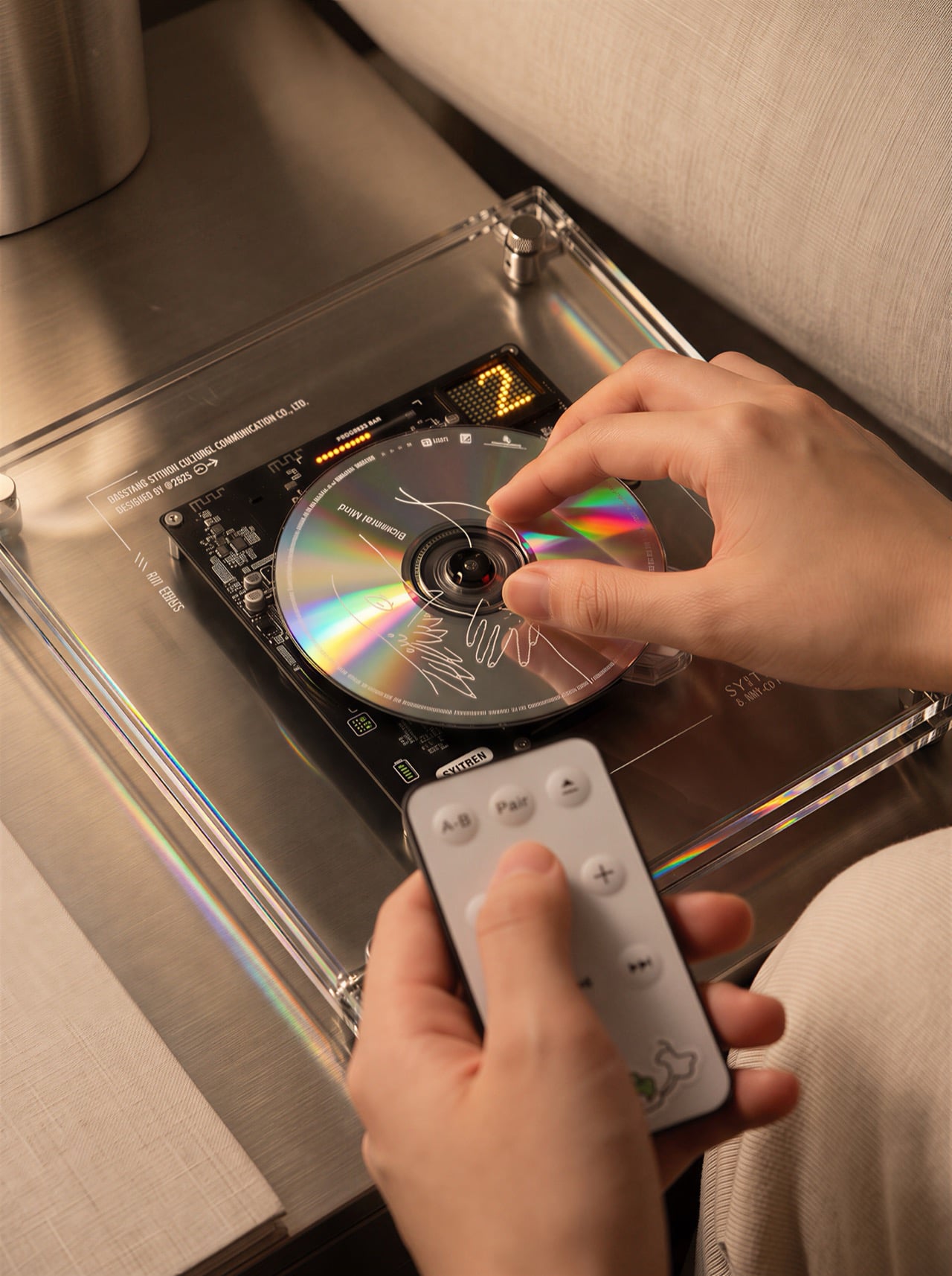
A warm-yellow 2×8 LED matrix, visible through the acrylic from the front, shows track number, animated visuals, and volume level alongside a linear progress bar. The amber glow against the spinning disc creates what SYITREN calls a “visual rhythm,” and it’s a phrase that actually earns its keep here. Warm lighting and a slowly rotating disc at the center of a room does something to the quality of an evening that a Spotify queue on a phone simply cannot. It’s a mood object as much as an audio component. The choice of warm yellow over a cooler white or blue LED tone is clearly deliberate, positioning the RM1 alongside lamps and wood furniture rather than making it look like something pulled from a server rack.

SYITREN’s decision to ship the RM1 without a built-in speaker is both a nod to the Discman-meets-headphones culture, but also just fair common-sense engineering. Squeezing a driver into a 42mm-thick transparent frame would have produced tinny, directionally compromised sound that undermined everything else about the product. Instead, the RM1 connects to your existing speakers or headphones via Bluetooth 5.3 at a 10-meter range with a 95 dB SNR, or through a 3.5mm AUX jack for wired setups. For anyone who already owns a decent Bluetooth speaker or a bookshelf stereo, this approach makes the RM1 a source component and a visual object, which is exactly what it should be. It’s the same logic that drives high-end audio separates: source, amplification, and output each handled by the component built specifically for that job.

A built-in 16-bit DAC and 24-bit DSP sit at the core of the RM1’s signal chain, sampling at 8-48 kHz with a CD audio SNR of ≥85 dB and total harmonic distortion plus noise below 0.1 percent. Dynamic range lands at ≥70 dB, which is a respectable figure for a consumer portable at this price. Supported formats include standard audio CDs, MP3 discs, and WMA discs, which covers everything from your 2004 burned collection to freshly pressed albums. Playback modes offer repeat one, sequential play, and shuffle, with a remote control included in the box. The battery is an 18650 cell rated at 2000mAh, charging via USB-C in one to two hours and delivering six to eight hours of continuous playback.

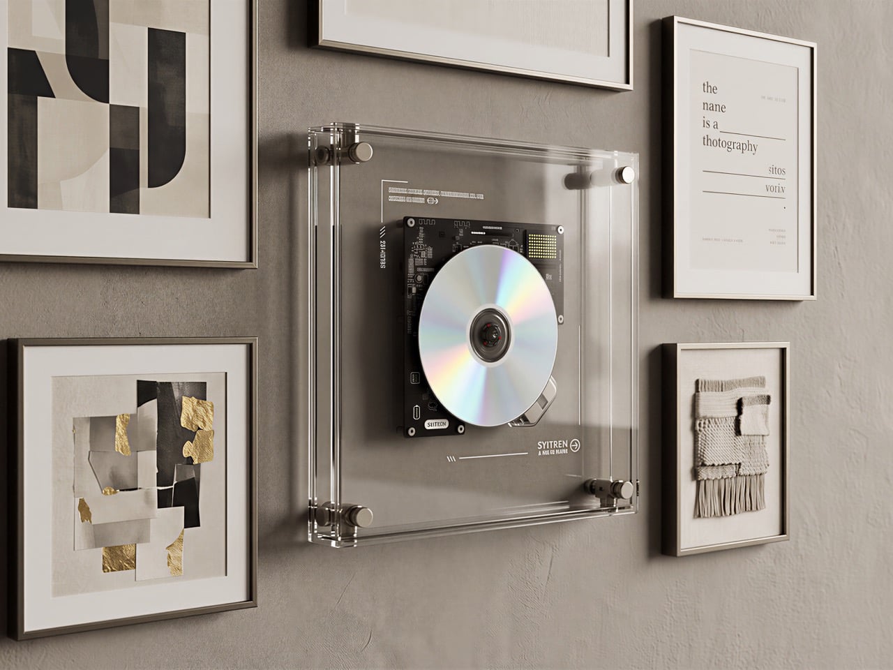
Wall-mounting a CD player requires solving a problem that horizontal-tray consumer units have never had to worry about. CD optical pickups are designed to track a horizontally spinning disc, and tilting the whole assembly vertically introduces vibration and skip risks that would make most standard mechanisms unreliable on a wall. SYITREN addressed this with a 40-second anti-shock buffer for standard audio CDs and a 120-second buffer for MP3 discs, pre-reading and caching audio data so that ambient vibration or minor disturbances can’t interrupt playback. The optical pickup itself was also specifically engineered for vertical operation. Most people who buy the RM1 will probably never think about any of this, which is precisely where engineering and design blur together in the best way.

The RM1 ships with both a wall-mount system and a detachable desk stand, making the placement decision entirely yours and entirely reversible. Hung against a wall between picture frames, it reads as a kinetic art piece during playback and a minimal geometric object when the disc isn’t loaded. On a desk or shelf, the angled stand positions the disc facing you directly, turning the player into the kind of object your eye keeps returning to from across the room. SYITREN’s own imagery places it in apartments, studios, cafes, and living rooms, and the transparent form factor genuinely holds up across all of those contexts. At 0.9kg and 42mm deep, it’s also considerably lighter and thinner than photographs tend to suggest.

The RM1 starts at $99 and is available through SYITREN’s campaign, with the N200 Bluetooth speaker bundled together for a price of $139. The 18650 cell charges via USB-C in one to two hours and delivers up to eight hours of continuous playback, so the unit is genuinely portable if you want to move it between rooms. SYITREN doesn’t publish a formal warranty term in its current materials, so confirm those details directly before purchasing. The company has been manufacturing and shipping audio hardware since 2017, with distribution across more than 15 US retail cities and five global markets. At $99, the RM1 is the most considered CD player I’ve seen that treats the format as something worth displaying, and for anyone sitting on a collection of discs that hasn’t been played in years, that’s a genuinely compelling reason to dust them off.

Click Here to Buy Now: $99 $179 (45% off) Hurry, 62 of 1200 units left!

The post This Clear Acrylic CD Player Turns Your Music Collection Into Kinetic Art first appeared on Yanko Design.
A $2,699 Gaming PC That Doubles as a Display Case for Figurines

Cables are the dirty secret of PC building. No matter how carefully chosen the components are, or how expensive the case gets, the tangle of power, data, and fan connectors that crisscross the interior of most gaming desktops eventually undermines every effort at a clean aesthetic. The glass side panel that was supposed to show off the build ends up framing a web of wires that even the most diligent cable manager struggles to fully tame.

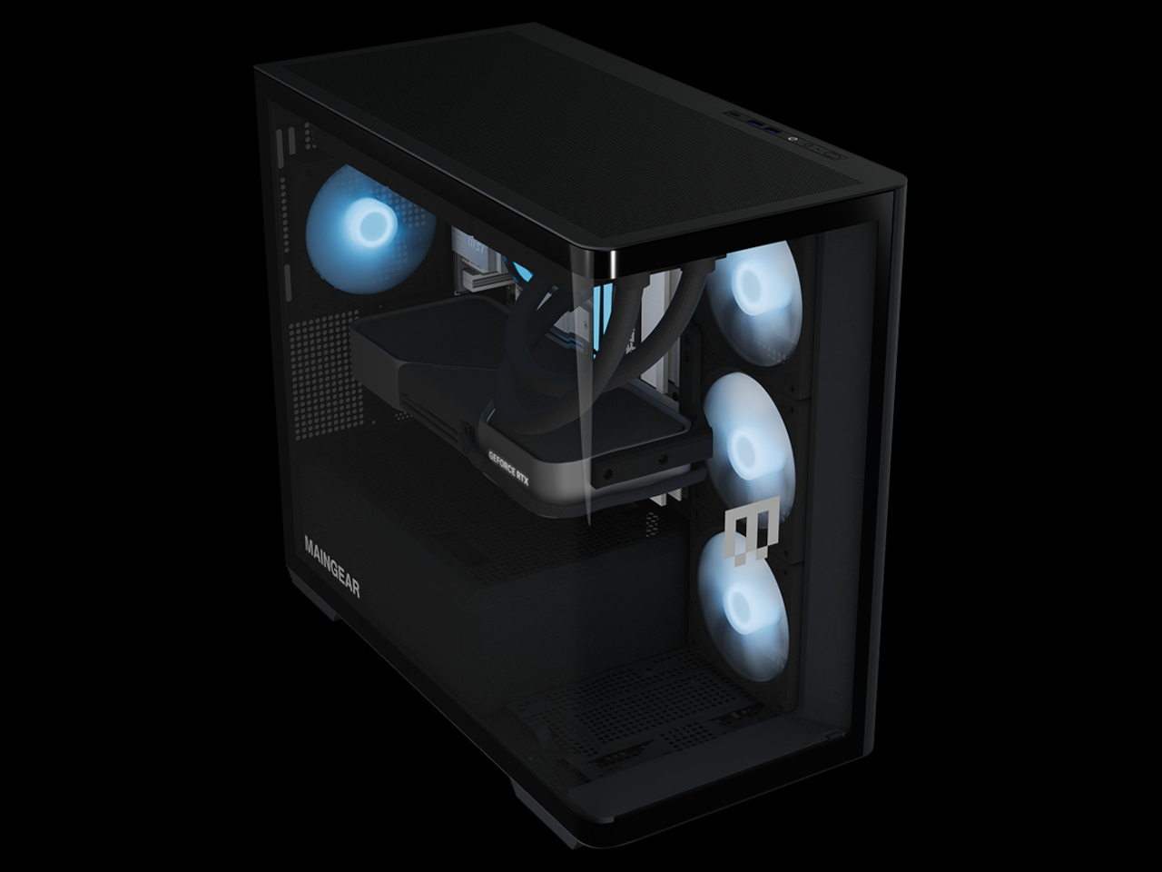
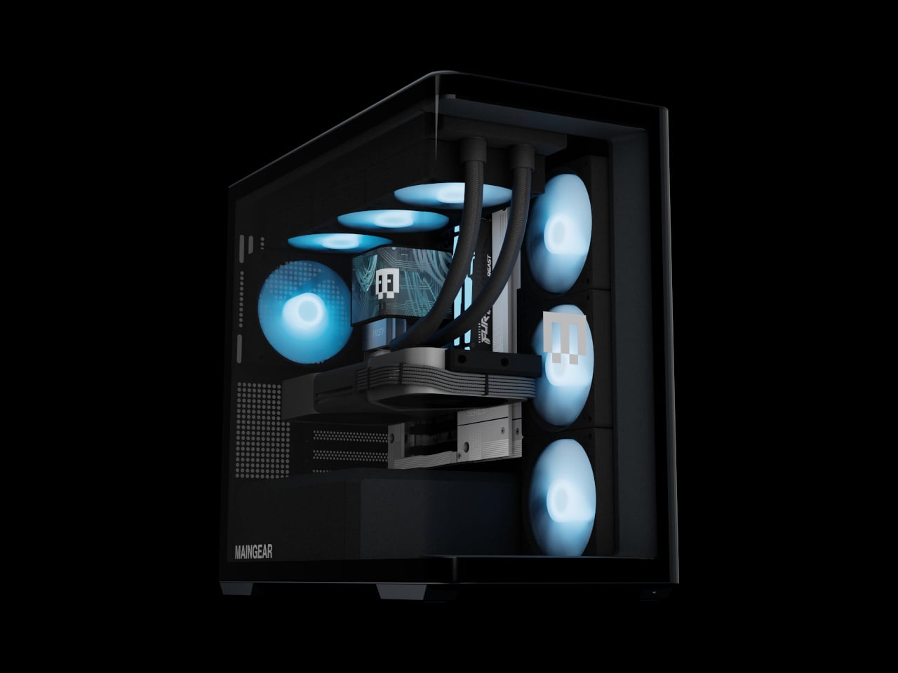
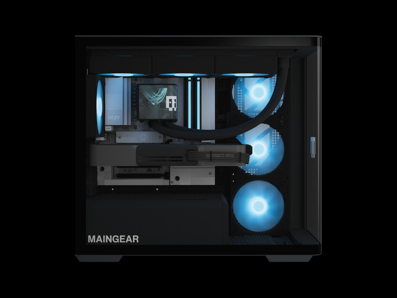
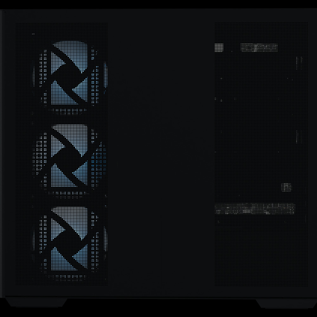
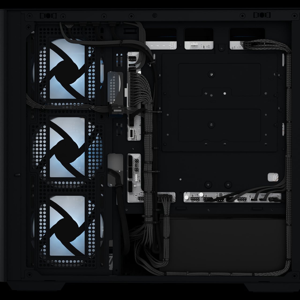
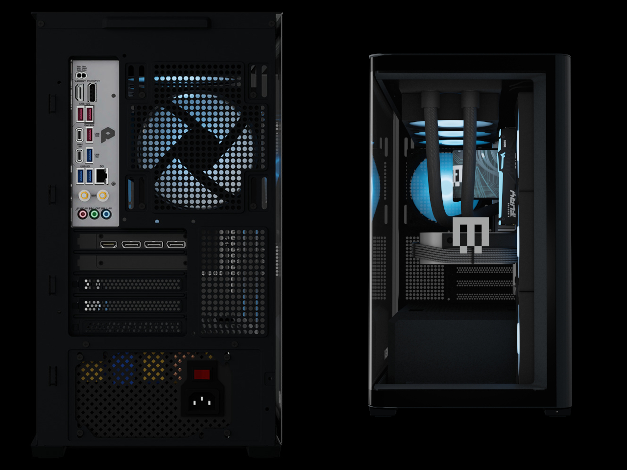
The Maingear Zero treats that problem as the actual design brief. Its patented MG-RC, or Rear Connection, system moves every motherboard connector to the back and underside of the board, clearing the visible interior of cables entirely. Paired with a single, seamless 4 mm tempered glass curve that wraps the front and side of the chassis without a single seam or pillar, the result is a desktop that looks like it has nothing to hide, because it genuinely doesn’t.

Designer: Maingear

Seven fans work to keep the hardware running at full performance without drawing much attention to themselves. A mix of standard and reverse-blade units pushes cool air in through the front and exhausts it out through a 360mm AIO liquid cooler at the top, all following a single front-to-back airflow path. The reverse-blade intakes are specifically designed so the fan blades themselves don’t interrupt the view through the glass, which is a level of detail that most cases simply don’t think to address.

All RGB lighting inside the Zero is diffused rather than sourced from visible diodes, meaning the light saturates the interior without any glowing point of origin to break the illusion. The whole package measures 236mm wide, 421mm tall, and 460mm deep, which is more compact than a traditional mid-tower while still accommodating a full-sized GPU and the 360mm cooler overhead. It doesn’t look like a PC that compromised on size to achieve the aesthetic.

The hardware ceiling is genuinely high. Configurations top out at an NVIDIA GeForce RTX 5090 paired with an AMD Ryzen 7 9850X3D or Intel Core Ultra 7 270K Plus, 32GB of DDR5 memory, and a 2TB NVMe SSD. The chassis uses standardized mATX components throughout, with no proprietary parts, so future upgrades don’t require a trip back to the manufacturer.

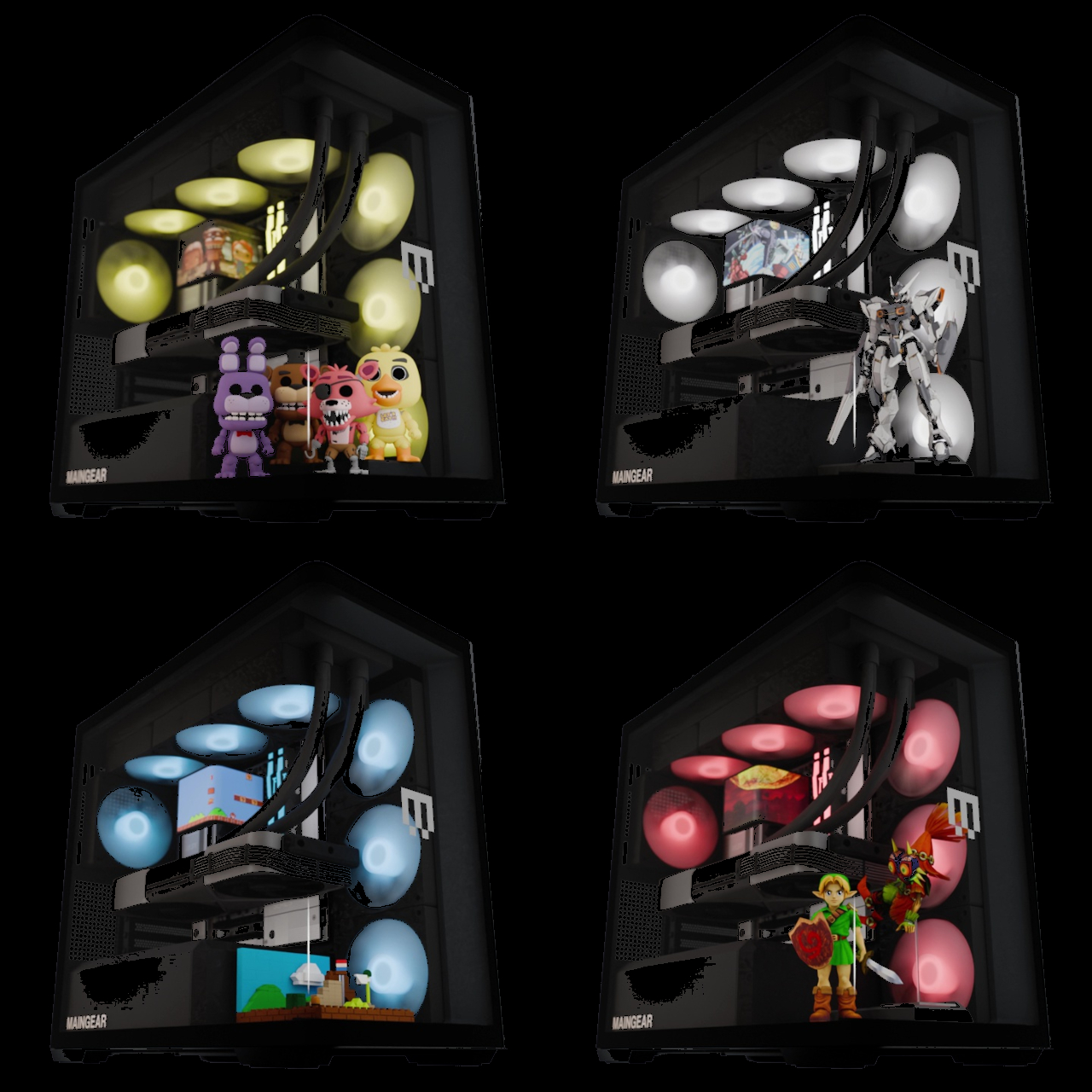
Beyond the hardware, the Launch Edition adds a pair of tool-free snap-in display stands inside the chassis, one for figurines and one for brick builds. The stands sit inside the case floor where passive airflow keeps whatever’s displayed inside dust-free. It’s the kind of feature that turns the interior from a hardware showcase into something closer to a display cabinet, which only makes sense given how much effort went into eliminating everything else that wasn’t worth looking at.

Every system is hand-built in New Jersey and ships with no bloatware pre-installed. Pricing starts at $2,699 for the base configuration, with the top-end Launch Edition Champion reaching $6,799. Built around the premise that nothing inside should be hidden, the Zero demonstrates how the best-looking gaming PC doesn’t have to sacrifice anything to get there.

The post A $2,699 Gaming PC That Doubles as a Display Case for Figurines first appeared on Yanko Design.
Transparent Purple Makes This $35 Phone Controller Impossible to Ignore

Touch controls on smartphones are a compromise most mobile gamers have learned to live with. They work well enough for casual games designed around them, but the moment you try running a classic arcade title or an emulated game that expects physical buttons, things fall apart quickly. Your thumbs slide off invisible buttons, precision goes out the window, and the whole appeal of playing a retro game on the go quietly evaporates.

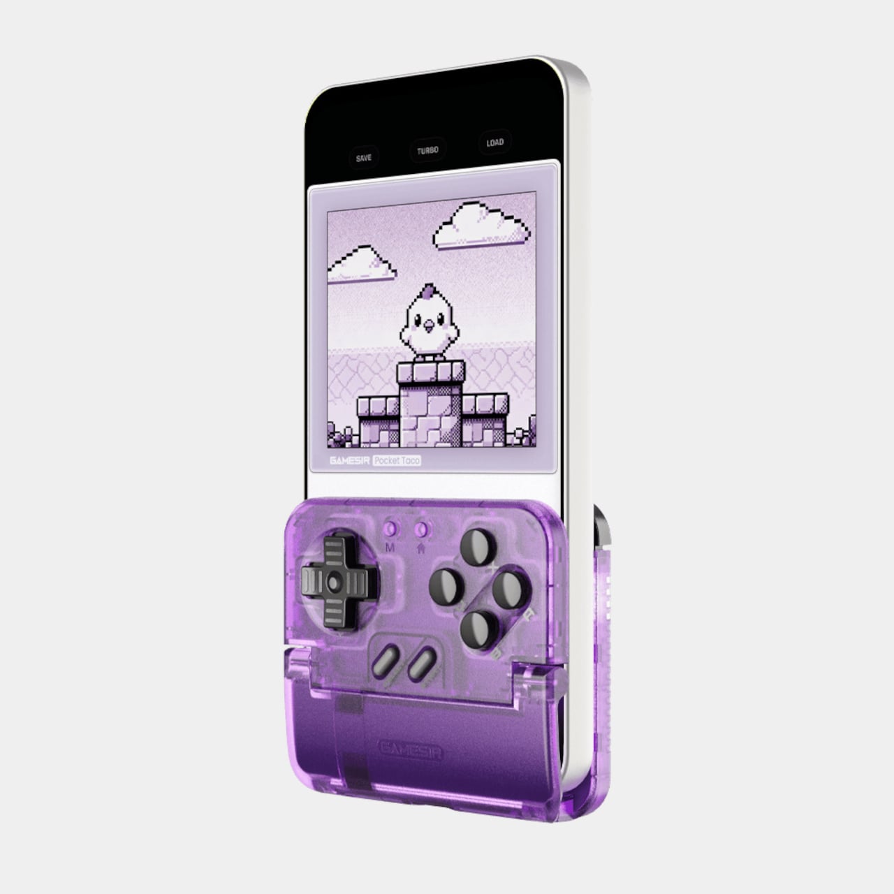
The GameSir Pocket Taco is a clamp-style vertical controller that clips around your phone and instantly turns it into something far closer to a proper handheld console. The design is vertical rather than the sideways landscape grip most mobile controllers use, which puts the phone in portrait style and gives the whole setup that unmistakable Game Boy silhouette. It’s a specific choice that makes a lot of sense for the kind of games it’s clearly built around.

Designer: GameSir

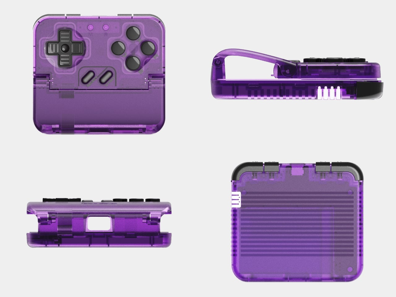
The Voltage Purple colorway is a new option for the Pocket Taco, arriving a few months after the original retro grey version launched. Where the original leaned into a deliberately aged aesthetic, Voltage Purple reads much more confidently as a contemporary gaming accessory. Both versions carry the same hardware and features, so the choice between them comes down entirely to how you want the thing to look in your hand.

The buttons are the central selling point. Cushioned membrane ABXY and D-pad inputs sit at the bottom of the controller, backed by tactile switch triggers and bumpers, and the whole layout comes together in a way that feels genuinely satisfying for side-scrollers, shoot ’em ups, and anything else designed around a proper gamepad. A turbo function covers all eight main buttons, which the hardcore retro gaming crowd will appreciate immediately.

The Pocket Taco handles some practical concerns that most accessories at this price point ignore. Soft silicone pads line the phone clamp area to prevent scratches, a hollow gap at the bottom aligns with your phone’s charging port so you can top up during longer sessions, and the whole thing powers on automatically when you unfold it and shuts off when you close it. At 62.2 g, it barely adds any noticeable weight.

The GameSir App extends the experience further with button remapping, D-pad diagonal lock, and G-Touch and V-Touch functions for on-screen input simulation. There’s also a keyboard mode built in, letting you switch input types for games or apps that need it. A 600 mAh battery handles cordless sessions, and the package includes a storage box, a charging cable, and a lanyard so the whole thing stays organized between uses.

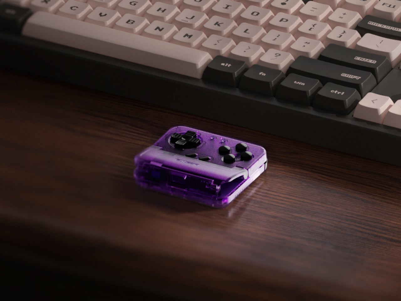
The Pocket Taco in Voltage Purple retails for $34.99, while the original grey version currently sits at $29.99. The $5 difference comes down entirely to the color choice. At 78mm x 70.9mm x 20.7mm, it slips into a pocket or bag with the storage box without much fuss, which keeps the pitch for daily carry entirely believable for anyone who tends to game in short bursts throughout the day.

It’s not a controller for every kind of mobile gaming. If you spend most of your time in landscape-format games that already support proper controller input, a horizontal grip will serve you better. But for anyone running emulators, arcade titles, or vertical shoot ’em ups on their phone, the Pocket Taco fills a gap that the rest of the mobile controller market has mostly ignored.

The post Transparent Purple Makes This $35 Phone Controller Impossible to Ignore first appeared on Yanko Design.
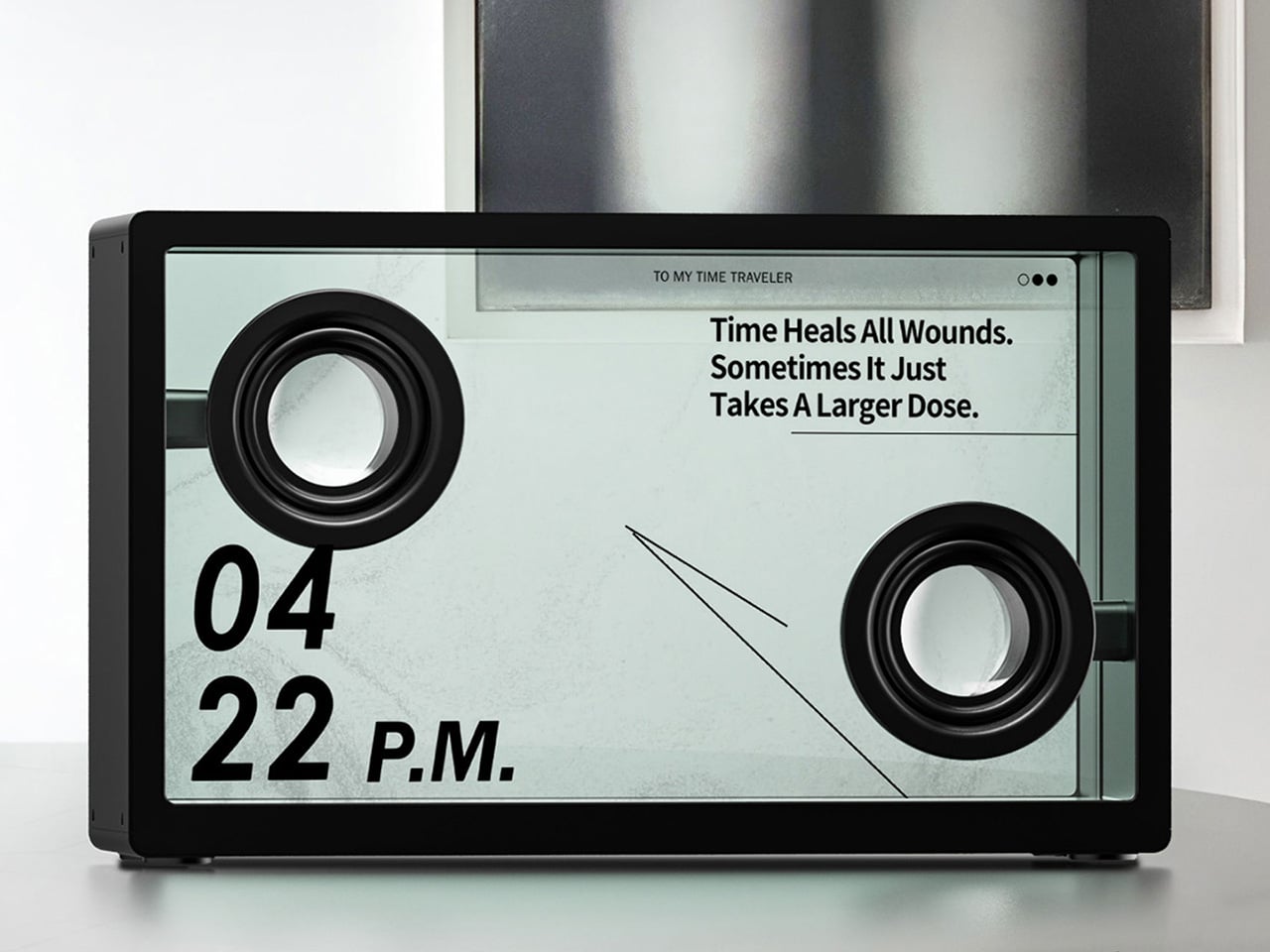
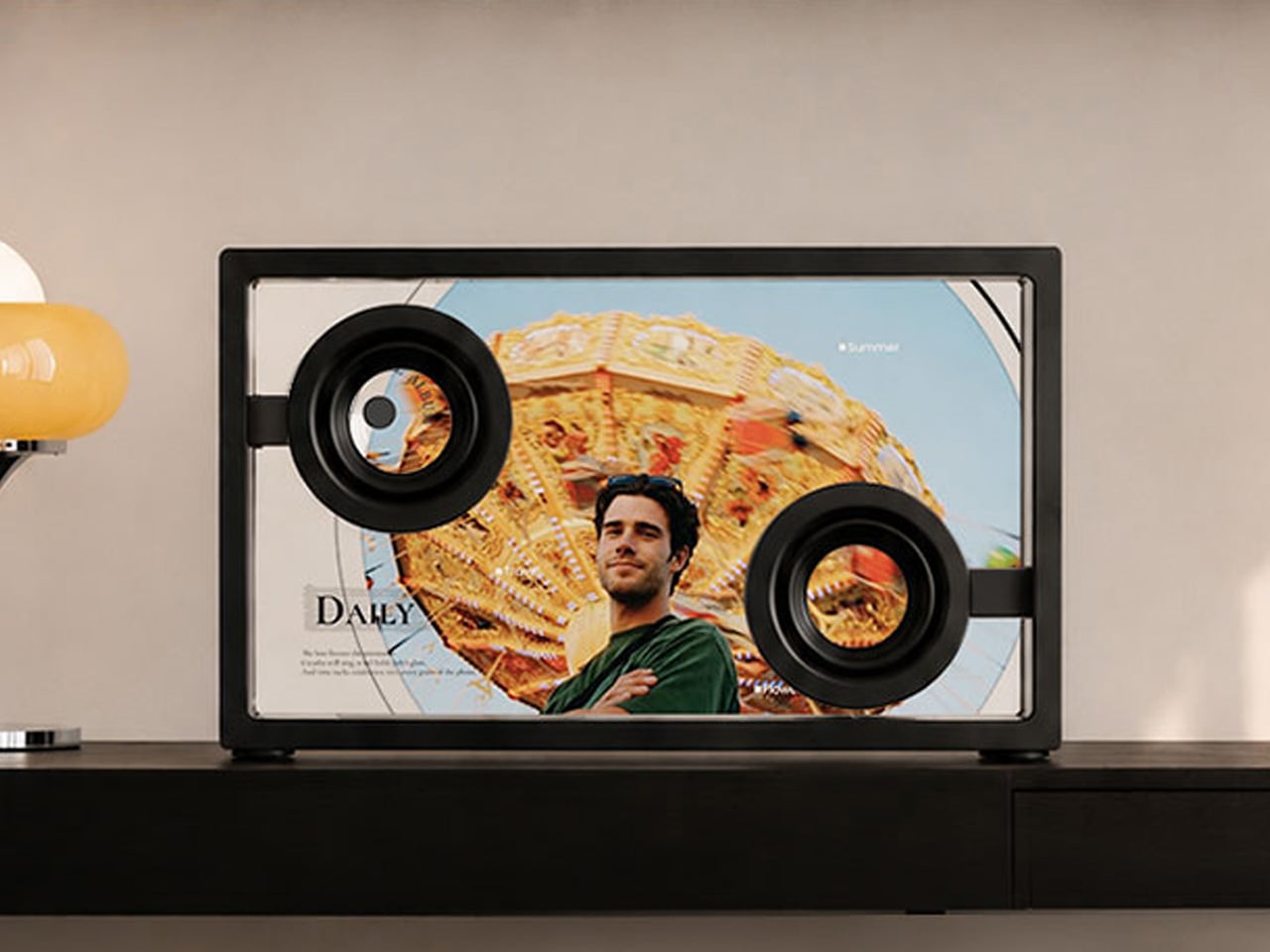
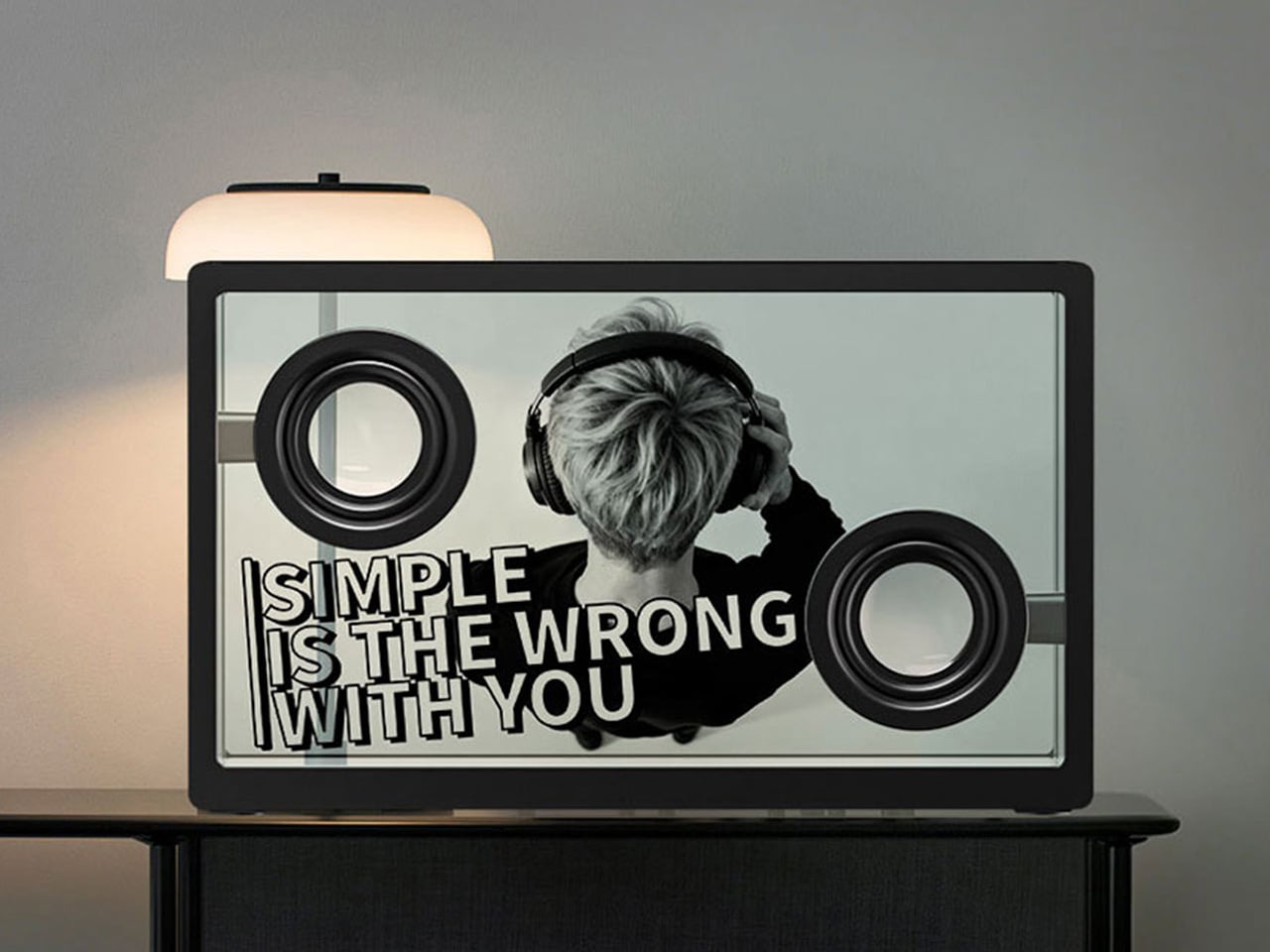
The 21.5-Inch Transparent Speaker That Animates Lyrics to Match Your Music

Most home speakers today have settled into a comfortable invisibility. Whether they’re slim soundbars pushed against a wall or cylindrical mesh towers parked on a bookshelf, the design goal is essentially the same: stay out of the way. They’re meant to be heard and rarely looked at, and even the ones that look interesting rarely offer much to see once the music starts.

MorningBlues has a clear thesis about music, and it has a lot to do with how the things we listen to can also be things worth looking at. Its SonicGlass A1 is a hi-fi speaker built around a transparent glass driver that lets you watch sound in motion as music plays. It’s the kind of object that sits on a shelf the way art does, with intention, and with something to say even before you press play.

Designer: MorningBlues

Click Here to Buy Now: $646 $999 (35% off). Hurry, only 16/205 left! Raised over $360,000.

The SonicGlass A1’s front face is a 21.5-inch TFT panel with high-transparency tempered glass, framed in black with over 90% light transmission. The transparent driver sits behind it, fully visible, which is both an acoustic feature and a design statement. There’s no grille hiding anything, no fabric obscuring the view. What you see is the working interior of the speaker, presented like an exhibit rather than concealed like a component.

When a song plays, lyrics appear across the glass surface in motion styles drawn from the track’s rhythm, pace, and emotional character. MorningBlues calls this MoodLyric, built on data from hundreds of millions of playbacks to animate text in ways that feel tied to what the song is actually doing. All lyrics are licensed through LyricFind, meaning the display does right by the artists whose words it borrows.

Beyond the lyrics, a feature called SceneSync adds a visual layer that responds to music genres. Pop, hip-hop, R&B, and rock each trigger different visual aesthetics on screen, generated in real time by AI. The idea is that the speaker shouldn’t just play a song; it should match the world the song is coming from. It’s a more cinematic take on the standard music visualizer.

The MorningBlues app lets you upload a personal photo that AI uses to place your face inside a genre-matched music video, displayed on the speaker’s screen. It’s the kind of feature that’s genuinely fun at a gathering, or just for yourself on a slow afternoon. You can also load the speaker with your own photos and videos to use as background content, turning it into a personal display.

When the music stops, the SonicGlass A1 doesn’t go blank. It has ambient display settings that keep it working as a room fixture, with options like ambient backgrounds, dynamic clock faces, and an ASMR sleep mode for winding down at night. That always-on character makes the speaker feel less like a device you switch off and more like something that already belongs in the room.

Pair the A1 with a microphone, and it becomes a home karaoke setup with licensed lyrics scrolling on screen in sync as you sing. The MorningBlues Music Hub 1, a dedicated controller for phone-free playback, rounds out the experience by letting you manage everything from a single tactile device, so your phone doesn’t need to be part of the evening at all. The large glass screen handles the rest.

The SonicGlass A1 isn’t angling to be the most powerful speaker in the room or the one with the most impressive spec sheet. It’s made for people who think about music the way they think about other things they choose to live with, considering both what those things do and how they look doing it. MorningBlues is asking a direct question: what if your speaker was worth watching?

Click Here to Buy Now: $646 $999 (35% off). Hurry, only 16/205 left! Raised over $360,000.

The post The 21.5-Inch Transparent Speaker That Animates Lyrics to Match Your Music first appeared on Yanko Design.
Tame Impala’s Kevin Parker Co-Designed a Synth So Good It’s Now a Collector’s Item

Transparency in tech has followed the classic arc of any design trend: radical, then referential, then mainstream, then meaningful. Nothing made it radical. Dozens of imitators made it referential. Beats and Casetify brought it mainstream. The interesting question now is which products use it meaningfully, where the visible internals are genuinely worth seeing, and the form of the object actually benefits from the revelation. A cheap Bluetooth speaker with a clear shell is just a clear shell. An instrument with carefully designed internal geometry, a speaker assembly, a green PCB, and ribbon cables threading between custom-designed synth hardware is something else.

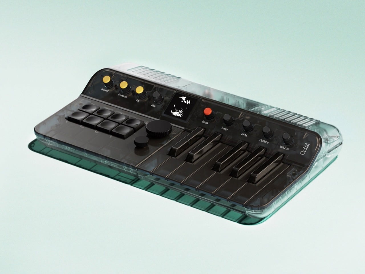
That distinction is what makes the Clear Orchid: Arctic worth drooling over. Telepathic Instruments, the company Kevin Parker of Tame Impala co-founded with Ignacio Germade and a small team of music technology obsessives, has announced the fifth drop in its Orchid hardware line: a fully transparent, teal-based limited edition capped at 3,000 units worldwide, available May 11. The Orchid earned its place on TIME’s Best Inventions of 2025 list on the back of a chord-first synthesis system that separates root note, chord type, and voicing into independent controls. The Arctic edition puts all of that hardware on display and makes a visual argument that the guts of a well-designed instrument are as compelling as its sound.

Designer: Telepathic Instruments

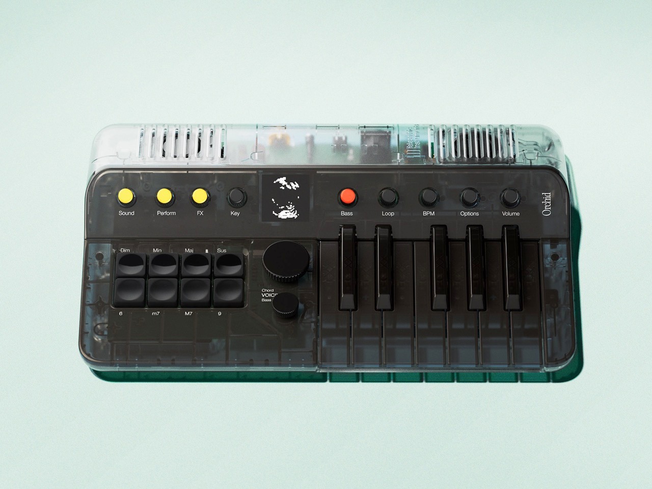
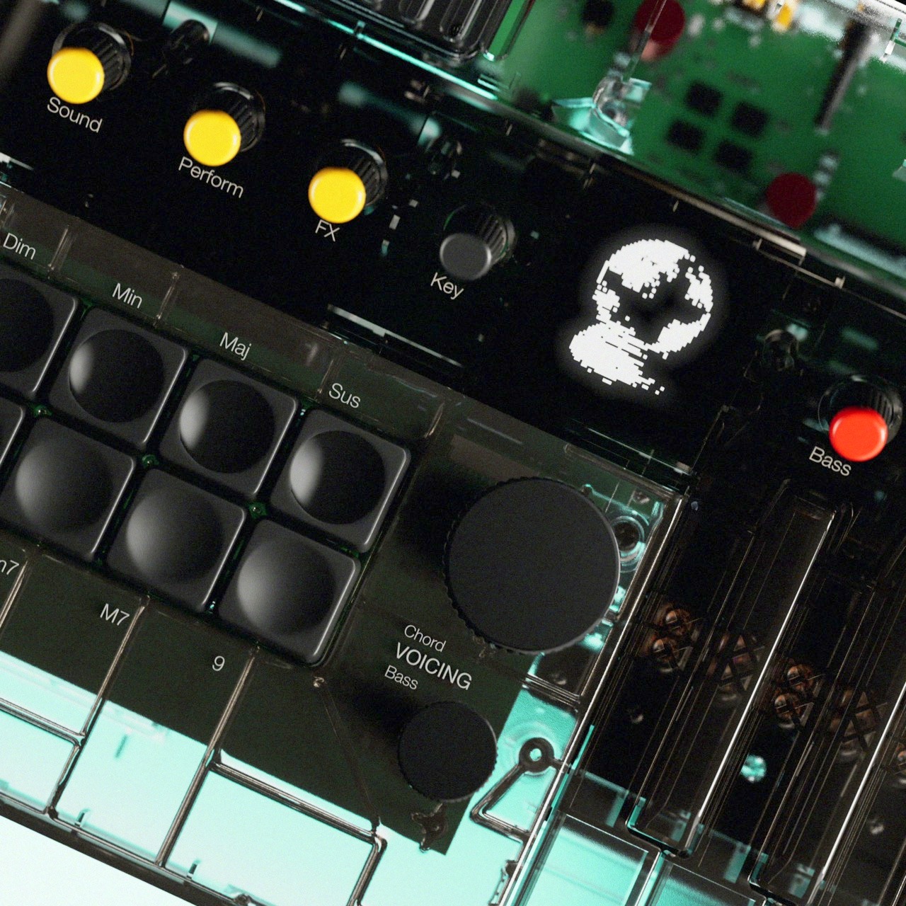
If you haven’t encountered the Orchid before, the short version is this: where every other synthesizer on the market is built around individual notes, Orchid is built around chords. Press a key and you trigger a full harmonic voicing. Your left hand works a matrix of chord-type buttons, labeled Dim, Min, Maj, Sus, M7, 9, and a few others, while your right hand handles the keys and a large Chord Voicing encoder adjusts how those chords sit across the register. A patent-pending voicing system repositions harmonies across the equivalent of a full piano keyboard’s worth of range, far beyond what the compact one-octave keybed physically suggests. Three synthesis engines, a virtual analogue subtractive, FM, and a vintage reed piano emulation modeled on 1960s electric pianos by renowned German developer Stefan Stenzel, give the harmonic system genuine sonic depth rather than the thin, preset-cycling feel that plagues most beginner-friendly instruments. When we first covered the Orchid at launch, we described it as an “ideas machine,” a device for capturing musical intuition without requiring the theory background to justify it. That description still holds, and the Arctic edition makes it literal: you can see exactly where the ideas come from.

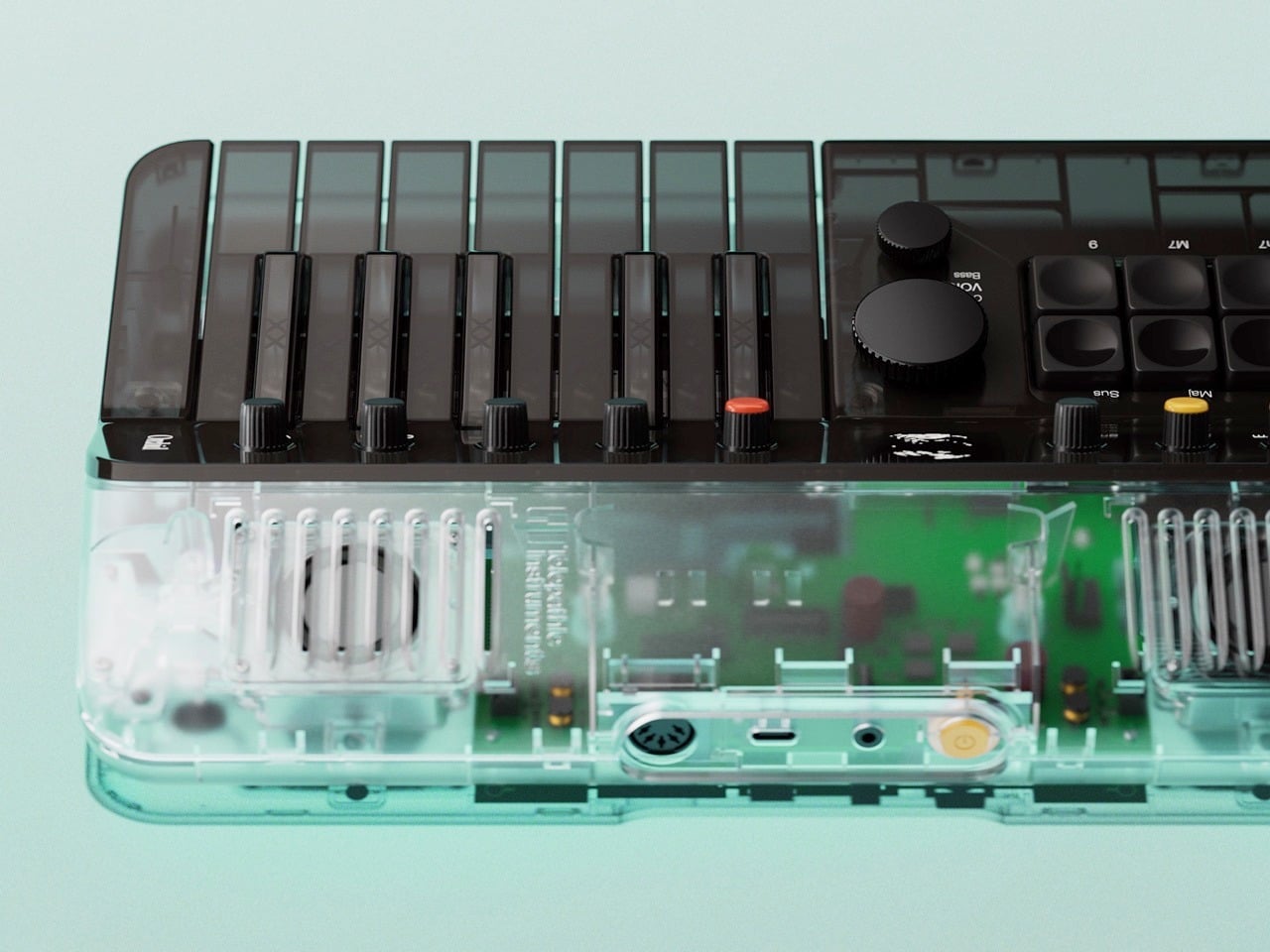
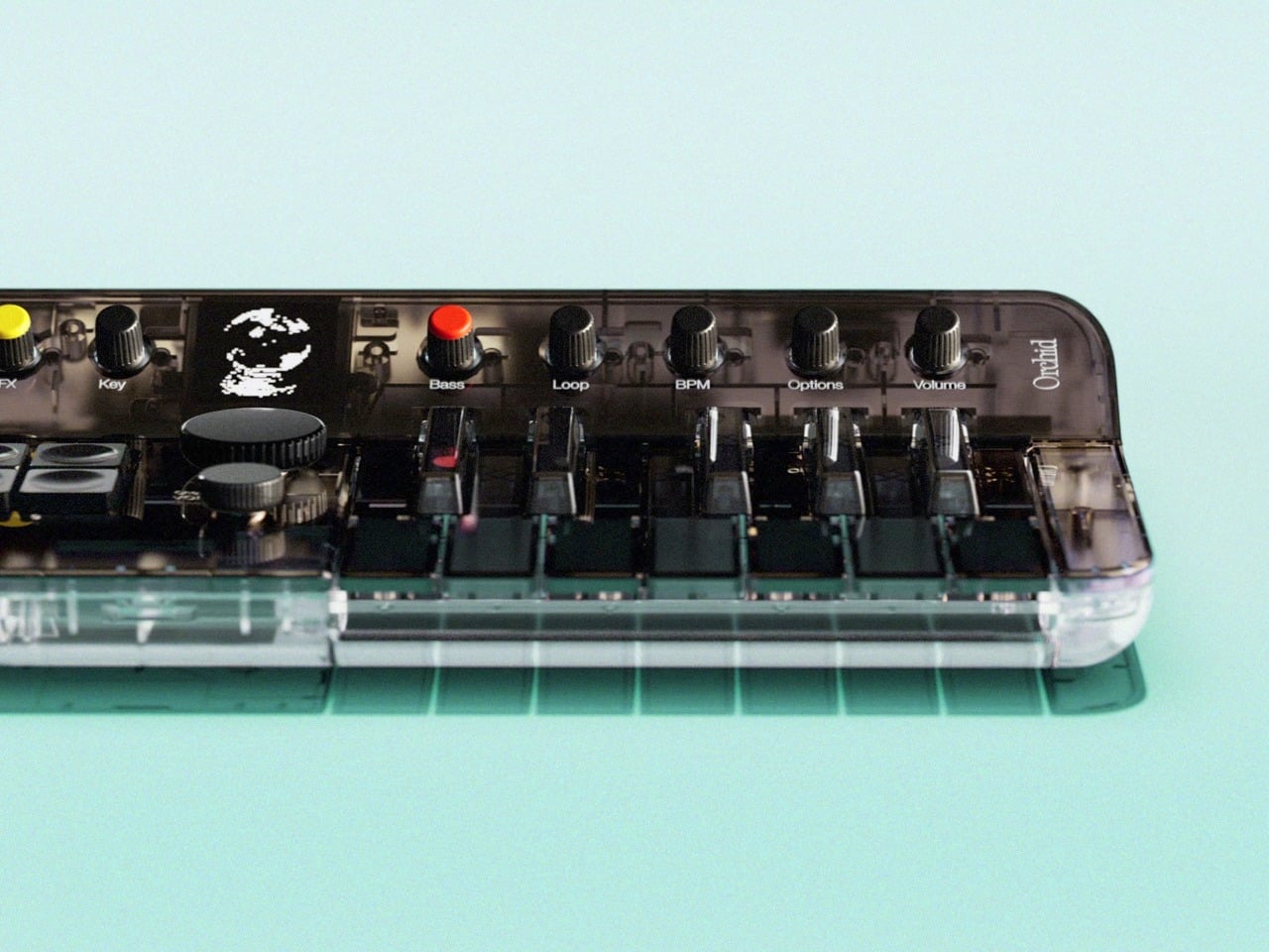
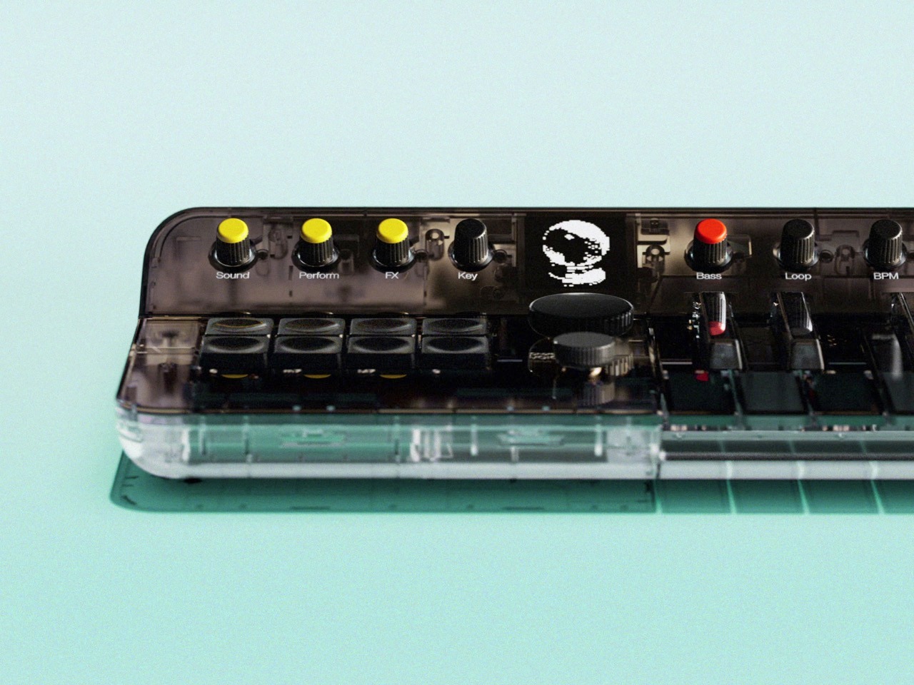
The transparent shell pulls double duty as both aesthetic statement and honest product communication. Look through the Arctic’s polycarbonate top and you see a green PCB laid out with visible intention, speaker grilles framed by the internal chassis, ribbon cables routed with the kind of care that only matters if someone will eventually see them. The teal-tinted base, slightly darker than the clear top, creates a subtle two-tone layering that stops the whole thing from reading as a prototype or an engineering sample. The yellow Sound, Perform, and FX knobs pop hard against the dark control surface above, the single red Bass button reads like a deliberate punctuation mark, and the OLED display at the center of the panel glows with Orchid’s skull mascot logo in a way that feels genuinely characterful rather than decorative. Telepathic Instruments clearly understood that a transparent enclosure raises the design bar: every component becomes load-bearing visually, and the Arctic clears that bar without much visible effort.

The Drop 5 release pairs the Arctic with the full launch of Pistil, Orchid’s companion VST plugin, now available on both Mac and Windows. Pistil brings Orchid’s three synthesis engines directly into any DAW, with ten new sounds in the full release, a rebuilt delay engine, and expanded fine parameter control. Existing Orchid owners get it at a discount, and standalone buyers can purchase it for $99 without the hardware. The practical implication is that the Orchid ecosystem has matured considerably since its initial 1,000-unit beta run: 12,000 units across 60 countries, placements at Abbey Road and Rue Boyer, and a featured role on Don Toliver’s Octane. Lewis Capaldi, Janelle Monáe, Fred Durst, Kid Cudi, and Diplo are all documented users. Josh Homme narrates the drop’s accompanying short film, a deadpan skewering of the creativity-guru industrial complex that is, frankly, funnier than most instrument launch content has any right to be.

The Arctic is limited to 3,000 units worldwide, with waitlist members getting priority access at 9 AM PDT for North America and 10 AM CEST for Europe on May 11, and the general public window opening an hour later. The classic Orchid colorway and the orange carry case are back alongside it. Join the waitlist at telepathicinstruments.com.

The post Tame Impala’s Kevin Parker Co-Designed a Synth So Good It’s Now a Collector’s Item first appeared on Yanko Design.
This transparent speaker celebrates the beauty of sound engineering

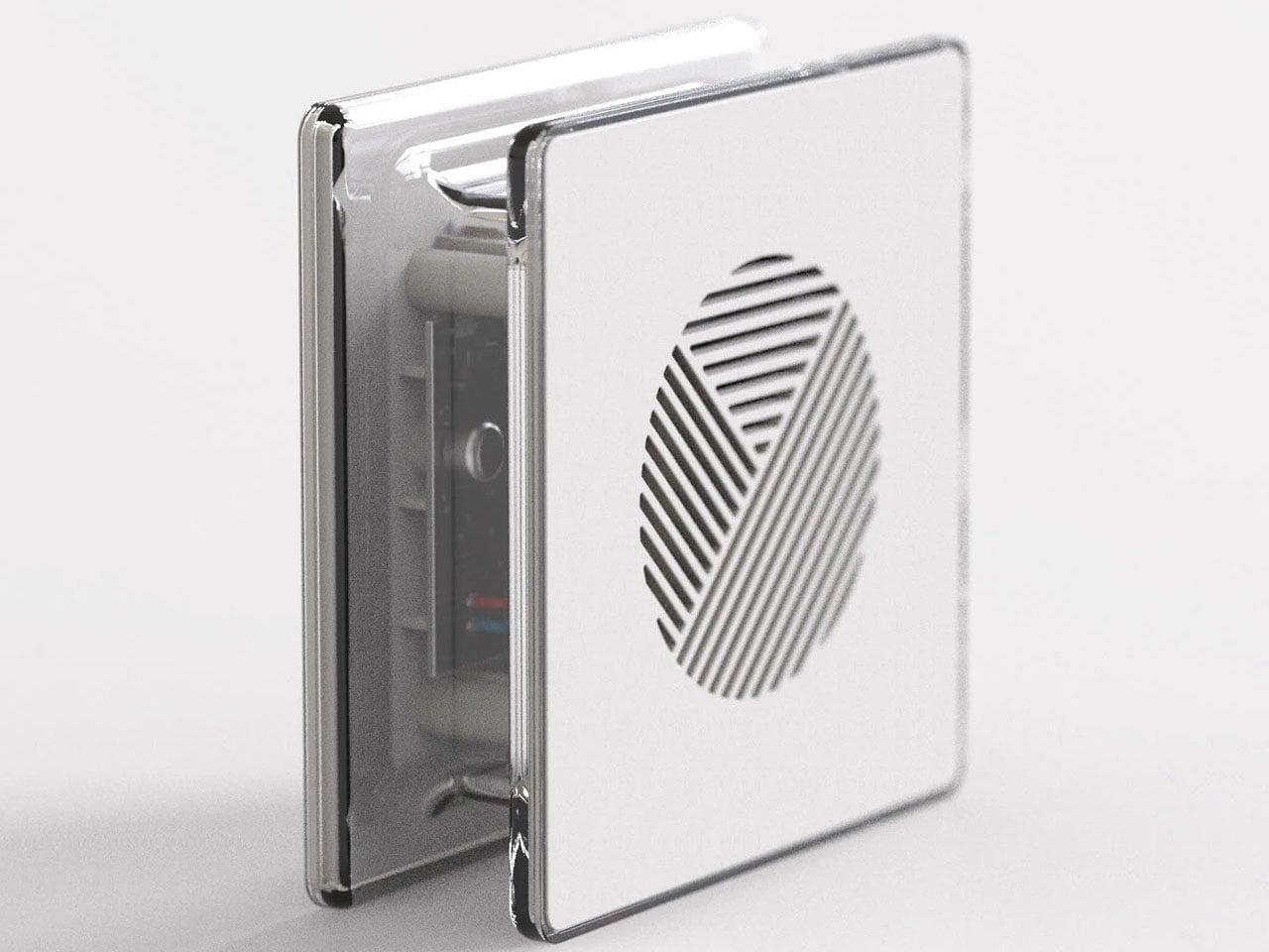
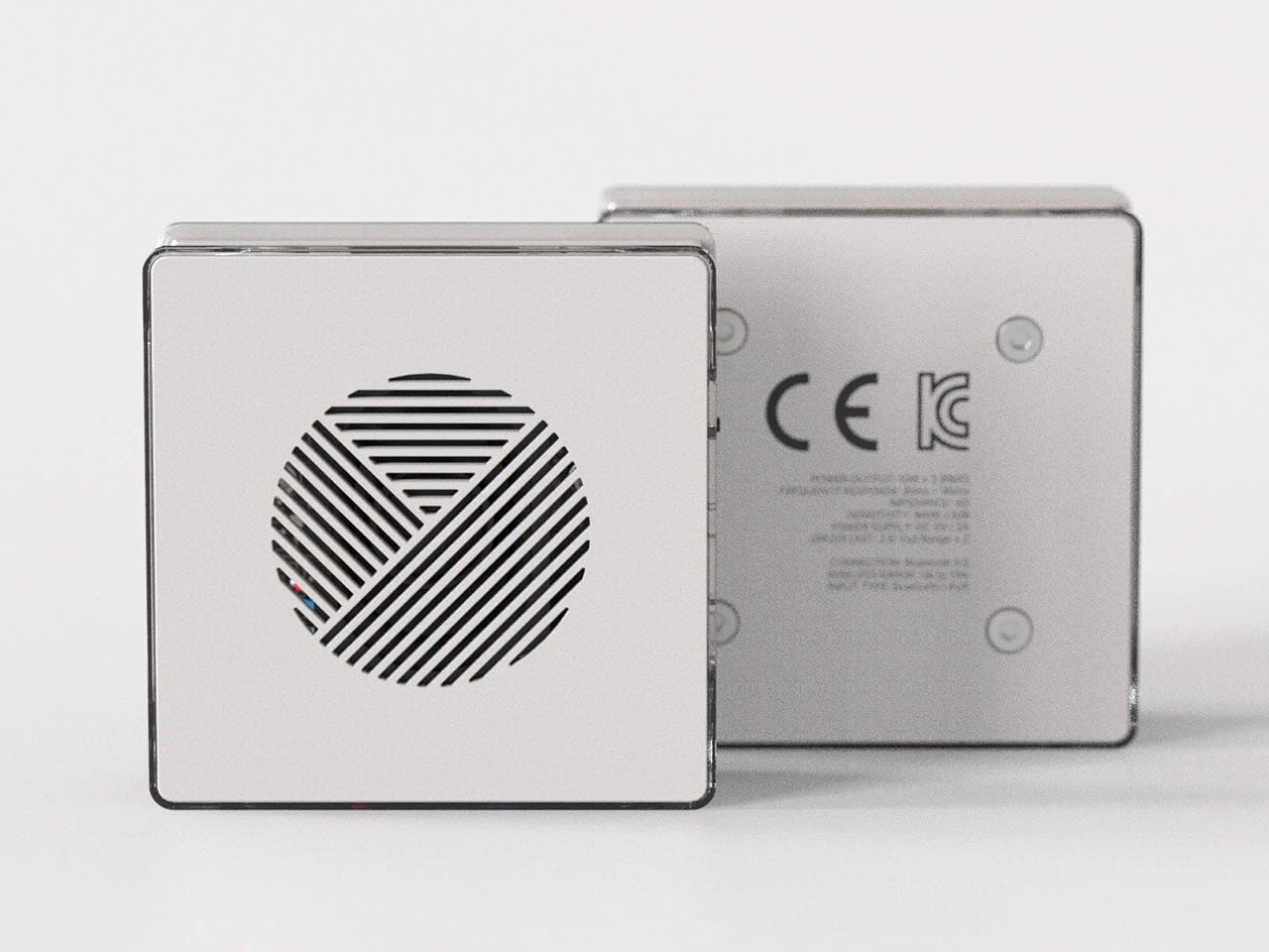
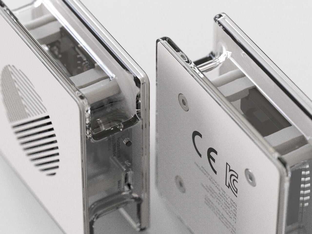
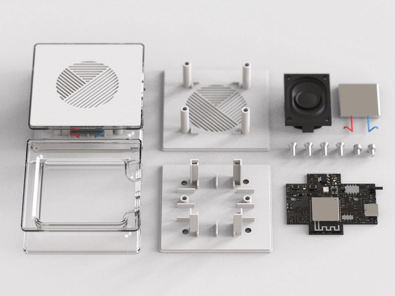
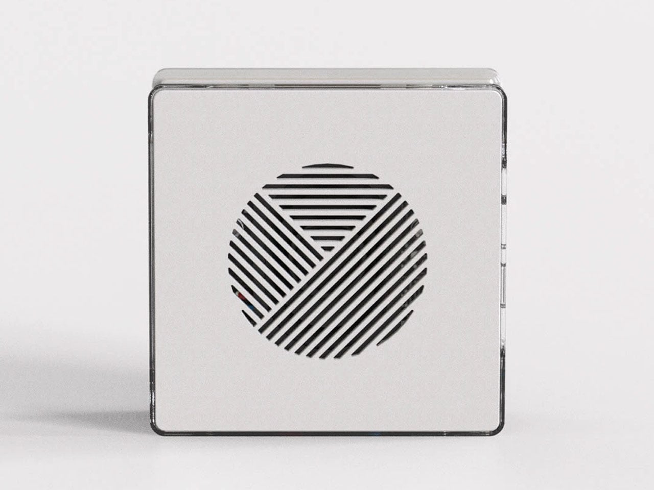
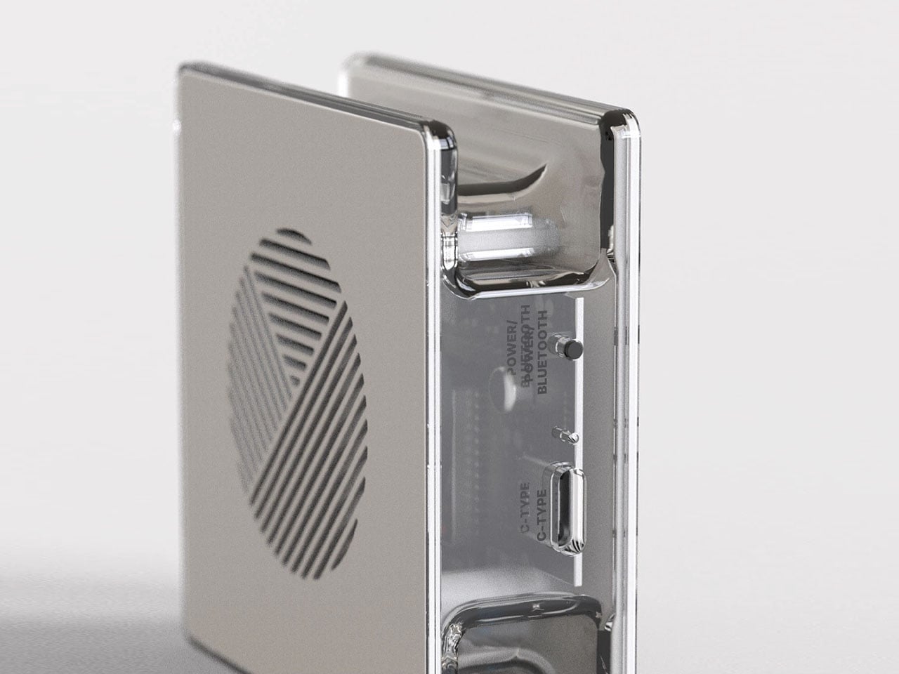
There’s something about transparent gadgets and audio gear that evokes a sense of retro-futurism. Although we’ve seen a fair share of transparent speakers, this one hits different. Rather than using transparency as a simple aesthetic trick, the design turns the internal structure of the speaker into a visual highlight. The clear enclosure reveals the driver, supporting frame, and internal layout that are usually hidden inside conventional speakers.

This approach transforms the product from a typical audio device into something more expressive, where the engineering becomes part of the visual story. The result feels less like a traditional gadget and more like a piece of functional design that celebrates the mechanics of sound.

Designer: Jinkyo Han

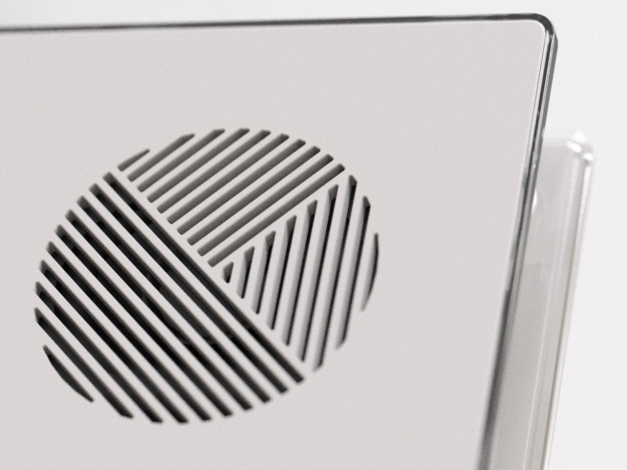
The form itself is minimal and geometric, allowing the transparency to remain the focal point. At the center sits the circular driver, clearly visible through the casing and positioned as the focal point of the entire design. Instead of concealing this critical component behind fabric or grills, the speaker proudly displays it. This not only creates a strong visual identity but also highlights the hardware responsible for producing the audio experience.

The internal elements appear carefully arranged to maintain balance and symmetry. With the casing fully transparent, every structural element becomes visible, which places greater importance on thoughtful layout and clean engineering. The frame surrounding the driver provides both support and visual structure, giving the speaker a refined, almost architectural appearance. Observing these internal layers gives users a rare glimpse into how a speaker is physically constructed.

Another benefit of the transparent enclosure is the way it interacts with light. Reflections and shadows passing through the clear surfaces add depth and dimension, making the device visually engaging even when it’s not in use. In modern living spaces where technology often blends with décor, a speaker like this can easily function as both an audio device and a decorative object. Placed on a desk, shelf, or side table, it naturally draws attention without being overly flashy.

Despite its artistic appearance, the concept remains grounded in practicality. Designed as a Bluetooth speaker, it emphasizes wireless connectivity and everyday usability. The simplicity of the overall form suggests that controls and functionality are kept minimal, ensuring the product remains intuitive while preserving the clean aesthetic. To add a bit of flair, the designer imagines the speaker in two sophisticated color options: Dusty Blue and Ocre.

The post This transparent speaker celebrates the beauty of sound engineering first appeared on Yanko Design.
Modded Transparent iPhone Air with a Working SIM Slot Looks Like Apple and Nothing had a Dream Child

12:28 AMHuaqiangbei operates on its own physics. The sprawling electronics market in Shenzhen is the place where flagship smartphones get dismantled, reimagined, and rebuilt into things their original manufacturers never approved and probably never imagined. It runs on American time, buzzes with microscopes and milling machines, and treats the word “warranty” as a polite suggestion. If you want something done to your phone that a brand explicitly decided against, this is where you go.

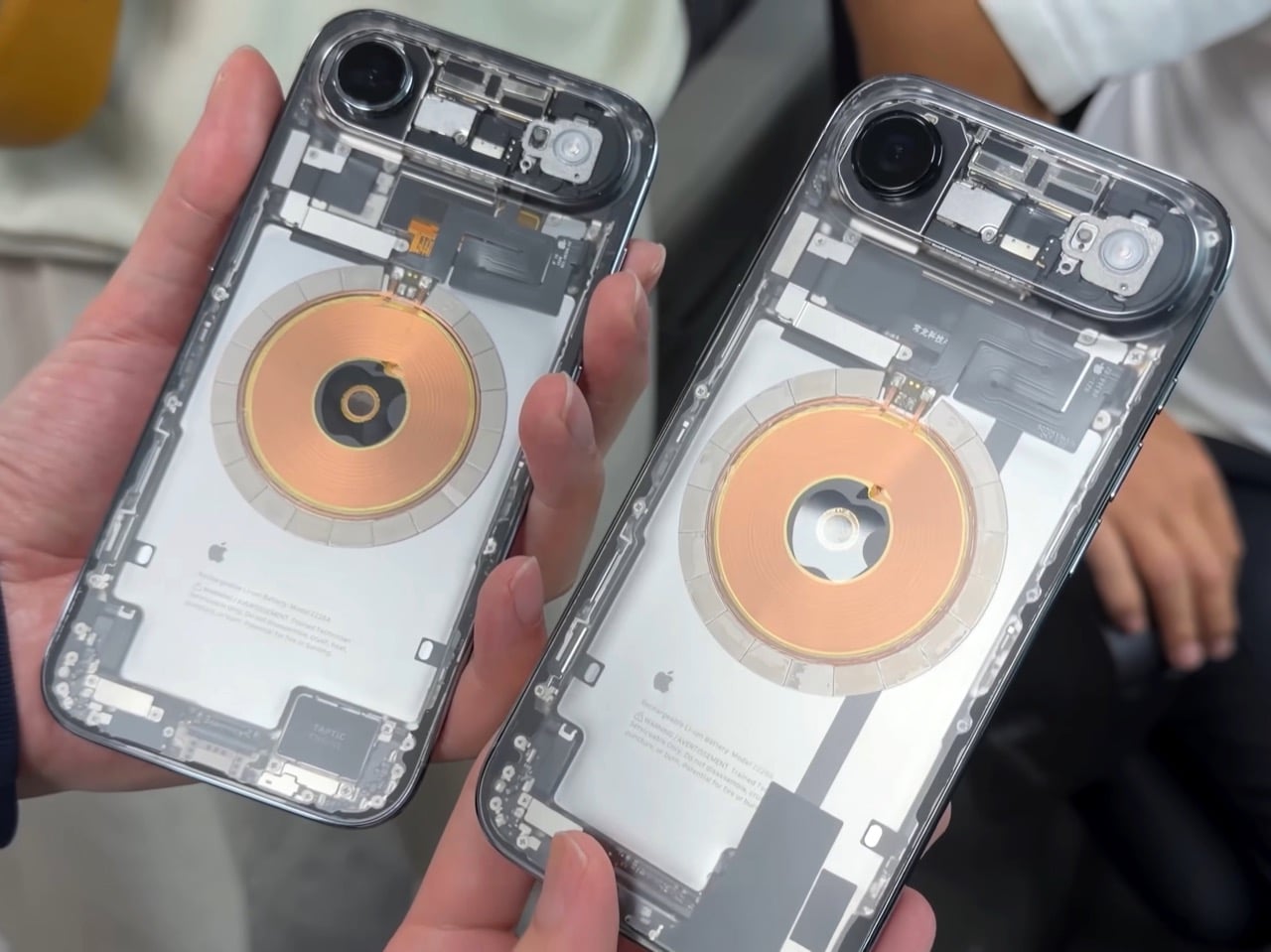
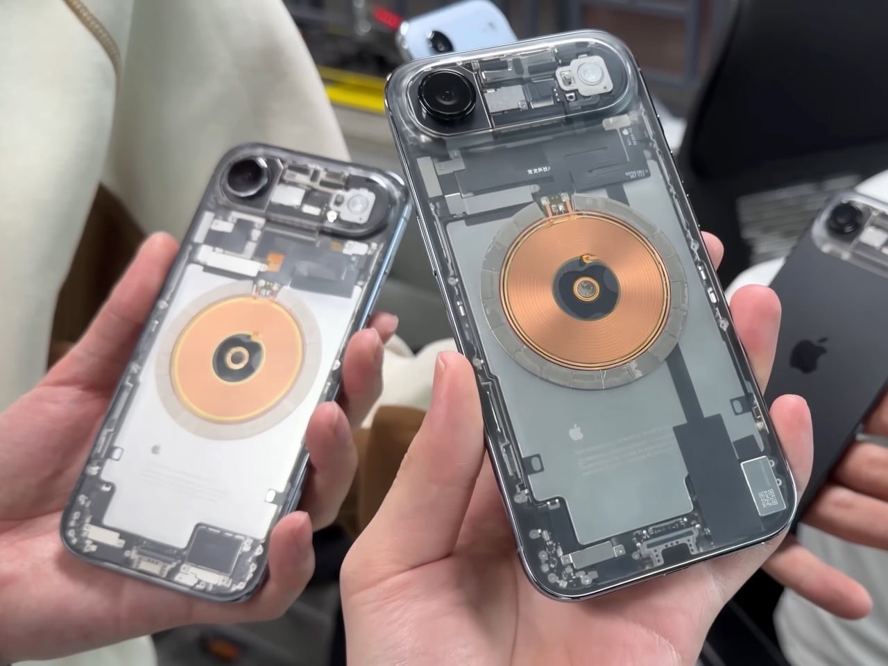
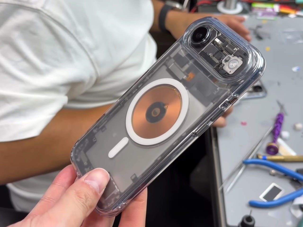
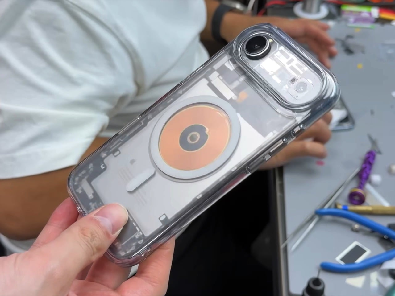
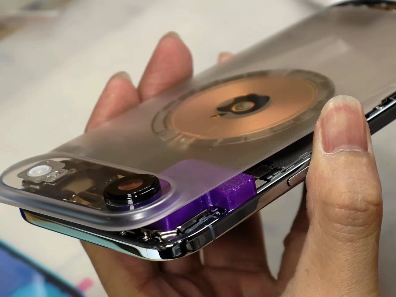
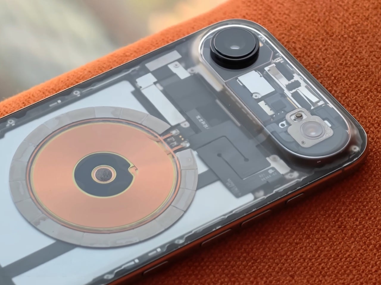
Taiwanese creator Linzin Tech went there with a blue iPhone Air, the thinnest iPhone Apple has ever made and the first one sold without a physical SIM slot anywhere in the world. He left with something that looks like a cyberpunk collector’s piece: a fully transparent-backed iPhone Air with a functioning nano-SIM tray carved directly into its frame, wired into the motherboard by hand, under a microscope, late at night. A Dbrand X-Ray case could never…

Designer: Linzin Tech

YouTuber Scotty Allen built an iPhone with a headphone jack in Huaqiangbei. He also assembled a working iPhone almost entirely from parts bought off the street there. The market has this reputation for turning Apple’s deliberate omissions into solved problems, and the community around it keeps raising the difficulty level. Linzin’s challenge was particularly gnarly because he wanted two separate modifications on Apple’s most space-constrained iPhone ever, one cosmetic and one structural, and both required touching parts of the phone that Apple engineers spent years optimizing down to the millimeter.

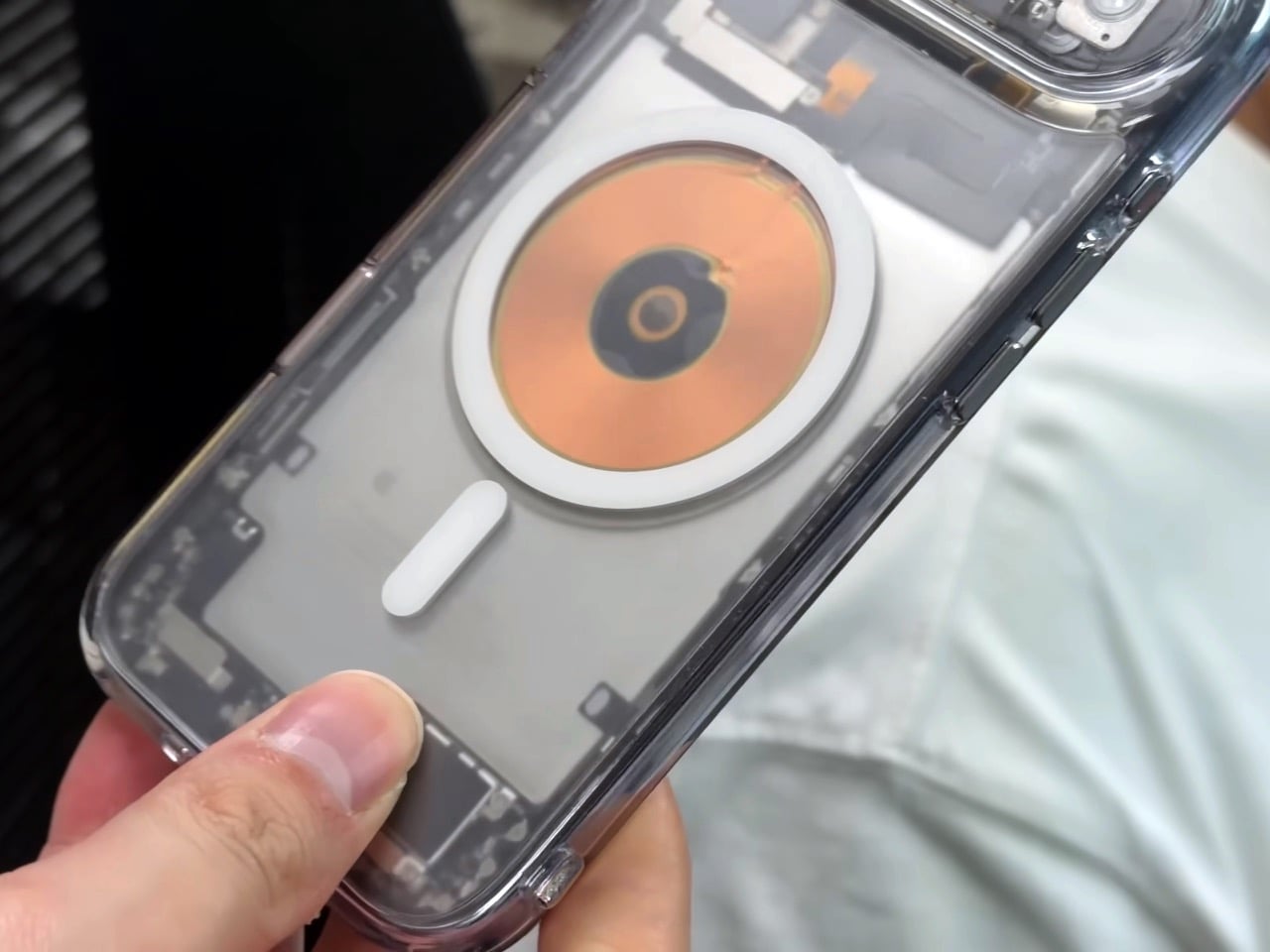
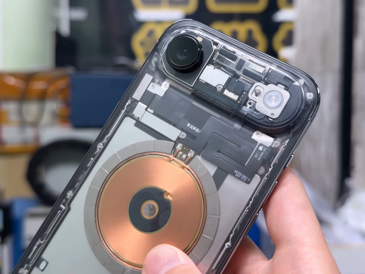
The transparent back came first, and the process was a laser job performed on the rear glass panel. Technicians at Changlong Technology stripped the internal paint layer without touching the MagSafe charging coil sitting directly beneath it, which is about as precise as it sounds. Once the coating was gone, the phone’s internals became fully visible through the glass: the battery, logic board, shielding, internal connectors, and the flexible cable running between the upper and lower assemblies with “Changlong Technology” printed right on it. The Apple logo floats above actual hardware now. It looks like a concept render that somehow got approved.

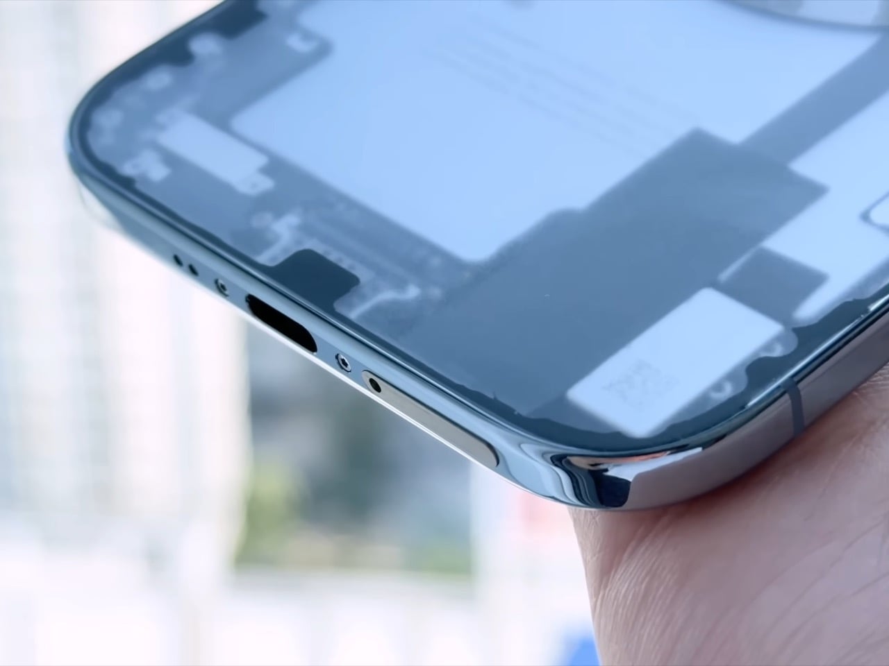
The iPhone Air has no physical SIM slot in any market, globally, which meant Changlong’s team had to use a CNC milling machine to carve a slot opening into the phone’s ultra-thin metal frame. The original Taptic Engine had to come out entirely because there was simply no room for both it and a SIM tray in that chassis. A smaller third-party linear motor went in its place. Linzin estimates the haptic feedback at around 98% of the original, with the main perceptible difference being less granularity between light and heavy vibration patterns. Apple’s Taptic Engine is genuinely one of the finest haptic systems in consumer electronics, so even a 2% degradation is something purists will notice.

Board-level microsoldering connected the new SIM reader to the motherboard, and after a reboot the phone recognized a physical nano-SIM and connected to a carrier on 5G. Hot-swapping requires a restart to register a new card, which is a minor workflow tax. The thermal picture is less rosy. The graphite heat spreader sheets were casualties of the laser process and were not fully reinstated, which pushed operating temperatures noticeably higher under sustained load. Linzin ran 20 rounds of stress testing and confirmed the throttling. IP68 water resistance is also gone the moment the frame gets milled. And on the morning he flew back to Taiwan, the microphone ribbon cable came loose, sending the phone back to Shenzhen for repairs.

Close-up of the machined SIM tray

Here is the thing though. Linzin paid real money for a phone Apple sells for a premium, then paid again to have it modified, accepted degraded thermals, lost water resistance, voided his warranty instantly, and still calls it worth it. His reason is genuinely practical: he changes phones weekly and eSIM-only means a carrier visit every single time. The modification solves a real problem for a specific kind of power user, and it does so with enough visual drama that you would probably auction this thing for three or four times its retail price. Huaqiangbei has been poking holes in Apple’s “impossible” list for years. This one just happens to be the most beautiful hole yet.

The post Modded Transparent iPhone Air with a Working SIM Slot Looks Like Apple and Nothing had a Dream Child first appeared on Yanko Design.
Camera (1) Imagines a Tactile Digicam for a Screen-Tired Generation

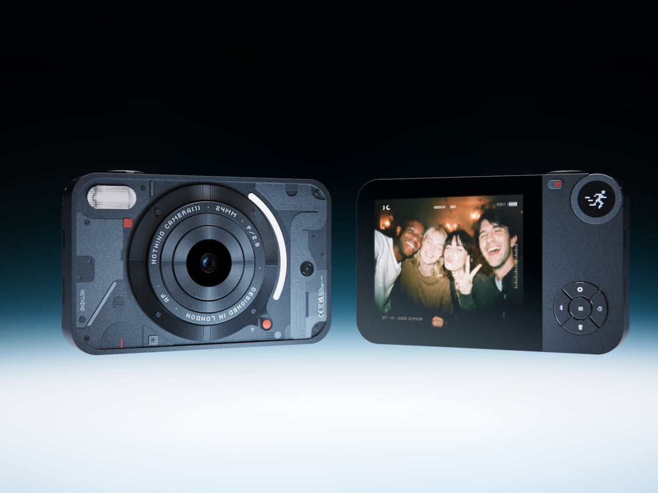
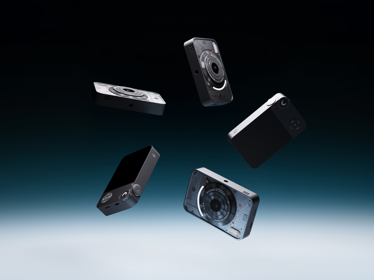
Most photos now live inside phones, buried between notifications and apps. A new generation has started picking up old digital cameras to make shooting feel more intentional again, separate from scrolling and messaging. Many of those cameras still carry clunky menus and dated interfaces. Camera (1) is a concept design that asks what a modern compact could feel like if it were designed around touch and light instead of software layers.

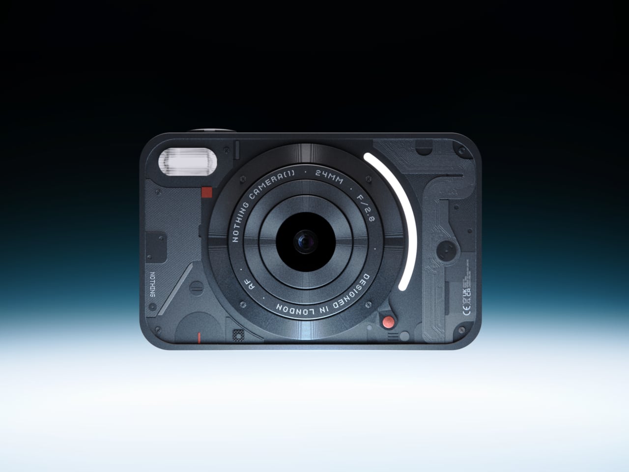
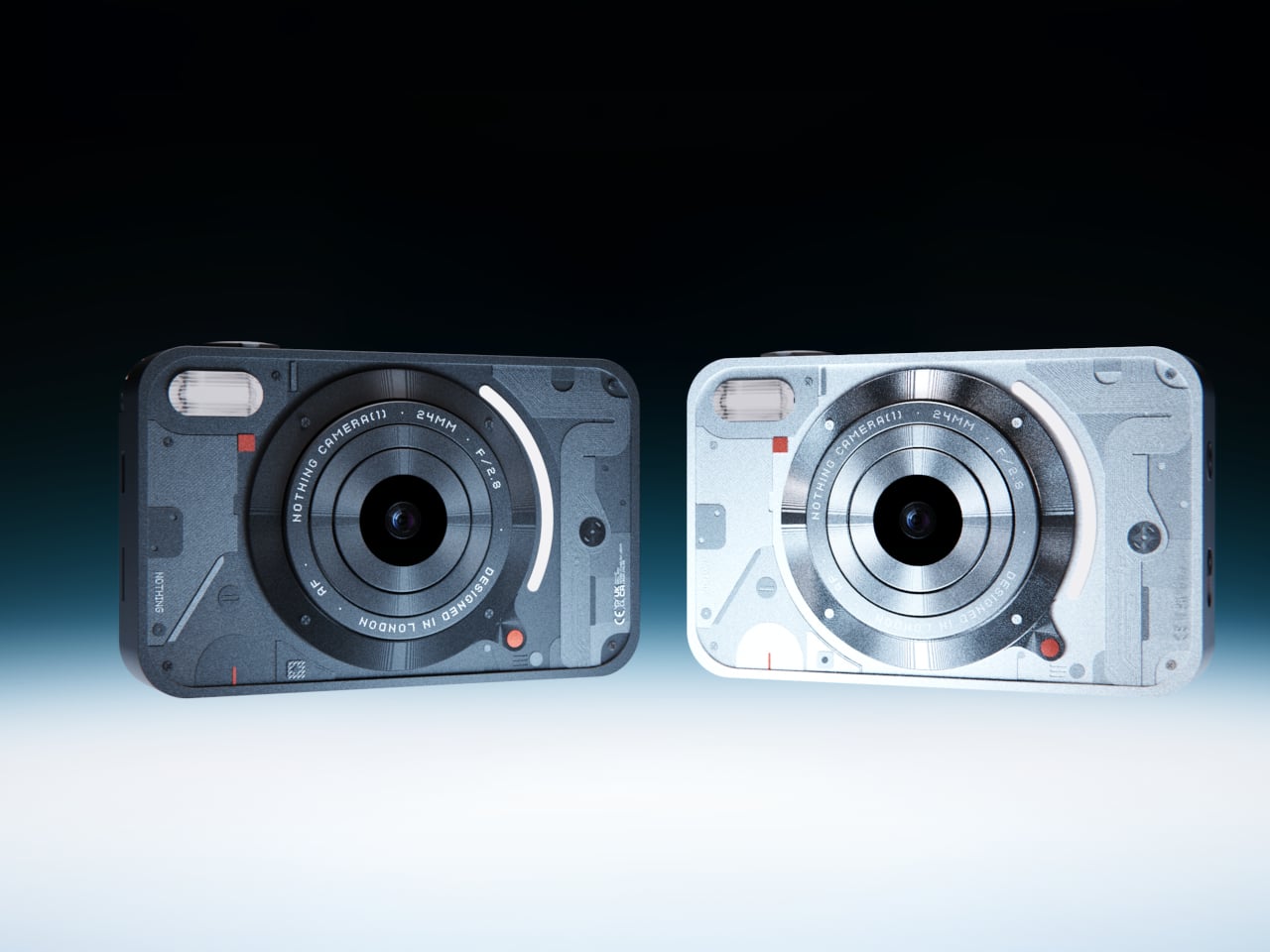
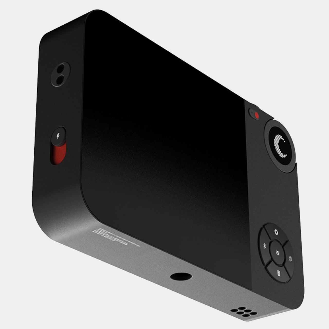
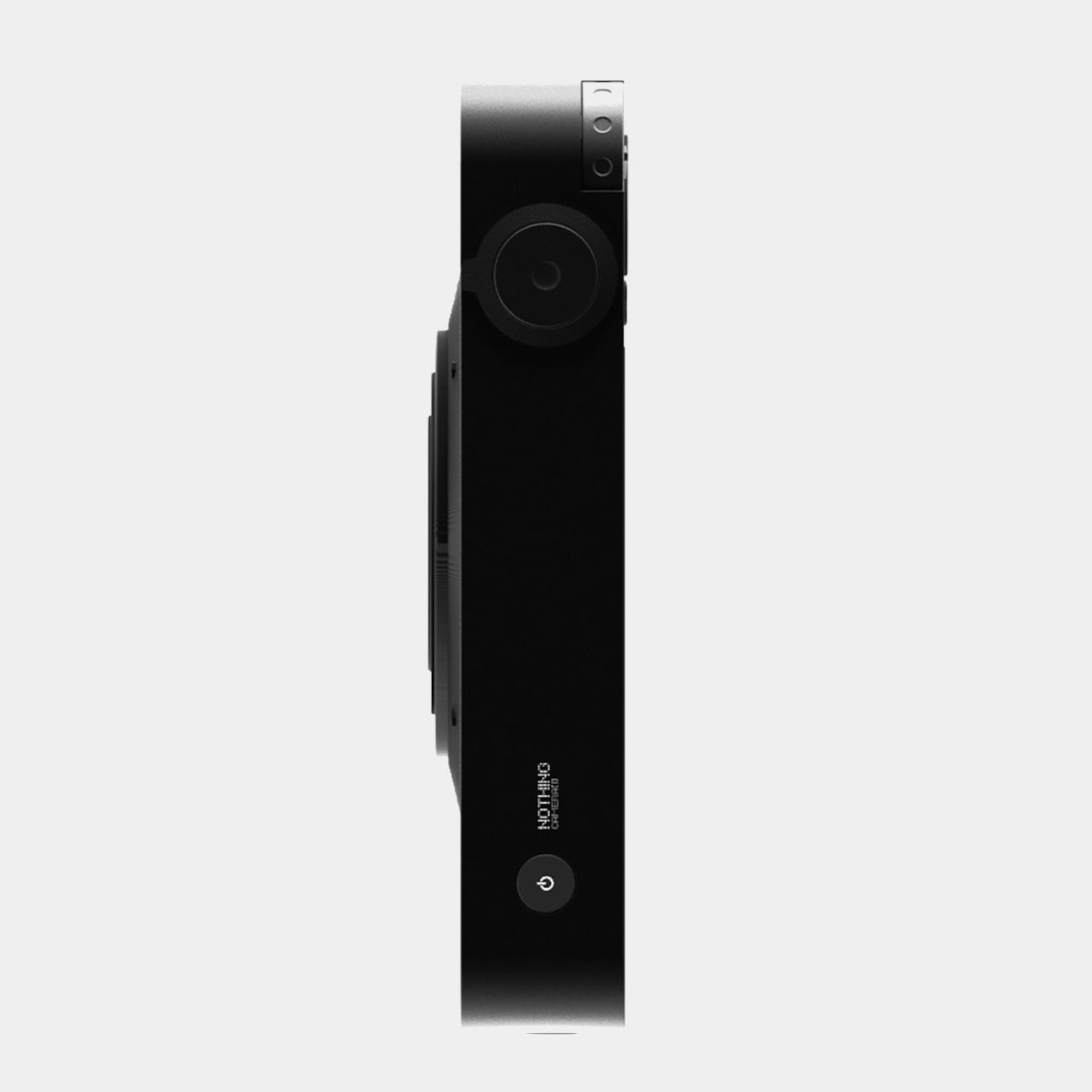
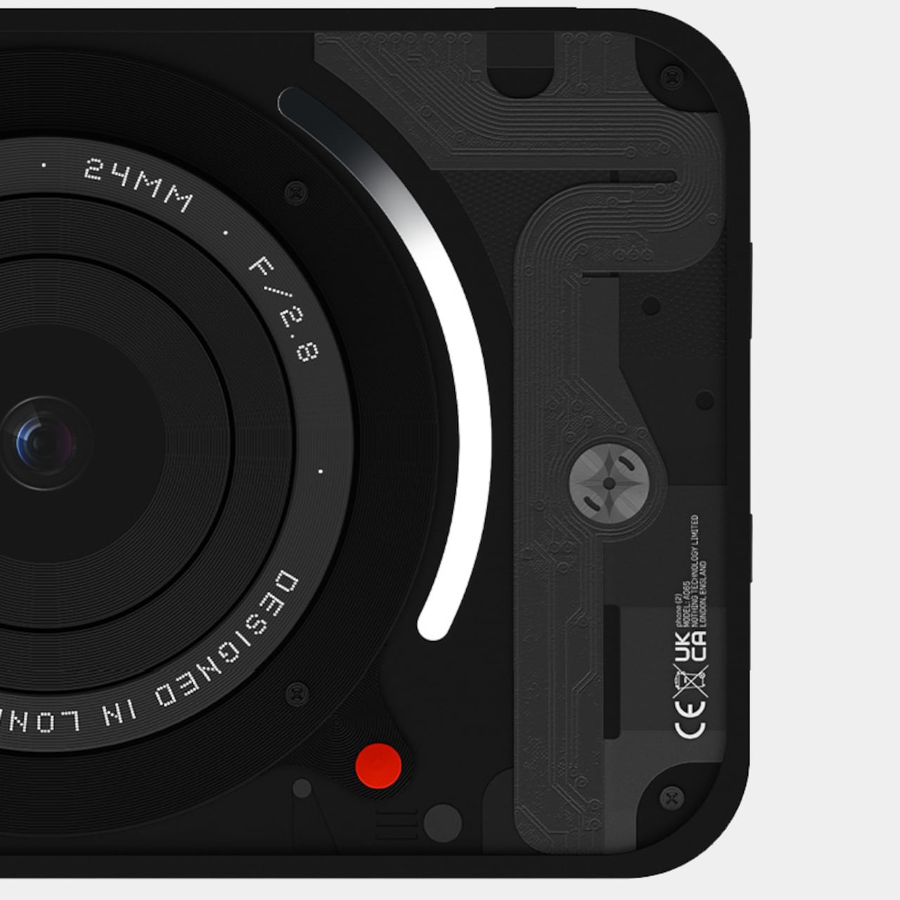
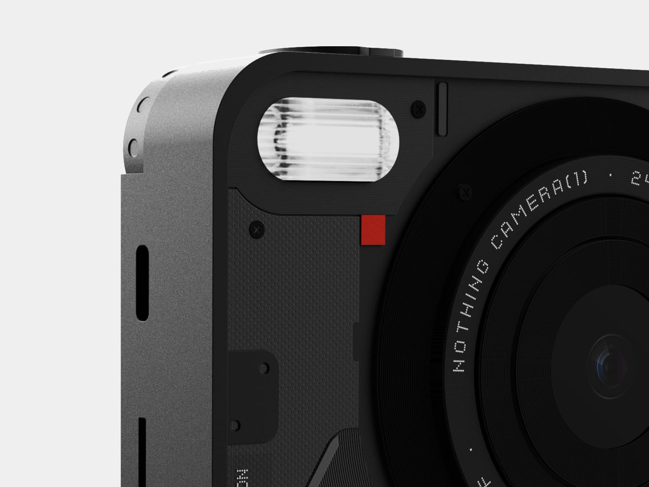
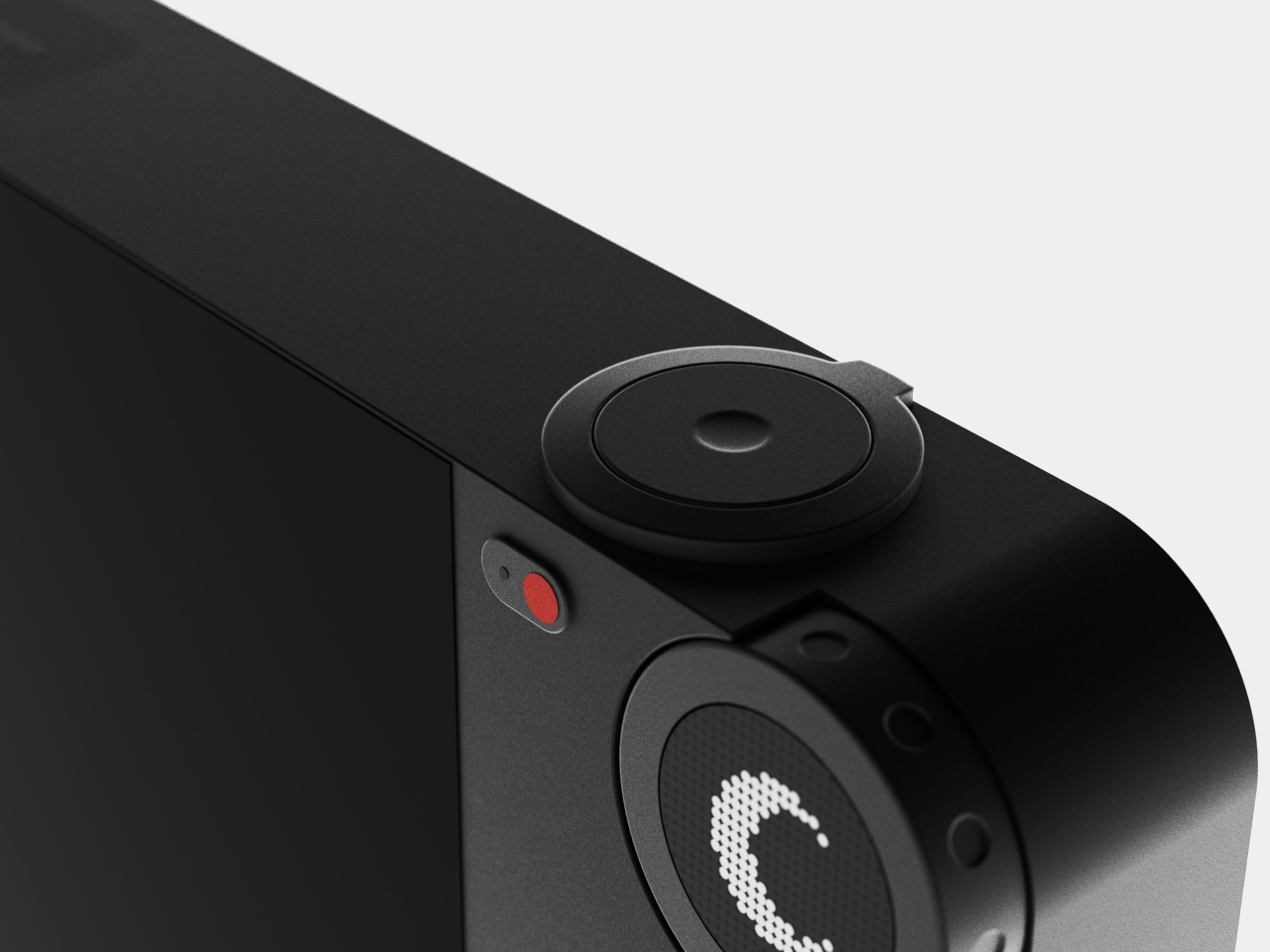
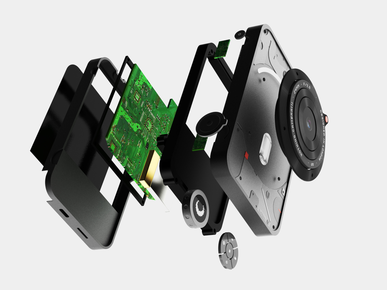
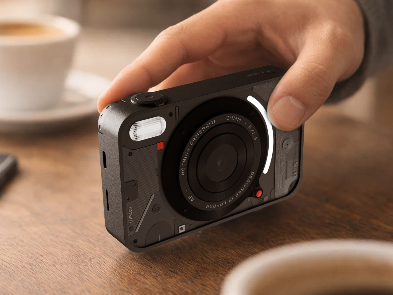
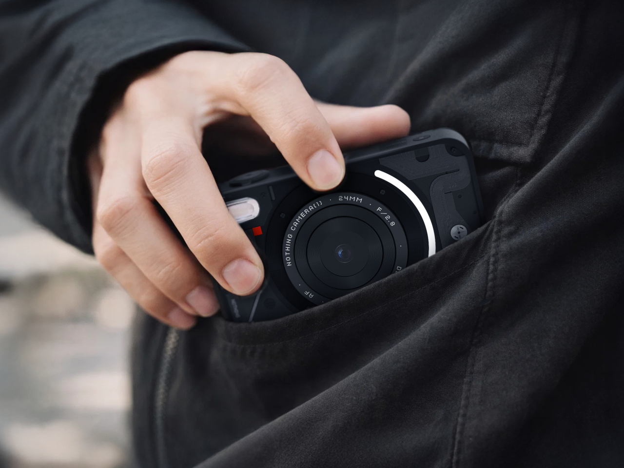
Camera (1) is a compact, metal-bodied device with softly rounded corners, sized to slip into a pocket but solid enough to fill the hand. All the main controls live on one edge, so your thumb and index finger can reach the shutter, a circular mode dial with a tiny glyph display, and a simple D-pad without shifting your grip or poking at a touchscreen. The concept is inspired by the now familiar transparent, hardware-forward design language of Nothing.

Designer: Rishikesh Puthukudy

Taking the camera to a dinner or a show means twisting the lens ring to frame, feeling the click of the shutter under your finger, and glancing at the little icon on the dial to know whether you are in stills or video. The camera encourages you to look at the scene more than at the screen, letting the physical controls carry most of the interaction so the rear display stays out of the way.

The dot-matrix glyph on the dial shows simple icons for modes, while a curved light strip around the lens can pulse for a self-timer, confirm focus, or signal that video is rolling. Instead of deep menu trees, you get a handful of physical states you can feel and see at a glance, which makes the device feel more like an instrument than a gadget you have to decipher before you can take a picture.

The engraved lens ring, marked with focal length and aperture, invites you to twist rather than pinch. Zooming or adjusting focus becomes a small, satisfying motion instead of a jittery rocker or on-screen gesture. That tiny bit of resistance under your fingers reinforces the idea that changing perspective is a choice, not something you do absentmindedly while flipping through feeds.

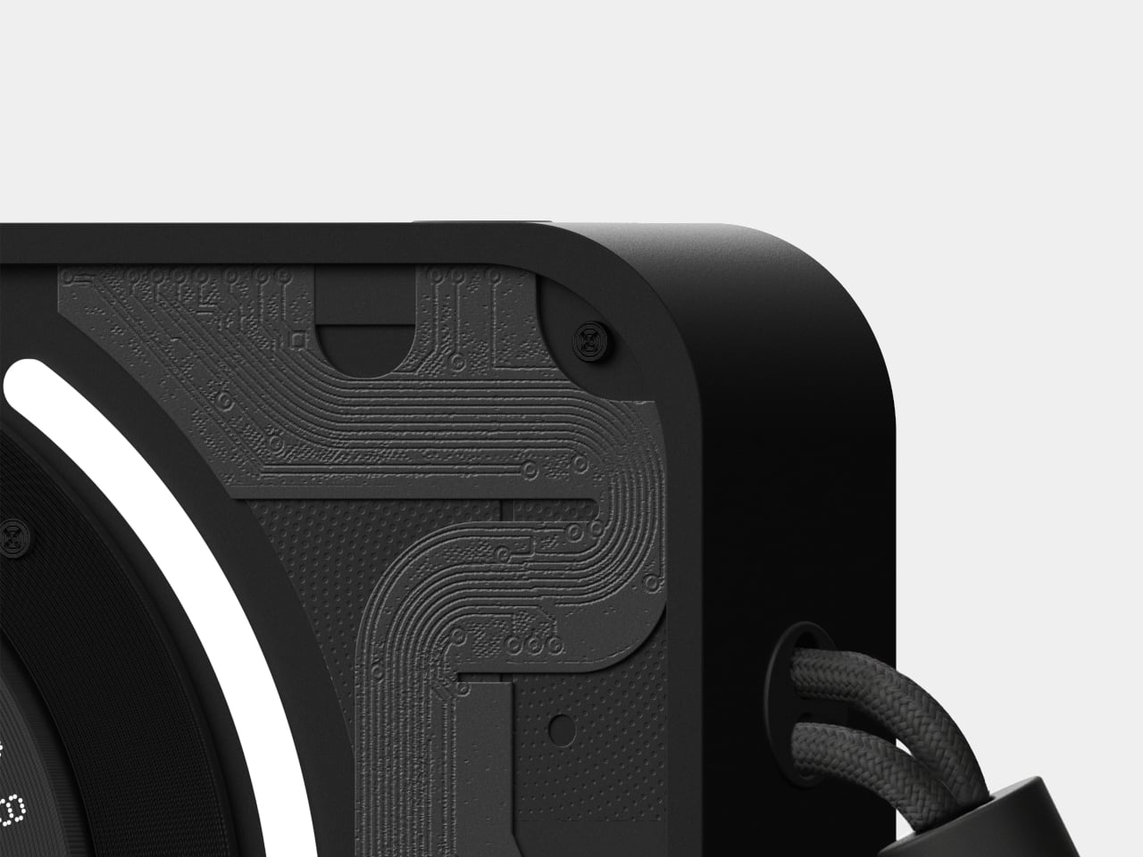
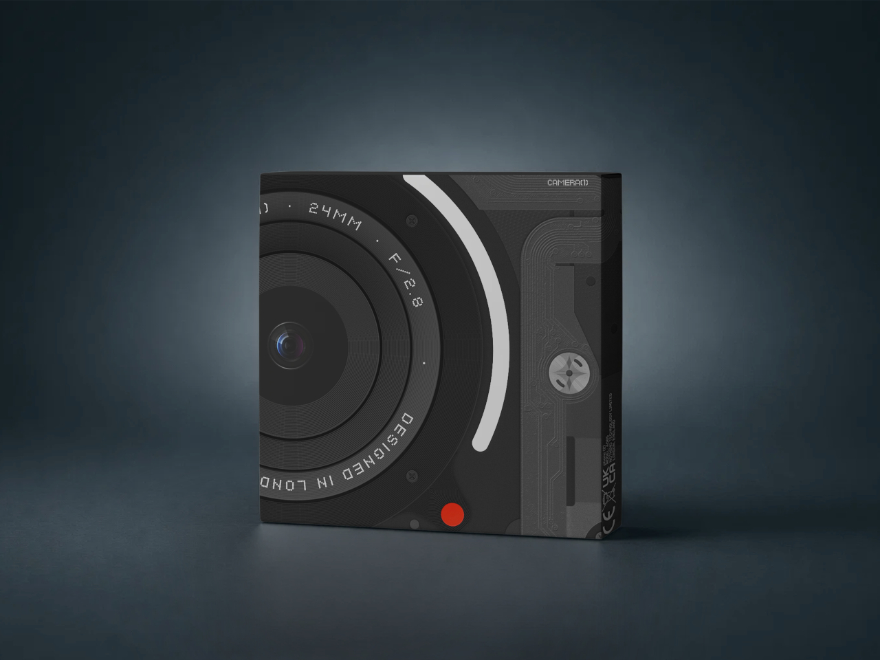
The bead-blasted metal shell, the layered front panel with circuit-like relief, and the small red accents and screws give the camera a technical, almost transparent character without actually exposing its internals. It feels like a piece of hardware that is honest about how it works but still restrained enough to live on a café table or hang from a wrist strap without looking like it is trying too hard.

Camera (1) is not trying to beat the phone at convenience. It is offering a different relationship with photography, one where you press real buttons, read simple glyphs, and let light and tactility tell you what the camera is doing. In a world where every screen wants something from you, a compact that just wants you to notice what is in front of it feels like a refreshing thought experiment.

The post Camera (1) Imagines a Tactile Digicam for a Screen-Tired Generation first appeared on Yanko Design.
5 Best Transparent Tech Of January 2026 That Just Beat Nothing at Its Own Game

Transparent technology has moved far beyond its novelty phase to become a legitimate design movement reshaping how we interact with our devices. What started as a nostalgia trip courtesy of Nothing’s transparent phones has evolved into a full-blown aesthetic revolution where seeing the guts of your gadgets is no longer just acceptable but desirable. The best transparent designs do more than simply expose circuitry; they create visual narratives about how technology works while delivering genuine functional benefits that justify their existence beyond mere eye candy.

January 2026 has given us a particularly strong lineup of transparent tech that ranges from retro-futuristic audio devices to gaming powerhouses wrapped in see-through shells. These designs prove that transparency works across every category of consumer electronics when executed with intention and intelligence. The following five products represent the pinnacle of this movement, each bringing something unique to the table while celebrating the beauty of visible mechanics and electronic components in ways that feel fresh rather than gimmicky.

1. Transparent Sony Walkman Concept

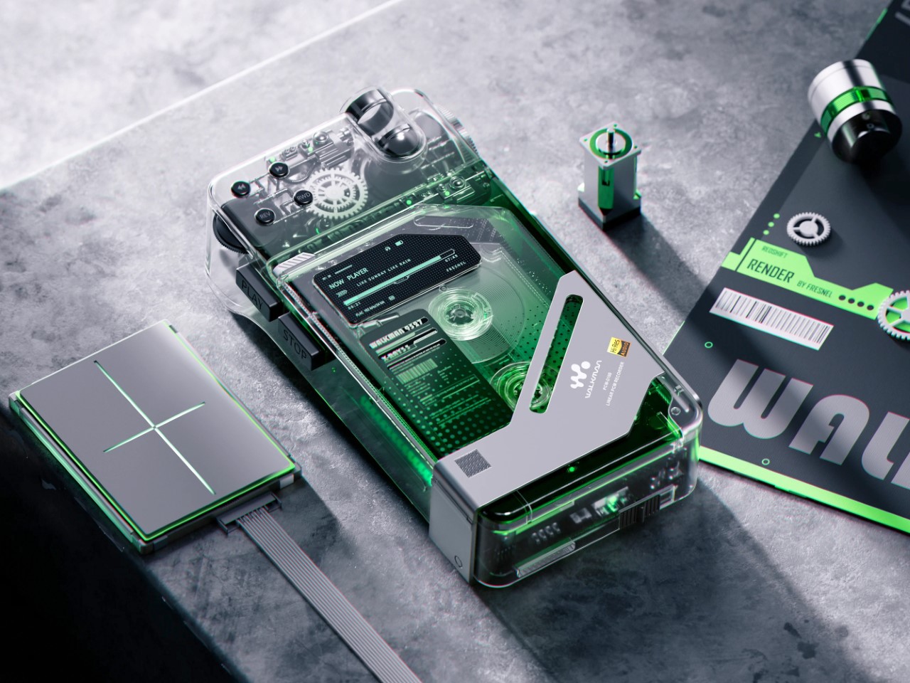
This transparent cassette recorder concept represents everything compelling about retro-futurism executed with modern design sensibilities. The device combines the tactile satisfaction of analog media with visual transparency that transforms mechanical components into the main attraction. Those exposed gears and rollers work their magic through crystal-clear housing that makes the entire mechanism visible during operation, creating a mesmerizing display of analog technology in motion. The top-mounted mechanical elements evoke luxury watch movements where visible complexity becomes the primary selling point rather than something to hide behind opaque shells.
The design succeeds because it creates genuine tension between old and new technologies rather than simply copying vintage aesthetics. A digital display nestles among analog components, suggesting computational intelligence working alongside mechanical systems. Those pixel-perfect UI elements visible through transparent housing indicate this isn’t merely a playback device but something with smart capabilities. The tiny control buttons along the top edge deliberately reference 80s Sony recorders while embracing modern miniaturization techniques. This Walkman concept could easily exist in Blade Runner’s world or on a contemporary design enthusiast’s shelf with equal credibility.

What We Like

  • The visible gear systems create a hypnotic viewing experience during tape playback.
  • The combination of analog mechanics and digital intelligence feels genuinely innovative.
  • The transparent housing transforms mechanical movement into visual entertainment.
  • The design language successfully bridges multiple decades of technology evolution.

What We Dislike

  • Physical media dependence limits practicality for streaming-era consumers.
  • The concept status means you cannot actually purchase this beautiful object.

2. Pomera DM250 Crystal Neon Yellow

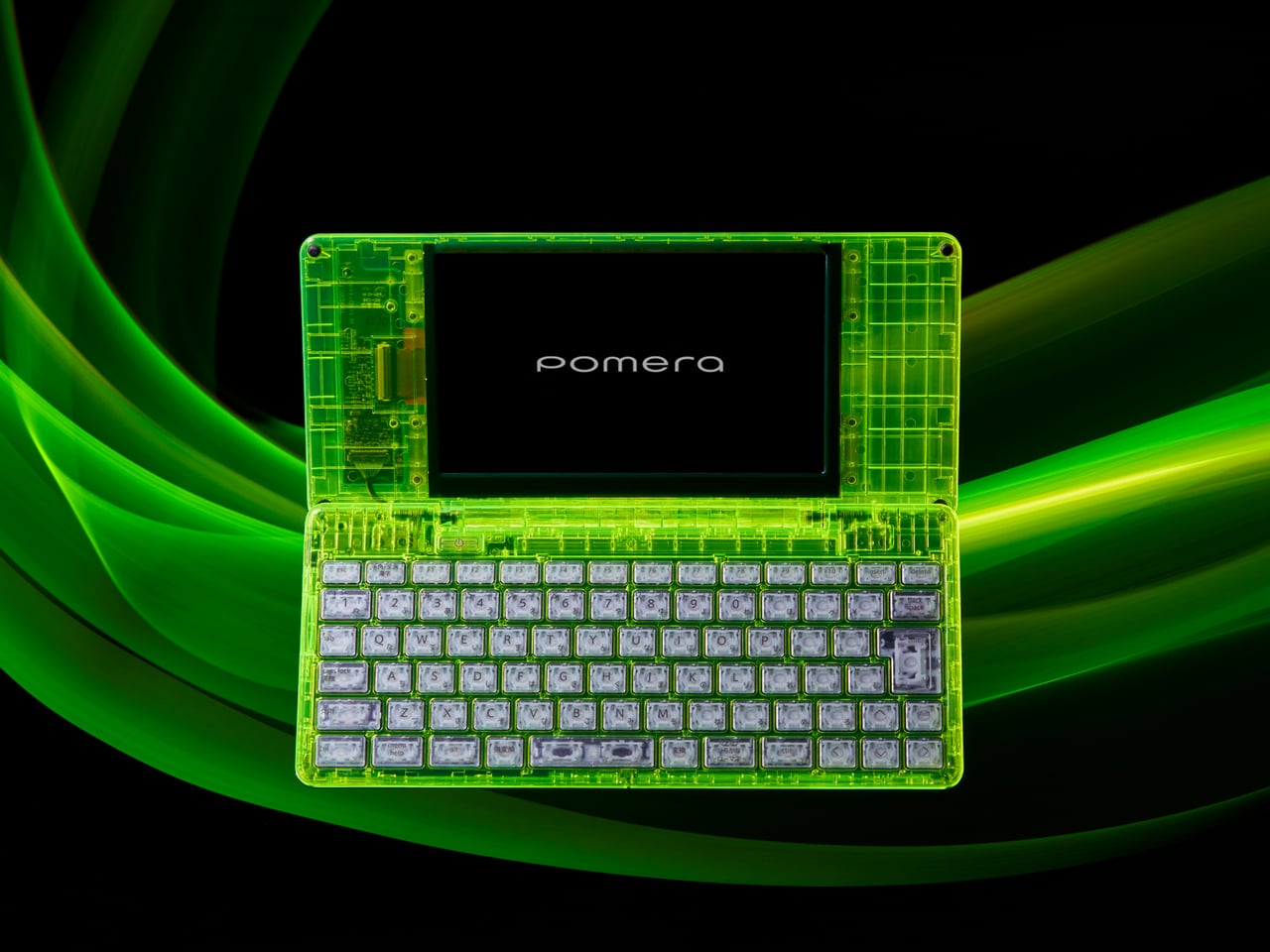
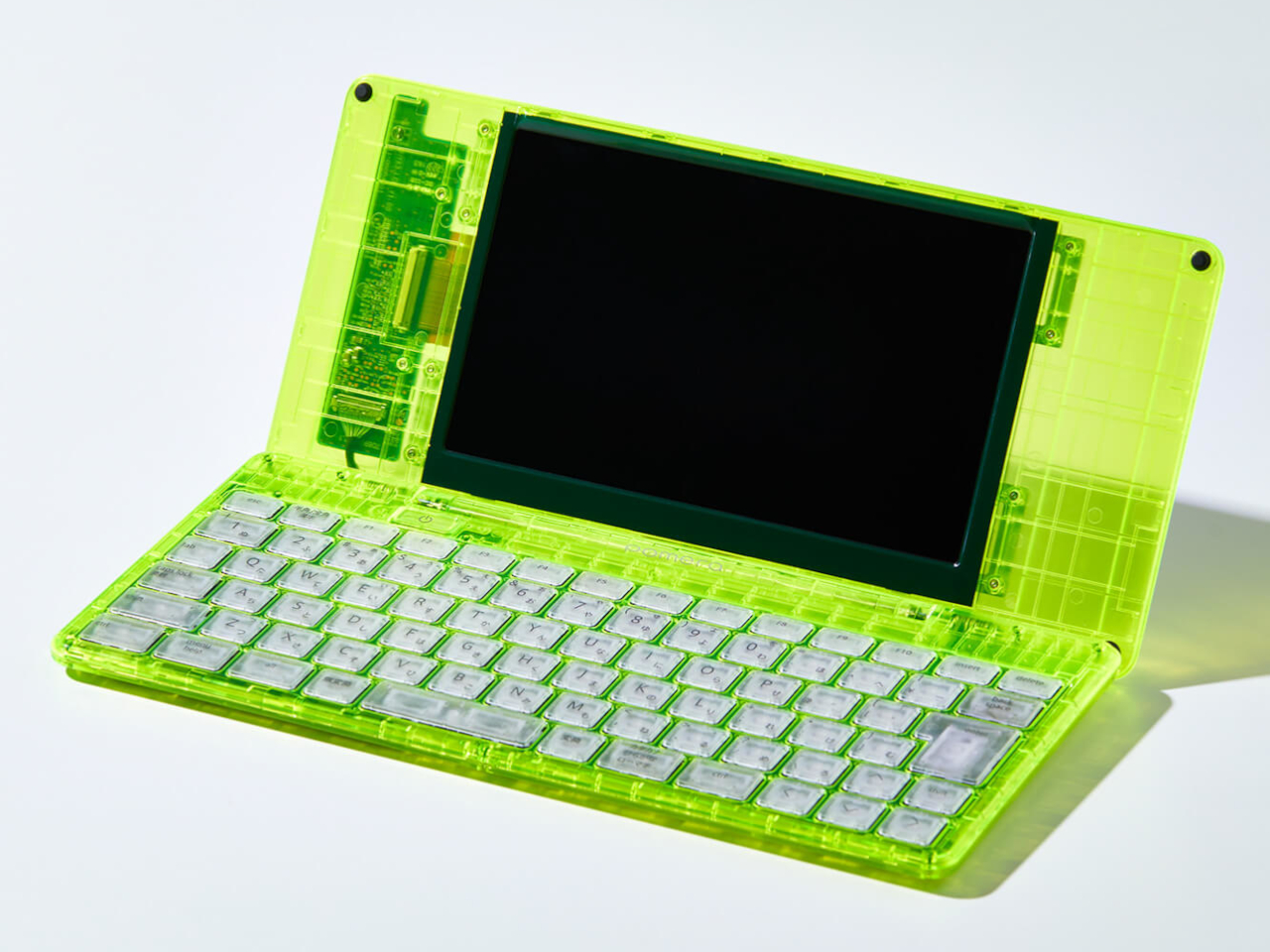
The limited-edition Pomera DM250 in Crystal Neon Yellow ditches conventional white or black finishes for a vivid, almost glowing green shell that channels cyberpunk aesthetics straight out of futuristic cinema. The transparent design feels deliberately pulled from a William Gibson novel, mixing nostalgia for vintage computing with an ultra-modern sensibility that makes the device feel both retro and cutting-edge simultaneously. This isn’t just a writing tool but a statement piece that announces your commitment to focused creativity before you type a single word.

The core philosophy here centers on unwavering dedication to one task: getting words onto the screen without distractions. The DM250 sports a compact yet full-size 80-key keyboard paired with a crisp monochrome LCD that strips away every possible distraction. The software is deliberately minimal, offering everything a writer needs for text creation while providing nothing that might derail focus or waste precious writing time. That transparent shell showcasing the device’s internal components serves as a visual reminder of its pure functionality, where every element exists to support the writing process rather than tempt you toward multitasking.

What We Like

  • The monochrome display eliminates distractions that kill writing productivity.
  • The full-size keyboard delivers proper typing ergonomics in a compact form.
  • The Crystal Neon Yellow finish makes a bold visual statement.
  • The single-purpose design philosophy respects writers’ focus needs.

What We Dislike

  • The monochrome display feels dated compared to modern screen technology.
  • Limited functionality beyond text editing restricts versatility for mixed workflows.

3. RedMagic Astra Gaming Tablet

Nothing spent years teasing transparent design language, while RedMagic simply dropped the Astra with a full transparent strip down its back panel, complete with faux circuit board details that scream technological prowess. The visual trickery taps into tech enthusiast psychology that made transparent Game Boys and iMacs cultural phenomena decades ago. Those faux components create an impression of hardware sophistication perfectly aligned with gaming tablet expectations. RedMagic effectively claimed transparent tablet territory before Nothing could plant their flag, proving that execution speed sometimes matters more than brand heritage in emerging design categories.

The transparent strip serves as eye candy on what might be the most compelling compact gaming tablet available. RedMagic packed the Astra with the Snapdragon 8 Elite processor and hardware that puts most full-sized tablets to shame. The 9.06-inch form factor feels genuinely manageable for handheld gaming while maintaining enough screen real estate for immersive experiences. Aggressive pricing makes the iPad Mini look overpriced and underpowered by comparison. The Astra knows exactly what it wants to be: a gaming powerhouse that happens to work as a tablet, rather than a tablet that sorta plays games. This focused approach pays dividends across every aspect, from display technology to thermal management systems.

What We Like

  • The Snapdragon 8 Elite processor delivers flagship performance in a compact package.
  • The transparent design differentiates it from generic black rectangles flooding the market.
  • The 9.06-inch size balances portability with usable screen space for gaming.
  • Aggressive pricing undercuts competitors while delivering superior hardware specifications.

What We Dislike

  • Faux circuit board details might feel inauthentic to purists wanting real component exposure.
  • Gaming focus means it might not excel at productivity tasks that some users expect from tablets.

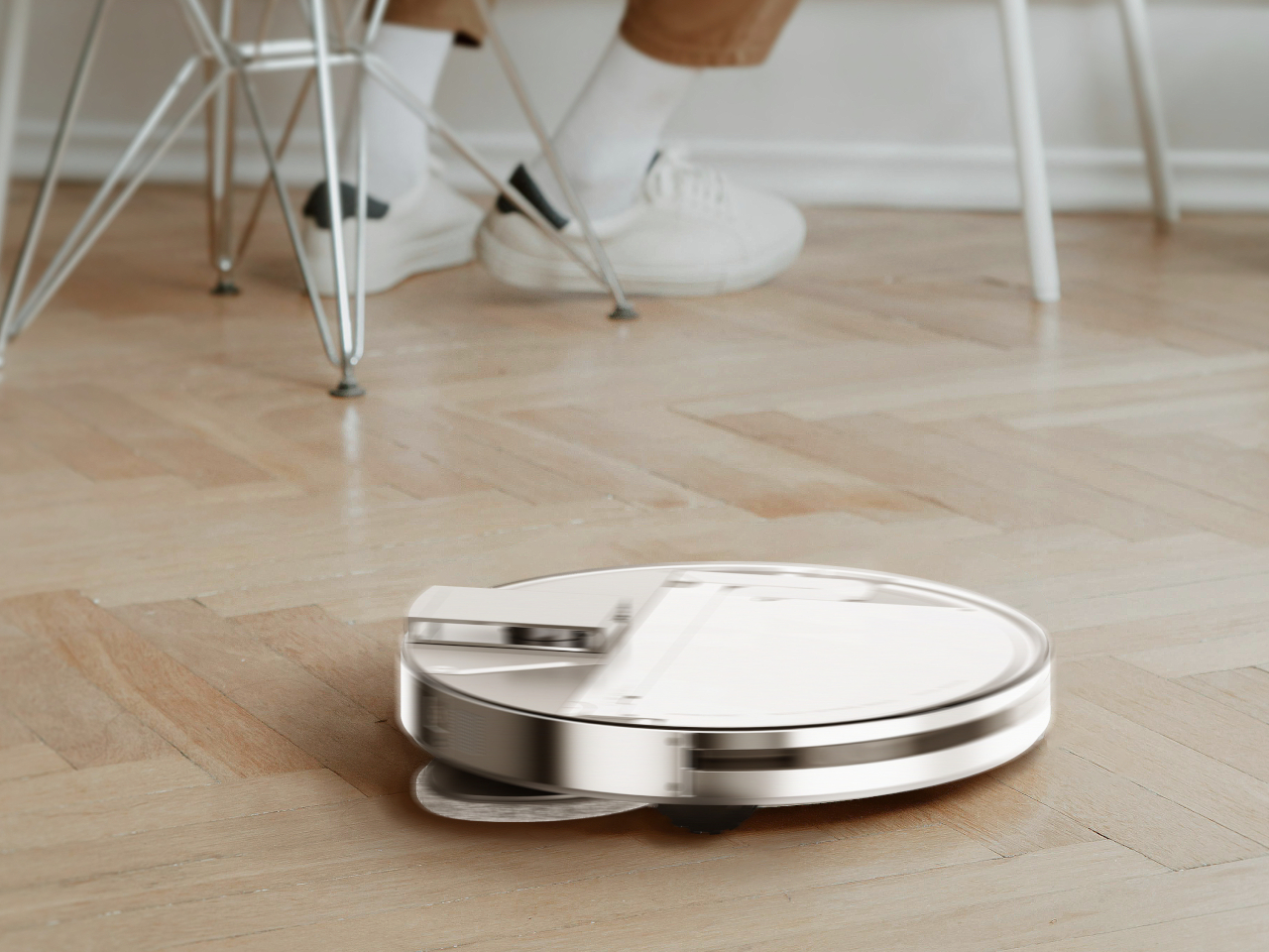
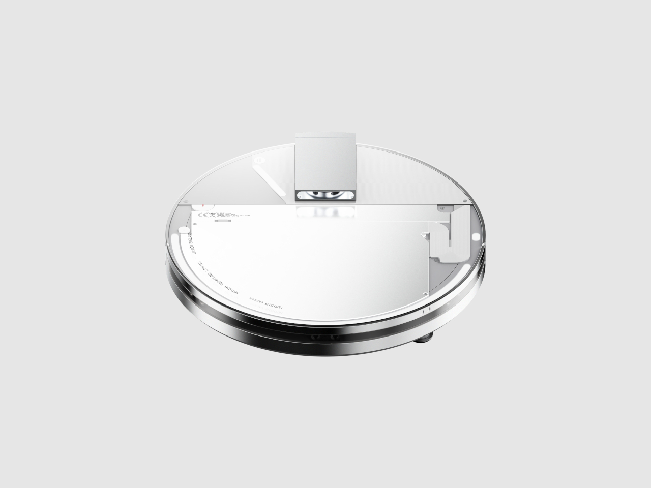
4. Nothing-Inspired Transparent Robot Vacuum

Designer Taeyeon Kim took the transparent tech aesthetic and applied it to one of the most mundane household appliances imaginable, creating an independent concept that reimagines how cleaning technology could integrate into daily life. The transparent philosophy celebrates inner workings rather than hiding them behind opaque plastic shells that make appliances invisible and forgettable. This vacuum features a completely clear shell exposing all internal components from the motor and sensors to the circuitry, making it function, transforming utilitarian hardware into something worth displaying prominently.

Most robot vacuums are designed for invisibility, tucked away in corners where they won’t interfere with carefully curated interior design schemes. Kim’s concept takes the opposite approach entirely, embracing transparency and modularity to create a cleaning system that actually wants to be seen and interacted with regularly. The exposed components serve educational purposes, helping users understand how their cleaning technology actually works while making maintenance and troubleshooting more intuitive. The modular design philosophy means components can be swapped or upgraded without replacing the entire unit, extending product lifespan while reducing electronic waste that plagues the appliance industry.

What We Like

  • The transparent shell transforms a mundane appliance into an interesting design object.
  • Exposed components make maintenance and troubleshooting more intuitive for users.
  • The modular philosophy extends product lifespan through component upgrades.
  • The design challenges the appliance industry norms around hiding technology from view.

What We Dislike

  • Visible dirt accumulation in transparent components might require more frequent cleaning.
  • The concept status means this innovative design isn’t available for purchase yet.

5. Sony WF-C710N Glass Blue Earbuds

The Glass Blue variant of Sony’s WF-C710N earbuds challenges the industry’s tendency toward either clinical white or anonymous black with a design choice that celebrates rather than conceals technological sophistication. The transparent housing goes beyond mere novelty to create a visual narrative about the engineering packed into these tiny devices. Sony offers four color options, but the Glass Blue stands out by making the internal components part of the aesthetic rather than something requiring concealment. The naturally elegant, compact form factor prioritizes both aesthetics and functionality in ways that prove transparent design works even at this miniature scale.

Sound quality remains Sony’s primary focus despite attention-grabbing aesthetics that could easily overshadow performance. The unique 5mm drivers deliver powerful bass and crystal-clear vocals across all music genres, while Digital Sound Enhancement Engine processing restores high-frequency elements often lost in compressed digital audio files. This technical prowess ensures the WF-C710N earbuds sound as impressive as they look, delivering an audio experience satisfying even discerning listeners who prioritize performance over style. The noise-canceling capabilities work seamlessly with the compact design, proving that transparent housings don’t require compromises in acoustic performance or active noise management systems.

What We Like

  • The Glass Blue finish makes a bold statement against boring black or white alternatives.
  • The 5mm drivers deliver impressive audio quality from compact components.
  • Digital Sound Enhancement Engine processing restores lost audio details effectively.
  • Active noise canceling proves transparent design doesn’t compromise acoustic performance.

What We Dislike

  • The transparent design might show dirt and debris accumulation more visibly than opaque alternatives.
  • The 5mm drivers might not satisfy audiophiles seeking maximum bass response depth.

The Transparent Future

Transparent technology has matured from gimmick to genuine design movement with staying power. The five products showcased here demonstrate how exposure of internal components can serve both aesthetic and functional purposes when executed thoughtfully. Designers are moving beyond simply slapping clear cases on existing products to creating devices where transparency informs every aspect of the user experience, from interaction patterns to maintenance accessibility. The visual honesty of exposed mechanics and circuitry creates connections between users and their technology that opaque housings cannot replicate.

What makes January 2026’s transparent offerings particularly compelling is their diversity across product categories and price points. From retro-futuristic Walkman concepts to pragmatic writing tools and gaming tablets, transparent design proves its versatility. These products suggest we’re entering an era where seeing how our devices work isn’t just acceptable but expected by consumers who want deeper relationships with their technology. The transparent revolution is just beginning, and these five designs point toward a future where every electronic device might celebrate rather than hide its technological sophistication.

The post 5 Best Transparent Tech Of January 2026 That Just Beat Nothing at Its Own Game first appeared on Yanko Design.