One Pole to Rule Them All: The Swiss Army Knife of Streetlights

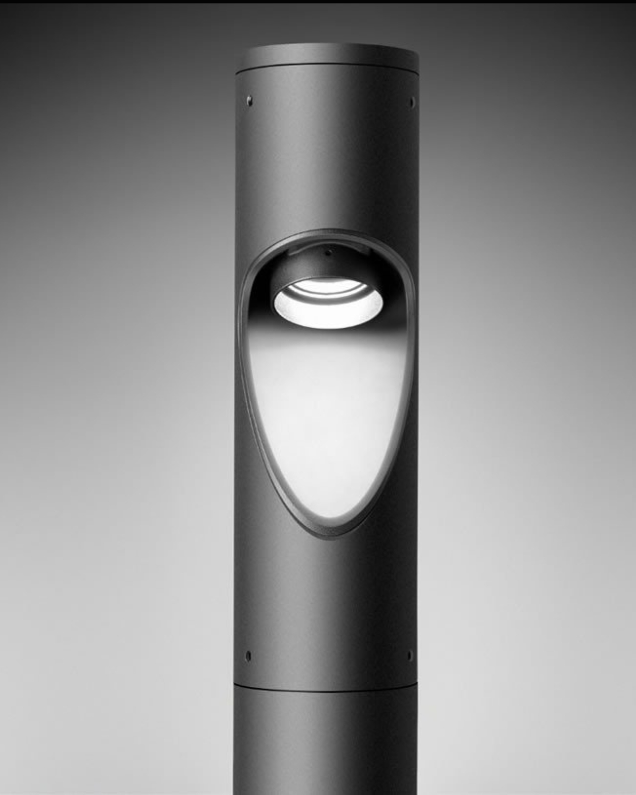
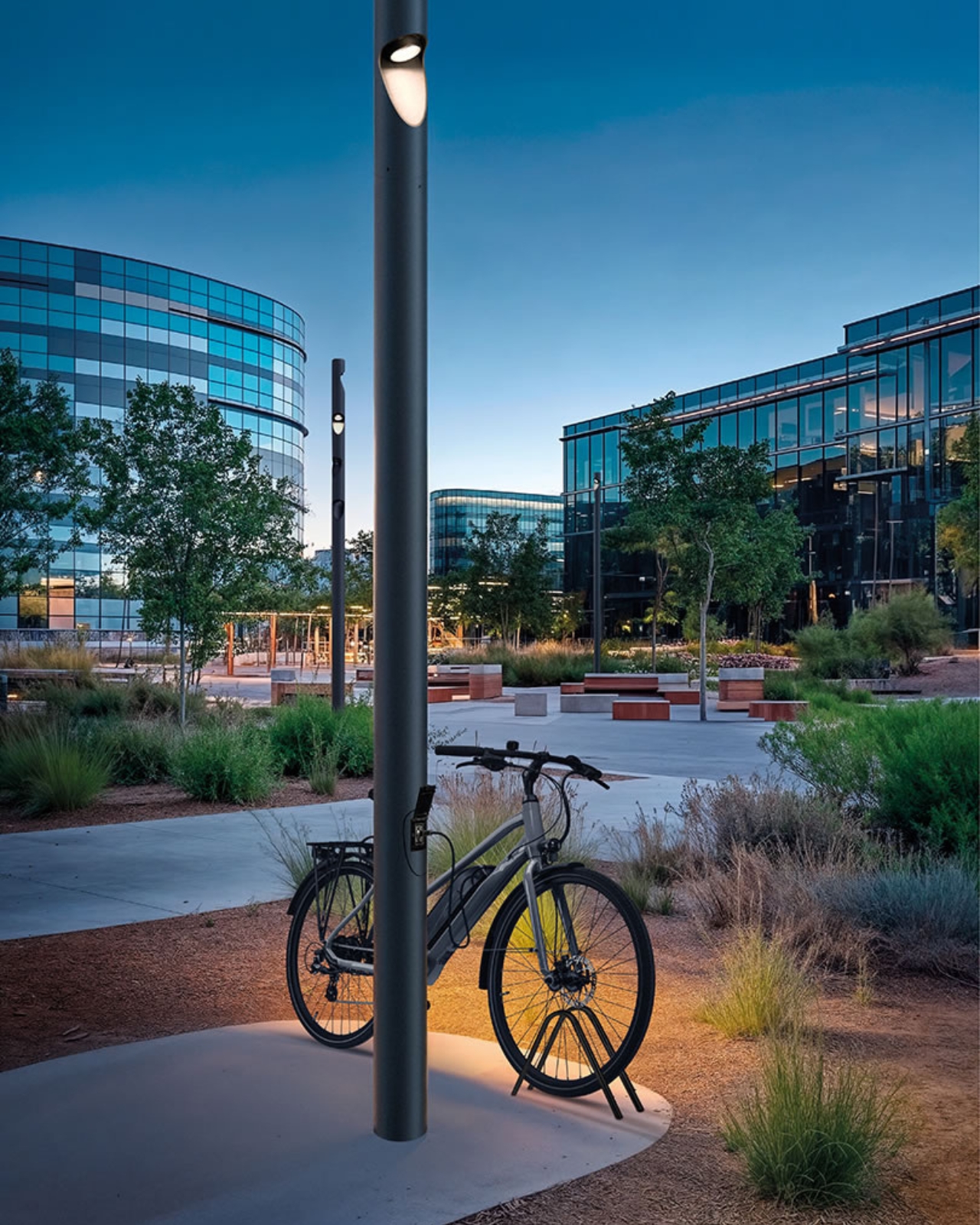
You know those moments when you walk through a city and notice something that makes you think, “Why didn’t anyone think of this sooner?” The Shift Pro by Italian design firm Simes is one of those designs. It’s not trying to reinvent the wheel, but it’s definitely reimagining what a simple streetlight can do.

Think of it as the Swiss Army knife of urban infrastructure. Instead of cluttering our sidewalks with separate poles for lighting, cameras, speakers, and Wi-Fi routers, Simes has condensed everything into one sleek, weatherproof system that actually looks good while doing all the heavy lifting.

Designer: Simes

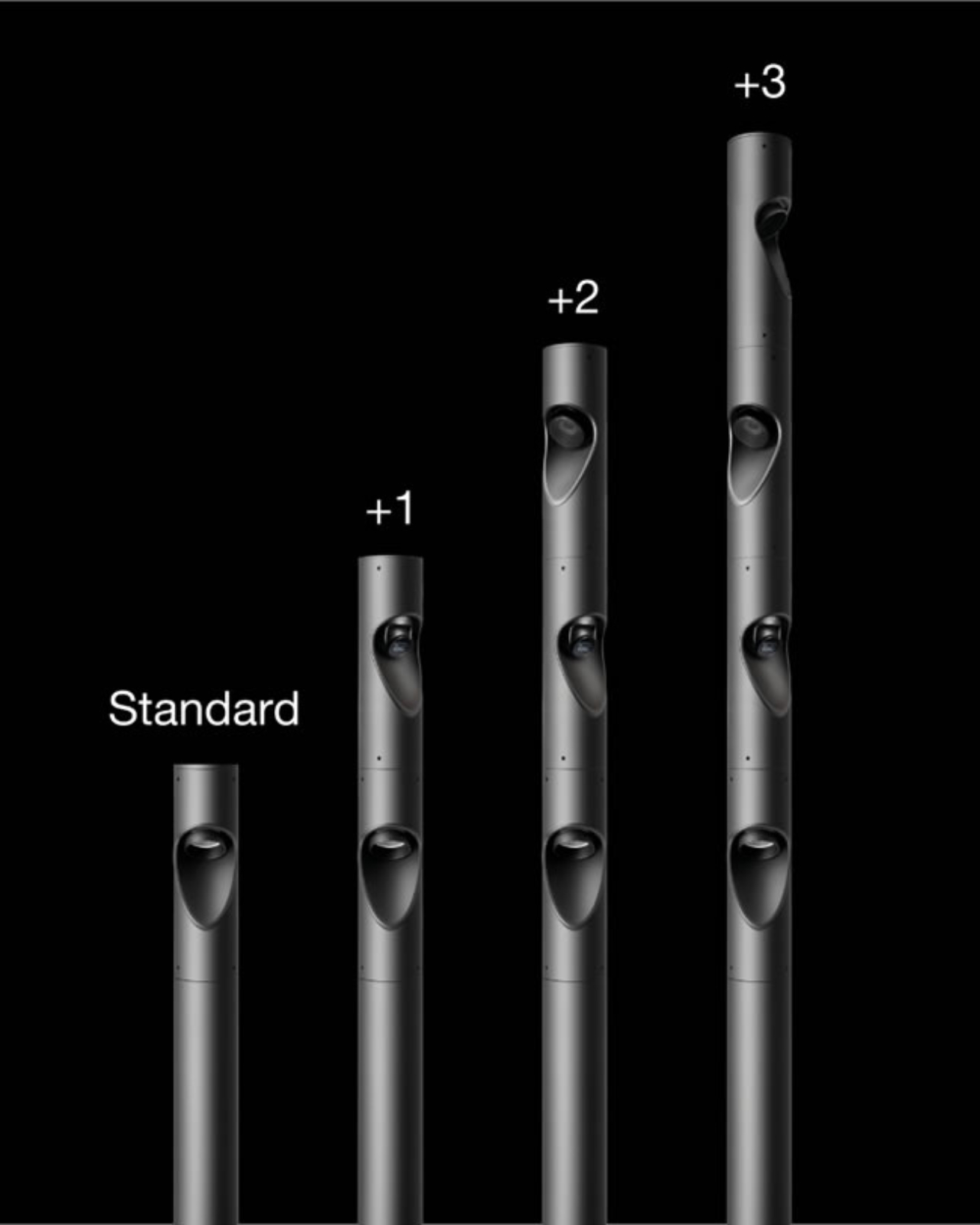
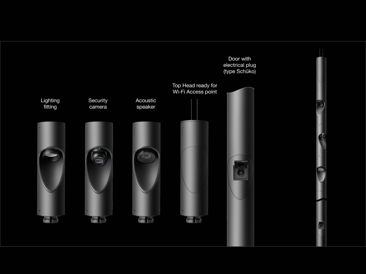
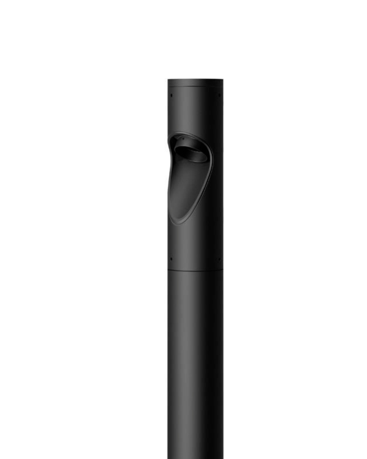
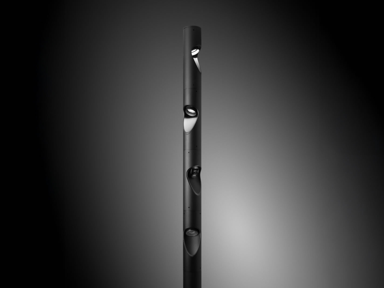
At first glance, the Shift Pro looks like your typical modern street pole with a minimalist black finish. But here’s where it gets interesting: this thing can be equipped with up to four independently manageable modular heads. Each head can be customized to serve different functions, from adjustable LED lighting to IP67 security cameras, passive acoustic speakers, or Wi-Fi access points. Oh, and if you’re riding an e-bike or electric scooter, there’s even an optional door with an electrical socket for charging.

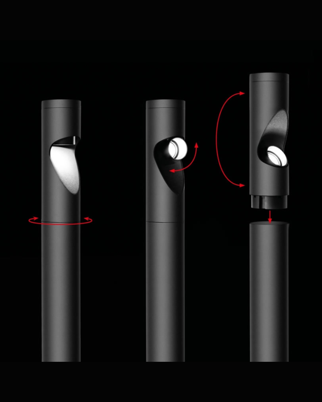
The flexibility here is genuinely impressive. Each head can rotate 360 degrees, and the integrated projectors can tilt up to 90 degrees. This means you’re not stuck with fixed lighting that only illuminates one spot. Cities can adjust the configuration based on what each specific location needs. A park might prioritize lighting and speakers for events, while a commercial district could lean into surveillance and Wi-Fi connectivity.

What I really appreciate about the Shift Pro is how it addresses a real urban planning headache. Walk down any busy street and you’ll see the visual clutter: one pole for streetlights, another for traffic cameras, a third for public Wi-Fi, maybe a fourth for something else entirely. It’s messy, it’s expensive to maintain, and honestly, it’s not great to look at. By consolidating these functions, Simes isn’t just solving an aesthetic problem but also making cities more efficient and potentially saving money on installation and maintenance.

The technical specs are solid too. With an IP66 protection rating and IK10 impact resistance, this pole is built to withstand whatever weather or vandalism throws at it. The LED lighting comes with DALI 2 dimming capabilities, which means cities can easily adjust brightness levels based on time of day or specific needs. During late hours, for instance, lights could dim to save energy but brighten when motion is detected.

Of course, there’s the elephant in the room: surveillance. The idea of integrated cameras might make some people uncomfortable. And that’s a valid concern worth discussing. We’re living in an era where the balance between public safety and privacy is constantly being negotiated, and adding more cameras to our streets isn’t a decision to take lightly. But the beauty of the modular design is that cities can choose which functions to include. If a community decides they’d rather not have cameras, they can opt for lighting and connectivity instead.

What makes the Shift Pro particularly clever is how it turns infrastructure into a service platform. Cities aren’t just getting a light pole, they’re getting a foundation for smart city technology that can evolve over time. Need to add emergency communication features later? Swap out a head. Want to upgrade the camera system? Same deal. This kind of flexibility is increasingly important as urban technology advances faster than traditional infrastructure can keep up.

Simes, based in Italy’s Franciacorta region, has been specializing in outdoor lighting for years with a focus on what they call “Light for all around the building.” The Shift Pro feels like a natural evolution of that philosophy, expanding from just illuminating spaces to genuinely enhancing how those spaces function and connect.

Since a lot of cities are getting smarter but also more cluttered with technology, the Shift Pro offers a refreshingly elegant solution. It’s not flashy or revolutionary in the disruptive sense, but it’s thoughtful design that makes you wonder why we’ve been doing things the complicated way for so long. Sometimes the best innovations aren’t about inventing something entirely new, but about combining what already exists in a way that just makes sense.

The post One Pole to Rule Them All: The Swiss Army Knife of Streetlights first appeared on Yanko Design.

SPOT ON Charger Makes Wireless Charging Feel Like a Bullseye

Wireless chargers have become common, but most are anonymous black discs that disappear into the desk. They do the job, but rarely feel personal or satisfying to use beyond the first week you own them. SPOT ON is a concept that tries to make charging feel more deliberate and expressive, combining a magnetic pad with a small lamp so the whole interaction has a bit more presence on your nightstand or desk.

SPOT ON is a wireless charger and ambient lamp concept designed around a bow-and-target motif. The charging pad is a circular target that snaps magnetically to the front of a tilted cylindrical lamp body. You can dock the pad to use it as a stand charger, or pull it off and lay it flat as a separate wireless pad while the lamp continues to glow in the background.

Designer: SEUNG-A-LEE

Inside the pad is a magnet that aligns the phone with the charging coil, so when you bring your device close, it snaps into place with a satisfying click. The designer explicitly likens this to hitting the target, turning the usual hunt for the right charging spot into a more playful, bullseye moment. The subtle cross mark on the pad reinforces that visual cue every time you place your phone.

The lamp body is a tilted cylinder with vertical grooves, mounted on a simple rectangular base. When lit, the ribbed surface diffuses a warm, gentle glow, more mood light than task lamp. It’s the kind of object that can sit on a bedside table or shelf without screaming tech, giving you a bit of atmosphere while your phone charges upright in front of it.

Because the pad attaches magnetically, it can be pulled off in one motion and used as a flat wireless charger anywhere on the desk or nightstand. The lamp stays behind as a standalone light. That separation lets users adapt SPOT ON to different environments and habits, whether they prefer a stand for video calls or a low pad for casual overnight charging without the upright position.

SPOT ON comes in soft, desaturated tones like warm beige, blush pink, and muted teal, each with a matching pad. The palette leans more toward interior decor than gadgetry, making it easier to blend into different rooms. The combination of simple geometry, gentle colors, and the bow-and-target metaphor gives the charger a character that feels more like a small object you chose than a piece of infrastructure you tolerate.

SPOT ON is a reminder that even something as mundane as charging a phone can be turned into a small ritual. By adding a magnetic snap, a bit of ambient light, and a form that shifts between stand and pad, it nudges the interaction from purely functional to quietly satisfying. For anyone tired of generic charging pucks, this kind of concept hints at a more thoughtful future for everyday tech.

The post SPOT ON Charger Makes Wireless Charging Feel Like a Bullseye first appeared on Yanko Design.

These 3D-Printed Lamps Glow Like Coral Reefs

There’s something quietly radical happening when designers stop thinking about furniture as rigid, finished objects and start treating them like organisms that could have grown from the ocean floor. That’s exactly what YET FAB has done with their Alherd Collection, a series of lamps that look less like traditional lighting and more like glowing coral formations pulled from some computational reef.

Founded by Ilya Kotler, Anastasiya Kotler, and Rael Kaymer, YET FAB sits at that fascinating intersection where material science meets algorithmic design. The Alherd lamps are all born from the same generative system, inspired by how coral grows and how water erodes stone over centuries. The result is a porous, cellular texture that doesn’t just hold light but transforms it into something softer, more atmospheric, more alive.

Designer: YET FAB

What makes this collection especially interesting is how it scales. Rather than designing three separate products, YET FAB created one visual language that works whether you’re holding a compact table lamp or standing next to a 130 cm floor sculpture. It’s a smart approach that gives the collection a cohesive identity while offering real flexibility for different spaces and needs.

The table lamp is the quiet overachiever of the trio. Small enough to live comfortably on a desk or nightstand, it has this sculptural presence that works even when it’s switched off. But here’s where it gets clever: inside that organic, textured shell is a customizable filter system. You can swap out internal filters to shift the mood completely, moving from warm amber to soft white to deep red without changing how the lamp looks externally. It’s like having multiple lamps in one body, ready to adapt to whether you’re working late, hosting friends, or just need something moody for a quiet evening.

That adaptability matters more than it might seem at first. We’re living in smaller spaces with less room for single-purpose objects, and lighting plays a huge role in how a room feels. A lamp that can shift its emotional register without demanding more square footage? That’s genuinely useful design thinking wrapped in a beautiful package.

Then there’s the floor lamp, which takes everything up several notches in scale and presence. Standing at 130 cm, this piece becomes a vertical sculpture that anchors a room rather than just illuminating it. It’s made from recyclable plastic using a custom 3D printing process, which means each one is fabricated to order. The sustainability angle isn’t just marketing speak here; it’s baked into how these lamps are actually made.

You can choose between fully transparent or a sunset gradient finish, each offering a different vibe. Both versions use internal LED tubes that make the entire porous surface glow from within, creating this soft halo effect that feels more like ambient sculpture than functional lighting. It’s the kind of piece that makes you rethink what a floor lamp can be.

The pendant version brings that same organic aesthetic overhead. Suspended by two minimal cables, it floats above dining tables or work surfaces with an elongated form that breaks away from the typical linear pendant design. There’s something almost weightless about how it hangs there, despite having such a strong visual presence. Like its siblings, it comes in transparent or sunset gradient finishes and uses that same coral-inspired, porous surface to diffuse light gently across whatever space it occupies.

What ties all three pieces together isn’t just their shared aesthetic DNA but the philosophy behind them. YET FAB is researching how computational design can create forms that reference natural systems without mimicking them directly. These aren’t literal recreations of coral; they’re interpretations of how natural structures grow, adapt, and interact with light. It’s biomimicry filtered through algorithms and fabricated with contemporary technology.

Every lamp in the Alherd series is made to order and can be customized in color on request, which adds another layer of personalization to an already thoughtful collection. In a world drowning in mass-produced lighting that all looks vaguely the same, there’s something refreshing about objects that feel computationally precise yet organically imperfect, sustainable yet sculptural, functional yet deeply atmospheric. These aren’t just lamps. They’re experiments in how we might live with light differently.

The post These 3D-Printed Lamps Glow Like Coral Reefs first appeared on Yanko Design.

These Modular Wax Lights Stack Like Living Totems

There’s something almost magical about watching a candle melt, the way solid wax transforms into liquid and back again. Copenhagen-based studio Daydreaming Objects has taken that transformative quality and turned it into something completely unexpected: sculptural light towers that feel like they’re alive.

Their project, Soft Solids, recently won the Seoul Design Award 2025, and once you see these pieces, you’ll understand why. These aren’t your typical lamps. They’re modular sculptures that stack like organic totems, built from specially developed natural wax blends and vintage lighting hardware salvaged from mid-20th-century fixtures across Sweden, Italy, and former Czechoslovakia.

Designer: Daydreaming Objects (photos by Norbert Tukaj)

The beauty of this project lies in its contradiction. Wax feels temporary, fragile even. We think of it dripping down birthday candles or melting in the sun. But Daydreaming Objects has figured out how to make it durable, heat-resistant, and strong enough to serve as functional lighting. They’ve developed a blend using soy wax and stearin, a vegetable or animal fat derivative that’s far more sustainable than petroleum-based paraffin. The result is a material that can be endlessly recycled, melted down and recast into new forms without losing its integrity.

What makes Soft Solids particularly clever is its modularity. The Stem light sculpture, one of the standout pieces in the collection, consists of cylindrical wax units that stack vertically. You can add or remove sections, adjusting the height and composition to fit your space or mood. It’s like playing with blocks, except these blocks glow. By day, they stand as quiet, solid forms with a minimalist presence. By night, LED lights transform them into luminous columns that diffuse warmth throughout a room.

The design philosophy here draws heavily from nature. The biomorphic shapes echo patterns of growth and regeneration you’d find in plants or geological formations. The color palette reinforces this connection: off-white, soft blue, and muted green hues that evoke natural landscapes rather than synthetic spaces. Each piece receives a protective natural layer that increases strength and heat resistance while ensuring the LED light diffuses evenly through the wax.

But there’s also an element of nostalgia woven into these contemporary pieces. The vintage hardware, those metal and glass components from decades past, gives each light sculpture a sense of history. It’s not just about sustainability through using renewable materials but also about extending the life of objects that already exist. Instead of letting old lamp parts gather dust in storage or end up in landfills, Daydreaming Objects pairs them with something entirely new, creating a conversation between past and present.

The process itself is surprisingly high-tech for such an organic-feeling result. The designers use computer software and 3D printing technology to create prototypes and silicone negatives for casting the molten wax. Each shade is specifically designed to match its vintage base, ensuring both aesthetic harmony and functional compatibility. It’s a fascinating blend of digital precision and handcrafted sensibility.

What’s particularly relevant right now is how this project addresses our growing awareness of material waste and circular design. Wax is infinitely recyclable. If a piece breaks or you simply want to change it, you can melt it down and start over. This circular approach to lighting design feels refreshingly honest in a world drowning in disposable products. For anyone interested in where design is heading, Soft Solids offers a compelling glimpse. It proves that sustainable materials don’t have to look earnest or utilitarian. They can be poetic, playful, and deeply beautiful. The project challenges our assumptions about what’s permanent and what’s temporary, what’s precious and what’s everyday.

Daydreaming Objects has essentially created a new design language where transformation isn’t a bug but a feature. The very impermanence of wax becomes its strength, allowing for endless reimagining. These light sculptures don’t just illuminate rooms; they illuminate a path forward for thoughtful, regenerative design that respects both history and the future.

The post These Modular Wax Lights Stack Like Living Totems first appeared on Yanko Design.

This Designer Just Made a Lamp You Pump Up Like a Bike Tire

Picture this: a lamp that literally grows before your eyes, expanding and glowing brighter as you pump air into it like you’re inflating a bicycle tire. It sounds like something out of a science fiction movie, but it’s very real, and it’s called Blow. Designer Jung Kiryeon has created something that makes you rethink what a lamp can be, and honestly, it’s kind of mesmerizing.‎

The Blow lighting series isn’t your typical flip-a-switch-and-forget-it situation. Instead, these interactive lamps require you to physically engage with them using a hand pump. As you pump air into the structure, the lamp inflates and the light gets brighter. The more pressure you add, the more the lamp expands, creating this beautiful visual transformation right in front of you. It’s functional art that responds to your actions in real time.‎

Designer: Jung Kiryeon

Aside from just the cool factor of an inflating lamp, the design actually has a deeper meaning. Jung Kiryeon designed Blow as an exploration of anxiety, specifically the kind that builds up when you’re navigating unfamiliar territory or dealing with negative feedback loops. Instead of treating these uncomfortable feelings as something to push away, the designer examined how they progress and found a way to express them through light, volume, and material.‎

The result is a lamp that actually embodies emotional tension. Think about it: when you’re anxious, that feeling builds and expands inside you. With Blow, you’re literally pumping pressure into a structure, watching it swell and brighten. It’s a physical manifestation of an internal state, transforming something invisible and abstract into something you can see, touch, and control. There’s something oddly satisfying about externalizing that feeling, making it tangible.

The series includes two pieces, Blow 01 and Blow 02, and each one only comes alive through user interaction.‎ You’re not just passively consuming light; you’re actively participating in creating it. This shifts the relationship between person and object from passive to collaborative. The lamp needs you, and in a weird way, you might need it too, especially if you’re looking for a tactile way to process stress or tension.

From a design perspective, Blow sits at this fascinating intersection of product design, emotional wellness, and interactive art. It challenges our expectations about how everyday objects should behave. Most lighting is static: you turn it on, it provides light, end of story. But what if your lamp could be a ritual, a moment of mindfulness, or even a form of stress relief? What if the act of turning on a light could be meditative rather than automatic?

The materials and mechanics behind Blow are also intriguing. The inflatable structure likely uses flexible, durable materials that can withstand repeated expansion and contraction. The integration of lighting with air pressure mechanics requires careful engineering to ensure the light intensifies as the form expands. It’s a technical achievement wrapped in conceptual design. And let’s talk about aesthetics. There’s something undeniably captivating about watching an object transform. The visual language of expansion, the way light diffuses through the inflated material, the organic shapes that emerge as air fills the structure… it all creates a dynamic viewing experience. It’s the kind of thing that would absolutely become a conversation starter in any space.

Blow also taps into our growing interest in experiential design. We’re living in an era where people value experiences and interactions, not just static possessions. This lamp offers both utility and experience. It’s not just about illumination; it’s about the journey of creating that light, the physical effort, the visual reward. Jung Kiryeon’s work reminds us that design can be more than problem-solving or aesthetics. It can be a language for expressing complex emotional states, a way to make the invisible visible. In our increasingly digital world, where so much of what we experience is intangible, there’s something refreshing about a physical object that demands your participation and responds to your input in such an immediate, visceral way.

The post This Designer Just Made a Lamp You Pump Up Like a Bike Tire first appeared on Yanko Design.

This Curved-Light Overhaul Rewrites How a Taiwanese Apartment Breathes and Feels

In the dense fabric of Taichung City, where many apartments follow a predictable rhythm of boxed rooms and tight circulation, one home has been quietly re-scripted into something far more uplifting. Very Studio | Che Wang Architects took a standard Taiwanese unit – one that had long conformed to the typical formula of interior-facing public spaces – and reimagined it as a sanctuary of white light, flowing curves, and subtle sensory cues. The transformation is not dramatic in gesture, but in ethos. The designers approached the project as an opportunity to create a gentler way of inhabiting space.

Before renovation, the apartment suffered from a condition that many urban Taiwanese homes share: the living and dining spaces sat deep in the centre, encircled by rooms that blocked natural light and ventilation. Only one opening on the south side offered sunlight, creating an uneven distribution of brightness and a general feeling of being enclosed. The home wasn’t dysfunctional, but it lacked the openness and warmth that contemporary living often requires.

Designer: Very Studio | Che Wang Architects

The architects began by overturning the logic that kept the apartment so compartmentalised. Instead of adhering to a rectilinear grid, they introduced a pentagon-shaped spatial order—an entirely new geometry that subtly reshaped the experience of moving through the home. By replacing rigid corners with angled walls, they created sightlines that extend rather than stop, and movement paths that feel organic instead of imposed. Light, travelling across these oblique surfaces, gains softness; shadows no longer cut sharply but instead drift gradually, as if sliding across curved paper.

This new spatial framework allowed the team to reorganise the shared spaces more effectively. By opening up the north, west, and south sides, the apartment no longer depends on a single window for illumination. Sunlight now enters from multiple directions, diffusing evenly through the white interior. Air moves more naturally, creating a cross-ventilation pattern that makes the home feel physically lighter and far more comfortable. What used to be the darkest portion of the unit is now the most breathable—an airy core shaped by light rather than walls.

A particularly thoughtful move was the architects’ decision to use sound as a spatial differentiator. Instead of carving the open area into smaller segments, they gave each pentagonal zone a dome-shaped ceiling. These domes alter acoustics subtly: a soft concentration of sound in one zone hints at gathering space; a more diffused quality in another suggests circulation or transition. This sensory layering allows the home to maintain openness while still creating distinct functional pockets. Lighting concealed around the curves of each dome adds a floating glow that enhances this sense of layered depth.

The result is a home that feels both minimal and richly atmospheric. Arches lead sunlight inward; curves erase the harshness of structural edges; air movement becomes part of the spatial choreography. Nothing is loud, yet everything is intentional. The apartment no longer behaves like a series of rooms; it behaves like an environment.

What this project ultimately demonstrates is the power of reframing the basics. With a few bold shifts in geometry and a heightened sensitivity to light, air, and sound, even an unremarkable apartment can become an unexpectedly serene refuge. Good design doesn’t always announce itself; sometimes it simply makes living feel quieter, clearer, and more considered.

The post This Curved-Light Overhaul Rewrites How a Taiwanese Apartment Breathes and Feels first appeared on Yanko Design.

LOOP GEAR LOOPDOT Flashlight Plays 11 Mini Games and Has a Fidget Dial

Flashlights are one of those things you never think about until you need one, and then you spend five minutes digging through drawers looking for the cheap plastic one that barely lights up anymore. Most of them do the bare minimum, offering a single brightness setting and maybe a strobe mode you’ll never use. They’re tools, not gadgets, and they certainly don’t inspire any excitement when you’re packing them into a bag or clipping them to a keychain.

The LOOPDOT by LOOP GEAR approaches this differently. Instead of treating a flashlight as purely functional, it adds a pixel display, a mechanical fidget dial, and enough personality to make you actually want to carry it around. It’s the kind of device that makes you realize how boring most pocket lights have been, combining serious output with features that are genuinely fun to play with.

Designer: LOOP GEAR TEAM

Click Here to Buy Now: $39.99 $49.99 (20% off). Hurry, deal ends in 48-hours! Website Here.

The first thing you notice is how compact it is. At roughly the size of a car key fob, the LOOPDOT slips into pockets, bags, or clips onto keychains without adding noticeable weight. The body is aluminum or titanium, depending on which version you choose, and the finish feels solid in your hand. The pixel display on the front shows twinkling stars, flowing rainbows, or animated patterns that can be changed to match your mood.

The fidget dial dominates the top of the device, a large knurled ring that rotates smoothly to adjust brightness. Unlike buttons that click through preset levels, this dial offers stepless dimming, letting you dial in exactly the amount of light you need. The tactile feedback alone makes it satisfying to spin, even when you’re not adjusting anything. Dual infrared sensors detect rotation without mechanical contacts, ensuring smoother control and longer lifespan.

LOOPDOT offers two lighting modes that switch with a simple shake. Spotlight mode throws a focused 400-lumen beam up to 100 meters, perfect for nighttime walks, finding your tent in the dark, or lighting up a path when you’re hauling groceries from the car. Floodlight mode delivers 270 lumens with a CRI of 90, creating soft, natural light that works beautifully for reading or close-up tasks.

The pixel display isn’t just decoration. It shows battery status, lighting mode, and even plays 11 mini games when you’re waiting around with nothing to do. Rolling dice, tossing coins, or watching animated patterns flow across the screen turns idle moments into something slightly more entertaining. It’s a small touch, but one that makes the LOOPDOT feel less like a tool and more like a gadget you enjoy carrying.

Battery life is respectable for something this small. The 600mAh rechargeable battery lasts up to 11 hours on the lowest setting, or about 1.5 hours on full spotlight blast. USB-C charging means you can top it up with the same cable that charges your phone, and the IPX6 water resistance rating handles rain, splashes, or accidental drops into puddles without issue.

What makes the LOOPDOT feel genuinely different is how it refuses to be boring. Most EDC flashlights are black cylinders with a button and maybe a clip. This one has animations, a fidget dial that begs to be spun, and lighting modes that adapt to whatever you’re doing. It’s the kind of thing you show to friends, not because it’s overwhelmingly practical but because it’s oddly delightful.

LOOP GEAR managed to pack all of this into a device that’s smaller than most multitools, which is almost impressive on its own. While it won’t replace a dedicated camping lantern or tactical light, it fills the gap between cheap throwaway flashlights and serious outdoor gear. For anyone who wants something that’s actually fun to carry every day, that’s probably the sweet spot worth aiming for.

Click Here to Buy Now: $39.99 $49.99 (20% off). Hurry, deal ends in 48-hours! Website Here.

The post LOOP GEAR LOOPDOT Flashlight Plays 11 Mini Games and Has a Fidget Dial first appeared on Yanko Design.

PERLEGEAR Black Friday: Home Entertainment Lights That Pulse to Music

Black Friday deals usually mean hunting for discounts on the same boring products everyone already owns. TV mounts that do the bare minimum, speaker stands that hold things up and nothing more, and entertainment furniture that treats lighting as an afterthought. It’s all functional enough, but there’s rarely anything that makes you excited about setting up your living room. Most people settle for whatever gets the job done, then spend years looking at the same bland hardware every time they sit down to watch something.

PERLEGEAR’s AuraFrame™ and SonicBeam™ collections take a different approach. Instead of treating mounts and stands as purely mechanical necessities, the brand integrates customizable RGB lighting that syncs with your music and creates actual ambiance. It’s the kind of upgrade that makes your entertainment space feel more intentional, turning functional hardware into something that enhances the entire experience. Heck, you might actually want to show off your setup for once instead of hiding cables and hoping nobody notices the generic black brackets holding everything together.

Designer: PERLEGEAR

AuraFrame™ Pre-Assembled TV Wall Mount

The AuraFrame wall mount handles TVs from 26 to 65 inches and up to 99 pounds, with full-motion articulation that includes 16.4 inches of extension, 45-degree swivel, and tilting between negative 15 and positive five degrees. That flexibility is standard for premium mounts, but the integrated LED light bars are what set this apart. You get 16 million colors, multiple lighting modes, and music sync that pulses in rhythm with whatever you’re watching or listening to.

Installation is refreshingly straightforward thanks to pre-assembled arms and a wall plate that cuts setup steps by about 30 percent. The mount also includes three height settings and leveling adjustments, so you can fine-tune positioning even after everything’s mounted. The reinforced steel frame and thicker articulating arms mean the thing holds your TV securely without any wobbling, which is reassuring when you’re extending a 65-inch screen nearly a foot and a half from the wall.

Click Here to Buy Now: $55.98 $69.99 (20% off). Hurry, deal ends in 48-hours!

AuraFrame™ Pre-Assembled TV Stand

For those who’d rather not drill into walls, the AuraFrame™ TV stand offers a floor-standing alternative that fits TVs from 32 to 75 inches and up to 110 pounds. The same RGB lighting system runs down both sides of the stand’s pillars, creating a backlight effect that’s controlled via app, remote, or in-line switch. The solid wood base adds a premium touch, and the entire setup feels stable enough to trust with larger screens.

What makes this stand genuinely practical are the 12 height configurations and the tilt and swivel adjustments. You can position the screen exactly where it needs to be for comfortable viewing, whether you’re sitting on the couch or standing in the kitchen. Cable management keeps wires hidden inside the stand’s frame, so you’re not looking at a tangled mess every time the lights are on.

Click Here to Buy Now: $109.99 $139.99 (21% off). Hurry, deal ends in 48-hours!

SonicBeam™ Speaker Stands with RGB Lighting

The SonicBeam™ stands won an iF Design Award for their minimalist double-pole design, which makes sense once you see them in person. They’re slim, clean, and designed to blend into modern interiors rather than dominate them. Each stand supports up to 22 pounds and includes two top plates, one specifically shaped for the Sonos Era 300 and a universal flat tray for other speakers like the Era 100, HomePod, or KEF models.

The built-in RGB lighting runs vertically along both poles, syncing with your TV or audio content to create a cohesive audiovisual atmosphere. You can control everything through the app or remote, choosing from modes like Pure Color, Rhythm Pulse, or Music Sync. The aluminum alloy construction feels solid, and the dual-side cable channels keep wires completely out of sight. It’s the kind of setup that makes you realize speaker placement can actually contribute to a room’s aesthetic instead of just being another thing to work around.

Click Here to Buy Now: $199.99.

AuraFrame™ Universal Swivel TV Stand

This tabletop stand is the most compact option, fitting TVs from 32 to 70 inches and up to 88 pounds. The tempered glass base and alloy steel frame give it a sleek, modern look, while the integrated RGB lighting offers the same customization options as the other AuraFrame products. Nine height levels let you position the screen between 18 and 24.5 inches, with tilt and swivel adjustments for finding the right angle.

Assembly takes about 10 minutes with no tools required, which is almost suspiciously easy compared to most furniture you’d buy. The pyramid-shaped structure keeps everything stable, and there’s enough room underneath for soundbars or media players. It’s perfect for bedrooms, offices, or anywhere you want a TV without committing to wall mounts or floor stands.

Click Here to Buy Now: $69.99 $99.99 (30% off). Hurry, deal ends in 48-hours!

Black Friday is one of those rare opportunities to upgrade your entertainment setup without immediately regretting the expense. PERLEGEAR’s lighting-integrated collection offers a way to do that while actually improving how your space looks and feels, not just adding more functional hardware that disappears into the background. Whether you’re mounting a TV, setting up speakers, or rearranging your living room layout entirely, having lighting that adapts to what you’re watching makes the whole experience feel more considered.

The post PERLEGEAR Black Friday: Home Entertainment Lights That Pulse to Music first appeared on Yanko Design.

This Printed-Circuit Sconce Turns Exposed Electronics Into Functional Sculpture

In contemporary lighting, technology is often concealed, hidden behind frosted diffusers, buried in housings, or tucked into recesses where its presence is merely utilitarian. The Printed Circuit sconce by American designer August Ostrow turns this convention inside-out. Instead of disguising the mechanics of illumination, the sconce makes electronics themselves the aesthetic centerpiece, revealing the beauty of a material more frequently associated with industrial devices than interior design.

At the core of the sconce is a flexible polyimide printed circuit board, a material prized in the electronics industry for its thermal stability, durability, and ability to bend without losing structural integrity. Commonly found within consumer devices, aerospace components, and advanced industrial systems, polyimide typically remains unseen, functioning behind the scenes as a backbone for electrical pathways. Ostrow repositions this substrate as both shade and light source, allowing the circuitry to take on a sculptural presence within the room.

Designer: August Ostrow

The traces, copper routes, and tactile surface details that usually operate invisibly now become the primary graphic language of the design. When illuminated, these pathways glow softly, revealing an intricate network that is part engineering diagram, part textile-like pattern. The sconce becomes a luminous map of its own function, offering viewers a rare opportunity to see the inner logic of circuitry elevated to decorative status.

This approach aligns with Ostrow’s broader practice of material exploration, challenging expectations of what electronic components can be when removed from their typical contexts. By bending the polyimide board into a gentle arc, the designer leverages its natural flexibility, allowing it to act simultaneously as a structural element, a diffuser, and a carrier for the embedded LEDs. The armature that supports the sconce performs dual duty as well: it physically holds the piece in place while also serving as the conduit for its DC power connection. The result is a clean, integrated assembly where function and form are inseparable.

The Printed Circuit sconce also speaks to a growing movement in industrial and lighting design where designers intentionally expose mechanisms, celebrate raw materials, and reveal inner workings rather than hiding them. The aesthetic of the PCB, once considered too technical or visually chaotic for interior surfaces, is reinterpreted here as refined, graphic, and unexpectedly elegant. The glow of the light accentuates the fine geometries etched into the board, producing an effect that is both futuristic and tactile.

Beyond its visual appeal, the sconce raises interesting questions about the relationship between technology and ornamentation. What does it mean when circuitry, traditionally understood as purely functional infrastructure, becomes decorative? How do our perceptions shift when we encounter electronic materials not as hidden hardware but as expressive, crafted surfaces? The Printed Circuit sconce offers a compelling answer: electronics, when thoughtfully framed, possess a structural and aesthetic richness worthy of display. In celebrating the circuitry rather than concealing it, the design offers a refreshing perspective, one that suggests beauty does not need to be added to technology; sometimes it only needs to be revealed.

The post This Printed-Circuit Sconce Turns Exposed Electronics Into Functional Sculpture first appeared on Yanko Design.

Alma Light’s Totem I Turns Fluted Glass Into a Glowing Column

Floor lamps usually sit in the corner, trying not to be noticed until you need them. They’re functional objects first, designed to throw light where you need it and stay out of the way the rest of the time. Most look like afterthoughts, with utilitarian bases and fabric shades that blend into whatever room they occupy. That works fine for ambient lighting, but it means the lamp contributes almost nothing to how a space feels.

Alma Light’s Totem I takes a different approach, treating the floor lamp as a vertical presence that can anchor a room rather than just fill it with light. Designed by Cristian Cubiñá, it borrows the idea of totems as ascending symbols and translates that into a tall, slender column of fluted glass. The lamp stands 150 centimeters high and only 15 centimeters wide, creating a luminous vertical line that projects light outward while occupying almost no floor space.

Designer: Cristian Cubina for Alma Light

The glass cylinder is the defining feature. Made from transparent fluted borosilicate glass, it catches and diffuses light through vertical ridges that run the entire length. The fluting gives it a subtle retro feel, like classical columns or vintage fluorescent fixtures, but refined into a single, clean silhouette. When lit, the ridges create soft striations of light and shadow, adding texture to what would otherwise be a simple glowing tube.

The structure itself is minimal. A circular iron base in either textured black or satin bronze grounds the lamp, while a matching cap sits at the top. The finishes give you flexibility depending on the room. The bronze version adds warmth and works beautifully against wood paneling or patterned tile, while the black finish lets the lamp recede into darker, more minimalist spaces.

The light source is a 150-centimeter T8 LED tube that runs the full length of the glass, projecting light in 360 degrees. The lamp is designed to really illuminate a space rather than just provide accent lighting, which sets it apart from most floor lamps that focus light upward or downward. The result is a warm, enveloping glow that fills the room without harsh shadows or directional glare.

What makes Totem I genuinely versatile is how well it adapts to different interiors. In the photos, it stands against wood paneling in a historic room, anchors a corner in a contemporary living room with teal seating, and complements a minimal lounge with soft armchairs. It can either act as a sculptural focal point or blend quietly into more complex settings.

The lamp works particularly well in spaces where vertical elements matter. Hotel lobbies, restaurant waiting areas, and large residential rooms benefit from the way Totem I emphasizes ceiling height and creates a strong vertical gesture without cluttering the floor. It’s the kind of piece that changes how a room feels the moment you switch it on.

The post Alma Light’s Totem I Turns Fluted Glass Into a Glowing Column first appeared on Yanko Design.