We’ve all been there. You sit down to check your calendar, and thirty minutes later you’re three layers deep in Instagram stories wondering where your morning went. Our phones were supposed to make us more productive, but somewhere along the way, they became the world’s most sophisticated distraction machines. Enter Focus, a desktop board from Vestel Design Center that’s reimagining how we interact with our digital lives without falling down the social media rabbit hole.
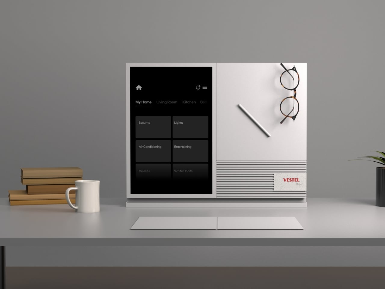
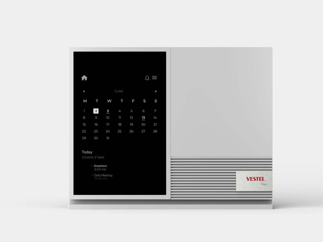
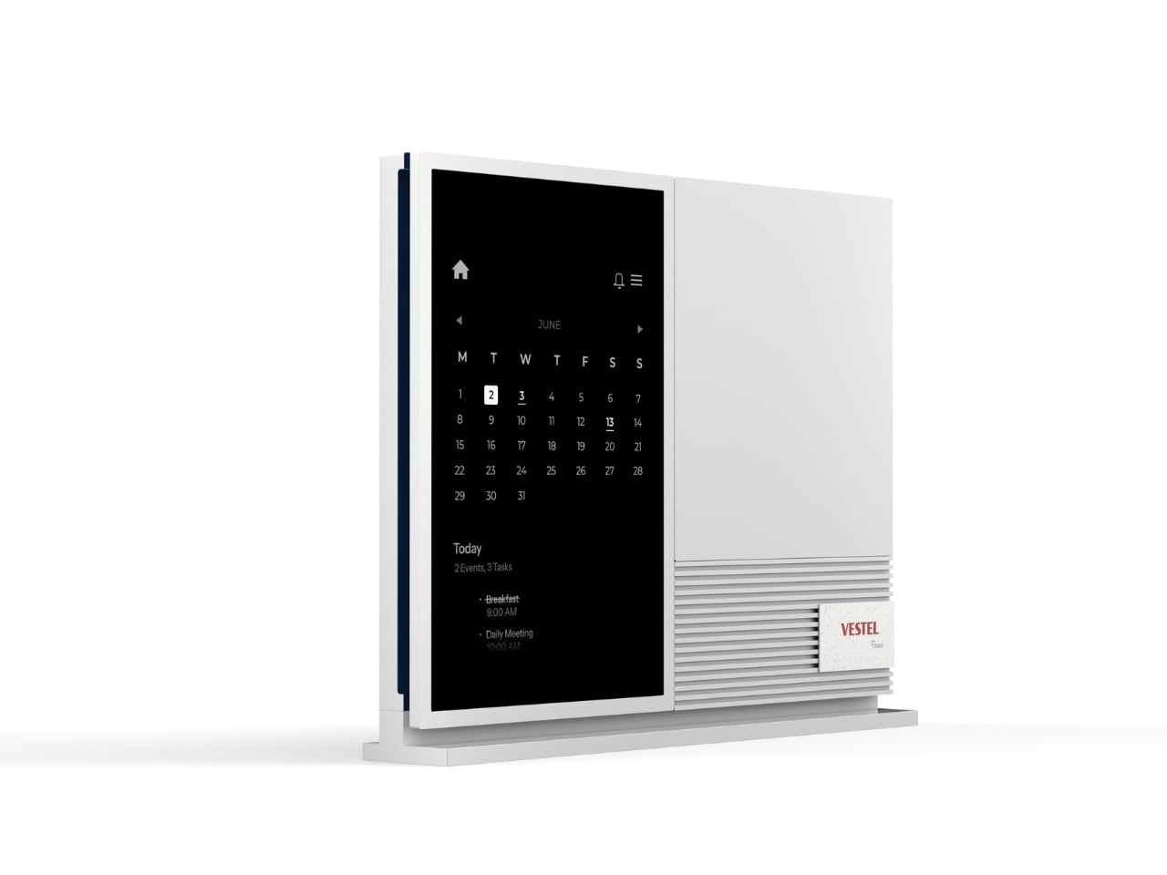
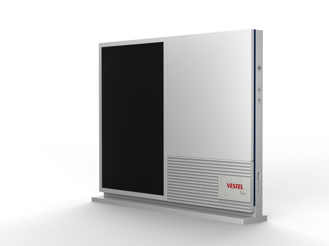
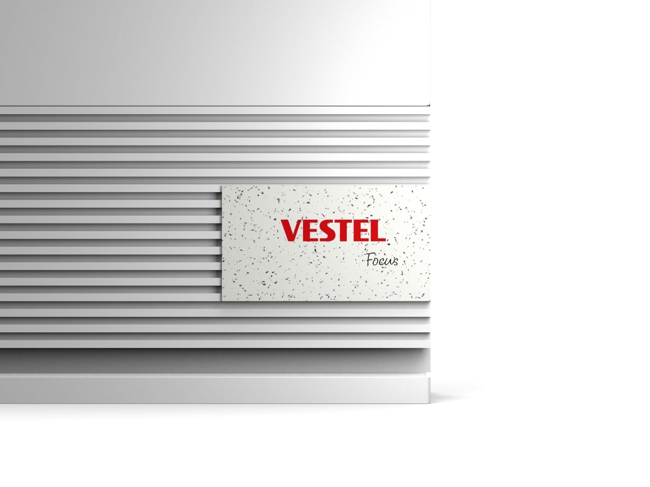
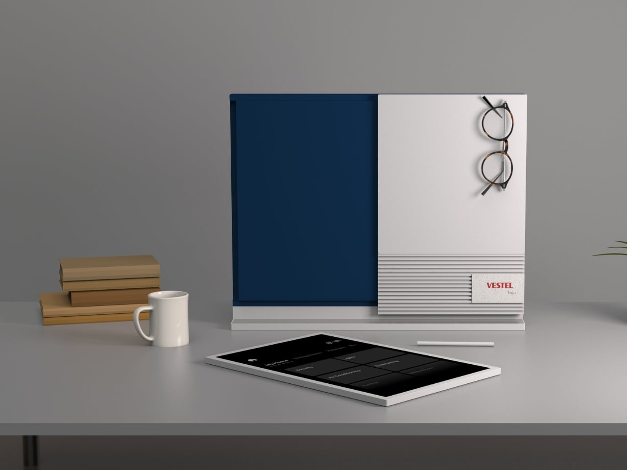
At first glance, Focus looks like a minimalist piece of desk art, which honestly might be the smartest design choice they could have made. The device combines an E Ink display panel with a magnetic tool board and built-in speaker, creating what they’re calling a “multifunctional hub.” But what it really is? A thoughtful intervention between you and your phone’s never-ending notification nightmare.
Designer: Vestel Design Center
The E Ink panel is the star of the show here. If you’ve ever used a Kindle, you know that magical paper-like quality that’s easy on the eyes and visible in basically any lighting. Focus takes that same technology and turns it into your personal command center. It syncs with your phone to display your tasks, calendar events, and selected notifications. The key word being “selected.” You get to choose what makes it through, which means your cousin’s hot takes and algorithm-fed content suggestions stay firmly where they belong: on your phone, not in your line of sight while you’re trying to work.
But here’s where it gets interesting. Focus isn’t just about filtering information. It integrates with your smart home ecosystem, letting you control lights, adjust your thermostat, or manage security without reaching for your phone. Think about how many times you unlock your phone for one simple task and end up scrolling for fifteen minutes. This board cuts out that middle step entirely. Need to dim the lights for a video call? Done. Want to check if you locked the front door? Right there on the screen. All without breaking your workflow or tempting yourself with whatever’s happening on Twitter.
The design itself shows real restraint, which feels refreshing in a world where tech products often scream for attention. The illuminated base ensures the E Ink display stays visible even in darker rooms, solving one of the technology’s traditional limitations. And when you’re not actively using it, the panel switches to display mode, showing artwork or other visuals. It becomes part of your space rather than just another gadget cluttering your desk.
The magnetic tool board section adds a physical element that’s surprisingly practical. There’s something satisfying about having a designated spot for your glasses, pen, or phone that’s both functional and looks intentional. It’s the kind of detail that suggests the designers actually thought about how people work, not just how to cram more features into a product.
What makes Focus particularly relevant right now is its underlying philosophy. We’re all dealing with attention fatigue, that exhausting sense that our brains are being pulled in seventeen directions at once. The constant ping of notifications has trained us to be reactive rather than intentional about how we spend our time. This board is essentially saying, “What if your technology helped you stay on track instead of constantly derailing you?”
Of course, the success of something like Focus depends entirely on execution. The interface needs to be genuinely intuitive, the smart home integration reliable, and the filtering system actually useful rather than frustrating. But the concept addresses a real problem that a lot of us are struggling with: how to benefit from technology without letting it dominate our attention.
Tech companies have been competing for every second of our focus so there’s something almost radical about a device designed to give us less, not more. Focus isn’t trying to replace your phone or become another screen demanding your attention. It’s positioning itself as the thoughtful middleman, the calm voice in the chaos, the tool that helps you engage with technology on your terms.
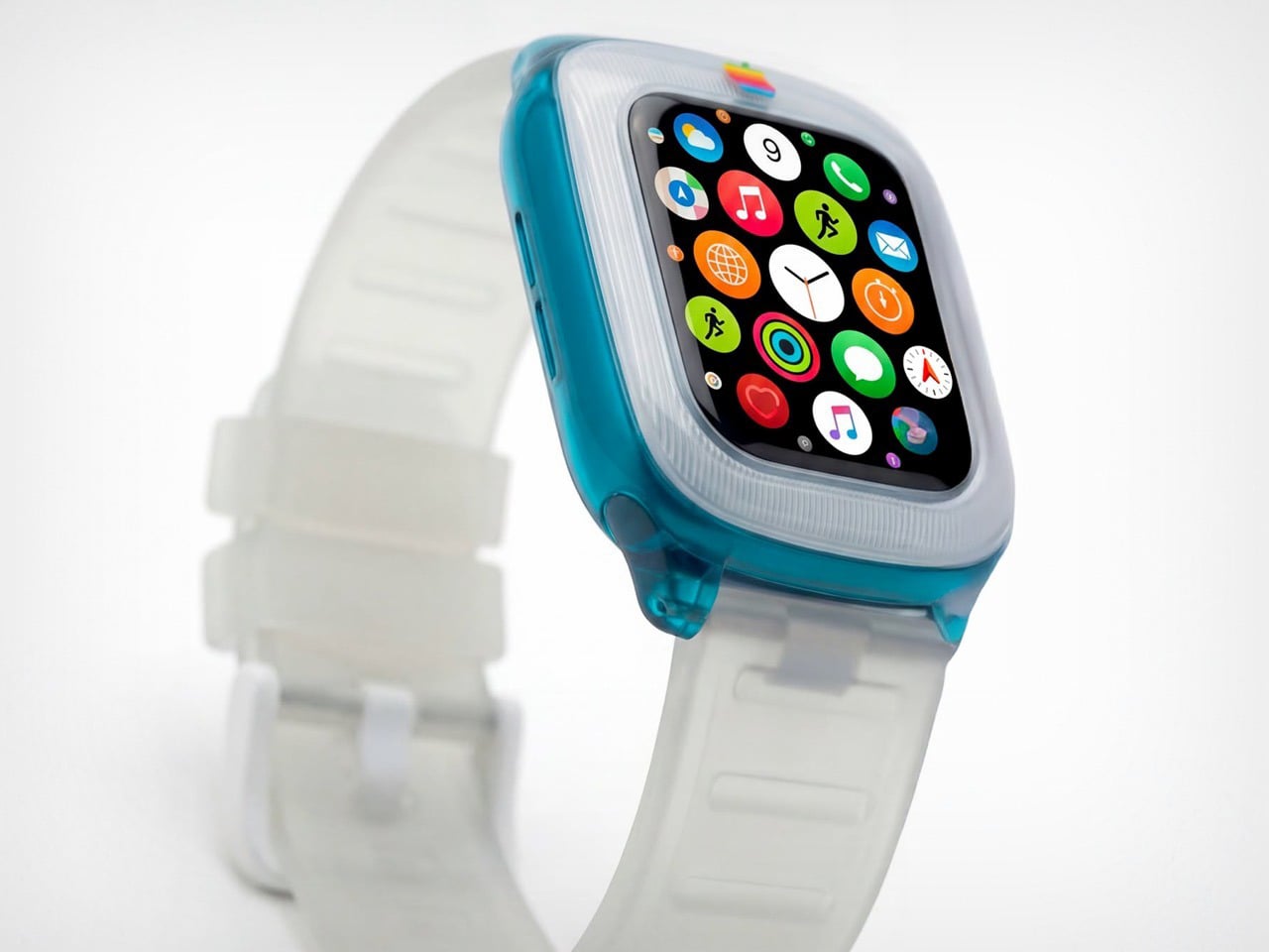
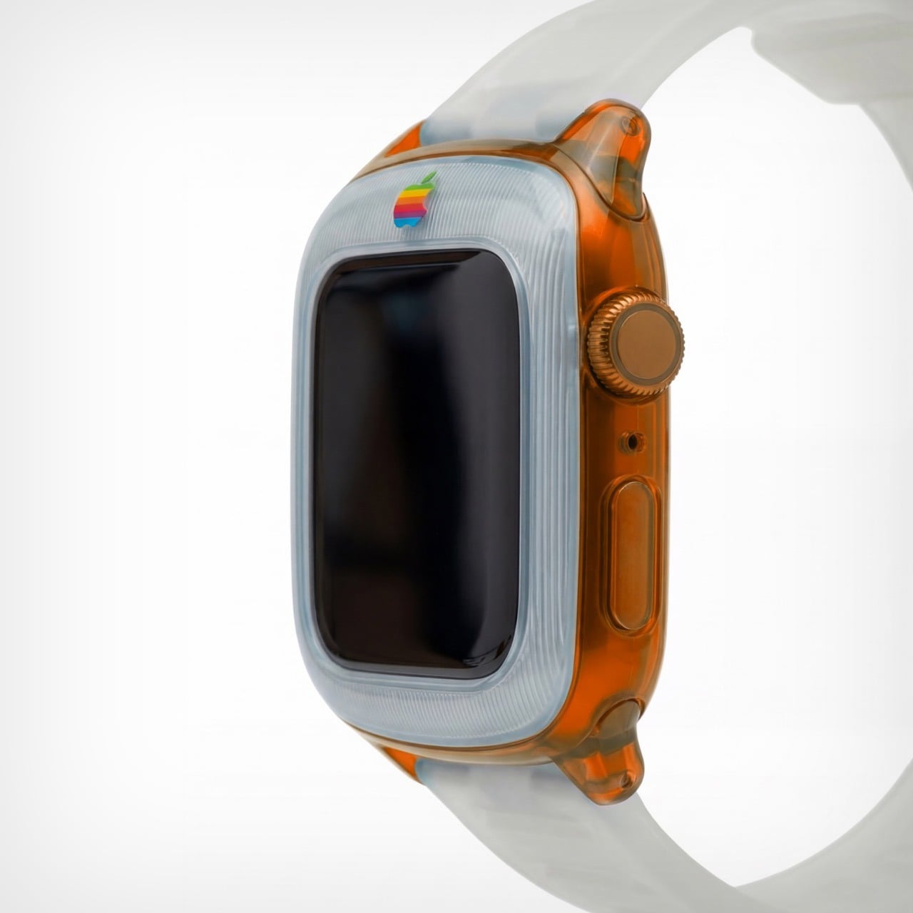
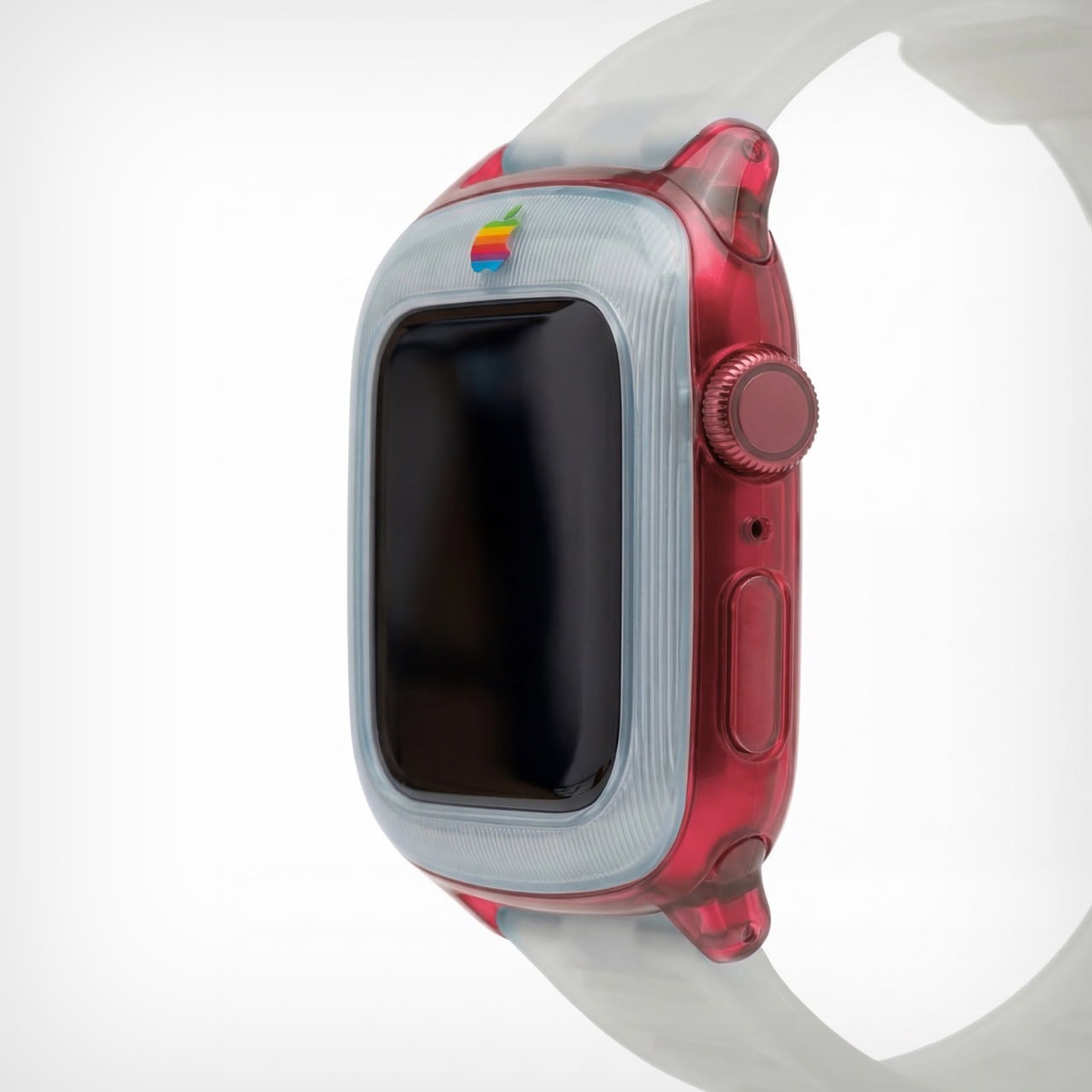
The iMac G3 was discontinued in 2003, around the same time Apple began pivoting to its clean, color-free aesthetic. Cut to a few years later and Apple transitioned entirely to aluminum for its devices, ushering in an era of sleek, and a few more years later, Apple built a computer small enough for your wrist. That means there was a little over a decade between Apple’s era of color, and the Apple Watch. Sadly, the two didn’t coexist in the same timeline, but that doesn’t mean a guy can’t imagine, right?
Saffy Creatives’ Apple Watch G3 concept brings the two together in what I can only describe as sheer nostalgic dream-come-true. The two design worlds collide perfectly – the body of a Watch with the soul of Apple’s G3 devices (tbh even the MacBook was absolute eye-candy). The results don’t just look fantastic, they honestly look wearable – like I would absolutely like to be caught with this piece of hand-candy across my wrist, even if its vibrant colors feel less serious than the cool metallic finish of your standard Watch.
Designer: Saffy Creatives
It’s worth noting that this isn’t just an existing watch with a plastic body. There are a few changes to the design itself to make it stand true to its inspiration. For starters, the watch has a chonky bezel, quite like the G3 iMac did. The bezel separates itself from the body by being made of an entirely separate plastic component. This is further reinforced by the watch’s two-tone colorway. The bezel adopts a clear white plastic design, while the body itself goes for the transparent tinted plastic that G3 fans know too well. The watch ditches all perceivable metal components, barring probably the crown, which looks like metal anodized to match the body’s color. The power button on the side is clear plastic, as are the lugs, and even the strap!
The G3 trend even carries to the Apple’s colored logo, which features on the bezel of the watch. It’s rare for the watch to have a logo on the front, but then again, it’s entirely inconceivable for Apple to make a plastic watch. But, like I said, a guy can dream! The colorful logo sits on the front, right above the standard touchscreen display with its curved glass almost perfectly mirroring the iMac G3’s CRT display.
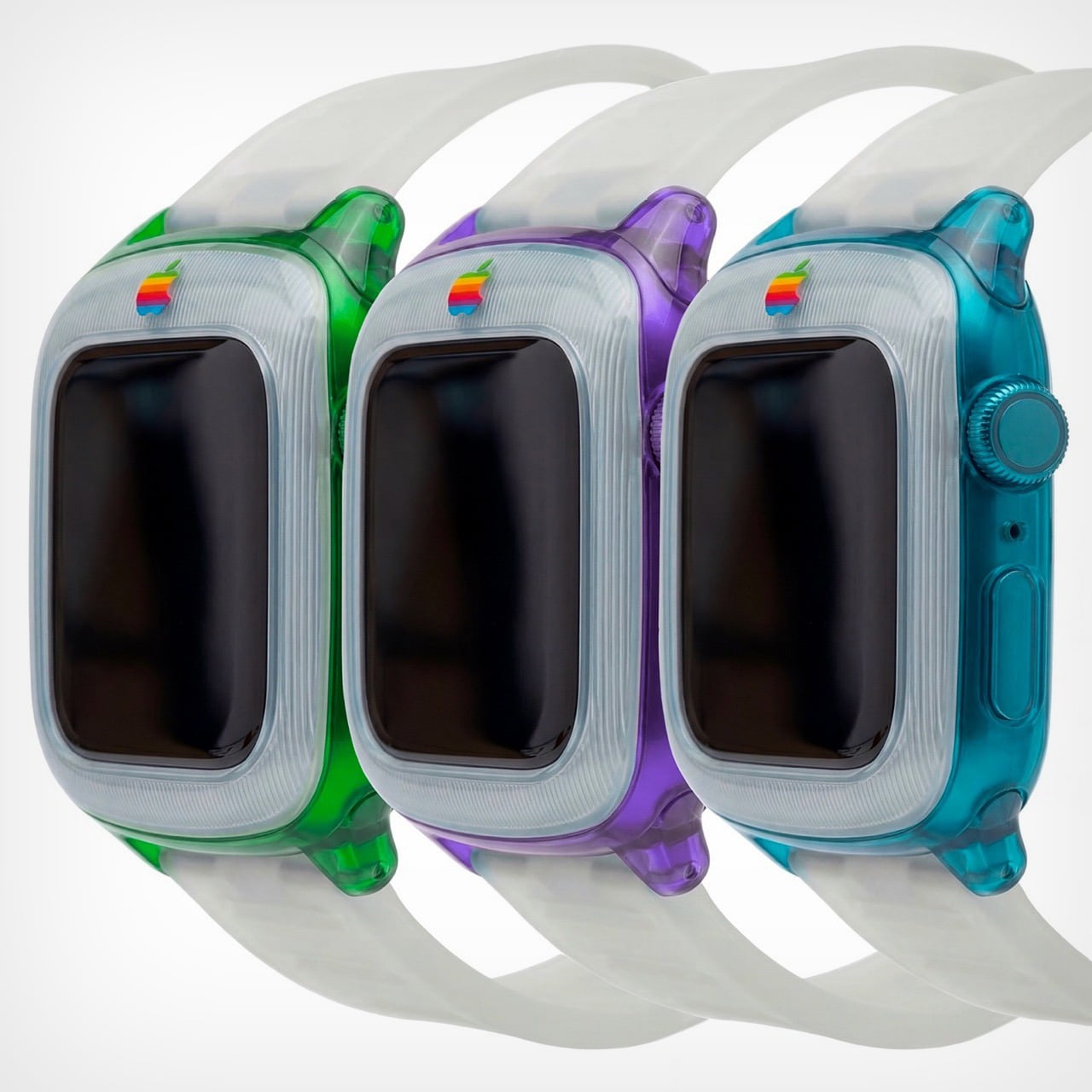
The watch comes in a variety of colors, all celebrating that short but iconic era. You’ve got the truly legendary Bondi Blue, along with the Strawberry, Lime, Tangerine, and Grape variants. Like I said, this is, for most parts, an entire redesign of the watch itself. It isn’t really possible to make a watch case that captures the retro beauty of this watch – unless you expand the design outwards to give the watch a true bezel, or cut into the watch’s screen to keep the exact proportions as shown here. That being said, I’d like to see Spigen or any other company try giving the Apple Watch a retro flavor. That being said, this iMac G3-inspired Watch Charger from Spigen is perhaps the closest we’ll ever come to seeing anything!
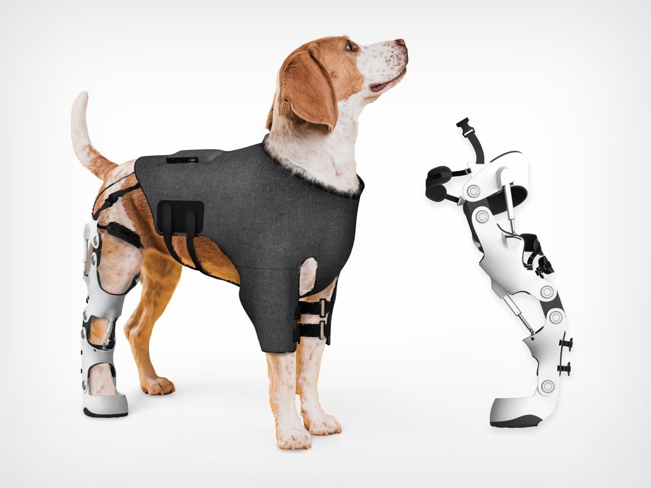
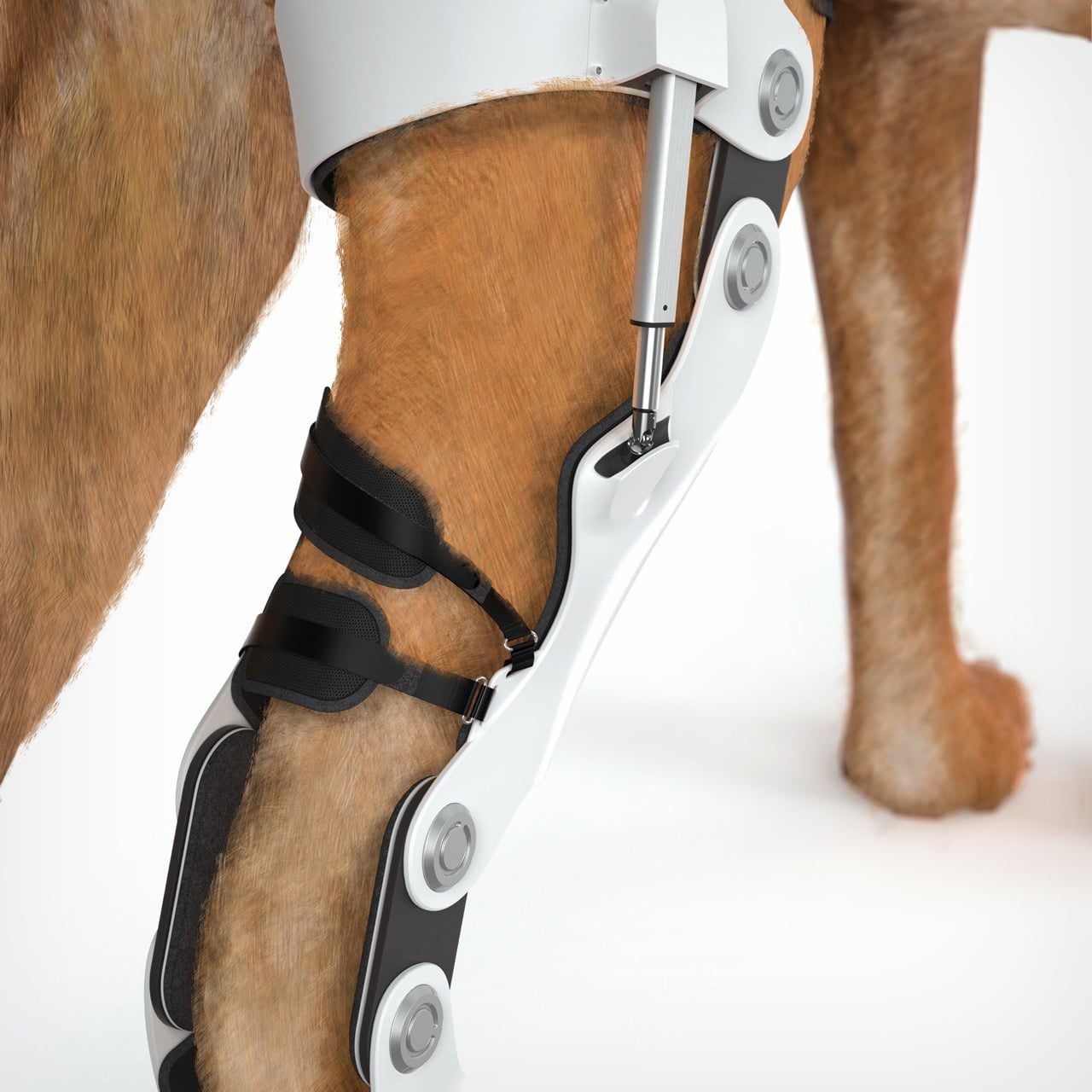
Watching a dog struggle to walk is quietly heartbreaking. Movement, for animals, is not just mobility. It is freedom, confidence, and joy. The Pet Power Assistive Exoskeleton was born from this understanding, blending emotional insight with advanced engineering to create a rehabilitation solution that truly listens to the animal it supports.
The project’s inspiration traces back to a news report on prosthetic limbs designed for disabled pets. While well-intentioned, many of these solutions revealed clear shortcomings. They were passive, rigid, and often uncomfortable, offering limited support beyond basic mobility. This realization became deeply personal when the designer cared for their own dog after a hindlimb injury. Seeing firsthand how difficult recovery could be for an animal exposed a larger issue. Modern rehabilitation technology has evolved rapidly for humans, yet animal care continues to rely on simplified, often outdated aids. This gap sparked a mission to extend intelligent, humane rehabilitation into veterinary practice.
Designer: Leijing Zhou
Instead of forcing movement, the Pet Power Assistive Exoskeleton focuses on understanding intention. Borrowing principles from active exoskeleton systems used in stroke rehabilitation, the device uses surface electromyographic sensors to read muscle signals from a dog’s healthy forelimb. As the dog initiates movement, these signals are analyzed in real time to predict how the impaired hindlimb should move. The system then activates precise mechanical assistance, synchronizing the injured leg with the dog’s natural gait.
This approach transforms rehabilitation into a cooperative process rather than a mechanical correction. The dog leads, and the technology follows, creating movement that feels natural, fluid, and instinctive. By aligning assistance with intention, the exoskeleton reduces strain, encourages correct gait patterns, and supports faster, more confident recovery.
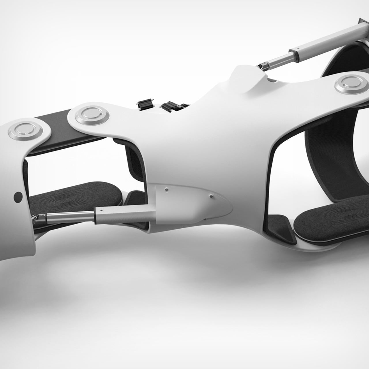
Personalization is central to the design philosophy. Every dog has a unique body, posture, and injury profile, so the exoskeleton is created using advanced 3D printing based on individual body scans. This ensures a tailored fit that distributes weight evenly and avoids discomfort. Carefully selected materials such as lightweight structural components, soft memory foam padding, and non slip contact surfaces prioritize comfort, stability, and long term wearability. This makes the device suitable not only for clinical rehabilitation but also for everyday use.
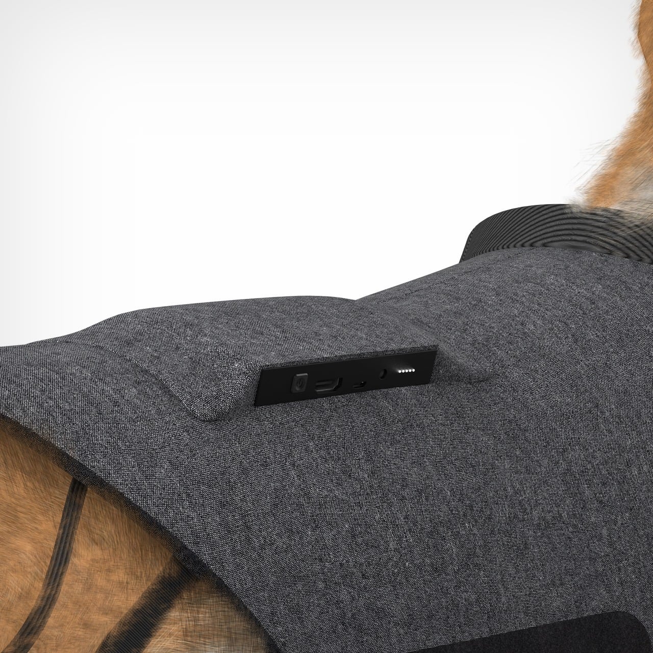
Developed between 2023 and March 2025 in Hangzhou, the project required extensive research and experimentation. One of the greatest challenges was interpreting muscle signals in animals, an area with little existing data or standardized methods. Translating raw biological signals into reliable movement predictions demanded repeated field testing, iterative modeling, and close observation of real canine behavior. Equally complex was balancing strength and comfort, designing a structure robust enough to assist movement while remaining gentle and non restrictive.
Ultimately, the Pet Power Assistive Exoskeleton represents more than a technical innovation. It reflects a shift in how we think about animal care, recognizing pets not as passive recipients of aid, but as active participants in their own recovery. By merging empathy with intelligent technology, this project restores more than mobility. It protects dignity, independence, and the simple joy of movement.
Jet skis rip through water with ridiculous speed and agility. They’re also terrible at everything else. Try bringing friends along for the ride, or packing anything beyond a phone in a waterproof case. Yachts fix the space issue completely, but they cost a small fortune and require actual skills to operate. Spanish designer Amor Jimenez Chito created the One 16 to split the difference: it’s a six-meter boat powered by a jet ski that detaches when you want to go full throttle solo. The design won the Golden A’ Design Award for 2025, which apparently goes to projects that solve problems nobody else bothered to address.
The engineering is surprisingly straightforward. Your jet ski slots into the hull and becomes the propulsion system for the entire boat. The plug-and-play setup works with major jet ski brands, so you can use whatever you already own or prefer. Six people fit comfortably on deck, where a convertible bow switches between table mode and sunbathing platform depending on the vibe. The hull keeps weight distributed properly so the whole thing stays stable instead of feeling like you strapped a picnic table to a rocket. You get two vehicles in one without paying marina fees for two vehicles. That’s the entire pitch, and it actually makes sense.
Designer: Amor Jimenez Chito
This kind of modularity has been tried before, usually with clunky results that looked like a science fair project gone wrong. The reason the One 16 works, at least conceptually, is that it doesn’t try to hide what it is. The jet ski integration is a core feature, not an afterthought. Chito’s background in industrial design engineering clearly shows in the execution, where the docking mechanism appears both robust and user-friendly. Making it compatible with Sea-Doo, Yamaha, and Kawasaki from the get-go is the smartest decision they could have made. It bypasses the proprietary ecosystem trap and opens the concept up to the entire existing PWC market, which is a massive advantage.
Of course, the real test is how it handles chop with a 300-horsepower jet ski bolted into its spine. The weight distribution is supposedly optimized, but there’s a big difference between a CAD rendering and a windy afternoon on the water. Aesthetically, it’s clean and inoffensive, which is probably the right call for a product aiming for broad appeal. It won’t turn heads like a Wally tender, but it’s not supposed to. The One 16 is a clever piece of problem-solving that prioritizes function over form. It’s a utility player, a waterborne multitool for people who want more options without owning an entire fleet.
If Part 1 of this list proved that nostalgia is having a moment, Part 2 is here to show you that 2025 wasn’t only about looking backward. Sure, we are obsessed with what came before, but the best designs this year didn’t just resurrect the past, they remixed it with enough modern intelligence to feel genuinely new. This is where things get interesting: when designers stop treating retro as a costume and start using it as raw material. The result is products that feel familiar enough to trust but fresh enough to justify their existence in a world already drowning in stuff.
So here are the next 10 designs that made 2025 unforgettable. Some lean hard into nostalgia. Others push so far forward they feel like prototypes from 2030. A few manage to do both at once, which might be the most 2025 thing possible. Whether you spent this year glued to design blogs or just trying to keep your head above water, these picks represent the moments when form, function, and cultural timing aligned perfectly. Let’s dig into the second half of what made this year worth paying attention to.
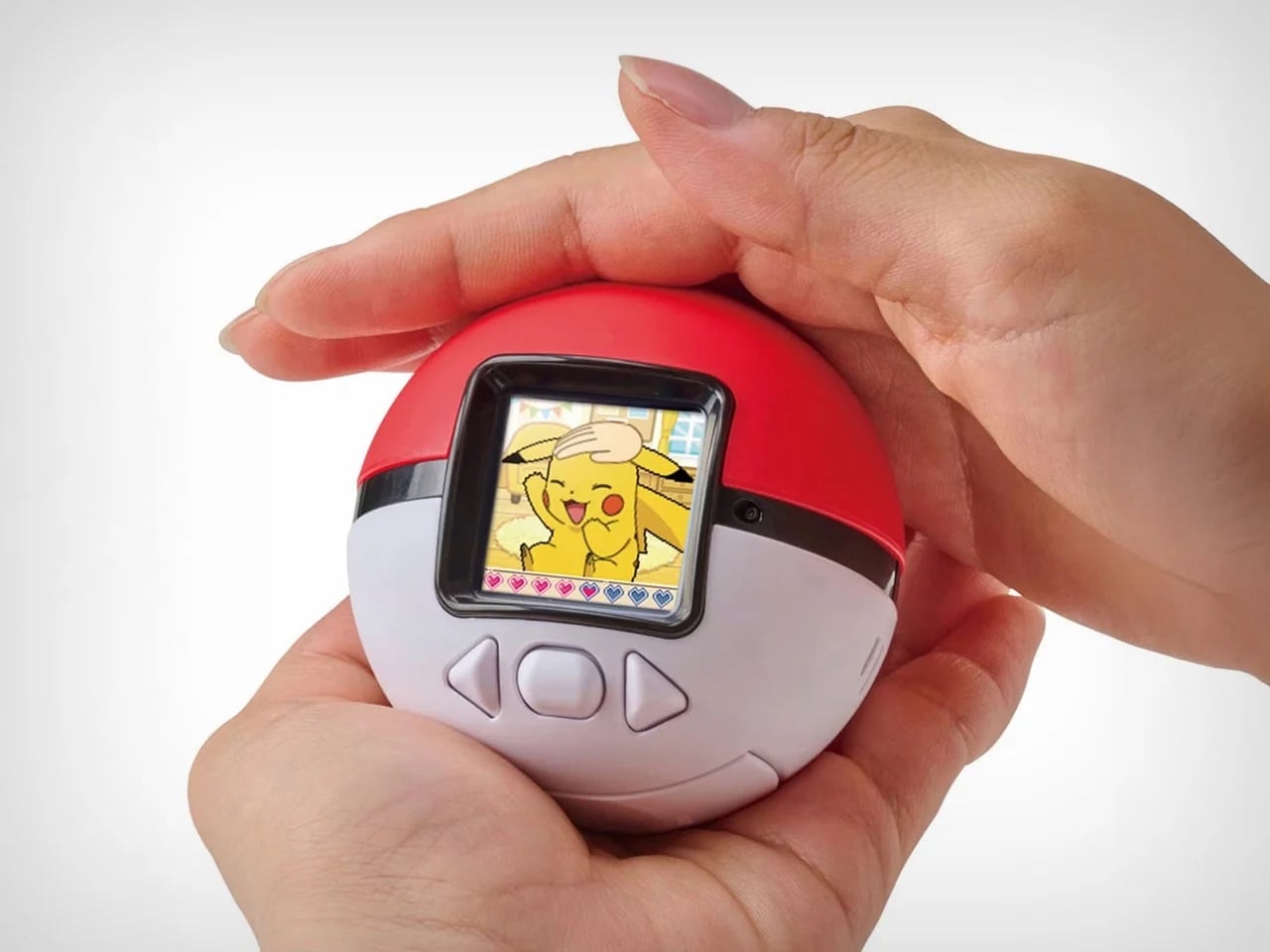
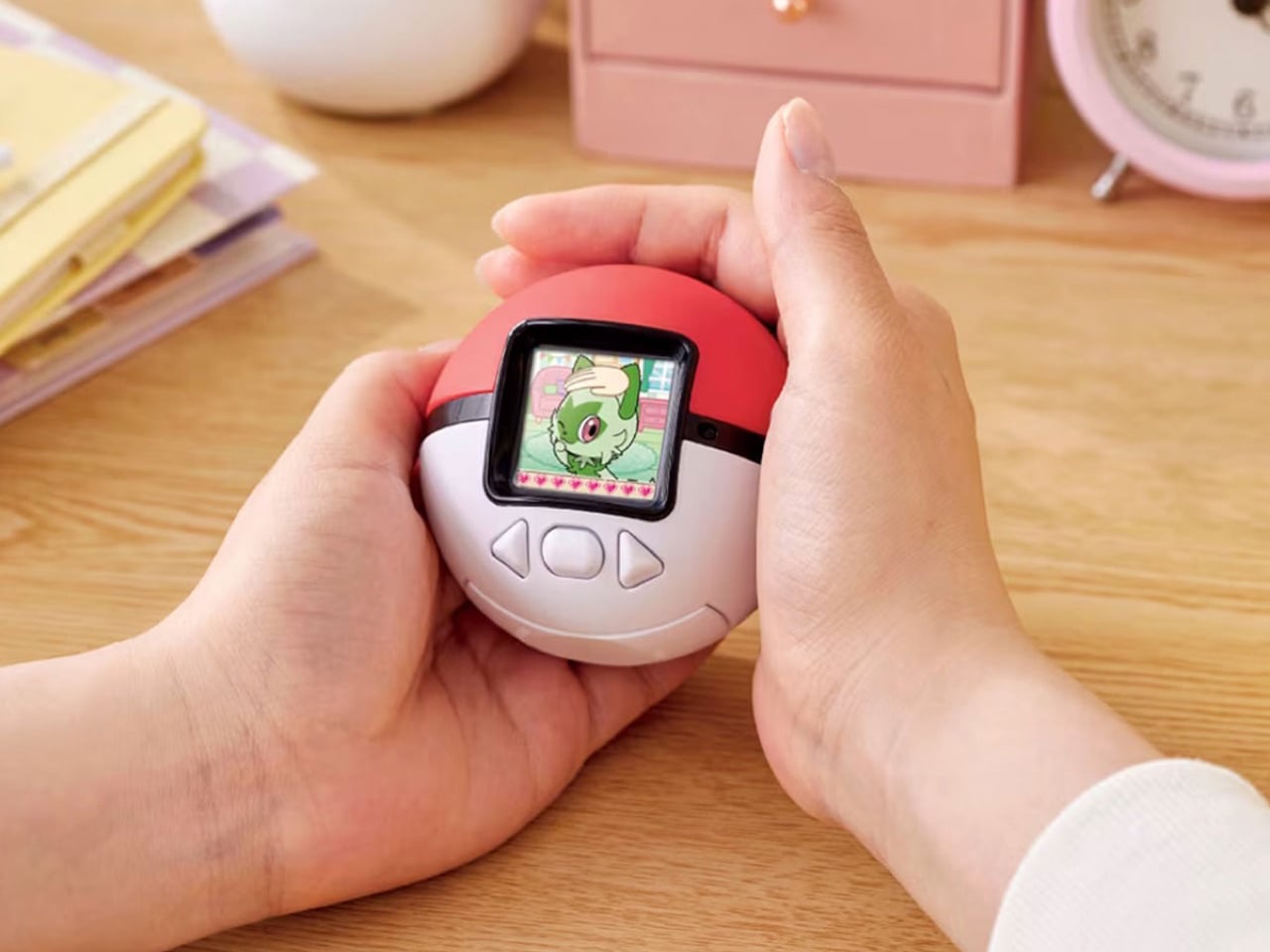
1. Poke-Nade Monster Ball by Takara Tomy & The Pokémon Company
Nostalgia is a fickle mistress! She shows up when you least expect her, whispers about the good old days, and convinces you to spend money on things that have no business existing in 2025. Case in point: Pokemon just dropped the Poke-Nade Monster Ball, which is essentially a Tamagotchi disguised as a Pokéball, and millennials are losing their collective minds over it. This is not groundbreaking technology. This is not solving any real problems. This is pure, weaponized nostalgia, and it is working exactly as intended.
The device takes everything we loved about late-90s virtual pets and wraps it in Pokemon branding so potent you can practically hear the theme song playing. A color LCD screen sits inside a touch-sensitive shell shaped like an actual Pokéball, letting you stroke, tap, and physically interact with your digital companion. Pet it gently and it reacts with happiness. Tap persistently and it falls asleep. The gestures unlock deeper animations as your friendship level grows, which is a clever evolution of the old Tamagotchi button-mashing routine. But let’s be honest, the innovation here is minimal. What they are really selling is the emotional real estate Pokemon and Tamagotchi occupied in our childhoods, repackaged with a slightly better screen and some capacitive touch sensors. And you know what? That is enough. Because nostalgia does not need to innovate. It just needs to remind you of a time when feeding a pixelated creature between math classes felt like the most important responsibility in your life. Pokemon knows this. They counted on it. And judging by how fast these things are selling out, they were absolutely right.
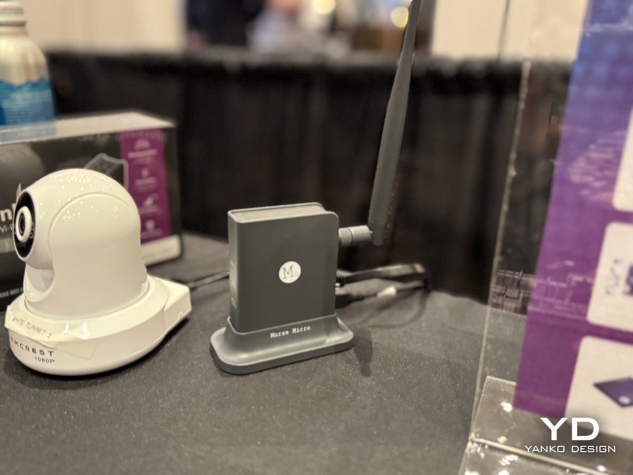
2. Wi-Fi HaLow (with 9.9 mile connectivity) by Morse Micro
And to counteract that, here’s some serious tech innovation from the beginning of the year that grabbed eyeballs. While most brands relied hard on nostalgia, Morse Micro decided to solve a problem that has plagued connectivity since WiFi was invented: range. The Wi-Fi HaLow system delivers connectivity across a 9.9-mile radius using sub-GHz radio waves, which means it can punch through walls, penetrate obstacles, and maintain signal strength over distances that would make standard Wi-Fi routers give up and go home. Traditional Wi-Fi operates on crowded high-frequency bands that struggle beyond a few dozen meters and get blocked by anything denser than drywall. HaLow operates at lower frequencies with significantly better propagation characteristics, turning your home network into something closer to a neighborhood utility than a room-specific convenience.
The implications go way beyond streaming Netflix from your driveway. You could theoretically connect to your home network from the grocery store, maintain smart home control from miles away, or create IoT networks that span entire campuses without repeaters or mesh nodes cluttering every hallway. Industrial applications become viable where they were previously impossible, rural connectivity suddenly looks feasible without expensive cellular infrastructure, and the whole concept of what a local network means gets redefined. This is not retro. This is not nostalgic. This is pure forward momentum, the kind of innovation that makes you wonder why we spent decades optimizing the wrong frequencies when the solution was sitting in a less congested part of the spectrum the whole time. If 2025 taught us anything, it is that sometimes the best way forward has nothing to do with where we have been.
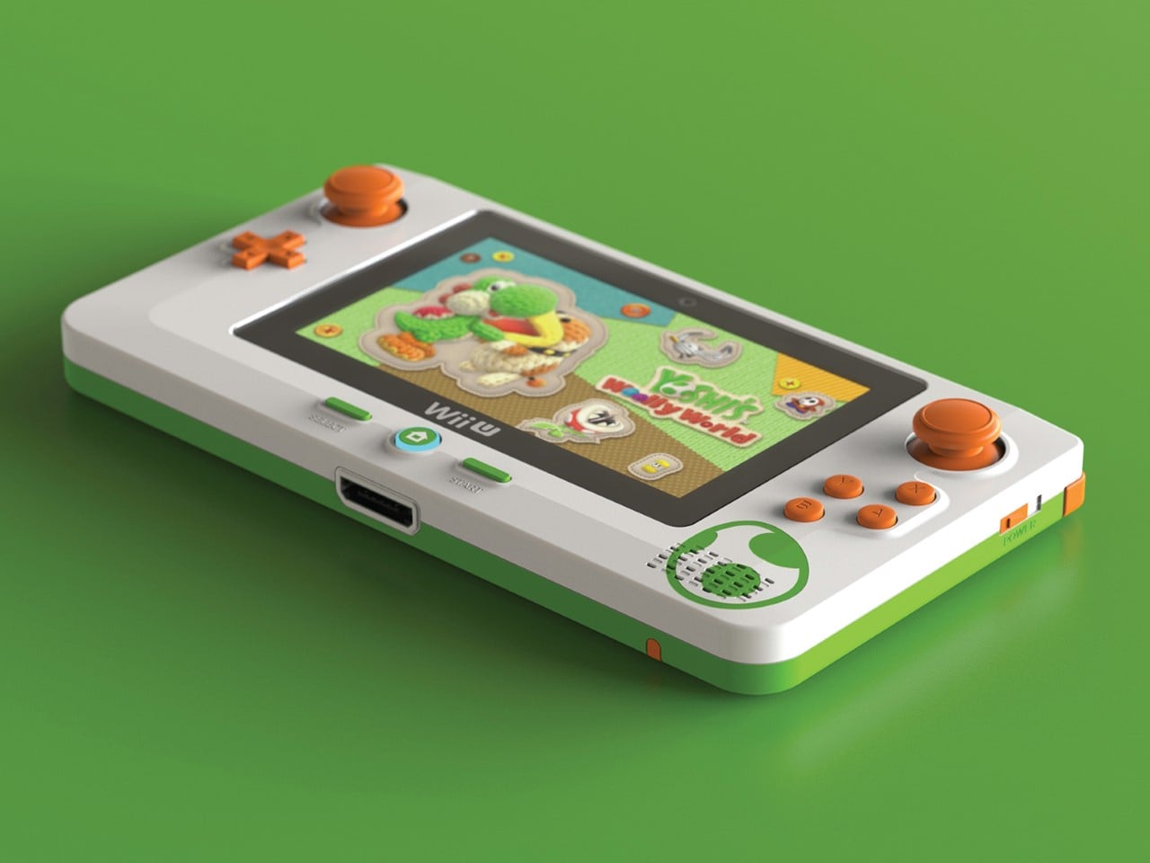
3. Nintendo Wii U Revival by Brenden Sullivan
The Wii U was Nintendo’s most spectacular failure in recent memory, a console so confusing in its messaging and underwhelming in its execution that even hardcore fans pretend it never happened. Yet here comes a concept that asks: what if we took the one genuinely clever idea from the Wii U, the gamepad with the built-in screen, and rebuilt it for the Switch 2 era? This Wii U revival concept imagines a companion device that pairs with Nintendo’s next console, offering dual-screen gameplay, touch controls, and the asymmetric multiplayer experiences that made the Wii U interesting for about five minutes before everyone forgot it existed. It is nostalgia for hardware that barely had time to build nostalgia in the first place, which makes it either brilliantly contrarian or deeply misguided depending on how charitable you are feeling.
What makes this concept work as a 2025 artifact is that it refuses to let a good idea die just because the original execution flopped. The Wii U’s tablet controller was ahead of its time in some ways and catastrophically behind in others, but the core premise, that asymmetric information and split-screen interactions could create new gameplay dynamics, never got a fair shot. This concept takes that kernel and strips away everything that made the original clunky: the limited range, the single-controller restriction, the confusion about whether it was a handheld or a console accessory. By positioning it as an optional sidekick to the Switch 2 rather than the main event, it fixes the branding disaster while keeping the innovation. It is nostalgia weaponized correctly, not as pure recreation but as salvage operation, pulling the worthwhile parts from the wreckage and giving them a second chance in a context that might actually appreciate them.
4. No.1/1000 Titanium Fractal Vise by Titaner
Most tools are designed to disappear into workshops, utilitarian objects that do their job without demanding attention. Titaner’s titanium fractal vise does the opposite. It announces itself as both precision instrument and sculptural object, with a body machined from solid titanium and a fractal pattern that serves actual structural purposes rather than just looking cool. The geometry distributes clamping force efficiently while reducing material weight, which means the mathematical beauty is not decorative, it is load-bearing. Limited to a small production run, each vise is CNC-machined to tolerances that make it as much a collector’s item as a working tool, the kind of thing that sits on a workbench and makes visitors ask questions before they realize it actually functions.
What makes this a 2025 design rather than just expensive engineering porn is the way it represents a larger shift in how we think about tools and objects. We are moving past the idea that functional items need to be aesthetically neutral, that beauty and utility occupy separate categories. This vise proves you can have museum-grade craftsmanship in something designed to grip metal and take abuse. It is the intersection of maker culture, precision manufacturing, and the growing appreciation for objects that justify their cost through both performance and presence. There is no nostalgia here, no retro callback, just an argument that everyday tools can be extraordinary if we stop accepting mediocrity as the baseline. It is innovation in the form of asking why more things are not built this well, and then actually building one to prove the point.
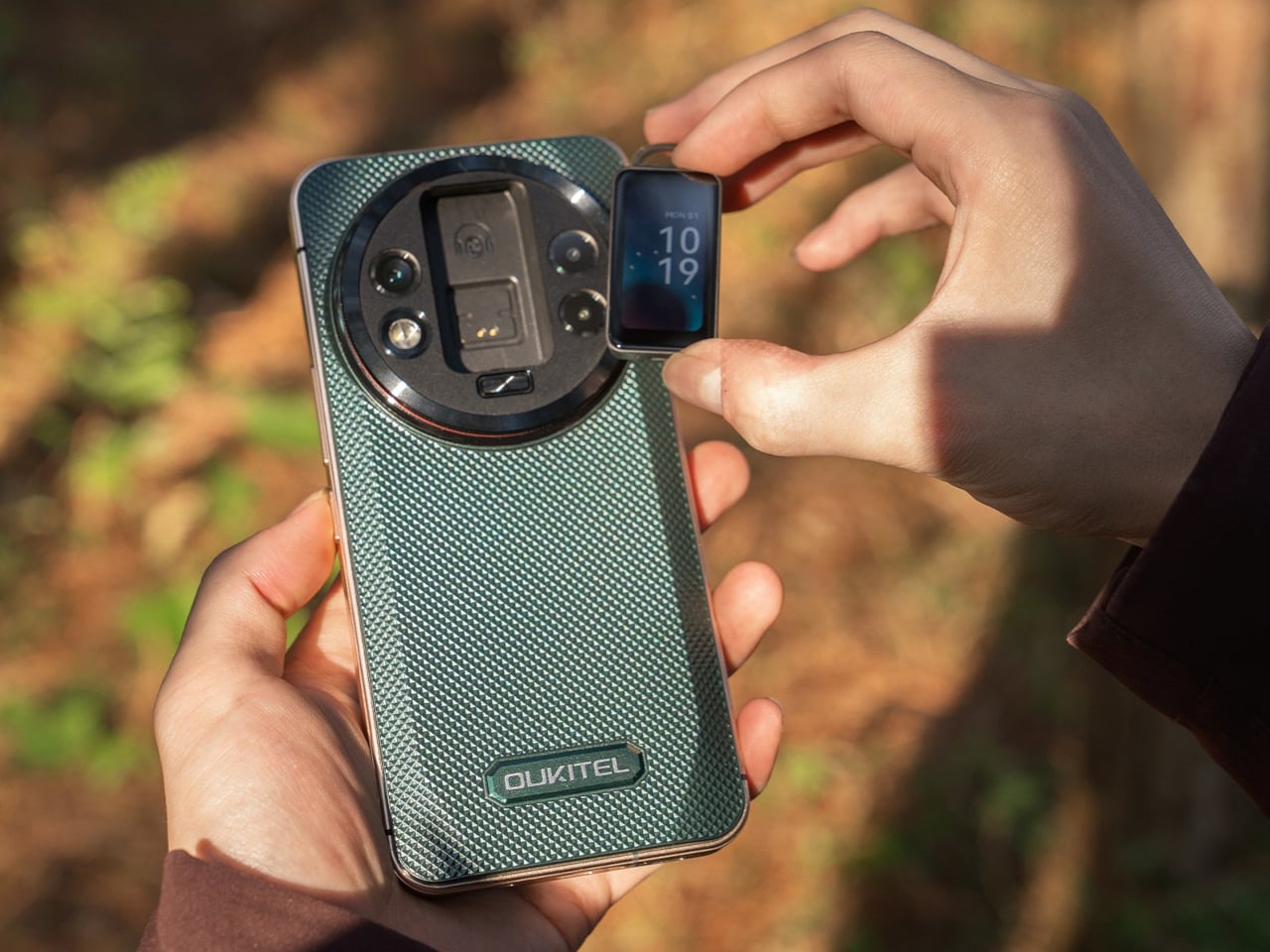
5. WP200 Pro Modular Smartphone by OUKITEL
Modular smartphones have been promised, prototyped, and abandoned so many times that most people stopped believing they would ever work. Then the rugged WP200 Pro from OUKITEL shows up with a detachable display that does not just disconnect, it transforms into entirely different devices. The screen pulls away from the phone body and can be reconfigured as either a smartwatch strapped to your wrist or an earbud clipped to your ear. The phone itself continues functioning with a secondary display underneath, so you are not sacrificing core functionality when you repurpose the main screen. It is the kind of absurdly ambitious design that sounds like vaporware until you see the mechanical hinges and magnetic connections that make it plausible.
This is innovation trying to solve a problem nobody asked for but might actually appreciate once it exists: the fact that we carry multiple screens doing similar jobs when one good screen could rotate between contexts. Why own a phone, smartwatch, and wireless earbuds when one modular system could cover all three? The rugged construction suggests this is built for field work, outdoor use, or situations where carrying multiple fragile devices makes no sense. It is the opposite of nostalgia, there is no retro aesthetic here, no callback to simpler times, just aggressive forward-thinking that asks whether our current device ecosystem is as optimized as we assume. Whether it ever ships is anyone’s guess, but as a statement of intent, it proves that some designers are still more interested in what comes next than what came before.
6. Kangourou Tiny Home by Quadrapol
Tiny homes have been sold as this romantic solution to housing affordability and minimalist living, but they come with one universal design flaw that nobody wants to admit: climbing a ladder to your bed every night gets old fast. Especially if you have kids, aging parents, mobility issues, or just a baseline desire to not break your neck at 3am during a bathroom trip. This family-friendly tiny home named Kangourou redesigns the entire layout to put every sleeping space on the ground floor, which sounds simple until you realize how much spatial gymnastics that requires in a structure measuring under 400 square feet. The designers pulled it off using sliding partitions, convertible furniture, and clever vertical storage that keeps the ceiling height usable without forcing anyone to sleep in what amounts to an attic crawlspace.
What makes this relevant to 2025 is that it represents tiny home design finally maturing past the Instagram aesthetic phase. For years, tiny homes prioritized looking good in photos over actually functioning as long-term residences, which is why so many ended up as glorified vacation rentals rather than permanent housing solutions. This design prioritizes livability, accessibility, and the reality that families need private sleeping spaces that do not require ladder proficiency. It is not flashy. It is not trying to reinvent architecture. It is just solving a known problem with enough intelligence that it stops being a problem, which might be the most underrated form of innovation. If the tiny home movement wants to be taken seriously as housing rather than lifestyle content, this is the direction it needs to go: less emphasis on clever lofts, more focus on whether you would actually want to live there past the honeymoon phase.
7. Pexar Starlight 15.6″ Picture Frame by Lexar
Wizarding photographs in Harry Potter had one feature that always felt unfair: they moved, waved back, captured the full motion of a moment instead of freezing it into stillness. Muggles have been trying to close that gap ever since, and digital picture frames are basically our best attempt at making photos feel alive without actual magic. The Pexar Starlight takes that idea and adds ambient backlighting, turning a 15.6-inch display into something that sits between traditional frame and mood lighting. Photos cycle through with adjustable brightness that shifts based on time of day, so your memories glow softly in the evening and stay crisp during daylight hours. It is designed to blend into home decor rather than scream “tech gadget,” which is harder than it sounds when you are essentially mounting a screen on the wall.
What separates this from the dozens of other digital frames cluttering the market is the execution of details most brands ignore. The matte finish reduces glare without killing color vibrancy. The frame itself comes in multiple finishes so it does not look like every other black-bezeled rectangle. Setup happens through a companion app that actually works instead of requiring a computer science degree to navigate, and photo uploads can be automated from cloud storage so you are not manually curating every week. The backlight feature is the real differentiator, creating depth and warmth that makes photos feel more like displayed art than screensaver content. It is not trying to replace your phone’s photo library. It is trying to give your best shots the kind of presence they deserve, somewhere between nostalgia object and functional decor, which is exactly where digital frames should have been aiming all along.
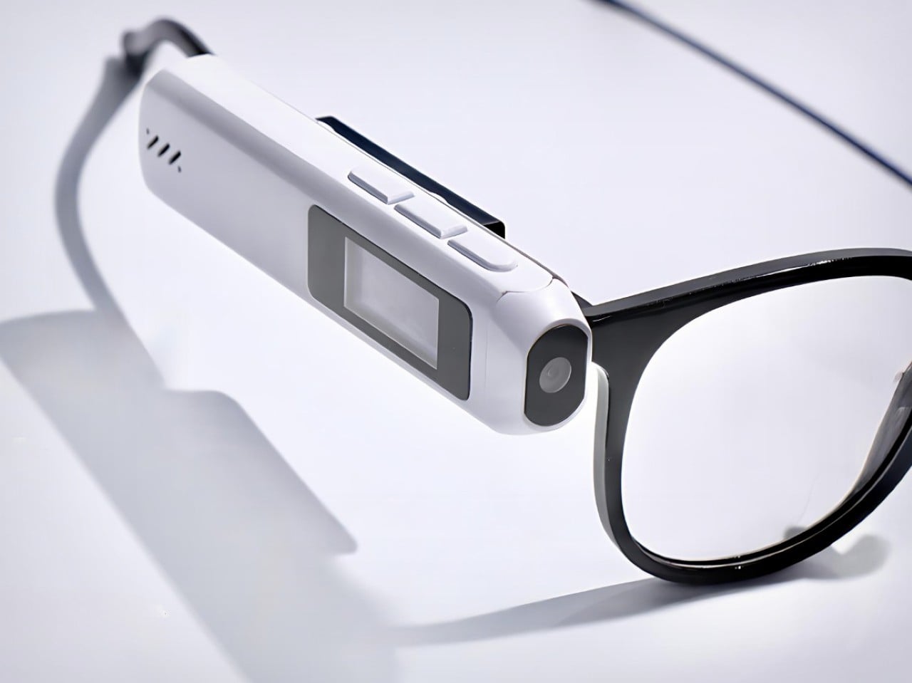
8. CAMIO Wearable by BQEYZ
Meta’s smart glasses cost several hundred dollars and lock you into their ecosystem, their frames, their design language, and their gradual feature rollout that always feels like paying for a beta test. Meet CAMIO, a $79 snap-on module from an upstart competitor that takes a different approach: it clips onto any pair of glasses you already own and turns them into recording devices with a tiny camera, built-in storage, and wireless connectivity. You keep your prescription lenses, your favorite frame style, your existing investment in eyewear. The module just adds the capture functionality without forcing you to replace everything. It records video, snaps photos, and syncs to your phone over Bluetooth, handling the basics without trying to be a full augmented reality platform or AI assistant.
The genius here is recognizing that most people do not want to replace their glasses, they just want their glasses to do more. Meta’s approach requires buying into their hardware completely, which is a tough sell when you have frames you like or prescriptions that need specific lenses. This module treats smart features as an add-on rather than a replacement, which dramatically lowers the barrier to entry both financially and practically. It is not going to match Meta’s polish or integration depth, but it does not need to. It just needs to capture moments hands-free and stay out of the way when you are not using it. For seventy-nine dollars, that is a value proposition that makes sense in a way premium smart glasses still struggle to justify. Sometimes the best innovation is not building something entirely new, it is building something that works with what people already have.
9. Small House On A Corner Lot by KOMINORU Design
Tokyo real estate operates on a completely different logic than most cities. Space is so expensive and scarce that architects have spent decades perfecting the art of making tiny footprints feel livable, even generous. This Japanese tiny home takes those spatial compression techniques and pushes them further, creating a dwelling that maximizes every cubic inch without feeling claustrophobic or compromised. The design uses vertical layering, multifunctional furniture, and strategic transparency to make a structure barely wider than a parking space feel like a complete home rather than an elaborate closet with plumbing.
What sets this apart from typical tiny home design is the cultural context. Japanese architecture has been optimizing small spaces for centuries, long before minimalism became a lifestyle trend or tiny homes became YouTube content. This design pulls from that tradition: sliding shoji-inspired partitions that reconfigure rooms on demand, sunken floors that create separation without walls, storage integrated into every surface so nothing feels like dead space. Natural light floods in through carefully positioned windows that also provide ventilation and visual connection to the exterior. The result is a home that feels intentional rather than constrained, where every design choice serves multiple purposes and nothing exists just for show. It is a masterclass in efficiency that does not sacrifice comfort, proving that small spaces stop being a limitation once you design specifically for them instead of trying to cram traditional layouts into compressed square footage. If urban density is the future, this is the blueprint for making it actually desirable.
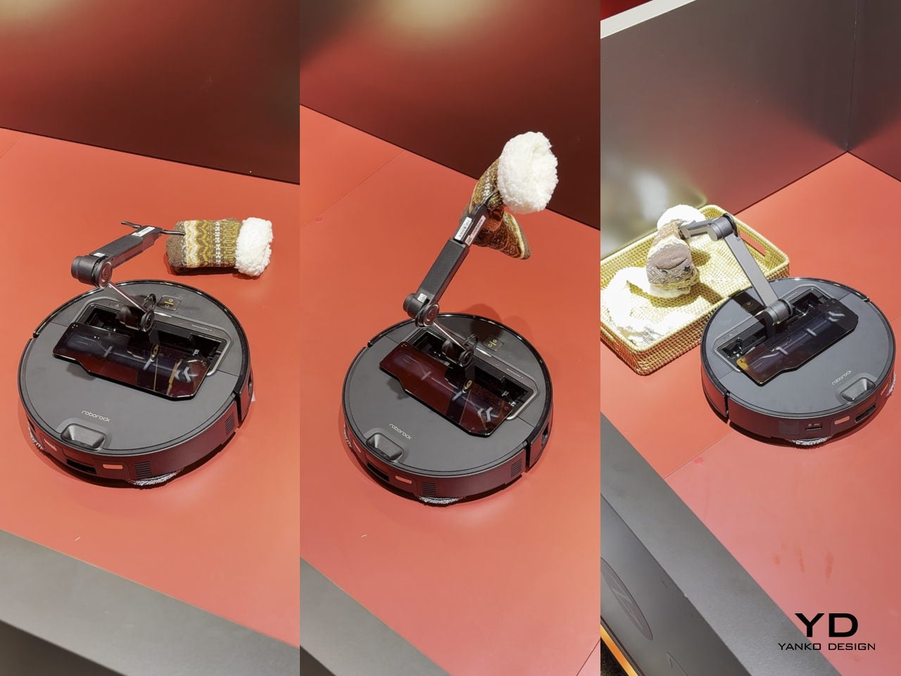
10. Saros Z70 by Roborock
Robot vacuums have gotten really good at one thing: vacuuming. They map your floors, avoid obstacles, empty themselves, and generally handle the task they were designed for with increasing competence. But they have always had one glaring limitation: if there is a sock on the floor, a charging cable, a kid’s toy, anything that is not flat dirt or debris, the vacuum just routes around it or gets tangled and calls for help. The Roborock Saros Z70 fixes this with the most obvious solution nobody thought to mass-produce until now: it adds a robotic arm. A literal articulated arm that extends from the vacuum’s body, grabs objects off the floor, and moves them out of the way so it can continue cleaning underneath. Socks, shoes, small towels, cables, anything under a certain weight gets picked up and relocated to a designated drop zone.
This is innovation that feels overdue the moment you see it. We have had the mechanical capability to build grabber arms into consumer robots for years, but nobody committed to the engineering challenge until Roborock decided the robot vacuum category had gotten boring enough to need disruption. The arm uses vision recognition to identify objects, assess their weight and shape, and determine whether they are safe to grab, which prevents it from trying to lift furniture or drag your laptop across the room. It is not perfect, weight limits and object recognition will have edge cases, but it represents a fundamental expansion of what a cleaning robot can do. Instead of just reacting to obstacles, it actively manipulates its environment to complete its job. That is a step change in capability that makes every previous robot vacuum feel like it was solving only half the problem. If this actually ships at a reasonable price point and the arm proves reliable, it will instantly make the entire existing market feel outdated, which is exactly what genuine innovation is supposed to do.
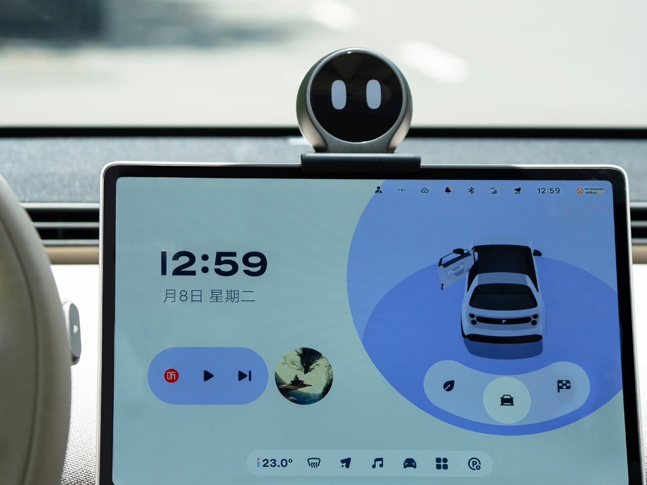
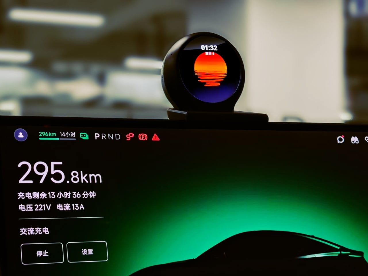
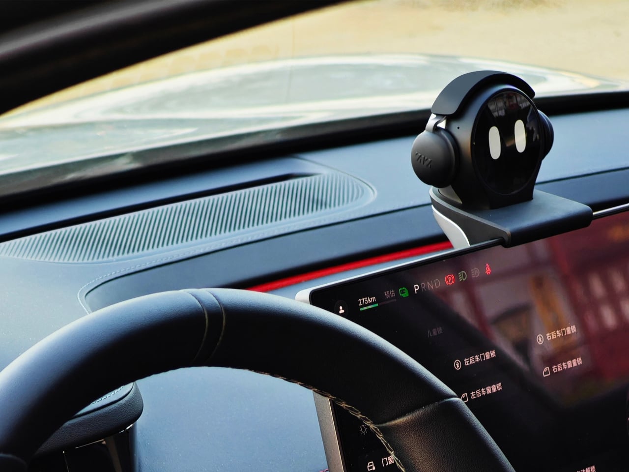
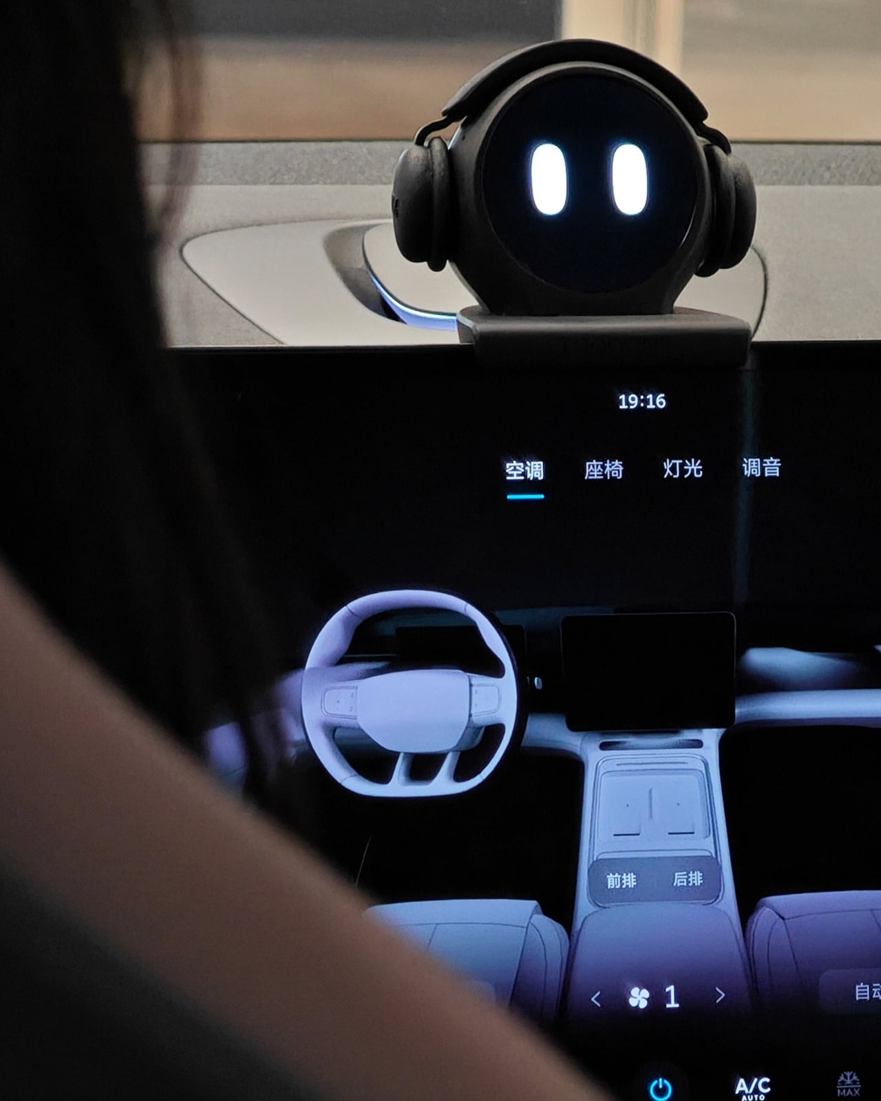
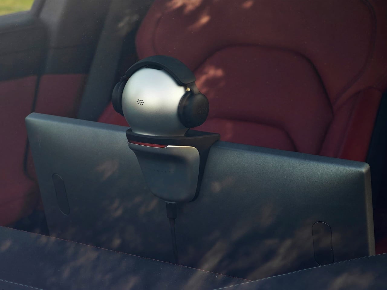
Picture this: you slide into your car, and instead of being greeted by cold, silent technology, there’s a little spherical companion perched on your dashboard, ready to chat. That’s TOOOONY, and it’s rethinking what it means to have tech in your vehicle.
At first glance, Toooony looks like it escaped from a Pixar film. It’s got this perfectly round head with big, expressive eyes that light up on its circular screen, and honestly, you can’t help but smile when you see it. The design team at ZIZ Intelligent Manufacturing, led by Junjia Yang, Yang Shen, Yanan Liu, and Ruilin Niu, clearly understood something crucial: if you’re going to spend hours in your car, your tech companion should feel like an actual companion, not just another gadget bolted to your dashboard.
Designers: Junjia Yang, Yang Shen, Yanan Liu, Ruilin Niu
But Toooony isn’t just sitting there looking cute. This little robot is packed with functionality that genuinely changes how you interact with your vehicle. The anthropomorphic AI dialogue system means you can actually have conversations with it, not just bark commands. It responds to voice, recognizes touch, and here’s where it gets interesting: it features “tap-to-interact” functionality that lets you communicate with other Toooony users on the road.
Think about that for a second. We’ve all had those moments driving where we wish we could easily communicate with another car. Maybe it’s a friendly wave, sharing traffic info, or just acknowledging a fellow road tripper. Toooony makes this possible through LoRa near-field encrypted communication, positioning itself as the world’s first cross-brand non-contact travel social device. You can connect with other drivers without switching car brands or fumbling with apps, all while keeping your communication secure and encrypted.
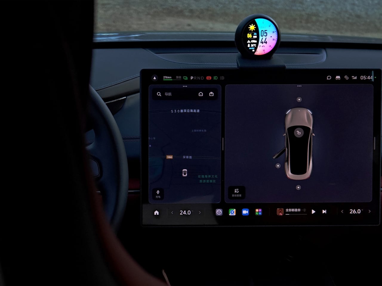
The circular screen serves as Toooony’s face and information hub, displaying a variety of customizable watch faces. One minute it might show you the weather with a sunset reflection, the next it’s displaying your vehicle stats or just giving you those cheerful cartoon eyes that make even traffic jams slightly more bearable. The screen adapts to different contexts, whether you need navigation info, want to control your music, or just need a visual companion during your commute.
What really sets it apart is how it blends personality with practical features. Built-in lighting creates ambiance and provides visual feedback, while the sound system handles everything from navigation prompts to music. The expressions change based on what’s happening, giving you emotional cues that feel natural rather than robotic. When you’re low on battery, the device might look concerned. Hit the road after a long day? It might greet you with a cheerful face that genuinely makes you feel less alone.
Then there’s the connectivity piece. Toooony isn’t just another Bluetooth speaker pretending to be smart. It’s equipped with 4G capability and can transform into a stable mobile hotspot that covers your entire vehicle. This means passengers can stream, work, or browse without draining phone data plans, and the connection stays consistent because it’s not relying on your phone’s tethering. For families on road trips or remote workers who treat their car like a mobile office, this feature alone justifies the device’s existence. The cross-device communication capability extends beyond just car-to-car interaction. It can sync with your other devices, creating a seamless tech ecosystem that follows you from home to vehicle and beyond. That playlist you were listening to in your living room? Toooony picks it up. Calendar reminders? They’ll pop up on that circular screen at the right time.
What makes Toooony particularly clever is that it’s designed as a customizable physical robot. This isn’t one of those “smart assistants” that’s just a speaker with lights. It’s an actual presence in your car with physical character. You can personalize its responses, change its watch faces to match your mood or aesthetic, and over time, it genuinely starts to feel like your driving buddy rather than just another piece of car tech.
The form factor matters too. Toooony sits on your dashboard without being intrusive, positioned where you can see it but it doesn’t block your view. The spherical design with what appears to be little headphone-like elements gives it this endearing character that makes sense in a vehicle environment. It’s friendly tech that doesn’t demand your attention but is there when you need it. The device brings a human touch to the driving experience when usually it seems like it’s designed by engineers for engineers. It’s functional without being cold, smart without being intimidating, and connected without being creepy. Sometimes the best innovations aren’t about cramming in more features but about making technology feel like it actually belongs in our lives. Toooony gets that balance right.
I read somewhere that Nostalgia sells harder than Innovation and it really made me do a double-take. Does it make sense? Well, not really, considering how fast things are progressing on the robotics and AI front – but here’s where I’d like to believe that statement rings true. Take a look at culture – old music is in again, Taylor’s new album is an homage to the old. Thomas Bangalter of Daft Punk made his first stage appearance in nearly a decade. What about movies, you ask? They’re shooting the next Shrek film, Robert Downy Jr. is back at Marvel, and heck, Shia LaBoeuf just announced his return to Transformers. Tech is playing the retro game very well too, whether it’s reissuing of old-style hardware, emulators, or even trends like transparency that remind us of the Nintendo GBA and the iMac G3. The grand point I’m making here, is that this last year has been an absolute pendulum, swinging between extremes, aesthetic styles, ideologies, and eras.
So we zeroed down to 20 designs (spread across two articles) that represent what 2025 gave us. These are the first half of our top picks from the year, gathering designs that we as editors loved, but also taking you, the reader into account. After all, we don’t write in a vacuum. We try to find designs and tech that genuinely impress or inspire you, and if you’ve been spending 2025 doing a bunch of other things (like surviving) apart from reading Yanko Design, here are 10 handpicked (yes, I picked them myself!) designs that encapsulate the BEST of 2025. Stay tuned for part 2!
1. Google Pixel Headphones by Sidhant Patnaik
Sometimes concept renders accomplish more than actual products ever could. Designer Sidhant Patnaik’s Google Pixel Headphones exist only as pixels and Photoshop layers, yet they have sparked more genuine excitement than most real hardware launches Google has executed in years. The design borrows visual cues from the Pixel phone lineup, clean geometric forms, two-tone color blocking, subtle branding, while integrating Gemini AI as a core feature rather than an afterthought. Imagined controls include gesture-based interactions, seamless Pixel ecosystem integration, and the kind of ambient intelligence that Google keeps promising but rarely delivers in satisfying ways. It looks credible enough that people keep asking where to buy it, which is both flattering to the designer and damning to Google’s actual product strategy.
Here’s the uncomfortable truth this concept exposes: Google has all the pieces to dominate the premium headphone market but refuses to assemble them. They own best-in-class voice recognition, industry-leading AI through Gemini, deep Android integration, and more audio patents than most people realize. Apple charges $550 for AirPods Max and can barely keep them in stock. Nothing launched Headphone (1) at $299 and sold out immediately despite being a first-generation product from a startup. Meanwhile Google sells Pixel Buds that nobody talks about and leaves the over-ear category completely vacant. The demand is screaming at them through every comment section under this concept. When a render generates this much enthusiasm, it stops being fantasy and starts being a market signal Google is choosing to ignore.
2. Concept Plumage by Jet Weng
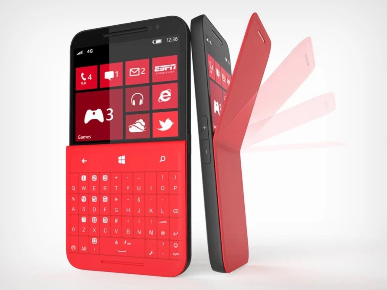
One of the ‘best’ designs of 2025 is actually from nearly 13 years ago! Isn’t that insane?! But that’s how you define ‘ahead of its time’, I guess. Designed by Jet Weng, this absolutely genius keyboard design solves the modern-day smartphone’s BIGGEST problem – the fact that touchscreen keyboards still suck. Concept Plumage is a flip-case that integrates a full QWERTY keyboard into the back of your phone’s protective cover. When you need to type something longer than a text message, you flip the case around to reveal physical keys that give you actual tactile feedback. When you’re done, it folds back flush against the phone, adding virtually no bulk to your everyday carry. The whole system lives within the footprint of a standard phone case, which means you get BlackBerry-level typing precision without sacrificing the sleekness of modern smartphone design.
What makes this concept so painfully relevant in 2025 is that we are still dealing with the same frustrations Weng identified over a decade ago. Autocorrect still mangles sentences. Thumbs still obscure half the screen. Typing anything substantial on glass remains an exercise in patience and typo correction. The design world spent years convincing us that we would eventually master touchscreen typing, that our muscle memory would adapt, that software would get smarter. Instead, we just learned to accept mediocrity. Plumage refused that compromise, offering a solution that feels both retro and futuristic, like someone time-traveled from 2013 with the one idea we should have mass-produced immediately.
3. Public Library by Thilina Liyanage
Some libraries try to attract bookworms. This one commits to the metaphor so completely that walking inside feels like stepping between pages. Thilina Liyanage’s Public Library‘s exterior mimics an open book mid-read, with two curved structures meeting at a spine, their forms arching upward like paper caught in a breeze. Floor-to-ceiling glass panels stretch across both halves, flooding the interior with natural light that shifts throughout the day, casting reading nooks into soft afternoon glow or sharp morning clarity depending on where the sun sits.
Inside, the architect abandoned the grid entirely. Shelves curve with the walls, following the book-like contours instead of fighting them. Reading spaces cascade across multiple levels connected by flowing staircases that feel more like narrative transitions than functional infrastructure. The central atrium, positioned where the spine would be, rises through all floors and functions as both circulation hub and dramatic gathering space. Materials skew minimal and futuristic, lots of white surfaces, polished concrete, transparent railings, so nothing competes with the architecture’s bold gesture. It is the kind of space that makes you want to linger even if you didn’t come to read, which might be the highest compliment you can pay a library in 2025.
4. HubKey Gen2 by HubKey
The modern laptop gives you two USB-C ports and expects you to figure out the rest yourself. Most people end up with a drawer full of dongles, one for HDMI, another for ethernet, maybe a card reader that works half the time, all daisy-chained together in configurations that feel temporary but somehow become permanent. HubKey Gen2 consolidates that mess into an 11-in-1 hub with an unusual twist: it includes physical shortcut keys and a rotary knob on top, turning connectivity infrastructure into an actual control surface. Four programmable buttons and a central dial let you trigger macros, adjust volume, skip tracks, or launch applications without reaching for the keyboard. It treats the hub as something you interact with regularly rather than plug in once and forget about.
The headline upgrade is dual 4K at 60Hz, both HDMI outputs running simultaneously without bandwidth compromises or resolution drops. Add 100W pass-through charging, a 2.5Gbps ethernet port, 10Gbps USB-A data transfer, SD and microSD slots, and a 3.5mm audio jack, and you have covered most desk setups without needing secondary adapters. The customizable keys support complex shortcuts through companion software, which means editors can bind them to timeline controls, designers can trigger layer actions, and anyone else can just use them for Spotify and Zoom mute. It is a small addition that changes how the device sits in your workflow, shifting it from passive infrastructure to active tool. Most hubs disappear under your desk. This one earns a spot within arm’s reach.
5. Switzerland Passport Re-design by RETINAA
Most passports are exercises in bureaucratic minimalism, but Geneva-based studio RETINAA treated Switzerland’s passport redesign like a cartographic love letter. The new passport centers around water, Switzerland’s most defining geographic feature, with a hydrological map of the country’s rivers and lakes spreading across the inner cover. Each page features detailed illustrations of Swiss landmarks, architectural icons, mountains, and valleys rendered in precise line work that feels equal parts technical drawing and fine art. The design draws heavily from Switzerland’s rich tradition of cartography and graphic design, honoring the country’s obsessive attention to visual detail while meeting all modern security requirements. It is rare to see a government document that looks like it could hang framed in a design museum, but this one legitimately pulls it off.
The hidden layer makes it even better. Under ultraviolet light, topographic contour lines emerge across the pages, revealing Switzerland’s dramatic elevation changes in glowing detail. The Alps materialize as layered ridges, valleys sink into shadow, and the whole document transforms into something that feels alive. Water remains the conceptual anchor throughout, a nod to the country’s hydroelectric infrastructure and the way rivers and lakes have shaped Swiss identity for centuries. RETINAA managed to make a security feature feel poetic, which is not an easy trick. This is what happens when you let actual designers loose on something usually handled by committee and compliance officers. The passport does not just represent Switzerland, it performs the country’s design ethos with every page turn.
6. Modern Apple iPod by Zac Builds
See?! This is where Nostalgia really sells harder than Innovation! YouTuber Zac Builds took a fifth-generation iPod Video and resurrected it into what Apple should have made if they had any interest in keeping the product line alive. The outside looks nearly identical to the 2005 original, same click wheel, same proportions, same satisfying tactile response. Everything else is 2025. He swapped the 30-pin connector for USB-C, added Bluetooth 5.0 for wireless audio, upgraded the storage to a modern SD card solution, and installed custom firmware that supports FLAC, ALAC, and basically every audio format iTunes ever refused to acknowledge. Most importantly, the whole thing syncs like a standard USB drive, no iTunes required, no proprietary software gatekeeping your music library. Just drag and drop files like it’s 2003 but without the artificial limitations.
The build represents everything people loved about dedicated music players before smartphones absorbed their function. No notifications interrupting an album. No battery drain from a hundred background apps. No accidental skips from a touchscreen registering phantom taps in your pocket. Just a device that plays music exceptionally well and does nothing else. The fact that it took a hobbyist with a soldering iron to deliver this rather than Apple themselves says everything about where consumer electronics have drifted. Zac’s version honors the iPod’s legacy while fixing its most dated frustrations, which might be the perfect definition of thoughtful nostalgia. This is not a museum piece. It is a working argument for why single-purpose devices still matter in a world obsessed with convergence.
7. TobenONE 6-in-1 Hub by TobenONE
HDMI cables are the cockroaches of tech, somehow surviving every wireless revolution that should have killed them off by now. We beam 4K movies through the air, charge devices without plugging them in, and send gigabytes of data across continents in seconds, but connecting a laptop to a projector still means crawling under desks hunting for the right dongle. The TobenONE T1 finally addresses this absurdity with a transmitter-receiver combo that handles video streaming wirelessly while doubling as a fully functional USB-C hub. Plug the transmitter into your laptop, connect the receiver to your TV or monitor via HDMI, and the two talk to each other over 5G Wi-Fi at distances up to 30 meters. No network required, no firmware updates, no app to download and immediately forget your password for.
What separates this from the dozens of other wireless HDMI solutions is the fact that it doesn’t just replace one cable, it replaces six. The hub side includes multiple USB-A ports, an SD card reader, and pass-through charging, which means your laptop stays powered while streaming a presentation or mirroring gameplay. It handles 1080p at 60Hz, which is not cutting-edge but plenty adequate for most use cases outside of competitive gaming or pixel-peeping design work. The real appeal here is convenience compounded, eliminating both the video cable and the separate hub most people already carry. Conference rooms, living room setups, and anyone tired of the “which adapter did I forget this time” ritual will find this particularly satisfying. It is one of those products that feels obvious in hindsight, which usually means someone should have made it years ago.
8. LEGO Snow Globes by ItzEthqn
LEGO has been mining nostalgia so effectively for years that it barely registers as a strategy anymore, it just feels like what LEGO does. But every so often they drop something that reminds you how good they are at packaging childhood wonder into adult-friendly formats. These buildable LEGO snow globes hit that sweet spot perfectly: tactile enough to justify the LEGO branding, decorative enough to sit on a desk without looking like a toy, and seasonal enough to qualify as a gift without feeling like obligatory holiday merch. Each globe contains a miniature scene, winter villages, festive characters, iconic moments, all rendered in brick form and sealed inside a transparent sphere that sits on a buildable base.
The genius is in the scale and execution. These are not massive display pieces that demand shelf real estate and explanations to guests. They are compact, self-contained, and instantly recognizable as both LEGO and snow globe, which means they work as decor, conversation starters, or stocking stuffers without needing context. The build process is simple enough to be relaxing but detailed enough to feel rewarding, which is basically LEGO’s entire value proposition distilled into a seasonal format. They tap into two separate nostalgia streams simultaneously: the childhood joy of LEGO construction and the sentimental pull of snow globes as holiday symbols. It is a perfect example of nostalgia not just selling, but selling smart, giving people something familiar enough to want and novel enough to justify buying in the first place.
9. Plus Pool by Dong-Ping Wong, Oana Stanescu, Archie Lee Coates IV & Jeffrey Franklin
New York City has not had a functional public swimming spot in its rivers for generations, mostly because jumping into the East River carries the same appeal as bathing in a toxic soup. Plus Pool fixes this with an ambitious solution that sounds too simple to work but somehow does: a floating, self-filtering swimming pool that pulls water directly from the river and cleans it in real time. Shaped like an oversized plus sign, the design allows multiple swimming zones, kids’ area, lap lanes, lounging sections, all configurable depending on how many people show up. The filtration system uses multiple straining layers to remove debris and particles, then hits everything with UV treatment for disinfection, no chlorine involved. Construction finally started in 2025 after 14 years of bureaucratic delays, fundraising hurdles, and engineering challenges.
The pool itself is a 320-ton steel structure currently undergoing testing before it gets anchored near Pier 35 on Manhattan’s Lower East Side. A walkway will connect it to the shore, making it accessible without boats or special permits. Once operational, it will filter over half a million gallons of river water daily while people swim in it, turning one of the city’s most neglected natural resources into usable public space. The project represents a rare kind of urban optimism, the belief that infrastructure can do more than just function, it can invite people back to landscapes they abandoned decades ago. If it works as promised, Plus Pool will be the kind of civic landmark that makes people wonder why nobody thought to build it sooner, even though the answer is clearly that it took this long because ambitious public projects always do.
10. Dash Cam 4K T800 by 70mai
Most dash cams cover what is directly in front of you and maybe behind if you spring for the dual setup. That still leaves your sides completely vulnerable and your interior as an afterthought, which is a problem when insurance disputes or break-ins hinge on angles your camera never captured. The 70mai 4K T800 fixes this with three synchronized lenses: 4K front-facing, 1080p rear, and an interior camera that rotates 360 degrees. The front camera handles road footage with Sony STARVIS 2 sensor clarity, the rear covers tailgaters and parking lot incidents, and the interior lens can swivel to monitor the cabin or point sideways through windows to catch side-impact collisions and door dings. Together they eliminate the blind spots that turn minor accidents into he-said-she-said nightmares.
The system records all three feeds simultaneously and displays them in picture-in-picture mode on a 3-inch screen, giving you mission control visibility without needing to dig through separate files later. Built-in GPS tracks your route, the G-sensor triggers emergency recording on impact, and 24-hour parking surveillance keeps an eye on things when you are not around. At $323, it sits at the higher end of dash cam pricing, but it delivers the kind of comprehensive coverage that single and dual-lens setups simply cannot match. The logic is straightforward: if you are going to mount a camera system in your car, it might as well see everything worth seeing. This one does.
We’ve all been there. It’s 2 a.m., you’re staring at your phone for the third time, and your brain refuses to shut down even though you have an early morning ahead. The usual advice is always the same: put away screens, create a routine, dim the lights. But what if someone actually designed a product that does all of that for you, and looks good doing it?
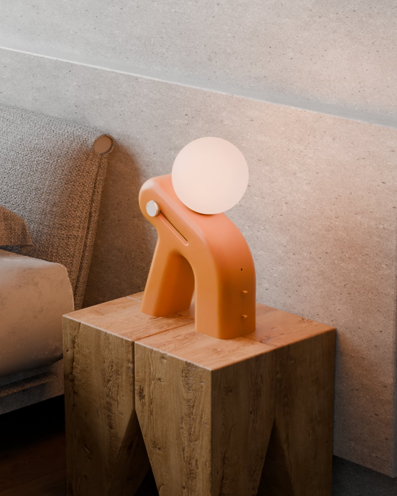
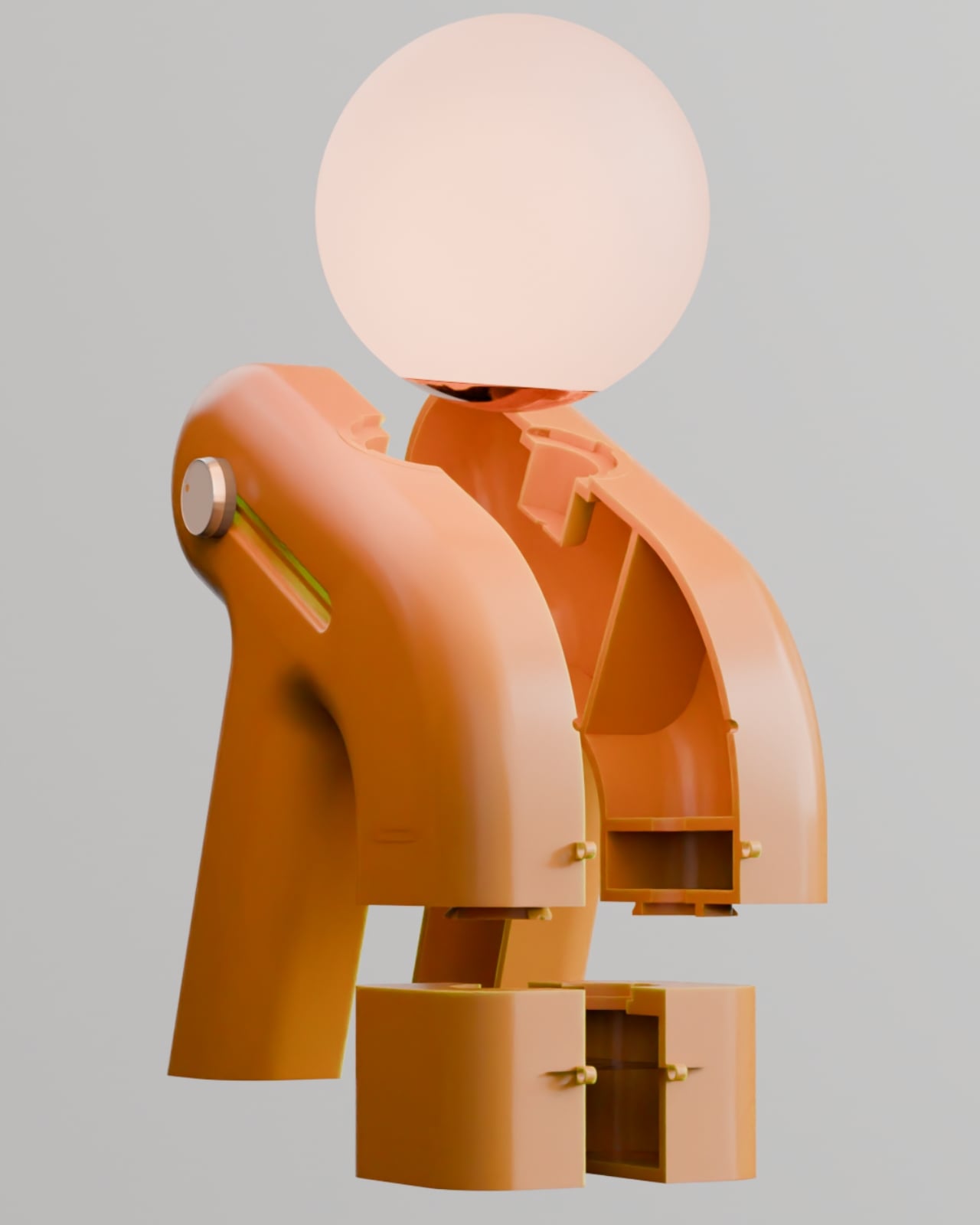
Enter Lunora, a sleep aid device designed by Prithvi Manoj Bhaskaran that’s honestly unlike anything you’ve seen on your bedside table. At first glance, it looks like a little sculptural figure taking a much-needed rest, complete with a glowing orb balanced on its back. That gentle lean, those smooth curves, it all feels intentional in the best way. This isn’t another gadget screaming for your attention. It’s the opposite.
Designer: Prithvi Manoj Bhaskaran
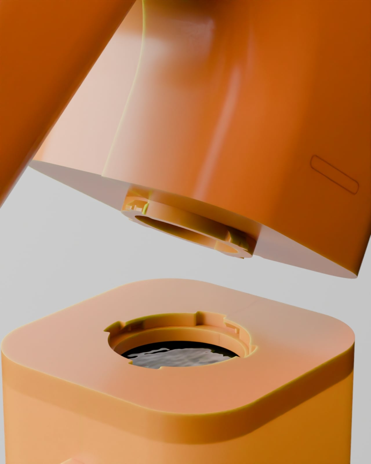
What makes Lunora interesting is how it approaches the whole wind-down process. Instead of tracking your sleep or buzzing you awake, it focuses on helping you actually get there. The device combines three sensory elements: a softly dimming light, gentle aroma diffusion, and low-distraction sound. Think of it as creating a mini sanctuary that guides your body from alert mode to rest mode, without any jarring alarms or bright screens interrupting the vibe.
The way it works is refreshingly simple. You start your routine, and Lunora does its thing. The light gradually dims, signaling to your brain that it’s time to power down. The aroma diffuser releases calming scents that help cut through mental clutter. And the sound component keeps things ambient without being distracting. It’s all about repetition and ritual, the kind of stuff our bodies actually respond to when we give them a chance.
For anyone juggling late-night study sessions or those particularly brutal stress-heavy days, this kind of product makes a lot of sense. You’re not adding another task to your routine or forcing yourself to follow some complicated sleep protocol. You just let Lunora do the heavy lifting while you focus on actually relaxing. It’s like having a friend gently remind you that yes, it’s okay to slow down now.
But here’s where the design really shines. That leaning posture isn’t just for show. It creates this almost human-like presence that feels comforting rather than clinical. The warm terracotta color and those organic curves make it look more like a piece of art than a piece of technology. You could absolutely see this sitting in a carefully curated room on Instagram, but it’s also genuinely functional. The glowing orb on top doubles as the light source, while the body houses the aroma diffuser, visible in those beautifully detailed close-ups.
There’s something refreshing about a product that doesn’t promise to hack your sleep or optimize your REM cycles. Lunora just wants to help you unwind at your own pace. No data tracking, no app notifications, no performance anxiety about whether you’re sleeping correctly. It’s tech that knows when to step back and let you be human.
In a world where we’re constantly optimizing, tracking, and measuring everything, maybe what we need at the end of the day is something that simply helps us transition. Something that looks friendly, feels calming, and doesn’t demand anything from us except the willingness to slow down. Lunora manages to package all of that into a form that’s both sculptural and functional, the kind of design that makes you stop and appreciate the thoughtfulness behind it.
Whether you’re a design enthusiast who appreciates objects with personality, a tech lover curious about ambient devices, or just someone tired of staring at the ceiling at night, Lunora offers something different. It’s a reminder that good design doesn’t always have to be complicated. Sometimes it just needs to understand what you need, and then quietly help you get there.
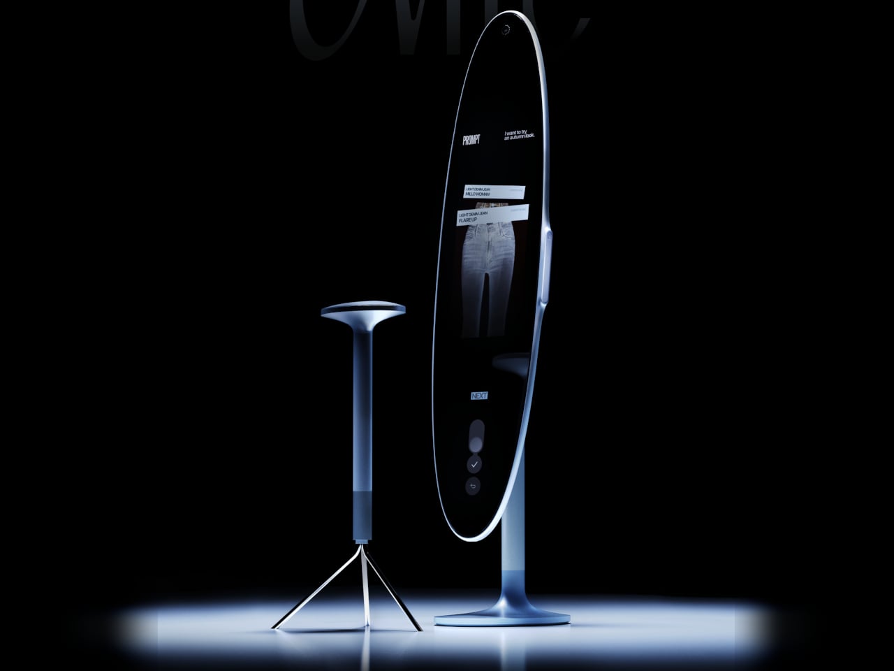
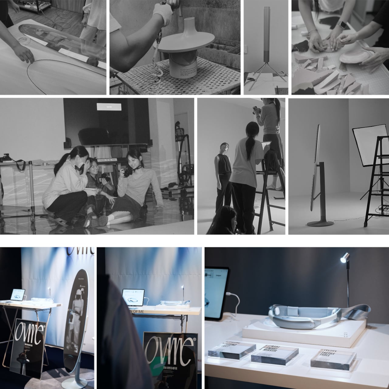
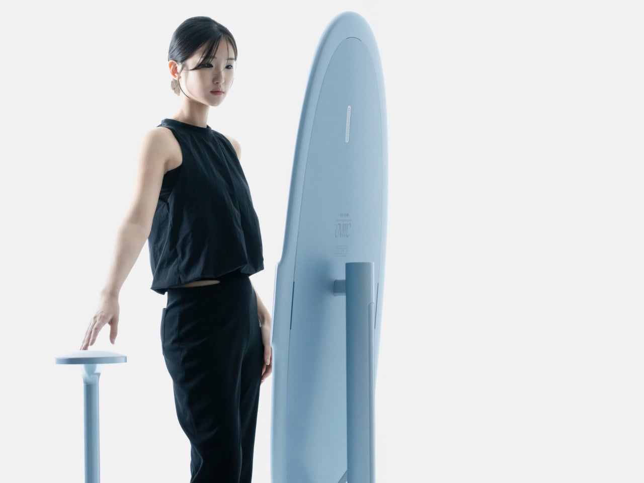
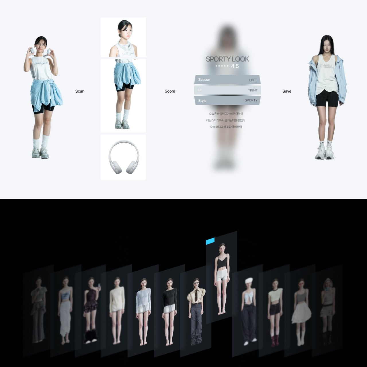
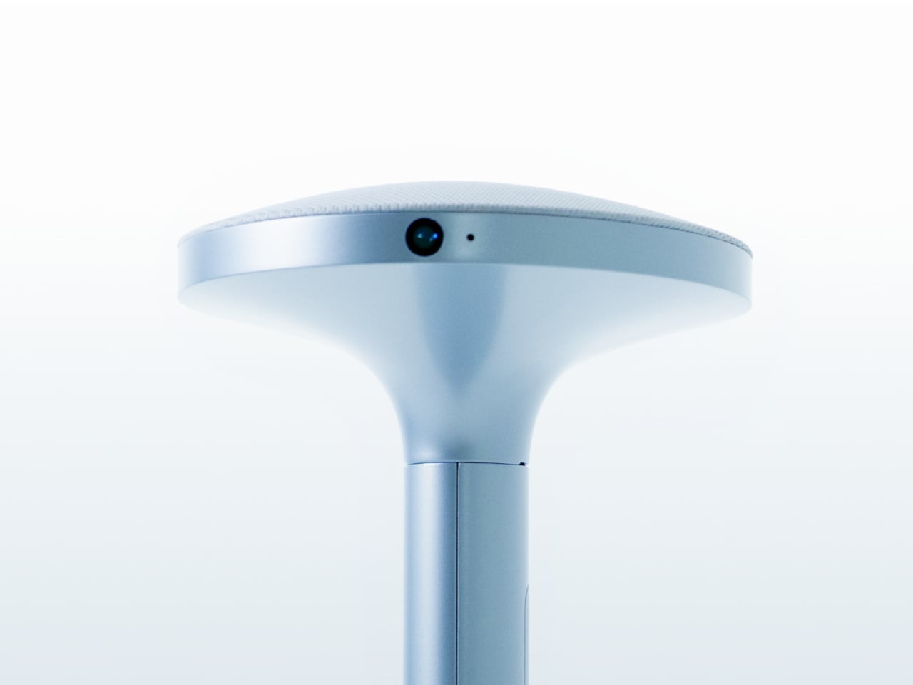
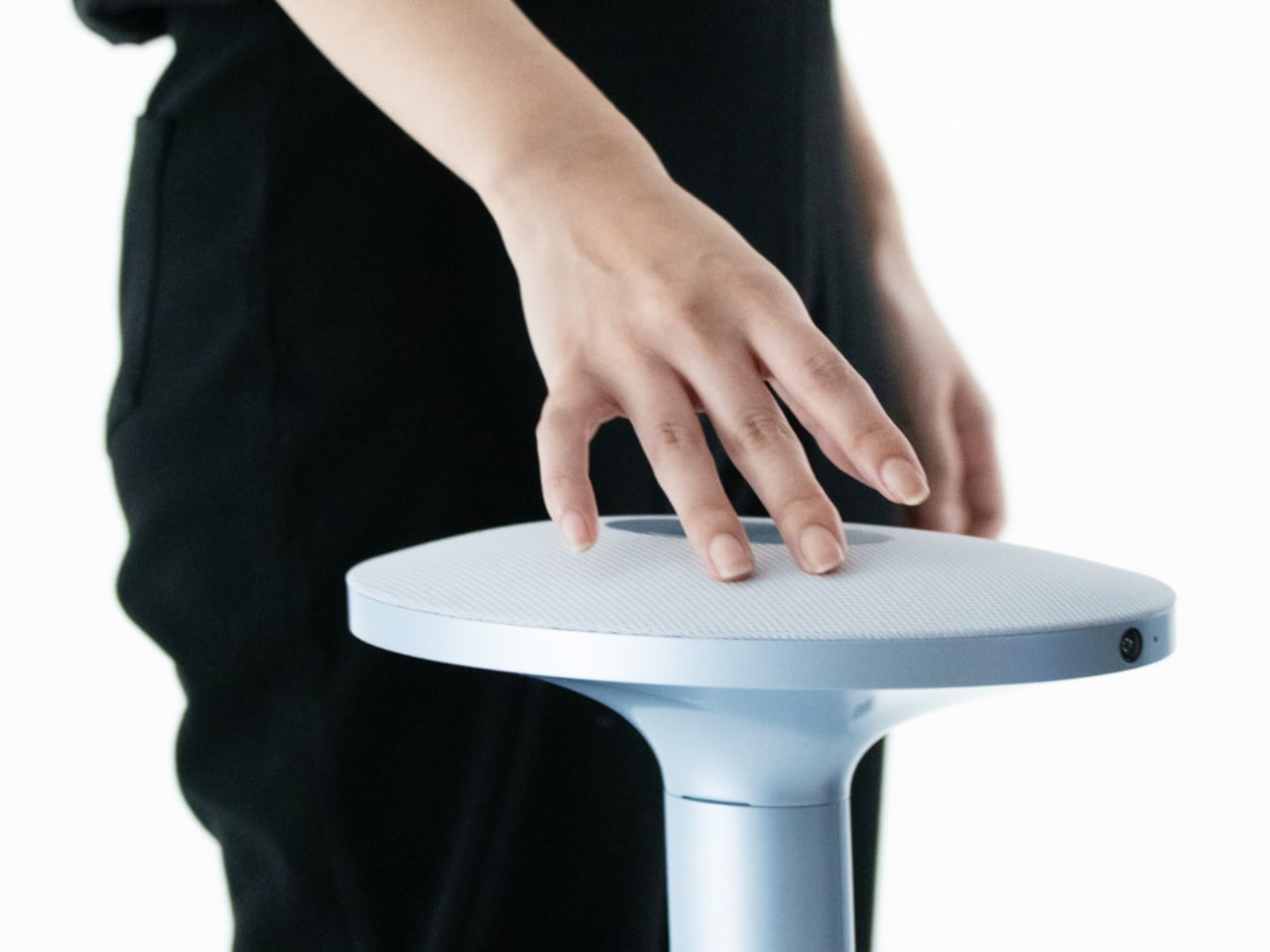
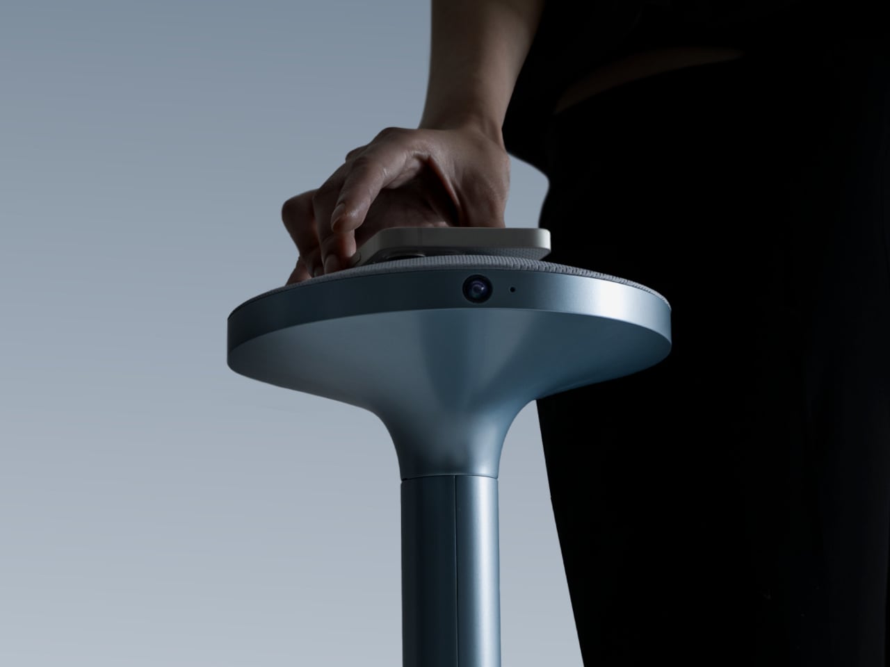
The everyday “what should I wear today?” moment has gotten more complicated by online shopping. You can scroll endless outfits, but a screen cannot show how something fits, feels, or plays with what you already own. Ovme is a concept that treats the mirror as a missing link between your closet, your feed, and your actual body, closing the gap between seeing and knowing.
Ovme is an AR smart mirror ecosystem built around three objects: a full-height mirror, a sensor-laden fitting belt, and a haptic tactile table, plus a companion app. The name stands for “Own version of me,” and the system is designed to help you find new styles, feel how they fit, and touch virtual fabrics before you ever click buy or open your wallet.
Designers: Daun Park, Seyeon Park, Chawon So, Yewon Shim, Yejin Hong
The mirror acts like a personal stylist, overlaying outfits on your reflection and pulling from three sources: new looks, your existing wardrobe, and reference images you feed it. You can swipe through categories like formal, sporty, or feminine, and see complete outfits assembled around your silhouette, then save the ones that feel right into a virtual closet for later when you need inspiration or want to revisit.
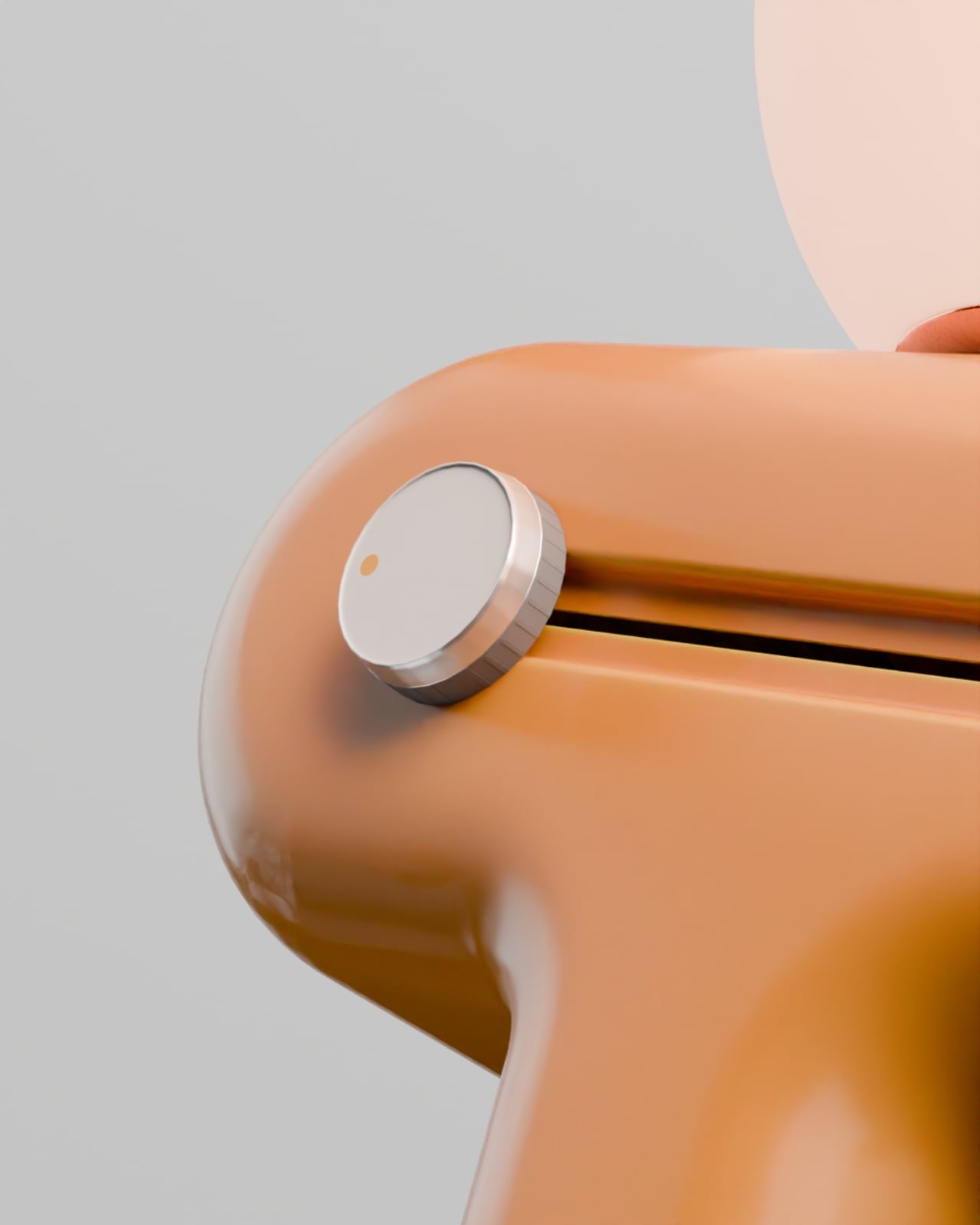
The fitting belt is a flexible band with sensors that can wrap around your head, waist, or thigh. It measures circumference and applies gentle pressure, tightening or loosening to simulate how a garment would hug or hang on that part of your body. On the mirror, the virtual outfit responds in real time, turning fit from a guess based on size charts into something your body can actually sense.
The tactile table is a slim pedestal with a haptic surface that uses electro-tactile feedback to mimic fabric textures. When you place your hand on it, the system can suggest sensations like smooth silk, textured knit, or structured leather in sync with what you see in the mirror. It attempts to close the gap between seeing a material and knowing how it might feel against your skin or draped over your shoulders.
Ovme also acts as a style diary. It can scan what you are wearing today, score the outfit, and save it to a timeline called My Closet, so you can revisit past looks and see patterns in what you actually wear. A social layer called OvUS lets you browse other people’s saved styles and mood boards, turning the mirror into a place to share and borrow ideas rather than stare at yourself alone.
Ovme treats getting dressed as an ongoing design process, not a daily panic, and uses AR, haptics, and sensing to give online fashion some of the feedback loops of a real fitting room. Whether or not this exact hardware ever ships, the idea of a home mirror that helps you experiment, feel, and remember your style captures a direction that deserves attention, especially as wardrobes become more scattered across platforms and shopping becomes more remote.
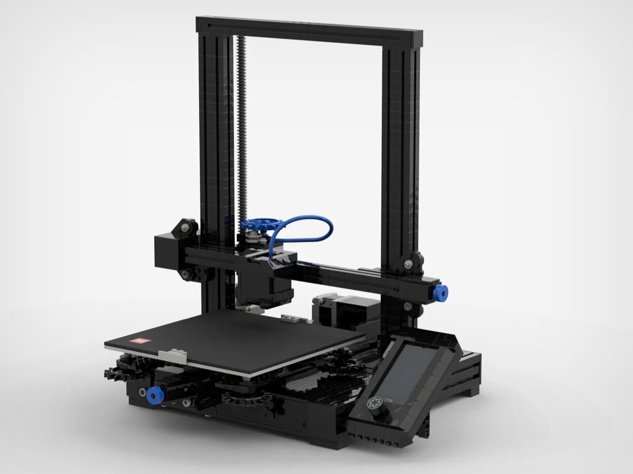
LEGO and 3D printing occupy similar creative territory, both letting you turn ideas into physical objects through systematic processes. Yet despite this natural kinship, there’s never been an official LEGO model of the specific machine that’s currently democratizing small-scale manufacturing. This fan submission fixes that gap with a recognizably Ender-inspired design that captures both the utilitarian aesthetic and basic kinematic structure of Creality’s popular printer lineup.
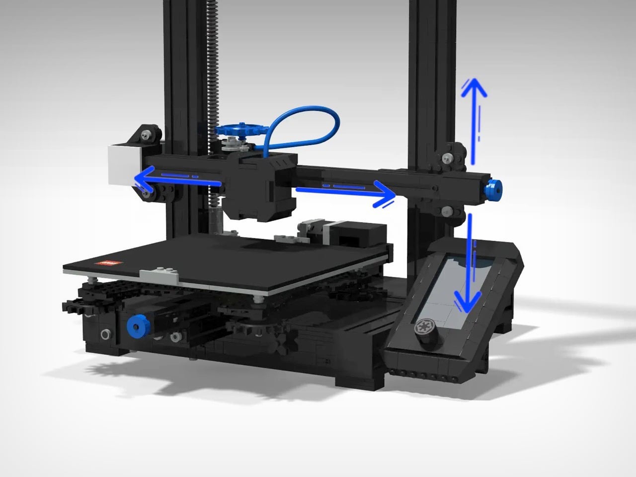
The build doesn’t actually function like some ambitious LEGO projects (there’s a working LEGO Turing machine out there made from 2,900 bricks), but that’s not really the point. Someone unfamiliar with 3D printing could assemble this and understand how Cartesian motion systems work, how the hotend assembly relates to the build plate, and why those vertical lead screws matter for Z-axis stability. For people who already own an Ender or similar machine, it’s more about the novelty and nostalgia of seeing familiar hardware translated into a tabletop collectible to admire and cherish.
Designer: Guris14
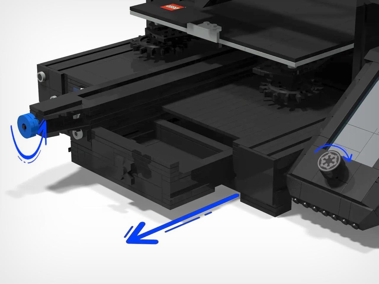
Paying homage to the Ender 3 is fitting, since it was literally the first 3D printer for so many people, quite like an entire generation having a Nokia first phone. Creality sold hundreds of thousands of these things, maybe millions at this point, and the design became the default mental image of what a 3D printer looks like for an entire generation of makers. That boxy aluminum frame, the single Z-axis lead screw on earlier models (this LEGO version appears to reference the dual-screw V2), the bowden extruder setup with that blue PTFE tube snaking from the frame-mounted motor to the hotend. That characteristic black and silver color scheme with blue accent components has become as visually shorthand for “budget 3D printer” as the beige tower was for 90s PCs. Designer Guris14 scaled the model down from the Ender 3 V2’s actual 220x220x250mm build volume to something desk-friendly, but kept the proportions honest enough that you immediately recognize what you’re looking at.
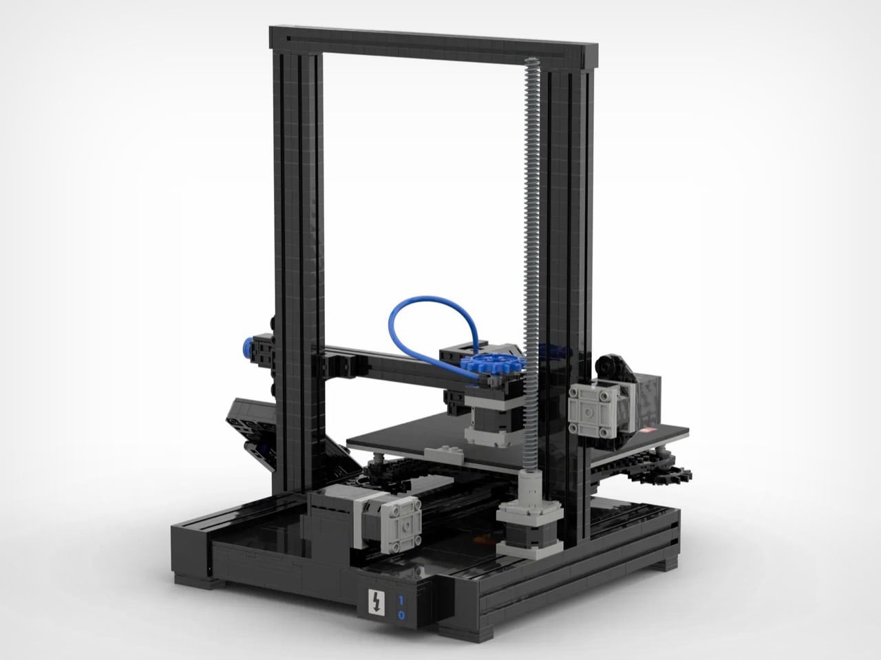
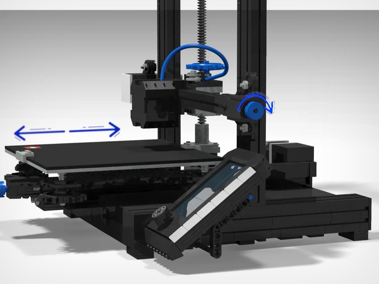
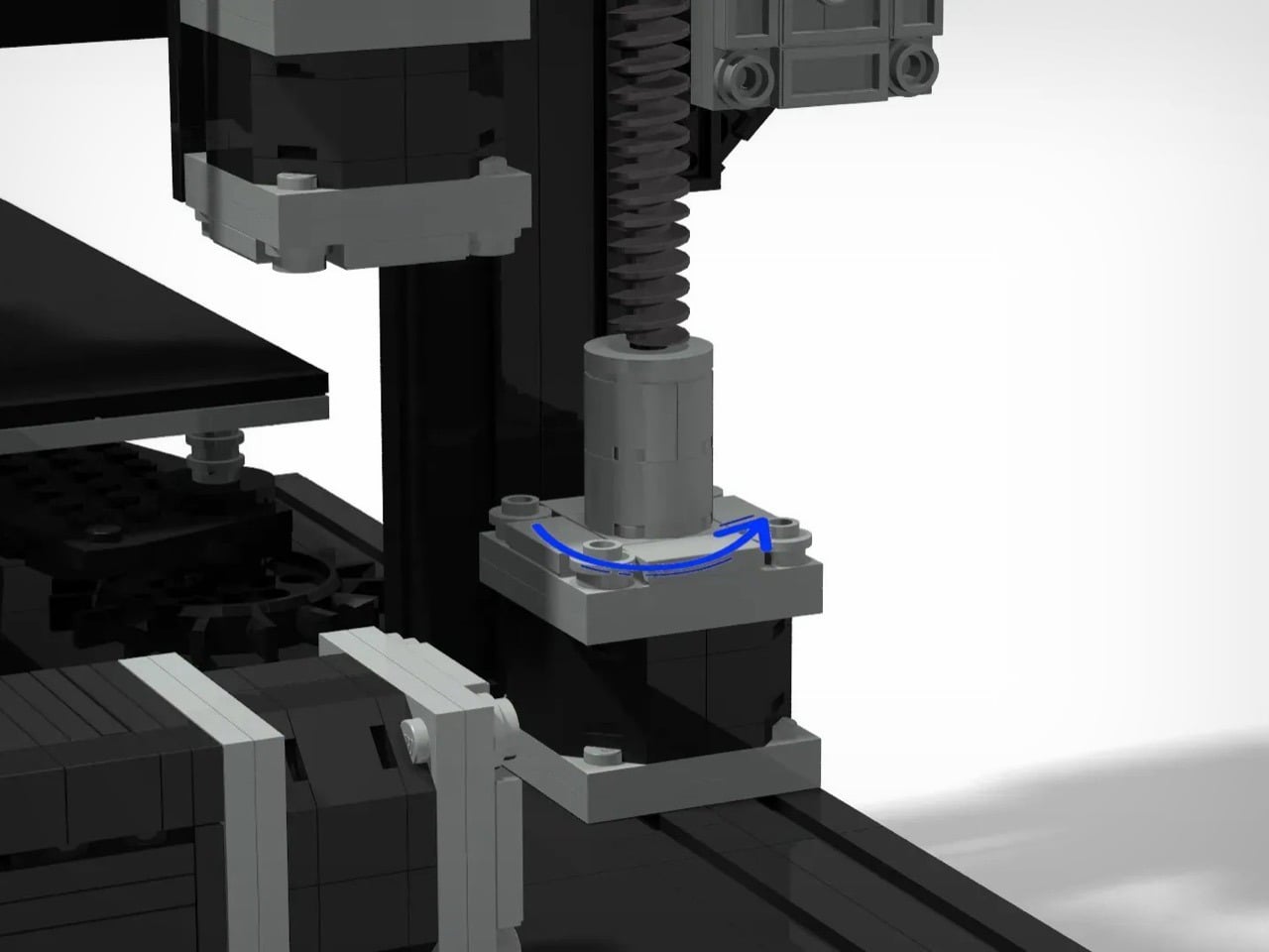
What’s impressive is how the mechanical systems translate into LEGO’s vocabulary without completely abandoning accuracy. The Z-axis uses what appears to be LEGO’s ribbed hose pieces to represent lead screws, with the gantry able to move up and down the vertical supports. The X-axis gantry rides on a black beam that mimics the 2040 aluminum extrusion found on real Enders, while the hotend assembly hangs from a carriage with that signature blue bowden tube curling back toward the extruder. The build plate sits on a Y-axis assembly with its own lead screw mechanism, and there’s even a LEGO logo on the build-plate, like perfectly placed branding!
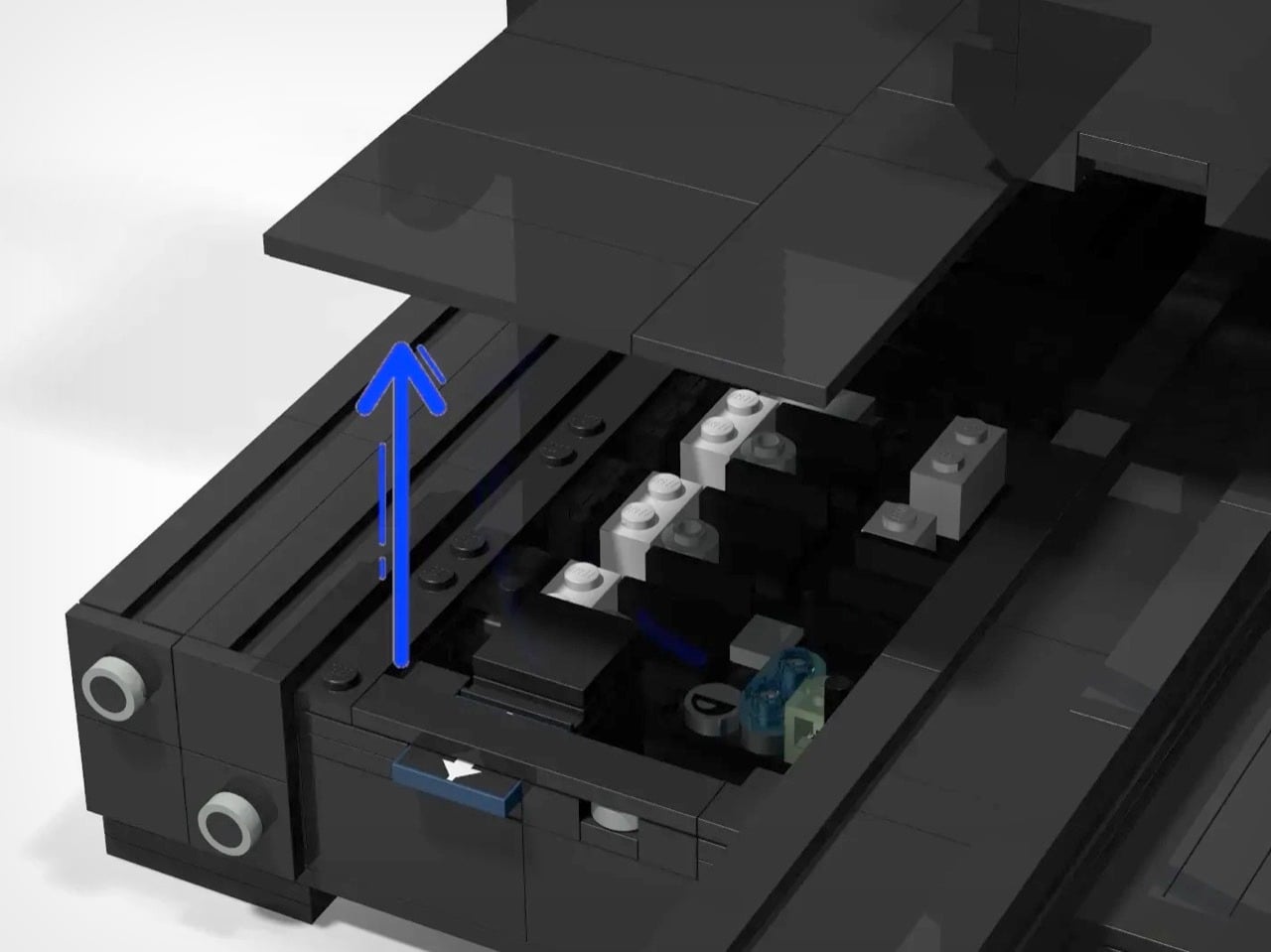
Flip the model and you’ll find representations of the motherboard and power supply tucked beneath the build plate, exactly where Creality positions them on the actual hardware. There’s that angled LCD screen mount on the front right corner, positioned just like the stock Ender setup. Even the spool holder perched on the top frame gets included, which is the kind of completeness that separates a thoughtful recreation from a surface-level approximation. You could hand this to someone who’s never seen a 3D printer and they’d walk away with a surprisingly accurate mental model of how these machines are structured.
The project currently sits on the LEGO Ideas website, where fans share their own creations and vote for their favorites. Lucky builds that hit the 10,000 vote mark move to the review stage where LEGO actually considers it for production. That’s always been the tricky part with Ideas submissions. You need a concept that’s simultaneously niche enough to excite enthusiasts but broad enough that LEGO thinks they can sell tens of thousands of units through their retail channels. A 3D printer model lives in an interesting space there. The maker community overlap is real and passionate, but you’re also asking LEGO to produce a set celebrating a technology that competes with their own manufacturing process in certain contexts.
Still, LEGO has greenlit plenty of sets that celebrate tools and technology. The Typewriter, the Polaroid camera, the various Technic construction vehicles, all of these acknowledge that people enjoy building detailed models of machines they find interesting or useful. A 3D printer fits that pattern perfectly, especially as these devices become more common in homes and schools. The educational angle writes itself: here’s a hands-on way to understand additive manufacturing without dealing with bed leveling or filament moisture. Whether that’s enough to get LEGO’s product team on board is another question entirely, but stranger things have made it through the Ideas gauntlet. The NASA Apollo Saturn V started as a fan submission. So did the ship in a bottle.