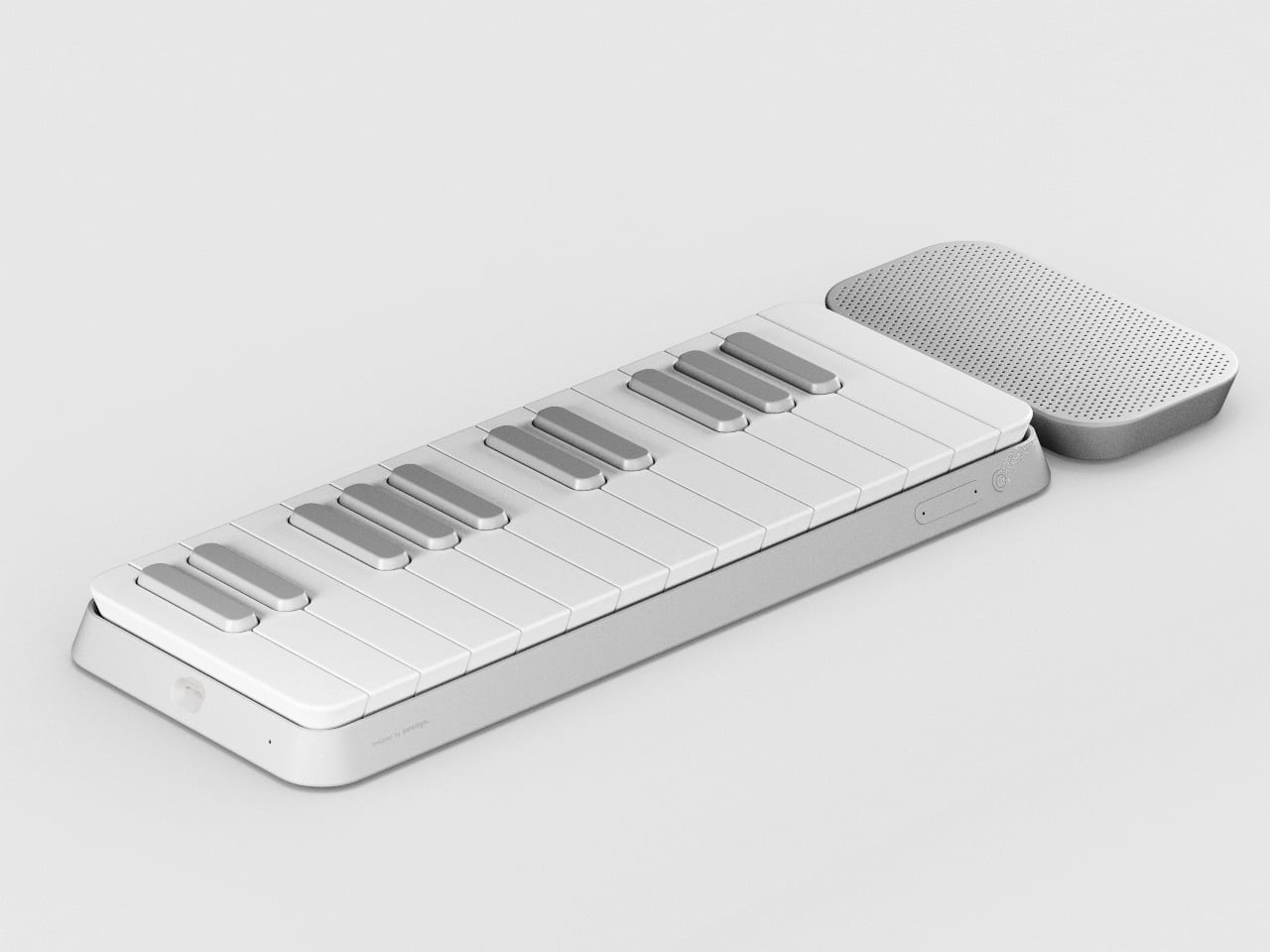
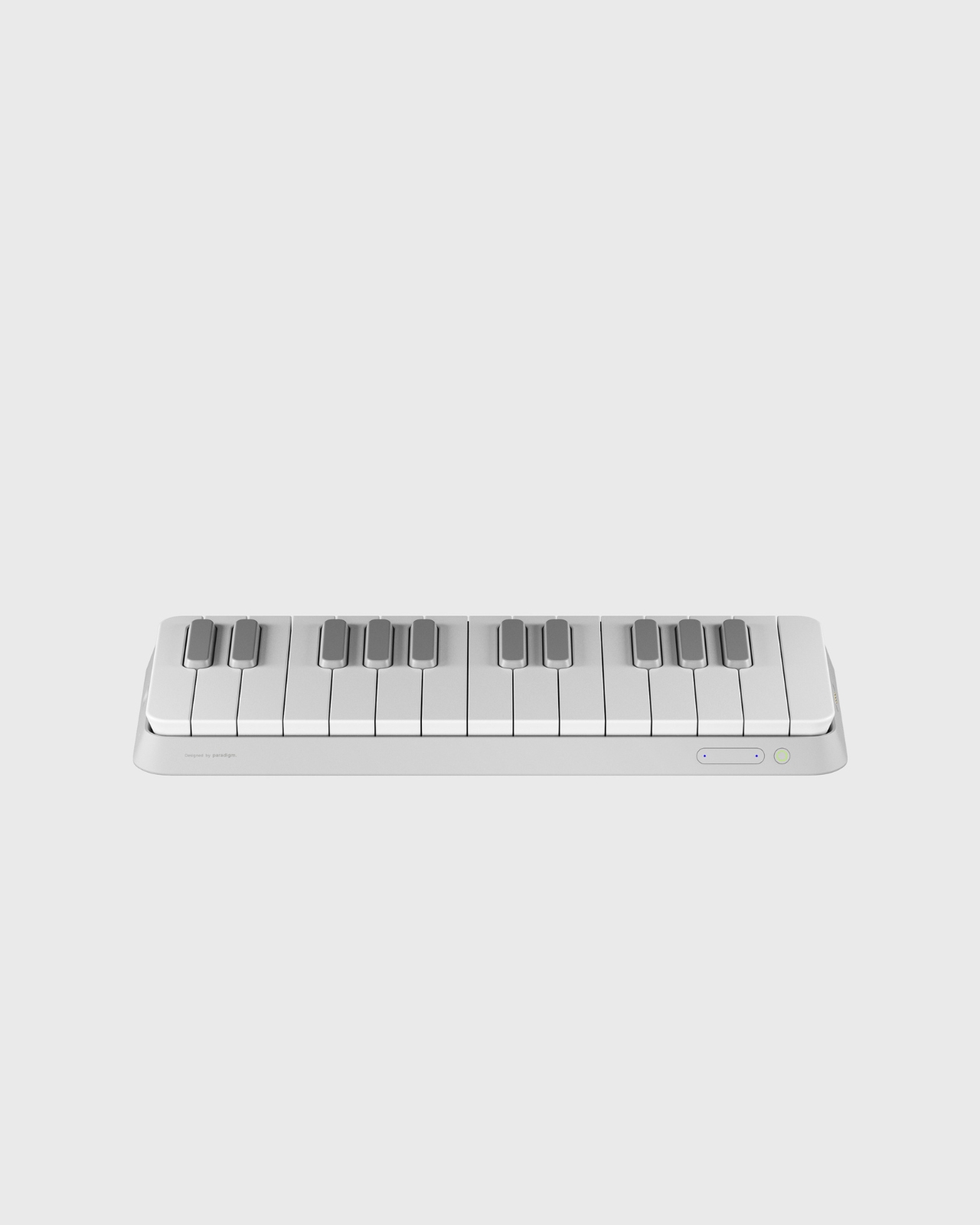
There’s something refreshing about a gadget that looks this good while solving real problems. Germain Verbrackel’s MIDI controller concept doesn’t try to reinvent the wheel, but it does ask an interesting question: what if our music-making tools were designed with the same care we give to the objects we use every day?
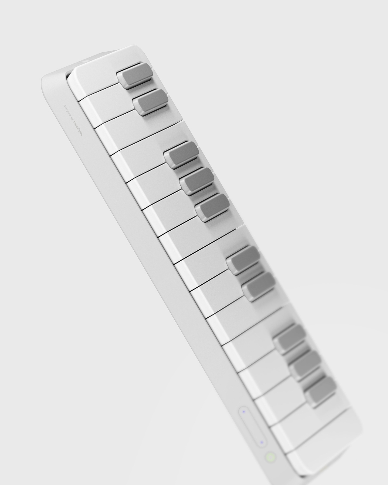
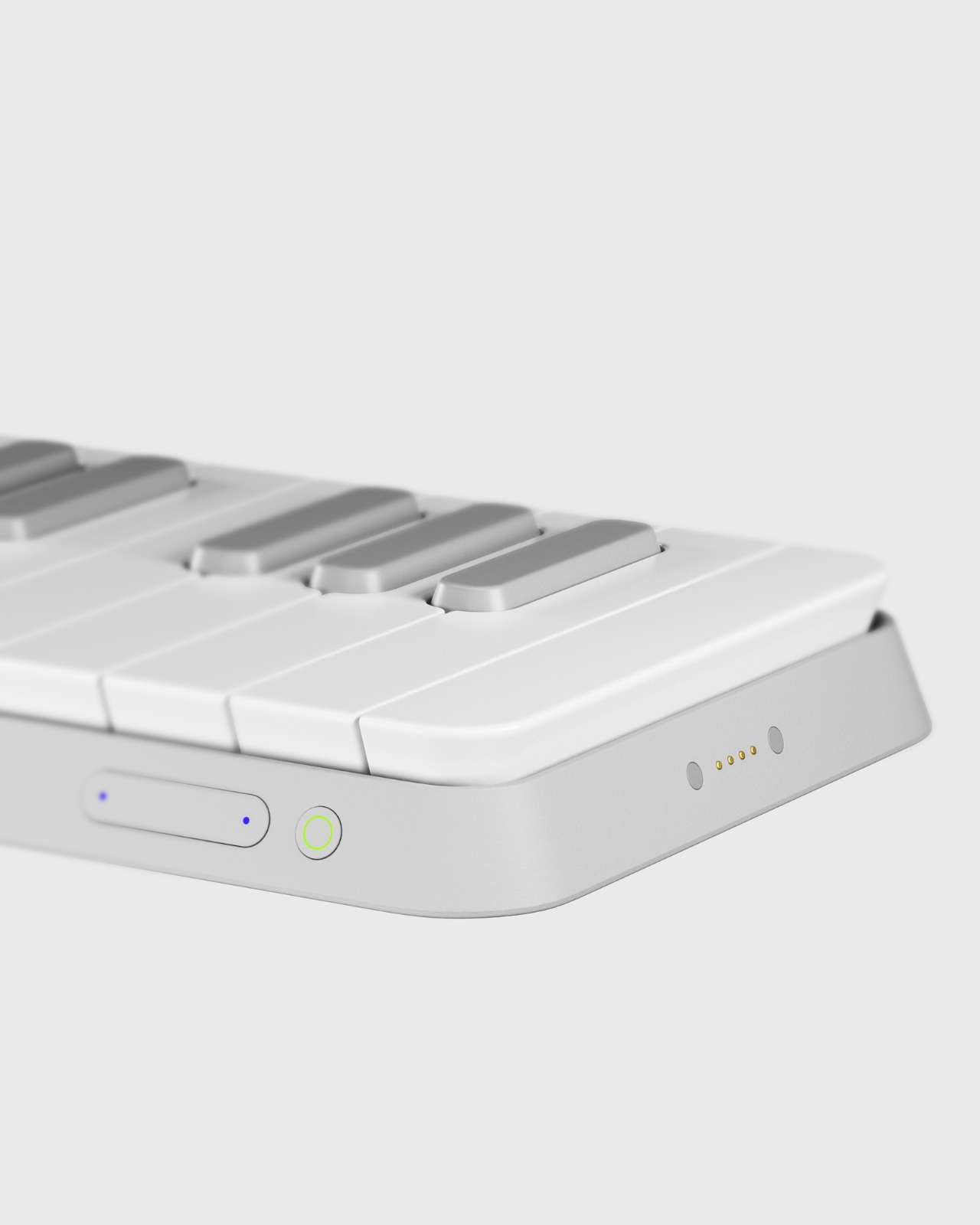
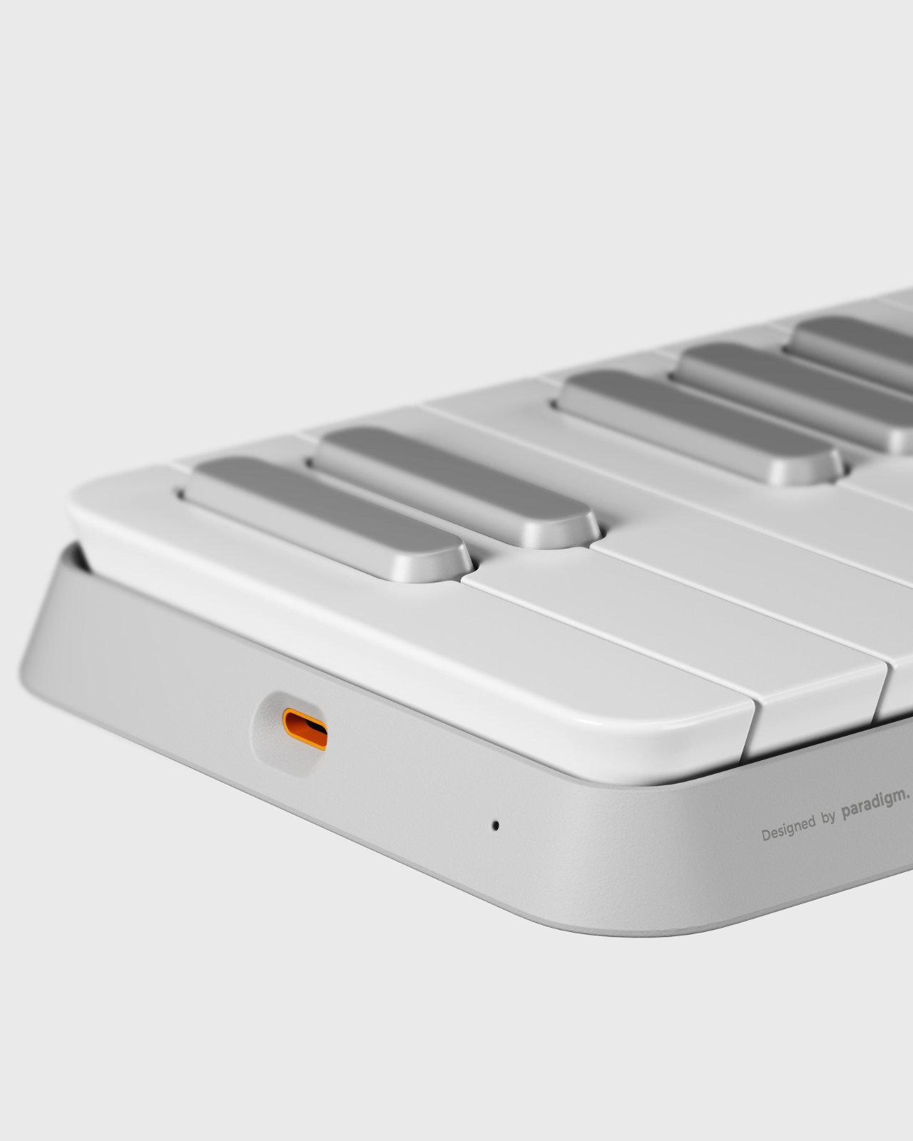
At first glance, this looks like a minimalist’s dream. The all-white palette and clean lines give it that “I belong on a designer’s desk” vibe. But look closer, and you’ll notice that every curve and angle here has a job to do. The chamfered base isn’t just there to look pretty. It creates a sense of groundedness, like the controller is planted firmly on your desk, ready to work. There’s a subtle confidence to it, the kind that comes from knowing exactly what it is and what it’s supposed to do.
The keys tell an even better story. Each one features a chamfered edge that guides your fingers into position. It’s a small detail, but it’s the kind of thing that makes a huge difference when you’re actually using the device. Think about how many times you’ve fumbled with flat, generic buttons that all feel the same. These keys practically tell your fingertips where to go. That’s not just good design, that’s thoughtful design.
What really sets this controller apart, though, is the magnetic speaker attachment. This is where the concept shifts from “nice MIDI controller” to “oh, that’s clever.” Most MIDI controllers are tethered to computers or external speakers. They’re input devices, not standalone instruments. But snap that speaker module into place, and suddenly you’ve got a self-contained music-making tool. No laptop required. No cables snaking across your workspace. Just you and the music.
The magnetic connection is particularly smart because it maintains the device’s sleek profile when you don’t need the speaker, but transforms it into something more complete when you do. It’s modular design done right, not as a gimmick but as a genuine enhancement to functionality. The speaker itself has a textured grille that provides visual and tactile contrast to the smooth keys, giving the whole setup a more dynamic look when assembled.
There’s also something to be said for how portable this design appears. The compact form factor suggests this is meant to travel with you, to be the controller you throw in your bag when inspiration might strike at a coffee shop or a friend’s place. The chamfered base helps here too, because that angled edge makes it easier to pick up off a flat surface. Again, it’s a small thing, but these small things add up to create an object that feels like it was designed by someone who actually uses these tools.
The aesthetic choices matter here as well. In a market full of MIDI controllers that either try too hard to look “professional” with all-black industrial designs or go the opposite direction with RGB lighting and gaming-inspired looks, this one takes a different path. It’s contemporary without being trendy. It’s minimal without being cold. It could sit next to your laptop, your coffee maker, or your favorite design book and look equally at home.
What Verbrackel has created here is a case study in how industrial design can elevate everyday tools. This isn’t about adding features for the sake of features or making something look futuristic just because you can. It’s about understanding how people actually use these devices and designing accordingly. The chamfered edges, the magnetic speaker, the clean color palette, they all serve the same goal: making music creation more intuitive and more enjoyable.
The controller represents a broader shift we’re seeing in tech design, where the focus moves from pure functionality to thoughtful integration of form and function. It’s the same philosophy that’s made smartphones beautiful and kitchen appliances worthy of counter space. Why shouldn’t our creative tools receive the same level of design attention? Whether this concept makes it to production or remains a stunning portfolio piece, it’s already done its job. It’s made us think differently about what a MIDI controller can be. And that’s worth celebrating.
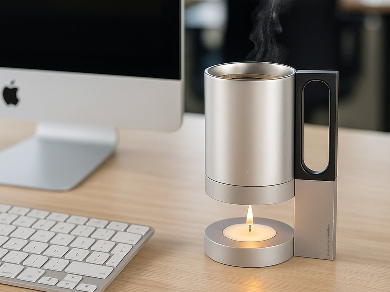
You know that moment when you’re deep into a project, finally hitting your flow state, and you reach for your coffee only to find it’s gone stone cold? It’s one of those tiny frustrations that can derail your entire momentum. But it’s also part of the workflow that you forget you have a warm cup waiting for you to wake you up since you’re engrossed with whatever it is you’re doing. So when you realize it’s gone cold, you either just slurp it down or you make a new cup.
Designer Germain Verbrackel clearly understands this universal struggle, because his new concept called Warmer tackles it with the kind of elegant simplicity that makes you wonder why it hasn’t been done before. Why not have something that will keep your coffee or any beverage warm so you won’t suffer through drinking something lukewarm?
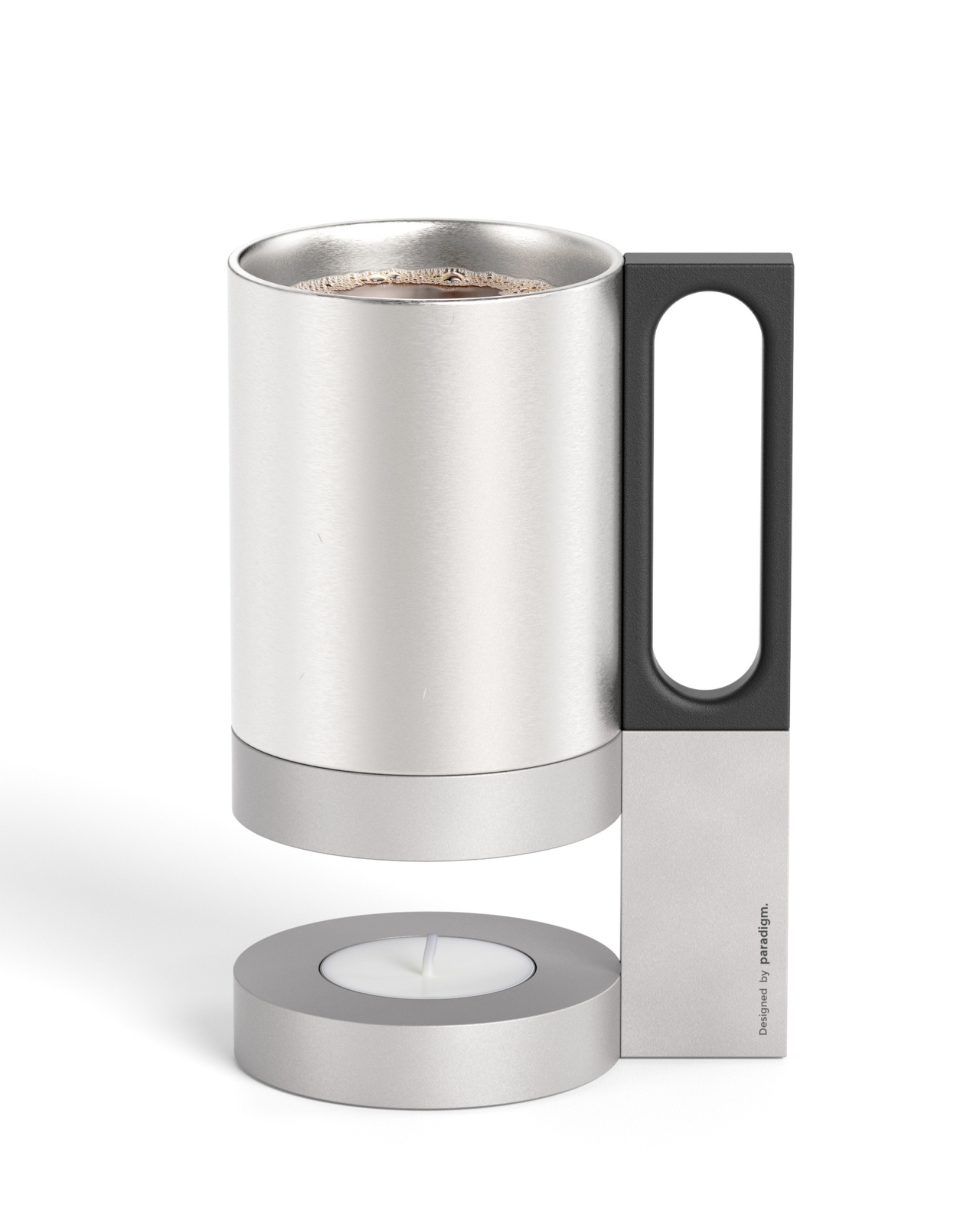
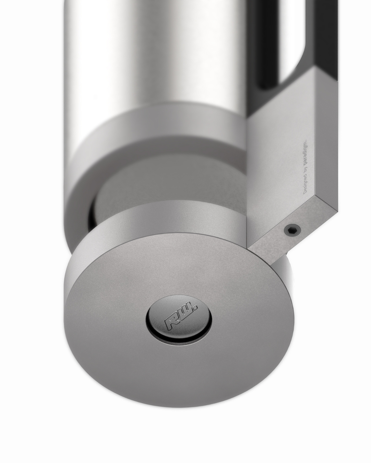
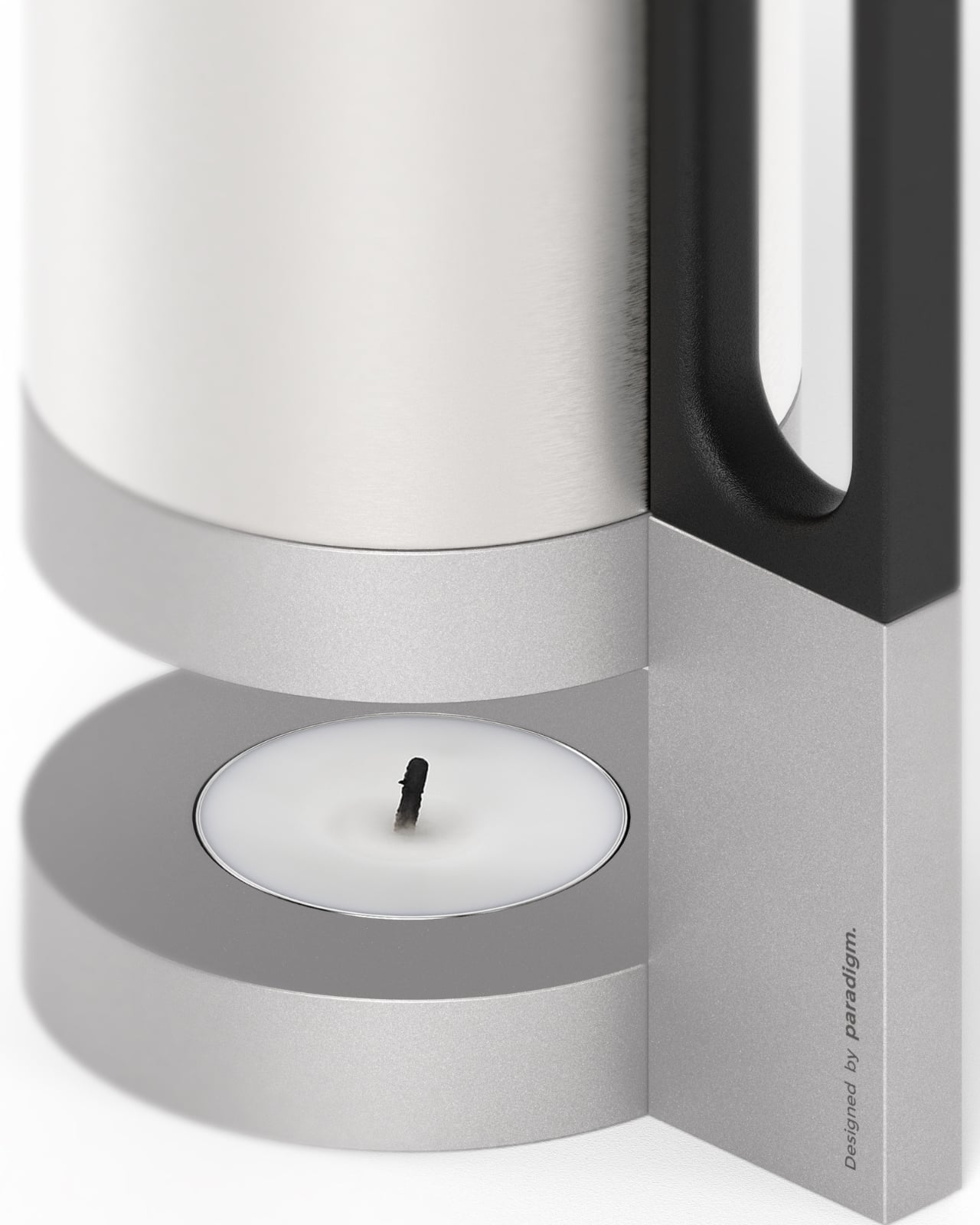
At first glance, Warmer looks like something that could sit comfortably on the desk of a minimalist tech enthusiast or grace the pages of a Scandinavian design magazine. Crafted from aluminum and brushed steel, it has that industrial-yet-refined aesthetic that never goes out of style. But what makes it particularly interesting is that it’s completely analog in our hyper-digital world. No USB cables, no app to download, no Bluetooth connectivity. Just a simple tea light candle providing gentle, sustained heat.
The design itself is brilliantly straightforward. A circular base houses the candle, and a vertical support structure rises up to hold your cup, bowl, or small pan at the perfect distance from the flame. That black geometric handle detail adds a nice visual contrast to all that brushed metal, giving it a touch of contemporary flair without feeling overdone. It’s functional sculpture, really.
What I love about this concept is how it challenges our default assumption that every solution needs to be high-tech. We’ve become so accustomed to electric mug warmers with their glowing LED indicators and temperature controls that we’ve forgotten about the simple physics of a candle flame. There’s something almost meditative about watching that tiny flame flicker while you work, knowing it’s quietly doing its job without demanding anything from your power strip or Wi-Fi network.
The versatility factor is pretty smart too. Sure, keeping your morning coffee at the perfect sipping temperature throughout those long Zoom meetings is great, but Verbrackel designed Warmer to accommodate different container types. Need to keep soup warm during lunch at your desk? Done. Want to gently heat something small in a bowl or pan? It can handle that. This multi-purpose approach gives it staying power beyond being a one-trick pony.
From a practical standpoint, there are some real advantages to this candle-powered approach. Tea lights are incredibly cheap, widely available, and burn for hours. There’s no complicated maintenance, no heating element to burn out, and no worrying about forgetting to turn it off (though obviously, you still need to be mindful of open flames). It’s the kind of product that would work just as well in a modern office as it would in a cabin without electricity. The material choice speaks to durability and heat conductivity. Aluminum and steel can handle constant exposure to heat without degrading, and that brushed finish will age gracefully rather than looking worn. It’s clearly designed to be something you’d keep on your desk as a permanent fixture rather than tucking it away in a drawer.
There’s also something quietly rebellious about Warmer in our current moment. While tech companies are racing to make everything “smart” and connected, this design deliberately goes the opposite direction. It’s almost making a statement about intentional simplicity and questioning whether we really need to digitize every aspect of our daily routines. In a world of planned obsolescence and constant software updates, a candle-powered warmer feels almost radical in its simplicity.
Of course, this is still a concept design showcased on Behance, so we don’t know yet if it will make it to production. But that’s part of what makes following industrial design so fascinating. These concepts give us a glimpse into how designers are thinking about everyday problems and push us to reconsider assumptions we didn’t even know we were making. Whether Warmer ever hits store shelves or not, it’s a beautiful reminder that good design doesn’t always mean more complexity. Sometimes the best solution is the one that strips away everything unnecessary and gets back to basics. And honestly, your coffee deserves to stay warm while you conquer your to-do list.
Here’s the thing about living in a city. You’re always caught between two opposing needs. You want to tune out the world on your commute, but also crave those spontaneous outdoor moments with friends. You need to look professional on video calls, but sometimes you just want to capture a memory for yourself. Your laptop runs hot, and honestly, so do you after a long day. It’s exhausting, this constant push and pull.
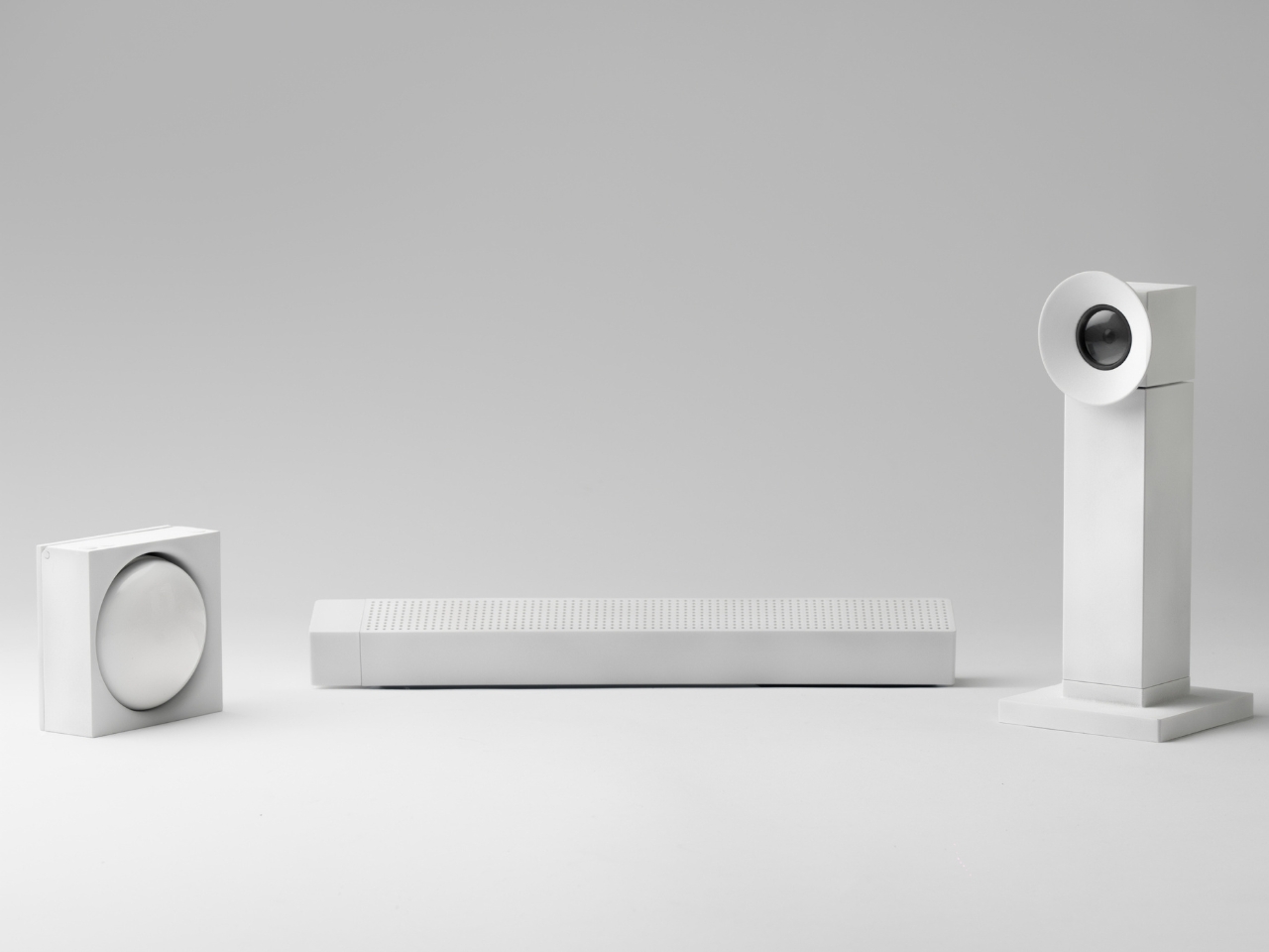
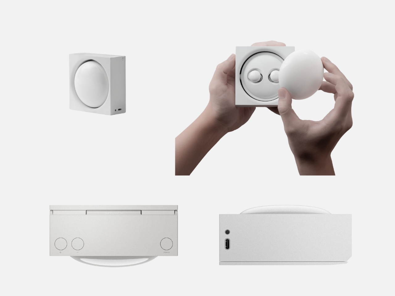
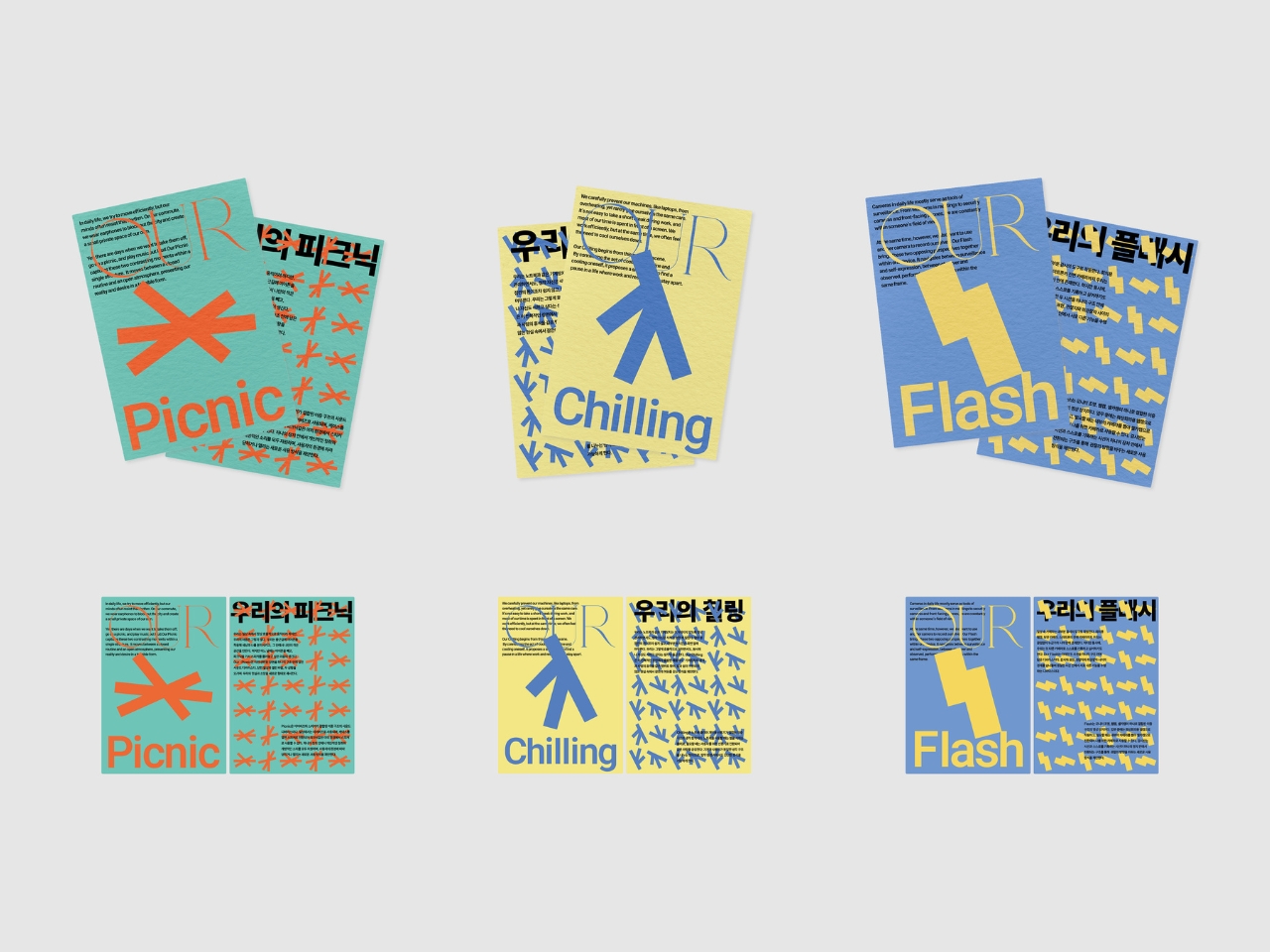
Designer Junwoo Lim has been paying attention to these contradictions. His “Our Seoul” project isn’t about creating more gadgets we don’t need. It’s about recognizing that our daily desires are complicated, and maybe our objects should be too. The series includes three products, each designed around a specific urban tension: Our Picnic, Our Flash, and Our Chilling. Together, they explore how reality and personal longing can coexist in the same space, the same device, the same moment.
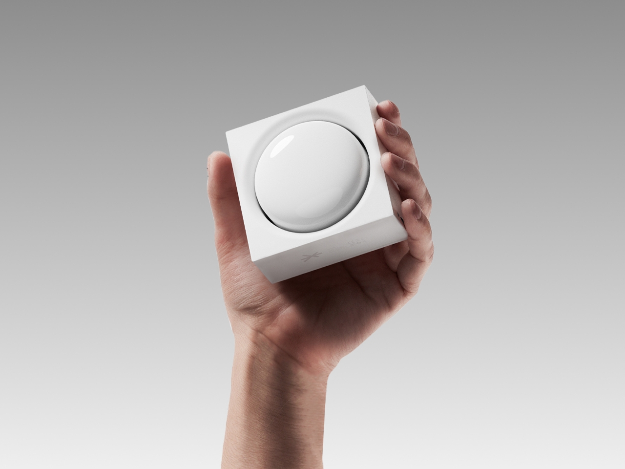
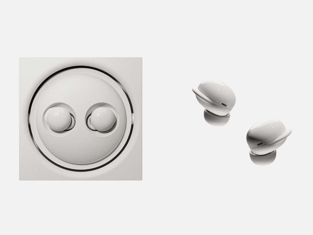
Let’s start with Our Picnic, because it perfectly captures something we all experience. Most mornings, you’re plugging in earbuds to create a bubble of privacy during your commute, shutting out surrounding sounds to protect your sanity. But then the weekend arrives, and suddenly you want the opposite. You want to be outside, sharing music, letting sound fill the space around you. Picnic bridges these two modes by transforming from earbuds into a speaker. Rotate the inner body 180 degrees, and what was personal becomes communal. When you’re outdoors, you can even rotate the back section 45 degrees to prop the device on the ground. The main body holds a 600 mAh battery while each earbud contains about 50 mAh, giving you flexibility for both modes. It’s a simple mechanical solution to an emotional need.
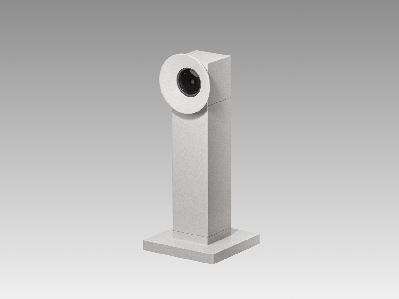
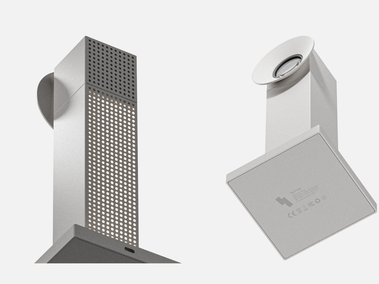
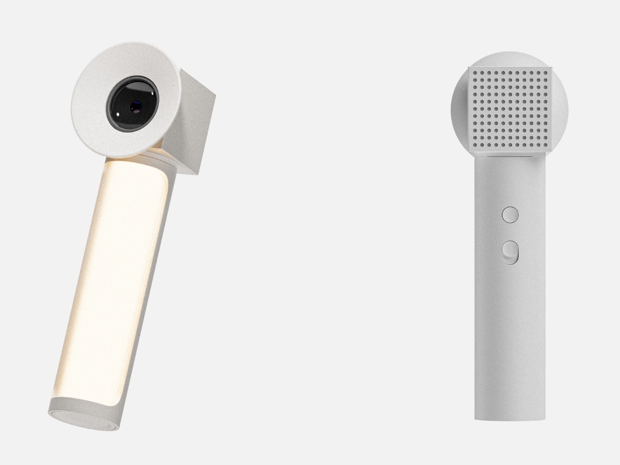
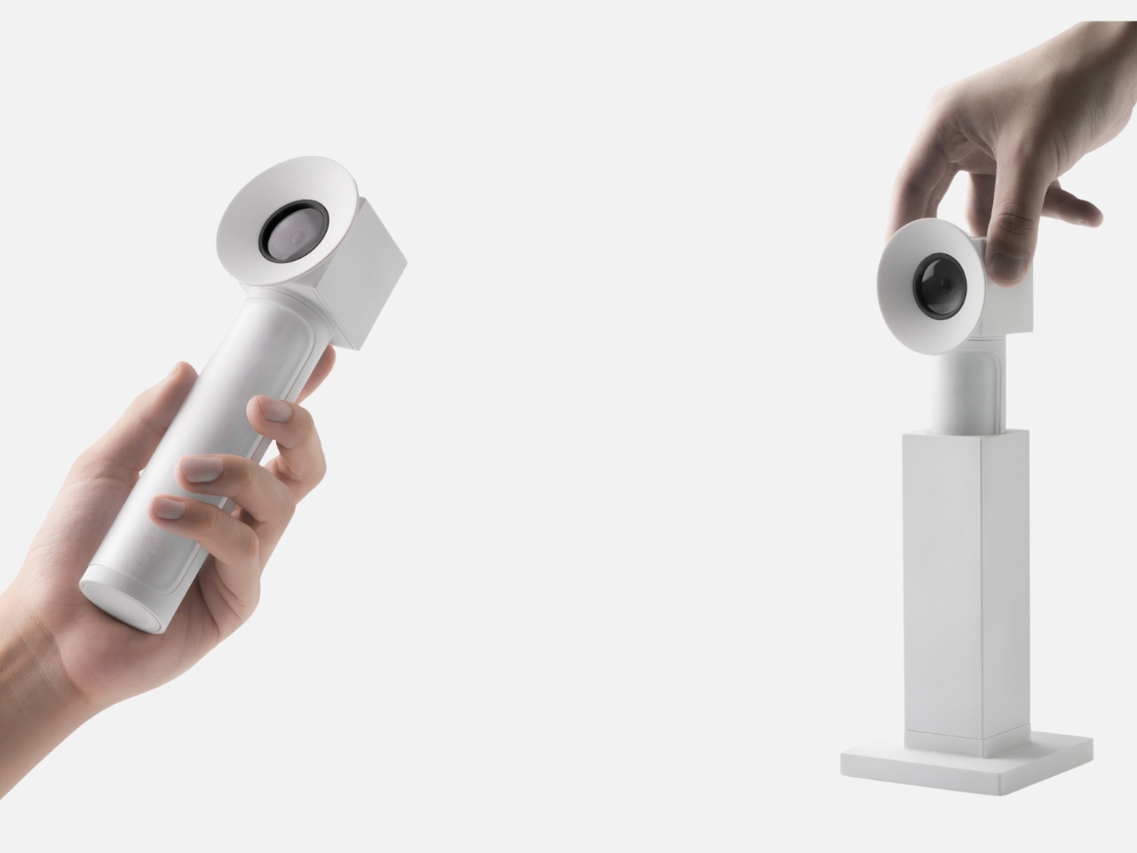
Our Flash tackles a different kind of duality, one that’s become painfully familiar in our video call era. Cameras are constant observers now. We exist within someone’s field of vision during meetings, always aware of being watched. But we’re also the ones doing the watching and recording, capturing moments we want to preserve and control. Flash merges these experiences into a hybrid camera unit that functions as both webcam and selfie camera, positioned somewhere between “the me that is seen” and “the me I want to show.” As a desk webcam, it handles your professional presence. But lift the head section, and the internal selfie camera detaches, ready for personal documentation. The clever part? That perforated central section that normally serves as a vent becomes a 360-degree rotating desk lamp when the internal light activates. It’s surveillance and self-expression and ambient lighting, all depending on what you need in that moment.
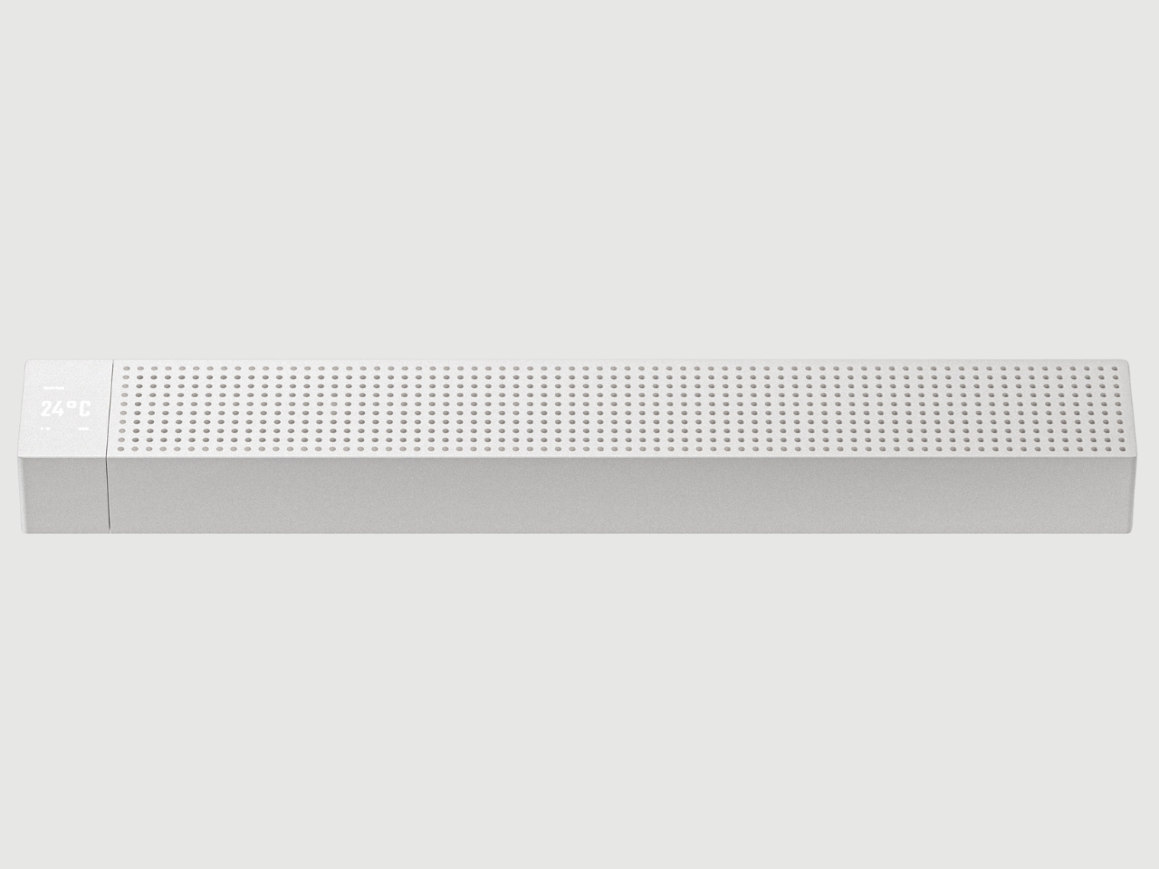
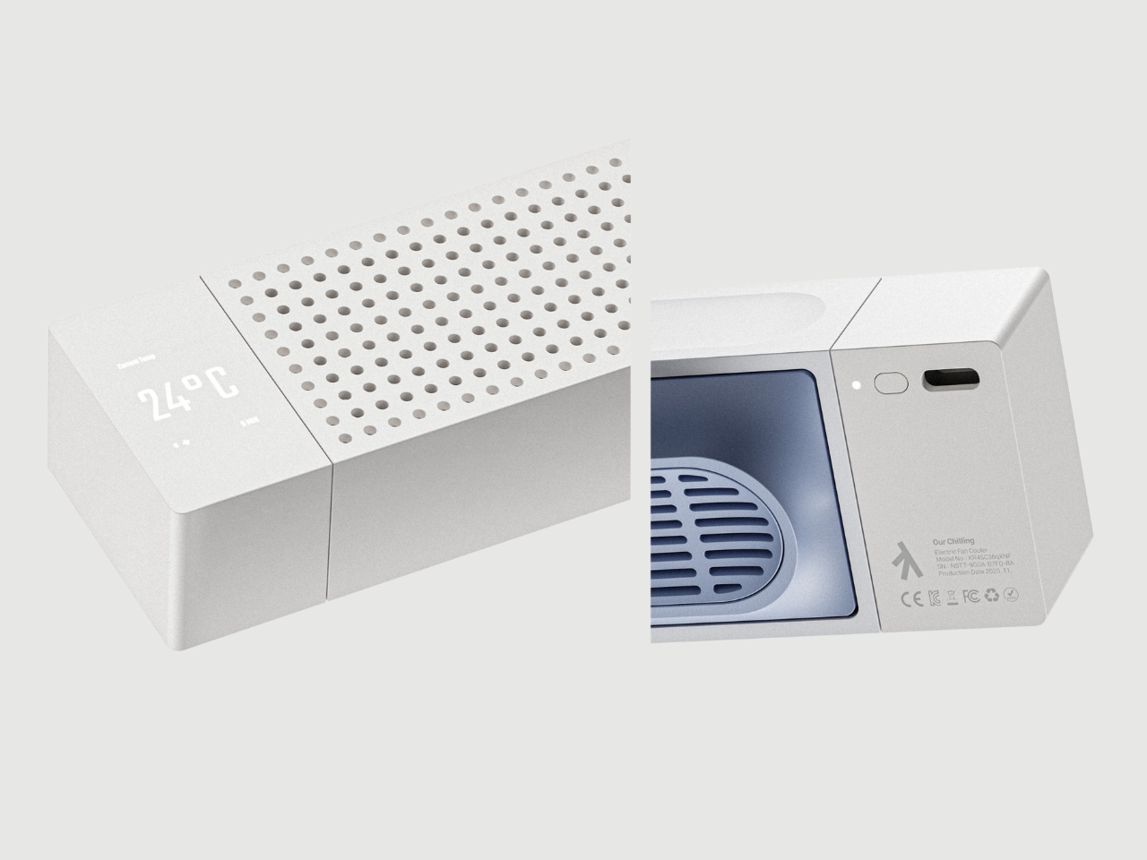
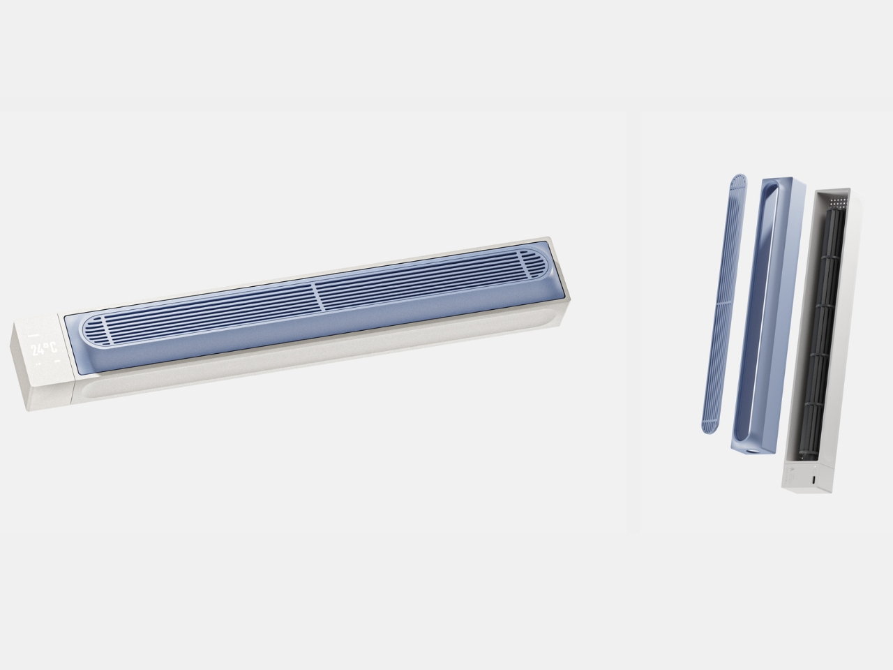
Then there’s Our Chilling, which might be the most relatable concept of all. We spend our lives surrounded by devices that need cooling. Laptops, desktops, gaming rigs. We’re constantly monitoring temperatures, adjusting fan speeds, making sure our machines don’t overheat. But who’s taking care of us? Chilling functions primarily as a laptop cooler with Bluetooth connectivity, letting you monitor CPU and GPU temperatures in real time and adjust cooling intensity through your laptop’s software. The bottom stand even adjusts the tilt angle for ergonomic positioning. But here’s the twist: flip it over, and those tower fan blades inside suddenly serve a different purpose. It becomes a desktop fan, one that can monitor room temperature just like it monitors your laptop’s heat. The same stand that adjusts your laptop angle now controls the fan’s direction. It’s a reminder that in a life where work and rest blur together, maybe we deserve the same attention we give our machines.
What makes this project compelling isn’t the technical specs or the minimalist aesthetic, though both are thoughtfully executed. It’s the underlying philosophy. Lim isn’t trying to simplify urban life or pretend we can eliminate its contradictions. Instead, he’s designing objects that acknowledge the messiness, the constant switching between modes, the way we’re always negotiating between competing needs. The “Our Seoul” series suggests that good design doesn’t resolve tension. It accommodates it.
These are concepts rather than products you can order today, but that’s exactly what makes them valuable. They capture something true about how we’re living right now, in cities that demand constant adaptation, surrounded by technology that often feels like it’s designed for a simpler, more consistent version of ourselves. We’re not that simple. Maybe our objects shouldn’t be either.
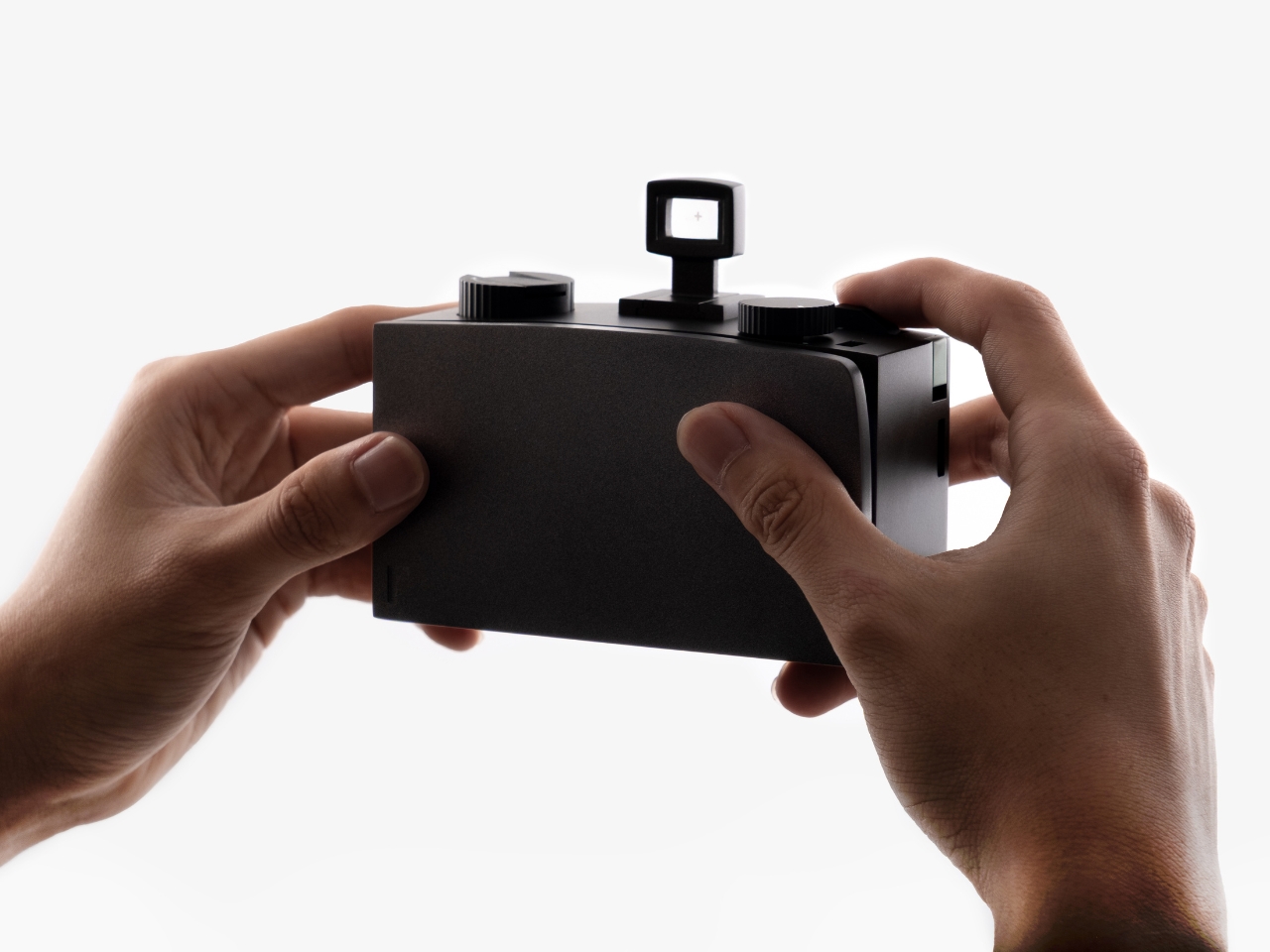
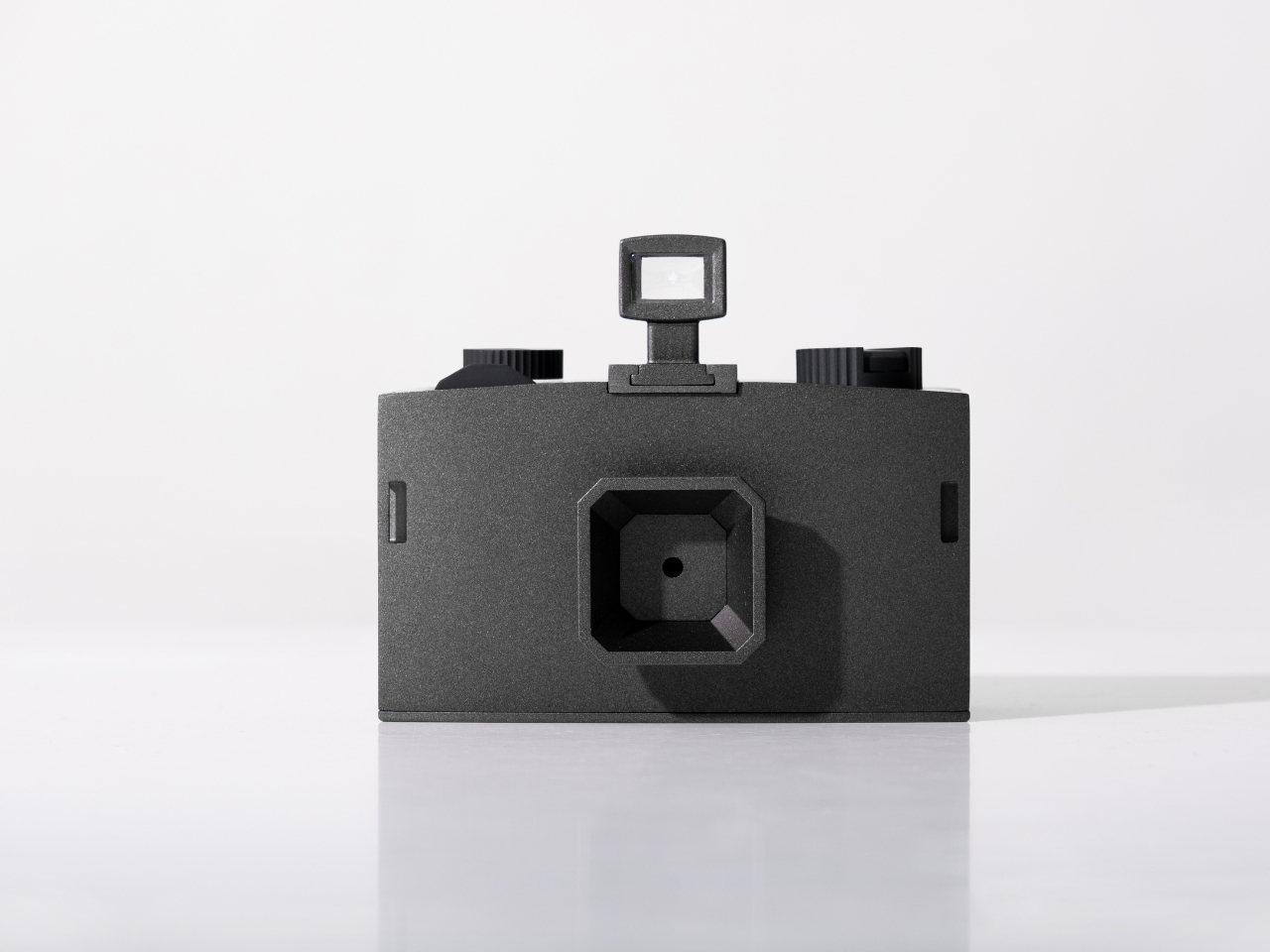
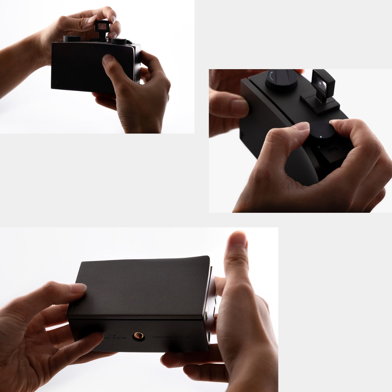
We take thousands of photos on our phones without thinking twice. Snap, scroll, forget, repeat. But here’s a wild thought: what if a camera literally forced you to slow down? That’s exactly what designer Seulgi Kim is exploring with RAW, a pinhole camera concept that’s part time machine, part meditation device, and entirely about reclaiming something we’ve lost in the digital age.
The name RAW works on two levels. First, it means “unrefined,” which perfectly captures the camera’s back-to-basics philosophy. Second, it references RAW image files in photography, those unprocessed originals that contain all the data before any digital manipulation happens. It’s a clever double meaning that sets up everything this concept is about: stripping away the excess to get back to what photography actually is.
Normally we can shoot a hundred photos in seconds with our phones but RAW does something almost rebellious. It uses a pinhole aperture instead of a lens, which means each exposure takes several seconds or even minutes to complete. You can’t rapid-fire shots. You can’t casually capture every moment. Instead, you have to stand there with your subject, waiting, observing, really seeing what’s in front of you. It’s the photographic equivalent of choosing to walk instead of drive, not because you have to, but because you want to notice things along the way.
What makes RAW fascinating beyond its function is how Kim translated traditional Korean architecture into its design language. This isn’t just aesthetic borrowing; it’s a thoughtful connection between two forms of slowness and intentionality. Traditional Korean architecture embodies what Kim calls “the aesthetics of slowness,” where every element reflects careful consideration of space, time, and human presence. Those principles shaped buildings that have stood for centuries, and now they’re informing how we might think about capturing a single photograph.
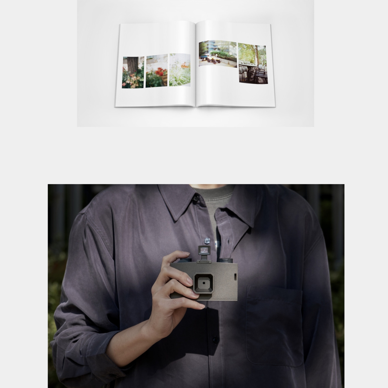
Look at the curved panel on the camera’s side. It’s directly inspired by the gentle curves of traditional Korean roof tiles, which were designed to protect houses from rain and wind. But here, that curve serves a completely modern purpose: it prevents slipping and creates a comfortable, stable grip. It’s functional heritage design at its best, where historical wisdom solves contemporary problems.
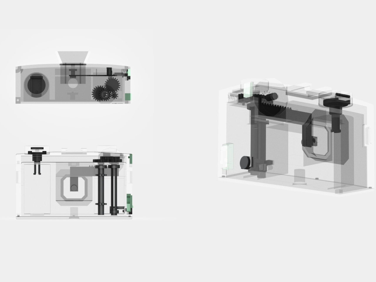
Then there’s the twelve-sided dial on top of the camera, which controls exposure time. In traditional Korean architecture, polygonal structures weren’t decorative flourishes; they provided stability and balance. Kim applies that same geometric logic to the timer dial, creating something that ranges from B (Bulb mode) through various seconds up to 30 minutes. That dodecagonal shape makes it intuitive to read and adjust your exposure settings at a glance. The design literally transforms time into something you can touch and see.
At the camera’s front, an octagonal hood acts as the window for incoming light. It’s not just there to look cool (though it does). The hood directs light rays evenly into the body and minimizes glare, ensuring balanced exposures. Every geometric choice serves both form and function, creating what Kim describes as “harmonious balance” between mechanical precision and traditional aesthetics.
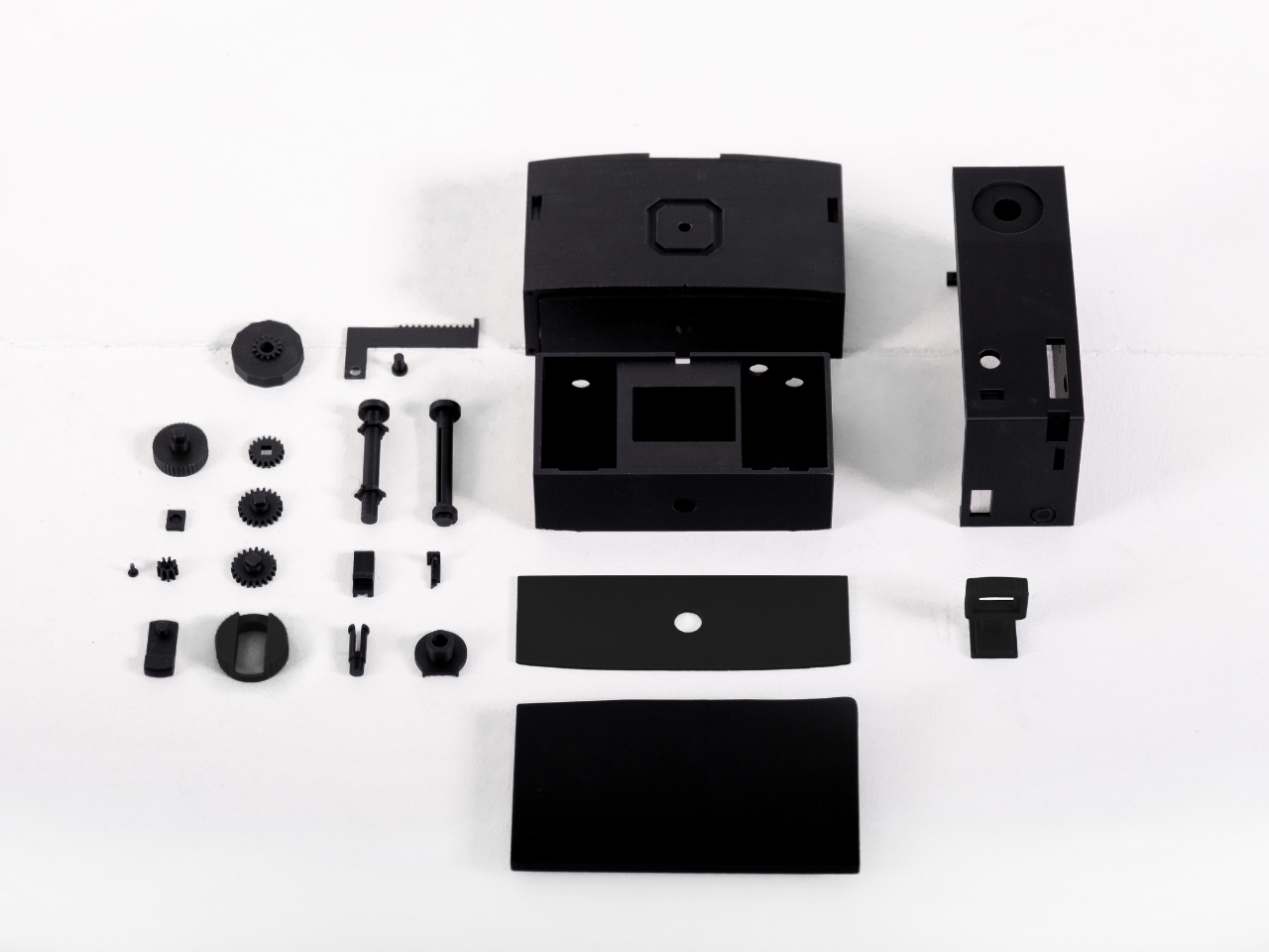
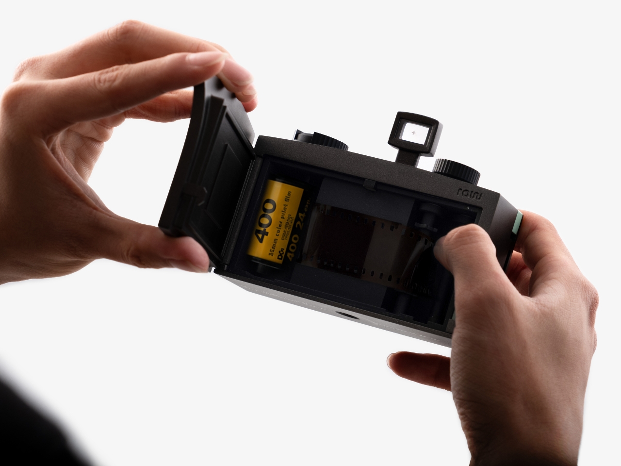
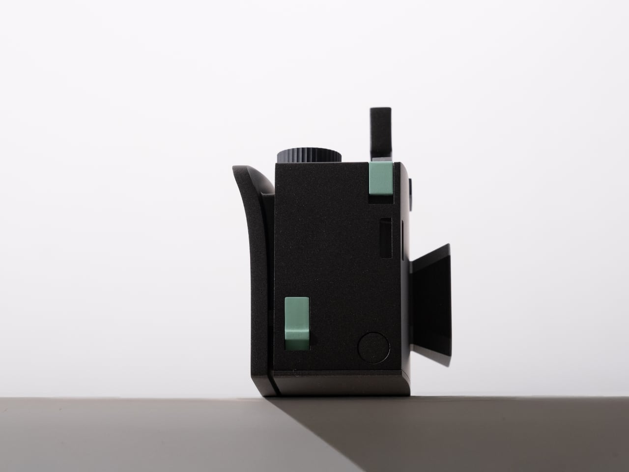
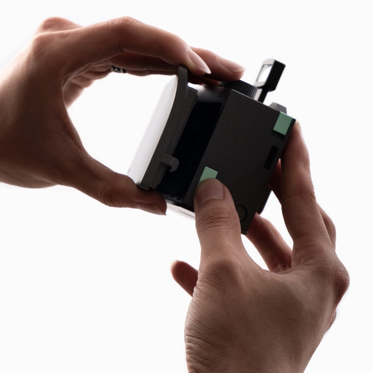
The whole package comes in matte black with subtle mint-green accents on the shutter button and side controls. There’s a minimalist viewfinder on top and a woven camera strap that adds tactile warmth to the technical precision. When you see the camera disassembled in one of the concept photos, all those gears and components laid out like an exploded diagram, it drives home just how much mechanical thought went into something designed to be analog in a digital world.
What’s really striking about RAW is how it challenges our relationship with image-making in 2025. We’ve reached a point where our phones can computationally enhance photos before we even press the shutter. AI can generate entire images from text prompts. Photography has become almost too easy, too fast, too disposable. Kim isn’t saying technology is bad; she’s asking what we lose when everything becomes instant.
The pinhole camera format forces a different kind of presence. When you need minutes to capture a single frame, you can’t be casual about it. You have to choose your subject carefully, consider the light, commit to the moment. That extended exposure time becomes a form of meditation, a way of connecting with what you’re photographing that simply isn’t possible when you’re machine-gunning through dozens of shots. RAW proves that sometimes the most innovative design move is stepping backward. By reaching into centuries-old architectural wisdom and combining it with one of photography’s oldest techniques, Kim has created something that feels genuinely fresh. It’s a camera that doesn’t just take pictures. It changes how you see.
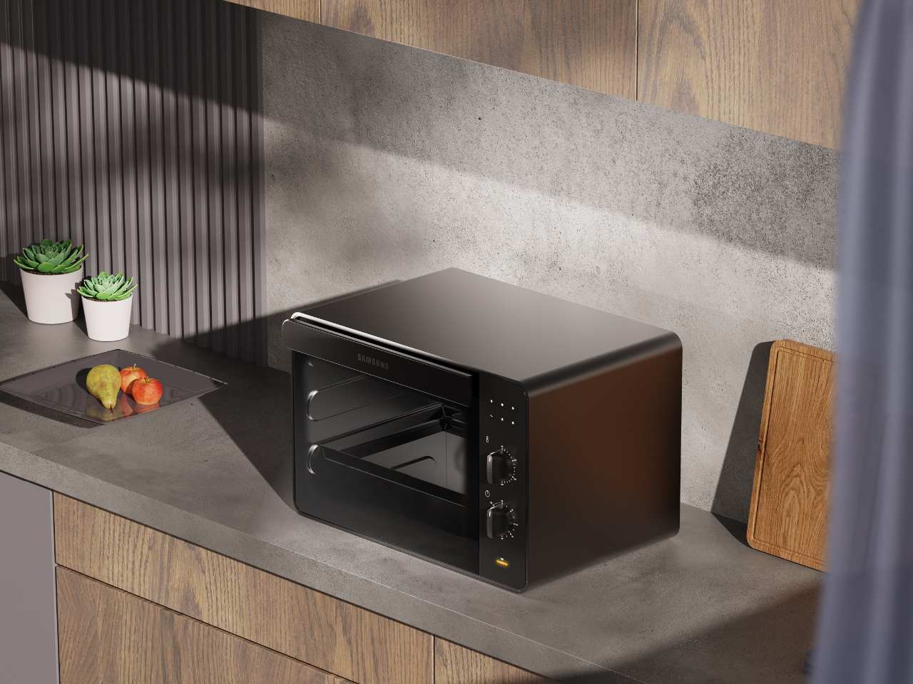
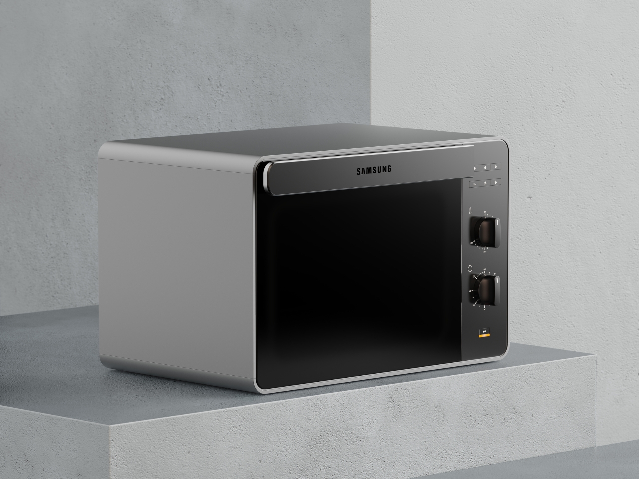
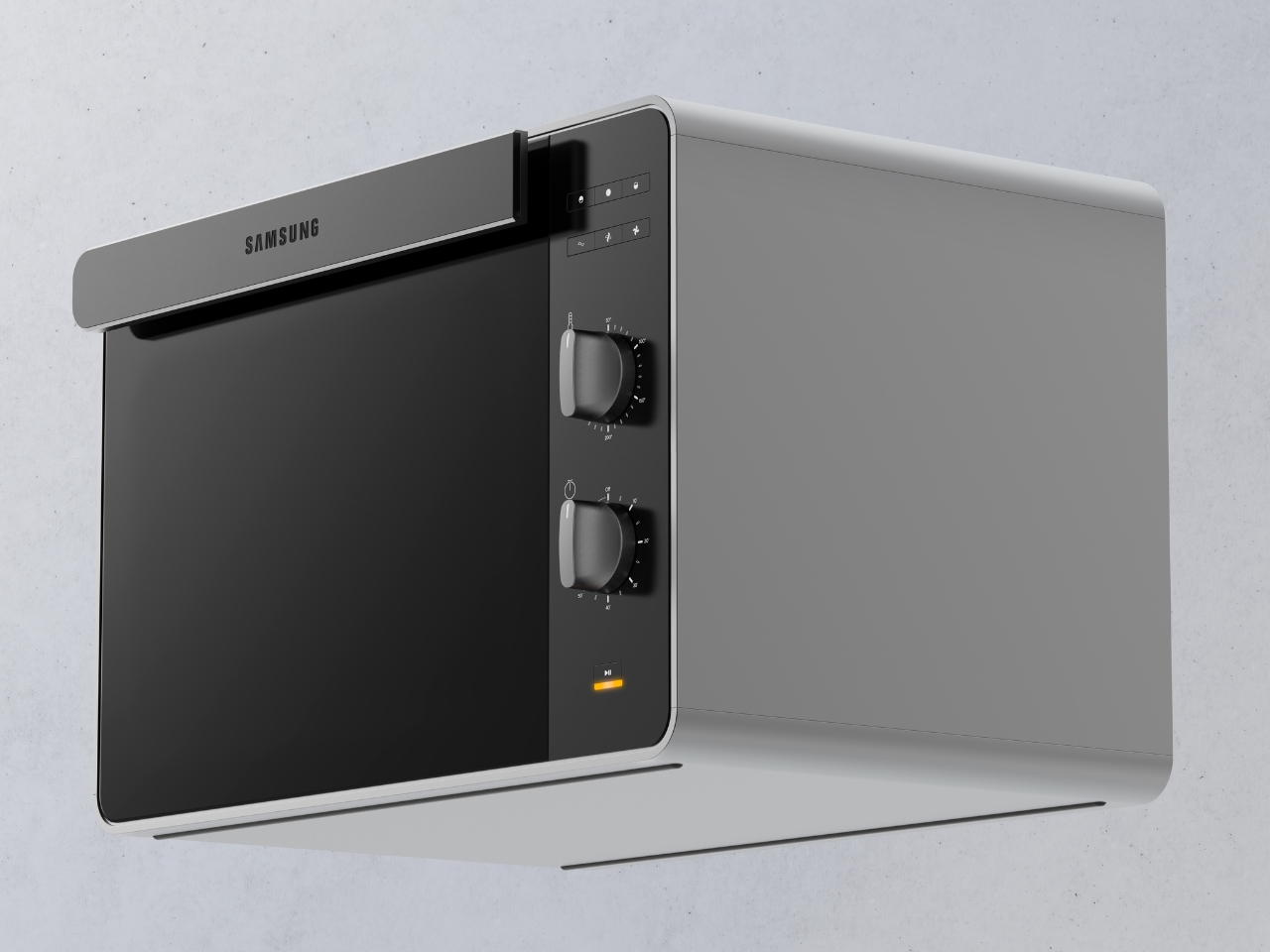
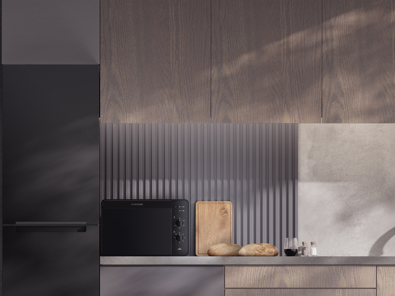
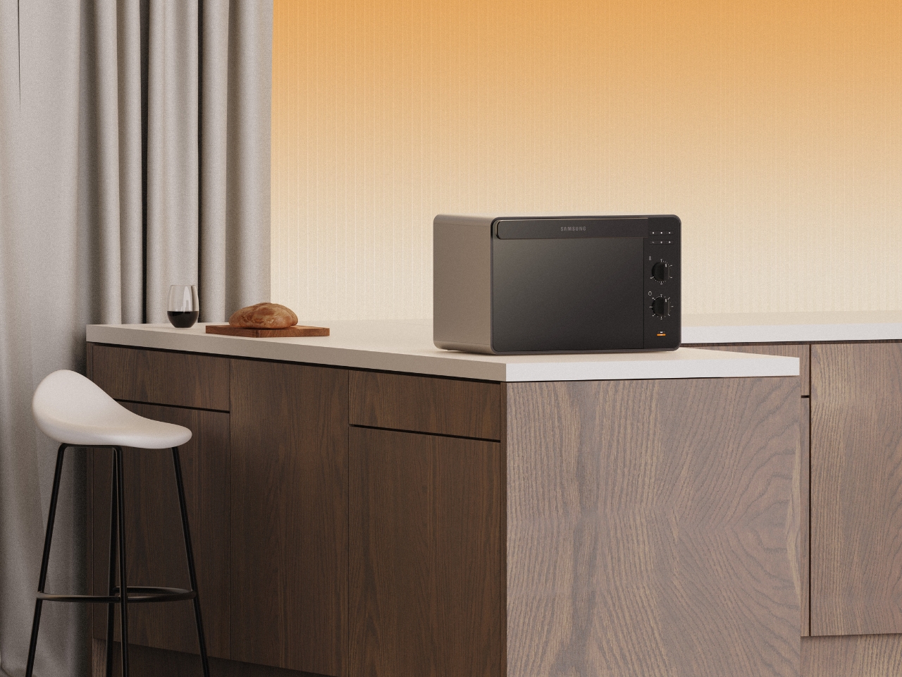
There’s something refreshing about a kitchen appliance that doesn’t try too hard. The Samsung Bake Ultra concept by Octavio Leon Villareal proves that minimalism, when done right, can be anything but boring. This compact electric oven manages to look like a premium piece of tech while maintaining the kind of simplicity that actually makes sense in real life.
At first glance, the Bake Ultra’s two-tone design catches your eye without demanding attention. The soft gray body paired with a black glass front creates a visual balance that feels both contemporary and timeless. It’s the kind of aesthetic choice that works whether your kitchen leans industrial-chic or warm-and-cozy. The rounded edges soften what could have been an overly boxy silhouette, giving it an approachable quality that invites you to actually use it rather than just admire it from afar.
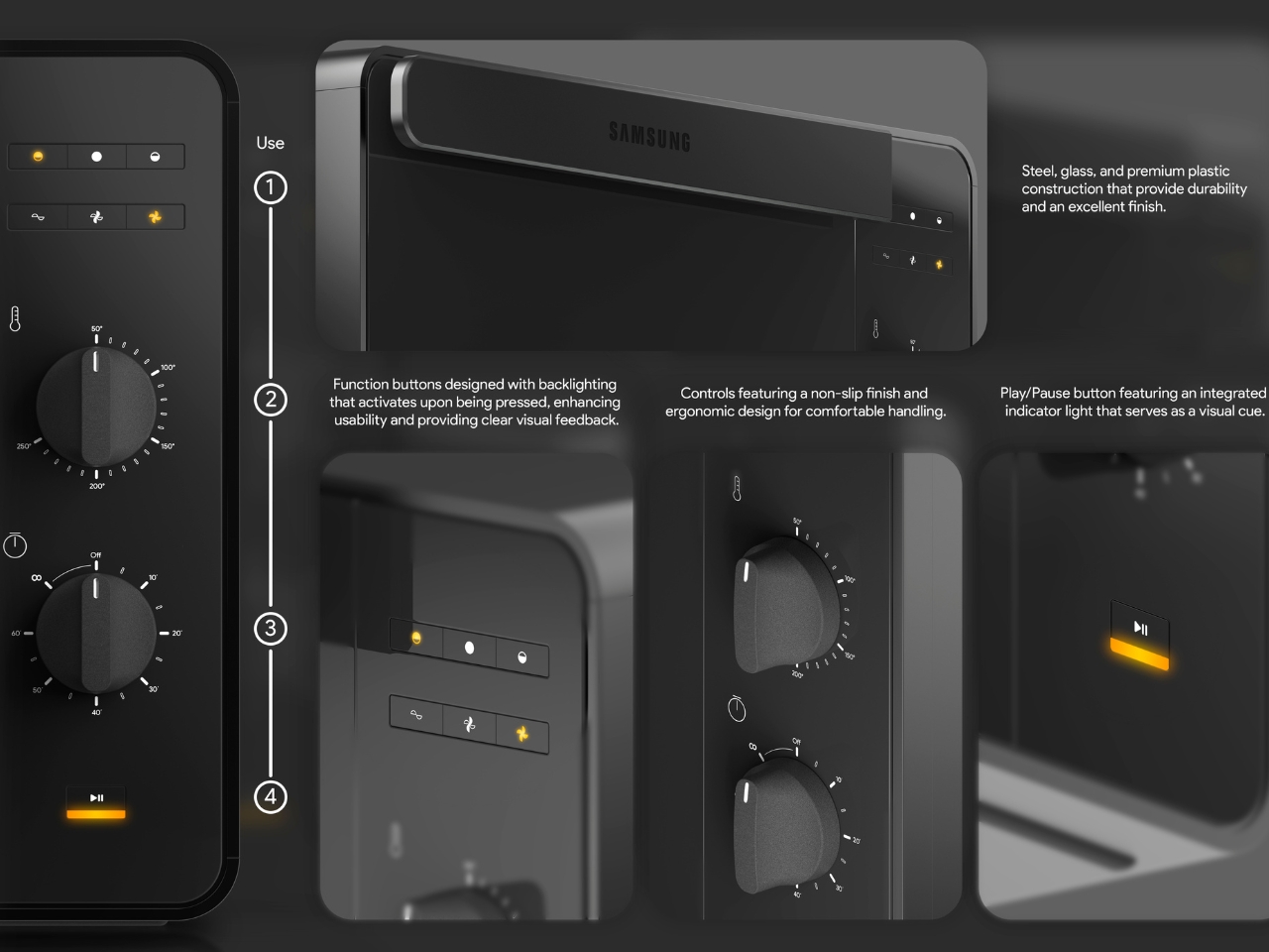
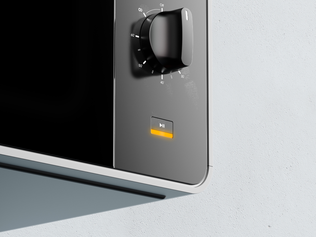
What really sets this concept apart is how thoughtfully the details have been considered. Take the control panel, for instance. While many modern appliances chase touchscreen interfaces and digital everything, the Bake Ultra embraces tactile controls with two substantial dial knobs. There’s something inherently satisfying about turning a physical dial, getting that immediate feedback in your hand as you adjust temperature or time. It’s intuitive in a way that doesn’t require you to remember which icon does what or whether you need to hold or tap.
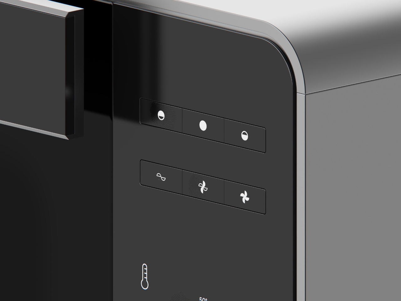
The function buttons sit flush against the black panel, their minimalist pictograms becoming visible when backlit. This clever detail means the interface stays clean and uncluttered when the oven is off, but provides clear visual feedback when you need it. No squinting at faded labels or wondering if you’ve actually pressed the right button. The yellow accent on the play/pause indicator adds a pop of warmth to the otherwise monochromatic palette, serving as both a functional cue and a subtle design element.
The compact footprint makes this particularly relevant for how many of us actually live. Not everyone has the space or budget for a full kitchen renovation with built-in everything. The Bake Ultra sits comfortably on a countertop, fitting into small apartments, office kitchens, or as a supplementary oven for larger spaces. The renders show it in various settings, from minimalist concrete-and-wood kitchens to warmer spaces with traditional cabinetry, and it holds its own in each environment. That versatility is the hallmark of genuinely good design.
Looking at the ergonomics, the controls are positioned on the right side panel at a comfortable height for standing operation. The knobs have a non-slip finish and substantial presence that suggests quality and ease of use. These aren’t flimsy plastic dials that will wear out after a year. They look like they mean business, with clear temperature markings and a tactile response that gives you confidence in what you’re setting.
What makes this concept compelling is how it aligns with Samsung’s broader design identity while still feeling fresh. You can see echoes of their smartphone and television aesthetics in the clean lines and premium materials, creating a cohesive ecosystem for people who appreciate that kind of design continuity across their tech and appliances. It’s the difference between a collection of random stuff and a curated space.
Will we ever see the Bake Ultra on store shelves exactly as rendered here? Maybe, maybe not. But that’s not really the point of concept design. Projects like this push the conversation forward about what our kitchen appliances could be. They challenge manufacturers to think beyond the status quo and remind us that functional objects can also be beautiful, that technology can feel human, and that minimalism doesn’t have to mean cold or boring.
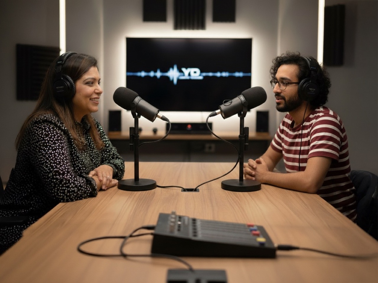
Design Mindset, Yanko Design’s original podcast series powered by KeyShot, has been steadily carving a niche for itself in the design world by giving listeners an inside view on how creativity becomes impact. Every Friday, the show brings together design’s top minds to share stories that go beyond the project and into the strategies, pitfalls, and breakthroughs shaping the industry today. Episode 10 is no exception, it explores the real-world effects of design publicity on careers, and the conversation is especially relevant to anyone hoping to turn a portfolio into a profession.
This week’s guest is Sarang Sheth, Editor-in-Chief at Yanko Design and a designer whose own path was transformed by media exposure. Few are better positioned to dissect the mechanics of design publicity, both as a former featured designer and now as a gatekeeper for one of the world’s most influential design platforms. The episode not only spotlights Sarang’s journey but also delivers a tactical playbook for designers seeking to amplify their work and maximize recognition.
When Five Views Become 450: The Career-Altering Power of Global Exposure
There’s a stark difference between being a talented designer and being a recognized one. This isn’t a lesson taught in most design schools, but it’s one Sarang Sheth learned firsthand in 2014. Fresh out of university and nine months into an unsuccessful job hunt abroad, he was sending portfolio links to companies and tracking their engagement. “I would see like, you know, I’m sending portfolios out to these companies and I’m getting like five views a day, three views a day. So I knew that people were checking their mails and at least looking through my work,” Sarang recalls. Then something shifted. He submitted work to Yanko Design, and editor Troy Turner decided to feature it. “Suddenly I saw like 300 views on my website and like 450 views. And I was like, okay, that’s a significant jump.”
But the numbers told only part of the story. The granular data revealed something more profound: views were coming in from Turkey, Croatia, and the UK. “This is incredible because A, I didn’t pay for it. And B, there was no extra work for me. All I had to do was share it with someone who was willing to talk about it,” Sarang says. This moment crystallized two truths for him. First, that international media exposure offered opportunities that local recognition simply couldn’t. As he bluntly puts it, “local recognition is like winning best dancer within your society, it does nothing.” And second, that storytelling itself could be a viable career path. The article about his work resonated with him as much as the traffic spike did. “I read the article and I realized that this is something I can actually do,” he remembers. That realization, combined with the viral reach of design media, didn’t just land him a job, it set the stage for his entire career trajectory. Today, Yanko Design reaches millions per month across multiple platforms, Instagram, Pinterest, Twitter, LinkedIn, Facebook, YouTube, and its newsletter. “Regardless of what your concept is, what your project is, there are multiple ways that Yanko Design can sort of get you to reach the audience that you’re looking to reach,” Sarang notes. Those eyeballs, he adds, increasingly include potential investors, jury members, and employers, all of whom can change the course of a designer’s career with a single connection.
Ideas Don’t Need to Be Real to Be Powerful
One of the most counterintuitive insights from the conversation is that conceptual work can resonate as powerfully as finished products, sometimes even more so. Sarang points to several examples that illustrate this phenomenon. Earlier this year, he featured a project by Indian designer Siddhant Patnaik, a Google-branded version of the AirPods Max. “People resonated with it so much that it ended up getting its own segment on Marques Brownlee’s Waveform podcast,” he shares. The design garnered hundreds of thousands of views not just on Yanko Design but across multiple media outlets, despite never being a real product. This isn’t an isolated case. Sarang has created his own conceptual designs for Yanko, foldable phones, patent-related concepts, and an Apple Pencil that docks inside a MacBook, which is still featured on Forbes. “I’ve seen reels on it and reels showing Yanko Design’s page. So, it’s great to see that people realize that they’re not necessarily fond of great products, they’re also fond of great ideas.”
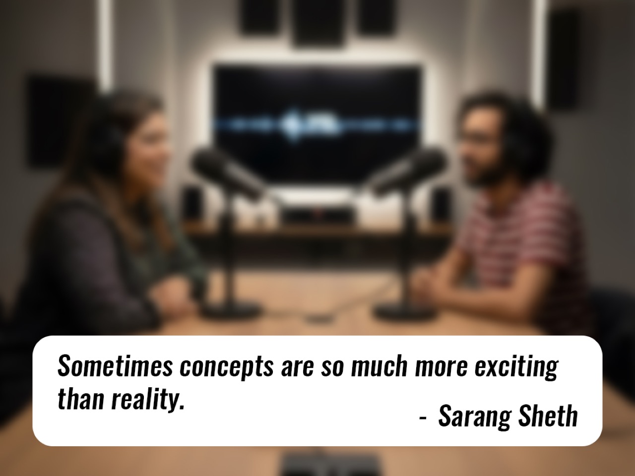
This creates a fascinating dynamic: media visibility alone can stimulate demand and validate interest even before a product enters production. “A lot of times they’re concepts,” Sarang says about inquiries from potential buyers. “Which validates the fact that sometimes concepts are so much more exciting than reality.” The takeaway for designers is clear: don’t wait until you have a manufactured product to share your work. High-quality 3D renders and compelling narratives can generate demand, attract licensing interest, and open doors to partnerships. “Ideas are cheap, execution is tough, but something that I have also learned is that holding your cards close to the chest and not sharing those ideas with anybody doesn’t benefit anybody,” he advises. The key, however, is presentation. In the age of AI-generated imagery, granular control offered by professional 3D rendering can push a concept over the credibility threshold. “A pencil sketch has to be incredibly good as an idea to sort of translate to massive success. Whereas a really, really well-made render has a much easier path ahead,” Sarang explains.
Turn Ripples Into Waves: The Designer’s 48-Hour Action Plan
Getting featured is just the beginning. Too many designers treat media coverage as a finish line when it should be treated as a starting gun. Sarang is emphatic about this: designers need to move from passive observation to active amplification. “Don’t just repost initial coverage; turn ripples into waves,” he urges. The first step is preparation. Before pitching any publication, designers should have a press kit ready, complete with high-resolution images, project descriptions, and relevant context. “Please, it’s not that difficult. ChatGPT will literally write the press release for you and your images are already in there, you need to just compress them,” Sarang says. AI tools have made this process easier than ever, but the fundamentals remain: professional assets signal that you’re serious about your work.
Once a feature goes live, the real work begins. Designers should immediately reach out to other outlets, Designboom, Hypebeast, and niche blogs relevant to their work. “You should have at least five or six media contacts in your outreach,” Sarang recommends. Each additional feature compounds the impact of the first, creating what he calls a “cascading effect.” Media coverage also serves as social proof that can be leveraged in other contexts. “Use features to bolster award entries, multiplying reach and credibility,” he advises. But there’s a crucial caveat: not every design fits every outlet. Understanding platform fit is essential. “Each design blog or each design platform has its own visual ethos, has its own direction, has its own strengths,” Sarang explains. Yanko Design, for instance, may not be the right fit for highly technical architecture projects, but it excels with consumer-facing product design, EDC items, and tiny homes. Sarang is candid about this curation process: “If designers come to us with 2D sketches, we’re like, hey, you know what, render it out and then bring it back to us. We’d love to feature it then.” This isn’t gatekeeping; it’s guidance. The goal is to reach the right audience, and sometimes that means directing designers to other platforms where their work will resonate more strongly. As Sarang puts it, “You won’t go trying to plant a mango in winter.”
Crowdfunding First, Media Second, Awards Third
When presented with a hypothetical scenario during the podcast’s “Design Mindset Challenge”, a talented designer with budget and time to pursue one of three paths (major design award, crowdfunding campaign, or media features), Sarang’s answer was surprising and strategic. “Start with crowdfunding,” he says without hesitation. His reasoning is multifaceted. First, crowdfunding offers the strongest form of validation: real demand, backed by real money. “When you’re going down the crowdfunding route, it’s the highest form of design skill validation because you’re not getting clicks, you’re not getting a job, you’re setting up a company that is solely focused around your product,” he explains. Unlike media coverage, which generates interest, or awards, which confer prestige, crowdfunding forces execution. It demands prototyping, production planning, and supply chain management. “The people who look at the product and are like I believe in that vision, those are the people who are jumping on board, and that is the best way to put that stamp of approval on your product being a good idea,” Sarang notes.
Crowdfunding also offers pragmatic intellectual property protection. By being first to market, even in a crowdfunding context, designers stake their claim publicly. “When you share an idea on a design platform like us, we do share a lot of concepts, but it’s obvious,” Sarang says, acknowledging the risk of plagiarism. “First crowdfund, secure your IP in however, whatever way possible. Spend money on patents or copyrighting or whatever.” Once the crowdfunding campaign is live or funded, designers can leverage that momentum for media coverage. Publications are far more likely to feature a project with market validation than a standalone concept. “That will help you secure your idea and make sure that you’re not being plagiarized by other people who beat you to it,” Sarang adds. Finally, awards should come third. “Awards are a much more expensive bet, I would say. And the awards do have timelines,” he explains. Media can react quickly, publishing within days, while award results take months. The strategic sequence, crowdfunding, media, then awards, allows designers to build credibility at each stage, using prior success to unlock the next opportunity. This ecosystem approach doesn’t just maximize recognition; it creates sustainable business outcomes.
Why 2 Million Views Trump a Design Award
In the rapid-fire segment of the podcast, host Radhika Seth posed a provocative question: what’s more career-changing, winning a design award or getting 2 million views on Yanko Design? Sarang’s answer was immediate and unequivocal: “2 million views on Yanko Design. Wow. Because that has a cascading effect.” His response cuts to the heart of a broader truth about recognition in the digital age. Awards carry prestige and credibility, especially when backed by respected juries, but their reach is often limited to industry insiders. Media exposure, by contrast, casts a far wider net. A feature on Yanko Design doesn’t just reach designers; it reaches design consumers, potential investors, manufacturers exploring licensing opportunities, and employers scouting for talent. “Global features expose work to buyers, investors, co-founders, and employers,” Sarang notes, emphasizing that media responsiveness can even aid with time-sensitive opportunities like visa documentation.
Yanko Design’s audience, which Sarang describes as “design consumers” rather than just designers, is particularly valuable. “I like to believe that our audience are not only designers, but they also design consumers because I have seen so many campaigns, Kickstarter campaigns or the Indiegogo campaigns that we feature bring in so much of revenue for the campaigners,” he explains. Certain niches perform exceptionally well: EDC (everyday carry) items and tiny homes consistently generate strong engagement and conversions. “EDC content often drives campaign revenue,” Sarang says, noting that the writers at Yanko are genuine enthusiasts whose passion translates into the coverage. “A lot of our write-ups also come from a place of excitement and that just translates to the readers.” This isn’t to diminish the value of awards. Jury validation carries weight, and media partners often amplify award wins, creating a multiplier effect. But for sheer, immediate impact on a designer’s trajectory, media reach is unmatched. As Sarang puts it, “A 2 million-view YD feature can be more career-changing than a single award due to cascading recognition, opportunities, and serendipitous discovery by influential readers.”
From Designer to Storyteller: Why Context Matters
Sarang’s own career shift from designer to editor was inspired by filmmaker Gary Hustwit, an industrial designer turned documentarian whose films on Dieter Rams, Apple, and the Helvetica font have become cultural touchstones. “He was basically an industrial designer who also graduated and realized that his calling wasn’t industrial design, it was storytelling,” Sarang says. This resonated deeply. “Whenever I introduce myself, I say, you know how they say a picture is worth a thousand words? I’m the guy who writes those thousand words.” For Sarang, storytelling is a design-adjacent calling, one that expands the impact of products by giving them context and accessibility. “A lot of designers are so involved with creating products that they forget sometimes that the products need context and explanations,” he observes. This is where design media plays a crucial role: translating innovation into narratives that resonate with broader audiences.
Sarang’s approach to writing reflects this philosophy. Yanko Design doesn’t just catalog products; it explores their potential, their cultural relevance, and the problems they solve. “Translating products into accessible narratives expands impact,” he says, framing editorial work as an essential bridge between creators and consumers. This storytelling function is especially vital in an era dominated by algorithmic feeds and unpredictable social media platforms. “Algorithms are unpredictable,” Sarang notes. “Editorial curation connects designers with targeted stakeholders, buyers, investors, co-founders, through trusted storytelling and focused audiences.” Unlike a viral TikTok or Instagram post, which might reach millions but lack context or credibility, a curated editorial feature provides depth and legitimacy. It signals that the work has been vetted, that it’s worth paying attention to. For designers, this means that presentation and narrative matter as much as the design itself. A well-crafted story can turn a good product into a great one, and in some cases, it can even turn a concept into a business opportunity before the product exists at all.
Design Mindset premieres every Friday on Yanko Design, bringing fresh perspectives from design’s leading voices. This episode underscores a critical truth: design recognition isn’t just about talent, it’s about understanding the ecosystem of media, awards, and crowdfunding, and knowing how to navigate it strategically. For designers ready to share their work, Sarang’s advice is simple: “Send your work to Yanko Design, publication@yankodesign.com. Send it to us on Instagram, send us links, Behance links, whatever, however you want to send it to us. Please keep sending your work. It can’t get easier.”
In the world of product design, there’s a special kind of magic that happens when a concept moves from sketch to stunning photorealistic image, and KeyShot rendering software has become the go-to tool for designers who want to bring their visions to life with breathtaking clarity. This powerful rendering engine transforms 3D models into images so realistic you’d swear you could reach out and touch them, capturing every subtle detail from the grain in natural wood to the way light refracts through fluted glass. For designers, it’s not just about making pretty pictures; it’s about communicating ideas, testing color palettes, and visualizing how a piece will actually feel in your space before a single prototype is ever made.
We’ve rounded up five exceptional designs that showcase just how transformative KeyShot rendering can be, from a Japanese-inspired bird feeder that looks like garden sculpture to a modular glass lighting system that captures the neon glow of Taiwan’s street culture. Each piece tells its own story through these beautifully rendered images, whether it’s a playful desk organizer that helps you find misplaced items or a minimalist bedside table that celebrates honest craftsmanship. These aren’t just concept drawings or rough sketches; they’re fully realized visions that let you fall in love with a design before it ever leaves the digital realm. Let’s dive into these stunning creations and discover what makes KeyShot rendering such a game-changer for contemporary design.
Create your own Aesthetic Render: Download KeyShot Studio Right Now!
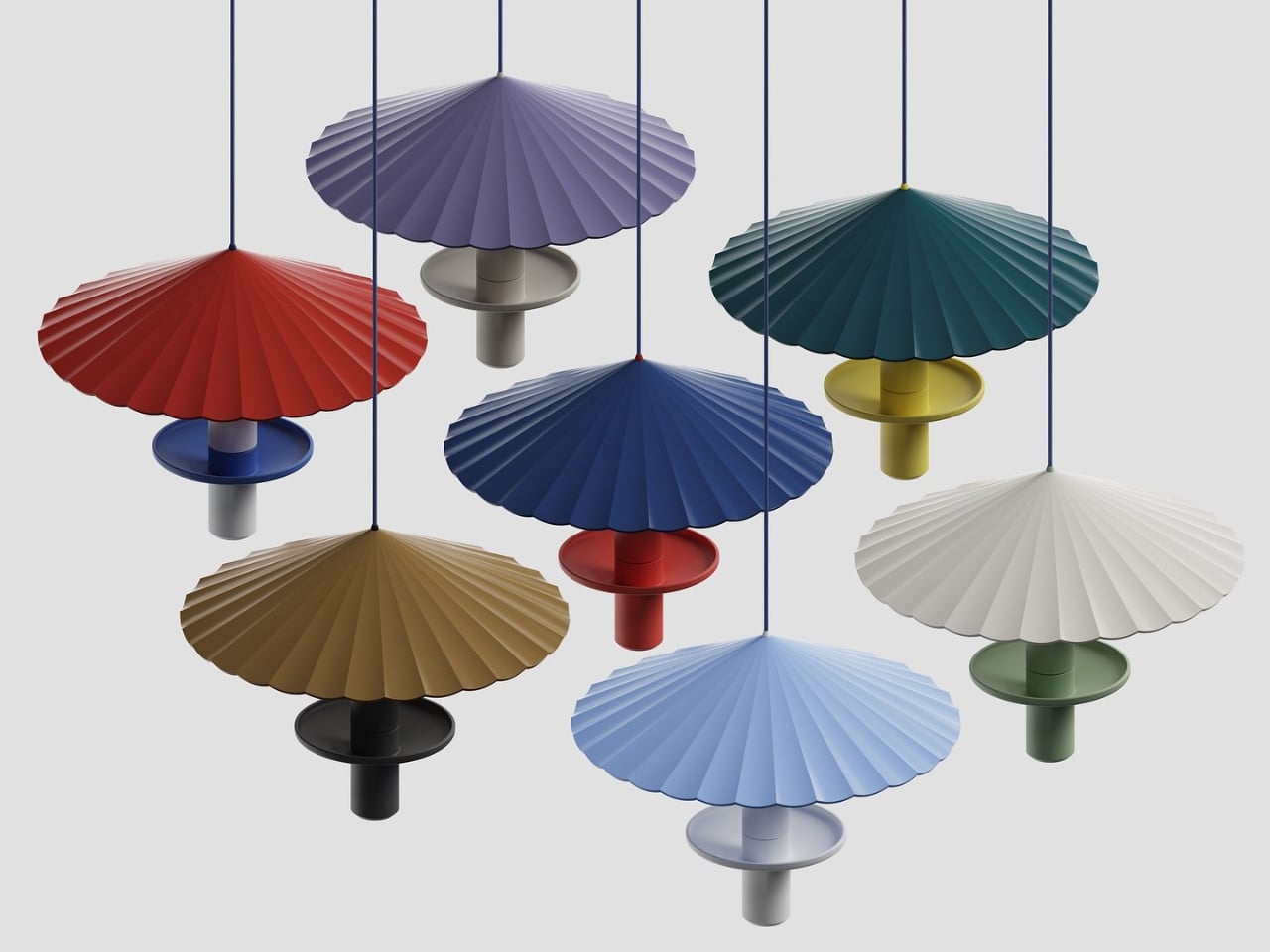
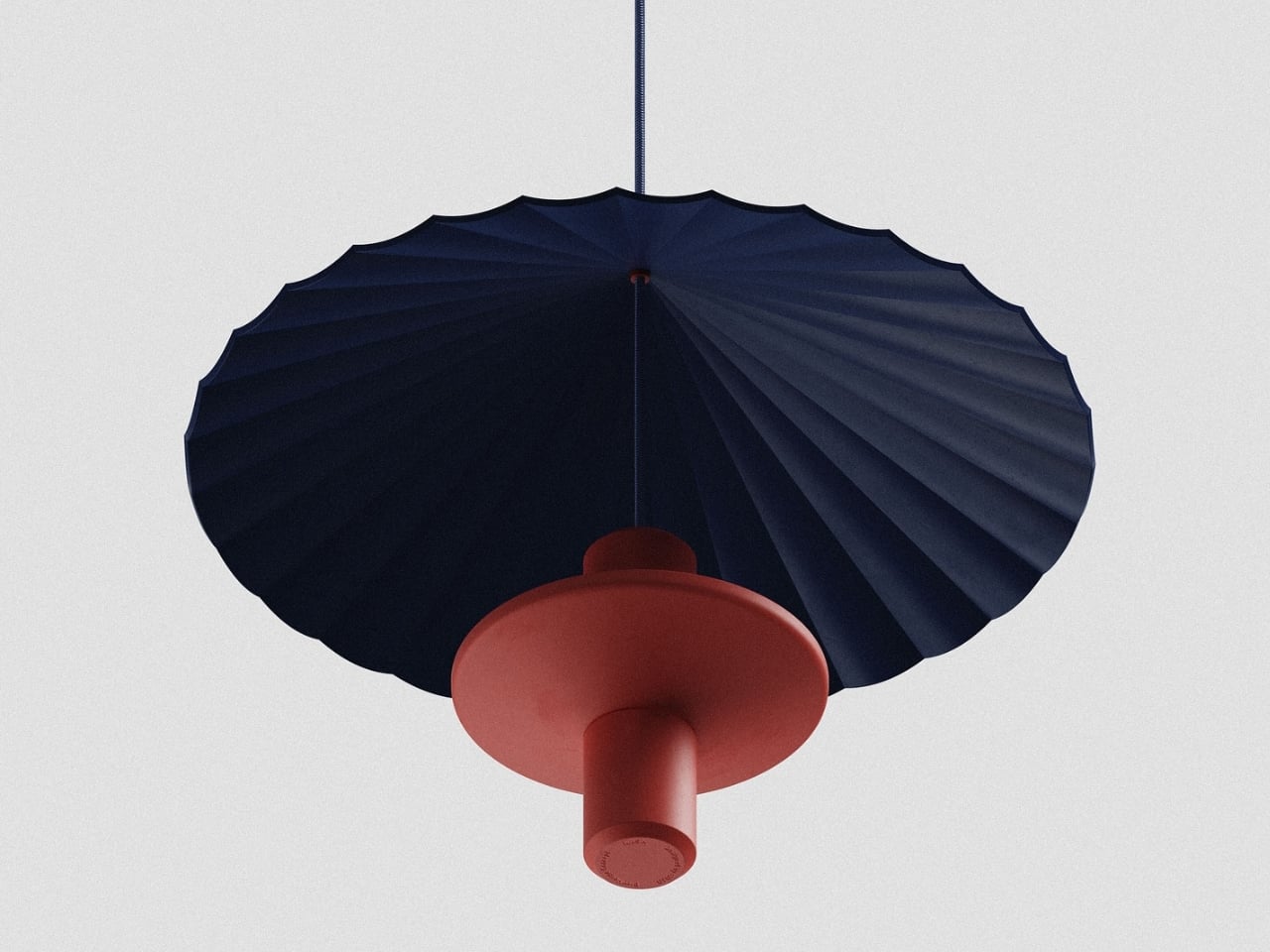
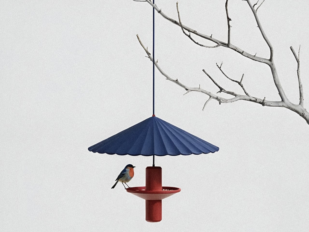
This elegant bird feeder reimagines a garden staple through the lens of Japanese design, drawing inspiration from the graceful, pleated form of a traditional wagasa umbrella. The umbrella canopy features delicate radial folds that fan outward in a sunburst pattern, creating both visual drama and functional shelter for visiting birds. Available in a stunning array of rich, matte colors, from deep navy and terracotta to sage green and mustard yellow, each feeder becomes a sculptural accent piece in your outdoor space, blending seamlessly with modern aesthetics while honoring centuries-old craftsmanship.
The design process by Ed.i.d reflects a beautiful marriage of tradition and technology, beginning with conceptual sketches and AI-assisted explorations in Vizcom.ai, then refined through detailed 3D modeling and photorealistic KeyShot rendering. The result is a piece that’s as thoughtful as it is beautiful: the umbrella canopy protects seed from rain while providing a safe dining spot for small songbirds, and the central cylindrical body adds architectural interest even when birds aren’t visiting. Whether hung from a tree branch or displayed as a cluster in varying colors, this bird feeder transforms functional outdoor decor into a gallery-worthy statement piece that celebrates both nature and design.
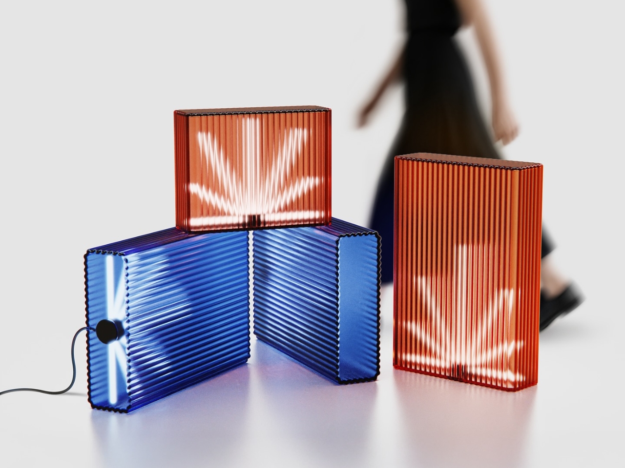
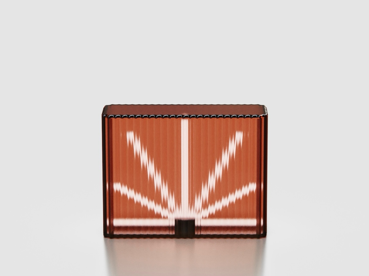
Ice Cube by Harry Chang draws from an unexpected blend of influences: the utilitarian geometry of office ceiling lights meets the electric, neon-soaked ambiance of Taiwan’s iconic betel nut shops. The result is a lighting concept that feels both nostalgic and utterly contemporary, capturing the raw energy of urban nightlife in a refined, sculptural form. Each piece is crafted from 1cm thick fluted glass that transforms ordinary light into something almost magical: the vertical ridges diffuse and refract illumination into starburst patterns that seem to pulse and shift as you move around them. Available in jewel-toned hues like sapphire blue and warm coral, these glowing glass blocks bring an unexpected dose of drama to any space.
What makes Ice Cube truly special is its modular flexibility. It is offered in two heights (70cm and 40cm), the lights can be stacked, clustered, or lined up to create custom lighting installations that double as spatial dividers. Imagine grouping several in varying heights to define a dining area, or placing a single glowing cube on a console table as a sculptural accent piece. The fluted surface doesn’t just look gorgeous; it creates an ever-changing play of light and shadow that turns walls and ceilings into canvases for radiant, geometric reflections.
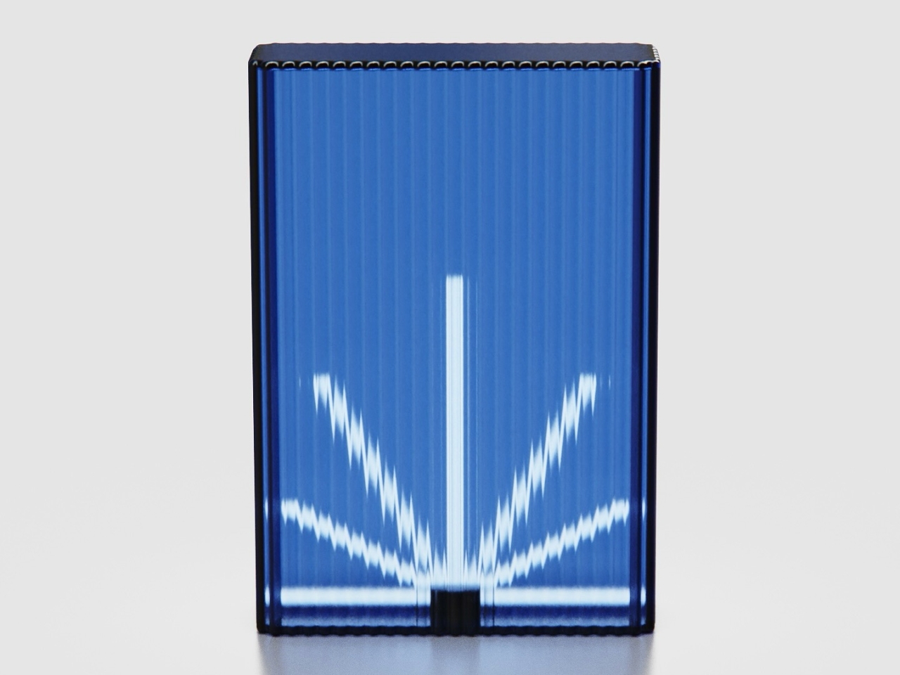
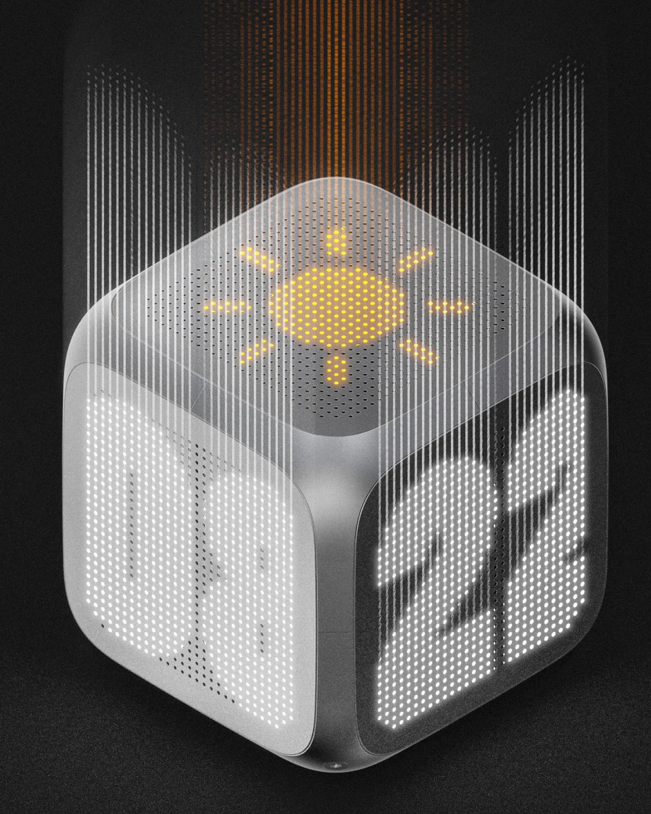
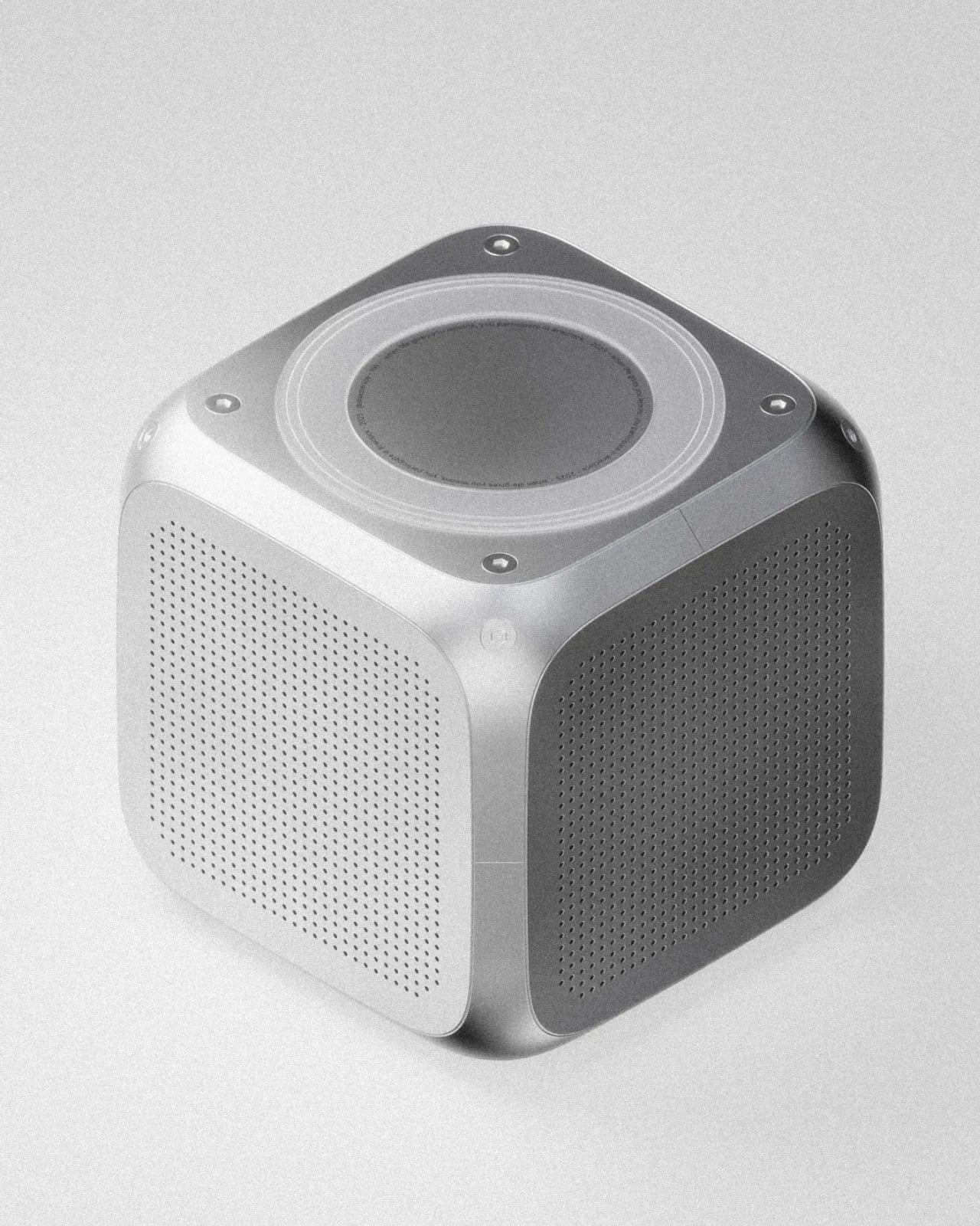
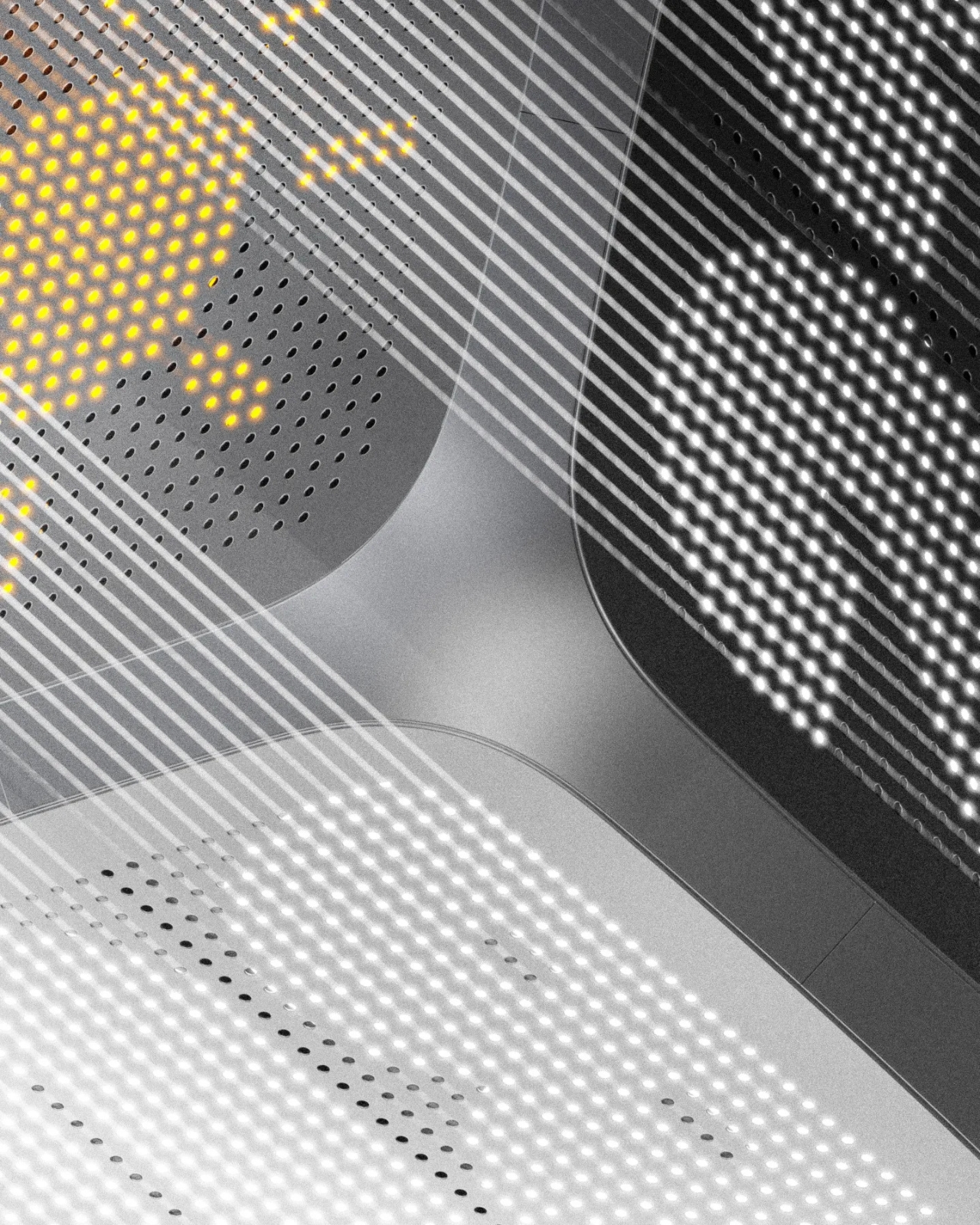
Bold Text reimagines the humble desk clock as a three-dimensional conversation piece that refuses to be ignored. Breaking away from the flat, one-sided displays we’re all used to, this cube-shaped design by Silvester Kössler wraps time around you, literally. Each face features perforated metal screens that conceal bold LED typography displaying hours, minutes, weather icons, and ambient information that glows through the industrial mesh like a secret waiting to be discovered. The genius here is in the positioning: this isn’t a clock you face head-on from your desk; it’s meant to exist in space, casting its dot-matrix glow from a console table, shelf, or corner where multiple sides can be appreciated at once. The aluminum frame and geometric form give it an architectural presence that feels equal parts tech-forward and brutalist sculpture.
Created as part of a design challenge to push beyond comfortable territory, this concept leans hard into graphical, almost cinematic rendering. Think of it as a clock that wants to be photographed from every angle. The perforated screens create mesmerizing moiré patterns when the LEDs illuminate beneath, and the bold, chunky typography ensures legibility without sacrificing style. There’s something beautifully paradoxical about a timepiece that demands you move around it, that rewards curiosity and changes its personality depending on your vantage point. Bold Text transforms timekeeping from a passive glance into an active, spatial experience. It’s proof that even the most utilitarian objects deserve a little drama.
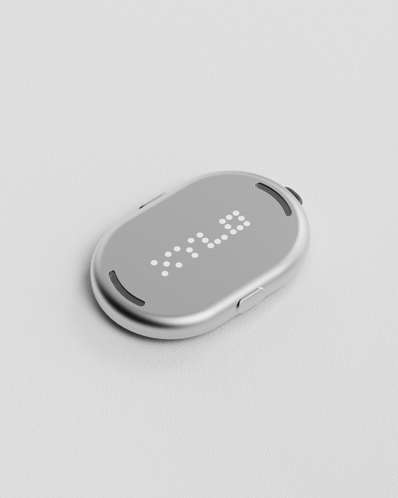
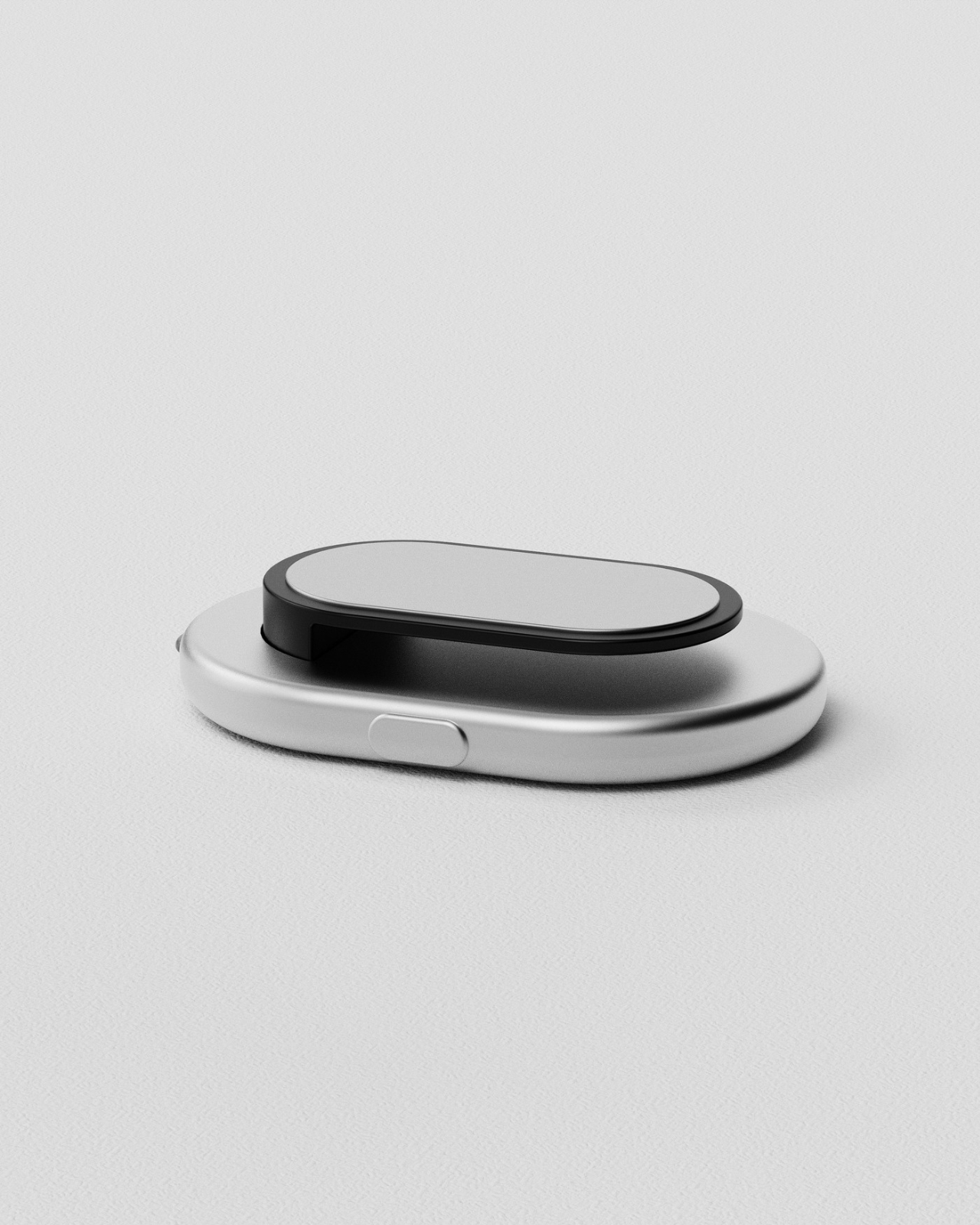
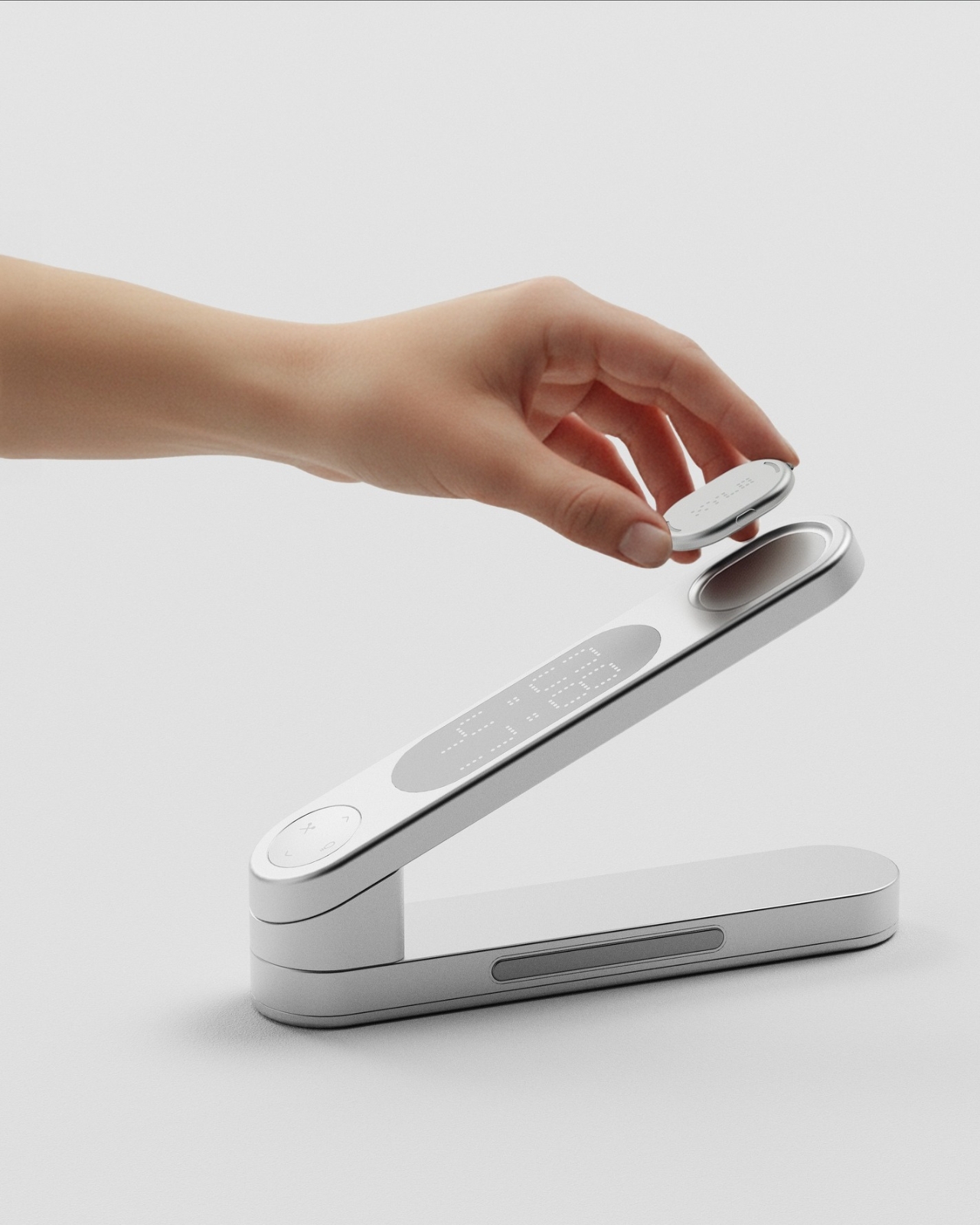
XYLO solves one of those frustrating everyday problems we all know too well: that frantic search for your favorite notebook, important documents, or that USB drive you swear you just had five minutes ago. Unlike our smartphones that chirp back when we call for them, most of our workspace essentials stay frustratingly silent. This sleek desk object designed by Kim Min Hyeok changes that game entirely. Inspired by the classic xylophone, XYLO features detachable tags that respond instantly with sound when you press the corresponding key on the minimalist base unit. Just attach a slim tag to anything you tend to misplace, and suddenly your most elusive items become findable with a single tap.
What makes XYLO so clever is how intuitive and elegant the whole system feels. The design borrows from the xylophone’s most satisfying quality: that immediate, tactile response when you strike a note. Each smooth, pebble-shaped tag magnetically nests into the base when not in use, creating a sculptural desk accessory that’s as beautiful as it is functional. The tags are lightweight enough to clip onto notebooks, slip into laptop sleeves, or attach to pouches and folders without adding bulk. For anyone who collects beautiful desk objects or just wants to bring a little more order (and a lot less stress) to their workspace, XYLO transforms the mundane task of keeping track of things into something almost playful.
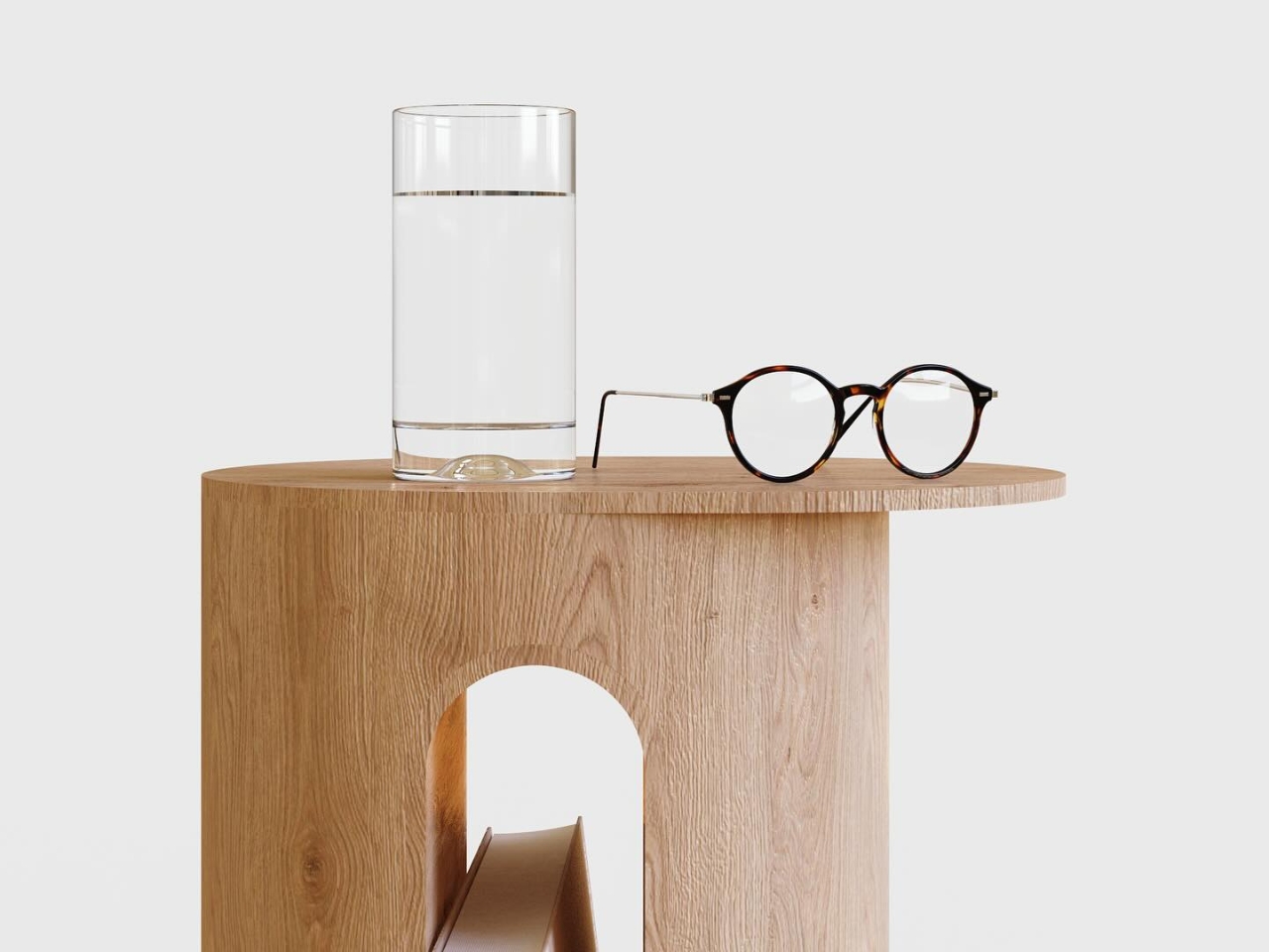
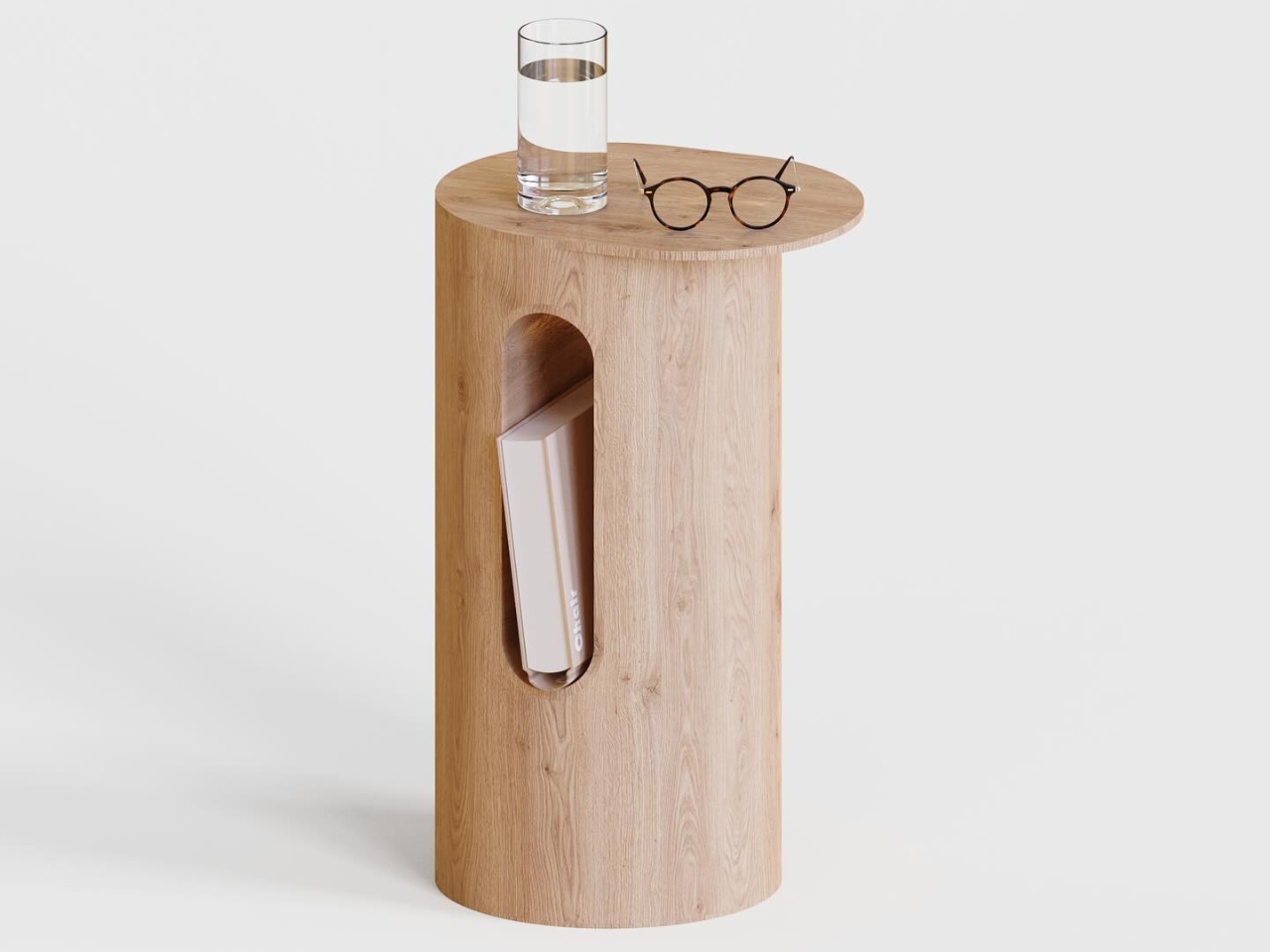
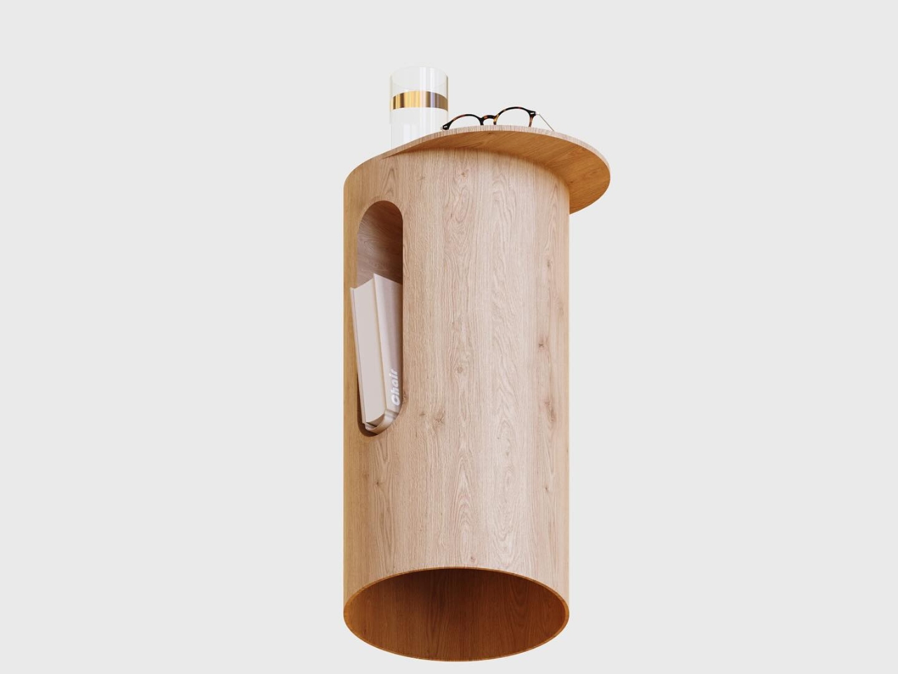
Sometimes the most beautiful designs are the ones that don’t try too hard, and this cylindrical bedside table is a perfect example of that philosophy. Crafted from warm, natural oak, the simple pedestal form by Mads Hindhede Svanegaard feels both modern and timeless, like a sculptural accent piece that just happens to hold your water glass and reading glasses. What makes it special is that clever arched cutout on the front, a built-in magazine or book holder that keeps your current read within arm’s reach without cluttering the top surface. The rounded tabletop offers just enough space for nighttime essentials, while the hollow cylinder design keeps the visual weight light and airy, perfect for smaller bedrooms or minimalist spaces.
Created as an exercise in efficient design workflow, this piece was modeled in Fusion 360 and rendered in KeyShot using traditional, old-school techniques with no AI assistance. The result is refreshingly straightforward: a side table that celebrates the beauty of natural wood grain and honest construction. The cutout detail casts gorgeous shadows that shift throughout the day, adding subtle visual interest without any fuss. It’s the kind of design that would feel at home next to a mid-century platform bed or a contemporary upholstered frame, proving that sometimes simplicity and thoughtful functionality are all you really need. For collectors who appreciate understated Scandinavian-inspired design and furniture that feels both functional and sculptural, this little table delivers quietly confident style.
Create your own Aesthetic Render: Download KeyShot Studio Right Now!
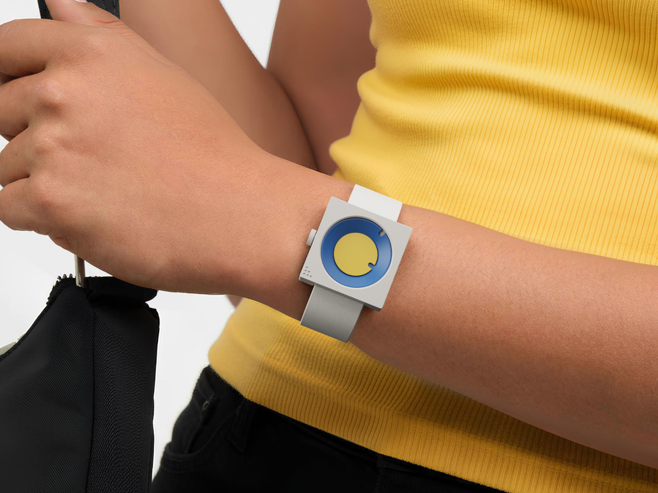
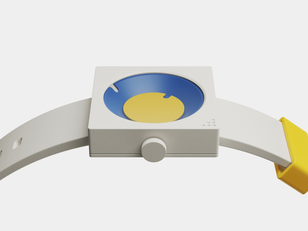
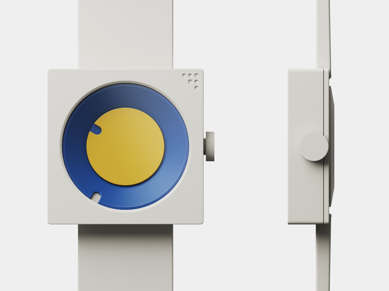
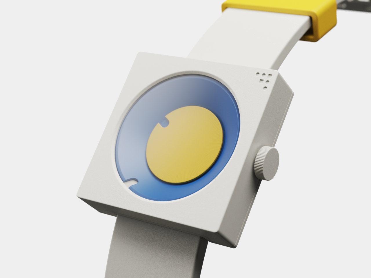
Most clocks and watches fade into the background, quietly marking the hours without much personality or visual presence on your desk or wrist throughout the day. But what if timekeeping could be playful, sculptural, and as expressive as the rest of your space or personal style choices? What if checking the time felt less like a utilitarian glance and more like appreciating a piece of functional art?
The FC-30 Desk Clock and FW-50 Wrist Watch concepts flip the script on conventional timekeeping, using bold geometry, vibrant color, and tactile design to turn telling time into a daily ritual worth savoring. Inspired by mid-century modern design principles from the 1950s and 60s, both pieces are as much about art as they are about function, bringing sculptural presence to everyday moments throughout your routine.
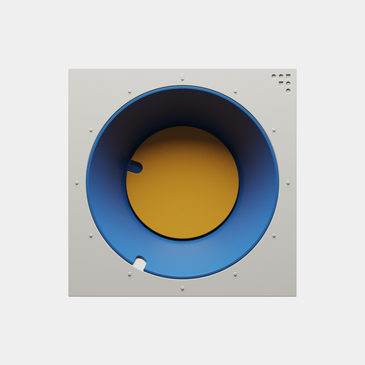
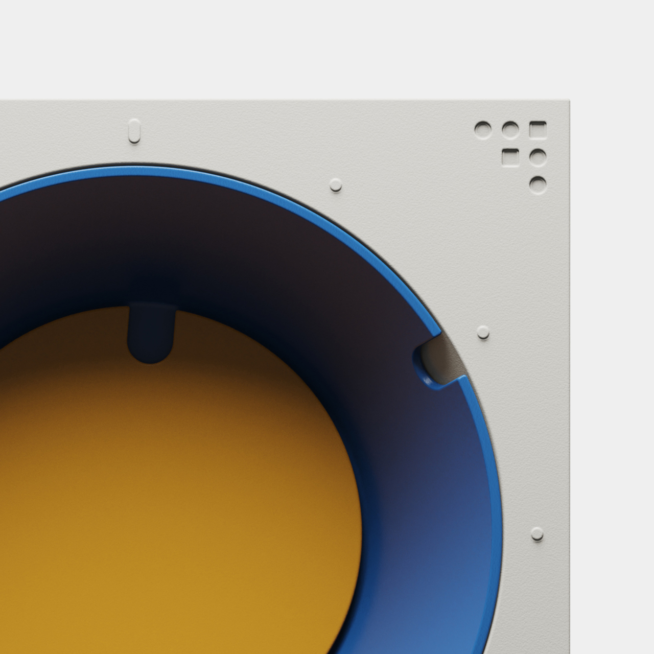
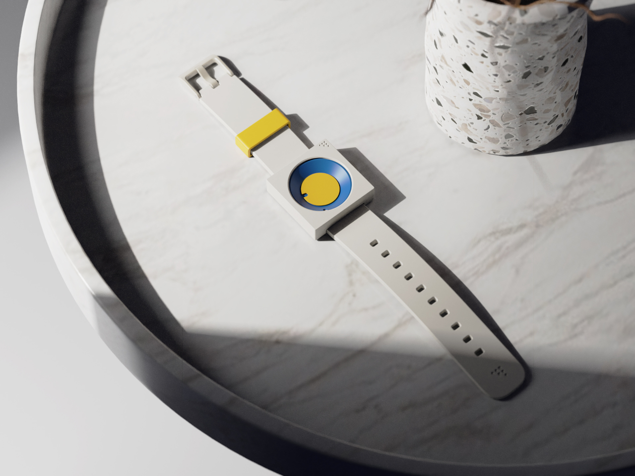
Both pieces are built around the frustum, a geometric form with an angled face that creates visual interest and dynamic readability throughout the day. The FC-30 uses a 30-degree incline for the minute indication, while the FW-50 adapts the idea to a 50-degree angle optimized for wrist wear and comfort. The hour is shown by a colored disc housed inside the frustum, while the sloped edge indicates minutes.
The result is a visual experience that feels fresh and interactive, inviting you to engage with the object every time you check the hour rather than passively glancing at digits. The unconventional layout is intuitive once you spend a moment with it, turning time-telling into something more tactile and memorable than reading digital numbers or traditional clock hands that blend into the background of modern life.
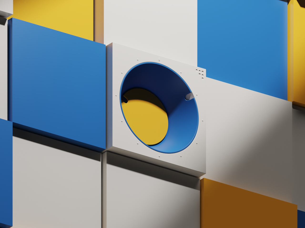
Inspired by mid-century modern classics from the golden age of product design, both the clock and watch feature a palette of bold blues, yellows, greens, and oranges, set against matte white or gray cases with clean edges and visible fasteners. The color blocking and clean lines make each piece stand out visually, whether positioned on a desk, mounted on a wall, or worn on the wrist.
The FC-30’s sculptural form with its angled frustum is as much a statement piece as a practical timekeeper for workspace organization and visual interest. The FW-50’s playful colorways, ranging from sage green to vibrant orange, and tactile crown turn a daily accessory into a personal expression of style and taste. Both designs celebrate the visual language of functional design from classic mid-century product eras.
The absence of numerals and reliance on form and color encourage users to interact with the pieces differently from conventional timepieces. The disc hour and sloped minute readout are learnable at a glance, but different enough to spark curiosity and conversation with visitors or colleagues. Both designs can be oriented or worn in multiple ways for varied visual effects, depending on mood.
The FC-30 and FW-50 concepts bring a little more art into daily routines and personal environments for those who appreciate design. For anyone curating a workspace or searching for a unique statement piece, these timepieces offer a compelling vision where timekeeping becomes an opportunity for visual and tactile delight rather than just a practical necessity.
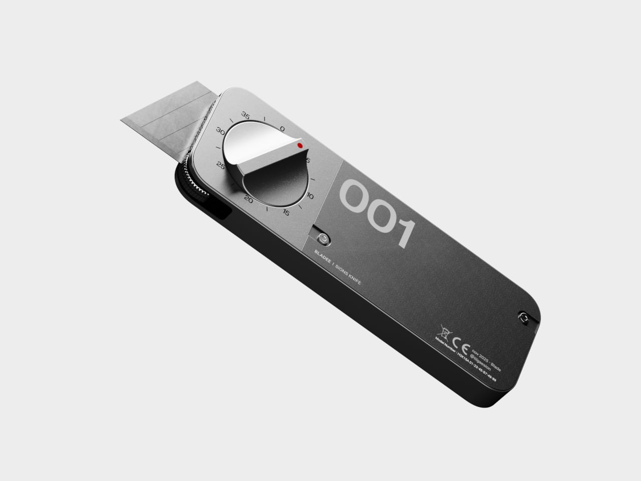
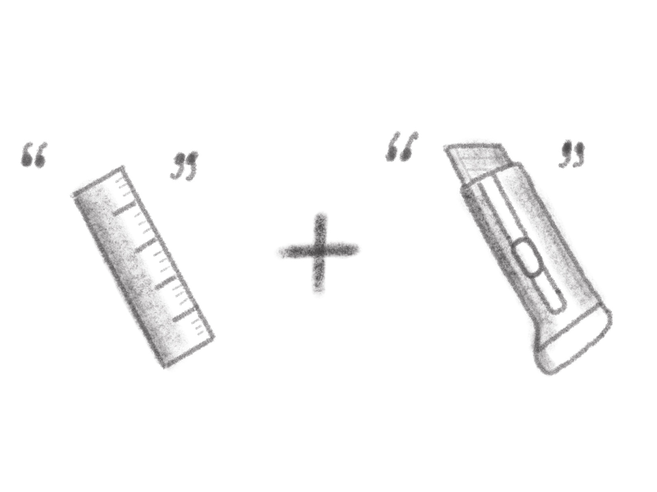
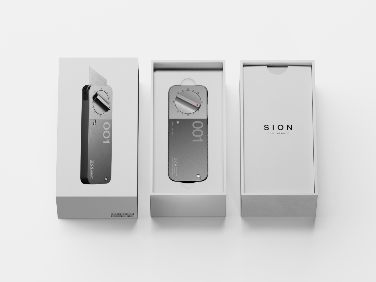
Cutting a straight line should be simple, but for anyone who’s ever measured, marked, and sliced the same piece of foam board or cardboard over and over, the process is anything but straightforward or efficient in practice. The classic “measure twice, cut once” mantra is great advice until you’re making dozens of identical cuts for a project, and the ruler starts to feel like a bottleneck slowing down your entire workflow and creative process.
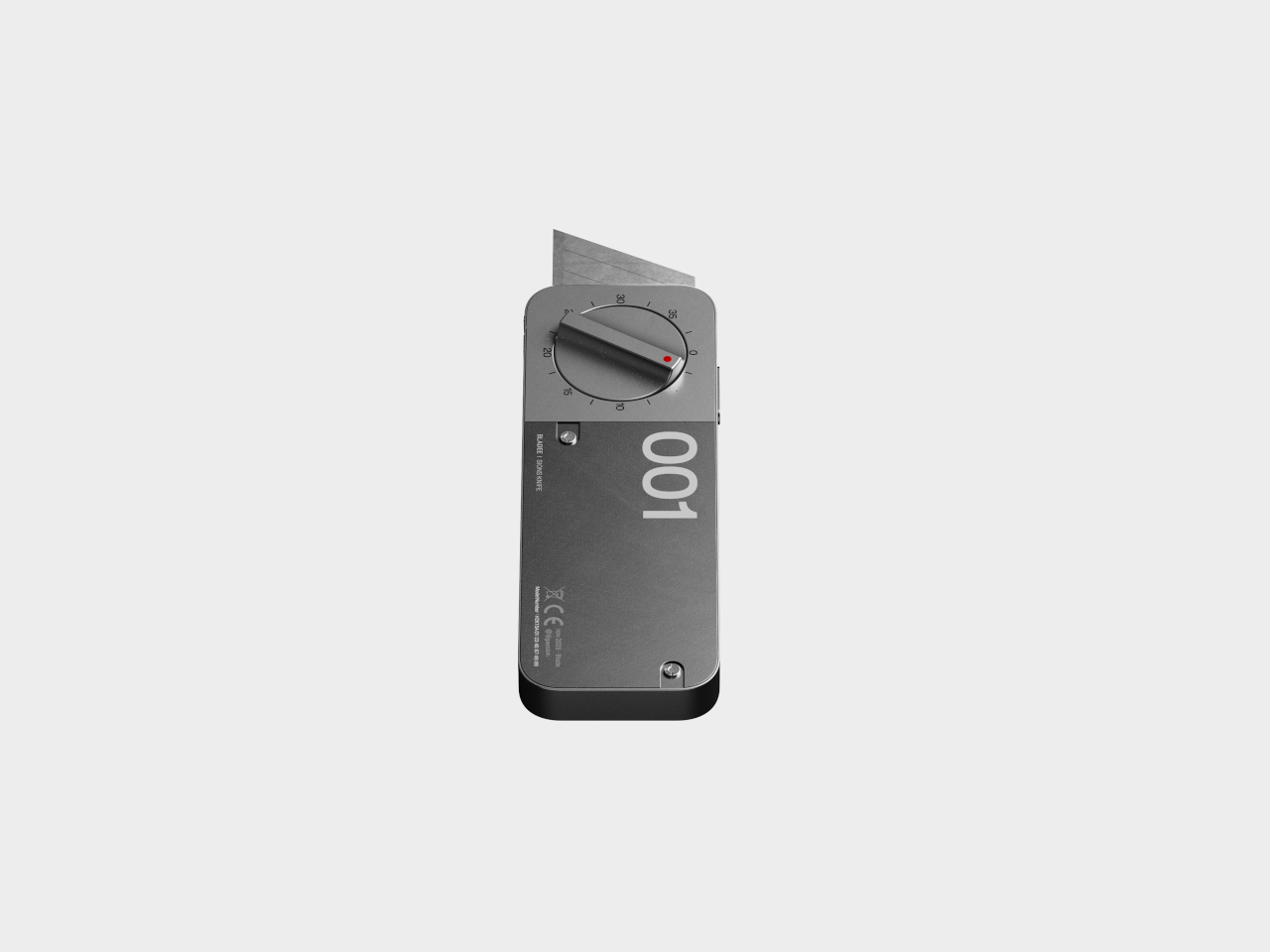
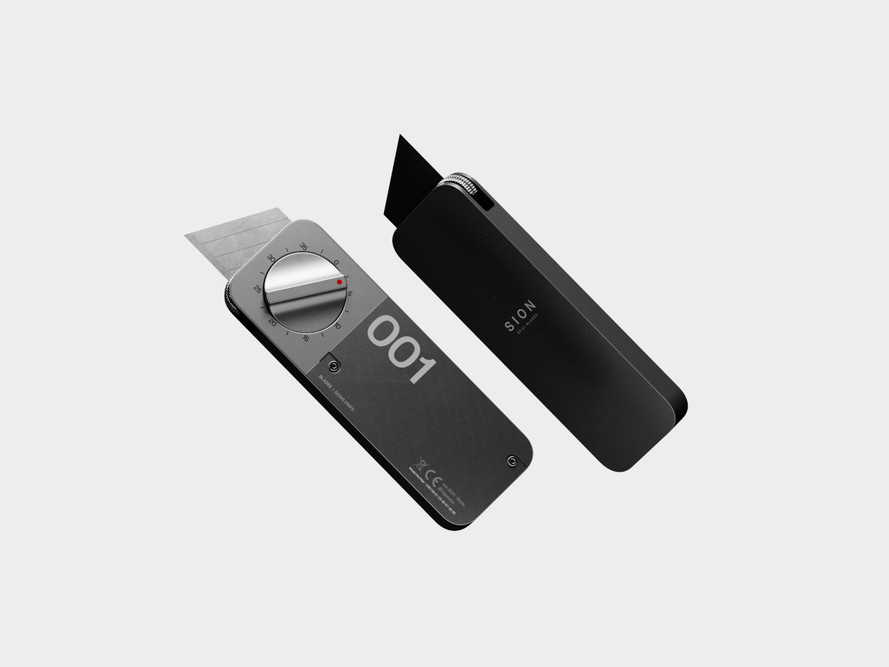
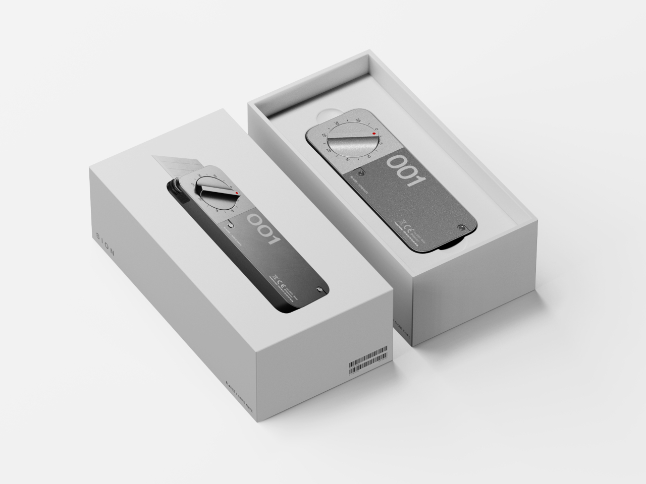
The BLADEE box cutter concept is a rethink of the humble utility knife designed for modern makers and professionals. By building measurement and precision into the tool itself through integrated mechanics and a dial system, it promises to make repeatable, accurate cuts faster and easier throughout your day without external measuring tools. No ruler needed, no marking required, and no guesswork involved when you’re deep into production work.
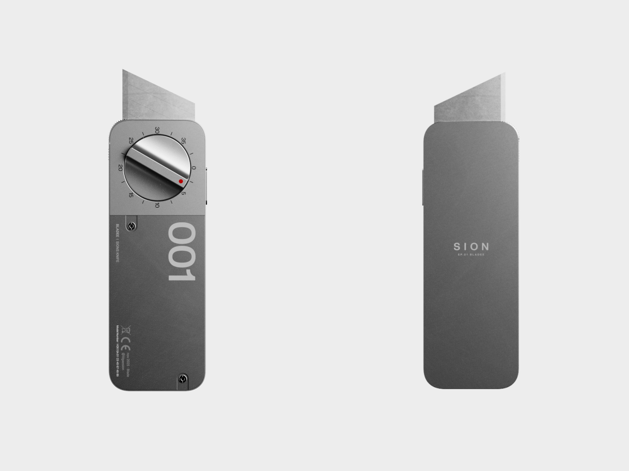
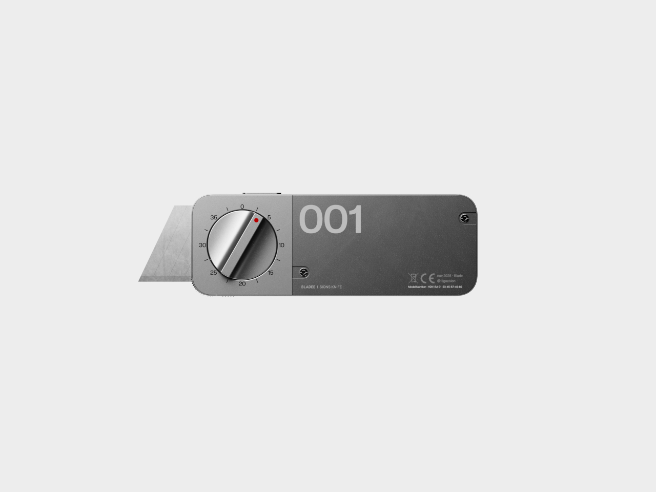
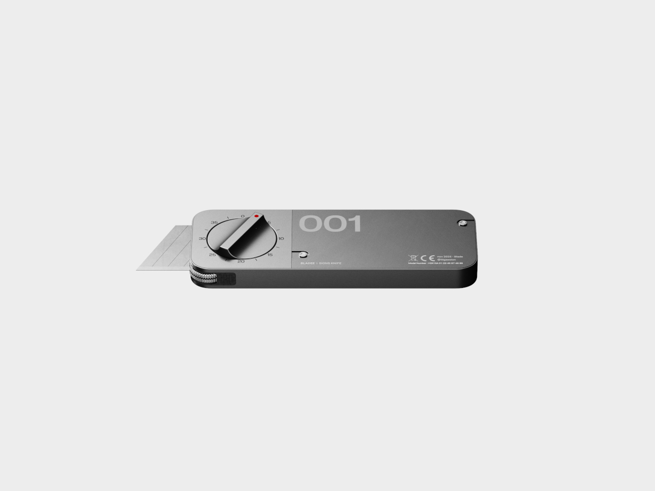
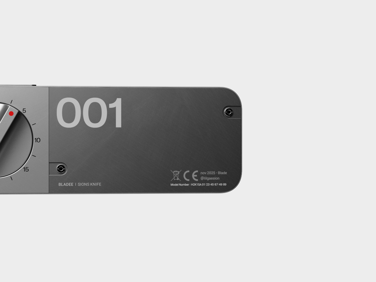
BLADEE’s minimalist, phone-sized body is all about clean lines, matte metal finishes, and a prominent dial that dominates the top surface for immediate visibility and control. The numbered dial lets you set your target cut length from 0 to 35 units, while a lower measurement wheel tracks your progress in real time as you slice through materials. As you approach the preset length, the blade gradually retracts automatically.
The blade always extends a fixed stroke for initial penetration, then withdraws at the set point to ensure every cut finishes smoothly and precisely at the same spot every time. The auto-lock at zero prevents accidental activation during transport or storage, and the dial only works when you press the side button for additional safety during use. This dual-safety system protects both the user and nearby materials.
The real magic is how BLADEE changes the workflow entirely for professional and hobbyist makers alike. No more juggling rulers, pencils, and knives across your workspace while trying to maintain precision and accuracy. Just set the dial to your desired measurement, cut with confidence, and repeat as many times as needed. Whether you’re prototyping packaging designs, building architectural scale models, or crafting at home, the tool eliminates tedious marking.
The right-hand cover is modular and swappable, letting you change colors, finishes, or even add project numbers or initials for organization and personalization. The measurement wheel rolls alongside the blade during cutting, counting travel with each pass and engaging the internal linkage for smooth, automatic retraction at the endpoint. This prevents over-cutting while reducing the risk of slips and accidents at the vulnerable end of each cut.
The robust metal construction, bold “001” graphics, and red pointer indicator give BLADEE a premium, professional feel that makes it as satisfying to use as it is to display prominently. For anyone who values accuracy and efficiency in their creative work, this concept offers a compelling reminder that even the most ordinary, everyday tools can be reimagined for modern workflows and contemporary creative needs when designers prioritize user experience and workflow efficiency.
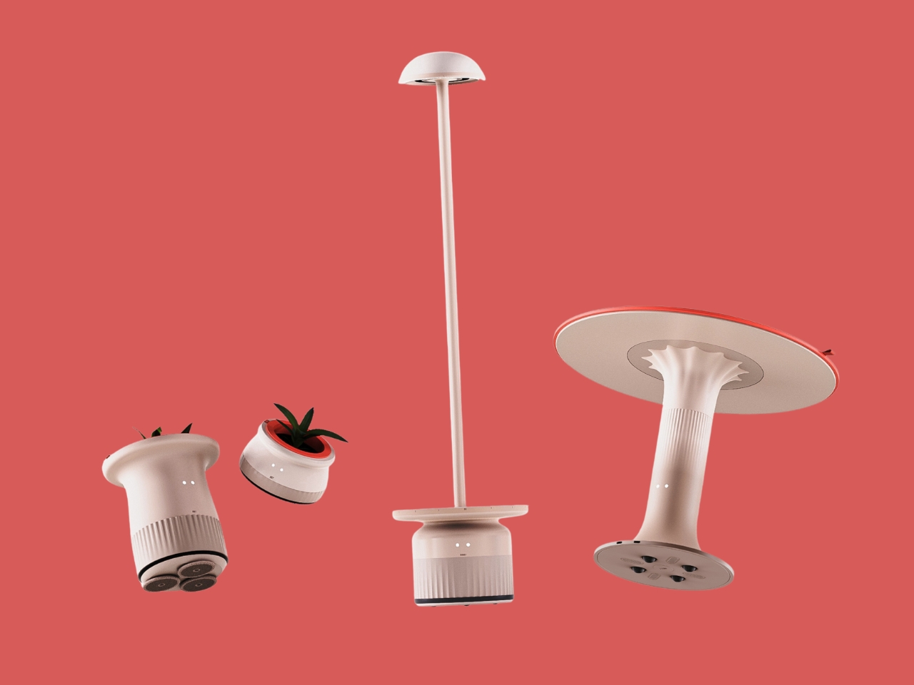
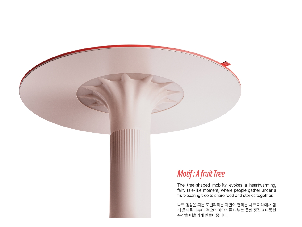
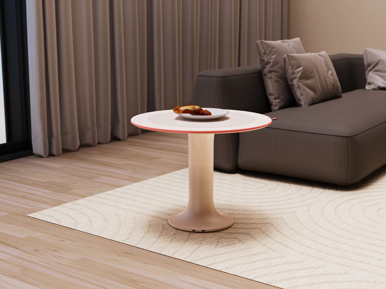
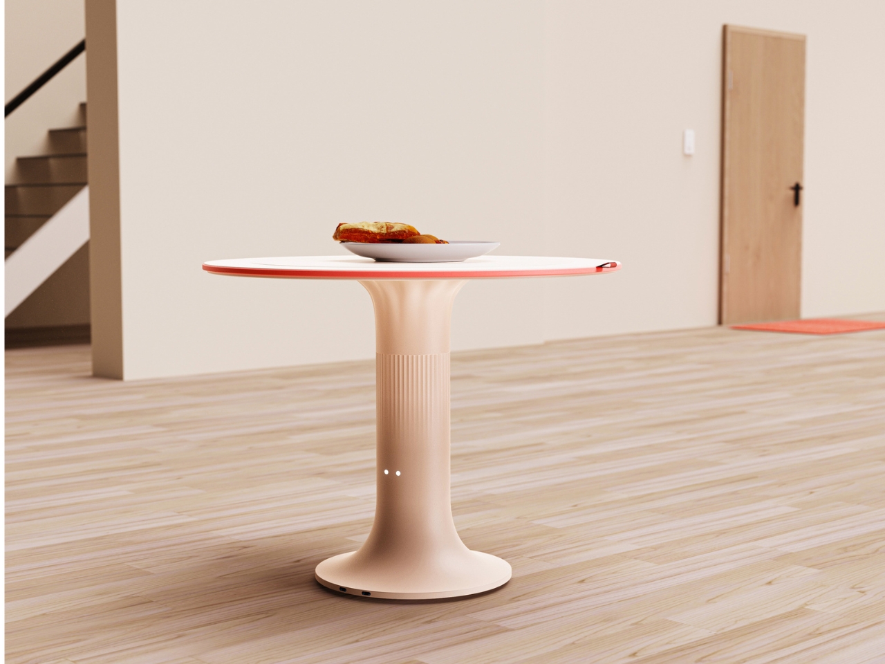
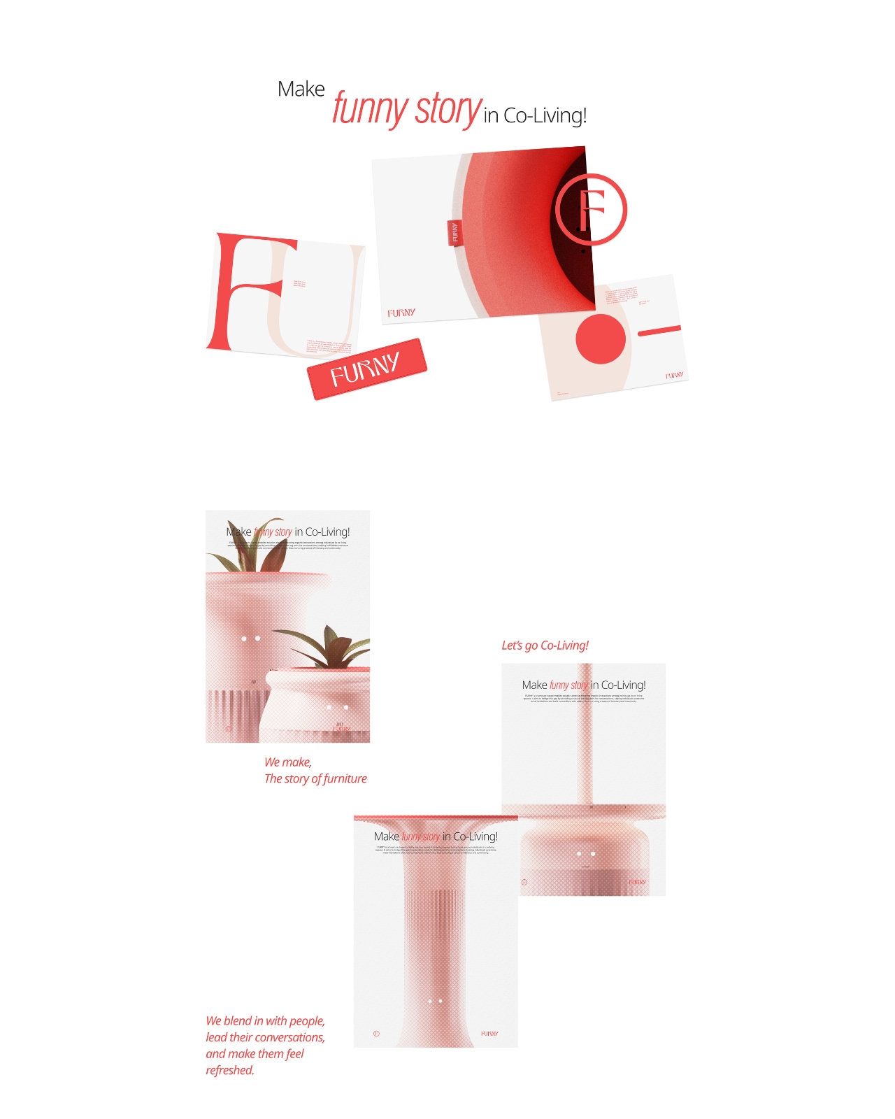
Here’s a scenario you might know too well: You’re living in a co-living space with a bunch of strangers. You pass someone in the kitchen, make awkward eye contact, mumble “hey,” and retreat to your room. Sound familiar? Designers Ye Jin Lee, Jung A Park, and Yujin Lee definitely think so, because they created FURNY to solve exactly this problem.
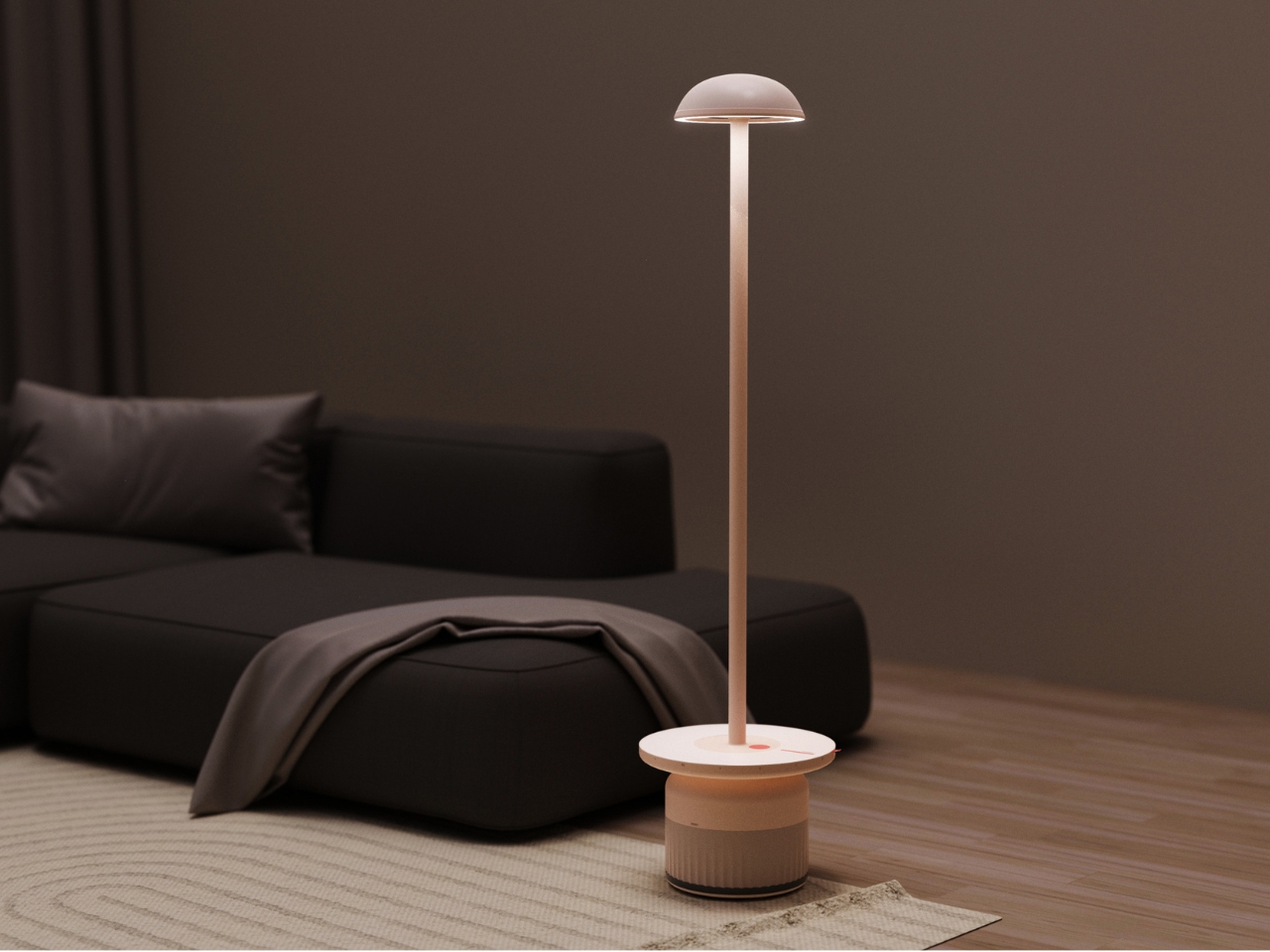
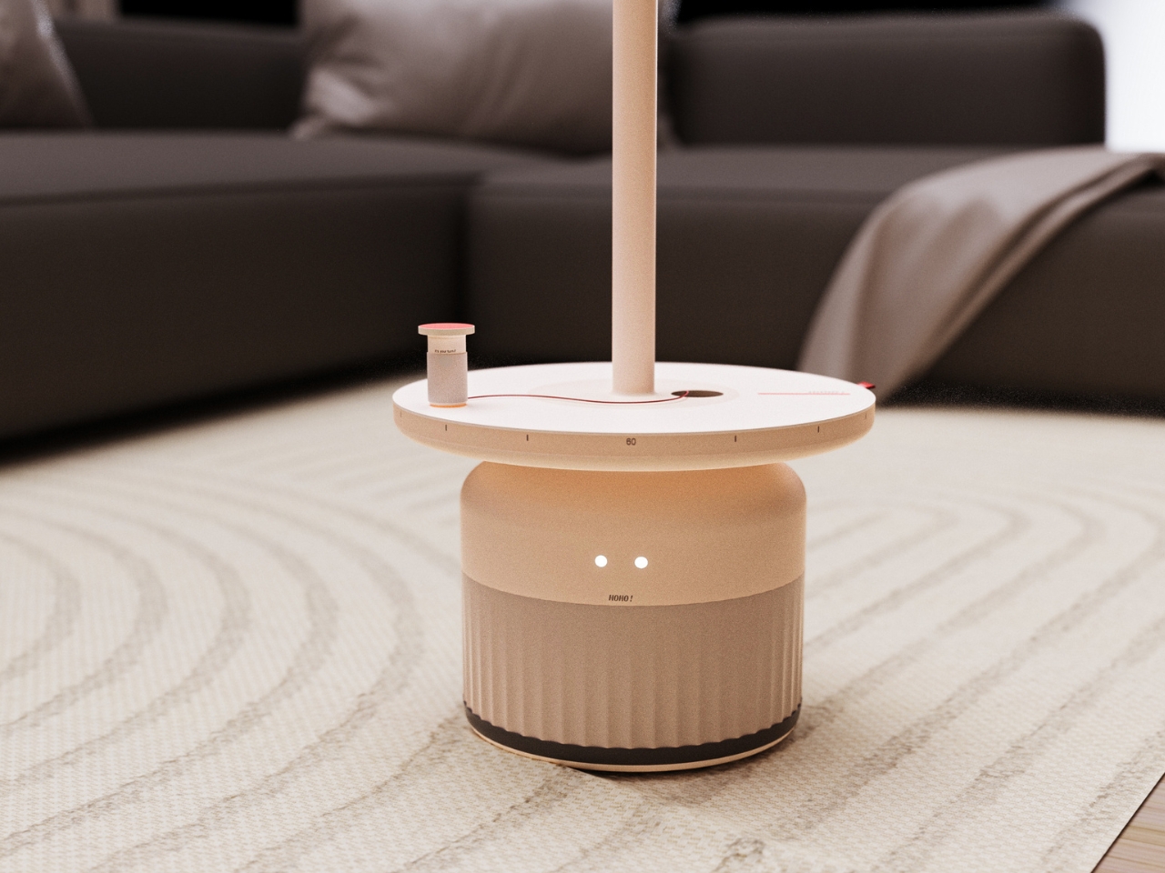
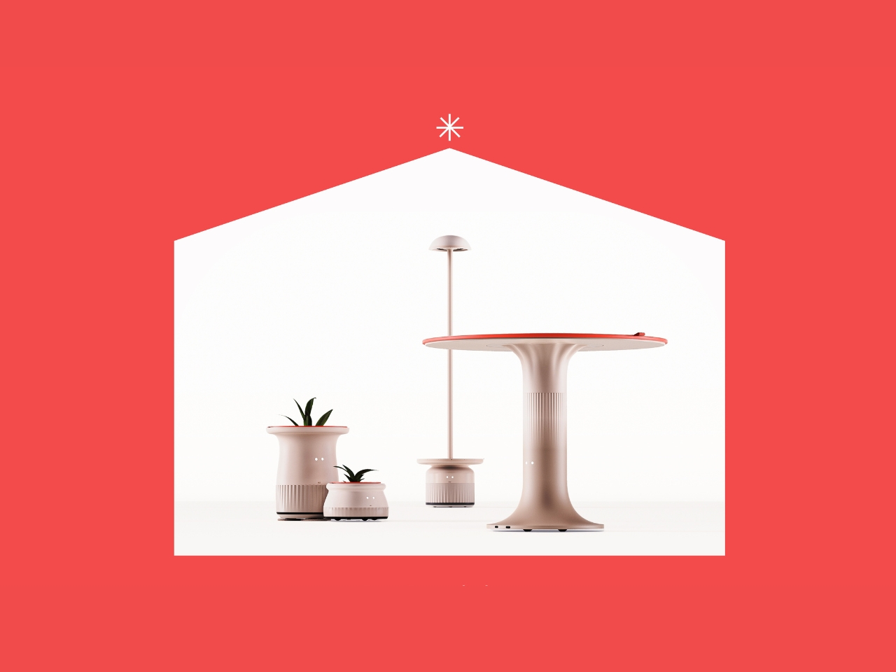
FURNY isn’t your typical furniture design project. It’s a mobile furniture system specifically built for co-living spaces, and its entire purpose is to help people start conversations without that painful awkwardness we’ve all experienced. The concept is simple but clever: what if furniture could be the friendly person who breaks the ice first?
Create your own Aesthetic Render: Download KeyShot Studio Right Now!
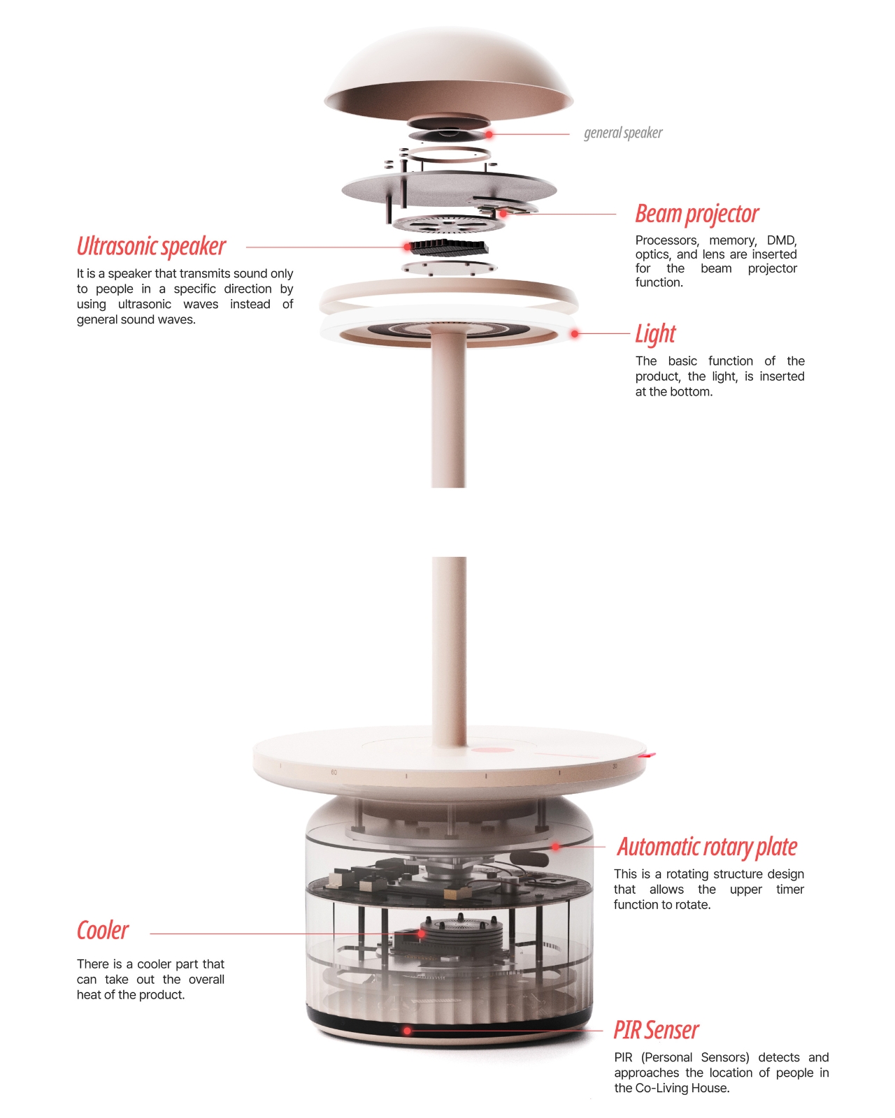
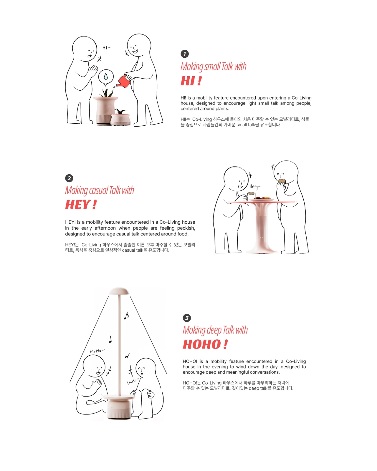
Think about it. Co-living spaces are designed to foster community, with all those shared kitchens and common areas. But having the space doesn’t automatically make connection happen. Most of us know the struggle of wanting to meet our housemates but not knowing how to start a conversation without seeming weird or intrusive. That “too long distance” between strangers in a shared space can feel impossible to cross. FURNY tackles this by being furniture that moves with purpose throughout the day, creating natural gathering points that give people an excuse to interact. The genius is in how it adapts to different times and moods, offering three distinct “conversation modes” that match the rhythm of daily life.
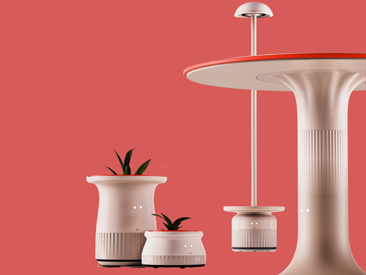
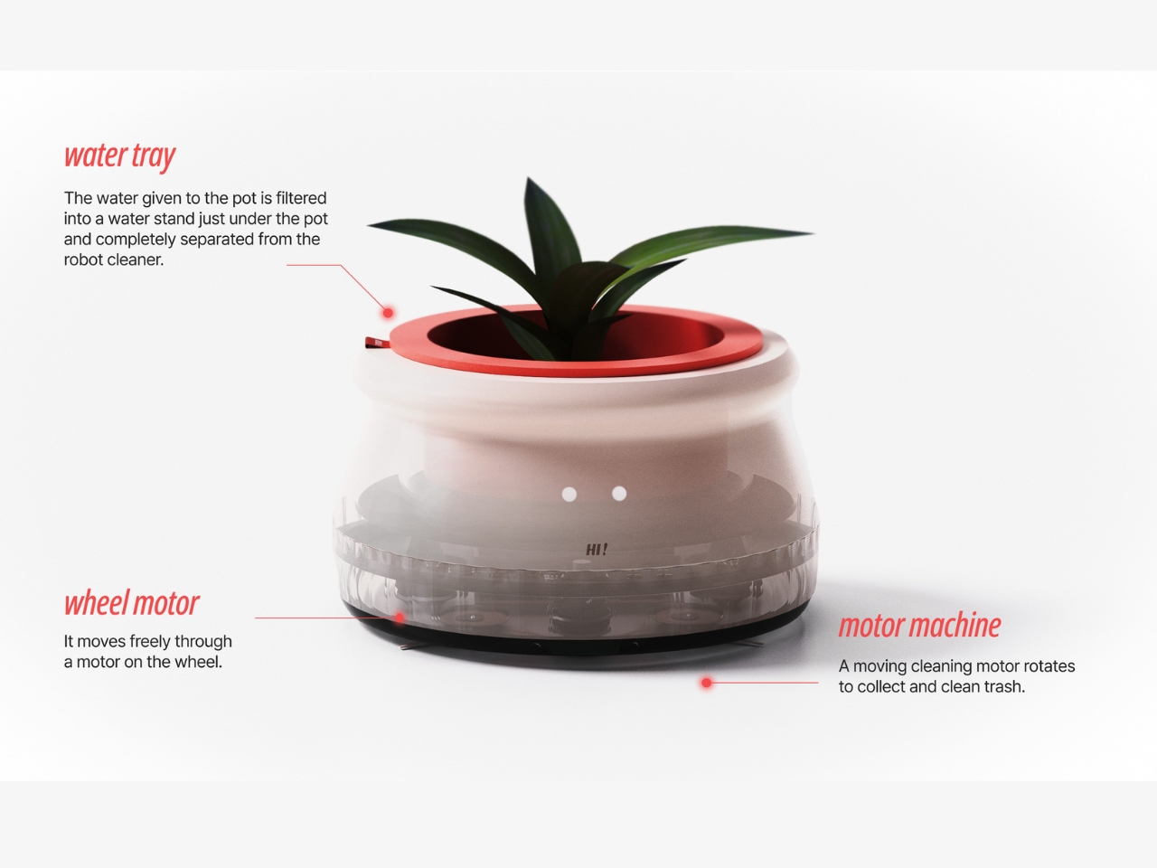
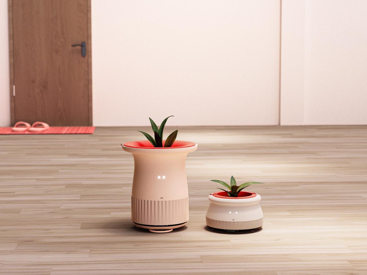
In the morning, when someone enters a common space, FURNY becomes “HI!” mode. It positions itself as a welcoming presence, often incorporating plants as a focal point. Plants are perfect ice breakers, right? Everyone can comment on how the succulent is doing or share watering tips. It’s the kind of small talk that feels natural and unforced, the kind that happens when you’re both just existing in the same space doing normal things.
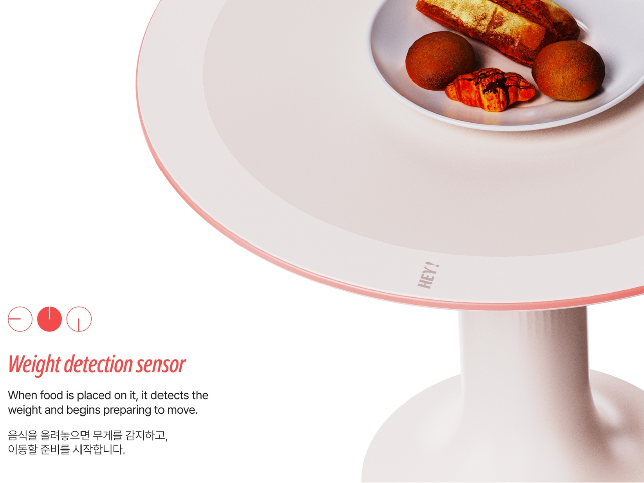
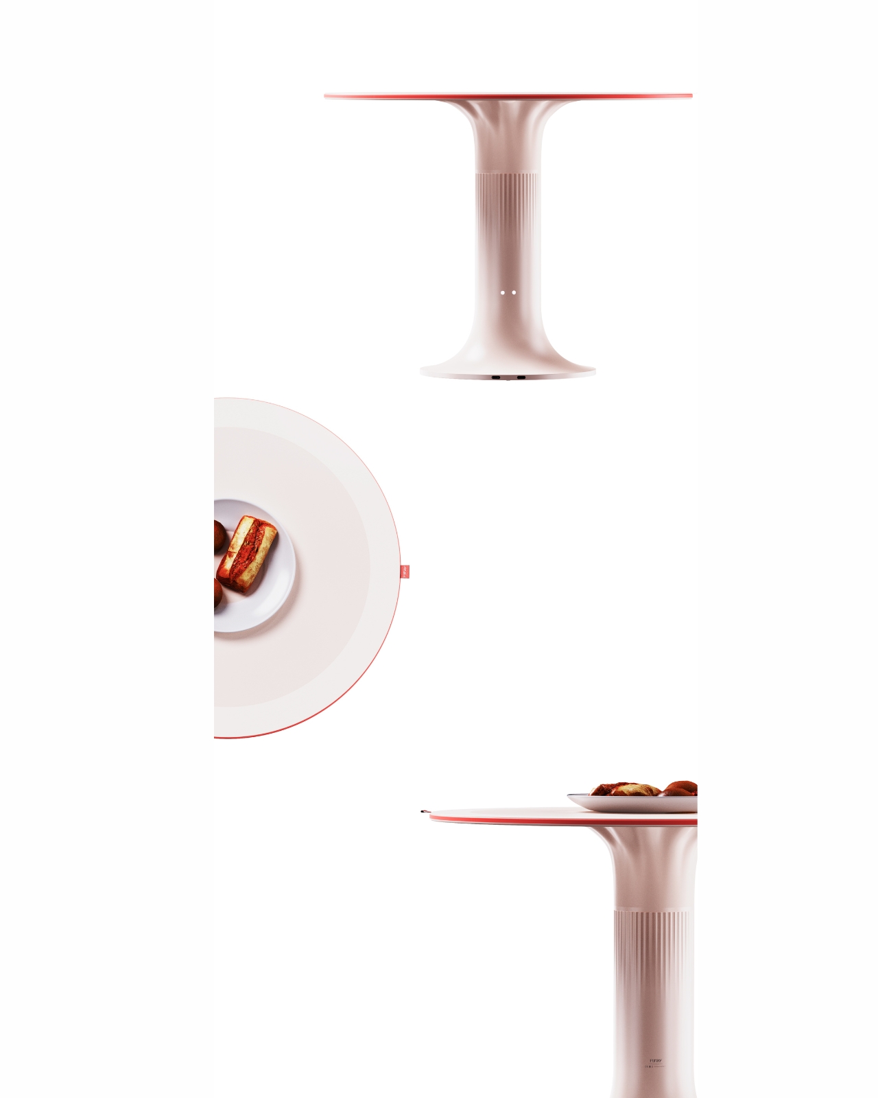
By early afternoon, when people start getting peckish and wandering toward the kitchen, FURNY shifts into “HEY!” mode. Now it becomes a casual gathering spot centered around food. Food is basically a universal conversation starter. Whether someone’s cooking something that smells amazing or you’re both scrounging for snacks, having a mobile piece of furniture that facilitates these food-centered interactions makes everything feel more communal and less like you’re awkwardly hovering.
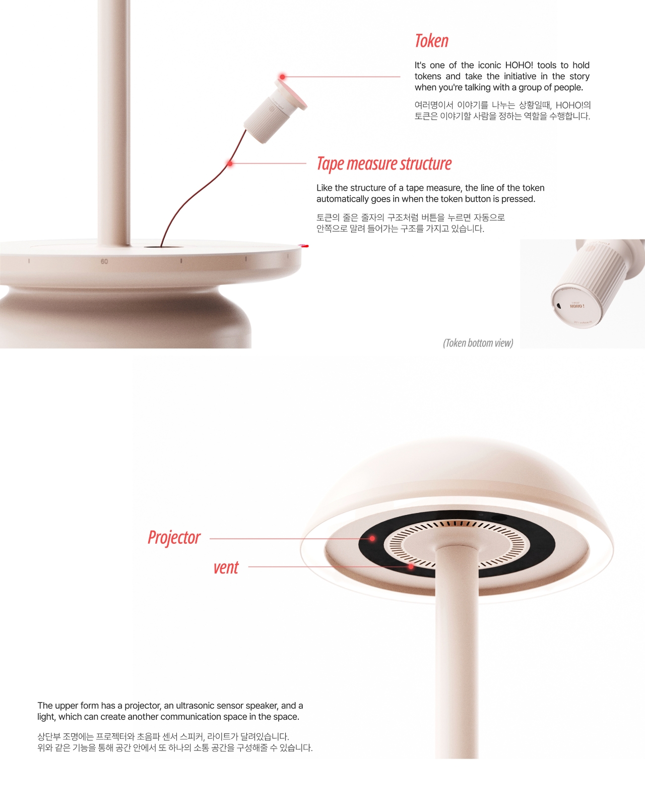
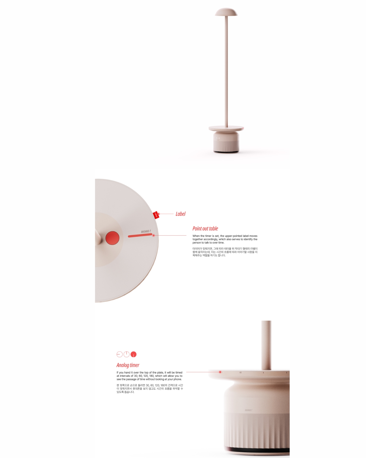
Then evening rolls around, and FURNY transforms into “HOHO!” mode. This is where the magic really happens. After a long day, people are more ready to wind down and have real conversations. FURNY creates an ambient, comfortable setting that encourages those deeper talks, the kind where you actually get to know your housemates beyond surface level.
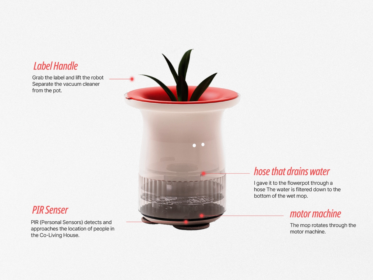
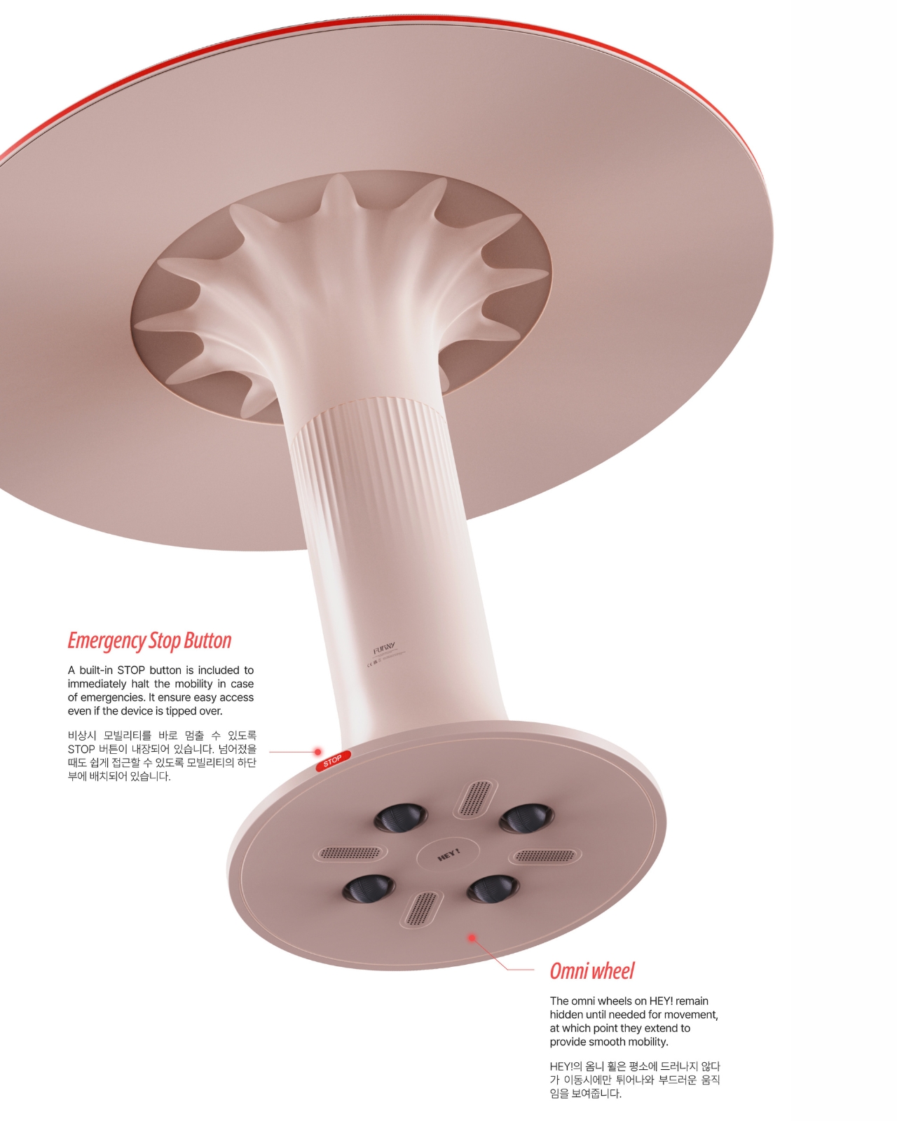
The mobility aspect is crucial here. FURNY isn’t stuck in one spot forcing interactions. It moves to where conversations naturally want to happen, adapting to how people actually use shared spaces throughout the day. When it’s not being used, the wheels tuck away so it blends seamlessly into the environment. It’s there when you need it, invisible when you don’t. The design itself reflects this approachable philosophy. The team chose ivory and beige as the main colors, keeping things neutral and calming. But they added red as an accent color to bring that lively energy without overwhelming the space. It’s furniture that wants to be part of the background until it needs to step forward and facilitate connection.
What makes this project particularly relevant right now is how many people are turning to co-living arrangements. Whether it’s for affordability, location, or the promise of built-in community, shared living is becoming increasingly common, especially in cities. But the reality often doesn’t match the dream. You move in hoping for friendships and end up with a bunch of people who live parallel lives under the same roof. FURNY addresses the fundamental problem: the gap between wanting community and knowing how to create it. By being that “friendly someone” who creates the atmosphere first, it gives people permission to join in without the anxiety of initiating. You’re not bothering someone, you’re just gravitating toward where things are already happening.
For anyone interested in how design can solve social problems, FURNY is a fascinating case study. It’s not trying to force interaction or manufacture community. Instead, it’s removing barriers and creating conditions where connection can happen organically. The furniture becomes infrastructure for friendship, a framework that supports the natural human desire to connect while respecting the equally natural hesitation we feel around strangers. In co-living spaces everywhere, furniture just sits there. FURNY asks: what if it did more?