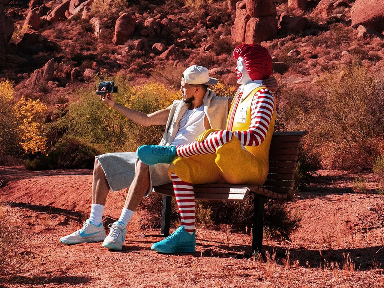
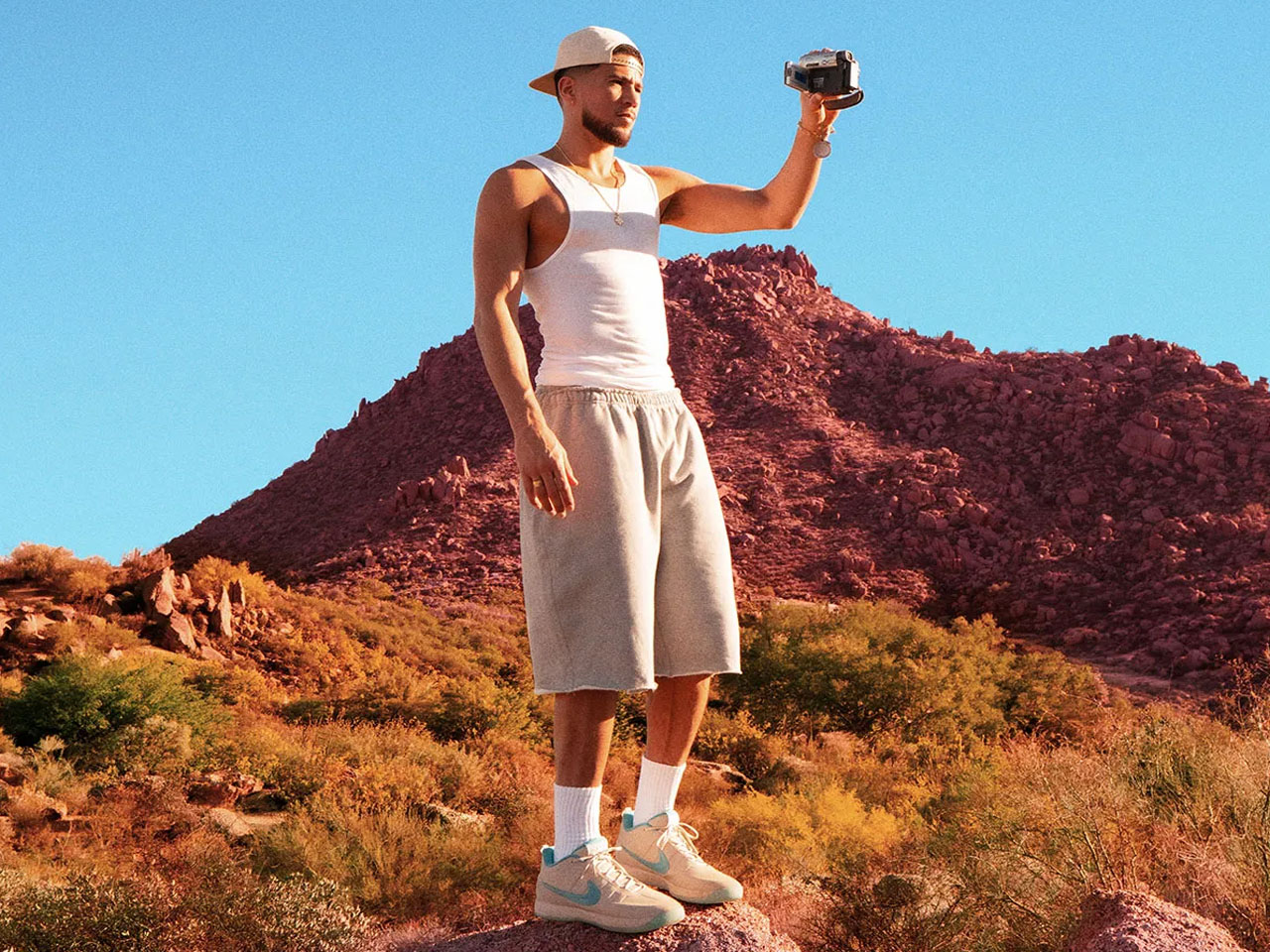
Signature sneakers rarely manage to feel personal anymore. Most arrive overloaded with athlete branding and colorways engineered more for resale culture than everyday wear. Devin Booker’s Nike Book 2 collaboration with McDonald’s takes a surprisingly different route. Instead of leaning into fries-and-burgers nostalgia, the sneaker pulls inspiration from one of Arizona’s oddest landmarks — the turquoise-arched McDonald’s in Sedona — and turns it into a basketball shoe that feels more rooted in place than corporate crossover hype.
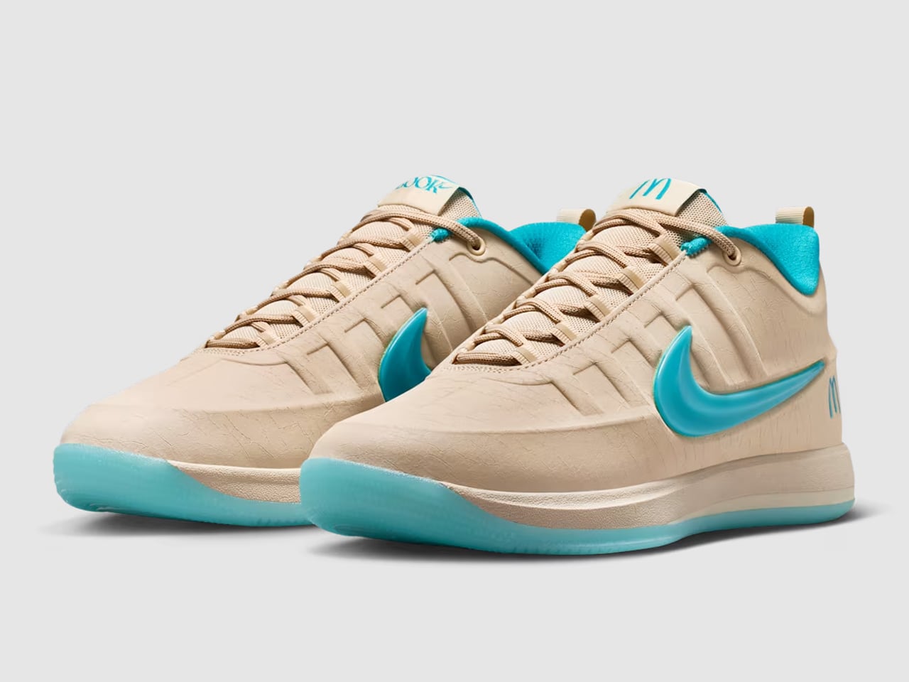
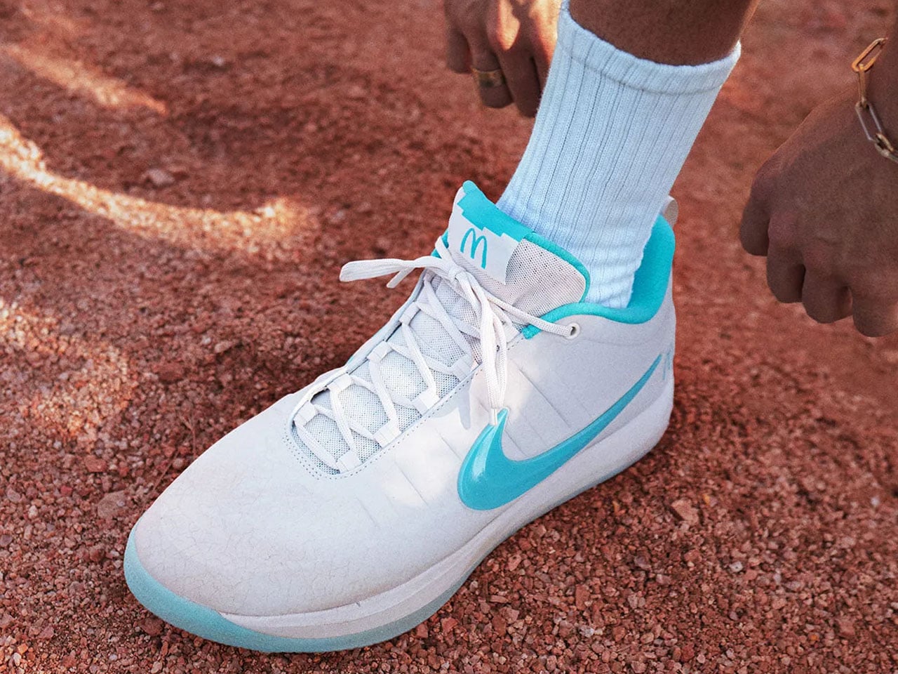
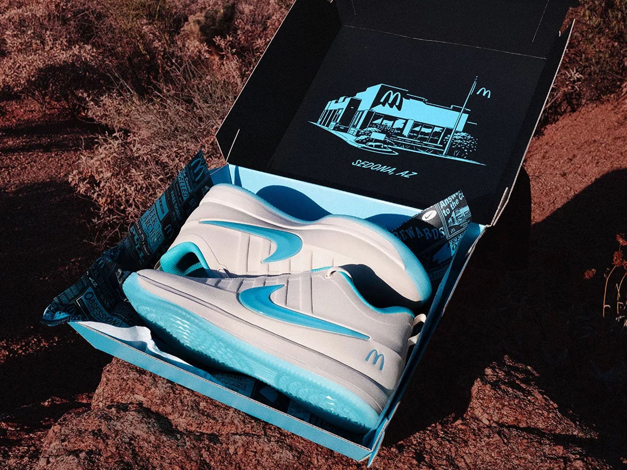
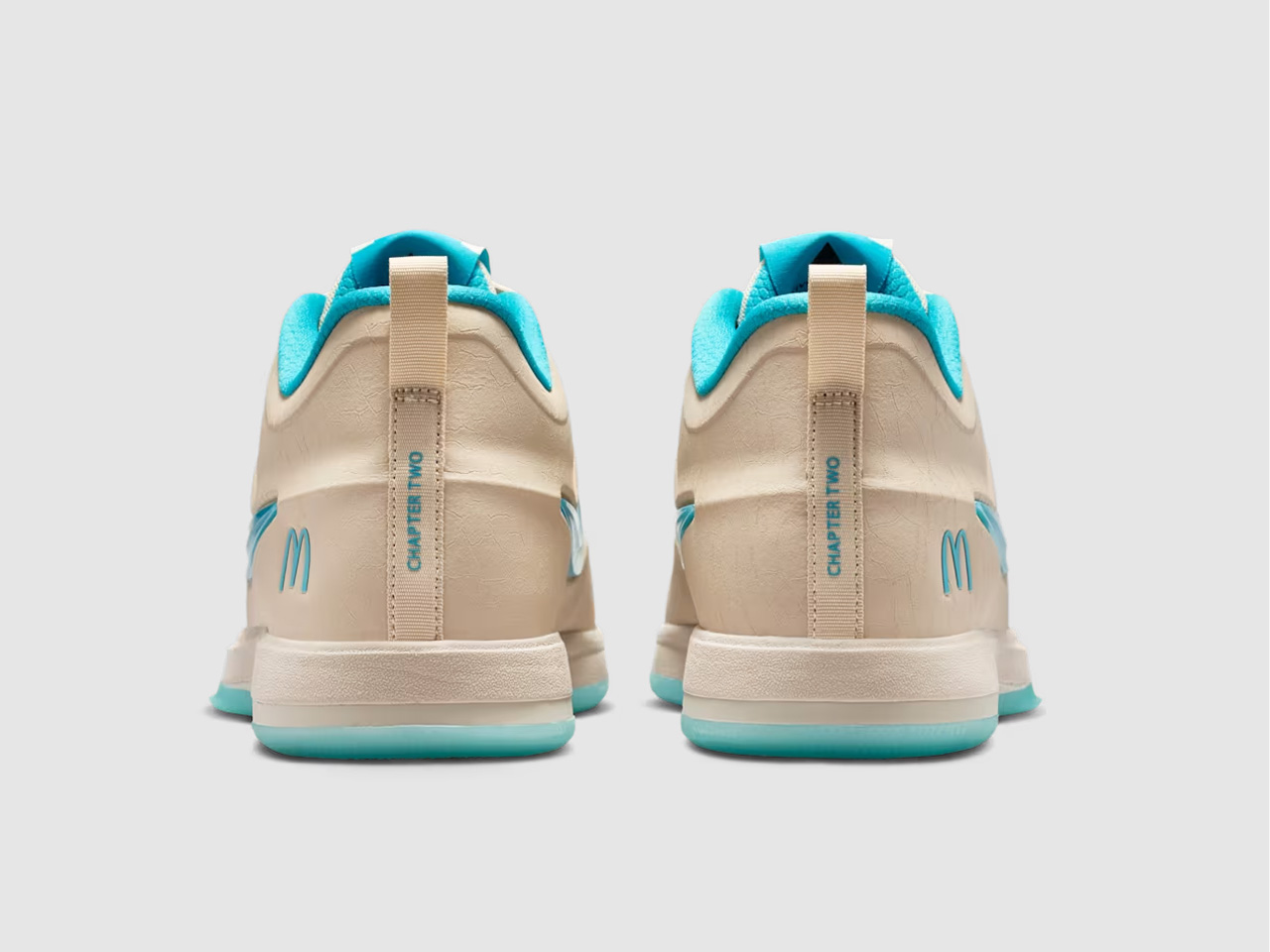
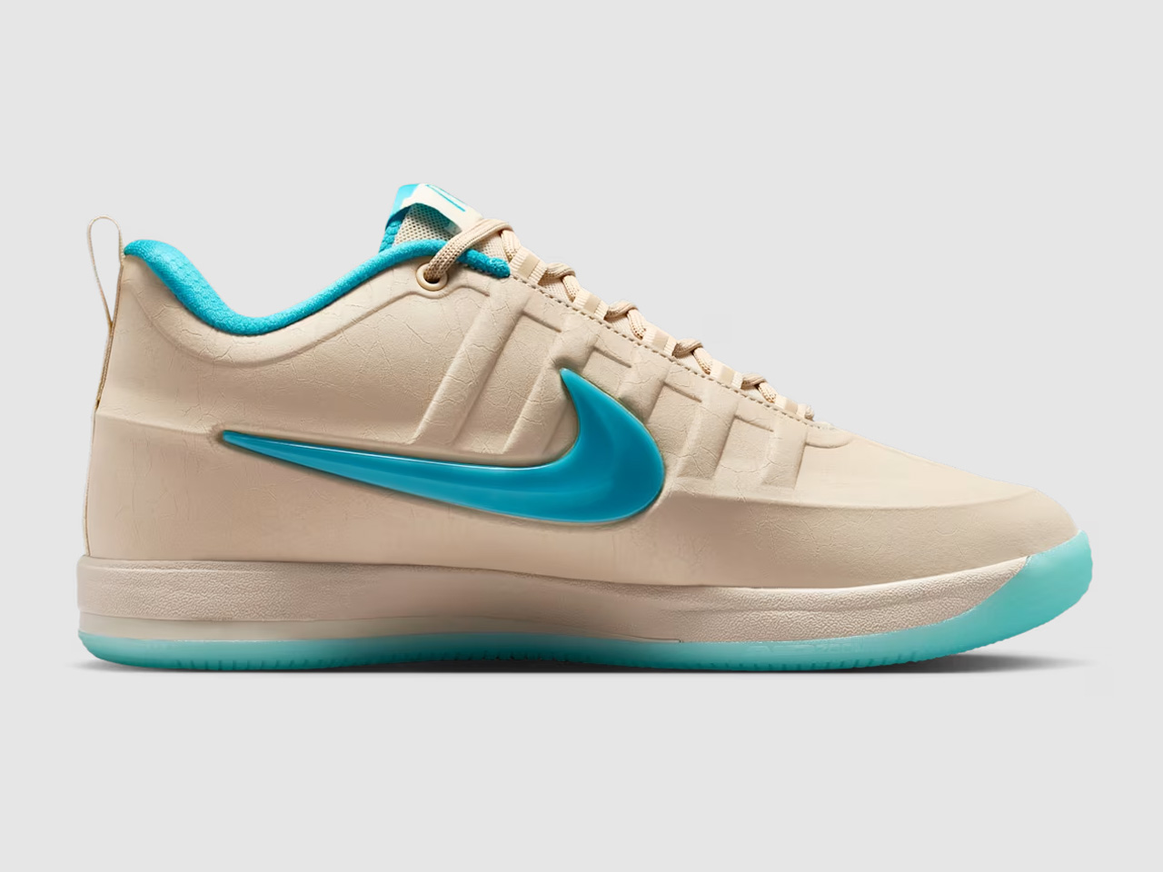
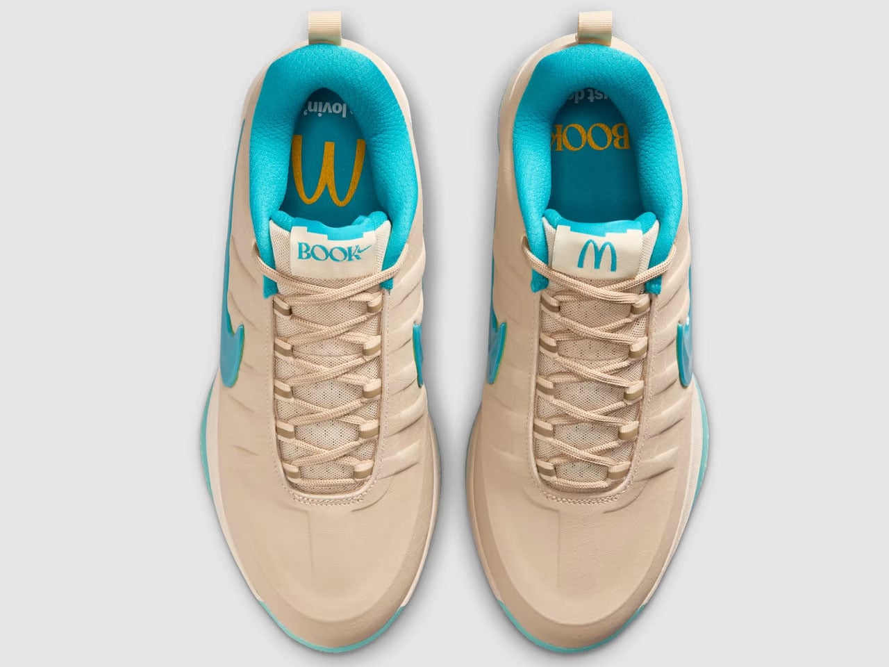
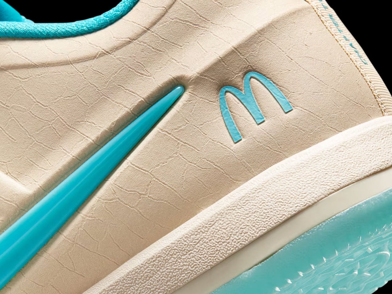
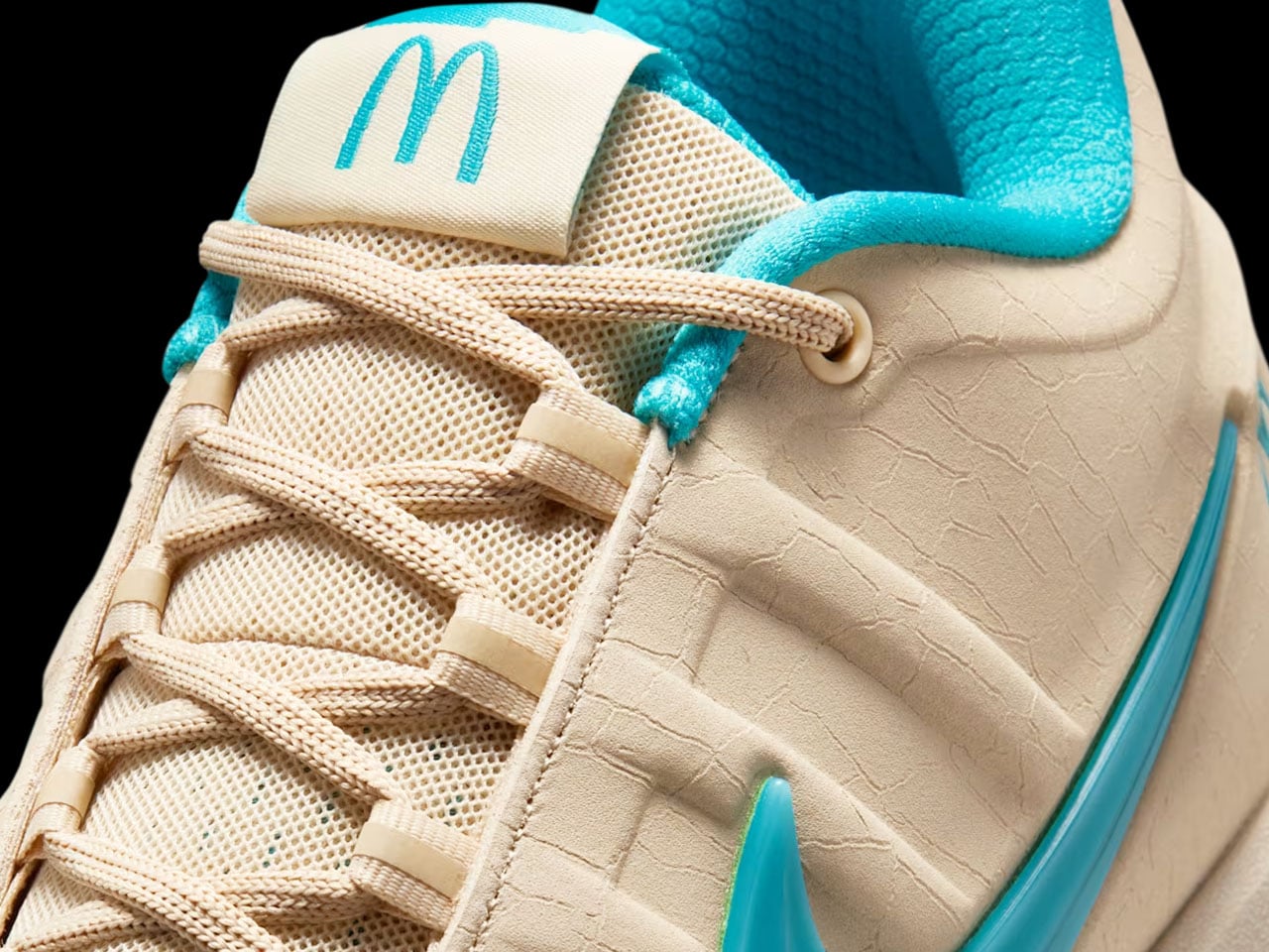
At first glance, the Nike Book 2 “Sedona” barely resembles a McDonald’s collaboration at all. The sneaker trades loud fast-food colors for sandy beige uppers, dusty earth tones, and soft turquoise accents inspired by the famous Sedona McDonald’s location, which swapped its golden arches for turquoise ones to better blend with the city’s iconic red rock surroundings. It’s the kind of hyper-specific regional detail that could have easily become gimmicky, but Booker’s growing signature line has consistently worked best when it stays connected to Arizona culture rather than chasing trends.
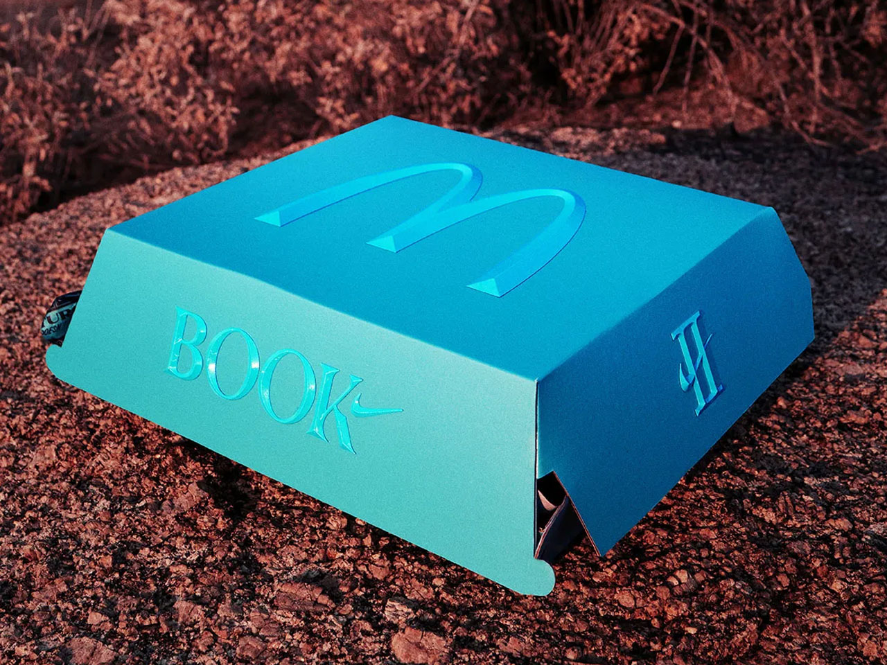
Designer: Nike x McDonald’s
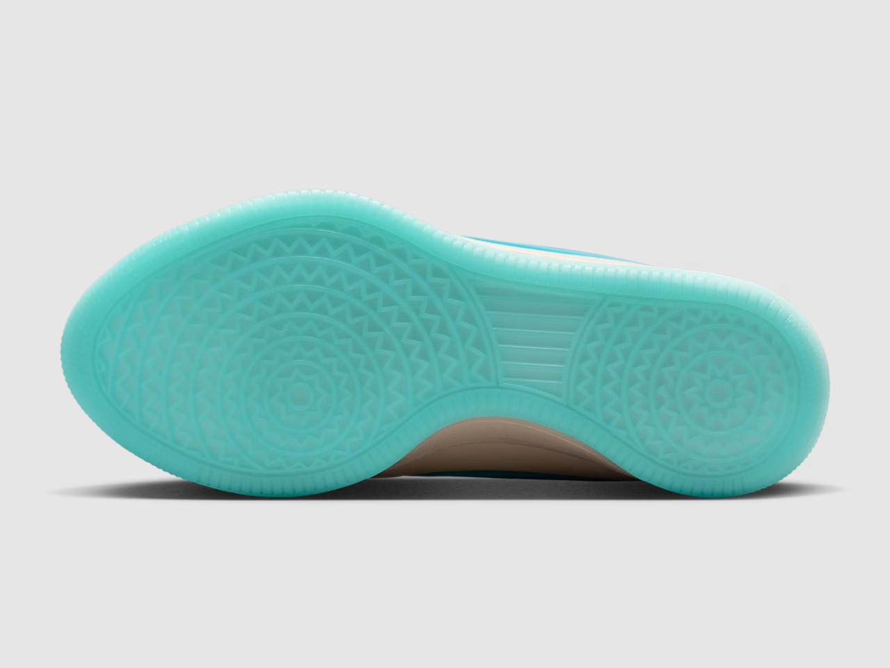
The design itself continues the Book series’ understated approach to basketball footwear. Where many modern performance sneakers rely on exaggerated shapes and futuristic layering, the Book 2 keeps things clean and wearable. The low-cut silhouette looks closer to a lifestyle sneaker than a traditional on-court model, borrowing cues from retro Nike runners and skate shoes while still packing modern basketball tech underneath. Nike equips the sneaker with a forefoot Air Zoom unit, Cushlon 3.0 cushioning, and a lightweight molded upper designed around Booker’s preference for responsive movement and minimal bulk.
That balance between performance and casual wearability is what gives the Book line its identity. Booker has never approached his signature shoes like loud statement pieces; they feel more like sneakers designed by someone who genuinely cares how they look off the court. The “Sedona” colorway pushes that idea even further. The cracked leather details, aged textures, and muted desert palette make the sneaker feel intentionally lived-in, almost like something discovered on a road trip through Arizona rather than a highly manufactured sports collaboration.
McDonald’s also seems aware that the appeal here extends beyond basketball fans. Instead of limiting the partnership to standard product placement, the company built a broader campaign around Booker’s connection to the Southwest. Promotional visuals lean heavily into desert imagery, road-trip aesthetics, and surreal humor, including a campaign video featuring Booker wandering through Sedona alongside a silent Ronald McDonald appearance that somehow feels strange and perfectly on-brand at the same time.
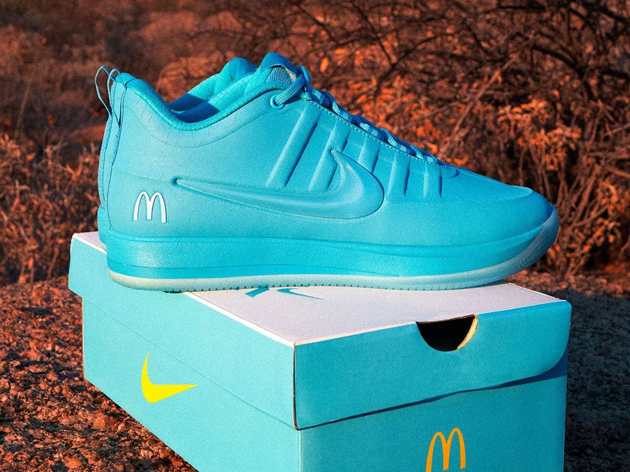
The collaboration also arrives with a Friends & Family sweepstakes through the McDonald’s app, giving select customers access to an exclusive variation of the sneaker with the purchase of specialty beverages. A dedicated pop-up event tied to the release is also expected ahead of launch, reinforcing how brands increasingly treat sneaker drops more like cultural events than product launches. The McDonald’s x Nike Book 2 “Sedona” sneaker is scheduled to release on June 2 through Nike SNKRS and select retailers for $155.
The post McDonald’s-inspired Nike Book 2 bring Arizona Desert colors to your next everyday basketball sneaker first appeared on Yanko Design.