De’Longhi Just Turned 5 Coffee Machines Into Tiny Cafés

If you’re a coffee lover, chances are you’re also a fan of going to coffee shops. While most die-hard connoisseurs would probably prefer to make a cup for themselves, apparently 72% of consumers still believe that the best coffee can only be made in a café, by actual experts who trained for it (well, unless you did train as an actual barista and have the complete equipment at home).

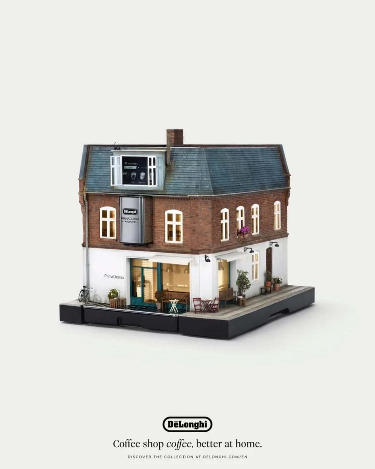
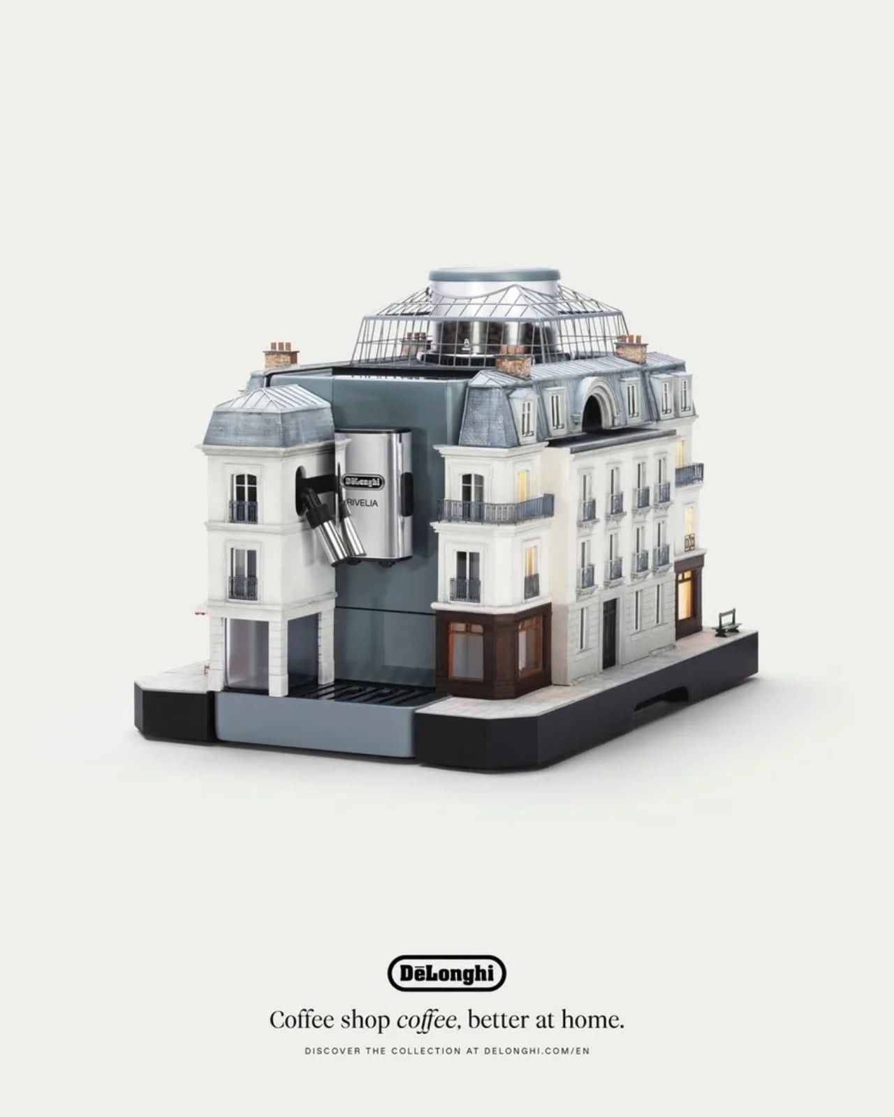
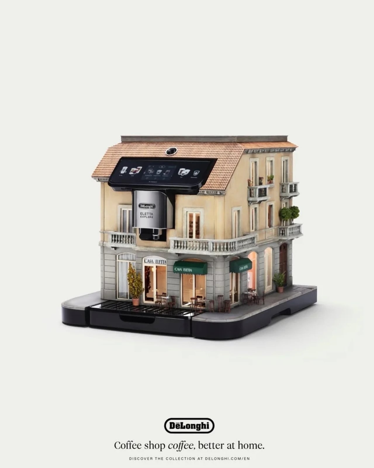
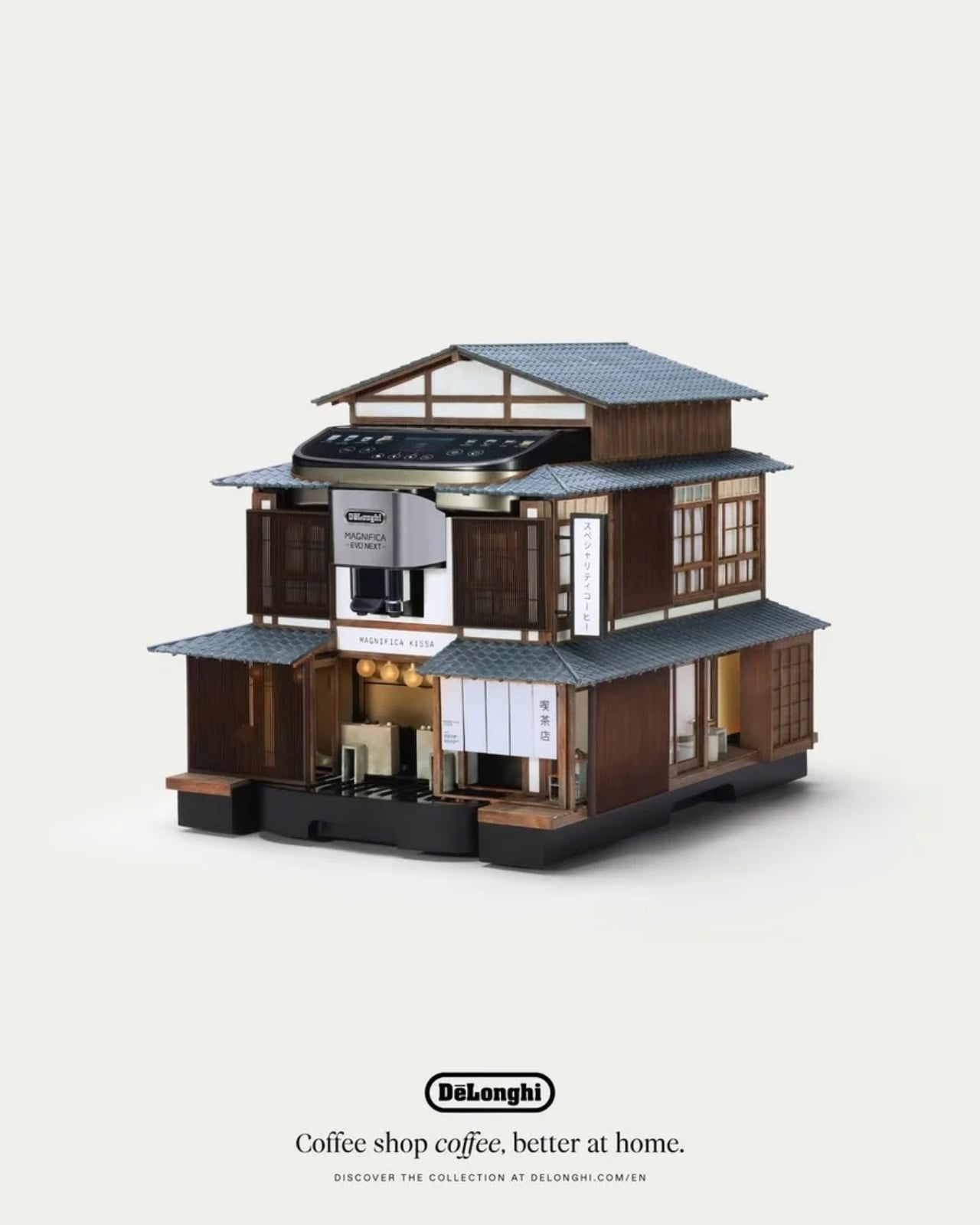
De’Longhi wanted to show that you can have café-quality coffee at home, and they did it in the most charming, unexpected way possible: by turning their machines into miniature versions of the world’s most iconic cafés. The campaign is called “The World’s Smallest Coffee Shop,” developed in partnership with creative agency LOLA Madrid and brought to life by master miniaturist Simon Weisse and his collaborator Cindy Schnitter. Weisse is no stranger to creating miniature movie magic; he is best known for his work with director Wes Anderson on films like The Grand Budapest Hotel and Asteroid City, where his tiny, hand-crafted worlds became just as iconic as the stories themselves.

Designer: Simon Weisse and Cindy Schnitter for De’Longhi

The idea was simple yet brilliant: create five intricate, handcrafted miniature café façades and mount them directly onto De’Longhi’s bean-to-cup coffee machines. Each of these five miniature coffee shops is inspired by an iconic global coffee culture city and paired with an elite De’Longhi machine:

🇫🇷 Paris mounted on the Rivelia
🇯🇵 Tokyo mounted on the Magnifica Evo Next
🇮🇹 Milan mounted on the Eletta Ultra
🇩🇰 Copenhagen mounted on the Eletta Explore
🇩🇪 Berlin mounted on the Primadonna Aromatic

It’s not just a simple miniature, of course, given the credentials of the designers and their team. Each piece was hand-built over 1,500 hours total using traditional model-making techniques by specialist model makers. They incorporated architectural textures, aged finishes, and intricate detailing, including tiny windows and miniature signage, just as if they were crafting a set for a major film production. The level of care poured into every surface and every tiny detail is nothing short of extraordinary.

What makes this campaign particularly compelling is the signature technique Weisse’s studio brings to the table: “forced perspective,” the same cinematic method used on film sets to make miniature environments appear life-sized and completely believable. When De’Longhi approached the studio, Weisse immediately recognized an opportunity to apply this storytelling craft to something most of us interact with every single morning: a coffee machine. The goal wasn’t just to create something beautiful to look at, but to shift the way we think about where great coffee truly comes from.

The result is nothing short of a collector’s dream. Looking at each machine, it’s hard not to imagine yourself sitting at a tiny cobblestoned café in Paris, warming your hands around a bowl of café au lait, or perched on a Tokyo street corner, breathing in the scent of a perfectly pulled espresso. The detail is so immersive and so deliberate that the machine stops being an appliance and becomes an experience, or rather, an entire world in miniature.

The campaign made its stunning debut at Milan Design Week 2026, one of the most prestigious design events in the world, where all five machines were showcased together for the very first time. And the timing couldn’t be more fitting: in a world where home has become our office, our restaurant, and our gym, why shouldn’t it also be our favorite café?

De’Longhi CMO Aparna Sundaresh summed it up beautifully: “The café hasn’t just been miniaturised; it has been brought home.” Whether you’re a collector drawn to the artistry, a coffee lover chasing the perfect cup, or simply someone who appreciates craftsmanship that makes you stop and stare, The World’s Smallest Coffee Shop is a masterclass in how great design can transform the everyday into something truly extraordinary, one tiny façade at a time.

The post De’Longhi Just Turned 5 Coffee Machines Into Tiny Cafés first appeared on Yanko Design.

How a Park in China Made Public Space Feel Human

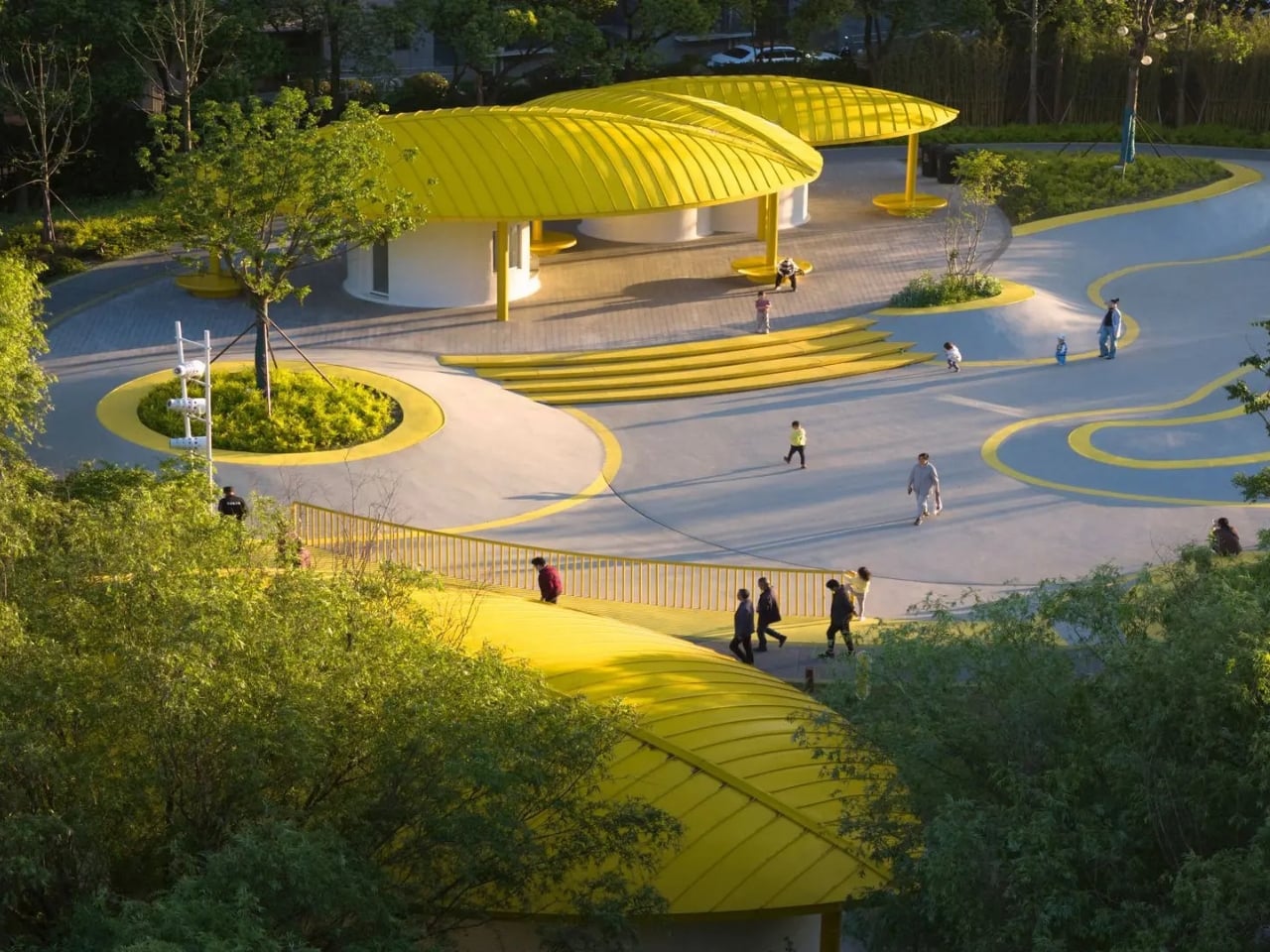
Most parks follow a familiar formula: some benches, a jogging path, maybe a playground, and if you’re lucky, a fountain. They’re functional, sure, but they rarely feel like they were designed with any real conviction. Orchestra Park in Kunshan, China, by local studio SoBA, is a different kind of project altogether. It’s one of those rare public spaces that actually earns its name.

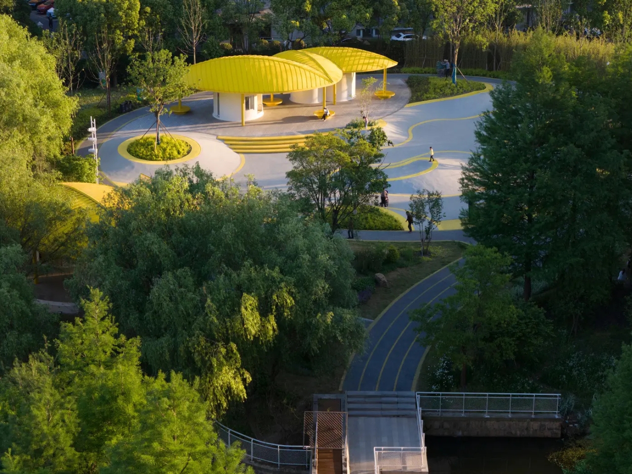
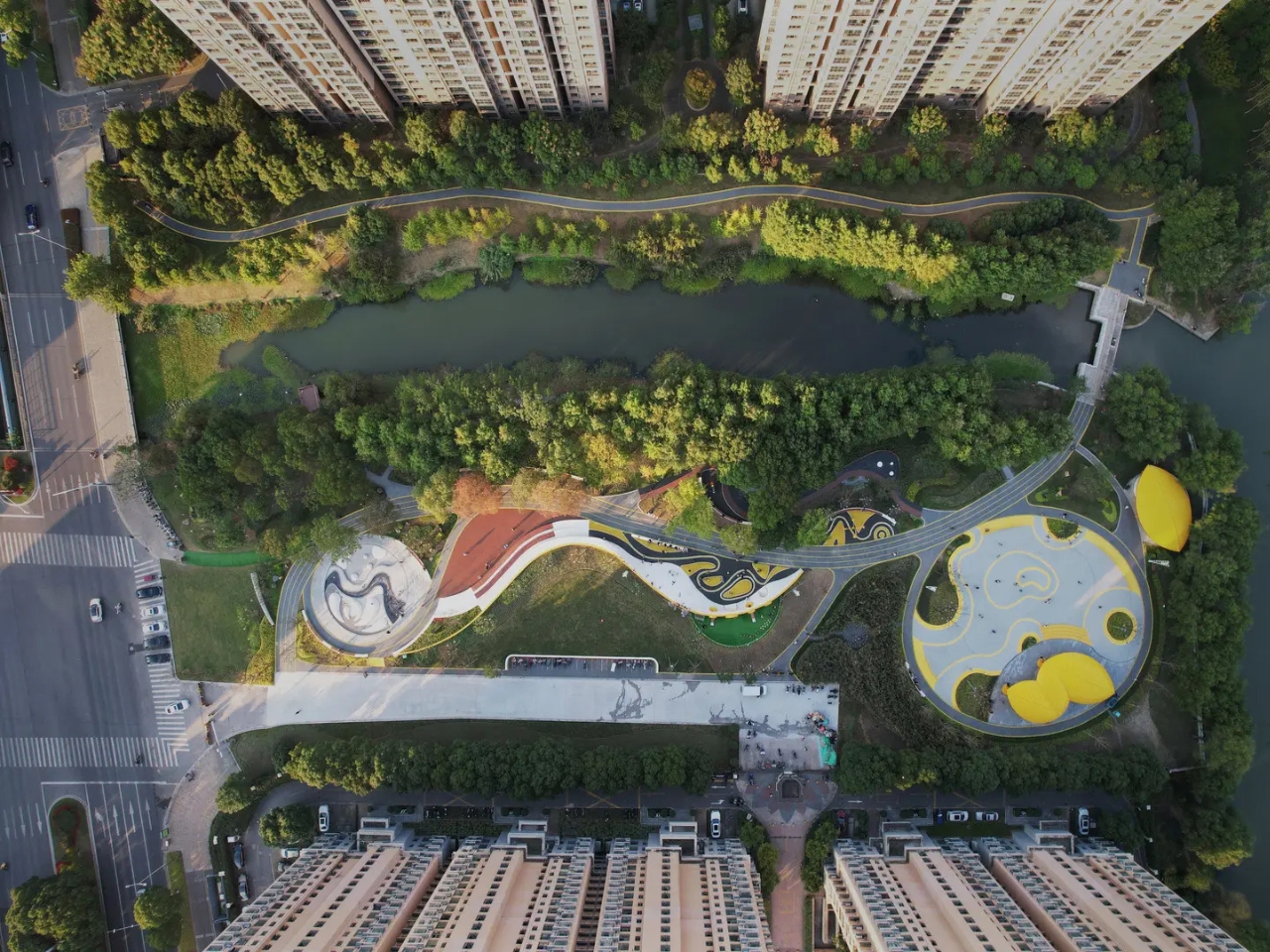
The park sits in the Huaqiao Economic Development Zone, tucked between two high-density residential neighborhoods at the confluence of two rivers, covering 8,500 square meters. On paper, it sounds modest. In reality, it’s the kind of project that makes you wonder why more cities aren’t doing this.

Designer: SoBA

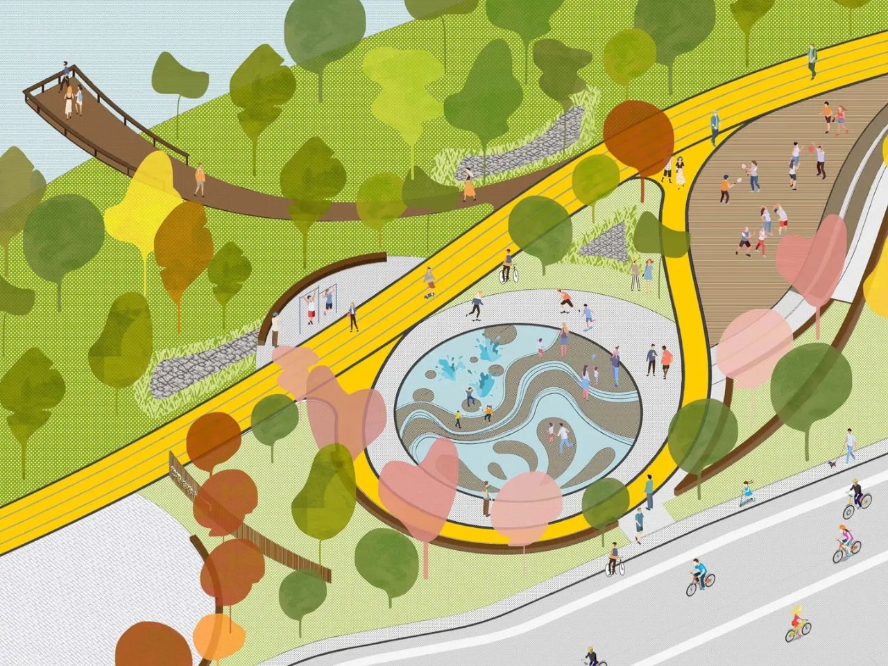
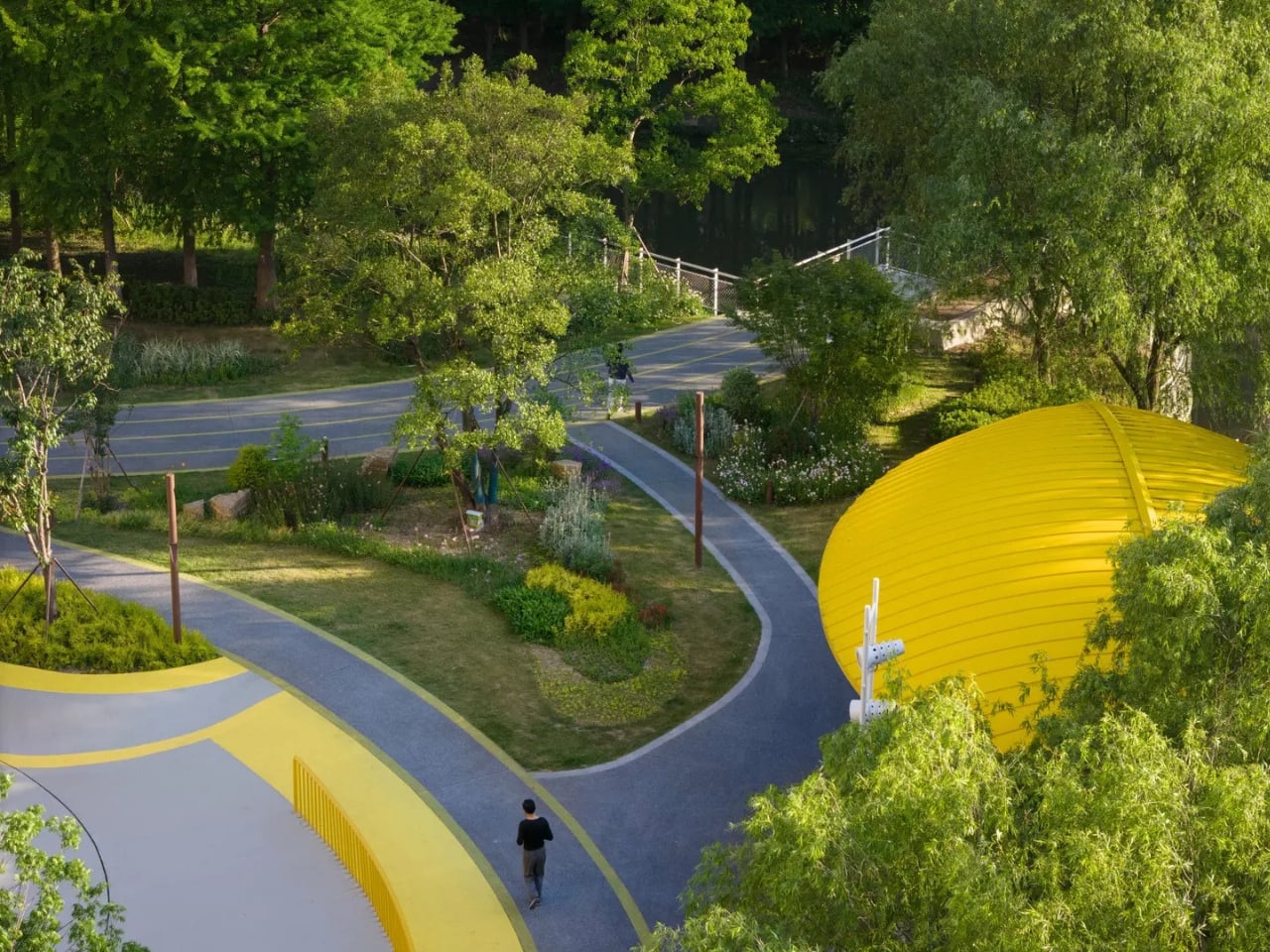
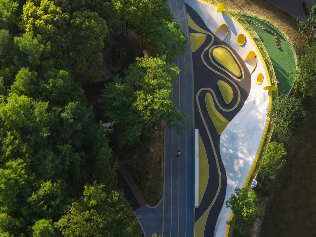
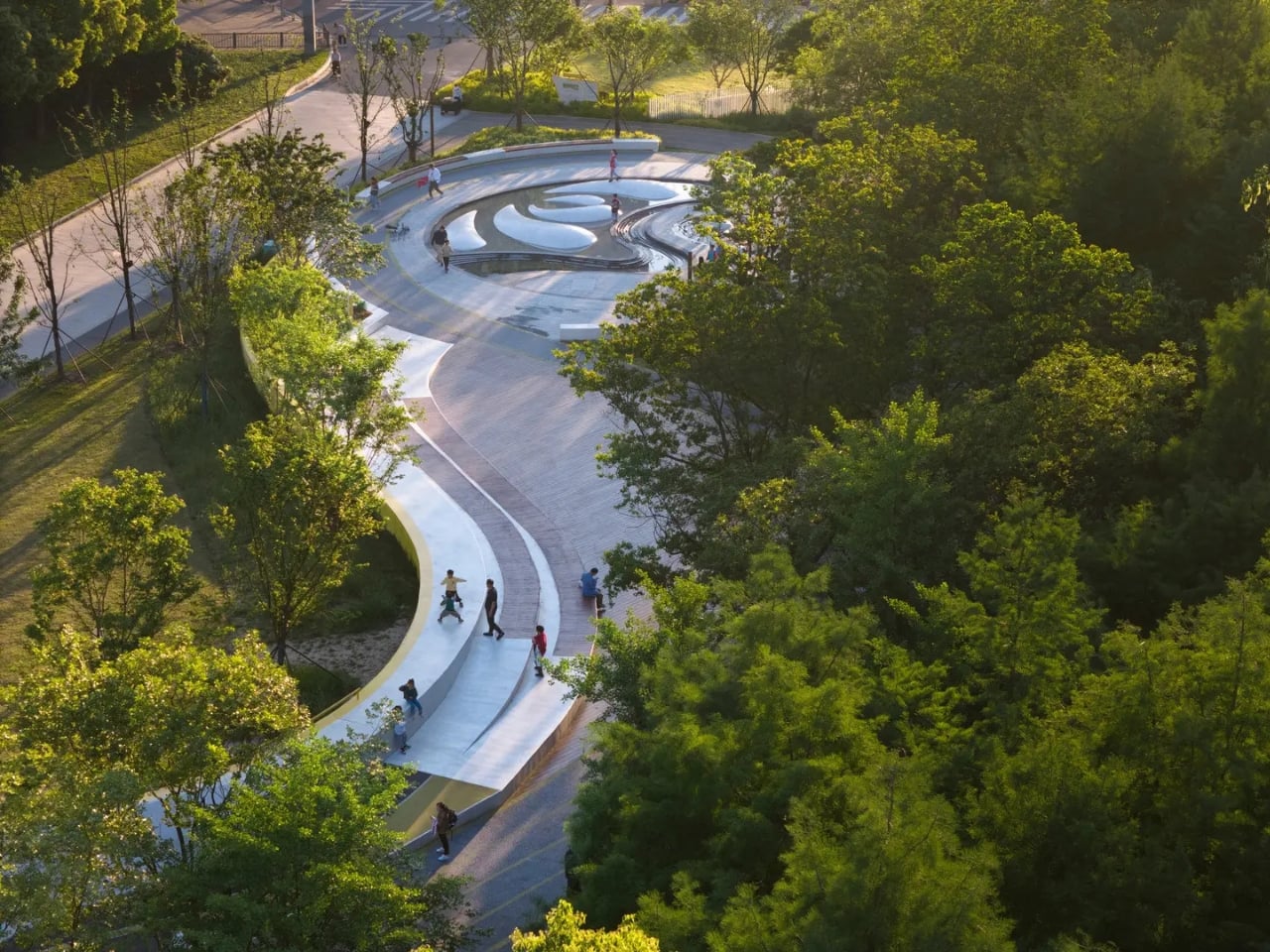
The entire design draws from sizhu music, a traditional form of Jiangnan Silk and Bamboo music recognized as part of the area’s intangible cultural heritage. Played on instruments like the bamboo flute and erhu, sizhu is known for its graceful, flowing melodies. SoBA took that quality literally, translating the music’s “curves and rhythm” directly into the park’s physical forms. The jogging path follows the curves of musical instruments. The layout flows rather than divides. Scattered throughout are interactive, trumpet-like music installations that double as sculptural features. It’s the kind of design move that could easily feel gimmicky, but here it reads as genuinely considered.

What makes it work, I think, is the restraint. SoBA’s founding partner Ruo Wang described the challenge as integrating park facilities “without disrupting the ecological balance.” The site already had mature camphor and dawn redwood trees, as well as nearby wetlands, and the team made a deliberate choice to keep those elements intact rather than clearing the slate for something new and shiny. That’s not a small thing. That decision alone separates Orchestra Park from a lot of contemporary public projects that bulldoze their context in the name of design.

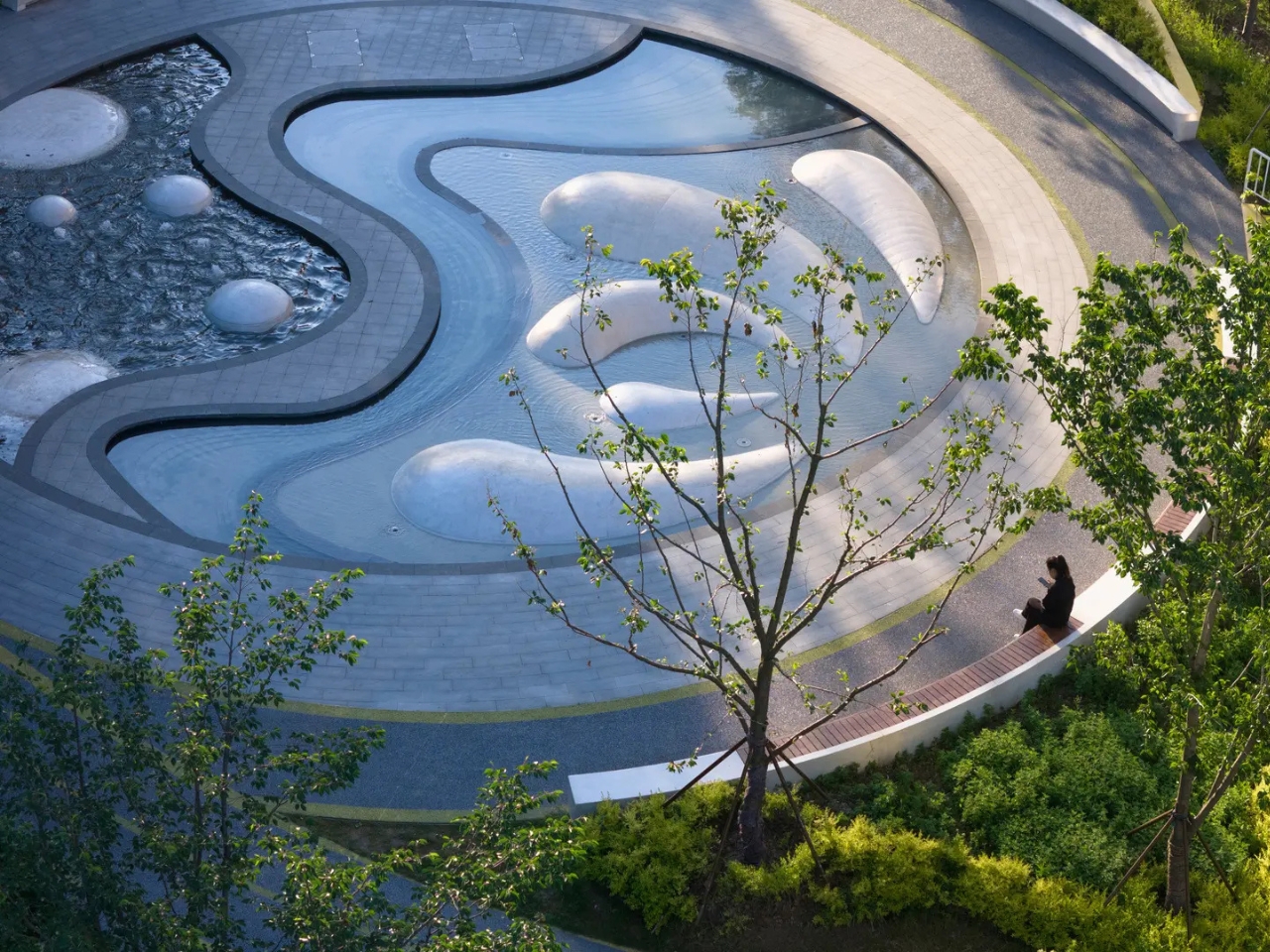
The spatial program is surprisingly layered for something under a hectare. There’s a skatepark, a climbing area, a fitness playground, an open-air theater, bamboo grove pathways, a musical fountain plaza, and a small music classroom. A viewing platform extends out over the wetland at the northwest corner, and a small bridge leads to a winding path that loops the entire park and connects back to the surrounding neighborhoods. It’s a lot to pack in, and yet nothing about the space feels cluttered. The geometry is precise, combining straight lines and tangent arcs to create what the team describes as a “fluid yet rational form.”

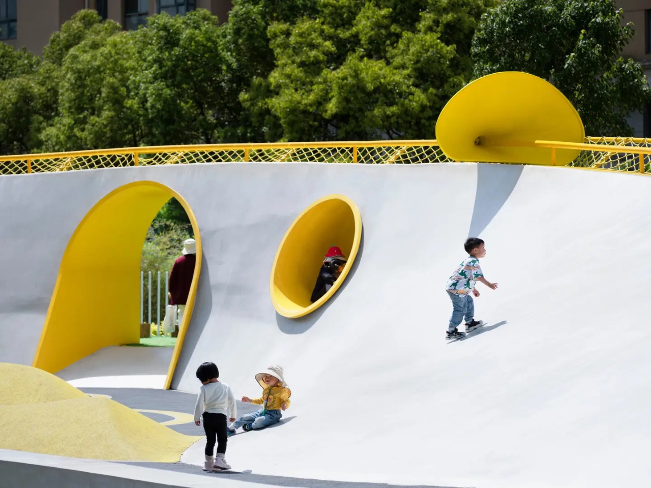
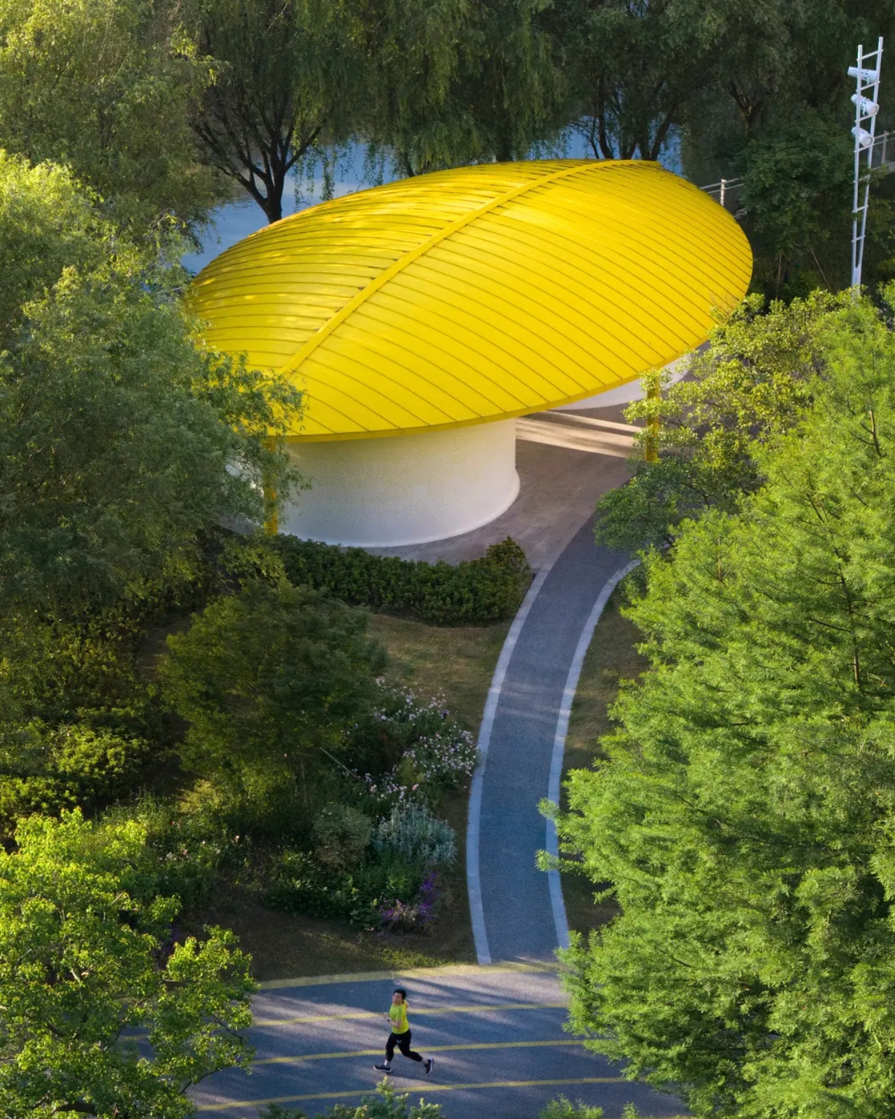
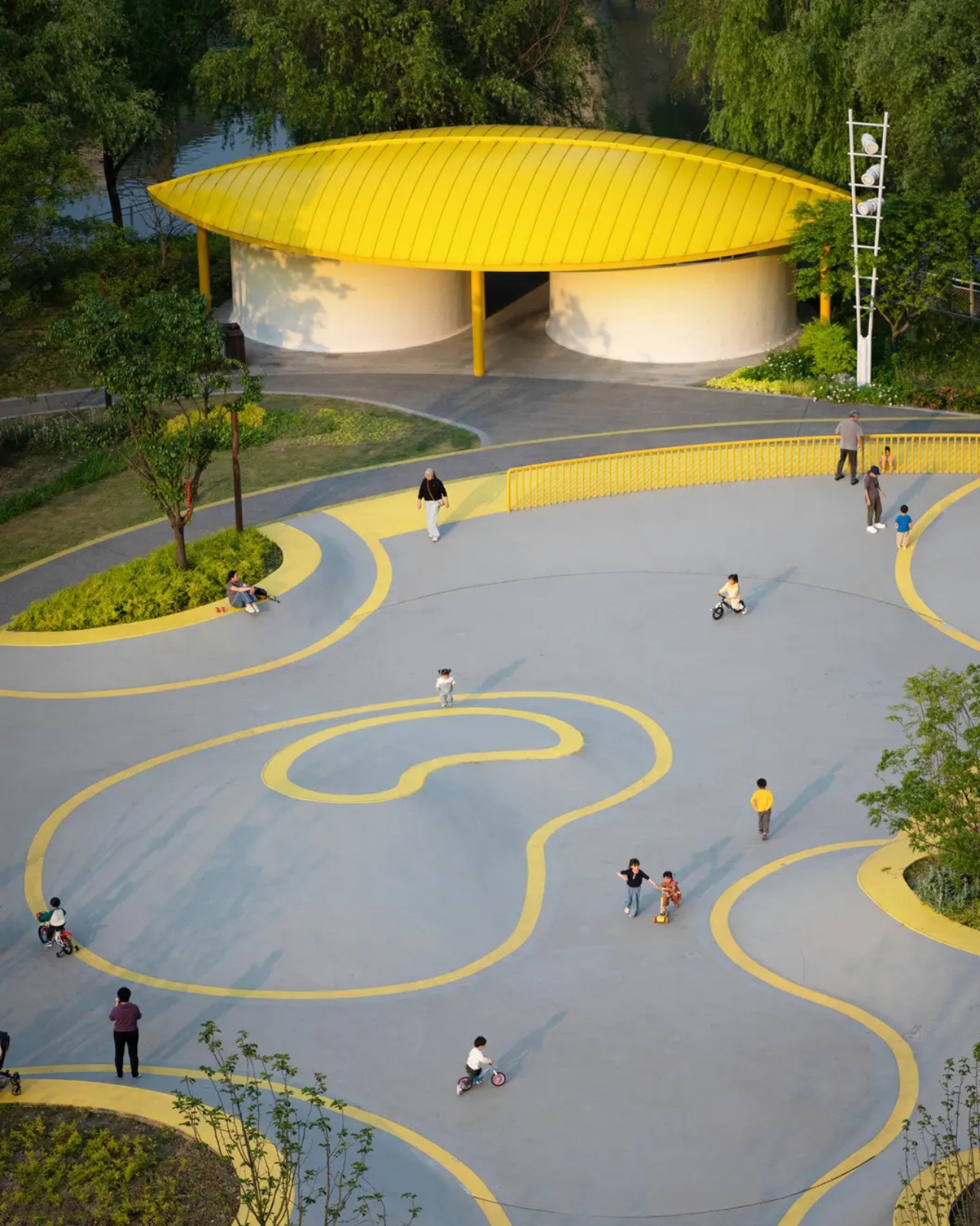
And then there’s the yellow. Bright, saturated, impossible to ignore. SoBA used it as an accent throughout: on the music installations, balustrades, planters, the lines of the running track, and a series of tunnels punched through a curved wall. It’s an unapologetically bold choice in a project that otherwise prioritizes softness and nature, and it works precisely because of that contrast. The yellow pulls you through the park like a visual thread, giving the space both coherence and energy. At the eastern end, cylindrical restroom structures are topped with leaf-shaped aluminum canopies, also yellow. Even the infrastructure has a personality here.

SoBA operates under a philosophy they call “Soft Build,” which emphasizes agility, sensitivity, and inclusiveness. That framing might sound like the kind of thing you’d read in an architecture brief and promptly forget, but Orchestra Park genuinely backs it up. The space serves children, skaters, fitness enthusiasts, music lovers, and people who just want to sit near trees. It doesn’t force a single narrative onto its users. That kind of openness is harder to design than it looks.

Public parks are often where design ambition goes to die, buried under budget constraints, committee approvals, and the pressure to please everyone at once. Orchestra Park sidesteps that fate by doing something deceptively simple: it starts with a cultural idea, commits to it fully, and lets everything else follow. The result is a park that doesn’t just serve its community. It reflects it.

The post How a Park in China Made Public Space Feel Human first appeared on Yanko Design.

Georgia Is Building a Chess Palace That Looks Exactly Like a Chessboard

Georgia has a claim on chess culture that goes deeper than most countries appreciate. The nation has produced grandmasters at a rate disproportionate to its size, and the game is woven into its educational and cultural identity in ways that feel genuinely foundational rather than ornamental. Given that context, the decision to build a dedicated Chess Palace in Batumi reads as overdue rather than extravagant, the kind of civic investment that a country with this relationship to the game probably should have made a generation ago.

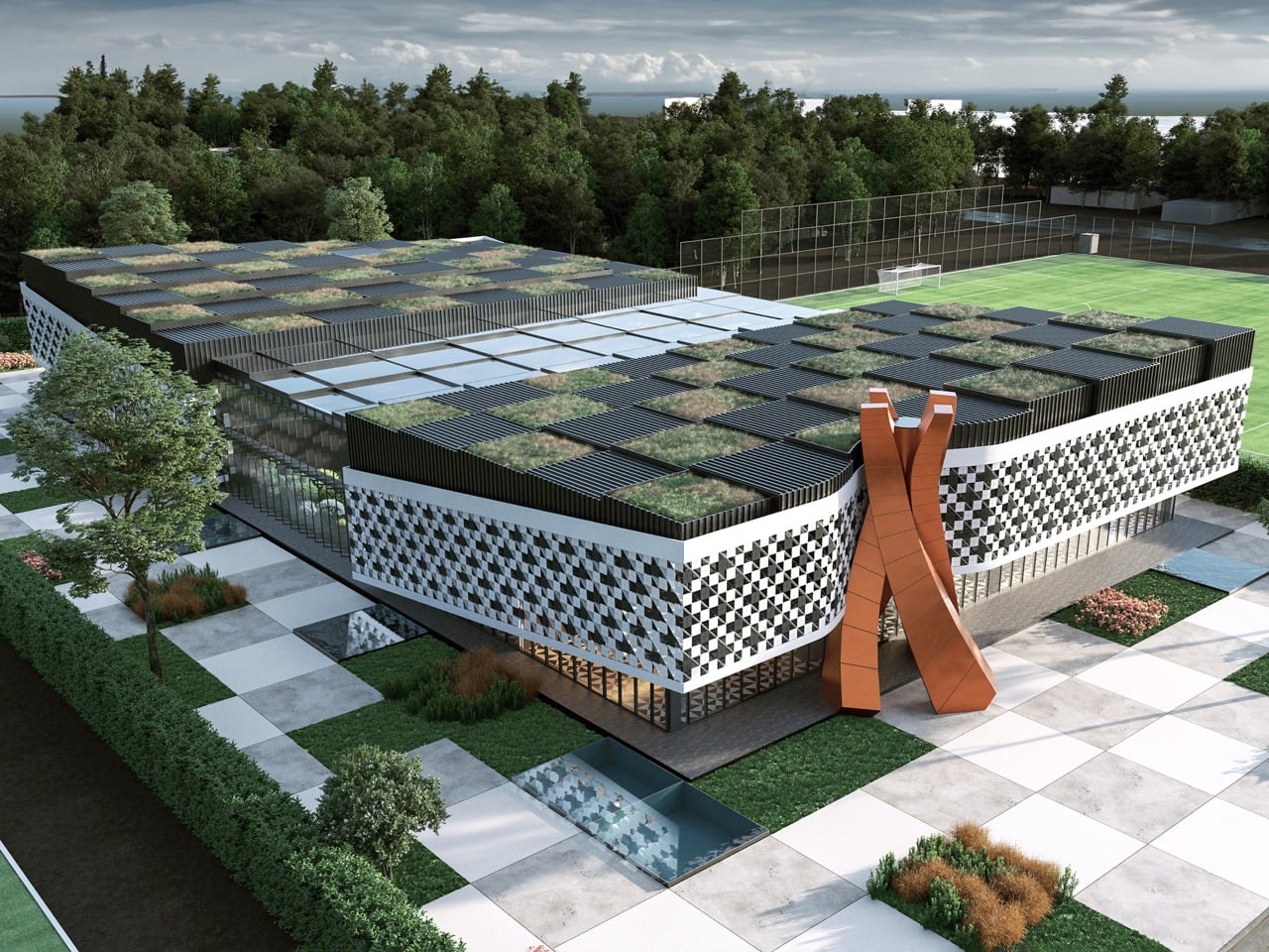
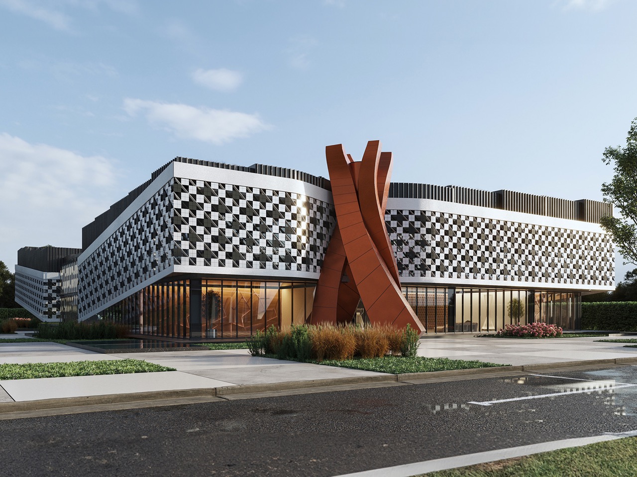
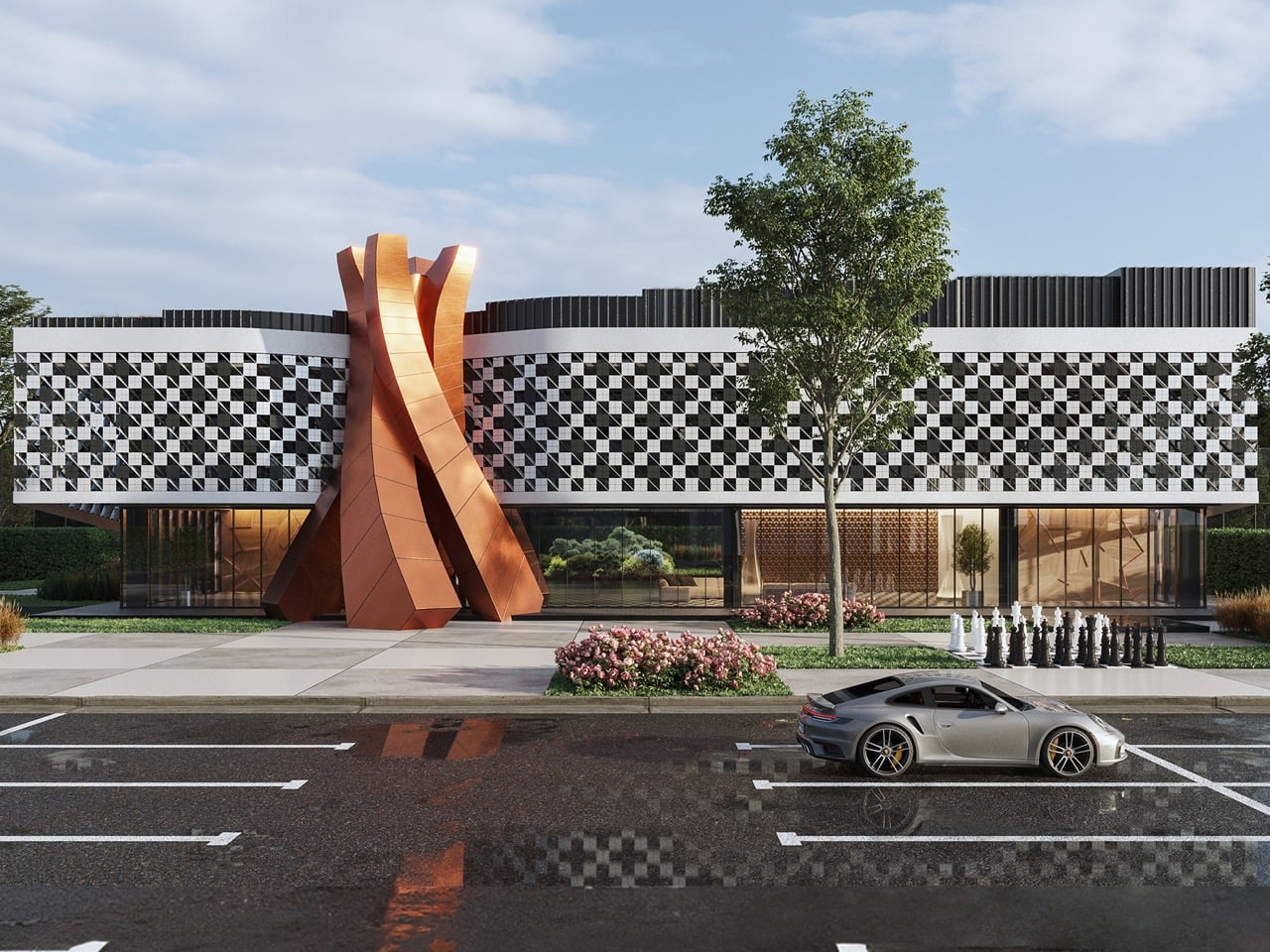
What makes the Batumi Chess Palace architecturally compelling is that Irakli Emiridze of Alpha Architecture refused to treat chess as mere decoration. The entire building is organized around the game’s visual logic. Its form references an unfolded chessboard, its facades use perforated solar shading to animate a black and white grid pattern with real-time light and shadow, and a dramatic sculptural installation marks the entrance as both functional threshold and symbolic statement. The two-story, 60-meter-deep structure is due for completion in 2027, housing a tournament hall, chess library, hotel rooms, exhibition spaces, a gym, and study rooms.

Designer: Irakli Emiridze, Alpha Architecture

Perforated solar shades wrap all four elevations in a dense, pixelated black and white grid that shifts in depth and shadow as the sun moves across it. In still photography, the building reads as a graphic object, clean and immediate. Experienced over the course of a day, the surface behaves more like a living board mid-game, its apparent pattern changing with conditions outside any designer’s control. That quality, the way the building changes without changing, separates a strong concept from a merely clever one. The HPL panel system that underlies the shading adds durability to what could have been a purely cosmetic gesture.

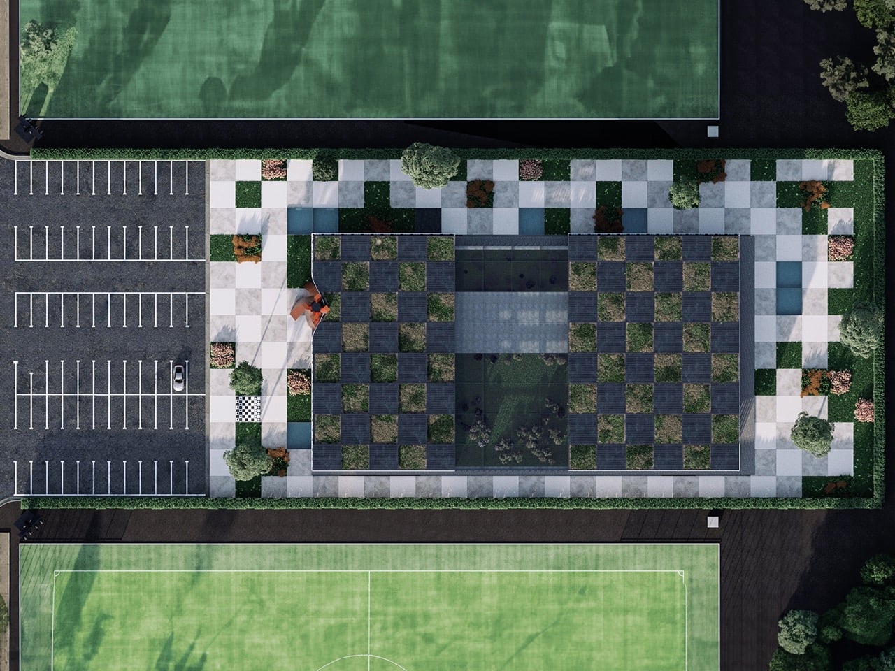
Emiridze has extended the chessboard geometry across the entire site rather than limiting it to the elevations. From above, the rooftop alternates planted green squares against glazed skylights in a grid that mirrors the facade pattern. The ground plane continues in oversized alternating light and dark paving squares that push the building’s visual field outward into the surrounding landscape. Every vantage point, aerial, street level, interior looking out, returns the same binary rhythm, a level of conceptual commitment that most thematic buildings abandon the moment it becomes structurally inconvenient.

Rather than placing a literal chess piece at the entrance, Emiridze commissioned a tall, twisting corten-steel installation, two interlocking curved fins spiraling upward into a form that hovers between abstraction and figuration. It suggests a chess piece without depicting one, which is the more intelligent move. A literal rook or knight would have read as theme-park signage. This form reads as architecture, and the warm oxide tone of the corten against the monochrome facade gives the building’s street presence a focal point that earns its scale.

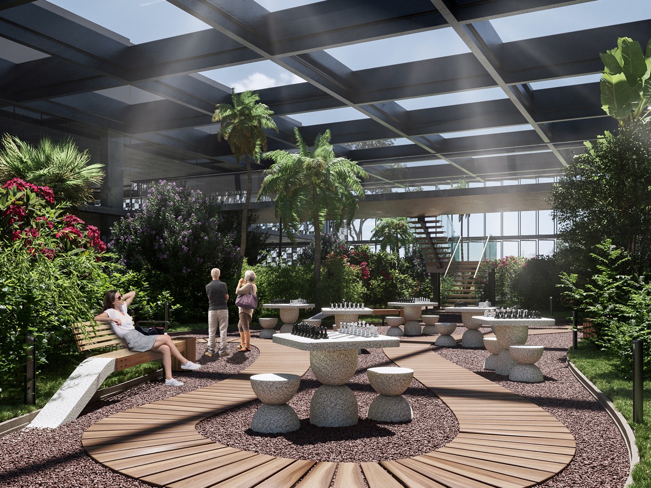
The program signals serious ambition for chess tourism. Beyond the tournament hall and study rooms, the building incorporates a chess library, exhibition space, conference facilities, a sports shop, a food facility, hotel rooms with two adapted for disabled visitors, and a gym. That breadth positions Batumi as a potential international destination for the chess world, a place where a grandmaster could arrive, compete, study, eat, and sleep without leaving the building. Alpha Architecture won this commission through a governmental competition, which means the Chess Palace carries public accountability alongside its conceptual ambition. The real test arrives in 2027, when Batumi either gets a landmark that genuinely serves its chess community, or a building that performed better on screen than on the ground. The bones are strong enough to be optimistic.

The post Georgia Is Building a Chess Palace That Looks Exactly Like a Chessboard first appeared on Yanko Design.

These 5 Playful Everyday Objects Were Designed to Make You Feel Like a Kid Again

For decades, “form follows function” shaped how you designed and lived. Minimalism stripped objects down to pure utility, where functional products like a chair were only a chair, or a lamp was only a source of light. That clarity once felt essential, but now it feels incomplete. We are moving into an era of playful functional design, where everyday objects reclaim character, becoming whimsical, unexpected, and slightly strange.

This shift is not about excess but about emotional precision. Function no longer ends at performance, but it extends into experience. Objects are designed to engage, surprise, and evoke emotion. A well-designed piece does not simply serve a purpose; it leaves a lasting impression.

1. Interactive Furniture Design

The era of the static, rigid sofa is fading as furniture begins to take on a more expressive role. Pieces are no longer designed to sit quietly in the background, but they carry presence through bold forms and modular compositions. Soft, blobby silhouettes and subtle anthropomorphic details transform chairs and stools into objects that feel almost alive, inviting interaction.

The real transformation lies in how people engage with these designs. Materials like memory foam and recycled plastics allow furniture to adapt to the body, shifting from passive to responsive. As a result, furniture moves beyond function and begins to feel more like a companion within a space. This shift creates interiors that are more intimate, expressive, and dynamic, where everyday objects actively shape the playful atmosphere.
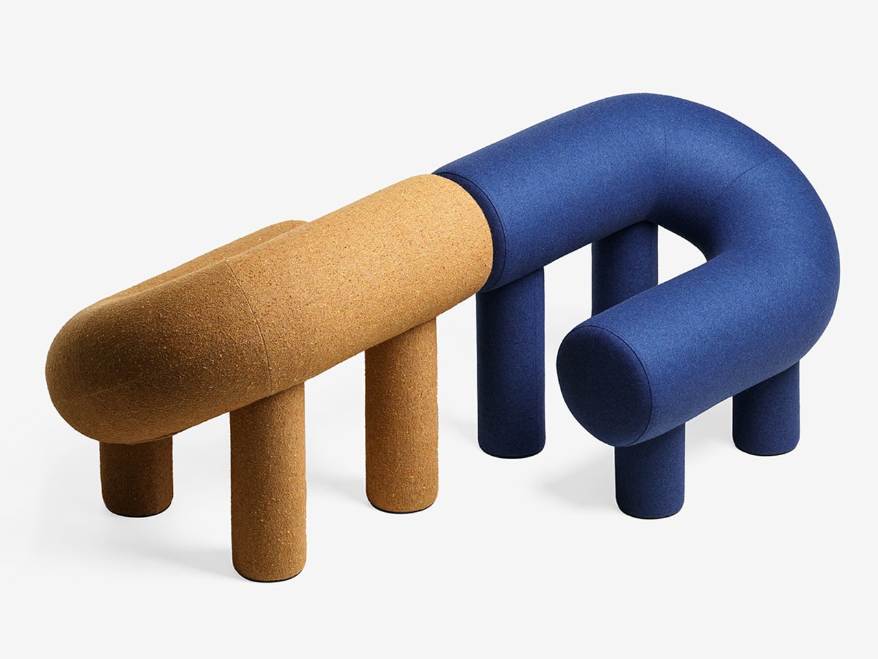
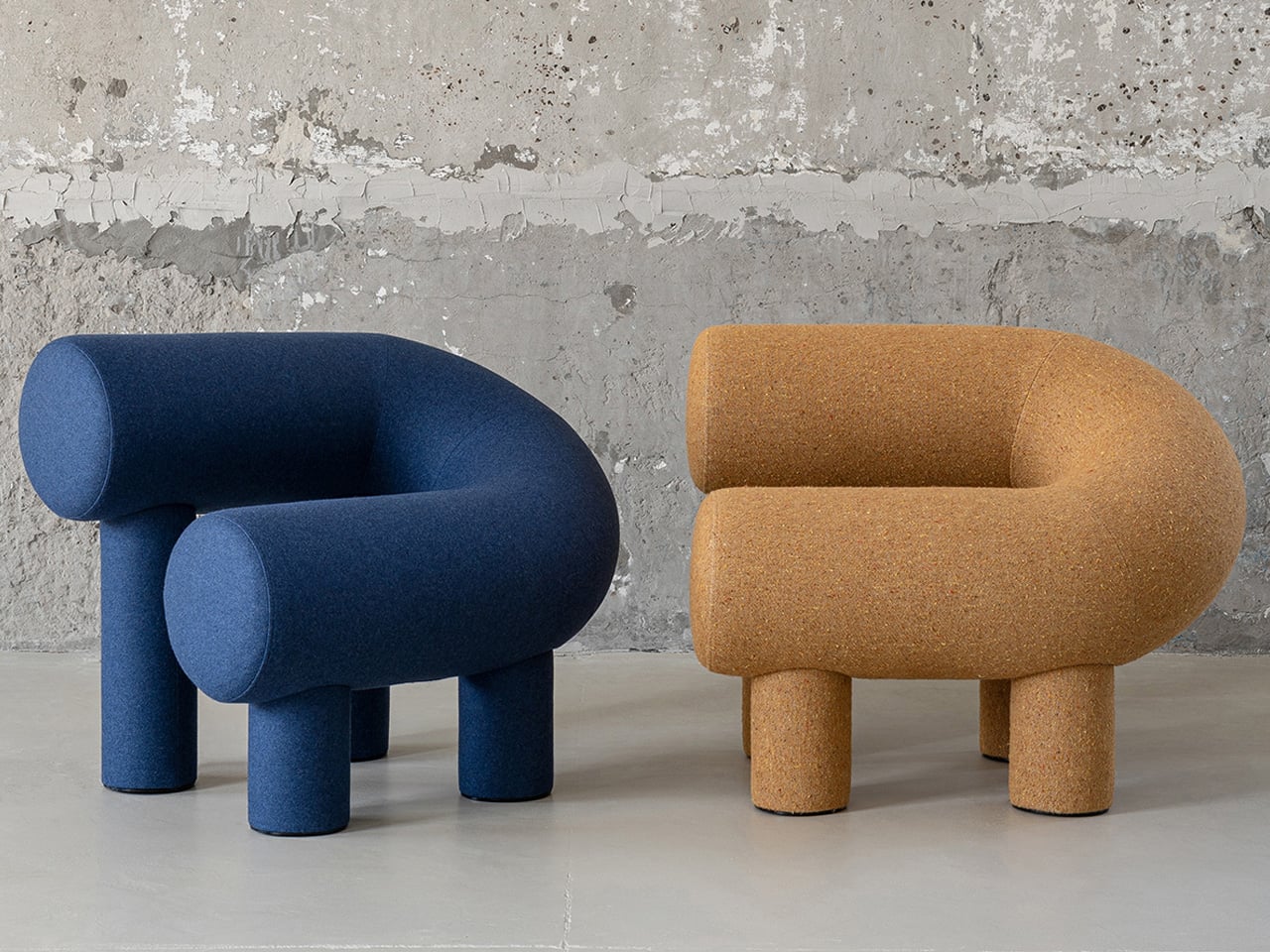
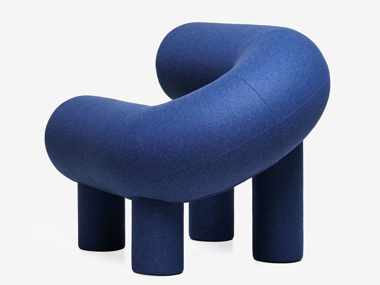
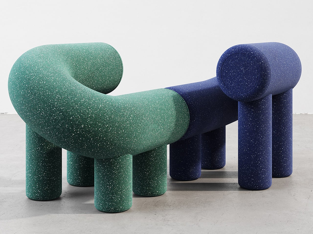
Playful furniture is reshaping everyday living, and the UMI Armchair by Rostislav Sorokovoy for Woo reflects this shift with ease. It moves beyond conventional seating, becoming an interactive object that sparks curiosity. Its bold, chunky form carries a soft, sculptural presence, giving it the character of a modern art piece. Designed to invite engagement, the chair encourages relaxed lounging and a more instinctive, almost childlike interaction.
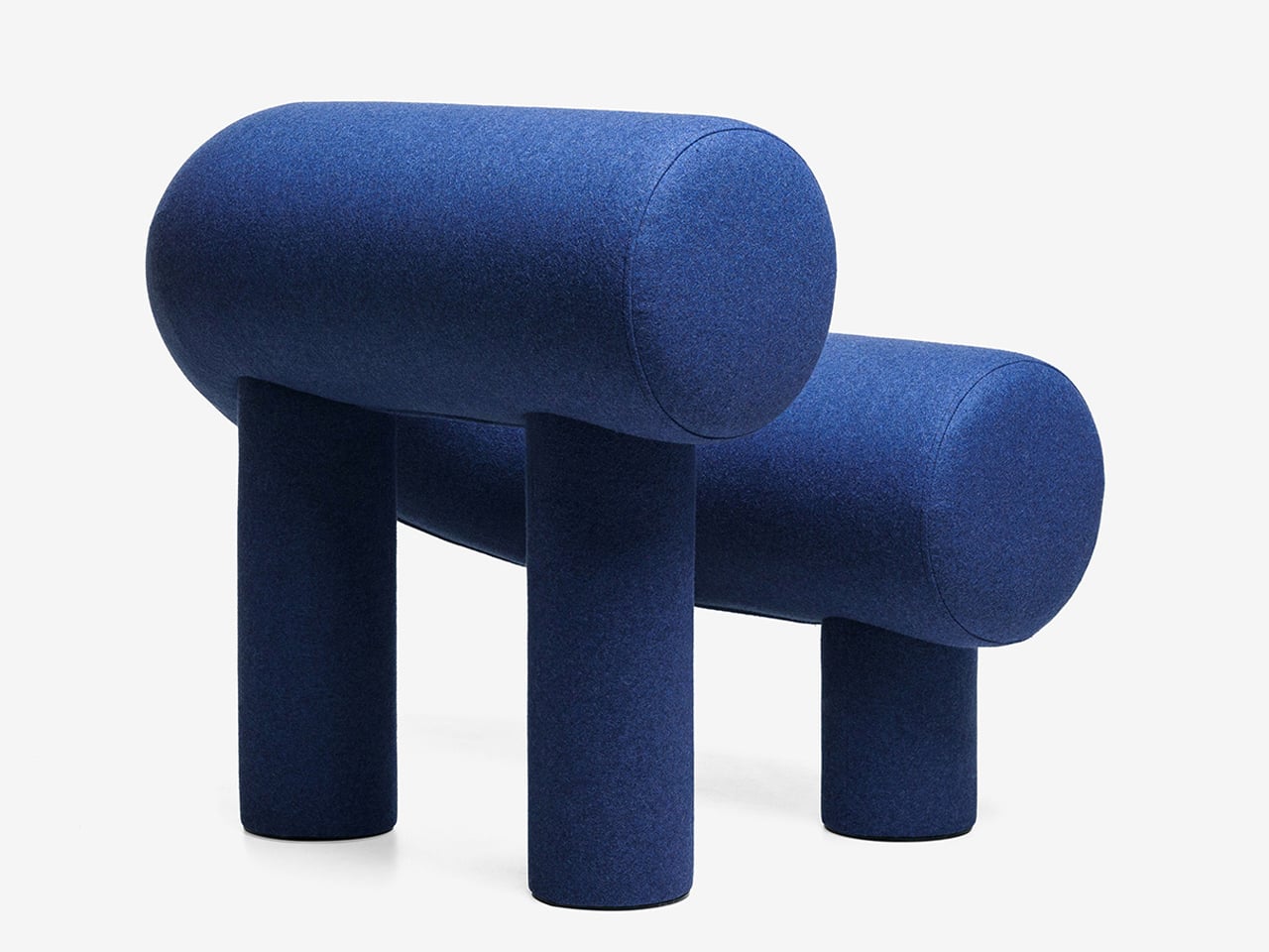
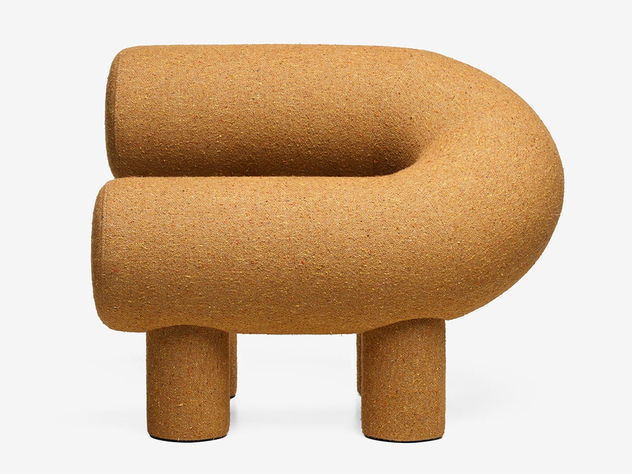
Its distinctive horseshoe shape is created using two cylindrical volumes, supported by four plush legs that provide both stability and visual charm. Constructed with a plywood frame, polyurethane foam, and textile upholstery, it delivers comfort alongside strong design appeal. While its scale may not suit compact interiors, it works effortlessly in larger spaces where its expressive form can stand out. Whether used alone or in pairs, it creates a seating arrangement that feels tactile, inviting, and visually dynamic.

2. Sculptural Light Design

Lighting has moved beyond pure function, evolving into something sculptural, immersive, and subtly performative. A fixture is no longer just a source of illumination as it becomes an object that encourages interaction. With hidden LEDs and responsive sensors, even the simple act of turning on a light feels more intentional, almost ritual-like.

The experience is defined by engagement. Some lamps require a physical gesture, like placing a glowing orb to activate them, while others shift form as they dim, echoing organic movement. When light is treated as a material to shape and experience, rather than just a utility, it transforms the mood of a space. Shadows gain depth, and dim corners turn into moments of intrigue, adding a layer of quiet wonder to everyday environments.
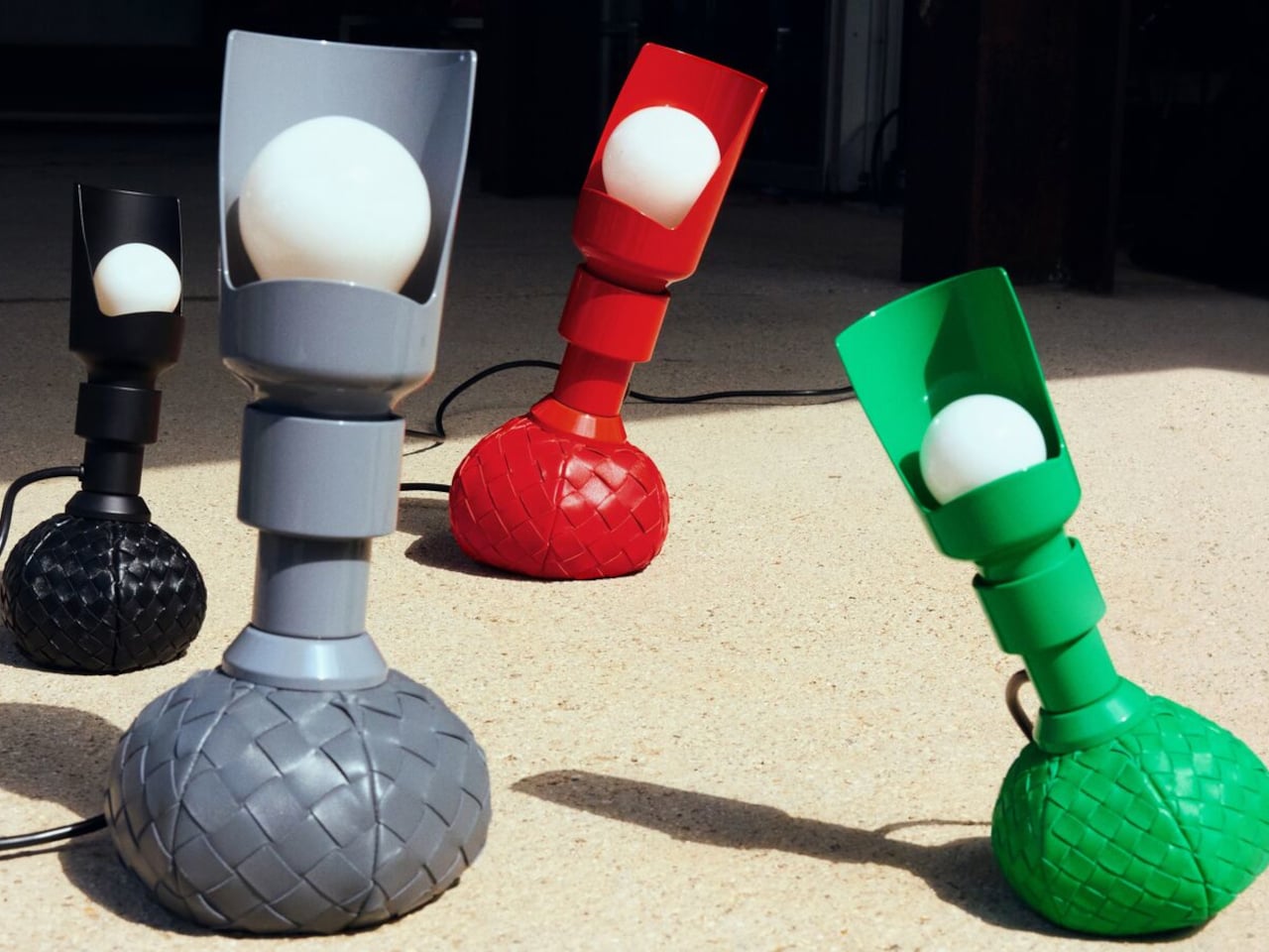
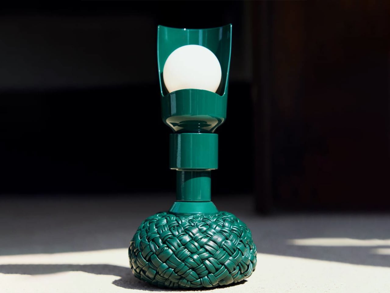
Lighting is often viewed as purely functional, designed to illuminate and enhance a space. Yet some designs move beyond utility, introducing interaction and character without feeling overly whimsical. The reimagined Model 600 by Bottega Veneta x Flos, created by Gino Sarfatti, captures this balance with ease. Its rounded base offers a soft, inviting presence, while the slender metal stem adds a refined contrast, resulting in a form that feels both approachable and sophisticated.
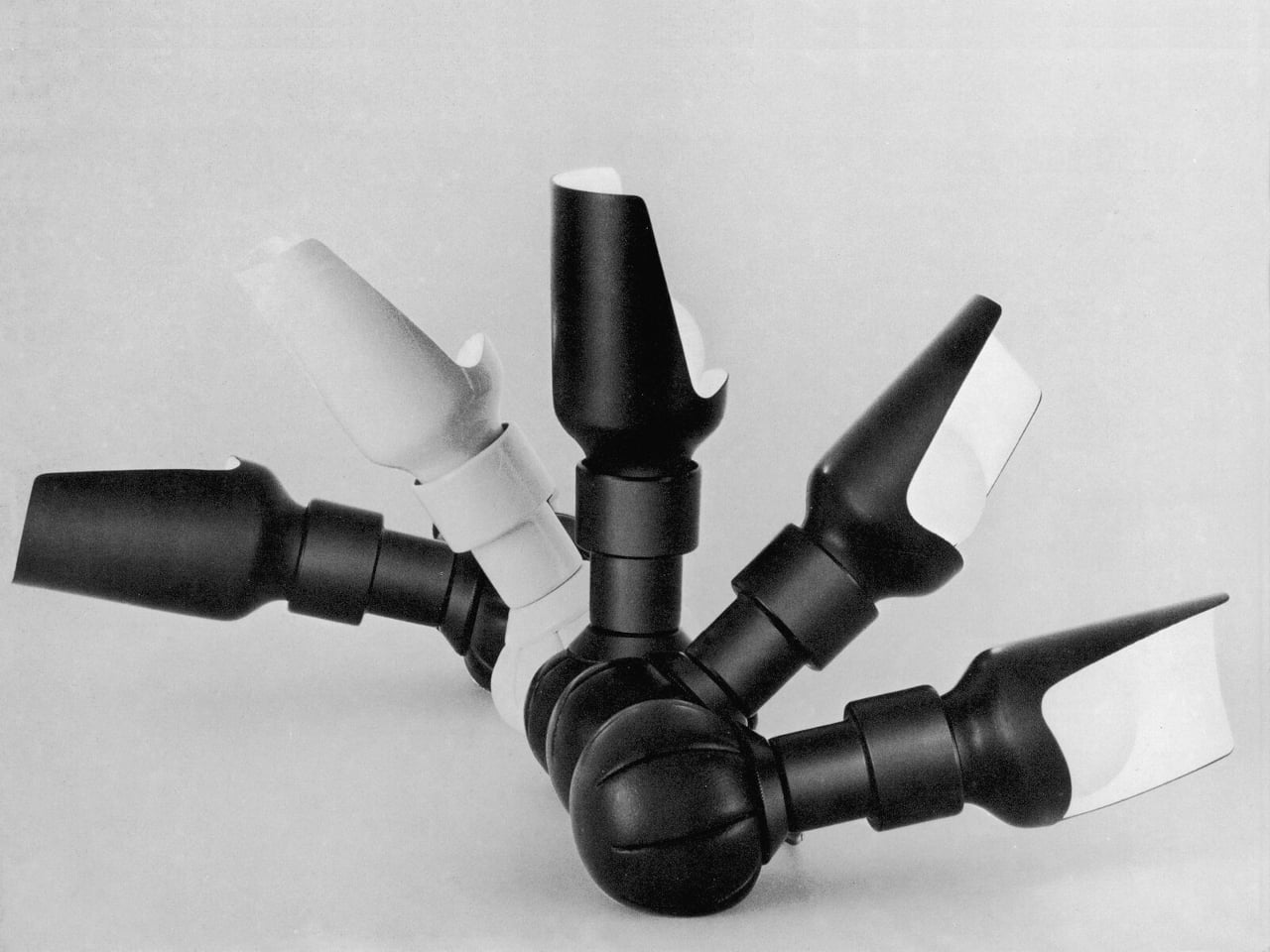
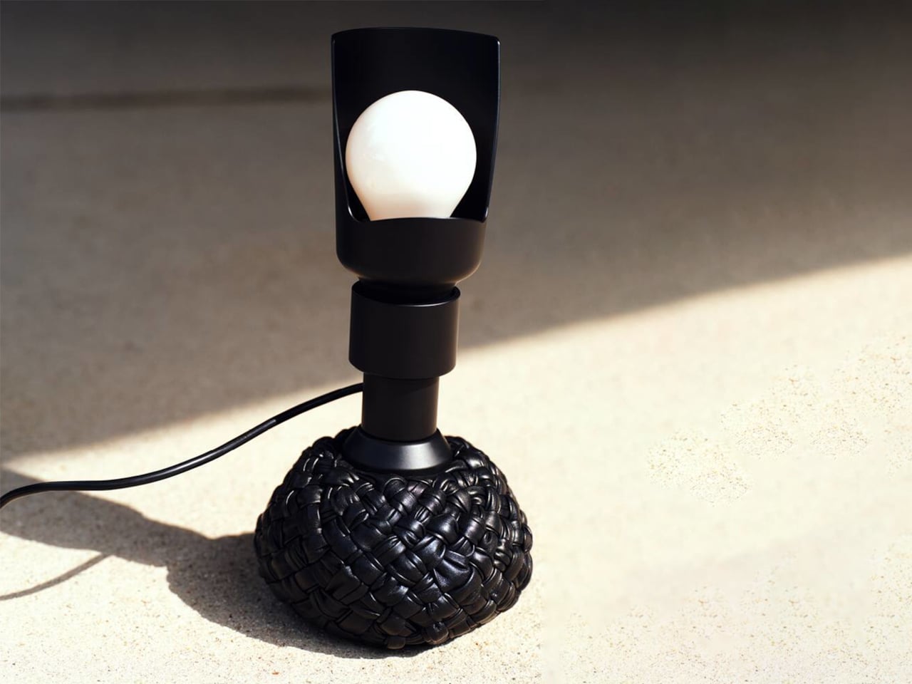
The original 1960s design embraced experimentation with a weighted leather base that could tilt without falling. The updated version retains this dynamic feature while introducing an interwoven leather texture that enhances its visual depth. Functionally versatile, it serves as a desk and floor lamp, with adjustable light direction through a curved reflector. Available in multiple sizes and colors, it merges structure with softness, creating a lighting piece that feels engaging, elegant, and enduring.

3. Playful Gadgets

Technology has long been defined by precision and restraint, often creating a sense of distance through its polished perfection. That gap is now narrowing, as a new generation of gadgets introduces softness, charm, and tactility. Drawing from “kawaii” influences and responsive design, these objects invite touch and emotional connection, from companion-like power banks to speakers that move and respond with sound.

The real shift is in how these devices are perceived and experienced. Tools once valued solely for efficiency are now designed as sensory interactions. A hard drive wrapped in soft silicone, yielding like a stress ball, blurs the line between utility and play. In this transition, technology becomes more personal and approachable, transforming everyday use into something warmer, lighter, and more human-centered.
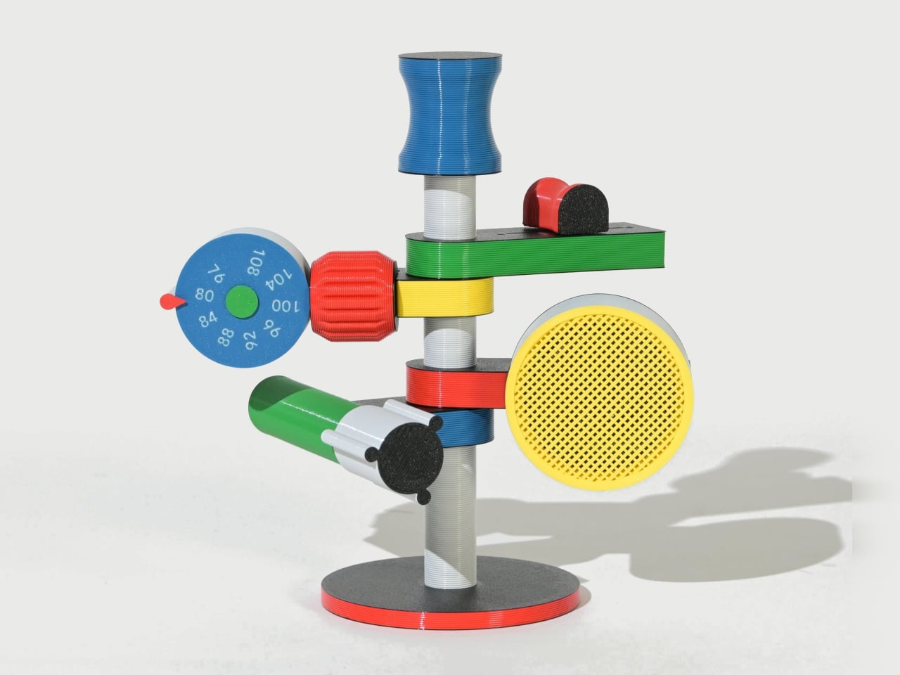
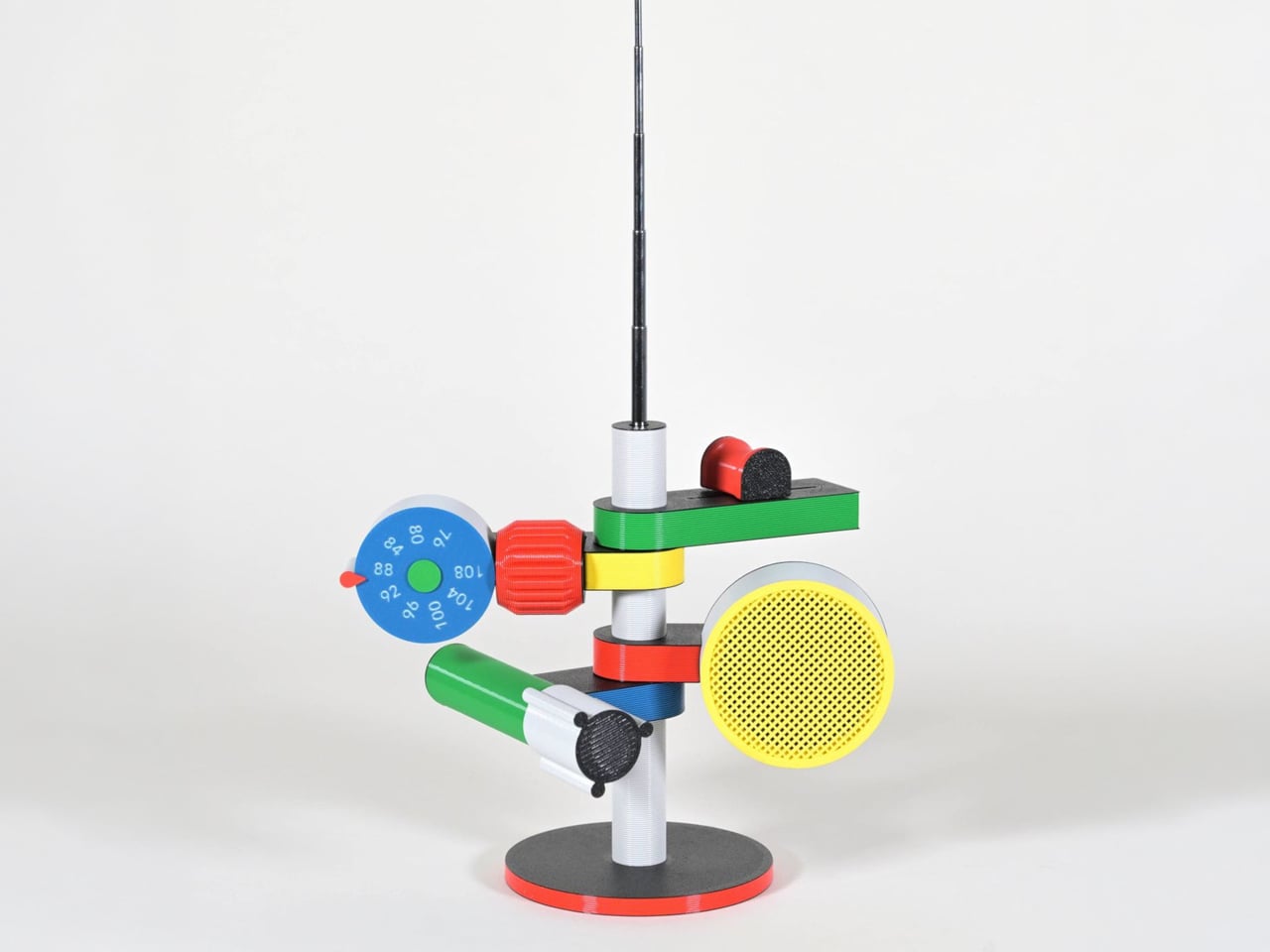
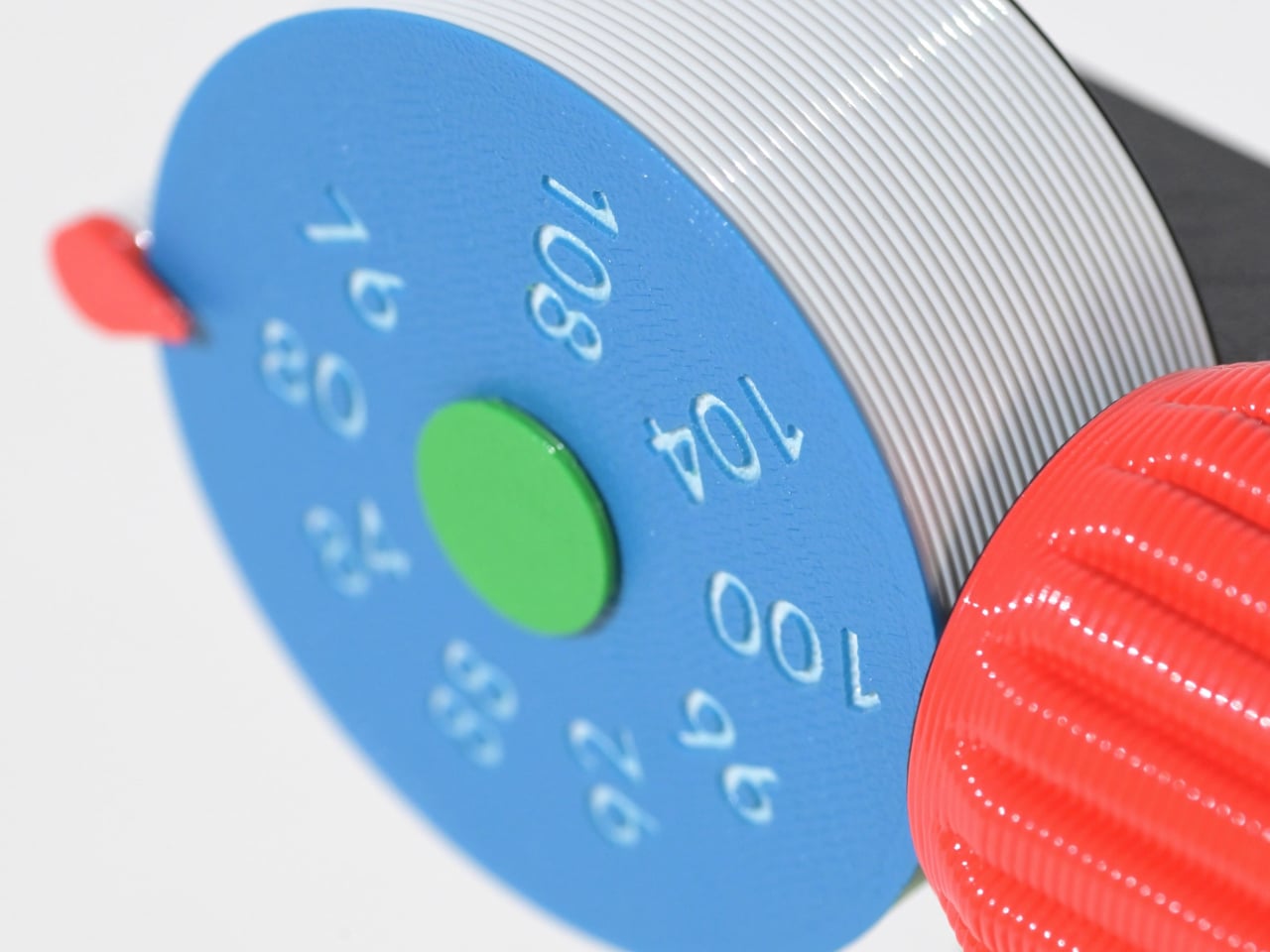
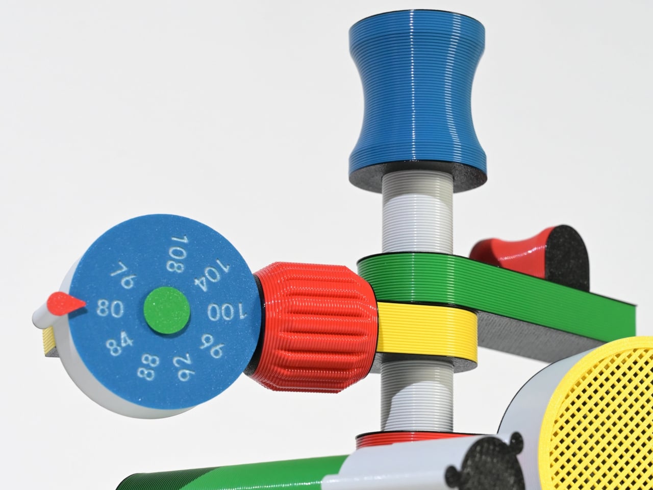
Some gadgets stand out not for precision or minimalism, but for their sense of character. The Anomalo FM radio by SHINKOGEISHA leans into this idea, presenting itself as an object that feels closer to a playful sculpture than a conventional device. With its bold colors and exaggerated form, it instantly grabs attention, sparking curiosity even before it’s switched on. The tall antenna anchors the design, while branching, limb-like extensions give it an almost animated presence.
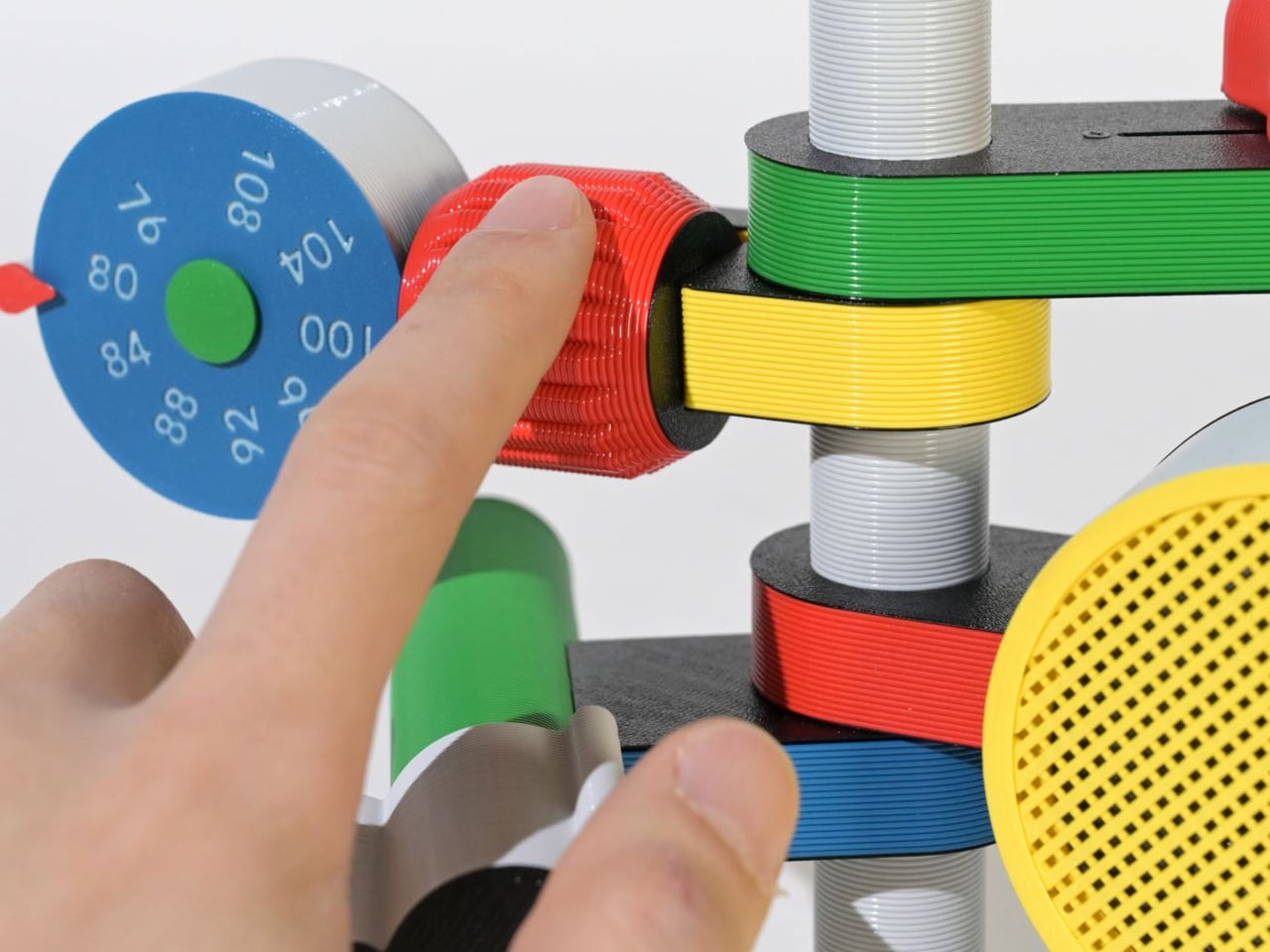
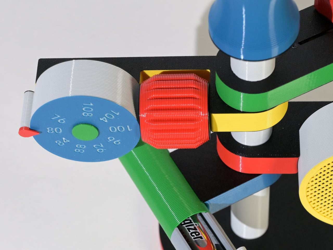
Each extension serves a clear function, creating a tactile, engaging experience. A roulette dial scans stations, a barrel controls volume, and a bold speaker projects sound, while exposed wiring enhances its expressive look. Made with PLA through digital fabrication, it favors creativity over polish, reflecting a shift toward more personal, experimental electronics.

4. The Joy of Stationery

Even in a digital world, the desk is becoming a space for quiet play. Stationery is no longer purely functional as it engages the senses. The focus has moved beyond simple aesthetics to how tools feel, respond, and enhance the act of making.

Erasable inks react to friction, washi tapes create layered compositions, and modular notebooks connect with magnetic precision. Writing no longer feels routine as it transforms into a small ritual, where thinking on paper feels intentional, creative, and deeply satisfying.
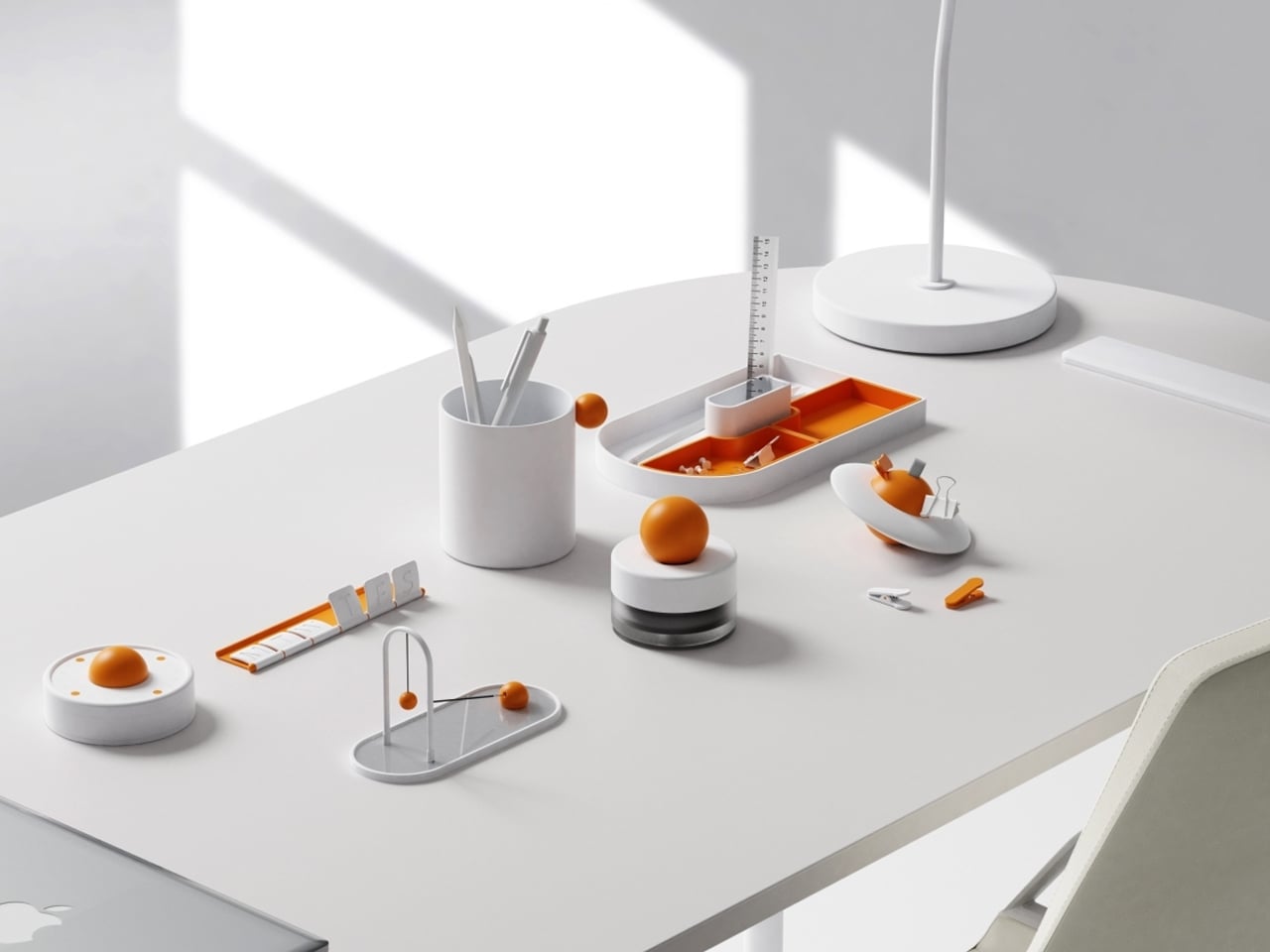

Objects on a desk quietly influence mood and thought throughout the day. While some environments lean toward minimal setups for clarity, others incorporate subtle moments of joy. The Madang collection by Jiung Yun, Siwook Lee, Jihyun Hong, and Junsu Lee brings these ideas together, balancing simplicity with a gentle sense of play inspired by traditional Korean childhood games.


Each piece translates a familiar activity into a functional object. A wrist tool references tug-of-war, trays mirror playful ground layouts, and clips echo movement-based games, turning routine actions into engaging interactions. Even more abstract elements, like a circular timer or sculptural pen holder, carry narrative undertones. Finished in a soft white and orange palette, the collection remains visually calm yet expressive, adding character without clutter while making everyday work feel lighter and more thoughtful.

5. Joyful Building Design

Playful thinking is extending into architecture, reshaping how buildings and cities are experienced. The rigid “gray box” is gradually giving way to environments that encourage curiosity and movement. Designers are introducing spatial surprises into everyday settings, from slides integrated into workspaces to hidden gardens within facades and windows that break rigid grids to filter light in unexpected ways.

These interventions go beyond visual appeal. They disrupt routine and draw attention to the surroundings. A burst of color or an unconventional pathway shifts perception, encouraging awareness and engagement. As a result, architecture moves beyond shelter, becoming more interactive and expressive while transforming the built environment into something dynamic, human-centered, and quietly uplifting.
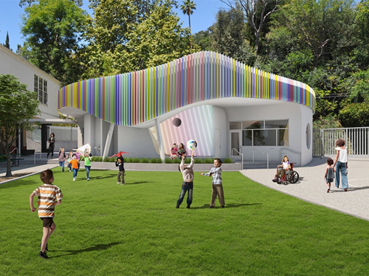
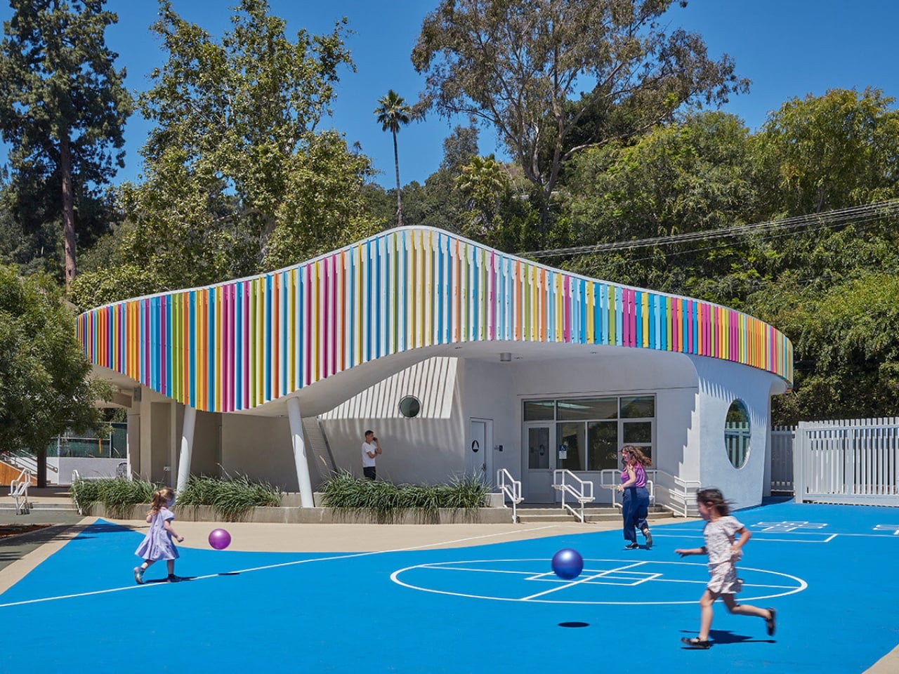
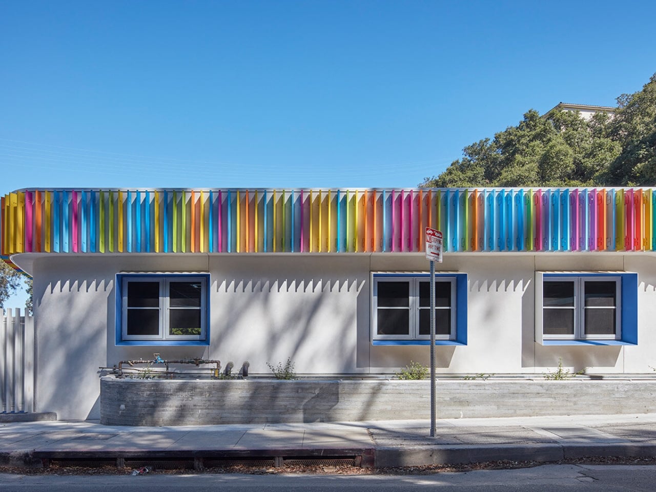
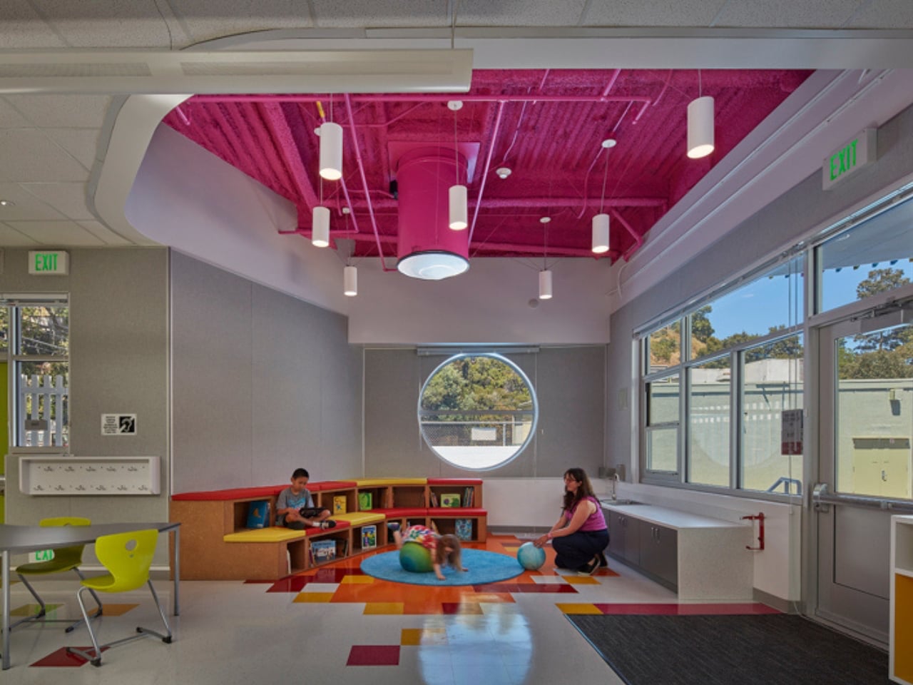
Most early school memories are tied to plain, boxy classrooms that felt more functional than inspiring. Spaces like these rarely encourage curiosity or creativity, making learning feel routine rather than exciting. In contrast, thoughtfully designed environments can shape how children engage with education. In Laurel Canyon, Los Angeles, Wonderland Elementary School’s new kindergarten building by John Friedman Alice Kimm Architects (JFAK) reimagines this experience through a design that feels open, engaging, and visually dynamic.
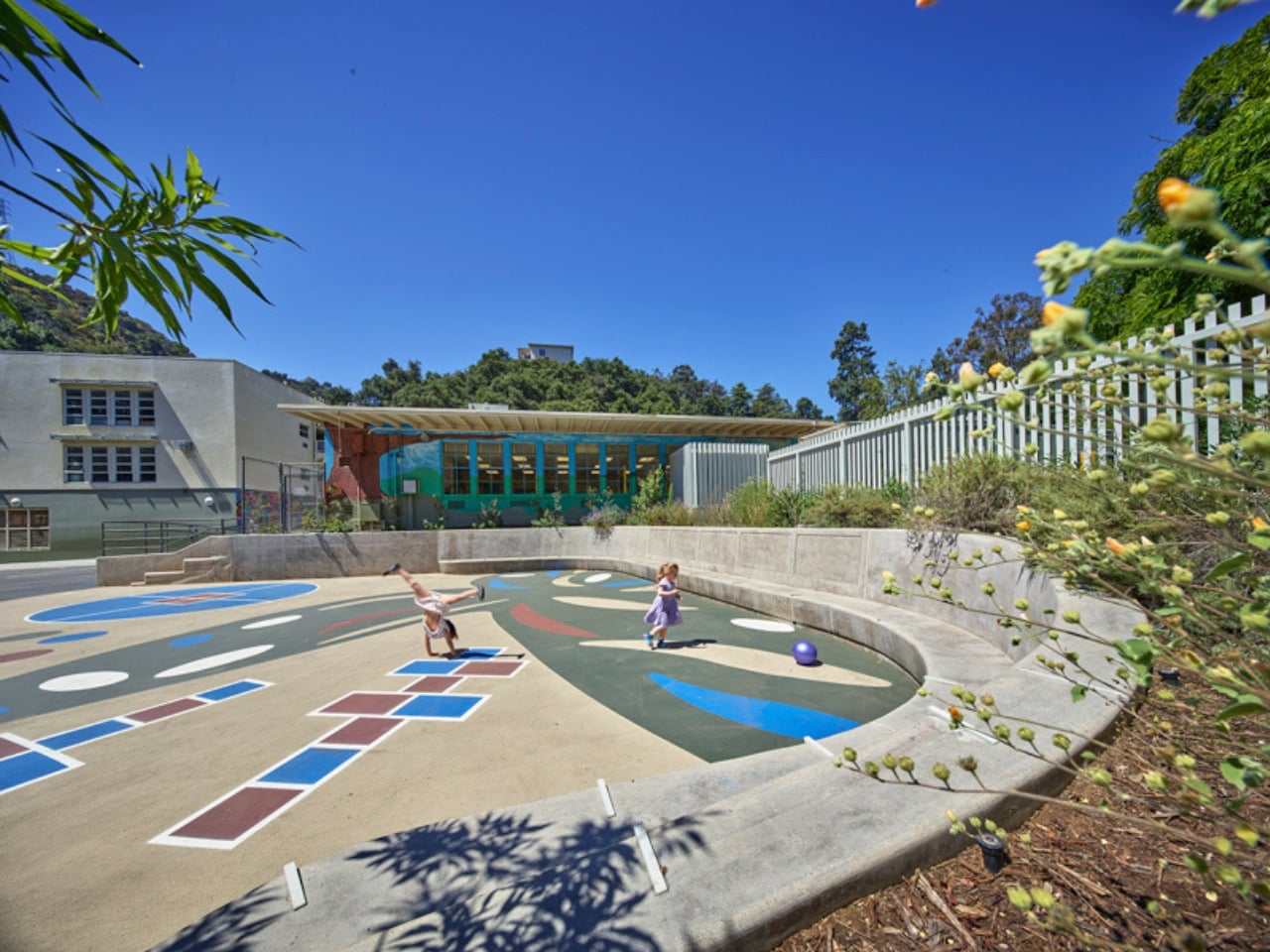
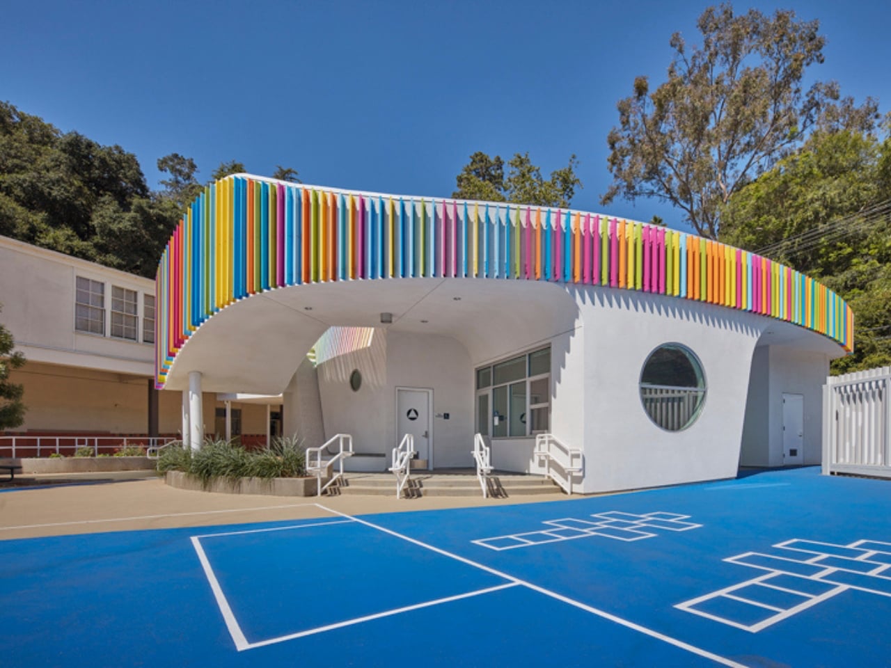
The structure stands out with its soft, curved form and colorful exterior louvers that filter sunlight into shifting patterns across the interiors. Inside, natural light pours in through skylights and solar tubes, creating a warm and welcoming atmosphere. Classrooms feature circular reading nooks, low seating, and accessible storage tailored for young learners. A semi-covered outdoor space encourages interaction and play, while exposed ceilings reveal structural elements, sparking curiosity. Designed with sustainability in mind, the building blends function with imagination, turning everyday learning into a more engaging and enriching experience.

Everyday objects still hold the power to surprise. When play enters function, design softens decision fatigue and digital burnout. Objects with wit and warmth transform spaces, turning routine into experience and making daily life feel more engaging, expressive, and alive.

The post These 5 Playful Everyday Objects Were Designed to Make You Feel Like a Kid Again first appeared on Yanko Design.
5 Containers, a Sauna, and a Rooftop Deck in Rural Vermont

The Vermont Villa by Backcountry Containers is the kind of build that makes you reconsider everything you thought you knew about shipping container homes. Not because it’s shocking, but because it’s genuinely, quietly good.

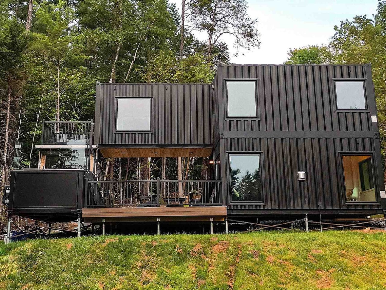
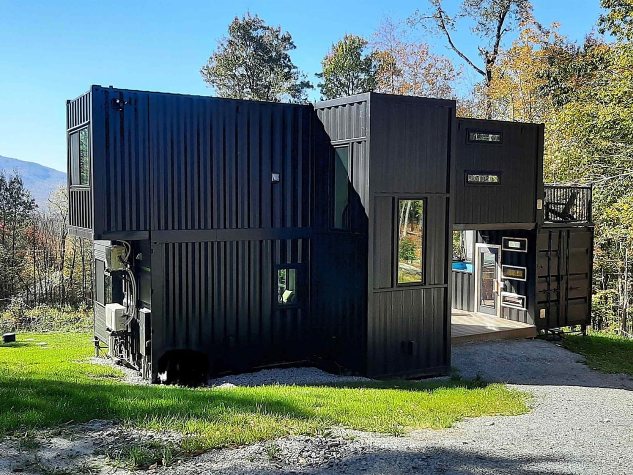
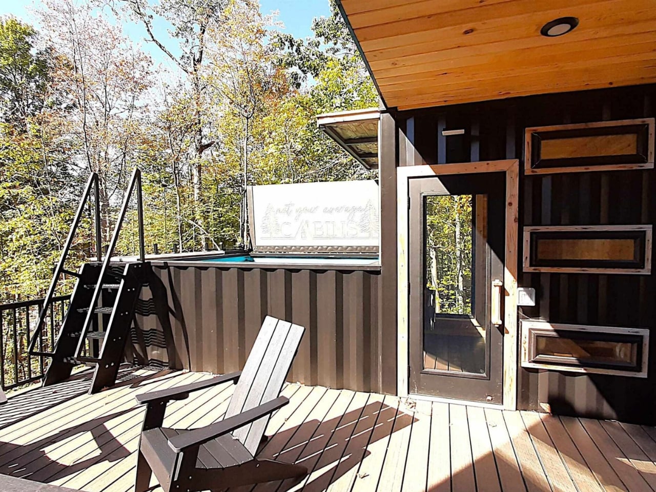
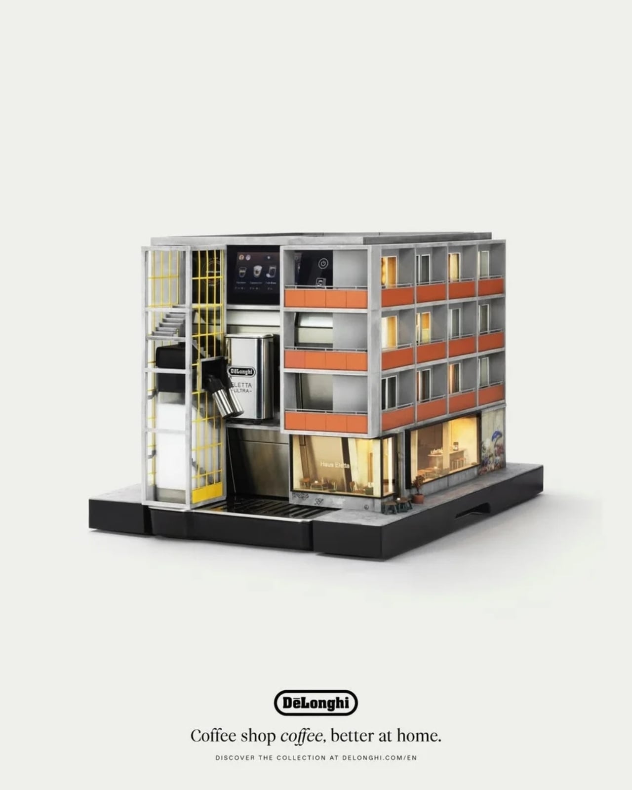
The running joke about container homes has always been that they’re either a clever budget hack or an architect’s ego project that ends up costing twice as much as a conventional house anyway. The Vermont Villa doesn’t entirely escape that conversation, but it does manage to sit on the more convincing side of it. Backcountry Containers, a family-owned U.S. builder, stacked and arranged five shipping containers (three 20-foot units, one 40-foot, and a custom 20-foot SaunaPlunge container) into a two-story, three-bedroom, two-bath home that sits quietly in rural Vermont and looks like it genuinely belongs there.

Designer: Backcountry Containers

All five containers are painted a uniform matte black, which sounds like it could go very wrong in the middle of the New England countryside, but it actually works. The arrangement is staggered rather than just linear, creating terrace spaces on multiple levels. Against trees and open sky, the structure reads as intentional rather than industrial. The heavy modification helps too: the containers have been cut up and fitted with windows and doors that give the home a proper architectural language, rather than looking like boxes with holes punched in them.

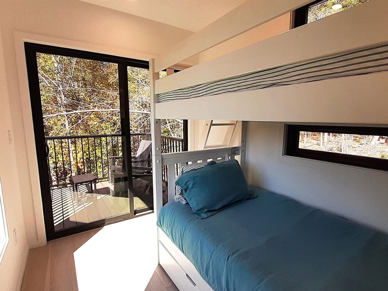
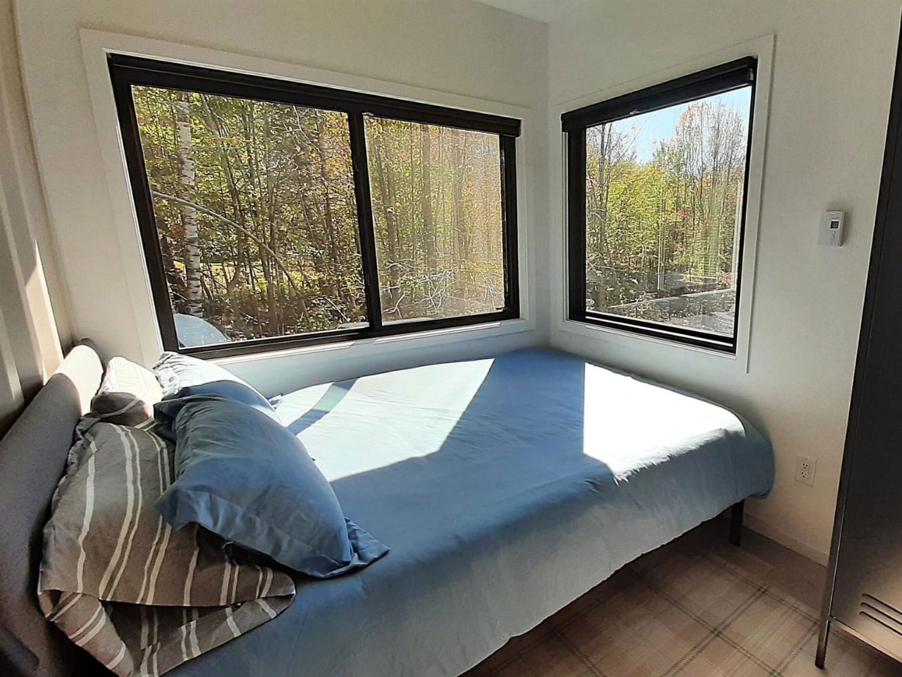
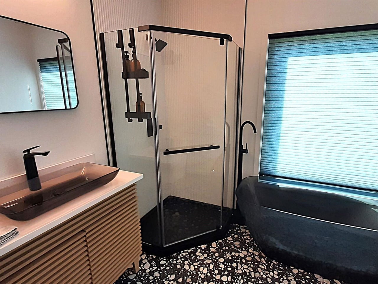
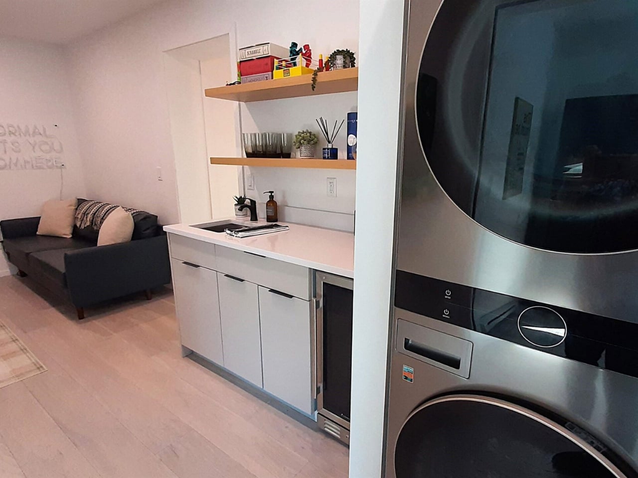
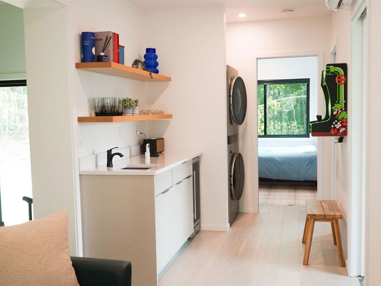
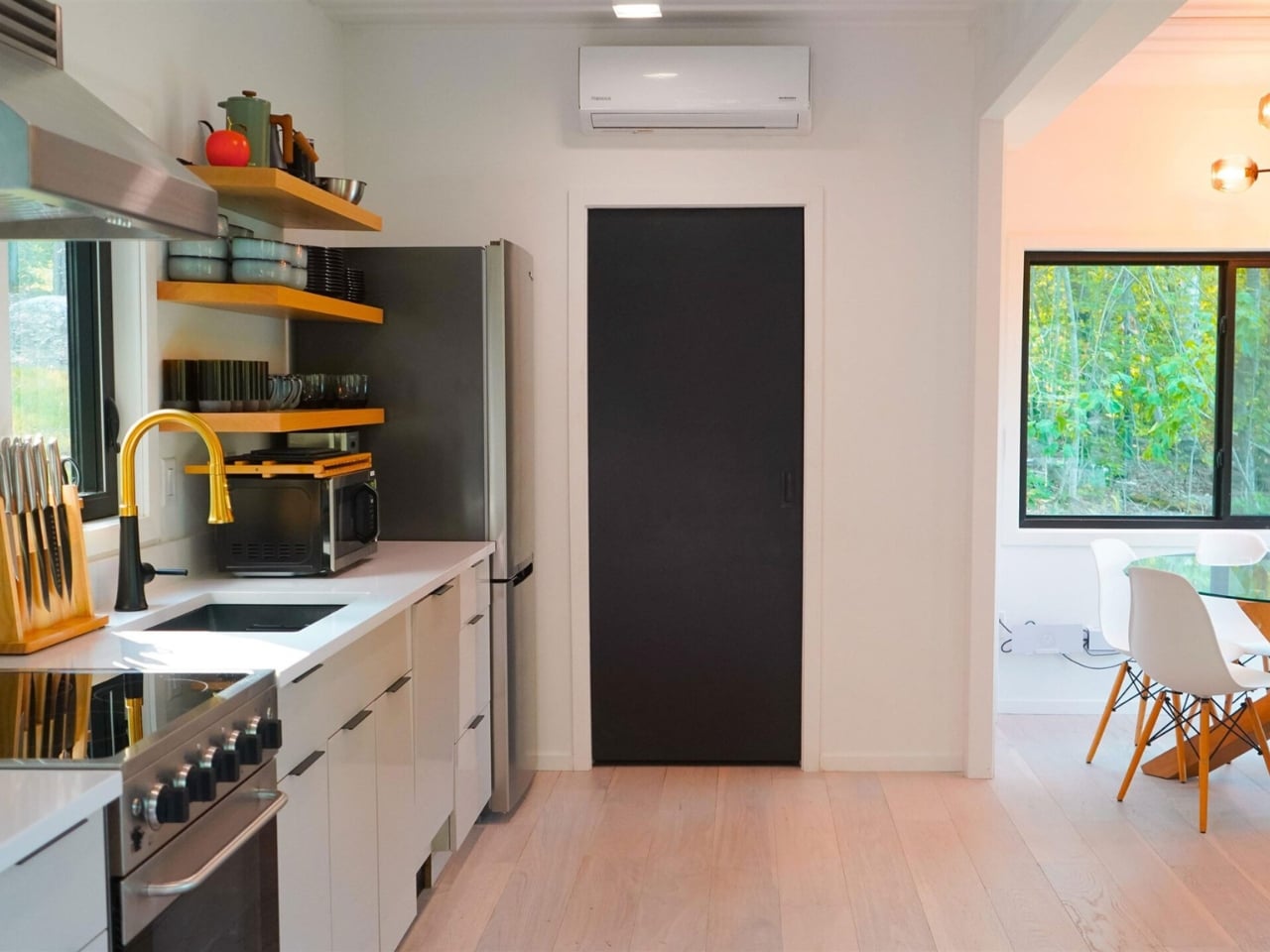
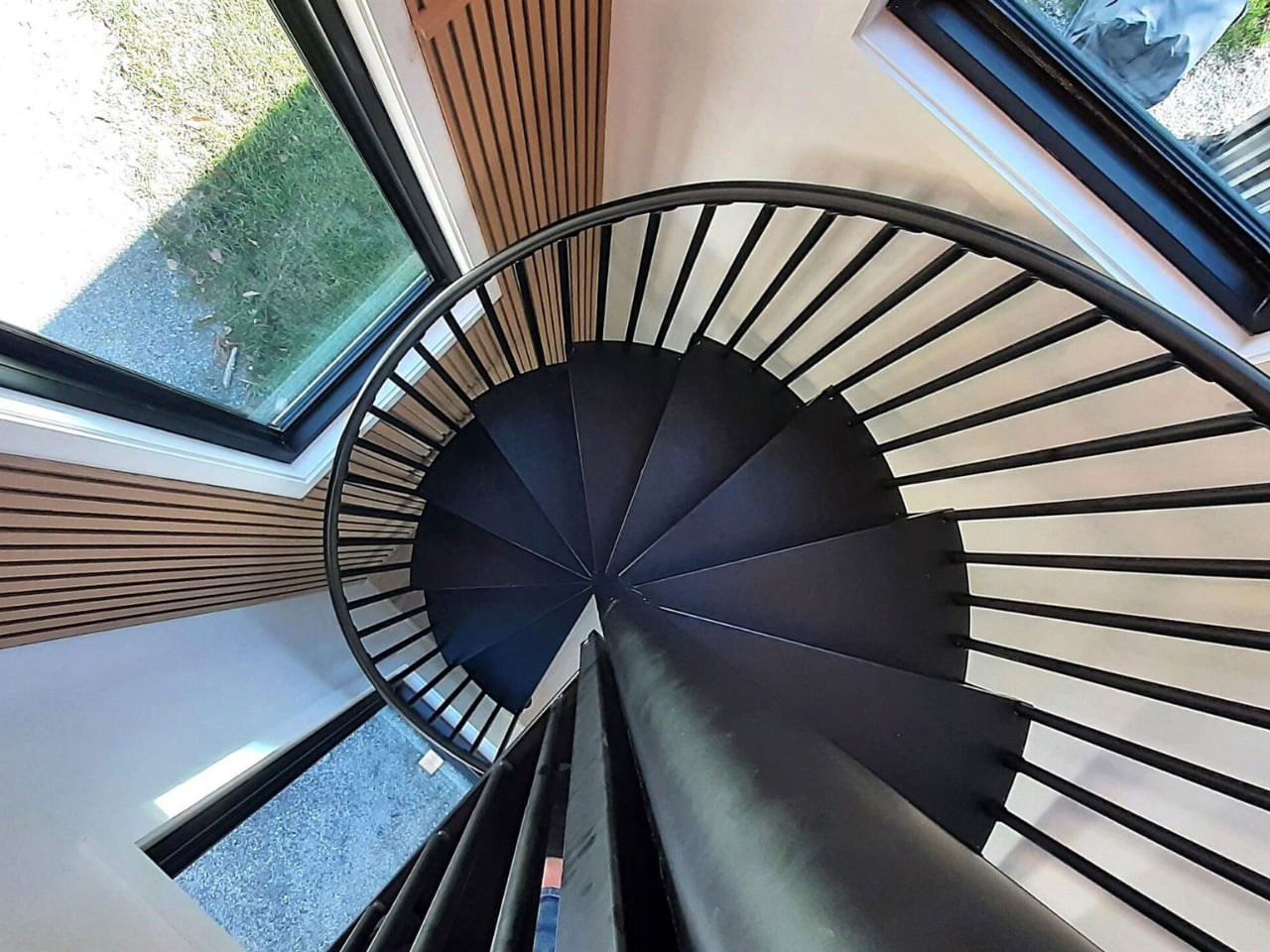
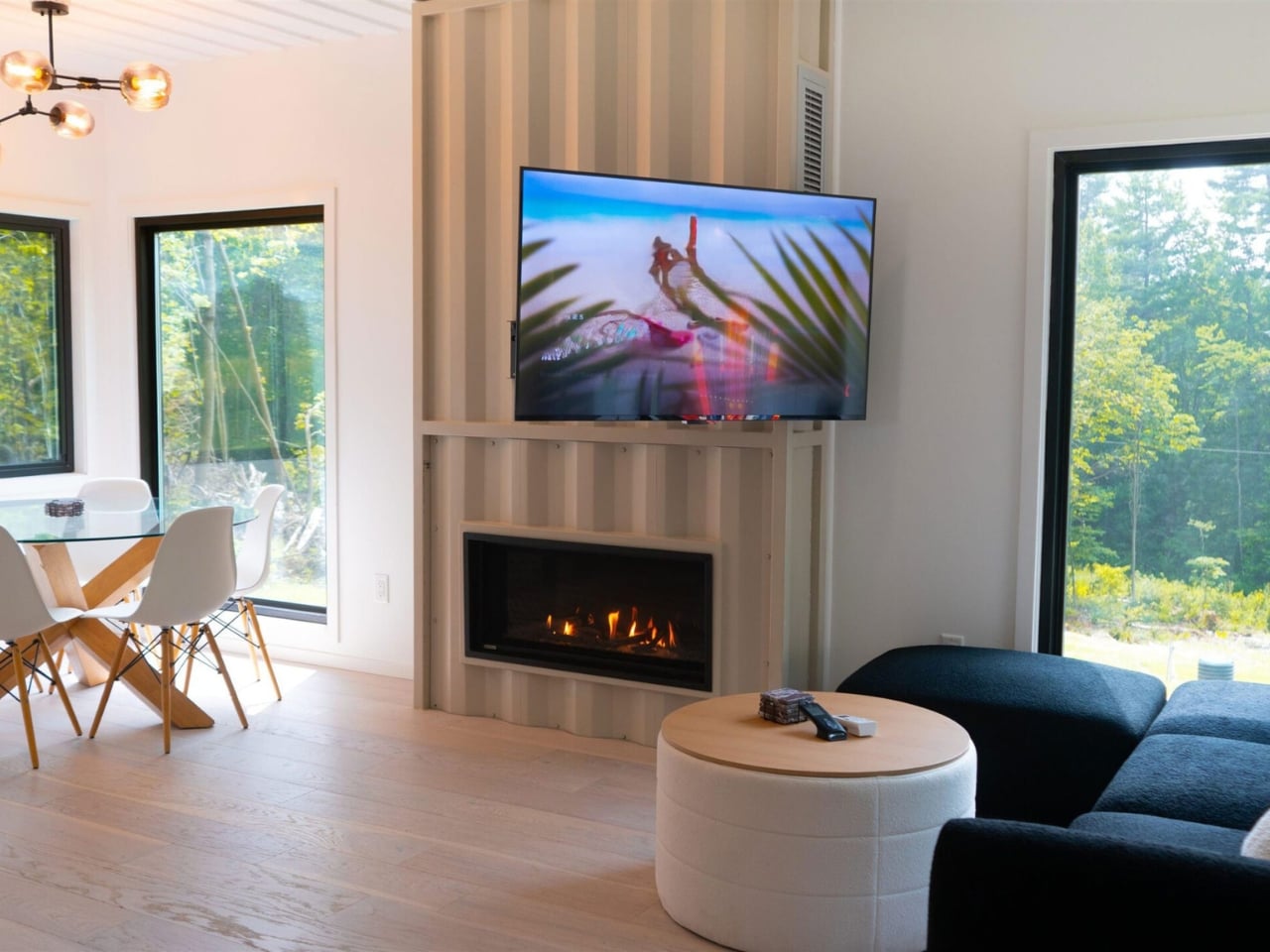
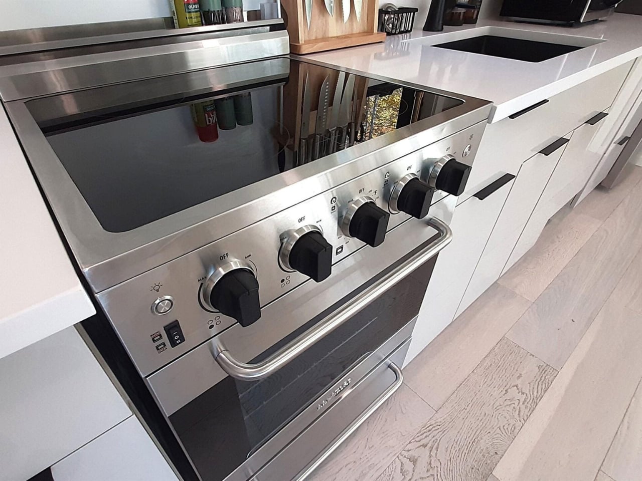
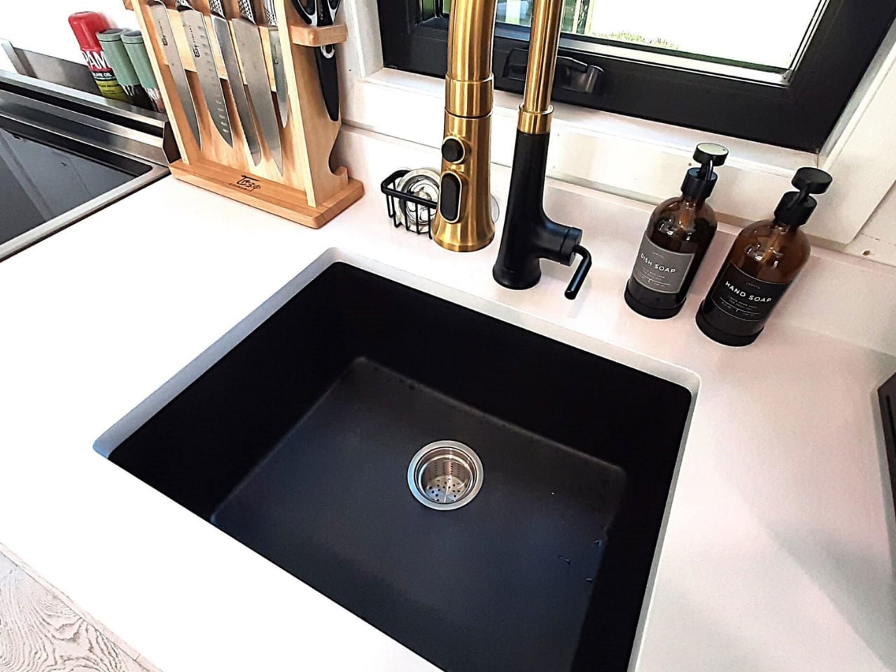
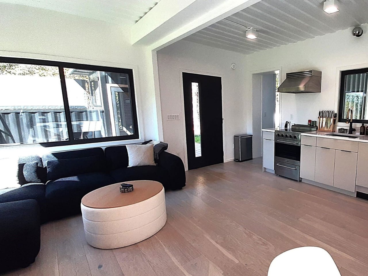
Inside, the layout includes a full kitchen, a wet bar, two separate living areas, and a spiral staircase connecting the two floors. Natural light is the real hero of the interior. Container homes are often criticized for feeling like dim metal tubes, and Backcountry Containers clearly took that criticism to heart. The windows throughout are generous, and the open-plan approach keeps the space from feeling like you’re living inside cargo. The bedrooms and bathrooms are described as “well-appointed,” which is the kind of language designers use when the finishes are actually nice and they’d rather undersell than overpromise.

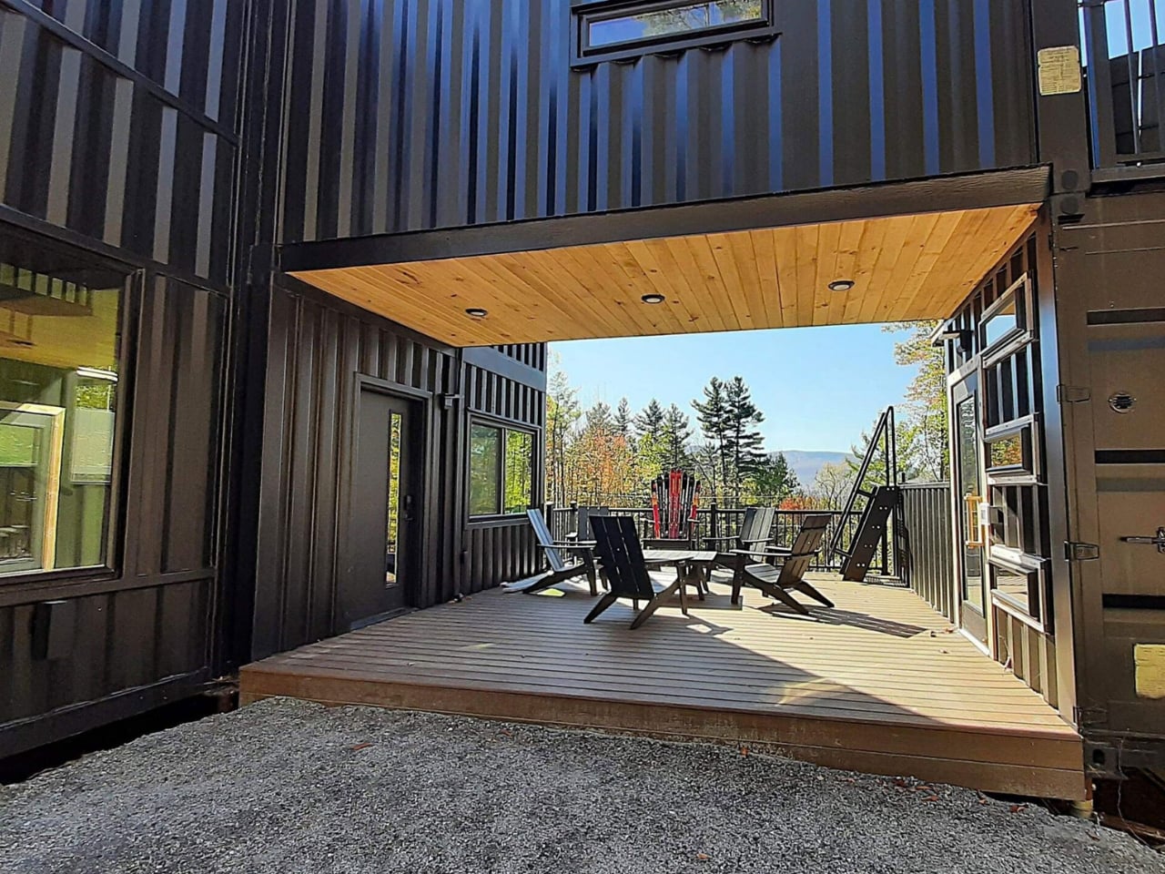
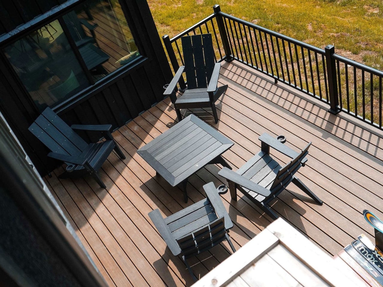
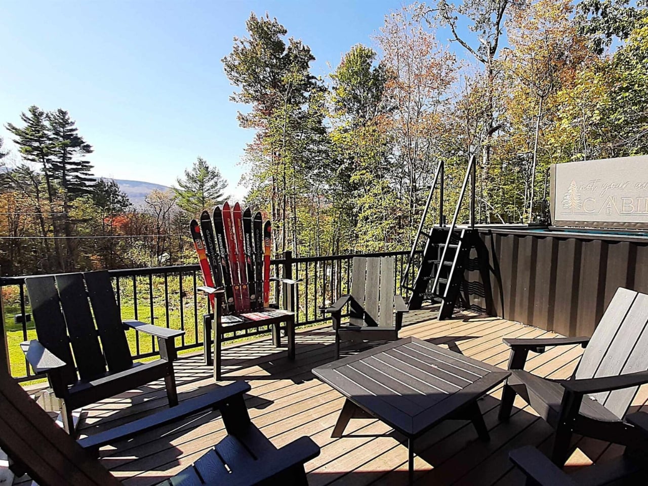
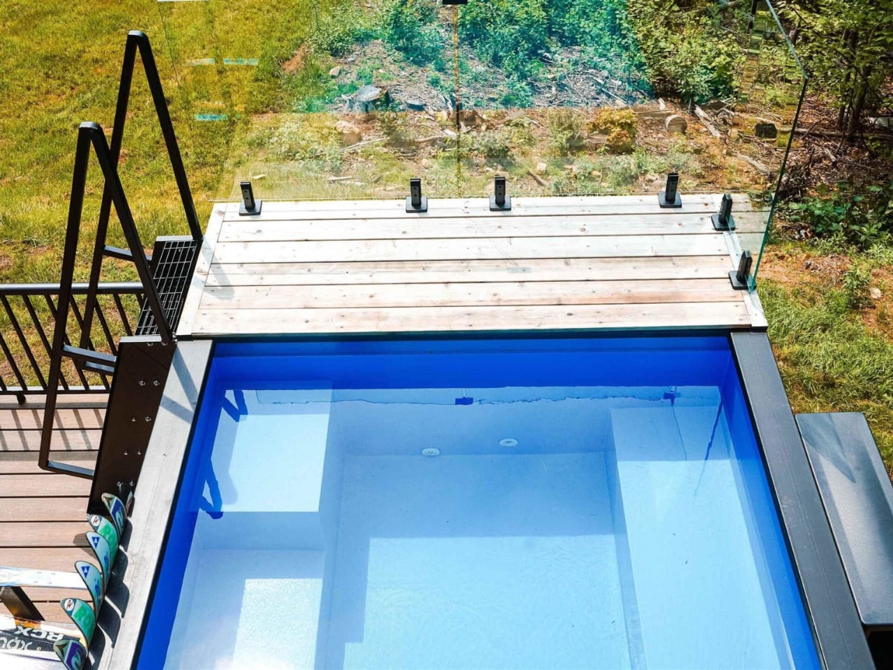
The outdoor situation is where things get genuinely interesting. Two decks, one at ground level and one on the rooftop, anchor the exterior. The views from a rooftop in that corner of the country, at almost any time of year, tend to be worth the climb. But the real conversation piece is the SaunaPlunge container: a custom 20-foot unit that combines a sauna with a three-in-one plunge pool. Cold plunging has had its cultural moment over the past few years, and integrating it directly into the home’s architecture rather than dropping a freestanding tub somewhere near the back porch feels like a legitimately smart call. It treats wellness as infrastructure, not decoration.

Container architecture has been having a sustained moment for over a decade now, and the discourse around it tends to oscillate between two poles. Either it’s framed as some radical act of sustainability (which it is, somewhat, though the modifications and insulation required complicate that story), or it gets dismissed as a design trend that doesn’t actually solve any real housing problem. Both critiques have merit. The Vermont Villa isn’t pretending to fix affordable housing. It’s a well-designed, custom-built home that happens to be made from repurposed industrial materials, and it makes no apology for that.

Backcountry Containers has been building container homes for over a decade, with features on HGTV and the DIY Network to show for it. Every project is handled by their in-house team, from design and metal fabrication to carpentry and plumbing. They know how to deliver a project that doesn’t look like a prototype or a mood board come halfway to life. The Vermont Villa is a finished home with a pool, a sauna, a rooftop deck, and enough interior square footage to feel genuinely livable for a family. That’s the benchmark container homes have been reaching toward for years, and this one clears it comfortably.

The question I keep coming back to isn’t whether container homes are worth it. It’s whether a build like this starts to shift what we consider normal. The Vermont Villa makes a decent case that it should.

The post 5 Containers, a Sauna, and a Rooftop Deck in Rural Vermont first appeared on Yanko Design.

Vancouver’s First Supertall Was Inspired by the Ocean Floor

Vancouver has always had good bones. The mountains, the water, the way the city sits between them like it was planned by someone with an eye for drama. But for all its natural beauty, its skyline has played it relatively safe. That’s about to change, and the agent of disruption is, of all things, a sea sponge.

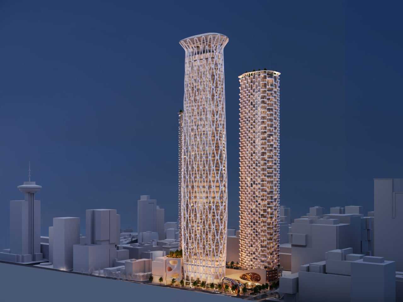
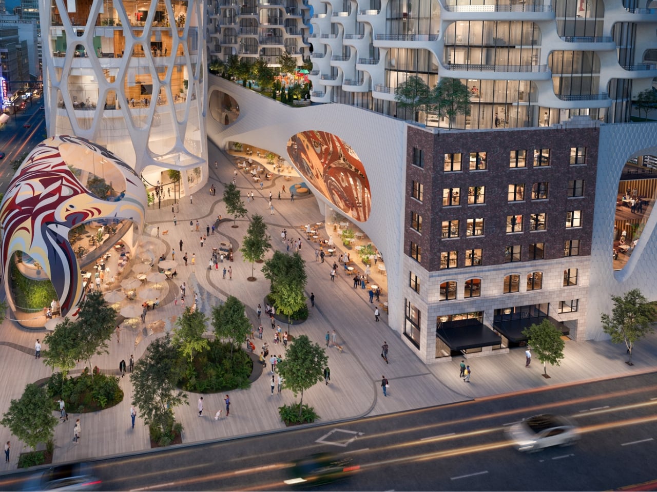
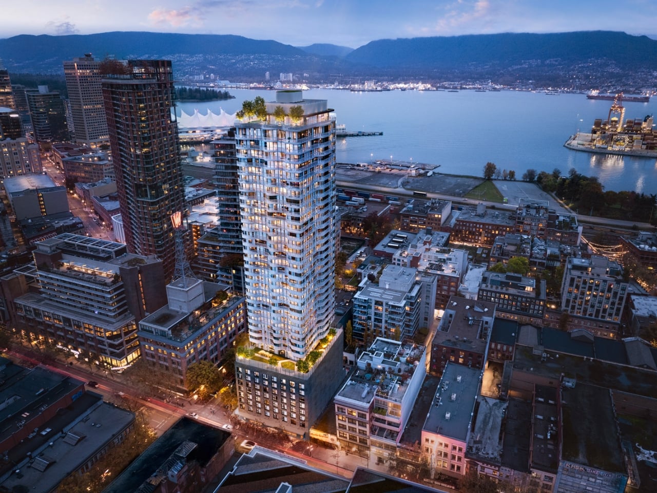
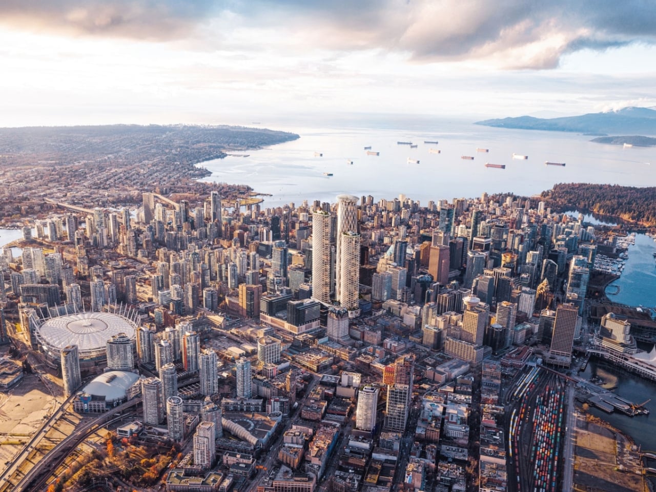
Henriquez Partners Architects, a local Vancouver studio, has unveiled designs for 595 West Georgia Street, a 1,033-foot tower that will become the city’s first-ever supertall skyscraper. To earn that designation, a building has to exceed 984 feet, which puts 595 West Georgia just barely in that club and makes it a landmark before a single floor has been built. It’s the centerpiece of a larger trio called Georgia & Abbott, developed by Holborn Group, but this one is clearly the main event.

Designer: Henriquez Partners Architects

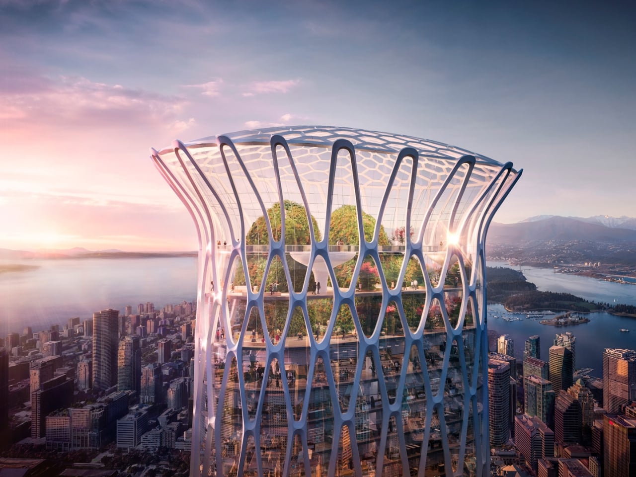
The design draws from the glass sea sponge reefs, specifically hexactinellids, found off the coast of British Columbia. These aren’t the bath sponges you’re picturing. They’re ancient, rare, deep-sea organisms with a crystalline skeletal structure that is simultaneously porous and structurally formidable. Henriquez Partners didn’t just borrow the idea aesthetically; they borrowed it structurally. The building is wrapped in a steel exoskeleton clad in white Glass Fibre Reinforced Polymer panelling, with highly translucent spans of glass filling the rest. That external framework carries the structural loads, which means fewer internal columns, more open floor plates, and a surface that looks woven and textured rather than sealed and flat.

That last distinction matters more than it sounds. Glass-box towers have dominated skylines for decades, and while some are genuinely beautiful, most are just reflective. They bounce light around and blend into each other. 595 West Georgia is going for something different: depth. The lattice of the exoskeleton creates shadows and layers depending on where you’re standing and what time of day it is. It moves, visually, in a way that most modern towers simply don’t, which makes looking at it feel more like watching a living surface than a fixed object.

Henriquez Partners described the design as telling “a story that is unique to British Columbia.” That kind of regional specificity is increasingly rare in architecture, where global firms often produce work that could exist in Dubai just as easily as Dallas. The fact that this building could only make sense in Vancouver, because the glass sponge is native to BC’s coastal waters, gives it a conceptual integrity that goes beyond branding. It’s a building that knows where it lives.

The program is equally considered. 595 West Georgia will function as a hotel tower, with conference facilities, a rooftop restaurant, and a publicly accessible observation deck at the top that will be free for Vancouverites to visit. That detail alone shifts the building’s relationship to the city. A supertall designed to be shared with the public rather than sealed off for guests feels like a genuine gesture, and it suggests that the architects and developer thought about this tower as part of the city’s fabric, not just its skyline profile.

The whole project sits at a compelling intersection of ideas. It’s biomimicry applied at an urban scale, which is a growing conversation in both design and engineering. It’s also a statement about what cities are willing to reach for, literally and figuratively. Vancouver has been measured about its height limits for years, and for good reason. The city’s low-rise character has long been part of its identity. Greenlighting a supertall signals that the city is ready to stretch those boundaries, and having one that can argue its design philosophy this clearly makes that shift feel earned.

Whether 595 West Georgia turns out to be as striking in person as the renderings suggest is something only construction can answer. But the foundational idea, that the most interesting path forward might look like something pulled from the ocean floor, is exactly the kind of thinking that makes architecture worth paying attention to right now. Not every city gets to say its most ambitious tower was modeled after an organism that’s been living quietly underwater for centuries. Vancouver gets to say that.

The post Vancouver’s First Supertall Was Inspired by the Ocean Floor first appeared on Yanko Design.

The Tiny Home That Proves You Don’t Have to Downsize Your Family to Downsize Your Life

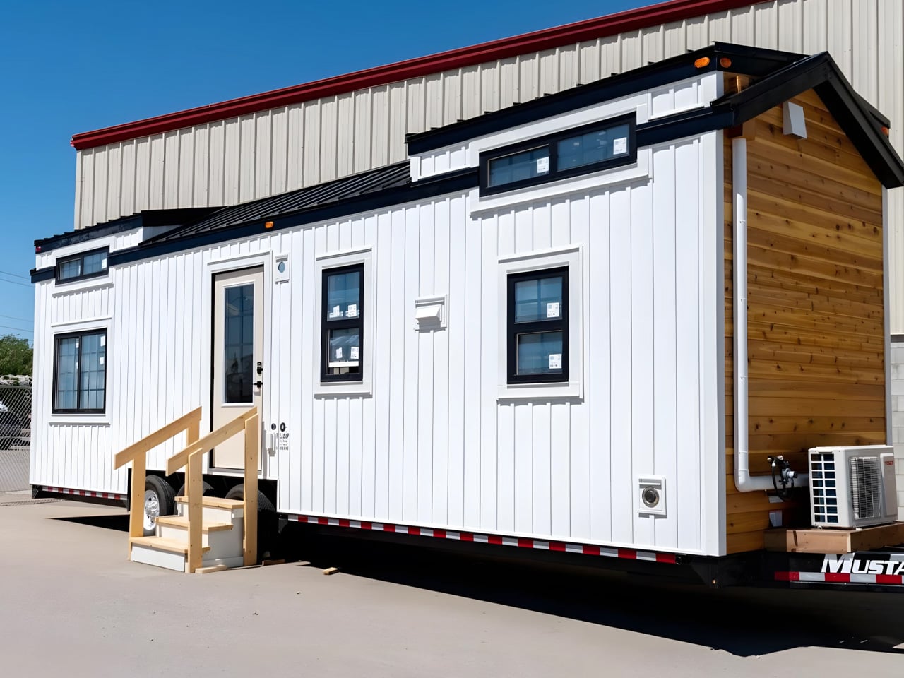
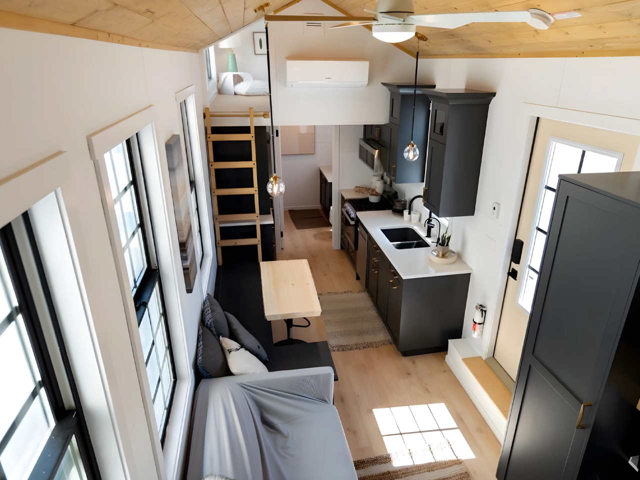
There’s a persistent myth that tiny homes are only for solo dwellers or couples who’ve traded square footage for a hashtag. The Harmony, the latest offering from Alberta-based builder Teacup Tiny Homes, exists entirely to dismantle that idea. Rooted in the company’s popular Ellie range, the Harmony was originally conceived for a family of four in Southern Alberta who were done with the financial and time burdens of conventional living. What came out of that brief is one of the most thoughtfully designed family tiny homes on the market right now.

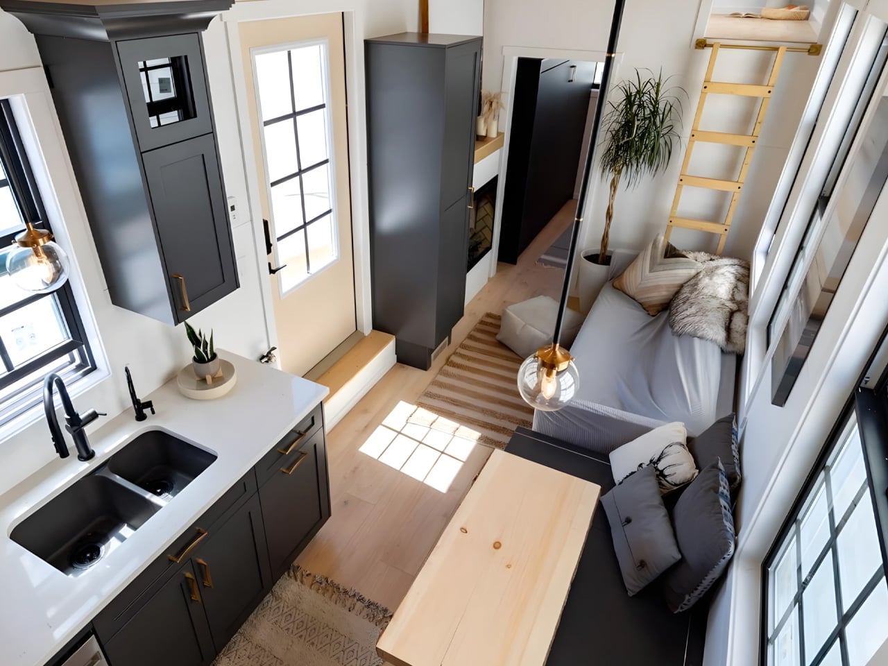
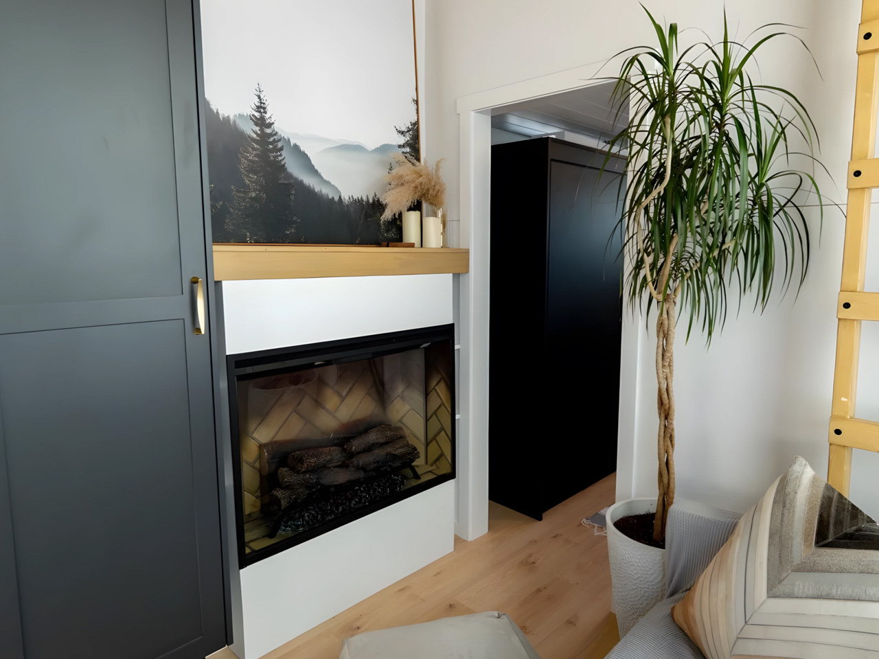
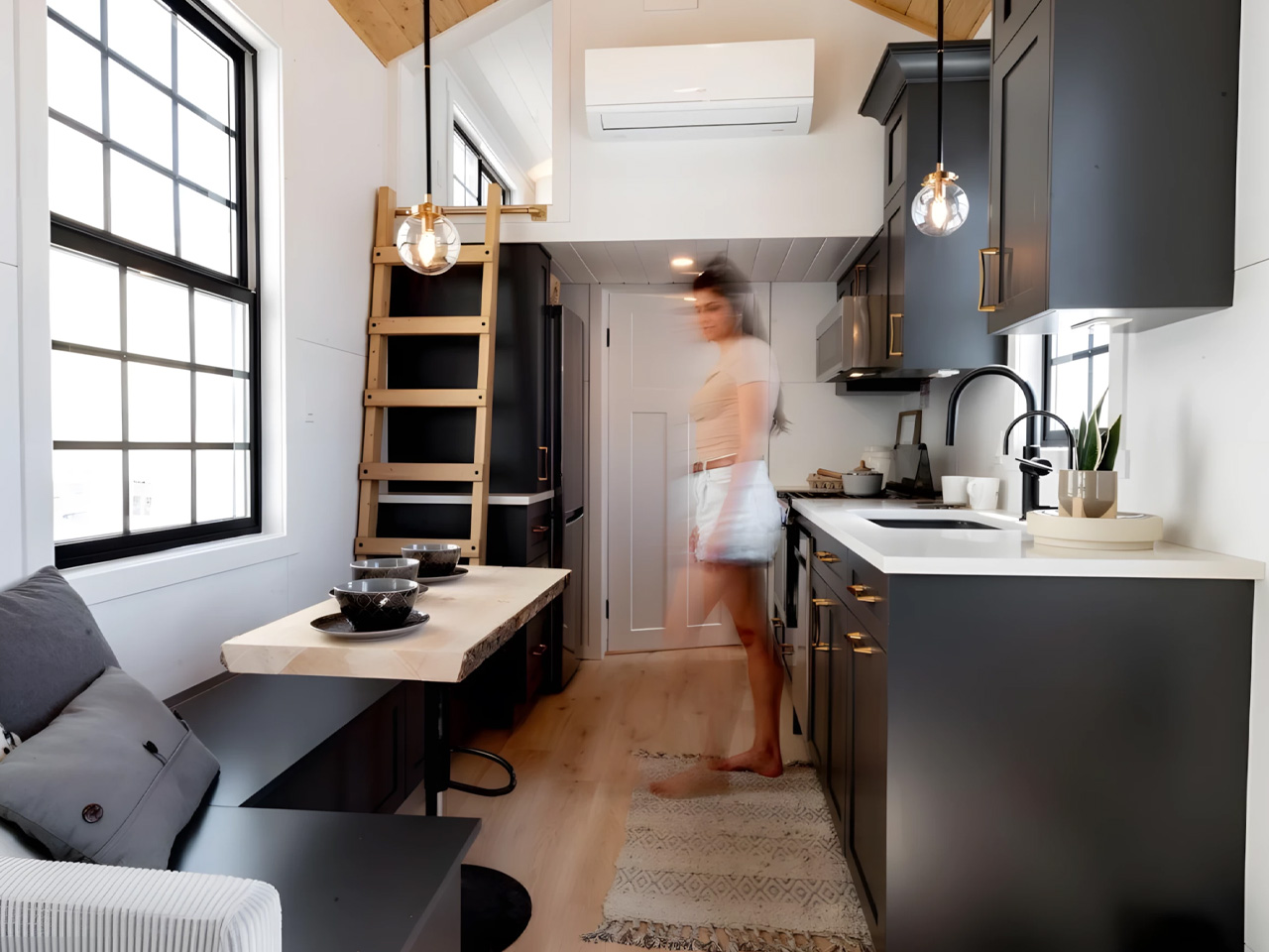
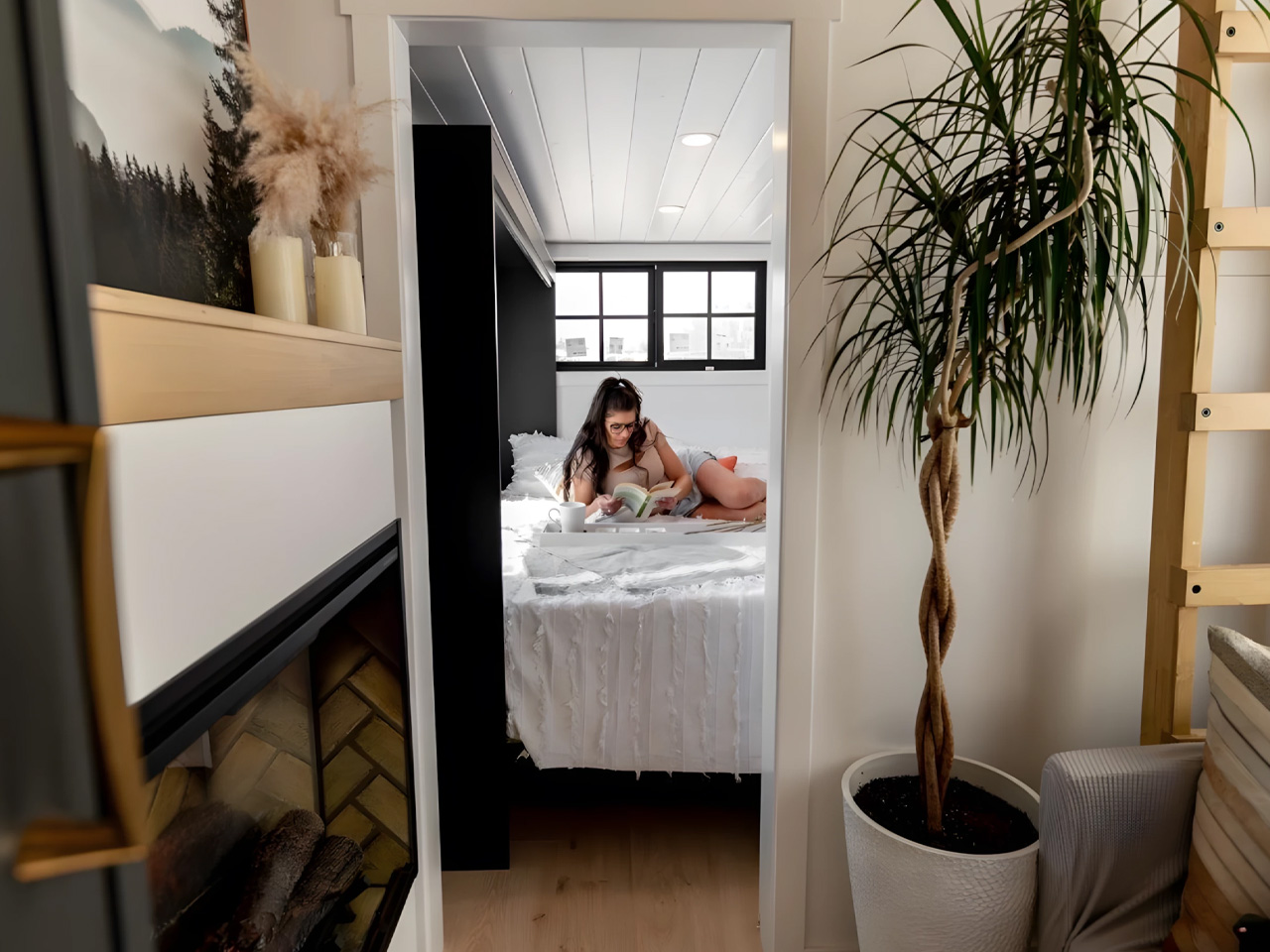
Built on a triple-axle trailer and clad in metal and wood, the Harmony measures 34 feet long and 8.5 feet wide, the standard road-legal width, meaning it can be towed across North America without a special permit. That mobility is no small thing for a family that wants flexibility without sacrificing the feeling of a real home. Inside, the floor plan stretches to 423 square feet, and every inch has been considered. The living area comes fitted with a sofa, a fireplace, and a dedicated TV wall, the kind of space where family nights actually happen.

Designer: Teacup Tiny Homes

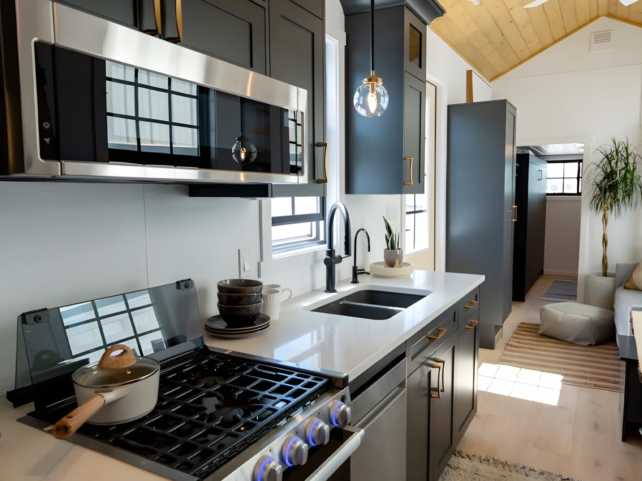
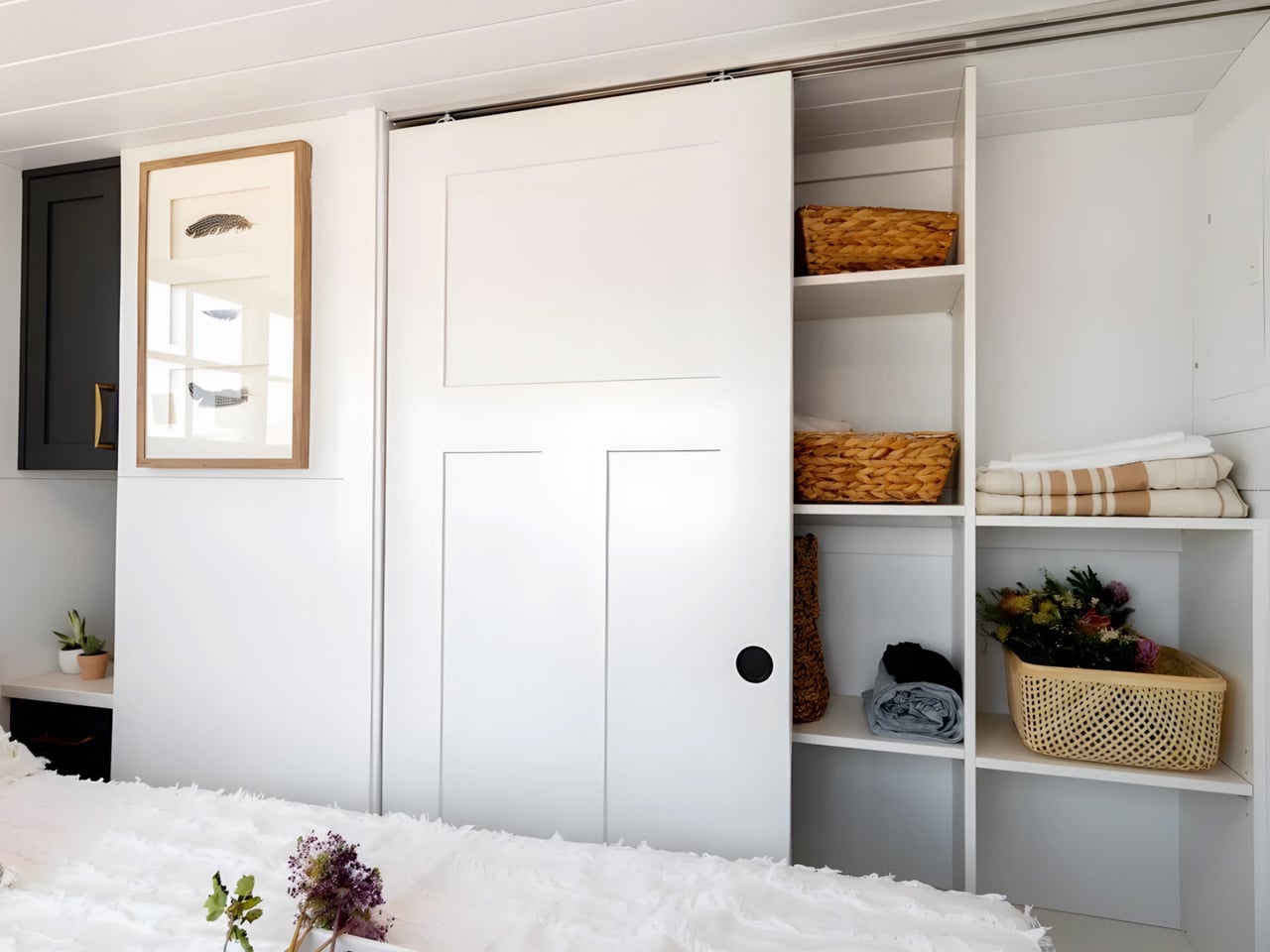
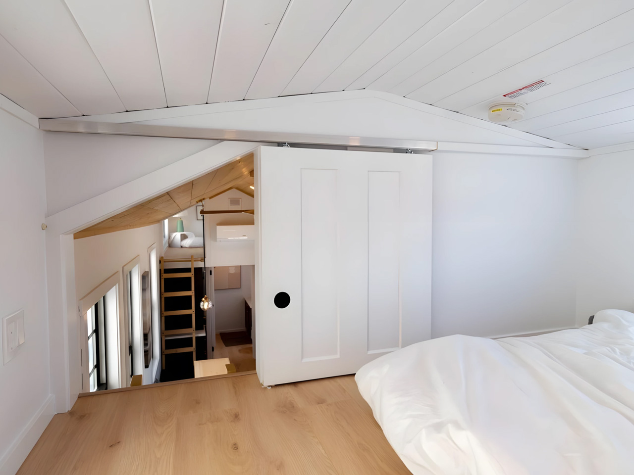
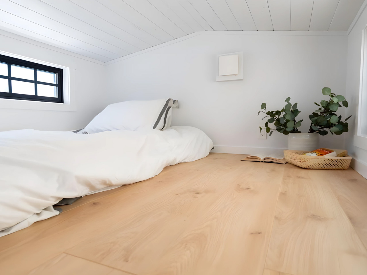
What sets the Harmony apart from most tiny homes is its three-bedroom layout. Two sleeping lofts sit above, while the ground-floor bedroom offers enough headroom to stand upright, a rare and deliberate design choice that makes daily life feel far less like a puzzle to be solved. The kitchen is full-sized and functional, designed for people who actually cook rather than just reheating takeout. It’s a plan that doesn’t ask its occupants to compromise on the rhythms of family life; it just asks them to do it in a smaller footprint.

Teacup Tiny Homes, which has been building since 2016, approaches its designs with the conviction that simpler living doesn’t have to mean lesser living. The Harmony is perhaps the clearest expression of that philosophy yet, a home genuinely engineered for a family, not retrofitted for one.

Priced starting at CAD $185,000 (approximately US $132,000) and available for delivery throughout North America, it sits at a premium compared to entry-level tiny builds, but the craftsmanship and livability make a strong case for the ask. For families eyeing a way out of the mortgage spiral, the Harmony might just be the most practical dream.

The post The Tiny Home That Proves You Don’t Have to Downsize Your Family to Downsize Your Life first appeared on Yanko Design.

The 190sqm Melbourne Renovation That Didn’t Touch the Street

Melbourne’s inner-city suburb of Abbotsford is the kind of place that makes you feel the weight of time. Its streets are lined with single-fronted worker’s cottages, row after row of modest Victorian weatherboards that have been standing since the 19th century, when industrial workers first settled around the nearby factories of Fitzroy and Collingwood. The vernacular is intact, the character deeply established. To build something new here isn’t just a design challenge. It’s a negotiation with history.

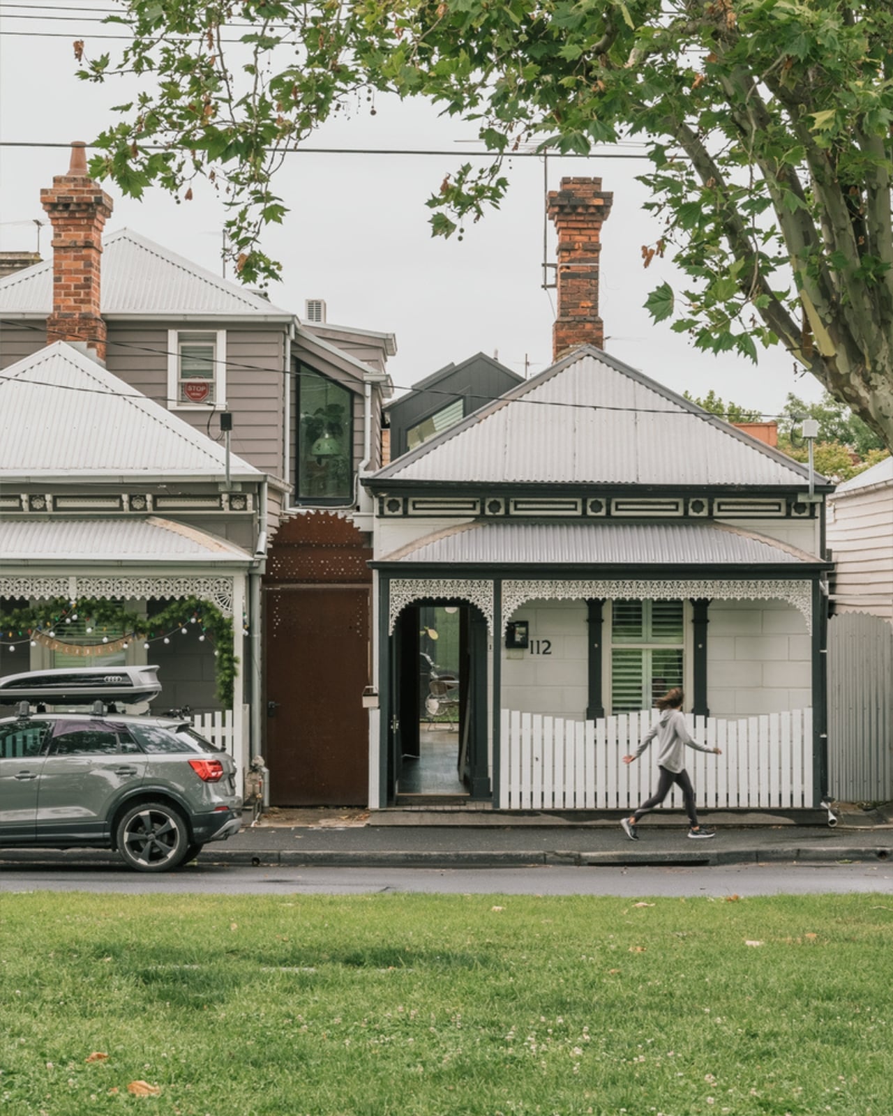
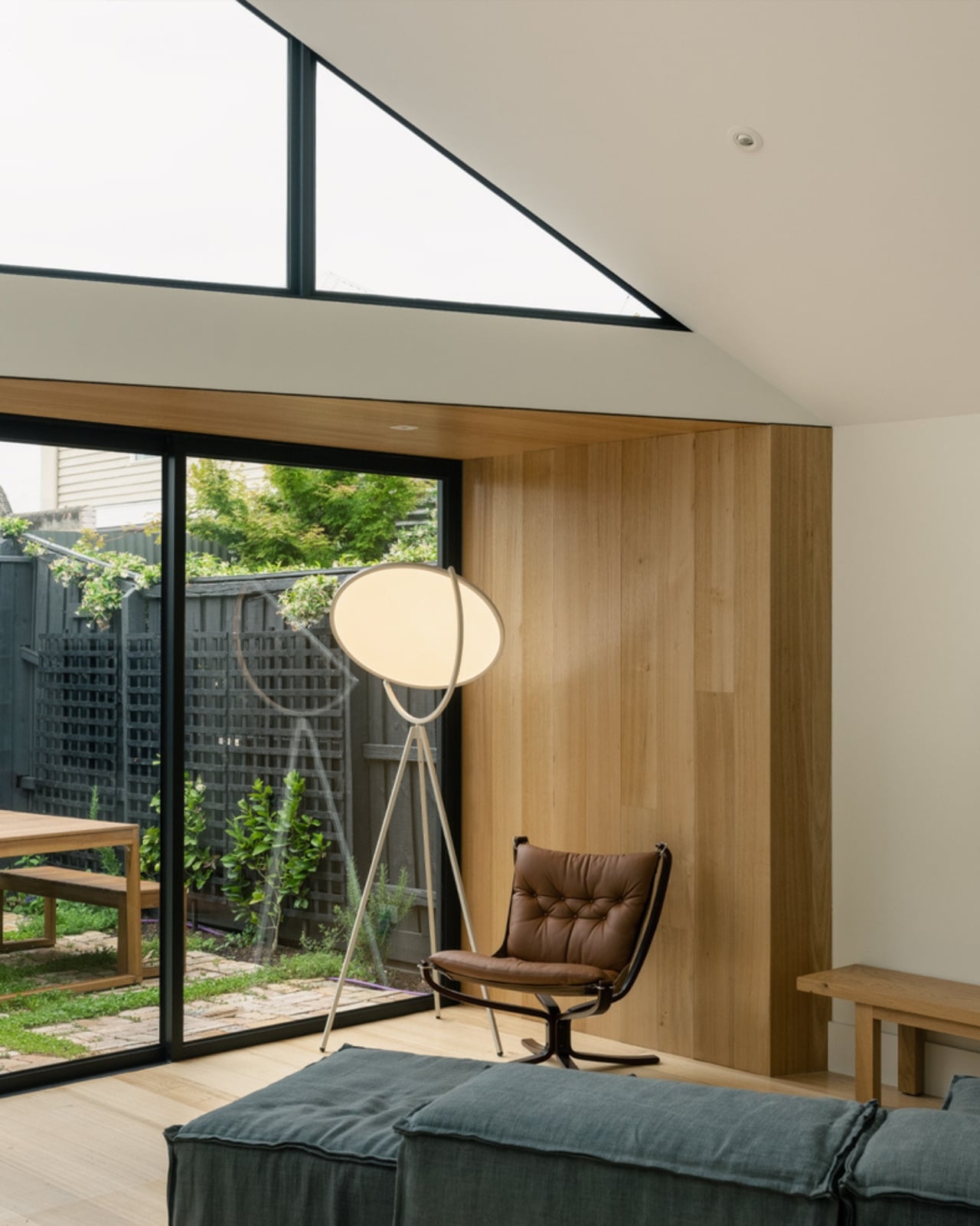
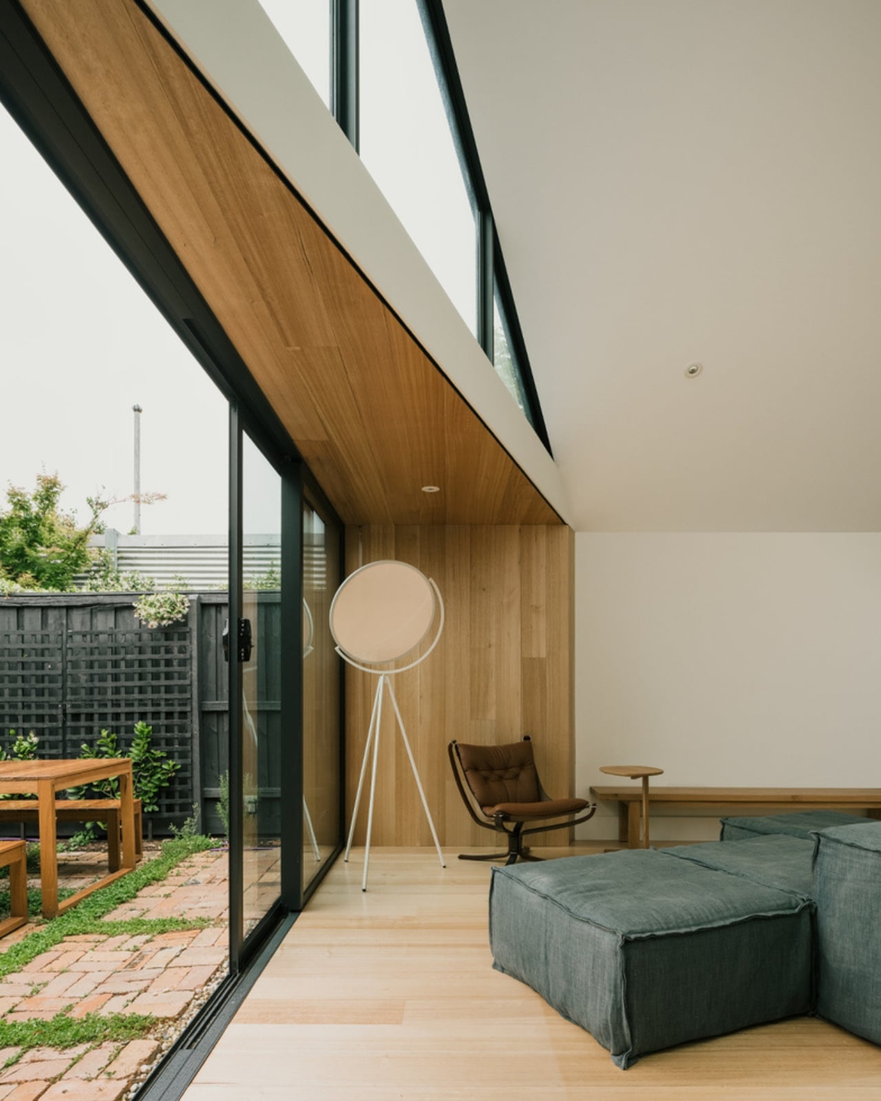
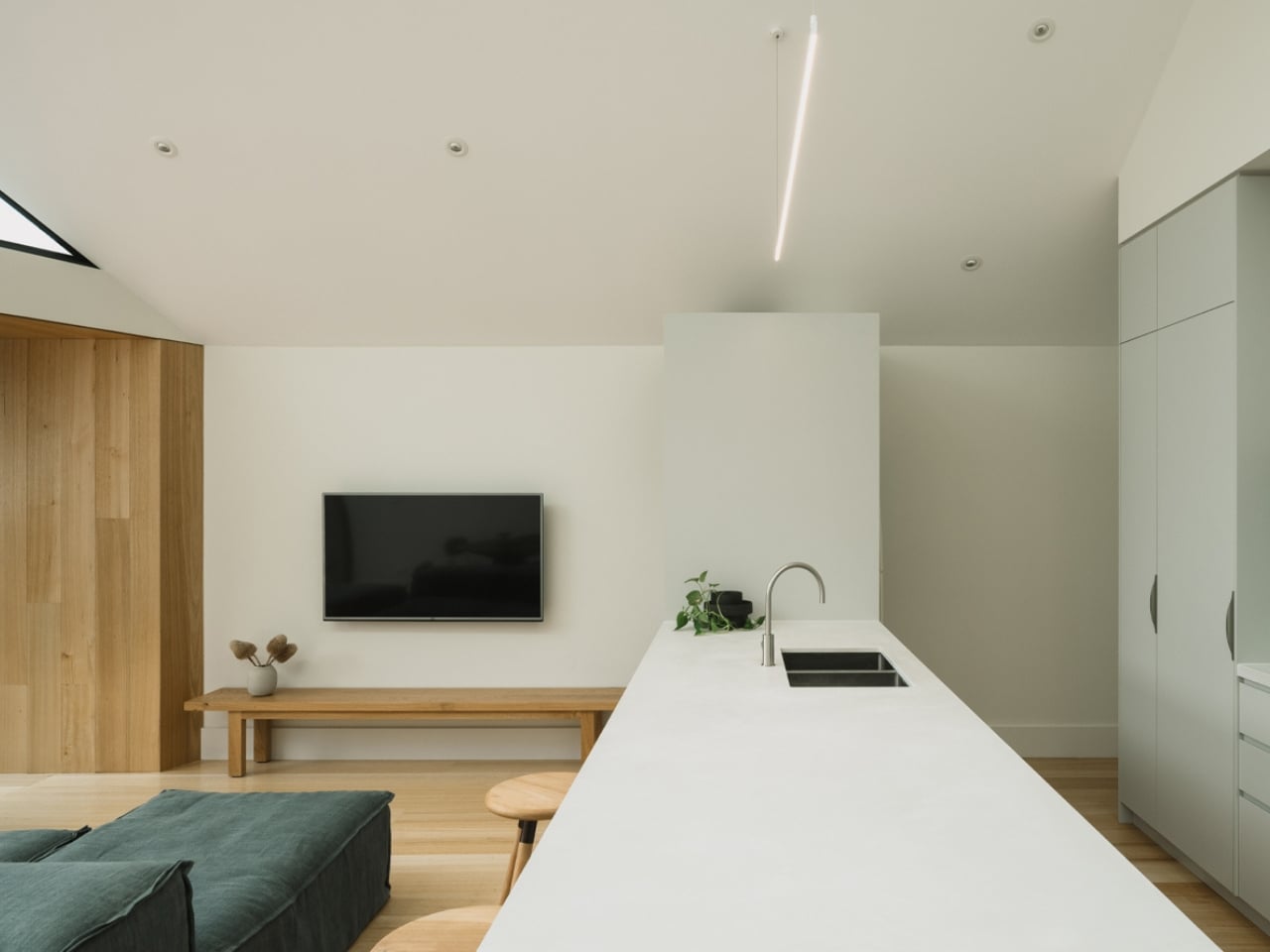
That’s what makes the Abbie Abbotsford Terrace by Eckersley Architects so worth paying attention to. Not because it breaks the rules, but precisely because it knows which ones to follow. Completed in 2021, the project began with a single-fronted worker’s cottage situated directly opposite a leafy park and asked a straightforward but deceptively difficult question: how do you expand a home that’s defined by its modesty without losing the thing that makes it meaningful? The answer Eckersley Architects arrived at is one of restraint, context, and a quiet kind of confidence that isn’t always easy to pull off.

Designer: Eckersley Architects

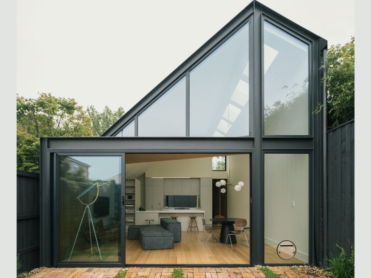
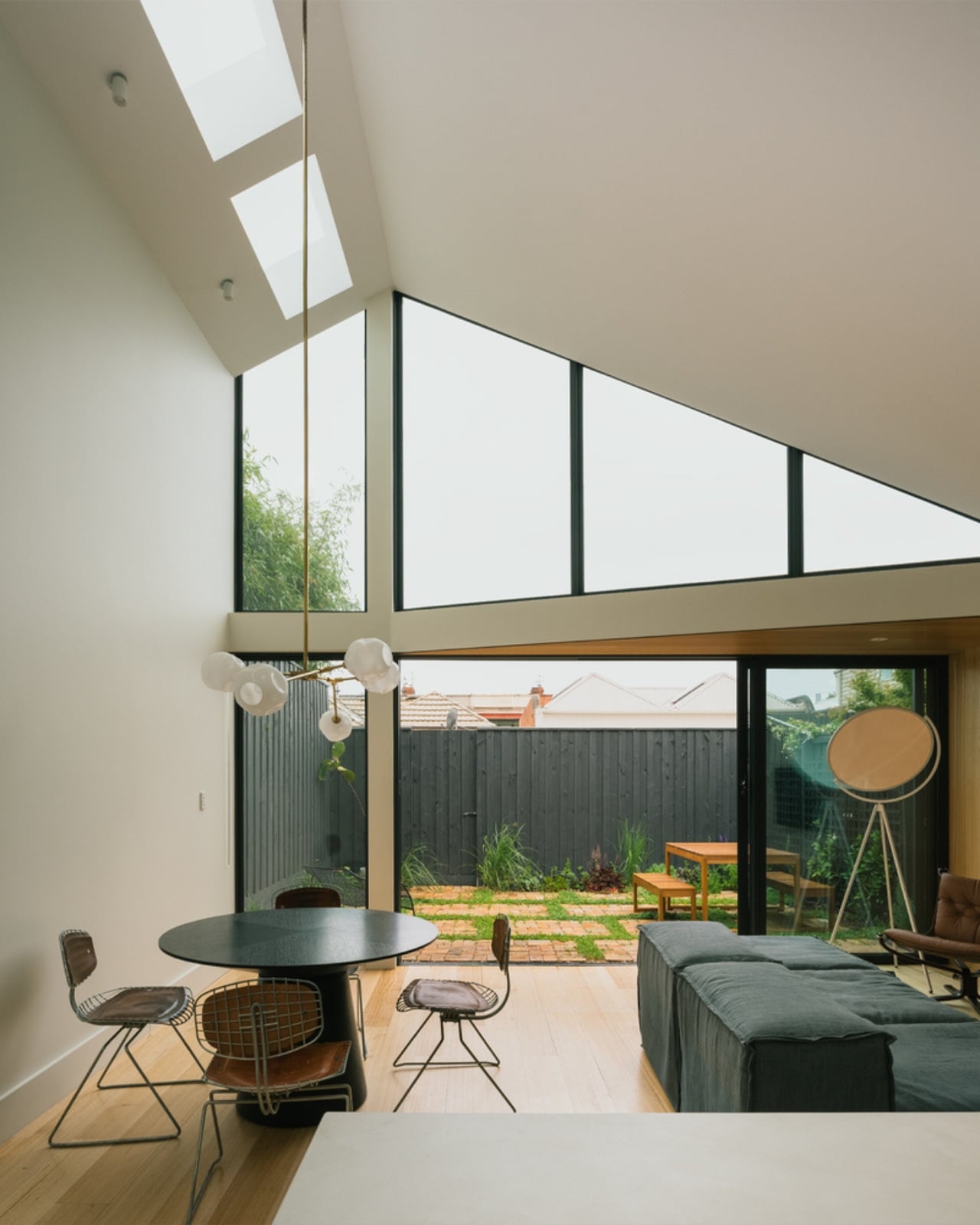
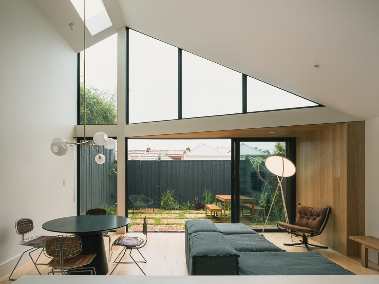
The approach was to preserve and restore the original cottage entirely, keeping it as the street-facing face of the home. The new addition lives at the rear, a modern single-level extension that opens generously onto a private, enclosed courtyard. It doesn’t announce itself. It doesn’t try to compete. The original and the new sit in dialogue rather than in tension, and that matters more than it might first appear.

One of the more understated decisions in the design is how the building form was shaped by its immediate neighbours. To the north, a two-storey dwelling. To the south, a single-level home with very little outdoor space. Rather than ignoring this context, Eckersley Architects used it as a structural premise, positioning Abbie as the bridge between two opposing scales, sitting equally adjacent to both boundary walls and carefully calculated to cause minimal shadowing to the southern neighbour. It’s the kind of considered empathy that rarely gets talked about in residential architecture, but it’s exactly the sort of thinking that separates good design from great design.

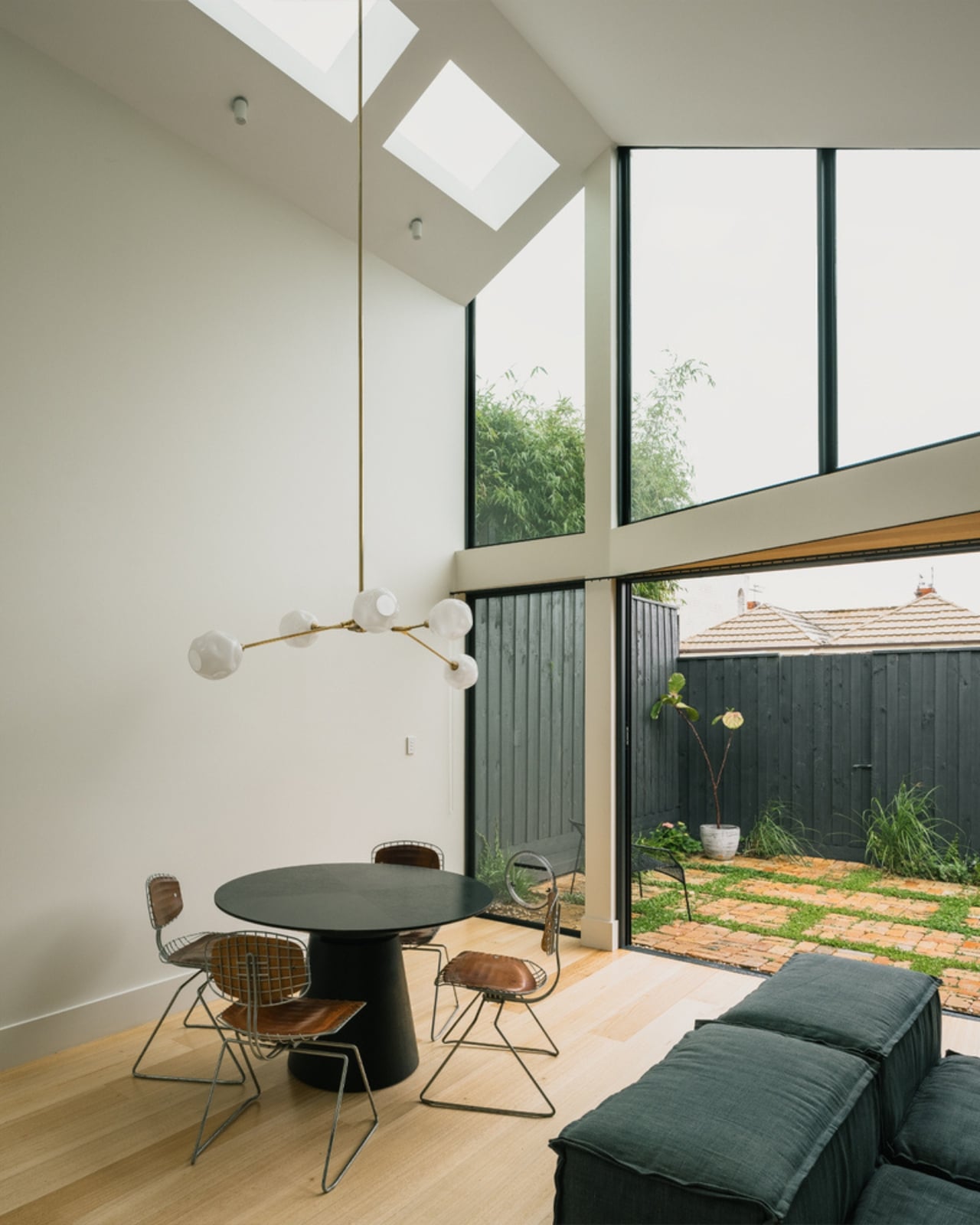
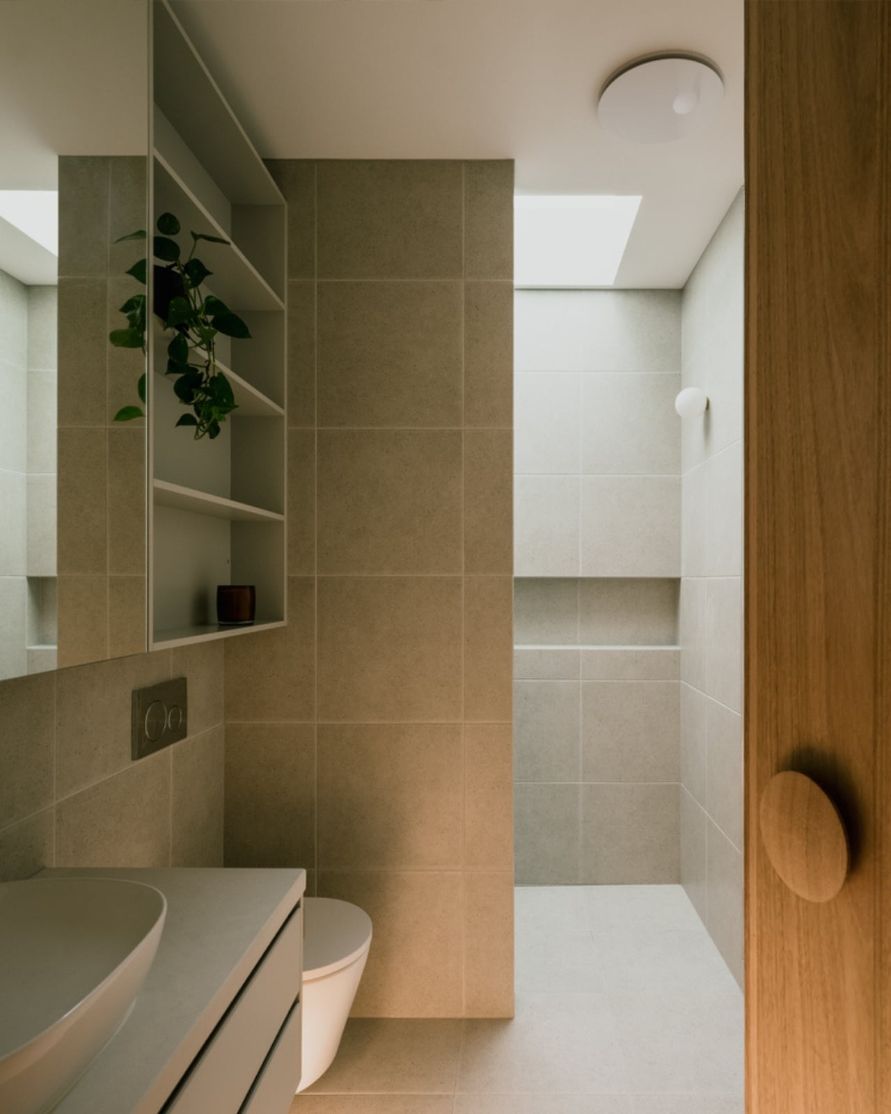
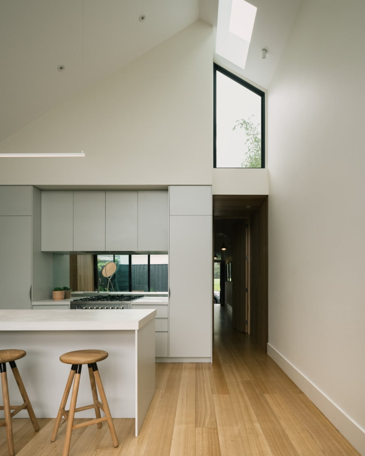
The result, at 190 square metres, is a home that punches well above its footprint. The new addition features lofty ceilings and expansive windows that frame the rear courtyard. The living space feels generous without being excessive, and the courtyard itself functions as an outdoor room, extending the home’s liveable area into something that feels genuinely alive. Photography by Dan Preston captures it all with a warmth that makes you want to be there, which is the ultimate compliment to any home.

I keep thinking about why projects like this matter so much right now. We spend a lot of time talking about bold new architecture, the statement builds, the hero houses dropped onto open sites with unlimited vision and budgets to match. And those are exciting, too. But the harder, more quietly radical act is doing exactly what Eckersley Architects did here: entering an existing neighbourhood, respecting its inherited logic, and finding a way to add to it rather than override it. Abbotsford’s rows of Victorian cottages are a form of collective memory. The preservation of that streetscape, maintained by dozens of homes that all quietly hold the line, is what gives the neighbourhood its character. When a renovation like Abbie comes along and chooses to work with that, rather than against it, it earns its place.

The project was completed in 2021 and has only now landed on ArchDaily, which feels right. It was never going to make a loud entrance. It’s a house doing exactly what it needs to do without reaching for attention. The best residential architecture often works that way. It reveals itself gradually, detail by detail. Abbie Abbotsford doesn’t reimagine what a house can be. It simply becomes a very good version of what this one always had the potential to be. And sometimes, that is enough.

The post The 190sqm Melbourne Renovation That Didn’t Touch the Street first appeared on Yanko Design.

Belgium’s Most Striking Concrete Villa Was Designed by the Dunes

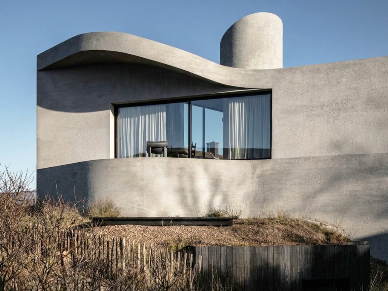
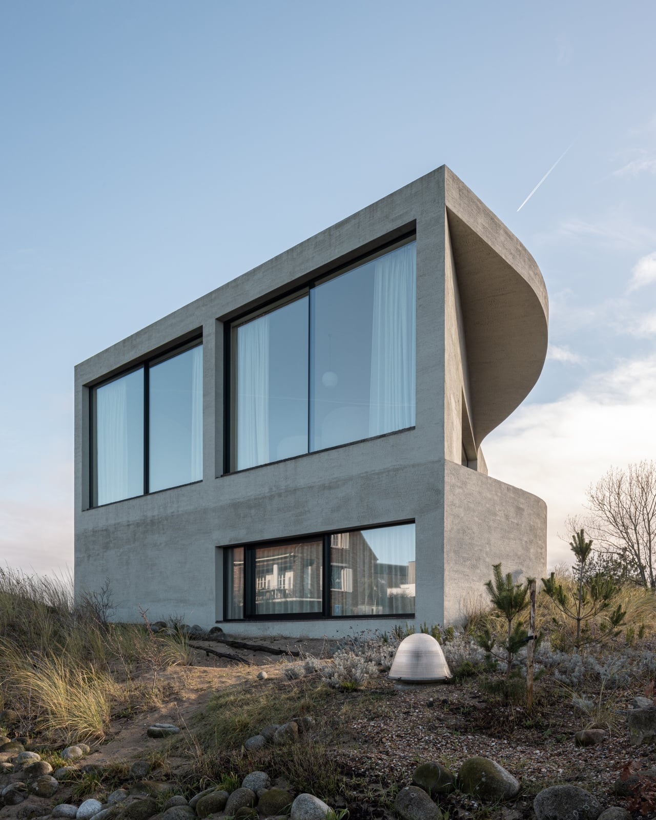
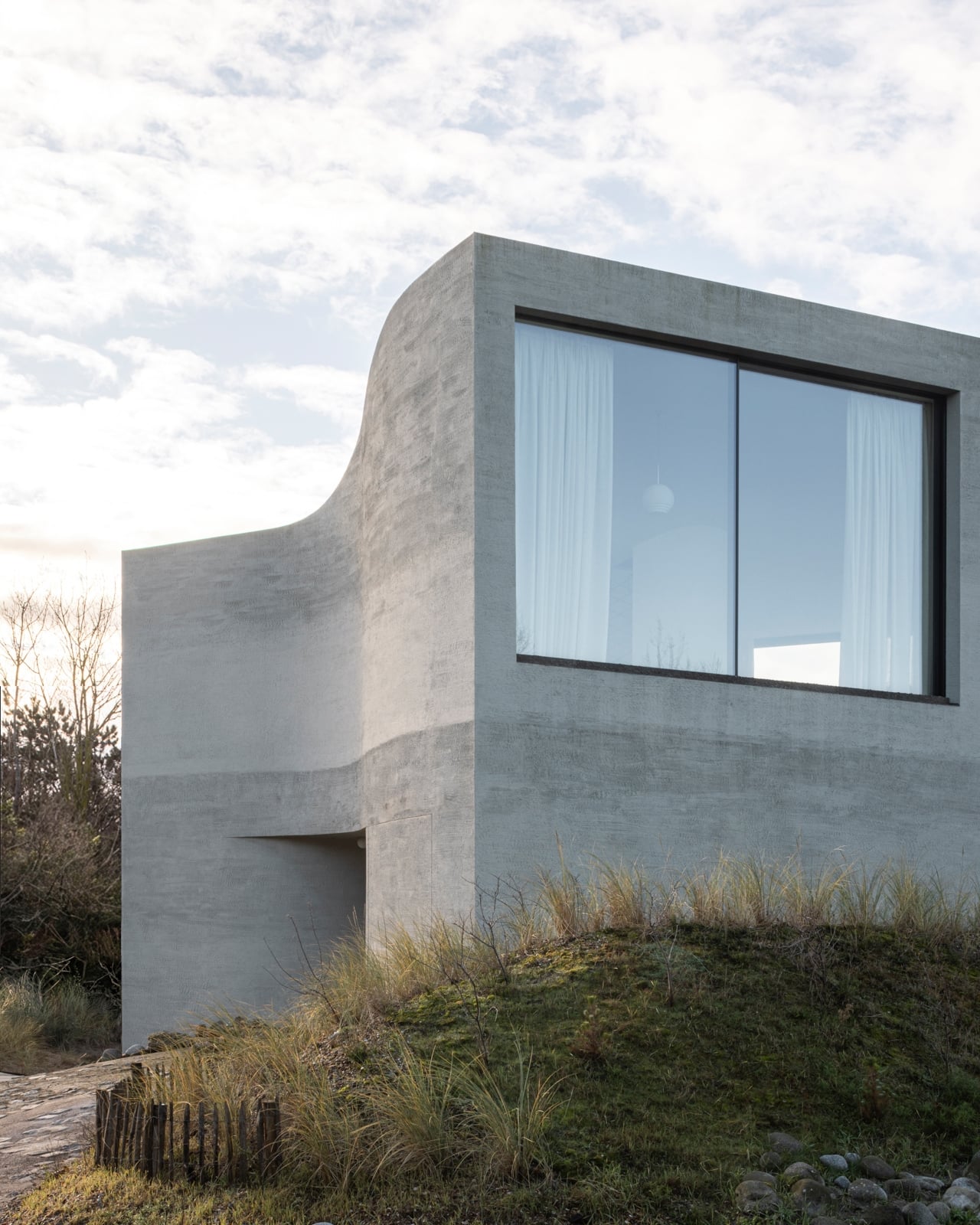
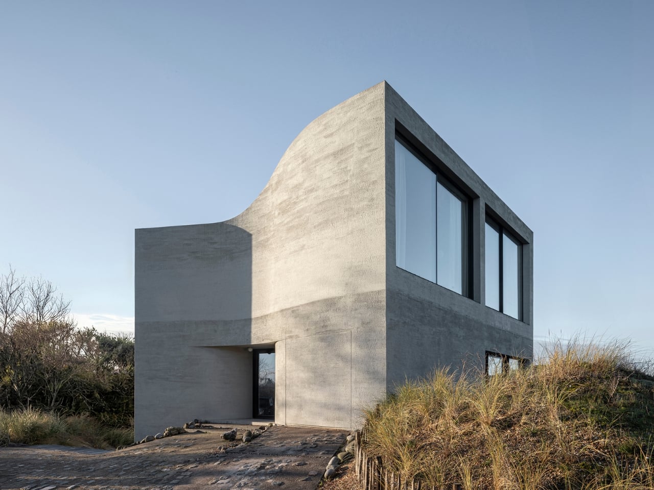
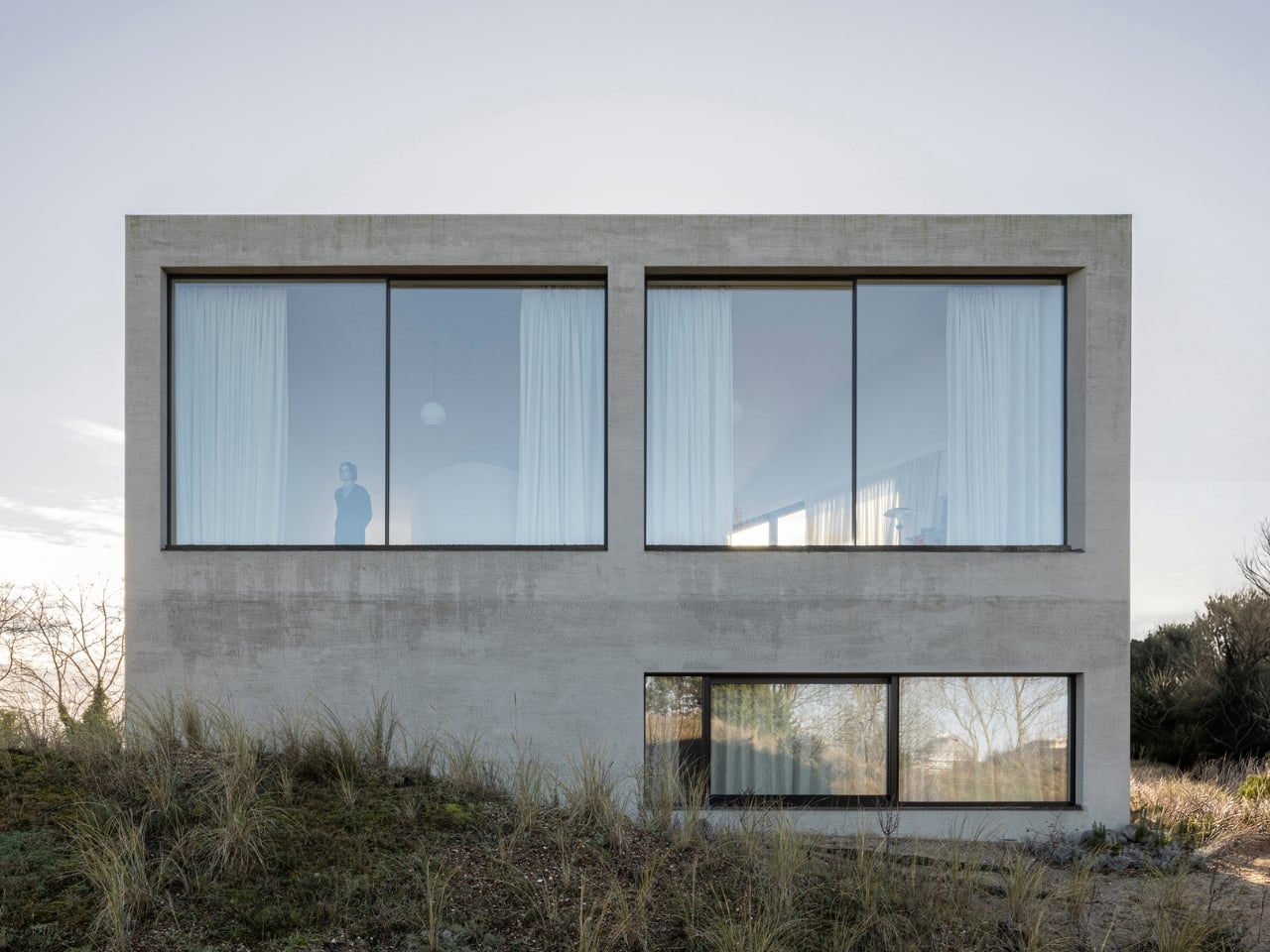
If you’ve ever stood on a beach and watched the tide pull back, you know that moment right before the water retreats completely, when it leaves those delicate horizontal lines etched across wet sand. That’s what the facade of Villa Nouvelle Vague looks like. Not metaphorically. Literally. Belgian architect Magalie Munters designed the concrete surface of this seaside villa in Oostduinkerke with a horizontal grain that mirrors the striations the North Sea leaves behind at low tide. The reference isn’t decorative, it’s structural. And that distinction matters.

The villa sits on a corner plot at the edge of a protected dune reserve in Oostduinkerke, a small coastal town already known for a few wonderfully eccentric things: a ship-shaped restaurant and fishermen who harvest shrimp on horseback. Into this landscape, Munters has introduced something that manages to be arresting without being loud. The form is sculptural and unmistakably modern, but it doesn’t shout. It settles.

Designer: Magalie Munters

The name “Nouvelle Vague” borrows from the French New Wave film movement, and the reference is apt in ways that go beyond the obvious nod to style. The French New Wave was defined by breaking conventional rules while remaining deeply committed to craft. Munters is working in a similar register. For years, her Ghent-based boutique studio has been developing residential architecture with organic geometries, pushing against the idea that construction methods should set the ceiling on what architecture can achieve. “Through that ongoing research, I developed a way of building in which construction and technology no longer act as a limitation to the architecture,” she explains. Villa Nouvelle Vague is where that research cashes out.

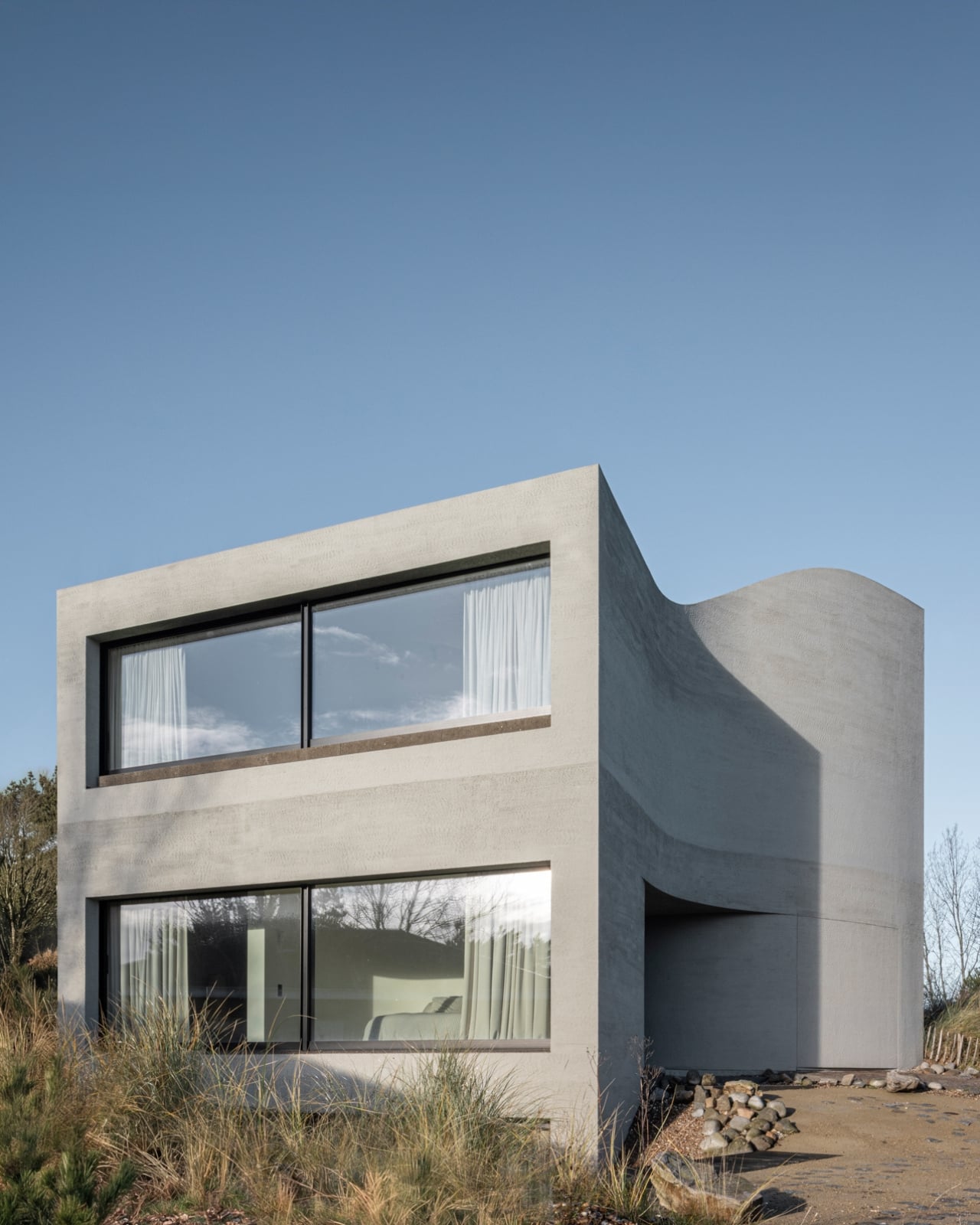
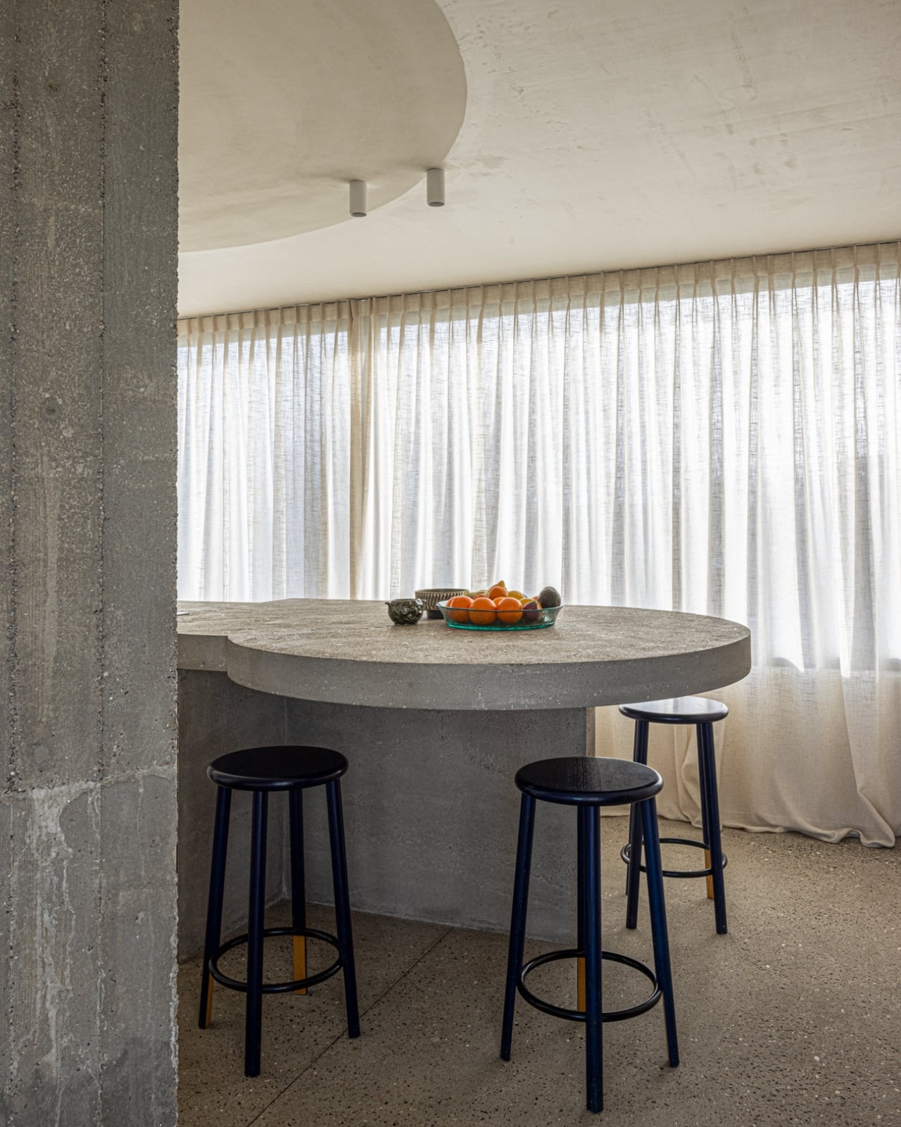
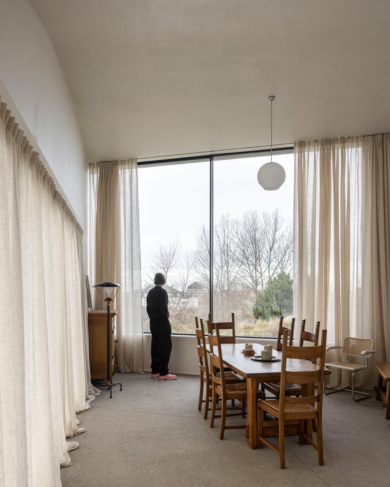
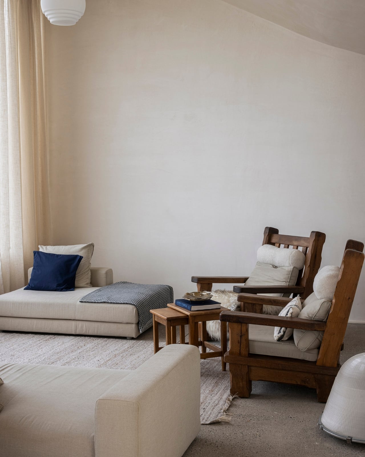
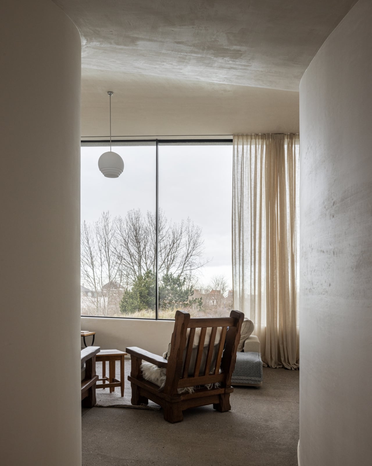
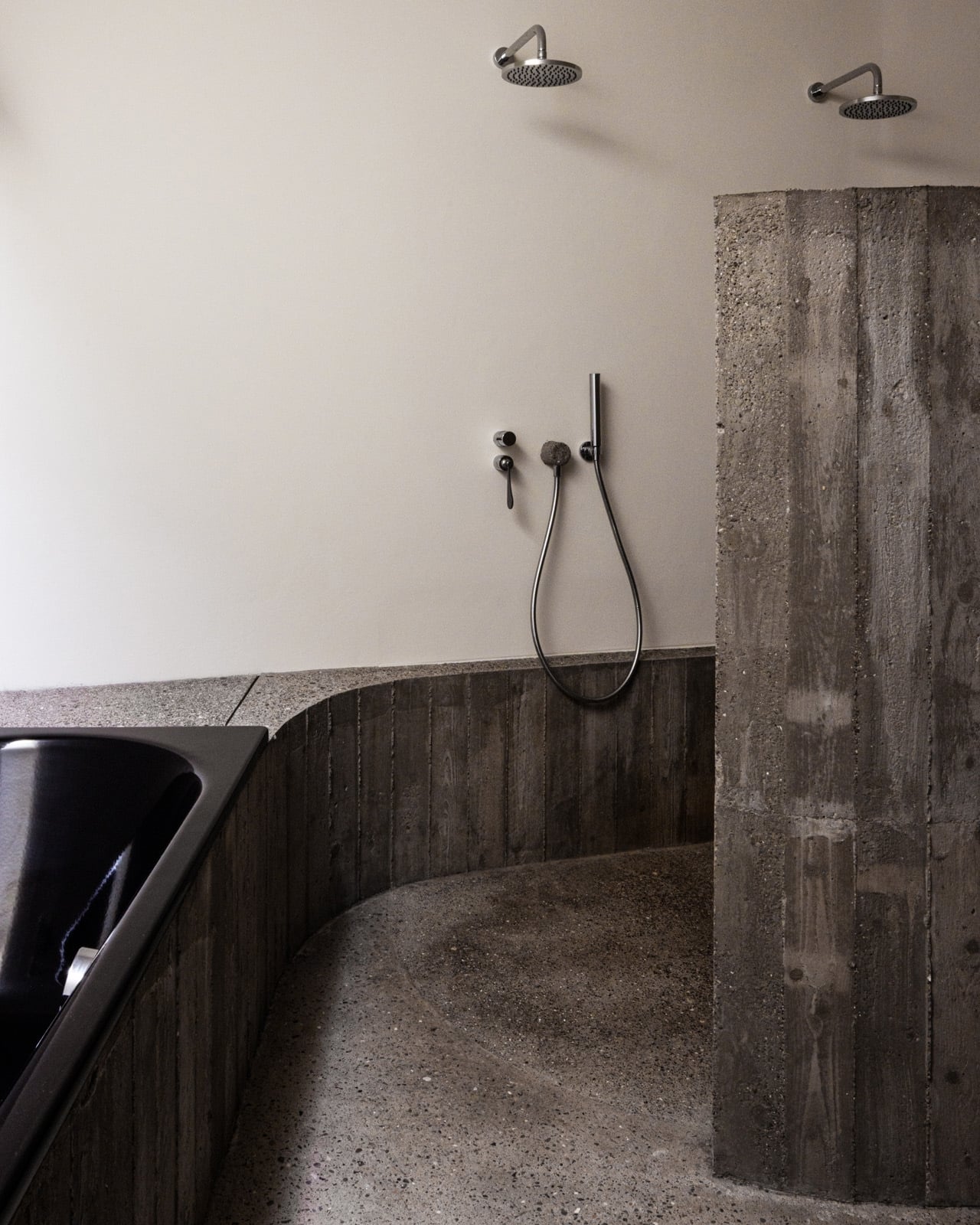
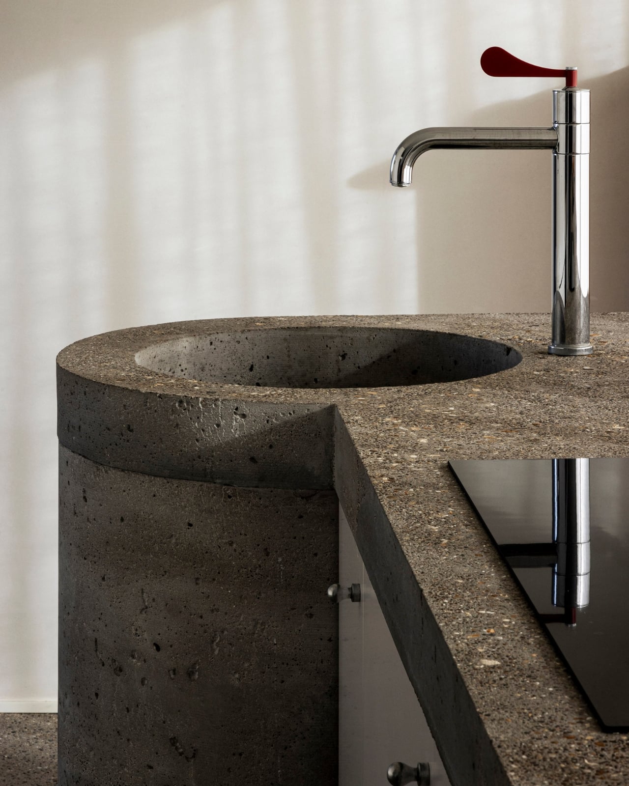
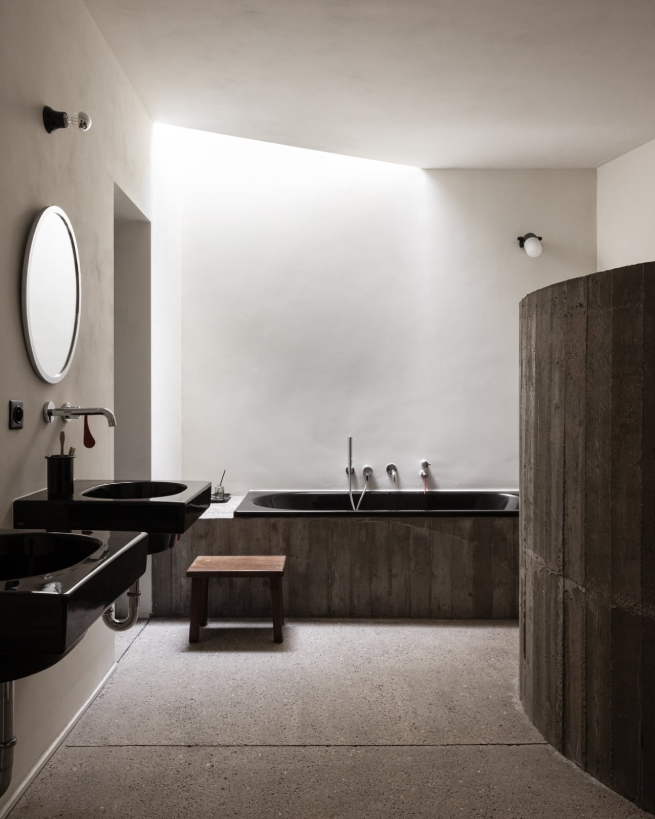
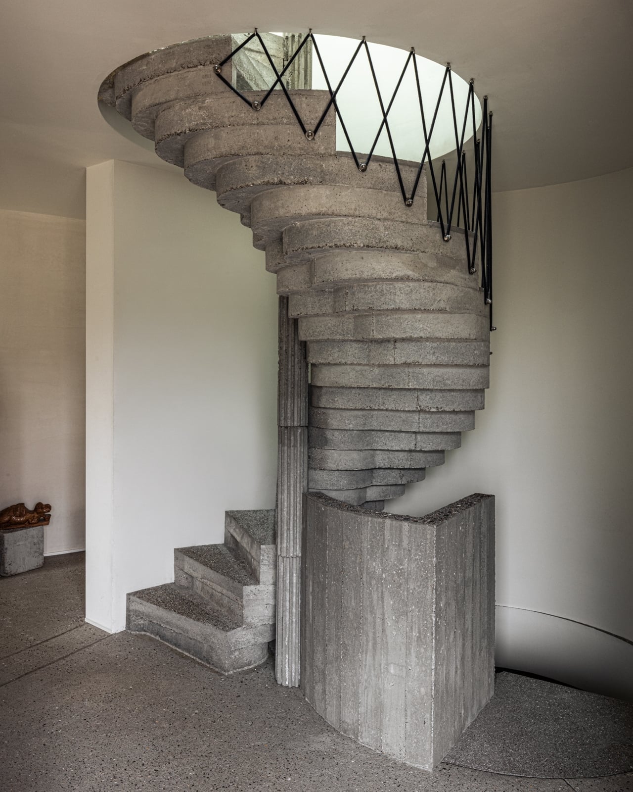
The concrete form is completely curved across the entire volume, not just as a surface treatment but as a governing logic, carried through every detail: the absent roof edges, the curved garage opening, even the way the house integrates into the ground. The bedrooms are half-buried in the dunes, which is both a functional and a conceptual move. The house doesn’t sit on the landscape. It’s anchored into it. Above those buried rooms, the living spaces rise toward the horizon, pulling in light and opening out to views of the dunes in a way that feels earned rather than forced.

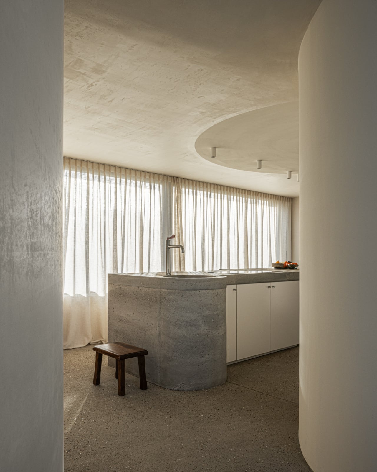
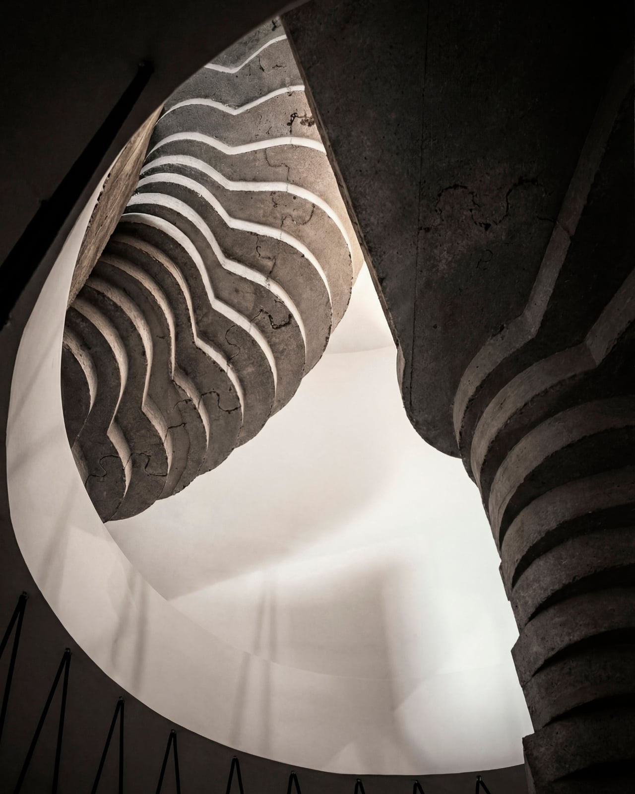
The way you move through the house is where Munters’ admiration for Le Corbusier becomes most legible. She’s spoken about his influence, specifically in “the rooftop solarium, in the way spaces expand and contract, and in the vertical shafts that structure movement through the house.” You enter through a vertical shaft that climbs toward the roof before expanding into the main living space. The compression-then-release is theatrical in the best sense. The house is working on your nervous system before you’ve even sat down.

I keep coming back to that word: deliberate. Munters uses it herself: “What might appear as a free form is in fact the result of a very deliberate construction logic.” That’s the tension the villa lives in, and frankly, it’s what makes it interesting. Nothing here is freehand improvisation. The curves look fluid because the logic behind them is airtight. The concrete looks like it grew from the dunes because the architect studied the dunes before she touched a drawing. That’s different from a building that mimics nature for aesthetic points. It’s rarer, and harder.
Belgian architecture doesn’t always get the international visibility it deserves, and Magalie Munters is one of those names worth paying attention to even if residential architecture isn’t usually your thing. Villa Nouvelle Vague is the kind of project that earns its name. It has the confidence of something that knows exactly what it is, and the intelligence not to over-explain itself. Just like the best films of the movement it references.

The post Belgium’s Most Striking Concrete Villa Was Designed by the Dunes first appeared on Yanko Design.

Belgium’s Most Striking Concrete Villa Was Designed by the Dunes

If you’ve ever stood on a beach and watched the tide pull back, you know that moment right before the water retreats completely, when it leaves those delicate horizontal lines etched across wet sand. That’s what the facade of Villa Nouvelle Vague looks like. Not metaphorically. Literally. Belgian architect Magalie Munters designed the concrete surface of this seaside villa in Oostduinkerke with a horizontal grain that mirrors the striations the North Sea leaves behind at low tide. The reference isn’t decorative, it’s structural. And that distinction matters.

The villa sits on a corner plot at the edge of a protected dune reserve in Oostduinkerke, a small coastal town already known for a few wonderfully eccentric things: a ship-shaped restaurant and fishermen who harvest shrimp on horseback. Into this landscape, Munters has introduced something that manages to be arresting without being loud. The form is sculptural and unmistakably modern, but it doesn’t shout. It settles.
Designer: Magalie Munters

The name “Nouvelle Vague” borrows from the French New Wave film movement, and the reference is apt in ways that go beyond the obvious nod to style. The French New Wave was defined by breaking conventional rules while remaining deeply committed to craft. Munters is working in a similar register. For years, her Ghent-based boutique studio has been developing residential architecture with organic geometries, pushing against the idea that construction methods should set the ceiling on what architecture can achieve. “Through that ongoing research, I developed a way of building in which construction and technology no longer act as a limitation to the architecture,” she explains. Villa Nouvelle Vague is where that research cashes out.
The concrete form is completely curved across the entire volume, not just as a surface treatment but as a governing logic, carried through every detail: the absent roof edges, the curved garage opening, even the way the house integrates into the ground. The bedrooms are half-buried in the dunes, which is both a functional and a conceptual move. The house doesn’t sit on the landscape. It’s anchored into it. Above those buried rooms, the living spaces rise toward the horizon, pulling in light and opening out to views of the dunes in a way that feels earned rather than forced.

The way you move through the house is where Munters’ admiration for Le Corbusier becomes most legible. She’s spoken about his influence, specifically in “the rooftop solarium, in the way spaces expand and contract, and in the vertical shafts that structure movement through the house.” You enter through a vertical shaft that climbs toward the roof before expanding into the main living space. The compression-then-release is theatrical in the best sense. The house is working on your nervous system before you’ve even sat down.

I keep coming back to that word: deliberate. Munters uses it herself: “What might appear as a free form is in fact the result of a very deliberate construction logic.” That’s the tension the villa lives in, and frankly, it’s what makes it interesting. Nothing here is freehand improvisation. The curves look fluid because the logic behind them is airtight. The concrete looks like it grew from the dunes because the architect studied the dunes before she touched a drawing. That’s different from a building that mimics nature for aesthetic points. It’s rarer, and harder.

Belgian architecture doesn’t always get the international visibility it deserves, and Magalie Munters is one of those names worth paying attention to even if residential architecture isn’t usually your thing. Villa Nouvelle Vague is the kind of project that earns its name. It has the confidence of something that knows exactly what it is, and the intelligence not to over-explain itself. Just like the best films of the movement it references.

The post Belgium’s Most Striking Concrete Villa Was Designed by the Dunes first appeared on Yanko Design.