There are few symbols more familiar than the heart. It appears everywhere, from children’s drawings to luxury branding, which is perhaps why designers rarely touch it. The shape carries so much cultural baggage that it can quickly slip into sentimentality.
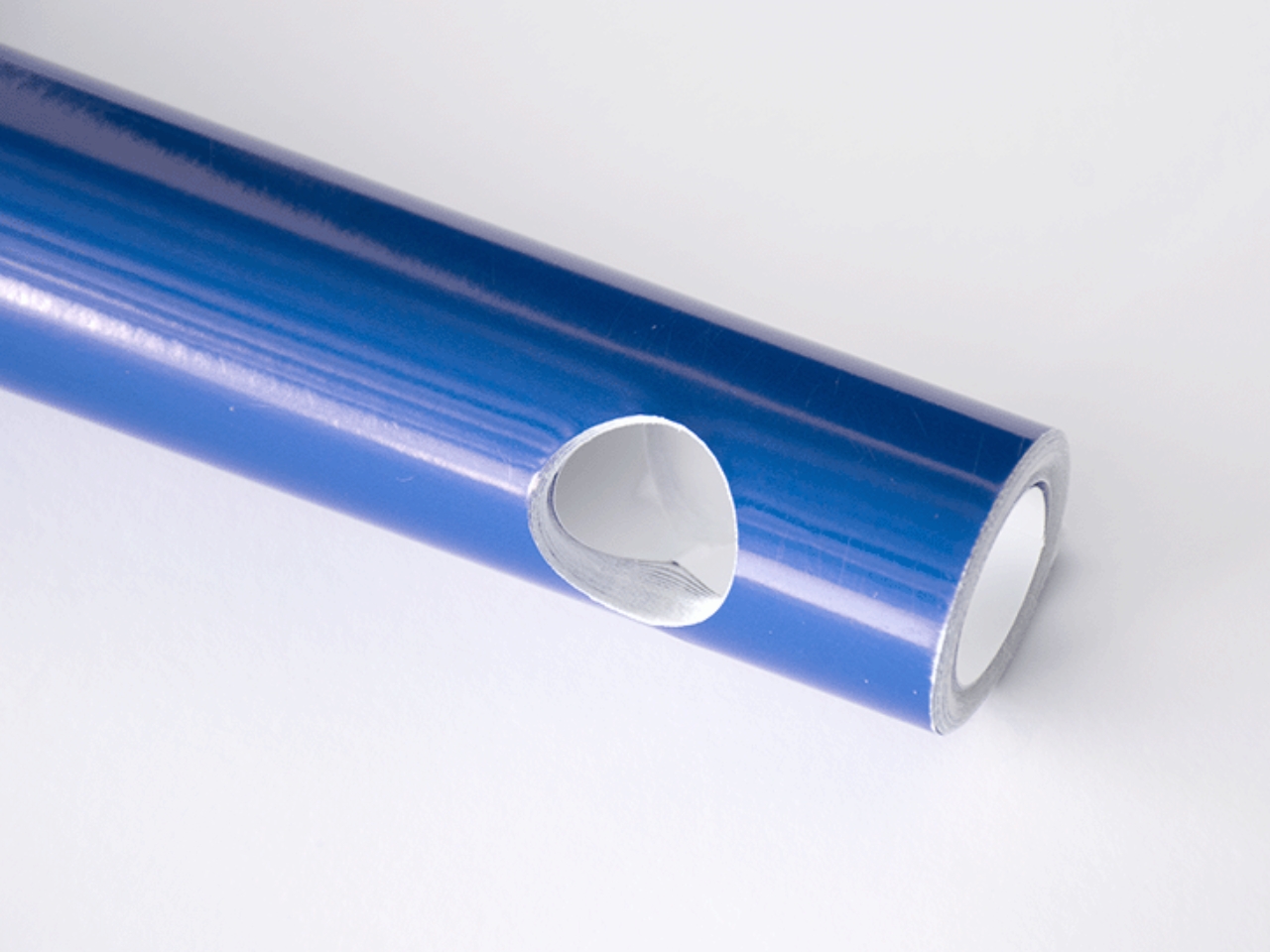
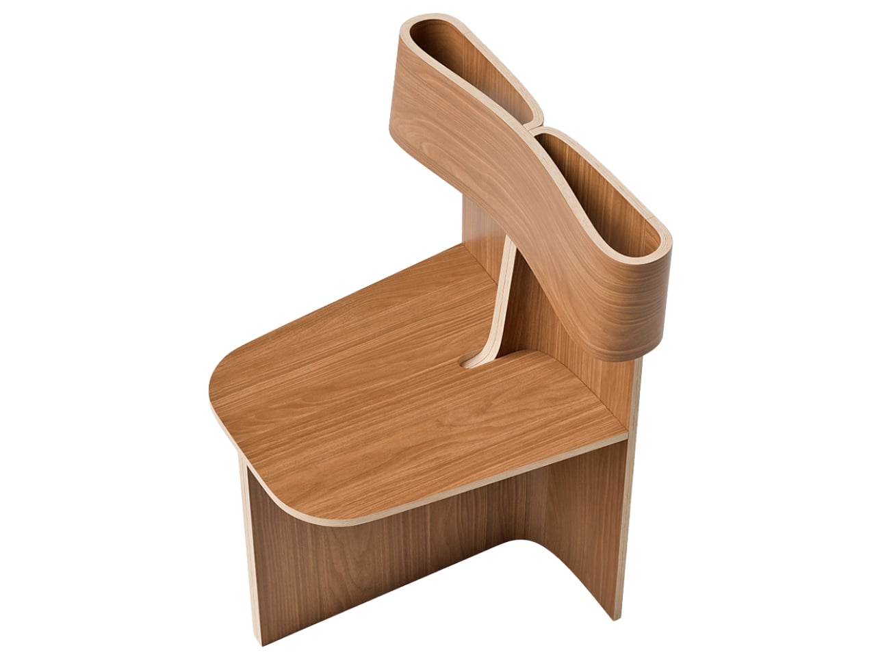
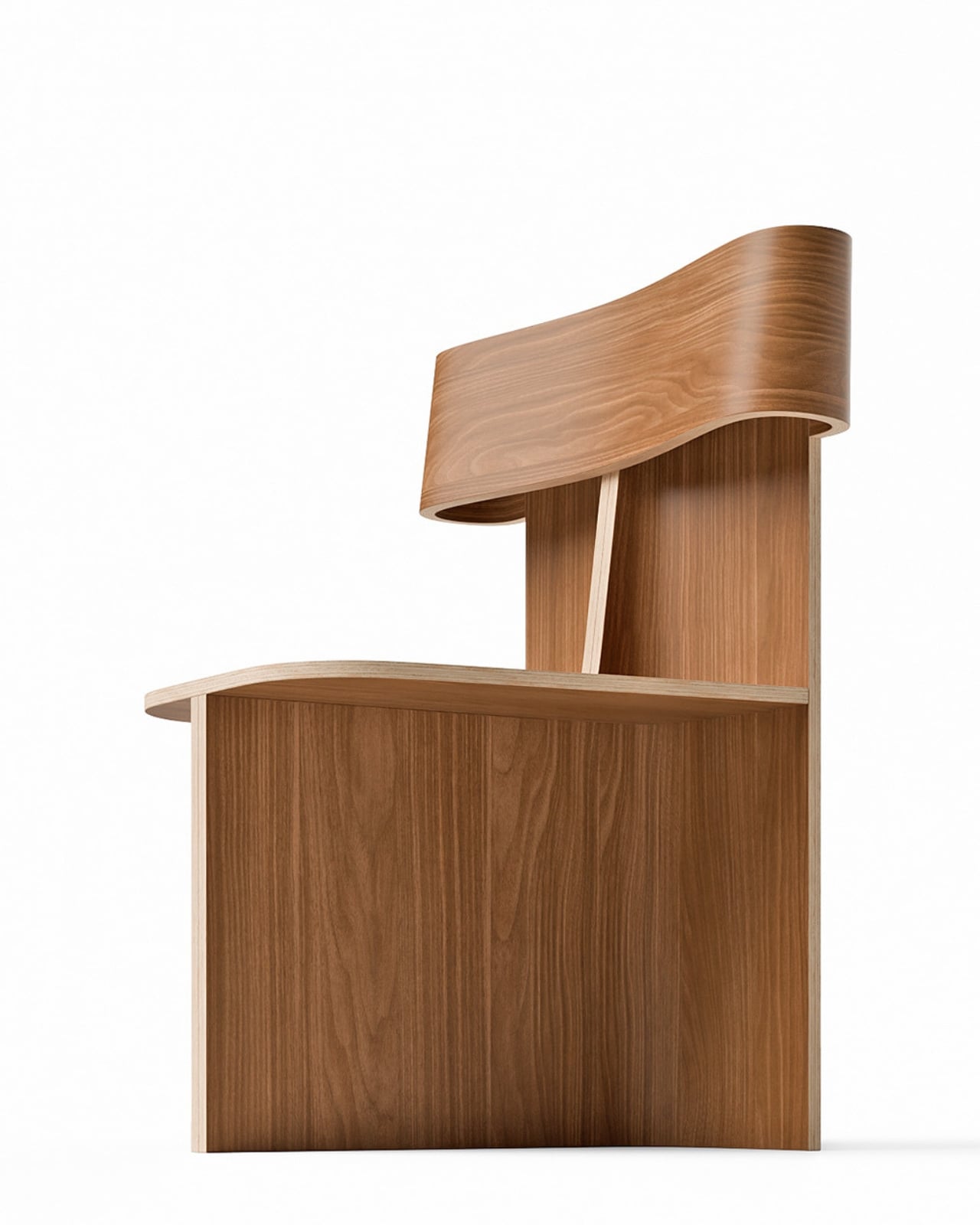
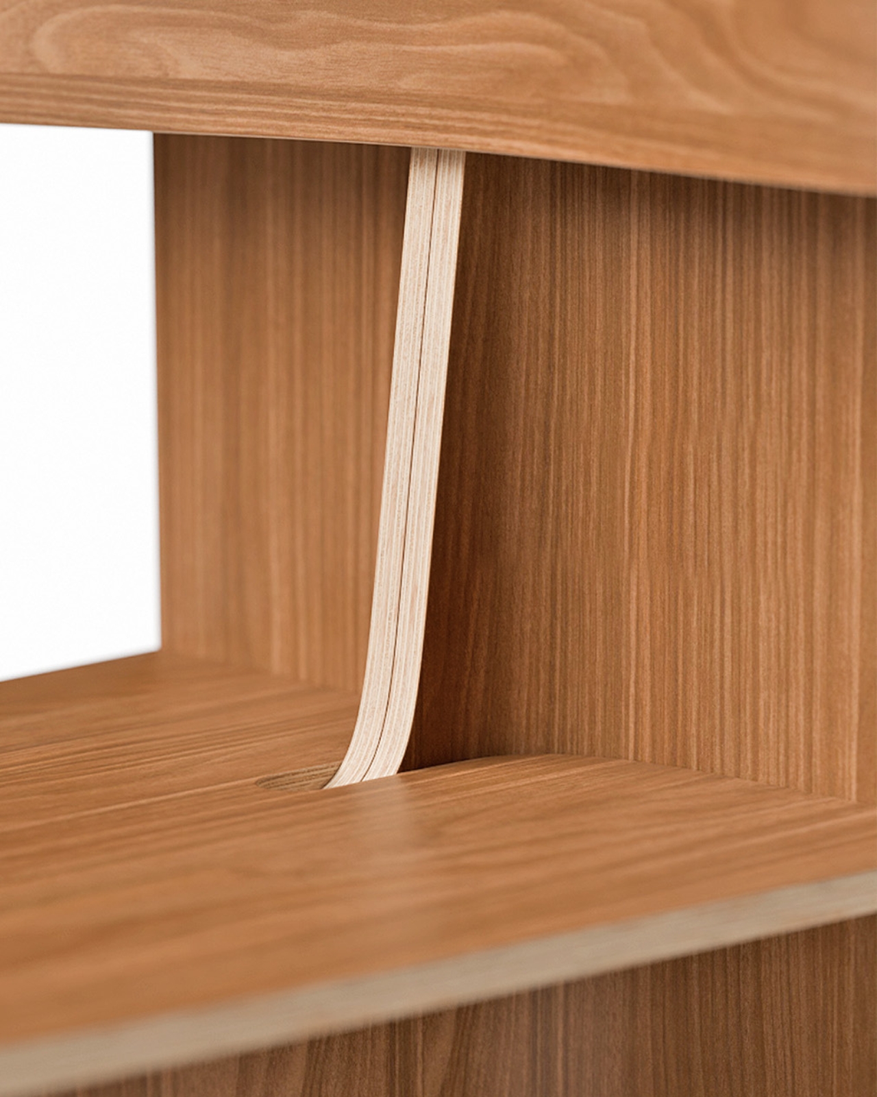
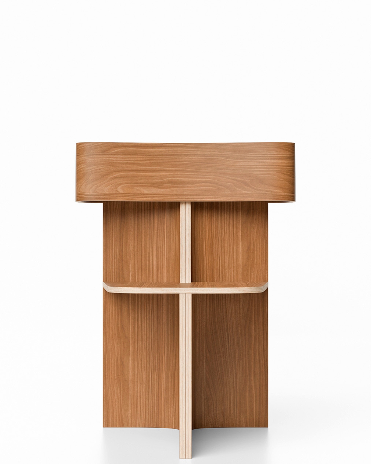
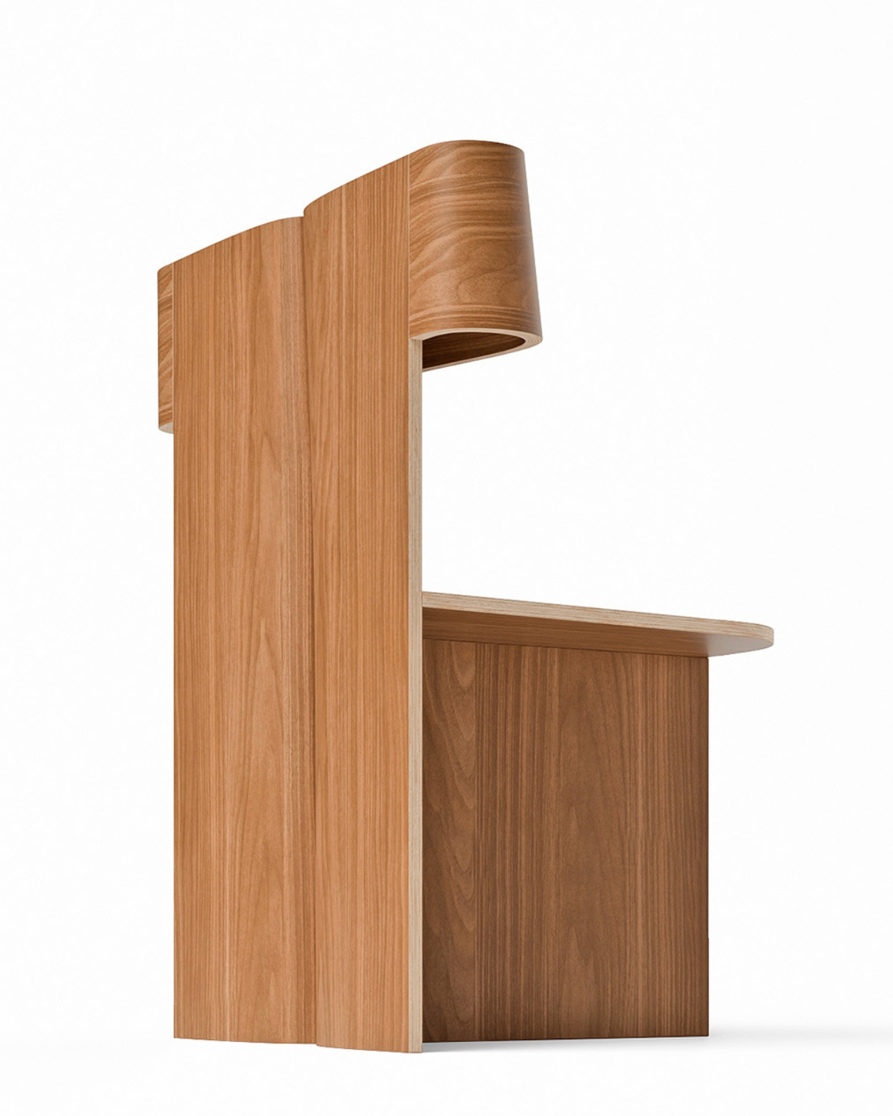
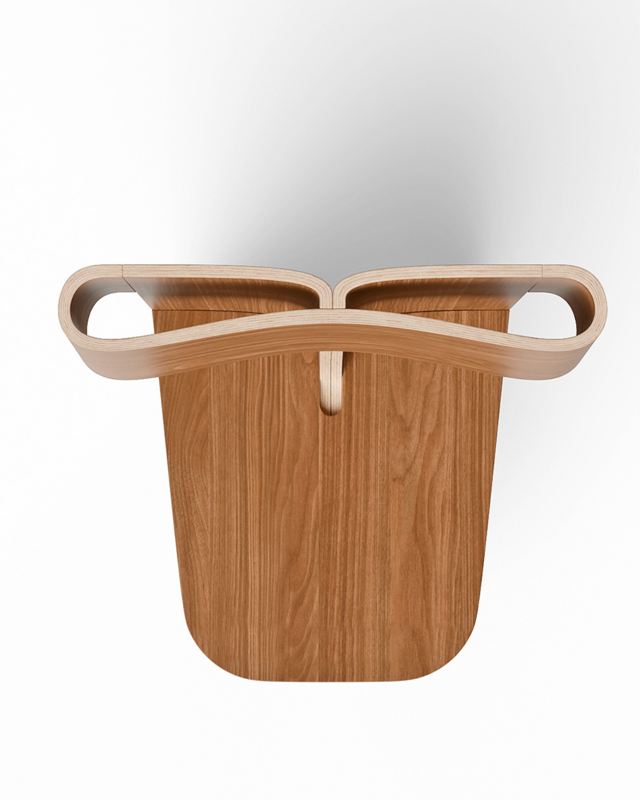
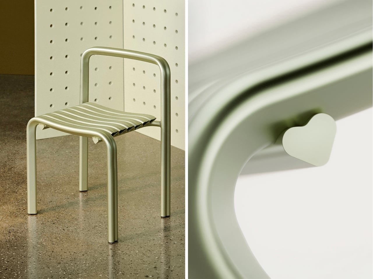
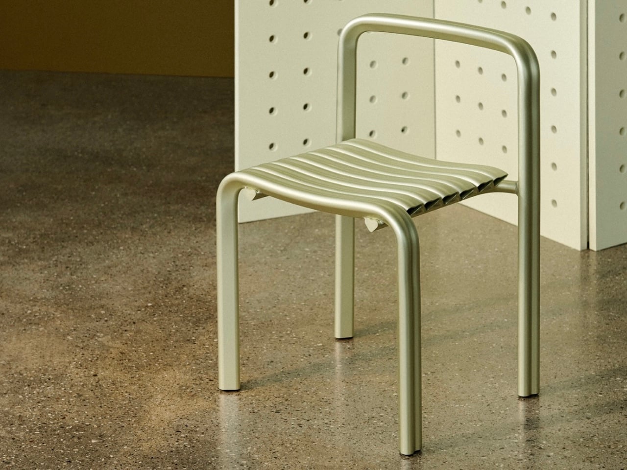
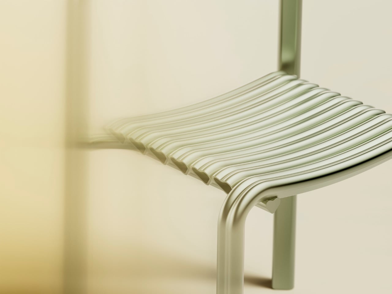
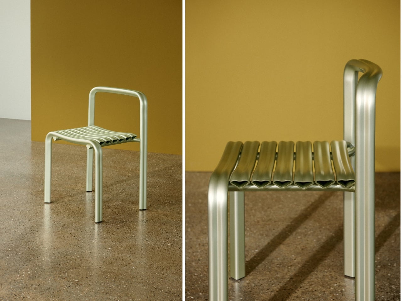
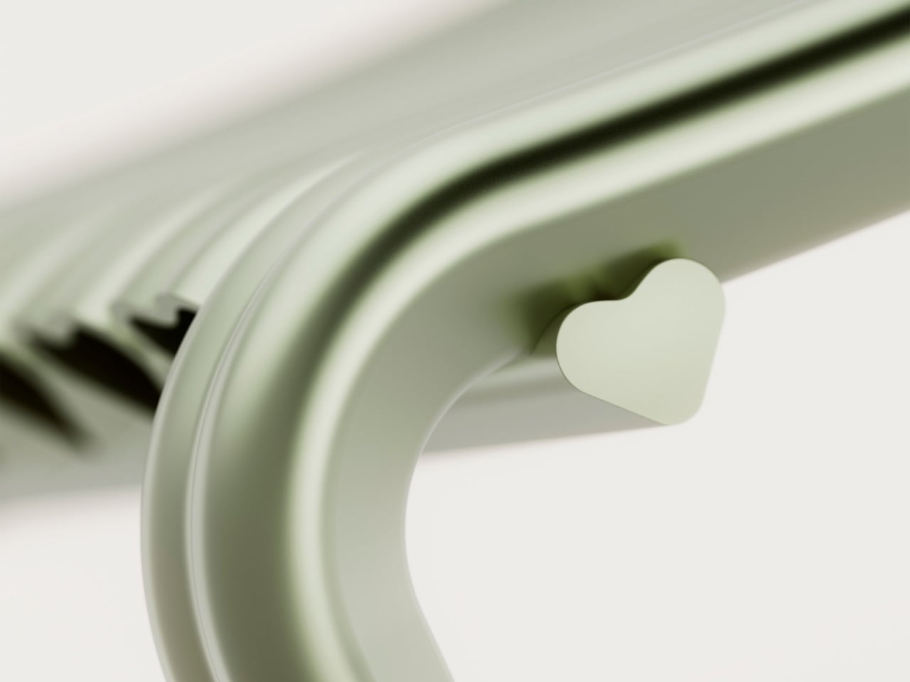
For its twentieth anniversary, Danish furniture brand Muuto decided to take that risk! Created with Copenhagen studio Spacon, the *Close to Heart* chair debuts during 3 Days of Design as part of Muuto’s anniversary programme, *Next Chapters in Scandinavian Design*. Limited to 150 pieces and produced in Denmark from extruded aluminium, the chair transforms the heart from a graphic symbol into a structural system. Every profile used to construct the chair is shaped like a heart.
The project began with a clear direction from Muuto, which was to avoid nostalgia. Rather than celebrating the past, the anniversary was framed as an opportunity to explore where Scandinavian design might go next. For Spacon partners Nikoline Dyrup Carlsen, Malene Hvidt, and Svend Jacob Pedersen, that conversation led unexpectedly to the heart.
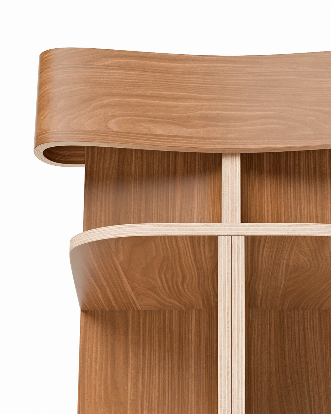
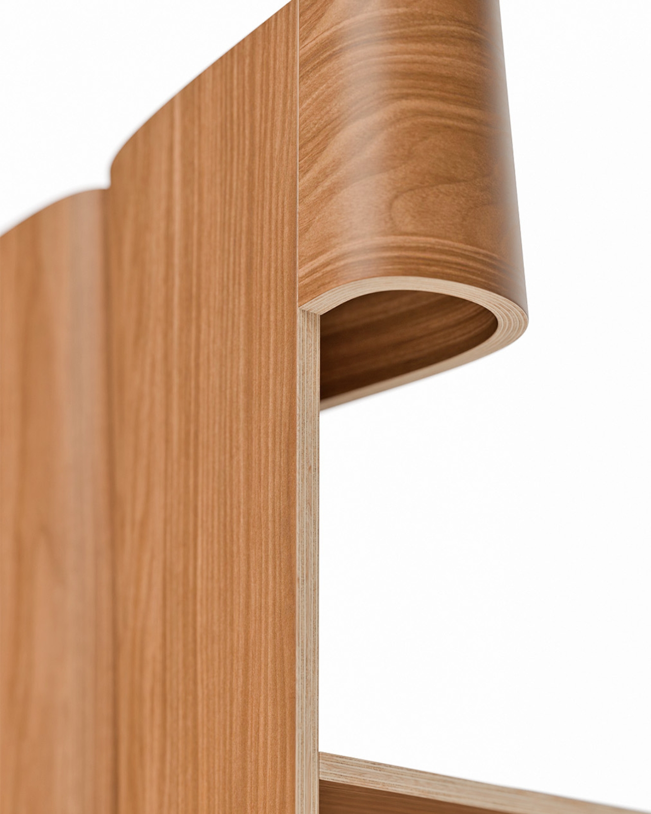
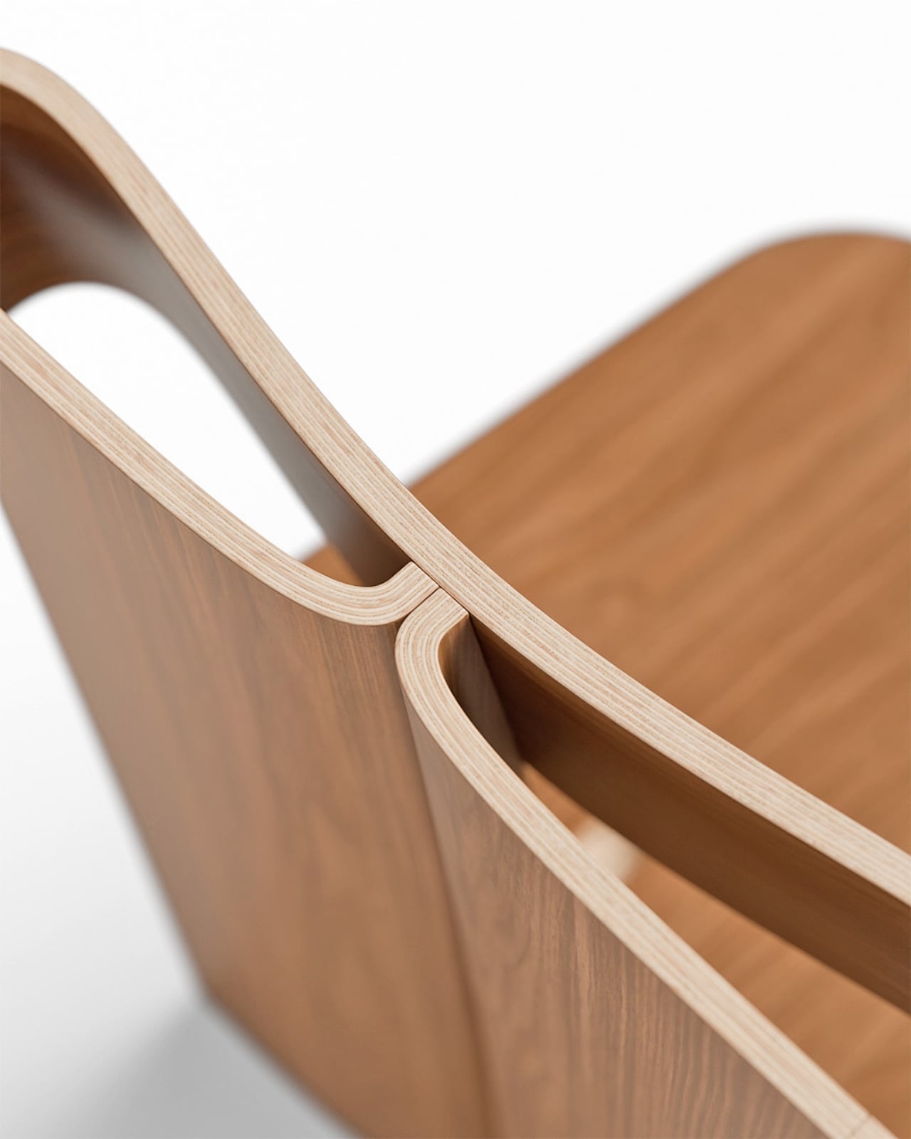
What attracted the designers was not its symbolism alone, but its geometry. A heart combines two very different formal qualities within a single shape. One side is defined by a sharp triangular point, while the other is made up of generous curves. It is a shape that feels simple at first glance, yet becomes surprisingly intricate when examined closely.
That balance between softness and precision carries through the entire chair. From a distance, the heart references are obvious. Up close, they begin to disappear into the construction, becoming part of the chair’s proportions, joints, and structure rather than decorative details.
Material selection played an equally important role. Extruded aluminium is typically associated with engineering and manufacturing efficiency, making it an unusual choice for an object built around one of culture’s most emotionally loaded symbols. Yet the designers found that the material’s characteristics aligned naturally with the concept. Its light weight and ability to accommodate smooth curves allowed the heart profile to be repeated throughout the chair without becoming visually heavy.
The anodized finish further softens the material’s appearance. Instead of presenting aluminium as hard or industrial, the treatment gives the surface a subtle depth that reacts to changing light throughout the day. Reflections become muted, colors from the surrounding environment are absorbed into the surface, and the material takes on a quieter presence.
The chair sits within a broader collaboration between Muuto and Spacon centred on the relationship between technical systems and emotional experience. Muuto’s history is rooted in innovation and manufacturing development, while Spacon’s work frequently crosses between architecture, interiors, art, and craft. Close to Heart brings those interests together in a single object.
That intersection feels particularly relevant to how Scandinavian design is evolving today. The defining values remain familiar: experimentation, material honesty, and careful craftsmanship. What is changing is the willingness to embrace stronger narratives, cultural references, and emotional expression without treating them as separate from function.
The heart, surprisingly, proved to be a useful vehicle for that discussion. What could easily have become a novelty instead became a study in proportion, material, and manufacturing. The symbolism is impossible to ignore, yet the chair succeeds because it never relies on symbolism alone.
For Muuto and Spacon, the anniversary project is less about celebrating twenty years of design history than testing where design can go next. If Close to Heart is any indication, that future may involve a little more emotion, a little more playfulness, and a willingness to find sophistication in places designers have often overlooked.
The post Muuto’s Minimalist Chair Hides A Tiny Heart In Its Details first appeared on Yanko Design.