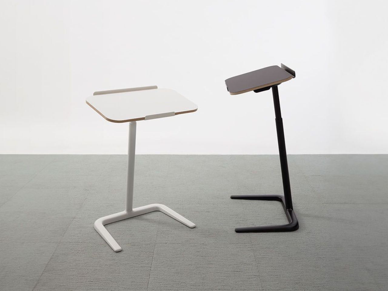
Cosi Laptop Table Brings a Fully Adjustable Work Surface to Any Chair

Laptops have escaped the desk and now show up on sofas, lounge chairs, and every in-between space, often with terrible posture as a side effect. Balancing a laptop on your knees or hunching over a coffee table is fine for checking email but not for real work. The Cosi laptop table is a small, adjustable surface designed to follow those habits and make them more ergonomic.

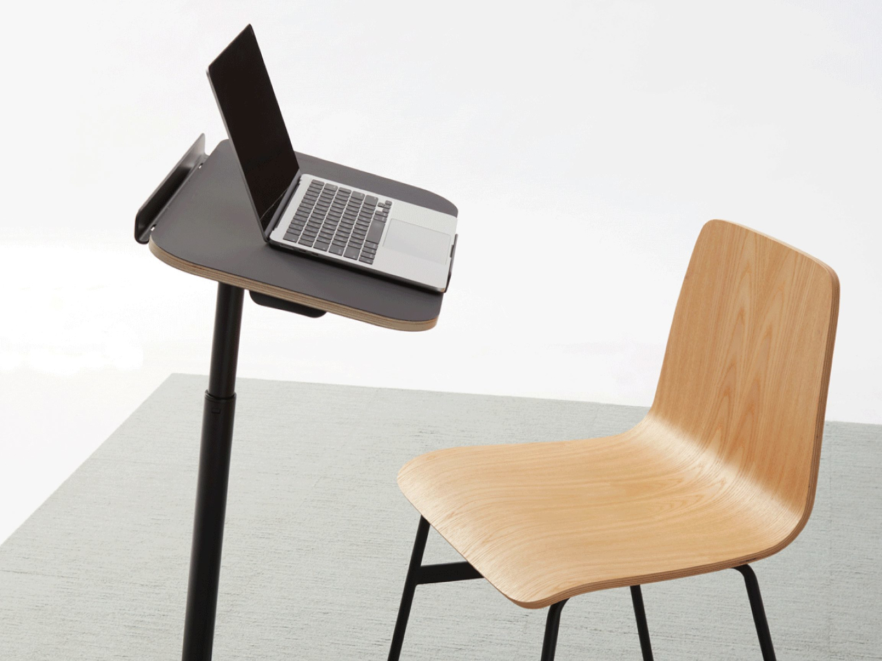
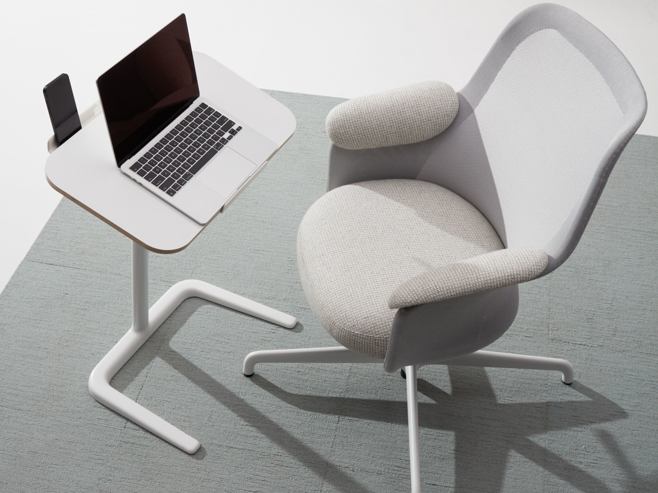
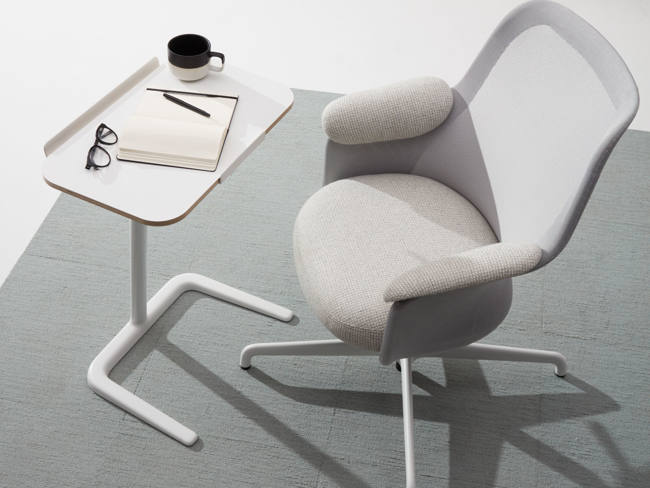
Cosi is a fully adjustable laptop table developed by Pearson Lloyd for Teknion’s portfolio. It’s a compact side table with a height-adjustable column and a slim top, meant to support typing, writing, or video calls whether you’re in a task chair or a deep lounge. Despite its simple silhouette, it’s the result of a careful review of how people actually work across different seating types and informal spaces.

Designer: Pearson Lloyd for Teknion
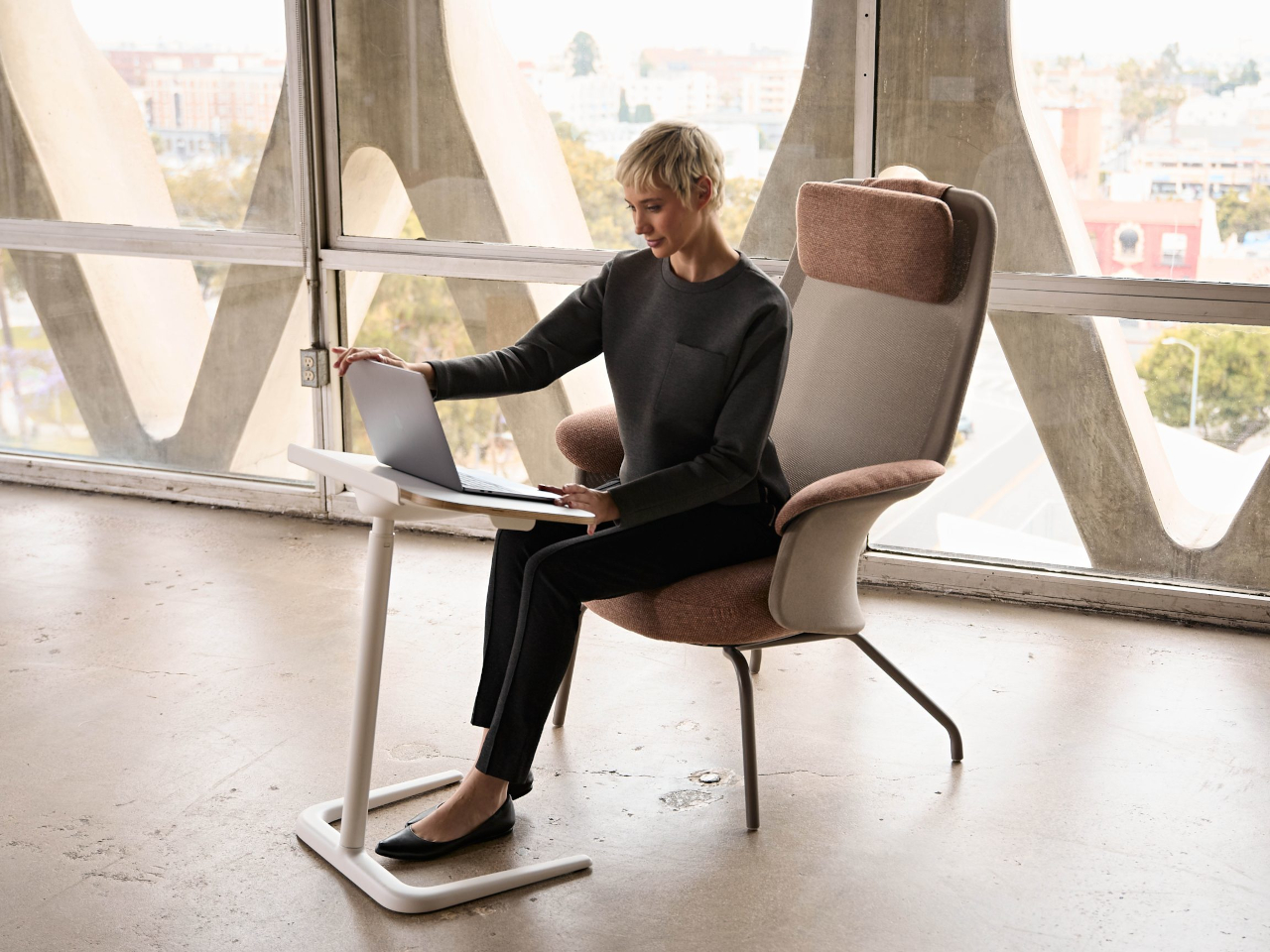
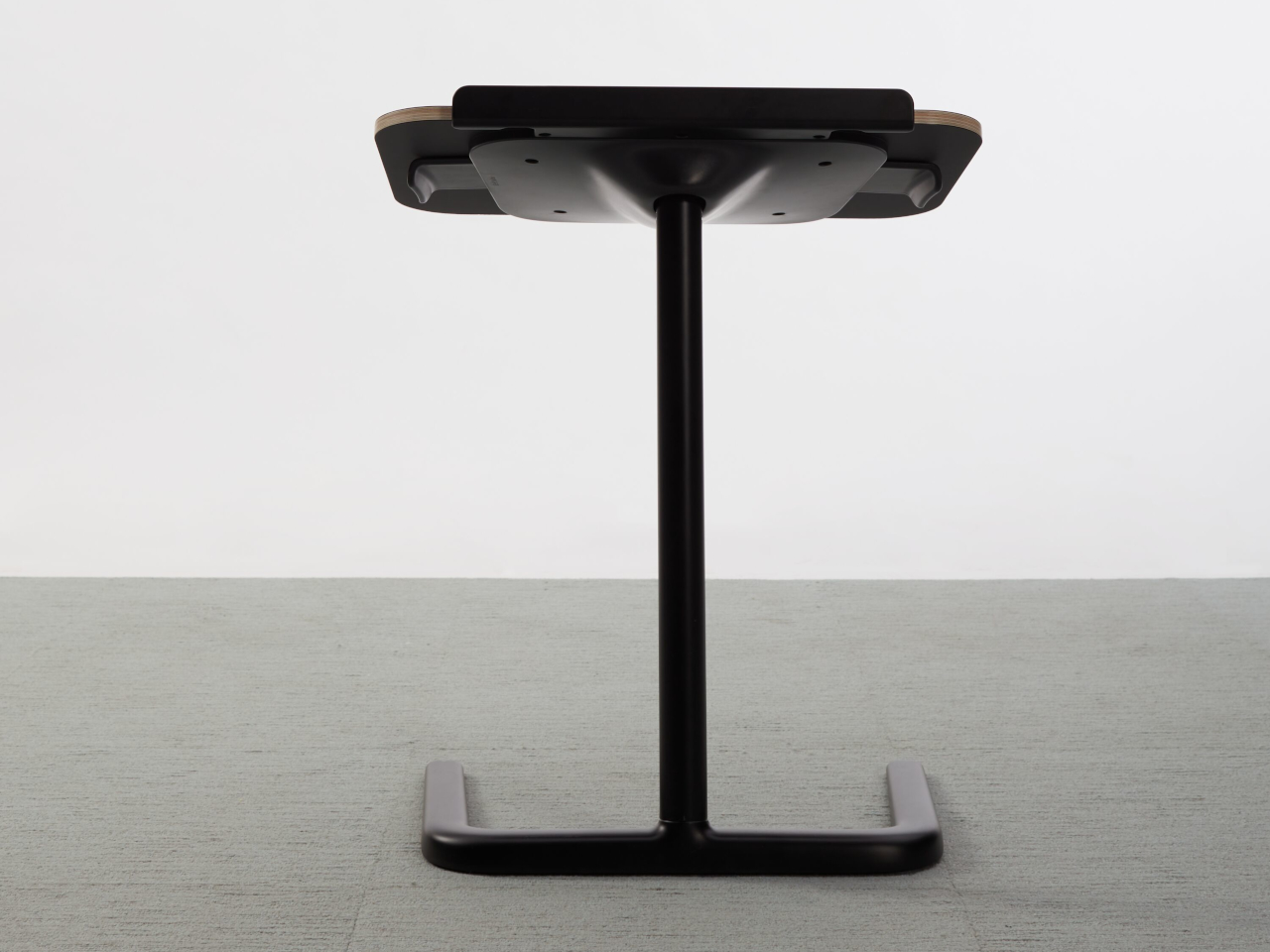
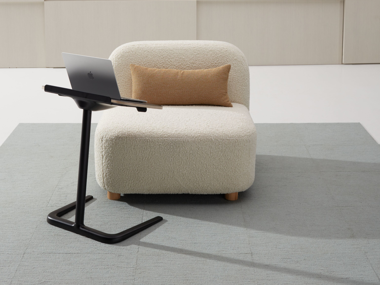
The basic form is a thin rectangular top with softly rounded corners sitting on a single round column, which rises from a flat, low-profile base. The base is slim enough to slide under chair legs or lounge frames, while the offset column lets the top cantilever over your lap. The proportions keep it visually light, so it reads as a quiet companion rather than a shrunken desk taking up floor space.
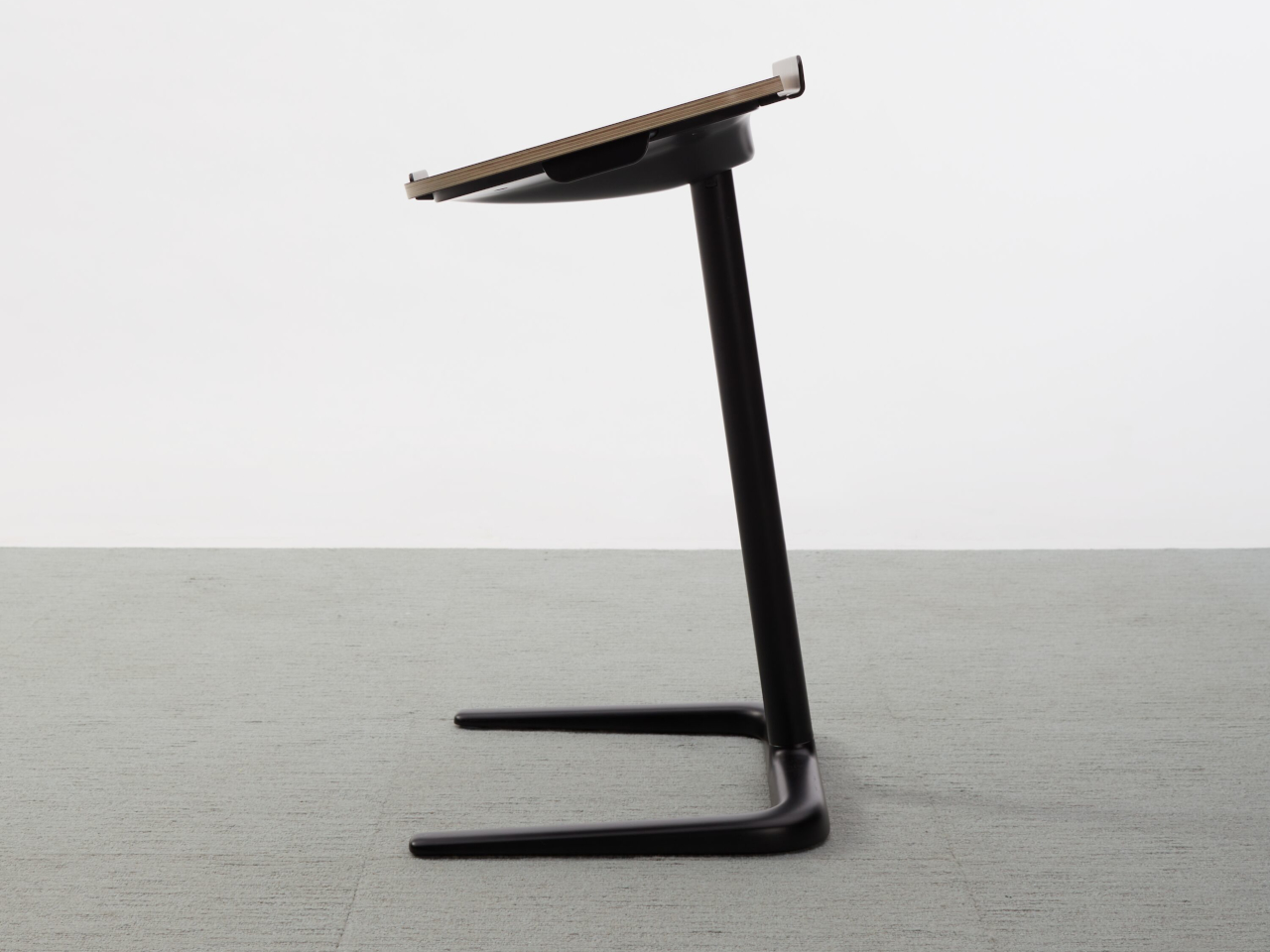
The column allows the top to move from standard typing height when you’re upright in a task chair to a higher position when you’re reclined in a lounge. That means your wrists and shoulders can stay in a more neutral position instead of hunching over a laptop balanced on your knees. Cosi turns casual seating into a place where you can actually work comfortably for more than ten minutes.
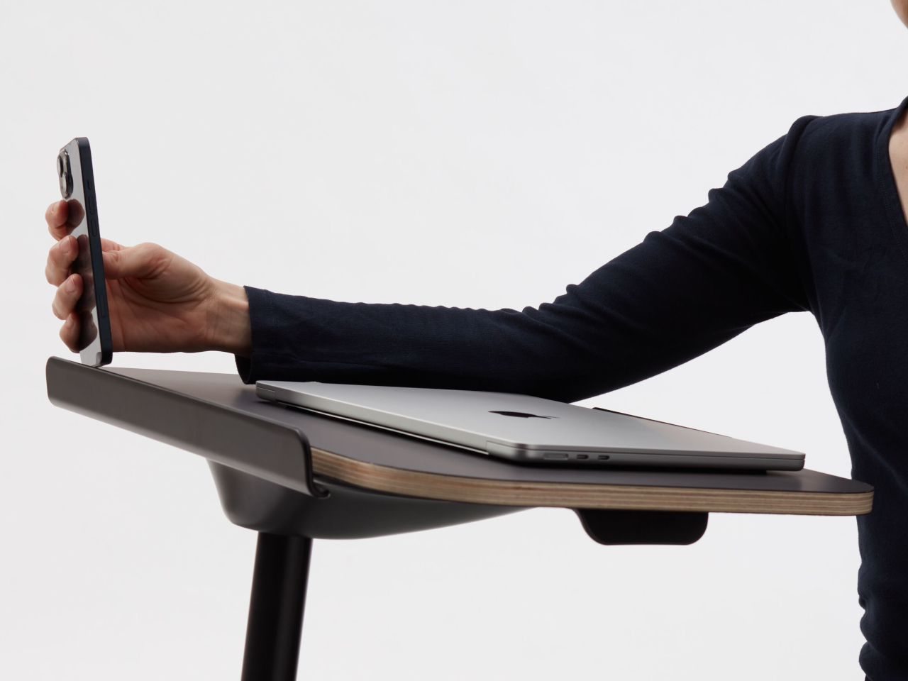
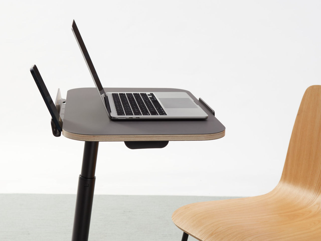
Paired with Teknion’s Aarea lounge chairs, the base tucks under the sled frame while the top hovers over the seat. In more traditional offices, it can park next to task chairs as a personal work island. Because it’s small and visually quiet, multiple tables can live in a lounge or focus area without making the space feel cluttered or over-furnished like a forest of full-size desks.
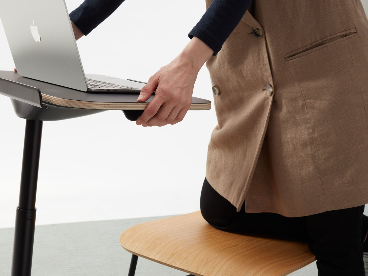
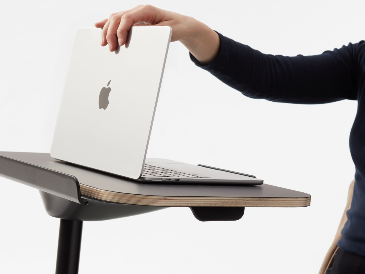
The detailing makes it feel more like furniture than equipment. The tabletop edge is thin and refined, the column-to-base junction is clean, and the finishes align with Teknion’s broader palette, from neutral paints to wood-look tops. There are no exposed mechanisms or clunky levers, just a smooth, minimal form that hides the engineering and lets you focus on the surface itself.
Cosi is one of those small tools that quietly make hybrid work more sustainable. It doesn’t try to replace a full desk, but it gives laptops a proper landing spot wherever you choose to sit. By combining adjustability, a slim footprint, and a restrained aesthetic, it turns the improvised habit of working from any chair into something your body and your workspace can live with a little better.
The post Cosi Laptop Table Brings a Fully Adjustable Work Surface to Any Chair first appeared on Yanko Design.
This School Chair Concept Has 3D-Printable Replacement Parts

Old school chairs like the Mullca were built to survive decades of abuse, with welded steel frames and bolted parts that could outlast the building itself. That durability was impressive, but it also meant the chairs were impossible to take apart or repair at home if something did eventually break. Contemporary designers are questioning whether indestructibility is the only way to think about longevity, with design for disassembly and repair becoming just as important as raw toughness.

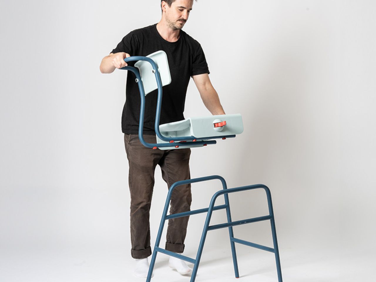
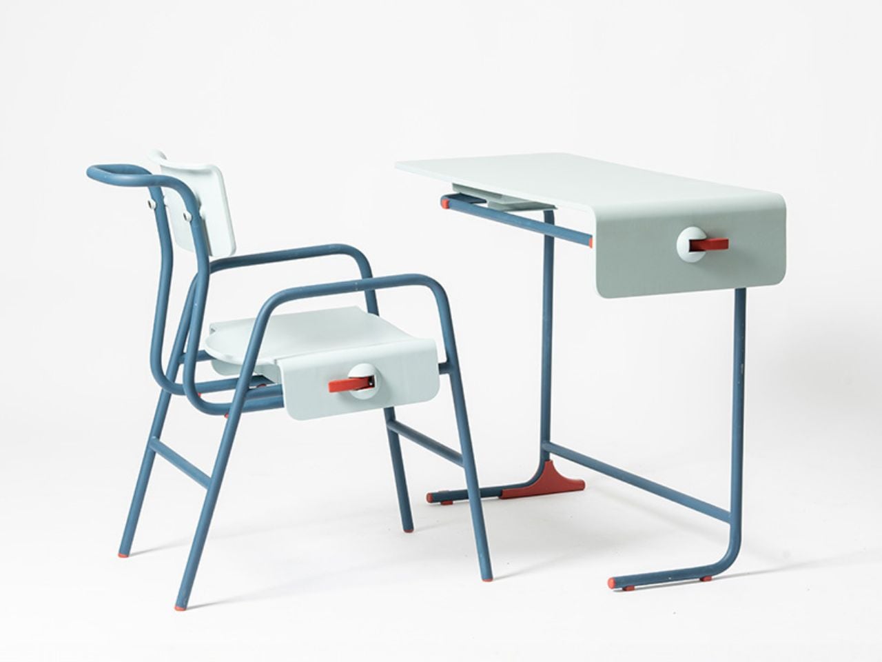
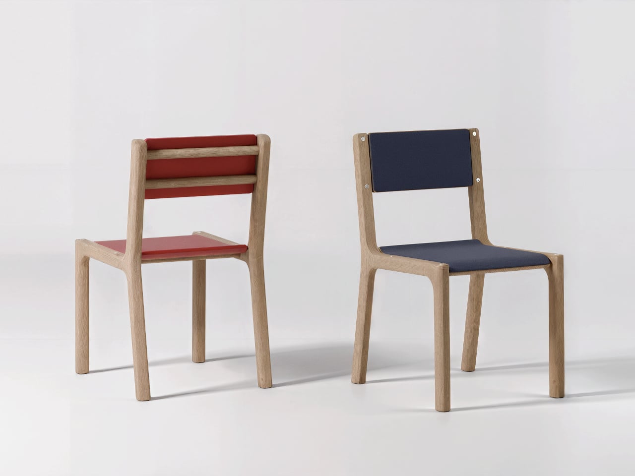
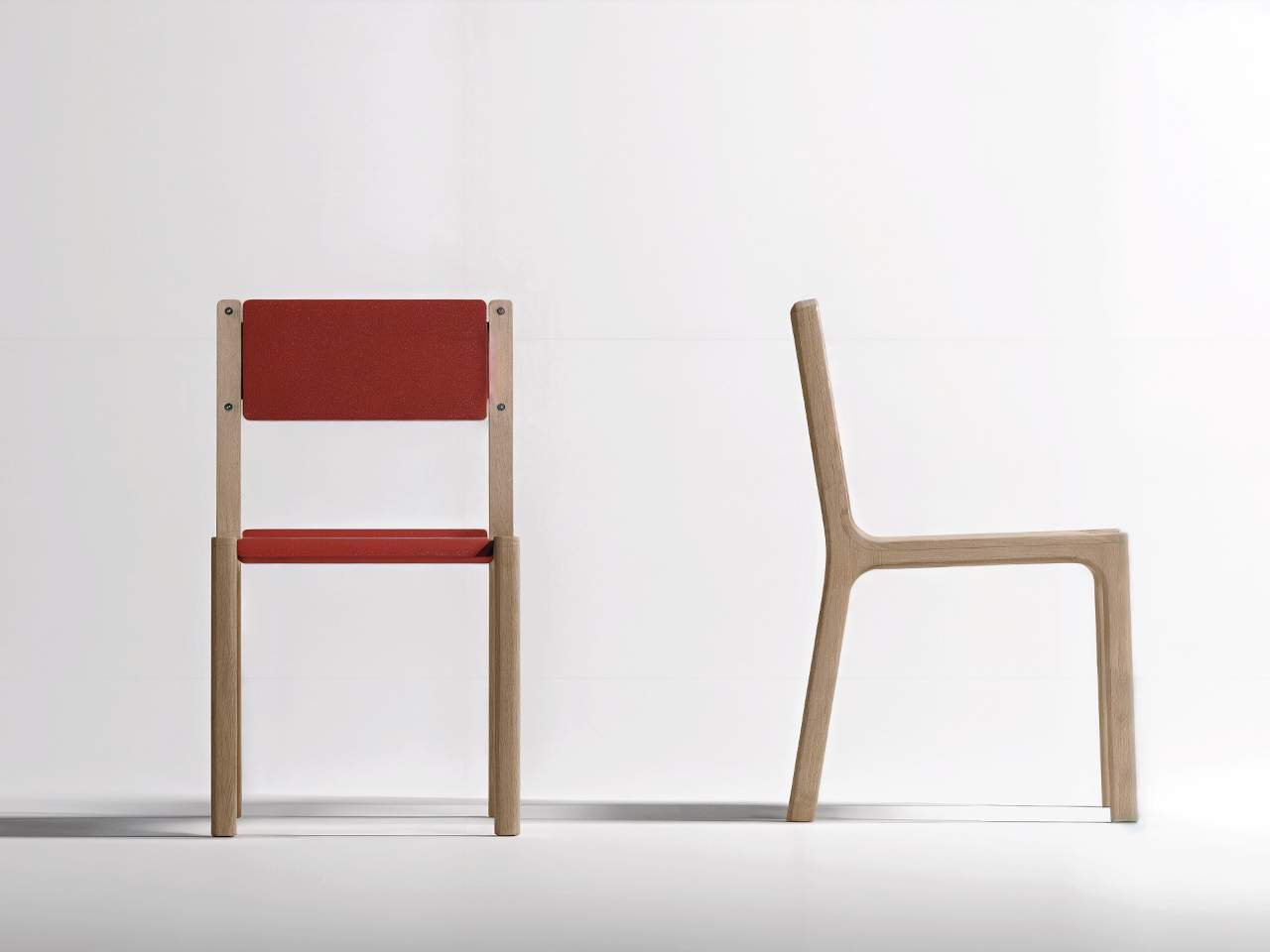
Carrousel is a chair concept by Thibaud Rollet that starts from the familiar silhouette of nostalgic school chairs but shifts the focus to how it is assembled and maintained. Instead of chasing the legendary durability of a Mullca, Carrousel is designed to be easy to produce, disassemble, and repair, with individual elements that can be replaced or even 3D printed by the user at home when parts wear out or need refreshing.

Designer: Thibaud Rollet

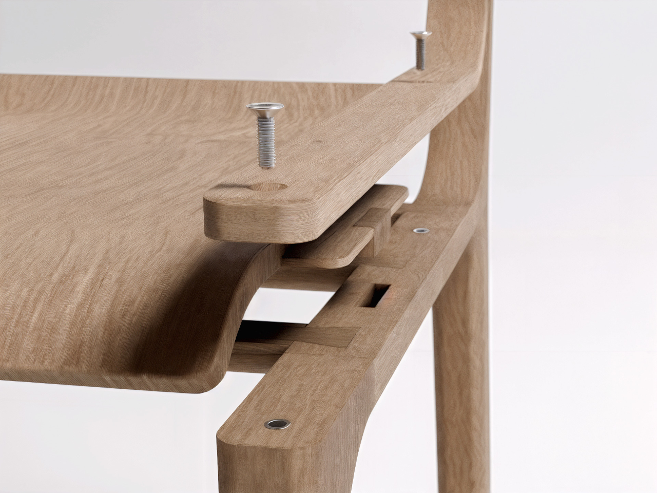
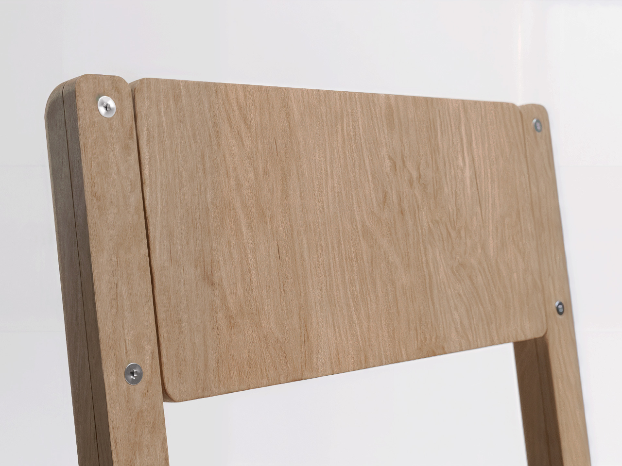
The basic construction is straightforward. A bent or laminated wooden frame forms the legs and backrest supports, while horizontal traverse pieces carry the structural load. The seat and backrest are separate panels fixed with four screws each, visible on the surface. Those screws bite into metal threaded inserts embedded in the wood, so panels can be removed and reattached repeatedly without damaging the material or stripping the threads.

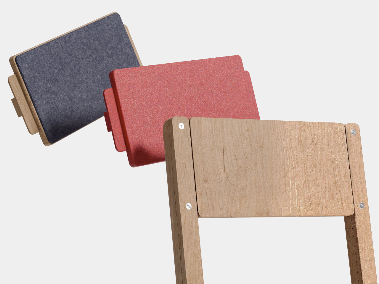
The covering L-shaped pieces sit over the joints between the frame and the seat or backrest. These parts are held in place by the screws and inserts, and they are the most likely candidates for 3D printing. Users could swap them out to change colors, textures, or even shapes, turning a functional joint into a place for customization and personal expression without needing professional tools.

The visible screws and simple joinery send a clear message that the chair is meant to be taken apart, not treated as a sealed object. Instead of hiding the assembly, Carrousel uses it as part of the aesthetic language. That openness encourages people to replace worn panels, refresh the look, or tinker with new parts, extending the chair’s life in a way that feels approachable rather than intimidating.

Of course, swapping a backrest or changing the covering pieces can refresh the chair without replacing the whole thing, and the act of playing with those options adds emotional value. When you’ve customized or repaired something yourself, you are more likely to keep it around rather than send it to the curb when a screw loosens or a panel gets scratched.

Carrousel borrows the reassuring outline of a school chair but rewires the logic underneath, making it easy to disassemble, repair, and personalize. It suggests that the next generation of everyday chairs might be less about lasting untouched forever and more about being easy to live with, update, and care for. That shift from indestructible to repairable might end up keeping more furniture out of landfills than any amount of added steel ever could.

The post This School Chair Concept Has 3D-Printable Replacement Parts first appeared on Yanko Design.
TWIST Bends One Metal Sheet Into Table, Storage, and Handle

Side tables usually end up as simple flat discs on legs, doing little more than holding a drink or a phone you keep checking when you should be reading. There’s nothing wrong with that, but it also means they contribute almost nothing else to a room beyond a horizontal surface. The growing interest in compact, multi-functional furniture has designers rethinking how small pieces like side tables can quietly add storage and flexibility without cluttering a space.

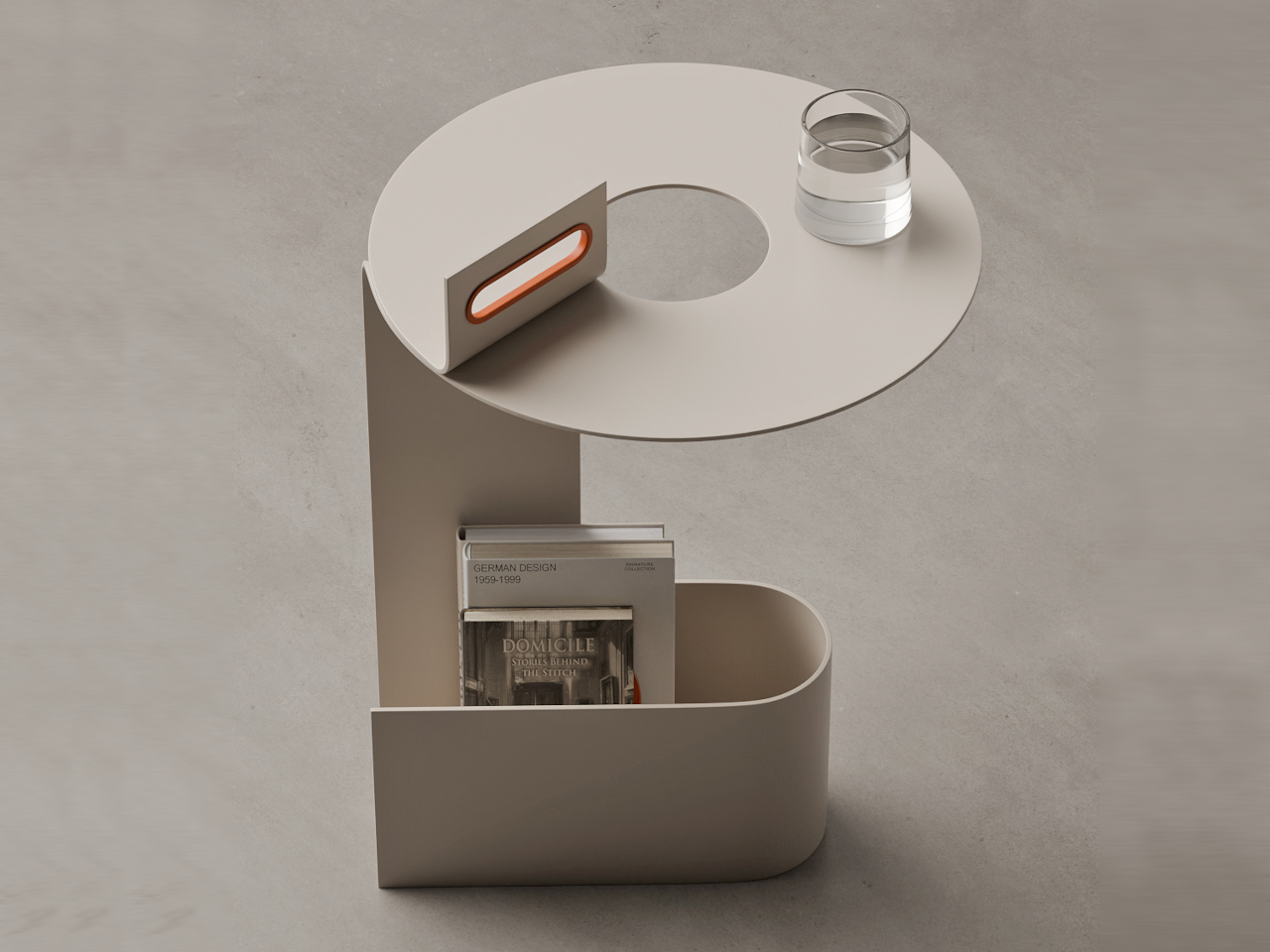
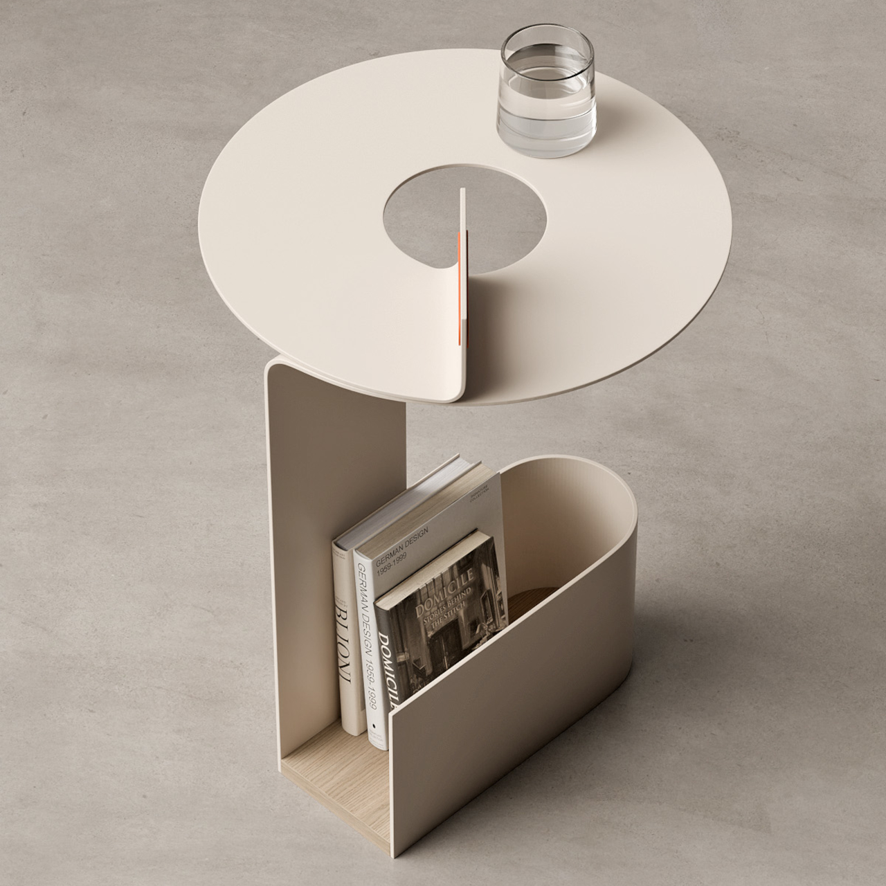
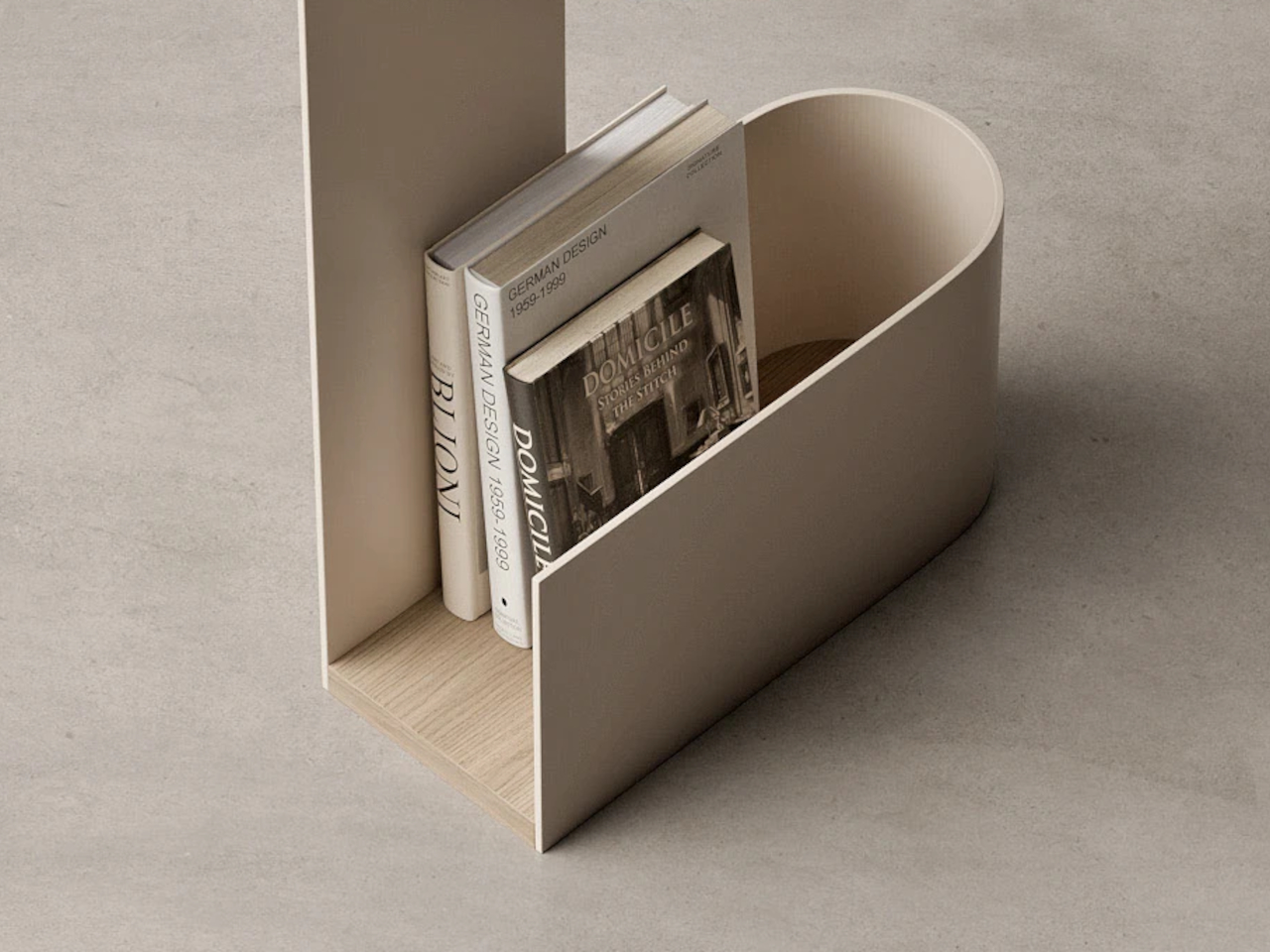
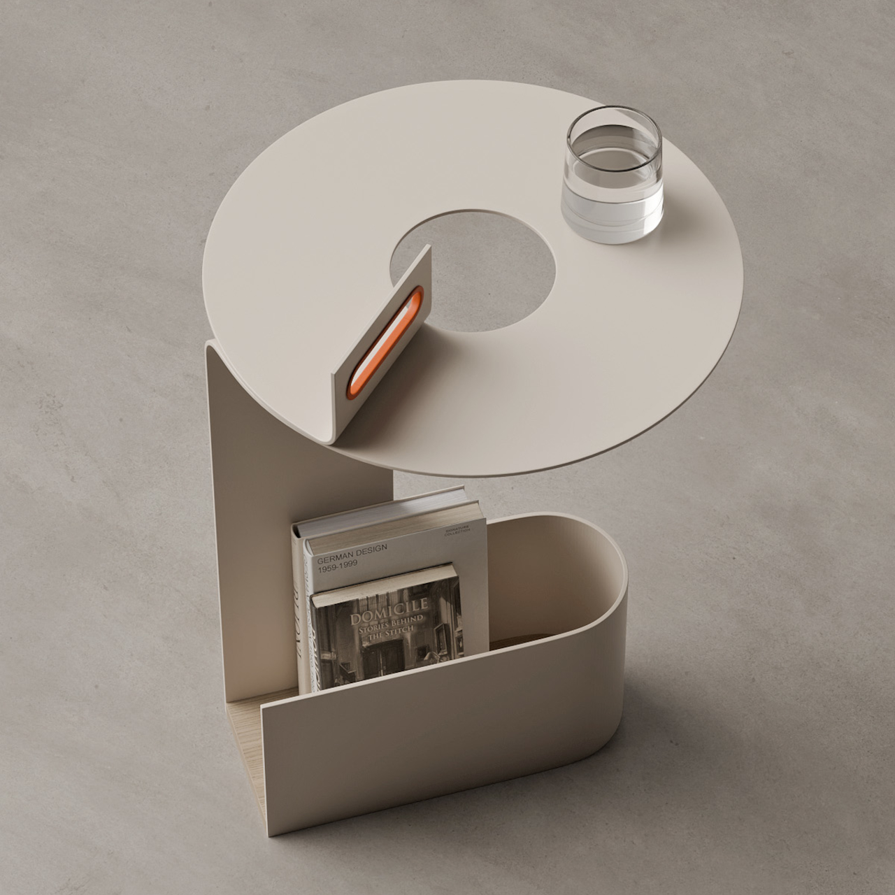
The TWIST side table uses a single sheet of metal looping in a circular motion to form a tabletop, support, and storage all at once. It integrates a carry handle and a book compartment, with a wooden base adding warmth to balance the cool metal. The whole piece reads like a ribbon frozen mid-twist rather than a collection of separate parts, giving it a sculptural quality that works even when it’s not holding anything.

Designer: Joao Teixeira

The geometry is surprisingly simple once you trace it. The metal rises from the floor as a vertical panel, bends into a round tabletop with a large central cut-out, then drops down and curls into an oval storage bin at the base. The tabletop forms a ring that frames whatever you place on it, while the circular void in the center lightens the visual mass and makes room for the handle element to pass through.

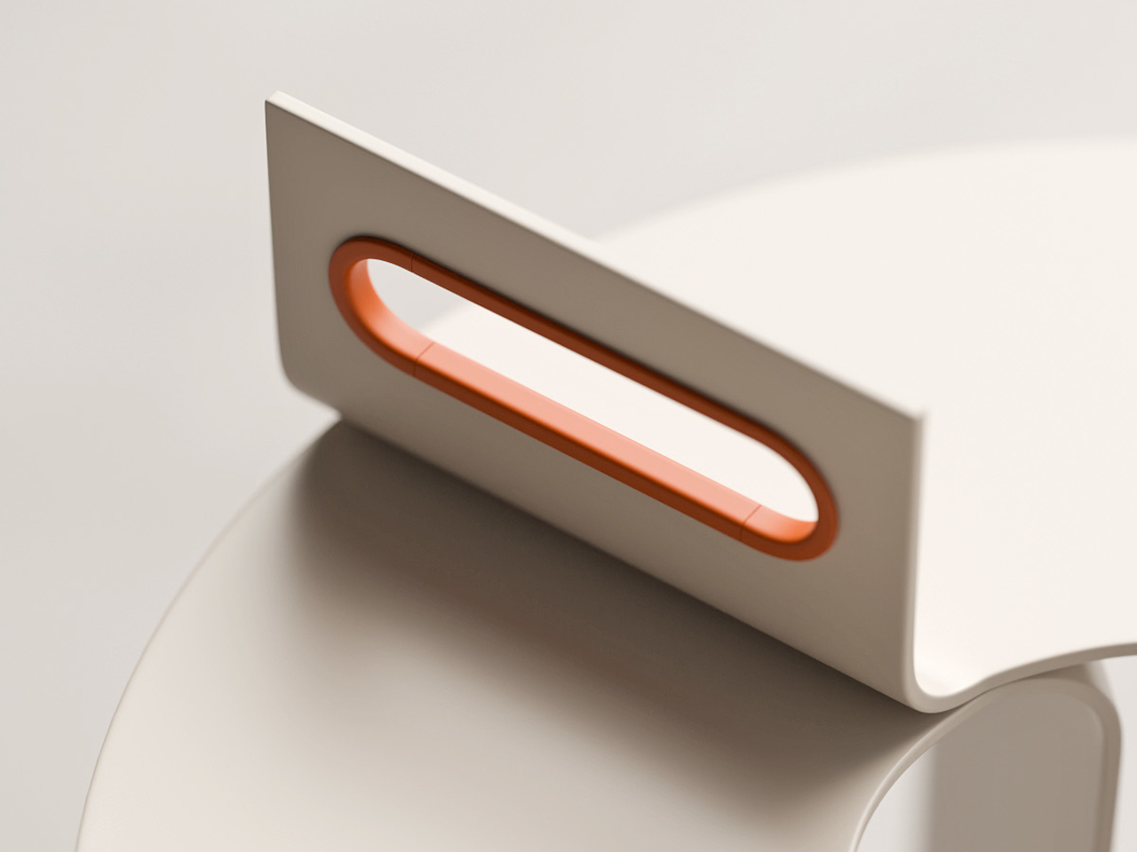
That handle emerges from the tabletop as a vertical fin aligned with the central opening. It’s wrapped with a soft material shown in a contrasting orange, making it comfortable to grip and visually highlighting the interaction point. The handle turns the table into something you can easily pick up and move around a room, reinforcing its role as a portable companion rather than a piece anchored permanently to one spot.

The lower section functions as an open-topped storage bin sized for books and magazines. The metal walls curve smoothly into rounded corners that echo the tabletop’s circular geometry, while a wooden base panel inside the bin adds warmth and keeps stored items stable. That wooden surface also grounds the piece visually, preventing the lower section from feeling too light compared to the tall vertical panel rising above it.

The material palette visible in the renders keeps everything calm and neutral. A matte, light beige metal body pairs with a pale wood base and a small orange accent in the handle. The orange gives the eye a focal point without dominating the design, while the wood base balances the cool metal and helps the table feel at home in living spaces rather than purely industrial settings.

TWIST works well next to a sofa or lounge chair, holding a glass on its circular top while a few favorite books rest in the lower bin. It functions as both a sculptural object and a practical helper, offering storage, surface, and a built-in way to move it wherever you need. It’s a small reminder that even a side table can be drawn as one thoughtful line.

The post TWIST Bends One Metal Sheet Into Table, Storage, and Handle first appeared on Yanko Design.
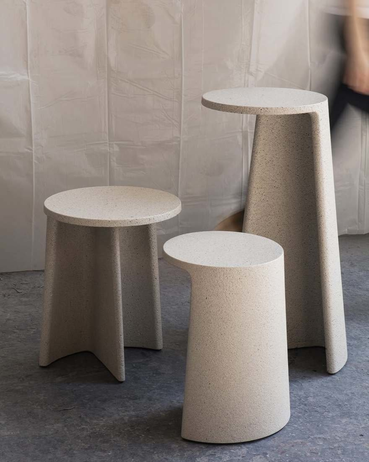
Concrete Never Looked This Good: Ronan Bouroullec’s Ancora Tables

You know that feeling when you see something that completely flips your expectations? That’s exactly what happens when you encounter Ronan Bouroullec’s Ancora tables. Here’s a material we typically associate with parking garages and brutalist architecture, yet somehow this French designer has coaxed concrete into becoming downright graceful.

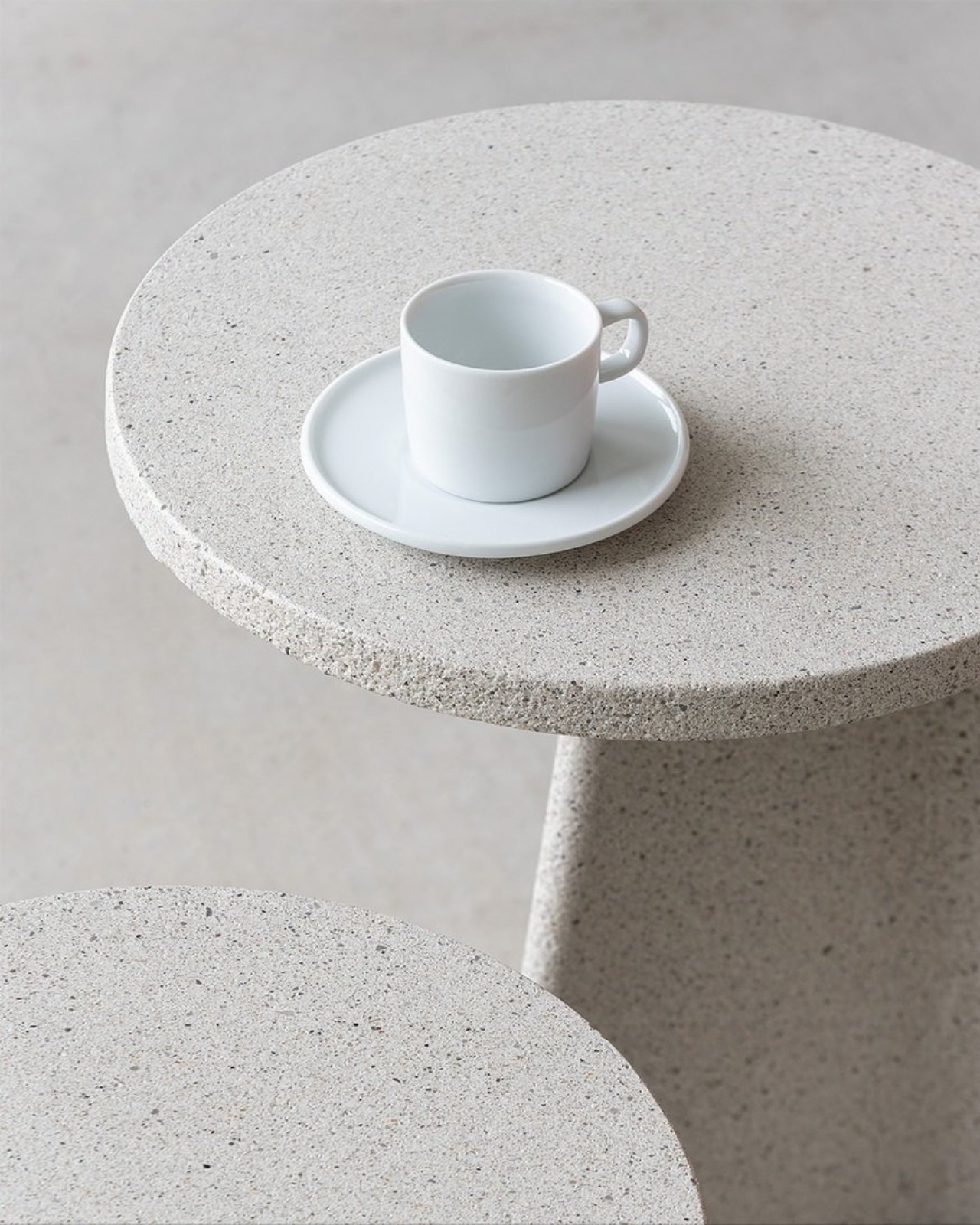
The Ancora collection, now in production by Italian furniture maker Magis, includes rectangular and round dining tables along with low tables and side tables. What makes them special isn’t just that they’re made from concrete (though that’s certainly part of it) but how Bouroullec has reimagined what this humble material can actually do when treated with a little finesse.

Designer: Ronan Bouroullec x Magis

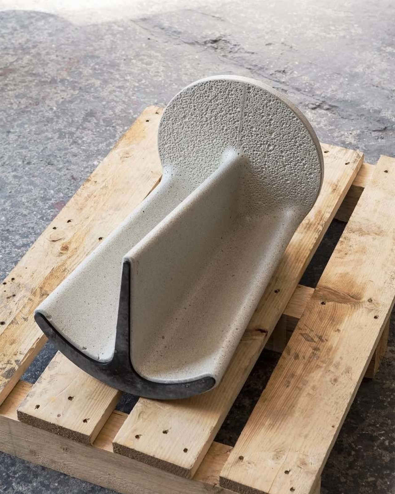
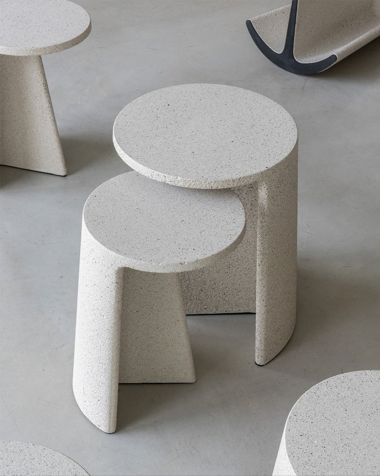
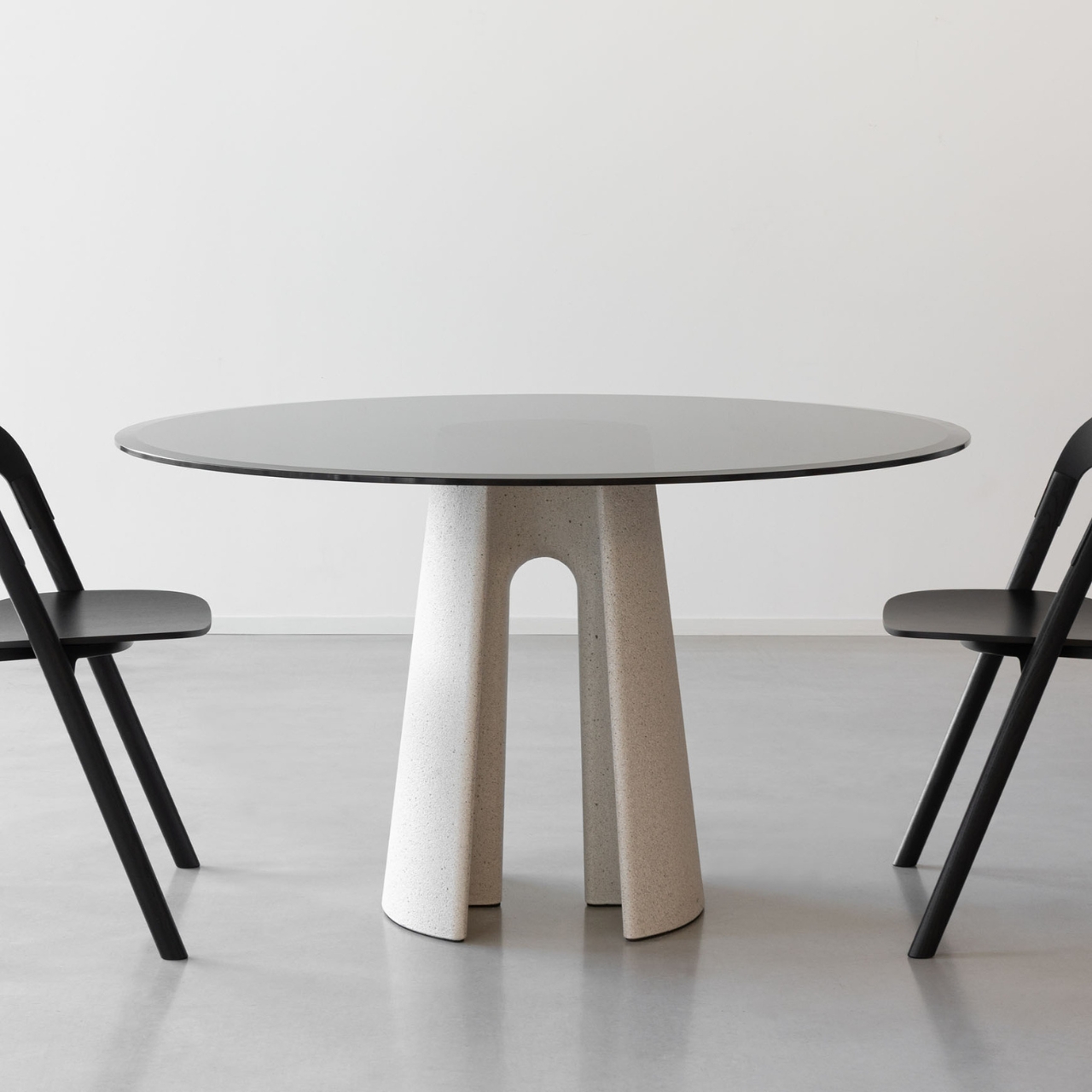
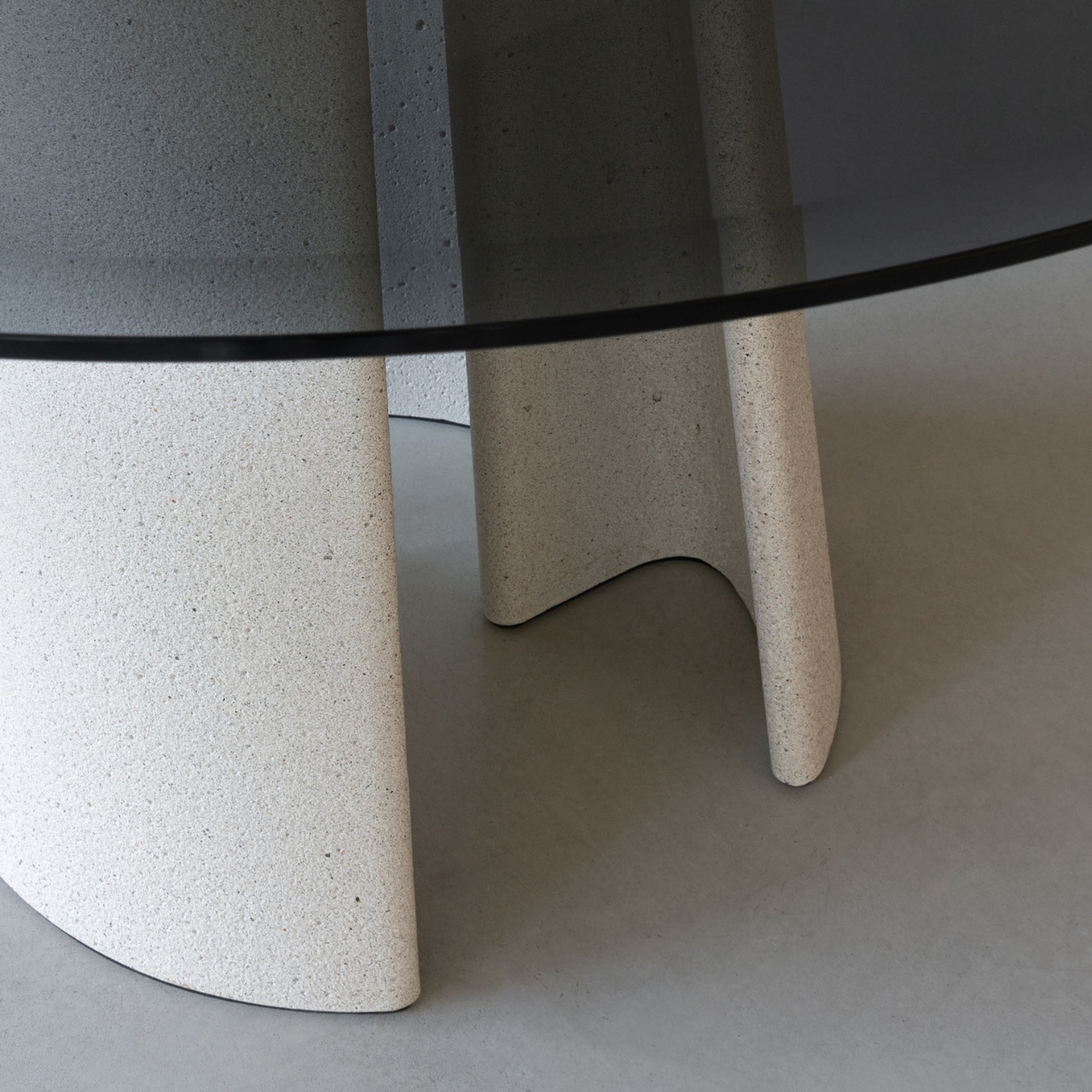
Let’s talk about that name for a second. “Ancora” means “anchor” in Italian, and once you know that, you can’t unsee it. The base of each table features this ingenious curved edge that flows into a structural rib, creating a shape that genuinely resembles an anchor. It’s one of those design moves that’s both practical and poetic, balancing the need for stability with an aesthetic that feels almost nautical in its elegance.

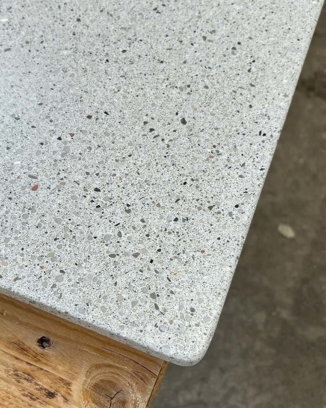
What really gets me about these tables is how they challenge our assumptions about concrete. We’re so used to thinking of it as heavy, cold, and industrial. And sure, concrete is heavy by nature, but Bouroullec’s design makes it appear surprisingly light and airy. The way the base tapers and curves, the proportions of the anchor-shaped support, it all works together to create visual lightness despite the material’s obvious heft.

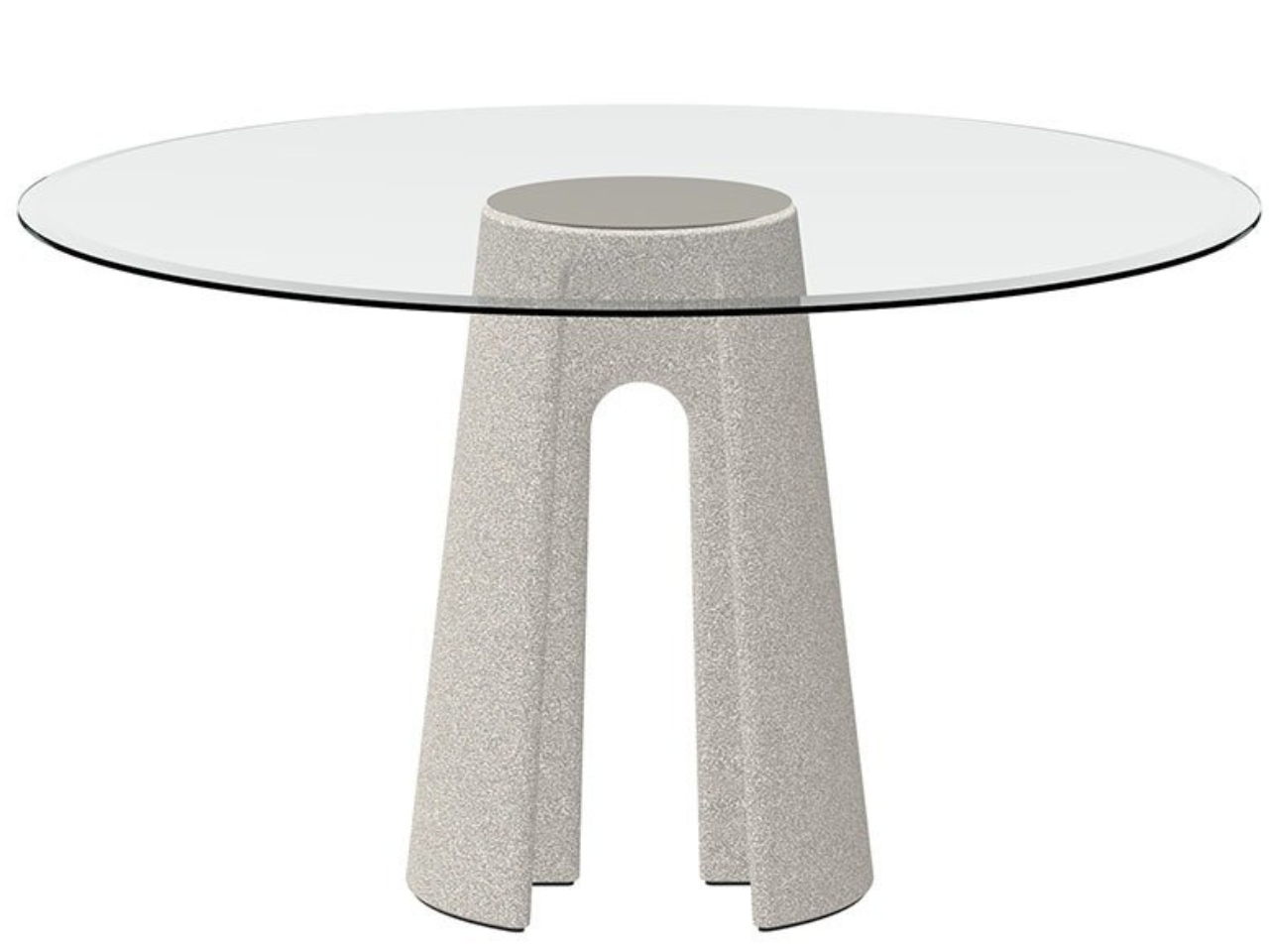
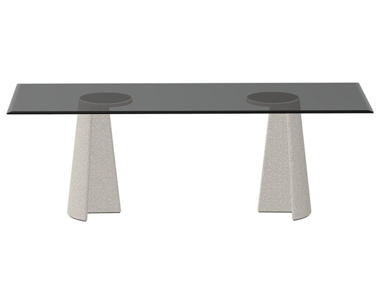
The collection offers flexibility too. You can get the rectangular table in a generous 220 by 90 centimeter size, perfect for those dinner parties where everyone actually wants to sit together and talk. The round version clocks in at 130 centimeters in diameter, ideal for smaller spaces or creating a more intimate dining situation. And because these are designed for both indoor and outdoor use, you’re not stuck making that impossible choice between keeping your beautiful furniture pristine inside or actually enjoying your patio.

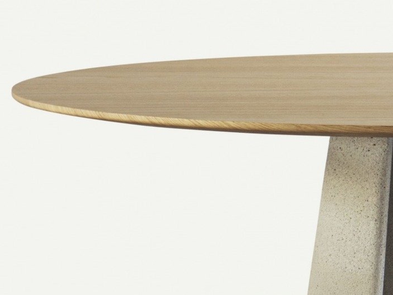
Material choices matter here. The bases are concrete (obviously), but you get options for the tops. Tempered glass in clear or smoked finishes gives you that contemporary look and lets the sculptural base really shine through. If you prefer something warmer, there’s MDF veneered in oak, which adds a organic element that plays nicely against the concrete’s industrial vibe.

There’s something almost subversive about what Bouroullec is doing with these pieces. Concrete has this long history in Italian design and architecture, particularly through masters like Pier Luigi Nervi who showed how structural elements could be beautiful. Bouroullec taps into that tradition but pushes it somewhere new, somewhere more refined and residential. He’s taken a material that shouts and taught it to whisper.

The beauty of Ancora lies in its simplicity. There are no unnecessary flourishes, no look-at-me details. The design is essentially sculptural, letting the form speak for itself. That anchor-shaped base does all the heavy lifting (literally and figuratively), creating visual interest without needing any decorative additions. It’s the kind of confident design that comes from really understanding your material and what it wants to do.

What strikes me most about these tables is how they fit into our current design moment. We’re collectively moving away from the mid-century modern pieces that have dominated for the past decade and looking for something with more substance, more presence. Concrete delivers that weight and permanence we’re craving, but Bouroullec ensures it doesn’t feel oppressive or dated. These tables feel contemporary without trying too hard to be trendy.

For anyone interested in design that pushes boundaries while staying practical, Ancora represents that sweet spot. These aren’t art pieces you need to tiptoe around. They’re built to be used, indoors or out, for everyday meals or special occasions. The fact that they happen to be absolutely gorgeous is just the bonus.

The post Concrete Never Looked This Good: Ronan Bouroullec’s Ancora Tables first appeared on Yanko Design.
This Shape-Shifting Classroom Setup Lets Students Build Their Own Learning Space

In traditional classrooms, furniture rarely moves, but learning does. Eduba, the adaptive modular furniture system developed by designer Roie Avni, challenges the static environment of conventional education by introducing a new kind of classroom: one that shifts, evolves, and responds to its users. Through a clever blend of modularity, lightweight construction, and intuitive mechanisms, Eduba transforms the act of sitting and studying into a dynamic experience shaped by students themselves.

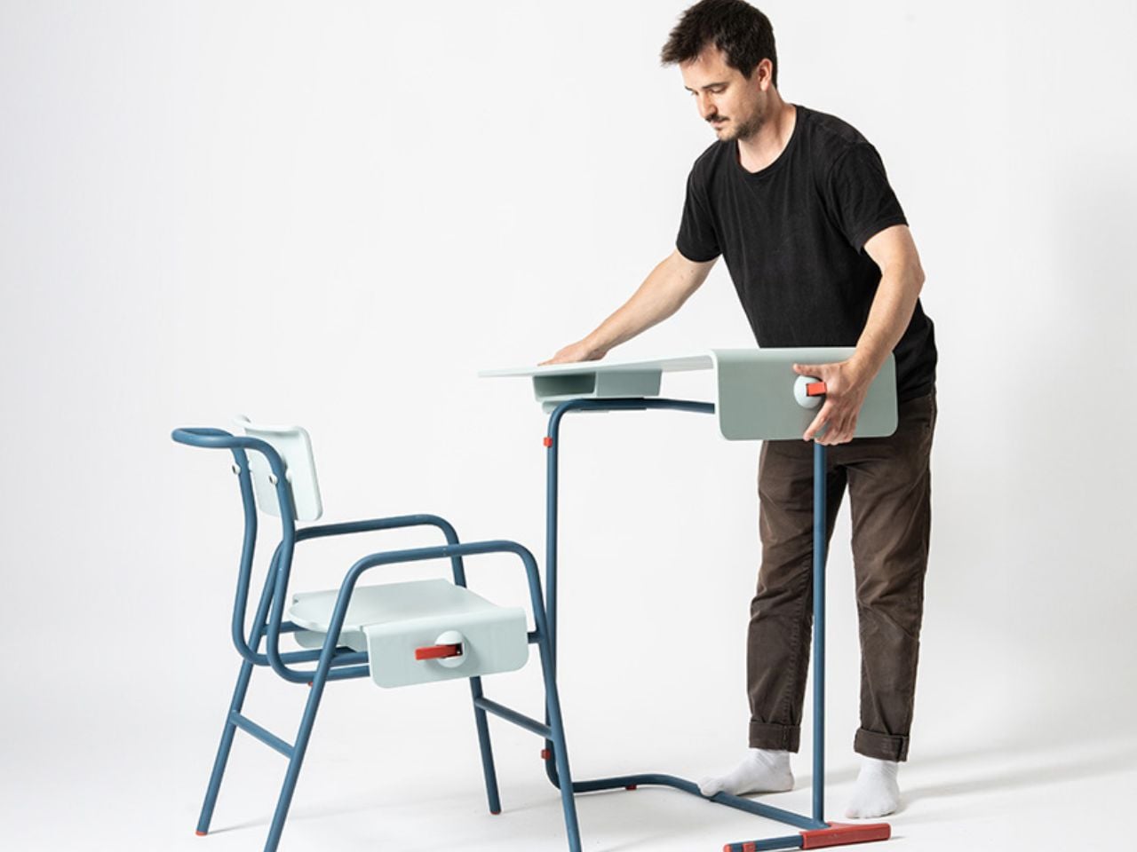
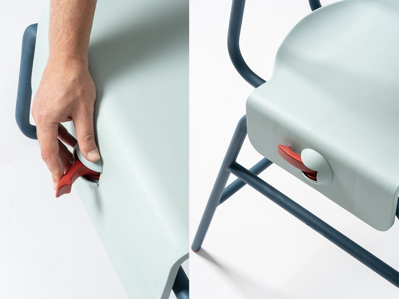
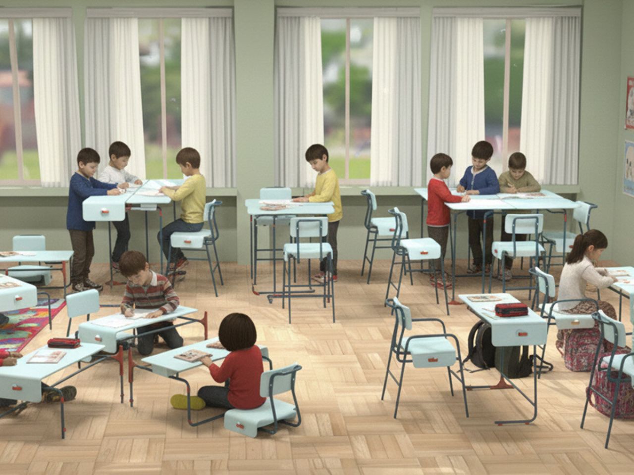
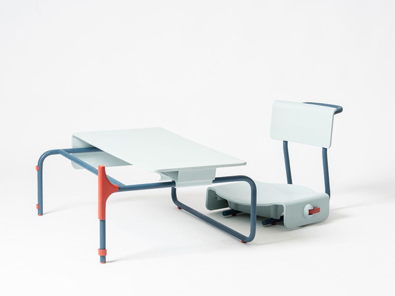
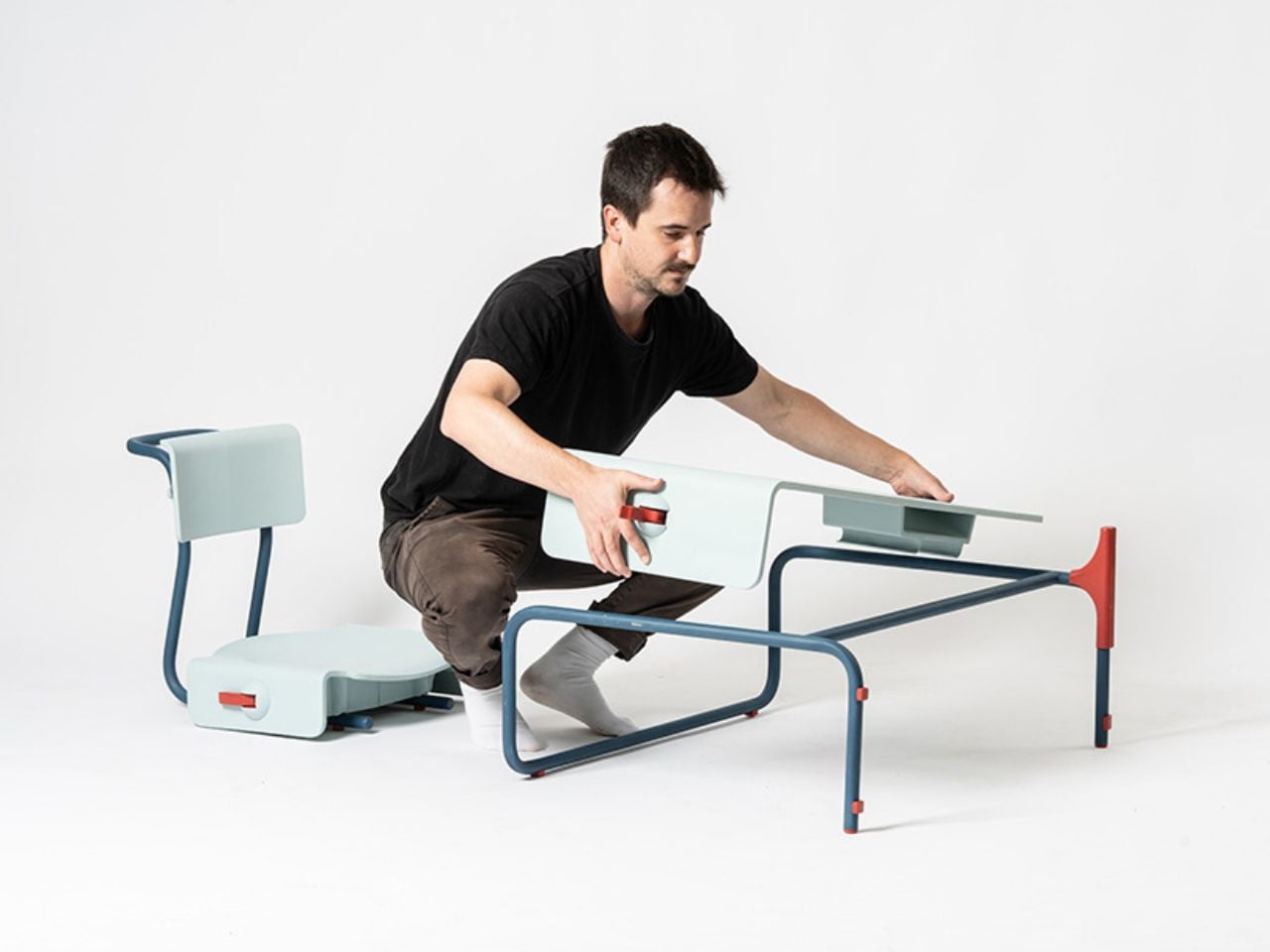
At its core, Eduba is a chair-and-table duo designed for versatility. Each piece can be connected, detached, flipped, or reconfigured within seconds. The table offers three height levels depending on how it is placed on its geometric base, while the chair shifts between high, mid, and low seating positions through a simple handle mechanism that locks and unlocks the frame. With no tools required, the furniture can be taken apart and rebuilt on the fly, supporting seamless transitions between different modes of learning.

Designer: Roei Avni

Eduba is rooted in the belief that learning is not one-size-fits-all. Instead of forcing every student into the same posture, the system enables each learner to personalize their physical setup based on their comfort, task, or energy level. Low seating supports relaxed learning, free-flow discussion, and floor-level exploration. Mid-level, more conventional seating mirrors structured, front-facing layouts. High seating encourages movement, collaboration, and active engagement, turning the classroom into an interactive space rather than a passive one.

This fluidity empowers teachers as well. Whether a lesson calls for intimate small-group work, focused heads-down concentration, or an energetic collaborative session, the classroom can be rearranged in minutes. Different areas of the same room can support different activities simultaneously, from quiet individual study to lively project clusters.

Constructed from durable plastic and lightweight aluminum, Eduba strikes a balance between strength and portability. Its components are sturdy enough for daily school use yet light enough for rapid reconfiguration. The intuitive handle-based mechanism enables seat and table height changes without effort, encouraging students to interact with the furniture and take ownership of their own learning environment.

This adaptability extends beyond function, shaping a philosophy of what education can be. Eduba transforms the classroom into a living, breathing ecosystem, one where posture, space, and interaction evolve throughout the day, reflecting the needs and rhythms of its users.

Roie Avni’s Eduba is a statement about the future of learning. By promoting movement, flexibility, and student-centered design, it reframes the classroom as a place that grows, shifts, and responds, mirroring the organic, ever-changing nature of curiosity itself.

The post This Shape-Shifting Classroom Setup Lets Students Build Their Own Learning Space first appeared on Yanko Design.
YouTuber custom-builds coffee table with functional star system around an exploding sun

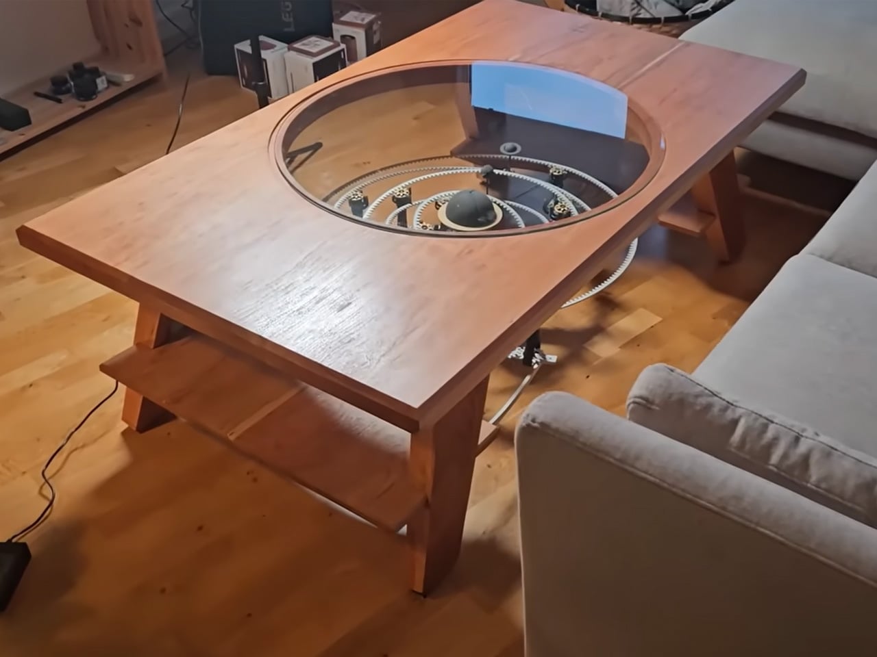
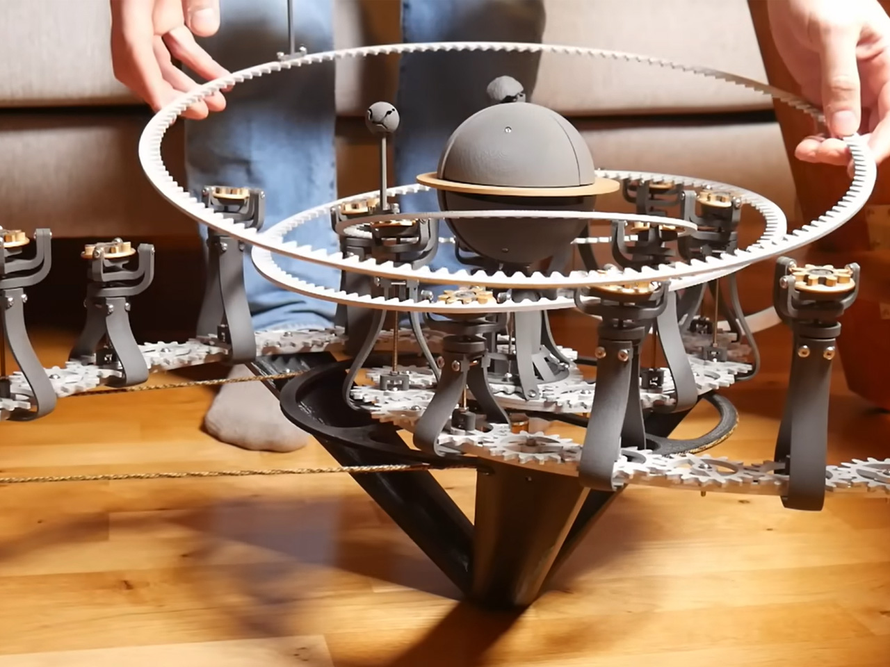
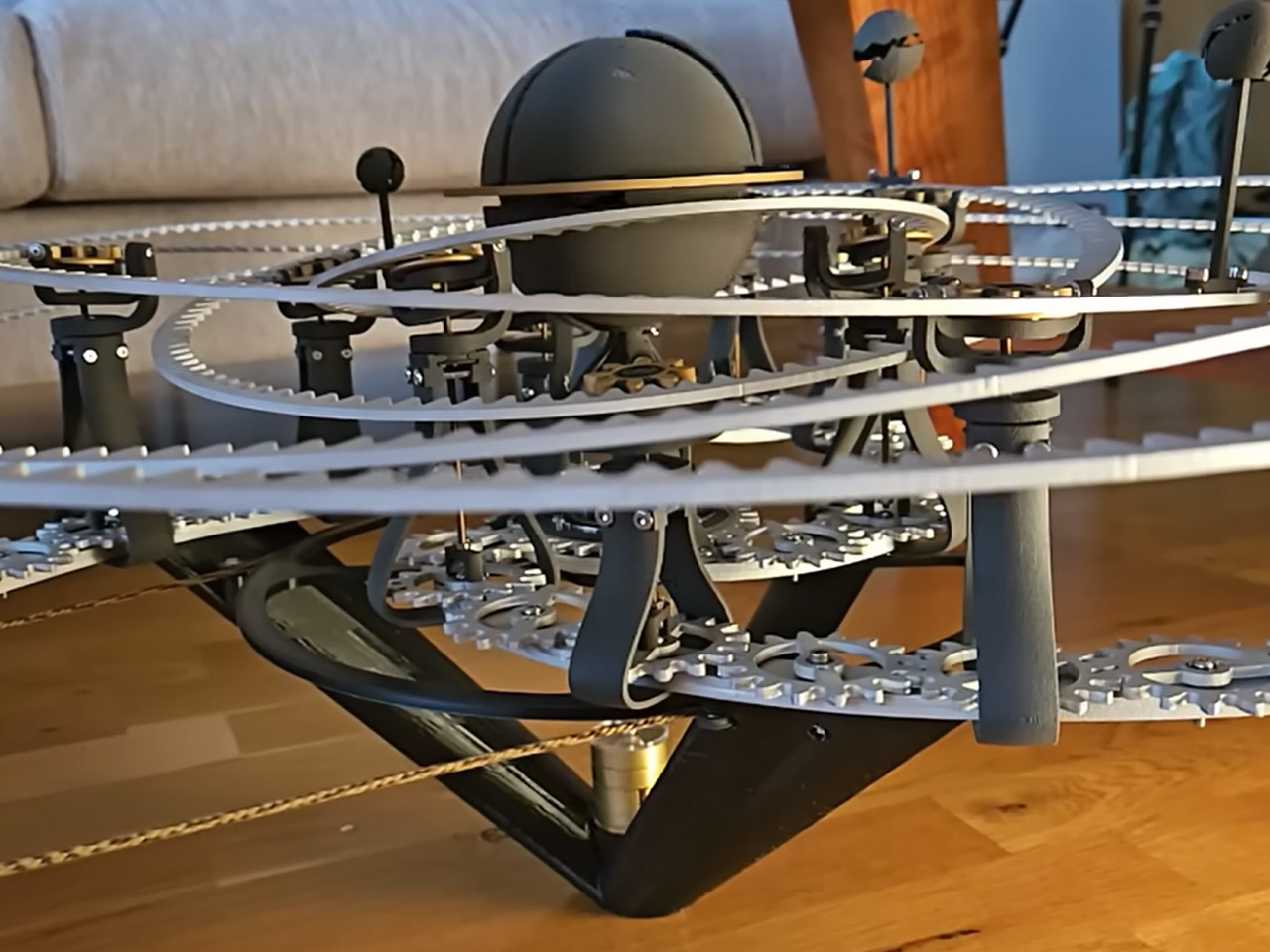
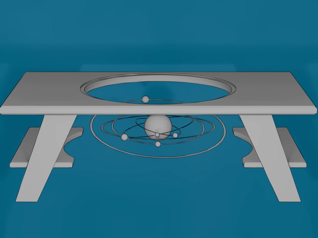
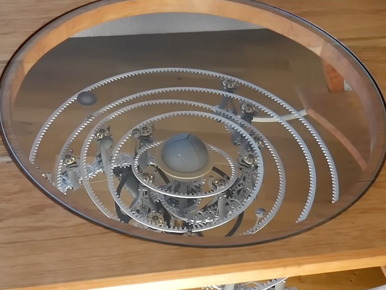
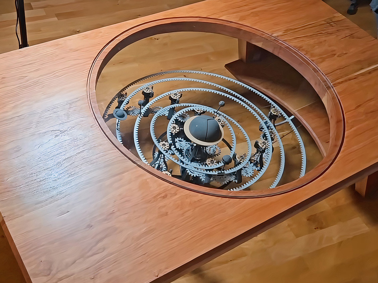
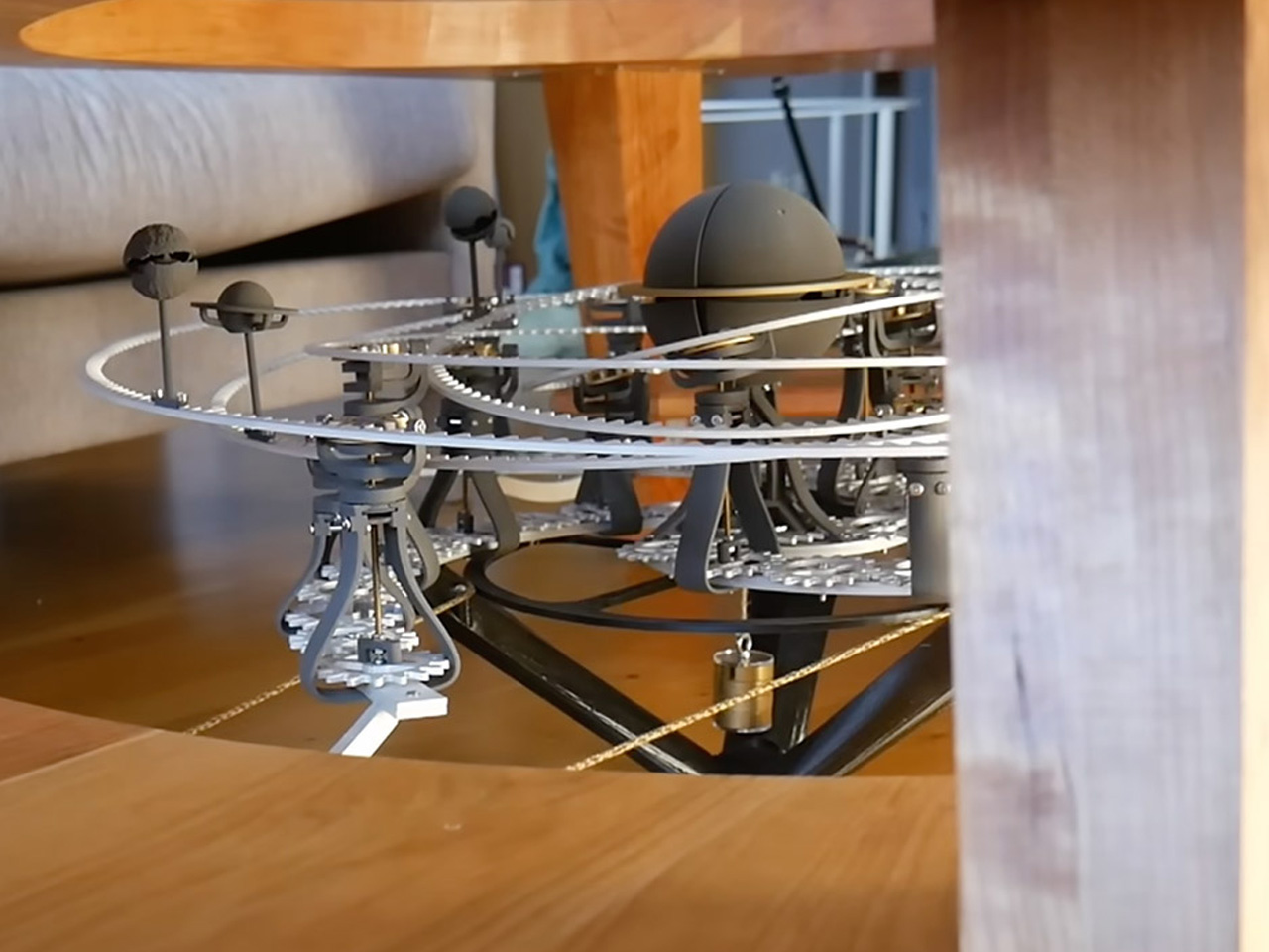
Have you ever dreamed of sitting around the solar system? Modder at The 5439 Workshop on YouTube may have just made it possible with this new kind of solar system inside a coffee table. This is a cherry wood and aluminum coffee table with a precision cutout in the middle where a “mechanical orrery with both tilting orbits and an exploding star” finds refuge under a glass cover.

The modder refrains from calling this contraption a “particularly practical one,” but I stand to disagree. At the first given chance, I would put this guy in my living room without a thought and flaunt the celestial magnificence it beholds to just about anyone walking inside the main entrance.

Designer: The 5439 Workshop

If you don’t know much about 5439, the Swedish modder doesn’t have a massive following, that’s why. With only three published videos and a modest 5.6K followers, he is just starting out with robotics, and this coffee table is perhaps the “most mechanically complicated” – in his own words – thing he has designed and built. Before we get to the details of the star system, let’s get the other details of the table out of the way.

The table, as mentioned, is meticulously crafted from cherry wood. The wood is essentially chosen for its warm texture and its ability to reflect light at the right place. The two-layered table is nicely engineered by squaring the cherry wood planks – two of them, which are combined with three white boards to make up the tabletop. Once the top is created, a giant cutout is made in the middle, which, along with the glass top, creates a viewing window to the mechanical star system hidden below. The table sits on four robust pillars (legs) attached to a base frame.

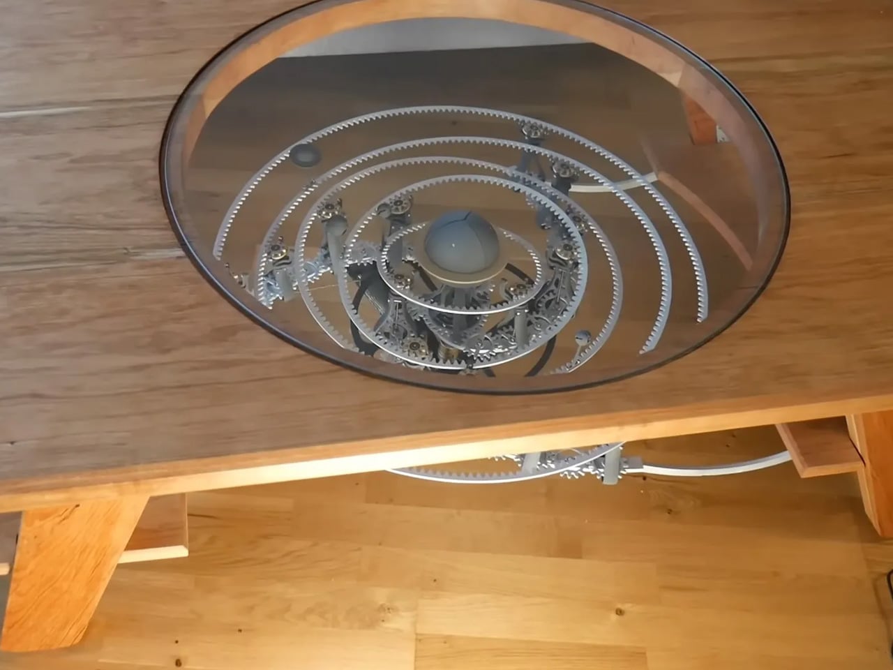
After sanding and smoothing all the blemishes (after the glueing) in the top and the rough parts of the center cutout, the modder gets to creating the covering of the center hole with the sheet of glass and then gets to the bottom of the t where the celestial goodness is built. Visible through the glass viewport, this mechanical model of the planets dancing around the sun is not short of a feat.

The entire contraption of gears, bearings and motors finds an exploding sun at its center with the planets (in their usual) revolving around, happily on their own axis that of course, are elliptical and tilting to mimic the universe. The sun is notably a fist-sized sphere, built layer-by-layer using a selective laser sintering (SLS) printer with nylon powder, which splits open like the flower petals when it explodes.

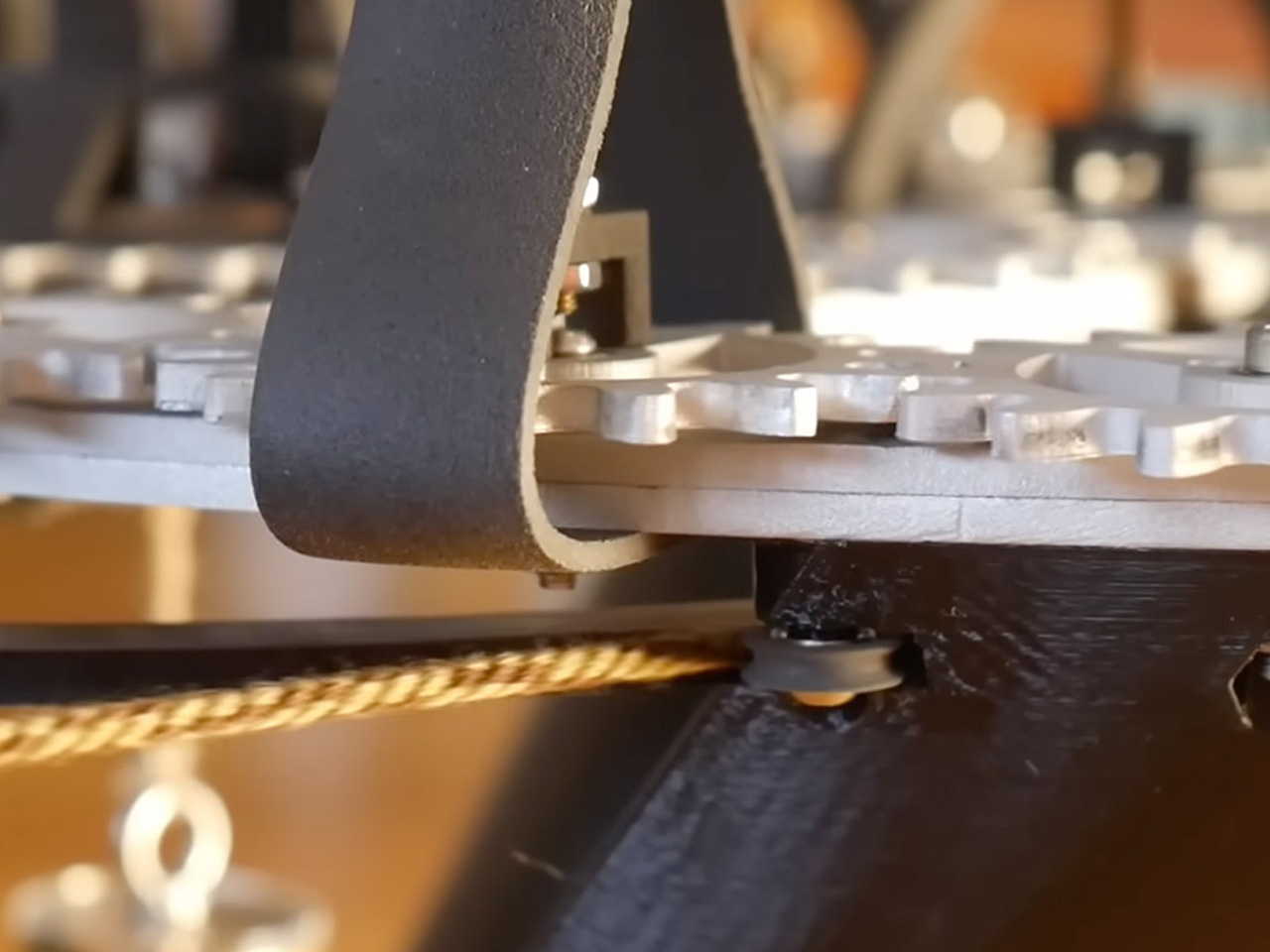
Made of anodized aluminum parts, the star system features rings tilting at unexpected angles, making the planets move up and down on a single plane with the power of a nearly silent motor tucked into the table frame. The YouTube community seems to like what they see in the video demonstration (embedded above). The comment section is filled with positive feedback, including ideas where one commenter “suggests walling off the sides,” while the other recommends adding a “black run” underneath “to really make the mechanism pop.” What do you think?


The post YouTuber custom-builds coffee table with functional star system around an exploding sun first appeared on Yanko Design.
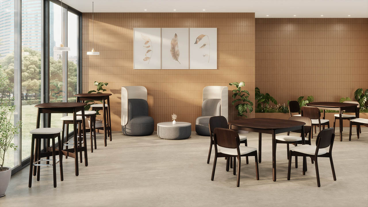
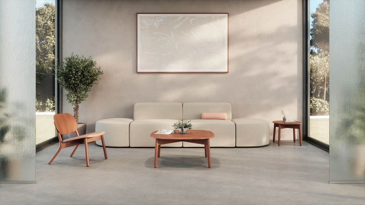
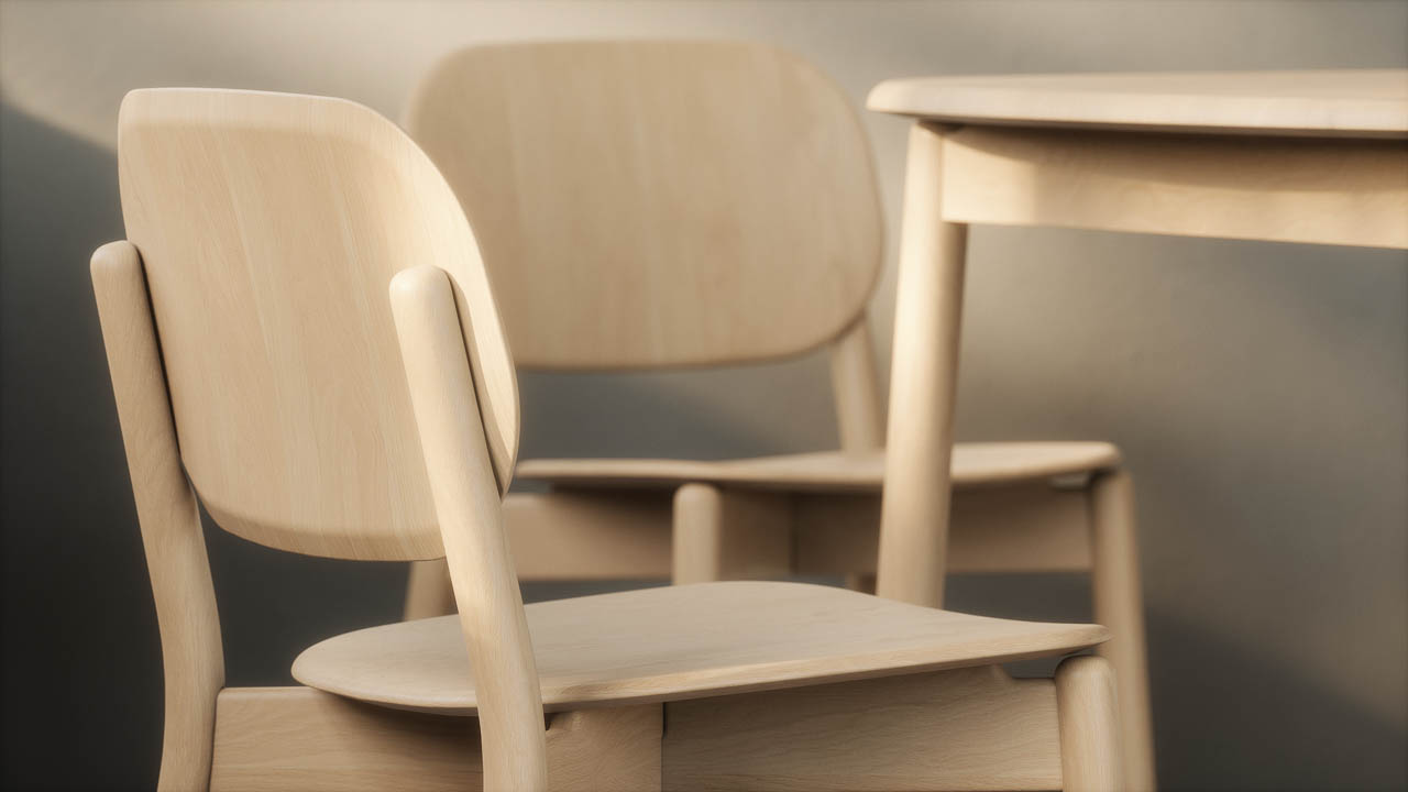
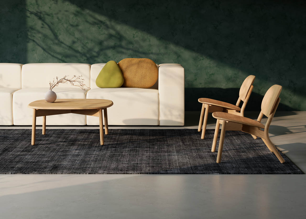
Silva Wood Collection by KFI Studios: Steam-Bent Beech Furniture Designed by Union Design

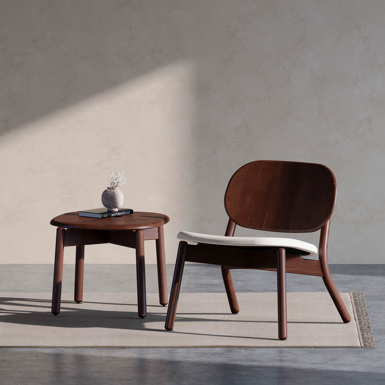
When solid beech wood flows from floor to backrest in a single steam-bent arc, you’re witnessing KFI Studios push the boundaries of what wood furniture can achieve. Silva, the company’s first fully wood collection, exemplifies material honesty and sculptural restraint.

Designer: KFI Studios

Designed in collaboration with Union Design, Silva rejects the noise of contemporary furniture design in favor of something more enduring: curves that follow the wood’s natural character, finishes that reveal rather than conceal grain patterns, and forms that balance timeless craft with approachable modern sensibility.

A Collection Built on Natural Warmth

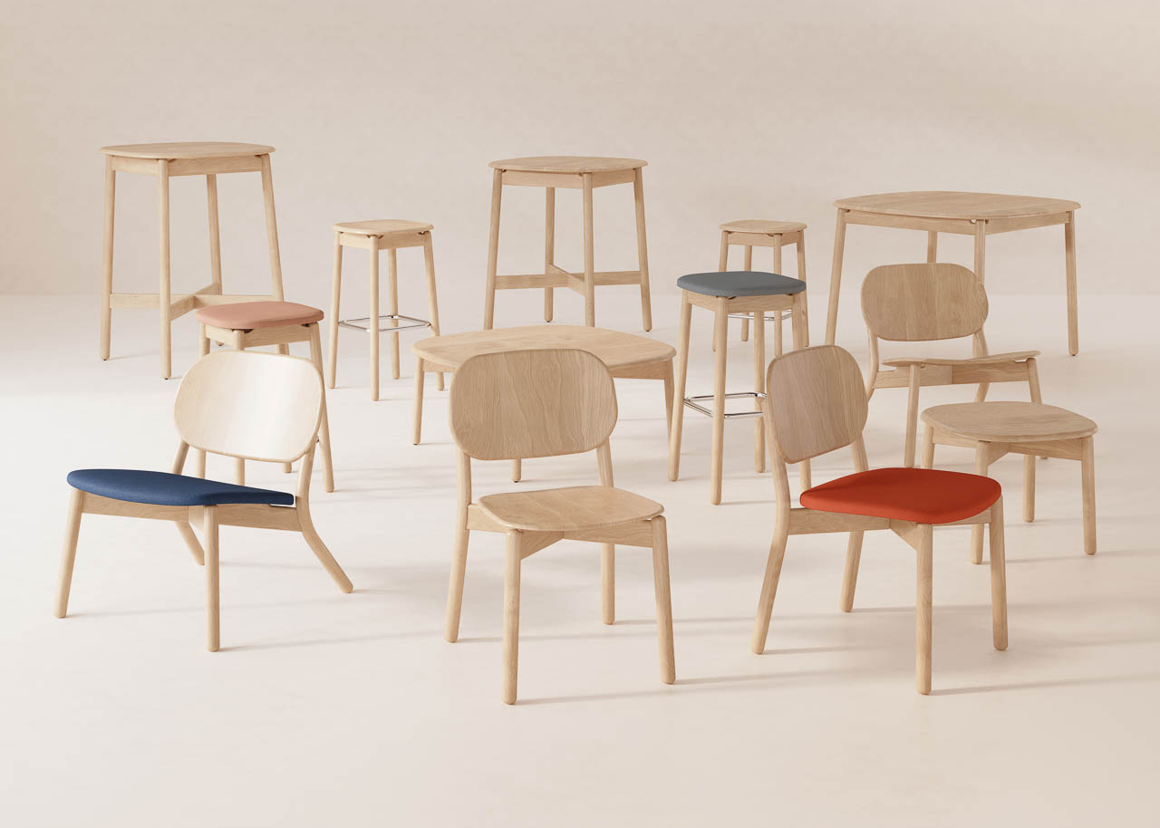
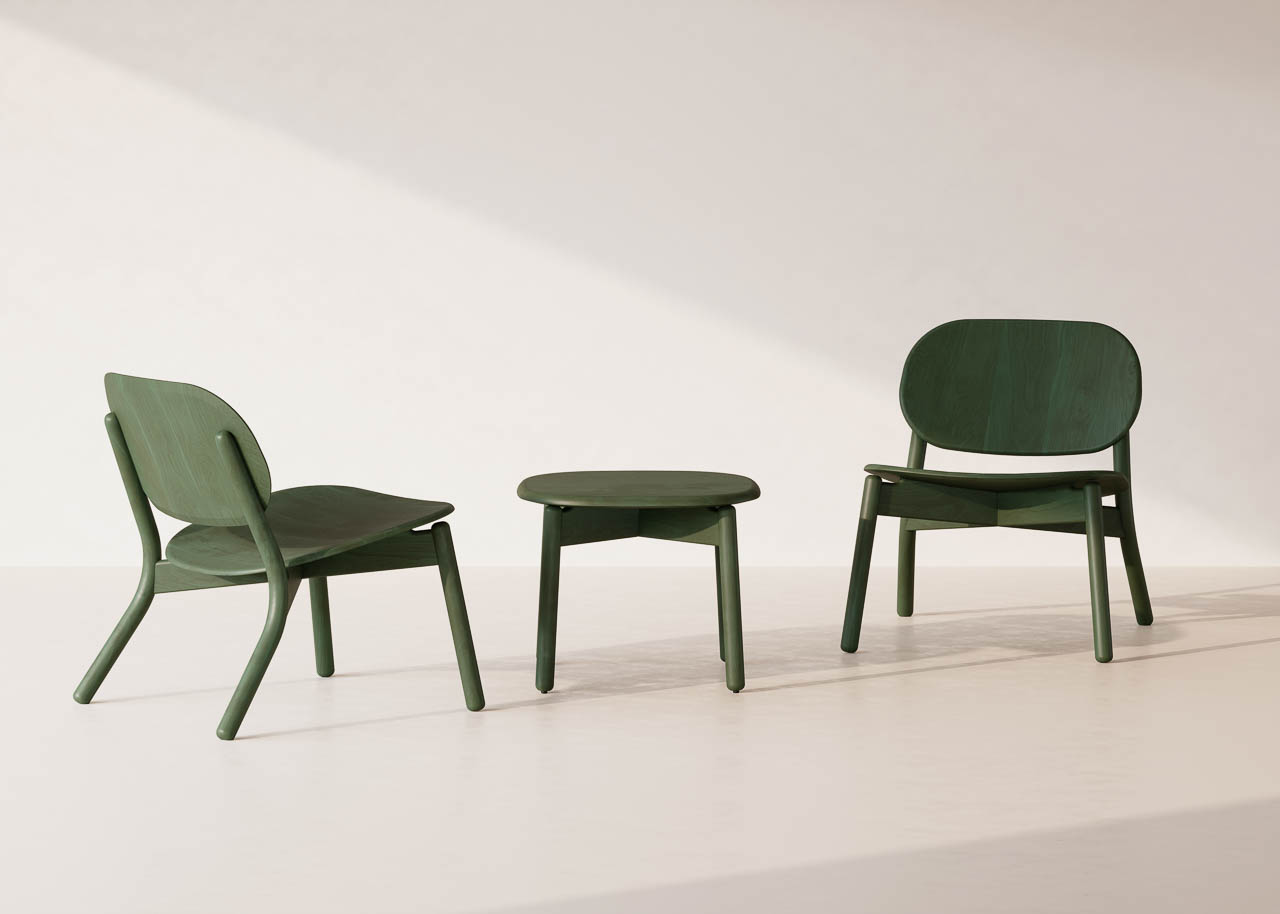
Silva includes guest chairs, lounge chairs, stools, and coordinating tables across occasional, standard, counter, and bar heights. The versatility makes it equally at home in workplace lounges, hospitality environments, and social spaces where warmth matters more than clinical precision.

“It’s our first full wood collection, and something we’ve wanted to do for a long time,” says Chris Smith, CEO of KFI Studios. “It’s got that natural warmth and character that makes spaces feel instantly inviting.”

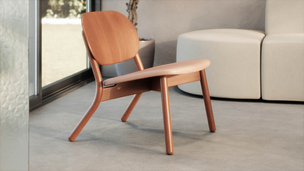
The signature detail defining the collection is that steam-bent rear leg. It flows in a single graceful line from floor to backrest, giving each piece a sculptural quietness that traditional joinery methods simply can’t achieve. The lounge chair in particular pushes wood bending techniques into elegant, continuous arcs that demonstrate what happens when material capability meets design ambition.

Design Details That Honor the Material

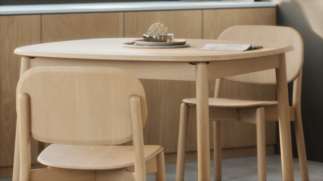
Every curve, edge, and contour in Silva was calibrated to highlight beech wood’s natural grain and inherent character. Gently rounded edges on seating pieces create tactile comfort without over-designing. Softly shaped square tabletops offer practical surface area while maintaining the collection’s organic aesthetic language.

“Every curve, edge, and contour was carefully considered to highlight the material, create comfort, and offer a sense of simplicity,” says Jeff Theesfeld, founder of Union Design.

The solid wood construction extends throughout the collection, with subtle engineering details that enhance functionality without compromising aesthetic purity. Guest chairs stack three high for space-efficient storage, making them practical for venues that need flexible seating arrangements. Stools feature chromed steel footrests that add durability and comfort while maintaining visual lightness. Table tops come in two configurations: wood tops with soft edge profiles that emphasize organic warmth, or optional laminate tops with knife edge profiles for environments requiring enhanced durability.

The finish palette expands beyond traditional wood tones into territory that feels distinctly contemporary. Seven stain options include Natural, Timber, Coffee, and Black alongside modern color-drenched hues: Navy, Evergreen, and Clay. These colored finishes don’t obscure the wood grain. They enhance it, letting the material’s natural texture show through while introducing unexpected color depth.

Chairs can be specified with or without upholstered seats. When upholstery enters the equation, KFI Studios offers a wide selection of graded-in textiles or COM options, allowing designers to calibrate comfort and aesthetic expression to specific project requirements.

Silva and the Biophilic Design Resurgence

According to Jeff Theesfeld, Silva arrives at a moment when designers are increasingly prioritizing wellbeing through material choices. Biophilic design, the practice of connecting interior environments to natural elements, continues gaining momentum as research confirms what intuition already suggested: natural materials and calming tactility improve how people experience spaces.

Silva’s all-wood construction, paired with finishes that enhance rather than hide wood grain, brings grounding presence to environments that benefit from nature-inspired warmth. As workplace design evolves beyond stark minimalism and hospitality spaces seek differentiation through material authenticity, collections like Silva offer designers tools to create environments that feel both contemporary and fundamentally human.

The collection represents more than aesthetic preference. It signals a broader shift toward furniture that prioritizes enduring material quality over trend-driven surface treatments, toward forms that respect craft traditions while serving modern spatial requirements.

The post Silva Wood Collection by KFI Studios: Steam-Bent Beech Furniture Designed by Union Design first appeared on Yanko Design.

This Furniture Collection Was Designed By Your Inner 5-Year-Old

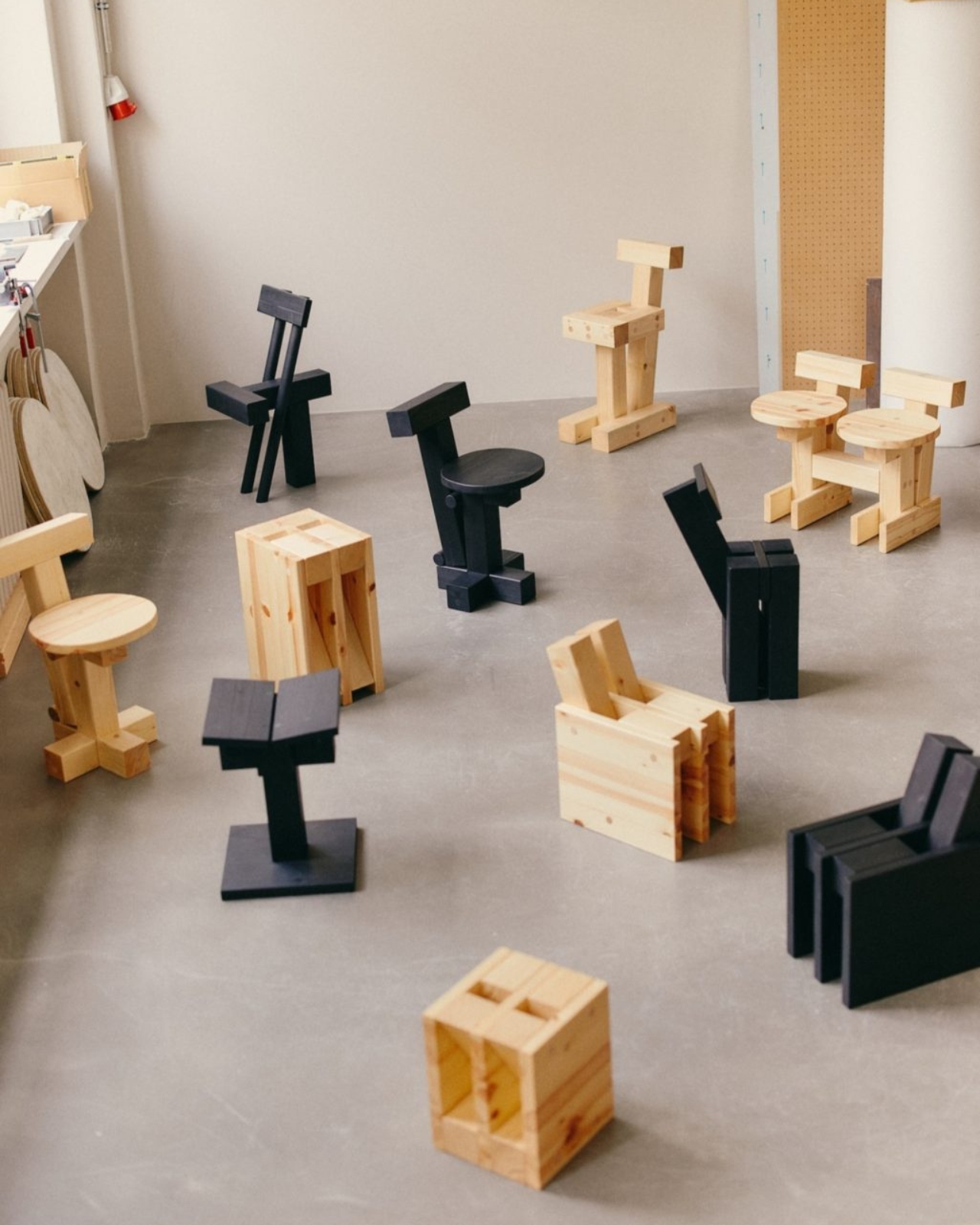
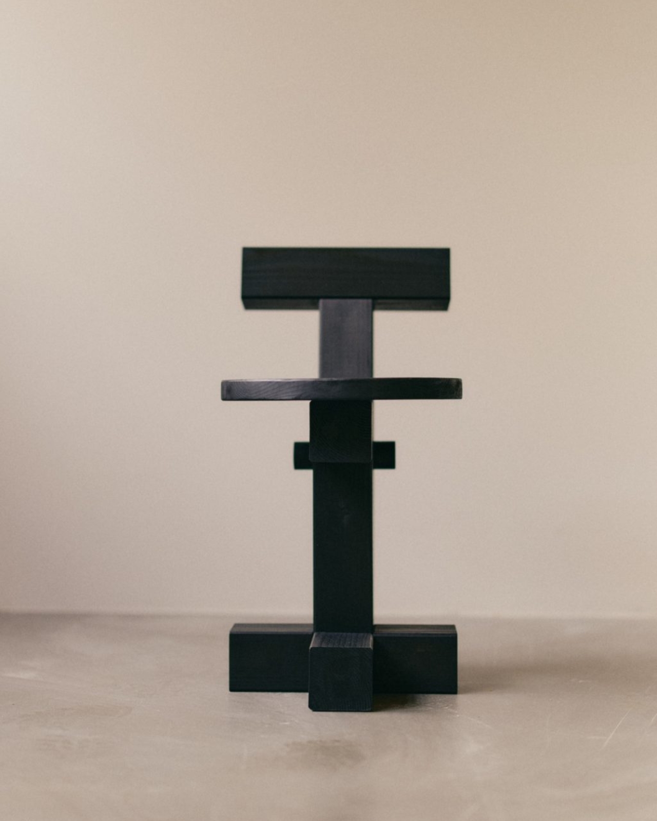
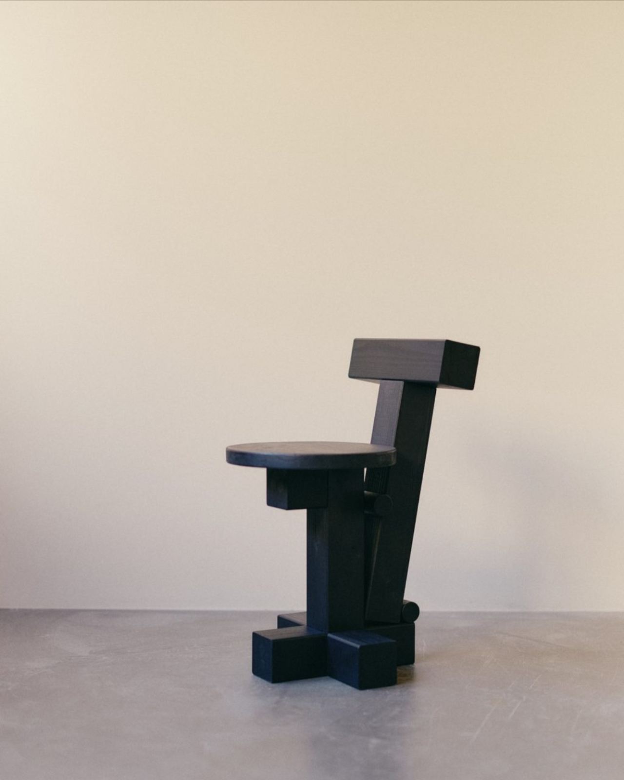
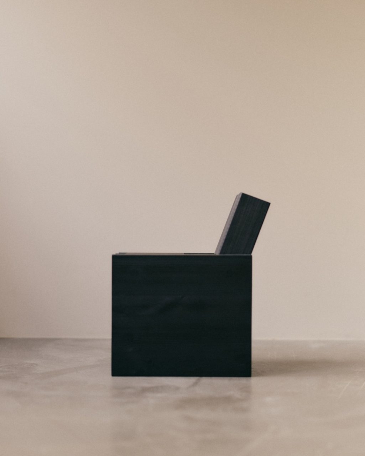
Remember the pure joy of stacking blocks as a kid? That satisfying click when you balanced a square on a circle, or the creative rush when you toppled everything and started fresh? Yellow Nose Studio remembers, and they’ve turned that childhood magic into furniture that actually makes sense for adults. Their INDERGARTEN collection is basically what happens when you let your inner five-year-old design chairs, and honestly, it’s brilliant.

The Berlin-based Taiwanese design duo behind Yellow Nose Studio did something clever with the name itself. They dropped the “K” from kindergarten, and in doing so, opened up a whole new way of thinking about design. It’s not just a cute play on words. It’s an invitation to approach furniture the same way we approached play: with curiosity, experimentation, and zero pretension.

Designer: Yellow Nose Studio

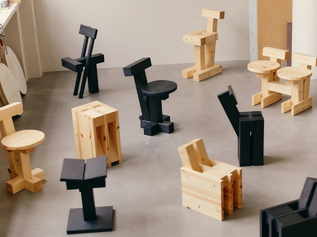
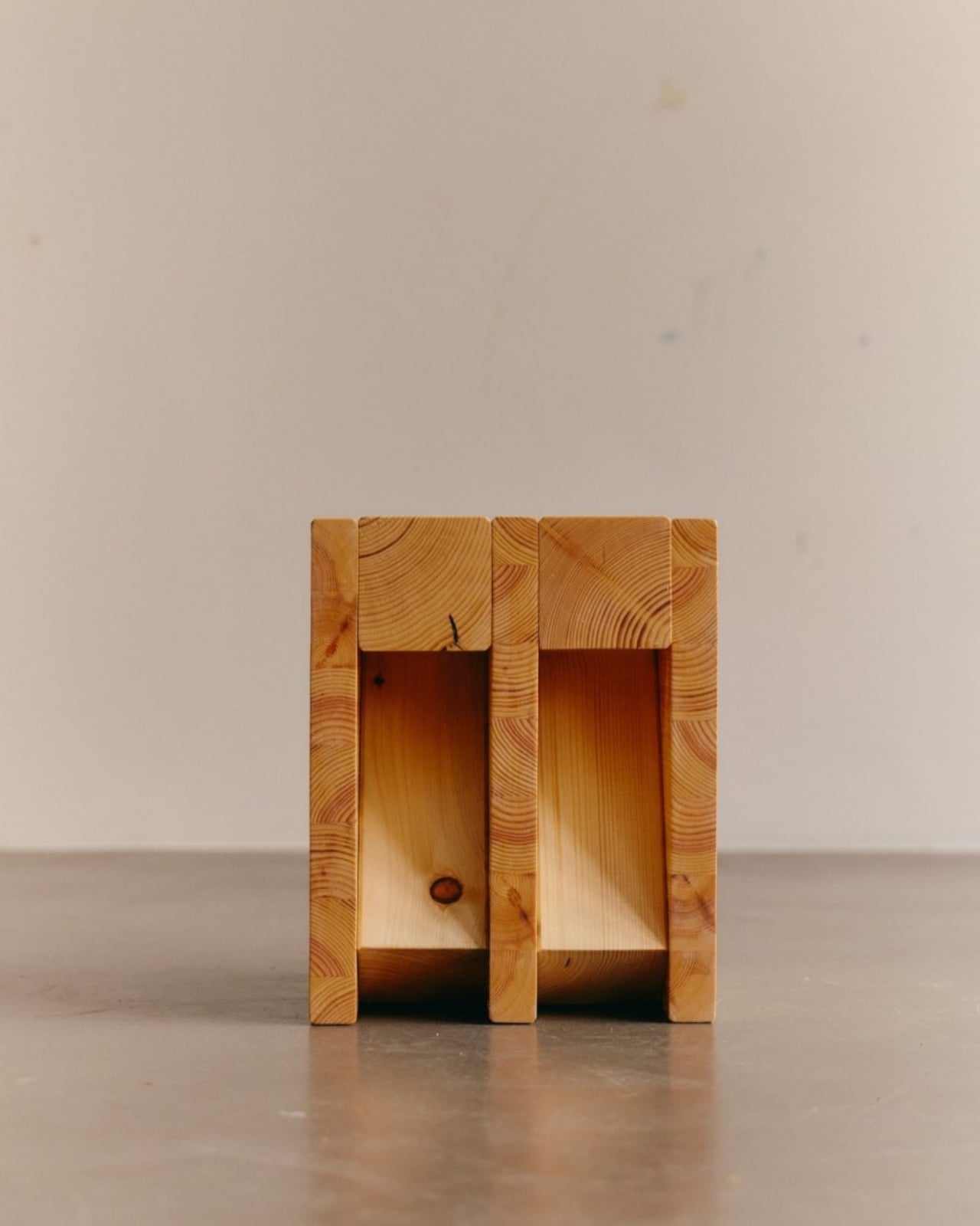
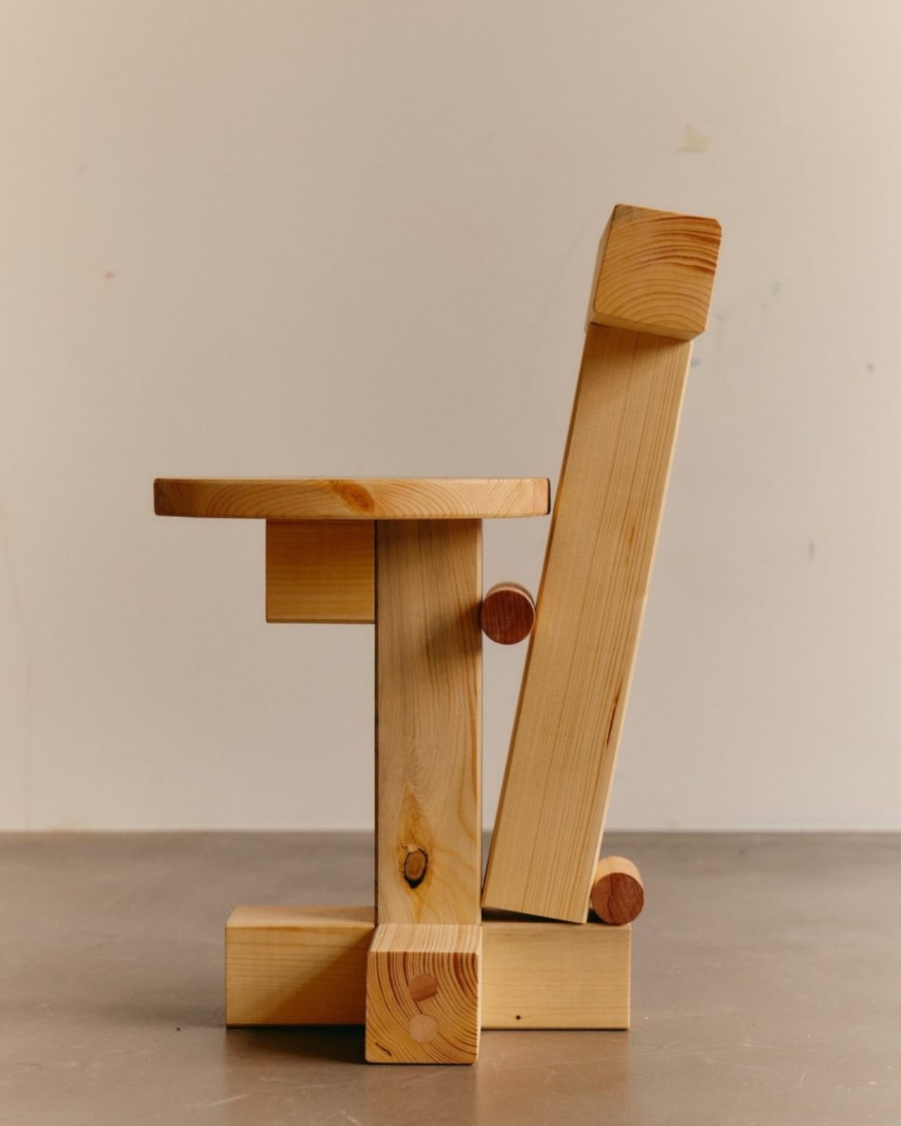
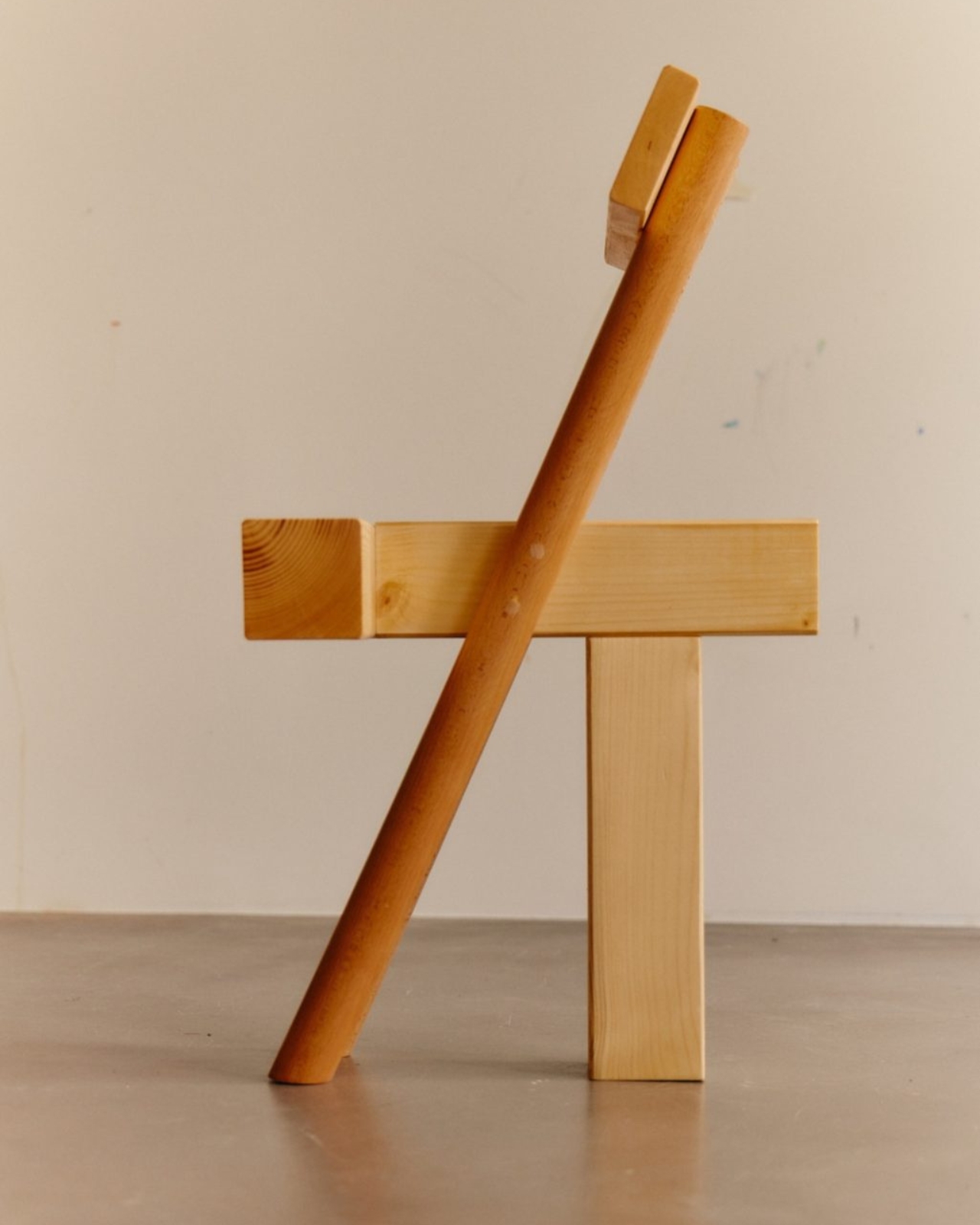
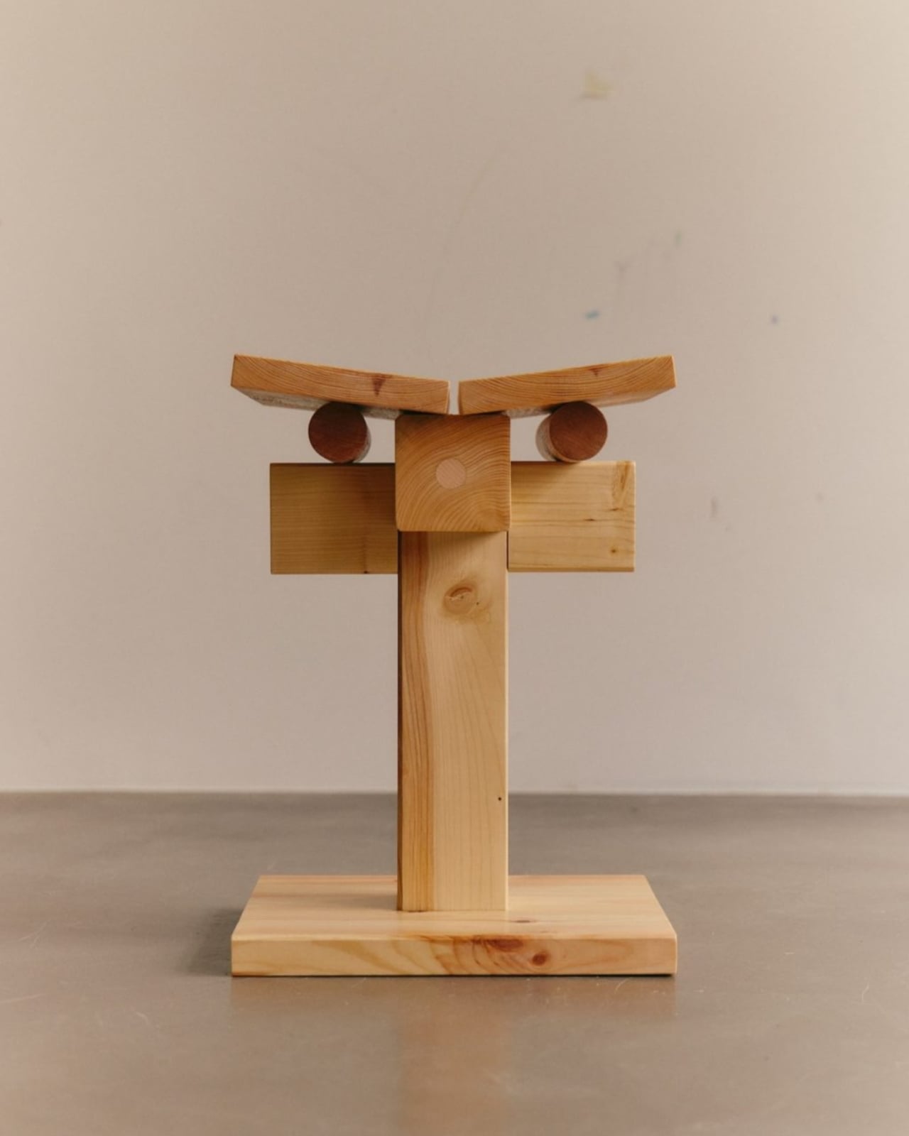
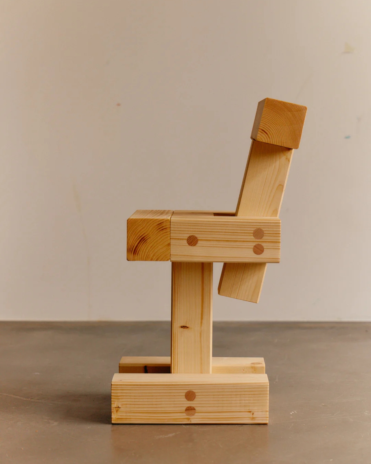
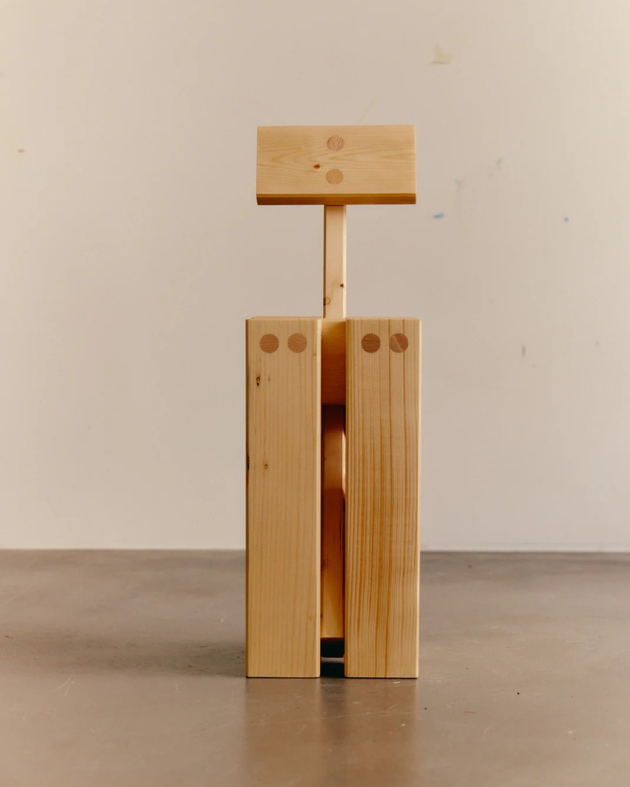
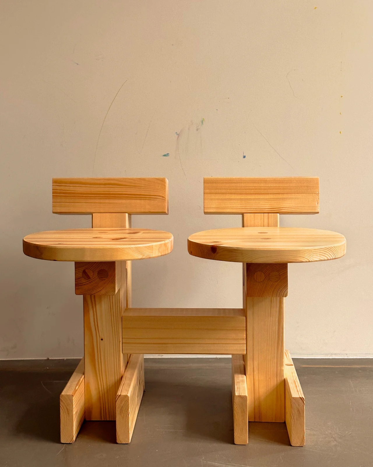
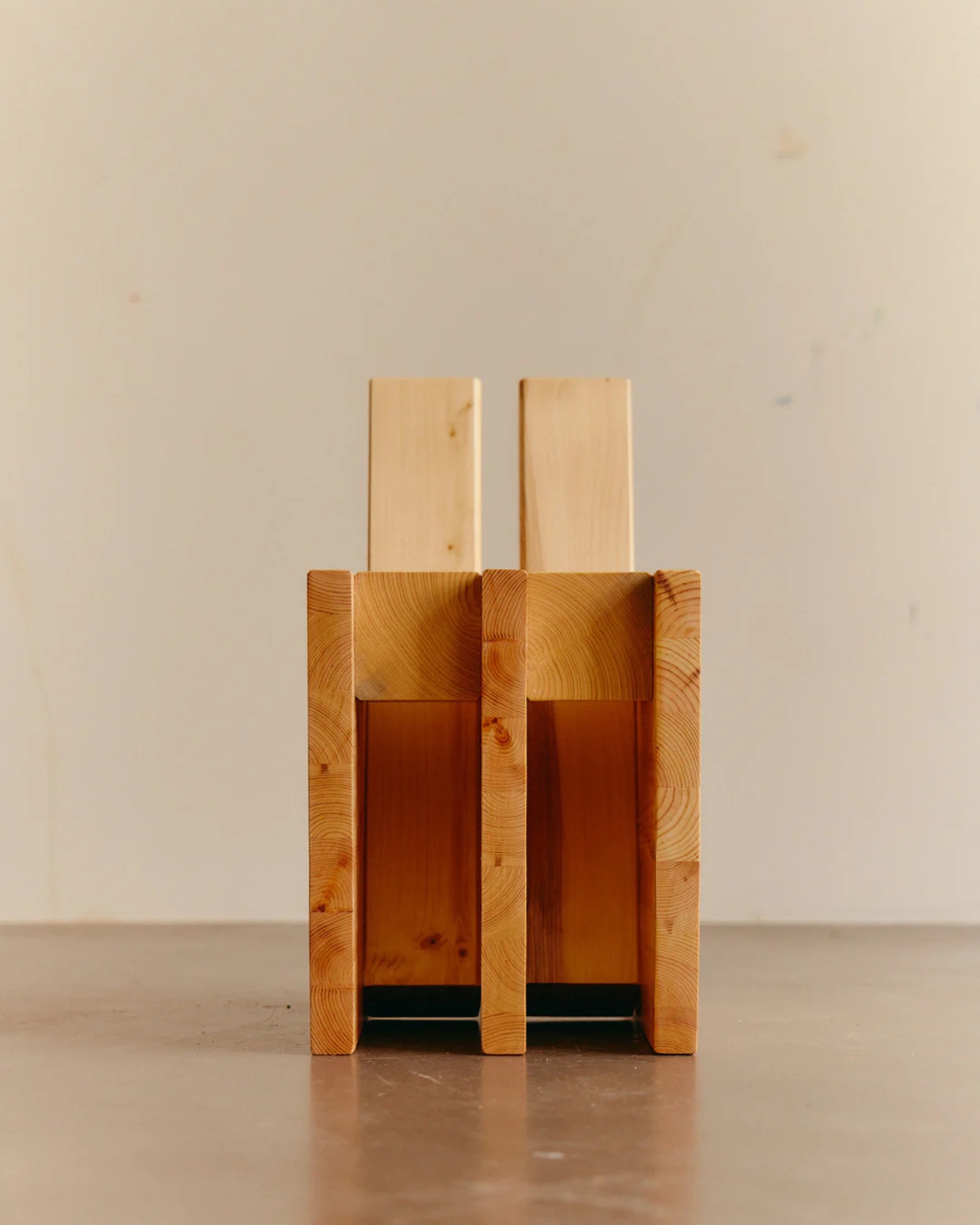
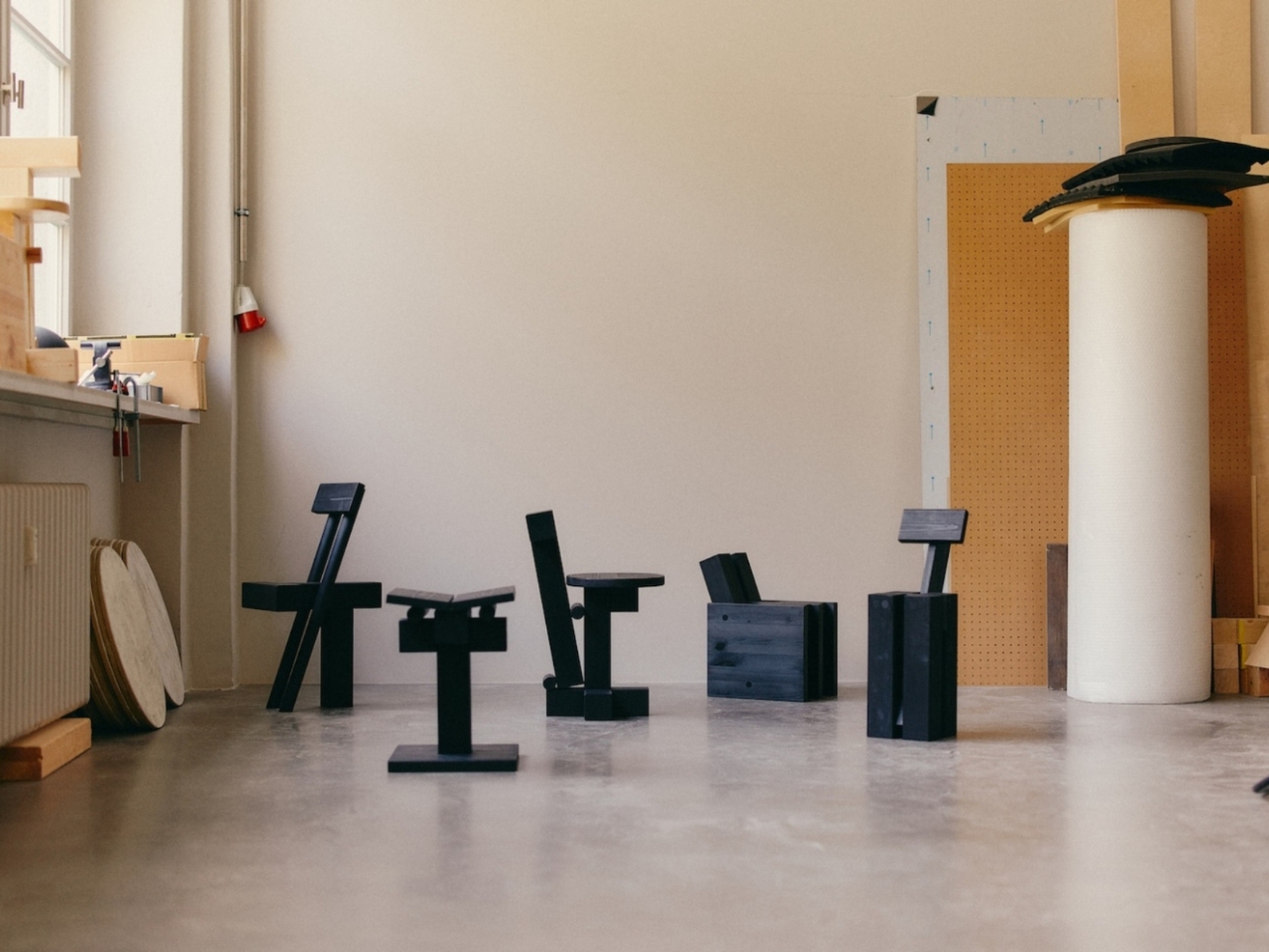
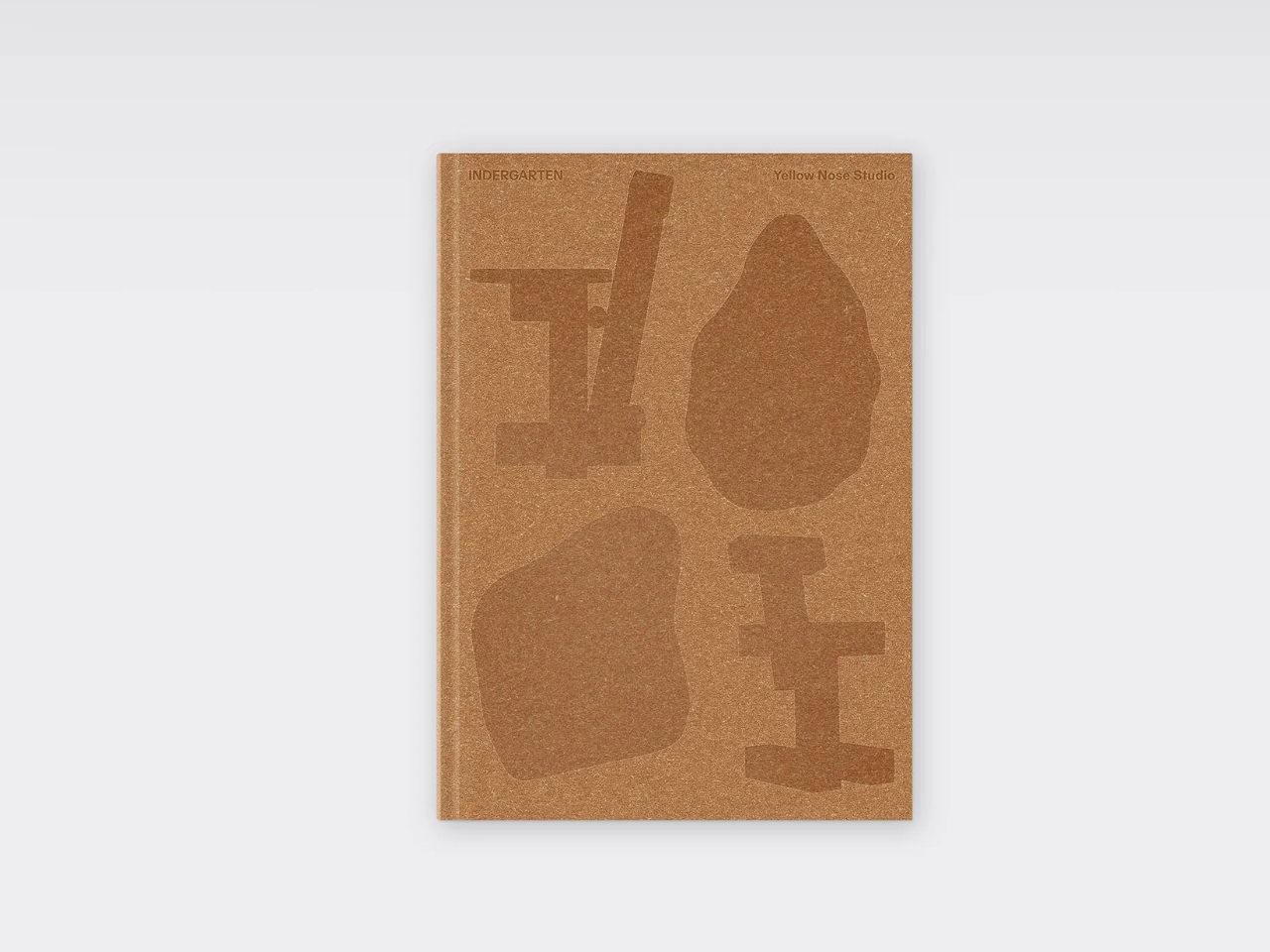
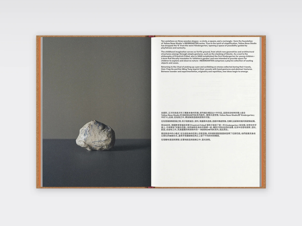
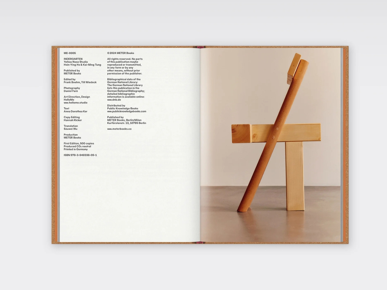
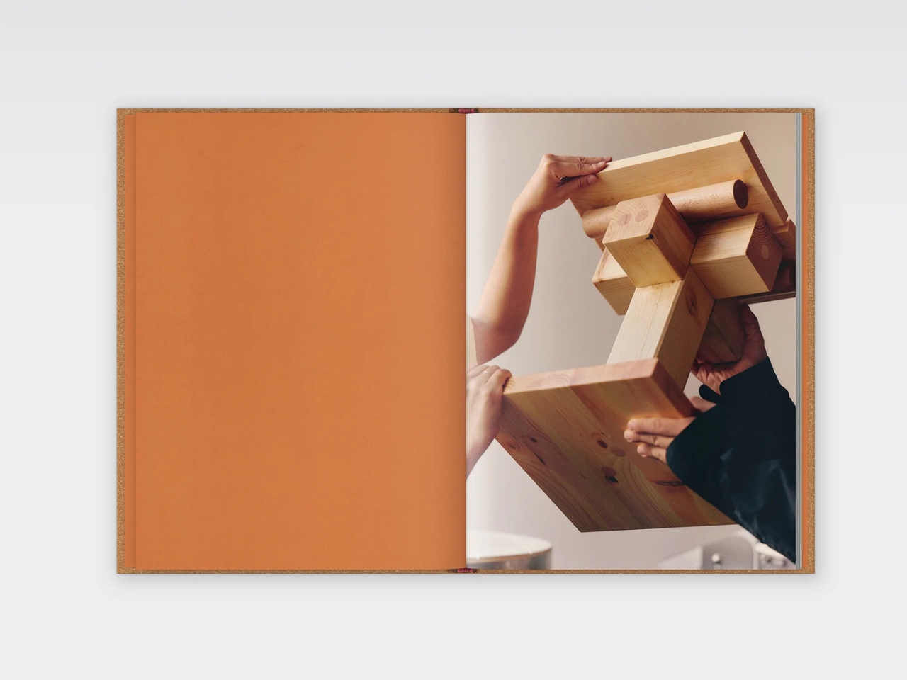
Here’s the concept in its simplest form. Take three basic wooden shapes: a circle, a square, and a rectangle. Stack them. Rotate them. Layer them differently. What you get is ten distinct variations that somehow look like they belong in a contemporary art gallery and your living room at the same time. The pieces function as seating objects and vases, all handcrafted from beech, cedar, and pine.

What makes this collection so fascinating is how the duo actually creates these pieces. They don’t just sketch ideas and hand them off to manufacturers. Each designer makes ten pieces, then they swap and literally deconstruct each other’s work, adding new elements until they both agree on the final ten designs. It’s collaborative in the truest sense, with every piece containing both perspectives. That back-and-forth, that willingness to take apart and rebuild, echoes exactly how kids play with blocks, and it’s what gives these pieces their unique energy.

The philosophy behind INDERGARTEN nods to Friedrich Froebel, who established the first kindergarten in 1840 with the radical idea that children learn best through play and hands-on experimentation. Yellow Nose Studio has taken that concept and applied it to their entire creative process. The result is furniture that feels both architectural and organic, structured yet playful. New geometries emerge from simple gestures, the same way a tower appears when you stack blocks one on top of another.

The collection made its debut and has since traveled to exhibitions, including “A Second Field” at Tokyo’s LICHT Gallery in 2025. The gallery’s director gave them total creative freedom, telling them to create whatever they wanted with no restrictions. That kind of trust speaks to how well this collection bridges the gap between functional design and art. These aren’t just chairs you sit on. They’re conversation pieces that challenge how we think about form, function, and the creative process itself.

In a design world that often takes itself too seriously, INDERGARTEN feels refreshing. The pieces are sophisticated without being stuffy, minimal without being cold, and playful without being childish. They prove that you can make something grown-up and refined while still channeling the experimental spirit of play. Whether you’re a design enthusiast, someone who appreciates contemporary craft, or just someone who wants furniture that makes people do a double-take, this collection delivers.

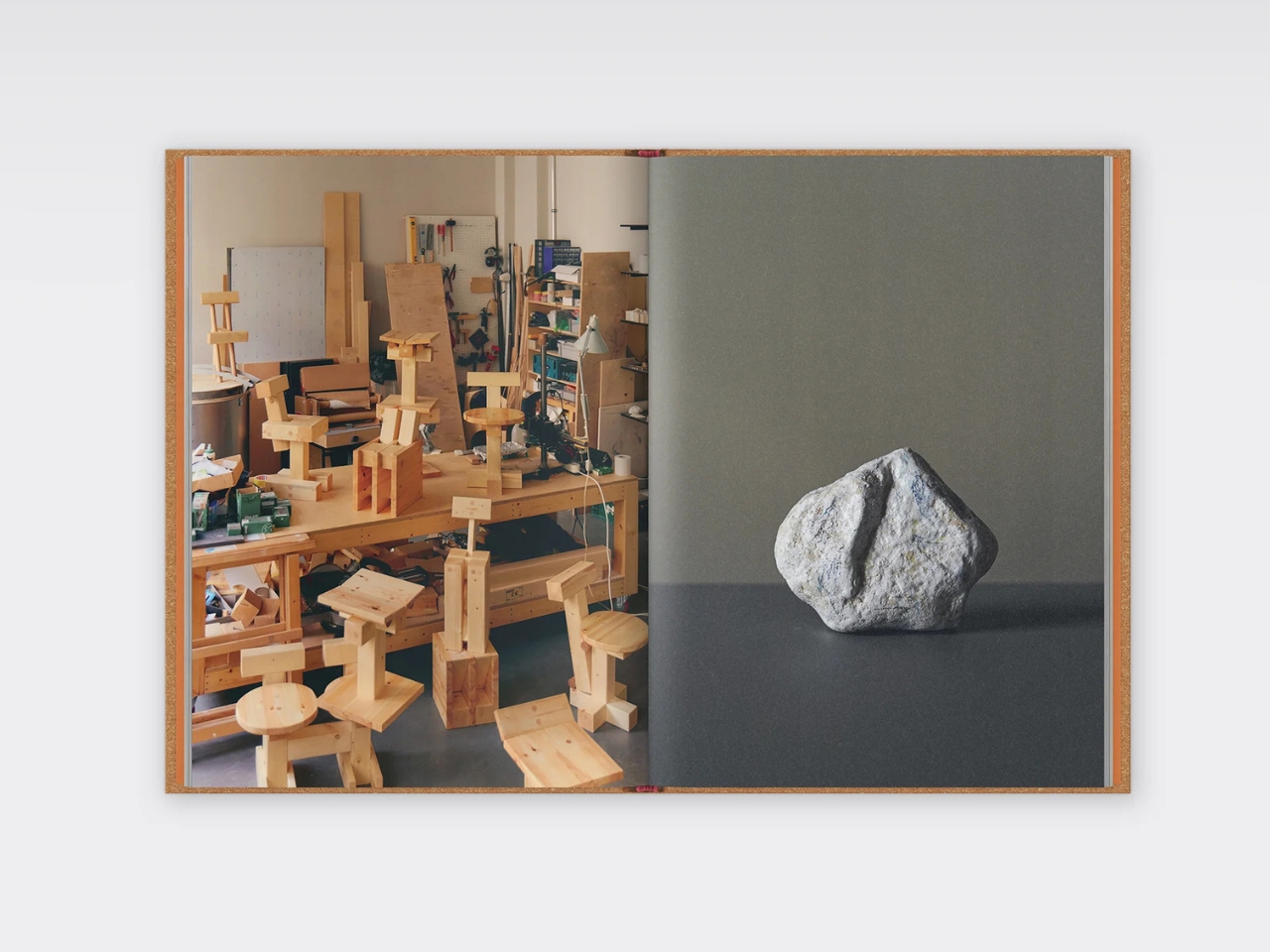
Yellow Nose Studio has even published a monographic book documenting the series, complete with stunning photography by Daniel Farò. The hardcover publication emphasizes the duo’s fluid practice between design, craft, art, and architecture, showing how blurry those boundaries can get when you’re working from a place of genuine curiosity. What’s next for INDERGARTEN? The designers hope curators will imagine these ideas evolving into bigger projects. They’re following the same playful, exploratory process to see where it leads. And if their wooden blocks have taught us anything, it’s that the best creations come from stacking, unstacking, and being willing to start over when the spirit moves you.

The post This Furniture Collection Was Designed By Your Inner 5-Year-Old first appeared on Yanko Design.

George & Willy’s Cafe Table Mounts to Walls and Lifts Off Daily

Small cafes and bistros face a constant battle with space. You need enough seating to make the business worthwhile, but cramming too many tables and chairs into a narrow sidewalk or patio turns the whole setup into an obstacle course. Floor-standing tables claim precious real estate even when they’re not in use, and moving them around every day to accommodate different crowds or weather becomes a hassle nobody wants to deal with.

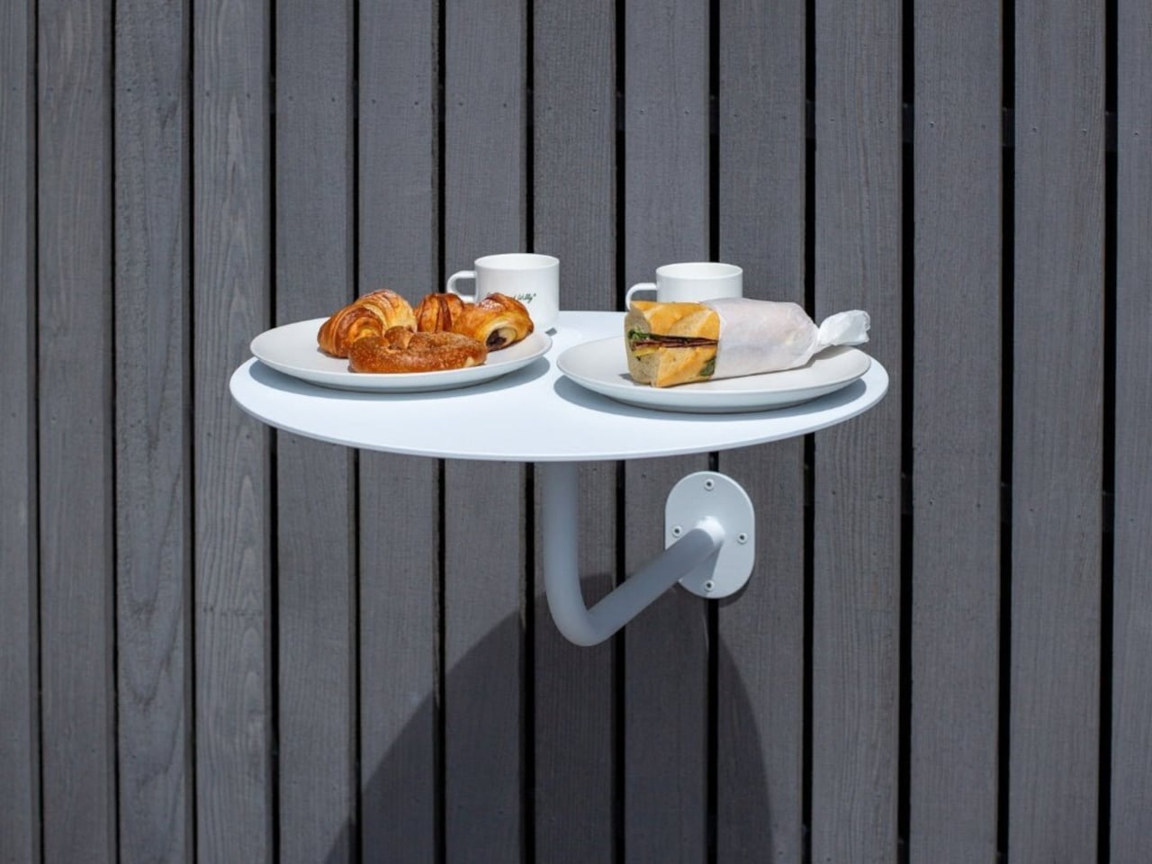
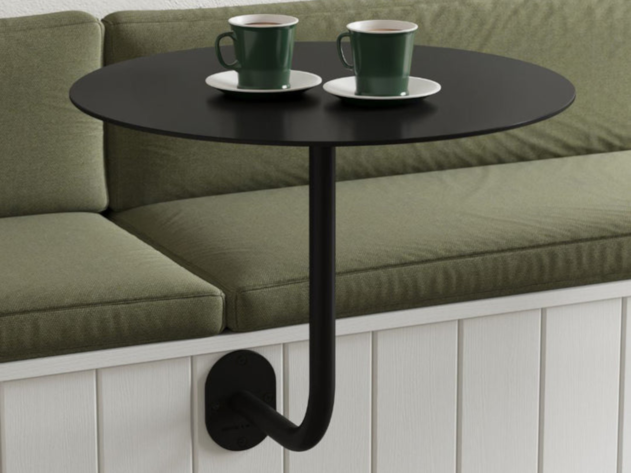
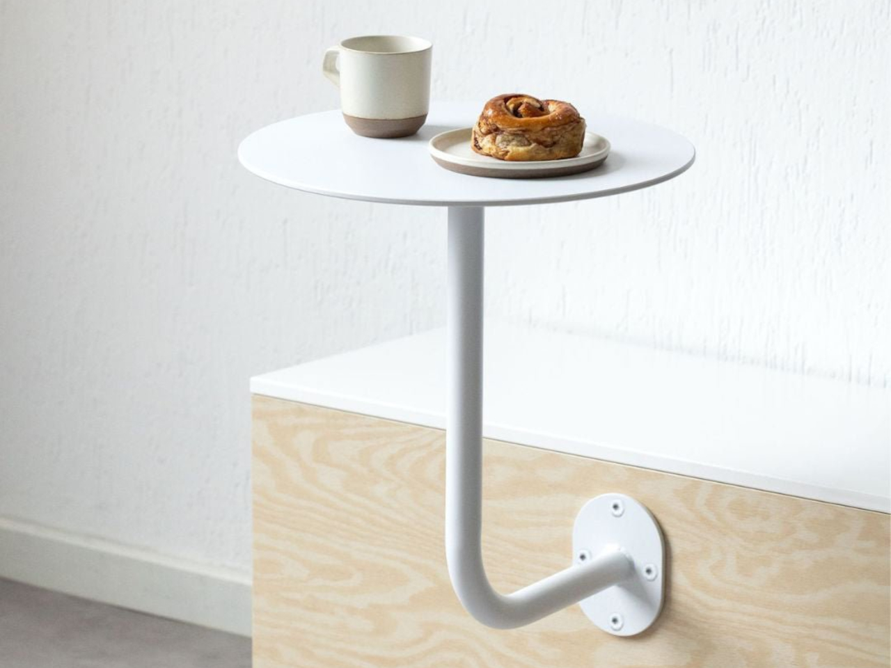
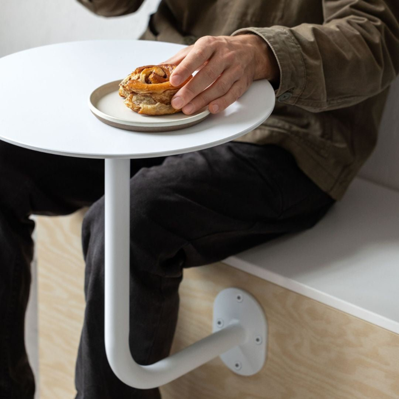
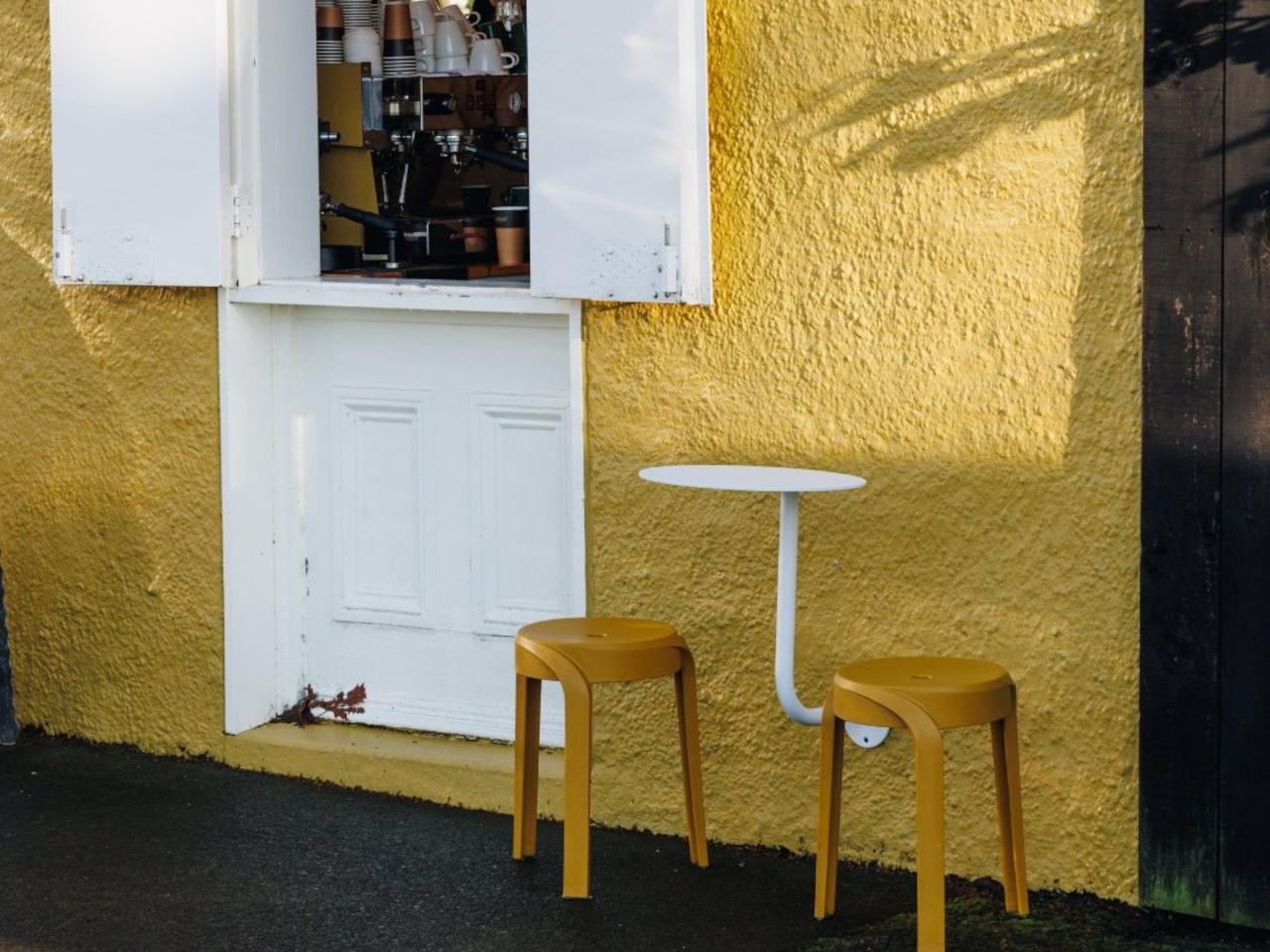
George & Willy’s Wall-mounted Cafe Table solves this by eliminating the floor space problem entirely. The table attaches directly to the wall or a bench seat with a reversible bracket that lets you position it high or low depending on your needs. When the day’s done, you can slot the table out of its bracket and bring it inside, leaving nothing behind but a small wall plate. It’s a simple approach that makes flexible seating actually flexible.

Designer: George & Willy

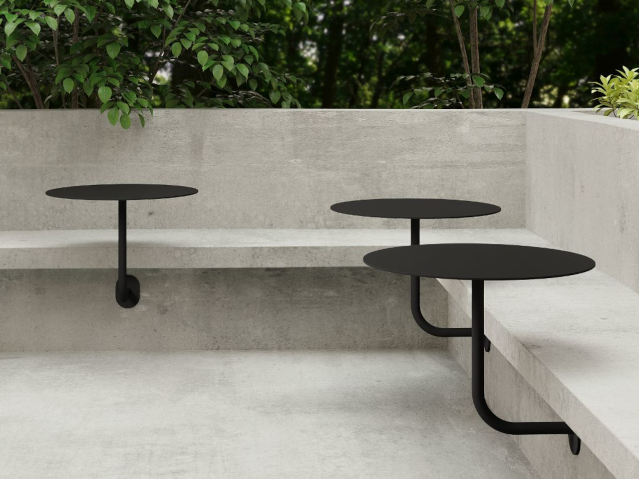
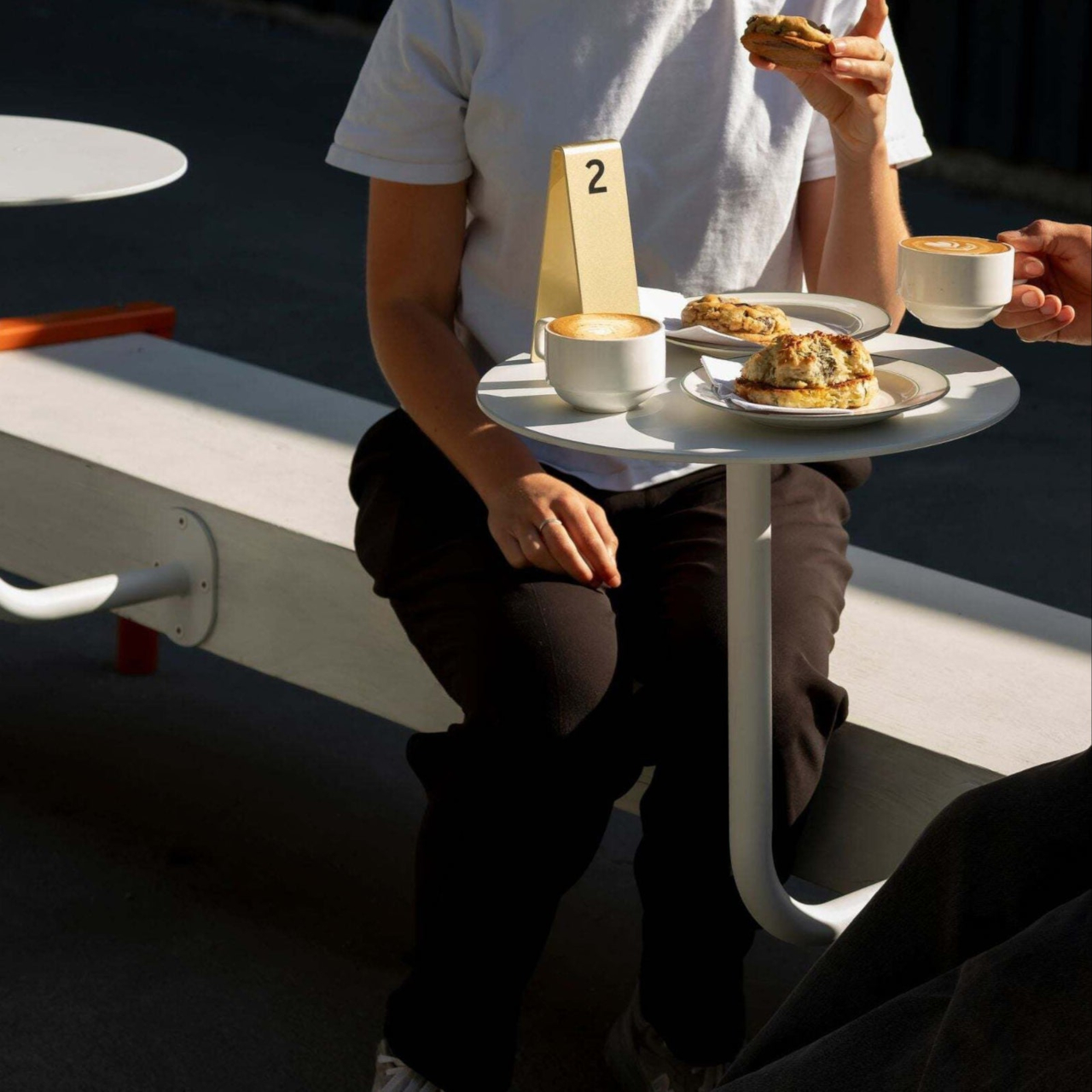
The table itself features a round aluminum top available in two sizes, either 40 cm or 60 cm in diameter, both with a clean powder-coated finish in black or white. A curved stem extends from the wall bracket, creating a graceful arc that supports the tabletop without needing legs underneath. The whole thing weighs just 8.4 pounds but can hold up to 17.6 pounds, which is plenty for coffee, pastries, laptops, or small meals.

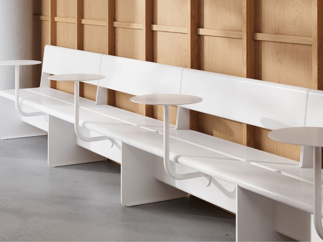
Of course, the real cleverness is in the bracket system. You can mount it in a tall orientation, where the table attaches to a bench seat and sits higher and closer to the wall, or in a short orientation, where it mounts directly to the wall and extends further out for more legroom. The same bracket handles both setups, so you’re not locked into one configuration when your space inevitably needs to change.

The table’s weatherproof construction means it works just as well outdoors as it does inside. Rain, humidity, and temperature swings won’t damage the aluminum or zinc-coated steel, which is why you see these tables installed on patios, sidewalks, and garden walls. The removable design also makes cleaning straightforward since you can take the whole thing down, wipe it off, and slot it back in without any tools.

What makes the Wall-mounted Cafe Table feel genuinely smart is how it adapts to different situations. You can install multiple tables in a row along a wall for group seating, space them out for solo customers, or mix tall and short orientations to accommodate benches and stools in the same area. That kind of modularity is rare in furniture that also looks this minimal and intentional.

The table’s slim profile and clean lines fit seamlessly into modern cafes, but the design works just as well in home settings where space is tight. Balconies, small patios, or even compact kitchens can benefit from a surface that doesn’t claim floor space and can be tucked away when you need the room. It’s the kind of simple, thoughtful design that makes you rethink how furniture occupies space.

The post George & Willy’s Cafe Table Mounts to Walls and Lifts Off Daily first appeared on Yanko Design.
Layer Just Built the AI Chair Remote Workers Need

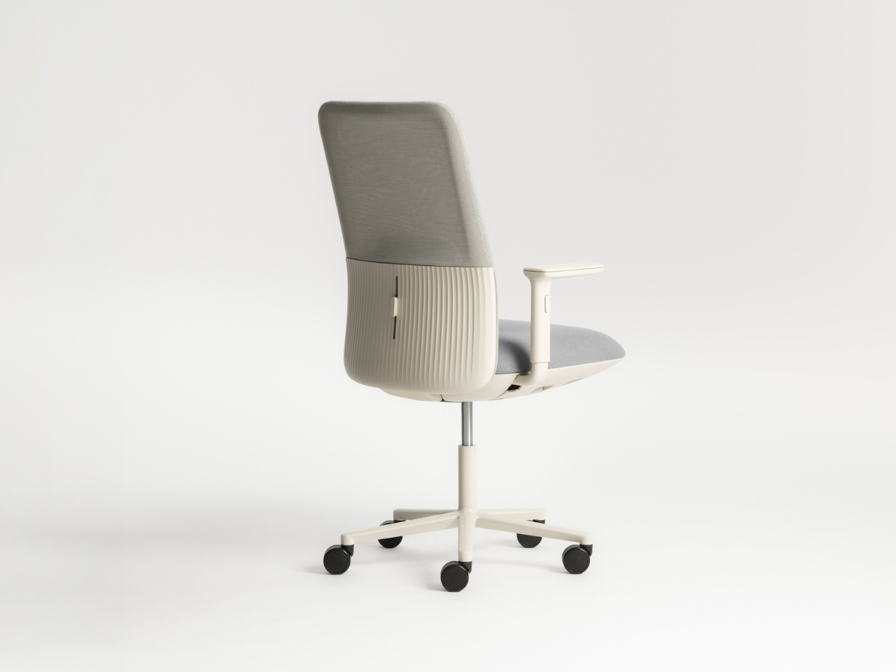
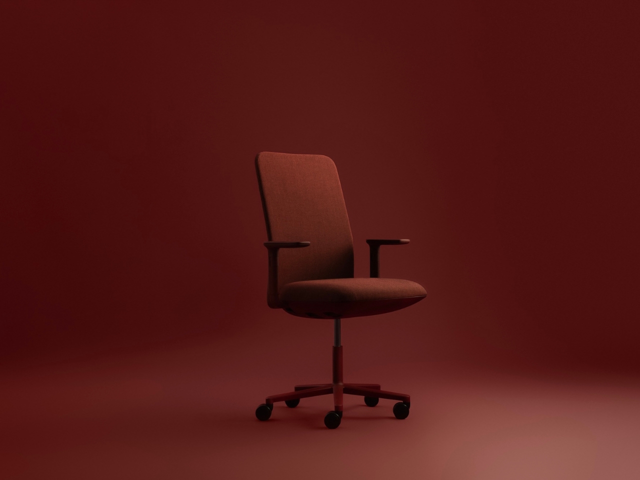
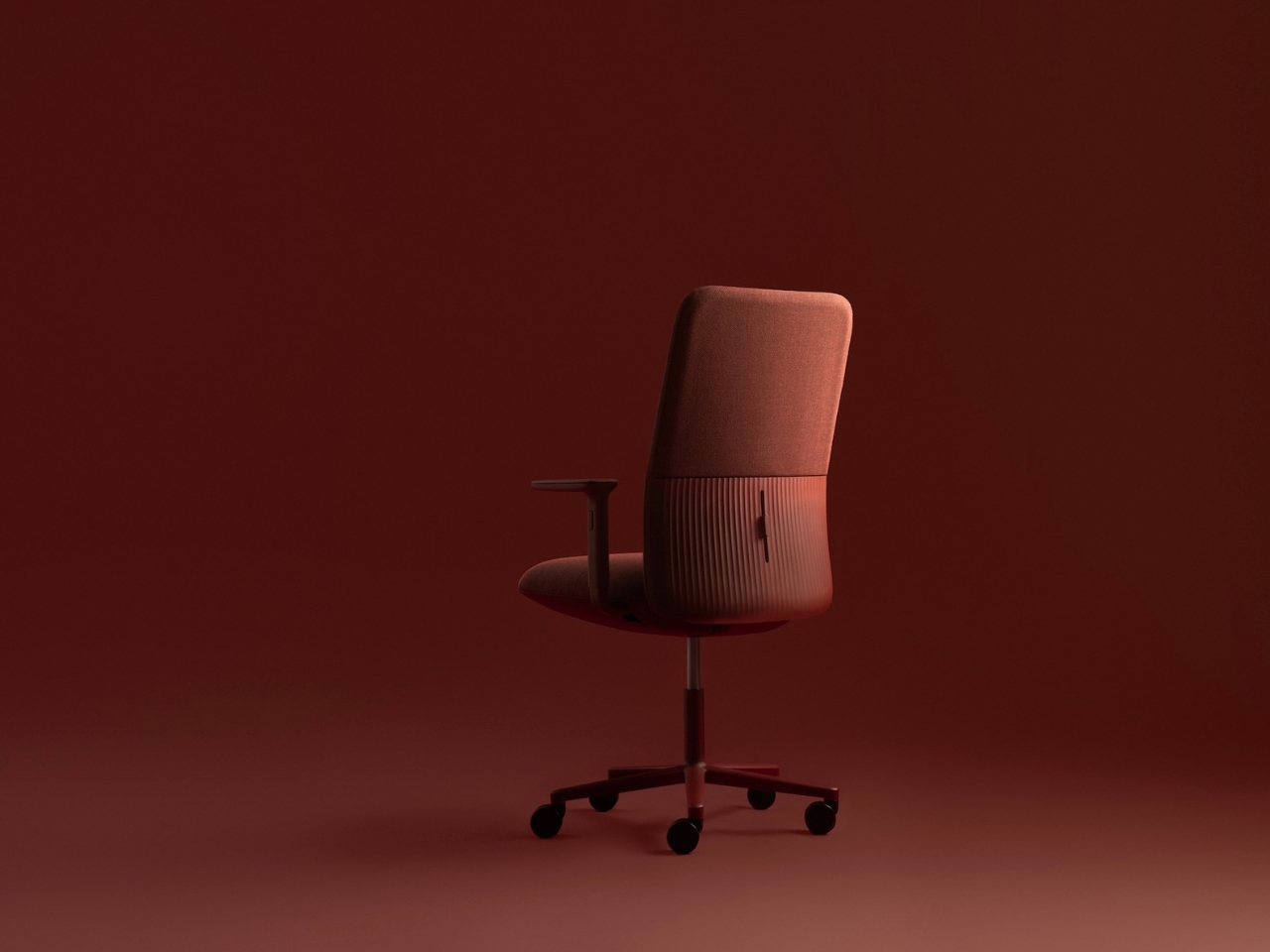
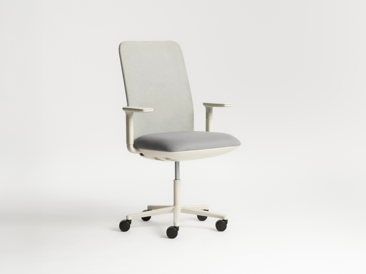
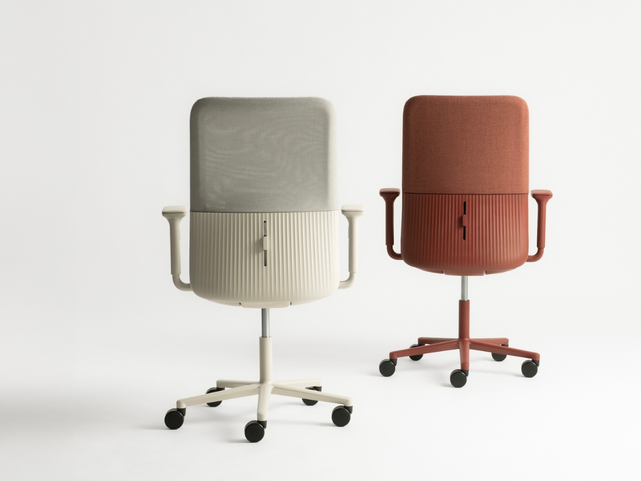
There’s something quietly revolutionary happening in office furniture, and it doesn’t involve more buttons, levers, or adjustment knobs. LAYER, the London-based design studio founded by Benjamin Hubert, has partnered with Spanish furniture maker Andreu World to create Velo, a task chair that throws out the instruction manual and replaces it with something far more intuitive: material intelligence.

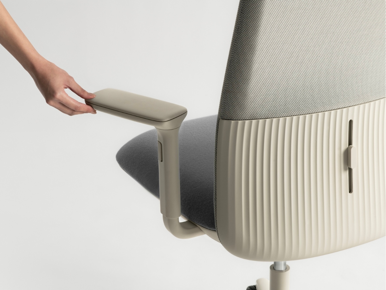
If you’ve ever sat in a high-end office chair, you know the drill. There are usually about seven different levers under the seat, each controlling a specific function, and you’re expected to become an amateur ergonomics expert just to sit comfortably. Tilt tension here, lumbar support there, armrest height, armrest width, seat depth. It’s exhausting before you even start working. Velo takes a different approach entirely, one that feels almost obvious once you experience it.

Designer: LAYER x Andreu World

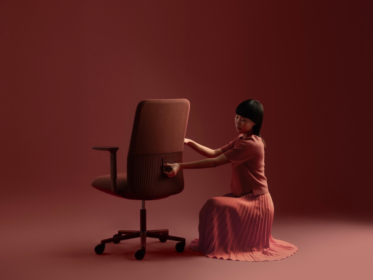
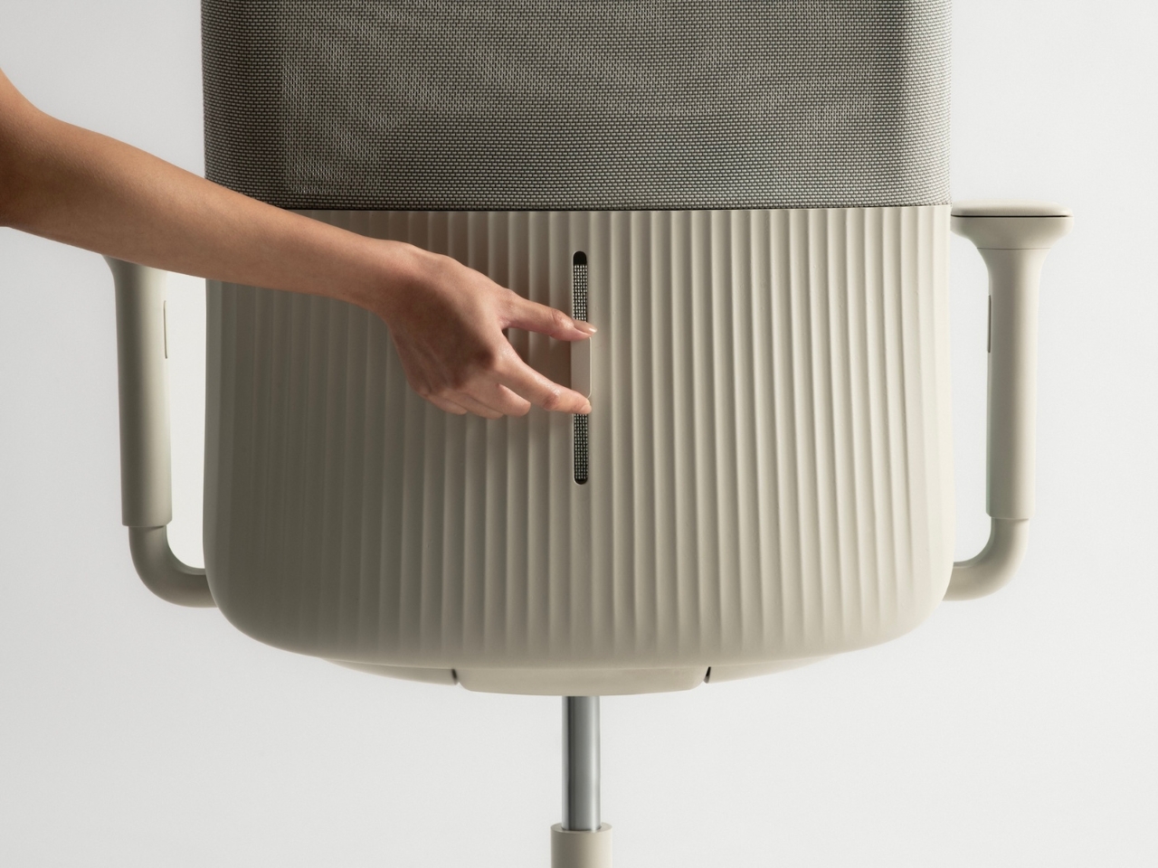
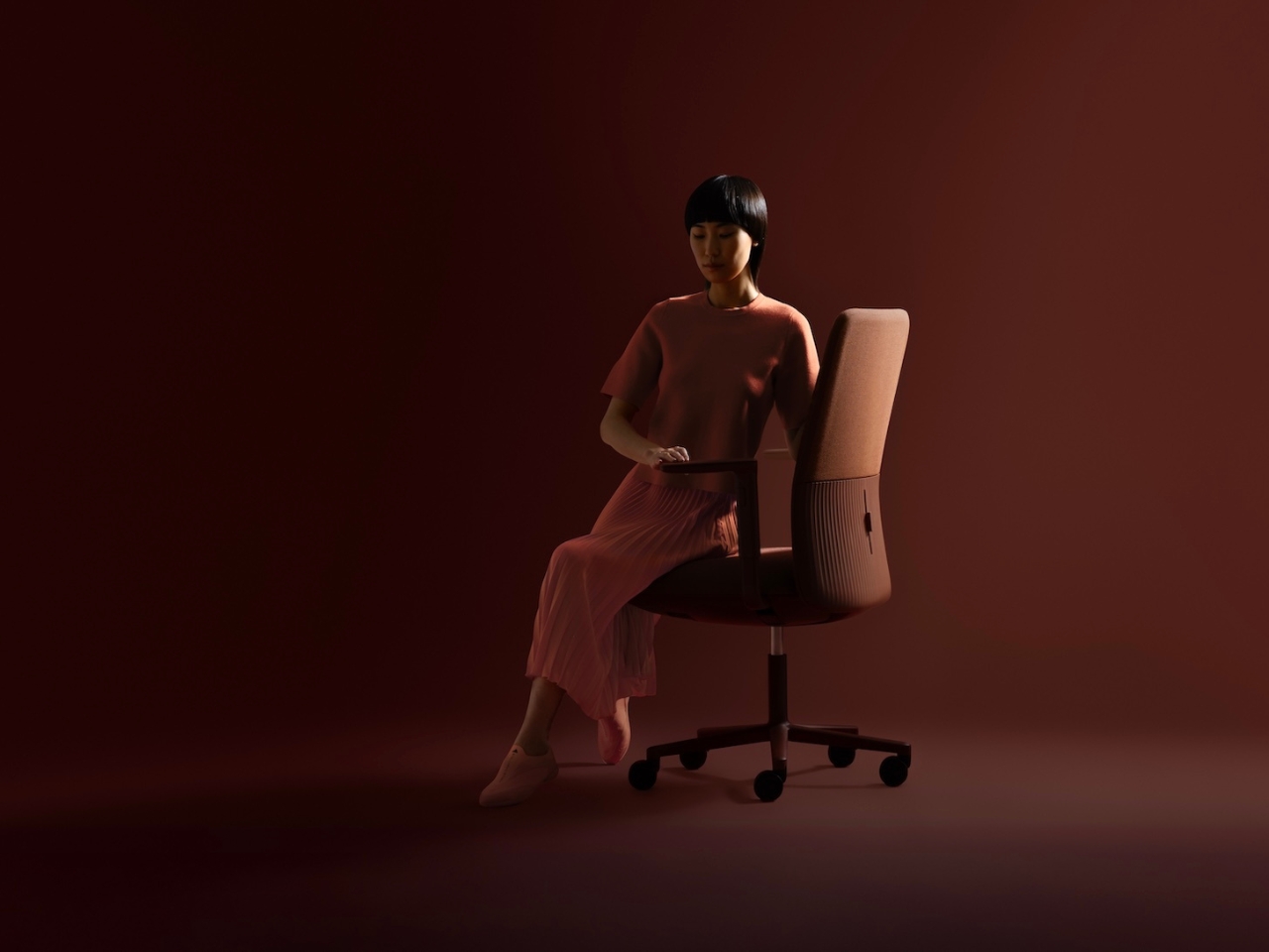
At the heart of this chair is a weight-activated mechanism that LAYER developed specifically for this project. Instead of requiring you to manually adjust anything, the chair simply responds to how you’re sitting. Lean back, and it flexes with you. Shift your weight forward, and it adapts. The contoured backrest moves in real time with your body, providing ergonomic support that feels less like furniture and more like the chair is actually paying attention to you.

This isn’t some gimmick hiding behind sleek marketing language. The technology here is genuinely clever. LAYER engineered a system that uses the sitter’s own body weight to activate the mechanism, eliminating the need for springs, gas lifts, or complex pivot points that typically make task chairs feel like miniature machines. The result is a chair that looks refreshingly simple but performs with sophisticated precision.
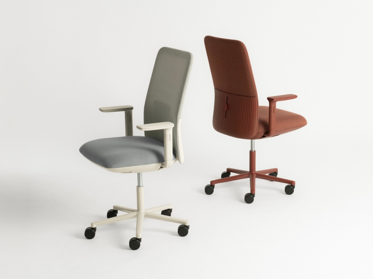
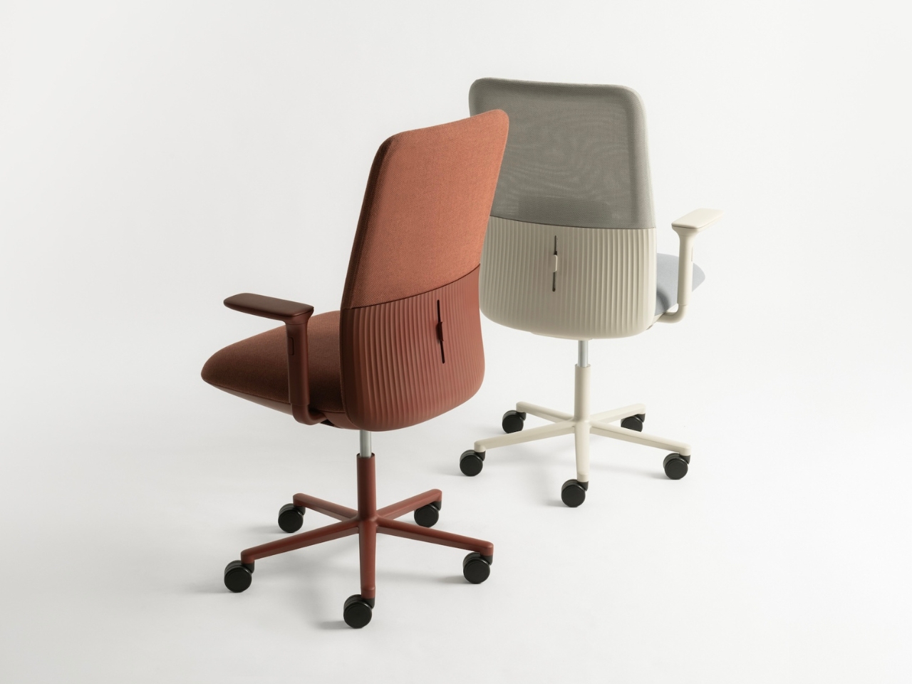
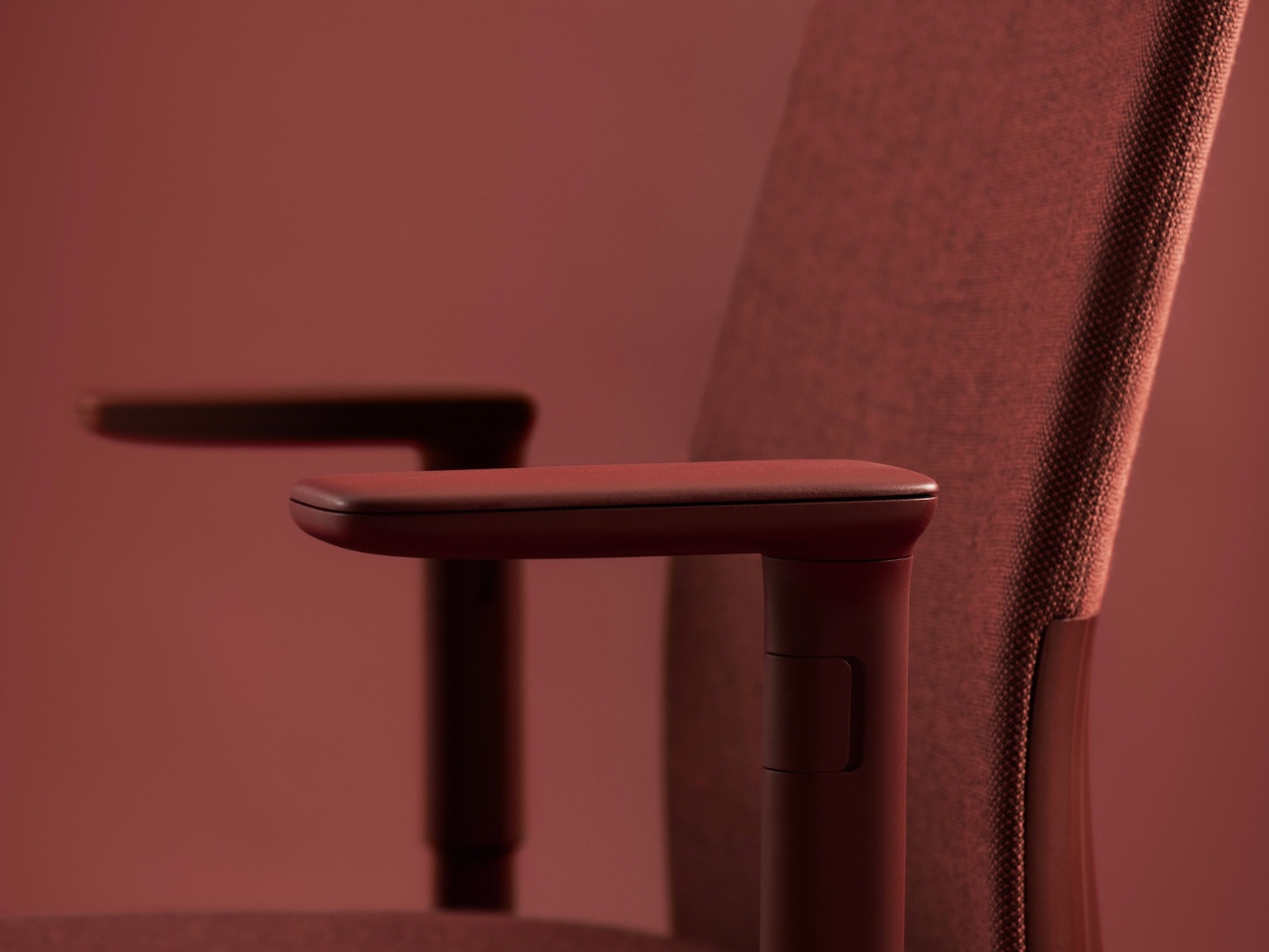
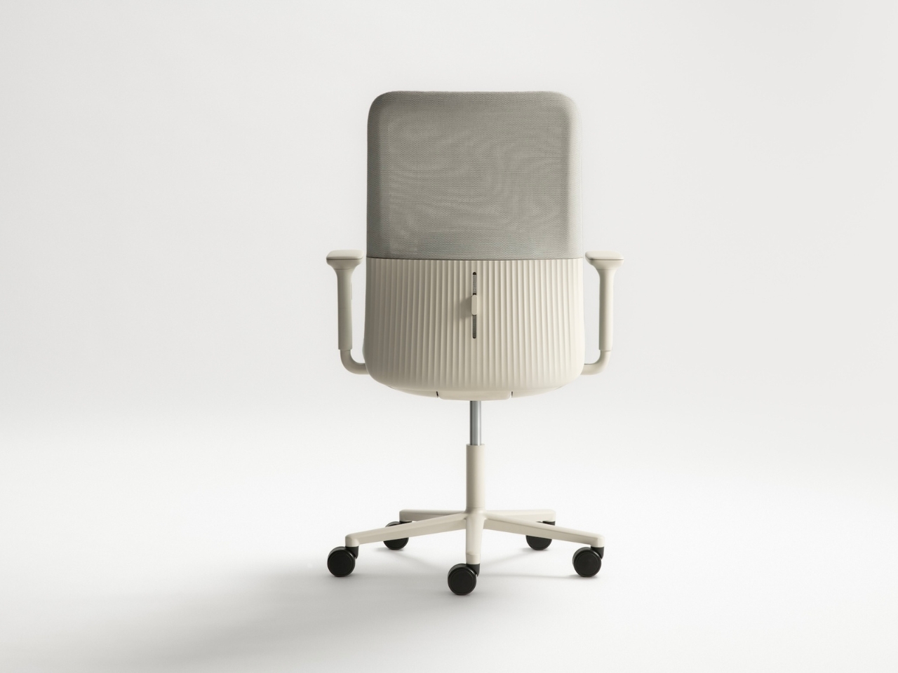
Visually, Velo is a departure from the aggressively technical aesthetic that dominates the office furniture world. Where most task chairs announce their functionality with exposed mechanisms and industrial details, Velo opts for soft, organic lines and a sculptural silhouette. It’s the kind of chair that wouldn’t look out of place in a contemporary home office, which is exactly the point. With more people working from home or splitting time between multiple locations, the old distinctions between commercial and residential furniture are breaking down. Velo was designed for that fluid reality.
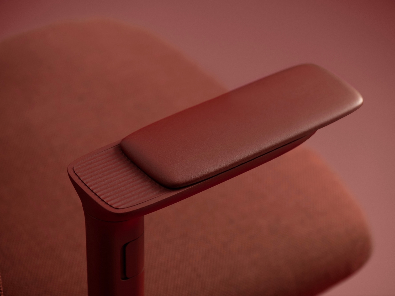
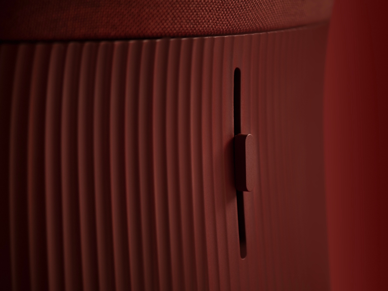
You can spec the chair in two main configurations. The mesh backrest version offers breathability and a lighter visual presence, perfect for warmer climates or minimalist spaces. The fully upholstered version provides a softer, more enveloping feel. Both options feature adjustable lumbar support, and you can choose between standard armrests or 4D movement arms that adjust in multiple directions. The base comes in Andreu World’s range of powder-coated finishes, and the upholstery options pull from their sustainable textile collection.

Speaking of sustainability, Velo was designed with end-of-life in mind from the very beginning. The lightweight frame and base are manufactured from recycled thermopolymer, a high-performance material that maintains durability while reducing environmental impact. The chair uses a minimal part count, which not only simplifies manufacturing but also makes disassembly straightforward when it’s time to recycle. The upholstery fabrics are either low-impact or fully recyclable, continuing Andreu World’s commitment to circular design principles.

Benjamin Hubert’s perspective on the project gets at something essential about where design is heading. As he puts it, people don’t want overly technical products anymore. They want intuitive, adaptable things that fit into their lives without requiring a learning curve. Velo strips back complexity and focuses on the fundamental question: what does a chair actually need to do? It’s not trying to reinvent sitting, but it is rethinking how a chair can support the way we actually work now, without making us work to figure out the chair itself.

The post Layer Just Built the AI Chair Remote Workers Need first appeared on Yanko Design.