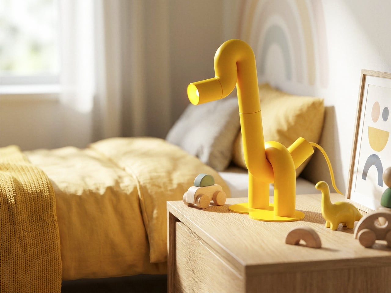
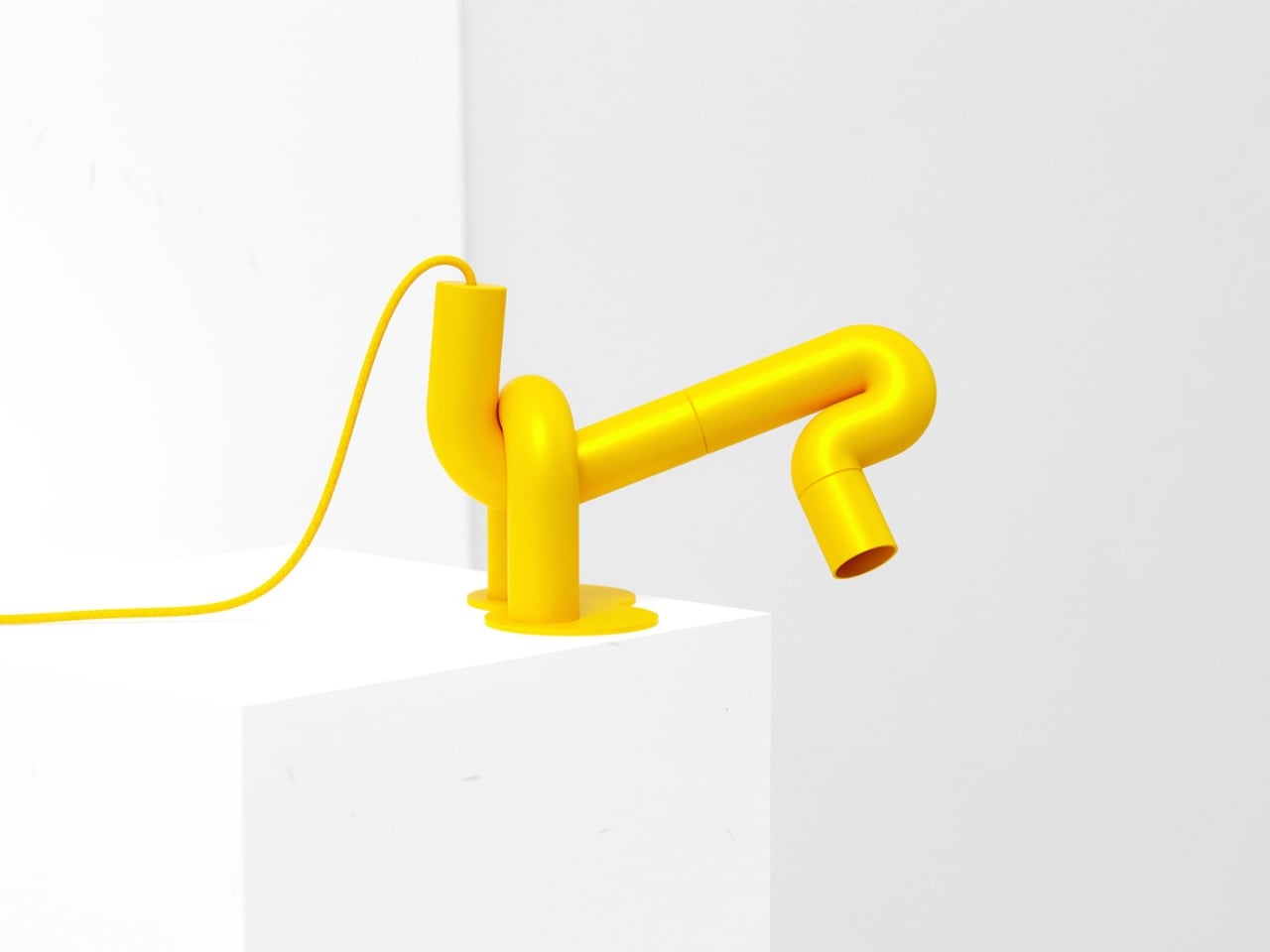
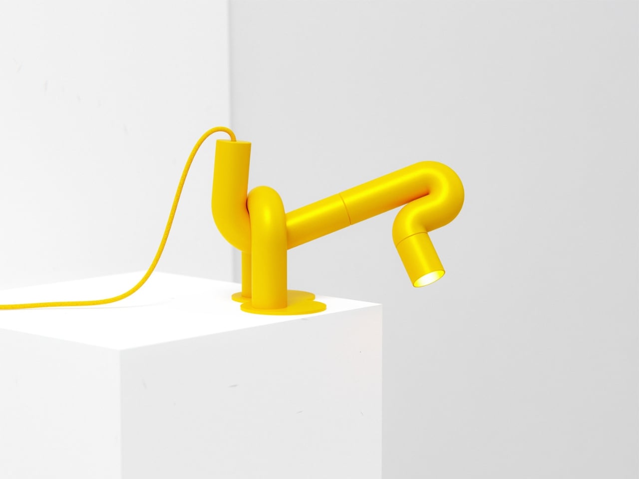
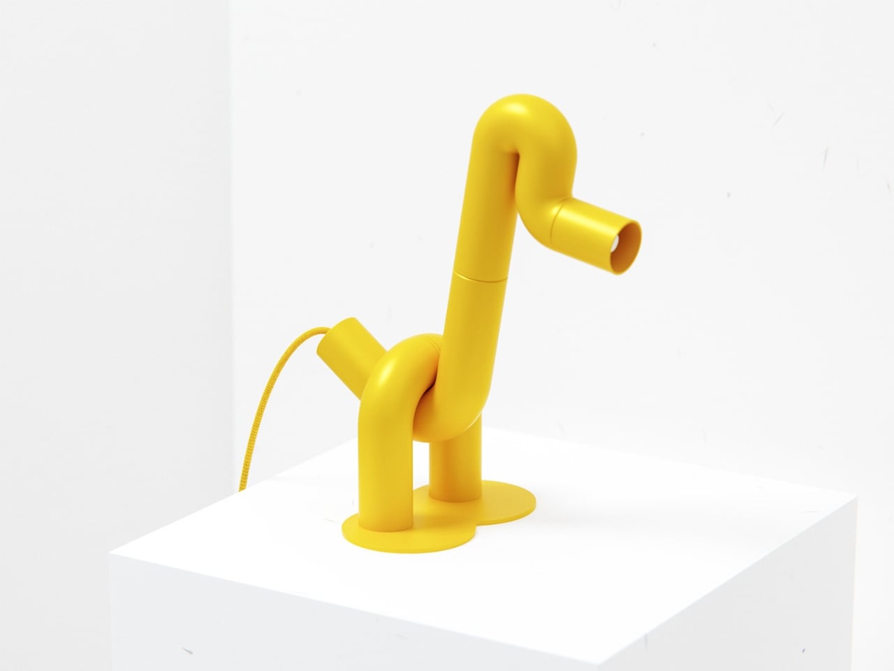
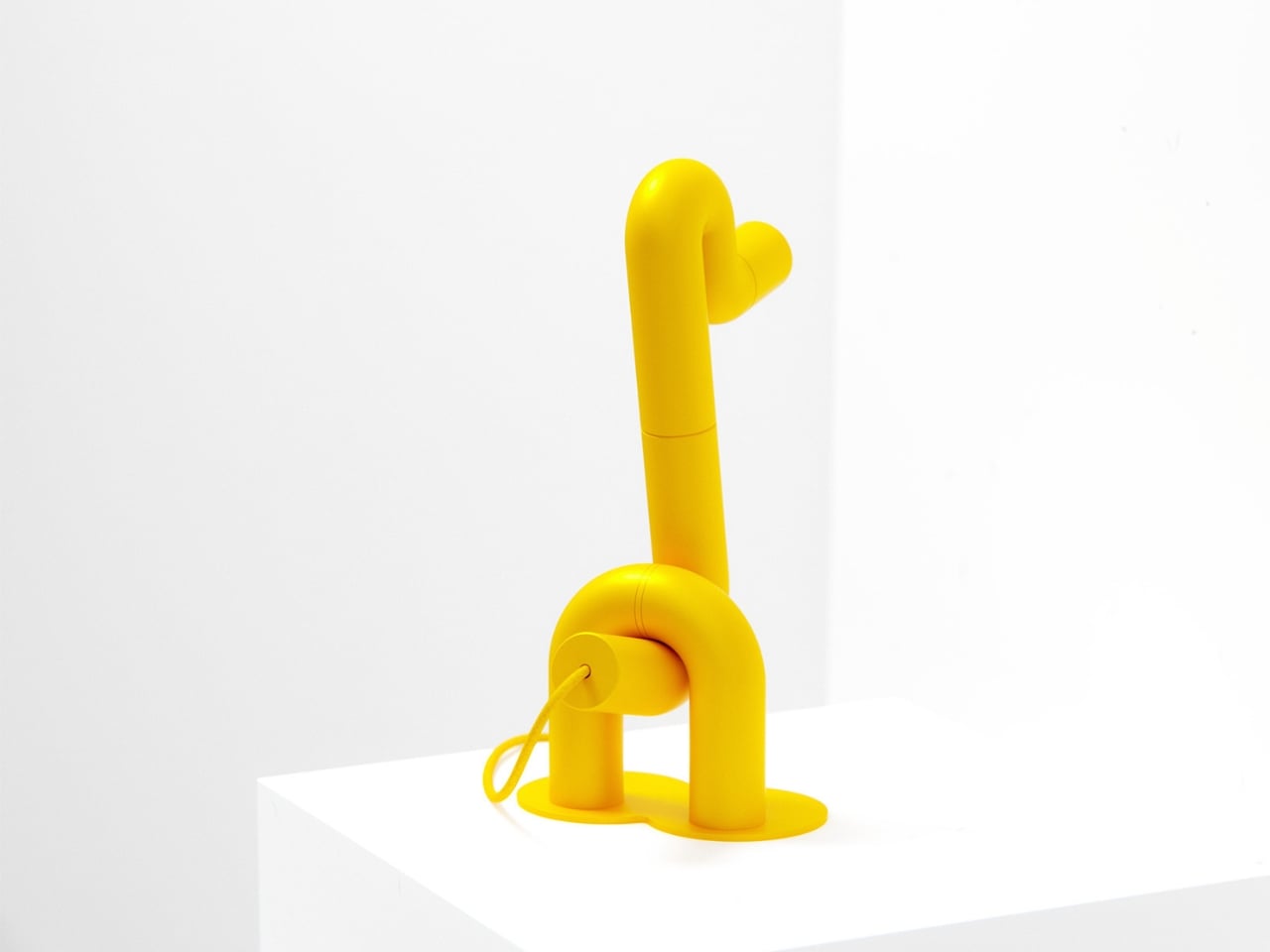
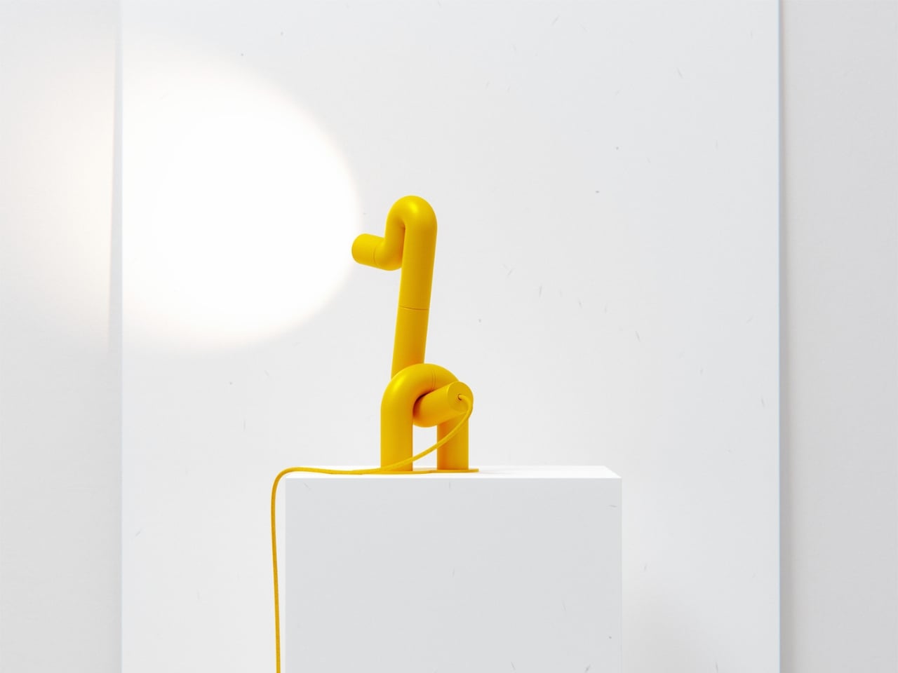
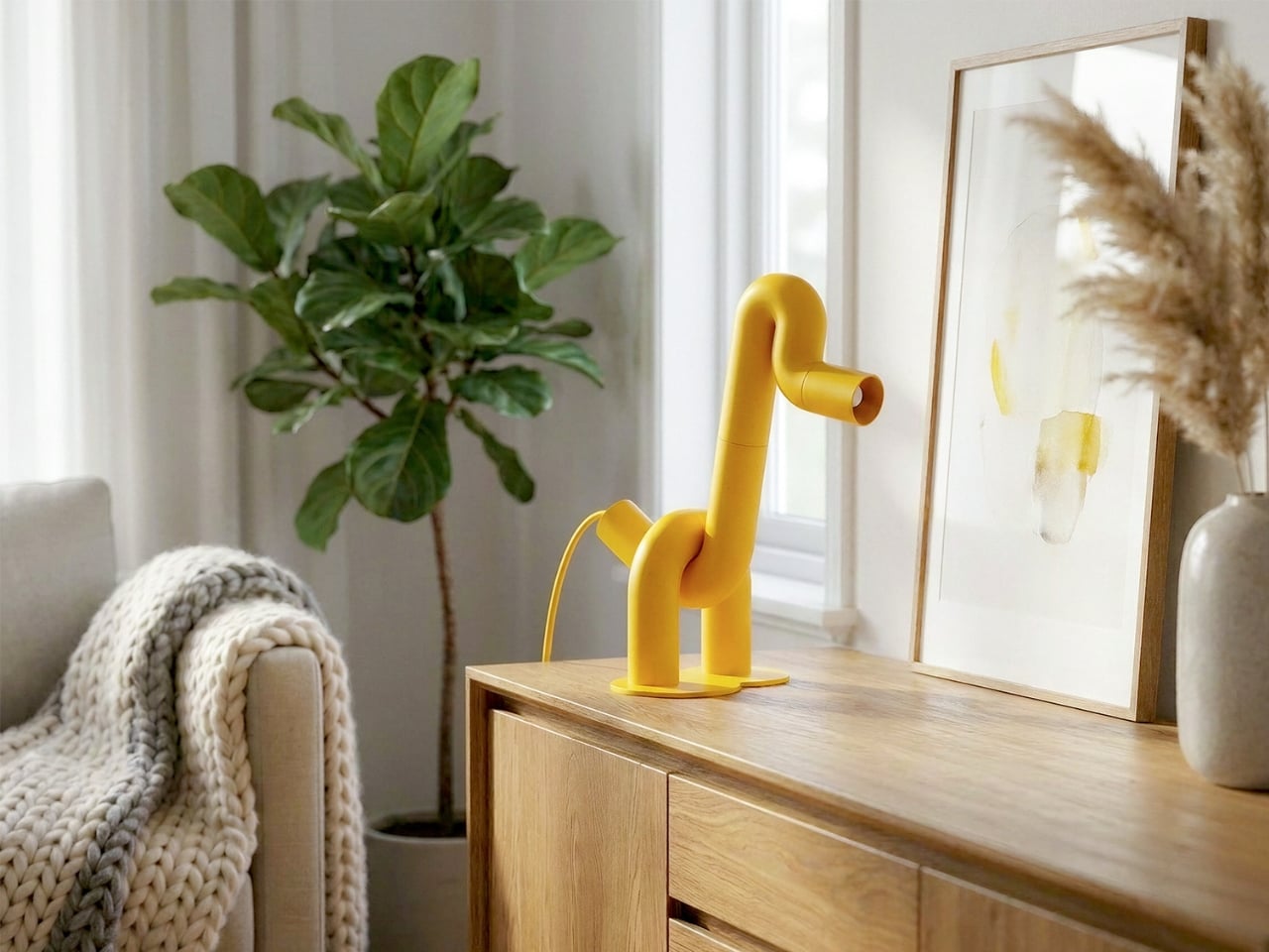
The first thing you notice is the yellow. Not a soft, hedging yellow, but a full-commitment, matte, warm yellow that coats every millimeter of the piece without apology. Then you notice the shape. A long, arching neck. Two sturdy legs. A horizontal head that doubles as the light source. Duke, the table lamp designed by Liam de la Bedoyere of Bored Eye Design, is a duck. More precisely, it’s a duck drawn by someone who decided that one continuous tube was all they needed.
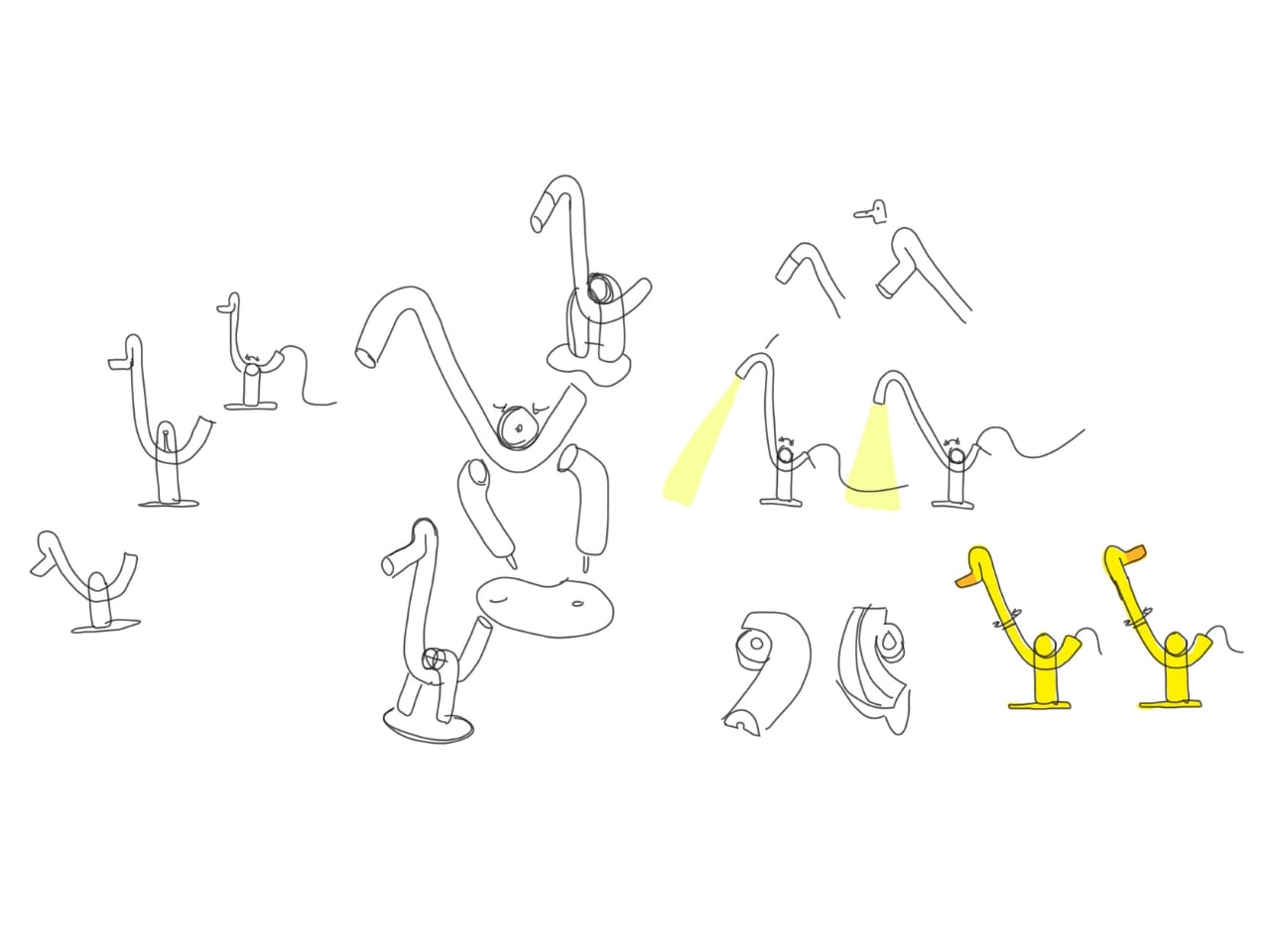
That’s the central idea, and it’s worth sitting with. De la Bedoyere’s design vocabulary here is essentially a single rule: take a tube, bend it, and let the animal emerge from the bends. No additional elements, no decorative flourishes, no mixed materials. Just the tube, its curves, and the form they describe. The result is a piece that communicates immediately. You read it as an animal before you register that it’s a lamp, which is the correct order of things.
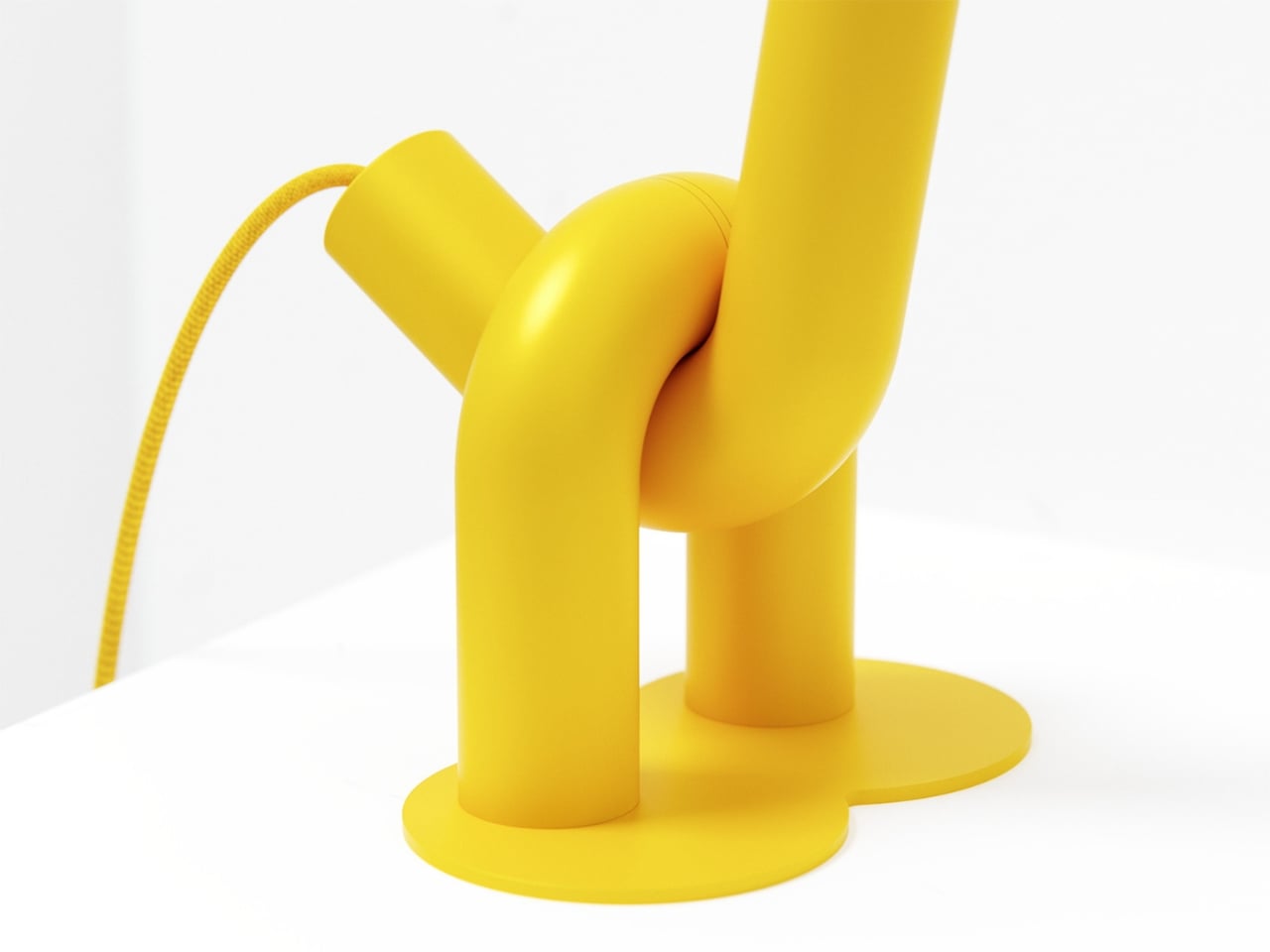
Up close, the construction rewards attention. The tubular sections connect in visible segments, and those joints give the piece a modular, almost architectural quality that tempers the playfulness with something more considered. The bends themselves are generous and smooth, with a radiused curve that keeps everything feeling soft rather than rigid. The head is a cylinder open at the end, functioning as the spotlight, and that detail is quietly clever. The light doesn’t interrupt the form. It completes it, pointing forward from the duck’s snout like the whole thing was always meant to do exactly this.
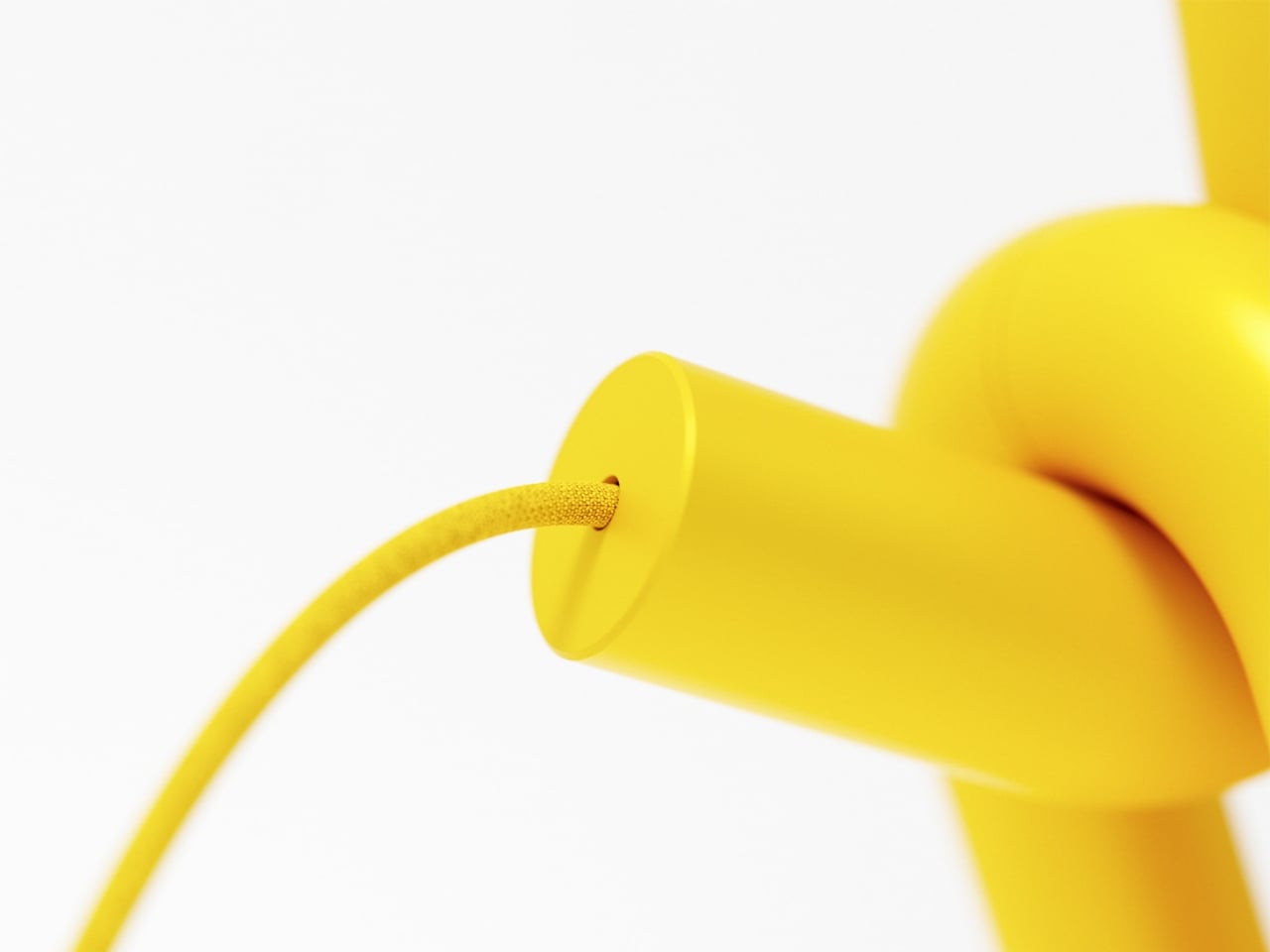
The base is a flat circular disc, minimal and low to the surface. Two legs rise from it and immediately branch into the body, giving the lamp a planted, grounded stance that stops it from reading as fragile. And then there’s the cord, a braided yellow cable that matches the body exactly, looping out near the base. Most designers treat the cord as a problem to solve or something to hide. Here it’s an afterthought that became a feature, trailing away from the lamp like a tail. It’s one of those small decisions that reveals how thoroughly this design was thought through.
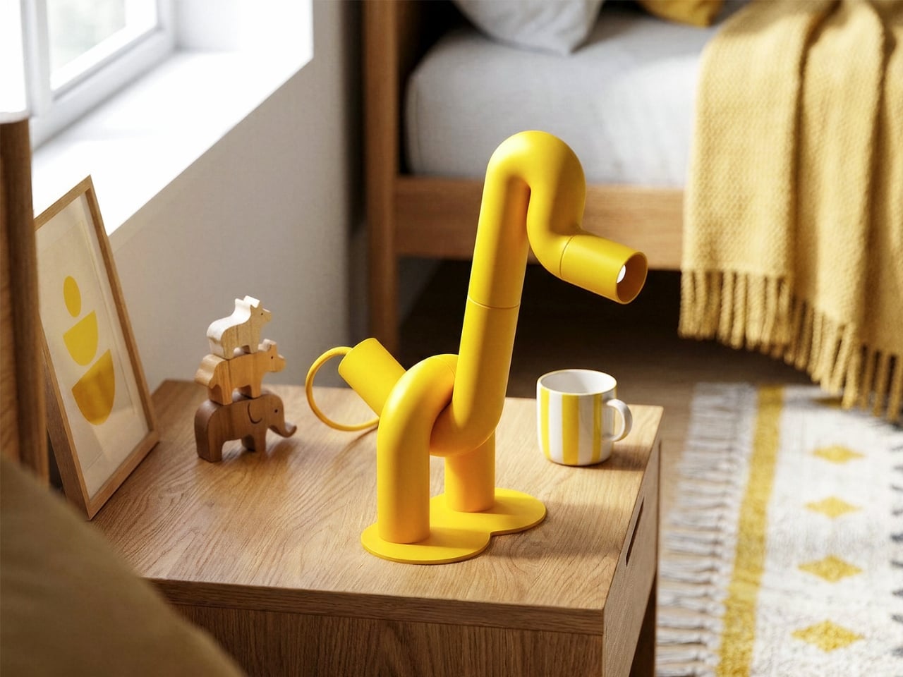
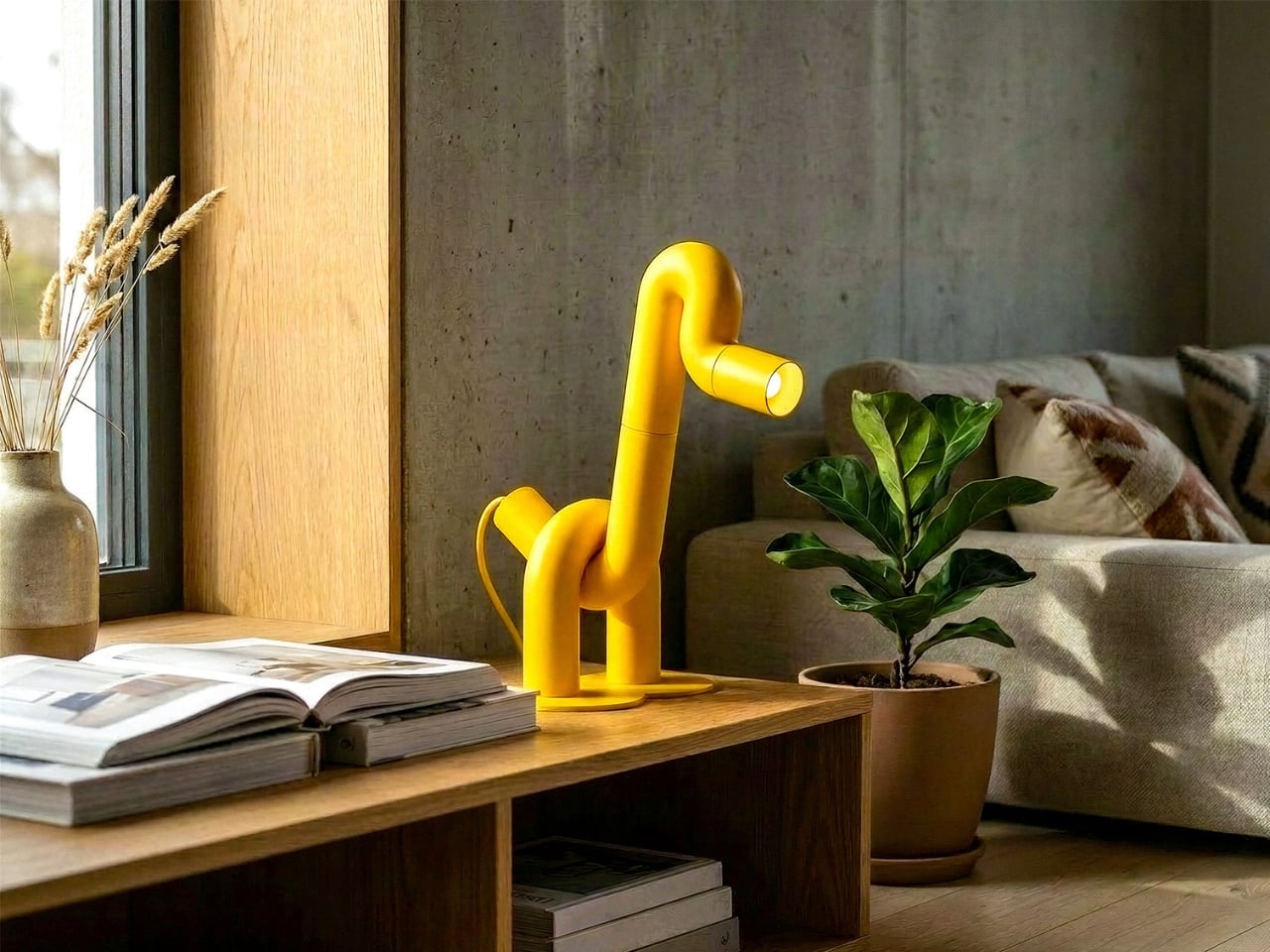
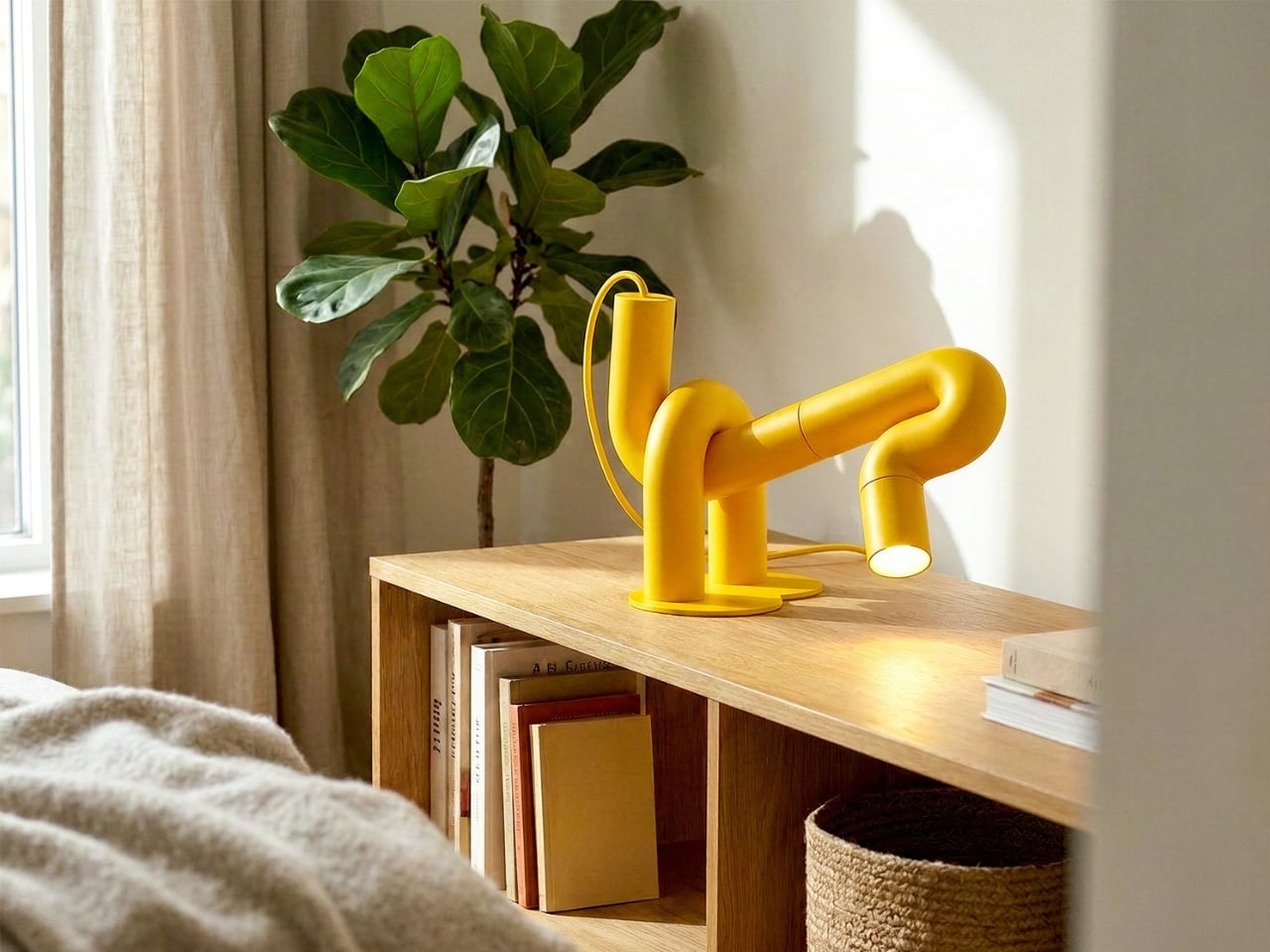
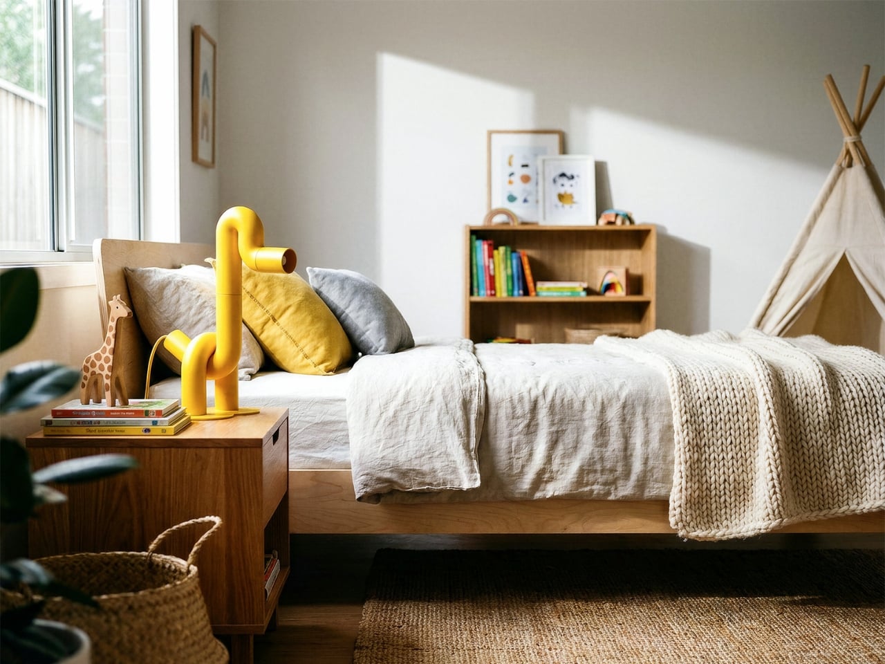
The monochromatic yellow does something important for how the silhouette reads. By removing any tonal contrast within the piece itself, the animal form becomes purer and more immediate. Your eye traces the outline rather than getting pulled into detail, which is exactly what you want from a lamp that’s also functioning as sculpture. The color also travels. Looking at Duke placed against warm wood, concrete, white walls, and natural linen, it doesn’t clash with any of them. Yellow at this saturation and matte finish is warmer than it is aggressive, and it reads more like a material choice than a color choice.
The design is also genuinely versatile, which isn’t something you can say about most statement objects. Duke works in a child’s bedroom because it looks like a toy. It works on a bookshelf or a credenza in an adult living space because the construction is clean and the form is abstract enough to read as sculptural. Place it next to a magazine on a coffee table and it looks like something you’d find in a design gallery. That range of contexts isn’t accidental. It comes from the clarity of the underlying concept. When a design is resolved at the idea level, it adapts.
What makes Duke feel significant beyond its charm is that de la Bedoyere is clearly developing a language, not just making individual pieces. The Flamingo Lamp came first, and the same logic runs through both, which means the interest is in the system as much as the object. A lamp collection built entirely on the premise of one continuous tube tracing an animal is a genuinely interesting editorial position for a designer to take. It’s a constraint that produces rather than limits, and that’s the kind of thinking that tends to produce lasting work.
Duke doesn’t try to do many things. It tries to do one thing very well, and in design, that’s harder than it sounds.
Getting kids through morning and bedtime routines is one of those parenting problems that never quite gets solved. Apps on tablets and phones have tried, but the device that’s supposed to help with brushing teeth is the same one that can pull up YouTube. Most parents end up nagging anyway, just now with a screen involved. The category of kids’ tech hasn’t really made mornings easier. It’s made them busier.
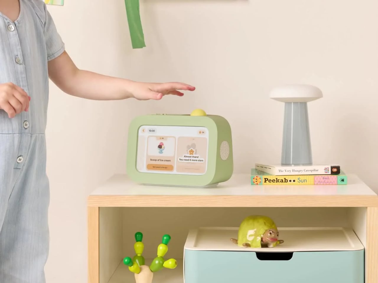
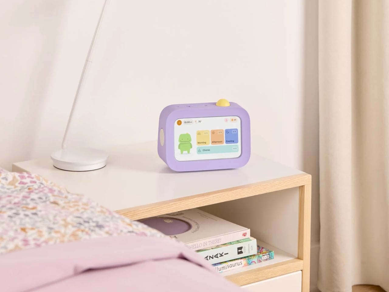
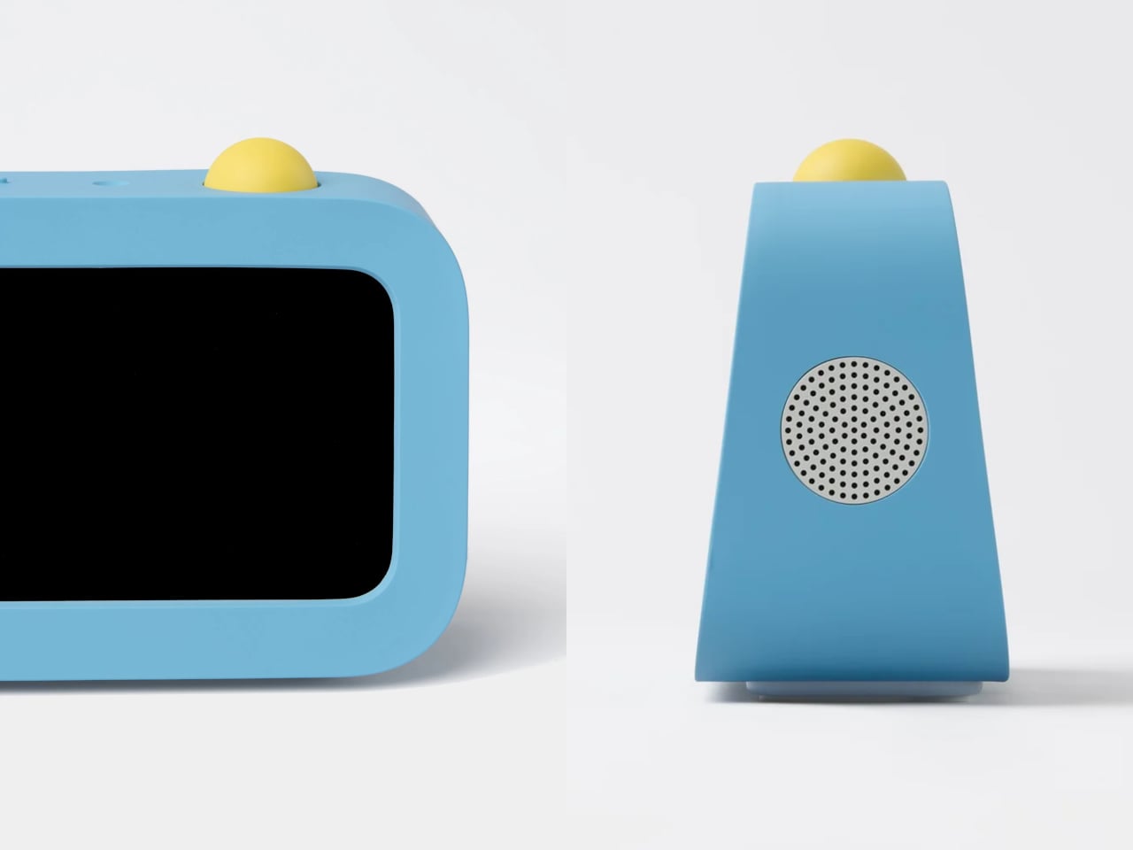
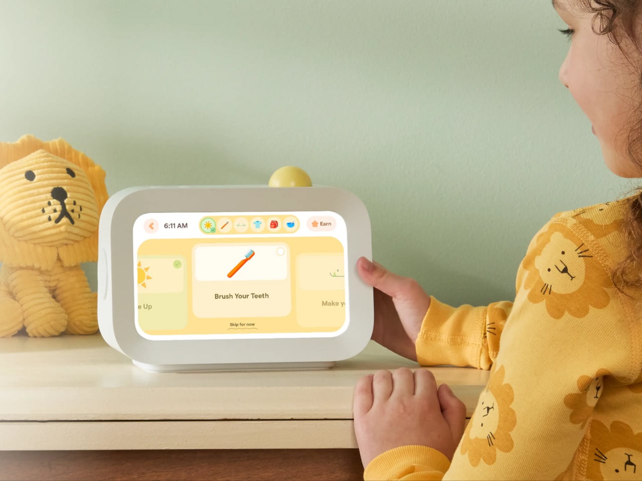
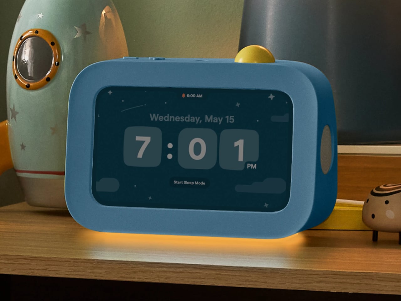
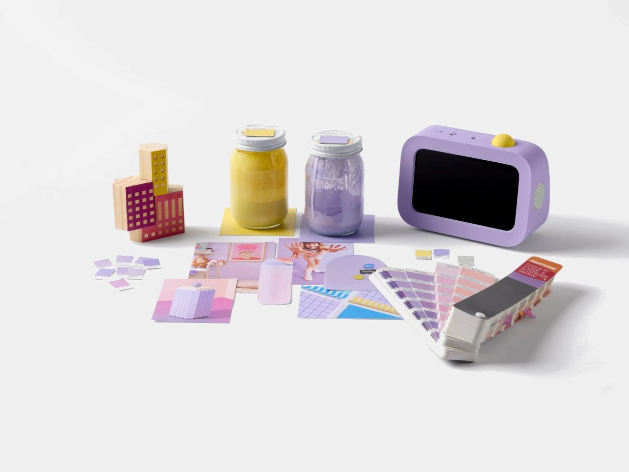
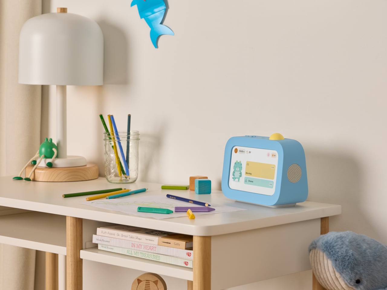
Skylight Buddy takes a different approach. It’s a purpose-built bedside device for children ages 4 to 10, with a touchscreen, a speaker, a built-in nightlight, and a physical action button. What it doesn’t have is just as deliberate: no internet access, no browser, no downloadable apps, no camera, and no microphone. It launched in June 2026, and its first production run sold out within a week.
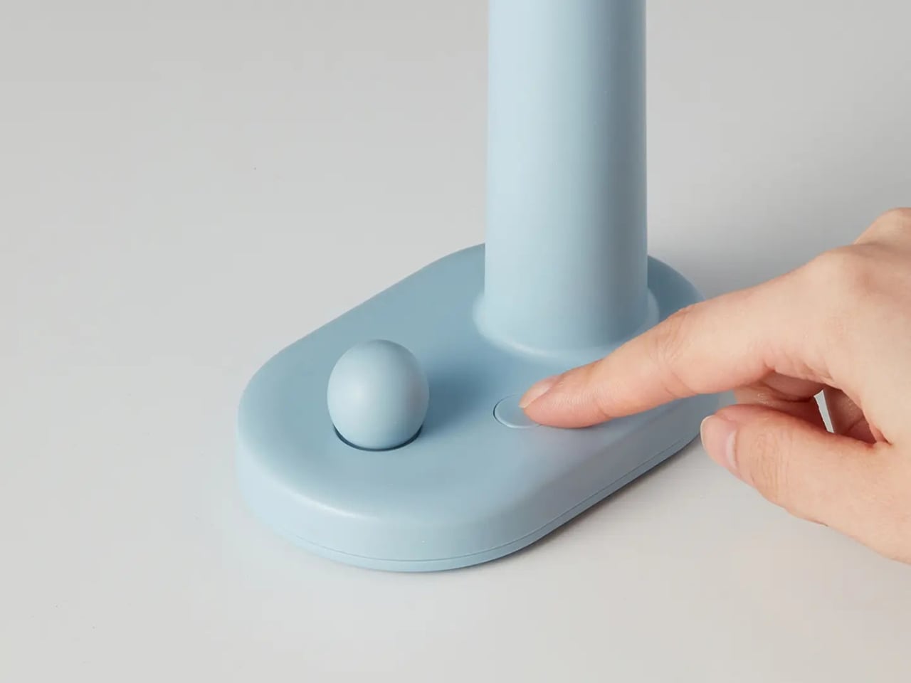
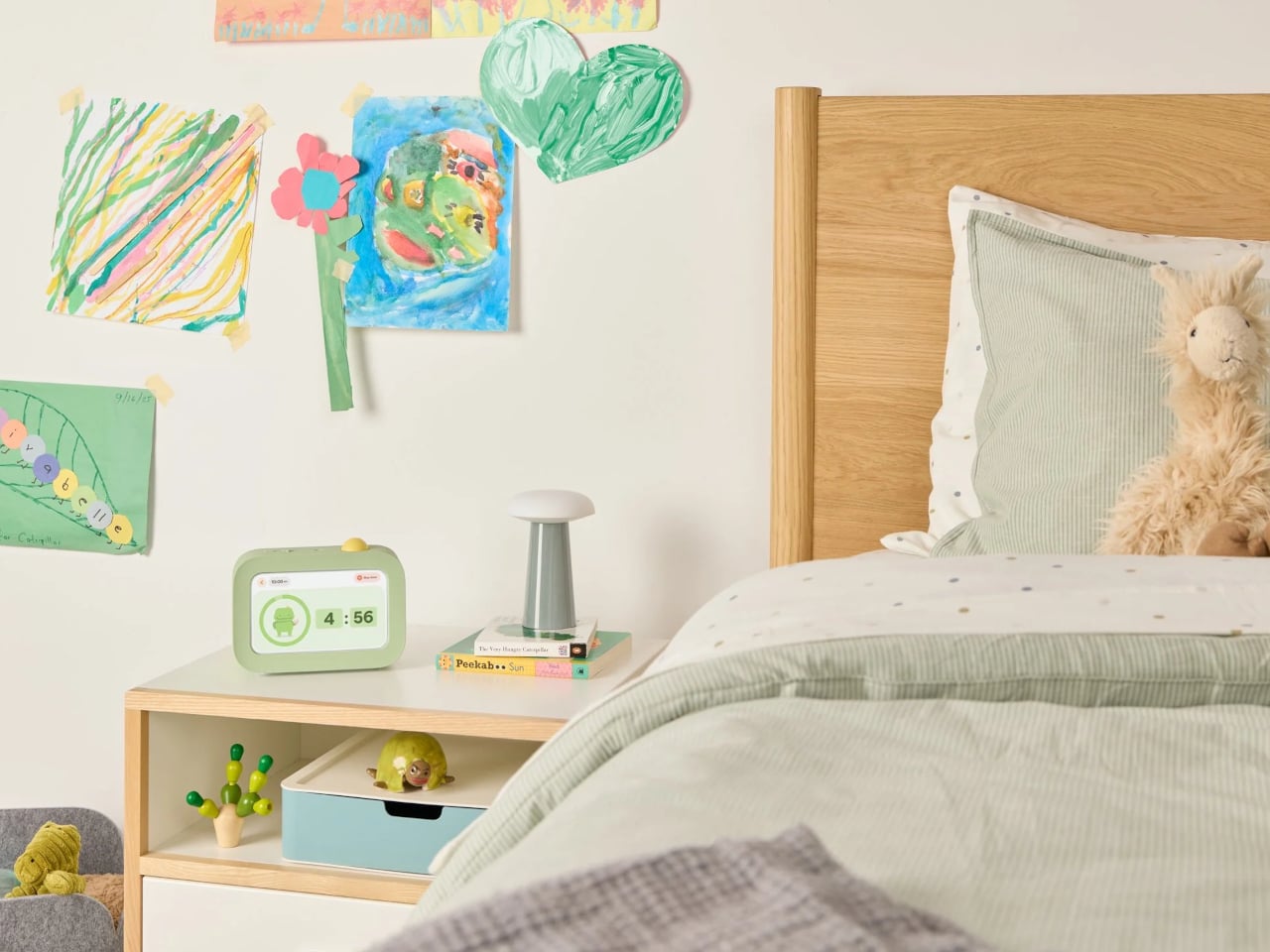
The core interaction is simple. Buddy guides kids through their morning, after-school, and bedtime tasks one at a time, showing each with clear on-screen visuals. When a task is done, the child presses the action button on top to confirm, advance to the next step, and collect stars. The design team pushed hard to keep that physical button rather than defaulting to a screen-only approach.
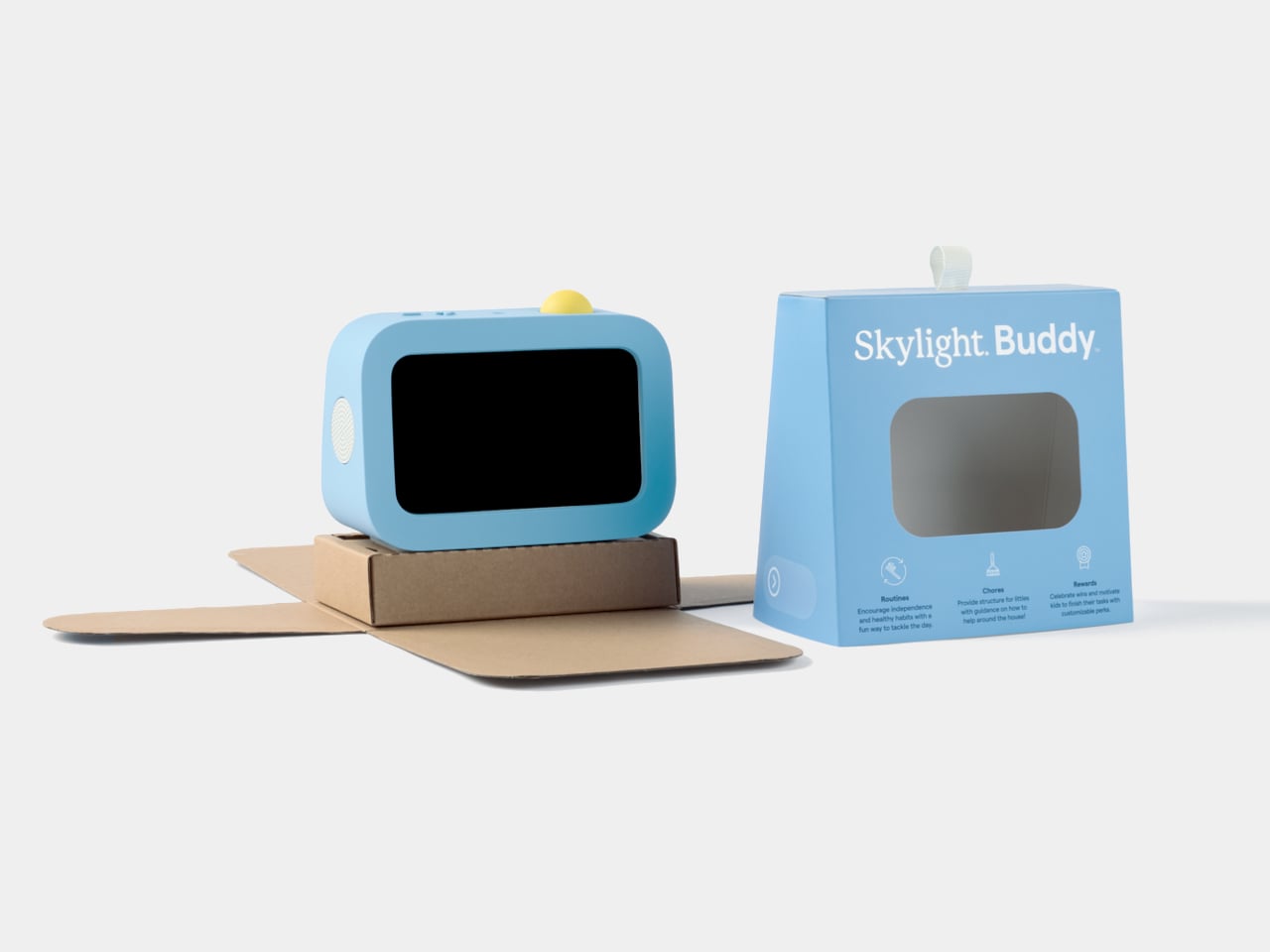
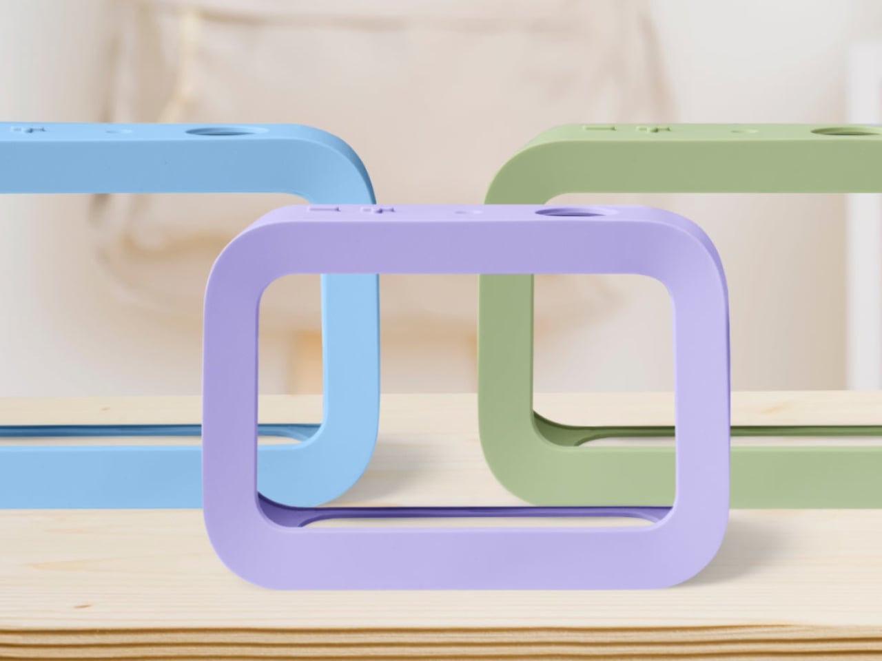
The button is yellow across all three colorways, which serves a functional purpose. It’s the brightest thing on the device, a deliberate visual signal that reads as “press me” from across the room. Buddy comes in blue, sage, and lavender, each with a soft silicone case that wasn’t designed as an accessory but as part of the form. With the case on, the side speaker sits flush with the body.
The integrated light handles two things that parents often buy as separate products: a nightlight for bedtime and an OK-to-wake signal for mornings, so younger kids know when it’s actually time to get up. Add a sound machine for winding down at night and an alarm clock for starting the day, and Buddy replaces a collection of single-purpose devices that typically end up crowding a child’s nightstand.
Buddy works as a standalone device right out of the box, covering routines, chores, the alarm clock, and all core features without any additional cost. Families who already use Skylight Calendar can link the two through the same parent app, syncing a child’s tasks and rewards automatically. A Buddy Plus subscription unlocks additional tools, including rewards tracking, visual timers, and nudges for transitions that are harder to manage.
At $139, it isn’t a cheap clock, but it’s also not competing with tablets or general-purpose screens. That’s the point. Kids can’t download apps on it, can’t open a browser, and can’t drift into videos once their tasks are done. For a category of products that’s gotten very good at capturing children’s attention for all the wrong reasons, Buddy’s restraint is its most compelling feature.
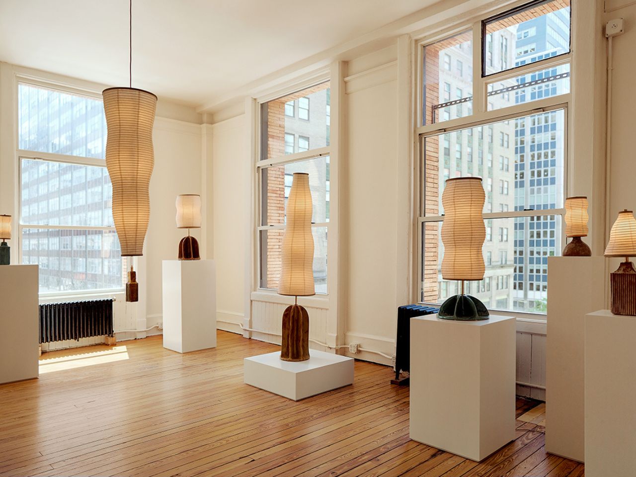
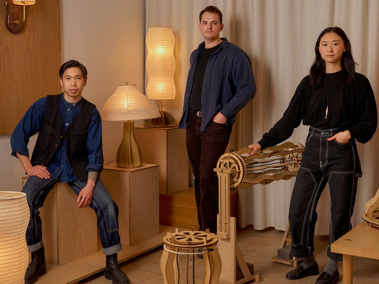
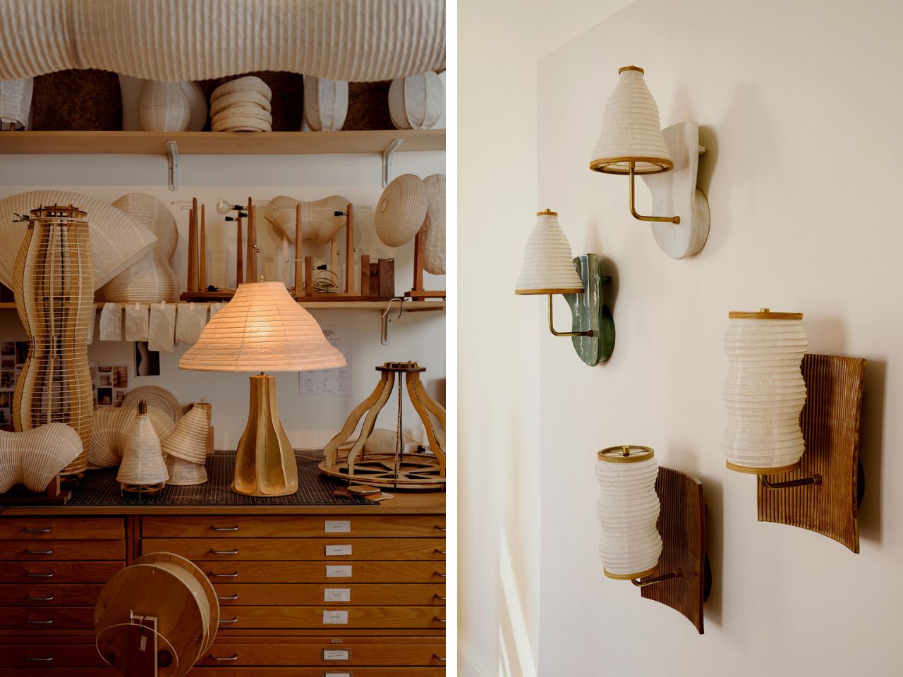
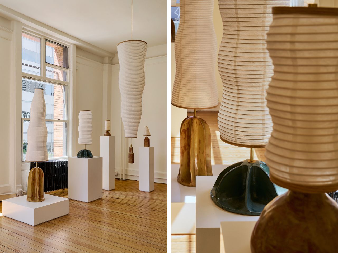
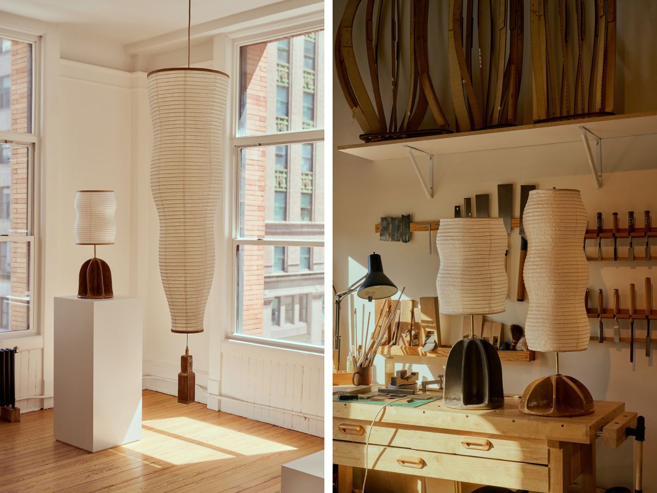
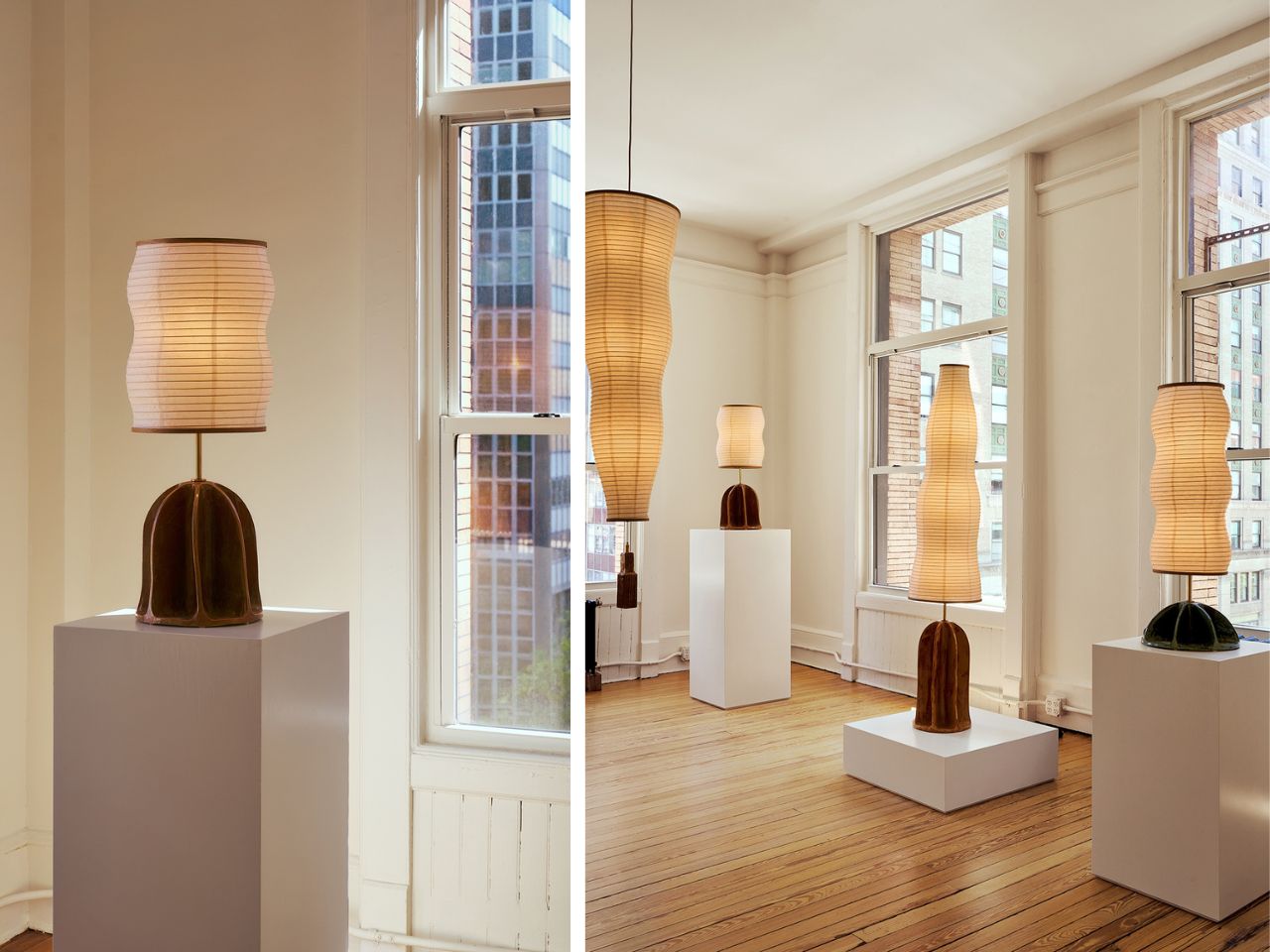
The Amica lighting collection brings together organic form, traditional craft, and sculptural illumination in a way that feels quiet, warm, and carefully considered. Made up of pendant, table, and wall-mounted lights, the collection treats lighting as more than a practical object. Each piece has a sculptural presence, shaping the mood of a room through material, texture, shadow, and glow.
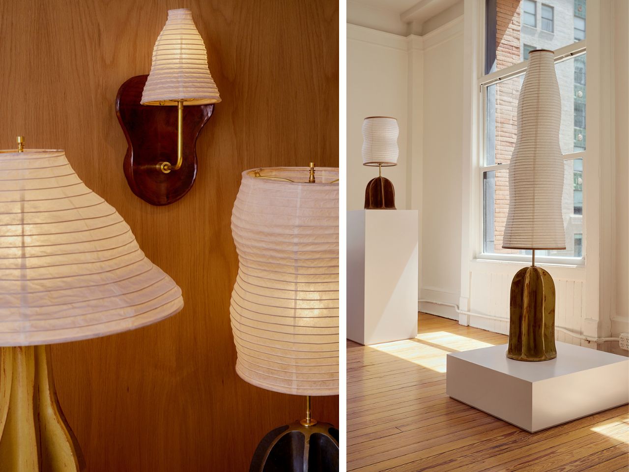
Much of Amica’s character comes from the contrast between its materials. Earth-toned ceramic bases give the pieces weight and grounding, while the paper forms bring softness, translucency, and movement. The ceramic surfaces are ridged, irregular, and slightly imperfect, giving them a handmade quality. Set against them, the paper elements feel light and delicate, glowing gently when illuminated and revealing the craft behind every fold, wrap, and curve.
The collection takes inspiration from natural and familiar forms rather than strict geometry. Pods, fans, lanterns, vessels, and ceremonial objects seem to echo through the work. These references make the lights feel approachable, almost recognizable, but still unusual enough to hold attention. They sit somewhere between functional objects and quiet domestic sculptures.
A few pieces from the larger collection show this language especially clearly. The Standing Legume Lamp is one of the more playful examples. Inspired by the curves of leguminous pods, it stacks two illuminated modules vertically above an offering tray. The form feels like a small gesture toward food, harvest, and ritual. It has a simple presence, but the reference gives it warmth and personality. Rather than reading as a conventional lamp, it feels closer to a small domestic monument.
The Relic I Lamp moves in a more poetic direction. It reimagines the folding fan as a light sculpture, with pleated paper opening out in sweeping arcs. Held upright by a totem-like wood base and anchored by a cast concrete block, the piece captures the feeling of motion paused mid-gesture. There is a sense of air, shadow, and light moving through it, even while the object remains completely still.
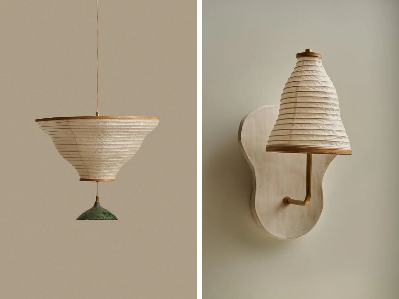
The Legume Pendant Horizontal, Double continues the collection’s organic vocabulary. Inspired by strung beans, it turns pod-like curves into a suspended paper illumination system. Its modular structure gives the form flexibility, while the handmade details keep it grounded in craft. Regionally sourced Japanese kozo paper, Shaker-style bentwood caps, and hand-hammered nails bring a sense of material honesty to the piece.
The Souvenir Sconce offers a quieter but equally expressive moment. Mounted to the wall, it shows the undulating paper form from one of its most graceful angles. The construction is minimal, but the silhouette is soft and full of movement. It celebrates pleated lantern craftsmanship with restraint, making a bold statement in a gentle voice.
These works are only a portion of the broader Amica collection. Across its many forms, the collection continues to explore the same relationships between ceramic weight, paper softness, organic silhouettes, and careful detailing. The pieces feel connected, but not repetitive. Each one has its own proportion, gesture, and mood.
What makes Amica compelling is the way it balances opposites: heavy and light, earthy and translucent, structured and organic. The pieces do more than brighten a space. They change how the space feels. Even when unlit, they hold their own as objects with texture, rhythm, and presence.
Amica feels contemporary without losing its connection to older craft traditions. Paper, ceramic, wood, and concrete are used in a way that feels both familiar and fresh. The collection invites slower looking, asking the viewer to notice the ridges, folds, shadows, and small handmade details that give each piece its character.
At its core, Amica is a collection about softness with structure. It turns natural references and crafted processes into luminous objects that feel intimate, expressive, and quietly theatrical.
Lamp switches don’t get much design attention. They’re usually a small toggle on the cord, a push button under the shade, or a touch-sensitive strip on the base that’s easy to miss in the dark. They get the job done, but they’re rarely treated as a meaningful part of the object. It’s one of those details that most lamp designers seem perfectly happy to leave to the supplier catalog.
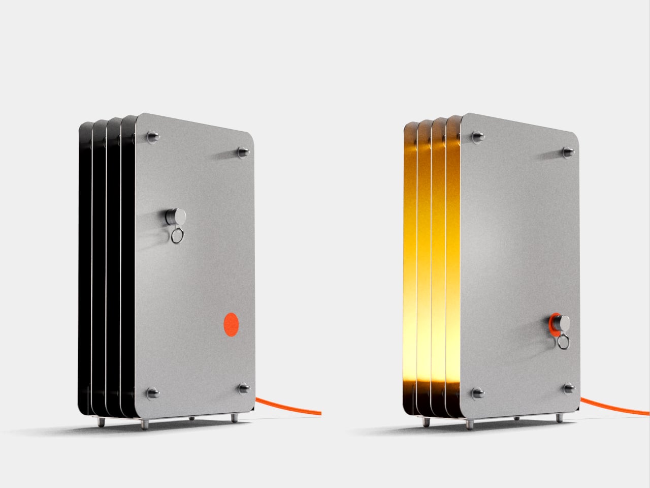
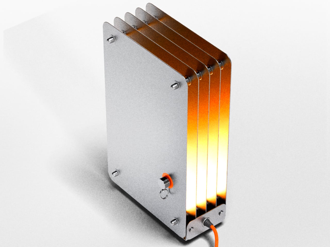
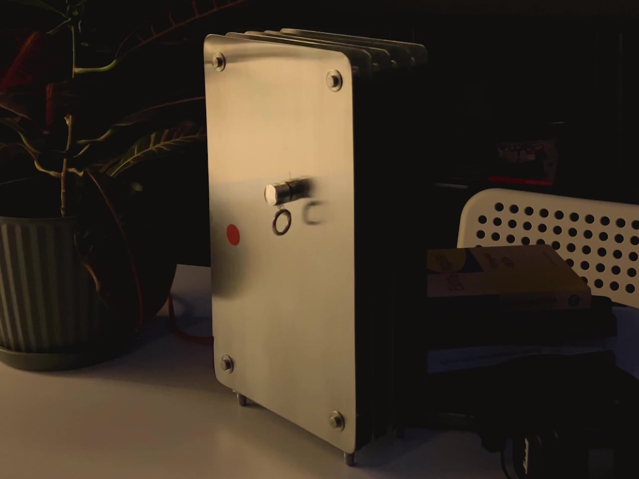
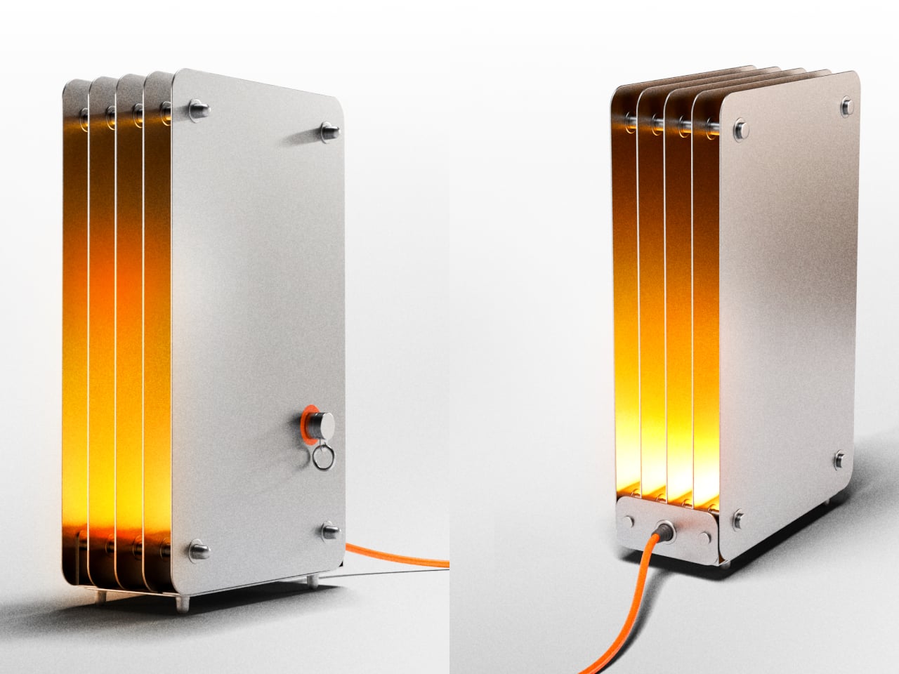
The Strata lamp takes a different position on both counts. It’s a handmade steel table lamp that earns its name from geological rock formations, those compressed, layered bands of sedimentary stone that build up over time into something structurally dense and visually striking. The lamp translates that geological idea directly into stacked steel panels, and pairs it with a switching mechanism that makes turning a lamp on feel unexpectedly deliberate.
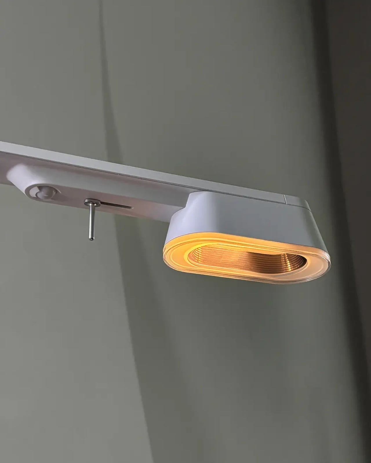
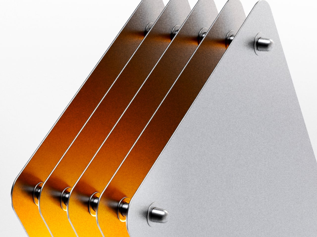
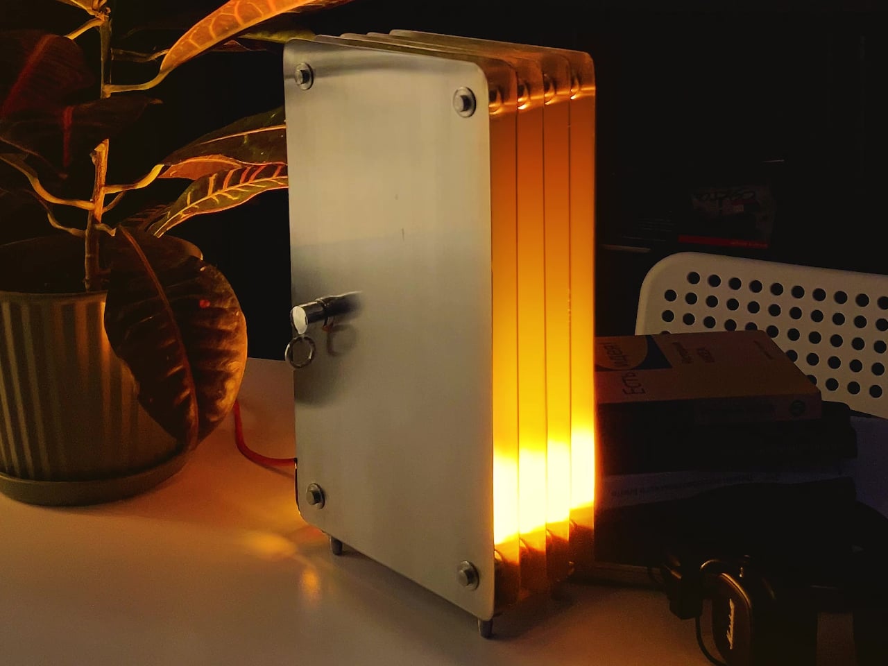
The body is built from individual steel plates with rounded rectangular corners, held in parallel by cylindrical steel standoffs at each corner and center. When lit, warm amber light radiates from the gaps between every plate and from the open front edge, creating a layered glow that shifts from deep orange near the top of the lamp to a brighter, more diffused yellow further along each inner steel surface.
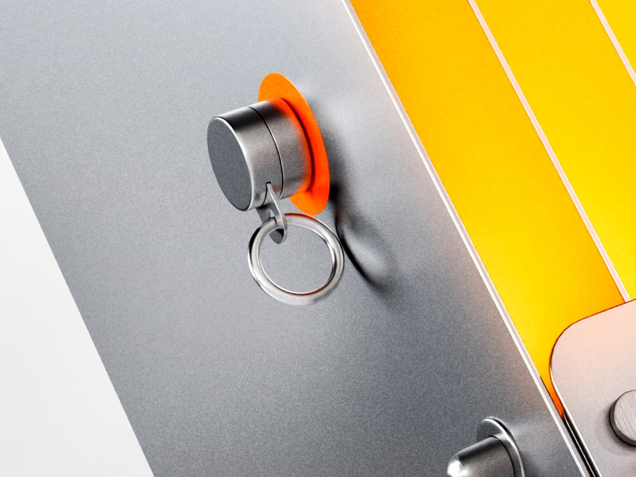
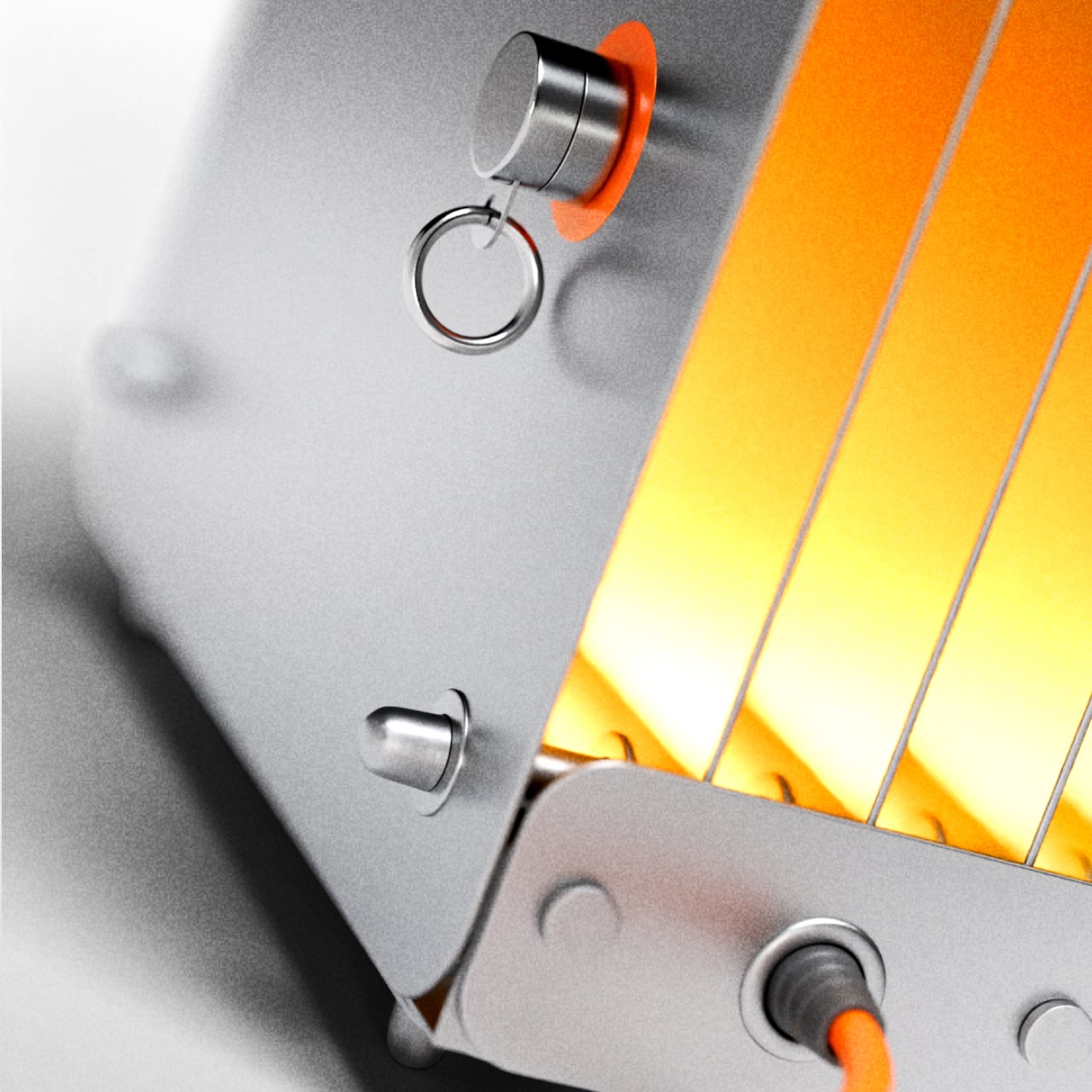
The switch is a magnetic reed switch, one of the simpler components you can put inside a lamp. A small cylindrical magnet, tethered to the body by a metal ring, acts as the key. Set it on the orange circle marked on the front panel, and the lamp turns on. Lift it away, and it turns off. The magnet parks on a small post when it’s not in use.
That interaction is a harder thing to design well than it sounds. Reed switches are decades-old technology, and the magnet-on, magnet-off logic is genuinely simple. But the way it’s set up here gives the action more weight than it would otherwise have. You’re not flipping a switch. You’re placing something intentionally, and removing it just as deliberately. It’s the kind of small habit that starts to feel like a routine.
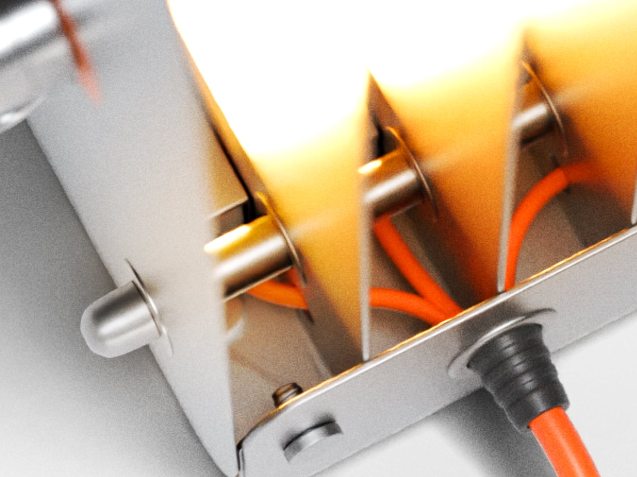
The rest of the construction follows the same thinking. The steel plates, the standoff hardware, and the small feet that lift the base all stay visible rather than concealed, and an orange power cord exits from the bottom without apology. That cord color, matched to the activation circle on the panel, is the one deliberate accent in an otherwise entirely industrial material palette of matte gray and polished steel.
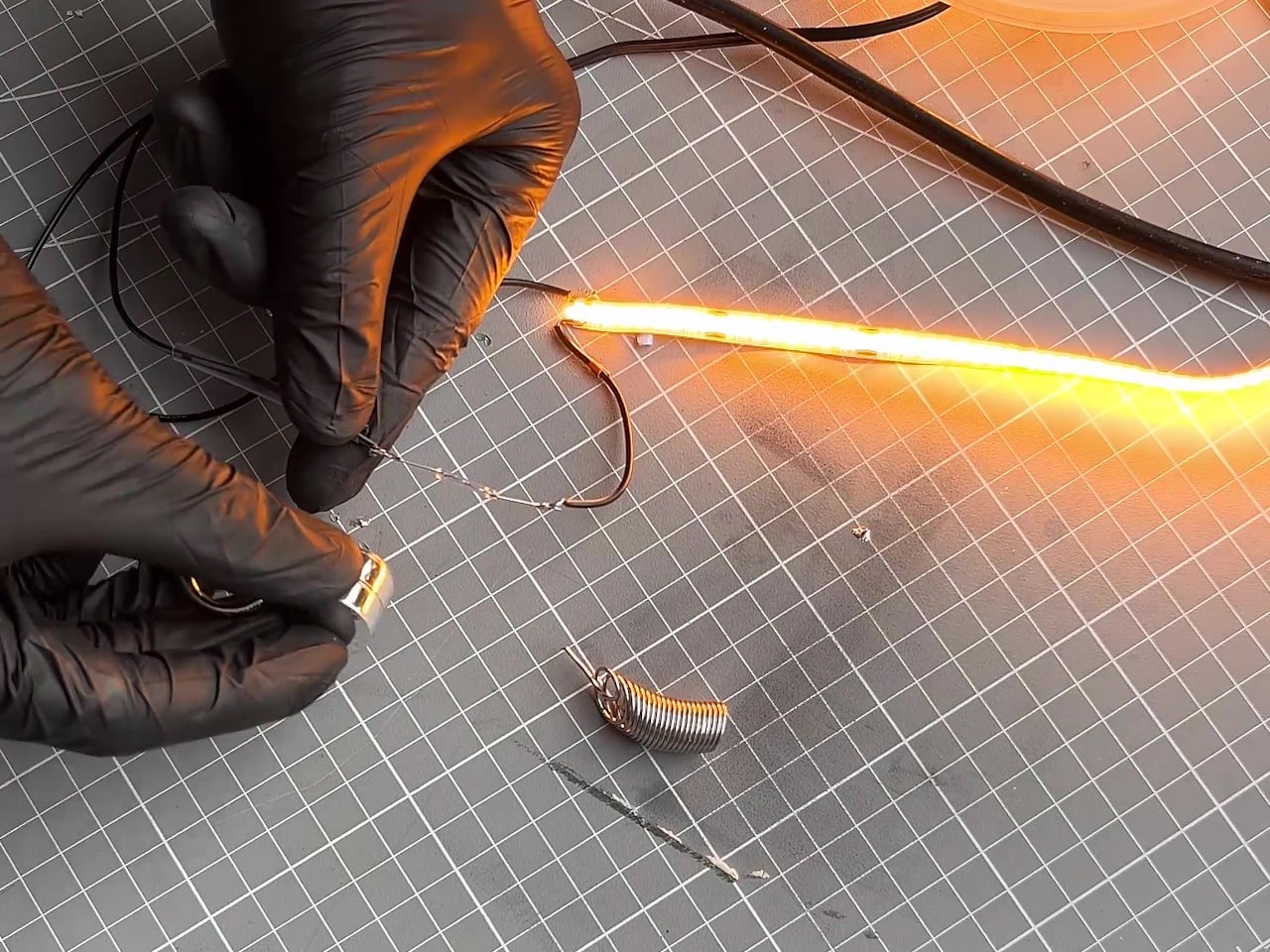
Strata was built by hand, and that’s evident in the quality of each component rather than any sense of roughness. The plates are cut cleanly, the standoffs are consistent, and the glow that fills the gaps between the sheets has a warmth that a simple LED strip wouldn’t normally produce on its own. The steel acts as both housing and reflector, which is about as economical as structural decisions get.
Most lamps don’t ask questions. They turn on, throw light at you, and call it a day. You adjust the brightness, maybe swap out a bulb with a warmer hue if you’re feeling particularly intentional about your space, and that’s the extent of the conversation. For decades, that’s been enough. But Korean brand BAENUE, the consumer-facing arm of LED technology company Baelux, is making a compelling argument that it shouldn’t have been.
The premise behind BAENUE is rooted in photobiology, the study of how light affects living organisms at a biological level. Specifically, the brand is built around something most of us quietly experience but rarely attribute to our lamps: the way artificial light disrupts our body clocks. The blue-toned light that keeps us sharp and focused at 9 a.m. is the same kind our phones and laptops push out at 11 p.m., suppressing melatonin production and quietly convincing our bodies that it’s still daytime. We chalk restless nights up to stress, too much screen time, too much coffee. Rarely do we think to blame the lamp sitting on the desk.
Designer: Baelux
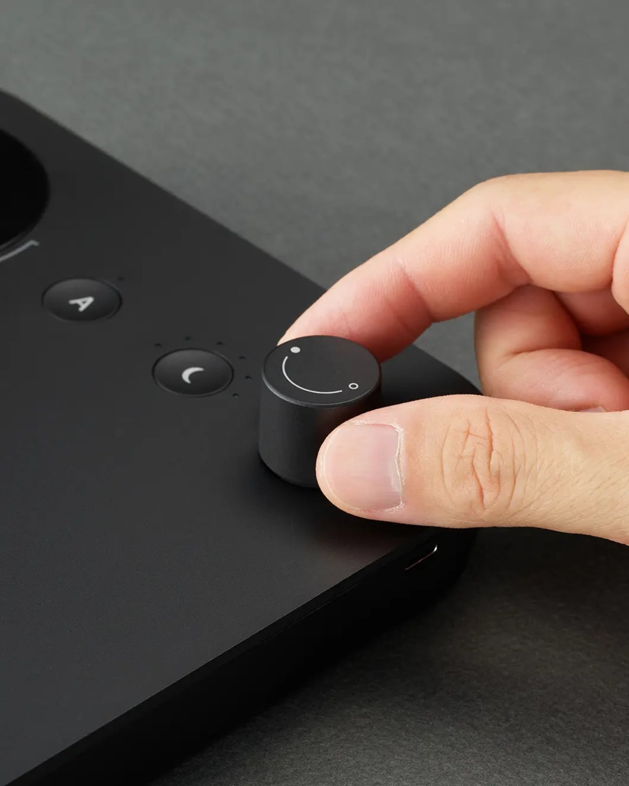
BAENUE’s answer is a proprietary, patented technology called Dim2Amber. The concept mirrors nature in a way that feels almost obvious once you understand it. As you dim the light, the lamp doesn’t just reduce brightness. It simultaneously shifts the spectrum toward warmer, amber tones. Bright and crisp when you need to focus. Soft and golden when the evening calls for it. The entire transition happens through a single analog dial, a deliberate choice by founder and chief developer Dr. Jinwoo Bae, an MIT-trained engineer who has built his career on making advanced technology feel effortless rather than overcomplicated.
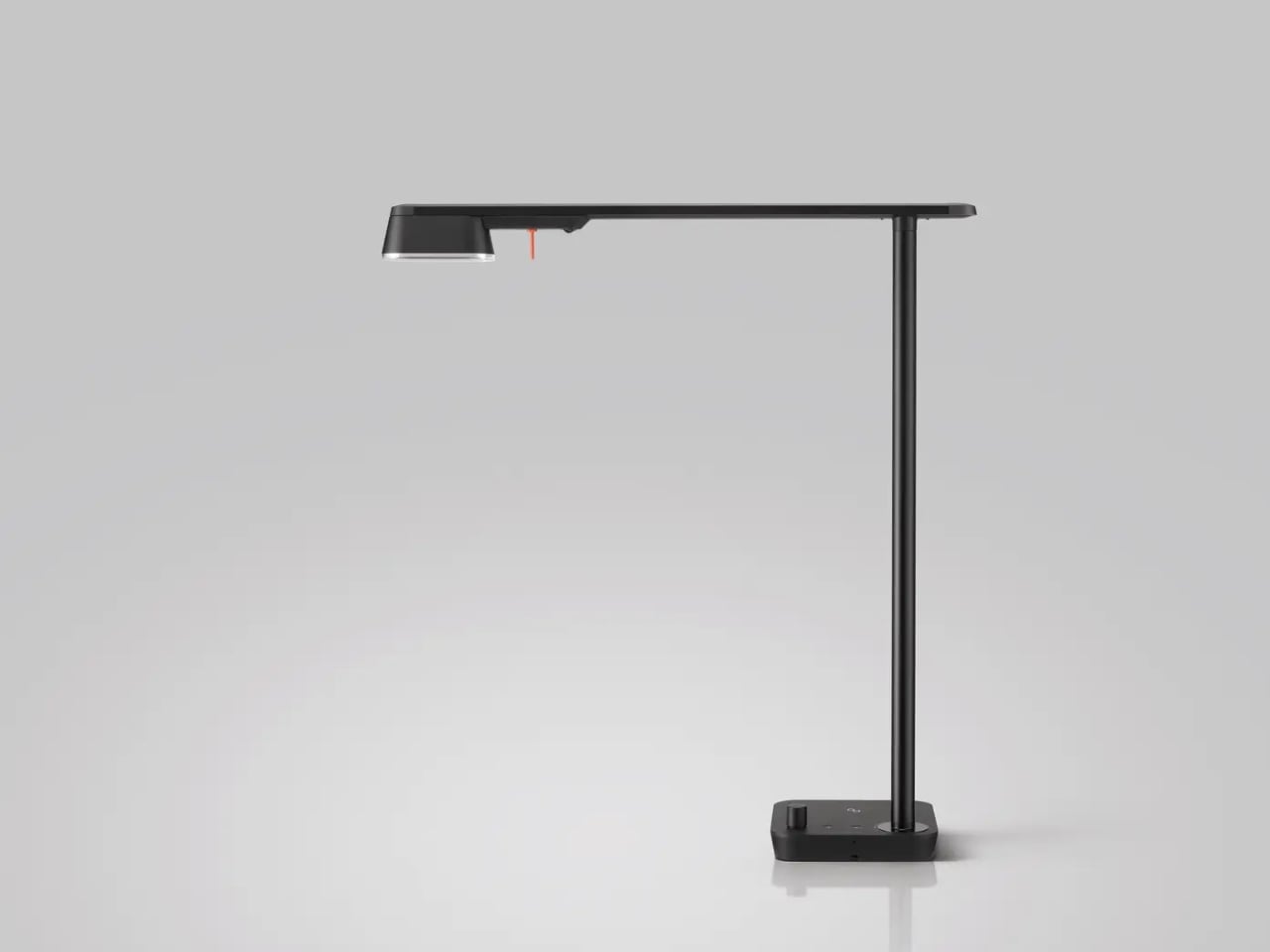
Both of BAENUE’s current products, The New Lamp and the portable MINI, carry this philosophy into their design. The New Lamp is the flagship desk piece, proportioned using the golden ratio to minimize glare and direct light precisely where it needs to go. It includes wireless charging, a motion sensor for automatic on/off, and a high CRI light source that renders color accurately. That last detail matters more than people realize until they’ve spent time under genuinely high-quality light and noticed the difference. The MINI is designed for mobility. Hand-sized, wireless, and versatile enough to function as a reading lamp, ambient light, or table lamp depending on where you set it down.
The price, around $575 to $635 for The New Lamp, will be the number that stops people mid-scroll. That reaction is fair, and worth sitting with for a moment before writing it off. Baelux has spent over a decade supplying LED light sources to premium architectural and commercial projects across Europe, quietly powering the kind of lighting most people only encounter in luxury hotels and gallery spaces. BAENUE is that same industrial-grade precision, redirected toward everyday life. You’re not just buying a lamp. You’re buying the output of years of engineering research that most people would never think to demand from something sitting on their nightstand.
The brand’s restraint around wellness language is one of the more reassuring things about it. Dim2Amber is patented and technically specific. Dr. Bae’s insistence on eliminating micro-flicker, that imperceptible rapid fluctuation in light that contributes to eye strain without ever announcing itself, is exactly the kind of detail that only surfaces when someone genuinely cares about what light does to the human body. BAENUE made its public debut at 3 Days of Design 2026 in Copenhagen, a fitting stage for a brand that treats purpose and form as equally non-negotiable.
Lighting design has lagged behind the broader wellness conversation for too long, still measured mostly by how a room looks rather than how it makes your body feel. BAENUE is one of the more serious attempts to close that gap. Whether it changes the way the industry thinks about what a lamp is supposed to do is a bigger question, but the fact that someone is asking it seriously is, at minimum, a good start.
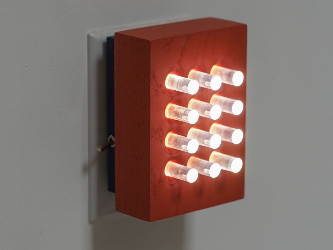
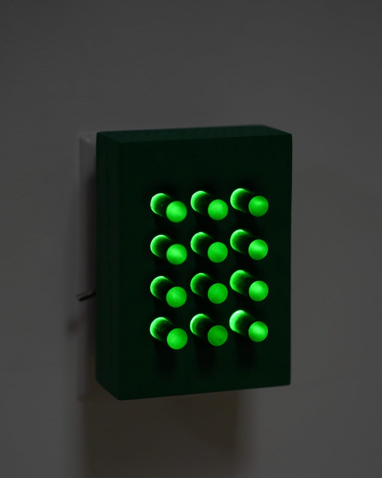
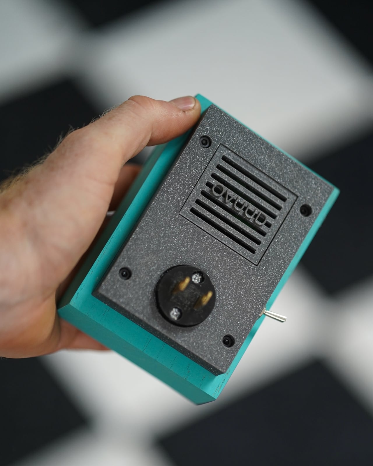
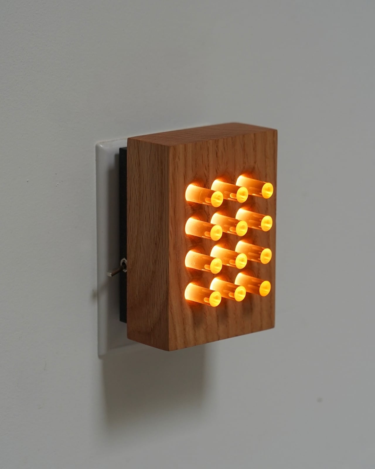
Most nightlights are afterthoughts. A dim plug-in tucked behind a dresser, maybe something shaped like a mushroom from a big-box store. They exist to serve a single function: keep you from stubbing your toe at 2 a.m. Nobody really talks about them. Nobody really considers them. That changed for me when I came across Benjamin Gillespie’s latest from his Philadelphia-based studio, Ovuud, and suddenly I found myself genuinely excited about a nightlight.
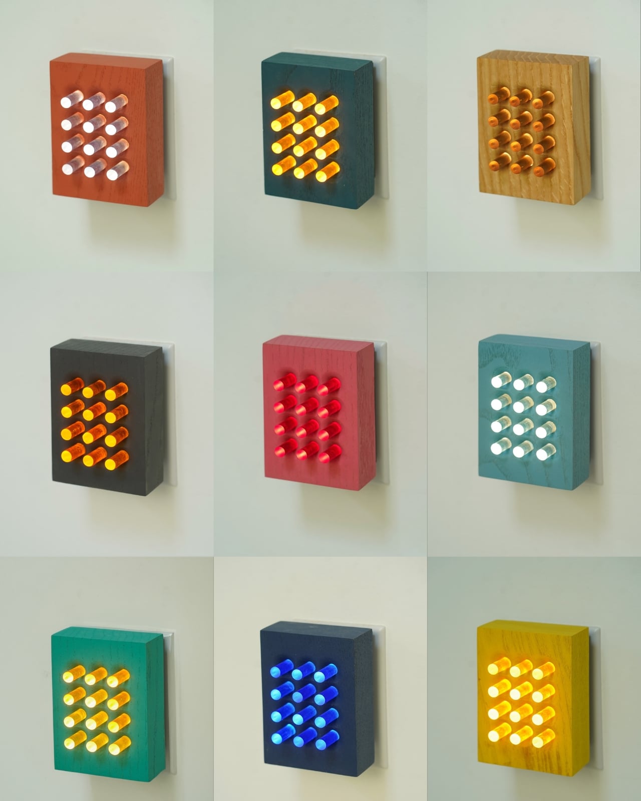
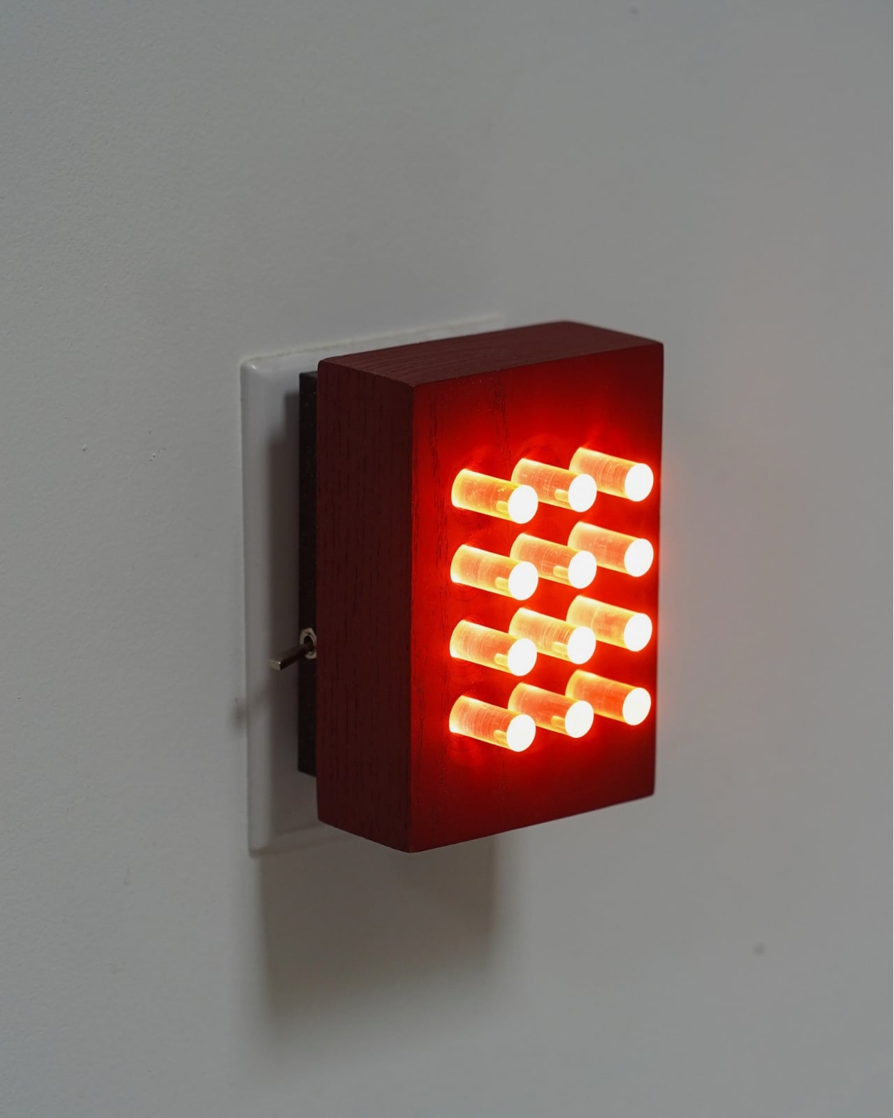
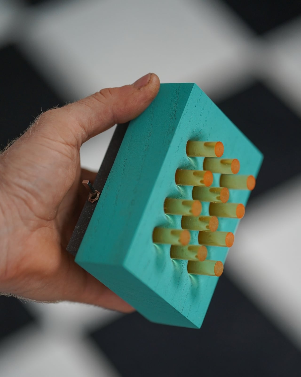
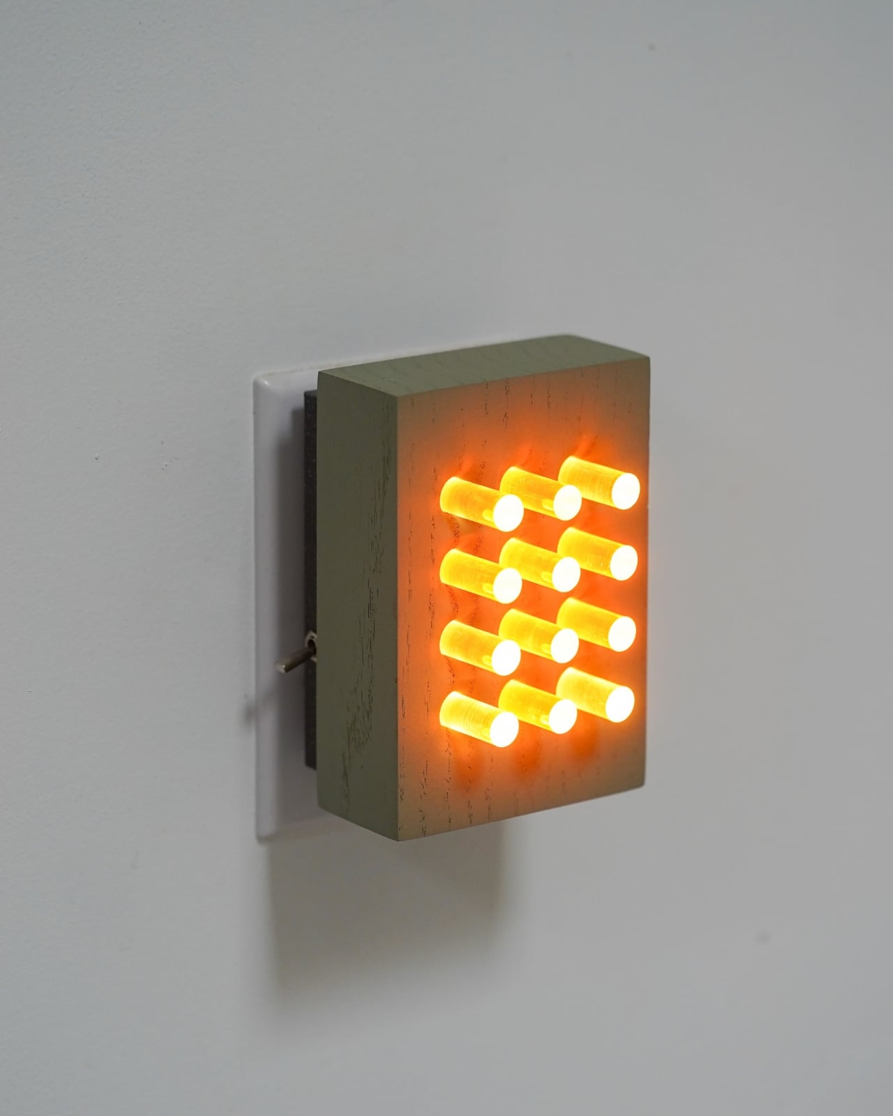
The piece is called Reactor, and it’s now available in a color series that’s worth paying attention to. Gillespie, who runs Ovuud as a one-man operation out of Philadelphia, designs and builds every piece by hand using locally sourced wood. His background is an unusual combination of engineering, woodworking, and a deep architectural sensibility, and you can feel all three of those things at once when you look at his work. The LED is hidden, the wood glows, and everything feels considered without feeling precious.
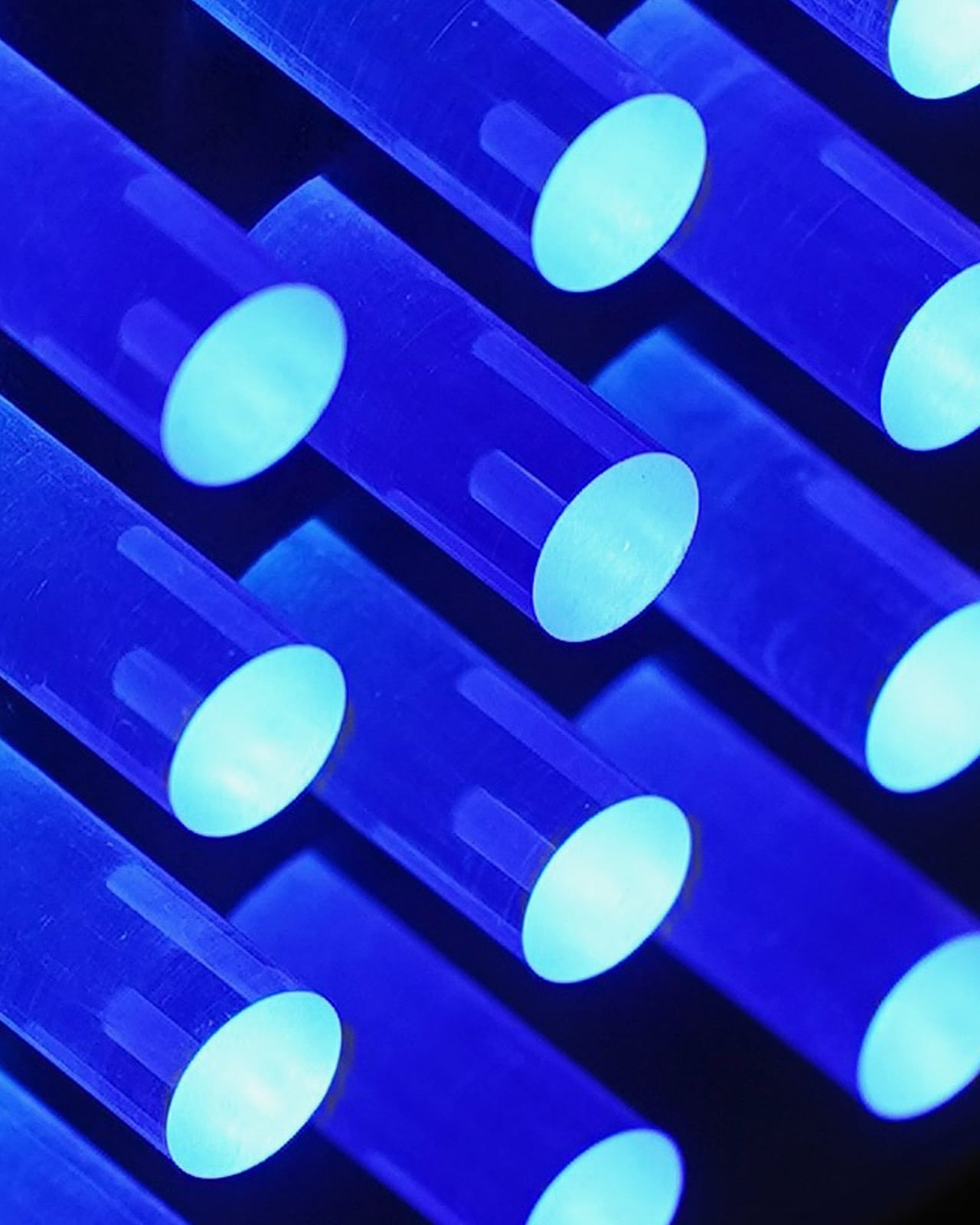
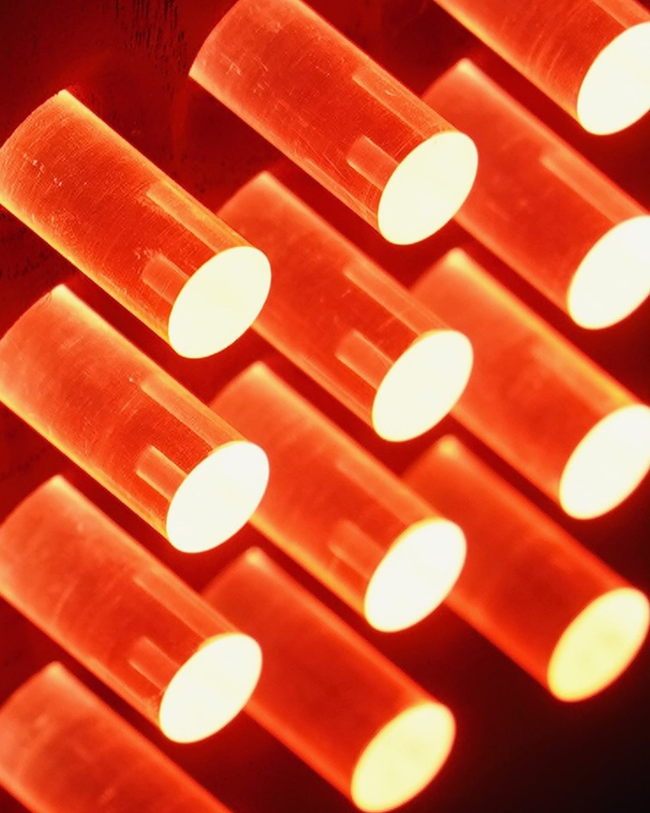
What the Reactor does differently is how it handles the relationship between function and mood. It pairs a warm white task light with a mood light, and the two can be independently controlled depending on what you need at any given moment. The color series expands on this by offering different colored light options, each creating a distinct atmosphere from the same compact wooden form. A pink glow reads like warmth. A deeper red reads like atmosphere. The shift from one to the other is not dramatic in the way smart bulb color changes tend to be. It’s quieter than that, and more intentional.
I keep thinking about the name. Reactor. It’s not passive. A nightlight is usually passive by definition. It just sits there. But a reactor implies a response, a relationship between the object and whoever is using it. Gillespie even described the pink version as “a hug in the dark,” which is such a specific and unexpectedly tender way to talk about a light source. That sensibility carries through the design. These are not decorative pieces pretending to be functional. They’re functional pieces that happen to be beautiful.
Ovuud has been building a quiet reputation in design circles for a while now. Featured in Dwell Magazine’s 2022 list of rising international designers, Gillespie’s work has always been about finding that balance between material limits, desired function, and aesthetic harmony. The Reactor color series feels like that philosophy at its most distilled. The form is small enough to sit on a nightstand without demanding attention during the day. At night, it changes the temperature of the entire room without you having to do anything complicated.
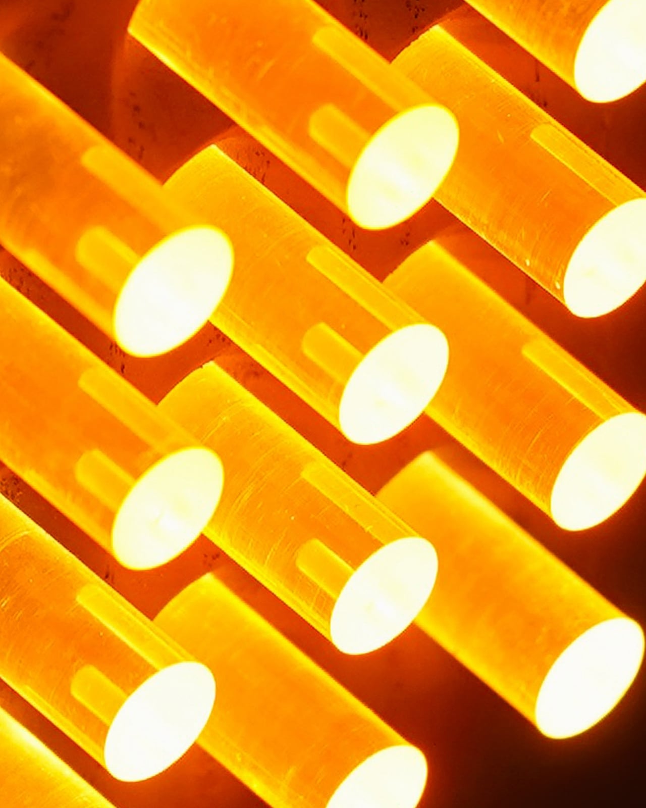
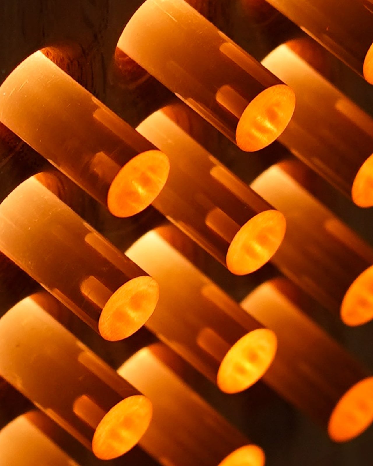
The wood-and-plexiglass combination Gillespie uses throughout his work is particularly effective here. The wood grounds it, gives it warmth and texture and the kind of object permanence that makes you want to keep a thing rather than replace it. The plexi diffuses the light in a way that feels organic, not clinical. Together, they make something that feels genuinely handmade without looking rustic or unfinished. That’s harder to achieve than it sounds.
A design object like the Reactor matters because it doesn’t ask you to choose between living well and buying well. A lot of design right now sits in one of two camps: either it’s priced and positioned for collectors, beautiful but untouchable, or it’s mass-produced and optimized for a market that doesn’t particularly care about craft. Gillespie exists somewhere outside both of those camps, making things by hand in his studio that are accessible enough to actually use and thoughtful enough to actually keep.
The Reactor color series is the kind of thing you discover on Instagram and then find yourself thinking about for days. Not because it’s flashy or trend-driven or algorithmically designed to stop your scroll, but because it’s quietly doing something right. It’s a nightlight. It lights up your night. And somehow, against all odds, it makes that feel like enough.
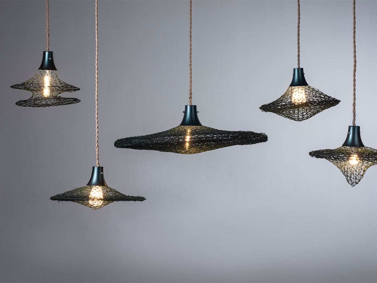
Some objects arrive in our homes with perfect surfaces and polished silence. Tides Rewoven Light does the opposite. It carries its past visibly. Its fibers remember the sea, its textures hold the marks of use, and its form tells a story of rescue rather than reinvention.
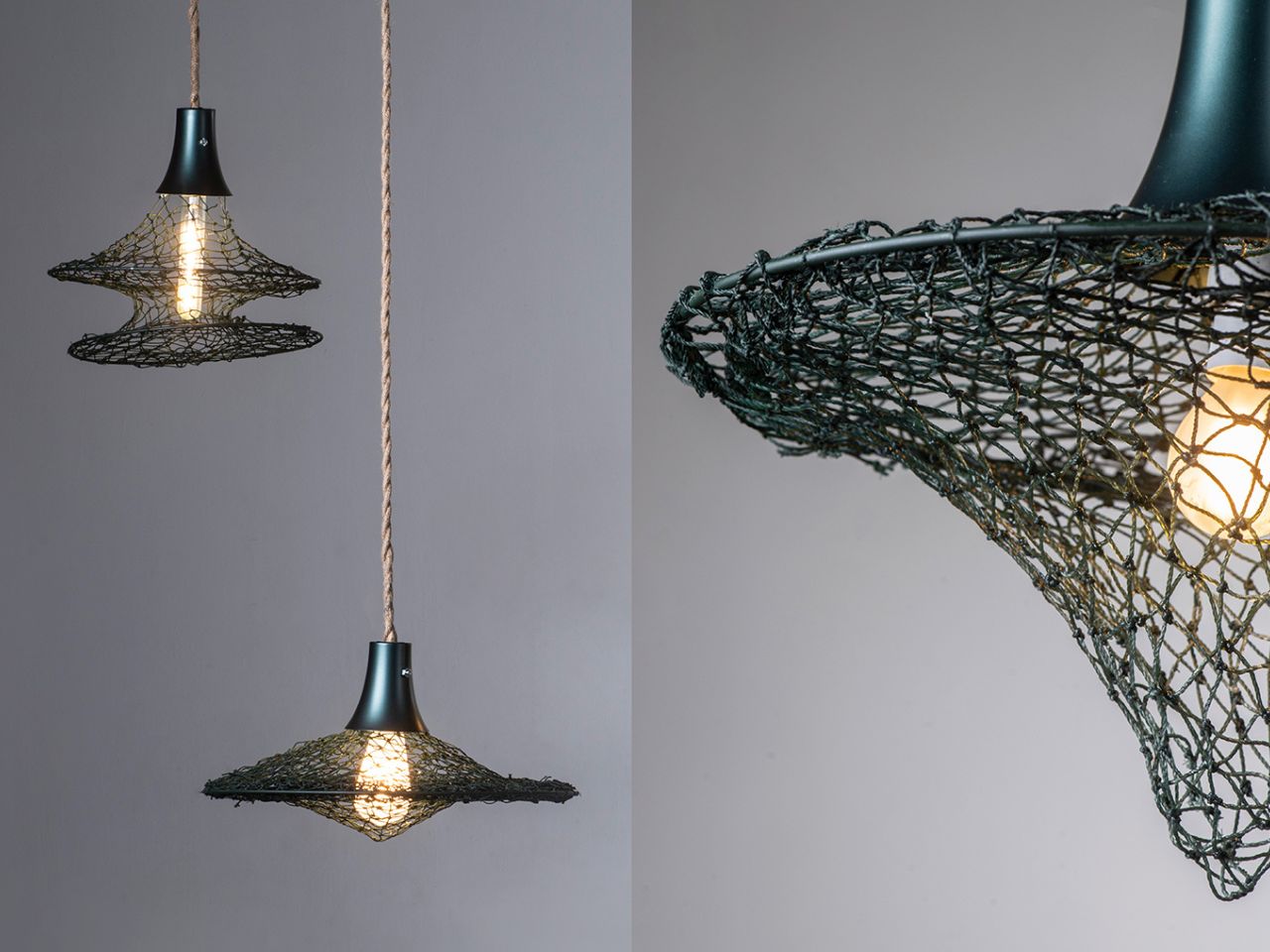
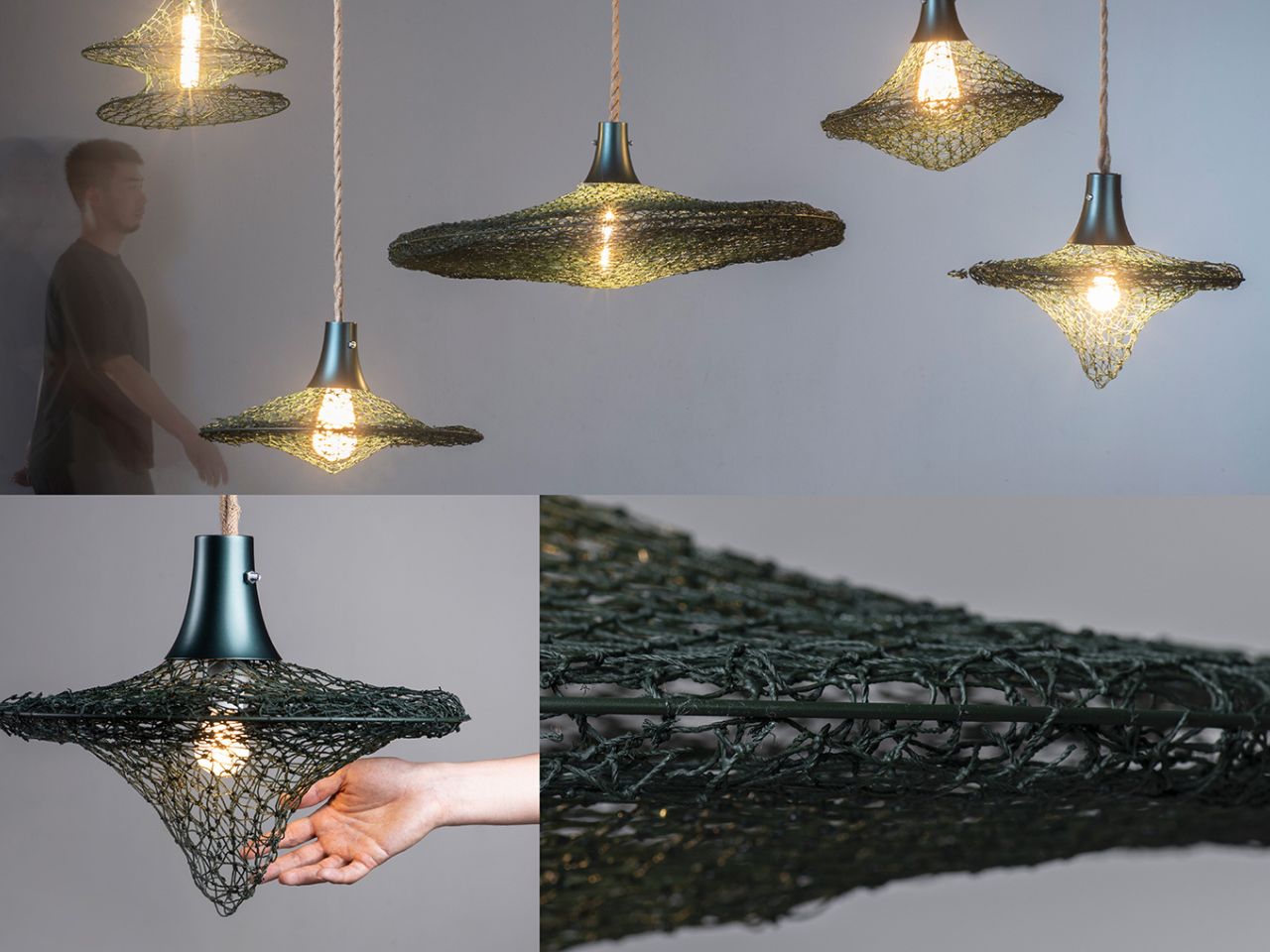
Created from abandoned fishing nets and plastic marine debris collected from Wengzi Fishing Harbor, the project transforms waste into a functional lighting object through a process of cleaning, sorting, weaving, repairing, and reshaping. But what makes the work compelling is not simply that it recycles material. It refuses to erase the material’s history.
Fishing nets are strangely contradictory objects. In human hands, they are flexible, useful, and finely engineered. In the ocean, once abandoned, they become ghostly hazards: trapping marine life, degrading into microplastics, and remaining painfully difficult to recover through conventional systems. Tides Rewoven Light begins exactly at this contradiction. Instead of treating discarded nets as anonymous raw matter to be crushed, melted, or chemically reprocessed, the design asks: what if the net could continue being a net, just in another life?
That question shapes the project’s entire circular design approach. The broken fishing nets are not hidden under a new skin. They are repaired and joined through weaving, allowing their fiber structure, flexibility, and aged texture to remain visible. Collected marine plastic is also brought into the process, not only as material, but as part of the making system itself. Plastic bowls, columnar objects, and other debris are used as molds, supported by a temporary metal framework for shaping and resin coating. Once the form is set, the framework is removed, leaving behind an object shaped by the very waste it seeks to address.
This is where the project moves beyond the familiar language of “upcycling.” Many recycled products depend on energy-intensive transformation, where waste must be broken down until it becomes unrecognizable. Tides Rewoven Light takes a quieter, more localized route. It works with the material’s existing properties instead of fighting them. The net’s flexibility becomes structure. Its knots become memory. Its weathered surface becomes an aesthetic value.
The result is not just a lamp made from marine debris, but a design argument: circularity does not always have to mean purification. Sometimes it can mean continuity. By preserving the traces of salt, labor, time, and damage, the product invites users to live with an object that still points back to the place it came from. It turns environmental crisis into domestic presence without softening the urgency behind it.
There is also something deeply poetic about turning discarded fishing nets into light. Nets are objects of capture; here, they become objects of release. They once pulled life from water. Now they diffuse light into living spaces. This shift gives the project emotional depth, making sustainability feel less like a technical checkbox and more like a cultural act of repair.
The team’s future vision strengthens this potential. By building partnerships with fishing ports and local communities, the project could become more than a single product. It could grow into a localized circular ecosystem for collecting, processing, and upcycling marine waste. Such a system would not only reduce environmental harm but also create social and economic value around materials that are usually seen as burdens.
The lifecycle thinking is equally important. The object is designed with future disassembly and recycling in mind, aligning with a cradle-to-cradle philosophy where use is not the final chapter. Instead of ending in disposal, the product is imagined as part of an ongoing material cycle.
Tides Rewoven Light is powerful because it does not romanticize waste, nor does it disguise it. It lets the material speak. It shows that circular design can be local, low-energy, emotionally resonant, and materially honest. In a world often obsessed with making sustainable products look untouched, this project suggests something more interesting: maybe the most responsible objects are the ones brave enough to show where they have been.
The rechargeable table lamp has been around for a while, but it hasn’t always been something designers were excited to work on. For most of its life, it was a category of hotel patios and restaurant terraces, objects tolerated for their practicality and forgiven for looking like camping gear. Most of them leaned on lantern shapes, chunky handles, and rubberized finishes that communicated utility before anything else.
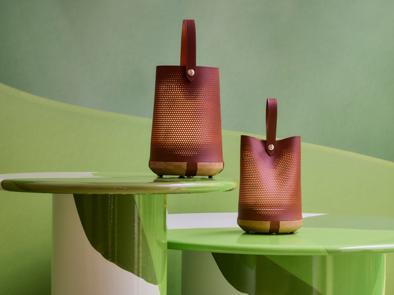
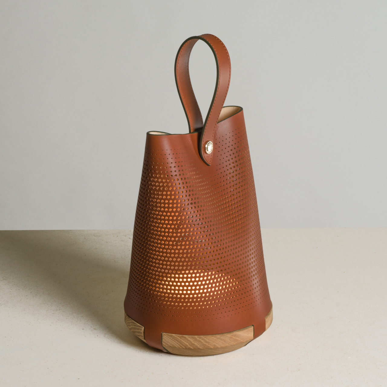
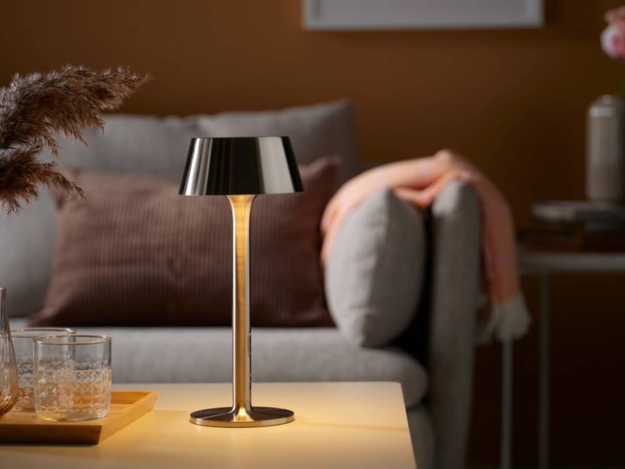
That started to change noticeably around Milan Design Week 2026, when the cordless lamp stopped being a hospitality accessory and became something designers were treating as a proper object type. Alexander Pott did one for IKEA’s PS Collection. Studiopepe built an entire lamp family around it for Rakumba. Patrick Jouin wrapped one in micro-perforated leather for Longchamp. Suddenly, the rechargeable table lamp had a design argument behind it.
IKEA PS 2026 brings Alexander Pott’s cordless lamp to the mainstream
There’s a certain logic to watching what IKEA does with its PS Collection. The line has a history of giving up-and-coming designers a platform to push against convention, which means that when a rechargeable lamp shows up there, it’s worth paying attention. It signals that portable lighting has moved far enough into the mainstream that it deserves a considered, well-designed answer at an accessible price point.
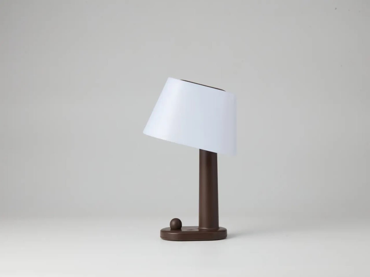
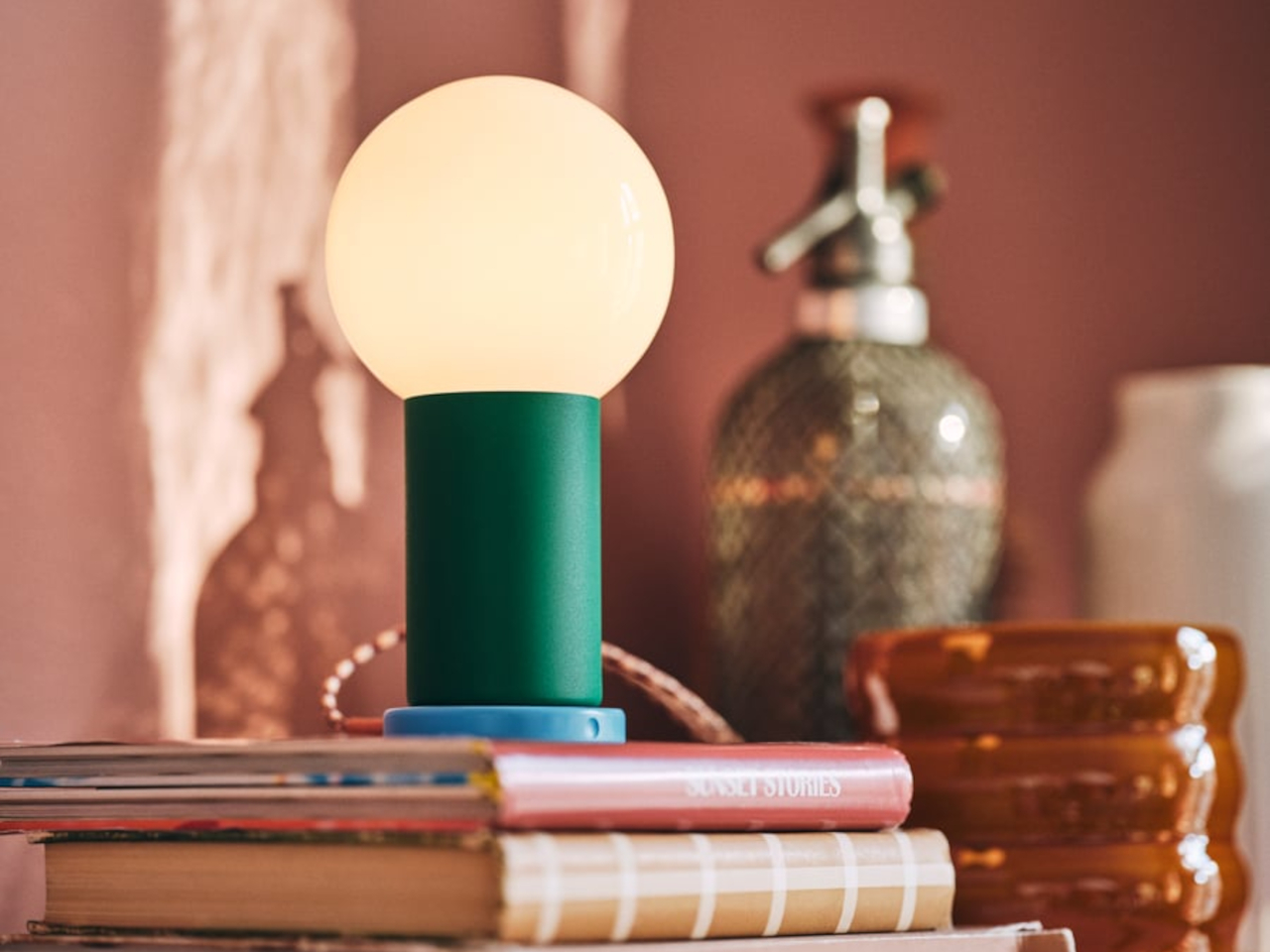
Alexander Pott’s design for the IKEA PS 2026 line keeps things deceptively simple: a metal-and-glass body with three dimming levels and a battery that frees you from thinking about where the nearest socket is. It comes in a few color combinations that make it feel more playful than precious, and it’s light enough to move from a dining table to a windowsill without making it a whole thing.
Studiopepe’s Torre family gives Rakumba a fully rechargeable lamp line
One-off cordless lamps are easy enough to find, but a whole family of them built around a consistent design language is something else. It suggests that whoever made it isn’t treating the rechargeable lamp as an afterthought or a novelty but as a genuine product category worth investing in. That’s the kind of thinking Studiopepe brought to their Torre line for Rakumba, and it shows.
The Torre family doesn’t try to hide what it is. The forms are clean and architectural, built for spaces where the lighting is meant to feel intentional rather than improvised. The concealed light source keeps it calm in a room, and being rechargeable means it can move between an indoor shelf and an outdoor table without losing any of that composure in the process.
Ostara is what happens when Longchamp and Patrick Jouin design a lamp together
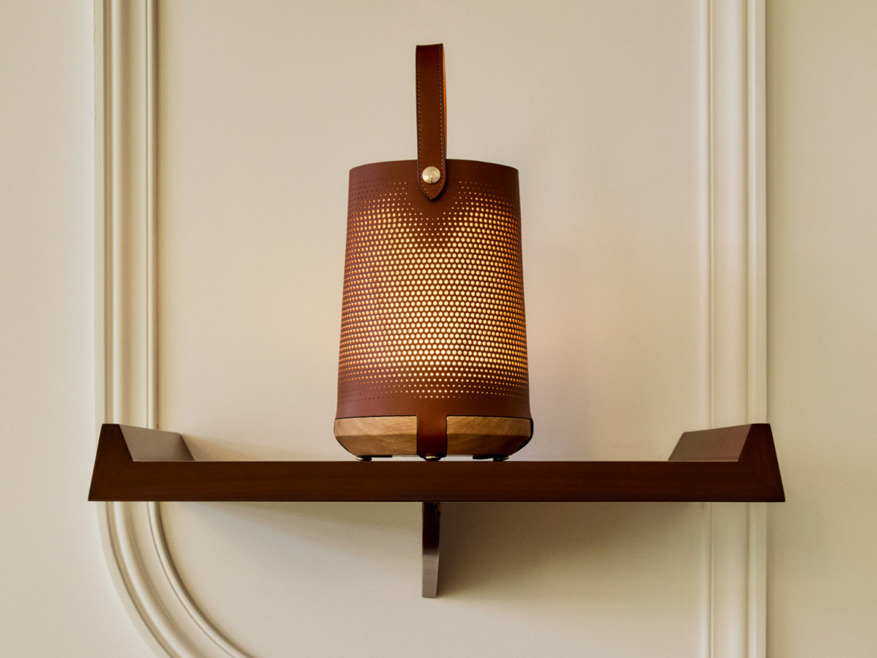
Fashion and luxury brands don’t wander into product design unless they see a genuine opportunity to say something with the object. The result is usually either impressive or awkward, with little in between. With Ostara, Longchamp and Patrick Jouin landed on the right side of that line, producing a rechargeable lamp that feels less like a lifestyle extension and more like a considered design object.
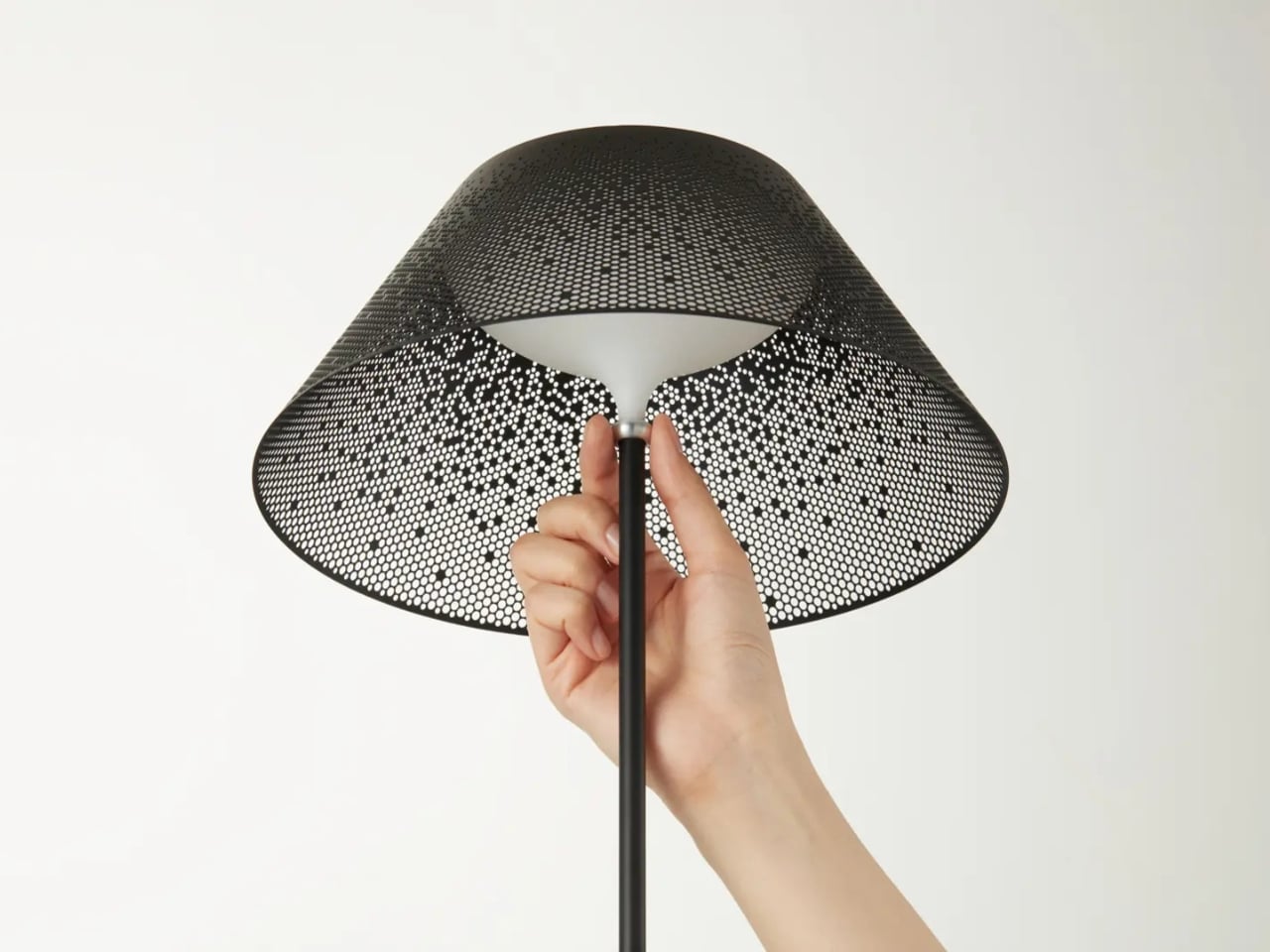
Jouin used micro-perforated leather for the shade, which gives the light that comes through it a texture that’s harder to achieve with glass or plastic. Being wireless and rechargeable means it can sit on a dining table or a bedside surface without the visual interruption of a cord, which matters more in a lamp built around intimacy and atmosphere than around raw output.
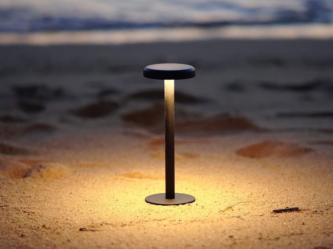
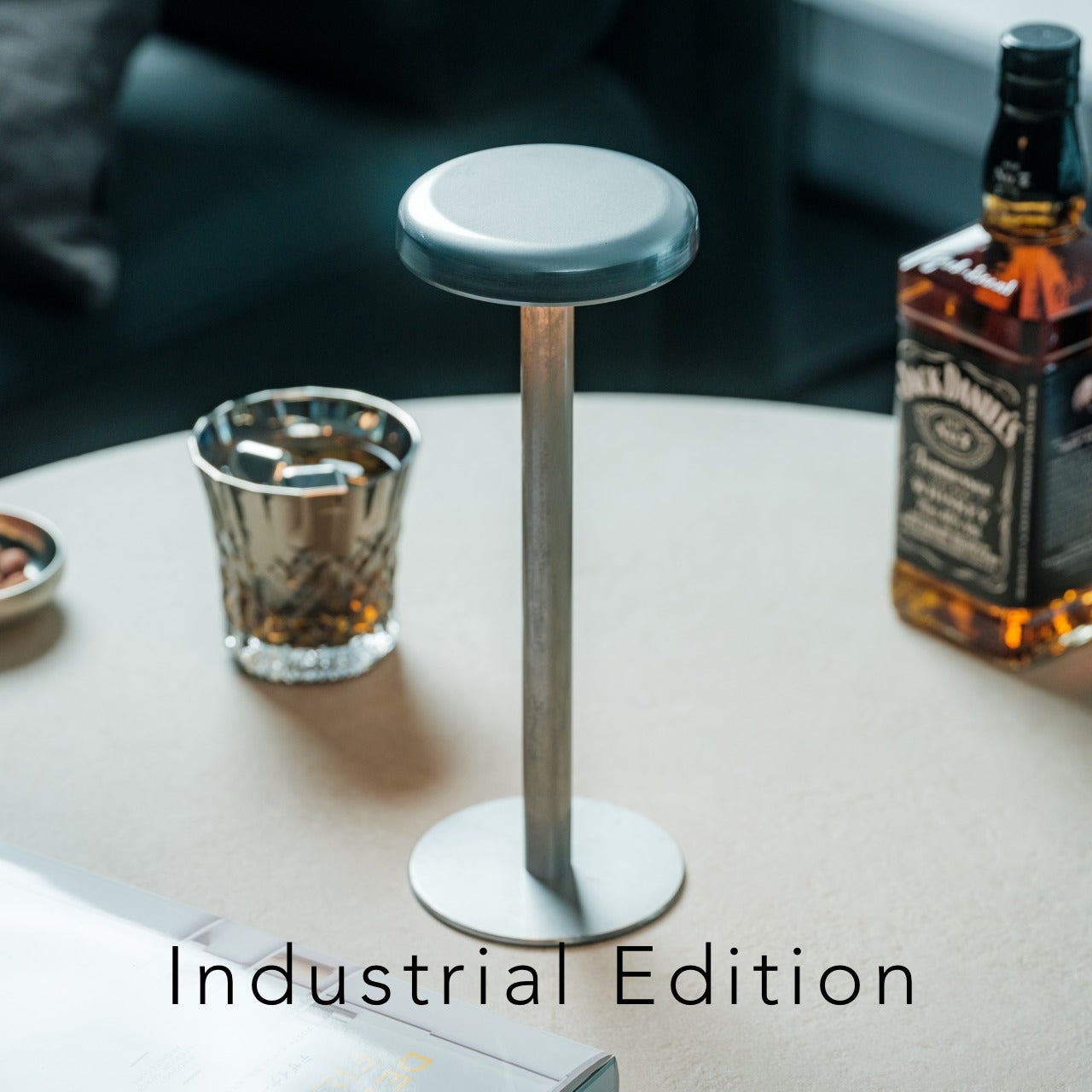
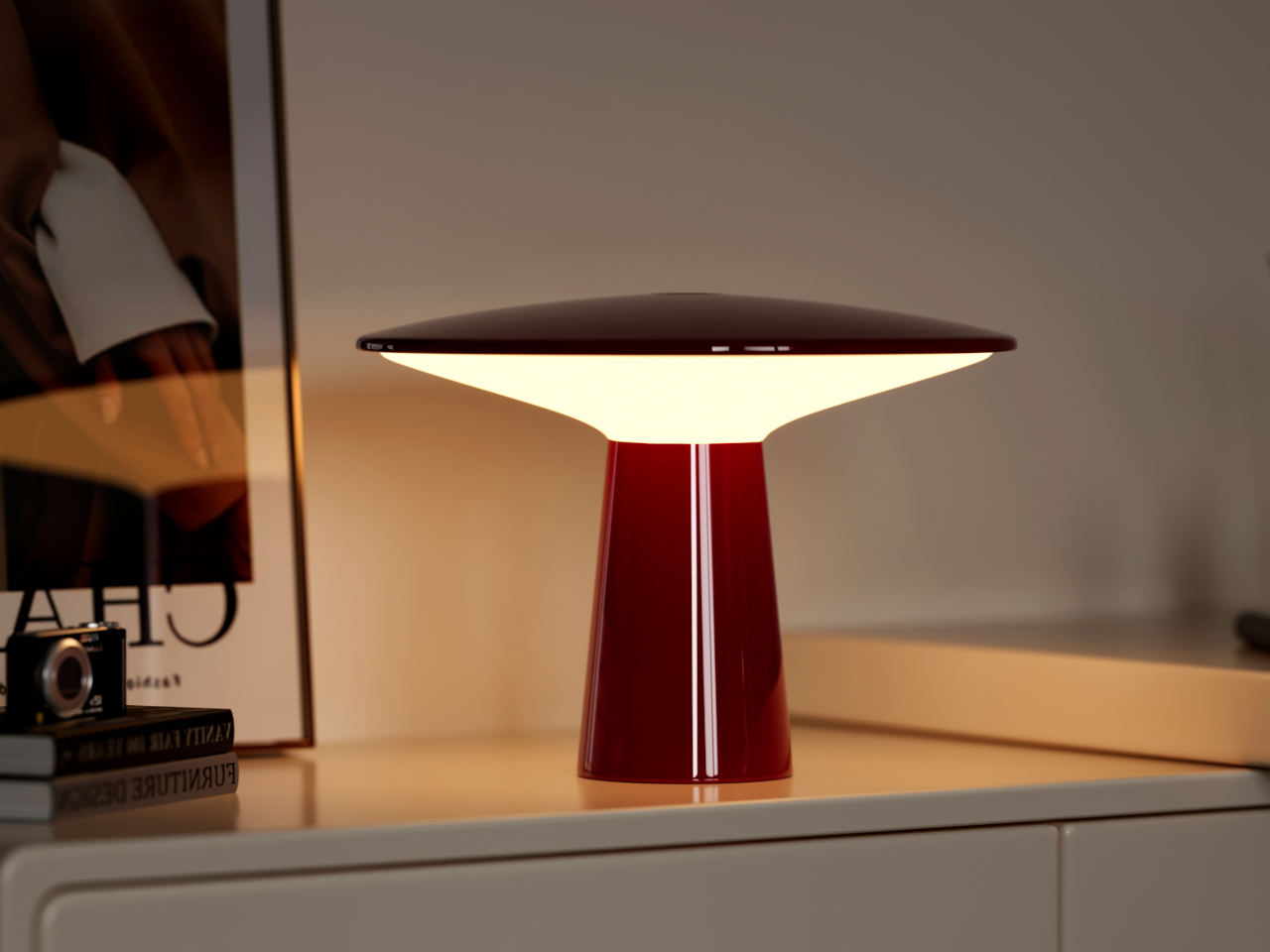
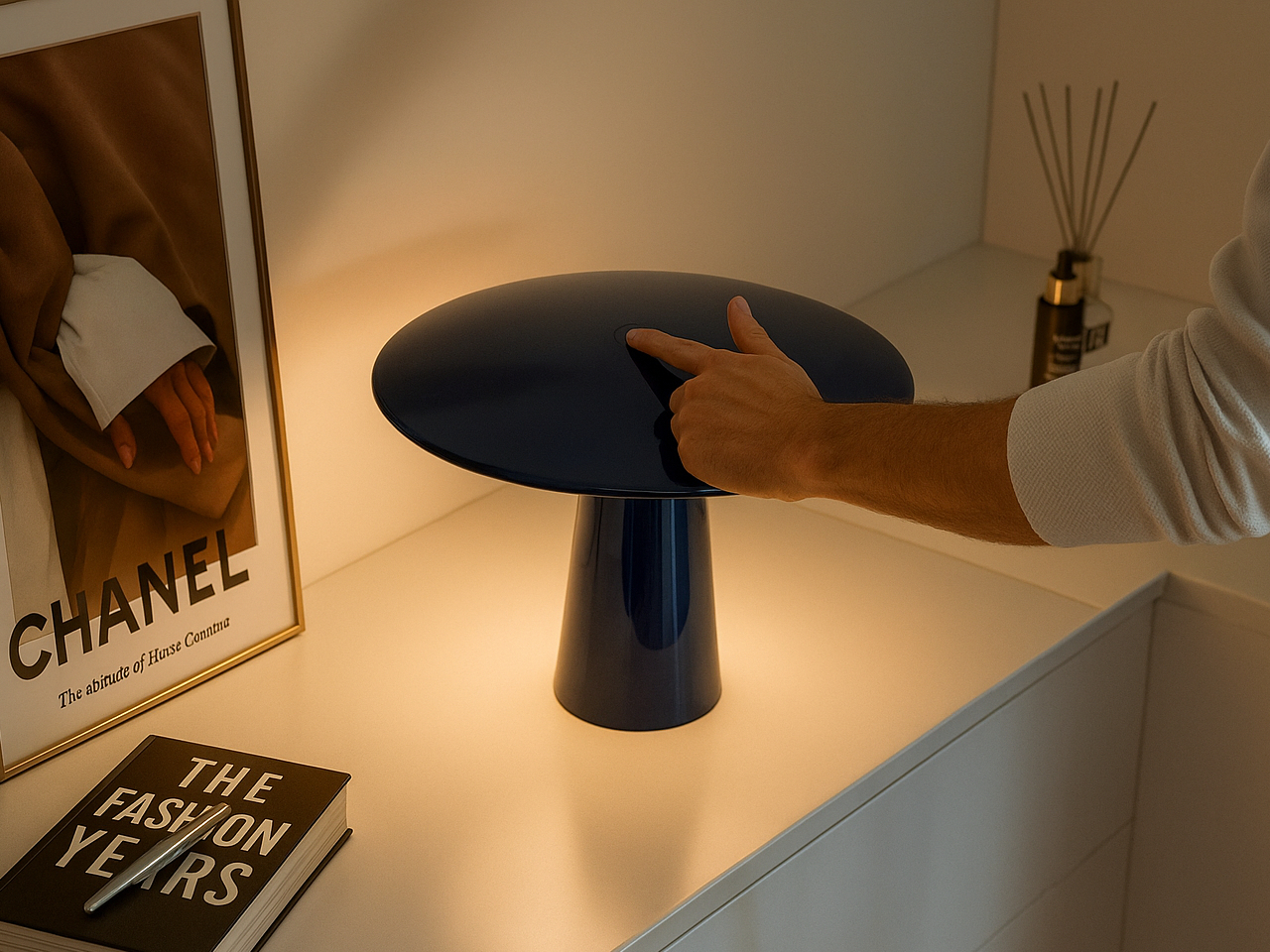
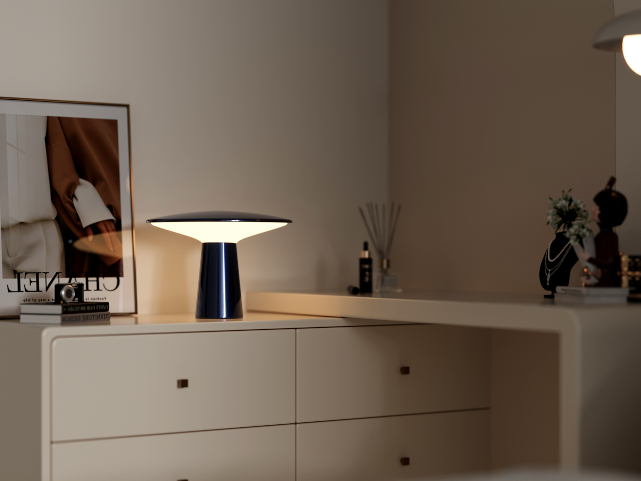
IKEA AVHÅLL goes outdoors without looking like it belongs there
There’s a frustrating design problem at the heart of most outdoor-rated portable lamps. They want to be taken seriously as practical objects, so they usually adopt a rugged aesthetic that makes them look slightly out of place indoors. Bringing one in from the balcony feels like dragging a piece of patio furniture into the living room, which is exactly the kind of visual compromise most people don’t want to make.
The AVHÅLL handles that transition more gracefully than most. It’s a metal lamp with three dimming settings and enough weather tolerance to live on a terrace, but it doesn’t dress itself up in tactical styling or rubberized finishes to make that point. At $39.99, it’s the kind of object that can light an outdoor dinner, come back inside afterward, and not look out of place in either setting.
The Anywhere-Use Lamp makes the case for AA batteries over built-in cells
Not every cordless lamp needs to carry a built-in battery to justify its place in this conversation. The Anywhere-Use Lamp makes a different kind of case: four AA batteries instead of a sealed internal cell, which sounds like a step backward until you factor in that rechargeable AAs are widely available, easy to swap, and don’t degrade the way built-in batteries do after a couple of years of daily use.
It moves freely between a desk, a bookshelf, a bedside table, or an outdoor corner without needing a socket or a charging cable. Four brightness levels cycle through a tap of the cap, and the whole thing breaks down flat when you need to pack it. At $149, it isn’t cheap, but the placement freedom it offers is the kind that genuinely changes how you think about where light belongs.
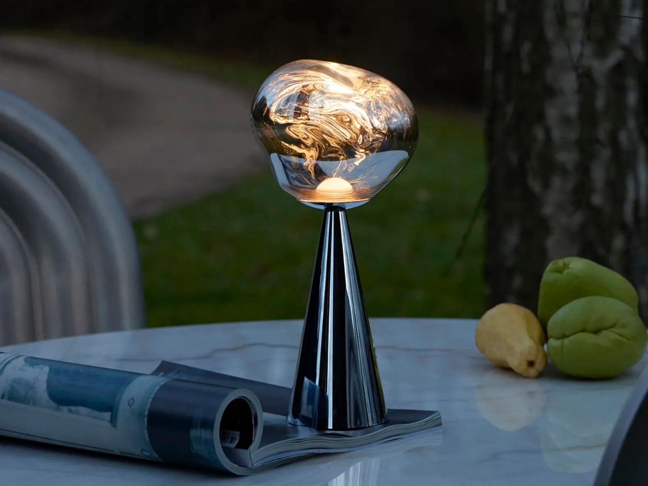
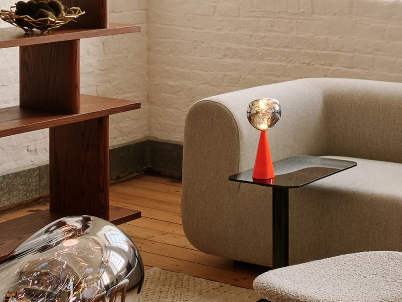
Melt is one of the more dramatically finished lamps on this list
Once the rechargeable lamp stopped having to justify itself as a practical solution, designers had more room to get expressive. The form no longer had to be neutral or apologetic, which opened the door for objects that could hold their own in a room even when they weren’t switched on. That’s a higher bar than most lamps are held to, and one worth reaching for.
Melt leans into that idea pretty directly. Its surface treatment mimics the look of metal mid-pour, giving it a kind of arrested-motion quality that makes it genuinely interesting to have around. It also runs for up to 10 hours on a single charge, which means it can handle a long evening without going dark before the conversation does. At around $300, it’s the most overtly expressive lamp on this list.
Monir skips the app, the cord, and all the usual complications
There’s a growing exhaustion with lamps that want to be smart home hubs. At some point, the dimming app, the voice controls, and the tunable spectrum start feeling like overhead for something that’s supposed to quietly light a corner of the room. Not every lamp needs to be a connected device, and it’s becoming clearer that the most relaxed interiors are often lit by the least complicated objects.
Monir makes no effort to be anything other than a lamp. No app required, no cord in sight, and the whole thing is built from 100% recycled aluminum, which gives it a quieter kind of design intention than most objects in this space. Its moon-inspired form is soft enough to fit into a bedroom or reading corner without demanding attention, just providing a warm, ambient glow when you need it.
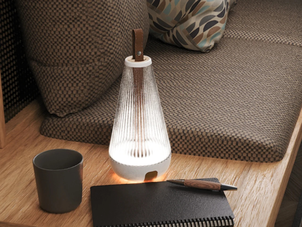
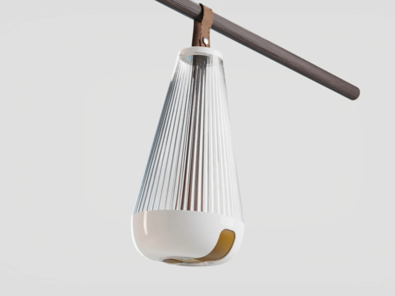
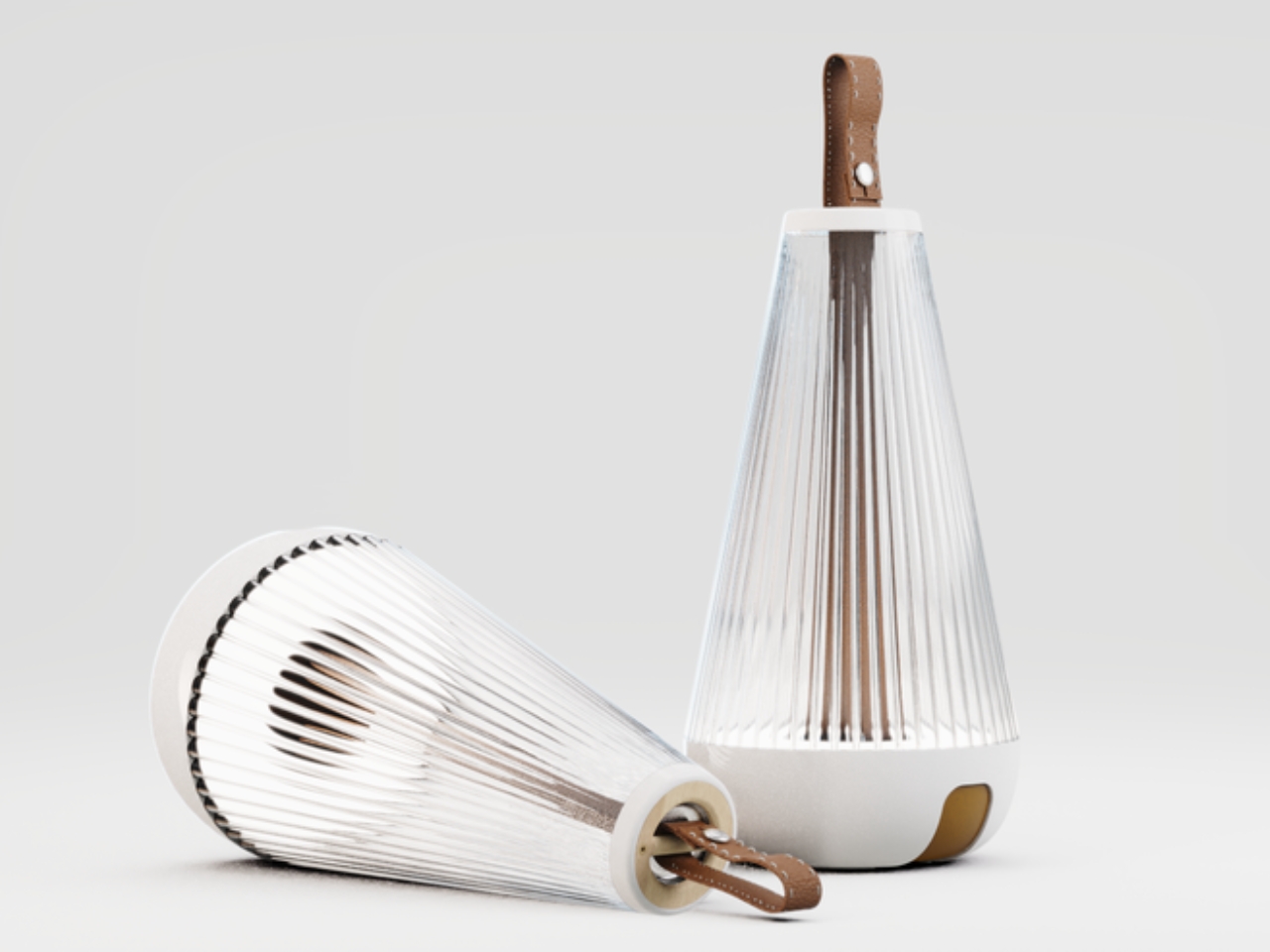
Fluted questions what the portable lamp’s silhouette should look like
The lantern is the oldest visual reference point in portable lighting, and it’s also one of the hardest to escape. Designers keep reaching for it because it signals mobility and self-sufficiency, but it also carries a lot of campsite and emergency-preparedness baggage that’s difficult to shed. Younger designers seem more interested in questioning those associations rather than just refining them, which is where things get more interesting.
Fluted, a student project recognized at the Core77 Design Awards, does exactly that. It borrows the lantern’s silhouette but softens its edges and refines its finish into something that reads less like outdoor gear and more like an object you’d actually want to keep on a shelf. It’s a concept rather than something you can order today, but it points at where the category’s visual language could go next.
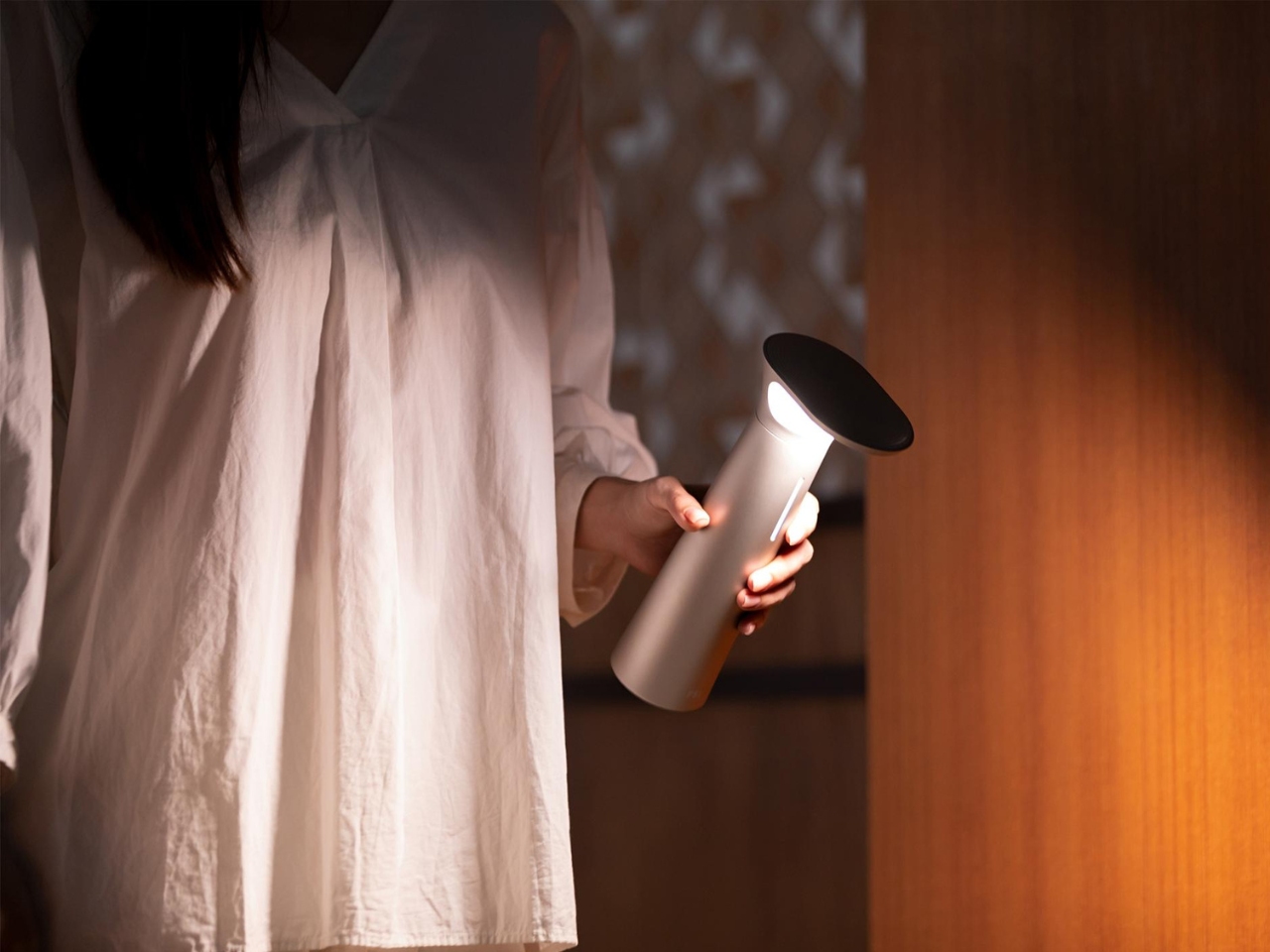
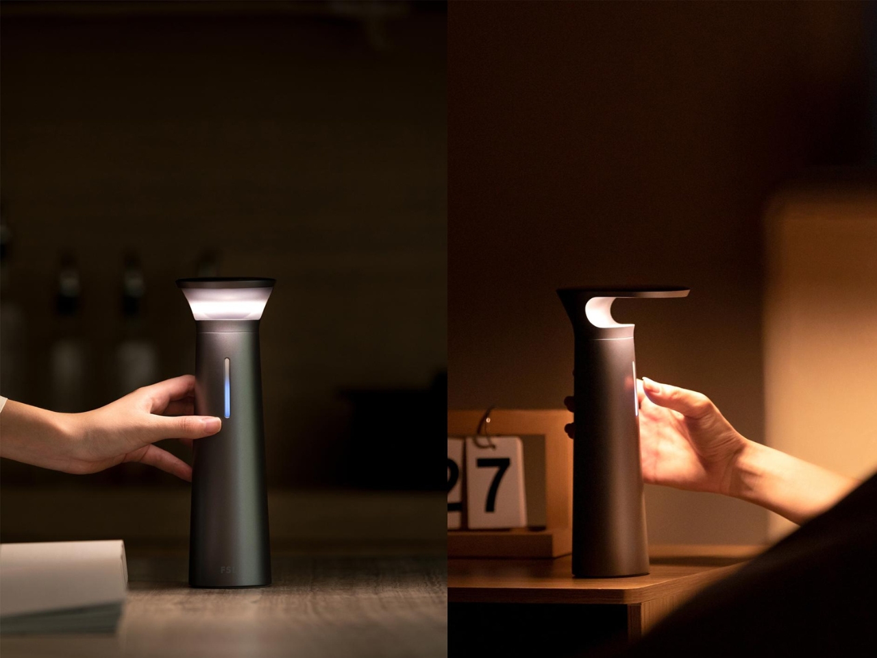
The FSL Wireless Portable Desk Lamp doesn’t know which category it belongs to
Desk lamps and table lamps have always played by slightly different rules. A desk lamp is positioned and pointed; a table lamp is placed and left alone. That distinction made a lot of sense when both types were tethered to a wall, but it starts to feel less rigid when the power source is no longer doing the work of keeping the object in one place.
The FSL Wireless Portable Desk Lamp sits comfortably in that gap. It carries the directed functionality of a task light with the portability of an object that doesn’t belong to any single corner of the room. It can move from a desk to a dining table to a nightstand without asking for a socket along the way, which quietly makes the case for what cordless lighting could become.
The nightstand has become a staging ground for technology. Between a phone, a white noise machine, a lamp, and whatever book you’re pretending to read before you fall asleep, it tends to get crowded. That clutter has gotten to the point where some people start their mornings already stressed from looking at the pile, which is counterproductive for something that’s supposed to help you rest.
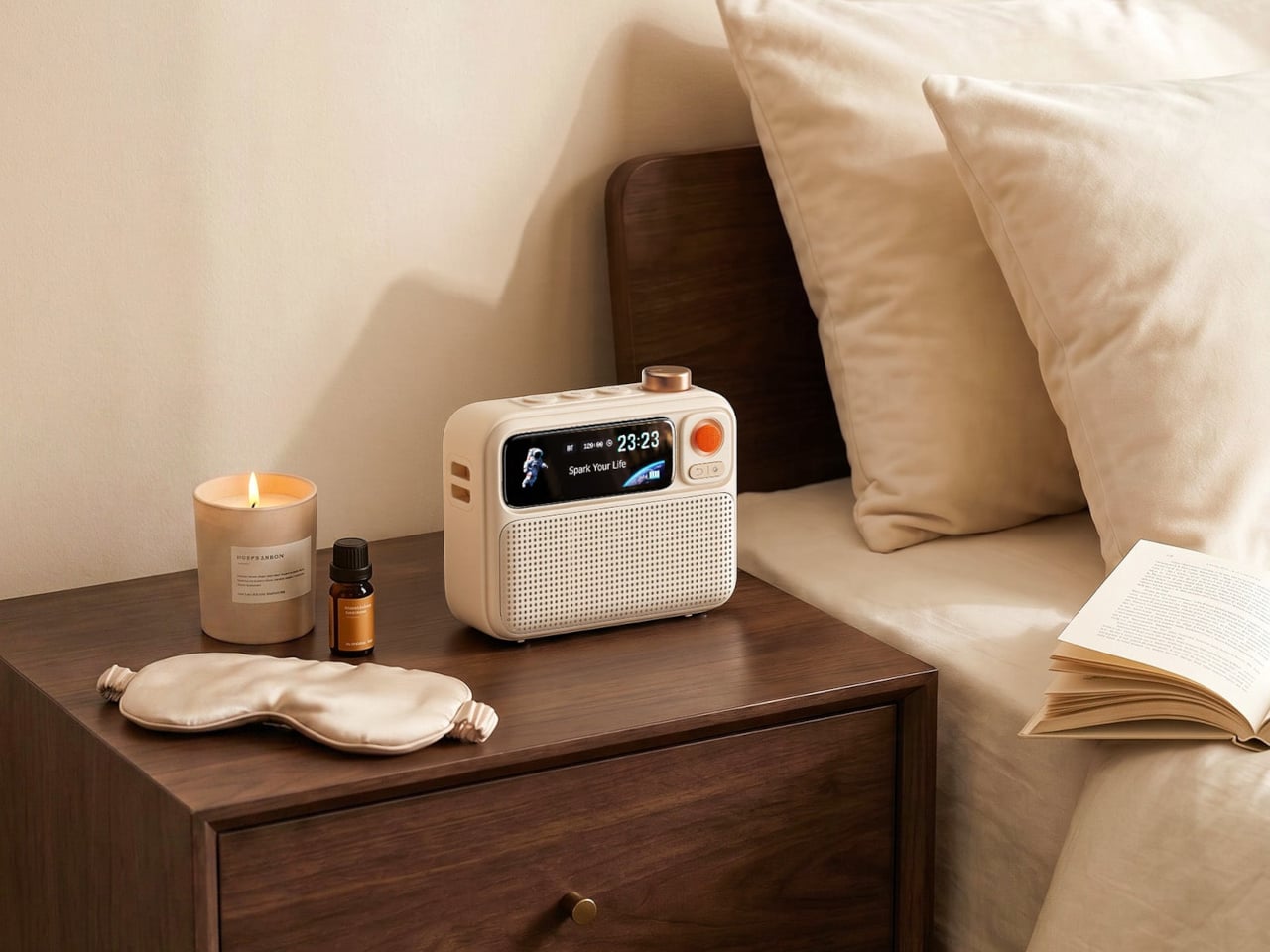
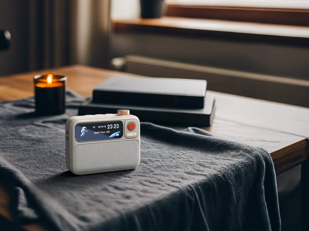
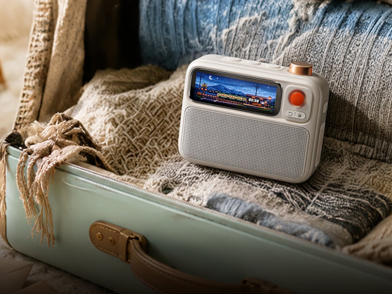
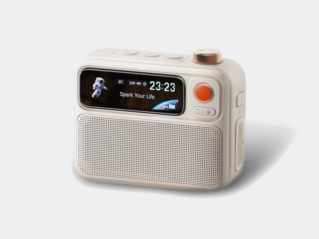
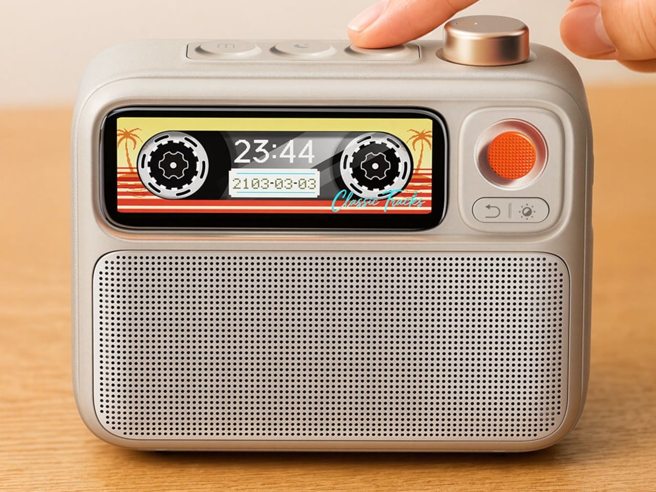
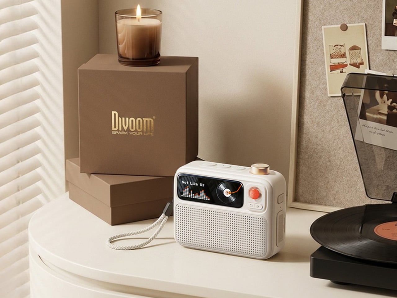
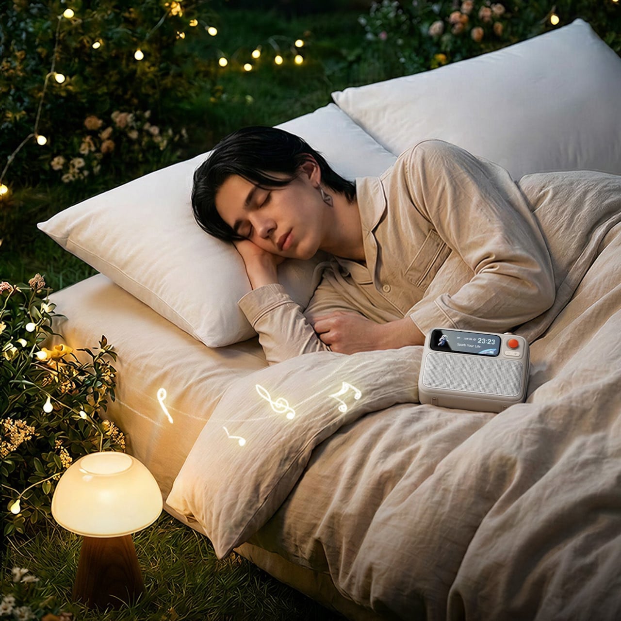
The Divoom FlowToo works around that problem by collapsing three bedside staples into a single compact device. It’s a Bluetooth speaker, white noise machine, and alarm clock all at once, with a customizable display that rounds the whole thing out. Rather than adding another device to the pile, it’s designed to clear some of it, while actually improving on each of those functions rather than just combining them with asterisks.
The speaker runs through a 10W amplifier and 45mm full-range driver, which makes it a genuine music speaker rather than the obligatory audio feature most alarm clocks bolt on as an afterthought. You can stream music from your phone over Bluetooth and get enough volume to fill a bedroom without things getting harsh. For a device that lives on a nightstand, that sets it apart from most of the competition.
The FlowToo’s more than 90 built-in sounds cover what people actually reach for at night, from rain and ocean waves to forest ambience and other calming tones. These aren’t just sleep aids; they work just as well for focusing during the day when you need background noise that doesn’t pull your attention elsewhere. The library is large enough that finding something to suit your preference won’t take long.
Getting out of bed is the harder side of this equation, and the FlowToo handles it carefully. Rather than a jarring alarm tone, it wakes you gradually with natural sounds that grow louder while a gentle light fills in from the display. The idea is to bring you up without jolting you out of sleep, which tends to leave you considerably less wrecked for the rest of the morning.
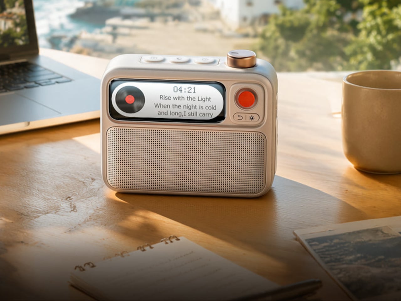
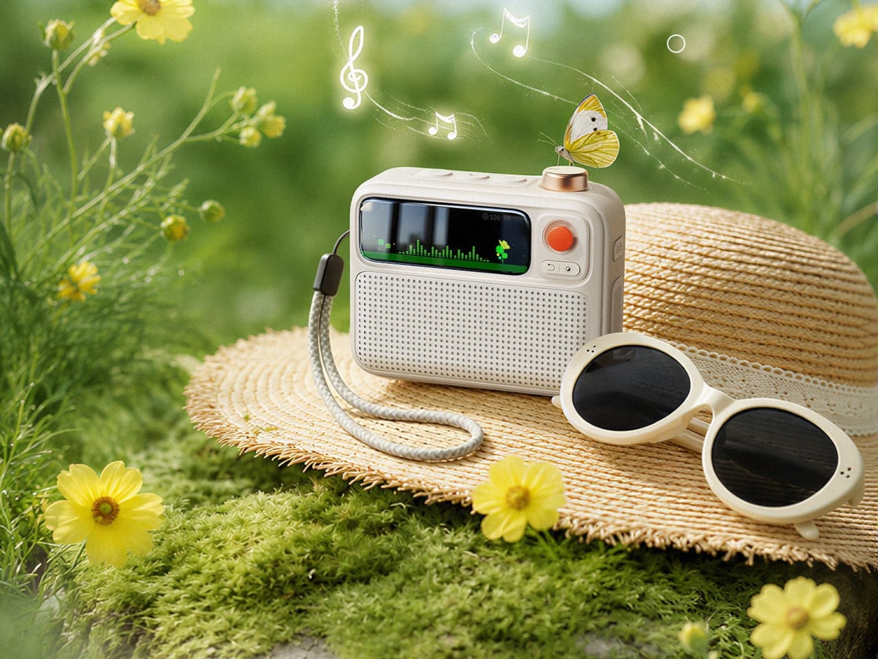
The 2.26-inch smart display is where the FlowToo takes on a bit more personality than a typical clock radio. It can show multiple clock face designs, music visualizers that react to what’s playing, sleep scene animations, and mood lighting to set a different tone in the room. The Divoom App lets you swap between these, set alarms, and choose sounds from your phone, which keeps the device simple to operate.
The FlowToo comes in White and Black and currently retails for $99.99. It’s compact enough to sit comfortably beside most beds without taking over the surface. The overall look is clean and rounded rather than clinical, which makes it easier to accept as a permanent bedroom addition instead of something that feels like a tech purchase trying too hard to belong on a nightstand.
There are more focused devices for each of those individual functions, and some will argue that a dedicated white noise machine sounds better or that a standalone speaker gets louder. That’s fair enough. But most people aren’t looking for world-class performance across every category; they’re looking for something reliable and pleasant that takes up less space, starts their morning decently, and doesn’t require them to manage four different apps.
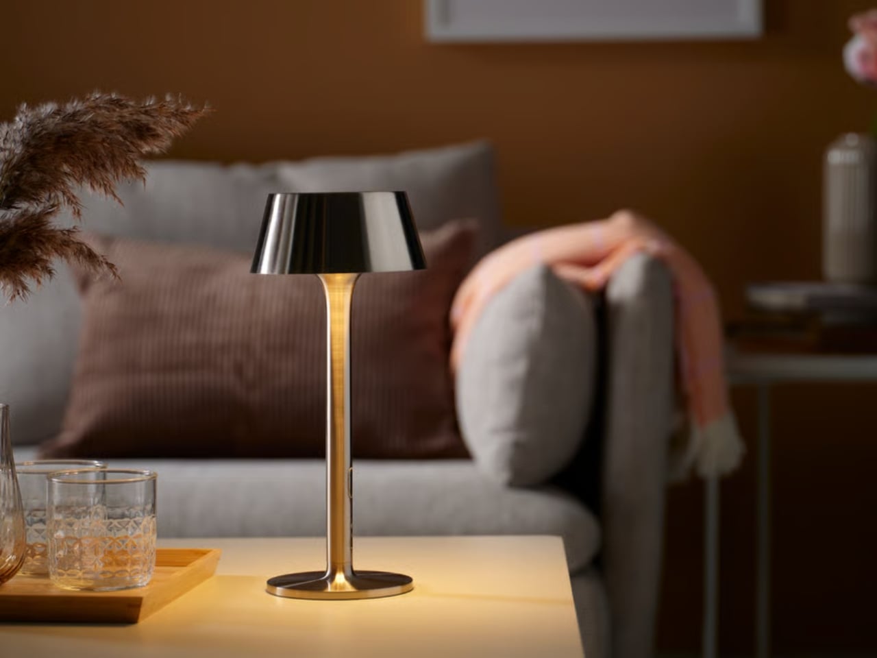
Maybe the most radical thing a lamp can do in 2026 is untether itself from the wall. No outlet, no cord snaking across the floor, no compromise on placement. You just pick it up and put it somewhere. That’s the entire pitch of IKEA’s AVHÅLL LED portable lamp, and somehow, at $29.99, it feels like one of the more quietly clever products to come out of Älmhult in a while. A small object making a quiet case for a different kind of light.
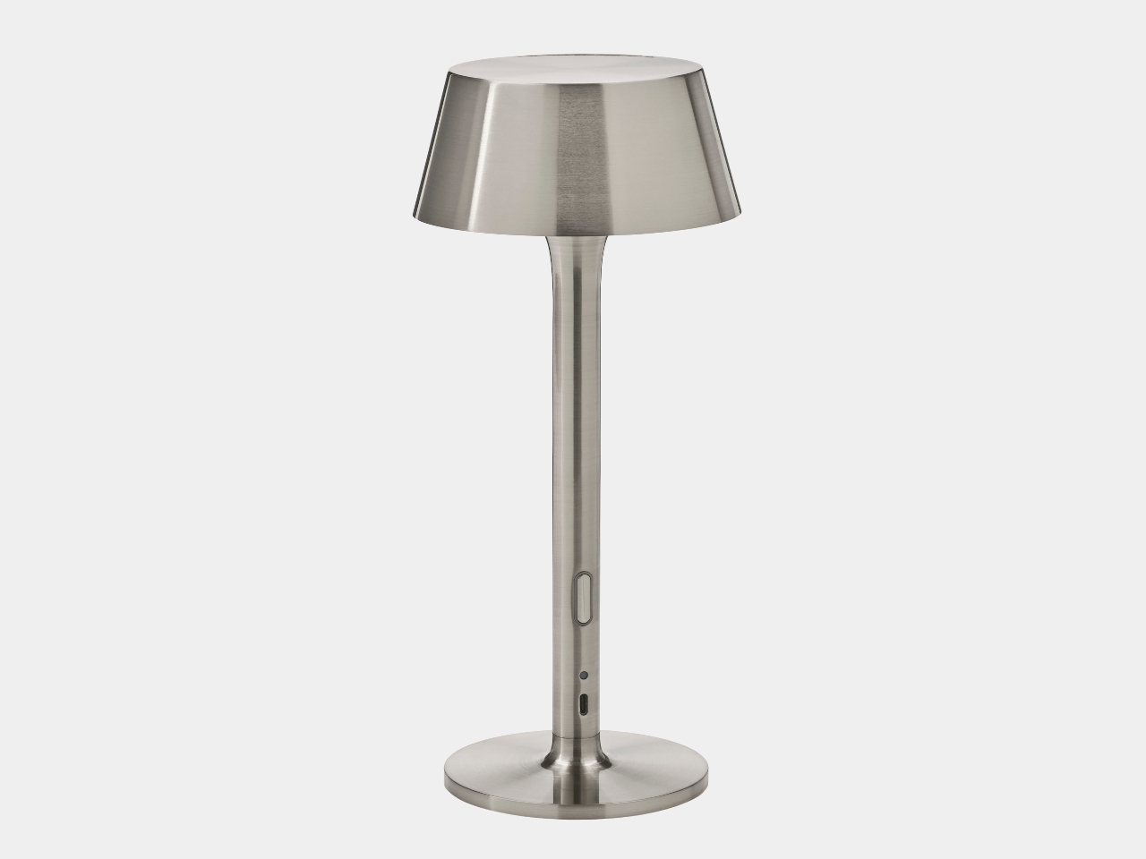
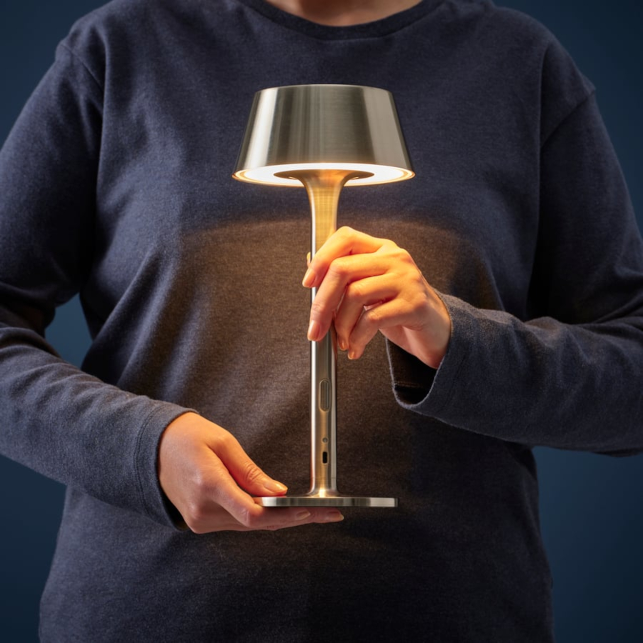
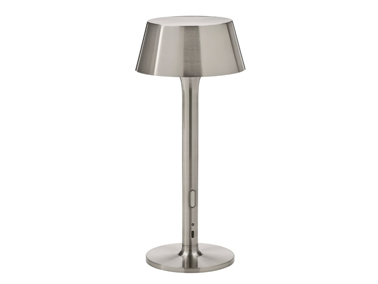
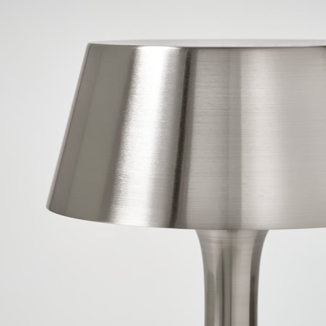
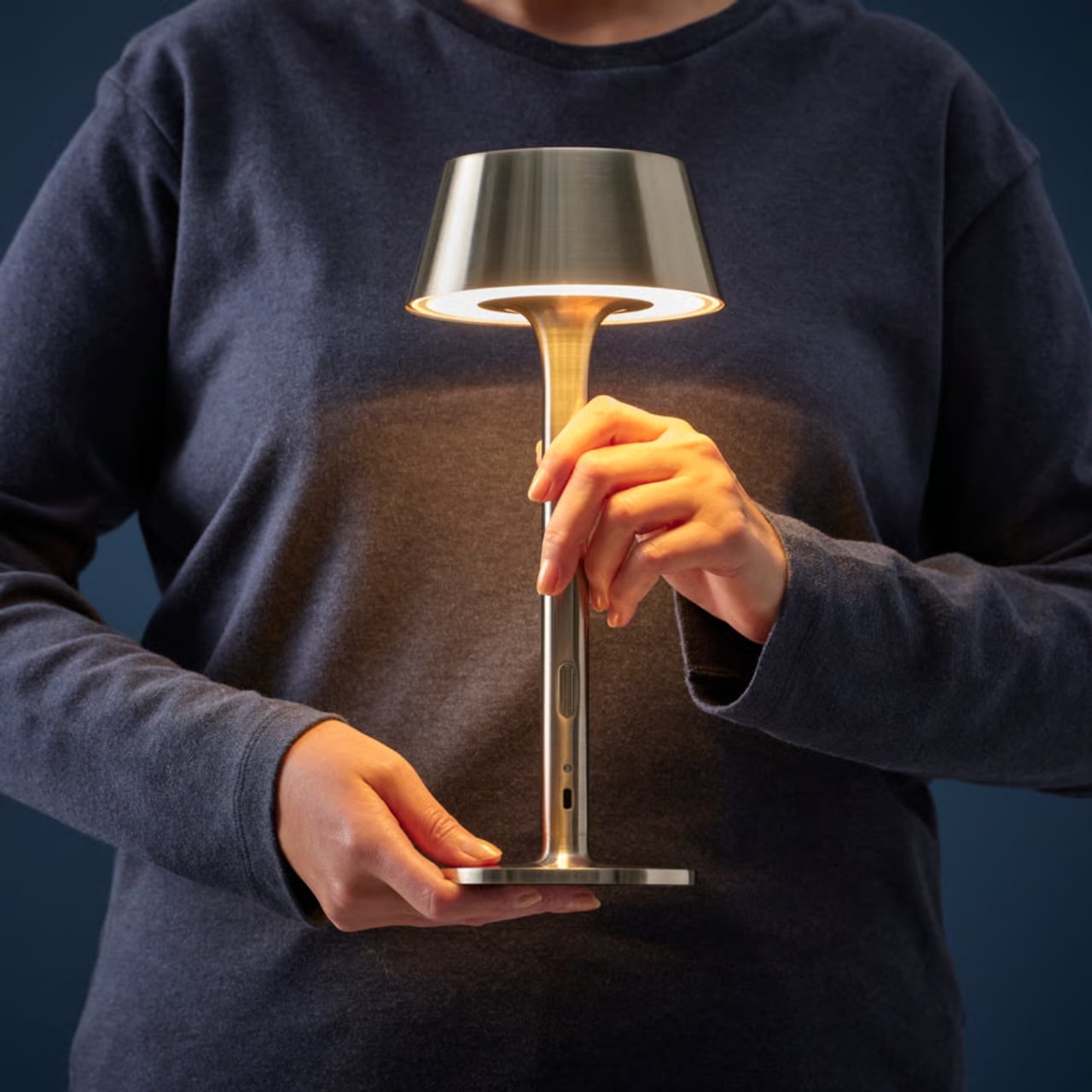
The AVHÅLL is compact and confident. At just 11½ inches tall, it’s not trying to dominate a room. It’s made entirely of metal, with a nickel-plated finish that catches the light in that cool, almost liquid way chrome does when the sun hits it at an angle. It’s the kind of lamp that makes you feel like you assembled a vignette rather than just set something down on a table. The black version exists too, and it’s a perfectly good choice, but the nickel-plated one is the one worth talking about. Chrome is everywhere right now, from kitchen fixtures to jewelry to sneaker hardware, and this lamp fits neatly into that current without looking like it’s trying too hard.
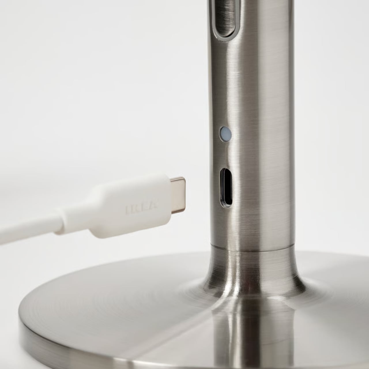
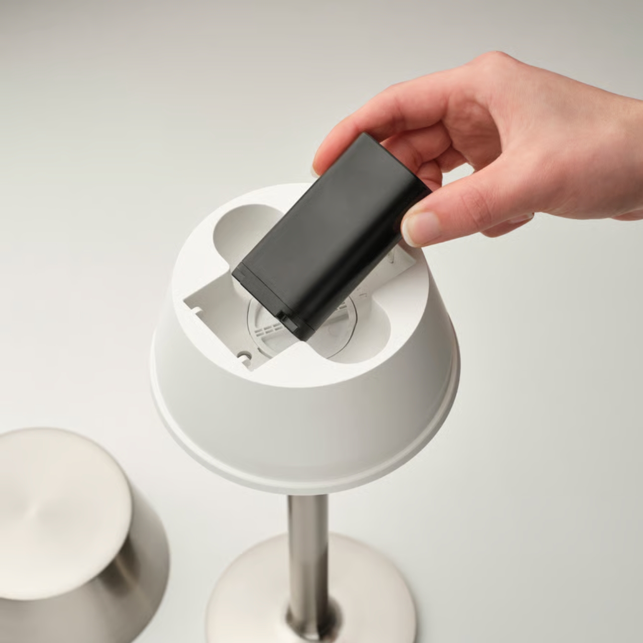
The functional side is genuinely well considered. The AVHÅLL is battery-operated with the battery included, which is already a point in its favor. It dims in three steps, so you get full brightness, a mid level, and something low and warm that works as ambient light after dark. Charging happens via USB-C, which means the cable you already have on your nightstand will probably work for this too, though IKEA sells the cable and charger separately. You can charge it with the battery in or out, which is a small convenience that ends up mattering more than you’d think. And it carries an IP44 rating, meaning it handles splashes and light rain, making it legitimately useful on a patio, a balcony, or a dinner table outside.
The LED inside has an expected lifespan of around 25,000 hours and is replaceable. That last detail might seem small, but it’s actually the kind of decision that separates thoughtful product design from disposable product design. IKEA has been getting called out on sustainability for years, and a replaceable bulb in a $30 lamp is at least a step in the right direction. It matters.
Where the AVHÅLL really earns its place is in the gap it fills. Portable lamps at this price point usually look like it. They tend to skew plasticky, or they have that vaguely clinical look you get from something designed to be cheap rather than designed to feel intentional. The AVHÅLL doesn’t suffer from that. It looks like something you’d see in a higher-priced lifestyle catalog, not because it’s deceiving you about what it is, but because the design decisions, the metal body, the warm light output, the proportions, actually hold up. It reads well in a photo and it reads well in person, which is increasingly the benchmark for whether something is worth paying attention to.
The one thing to note before you buy is the price of accessories. The USB-C cable and charger are sold separately, so if you’re coming in at $29.99 and expecting everything you need in the box, adjust expectations slightly. It’s a minor irritation, especially at this price point, but it’s worth knowing upfront.
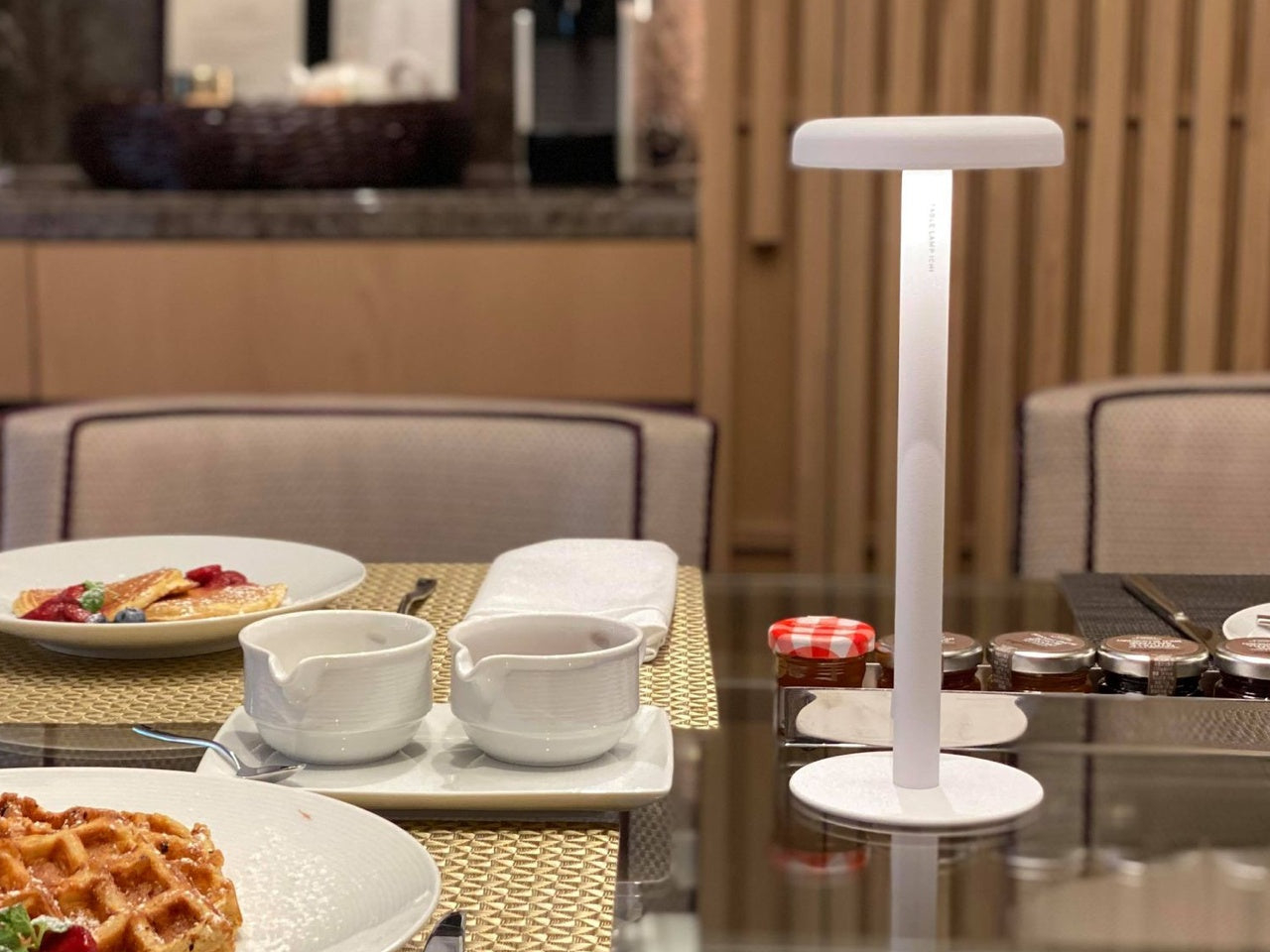
Still, it’s hard to be too critical of a lamp this considered at this price. The AVHÅLL is exactly the kind of object that makes people realize how much ambient light shapes how a room feels, and how rarely they’ve had the flexibility to change it. Move it from your bedroom to the living room. Take it outside. Put it on the coffee table during a dinner party. It travels with you through the house, and that’s what makes it interesting. A cord would ruin the whole thing.


 . The concept mirrors nature in a way that feels almost obvious once you understand it. As you dim the light, the lamp doesn’t just reduce brightness. It simultaneously shifts the spectrum toward warmer, amber tones. Bright and crisp when you need to focus. Soft and golden when the evening calls for it. The entire transition happens through a single analog dial, a deliberate choice by founder and chief developer Dr. Jinwoo Bae, an MIT-trained engineer who has built his career on making advanced technology feel effortless rather than overcomplicated.