Brutalist speaker concept is inspired by an equally brutalist church building

Regardless of religious inclination or lack thereof, the word “church” would often conjure up images of lofty buildings designed to inspire awe or command respect. Of course, church architecture often reflects the trends and styles of their times, and there are indeed churches today that wouldn’t look out of place beside commercial buildings and structures. Of these, the former Church of Saint Agnes in Berlin, now home to the Konig gallery, is perhaps one of the most striking examples of the modern brutalist movement applied to such a structure, and its imposing character happens to be the almost literal inspiration for a desk speaker concept that similarly embraces that spirit of extreme austerity in a beautiful and memorable way.

Designer: Philipp Emrich

Designed by architect Werner Duttmann and finished in 1967, the former Church of St. Agnes, now the Gallery of Konig, stands almost in opposition to common church architectures of that period and the ages before it. Its unadorned, boxy shapes don’t stand out among the rows of concrete buildings that line up most cities, making it feel like just another part of the community. At the same time, however, its austere appearance still cuts an imposing figure that gives the impression of something that is meant to exist on a completely different and higher level.

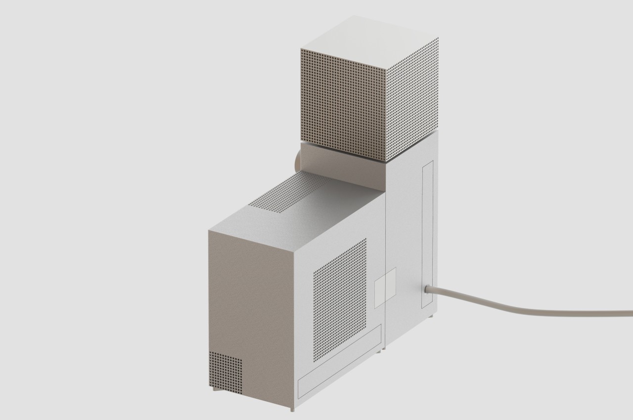
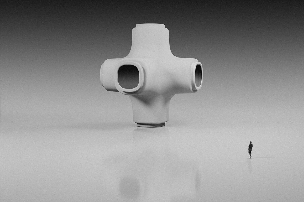
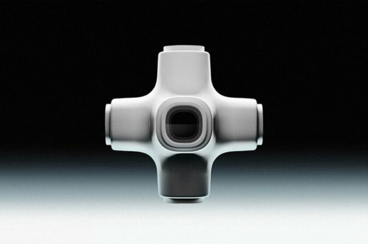
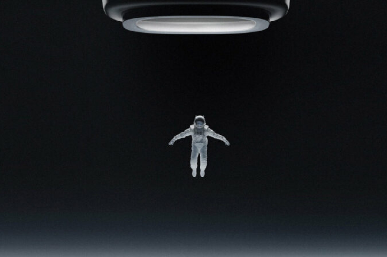
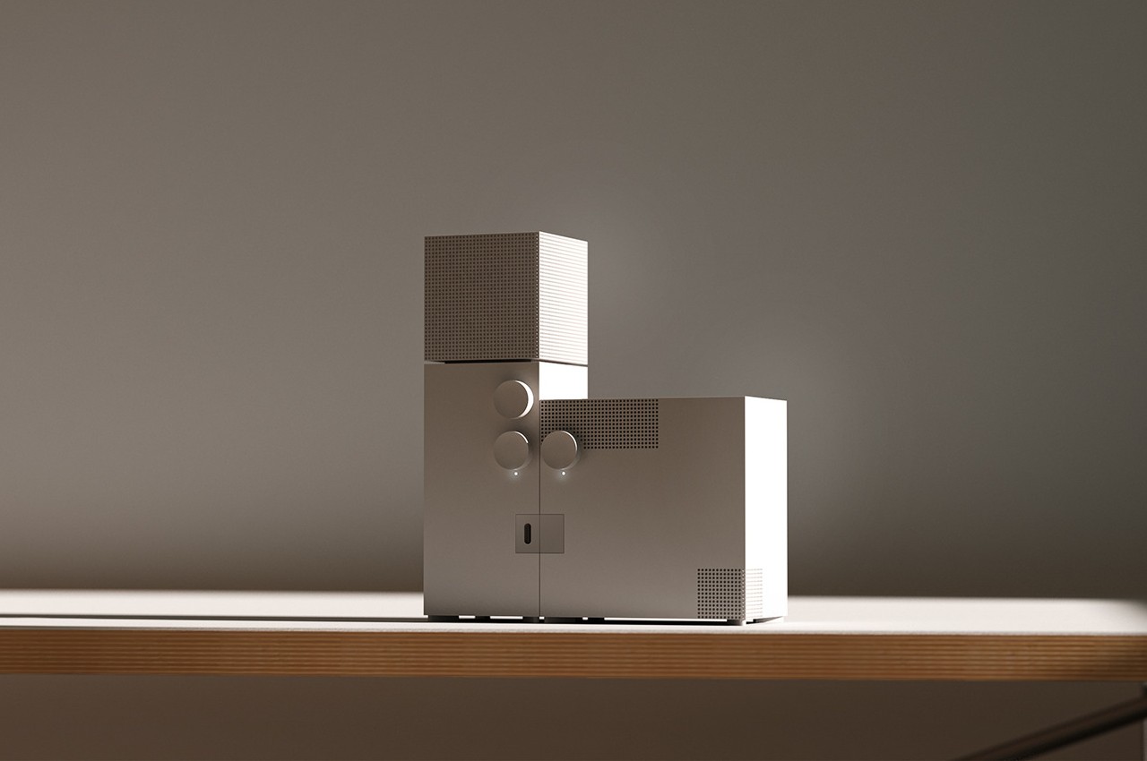
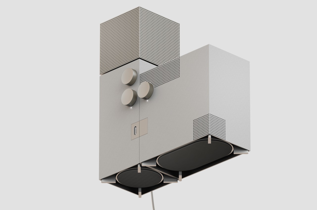
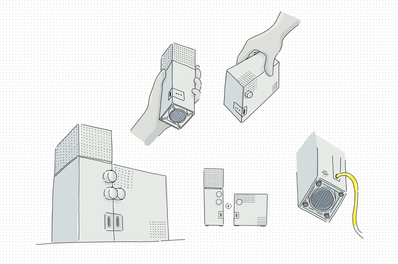
It’s that same stunning characteristic that the Agnes desk speaker concept tries to convey on a smaller scale. Like the church it takes both its shape and name from, the design is made from two plain rectangular pieces, though the roles are switched. The vertical “bell tower” is actually the main speaker, with the top box providing 360-degree output, while the larger detachable box provides bass on demand.

Like any brutalist design, the speakers express rawness, expressed through metal instead of concrete and accentuated by the use of the simplest geometrical shape and sharp edges. In terms of functionality, however, there is nothing unrefined about the Agnes speaker concept, and it even imagines a feature not found in any 360-degree speaker today. While the lower knob controls the speaker volume, the one above it determines where sound is directed, whether it’s only from the front, from the front and the sides, or from all four sides.

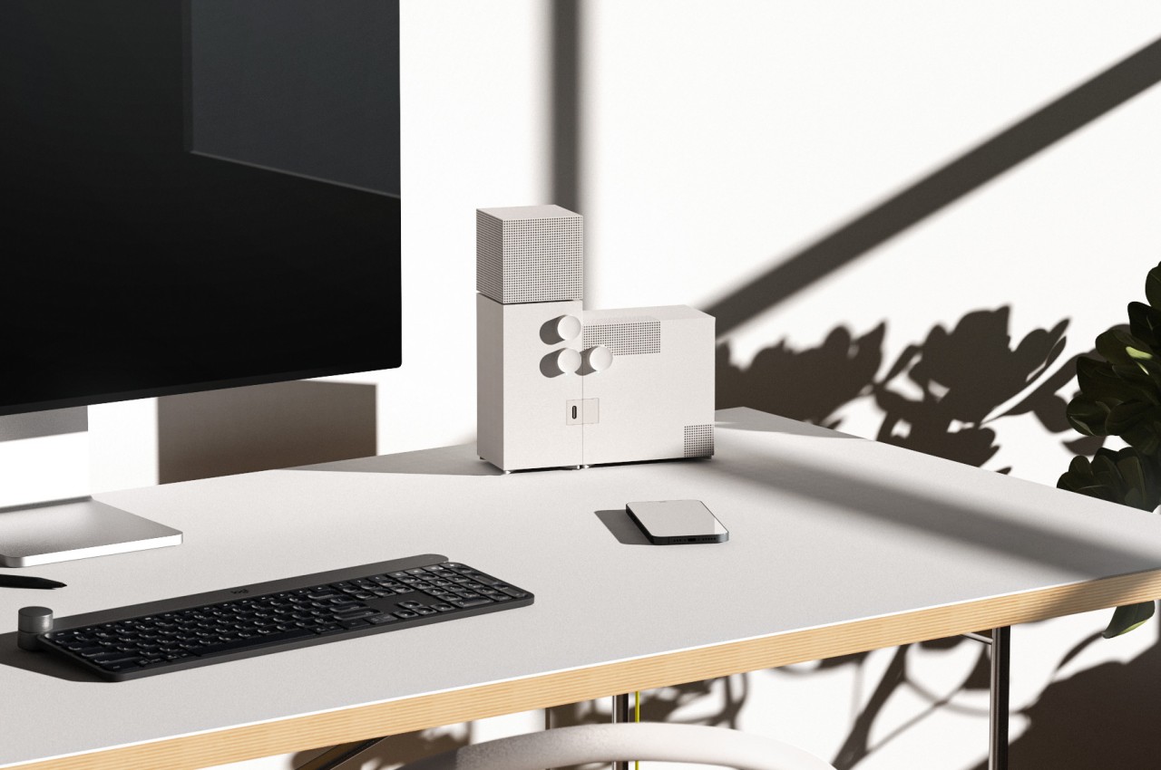
Smart speakers today are trying their best to blend into their surroundings, namely your interior decor, and just like its inspiration, the Agnes desk speaker concept presents a duality in that regard. It definitely mixes well with minimalist designs, but its raw appearance and imposing stature also make it stand out easily, turning what would normally be just a functional appliance into a unique work of art that looks almost out of place and out of time.

The post Brutalist speaker concept is inspired by an equally brutalist church building first appeared on Yanko Design.

WiFi router concept uses cork as material and design aesthetic

A wifi router is one of those devices that every house needs but we don’t really think about how it’s designed, what materials are used to make it, and other factors that come into it. As long as it does what it’s supposed to do, which is get you connected to the internet, then we’re almost always fine with it. However, most routers have a lifespan of 2-3 years and so it contributes to the million tons of e-waste that is generated annually by people who constantly change their gadgets and devices.

Designer: Connor Rusnak

A concept for a sustainable wifi router tries to solve that issue and at the same time give us a well-designed one that you will proudly display in your home office. The Pella uses cork in the design so you get an eco-friendly material that can also look good on your device. In theory, using this material should not interfere with the functionality of the device which is of course important since the only reason you’ll get a router is to be able to connect all your devices to the WiFi.

The cork is not just a building material but an integral part of the design. The router looks more like a smart speaker with its spherical shape which is also reminds me of a top but with a stable base. The basic controls, which are mainly the on/off button and what seems to be a reset button, are located on the base. There’s no need for any other controls or buttons so you get a pretty minimalist design, as all routers should probably have.

More often than not, these routers are hidden away in our home not just because it needs to be near a wall socket but because there isn’t any decorative aspect to it. But something like the Pella, which was designed with the brand Logitech in mind, can be something you put on your desk especially if you have an earthy or cork-like aesthetic.

The post WiFi router concept uses cork as material and design aesthetic first appeared on Yanko Design.

Smart gardening pot concept makes growing plants indoors less stressful

There has been a new kind of hobby that gripped the world in the past few years, especially when people were forced to stay home for a few months. “Home gardening” was no longer limited to having a small plot of soil outdoors, especially if you can just grow them in pots indoors. That said, it’s a process that still requires a bit of work and effort, especially if you want to keep your plants alive long enough to enjoy the fruits (or leaves) of your labors. Unsurprisingly, a rather niche market of indoor planter appliances has popped up, some including pretty smart functions to boot. This concept tries to offer the same conveniences in a more aesthetic presentation, providing a painless experience of growing plants in an automated environment that looks great as a piece of home decoration as well.

Designer: Saiyami Jhaveri

Just like with plants grown outdoors, indoor plants need regular maintenance from watering, sunlight, and even protection from pests. You can do all of those manually, of course, and some people do enjoy the satisfying feeling of getting down and dirty with such tasks. Others, however, find the process too time-consuming and burdensome, especially if all they want is regular access to fresh herbs or beautiful green plants to liven up a space.

Ecobloom is a concept device that tries to take the drudgery out of this painstaking and laborious process. Almost all parts of that process are automated; all you really need to do is plant the greens and make sure the water tank at the top is filled. You don’t have to do guesswork on when it’s the right time to water the plants thanks to soil moisture sensors that determine the perfect moment for you. Drippers also make sure the plants don’t suddenly get drowned by dispensing the right amount of water as needed. And, of course, there are artificial “grow lights” that save you the trouble of having to put the pot out under the sun.

The smart gardening pot has an interesting function that you won’t always see in actual appliances. It is noted to have a built-in insect repellent to keep those pests away and protect your plants. The concept doesn’t exactly detail how this function works, but one can presume it will be using safe and scientifically tested methods that won’t harm humans and pets in the process.

What makes Ecobloom really interesting is the form it comes in. It uses three concentric circles at different heights, with the topmost acting as the water tank. This gives the appliance a more pleasing appearance compared to just boxes or compartments. Ecobloom can thus be also used to decorate a space, giving as much enjoyment to the planting process as simply watching the plants grow.

The post Smart gardening pot concept makes growing plants indoors less stressful first appeared on Yanko Design.

Minimalist wooden furniture uses curved shapes to add storage spaces

Furniture takes up space, there’s really no getting around that. Of course, you need that space to actually use the furniture, but the furniture themselves aren’t always in use. You might not sit on those chairs or couches all day, and tables might be empty at certain points in time. During those moments, they might just be wasting space, so it sometimes pays to have them perform some other purpose, even if it means just looking pretty. That’s not to say you have to stop at looks, especially if such aesthetic furniture can also function as storage spaces, like what this collection of design concepts tries to achieve using nothing but simple curved layers of plywood.

Designer: Julian Topor

Partly thanks to the popularity of flat-packed products from the likes of IKEA, minimalist wooden furniture has become a popular choice in households. Their simple designs save space not only in packaging but sometimes also on the floor. Furniture, however, can also become a space to place some of your things, from books to accessories to even shoes. The KURVE furniture collection accomplishes this without having to resort to complicated construction or mechanisms, using only curves that wrap around an empty space to create a hollow nook for your stuff.

The throne-like KURVE chair, for example, has no legs but instead has a curved backless box for its bottom half. What makes its design particularly interesting is that the seat, backrest, and arms are all made from the same single sheet of layered plywood, just bent on the back and sides to create those support structures.

The KURVE Couch stretches out this concept, quite literally, to provide sitting for two. A central console splits the couch in half and provides a small area to place cups and phones, as well as a compartment below for things like the TV remote. The bottom of the couch is an even wider space for more things, whether or not they have business being there.

The table is admittedly the simplest of them all, nothing more than a wooden trapezoid to hold things above and below it. Its lengthy shape makes it more suited to be placed against walls rather than being a center table, perhaps somewhere near the front door so your shoes and keys can easily find a home for easy access next time you step out.

Last but not least, the KURVE Night Stand is also a trapezoid, just taller and narrower. Like other nightstands, it has a drawer, but this compartment is oddly located a little below the top. This creates yet another space for your things, maybe for a phone that you don’t want to tempt you while you’re resting.

The post Minimalist wooden furniture uses curved shapes to add storage spaces first appeared on Yanko Design.

Compal Dual-Screen Laptop Concept can be unfolded in either direction

It’s still a very niche design, but it seems that dual-screen laptops are being adopted by major PC makers. Unlike a foldable laptop that mimics a foldable phone, a dual-screen laptop simply offers two separate displays joined by a hinge, sort of like offering a second monitor that’s permanently attached to the laptop. Given this design, however, the only available design was a book-type foldable like the aborted Microsoft Surface Duo, the ASUS ZenBook Pro Duo, and the Lenovo Yoga Book 9i. That, however, only covers about half of the use cases you might have for a dual-screen configuration and lacks the flexibility you’d enjoy with a detached second screen. That’s the kind of design problem that Compal’s concept is trying to solve and it does so in a very intriguing way.

Designer: Compal

The way dual-screen laptops are designed today is pretty much a product of familiarity rather than innovation. It’s the closest that resembles a regular laptop and is the easiest to implement. Ironically, it’s actually not the way people with two monitors arrange their screens in normal circumstances. Most have two horizontal monitors side by side or one stacked on top of the other. While current dual-screen laptops do support the latter use case, putting the monitors side by side requires having them standing vertically, opened like a book.

The Compal DualFlip concept flips that design on its head, pardon the pun, by giving the user the freedom to choose the configuration they need or want. They can have it stacked or side-by-side or even in the conventional book style. Or they can have only one screen active with the wireless keyboard sitting on top of the other, turning it into a regular laptop. The key point is that they dictate how they want to use the product rather than the other way around.

This opens the device to even more applications and users who have different needs and working conditions. Those monitoring data will probably appreciate having the monitor on top while those coding and writing might put the screen to the side. The latter is also the configuration that most will use for making digital art. Interestingly, having the screens stacked on top of each other also solves one of the biggest problems with dual-screen laptops and manages to “hide” the hinge and the gap that it creates between the two displays.

The key to this flexible design is the hinge that can fold or flip the screen as needed, hence the name. Of course, it’s still a concept and it’s uncertain if Compal already has working prototypes for this, but it definitely looks doable. If Compal manages to pull it off, it will definitely raise the brand’s profile and put it back on the map. That is unless its bigger rivals figure out another design that also solves that problem and actually puts it into production first.

The post Compal Dual-Screen Laptop Concept can be unfolded in either direction first appeared on Yanko Design.

Smart home camera and router concepts look like ghosts to be less conspicuous

Our homes are starting to get filled with smart gadgets, and not just the usual culprits like smartphones and tablets. From smart lamps to smart refrigerators, a lot of devices in our houses are now connecting to the Internet. While some of these try to blend in with the rest of your decor as much as they can, others just stand out like a sore thumb. Devices like home security cameras and routers still carry the aesthetics of their predecessors, which is impersonal, technical, and at times even disconcerting. While these products might be important in modern smart homes, they don’t need to be seen in order to function, which is why this concept design tries to make them almost literally fade into the background as if they were ghosts.

Designers: Seokhyun Ahn, Yejee Park, Cho Yumi, Yumin Shin, Myeongryun Kim, Dohyun Park, Lee Dahye, Kim Geonhee, Yang Yurim

We easily take for granted how things that look out of place can affect our minds and moods. Whether it’s a messy desk, a less-than-appealing piece of decoration, or clashing designs, the visual discomfort and confusion can actually bleed into your physical and mental state. They say that the best interfaces and designs are the ones that you barely notice, and what is the least noticeable thing if not a ghost?

Geist, which literally means “spirit” or “ghost,” is a concept design that tries to make those smart home devices less noticeable. Rather than having a black sphere or rectangle that feels like it’s spying on you, the John Doe ghost camera has a translucent body that almost looks like a piece of cloth flying in the wind, just like your stereotypical ghost from cartoons. It is even slanted at an angle to give the impression that it’s levitating and floating as it moves forward. It does have an “eye” for the camera, but it can turn it down to protect your privacy, indicating that it isn’t recording at the moment.

The Wi-Fi router Jane Doe takes on the shape of a gentle wisp of smoke or cloud. With an asymmetrical shape that is mounted vertically on a wall, it almost looks like a ghost passing through a solid surface. It’s impossible to completely hide some of the cables, particularly the power cable, but it at least forces these wires to go in a straight vertical line rather than ending up in a tangled mess.

Although the Geist concept design is actually meant to be less conspicuous and reduce visual discomfort, they can actually also have the opposite effect, depending on the person. Some might not be keen on seeing any representation of the paranormal, so anything that might remind them of ghosts might be even more uncomfortable. That said, the designs are aesthetically pleasing on their own, if you leave out the ghost association, so they still present a more pleasing aesthetic compared to the typical designs of these devices.

The post Smart home camera and router concepts look like ghosts to be less conspicuous first appeared on Yanko Design.

Saturn-inspired Bluetooth speaker brings a unique look to your music

There are a lot of Bluetooth speakers in the market, from simple and minimalist ones to the more luxurious and expensive-looking ones. When it comes to design though, there aren’t that many that go out of the box so to speak so we see either circular, box-shaped, dome-shaped, spherical, and other common shapes. So when we see uniquely-designed ones, even if they’re still just in the concept stage, then it catches our attention.

Designer: Hyunjae Noh

The concept for the Saturn Bluetooth speaker is inspired by, you guessed it, the planet Saturn. It’s one of the more “unique” planets in a sense that it has countless rings surrounding it made from ice and rock particles. It also has a yellow-brown golden hue when viewed from earth because of gases like helium and hydrogen. The designer was able to adapt these qualities into a design for a speaker that would most likely stand out. It would look like a sculpture of the planet but once you start playing music from it, then it would be a conversation starter as well.

But it just doesn’t emulate the look of Saturn. There’s a functional purpose for the parts as well. There is an upper body, a lower body, and a singular ring. The last one is what you will use to adjust the volume of the music or podcast streaming from the speaker. Because there is an upper and lower part, the support between the two is there to minimize the vibration interference from the woofer, midrange, and tweeter as well as minimizing interaction between them. This means there should be better sound quality and accuracy of sound reproduction.

The 360 degree speaker placement means your sound can be distributed around the room. The multi-way system is also able to accurately separate low, mid, and high-frequency ranges. You get 10 hours of playback on a full wireless charge, so it means you can also bring it around with you if you don’t mind carrying around a planet.

The post Saturn-inspired Bluetooth speaker brings a unique look to your music first appeared on Yanko Design.

Laptop cooling system concept extends its back to let air flow even better

Laptops today have become quite powerful beasts, capable of handling AAA games and even multimedia creation that their predecessors would choke at. But with great power comes great heat generation, the bane of CPU performance and battery life. Keeping a laptop cool has been a very big puzzle for laptop designers, mostly because of the problem of squeezing an efficient cooling system inside an extremely thin chassis. There are many existing solutions available today, ranging from extra large fans to vapor cooling chambers, but this particular concept offers an additional level of thermal management where a portion of the laptop’s rear extends to facilitate better airflow to and from the internals.

Designer: Wistron

Laptop cooling systems might come with different names and gimmicks, but they all function with the same principle. You draw heat away from the processors and battery and blow out the hot air while simultaneously drawing in cooler air. Whether it’s passive cooling with vapor chambers or active cooling with fans, proper airflow is still a critical element in the system. Unfortunately, due to design requirements, laptop air vents are actually small and too few.

This design concept tries to fix that problem by almost literally opening up a part of the laptop in order to create more and bigger openings for air to pass. Dubbed “dynamic airflow,” the design has one part of the laptop extend and move, exposing more vents for better airflow. In this case, it’s the back of the laptop that moves further back once you open up the lid. Conversely, that rear panel retracts again as you close the lid.

This moving part can house the laptop’s “heat module,” which can be, for example, small fans that move the air around. Normally, thermal cooling systems are placed on top of the laptop’s motherboard, which ironically leaves little room for the air to flow. Separating this thermal component not only frees up more space for airflow, it also makes it theoretically possible to make the laptop even thinner with this arrangement.

Of course, it’s easier said than done, as the design will also have come with its own consequences. For one, it makes the laptop design more complicated with more moving parts and mechanisms to extend and retract that component, which, in turn, could introduce structural compromises and new points of failure. Given the company behind the design, we might actually see this dynamic airflow concept tested in the wild by some major laptop manufacturers, which will then give us a better handle on how effective the solution really is.

The post Laptop cooling system concept extends its back to let air flow even better first appeared on Yanko Design.

Concept for a hotel in space reimagines outer space living

When you think about living in space, the Jetsons’ house is probably the first thing that comes to mind (well, that is if you’re of the generation that regularly watched the animated series). We’re basically imagining how we live on earth but transported to space so there may be some advanced technology things floating around. But the reality is that housing in outer space will probably be very different from how we live on our planet.

Designer: Acromnia Studio

The Acromnia Orbital Hotel is a speculative concept design for how we may actually live in space and it is vastly different from what we’re probably imagining. Instead of just transporting a futuristic looking regular hotel room to space, this is actually a “room” that doesn’t have any furniture or any of the other trappings that we expect from it. Inside the shell (we can barely call it a room), you have a sort of shape-shifting, responsive material that will adapt to what the occupant needs at a certain time.

For example, when it’s sleeping time, the walls will envelop you, which is not so good news if you’re not a fan of closed spaces. In fact, the entire space has a bit of a claustrophobic look to it so it’s not something I’m looking forward to. There are also various buttons and navigation devices that you can use to control what elements and furniture will come out when you need them. The shell also has micropores that will let things like sound, light, scent, and air flow freely through your space.

The hotel room can exist independently as a hexahedron-shaped structure or it can also be put together to form a network of capsules. Living in space outside of space shuttles is still such a conceptual idea that things like this seem light years away for now. But for design companies and for those that are looking into space travel, it’s never too early to plan how we’re going to live and survive outside of Earth.

The post Concept for a hotel in space reimagines outer space living first appeared on Yanko Design.

Minimalist desk concept has a special place for your cat to sleep in

Our parents told us how keeping pets is a huge responsibility, and many of us probably took that advice for granted. Even as adults, we might sometimes have love-hate relationships with the furry members of our family, especially when they get in the way of work. That seems to be especially true for cats, who have a bewildering knack for sleeping on our desks when we need to get things done, even going as far as sleeping on top of keyboards while we’re still typing. Every feline owner knows there’s really no stopping these masters of flexibility when they put their minds to something, but it also helps to give them something more comfortable to lie on than your hands. That’s what this desk concept aims to offer, giving your cat some space to still be near you when you work but also some privacy to keep to itself, like what most cats often to do.

Designer: Liam de la Bedoyere

This wooden desk is minimalist almost in the extreme sense. It’s pretty much just a bent plank of wood standing U-shaped bent metal for legs. There are no compartments, hidden or otherwise; just a flat and open surface to put your things on. It forces you to be extra neat, or at least creative in how you decorate and place accessories to hold your work tools. Or perhaps it’s best to actually leave it bare without anything that your cat might topple over.

Of course, the signature feature of this concept is the small space or “cubby” designed especially for a cat. One side of the table bends inward to create a hook shape that’s probably just big enough for your average cat. That cubby has a pillow for their comfort, though the material for that cushion might be questionable. After all, cats are known to scratch so that pillow might not last that long.

The Cat Cubby Desk tries to offer a comfy place for your cat to lie on without getting in the way of your work. Or at least that’s the goal. Whether or not your furry feline friend prefers to take that spot or, more likely, still lie on your keyboard will be totally up to your training and its mood. Given cats’ inclination to cram themselves in tight spaces, this does look like a very tempting location for them. And if your pet ends up ignoring it, you can always repurpose the cubby for other things, like as a space for books and folders. Hopefully, your cat won’t suddenly decide to jump in and knock all those off.

The post Minimalist desk concept has a special place for your cat to sleep in first appeared on Yanko Design.