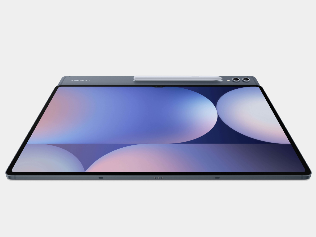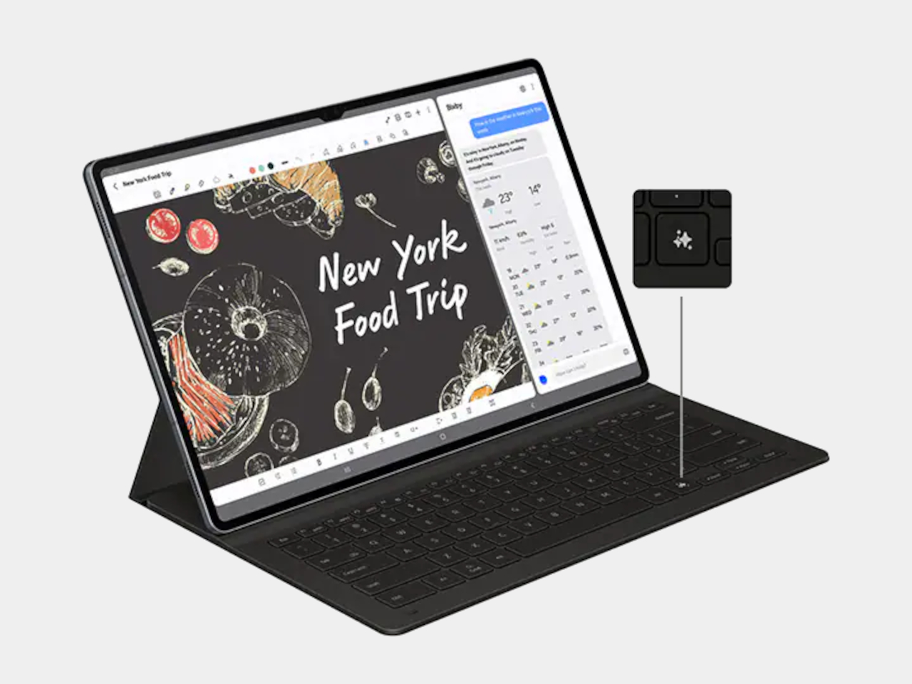
Lenovo ThinkBook Plus leak shows a laptop with an Android tablet as the screen

Laptops are no longer what they used to be. Sure, the majority still come in the standard clamshell design, but even those sometimes have touchscreens or even second displays. And then there are laptops that are actually tablets in disguise, folding backward or splitting in half. These convertibles and detachables, respectively, have shifted the landscape of portable computers, opening the doors to more use cases and features. For the most part, however, they’re all still typical Windows laptops, but Lenovo might be putting an odd twist to the design with a 2-in-1 laptop whose screen transforms into an Android tablet when detached from its main body.

Designer Name: Lenovo (via “Apocalypse“)

The idea behind a 2-in-1 laptop, popularized by the likes of the Microsoft Surface Pro, is actually the reverse of a laptop. Technically, it’s more of a tablet that you can attach to a keyboard, whether that keyboard simply serves as a cover or a weighted base like a regular laptop. All the electronics are actually behind the screen, from the processors to the storage to even the battery, making the screen completely standalone.

What Lenovo might have in mind, however, is to have two different operating systems installed on the device, working independently depending on the situation. When the screen is docked on the keyboard, it will display Windows that’s running in the base. Once pulled out, however, that screen becomes a standalone tablet running Android and not Windows.

ASUS Transformer Book Duet

As odd as that might sound, it’s not exactly completely new. Back in 2014, ASUS announced what would have been the crowning glory of its Transformer Book line of 2-in-1 detachable laptops. The Transformer Book Duet could run both Android and Windows, though you have to boot into each one separately. Here, all the computing hardware is still on the display, and the keyboard is just an accessory to keep the screen anchored down. ASUS’s ambitions, however, were allegedly crushed by both Microsoft and Google who didn’t want their operating systems to be living under the same roof. That was nearly a decade ago, however, and Lenovo might be thinking it’s time to stir things up again.

What isn’t clear is whether it will be a case of a dual-boot tablet again or if Lenovo will be doing things a little differently. It’s possible to have a complete set of hardware inside the keyboard, running Windows, while the tablet has its own hardware dedicated to running Android. That makes the division of labor a little simpler and you don’t have to reboot over and over again to switch between operating systems. Unfortunately, that would also mean you can’t use Windows in tablet mode and take advantage of the stylus for creating digital art. Then again, Windows hasn’t really been great on tablets, which is why there would be interest in putting Android there in the first place.

The post Lenovo ThinkBook Plus leak shows a laptop with an Android tablet as the screen first appeared on Yanko Design.
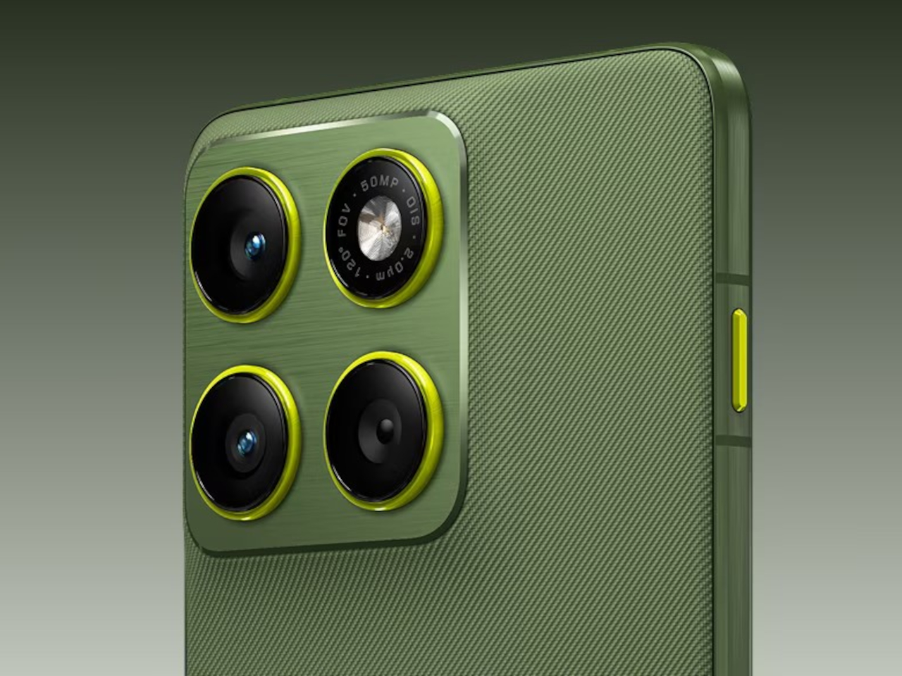
OnePlus 12R design will come with a familiar face, budget-friendly price

Although 2023 is practically over, that doesn’t mean brands have to stop teasing what’s to come. In fact, it’s the perfect time to dangle tempting treats, especially those that will be coming out early next year. OnePlus, for example, already revealed the OnePlus 12 earlier this December, but that’s only for the Chinese market. The rest of the world is still waiting for its turn, which will take place at the end of January 2024. Fans of the brand will also have something else to look forward to, it seems, with the OnePlus 12R also spotted over the horizon, bringing the same iconic design to what is expected to be a more affordable handset.

Designer: OnePlus (via Ishan Agarwal)

Smartphone names can be very confusing, especially over on the Android side where brands, model numbers, and variants create a sordid mess of hard-to-remember monikers. For example, it wasn’t too long ago that OnePlus started the tradition of having an “R” series alongside its main flagship, to offer a slightly watered-down smartphone with a price tag to match. That is the story with the OnePlus 12 and OnePlus 12R, but the gap between the two seems to be getting closer each year.

Based on the leaked announcement, the OnePlus 12R will have the exact same design as the OnePlus 12 that was announced this month. That means the exact same “monocle” design that the brand has used for the OnePlus 11, complete with the four black circles that are actually just three cameras. That, fortunately, also means that the OnePlus 12R has the same alert slider that has become a crowd favorite, even though it was “inspired” by the iPhone’s mute switch.

There are differences, of course, though not easy to spot. The color options, for example, are more limited and different, comprising only of Cool Blue and Iron Gray. The gray colorway is particularly interesting in that it might have a matte texture, maybe even a fabric-like cover. The latter is highly unlikely, though, given the target SRP of this product. It’s probably closer to a sandstone finish, a trick OnePlus is only too familiar with.

The biggest difference between the OnePlus 12 and OnePlus 12R will be the parts that you can’t see, like the Qualcomm Snapdragon 8 Gen 2 which will be one generation older by early 2024. The camera array is also less impressive, with only a 50MP camera accompanied by an 8MP ultra-wide shooter and a measly 2MP macro camera. That could mean reduced prices for the OnePlus 12R, though that might not make much of a difference if it won’t be available as widely as the OnePlus 12.

The post OnePlus 12R design will come with a familiar face, budget-friendly price first appeared on Yanko Design.
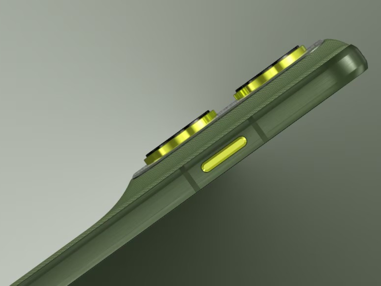
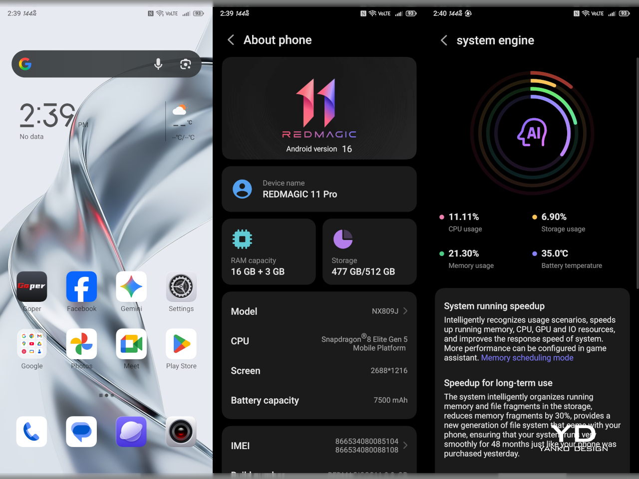
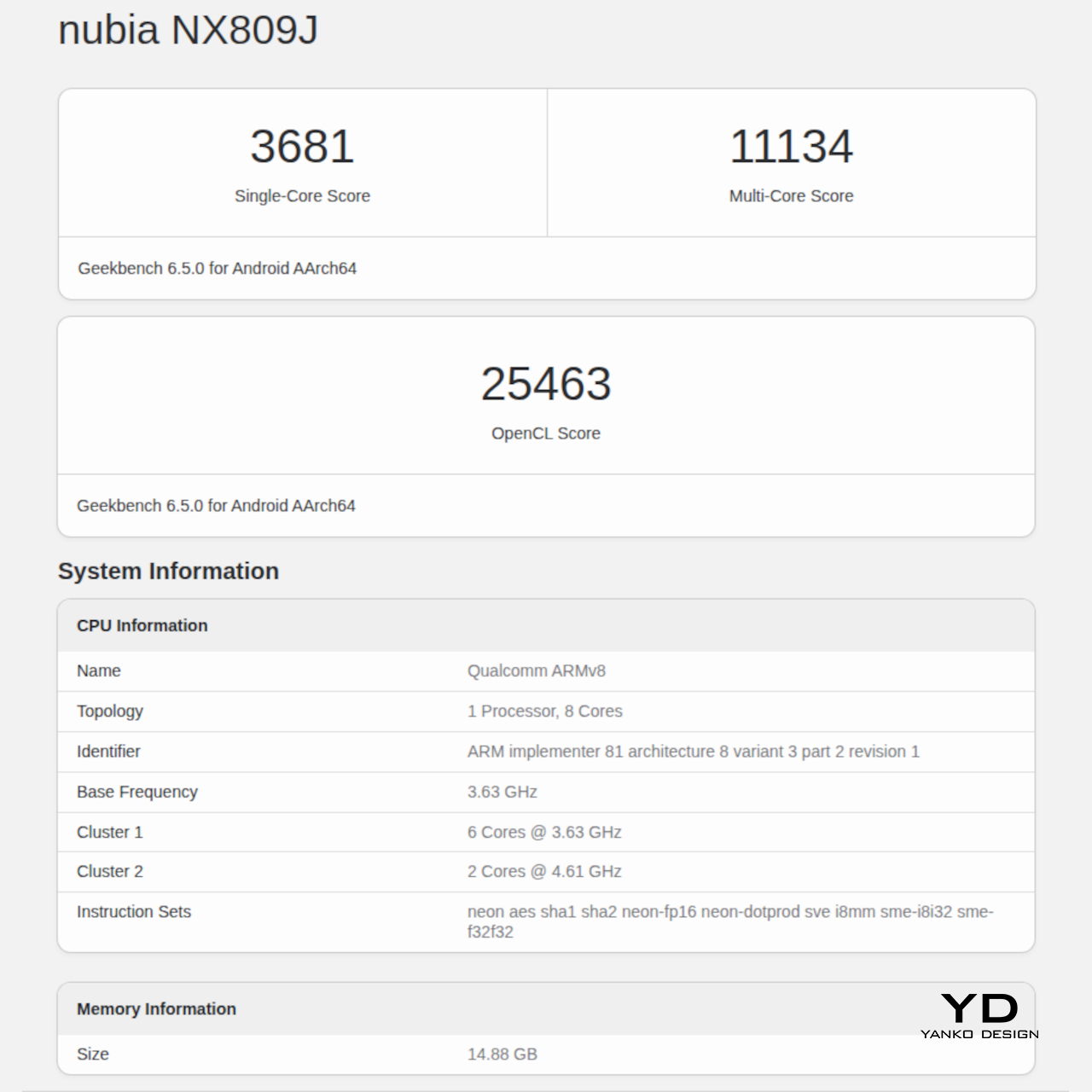
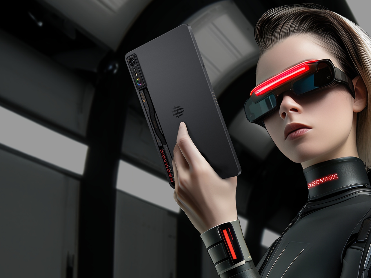
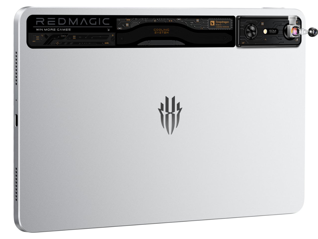
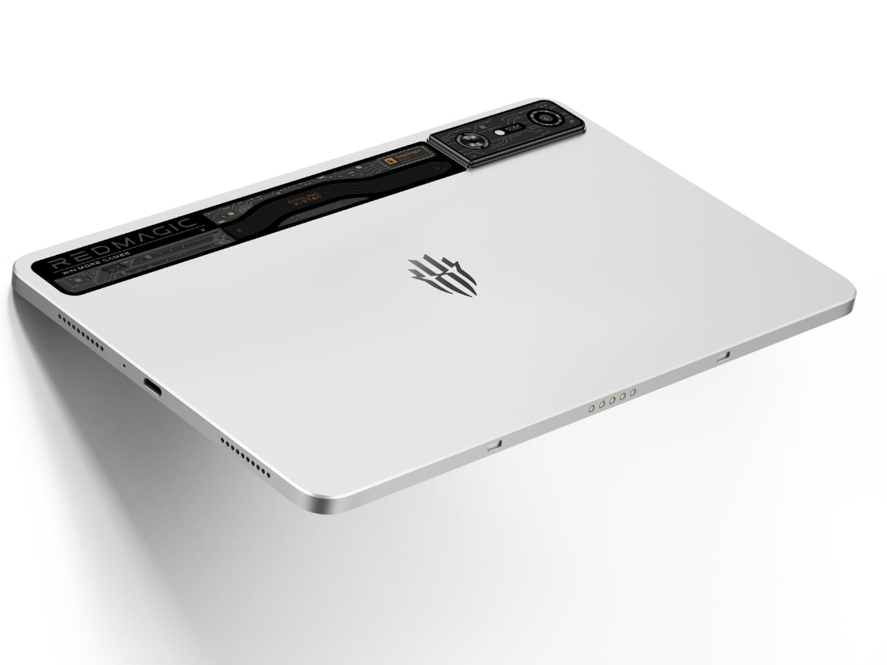
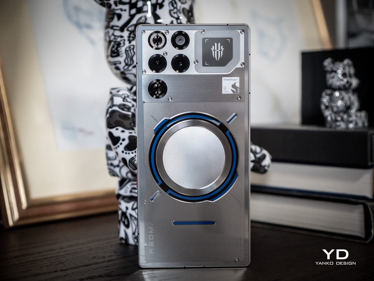
nubia RedMagic 9 Pro gaming phone arrives with a new design, same tiny fan

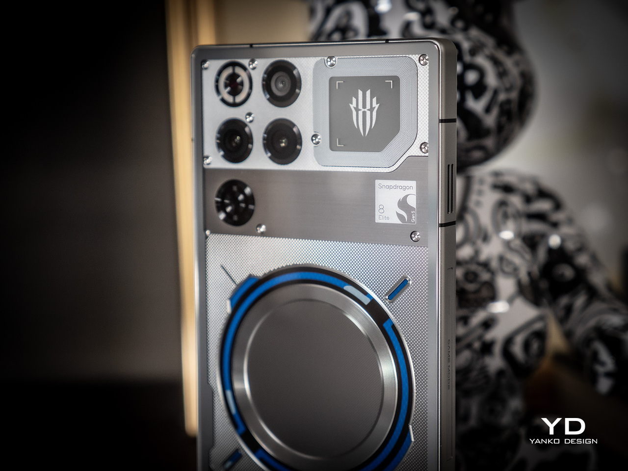
The year is almost over, but there’s plenty of time left to unveil new products, including new smartphones that could become gift ideas for people in some markets. We’ve seen quite a few make their way to the market a few days ago, but most of them revolve around “normal” phones for everyday use. Gaming phones, however, still make up a slice of that large pie, and one of the top brands in this market is taking out its big guns early. Former ZTE sub-brand nubia is reaching out to gamers with the latest RedMagic model, bearing a slightly new design that manages to keep key features that fans of the brand have grown fond of, whether they make sense or not.

Designer: nubia

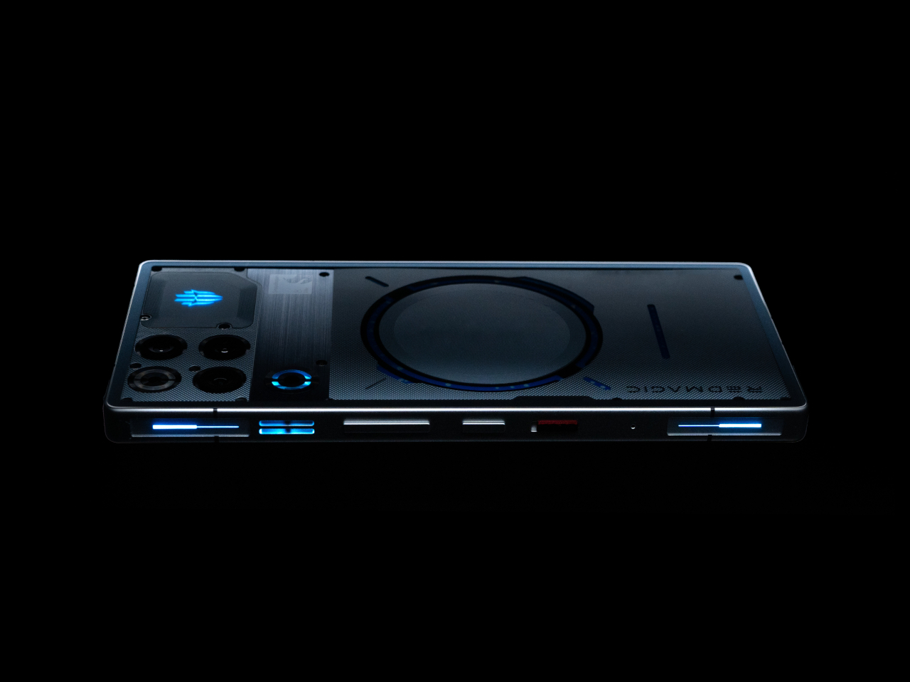
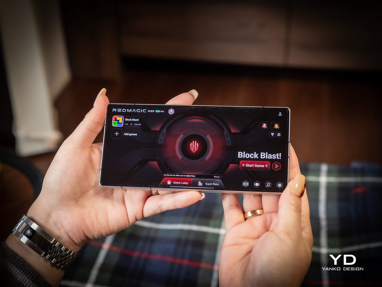
What sets a gaming smartphone apart from regular smartphones, including those expensive ones, isn’t just their over-the-top performance. Most gaming-centric phones carry a certain aesthetic that really marks them for a certain crowd, one that appreciates a lot of RGB lighting, lines and geometric shapes, and other details that make the design look futuristic if not highly technical. The nubia RedMagic 9 Pro continues that tradition this year but makes a few tweaks that streamline the gamer design a little bit better.

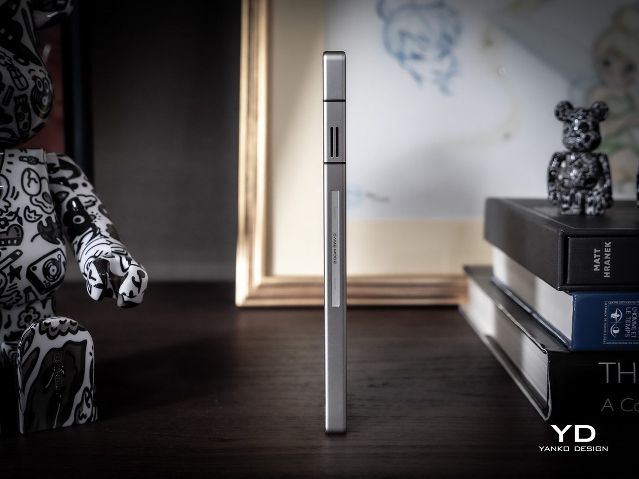
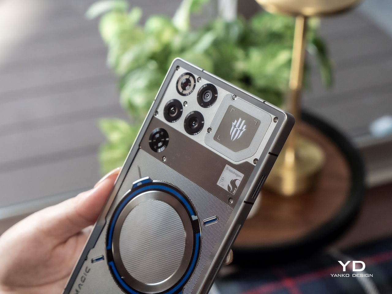
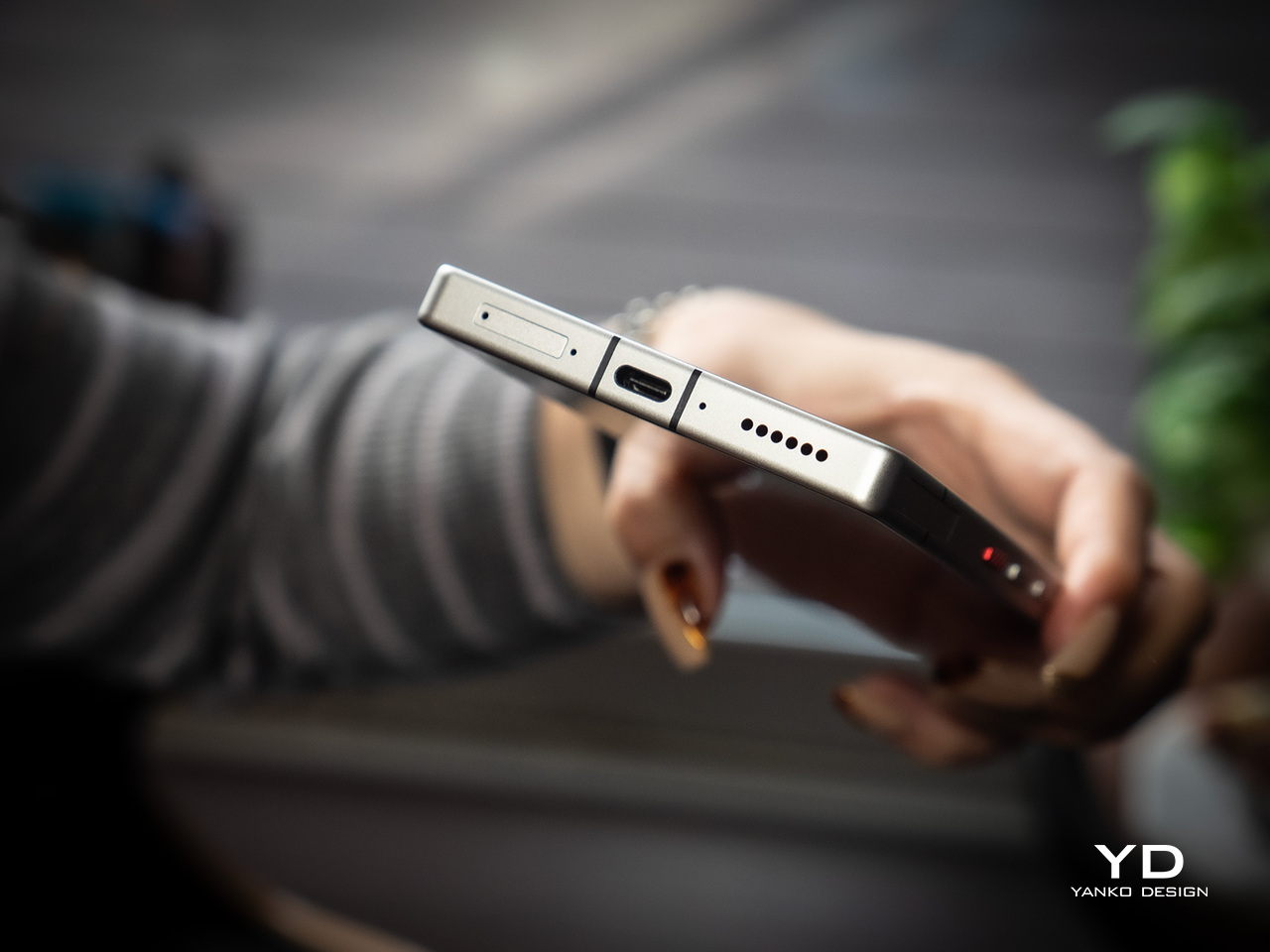
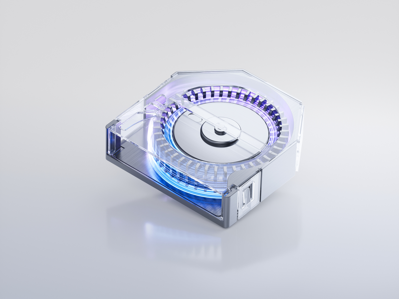
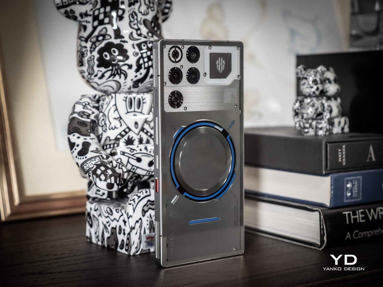
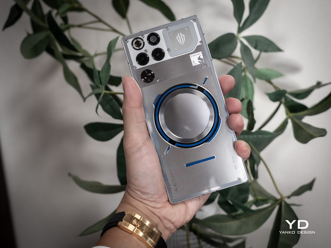
Most notable is the relocation of the cameras from the middle of the phone to the side, something that’s almost a standard across all smartphone designs. The camera bump is also gone, with the lenses sitting flush against the entire back. That does mean that the phone is a little bit thicker than most of its kind, but a hefty and beefy handset is already expected for a device that’s designed to be a heavy-duty gaming machine. The rather odd design change is that only two of the three big circles are actually cameras, with the third deceptively hiding the cooling fan. The third camera is off to the side, though having a 2MP depth sensor makes it almost negligible.

The rest of the RedMagic 9 Pro has a similar vibe to its predecessor, with lines and shapes on the back that give the semblance of panels that cover futuristic machines like ships, robots, and similar. For those who prefer a more subtle appearance, the Sleek model has an aesthetic closer to the typical black smartphones, masking its identity for more discreet uses. The front still has an under-display camera, which means there’s nothing visually breaking the large screen.

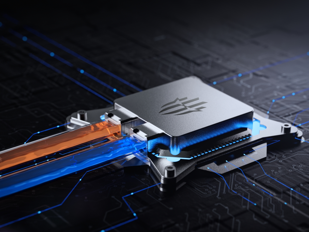
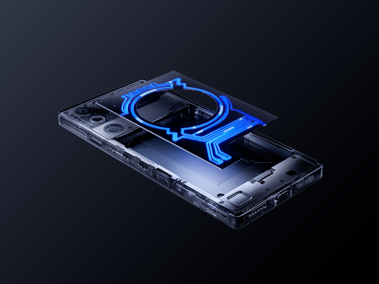
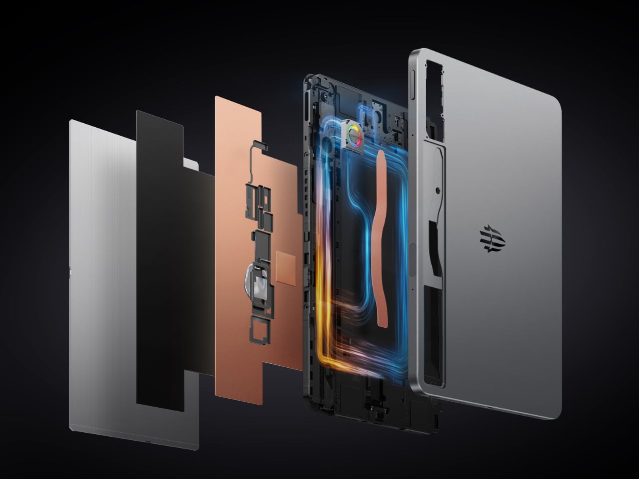
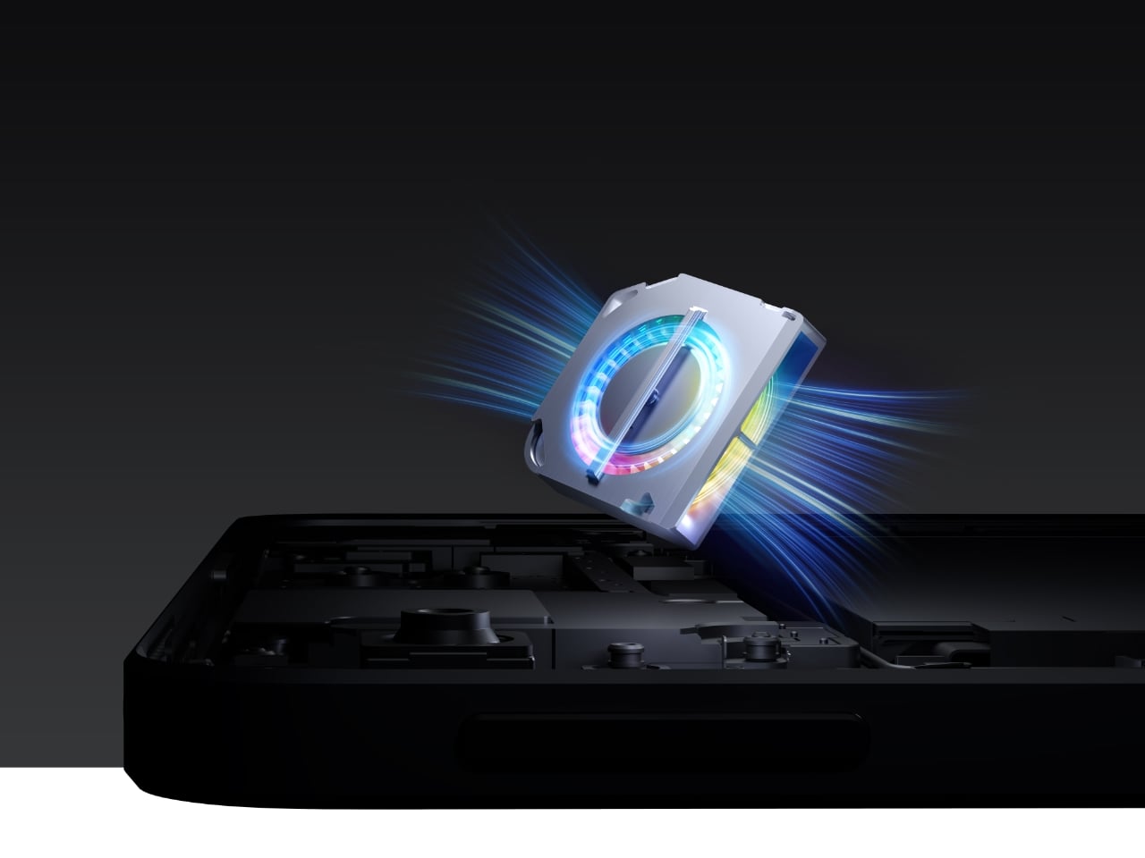
There’s also still that miniature cooling fan, one of the brand’s gimmicks to help keep things cool and prevent the phone from throttling its performance. It may be effective to some degree, but the price that is paid is having no dust or water resistance guarantee. With a more efficient Qualcomm Snapdragon 8 Gen 3 processor and a newer “ICE 13 Multi-Dimensional” cooling system, such a fan might no longer be needed and is becoming more of a liability than a selling point in the long run.

The post nubia RedMagic 9 Pro gaming phone arrives with a new design, same tiny fan first appeared on Yanko Design.
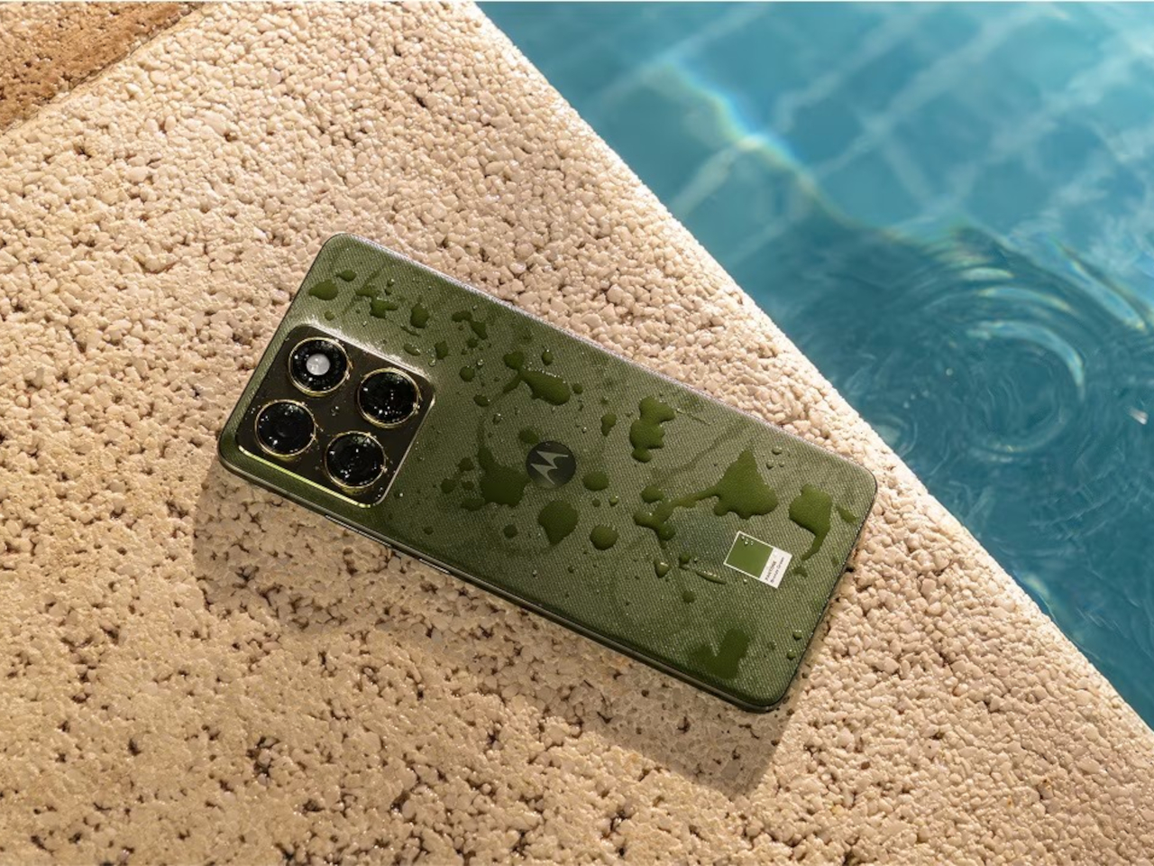
Samsung Galaxy A15 and A25 launched with an odd design element

Compared to its rather rowdy past, Samsung has been changing its phone designs less frequently these days. This allows the brand to cement its image, especially when those designs remain unique to it. The absence of a large camera bump, for example, has become a signature element in Samsung’s flagship Galaxy S phones, espousing a level of minimalism not found in other brands. It’s also becoming a standard even in its mid-range Galaxy A family, almost turning into Samsung’s design DNA. That’s not to say it no longer experiments with different designs, as demonstrated by its latest mid-range models that bear what might be the strangest design detail to have come across a Samsung phone in recent years.

Designer: Samsung

At first glance, the new Galaxy A15 and A25 look quite plain, almost like the smaller versions of the Samsung Galaxy S flagship. In fact, given what we know so far about next year’s upcoming Galaxy S24, you could almost say they prefigure Samsung’s next big thing. The Galaxy A15 and A25 feature very flat edges on all sides, at least except where the volume and power buttons are.

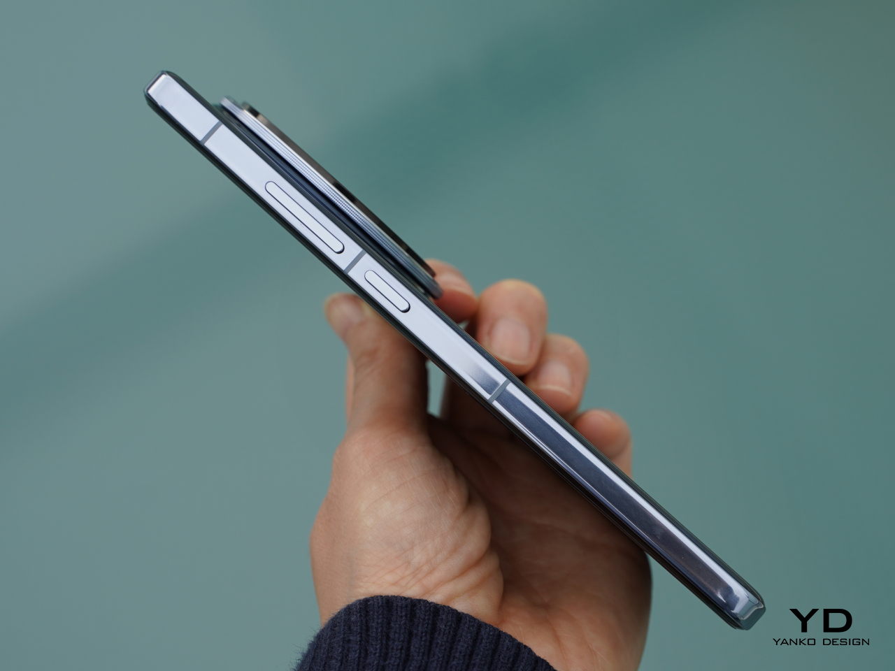
In most smartphones, the volume and power buttons are the only pieces that protrude from the side of an otherwise flat or featureless edge. It’s a necessary style to allow the fingers to immediately locate and press the buttons even without seeing them. Samsung, however, seems to have gotten the idea to raise not the buttons themselves but the area surrounding the buttons. It calls it “Key Island,” and it seems to be inspired by the common camera island or camera bump design on most smartphones.

The area flanking and in between these two buttons are raised almost to the same height as the buttons themselves. The sides of this mound gently curve upward while the island itself has a curved surface that contrasts with the flat edges of the rest of the phone. It’s not immediately clear, but it seems that the volume and power buttons still rise a little bit higher than the island, making it a two-step elevation also like some smartphone camera bumps.

While it adds a bit of visual uniqueness to the Galaxy A15 and A25, it is still puzzling why Samsung decided to go with this Key Island design in the first place. To some extent, it defeats the purpose of tactile physical buttons since it will be harder for fingers to sense where the correct buttons or areas actually are. The extruded portion might also snag more than simple buttons, not to mention taking up more space and becoming incompatible with cases that would have otherwise fit these two phones. Thankfully, these are mid-tier products and Samsung can afford to play around with what might become unpopular designs. Hopefully, this isn’t a foreshadowing of what the Galaxy S24 will have in a few months.

The post Samsung Galaxy A15 and A25 launched with an odd design element first appeared on Yanko Design.
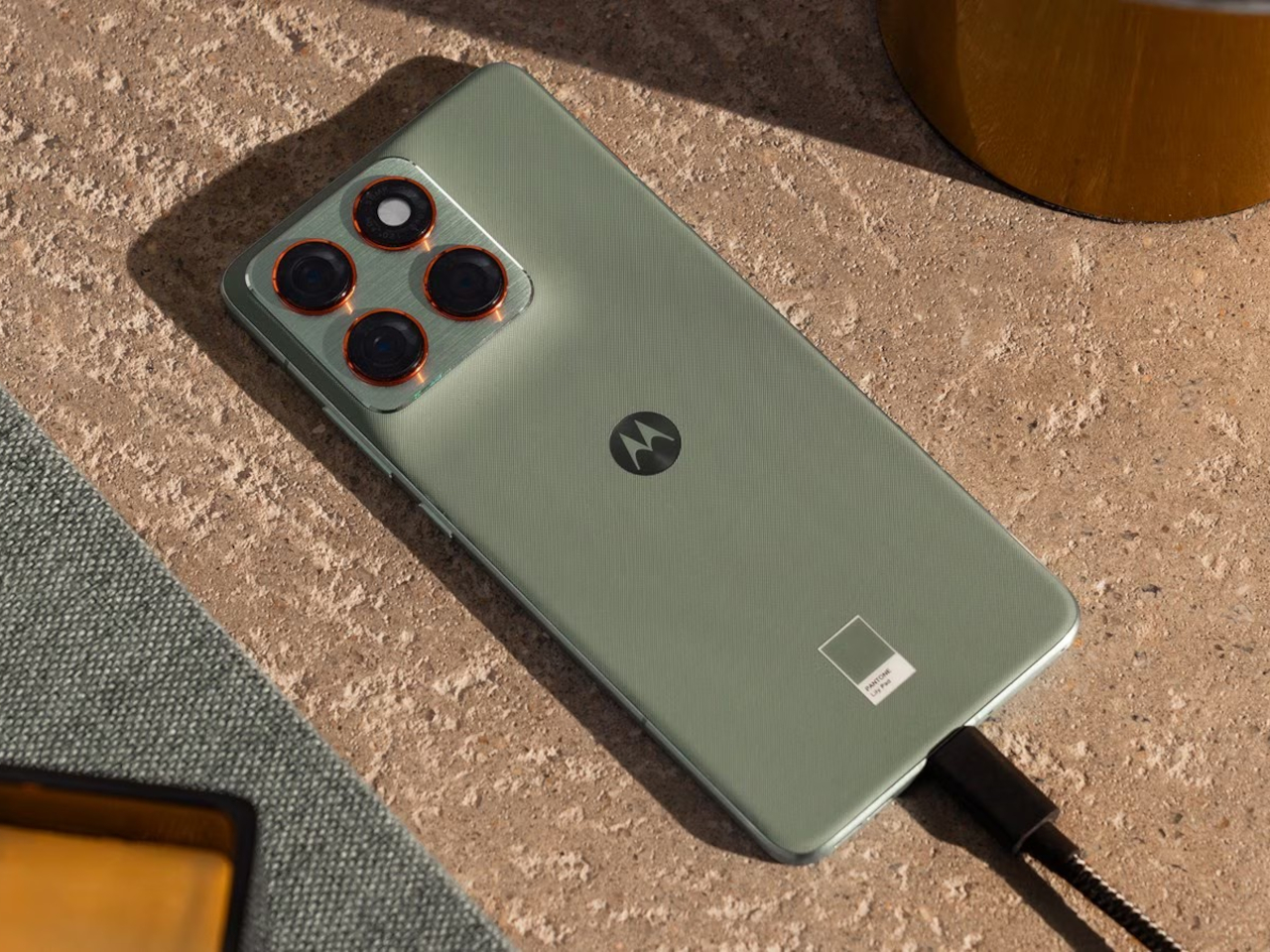
ASUS ROG Phone 8 design takes a very different direction

Almost every smartphone these days can play games, especially the expensive high-end ones, but there are a few that definitely take the cake. They’re labeled gaming phones not just because of some special feature, such as a tiny fan spinning inside, but also because of the gamer aesthetics that they embrace. For years now, the ASUS ROG Phone has held the crown of having the most gamer-friendly design, but it seems that it’s finally willing to let that title go next year. Based on its own teasers, the next Republic of Gamers smartphone might be embracing a more mainstream design in exchange for what might finally be more capable cameras as well.

Designer: ASUS (via GSMarena)

ASUS ROG Phone 7

To be fair, there is no guidebook on how to apply a gamer aesthetic to products, but you can bet it will have plenty of RGB lighting and lines going in multiple directions that suggest the presence of machine panels. Indeed, the previous ROG Phones have employed those design elements, sometimes even going as far as using small LED screens for more dynamic accents. Of course, none of these are essential to the actual gaming experience, but they do add a nice touch that marks the product as something truly designed with gamers in mind.

ASUS ROG Phone 6

ASUS ROG Phone 6

ASUS ROG Phone 6

Given its history, it’s a bit surprising that the ASUS ROG Phone 8 might do away with those design elements almost entirely. Although nothing’s set in stone yet, the brand’s official teaser suggests that it might be adopting a more minimalist and subdued design, one that eschews the lines and RGB colors. What we see instead is a clean dual-tone composition that, given the gray colors, looks more industrial than futuristic. There could still be some lighting underneath the ROG logo, but could very well be the only place it shows up.

Perhaps more curious is the camera bump design, a thick pentagon laid on top of a square. For generations, the ROG Phones have carried mediocre cameras, so a switch to a triple camera system could be big news for fans of the brand. It’s not a clear win yet, of course, but it’s commendable that ASUS is willing to shake things up to improve its performance.

To its credit, the ROG Phones have slowly been moving towards more conventional and less spectacular designs, but the ROG Phone 8 could have the most drastic changes if the teasers are to be taken at face value. On the one hand, it does help make the ROG Phones more acceptable in “regular” scenarios and won’t stand out as much. On the other hand, if you want a more conventional-looking smartphone that can handle mobile games, there are already plenty of those in the market, making the ROG Phone 8 redundant.

ASUS ROG Phone 7

The post ASUS ROG Phone 8 design takes a very different direction first appeared on Yanko Design.

iQOO 12 Review: Checking Most of the Right Boxes, No More, No Less

PROS:


  • Impressive camera output

  • Outstanding hardware performance

  • Distinctive BMW "Legend" Edition design (not the review unit)

CONS:


  • Low IP64 water resistance

  • Mediocre 16MP front camera

  • Limited global availability

RATINGS:

AESTHETICS
ERGONOMICS
PERFORMANCE
SUSTAINABILITY / REPAIRABILITY
VALUE FOR MONEY

EDITOR'S QUOTE:

Designed for mobile photography and games, the iQOO 12 delivers a solid performance without much fuss or fanfare.

The year is almost over, but it’s never too late to announce new flagship smartphones, especially when there’s a new mobile processor available. Riding on Qualcomm’s momentum, a few phone makers have almost simultaneously revealed their newest wares in a race to be the first and the best. Of course, just because you’re using the latest hardware available in the market doesn’t immediately mean you’re able to deliver the best overall user experience. There are a lot of ingredients that make up the perfect smartphone dish, so we’re taking the new iQOO 12 for a taste test to see if it managed to get the perfect mix or if it just had too much on its plate to leave a positive impression.

Designer: iQOO

Aesthetics

The moment you see the iQOO 12, you will immediately appreciate its elegant design. After that first impression, however, you might suddenly feel like you’ve seen it before, especially with the black “Alpha” edition that we received for this review. Aside from the large and unconventional camera island, the phone’s Fluorite AG glass is quite common. Yes, it has a sandblasted finish that makes it sparkle when viewed from certain angles, but that, too, has been done before. It’s pretty, yes, but nothing to write home about.

On the other hand, the BMW “Legend” Edition is a bit more interesting from a design perspective. It uses a Porcelain Enamel Glass that gives it a unique texture, while the clean white motif endows it with a stylish classic appearance. The engraved signature BMW M Motorsport stripes are tastefully done, clearly marking its identity without being flashy. It has the right balance of branding and minimalism that paints a picture of a truly special design.

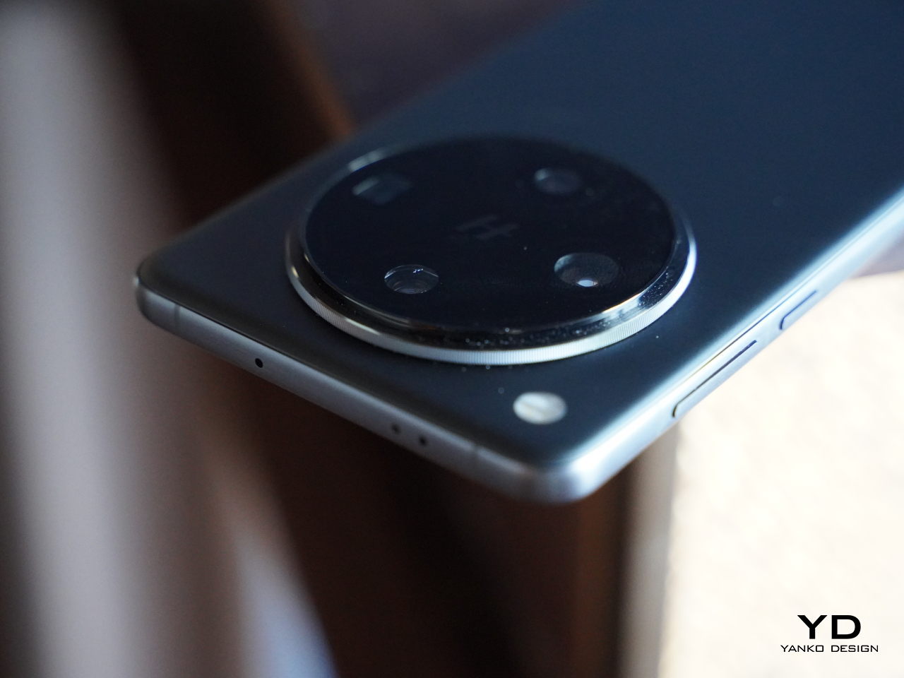
Although almost opposite in their appearances, both Alpha and Legend editions share a common design element that you won’t find on any other smartphone. Rather than a square or a circle, the iQOO 12 employs a “squircle” shape that the company describes as a nod to ship portholes that let light in and give a dramatic view of the outside world from within a ship. Of course, it stretches the camera metaphor quite a bit, but its unusual shape still gives the phone a distinctive appearance.

The iQOO 12 Alpha carries a simple and elegant design that gives it an air of being a premium phone. Unfortunately, that doesn’t exactly help it stand out from its peers, especially if you find the “porthole” camera design less appealing. The design won’t win fans, but it probably won’t attract haters either.

Ergonomics

Fluorite AG glass has become a favorite material for smartphones because of how it’s able to avoid smudges. Some are even able to pull off matte textures using it, or at least some semblance of matte texture. In practice, however, it’s still glass and the iQOO 12 feels quite slippery in the hand, regardless of what the marketing material tells you. If you’re not confident with your grip, you’ll probably want to put on the included clear case just for peace of mind.

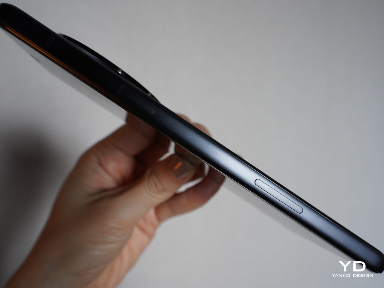
The iQOO 12 is by no means a thin phone at 8.1mm, nor is it that lightweight at almost 204g. It’s a large slab of metal and glass and you can definitely feel it the moment you hold it in your hand. That means you’ll have to try and grip it harder to ensure a more stable hold, but that also means putting more strain on your hand in the long run. The phone is also a bit top-heavy, which isn’t surprising considering all the parts located there, though that means the position of the fingerprint scanner near the bottom of the screen makes it a little bit precarious to hold.

Performance

The iQOO 12 definitely has all the makings of a high-end smartphone. It is one of if not the first to launch with a Snapdragon 8 Gen 3 processor, and that is paired with fast 16GB LPDDR5X memory and an equally fast 512GB UFS 4.0 storage. Those alone already mean that it can handle any task you throw at it with aplomb. The bright and vibrant 6.78-inch 2800×1260 AMOLED screen with 144Hz refresh rate is great for viewing moving content, both videos as well as games. It’s an all-around powerful workhorse, but it also has a trick up its sleeve.

While some brands have custom processors for photography or AI, iQOO’s Supercomputing Chip Q1 focuses on enhancing display performance without taxing the main Qualcomm processor. Its biggest achievement is boosting frame rates to 144fps to match the screen’s native 144Hz refresh rate for a smoother and more fluid visual experience. Even under all the stress, the phone gets only lightly warm and never too hot, all thanks to a new four-zone vapor cooling chamber.

On the software side, the iQOO 12 runs the latest FuntouchOS 14 that’s already based on the current Android 14 release, and it’s promised to still get three years of Android updates. There is surprisingly little bloatware, although it still exists, and the user experience almost resembles vanilla Android while still offering plenty of customization options. The UI is smooth and responsive, though that should be expected given all the hardware driving it.

1x

1x Night

10x

The phone’s triple camera system is living proof that you shouldn’t judge hardware by their brand. Eschewing the usual Samsung or Sony sensors (except for one), the iQOO 12 was made in collaboration with and showcases the best of what OmniVision has to offer, particularly with the 50MP OV50H main camera and 64MP OV64B telephoto camera with a periscope-style lens. The latter is able to achieve 3x optical zoom and 10x lossless zoom, though iQOO is advertising a 100x digital zoom that, in practice, isn’t really going to wow anyone. The third camera is a 50MP Samsung sensor for ultra-wide shots.

1x

1x Portrait

1x Portrait

10x Night

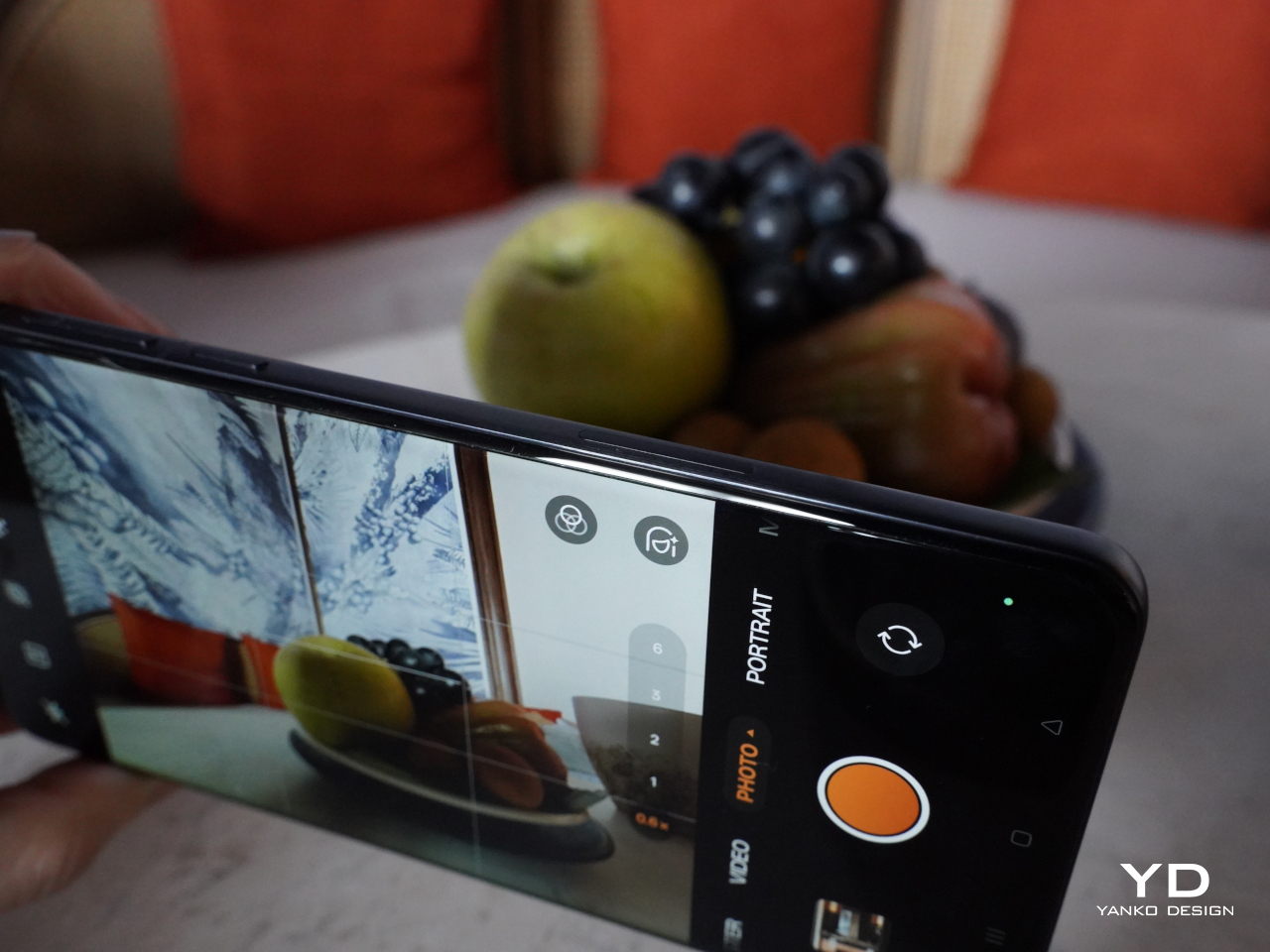
What all these translate to in practice are impressive images, both during the day and at night. Details are rich and colors are quite vibrant, though they tend to be a bit more saturated by default, as expected. The 10x lossless (a.k.a. hybrid) zoom is surprisingly good, though with the expected loss of detail. Combined with Night Mode, it even makes decent nighttime photos, though that largely depends on the subject as well. Thanks to that same periscope telephoto camera, bokeh or Portrait Mode comes out with pleasing blurs and accurate separation of foreground and background elements. All in all, the iQOO 12 delivers an excellent mobile photography experience, except for the 16MP front camera that brings only the bare minimum to the table.

Ultrawide

1x

3x

10x

Sustainability

The iQOO 12, unfortunately, doesn’t grade well when it comes to sustainable design and longevity. It has your usual assortment of unsustainable materials, and the brand isn’t as aggressive in promoting its eco-friendly strategies as its rivals (unless you consider its parent company, vivo). The phone is also only IP64 rated, which means it has very weak defenses against water and other liquids. Sure, it’s better than nothing, but you’d expect a much better guarantee from a premium phone such as this.

Value

From a holistic perspective, the iQOO 12 is quite a splendid high-end phone. It has the chops to cater to both photography and gaming enthusiasts and has a design that, while simple, is still stylish enough to not look cheap or dated. But no phone exists in isolation, and the iQOO 12’s value will largely depend on the competition.

At the moment, there are very few phones running on the new Snapdragon 8 Gen 3, but that’s about to change in a month’s time or so. But even now, those few devices, the iQOO 12 included, have very limited availability in the first place. The $600 price tag is tempting but pointless if you can’t buy one that is 100% guaranteed to work on your country’s cellular networks. There’s also the fact that the design, while pleasant, doesn’t have enough pull to make it stand out from the crowd unless you’re able to get the BMW Legend Edition. It’s definitely a strong contender, but not one that might leave a strong, lasting impression.

Verdict

The iQOO 12 feels like it has almost everything. It has the latest specs that breeze through the toughest demands, especially gaming. The cameras are generally impressive under the majority of situations, except for that disappointing 16MP selfie cam. It’s clearly iQOO’s best work yet, but it also feels like it lacks that final punch to knock everyone else out of the ring.

Despite its pleasant minimalist aesthetic, the Alpha Edition’s design is honestly a bit underwhelming. The porthole-inspired camera bump is new to our eyes and ears, but it’s simply just another take on the same old design. In terms of both style and materials, the BMW Legend Edition is far more interesting, though possibly also more limited in supply. Then again, not everyone will be buying phones just for their looks, and the iQOO 12 does make an enticing offer, but soon there will be others that will easily grab the spotlight from it.

The post iQOO 12 Review: Checking Most of the Right Boxes, No More, No Less first appeared on Yanko Design.

OnePlus 12 design revealed with a very familiar face, no wood grains in sight

Without much fanfare, OnePlus revealed the design that would mark its newest flagship, the OnePlus 12. While that two-digit number proves it’s no longer a young upstart, the brand is famed for outside-the-box thinking when it comes to design and materials. That’s not to say it always comes out with guns blazing, and zeal sometimes has to be tempered with practicality. Take for example the upcoming OnePlus 12 which is now officially confirmed to be using pretty much the exact same design as its predecessor. While that might not make for a sensational launch, it does give a sense of familiarity and stability. Unfortunately, there doesn’t seem to be any sign of an earlier wooden grain shell, which could probably dampen a few excited expectations.

Designer: OnePlus

At this point, it might be difficult to pinpoint which company really started this camera design trend, but OnePlus has been doing some rather interesting experiments in the past years. In order to make the usual camera bump a little more interesting visually, the OnePlus 10 last year adopted a rather unique style where the camera’s raised bump actually continued and curved off to the side. This year’s OnePlus 11 mixed that up with the circular camera island design that made the phone look like it was wearing a monocle or an eyepatch.

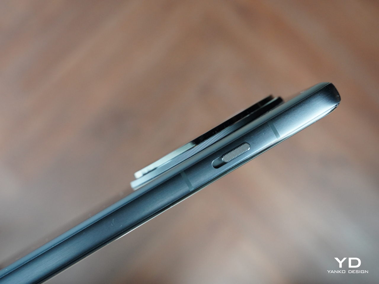
The OnePlus 12 uses this exact same design with one small but important change. There are four sensors now, though one is most likely an RGB or 3D Time-of-Flight (ToF) sensor, so the flash had to move out of the enclosure, giving the camera a more symmetric appearance. Other than that, there are no big visible changes, which means that OnePlus is able to preserve its brand identity for one more generation. Admittedly, the design doesn’t appeal to everyone, but it’s hard to deny that it’s a distinctive one.

What OnePlus has officially revealed so far, however, doesn’t yet include the earlier leaked “wood grain shell,” which could either be a new variant or an official protective case. Instead, the OnePlus 12 will come in three colors with subtly different textures despite all being made from glass. White is compared to silk, black is likened to ceramic, while the green variant seems to be trying to pull off another marble-like aesthetic.

OnePlus hasn’t yet completely spilled all the beans regarding its upcoming flagship, so it’s a little too early to say if that’s all there is to it. Of course, in terms of hardware, it will have the latest Qualcomm Snapdragon 8 Gen 3 processor to lead the way, and its photography roster is expected to include a 50MP main camera and a 64MP telephoto shooter with 3x optical zoom. The OnePlus 12 is scheduled to be officially announced in China next week, but a global date is expected on December 15.

The post OnePlus 12 design revealed with a very familiar face, no wood grains in sight first appeared on Yanko Design.

iQOO 12 Legend Edition design brings the BMW M Motorsport racing spirit to smartphones

There are very few things that can make your heart stop with their speed, and motorsport race cars are one of those. The suspense, tension, and adrenaline you feel as these four-wheeled demons pass by is enough to put people on the edge of their seats, literally. There seems to be an innate human fascination for speed and power, and race cars have long been the symbol of those aspirations. Of course, such qualities can also be found in other things, like the impressive pieces of technology that we call smartphones. It’s not surprising, then, that these two very different worlds would eventually meet, such as in the iQOO 12 Legend Edition that embodies the BMW M Motorsport spirit through its power and style.

Designer: iQOO x BMW M Motorsport

This isn’t the first time you might have heard of an automotive brand lending its clout to a smartphone, whether in name or in design. In fact, the partnership between iQOO and BMW M started way back in 2019, resulting in the gaming-oriented iQOO 7 BMW M edition as well as an iQOO-branded BMW DTM car during the 24 Hours of Nürburgring race. This year, that partnership was again witnessed at the 2023 IMSA SportsCar Championship, and 2024 will see iQOO’s presence on a BMW M Hybrid V8 Hypercar at the FIA World Endurance Championship.

Of course, BMW M Motorsport is also leaving its own mark on the iQOO 12, specifically the special Legend Edition that will bear that exclusive branding. This year’s design, however, is a bit different and actually a little more subtle. The overall motif is still predominantly white, of course, just like many race cars. But instead of tall stripes in BMW M’s iconic blue, black, and red colors, the tiny stripes are actually embossed in a Clous de Paris pattern and located off the right side instead. In a way, the BMW M Motorsport is less in-your-face, subtler, and more elegant, allowing viewers to draw the associations between the two brands through the smartphone’s own prowess.

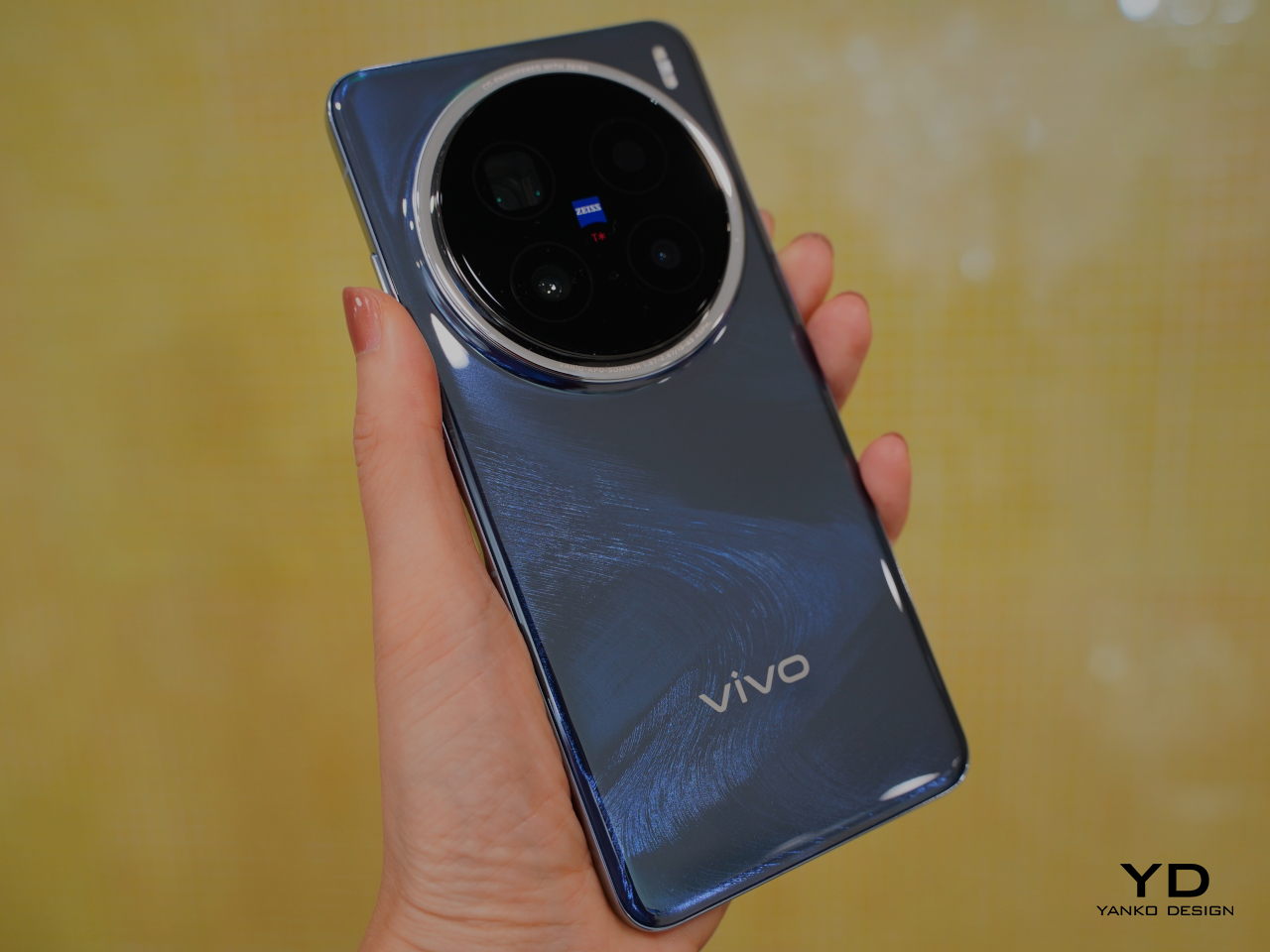
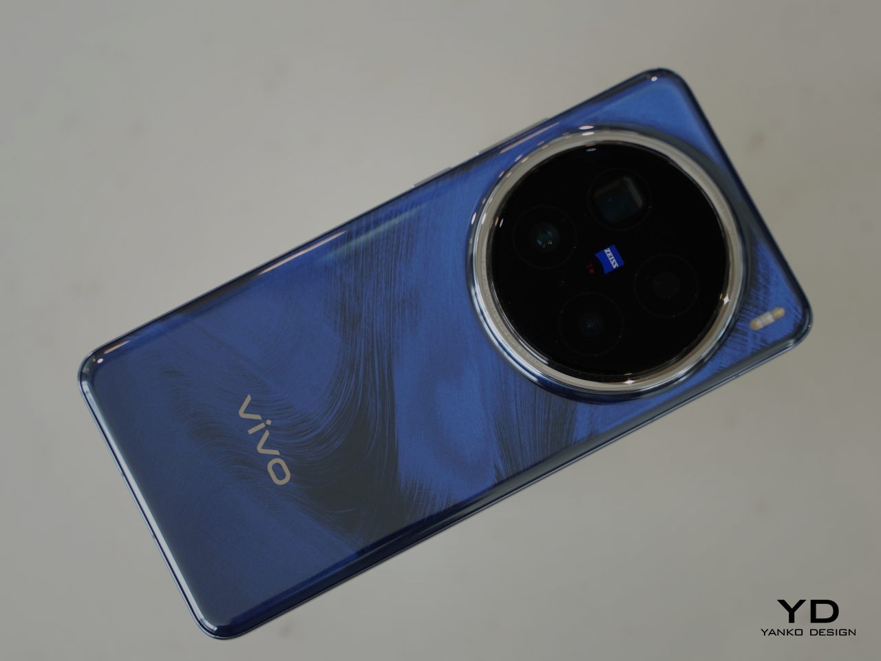
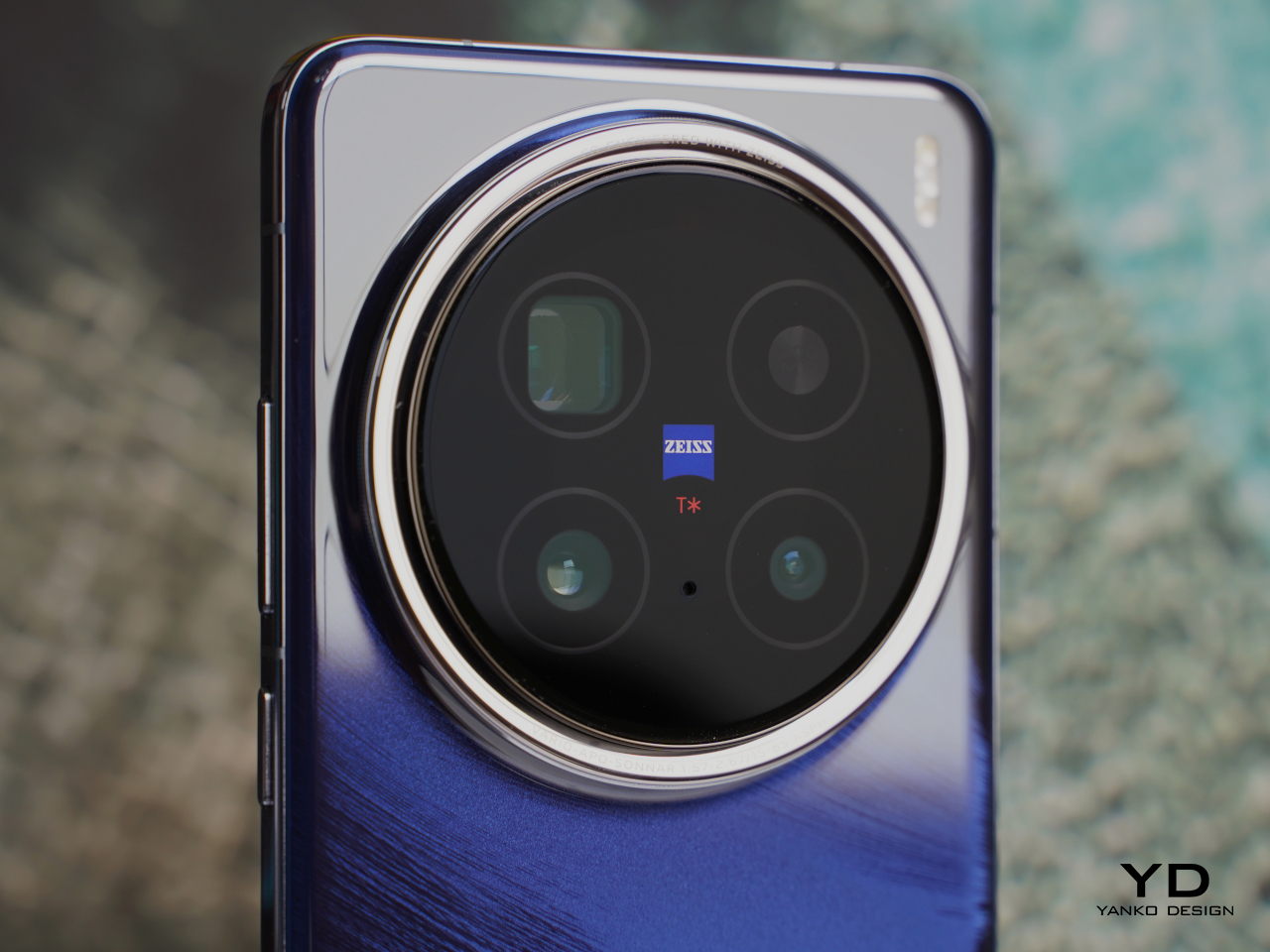
The iQOO 12, after all, is definitely a speedster, being one of the first phones to be powered by the new Qualcomm Snapdragon 8 Gen 3 chipset. It has a large and powerful camera system that is designed in the likeness of ship portholes, conveying the spirit of exploration. It isn’t just for show either, boasting a team that includes an Astrography Camera with an ultra-large main sensor, a periscope telephoto lens, and a wide-angle shooter. Despite the power it holds inside, the iQOO 12 Legend Edition still exudes beauty, grace, and comfort with its ergonomic contoured glass and nano-textured finishes. The flat edges and flat display perfectly complement each other, giving the phone a contemporary aesthetic that belies its nature a smartphone equivalent of a performance car.

With first-class features and a striking design, the iQOO 12 Legend Edition perfectly embodies BMW M Motorsport’s mantra of “Fascination Meets Innovation.” It delivers the performance to satisfy users’ need for speed while subtly capturing the visual and spiritual essence of a roaring race car. Already available in China, the iQOO 12 Legend Edition is slated to launch globally by the end of this year.

The post iQOO 12 Legend Edition design brings the BMW M Motorsport racing spirit to smartphones first appeared on Yanko Design.
Onyx BOOX Note Air3 C E-Reader Review: Solid Basics

PROS:


  • Simple, Elegant, Lightweight Design

  • Crisp, comfortable, and fast color E Ink display

  • Perfect size for comics, magazines, and A5 documents

  • Google Play Store pre-installed

CONS:


  • Quite pricey

  • Reduced battery capacity

  • No keyboard folio like the Tab Ultra C

RATINGS:

AESTHETICS
ERGONOMICS
PERFORMANCE
SUSTAINABILITY / REPAIRABILITY
VALUE FOR MONEY

EDITOR'S QUOTE:

With a crips color E Ink display and a more affordable price tag, the BOOX Note Air3 C delivers the essential modern e-reader experience without unnecessary cruft.

The current generation of e-book readers has torn down the walls separating it from typical Android tablets. In fact, except for the display and customized home screen, these devices are pretty much Android tablets using E Ink panels instead of LCDs or OLEDs. While this empowers e-readers to be able to do more things, there’s also the risk of going overboard with features that may burden the user, both literally as well as figuratively. Fortunately, there’s quite a wide range of options for those who want different things from an e-reader, ranging from the most basic to the most powerful, but that also makes it harder to choose the right one for your needs. The new Onyx BOOX Note Air3 C promises the middle ground between these two extremes, so we give it a good test to see if it really offers a new experience or is just a rehash of a recent product.

Designer: BOOX

Aesthetics

Although BOOX is probably better known for blurring the lines between e-readers and tablets, it can also be credited with changing the face of e-readers for the better. While these devices started out as simple yet uninspiring small slabs of plastic, the current generation can stand with their heads held up high, proudly displaying their more elegant designs. The BOOX Note Air3 C carries this tradition with a minimalist yet elegant appearance that attempts to resemble the appearance of a thin book. In addition to the wide bezels surrounding the display, the left side has a very wide margin similar to the spine of a book. Of course, you can flip the e-reader around if you prefer that margin to be on the right side, and the UI will rotate as well.

The overall design of the BOOX Note Air3 C is mostly flat, from the front to the back to the edges. It’s the trend in tablets these days, so it gives the device a more modern appearance compared to the curved backs of typical e-readers. It’s arguable whether this design is more ergonomic, as we’ll see later, but there will be little debate that it looks premium. It also feels premium, with a light yet solid aluminum chassis that is sure to stand the test of time and your bag. There are very few markings on the device, most of them on the “margin” side and its edge. There isn’t much visual noise that will distract you from what matters the most: reading on the screen.

That 10.3-inch screen size is admittedly still a novelty among e-readers, most of which are designed to easily slip inside small bags or hold comfortably in bed above your head. It is, however, also the perfect size for viewing most reading material, including comics, manga, and magazines. Some papers, particularly those in A4 size, will look a bit compressed, but the crisp and sharp Kaleido 3 E Ink panel still makes such content comfortable to read. Of course, it’s a color E Ink panel, which looks fantastic on the matte screen. Of course, colors are limited and muted compared to regular tablets, but we’re talking about eye-friendlier e-paper displays here anyway.

All in all, the BOOX Note Air3 C presents a minimalist design that really contains the basics for an e-reader. There isn’t even a camera, a.k.a. document scanner, unlike its BOOX Tab Ultra C look-alike. Save for the minimum branding accents, it has very few distractions in terms of appearance and even controls, allowing you to be fully immersed in what you’re reading instead.

Ergonomics

The Onyx BOOX Note Air3 C is by no means a small device, especially when compared to common e-readers like the Amazon Kindle. While that does mean it has more screen space for comfortable reading, it also means it’s larger and heavier than your typical e-book readers. That, in turn, has implications on how comfortable it is to use, especially for long periods of time.

With a weight of 430g and a size of 226 x 193 x 5.8 mm, it is almost comparable to a 5th-gen iPad Air (2022) but also considerably lighter. That still means it’s going to tire out your arms when you hold it up too long and it will hurt a lot when you accidentally drop it on your face while lying in bed. There’s still an ongoing debate on whether flat edges are more ergonomic because they don’t easily slip from your hand or if curved is the way to go because it’s kinder to your skin.

Where the BOOX Note Air3 C really shines is in the comfort it brings to your eyes thanks to E Ink technology. Unlike typical LCD or OLED screens, it doesn’t shine light directly toward your eyes and uses front lighting instead. It is gentler on the eyes and solves most of the blue light problems that screens have (if you don’t turn on the front light), so it’s definitely a significantly better option for those who love reading all the time. Like most of BOOX’s devices, you also get to select the level of brightness and the warmth of the light that you’re comfortable with, allowing you to fine-tune the reading experience to your personal tastes.

Performance

Similar to the latest generations of BOOX devices, the BOOX Note Air3 C is really an Android tablet at heart, both in hardware and in software. It’s powered by a 2.4GHz octa-core processor, most likely a Qualcomm Snapdragon 600 series, with 4GB of RAM and 64GB of storage. The screen is a 10.3-inch E Ink Kaleido 3 panel with a 300 ppi pixel density for black and white content and 150 ppi for colors, pretty much the gold standard for now. It has a Wacom digitizer layer for input with a stylus, which we’ll get to later. Rounding up the specs is a microSD card slot, built-in speakers and mic, Wi-Fi and Bluetooth connectivity, and a fingerprint scanner on the power button.

If most of these sound familiar, you might have already seen or even bought the Onyx BOOX Tab Ultra C. They’re almost identical, save for the smaller 3,700 mAh battery and the lack of a camera that serves as a document scanner. The latter is honestly something that felt quite superfluous on the BOOX Tab Ultra, so it’s a bit encouraging that an unnecessary feature was removed to help cut down on costs. Cutting the battery capacity in half, however, is a bit too drastic, even if it results in a lighter build. Battery life is still a lot better than regular tables, running for days rather than just hours, but it won’t last more than 2 or 3 days of constant use, especially when running a lot of apps.

Those apps will mostly come from the Google Play Store, thanks to being a certified Android 12 device. That means you have access to the same library of apps available to tablet owners, whether or not they make sense to use on an E Ink screen. Performance won’t be the same of course, especially for apps with fast-changing content like games and videos, but you can run them at least. It also means that you won’t be lacking sources for content since you can install the likes of Amazon, Kobo, and more. And yes, you can do your Web browsing, social media, or even work on this device. The built-in speakers are serviceable but not that great, so you’ll want to pair it up with wireless earphones if you really want to enjoy audiobooks or podcasts.

Of course, the real star is the Kaleido 3 E Ink screen, which shows clear, crisp, and sharp text, especially in black and white. Colors are naturally not vibrant and look more like pastels, but that’s on par with current technology. The screen is quite responsive and fast, thanks to the BOOX Super Refresh technology, and it is really at the top of its class. The BOOX Note Air3 C offers the usual four speed modes where you get to trade quality for quick refreshes. Thankfully, the custom user interface lets you choose the mode on a per-app basis rather than just as a global switch.

The BOOX Note Air3 C ships with the Pen 2, the version of BOOX’s Wacom-compatible stylus that doesn’t come with a dedicated eraser on the opposite end. Thanks to using a standard technology, however, you can use different kinds of Wacom styluses if the free one isn’t your cup of tea. On built-in apps as well as a few chosen ones like OneNote, the stylus is smooth, fluid, and accurate. Unfortunately, any other app outside those will reveal the lag that is more a limitation of the slow E Ink screen rather than a flaw in Wacom technology. Hopefully, BOOX will open up its pen optimizations to all apps soon.

Another big difference from the BOOX Tab Ultra C is a lack of pogo pins for connecting a keyboard folio cover. In fact, BOOX doesn’t have such an accessory for this model, which means people who want to type will have to make do with a Bluetooth or USB-C keyboard instead. It’s not a huge deal-breaker per se, but it does change the narrative a bit. While the BOOX Tab Ultra C seems almost geared for productivity, including typing documents, the BOOX Note Air3 C goes back to the roots of enjoyable reading, just with a few productive apps on the side.

On the one hand, the feature set of the BOOX Note Air3 C doesn’t sound so sensational, especially compared to the discontinued BOOX Tab Ultra C and the new BOOX Tab Ultra C Pro. On the other hand, it actually checks all the right boxes and delivers on its promise without excessive features that few people actually use or even ask for. It performs admirably, with just a few kinks here and there, offering a solid E Ink tablet experience without unnecessary cruft that comes at a literal price.

Sustainability

Onyx hasn’t really scored well in this department and, unfortunately, it is keeping its track record. It’s definitely comforting to see it use more metal and less plastic in its devices, though that seems to only be true for its larger readers. It at least has been quite restrained in its packaging and doesn’t ship with a charger, so material and e-waste are reduced. It still uses plenty of plastic, though, so that knocks off a few marks from its grade.

The BOOX Note Air3 C is, fortunately, built to last thanks to its durable body and solid build quality. There’s no formal dust or water resistance, of course, but that’s also not surprising for this line of devices. When accidents do happen, repairs are going to be quite difficult considering there won’t be many shops offering services. You’ll have to gamble on sending the unit back to Onyx or the few authorized service providers they have around the world.

Value

At $499.99, the BOOX Note Air3 C is hardly inexpensive as an e-reader or even as an Android tablet. That price does include the BOOX Pen 2 and a folio cover, so you do save a bit in the long run. It’s still not something you’ll be buying on a whim and will definitely require some decision-making. How many of the things you read are magazines, comics, manga, or other kinds of content that are easier to read on a larger screen? How many of those would require color to really enjoy? And why would you choose it instead of Onyx’s other e-readers that come in a variety of sizes and prices?

It all boils down to having the right ratio of features and price, bringing the core features you need for an E Ink device, including a few hues of color, without bumping the cost up too much. The BOOX Tab Mini C might be good for reading anywhere, anytime, but it might be too small for some types of content. The new BOOX Tab Ultra C Pro, on the other hand, has all the bells and whistles, practically replacing the BOOX Tab Ultra C, but has a significantly higher asking price as well.

Verdict

Where there were once just three or so e-book readers in the market, we now have a wide variety of brands and models to choose from. While that’s great for the market and users, it can also make things a bit more complicated when choosing to buy one. Onyx itself has quite a selection, and its newest lineup expands the roster even further. With the discontinued BOOX Tab Ultra C, the new BOOX Tab Ultra C Pro, and the smaller BOOX Tab Mini C, you will definitely wonder what the new BOOX Note Air3 C can offer to make a difference. The answer: a solid E Ink experience with a reasonable price tag.

The BOOX Note Air3 C doesn’t simply heap on features just for the sake of having them there. It carefully distills the experience down to the basics but delivers it in a way that’s almost perfect. You get a well-performing Android tablet with a fast and sharp color E Ink screen wrapped in a subdued but elegant design. Yes, it could use a bit more battery, though that would have also made the device heavier as well, and yes, the price tag is a bit hard to swallow. But if you’re looking for a long-term investment in an e-reader that’s going to last you for years, then the BOOX Note Air3 C is definitely something you should consider adding to your cart.
The post Onyx BOOX Note Air3 C E-Reader Review: Solid Basics first appeared on Yanko Design.