PROS:
- Strong display for the money
- Complete accessory ecosystem
- Big batteries
CONS:
- Neither tablet is light enough for comfortable one-handed use
- Fully kitted-out X1 with Floating Keyboard and Focus Pen gets expensive fast
Poco built its name on phones that punch above their price, and now it wants to do the same on your coffee table. With Poco Pad X1 and Poco Pad M1, the brand is not just throwing out a couple of cheap tablets. It is trying to turn its budget DNA into a fuller ecosystem that covers gaming, work, and everyday media.
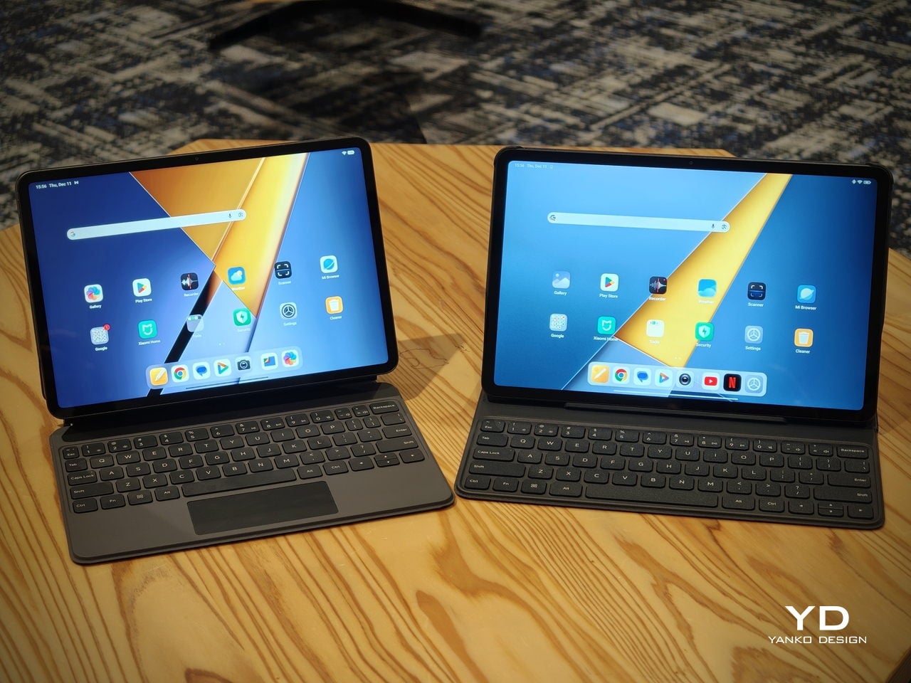
You can feel that ambition in how these two models are drawn. The Poco Pad X1 is a slightly more compact, high refresh performance slate, tuned for games and quick multitasking on an 11.2-inch 3.2K display. The Poco Pad M1 steps up to a 12.1-inch 2.5K panel and the largest battery Poco has ever shipped in a global device, aiming to be the big screen that carries you through movies, sketching sessions, and long days away from a charger.
Designer: Poco
If you have been eyeing an affordable Android tablet for gaming, streaming, or light work, should you reach for the sharper, faster Poco Pad X1, or the larger, more relaxed Poco Pad M1? In this review, we will live with both, compare their strengths, and help you decide which one actually fits your desk, your bag, and your budget.
Aesthetics
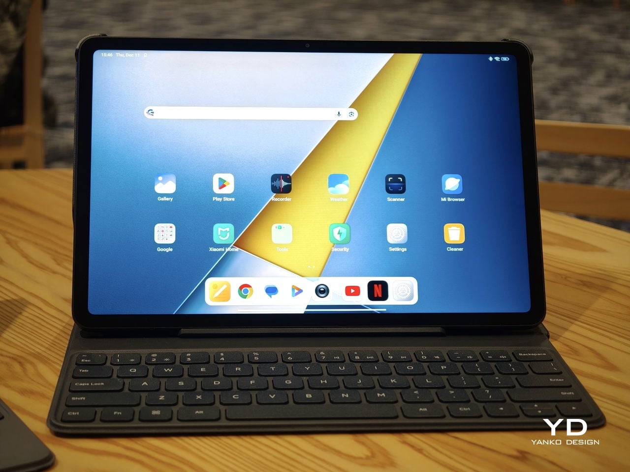
Poco Pad X1
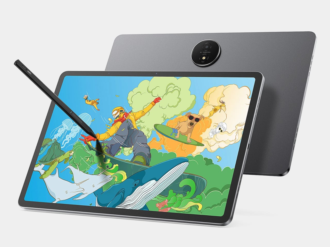
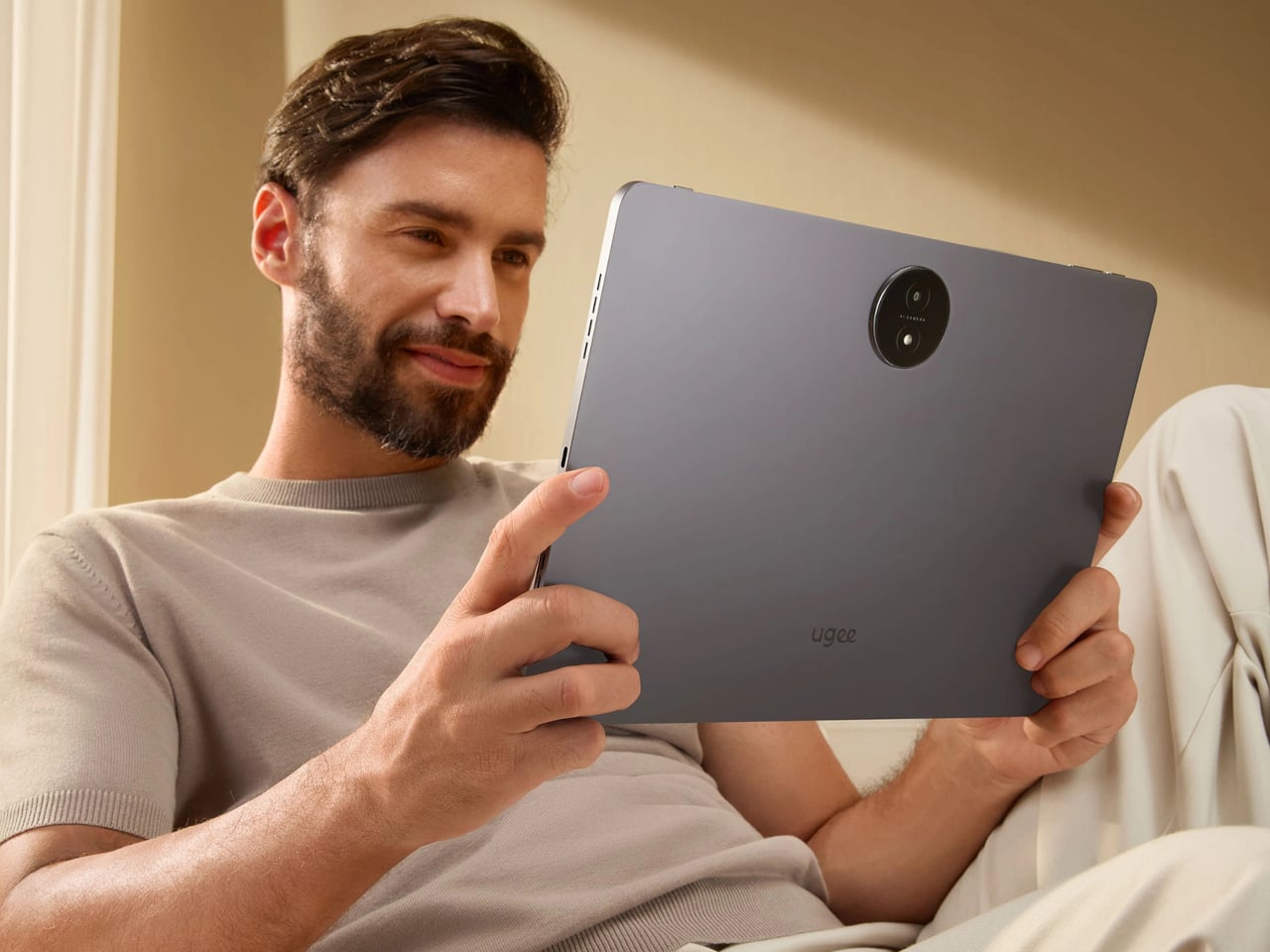
Poco is not trying to reinvent tablet hardware with Poco Pad X1 or Poco Pad M1. Both follow a familiar rectangle with rounded corners, flat sides, and a camera module that sits quietly in one corner. On Poco Pad X1, the focus is clearly on framing its 11.2-inch display as efficiently as possible. Poco Pad M1 takes the same basic formula and scales it up with a 12.1-inch panel.
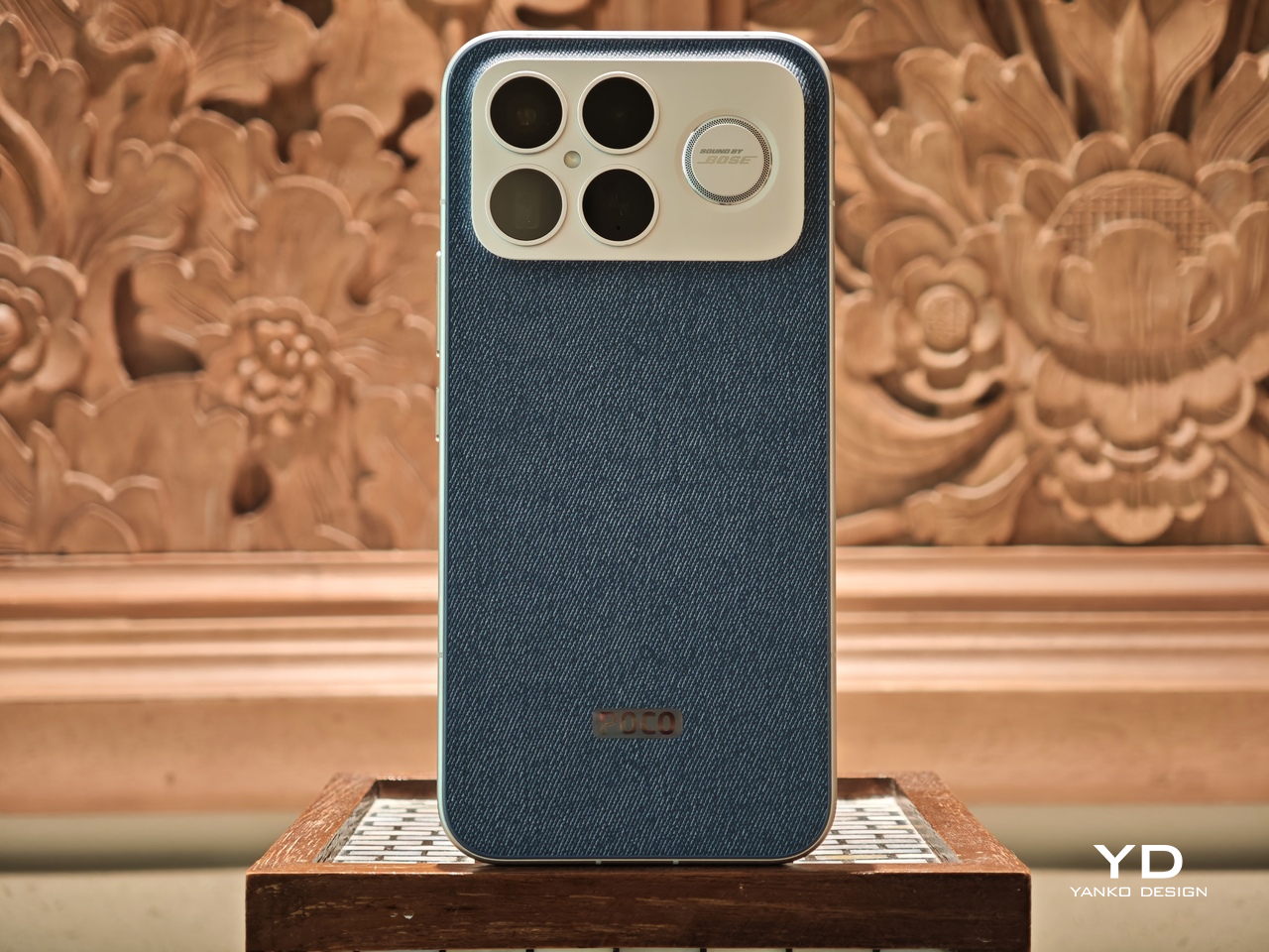
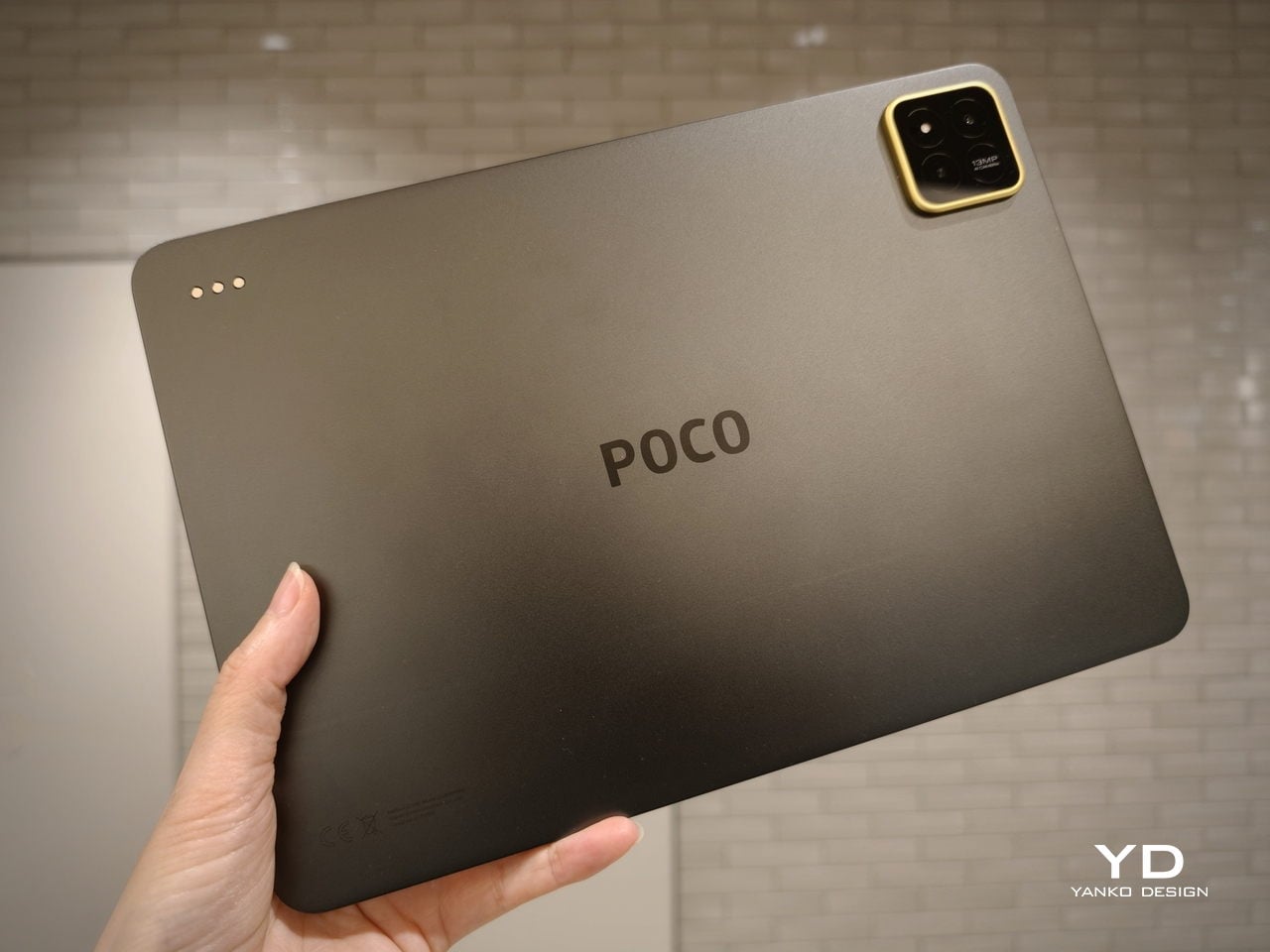
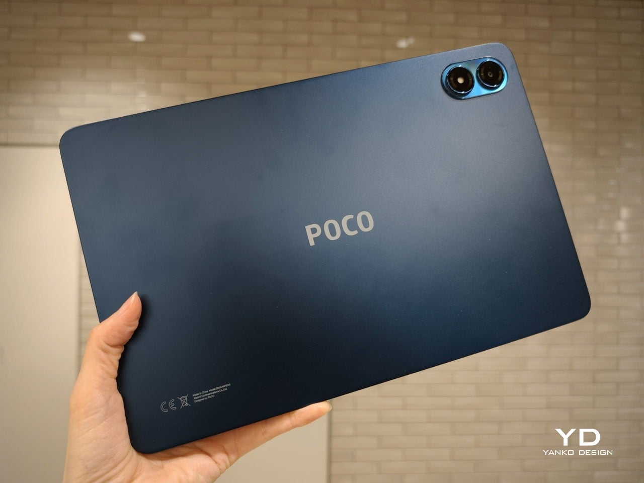
Color choices on the Pad X1 and the Pad M1 are simple. They both come in Grey and Blue. Grey leans more gunmetal and understated with a contrasting yellow accent around the camera module, while Blue reads a little more casual and friendly, but neither option is loud or experimental. Both tablets use a metal unibody design for the main shell, with separate parts for the camera island and buttons, and a big Poco logo stamped in the center for instant brand recognition. The Poco Pad X1 uses a square camera island, while the Poco Pad M1 switches to a softer oval, which gives each model a slightly different signature when you flip them over.
Poco Pad M1
Taken together, the two tablets look exactly like what they are meant to be. They are straightforward, modern Android slabs that fade into the background and let their screens and specs do the talking. For budget-friendly hardware, that quiet, functional design approach feels like the right call.
Ergonomics
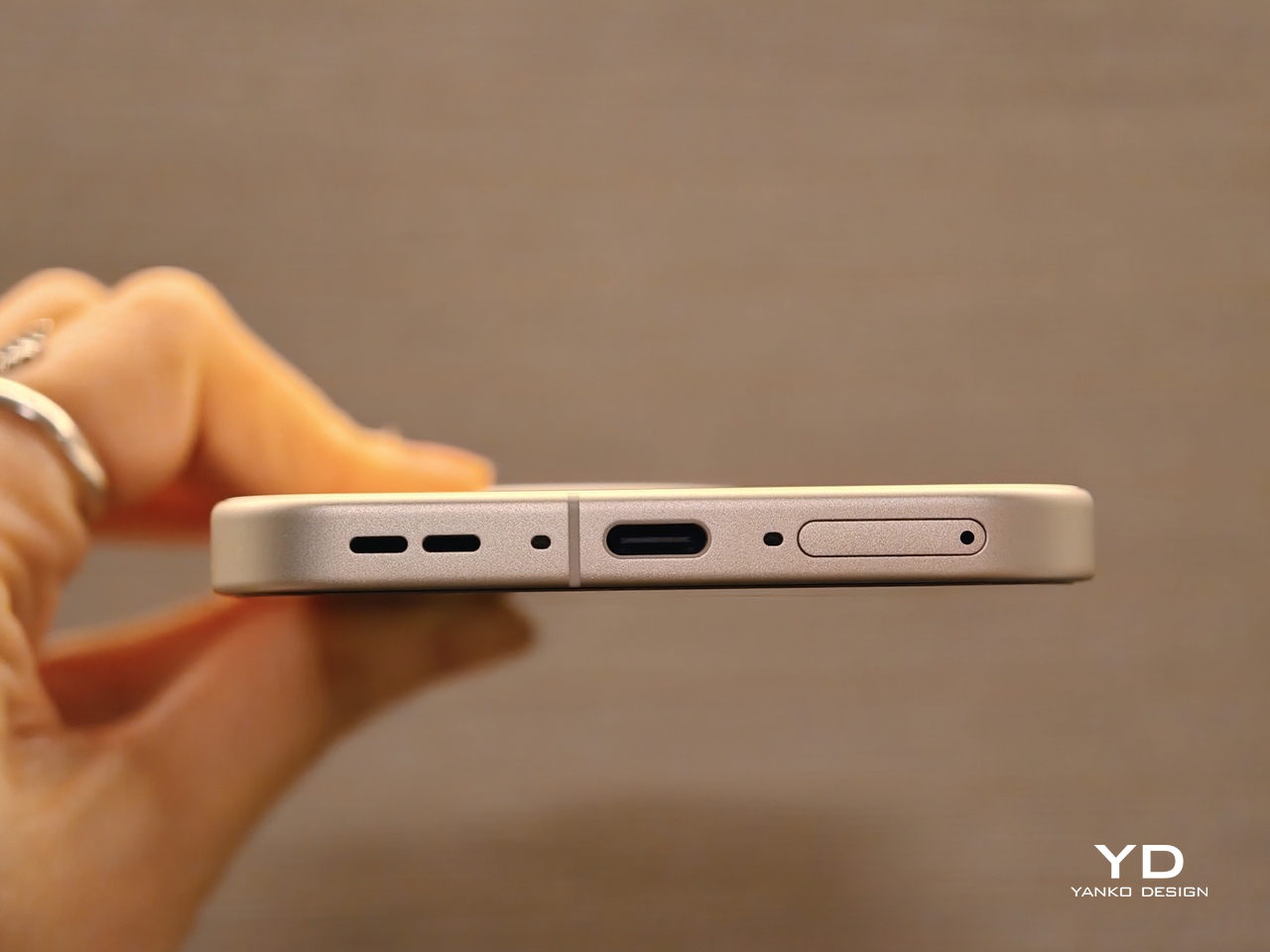
In the hand, the main ergonomic difference between Poco Pad X1 and Poco Pad M1 is simply size and weight, but neither is a true one-handed tablet for long stretches. The Poco Pad X1, with its 11.2-inch footprint and 500 g weight, is the more compact of the two. It is easier to manage on a sofa or in bed than the larger Poco Pad M1, but you will still want a second hand or some support if you are holding it for a long time. Even though the Poco Pad X1 is relatively slim and light for an aluminum unibody tablet with an 8,850 mAh battery, with dimensions of 251.22 x 173.42 x 6.18 mm, it does not quietly disappear in one hand the way a smaller 8 or 9-inch device might.
Poco Pad M1
Poco Pad M1 stretches that template out to a 12.1-inch diagonal with dimensions of 279.8 x 181.65 x 7.5 mm and a weight of about 610 g, which puts it clearly into big tablet territory. It is still slim, but the larger footprint makes it even less suited to long one-handed use, especially if you are moving around. Instead, it feels more like a tablet you rest on a table, prop up with a cover, or pair with its official keyboard, where the extra screen real estate really pays off for split-screen apps, video, and drawing.
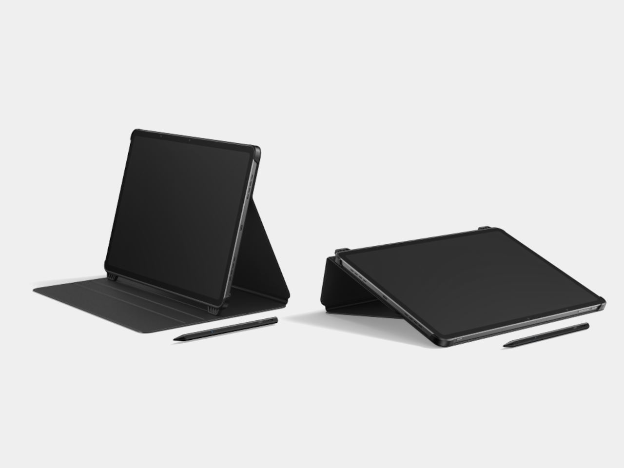
The accessory ecosystem around the Pad X1 and the Pad M1 makes them versatile, but in slightly different ways. Poco Pad M1 is compatible with the optional Poco Pad M1 Keyboard, Poco Smart Pen, and Poco Pad M1 Cover, a trio that turns it into a very capable small-screen workstation. The cover folds into a stand and adds a built-in holder for the pen, which makes it easy to move between bag, desk, and sofa without worrying about where the stylus went. The keyboard is lightweight and easy to carry, but the keys feel a bit plasticky in use, which slightly undercuts the otherwise solid metal body of the tablet.
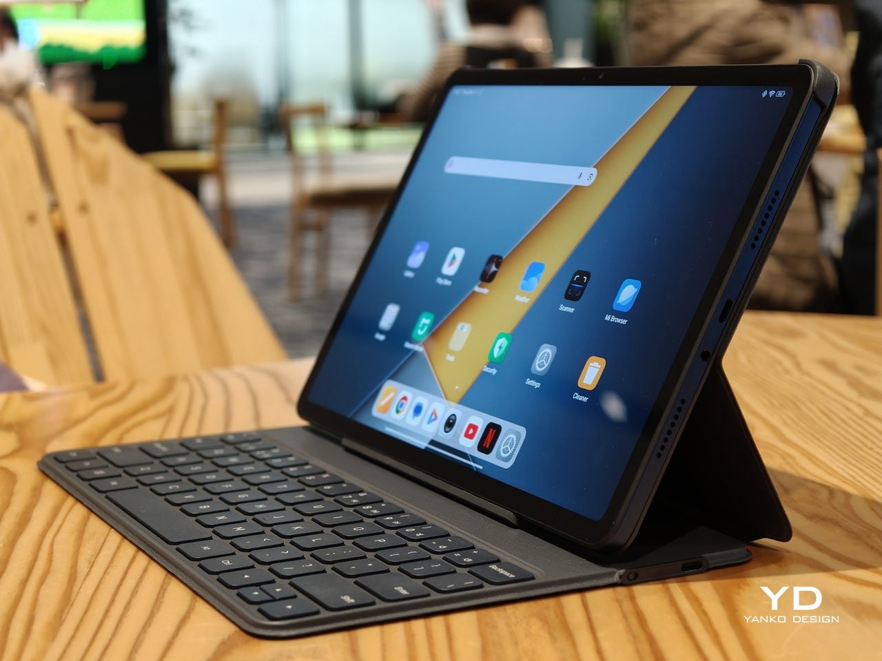
Poco Pad X1
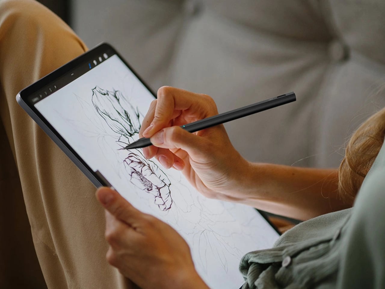
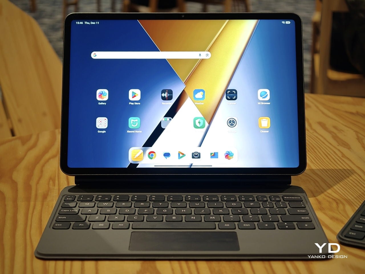
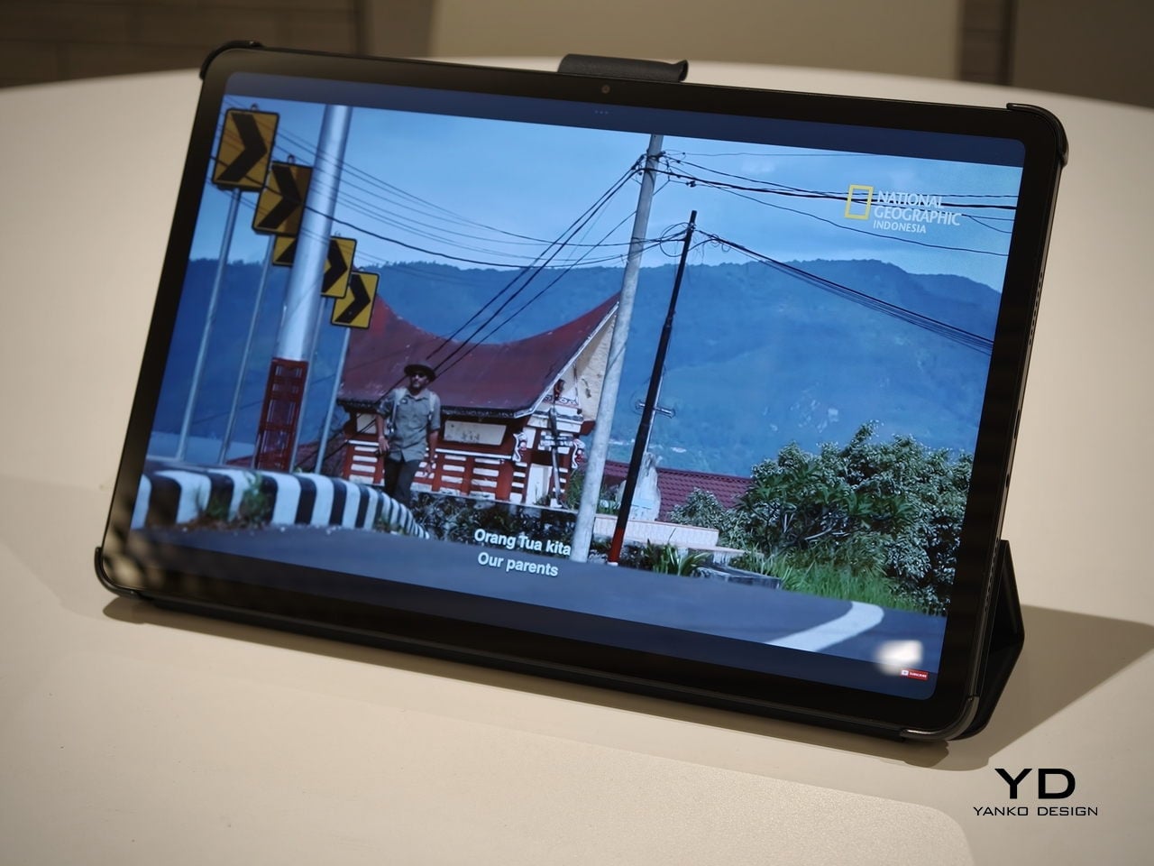
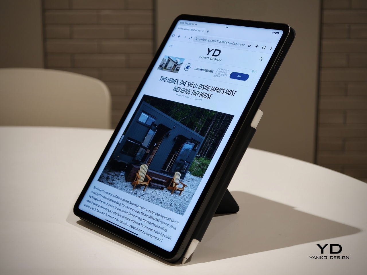
Poco Pad X1 has its own dedicated set of accessories. It supports the Poco Pad X1 Floating Keyboard, the Poco Pad X1 Keyboard, the Poco Focus Pen, and the Poco Pad X1 Cover, which together give it a surprisingly flexible setup for both work and play. The cover folds like origami and doubles as a stand, letting you enjoy the tablet vertically or horizontally, and for horizontal use, you can choose between two different viewing heights.
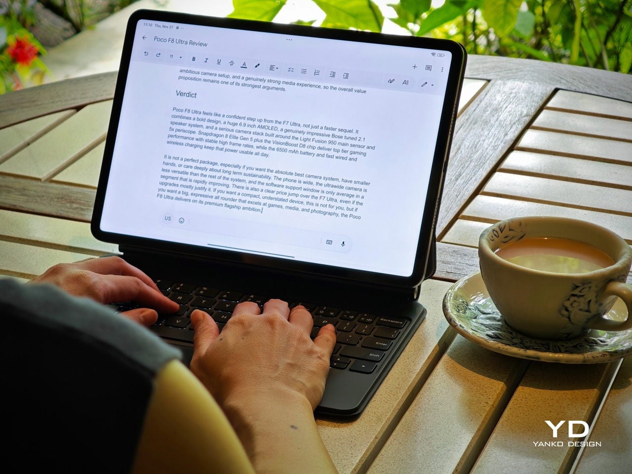
The Floating Keyboard is the standout here. It adds some weight and only offers a modest tilt range, but the key feel is excellent for this class, and the trackpad is responsive and accurate enough that you quickly forget you are on a tablet accessory. Clipped together, the Poco Pad X1 and the Floating Keyboard behave much more like a compact laptop than a budget slate with an afterthought keyboard, which makes it far easier to treat this smaller tablet as a real writing and work machine when you need it.
Performance
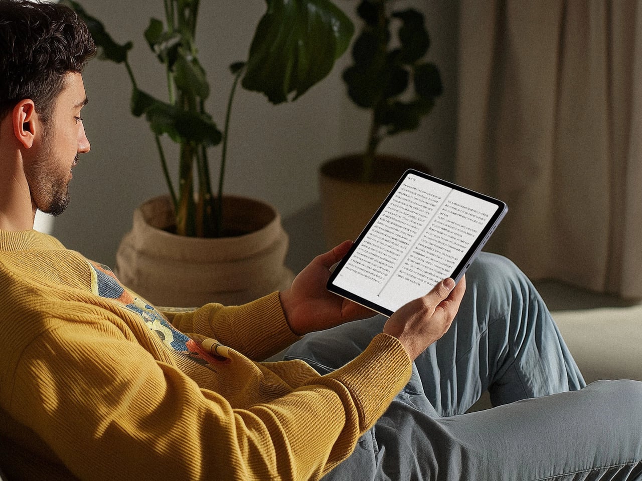
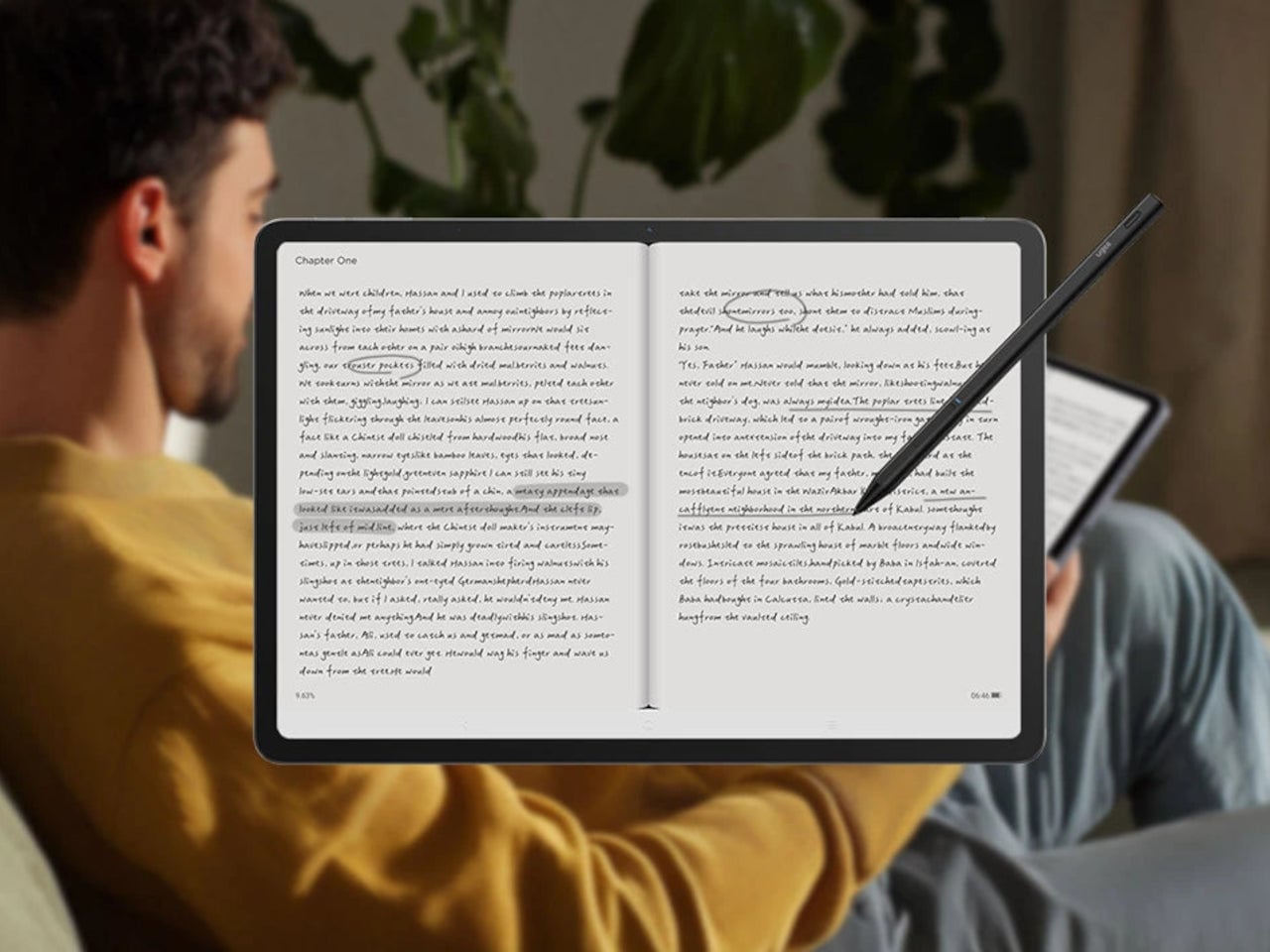
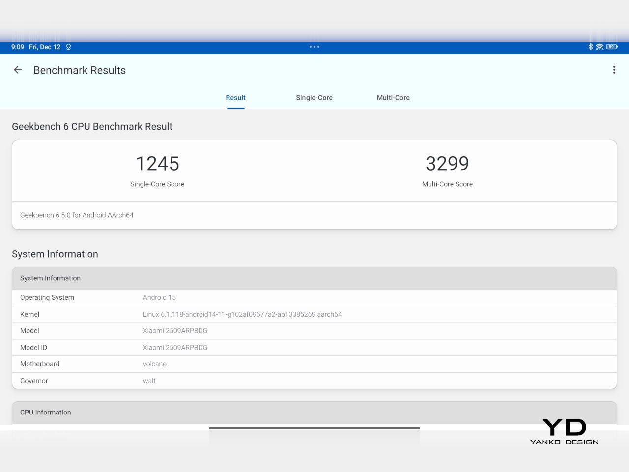
Living with Poco Pad X1 and Poco Pad M1 quickly shows how differently they lean, even though they share a lot of DNA. The Poco Pad X1 is the sharper and faster option, with an 11.2-inch 3.2K display at 3,200 x 2,136 px, around 345 ppi, and refresh up to 144 Hz in supported apps. It can hit about 800 nits peak brightness, supports Dolby Vision and HDR10, and uses a 3:2 aspect ratio that feels very natural for reading, web browsing, and document work, helped by TÜV eye care, DC dimming, and adaptive colors to keep things comfortable.
Poco Pad M1
The Poco Pad M1, on the other hand, trades a bit of sharpness and speed for sheer size and flexibility. Its 12.1-inch 2.5K panel runs at 2,560 x 1,600px with around 249 ppi and up to 120 Hz refresh, plus 500 nits typical and 600 nits in high brightness mode. You still get Dolby Vision, DC dimming, and TÜV certifications for low blue light, flicker-free behavior, and circadian friendliness, along with wet touch support that keeps it usable with damp fingers.
Poco Pad X1
Both tablets use quad speakers with Dolby Atmos and Hi-Res support, so you get surprisingly full sound from either. Crucially, the Poco Pad M1 also adds a 3.5 mm headphone jack and a microSD slot for up to 2 TB of expandable storage, which makes it a much easier media hoarder and a better fit for wired headphones and speakers. The X1 relies on its internal storage and wireless audio instead, which suits its more performance-driven, travel-friendly role.
Poco Pad X1
Poco Pad M1
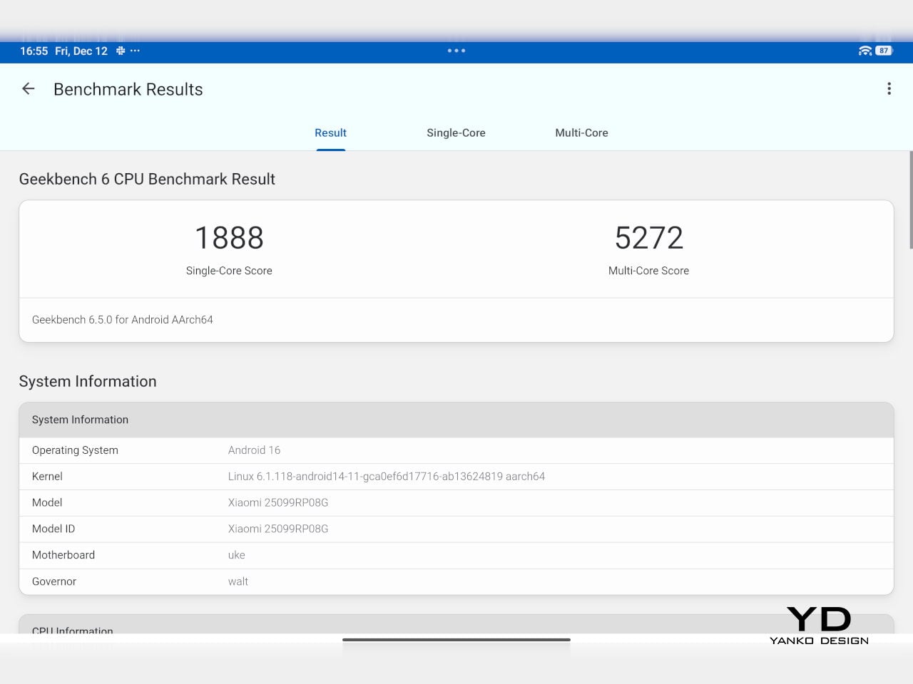
Performance and gaming clearly favor the Poco Pad X1. It uses the Snapdragon 7+ Gen 3 with 8 GB of RAM and up to 512 GB of storage, and combined with the 144 Hz panel, it feels like a handheld console that also happens to be good at multitasking and productivity. The Poco Pad M1 steps down to the Snapdragon 7s Gen 4 with 8 GB of RAM and 256 GB of storage, which is still more than enough for apps and casual gaming, but clearly tuned more for streaming, browsing, and note-taking than for chasing every last frame. In practice, the Poco Pad X1 is the one you reach for when you care about smooth, high refresh gameplay, while the Pad M1 is the one you leave on the coffee table for everyone to use.
Poco Pad M1
Battery life follows the same logic. The Poco Pad X1 pairs its 8,850 mAh battery with 45 W turbo charging, which Poco says can go from zero to full in about 94 minutes, and my experience matches that claim in day-to-day use. The Poco Pad M1 leans into a 12,000 mAh pack, billed as the largest battery in a global Poco device, with up to 105.36 hours of music playback, around 83 days of standby, 33 W charging, and up to 27 W wired reverse charging so it can top up your other devices.
Poco Pad M1
Poco Pad X1
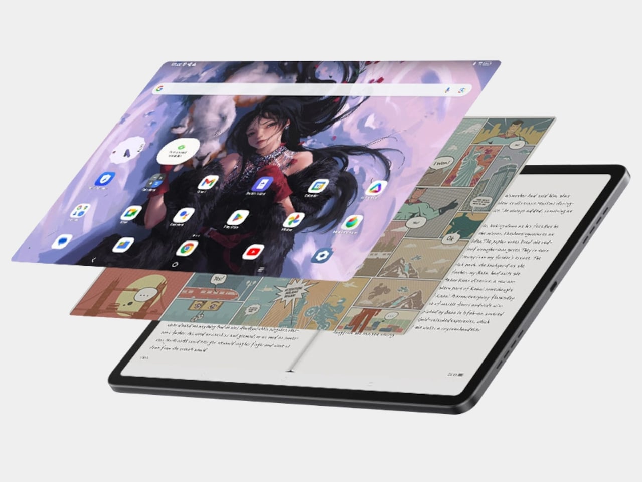
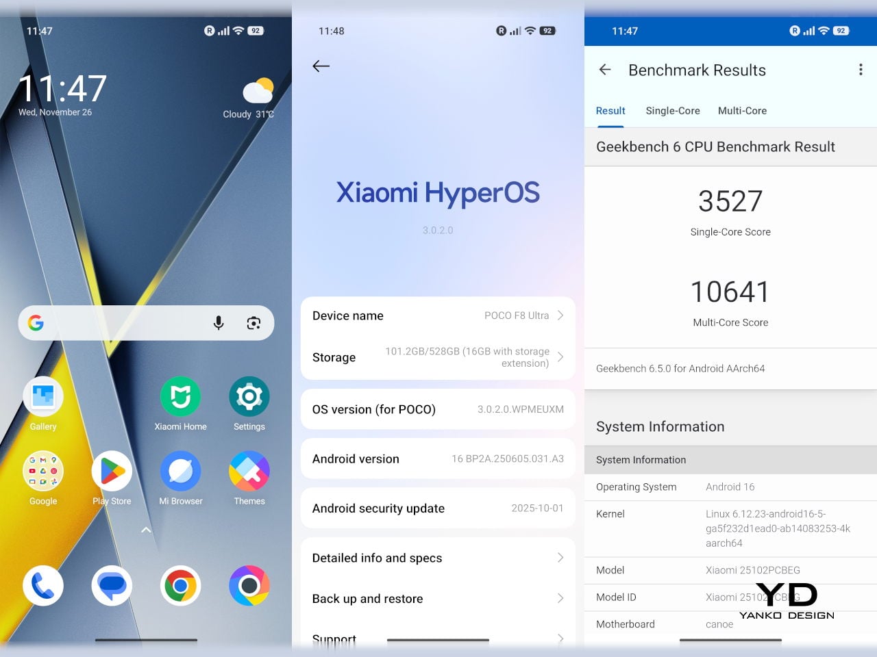
On the software side, both run Xiaomi HyperOS with Xiaomi Interconnectivity and Google’s AI hooks, so you get shared clipboard, call and network sync, Circle to Search, and Gemini support whichever size you choose. As for cameras, Poco Pad X1 pairs a 13 MP rear camera and an 8 MP front camera, while Poco Pad M1 sticks to 8 MP sensors on both sides. The results are perfectly fine for video calls, document scans, and the odd quick snap, but nothing special, which is exactly what you would expect from tablets at this price bracket.

Poco Pad M1

Poco Pad X1
Sustainability
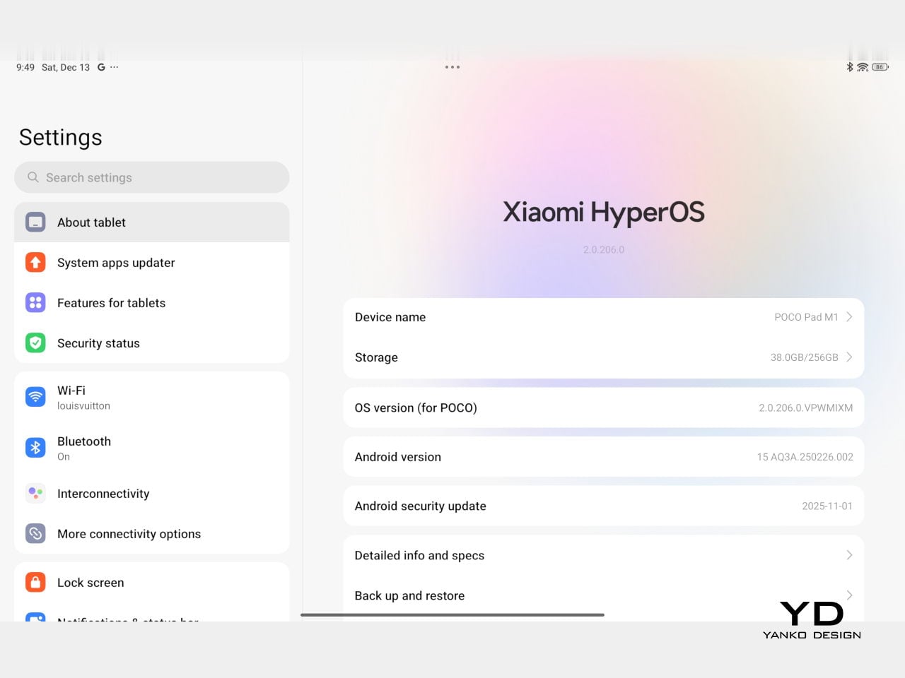
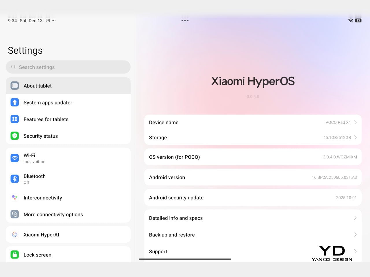
Poco is not making a big environmental branding play with Poco Pad X1 and Poco Pad M1, but there are a few practical touches that matter if you plan to keep a tablet for several years. The most important one is long-term software support. Both Pad X1 and Pad M1 are slated to receive four years of security updates, which gives you a clearer runway for safe everyday use. For budget tablets, that commitment is still not guaranteed across the market, so it is good to see Poco spell it out.
Poco Pad M1
That longer support window pairs well with the hardware choices. The aluminum unibody shells on both models feel sturdy enough to survive several upgrade cycles, and the generous storage options, plus microSD expansion on the Poco Pad M1, reduce the pressure to replace them early just to fit more apps or media. It is not a full sustainability story with recycled materials and carbon tracking, but if your definition of sustainable starts with buying something that will not feel obsolete or unsafe in two years, these tablets are at least pointed in the right direction.
Value
The Poco Pad X1 and Poco Pad M1 both land in the affordable bracket, but they scale very differently once you add accessories. The Poco Pad X1 with 8 GB of RAM and 512 GB of storage is $399 USD, which feels fair for the Snapdragon 7+ Gen 3 and high-end 3.2K 144 hertz display. Its accessories are priced like mini laptop gear, with the Floating Keyboard at $199 USD, the X1 Keyboard at $129 USD, the X1 Cover at $49 USD, and the Poco Focus Pen at $99 USD. A fully loaded X1 setup quickly pushes past $600 USD, but in return, you get a compact tablet that can genuinely stand in for a small laptop and drawing pad.
Poco Pad X1
The Poco Pad M1 starts cheaper at $329 USD for 8 GB and 256 GB, and its add-ons stay firmly in value territory. The M1 Keyboard is $99 USD, the M1 Cover is $29 USD, and the Poco Smart Pen is $69 USD, so even a complete kit undercuts an equivalently kitted X1 by a healthy margin. Factor in the microSD slot and 3.5 millimeter headphone jack, and M1 clearly aims to be the better deal for big screen media, note-taking, and family use, while X1 makes more sense if you are willing to pay extra for performance, storage, and that excellent Floating Keyboard experience.
Verdict
The Poco Pad X1 and Poco Pad M1 end up serving two somewhat different roles. If you prioritize performance, the Poco Pad X1 is the clear choice. The Snapdragon 7+ Gen 3, 3.2K 144 Hz display, 512 GB storage, and excellent Floating Keyboard make it feel like a serious little work and gaming machine, even if the full setup gets expensive and you give up the headphone jack and SD slot. If you care more about big-screen comfort and value, the Poco Pad M1 quietly wins. The 12.1-inch 2.5K screen, quad speakers, 3.5 mm jack, microSD expansion, huge battery, and cheaper accessories make it a better fit for big-screen media and everyday productivity.
Poco Pad X1
Whichever way you lean, you are getting more tablet than the price suggests. For context, Apple’s base iPad costs $449 with only 64 GB of storage and a 60 Hz screen. The iPad still has a faster processor and a tighter app ecosystem, but Poco gives you bigger batteries, sharper displays, and a lot more storage for less money. Pick the Poco Pad X1 if you want compact power and a great keyboard experience. Pick the Poco Pad M1 if you want maximum screen, battery, and flexibility for the money. Either way, you end up with a tablet that feels more considered than most of what you will find at this price.
The post Poco Pad X1 & Poco Pad M1 Review: Budget Tablets That Challenge the iPad first appeared on Yanko Design.