$450 Smart Glasses, 78 Languages, Zero Smartphone Required

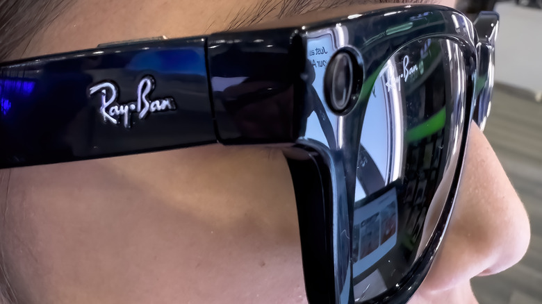
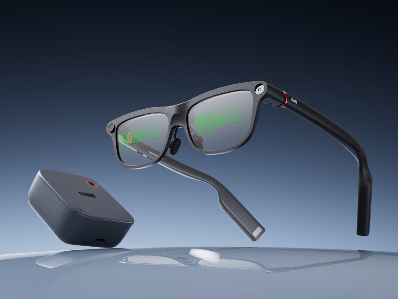
Smart glasses companies love to talk about a grand future, but the strongest case for INMO GO3 arrived in a very ordinary setting: a live presentation. During its appearance at Global Connect in China, an INMO presenter used the glasses’ teleprompter feature while addressing the room, letting the script move with her speaking pace. It was a simple demonstration, slightly funny once the audience noticed the note cards she held as a backup option, and far more memorable than a spec sheet.

That kind of practicality is central to INMO’s broader strategy. The company describes its mission as building glasses people can wear daily, and GO3 reflects that approach with features aimed at frequent, low-friction use. Real-time translation, live transcription, meeting summaries, HERE Maps navigation, and photo translation all point toward the same goal: putting AI and information in front of the eye in a form people might actually keep on their face all day.

Designer: INMO

What makes the GO3 feel more meaningful than many smart glasses pitches right now is the kind of display it chooses to be. The category is increasingly pulled toward a model where glasses become another surface for platforms to mediate your attention, observe your behavior, and layer commerce or data collection into the act of seeing. That vision promises convenience, but it also raises the prospect of a device that quietly turns everyday life into a stream of signals for someone else to measure, sort, and monetize.

INMO’s framing, at least from this demo and conversation, points in another direction. The GO3 display feels useful because it serves the wearer in immediate, legible ways. It helps you follow a script. It helps you catch a conversation through live transcription. It helps you understand another language, navigate a route, or pull information from the world through photo translation. The point is not to create a new theater for algorithmic persuasion. The point is to reduce friction between a person and the task in front of them.

That’s a fairly important distinction because smart glasses will live or die on trust as much as technical ability. People may tolerate a phone screen as a chaotic marketplace of prompts, ads, feeds, and nudges because phones already carry that baggage. Glasses sit closer to the body and closer to perception. They ask for a different kind of acceptance. A product in that position has to prove it deserves to be there, and the most convincing way to do that is by helping with something clear, fast, and human scale.

The GO3 seems to understand that. On paper, its features are varied enough to sound ambitious: standalone real-time translation in 78 languages, AI teleprompting with auto-scroll, meeting summaries, action items, hands-free navigation through HERE Maps, photo translation, prescription support up to 2000 degrees, and a swappable battery system that can be changed in about five seconds. In practice, though, the appeal comes from how these features collapse into ordinary moments. A work presentation. A multilingual conversation. A commute. A quick glance for context instead of a full stop to unlock and consult a phone.

That is why the live teleprompter demo landed so well. It showed the GO3 handling one of the simplest possible tasks, and in doing so, it made a broader case for the category. Smart glasses do not need to begin with spectacle to feel transformative. They can begin with assistance. They can begin with a line of text, quietly placed where you need it, moving at your pace, leaving your hands and attention freer than they were a moment before. Once that works, bigger use cases start to feel plausible.

Some details remain fuzzy, especially around video recording, which was less clearly explained in conversation than photo capture. Any smart glasses company also has to prove that software quality can hold up outside the demo environment, particularly for translation, transcription, and AI-generated summaries. Those are high-value features, but they are also the ones most likely to disappoint if latency, accuracy, or interface design slips. INMO’s been in the business long enough to know that, and to also have a fairly strong grip on a fix.
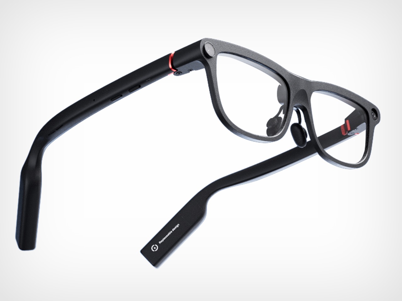
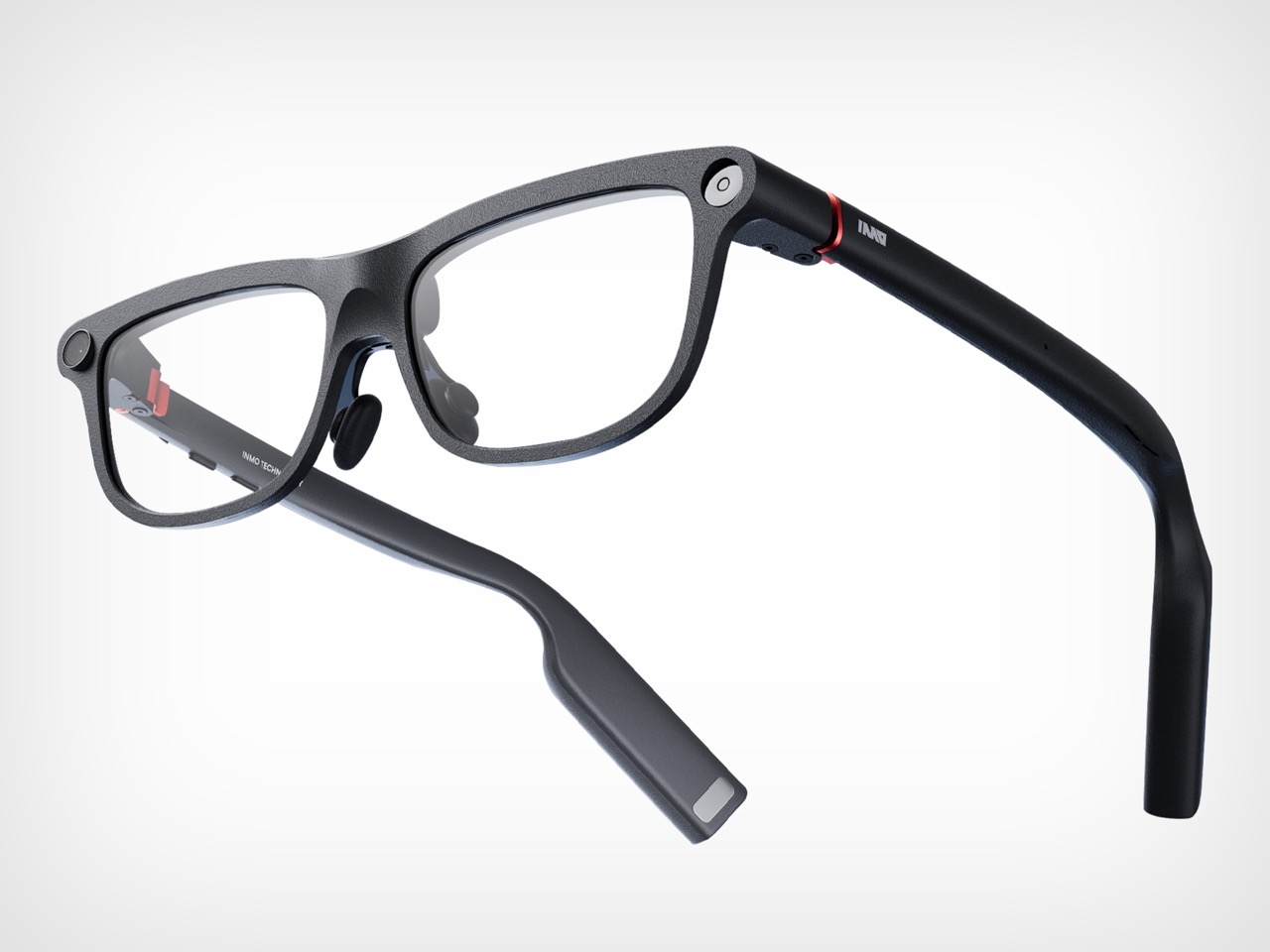
Even with those caveats, INMO’s pitch feels unusually coherent. Founded in 2020, the company says its goal from day one has been to make glasses people will wear every day, and GO3 is the strongest expression of that idea so far. At 58 grams, with prescription support and a battery system designed for long use, it is clearly being shaped around wearability rather than occasional novelty. That design logic gives the product a sense of discipline that many competitors still lack.

The larger vision behind GO3 is that smart glasses will become the next mobile computing platform, eventually taking over as the primary interface for AI. That is a huge claim, and one the industry repeats often. What gives INMO a better argument than most is that it starts from the simple setting rather than the maximal one. If smart glasses are going to matter, they have to prove themselves in the small moments first. GO3 makes that case persuasively. It suggests the future of wearable computing may arrive not through spectacle, but through usefulness that quietly earns its place.
The post $450 Smart Glasses, 78 Languages, Zero Smartphone Required first appeared on Yanko Design.


Simplify Further’s Goa Tiny Home Fits a Full Life Into 252 Square Feet

Most tiny homes ask you to give something up. The Goa by Simplify Further Tiny Homes is built around the idea that you shouldn’t have to. It’s a 24 x 8-foot home on wheels designed for people who want to genuinely live small, not just survive it. At 252 square feet, the Goa is built to sleep four to five people, which already tells you something about how thoughtfully the space has been planned.

Two sleeping lofts — one measuring 7×8 feet and another at 7×5 feet — sit overhead, leaving a loft height clearance of 36 inches at the low side and 6 feet 4 inches of headroom beneath them. It’s a layout that stacks the private spaces upward and reserves the ground level for living, cooking, and everything in between.

Designer: Simplify Further Tiny Homes

The kitchen is the centerpiece of the Goa, and Simplify Further leans into that fully. A U-shaped layout tucks beneath one of the sleeping lofts, fitted with a four-burner electric range, a 7.1 cubic foot refrigerator, and generous built-in storage — including more tucked beneath the staircase that leads to the loft. It’s a kitchen that actually invites you to cook, not just reheat. A small dining table and seating area sit nearby, keeping the social flow between the kitchen and living room easy and natural.

The bathroom is full-sized — a detail that shouldn’t feel remarkable but often does in homes this compact. Buyers can opt for a full-size bathtub or a 36-inch shower with additional storage, depending on how they want to use the space. A washer/dryer combo is also included as standard, which rounds out the Goa as a proper full-time residence rather than an extended camping experience.

Finish-wise, the interior is dressed in drywall, pine tongue-and-groove ceilings, and vinyl flooring — warm without trying too hard. Upgrade options include shiplap interior walls and furnishings for those who want to move in without lifting a finger beyond signing a check.

The Goa rolls on a hand-built chassis with double axles rated at 7,500 pounds each, trailer brakes, and DOT-approved highway lighting. It carries NOAH certification as an RV and can also be built to satisfy IRC Appendix AQ standards by request. Starting at $65,000, the Goa lands as one of the more compelling full-time tiny home options on the market — a house that earns its footprint rather than apologizing for it.

The post Simplify Further’s Goa Tiny Home Fits a Full Life Into 252 Square Feet first appeared on Yanko Design.

Crocs Just Entered the Mushroom Kingdom and We’re Into It

Crocs and Nintendo are not brands you’d typically put in the same sentence as “high-concept design collaboration.” And yet here we are, with the Crocs x Super Mario collection dropping July 15, 2026, looking far better than the premise suggests it should.

The announcement landed earlier this week, and the first reaction — at least my first reaction — was that resigned nod you give when two things that were always meant to go together finally figure it out. Crocs has been quietly rebuilding its cultural credibility for years through a series of increasingly clever partnerships, and Super Mario is the one IP on the planet that genuinely belongs to everyone. People who grew up with a Game Boy, adults who still boot up Mario Kart on a Friday night, and people who have never touched a controller but know exactly who Mario is. That kind of universal ownership is rare, and landing it on a foam clog might be the smartest move either brand has made this year.

Designer: Crocs x Nintendo

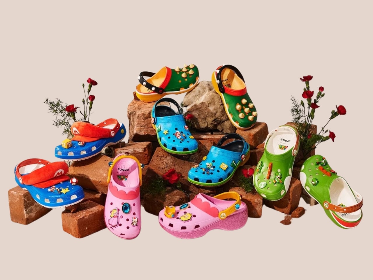
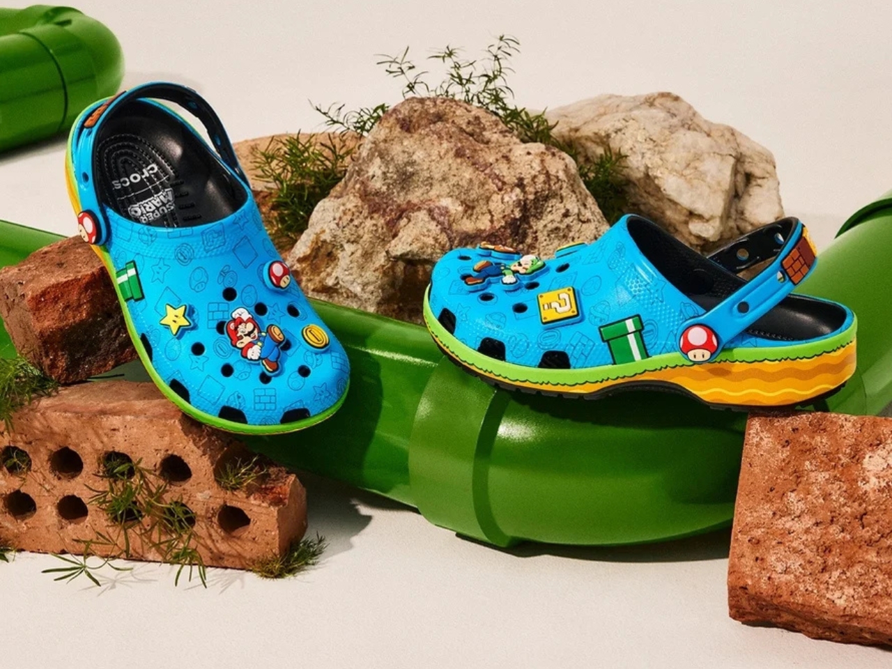
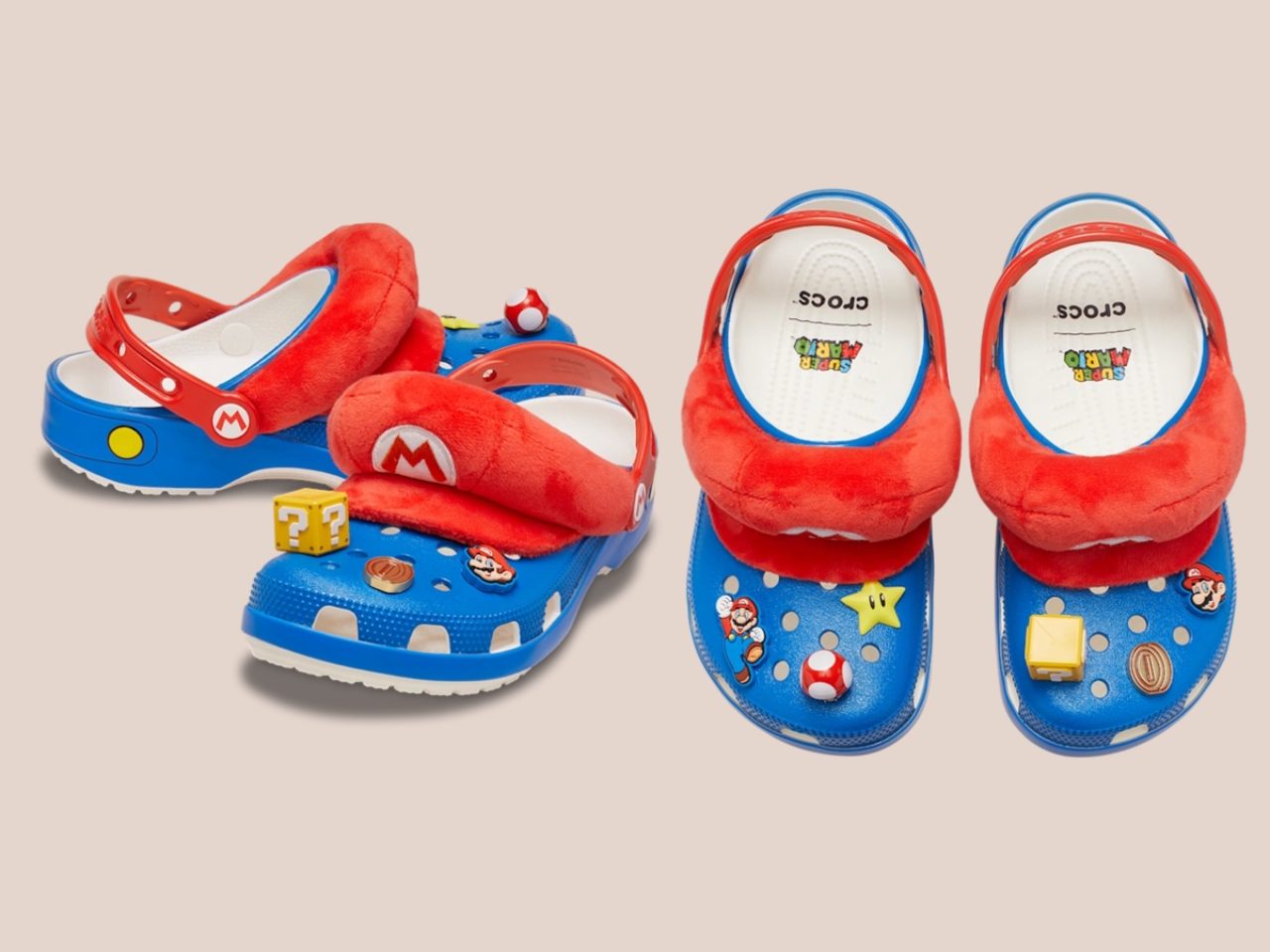
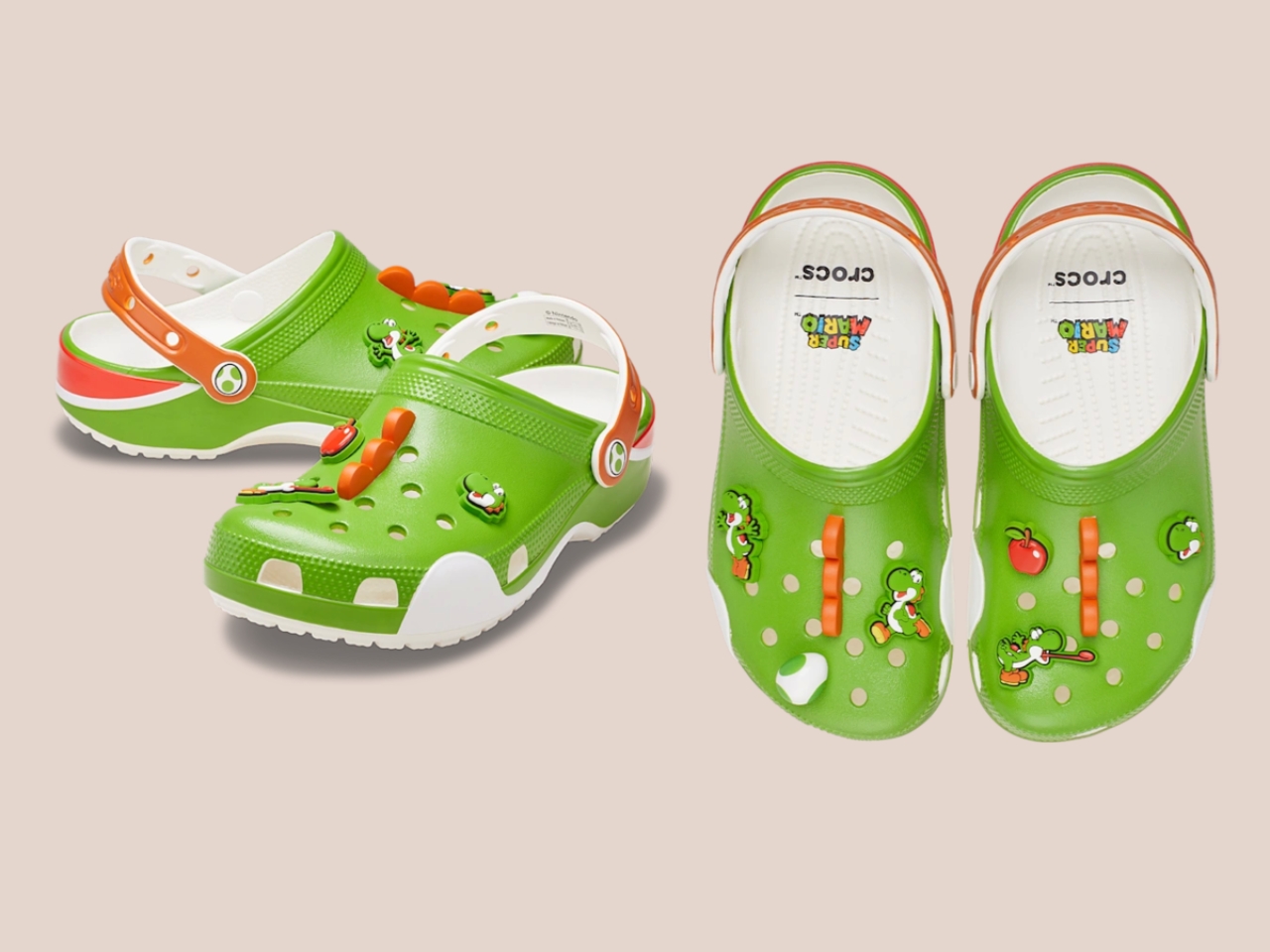
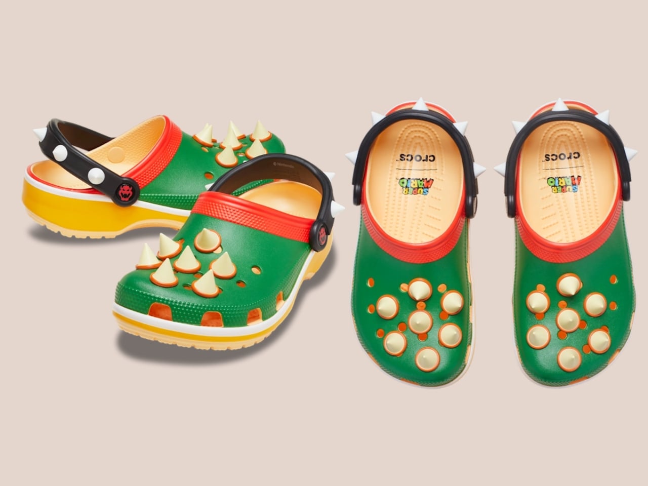
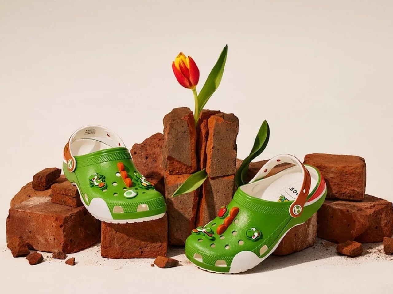
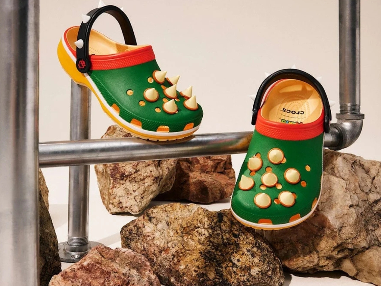
Five styles make up the collection, each built around a specific character, and the level of detail is more than you’d expect from a licensed shoe drop. The Mario clog sits on a blue foam base with a plush version of Mario’s signature red cap attached directly to the upper — playful without being costume-y. The Yoshi style goes full green with PVC fins running along the upper, which somehow manages to feel sculptural rather than silly. Then there’s the Bowser clog: dark green foam, seven PVC spikes on the upper, and five more replacing Jibbitz on the strap. Bowser would absolutely approve.

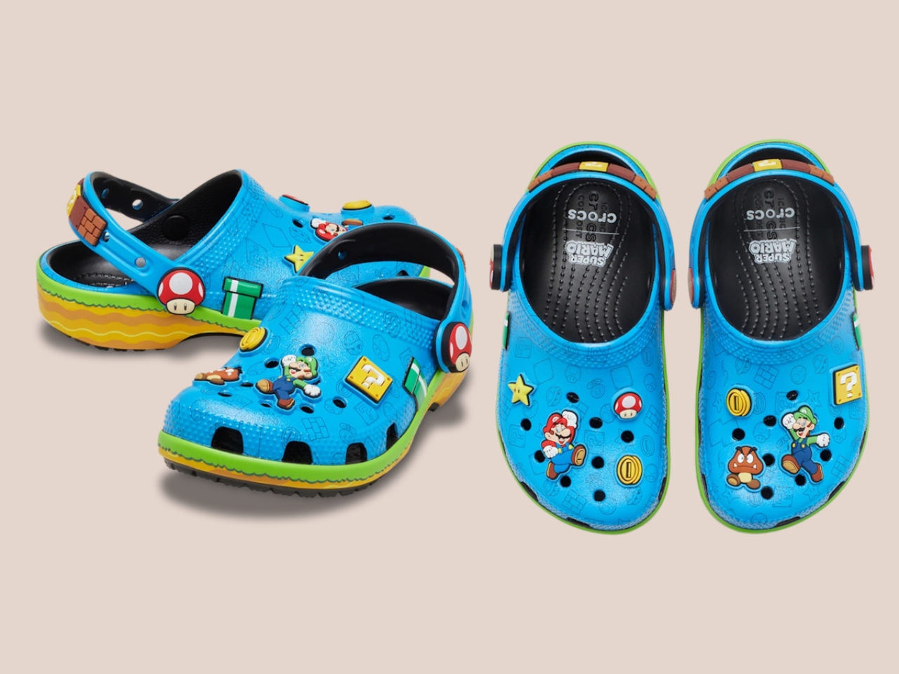
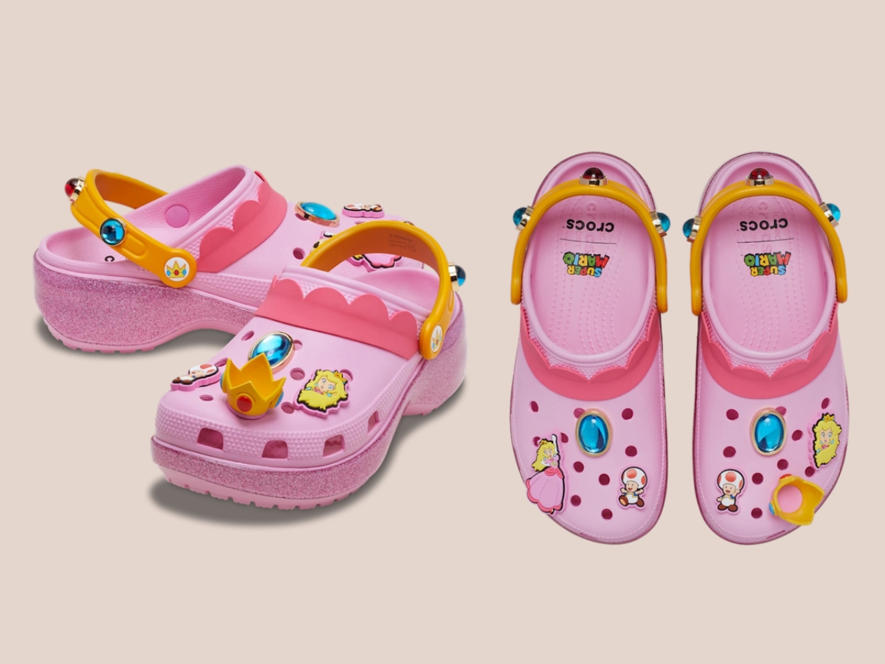
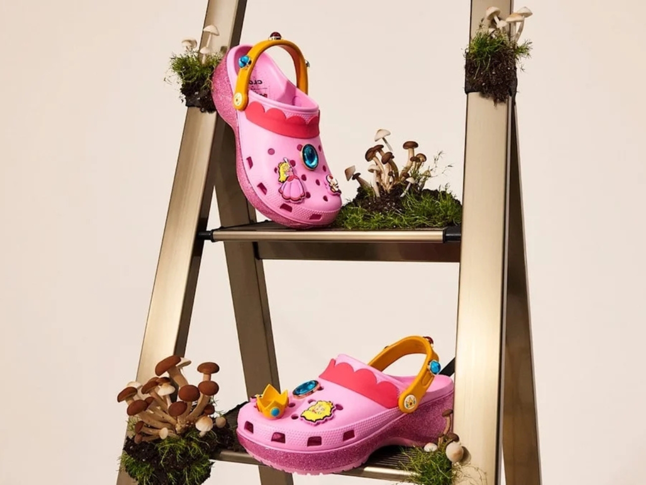
Princess Peach gets the most elevated treatment, with a platform sole finished in pink glitter and seven exclusive Jibbitz charms. It reads more fashion than novelty, which is a genuine design achievement for a shoe that has a question block on it. Rounding out the group is the Core Classic Clog, which pulls from the game’s broader iconography — coins, stars, turtle shells — and comes with eight Jibbitz charms and an option in kids’ sizing. The right call.

Pricing runs from $55 to $90, which lands comfortably in impulse-buy territory for any adult who will absolutely tell themselves they’re buying it for their kid.

What makes this feel considered rather than purely commercial is how naturally the characters map onto what Crocs already does. Crocs has never been a brand that does subtle. It’s loud, comfortable, and entirely unapologetic about existing. Nintendo’s Super Mario roster operates the same way. These are characters drawn in primary colours with maximum personality and zero pretension. They don’t need your endorsement. So when Bowser turns up as a spike-covered clog, it doesn’t feel like a brand sticking a logo on a product. It feels like the character found the right medium.

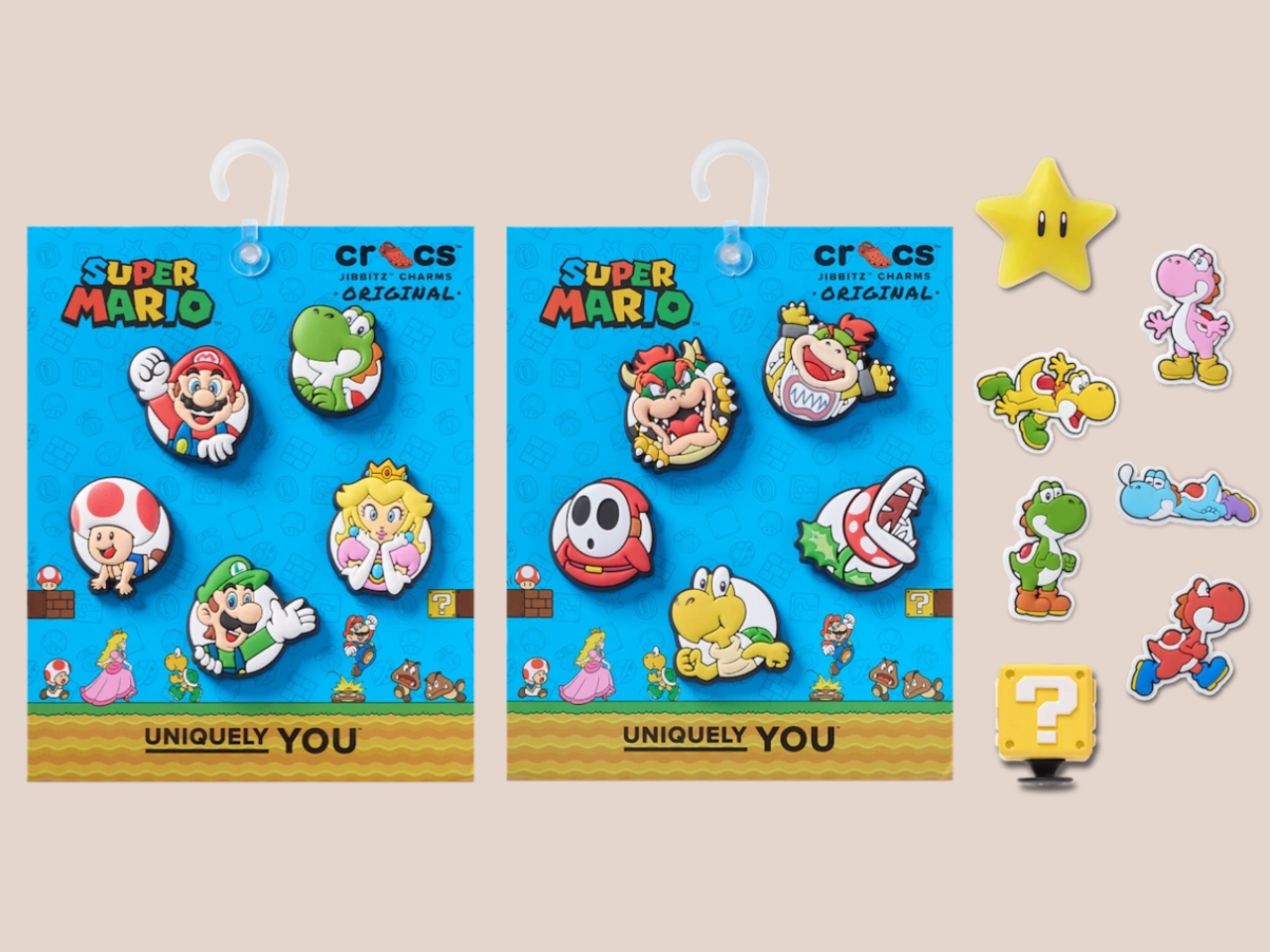
The Jibbitz element is doing quiet but important work across the collection. Each pair ships with six to eight exclusive co-branded charms, which means every clog doubles as an entry point into Crocs’ customisation ecosystem. Crocs has always understood that Jibbitz turn a shoe into something personal, closer to a wearable mood board than just footwear. Giving Super Mario fans a way into that system is smart, and it means the collection will live well past its launch date.

I’ll be straight: I did not expect to be genuinely interested in a pair of foam shoes shaped like Yoshi. I expected novelty for children and maybe a few nostalgic adults grabbing one on a whim. What the collection actually delivers is a thoughtful translation of game design into product design — character-specific textures, shapes, and details that suggest someone actually played the games and asked what it means for a shoe to feel like a character, not just look like one.

The Crocs x Super Mario collection is available from July 15 on crocs.com, the Nintendo Store, and select retailers globally. Your feet are going to the Mushroom Kingdom.

The post Crocs Just Entered the Mushroom Kingdom and We’re Into It first appeared on Yanko Design.
Apple said ‘AI’ exactly 28 times at WWDC 2026. Google mentioned it nearly 100 times at I/O.

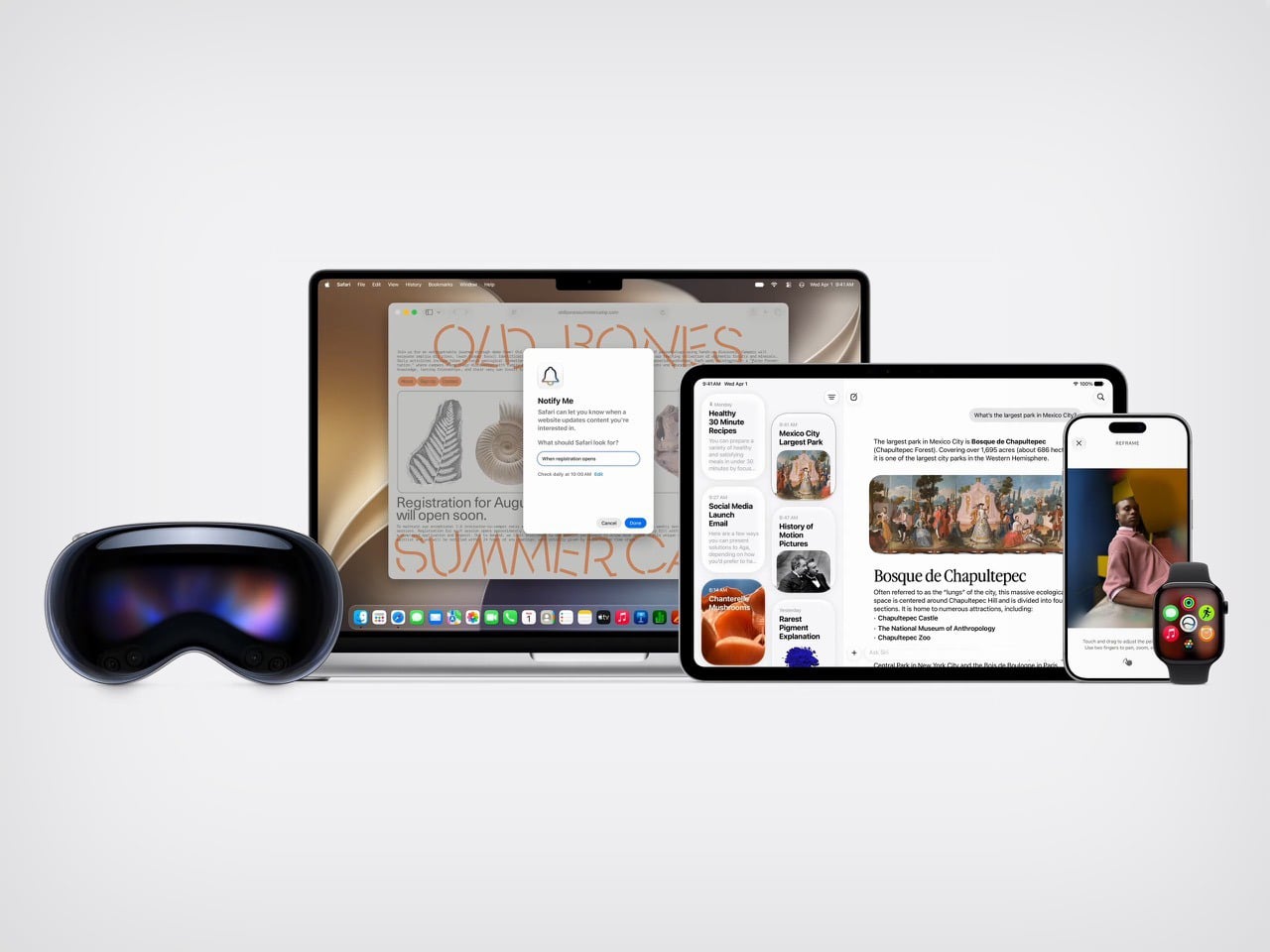
By the end of this year’s big tech keynotes, one comparison stood out more than any product demo. Apple said “AI” 28 times at WWDC 2026. Google said it nearly 100 times at I/O 2026. Same industry, same race, same obsession, but two very different instincts about how to sell the next phase of computing.

Google’s keynote reflected the current rhythm of the AI industry, loud, relentless, and eager to stamp the term onto everything in sight. Apple’s presentation moved differently. It kept circling back to what people could actually do with the technology, how private it would be, and where it would fit into everyday routines. That softer framing may frustrate people who want Apple to move faster and compete harder. It may also be exactly why Apple’s pitch feels easier to absorb at a moment when audiences are already saturated with AI promises.

AI fatigue is real, and it has been building for a while. After years of keynotes, product launches, and press releases leading with the same two letters, the word has started to lose its grip on audiences. What once signaled breakthrough capability now signals marketing effort. When a company says “AI” 100 times in a single presentation, the listener stops hearing a technology and starts hearing a strategy. The signal becomes noise, and somewhere in that noise, the actual products get harder to see.

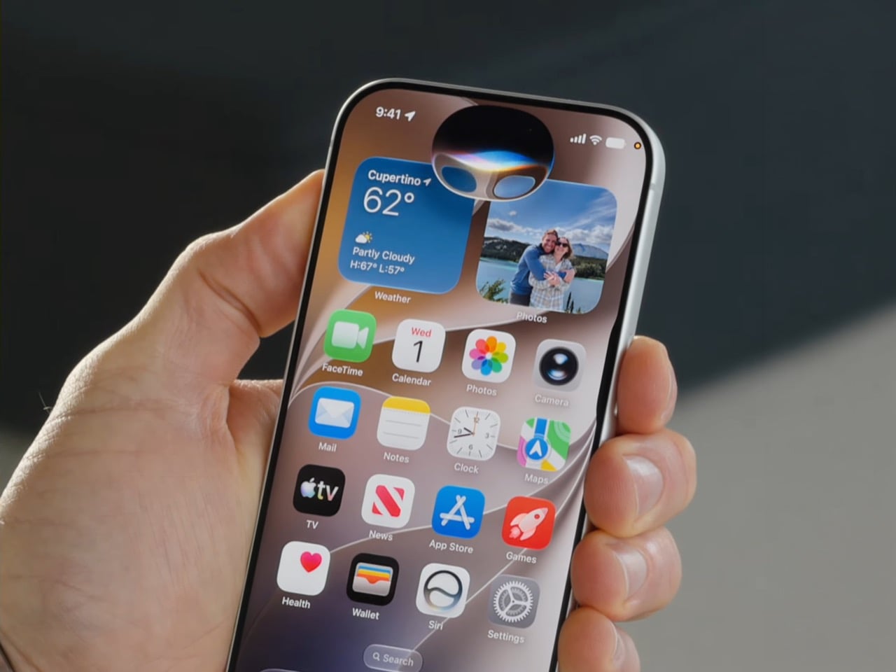
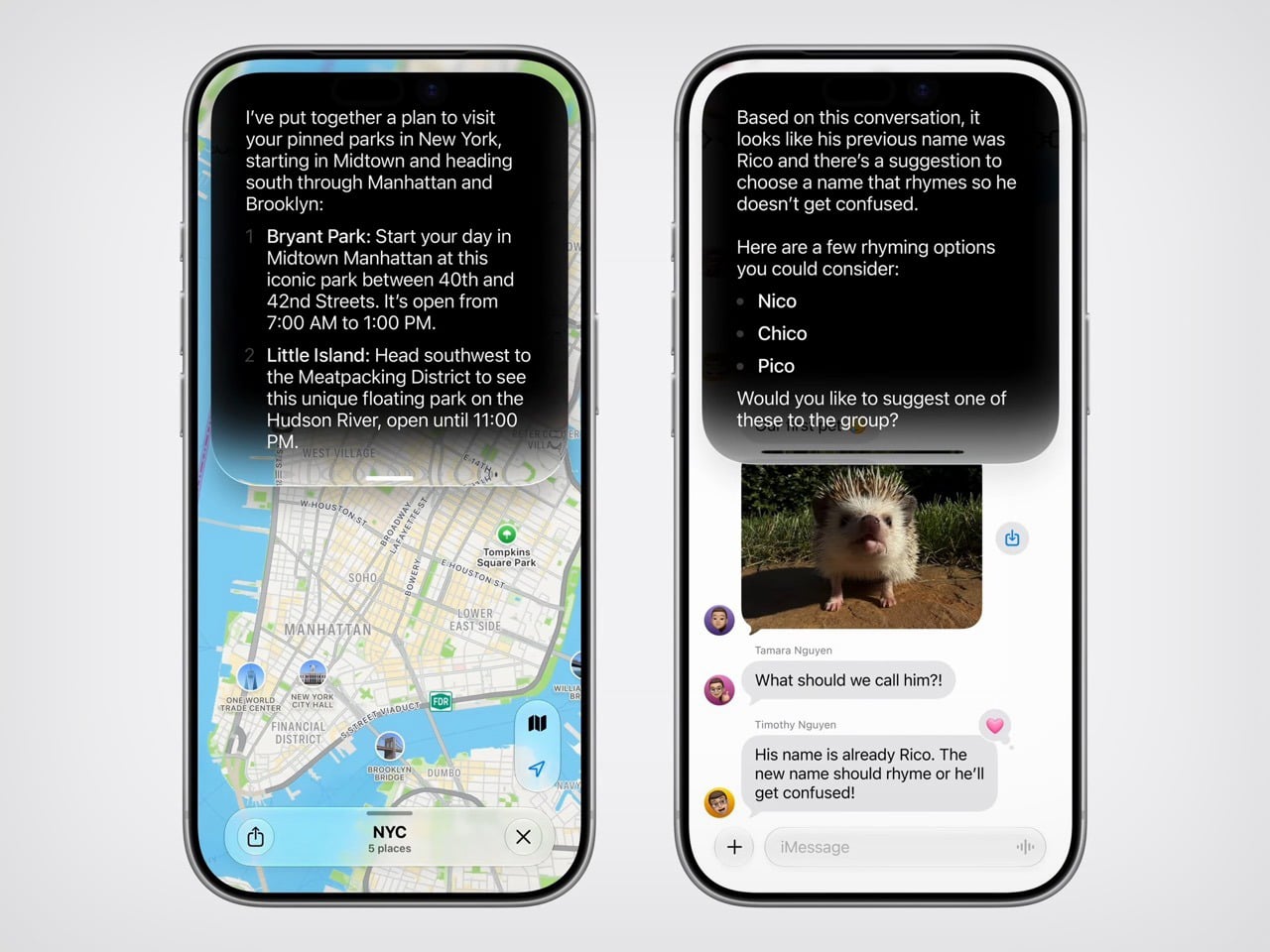
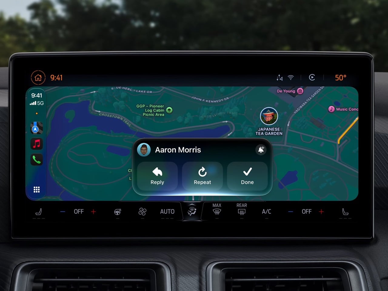
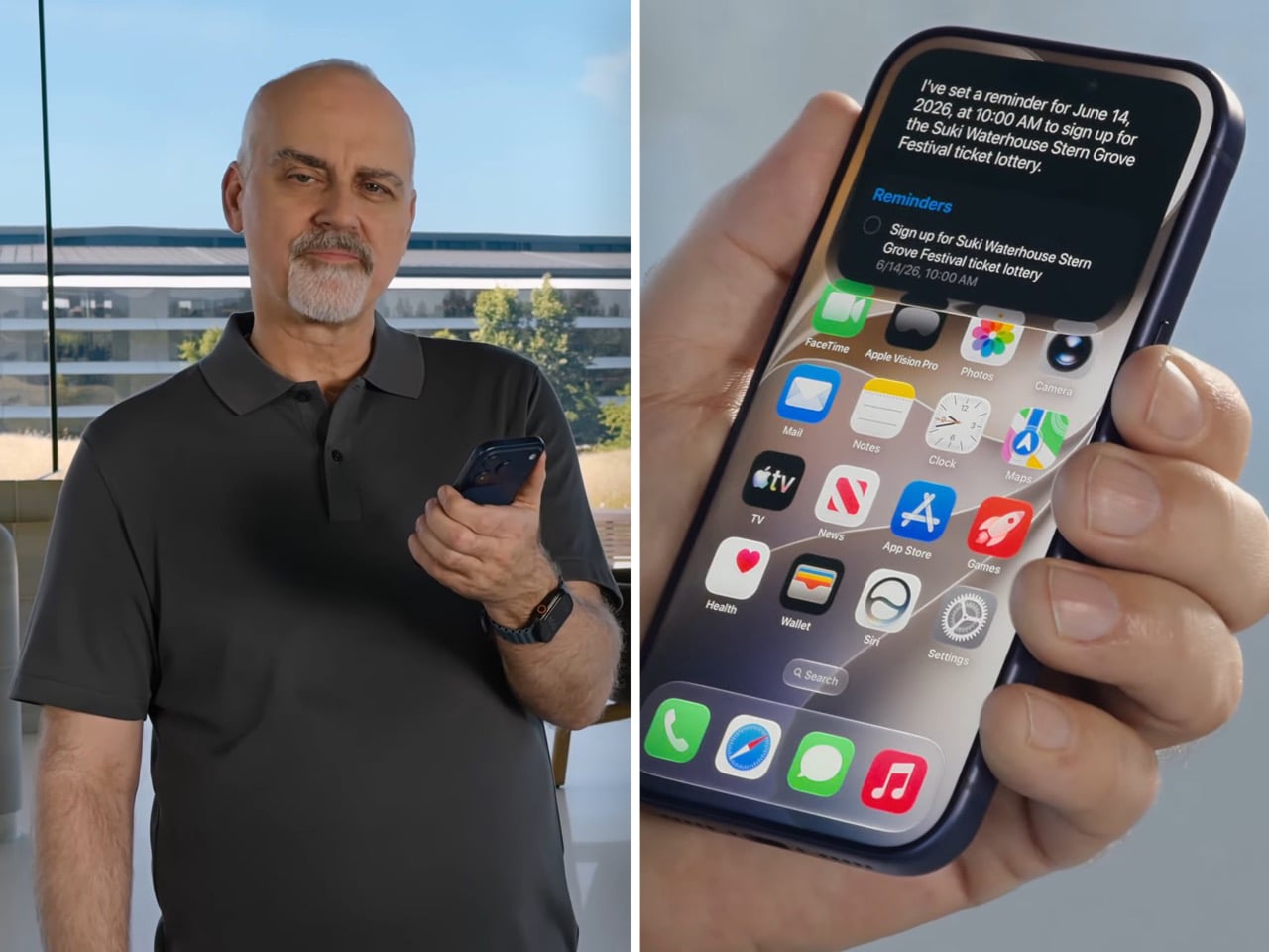
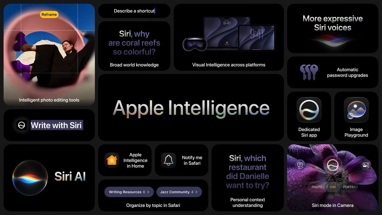
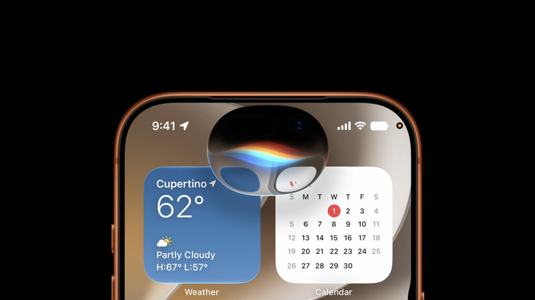
Apple’s approach at WWDC 2026 worked around that problem by reframing the conversation entirely. Instead of leading with technology, it led with moments. Siri finding a friend’s new address buried in a weeks-old message thread. A photo being reframed after the fact, as if you had stepped to the right before pressing the shutter. A restaurant bill split with Apple Cash by pointing a camera at it. These are small things, but they are the kind of small things that people actually think about during their day. Anchoring the keynote to those moments gave the technology a human scale that raw AI talk rarely achieves.

The branding reflects the same thinking. Apple calls it “Apple Intelligence,” a label that keeps the company name front and center while quietly sidestepping the overcrowded AI conversation. It is a deliberate choice, and it shows. Google’s keynote was structured around the technology itself, its power, its speed, its range. Apple’s keynote was structured around the people using it. That difference in framing shapes how audiences receive the same underlying capability, and Apple’s version is considerably easier to trust.

Privacy played a central role in building that trust. Apple returned to on-device processing and Private Cloud Compute repeatedly throughout WWDC, not as a footnote but as a feature. At a time when public concern about how AI companies handle personal data is growing steadily, that emphasis lands differently than it might have a few years ago. Google builds powerful models and serves them at enormous scale. Apple builds careful models and makes a point of telling you where your data goes and where it stays. For a meaningful portion of consumers, that distinction matters more than benchmark scores.

None of this means Apple is winning the AI race on capability. Google’s models are more powerful, more publicly accessible, and more deeply woven into the daily workflows of people around the world. Gemini’s reach across Search, Gmail, YouTube, and Android gives Google a distribution advantage that Apple’s ecosystem, for all its loyalty, cannot easily match. If the competition were judged purely on technical ambition and model performance, Google’s 100 mentions would feel earned.

But technology keynotes are not judged purely on technical ambition. They are judged on how they make audiences feel, what they make people want, and whether they leave the room energised or overwhelmed. On those terms, Apple’s 28 mentions of “AI” accomplished something that Google’s near-100 did not. They kept the word rare enough to mean something. Every time Apple said it, there was a feature attached, a privacy assurance nearby, and a use case grounded in daily life. The word carried weight because it was not being used to fill space.

The larger irony is that Apple may be the company best positioned to benefit from a backlash it did not entirely create. Google, Microsoft, Meta, and others have spent years flooding the conversation with AI language, and the fatigue that has followed is a byproduct of their own enthusiasm. Apple watched, built quietly, and showed up at WWDC 2026 with a keynote that treated restraint as a product decision. Whether that restraint reflects genuine strategic confidence or simply a capability gap dressed up in good marketing is the question the next few years will answer. For now, 28 versus 100 tells a story that Apple’s communications team could not have scripted better.

The post Apple said ‘AI’ exactly 28 times at WWDC 2026. Google mentioned it nearly 100 times at I/O. first appeared on Yanko Design.