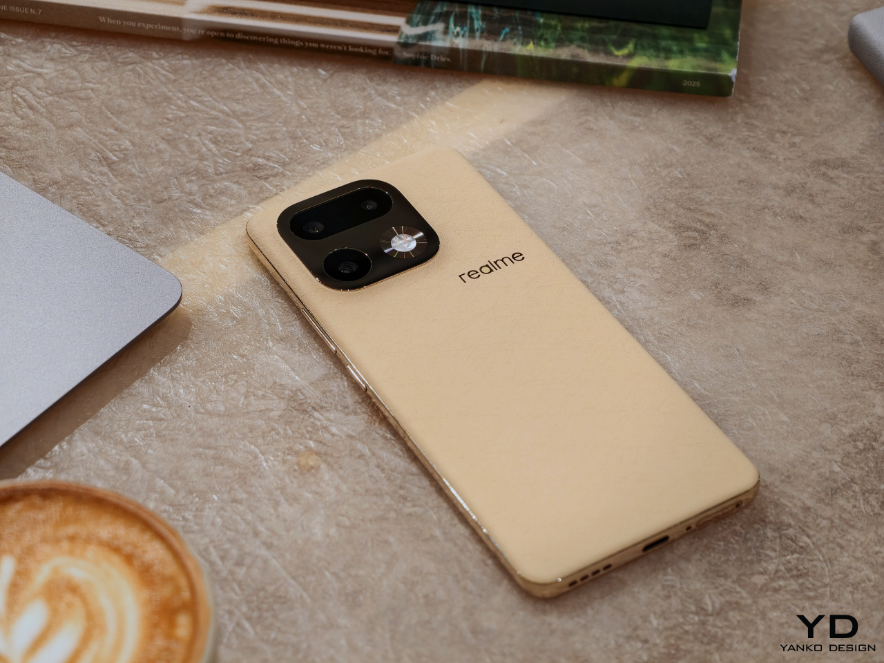
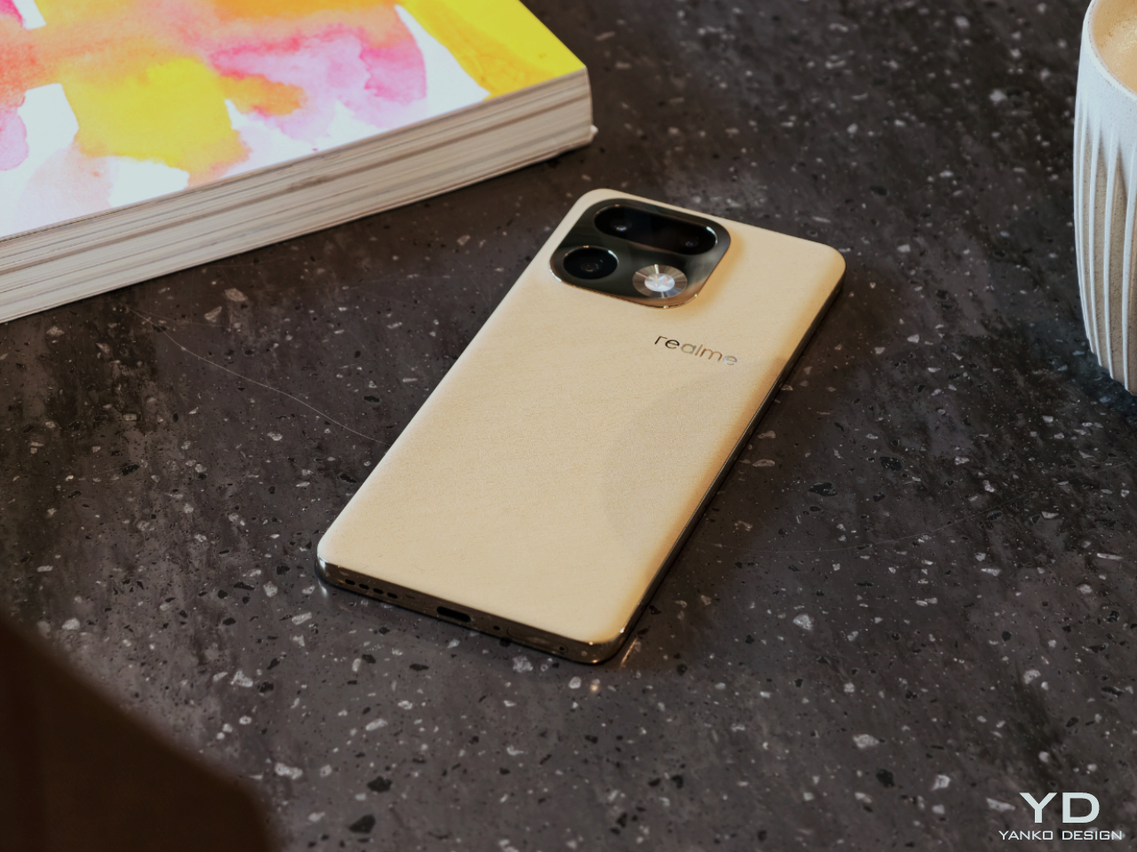
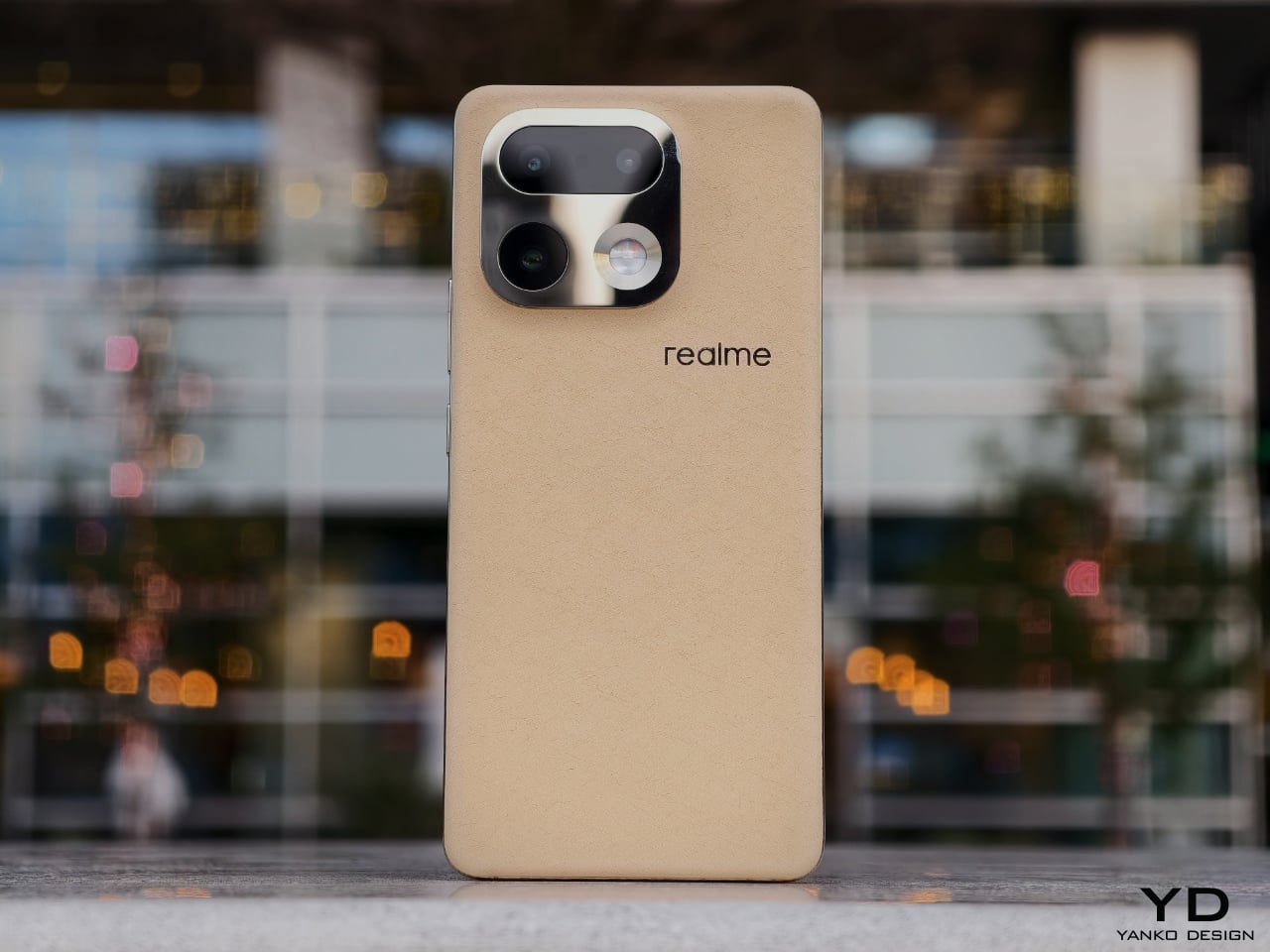
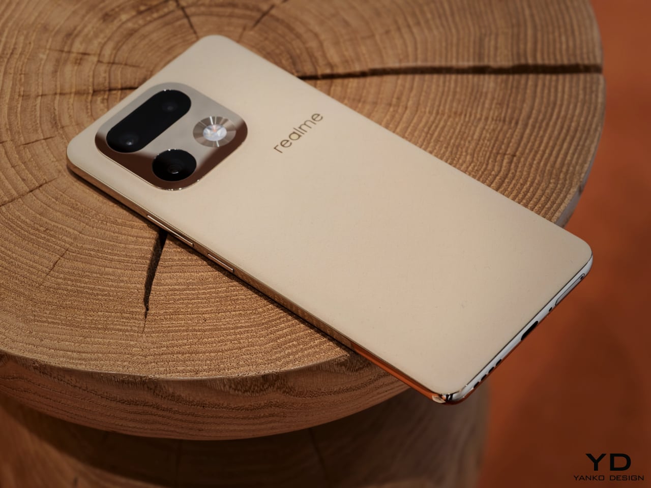
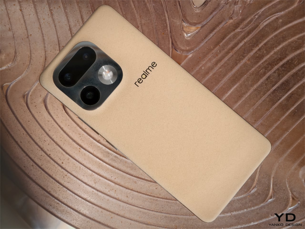
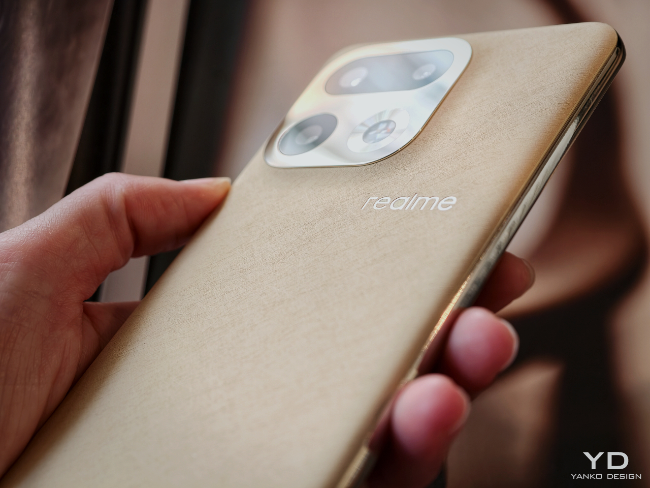
With the realme 16 Pro series, Naoto Fukasawa and realme reunite for their fifth collaboration. Past Master Edition phones have been anchored in concrete metaphors such as onion and garlic for food, concrete and brick for architecture, a suitcase for exploration, and paper for sustainability. This time, the theme is Urban Wild Design, which combines a softly textured, bio-based back with a mirror-polished camera island and frame so that the phone feels less like a gadget and more like something between a pebble, a wheat field, and a piece of jewelry.
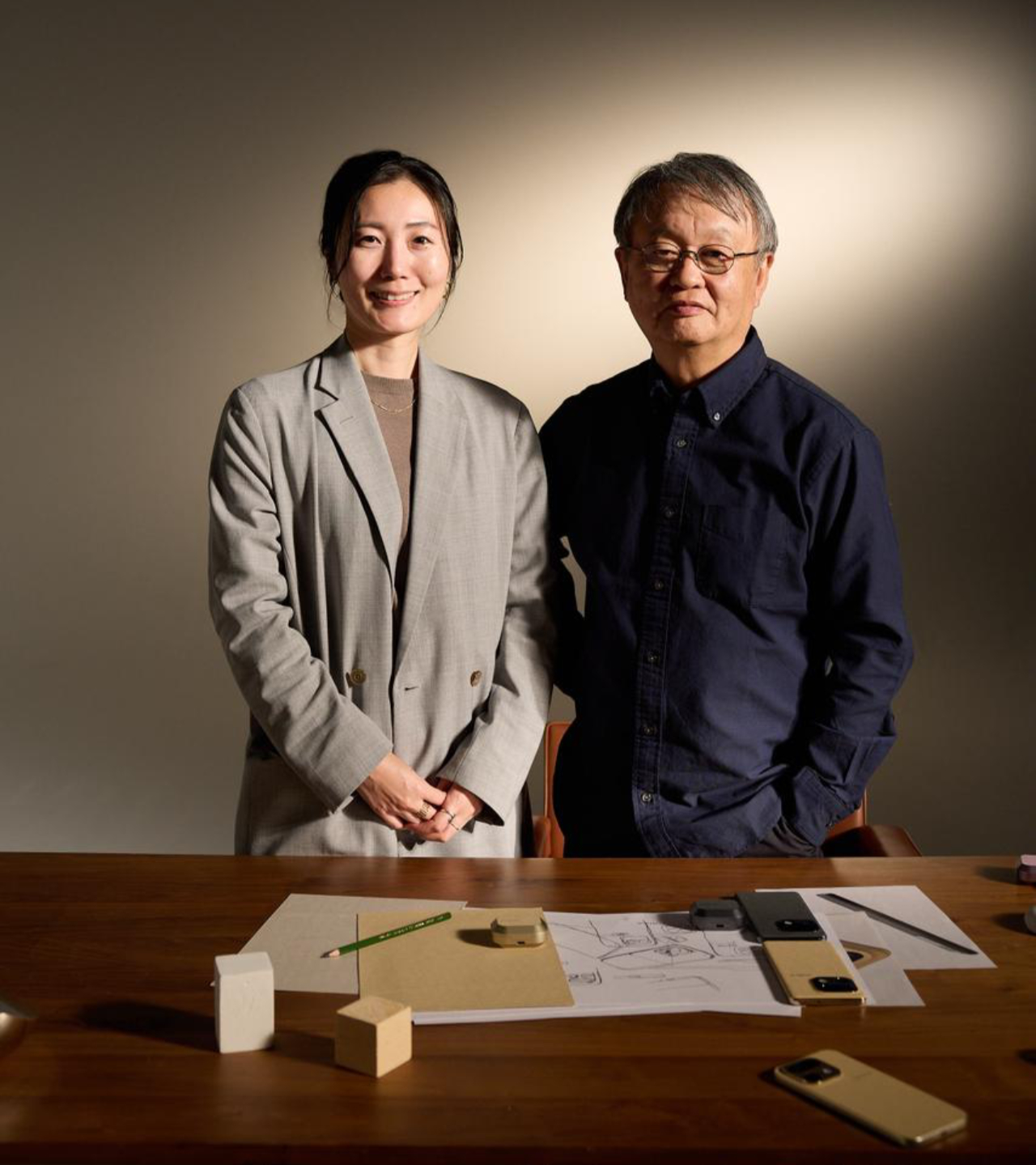
To understand the thinking behind Urban Wild and where smartphones sit in his larger body of work, we spoke with Fukasawa in Tokyo. What emerged was a conversation about optimal solutions, poetic observation, and the slow transformation of phones from tools into objects we might someday find in a jewelry boutique.
Smartphones after the “optimal size”
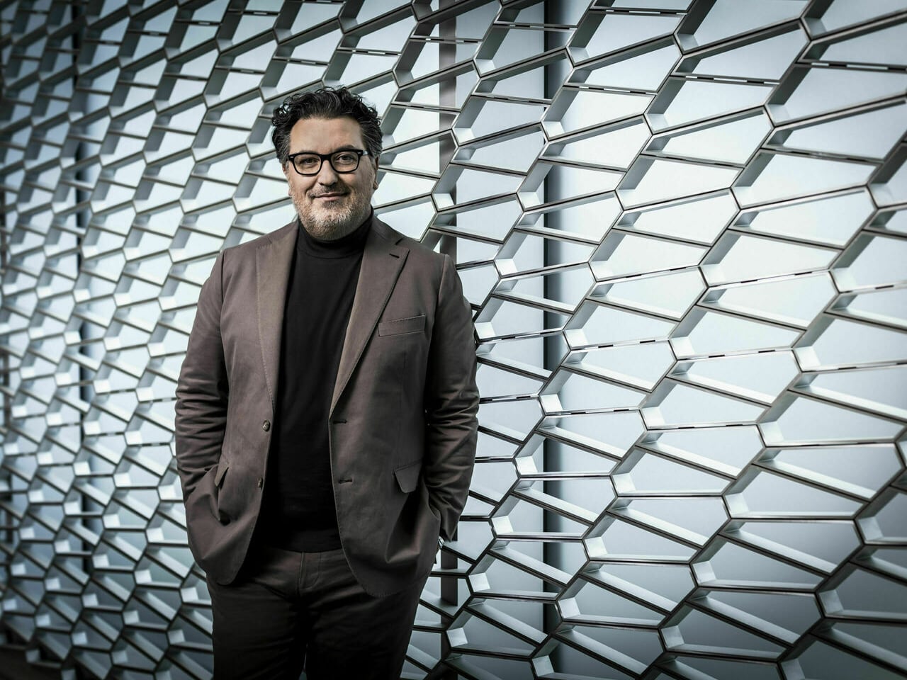
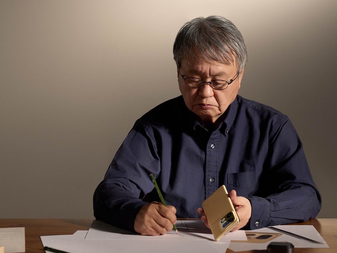
Designer: Naoto Fukusawa
Fukasawa has designed furniture, appliances, and a wide range of everyday objects. When we ask how he now sees the smartphone in our lives, and whether it feels closer to a tool or to a companion, he does not answer with a metaphor about friendship or dependence. He goes straight to something more concrete, which is size, and explains that mobile phones kept shrinking until they reached the smallest form that people could still use comfortably, then stopped. For him, that point, where going any smaller would make them difficult to handle, is roughly where the smartphone’s footprint settled, and in terms of size, we have already reached something close to an optimal answer.
Once that size is fixed, the phone stops being just an efficient tool and, because we always carry it, becomes part of daily life. As new functions and applications accumulate, the phone becomes more than a neutral object. It starts to feel like something that responds to you, and something you relate to on an emotional level as well as a functional one. In that sense, the smartphone has moved closer to a partner than a simple instrument.
From gadget to accessory
Over the last several years, Fukasawa has watched both the devices and the surrounding market change. For a long time, selling more products meant multiplying variations, and that approach helped companies grow, yet also made everyday life feel crowded with choices. “People used to believe that the more options you had, the happier you would be,” he says. “Now, with so many choices, life has become overwhelming and even a little painful.”
From his perspective, the next step is not to say here is another option, but to say this is the object that suits you best. If designers can get closer to a true optimum, there may be less need for endless variations, and in the extreme case, one type might actually be enough. For him, the smartphone is already close to a final archetype, and the real work now lies in how it feels in the hand and how it lives with us each day.
Once the basic form and functions have settled in this way, what separates one phone from another is less about what is inside and more about how it is expressed on the outside. That is where collaboration and brand character start to matter. realme is a relatively young brand, its identity closely tied to youth, and that youthfulness was part of the attraction for Fukasawa when the collaboration began in 2019 with the realme X Master Edition.
Smartphone hardware has almost converged, and most major brands now work with similar capabilities, which means the design, appearance, and feel of the device become more important. In that context, the 16 Pro series became a way to explore something he feels is still rare, a sense of quiet luxury for a young audience. Youth and luxury are not usually linked, and young users are often expected to settle for things that look cheap or temporary, but with realme he wanted to offer something more refined without losing accessibility.
“We had not really thought about it from that side before,” he says. He wanted to treat the phone not only as a gadget, but also as something closer to an accessory that people might choose in the same way they choose a watch or a piece of jewelry. He thinks smartphones are now heading in that direction. The hardware inside will keep evolving, yet the design on the outside will increasingly be judged like something you adorn yourself with and show in public.
realme’s target is young users, but he did not want to make something throwaway. Instead, he aimed for a slightly more grown-up kind of elegance, the kind of subtle sparkle a young person might want when walking through the city. That balance between youth and a touch of luxury is, for him, a key part of what makes the 16 Pro feel different.
Urban Wild, bringing nature into the city
For Fukasawa, the starting point for the 16 Pro was a human wish to bring nature into urban life. He feels that wish has grown stronger after decades of rapid growth and increasingly inhuman city environments. More people now seem drawn to things that feel closer to natural phenomena or handmade objects, and to smaller quantities of more considered products. He senses a shift in what people value, away from volume and speed and toward calm and presence.
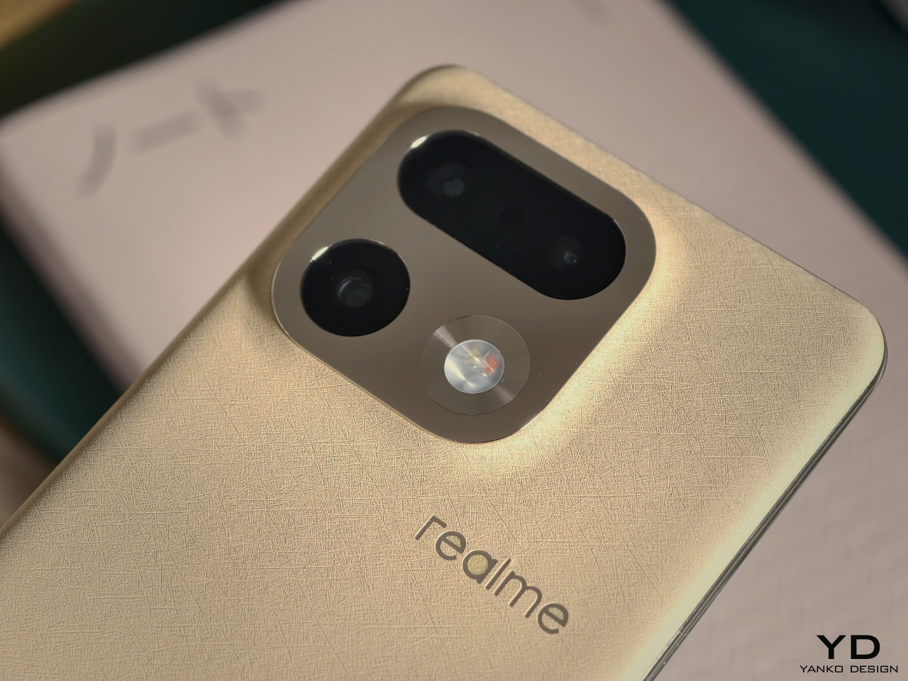
He wanted the phone to carry that feeling in a direct, physical way. The first idea was a touch that did not feel cold, and a back surface that felt slightly soft and warm in the hand, almost like paper or fabric rather than hard plastic or rubber. At the same time, he knew the design would include accents that could take on a mirror finish, so it became a deliberate contrast, with a soft and quiet body paired with shiny, jewelry-inspired highlights.
To him, this mix of natural warmth and precise shine points to where value is moving. “That is where value will be,” he says. For Fukasawa, what feels valuable now is not more noise, but a calm presence that still has intensity. In that sense, his idea of wildness is broader than the way the word is often used in marketing.
The word wild is usually attached to something loud and extreme, but for him, it can just as well describe a kind of clarity and simplicity that stands out in the middle of a noisy world. “In a very noisy environment, when something is extremely simple, that can also be wild,” he suggests. In the same way that Super Normal objects are, in his words, super special, Urban Wild is less about spectacle and more about a stripped-back intensity where quietness itself becomes the bold statement. The phrase Urban Wild came later, after the design already existed and had made people quietly say “wow,” so it was a name that followed a feeling rather than the other way around.
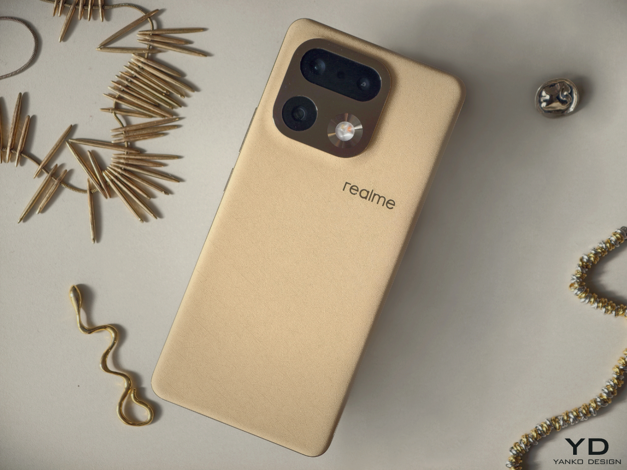
True to nature color and texture
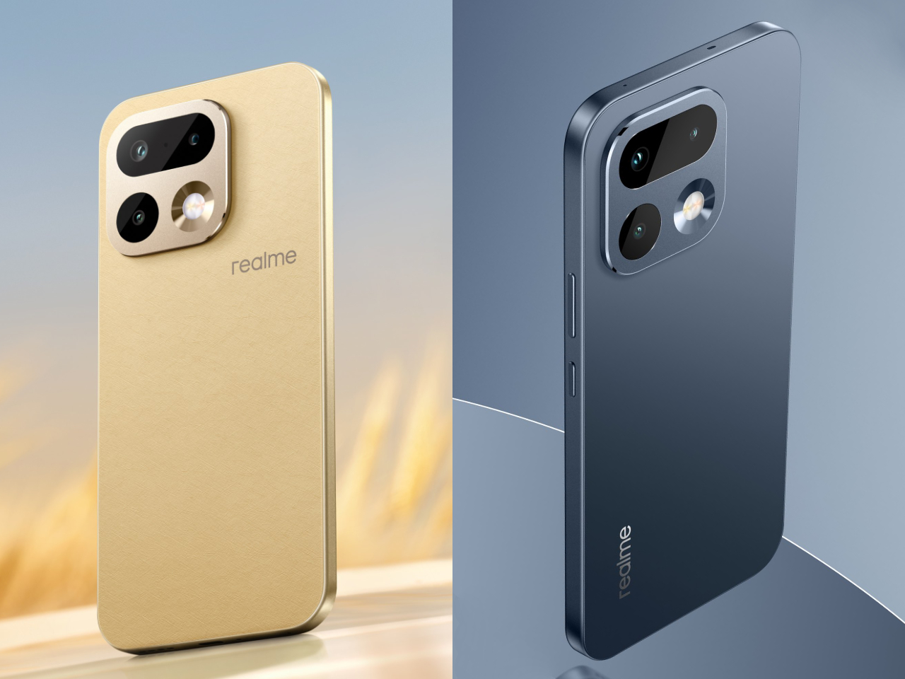
The 16 Pro series launches in Master Gold and Master Gray. Both are positioned as True to Nature colors, but Fukasawa is careful not to treat nature as something that simply appears without human choice. He points out that in both fashion and product design, there are always people and organizations thinking about what colors the world needs next.
Trends do not appear from nowhere. They only succeed if they resonate with a mood that is already forming around the world. Right now, that mood is moving away from aggressive, saturated hues toward quieter tones you might find in a landscape. Beige, for example, might be a slightly yellow beige or a sand beige with a hint of warm brown, and those small shifts are where design happens.
For the 16 Pro, Fukasawa worked with that global sense of “this is the color of now,” but tuned it toward natural calm rather than toward fashion drama. Texture plays an equal role in the experience. A fabric-like grain on the surface can make the same color feel much softer and more approachable, and that combination of controlled hue and subtle texture is what gives Master Gold and Master Gray their understated presence.
A back that feels closer to skin than rubber
The most radical part of the 16 Pro hardware is the back material, a bio-based organic silicone made from plant-derived straw. It is soft, faintly elastic, and subtly leather-like, and Fukasawa sums it up by saying that it has moved closer to human skin, not just to soft rubber. For him, this is not only about one smartphone, but part of a wider change in how technology touches the body.
He connects it to a broader shift in robotics, where early humanoid robots were metal blocks and newer soft robotics explores flexible, cushiony structures that can interact more gently with people. The 16 Pro is still a highly precise gadget, but introducing a genuinely soft and skin-like element into that precision feels to him like one step up in the evolution of devices. It hints at a future where high technology does not have to feel hard or distant from the body.
On sustainability, he is clear that recyclability alone is not the end goal. “Sustainable means able to be sustained,” he points out, and recycling discarded materials is only an intermediate step in a longer journey. If people feel that a material truly suits them, and it continues to be used across generations of products, then it does not become obsolete or unwanted, and in his words, that is the strongest form of sustainability.
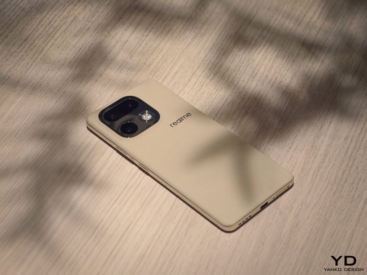
Curves decided by human experience
realme describes the overall silhouette as an All Nature Curve Design, with continuous curves linking the back, mid frame, and screen. Within the rigid rectangle of a smartphone, it is not obvious where there is room to change the feeling in the hand, yet for Fukasawa, the answer lies less in formal theory and more in accumulated human experience. Over time, our hands learn what feels right and what feels wrong, and those memories build a shared sense of which shapes are comfortable and which ones look natural.
He gives the simple example of a table edge, and as he talks, he runs his fingers along the corner in front of him, which we expect to be neither too sharp nor too rounded. Sharp corners can look cool but feel harsh, while very rounded edges can look sloppy or tired, and the sweet spot sits somewhere in between. Once the size and thickness of the phone are fixed, the gentle line that naturally fits those dimensions almost decides itself, and he describes the final curves as something that emerged rather than something he forced into place. “I was not trying to think up a shape,” he says. “It formed naturally,” and that naturalness is part of what makes the phone feel calm in the hand.
A phone that belongs in a jewelry boutique
He imagines taking the phone out of the electronics aisle and placing it in a boutique that sells luxury bags and jewelry, and he wanted a smartphone that could sit there without feeling out of place. “If we always stay in the gadget section, we will always be seen as gadgets,” he says, and that is precisely what he wants to move beyond.
With the 16 Pro, he wanted people to feel drawn to it in the same way they are drawn to a beautiful accessory, and not through spectacle or aggressive styling. Instead, he aims for a sense of calm quality and high sensibility that invites people closer and rewards touch. The ideal first reaction is not a shout, but a soft “wow, this feels nice” that might never be spoken aloud.
Poetic observation and advice for young designers
Toward the end of our conversation, we moved from smartphones to design education. Fukasawa believes that design has grown up alongside industry, but that not all of that growth was right. He feels that today, technology has finally caught up enough that designers can aim closer to the essence of human life. What is needed now, he says, is not only observation in the marketing sense, which means staring at the market, but a different kind of observation directed at people and environments.
The problem is that simply telling young designers to observe often leads nowhere, because they open their eyes and still see nothing. To make the idea more concrete, he and a cognitive psychologist friend began using the term poetic observation instead. He likens it to writing a short poem, a haiku, about what you see, and when you look at the world with that mindset, things start to appear more human and more connected, and small scenes begin to feel like stories.
“It is like listening to a song whose lyrics suddenly turn the whole scene into a story and make everyone in it a kind of main character,” he says, and he believes poetic observation can do the same for everyday life. When I suggest that this sounds less like looking with the eyes and more like seeing with the heart, he nods and says, “Yes, exactly. Poetic means bringing in emotion. That is how you should look at the world.”
It is not only for designers, but he adds, because if everyone could see the world that way, the world would become better. Urban Wild is therefore not just a styling exercise for a mid-range smartphone, but one expression of Fukasawa’s larger project to make the tools we live with calmer, more human, and a little more poetic, even in the middle of the city.
The post Naoto Fukasawa on Poetic Observation and Designing the realme 16 Pro Urban Wild first appeared on Yanko Design.