A Step Stool That Actually Belongs in Your Entryway

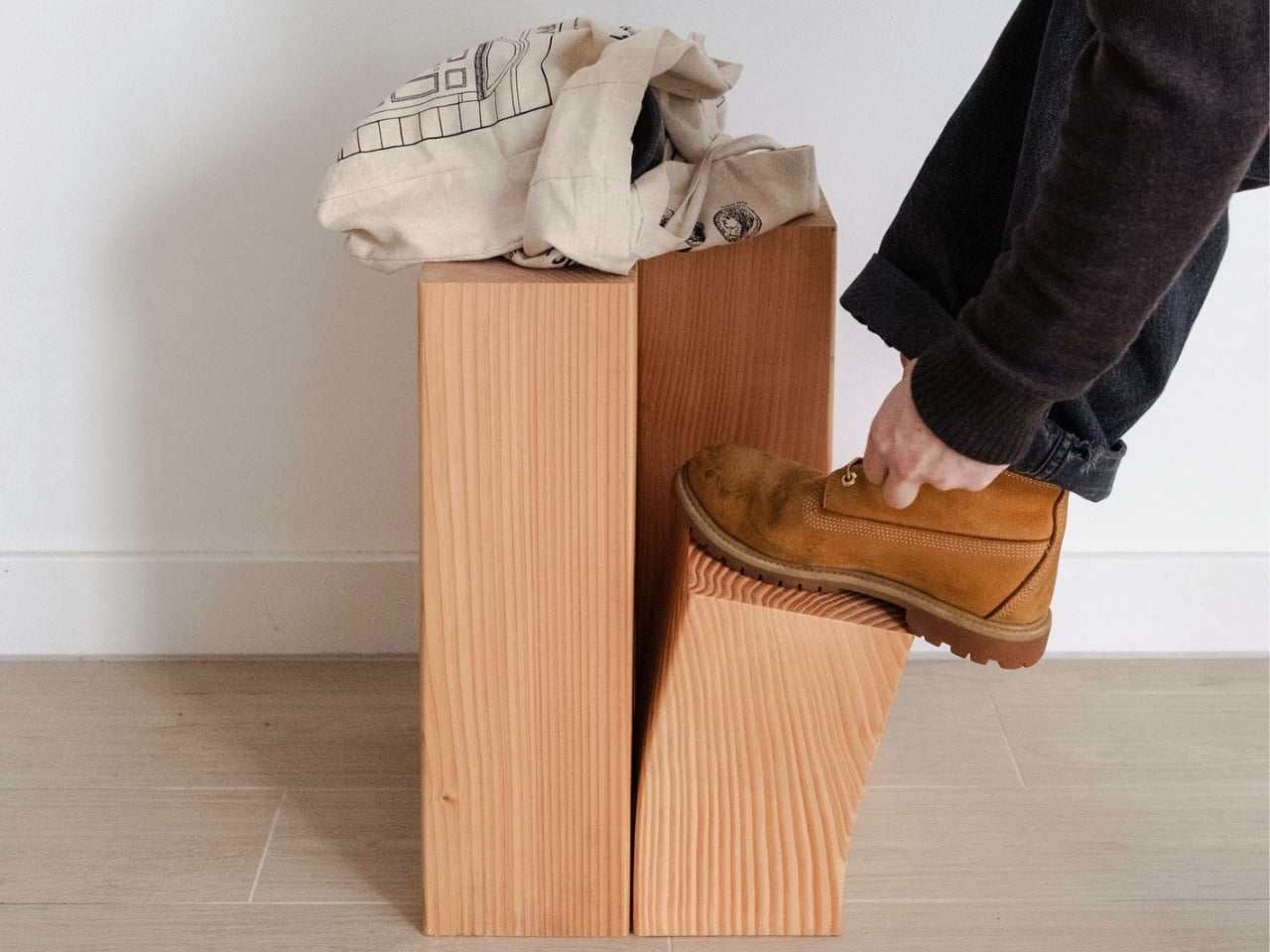
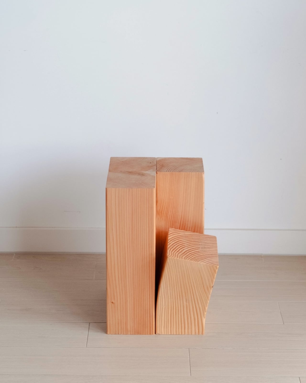
Tying your shoes in the entryway shouldn’t feel like a balance test, but it usually does. You hop on one foot, grip the doorframe or a console table that wasn’t built for that kind of abuse, and hope you don’t tip over before the laces are done. It is a tiny, daily inconvenience that most American homes have quietly accepted, because the entryway is rarely treated as a space worth designing for. Stephen Chan decided to fix that with a step stool built from Douglas Fir, one with a single offset block positioned at exactly the right height to rest a foot while you knot your laces, and it is well-crafted enough that hiding it in a closet would feel like a waste.

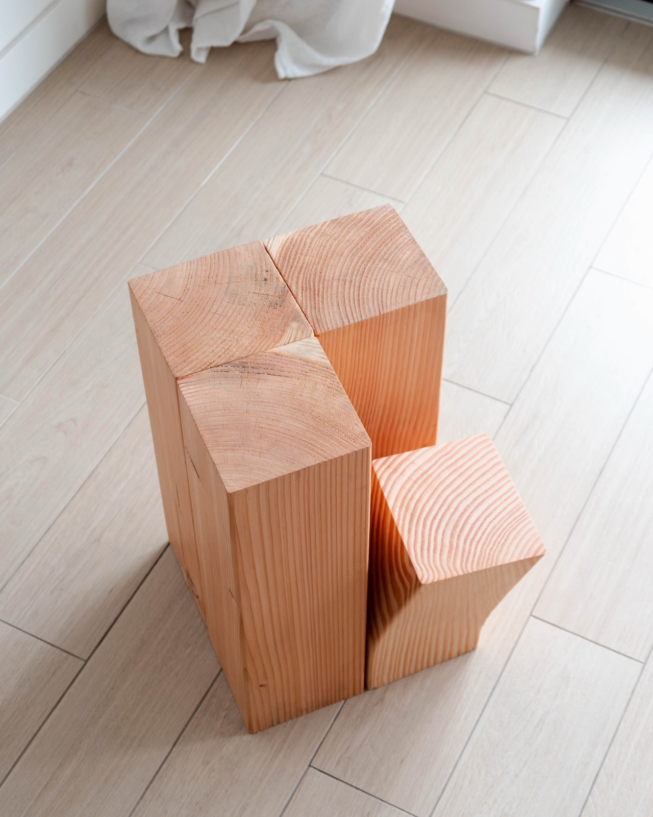
That combination is rarer than it should be. Most step stools look utilitarian by design, the kind of thing you tuck behind a door and drag out only when necessary. Chan’s version refuses that fate. The composition reads as a cluster of rectangular volumes grouped together, with one shorter block offset to one side to create a natural foot ledge. It is immediately functional without a label or instruction, and the geometry is clean enough that it reads as sculpture before it reads as utility.

Designer: Stephen Chan
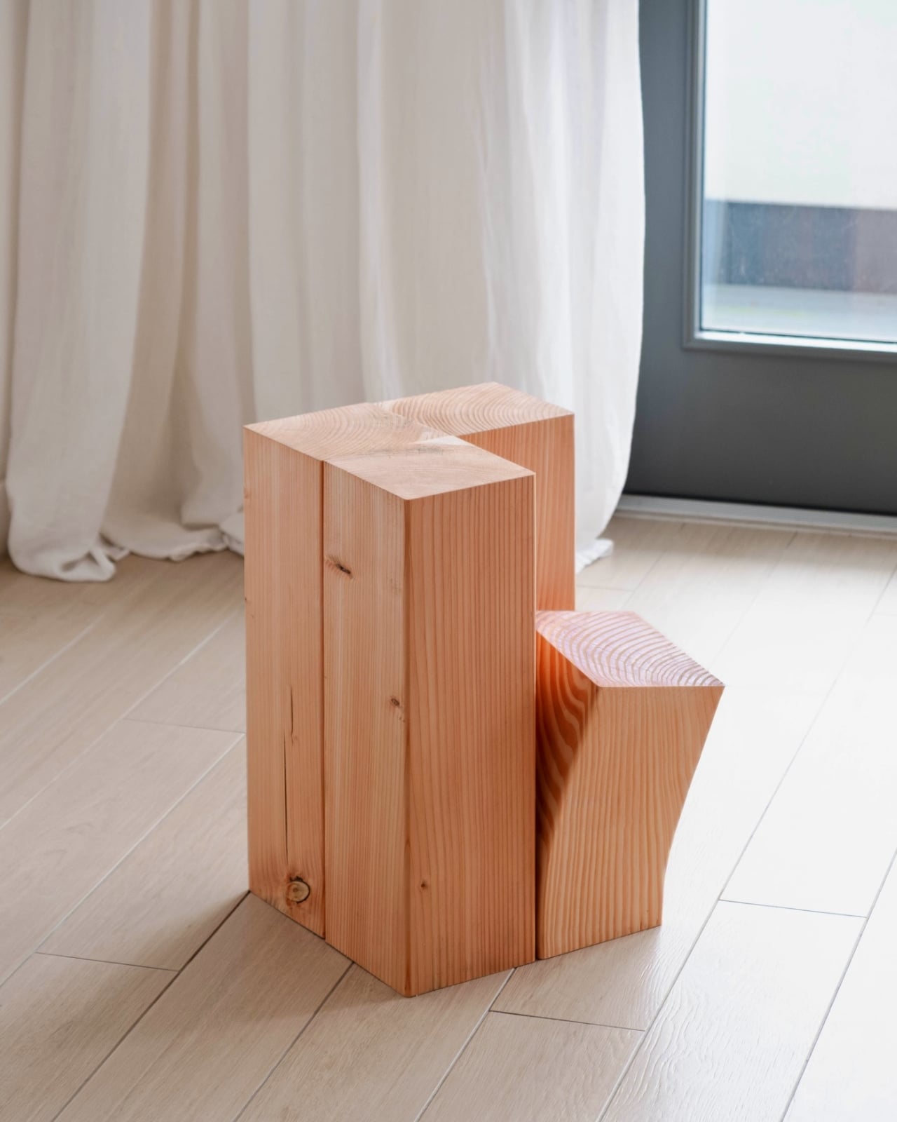
The material choice matters here. Douglas Fir is a Pacific Northwest species, pale and straight-grained, and Chan finishes it in hardwax oil rather than a thick lacquer, so the surface stays matte and raw-looking rather than polished and precious. The wood still feels like wood, with the grain visible and the texture honest. At 300 by 300 by 480 millimeters, the proportions are heavy but not oversized, solid enough to trust with real weight, compact enough to fit in a New York apartment entry without dominating it.

American design right now leans into curves and soft materials, bouclé everything, rounded edges that signal comfort and approachability. Chan goes the other direction entirely. The stool is blocky and angular, closer in spirit to a Donald Judd sculpture than anything you would find at a furniture chain. That is not a criticism. The right-angle joinery is precise and the overall form has the kind of quiet confidence that does not need softening to work in a home. It earns attention without demanding it.
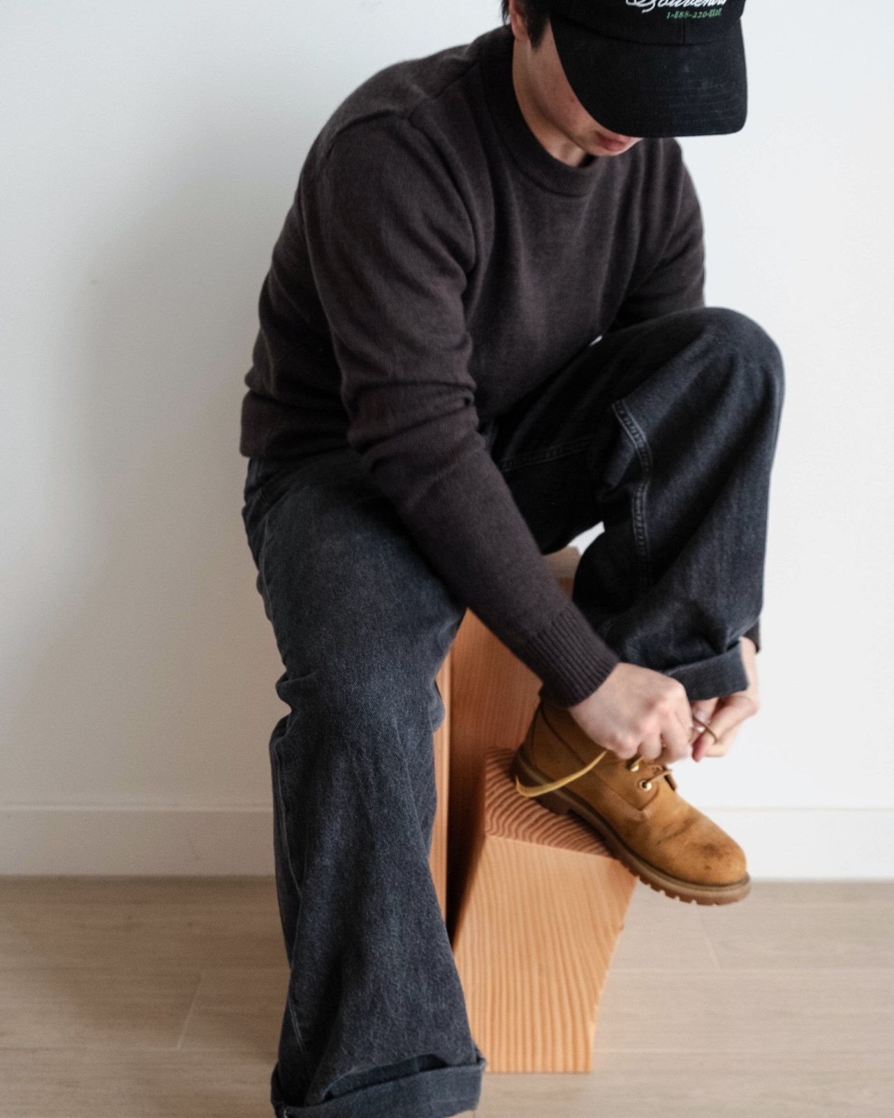
There is a specific context this piece fits into that Chan actually illustrates in his own photos, where he is pictured lacing up a pair of Timberland boots on it. That single image places the stool in a very familiar scene: the entryway of a house in a state with real winters, where work boots and rain boots live by the door out of necessity. Douglas Fir itself grows in that same region, so the material and the use case are quietly connected in a way that feels considered rather than coincidental.

The stool does not try to multitask. It is not a side table or a plant stand or a storage unit with a hidden compartment. It has one job and it does that job with more precision than furniture at twice the price usually offers. That kind of restraint is genuinely rare in a market that rewards versatility over specificity, where every piece of furniture is expected to justify its footprint by doing three things at once. Sometimes the better answer is an object that solves one unglamorous problem extremely well and looks good doing it.
Nobody has ever really solved the entryway stool in a way that made you want to keep it visible. Chan’s version makes the case that the reason most of them get tucked away is not the category, it is the execution. When the craftsmanship is there and the geometry is intentional, a step stool can actually belong in the room rather than hiding from it. Chan’s work is on Instagram at @stephen_____chan. If you follow design accounts, it is worth a look.
The post A Step Stool That Actually Belongs in Your Entryway first appeared on Yanko Design.
Pokémon Just Made the World’s First Human-Sized Poké Ball Hotel

Anyone who’s a huge fan of the Pokémon universe has probably, at one time or another, dreamed about waking up inside that world surrounded by their favorite creatures, training and catching them. Sure, you’d probably turn into an animated character (unless it’s more like the live-action Detective Pikachu, which blended both worlds), but it would still be a blast to run around and try to catch ’em all.

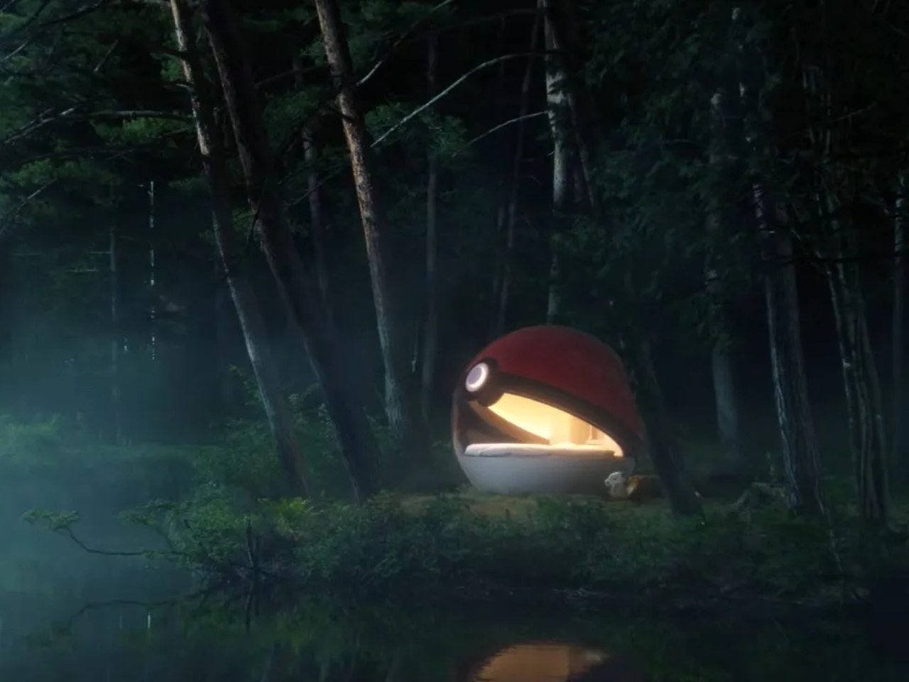
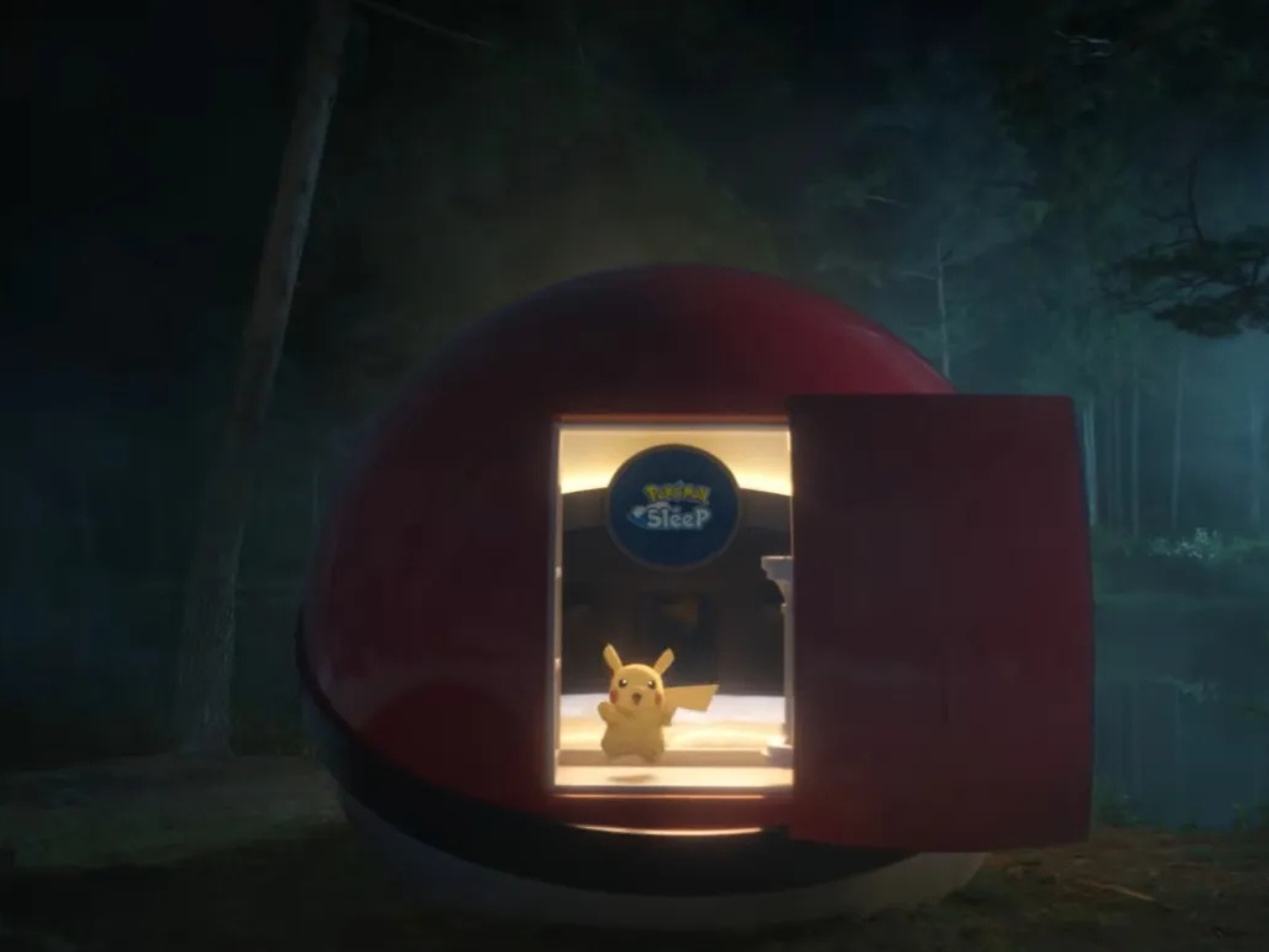
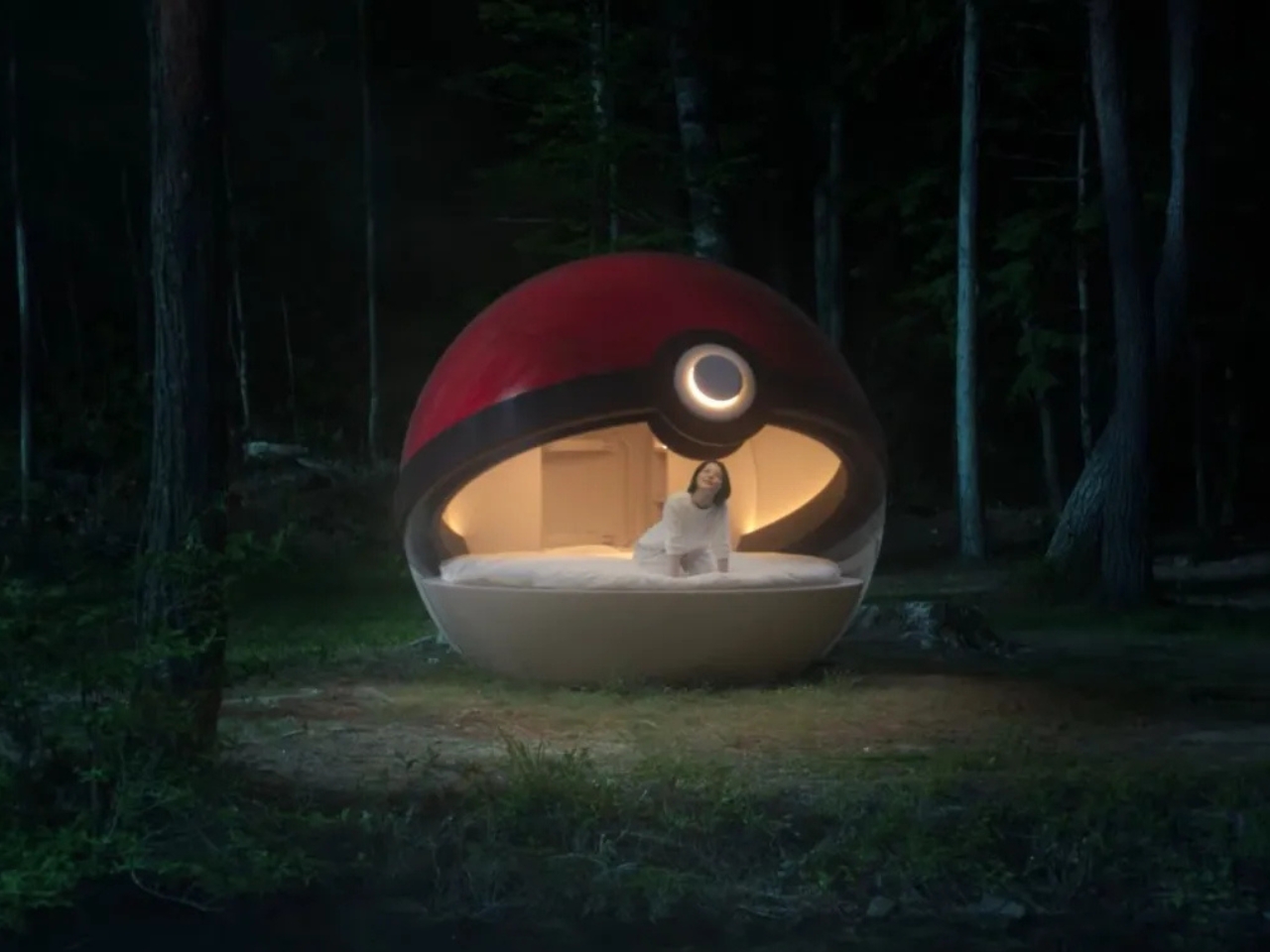
Well, your dream might just come true, to some extent. Japanese hospitality brand NOT A HOTEL has partnered with The Pokémon Company, specifically the Pokémon Sleep app, to create a Poké Ball-Themed Hotel somewhere in the forests of Hokkaido, giving fans the rare chance to spend the night inside a human-sized Poké Ball and maybe wake up imagining Snorlax and Jigglypuff wandering nearby.

Designer: The Pokémon Company x NOT A HOTEL

Usually, when a hotel offers a “themed” room, you just get some decorations and maybe a few painted walls inside an otherwise ordinary building. But this one is nothing like that. It’s a detached, freestanding spherical structure set outdoors, somewhere amid Hokkaido’s wilderness. Think of it as camping, or more accurately glamping, except instead of a tent, you’re sleeping inside a giant ball. NOT A HOTEL is known for building one-of-a-kind architectural homes rather than cookie-cutter rooms, so if anyone can pull off turning a cartoon object into a livable structure without it feeling like a cheap novelty prop, it’s them.

The collaboration is actually built around Pokémon Sleep, the mobile sleep-tracking app that just celebrated its third anniversary. The app gamifies your bedtime by “catching” Pokémon based on your real sleep data. This hotel flips that concept on its head: instead of having the creatures visit you while you sleep, you’re the one visiting their world instead. Well, sort of. Let’s just say your imagination will probably run wild the moment you check into your very own Poké Ball.

Interestingly, the project uses the international name “Poké Ball” rather than “Monster Ball,” which is what the item is officially called in Japan. That small detail suggests this experience is designed to welcome fans from all over the world, not just domestic travelers.

We don’t have a ton of details yet, but everything is set to be revealed on September 15, including how the whole thing will actually work. Based on what’s been shared so far, this won’t be a simple online booking like a typical hotel stay. It sounds like it’ll be run more like a limited, lottery-style campaign, meaning only a lucky handful of selected guests will actually get to spend the night inside. The exact location in Hokkaido is also still being kept a secret, adding an extra layer of mystery to the whole reveal.

Fair warning: whether it ends up being a paid stay, a members-only perk, or a straight-up giveaway, it’s probably safe to assume this won’t be an easy ticket to get. But honestly, that’s probably a small price to pay (literally or figuratively) to fulfill a childhood dream you never thought would actually happen. It’s a genuinely clever marketing move, one that’s perfectly engineered to hook die-hard Pokémon fans and casual travelers hunting for a one-of-a-kind experience, all at once.

At the end of the day, this is one of those rare collaborations that actually makes sense on every level. It’s not just slapping a familiar logo onto a hotel room and calling it a day. It’s a legitimate design experiment that ties directly back to the game it’s promoting, wrapped in the kind of nostalgia that makes Pokémon fans of literally every age stop scrolling. Whether or not you personally end up snagging one of the extremely limited spots, it’s still fun to imagine what it might feel like to fall asleep inside a giant red-and-white sphere, tucked away in the quiet forests of Hokkaido.

So mark your calendar for September 15. That’s when NOT A HOTEL and The Pokémon Company are expected to lift the curtain on pricing, application details, and what the inside of this thing actually looks like. Until then, all we can do is speculate, dream, and maybe rewatch a few old Pokémon episodes to get in the mood. After all, this might be the closest any of us ever get to living out that childhood fantasy of stepping straight into the Pokémon world.

The post Pokémon Just Made the World’s First Human-Sized Poké Ball Hotel first appeared on Yanko Design.

Vention’s New Power Bank Reads Like a Sunset, Not a Spec Sheet

Vention spent years building batteries for other people’s brands before deciding portable power deserved a signature of its own. At IFA 2026, the company stepped out from behind the curtain with the Vention H Series and Dash Series, betting that people choose chargers the same way they choose anything else they carry every day: based on how it looks and feels, not just how many watts it pushes.

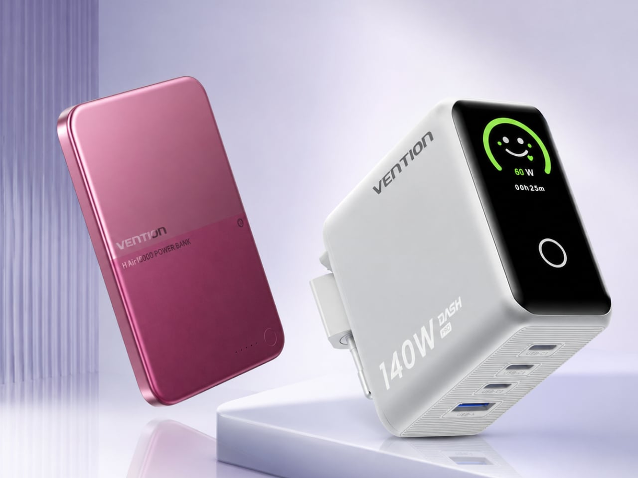
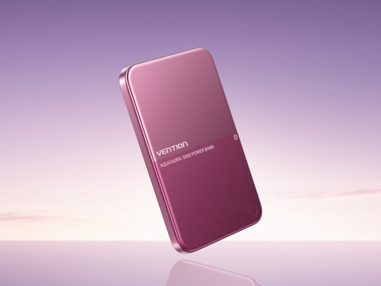
That bet shows up clearest in the H Series’ signature Burgundy Dusk finish, a colorway built around a concept Vention calls “Half Sky, Half Earth.” Two shades of the same hue meet across the middle of the shell, evoking the horizon where sky color bleeds into reflected light on the ground. It’s a quieter kind of design language than the single-tone, tool-like aesthetic that’s defined portable batteries for years.

Designer: Vention

At just 6.9mm thick, the H Series wraps that two-tone finish around a contoured aluminum alloy body finished with a soft, frosted matte texture, the kind of detail that rewards actually holding the thing rather than just glancing at a product photo. A 5,000mAh solid-liquid hybrid battery, borrowed from flagship smartphone engineering, keeps the slim shell from sacrificing energy density or cold-weather reliability.

Safety backs up that slim profile with real engineering rather than just marketing language. The battery passed a 4mm tungsten steel needle puncture test without sparking or smoking, and it survived a 275°F hot-box test for a full hour without combustion. A companion app translates all that internal monitoring into plain readouts covering temperature, current, and battery health, replacing a single vague percentage with something people can actually trust.

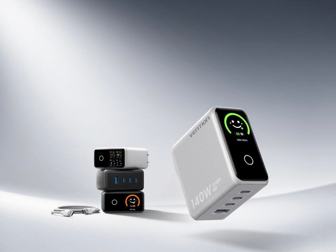
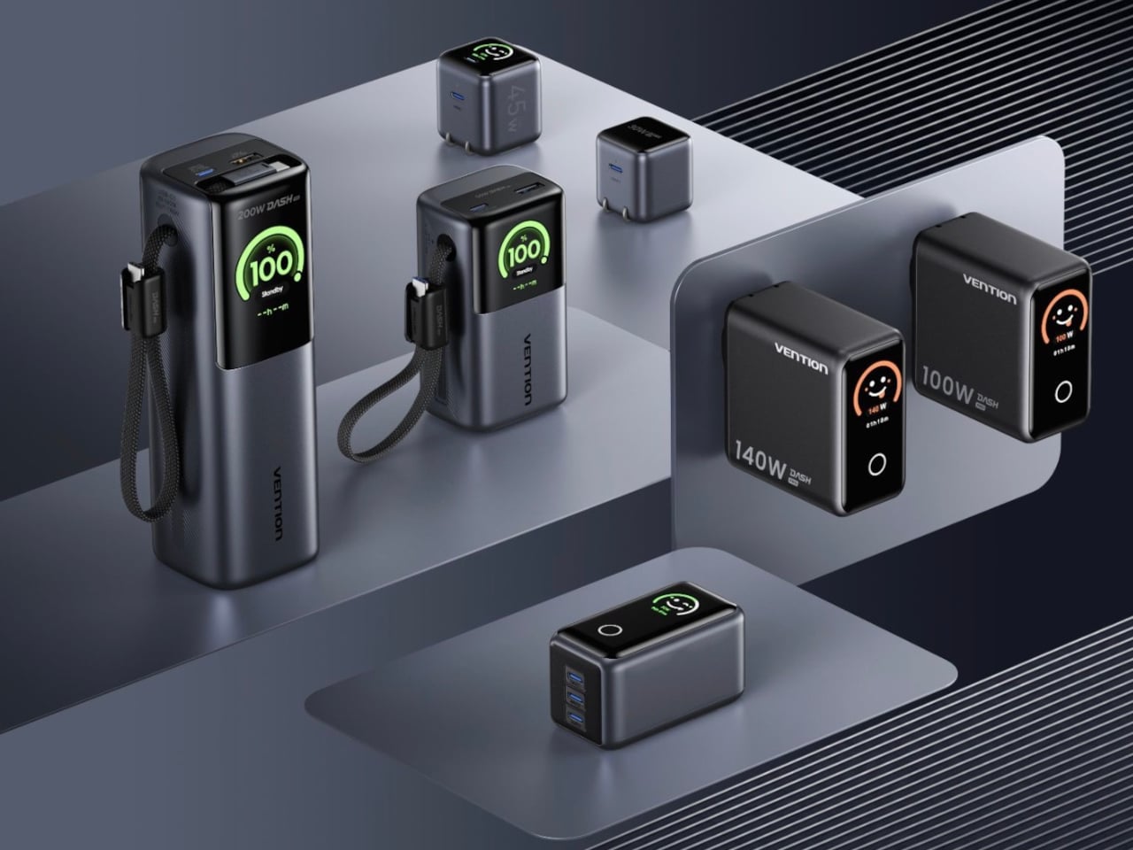
Charging gets the same attention to detail through the Dash Series, six chargers led by the Dash Pro, a 140W four-port GaN 5.0 charger that solves a problem most power bricks never bother addressing. Rather than showing a static battery icon, Dash Pro displays five animated, color-coded faces, sleepy white when idle, calm blue during trickle charging, cheerful green at fast-charge speeds, and excited orange at full throttle.

That small screen turns an otherwise invisible process into something readable at a glance, useful for anyone juggling a phone, tablet, and laptop off the same brick during a layover. FlashCore technology backs that visual feedback with broad protocol support, covering PD 3.1, QC, PPS, and UFCS, so older devices charge just as reliably as this year’s flagships plugged in beside them.

Vention engineered the Dash Pro’s physical plug to match its software polish, reinforcing the prongs so a four-port charger doesn’t tilt or loosen under its own weight, a small annoyance anyone who’s traveled with a bulky multi-port brick will recognize instantly. Adaptive voltage support between 100V and 240V, paired with a foldable plug, rounds out a design built for hotel outlets as easily as home ones.

Between the H Series’ sunset-inspired shell and the Dash Series’ emoji-driven charging displays, Vention is making a clear argument that portable power doesn’t have to look like it belongs in a toolbox. Both lines land in the U.S. and E.U. as Vention’s first real step from anonymous manufacturer into a brand people might actually recognize on a store shelf.

The post Vention’s New Power Bank Reads Like a Sunset, Not a Spec Sheet first appeared on Yanko Design.

Most Fitness Watches Tell You How to Live, the Moto Ultra Listens

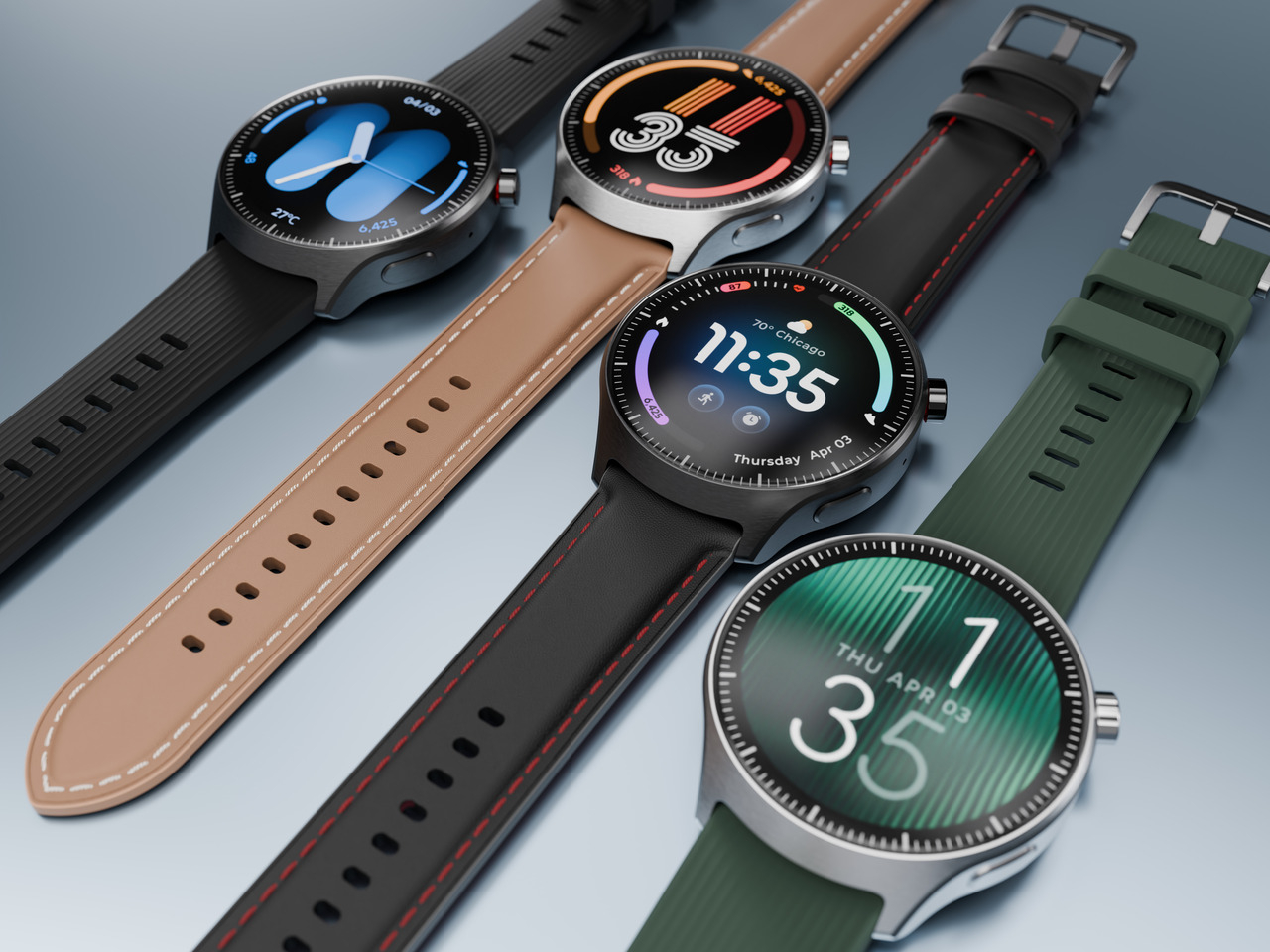
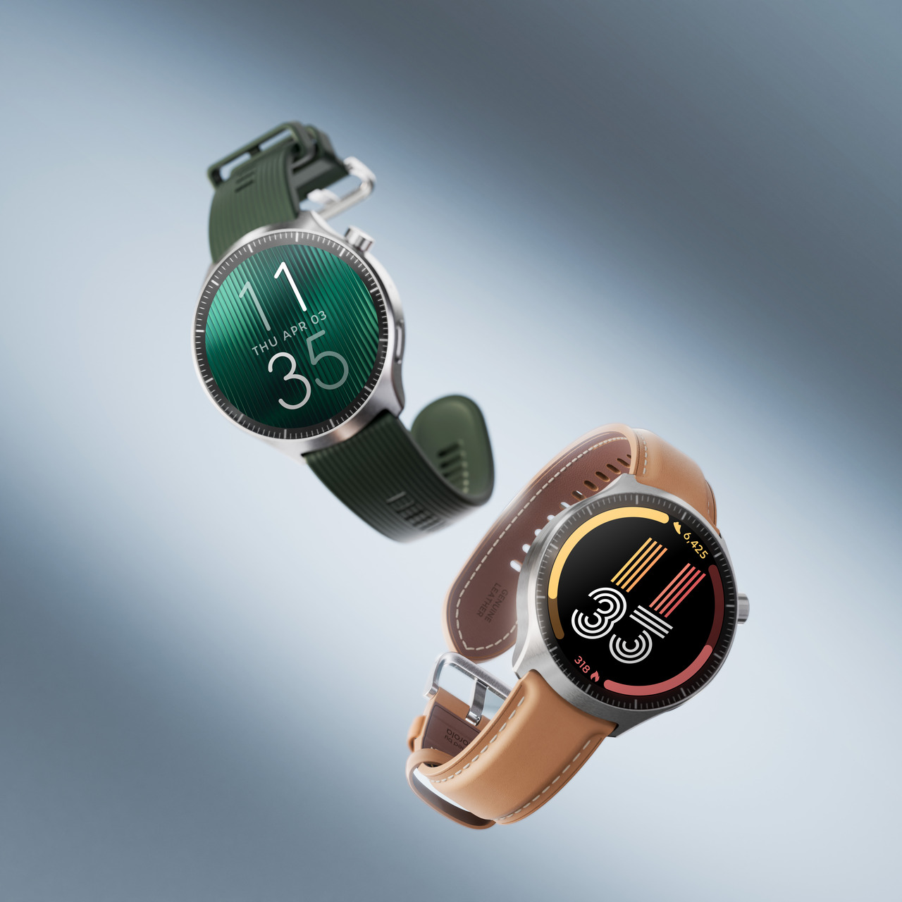
Motorola built the moto watch ultra around a premise most fitness wearables skip past: that a healthy lifestyle looks and feels different to everyone. Rather than forcing a single definition of fitness onto every wearer, the watch adapts around whoever’s wearing it, from 5 a.m. training regimens to people just starting to pay attention to their own bodies. It’s Motorola’s most ambitious attempt yet at making a smartwatch feel personal rather than prescriptive.

That personalization comes from Polar, whose science-backed algorithms power features built around distinctly different priorities. Serene offers real-time biofeedback for relaxation, tracking how long someone spends in three serenity zones and whether their breathing synced with an optimal rhythm. Nightly Recharge and Sleep Plus Stages work in tandem overnight, calculating a personal sleep score from time spent in light, deep, and REM cycles alongside nervous system recovery.

Designer: Motorola

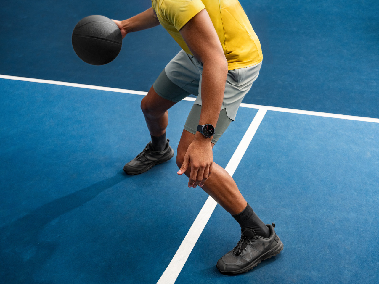
For anyone chasing more active goals, Activity Score and Active Intensity Zones translate daily movement into numbers that actually mean something, weighing heart rate and motion against a tailored target rather than a generic step count. Energy Sources goes a layer deeper, breaking down how the body burns fat, carbs, and protein mid-workout. Running Coach rounds things out with guided pacing cues, useful for someone training for a first race or trying to shave minutes off a personal best.

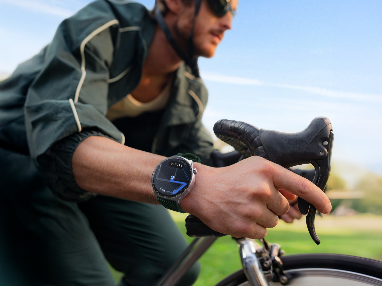
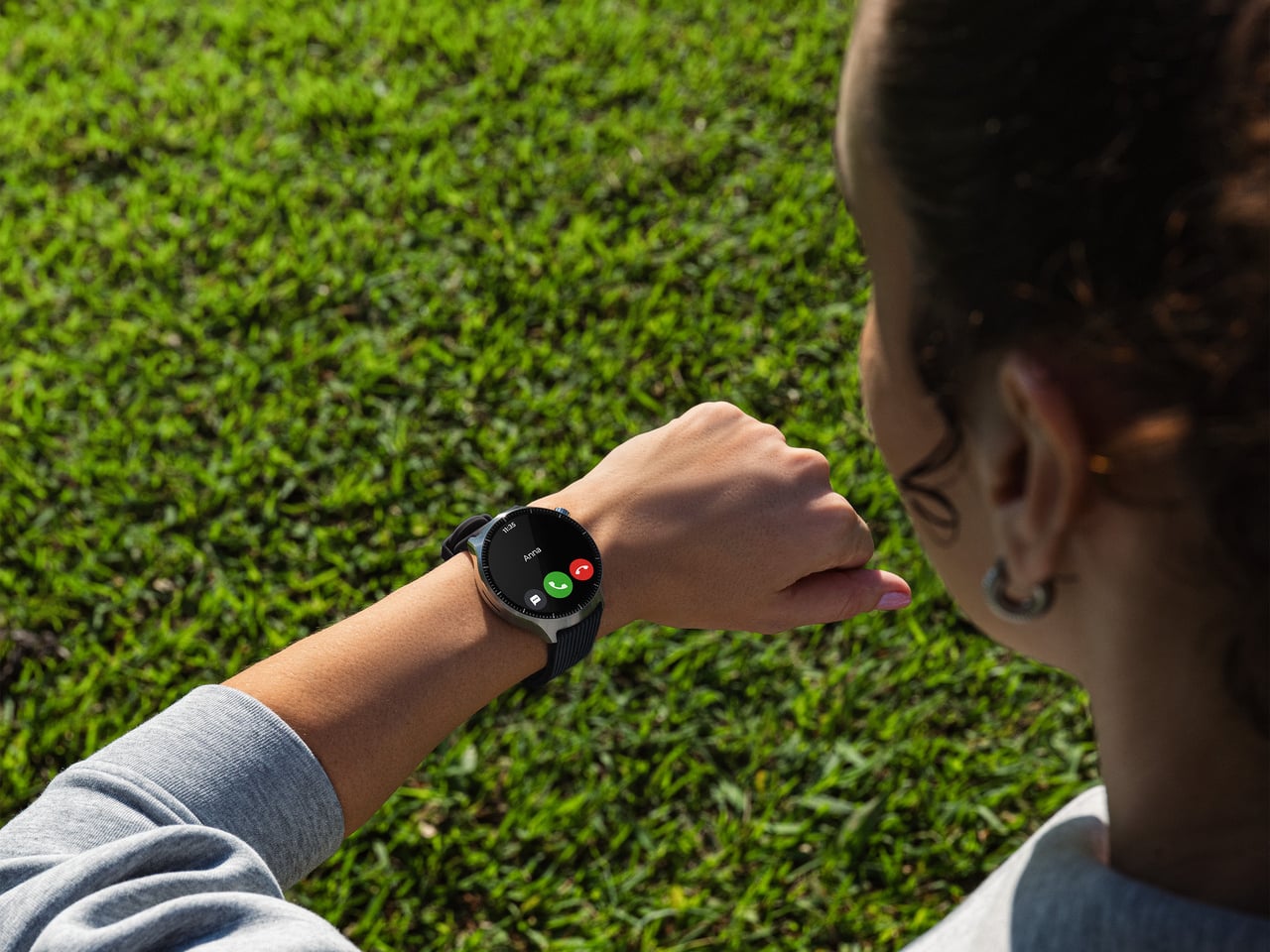
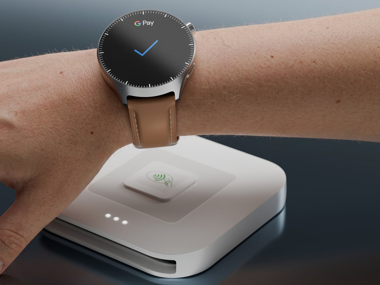
None of that tracking requires staying tethered to a phone. As the first moto watch with LTE functionality, the ultra lets wearers take calls, send texts, and manage notifications entirely from the wrist, useful for a run where carrying a phone feels like unnecessary weight. Google Wallet and NFC support cover an impromptu coffee stop afterward, while dual-band GPS keeps navigation accurate even through dense urban blocks or wooded trails.

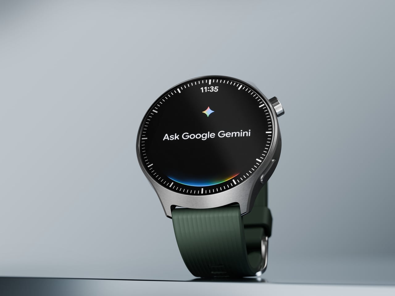
Software adds another layer of convenience. Running Wear OS by Google unlocks YouTube Music, Google Maps, and Google Gemini directly from the wrist, while built-in Motorola Qira, a first for any Motorola wearable, lets someone raise their wrist or simply say “Hey Qira” to pull up saved information across compatible Motorola and Lenovo devices. A Snapdragon W5+ Gen 1 chip keeps all of it running without noticeable lag between apps.

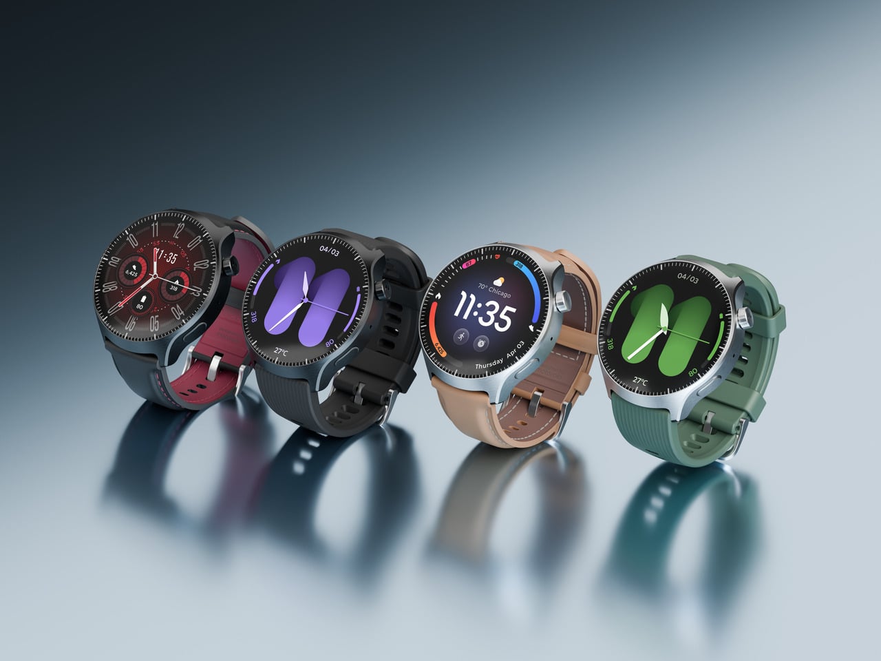
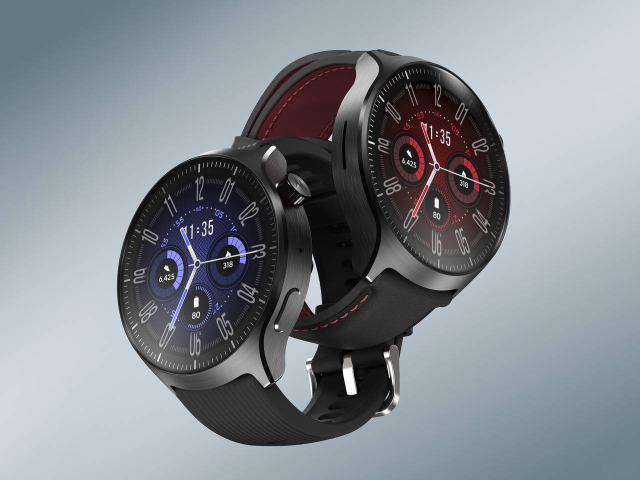
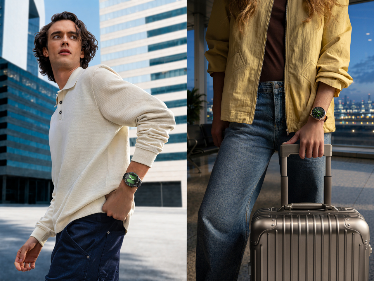
Physically, the watch carries a 46mm stainless steel case with a 1.5-inch OLED display that hits 2700 nits of brightness, bright enough to stay legible under direct sun during a midday run. Third-party 22mm band compatibility opens up styling options beyond Motorola’s own silicone and leather choices, letting the watch shift from gym equipment to something that pairs fine with a blazer.

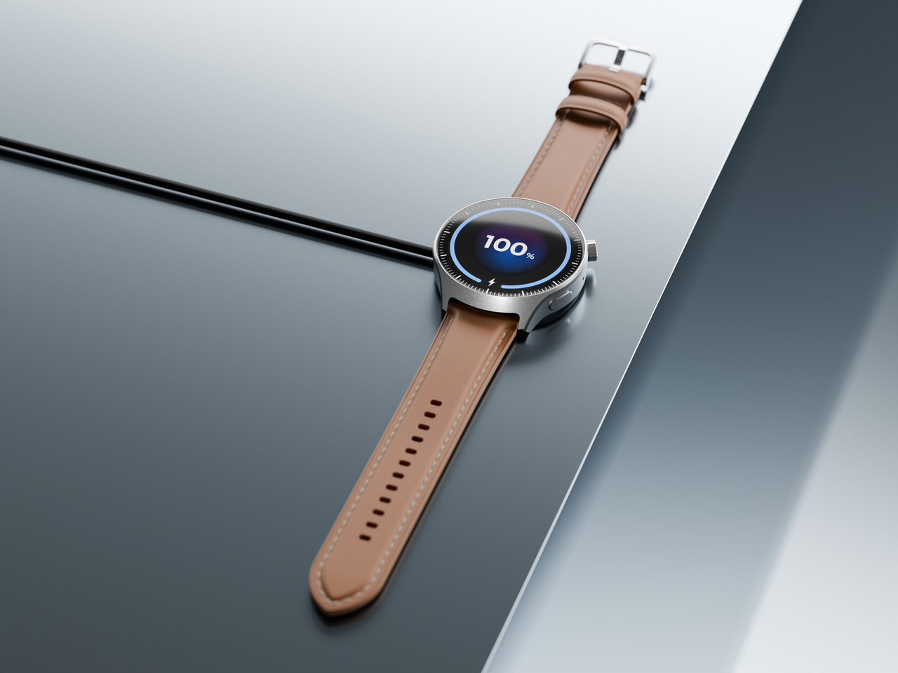
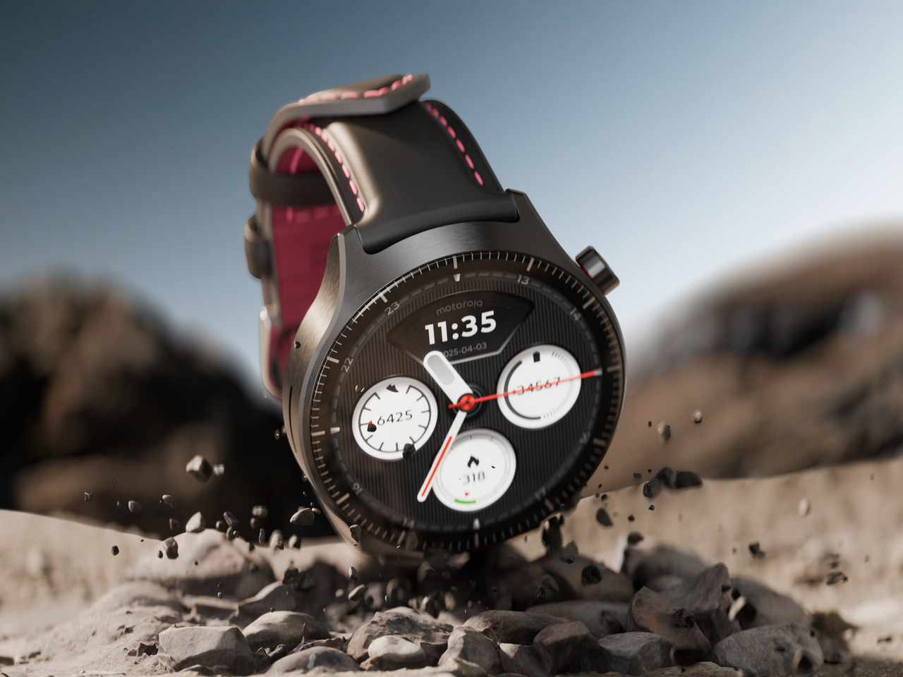
Durability backs up all that daily flexibility, with IP68 and 5ATM protection covering pool laps, rainy commutes, and steamy yoga studios alike, while Corning Gorilla Glass 3 guards the display against scratches picked up during actual use rather than careful display-case handling. Battery life holds up its end too, delivering up to 2 days of active use on a charge, or 24 hours from a 15-minute top-up before heading out the door.

Pricing lands at $349.99 when the moto watch ultra arrives on Motorola.com on September 10, followed by Verizon on September 24 and additional carriers in the months after. Between Polar’s wellness algorithms, LTE independence, and a design built to move between a trailhead and a boardroom, Motorola seems intent on proving a smartwatch can flex around a life instead of asking a life to flex around it.

The post Most Fitness Watches Tell You How to Live, the Moto Ultra Listens first appeared on Yanko Design.