Honor launched a $193 Kid-focused iPad Alternative with 22 Hours of Battery and Parental Controls Already Set Up

Setting up an iPad for a child costs $350 and about forty-five minutes of your life. You disable iCloud so your camera roll stays off their screen, lock down the App Store so in-app purchases don’t silently drain your card, configure Screen Time, and then spend the next six months re-configuring it every time an iOS update quietly resets something. Apple makes extraordinary tablets, but the parental infrastructure is clearly designed for adults who already know where to look. HONOR looked at that friction and built a tablet where none of that setup exists, because the kids-first architecture is the factory state, not a layer you construct yourself.

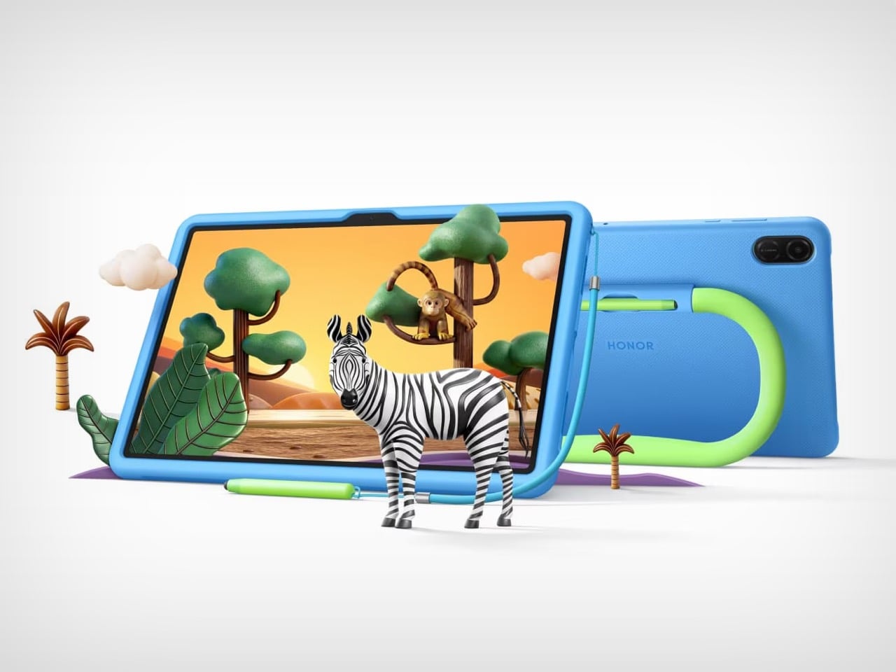
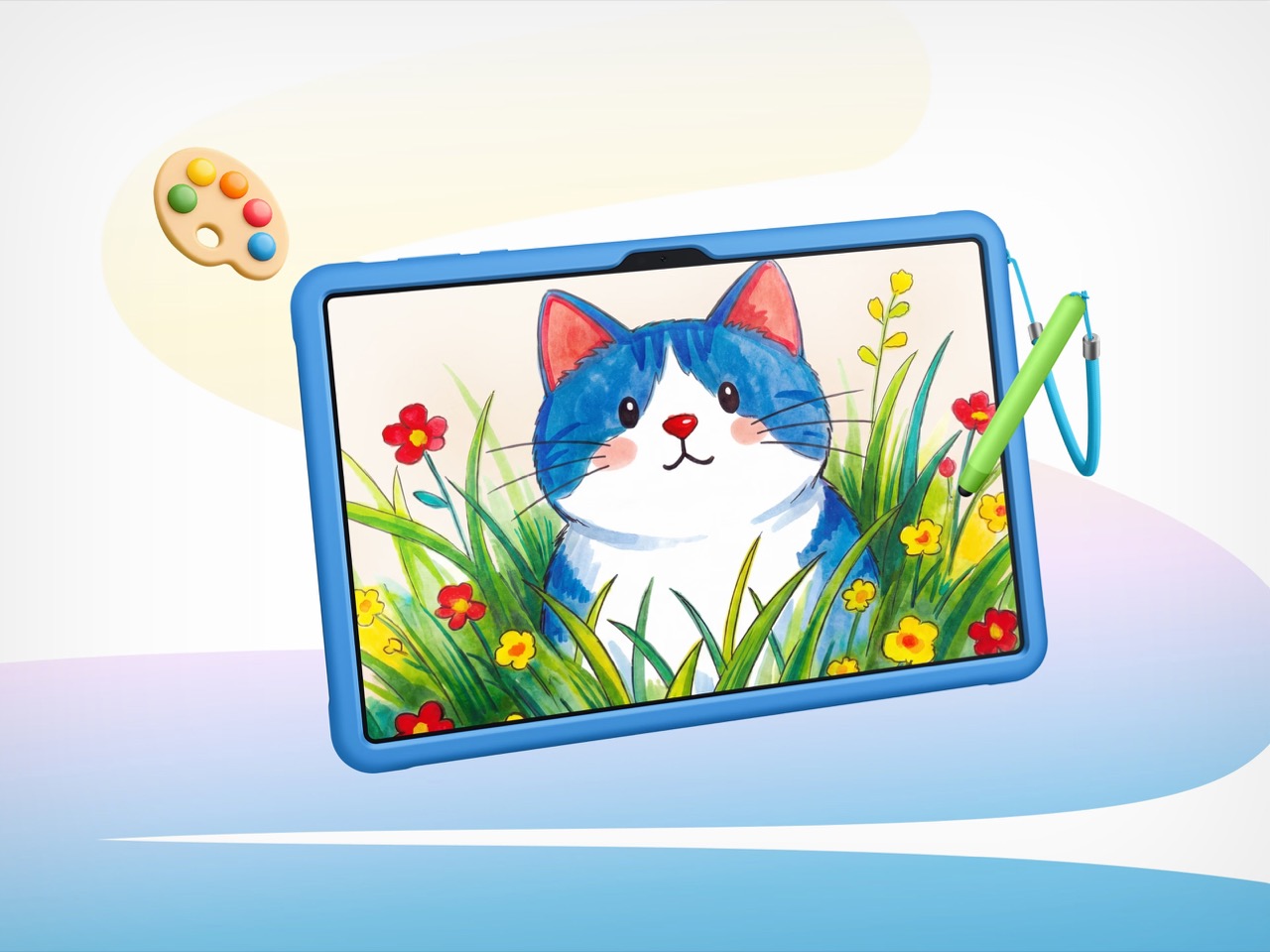
The Pad X8b Kids Edition starts at $193, landing it well under the entry iPad, and arrives with a dedicated Honor Kids OS environment, SGS 5-star drop resistance, a built-in kickstand handle, an integrated stylus silo, and a 10,100mAh battery that makes weekly charging a realistic schedule rather than an aspiration. The value proposition assembles itself pretty quickly.

Designer: HONOR
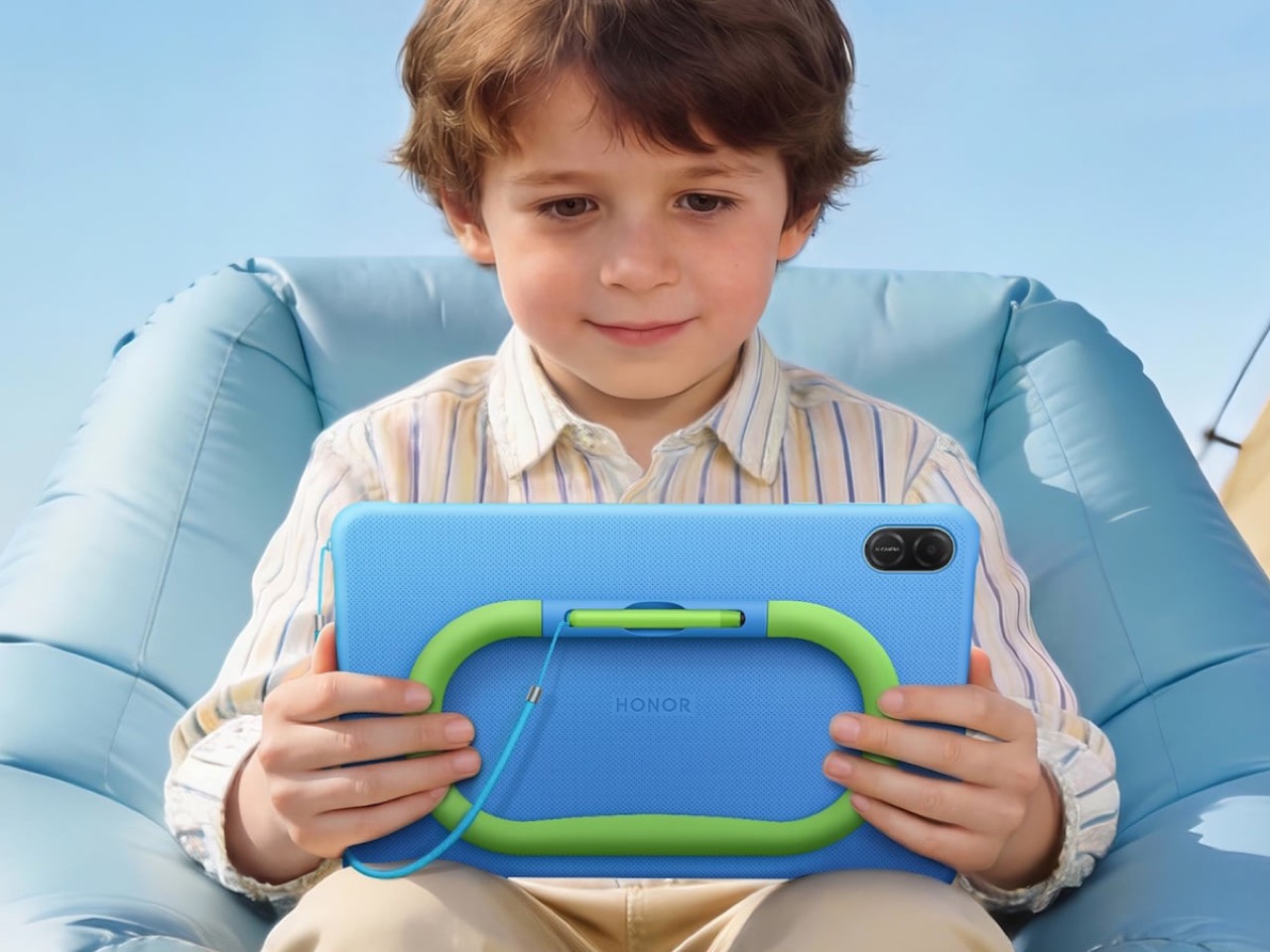
The blue silicone case with its lime-green handle does double duty as a carry grip and kickstand, which maps directly to how children actually use tablets: they’re either holding it or propping it against something. No separate folding stand, no accessory that gets left in a drawer. The handle is the stand. The Doodle Pen slots into a silo built into the case back so it travels with the device rather than disappearing within 48 hours of unboxing. FDA food-grade silicone throughout, SGS 5-star drop and crush resistance certification, and a construction that has clearly been tested against the kind of physical punishment children deliver with remarkable consistency and zero remorse.
The 11-inch panel runs at 1920×1200 with a 90Hz refresh rate, 500 nits of brightness, and carries TÜV Rheinland certifications for both low blue light and flicker-free performance. On a kids device those certifications carry more weight than on an adult one, given how close children hold screens and how many hours they log. The eye protection goes further than badges, though. Distance alerts, posture monitoring, brightness adjustments, and bumpy road detection that nudges kids away from reading in a moving car all run continuously without a parent needing to remember to enable anything.

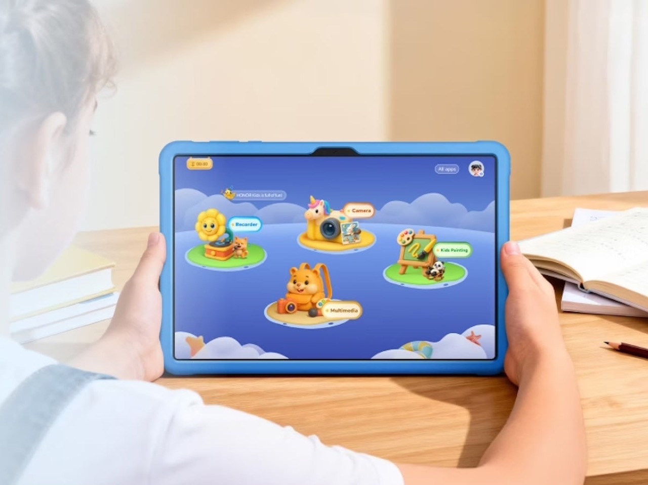
The Honor Kids OS runs as a fully separate environment rather than a locked launcher sitting on top of the standard interface. The home screen uses cartoon island-style icons for Camera, Recorder, Kids Painting, and Multimedia, and parents manage the whole thing remotely through the HONOR Parental Assistant app, setting time slots and reviewing activity through visual charts. One tap activates Kids Mode, and getting back out requires authentication. None of this requires a Saturday afternoon in Settings.
The 10,100mAh battery is the unsung hero of the package. Twenty-two hours of continuous video playback means roughly eleven days of two-hour screen time sessions before a charge becomes urgent, and the 97-day standby figure means a tablet left on a shelf over a school break actually comes back to life when you pick it up. For a device category where battery anxiety is a genuine daily friction point, those numbers change the ownership experience in a way that a spec sheet undersells.

At $193, the Pad X8b Kids Edition sits in a position where competing options either underdeliver on hardware or ask parents to retrofit a general-purpose tablet for child use on their own time. HONOR made the child-safe design brief the starting point, and the result is a device that earns its price before you’ve even opened the box.

The post Honor launched a $193 Kid-focused iPad Alternative with 22 Hours of Battery and Parental Controls Already Set Up first appeared on Yanko Design.

The Hermès Birkin Finally Has a LEGO Version and It Opens to Reveal A Secret Runway Inside

The Hermès Birkin has one of the most theatrical purchasing rituals in luxury retail. You cannot simply walk into a boutique on Rue du Faubourg Saint-Honoré and buy one. Hermès makes you earn it, building a relationship with a sales associate over months, sometimes years, demonstrating cultural fluency with the house before they’ll even have the conversation. The result is an object that carries as much mythology as it does resale value, a handbag that has become shorthand for a particular kind of aspirational excess that the internet finds endlessly fascinating.

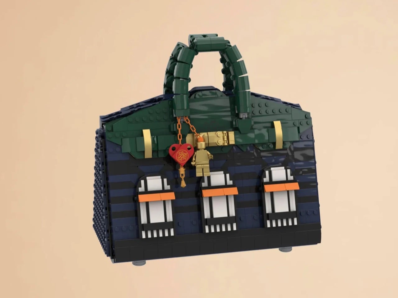
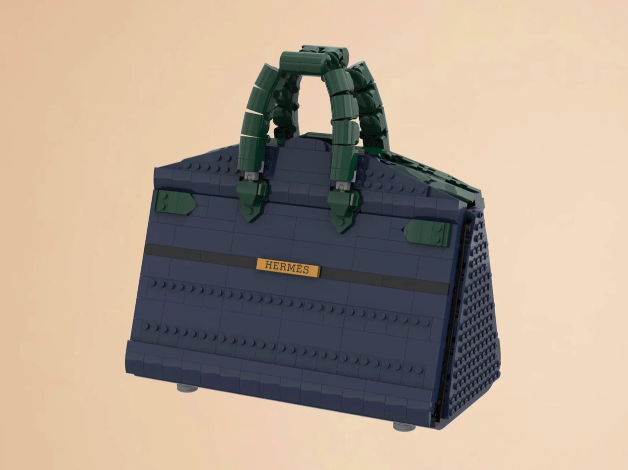
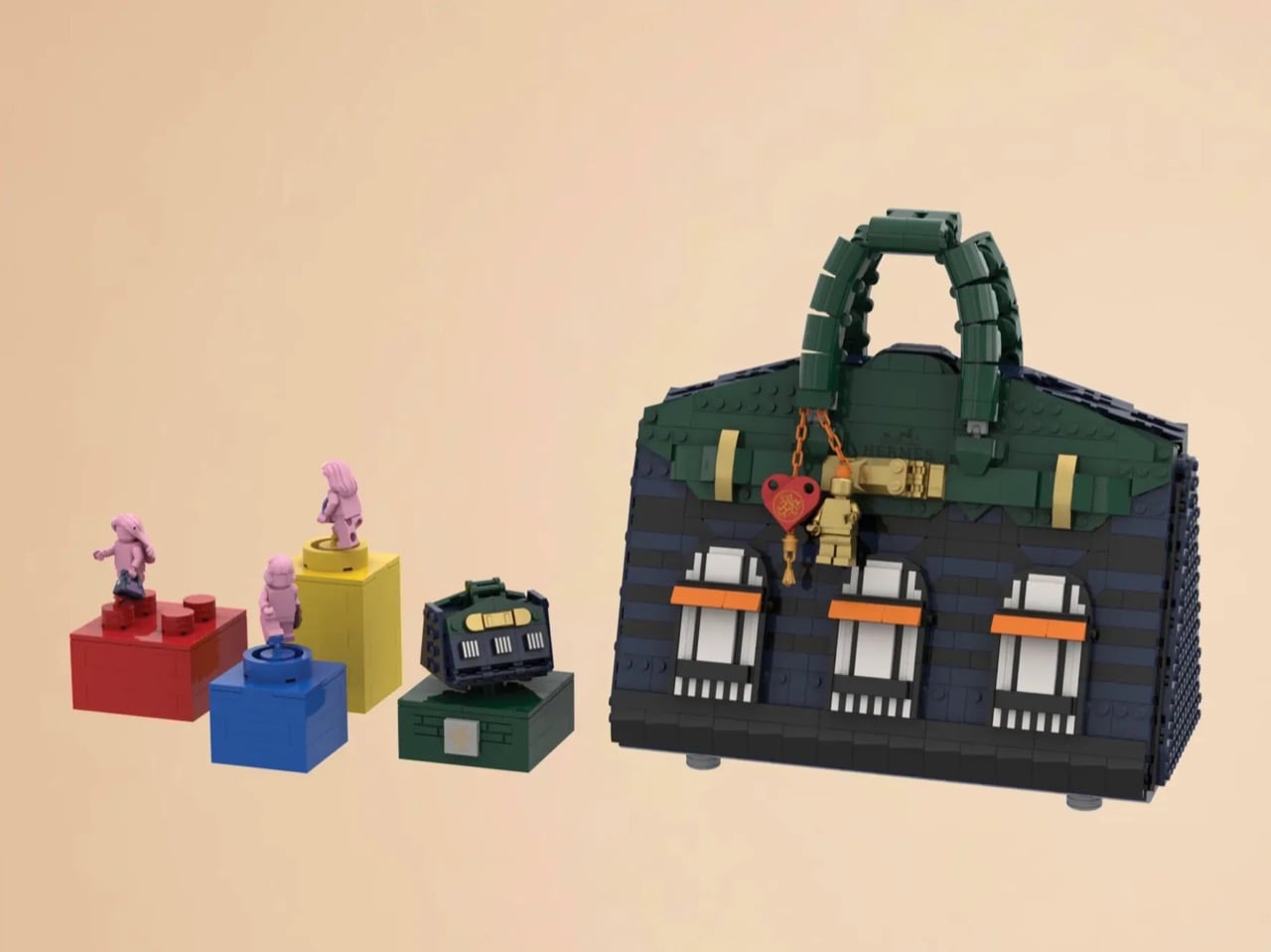
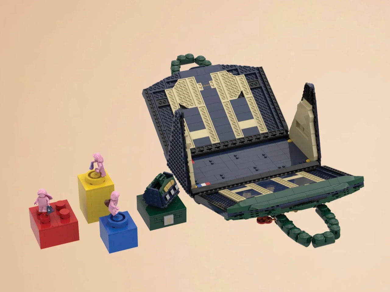
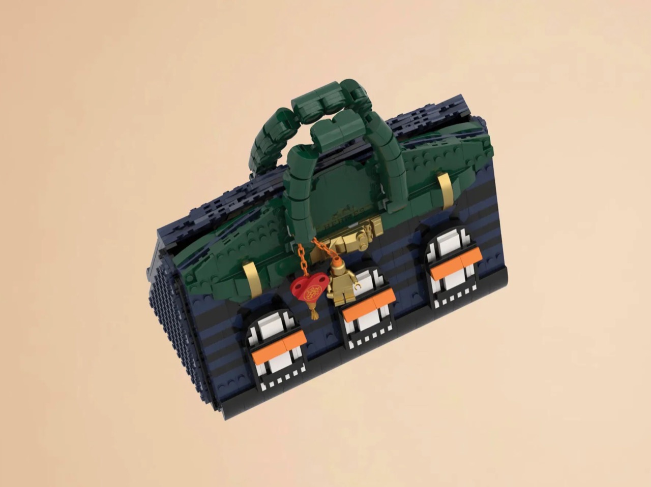
LEGO Ideas builders BOI_Design and KittyJW found a rather elegant workaround. Their MOC (My Own Creation) reimagines the Birkin 20 Faubourg, the special edition inspired by Hermès’s flagship Paris store, as approximately 1,400 bricks of deep navy, dark green, and gold. The exterior facade doubles as a miniature rendering of 24 Rue du Faubourg Saint-Honoré itself, complete with arched boutique windows and orange awnings. And it opens.

Designers: BOI_Design and KittyJW

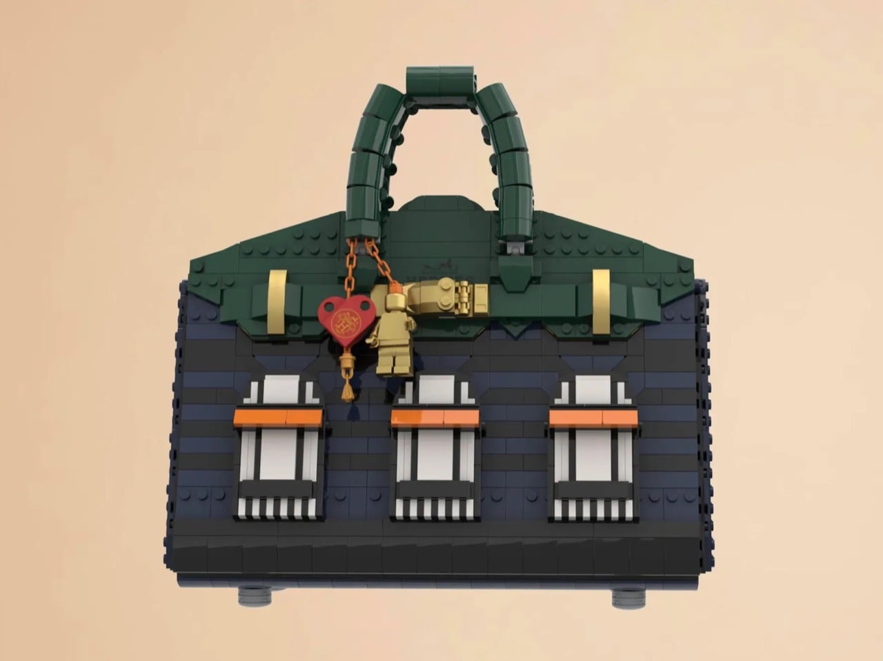
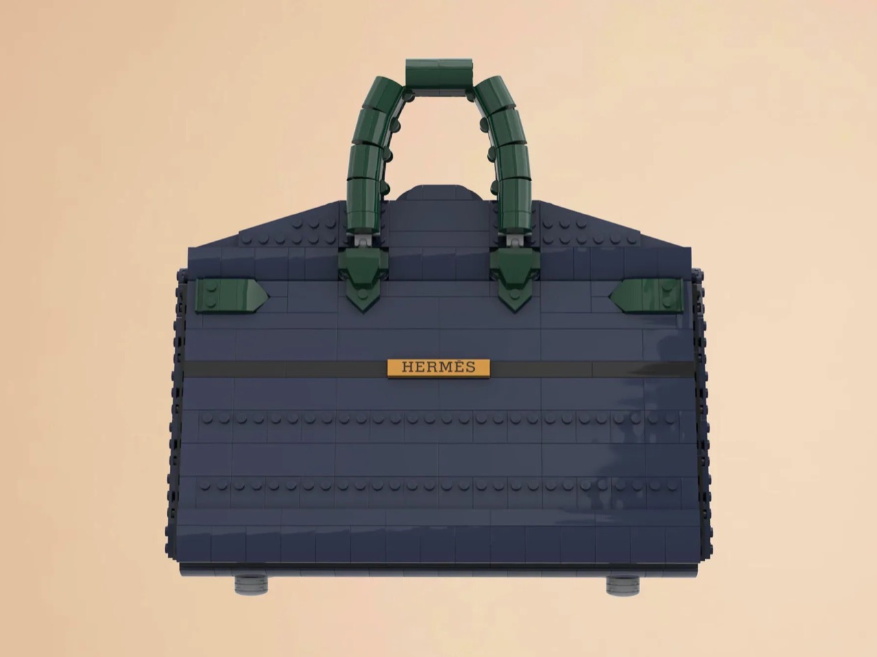
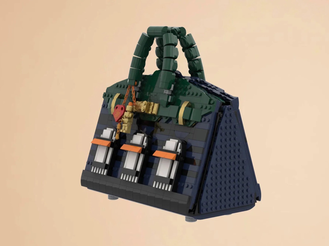
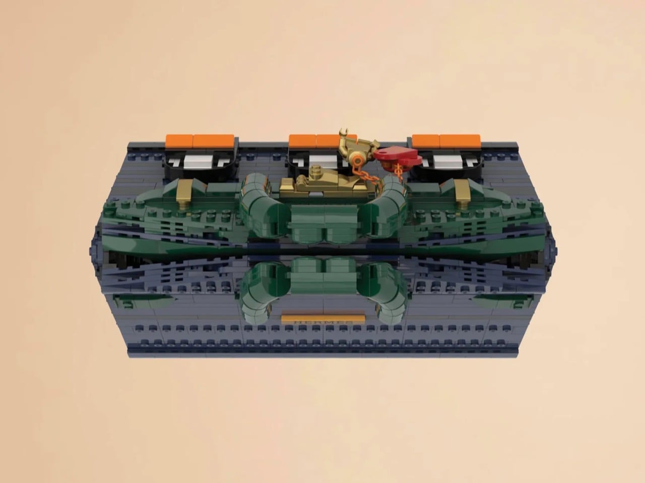
The silhouette is immediately recognizable to anyone who has spent time in the vicinity of luxury retail, or, more realistically, scrolled past one on Instagram. The trapezoidal body is rendered in deep navy blue tiles, layered with a subtle horizontal banding that gives the surface genuine texture and depth. The handles arc overhead in dark green, assembled from linked Technic-adjacent elements that convincingly mimic the soft curve of the real bag’s leather grip. Gold hardware details sit at the clasp, at the side buckles, and along the turnlock assembly, and a tiny linked orange chain drops a red heart charm and a gold minifigure pendant in a detail that reads as both playful and surprisingly precise. Flip the bag around and the back panel is clean and quiet, just navy tiles and a gold Hermès tile sitting on a dark strap, which is exactly how the real thing looks.

The front face depicts three arched windows dressed with crisp white frames and orange awnings are spaced across the lower body, referencing the Haussmannian rhythm of the actual boutique facade at Faubourg Saint-Honoré. It takes a second to fully resolve in your eye, this thing that is simultaneously a handbag and a building, and that slight double-take is very much the point. The builders describe it as merging fashion and architecture into a single object, and looking at it straight on, that framing holds up completely.

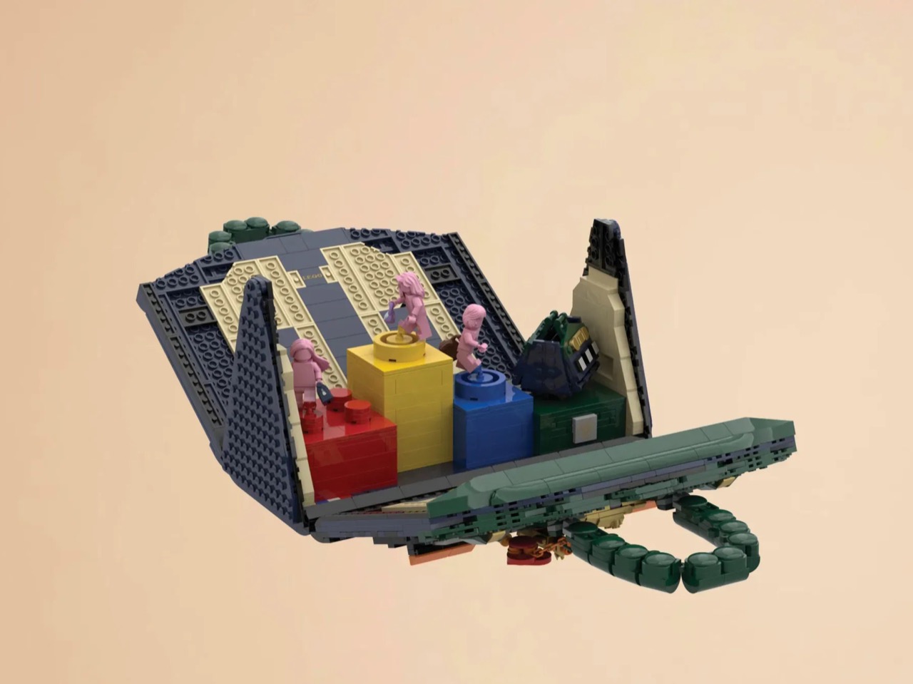
My favorite detail, however, is what happens when you open it. The lid swings up to reveal a hidden interior scene that commits fully to the bit. Three pink minifigures, each carrying a tiny handbag, are posed on oversized primary-color bricks in red, yellow, and blue, the kind of bold, joyful color blocking that feels distinctly LEGO while also evoking a fashion week runway setup. Nestled alongside them is a miniature Birkin 20 Faubourg bag rendered at a smaller scale, a self-referential easter egg that will land immediately with anyone paying attention. The interior lining is lined in cream and tan tiles, a genuinely considered touch that mirrors how a real Birkin’s suede interior contrasts against its exterior leather. At 28.5 centimeters wide and 29 centimeters tall, the whole thing has real physical presence on a shelf.

The build is currently gathering votes on LEGO Ideas, the community platform where fan submissions need to reach 10,000 supporters before LEGO’s internal team will formally review them for potential production. It’s early days for this one, but the concept has the kind of crossover appeal, fashion collectors, LEGO enthusiasts, Paris romantics, people who just want the Birkin experience without the two-year waitlist, that could carry it a long way. You can head to the LEGO Ideas page here to cast your vote.

The post The Hermès Birkin Finally Has a LEGO Version and It Opens to Reveal A Secret Runway Inside first appeared on Yanko Design.
Samsung Just Turned a Theme Park Queue Into a 3D Safari, No Glasses

Waiting in line at a theme park is one of those unavoidable experiences that nobody designs for enthusiastically. The physical infrastructure exists, the rope lines are laid out, and in the best-case scenario, there’s some signage or ambient music to occupy the time. But the queue is fundamentally dead space, a stretch of minutes that happens before the experience begins rather than as part of it. That’s a design problem, and most parks accept it as one that can’t really be solved.

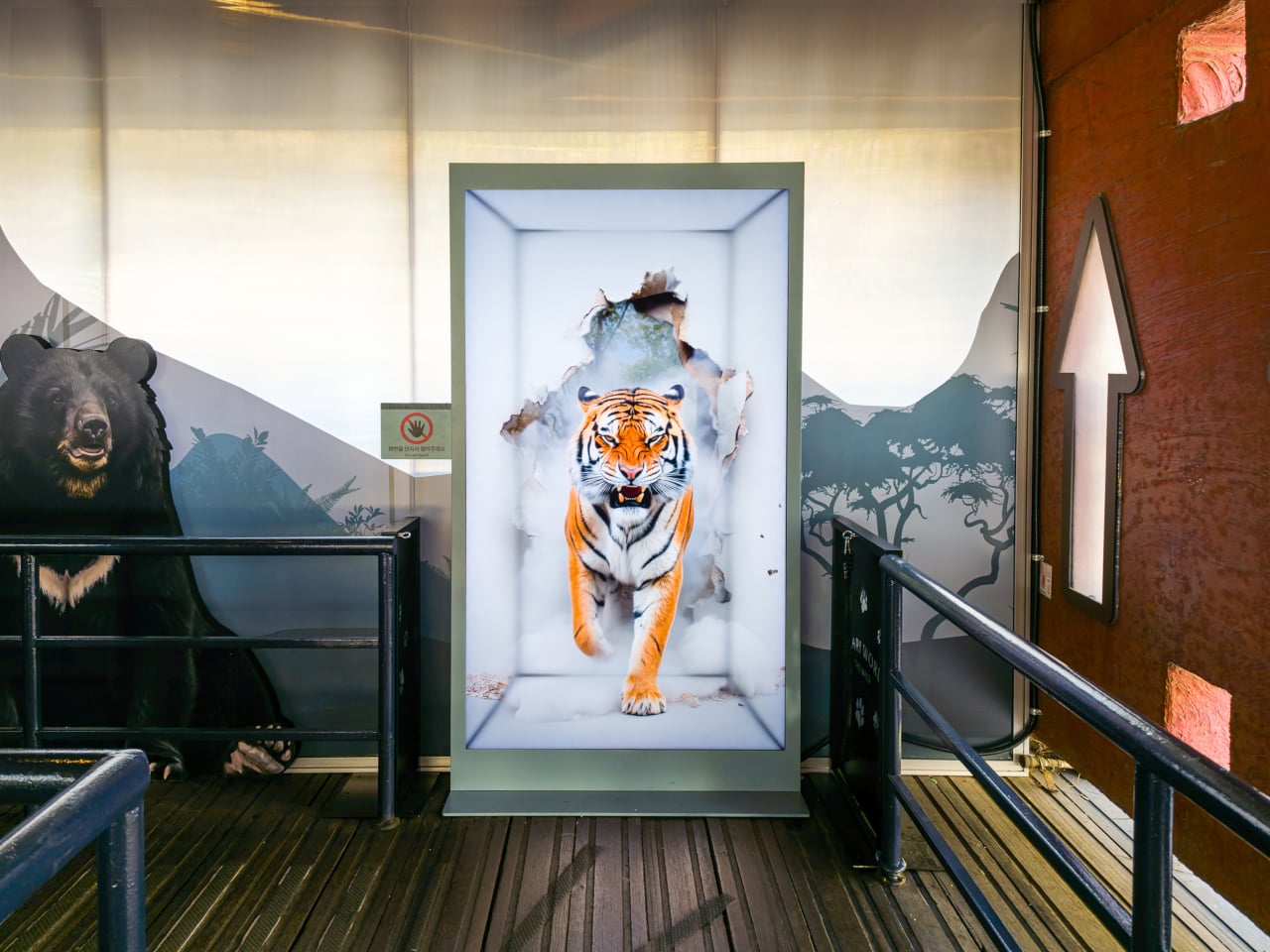
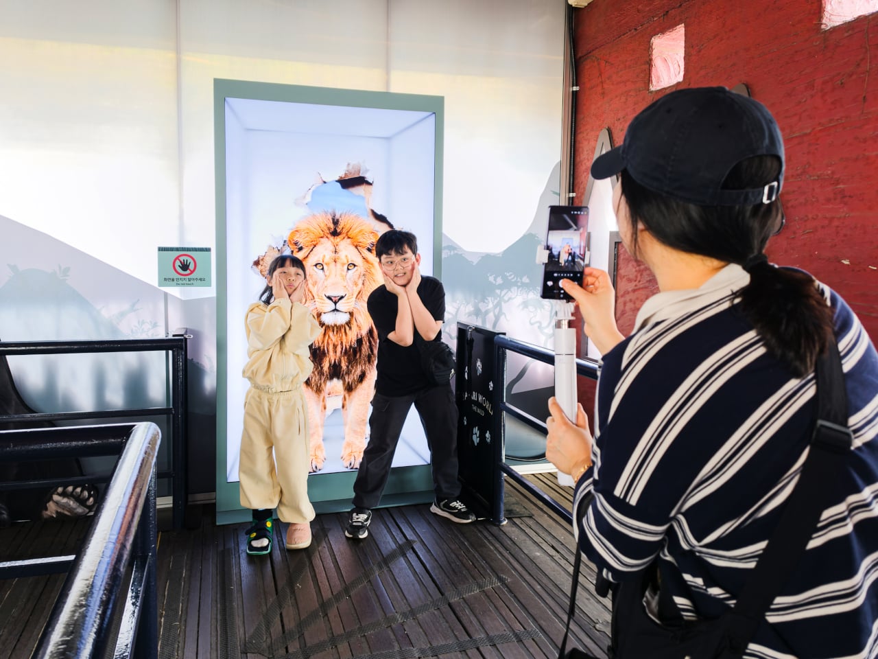
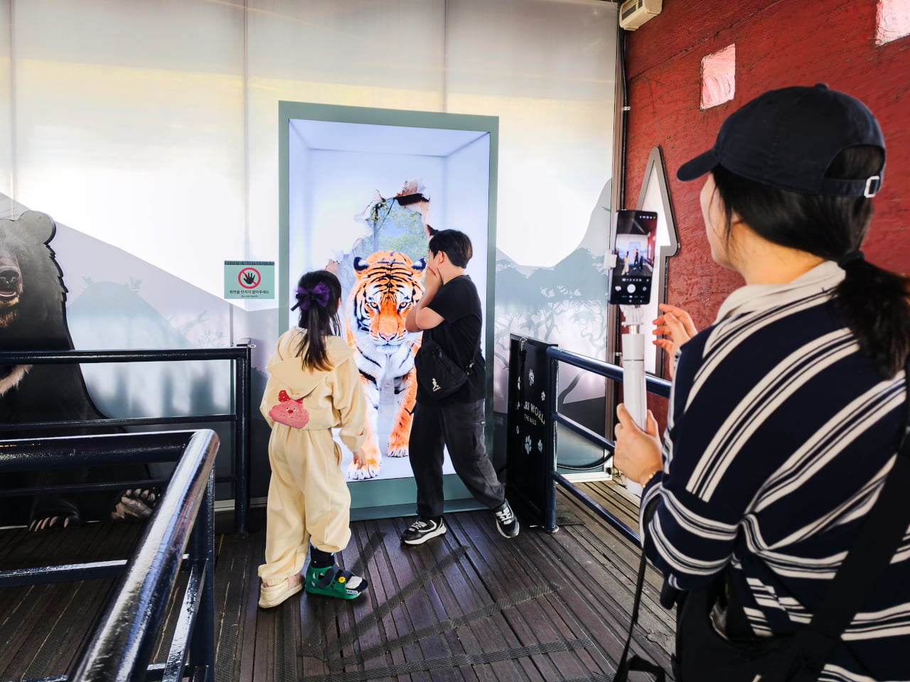
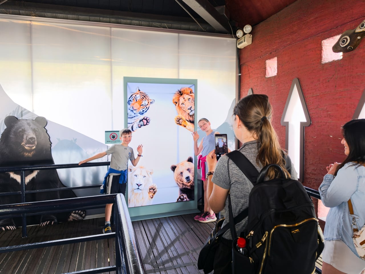
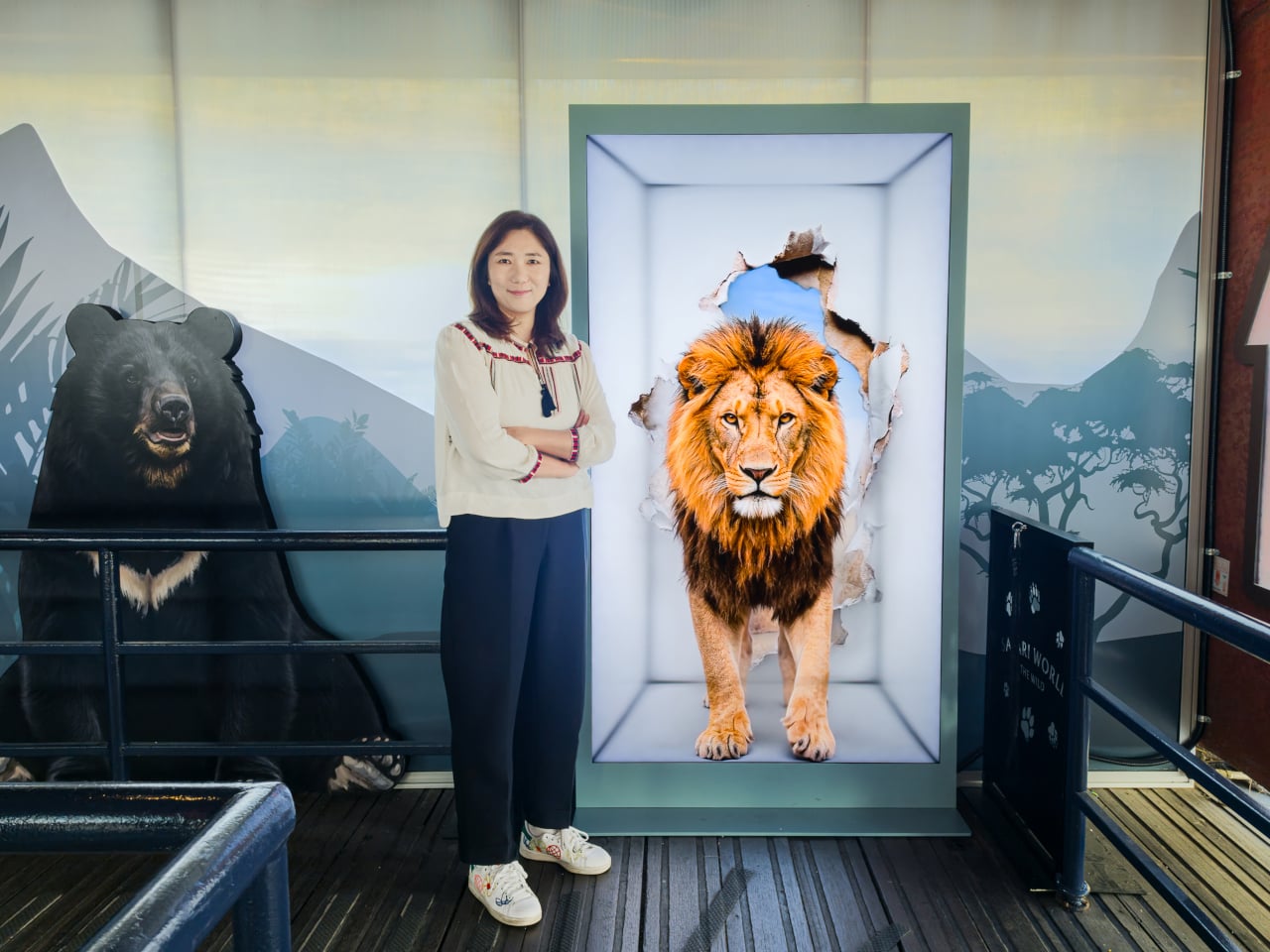
Samsung’s Spatial Signage installation at Everland in South Korea offers a different answer. At the newly renovated Safari World: The Wild attraction in Yongin, the company installed its glasses-free 3D display directly in the queue area, where life-scale tigers and lions appear to surge toward visitors without so much as a pair of 3D glasses required. The wait effectively becomes the opening act.

Designer: Samsung

The technology making that possible is Samsung’s patented 3D Plate system, which uses binocular parallax to deliver separate images to each eye, tricking the brain into perceiving depth the same way it does when looking at real objects at real distances. Unlike the boxy, space-hungry installations that most 3D signage has historically required, the Spatial Signage display slots into the queue corridor in an 85-inch, portrait-oriented panel with a 52 mm profile. There’s nothing protruding into the space, and no hardware for visitors to interact with.

The content for the Everland installation was developed by Klleon, whose team prioritized capturing the natural movement rhythms of the animals rather than exaggerated cinematic effects. The result is a quality of realism that works specifically because of the environment: a queue is typically a narrow, enclosed space where visitors are already looking forward and standing relatively still, which happens to be exactly the viewing geometry where the 3D depth effect lands best.

What that means practically is that the queue line stops being something guests endure and starts being something they talk about. Anticipation for an attraction is one of the least exploited moments in the theme park visit. Visitors heading toward Safari World already have the right frame of mind for a wildlife encounter, and the display capitalizes on that readiness by delivering a preview of that encounter before anyone boards a vehicle or rounds a corner.

The broader implication is about how display technology fits into destination entertainment design. For years, attractions have used projection mapping, animatronics, and theatrical sets to build immersion during rides and shows, but the queue almost always remains a visual afterthought. A display that can occupy a narrow corridor at wall depth, require no headgear, and show content at true-to-life scale without any spatial awkwardness changes what’s possible in that format.

Everland isn’t a retail shelf or a shopping center atrium. The animals aren’t selling anything. They’re there because a flat screen in that corridor would register as background noise, and a three-dimensional tiger at eye level does not. That distinction, between content that is present and content that actually commands attention, is the problem Spatial Signage was built to solve, and the queue turned out to be a rather fitting test.

The post Samsung Just Turned a Theme Park Queue Into a 3D Safari, No Glasses first appeared on Yanko Design.