So here’s the timeline we’re apparently living in: Apple will ship a completely redesigned MacBook Pro with OLED displays and touchscreens before Rockstar manages to release GTA 6. Let that sink in for a second. A company that refreshes laptops on a predictable yearly cadence is moving faster than a studio working on a game announced in 2022. Industry sources suggest Apple is accelerating development of its M6-powered models, with launch windows now pointing to late 2026 rather than the previously expected 2027 timeline. The shift signals confidence in advancing multiple breakthrough technologies simultaneously, from next-generation display panels to cutting-edge silicon manufacturing.
The irony is delicious because both Apple and Rockstar operate on their own time. They ship when they’re ready, audiences be damned. Except Apple apparently got ready really fast this time. For professionals who have waited through several years of iterative updates, the M6 models promise substantial reasons to upgrade. The combination of OLED technology borrowed from the iPad Pro, potential touchscreen integration, and the performance leap expected from 2-nanometer chips creates a compelling package. Add to this a thinner chassis, refined thermal management, and possibly even cellular connectivity, and the M6 MacBook Pro begins to look like the generational shift many have been anticipating since the original Apple Silicon transition.
Designer: Apple
Representative Image
The rumor mill had most of us penciling in a 2027 launch for the M6 MacBook Pro, giving Apple time to perfect the OLED transition and work through the inevitable supply chain headaches. But production starting early suggests either the technology matured faster than expected or Apple sees competitive pressure building and wants to strike first. My money is on both. The shift signals confidence in advancing multiple breakthrough technologies simultaneously, and when Samsung starts manufacturing panels months ahead of schedule, it means someone with deep pockets is pushing hard. That someone is Apple, and they clearly want these machines out the door before 2027.
The redesign also alleges a shift to tandem OLEDs, the same technology we saw on the iPad Pros last year (which apple called their Ultra Retina XDR Display). Tandem OLED uses two emissive layers stacked on top of each other, which delivers higher sustained brightness, better power efficiency, and dramatically reduced burn-in risk. The iPad Pro already proved this works beautifully. Blacks that actually look black, colors that pop without looking oversaturated, and HDR content that doesn’t feel like a compromised laptop experience. Moving that to a 14-inch or 16-inch panel with different thermal constraints is complex, but Apple’s display team has pulled off harder tricks. The mini-LED panels in current MacBook Pros are excellent. OLED makes them look outdated.
Representative Image
Then Apple is apparently adding touchscreens, which is wild considering how long they insisted touchscreens on laptops were bad design. They weren’t entirely wrong. Gorilla arm is a real problem. Nobody wants to reach up and poke a vertical screen all day. But the implementation details suggest Apple found a middle ground that actually works. Reinforced hinges keep the display stable when you tap it. A hole-punch camera cutout instead of the notch, possibly with Dynamic Island functionality, points to interface elements designed for quick touch interactions. This isn’t about replacing the trackpad. This is about adding occasional touch input for specific tasks where it makes sense, like scrolling through a timeline or adjusting sliders in creative apps.
The M6 chips built on TSMC’s 2-nanometer process could deliver 15 to 20 percent performance gains over M5 while improving energy efficiency. That translates to faster renders, quicker compile times, and snappier machine learning workflows without sacrificing battery life. The real party trick is how Apple might structure the chips with CPU and GPU in separate blocks, allowing more customization in performance configurations. You get exactly the compute power you need without paying for components you’ll never max out. Smart, efficient, very Apple.
Representative Image
Here’s where the joke stops being funny though. These redesigned models will probably only come in Pro and Max configurations initially, with the base model stuck on the old design for another year. That’s Apple’s way of charging a premium while keeping cheaper options available. The iPad Pro jumped about $200 when it got tandem OLED. Expect similar economics here, putting the entry point for a redesigned 14-inch model somewhere around $2,200 or higher. You’ll be able to buy this laptop and play GTA 6 on it via cloud gaming before you can buy GTA 6 natively. What a time to be alive.
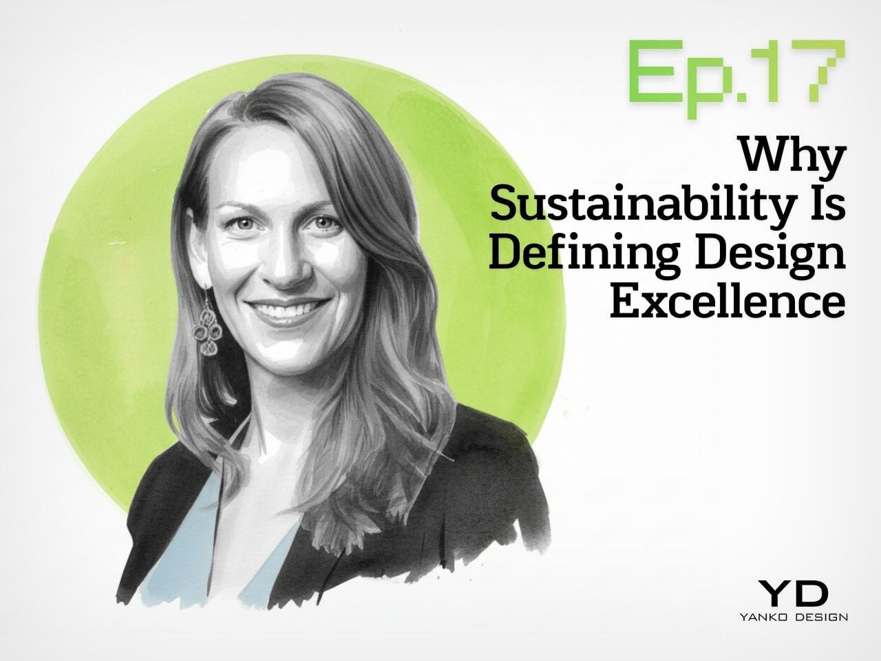
Yanko Design’s podcast, Design Mindset, continues to bring compelling conversations with design leaders who are shaping the future of the industry. Powered by KeyShot, the show premieres weekly, offering listeners deep dives into the minds of innovators, strategists, and visionaries. Episode 15 tackles one of the most critical shifts happening in design today: how sustainability has moved from a nice-to-have checkbox to a core measure of design excellence itself.
This week’s guest is Lisa Gralnek, a brand builder with 25 years of experience who currently serves as U.S. Managing Director and Global Head of Sustainability and Impact for iF Design, a respected member of the international design community since 1953 and host of the prestigious iF Design Award. Lisa’s journey spans work with giants like Adidas and the Boston Consulting Group, giving her a unique vantage point on how sustainability has evolved from corporate afterthought to design imperative. In this conversation, she reveals how one of the world’s most prestigious design competitions is fundamentally redefining what “good design” means.
Embedding Sustainability into iF Design’s Evaluation Framework
When asked about the decision to make sustainability one-fifth of the iF Design evaluation framework, Lisa shared her pride in the initiative. iF Design has been operating since 1954 and now spans nine disciplines across 93 categories, from product and packaging to branding communications, UX, UI, service systems, architecture, and interior architecture. The shift was deliberate and structural: iF Design moved from a general “impact” criterion to explicitly isolating environmental and social sustainability as 20% of the score. Commercial impact was repositioned into differentiation, one of their five criteria, allowing them to “really single out the environmental and social ramifications of a design.” This alignment reflects the iF Design Foundation’s core mission to advance design for a better world.
The design thinking process involved convening a Sustainability Working Group of eight experts from around the world who bring deep, often sector-specific sustainability expertise. “We work together to figure out what is the process, what is the questions, what are the certifications and accreditations we’re acknowledging, as well, most importantly, I would say, of supporting the jurors as they go through this process as well,” Lisa explained. The group co-developed processes, discipline-specific optional questions, recognized certifications and accreditations, and on-site juror support aimed at consistency, rigor, and education for both entrants and jurors. This collaborative approach ensures that sustainability evaluation remains both credible and practical across vastly different design categories.
Distinguishing Authentic Impact from Greenwashing
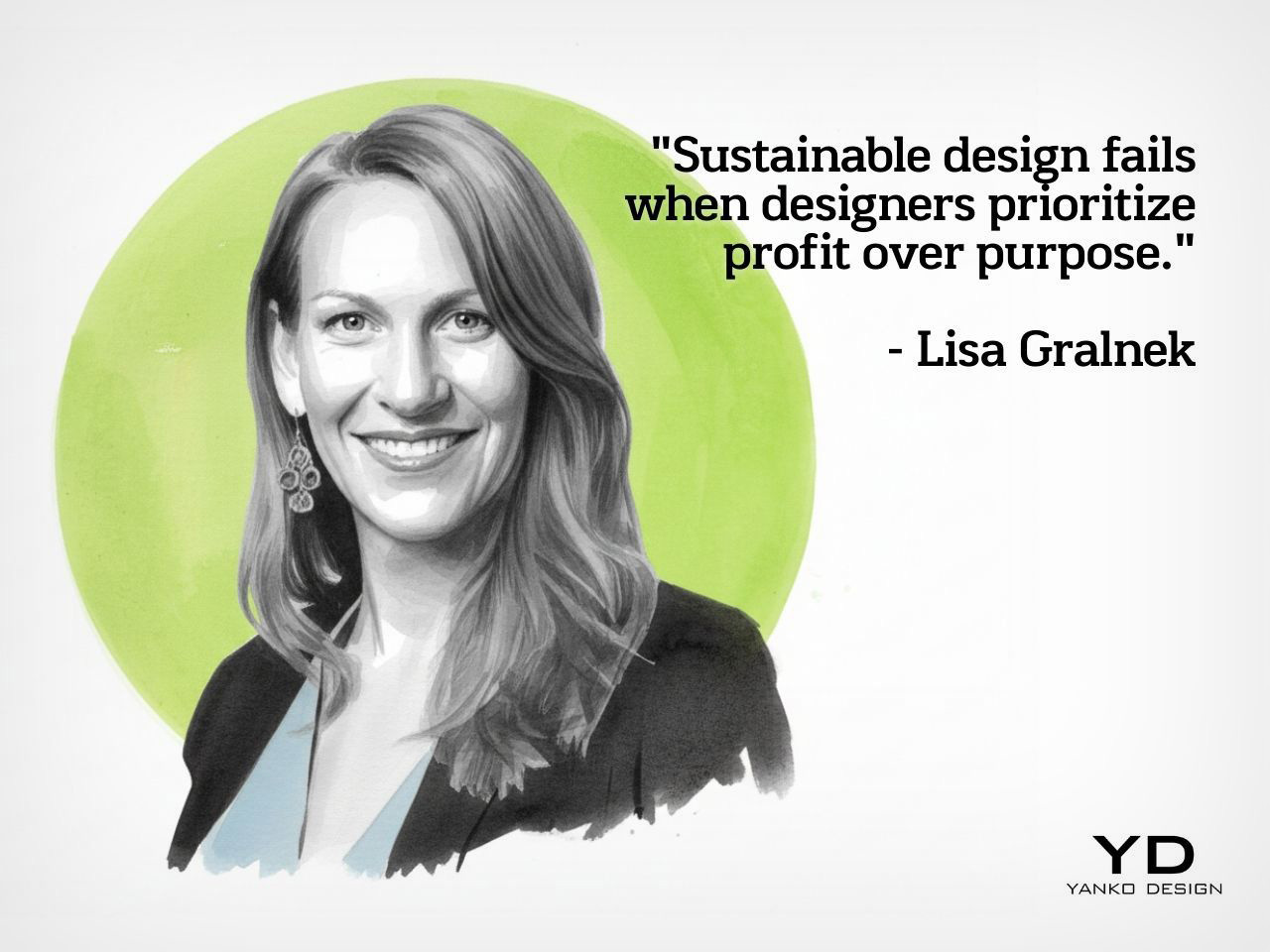
One of the biggest challenges facing any sustainability evaluation is distinguishing genuine innovation from performative claims. Lisa explained how the first year revealed significant gaps: jurors felt skeptical not about sustainability itself but about making accurate judgments with insufficient information. At that first jury, sustainability experts were on the ground for only the second year, and the feedback was clear. Entrants weren’t providing enough detail in the character-limited impact field for jurors to make informed decisions, whether they were discussing environmental impact, social impact, or business impact.
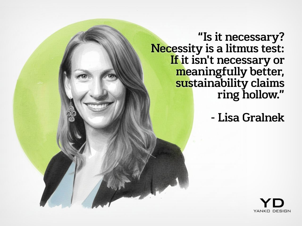
The solution was to embed three optional questions into every discipline, sometimes tailored at the category level, along with a selectable list of objective global, regional, and industry-led certifications. These questions remain optional because iF’s mandate focuses on rewarding good design rather than punishing inadequate submissions. Lisa gave a concrete example of how this helps identify hollow claims: when a television or computer monitor entry discusses sustainable packaging in the sustainability field, it raises red flags because the entry itself is about the product, not the packaging. In packaging specifically, iF piloted requesting a bill of materials (BOM) or digital product passport (DPP) to quickly validate claims about recycled content, compostability, low-impact inks, and water-saving processes. Interestingly, packaging entries dipped this year, raising the question of whether increased scrutiny discouraged greenwashing or simply affected submission rates.
“Fewer, Better” as a Design and Consumption Ethos
Lisa’s philosophy around sustainable design cuts to the heart of overconsumption. She candidly admitted that if she were being a radical sustainabilityist, “none of us needs anything. None of us needs anything anymore.” She recalled an interview on The Economist after the 2008 financial collapse where experts insisted people needed to buy, that society needed to incentivize consumption. But consuming our way out of financial collapse, she argues, represents the capitalistic model and business operating system of the world without necessarily serving the planet or people. Her first jury experience brought this reality into sharp focus: walking into the warehouse where 50% of the 10,000 to 12,000 annual entries are physically displayed, she burst into tears. The sheer volume of stuff human beings create, all in service of capitalism’s engine, became overwhelming when viewed through a sustainability lens.
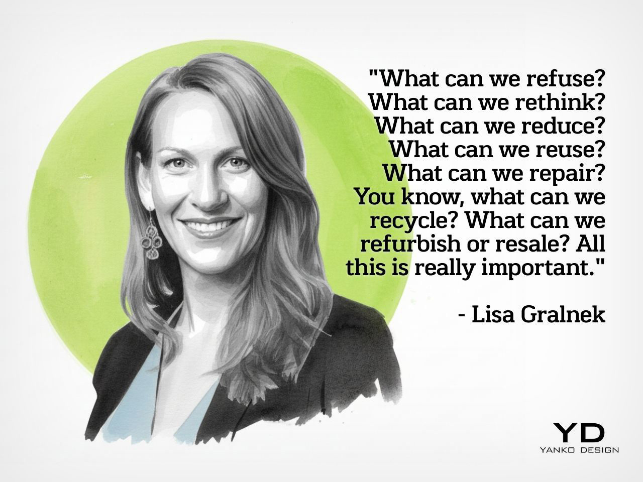
So what does “fewer, better” actually mean in practice? Lisa explained it operates on two levels: individual conscious consumption choices and organizational design decisions. At the designer and company level, it means thinking through the circular R ladder: what can we refuse, rethink, reduce, reuse, repair, recycle, refurbish, or resale? “Fewer, better is like, I think it’s less extractive and more regenerative,” she explained. This approach shifts the entire paradigm from novelty-driven production cycles to necessity-driven design that prioritizes extending product lifecycles and reducing resource pressure. Even digital alternatives and AI, which some propose as solutions, carry their own massive environmental footprints, making the “fewer, better” ethos essential regardless of the medium.
The Shift from “Nice-to-Have” to Imperative
Lisa has been passionate about sustainability since early in her career, leaving fashion after nine years because she’d lost appreciation for the craft amid the luxury sector’s excesses. She attended graduate school intending to return and work on sustainability in luxury, but graduated into the 2008 financial collapse when sustainability wasn’t even a conversation starter. Her time at Boston Consulting Group revealed the depth of corporate resistance: she vividly remembers asking a snack food company CEO about greening their packaging supply chain at a luncheon and being laughed at by both the CEO and a senior partner. Whether the dismissal stemmed from her being a young woman among older men or the sheer absurdity they perceived in the question, she witnessed this pattern repeatedly across retail, travel and tourism, consumer packaged goods, and fashion. The consistent message: sustainability is awesome, so long as it doesn’t cost margin or sales.
Yet Lisa sees a significant shift happening now, driven primarily by consumers. Awareness of climate change, planetary degradation, and social unfairness has grown dramatically, particularly as social media makes information more accessible regardless of which news sources people consume. Most people globally now recognize there’s a problem and understand that action is needed. There’s also a compelling business case, as demonstrated by Walmart’s LED transition 15 to 18 years ago. Despite enormous upfront costs to change every light bulb in every warehouse and retail store, the head of sustainability reported a payback period of just three and a half weeks in energy savings. “So often you just need to make the change and people are so scared and teams are so siloed and you know people are afraid like you can’t be afraid and the business case is almost oh almost always there to do better,” Lisa observed.
Technology’s Double-Edged Sword: E-Waste and Hope
When asked about sustainable design trends she wished would disappear, Lisa pointed to a concerning paradox: our increasing dependence on technology. E-waste is burying us, with most electronic waste filled with rare earths that are extremely difficult to mine and controlled by very few players. This issue increasingly surfaces in geopolitical conversations and international trade negotiations yet remains underrepresented in sustainability discourse. Lisa referenced a presentation at South by Southwest where visuals showed the number of dump trucks filled with e-waste every hour that the world creates and deposits into landfills. These landfills poison water sources and ground soil, creating massive downstream pollution and health impacts. Everything exciting and technological, while representing the direction the world is heading, simultaneously presents this enormous environmental problem.
Yet within this challenge lies genuine hope. Lisa expressed excitement about the increase in repairability, recyclability, upgradability, and upcyclability in electronics, whether discussing car batteries, e-bike batteries, mobile phones, speakers, or computer interfaces. The momentum isn’t moving fast enough and integration remains incomplete, but the trajectory points toward keeping electronics in use longer and reducing waste. This trend represents designers and companies genuinely rethinking product lifecycles and moving away from planned obsolescence. Lisa’s realistic optimism captures the mindset she sees among sustainability leaders across disciplines: they’re very realistic about where we are and where we’ve been, but they’re willing to fight for transformation in the future. They recognize that future transformation only becomes possible when action starts today, with imperfect solutions, uncomfortable conversations, and puzzle pieces that contribute to a larger systemic change.
Design Mindset, Powered by KeyShot, premieres every week with new conversations exploring the minds shaping the future of design. Listen to the full episode with Lisa Gralnek to hear more insights on sustainability and how it plays a pivotal role in shaping iF Design’s outlook.
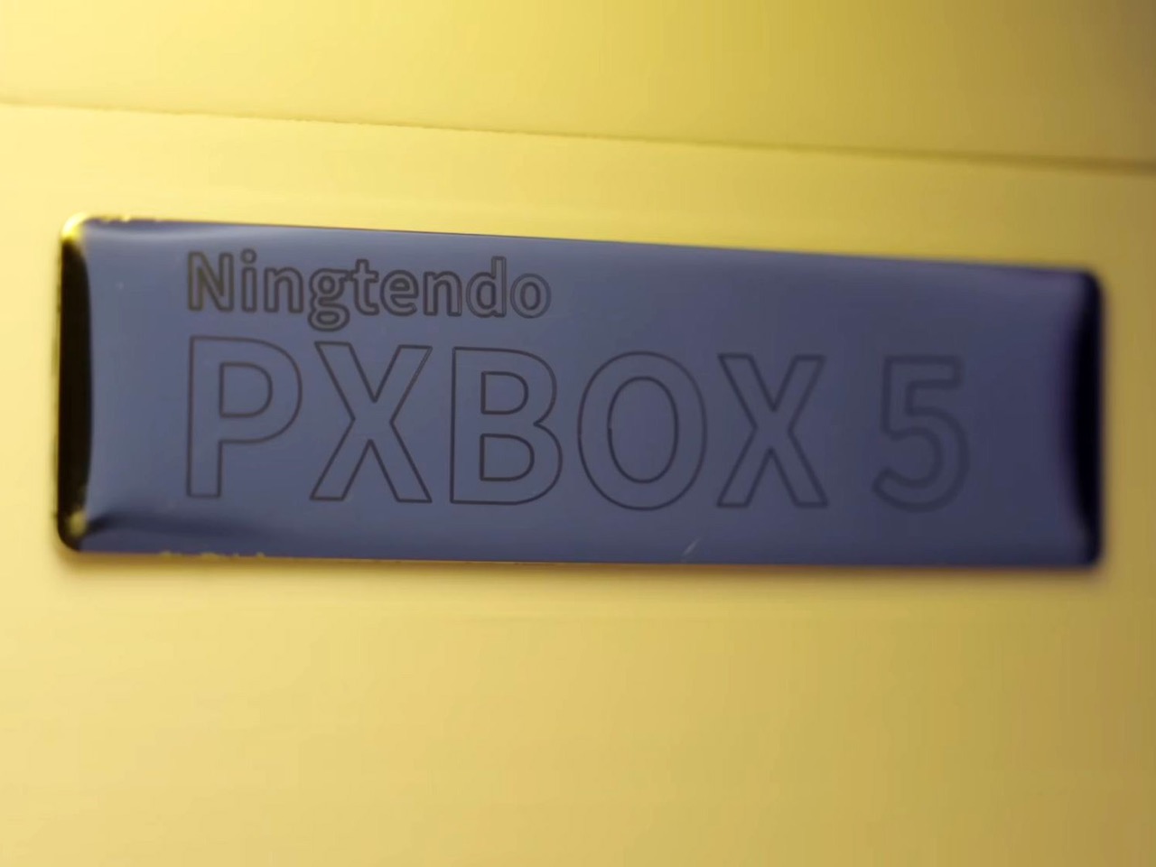
The console wars are dead. And what killed them wasn’t rising RAM prices, GPU scarcity, tariffs, or any sort of monopolistic practices. It was one modder who was tired of the multi-ecosystem approach. Chinese hardware enthusiast 小宁子 XNZ (or XNZ for short) looked at her collection of gaming consoles, realized she was constantly swapping cables and power supplies just to access different game libraries, and decided to do something about it. The result is the Ningtendo PXBOX 5, a custom-built system that combines PlayStation 5, Xbox Series X, and Nintendo Switch 2 hardware into a single triangular chassis that switches between all three platforms with a button press. One console to rule them all…
XNZ stripped each console down to its motherboard and mounted them on three sides of a custom aluminum cooling block, inspired by the old trash can Mac Pro design. A single 250-watt power supply feeds everything, while a Phanteks fan at the bottom pushes air through the shared heatsink. Press the button on top and an Arduino board handles the switching logic, cycling through the three systems in about three seconds. A front-mounted LED strip glows blue for PlayStation, green for Xbox, or red for Switch 2, so you always know what’s active. The catch is you need to close your game before switching to avoid overloading the power supply, but that’s a small price to pay for having Sony, Microsoft, and Nintendo living peacefully under one roof. Both the PS5 and Xbox are digital-only versions, so no disc drives made it into the final build.
Designer: 小宁子 XNZ
XNZ pulled inspiration from Apple’s 2013 trash can Mac Pro, which remains one of the most divisive desktop designs Apple ever shipped. That machine had a triangular prism cooling system sitting dead center, with each of its three sides pressed tight against a separate component board. A fan at the top pulled hot air straight up through the whole assembly in one clean thermal column. Apple bet wrong on dual-GPU workstation builds and killed the product line, but the core thermal design was actually brilliant. For this project, it turned out to be the perfect blueprint. Three consoles, three motherboards, three sides of a triangle. The geometry practically solved itself.
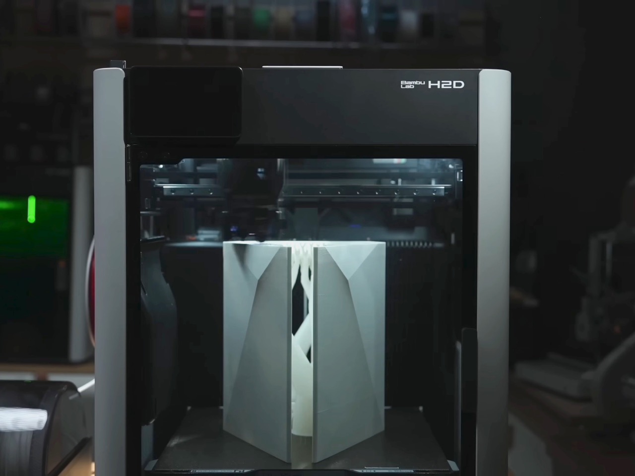
Building that triangular heatsink presented a different problem entirely. XNZ needed dense fins capable of dissipating heat from three different APUs, but CNC machining quotes came back at around $700. Metal 3D printing wasn’t much better, and both options involved waiting in manufacturing queues that would kill any chance of rapid iteration. So she went old school. Really old school. We’re talking 1,500 years old.
Lost-wax casting has been around since ancient China, traditionally used for intricate bronze artifacts like the Yunwen Bronze Vessel. The principle is simple: carve a detailed model in wax, coat it in clay, melt out the wax, and pour molten metal into the cavity left behind. XNZ modernized the process by replacing wax with PLA filament from her 3D printer. She designed the heatsink in CAD software, printed it with support structures and cooling channels built right in, then encased the whole thing in high-temperature gypsum. The gypsum can withstand 700 degrees Celsius while PLA starts melting at 100 degrees and burns completely by the time you hit 700. Stick it in an electric kiln, run it through four heating stages over 12 hours, and you’re left with a clean ceramic mold ready for aluminum.
The first casting attempt failed halfway through when the molten aluminum cooled too fast and solidified before filling the entire mold. The fins were also too dense, causing the thin gypsum walls between them to crack. XNZ adjusted the fin thickness, changed their orientation to shorten the flow path, and recalibrated both the mold temperature and the aluminum pour temperature. Second attempt came out perfect. The surface captured fine details from the 3D print, including the layer lines from the support structures on the bottom. After sawing off the pouring gate and polishing the contact surfaces, she had a functional aluminum heatsink that cost maybe 50 bucks in materials instead of several hundred in machining fees.
Copper plates bolt onto two sides of the aluminum block where the PS5 and Xbox motherboards make contact. The third side, reserved for the Switch 2, doesn’t get a copper plate because Nintendo’s handheld apparently doesn’t need active cooling when docked. Thermal paste replaces the PS5’s stock liquid metal since the copper and aluminum combo provides enough thermal mass. During testing, the whole system ran Elden Ring for 30 minutes without overheating warnings, topping out at 60 degrees Celsius measured across the heatsink surface. That’s impressive considering you’ve got three separate APUs sharing one cooling solution and one 12-centimeter fan doing all the work.
The Switch 2 integration required a custom dock since the handheld needed to remain removable. XNZ gutted Nintendo’s official dock, pulled out the USB-C daughterboard and relevant electronics, and stuffed everything into a 3D-printed housing that attaches to the cooler’s third face. She wanted a spring-loaded ejection mechanism like a toaster, but metal springs couldn’t provide enough force to overcome USB-C port friction. The solution came from Bambu Lab’s MakerWorld, where she found a parametric spring generator that lets you customize dimensions through simple value inputs. She printed the entire dock assembly using dual-extrude printing with PLA for the rigid case and PETG for the flexible spring components. The two materials bond during printing so the spring stays permanently embedded in the structure but remains fully functional right off the print bed.
Power management turned out simpler than expected. The PS5 pulls 225 watts under full gaming load but drops to 4 watts in standby. The Xbox Series X shows similar behavior. A gallium nitride 250-watt power supply handles both consoles running in parallel as long as you’re only actively gaming on one at a time. The Switch 2 gets its juice through a transformer and USB-C PD trigger that converts the main rail voltage. An Arduino board sits inside the case managing power distribution and HDMI switching, triggered by that single button on top. Press it once and the LED bar changes color while the Arduino routes both power and video output to the next console in the sequence. Takes three seconds to complete the switch, which is faster than most people can close their game and navigate back to the home screen anyway.
The whole thing weighs less than having three separate consoles on your shelf and uses one HDMI cable, one power cord, and zero mental energy deciding which box to turn on. Sure, you lose disc drive functionality since both the PlayStation and Xbox are digital editions. And yes, the 250-watt ceiling means no running multiple games simultaneously or the power supply trips. But XNZ built a working proof of concept that platform exclusivity is a solvable engineering problem, not some immutable law of physics. Sony, Microsoft, and Nintendo have spent decades convincing people their ecosystems need to stay separate. One person with a 3D printer, some molten aluminum, and a weekend said otherwise.
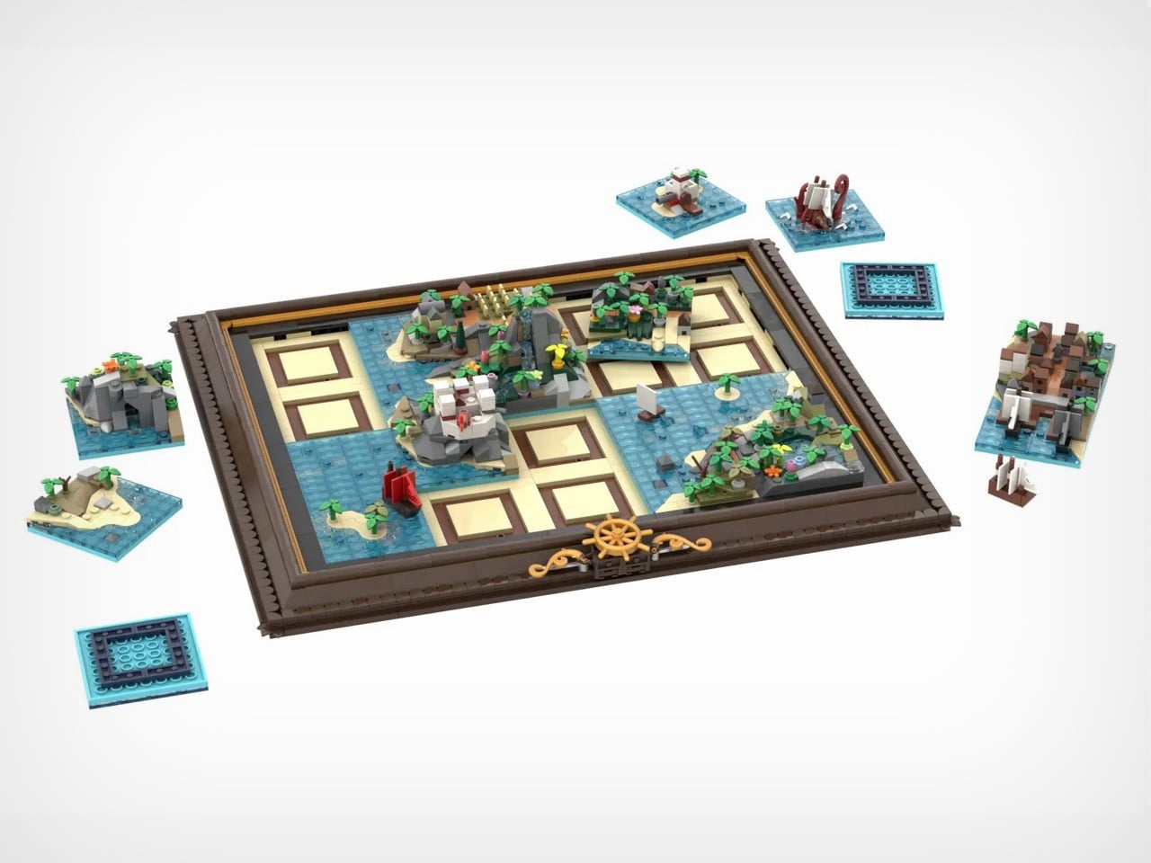
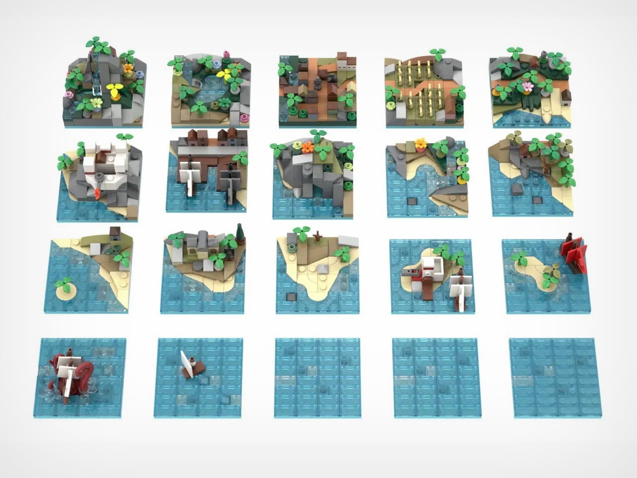
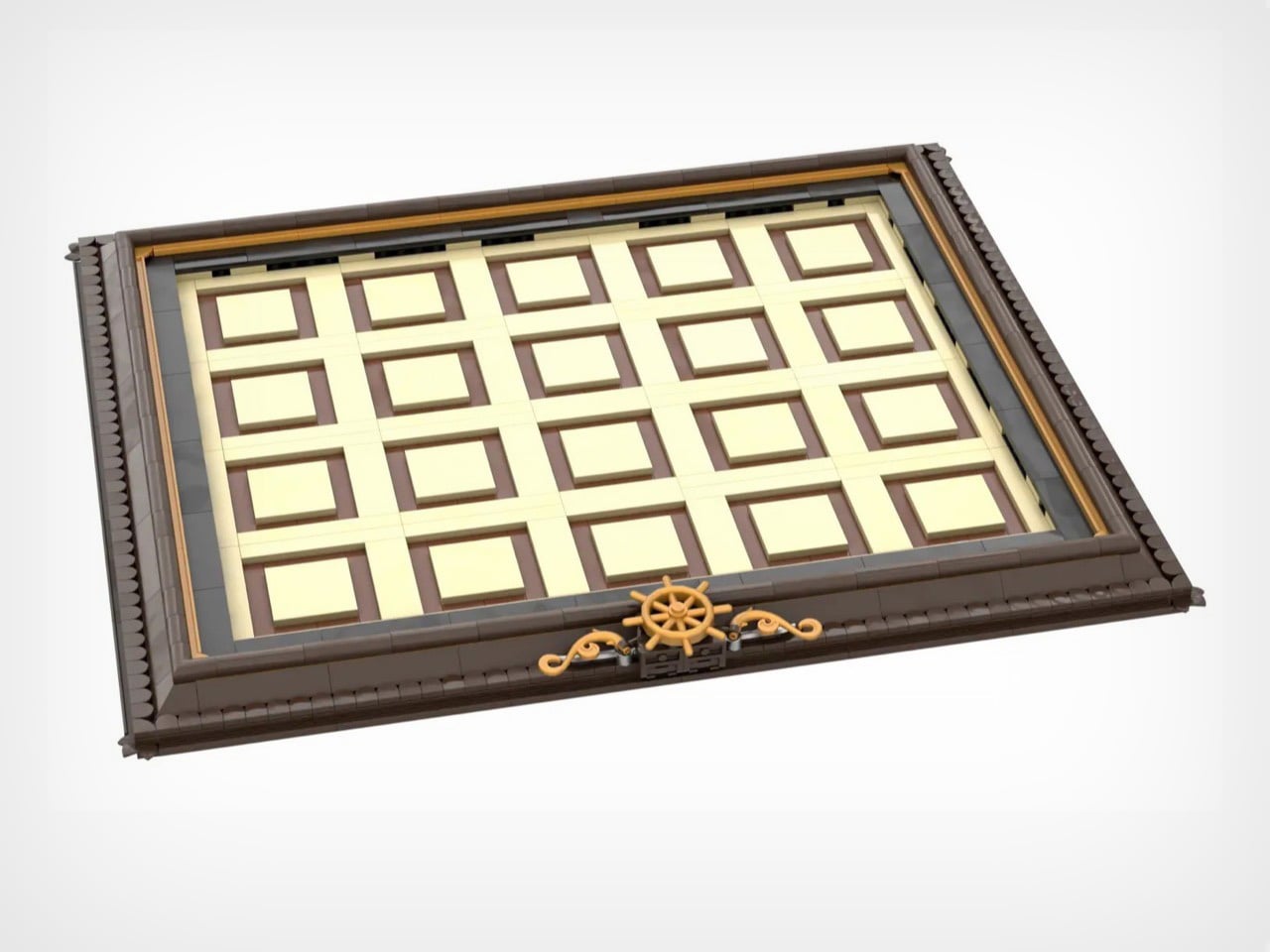
X marks the spot, but which spot? George Brickman’s Modular Pirate Map refuses to commit, and that’s precisely why I love it. This LEGO Ideas submission treats the pirate world like a puzzle where every piece works anywhere, creating a different adventure depending on your mood. Twenty tiles, each bursting with microscale detail, slot into an elegant frame to form a complete map. Then you mix them up and start again.
The tiles themselves are tiny masterpieces. Corner pieces house imperial forts and mysterious caves. Interior tiles feature mountain waterfalls and crop fields. Island tiles show colonial outposts. And then there’s the kraken, red tentacles wrapped around an unfortunate vessel, ready to terrorize whatever waters you assign it to. With approximately 2,120 pieces and already marked as a Staff Pick, this project currently has 4,172 supporters steering it toward the 10,000-vote goal. The frame measures about 16 by 13.5 inches, but the possibilities stretch much further.
Designer: George Brickman
The constant element here is the map’s frame. Dark brown borders with golden accents, three ship’s wheels positioned along the bottom edge like they belong in a captain’s quarters. It’s museum presentation meets functional toy, which is a balance LEGO constantly chases but doesn’t always nail. When you pull tiles out to rearrange them, that empty grid doesn’t look unfinished. It looks like a map in progress, a world being redrawn in real time. The tan and brown tile slots aren’t just practical. They’re decorative infrastructure.
Six corner tiles carry the major landmarks. Bustling harbor with docked ships. Imperial fort with battlements and flag. Cave entrance carved into rocky cliffs. Mountain waterfall cascading into pools. Field of golden crops. Small town with multiple buildings crammed together. Four interior tiles handle the transitional spaces with pools, more agriculture, additional structures, varied terrain. Two island tiles add strategic focal points including an imperial outpost. One side tile gives you coastline on a single edge for asymmetrical builds. Four blank water tiles let you control how much ocean dominates your world. Every piece has a job, and Brickman clearly spent time figuring out what players would actually need versus what just fills space.
There’s a Kraken tile that adds a perfect amount of whimsy to the map. Massive red tentacles wrapped around a ship getting absolutely wrecked. At this scale, giving those appendages actual volume and curve is legitimately difficult, but Brickman pulled it off. Position matters with this one – drop it near your harbor and you’ve got a siege. Place it next to blank water and it becomes a deep-sea horror story. The kraken doesn’t passively occupy a tile. It dictates tone for everything around it, which is exactly how a showpiece element should function.
Modularity only works when every tile has character and purpose. You need each piece to justify independent existence, otherwise why bother with the swapping mechanic at all? Palm trees lean at intentionally different angles. Rocks stack with natural irregularity instead of uniform patterns. Ships have distinct hull shapes and sail configurations rather than cookie-cutter repetition. Microscale forces brutal economy because you can’t hide weak composition behind part-count excess. When you only have 75 pieces per tile, every single brick needs purpose.
Start mixing configurations and the mathematics get wild. A 4×5 grid holding 20 tiles produces absurd permutation counts even accounting for corner and edge restrictions. You could theme it with all land tiles clustered on one side creating an archipelago. You could scatter islands randomly across mostly-water fields. You could jam civilization into one corner and leave wilderness sprawling everywhere else. The modularity isn’t decorative flexibility. It’s the entire reason this concept works as a product rather than just a pretty render.
4,172 supporters with 589 days remaining and Staff Pick status means this campaign has actual legs (or kraken tentacles, should I say). LEGO has done modular buildings for years. They’ve released countless pirate ships across multiple themes. Nobody’s done a modular map, which feels like an obvious gap now that someone’s finally filled it. If this survives the 10,000-vote threshold and makes it through LEGO’s review process, you’re looking at a potential template for an entire category. Modular fantasy maps with castles and dragons. Space station maps with docking bays and asteroid fields. Underwater maps with submarines and coral reefs. The format translates to literally any theme that benefits from spatial reconfiguration. That’s a vision I can get behind – and if you believe in it too, go ahead and cast your vote for Brickman’s MOC (My Own Creation) on the LEGO Ideas website. It’s free!
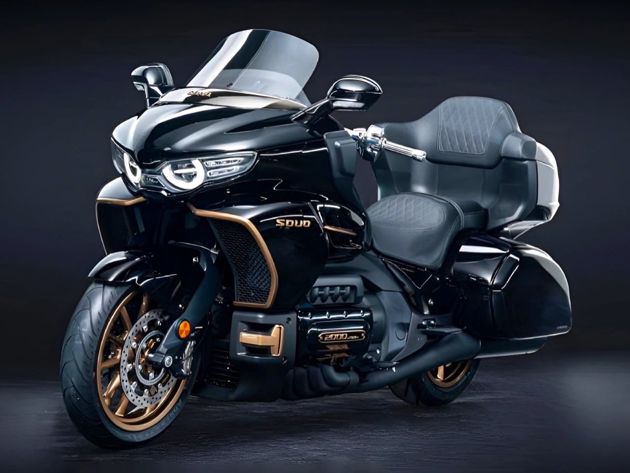
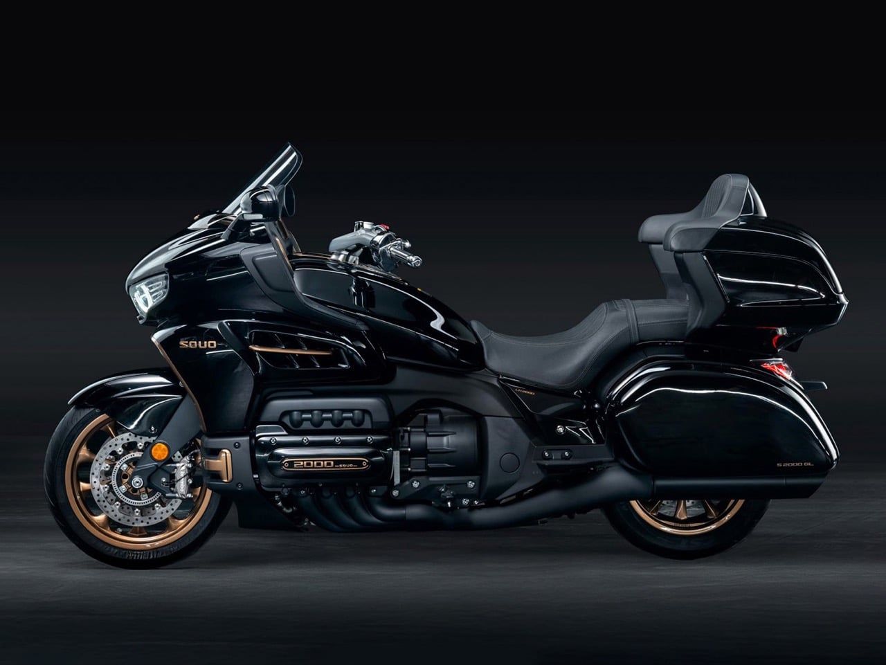
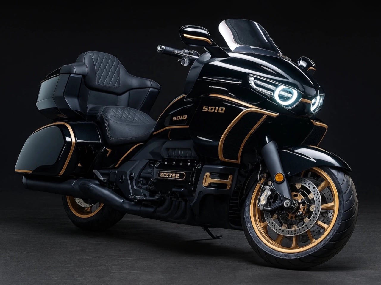
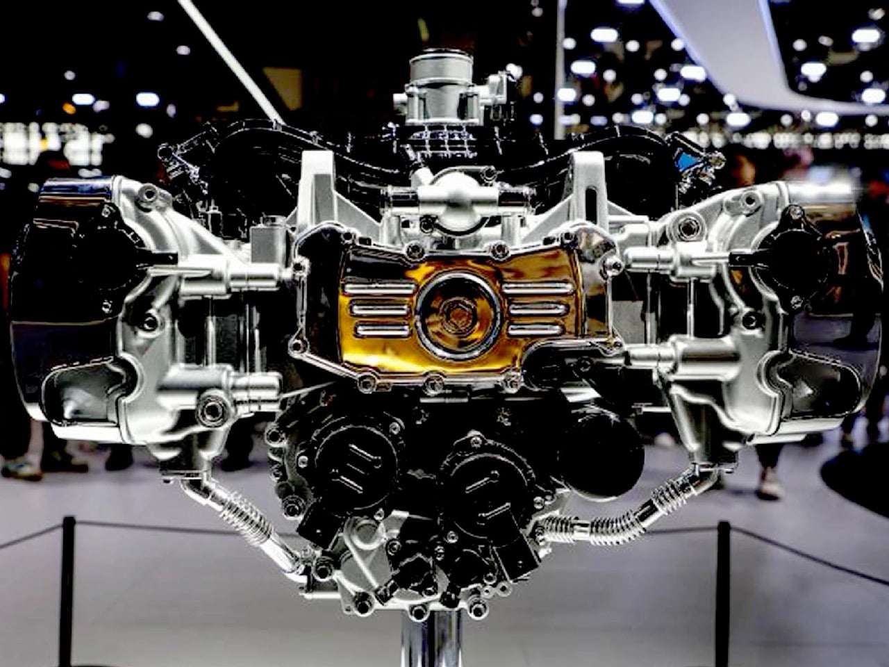
Picture this: a Chinese automotive giant with zero motorcycle heritage decides its first two-wheeled creation should pack eight cylinders, displace two liters, and weigh over half a ton. Most companies would call that insane. GWM chairman Wei Jianjun called it a passion project and threw over 150 million dollars at making it happen.
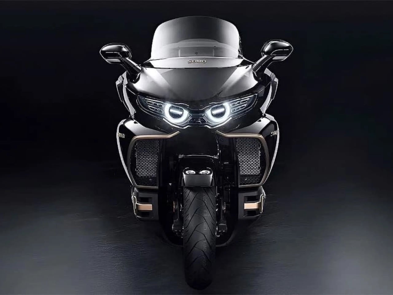
The result is the Souo S2000, the world’s first production motorcycle with a flat-eight engine. While Honda, Harley, and BMW pivot toward electric futures and downsized engines, GWM has built something gloriously unnecessary: a touring bike with more cylinders than most cars, more power than a Honda Goldwing, and enough chrome and gold trim to make a baroque cathedral jealous. It’s excess personified, and it’s reportedly headed to America in 2027 with a $30,000 price tag.
Designer: Great Wall Motor Company
The specs read like someone’s fever dream. A 1,999cc horizontally opposed eight-cylinder engine making 154 horsepower at 6,500 rpm and 190 Nm of torque at 4,500 rpm. That’s 21% more power than the Goldwing’s 1.8-liter flat-six from only 9% more displacement, which suggests GWM’s engineers actually know what they’re doing. The engine connects to an eight-speed dual-clutch transmission because apparently seven speeds wasn’t enough to embarrass Honda. And here’s the kicker: it has a reverse gear that moves at 1.8 mph because backing up 461 kilograms by foot would be physically impossible for most humans.
The chassis borrows from automotive thinking in ways that make traditional motorcycle engineers wince. GWM claims the frame uses a bolt-free welded aluminum construction, which sounds impressive until you remember this thing weighs more than some compact cars. The front suspension is a three-tier double wishbone setup that they’re calling a world first, though anyone familiar with the Hossack front end will recognize the DNA. It’s basically a way to separate braking forces from suspension duties, which matters when you’re trying to stop a half-ton missile from 130 mph. Brembo supplies the four-piston calipers on both ends because of course they do.
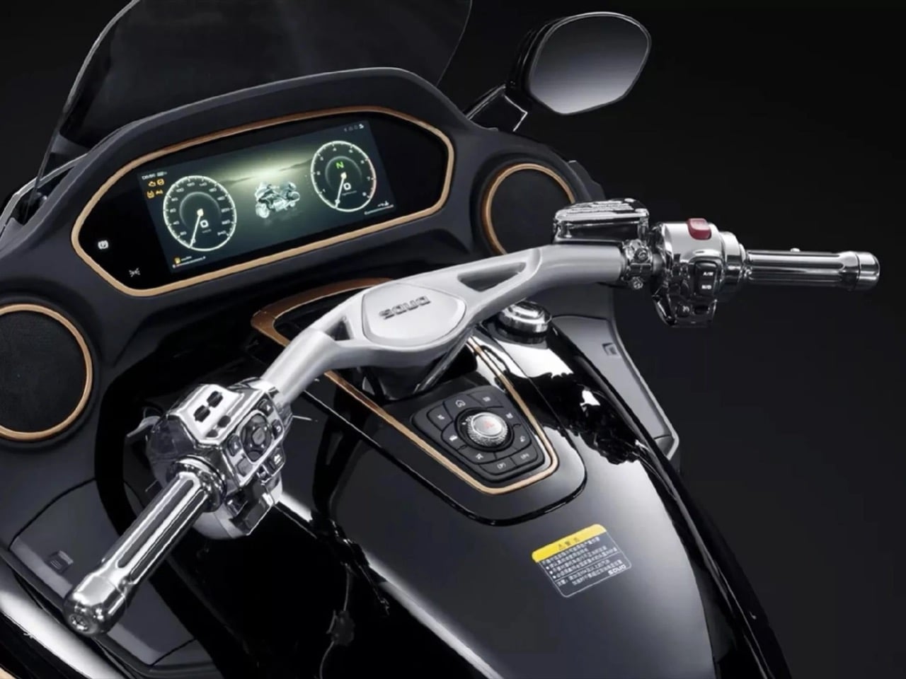
That 1,810mm wheelbase is 115mm longer than the Goldwing, which explains why photos of this thing make it look like a small spaceship. The seat height sits at a surprisingly reasonable 740mm despite the bike’s overall mass, meaning shorter riders can actually touch the ground. GWM stuffed 118 liters of luggage capacity into the panniers and top case, heated everything that could conceivably be heated, and threw in an eight-speaker sound system because subtlety died somewhere around cylinder number five.
The really fascinating bit is how this bike even exists. GWM is primarily known for making SUVs and pickup trucks. They rank among the top 25 automakers globally and export to over 170 countries, but motorcycles? Completely new territory. Wei Jianjun simply loves bikes and had the resources to make this happen, so he did. The first batch of 200 units sold out. The second batch sold out. The third batch that went on sale in March 2025 also sold out. Chinese buyers are paying between 218,800 and 288,800 yuan depending on trim level, which translates to roughly $31,000 to $41,000 USD.
For context, a Honda Goldwing Tour with DCT starts at around $26,000 in America. The S2000 costs more and weighs 71 kilograms more than the fully loaded Goldwing Tour. It’s also faster, angrier, and comes in a Founder Edition with 24-karat gold accents and the chairman’s signature etched into the fuel tank. Only 88 of those were made, and someone recently paid 668,800 yuan for a one-off called the Cloud Lion with hand-painted clouds and mother-of-pearl lacquering. That’s over $100,000 for a motorcycle.
The question everyone’s asking is whether this thing will actually make it to American roads. GWM confirmed at CES 2026 that they’re planning a North American launch in 2027, targeting that same $30,000 price point. The company has zero presence in the US market currently, which makes this either incredibly ambitious or incredibly stupid. Probably both. They’re planning to expand through Europe and Australia first, testing the waters before tackling American regulations and the nightmare that is establishing a dealer network from scratch.
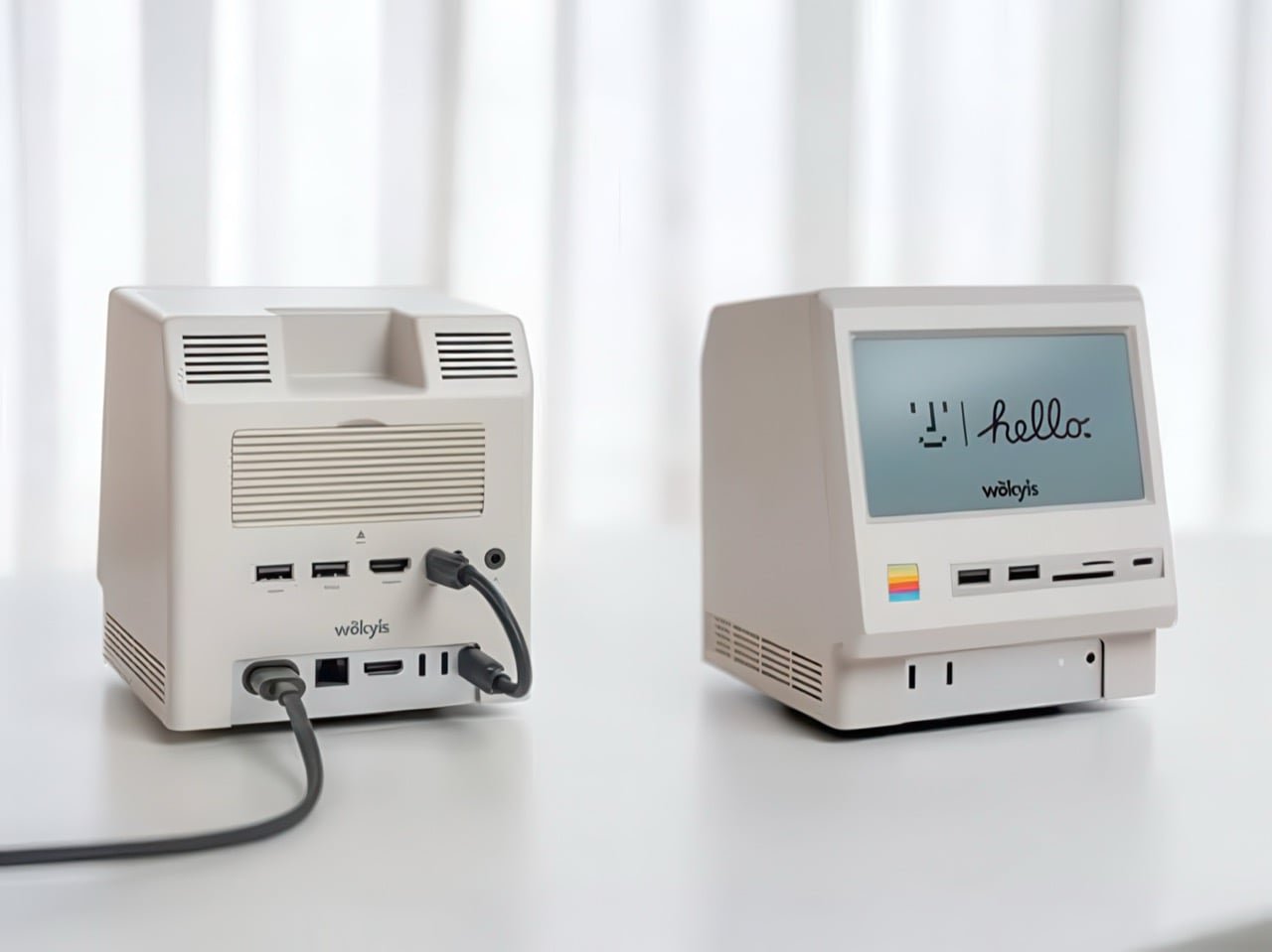
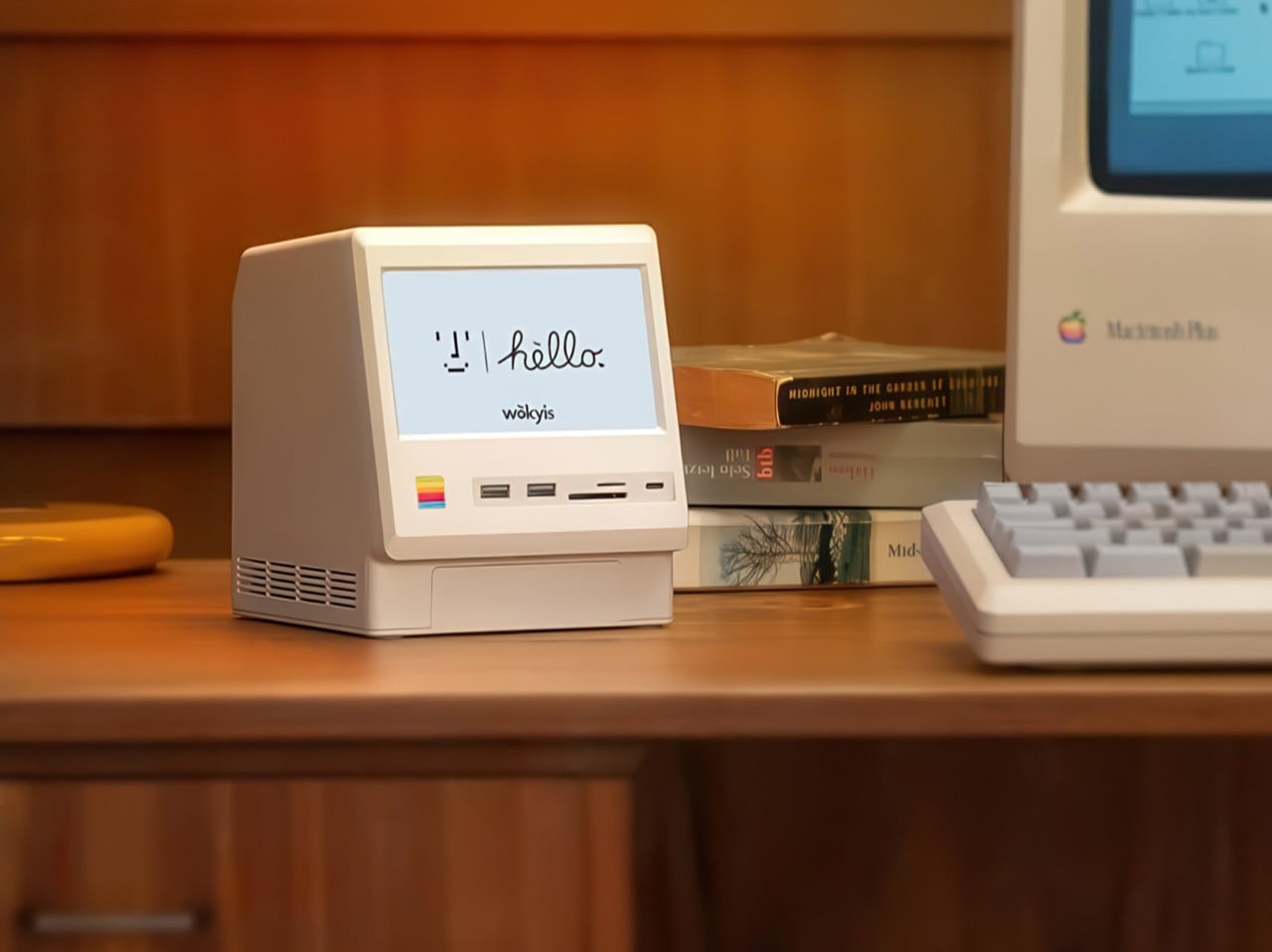
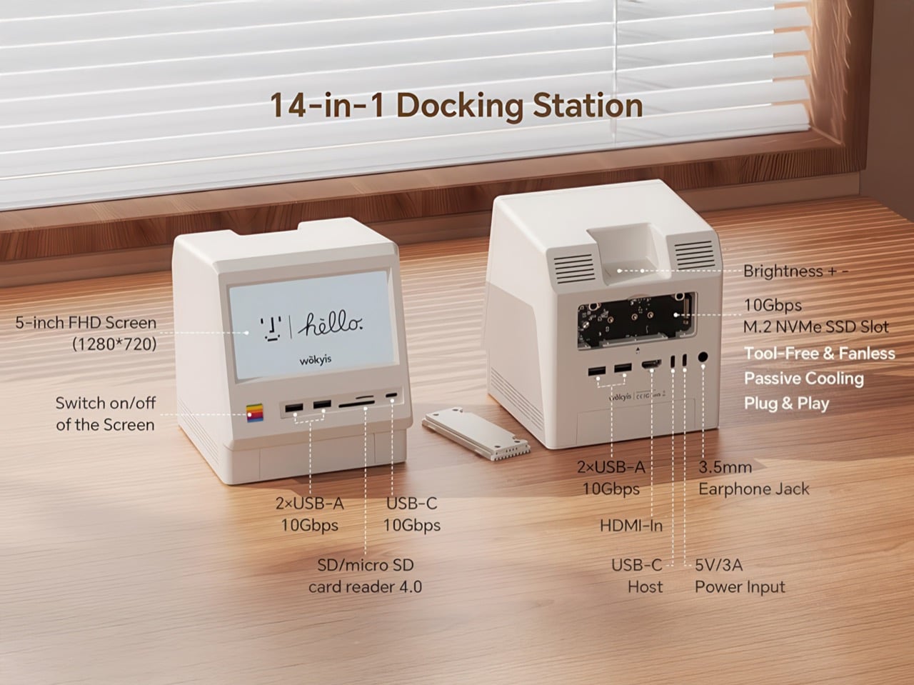
Apple’s Mac mini M4 is absurdly powerful for its size, but connecting anything to it requires a patience-testing game of dongle Tetris. The Wokyis M5 fixes this the fun way, wrapping your diminutive desktop in a retro Macintosh shell that’s actually packed with ports and storage. Yes, the naming is confusing since there’s no Mac mini M5 yet, but the compatibility story is straightforward: this works with the M4, M2, and M1 Mac minis, plus any Mac with Thunderbolt 3/4/5 ports.
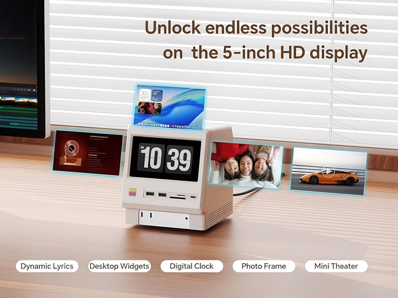
Inside that beige plastic homage to computing history, you’ll find legitimately fast 10Gbps connectivity on both USB-A and USB-C ports, card readers that hit 312MB/s with UHS-II cards, and a tool-free M.2 enclosure with included thermal pads for proper heat management. The 5-inch screen displaying “hello” works as a proper 720p panel for desktop widgets, music lyrics, photo frames, or system stats. Testing shows the SSD enclosure delivers around 900 MB/s with quality NVMe drives, which is respectable for a hub in this price range. The design lets you access the Mac mini’s own ports through a removable bottom panel, so nothing gets sacrificed in the name of aesthetics.
Photographers and video editors know the Mac mini M4’s port limitation intimately. Three Thunderbolt 4 ports and two USB-A ports sound adequate until your monitor claims one, your external SSD takes another, and you’re suddenly rationing connectivity like it’s a finite resource. The front panel of the M5 solves this with two USB-A 10Gbps ports, one USB-C 10Gbps port, and SD plus microSD slots that handle UHS-II speeds at 312MB/s. Offloading a 128GB card from a photo shoot takes minutes instead of the geological timescale you’d experience with slower readers. You do this without unplugging anything or performing cable gymnastics behind your monitor.
The M.2 enclosure accepts NVMe drives from 2230 to 2280 form factors and supports up to 8TB of storage. Pair it with a Samsung 990 EVO Plus and you’ll see read and write speeds hovering around 800 to 900 MB/s, which translates to genuinely usable performance for 4K editing timelines or RAW photo libraries. Wokyis ships two thermal pads in the box: a thicker one for single-sided SSDs and a thinner variant for double-sided drives. The passive cooling approach works because there’s actual thought behind the thermal management rather than hoping convection does all the heavy lifting. No fans means no noise, which matters when you’re recording voiceovers or working in a quiet space.
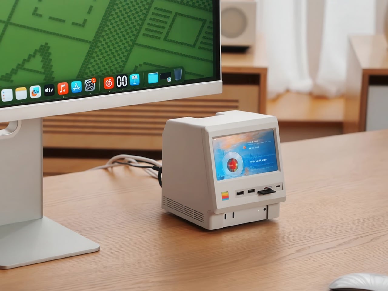
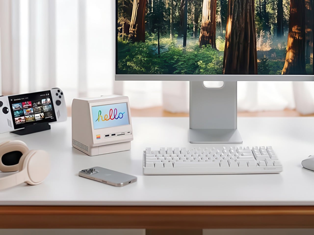
That 5-inch display hits 1280×720 resolution at roughly 290 PPI, putting it squarely in Retina territory for normal viewing distances. Text renders crisp, colors track accurately for casual use, and brightness handles typical indoor lighting without struggle. You can feed it content through the HDMI-in port or the USB-C host connection depending on your setup preferences. People are running Spotify controls on it, system monitoring dashboards, security camera feeds, even Slack notifications. The dedicated power button on the front means you can kill the screen when you don’t need it running, which beats having a perpetually glowing display burning into your peripheral vision at 2 AM.
Wokyis nailed the proportions by treating the original Macintosh as inspiration rather than a blueprint to slavishly recreate. The beige matches Apple’s classic off-white perfectly, the ventilation grills reference the original’s cooling design, and that rainbow stripe sits exactly where your brain expects it. The dimensions wrap the Mac mini M4 specifically, with a removable base plate that keeps every native port accessible. You’re adding capability on top of what Apple gave you rather than trading functionality for aesthetics. The Mac mini slides in, locks down, and you’ve suddenly got a setup that looks like it time-traveled from 1984 while performing like it’s from 2025.
Generic USB-C hubs from Anker or CalDigit run $80 to $150 and offer similar port counts with zero personality. None of them include an SSD enclosure or a display. The M5 at $169.99 lands in a weird value proposition where you’re paying a modest premium for design that actually makes you happy to look at your desk. The 80Gbps Thunderbolt 5 version exists at $389 if you’re pushing enormous video files or running external GPUs, but that’s specialist territory. The 10Gbps model handles what 90% of users throw at it. Ships in two days direct from Wokyis or grab it from Amazon if you’ve got Prime and prefer that refund safety net. Either way, you’re getting a dock that makes the Mac mini M4 better at its job while looking fantastic doing it.
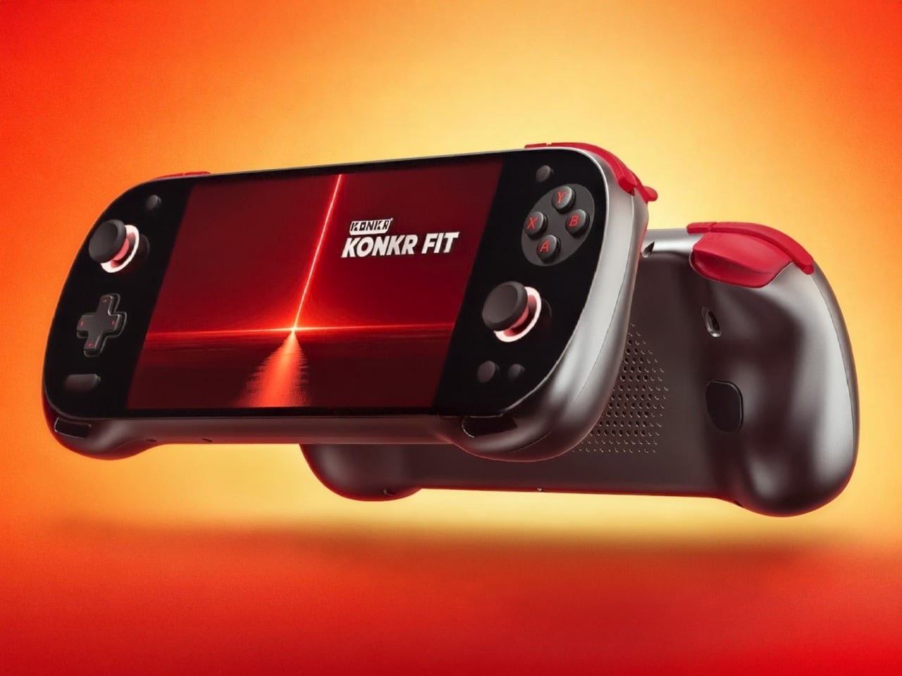
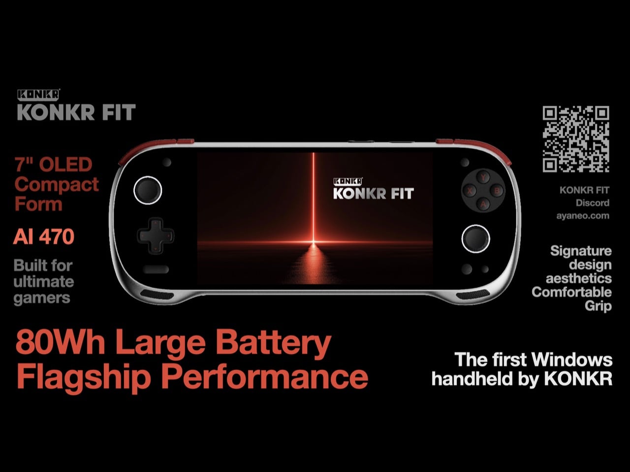
Ayaneo’s budget Konkr brand is expanding beyond Android. After launching the Pocket Fit with Snapdragon G3 Gen 3 and the more powerful Pocket Fit Elite with Snapdragon Elite 8, the company has unveiled its first Windows handheld under the Konkr name. The new device drops “Pocket” from its title for good reason.
The Konkr Fit features a 7-inch OLED display, significantly larger than the 6-inch screens on its Android siblings. Powering this Windows handheld is an AMD Ryzen AI 9 HX 470 processor, marking a departure from Snapdragon mobile chips. The device also packs an impressive 80Wh battery, dwarfing the capacity found in competitors like the Lenovo Legion Go S and even the Legion Go 2.
Designer: Ayaneo
80Wh in a handheld gaming device puts the Konkr Fit in genuinely rare company. The Legion Go S limps along with 55.5Wh, while even Lenovo’s newer Legion Go 2 only manages 74Wh. We’re talking about potentially game-changing longevity here, especially considering Windows handhelds typically drain batteries faster than their Android counterparts. The Ryzen AI 9 HX 470 is a hungry chip, sure, but you’re still looking at a device that might actually survive a cross-country flight without searching desperately for an outlet. Battery anxiety has plagued this entire product category since the Steam Deck launched, and Ayaneo seems to understand that cramming in more capacity solves more problems than any amount of software optimization ever will.
The HX 470 belongs to AMD’s Strix Point lineup, the same family powering proper gaming laptops. You’re getting Zen 5 cores and RDNA 3.5 graphics, which means AAA titles at respectable settings become genuinely playable. Compare that to the Snapdragon Elite 8 in the Pocket Fit Elite, which excels at emulation and Android titles but starts sweating with demanding PC games. Ayaneo clearly wants this positioned as a real PC gaming device, not just an emulation box with delusions of grandeur. The processor alone tells you they’re betting on people who want to run their Steam libraries natively, not folks content with streaming or playing mobile ports.
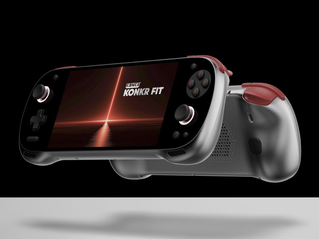
Borrowing heavily from its Android siblings makes sense when you consider the Pocket Fit’s design already works. Hall Effect joysticks handle the analog inputs, which means drift shouldn’t plague these controllers the way it does cheaper alternatives. Adjustable triggers and dual back buttons carry over unchanged. The company offers two colorways: Retro Gray with red accents and a straight Yellow option. Both feel very much in line with the broader handheld gaming aesthetic that’s emerged, though the gray and red combo has some Steam Deck vibes whether Ayaneo wants to admit it or not.
Two USB-C ports now sit at the top edge, giving you actual flexibility for charging while gaming or connecting accessories without blocking your hands. Larger inlet vents dominate the back panel compared to the Pocket Fit, addressing what will inevitably become thermal challenges with a chip this powerful. Even the screws holding the backplate are exposed, suggesting Ayaneo expects enthusiasts to crack this thing open for maintenance or upgrades. These aren’t cosmetic flourishes. Windows gaming generates serious heat, and pretending otherwise is how you end up with a handheld that thermal throttles ten minutes into Cyberpunk 2077.
The OLED panel upgrade from the Pocket Fit’s LCD matters beyond the obvious visual improvements. Response times eliminate the ghosting issues that plague cheaper LCD panels during fast-paced gaming. Deep blacks mean better contrast in dimly lit game environments, which basically describes half of modern AAA titles. At 7 inches, you’re getting enough screen real estate that Windows UI elements remain readable without squinting, though whether Windows 11 plays nicely with a 7-inch touchscreen remains an open question. Microsoft has never really figured out how to make their OS work elegantly on small displays, and I doubt Ayaneo’s custom launcher will magically solve decades of interface design problems.
Pricing remains a company secret, but simple math suggests this slots above the $399 Pocket Fit Elite. The Ryzen AI 9 HX 470 costs more than Snapdragon chips, Windows licensing adds expense that Android avoids, and that 80Wh battery doesn’t come cheap. My gut says somewhere between $500 and $600, which plants this squarely in Steam Deck OLED territory. That’s awkward positioning for a brand that built its identity on being the affordable alternative to Ayaneo’s own thousand-dollar flagships. Then again, Ayaneo could just drop the details and prove me wrong.
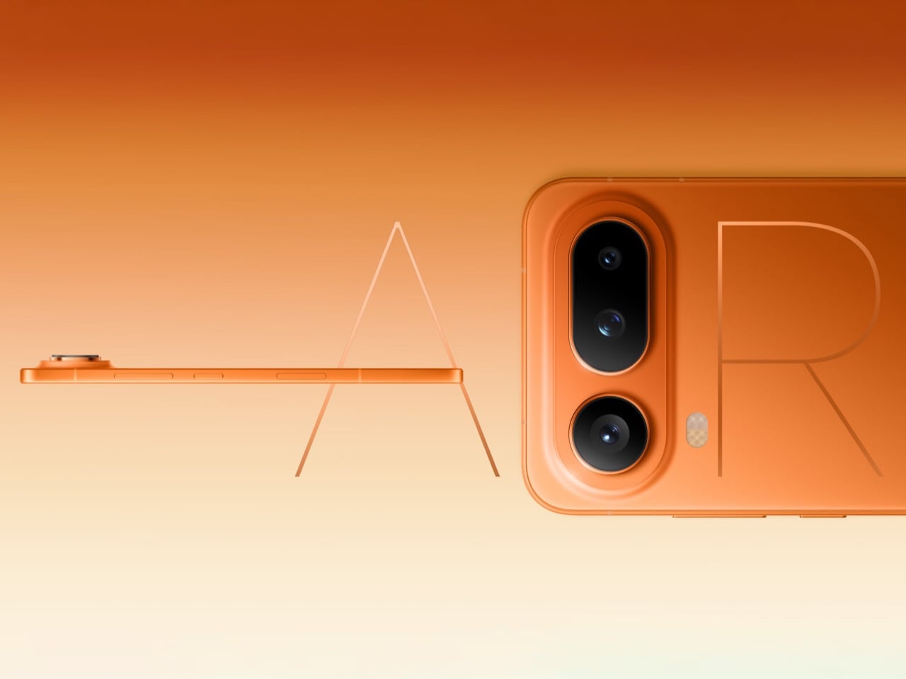
Sometimes the most interesting phones aren’t the ones pushing boundaries into weird new territory. They’re the ones that look at existing boundaries and ask why they exist in the first place. Honor’s Magic8 Pro Air sits at 6.1mm thick, which matches the iPhone 16 Pro’s obsession with thinness, but then it throws in a full triple camera array and a 5,500mAh battery just to prove a point. That point being: maybe we’ve been too quick to accept compromises that aren’t actually necessary.
The whole package reads like a direct response to Apple’s recent design choices, except Honor isn’t playing the “our number is bigger” game. They’re playing the “why can’t we have nice things” game, and honestly, it’s refreshing. For years, flagship phones have operated under this assumption that serious camera systems and all-day batteries require chunky bodies. The Magic8 Pro Air suggests that’s more about engineering priorities than physical limitations. Whether it actually delivers on that promise in real-world use is another story, but the ambition alone is worth paying attention to.
Designer: HONOR
Sure, a triple-camera array on a phone that thin is impressive, but what knocks my socks off more is the fact that this phone packs nearly 75% more battery than the iPhone Air. For context, the iPhone Air maxes out around 3,149mAh and sits at roughly 5.6mm. Samsung’s Galaxy S25 Edge packs slightly more at 3,900mAh into a 5.8mm frame. Honor somehow found an extra 1,600mAh while adding just 0.3-5mm more than the competition. That translates to a good 5+ hours more of daily use before reaching for a charger or power bank. Let’s not ignore how impressive that is.
The triple camera setup tells a similar story of refusing easy compromises. We don’t have full specs yet on the sensor sizes or focal lengths, but the fact that Honor committed to three lenses instead of following Apple’s single-camera approach on the standard iPhone 16 says something about their priorities. Modern computational photography has convinced a lot of companies that one good sensor plus aggressive software processing can replace optical versatility. Honor clearly disagrees, or at least thinks consumers disagree enough to matter. They’re betting that people still want actual telephoto reach and ultrawide perspective without relying entirely on digital trickery and crop-zoom theatrics.
What makes this launch particularly on-point is the tagline. Honor’s marketing team went with “thin but not lacking” in Chinese, which translates the subtext into actual text. They know exactly what conversation they’re entering. Apple spent the last few years teaching the market that premium means thin, and thin means sacrifice – whether it’s a camera lens on the iPhone Air, a 3.5mm jack on the iPad Pro, or just ports on their MacBook Airs. Honor looked at that equation and decided the sacrifice part was optional, which either makes them bold or delusional depending on how the phone actually performs once reviewers get their hands on it.
The broader implications here matter more than one phone from one manufacturer. If Honor can ship a 6.1mm device with flagship battery life and proper camera versatility, then every other manufacturer now has to explain why they can’t or won’t. The “we had to choose between thin and capable” excuse stops working when someone demonstrates the choice was never binary. This puts pressure on Samsung, Google, and especially Apple to either match the capability or justify why their engineering led to different conclusions. Competition works best when companies stop accepting the same limitations and start solving problems their competitors declared unsolvable.
Honor’s brand-recall in Western markets still has room for improvement, although they’re perhaps one of the most reputed brands in their home country of China. The Magic8 Pro Air might be brilliant, but if people don’t know where to easily buy one, the competitive pressure stays theoretical. Still, specs like these have a way of forcing conversations that manufacturers would rather avoid. Apple doesn’t need to worry about Honor’s market share to feel the heat when tech reviewers start asking why the iPhone 17 can’t pack a bigger battery at the same thickness – and every tech reviewer should absolutely call on Apple to be less compromising. The Magic8 Pro Air wins just by existing and working as advertised. Everything after that is bonus points.
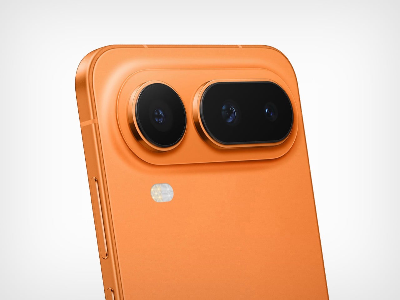
If someone told you in 2019 that we’d see seven generations of Samsung Galaxy Folds before Apple released a single foldable iPhone, you’d probably have believed them because that’s exactly how Apple operates. Wait, watch, then swoop in like they just invented the whole concept. Well, 2026 might finally be the year, assuming these leaks are legit and not just wishful thinking from analysts who’ve been predicting the iPhone Fold since the Obama era.
The rumor mill is churning out some pretty specific claims right now. We’re talking actual dimensions, chip specs, and price points that’ll make your wallet weep. But more interesting than the what is the how and why. Apple’s supposedly been tackling the exact problems that have kept foldables from going mainstream, which either means they’ve cracked the code or they’re about to learn the same expensive lessons Samsung already learned. Let’s unpack what we actually know versus what’s tech journalism fan fiction.
Designer: Apple
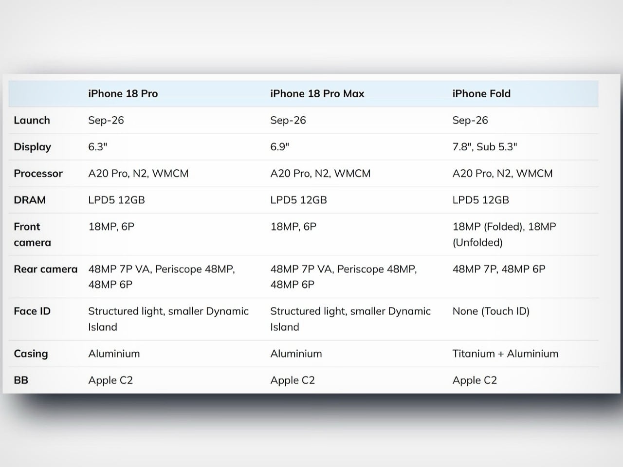
The specs coming out of supply chain analyst Jeff Pu’s investor briefings paint a picture of a device Apple’s positioning right alongside the iPhone 18 Pro lineup. September 2026 launch date, which means they’re treating this as a flagship product rather than some experimental side quest. The inner display clocks in at 7.8 inches when you unfold it, putting it in direct competition with Samsung’s Galaxy Z Fold 8. The outer screen sits at 5.3 inches, which is actually smaller than what Samsung’s offering. That’s either Apple prioritizing pocketability or a sign they couldn’t fit a bigger screen without compromising the design. Probably both, knowing how Apple thinks about these things.
The whole device reportedly measures 4.5mm when unfolded, which is genuinely insane when you consider what’s packed inside. For context, that’s thinner than most credit cards and absolutely thinner than any iPhone that’s ever existed. The folded thickness supposedly hits around 9mm, which still slides into a pocket easier than carrying an iPad mini everywhere. Apple’s apparently using a combination of aluminum and titanium for the frame construction, same lightweight-but-strong approach they’ve been pushing across the Pro iPhone lineup. The real party trick though is the hinge mechanism, which multiple sources claim uses liquid metal components to handle the stress of constant folding without creating that ugly crease everyone hates about foldables.
The A20 chip powering this beast is built on TSMC’s 2-nanometer process, same silicon going into the iPhone 18 Pro models. Apple’s apparently not treating this as a lesser device that gets last year’s processor, which tells you how seriously they’re taking the category. Battery capacity is rumored between 5,400 and 5,800 mAh, making it the largest battery Apple’s ever put in an iPhone because powering two displays simultaneously turns out to require actual juice. That’s almost double the capacity of a regular iPhone 15 Pro, and it needs to be.
The crease is the hot-topic on everyone’s mouths, with the rumor being Apple’s somehow found a way to obliterate it. Every foldable phone on the market has that visible line running down the middle when you unfold it, and it drives people absolutely insane. Apple’s supposedly using a liquid metal hinge design combined with some display technology wizardry to make the crease “nearly invisible” according to the leaks. I’ll believe it when I see it, but if they actually pulled this off, it would immediately make every other foldable look outdated. Samsung’s been iterating on this problem for seven years and still hasn’t fully solved it.
Touch ID is coming back, which is wild after Apple spent the better part of a decade convincing everyone Face ID was the future. The decision makes sense though when you think about the form factor. Authentication needs to work whether the phone is folded, half-open, or fully unfolded, and Face ID gets wonky when you’re holding a device at weird angles or using it propped up like a tiny laptop. A fingerprint sensor in the power button solves all of that instantly. It’s the same approach they took with recent iPads, and it works.
Pricing is where this whole thing either makes sense or falls apart completely. The leaks point to somewhere between $2,000 and $2,500, with recent intel skewing toward the higher end. That’s Mac Studio money for a phone that folds. That’s almost double what an iPhone 17 Pro Max costs. Samsung’s Galaxy Z Fold 8 will probably land around $1,999, so Apple’s betting people will pay a premium for whatever magic they’ve supposedly worked on the crease and overall build quality. Whether that bet pays off depends on a lot of factors, but I guess seeing Apple’s vision of a folding phone first-hand will really help seal the deal regarding whether this 6-7-year wait has finally paid off.
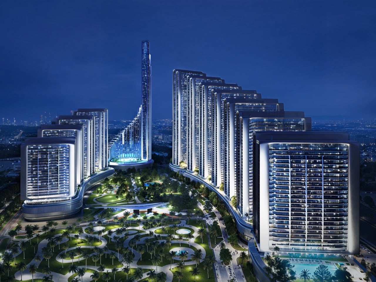
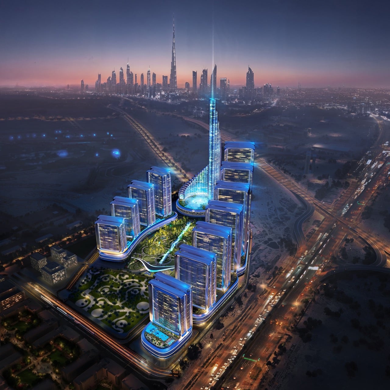
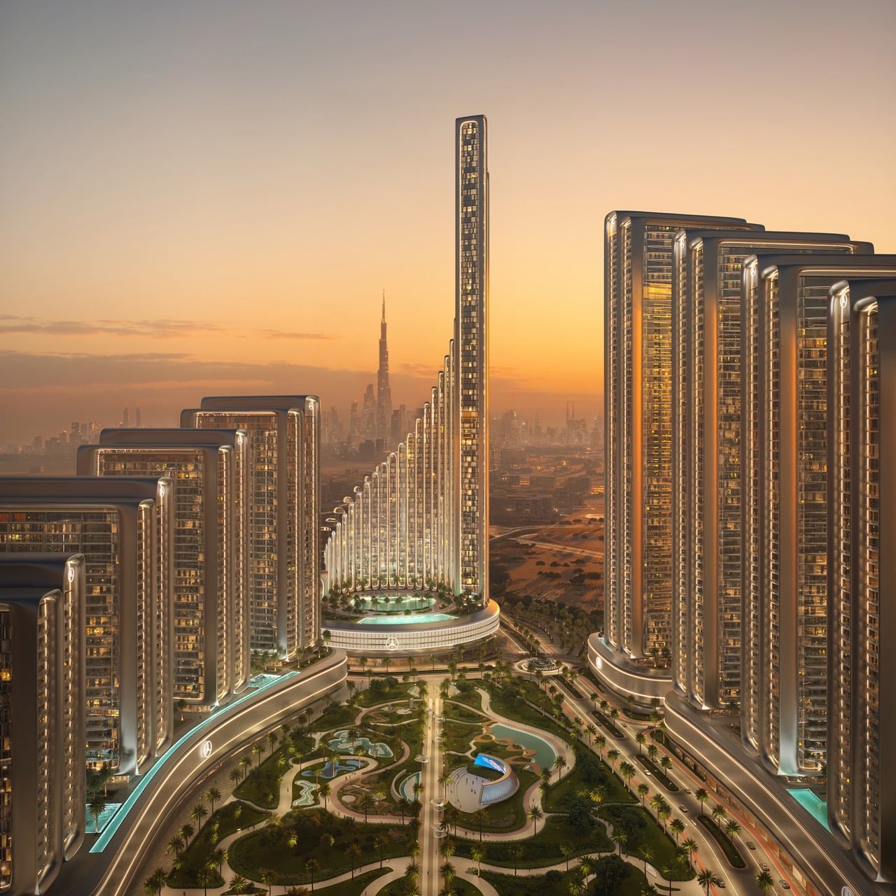
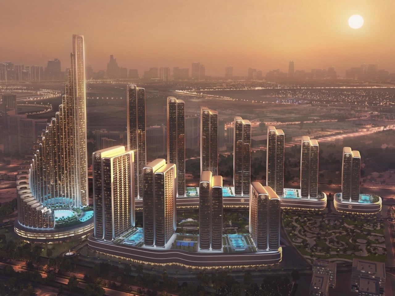
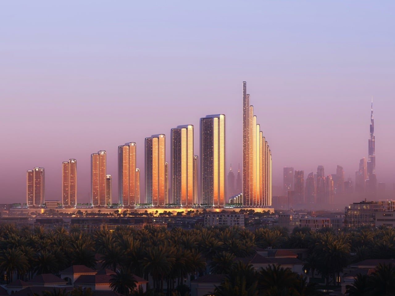
Luxury car brands moving into real estate isn’t exactly new anymore. Porsche kicked things off with its Design Tower Miami in 2017, followed by Aston Martin’s 66-story sail-shaped tower that opened in Miami in May 2024, and Bentley Residences expected to complete in 2026. Bugatti and Pagani both have projects underway in Miami and Dubai. But Mercedes-Benz and Binghatti just took it to another level with their newly launched Binghatti City project in Dubai. Instead of stopping at a single branded tower like most automotive companies do, they’re building an entire 10-million-square-foot district with 12 residential skyscrapers containing 13,000 apartments. The $8.2 billion development centers around a 341-meter tower called Vision Iconic, surrounded by 11 progressively shorter towers creating this cascading skyline in the Meydan area. This is their second collaboration after a 65-floor Mercedes tower in Downtown Dubai that’s nearly complete, proving the concept works well enough to scale up dramatically.
The architecture pulls heavily from Mercedes design DNA, incorporating elements like their signature grille pattern into horizontal podiums, plus generous use of chrome and silver accents throughout. Each tower carries the name of a Mercedes concept vehicle, and apartments feature the brand’s Sensual Purity design philosophy with black and silver palettes accented by wood and leather. They’re not just building housing though. The masterplan includes cultural districts, retail spaces, parks, mobility hubs, sports facilities and dining venues, essentially creating a walkable branded ecosystem. Units start at $435,600 for studios and top out around $5 million for three-bedrooms. Timeline calls for completion in three and a half years from the January 14, 2026 launch.
Designer: Binghatti for Mercedes-Benz
The luxe pricing structure here tells you everything about who Mercedes thinks will actually live in this thing. Studios at $435,600 might sound almost reasonable by Dubai standards until you remember that’s the entry point for literally the smallest unit available. One-bedroom units jump to $2.6 million, two-bedrooms hit $3 million, and three-bedrooms start at $5 million. They’re casting a wide net, sure, but even the “affordable” end of this spectrum requires the kind of disposable income that makes luxury car ownership look like a casual purchase decision. The real question is whether 13,000 apartments worth of wealthy people exist in Dubai’s orbit who specifically want to live in a Mercedes-branded environment. That’s a lot of units to fill, even in a city that treats superlatives like a competitive sport.
The design philosophy they keep mentioning, Sensual Purity, sounds like the kind of corporate branding speak that emerges from late-night brainstorming sessions, but it does translate into some specific material choices. Black and silver form the base palette because of course they do, you can’t have a Mercedes-branded space without channeling the aesthetic of a C-Class interior. The wood and leather accents are presumably there to soften all that chrome and convince people this is a home rather than an extremely expensive showroom. Each tower named after a concept car like Vision One-Eleven or Vision AVTR adds another layer of brand immersion that either sounds incredibly cool or slightly dystopian depending on your tolerance for corporate aesthetics in residential spaces.
The amenities list reads like someone took every luxury condo marketing brochure from the past decade and merged them into one. E-sport lounges, ballrooms, event halls, sporting clubs, water pools, fitness facilities, picnic groves. They’re promising this self-contained urban ecosystem where you theoretically never need to leave, which raises interesting questions about what happens when your entire residential community is tied to a single brand identity. Do you start identifying as a Mercedes person in ways that go beyond car ownership? Does living in Mercedes-Benz Places Binghatti City become part of your personal brand? These are the kinds of questions that sound absurd until you remember people absolutely do this with Apple products and Patagonia vests.
Binghatti’s track record with branded developments gives this project more credibility than if some random developer tried pulling it off. They’re simultaneously working on Bugatti residences and have that Jacob & Co collaboration, so they’ve figured out the formula for translating automotive brand language into architectural form. The three-and-a-half-year timeline feels optimistic but not wildly unrealistic for Dubai’s construction pace. Whether the market can actually absorb 13,000 Mercedes-branded units in Meydan while their first tower in Downtown Dubai is still finding buyers remains the real test of whether this brand extension strategy works at city scale or if they’ve dramatically overestimated the overlap between car enthusiasts and people who want their entire living environment wrapped in automotive branding.