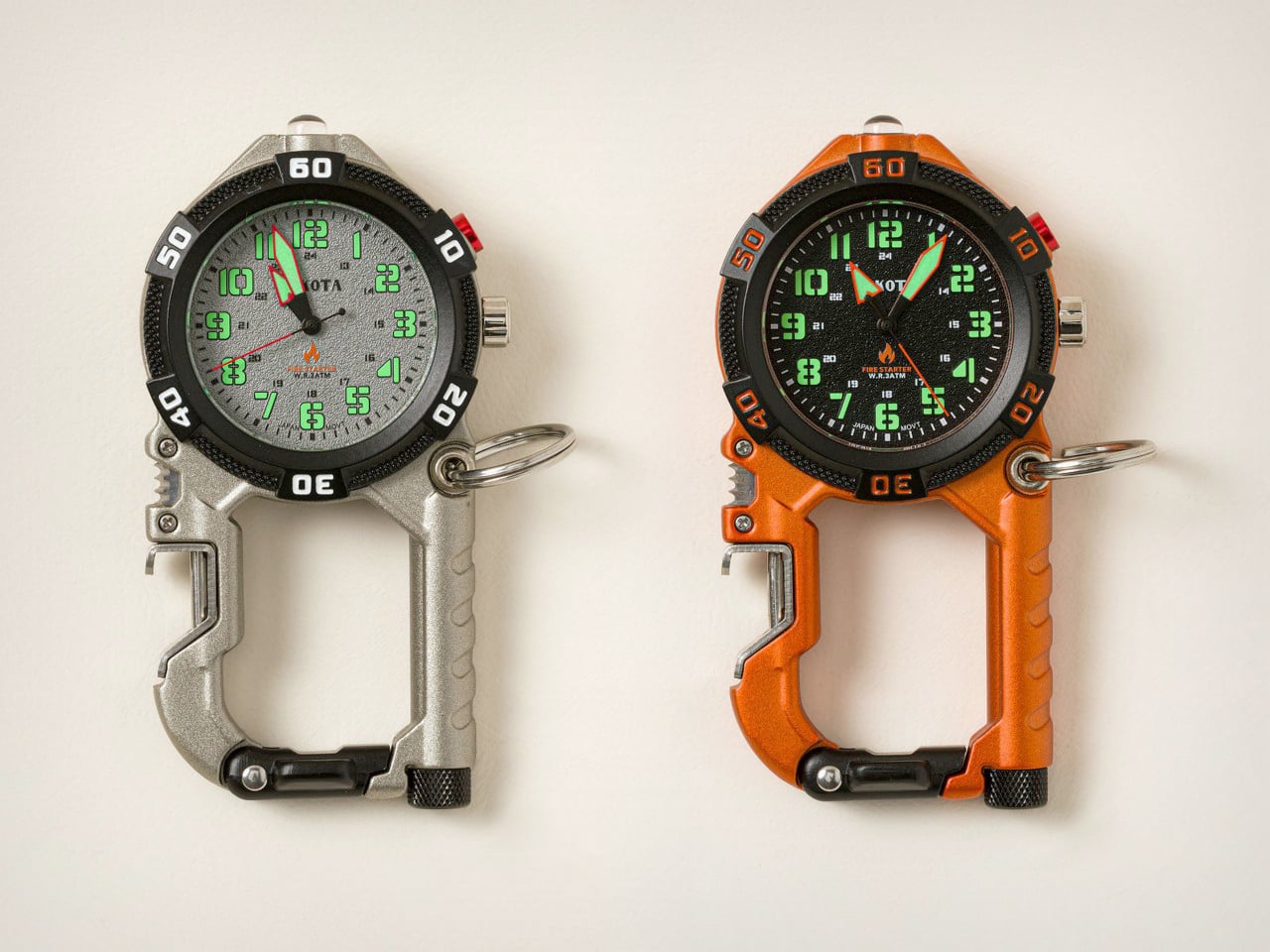
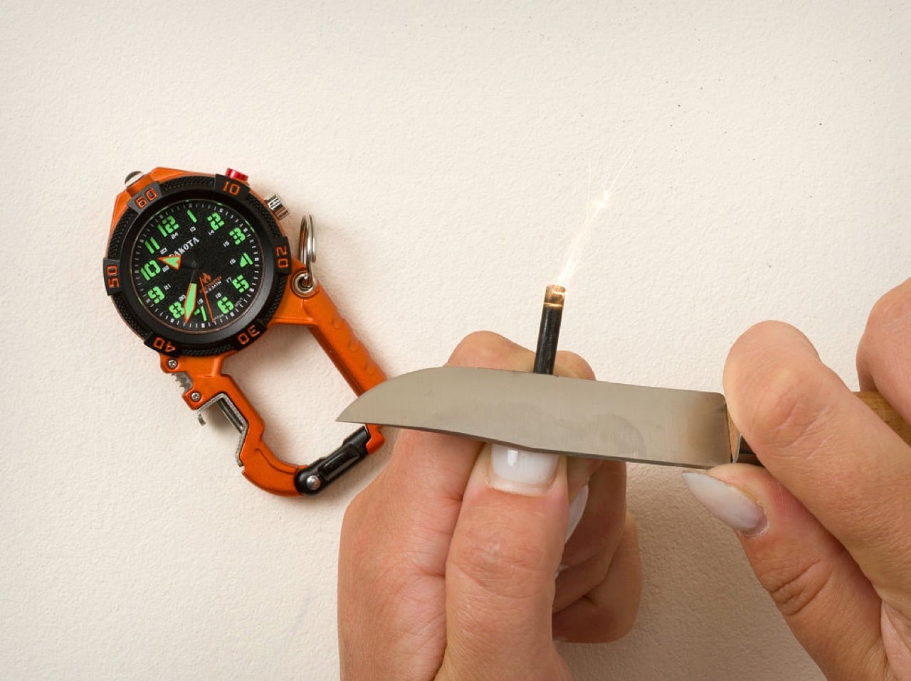
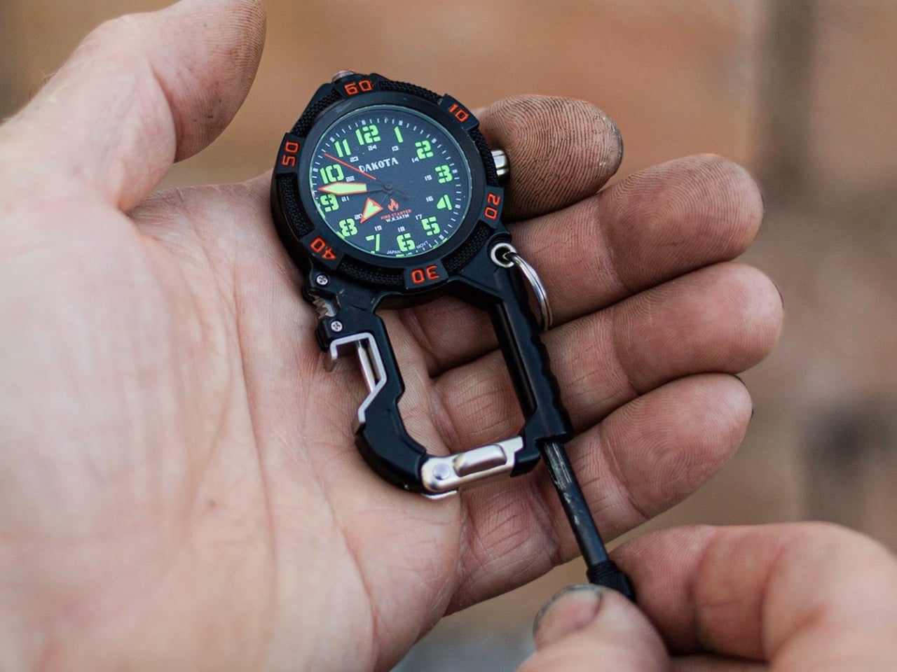
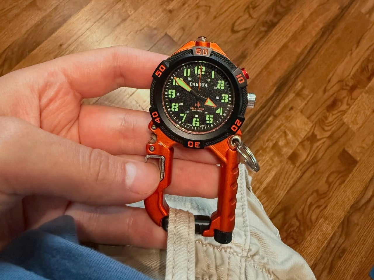
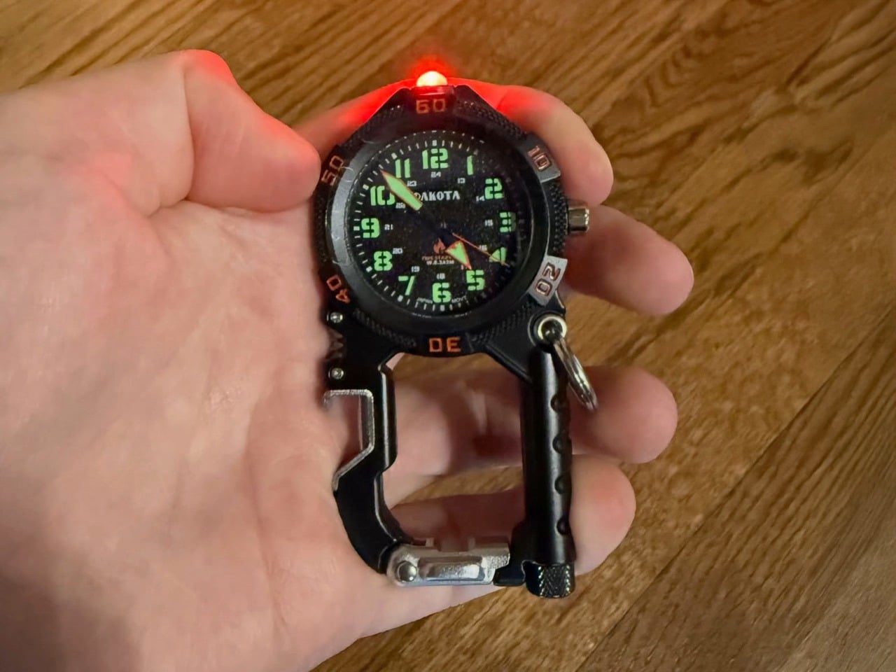
Funnily enough, this isn’t a fairly new product. Dakota Watch Company’s sort of pioneered this category of outdoor-ready carabiner pocket-watches… with the Flint being just one of multiple in the set. However, each individual watch has its own unique selling point – and for the Flint (as its name rightfully suggests), it’s the waterproof flint-rod that’s integrated into the watch’s body. Unscrew it when you want to start a fire, scrape on the rod using a pocket knife, and sparks immediately shoot off, igniting any form of tinder, creating a tiny fire that can then be harnessed to light a campfire, an old-fashioned torch, or an emergency signal in a time of distress.
Before we talk about the watch itself, Dakota Watch Company used this particular elevated-carabiner format to pack even more tools, making the pocket watch something that goes beyond just keeping you punctual. A built-in bottle opener lets you crack open a brew when you’re in the great outdoors, and it could be used to pry open lids too (not to be mistaken with a can opener). A slight serrated corner above the bottle opener doesn’t outline a specific purpose, but it looks sharp enough to cut through rope with a little vigorous action. You could use it to scrape against the flint-rod too, lighting that campfire to go perfectly with the chilled beer you just cracked to get the evening started.
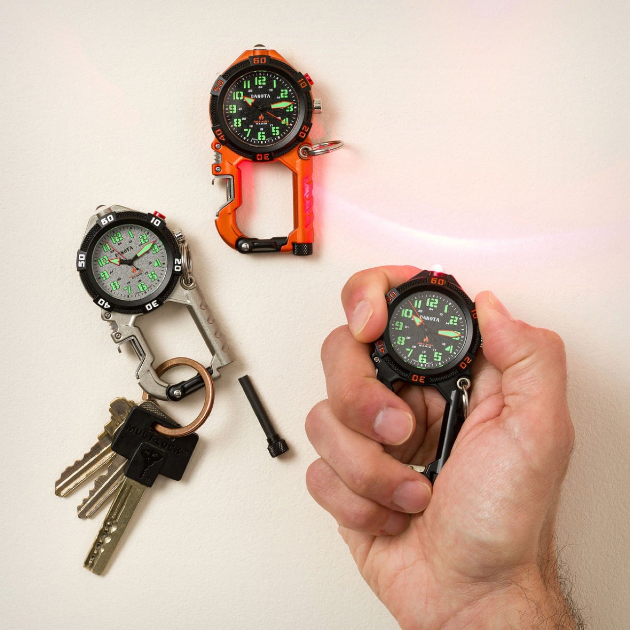
Build almost exclusively for the outdoors, the Flint Clip Carabiner Watch also packs a discreet red LED microlight, used for illuminating the way in stealth scenarios where bright lights could give away your position. The red light (activated using a button at the 2 o’clock position) provides the right amount of visibility without necessarily blowing your cover or obscuring your low-light vision in the dark. This means you can see with the light, but continue to do so even after the light’s shut (unlike most flashlights that leave you blinded in the pitch dark once the light’s turned off).
The watch itself is as outdoor-ready as it gets. The body is crafted from stainless steel (carabiner included), with a mineral glass cover on the top. Numbers on the dial are thick and easy to read without straining your eyes, and luminous coatings on both the numbers as well as the hands means reading the time flawlessly in the dark. The watches are built to be water-resistant up to 100 feet, which means you could go boating or wading through a stream with the Flint attached to you and you’d have nothing to worry about.
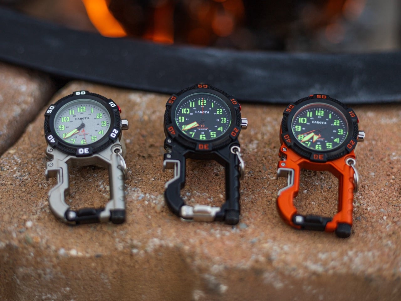
The Flint Clip Carabiner comes in 3 distinct colors – a silver, with a light-colored watch-face to match, a black, with a dark watch-face, and perhaps my favorite, an eye-catching orange that also sports the same dark-colored watch face. All three watches have a Japanese Quartz movement on the inside, which isn’t anything to write home about if you’re a watch aficionado, but the movement, like every other part of the watch, screams reliability, so you know you’ve got an EDC you can trust, whether it’s to tell you the time, or be your ultimate outdoor adventure sidekick.
The Cessna 172 has logged more flight hours than any other powered aircraft in history. Since its debut in 1956, it has carried student pilots over Kansas wheat fields, bush flyers above the Canadian tundra, and island-hoppers between Greek archipelagos. It is the plane that taught the world to fly.
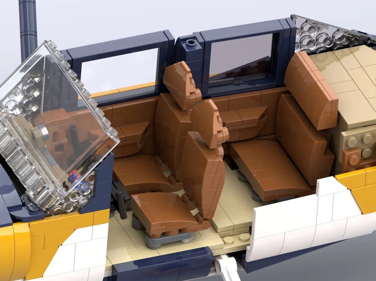
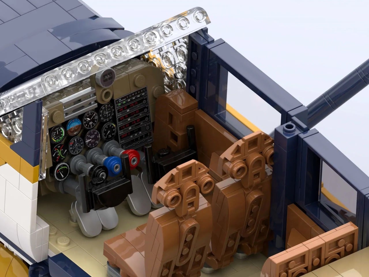
Now, LEGO Ideas builder Mike_the_Brickanic has translated that enduring icon into approximately 2,000 bricks, capturing the 172’s distinctive high-wing silhouette, its trademark strut-braced wings, and a cockpit detailed down to the dual yokes and instrument panel. The result is a faithful tribute to one of aviation’s most beloved machines, rendered in a striking dark blue and curry yellow livery that feels every bit as purposeful as the real thing.
Designer: Mike_the_Brickanic
The real Cessna 172 Skyhawk sits at about 8.28 meters long with a wingspan of 11 meters, cruises at 226 km/h, and has a service ceiling of 4,300 meters. It weighs just 767 kg empty. That power-to-weight ratio combined with forgiving low-speed handling is why flight schools worldwide still default to it after nearly 70 years. Over 44,000 units have been produced. When Mike_the_Brickanic chose this as his subject, he picked something with real cultural weight, not just a recognizable shape, but a machine with a documented, measurable legacy in aviation history.
Building aircraft in LEGO is genuinely hard. Appliances have flat surfaces, buildings have right angles, but planes demand curves that flow into each other without telegraphing the underlying geometry. The 172’s fuselage is particularly tricky because it tapers toward the tail while simultaneously curving downward, and the wing root blends into the cabin in a way that feels almost organic. Mike solved this with a combination of curved slopes, ball joints at the wing sides, and clip connections at the cabin top, which is clever because it distributes structural load while preserving that smooth visual transition from windscreen to wing.
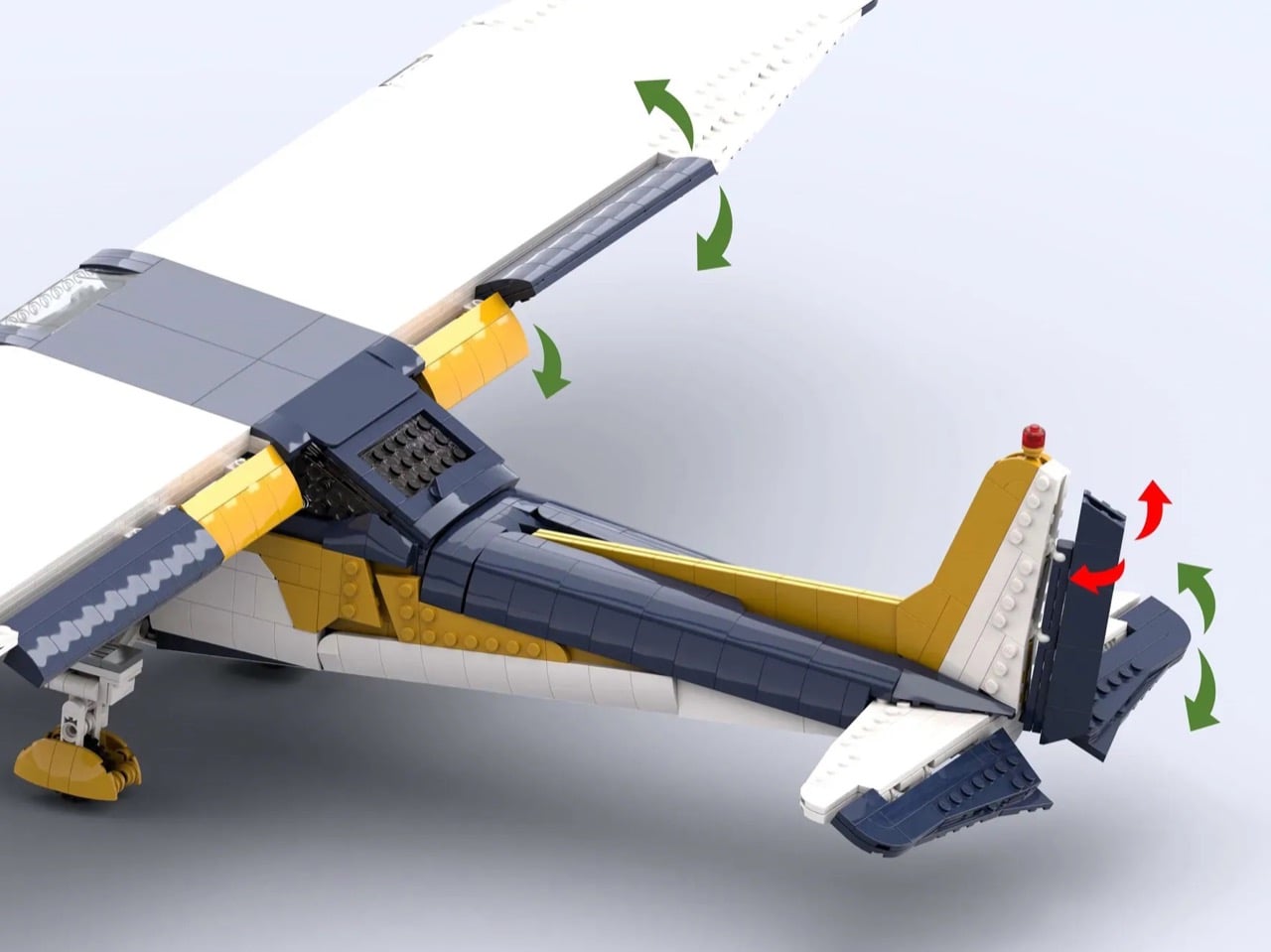
The ailerons, elevator, and rudder all move. The flaps extend to 40 degrees, which is accurate to the real 172’s full-flap configuration used during short-field landings. The propeller spins, the wheels roll and steer, and the nose gear is mounted on Technic axles for structural integrity. Those aren’t decoration, they’re engineering decisions that required real thought about how LEGO geometry intersects with aeronautical geometry. The “Remove Before Flight” tags on the pitot cover and control locks are a nerdy touch that actual pilots will absolutely clock.
Open the door and the interior holds up. Two adjustable front seats rendered in medium brown, a rear bench, tinted rear windows, and a cockpit panel dense enough with sticker detail that you can actually identify individual instruments. The dual yokes are there. The throttle quadrant is there. This is the kind of interior work that separates builders who understand their subject from builders who are approximating it. The 172’s cockpit is famously approachable and uncluttered, and the model reflects that without oversimplifying.
The color choice is just *chef’s kiss*. Dark blue over dark yellow (curry) with white accents is not a scheme you see constantly in LEGO aviation MOCs, which tend toward red-white or military grey. It gives the model a particular visual weight, something that reads as contemporary but grounded. The way the curry stripe flows along the fuselage and up into the tail mirrors how real-world livery designers think about visual continuity across an airframe. Whether intentional or instinctive, it works.
LEGO Ideas is the official platform where fan-designed sets get a shot at becoming real retail products. Submissions need 10,000 supporters to trigger an official LEGO review, after which the company decides whether to produce it commercially. Mike’s Cessna 172 is currently sitting at just over 1,000 supporters with 598 days left on the clock, which means there is runway to work with. If you have any appreciation for aviation, precision building, or just want to see more interesting things on toy store shelves, head to the LEGO Ideas page and give it a vote.
The bedroom studio era changed everything. A generation of musicians learned to record, mix, and release music without ever setting foot in a professional facility, and the results reshaped the entire industry. Now, that same creative energy has migrated to the livestream, where a single performance on TikTok Live or Instagram can reach more people than a record label could have dreamed of a decade ago. The bar for audio quality has quietly but decisively risen.
Roland’s GO:MIXER STUDIO arrives at exactly this inflection point. The company has been iterating on this product family since 2017, and with each generation you could feel them getting closer to something that actually made sense for serious creators. At $299, this latest version brings 24-bit/192kHz recording, onboard EQ, compression, and reverb modeled after Roland’s own studio processors, all into a chassis that weighs roughly as much as a large coffee mug. Whether that combination of specs and portability holds up in the real world, where cables get tangled and livestreams go sideways, is a more interesting question than the spec sheet alone can answer.
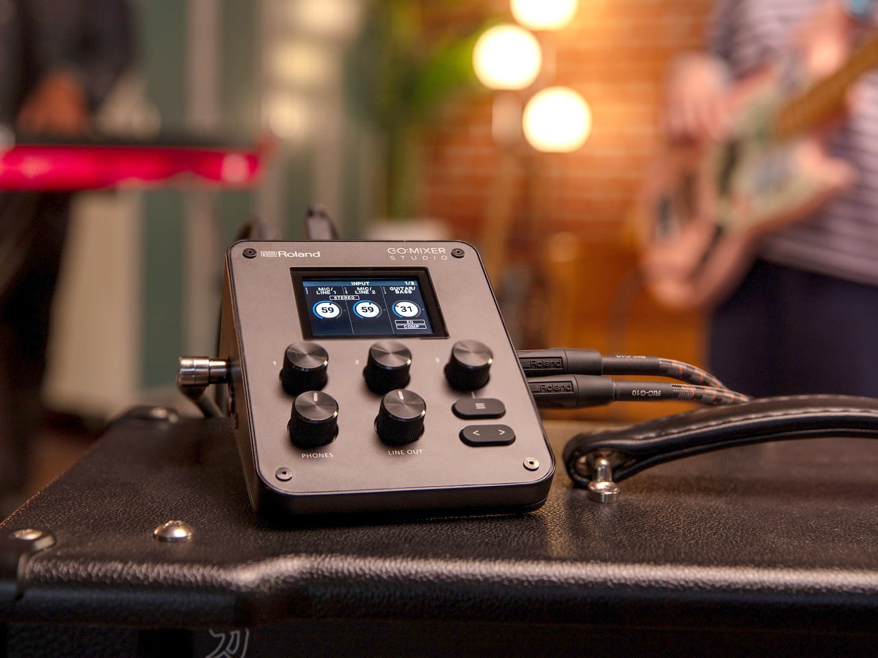
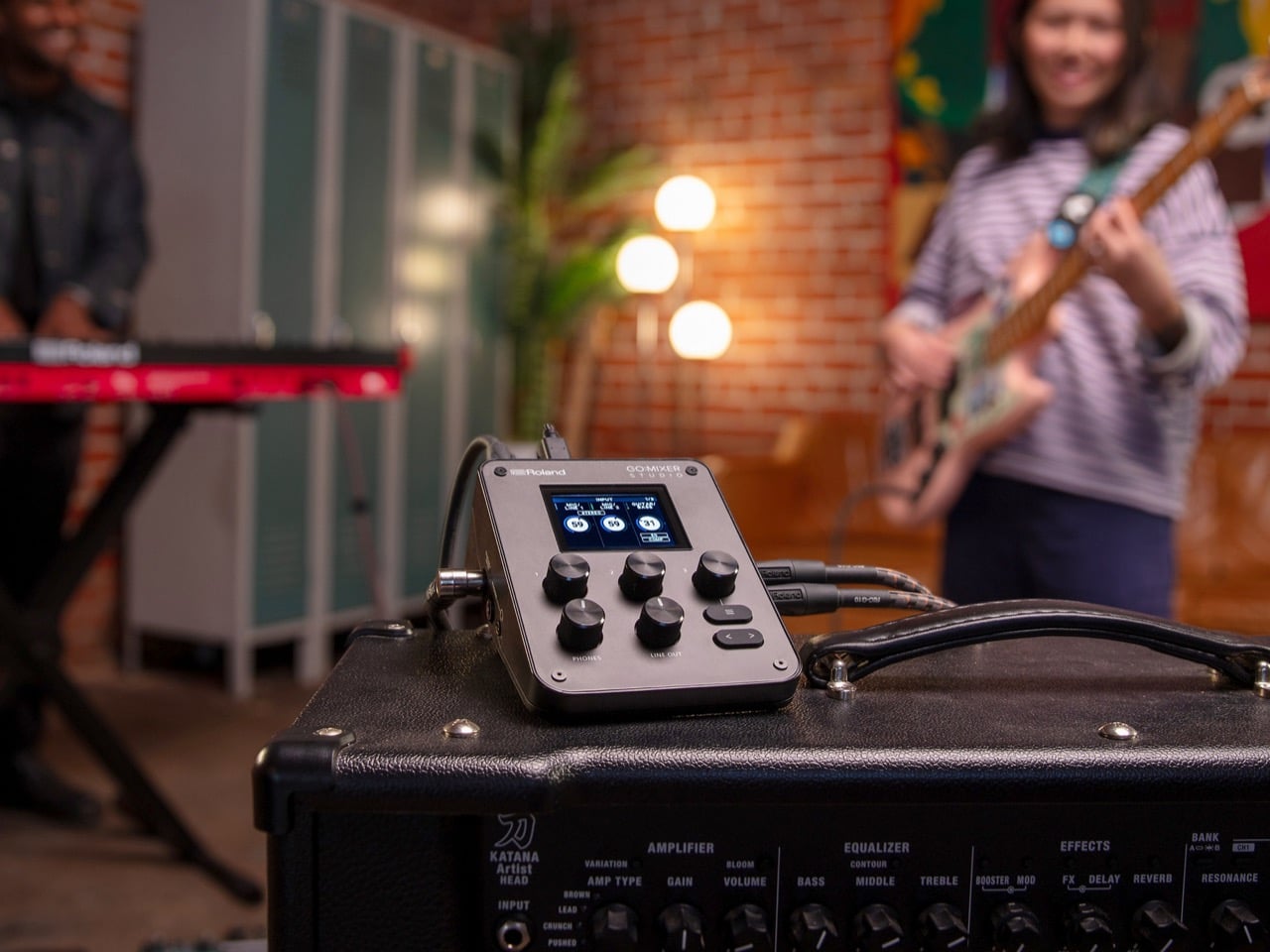
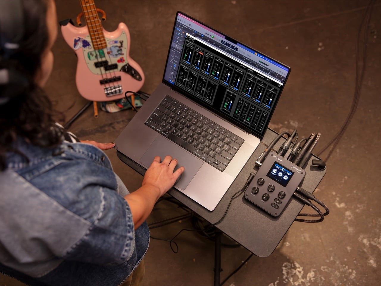
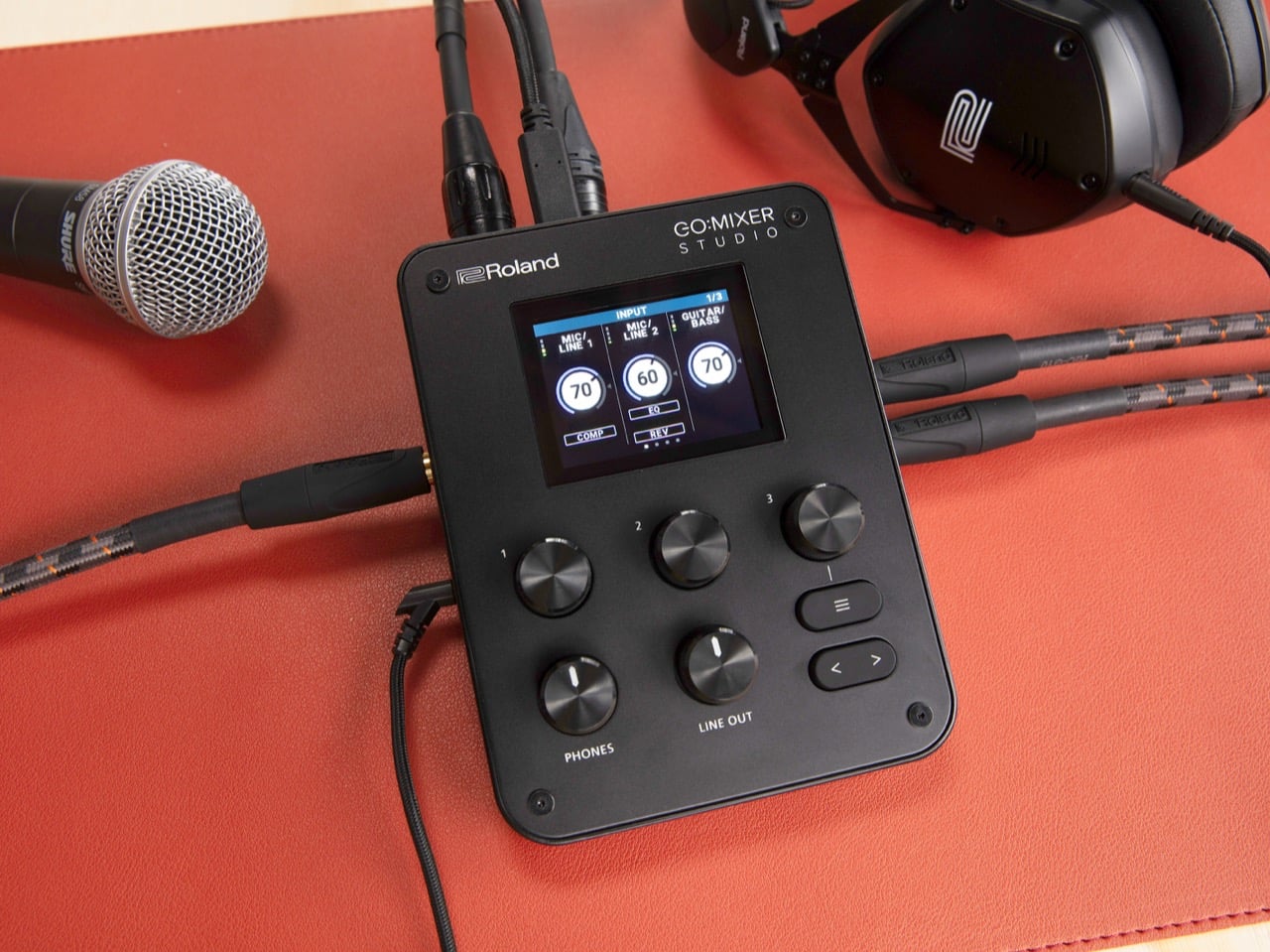
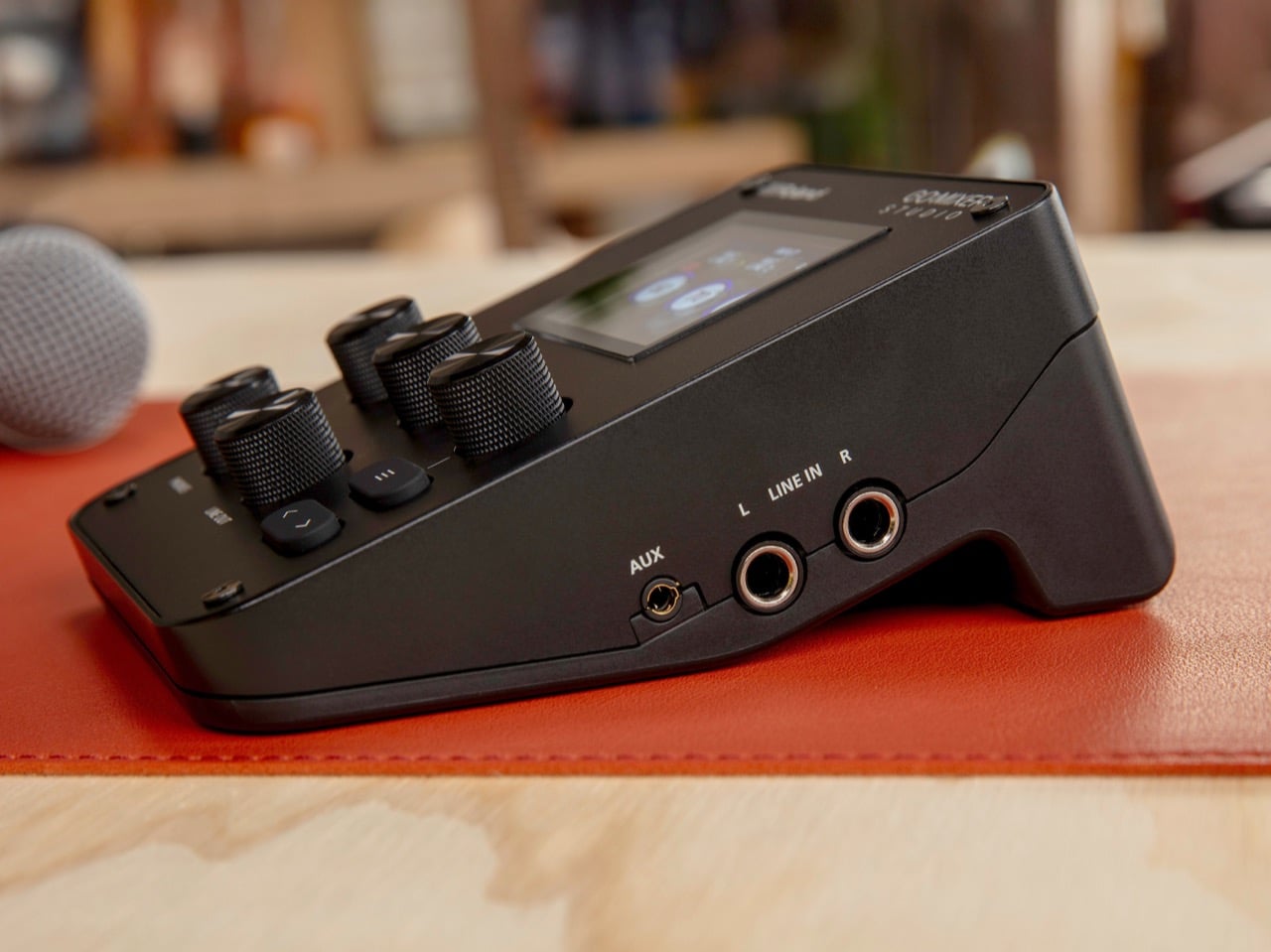
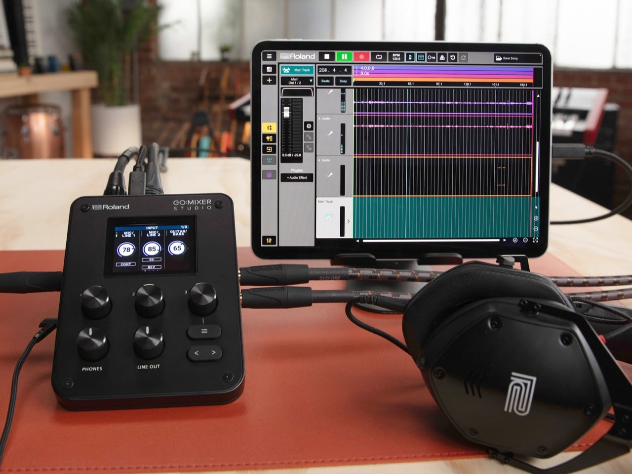
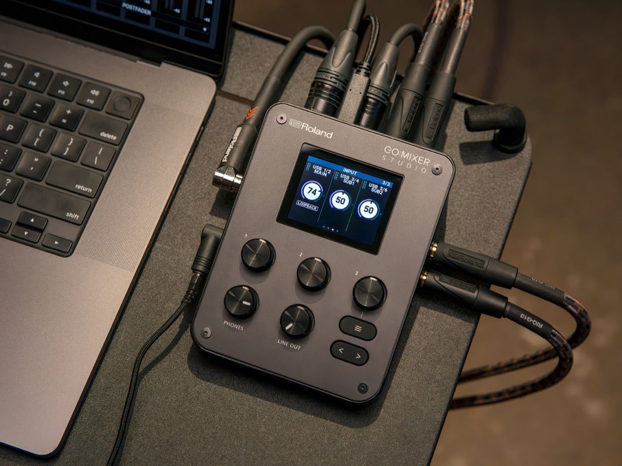
At 156 x 110 x 65mm and 440 grams, it sits comfortably on a mic stand next to a performer mid-set, which is a specific and deliberate choice. The color LCD showing per-channel EQ, compression, and reverb status is genuinely useful during a live session when reaching for your phone means losing eye contact with your audience. Three chunky knobs handle channel levels, and the whole thing can be powered by a USB battery pack, which means no wall outlet required and no excuses for bad audio in a green room, a hotel room, or the back of a van. The matte black chassis reads professional without being precious about it, the kind of gear that does not mind getting thrown into a backpack.
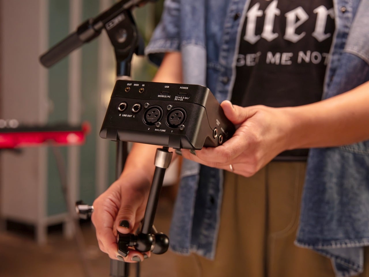
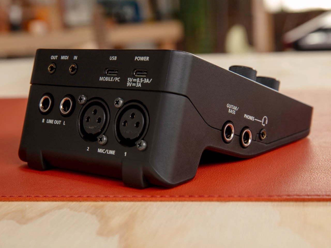
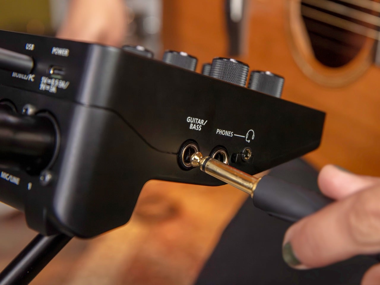
Twelve input channels is pretty great value for money. Two XLR mic inputs with 48V phantom power, a dedicated high-impedance guitar and bass input, stereo quarter-inch line inputs for keyboards or drum machines, a 3.5mm aux with TRRS support for mobile devices, and MIDI via 3.5mm TRS. That last one matters more than it might seem, because it means you can sync external hardware, run a click track, or trigger backing tracks without adding another piece of gear to your table. The 32-bit float internal processing handles the heavy lifting before anything gets committed to your recording at 24-bit depth, giving you real headroom for fixing gain mistakes in post.
The GO:MIXER Cam app for iOS records genuine multitrack audio alongside your video, which opens up post-production options that creators on competing setups simply do not have. Standard camera apps give you a single stereo mix from whatever mic is closest, and that is the entire ceiling of what they can do. Roland also ships a desktop editor for macOS and Windows with full remote control of the mixer, and the 16 scene memory slots mean a creator with a regular weekly setup can recall their entire configuration instantly. That kind of workflow thinking is genuinely rare in gear aimed at the creator market, where the assumption is usually that you will rebuild everything from scratch each time.
No Android support is a real omission in 2026, full stop. SD card recording is also absent, meaning you are always dependent on a connected device and truly standalone operation is off the table. At 192kHz via USB, the channel count drops from 12 inputs to 8, a constraint worth knowing before planning a complex live setup around it. The Zoom LiveTrak L-8 and the Rode RodeCaster Pro II occupy overlapping territory, though both trade the GO:MIXER STUDIO’s portability for more features, and neither fits as naturally into a one-person mobile setup. Roland has made a very acceptable set of mild tradeoffs here, and at $299 the value case is solid for almost everyone that’s already tied into the Apple ecosystem.
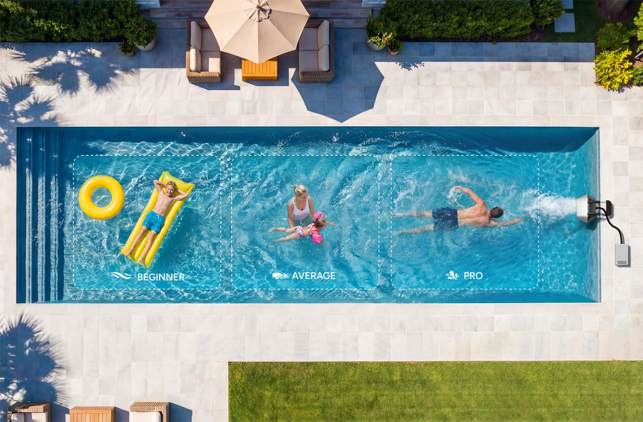
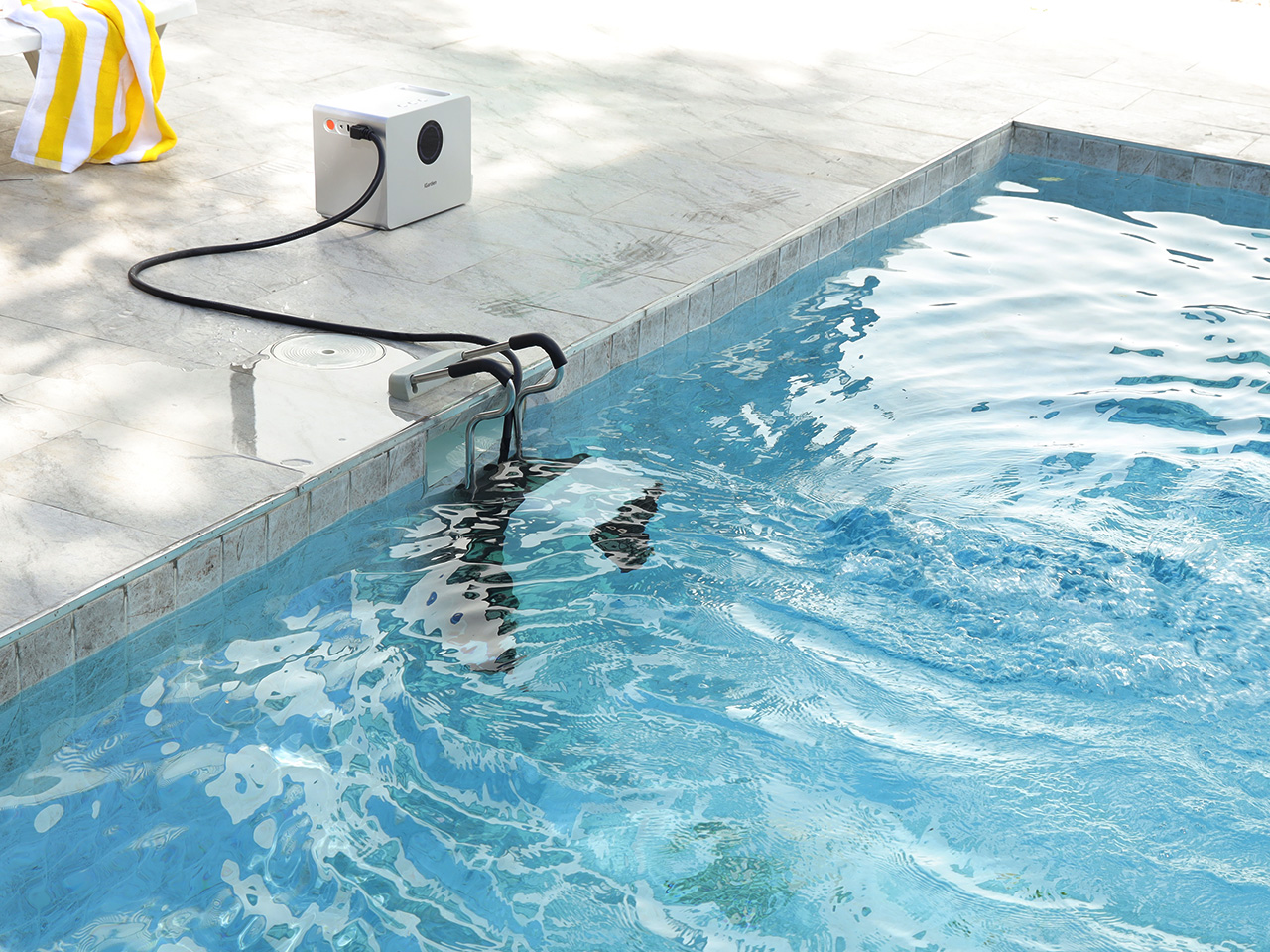
Here’s a question: what if your backyard pool could moonlight as a personal aquatic gym, wave pool, and lazy river – all without any permanent installation? That’s the pitch behind iGarden’s new Swim Jet X Series, a battery-powered contraption that clamps onto your pool edge and fires water at speeds that can actually challenge competitive swimmers.
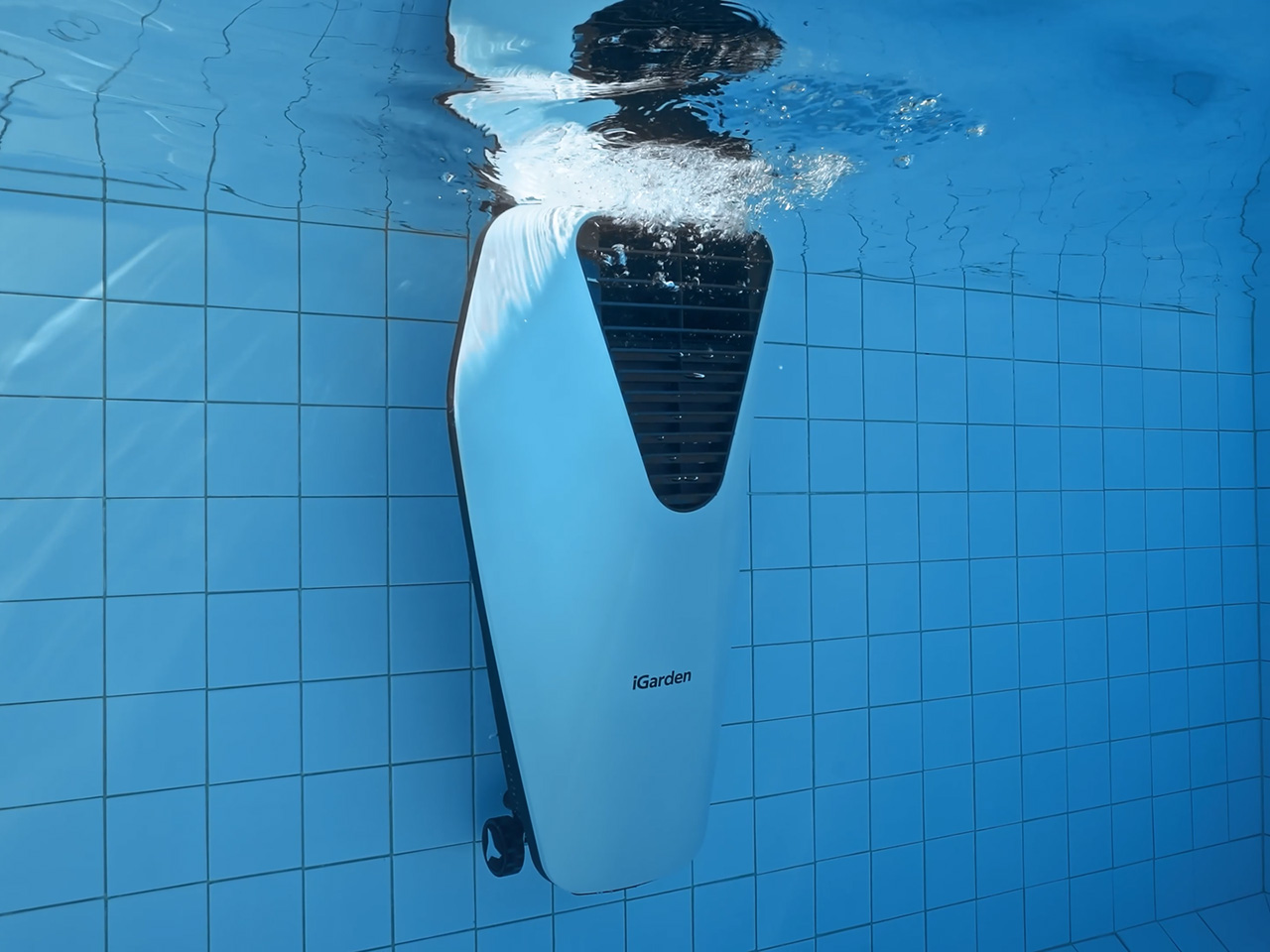
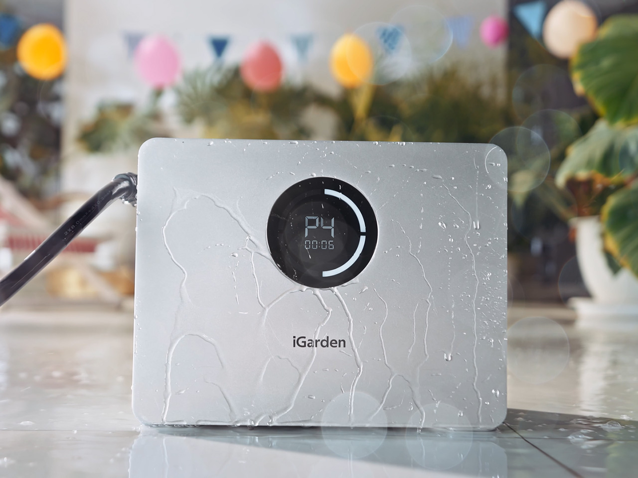
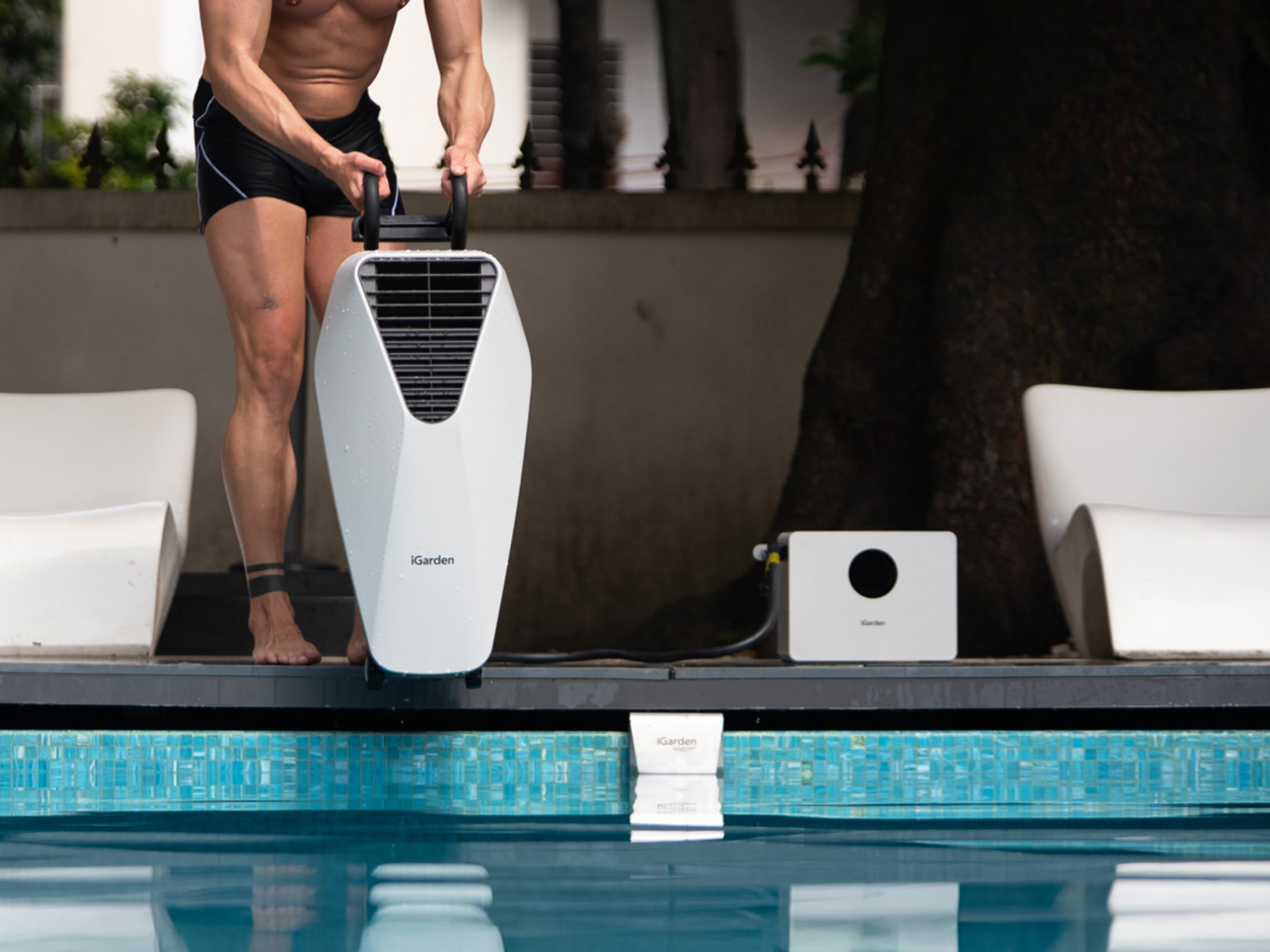
The whole setup is refreshingly simple. Mount the jet unit to your pool’s edge using the included clamps – no drilling, no plumbing, no construction crew required. The separate power box sits poolside, connected via a safety tether. Then you’re off, swimming against an artificial current that ranges from gentle lazy-river vibes to serious resistance training. It’s like having a treadmill, but for swimming.
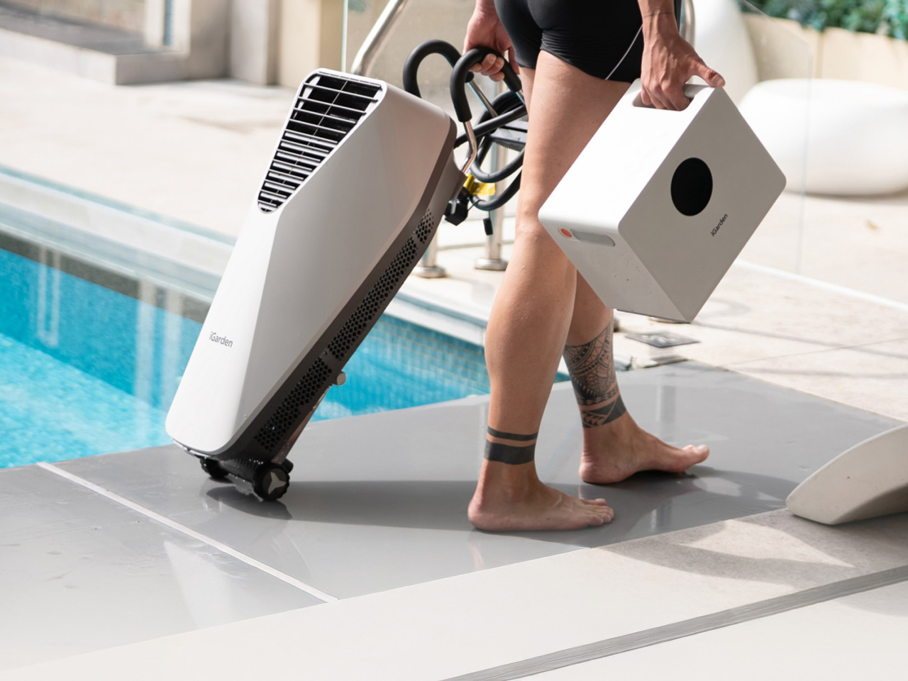
The beauty lies in the fact that the Swim Jet X isn’t a permanent pool fixture. You place it when you need, take it off when you don’t. The power box comes with suitcase-style wheels and a handle, so you can wheel it around like luggage. iGarden claims you can set up or pack away the entire system in minutes, which addresses one of the main complaints about traditional swim jets – they’re permanent additions that require professional installation and cost upwards of $20,000. This? Starts at $699, comes with wheels, and can be carried to a nearby Airbnb with a pool too, just in case you want to swim while on a staycation.
The AI branding feels a bit more grounded once you look at what iGarden is actually doing under the hood. The Swim Jet X Series uses an AI Inverter control system to dynamically optimize motor RPM, aiming to keep the current ultra-stable and laminar even when you crank resistance to the top end. Underneath that control layer is a next-gen PMSM (Permanent Magnet Synchronous Motor), chosen for higher power density and efficiency than traditional induction motors, with the flagship X35 model reaching a 1000W peak output. Pair that with iGarden’s hydrodynamic “Straight-line Runway Flow” structure, and the promise is less about flashy buzzwords and more about efficiently shaping water into a cleaner, steadier stream, pushing flow speeds up to 3.5 m/s. Training-wise, the system also leans into adaptive programming via a Flow Level Test Sequence (P1 to P4), scaling from “Easy Aerobic” to “Endurance Challenge” using real-time feedback, and syncing with heart rate and fat-burning metrics so the current can track the workout, not just the other way around.
iGarden is launching three models with escalating power levels. The entry-level X20-P10 runs on 300W, delivers flow speeds of 660 gallons per minute at 150 meters per hour (about 1.24 mph or 2 km/h), and provides roughly 0.8 to 1.5 hours of runtime depending on intensity. It’s designed for light training and casual family fun. The mid-tier X30-P30 bumps things up to 500W with 880 GPM flow at 200 meters per hour (approximately 1.55 mph or 2.5 km/h) and extends runtime to 1.5 to 5 hours. This is the Goldilocks option for most recreational swimmers and fitness enthusiasts.
Then there’s the flagship X35-P60, which is where things get serious. This model pushes 1000W of power, generates 1000 GPM flow, and hits speeds of 250 meters per hour (around 2.17 mph or 3.5 km/h). That might not sound dramatic until you realize it’s enough resistance to challenge advanced swimmers and triathletes. The X35-P60 also boasts up to 10 hours of continuous runtime, which means you could theoretically run full-day pool parties or extended training sessions without needing a recharge. That longevity pairs nicely with a new 2-in-1 versatility angle: the same unit can switch between Surface Mode and Underwater Mode, depending on what you’re trying to do. Surface Mode is geared toward casual family fun and splashing, while Underwater Mode is hydrodynamically optimized for more professional-grade stationary swim training.
All three models use high-density lithium-ion battery packs with IP65 waterproof ratings and are rated for over 600 charge cycles, which translates to roughly 3 to 5 years of regular use. Charging times range from 3.5 hours for the X20-P10 to 7 hours for the X35-P60. They’re compatible with pools larger than 2 meters by 4 meters, which covers most residential installations. The universal clamp system works with various pool edge styles, and the jet angle is adjustable so you can direct the flow exactly where you want it.
The safety features are thorough: instant power cut-off if the box tips over, leak-proof construction with no exposed outlets or loose cables, a kid-safe grille design that protects curious hands, and low-voltage operation that eliminates shock risks. There’s also an emergency cutoff button directly on the power box, because nobody wants to fumble with an app during a pool crisis.
Now, is this thing actually AI? Well, not really. The “Smart Flow Technology” they mention is essentially a brushless PRISM motor with an inverter controller that adjusts output based on your app settings. That’s automation, not artificial intelligence. But let’s not get hung up on marketing speak – what matters is whether it works, and the specs suggest it should deliver on the core promise of creating adjustable resistance in your existing pool.
The real question is durability. Battery-powered pool equipment lives a tough life: constant moisture exposure, temperature swings, UV bombardment, and the occasional collision with a pool noodle or overly enthusiastic golden retriever. iGarden offers a 2-year extended warranty for VIP backers, which suggests they’re at least somewhat confident in the build quality. The unit also comes with a storage bag free for early backers, which is a thoughtful touch for off-season storage or transport between pools.
Pricing starts at $699 for the X20-P10, with multiple discounts that can combine depending on how you buy in. VIP backers get an extra $200 off the Super Early Bird price, and iGarden says the total discount can reach up to $1,900 off MSRP depending on the model and tier. The VIP reservation requires a $50 deposit that’s fully refundable before launch and holds your spot for the lowest price window. During the campaign, iGarden lists the X30-P30 at $1,699 versus a $2,999 retail price, while the X35-P60 is $2,399 compared to its $4,299 future price. Shipping is a flat $50 in the US, with customs duties covered for backers in the US, EU, Australia, Canada, and the UK, and deliveries are scheduled to begin in May 2026.
Is this a revolution in backyard fitness? Probably not. But it’s a clever rethink of swim jets that removes the installation barrier and dramatically cuts the price point. For anyone who’s ever wished their pool could do more than just… be a pool, this is worth watching. The Kickstarter campaign launches in March 2026. Until then, you can reserve your spot with a $50 deposit at iGarden’s site.
The Switch 2 barely celebrated its first birthday and yet here we are already whispering about what comes next. That’s the “Nintendo Effect”, really. The company trains us to speculate obsessively, and honestly, the rumor mill right now is giving us plenty of material to work with. So let’s lean into it: is a Switch 2 Pro or some kind of premium hardware revision actually on the horizon sooner than expected? The signs are quietly pointing toward yes, and it’s worth getting excited about.
The most tantalizing breadcrumb dropped just last month. A sharp-eyed Bluesky user going by the handle Dootsky.re dug through Nintendo’s Account Portal and found an unused hardware model code labeled “OSM.” For reference, the Switch 2’s own model code is “BEE,” and the original Switch used “HAC,” with “HAD” reserved for its later battery-upgraded variants. The fact that “OSM” already exists in Nintendo’s backend infrastructure, and that requesting it actually returns an image of a Switch 2, is the kind of detail that quietly screams “something is cooking.” Nintendo doesn’t register model codes for fun.
Designer: Nintendo
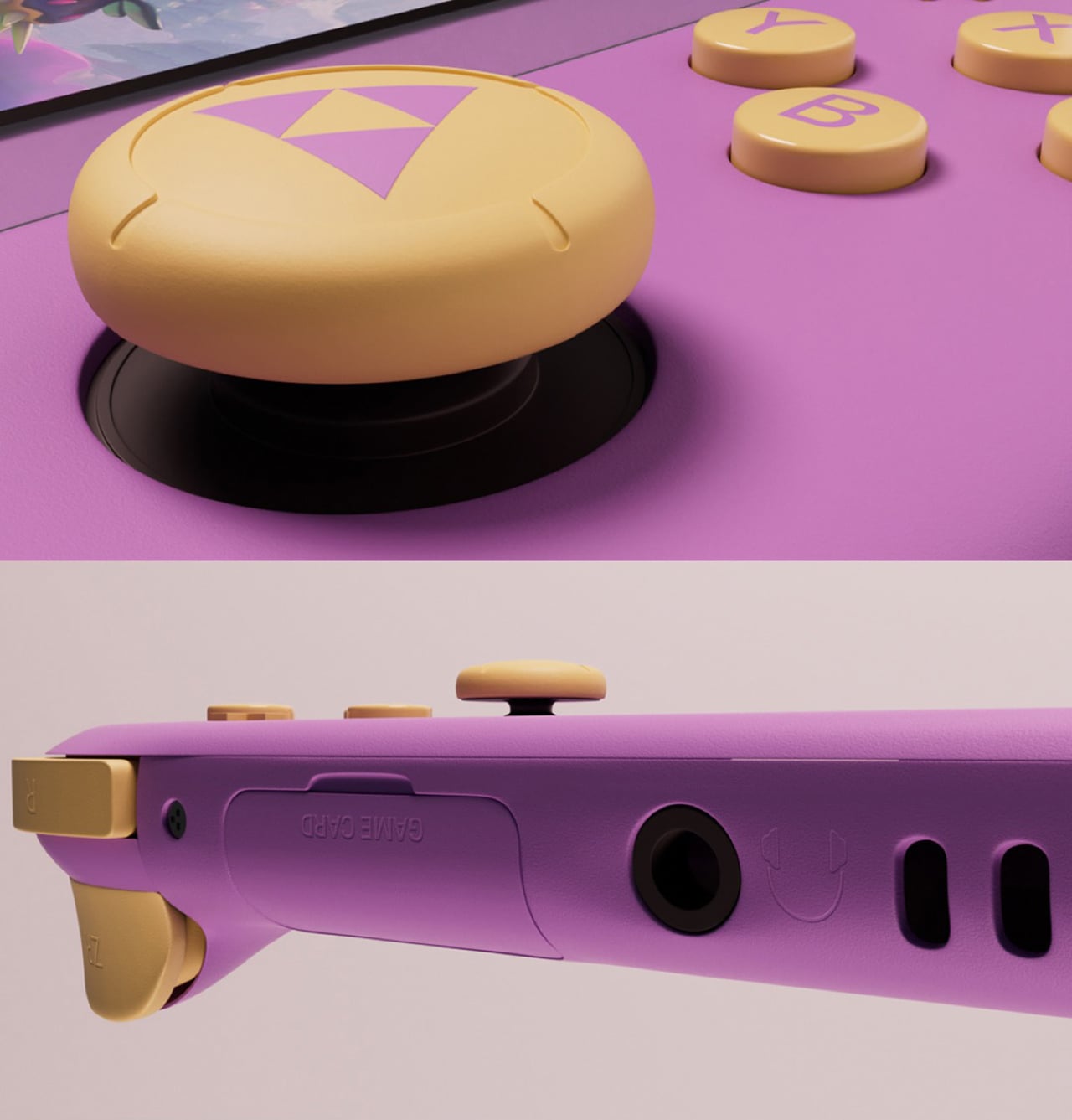
What could OSM stand for? Speculation has been predictably wild. One theory floating around Reddit suggests it means “Ounce Small Model,” pointing toward a Switch 2 Lite with a reduced footprint and lower price point. That theory makes a lot of sense given the Switch 2’s $450 launch price, which stung more than a few buyers and left a sizeable chunk of Nintendo’s potential audience watching from the sidelines. A leaner, cheaper variant that strips out the dock functionality but keeps the core gaming experience intact would be a very Nintendo move, and it would open up the platform to an entirely new demographic.
But another theory carries just as much electricity. Some observers are reading “OSM” as a pointer toward an OLED model, a Switch 2 that finally gives the people what the Switch 2’s launch arguably should have delivered from day one: a proper OLED display. The current Switch 2 runs a 7.9-inch LCD, which is perfectly fine but feels like a missed opportunity when you consider that the original Switch OLED was basically the definitive version of that console. An OLED-equipped Switch 2 with a refined chip process could genuinely be the “Switch 2 Pro” that players have been quietly hoping for, one that offers a noticeably upgraded portable experience without requiring an entirely new software library.
And that’s the thing: a hardware revision in the Switch family has always been more of a premium upgrade than a generational leap. Nintendo’s historical cadence backs this up beautifully. The original Switch launched in 2017. The Lite arrived in 2019. The OLED landed in 2021. Apply that roughly two-year rhythm to the Switch 2 timeline, and a revised model somewhere in 2027 sits right on schedule. But here’s where it gets interesting: the “OSM” code is already sitting in Nintendo’s systems, which suggests development is well underway. Hardware doesn’t appear in account portals by accident. If Nintendo is already assigning codes, the pipeline for a new variant is real, active, and potentially closer to announcement than anyone expected.
Meanwhile, the Switch 2’s software trajectory is also telling. Nintendo is loading up 2026 with big titles to keep the current hardware thriving, with Fire Emblem: Fortune’s Weave, Splatoon Raiders, Tomodachi Life: Living the Dream, Rhythm Heaven Groove, and a rumored new 3D Mario all either confirmed or heavily anticipated for this year. That’s a lineup designed to sustain momentum, not wrap things up. And a premium hardware revision landing in late 2027 alongside whatever monster franchise entry Nintendo saves for that window? That’s a product launch that practically writes itself.
A Switch 3, for comparison, feels genuinely far away. Nintendo doesn’t abandon a platform that’s selling at record pace, and the Switch 2 already smashed records to become the fastest-selling console of all time globally. You don’t walk away from that kind of commercial velocity. A generational successor needs years of runway, a clear technological leap, and a reason for consumers to start over. None of those conditions exist right now, and the software library is too young and too rich to justify anything close to a hardware retirement.
So what’s the realistic picture heading into 2027 and beyond? A Switch 2 Lite targeting the budget end sometime in late 2027 feels very probable, with an OLED or performance-focused “Pro” variant following close behind, potentially the crown jewel that finally gives the Switch 2 the premium screen it deserved at launch. The “OSM” code is just the first breadcrumb, but if Nintendo’s history has taught us anything, those breadcrumbs tend to lead somewhere worth following.
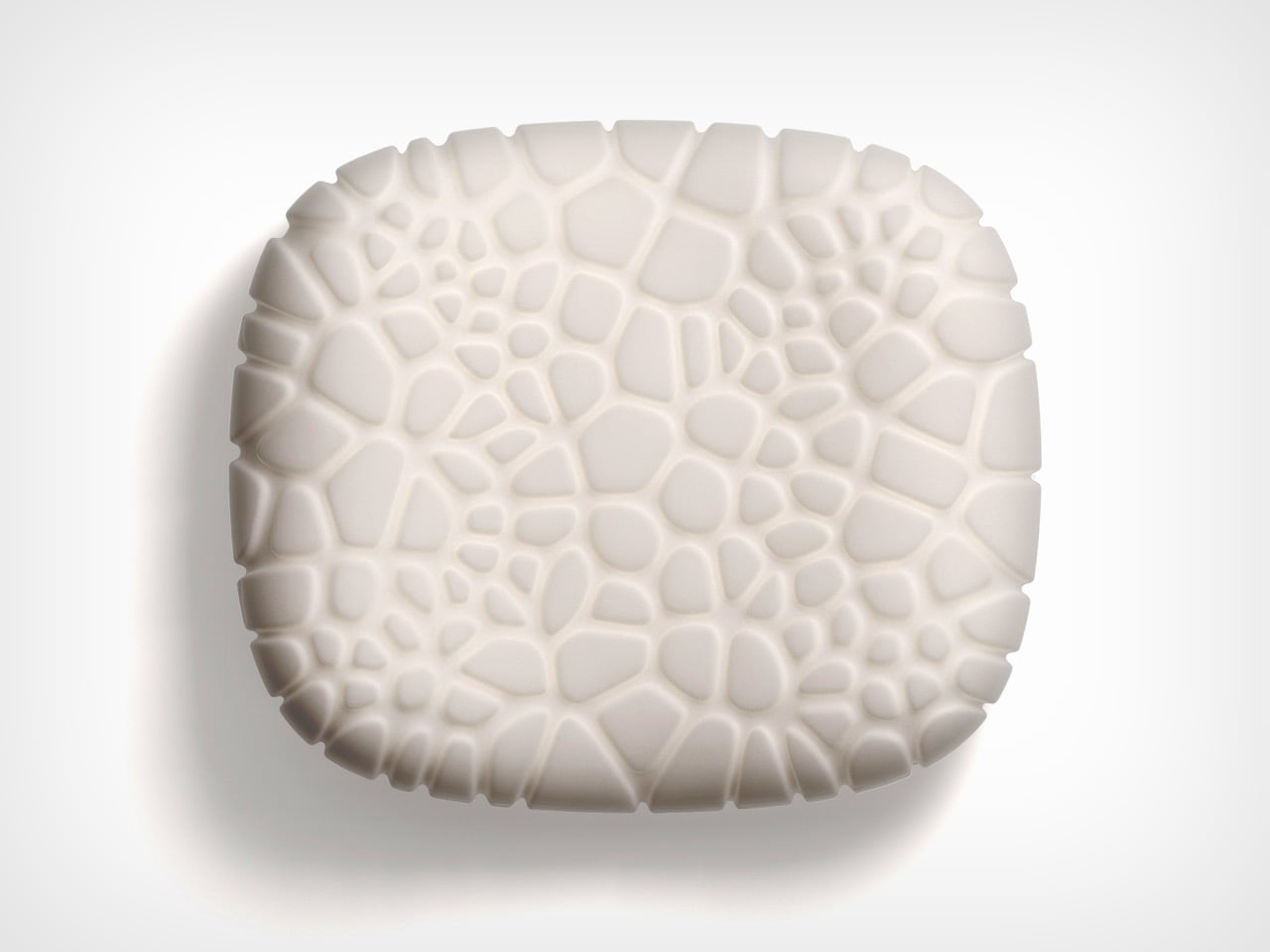
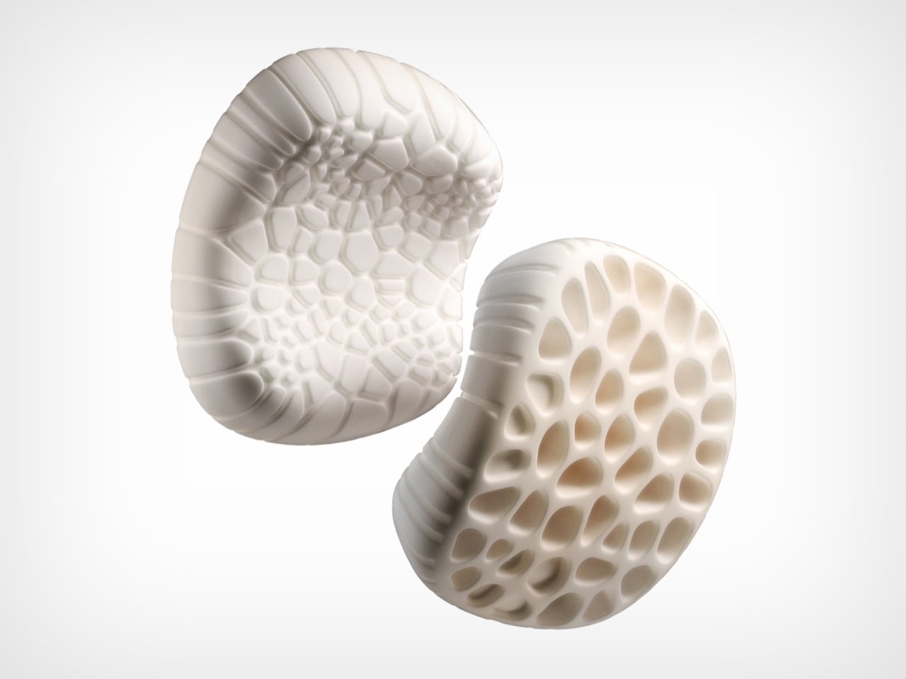
Nature has been solving the problem of lightweight, load-bearing structure for hundreds of millions of years. Chen Xu, designing for RestBase, decided to take notes. The Camp Napper is a portable camping pillow whose form is derived from two specific biological sources: the surface texture of fungal spores, which informed the pillow’s contact face, and the hollow vascular structure of plant stems, which shaped its core. The outcome is a product that performs as well as it looks.
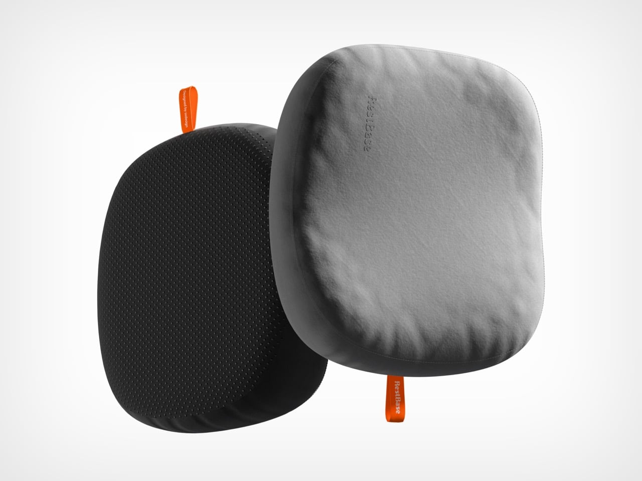
Using Voronoi polygon modelling, the design team mapped how pressure from a sleeping head distributes across the pillow’s surface, then engineered protrusions and recesses to respond to that data. The front face features raised cellular structures that increase the contact area between pillow and skin, improving comfort while simultaneously channelling airflow to keep things cool. The back face offers four distinct tactile zones depending on orientation, giving users a degree of customisation that is rare in camping gear. Also, a little warning but: trypophobia alert.
Designer: Chen Xu
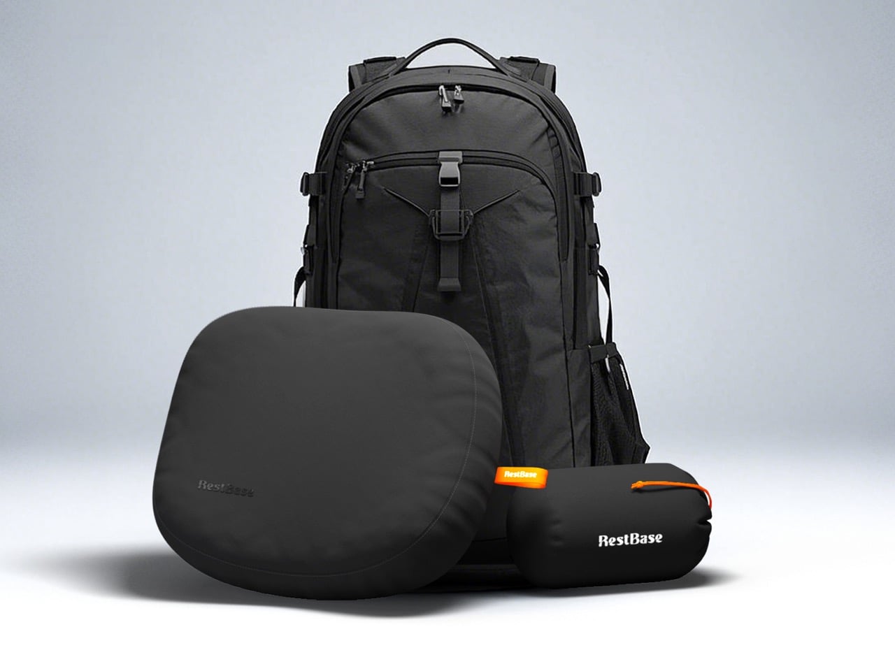
The core replicates the hollow geometry found in plant stems, achieving a structure that sheds mass without compromising its ability to hold form under repeated compression. Total weight lands at around 400 grams, and the whole pillow compresses into its storage bag at roughly the dimensions of a water cup, making it genuinely packable rather than merely marketed as such.
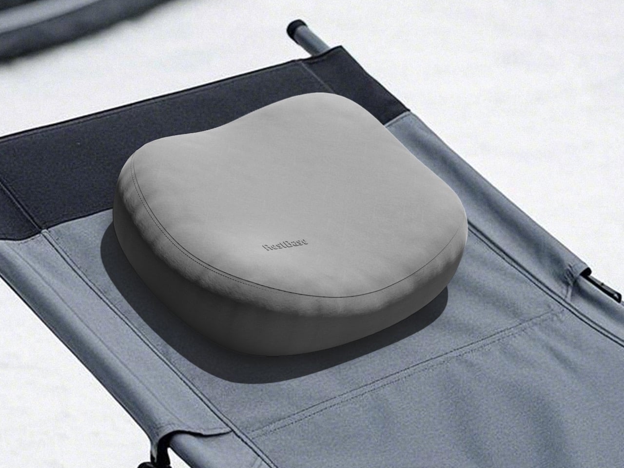
Memory foam was selected for its ability to conform to different sleepers while maintaining the structural geometry of the bionic surface. Anti-slip rubber particles on the base keep the pillow in place across the varied surfaces camping tends to involve, from sleeping pads to camp chairs to hotel floors. RestBase positions the Camp Napper across indoor and outdoor contexts, and the material specification backs that up without demanding a different product for each one.
The project ran from March to December 2024 in Beijing, with the team conducting pressure simulations using volunteer data before building the mathematical model that generated the bionic surface structure. Mold development required continuous adjustment of material ratios and foaming parameters to meet yield and appearance standards. The finished product carries all of that process lightly, presenting as something organic and considered rather than laboured. For a category where most innovation stops at inflation valves and stuff sacks, that is a meaningful place to arrive.
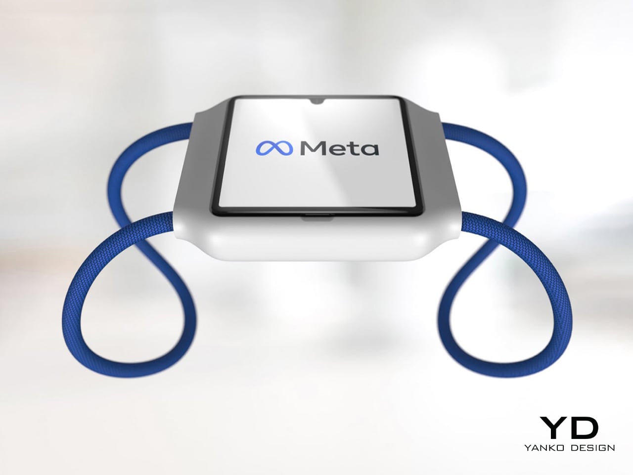
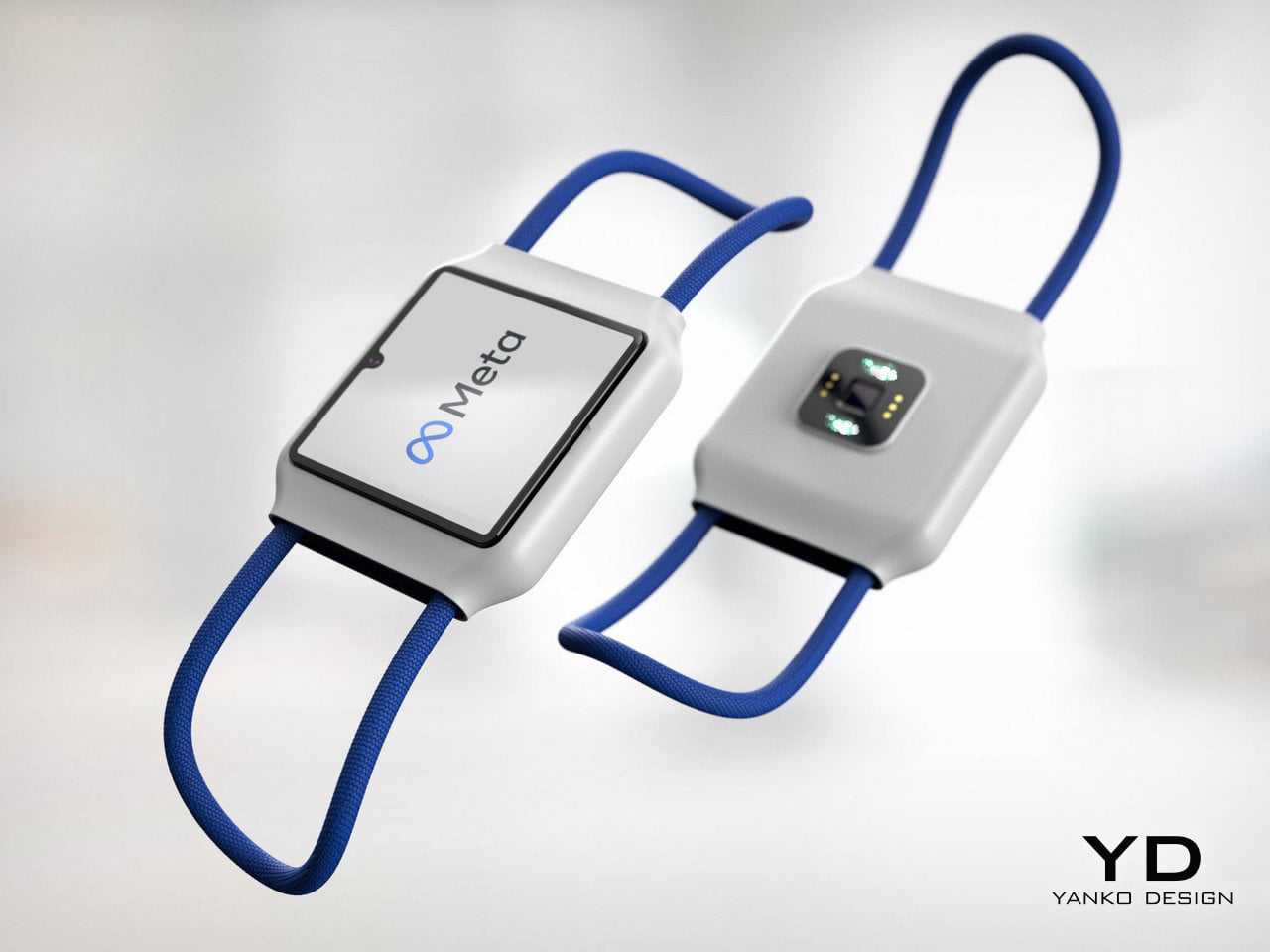
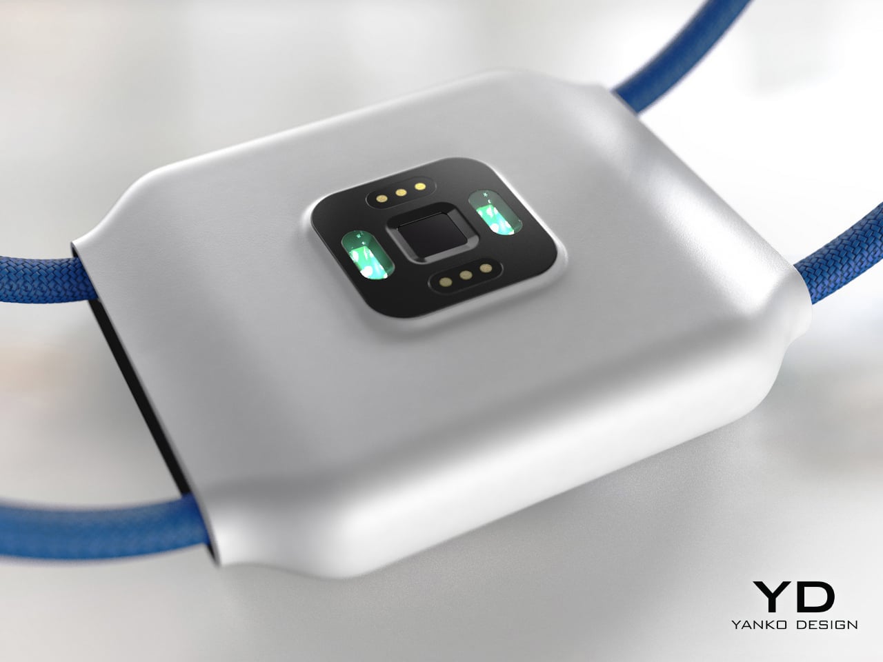
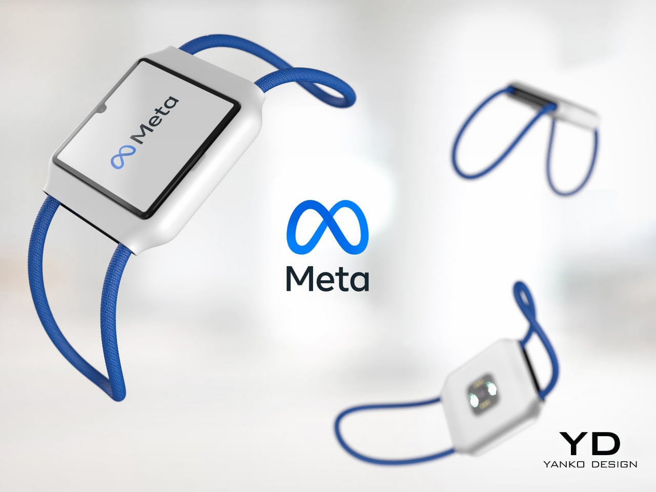
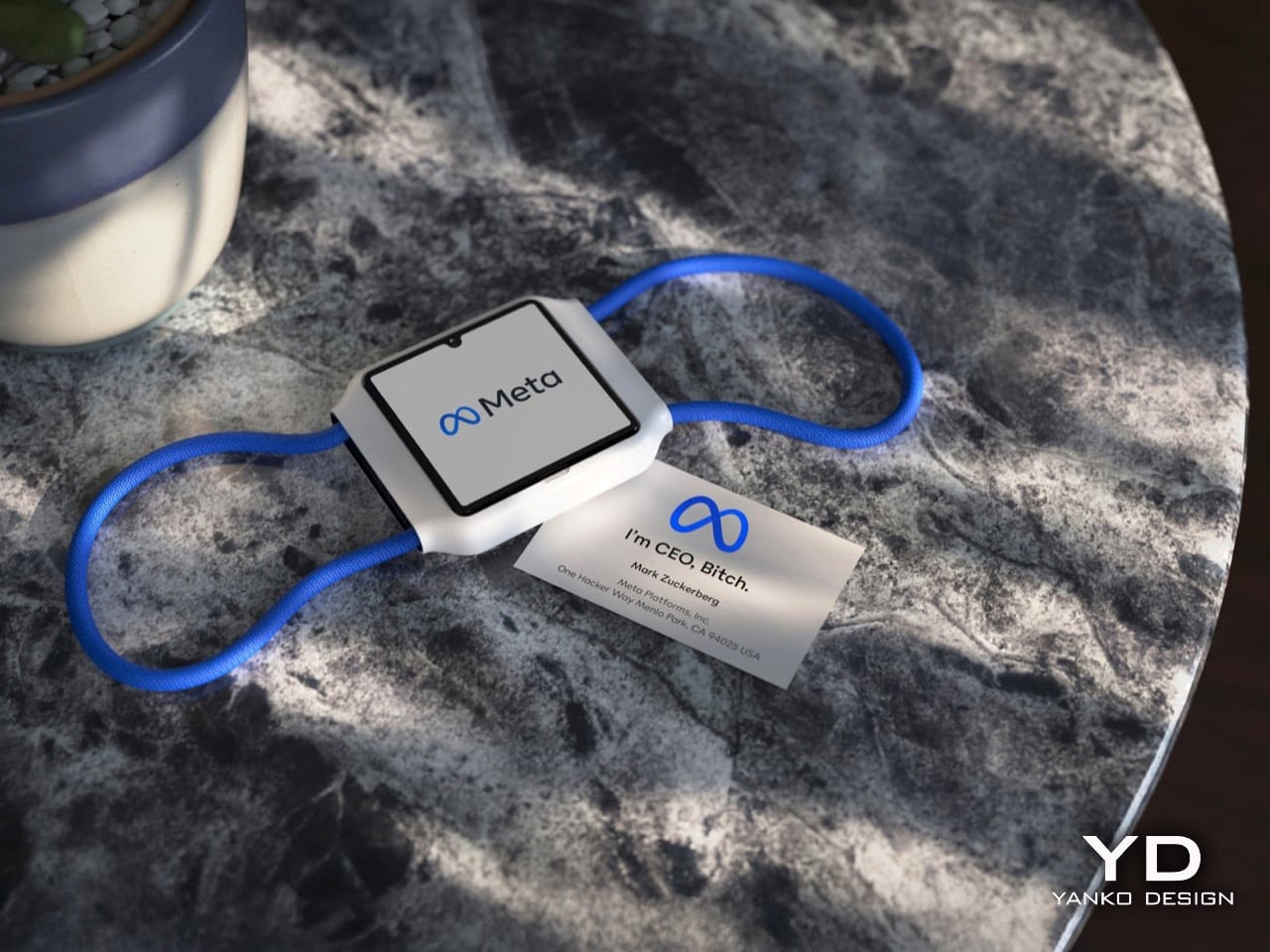
Meta is building a smartwatch, and it wants to know your heart rate, your sleep patterns, your activity levels, and whatever else it can pull from a sensor pressed against your skin all day. The device is codenamed Malibu 2, it’s targeting a 2026 launch, and by most accounts it sounds like a perfectly competent health wearable. The problem isn’t the hardware. The problem is the company attached to it.
This is the same Meta that just faced congressional scrutiny over social media addiction today. The same Meta whose smart glasses are reportedly inching toward facial recognition. The same Meta that filed a patent for Project Lazarus, a system designed to generate posthumous content from deceased users, because apparently your data doesn’t stop being useful to them just because you do. Handing your most intimate biometric information to that company is a case study in one.
Designer: Meta
To be fair, the product itself has a coherent logic behind it. Meta’s Ray-Ban Display glasses have been received surprisingly well by the press, and the neural wristband that ships with them, which uses electromyography to read muscle signals and translate them into gestures, only works with those glasses. That’s a real limitation. A smartwatch that absorbs that gesture-control functionality while adding health tracking and a persistent AI assistant would close a gap that currently makes the whole setup feel incomplete. From a pure product strategy standpoint, Malibu 2 makes sense.
The hardware ambitions have also matured since Meta’s first attempt at a smartwatch, which was scrapped in 2022 after accumulating plans for detachable cameras and metaverse tie-ins that never quite added up to a coherent device. Malibu 2 is reportedly focused on health tracking and Meta AI integration, which is a much cleaner pitch. The company already has a working partnership with Garmin, visible in the Oakley Vanguard sports glasses and a neural band demo at CES 2026 inside a Garmin-powered car concept. If there’s a natural manufacturing and platform partner for this watch, Garmin is the obvious candidate.
Meta is also reportedly developing the watch to sit alongside updated Ray-Ban Display glasses, internally called Hypernova 2, with both devices likely to be unveiled at Meta Connect in September. The Phoenix mixed reality glasses, meanwhile, have been pushed to 2027 partly because Meta’s executives were concerned about releasing too many devices at once and confusing consumers. That’s a reasonable concern. It’s also a little rich coming from a company whose current product lineup already includes smart glasses with a separate neural band that only controls one device.
The wearables market is genuinely ready for a credible third competitor alongside Apple and Samsung, and Meta has the AI infrastructure and the existing glasses ecosystem to make Malibu 2 compelling from launch. But compelling and trustworthy are different things, and Meta has spent twenty years demonstrating which one it prioritizes. Your Apple Watch data sits in Apple’s ecosystem, behind a company that has made privacy a marketing pillar and a legal battleground. Your Malibu 2 data sits with a company that patented a way to keep monetizing you after you die.
Meta is building a smartwatch, and it wants to know your heart rate, your sleep patterns, your activity levels, and whatever else it can pull from a sensor pressed against your skin all day. The device is codenamed Malibu 2, it’s targeting a 2026 launch, and by most accounts it sounds like a perfectly competent health wearable. The problem isn’t the hardware. The problem is the company attached to it.
This is the same Meta that just faced congressional scrutiny over social media addiction today. The same Meta whose smart glasses are reportedly inching toward facial recognition. The same Meta that filed a patent for Project Lazarus, a system designed to generate posthumous content from deceased users, because apparently your data doesn’t stop being useful to them just because you do. Handing your most intimate biometric information to that company is a case study in one.
Designer: Meta
To be fair, the product itself has a coherent logic behind it. Meta’s Ray-Ban Display glasses have been received surprisingly well by the press, and the neural wristband that ships with them, which uses electromyography to read muscle signals and translate them into gestures, only works with those glasses. That’s a real limitation. A smartwatch that absorbs that gesture-control functionality while adding health tracking and a persistent AI assistant would close a gap that currently makes the whole setup feel incomplete. From a pure product strategy standpoint, Malibu 2 makes sense.
The hardware ambitions have also matured since Meta’s first attempt at a smartwatch, which was scrapped in 2022 after accumulating plans for detachable cameras and metaverse tie-ins that never quite added up to a coherent device. Malibu 2 is reportedly focused on health tracking and Meta AI integration, which is a much cleaner pitch. The company already has a working partnership with Garmin, visible in the Oakley Vanguard sports glasses and a neural band demo at CES 2026 inside a Garmin-powered car concept. If there’s a natural manufacturing and platform partner for this watch, Garmin is the obvious candidate.
Meta is also reportedly developing the watch to sit alongside updated Ray-Ban Display glasses, internally called Hypernova 2, with both devices likely to be unveiled at Meta Connect in September. The Phoenix mixed reality glasses, meanwhile, have been pushed to 2027 partly because Meta’s executives were concerned about releasing too many devices at once and confusing consumers. That’s a reasonable concern. It’s also a little rich coming from a company whose current product lineup already includes smart glasses with a separate neural band that only controls one device.
The wearables market is genuinely ready for a credible third competitor alongside Apple and Samsung, and Meta has the AI infrastructure and the existing glasses ecosystem to make Malibu 2 compelling from launch. But compelling and trustworthy are different things, and Meta has spent twenty years demonstrating which one it prioritizes. Your Apple Watch data sits in Apple’s ecosystem, behind a company that has made privacy a marketing pillar and a legal battleground. Your Malibu 2 data sits with a company that patented a way to keep monetizing you after you die.
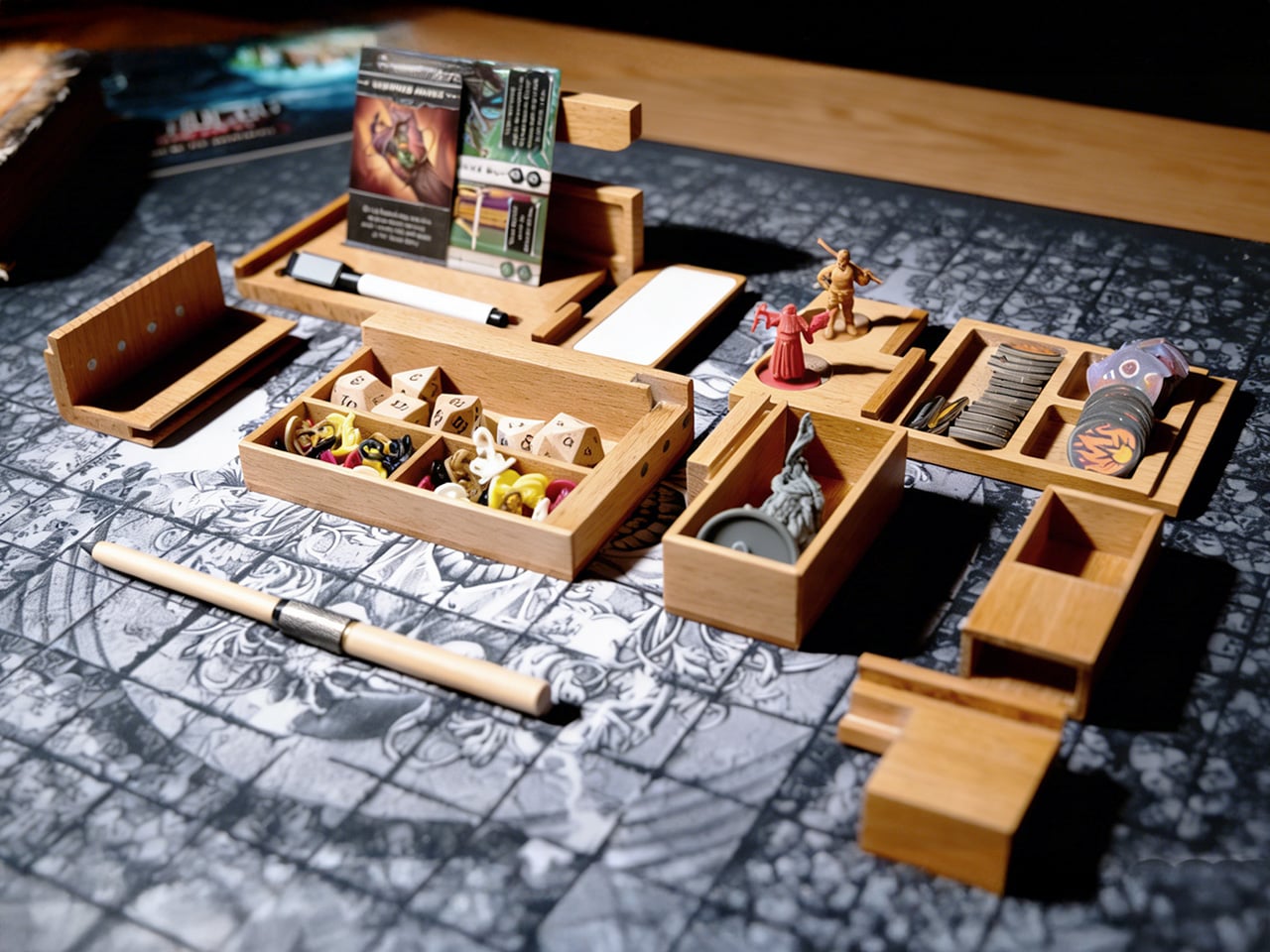
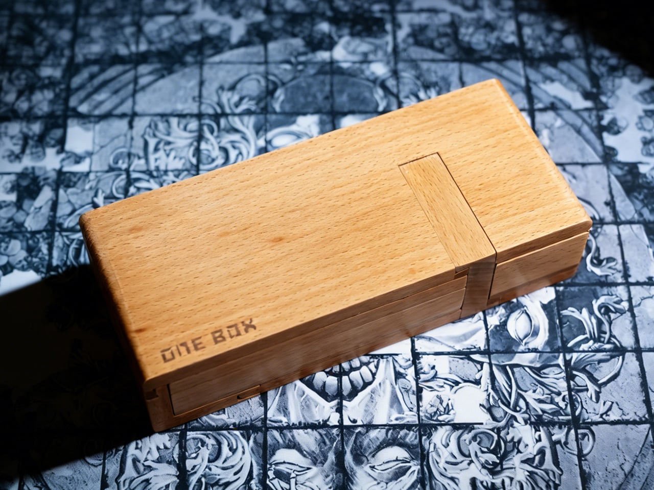
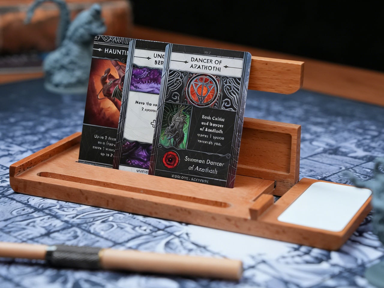
Board game nights typically end the same way: scattered tokens, bent cards sliding across the table, dice that have rolled onto the floor for the third time. The chaos becomes part of the experience, tolerated because storage solutions only address what happens after everyone goes home. ONE BOX 4.0 takes a different approach by treating organization as something that belongs inside the game itself, using modular wooden compartments that stay open and active throughout play. The whole thing behaves less like a box and more like a portable command deck that happens to collapse into something the size of a pencil case. You unfold it, and the table suddenly has lanes, stages, and zones instead of a single flat battlefield where everything fights for the same square inches.
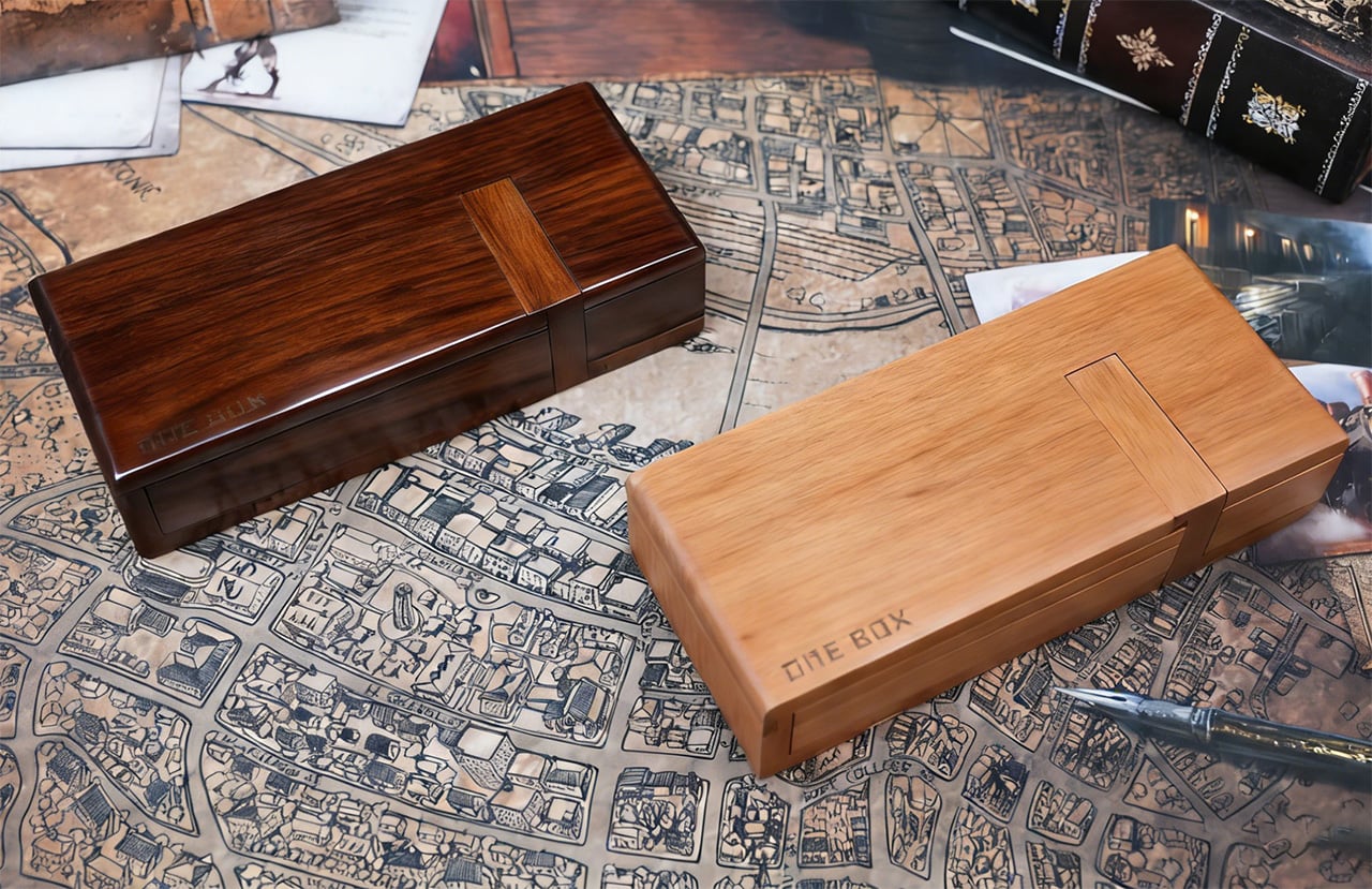
CHENGSHE.design built the system from mortise and tenon joinery, the kind of traditional woodworking that holds furniture together without screws or glue. Each unit comes in beech, teak, or black walnut, and the natural grain variations mean no two boxes look identical. The modules include card display stands, contained dice rolling areas, and phone holders that keep digital rulebooks accessible without crowding the play surface. The parts interlock into a single carryable brick, then fan out into a full tabletop system in a couple of moves. It feels like someone took the logic of a good travel tool roll, mixed it with a GM screen, and then asked an architect to make it beautiful without turning it into furniture cosplay.
The design addresses three distinct phases of a session: setup, active play, and teardown. Before play, the modules unfold from a single case into multiple zones in a matter of seconds, with dividers and trays already proportioned for cards, dice, tokens, and reference materials. During play, cards sit upright in angled stands, which keeps information visible and reduces edge wear from constant handling. Dice move through a contained rolling lane that prevents table escapes and limits collisions with card stacks or miniatures. After the session, components return to defined compartments, which then recombine into a unified case for transport and shelf storage.
Underneath the pretty wood, the logic is very modular and very modern. One set of modules can handle a deck-heavy Euro game one night and a crunchy TRPG session the next, simply by rearranging dividers and stands. The dividers are adjustable, so you can create narrow lanes for standard 63.5 by 88 mm cards or open wider slots for tarot or oversized character sheets. A lot of “board game accessories” assume a single flagship game and then become useless when your group rotates titles. ONE BOX 4.0 behaves more like a system-level accessory, closer to a camera cage or modular tool chest that expects you to change the loadout constantly. The fact that this is the fourth generation shows in that ecosystem thinking.
The mortise and tenon construction is not a decorative flex either. That joint style is pretty resilient when you are opening and closing something hundreds of times, applying torsion in slightly different directions every session. Screws back out, cheap hinges loosen, glued butt joints fail at the worst moment. Properly cut mortise and tenon joints share load across surfaces and age with the wood rather than against it. Combined with hardwoods like teak and black walnut, you get a product that can take the mild abuse of transport and table slams without turning into a rattling box of regret.
The other design decision that lands beautifully is backward compatibility. If you bought ONE BOX 3.0, you do not have to retire it to adopt 4.0. The new modules plug into the old ecosystem, which is the kind of long horizon thinking you usually only see in camera mounts, bike standards, or pro audio racks. That matters because people build habits around their table setups. If you already have a certain arrangement for card lanes and dice trays, you can add a new TRPG-focused module or that OB Infinite Pen without rethinking everything. This is how you build a niche platform instead of a series of isolated products that age out every two years.
The OB Infinite Pen and erasable whiteboard module signal a clear orientation toward TRPG and scenario driven gameplay. By dedicating space to writing tools and a reusable surface, the system supports initiative tracking, hit points, quick maps, and ad hoc notes without adding disposable paper clutter. The pen shares the same wood material language as the box, which unifies the visual identity and reinforces the idea that note taking is an integrated part of the experience. For groups that run mixed digital and analog setups, the phone and tablet holder aligns with this approach, parking screens at the edge of the system instead of scattering them across the main play field.
Visually, this is the opposite of RGB acrylic chaos. Natural wood, clean chamfers, visible grain, and a restrained color palette of light beech, warm teak, and dark walnut. On a table, it reads more like a compact piece of joinery than a toy, which is exactly what you want if your “game table” is also your work desk or dining surface. There is a subtle psychological trick here: when the tools of play look like serious objects, people tend to treat the whole session with a bit more focus. You are less likely to fling dice across a carefully built wooden lane than across a bare laminate tabletop.
Folded shut, the core ONE BOX 4.0 package is roughly pencil box sized, which means it goes into a backpack alongside a laptop and a rulebook without much negotiation. Unfolded, it spreads to cover a player station or GM area without requiring a dedicated gaming table. That portability is what separates this from the beautiful but immovable wooden tables that dominate the aspirational side of tabletop culture. You can take this to a cafe, a friend’s apartment, or a convention hall, and your setup logic travels with you instead of being rebuilt from scratch every time.
The ONE BOX 4.0 comes in three primary wood options: beech for a pale, almost Scandinavian tone, teak for a warmer mid tone, and black walnut for a darker, more saturated look. Configurations range from a single core box setup to multi box “command station” style bundles that add dedicated dice rollers, erasable whiteboard modules, storage bags, and the OB Infinite Pen in matching wood. Up to 50 early backers can grab the beech variant for as low as $59, while the next tier for all wood versions sits at $79 (which includes the ‘recording kit’ featuring the OB Infinite Pen and erasable whiteboard modules). Throw in an extra twenty, and the $99 tier also gets you a dice roller. The ONE BOX 4.0 is open for preorder and ships globally starting May 2026.
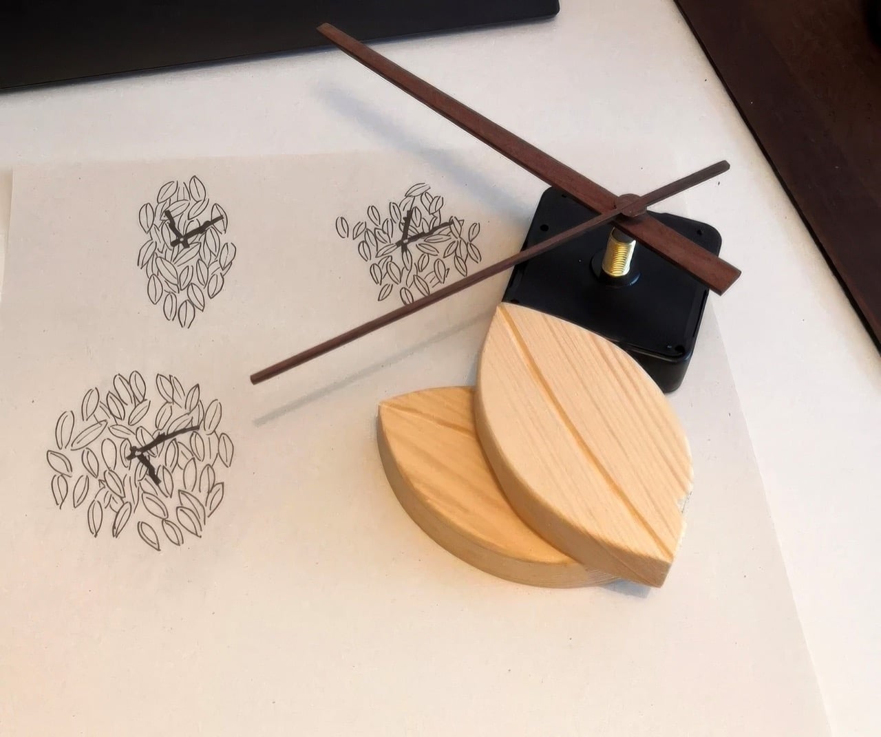
“Foglie” is the Italian word for leaves, and Tobias Sartori makes no effort to obscure the reference. His Foglie Wall Clock is built from dozens of hand-carved pine leaves, each shaped with a carved central ridge that mimics a real leaf’s midrib, arranged into a pointed, flame-like cluster that functions as the clock face. Branch-carved hands in a contrasting darker finish sweep the hours from a movement housed at the center. The result sits between decorative object and wall art, and it does so with enough material confidence to hold that ground convincingly.
Sartori first worked with leaf forms in a jewelry project, carving wooden pendants for necklaces, and the motif followed him home. A beech hedge outside and a botanical wallpaper inside reinforced the idea, together suggesting that an entire clock could operate in the same visual vocabulary. Several layout sketches followed before two strong candidates emerged. The chosen design is the one where every individual carved leaf echoes the overall silhouette of the piece, creating a quality that feels grown from the inside out.
Designer: Tobias Sartori
The final piece has a remarkable sense of depth and texture, a direct result of its meticulous construction. Because each pine leaf is an individual component, hand-carved and set at a slightly different angle and height, the clock creates a dynamic topography of light and shadow that shifts throughout the day. This layered arrangement gives the object a living quality, changing its character as the sun moves across the room.
The choice of pine, with its warm and expressive grain, gives the clock an approachable, organic feel that invites a closer look. The darker, more delicate hands provide just enough contrast to ensure legibility without overpowering the woodwork. It is a quiet object that reveals its handmade complexity gradually, rewarding careful observation with subtle details that a mass-produced item could never replicate.
Sartori’s process sketches reveal another, more traditional round variant that he ultimately set aside, a decision that proved critical to the design’s integrity. The circular concept, while pleasant, felt more like leaves applied to a conventional clock shape. The final, elongated form, however, feels like a clock that grew directly from the leaves themselves. This distinction is the core of its success. By housing a simple, reliable clock movement within a form that feels completely natural, Sartori allows the artistry of the woodwork to remain the main story. The Foglie clock successfully integrates function into a form that feels elemental and intentional, as if a gust of wind had gathered the leaves on the wall in a moment of perfect, fleeting composition.