CIGA Design Just Built the Most Interesting Tourbillon Watch of 2026

In Mandarin, the phrase 马上 (mǎ shàng) translates literally as “on horseback,” but its common meaning is “immediately” or “without delay.” It’s a concept of swiftness and forward momentum. For its Year of the Horse timepiece, CIGA Design has built an entire watch around this clever piece of wordplay. The design embodies that feeling of instant progress and unstoppable movement, creating a narrative woven directly into the mechanical and aesthetic choices. It is a watch about the philosophy of action.

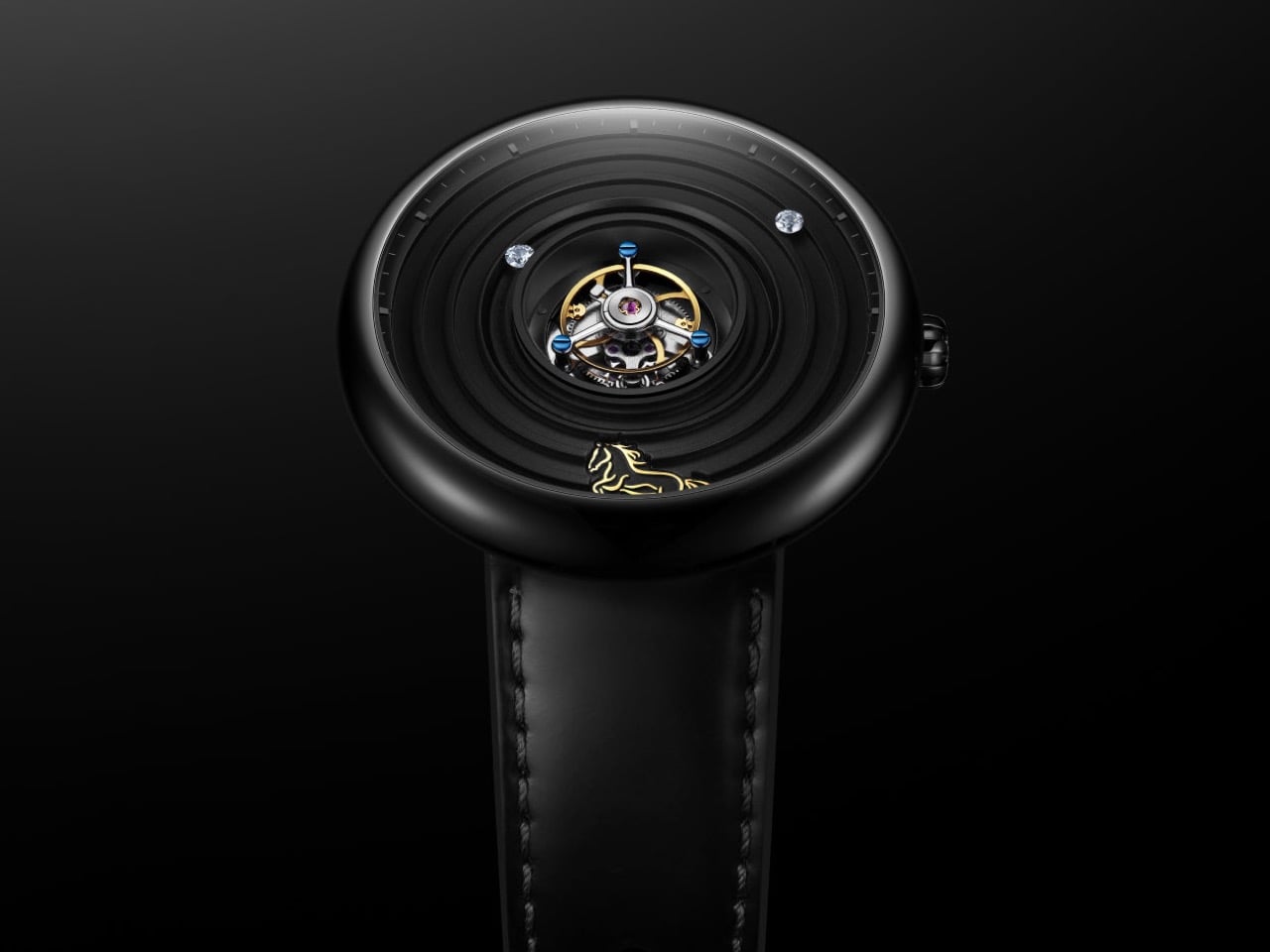
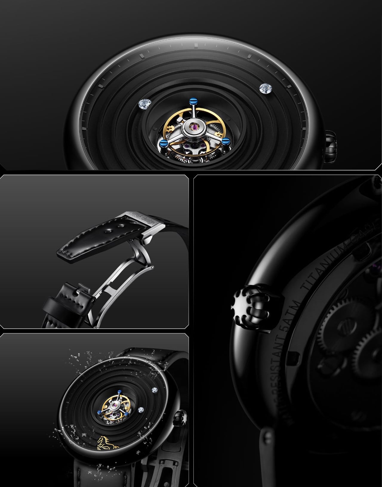
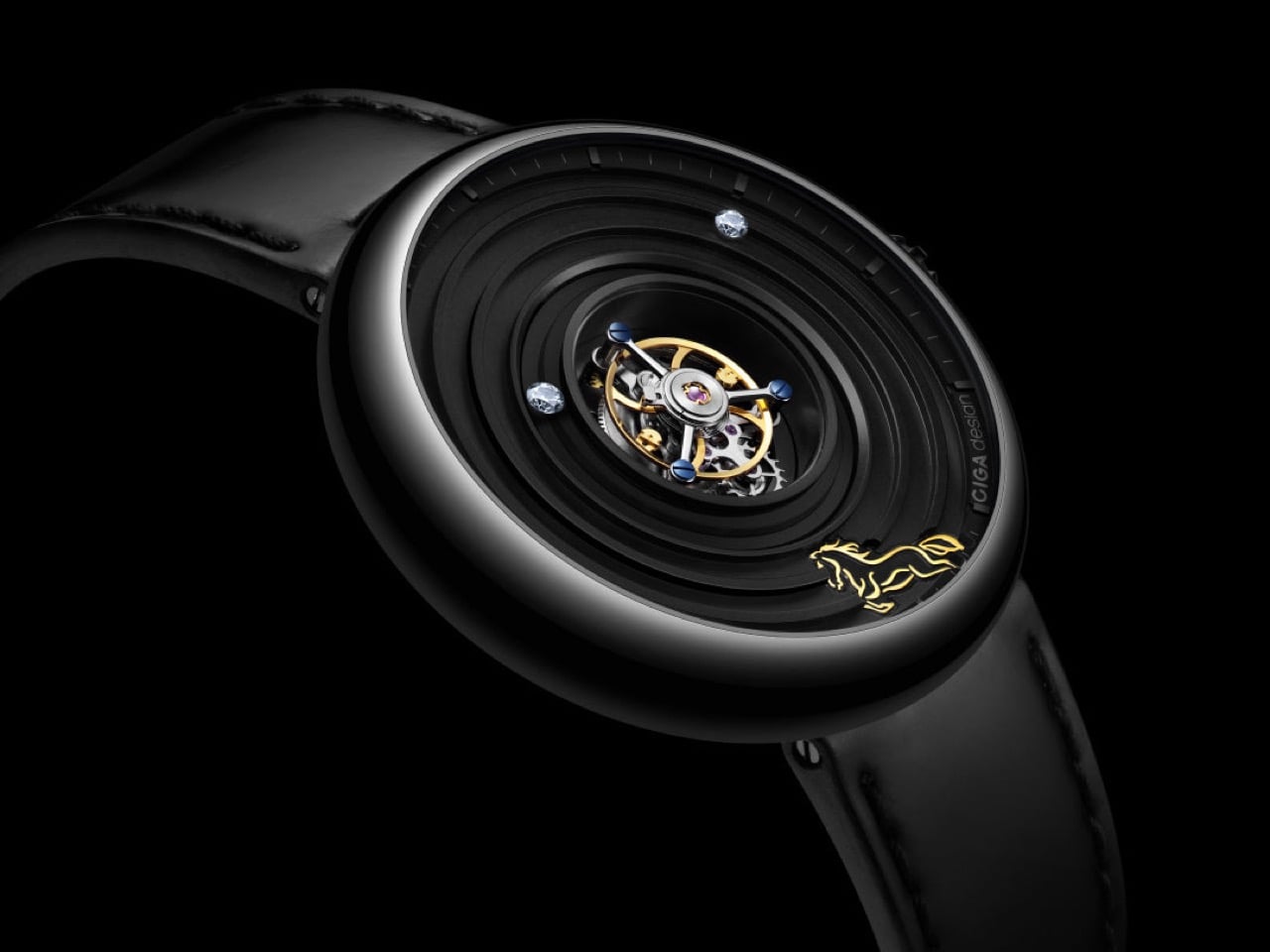
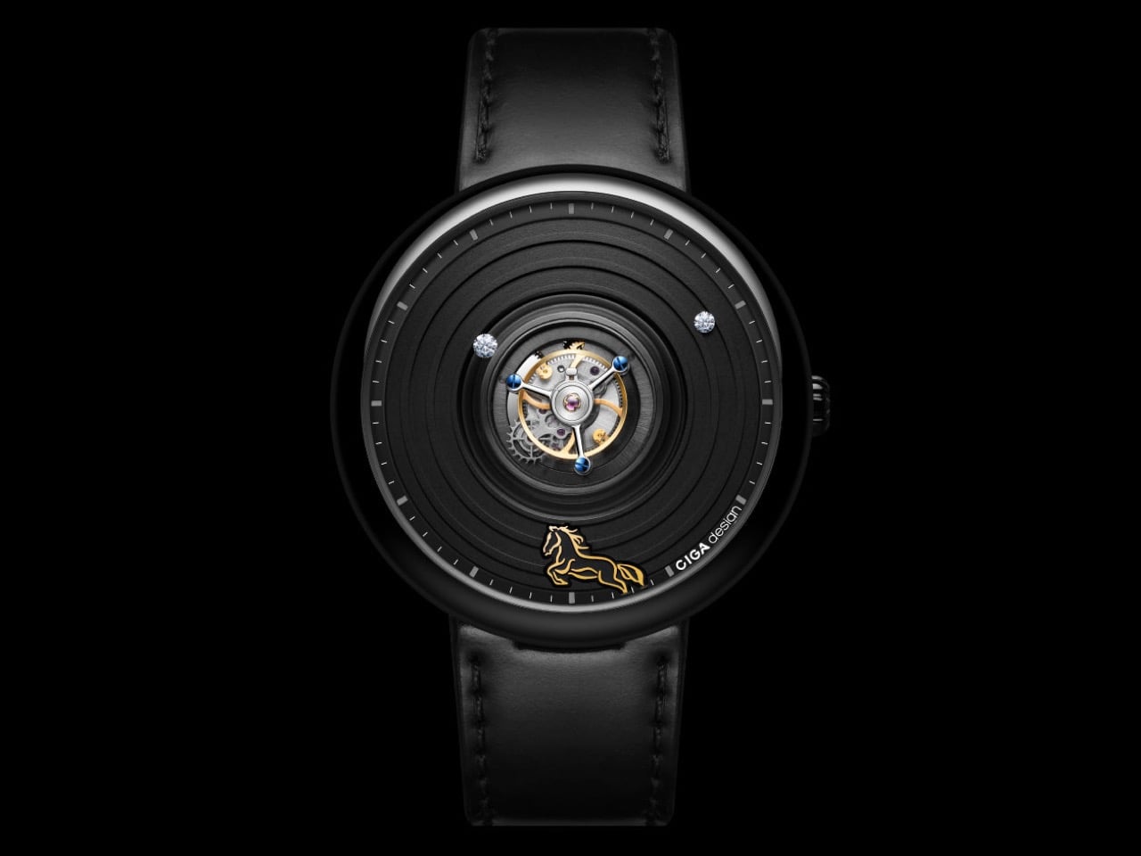
The central tourbillon is the engine of this idea, its constant rotation a visual metaphor for momentum that the wearer sees with every glance at the wrist. The dial’s concentric grooved rings radiate outward from this spinning core, amplifying the sense of energy in every direction. A 24K gilded horse at six o’clock connects the concept directly to its zodiac inspiration, rendered small and precise, more like a seal than a decoration. CIGA Design, the first Chinese watchmaker to win the Grand Prix d’Horlogerie de Genève, has a track record of treating mechanics as design language, and this is the clearest expression of that philosophy yet. The cultural reference and the engineering are telling the same story, which is rarer in theme watches than it should be.

Designer: CIGA Design

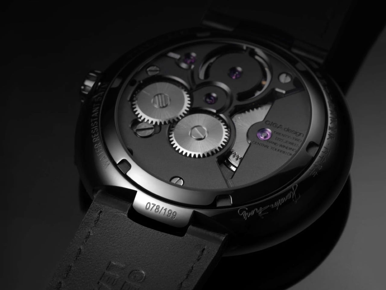
Putting a tourbillon front and center is a serious power move. Most watchmakers tuck it away at the six o’clock position, but CIGA’s in-house CD-12-SI caliber was clearly designed for the spotlight. The entire visual architecture of the watch is built to serve this mechanism. It runs at a modern 28,800 vibrations per hour, which gives the balance wheel a smooth, fluid sweep. A 38-hour power reserve is perfectly serviceable for a manual-wind piece, meaning you get to have that tactile interaction with it daily. It’s the kind of engineering that invites you to look closer, to appreciate the complexity instead of just accepting that it works.

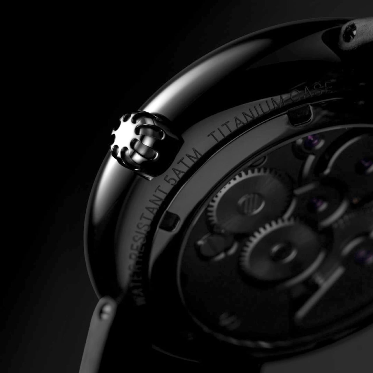
The case material, Grade 5 titanium, is a choice that speaks volumes. At 45.5mm, this watch could have been a heavy, unwieldy piece of metal in steel, but titanium makes it surprisingly light and comfortable on the wrist. The black DLC coating gives it a tough, scratch-resistant finish that feels both modern and understated. Those concentric grooves on the dial are the most impressive part of the case work. They give the flat black dial a sense of depth and texture that plays with light in interesting ways. It’s a very architectural approach that prevents the watch from feeling boring, which is a real risk with monochrome designs.

You solve the problem of telling time without cluttering the main event with a pair of floating diamonds for hands. It’s a brilliant, minimalist solution. Legibility might take a slight hit in certain lighting, but it’s a worthy trade-off for maintaining an unobstructed view of the tourbillon. The strap is shell cordovan, a fantastic, non-porous leather known for its durability and rich patina over time. Pairing it with a hidden butterfly clasp was the right call, preserving a clean, unbroken line around the wrist. These details show a design team that was thinking about the complete ownership experience, not just the initial wow factor.

The $2,699 price fundamentally challenges the idea that an in-house tourbillon must cost as much as a mid-size sedan. This watch appeals directly to the enthusiast buying the complication itself, not the logo on the dial. The 199-piece production run feels like a calculated appeal to a very specific customer who values the engineering over the emblem. With this move, CIGA methodically builds its credibility on accessible complexity and a design language that is unmistakably its own. They are carving out a space by delivering serious horology without the traditional five-figure barrier to entry.

The post CIGA Design Just Built the Most Interesting Tourbillon Watch of 2026 first appeared on Yanko Design.

This $56 Machete Multitool Borrows Its Best Idea From WWII Survival Gear

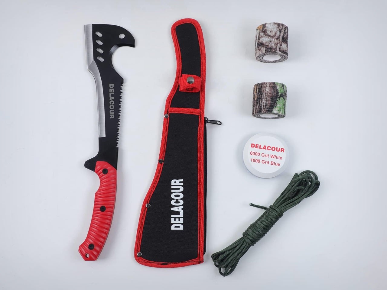
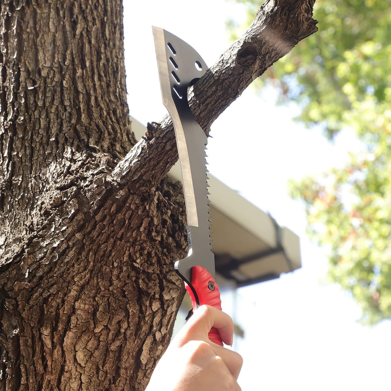
The Woodman’s Pal is an 84-year-old Pennsylvania tool that the US Army adopted almost immediately after its 1941 introduction, issuing it to Signal Corps troops in the Pacific and eventually to pilots as a survival blade through Vietnam and Desert Storm. It costs $169.95, uses 1075 high-carbon spring steel, and is still hand-assembled in Lancaster County with buffalo leather sheaths stitched by Amish craftsmen. The once-patented design now exists in public domain, prompting other creators like Jinhua Shengpu Tools Co., Ltd to make their own, modified versions of it with better materials and at a lower cost. Meet the Delacour Multi-Use Axe Machete, a Woodman’s Pal tribute that is more than 70% more affordable, bringing the winning design to a larger audience.

The logic behind both tools is simple: forward-weight the blade, add a reverse hook at the tip for catching and pulling vines, put saw teeth on the spine for crosscutting, and the result replaces a machete, axe, pruning hook, and bow saw simultaneously. The Delacour reproduces this geometry faithfully. The hook works. The saw back works. The forward mass creates chopping momentum that a straight blade cannot replicate.

Designer: Jinhua Shengpu Tools Co., Ltd

Click Here to Buy Now

The two tools diverge most clearly in material. The Delacour uses 3Cr13 stainless steel at 4mm, a mid-grade alloy that prioritizes corrosion resistance and manufacturability. The Woodman’s Pal uses 1075 high-carbon spring steel, which holds an edge under sustained load. At $56, the Delacour’s steel is a reasonable trade-off for light clearing, campsite work, and occasional trail use. It becomes a constraint only when pushed into the heavy chopping the blade geometry invites.

The visual language is a departure from the Woodman’s Pal’s austere utility. The injection-molded red nylon grip is aggressively textured and colored, reading more as consumer outdoor product than working tool. Lightening holes punched through the blade add visual complexity without a clear weight or balance rationale. The package throws in camo wrap tape, a paracord coil, and a dual-sided whetstone, rounding the Delacour out as an entry-level survival kit rather than a single well-considered implement.

At $56, the Delacour asks a reasonable question: how much of what makes the Woodman’s Pal worth $170 is the steel, and how much is the leather, the Lancaster County provenance, and 84 years of military heritage? The geometry, at least, costs the same in both.

Click Here to Buy Now

The post This $56 Machete Multitool Borrows Its Best Idea From WWII Survival Gear first appeared on Yanko Design.

Apple Gave AirPods Max a Brain Transplant After 5 Years (Same Design, New Chipset)

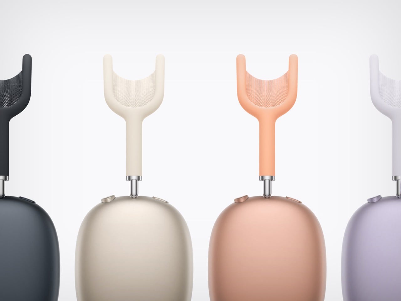
Apple just gave the AirPods Max a brain transplant, and after five years on H1 silicon that was already a generation behind when the AirPods Pro 2 launched in 2022, it was due. The H2 is the real story here, because everything else on this headphone is identical to what shipped in December 2020. Same aluminum frame, same stainless steel headband, same mesh knit ear cushions, same 385-gram weight, same $549 price. ANC is rated at 1.5x more effective than the previous gen, and the full H2 feature set, Adaptive Audio, Conversation Awareness, Voice Isolation, and Live Translation, all land here for the first time. What changed is everything running underneath a design that was already doing its job.

Adaptive Audio is what AirPods Max owners have been watching from the sidelines since AirPods Pro 2 launched in 2022. The mode dynamically blends active noise cancellation and transparency based on your environment, dialing back the ANC when someone speaks nearby and re-engaging it when you’re back on a loud street. It sounds incremental until you’ve used it for a full commute, at which point going without it feels like a step backward. H2 also brings lossless audio at 24-bit, 48 kHz, though only over a wired USB-C connection, so wireless listening stays capped at AAC. That’s a real ceiling to live with at this price, but the original AirPods Max never offered lossless in any configuration, so it’s at least movement.

Designer: Apple

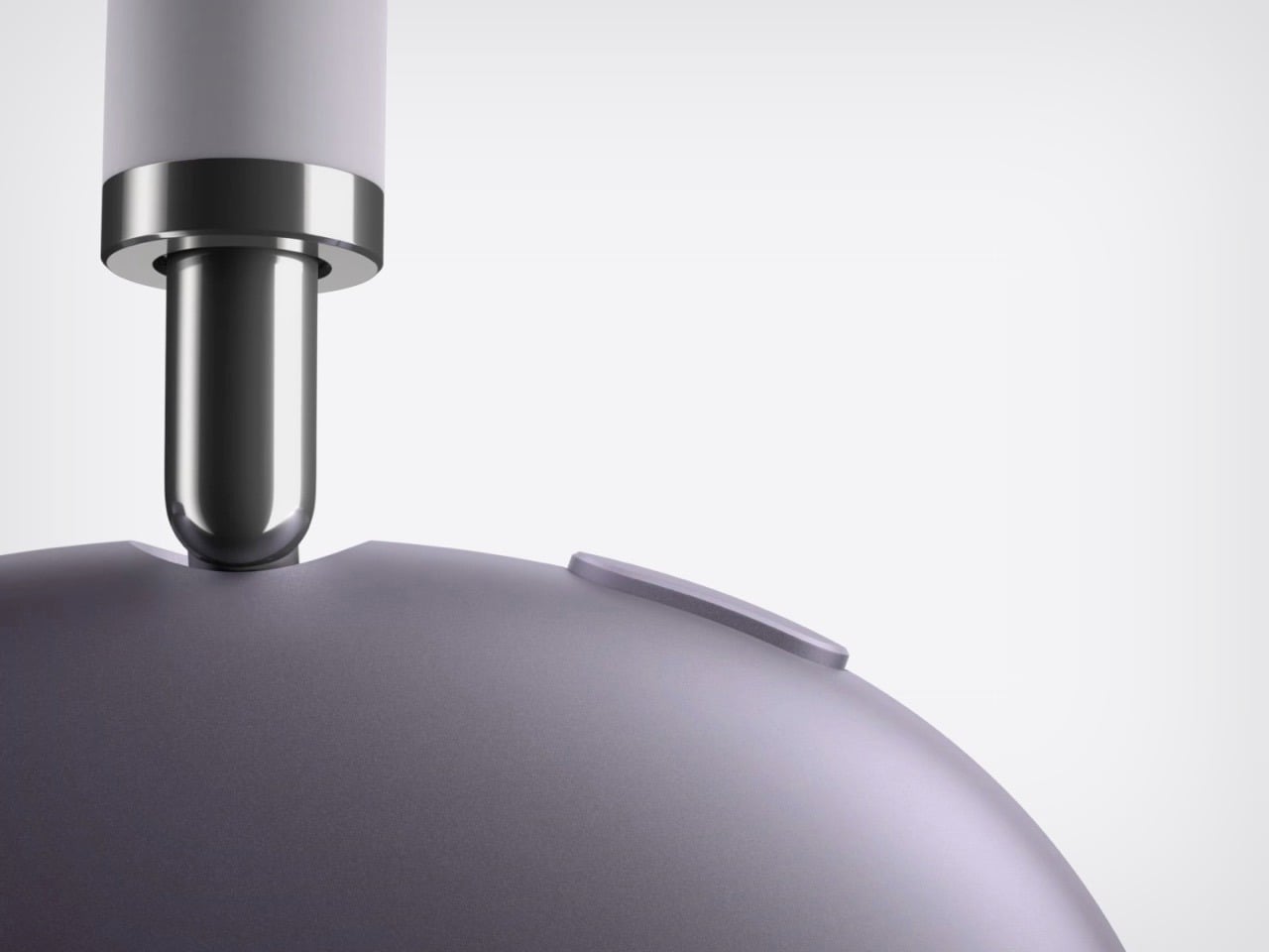
Five years, and Apple didn’t touch the design, which makes sense once you understand what the design is doing. The aluminum ear cups and stainless steel headband aren’t decorative choices, they’re structural, and they’re why this thing still looks and feels like a premium object after years of use, while equivalent plastic-and-fabric builds from Sony and Bose at lower prices tend to show wear sooner. The AirPods Max weighs 385 grams, heavier than anything in the over-ear category at this tier, and it still doesn’t fold flat for travel. Sony’s WH-1000XM6 and Bose’s QuietComfort Ultra are both lighter, foldable, and notably cheaper. Apple’s bet was that material quality carries the argument, and for desk or commute use, it mostly does. The Digital Crown for volume and track control is still here, and it remains one of the better physical inputs on any over-ear headphone.

The Smart Case is still a pouch, not a case in any conventional sense. It’s a silicone sleeve that covers the ear cups and nothing else, leaving the headband fully exposed to whatever else is in your bag. It doesn’t fold the headphones flat, it adds no meaningful drop protection, and it looks like a small clutch that wandered in from a different product category. For $549, the carry solution should be better than this, and the fact that it’s unchanged after five years suggests Apple either rationalized it or decided the complaint volume wasn’t loud enough to act on. It’s the one part of the AirPods Max story that feels genuinely unfinished, and at this price, that friction sticks out more than it should.

Battery life holds at 20 hours, which is fine but trails the Bose QuietComfort Ultra’s 24-hour rating and Sony’s 30-hour claim on the XM6. What AirPods Max 2 actually has now is alignment with the rest of Apple’s audio lineup, a chip-level catch-up that makes this headphone feel current for the first time since launch. The ANC improvement is real, the H2 feature parity with AirPods Pro 3 is real, and lossless audio over USB-C gives the product a use case it never had before. If you own the original and spent three years watching Adaptive Audio and Conversation Awareness roll out to cheaper AirPods, the upgrade argument is now solid. First-time buyers are getting the version of this headphone the original was always pointing toward.

The post Apple Gave AirPods Max a Brain Transplant After 5 Years (Same Design, New Chipset) first appeared on Yanko Design.

This Volkswagen Concept Gives Front and Rear Passengers Completely Different Cars to Ride In

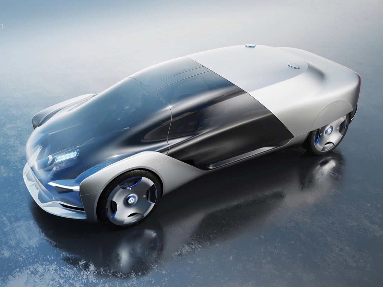
Most autonomous vehicle concepts ask the same question: what do you do with the interior when nobody needs to drive? The answer is almost always some variation of a lounge on wheels, seats rotating to face each other, a table unfolding from nowhere, everyone pretending they’re on a train. Seoul-based designer Seonmyeong Woo looked at that answer and decided it was too blunt. His Volkswagen ID. Counterpoint Concept, developed between January and May 2024, starts from a more interesting premise: what if the two rows of a car don’t need to want the same thing at all?

The project is built around a Level 5 autonomous driving scenario, which is the SAE designation for full, unconditional self-driving with no human input required under any circumstances. At that level of autonomy, the designer argues, the probability of accidents drops so dramatically that it liberates materials and structures previously constrained by crash safety logic. The passenger’s view direction no longer needs to follow the direction of travel. The body of the car doesn’t need to treat every occupant as an identical unit to be protected the same way. This is where the Counterpoint concept gets its name and its actual design logic, because the two rows are treated as fundamentally separate experiential zones with different enclosures, different postures, and different relationships to the outside world.

Designer: Seonmyeong Woo

The front row, called Open Window, uses a mono-volume form and a lying-down posture. The windshield is fully glazed and doubles as an AR surface, so the occupant reclines and looks upward through the transparency of the forward section of the car. It reads spatially like an open sky capsule, an almost observatory-like relationship to the environment outside. The rear row, called Private Wall, is a notchback configuration with an opaque body section that creates a large, enclosed private space. The visual language here references the customizable wall that appears in Woo’s moodboards, something closer to a room than a seat. The tension between those two conditions, the transparent front and the opaque rear, is where the exterior form actually comes from. It is not decoration; it is the literal expression of the interior split.

The sketches and ideation process documented in the portfolio show Woo working through the problem of where to place windows and walls across dozens of iterations. Several rejected directions used conventional side window apertures that created visual continuity between rows, which would have defeated the concept’s core argument. The final direction draws a hard material boundary along the body at roughly the B-pillar zone, with the front half clad in glassy, translucent surfaces and the rear half wrapped in the kind of opaque, sculpted body you’d find on a premium notchback. The wheels are covered by enclosed turbine-style rims that give the exterior a sealed, monolithic quality, which reinforces the idea that this is a vehicle you disappear into rather than one you drive.

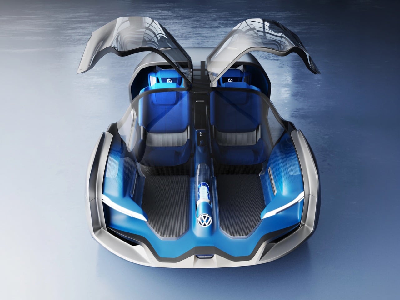
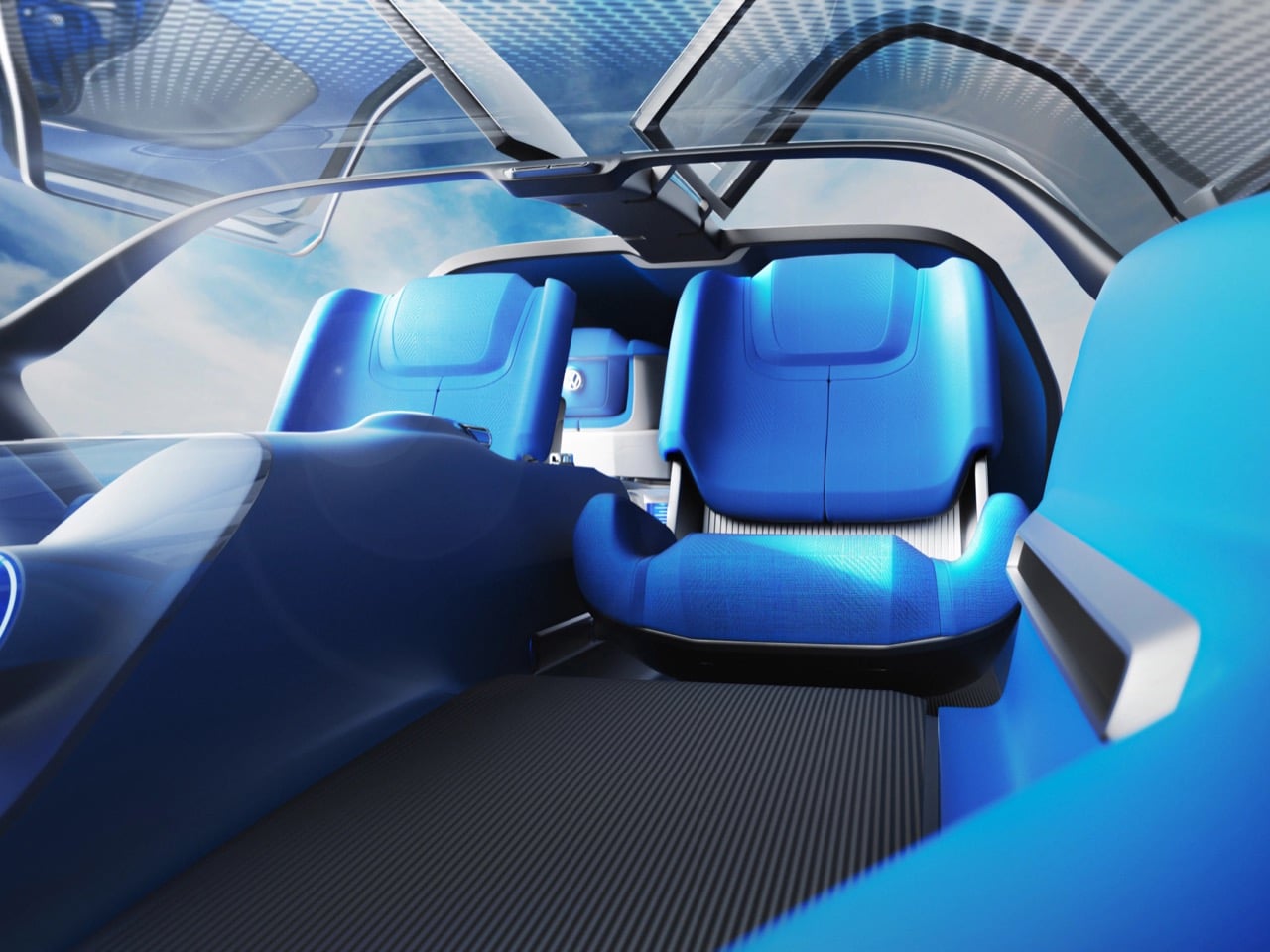
Interior ideation shows rotating and sliding seat mechanisms for the first row alongside a projecting seat configuration that allows the reclining posture without compromising ingress. The renders show the cabin upholstered in a saturated cobalt blue with carbon-weave floor surfaces, giving the inside a deliberately product-forward quality that sits between automotive and industrial design. The gullwing-style opening panels that expose both rows from above in the hero overhead render are clearly concept-specific theater, but they communicate the spatial relationship between the zones clearly in a way a plan view never could. The exterior renderings in lifestyle environments, a pre-dawn forest road, a wet urban expressway at night, show a car that reads as a single coherent object from the outside while containing two completely different spatial logics inside. That is the counterpoint of the title: not contradiction, but controlled contrast between two things that share a structure but operate independently of each other.

The post This Volkswagen Concept Gives Front and Rear Passengers Completely Different Cars to Ride In first appeared on Yanko Design.

Meta Is Turning Its Smart Glasses Into A Mass Surveillance Tool… And You Can’t Stop It

If not Palantir, why Palantir-shaped??

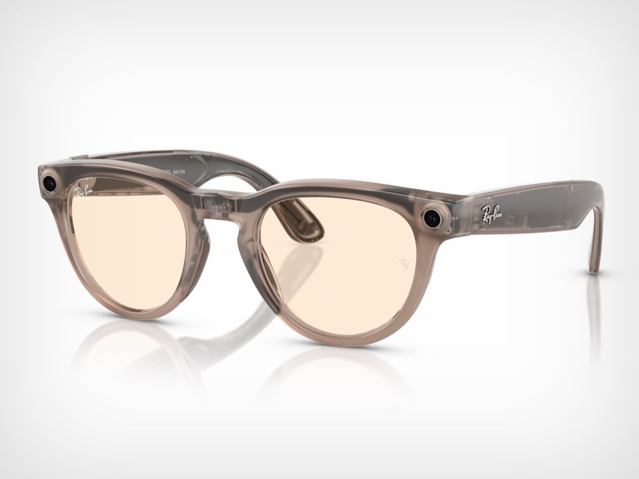
Palantir builds spy tech for the CIA, DHS, and ICE. It aggregates data, maps your life, and tells governments who to watch. Meta is building something with the same bones. It’s called Name Tag, a facial recognition feature coming to Ray-Ban smart glasses that lets a wearer look at a stranger in public and have an AI identify them in real time, pulling their name and profile directly from Facebook and Instagram. The surveillance hardware is a $300 fashion accessory, the database was built by 3 billion people tagging photos for free, and the targets are anyone, anywhere, who never agreed to any of it.

A leaked internal memo from May 2025, obtained by The New York Times, laid out the full scope: the feature is planned for every pair of Meta’s glasses, from Ray-Bans to the Oakley Meta HSTN sports line. Meta’s official response was a practiced non-denial: “we’re still thinking through options and will take a thoughtful approach if and before we roll anything out.” Companies that aren’t building something just say they’re not building it. Meta is not saying that.

The Database Was Being Built Before the Glasses Existed

Facebook turned on automatic photo tagging in 2010 with zero opt-in, and for eleven years, every time you tagged a friend’s face in a photo, you were feeding their facial recognition model. When Meta “deleted” over a billion faceprints in 2021 under lawsuit pressure, they kept the photos. They kept the social graph. They kept the engineers who built the whole thing. Name Tag isn’t a new product concept; it’s a previously mothballed capability getting a second run, this time with a camera on your face instead of a server in Menlo Park.

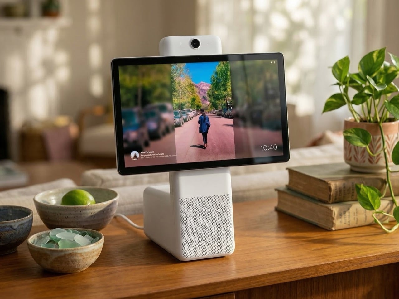
Anyone with a public Instagram account is immediately a potential target (it’s not like making your account private makes you any safer), which covers hundreds of millions of people who signed up to share photos, not to be enrolled in a real-world biometric identification system. Remember Portal, Meta’s smart home display with a face-tracking camera? It launched in 2018 right in the middle of the Cambridge Analytica fallout, and consumers collectively declined to put a Facebook camera in their living room. Meta discontinued it by 2022. The lesson they apparently took wasn’t “don’t build surveillance hardware.” It was “make sure the camera comes in wearing someone else’s face.”
They Know Exactly How We’ll React

“We will launch during a dynamic political environment where many civil society groups that we would expect to attack us would have their resources focused on other concerns.” That’s a sentence directly from an official internal planning document from Meta’s Reality Labs, dated May 2025, reviewed by The New York Times. The company was explicitly planning to exploit civic chaos as a launch window, timing the rollout of a mass surveillance feature to coincide with another crisis-event that occupies our mind so we’re distracted. Sleight of hand, with a dash of corporate evil. There’s no ethical framework in which that sentence represents good-faith product development.

Their original rollout plan was to debut Name Tag at a conference for the blind, wrapping a mass-surveillance tool in the language of accessibility before expanding it to the general public. That plan was eventually shelved, but the thinking behind it is the more revealing part. The accessibility framing was a softening mechanism, a way to generate human-interest coverage before the obvious misuse cases took over the conversation. Privacy advocates, abuse charities, and civil liberties groups were going to come for this feature regardless. The strategy was never to address their concerns. It was to buy a news cycle of goodwill first.

Your Face Is Being Reviewed in a Nairobi Office Park Right Now

Swedish newspapers Svenska Dagbladet and Göteborgs-Posten tracked Meta’s data pipeline from Ray-Ban glasses worn in Western homes to a company called Sama, operating out of an office park in Nairobi, Kenya. Workers there are paid to watch footage captured by glasses users and label what they see, teaching Meta’s AI to understand and interpret the visual world. The footage includes people on the toilet, naked bodies, couples in bed, bank card details accidentally filmed, and intimate conversations being had by people who had no idea they were being recorded, let alone reviewed by a contractor on another continent.

Meta’s defense was to point at a clause buried in their terms of service permitting “manual (human)” review of AI interactions, which is technically accurate and practically worthless as a justification, because no person buying a pair of fashion-forward smart glasses understands that clause to mean workers in Kenya are watching them undress. The April 2025 privacy policy update for the glasses silently expanded Meta’s right to use all captured photos, videos, and audio for AI training, with no prominent notification to existing owners. A class action lawsuit filed in San Francisco federal court in March 2026 argues this constitutes consumer fraud, given that Meta’s own marketing described the glasses as “designed for privacy, controlled by you.” The UK’s Information Commissioner’s Office wrote to Meta characterizing the situation as “concerning,” which in British regulatory language lands somewhere between “deeply troubled” and “genuinely alarmed.”
$2.1 Billion in Fines and Still Going

The fine history reads like a repeat offender’s rap sheet. Meta paid $650 million to settle an Illinois class action over collecting facial geometry without consent through Facebook’s “Tag Suggestion” feature. They paid another $68.5 million for the same BIPA violation in 2023. In 2024, Texas extracted $1.4 billion from them for capturing biometric data on millions of Texans “for commercial purposes” without informed consent, with the lawsuit specifically alleging Meta was disclosing that data for profit. That’s over $2.1 billion in biometric privacy penalties across four years, all for variations of the same violation, against the same company, building the same technology.

None of it changed the product roadmap. The Texas settlement of $1.4 billion represents roughly one percent of Meta’s $134 billion in 2023 revenue. The Electronic Privacy Information Center has filed complaints with the FTC calling Name Tag a direct facilitator of “stalking, harassment, doxxing and worse.” The EU’s AI Act classifies real-time remote biometric identification in public spaces as high-risk AI and prohibits it for most commercial applications. The fines and the regulatory pressure are clearly baked into Meta’s planning rather than functioning as deterrents. They paid $2.1 billion to establish what a decade of biometric data collection actually costs, looked at that number next to their revenue, and decided it wasn’t a fine. It was an investment.

The Glasses Are Just the Beginning

Name Tag as currently designed still requires the wearer to deliberately trigger an identification query. The next product removes even that minimal friction. Internal documents describe “super sensing” glasses with always-on cameras and microphones that record continuously for the entire duration they’re worn, feeding an unbroken stream to an AI assistant that builds a fully searchable log of the wearer’s day. The surveillance model shifts from opt-in query to permanent ambient default. Every person who passes within the glasses’ field of view gets their face processed, regardless of whether they’ve opted out, regardless of whether they even know the technology exists.

The threat model was demonstrated in 2024 by two Harvard students, AnhPhu Nguyen and Caine Ardayfio, using nothing but current, available hardware. They connected Ray-Ban Meta Gen 2 glasses to PimEyes, a commercial facial recognition engine, alongside LLM data extraction tools, FastPeopleSearch, and Cloaked.com for social security lookups. Streaming the feed to Instagram Live, they identified strangers on the Boston subway and pulled names, home addresses, phone numbers, and social security numbers in seconds. They approached a woman on the street, told her they’d met at a Cambridge Community Foundation event, and she believed them. They told a female student her Atlanta home address and her parents’ names; she confirmed they were right. Name Tag doesn’t make this possible. It already is possible. Name Tag just makes it Meta’s official product.

What “Opt-Out” Actually Means

Meta’s proposed safeguards rely on limiting identification to connected contacts or public accounts, and offering an opt-out toggle buried in Instagram settings. The connected-contacts restriction doesn’t address the most statistically common danger. Stalkers, abusers, and harassers overwhelmingly target people they already know. Limiting the feature to existing connections doesn’t reduce the risk to the most vulnerable users; it focuses it on them. Domestic abuse charities in the UK raised this point directly, noting that abusers could use Name Tag to locate survivors who have relocated, changed their appearance, or created entirely new digital identities to stay safe.

The opt-out toggle is available to Instagram’s roughly 2 billion monthly active users, almost none of whom will encounter it organically. Privacy protections that require the potential victim to proactively locate and activate a setting are not privacy protections. They are liability documentation. Abuse survivors, journalists, political dissidents, undocumented individuals, people in witness protection: these are the people with the highest stakes, and also the people with the least bandwidth to hunt through app settings on the off chance that facial recognition has been added to a device they don’t even own. The toggle protects Meta in a courtroom. It protects its users in no meaningful sense at all.

We Were Free Labor All Along

Twenty years of tagging photos, liking posts, following accounts, and uploading selfies. Every interaction trained the model. Every tagged face sharpened the database. Meta framed all of it as self-expression and social connection, and it was, but it was also free labor on the world’s largest biometric mapping project. The glasses are the hardware layer that connects that digital registry to the physical world. The data collection phase is largely complete. The deployment phase is now.

Reddit ran the same playbook with text and nobody stopped them either. In early 2024, Reddit signed a $60 million-per-year deal with Google to license user-generated content for AI training, then struck a separate deal with OpenAI estimated at $70 million annually. Two decades of forum posts, niche expertise, personal advice, and community-built knowledge that users created for each other got packaged and sold to the highest bidder. Users built the database. Reddit sold it. The users got nothing except the knowledge that their words now live inside a model they don’t control. Meta’s version is identical in structure and more intimate in substance, because the asset being extracted isn’t something you typed. It’s your face, your home, and the faces of everyone in your immediate vicinity.

While all of this unfolds on the hardware and data side, Meta is simultaneously stripping privacy from the software side. End-to-end encryption for Instagram DMs dies on May 8, 2026. Meta’s stated justification is that “very few people” were using it, which is a direct consequence of never making it the default and never promoting it. After May 8, Meta retains full technical access to message content, which means any contractor, government request, or legal process with sufficient leverage can access it too. The feature was specifically extended to users in Ukraine and Russia during the war as a safety measure for people in genuine danger. Those users are now being told to download their chats before the cutoff. The facial recognition is the front door. The unencrypted message access is the unlocked safe. At some point the question stops being “is Meta building a surveillance company?” and starts being “why are we still acting like it isn’t one?”

The post Meta Is Turning Its Smart Glasses Into A Mass Surveillance Tool… And You Can’t Stop It first appeared on Yanko Design.
This Concept Smartwatch Detaches Into an AR Monocular, and It Solves a Problem Meta Can’t

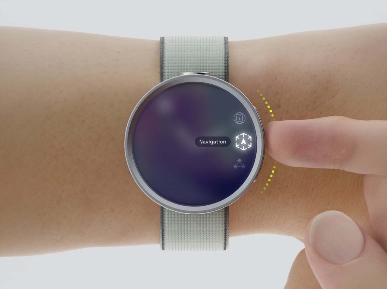
Sailors used to carry pocket telescopes. Birdwatchers still carry monoculars. Geologists carry hand lenses. What these instruments share, beyond the obvious optical function, is a deliberate relationship to information: you raise the tool when you choose to engage with it, and the world stays unmediated the rest of the time. That’s actually a pretty sophisticated UX philosophy, and it’s one the entire wearable tech industry has quietly abandoned in favor of always-on overlays, persistent notifications, and the assumption that more access to information is axiomatically better. Yuxuan Hua’s Lens concept is a Silver A’ Design Award winner that makes the counterargument in hardware form.

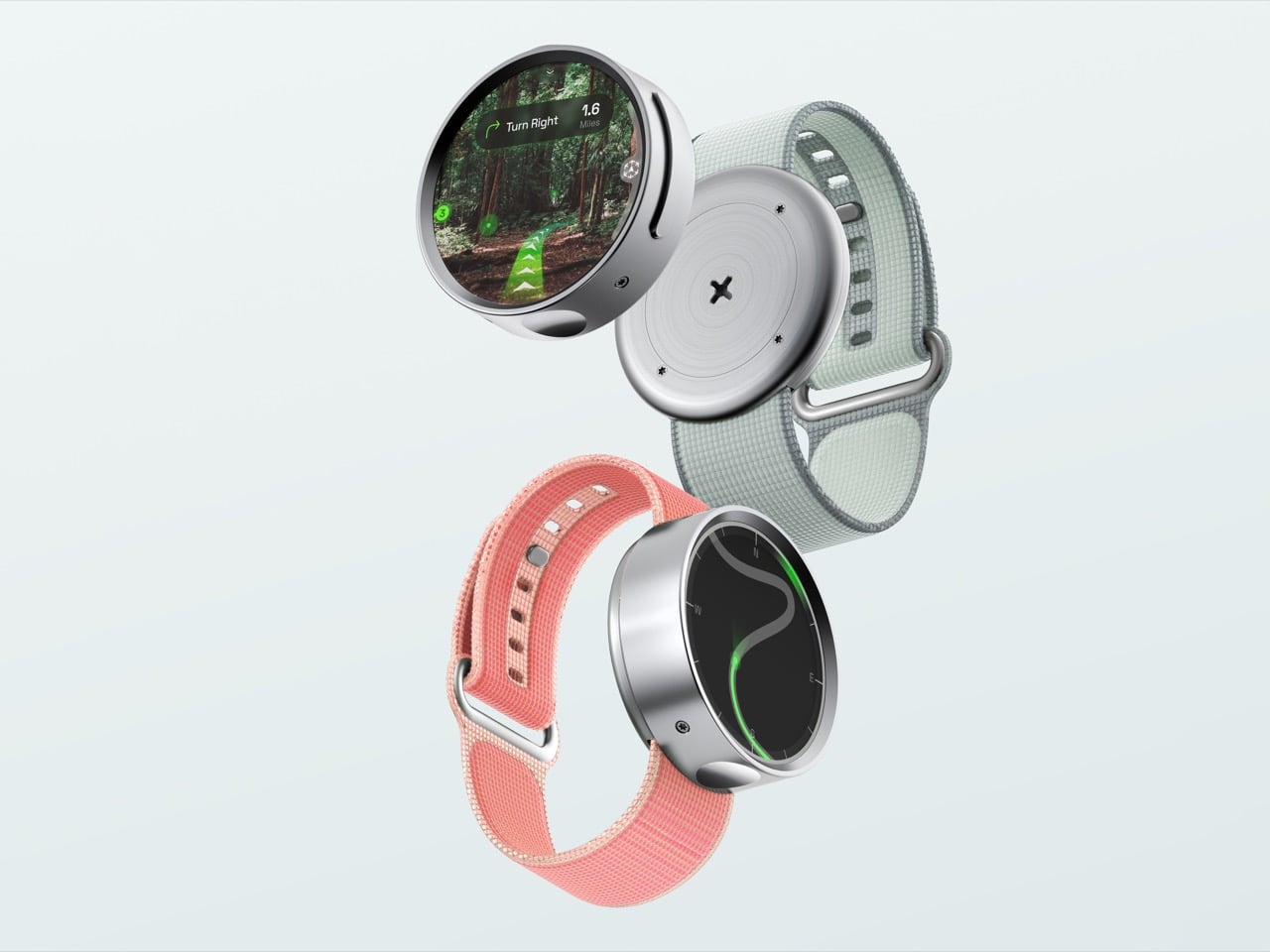
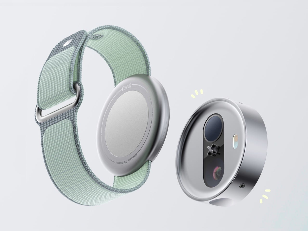
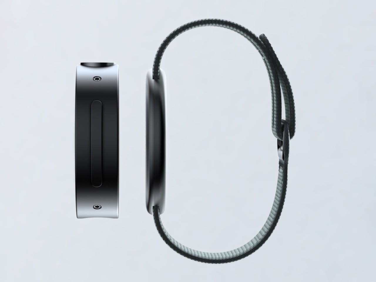
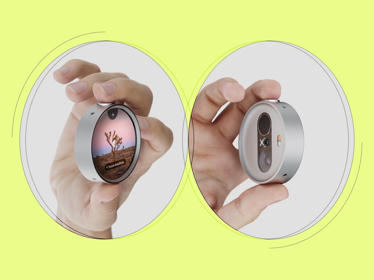
The concept is a detachable AR smartwatch that splits into two objects: a wrist-worn puck for everyday use and a handheld monocular for AR-enhanced outdoor exploration. The back face of the module houses a dual-lens optical array, a wide camera and LiDAR sensor tucked into a vertical pill recess, while the face doubles as a circular display that overlays navigation prompts, species identification, and star charts over a live feed when held up like a field scope. The band itself is Alpine-loop textile, the lug system simple enough to suggest the module can swap across band styles, and the whole thing comes in at 48mm wide and 68g. The rendering detail is strong: the detached module has the cold, machined look of a quality compass or a classic light meter, the kind of object that rewards handling.

Designer: Yuxuan Hua

Hua interviewed hikers, foragers, and stargazers and found three consistent frustrations: devices were too bulky and fragile for rugged environments, and frequent screen interactions broke the rhythm of being outside. The phone-as-field-guide pattern, pull it out, unlock, navigate to the app, wait for it to load, try to hold it steady while pointing at something, is a sequence of six interruptions where you actually wanted zero. Smart glasses solve the unlock problem but introduce the far more annoying problem of a permanent digital scrim between you and whatever you came outdoors to look at. The monocular is the thing you raise when you want to know something and lower when you don’t, which is precisely how attention works when you’re actually engaged with a landscape.

Most AR concept hardware reaches for science fiction: translucent surfaces, glowing elements, the visual grammar of a prop department. Lens reaches instead for the instrument drawer: the detached module has the proportions and material honesty of a quality compass housing or a Leica light meter, machined aluminum with visible fasteners and a lens array that looks like it belongs in an optician’s toolkit. It doesn’t look like the future. It looks like a very well-made tool, which is a significantly harder design target to hit.

Hua began developing Lens in 2021, during the pandemic, which is useful context. Lockdown-era design projects often reveal what designers actually miss about the physical world when it’s taken away, and what Lens mourns, obliquely, is uninterrupted attention. The whole concept is an argument that the best AR device for outdoor use is one that disappears when you’re not using it, one that earns its presence by staying out of the way until the moment it’s needed, then delivers exactly what the moment requires. Whether the engineering can catch up to that vision, packing AR projection, LiDAR, and a wide-FOV camera into a 68g coin of aluminum, is another question entirely. As a design proposition, it’s already done its job.

The post This Concept Smartwatch Detaches Into an AR Monocular, and It Solves a Problem Meta Can’t first appeared on Yanko Design.

Mac Neo Concept Imagines a Cheaper, A18 Pro-powered Apple Desktop Built for the OpenClaw Era

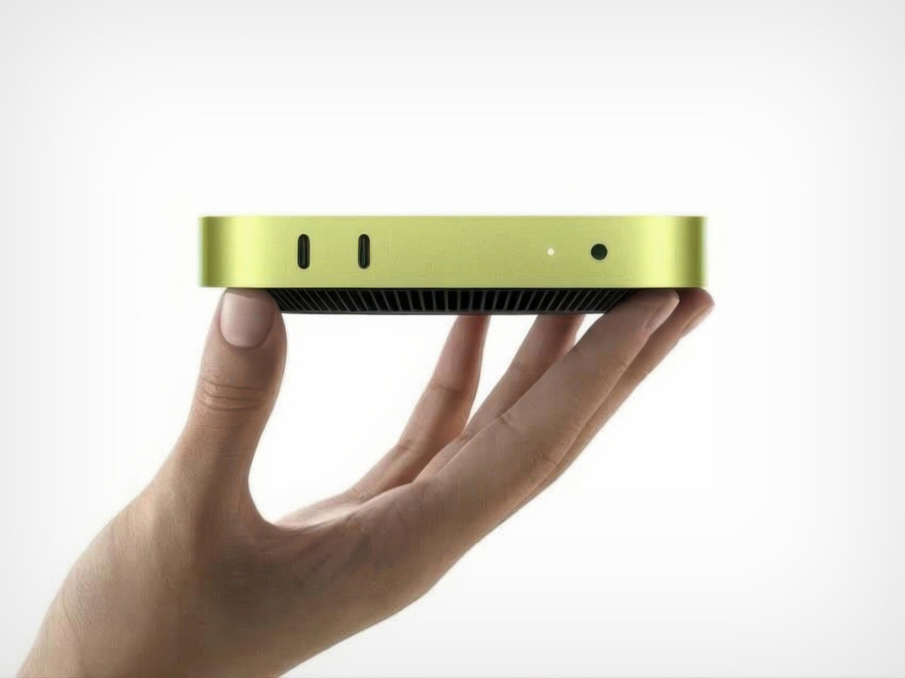
Apple’s MacBook Neo opened the door to a new kind of Mac, one that trades raw power for accessibility, color, and mass appeal. The A18 Pro chip powering it has already proven capable enough for a full laptop experience, which makes the logical next question an obvious one: what happens when that same formula moves to the desktop? The timing couldn’t be sharper. OpenClaw’s rise as a locally-run AI agent has sent Mac Mini demand into a frenzy, with high-memory units backordered for up to six weeks and stock selling out across multiple markets. People clearly want affordable Apple silicon desktops, and supply simply hasn’t caught up.

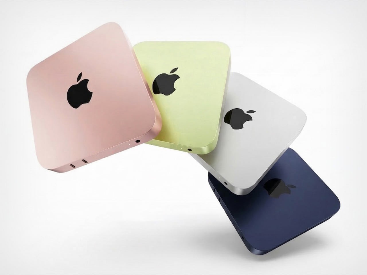
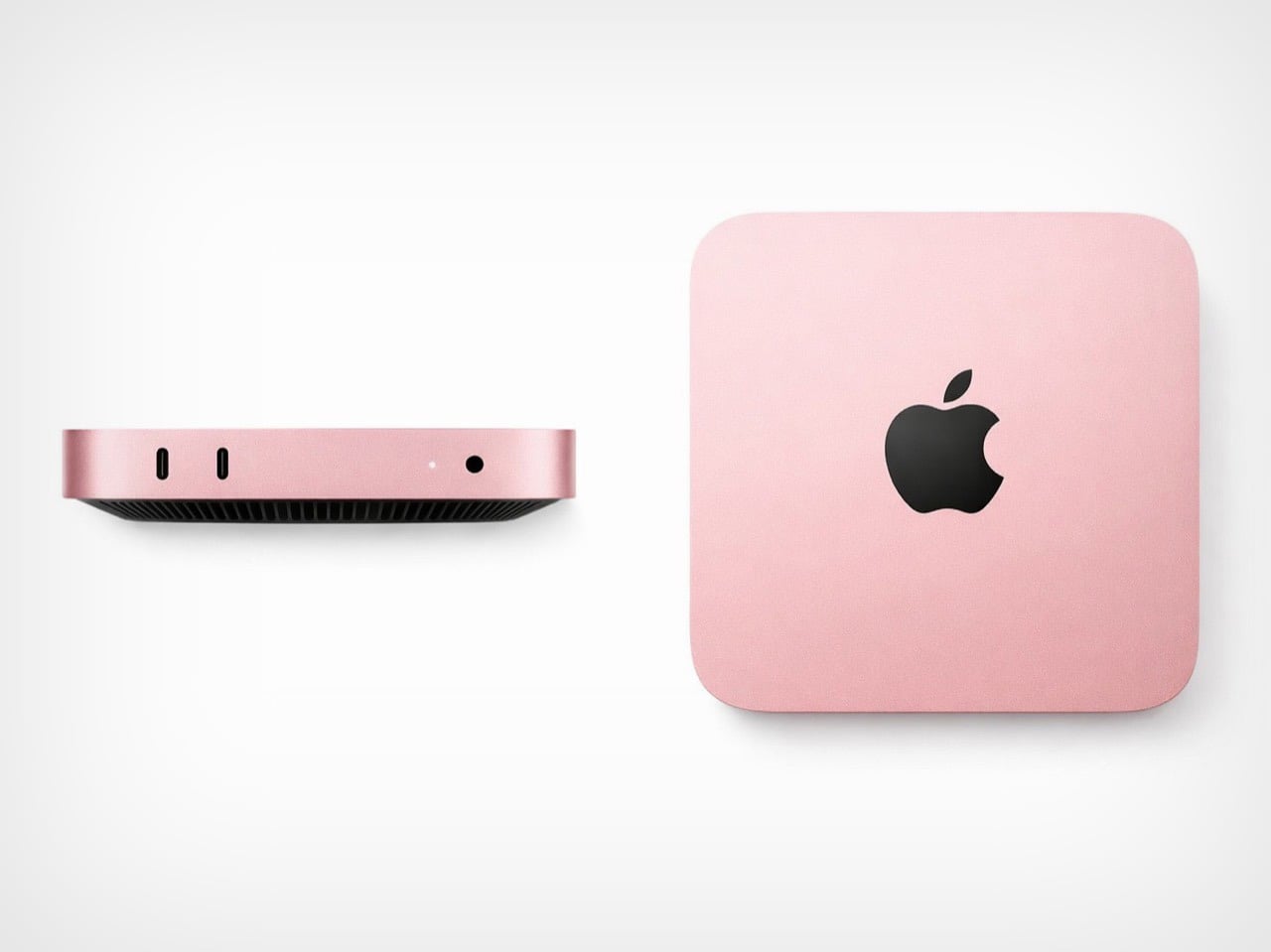
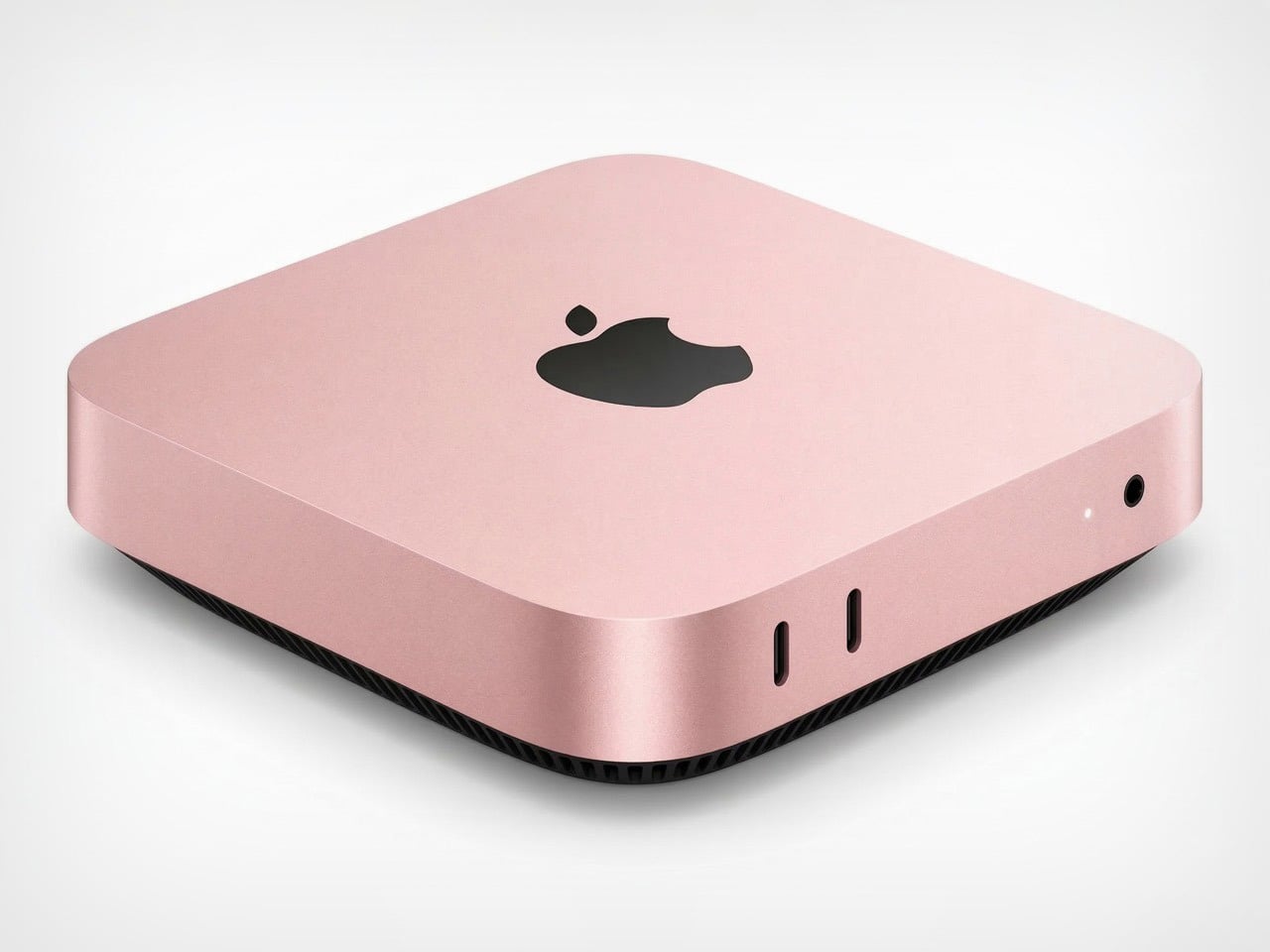
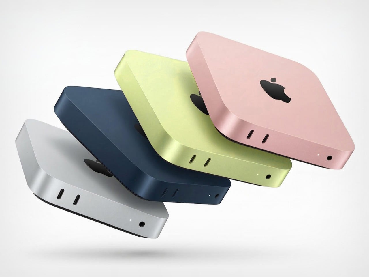
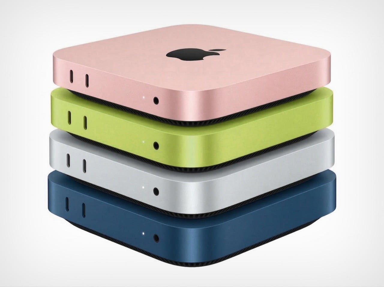
That gap is exactly where a Mac Neo would land. Sitting below the Mac Mini in price while carrying the same cheerful color identity as the MacBook Neo, it fills a slot in Apple’s lineup that currently doesn’t exist but arguably should. Students, first-time Mac buyers, and anyone running lightweight local AI workloads would have a natural home in the Mac Neo. Apple already has the MacBook Neo pulling switchers in from the laptop side, and a matching desktop completes the picture. It carries the MacBook Neo’s spirit forward into the living room, the dorm room, and the home office, completing a product family that right now feels one piece short.

Designer: Apple
Images Created Using AI

That Mac Mini silhouette in blush pink or citrus yellow feels like the iMac G3’s spiritual successor. The color makes it feel personal rather than utilitarian, which is exactly what Jobs and Ive were aiming for with the iMacs back in the pre-aluminium days. The color-matched aluminum shell mirrors the same four-finish palette as the MacBook Neo, which means Apple could market these as a set to schools and first-time buyers with minimal effort. What’s visually notable is the slim profile, noticeably thinner than the current Mac Mini, which tracks given the A18 Pro runs completely fanless in laptop form. A desktop chassis with even modest passive cooling could push that chip harder and longer than any laptop allows.

The A18 Pro ships with a 6-core CPU, 5-core GPU, and a 16-core Neural Engine on TSMC’s second-generation 3nm process. In the MacBook Neo, it runs completely fanless through photo editing, streaming, and light AI inference. Drop it into a desktop with a real power brick and passive cooling, and the chip gains the thermal headroom to sustain performance a laptop chassis simply cannot hold. Apple’s own benchmarks show the A18 Pro outperforming Intel Core Ultra 5 PCs in the same class, and a desktop form factor with better cooling only reinforces that. Configure it with 16GB of unified memory and you have something that runs local model inference comfortably and covers the full Apple Intelligence feature set.


Apple’s current Mac lineup has no desktop entry below $599, leaving the budget switcher market completely unaddressed. A Mac Neo at $399 puts macOS in the same price bracket as Chromebooks, which have dominated education for over a decade largely because Apple never showed up at that price with a desktop. The OpenClaw surge sharpens the argument: Mac Mini shortages stretching six weeks on high-memory units confirm massive pent-up demand for affordable Apple silicon desktops. These buyers want local AI on hardware they own, and the Mac Mini’s $599 floor prices many of them out. A Mac Neo with 16GB unified memory, Apple Intelligence support, and a $399 starting price addresses all of that and does it in a package that actually looks like it belongs on a desk.


The post Mac Neo Concept Imagines a Cheaper, A18 Pro-powered Apple Desktop Built for the OpenClaw Era first appeared on Yanko Design.

This $99 Water Jet Remotely Cleans Your Car’s Backup Camera Without You Leaving Your Seat

Reverse driving accounts for just 1% of all driving time, yet it’s responsible for roughly 25% of all accidents. A dirty backup camera in winter, mud season, or on dusty country roads is not a hypothetical inconvenience but a genuine safety liability, one that most drivers have resigned themselves to either living with or solving by stepping out of the car every time. Mike Klein, a Vermont-based tinkerer with a characteristically no-nonsense approach to annoying problems, got fed up enough to build a solution in his garage. What started as a Ziploc-bag-and-zip-tie prototype strapped to his license plate has turned into the Lens Lizard, a compact, self-contained, remote-controlled backup camera washer that just hit Kickstarter and has absolutely run away with its funding goal.

The concept is beautifully blunt. Lens Lizard mounts behind your license plate, sandwiched discreetly between the plate and the bumper using your car’s existing screw holes. No drilling, no wiring, no running tubing through door gaps or under trim panels. The whole install takes under five minutes with a standard screwdriver, and once it’s on, it’s invisible. The unit itself houses a fluid reservoir, a battery pack, and a high-pressure nozzle that you aim at your camera once during setup and then never have to touch again. When your backup camera gets caked in snow/ice or road salt on a grey January morning, or buried under a slush splatter from the truck overtaking you on a Vermont highway, you press a wireless remote button from inside the car and a jet of washer fluid blasts the lens clean. Sort of like a lizard or a chameleon striking its prey with a sharp, swift flick of its tongue. Except this time, it’s a concentrated jet of soapy water. Maybe a Pokémon reference would work better but I don’t want Nintendo’s lawyers sending me a cease and desist.

Designer: Mike Klein

Click Here to Buy Now: $99 $149.99 ($50.99 off) Hurry! Only 5 days left.

The engineering philosophy here is aggressively practical. Klein explicitly designed the Lens Lizard for Vermont winters, which means sub-zero temperatures, aggressive road salting, heavy snow, and the kind of freeze-thaw cycling that destroys lesser materials. The housing is sealed and built from automotive-grade materials, and the battery and fluid reservoir are sized to last four-plus months between refills and recharges, meaning you top everything up roughly once per season.

Maintenance is a non-event: open the latch, refill with washer fluid, charge via USB-C, close it back up. Klein’s origin story is worth noting too, because it gives the product a satisfying internal logic. He tried hydrophobic lens covers (they peeled), ceramic coatings (they did essentially nothing), and eventually decided to just build a scaled-down windshield washer system for his license plate. The first prototype was, by his own admission, ridiculous. But it worked, and that was enough to tell him the idea had legs.

Lens Lizard works with any vehicle where the backup camera sits above the license plate, which covers 99% of cars on the road, pickup trucks very much included. The product ships with assorted license plate screws to handle different fastener sizes, and the adjustable nozzle lets you dial in the spray angle for your specific camera position during initial setup. After that, the unit lives its entire life tucked behind the plate, completely out of sight. The wireless remote is puck-shaped and lives wherever you keep it in the cabin, a glove box, a cupholder, the center console.

The Lens Lizard starts at just $99 for the entire kit as an early bird discount off its $149 price tag. A dual bundle costs $189 if you’ve got two cars, and all bundles include the Lens Lizard unit, a wireless remote, a battery pack, and an assortment of screws to help you install the gizmo on your car. Given its specific design (and that every nation has a different license plate), the Lens Lizard only ships to the US and Canada for now, although I’m sure a more universal version is in the works. Production is slated to begin in April 2026, with shipping to backers planned for May. For drivers in cold-weather states, high-dust regions, or anywhere that sees serious road grime, it’s a hard value proposition to argue with. Certain premium vehicles have had integrated camera washers for years, quietly tucked into the bumper plumbing. Klein has simply figured out how to give everyone else the same result for under a hundred bucks, no dealer visit required.

Click Here to Buy Now: $99 $149.99 ($50.99 off) Hurry! Only 5 days left.

The post This $99 Water Jet Remotely Cleans Your Car’s Backup Camera Without You Leaving Your Seat first appeared on Yanko Design.
Ex-BlackBerry Designer Is Calling Out Everything That’s Wrong With Modern Phones

Design Mindset is Yanko Design’s weekly podcast, powered by KeyShot, the 3D rendering and visualization software that helps designers test how products feel, not just how they look. Hosted by Radhika Seth, the show goes deep into the philosophy and process behind world-class products, sitting down with the designers and founders who actually built them. Episode 19, premiering this week, is one of the most thought-provoking conversations the series has produced yet.

Joseph Hofer is the founder of Hofer Studio, where he consults with hardware entrepreneurs on building profitable, world-class product portfolios. Before that, he spent over a decade at BlackBerry as senior industrial designer, establishing the look and feel of the iconic Bold family and shaping devices like the Q10, Z10, and the BlackBerry Passport. His work spans over sixty design and utility patents, touching products that have sold over twenty-one million units and generated upward of $3.1 billion in revenue. More recently, he’s been the design force behind the Clicks Communicator, a physical-keyboard phone that launched at CES and challenges the smartphone status quo from the ground up.

Download your Free Trial of KeyShot Here

Designing Within Human Limits and Intentional Use

Joseph opens the conversation with something that sounds almost poetic but lands with the weight of a core design principle, saying that “most of the objects we use every day quietly train us. They teach us how to hold them, how long to focus, how patient we need to be. When design ignores human limits, it drains us. When design respects them, it almost feels like care.” He critiques what he calls “sticky” experiences, the kind that benefit companies at users’ expense, arguing that the real question designers should be asking is whether a product helps people become a better version of themselves, or whether the company simply wins after ten years of draining them.

His case against the modern smartphone is pointed. Everything phones have become reactionary devices, he says, describing the experience of opening one to send an email and somehow finding yourself fifteen minutes deep in a reel, asking yourself how you got there. Big tech, in his view, has deliberately shaped products to increase screen time and sell more through ads. His philosophy runs in the opposite direction: good design should prompt intention before action, not exploit the absence of it.

Integration as Core Design Principle

One of the more revealing details Joseph shares early on is that at BlackBerry, the design team’s official title wasn’t “Industrial Design.” It was Design Integration. That framing stayed with him. “Integration is probably the word, the action that I look to do well in every project I work on,” he says, adding that a product can be really strong in one area but fall flat in others if you’re only focused on a single dimension. Great design, strong UX, and poor profit economics don’t add up to a sustainable company. Economics, manufacturing, cost, and complexity all have to be part of the thinking from the start.

His advice to technical founders reflects the same logic. Many of them start with a breakthrough innovation and then go looking for a market to push it into, which he sees as working in the wrong direction. The better path is to step back, clearly analyze the problem bubbling up from the market, shape an experience that solves it, and then let the technology marry with that. Letting one run too far ahead of the other is how good innovations end up as products nobody uses.

The Clicks Communicator: Intentional Mobile Interaction

The Clicks Communicator is the most direct physical expression of Hofer’s philosophy. It was the first phone he designed in ten years after BlackBerry, and the central idea is a complete inversion of how smartphones currently work. Rather than an app grid that presents notifications and pulls users in reactively, the Communicator prompts users to decide what they want to do first, then acts on it. Physical keys map to intentional shortcuts: pressing K calls a specific contact, pressing I opens Instagram only when the user has consciously chosen to. “It flips it from being reactionary to intentional,” Joseph says simply.

He’s also clear that the product’s appeal isn’t nostalgia. A lot of the customers aren’t even BlackBerry users, he notes; they’re younger people who simply want a different relationship with their mobile device. The Communicator sits within what he sees as a broader 2025 trend of “intentional tech,” products designed to decouple from the everything-phone model and serve one specific purpose well. Adding a 3.5mm headphone jack and a removable SD card wasn’t feature-stacking for its own sake either; those choices are signals to a specific audience that the team is listening and cares about them.

Recognizing Quiet Ideas and Process Discipline

When Radhika points out that the BlackBerry keyboard now feels like it was always inevitable, Hofer pushes back immediately. “Sometimes these quiet ideas that feel obvious or become obvious actually took a lot of effort and iteration to get there,” he says, describing the motto his team lived by: think, build, test. The keyboard’s evolution wasn’t a single stroke of insight; it was a response to real constraints. As iPhones pushed screens larger, BlackBerry faced intense pressure to shrink keypads, which meant switching from oval keys to square ones, losing the tactile separation users relied on. The innovation was subtle: raising a curved edge on each square key to preserve the feeling of the oval, essentially hiding a reference to the old shape inside the new form. Speed tests, accuracy tests, user sentiment on different options, all of that grinding iteration is what produced something that feels natural.

He applies the same thinking to simplicity broadly. Designing for a ten-year-old, he argues, is one of the most useful principles any designer or founder can adopt. If you can’t explain the product to a ten-year-old, it’s too complicated. He tested this literally the night before the recording, sitting down with his eight-year-old daughter to ask about her CD player. Her answer was that it had way too many buttons. Her ideal? Three: power, volume up, volume down. Six identical-feeling buttons with in-mold graphics that disappear in the dark told a clear story about what the designers had gotten wrong.

Restraint as Confidence and Commercial Strategy

The tension between restraint and visibility is something Hofer takes seriously. He doesn’t frame minimalism as a virtue in itself. “Clarity is actually an even stronger word,” he says, arguing that a vanilla product solving a vanilla problem will simply go unnoticed. The goal isn’t to be quiet; it’s to solve a real, specific problem so well that the product becomes the only answer for a particular group of people. A phrase he came up with captures where he’s trying to take the companies he works with: from viral products to vital ones, products that customers genuinely need in their lives because of the difference they’ve made.

That philosophy maps directly onto commercial outcomes. A product that meets the emotional and functional needs of a user, reduces cognitive load, lasts longer, and has lower return rates naturally builds a brand that draws people in without needing to be aggressively sold. “When products are just better,” he notes, “they need to be marketed and sold maybe less. That’s an effect on your bottom line.” His work at Hofer Studio is less about crafting beautiful objects and more about asking founders what commercial success actually means to them and building backwards from that.

When the rapid-fire round asks him to describe restraint in design in a single word, his answer arrives without hesitation: confidence. “What does obviousness create? It creates confidence. I know how to enter this experience. I know how to start this product. I feel more confident with it in my life.” It’s a fitting close to a conversation that consistently returned to the same idea: that the design decisions nobody notices are usually the ones that took the most care to make.


Design Mindset drops every week on Yanko Design. Catch Episode 19 in full wherever you listen to podcasts. For a free trial of KeyShot, visit keyshot.com/mindset.

Download your Free Trial of KeyShot Here

The post Ex-BlackBerry Designer Is Calling Out Everything That’s Wrong With Modern Phones first appeared on Yanko Design.

Rivian Just Launched Its Own Version of BMW M, and It’s Called RAD (Rivian Adventure Department)

Meet RAD, short for Rivian Adventure Department, which is either a very clever name or a very brave one. In practical terms, it is Rivian’s newly formalized performance and development group. The team takes its trucks and SUVs into demanding events, learns what breaks, what grips, what flies, and channels those lessons into future products and features. It has been operating inside Rivian for years without a formal name. Think of it as Rivian’s version of BMW M or Toyota GR, except its proving ground is desert rallies and frozen lakes rather than the Nurburgring.

Rivian unveiled RAD at the 2026 FAT Ice Race in Big Sky, Montana, which feels like the correct setting for a division built around speed, control, and chaos management. FAT stands for Fahren auf Eis, German for “driving on ice,” and the event mixes vintage cars, modern performance machines, and now, 1,025-horsepower electric SUVs. The quad-motor R1S came in second on RAD’s debut, a solid first result. The bigger story is what RAD signals about where Rivian is heading. The company had the adventure image locked down already, and it now wants a firm grip on performance too, seemingly content to make that argument sideways on ice.

Designer: Rivian

RAD’s first deliverable for actual owners is the RAD Tuner, and it is more substantive than a typical software feature drop. It gives quad-motor R1S and R1T owners on Gen 2 hardware touch sliders to build custom drive modes across more than 10 powertrain and suspension variables, including power output, torque bias, stability control intervention, and brake regeneration. Two presets come built in: Desert Rally, developed from Rebelle Rally data, and Hill Climb, shaped by Pikes Peak runs. Both modes came from a team driving a 1,025-horsepower EV through punishing terrain and noting what actually worked. That feedback loop between competition and production software is what separates a real performance division from a badge on a brochure.

Speculation around RAD-badged production models is already building, and Rivian is doing nothing to quiet it. The R2, Rivian’s more compact SUV arriving in the second half of 2026, showed up at the FAT Ice Race dressed in full RAD livery, which is not a styling accident. The Drive has laid out the theory that quad-motor R1 models get rebranded R1 RAD, with a tri-motor R2 in the R2 RAD slot. When Rivian’s spokesperson was asked about the conspicuously missing R2 tri-motor from the launch lineup, the reply was “so much more to come” with an actual winking emoji. If RAD graduates to a production badge, Rivian enters the same conversation as the Ford Raptor, the Ram TRX, and every performance sub-brand that has figured out how to charge a premium for pushing factory hardware past its polite defaults.

The EV industry has spent years anchored to range figures and charging infrastructure debates, both necessary conversations, but ones that leave genuine enthusiasm largely unaddressed. Rivian is making the argument loudly that electric trucks can be athletic, competition-tested, and interesting to the crowd that wakes up on a Saturday morning wanting to do something dumb and fast. The RAD Tuner is a modest first chapter, but the direction is unambiguous. Performance divisions grounded in real competition data take years to build and are hard to fake from scratch. Rivian has that foundation in place.

The post Rivian Just Launched Its Own Version of BMW M, and It’s Called RAD (Rivian Adventure Department) first appeared on Yanko Design.