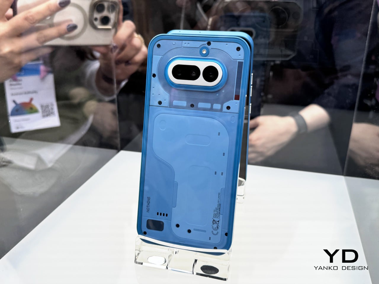
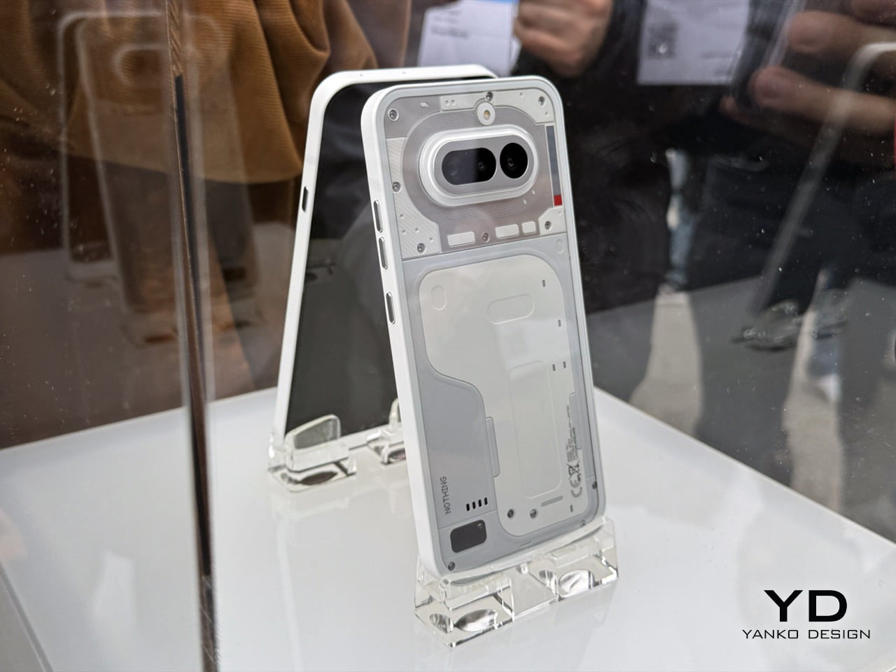
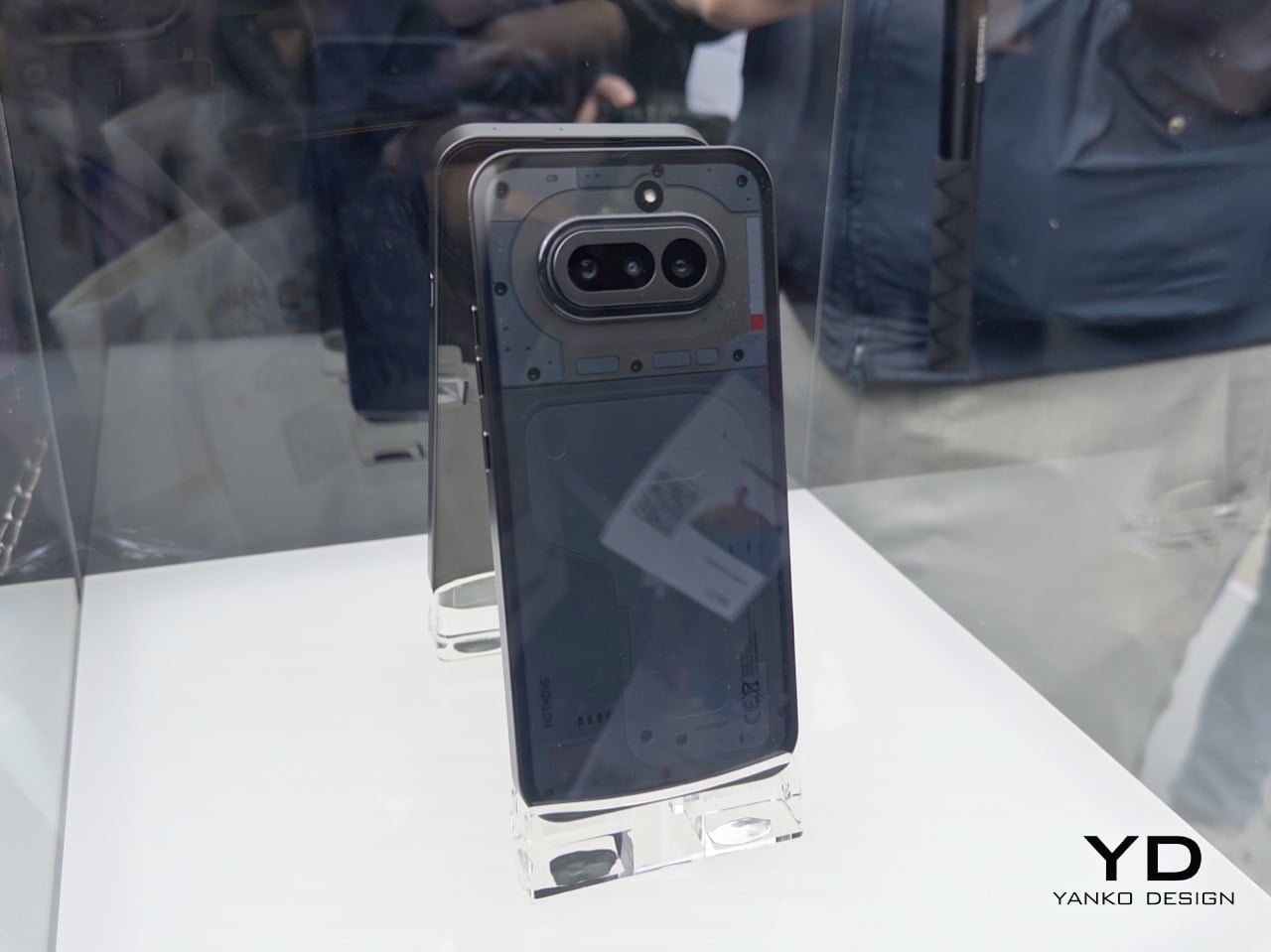
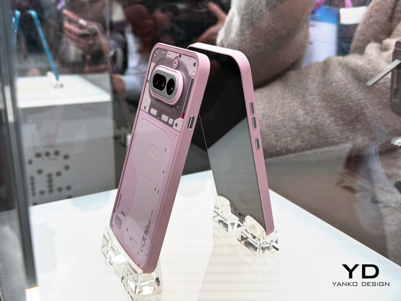
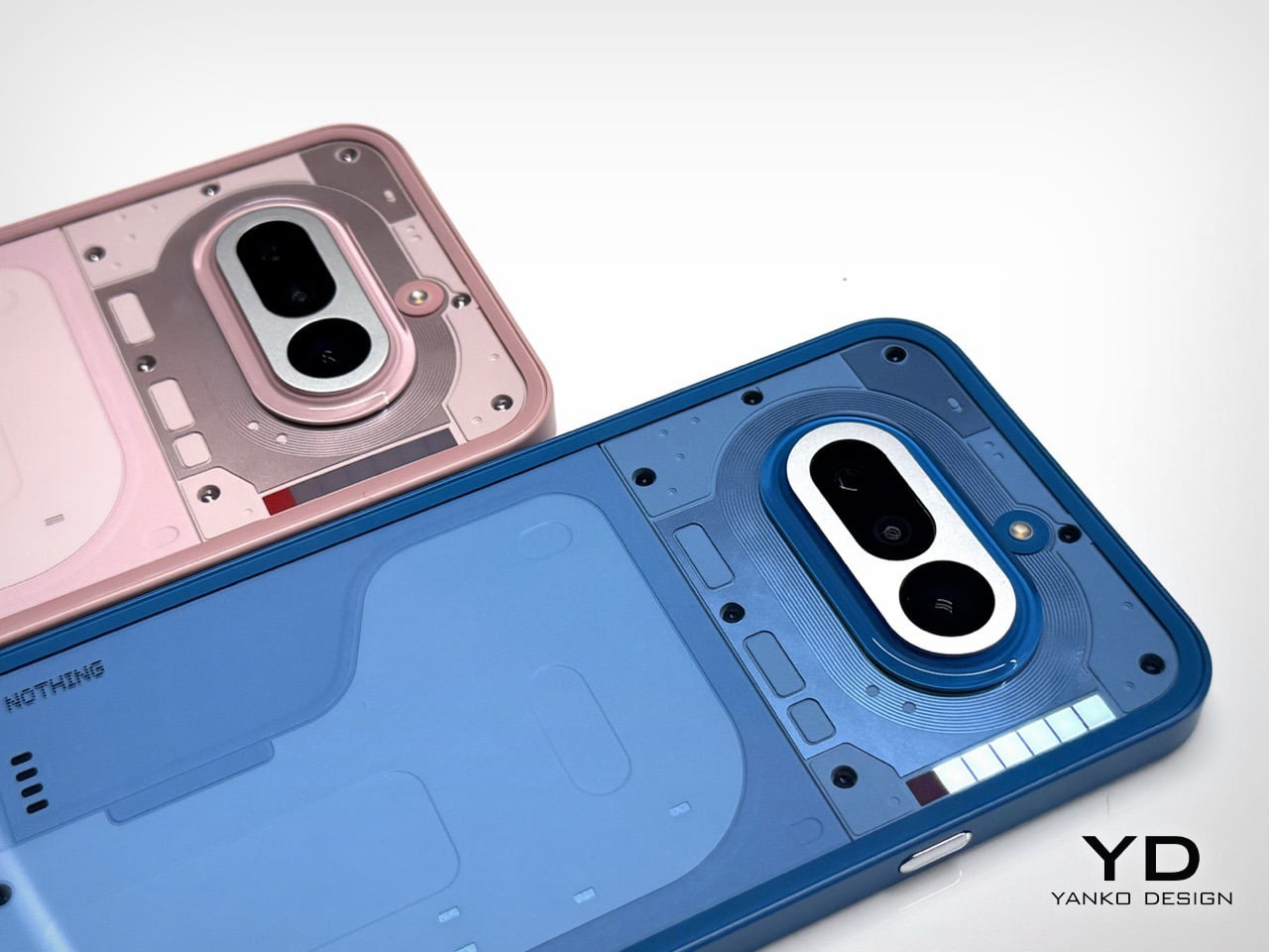
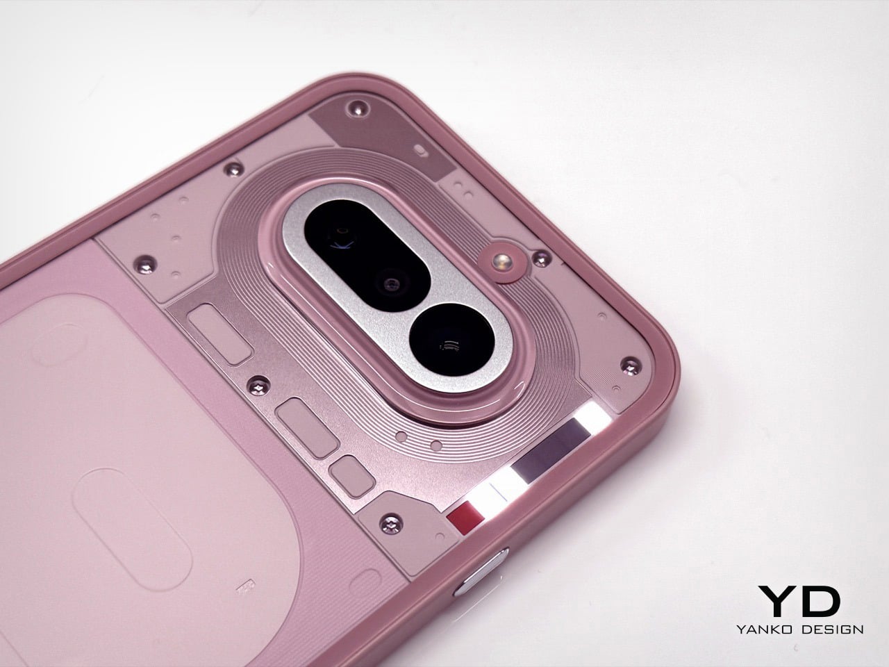
Nothing Phone 4a Pro: Metal Build, Glyph Matrix, and a Price That Actually Makes Sense


The ink on Barcelona was barely dry when Nothing pulled everyone back to London. The Phone (4a) had its big MWC moment just days ago, where journalists and the public got their hands on it, took the obligatory photos, and filed their takes. And then Nothing said: actually, we have another one. The Phone (4a) Pro launched today at Central Saint Martins, the world-famous College of Art and Fashion in London’s Kings Cross, a deliberately art-coded venue for a brand that has always treated its phones as objects as much as devices. This is how Nothing operates in 2026, staggered drops fired in rapid succession to keep the conversation alive, and the strategy is working.

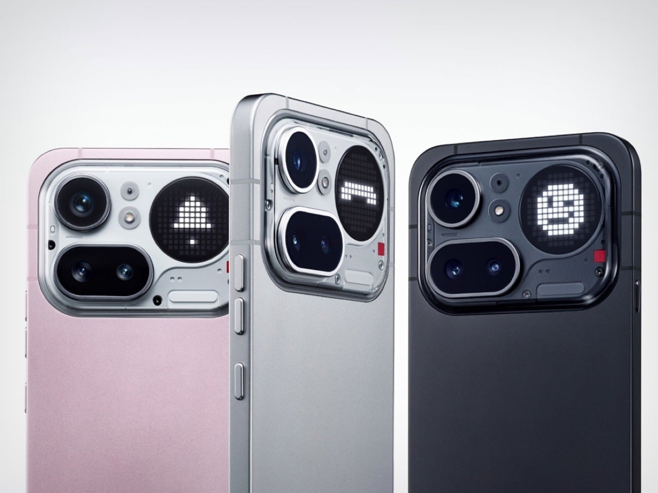
The reason the Pro matters so much this year comes down to a decision Carl Pei made at the start of 2026: Nothing will not launch a flagship phone this year. That puts the Phone (4a) Pro in the role the Phone (3) would have occupied, as the design halo, the statement piece, the device that earns a second look across a dinner table. And so the Glyph Matrix returns. When we covered the Phone (3), the Matrix was the headline, a circular LED array in the top-right corner of the rear panel that could display pixel-style animations, timer readouts, caller signatures, and even a spin-the-bottle mini-game. It was the kind of feature that made you rethink what a phone’s back panel could do. The (4a) Pro’s version runs 137 LEDs against the Phone (3)’s 489. On paper that sounds like a step back. In practice, the circle is 57% larger and the LEDs are twice as bright at 3,000 nits, making for a more visible, punchy display even if the pixel resolution is reduced. The tradeoff is real but not as simple as the numbers suggest.

Designer: Nothing
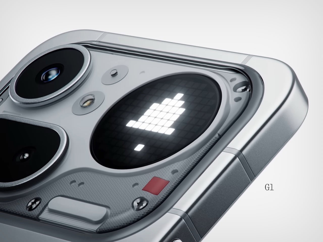
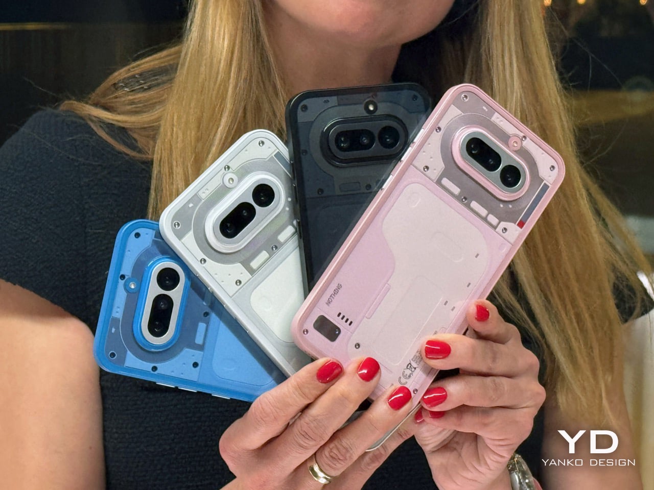
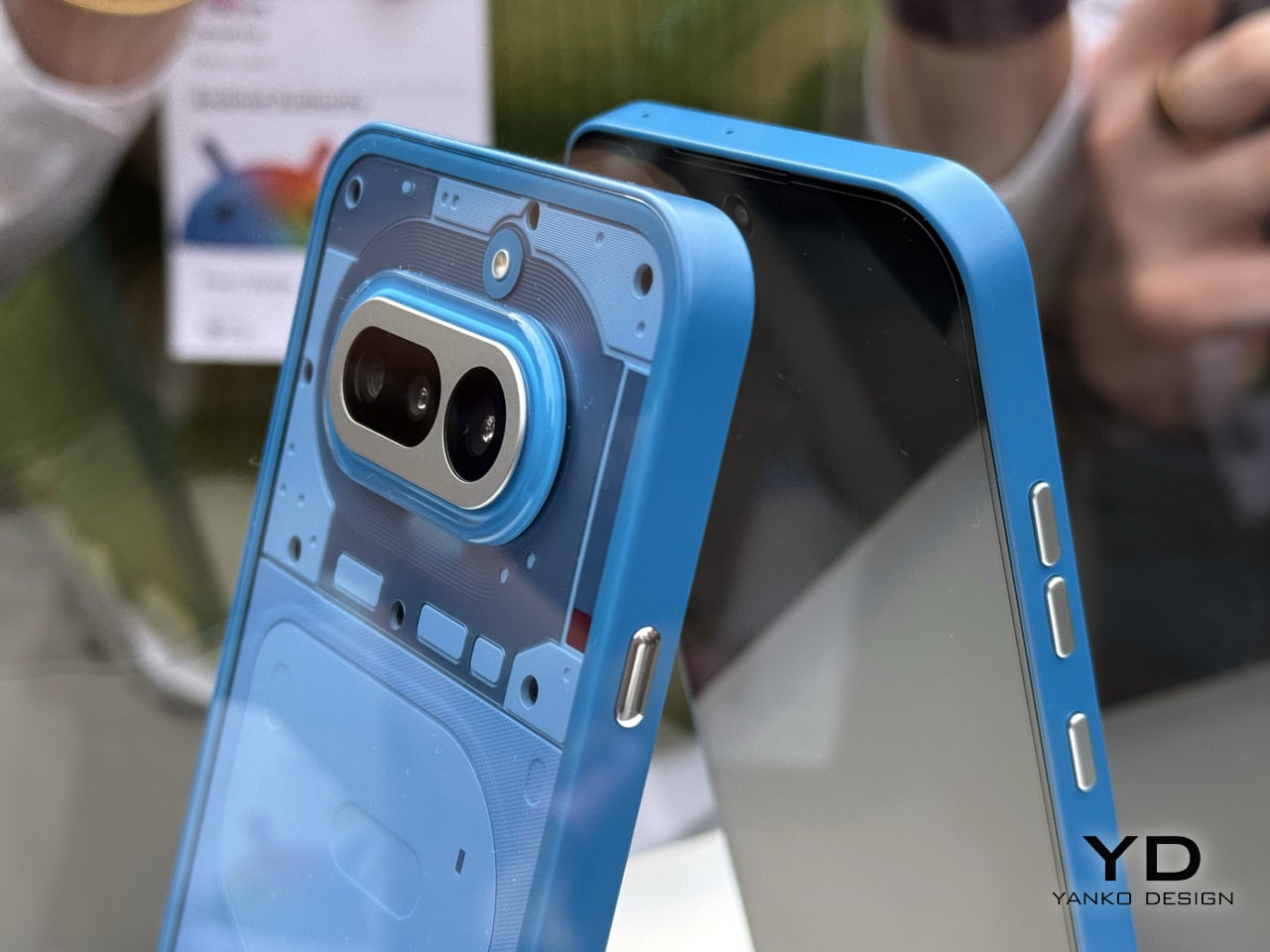
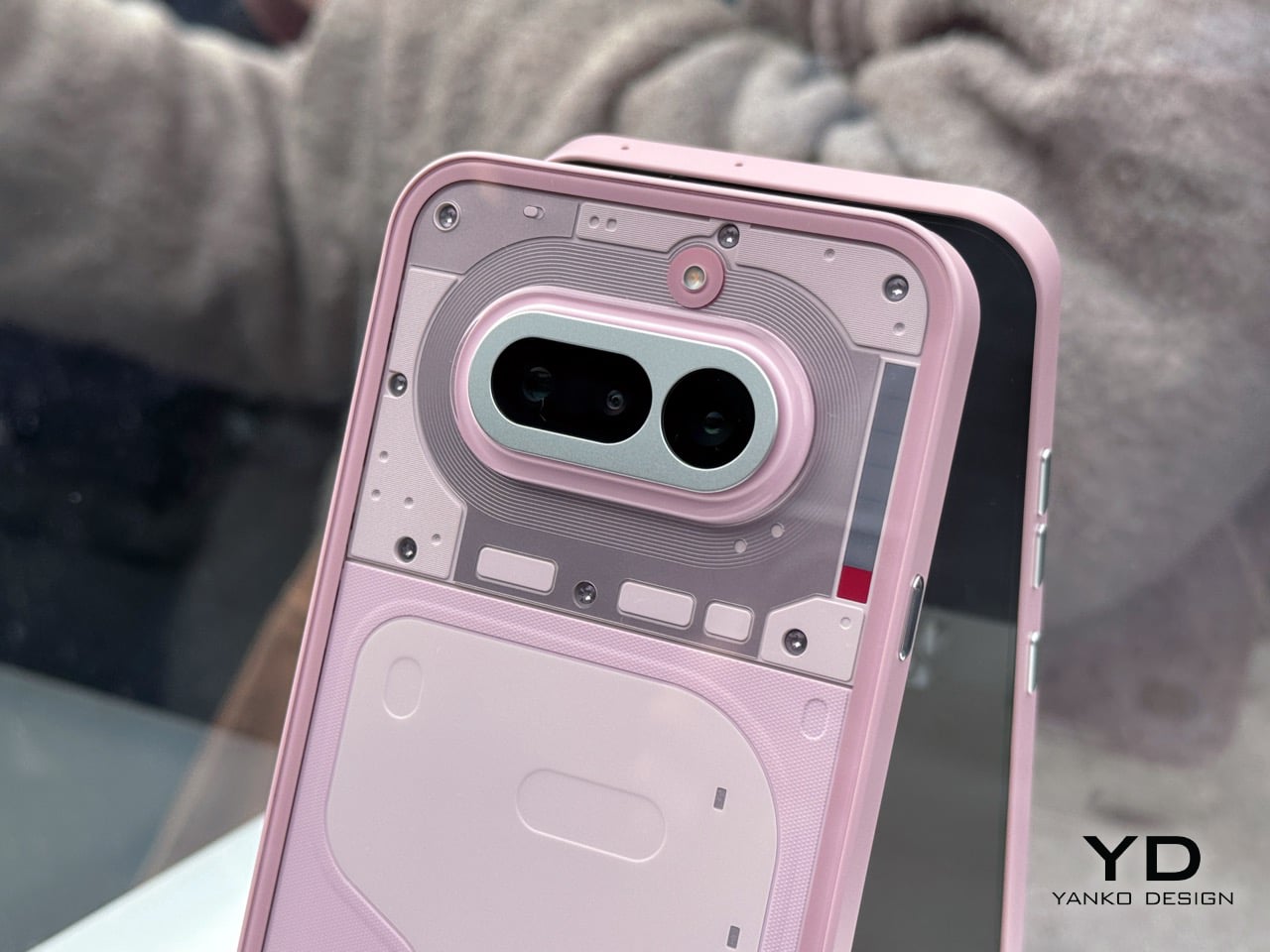
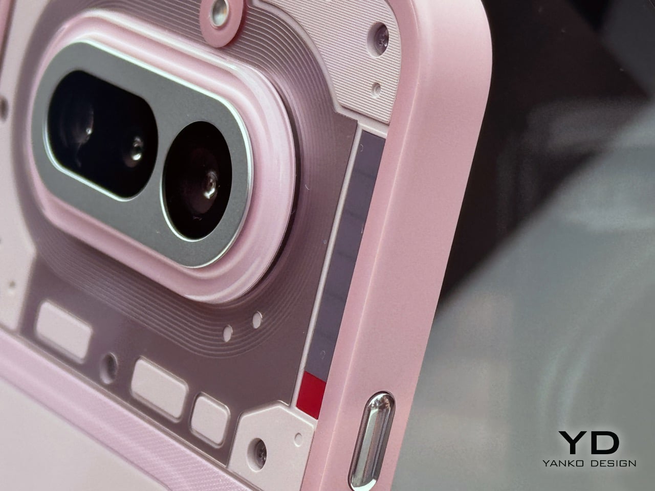
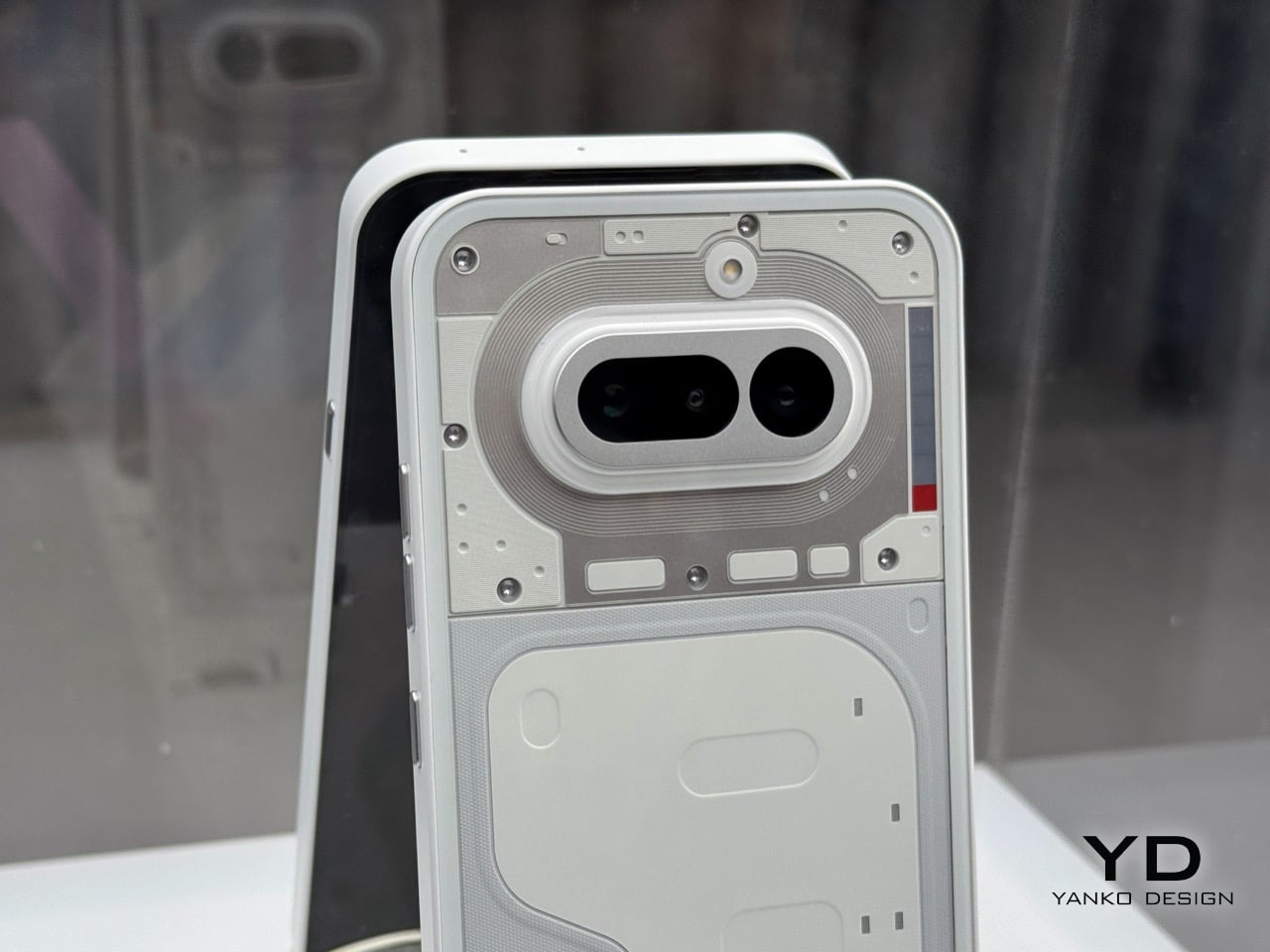
Compare the (4a) Pro’s rear panel to the (3a) Pro’s and you feel the difference before you can articulate it. We wrote about the (3a) Pro’s camera arrangement at the time, and the word we used was chaos: lenses placed asymmetrically, Glyph LEDs ringing a circular module like someone got excited and kept adding things. The (3a) Pro took cameras arranged asymmetrically with Glyph LEDs around the circular camera module. The (4a) Pro looks like that design went away, thought about what it was doing, and came back with some self-control. The cameras and Glyph system now sit inside a raised transparent plateau, three lenses in a proportional, structured arrangement with the Matrix at the top-left and the red recording indicator tucked below it. Nothing is pushing back on the plateau comparison, but the composure of the layout is undeniable. This is what a camera array looks like when the brief is restraint rather than personality, and it turns out restraint suits Nothing rather well.
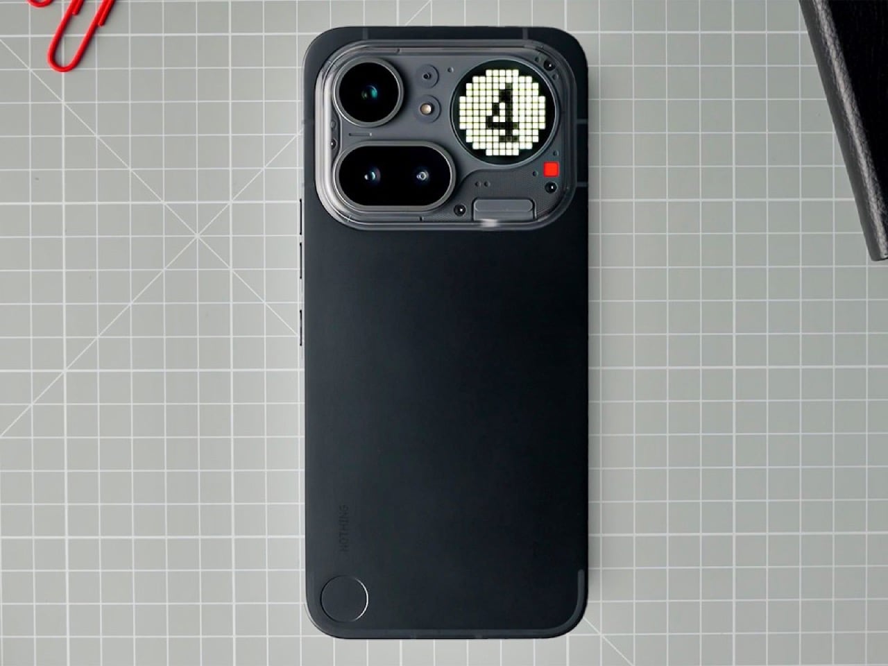
That same shift in attitude shows up in the build. The (4a) Pro drops the plastic frame and goes metal unibody at 7.95mm, which is directly relevant to something we flagged in our (4a) coverage: the blue colorway looked cheap against a plastic frame, the color promising something the material could not back up. That tension is gone on the Pro. A metal chassis earns the Silver colorway, gives the Pink something to push against, and makes the whole thing feel like a considered object rather than an aspirational one. The IP65 rating arrives alongside it, with a non-standard but still real claim of 25cm submersion for 20 minutes. The chipset steps up properly too: the Snapdragon 7 Gen 4 brings a 27% CPU uplift, 30% better GPU performance, and a 65% jump in AI processing over the 7s Gen 3 that powered the (3a) Pro. The standard (4a) gets the 7s Gen 4, technically a newer chip but only a 7% performance improvement over the outgoing model. The meaningful generational gains live in the Pro.
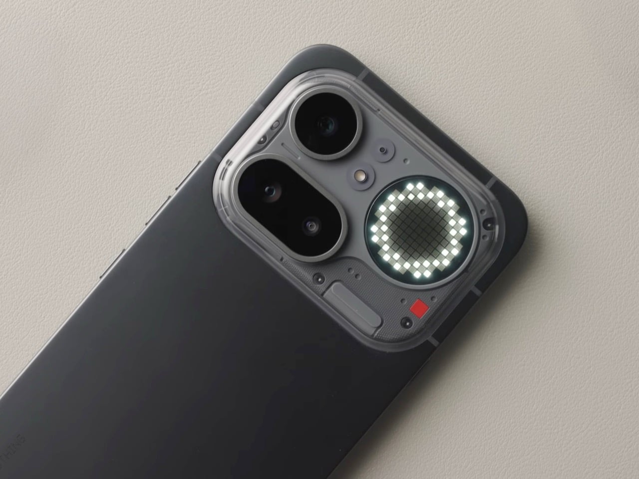
On the camera side, the Pro runs Sony’s Lytia 700C, a 50MP 1/1.56-inch main sensor with OIS, alongside a periscope telephoto using a Samsung JN5 50MP sensor at 3.5x optical zoom, extendable to 7x with in-sensor cropping. The system supports 4K Ultra XDR recording, comparable to Dolby Vision, with up to 140x hybrid zoom. The display is a 6.83-inch AMOLED at 144Hz, 1.5K resolution. The Pro comes in Black, Silver, and Pink, while the (4a) ships in Black, Blue, Pink, and White. Both run Nothing OS 4.1 on Android 16, with three OS updates and six years of security patches committed.
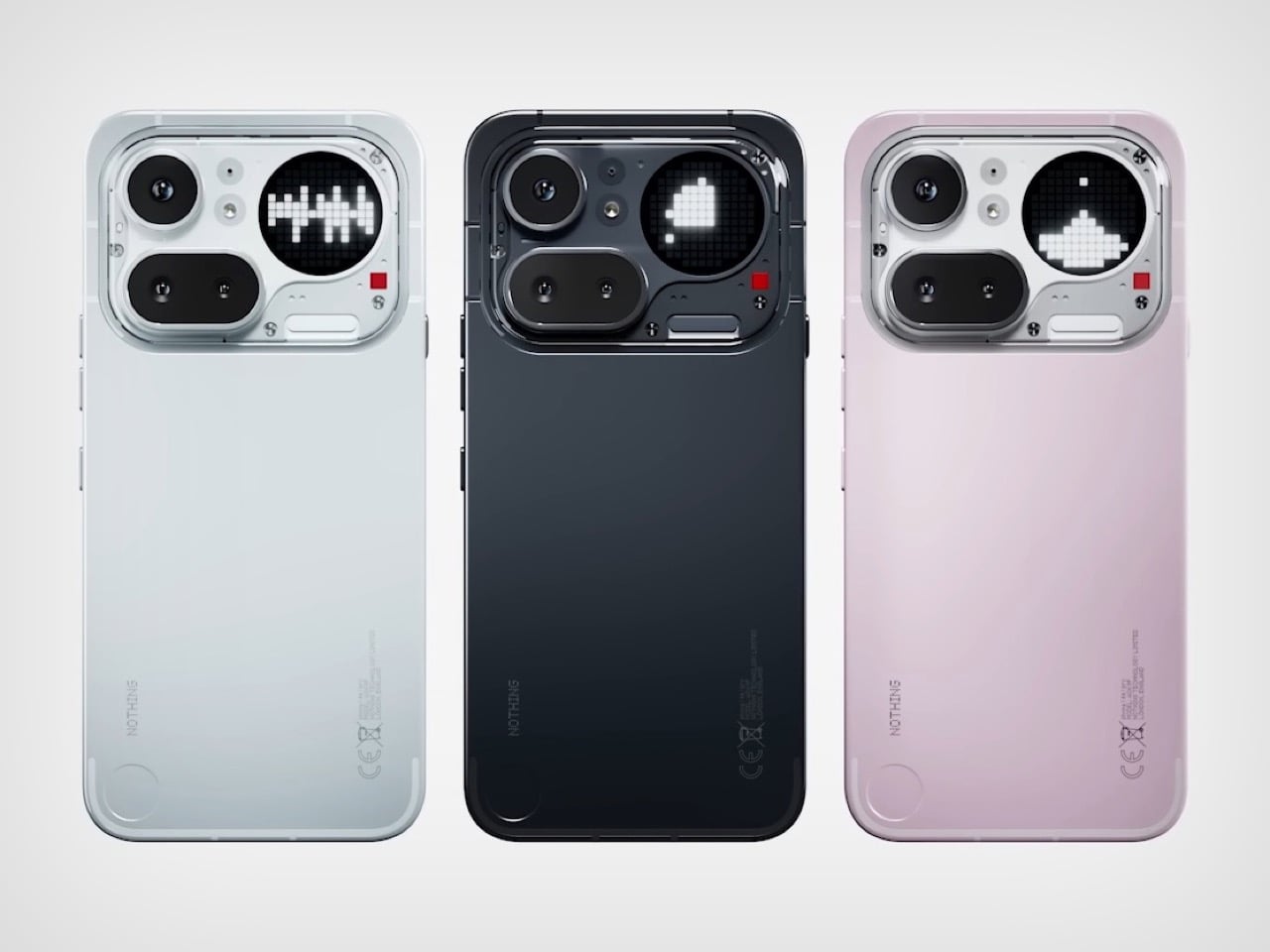
Pre-orders for the (4a) open today with sales from March 13, while the (4a) Pro takes pre-orders from March 13 with open sales on March 27. UK pricing is £349 and £499 respectively. Holding the launch at Central Saint Martins was not a neutral decision: it is one of the most culturally loaded art schools on the planet, and Nothing knows exactly what it is saying by being there. Two phones, one week, one city. Nothing is playing the long game with a short runway.

The post Nothing Phone 4a Pro: Metal Build, Glyph Matrix, and a Price That Actually Makes Sense first appeared on Yanko Design.
I Ran Android On A MacBook And Even Airdropped Files To iPhone at MWC 2026… And You Can Too

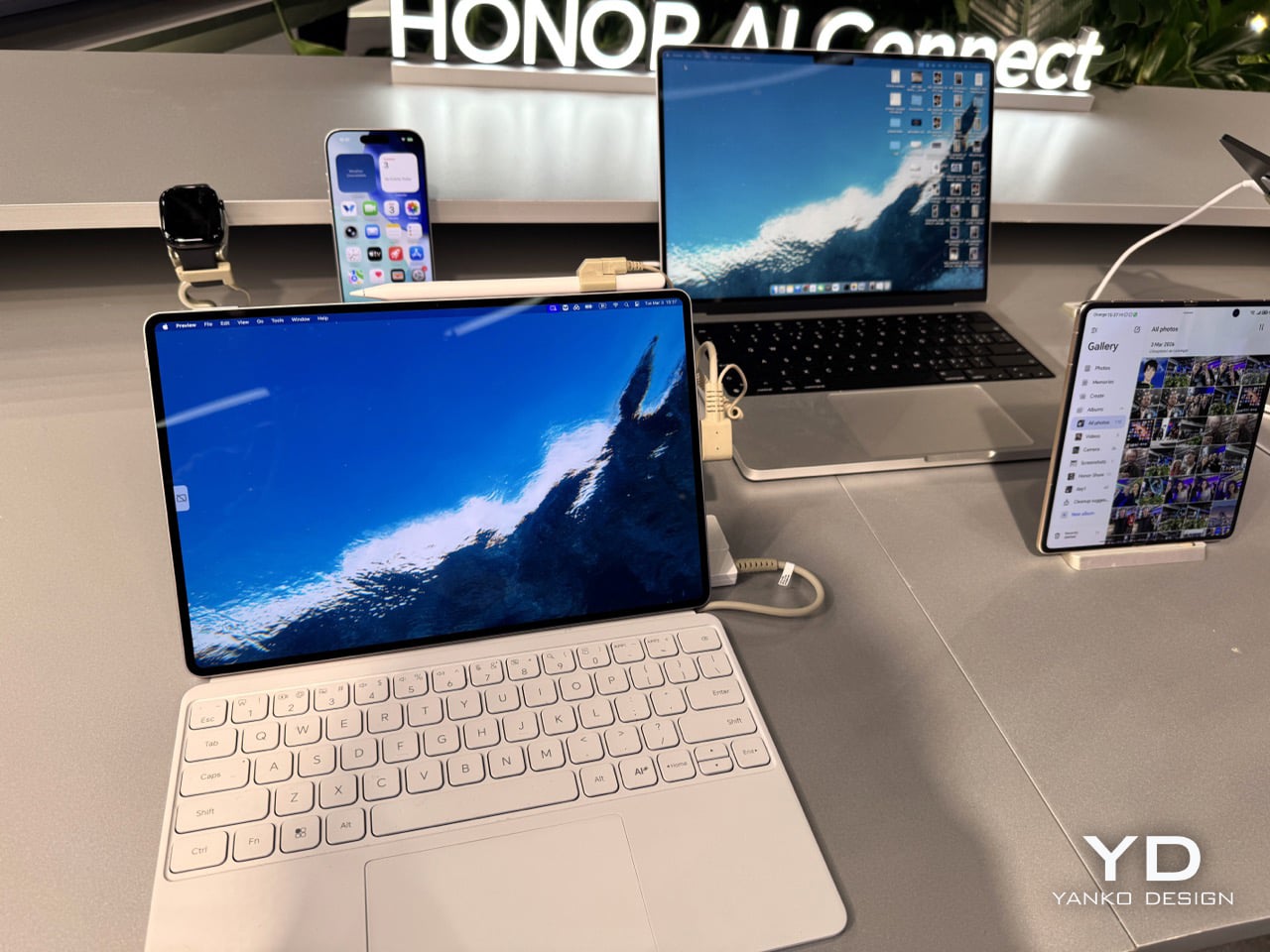
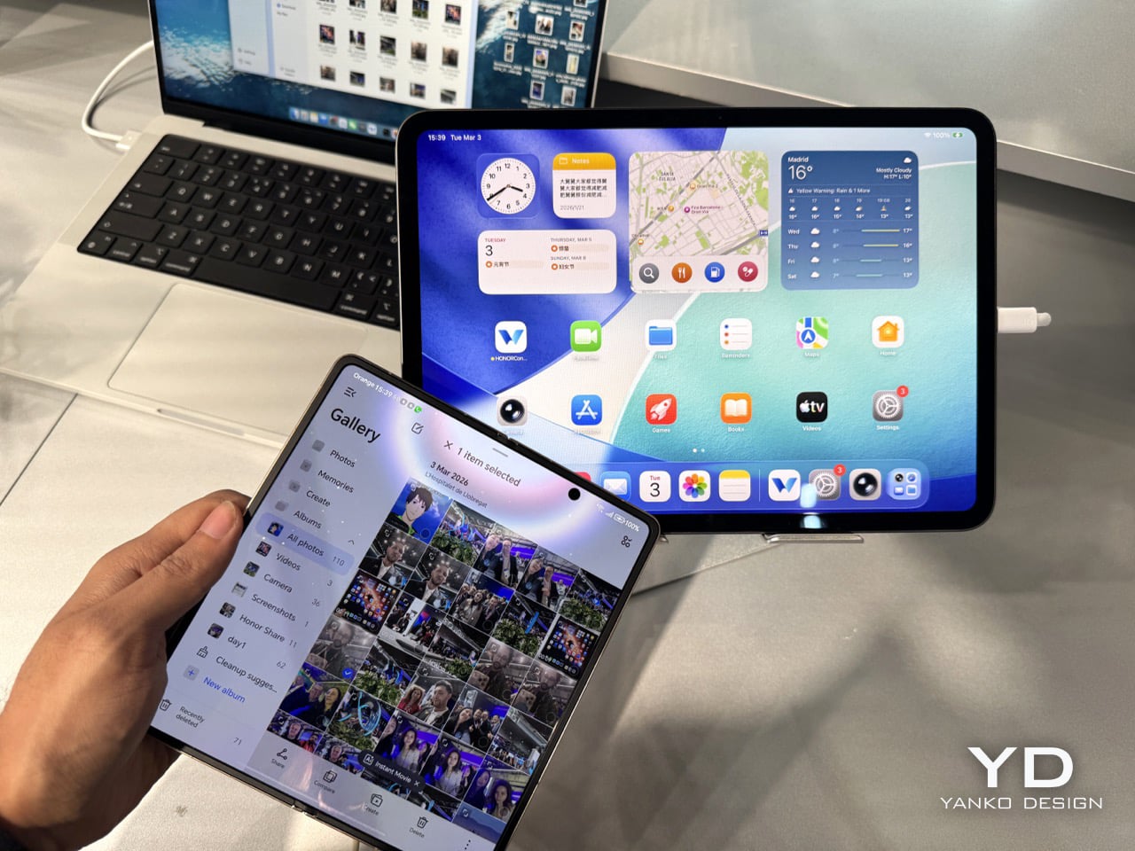
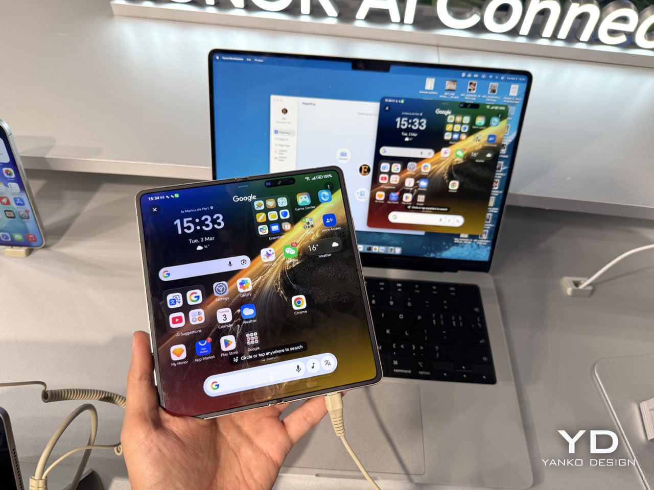
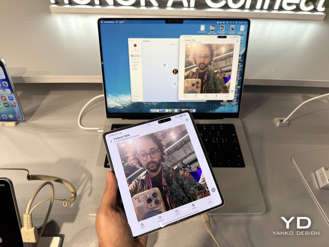
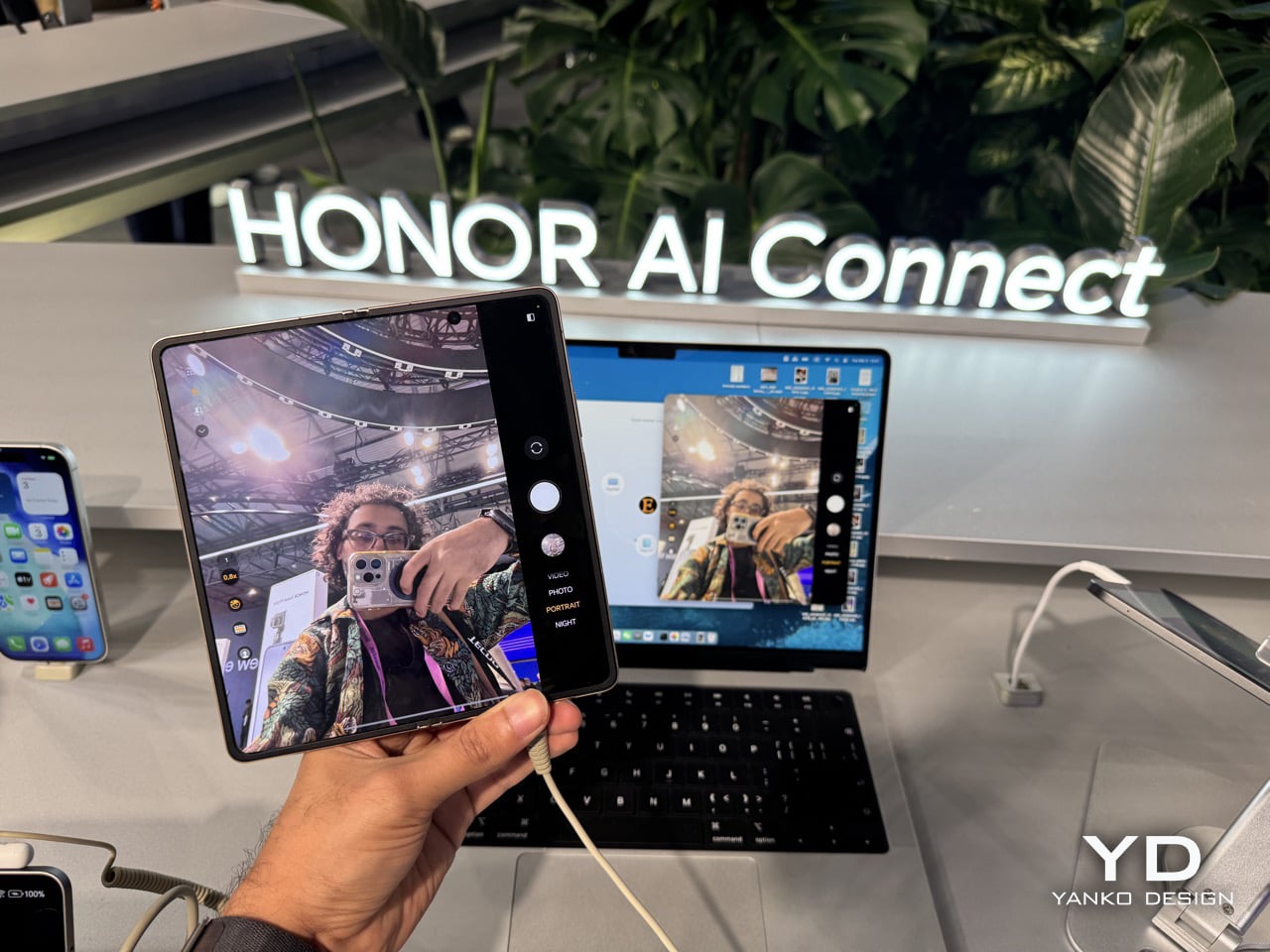
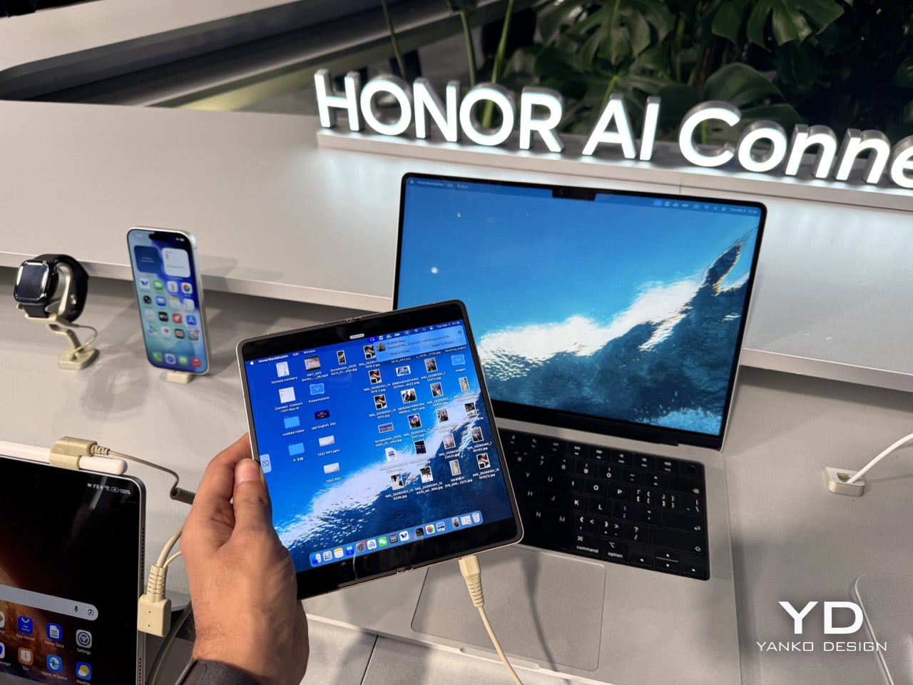
Mirroring a MacBook screen onto an Android phone is not something you expect to work, let alone work fluidly with smooth animations. At HONOR’s MWC 2026 booth, it did exactly that, and then went further by letting you mirror the Magic V6’s display back onto the MacBook, turning the interaction into a genuine two-way street. Tap your HONOR device near an iPhone and files transfer between them, photos, videos, documents, the whole lot, with the kind of animated polish you associate with Apple’s own AirDrop. The same trick works with iPads. HONOR calls the system HONOR Share, and the cross-platform angle is just one layer of a much deeper ecosystem play the company quietly walked in and demonstrated on final, shipping hardware at one of the world’s biggest tech shows.

This cross-platform handshake is part of a broader upgrade to HONOR Share, and it extends well beyond just sending a photo to your friend’s iPhone. The company is positioning its new flagship trio, the Magic V6, MagicPad 4, and MagicBook Pro 14, as an open bridge rather than another walled garden. For the Magic V6, a feature called OneTap transfer allows it to push files directly to a Mac with a single touch, a claim that seems to hold up based on the MWC demos. It’s a direct, pointed solution to a daily friction point for anyone living with a foot in both ecosystems. While Google is still in the process of rolling out its own Quick Share-AirDrop interoperability to the wider Android world in 2026, HONOR just went ahead and shipped a finished product.

Designer: HONOR

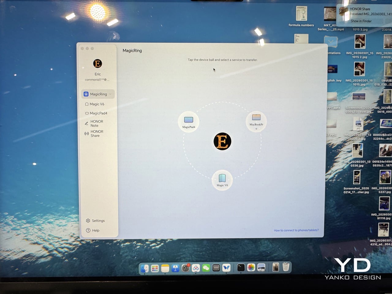
The MagicRing integration goes several layers deeper than the Apple-facing features (FYI, it’s a software feature, not an actual ring). Within the HONOR ecosystem, the Magic V6, MagicPad 4, and MagicBook Pro 14 all communicate through HONOR Connect, and any screen can project onto any device bidirectionally, something Apple’s Sidecar only partially replicates within its own hardware range. The mechanics are drag-based: open HONOR Connect, find your target device, drag the screen sharing icon over to it, and projection starts. Bidirectional means both directions work, the MacBook’s display mirroring onto the foldable, the foldable mirroring onto the laptop, same process either way. Dropping files and folders between devices with continuity-style drag behavior runs natively on the MagicPad 4, without a companion app or cloud relay.

At 4.8mm thick with a 12.3-inch 3K OLED running at 165Hz, the MagicPad 4 is a serious piece of hardware to run a MacBook’s extended display onto. The Snapdragon 8 Gen 5 inside means you’re not compromising on the secondary screen, which matters when you’re doing real creative or coding work. Used as a real-time extended display for a MacBook, it eliminates the need for additional hardware, and for mixed-ecosystem users that’s already a compelling argument on its own. Cross-device drag-and-drop turns it into a productivity node rather than a conventional Android tablet, a designation very few Android tablets have earned. Xiaomi’s iOS Bridge in HyperOS 3.1 gestures at something similar but still relies on companion apps and hasn’t been demonstrated on final shipping hardware.

Apple’s Continuity framework has set the benchmark for multi-device workflows since 2014, and the gap between what Apple offers and what Android could offer was real enough to function as a legitimate reason to stay in Apple’s ecosystem. That gap is narrowing. The Magic V6’s foldable form factor already does things no iPhone can, and layering genuine Apple interoperability on top removes the last practical friction for anyone straddling both worlds. The MWC demo landed on execution: working software on final hardware, smooth animations, no companion apps required. For a certain kind of user, the question of whether to stay full-Apple or go mixed just got significantly harder.

HONOR’s AI Connect Platform, projected to integrate over 20,000 AI services by end of 2026, is the infrastructure underneath all of this, and the MWC demos are its first serious public proof of concept. The company has been repositioning from a budget device manufacturer into what it now calls a global AI device ecosystem company, and this is the first time that framing has been backed by something you could touch and test on a show floor. The Magic V6, running the Snapdragon 8 Elite Gen 5, is the first foldable to carry that chip and the anchor device pulling the whole network together. Google’s Quick Share-AirDrop interoperability is confirmed for broader rollout this year, but it carries sharing mode caveats that HONOR has already cleared. The demo in Barcelona was an answer, not a preview.

The post I Ran Android On A MacBook And Even Airdropped Files To iPhone at MWC 2026… And You Can Too first appeared on Yanko Design.
Did Apple’s $599 MacBook Neo just paint a target on the Google Chromebook’s back?

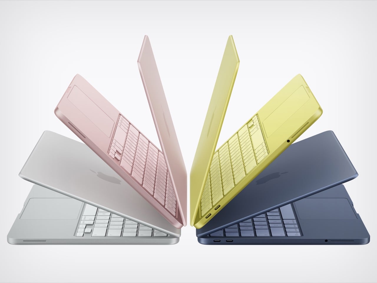
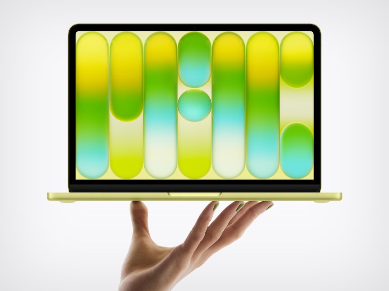
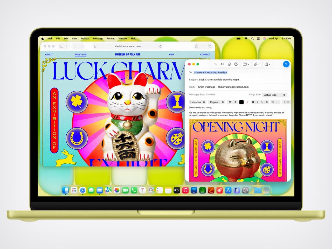
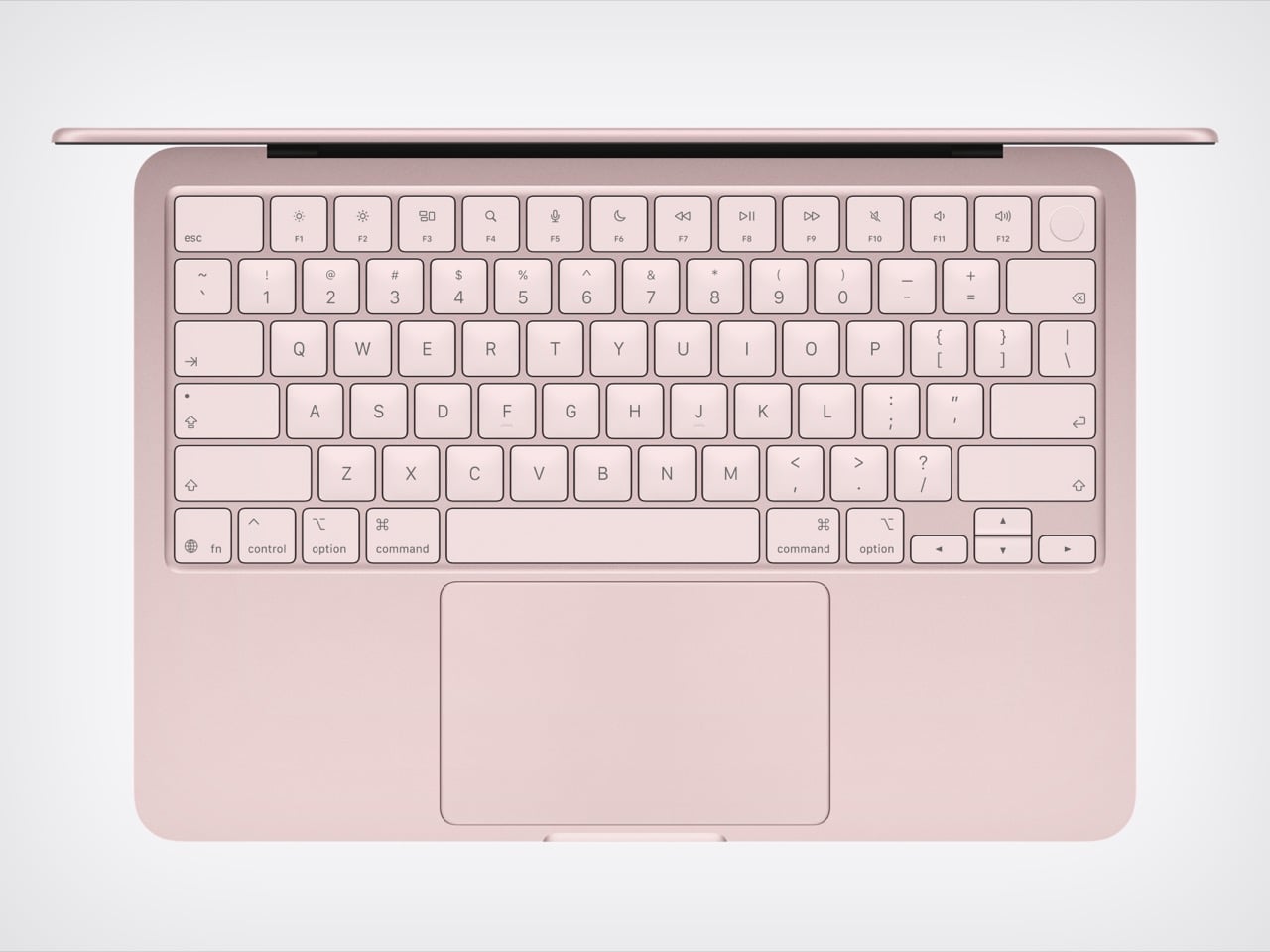
The cheapest MacBook now costs exactly the same as the cheapest iPhone. That’s not a punchline; it’s a price list. For $599, you can get a phone, or you can get a laptop that runs on a phone’s chip, specifically the A18 Pro that powered the iPhone 16 Pro a couple of years back. Apple looked at its vast bin of perfectly good, massively over-engineered mobile silicon and made the most logical leap imaginable. They put it in a beautifully milled aluminum chassis with a keyboard and a 13-inch Liquid Retina display, creating a machine that is, for all intents and purposes, a grown-up iPhone that doesn’t make calls. It’s a wildly clever, almost cynical, piece of product engineering that redefines the entry point to the entire Mac ecosystem.

This move wasn’t about inventing new technology, but about finding the perfect home for existing tech that had become inexpensive through sheer scale. The A18 Pro, with its 6-core CPU and 5-core GPU, is more than capable of handling the daily workload of the average student or web-browser warrior. Paired with a baseline of 8GB of unified memory and a 256GB SSD, the MacBook Neo is engineered to be just enough computer for a massive audience that was previously priced out. Apple’s genius here is recognizing that the performance floor of their mobile chips has risen so high that it now meets the “good enough” ceiling for a huge segment of the laptop market. This is an exercise in masterful cost management, not a race for benchmark glory.

Designer: Apple

That brings us to the real target of this colorful little machine: the classroom. The MacBook Neo isn’t for the video editor or the traveling professional; it’s a precision-guided missile aimed directly at the heart of Google’s Chromebook empire. With an education price of just $499, Apple has officially entered a knife fight with a very sharp, very shiny knife. For years, schools have defaulted to fleets of cheap, functional, and ultimately disposable Chromebooks. Apple is betting that for a small premium, school districts will jump at the chance to give students a device that feels premium, integrates with their iPhones, and carries the weight of the Apple brand. It’s a compelling argument that repositions the Mac from an aspirational product to a practical, attainable one.

It’s not that Google completely fumbled its lead, but it certainly grew complacent. The Chromebook ecosystem won on price and dead-simple IT management, not on user experience. Google’s Auto Update Expiration policy, which effectively gives every device a software death sentence, has been a constant source of friction for budget-strapped schools that need hardware to last. This created an opening for a company known for its long-term software support. Apple can now walk into a school administrator’s office and offer a more durable, better-feeling machine with a clear software roadmap, making the slightly higher initial cost seem like a smarter long-term investment. Google sold schools a cheap solution, and Apple is countering with a cost-effective one.

Of course, a $599 Mac comes with an asterisk, and the MacBook Neo has a few big ones. The most glaring omission is the lack of a backlit keyboard, a feature that has been standard on laptops for over a decade and feels almost punitive to remove. There’s also no support for fast charging, so topping up the battery will be a leisurely affair. These aren’t accidents; they are carefully calculated sacrifices made to protect the profit margin and create clear feature differentiation from the more expensive MacBook Air. Apple is using the vibrant new color options, like Citrus and Indigo, to distract from the spec sheet compromises, but to be honest, nothing is more of a distraction than that price point.

The post Did Apple’s $599 MacBook Neo just paint a target on the Google Chromebook’s back? first appeared on Yanko Design.
Two ESR Accessories That Fix the iPad’s Most Frustrating Problems

The iPad has a funny relationship with its own potential. Apple builds these devices with silicon that outpaces many laptops, pairs them with displays that creative professionals genuinely covet, sandwiches everything into one impossibly sleek slab of glass and aluminum… and then just announces them without obsessively planning the broader ecosystem. The Magic Keyboard, while capable, is expensive, as is the Pencil. One confines you to a laptop-style of using, the other to a conventional tablet. This, I believe, is Apple building a symbiotic relationship with third-party accessory makers who, more often than not, do a better job than Apple at really planning an ecosystem around powerful devices like the iPad Pro… and at a much lower price point.

ESR has made a habit of knowing how to harness the iPad’s hybrid potential correctly. The Shift Keyboard Case (Detachable) and the Geo Digital Pencil read like two products designed by people who use an iPad seriously and got tired of being held back. One brings detachable keyboard flexibility and a generous trackpad to a category Apple makes expensive and rigid. The other brings Find My tracking and Bluetooth shortcuts to stylus use, features that make you wonder why they were ever considered optional. Together, they close the loop on what a well-designed iPad workflow actually needs.

ESR Shift Keyboard Case: Designed Around How People Actually Use an iPad

The biggest issue with turning an iPad into a laptop has always been the finality of it. Most keyboard cases, including Apple’s own, lock the device into a landscape, clamshell-style format that feels clumsy the moment you want to use it as a tablet again. The Shift Keyboard Case is built around a strong magnetic connection that sidesteps this entire problem. The keyboard half simply lifts away from the stand and case, leaving the protected iPad behind. This design treats the keyboard as a powerful, dedicated tool you bring in for serious typing, not as a permanent attachment you have to constantly wrestle with. It’s a simple mechanical solution to a complicated user experience problem, and it fundamentally changes how you approach the device.

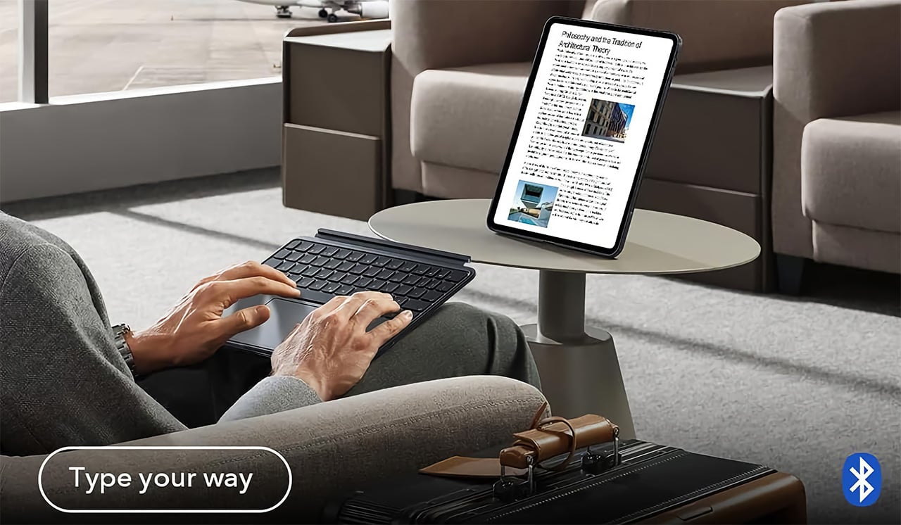
When the keyboard is attached, the setup feels remarkably committed to a proper laptop workflow. ESR put a large, click-anywhere trackpad at the center of the design, which is the correct choice now that iPadOS has such robust cursor support. It lets you navigate, select text, and use gestures without your hands ever leaving the typing area. The keys themselves are backlit, with enough travel to feel responsive for long-form writing rather than just firing off a quick email. This combination of a full-featured keyboard and a genuinely usable trackpad is what separates a serious work setup from a temporary compromise, and it’s clear which side of that line ESR was aiming for.

Once you detach the keyboard, the other half of the product’s intelligence becomes apparent. The remaining case and stand function independently, offering multiple viewing angles in both landscape and, crucially, portrait orientation. This is a detail that many competitors miss entirely. Being able to set the iPad up vertically for reading documents, coding, or taking video calls respects the fact that not all work happens in a 16:9 window. The stand mechanism is sturdy enough to support the iPad securely on a desk, making it a useful tool for media viewing or as a secondary display, all without the keyboard taking up space.

Putting it all together, the Shift case presents a complete, two-part system that adapts to the task at hand. The protective shell keeps the iPad safe, while the keyboard and stand components offer a level of functional flexibility that feels genuinely thoughtful. It’s a design that acknowledges the iPad is not a laptop, nor is it just a tablet; it’s a hybrid device that thrives when its accessories allow it to switch between roles effortlessly. The entire package is less about forcing the iPad into a new shape and more about giving its existing, versatile shape the tools it needs to be useful in more situations.

Why We Recommend It

At $89.99, the Shift Keyboard Case costs roughly a fifth of what Apple charges for the Magic Keyboard, and that price gap alone would almost be enough. What makes the recommendation easy, though, is that the Shift Case actually offers something the Magic Keyboard doesn’t: the ability to leave the keyboard behind entirely. Apple’s solution commits you to a permanent clamshell, while the Shift Case treats that keyboard as a deployable tool with a specific job to do. For anyone who uses their iPad across genuinely different contexts, a desk in the morning, a couch in the evening, a bag in between, that modularity has real, daily value. The backlit keys and click-anywhere trackpad raise the floor on what a $90 keyboard case is supposed to feel like, making it difficult to justify spending more for fewer options.

Click Here to Buy Now: $89.99 | Amazon Link Here.

ESR Geo Digital Pencil: A Stylus That’s Actually Hard to Lose

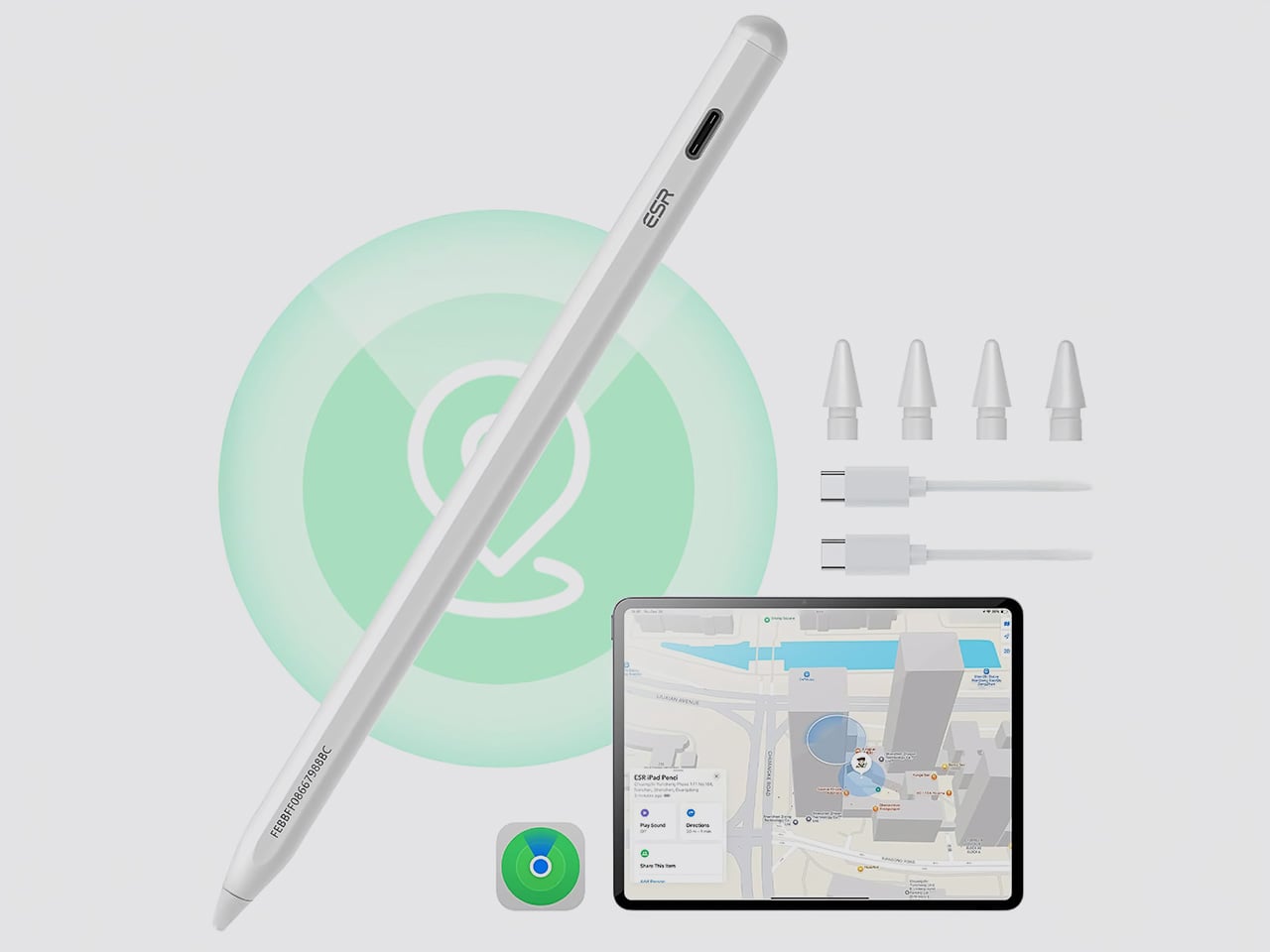
The most intelligent feature in the Geo Digital Pencil has nothing to do with drawing. It’s the integration of Apple’s Find My network, a decision so logical it feels like an oversight on Apple’s part. Not only can you locate the stylus using Apple’s Find My, you can even ping it through the app, causing the stylus to emit an audio alert for helping find it easily. This elevates the stylus from an easily misplaced accessory into a trackable piece of hardware, just like an AirTag or a pair of AirPods. Losing a stylus between sofa cushions or leaving it behind in a cafe is a common, expensive problem. By making the Geo Pencil locatable on a map directly within the Find My app, ESR has addressed a genuine point of user anxiety with a clean, native software solution that requires no extra apps or dongles.

Standardizing on a USB-C charging port was the other correct, user-first decision. It aligns the pencil with the charging ecosystem of the iPad, the Mac, and countless other modern devices, eliminating the need to carry a separate, proprietary cable. The port is discreetly located near the top of the stylus, allowing for a full charge in just 20 minutes, which is fast enough to rescue a dead battery right before a meeting or class. This commitment to a universal standard removes a significant point of friction from the daily workflow, acknowledging that convenience is a critical feature in any tool you rely on.

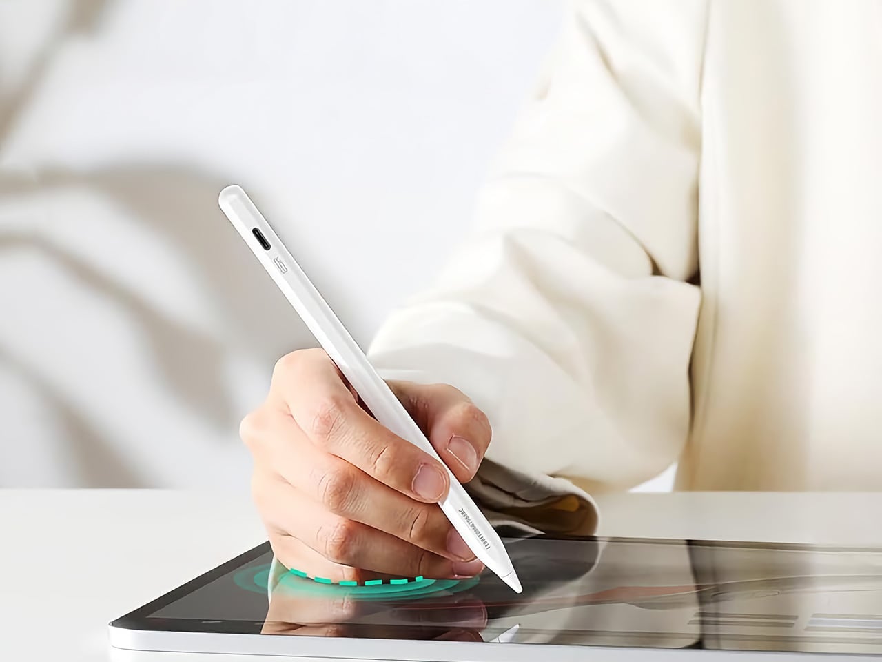
For actual creative and navigational input, the pencil delivers the features that cover the majority of use cases. It has full tilt sensitivity, allowing you to vary line thickness for shading in apps like Procreate, and its palm rejection is reliable enough for you to rest your hand on the screen while writing. While it doesn’t include pressure sensitivity, a feature reserved for high-end artistic work, it adds utility elsewhere. Once paired over Bluetooth, the top button becomes a shortcut key: a single tap returns you to the home screen, and a double tap opens the multitasking view, turning the stylus into a capable system remote.

These thoughtful features add up to a tool designed for the realities of daily use. The pencil snaps magnetically to the side of compatible iPads for easy storage, and its weight and balance feel comfortable for long note-taking sessions. It operates with pixel-perfect precision and no discernible lag, behaving exactly as you would expect a native stylus to. The Geo Digital Pencil is a clear example of a product designed to complete an experience, addressing the practical needs of organization, charging, and system navigation that make an iPad a genuinely more capable device.

Why We Recommend It

The Apple Pencil USB-C, Apple’s most affordable stylus, retails at $79 and offers no Find My support, no Bluetooth shortcuts, and no battery indicator. The Geo Digital Pencil costs $32.99 and has all three. That comparison does most of the heavy lifting, but the more interesting case for the Geo Pencil is what it means for the kind of person who carries an iPad between locations constantly, students, freelancers, people working from cafes and conference rooms. Styluses disappear. They roll off desks, get left in bags, and turn up missing at the worst possible moment. Having Find My baked in at this price point converts a frustrating accessory into a dependable one, and that reliability is worth more in practice than any spec on a sheet. The 20-minute full charge via USB-C keeps it from becoming another thing you have to carefully manage, and the tilt sensitivity and Bluetooth shortcuts round out a package that punches well above its category.

Click Here to Buy Now: $32.99 $36.99 (11% off). Hurry, deal ends in 48-hours! Amazon Link Here.

The post Two ESR Accessories That Fix the iPad’s Most Frustrating Problems first appeared on Yanko Design.
Two ESR Accessories That Fix the iPad’s Most Frustrating Problems

The iPad has a funny relationship with its own potential. Apple builds these devices with silicon that outpaces many laptops, pairs them with displays that creative professionals genuinely covet, sandwiches everything into one impossibly sleek slab of glass and aluminum… and then just announces them without obsessively planning the broader ecosystem. The Magic Keyboard, while capable, is expensive, as is the Pencil. One confines you to a laptop-style of using, the other to a conventional tablet. This, I believe, is Apple building a symbiotic relationship with third-party accessory makers who, more often than not, do a better job than Apple at really planning an ecosystem around powerful devices like the iPad Pro… and at a much lower price point.

ESR has made a habit of knowing how to harness the iPad’s hybrid potential correctly. The Shift Keyboard Case (Detachable) and the Geo Digital Pencil read like two products designed by people who use an iPad seriously and got tired of being held back. One brings detachable keyboard flexibility and a generous trackpad to a category Apple makes expensive and rigid. The other brings Find My tracking and Bluetooth shortcuts to stylus use, features that make you wonder why they were ever considered optional. Together, they close the loop on what a well-designed iPad workflow actually needs.

ESR Shift Keyboard Case: Designed Around How People Actually Use an iPad

The biggest issue with turning an iPad into a laptop has always been the finality of it. Most keyboard cases, including Apple’s own, lock the device into a landscape, clamshell-style format that feels clumsy the moment you want to use it as a tablet again. The Shift Keyboard Case is built around a strong magnetic connection that sidesteps this entire problem. The keyboard half simply lifts away from the stand and case, leaving the protected iPad behind. This design treats the keyboard as a powerful, dedicated tool you bring in for serious typing, not as a permanent attachment you have to constantly wrestle with. It’s a simple mechanical solution to a complicated user experience problem, and it fundamentally changes how you approach the device.

When the keyboard is attached, the setup feels remarkably committed to a proper laptop workflow. ESR put a large, click-anywhere trackpad at the center of the design, which is the correct choice now that iPadOS has such robust cursor support. It lets you navigate, select text, and use gestures without your hands ever leaving the typing area. The keys themselves are backlit, with enough travel to feel responsive for long-form writing rather than just firing off a quick email. This combination of a full-featured keyboard and a genuinely usable trackpad is what separates a serious work setup from a temporary compromise, and it’s clear which side of that line ESR was aiming for.

Once you detach the keyboard, the other half of the product’s intelligence becomes apparent. The remaining case and stand function independently, offering multiple viewing angles in both landscape and, crucially, portrait orientation. This is a detail that many competitors miss entirely. Being able to set the iPad up vertically for reading documents, coding, or taking video calls respects the fact that not all work happens in a 16:9 window. The stand mechanism is sturdy enough to support the iPad securely on a desk, making it a useful tool for media viewing or as a secondary display, all without the keyboard taking up space.

Putting it all together, the Shift case presents a complete, two-part system that adapts to the task at hand. The protective shell keeps the iPad safe, while the keyboard and stand components offer a level of functional flexibility that feels genuinely thoughtful. It’s a design that acknowledges the iPad is not a laptop, nor is it just a tablet; it’s a hybrid device that thrives when its accessories allow it to switch between roles effortlessly. The entire package is less about forcing the iPad into a new shape and more about giving its existing, versatile shape the tools it needs to be useful in more situations.

Why We Recommend It

At $89.99, the Shift Keyboard Case costs roughly a fifth of what Apple charges for the Magic Keyboard, and that price gap alone would almost be enough. What makes the recommendation easy, though, is that the Shift Case actually offers something the Magic Keyboard doesn’t: the ability to leave the keyboard behind entirely. Apple’s solution commits you to a permanent clamshell, while the Shift Case treats that keyboard as a deployable tool with a specific job to do. For anyone who uses their iPad across genuinely different contexts, a desk in the morning, a couch in the evening, a bag in between, that modularity has real, daily value. The backlit keys and click-anywhere trackpad raise the floor on what a $90 keyboard case is supposed to feel like, making it difficult to justify spending more for fewer options.

Click Here to Buy Now: $89.99 | Amazon Link Here.

ESR Geo Digital Pencil: A Stylus That’s Actually Hard to Lose

The most intelligent feature in the Geo Digital Pencil has nothing to do with drawing. It’s the integration of Apple’s Find My network, a decision so logical it feels like an oversight on Apple’s part. Not only can you locate the stylus using Apple’s Find My, you can even ping it through the app, causing the stylus to emit an audio alert for helping find it easily. This elevates the stylus from an easily misplaced accessory into a trackable piece of hardware, just like an AirTag or a pair of AirPods. Losing a stylus between sofa cushions or leaving it behind in a cafe is a common, expensive problem. By making the Geo Pencil locatable on a map directly within the Find My app, ESR has addressed a genuine point of user anxiety with a clean, native software solution that requires no extra apps or dongles.

Standardizing on a USB-C charging port was the other correct, user-first decision. It aligns the pencil with the charging ecosystem of the iPad, the Mac, and countless other modern devices, eliminating the need to carry a separate, proprietary cable. The port is discreetly located near the top of the stylus, allowing for a full charge in just 20 minutes, which is fast enough to rescue a dead battery right before a meeting or class. This commitment to a universal standard removes a significant point of friction from the daily workflow, acknowledging that convenience is a critical feature in any tool you rely on.

For actual creative and navigational input, the pencil delivers the features that cover the majority of use cases. It has full tilt sensitivity, allowing you to vary line thickness for shading in apps like Procreate, and its palm rejection is reliable enough for you to rest your hand on the screen while writing. While it doesn’t include pressure sensitivity, a feature reserved for high-end artistic work, it adds utility elsewhere. Once paired over Bluetooth, the top button becomes a shortcut key: a single tap returns you to the home screen, and a double tap opens the multitasking view, turning the stylus into a capable system remote.

These thoughtful features add up to a tool designed for the realities of daily use. The pencil snaps magnetically to the side of compatible iPads for easy storage, and its weight and balance feel comfortable for long note-taking sessions. It operates with pixel-perfect precision and no discernible lag, behaving exactly as you would expect a native stylus to. The Geo Digital Pencil is a clear example of a product designed to complete an experience, addressing the practical needs of organization, charging, and system navigation that make an iPad a genuinely more capable device.

Why We Recommend It

The Apple Pencil USB-C, Apple’s most affordable stylus, retails at $79 and offers no Find My support, no Bluetooth shortcuts, and no battery indicator. The Geo Digital Pencil costs $32.99 and has all three. That comparison does most of the heavy lifting, but the more interesting case for the Geo Pencil is what it means for the kind of person who carries an iPad between locations constantly, students, freelancers, people working from cafes and conference rooms. Styluses disappear. They roll off desks, get left in bags, and turn up missing at the worst possible moment. Having Find My baked in at this price point converts a frustrating accessory into a dependable one, and that reliability is worth more in practice than any spec on a sheet. The 20-minute full charge via USB-C keeps it from becoming another thing you have to carefully manage, and the tilt sensitivity and Bluetooth shortcuts round out a package that punches well above its category.

Click Here to Buy Now: $32.99 $36.99 (11% off). Hurry, deal ends in 48-hours! Amazon Link Here.

The post Two ESR Accessories That Fix the iPad’s Most Frustrating Problems first appeared on Yanko Design.
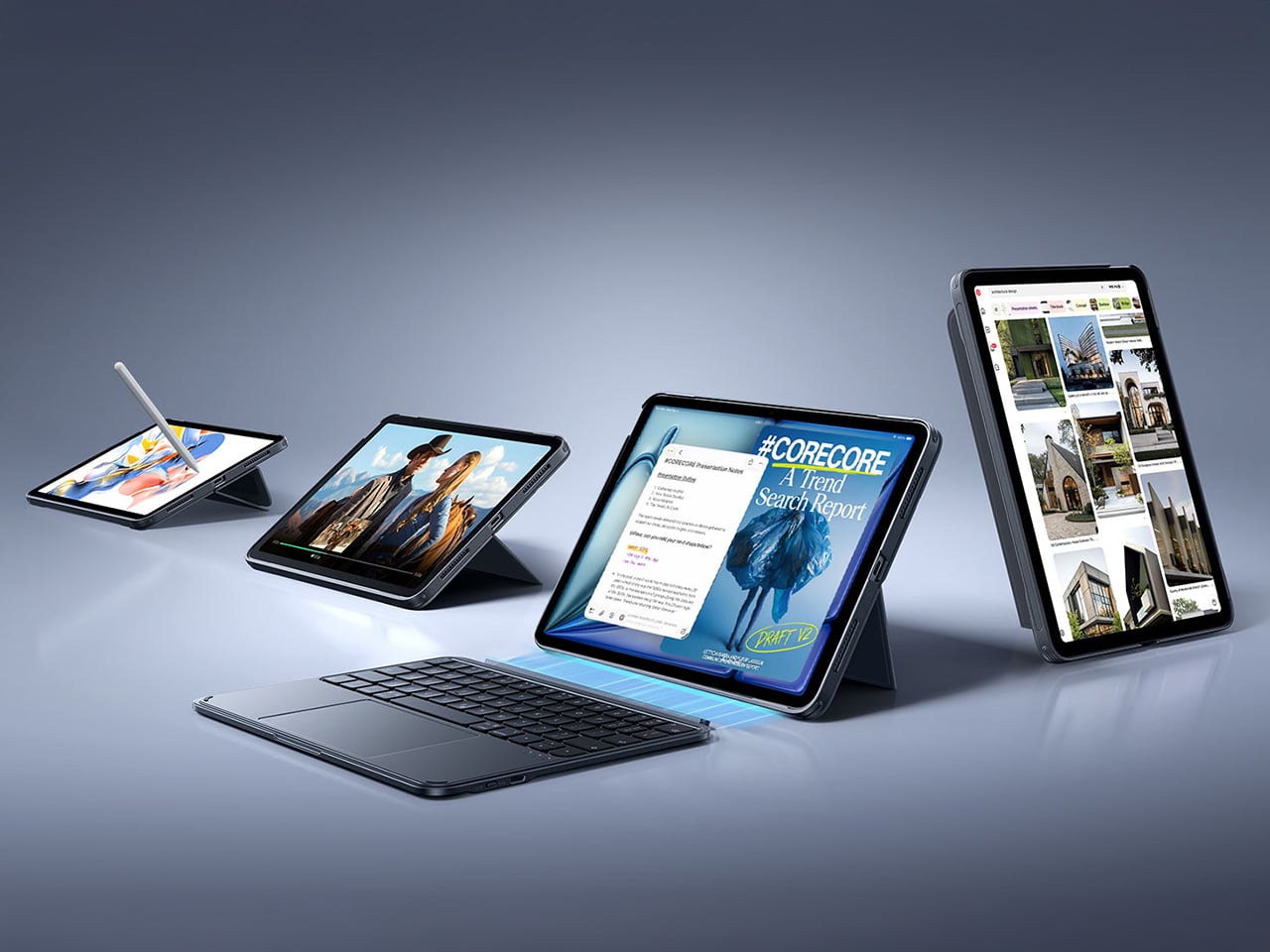
Two ESR Accessories That Fix the iPad’s Most Frustrating Problems

The iPad has a funny relationship with its own potential. Apple builds these devices with silicon that outpaces many laptops, pairs them with displays that creative professionals genuinely covet, sandwiches everything into one impossibly sleek slab of glass and aluminum… and then just announces them without obsessively planning the broader ecosystem. The Magic Keyboard, while capable, is expensive, as is the Pencil. One confines you to a laptop-style of using, the other to a conventional tablet. This, I believe, is Apple building a symbiotic relationship with third-party accessory makers who, more often than not, do a better job than Apple at really planning an ecosystem around powerful devices like the iPad Pro… and at a much lower price point.

ESR has made a habit of knowing how to harness the iPad’s hybrid potential correctly. The Shift Keyboard Case (Detachable) and the Geo Digital Pencil read like two products designed by people who use an iPad seriously and got tired of being held back. One brings detachable keyboard flexibility and a generous trackpad to a category Apple makes expensive and rigid. The other brings Find My tracking and Bluetooth shortcuts to stylus use, features that make you wonder why they were ever considered optional. Together, they close the loop on what a well-designed iPad workflow actually needs.

ESR Shift Keyboard Case: Designed Around How People Actually Use an iPad

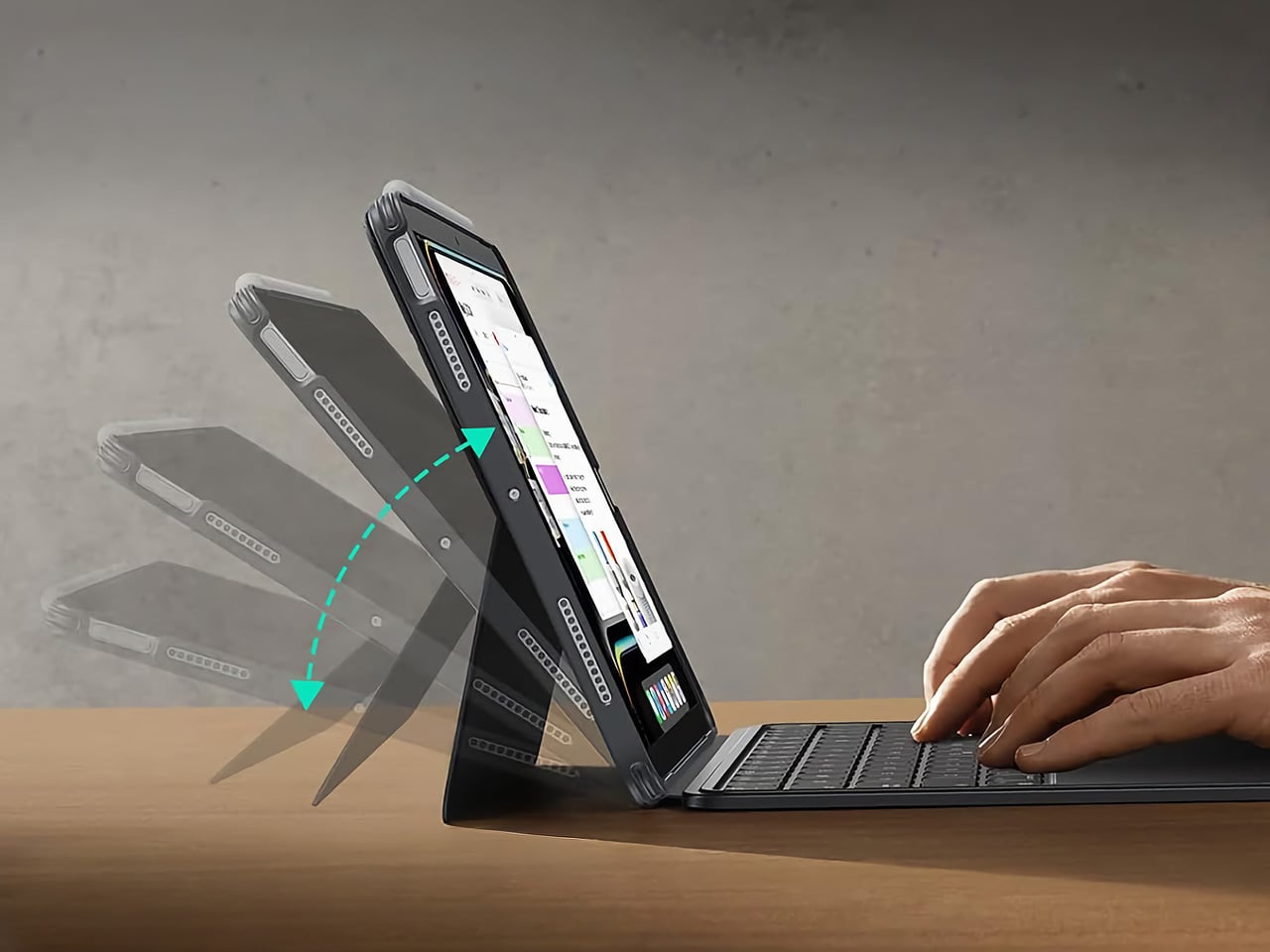
The biggest issue with turning an iPad into a laptop has always been the finality of it. Most keyboard cases, including Apple’s own, lock the device into a landscape, clamshell-style format that feels clumsy the moment you want to use it as a tablet again. The Shift Keyboard Case is built around a strong magnetic connection that sidesteps this entire problem. The keyboard half simply lifts away from the stand and case, leaving the protected iPad behind. This design treats the keyboard as a powerful, dedicated tool you bring in for serious typing, not as a permanent attachment you have to constantly wrestle with. It’s a simple mechanical solution to a complicated user experience problem, and it fundamentally changes how you approach the device.

When the keyboard is attached, the setup feels remarkably committed to a proper laptop workflow. ESR put a large, click-anywhere trackpad at the center of the design, which is the correct choice now that iPadOS has such robust cursor support. It lets you navigate, select text, and use gestures without your hands ever leaving the typing area. The keys themselves are backlit, with enough travel to feel responsive for long-form writing rather than just firing off a quick email. This combination of a full-featured keyboard and a genuinely usable trackpad is what separates a serious work setup from a temporary compromise, and it’s clear which side of that line ESR was aiming for.

Once you detach the keyboard, the other half of the product’s intelligence becomes apparent. The remaining case and stand function independently, offering multiple viewing angles in both landscape and, crucially, portrait orientation. This is a detail that many competitors miss entirely. Being able to set the iPad up vertically for reading documents, coding, or taking video calls respects the fact that not all work happens in a 16:9 window. The stand mechanism is sturdy enough to support the iPad securely on a desk, making it a useful tool for media viewing or as a secondary display, all without the keyboard taking up space.

Putting it all together, the Shift case presents a complete, two-part system that adapts to the task at hand. The protective shell keeps the iPad safe, while the keyboard and stand components offer a level of functional flexibility that feels genuinely thoughtful. It’s a design that acknowledges the iPad is not a laptop, nor is it just a tablet; it’s a hybrid device that thrives when its accessories allow it to switch between roles effortlessly. The entire package is less about forcing the iPad into a new shape and more about giving its existing, versatile shape the tools it needs to be useful in more situations.

Why We Recommend It

At $89.99, the Shift Keyboard Case costs roughly a fifth of what Apple charges for the Magic Keyboard, and that price gap alone would almost be enough. What makes the recommendation easy, though, is that the Shift Case actually offers something the Magic Keyboard doesn’t: the ability to leave the keyboard behind entirely. Apple’s solution commits you to a permanent clamshell, while the Shift Case treats that keyboard as a deployable tool with a specific job to do. For anyone who uses their iPad across genuinely different contexts, a desk in the morning, a couch in the evening, a bag in between, that modularity has real, daily value. The backlit keys and click-anywhere trackpad raise the floor on what a $90 keyboard case is supposed to feel like, making it difficult to justify spending more for fewer options.

Click Here to Buy Now: $89.99 | Amazon Link Here.

ESR Geo Digital Pencil: A Stylus That’s Actually Hard to Lose

The most intelligent feature in the Geo Digital Pencil has nothing to do with drawing. It’s the integration of Apple’s Find My network, a decision so logical it feels like an oversight on Apple’s part. Not only can you locate the stylus using Apple’s Find My, you can even ping it through the app, causing the stylus to emit an audio alert for helping find it easily. This elevates the stylus from an easily misplaced accessory into a trackable piece of hardware, just like an AirTag or a pair of AirPods. Losing a stylus between sofa cushions or leaving it behind in a cafe is a common, expensive problem. By making the Geo Pencil locatable on a map directly within the Find My app, ESR has addressed a genuine point of user anxiety with a clean, native software solution that requires no extra apps or dongles.

Standardizing on a USB-C charging port was the other correct, user-first decision. It aligns the pencil with the charging ecosystem of the iPad, the Mac, and countless other modern devices, eliminating the need to carry a separate, proprietary cable. The port is discreetly located near the top of the stylus, allowing for a full charge in just 20 minutes, which is fast enough to rescue a dead battery right before a meeting or class. This commitment to a universal standard removes a significant point of friction from the daily workflow, acknowledging that convenience is a critical feature in any tool you rely on.

For actual creative and navigational input, the pencil delivers the features that cover the majority of use cases. It has full tilt sensitivity, allowing you to vary line thickness for shading in apps like Procreate, and its palm rejection is reliable enough for you to rest your hand on the screen while writing. While it doesn’t include pressure sensitivity, a feature reserved for high-end artistic work, it adds utility elsewhere. Once paired over Bluetooth, the top button becomes a shortcut key: a single tap returns you to the home screen, and a double tap opens the multitasking view, turning the stylus into a capable system remote.

These thoughtful features add up to a tool designed for the realities of daily use. The pencil snaps magnetically to the side of compatible iPads for easy storage, and its weight and balance feel comfortable for long note-taking sessions. It operates with pixel-perfect precision and no discernible lag, behaving exactly as you would expect a native stylus to. The Geo Digital Pencil is a clear example of a product designed to complete an experience, addressing the practical needs of organization, charging, and system navigation that make an iPad a genuinely more capable device.

Why We Recommend It

The Apple Pencil USB-C, Apple’s most affordable stylus, retails at $79 and offers no Find My support, no Bluetooth shortcuts, and no battery indicator. The Geo Digital Pencil costs $32.99 and has all three. That comparison does most of the heavy lifting, but the more interesting case for the Geo Pencil is what it means for the kind of person who carries an iPad between locations constantly, students, freelancers, people working from cafes and conference rooms. Styluses disappear. They roll off desks, get left in bags, and turn up missing at the worst possible moment. Having Find My baked in at this price point converts a frustrating accessory into a dependable one, and that reliability is worth more in practice than any spec on a sheet. The 20-minute full charge via USB-C keeps it from becoming another thing you have to carefully manage, and the tilt sensitivity and Bluetooth shortcuts round out a package that punches well above its category.

Click Here to Buy Now: $32.99 $36.99 (11% off). Hurry, deal ends in 48-hours! Amazon Link Here.

The post Two ESR Accessories That Fix the iPad’s Most Frustrating Problems first appeared on Yanko Design.

Two ESR Accessories That Fix the iPad’s Most Frustrating Problems

The iPad has a funny relationship with its own potential. Apple builds these devices with silicon that outpaces many laptops, pairs them with displays that creative professionals genuinely covet, sandwiches everything into one impossibly sleek slab of glass and aluminum… and then just announces them without obsessively planning the broader ecosystem. The Magic Keyboard, while capable, is expensive, as is the Pencil. One confines you to a laptop-style of using, the other to a conventional tablet. This, I believe, is Apple building a symbiotic relationship with third-party accessory makers who, more often than not, do a better job than Apple at really planning an ecosystem around powerful devices like the iPad Pro… and at a much lower price point.

ESR has made a habit of knowing how to harness the iPad’s hybrid potential correctly. The Shift Keyboard Case (Detachable) and the Geo Digital Pencil read like two products designed by people who use an iPad seriously and got tired of being held back. One brings detachable keyboard flexibility and a generous trackpad to a category Apple makes expensive and rigid. The other brings Find My tracking and Bluetooth shortcuts to stylus use, features that make you wonder why they were ever considered optional. Together, they close the loop on what a well-designed iPad workflow actually needs.

ESR Shift Keyboard Case: Designed Around How People Actually Use an iPad

The biggest issue with turning an iPad into a laptop has always been the finality of it. Most keyboard cases, including Apple’s own, lock the device into a landscape, clamshell-style format that feels clumsy the moment you want to use it as a tablet again. The Shift Keyboard Case is built around a strong magnetic connection that sidesteps this entire problem. The keyboard half simply lifts away from the stand and case, leaving the protected iPad behind. This design treats the keyboard as a powerful, dedicated tool you bring in for serious typing, not as a permanent attachment you have to constantly wrestle with. It’s a simple mechanical solution to a complicated user experience problem, and it fundamentally changes how you approach the device.

When the keyboard is attached, the setup feels remarkably committed to a proper laptop workflow. ESR put a large, click-anywhere trackpad at the center of the design, which is the correct choice now that iPadOS has such robust cursor support. It lets you navigate, select text, and use gestures without your hands ever leaving the typing area. The keys themselves are backlit, with enough travel to feel responsive for long-form writing rather than just firing off a quick email. This combination of a full-featured keyboard and a genuinely usable trackpad is what separates a serious work setup from a temporary compromise, and it’s clear which side of that line ESR was aiming for.

Once you detach the keyboard, the other half of the product’s intelligence becomes apparent. The remaining case and stand function independently, offering multiple viewing angles in both landscape and, crucially, portrait orientation. This is a detail that many competitors miss entirely. Being able to set the iPad up vertically for reading documents, coding, or taking video calls respects the fact that not all work happens in a 16:9 window. The stand mechanism is sturdy enough to support the iPad securely on a desk, making it a useful tool for media viewing or as a secondary display, all without the keyboard taking up space.

Putting it all together, the Shift case presents a complete, two-part system that adapts to the task at hand. The protective shell keeps the iPad safe, while the keyboard and stand components offer a level of functional flexibility that feels genuinely thoughtful. It’s a design that acknowledges the iPad is not a laptop, nor is it just a tablet; it’s a hybrid device that thrives when its accessories allow it to switch between roles effortlessly. The entire package is less about forcing the iPad into a new shape and more about giving its existing, versatile shape the tools it needs to be useful in more situations.

Why We Recommend It

At $89.99, the Shift Keyboard Case costs roughly a fifth of what Apple charges for the Magic Keyboard, and that price gap alone would almost be enough. What makes the recommendation easy, though, is that the Shift Case actually offers something the Magic Keyboard doesn’t: the ability to leave the keyboard behind entirely. Apple’s solution commits you to a permanent clamshell, while the Shift Case treats that keyboard as a deployable tool with a specific job to do. For anyone who uses their iPad across genuinely different contexts, a desk in the morning, a couch in the evening, a bag in between, that modularity has real, daily value. The backlit keys and click-anywhere trackpad raise the floor on what a $90 keyboard case is supposed to feel like, making it difficult to justify spending more for fewer options.

Click Here to Buy Now: $89.99 | Amazon Link Here.

ESR Geo Digital Pencil: A Stylus That’s Actually Hard to Lose

The most intelligent feature in the Geo Digital Pencil has nothing to do with drawing. It’s the integration of Apple’s Find My network, a decision so logical it feels like an oversight on Apple’s part. Not only can you locate the stylus using Apple’s Find My, you can even ping it through the app, causing the stylus to emit an audio alert for helping find it easily. This elevates the stylus from an easily misplaced accessory into a trackable piece of hardware, just like an AirTag or a pair of AirPods. Losing a stylus between sofa cushions or leaving it behind in a cafe is a common, expensive problem. By making the Geo Pencil locatable on a map directly within the Find My app, ESR has addressed a genuine point of user anxiety with a clean, native software solution that requires no extra apps or dongles.

Standardizing on a USB-C charging port was the other correct, user-first decision. It aligns the pencil with the charging ecosystem of the iPad, the Mac, and countless other modern devices, eliminating the need to carry a separate, proprietary cable. The port is discreetly located near the top of the stylus, allowing for a full charge in just 20 minutes, which is fast enough to rescue a dead battery right before a meeting or class. This commitment to a universal standard removes a significant point of friction from the daily workflow, acknowledging that convenience is a critical feature in any tool you rely on.

For actual creative and navigational input, the pencil delivers the features that cover the majority of use cases. It has full tilt sensitivity, allowing you to vary line thickness for shading in apps like Procreate, and its palm rejection is reliable enough for you to rest your hand on the screen while writing. While it doesn’t include pressure sensitivity, a feature reserved for high-end artistic work, it adds utility elsewhere. Once paired over Bluetooth, the top button becomes a shortcut key: a single tap returns you to the home screen, and a double tap opens the multitasking view, turning the stylus into a capable system remote.

These thoughtful features add up to a tool designed for the realities of daily use. The pencil snaps magnetically to the side of compatible iPads for easy storage, and its weight and balance feel comfortable for long note-taking sessions. It operates with pixel-perfect precision and no discernible lag, behaving exactly as you would expect a native stylus to. The Geo Digital Pencil is a clear example of a product designed to complete an experience, addressing the practical needs of organization, charging, and system navigation that make an iPad a genuinely more capable device.

Why We Recommend It

The Apple Pencil USB-C, Apple’s most affordable stylus, retails at $79 and offers no Find My support, no Bluetooth shortcuts, and no battery indicator. The Geo Digital Pencil costs $32.99 and has all three. That comparison does most of the heavy lifting, but the more interesting case for the Geo Pencil is what it means for the kind of person who carries an iPad between locations constantly, students, freelancers, people working from cafes and conference rooms. Styluses disappear. They roll off desks, get left in bags, and turn up missing at the worst possible moment. Having Find My baked in at this price point converts a frustrating accessory into a dependable one, and that reliability is worth more in practice than any spec on a sheet. The 20-minute full charge via USB-C keeps it from becoming another thing you have to carefully manage, and the tilt sensitivity and Bluetooth shortcuts round out a package that punches well above its category.

Click Here to Buy Now: $32.99 $36.99 (11% off). Hurry, deal ends in 48-hours! Amazon Link Here.

The post Two ESR Accessories That Fix the iPad’s Most Frustrating Problems first appeared on Yanko Design.

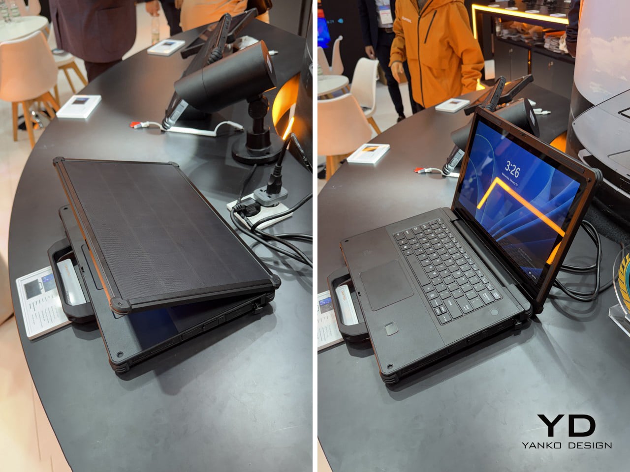
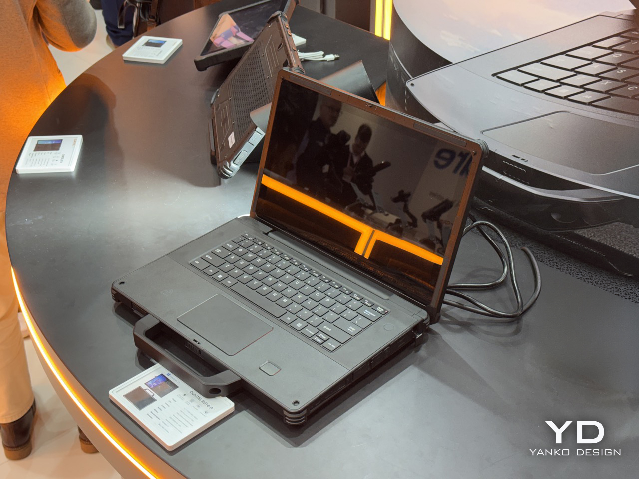
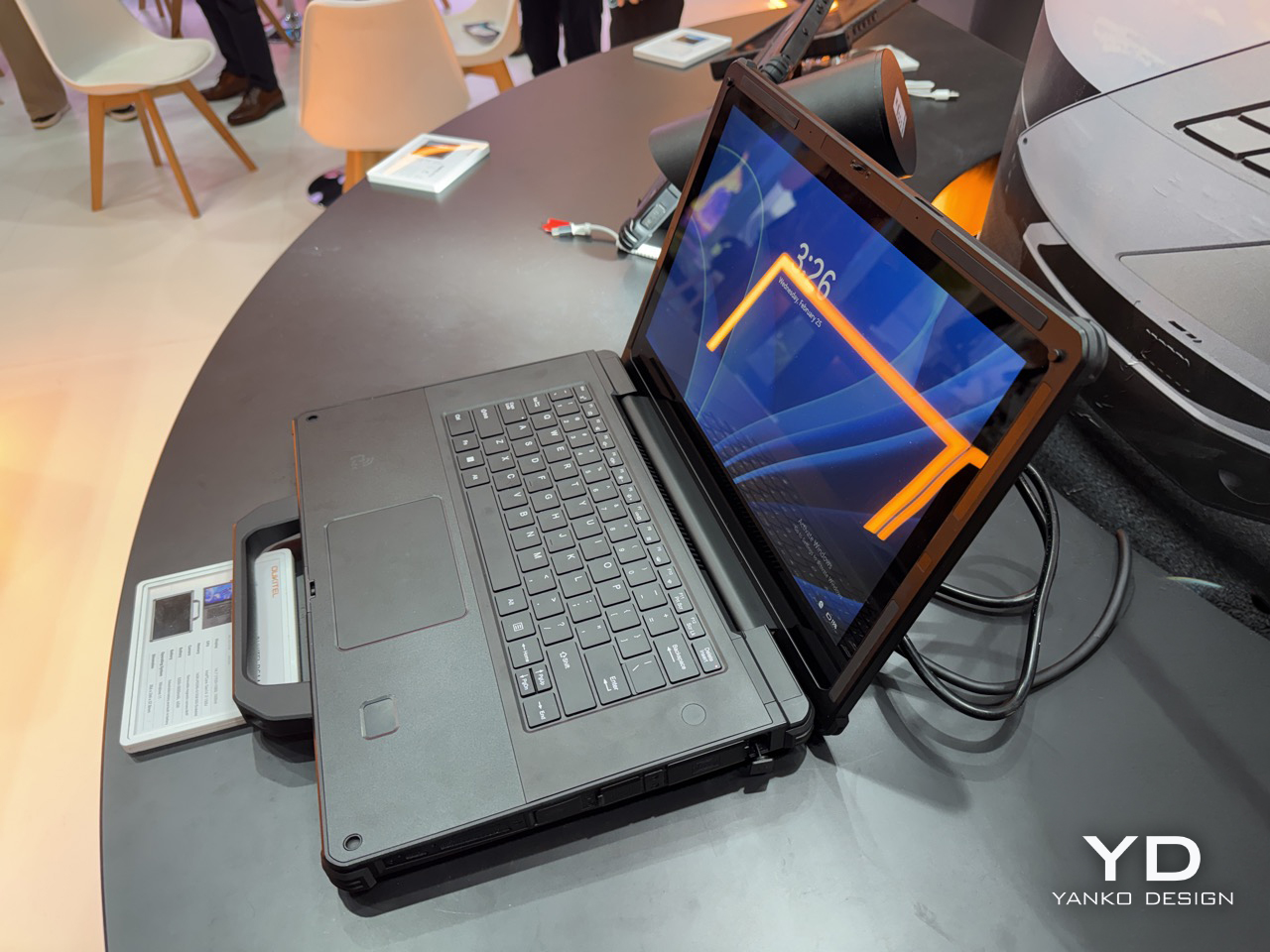
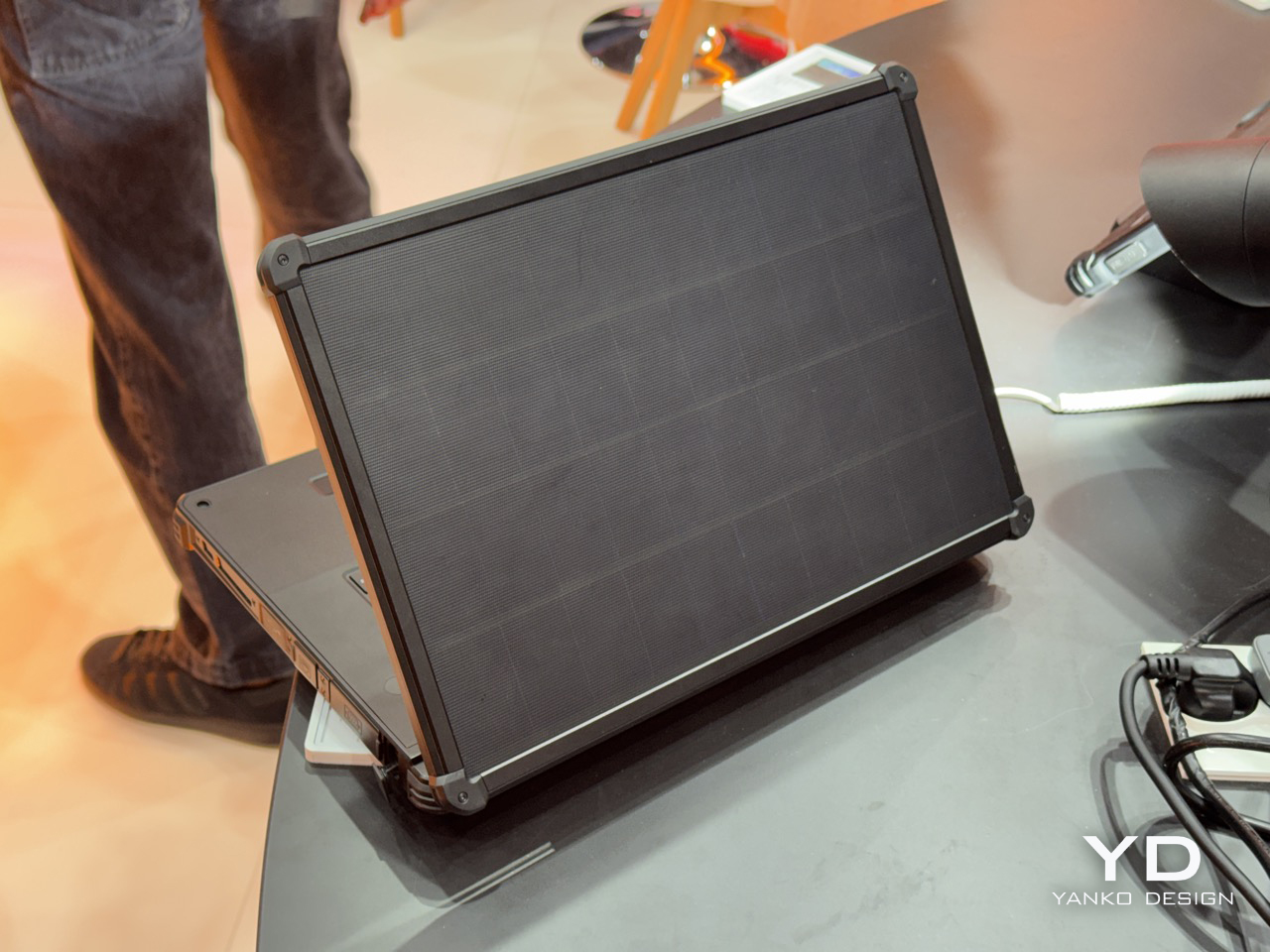
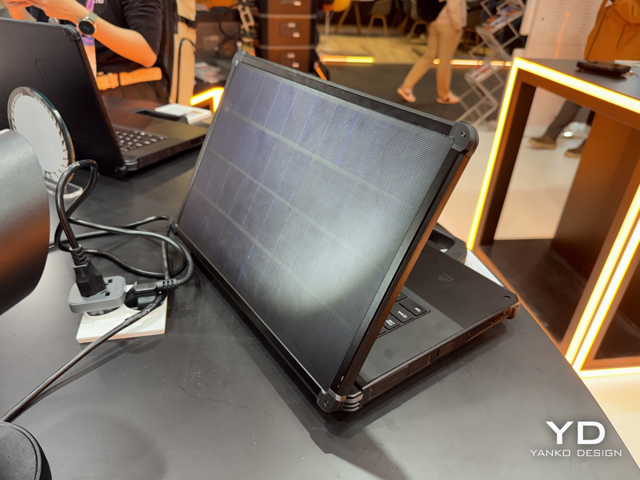
A Laptop With a Solar Panel Lid Just Showed Up at MWC 2026: Hands-on with Oukitel RG14-P

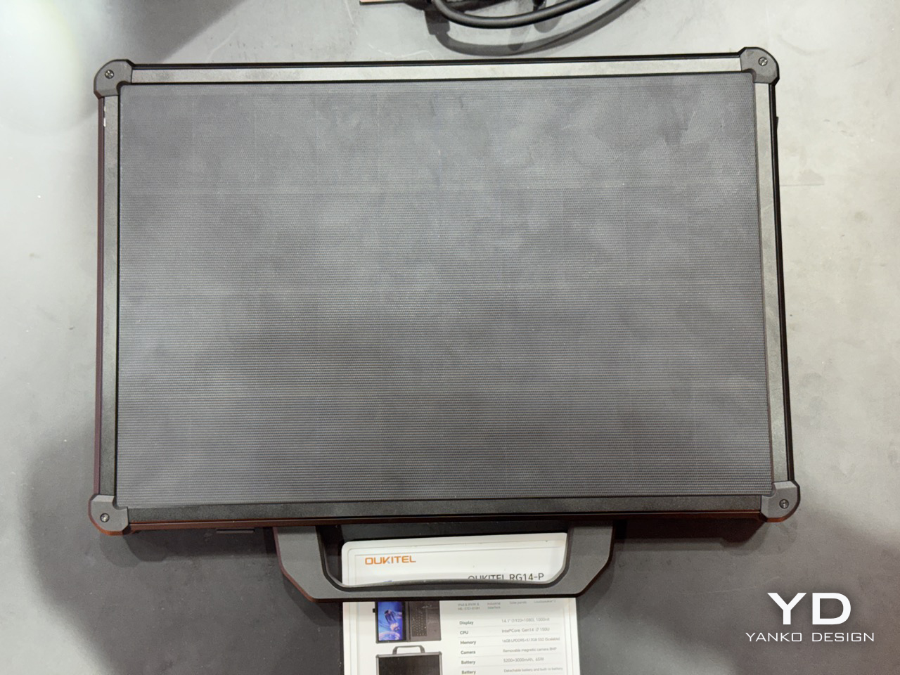
Solar charging on a laptop lid has been a niche curiosity since Samsung tried it with the NC215S netbook in 2011, a machine that needed two full hours of midday sun to buy you a single hour of runtime. Rough trade. The idea largely disappeared after that, surfacing occasionally in concept form, most recently with Lenovo’s Yoga Solar PC at MWC 2025, which packed 84 solar cells into an ultraslim lid at a reported 24.3% conversion efficiency. Lenovo’s version was sleek, consumer-friendly, and still a concept. Oukitel’s RG14-P, shown at MWC 2026 in Barcelona, skips the concept stage entirely and ships the thing.

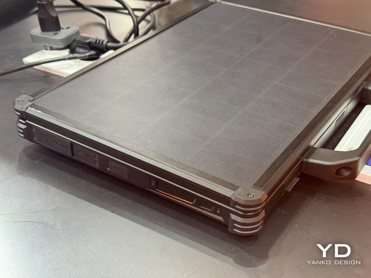
The RG14-P pulls 10W from its photovoltaic lid panel, enough to get the 95Wh dual-battery system to 50% in roughly six hours under optimal sunlight. That number sounds modest until you frame it correctly: this laptop is aimed at field engineers, utility inspectors, and emergency responders working in places where “finding a charging point” genuinely isn’t an option. For those people, six hours to half capacity under open sky is pretty meaningful. The dual-battery architecture pairs a 3,000mAh internal unit with a 5,200mAh hot-swappable external battery, meaning you can pull the secondary and slot in a fresh one without shutting the machine down. That feature gets requested loudly on job sites and almost never shows up.

Designer: Oukitel

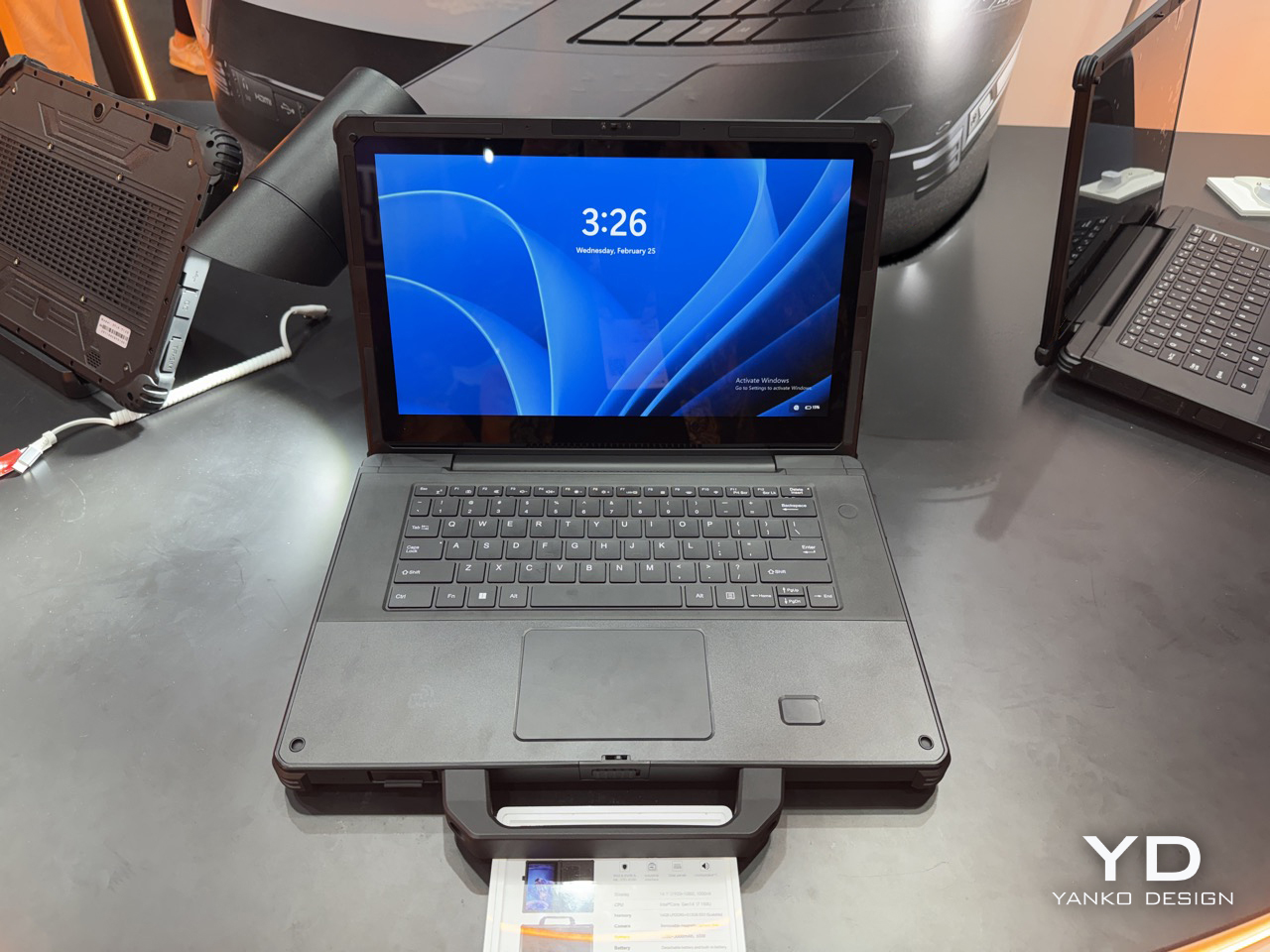
Under the lid, the RG14-P runs a 14th Gen Intel Core i7, 16GB of RAM, and 512GB of expandable storage, which puts it well past basic field terminal territory and into legitimate workstation range. The 14.1-inch touchscreen hits 1,000 nits, which matters enormously when your display is reflecting blue sky back at you. There’s also a 180-degree rotating magnetic camera, dual 5W speakers for noisy industrial environments, 65W fast charging as a backup, and IP68/IP69K certification currently in testing. IP69K specifically covers high-pressure, high-temperature jet spray, the kind of thing that happens near industrial cleaning equipment. The machine weighs 3.7kg, which is heavy, but rugged laptops have always made that tradeoff and nobody who needs one complains about it.

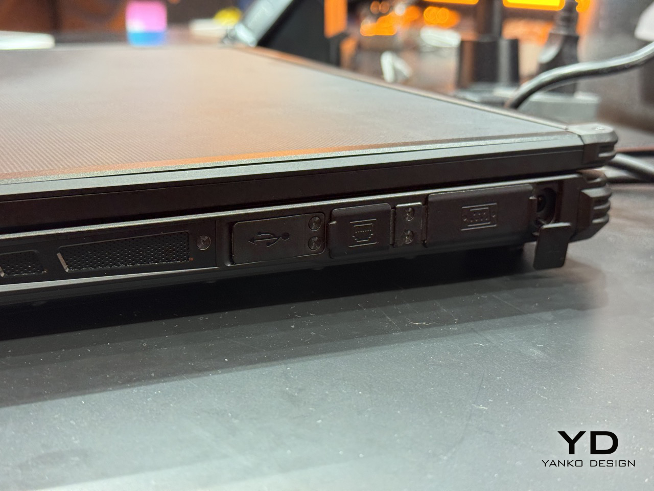
The connectivity stack is old-school in the best way: RS232, RJ45, HDMI, NFC, and fingerprint authentication. RS232 is serial protocol territory, the kind of interface still running on factory floor equipment and field measurement tools that haven’t been updated in a decade. Its presence signals that Oukitel actually mapped out real industrial workflows before finalizing the port selection, rather than building around a mood board. Compare that to where Lenovo has been spending its MWC energy lately: a rollable laptop at CES 2026 and a modular AI laptop concept at MWC 2026 that repositions the ThinkBook as an upgradeable platform. Both are interesting industrial design exercises, but neither one is solving a power access problem. The RG14-P is.

There’s also the RG14-L variant, which drops the solar lid and adds a built-in front camping light panel instead, turning the machine into a workstation and a light source simultaneously for night operations. Carrying less gear into a remote deployment is always a win, and building the light into the device rather than handing you a separate torch is exactly the decision you make when you’ve actually talked to the people using it. Pricing and availability are still unconfirmed post-Barcelona, and the IP68/IP69K certification is still in testing, so the most important durability claims haven’t been independently validated yet. Those are real open questions worth watching. But as a product that wraps the solar laptop concept around a genuine use case, with actual hardware specs and a shipping timeline, the RG14-P makes a far stronger argument for the idea than anything that’s come before it.

The post A Laptop With a Solar Panel Lid Just Showed Up at MWC 2026: Hands-on with Oukitel RG14-P first appeared on Yanko Design.
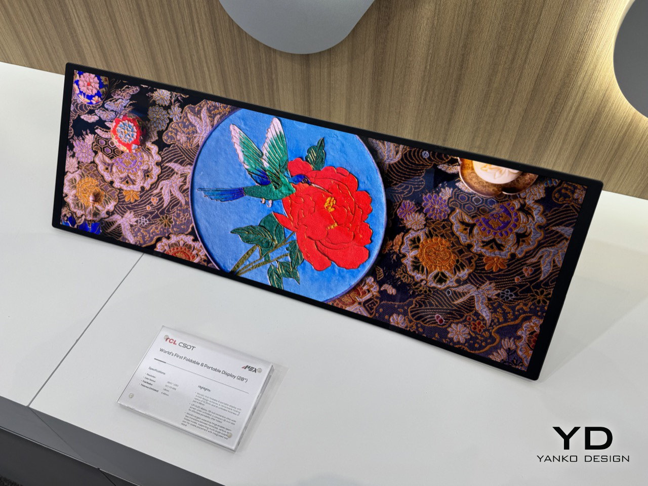
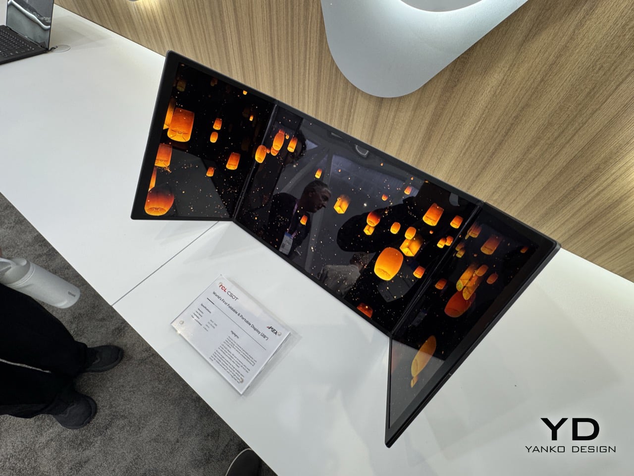
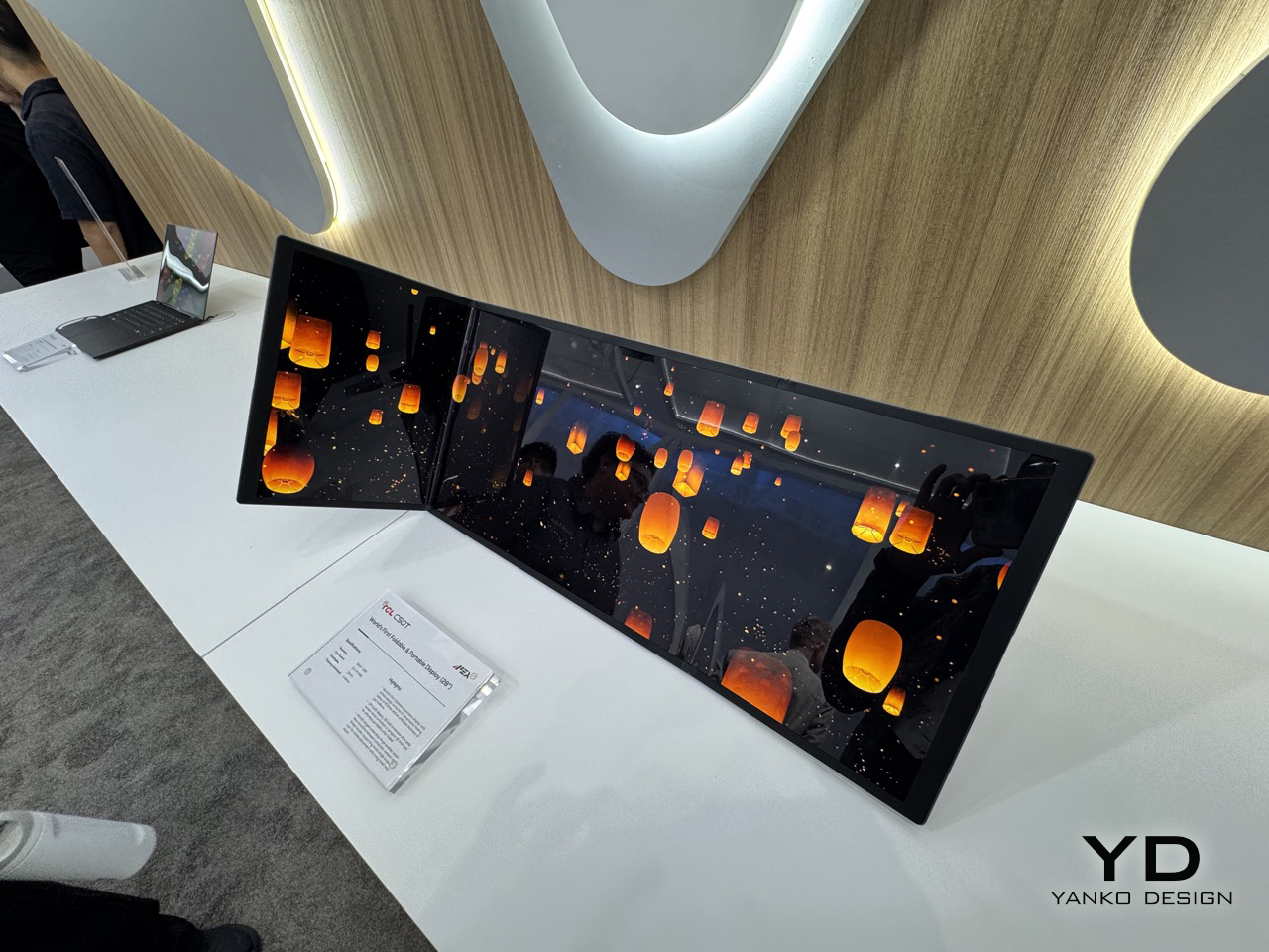
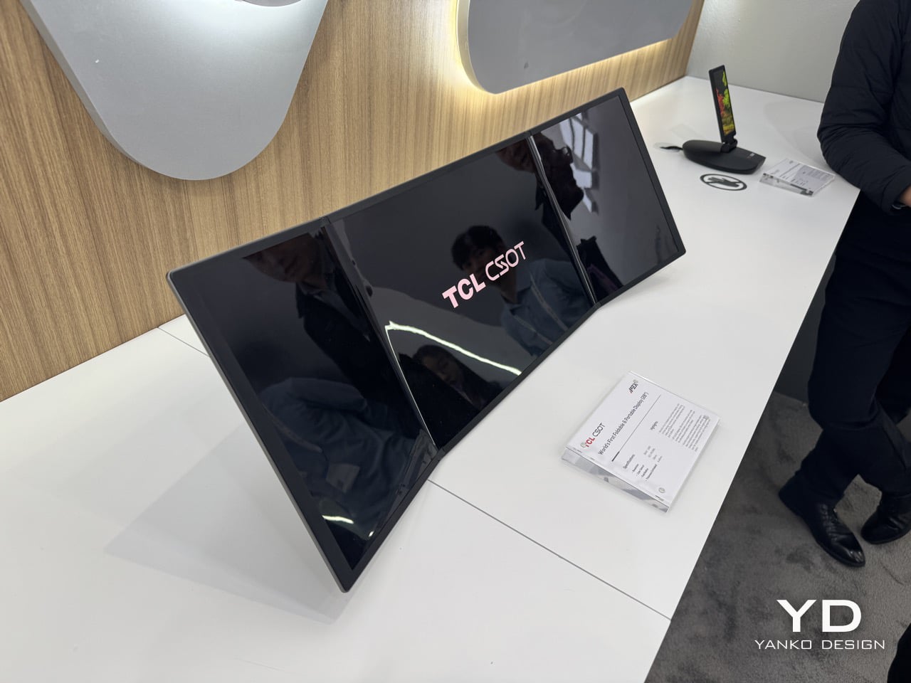
Meet The World’s First 28″ Tri-Fold Desktop Monitor: Hands-on with TCL CSOT Foldable Display at MWC 2026

The trifold idea has been tested to death on phones. Samsung, Huawei, and a handful of Chinese manufacturers have each taken their shot at folding a smartphone screen into thirds, with varying results. The Huawei Mate XT made headlines in 2024 as the world’s first mass-produced trifold phone, and then Huawei went further and stuffed a foldable display into a laptop. Lenovo tried something altogether weirder: a rollable screen that physically expands sideways, which is clever engineering built around a problem most people don’t have. TCL CSOT walked into MWC 2026 with a different angle entirely, and it landed.

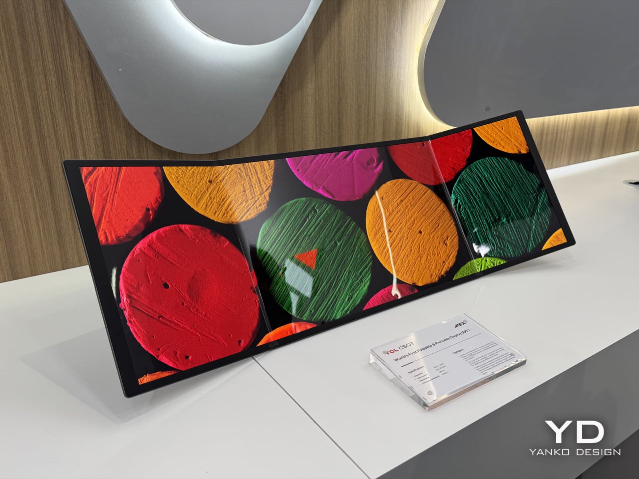
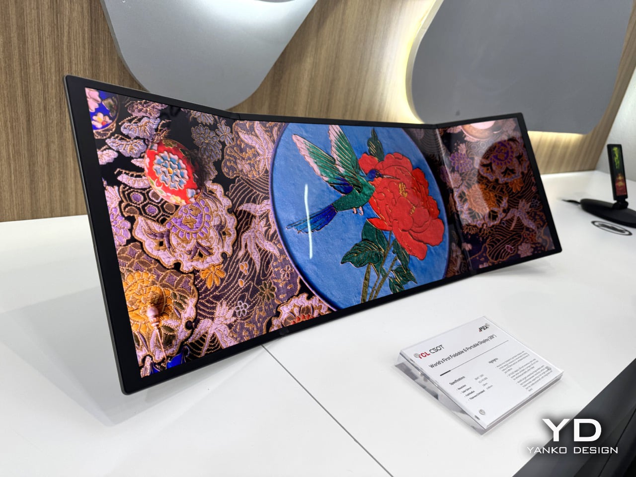
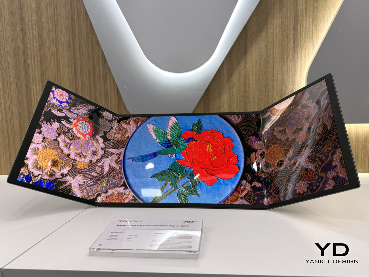
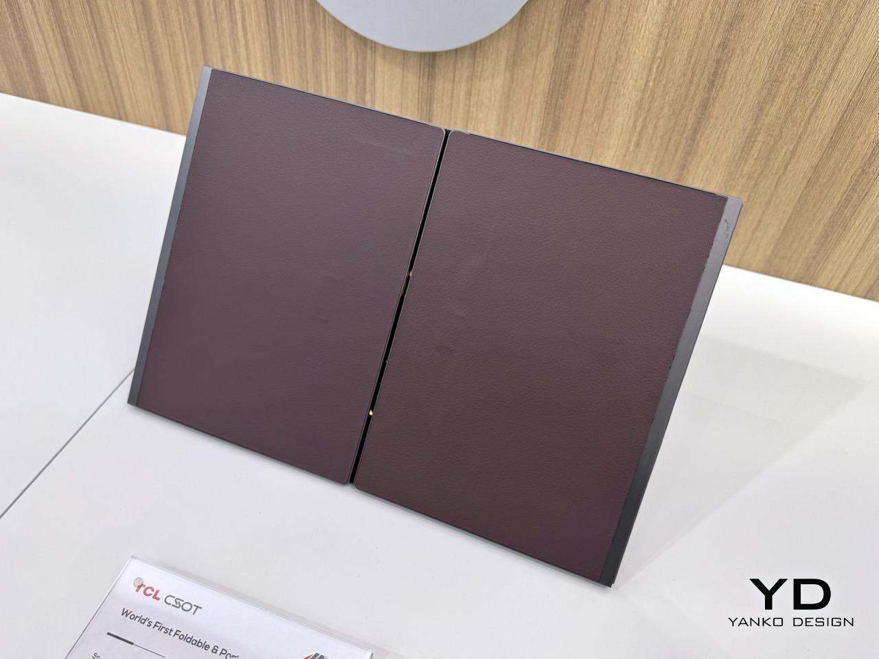
The 28-inch trifold monitor collapses to a 16-inch footprint for transport, which puts it roughly in line with what fits in a standard laptop bag. That 3840×1280 resolution spread across an ultra-wide aspect ratio gives you a panel that, when unfolded, genuinely looks absurd in the best way. The color gamut is DCI-P3 99%, so this is a cinema-grade screen, not a compromised one. What TCL has understood, and what the phone trifold race missed entirely, is that the use case for three folds is far stronger on a monitor than on a handset. Your phone doesn’t need 28 inches. Your desk setup, your hotel room, or your next flight absolutely does.

Designer: TCL

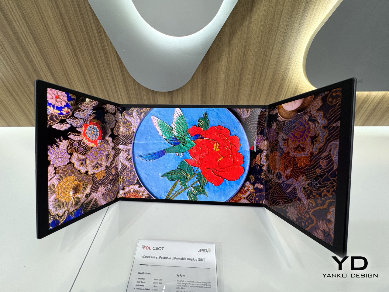
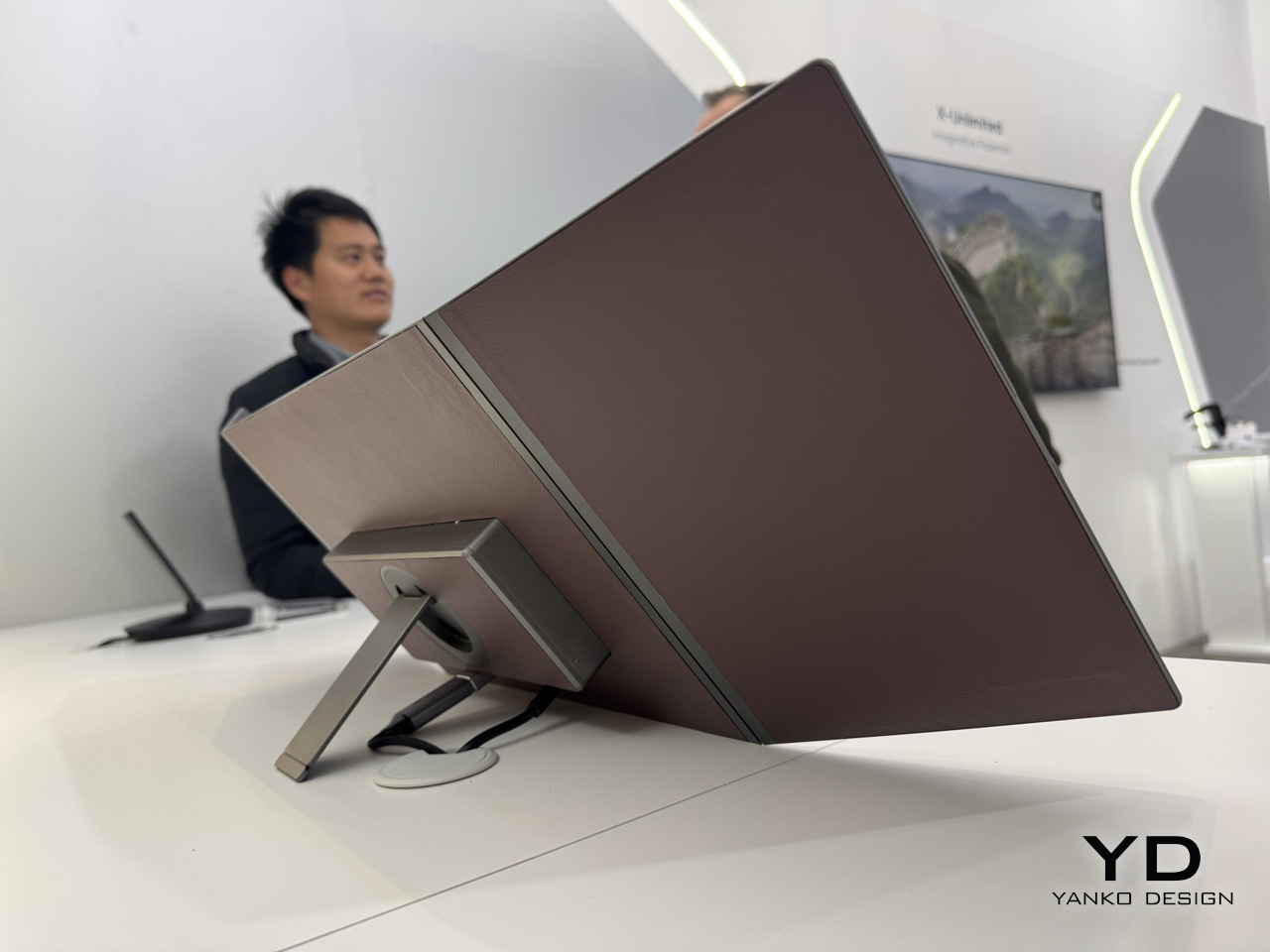
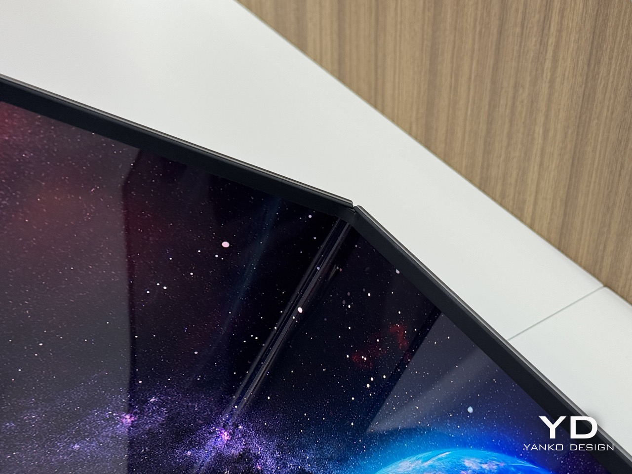
At 4.48mm when unfolded, the panel is thinner than most pencils, which makes the folded thickness even more impressive given the hinge hardware packed into it. The folding radius is R1.8mm, a number that sounds unremarkable until you consider how tight that crease is across a screen this wide, and how much precision engineering goes into preventing stress fractures at that radius. TCL calls the mechanism a waterdrop hinge, borrowed from the same architecture that the better phone foldables use, now scaled up to a 28-inch form factor. The hinge handles seamless transitions between horizontal, vertical, and folded positions, and the integrated rear stand supports multi-angle suspension with stable placement for however you need to prop it. That combination of hinge flexibility and stand design is what keeps this out of the conceptual gimmick category.

Keep it partially folded and you get something that starts behaving like a curved monitor. The two outer panels angle inward, creating a passive wrap effect that a flat ultra-wide simply cannot replicate without having a physical curve manufactured into the panel itself. The 3840×1280 field of view sits noticeably wider than what most monitors deliver below 34 inches on a flat panel, and the slight inward angle adds peripheral depth that genuinely affects how immersive the experience feels. The aspect ratio alone puts you in ultra-wide territory that most desktop users spend real money chasing. It rewards close-range use, the kind of face-in-screen focus you get at a proper workstation, not a portable screen propped on a table.

The IJP OLED (inkjet-printed OLED) process behind this panel is what makes the specs achievable. Inkjet printing deposits organic materials with greater precision and less material waste than conventional vapor deposition, which is part of why TCL can hit DCI-P3 99% at 4.48mm thick without anything feeling like a compromise. Huawei’s foldable laptop used a single crease, which limits reconfigurability to open or shut. Two folds changes the logic completely: fully open for productivity, partially folded for immersion, fully folded for transit. The trifold format finally has a product category where its complexity pays off.

TCL CSOT is not the consumer electronics brand most people recognize from the TV aisle. It is the panel manufacturing subsidiary of TCL Technology, founded in 2009, and it supplies display panels to other companies rather than selling directly to end users. Lenovo already uses TCL CSOT panels in devices including the Moto Razr 60 series and its rollable laptop concept. It’s worth noting that TCL CSOT won’t directly sell this 28″ monitor… but will rather license the technology out to manufacturers who see the merit in such a product existing. Maybe Lenovo’s next laptop could have such a display, who knows… As a result, no release window or pricing has been confirmed, but the production infrastructure is being built in parallel, which is a different situation from a pure prototype with no supply chain behind it.

The post Meet The World’s First 28″ Tri-Fold Desktop Monitor: Hands-on with TCL CSOT Foldable Display at MWC 2026 first appeared on Yanko Design.
Nothing Phone (4a) Hands-on at MWC 2026: Here’s which color NOT to buy…

Nothing has a flair for the dramatic – their MWC setup was no exception. Instead of a stuffy booth, they dropped a mysterious shipping container in an open square. It cranked open to reveal the Phone (4a) in its four colorways, a slick bit of industrial theater that gets people talking. We’d all seen the white and pink versions on YouTube, but seeing them in person alongside the brand new black and blue models changes the calculus entirely. It immediately became clear there are two versions of this phone you should absolutely buy, and two you should probably skip. The reasons are not what you might think, and it all comes down to the subtle interplay of material, color, and finish.
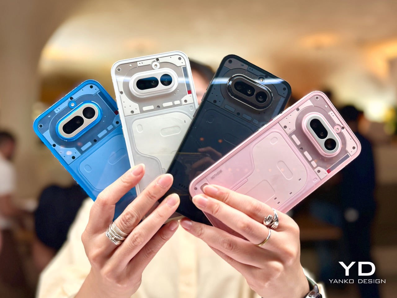
Lined up under glass, the quartet looked impressive. The initial reveal was just that, a visual presentation to let the press get their shots and build some hype. Nothing clearly knew which colors were their heroes; the white and pink that led their digital marketing campaign were positioned prominently. The black and blue felt like they were held back for this physical debut, and it makes sense why. In the controlled lighting of the display, they all looked sharp. But a phone isn’t a museum piece, it’s an object you hold and interact with in countless environments, and that’s where the story took a sharp turn later that evening.

Designer: Nothing

Later that night, the glass came off. At Nothing’s party, they had operational units for everyone to actually handle. First impressions… The device feels solid, and the overall form is a refinement of their established language. As I wrote last week, this is easily Nothing’s most confident design yet; it feels less like a startup experiment and more like a statement from a company that knows exactly what it’s doing. We cycled through the Glyph lights, pairing them with the classic and new generative ringtones, and the effect is still as cool as ever. But my focus was on how the materials felt, and how the colors held up in the real world.

Let’s get right to it: avoid the black. I know it’s the default safe choice for many, but it betrays the entire Nothing ethos. The earlier grey versions of their phones created a beautiful contrast, letting you peer in and appreciate the texture and layout of the components underneath. This new black is just pitch black. In low light, it becomes an amorphous blob, and under direct light, the glass back turns into a smudgy mirror, catching chaotic reflections that obscure any sense of depth. It loses all the nuance and visual intrigue that makes these phones special. You’re left with a simple black rectangle, and frankly, you can get that from anyone.

The blue is a more complicated story, and a more disappointing one. The shade of blue itself is fantastic, a vibrant choice that really stands out. The frame is the culprit here. Nothing uses plastic for its frames, which is fine, but the finish on the blue model makes it look and feel overtly like plastic. It has a certain sheen that reads as “budget-ish,” undermining the otherwise premium and considered design of the phone. While the frames on the white and black models have a finish that elevates them, the blue’s just doesn’t stick the landing. It’s a small detail that makes a huge difference in desirability. Thankfully, it’s a problem that can be solved with a good metal bumper case, if you’re truly set on the color.

This is why the white and pink versions are the ones to get. The white is the quintessential Nothing look; clean, architectural, and it showcases the internal components and Glyph system perfectly. The frame’s finish looks gorgeous and intentional. The pink is the surprise winner. It’s a fantastic, almost salmon-like shade that is both playful and sophisticated, and the finish on its frame works in harmony with the color. It feels fun without feeling cheap. Both of these colors feel like they were the primary focus of the design team, where the material choices and color selection are in perfect sync to create a cohesive and desirable object.

Of course, the phone is more than its colorway. The camera is genuinely impressive for this bracket. I took a few shots in the less-than-ideal lighting of the party, and while the processing takes a beat longer than you’d expect, the results are worth it. I was seriously impressed by the quality coming from the 3.5x lens; it’s sharp and holds detail well. The software felt snappy, and the screen is bright and responsive. It’s a proper smartphone experience, wrapped in a design that still turns heads and starts conversations, which has always been Nothing’s core strength.

This MWC party was just the appetizer for the main course. Nothing is holding another event on March 5th, where the full, official launch will happen. That’s when we’ll get the final specs, pricing, and availability. There is also a persistent rumor that the company will use that event to debut a more powerful Phone (4a) Pro model. Given the confidence on display in Barcelona, Nothing is clearly holding a few cards back for the big reveal. They got our attention with the hardware, now we wait to see the full strategy.

The post Nothing Phone (4a) Hands-on at MWC 2026: Here’s which color NOT to buy… first appeared on Yanko Design.