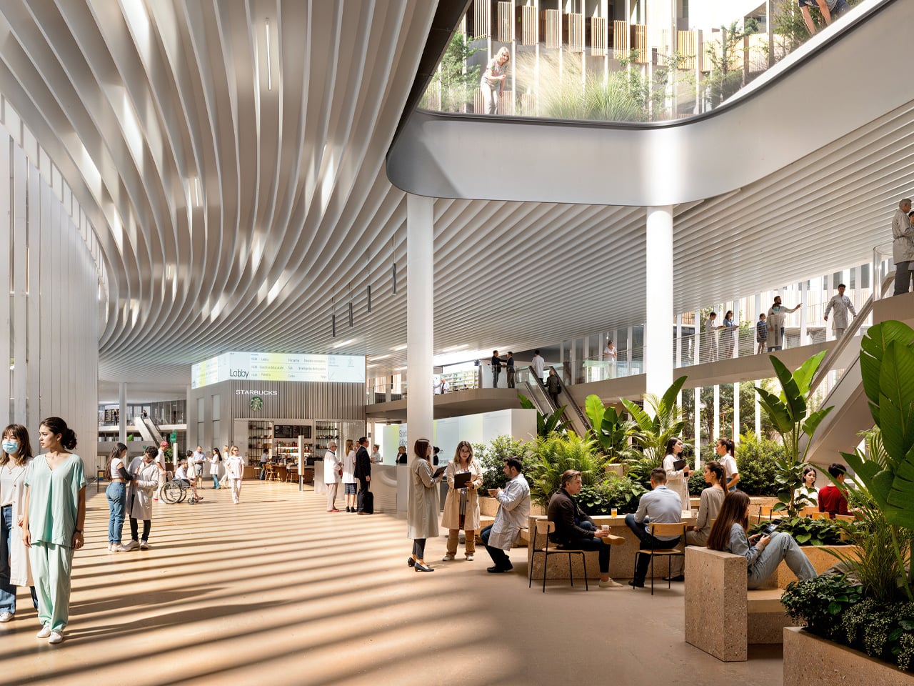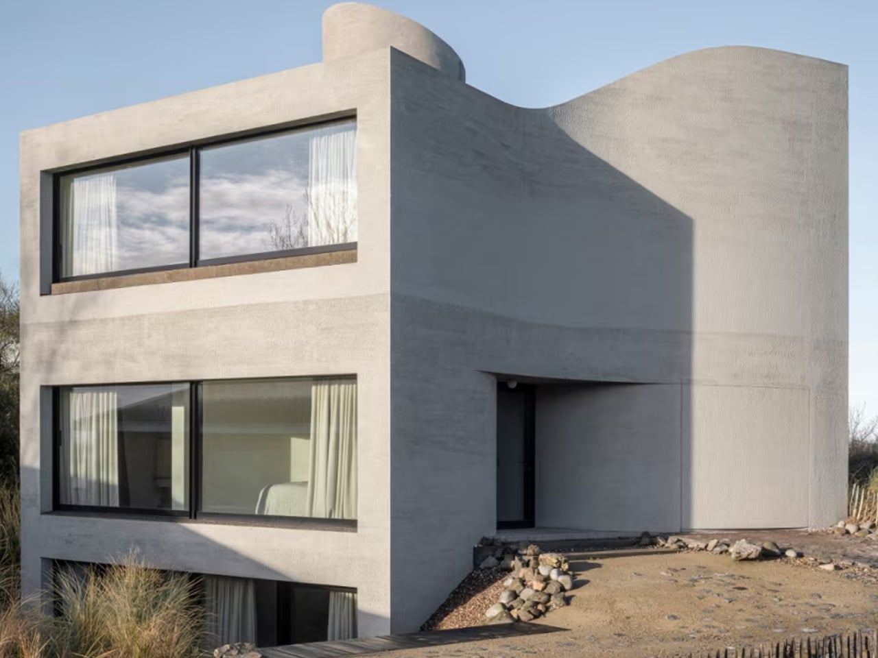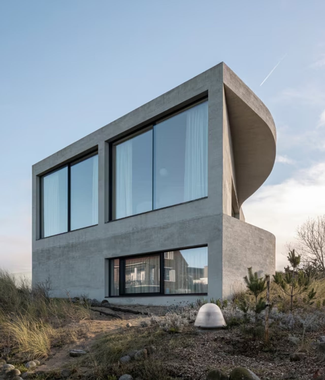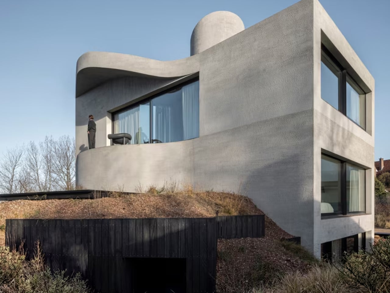
SoBA Stacks Color-Coded Blocks Into a Castle-Like Kindergarten That Defies Its Urban Surroundings

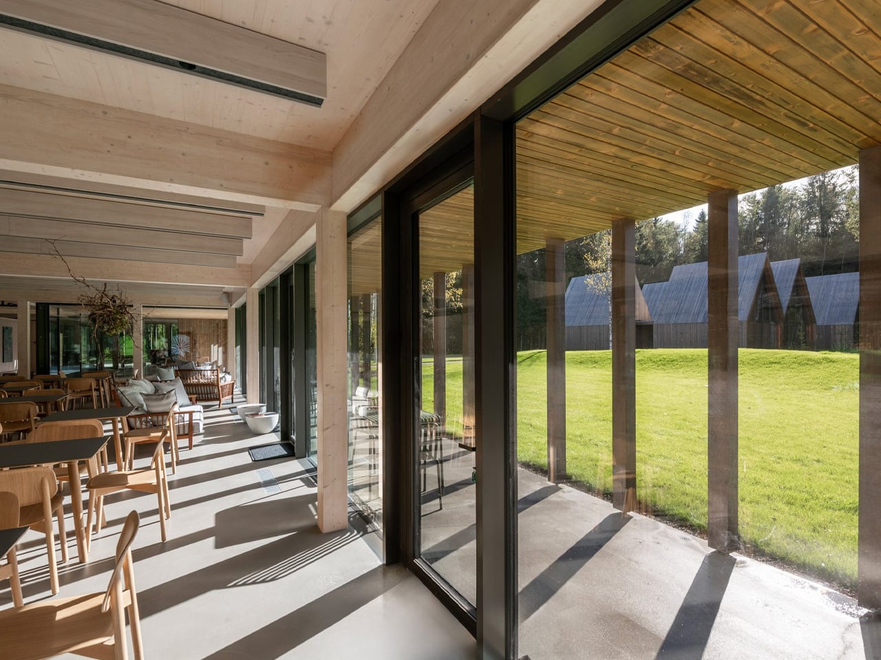
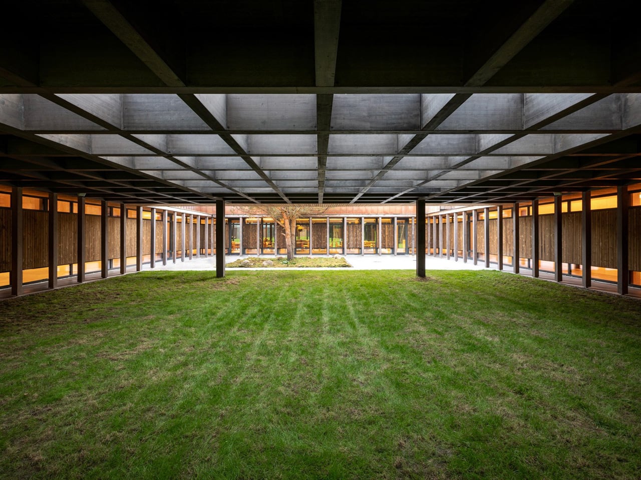
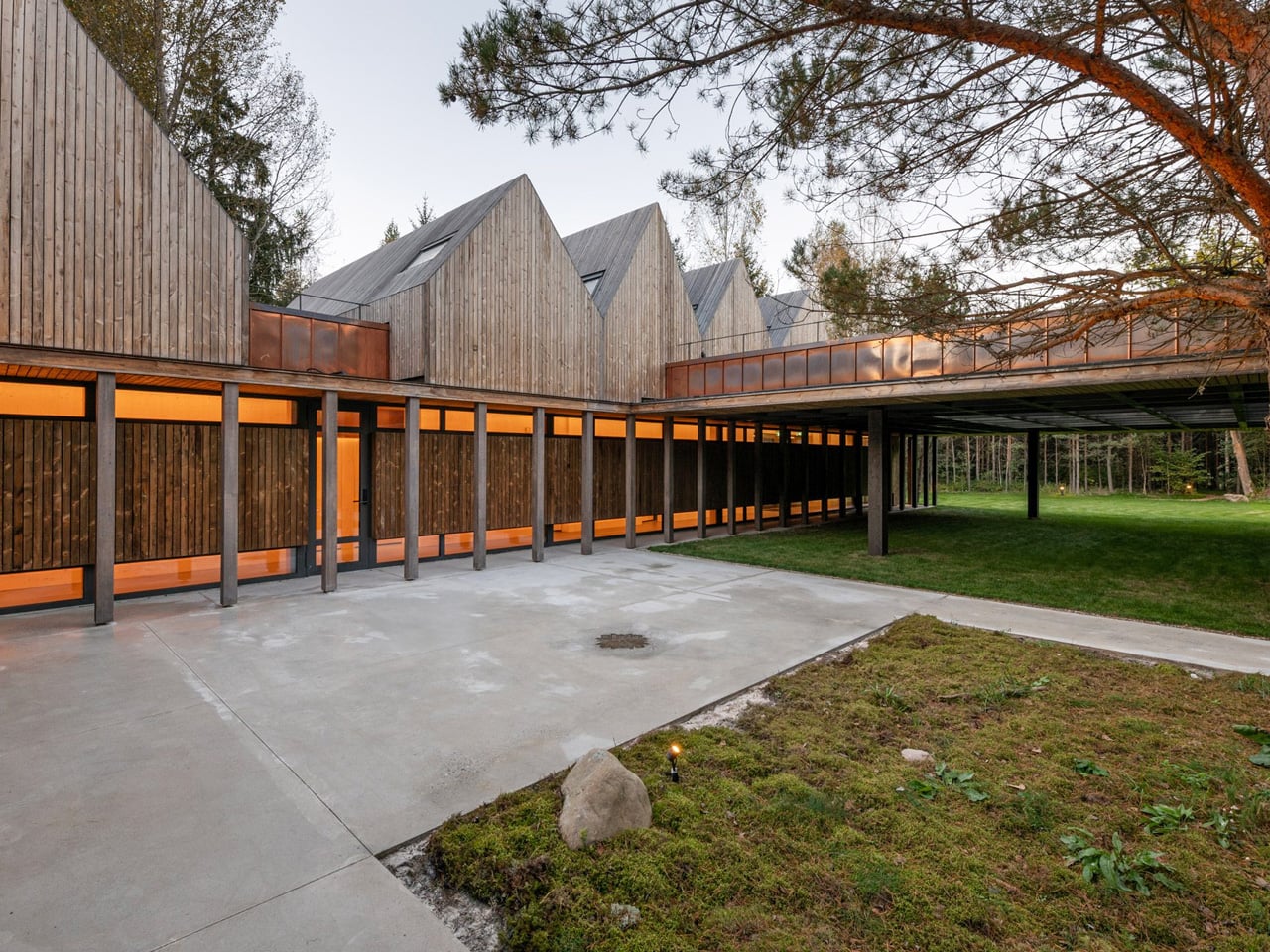
SoBA — the architecture and landscape practice led by Wang Ruo and Tang Haiyin — has completed Block Kindergarten in Kunshan, Jiangsu Province, a 21-class campus that stacks modular, color-coded volumes into something between a fortress and a LEGO set. Sitting east of Hongqi Road and north of Zhenchuan Road, the 9,012-square-meter campus doesn’t try to disappear into its surroundings. It holds its ground — and for good reason.

The site itself presents a genuinely difficult brief. High-rise residential towers crowd the north, more housing is planned to the east, and the south is lined with a 110kV substation, a waste transfer station, and an emergency medical center — the kind of infrastructure that leaves little room for poetry. SoBA’s response was to stop trying to negotiate with the context and instead build against it. The result is an inward-facing campus that prioritizes a protected inner world for children, using layered transitions between architecture and landscape to slowly introduce them to the city beyond.

Designer: SoBA

The organizational logic is direct: modular classroom volumes are stacked and arranged around a central courtyard that serves as the campus core. That courtyard integrates play, planting, and gathering in one continuous space — less a leftover void and more the beating heart of the whole scheme. Green landscape buffers line the perimeter, softening the transition from the campus edge to the surrounding infrastructure.

Color isn’t decorative here — it functions as spatial language. Children between three and six years old learn primarily through sensory perception, and SoBA leans into that, using variations in brightness and saturation to create gentle but legible spatial layers throughout. The reference point, according to the architects, is Luis Barragán’s concept of emotional architecture — the idea that a building can orchestrate light, color, and scale to evoke memory and feeling. Applied to a kindergarten, that philosophy translates into spaces that feel warm without being saccharine.

Transparency punctuates the massing at key moments. Glazed volumes interrupt the solid facade, letting children glimpse the sky, trees, and the city through carefully framed openings. Ecological thinking extends to the landscape: a planting garden in the southeast corner tracks seasonal growth cycles, while a rain garden in the northeast turns stormwater collection into a daily lesson. Block Kindergarten is a project that takes children seriously — architecturally, sensory-wise, and spatially — and it shows.

The post SoBA Stacks Color-Coded Blocks Into a Castle-Like Kindergarten That Defies Its Urban Surroundings first appeared on Yanko Design.
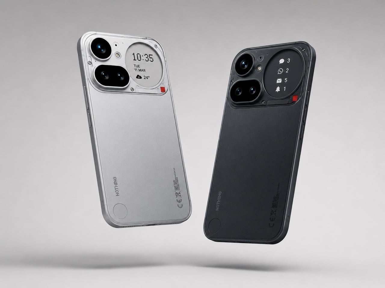
8 Summer EDC Essentials So Well-Designed We Carry Them Every Single Day

Summer edits your carry down to what actually earns its place. Pockets get shallower, days stretch longer, and the patience for objects that solve problems you don’t have disappears entirely. What survives that edit is a specific kind of thing — gear that performs with such quiet consistency you stop noticing it, until the day you leave it behind and immediately feel its absence. That’s the design standard this list holds to.

The eight products here span materials from full-grain leather to aircraft-grade titanium, functions from navigation to tracking to illumination, and price points from considered to genuinely surprising. Some are old enough to have earned their reputation without needing to announce it. Others are newer but carry the same unhurried confidence of objects that know exactly what they’re for. All of them reward a summer that moves fast and asks a lot from the things you carry.

1. AirTag Carabiner

Apple’s AirTag arrived as one of the most useful small objects of the last decade and shipped with no good answer to the question of how to carry it. Every case that followed treated the tracker as cargo — something to be accommodated rather than integrated. A purpose-built AirTag carabiner changes that relationship entirely, folding the tracker into a gate clip that performs as both tracking device and functional hardware without either function compromising the other. No protrusions, no awkward bulk, no aesthetic apology.

The summer case is specific. Beach bags left at a spot, day packs rotating between people, rental bikes at a festival — the carabiner means the AirTag follows the object rather than requiring a deliberate second step to attach or remember. Machined aluminum reads intentional alongside quality leather or ripstop goods and handles salt air, UV, and bag wear without complaint. It’s the kind of upgrade that seems obvious once you’re using it and unnecessary until the moment it isn’t.

Click Here to Buy Now: $149.00

What we like

  • Tracking hardware integrated into a functional carry tool removes the awkward middle step of managing a loose disc with no natural home
  • The gate clip handles real load and daily use rather than serving purely as a display mechanism for the AirTag

What we dislike

  • AirTag replacement requires opening the carabiner body, which varies by design and isn’t always a one-handed operation in the field
  • Works exclusively within Apple’s Find My network — Android users carry nothing usable here

2. Olight Baton 4 Premium Edition

The Baton 4 Premium’s best design decision isn’t the 1,300-lumen output or the magnetic tail cap — it’s the flip-top charging case that lets you activate the flashlight without removing it from the case at all. Open the lid, press the side button, and the light fires. That single interaction collapses the gap between a flashlight that lives in a bag and one that’s actually ready when something happens. The case also carries 5,000mAh, which means it recharges the Baton 4 up to five times and fills a phone running low mid-afternoon.

Summer nights are specifically where this earns its keep. Power outages during heat waves. Poorly lit parking structures at outdoor venues. The walk back to a campsite after a late fire. The magnetic tail cap converts the flashlight into a freestanding lantern by sticking to any steel surface, removing the need for a separate camp light in most situations. The IP68 waterproof rating handles rain without any adjustment required. Olight has made fewer products than most of its competitors and made them better, and the Baton 4 Premium is the clearest expression of that.

What we like

  • The charging case serves as a functional 5,000mAh power bank and activates the flashlight without removing it — two carry problems resolved by one object
  • The magnetic tail cap frees both hands during stationary tasks without requiring any additional accessories

What we dislike

  • Maximum 1,300-lumen output demands battery and drains quickly at full brightness — the case is a compensating mechanism, which means they need to travel as a pair
  • The case adds volume to the carry; users wanting the flashlight alone will need to leave the case’s power bank function behind

3. CraftMaster EDC Utility Knife

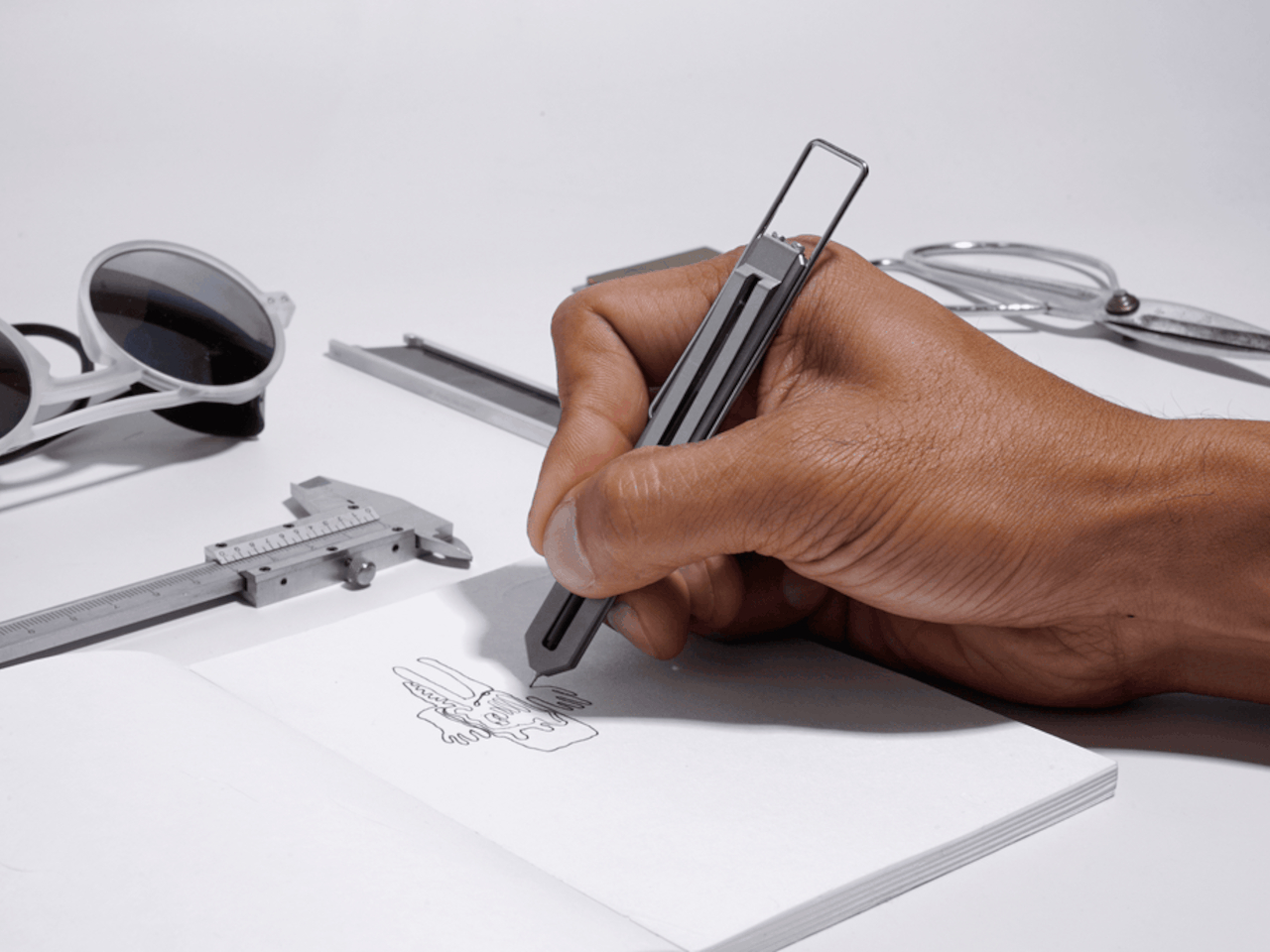
Most utility knives are industrial objects that tolerate being carried rather than inviting it. The CraftMaster moves the design conversation to a different place — a slim, considered profile that sits flush in a pocket and deploys a blade with the kind of controlled action that signals something built to a real standard. The form factor is purpose-built for people who cut things regularly during the day but don’t want to reach for an object that looks like it belongs on a construction site.

The blade swap mechanism is where the functional case gets specific. Precision work, whether opening summer deliveries to a vacation rental, trimming materials mid-project, or handling gear maintenance on the road, is better with a fresh edge rather than an apologetic compromise of a dull one. Having a design that makes the blade replacement clean and fast, rather than a minor ordeal, matters in practice across a long season of daily use. This is an EDC knife that understands the difference between a tool you carry and one you keep reaching for.

Click Here to Buy Now: $80.00

What we like

  • The slim profile fits a shorts pocket without the blade-forward bulk that makes most utility knives feel incompatible with summer carry
  • Replaceable blades mean the cutting performance stays consistent across the full season rather than degrading to an acceptable diminishment

What we dislike

  • Utility blades require sourcing compatible replacements, which adds a minor supply consideration that a fixed-blade EDC knife doesn’t carry
  • The design sits closer to a precision tool than a versatile field knife, which may not satisfy users looking for one object to handle both categories

4. Orbitkey Key Organiser

A standard key ring solves the organizational problem with the bluntness of something designed before pockets had size constraints. Keys stack against each other, jingle against everything nearby, and press uncomfortable ridges into the thigh pocket of summer trousers all day. The Orbitkey stacks two to seven keys flat inside a full-grain leather spine and stainless steel hardware, held under tension, producing no movement and no sound. Closed, it sits flat. In a pocket, it disappears.

The leather exterior develops its own grain and wear pattern over years of daily use — an explicit design position about longevity that most keychain products don’t take. The two-screw expansion system accommodates keys confidently up to its rated capacity, and a small ring attachment handles anything that doesn’t stack flat inside the body. Five colorways cover the range from black dress leather to warmer cognac tones. This is an object that solves a problem so quietly that after the first week, you only notice it when you try to go back.

What we like

  • The tension stacking system eliminates key jingle, which sounds like a minor quality-of-life gain until you experience the cumulative silence of a full summer without it
  • Full-grain leather construction ages into character rather than showing damage — the material signals a product built to outlast the trend cycle

What we dislike

  • Initial key installation involves a screwdriver and careful threading — not difficult, but not intuitive either, and the setup time is a real first-use commitment
  • Oversized or irregularly headed keys may not stack cleanly within the system’s geometry, which is worth checking before purchase

5. DraftPro Top Can Opener

A can opener is one of those objects most people own in the worst version that technically works. The DraftPro is the version that makes the case for caring about the design of a can opener, built around a top-cut mechanism that removes the entire lid flush rather than creating a jagged inner edge. The resulting can becomes a safe, open container rather than a minor hazard. The form is compact, the materials are considered, and the grip handles the torque of the task without requiring you to adjust mid-turn.

In summer specifically, the top-cut mechanism earns its place during outdoor cooking — at a campsite, a tailgate, or a beach house stocked with canned goods and minimal gear. There’s no snagged lid to fish out of the contents and no sharp rim to watch for when reaching into the can. The compact footprint means it packs into a cooking kit without requiring its own dedicated compartment. It’s the kind of product that rewards the decision to care about the design of even the tools you only reach for occasionally.

Click Here to Buy Now: $60.00

What we like

  • The flush top-cut mechanism removes the lid cleanly with no jagged inner edge and no floating metal to dig out of the food — a genuine functional improvement over the standard approach
  • Compact enough to live in a cooking kit, travel bag, or kitchen drawer without claiming space it hasn’t earned

What we dislike

  • The top-cut mechanism requires slightly more grip coordination than a traditional side-cut opener — the learning curve is short but real for first-time uses
  • Not designed for cans with non-standard lip profiles, which occasionally appear in imported or specialty goods

6. Loki Nav Compass

Most navigation tools have been optimized for a single condition: favorable ones. The Loki Nav by EckDesign starts from the opposite position — a Grade 5 titanium compass system engineered specifically for the conditions where GPS fails, the phone goes flat, or the environment makes electronics unreliable. Three interchangeable oil-filled compass modules provide a redundant navigation system in a 46.5mm body weighing 48 grams. The IPX8 waterproof rating means submersion to a meter for thirty minutes is a non-event. The cap houses a 12× magnifying loupe, an emergency mirror, and a wood file for fire-starting tinder.

The design logic is worth pausing on. Everything non-essential has been removed; everything that remains serves a specific function under pressure. The loupe rotates to protect the lens when not deployed. The mirror sits inside the cap, accessible without disassembly. The compass modules swap out via a toothpick through a base hole — a repair mechanism that works without tools. Summer outdoor itineraries that push past well-marked trails, coastal kayaking routes, and backcountry hiking all describe situations where the Loki Nav transitions from a beautiful object in a pocket to the most important thing in it.

What we like

  • Three interchangeable compass modules create a navigation system with built-in redundancy — a design decision that treats reliability as a first principle rather than a feature mention
  • The 3-in-1 cap packs mirror, loupe, and fire-starting file into a hinged cover rather than requiring separate tools for each function

What we dislike

  • At 48 grams in titanium, the Loki Nav is noticeably heavier than a basic compass — the weight is justified by the feature set but worth considering for ultralight carry setups
  • The compass module swapping mechanism, while elegant, involves a toothpick-through-base-hole method that takes practice to execute cleanly under field conditions

7. WESN Ridgeback Microblade

WESN approaches EDC from a position most tool brands don’t occupy — the belief that a well-made small object can carry the same material and craft standards as something three times its price and size. The Ridgeback Microblade is a fixed blade built to live in a pocket or on a keychain without announcing itself, machined from titanium with a blade steel chosen for edge retention under daily-use conditions. The form is narrow enough to disappear into any carry setup and substantial enough to register as a real cutting tool when deployed.

Fixed blades are fundamentally more useful than folding knives in the situations that matter most — faster deployment, no mechanical failure point, and less maintenance over a season of outdoor use. The Ridgeback addresses the reason most people don’t carry one: size. This is a blade designed for the specific constraint of summer pockets, where the margin between comfortable carry and uncomfortable carry is measured in millimeters. It’s the kind of precision that only appears when a brand is genuinely thinking about the object rather than simply satisfying a product line requirement.

What we like

  • The fixed blade format provides faster, more reliable deployment than any folder, while the Ridgeback’s profile keeps it genuinely pocketable in summer carry
  • Titanium construction handles salt, humidity, and daily use without the maintenance overhead that blade steel requires in coastal summer environments

What we dislike

  • Fixed blades occupy a complicated legal position in some jurisdictions — blade length and carry rules vary by location and are worth checking before traveling
  • The minimal form factor prioritizes portability over grip depth, which limits utility for tasks requiring sustained cutting pressure

8. Urban Pack

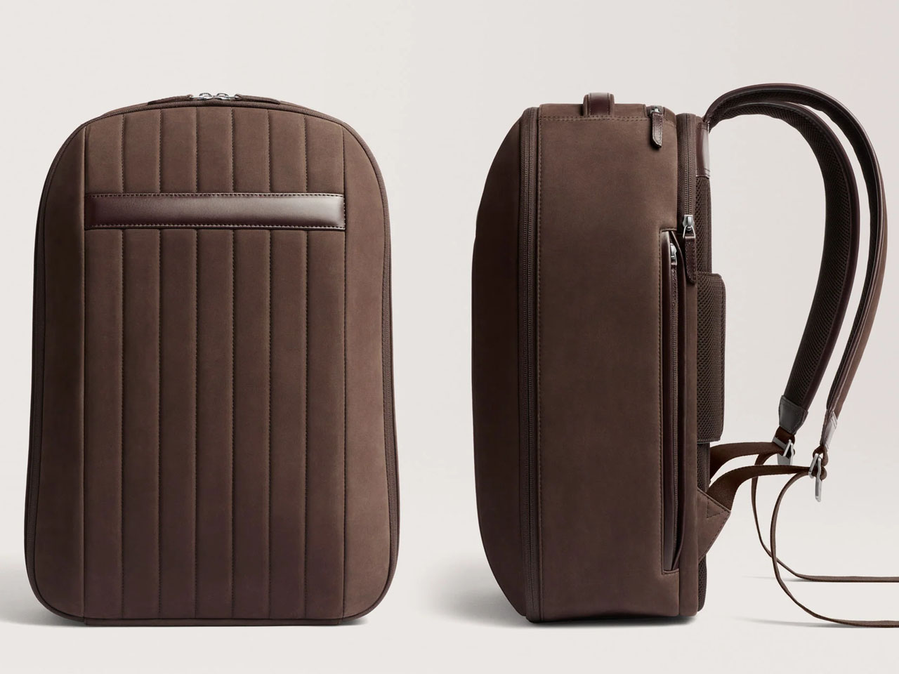
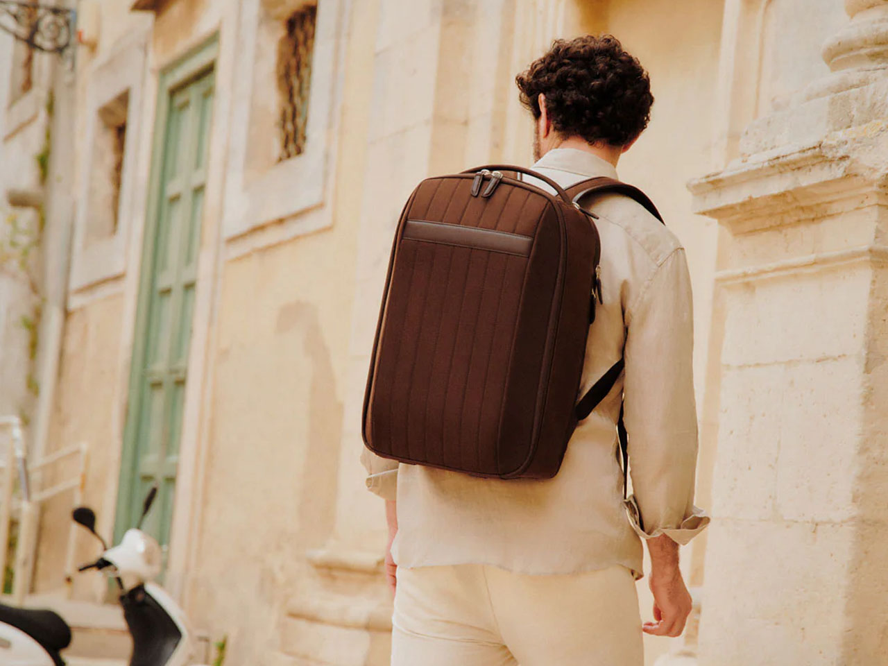
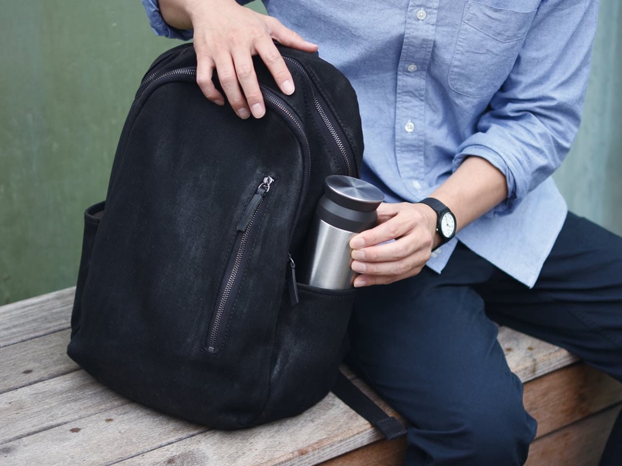
The Urban Pack resolves the tension that every commuter bag eventually creates: the design that works for a laptop meeting doesn’t work for a weekend overnight, and vice versa. Loft of Combie’s approach is modular — a carry system built around zippered separation that lets the bag configure to the day rather than requiring you to pack around a fixed interior. The external form reads clean and intentional rather than tactical, which matters when the pack is moving between a client-facing context in the morning and a trail or beach in the afternoon.

Summer specifically is the season when a single bag that reads across contexts is the most valuable thing in a carry rotation. Travel weekends, work trips that extend into leisure, day hikes that start from an office — the Urban Pack absorbs these transitions without requiring a gear change. The construction is honest about its materials, and the strap system distributes load without the overengineered hardware that makes most technical packs look like they belong in a different context entirely. This is a bag that earns its place through daily practicality rather than feature accumulation.

What we like

  • The modular configuration adapts to the actual demands of the day rather than requiring the user to adapt their packing to the bag’s fixed logic
  • The considered exterior aesthetic moves comfortably across professional and outdoor contexts without the visual code-switching that tactical bags force

What we dislike

  • Modular systems require an initial investment of time to understand how the configurations interact — the flexibility is real, but so is the learning curve
  • The clean exterior silhouette prioritizes appearance over external attachment points, which limits quick-access options for high-frequency items during active use

The Best EDC Is the Gear You Stop Thinking About

Every one of these objects earned its place through the same filter — not by being the most expensive or the most specified, but by being the most considered. Good EDC design doesn’t ask you to sacrifice function for form or form for function. It finds the point where those two things stop arguing and start working together, then holds that line across daily use, weather, and the small, relentless friction of a summer that moves faster than you plan for.

What ties this specific eight together is the refusal to waste a single design decision. The AirTag Carabiner doesn’t apologize for being two things at once. The Loki Nav doesn’t hedge on durability. The Orbitkey doesn’t give you extra features you didn’t ask for. That restraint is harder to achieve than complexity, and it’s what makes these objects feel inevitable once they’ve been in your pocket long enough. Summer is the best time to find out which gear is actually worth carrying.

The post 8 Summer EDC Essentials So Well-Designed We Carry Them Every Single Day first appeared on Yanko Design.
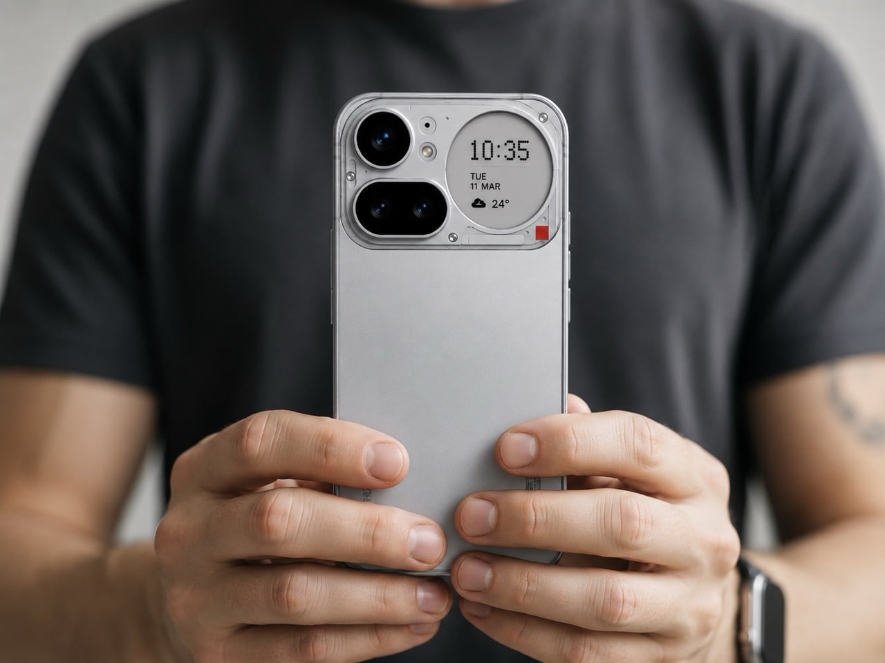
Africa’s Tallest Tower Was Worth the 40-Year Wait

Forty years is a long time to wait for a building. But when you see what’s rising in Abidjan, the delay starts to feel almost intentional — like the city was simply holding its breath for the right moment. Tour F, the supertall skyscraper currently piercing the skyline of Ivory Coast’s economic capital, was first imagined in the 1970s as part of a sweeping urban development plan for Abidjan’s Plateau district. The idea was straightforward: complement the existing administrative towers — A through E — with a sixth.

What wasn’t straightforward was actually building it. The project stalled for decades, a vision suspended in bureaucratic and economic uncertainty. Construction finally broke ground in 2021, with BESIX Group drilling 70 foundation bars and 62-meter-deep diaphragm wall panels to anchor the structure.

Designer: Pierre Fakhoury

Designed by Lebanese-Ivorian architect Pierre Fakhoury — the same mind behind the breathtaking Notre-Dame de la Paix Basilica in Yamoussoukro — Tower F is not trying to be a generic glass box. It has something to say. The form is sculptural: a slender volume whose facade is carved into trapezoidal inclined glass planes, each facet tilting inward toward the earth or reaching toward the sky. The top is cleanly truncated, then crowned with a dramatic extension of the glass facade that dissolves into open air. It’s restrained and bold at the same time — a difficult balance that Fakhoury pulls off with architectural confidence.

What makes the design genuinely compelling is its embedded cultural logic. When viewed from a certain angle, the play of facets reads as a stylized African mask — a nod to West African artistic tradition embedded quietly into a 21st-century supertall. The building is symmetrical along its east-west axis, grounding the sculptural gesture in structural clarity. At street level, a simple rectangular podium houses the main entrance hall and support services, keeping the base honest and approachable despite the tower’s imposing scale.

At 421 meters, Tower F is set to claim the title of Africa’s tallest building, surpassing The Leonardo in Johannesburg. The gross floor area reaches approximately 140,000 square meters, consolidating government ministries and administrative units currently scattered across the city — a practical ambition wrapped in an extraordinary shell.

Construction costs are estimated at approximately €450 million, developed through a collaboration between the Ivorian Ministry of Construction and local firm PFO Africa. Completion is expected in 2026. For a continent whose architectural ambitions are accelerating fast, Tower F is exactly the kind of project that reframes the conversation — not just about African skylines, but about what it means to design a building that carries cultural memory into the future.

The post Africa’s Tallest Tower Was Worth the 40-Year Wait first appeared on Yanko Design.
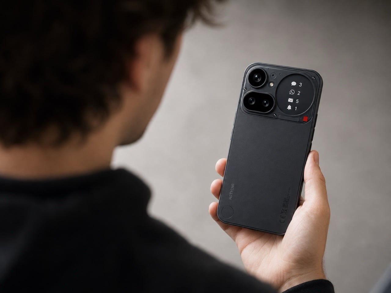
This Extra Wide Tiny Home Ditches the Loft and It’s Better for It

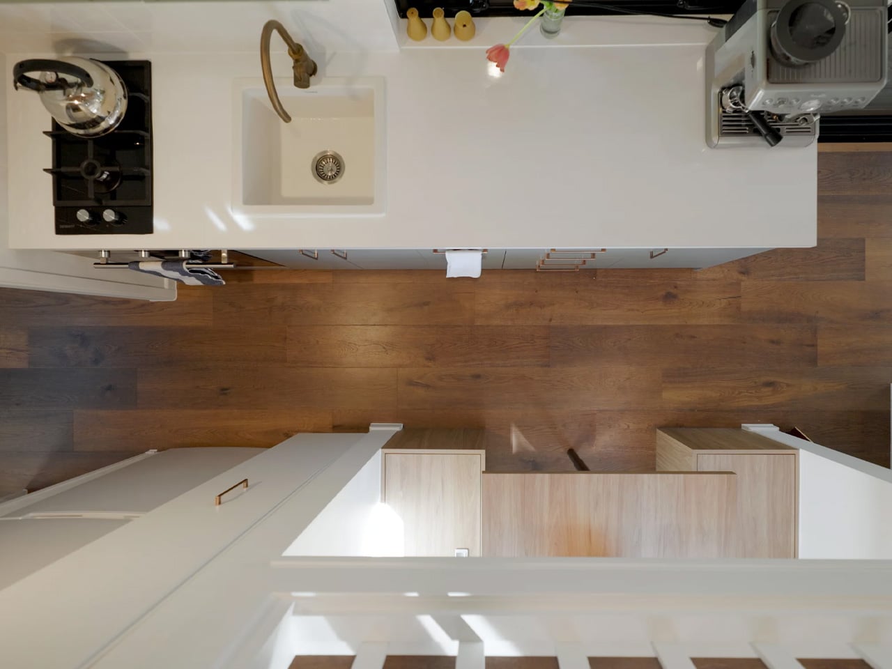
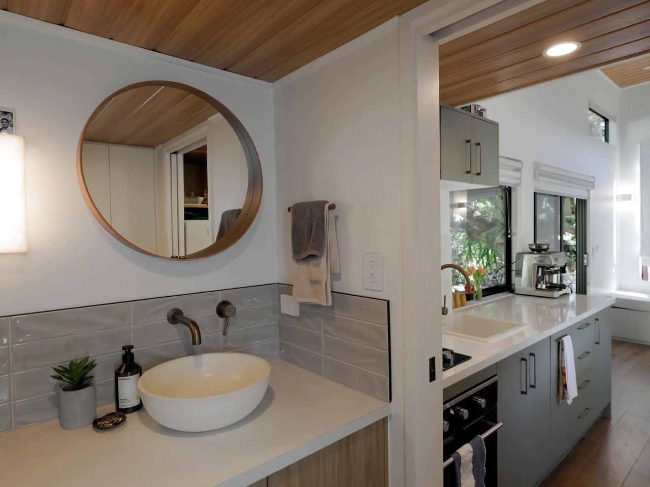
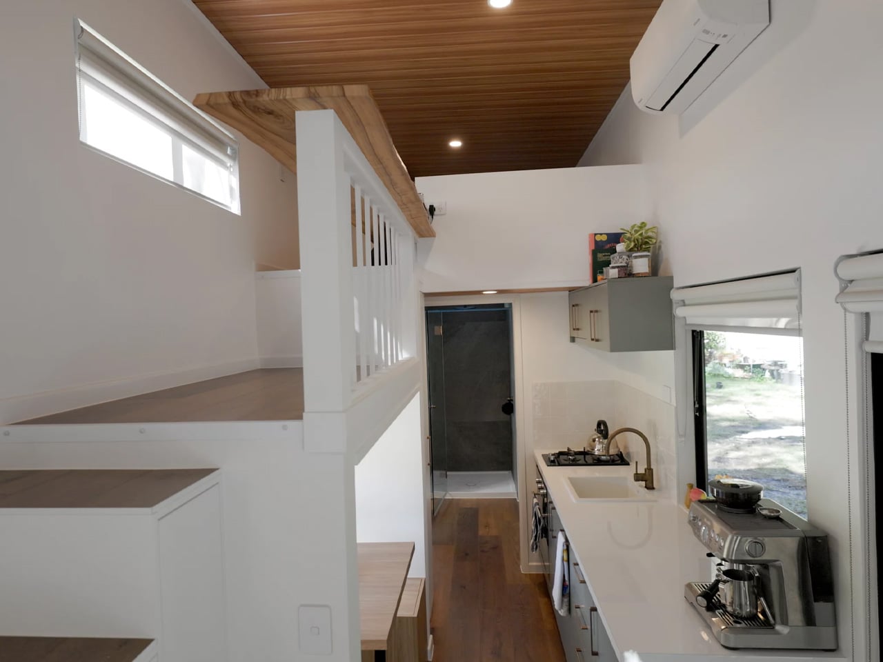
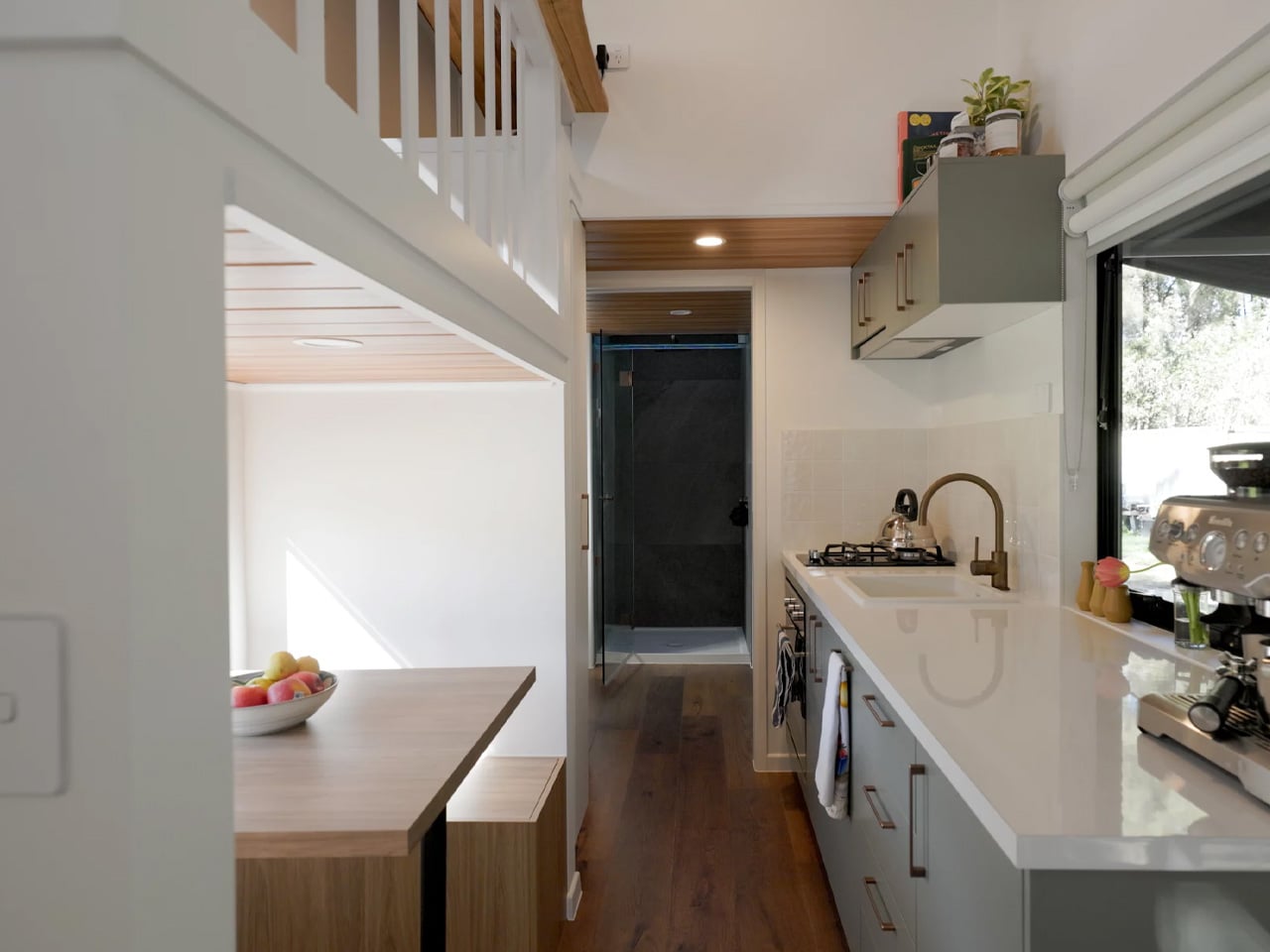
The loft bedroom is tiny home design’s most accepted cliché. Most designs in this space stack a sleeping loft above the living area and call it efficient. The Rose, a custom build by Vancouver Island-based Rewild Homes, takes a different position entirely, one that’s turning heads for all the right reasons.

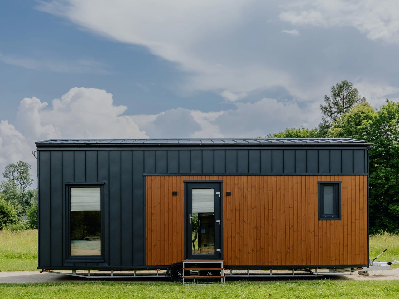
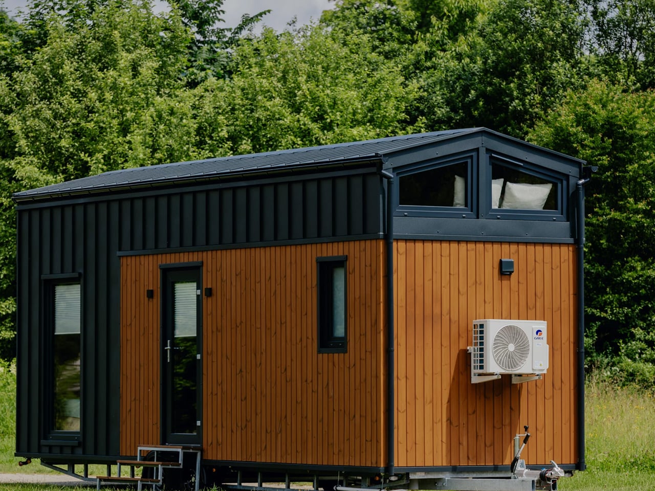
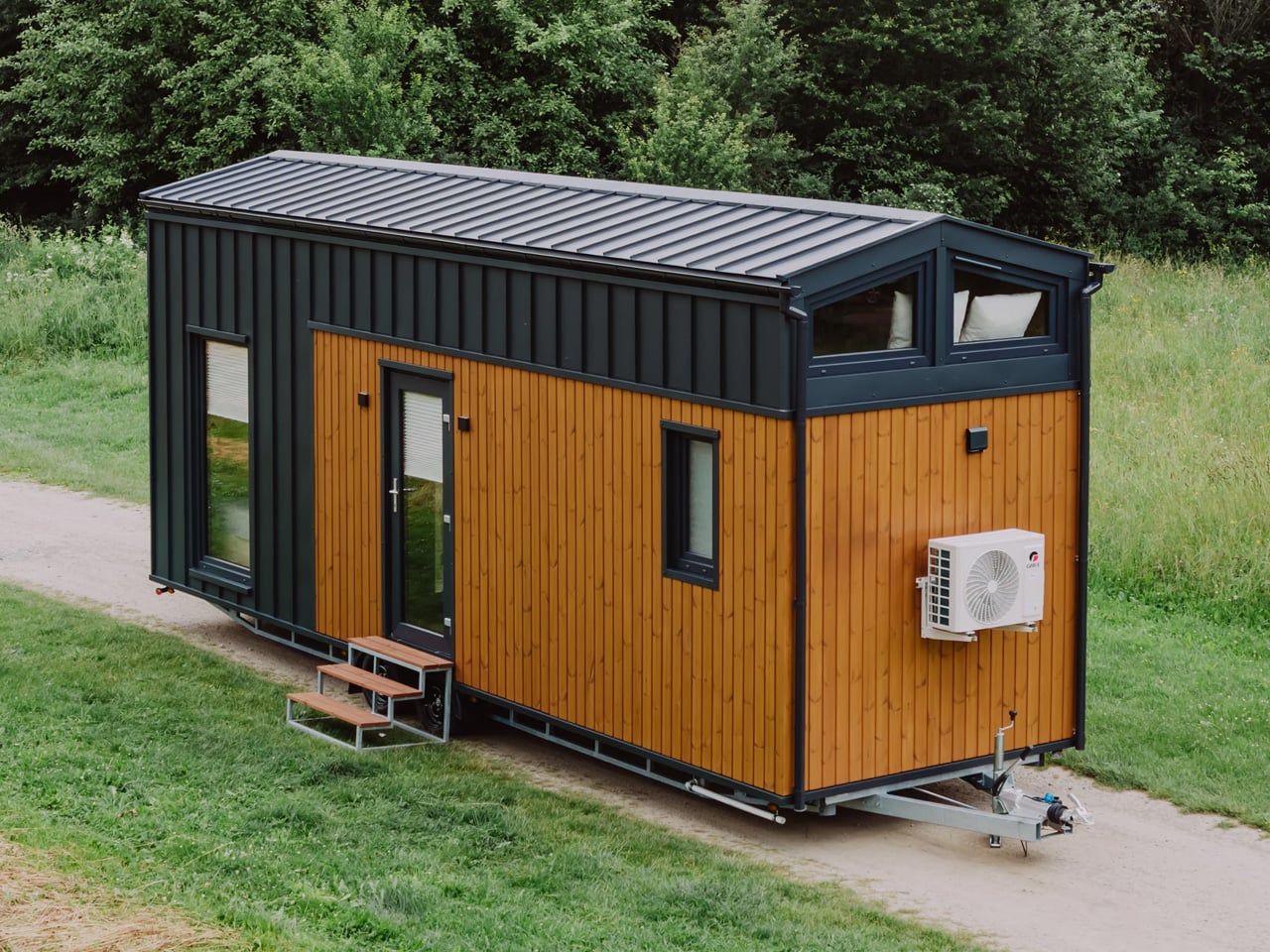
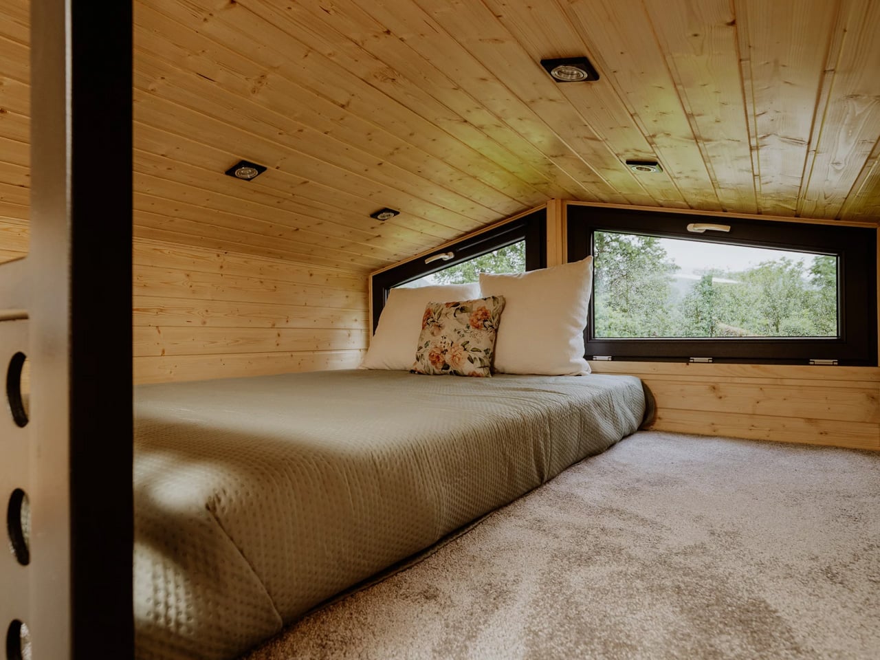
Named after the client’s beloved donkey, the Rose measures 30 feet long by 10’6″ wide, making it extra wide by tiny home standards. That additional footprint isn’t just a spec sheet flex. It’s what makes the entire layout feel less like a compromise and more like a considered place to actually live. The interior opens up in a way that standard narrow builds simply can’t achieve, bright, breathable, and genuinely functional across a single floor.

Designer: Rewild Homes

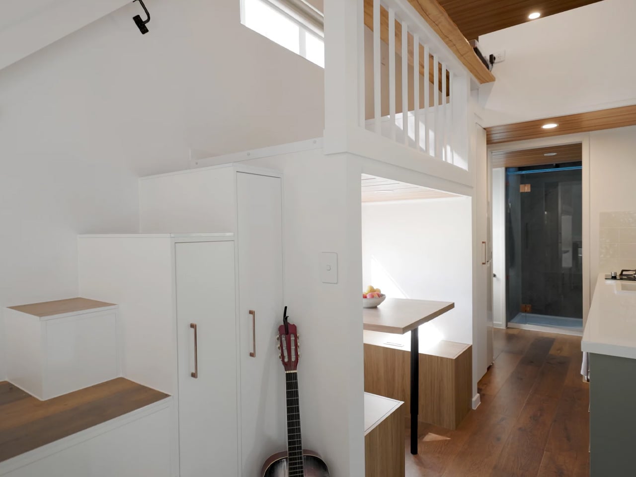
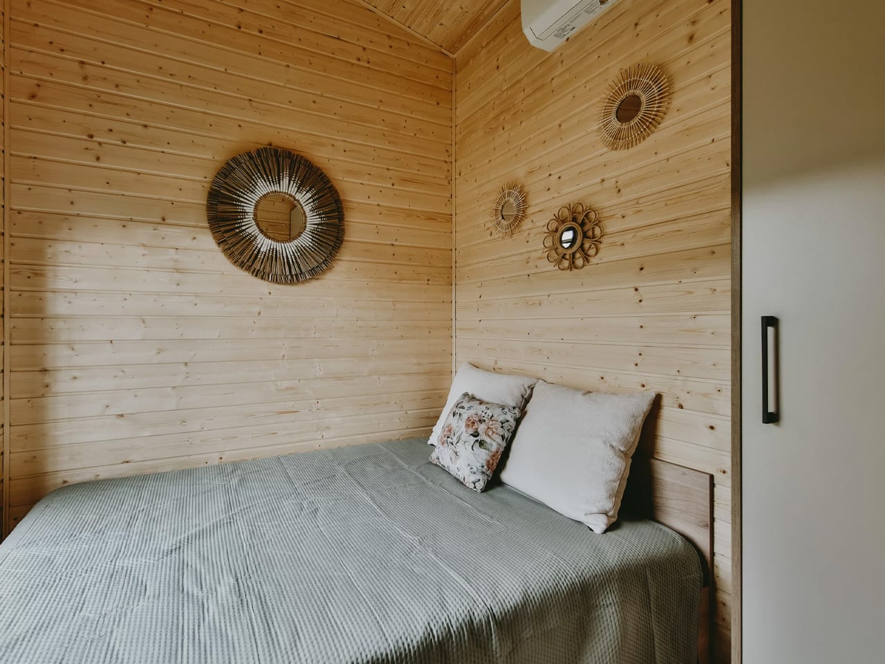
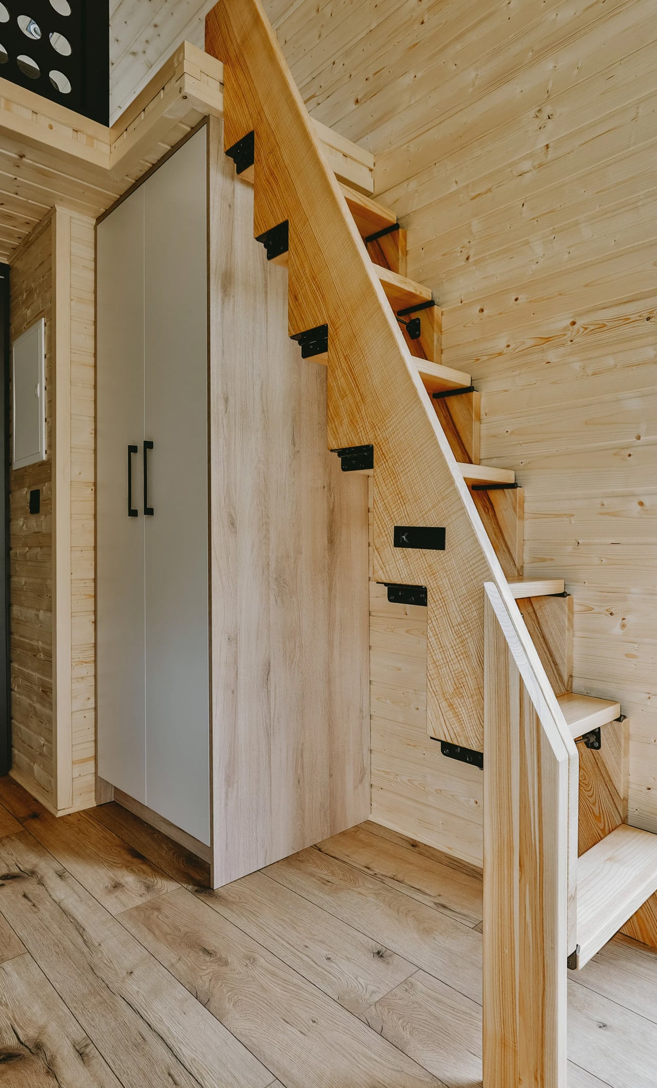
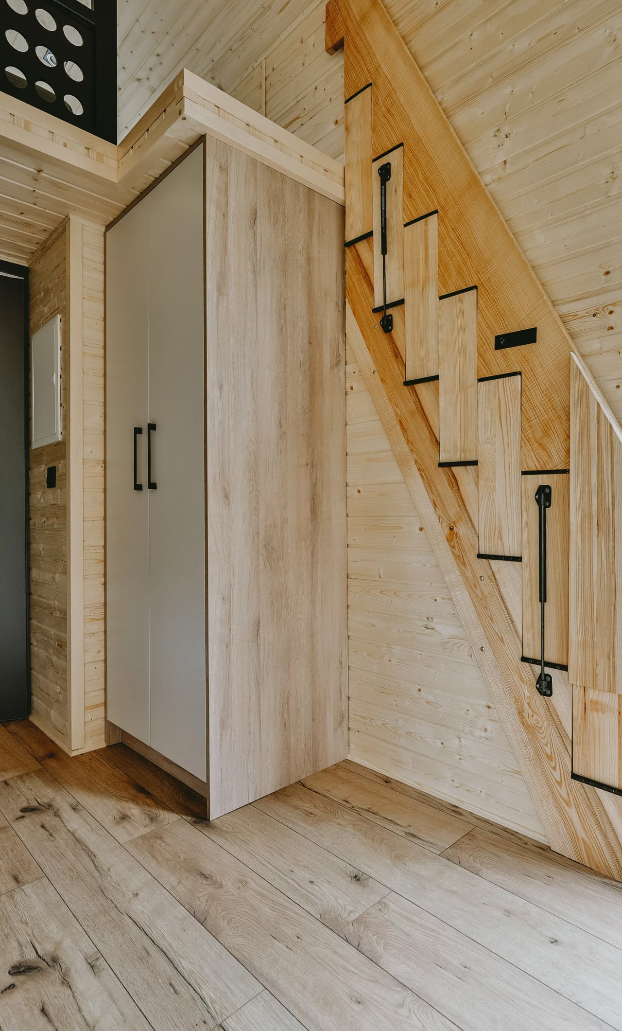
The standout move here is the ground-floor bedroom. Rather than tucking a sleeping area into a loft accessed by ladder, Rewild Homes kept everything at eye level, sliding behind a private door with its own separate exterior entrance. Beneath the bed, storage is built in. Closet space is tucked neatly alongside. It’s the kind of thinking that makes a small home feel resolved rather than resigned. The small loft above the bathroom, meanwhile, has been repurposed entirely as a storage zone, a practical pivot that frees the rest of the home from clutter. High ceilings throughout give taller inhabitants room to breathe, a detail that rarely gets enough credit in this category.

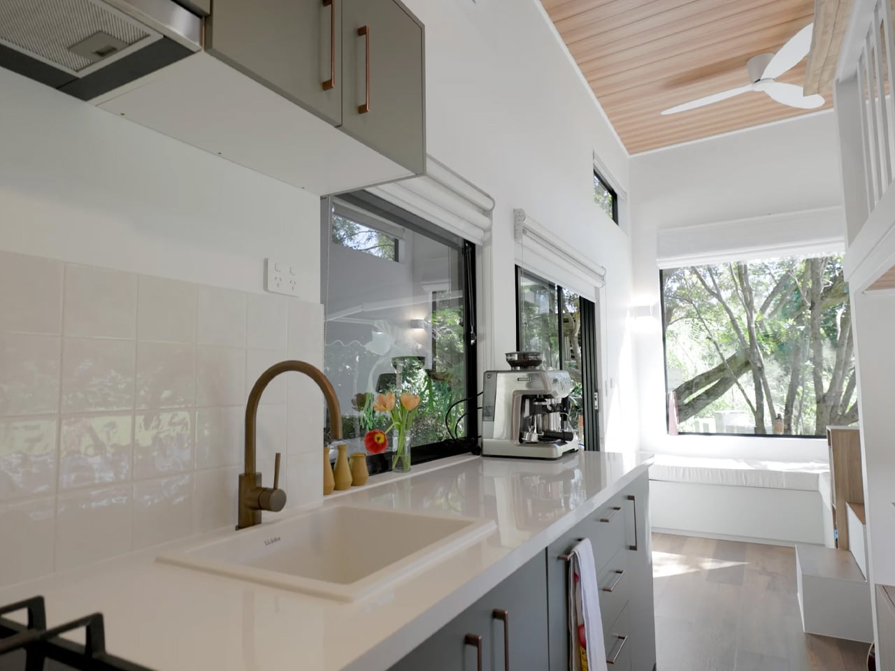
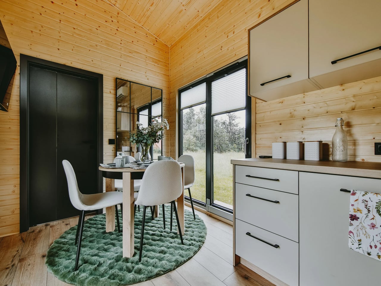
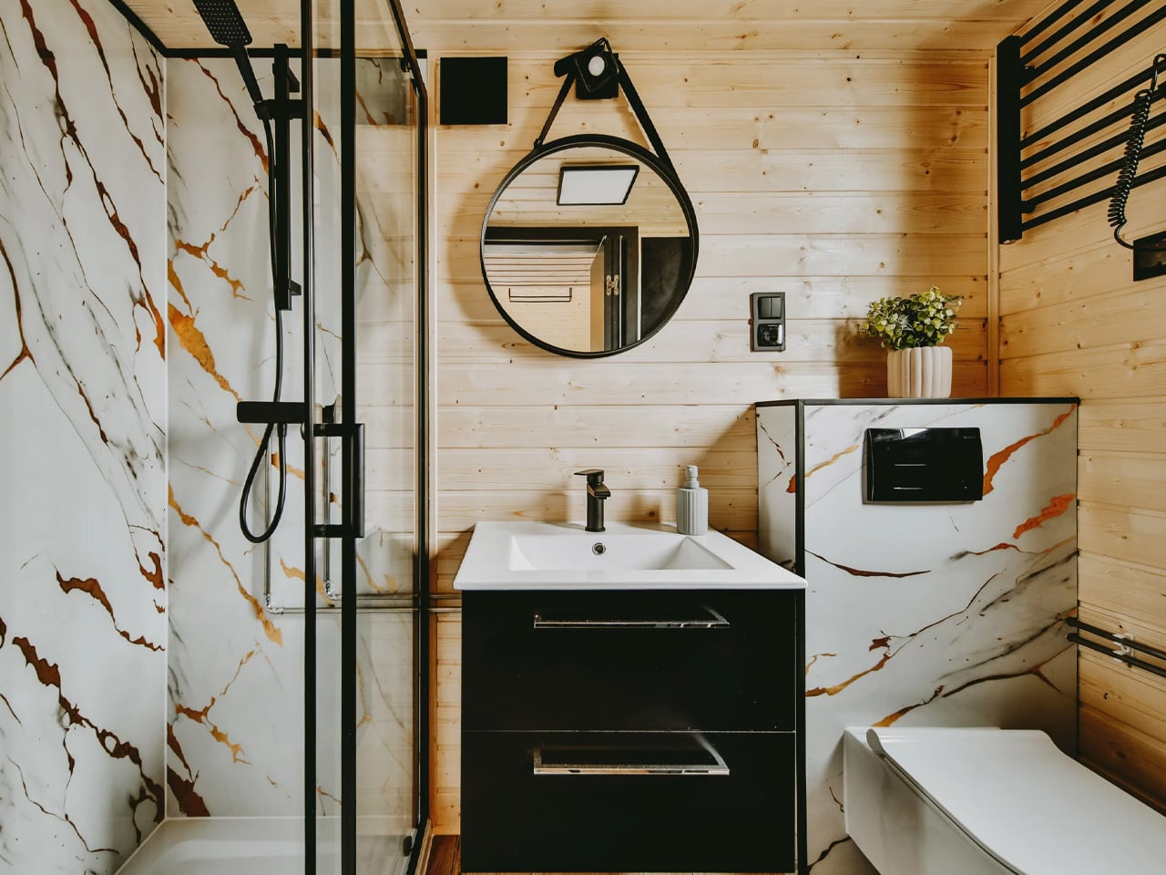
The kitchen and open living room flow naturally into each other, with the bathroom and bedroom each accessed via sliding doors that keep traffic patterns clean without sacrificing privacy. Utility requirements are simplified through propane-powered water heating and cooking, allowing the home to run on a 50-amp electrical connection, lean by design, not by accident.

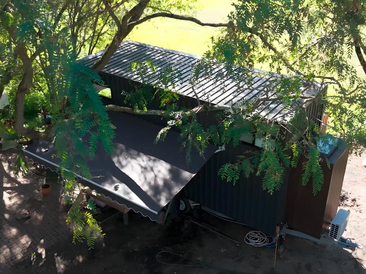
Outside, the Rose wears its West Coast origins confidently. A combination of metal and cedar siding gives the exterior a durable, low-maintenance finish that still has warmth and character. A metal roof rounds out the build, built to handle whatever the Pacific climate throws at it.

Rewild Homes operates out of Cobble Hill, British Columbia, building fully custom tiny homes with a focus on high-quality local materials. The Rose is a strong example of what that philosophy looks like in practice, a home that doesn’t ask you to sacrifice comfort for square footage, but rather rethinks what square footage can do.

The post This Extra Wide Tiny Home Ditches the Loft and It’s Better for It first appeared on Yanko Design.

8 Best Home Objects So Cleverly Designed They Make Your Entire Furniture Setup Look Boring

The most interesting objects in a room are rarely the loudest ones. They are the ones that sit quietly in plain sight, behaving like one thing until you look closely and realize they were always something else. A table that swallows a book. A clock that hides its own hands. A speaker tucked inside a tin dollhouse from the 1930s. The best design of 2025 and 2026 is hiding in plain sight, and it is hiding on purpose.

This listicle exists for the person who finds more satisfaction in a well-considered object than in a loud one. Every product here has a second identity — a behavior, a trick, or a material logic that reveals itself slowly. Some are available to buy right now. Some are concepts that deserve to exist in production. All of them share the same quality: they make you stop, look again, and want one.

1. NjommNjomm

Say the name out loud, and you already understand the concept. NjommNjomm, by Stuttgart-based designer Deniz Aktay, is a cuboid coffee table made from sustainable plastics with a bevelled internal compartment that does something no coffee table has managed before: it makes a book appear to vanish inside it. Slide the right-sized book into the slot, and the table appears to swallow it whole, the pages disappearing into the body of the furniture with an optical sleight of hand that stops every person who walks into the room.

What makes it work beyond the trick is the restraint of the form. Nothing about the NjommNjomm announces itself. The exterior is clean, minimal, and almost unremarkable until the moment it is not. The cuboid shape also means the table can be repositioned vertically, giving it a flexibility most coffee tables never offer. For anyone who stacks books on every surface and has quietly given up apologizing for it, this is the table that finally takes their side. It is currently a concept by dezinobjects, and it is the right place to start.

What We Like

  • The optical illusion is genuinely surprising every single time someone encounters it
  • Works horizontally and vertically, making it adaptable to smaller living spaces

What We Dislike

  • Currently, it is a concept with no confirmed production timeline
  • The slot is most effective with books of a specific size

2. Portable CD Cover Player

The Portable CD Cover Player does exactly what its name promises, and the effect is completely disarming. It looks like a CD sleeve. It sits like a CD sleeve. Then you realize it is the player itself. The entire device is designed around the silhouette of the packaging that physical music has always lived inside, turning the most overlooked part of the format into an object. For anyone who still has a collection gathering dust on a shelf, this reframes the entire relationship with the format in a single glance.

There is a specific kind of satisfaction in owning something that makes people pick it up and ask what it is. The Portable CD Cover Player earns that reaction every time it is left on a desk, a shelf, or a coffee table. It brings the physical music experience back without demanding space or ceremony, fitting into a bag or slotting between records with equal ease. Three remain in the YD shop, which is not a large number, and the kind of detail worth noting before moving on.

Click Here to Buy Now: $199.00

What We Like

  • The cover-as-player concept turns a format’s most discarded element into the product itself
  • Compact form factor slots naturally into an existing music collection without demanding its own space

What We Dislike

  • Only three units are currently available in the YD shop
  • Technical specifications for battery life and connectivity are not listed

3. Ghost Clock

Istanbul-based designer Fatih Demirci took a simple question — what if a clock tried to disappear — and turned it into one of the most quietly compelling wall objects of 2025. The Ghost Clock stretches a thin fabric over the hour and minute hands without restricting their movement. The result is two slow-moving bumps that creep around the face of the clock, telling the time and refusing to tell it at the same time. The concept is drawn from the way objects look under drapery, and the reference earns every bit of the eerie quality it produces.

You cannot read the Ghost Clock with the precision a meeting demands, and that is the point. It is a wall object that removes the anxiety from timekeeping and replaces it with something stranger and more honest — a gentle reminder that time is moving without forcing you to count how fast. In a bedroom or a reading corner, this presence is more useful than precision. It is a concept by Fatih Demirci, and it deserves to exist in every room that takes itself a little too seriously.

What We Like

  • The fabric-over-hands mechanism is deceptively simple and visually arresting from across the room
  • Shifts the emotional register of timekeeping without removing its function entirely

What We Dislike

  • Not suited for precision timekeeping and should not be the only clock in a working space

4. Sail Away Tranquility Mobile

DRILL DESIGN is an award-winning Japanese studio, and the Sail Away Tranquility Mobile is the kind of object that explains why it has that reputation. Three interlocking triangles — one lightweight aluminum, one polished steel, one warm walnut — are hand-balanced at a workshop in Ashikaga City, Tochigi Prefecture, until the whole structure finds a perfect equilibrium. Then it sits on your desk and does almost nothing. Until the air shifts, and the triangles begin to move in response, and you realize you have been watching it for considerably longer than you intended.

The secret of the Sail Away Mobile is that it is kinetic without demanding anything from you. No batteries, no charging, no interaction required. The movement comes from the air in the room, which means it is always slightly different and always responding to something real. Weighing just 80 grams and requiring no tools to set up, it is genuinely easy to live with. As a desk object, a housewarming gift, or a quiet act of calm placed in a room that moves too fast, it earns the space it occupies.

Click Here to Buy Now: $129.00

What We Like

  • Entirely passive movement with no power source needed — the room does the work
  • Handcrafted in Japan with meticulous material balance across three distinct and contrasting materials

What We Dislike

  • The gentle movement requires some ambient air circulation to be fully appreciated in still rooms

5. Verse Chair

Most chairs do one thing. The Verse Chair by Liam de la Bedoyere does two, and the second one is so specific and considered that it reframes the entire object. The 3D-printed chair has a curved seat designed for ergonomic comfort, but beneath the seat lies a sharp-angled V-shaped base proportioned precisely to hold a book open at the page you left it. Set the book down mid-chapter, and the chair holds it. Come back later, and the page is exactly where you stopped. The chair remembers for you.

The name Verse refers both to the line-by-line process of 3D printing and the V-shaped form of the base, which is the kind of naming discipline most designers do not manage to pull off. The chair does not shout its bookmarking function. It holds the book quietly, at floor level, in the structure of the legs, visible only when you know to look for it. For anyone who reads in the same chair every day, this is the version of that chair designed specifically around that habit.

What We Like

  • The book-holding function is built directly into the structural logic of the chair, not added to it
  • The name connects form, manufacturing process, and purpose into one coherent idea

What We Dislike

  • Currently a concept and not available for purchase
  • The bookmarking function works most reliably when the chair remains in a fixed position

6. BGN 11

Teenage Engineering has made a sampler that plays only Gregorian chants and a PC chassis with retro-futuristic proportions, so it should come as no surprise that they also made working speakers out of 1930s tin dollhouses. BGN 11, a collaboration with Toronto-based craft collective Bentgablenits, transforms ten salvaged pressed-metal toy buildings — a chapel, a corner shop, a living room, an ice cream parlor — into working TE OD-11 speaker units. Each one was hand-altered, rewired, and reupholstered to broadcast ambient compositions matched to its specific setting.

Only ten units were ever made, shown for three days at a Shopify creative space on Greene Street in Soho, New York, in June 2025. They are gone. BGN 11 sits in this roundup not as something to acquire but as proof of a design argument: that the most interesting audio object is one that makes you forget it is an audio object. A dollhouse murmuring like a congregation. A corner shop that chimes. The speaker disappears completely into the story of the building it lives inside.

What We Like

  • Each unit delivers a specific narrative through both its visual form and its audio content simultaneously
  • The collaboration between Bentgablenits’ tactile craft and Teenage Engineering’s acoustic precision produces something neither could have made independently

What We Dislike

  • The ambient compositions are matched to each specific unit and are not user-configurable

7. Invisible Shoehorn

The Invisible Shoehorn is the most committed object in this roundup. Where other pieces here have hidden functions or optical tricks, this one has a single purpose and has dedicated its entire design language to not being seen while performing it. Made from transparent acrylic, it is built to vanish against any backdrop — a shelf, a closet floor, a basket by the door. Its clear body and ergonomic curved form make it read as a small sculpture before it reads as a tool, and the moment you actually need it is the moment it stops being invisible.

There is a specific kind of confidence in designing something intended to be overlooked. The Invisible Shoehorn sits in a space and contributes nothing visually until the moment it contributes everything functionally, then returns to transparency. For a hallway or entryway that takes its aesthetic seriously, this is the version of the object that belongs there. The ergonomic curve makes it genuinely comfortable and easy to grip, and the transparent material means it works equally in any color palette.

Click Here to Buy Now: $299.00

What We Like

  • Transparent acrylic construction genuinely disappears against almost any surface or backdrop
  • The ergonomic curve makes it comfortable to use without compromising the minimal, tool-free visual

What We Dislike

  • Transparent acrylic shows fingerprints and requires regular cleaning to maintain the invisible effect

8. Magician’s Rope

Close the roundup with the table that should not hold anything, but somehow holds everything. Magician’s Rope, by designer Hanqi Jia, earned recognition at the NY Design Awards by doing something structurally improbable and making it look completely inevitable. A single continuous red metal line bends, loops, and crosses itself into a structure that supports a transparent tabletop. It looks like a drawing. It looks like a gesture caught mid-motion. It does not look like a table, which is precisely why it is such a considered one.

The red line is the detail that holds the whole thing together conceptually. Red, in most design contexts, demands attention. Here it asserts itself visually while the overall form stays quiet — the line says look at me, while the rest of the table says I will be here whenever you need me. The transparent top reduces the visual footprint significantly, making it a strong choice for smaller rooms or spaces already doing a lot of visual work. It is a concept by Hanqi Jia, and it earns the closing position in this list.

What We Like

  • A single continuous red metal line achieves structural integrity through elegance rather than bulk
  • The transparent top reduces the table’s visual presence dramatically in smaller or busier rooms

What We Dislike

  • The red line is a defining feature that will not integrate easily into every interior palette

The Best Objects Don’t Explain Themselves

Every object in this list shares the same quality: it does something you did not expect it to do. The table eats the book. The clock hides the time. The shoehorn disappears. The dollhouse plays a sermon from a tin chapel. None of them announces their second nature from across the room. You have to live with them, look closely, or accidentally slide a paperback into the wrong slot before discovering what they actually are.

That quality — the hidden behavior, the withheld function, the object that rewards attention — is increasingly rare when most products explain themselves loudly and immediately. These eight do not. They ask you to slow down, look again, and sit with something that has more going on than it first appeared. That is a reasonable thing to ask of the objects you choose to keep around you.

The post 8 Best Home Objects So Cleverly Designed They Make Your Entire Furniture Setup Look Boring first appeared on Yanko Design.

TRÆ Is the Timber Tower That Turns Waste Into Architecture

There’s a word in Danish, ‘træ’, that means three things at once: tree, timber, and three. It’s a fitting name for a building that refuses to be just one thing. Designed by Lendager and completed in Aarhus’ former industrial South Harbour, TRÆ stands 78 meters tall across three interconnected volumes, earning its place as Denmark’s tallest timber tower and the world’s first upcycle timber tower.

The ambition behind it is disarmingly simple: prove that a tower can be built from waste and wood without sacrificing safety, economy, or quality. What makes TRÆ remarkable isn’t just the height, it’s the conviction. The building operates within two material ecosystems simultaneously: the biogenic and the circular. Mass timber columns, cross bracing, and CLT floor slabs form the primary structure, with low-carbon concrete used only in the cores for fire safety and stability. Everything else is drawn from what already exists.

Designer: Lendager

The façades are the project’s most striking argument. Salvaged aluminium sheets, arranged to evoke the texture of birch bark, mottled, imperfect, alive, clad the exterior in industrial leftovers that feel entirely intentional. Retired wind turbine blades, repurposed as solar shading, line the building’s south-facing elevations. A comparative analysis showed their estimated carbon footprint to be 27 times lower than conventional aluminium solar screens. The math is compelling. The aesthetic is better.

Measured against a conventional concrete benchmark, TRÆ achieved a 26 percent reduction in CO₂ emissions, 21 percent from the timber-led design and 5 percent from integrated reused materials. It’s a number that reshapes the conversation around tower construction, a typology long associated with emissions-heavy concrete and steel. The project doesn’t chase certification checklists. Instead, it follows a value-driven framework that prioritises measurable outcomes from the ground up.

The social dimension is just as deliberate. TRÆ houses a volunteer initiative providing daily meals to families in need, and involves homeless people in the building’s upkeep, folding existing social realities directly into the life of the building. An undulating pedestrian bridge, starting at street level, snakes upward to connect TRÆ to Aarhus’ new highline, threading the tower into the city rather than above it.

The Aarhus Architecture Awards jury awarded TRÆ Best Building in 2025, noting that it “does not necessarily adhere to a classic architectural or beauty ideal” but stands as “an energetic reckoning with well-tested solutions and zero-error culture.” That’s exactly the point. TRÆ isn’t trying to be perfect. It’s trying to be right.

The post TRÆ Is the Timber Tower That Turns Waste Into Architecture first appeared on Yanko Design.

Slide, Spiral, Learn: Bernard Tschumi Completes a Science Centre Built on Motion

A science centre that asks students to slide between floors is either a gimmick or a statement. At Institut Le Rosey, it’s unmistakably the latter. Philo, the newly completed science and innovation centre by Bernard Tschumi Architects in Rolle, near Geneva, brings that idea to life with an architectural precision that feels entirely intentional.

The building, which took shape between 2019 and 2025, sits on the campus of one of Switzerland’s most prestigious international boarding schools, right alongside Carnal Hall, the metal-domed music venue Tschumi completed for the same institution back in 2014. Where Carnal Hall curves inward with acoustic purpose, Philo opens up — a ring-shaped structure five storeys tall, wrapping itself around a grand central atrium that functions less like a corridor and more like a covered public square.

Designer: Bernard Tschumi Architects

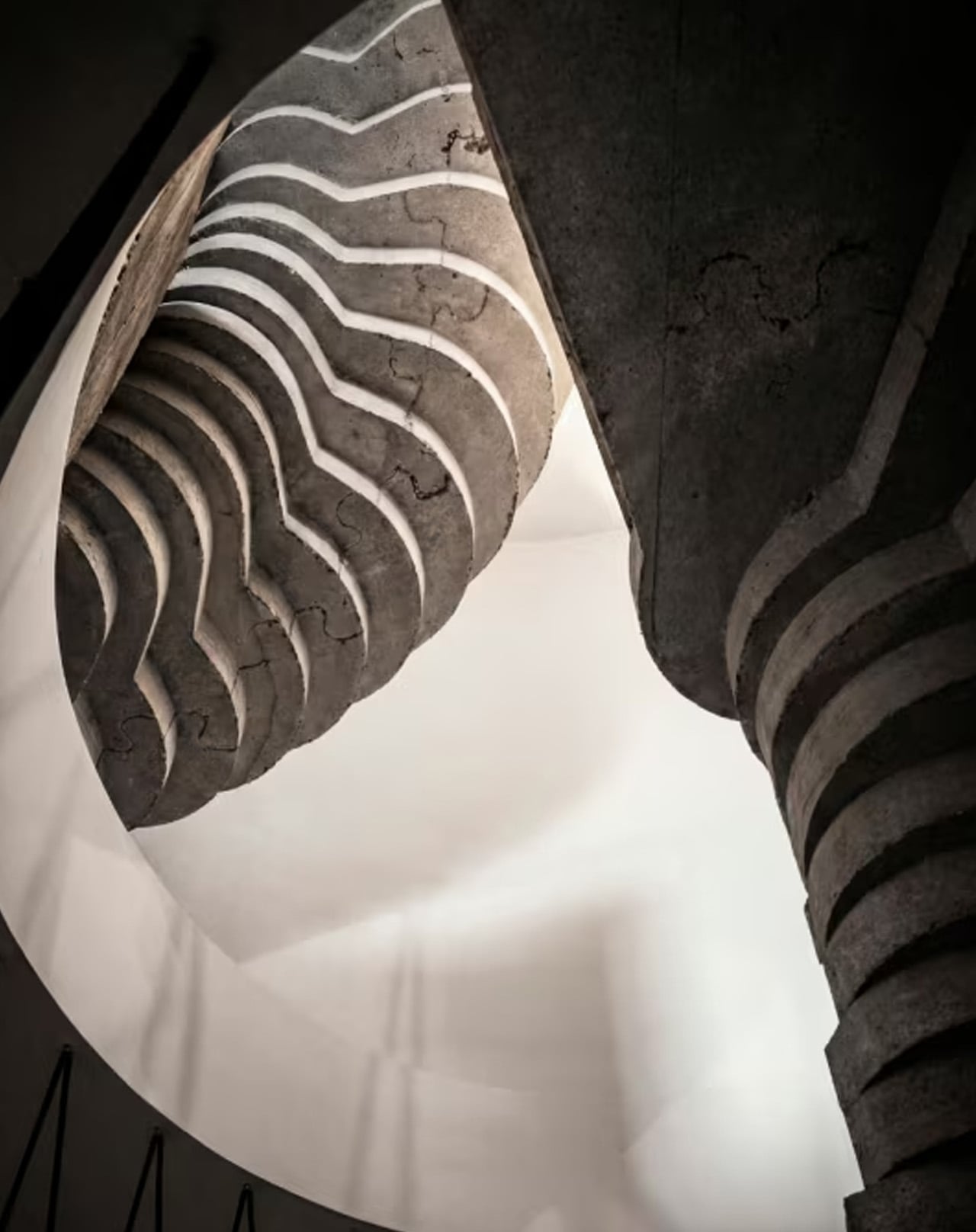
That atrium is the building’s beating heart. Three concentric walkways surround it, and vertical and horizontal circulation paths cut through the space, generating constant movement. Helical slides thread through the interior alongside the sculptural spiral staircase, turning the everyday act of moving between floors into something worth doing. It sounds playful — and it is —, but it’s also deeply considered. Tschumi has spent decades arguing that architecture only comes alive through movement and event, and Philo reads like a direct translation of that thinking into built form.

The programme inside is built around student innovation. Philo houses a Fabrication Lab, a Start-up Incubator Space, and a Pitch Room — a flexible rectangular space that can be reconfigured for presentations or performances. Classrooms and laboratories fill the remaining floors, all oriented around the central void. The result is a building that doesn’t separate learning from making, or thinking from doing. Every space feels connected, both literally and conceptually.

Externally, the ring form gives Philo a strong presence on campus without overpowering it. The circular geometry creates a clear dialogue with Carnal Hall’s dome, establishing a coherent architectural language across two very different building types. Aerial photography by Iwan Baan captures just how deliberately the two structures have been positioned — companions on a campus that now has a genuine architectural identity.

Philo isn’t trying to reinvent education. What it does, with impressive restraint, is create the conditions for a different kind of learning — one built on movement, collision, and chance encounter. For a studio whose founder once wrote that there is no architecture without events, it’s a building that lives up to the theory.

The post Slide, Spiral, Learn: Bernard Tschumi Completes a Science Centre Built on Motion first appeared on Yanko Design.

This House in Rural India Is Actually a Bridge — and It’s Covered in Scales

Most architects would see a seven-metre-deep gorge cutting through a site and call it a problem. Vinu Daniel and his studio, Wallmakers, looked at it and saw the house. The Bridge House in Karjat, Maharashtra, is exactly what its name promises — a weekend home that spans a 30-metre-wide spillway, with enough clearance below for diggers to pass through. Completed in 2025, the 4,500-square-foot structure sits across two parcels of land separated by two streams, and it does so with a quiet, almost organic confidence.

The structural logic is deceptively simple. Four hyperbolic parabolas form the spine of the suspension bridge, held together by minimal steel pipe and tendons working in tension. Over that skeleton, a grid of steel cables was laid out in a twisting hyperbolic paraboloid surface, then coated in a layer of mud — the same material Wallmakers has long treated as a primary architectural medium. The mud isn’t decorative. It provides the compressive strength that stabilises the entire bridge and acts as a barrier against the pests that typically undermine thatched construction.

Designer: Wallmakers

And then there’s the skin. The outer layer is local grass thatch, applied in overlapping scales that give the structure a texture closer to a living creature than a building. The resemblance to a pangolin is intentional. “Thatched roof construction, even though sustainable and thermally efficient, has been on the decline due to problems like pest invasion, lack of skilled labour, deforestation, and the hassle of constant reapplication,” Daniel noted. The mud-thatch composite here attempts to address exactly those failures — rethinking the material from the inside out rather than simply reviving a tradition.

Getting materials to the site was its own challenge. The remote location in Karjat pushed the team toward using what was available locally, which ultimately shaped the entire material palette. The result is a building that feels pulled from the landscape rather than dropped into it. Translucent screens and raw mud surfaces define the interiors, keeping the atmosphere spare and tactile. The design team — Preksha Shah and Ramika Gupta — worked within tight constraints that only tightened the design thinking.

Bridge House is the kind of project that makes the site’s difficulties readable in the finished form. The gorge isn’t hidden; it’s the reason the house exists at all. That honesty — structural, material, spatial — is what makes Wallmakers’ work consistently worth paying attention to.

The post This House in Rural India Is Actually a Bridge — and It’s Covered in Scales first appeared on Yanko Design.

5 Best Japanese Kitchen Gadgets That Make Cooking Feel Like a Meditation Ritual

Japanese kitchen tools operate differently from their Western counterparts. They don’t promise to speed things up or reduce effort. They promise to make that effort worth something. The objects below share a commitment to material honesty and precision that changes the pace of cooking without changing the recipe. Each one invites you to slow down, pay attention, and find something close to calm in the ordinary rhythm of preparing food.

None of these tools asks for much counter space. None comes with instruction manuals. What they share is a design philosophy rooted in centuries of Japanese craft tradition, where restraint and intention produce objects that reward your attention rather than compete for it. Cooking with them slows you down in a way that feels like a gift. The meditation isn’t something you bring to the kitchen. These tools create the conditions for it.

1. Iron Frying Plate

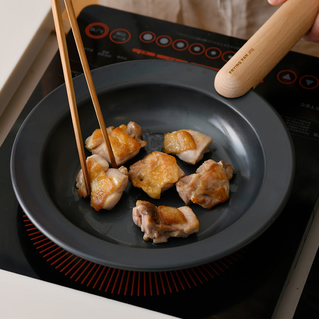
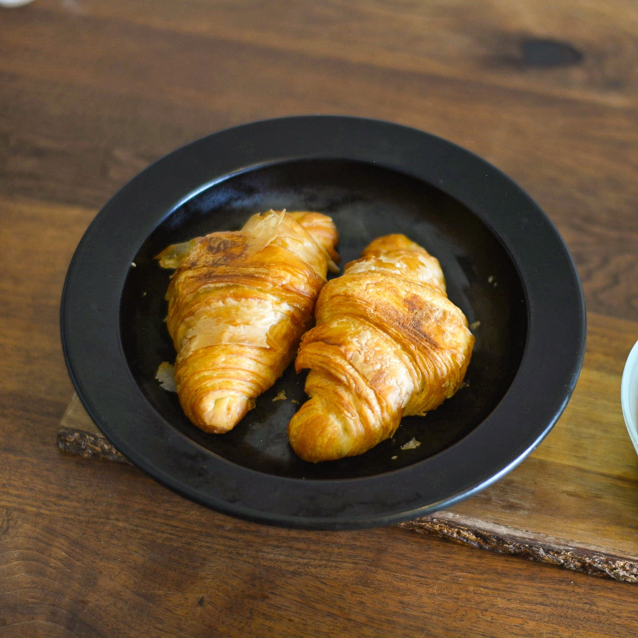
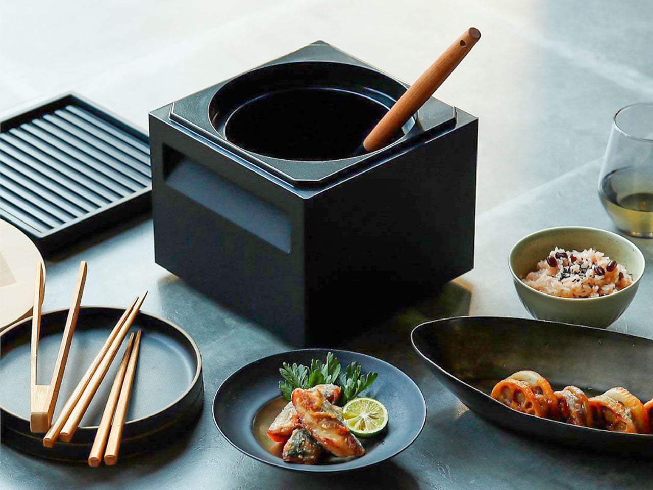
The Iron Frying Plate removes the boundary between the cooking vessel and the serving dish. Crafted from rust-resistant mill scale steel with a detachable wooden handle, it moves from stove to table without a transfer, without a plate in between. Eggs arrive still sizzling. Fish comes off the heat and onto the table in the same object, retaining the kind of temperature and texture that plating destroys. The cook-and-serve design isn’t a shortcut. It’s a different way of thinking about food.

The uncoated surface requires no seasoning before first use and develops natural non-stick properties through regular cooking. The detachable wooden handle attaches and releases with one hand, making the transition from burner to table completely fluid. Retained heat keeps food at a temperature throughout the meal, which changes its pace in subtle but noticeable ways. You stop rushing through dinner because the plate is still doing its job while you’re still deciding what to eat first.

Click Here to Buy Now: $69.00

What We Like

  • The cook-and-serve design preserves the temperature and texture that get lost in any transfer to a separate plate
  • The uncoated mill scale steel develops natural non-stick properties through use, with no chemical coatings involved

What We Dislike

  • The iron construction retains heat long after serving, which requires careful handling at the table
  • Heavier than standard serving dishes, which takes some adjustment if you’re used to lighter ceramics

2. Katakuchi Suribachi & Surikogi Set

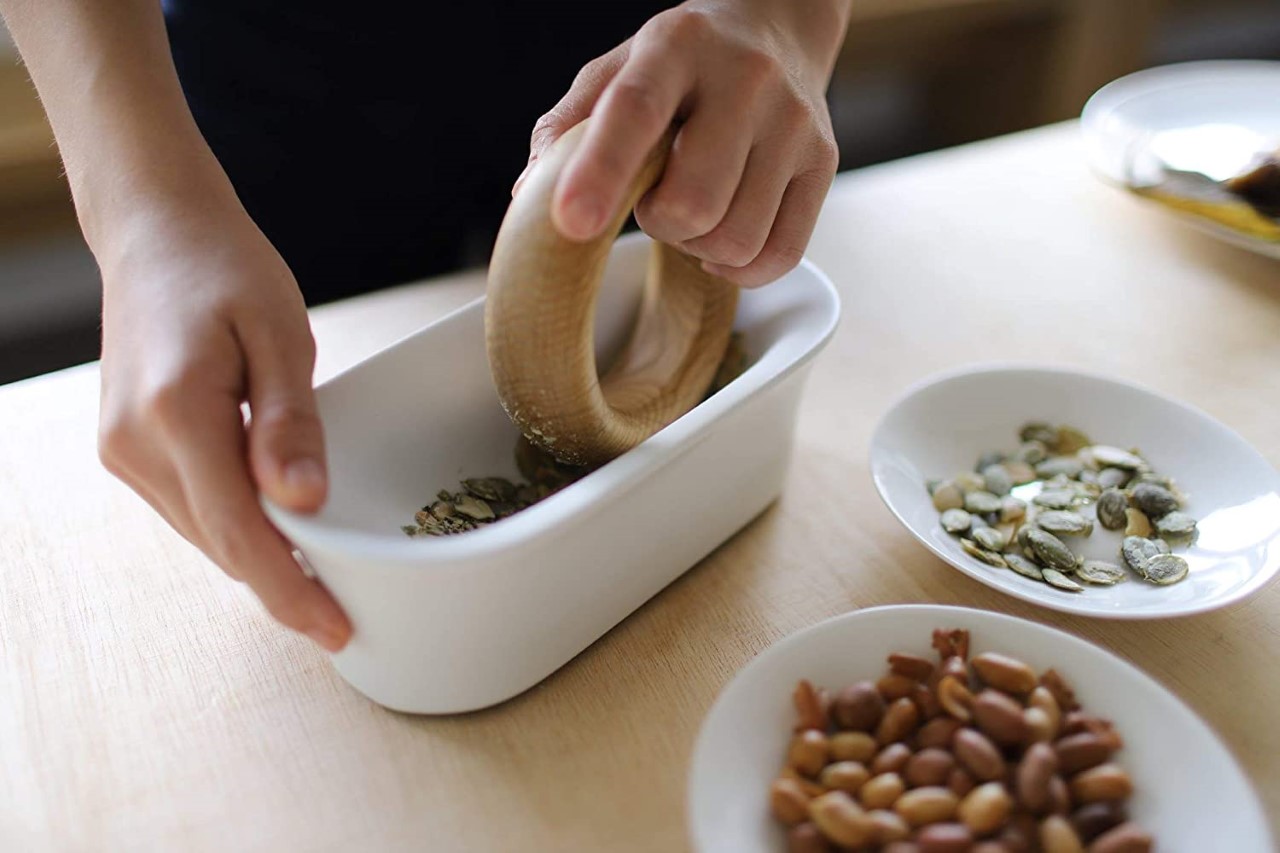
The suribachi is a Japanese mortar defined by its interior: a web of fine ridges that grip seeds and fibres and pull them apart through friction. Unlike smooth-walled mortars that crush, this one grinds, and the difference in what that produces is immediate. The katakuchi design adds a spout, so freshly ground sesame pours cleanly from the vessel without a transfer step. The wood surikogi follows the curve of the bowl exactly, which is the whole point of the pairing.

Using a suribachi imposes a different pace on cooking. You bring the seeds in, you begin to work the pestle in slow circles, and the sound changes as the seeds release their oil. The kitchen starts to smell like food before the pan is even on. That sensory sequence of physical work and gradual transformation is what separates this from a standard grinding tool. Available from TOIRO Kitchen in two colorways, it’s priced between $36 and $63 depending on size.

What We Like

  • The katakuchi spout makes it a single-vessel process from grinding to pouring; nothing gets lost in the transfer
  • The ridged earthenware interior produces a texture and aroma from sesame and spices that a food processor simply cannot replicate

What We Dislike

  • The earthenware body is heavy and requires careful handling; it’s not something you grab quickly
  • Cleaning the grooved interior takes more attention than a smooth-walled mortar

3. Iga-yaki Donabe Clay Pot

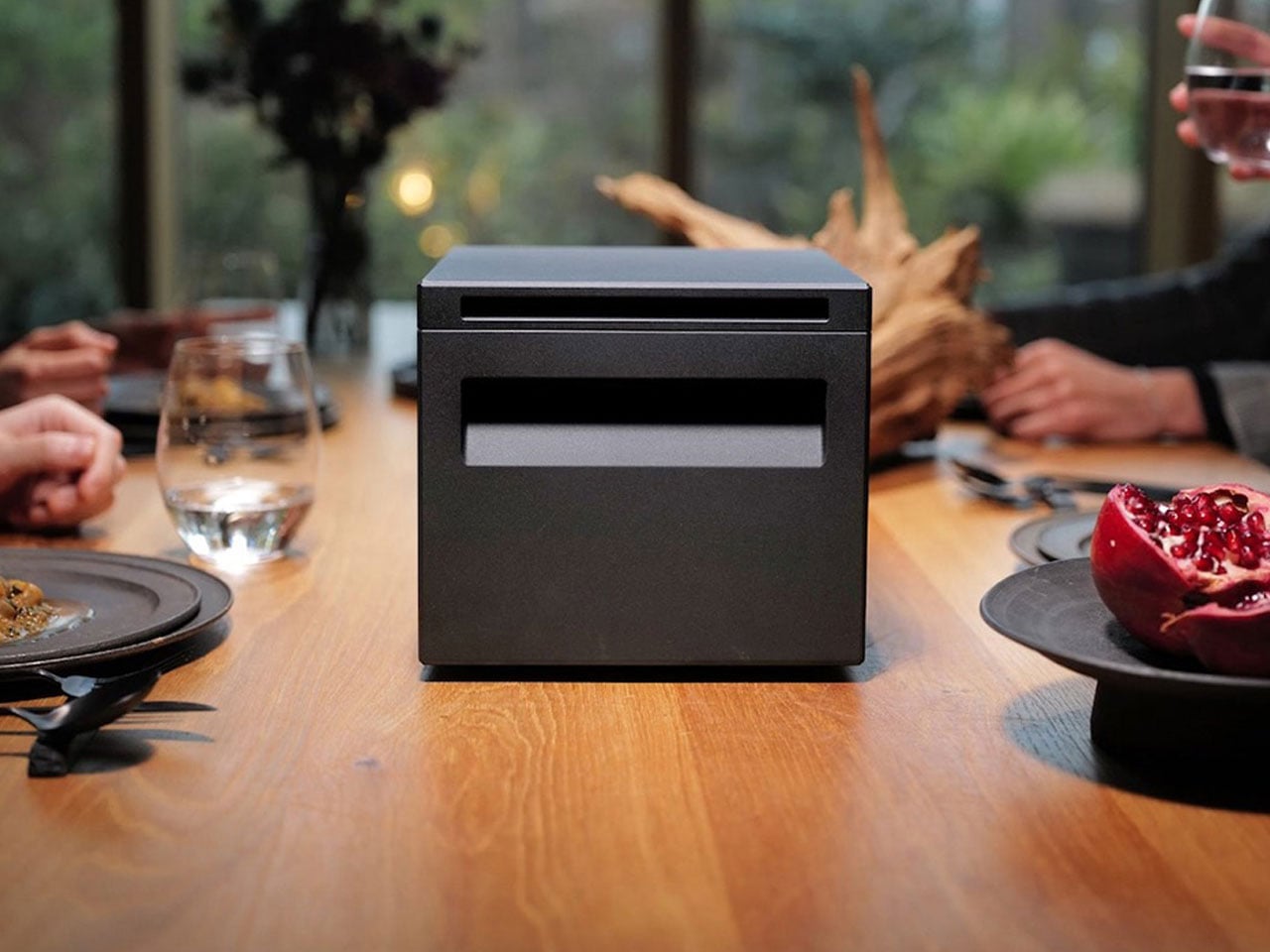
Iga-yaki clay comes from Mie Prefecture in Japan, where the local earth has been used for ceramics since at least the Kamakura period. The porous structure absorbs heat slowly and releases it evenly, creating a cooking environment that metal pots simply cannot replicate. Rice cooked in it sweetens. Broth deepens over a lower flame. The exterior stays rough and unfinished while the interior is glazed smooth: two textures on the same vessel, each doing exactly what it needs to.

Using a donabe imposes a different pace on dinner. You bring it to a heat gradually, you watch the steam rising from the lid, you lower the flame, and wait. That sequence of patient setup, attention to what the pot is communicating, and the discipline not to rush transforms cooking into something closer to practice than production. TOIRO Kitchen stocks Iga-yaki donabe in several sizes, all made in Japan, all functioning as vessels for the kind of cooking that rewards presence.

What We Like

  • Iga-yaki clay retains heat well past the point of turning off the flame, keeping food at a temperature while you’re still at the table
  • Genuinely versatile across hot pot, rice, steaming, and slow braise. One vessel covers all of it

What We Dislike

  • Clay donabe requires seasoning before first use, typically by simmering rice water in it, a step not everyone anticipates from the packaging
  • The porous clay body can absorb strong cooking odors over time and needs to be stored with the lid off after washing

4. Sakura Petal Grater

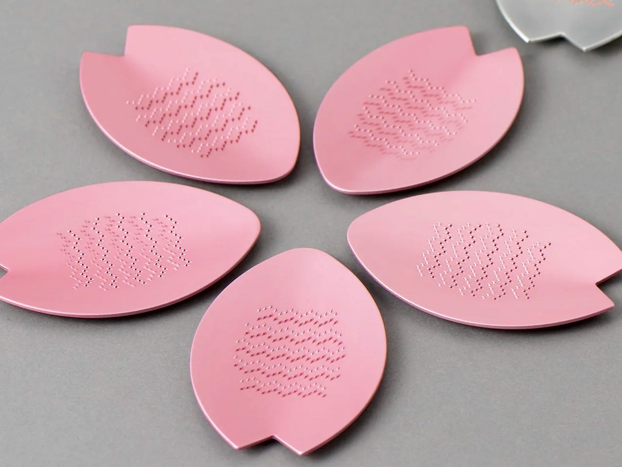
Fresh wasabi grated at the table is a different ingredient from the paste that comes in a tube. The same is true of ginger, of daikon, of any root that peaks the moment it’s reduced. The Sakura Petal Grater is built around that principle. Its sakura petal form brings tableside preparation into the meal itself, turning garnish work from a kitchen task into part of the ritual of eating. The circular motion has a quality that makes stopping feel abrupt.

Made from stainless steel, the grater sits flat and stable at the table, and the anti-slip silicone base doubles as a protective cover when stored. Its compact size means it takes no space to speak of, but what it brings to the table is disproportionate to its footprint. Grating fresh ginger over soup, wasabi alongside sashimi, and daikon over a bowl of soba becomes something you look forward to rather than manage. The shape itself is worth lingering on.

Click Here to Buy Now: $45

What We Like

  • Tableside grating turns fresh garnish preparation into part of the dining ritual rather than prep work done in advance
  • The compact form requires almost no storage space, and the silicone base doubles as a protective cover

What We Dislike

  • The small size means slower processing for larger quantities, so it works best for garnish amounts rather than bulk grating
  • Specialist in scope: for kitchen prep in volume, a larger grater is the more practical tool

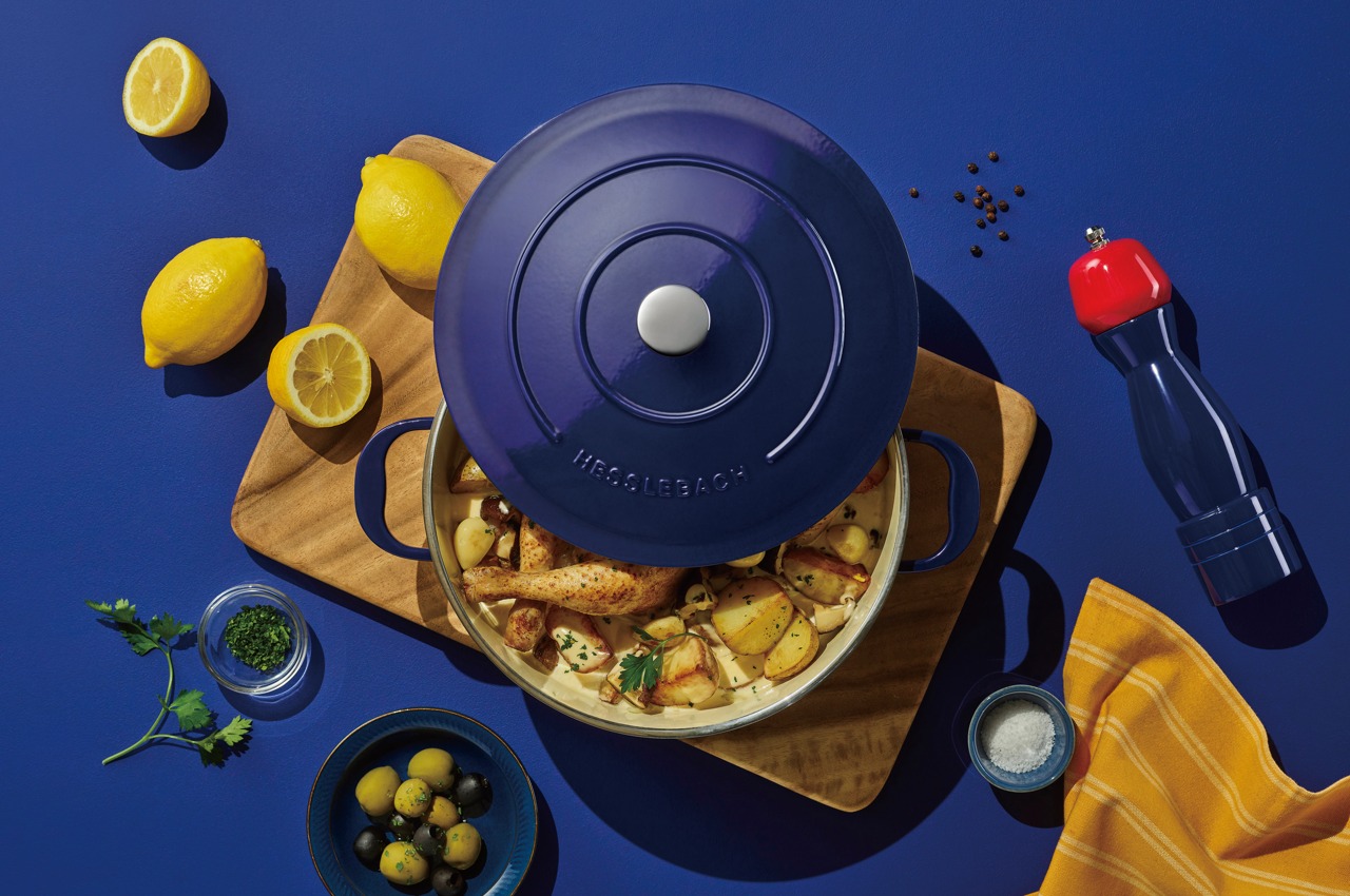
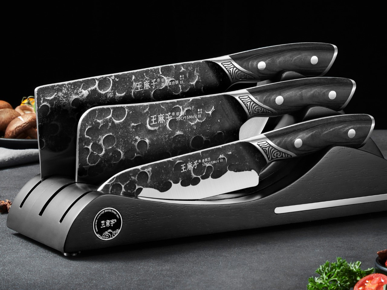
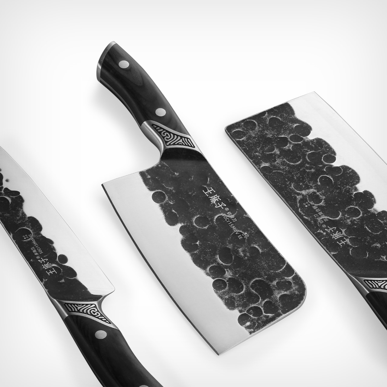
5. Yoshihiro VG-10 16-Layer Hammered Damascus Nakiri 165mm

The Nakiri is designed exclusively for vegetables, and that singular focus is the entire point. The flat rectangular edge makes full contact with the cutting board on every stroke, without tip lift, without the curved rock of a chef’s knife. Just clean forward pressure through root vegetables, leafy greens, and ripe tomatoes with equal consistency. Yoshihiro builds this version around a VG-10 core wrapped in 16 layers of hammered Damascus steel, and the surface reduces friction through each cut, so nothing drags.

The Damascus layering produces a pattern unique to each blade, a specific arrangement of steel that no other knife in the world shares with yours. That individuality matters more than it sounds. The full-tang mahogany handle distributes weight in a way that makes extended prep feel balanced rather than tiring. Each blade is handcrafted by master artisans and certified for commercial kitchen use.

What We Like

  • The 16-layer Damascus pattern is unique to every individual blade, making this a personal object in a way factory knives never manage
  • Full-tang construction distributes weight evenly through the handle, reducing fatigue during longer vegetable prep sessions

What We Dislike

  • The Nakiri is a specialist vegetable blade and is not designed for meat, fish, or general-purpose cutting
  • Damascus finishes need careful maintenance and proper storage to preserve both the edge geometry and the layered surface over time

The Kitchen Is Already the Meditation

These five objects share something beyond country of origin. They each ask something of the person using them: attention, patience, a willingness to slow down and notice. The iron plate asks you to eat at the pace of the heat. The donabe asks you to wait for the steam before you touch the lid. The suribachi asks you to stay with the grinding until the smell tells you it’s ready. That presence is the common thread.

None of these tools will make you a better cook overnight. What they will do is change how cooking feels from one session to the next, until the kitchen becomes a place you want to spend time in rather than a place you want to get through. That shift is harder to achieve than any technical skill, and these five objects are exceptionally good at producing it.

The post 5 Best Japanese Kitchen Gadgets That Make Cooking Feel Like a Meditation Ritual first appeared on Yanko Design.
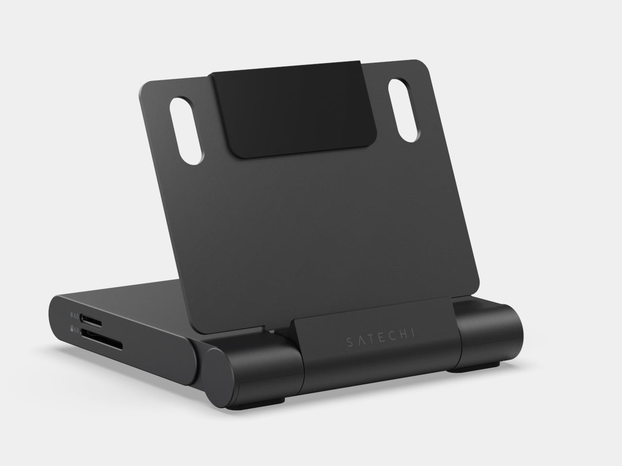
San Diego Is Getting One of the Most Ambitious Military Museums in America

Contemporary angular building with a glass façade, as people walk and gather in a sunny plaza in front of it.

San Diego has always had a deep, unspoken bond with the U.S. Navy. The city is home to one of the largest military concentrations in the country, and just across the bay in Coronado, every Navy SEAL is forged. So when the Navy SEAL Museum San Diego opened its doors on October 4, 2025, at 1001 Kettner Blvd, steps from the Embarcadero, it felt less like a ribbon cutting and more like a homecoming. But that was just the beginning.

In April 2026, the Port of San Diego Board of Commissioners voted unanimously to advance an environmental review for a far more ambitious vision: a striking, $256 million, four-story, 85,000-square-foot flagship museum at 1220 Pacific Highway, positioned at the northern edge of Lane Field Park along Harbor Drive. The vote was unanimous, and the enthusiasm in the room was hard to miss. “I predict that this is going to be the No. 1 museum in San Diego,” said Commissioner Frank Urtasun. “That design that you came up with is unbelievable. I love it.”

Designer: ZGF Architects

Modern waterfront complex with an angular dark-blue building, glass office tower with a yellow column, palm trees, and ships in the harbor.

The design, by US-based ZGF Architects, is nothing short of striking. The structure draws direct inspiration from stealth watercraft used by maritime special forces, with angular massing and faceted metal surfaces that give it the appearance of a futuristic ship cutting through open water. Perforated metallic panels will filter natural light into the interior, where immersive, technology-forward exhibits designed by Gallagher & Associates will bring the history of the SEALs to life across seven distinct galleries.

The proposed museum would also include a 2,500-square-foot theater, virtual reality environments, a youth education space, a café, retail, an event terrace overlooking San Diego Bay, and a new 150-foot public park that would complete Lane Field Park along Harbor Drive. The project is being developed in partnership with Hensel Phelps, which will oversee design, entitlement, construction, and completion.

The museum is part of the nonprofit UDT-SEAL Museum Association, the same organization behind the original Navy SEAL Museum in Fort Pierce, Florida, which has been operating since 1985. San Diego’s location was chosen deliberately, sitting just across the bay from Naval Special Warfare Command in Coronado, where all Navy SEALs train. The city draws more than 30 million visitors annually, placing it alongside cultural neighbors like the USS Midway Museum and the Maritime Museum of San Diego.

The California Environmental Quality Act review is expected to take roughly a year and a half before construction timelines are confirmed. But the direction is clear. San Diego is building something that honors the past and commands the waterfront for generations to come.

The post San Diego Is Getting One of the Most Ambitious Military Museums in America first appeared on Yanko Design.