The smart speaker category has been quietly stagnating. Go ahead and look around your house. Chances are there’s a Nest Audio or an Amazon Echo gathering dust on a shelf, doing exactly what speakers did in 2018 but with a fresh coat of AI marketing layered on top. It still feels like a tech product, which is to say, it still looks like one. Google seems to have noticed.
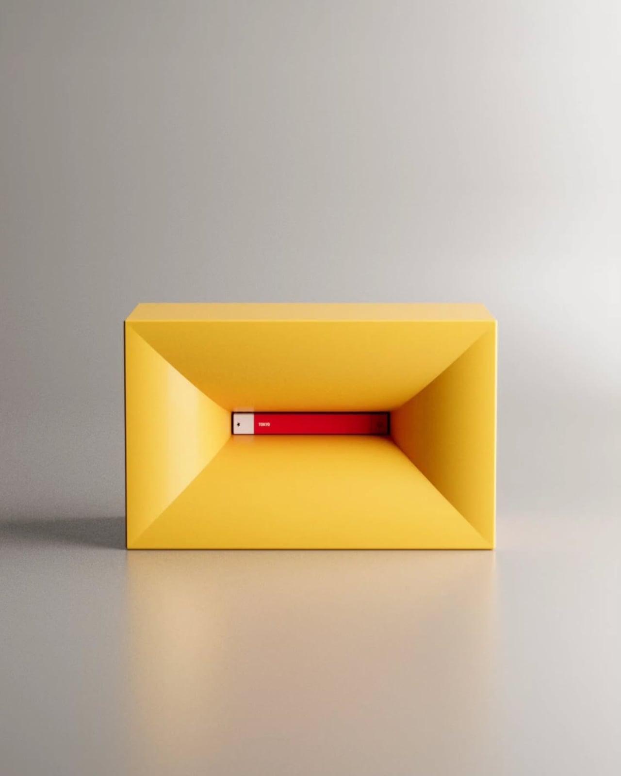
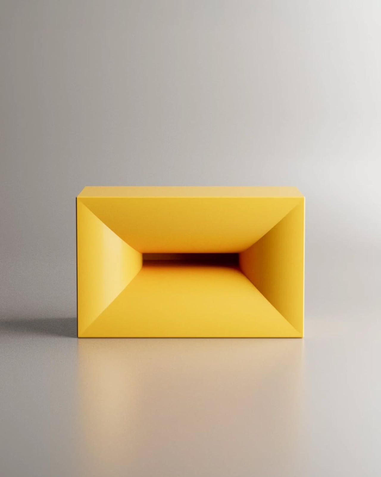
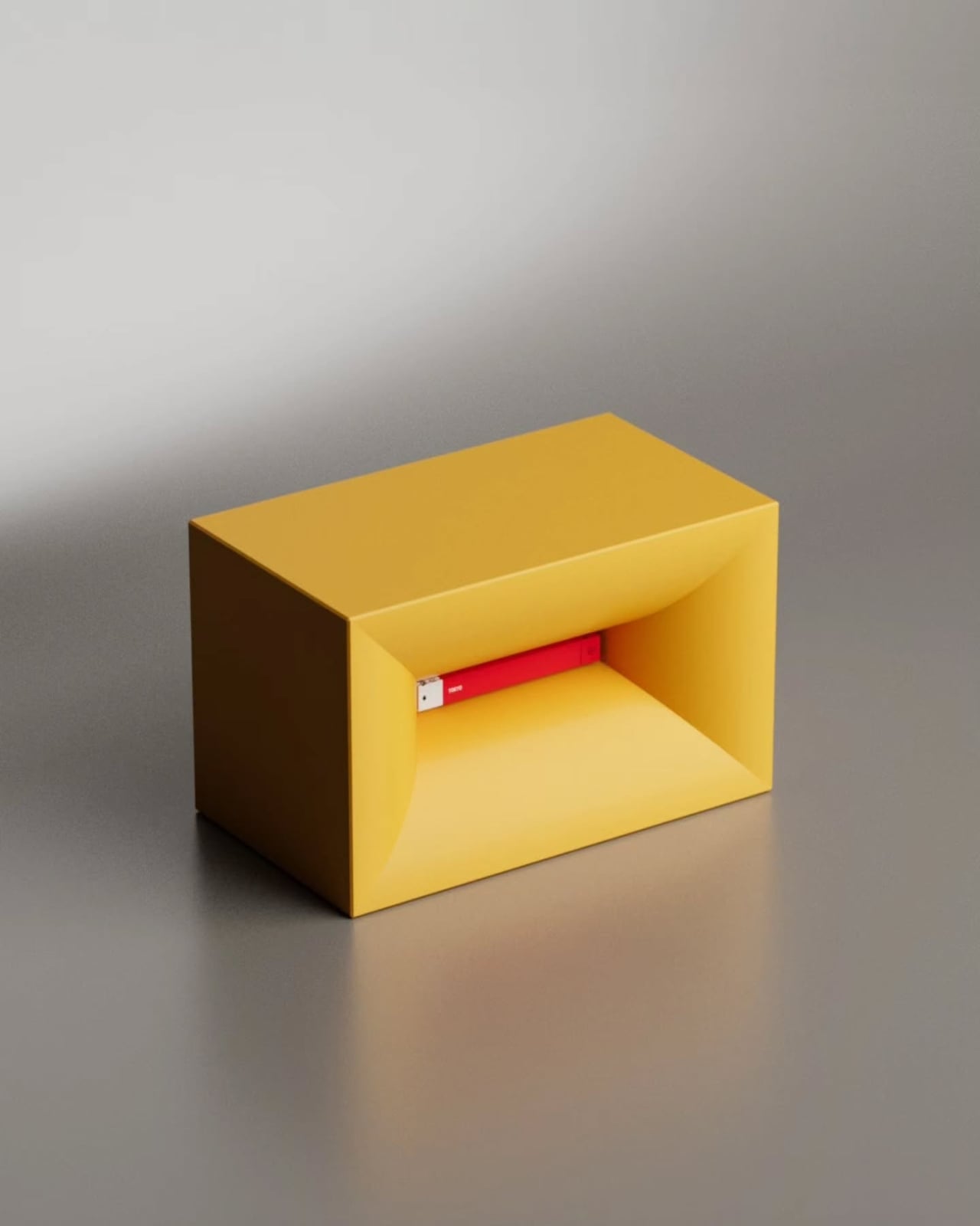
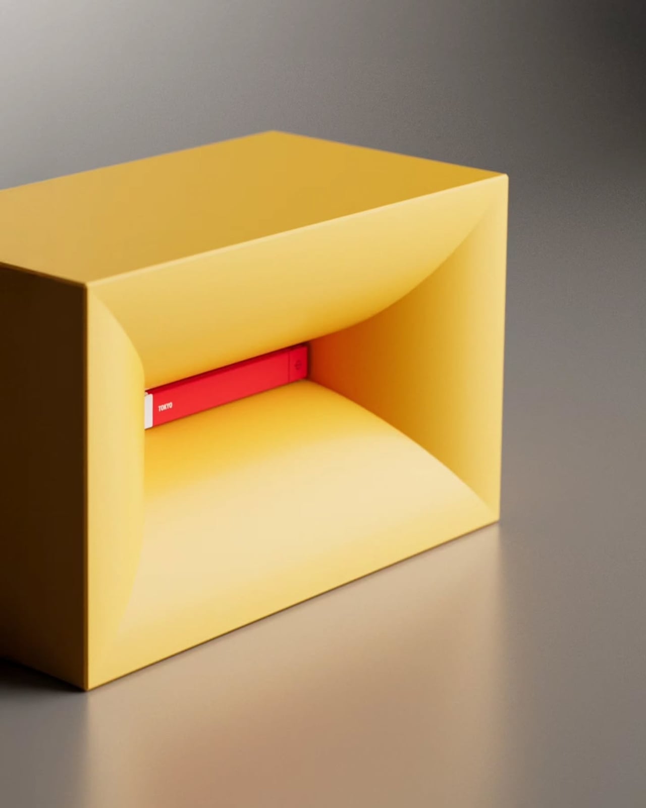
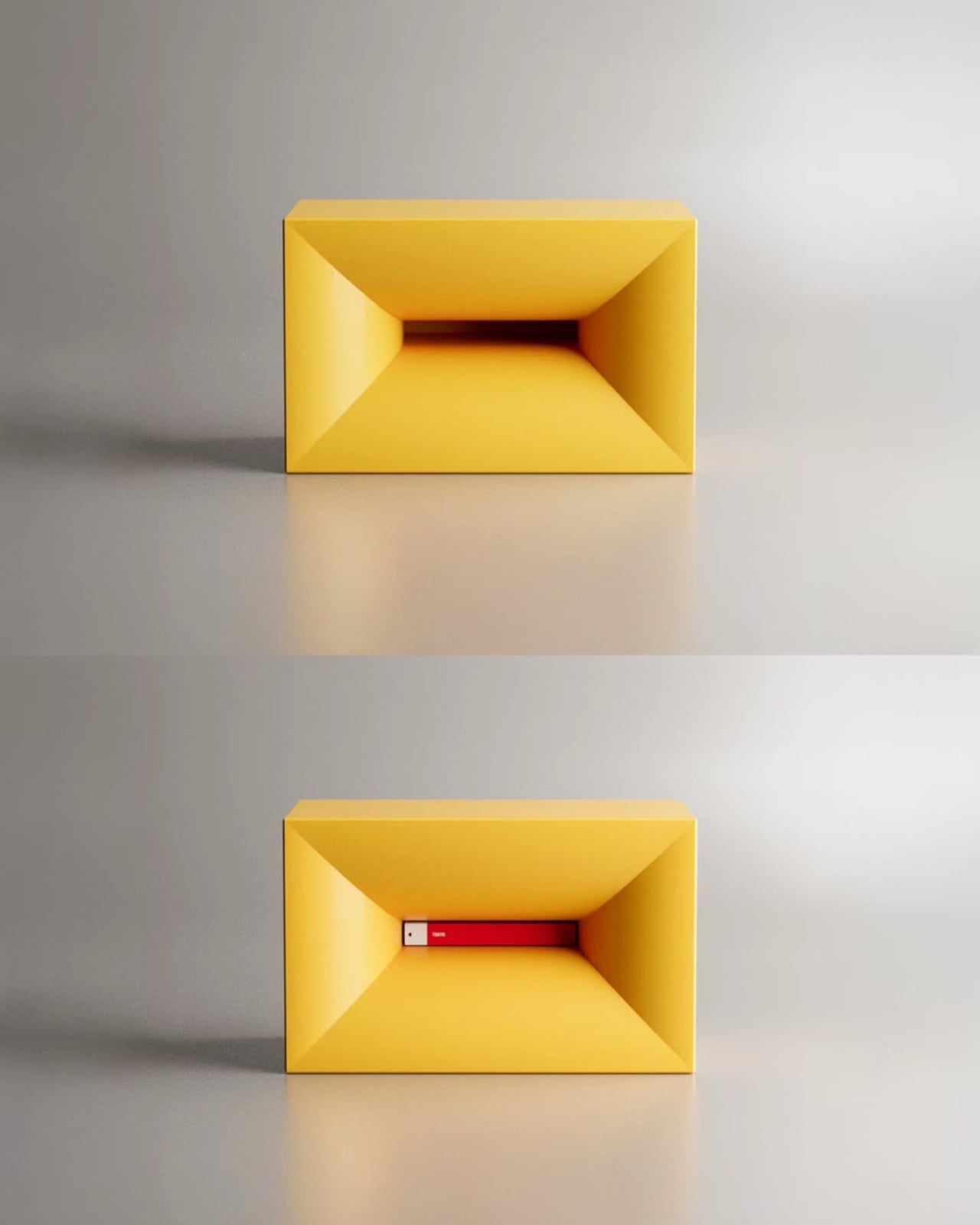
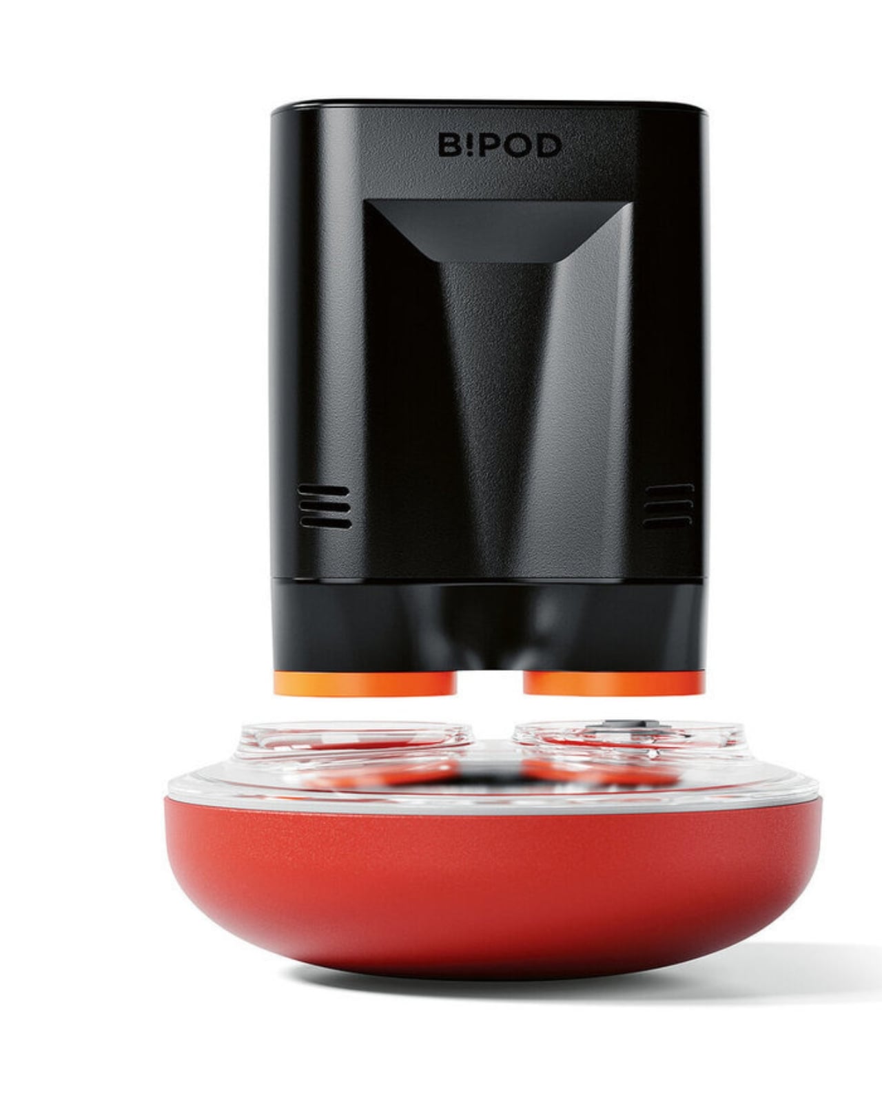
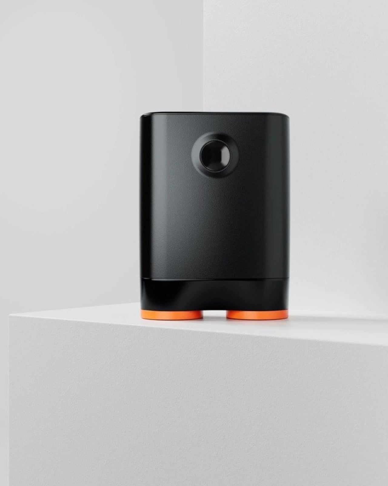
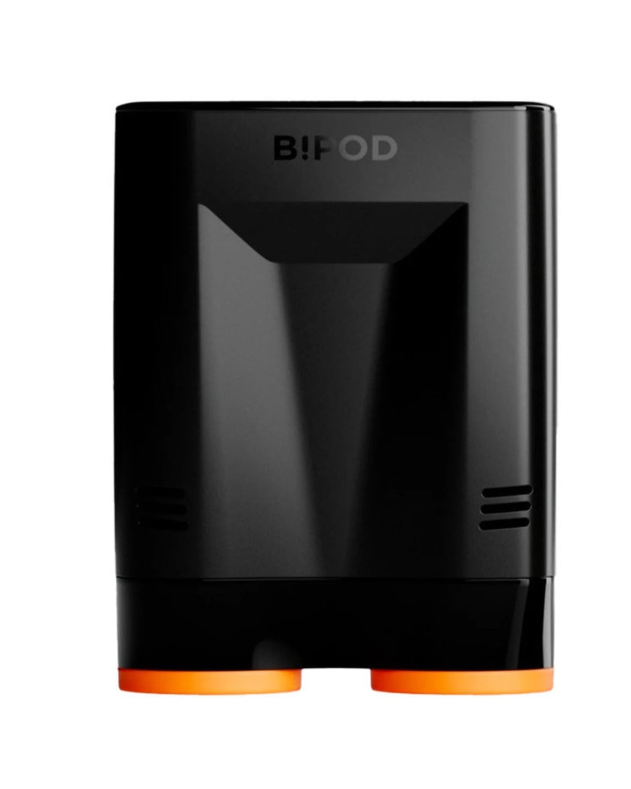
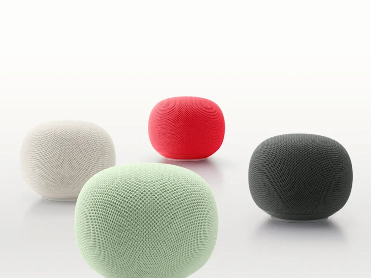
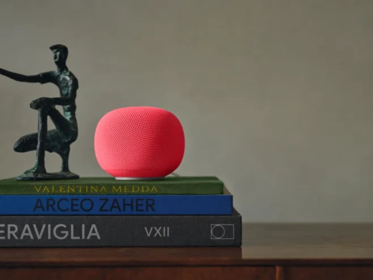
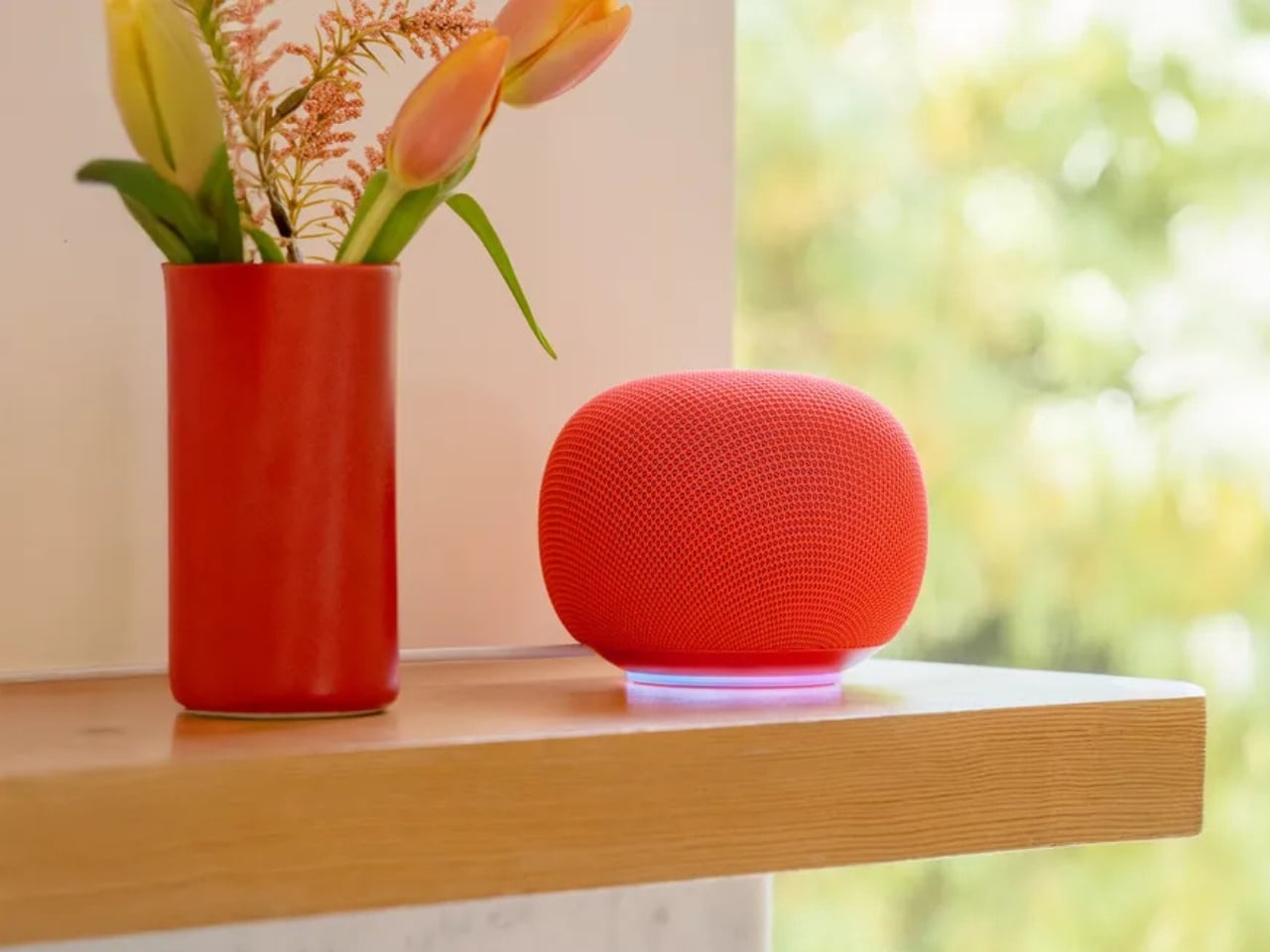
The new Google Home Speaker, officially arriving spring 2026 at $99.99 and heading to 19 countries, is not a Nest. That’s the first thing worth saying. Google dropped the Nest name entirely, and the shape that went with it. The speaker is round, compact, and wrapped in a 3D-knitted eco-friendly fabric that reads less like a gadget and more like something you’d find alongside handmade ceramics and artisan candles on a design blog. Google is calling the colorways Berry, Hazel, Jade, and Porcelain. Those aren’t accident names. That’s homeware language, not consumer electronics language.
Designer: Google
That shift matters more than it might seem. The naming tells you exactly who Google is designing for now, and it isn’t the person who organizes their cable management. Porcelain and Hazel are colors a person picks when they’re thinking about how something looks on a bookshelf, not which one has the best specs. Whether the average buyer consciously registers this or not, the vocabulary of the product positions it closer to a Muji lamp than a mesh Wi-Fi node. For a category that has long been aesthetically stranded, that’s a meaningful move.
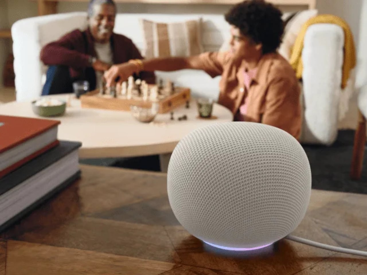
Underneath the fabric, the hardware story is genuinely interesting. The Google Home Speaker is built around Gemini for Home, which means it isn’t running a legacy assistant clumsily retrofitted with new AI layers. It has custom processing designed specifically for Gemini’s computational demands, meant to make conversations feel faster and more natural. A new light ring gives visual feedback as Gemini listens, thinks, and responds. The speaker also delivers 360-degree sound and supports stereo pairing. At $99, that’s a competitive package, especially compared to what Amazon and Apple are currently offering in the same price range, which hasn’t changed much in years.
Here’s the angle that gets underplayed in most coverage: Google built this speaker to coexist in an ecosystem that’s already expanding before the device even ships. Walmart’s Onn smart speaker appeared in CSA Matter filings in early May 2026, suggesting a budget tier of Gemini-compatible hardware is on its way. Google confirmed last October that Walmart’s Onn devices would work within Google Home. A $99 Google speaker alongside a cheaper third-party Gemini option creates a layered ecosystem where entry-level users get into the platform and those who want a more refined experience buy the Google-branded version. That’s a smarter market play than Google has made in this category in years.
What makes me take this launch seriously isn’t the hardware alone. Amazon has Alexa, which has gone through its own AI reinvention but still carries the aesthetic baggage of the cylinder era. Apple’s HomePod is excellent and priced accordingly. Sonos is navigating its own turbulent chapter. None of them are shipping something that looks like a river stone, costs $99, and runs a genuinely current large language model. Google, for once, doesn’t have obvious company in that specific lane.
The question I keep sitting with is whether the design conviction will hold once the product is actually in people’s homes. It’s easy to look good in product shots, and the Nest Audio looked great too. But if Google has genuinely committed to positioning this as a home object first and a gadget second, and if the Gemini experience inside it is as conversational as promised, then spring 2026 could mark something worth paying attention to.
The smart speaker had a moment, then it plateaued. A pebble-shaped $99 AI speaker with pastel names and a language model built for conversation might not sound revolutionary. Compared to what’s been sitting on kitchen counters for the last five years, though, it kind of is.
The post Google’s $99 Gemini Speaker Is About to Land first appeared on Yanko Design.