Every April, Coachella does that thing where it reminds you it’s not just a music festival. It’s a full-sensory exercise in spectacle, one that has always treated its art program with just as much ambition as its headliner lineup. This year, Dutch designer Sabine Marcelis is the one making that case loudest, with an installation called Maze that has, by most accounts, become one of the most talked-about spots on the entire festival grounds.
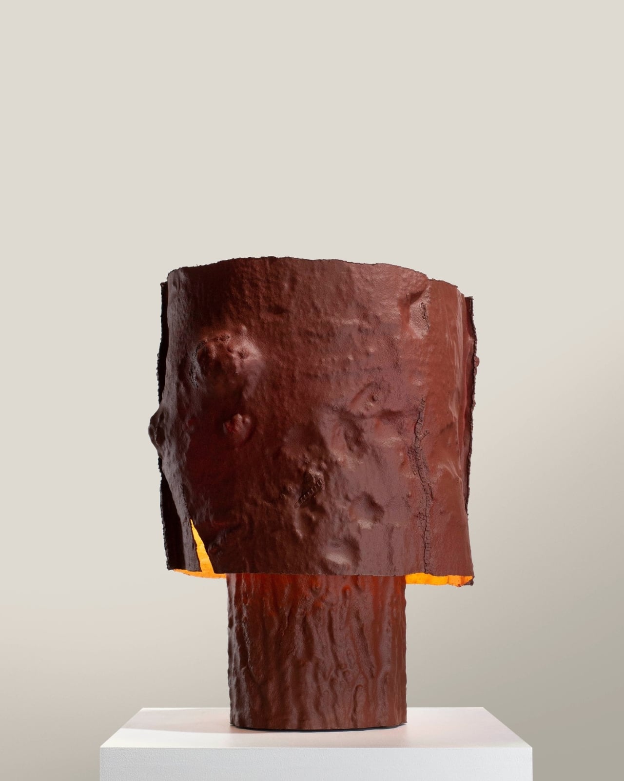
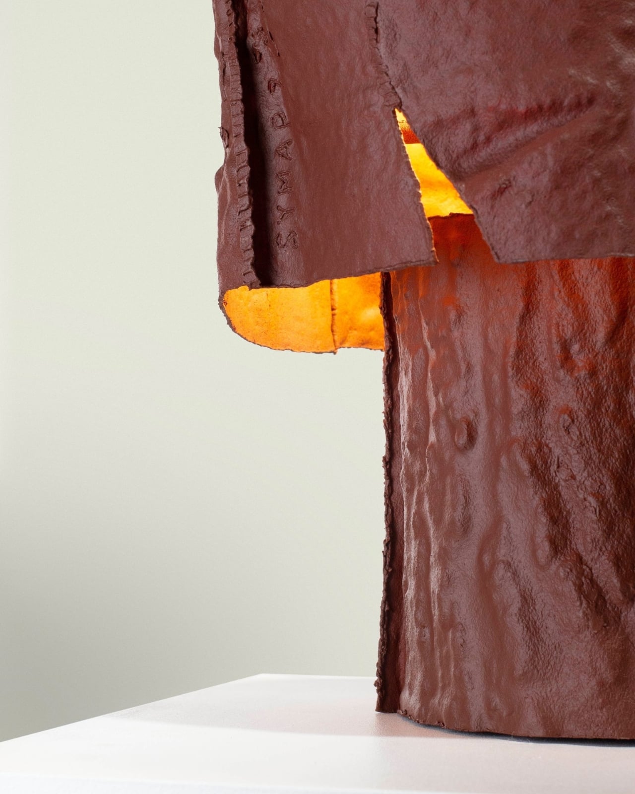
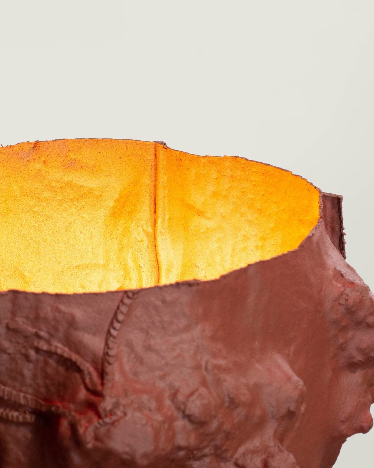
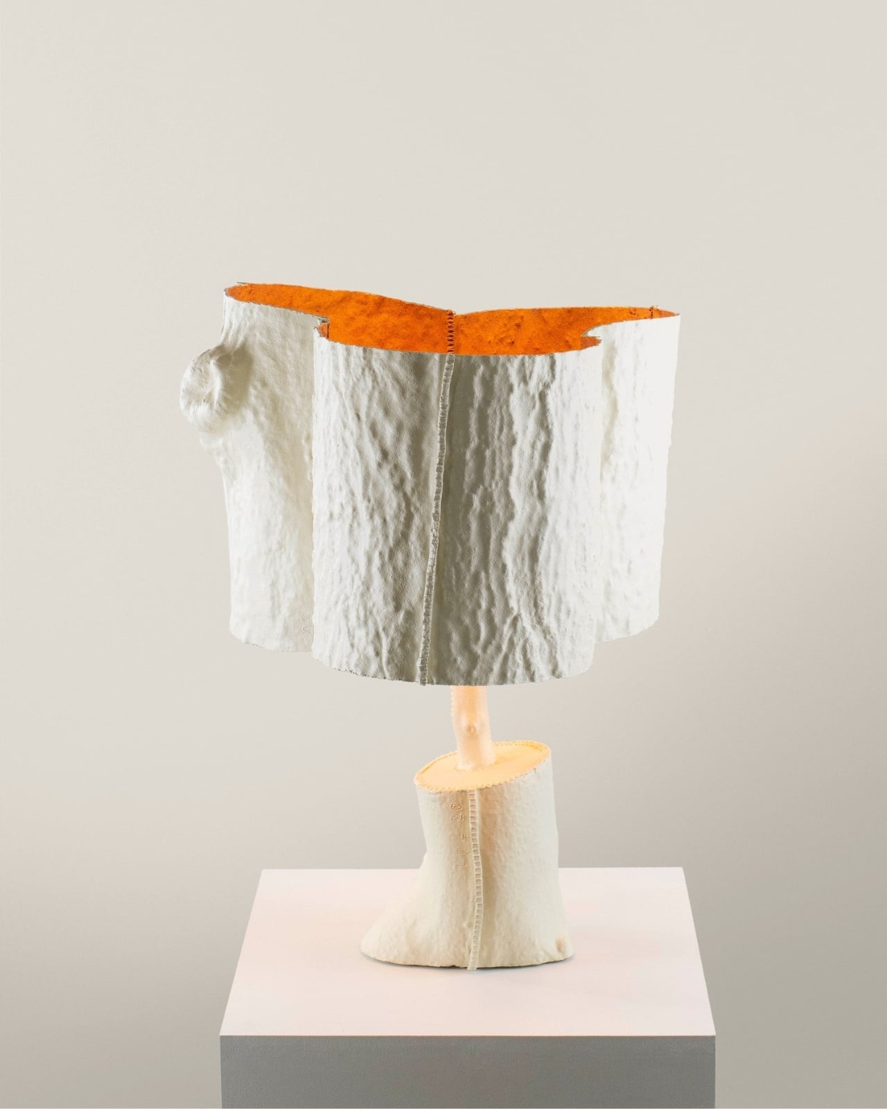
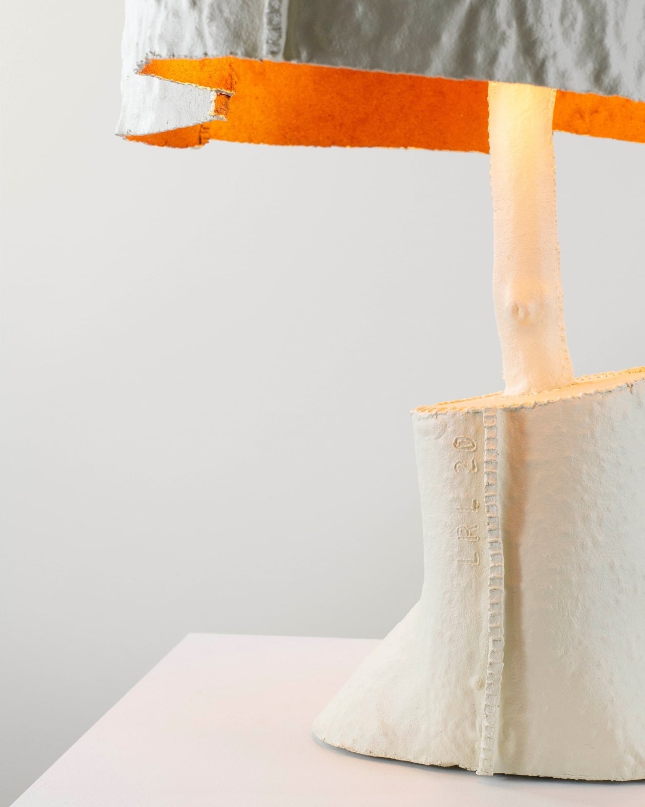
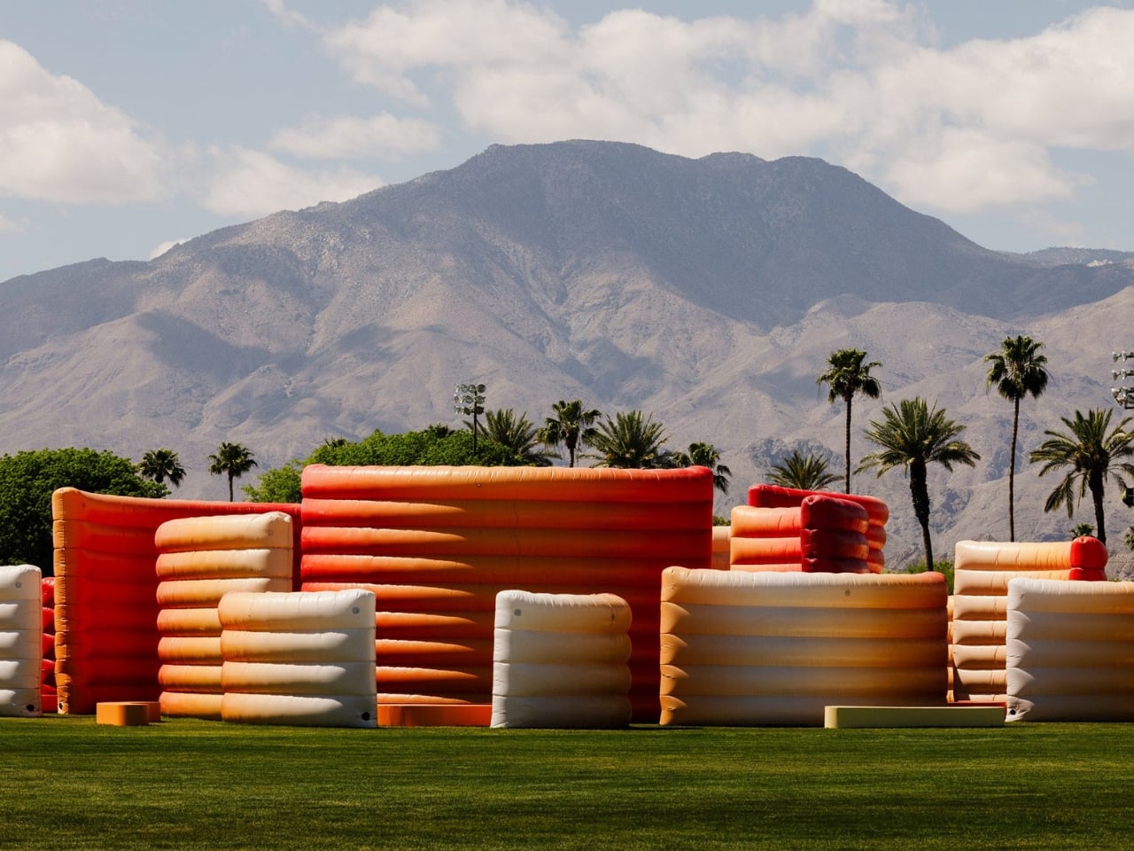
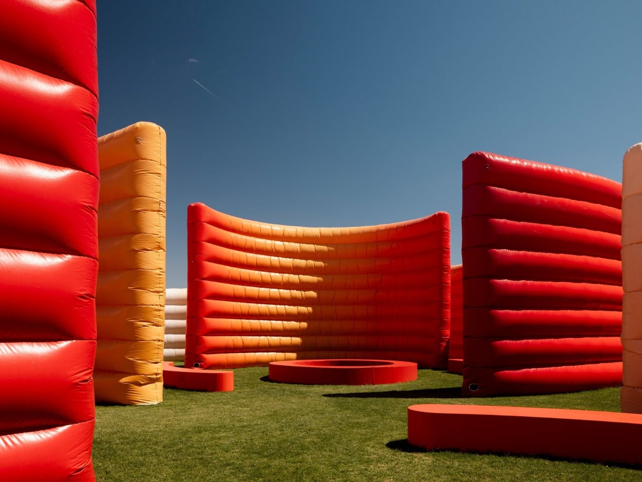
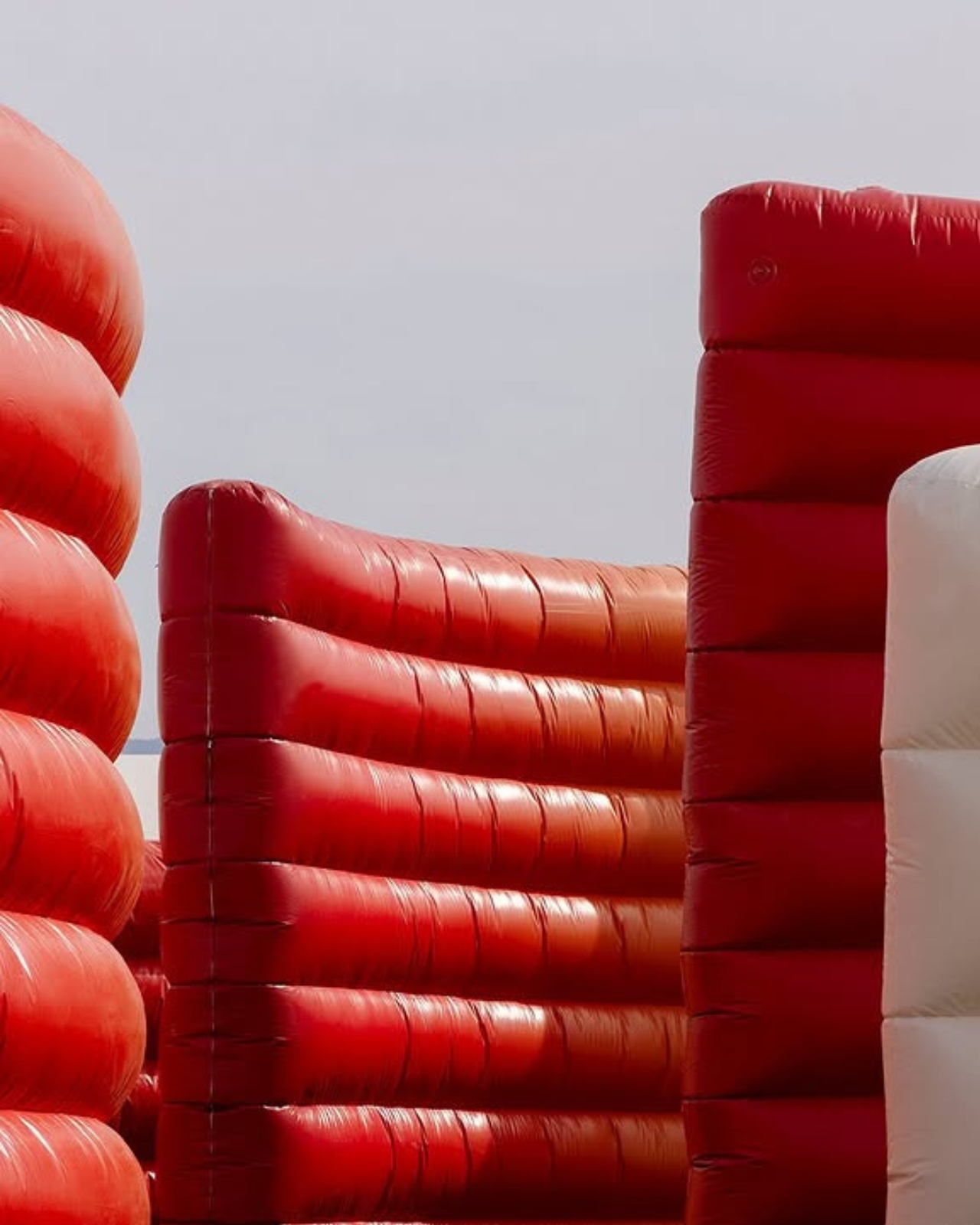
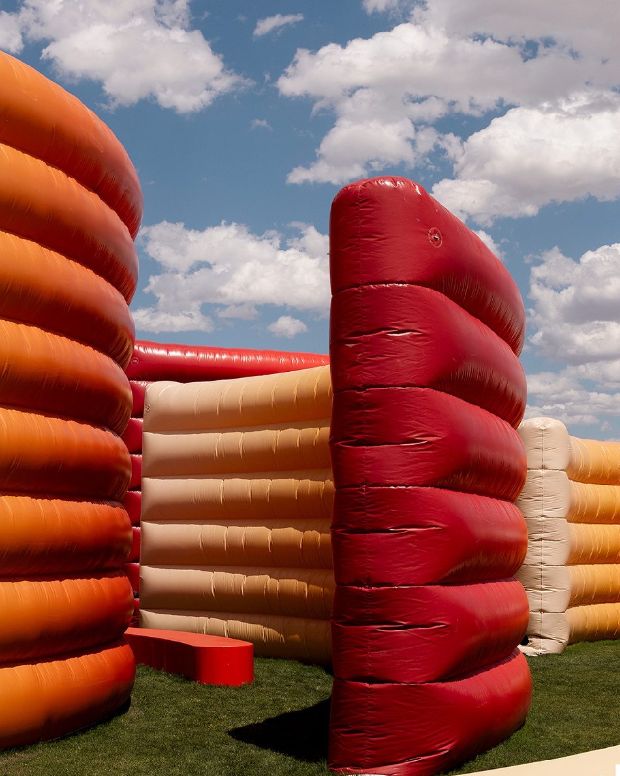
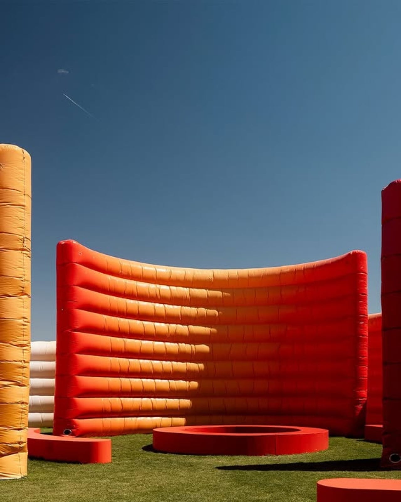
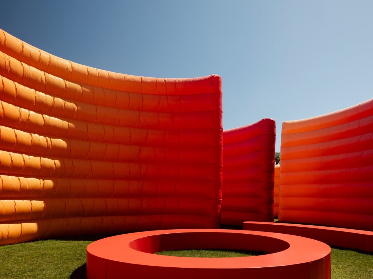
Maze is exactly what it sounds like, and also nothing like what you’d expect. Built from curved, inflated PVC walls that rise at varying heights, the structure winds across the Coachella grounds as a walkable labyrinth, one that feels less like an obstacle course and more like stepping into a fever dream of color and calm. The walls shift in a gradient from pale yellow at the outer edges to a deep, saturated red at the core, mimicking the warm, layered tones of a desert sunset. It’s the kind of color palette that looks deliberately, almost suspiciously perfect, and yet it doesn’t feel forced. It feels inevitable.
Designer: Sabine Marcelis
That’s what Marcelis does. The Rotterdam-based designer has built a body of work around the idea that light and material don’t just coexist. They perform together. Her practice leans into pure geometric forms and refined material investigations, always pushing manufacturing processes toward something surprising and sensory. At Coachella, that philosophy scales up beautifully. What could have been a gimmicky, oversized balloon art moment instead reads as something genuinely thoughtful: a structure designed to slow people down in a place that rarely stops moving.
And that’s the part that gets me. Coachella is famously relentless. Stages overlap, schedules are brutal, and the heat does not negotiate. Maze was built with that reality in mind. The inflated walls create shaded pockets, filtering both light and sound from the surrounding chaos. Seating runs along the outer edges, giving visitors actual places to stop and breathe. Clearings open up toward the stages, framing views of performances from inside the structure, so you never entirely lose the festival. You just get to experience it at a different speed.
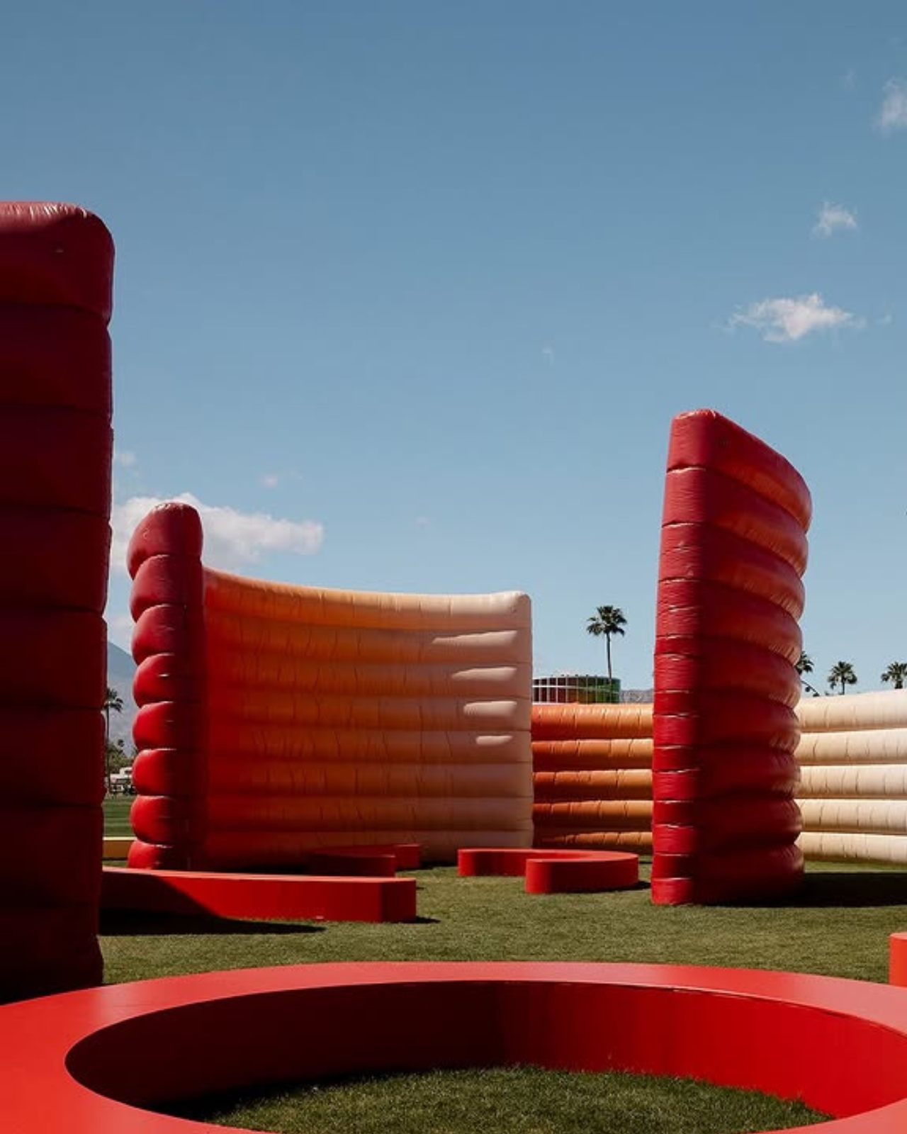
Inspired by the natural contours of the Coachella Valley, the design has a landscape quality to it that reads as more than an aesthetic reference. The curved forms echo the rolling terrain of the desert, and the color gradient mirrors the sky at the specific hours when the California desert looks like it was art-directed by someone very talented. Marcelis didn’t try to compete with the landscape. She translated it. At night, the whole thing transforms. The PVC walls glow from within, turning the maze into an illuminated field of warm color that sits somewhere between architectural installation and light sculpture. If the daytime version is about refuge, the nighttime version is pure atmosphere. It hits differently against the dark, and I mean that in the best way.
I’ll be honest. I’ve watched the Coachella art program grow more ambitious over the years, and my reaction to any given installation tends to hover somewhere between “impressive” and “Instagram bait.” Maze clears that bar and then some. It works because it has an actual point of view. Marcelis built something that functions, that shelters, that engages the senses, and that happens to be visually stunning. That’s a harder balance to strike than it looks.
The installation was curated by Public Art Company, and it’s part of a broader 2026 art program that continues to push Coachella’s visual ambitions. But Maze stands out not because it’s the biggest or the flashiest. It stands out because it treats the people walking through it as the point, not the backdrop. That’s good design. And at a festival where you’re constantly being asked to witness things, it’s genuinely refreshing to walk into something that simply asks you to sit down and stay a while.
The post Sabine Marcelis Built Coachella’s Best Spot Out of Thin Air first appeared on Yanko Design.