We spend so much time talking about modular design like it’s a modern revelation. Adjustable phone stands, swappable watch bands, magnetic laptop accessories, customizable everything. We talk about it like it’s a product of our era, born from Silicon Valley thinking and the rise of personal personalization. And then you come across Alex Linder’s Executive Desk from the 1970s and suddenly realize none of it is new at all.
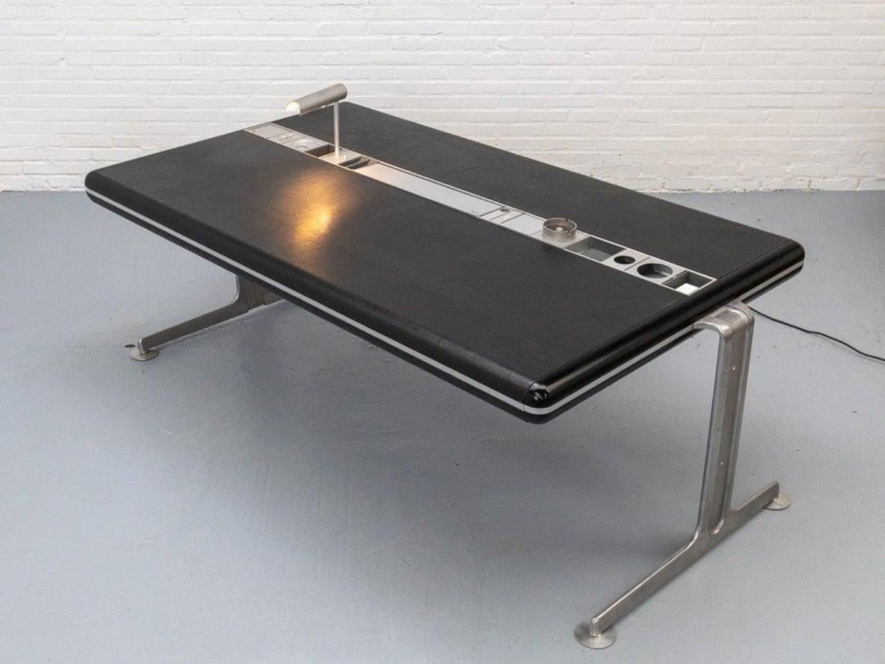
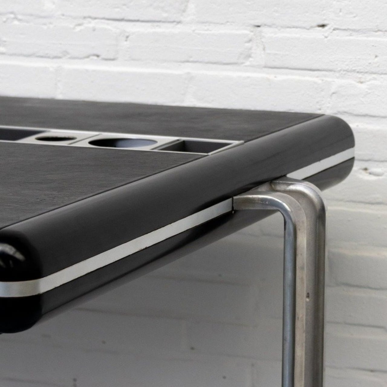
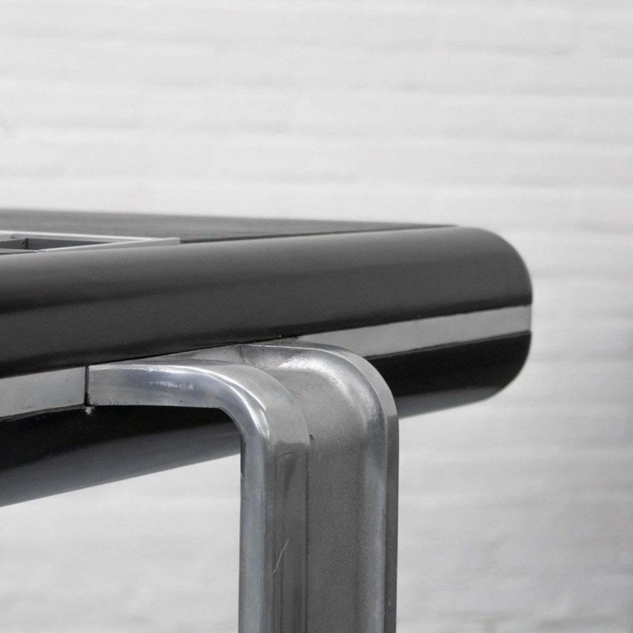
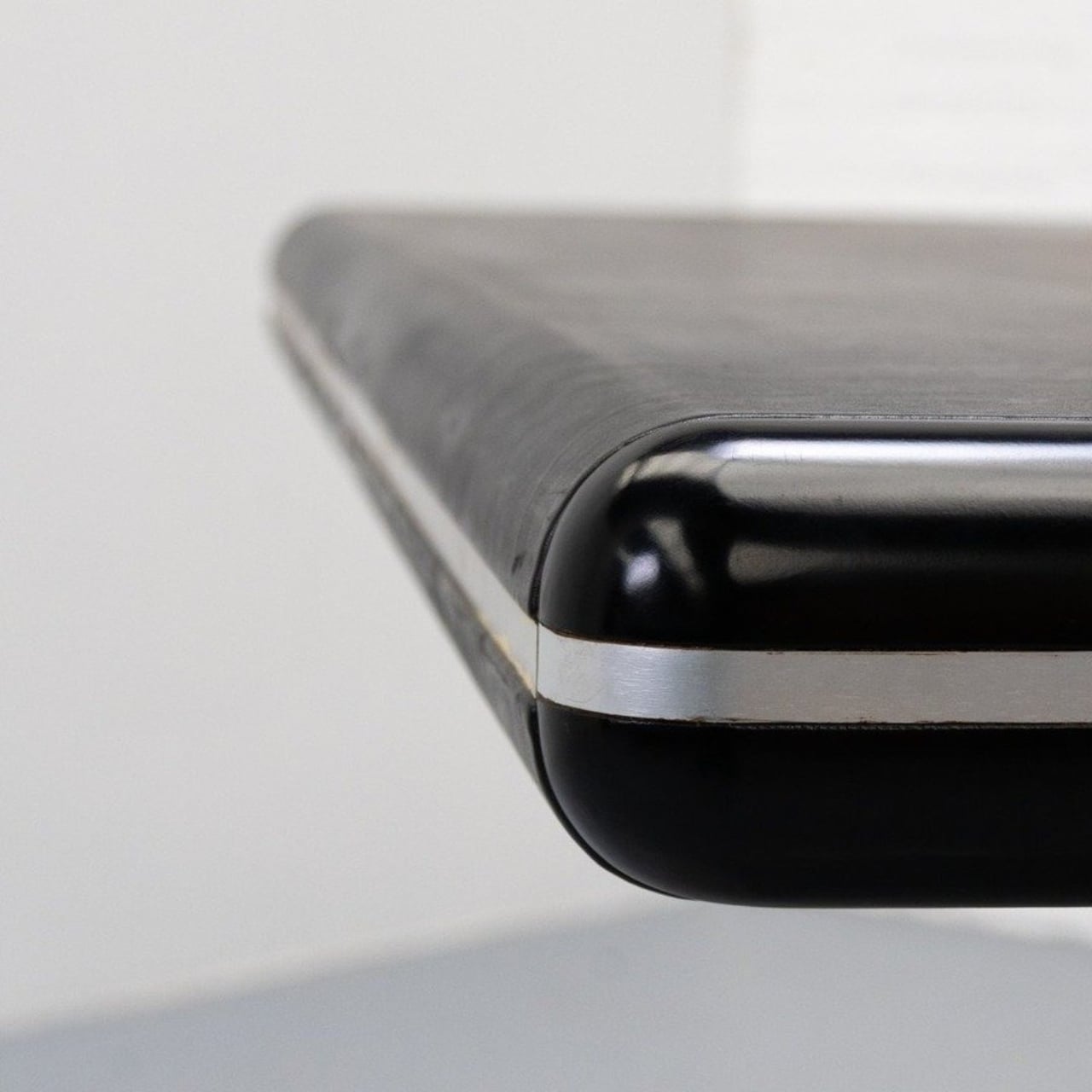
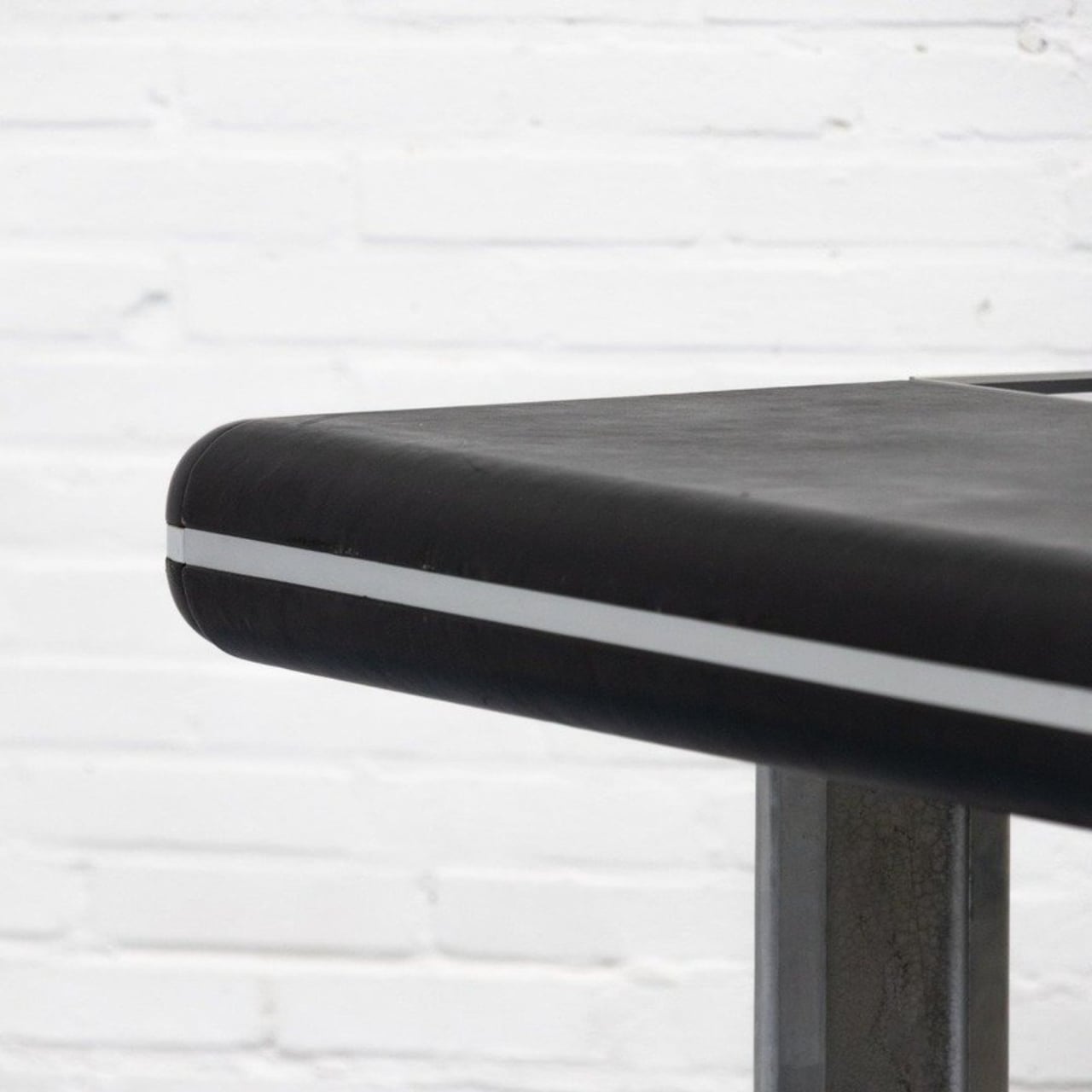
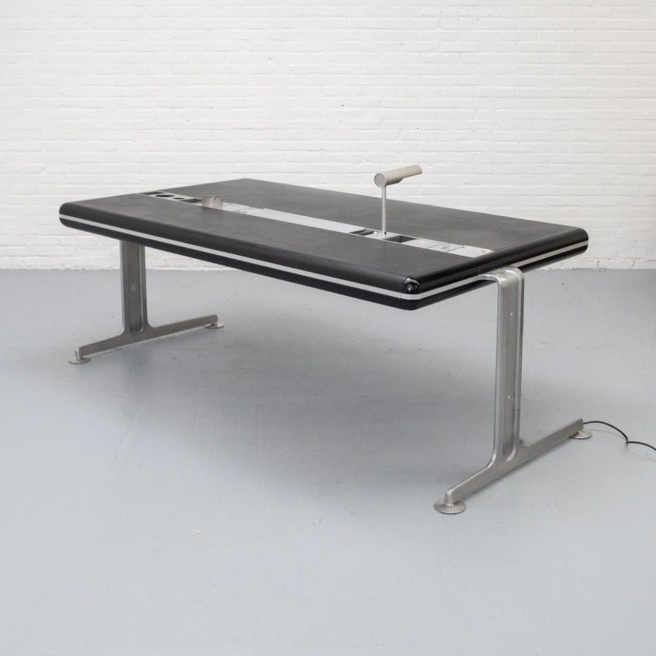
Linder, a Danish designer, built this desk sometime in the 1970s, and it is, by most accounts, extremely rare. Looking at it today, you’d be forgiven for thinking it was designed last year. The top is finished in black leather and framed with aluminum, resting on a solid metal base. The proportions are clean, the materials are considered, and the overall effect is exactly what good Scandinavian design tends to produce: something that looks inevitable, like there was never any other way to do it. But the real story isn’t the leather top or the beautiful lines. It’s what sits right in the center of the desk.
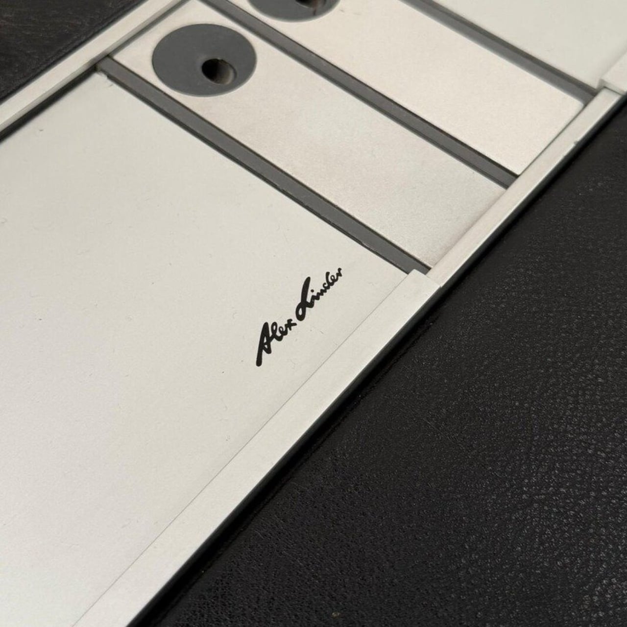
Designer: Alex Linder
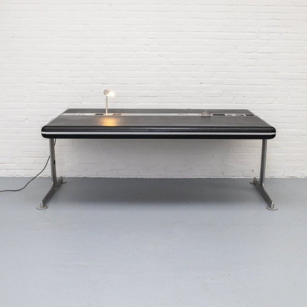
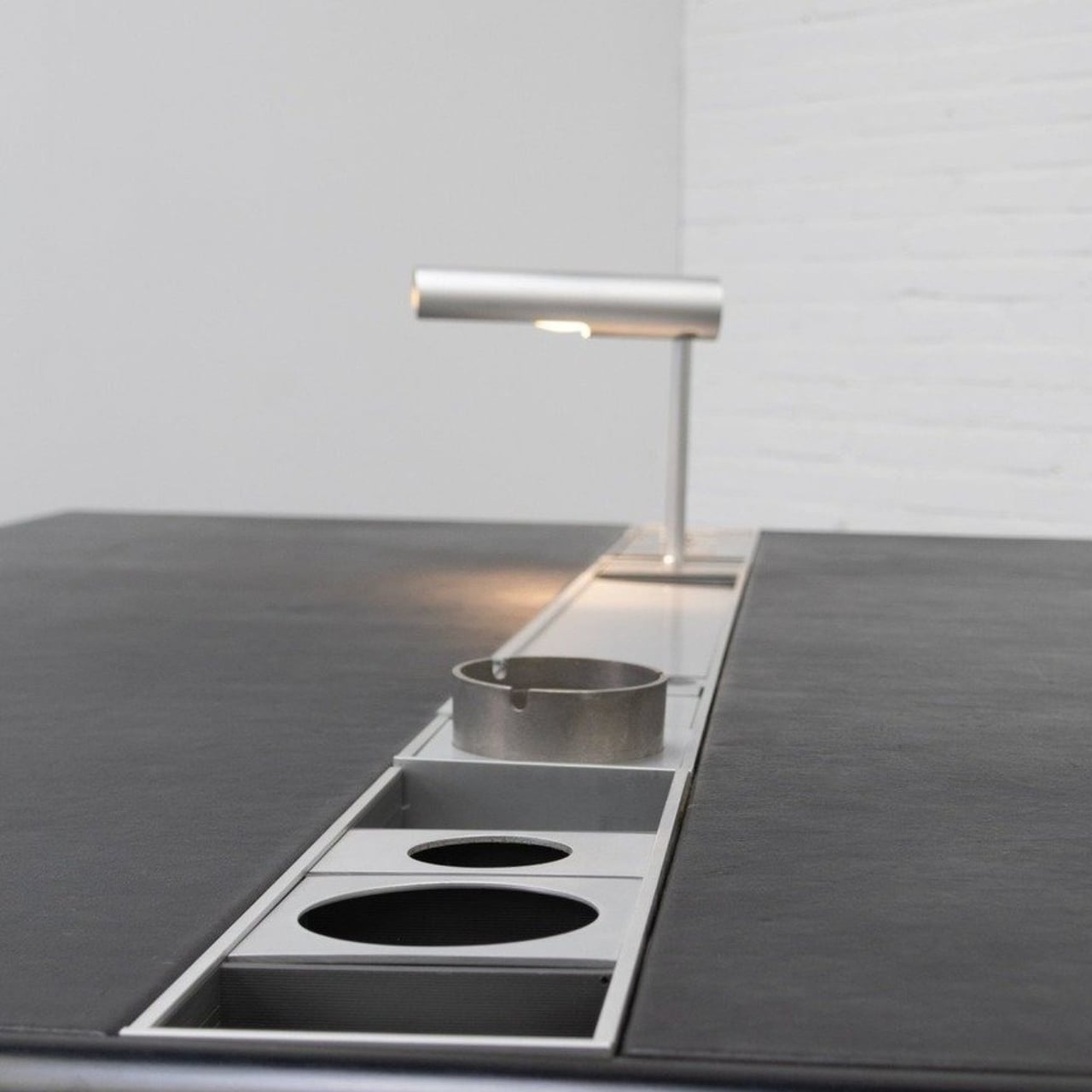
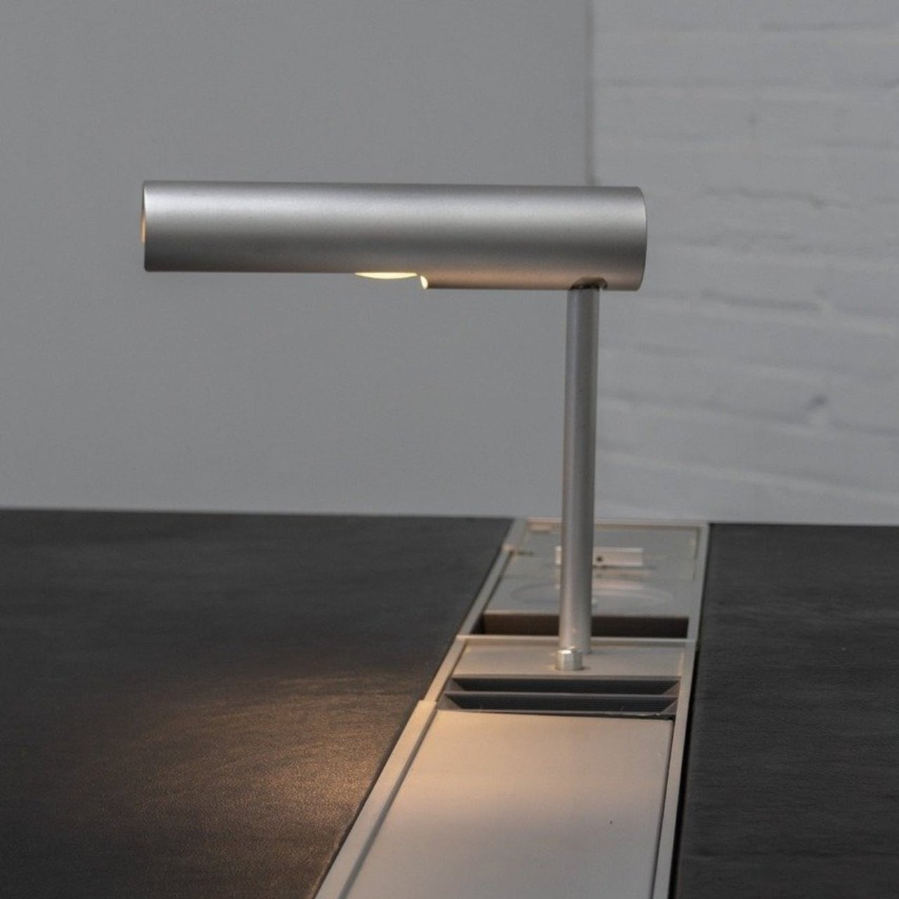
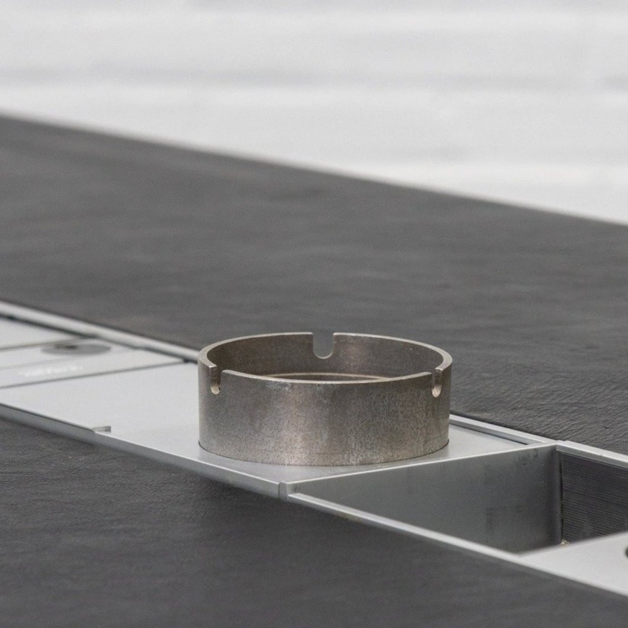
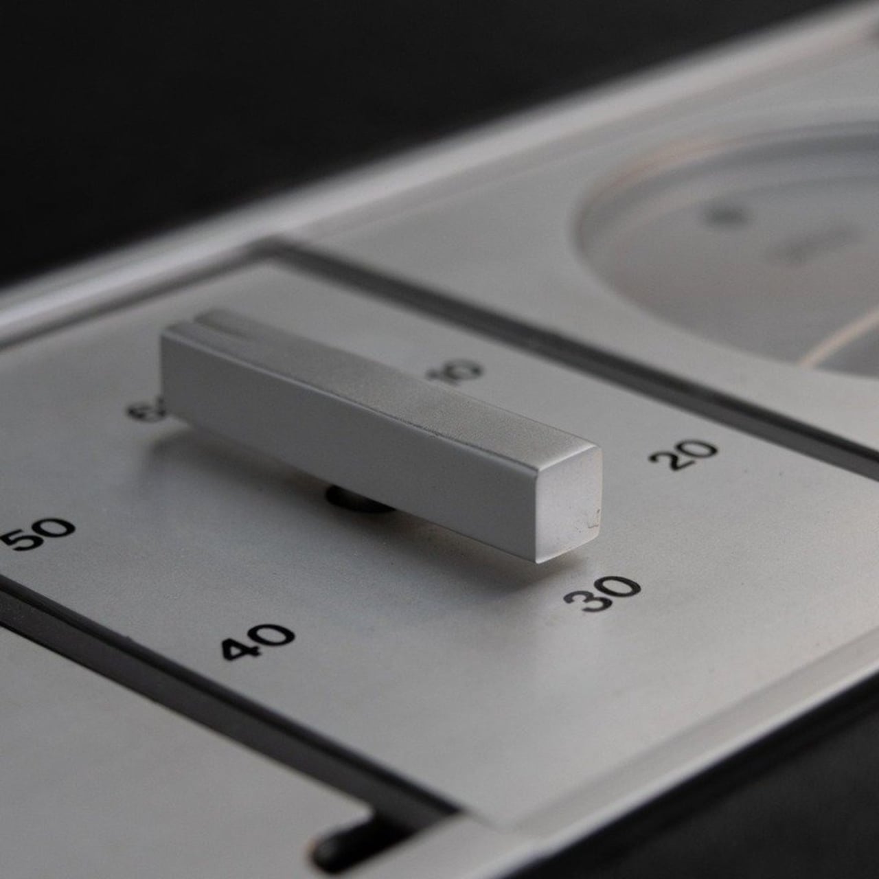
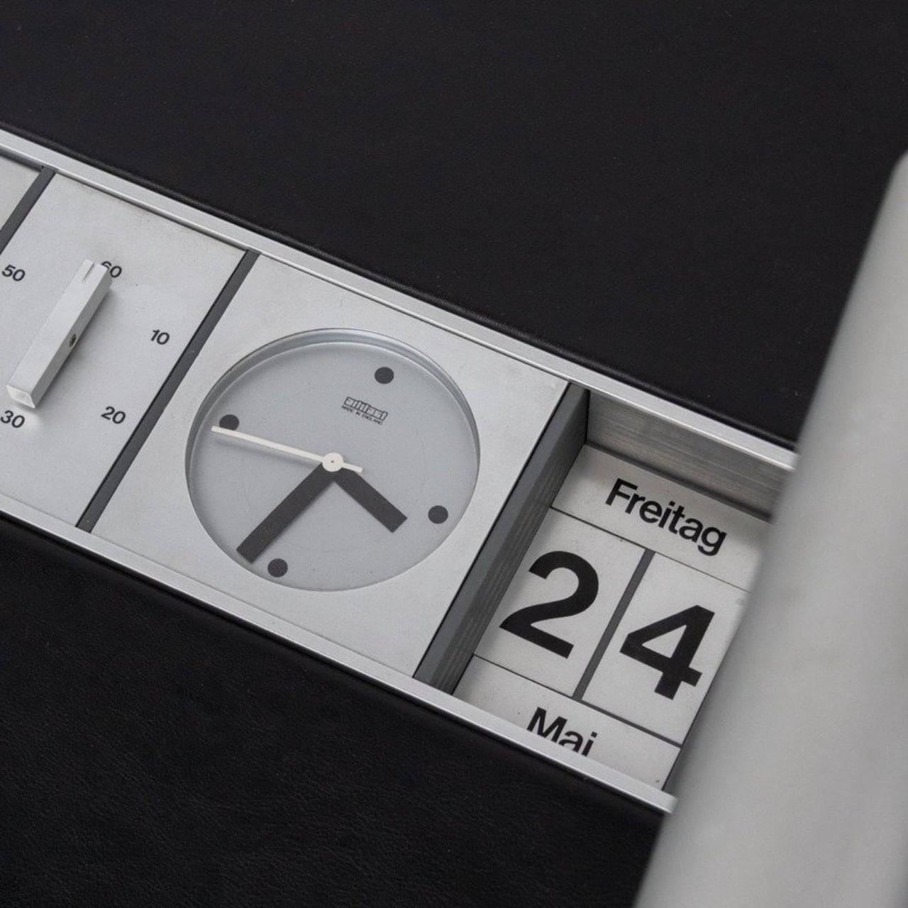
Linder built a recessed aluminum rail directly into the desk surface. Into that rail, you slot accessories: a rotating desk lamp, a clock, a calendar, a mechanical countdown timer presumably for meetings, small storage compartments for pens and miscellaneous objects, and, because it was the ’70s, an ashtray. Each piece sits flush and intentional, like it belongs. The desk also has no drawers, which feels like a deliberate statement rather than an oversight.
Think about what that actually means as a design decision. Linder looked at the way people used a desk and decided that the answer wasn’t more storage hidden underneath, but a curated surface system you could reconfigure based on what you actually needed. That’s not a small idea. That’s the kind of thinking that entire product categories are built on today. It’s about designing for adaptability rather than completeness, which is a genuinely harder problem to solve.
The modular design conversation is everywhere right now. We have monitor arms with built-in cable management, desk mats with snap-in wireless chargers, pegboard setups that practically have their own aesthetics communities on social media. Framework made a modular laptop and built a devoted following around it. The concept of making something that can evolve with the user’s needs has become a selling point, sometimes the selling point. And here’s Linder, decades earlier, doing it quietly on a leather-topped desk in Denmark.
That’s the thing about design that predates the internet: it didn’t have the benefit of going viral. Pieces like this stayed in offices, got passed through estates, ended up in European vintage markets for people who happened to stumble across them. Today, you can find Linder’s Executive Desk listed on resale platforms, tagged as “extremely rare,” priced around $5,000, and shipped from the Netherlands. It’s the kind of object that makes you wonder how many other brilliant, ahead-of-their-time designs are still sitting in storage somewhere, quietly waiting to be rediscovered.
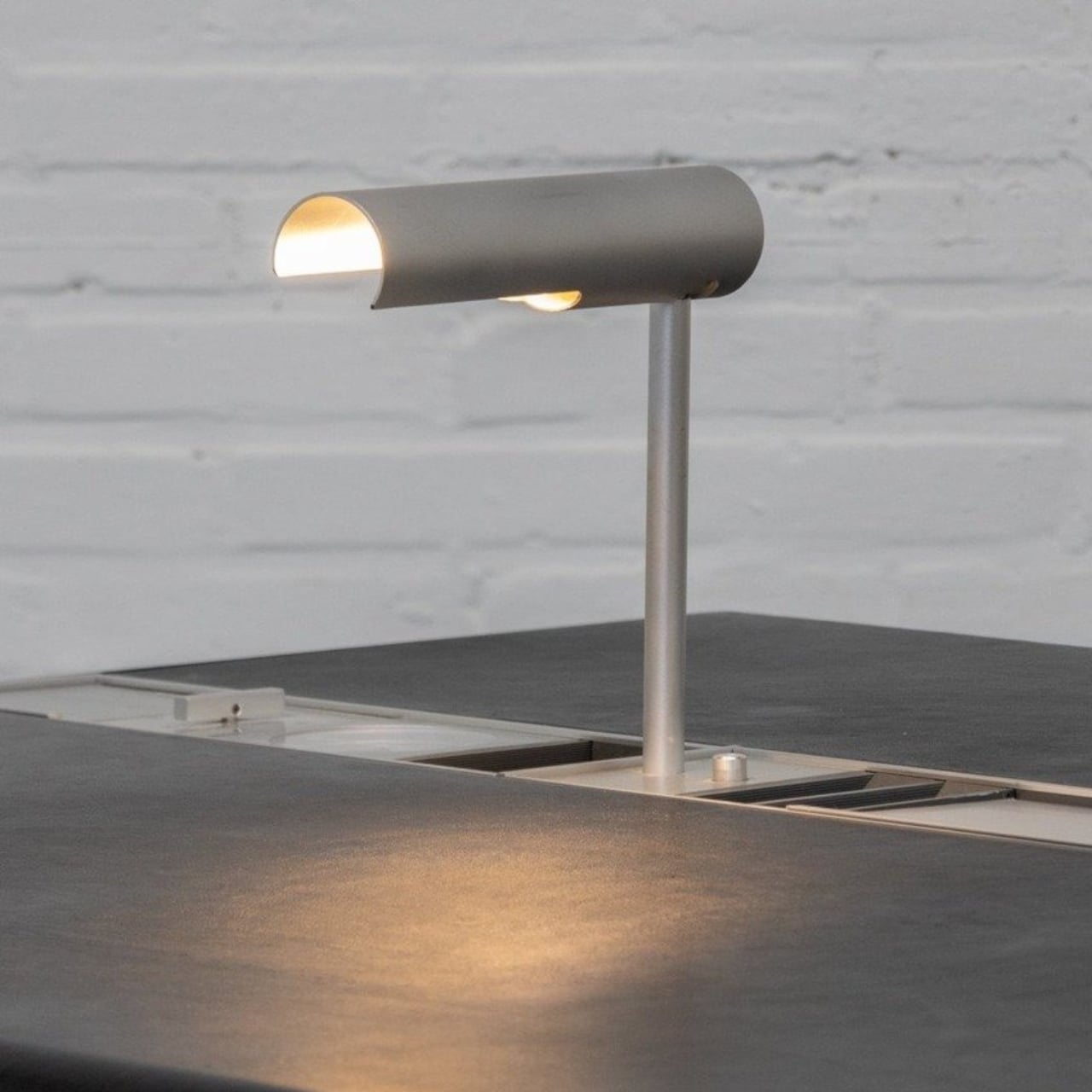
It’s also worth noticing what the desk says about how people worked in the 1970s. A countdown timer for meetings built directly into the furniture is either a sign of remarkable efficiency or remarkable anxiety, possibly both. The rotating lamp suggests someone thought carefully about task lighting at a time when most offices were settling for overhead fluorescents. Even the ashtray has a designated place, literally, which says something about how deliberately every inch of that rail was considered.
Good design doesn’t expire. That’s the lesson Linder’s desk keeps teaching every time someone spots it online and does a double take. It doesn’t look like a relic. It looks like something a design-forward brand would release today with a waitlist and a product launch newsletter. The fact that it came out of a Danish workshop fifty years ago is almost beside the point. The thinking was right then, and it’s still right now.
The post The 1970s Desk That Figured Out Modular Before We Did first appeared on Yanko Design.