There’s something beautifully ironic about the fact that we carry supercomputers in our pockets, yet the humble calculator refuses to die. And if designer Mariana Bedrina has her way, maybe it shouldn’t. Her GIA calculator concept doesn’t just crunch numbers. It makes you want to crunch numbers.
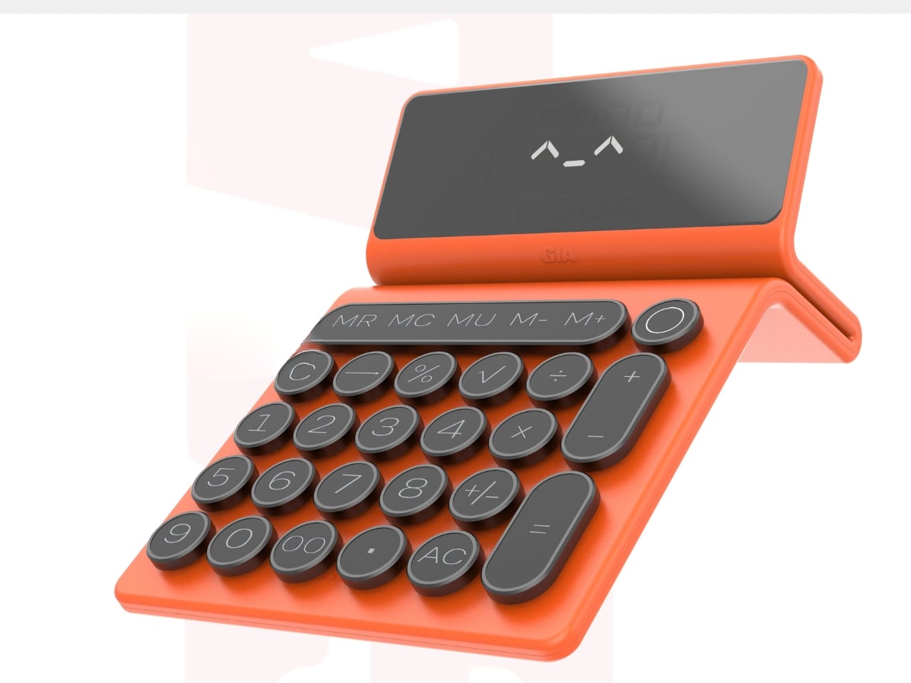
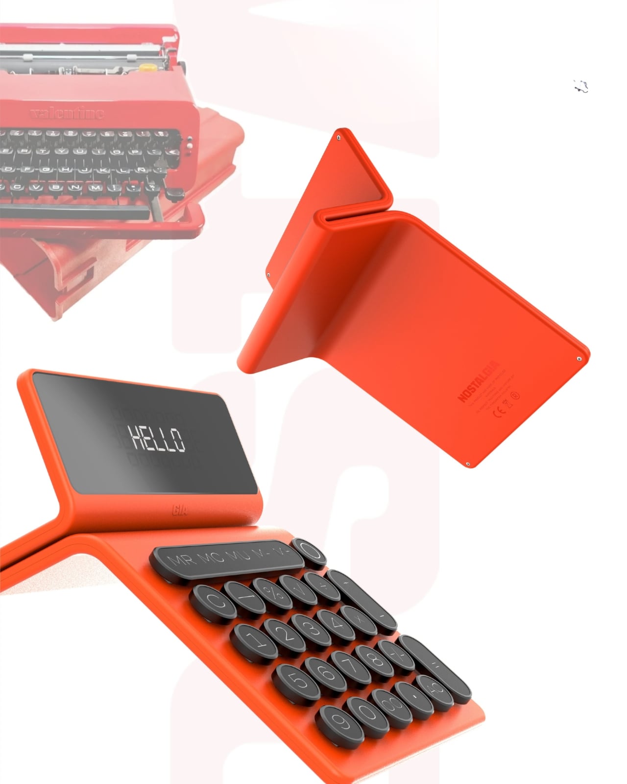
At first glance, the GIA looks like it time-traveled from a 1960s Italian design studio, stopped briefly in 2026 to pick up some modern tech, and landed on your desk with a personality. The inspiration comes from Olivetti typewriters, those gorgeous mechanical machines that made office work feel like an art form. Remember when tools had character? When objects didn’t just function but made you feel something? That’s what Bedrina is tapping into here.
Designer: Mariana Bedrina
Create your own Aesthetic Render: Download KeyShot Studio Right Now!
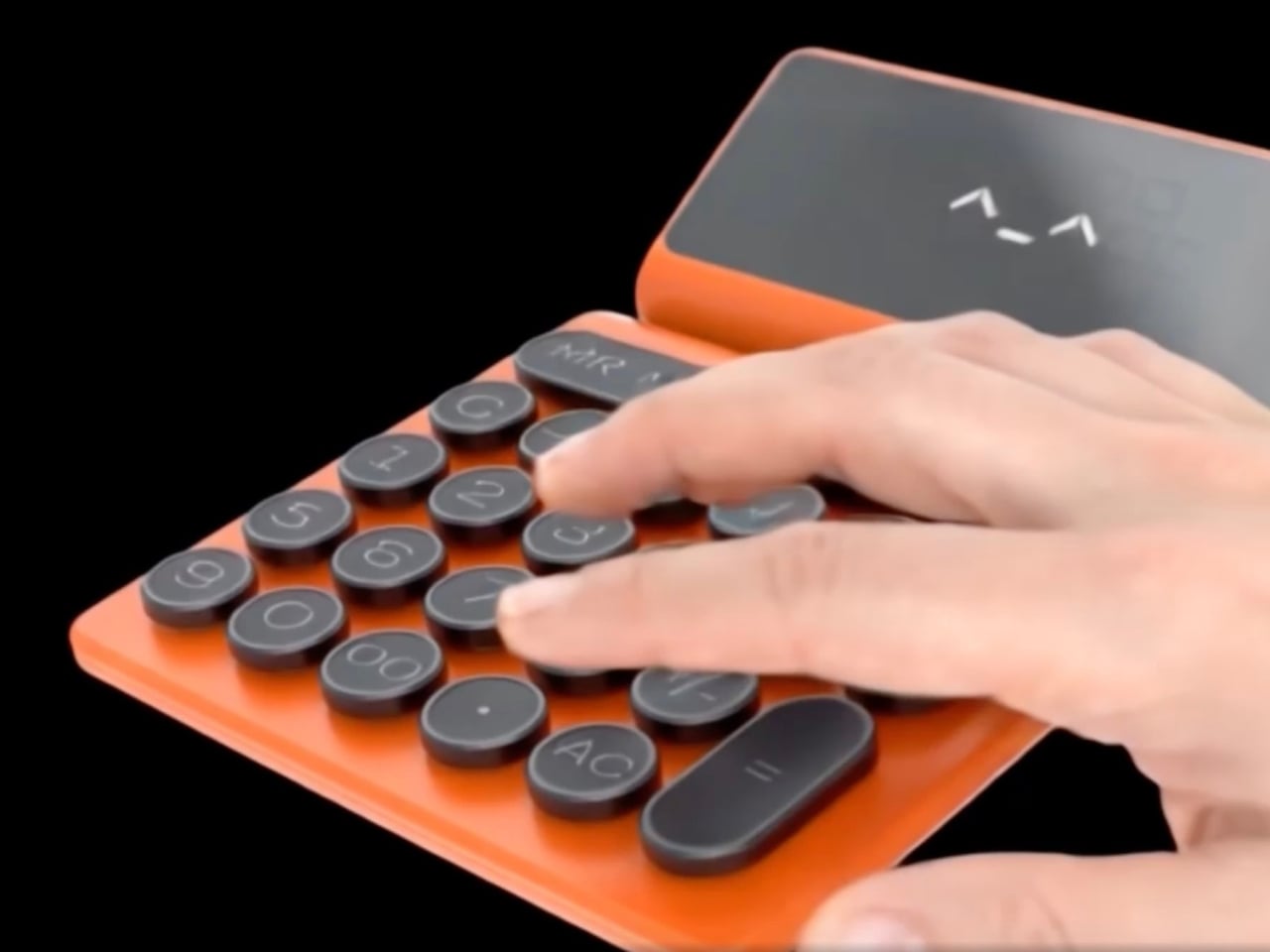
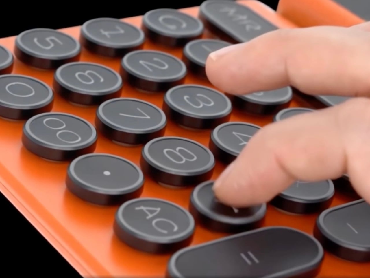
The design plays with contrasts in the most satisfying way. Soft-touch plastic meets metal-edged keys, creating something that looks simultaneously retro and contemporary. The calculator has a folding stand that props up the display at an angle, giving it this almost laptop-like presence on your desk. But what really sells the concept is the attention to tactile pleasure. Each button press promises a rhythmic click, that same satisfying feedback that made typewriters so addictive to use. There’s a reason mechanical keyboard enthusiasts spend hundreds of dollars chasing that perfect keystroke sound.
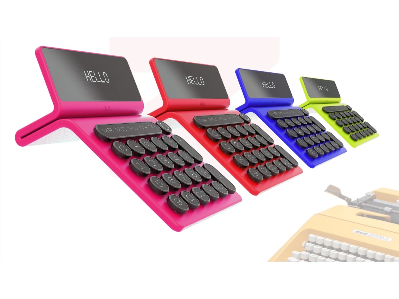
The GIA comes in a color palette that pulls directly from Olivetti’s most vibrant era. We’re talking coral red, electric blue, and that particular shade of lime green that somehow works when it absolutely shouldn’t. These aren’t the muted, “professional” colors we’ve been conditioned to accept in office supplies. They’re joyful. They’re loud. They demand to be noticed. The display even greets you with “HELLO” in a pixelated font that adds to the charm.
But here’s what makes this concept more than just a pretty nostalgic exercise. It recognizes something we’re only now starting to articulate: digital minimalism has left us craving physical objects again. We got so efficient, so streamlined, so invisible in our technology that we forgot how much we enjoy touching things, hearing things, seeing colorful things on our desks that aren’t just glowing rectangles.
The GIA positions itself as both a functional tool and a form of self-expression. Bedrina describes it as fitting equally well in office spaces and home studies, which tracks. This isn’t trying to be invisible professional equipment. It’s trying to be a conversation starter, a mood lifter, something that makes the mundane task of calculating expenses or balancing budgets feel less soul-crushing. There’s also something refreshingly analog about committing to a single-purpose device. Your phone can calculate, sure, but it can also distract you with seventeen notifications while you’re trying to figure out if you can afford that vintage lamp. A dedicated calculator keeps you focused. Add genuine design appeal, and suddenly you have an object that earns its place in your space.
The typewriter-inspired button layout is particularly clever. Those rounded keys with metal frames aren’t just aesthetic choices. They reference a specific era of design when Italian manufacturers proved that office equipment didn’t have to be boring. Olivetti’s typewriters were status symbols, objects people genuinely loved. They appeared in films, in photographs, in the hands of writers who could have afforded anything but chose these specific machines because they were beautiful.
Whether the GIA calculator will ever move beyond concept to production remains to be seen. The market for premium calculators exists but it’s niche. Yet seeing this design reminds us why concepts matter. They push against the current, question assumptions, and suggest possibilities. They ask: what if our tools brought us joy again? What if functional objects could also be emotional ones?
In a landscape dominated by minimalist design and disposable electronics, the GIA feels almost radical in its commitment to personality, color, and tactile pleasure. It suggests that maybe we don’t have to choose between functionality and delight. Maybe our calculators can have character. Maybe math doesn’t have to be boring, even when it’s just math.
The post A Typewriter-Inspired Calculator in Vibrant Coral Red Just Stole Our Heart first appeared on Yanko Design.