This $550 Modular Light Lets You Design Your Own Wall Art

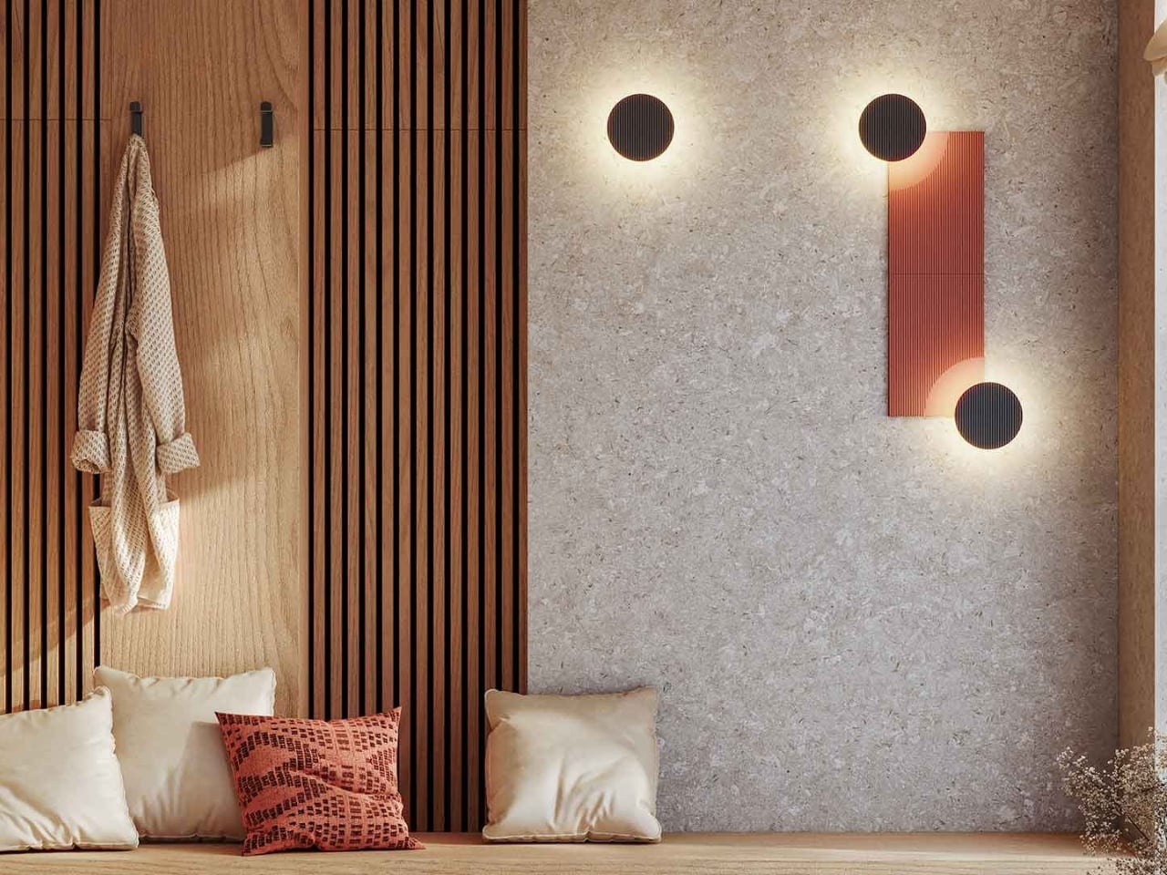
There’s something fascinating about watching designers take inspiration from the natural world and translate it into something you can actually use in your home. The ARID Modular Lighting System from Nahtrang Studio and Spanish brand Bover does exactly that, capturing the subtle beauty of arid landscapes and transforming it into a wall light that’s part art installation, part customizable tech.

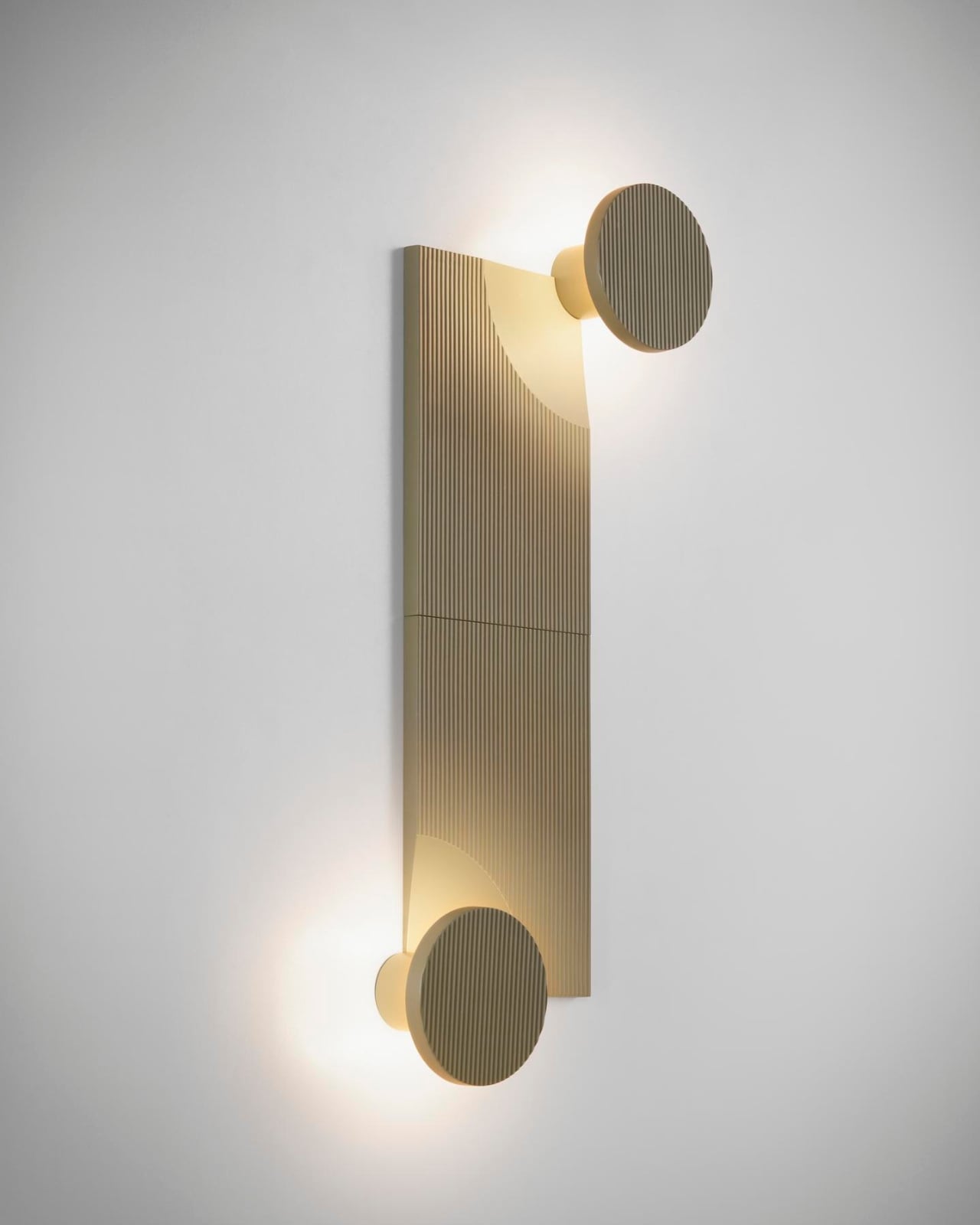
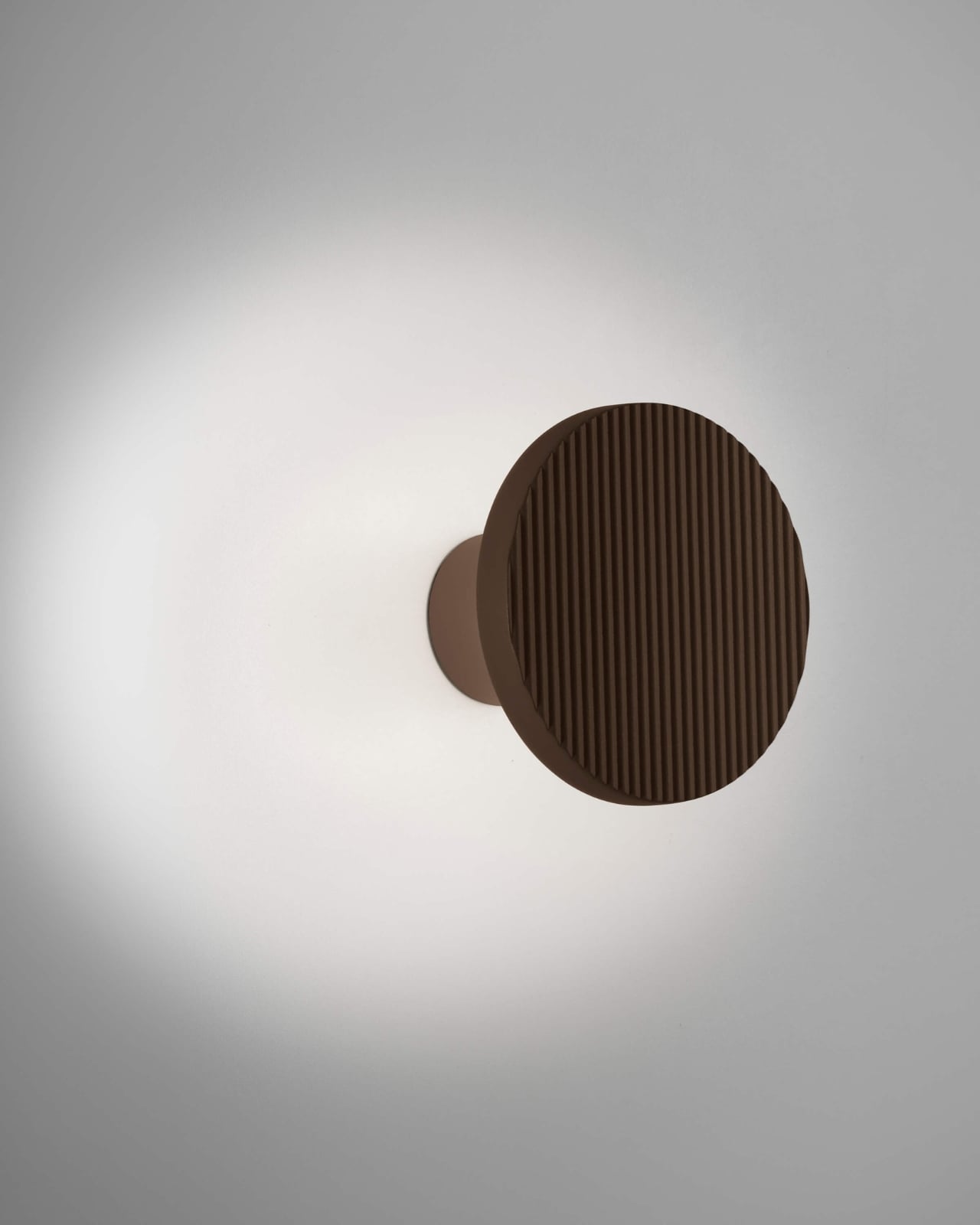
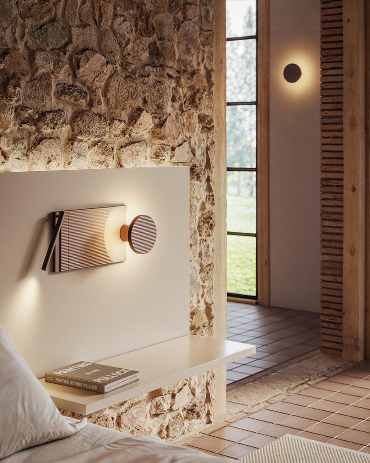
The concept is beautifully simple. Think of ARID as a grown-up version of building blocks, but for your walls. The system consists of a core lighting unit that can be paired with various aluminum tiles in different configurations. You can arrange them to create your own unique composition, which means no two installations have to look the same. It’s like getting a bespoke piece without the bespoke price tag.

Designer: Nahtrang Studio for Bover

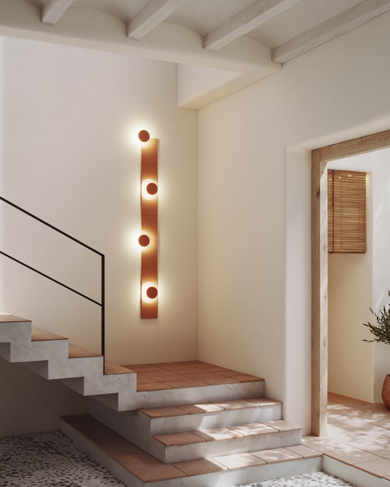
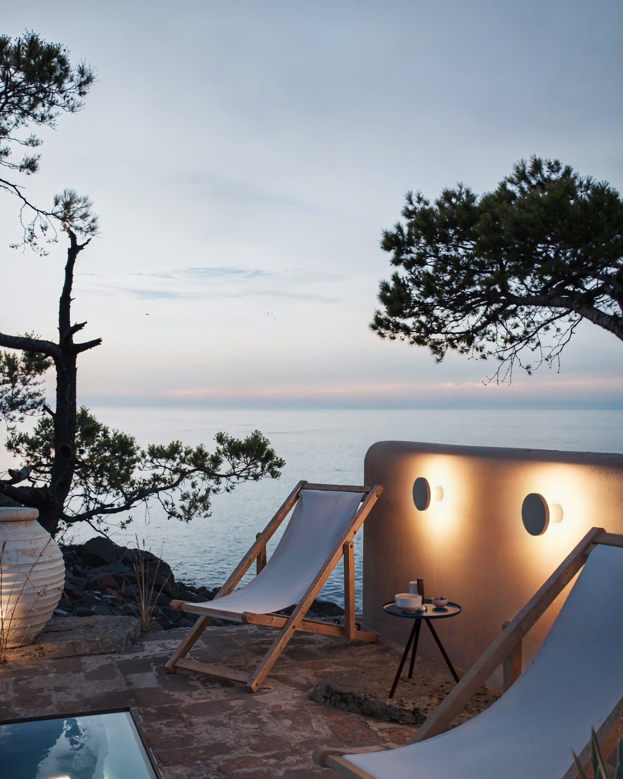
Nahtrang Studio approached this project with a clear mission from the start. They wanted to create something flexible and adaptable that could work in different spaces while maintaining a strong visual identity. The result is a fixture that performs its technical job while contributing real atmosphere to a room. Light emerges gently from behind the aluminum panels, tracing their forms and casting subtle shadows that mimic the way sunlight plays across desert terrain.

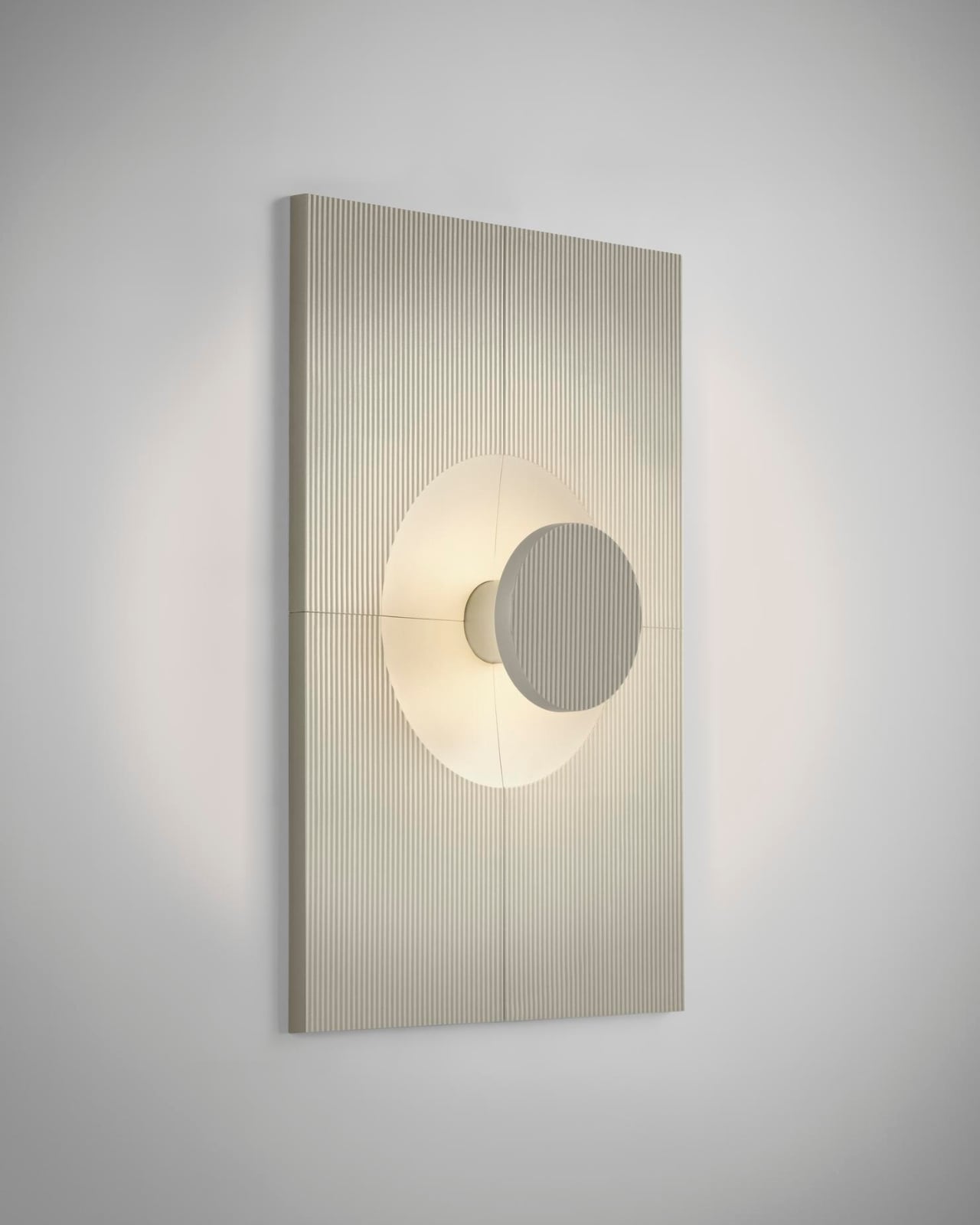
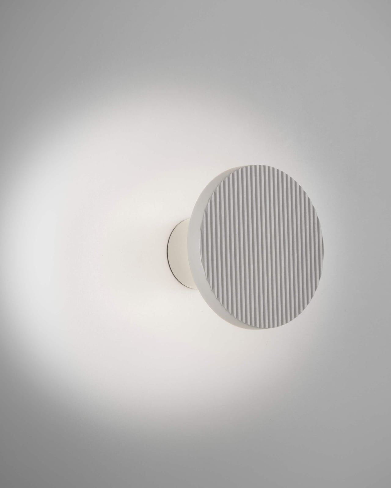
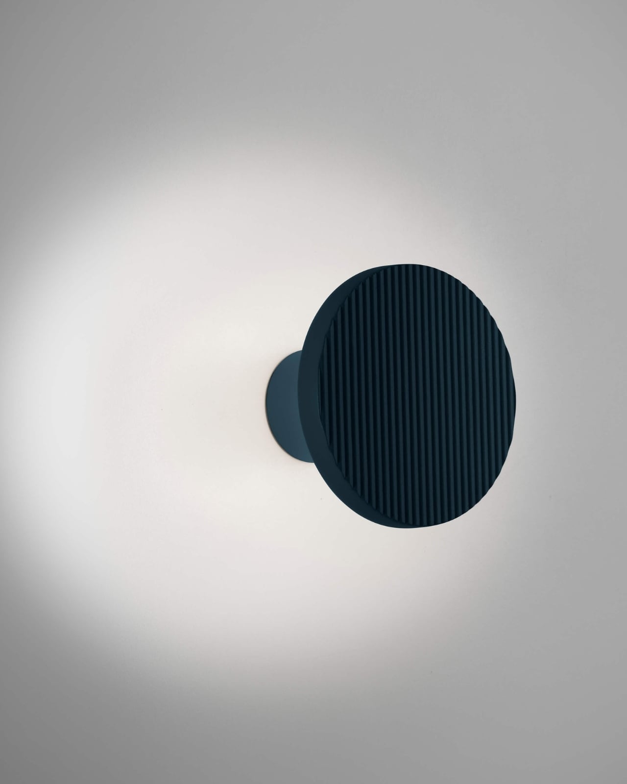
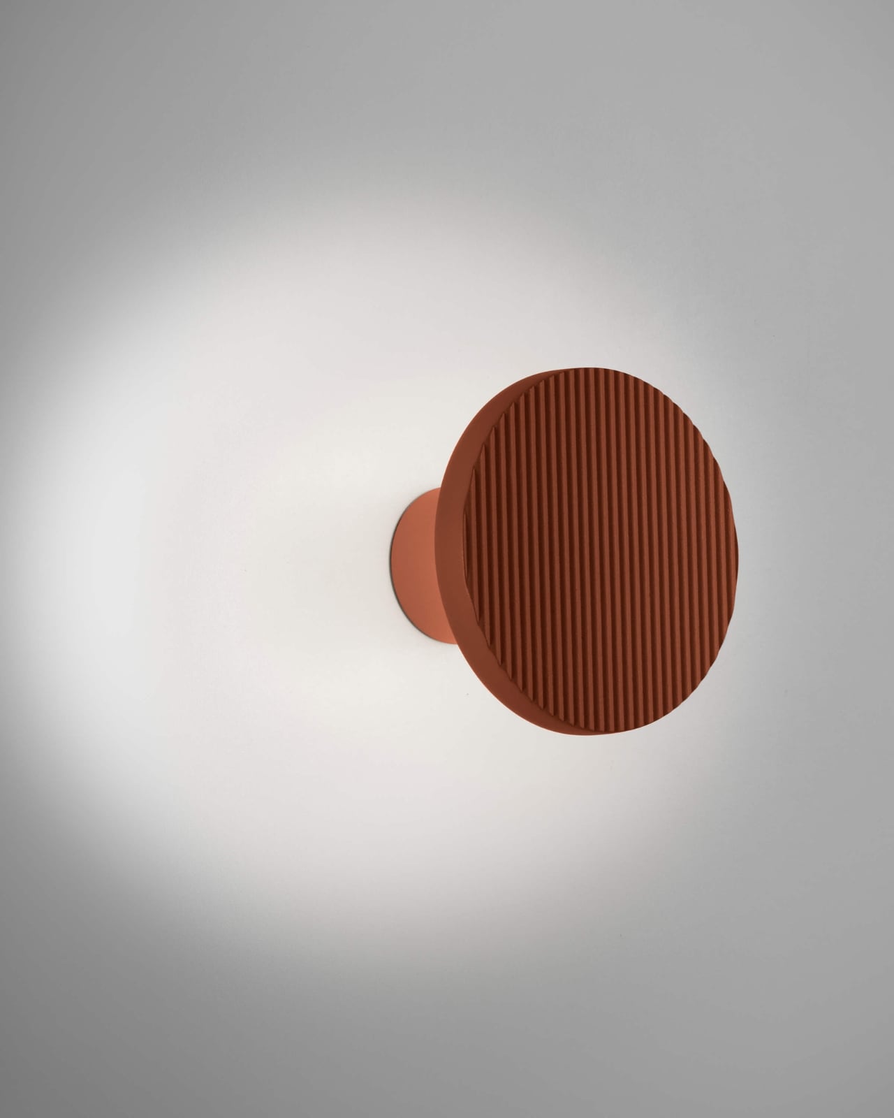
The choice of aluminum wasn’t arbitrary. According to the designers, it gave them the technical precision they needed while checking important boxes for sustainability. Aluminum is recyclable, lightweight, and durable, making it an intelligent choice for a product meant to last. The material also takes finishes beautifully, which is evident in the eight available colorways.

Speaking of colors, this is where ARID really shines. Forget basic black and white (though those are available if that’s your thing). The palette includes terracotta, pebble grey, graphite brown, olive grey, grey blue, and sand yellow. Each shade feels pulled directly from nature, giving you an easy way to bring earthy tones into contemporary spaces without things feeling forced or themey.

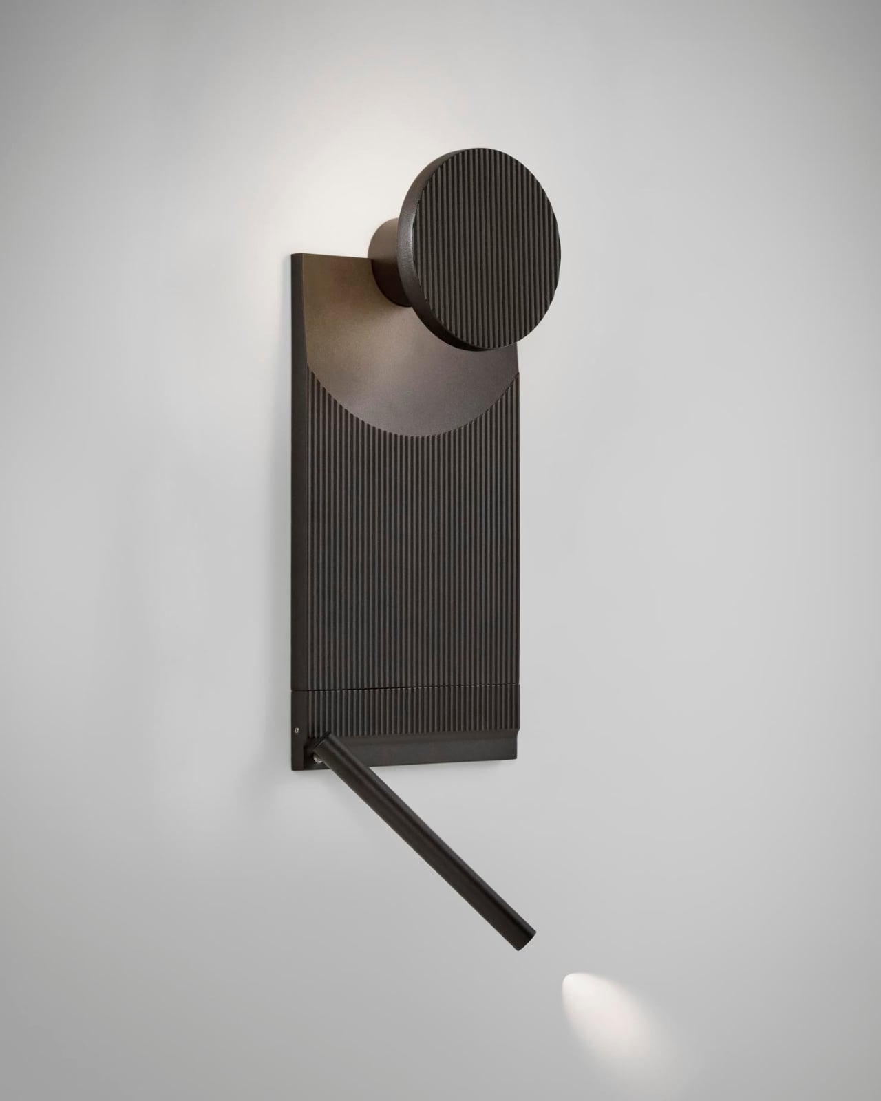
The modularity extends beyond just aesthetic choices. Different tile configurations create different lighting effects, so you can prioritize direct illumination in one area while keeping things more ambient in another. The lighting unit itself is rated IP44, meaning it can handle some moisture, and it’s fully dimmable, letting you adjust the mood as needed.

What makes ARID particularly interesting in today’s market is how it bridges the gap between customization and accessibility. Custom lighting installations typically require working with specialized designers and manufacturers, resulting in lengthy timelines and hefty costs. ARID gives you the creative control without the complexity. You’re essentially the designer, arranging the components in whatever configuration speaks to you.

This approach feels especially relevant now, when personalization has become such a significant part of how we think about our spaces. We’re no longer satisfied with mass-produced solutions that look exactly like everyone else’s. But we also don’t necessarily have the budget or patience for fully custom work. ARID occupies that sweet spot in between.

The system also reflects a broader shift in lighting design, where fixtures are increasingly expected to do more than just illuminate. They need to create ambiance, add visual interest, and ideally, tell some kind of story. ARID accomplishes this by referencing natural landscapes without being literal about it. You get the feeling of weathered rock formations and desert light without any kitschy desert motifs.

Barcelona-based Bover has built its reputation on this kind of thoughtful design, and their collaboration with Nahtrang Studio continues that tradition. Both the studio and the brand seem to share a philosophy about balancing technical excellence with emotional resonance, creating objects that work well while also making you feel something.

At around $550 to $625 depending on the configuration you choose, ARID sits in the premium category without reaching unapproachable luxury pricing. For that investment, you’re getting a lighting system that’s sustainable, customizable, and genuinely distinctive. More importantly, you’re getting something that can evolve with your space. As your taste changes or you move to a different room, you can reconfigure the tiles to create an entirely new look.

That kind of flexibility is genuinely rare in lighting design, making ARID feel less like a purchase and more like a long-term creative tool for your home.

The post This $550 Modular Light Lets You Design Your Own Wall Art first appeared on Yanko Design.

Fauna Robotics Just Built the First Humanoid You’d Want Home

Picture a humanoid robot, and you probably imagine something sleek, vaguely threatening, or at least a little cold. Maybe it’s built for a factory floor, towering and intimidating, or designed to look eerily human in a way that triggers that uncanny valley feeling. Either way, it’s not exactly something you’d want hanging around your living room.

That’s what makes Sprout so different. This portable humanoid from Fauna Robotics just launched out of stealth mode, and it’s taking a completely opposite approach to robot design. Instead of trying to look impressively human or industrial, Sprout leans into something that feels refreshingly approachable and, dare I say it, genuinely charming.

Designer: Fauna Robotics

Standing just 3.5 feet tall and weighing about 50 pounds, Sprout is compact and lightweight in ways that most humanoid robots simply aren’t. But what really sets it apart are those antenna-like eyebrows perched on its wide, rectangular head. They move up and down like little windshield wipers, giving this robot an expressive quality that feels more Pixar character than sterile machine.

The eyebrows work alongside a 360-degree LED facial display that animates with different light patterns and colors, plus body language that includes walking, kneeling, crawling, and sitting. Together, these features create a communication style that doesn’t rely on mimicking human faces or voices alone. Instead, Sprout uses a whole vocabulary of movement and light to express what it’s doing or feeling, which somehow makes it feel less like a failed attempt at humanity and more like its own friendly creature.

The design philosophy here clearly draws inspiration from beloved fictional robots like Baymax from Big Hero 6 or Rosie from The Jetsons, characters designed to feel helpful rather than threatening. Fauna Robotics wrapped the whole thing in a soft, padded exterior that’s safe to touch, and the company emphasizes that Sprout is built to operate in shared human spaces, around adults, children, and even pets.

This isn’t just a cute toy, though. The Creator Edition that’s shipping now is aimed at developers, researchers, and institutions that want to experiment with embodied AI in real-world settings. Sprout comes with some serious tech under that friendly exterior, including an NVIDIA Jetson AGX Orin processor with 64GB, stereoscopic vision, four time-of-flight sensors, a directional microphone array, and dual speakers.

Early customers are already putting Sprout to work. Disney, Boston Dynamics, UC San Diego, and NYU are all testing applications across retail, entertainment, home services, and research. The robot can navigate both indoor and outdoor environments without needing restricted zones, and its battery runs for about 3 to 3.5 hours before needing a swap. The price tag sits at $50,000 for the Creator Edition, which positions it as a serious development platform rather than a consumer product ready for mass adoption. But that’s kind of the point. Fauna Robotics is building the foundation for what humanoid robots could become once they leave the factory and start mingling with regular people in everyday spaces.

What strikes me most about Sprout is how it sidesteps the whole debate about whether robots should look human. By embracing a more abstract, expressive design, it avoids that creepy almost-human trap while still feeling relatable and engaging. Those eyebrows, as simple as they are, do more emotional heavy lifting than a thousand attempts at realistic facial expressions.

The broader question, of course, is whether we’re ready for robots like this in our lives. But maybe that’s the wrong question. Maybe the better question is whether robots are ready for us, designed in ways that make interaction feel natural rather than forced or unsettling. Sprout suggests that the path forward might not be about making robots that look like people, but rather creating robots that feel like they belong in the spaces where people actually live, work, and play.

With its soft exterior, expressive features, and human-scale design, Sprout represents a different vision of what personal robotics could look like. Whether it succeeds in changing minds about humanoid robots remains to be seen, but those articulated eyebrows are certainly making a compelling argument.

The post Fauna Robotics Just Built the First Humanoid You’d Want Home first appeared on Yanko Design.

Four Robot Arms Just Built a Farm House That Prints Its Future

Picture this: four robotic arms working in perfect harmony, tracing circular patterns like some kind of futuristic dance performance. But instead of creating art, they’re printing the walls of an actual farm. Welcome to Itaca, a project that just wrapped up its construction in the hills of Northern Italy, and it’s changing how we think about building homes.

WASP, the Italian company behind this audacious venture, just finished printing the walls of what they’re calling the first certified 3D-printed construction in Italy. Located in their Shamballa open-air laboratory, Itaca isn’t just a quirky experiment. It’s a fully functional, self-sufficient farm designed to house a family of four while producing its own food and energy.

Designer: WASP

The whole concept sounds like something from a sci-fi novel, but the execution is surprisingly grounded in ancient wisdom. The farm’s design takes inspiration from mandala geometry, with four robotic arms positioned at the vertices of a hexagonal structure. These machines use a lime-based printing material that allows the facades to regulate their temperature naturally, breathing like a living organism. No air conditioning required.

What makes Itaca genuinely fascinating is how it challenges our assumptions about both technology and sustainability. The walls aren’t just printed and left hollow. They’re packed with rice husks sourced from agricultural waste, creating natural insulation that keeps the interior comfortable year-round. The radiant heating systems and electrical installations are embedded directly during the printing process, which means less construction time and fewer workers needed on site.

But WASP didn’t stop at the structure itself. They’ve integrated 3D-printed vertical hydroponic systems that ensure fresh vegetables all year round using minimal water. The entire setup operates on a circular micro-economy model, where waste from one system becomes fuel for another. It’s the kind of closed-loop thinking that environmentalists have been advocating for decades, finally made tangible through advanced manufacturing.

Massimo Moretti, WASP’s founder, first unveiled Itaca at Italian Tech Week in Turin as part of the company’s broader vision to democratize sustainable housing. The real genius here is accessibility. The Crane WASP system used to build Itaca is designed to operate even in remote areas, making it possible to replicate this model worldwide. You don’t need massive infrastructure or armies of specialized construction workers. Just the machine, locally sourced materials, and the digital blueprints.

This approach to construction could be transformative for communities dealing with housing shortages or natural disasters. Traditional building methods require extensive supply chains, skilled labor, and months of work. With 3D printing, the timeline compresses dramatically, and the environmental footprint shrinks considerably. Using local materials means less transportation, fewer emissions, and buildings that are naturally suited to their climate. The ventilation system deserves special attention too. It’s designed to allow air to flow through the interior spaces continuously, transforming Itaca into what WASP calls a living house. This isn’t just clever branding. The structure literally responds to environmental conditions, adjusting naturally without mechanical systems that consume energy and break down over time.

What’s striking about Itaca is how it sidesteps the typical debate between high-tech solutions and traditional wisdom. It’s both. The robotic arms and digital design tools represent cutting-edge technology, while the materials and principles draw from centuries of vernacular architecture. Rice husks and lime have been used in construction for millennia because they work. WASP 3D Build, the startup within WASP dedicated to printed construction, executed the project using technology that’s already proven and available. This isn’t a prototype languishing in a research lab. It’s a real building that people will actually live in and farm around. That’s the difference between innovation theater and genuine progress.

The implications extend beyond individual homes. If this model scales, it could reshape how we approach rural development, affordable housing, and disaster relief. Instead of shipping prefabricated structures across continents, communities could print buildings on demand using materials from their own backyards. The rapid transmission of information through digital files means a successful design in Italy could be adapted and printed in Peru or Indonesia within weeks. Itaca represents something rare in architecture: a project that’s simultaneously visionary and practical, high-tech and humble. It proves that sustainability doesn’t require sacrifice or compromise. Sometimes it just requires thinking differently about the tools we have and the wisdom we’ve inherited.

The post Four Robot Arms Just Built a Farm House That Prints Its Future first appeared on Yanko Design.

Aram Just Released a Numbered Edition of This 100-Year Chair

Aram just dropped something special for design collectors: an exclusive limited edition of Eileen Gray’s iconic Bibendum chair, released to celebrate the 100th anniversary of its 1926 debut. This isn’t your standard reissue. This is a numbered, centenary edition of one of modernism’s most distinctive pieces, and it’s the kind of release that serious furniture enthusiasts have been waiting for.

The Bibendum chair has always been a statement maker. With its plump, upholstered cushions stacked like inflated tubes and cradled by a sleek chromium-plated steel base, it looks like the Michelin Man decided to become furniture. Gray herself named it after Bibendum, the tire company’s puffy white mascot, because the resemblance was too perfect to ignore. But what started as a cheeky observation became one of the most recognizable silhouettes in design history.

Designer: Aram and Eileen Gray

Now, a full century after Gray first created this rebellious piece, Aram is honoring the milestone with a limited production run that’s already generating buzz among collectors. The centenary edition represents something rare in the furniture world: a chance to own a specially designated version of an icon, not just another reproduction. At £6,750, it’s positioned squarely in the collector’s market, where provenance and exclusivity matter as much as the design itself.

What makes this limited edition significant goes beyond the anniversary stamp. Gray’s original vision was uncompromising. When she met with Zeev Aram in the 1970s to approve contemporary production of the chair, she demonstrated exactly how exacting her standards were. After sitting in the prototype, she paused, considered, and declared it needed to be precisely two centimeters wider. Not roughly wider. Not “a bit more comfortable.” Exactly two centimeters. That level of perfectionism is built into every Bibendum, and this centenary edition carries that legacy forward.

The chair’s history adds layers to its collectibility. It made its debut in Gray’s design for Madame Mathieu-Lévy’s Rue de Lota apartment, sharing space with Gray’s famous Brick screen and an extraordinary glass floor lit from beneath. When L’Illustration magazine photographed the apartment in 1933, the Bibendum commanded attention among an entire room of daring modernist pieces. It wasn’t just furniture. It was a statement about rejecting the hard-edged machine aesthetic that dominated the era.

That’s part of what makes this limited edition so compelling right now. We’re in another moment where design trends lean heavily toward minimalism and restraint. The Bibendum’s generous curves and unapologetic presence offer a counterpoint. It refuses to disappear into a room. It anchors it. The tubular steel base keeps it grounded in modernist principles, but those voluptuous upholstered cushions deliver comfort that feels almost decadent.

For collectors, limited editions like this serve multiple purposes. There’s the obvious appeal of scarcity. Numbered pieces from a commemorative run will always carry different weight than standard production models. But there’s also the narrative value. This chair tells a story about a woman designer who pushed boundaries in a field dominated by men, who insisted on curves in a world obsessed with angles, who believed comfort and beauty didn’t have to be mutually exclusive.

Gray’s career spanned lacquerwork, rug design, furniture, and architecture. The Bibendum embodies her refusal to be categorized or constrained. It’s modernist but not austere. It’s luxurious but not fussy. It’s sculptural but supremely functional. That complexity is what keeps it relevant a century later.

The standard Bibendum continues to be available in various leathers or wool felt, with polished chrome or matte black lacquered bases. But this new centenary limited edition is different. It’s not just about owning a beautiful chair. It’s about owning a specifically designated piece of design history, part of a finite release created to mark a hundred years of influence.

For design enthusiasts who’ve been watching the market, this release represents the kind of opportunity that doesn’t come around often. A century milestone for an icon like the Bibendum only happens once. Aram’s decision to commemorate it with an exclusive limited edition gives collectors something tangible to mark the moment. It’s not just furniture. It’s a rebellion wrapped in cushions, a reminder that sometimes the most radical thing you can do is insist on taking up space. And now, for a limited time, you can own a numbered piece of that rebellion.

The post Aram Just Released a Numbered Edition of This 100-Year Chair first appeared on Yanko Design.

The 2026 Olympic Torch That Knows When to Disappear

Right now, as the 2026 Winter Olympics torch relay makes its final journey through Milan toward tonight’s opening ceremony at San Siro Stadium, Carlo Ratti’s design is doing something revolutionary. It’s getting out of its own way. The MIT professor and architect didn’t set out to create another sculptural showpiece when he designed the Milano Cortina 2026 Olympic torch. Instead, he asked a question that probably should have been asked decades ago: what if the torch wasn’t the star of the show?

The result is something Ratti calls “Essential,” a name that feels like a manifesto. He designed the torch from the inside out, treating the flame itself as the architecture. The metal cylinder becomes a frame, almost a supporting actor, letting fire take center stage. It’s counterintuitive in a design culture that often mistakes complexity for sophistication.

Designer: Carlo Ratti

But the torch is only half the story. What makes this Olympic relay genuinely different is the mobile mini cauldron that travels alongside it, a piece of design that somehow manages to be both sculptural and invisible at the same time.

The cauldron exists to solve a practical problem: keeping the Olympic flame alive between legs of the relay. Previous Games handled this with utilitarian metal boxes, functional but forgettable. Ratti approached it differently. His studio created a transparent cylinder that transforms the flame into a vertical vortex, a twisting column of fire that appears to float in midair. The effect is hypnotic, like capturing a living piece of energy under glass.

The cauldron stands on a circular base finished in the same blue-green PVD coating as the Olympic torch itself, creating visual continuity between the two objects. When the relay pauses, when torchbearers hand off their flames, when the procession needs to rest, the cauldron becomes a temporary altar. It holds the fire safely while making it visible, watchable, alive.

Ratti’s team demonstrated the cauldron against some of Milan’s most iconic backdrops before the relay began. Against the Bosco Verticale towers with their cascading vertical forests. In front of the Duomo’s Gothic spires. At each location, the vortex flame created this strange visual dialogue between ancient architectural ambition and contemporary restraint. The buildings reached upward with ornate complexity. The flame spun quietly in its transparent case. Both were spectacular, but only one knew when to shut up.

This gets at something deeper in Ratti’s design philosophy. He splits his time between Turin, New York, and MIT, and brings an academic’s rigor to questions about how objects shape human experience. His studio created the French Pavilion for Osaka Expo 2025 and has worked across scales from furniture to urban planning. The through-line in all of it is this question of when design should assert itself and when it should recede.

Yesterday, the torch relay reached Piazza Duomo, carried by an extraordinary mix of athletes and celebrities. Snowboarding legend Shaun White, Paralympic swimming champion Simone Barlaam, and former figure skater turned K-pop idol Sunghoon of Enhypen. Even Snoop Dogg showed up to carry the flame through Milan’s streets. The spectacle of watching these recognizable faces holding Ratti’s understated torch drove home the design’s core idea: the people and the flame matter more than the object connecting them.

Today, the relay completes its final stage through Central Station, Castello Sforzesco, Parco Sempione, the Darsena, and neighborhoods like Brera and Porta Nuova. By tonight, that flame will ignite the Olympic cauldron at San Siro Stadium, and Ratti’s torch will have fulfilled its purpose by staying out of the way.

What strikes me about this whole system, torch and mobile cauldron together, is how it refuses to pander. A lot of Olympic design leans into grandiosity, into making bold statements about national identity or technological prowess. Ratti went the opposite direction. He created objects that work beautifully because they work honestly, that earn attention by being exactly what they need to be and nothing more.

The mobile cauldron especially embodies this. It could have been a massive sculptural statement, a piece of design that competed with the landmarks it appeared beside. Instead, it became a lens, a frame for the flame itself. The vortex effect isn’t decorative flourish; it’s a way of making fire more visible, more present, more itself.

When this relay ends tonight and the Games officially begin, thousands of people will have held that torch, watched that vortex flame, felt part of something larger than themselves. What they’ll remember isn’t the objects in their hands or on that base. It’s the fire they carried, the journey they were part of, the connection they felt. The design just made space for that to happen. Sometimes the most powerful statement is knowing when to disappear.

The post The 2026 Olympic Torch That Knows When to Disappear first appeared on Yanko Design.

This 1,048-Piece Grogu LEGO Set Is Perfect Movie Hype

There’s something universally irresistible about Baby Yoda, or as the purists insist we call him, Grogu. Those enormous eyes, the tiny green hands, that perfectly timed head tilt. We’ve missed seeing the little green guy on our screens but The Mandalorian and Grogu arriving in theaters later this year to solve that problem. There’s no better time to celebrate everyone’s favorite Force-sensitive toddler than with LEGO’s Grogu with Hover Pram set. This 1,048-piece buildable figure has become one of the most beloved Star Wars collectibles on the market, and it’s easy to see why.

The genius of this set lies in how it captures Grogu’s personality through thoughtful design choices. At 7.5 inches tall when nestled in his iconic hover pram, the buildable figure features posable ears, a tiltable head, and dial-operated arms that let you recreate those memorable moments from the series. Want him reaching for the shifter knob? Done. Prefer him clutching a cookie with both hands? Absolutely. The articulation gives you genuine creative control over how you display him, which means this isn’t just a static model collecting dust.

Designer: LEGO

LEGO clearly understood the assignment when it came to accessories. The set includes brick-built versions of Grogu’s most iconic items: a Sorgan frog (his favorite forbidden snack that caused so much trouble), the infamous Razor Crest shifter knob, and a little cookie. These aren’t random additions. They’re carefully chosen callbacks to specific moments that defined Grogu’s character throughout The Mandalorian series. Each piece tells a story, which makes the building process feel more like a journey through the show’s best moments.

The hover pram itself deserves special attention. LEGO nailed the weathered, functional aesthetic of the original prop. The muted grays and browns, the mechanical details, the way it closes protectively around Grogu when needed. It’s instantly recognizable to anyone who’s watched the show, but it also works as a standalone piece of design. You can display Grogu sitting comfortably inside or standing beside his transport, giving you flexibility depending on your mood or available space.

With the upcoming theatrical release putting Din Djarin and Grogu back in the spotlight, this set takes on new relevance. We’re getting a feature film that expands their story beyond the Disney+ series format, and having this physical representation of their journey feels particularly meaningful. It’s a way to keep that connection alive between viewings, a tangible reminder of why we fell in love with this unlikely duo in the first place.

The building experience itself offers something special for anyone who appreciates detailed construction. With over a thousand pieces, this provides hours of engaging assembly without becoming overwhelming. The instruction booklet guides you through creating Grogu’s expressive features, the mechanical elements of the hover pram, and all those character-specific details. There’s real satisfaction in watching this beloved character take shape brick by brick.

What makes this set particularly appealing is how it bridges multiple interests. Star Wars fans get authentic screen accuracy. LEGO enthusiasts get sophisticated building techniques and smart engineering solutions. Design lovers get a display piece with clean lines and a cohesive color palette that works in adult spaces. Pop culture collectors get a character at the peak of cultural relevance. It’s rare when a product genuinely delivers across so many categories.

The display stand includes an information plaque and even has space for the included Grogu minifigure with a smaller hover pram, adding another layer of presentation options. This attention to the display experience shows LEGO recognizes these sets live on shelves and desks, not in toy boxes.

While the set is expected to retire sometime in 2026, that’s not really the point. The point is that we’re in a moment where Grogu mania is about to hit peak levels again with a major theatrical release, and this beautifully designed set lets you bring that excitement home. Whether you’re preparing for the movie premiere, looking for the perfect display piece, or just want to spend a weekend building something that brings genuine joy, this hits all the right notes.

The post This 1,048-Piece Grogu LEGO Set Is Perfect Movie Hype first appeared on Yanko Design.

This 6-Fingered Robot Hand Crawls Away From Its Own Arm

Imagine a robotic hand that not only mimics human dexterity but completely reimagines what a hand can do. Researchers at École Polytechnique Fédérale de Lausanne (EPFL) have developed something that looks like it crawled straight out of a sci-fi fever dream: a modular robotic hand that can detach from its arm, scuttle across surfaces spider-style, and grab multiple objects at once.

The human hand has long been considered the gold standard for dexterity. But here’s the thing about trying to replicate perfection: you often inherit its limitations, too. Our hands are fundamentally asymmetrical. We have one opposable thumb per hand, which means we’re constantly repositioning our wrists and contorting our bodies to reach awkwardly placed objects or grasp items from different angles. Try reaching behind your hand while keeping a firm grip on something, and you’ll quickly understand the problem.

Designer: École Polytechnique Fédérale de Lausanne’s (EPFL) school of engineering

The team at EPFL, led by Aude Billard from the Learning Algorithms and Systems Laboratory, decided to throw the rulebook out the window. Instead of copying human anatomy, they created something better: a symmetrical hand that features up to six identical fingers, each tipped with silicone for grip. The genius lies in the design, where any combination of fingers can form opposing pairs for pinching and grasping. No single designated thumb here.

But wait, it gets wilder. The hand is completely reversible, meaning the palm and back are interchangeable. Flip it over, and it works just as effectively from either side. This eliminates the need for awkward repositioning and opens up grasping possibilities that humans simply can’t achieve. The device can perform 33 different types of human grasping motions, and thanks to its modular design, it can hold multiple objects simultaneously with fewer fingers than we’d need.

The most mind-bending feature? This hand can literally walk away from its job. Using a magnetic attachment and motor-driven bolt system, it detaches from its robotic arm and crawls independently to retrieve objects beyond the arm’s reach. Picture a warehouse robot that needs to grab something just out of range. Instead of the entire system repositioning, the hand simply walks over, grabs what it needs, and returns like a loyal (if slightly creepy) pet.

The practical applications are staggering. In industrial settings, this kind of “loco-manipulation” (locomotion plus manipulation) could revolutionize how robots interact with their environments. Service robots could navigate complex spaces and handle multiple tasks without constant human intervention. In exploratory robotics, think Mars rovers or deep-sea vehicles, a detachable hand could investigate tight spaces or retrieve samples from areas the main body can’t access.

The research team’s work, published in Nature, demonstrates that symmetrical design provides measurably better performance, with 5 to 10 percent improvements in crawling distance compared to traditional asymmetric configurations. The hand’s 160mm diameter palm houses motors that mimic the natural forward movement of human finger joints, but without being constrained by human limitations.

What makes this project so compelling isn’t just the technical achievement. It’s the philosophical shift it represents. For years, robotics has been obsessed with replicating human form and function. But by questioning whether human design is actually optimal for all tasks, the EPFL team has created something that surpasses our biological blueprint. It’s a reminder that innovation often requires abandoning our assumptions about how things should work.

This robotic hand represents more than just another engineering marvel. It’s a glimpse into a future where machines aren’t limited by human constraints, where form follows function in unexpected ways, and where a hand doesn’t need to stay attached to be incredibly handy. Whether it’s retrieving your dropped phone from under the couch or assembling complex machinery in factories, this crawling, grasping, reversible wonder proves that sometimes the best way forward is to let go of convention entirely.

The post This 6-Fingered Robot Hand Crawls Away From Its Own Arm first appeared on Yanko Design.

These Chairs Are Made From the Steel That Holds Up Buildings

There’s something beautifully rebellious about taking the skeleton of a building and turning it into something you’d actually want in your home. That’s exactly what designer Marquel Williams has done with his Beams collection, a furniture series that proves industrial components can have serious aesthetic game.

Williams built this entire collection around one specific element: the I-beam. You know, those steel supports that hold up skyscrapers and warehouses. The same component that was patented back in 1849 by Alphonse Halbou and has been refined over nearly two centuries to become the gold standard for structural efficiency. But instead of leaving these beams to do their usual heavy lifting in the background, Williams pulled them into the spotlight and transformed them into chairs, lamps, desks, and lounge seating.

Designer: Marquel Williams

The collection includes five distinct pieces, each one using the I-beam as its structural foundation alongside metal sheets and black leather upholstery. What makes this approach so compelling is how Williams managed to create such diverse pieces from a single standardized part. Each item has its own personality despite sharing the same DNA.

Take the Beam Chair, for instance. It’s monochromatic metal at its finest, with precisely angled I-beams and laser-cut aluminum sheets. The whole thing is treated with a waxed finish that balances rigid industrialism with actual functionality. Looking at it, you might think it would be uncomfortable with all that sharp geometry and metal, but there’s an intentional restraint in its design that makes it striking.

Then there’s the Chaise Longue, which takes an entirely different approach. While the chair feels rigid and precise, the chaise has this relaxed, almost delicate equilibrium going on. The leather upholstery softens the whole vibe, making it feel more approachable while still maintaining that industrial edge.

But the real showstopper might be the Floor Lamp. This piece gets technical in the best way possible, featuring adjustable height shades with a cantilever system. Here’s the kicker: the electrical cord isn’t hidden away like usual. Instead, it’s framed right inside the beam as a visible design detail. It’s that kind of thoughtful touch that shows Williams isn’t just using industrial materials for aesthetic novelty; he’s actually thinking about how to integrate every functional element into the design language.

Williams’s philosophy here is all about standardization and what you can do when you commit to a single industrial component as your foundation. The I-beam represents nearly 200 years of industrial production refinement, the absolute peak of standardized structural efficiency. By using it in unexpected ways, Williams subverts its typical purpose and transforms it into a vehicle for creativity and self-expression.

This approach isn’t entirely new in the design world. Italian designer Enzo Mari explored similar territory with his own I-beam experiments (called “putrella” in Italian), creating bowls and trays for dining tables by simply bending the extremities upward. Mari’s research into semi-finished products aimed to highlight the formal worth of industrial components and transform them into contemporary design icons. Williams is working in that same tradition but pushing it further by creating an entire cohesive furniture system.

The collection is handcrafted by Caliper in Spain and produced in very limited quantities, which makes sense given the level of craftsmanship required. These aren’t mass-produced pieces; each one requires careful fabrication and finishing to achieve that balance between industrial rawness and refined design.

What Williams has ultimately created is a collection that makes you rethink the materials around you. Those structural supports holding up buildings? They have untapped aesthetic potential. That standardized industrial component? It can be the basis for something truly unique. The Beams collection proves that creativity isn’t about reinventing the wheel; sometimes it’s about looking at the wheel differently and imagining what else it could become.

The post These Chairs Are Made From the Steel That Holds Up Buildings first appeared on Yanko Design.

When the Forest Sings Back: Human Perches in Quebec

Picture yourself standing on a small platform in the middle of a Quebec forest, balancing on what feels like an oversized bird perch. The moment your weight settles, something magical happens. A bird call rings out, blending seamlessly into an ethereal soundtrack that seems to rise from the forest itself. Welcome to Human Perches, the latest installation from Montreal design studio Daily tous les jours that’s making us rethink how we experience nature.

Located at Chouette à voir!, a bird of prey sanctuary in St-Jude, Quebec, this permanent installation transforms a 55-meter elevated boardwalk into an interactive musical journey through the seasons. Ten aluminum perching stations punctuate the path, each one waiting for a human visitor to activate its hidden soundscape. The design is brilliantly simple: step onto a green perch, and you become part of the forest’s symphony.

Designer: Daily tous les jours

What makes this project so captivating is how it flips our usual relationship with wildlife. We’re used to being the noisy intruders, the reason birds fall silent when we approach. Here, we become the activators of sound. When humans aren’t present, the artwork stays quiet, mirroring the behavior of the sanctuary’s winged residents. It’s a poetic reversal that makes you acutely aware of your presence in the ecosystem.

The experience unfolds like a sonic story as you move along the boardwalk. Each perch represents a different season, with soundscapes that capture winter’s vigilance, spring’s courtship, summer’s protection, and autumn’s migration. The genius lies in the layering. Juno Award-winning composer Keiko Devaux crafted an evolving dialogue between abstract base compositions and actual bird calls from local species. Sometimes the bird voices appear as themselves. Other times, they’re transformed into ethereal textures or rhythmic elements that pulse beneath the surface.

Daily tous les jours, led by co-founders Mouna Andraos and Melissa Mongiat, has spent fifteen years creating participatory urban experiences, from musical swings to interactive light installations. But Human Perches marks a shift in their practice. Instead of focusing purely on human-to-human connection, they’re exploring the delicate interfaces between species. It’s part of a broader investigation into how sound vibrations can stimulate growth and communication within ecosystems, a thread that runs through their concurrent Forest Mixer project on Hornby Island as well.

The physical design is minimal but thoughtful. The aluminum perches create a striking contrast against the organic textures of the red cedar and spruce boardwalk, highlighting the intentionality of human presence in wild spaces. Each station includes sensors that detect when someone steps up, triggering both a soft light and the corresponding bird call. The act of perching itself becomes meaningful. You’re balancing, aware of your body, suspended between the marsh below and the forest canopy above. It demands a different kind of attention than simply walking through.

There’s an educational dimension here too. The sanctuary is home to various bird species, including vulnerable ones, and the installation serves as both attraction and conservation tool. “Conservation efforts to preserve our precious wildlife also involve education and enchantment,” Andraos explains. The project received significant support from Quebec’s Ministry of Culture and Communications, reflecting recognition that these kinds of immersive cultural experiences can reach audiences in unexpected ways.

What resonates most about Human Perches is how it heightens awareness without being preachy. You’re not being lectured about biodiversity or habitat loss. Instead, you’re invited to listen differently, to tune into layers of sound you might have walked past before. After experiencing the installation, visitors report hearing the forest with new ears, imagining the hidden life thrumming all around them even after they’ve left the perches behind.

In our increasingly screen-saturated world, projects like this offer something rare: a reason to be fully present in a physical space, to engage your whole body in the act of listening. It’s technology in service of slowness, design that creates space for wonder rather than distraction. The forest has always been singing. Daily tous les jours just gave us a way to finally hear it.

The post When the Forest Sings Back: Human Perches in Quebec first appeared on Yanko Design.

A Hand-Built Stone Sphere Just Landed in Rural Portugal

There’s something profoundly strange about seeing a perfect sphere sitting in the middle of nowhere. It doesn’t belong there in the way a building or a bridge would, yet somehow it looks like it’s been there forever. That’s the magic of Ninho Globo, a monumental stone installation by Paris-based studio Atelier Yokyok that just landed in the windswept landscape of eastern Portugal.

Picture this: you’re standing on a rocky plateau in Salvaterra do Extremo, a small border town where Portugal meets Spain. The terrain is rough, dotted with old dry stone walls and scrubby vegetation. And right there, perched on what used to be a farm, sits this five-meter sphere made entirely of local black schist, a rock that splits into beautiful flat layers. Against the sky, it looks like something that either fell from space or grew from the earth itself. Maybe both.

Designer: Atelier Yokyok

Atelier Yokyok, a four-person team founded by architects Samson Lacoste and Luc Pinsard (later joined by Laure Qaremy and Pauline Lazareff), built this sphere by hand with the local community. This wasn’t a case of a design team parachuting in with prefab materials and machines. They used the schist that’s native to this region, honoring the geological identity of the place while creating something that feels both ancient and futuristic.

What really gets you is how the piece plays with your sense of scale. From far away, Ninho Globo looks planetary, like a dark moon that’s settled into the landscape. The name itself means “Global Nest” in Portuguese, and that double meaning is intentional. Is it a celestial body? A giant nest? A seed pod waiting to crack open? It refuses to be just one thing, and that ambiguity is part of its power.

Then you get closer and notice the fissure. There’s a deliberate crack called the “Canyon” that cuts through the sphere, inviting you inside. Step through, and suddenly you’re in a hollowed-out chamber where the scale flips completely. Now you’re not looking at something massive. You’re inside it, cradled by layers of stacked stone, experiencing the weight and texture of the schist up close. The space is cool and shadowy, a shelter carved from geometry. It makes you think about what it means to inhabit a space, to be protected by it.

This kind of visceral, physical experience is what Atelier Yokyok does best. The studio has spent years exploring how our bodies interact with space, often using lightweight materials like textiles in their earlier work. But with Ninho Globo, they’ve shifted toward mineral permanence, something that will weather and age with the landscape rather than disappear. It’s a move that speaks to bigger questions about what we build, why we build it, and what we leave behind.

The project was part of Landscape Together, a program co-funded by the European Union’s Creative Europe initiative that brings artists, institutions, and local communities together to breathe new life into rural areas. Ninho Globo is now part of the permanent collection at Museu Experimenta Paisagem, an open-air museum dedicated to site-specific art. The work embodies something we’re seeing more of in contemporary art and architecture right now: a turn toward low-tech, community-driven projects rooted in place. In an era obsessed with speed and novelty, building something slowly, collectively, and with local materials feels almost radical.

There’s also something to be said about the location. This is a border territory, a place that exists in the margins between two countries. It’s not a tourist destination. It’s remote, rugged, and deeply connected to the rhythms of the land. Water is scarce here, and the hollowed interior of Ninho Globo speaks to that absence, turning it into a meditative space where geological memory becomes tangible.

What Atelier Yokyok has created isn’t just a sculpture. It’s a conversation starter about habitat, shared resources, and how we relate to the places we live. It’s about time, both geological and human. And it’s a reminder that sometimes the simplest shape, a sphere, can hold the most complex meanings.

The post A Hand-Built Stone Sphere Just Landed in Rural Portugal first appeared on Yanko Design.