This Brick Light Turns Travel Memories Into Glowing Cubes

There’s something beautifully honest about a designer who stops creating long enough to actually live. That’s the story behind the Brick Light from O_1 Design, a lamp that feels less like a product and more like a memento brought back from somewhere you can’t quite place on a map.

The designer’s journey reads like a poem. Golden sunlight threading through misty fields. Frost covering endless plains. The physical memory of wind while cycling, of rough rock under climbing fingertips. These weren’t just Instagram moments to be captured and forgotten. They became something tangible, something you can hold in your hand and turn on at night.

Designer: O_1 Design

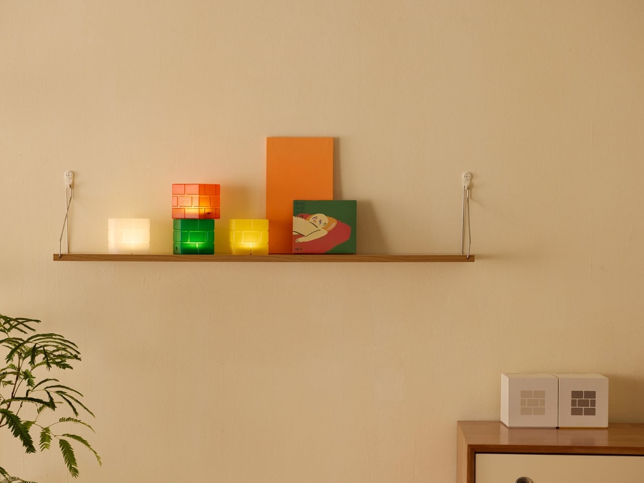
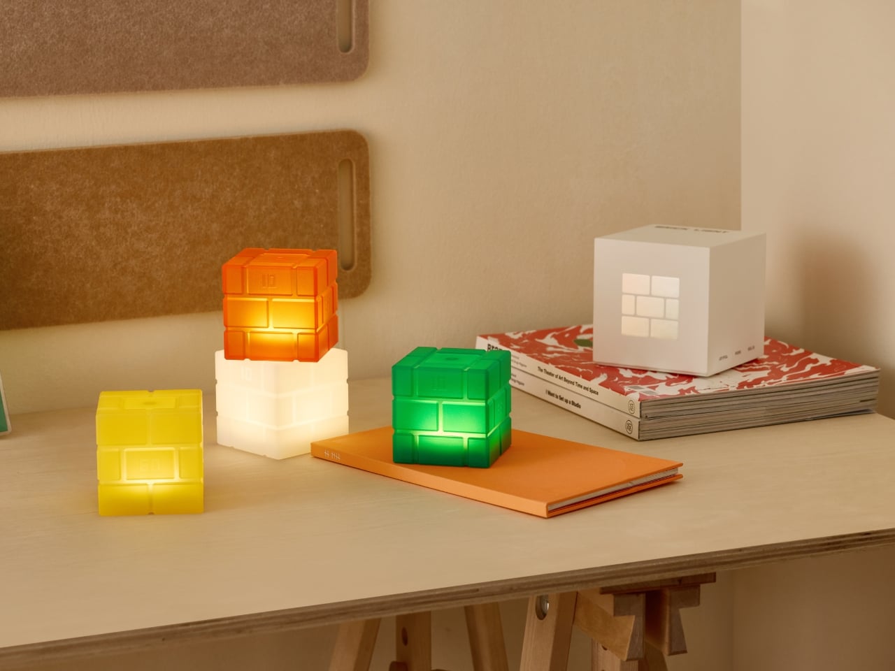
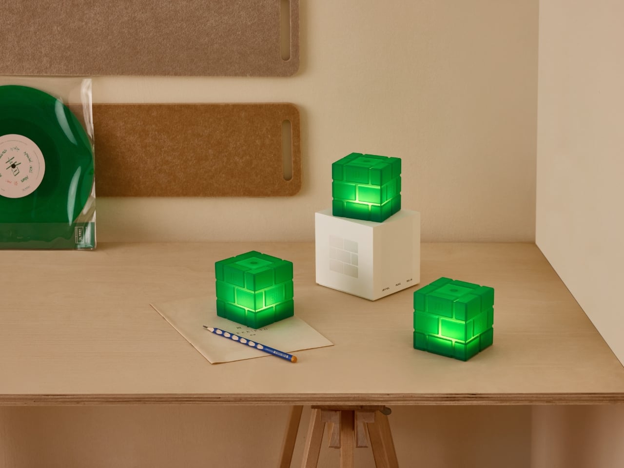
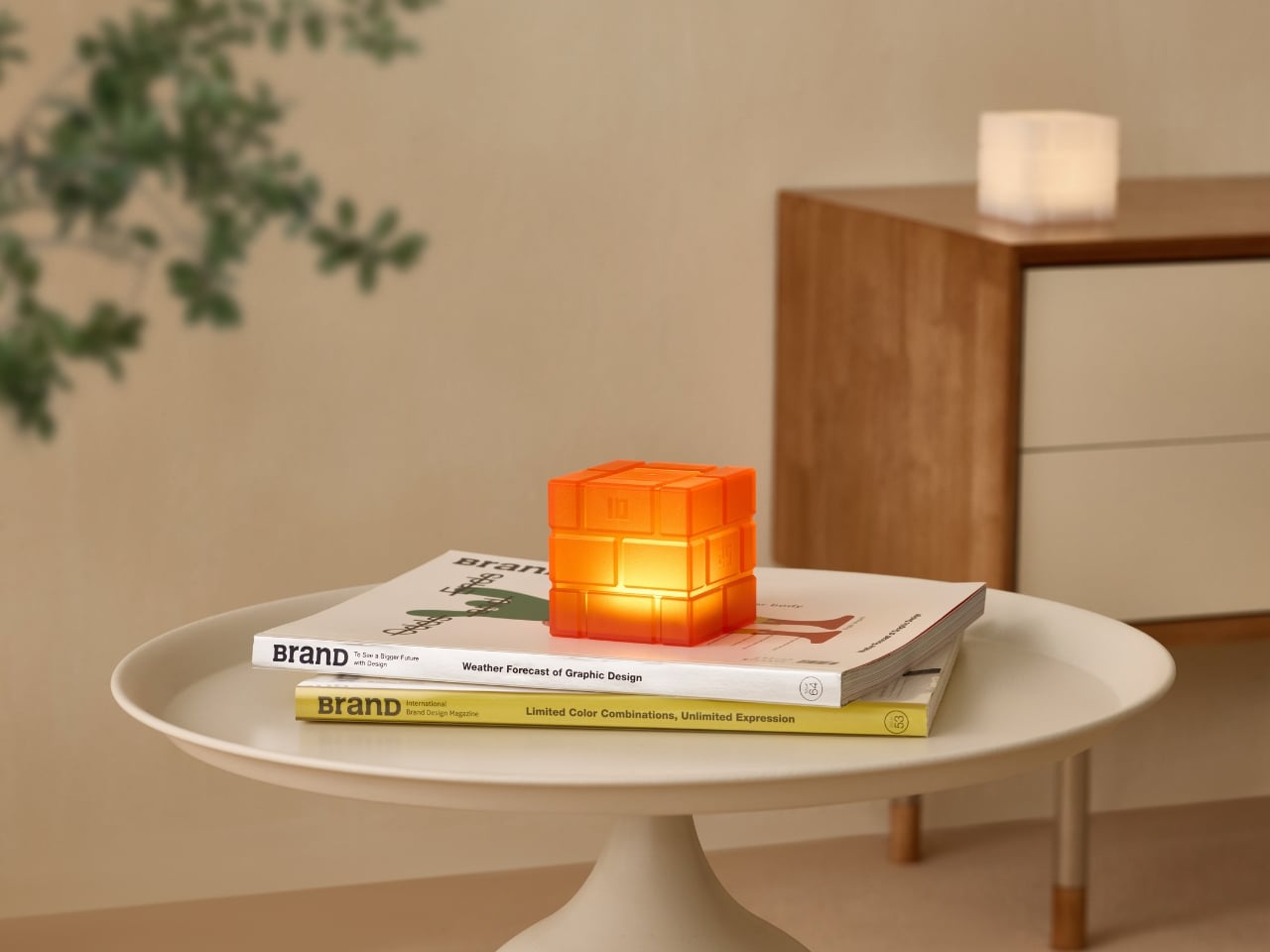
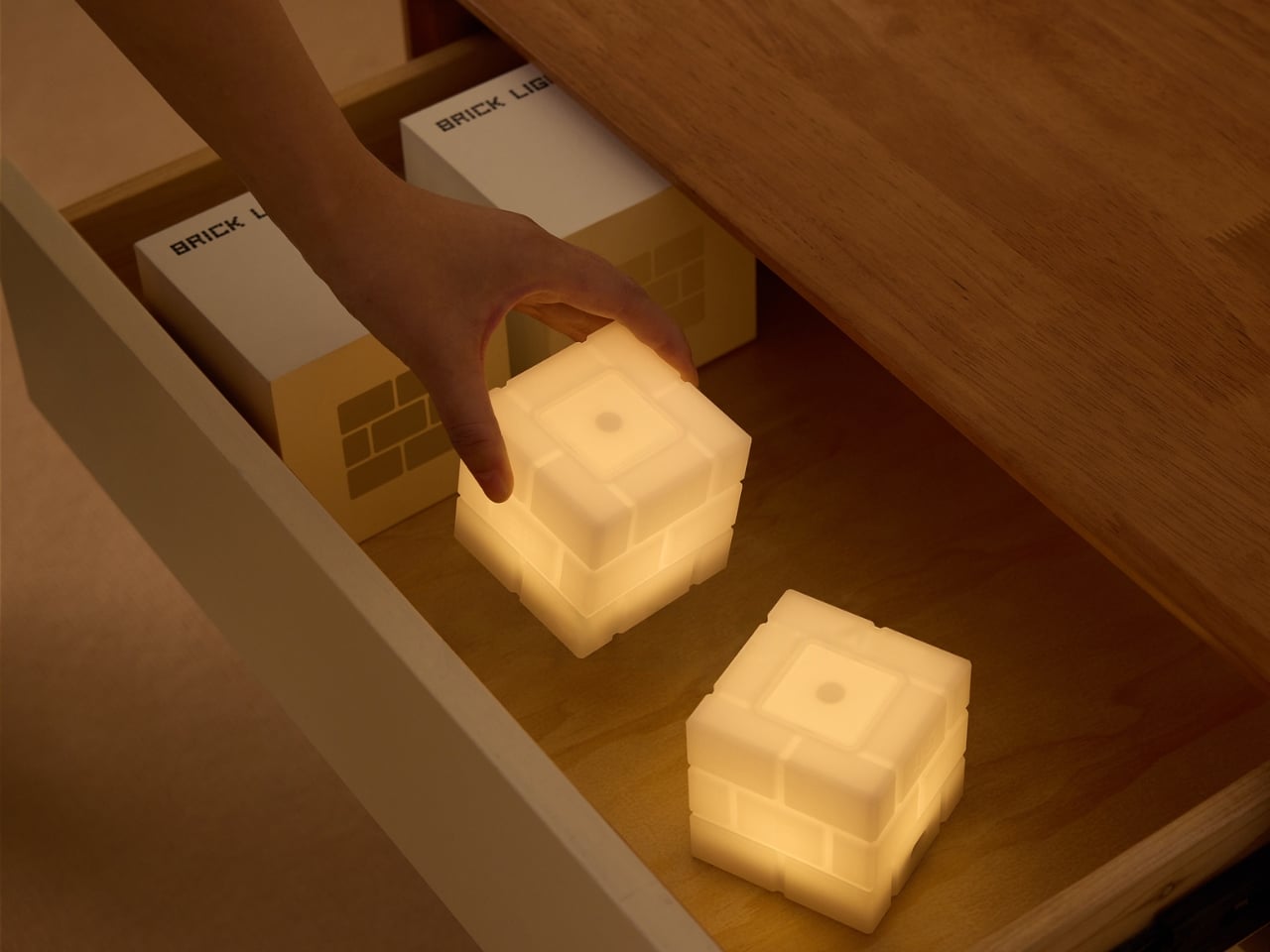
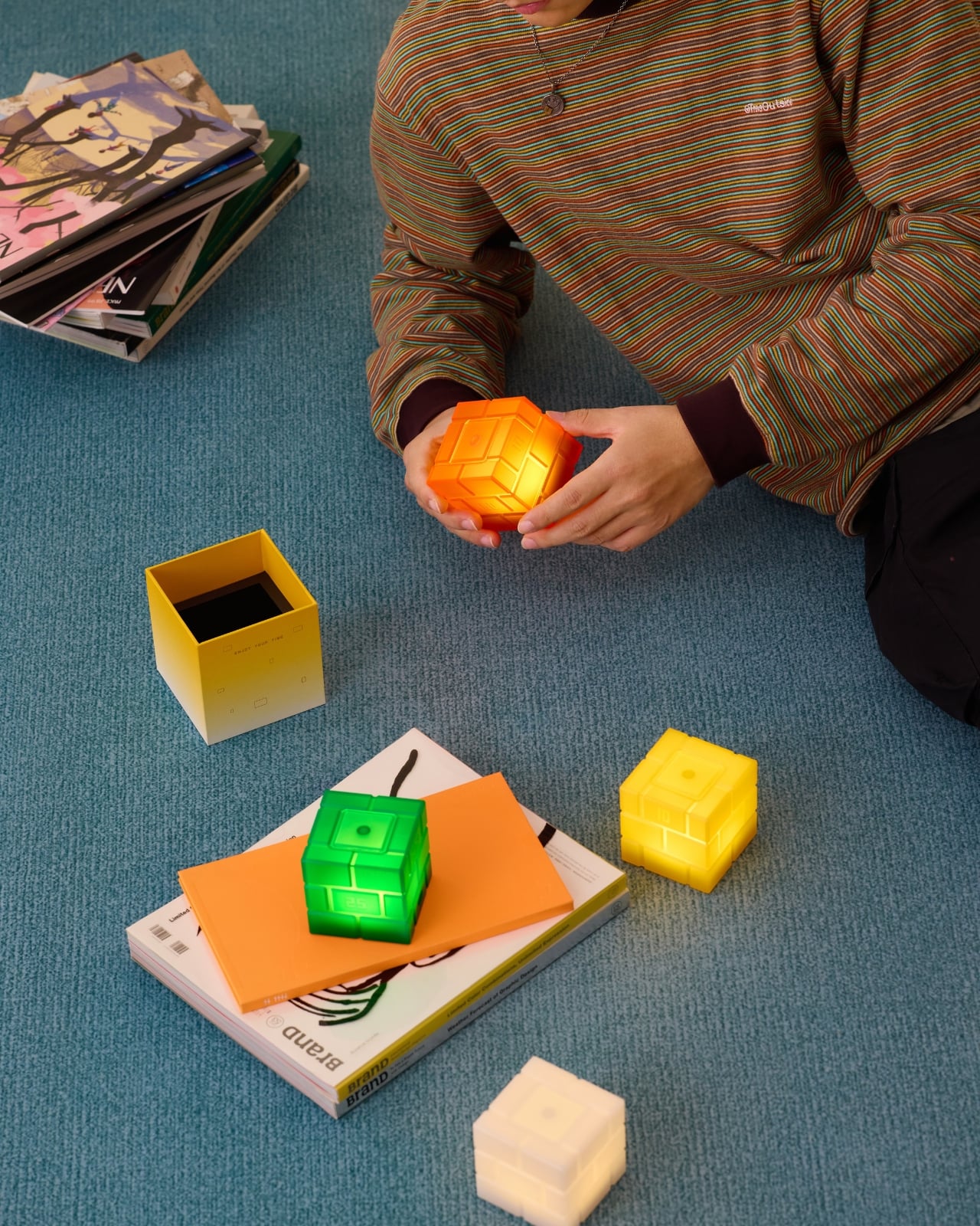
What emerged from all those collected sensations is refreshingly simple: three brick-shaped blocks stacked together, glowing softly from within. It’s the kind of design that makes you wonder why no one thought of it before, which is usually the hallmark of something genuinely clever. The inspiration comes from architecture’s most fundamental building block. Not the sexy, swooping curves of modern design, but the humble brick. The kind of thing that’s built everything from ancient walls to corner shops you pass without noticing. There’s a democratic quality to that choice, a nod to the idea that extraordinary things can come from ordinary elements.

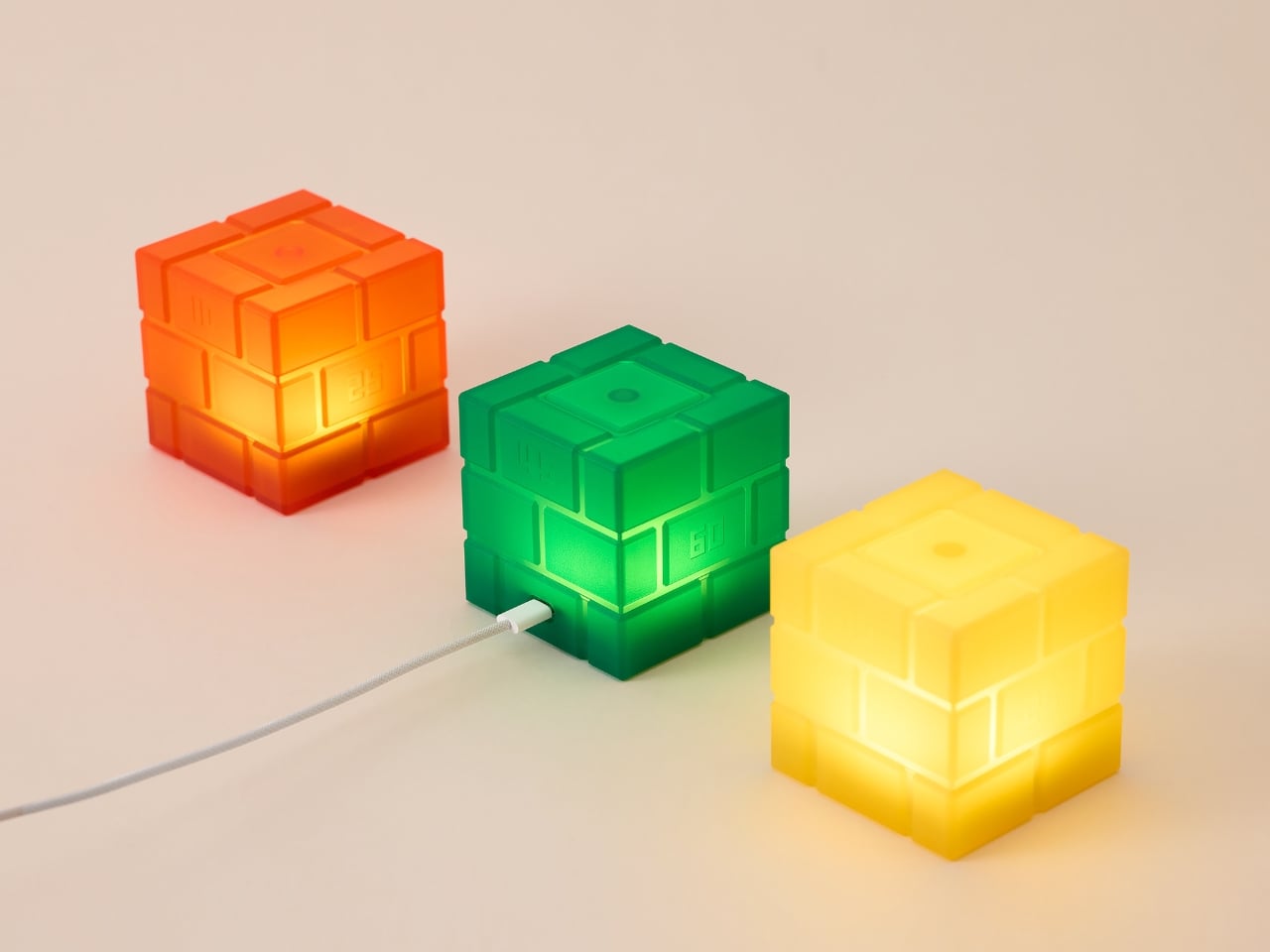
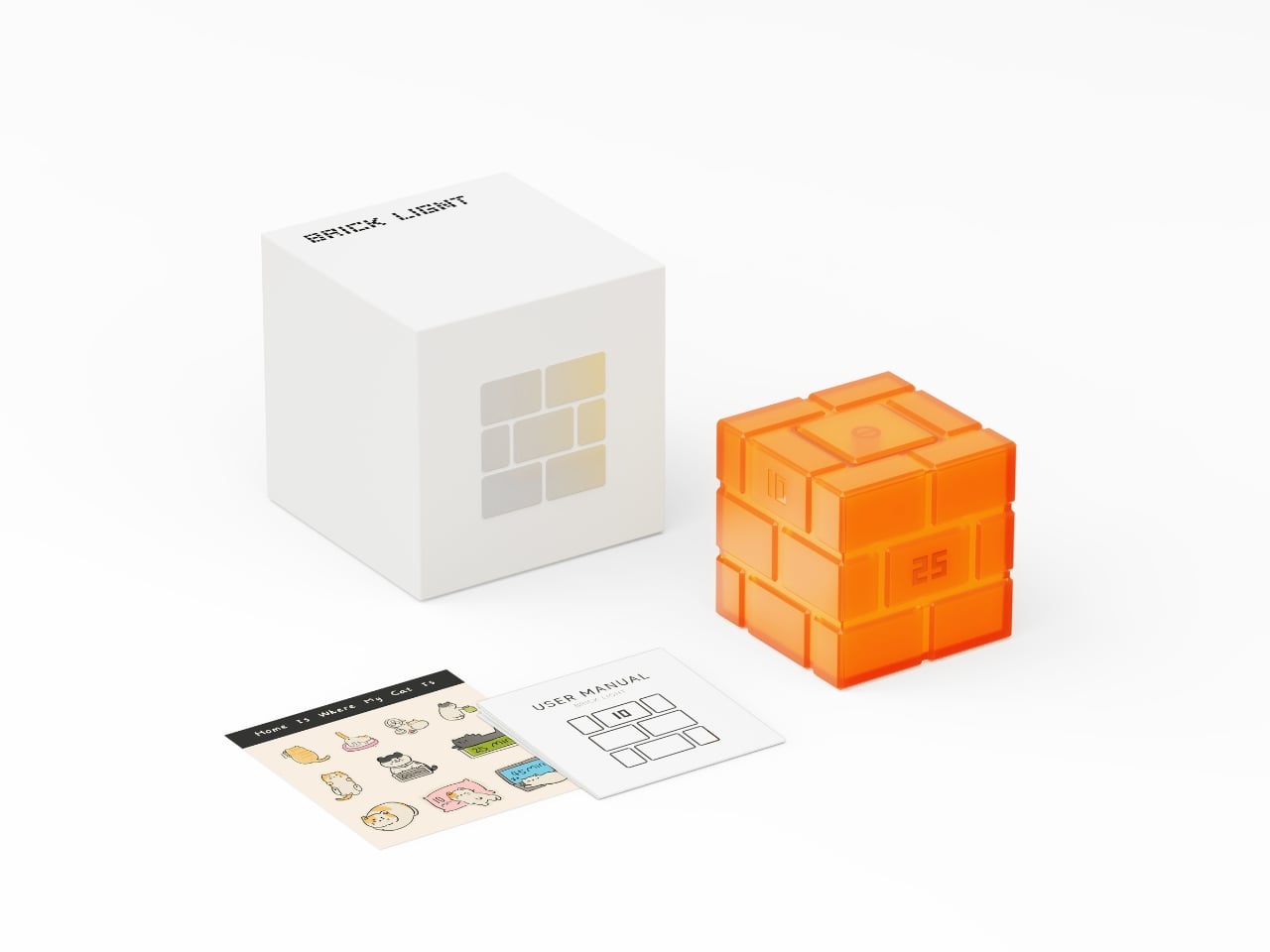
Each segment maintains perfect 1:1:1 proportions, creating a symmetry that feels almost meditative. The surface carries a subtle brick pattern, textured enough to catch your eye but not so literal that it becomes gimmicky. When the light filters through the flame-retardant PC material, it transforms into something between solid and ethereal, like a memory that’s both crystal clear and slightly hazy around the edges.

But here’s where things get interesting. This isn’t a lamp you just turn on and off with a boring switch. The Brick Light wants to play with you. Rotate it 90 degrees and you’re setting a sleep timer with options for 10, 25, 45, or 60 minutes. Flip it completely upside down and it begins a gentle fade to darkness, easing you into sleep like a bedtime story that knows exactly when to end. It’s this kind of thoughtful interaction design that separates memorable products from forgettable ones. Anyone can make a lamp. Making a lamp that invites touch, that rewards curiosity, that feels almost alive in its responsiveness? That takes actual imagination.

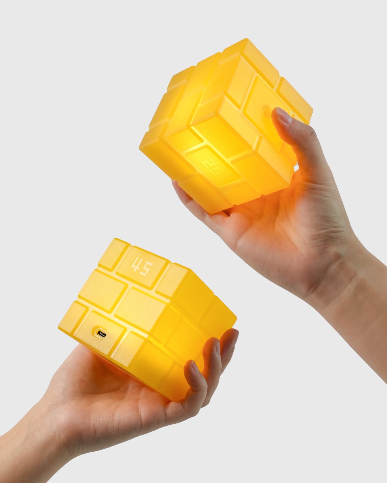
The technical details matter here too. This isn’t just about aesthetics. The patented internal structure uses a support and suspension system that allows the modular design to work as both form and function. The material choice prioritizes safety with flame-retardant certification, because beautiful things should also be responsible things.

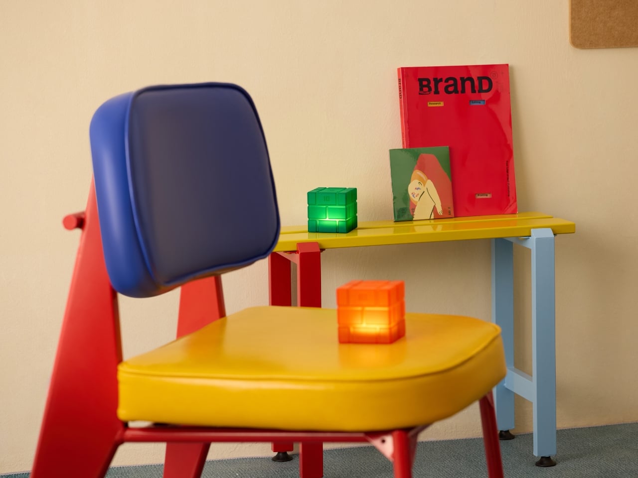
What strikes me most about the Brick Light is how it manages to feel both playful and contemplative. The promotional photos tell this story perfectly. Tiny figurines interact with oversized glowing cubes in miniature worlds ranging from arctic landscapes to desert sunsets to lush green countryside. It’s whimsical without being childish, fantastical while remaining grounded in real materials and honest construction.

In a market saturated with smart home devices that require apps and WiFi and monthly subscriptions, there’s something genuinely refreshing about a light that just asks you to flip it. The analog nature of the interaction feels almost radical in 2026. No voice commands, no connectivity issues, no firmware updates. Just you, the lamp, and the simple pleasure of physical manipulation creating immediate response.

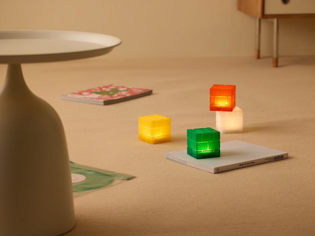
This is design that understands we’re all a little tired of being optimized and connected and notified. Sometimes you just want to hold something real, turn it in your hands, and watch what happens. The Brick Light offers that uncomplicated satisfaction while still delivering genuine innovation in how we interact with everyday objects. Whether it ends up on a nightstand helping you drift off to sleep or on a desk providing ambient lighting while you work, the Brick Light carries with it that original inspiration: the fragments of a journey, the rhythm of experience, quietly glowing.

The post This Brick Light Turns Travel Memories Into Glowing Cubes first appeared on Yanko Design.

This 1,571-Piece LEGO Set Recreates Harry Potter’s First Adventure

When I realized that the Harry Potter and the Sorcerer’s Stone movie is turning 25 this year, I really felt my bones creak. I still remember the excitement that Potterheads like me felt when our beloved fantasy world came to life on the movie screen like it was yesterday. But apparently we’re old as the first movie in the franchise is already a fully grown adult if it was a person.

Fully grown adults who want to relive this feeling can enjoy iconic scenes in brick form as LEGO has released the Sorcerer’s Stone – Collectors’ Edition, a 1,571-piece build that is a commemorative piece celebrating a quarter century since this movie enchanted the world. It’s a nostalgic LEGO set tribute that will resonate deeply with those who grew up with the series and also something to excite those that are just discovering this magical movie world.

Designer: LEGO

This is the perfect gift for yourself if you’re a Potterhead or for your loved one who loved the movies and/or the books. It’s meant for adults though since there are a lot of pieces and intricate setups needed. It brings to brick life iconic characters and objects from the movie, fun functions hidden in the centerpiece, and microscale versions of some classic scenes that you’d want to relive. This is also the first LEGO set to feature a Hedwig snowy owl figure with closed wings, and you can swivel its head so you get different display angles. This detail makes this particular set truly historic in the LEGO Harry Potter universe.

The three main leads of the movie series (Harry Potter, Hermione Granger, and Ron Weasley) get their minifigures so you can recreate those iconic scenes. You even get a Chocolate Frog card featuring Albus Dumbledore himself, and a Wizard Chessboard where you can move the queen piece. You can also blow the side of Harry’s trunk to have a recreation of the attack scene in the bathroom with the mountain troll. You will also see some other microscale scenes from the movie like the Hogwarts Express and 5 of the trials that Harry had to endure to reach the Sorcerer’s Stone.

What really sets this collector’s edition apart is the interactive experience it offers. The three hidden dials aren’t just gimmicks. They’re thoughtfully designed mechanisms that bring the display to life every time you interact with it. Whether you’re showing off your build to fellow fans or just need a moment of magical escapism during a busy day, these features keep the set engaging long after you’ve placed the final brick.

The build itself is designed as a premium experience for adults who appreciate mindful, hands-on creative activities. There’s something deeply therapeutic about losing yourself in a LEGO build, especially when it connects to a story that meant so much to you growing up. At 1,571 pieces, it’s substantial enough to provide hours of satisfying construction without being so overwhelming that it sits unfinished in the box. And when you’re done, you’ll have a conversation-starting display piece that measures 11.5 inches wide, 9.5 inches high, and 8.5 inches deep. It’s the perfect size for a bookshelf, desk, or dedicated display area.

The set also includes the legendary Sorcerer’s Stone itself and two Galleons, adding those little touches of authenticity that collectors absolutely love. Each element has been carefully designed to capture the essence of the film while maintaining that distinctive LEGO aesthetic.

At $169.99, this is actually one of the most affordable Harry Potter Collector’s Edition sets, making it accessible whether you’re treating yourself or searching for that perfect gift for the Potterhead in your life. The set officially released on January 1, 2026, and given its commemorative nature and that groundbreaking Hedwig figure, I wouldn’t be surprised if it becomes harder to find as word spreads among collectors.

Whether you’re a long-time LEGO enthusiast, a devoted Harry Potter fan, or someone who simply appreciates beautiful display pieces with a story to tell, this set offers something truly special. It’s not just about building with bricks. It’s about reconnecting with the magic that made you believe in impossible things all those years ago. And honestly, don’t we all need a little more magic in our lives?

The post This 1,571-Piece LEGO Set Recreates Harry Potter’s First Adventure first appeared on Yanko Design.

This 1970s Kids’ Desk Flatpacked Before IKEA Even Existed

Here’s something to blow your mind: decades before IKEA convinced us all that assembling furniture with an Allen wrench was somehow fun, a visionary designer named Luigi Colani was already flatpacking children’s furniture in the 1970s. And get this, it wasn’t just about convenience. His Tobifant desk and chair set was actually genius problem-solving at its finest.

If you know anything about Luigi Colani, you know he was the king of curves and organic shapes. This is the guy who designed everything from streamlined trucks to futuristic cameras, always with that signature bio-design aesthetic. But with the Tobifant collection, created for West German children’s furniture brand Kinderlübke, he tackled a problem every parent faces: kids grow way too fast.

Designer: Luigi Colani

The Tobifant set came flatpacked (yes, in the ’70s!), but that was just the beginning of its brilliance. Made from beech plywood, both the desk and chair featured height-adjustable frames, so you could raise the seat, backrest, and writing surface as your child sprouted upward. Instead of buying new furniture every couple of years, parents could invest once and adjust as needed. It was sustainable before sustainability became a design buzzword.

Think about what a radical concept this was. It was a time when most children’s furniture was either cheap throwaway pieces or expensive heirlooms that kids outgrew almost immediately. Colani created something practical, beautiful, and adaptable. The furniture could literally grow with your child, which meant it could potentially serve them from toddlerhood through their early teens.

But wait, there’s more. Colani didn’t just stop at smart construction. He actually specified that each Tobifant desk should come with one kilogram of modeling clay and three wooden tools. Because apparently he understood that a desk isn’t just a place to do homework. It’s a creative laboratory, and kids need to be encouraged to make things, to experiment, to get their hands dirty (or clayey, as it were). How many furniture designers think about what happens after the sale? Colani was playing 4D chess while everyone else was still figuring out checkers.

The flatpack design wasn’t just about shipping efficiency, though that was certainly a bonus. It was about democratizing good design. By making the furniture easy to transport and assemble, Colani made it more accessible to regular families. This was thoughtful, human-centered design at work.

What’s really striking when you look at photos of the Tobifant set today is how modern it still looks. The clean lines, the warm plywood finish, the elegant simplicity of the adjustable mechanism… it could easily sit in a contemporary home without looking dated. That’s the mark of truly timeless design. While so much ’70s furniture screams its decade with harvest gold upholstery and chrome everywhere, the Tobifant feels almost minimalist in its restraint.

The set went into production in the late 1970s, and today surviving examples pop up on vintage reseller sites, often commanding impressive prices from collectors. It makes sense. Original Colani pieces are increasingly rare, and the Tobifant represents such a perfect intersection of form, function, and forward-thinking design philosophy.

What’s fascinating is how Colani’s approach predated so many trends we think of as recent innovations. Flatpack furniture? Check. Modular, adjustable design? Check. Sustainability through longevity? Check. Child-centered functionality that doesn’t sacrifice aesthetics? Double check. He was essentially doing what today’s best furniture startups are trying to do, except he did it before many of them were even born.

So next time you’re wrestling with those cryptic IKEA instructions, spare a thought for Luigi Colani and his Tobifant collection. He proved that flatpack furniture could be more than just affordable practicality. It could be beautiful, innovative, and genuinely improve how families live. That’s the kind of design legacy that deserves way more recognition than it gets.

The post This 1970s Kids’ Desk Flatpacked Before IKEA Even Existed first appeared on Yanko Design.

This Tiny Air Freshener Spins Its Own Visual Story

Look, we’ve all been there. You walk into a room and wonder if the air freshener is actually working or if it’s just sitting there like a decorative paperweight. CONECTO’s Air Perfume, designed by superkomma, decided that was an unacceptable user experience. So they built something that literally shows you what’s happening and it’s kind of genius.

Here’s the thing about most air fresheners: they’re boring. They either plug into a wall looking apologetic about their existence, or they’re aggressively branded cylinders you hide in a closet. The Air Perfume takes a completely different approach. It’s a minimalist white cube that you’d actually want on display, but that’s just the beginning of what makes it interesting.

Designer: superkomma

The real innovation here is how superkomma approached the fundamental question of user interface. Instead of adding a screen or LED indicators (which would have been the obvious tech solution), they made the fan itself part of the visual language. When the device is running, a fragrance symbol attached to the fan blade spins along with it. You can literally see your scent in motion. It’s one of those ideas that feels obvious once you see it, which is usually the mark of genuinely thoughtful design.

CONECTO offers three signature scents, and each one gets its own symbol inspired by the fragrance’s character. Cotton gets a soft, cloud-like shape. Floral is represented by a delicate flower silhouette. Woody has a circular, organic form reminiscent of tree rings. These aren’t just decorative choices. They’re visual shorthand that connects your sense of smell with something you can see, creating a more complete sensory experience.

The execution is refreshingly simple. The fragrance cartridge slots into the bottom of the cube. The corresponding symbol clips onto the fan. When you turn it on, the symbol rotates, dispersing the scent while giving you immediate visual feedback that the device is working. No guessing, no checking your phone app, no wondering if you remembered to replace the cartridge three months ago. It’s all right there, spinning in front of you.

What’s particularly smart about this design is how it handles the aesthetics of functionality. That pure white cubic body could fit into literally any space without clashing. It’s the kind of neutral that works whether you’ve got a minimalist apartment, a maximalist studio, or something in between. But it’s not trying so hard to disappear that it becomes forgettable. The rotating symbol adds just enough visual interest to make the device feel alive and intentional.

The system also addresses a real problem that most air fresheners ignore: they don’t actually eliminate odors, they just cover them up. Air Perfume combines its fragrance delivery with legitimate deodorizing performance, which means you’re not just masking that gym bag smell with artificial flowers. You’re actually dealing with it. There’s something refreshing about design that doesn’t overcomplicate things. In an era where every device wants to connect to your smartphone and collect data about your scent preferences, Air Perfume just does its job with style. The rotating symbol isn’t controlled by an app or programmed with different speeds. It’s just physics and clever design working together.

Superkomma has created something that sits at an interesting intersection of product design, user experience, and visual communication. It’s functional enough for the practical minded, beautiful enough for design enthusiasts, and clever enough to make tech nerds appreciate the elegance of an analog solution. The device proves that sometimes the best interface isn’t digital at all. Sometimes it’s just a spinning flower that tells you everything you need to know at a glance.

The post This Tiny Air Freshener Spins Its Own Visual Story first appeared on Yanko Design.

This Silent Wind Turbine Solves Sailing’s Power Problem

There’s something romantic about sailboats that still speaks to us in this hyper-connected age. The idea that you can harness nothing but wind and water to glide across the ocean feels almost magical. But here’s the reality check: even the most old-school sailor needs power these days. Your GPS has to stay on, your radar needs juice, those navigation lights aren’t optional, and let’s be honest, nobody wants to lose their phone charge mid-voyage.

Traditionally, sailors have dealt with this in less-than-ideal ways. You can run an auxiliary motor to charge your batteries, which kind of defeats the whole wind-powered romance. Or you plug in at the dock and hope you remembered to charge everything before casting off. Neither option is particularly elegant, and both leave you dependent on fossil fuels or shore power. Enter the Grain Blanc, a clever little wind turbine from Belgian startup Phileole that’s rethinking how sailboats stay powered. This compact vertical turbine bolts right onto your mast and does something that feels almost too obvious in hindsight: it uses the very wind that’s already moving your boat to generate electricity for everything onboard.

Designer: Phileole

The design itself is refreshingly simple. Standing about 100 centimeters tall and 45 centimeters in diameter, it’s compact enough not to get in your way but substantial enough to actually do something useful. The vertical orientation is the key here. Unlike traditional horizontal wind turbines that need to pivot to face the wind, this thing captures air from any direction. When you’re out on the water and wind direction changes constantly, that’s a huge advantage.

What really makes the Grain Blanc stand out is how quiet it operates. Anyone who’s been around conventional wind turbines knows they can sound like an angry mechanical bee convention. This one? Silence. That’s not just nice for your peace of mind while you’re trying to enjoy the ocean; it’s better for marine life too. Phileole designed it to produce no vibration or disturbance to biodiversity, which feels increasingly important as we become more aware of how our technologies impact ecosystems.

The turbine handles all your essential navigation needs: keeping your lights on, your radar scanning, your VHF radio crackling, your GPS tracking, and your navigation console powered. Basically, all the stuff that keeps you safe and legal out there. But the utility doesn’t stop when you dock. Throughout winter, when your boat is sitting at the marina, the Grain Blanc keeps your batteries topped off and can even power a dehumidifier. Anyone who’s dealt with musty boat interiors knows that’s worth its weight in gold.

The environmental credentials here are genuinely impressive. The units are made primarily from recycled polypropylene and are themselves 95 percent recyclable. In an industry that’s historically generated mountains of waste, that circularity matters. It’s also worth noting that the turbine comes with a smart regulator that requires zero manipulation after installation. It automatically keeps your batteries charged and shuts itself down during storms. That kind of set-it-and-forget-it reliability is exactly what you want when you’re dealing with the unpredictability of ocean conditions.

While Phileole designed the Grain Blanc specifically for sailboats, the technology has broader implications. The same principles that make it work on a mast could potentially apply to other scenarios where you need compact, omnidirectional wind power. Urban balconies, remote cabins, mobile installations: anywhere traditional turbines are too bulky or finicky, vertical designs like this could fill the gap.

What strikes me most about the Grain Blanc is how it represents a shift in thinking about renewable energy. We often imagine clean power requiring massive infrastructure: sprawling solar farms or towering wind turbines dominating landscapes. But sometimes the most effective solutions are small, quiet, and fit seamlessly into existing systems. This little turbine doesn’t try to revolutionize sailing or make grand promises about saving the world. It just solves a real problem elegantly, using the resources already at hand. And honestly? That’s the kind of practical innovation that actually changes how we live.

The post This Silent Wind Turbine Solves Sailing’s Power Problem first appeared on Yanko Design.

This Oak Sideboard Has Doors You Can’t Stop Touching

You know that feeling when you run your fingers across something and the texture makes you stop in your tracks? That’s exactly the vibe British furniture maker Nick James is going for with his sideboard featuring sculpted doors. And honestly, it’s the kind of piece that makes you rethink what furniture can be.

At first glance, it looks like a solid oak sideboard. Clean lines, classic proportions, nothing too flashy. But then you get closer and realize those doors aren’t just doors. They’re carved with flowing, wave-like patterns that transform the flat surface into something that feels almost alive. The sculpting reveals the oak’s grain in ways you’d never see otherwise, creating shadows and depth that shift as you move around the piece.

Designer: Nick James

This isn’t Nick James’s first dance with texture. The British designer has built a reputation for bringing tactile interest to traditional furniture forms. His approach is about celebrating the material itself, letting the wood grain become the star of the show rather than hiding it under layers of paint or veneer. In a world where so much furniture feels mass-produced and anonymous, there’s something refreshing about a piece that proudly shows off its origins.

The sideboard itself is practical in all the ways you’d want. It measures a generous size, perfect for dining room storage or as a living room statement piece. Inside, you’ll find a height-adjustable shelf, so whether you’re storing wine bottles or board games, you can configure it to fit your life. The hardware is minimal, keeping the focus on those sculptural doors that really deserve center stage.

What makes this piece particularly interesting is how it straddles different design worlds. There’s a mid-century modern sensibility to the proportions and the floating quality of the case. But the textured doors feel almost Art Deco, with their geometric repetition and emphasis on craftsmanship. And then there’s an undeniably contemporary edge to the whole thing, because let’s face it, most traditional furniture makers aren’t carving wave patterns into cabinet doors.

The price point sits at £2,950, which puts it firmly in the investment furniture category. But here’s the thing about pieces like this: they’re made to order from solid oak, hand-finished, and designed to last decades. In an era when we’re all supposed to be buying less but buying better, a sideboard like this makes the case for choosing quality over quantity. Plus, it’s the kind of furniture that only gets better with age as the oak develops its patina and character.

Some design purists might argue about the use of CNC technology to create the repetitive carved pattern. There was even a comment on Core77 suggesting that precision CNC texturing lacks soul. But I’d push back on that. The technology is just a tool, like a chisel or a lathe. What matters is the design vision behind it and the quality of execution. James uses the precision to reveal something beautiful about the material itself, not to disguise it as something it’s not.

The sideboard also speaks to a broader trend we’re seeing in contemporary design: texture is having a major moment. Whether it’s fluted glass, ribbed wood, scalloped tiles, or carved surfaces, designers are moving away from the ultra-minimalist smooth finishes that dominated the 2010s. People want furniture that invites touch, that creates visual interest through shadow and form, that makes you want to get up close and really look.

What I love most about this piece is that it doesn’t shout for attention. It’s not trying to be the loudest thing in the room. Instead, it rewards the people who take time to notice the details. The way the light catches the carved surface. How the grain pattern emerges from the sculpting. The contrast between the textured doors and the smooth frame. These are the kinds of subtle pleasures that make living with good design so satisfying.

The post This Oak Sideboard Has Doors You Can’t Stop Touching first appeared on Yanko Design.

The AI Tennis Robot That Plays 3 Sports Better Than Your Friends

You know that feeling when you want to practice your serve but no one’s available to hit with you? Or when you’re playing a casual match with friends and everyone’s arguing about whether that ball was in or out? Designer Jaehong Jeon has created something that might just solve both problems, and it happens to look like the friendliest little robot you’ve ever seen.

ORVY is a court-centered companion robot that’s basically the Swiss Army knife of racket sports. This isn’t some clunky, industrial-looking machine that screams “future dystopia.” Instead, it’s got this adorable, minimalist design that looks like a friendly elephant decided to become a sports assistant. The rounded white body sits low to the ground on wheels, with what almost looks like a trunk extending forward. It’s the kind of design that makes you want to pat it on the head and say “good robot.”

Designer: Jaehong Jeon

Create your own Aesthetic Render: Download KeyShot Studio Right Now!

But here’s where it gets really interesting. We’re living in a moment where tennis courts are becoming increasingly flexible spaces. Pickleball is exploding in popularity across North America and Europe, and padel is gaining serious traction too. Courts that used to be dedicated solely to tennis are now being repurposed and shared among multiple sports. ORVY was designed specifically for this new reality of multi-use sports venues.

The robot operates in three different modes, each addressing a specific need. In “Following” mode, ORVY acts like that friend who’s always down to hang out. It tracks players around the court during pickleball and padel games, moving quietly along the sidelines without getting in the way. Think of it as your personal sports documentarian, except instead of just recording, it’s gathering data and learning your playing style.

Switch it to “AI Referee” mode, and ORVY becomes the neutral third party every friendly match needs. Using vision sensing technology, it tracks scores and makes accurate calls about whether balls are in or out. No more disputes, no more “I’m pretty sure that was on the line” arguments. The robot watches, learns the movements of both players, and can even simulate their playing styles for later analysis. It’s like having Hawk-Eye technology, but for your weekend games.

The “AI Coach” mode is where ORVY really shines for solo practitioners. When you’re training alone, it delivers balls and analyzes your movements in real time, providing feedback on your technique. You can select your desired opponent type and playing style, and ORVY adjusts accordingly. Want to practice against someone who hits with heavy topspin? ORVY’s got you. Need to work on your response to a serve-and-volley player? It can simulate that too.

What’s brilliant about the design is how Jeon drew inspiration from Wimbledon’s famous all-white dress code. Just as that tradition maintains visual focus during play, ORVY’s clean white exterior allows it to blend into the court environment without becoming a distraction. It’s there when you need it, but it doesn’t demand attention. The neutral color scheme also conveys a sense of reliability and trustworthiness, which is exactly what you want from equipment making judgment calls in your games.

This isn’t just about having a cool gadget on the court. ORVY represents a shift in how we think about sports technology and AI assistance. Rather than replacing human interaction, it’s designed to enhance solo practice and casual play. It fills the gaps when you can’t find a hitting partner or when you want objective feedback without hiring a coach. The timing couldn’t be better. As courts become shared spaces and new racket sports continue to grow, having adaptive technology that can serve multiple functions across different games makes perfect sense. ORVY isn’t locked into serving just one sport or one purpose. It’s flexible, which is exactly what modern sports facilities need.

Looking at this design, you get the sense that the future of sports technology doesn’t have to be intimidating or exclusive. It can be approachable, versatile, and yes, even kind of cute. ORVY manages to pack sophisticated AI capabilities into a form that feels more like a helpful companion than a complicated machine. And in a world where technology often feels like it’s racing ahead of us, that’s a refreshing change of pace.

The post The AI Tennis Robot That Plays 3 Sports Better Than Your Friends first appeared on Yanko Design.

The Pen That Went to the Moon Just Got a Tactical Upgrade

Remember when you were a kid and someone told you about the space pen? You know, the one that writes upside down, underwater, and in basically any condition imaginable because NASA needed something reliable for astronauts? Well, Fisher Space Pen just dropped a new version that makes their legendary writing instrument even more ridiculously practical, and honestly, I’m kind of obsessed.

Meet the Measure Twice, a bolt-action tactical pen that’s basically the Swiss Army knife of writing instruments. At $69, it’s not your average drugstore pen, but hear me out because this thing is genuinely clever.

Designer: Fisher Space Pen

First, let’s talk about that bolt-action mechanism. If you’ve ever fidgeted with a pen during a long meeting or phone call, you know the appeal of a good click. But this takes it to another level. The bolt-action deployment is smooth, satisfying, and way more robust than a standard clicker. It’s the kind of tactile experience that makes you actually want to use a physical pen in our increasingly digital world. Plus, it just looks cool. There’s something inherently appealing about that tactical aesthetic without it being over the top or trying too hard.

But here’s where it gets interesting. Fisher etched precision ruler markings right into the barrel of the pen. We’re talking both imperial measurements up to 3.5 inches and metric up to 9 centimeters. Think about how many times you’ve needed to measure something small and had to hunt around for a ruler or tape measure. Shopping for furniture online and need to visualize how big something is? Got it. Working on a craft project? Covered. Trying to figure out if that vintage frame will fit your photo? Done. It’s one of those features that seems almost too simple, but once you have it, you realize how often you actually need it.

The construction is pretty impressive too. Fisher switched from their traditional chrome-plated brass to anodized aluminum for this model. That means it’s lighter and more comfortable to carry all day, but still incredibly durable. The anodizing makes it resistant to scratches, corrosion, and impacts, so you can toss it in your bag or pocket without babying it. It’s designed to be used, not displayed on a shelf.

Now for the feature that really sets this apart: there’s a tungsten carbide glass breaker tip on the opposite end from the writing point. Yes, you read that right. This pen doubles as an emergency escape tool. In a car accident or emergency situation where you need to break a window, this could genuinely save your life. It’s the kind of thing you hope you never need, but knowing it’s there provides a weird sense of security. Plus, it speaks to the thoughtful design philosophy behind this pen. It’s not just about looking tactical or cool, it’s about actual functionality.

Of course, it still has all the legendary Space Pen technology that made the original famous. The pressurized ink cartridge writes upside down, works in extreme temperatures, functions underwater, and has a shelf life of over 100 years. That’s not marketing hype, that’s actual tested performance. These pens literally went to space and performed flawlessly in zero gravity.

What I really appreciate about the Measure Twice is how it represents a shift in how we think about everyday carry items. We’re constantly looking for ways to simplify what we carry, to have fewer, better things that do more. This pen nails that philosophy. It’s a precision writing instrument, a measuring tool, and an emergency device all in one sleek package that’s just over 5.5 inches long.

Fisher Space Pen took an icon and made it more relevant for 2026. The Measure Twice isn’t trying to replace your smartphone or be something it’s not. It’s just a really, really well-designed pen that happens to do a few extra things exceptionally well. And in a world of increasingly disposable products, there’s something genuinely appealing about a tool that’s built to last decades and actually earns its place in your pocket.

The post The Pen That Went to the Moon Just Got a Tactical Upgrade first appeared on Yanko Design.

An Artist Carved His Dead Oak Into Records That Play Bird Songs

One thing that the world has been learning the past few years is that people deal with grief differently. That’s why we can never judge how people react to death of loved ones, beloved pets, other living creatures, and even life changes. Artists and creative people in particular sometimes have profound ways of honoring whatever it is that they have lost.

When a 65-year-old oak tree in Steve Parker’s front yard died from a fungal disease called oak wilt, he wanted to create a tribute to this tree that served as a refuge for migratory birds in their area. What he created was a sound sculpture, a record player that could play actual discs with bird songs, a fitting honor to the life and legacy of the tree.

Designer: Steve Parker

Parker cut the trunk of the diseased tree into “wood cookies” or cross-sectional slices. He then carved grooves directly into the discs to create playable records. He then built a victrola or record player that is specifically designed to play the wooden records. This player is placed on a pedestal and the round tree slices are displayed on the walls behind it.

What plays on the wooden records is equally special. He etched the songs of migratory birds that once nested in the oak tree. You hear a scratchy, wooden sound which actually reminds you of that branch that would hit the side of an old farm house, which can be nostalgic or creepy depending on your experience of it.

Creating these wooden records wasn’t easy. Live oak is notoriously difficult to work with because it cracks as it dries, and many woodworkers avoid it entirely. But Parker saw those imperfections as part of the piece’s authenticity. Those cracks and warps in the sound aren’t flaws, they’re features that honor the tree’s natural character even in death.

But the wooden records are only part of “Funeral for a Tree.” Parker also created a companion sculpture called “Sheng Shrine”: a plant-like, valve-driven instrument built from salvaged brass valves from euphoniums and trumpets, copper tubing, and breathing bags. What makes this piece particularly moving is what animates it: CPAP machines and ventilators, the same medical equipment used to help people breathe when they’re ill.

These breathing machines give life to discarded Chinese shengs (mouth organs). The sheng is traditionally associated with the phoenix, and the word itself means life, voice, and sound in Mandarin. Parker collaborated with sheng virtuoso Jipo Yang, who interpreted the bird calls and performed short compositions around them. The sounds you hear include the clicks of tiny relays, the grunts of air pumps that almost sound like snores, and the wheezing as air pushes through the reeds. It’s mechanical yet deeply emotional.

There’s another layer to this work that makes it even more poignant. Parker realized that his grief for the tree echoed the loss of his father to cancer. Both were slow, inevitable declines where care could not prevent loss. When his father was really sick, Parker’s family monitored his breathing to assess his comfort and sense where his body was going. Those CPAP machines and ventilators in “Sheng Shrine” carry those memories. They’re devices associated with life support, transformed into instruments that give breath to dead instruments playing songs for a dead tree.

What makes “Funeral for a Tree” so powerful is that it’s not Steve Parker performing a requiem for the tree. It’s the tree performing its own memorial service. The wood itself becomes the instrument, the bird songs it once sheltered become the music, and the breath that once rustled through its leaves is replaced by mechanical breathing that keeps the dirge alive.

In transforming something most people would haul away as waste into a functioning musical instrument, Parker reminds us that grief doesn’t have to be silent or passive. Sometimes the most profound way to honor a loss is to let it speak for itself, to give it voice and breath and let it tell its own story. In doing so, he’s created something that transcends the personal: a meditation on memory, loss, and the ways we try to hold onto what’s gone.

The post An Artist Carved His Dead Oak Into Records That Play Bird Songs first appeared on Yanko Design.