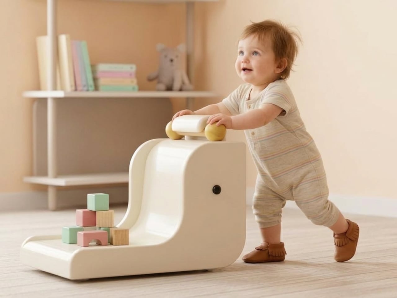
Nursery products have generally been designed around the assumption that function is the only thing that matters. A baby monitor that broadcasts clearly, a sound machine that blocks noise, a nightlight that stays on through the small hours without overheating. These things work, and most of them look exactly like what they are: appliances with a secondary mission, built from a brief that never included the word “beautiful.” The emotional dimension of the room they live in is almost never part of the specification.
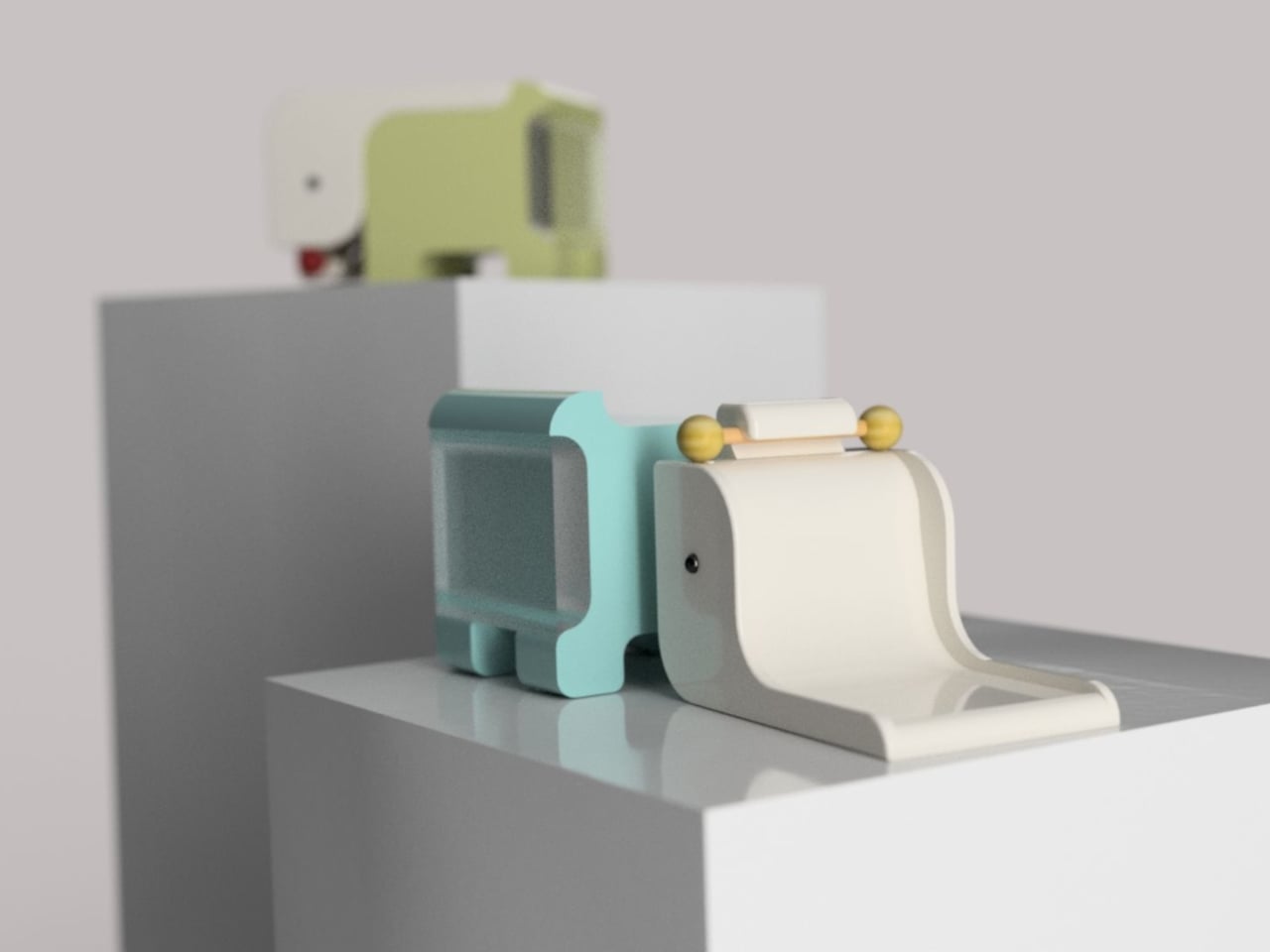
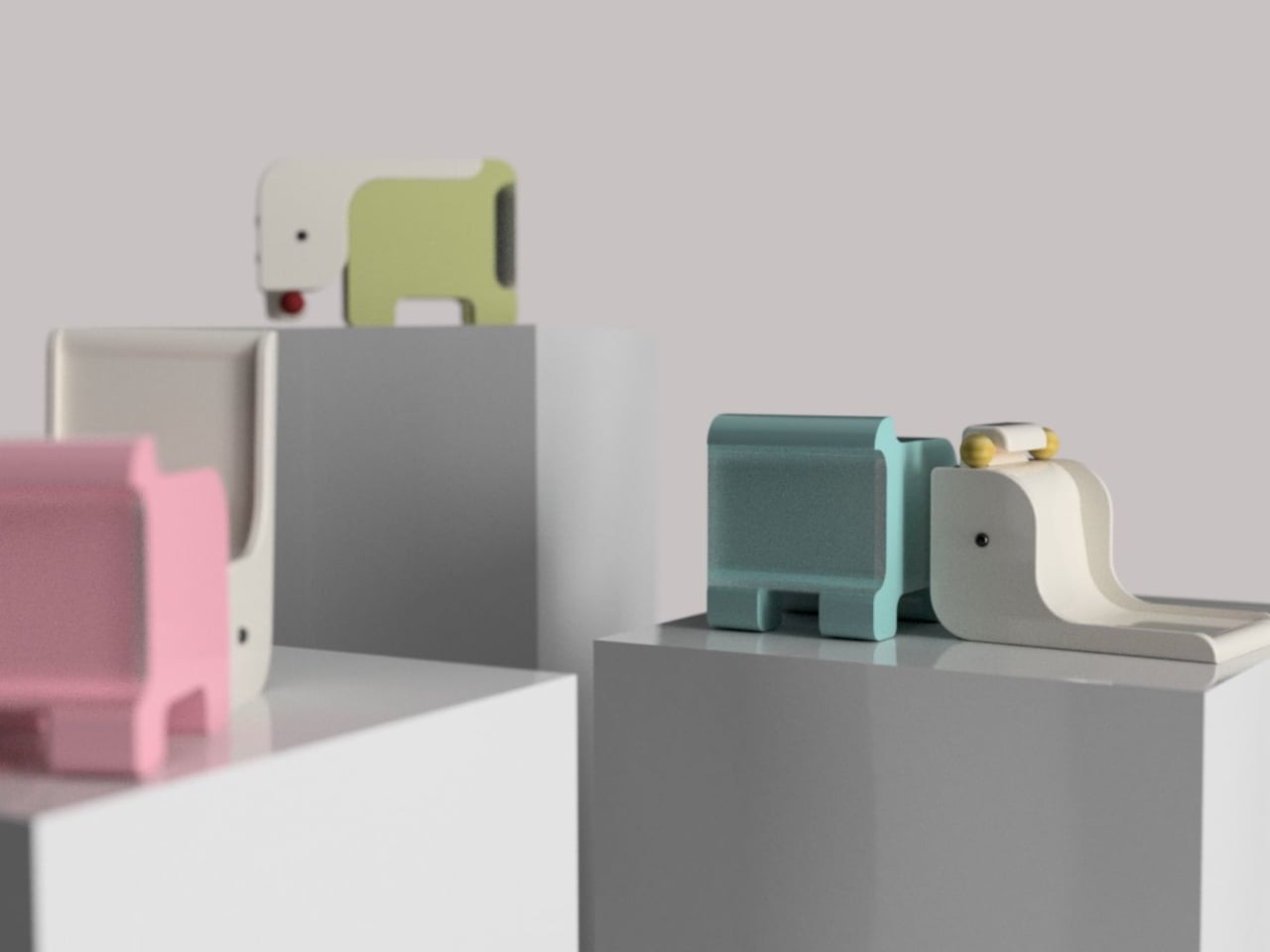
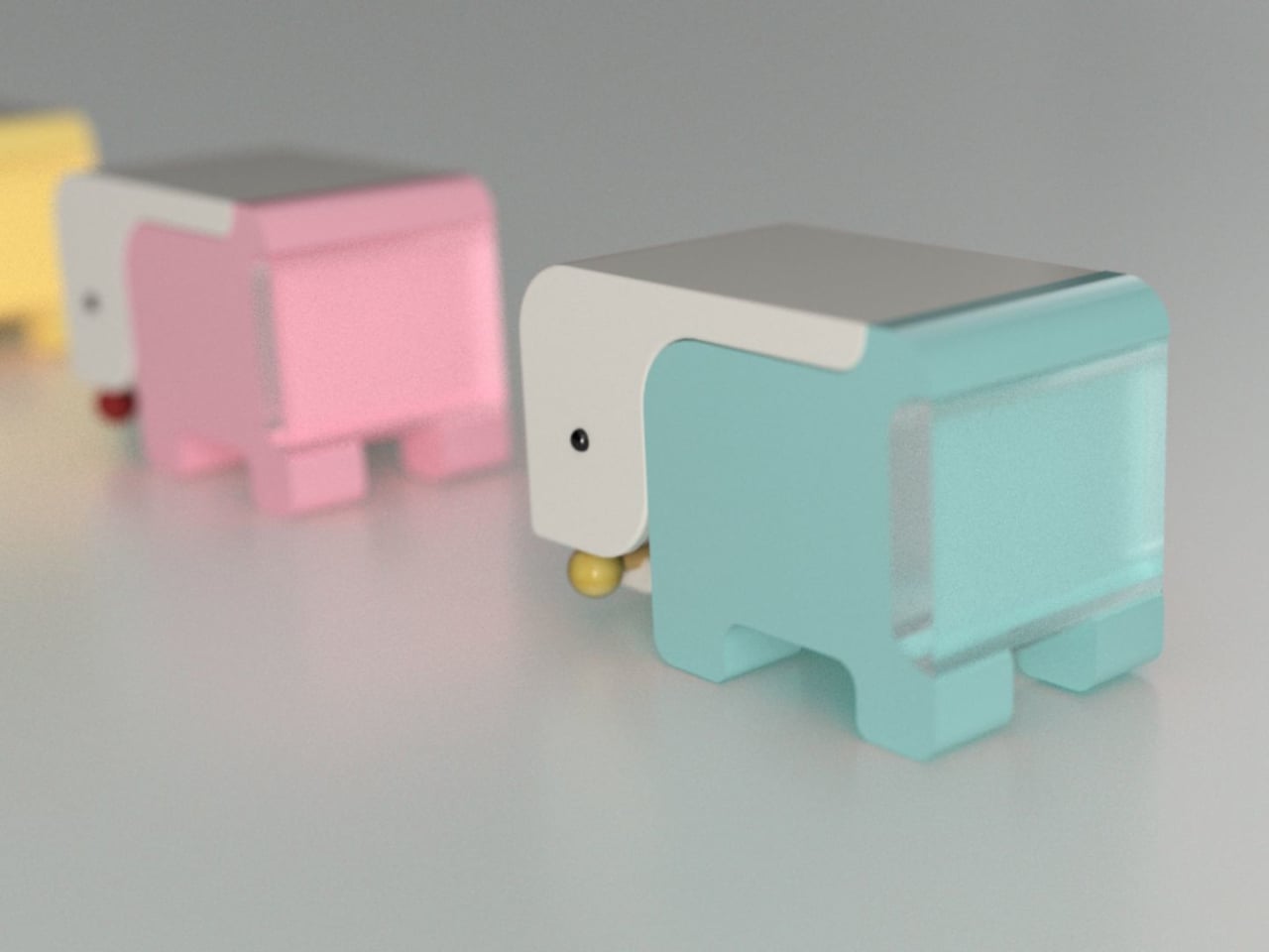
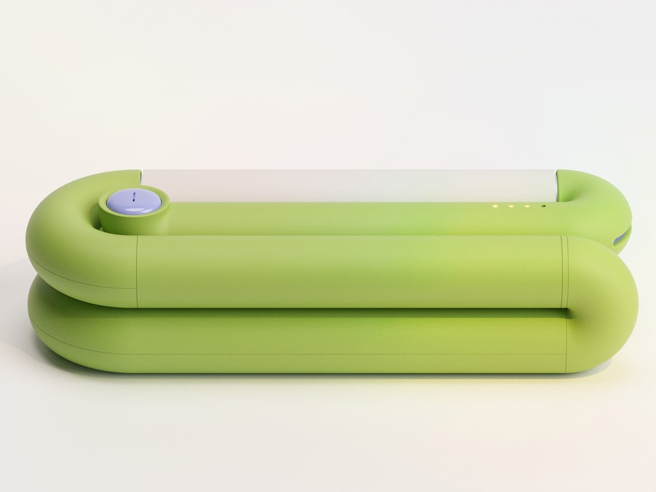
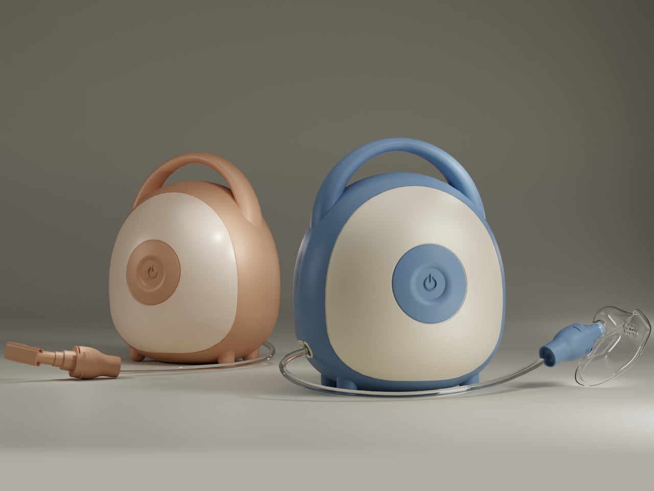
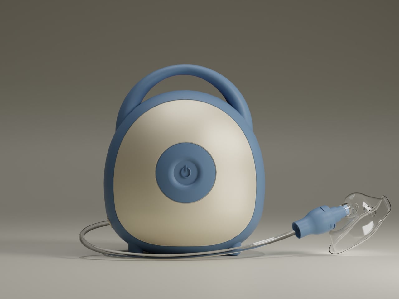
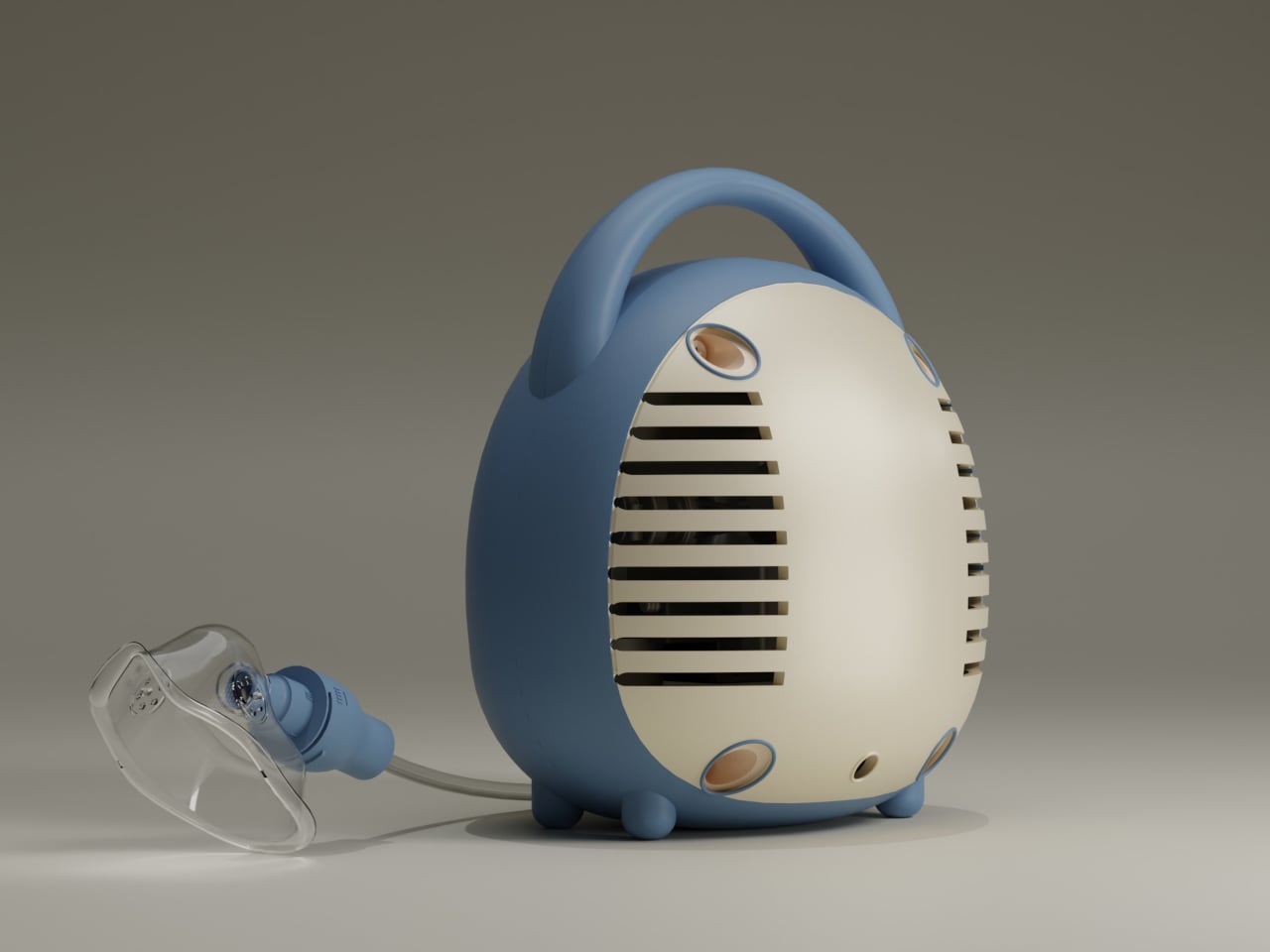
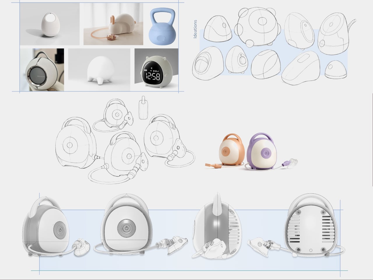
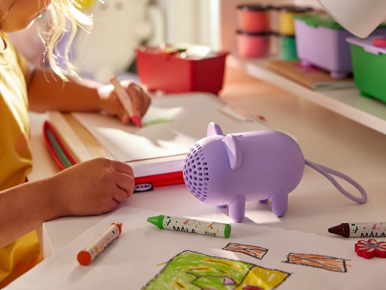
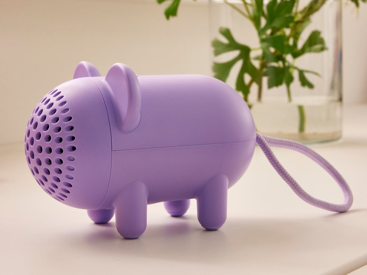
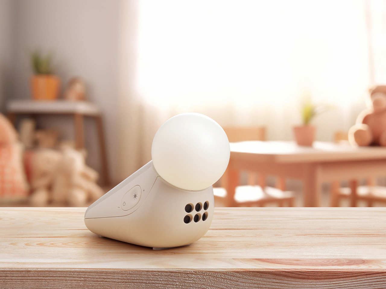
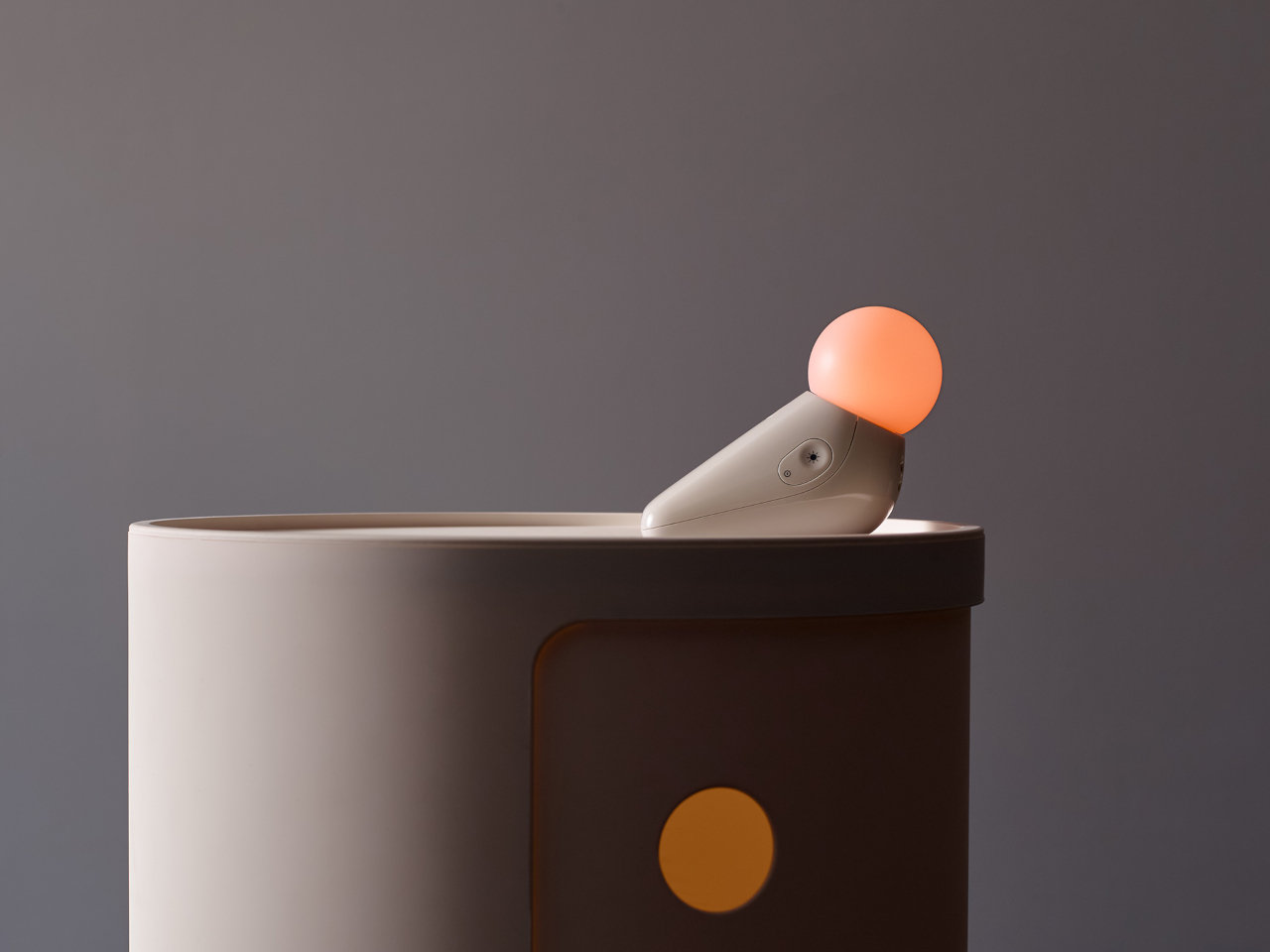
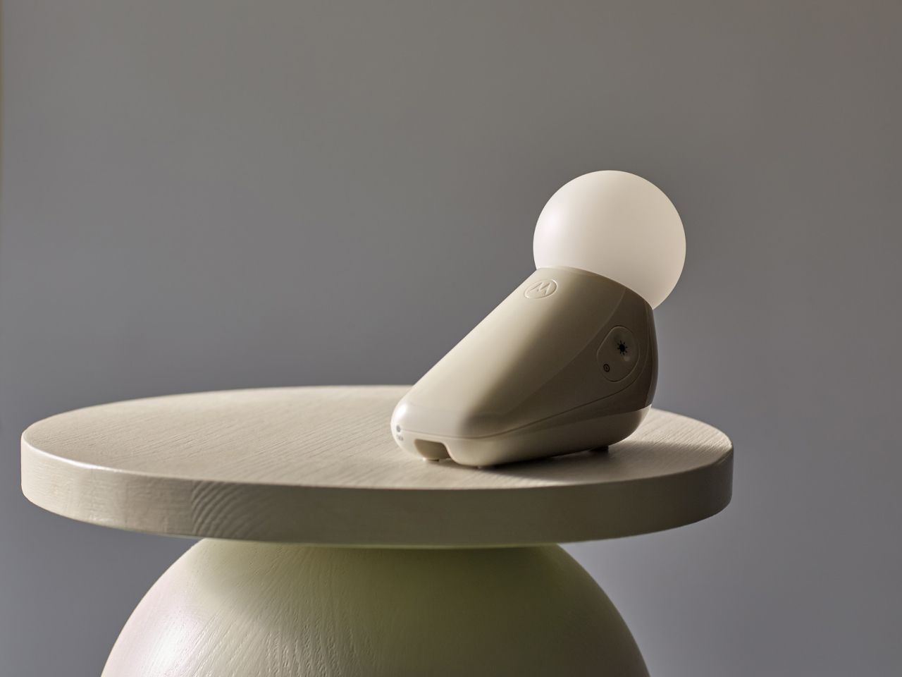
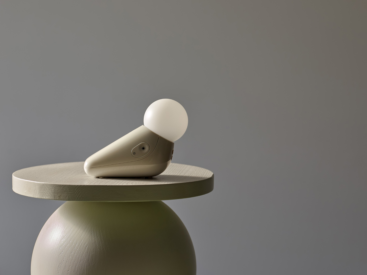
Industrial designer Tej Chauhan rethought that assumption through Motorola Nursery’s PIP collection, and the S1 Soother is the latest product from it. It begins with a sketch of a little seal, a soft, neotenic form drawing on the same mechanism that makes baby animals universally disarming. The rounded shape isn’t decorative padding over a functional core. It’s part of the reason the device works as well as it does.
Designer: Tej Chauhan for Motorola Nursery
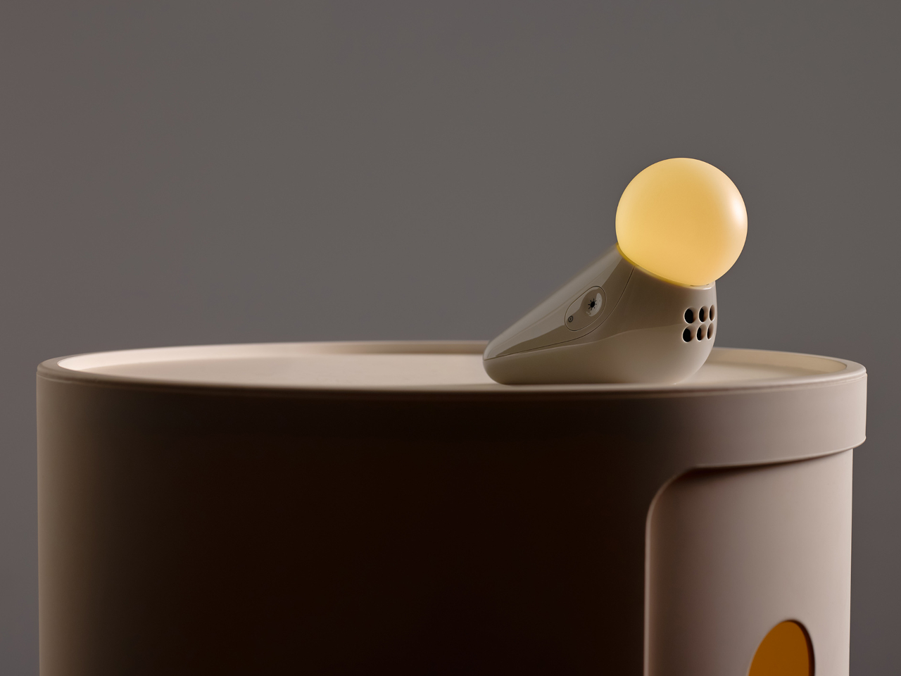
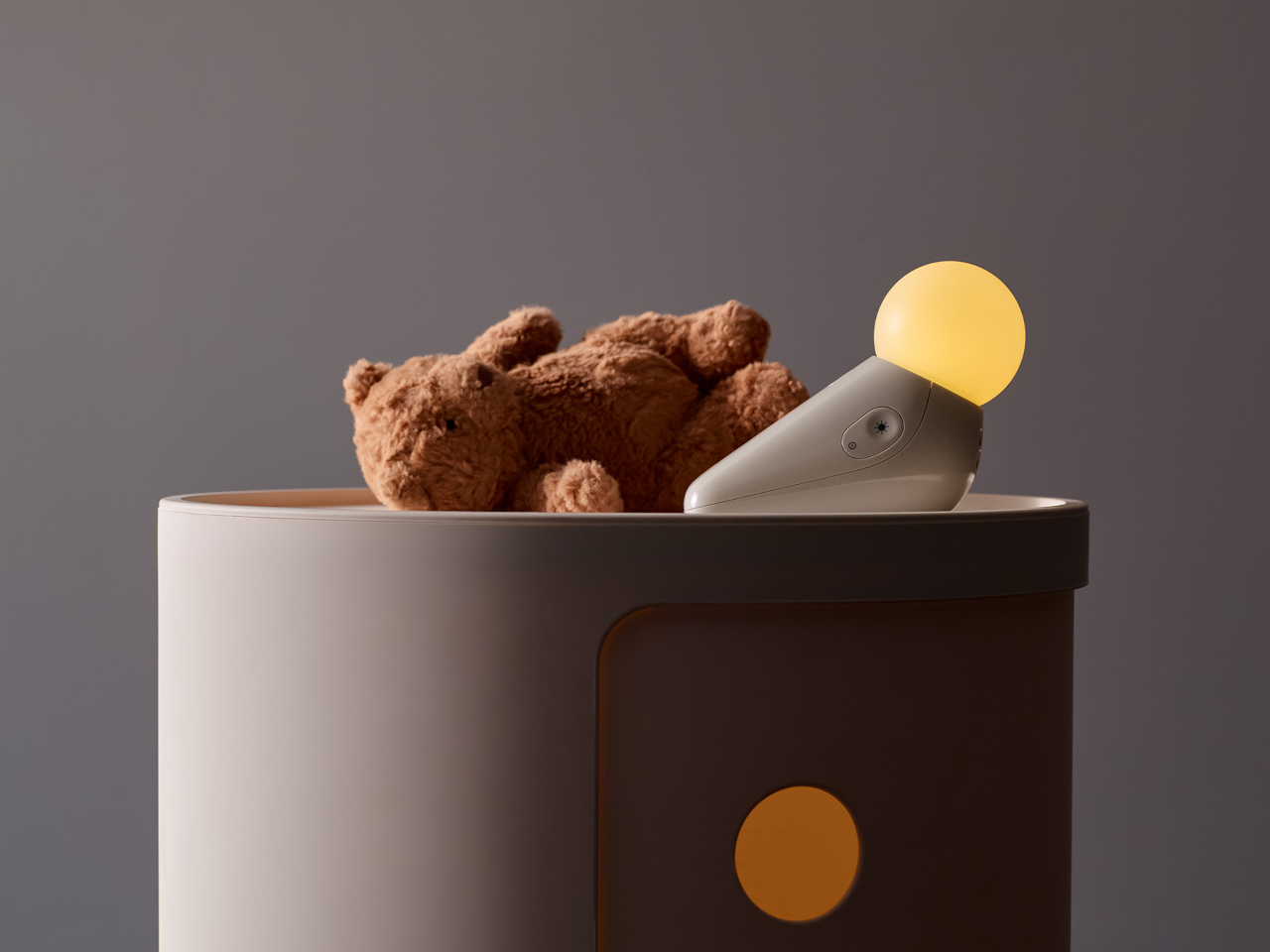
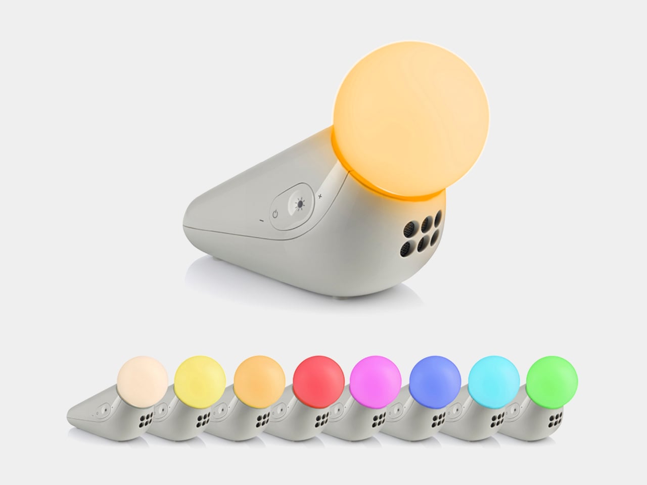
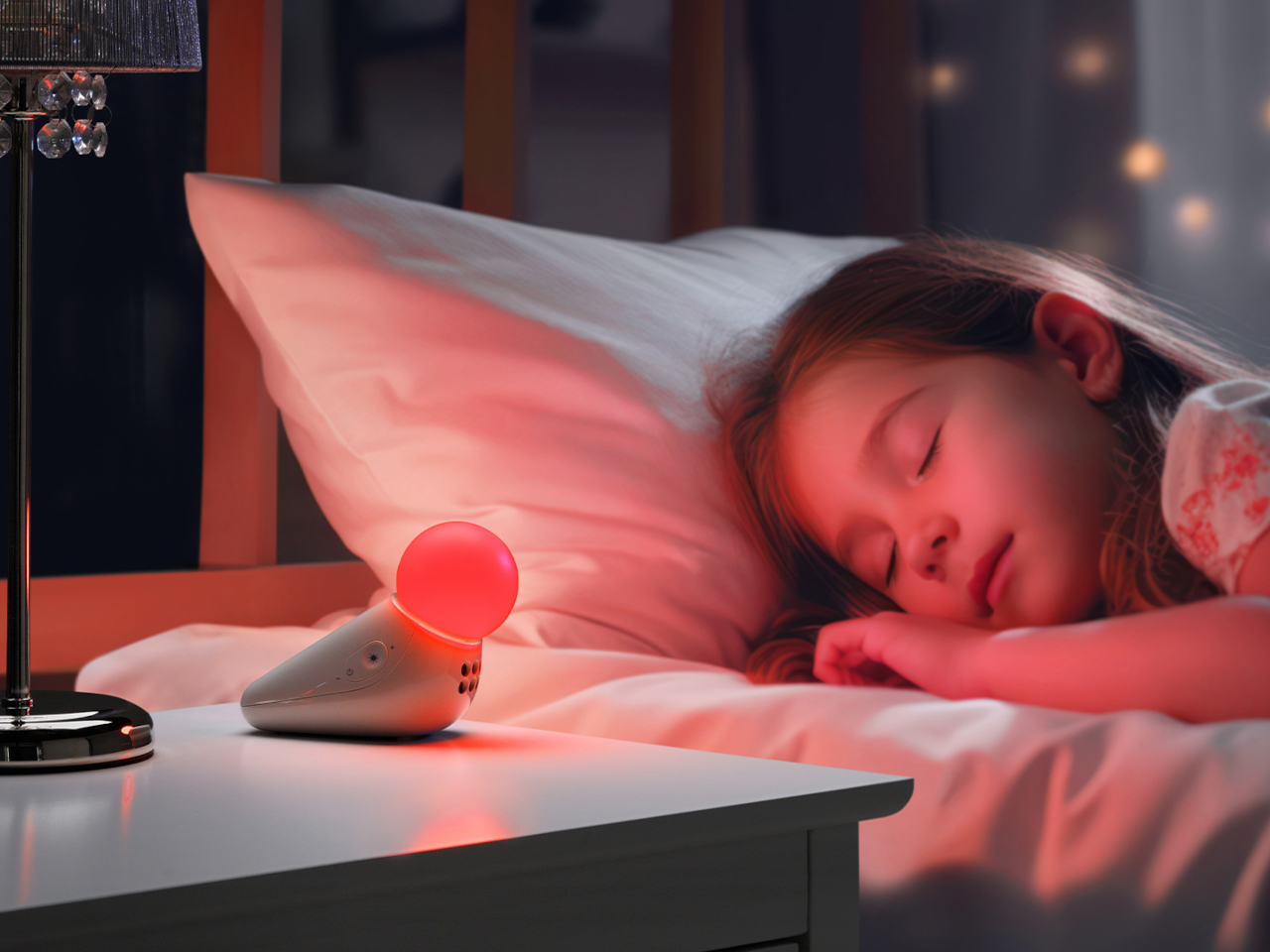
The form achieves something most nursery devices don’t: it looks considered even when it’s not on. Switched off, the S1 reads as a small sculptural object that a parent with a carefully arranged room wouldn’t feel compelled to hide. Switched on, the round tip glows in one of seven colors: yellow, orange, red, pink, blue, cyan, and green, adjustable across five brightness levels. The light is calm and diffuse by design.
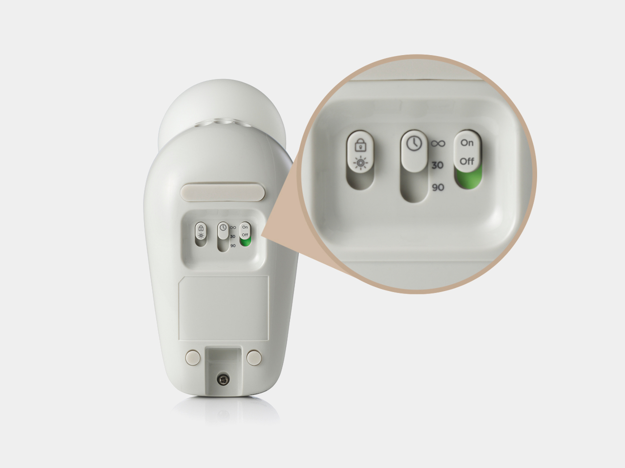

The sound side offers ten options: three lullabies, three nature sounds, white noise, brown noise, a fan loop, and a womb sound, covering the range that different babies respond to. Parents who’ve cycled through multiple sound machines will appreciate that breadth in a single device. Volume adjusts across five levels, and USB-C charging sustains up to 50 hours of use per charge, covering weeks of nap times before the next top-up.
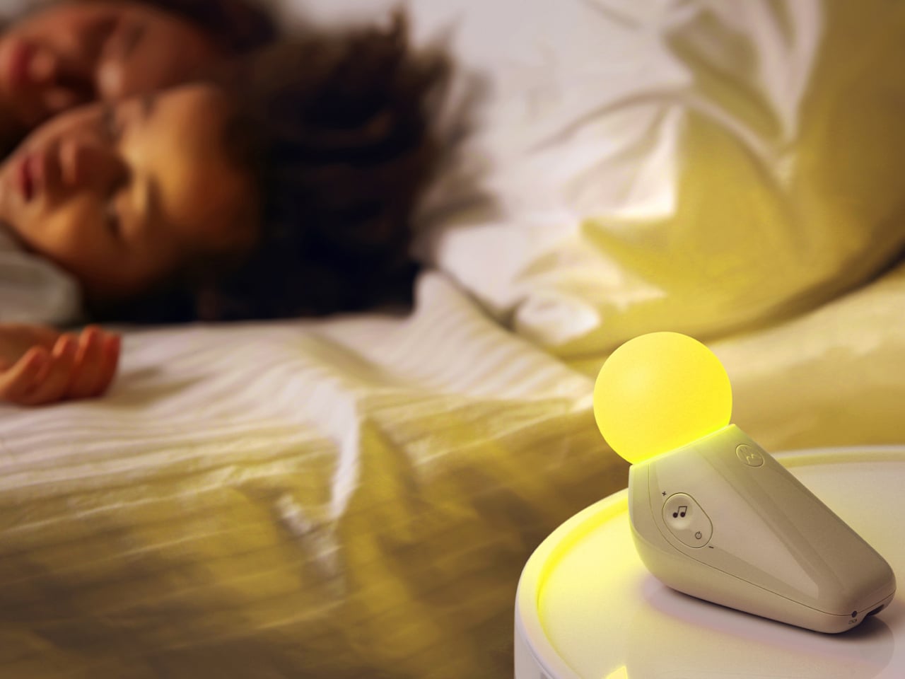
Portability isn’t incidental. The S1 travels in a bag without cables, without a base that won’t fit a hotel nightstand, and without the visual clash of a device that clearly belongs somewhere it isn’t. Non-toxic materials and rounded edges address the physical dimension of baby safety that gets less marketing attention than certification ratings but matters considerably more at close quarters with a curious infant.
Chauhan has described the goal as inviting warmth into an everyday routine while making something beautiful enough to live anywhere in the home, goals that usually don’t apply to baby gear. The neotenic seal shape suggests calm before it does anything else, which is the point. A device that parents genuinely want in the room works harder than one they merely tolerate because it does the job.
The objects that occupy a nursery carry more emotional weight than the ones in any other room. Chauhan’s goal, inviting warmth into an everyday routine while making something beautiful enough to keep, sounds loftier than a $29.99 nightlight deserves. But the design argument is sincere, and so is the result. Parents who’ve spent months chasing the right combination of light and sound will recognize what they’re getting.
The post Motorola Just Made the Baby Soother That’s Actually Worth Displaying first appeared on Yanko Design.