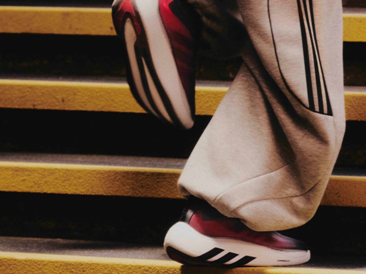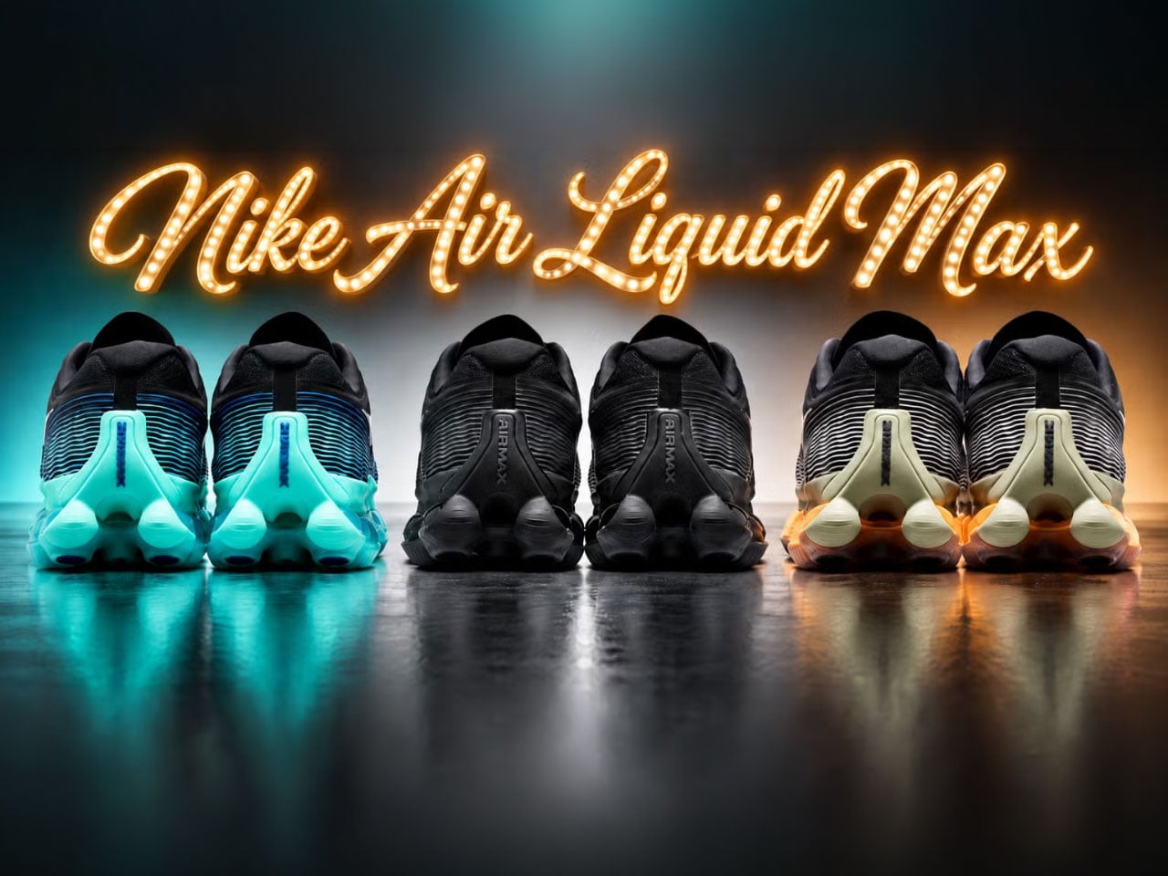
adidas x Carnival’s $170 Sneaker Is a Love Letter to Retro Gaming

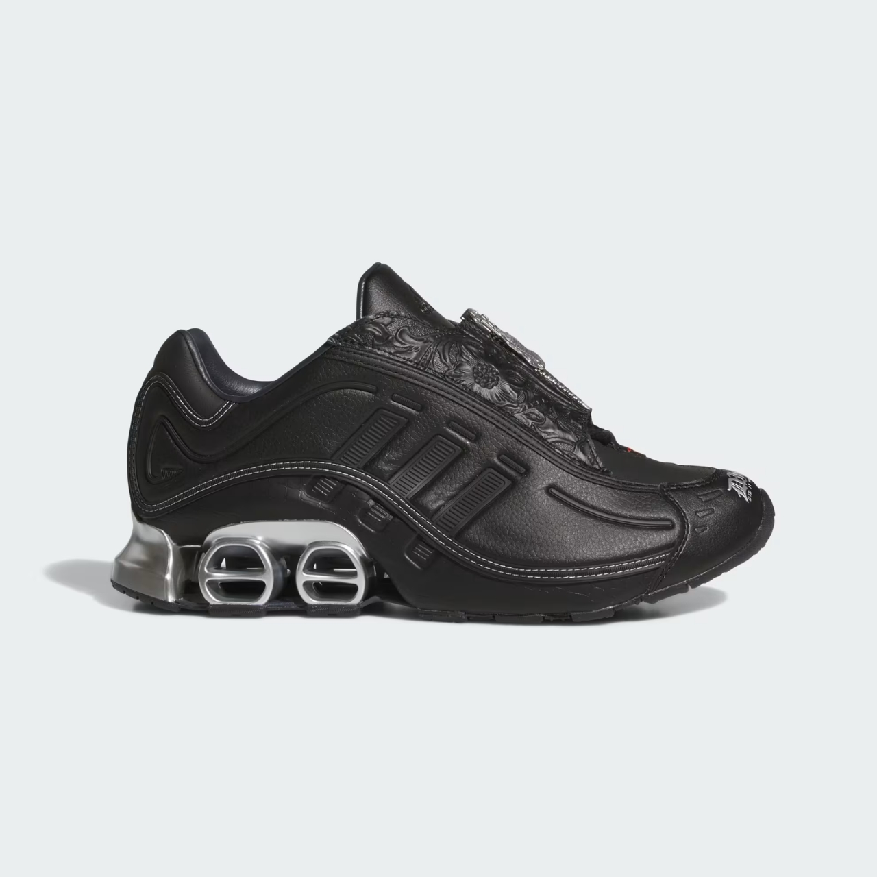
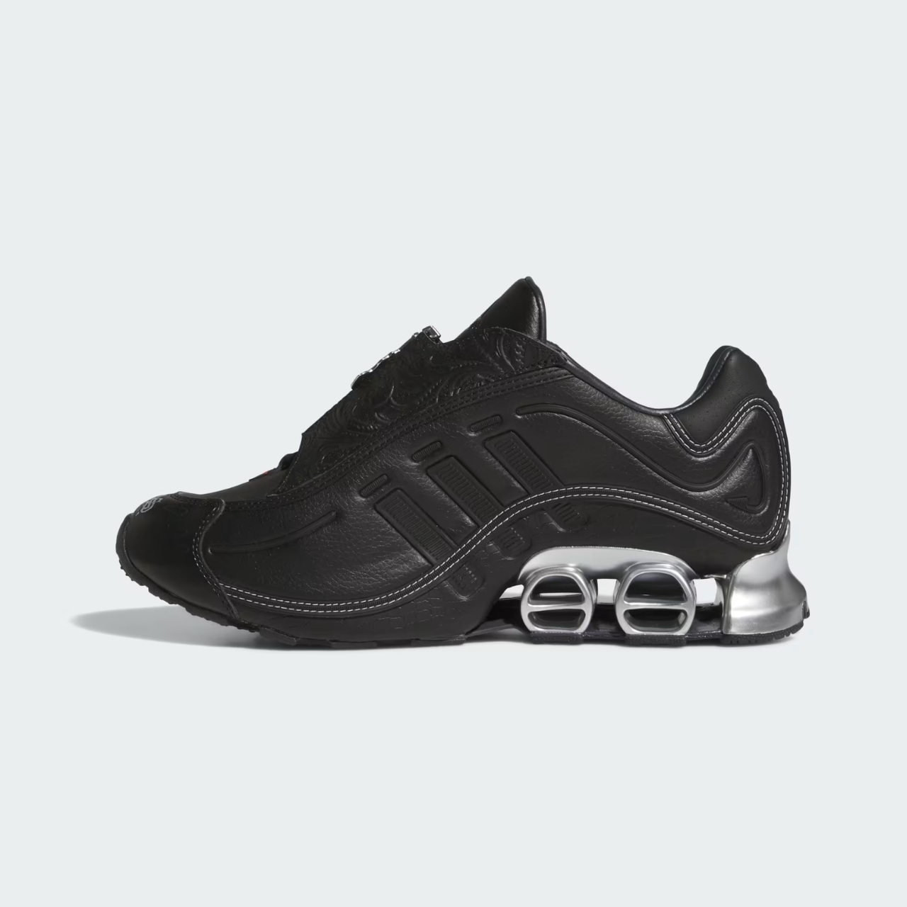
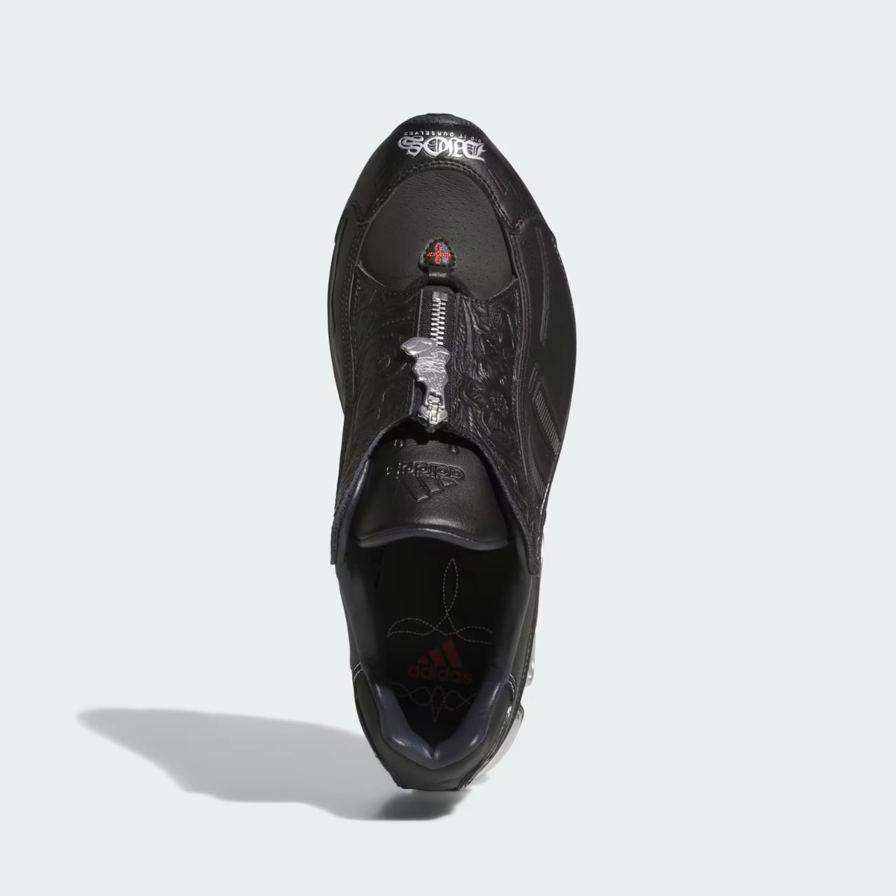
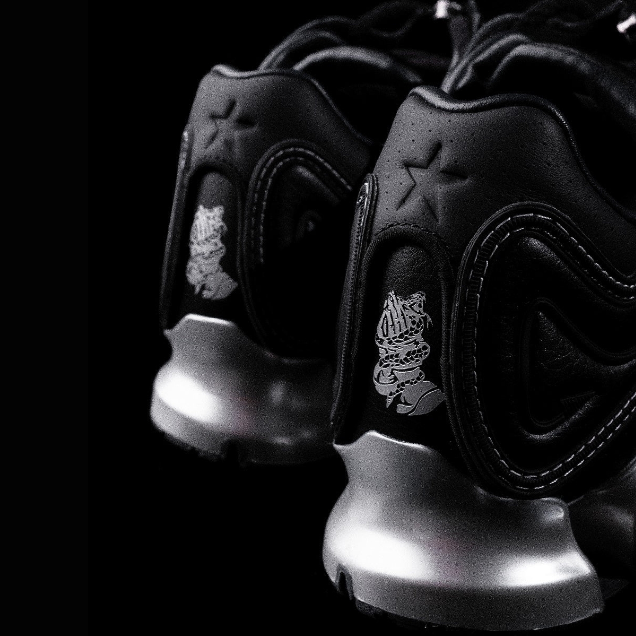
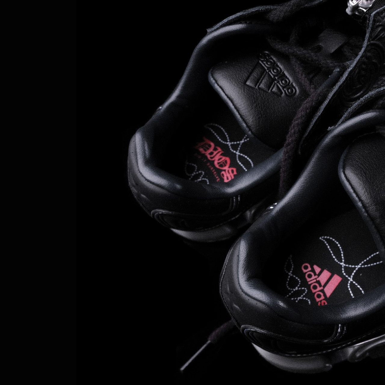
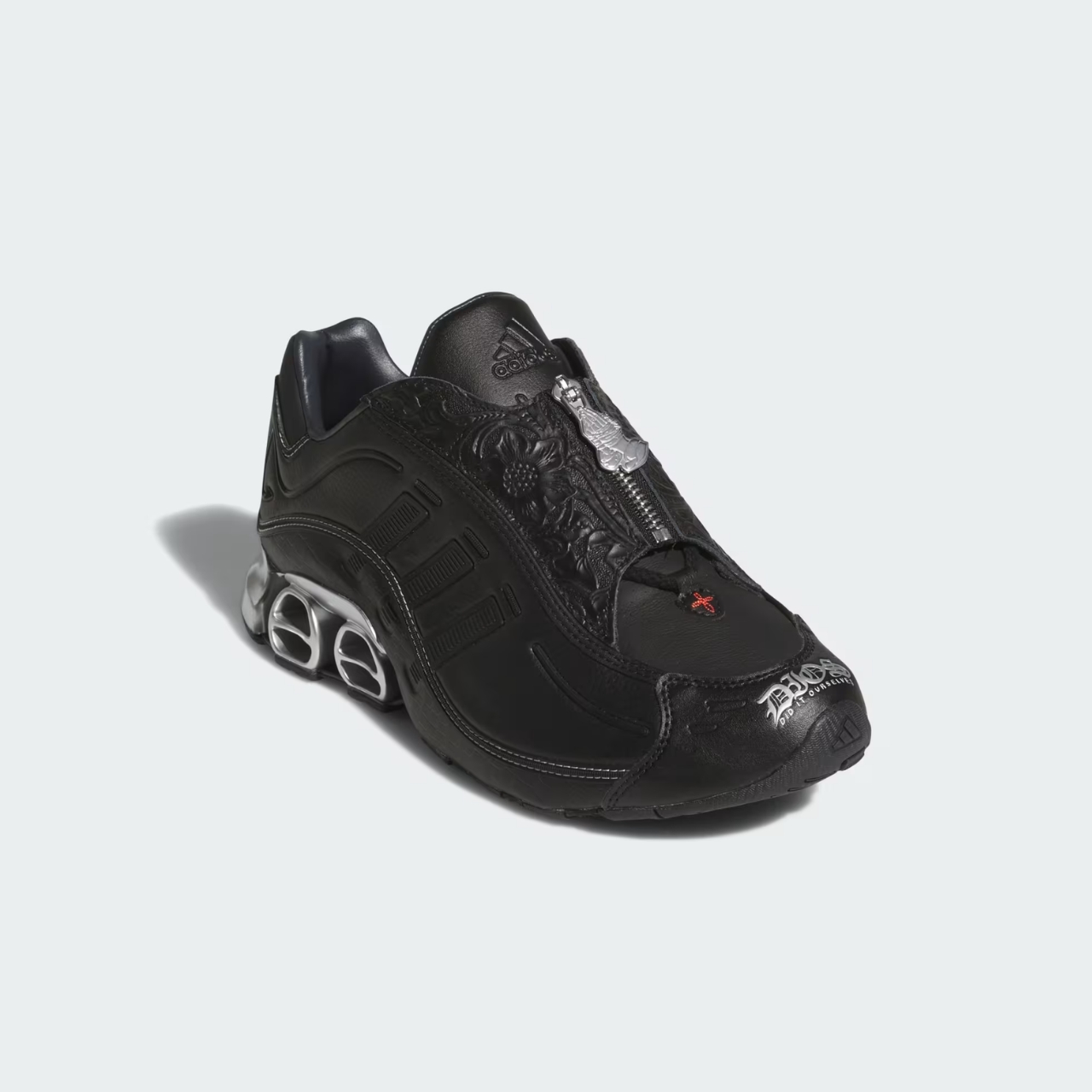
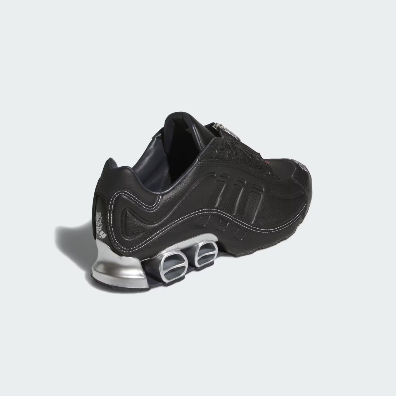
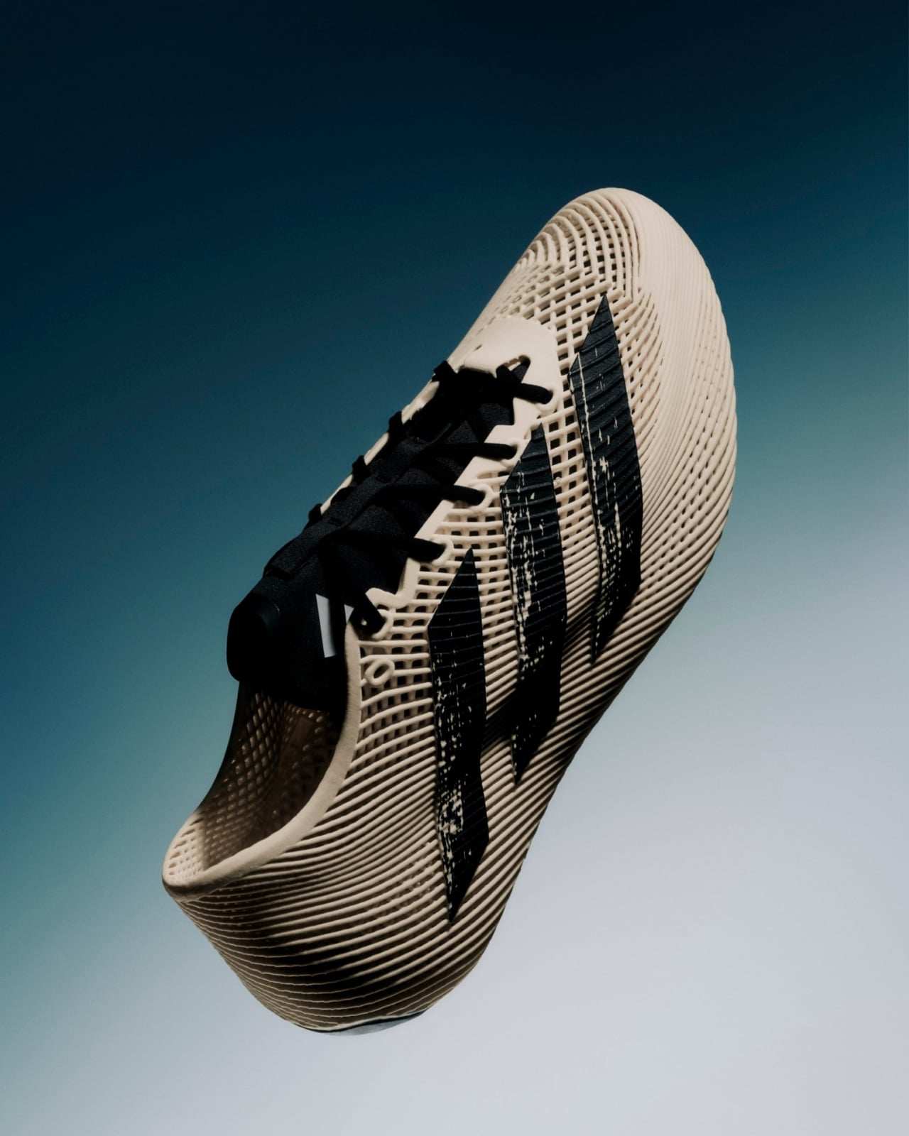
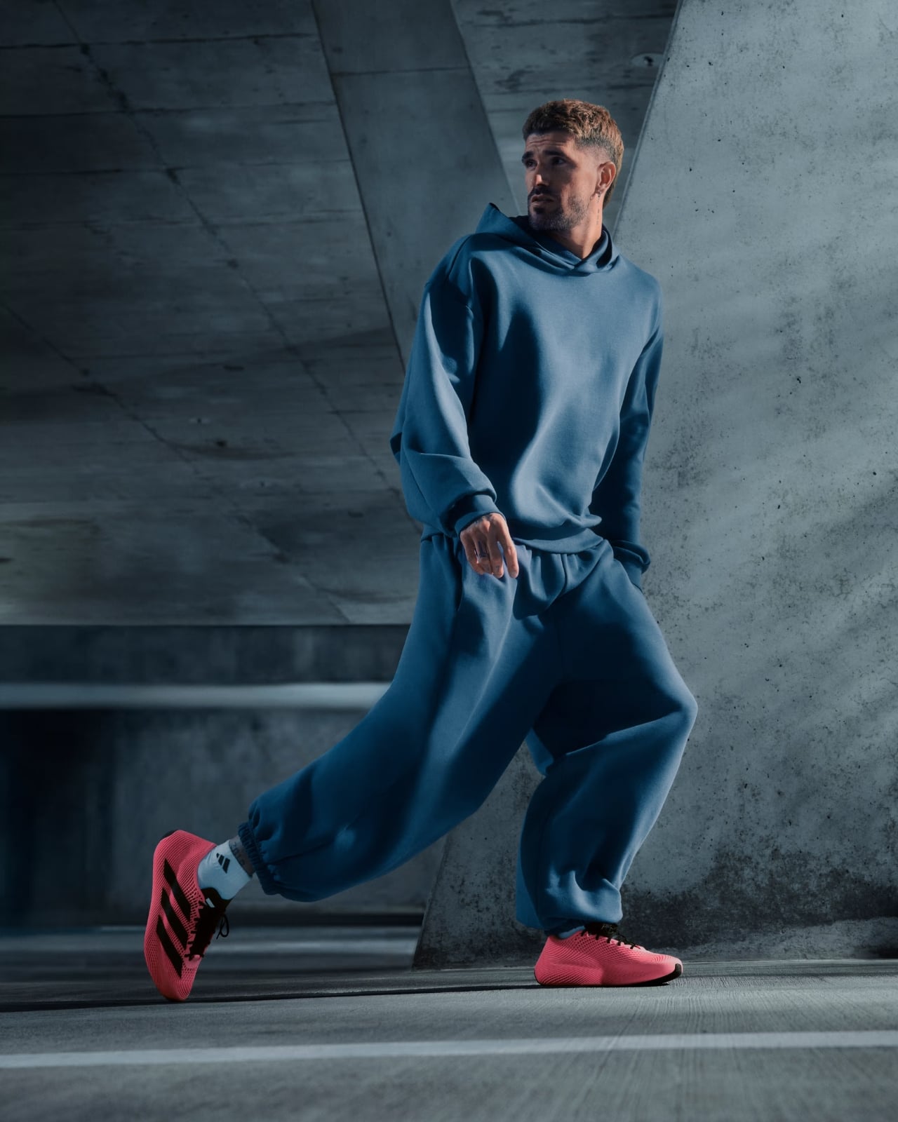
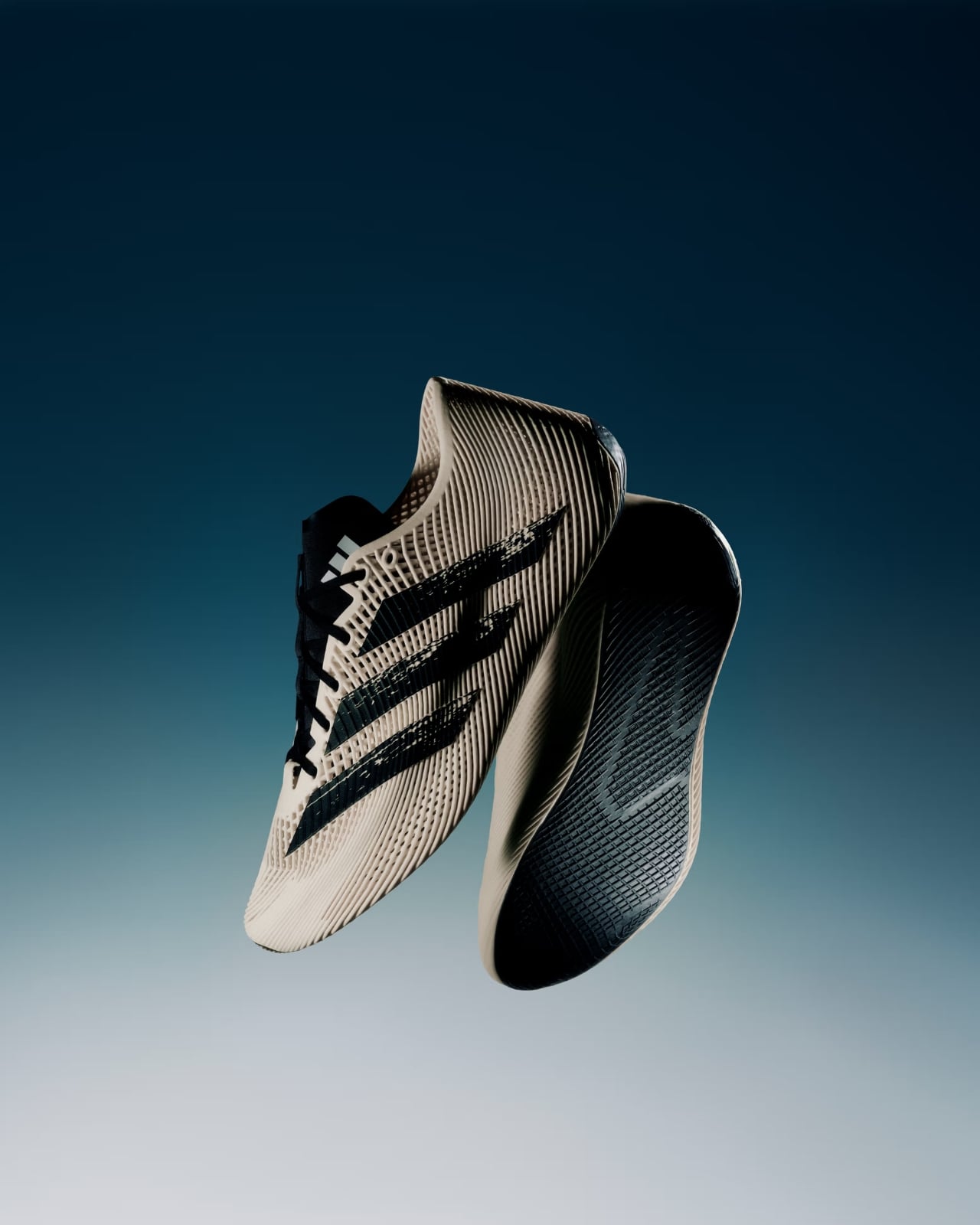
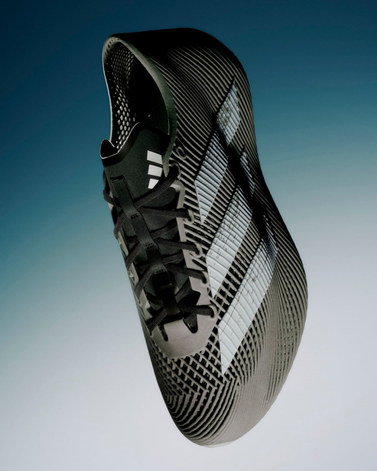
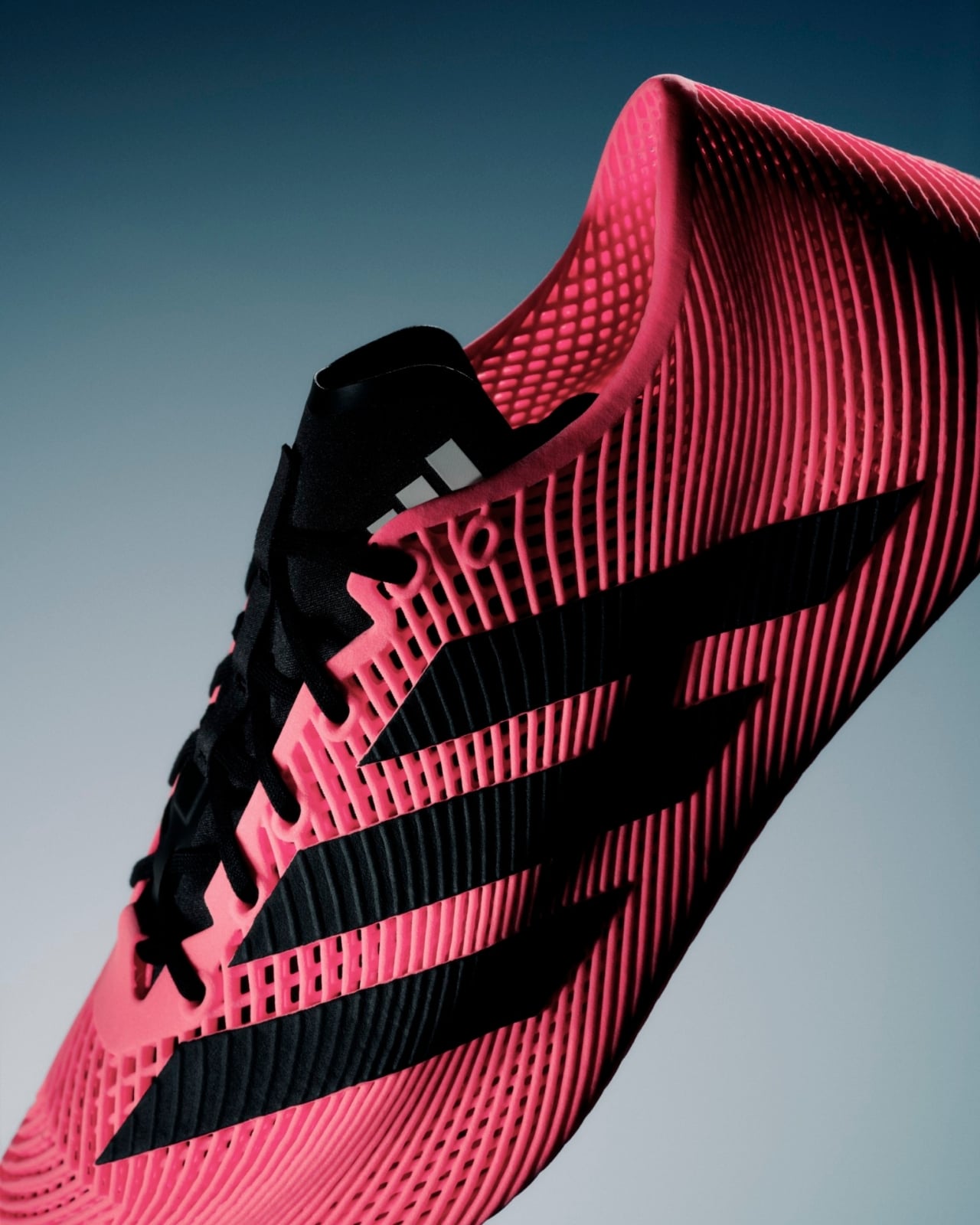
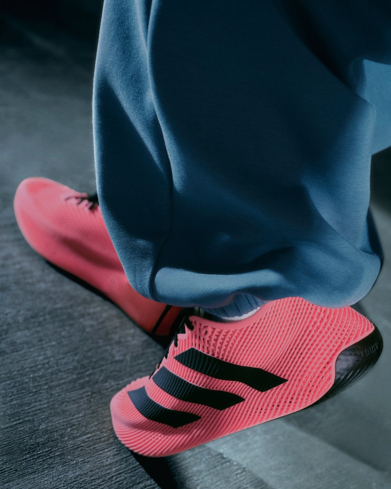
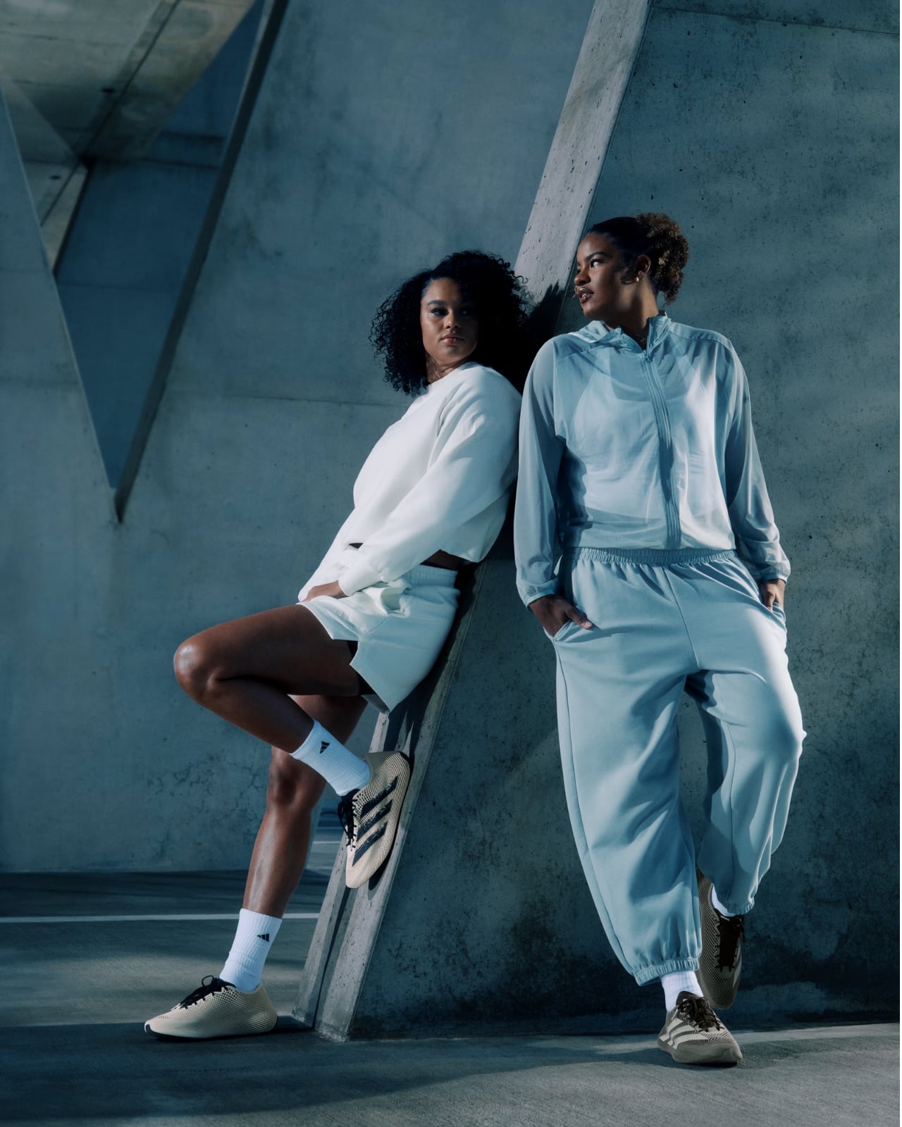
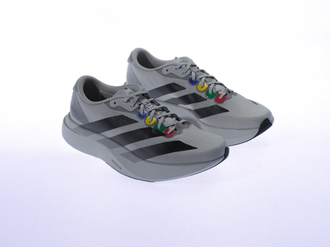
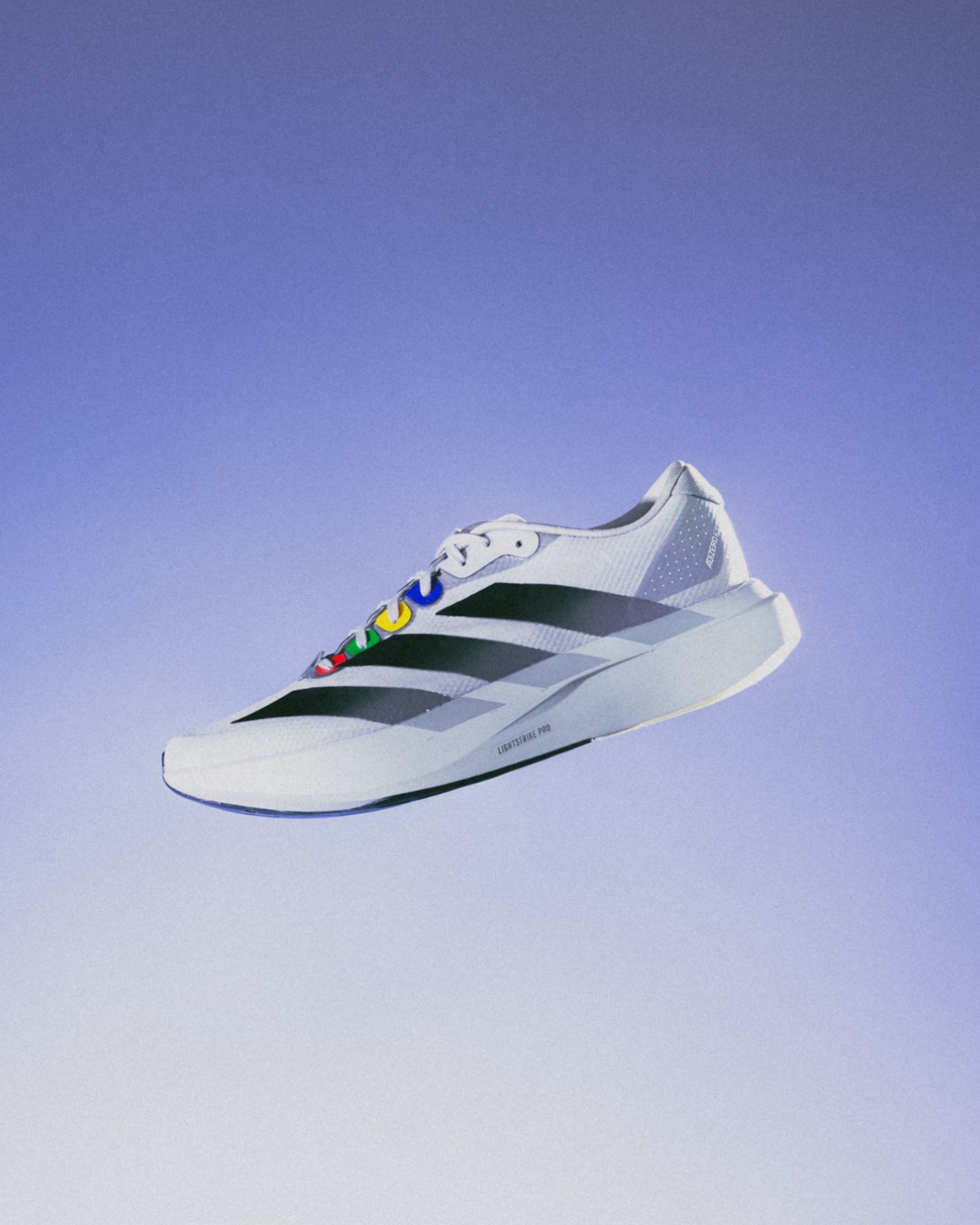
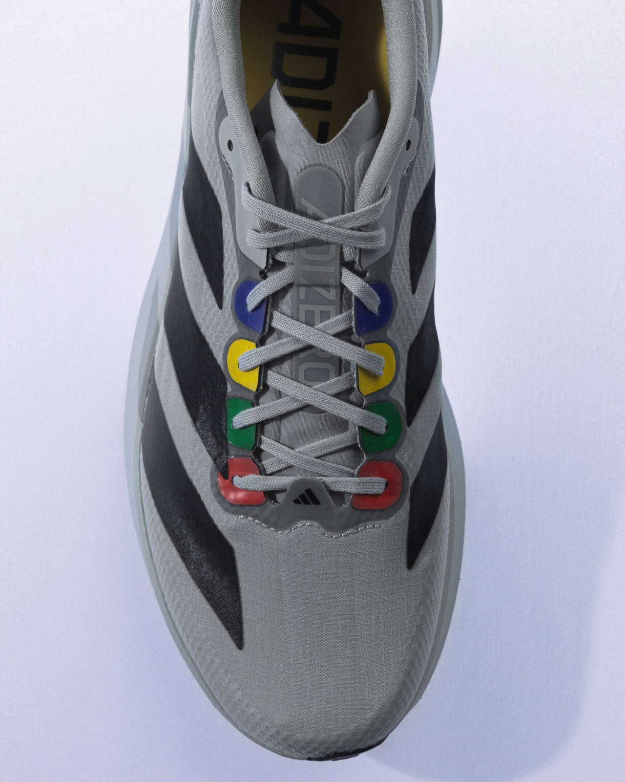
Somewhere between digging through a crate of old game cartridges and reaching for a solid pair of running shoes, Bangkok-based streetwear boutique CARNIVAL found its latest idea. The result is the CARNIVAL x adidas Adizero EVO SL “The Grey Console,” and it’s the kind of release that doesn’t need to try very hard to get your attention. It earns it.

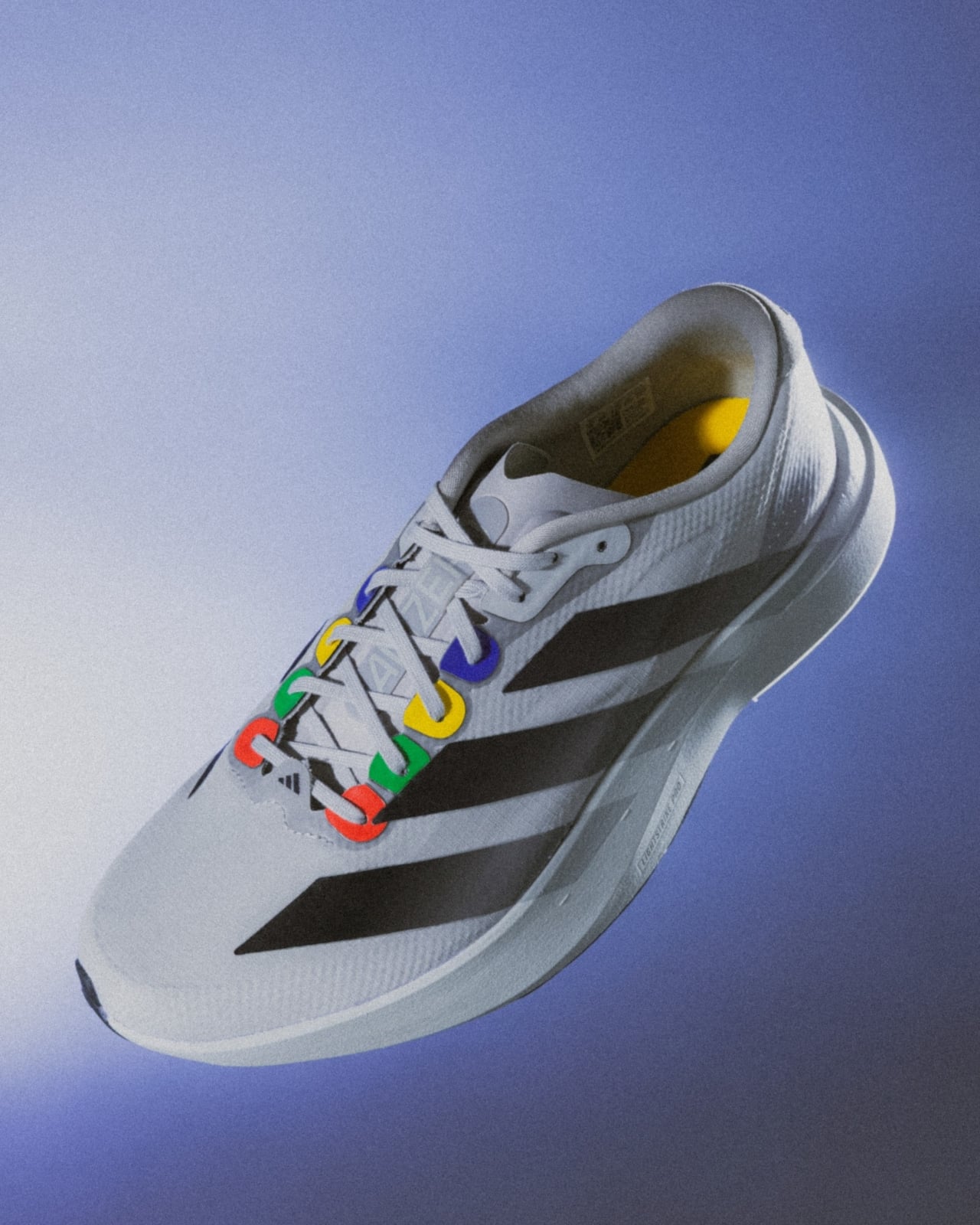
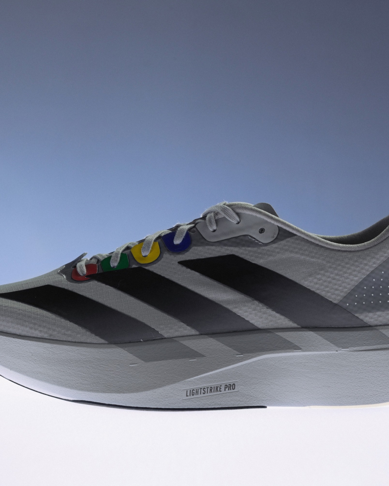
The concept is straightforward but well-executed: take the familiar grey shell of a retro gaming console, the kind that sat under your TV in the early 2000s, and translate that visual language onto one of adidas’ most capable modern runners. The grey mesh upper immediately reads like vintage hardware, the color of a Nintendo 64 or an original PlayStation left to age gracefully on a shelf. It’s industrial and a little utilitarian, but it also carries a specific kind of warmth that only nostalgia can give something.

Designers: adidas x Carnival

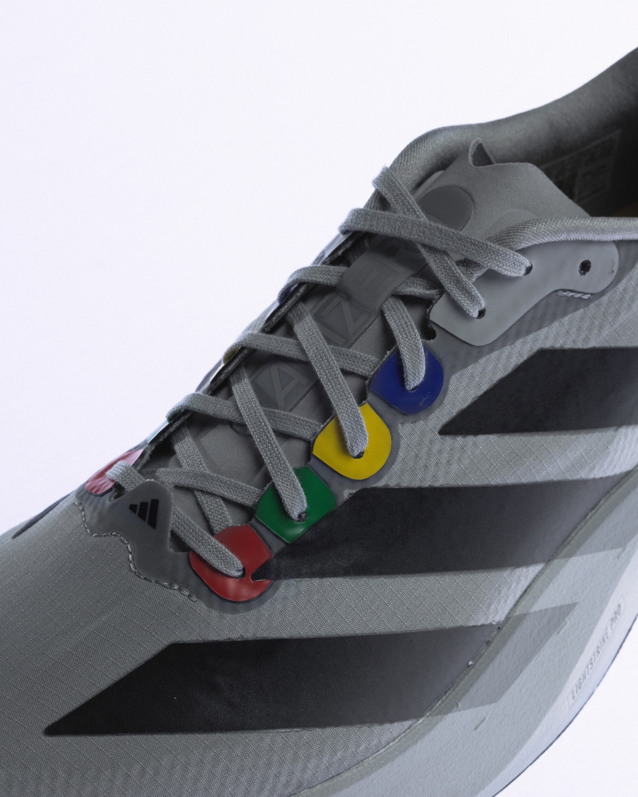
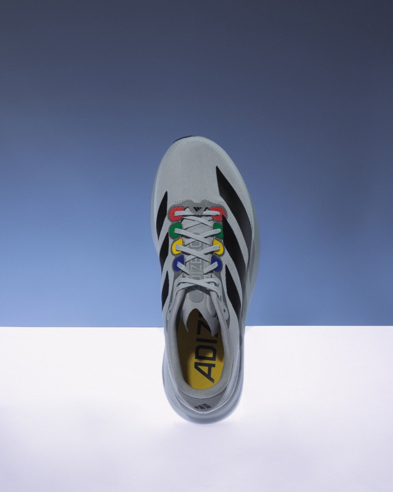
The real conversation starts in the details. The red, yellow, green, and blue accents scattered across the eyelets and branding aren’t subtle, but they don’t need to be. Those four colors are a shared visual memory for anyone who grew up with a controller in their hands. They’re shorthand for a specific era before streaming services and mobile gaming dominated everything, when plugging in a console felt like an event. CARNIVAL didn’t over-explain the concept. They trusted the design to speak, and it does.

What makes the execution particularly sharp is how disciplined the color placement is. The multicolor hits appear along the eyelets, surfacing only when you look closely. It rewards a second look. The grey mesh has a breathable, open texture that adds depth to the upper without overcomplicating the silhouette. The branding stays restrained, letting the colorway do the storytelling rather than relying on logos to carry the concept. The overall result is a shoe that reads as athletic from across a room and as a considered design object the moment you hold it.

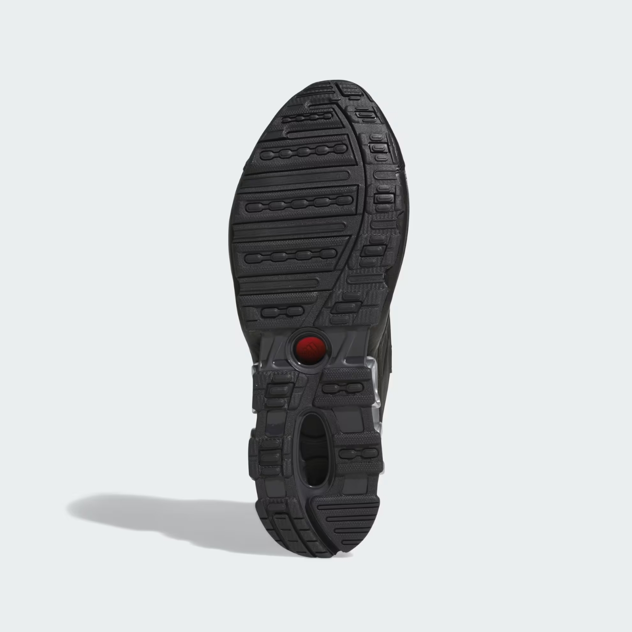
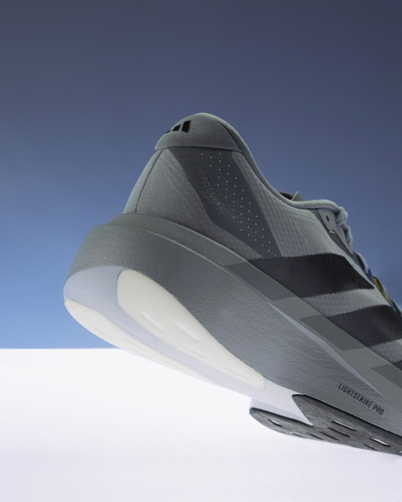
Performance-wise, the shoe isn’t riding purely on its references. The Adizero EVO SL runs on adidas’ LightStrike Pro foam, originally developed for elite race-day running. The midsole delivers a soft, responsive bounce without feeling excessive or gimmicky. A dimensional outsole structure aids weight transfer during a run, and the Continental™ Rubber at the forefoot adds traction that actually holds up. It’s a performance shoe doing exactly what a performance shoe should, just with a story attached to it.

That combination, a technically credible runner dressed in pure nostalgia, is what makes this collaboration feel earned rather than opportunistic. The EVO SL has built a strong collab roster with names like BAPE, Pharrell, and Hartcopy. CARNIVAL slots into that lineup not by screaming the loudest, but by being the most specific. The “Grey Console” concept doesn’t try to appeal to everyone. It targets a very particular person: one who played video games growing up, grew into someone who cares about footwear, and now finds those two worlds overlapping in a way that feels genuinely satisfying.

That specificity is exactly what separates a great collab from a forgettable one. Too many collaborations chase something broadly recognizable but ultimately hollow. The best have a point of view. CARNIVAL has always been good at this. As a Bangkok-based retailer with a loyal following across Southeast Asia, they consistently bring a cultural perspective that doesn’t feel assembled by committee. The Grey Console is personal, and that’s precisely why it lands.

At $170, it’s priced fairly for what it offers. The LightStrike Pro midsole appears in adidas race shoes that cost considerably more. You’re getting actual running capability here, not just a lifestyle silhouette with a compelling colorway bolted on. The shoe dropped on July 22, and sizes disappeared quickly. Whether a wider rollout is coming remains unclear, which makes the limited availability feel oddly appropriate for a concept this specific.

Some releases are designed to be everywhere. Some are designed for the person who immediately understands what they’re looking at. The CARNIVAL x adidas Adizero EVO SL “The Grey Console” is firmly the latter. That’s not a complaint. It’s a compliment.

The post adidas x Carnival’s $170 Sneaker Is a Love Letter to Retro Gaming first appeared on Yanko Design.
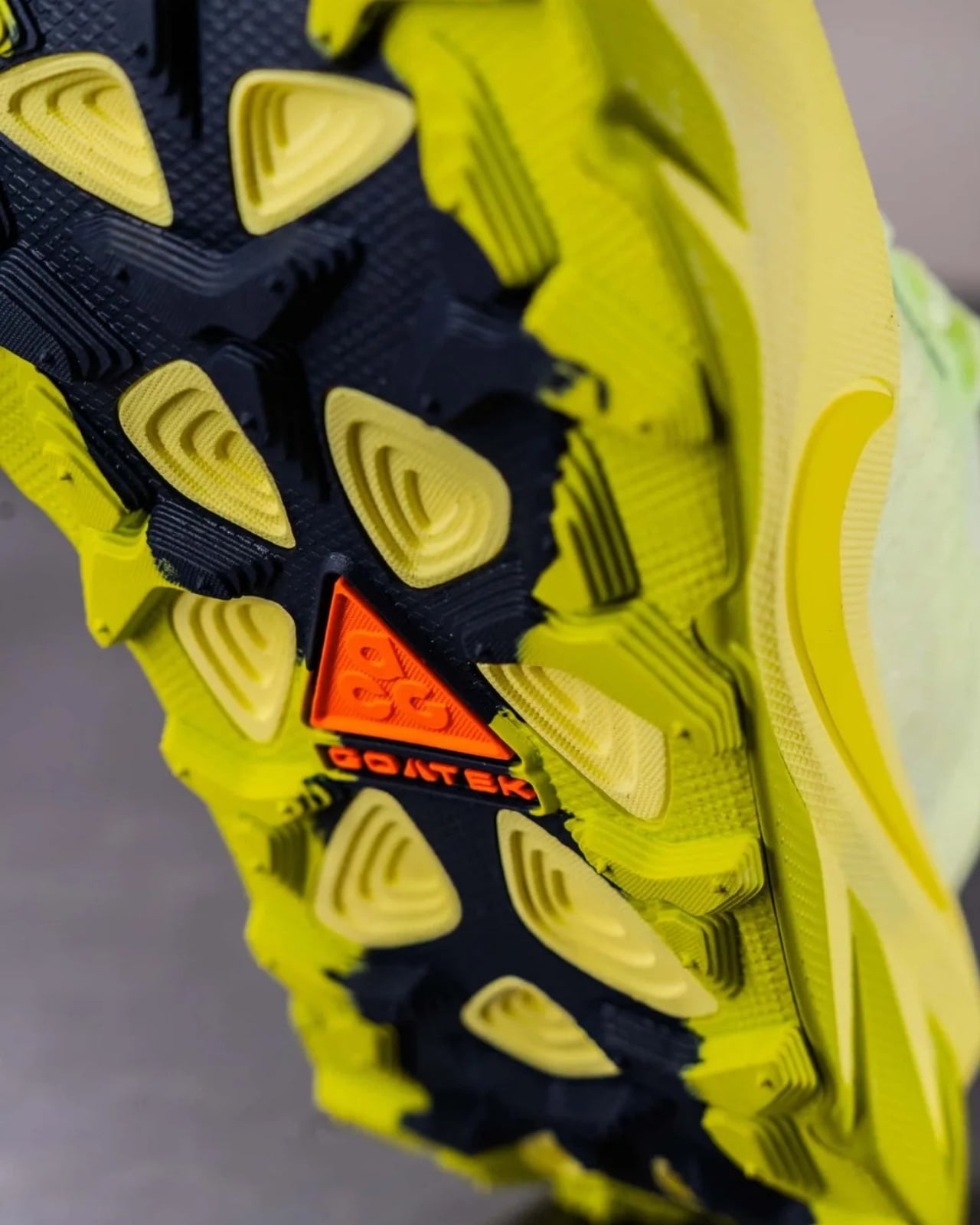
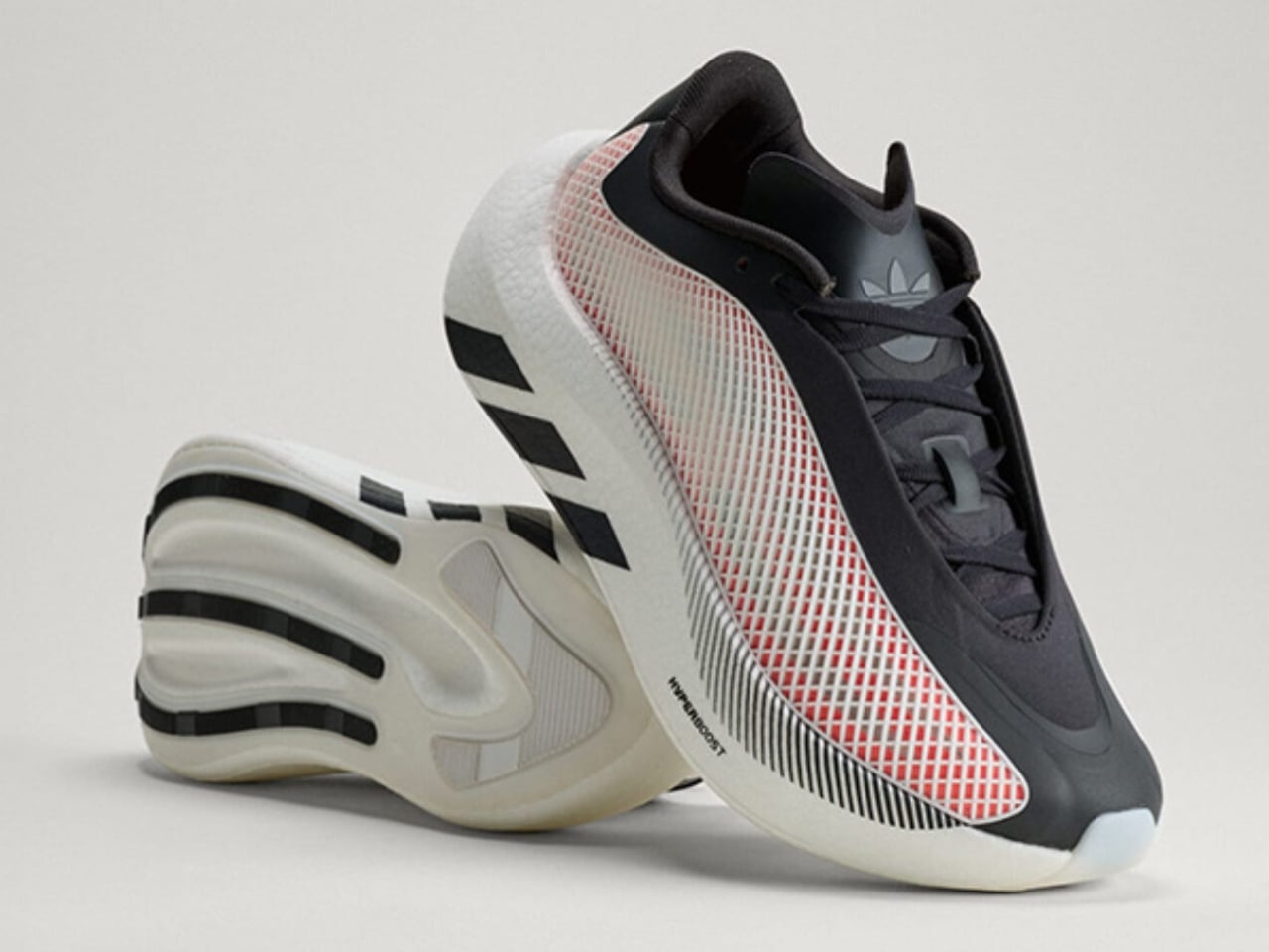
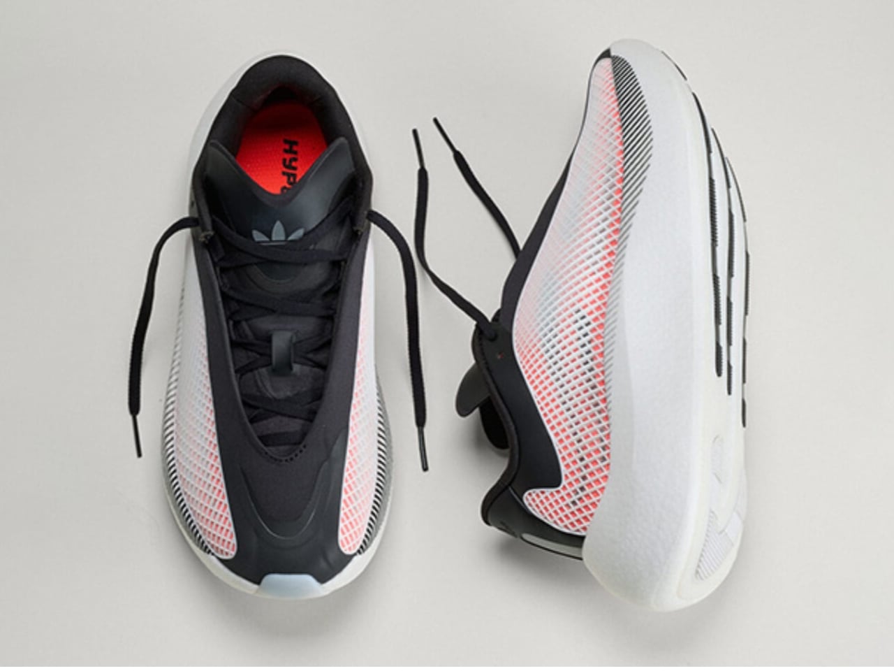
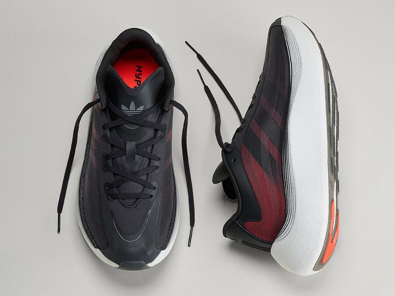
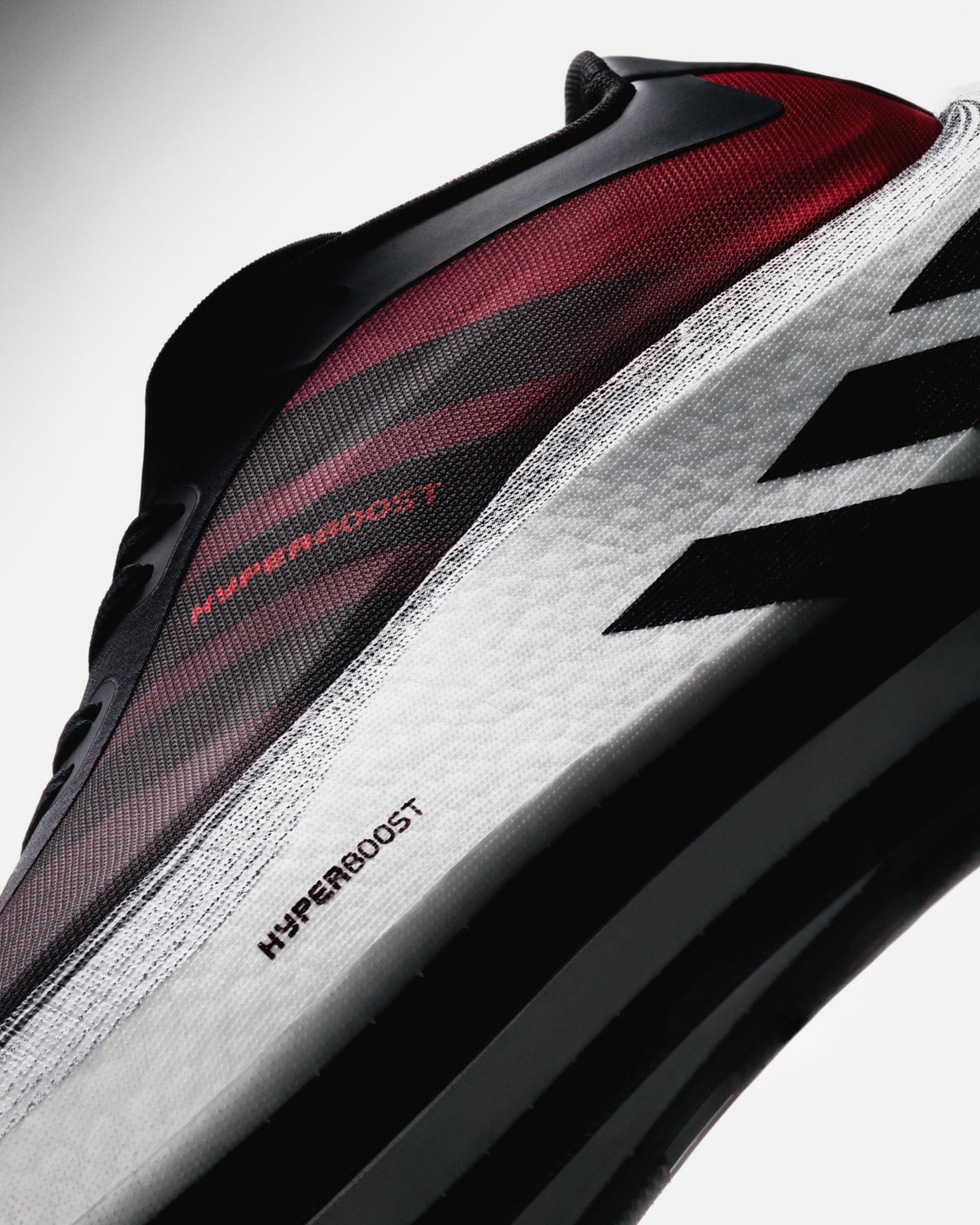
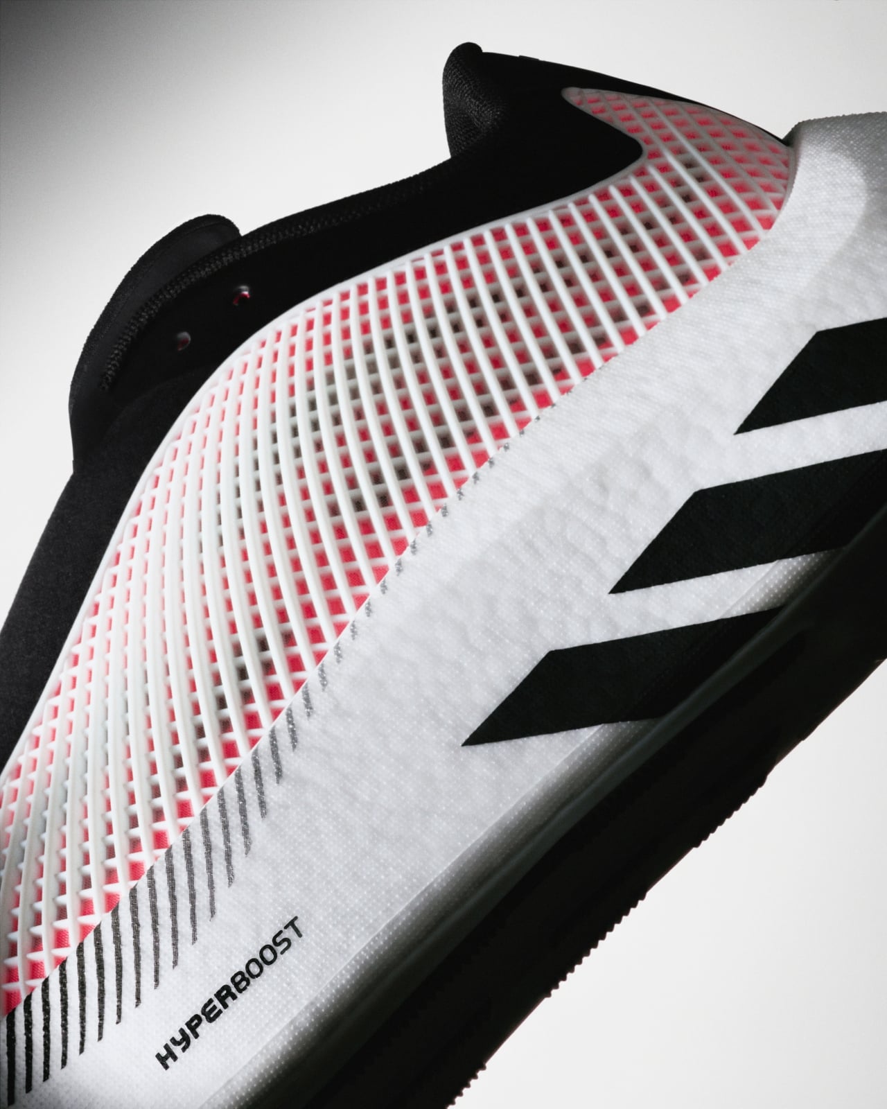
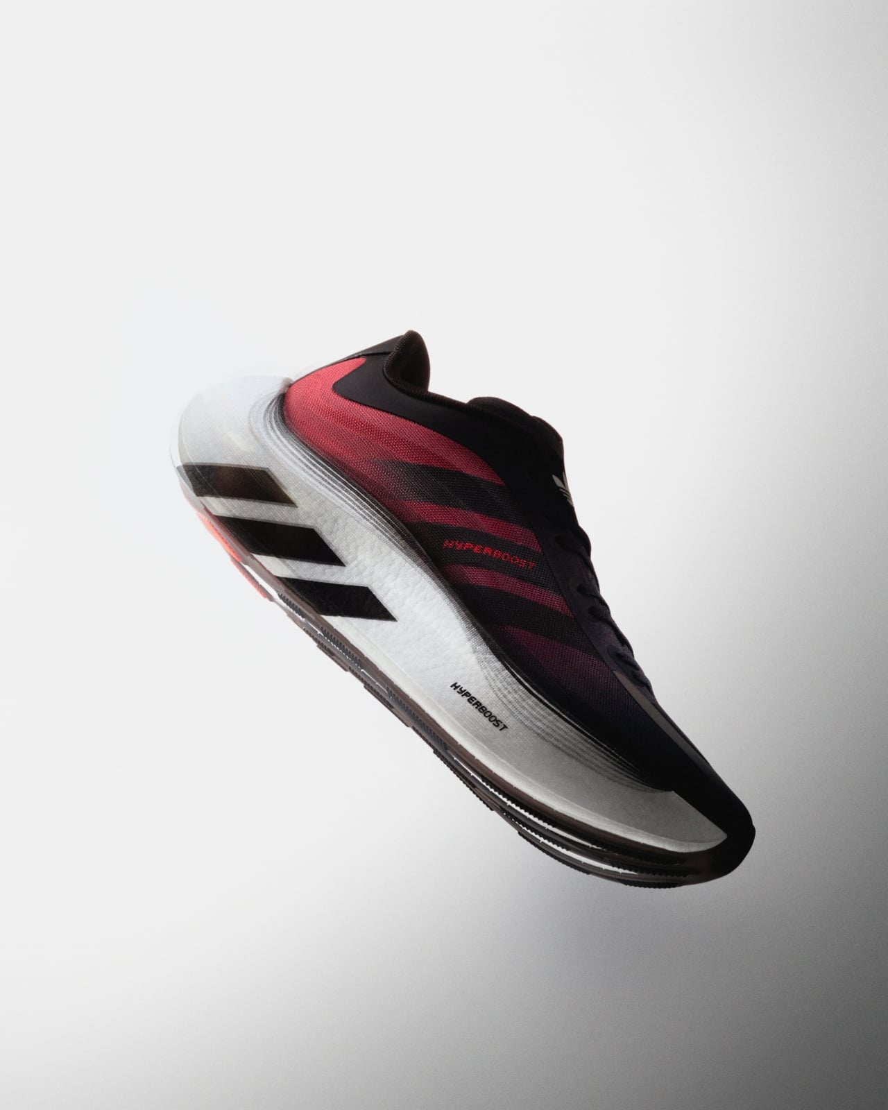
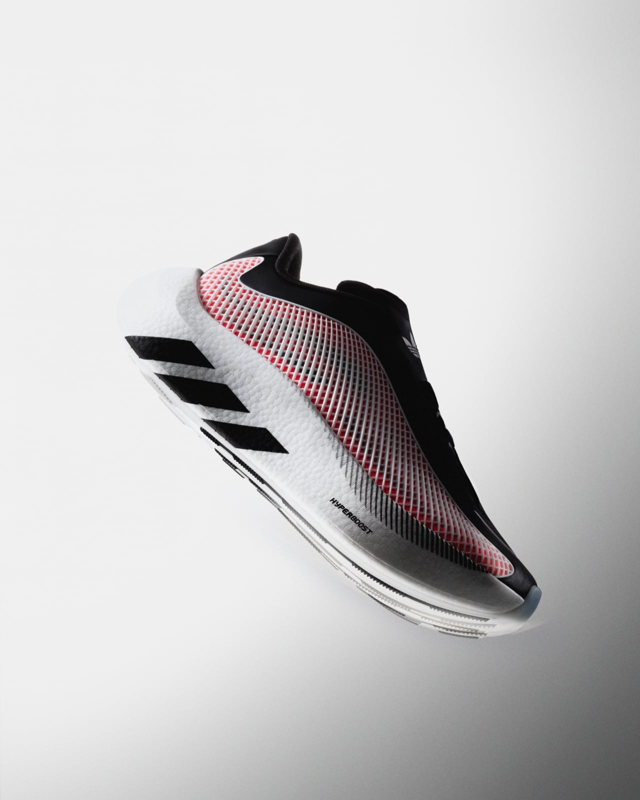
adidas Hyperboost Euphoria: The Foam That Outgrew the Track

Performance sneakers have a habit of making promises they can’t quite keep outside of the gym. They arrive looking like they were engineered on a space station, and the moment you wear them to brunch, you realize the rocker sole is pushing you forward like you’re perpetually late for a sprint. adidas knows this tension well, which is probably why the Hyperboost Euphoria exists.

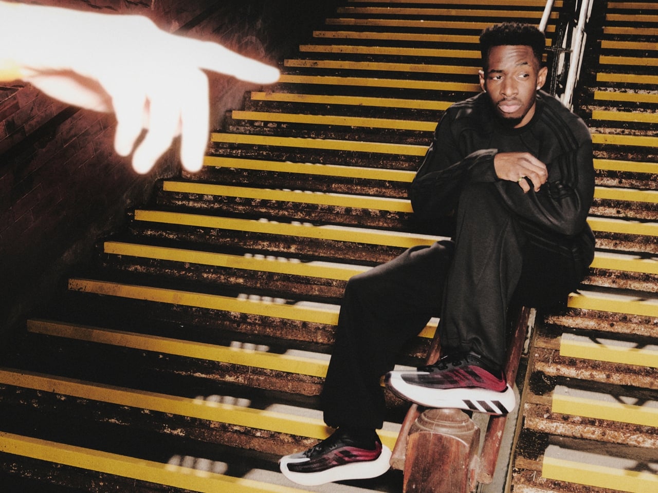
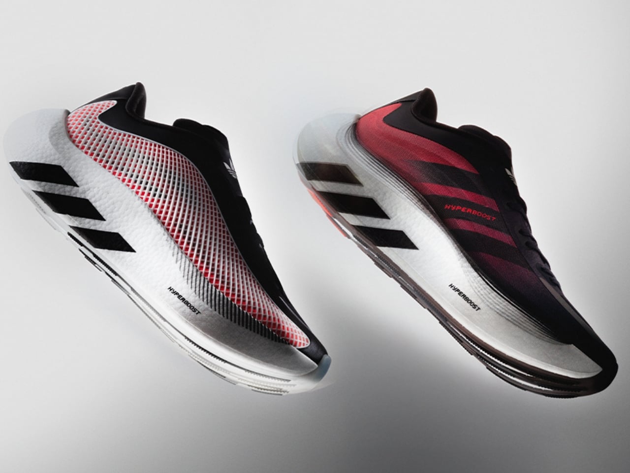
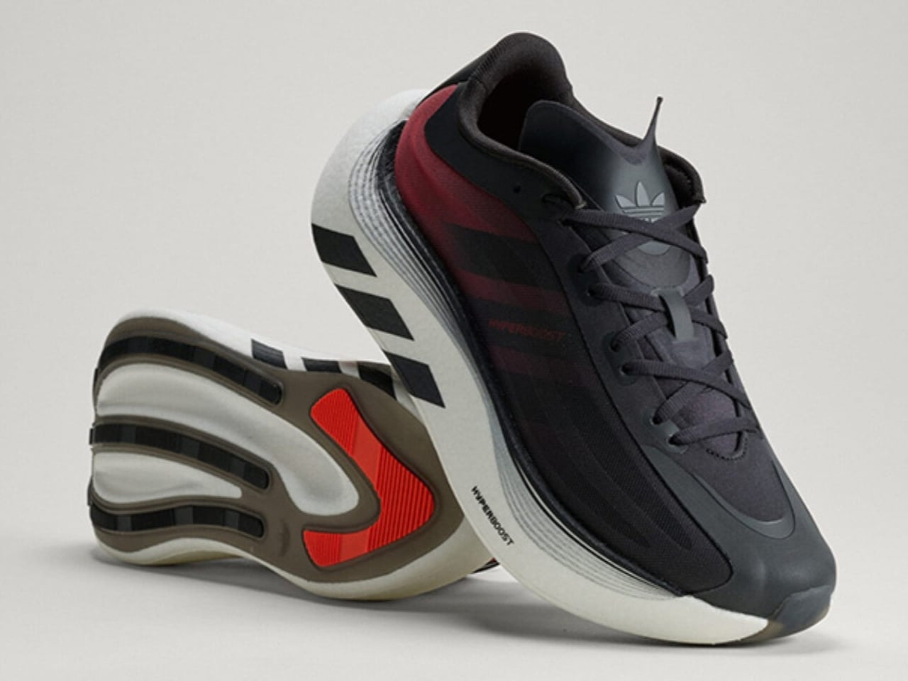
The Euphoria is the lifestyle sibling of the Hyperboost Edge, the performance running shoe adidas dropped in March. Where the Edge was built for the track, the Euphoria is built for the life you actually live, the one that involves a lot of walking, standing, sitting in cafés, and occasionally jogging for a bus. adidas pulled the same Hyperboost cushioning technology, the pebbled supercritical foam that made the Edge genuinely exciting, and reworked everything else around it. The midsole is carved out to save weight. The stance is wider. The heel extends out. The rocker is intentionally dialed back so the shoe doesn’t feel like it’s trying to propel you somewhere you didn’t ask to go. The result is a platform that is stable and grounded in a way that actually makes sense for daily wear.

Designer: adidas

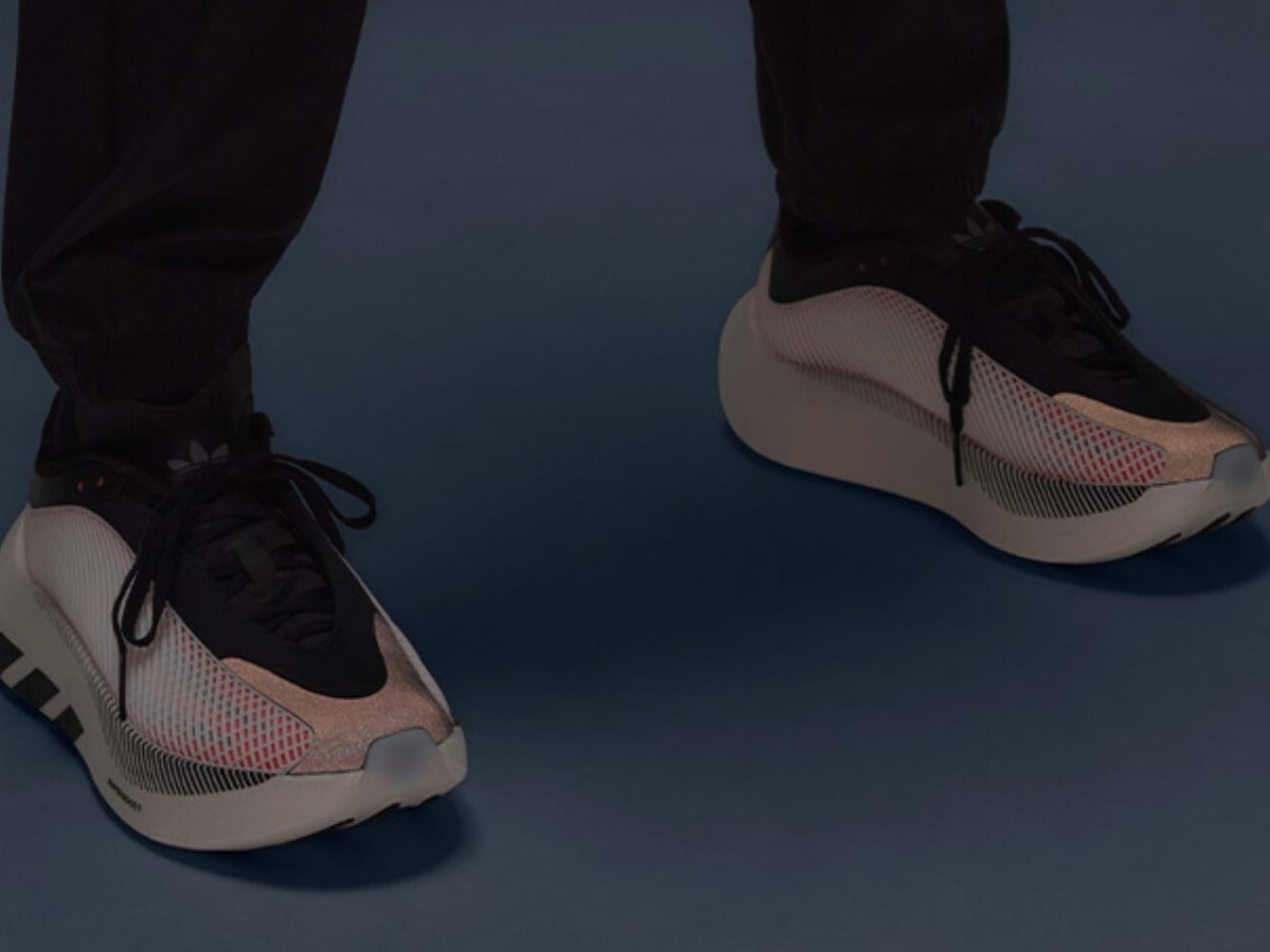
The upper is where things get interesting from a pure design standpoint. A large TPU net structure wraps the sidewalls, giving the silhouette a kind of exoskeleton quality that reads as technical without being loud about it. The semi-transparent nylon material plays against the structured cage nicely, hinting at the construction underneath. adidas also swapped out the mountain logo on the tongue for the Trefoil, a small but deliberate move that signals exactly what this shoe is: an Originals product, not a performance one. It is the kind of detail that only obsessives notice, and yet it matters.

There is an argument to be made that adidas is exceptionally good at this particular move, taking foam technology born in performance and migrating it into lifestyle. The Boost lineage did it. The 4D midsole has done it. The Hyperboost is following that same arc, and it makes sense commercially and creatively. If you develop something genuinely good, you eventually want it to live in more places.

The Euphoria has also already been spotted off the pitch on Jude Bellingham, Lionel Messi, and Pedri during the FIFA World Cup. That kind of high-profile visibility is not accidental, and it reinforces the positioning. adidas is clearly not treating this as a minor side release.

Colorway-wise, the launch lineup covers blue, black, and white, an all-black option, white and black, and a red that carries the same energy as the more expressive iterations. Bold but not chaotic, which tracks with the overall aesthetic of the shoe.

What I keep thinking about is how the sneaker market has recalibrated around comfort in a way that would have seemed overcorrected a decade ago. The chunky foam wave came, peaked, and landed somewhere permanent. Consumers who once wanted flat, minimal silhouettes are now completely comfortable in a stacked platform, and brands like adidas have gotten very good at making that stack feel intentional rather than excessive. The Hyperboost Euphoria does not feel like a compromise between performance and lifestyle. It feels like a shoe that was designed for exactly where it ended up.

Ilka Liebmann, VP of Design Footwear at adidas Originals, described it best: the shoe was created for those who embrace a sport-inspired lifestyle, people who prioritize spontaneity, comfort, and energy, and let movement lead them. That framing is a little aspirational by nature, but it is also accurate to the product. The Euphoria wears confidently. It does not demand context. You could pair it with technical trousers or track pants or denim and the shoe holds its own across all three.

adidas has made a genuinely considered thing here, and it lands at a moment when the performance-to-lifestyle pipeline feels more refined than ever.

The post adidas Hyperboost Euphoria: The Foam That Outgrew the Track first appeared on Yanko Design.
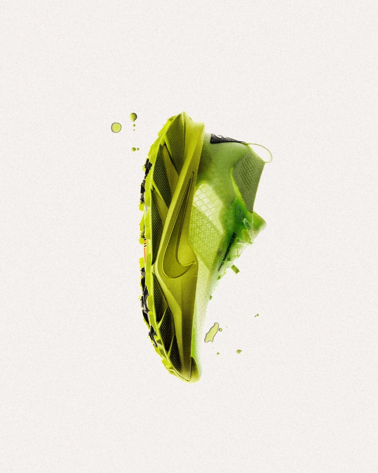
Merrell Just Made Hiking Shoes That Look Like They’re Alive

The shoes that make you look twice usually have a story behind them. The Merrell x P.A.M. (Perks and Mini) collaboration is that kind of story, and it starts, surprisingly, in a swamp.

The Australian creative label Perks and Mini teamed up with Merrell to explore two silhouettes you already know: the Chameleon and the Hydro Moc. But the brief wasn’t to simply freshen them up with new colorways or slap a logo on the tongue. The directive was weirder and much more interesting than that: explore amphibian life through form, texture, and function. The result is the Cham Storm GTX and the Hydro Next Gen Moc, two shoes that feel like they were designed at the intersection of a nature documentary and a design school thesis.

Designers: Merrell x P.A.M. (Perks and Mini)

I’ll start with the Cham Storm GTX because it’s the one I keep staring at. The engineered mesh upper gets a custom 3D silicone treatment that reads, unmistakably, as reptile skin. Not in a costume-y way, but in a way that feels considered and intentional, like the design team spent real time studying scale patterns before drawing a single line. A rough sand spray finish adds another layer of texture, and the molded TPU heel counter keeps the whole thing structurally anchored. Underneath all that visual storytelling is a FloatMax foam midsole and Gore-Tex waterproof technology, which means this shoe isn’t just doing aesthetic work. It can handle rain, trails, and whatever else you decide to put it through. The toggle quick-lace system makes getting in and out effortless, which is a small detail but one that matters when you’re moving quickly between environments.

The Hydro Next Gen Moc takes a softer approach. Where the Cham Storm is textured and almost aggressive in its visual language, the Hydro Moc leans into speckle. The EVA foam upper carries a speckled pattern with flecked sidewalls that reads less like armor and more like a frog’s underbelly, in the most complimentary possible way. It’s still loaded with FloatMax foam cushioning, and the easy on/off design makes it the kind of shoe you’ll reach for on days when you need to move from the house to the street to somewhere else without thinking too hard about your feet. The weight barely registers.

What makes this collaboration feel different from the usual outdoor-brand-meets-streetwear-label formula is the conceptual rigor behind it. P.A.M. didn’t just bring an aesthetic direction; they brought a worldview. Amphibious creatures exist in a perpetual in-between state, equally at home on land and in water, which is exactly the kind of cultural positioning that resonates right now. The boundaries between outdoor gear and everyday style have been dissolving for years, and the Merrell x P.A.M. shoes lean into that rather than apologizing for it.

Merrell has always been a brand that lives and dies by its performance credibility. Adding Gore-Tex to a shoe that could easily have coasted on aesthetics alone is a deliberate statement. It’s saying the design and the function are non-negotiable, and that you shouldn’t have to choose between looking interesting and being properly equipped for the day.

The broader conversation this drop enters is about what outdoor footwear is allowed to be. For a long time, “technical” meant beige, and “style-forward” meant sacrificing waterproofing. The Merrell x P.A.M. collaboration doesn’t accept that trade-off. It asks whether a shoe can be inspired by a chameleon, built for wet conditions, carry the creative vision of an independent Australian label, and still be worth wearing on a Tuesday afternoon when nothing remotely swamp-like is happening. The answer, based on what Merrell and P.A.M. put together, is yes.

The Cham Storm GTX and Hydro Next Gen Moc are both available now. Whether you’re buying them for the design, the function, or just the sheer novelty of wearing something that nods to a salamander, they’re worth a closer look.

The post Merrell Just Made Hiking Shoes That Look Like They’re Alive first appeared on Yanko Design.
New Balance’s 3-in-1 modular shoe transforms from waterproof boot to camp slipper, so you pack less

Many of us would remember the New Balance Niobium Concept 1. Launched back in 2020, the modular silhouette really reformed outdoor footwear with its multi-functional design, which allowed it to be used in more than one way. Of course, many brands have been approaching modular footwear design with the idea of a circular economy in mind, where the shoe can be taken apart for recycling convenience. However, New Balance’s approach is different.

It is working on a pair of shoes that can actually pull off not two but at least three different purposes. This was substantiated by the Niobium Concept 1, which is now flowing as inspiration into the newly launched New Balance TDS MSNB1, which offers similar capabilities but in a new form and colors.

Designer: New Balance

A bold intersection of craftsmanship, innovation, and functionality, the TDS MSNB1 is a revival of the Niobium Concept 1, pulled off in partnership by New Balance and Tokyo Design Studio Revive. The remarkable New Balance adaptability of the silhouette is retained with the addition of Tokyo Design Studio’s signature lifestyle aesthetics to form this shoe that changes shape in “three distinct stages of wear.” It can be worn as a rugged waterproof boot and become a functional outdoor mule when required. When you finally retire to the cozy comforts of the camp, it can also be used as a comfortable indoor slipper.

The modular nature of the TDS MSNB1 is ensured by the use of a specialized system of zippers that run down the tongue and around the heel. These zippers allow the wearer to easily assemble or disassemble the shoe’s components according to the activity or the time of day.

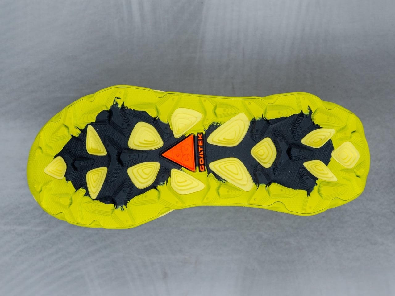
New Balance TDS MSNB1 modular silhouette is available in two colorways. While the TDS MSNB1 Zinc Blue is somewhere close to the tested territories, the Pistachio Butter colorway – in a muted yellow-green – is more enticing and distinct. Both the versatile shoes share the same design language. They comprise a stretch rip-stop upper, a neoprene collar, and welded PU overlays. The tongue is devoid of usual laces and features bungee elastic laces inside, while a zipper runs down the side of the tongue and around the heel.

For its durability as a camping boot, it features an eVent waterproof membrane and a rubber outsole for comfort. Since the design and functionality remain the same, your choice of color is what can make the difference between the two new offerings. You can make up your mind now. The New Balance TDS MSNB1 in both colorways is available starting today, July 2, with each costing $300.

The post New Balance’s 3-in-1 modular shoe transforms from waterproof boot to camp slipper, so you pack less first appeared on Yanko Design.

BAPE x adidas Just Dropped the World Cup Collab No One Expected

World Cup fever is still very much here and while most brands scramble to slap national flags on whatever they can find, adidas Originals and BAPE® took a very different road. Their latest collaboration for FIFA World Cup 2026 doesn’t just dress you for the occasion. It makes a case for why football culture and street culture were never really separate to begin with, and it does so through some of the most deliberately designed pieces either brand has produced together.

The collection splits into two sets: Home and Away. That familiar football divide becomes the entire creative brief here, and both sides carry it out with real conviction. The Home Set draws from a green, red, and blue Trefoil ABC Camo palette inspired by the World Cup host nations, and looking at the jersey up close, it earns every bit of that boldness. The body runs ABC Camo in blue and green, the raglan sleeves come in red with white adidas Three Stripes, and the whole thing is anchored by a gold BAPE crest badge at the chest. It’s loud in exactly the right way, like something designed to be spotted from three rows back in a stadium. The Away Set takes a gray, gold, and pink Trefoil ABC Camo palette for a more tonal result. The grey camo runs across the entire body, broken up by gold Three Stripes at the shoulders and flashes of yellow and pink at the sides. It’s the quieter of the two, but quieter is relative when BAPE’s involved.

Designers: adidas x BAPE

Both jerseys share the same Teamgeist base, which brings a mid-2000s football silhouette into the picture. The curved panelling and construction feel genuinely archival, not in a nostalgic way, but in the way that certain shapes simply never stopped working. Tucked into the details are BAPE STA™ branding on the chest, the number 93 referencing the year the Japanese brand was founded, and a release-specific code “2W0G2M6” inscribed on the lower back. Those kinds of details matter. They’re the difference between a collab that’s worn and one that’s kept.

Then there are the shoes, and the shoes might be the real story. The EVO SL follows a deliberate mismatched design formula, with the Home colorway dressing the left shoe in pine green and the right in royal blue. BAPE’s ABC camo appears on the red shoelaces, the tongue, and sockliners, while a white Lightstrike Pro midsole sits below. The Away colorway takes a completely different approach. The right shoe runs in sky blue with BAPE’s Shooting Star on the lateral, the left goes pink with the Three Stripes taking the lead, and ABC camo hits the laces, collar, and liner on both shoes with gold accents running through the branding details. The bilingual touch is one of my favorite things about the Away pair specifically: “A Bathing Ape” appears across alternate feet in English and Japanese, which feels like a genuinely considered design decision rather than a detail added at the end.

The mismatched format is worth sitting with for a moment. Sneaker collaborations usually play it safe by keeping both shoes identical. Choosing to make each foot its own thing is a creative risk, and it pays off because it mirrors the home-away split of the collection itself. You’re not just wearing two colors, you’re wearing a concept.

The Home set is only available in North America and Latin America, while the Away set is available worldwide, excluding those regions. That regional exclusivity adds another layer to the storytelling, making geography part of the design language.

BAPE® and adidas have been at this since 2003, which means they’ve had more than twenty years to develop a shared creative vocabulary. You can feel that here. Neither brand is overexplaining itself or trying to dominate the other. The ABC Camo sits comfortably inside the Teamgeist template. The BAPE STA lives naturally on the EVO SL’s lateral. Two very distinct design languages, sharing space without either one losing its voice. At $200, the shoes aren’t a casual purchase, but as a design object tied to a specific cultural moment, they make a strong case for themselves.

The post BAPE x adidas Just Dropped the World Cup Collab No One Expected first appeared on Yanko Design.
Adidas Finally Made the $150 Shoe Gym Rats and Runners Need

Most gym bags tell a story. For hybrid athletes, that story usually includes at least two pairs of shoes: one for running, one for lifting, and a creeping sense that neither is ever quite right for the moment you need it most. It’s the kind of inefficiency that gets quietly accepted because, until recently, no one had built a convincing alternative. Adidas has apparently decided to change that.

The Adizero Dropset Pro, launched on June 17, is the brand’s most aggressive answer yet to the hybrid training problem. It pulls technology from two of Adidas’s strongest lineages, the speed-obsessed Adizero racing series and the stability-focused Dropset training franchise, and merges them into a single shoe priced at $150. On paper, that sounds like the kind of thing every sneaker company promises. In practice, the details suggest Adidas might actually mean it this time.

Designer: adidas

Start with the midsole. Lightstrike Pro foam, the same cushioning technology found in Adidas’s elite racing shoes, sits at the core of the Adizero Dropset Pro. It’s lightweight and responsive, built for forward momentum, which is exactly what you need when you’ve just finished a set of deadlifts and you’re heading into a 1K run. Energy Rods run through the midsole for propulsion, pushing you off the ground with the kind of efficiency that shaves seconds off your transitions without requiring you to think about it.

The outsole is where the gym training credibility lives. Continental rubber, paired with Adidas’s Lighttraxion system, handles grip on both wet track surfaces and gym floors with equal reliability. A heel that holds steady during squats and wall balls while a midfoot and forefoot that responds during speed work is not a simple engineering ask, and the fact that Adidas addressed both in the same build is the real story here. A 2.6mm Adizero sockliner keeps the platform low and grounded, which matters more than it sounds when you’re loading a barbell.

What makes this launch feel genuinely considered, rather than just well-packaged, is the research behind it. Adidas surveyed hybrid athletes globally and found that 49% say their current training footwear limits their performance during workouts, and 47% say their shoes don’t adequately support both running and strength training. Those are not small numbers. They point to a real gap in the market, and the Adizero Dropset Pro was developed specifically to close it, with input from hybrid athletes Graham Halliday and Fabian Eisenlauer who tested the shoe through actual training conditions, not just lab settings.

The shoe debuted in Stockholm at the HYROX World Championships, which is exactly the right room to make that kind of statement. HYROX, for the uninitiated, is a global competitive fitness race that combines eight one-kilometer runs with eight functional fitness stations, a format that makes the shoe-switching problem very, very obvious. Wearing a shoe built only for running means compromising on the sled pushes and ski ergs. Wearing a lifting shoe means grinding through the runs. The Adizero Dropset Pro enters that conversation with a clear argument.

At 8.7 oz for a men’s 10.5, it’s genuinely light by training shoe standards, a deliberate signal that Adidas isn’t treating the speed component as secondary to the stability work. The engineered mesh upper transitions into a woven material that keeps the profile sleek without sacrificing structure. The fit reportedly lands somewhere between the narrower Dropset Elite and the roomier Dropset 4, which means most foot shapes should find a comfortable home here without needing to size up.

At $150, the value case is straightforward. A quality running shoe and a quality training shoe together can easily double that number, so the math is at least honest. Whether the Adizero Dropset Pro genuinely delivers on both fronts under real training conditions will be the longer story, but the design intent is clear and the execution looks considered. Adidas isn’t asking you to compromise anymore. It’s just building the shoe that earns the right to make that offer.

The post Adidas Finally Made the $150 Shoe Gym Rats and Runners Need first appeared on Yanko Design.
Adidas Just Squared the Stan Smith. It Actually Works.

The Stan Smith is one of those shoes you either already own or have owned at some point. Originally developed as a tennis shoe in 1965 under the name Adidas Robert Haillet, it became one of Adidas’s most recognizable silhouettes of all time, outlasting trends, entire aesthetic movements, and decades of fluctuating fashion without ever really trying. It’s clean, it’s white, it’s unmistakable. So when Adidas announced the Stan Smith SQ, a version with a deliberately squared-off toe, the reactions were predictably split between “finally” and “why would you do that.” I land firmly in the first camp.

The square toe has a longer history than most people realize. Evidence of blunt-toed footwear dates back over 1,700 years, with roots in Japan, and the style resurfaced periodically over the centuries, including in Victorian women’s shoes and later through rodeo culture, where square toes were practical for balance and foot movement. In the modern era, Martin Margiela made it a high-fashion statement with his square tabi shoes, and that influence never quite went away. Now, with brands across the spectrum embracing exaggerated silhouettes and unconventional geometry, the square toe is very much back in serious conversation. Adidas didn’t just chase a trend here. They attached it to one of the most recognizable shoe silhouettes in existence, which is either a genius move or a bold gamble, probably both.

Designer: Adidas

What makes the Stan Smith SQ work is that Adidas knew where to stop. The rest of the shoe is essentially untouched. You still get the glossy white leather upper, the signature Three Stripes perforations along the side, the green heel tab, and yes, the actual photograph of Stan Smith on the tongue. The update is a single, precise edit: one geometric shift that changes the entire energy of the shoe without erasing everything that made it iconic in the first place. That kind of restraint is harder to achieve than people give designers credit for. It’s easy to overhaul. It’s much harder to know which one thing to change.

The squared toe box introduces a sharper, more structured profile. It makes the shoe feel less sporty and more fashion-adjacent, which is clearly the point. For a sneaker that has spent decades straddling the line between athletic and everyday wear, the SQ version leans confidently toward the latter. It reads as intentional in a way the original can’t always pull off, given how casual and effortless its default vibe tends to be. Put the Stan Smith SQ on with a clean outfit and it doesn’t just blend in, it actually finishes the look.

There will be people who find the square toe awkward, and I get it. Rounded toes are familiar. They feel safe, anatomical, expected. The square version asks you to commit to something a little more deliberate, a little more fashion-aware. It’s the kind of shoe that signals you’ve thought about what you’re wearing, even if the rest of your outfit is as simple as jeans and a white T-shirt. That’s not a bad thing to communicate.

At $130, the Stan Smith SQ is priced in line with the original, which is worth noting. This isn’t a luxury reimagining or a limited collector release. It’s a widely accessible design update dropping in the classic white and green colorway for Summer 2026. That accessibility matters. It means the square toe gets a real audience beyond the fashion insiders who already knew the Margiela reference. It puts the idea in front of people who just want a good shoe that looks considered, and that’s a much broader and more interesting conversation to be part of.

Whether you’re a sneakerhead, a design enthusiast, or just someone who likes footwear that looks like it was chosen on purpose, the Stan Smith SQ makes a quiet but confident case for itself. Not every update to a classic needs to be revolutionary. Sometimes the most interesting design decision is a single, deliberate line drawn somewhere it hasn’t been before.

The post Adidas Just Squared the Stan Smith. It Actually Works. first appeared on Yanko Design.
Zara and PlayStation Just Made Gaming Fashion Actually Cool

Gaming and fashion have been flirting with each other for years, and most of the time, the results are predictable. Graphic tees with pixelated prints, oversized hoodies branded with controller icons, the kind of stuff you see at gaming conventions and immediately forget. So when Zara dropped a PlayStation capsule collection, my expectations were calibrated accordingly. Then I actually looked at it, and I had to reconsider.

For 2026, Zara released six PlayStation-branded pieces that sit somewhere between fan merch and something you’d genuinely pick up because it looks good. The lineup includes a wallet, high-top sneakers, a belt bag, and three distinct crossbody bags. Not a graphic tee in sight. As someone who’s watched the gaming-meets-fashion space produce some genuinely cringe-worthy results over the years, the restraint here is worth noting.

Designer: Zara

The star piece, at least from a conversation standpoint, is the PlayStation 30th Anniversary crossbody bag. It’s shaped like a PS controller, which sounds like it should be embarrassing, and yet it isn’t. The gray colorway keeps it from tipping into costume territory. It measures roughly 8.3 by 4.7 inches, just big enough to be functional, and comes with an adjustable and removable strap. The materials are standard Zara fare: polyamide outer shell, silicone accents, polyester lining. It retails for $32.90, which is the kind of price that makes impulse buying very easy to justify.

The PlayStation wallet follows a similar design language: a “PS” emblem against a black exterior, with a blue interior lined with card sleeves and pockets. PlayStation’s iconic triangle, circle, cross, and square symbols show up throughout the collection, and Zara was smart enough to let them do the heavy lifting without overdecorating everything else. Less is more is an obvious design principle, but it’s one that gaming merchandise consistently ignores. Zara mostly doesn’t.

The high-top sneakers in black are probably the piece I’d personally reach for. They have a lace-up closure, a back pull tab, and a rubber sole with an air chamber detail, nothing revolutionary in terms of construction, but the PlayStation branding is subtle enough that they read as a regular pair of fashion sneakers to anyone who isn’t paying close attention. That’s actually the point. The best pop-culture-inspired fashion pieces are the ones that don’t require you to announce what they’re referencing. They just exist in your wardrobe and let people figure it out.

It’s worth stepping back and understanding why this collection exists at all. PlayStation turned 30 in December 2024, and Sony spent much of the following year leaning into that milestone through partnerships with brands across fashion, design, and lifestyle. Zara, the Spanish fast-fashion giant, was one of the licensees granted the rights to design and sell PlayStation-themed products. The 30th anniversary bag generated real buzz on social media when it first appeared, with people on Threads and Instagram noting it was the kind of gaming merchandise they’d actually carry to a convention, or to brunch.

The broader context matters too. Sony is reportedly developing a new console and possibly a handheld, with speculation swirling about whether it’s going to be a hybrid device or two separate products. The PlayStation brand is being kept warm and visible across multiple categories while hardware fans wait for the next announcement. Fashion partnerships are part of that strategy, and they work best when the design side doesn’t get lazy.

Whether you’re a PlayStation fan or simply someone who appreciates a well-executed brand collaboration, the Zara capsule is worth a look. It doesn’t try too hard, and that’s its greatest asset. Gaming culture has spent decades trying to earn a seat at the fashion table. Collections like this one suggest the seat is finally being offered, not because gaming has changed, but because the rest of the world has caught up to how seriously people take it. The controller-shaped bag is genuinely fun. The sneakers are wearable. And the wallet might just be the most understated piece of PlayStation merchandise anyone has ever made.

The post Zara and PlayStation Just Made Gaming Fashion Actually Cool first appeared on Yanko Design.
Zara and PlayStation Just Made Gaming Fashion Actually Cool

Gaming and fashion have been flirting with each other for years, and most of the time, the results are predictable. Graphic tees with pixelated prints, oversized hoodies branded with controller icons, the kind of stuff you see at gaming conventions and immediately forget. So when Zara dropped a PlayStation capsule collection, my expectations were calibrated accordingly. Then I actually looked at it, and I had to reconsider.

For 2026, Zara released six PlayStation-branded pieces that sit somewhere between fan merch and something you’d genuinely pick up because it looks good. The lineup includes a wallet, high-top sneakers, a belt bag, and three distinct crossbody bags. Not a graphic tee in sight. As someone who’s watched the gaming-meets-fashion space produce some genuinely cringe-worthy results over the years, the restraint here is worth noting.

Designer: Zara

The star piece, at least from a conversation standpoint, is the PlayStation 30th Anniversary crossbody bag. It’s shaped like a PS controller, which sounds like it should be embarrassing, and yet it isn’t. The gray colorway keeps it from tipping into costume territory. It measures roughly 8.3 by 4.7 inches, just big enough to be functional, and comes with an adjustable and removable strap. The materials are standard Zara fare: polyamide outer shell, silicone accents, polyester lining. It retails for $32.90, which is the kind of price that makes impulse buying very easy to justify.

The PlayStation wallet follows a similar design language: a “PS” emblem against a black exterior, with a blue interior lined with card sleeves and pockets. PlayStation’s iconic triangle, circle, cross, and square symbols show up throughout the collection, and Zara was smart enough to let them do the heavy lifting without overdecorating everything else. Less is more is an obvious design principle, but it’s one that gaming merchandise consistently ignores. Zara mostly doesn’t.

The high-top sneakers in black are probably the piece I’d personally reach for. They have a lace-up closure, a back pull tab, and a rubber sole with an air chamber detail, nothing revolutionary in terms of construction, but the PlayStation branding is subtle enough that they read as a regular pair of fashion sneakers to anyone who isn’t paying close attention. That’s actually the point. The best pop-culture-inspired fashion pieces are the ones that don’t require you to announce what they’re referencing. They just exist in your wardrobe and let people figure it out.

It’s worth stepping back and understanding why this collection exists at all. PlayStation turned 30 in December 2024, and Sony spent much of the following year leaning into that milestone through partnerships with brands across fashion, design, and lifestyle. Zara, the Spanish fast-fashion giant, was one of the licensees granted the rights to design and sell PlayStation-themed products. The 30th anniversary bag generated real buzz on social media when it first appeared, with people on Threads and Instagram noting it was the kind of gaming merchandise they’d actually carry to a convention, or to brunch.

The broader context matters too. Sony is reportedly developing a new console and possibly a handheld, with speculation swirling about whether it’s going to be a hybrid device or two separate products. The PlayStation brand is being kept warm and visible across multiple categories while hardware fans wait for the next announcement. Fashion partnerships are part of that strategy, and they work best when the design side doesn’t get lazy.

Whether you’re a PlayStation fan or simply someone who appreciates a well-executed brand collaboration, the Zara capsule is worth a look. It doesn’t try too hard, and that’s its greatest asset. Gaming culture has spent decades trying to earn a seat at the fashion table. Collections like this one suggest the seat is finally being offered, not because gaming has changed, but because the rest of the world has caught up to how seriously people take it. The controller-shaped bag is genuinely fun. The sneakers are wearable. And the wallet might just be the most understated piece of PlayStation merchandise anyone has ever made.

The post Zara and PlayStation Just Made Gaming Fashion Actually Cool first appeared on Yanko Design.
McDonald’s-inspired Nike Book 2 bring Arizona Desert colors to your next everyday basketball sneaker

Signature sneakers rarely manage to feel personal anymore. Most arrive overloaded with athlete branding and colorways engineered more for resale culture than everyday wear. Devin Booker’s Nike Book 2 collaboration with McDonald’s takes a surprisingly different route. Instead of leaning into fries-and-burgers nostalgia, the sneaker pulls inspiration from one of Arizona’s oddest landmarks — the turquoise-arched McDonald’s in Sedona — and turns it into a basketball shoe that feels more rooted in place than corporate crossover hype.

At first glance, the Nike Book 2 “Sedona” barely resembles a McDonald’s collaboration at all. The sneaker trades loud fast-food colors for sandy beige uppers, dusty earth tones, and soft turquoise accents inspired by the famous Sedona McDonald’s location, which swapped its golden arches for turquoise ones to better blend with the city’s iconic red rock surroundings. It’s the kind of hyper-specific regional detail that could have easily become gimmicky, but Booker’s growing signature line has consistently worked best when it stays connected to Arizona culture rather than chasing trends.

Designer: Nike x McDonald’s

The design itself continues the Book series’ understated approach to basketball footwear. Where many modern performance sneakers rely on exaggerated shapes and futuristic layering, the Book 2 keeps things clean and wearable. The low-cut silhouette looks closer to a lifestyle sneaker than a traditional on-court model, borrowing cues from retro Nike runners and skate shoes while still packing modern basketball tech underneath. Nike equips the sneaker with a forefoot Air Zoom unit, Cushlon 3.0 cushioning, and a lightweight molded upper designed around Booker’s preference for responsive movement and minimal bulk.

That balance between performance and casual wearability is what gives the Book line its identity. Booker has never approached his signature shoes like loud statement pieces; they feel more like sneakers designed by someone who genuinely cares how they look off the court. The “Sedona” colorway pushes that idea even further. The cracked leather details, aged textures, and muted desert palette make the sneaker feel intentionally lived-in, almost like something discovered on a road trip through Arizona rather than a highly manufactured sports collaboration.
McDonald’s also seems aware that the appeal here extends beyond basketball fans. Instead of limiting the partnership to standard product placement, the company built a broader campaign around Booker’s connection to the Southwest. Promotional visuals lean heavily into desert imagery, road-trip aesthetics, and surreal humor, including a campaign video featuring Booker wandering through Sedona alongside a silent Ronald McDonald appearance that somehow feels strange and perfectly on-brand at the same time.
The collaboration also arrives with a Friends & Family sweepstakes through the McDonald’s app, giving select customers access to an exclusive variation of the sneaker with the purchase of specialty beverages. A dedicated pop-up event tied to the release is also expected ahead of launch, reinforcing how brands increasingly treat sneaker drops more like cultural events than product launches. The McDonald’s x Nike Book 2 “Sedona” sneaker is scheduled to release on June 2 through Nike SNKRS and select retailers for $155.

The post McDonald’s-inspired Nike Book 2 bring Arizona Desert colors to your next everyday basketball sneaker first appeared on Yanko Design.