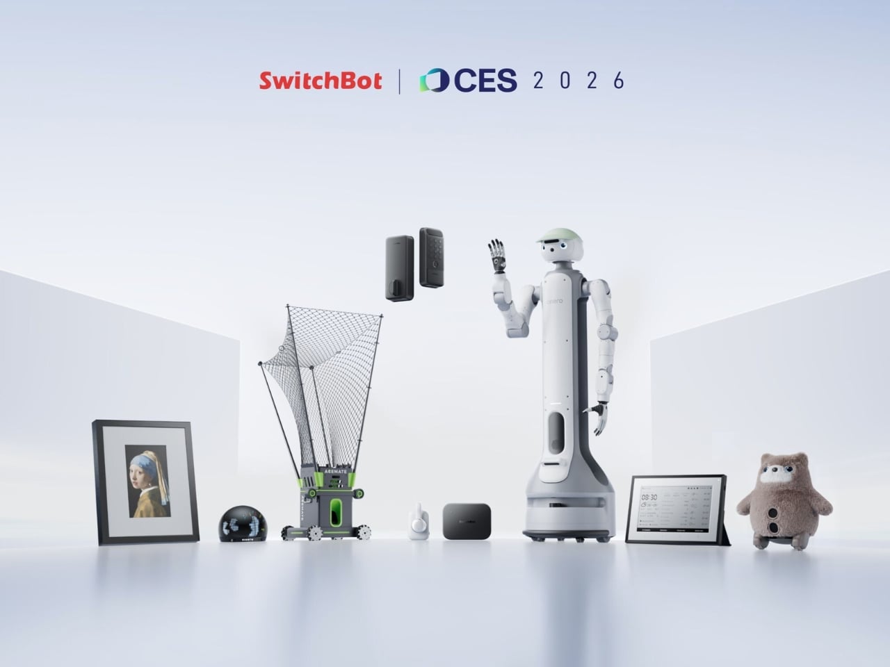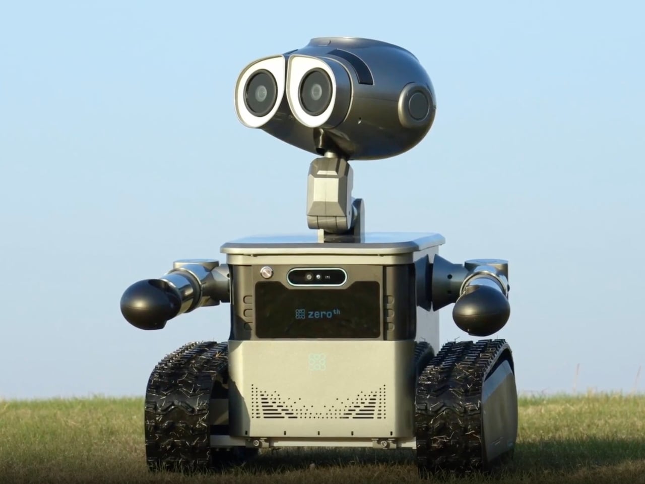
Remember that feeling you got watching WALL-E? That pang of desire for a loyal, expressive robot companion who could understand you and help out around the house? Well, Zeroth Robotics is betting you haven’t forgotten, because they’ve just launched the W1, and it’s basically bringing that Pixar fantasy into American homes.
Unveiled at CES 2026, the W1 isn’t Disney-licensed (that version stays in China for now), but it captures something essential that’s been missing from the “smart home” conversation. This isn’t about another voice assistant that sits in the corner. This is about a robot that moves through your space, physically interacts with your world, and yes, kind of makes you feel like you’re living in the future.
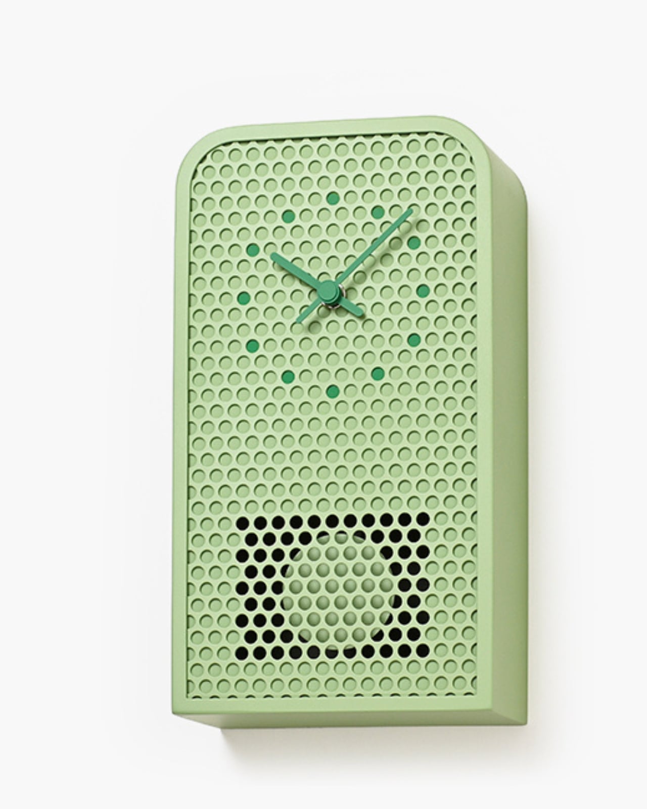
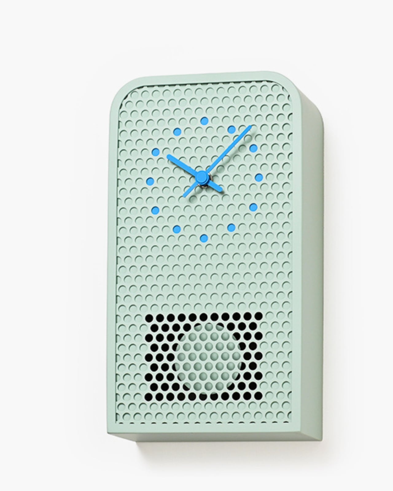
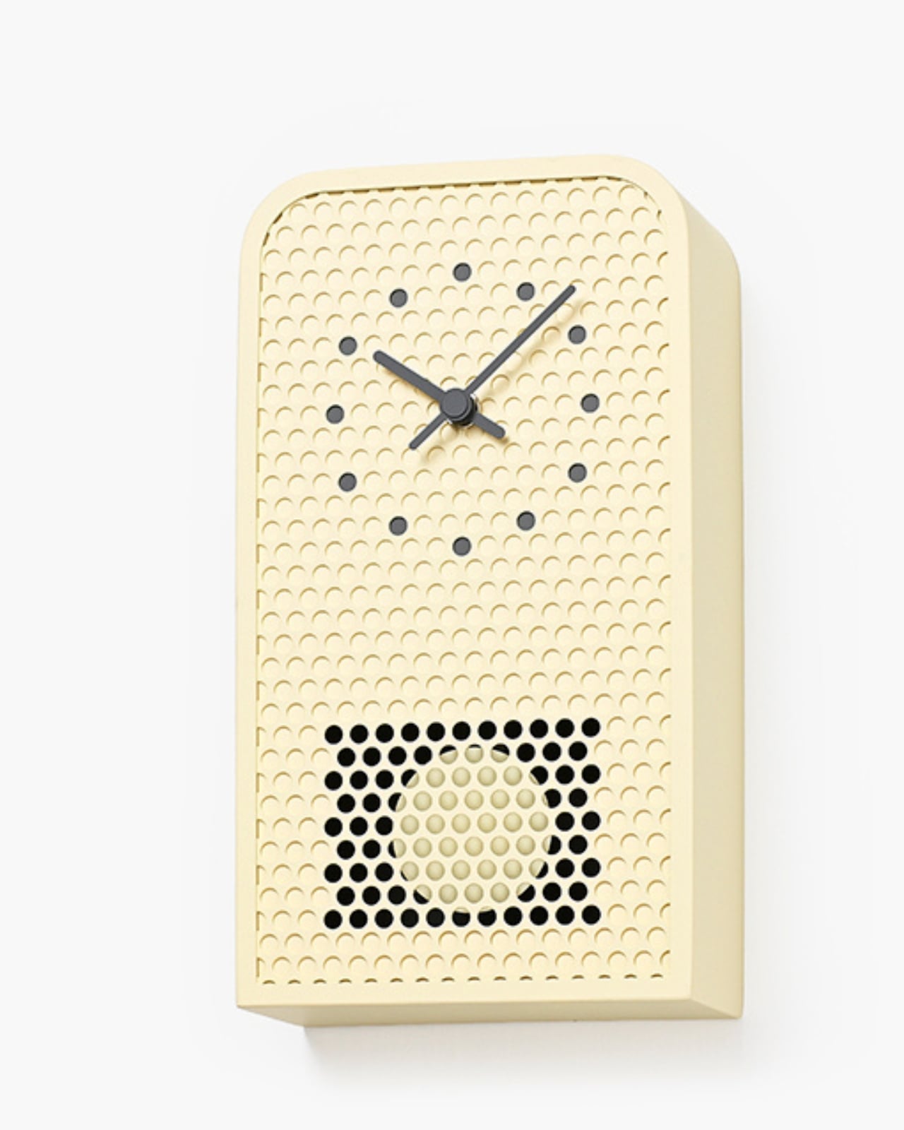
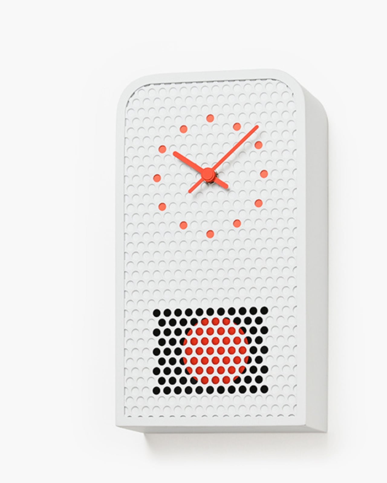
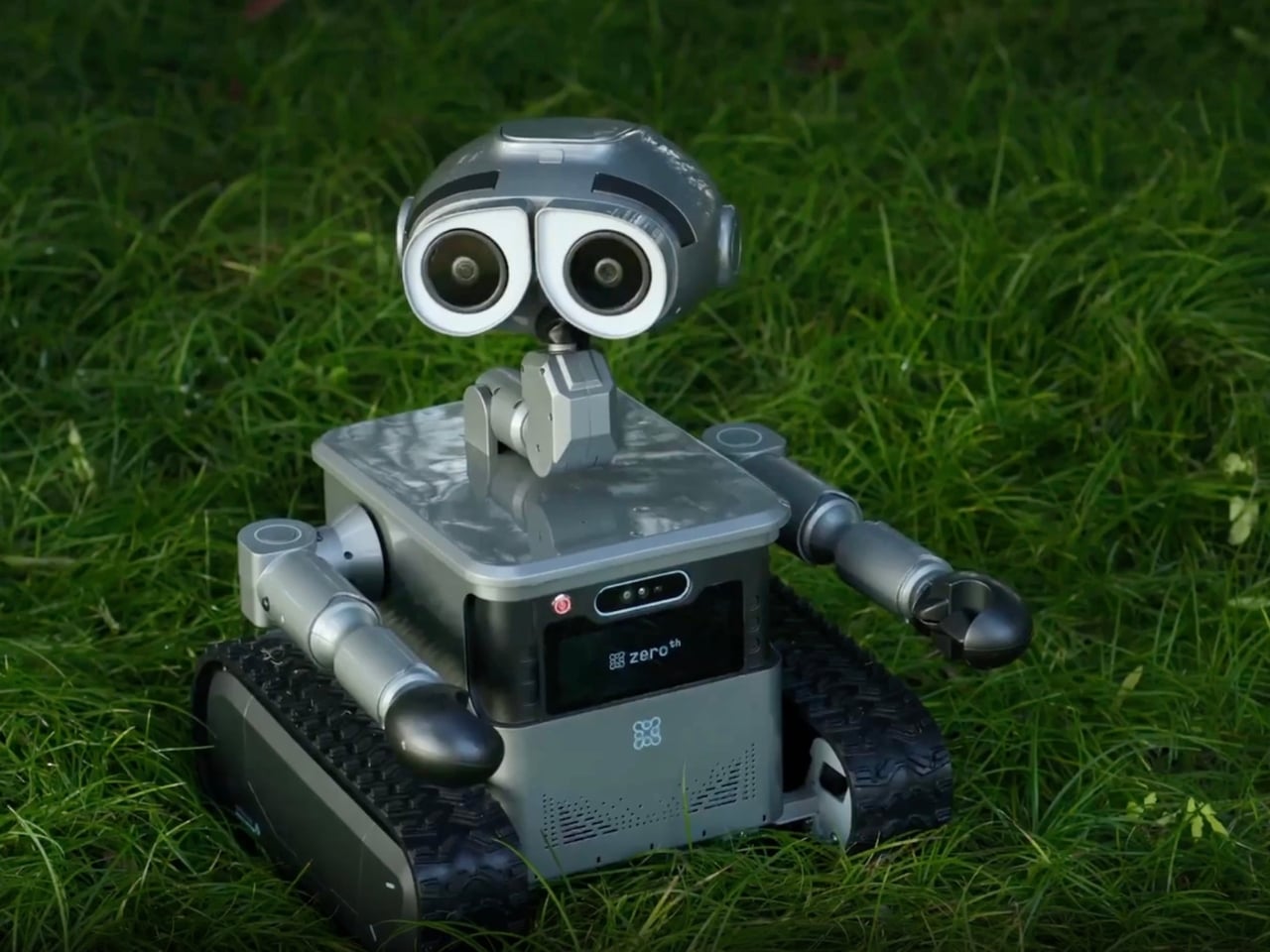
Designer: Zeroth
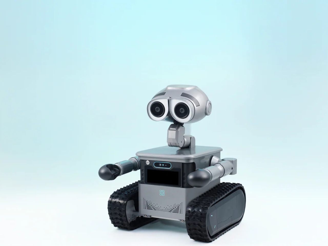
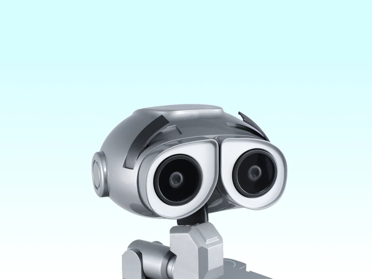
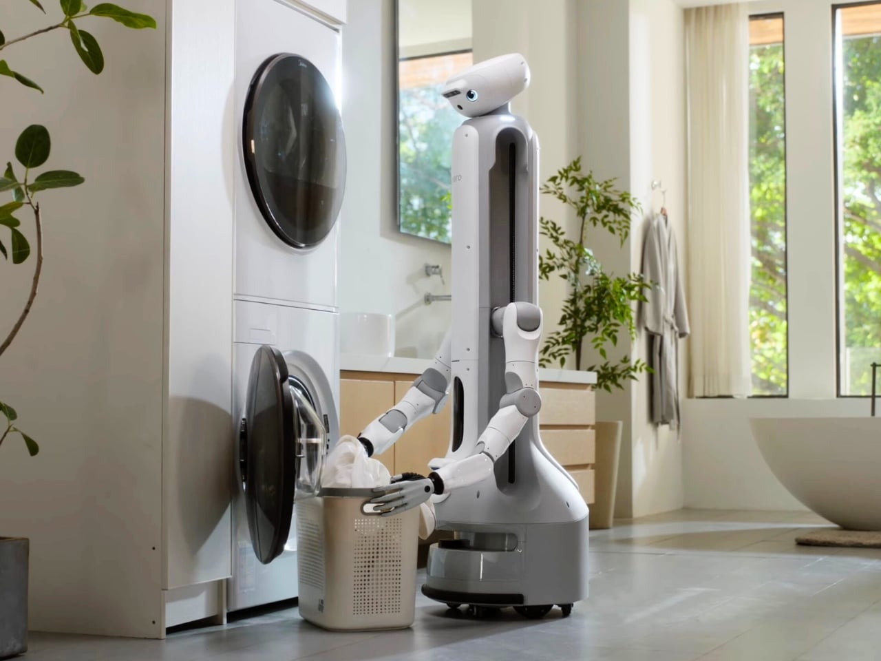
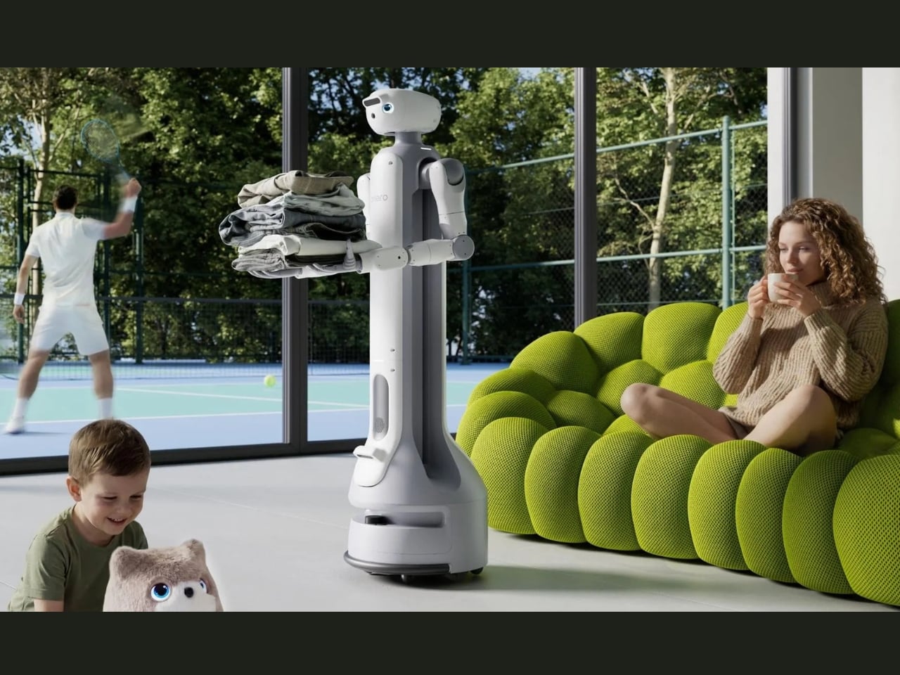
Let’s talk about what this thing actually does. At $5,599, the W1 is positioned as an autonomous, wheel-based assistant for homes and light commercial spaces. Standing 22.6 inches tall and weighing 44 pounds, it uses dual-tread wheels inspired by WALL-E’s iconic design to navigate complex terrain like grass, pavement, and gravel. That’s a bigger deal than it sounds, because most home robots panic when they encounter anything besides hardwood floors.
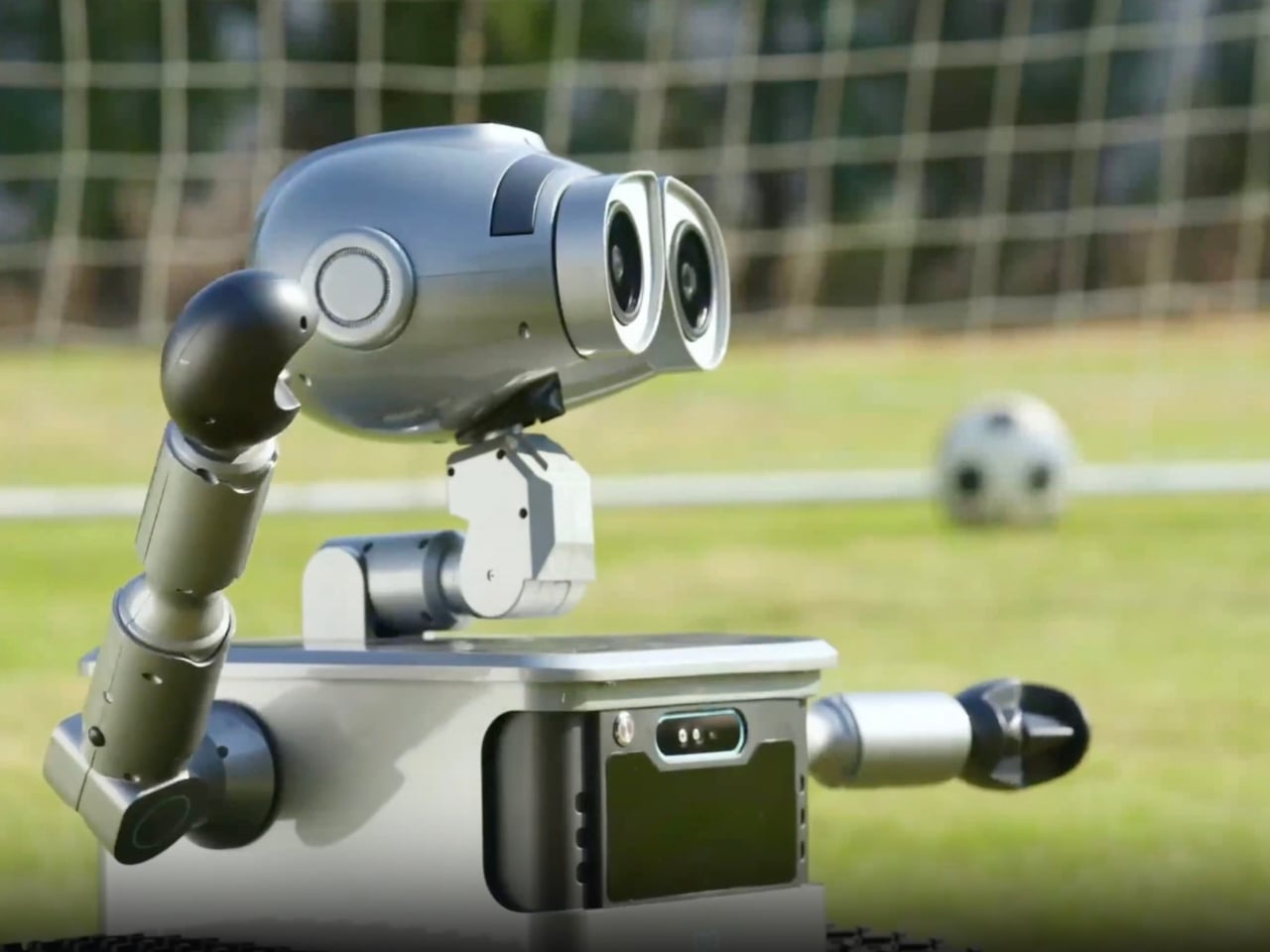
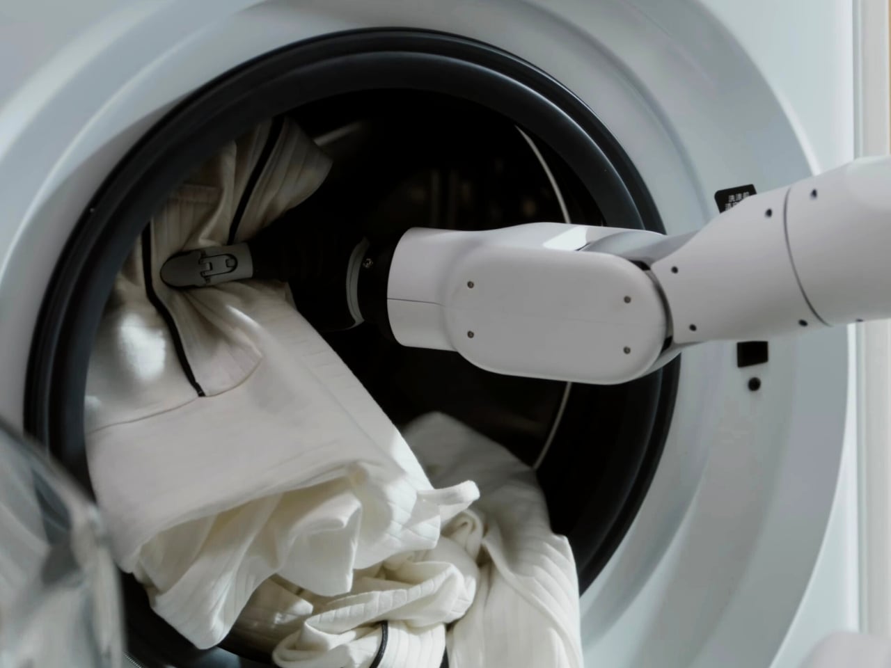
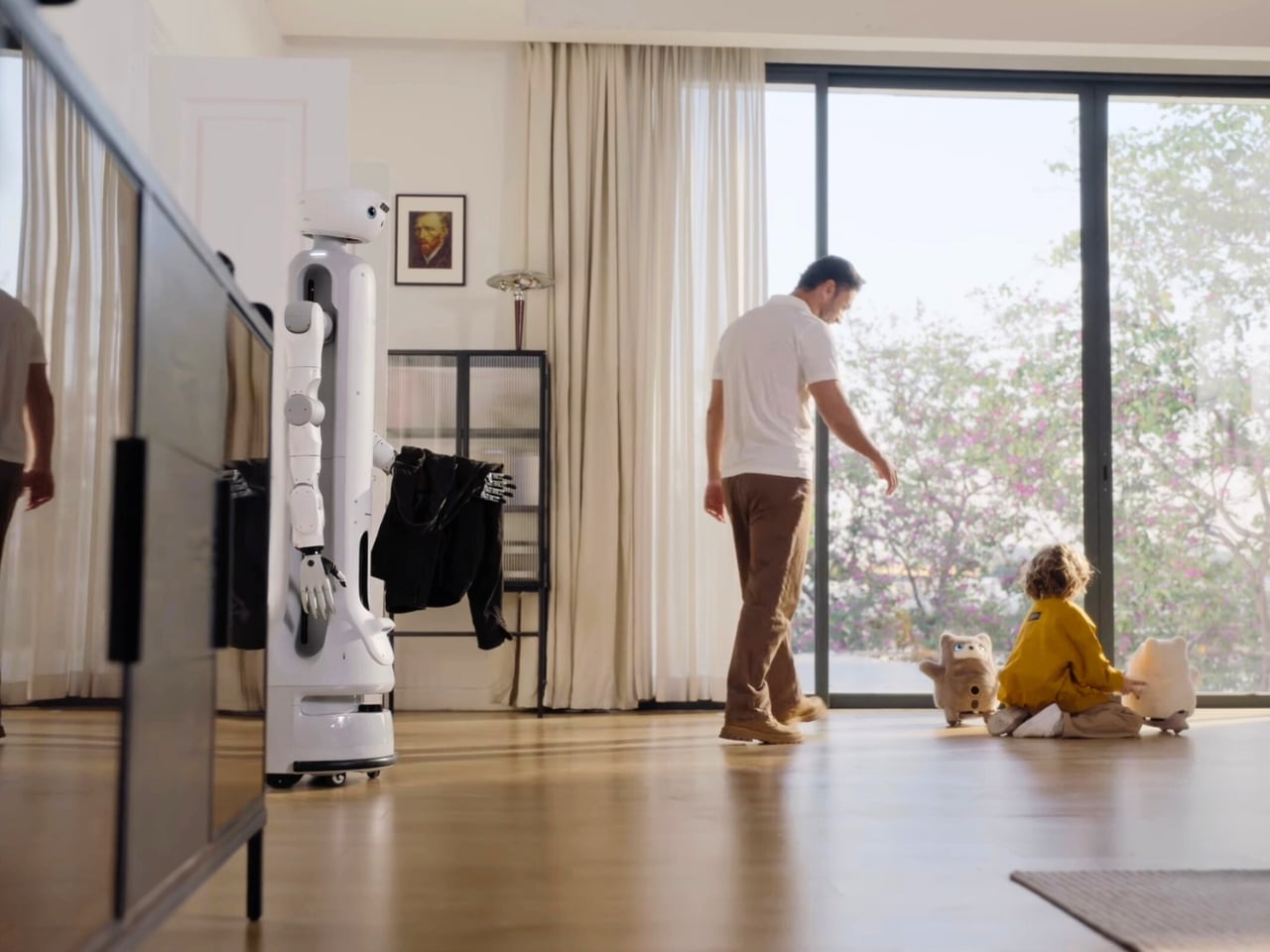
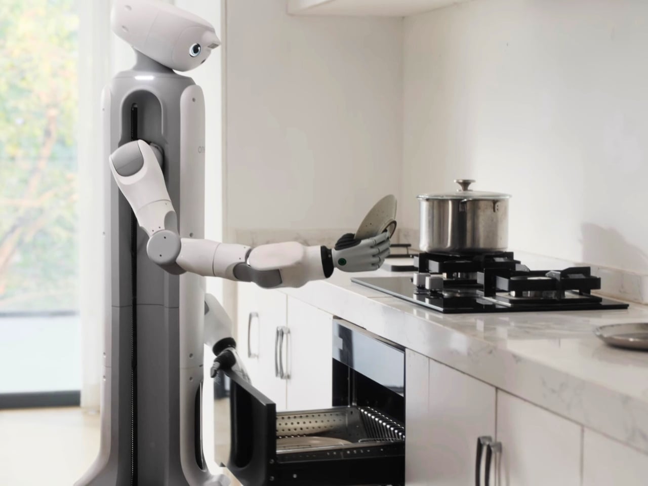
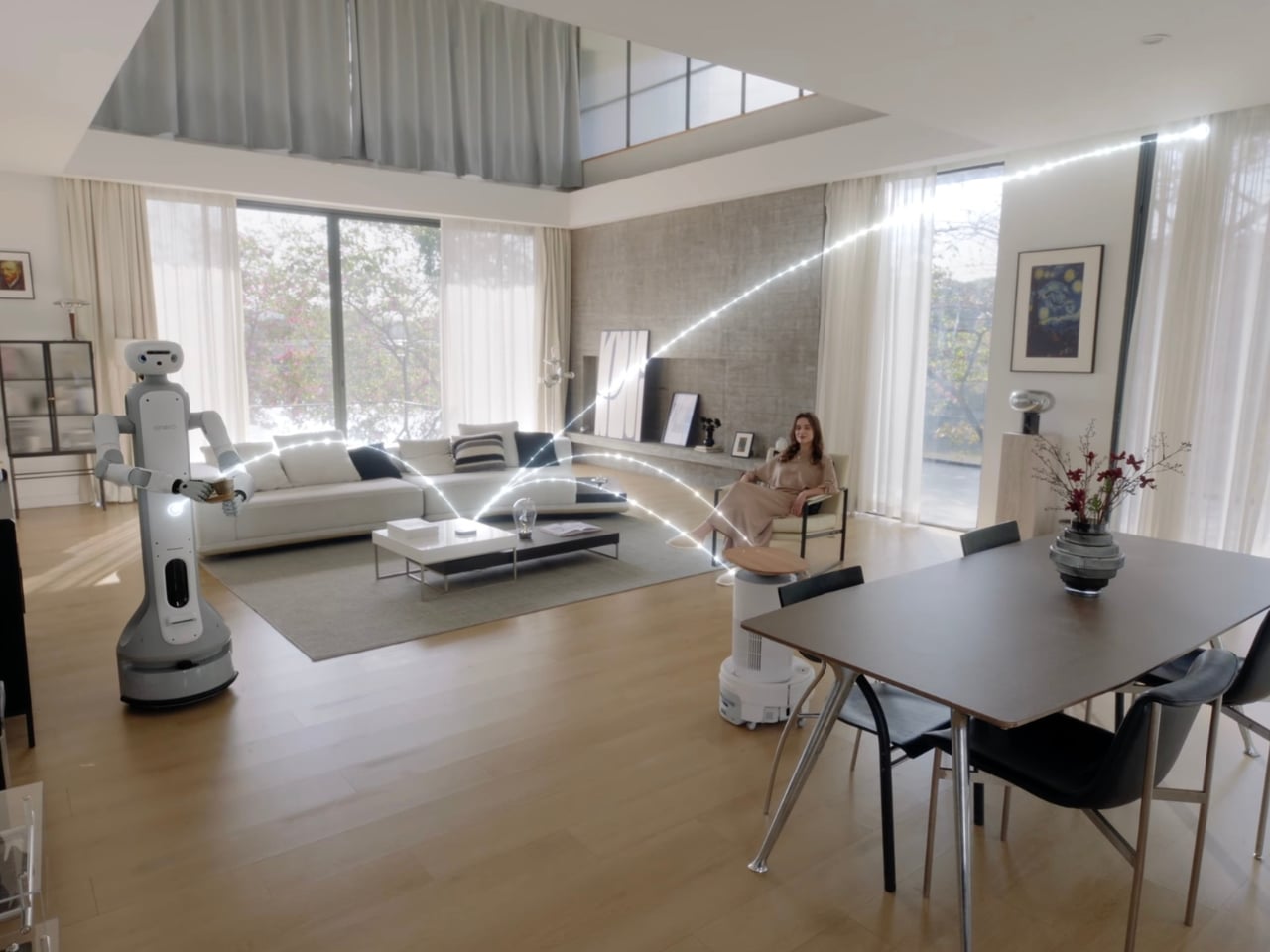
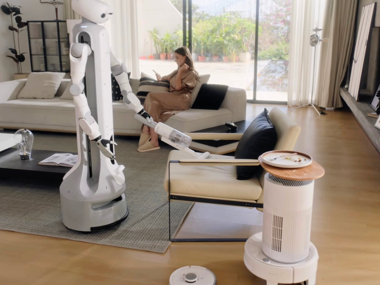
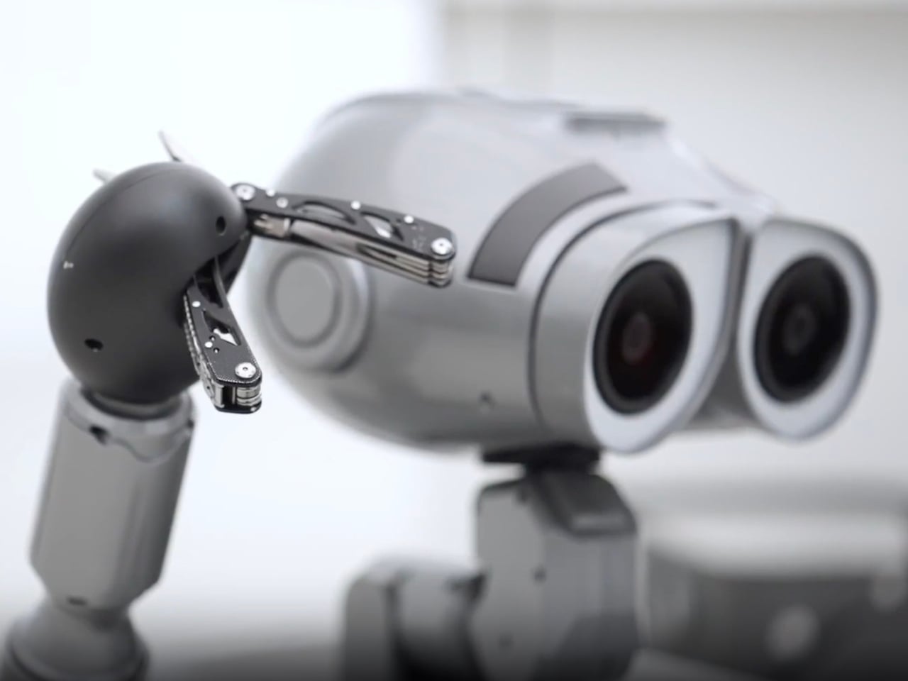
The navigation system relies on lidar, RGB cameras, and various sensors to understand its environment and avoid obstacles. It can carry up to 110 pounds (more than double its own weight), transport items around your home, follow you from room to room, and even snap photos with its 13-megapixel camera. The top speed is about 1.1 miles per hour, which sounds slow until you remember this isn’t a racing drone; it’s a household helper that needs to operate safely around pets, kids, and your favorite vintage lamp.

Now, here’s where we need to be honest. The W1’s task list feels limited at launch. It can transport stuff, follow you around, serve as a game host, and take pictures. That’s not exactly revolutionary. But Zeroth is building what they call a “Technology DNA,” a unified software and hardware stack that powers all their robots and can be updated over time with new behaviors and capabilities. This is the key differentiator. You’re not buying a static gadget; you’re buying into a platform that theoretically grows smarter and more useful.
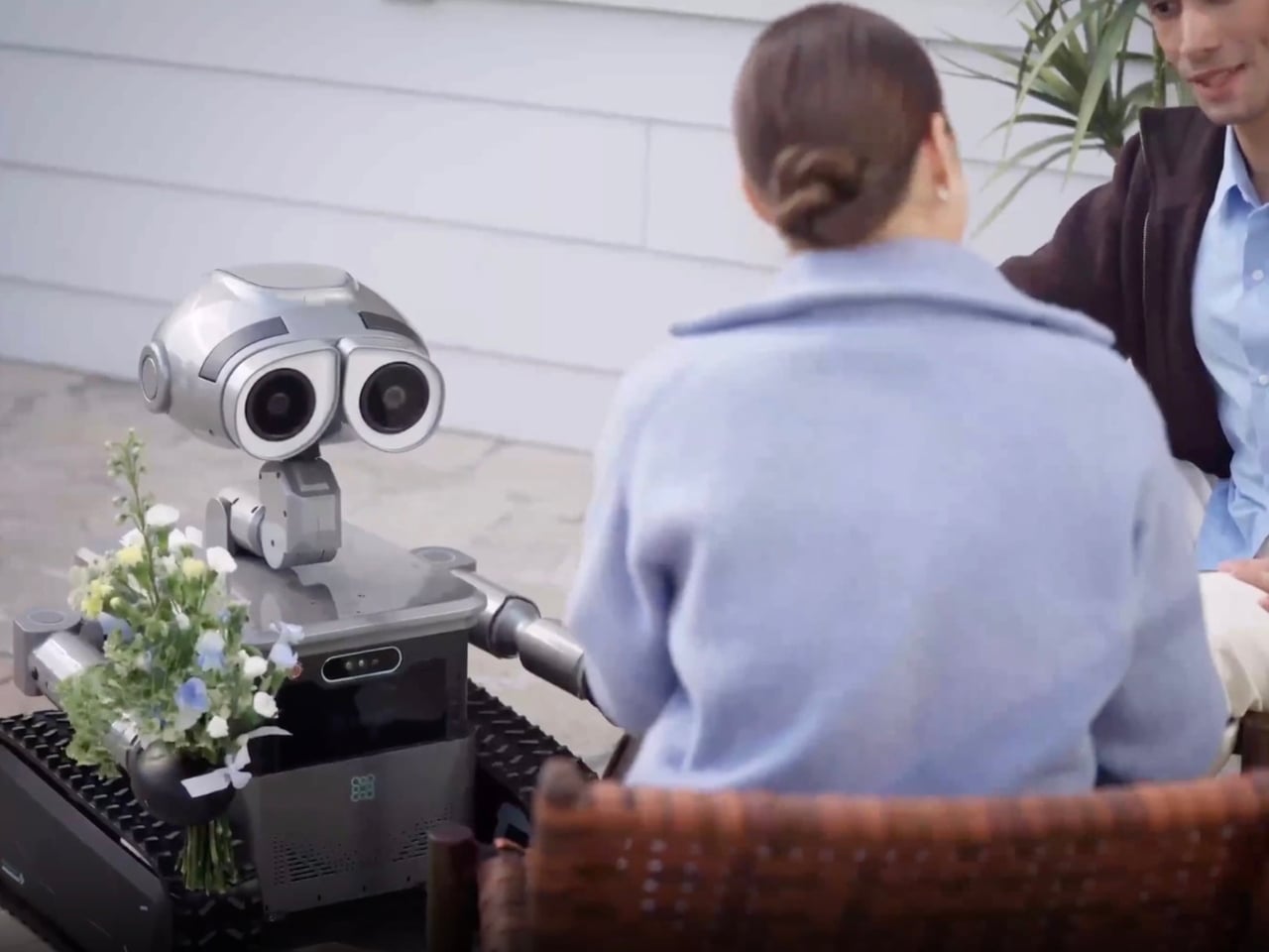
What makes the W1 compelling isn’t just the adorable WALL-E aesthetics (though let’s be real, that doesn’t hurt). It’s that Zeroth seems to understand something fundamental about consumer robotics that many companies miss: emotional connection matters. People don’t just want functional robots; they want robots they can relate to, robots that feel less like appliances and more like companions. That’s why the design language echoes one of the most beloved animated characters of all time.
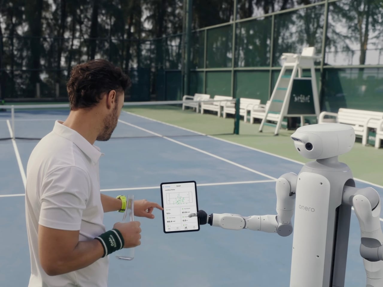
Zeroth Robotics, founded in 2024, is positioning itself as a company focused on “practical, emotionally aware robots” for everyday life. The W1 is part of a broader lineup that includes the M1 (a 15-inch humanoid home companion starting at $2,899), a Disney-licensed WALL-E for classrooms and retail spaces, the A1 quadruped for developers, and Jupiter, a full-size humanoid for real-world tasks. The strategy is clear: cover multiple use cases while maintaining a consistent technological foundation.
Pre-orders for the W1 are expected to open in Q1 2026, with general availability later this year. Whether the W1 becomes an essential household member or an expensive curiosity will depend largely on how well Zeroth delivers on those software updates and expanded capabilities. But there’s something undeniably exciting about a company that’s willing to make robots look and feel approachable instead of clinical. The W1 might not be saving Earth from an ecological disaster like its animated inspiration, but it might just save us from the monotony of carrying groceries from the car. And honestly? That’s a pretty good place to start.

The post Zeroth Just Designed the WALL-E Robot Every Millennial Wanted first appeared on Yanko Design.