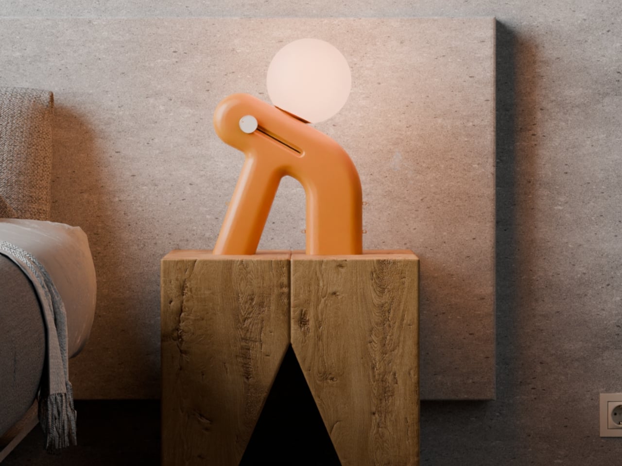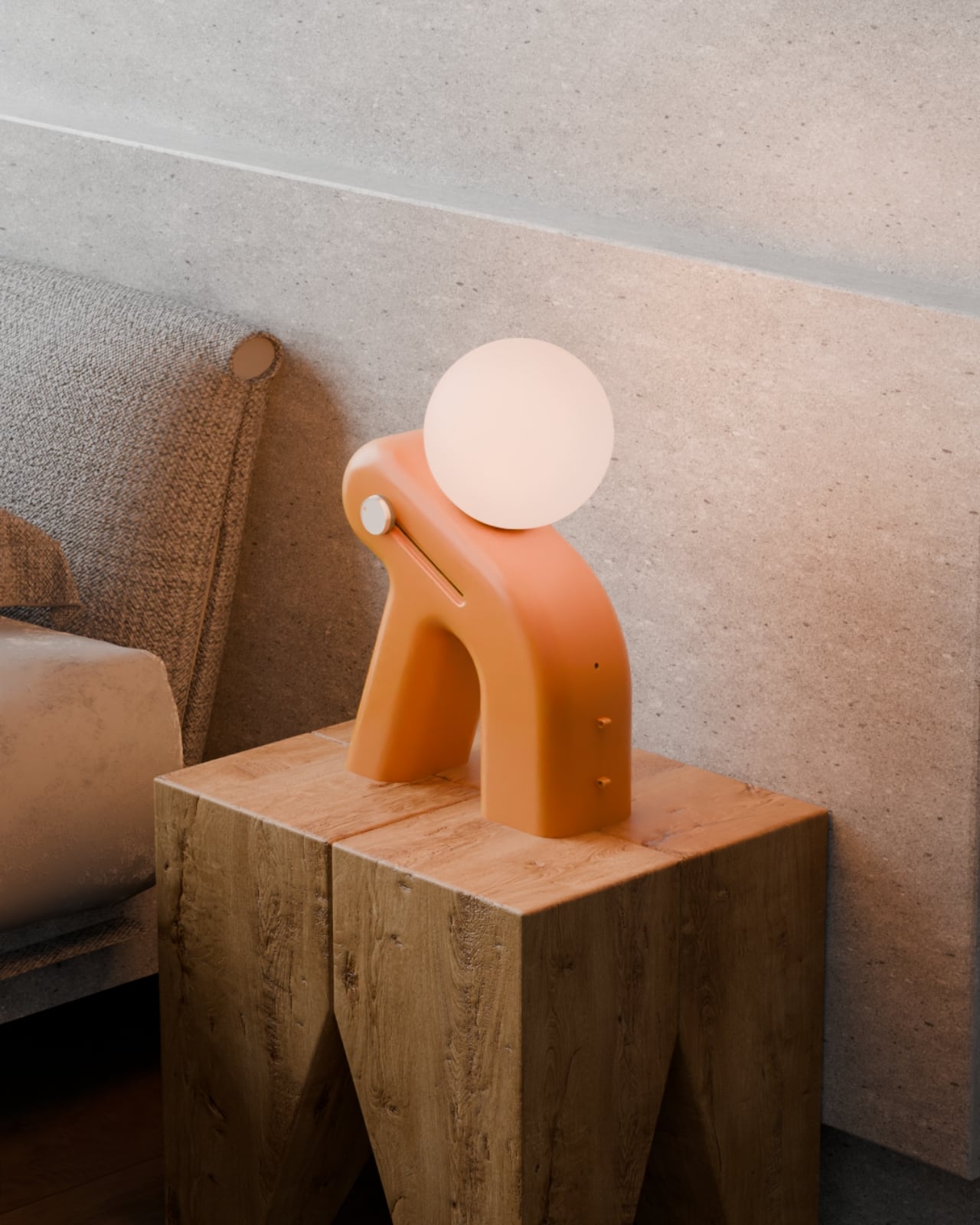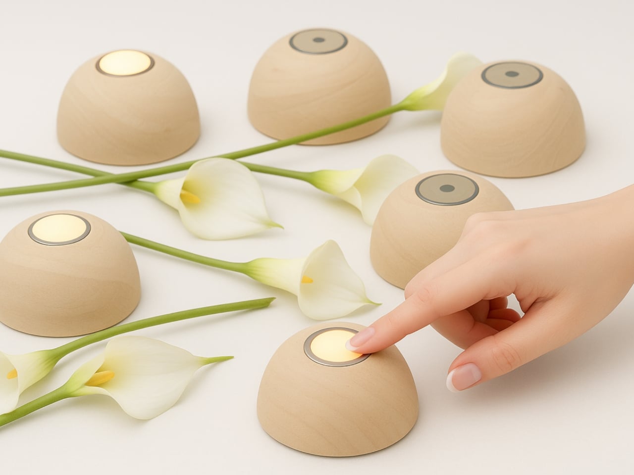
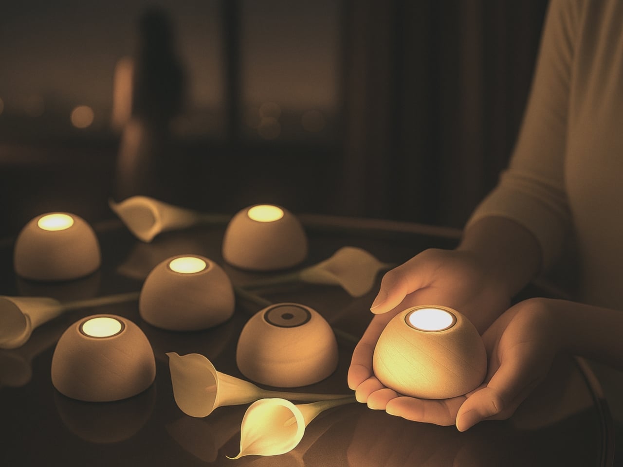
There’s something quietly revolutionary happening in the world of ambient lighting, and it looks like a smooth wooden pebble you’d want to hold in your palm. Meet Sula, a solar touch light designed by Maryam Mozafari that’s making the case for sustainable design without sacrificing an ounce of beauty or simplicity.
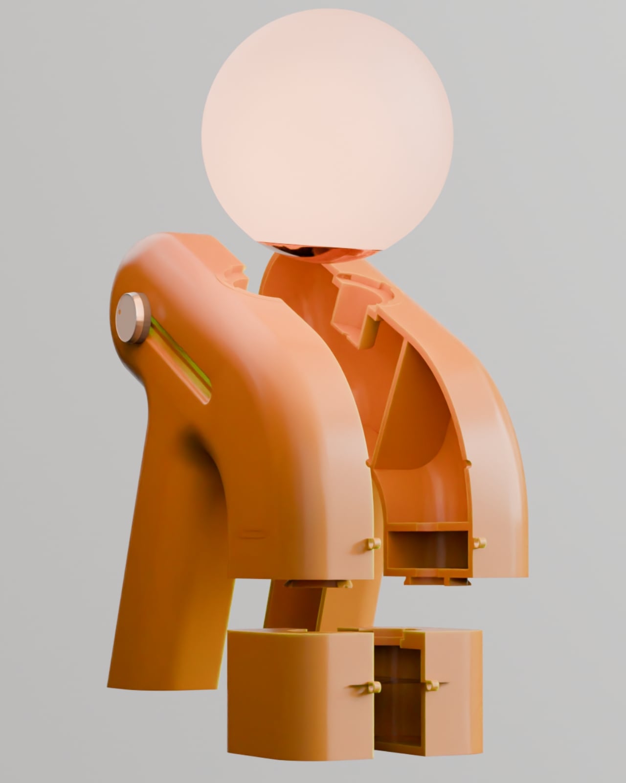
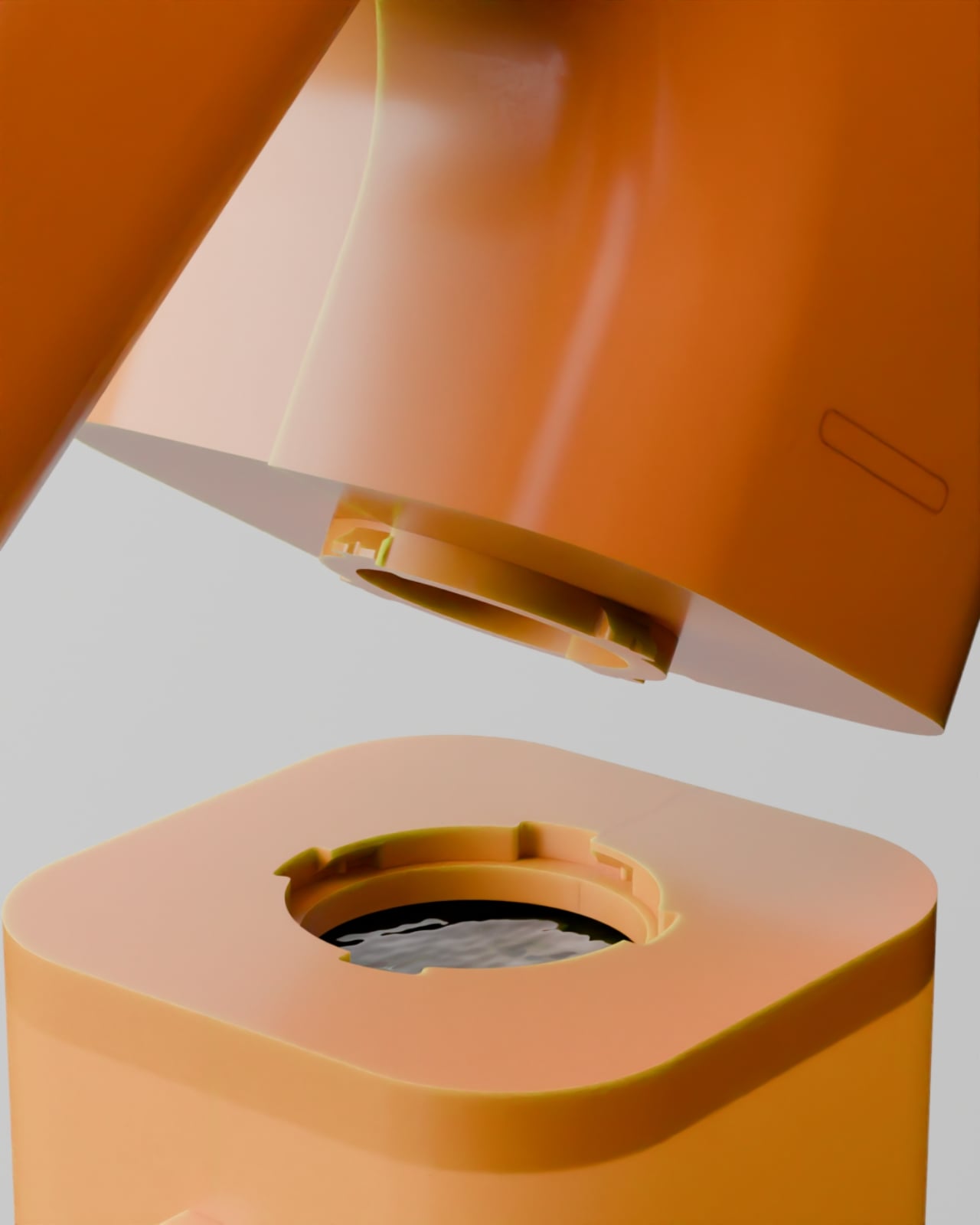
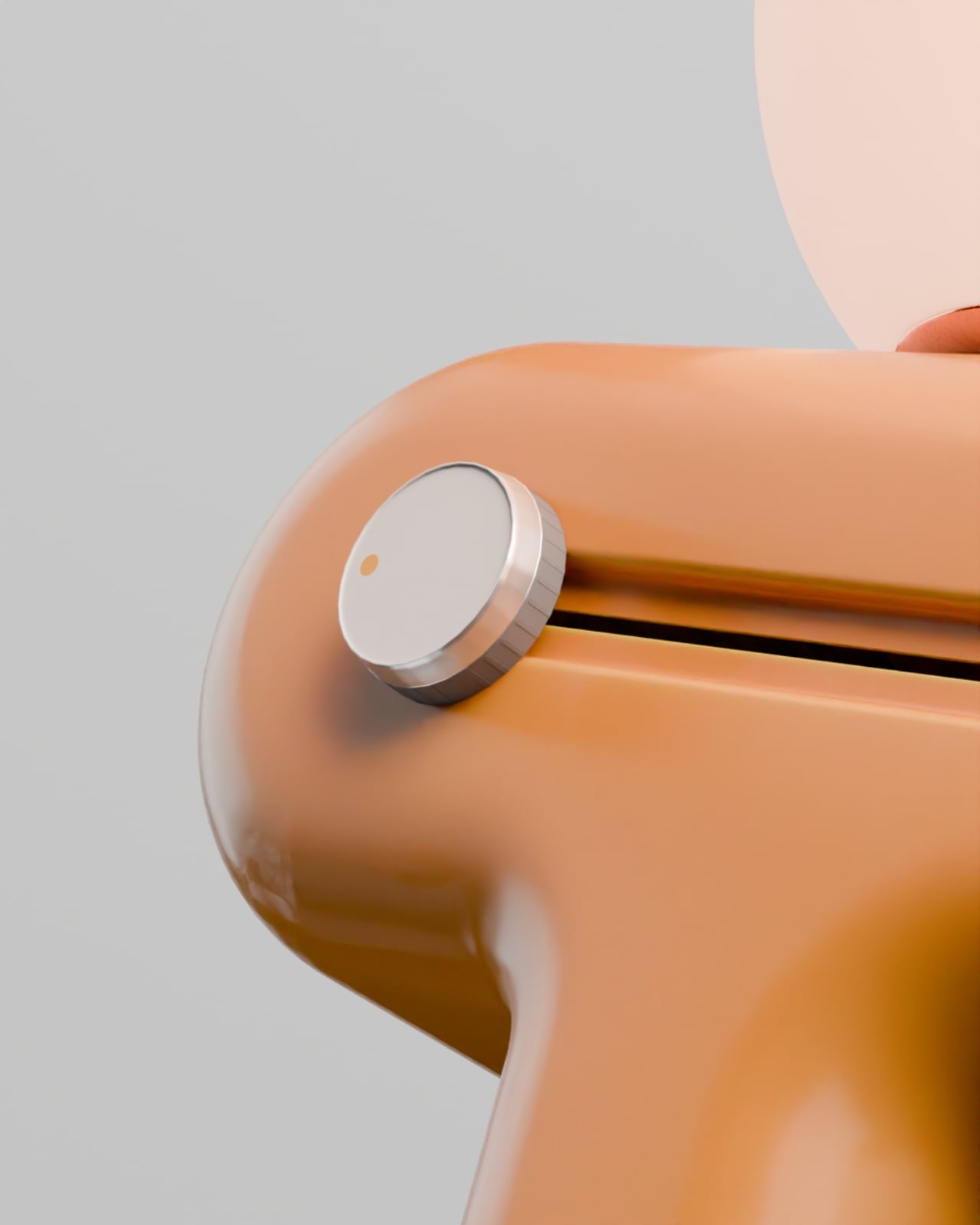
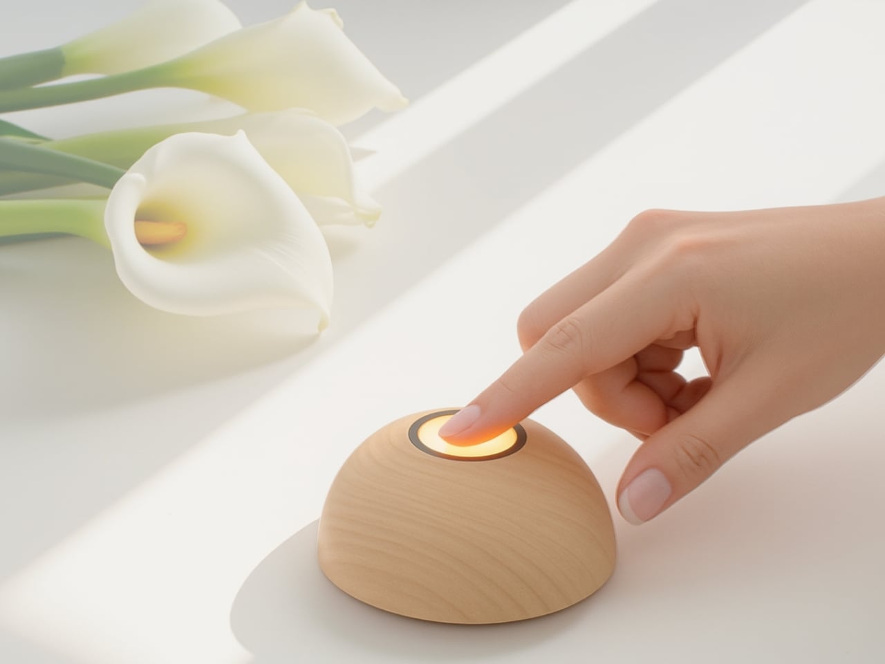
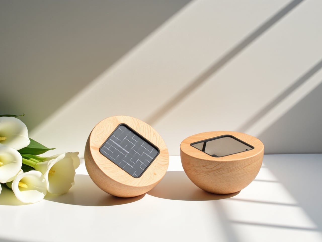
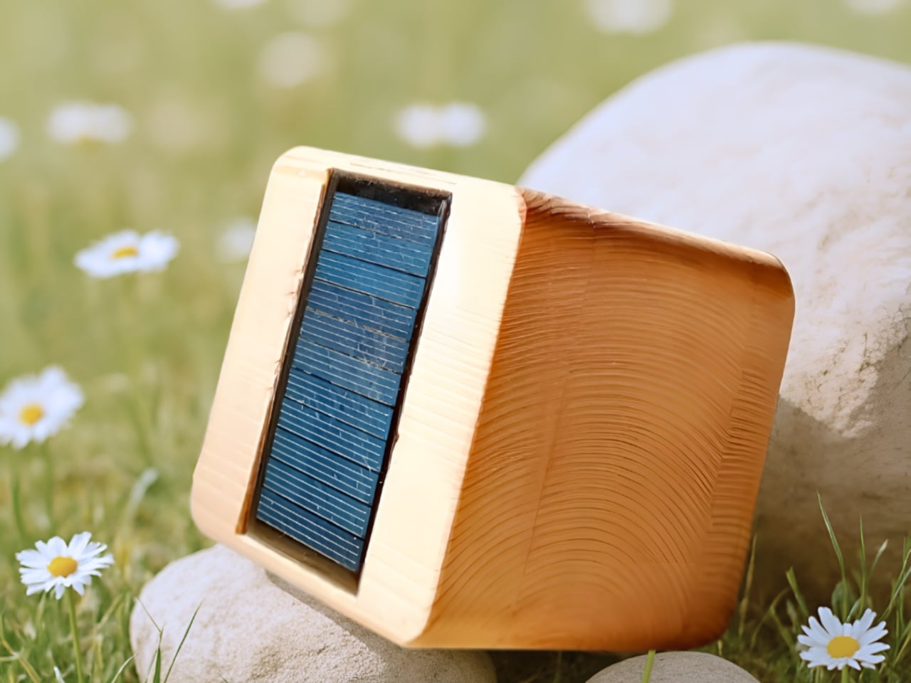
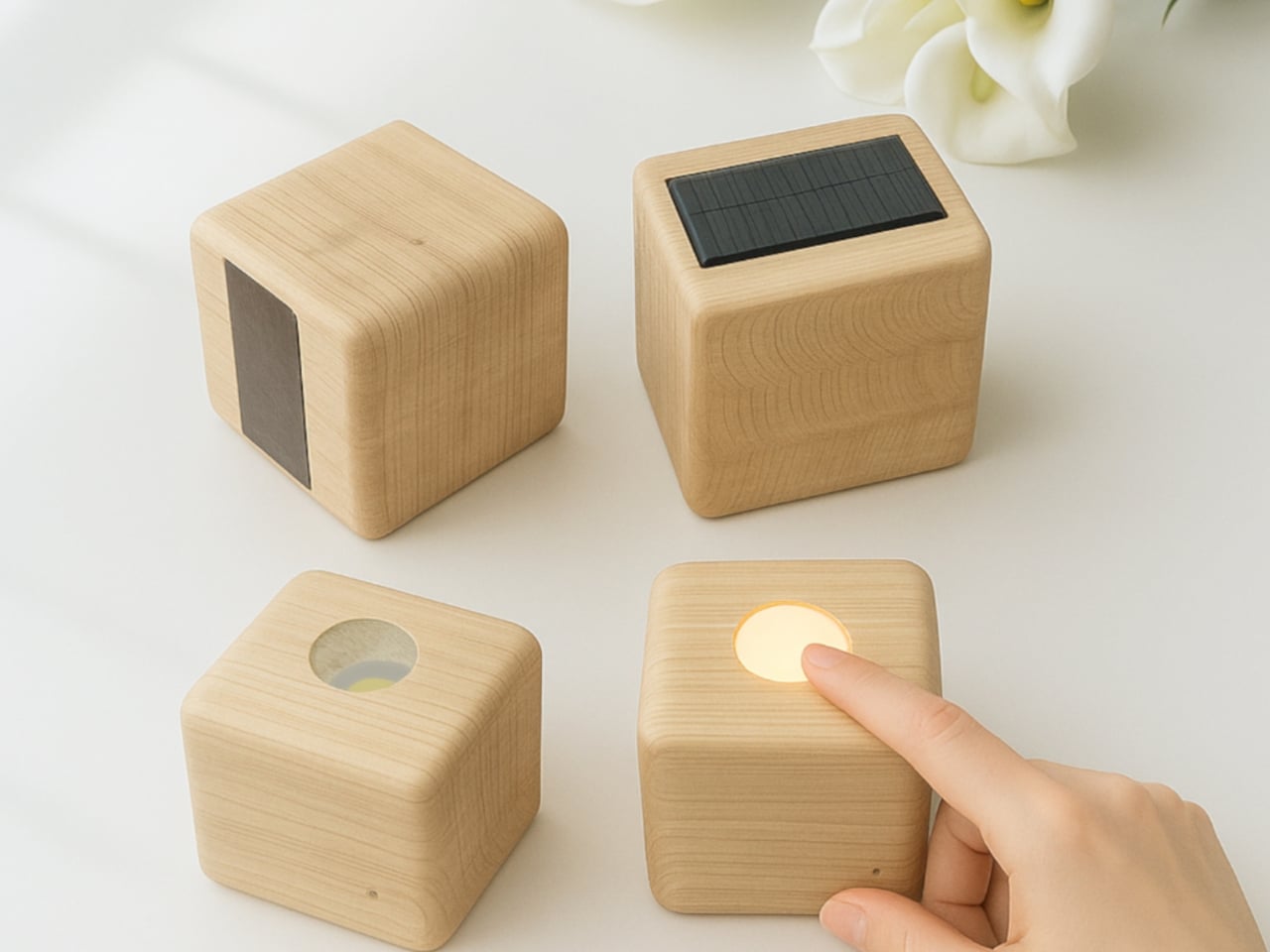
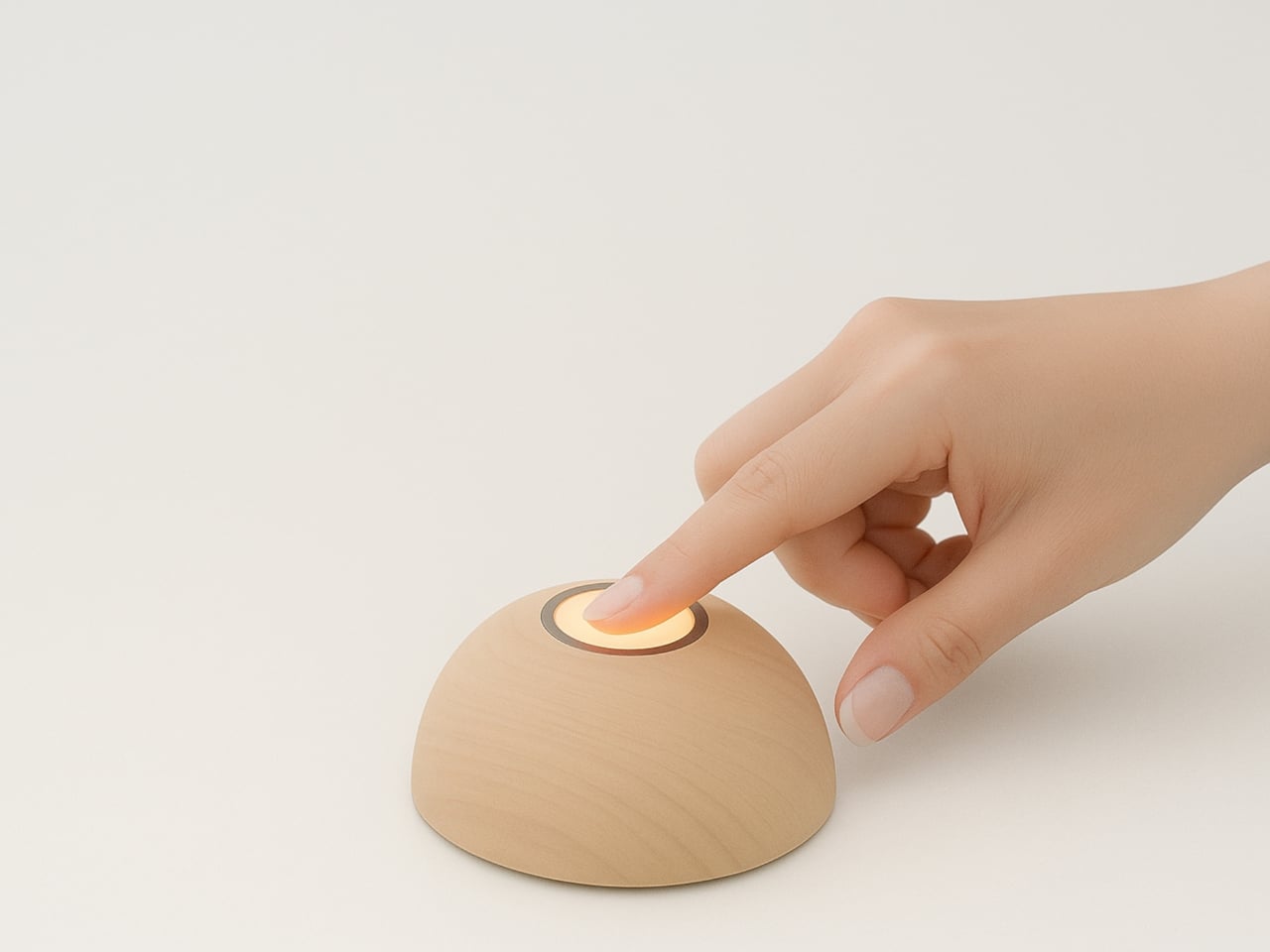
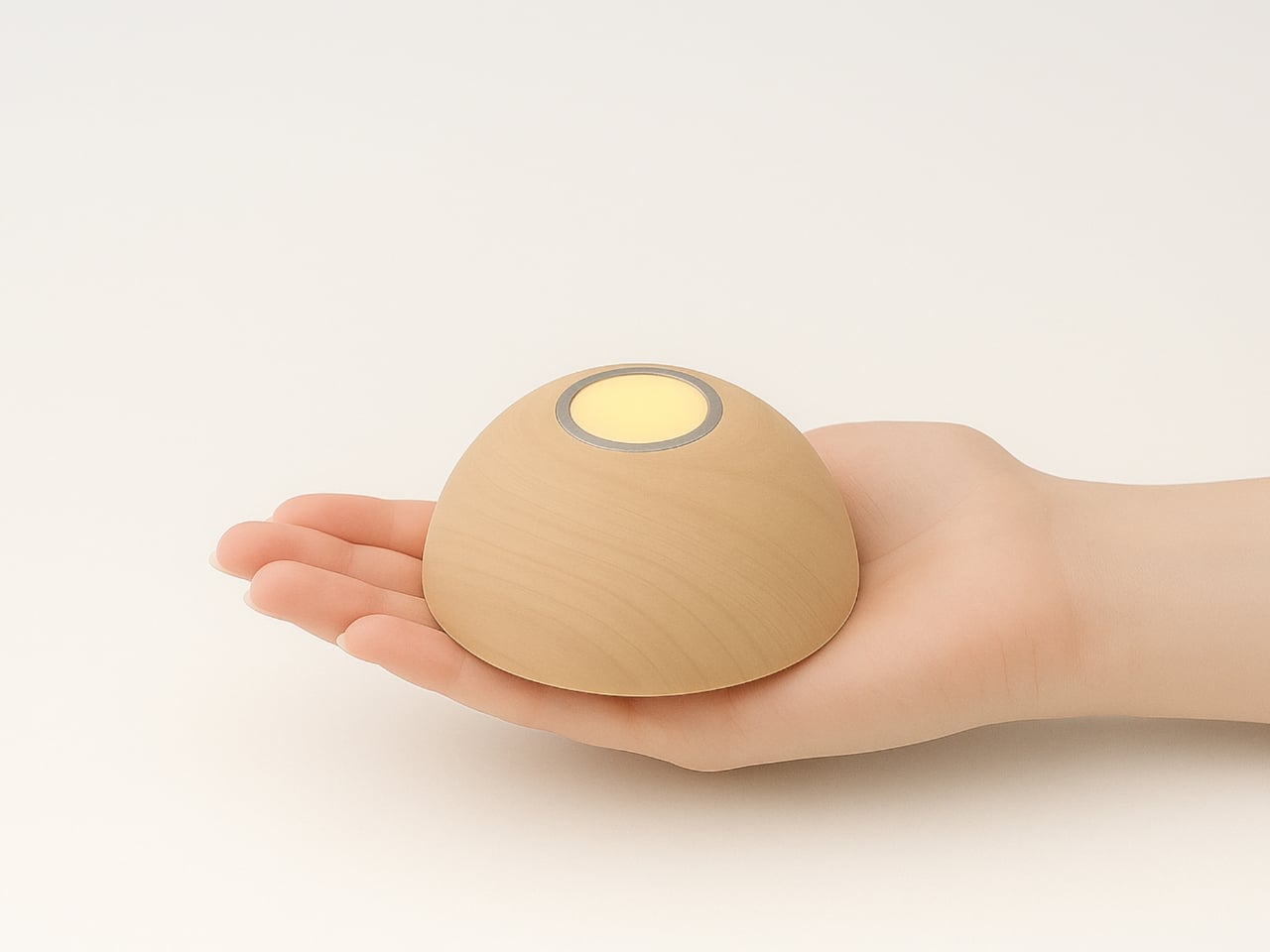
At first glance, Sula resembles a decorative candle that’s been reimagined for the 21st century. Its organic, rounded form sits comfortably in your hand, and the warm wood finish gives it that luxurious, handcrafted quality that makes you want to keep it on display even when it’s not lit. But flip it over or lay it on its side, and you’ll discover its secret: a hidden solar panel that soaks up sunlight and stores energy in its lithium battery.
Designer: Maryam Mozafari
The genius of Sula lies in how effortlessly it integrates sustainability into everyday life. We’re living in an era where solar panels still feel like clunky additions to our homes, awkward compromises between function and form. Sula challenges that assumption entirely. Instead of treating the solar panel as an eyesore to hide, Mozafari designed the entire object around the idea that charging should be as natural as setting something down. Want to power up your light? Just flip it upside down on a sunny windowsill. That’s it. No cords, no outlets, no apps to download.
This simplicity extends to how you actually use the light. A gentle touch activates the soft glow, creating that intimate, relaxing atmosphere we usually associate with candlelight but without the fire hazard or melting wax. There’s something deeply satisfying about touch activation. It makes you feel more connected to the object, more intentional about the mood you’re creating in your space.
The design comes in different forms too, giving it versatility that most ambient lights lack. The classic dome shape looks like a smooth river stone, while the cubic version brings a more contemporary, architectural vibe. Both variations share that same philosophy: beautiful objects that happen to be functional, rather than functional objects trying to look beautiful. It’s a subtle but crucial distinction that separates good design from great design.
What makes Sula particularly relevant right now is how it addresses our complicated relationship with technology and sustainability. We want to make better choices for the environment, but we don’t want those choices to feel like sacrifices. Solar power often comes with baggage: it’s expensive, it’s complicated, it requires installation. Sula strips all that away. It’s a light that charges itself using the sun, and the whole process is so seamless you barely think about it.

The ergonomics deserve attention too. The light is sized perfectly to be portable, to move from room to room as you need it. Imagine bringing a cluster of them to an outdoor dinner as the sun sets, or keeping one on your nightstand for gentle reading light that won’t blast you awake like your phone screen. The soft illumination creates pockets of warmth without overwhelming a space, which is exactly what good ambient lighting should do.
There’s also something wonderfully analog about Sula in our increasingly connected world. It doesn’t ping you with notifications, it doesn’t need updates, and it won’t become obsolete when a new model comes out. It’s just a light that runs on sunshine and responds to your touch. In a market saturated with smart home devices that promise to make life easier but often just add complexity, Sula’s straightforward approach feels refreshingly honest.
Mozafari’s design proves that sustainability doesn’t have to announce itself loudly to be effective. Sula isn’t covered in green leaves or covered with “eco-friendly” labels. It’s simply a beautifully crafted object that happens to run on renewable energy. That quiet confidence is what makes it work. It fits into modern homes not because it’s making a statement about sustainability, but because it’s genuinely lovely to look at and use.
For anyone who’s ever fumbled for a light switch in the dark or dealt with the anxiety of leaving candles burning overnight, Sula offers something better. It’s proof that the future of sustainable design isn’t about compromise. It’s about creating objects so well-designed that their environmental benefits become just one more reason to love them.

The post The Solar Touch Light That Hides Its Tech in Plain Sight first appeared on Yanko Design.