These 3D-Printed Lamps Glow Like Coral Reefs

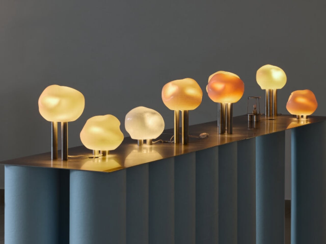
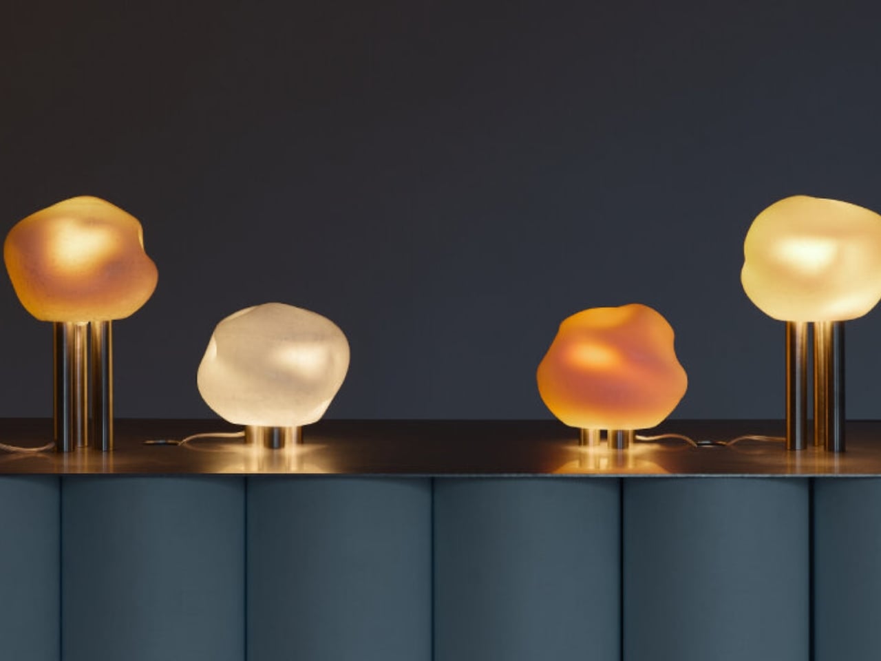
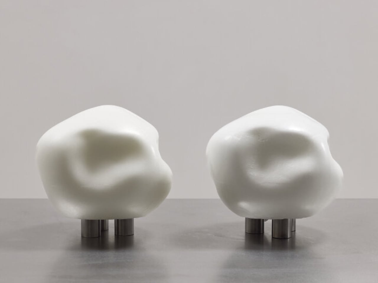
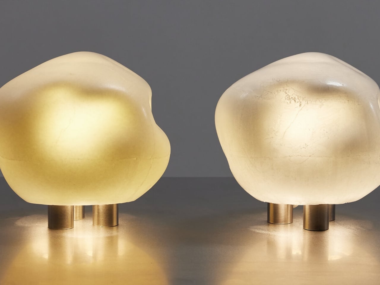
There’s something quietly radical happening when designers stop thinking about furniture as rigid, finished objects and start treating them like organisms that could have grown from the ocean floor. That’s exactly what YET FAB has done with their Alherd Collection, a series of lamps that look less like traditional lighting and more like glowing coral formations pulled from some computational reef.

Founded by Ilya Kotler, Anastasiya Kotler, and Rael Kaymer, YET FAB sits at that fascinating intersection where material science meets algorithmic design. The Alherd lamps are all born from the same generative system, inspired by how coral grows and how water erodes stone over centuries. The result is a porous, cellular texture that doesn’t just hold light but transforms it into something softer, more atmospheric, more alive.

Designer: YET FAB

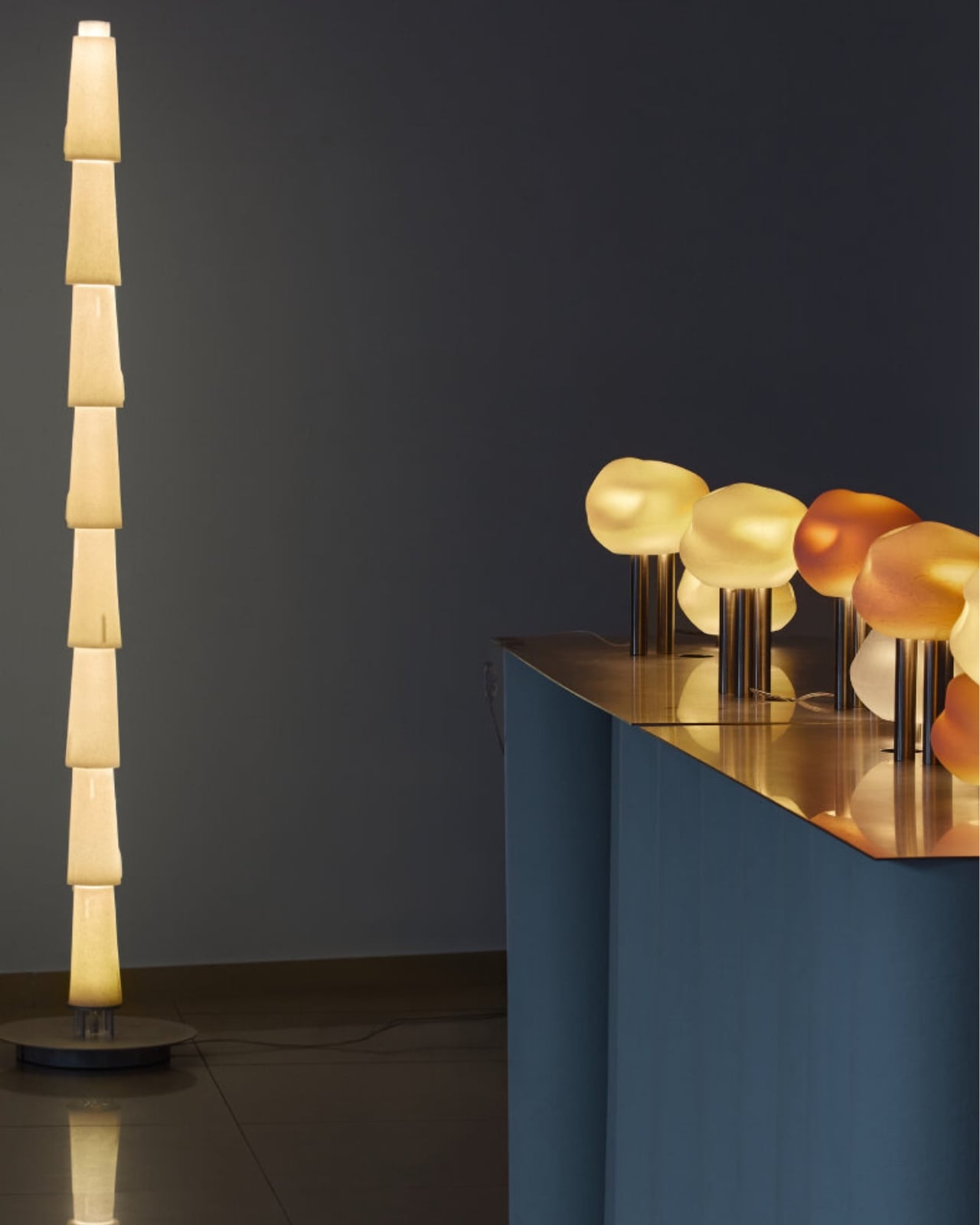
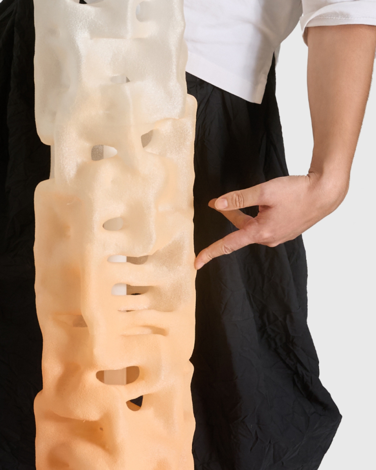
What makes this collection especially interesting is how it scales. Rather than designing three separate products, YET FAB created one visual language that works whether you’re holding a compact table lamp or standing next to a 130 cm floor sculpture. It’s a smart approach that gives the collection a cohesive identity while offering real flexibility for different spaces and needs.

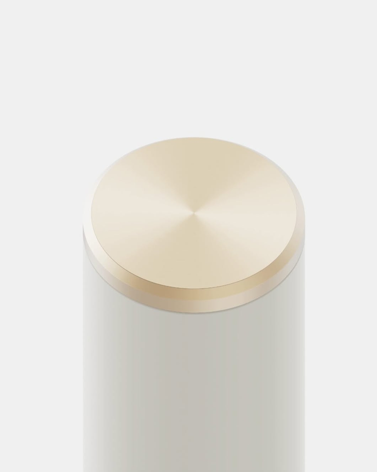
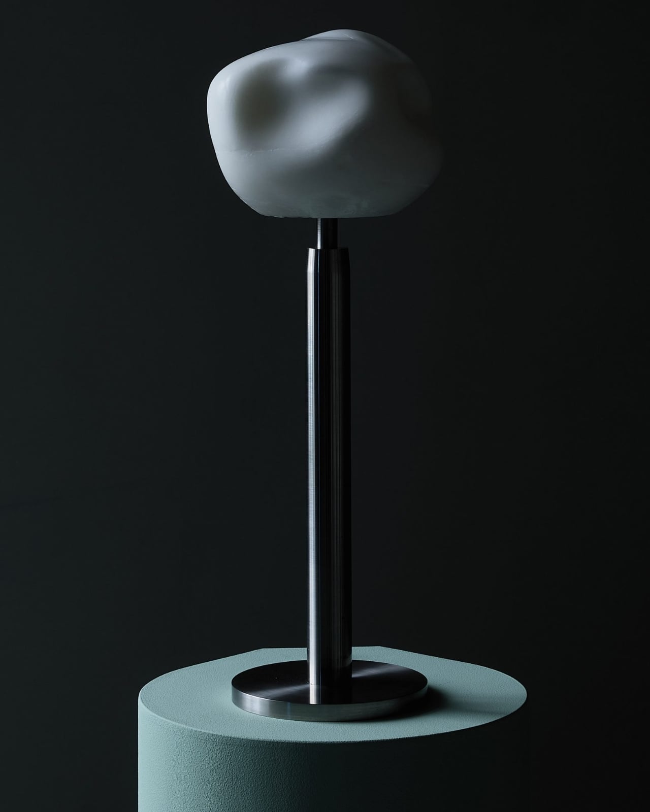
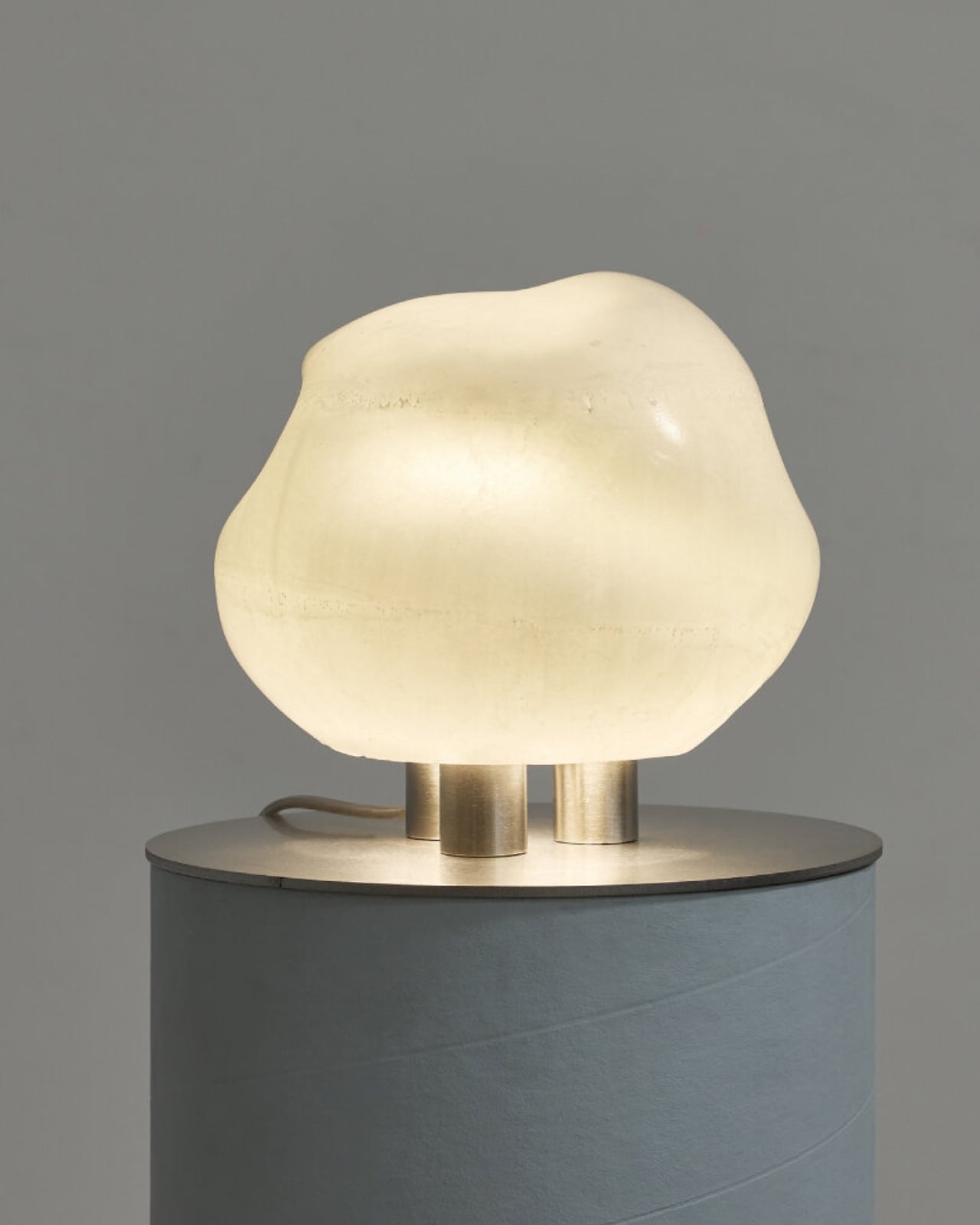
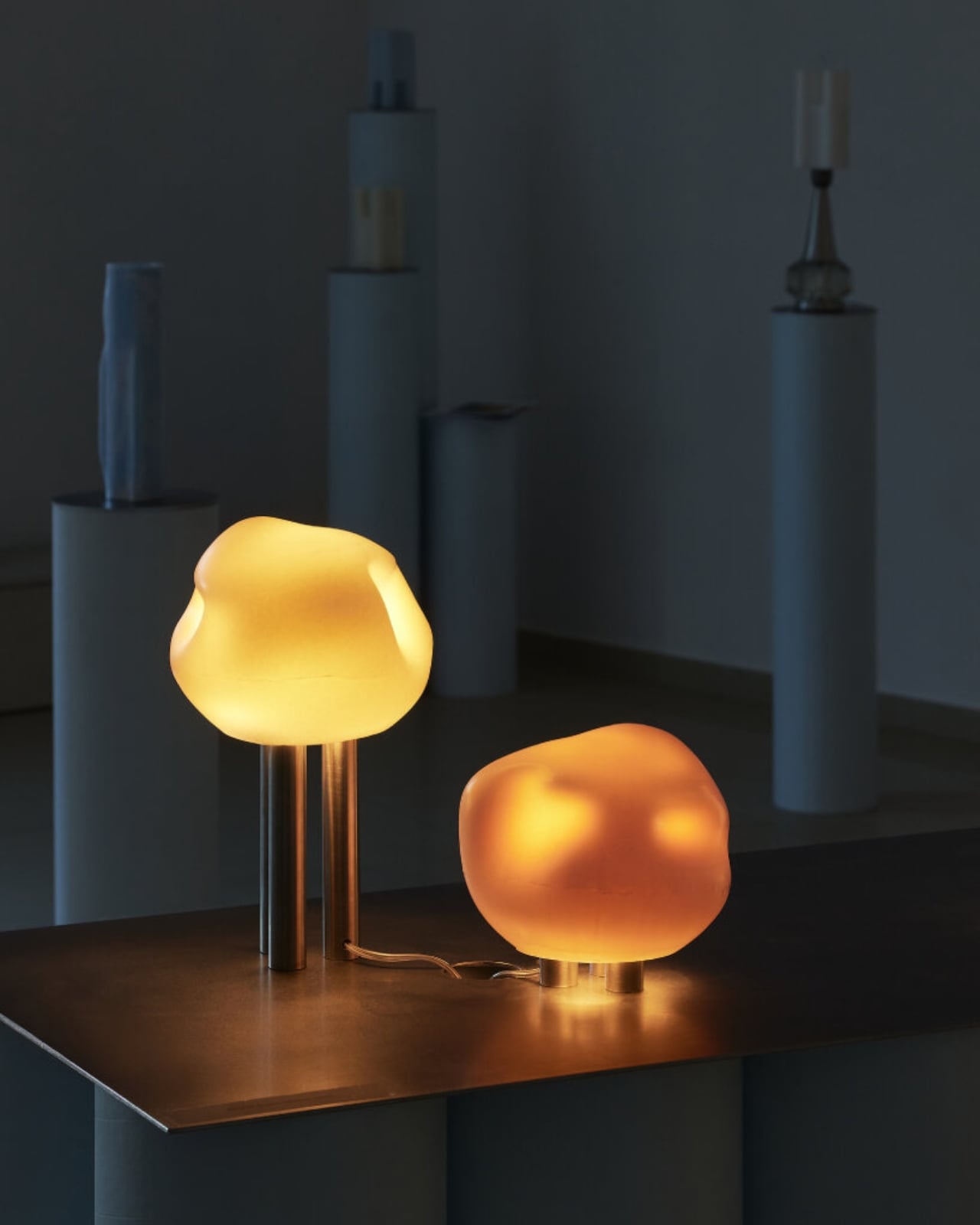
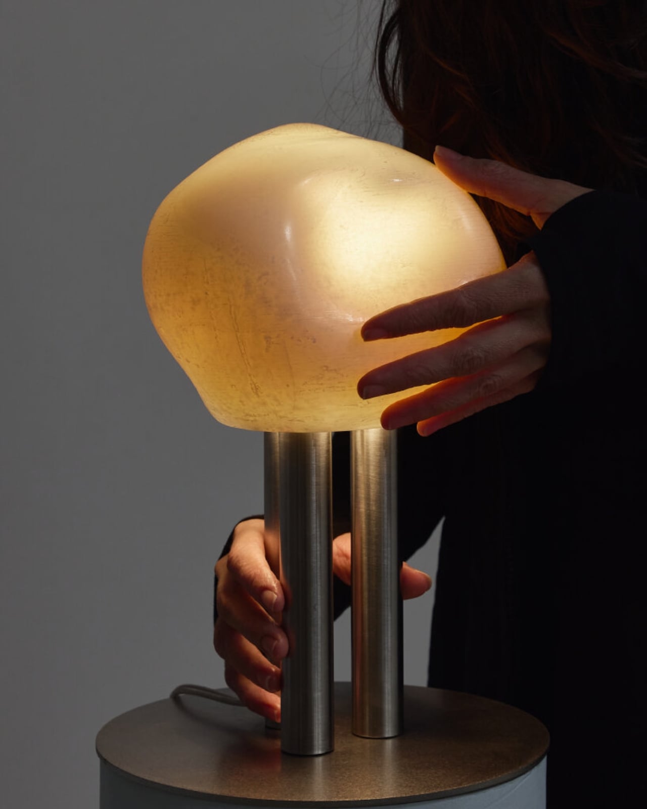
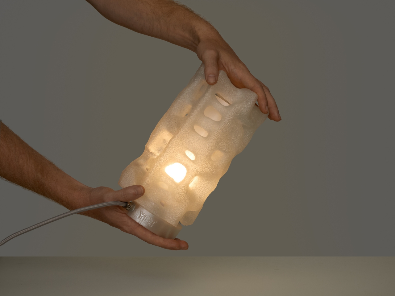
The table lamp is the quiet overachiever of the trio. Small enough to live comfortably on a desk or nightstand, it has this sculptural presence that works even when it’s switched off. But here’s where it gets clever: inside that organic, textured shell is a customizable filter system. You can swap out internal filters to shift the mood completely, moving from warm amber to soft white to deep red without changing how the lamp looks externally. It’s like having multiple lamps in one body, ready to adapt to whether you’re working late, hosting friends, or just need something moody for a quiet evening.

That adaptability matters more than it might seem at first. We’re living in smaller spaces with less room for single-purpose objects, and lighting plays a huge role in how a room feels. A lamp that can shift its emotional register without demanding more square footage? That’s genuinely useful design thinking wrapped in a beautiful package.

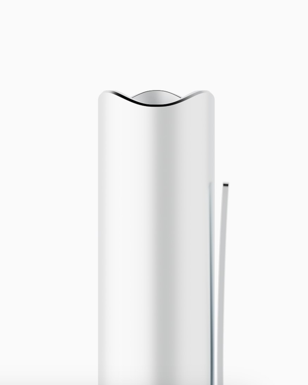
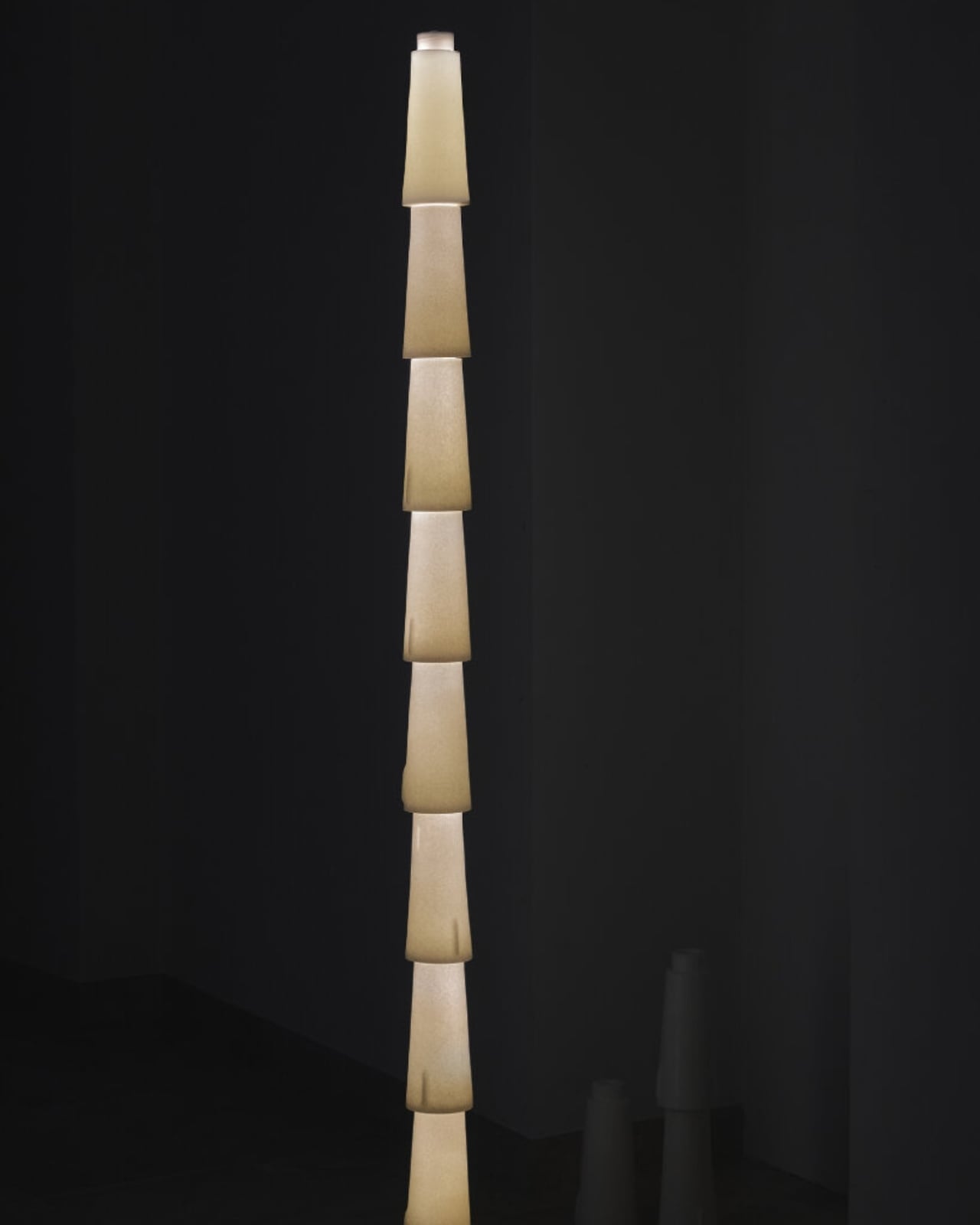
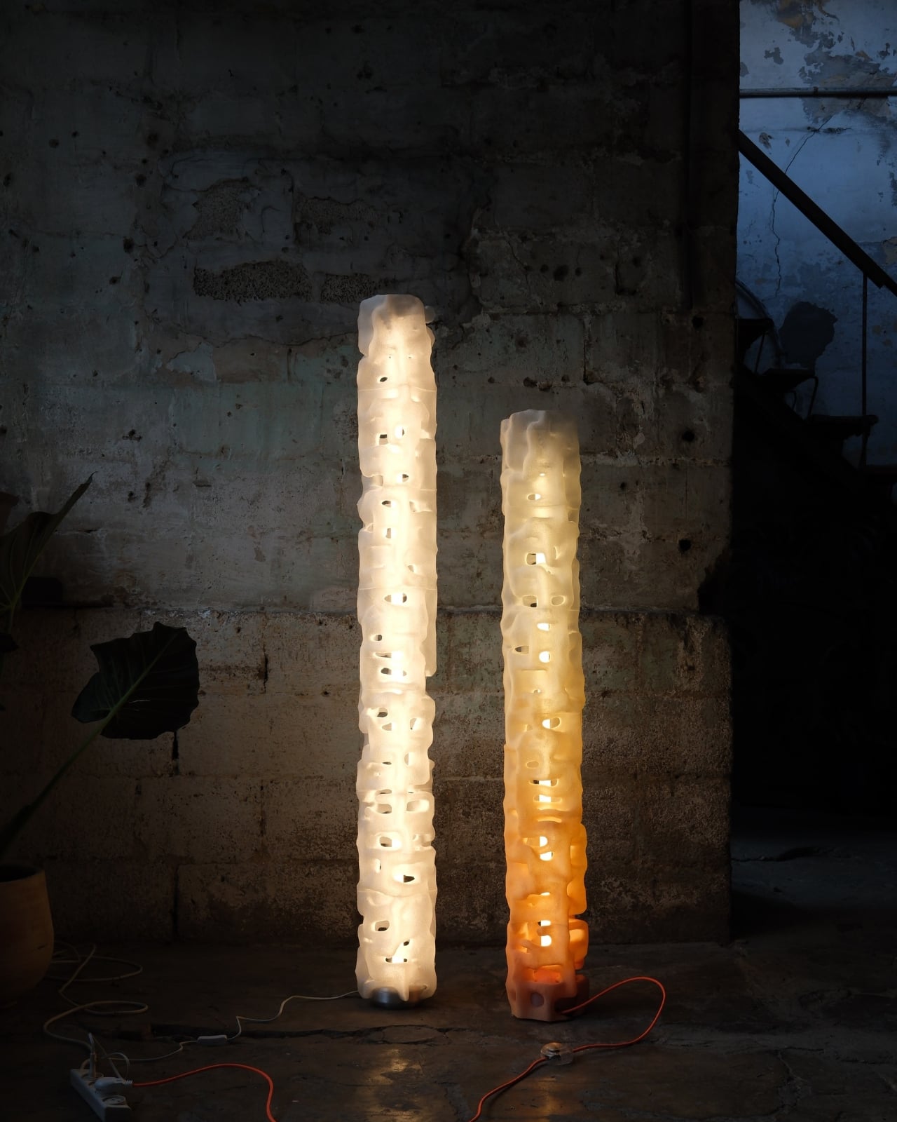
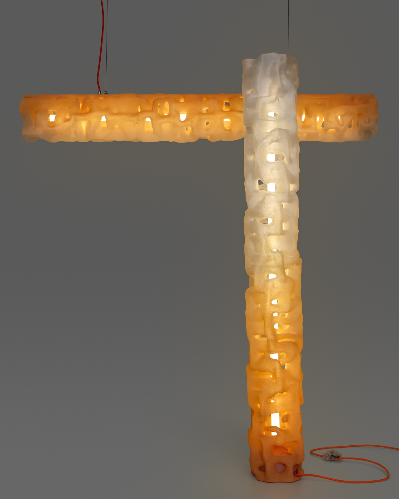
Then there’s the floor lamp, which takes everything up several notches in scale and presence. Standing at 130 cm, this piece becomes a vertical sculpture that anchors a room rather than just illuminating it. It’s made from recyclable plastic using a custom 3D printing process, which means each one is fabricated to order. The sustainability angle isn’t just marketing speak here; it’s baked into how these lamps are actually made.

You can choose between fully transparent or a sunset gradient finish, each offering a different vibe. Both versions use internal LED tubes that make the entire porous surface glow from within, creating this soft halo effect that feels more like ambient sculpture than functional lighting. It’s the kind of piece that makes you rethink what a floor lamp can be.

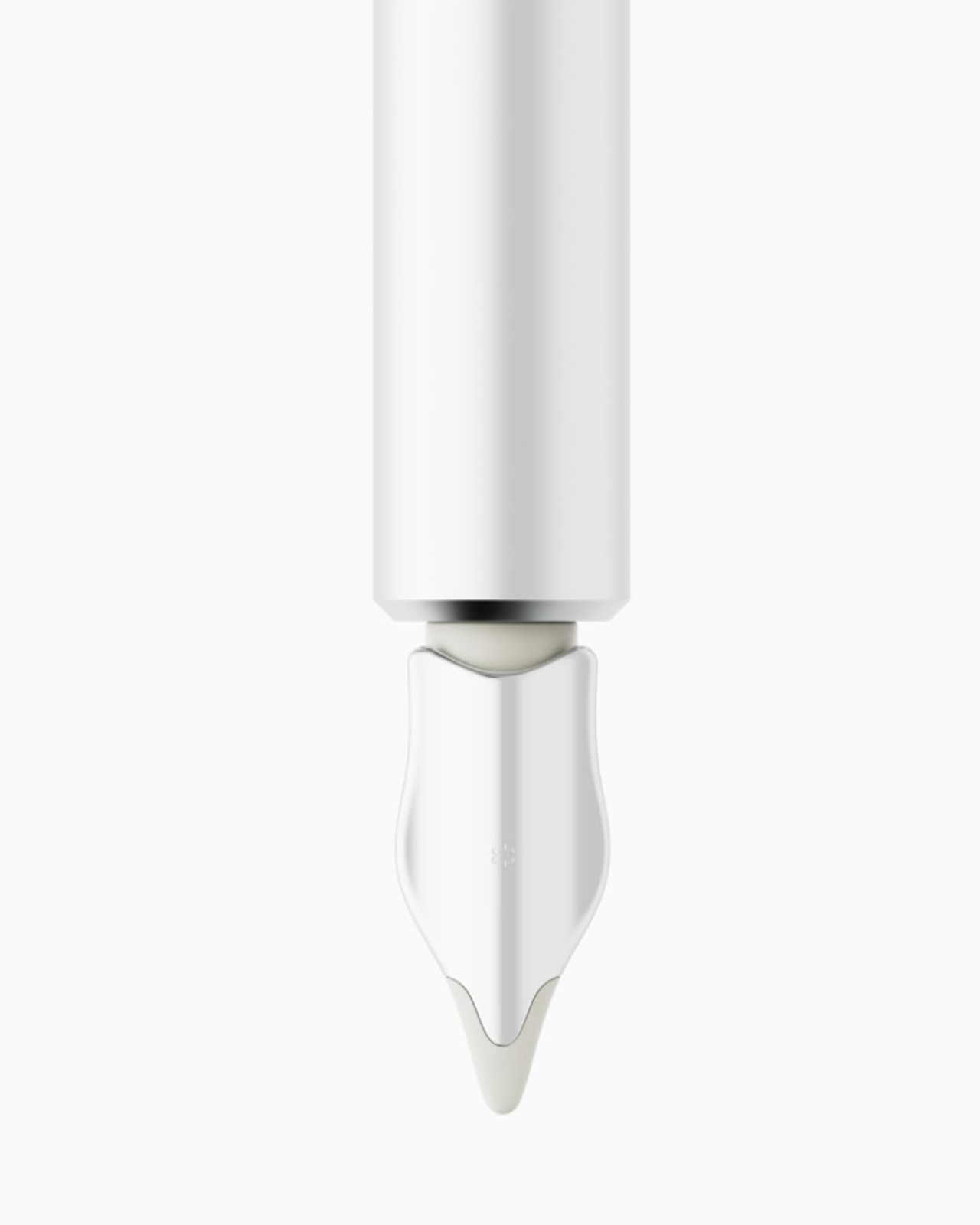
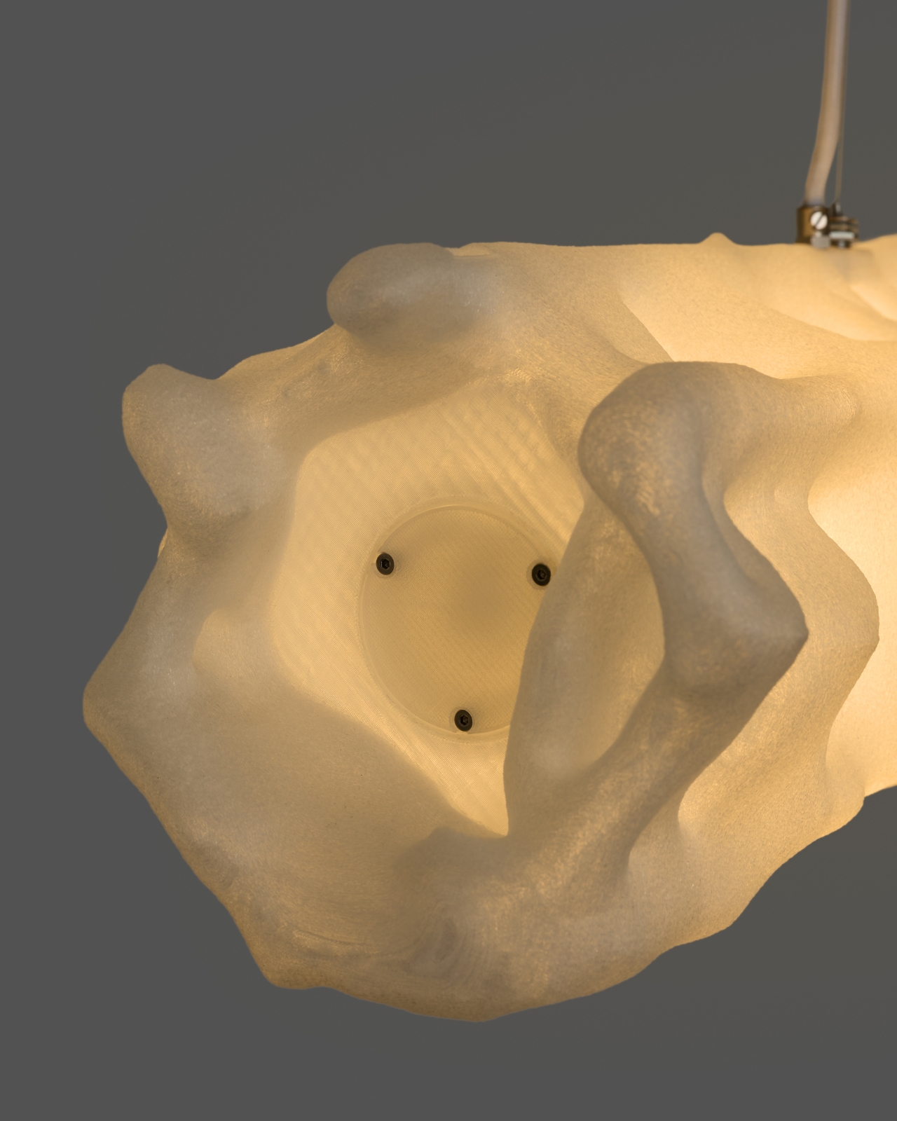
The pendant version brings that same organic aesthetic overhead. Suspended by two minimal cables, it floats above dining tables or work surfaces with an elongated form that breaks away from the typical linear pendant design. There’s something almost weightless about how it hangs there, despite having such a strong visual presence. Like its siblings, it comes in transparent or sunset gradient finishes and uses that same coral-inspired, porous surface to diffuse light gently across whatever space it occupies.

What ties all three pieces together isn’t just their shared aesthetic DNA but the philosophy behind them. YET FAB is researching how computational design can create forms that reference natural systems without mimicking them directly. These aren’t literal recreations of coral; they’re interpretations of how natural structures grow, adapt, and interact with light. It’s biomimicry filtered through algorithms and fabricated with contemporary technology.

Every lamp in the Alherd series is made to order and can be customized in color on request, which adds another layer of personalization to an already thoughtful collection. In a world drowning in mass-produced lighting that all looks vaguely the same, there’s something refreshing about objects that feel computationally precise yet organically imperfect, sustainable yet sculptural, functional yet deeply atmospheric. These aren’t just lamps. They’re experiments in how we might live with light differently.

The post These 3D-Printed Lamps Glow Like Coral Reefs first appeared on Yanko Design.

This Furniture Trick Makes Flat Wood Look Curved With Zero Waste

Have you ever wondered why ergonomic furniture costs so much? Here’s a secret: creating curves that actually fit the human body is ridiculously complicated. Our bodies are all soft lines and organic shapes, but transforming hard materials like wood into those comfortable contours usually requires serious craftsmanship, expensive machinery, or both. Designer Minhwan Kim just cracked this puzzle in the most elegant way possible, and the design world is taking notice. Layer, his recent furniture project, just won Red Dot’s prestigious “Best of the Best” award for 2025.

The genius of Layer lies in how it rethinks an old problem. Traditional curved furniture typically means either steam-bending wood (labor-intensive and temperamental) or carving from solid blocks (hello, massive waste). Some designers have experimented with parametric structures, which use flat sheets cut into specific patterns that can be assembled into three-dimensional curves. It sounds perfect in theory, but there’s a catch. These designs often waste huge amounts of material because the cutting patterns don’t efficiently use the available sheet space. You end up with gorgeous furniture and a dumpster full of expensive scraps.

Designer: Minhwan Kim

Kim’s approach flips this wasteful equation. Layer uses an optimized parametric system that minimizes material waste while creating furniture that looks like it was sculpted rather than assembled. The process starts by digitally breaking down a 3D curved surface into individual layers. Think of it like those topographic maps that show elevation through contour lines, except here each line becomes a physical piece of wood. These intersection curves are then aligned and processed into solid wood components that stack together to create the final form.

The beauty of this system is visible in the finished pieces. That curved seat you see isn’t molded or carved. It’s actually dozens of thin wooden layers precisely cut and stacked, creating a fluid, organic surface that perfectly supports the human form. The wood grain flows across the surface like waves, emphasizing the layered construction rather than hiding it. It’s functional sculpture that actually works as furniture.

What really makes this project special is how it bridges digital design and traditional craftsmanship. The parametric modeling happens on a computer, allowing Kim to optimize every cut for minimal waste. But the actual fabrication involves real woodworking, real routers and sanders, and actual human hands assembling each layer. You can see this in the workshop photos where curved wooden ribs are being clamped together, sawdust coating the workbench, showing that even cutting-edge design still requires getting your hands dirty.

The manufacturing process is surprisingly straightforward once you understand the system. Standard flat plywood sheets get CNC-cut into the calculated patterns. Because the system is optimized, the pieces nest together on the sheet like a jigsaw puzzle, using nearly every inch of material. These flat pieces are then processed into their final curved profiles through careful routing. Finally, they’re assembled layer by layer, each piece fitting into precisely calculated positions until the complete three-dimensional form emerges.

This isn’t just clever for its own sake. In an era when we’re increasingly aware of material consumption and waste, Layer demonstrates how thoughtful design can be both beautiful and responsible. The furniture industry generates enormous amounts of waste, particularly in custom and high-end pieces. By optimizing material usage from the digital design phase, Kim shows that sustainability and aesthetics don’t have to be competing values.

The finished stool in the exhibition space looks deceptively simple. Its dark wood surface curves gently to cradle the body, the layered edge visible like the pages of a closed book. Nothing about it screams “innovative fabrication technique” or “award-winning design.” It just looks like a really nice piece of furniture you’d actually want in your home. And maybe that’s the highest compliment you can give any design: it solves complex problems so elegantly that the solution becomes invisible.

For anyone interested in where design and technology intersect, Layer represents an exciting direction. It shows how computational design tools can enhance rather than replace traditional craft, and how constraints like material efficiency can inspire creative solutions rather than limiting them. Sometimes the most innovative designs aren’t about flashy new materials or radical forms, but about finding smarter ways to work with what we’ve always had.

The post This Furniture Trick Makes Flat Wood Look Curved With Zero Waste first appeared on Yanko Design.

This Smart Pen Just Turned a Poet’s Legacy Into Your Next EDC

Your everyday carry says something about you. Every item you slip into your pocket or bag is a choice, a reflection of what matters when you’re moving through your day. Nicolas Studio’s Poet smart pen understands this, which is why they designed something that’s not just functional tech, but a meaningful object worth carrying. It’s a tribute to Yun Dong-ju, one of Korea’s most beloved poets, and it might just earn a permanent spot in your rotation.

If you’re not familiar with Yun Dong-ju’s story, here’s why he matters. He wrote in Korean during Japanese colonial rule when doing so was an act of resistance. His poems were simple, everyday observations turned into quiet defiance, preserving language and culture through words until his death in a Japanese prison at 27. In a 1986 survey, Korean youth voted him their most popular poet, and that love hasn’t diminished. His work is about finding light in darkness, about self-reflection and hope, all expressed in language anyone could understand.

Designer: Nicolas Studio

That accessibility, that everyday poetry, became the design brief. Nicolas Studio didn’t want to create another aggressive tech gadget. They wanted something you’d actually want to carry every day, something that felt as natural in your hand as Yun’s words felt on the page. The result is a smart pen that proves EDC doesn’t have to sacrifice beauty for function.

The form language is all gentle curves and flowing lines, a direct translation of the softness in Yun’s poetry. The body is elegantly elongated with a subtle taper, finished in soft white that stays clean-looking without feeling clinical. It’s the kind of minimalism that works in real life, not just on a mood board. At a glance, it could be a premium fountain pen, but pull it out to sketch or take notes and the smart functionality reveals itself seamlessly.

The details make it. A warm gold band transitions between the body and writing tip, adding just enough visual interest without screaming for attention. The same brushed gold accent appears on the charging case, which doubles as a display stand for your desk. The word “poet” is etched vertically in lowercase letters, subtle enough that most people won’t notice, but meaningful when they do. It’s the kind of detail that rewards daily interaction.

Speaking of daily carry, the charging case is brilliantly designed. It’s cylindrical with a slightly undulating top edge that mirrors the pen’s curves, finished in matching white and gold. But here’s what matters for EDC: it’s compact enough to slip into a bag pocket without adding bulk, protective enough to keep your pen safe, and beautiful enough that you won’t mind leaving it on your desk between carries. It becomes a small sculptural moment in your workspace rather than tech clutter. Ergonomics were clearly a priority. The grip area has subtle contouring that makes extended use comfortable whether you’re sketching, annotating documents, or taking meeting notes. Smart pens can feel awkward, especially if designers prioritize tech over usability. The Poet feels like it was designed by someone who actually carries and uses a pen daily, not just renders it in CAD.

What elevates this beyond typical EDC gear is the story it carries. Yun Dong-ju used poetry to maintain humanity during Korea’s darkest period. Every time you pull out this pen, you’re connected to that legacy of using everyday tools for meaningful creation. It’s not just about capturing ideas or staying productive. It’s about the intentionality of choosing tools that mean something beyond their function. Most smart pens now look like they’re trying too hard to be futuristic but the Poet takes the opposite approach. It’s quiet. It’s refined. It earns its place in your carry through design restraint rather than feature overload. The tech serves the experience rather than defining it.

For the EDC enthusiast who appreciates when gear tells a story, or when design connects you to something larger than yourself, the Poet offers something rare. It’s proof that smart devices can have soul, that technology and poetry aren’t opposing forces. Sometimes the best addition to your everyday carry isn’t the thing with the most features, but the one that makes you think differently about why you carry anything at all. This is EDC with intention. This is carrying poetry in your pocket.

The post This Smart Pen Just Turned a Poet’s Legacy Into Your Next EDC first appeared on Yanko Design.

Peak Saunas Pack Medical-Grade Wellness Tech Into Your Home

Remember when saunas were those wooden boxes at the gym that smelled faintly of eucalyptus and other people’s sweat? Yeah, those days are over. Peak Saunas is changing the game with infrared saunas that look like they belong in a luxury wellness retreat, not your basement.

Here’s the thing about Peak Saunas: they’ve managed to pack every feature you’d expect to pay thousands extra for into sleek, minimalist designs that actually fit in modern homes. We’re talking medical-grade red light therapy, WiFi app control, oxygen ionizers, and upgraded Bluetooth speakers, all included as standard. Most premium brands would nickel and dime you for these add-ons, but Peak just builds them in from the start.

Designer: Peak Sauna

The lineup ranges from solo sanctuaries to couple-friendly spaces. The Rainier and Shasta are perfect one-person pods, while the Fuji and Everest offer two-person capacity for those who prefer company during their sweat sessions. If you’ve got the space and want to go all in, the Denali and Matterhorn models comfortably fit three people. And for the bold? There’s even the Patagonia, an outdoor model designed to handle whatever weather you throw at it.

What makes these saunas genuinely interesting from a design perspective is how they’ve solved the assembly problem. Anyone who’s ever tried to build flat-pack furniture knows the special kind of frustration that comes with cryptic instructions and missing hardware. Peak uses a modular, snap-together system with tongue-and-groove panels that apparently goes together so smoothly even non-DIY types can handle it. No special tools, no construction expertise required. Just you, the instructions, and maybe a friend to help hold things steady.

The tech integration is where Peak really shines. Each sauna connects to WiFi and comes with its own app, so you can preheat your sauna from your phone while you’re wrapping up work or finishing dinner. There’s something oddly satisfying about walking into a perfectly heated sauna instead of sitting there waiting for it to warm up. The full-spectrum infrared heating covers 360 degrees, from halogen and quartz heaters delivering near, mid, and far infrared wavelengths (700 to 25,000 nanometers, for the spec nerds out there) plus advanced carbon panels for consistent heat distribution.

Then there’s the red light therapy component, which has become increasingly popular in wellness circles. Peak includes XL medical-grade panels as standard equipment, not as an expensive upgrade. Red light therapy advocates swear by its benefits for skin health, muscle recovery, and overall wellness. Whether you’re a believer or skeptical, having the option built in gives you room to experiment without dropping extra cash.

The construction quality deserves attention too. Peak uses ethically sourced Canadian wood (either Hemlock or Red Cedar depending on the model) with no volatile organic compounds, which means cleaner air inside your sauna and better long-term durability. The wood naturally resists moisture and bacteria, making maintenance refreshingly simple. All electrical components come with EMF shielding, addressing concerns about electromagnetic field exposure during those long, relaxing sessions.

Peak hasn’t forgotten about ambiance either. Built-in chromotherapy lighting lets you bathe in whatever color suits your mood, from calming blues to energizing reds. Bluetooth speakers let you soundtrack your sessions with music, podcasts, or meditative sounds. There’s even an oxygen ionizer working quietly in the background to keep the air fresh. The company backs everything with a lifetime warranty, which speaks to their confidence in build quality and longevity. They claim these saunas are designed to last over a decade with daily home use, which is exactly what you want to hear when making this kind of investment.

What Peak Saunas really represents is the democratization of luxury wellness. The same features you’d find at high-end spas or exclusive fitness clubs are now available for your home, without the recurring membership fees or awkward small talk in the steam room. It’s wellness technology meeting thoughtful design, packaged in a way that actually makes sense for real homes and real people. Whether you’re an athlete looking for better recovery, a stressed professional seeking a daily escape, or someone who just really loves the idea of sweating in a beautiful wooden box while scrolling through your phone (no judgment), Peak has created something worth paying attention to. The sauna experience has officially gone mainstream, and it looks pretty good doing it.

The post Peak Saunas Pack Medical-Grade Wellness Tech Into Your Home first appeared on Yanko Design.

These Musicians Turn Obsolete Tape Decks Into Living Instruments

There’s something wonderfully defiant about watching three musicians hunched over dusty reel-to-reel tape recorders, coaxing haunting melodies from technology most people consider obsolete. The Japanese trio Open Reel Ensemble isn’t just playing vintage machines from the 1970s and 80s. They’re rewriting the rules of what counts as a musical instrument, one spinning magnetic tape at a time.

Their latest project, “Magnetic Folklore,” feels less like a performance and more like a conversation with ghosts trapped in analog media. While the rest of us stream crystal-clear audio from the cloud, these artists are literally fishing for sound waves, their hands manipulating tape loops stretched across bamboo bows in a process that looks equal parts technical wizardry and interpretive dance.

Designer: Open Reel Ensemble

The group, composed of Ei Wada, Haruka Yoshida, and Masaru Yoshida, has been perfecting what they call “magnetikpunk” for years. It’s a fitting name. Like cyberpunk imagined gritty futures through technology, magnetikpunk explores forgotten pasts through the warm hiss and physical presence of tape. The sound they create is ethereal and otherworldly, full of texture that digital production often scrubs away in pursuit of perfection.

What makes their approach truly fascinating is how they’ve turned recording equipment into live performance instruments. These aren’t simply tape playback devices. The ensemble has developed techniques to program sounds directly onto the recorders, switching individual tracks on multi-track machines on and off like notes on a guitar. They record blocks of sustained noise at various pitches, then trigger and disable them during performances to create intricate chords and melodies in real time.

One of their most striking innovations is the JIGAKKYU, which they describe as a traditional folk instrument despite being entirely invented. Picture this: magnetic tape stretched across a bamboo bow, attached to a reel-to-reel deck. As the performer draws the bow, they control how the tape moves through the machine, manipulating speed, tension, and playback in ways the original manufacturers never imagined. It looks like they’re fishing, only instead of catching dinner, they’re catching sounds that shouldn’t exist.

There’s something deeply satisfying about watching old technology get a second life. In our culture of planned obsolescence, where last year’s phone becomes this year’s landfill, Open Reel Ensemble’s work feels like a quiet rebellion. They’ve taken machines that most people hauled to the curb decades ago and transformed them into instruments capable of sounds no synthesizer can quite replicate. That characteristic warmth, the slight imperfection, the tactile relationship between performer and machine, it all adds up to music that feels genuinely alive.

The analog revival happening across creative industries isn’t just nostalgia, though there’s certainly some of that. It’s a recognition that different technologies offer different possibilities. Digital audio workstations can do things tape never could. But tape can do things digital never will. The physical limitations of the medium, the happy accidents, the way sound degrades and transforms as it passes through magnetic fields, these aren’t bugs. They’re features.

Open Reel Ensemble understands this intuitively. In interviews, Wada talks about constantly discovering new techniques, exploring “rotation and movements, and the relationship between magnetics and sound.” Each performance becomes an experiment, each machine a collaborator with its own quirks and personality.

What they’ve created goes beyond retro aesthetics or hipster fetishization of old gear. This is about expanding our definition of what music can be and where it can come from. In an era where AI can generate technically flawless compositions in seconds, there’s something powerful about three humans wrestling with finicky machines, their sounds emerging from friction and patience rather than algorithms and processing power.

The beauty of “Magnetic Folklore” lies in its contradictions. It’s experimental music that honors tradition, high-concept art that’s deeply tactile, cutting-edge performance built on discarded technology. It reminds us that innovation doesn’t always mean forward. Sometimes it means sideways, backward, or in directions we forgot existed.

For anyone fascinated by where design, technology, and art intersect, Open Reel Ensemble offers a masterclass in creative thinking. They looked at equipment everyone else had moved past and asked: what if we’re not done here yet? What stories are still trapped in these spinning reels? Turns out, quite a few. And they sound absolutely mesmerizing.

The post These Musicians Turn Obsolete Tape Decks Into Living Instruments first appeared on Yanko Design.

These Modular Wax Lights Stack Like Living Totems

There’s something almost magical about watching a candle melt, the way solid wax transforms into liquid and back again. Copenhagen-based studio Daydreaming Objects has taken that transformative quality and turned it into something completely unexpected: sculptural light towers that feel like they’re alive.

Their project, Soft Solids, recently won the Seoul Design Award 2025, and once you see these pieces, you’ll understand why. These aren’t your typical lamps. They’re modular sculptures that stack like organic totems, built from specially developed natural wax blends and vintage lighting hardware salvaged from mid-20th-century fixtures across Sweden, Italy, and former Czechoslovakia.

Designer: Daydreaming Objects (photos by Norbert Tukaj)

The beauty of this project lies in its contradiction. Wax feels temporary, fragile even. We think of it dripping down birthday candles or melting in the sun. But Daydreaming Objects has figured out how to make it durable, heat-resistant, and strong enough to serve as functional lighting. They’ve developed a blend using soy wax and stearin, a vegetable or animal fat derivative that’s far more sustainable than petroleum-based paraffin. The result is a material that can be endlessly recycled, melted down and recast into new forms without losing its integrity.

What makes Soft Solids particularly clever is its modularity. The Stem light sculpture, one of the standout pieces in the collection, consists of cylindrical wax units that stack vertically. You can add or remove sections, adjusting the height and composition to fit your space or mood. It’s like playing with blocks, except these blocks glow. By day, they stand as quiet, solid forms with a minimalist presence. By night, LED lights transform them into luminous columns that diffuse warmth throughout a room.

The design philosophy here draws heavily from nature. The biomorphic shapes echo patterns of growth and regeneration you’d find in plants or geological formations. The color palette reinforces this connection: off-white, soft blue, and muted green hues that evoke natural landscapes rather than synthetic spaces. Each piece receives a protective natural layer that increases strength and heat resistance while ensuring the LED light diffuses evenly through the wax.

But there’s also an element of nostalgia woven into these contemporary pieces. The vintage hardware, those metal and glass components from decades past, gives each light sculpture a sense of history. It’s not just about sustainability through using renewable materials but also about extending the life of objects that already exist. Instead of letting old lamp parts gather dust in storage or end up in landfills, Daydreaming Objects pairs them with something entirely new, creating a conversation between past and present.

The process itself is surprisingly high-tech for such an organic-feeling result. The designers use computer software and 3D printing technology to create prototypes and silicone negatives for casting the molten wax. Each shade is specifically designed to match its vintage base, ensuring both aesthetic harmony and functional compatibility. It’s a fascinating blend of digital precision and handcrafted sensibility.

What’s particularly relevant right now is how this project addresses our growing awareness of material waste and circular design. Wax is infinitely recyclable. If a piece breaks or you simply want to change it, you can melt it down and start over. This circular approach to lighting design feels refreshingly honest in a world drowning in disposable products. For anyone interested in where design is heading, Soft Solids offers a compelling glimpse. It proves that sustainable materials don’t have to look earnest or utilitarian. They can be poetic, playful, and deeply beautiful. The project challenges our assumptions about what’s permanent and what’s temporary, what’s precious and what’s everyday.

Daydreaming Objects has essentially created a new design language where transformation isn’t a bug but a feature. The very impermanence of wax becomes its strength, allowing for endless reimagining. These light sculptures don’t just illuminate rooms; they illuminate a path forward for thoughtful, regenerative design that respects both history and the future.

The post These Modular Wax Lights Stack Like Living Totems first appeared on Yanko Design.

This Designer Just Made a Lamp You Pump Up Like a Bike Tire

Picture this: a lamp that literally grows before your eyes, expanding and glowing brighter as you pump air into it like you’re inflating a bicycle tire. It sounds like something out of a science fiction movie, but it’s very real, and it’s called Blow. Designer Jung Kiryeon has created something that makes you rethink what a lamp can be, and honestly, it’s kind of mesmerizing.‎

The Blow lighting series isn’t your typical flip-a-switch-and-forget-it situation. Instead, these interactive lamps require you to physically engage with them using a hand pump. As you pump air into the structure, the lamp inflates and the light gets brighter. The more pressure you add, the more the lamp expands, creating this beautiful visual transformation right in front of you. It’s functional art that responds to your actions in real time.‎

Designer: Jung Kiryeon

Aside from just the cool factor of an inflating lamp, the design actually has a deeper meaning. Jung Kiryeon designed Blow as an exploration of anxiety, specifically the kind that builds up when you’re navigating unfamiliar territory or dealing with negative feedback loops. Instead of treating these uncomfortable feelings as something to push away, the designer examined how they progress and found a way to express them through light, volume, and material.‎

The result is a lamp that actually embodies emotional tension. Think about it: when you’re anxious, that feeling builds and expands inside you. With Blow, you’re literally pumping pressure into a structure, watching it swell and brighten. It’s a physical manifestation of an internal state, transforming something invisible and abstract into something you can see, touch, and control. There’s something oddly satisfying about externalizing that feeling, making it tangible.

The series includes two pieces, Blow 01 and Blow 02, and each one only comes alive through user interaction.‎ You’re not just passively consuming light; you’re actively participating in creating it. This shifts the relationship between person and object from passive to collaborative. The lamp needs you, and in a weird way, you might need it too, especially if you’re looking for a tactile way to process stress or tension.

From a design perspective, Blow sits at this fascinating intersection of product design, emotional wellness, and interactive art. It challenges our expectations about how everyday objects should behave. Most lighting is static: you turn it on, it provides light, end of story. But what if your lamp could be a ritual, a moment of mindfulness, or even a form of stress relief? What if the act of turning on a light could be meditative rather than automatic?

The materials and mechanics behind Blow are also intriguing. The inflatable structure likely uses flexible, durable materials that can withstand repeated expansion and contraction. The integration of lighting with air pressure mechanics requires careful engineering to ensure the light intensifies as the form expands. It’s a technical achievement wrapped in conceptual design. And let’s talk about aesthetics. There’s something undeniably captivating about watching an object transform. The visual language of expansion, the way light diffuses through the inflated material, the organic shapes that emerge as air fills the structure… it all creates a dynamic viewing experience. It’s the kind of thing that would absolutely become a conversation starter in any space.

Blow also taps into our growing interest in experiential design. We’re living in an era where people value experiences and interactions, not just static possessions. This lamp offers both utility and experience. It’s not just about illumination; it’s about the journey of creating that light, the physical effort, the visual reward. Jung Kiryeon’s work reminds us that design can be more than problem-solving or aesthetics. It can be a language for expressing complex emotional states, a way to make the invisible visible. In our increasingly digital world, where so much of what we experience is intangible, there’s something refreshing about a physical object that demands your participation and responds to your input in such an immediate, visceral way.

The post This Designer Just Made a Lamp You Pump Up Like a Bike Tire first appeared on Yanko Design.

This Floating Bench Defies Gravity (and Your Expectations)

Have you ever looked at a mountain peak piercing through clouds and thought, “I want to sit on that”? Well, Miles Hass from Make With Miles did exactly that, and the result is a piece of furniture that looks like it belongs in a modern art museum but would feel right at home in your living room.

The concept is beautifully simple yet wonderfully complex. A massive rock sits at the base, looking like a mountain rising from the floor, while a wooden bench top appears to float right through it. It’s the kind of design that makes you do a double take because your brain can’t quite process what your eyes are seeing. And that’s exactly the point.

Designer: Miles Hass

Miles drew inspiration from that dreamy image of mountaintops emerging from clouds, and somehow translated that ethereal feeling into something you can actually sit on. The execution required heading out to Joshua Tree, where he collaborated with fellow maker Ben Uyeda to bring this impossible-looking piece to life. Because apparently, regular furniture shopping was just too easy.

What makes this project particularly fascinating is the challenge it presents. You can’t just slap a piece of wood on a rock and call it a day. The engineering behind making a functional bench that appears to defy gravity while maintaining structural integrity is no small feat. The rock needs to support weight, the wood needs to actually hold someone sitting on it, and the whole thing needs to look effortlessly elegant. It’s like solving a three-dimensional puzzle where one wrong move means your mountain bench becomes a pile of expensive mistakes.

The aesthetic is pure contemporary design poetry. We’re often surrounded by mass-produced IKEA clones so there’s something refreshing about furniture that tells a story. This bench doesn’t just serve a function, it starts conversations. It’s sculptural enough to be art but practical enough to be, you know, an actual bench. That balance is harder to achieve than it looks.

For design enthusiasts, this project represents a growing trend in furniture making where natural elements meet modern sensibilities. We’ve seen epoxy river tables take over Instagram, live-edge everything dominate Pinterest boards, and now we’re watching makers push even further into territory where nature and craft become indistinguishable. The floating bench takes this concept and cranks it up to eleven.

What’s particularly cool about Miles’ approach is that he shares the entire process. We’re used to only being shown the polished final product so watching the actual building process, complete with challenges and solutions, makes the piece feel more accessible. Sure, most of us aren’t going to Joshua Tree to hunt for the perfect mountain-shaped rock and engineer a bench around it, but seeing it done demystifies the creative process and might just inspire someone to try their own impossible project.

The technical aspects are equally impressive. How do you secure wood to rock? How do you ensure the weight distribution won’t cause catastrophic failure when someone decides to plop down with their morning coffee? These aren’t questions with easy answers, and that’s what makes the finished product so satisfying to look at. This bench exists in that sweet spot where art, engineering, and function converge. It’s impractical in all the best ways while still being completely practical. You could put it in your entryway, and it would be the most interesting piece anyone encounters in your home. You could place it in a gallery, and it would hold its own against any contemporary sculpture.

In a design landscape often dominated by minimalism to the point of sterility or maximalism that verges on chaos, Miles’ floating bench offers something different. It’s bold without being loud, natural without being rustic, and modern without feeling cold. And honestly, isn’t that exactly what we want from design? Something that surprises us, makes us think, and still lets us sit down at the end of the day.

The post This Floating Bench Defies Gravity (and Your Expectations) first appeared on Yanko Design.

IKEA and Teklan Turn Tech Into Eye Candy

You know that weird thing we do with tech products? We buy them, we use them every day, but then we kind of hide them. Tuck the speaker behind the plant. Stash the lamp in the corner. As if apologizing for needing functional things in our homes. IKEA’s new collaboration with Swedish designer Tekla Evelina Severin (known as Teklan) is here to flip that script entirely.

The Teklan collection, which launches globally this December, is all about making your speakers and lamps the main character instead of background extras. We’re talking bold patterns, nostalgic color combos, and shapes that look like they wandered out of a really cool vintage store and somehow learned to play your Spotify playlist.

Designer: Teklan for IKEA

At the heart of the collection is the SOLSKYDD family, a trio of round Bluetooth speakers that refuse to be boring. The smallest is an 8-inch portable speaker in orange with a pattern that practically demands attention. The medium version comes in green with brown and beige diagonal stripes that feel very 70s but in the best possible way. And the largest? An 18-inch wall-mounted beast in textured orange that can even connect to a screen. These aren’t speakers that blend in. They’re conversation starters that happen to have excellent acoustics, designed by Ola Wihlborg to balance form with serious sound quality.

Then there’s the KULGLASS lamp speakers, which might be my favorite thing about this entire launch. Teklan designed them to look like soft-serve ice cream, because why shouldn’t your tech look like dessert? They come in mint green and a red-brown with pink combo, and they work as both lamps and Bluetooth speakers. The built-in volume knob is a nice tactile touch in a world where everything is controlled by tapping a screen.

What makes this collaboration feel special isn’t just the aesthetic, though the colors are definitely doing the heavy lifting. It’s the intention behind it. Teklan literally went to her grandparents’ house to match the exact shade of mint green to an old bar of soap from her childhood memories. That level of personal storytelling in product design is rare, especially for mass-market furniture retailers.

“We wanted to bring that softness and friendliness into technology, to help people see home electronics differently and invite more colour into their everyday spaces,” Teklan explained. And honestly, mission accomplished. These products feel warm and approachable in a way that most tech doesn’t. While the insides are packed with all the technical complexity you’d want from quality speakers, the outsides feel almost playful.

The collection also includes a refresh of IKEA’s cult-favorite VAPPEBY speaker, now decked out in Teklan’s signature colors, plus a whole range of braided charging cables called SITTBRUNN, RUNDHULT, and LILLHULT that are inspired by climbing ropes. Even your charging cables get to have personality now.

All the speakers can connect to each other and other compatible IKEA Bluetooth speakers for multi-speaker mode, and they support Spotify Tap, so you can seamlessly continue whatever you were listening to. The SOLSKYDD also comes in a plain white version if you’re not quite ready to commit to orange geometric patterns (though I’d argue that’s missing the point). Price-wise, we’re still solidly in IKEA territory. The portable SOLSKYDD starts at $80, the medium at $100, and the largest at $140. The KULGLASS lamp speakers are $130. Not cheap for IKEA, but reasonable when you consider you’re getting both form and function wrapped in genuinely unique design.

This collaboration represents something bigger than just pretty speakers. It’s part of a shift in how we think about the stuff that makes our homes work. After years of minimalism telling us to hide everything, make it all white, keep it neutral, there’s this growing appetite for objects with personality. Things that reflect who we are, what we love, the colors that make us happy.

IKEA has been experimenting with this more expressive approach since ending its partnership with Sonos earlier this year. The Teklan collection feels like a confident step into that space, proving that affordable design doesn’t have to mean boring design. The collection starts rolling out in December, with specific dates varying by market, so check with your local IKEA for availability. And maybe start thinking about where you want to display, not hide, your next speaker.

The post IKEA and Teklan Turn Tech Into Eye Candy first appeared on Yanko Design.

Puma Just Dropped Mismatched Rick and Morty Basketball Shoes

There’s something brilliantly chaotic about a basketball shoe that refuses to match itself. That’s exactly what Puma delivered with their latest collaboration featuring LaMelo Ball’s MB.05 and Adult Swim’s cult classic Rick and Morty, and honestly, I’m here for every interdimensional second of it.

This isn’t just another celebrity sneaker drop trying too hard to be relevant. It’s the third installment of what has become one of the most unexpected yet perfectly executed partnerships in recent footwear history. LaMelo Ball, the NBA All-Star known for his flamboyant court presence and genuine love for the animated series, has helped create something that feels authentically weird in the best possible way.

Designer: LaMelo Ball x PUMA

The design itself is pure multiverse mayhem. One shoe channels Rick’s chaotic genius with charged-up aqua and electric peppermint tones, while the other bursts with Morty’s anxious energy through vibrant orange and yellow. It’s asymmetrical, it’s bold, and it looks like it tumbled through six different portals before landing on shelves. The colorway, officially dubbed “Rickie Orange-Electric Peppermint,” breaks from the rockstar theme that has defined previous MB.05 releases.

What makes this collaboration work isn’t just the eye-catching colors. The MB.05 is built for performance, featuring Puma’s NITRO Foam technology that provides responsive cushioning without sacrificing court feel. The engineered mesh upper serves as the perfect canvas for Ball’s storytelling, while the revamped outsole stays true to his aggressive, unpredictable playing style. These aren’t just display pieces for your shelf, they’re legitimate performance basketball shoes that happen to look like they were designed by a mad scientist with impeccable taste.

The timing couldn’t be better. Rick and Morty has transcended its origins as a late-night cartoon to become a cultural phenomenon that resonates across demographics. Its humor is smart, dark, and unapologetically strange, much like Ball’s own approach to basketball. He plays with a creativity that feels improvisational, making passes that shouldn’t work but somehow do, launching shots from impossible angles. The connection between the show’s multiverse-hopping adventures and Ball’s style of play feels natural, not forced.

This partnership between Puma and Warner Bros. Discovery Global Consumer Products has expanded beyond just the MB.05. The collection includes the Puma Sportstyle Inverse and RS Surge styles, along with a full apparel line featuring two graphic tees, a long-sleeve option, shorts, a hoodie, and sweatpants. It’s the kind of comprehensive collaboration that shows real commitment to the concept rather than just slapping a logo on a product and calling it done.

At $135, the MB.05 Rick and Morty edition sits at a competitive price point for signature basketball shoes. Released on November 21, 2025, through Puma’s website, mobile app, the NYC flagship store, and select Foot Locker locations, the shoes represent accessible pop culture fashion for fans who want to express their interests through their footwear.

What’s particularly clever about this collaboration is how it embraces the core philosophy of Rick and Morty itself: nothing is sacred, everything is up for reinterpretation, and normal is overrated. In an era where most athletic footwear collaborations play it safe with neutral colors and subtle nods to their inspiration, Puma and Ball went full portal-gun chaos. They created something that demands attention and conversation, shoes that make people ask “what are those?” in the most complimentary way possible.

The broader implications for sneaker culture are worth noting too. This collaboration represents a growing trend of athletic brands embracing pop culture properties in genuine, creative ways. It’s not enough anymore to just reference something cool; the execution has to match the energy of both the athlete and the inspiration. Here, that balance is struck perfectly. Whether you’re a sneakerhead, a Rick and Morty superfan, or just someone who appreciates when design takes risks, the Puma x Rick and Morty MB.05 delivers. It’s weird, it’s functional, it’s conversation-starting footwear that doesn’t apologize for being exactly what it is: basketball shoes from another dimension.

The post Puma Just Dropped Mismatched Rick and Morty Basketball Shoes first appeared on Yanko Design.