EA delays Battlefield 6 Season 2 to February 17

The second season of Battlefield 6 is being pushed back based on “community feedback.” On Tuesday, EA and Battlefield Studios said Season 2 will now arrive on February 17.

Season 2 of Battlefield 6 had previously been scheduled for January 20, so we're looking at a delay of almost a month. As a consolation, the team is extending Season 1 through the start of the next season.

"During our ongoing development, we've continued to review community feedback and, in order to keep our promise, determined that our best path forward is to extend Season 1 and give ourselves extra time to further polish and refine Season 2," EA wrote in a blog post.

The game came out of the gates hot following its October launch, selling over seven million copies over its first three days. But recent Steam reviews provide a glimpse into the "community feedback" that sparked the delay. "The Battle Pass is extremely predatory and very FOMO, while the season itself doesn't give a lot to offer," one review with over 450 “helpful” votes said. They called out the title for having "so much FOMO stuff that it becomes more stressful than fun."

The Season 1 extension will include some bonus content. The Frostfire Bonus Path will give “players the chance to unlock new free and premium customization rewards, including a Weapon Package and a Soldier Skin, as well as XP Boosts, by advancing through the tiers of the Frostfire Bonus Path." The extension update arrives on January 20.

This article originally appeared on Engadget at https://www.engadget.com/gaming/ea-delays-battlefield-6-season-2-to-february-17-180306743.html?src=rss

NAK Studio Imagines a Hi-Fi Stack You Would Actually Want on Display

Most Hi-Fi gear still looks like anonymous black rectangles, even in carefully designed living rooms. Serious listeners often hide their amps and speakers in cabinets because the hardware rarely matches the rest of the furniture, even when the sound is great. The default assumption is that audio equipment belongs out of sight, tolerated for its performance but not celebrated for its presence.

Antoine Brieux of NAK Studio designed a complete stack he would personally want at home, treating it as a thought experiment about what happens when an integrated amplifier, speakers, and turntable are drawn as one family from the start. Color, tactility, and proportions are treated as seriously as the signal path, so the system could earn a spot in the open rather than behind doors or under furniture.

Designer: Antoine Brieux (NAK Studio)

The integrated amplifier is a low, solid block with a ribbed cylinder grafted onto one corner, turning the usual volume knob into a full control column. That cylinder suggests precise, satisfying adjustments for volume, inputs, and tone, giving your hand a clear place to land instead of hunting for tiny knobs or touch buttons scattered across a cluttered front panel.

The tall monochrome display beside the cylinder shows track info, a big dB scale, and twin bar-graph meters dancing with the music. The list of inputs covers phono and TV to Bluetooth and USB, and a warm-to-cold tonal slider sits below, so the front of the amp feels like a calm, legible dashboard rather than a technical interface that demands constant attention or an instruction manual.

The compact speakers are each a rounded rectangle with a single driver and tweeter, but finished in mixable Pantone colors, letting you treat them as color accents in a room. You could pair teal with orange, or match a pair to a shelf or wall, so they become part of the space’s palette instead of something you try to hide or apologize for when guests visit.

The matching turntable sits on the same footprint as the amp, with exposed suspension pillars and a straight arm that echoes the cylinder theme. The three components stack visually into a tidy tower, making the whole listening setup feel intentional, almost like a piece of modular furniture for records and streaming alike, cohesive enough to anchor a sideboard or desk.

NAK Studio’s concept is not about chasing specs, but about imagining a Hi-Fi system that earns its place in the open. The controls invite touch, the colors play with the room, and the stack looks as considered as the music it is built to play. It starts to feel less like a fantasy and more like how audio gear should have evolved all along.

The post NAK Studio Imagines a Hi-Fi Stack You Would Actually Want on Display first appeared on Yanko Design.

NBA League Pass is up to 55 percent off

Basketball fans can save on NBA League Pass right now, which lets you catch a bunch of out-of-market NBA games via streaming. The League Pass Premium subscription is on sale for $75, down from the usual $160, and League Pass Standard is marked down to $50 from $110. Considering we're almost halfway though the season, the discount makes sense and is a good deal for anyone who wants to keep a close eye on the rest of the games to be played this year.

The Standard plan includes commercials and support for only one device at a time, while the Premium tier offers no commercials, in-arena streams during breaks in the game, offline viewing of full games and concurrent streams on up to three devices at once.

Last year, League Pass added multiview, which allows you to view up to four games at once on a single screen. This is included across both subscription tiers. The service also added a smart rewind tool that automatically selects key highlights and plays from each game.

Outside the US and Canada, League Pass carries every single NBA game live, but within these countries a bevy of restrictions apply. In the US, any games being shown on your regional sports network will be blacked out as the service is meant for out-of-market games only. Also, any nationally broadcast games will not be available live, but instead will be available for on-demand viewing at 6AM ET the following day. The service is only for regular-season games.

If you're an avid NBA fan that follows multiple teams then the League Pass almost certainly carries dozens of games you can watch even with the restrictions in the US. Subscribers can get a list of applicable blackouts by entering their ZIP code before signing up.

Follow @EngadgetDeals on X for the latest tech deals and buying advice.

This article originally appeared on Engadget at https://www.engadget.com/deals/nba-league-pass-is-up-to-55-percent-off-163421368.html?src=rss

ILO Lamp Lets Soft Light Wander Between Rooms

Evenings drift from kitchen to dining table to balcony and back, while the nicest lamp stays tethered to a single socket. The small but persistent annoyance of cords, extension leads, and the feeling that lighting never quite follows where people actually end up sitting becomes background noise. Beautiful lamps are static, and that friction quietly shapes how and where you use light, even when it should not.

Arieto Studio’s ILO Lamp is a response to that pattern. The designers started by watching their own routines, noticing how often they moved while the light did not. ILO is an attempt to let light move as naturally as people do, without turning into a tech gadget or a camping lantern, treating the portable lamp as a piece of furniture that happens to be untethered when you need it.

Designer: Hanna Billqvist (Arieto Studio)

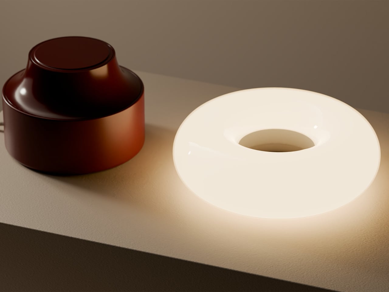
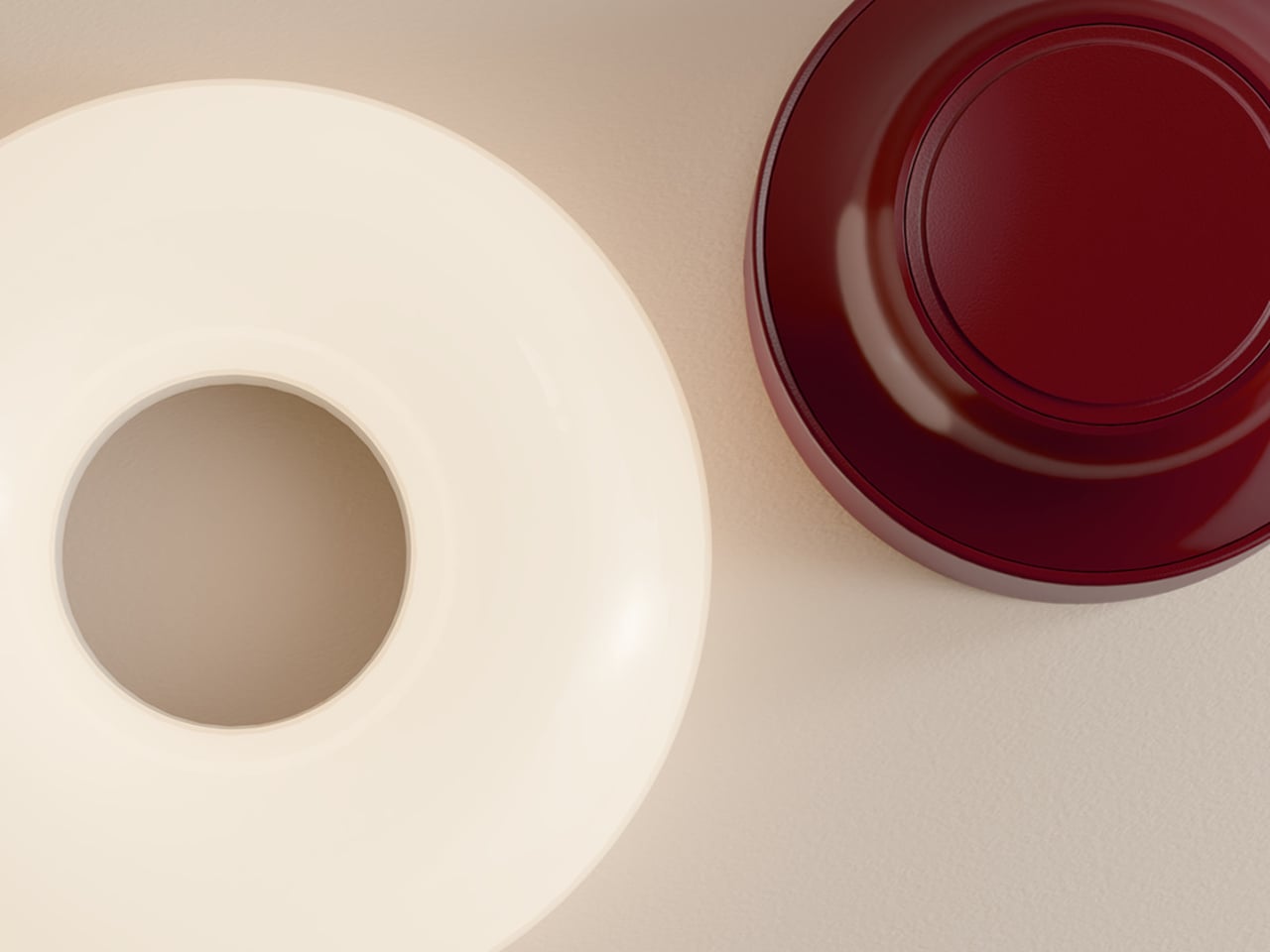
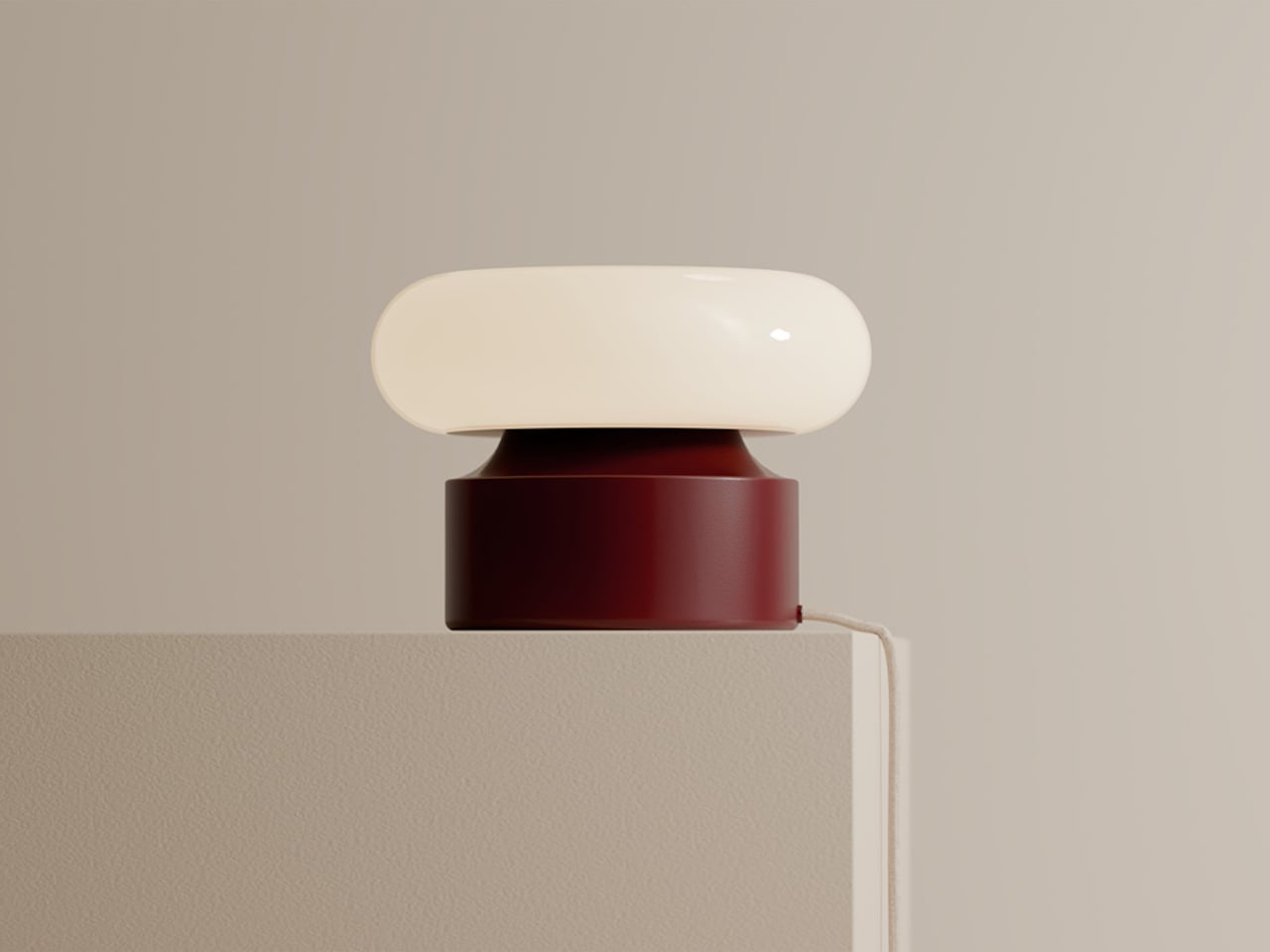
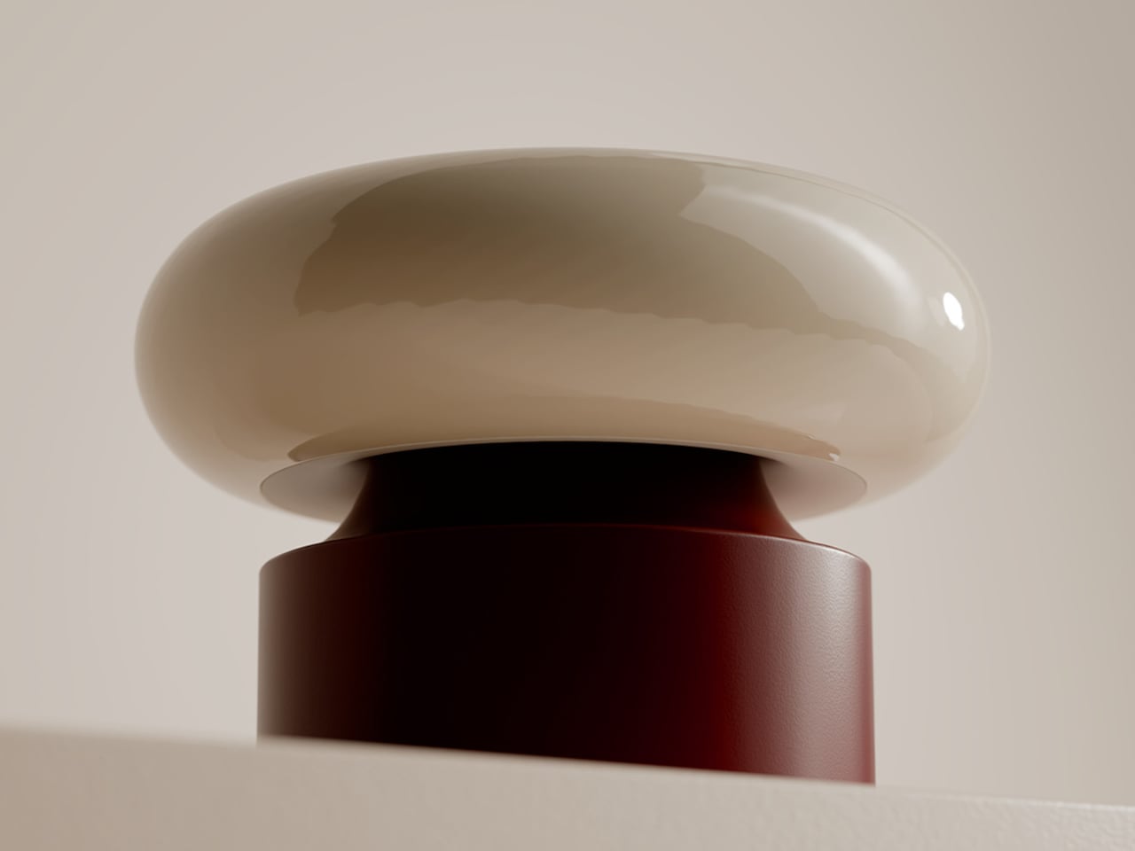
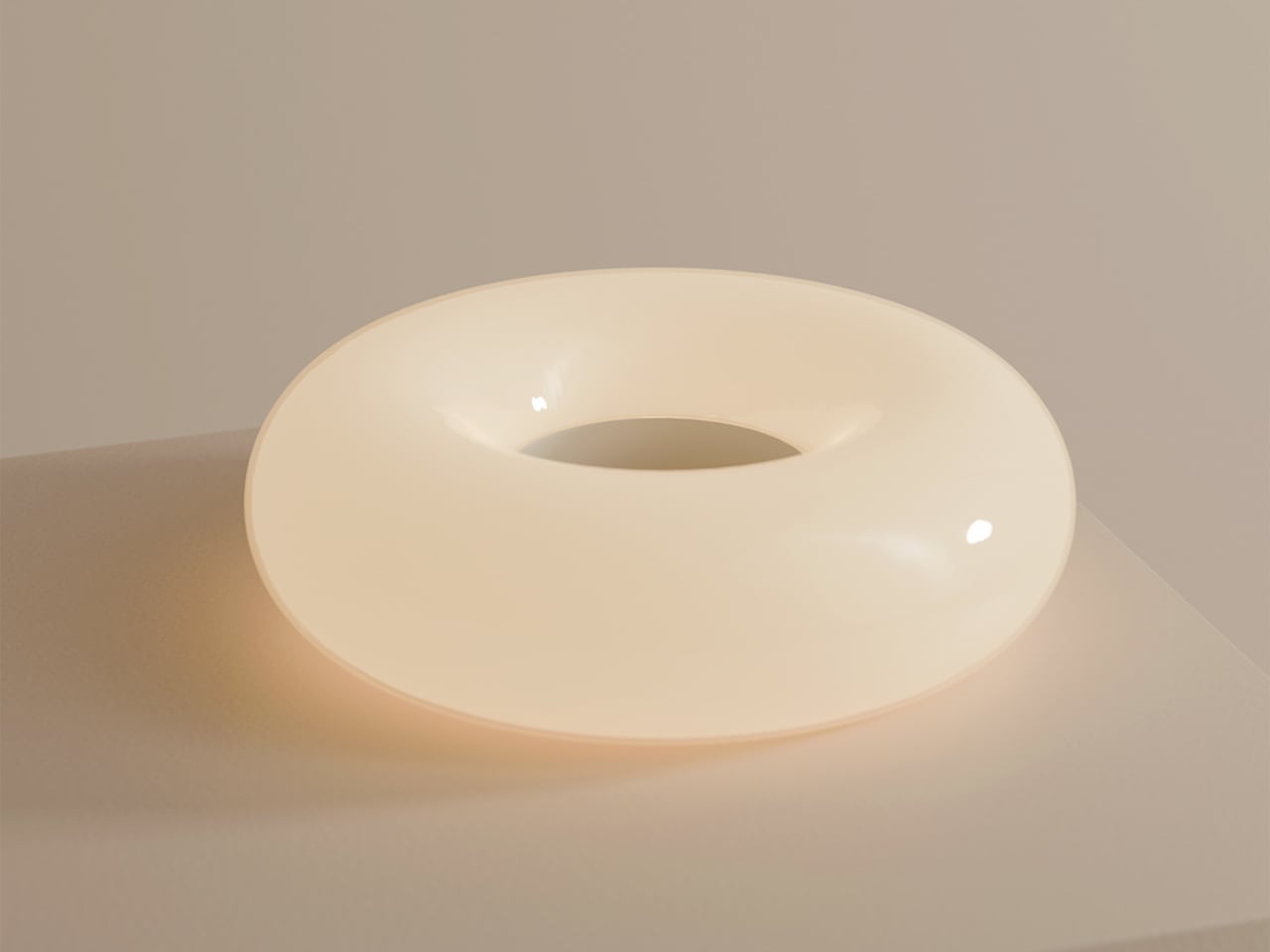
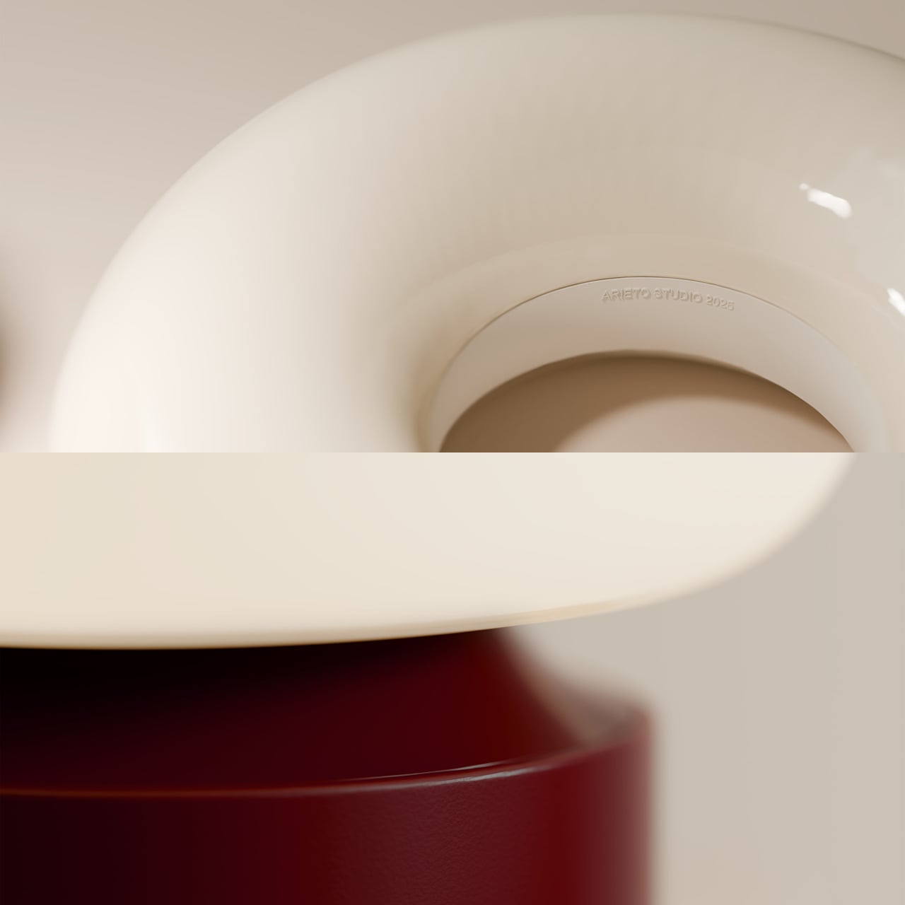
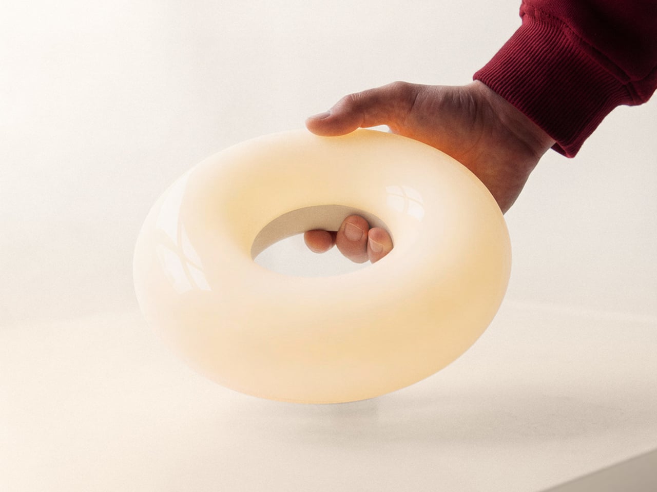
The lamp is two elements that live together, a luminous donut that holds the light and a weighted base that stays plugged in. When the donut rests on the base, it behaves like a sculptural table lamp. When lifted, it becomes a compact, cordless light that can travel to the terrace, coffee table, or hallway without trailing cables behind it or requiring a new outlet.

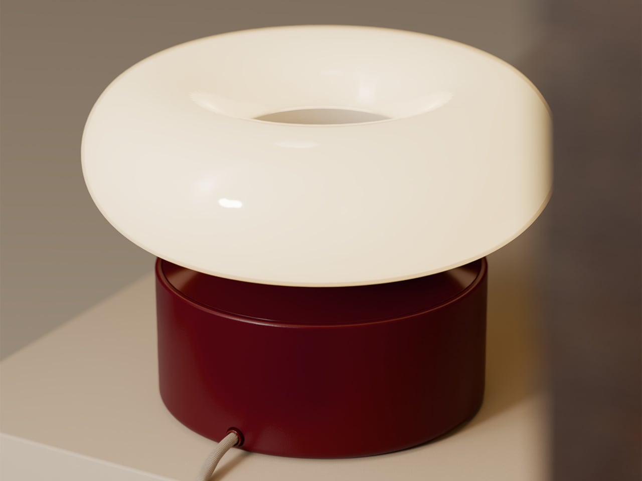
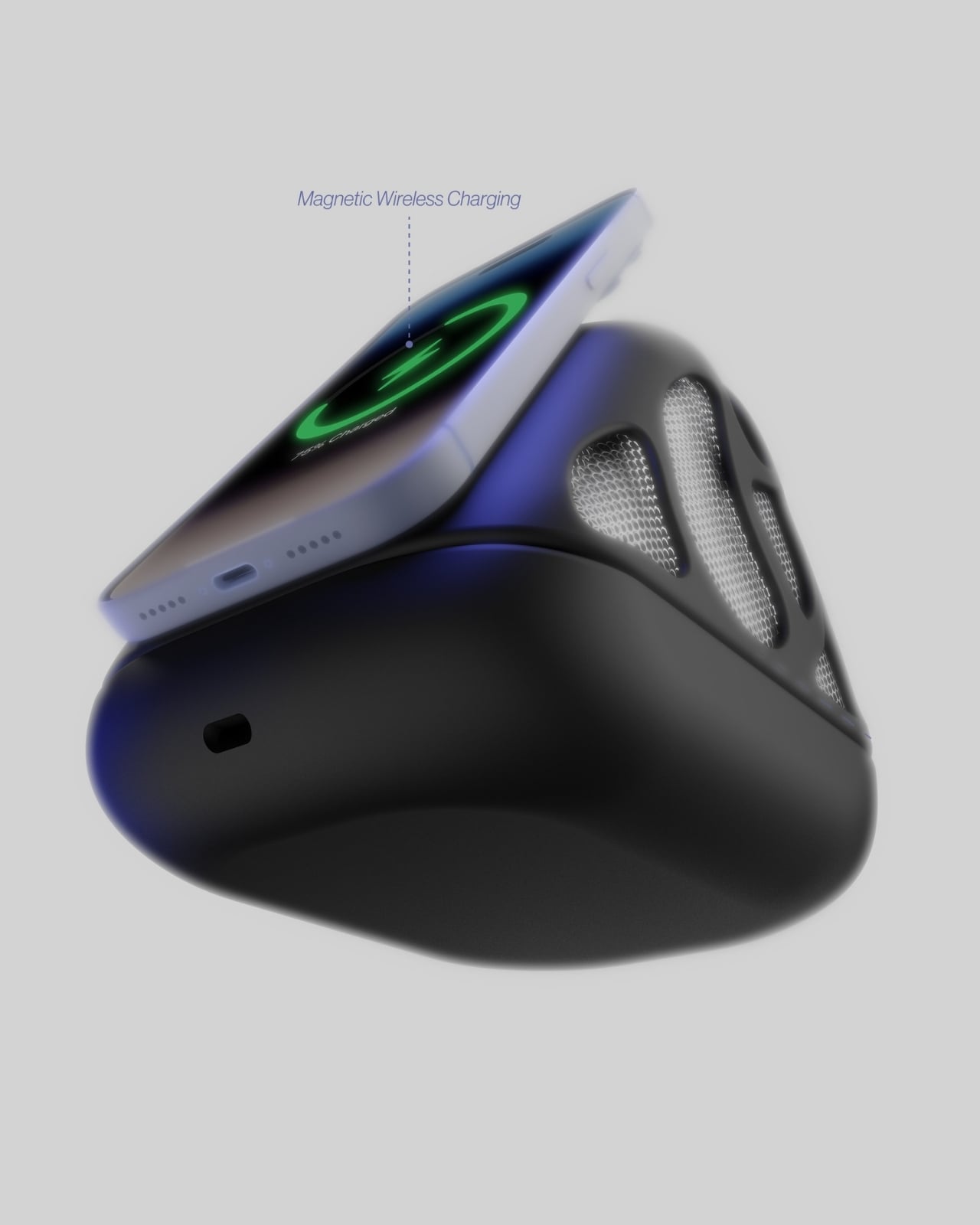
The base is both a stand and an induction charger. When the donut is dropped back onto it, charging starts automatically, no ports or cables to find in the dark. This turns recharging into a background ritual, the same motion you would make when tidying a table at the end of the night, and the lamp is ready again by morning without thinking about it.

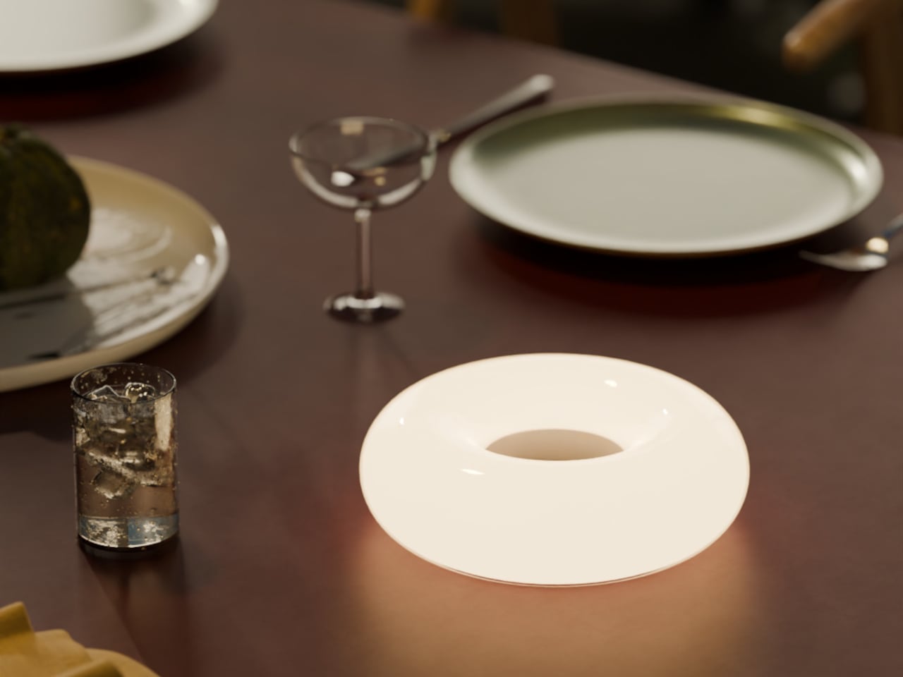
The soft, diffused glow from the ring throws gentle light across a table rather than a harsh spotlight. It is meant for calm, ambient illumination, the kind that makes late conversations feel unhurried and lets food or books sit in a pool of warm light without glare. The donut radiates evenly in all directions, so it never casts hard shadows or creates bright spots.

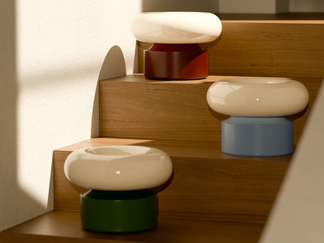
The donut on a balcony rail during a late drink, on a low shelf beside a sofa, or in a hallway where there is no convenient outlet shows how the same object moves between roles without looking like camping gear. It stays firmly in the language of interior objects, simple forms, rich colors, and a glow that feels like it belongs rather than borrowed from a utility drawer.

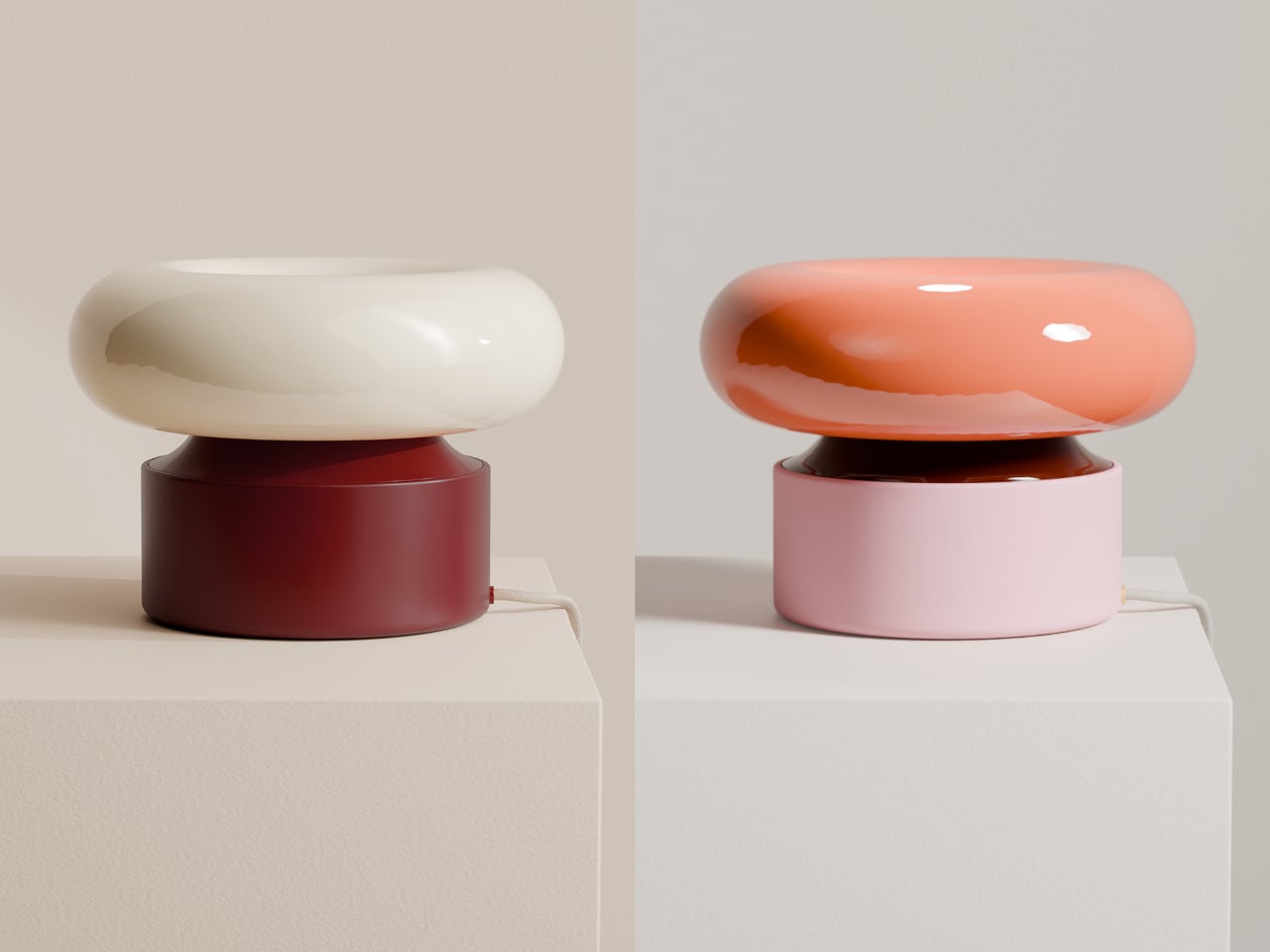
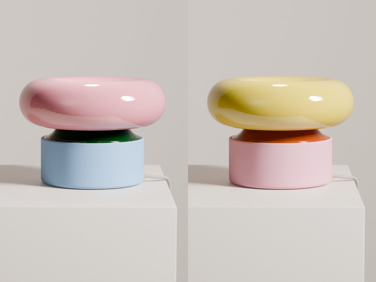
The contrast between the glossy, cream-colored ring and the solid, colored base makes the lamp read almost like a small sculpture when assembled. The base comes in several tones, burgundy, green, and blue, so it can either disappear into furniture or act as a quiet accent in a neutral room. The proportions are calm and grounded, not trying to impress with complexity.

ILO is less about showing off wireless charging and more about removing the tiny compromises that come with static lamps. It treats light as something that can follow dinners, conversations, and quiet moments, while still looking like a considered object when it comes home to its base. For people who move through their homes rather than settling in one spot all evening, a lamp that can keep up without cables or outlets starts to feel less like a luxury and more like how lighting should have worked all along.

The post ILO Lamp Lets Soft Light Wander Between Rooms first appeared on Yanko Design.

ONZA Just Designed a Dock That Replaces 3 Desk Accessories

We’ve all been there. You sit down at your desk, ready to tackle that project, and suddenly you’re drowning in cables, hunting for your phone charger, and watching your battery percentage drop to single digits. Your workspace looks like a tech graveyard, and your creative energy? Well, that died somewhere between untangling the third cable and knocking over your coffee while reaching for your headphones.

Enter the ONZA Desktop Dock, a concept design by Vedanta Maheshwari that’s making me seriously reconsider what a desk accessory can actually do. This isn’t just another “put your phone here” kind of solution. It’s a complete rethinking of how we interact with our workspace, and honestly, it’s about time someone figured this out.

Designer: Vedanta Maheshwari

At first glance, the ONZA system looks like something that beamed in from a more aesthetically pleasing future. The design features a sleek, geometric form that immediately catches your eye without screaming for attention. Think angular, almost sculptural, with a glossy black finish that somehow manages to look sophisticated rather than trying too hard. The body has these organic, flowing mesh panels that aren’t just there to look cool (though they definitely do). They’re functional speaker grills that transform this little powerhouse into an audio solution too.

But here’s where it gets interesting. The ONZA isn’t trying to be everything at once while doing nothing particularly well. Instead, it focuses on solving the actual problems creative professionals face every day. The integrated wireless charging pad means your phone gets juice while staying visible and accessible. No more digging through desk drawer chaos or having your device face-down on some random charging pad where you can’t see notifications. The angled design props your phone up at the perfect viewing angle, so it becomes part of your workflow rather than a distraction you have to pick up every five minutes.

Those subtle icons along the base? They’re not just decorative. They indicate battery status, storage connectivity, wireless capabilities, and audio functions. Everything you need to know at a glance, without any notification overload or annoying lights blinking at you while you’re trying to focus. It’s the kind of thoughtful detail that separates concept art from actual design thinking.

What really sells the ONZA concept, though, is how it plays with the entire desk ecosystem. Maheshwari’s renders show this thing in context, and it’s clear he understands that great design isn’t about creating isolated objects. It’s about creating harmony. The dock sits comfortably alongside mechanical keyboards, designer headphone stands, and dual monitor setups without fighting for visual dominance. It complements rather than competes, which is surprisingly rare in a market full of RGB-everything and aggressive gamer aesthetics.

The speaker integration is particularly clever. Most of us have dealt with the disappointing tinny sound of phone speakers or the hassle of connecting Bluetooth devices every single time we sit down. Having quality audio built into something that’s already anchoring your workspace? That’s the kind of convenience that actually changes how you work. Take a call without fumbling for earbuds. Play music while you design. Listen to a podcast while you’re organizing files. It’s all just there, ready to go.

Now, let’s be real for a second. This is a concept design, which means we can’t exactly run out and buy one tomorrow (trust me, I checked). But that’s also what makes it so exciting. Maheshwari is showing us what’s possible when designers really think about the creative workspace as a holistic environment rather than just a place to dump tech. The ONZA asks better questions: What if your charging solution also managed audio? What if your phone dock could integrate with your entire desktop ecosystem? What if workspace accessories could be genuinely beautiful without sacrificing functionality?

The creative workspace has evolved dramatically over the past few years, but our accessories haven’t always kept pace. We’re still dealing with solutions designed for problems from a decade ago. The ONZA Desktop Dock concept suggests a different path forward, one where form and function aren’t competing priorities but complementary goals. And honestly? That future looks pretty good from here.

The post ONZA Just Designed a Dock That Replaces 3 Desk Accessories first appeared on Yanko Design.

It’s the last day to get up to $90 off reMarkable E Ink tablet bundles

E Ink tablet maker reMarkable is running a bundle deal right now that can save you between $80 and $90 when buying a reMarkable 2 along with a Marker stylus and a folio case. The savings vary depending on the bundle you configure, but this can bring your out-the-door cost down to $449 from $529 for the tablet, Marker stylus and polymer weave book folio. The offer runs through January 17.

The company also sells a newer stylus called Marker Plus that lets you erase by flipping it around just like a real pencil, but that will cost you an extra $50. If you’ve been eyeing a dedicated writing tablet for work, school or just jotting down notes without the distraction of endless apps, this bundle deal is an ideal opportunity to pick one up.

The reMarkable 2 earned our top pick for best e-ink tablet. In our review, we said the tablet was prettier than ever with a 10.3-inch display and a handsome aluminum frame. The tablet is only 4.7mm thick and weighs less than a pound, helping it feel lean and portable.

The display can detect over 4,000 different levels of pressure with the Marker stylus, allowing for precise shading when sketching and the latency between the stylus and the screen is just 21ms. reMarkable fitted the display with a resin layer on top of the glass to make writing on it feel more realistic. We didn't think this passed muster, but we found writing on it was a joy nonetheless.

The tablet supports PDFs and ePUBs, which can be added via the companion mobile app or a desktop computer. You can also pair the reMarkable 2 with Google Drive, Microsoft OneDrive or Dropbox to access files. The battery is rated for an impressive two weeks between charges.

The reMarkable Paper Pro, a higher-end model with a richer feature set like a full color display and a built-in reading light, is our pick for best premium e-ink tablet. The pricier tablet also has bundle deals right now with savings up to $80 depending on configuration.

Follow @EngadgetDeals on X for the latest tech deals and buying advice.

This article originally appeared on Engadget at https://www.engadget.com/mobile/tablets/its-the-last-day-to-get-up-to-90-off-remarkable-e-ink-tablet-bundles-150242090.html?src=rss

Samsung Finally Did It: Why The Samsung Galaxy S26 Ultra is Different

Samsung Finally Did It: Why The Samsung Galaxy S26 Ultra is Different

  The Samsung Galaxy S26 Ultra is set to launch on February 25, 2026, with pre-orders beginning the same day and general availability starting in early March. This highly anticipated flagship introduces a significant new feature: native magnetic compatibility. Designed to compete with Apple’s MagSafe and Google’s Pixel Snap, this innovation allows you to attach […]

The post Samsung Finally Did It: Why The Samsung Galaxy S26 Ultra is Different appeared first on Geeky Gadgets.

Posted in Uncategorized

Meta refocuses on AI hardware as metaverse layoffs begin

As we expected, Meta has begun laying off more than 1,000 employees from its Reality Labs division, which focused on virtual reality and metaverse products, Bloomberg reports. The company will refocus on developing wearables, like its recent batch of AI-powered Ray-Ban smart glasses, according to a memo from CTO Andrew Bosworth.

The news isn’t too surprising. Reality Labs has lost more than $70 billion since the beginning of 2021, and while Meta has done a solid job of delivering desirable consumer VR headsets and smart glasses, that business hasn’t been nearly profitable enough to justify the cost. And of course, Mark Zuckerberg’s huge gamble on the metaverse, which involved renaming the company from Facebook to Meta in 2021, has gone nowhere.

According to Bloomberg, Meta’s metaverse plans will now focus on mobile devices, which could mean a combination of its future wearables as well as existing mobile apps. “With the larger potential user base and the fastest growth rate today, we are shifting teams and resources almost exclusively to mobile to continue to accelerate adoption there,” Bosworth wrote in a memo to staff this morning.

Meta isn’t dumping its VR headset plans entirely, but according to Bosworth the VR divion will “operate as a leaner, flatter organization with a more focused road map to maximize long-term sustainability.” Basically, don’t expect a Quest 3 follow-up anytime soon.

This article originally appeared on Engadget at https://www.engadget.com/ar-vr/meta-refocuses-on-ai-hardware-as-metaverse-layoffs-begin-145924706.html?src=rss