
The X app for iOS now has a built-in video editor
X now has a built-in video editor on iOS.

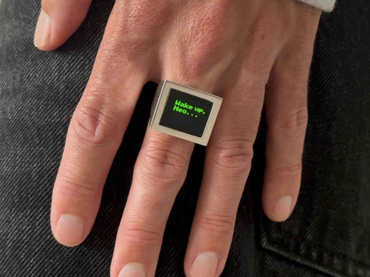
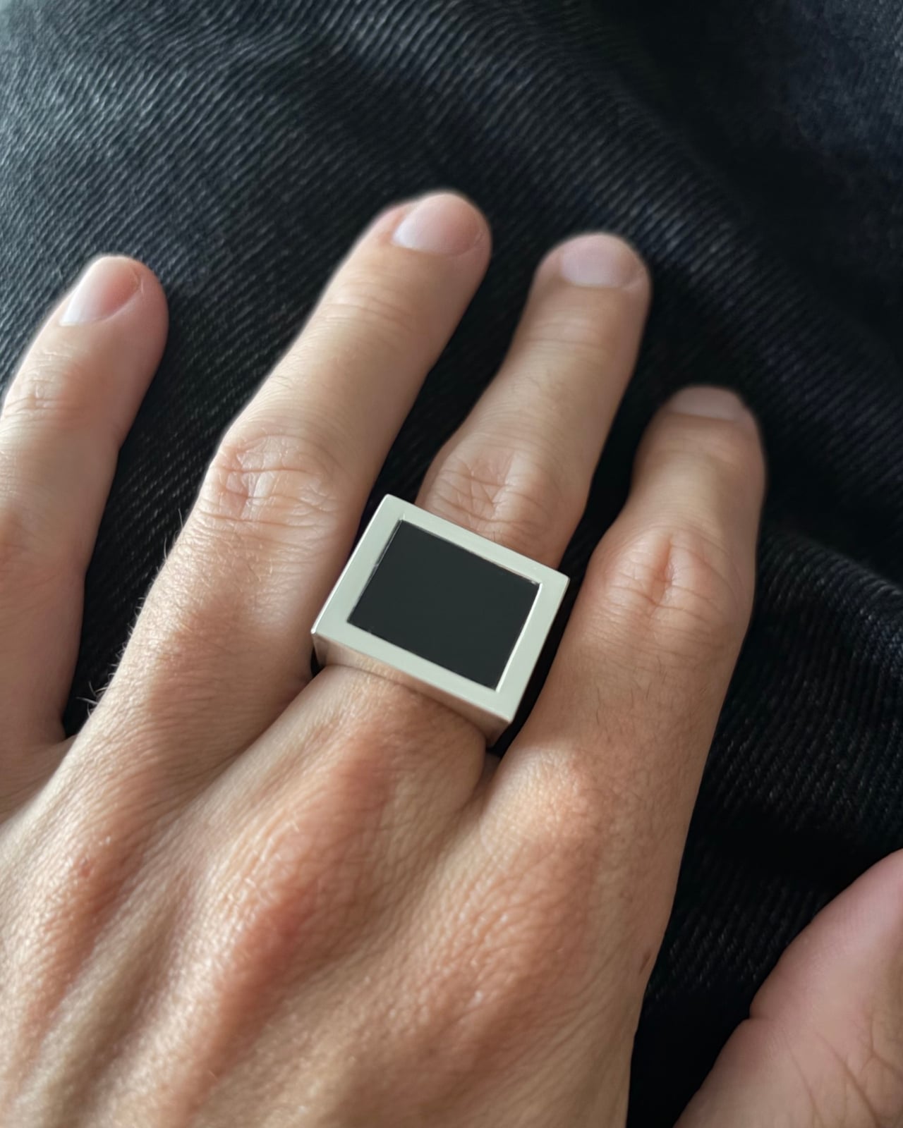
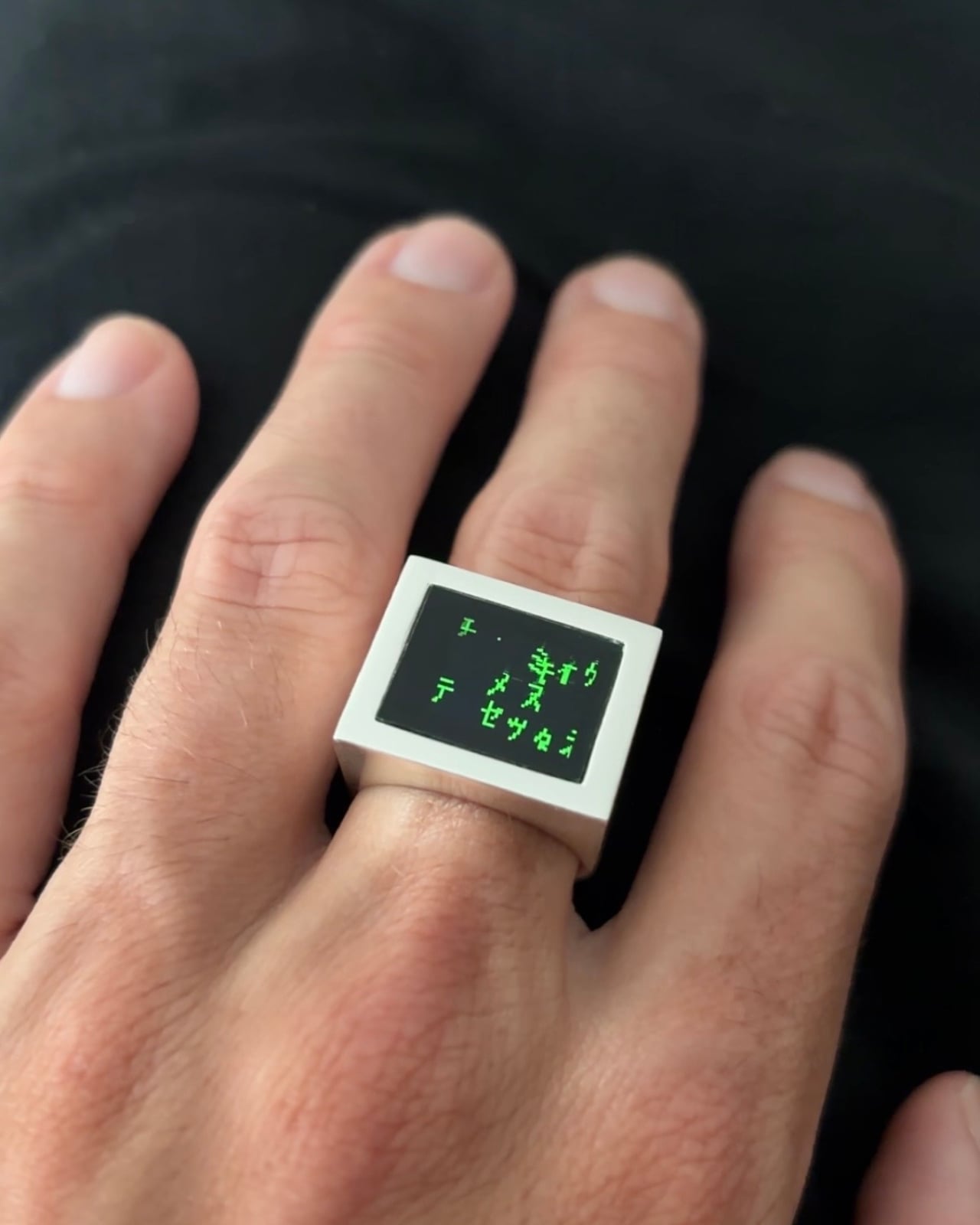
Look at the Digital Rain Ring when the screen is off, and you might not immediately clock what you’re looking at. A clean silver bezel. A flat black face. Bold, architectural proportions that sit somewhere between a modern signet ring and a minimalist sculpture. It reads as jewelry, completely and confidently. Then the animation starts.
That double life is arguably the most deliberate design decision Daniel Idle made. The OLED display, sitting recessed behind a polished silver frame, does something that most tech-forward jewelry fails to pull off: it disappears when it’s not in use. The black glass of the screen at rest looks remarkably close to a dark stone setting, the kind of graphic, monochromatic face you’d expect on a considered piece of contemporary jewelry. It’s only when the Matrix rain animation loops across it that the object reveals its other identity.
Designer: Daniel Idle
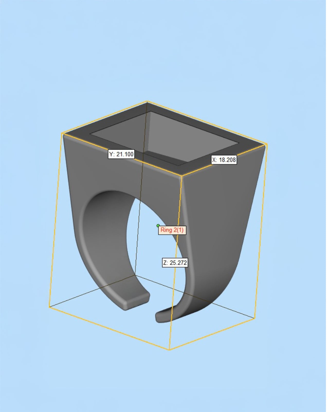
The physical form took real thinking to get right. Looking at the CAD model, the ring measures approximately 21mm by 18mm across the face, with a total height of just over 25mm. Those proportions matter. The face is large enough to hold the display at a readable scale, but the tapered body connecting it to the band keeps the overall silhouette from reading as clunky. The geometry is almost architectural, widening from the band up toward the face in a way that gives the piece visual weight without making it feel like you’re wearing a small appliance on your finger.
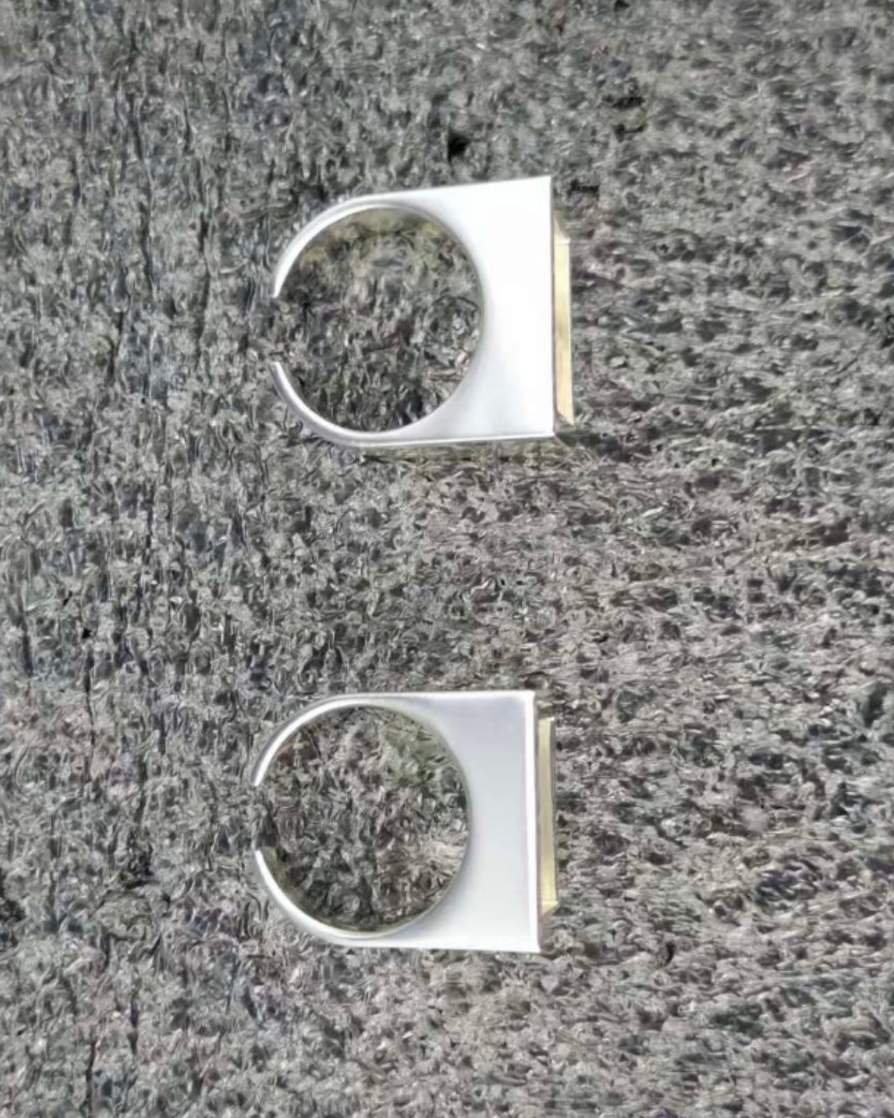
The band itself is an open C-shape rather than a fully closed ring. It’s a practical call given the electronics that need to live inside the body, but it also lands well aesthetically, softening what is otherwise a very hard-edged, geometric form. From the side, the two components sit in good proportion to each other. Nothing feels like an afterthought.
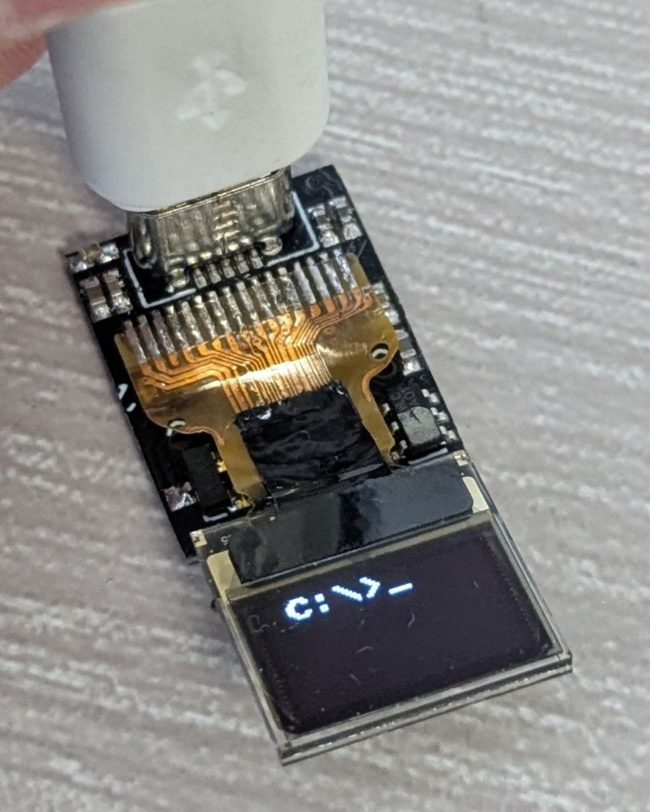
The custom PCB is worth pausing on. It’s tiny, densely packed, and clearly built to exact dimensions to fit within the ring body. A flexible ribbon cable connects the board to the OLED display, and a USB-C port is integrated for charging. The fact that all of this infrastructure lives inside something you wear on your finger is genuinely impressive engineering, but Idle’s judgment was to make sure none of it is visible in the finished piece. That restraint is what separates this from a hobbyist build.
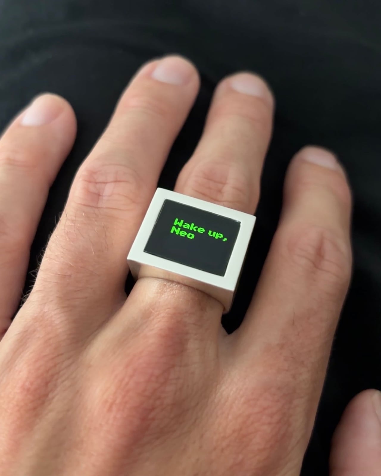
The prototype stage used a white resin body, which actually shows the concept quite clearly in a raw, honest way. You can see the display sitting flush with the face, the green animation already doing its work against the matte surface. But the shift to polished silver for the finished version was the right call. Silver gives the piece the visual language of jewelry rather than a prototype, and the contrast between the warm metal bezel and the deep black of the OLED screen is genuinely considered. It has the graphic confidence of a piece that was thought about as an object first and a technology project second.
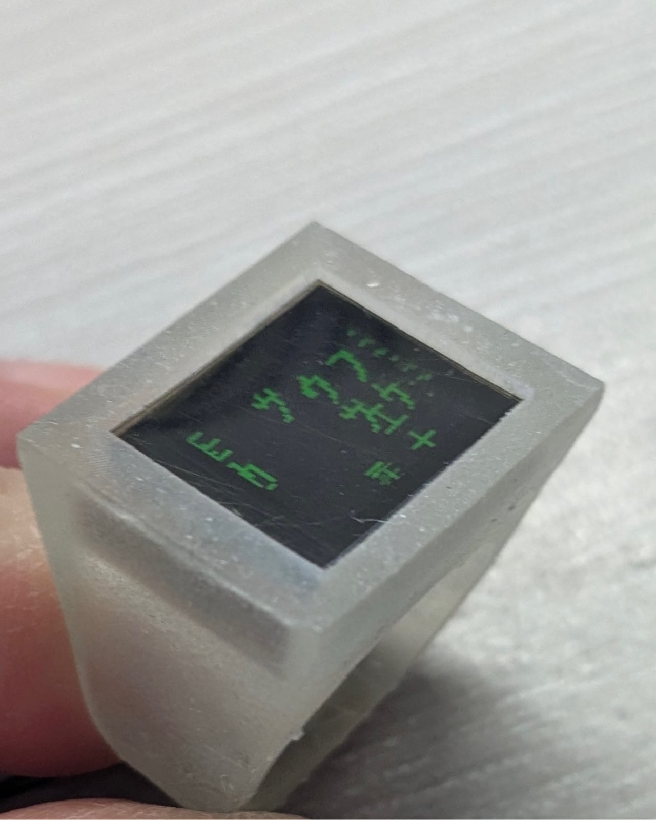
The animation choice suits the form well too. The Matrix rain, those cascading columns of green katakana-inspired characters, fills a small square display naturally. It loops cleanly, it doesn’t demand to be read in detail, and its cultural weight does a lot of communicative work in a very compact space. “Wake up, Neo” appearing in green pixels on a silver ring is a complete sentence in the language of pop culture, and Idle clearly knows that.
What makes the Digital Rain Ring worth paying attention to is not the novelty of putting a screen on a ring. It’s the evidence that someone thought through the design consequences of doing so. The proportions hold up. The material choices are intentional. The off-state is as considered as the on-state. Most tech jewelry gets the technology right and the jewelry part wrong. This one seems to have gone in the other direction, starting with the object and working inward from there. That’s a harder problem to solve, and it’s the one that actually matters.
The post Wake Up, Neo. Your Ring Is Playing the Matrix. first appeared on Yanko Design.

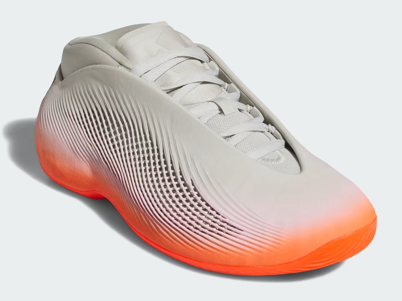
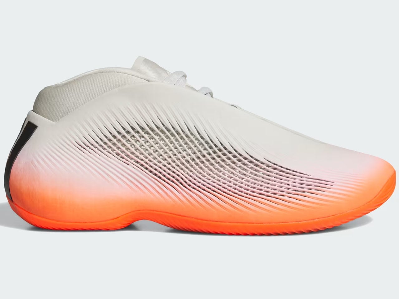
While the world is fixated on who’s making it to the quarterfinals of the FIFA World Cup. adidas thinks it’s done enough for the love of the game with the Trionda, and now it’s time to shift focus to basketball. To do that, the sportswear giant is bringing 3D-printed footwear innovation to the hardwood with the launch of adidas BB.01. It is the first 3D-printed basketball shoe to hit the market, in an eye-catching combination of Solar Red and Orbit Grey.
The 3D printed basketball shoe from adidas is a definite head-turner. It’s called the adidas BB.01 “Solar Red/Orbit Grey,” and it’s nothing like the traditional canvas, textile, and foam silhouettes. While most shoe midsoles are molded in factories, the BB.01 is printed entirely from resin in layers instead.
Designer: adidas
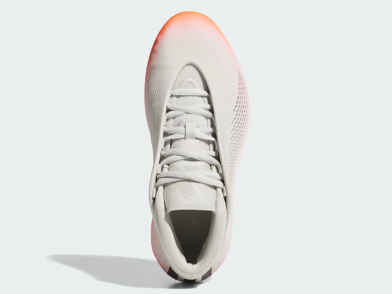
The basketball shoe is part of adidas’ Project R.A.P (Radical Athlete Perception). The program ensures that adaptive manufacturing is not just an experimental category but an actual way to create functional, court-worthy footwear. Based on this ideology, adidas BB.01 has been a long time coming.
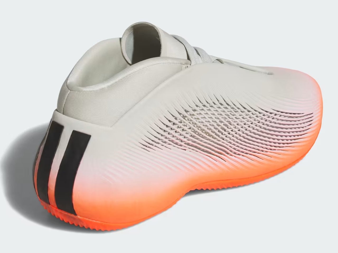
The much-anticipated footwear finally has a release date and a price. Fans should be able to get their feet into the 3D-printed marvel starting July 14, when it will be available through the adidas Confirmed app for $250. Meticulously combining “cutting-edge digital manufacturing with elite on-court performance,” the shoe features Orbit Grey in the base, which, in contrast, is highlighted by the Solar Red upper cage. The Three Stripes logo is present on the heel, from where it extends upward toward the collar.
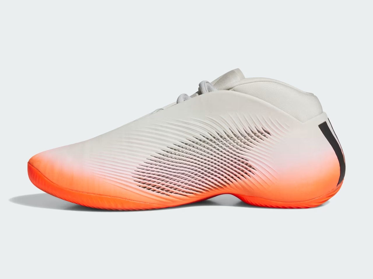
Since the footwear is designed to complement the wearer’s performance on the court, its 3D printed midsole is designed to handle the impact and keep the player “stable through cuts and landings.” The footwear weighs only 15.13 oz (428 g) and comes with its most striking resin outer shell on top of the engineered midsole, which utilizes a lattice design across the sidewalls. This form factor allows the shoe to flex with the twisting nature of the foot. Higher-density printing is also carried out around the toes and heels for stability.
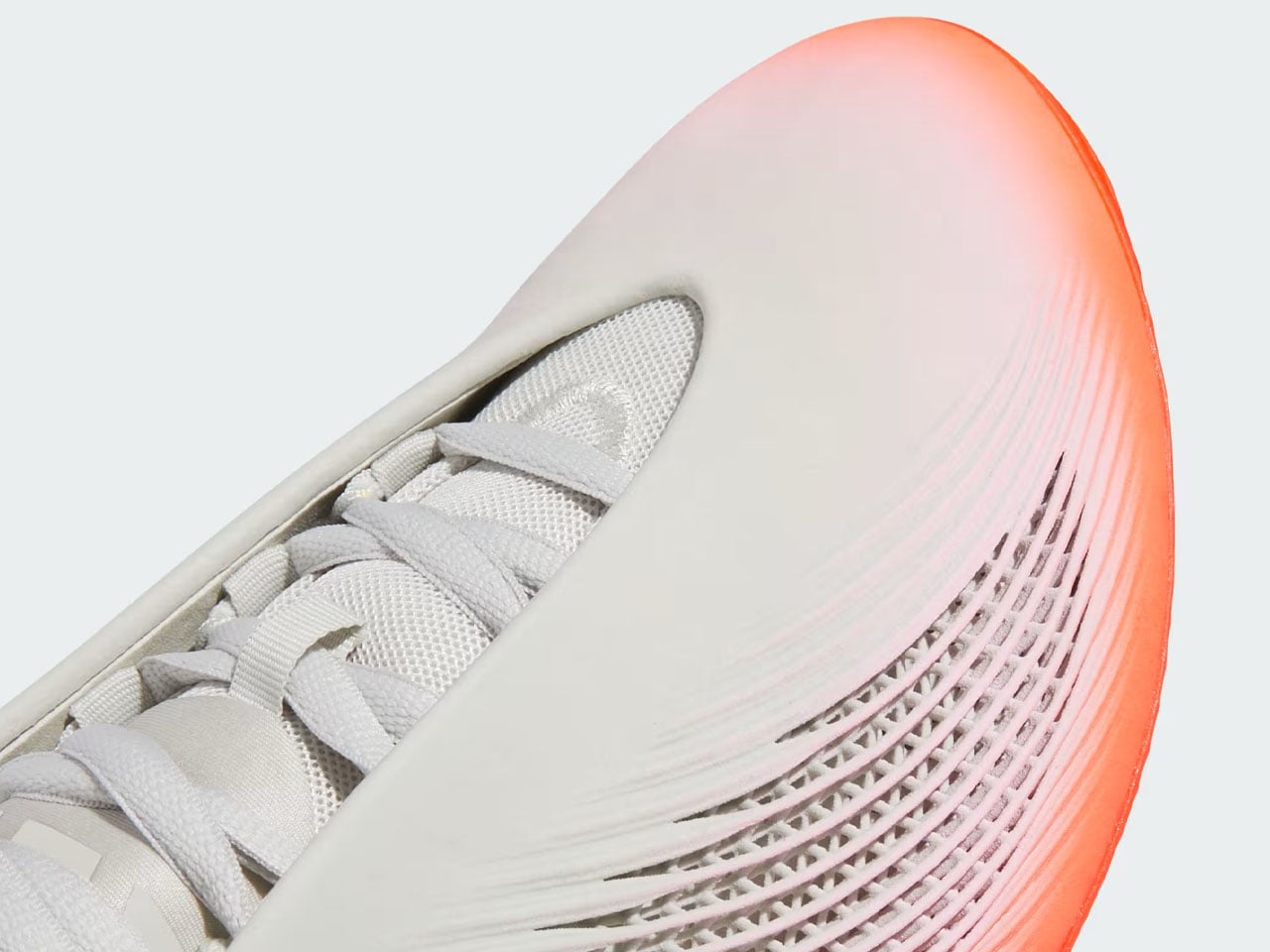
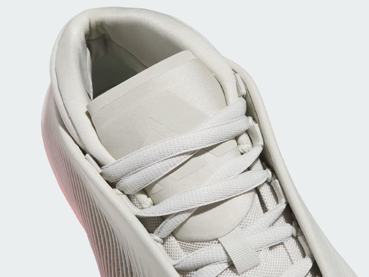
adidas BB.01 is not an attractive shoe on the outside alone. On the inside, it also features a soft textile bootie that locks the foot in place, ensuring support and comfort. A flagbearer of the future of 3D printing in the footwear industry, adidas BB.01 will release on July 14, but you can start registering for it as early as July 9 through the company website.
The post adidas BB.01 is first 3D-printed basketball shoe built to improve stability and flexibility on court first appeared on Yanko Design.

The best design ideas tend to be the ones that make you stop and think, “why hasn’t anyone done this before?” Gaenim’s silicone bottle cap water dispenser for dogs is that kind of idea. It’s not flashy. It doesn’t connect to an app. It doesn’t have a rechargeable battery or a minimalist unboxing experience. It’s just a small silicone piece that snaps onto a standard water bottle and folds out into a bowl for your dog to drink from. And yet, it’s the kind of thing that, once you’ve seen it, you can’t believe wasn’t a standard item in every pet owner’s bag already.
The premise is almost embarrassingly simple. You screw the silicone cap onto any regular water bottle in place of the original lid. When your dog needs a drink, you tip the bottle and the silicone portion unfurls into a shallow drinking tray. Your dog drinks, you tip the bottle back, the excess drains back in, and off you go. Korean e-tailer Gaenim designed it for hikers with dogs, but it’s equally useful on a city walk, a road trip, or a park visit. Basically, any time you’re out with your dog and a water bottle, this thing earns its place.
Designer Name: Gaenim

What makes it genuinely smart isn’t the mechanism itself. It’s the materials thinking behind it. Silicone is flexible enough to fold flat and snap back into shape, durable enough to survive being tossed in a bag, and food-safe enough that you don’t have to think twice about what’s touching your dog’s water. It also cleans easily. You’re not carrying around a rigid plastic contraption or a separate collapsible bowl that inevitably ends up with mildew in the seams by week three. The Gaenim cap sidesteps all of that because it’s essentially one single piece of material doing all the work.

Pet accessories have long had a habit of being either over-engineered or underwhelming. You’ve seen the products: complicated dispensers with buttons and reservoirs, squeezable bottles that require a very specific squeeze-to-pour ratio, or collapsible bowls that never actually fold up small enough to be genuinely portable. They all solve the same problem, but they do it by adding more stuff. The Gaenim cap goes the other direction entirely. It’s a replacement lid. That’s the whole thing. It adds almost no bulk to what you’re already carrying, and it requires no learning curve whatsoever.
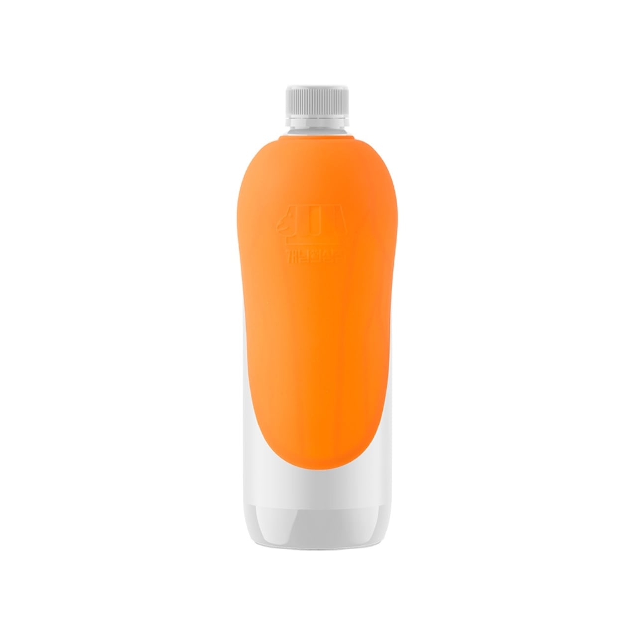
That said, it’s fair to acknowledge a small design puzzle that a few people have already noticed. When the cap is screwed on and you’re mid-hike, the surface that your dog licks is facing outward. It’s not a dealbreaker, and depending on how you carry your bottle, it may never be an issue. But it’s the kind of thing a second-generation design might address, maybe with a cap-over-cap configuration or a simple protective cover. The bones of the idea are solid enough that a refinement or two wouldn’t hurt.

It’s also worth pointing out that this isn’t trying to replace a purpose-built dog water bottle. If you’re doing long, high-exertion hikes in summer heat with a large dog, a dedicated bottle with a proper bowl attachment is still probably the smarter choice. What the Gaenim cap offers instead is frictionless everyday utility. It’s the thing you grab because you didn’t plan to walk as far as you did, or because your usual dog bottle is still drying on the dish rack.

Pet design has quietly become one of the more interesting spaces to watch right now. Dog owners are thoughtful consumers, and they’re done tolerating clunky, ugly, or needlessly complicated products. The fact that a Korean brand produced something this stripped-back and practical, and that it’s now getting attention from the design community, suggests the rest of the category should probably take notes. A small piece of silicone. A water bottle you already own. A dog that stays hydrated. Sometimes the math really is that simple.

The post The Smartest $9 Pet Accessory Is Just a Bottle Cap first appeared on Yanko Design.

Samsung is poised to make a significant impact on the foldable smartphone market with its upcoming Galaxy Unpacked event on July 22, 2026. The event is expected to showcase a range of highly anticipated devices, including the Galaxy Z Fold 8, Galaxy Z Fold 8 Ultra, Galaxy Z Flip 8, Galaxy Watch 9, Galaxy Watch […]
The post The Galaxy Z Fold 8 Series ‘New Shape’ Leak Changes Everything We Know About Foldables appeared first on Geeky Gadgets.

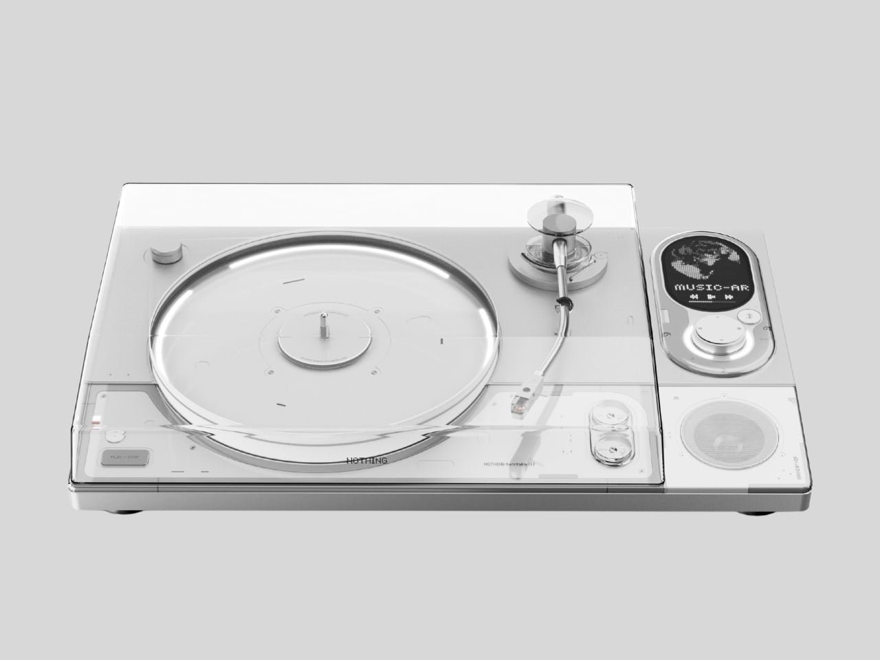
Sungwoo Choi is an industrial design student with one question: what if Nothing made a turntable? The answer is Turntable (1), a personal concept project with no official ties to the brand, and it’s been circulating online as exactly the kind of render that makes you briefly annoyed it doesn’t actually exist.
If you’ve spent any time in the vinyl revival conversation, you know most turntables fall into two camps: the warm, retro-wood-and-brass kind that lean hard into nostalgia, or the cold, purely utilitarian kind that audiophiles swear by but would never put on display. Very few designs ask the question that good industrial design should always ask. Can this be both beautiful and functional, without being precious about either? Choi’s concept does exactly that, in a visual language drawn directly from Nothing’s aesthetic, and it reads more resolved than many products that actually ship.
Designer: Sungwoo Choi
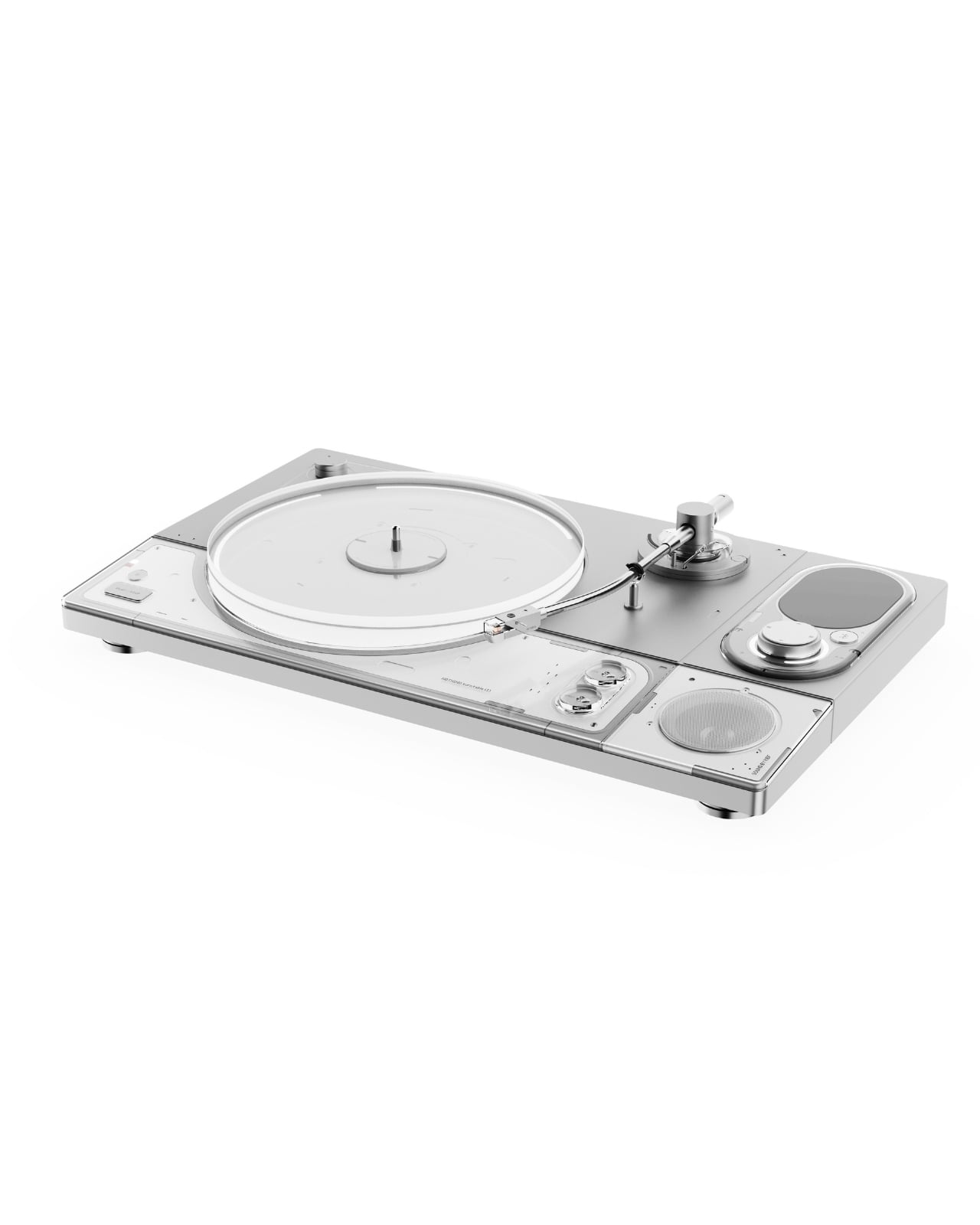
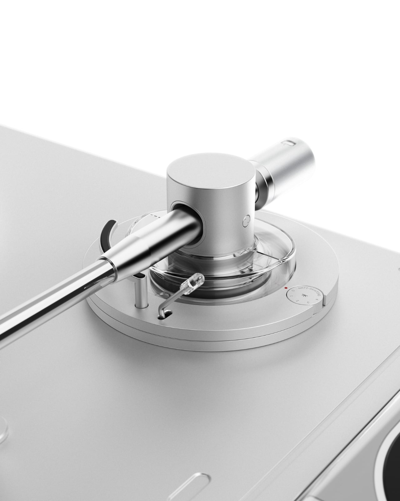
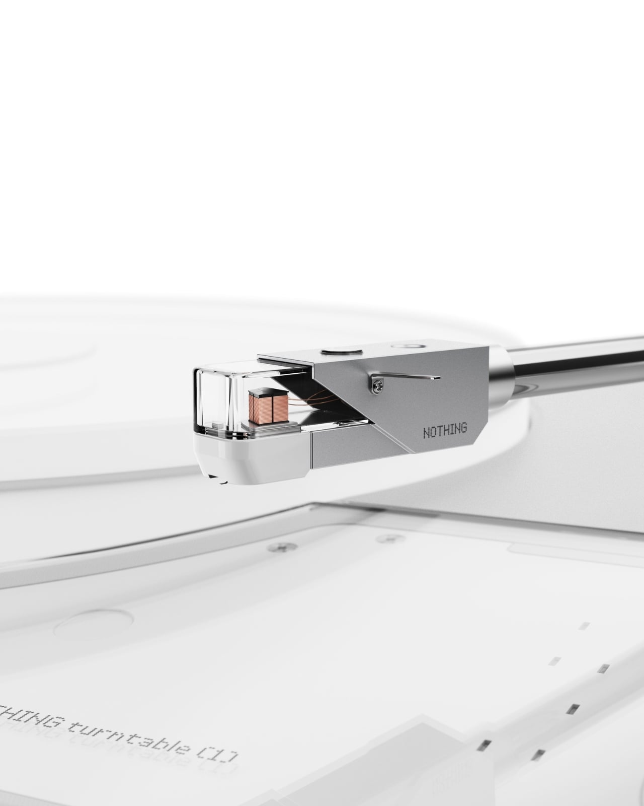
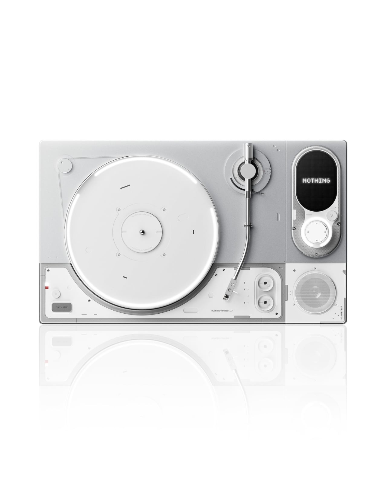
The design is clean in a way that reads as deliberate rather than sparse. The chassis is white with silver-tone aluminum accents, flat and rectangular with gently rounded module insets that divide the deck into distinct functional zones. The platter is rimmed in a transparent acrylic ring that catches light in a way that makes the whole unit feel alive without being showy. The tonearm is machined and substantial, seated on a circular mount encircled by concentric transparent rings, a detail that looks pulled from a scientific instrument. Nothing has built its entire reputation on making the internal visible, on transparency as both a literal and conceptual design choice, and Choi translates that language fluently into a format where seeing the mechanics only deepens the ritual of listening.
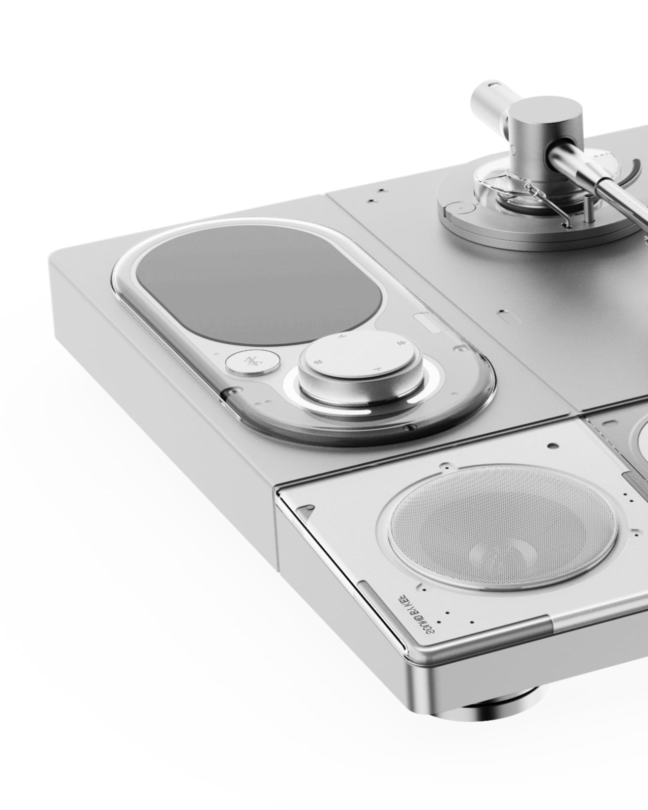
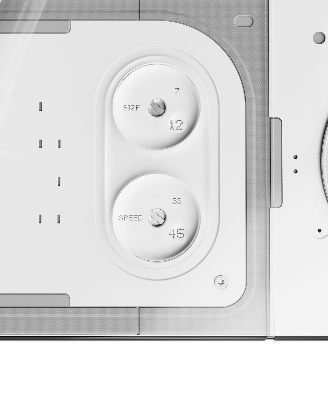
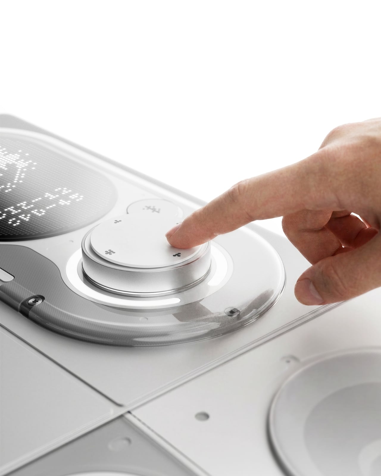
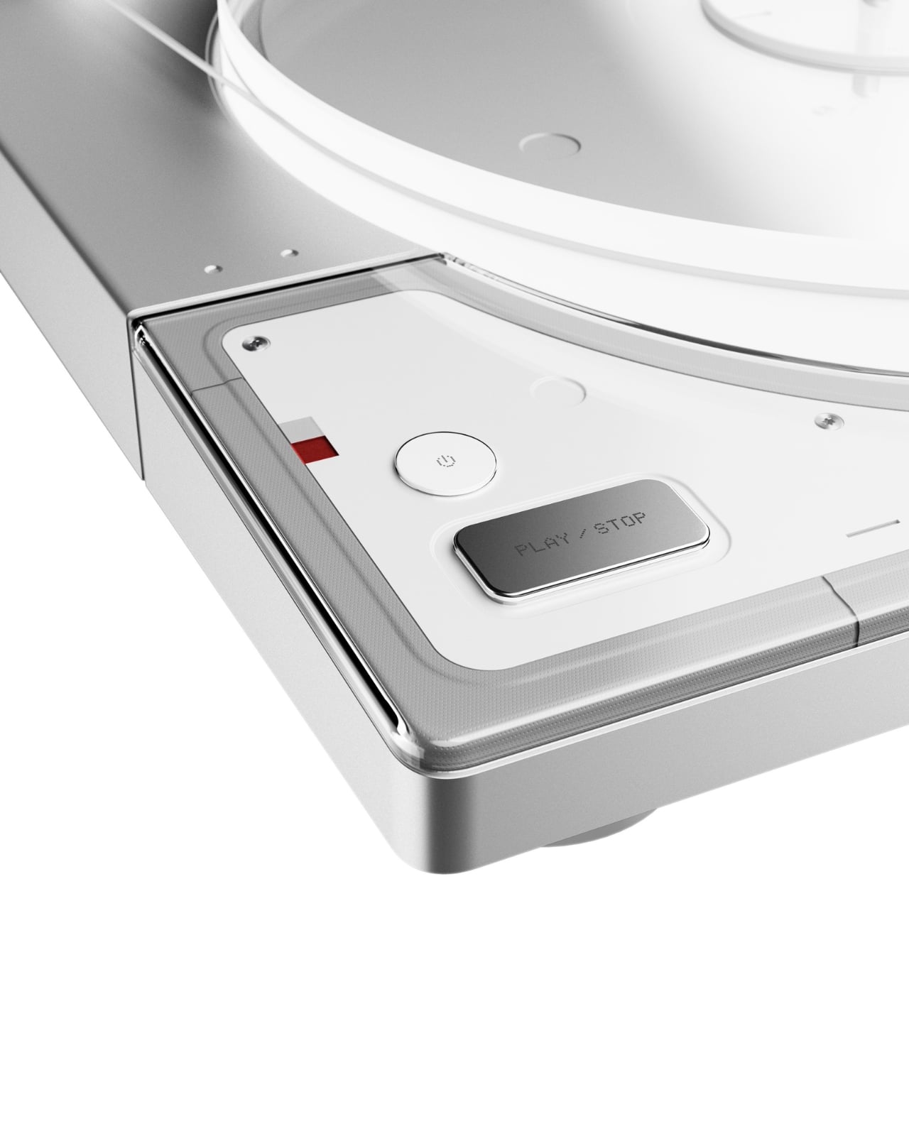
The control layout is where the concept gets genuinely interesting. Size (7/12) and Speed (33/45) dials are housed in a recessed rounded module, labeled with a matter-of-fact clarity that feels more like precision calibration than consumer product design. The volume knob is large and satisfying, surrounded by a clear acrylic trim ring and a small dot-matrix display panel marked “MUSIC-AR,” presumably a nod to some form of augmented reality integration. A flush-mounted speaker sits directly in the deck surface, making Turntable (1) a genuinely self-contained system. A Play/Stop button and a power button occupy the front-facing panel with quiet authority, like the designer knew exactly which controls needed physical presence.
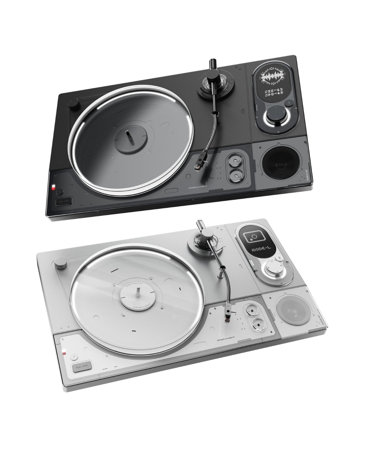
The naming is the detail that does the most work quietly. Turntable (1). Choi borrows Nothing’s signature naming convention deliberately: Phone (1), Ear (1), Ear (stick). The convention carries a specific kind of promise. The (1) implies a (2). It implies a roadmap, a lineage, a commitment to return. By applying it here, Choi isn’t framing this as a one-off fan exercise. He’s imagining an entire product category for a brand that has already proven it can take commoditized consumer electronics and make people genuinely want to look at them.
The vinyl market argument practically makes itself. Records have been in cultural resurgence for well over a decade now, and the market is robust enough to support a premium, design-forward turntable aimed at people who care as much about what sits on their shelf as what comes out of their speakers. Nothing’s core audience, younger buyers who are design-literate and culturally engaged, are the exact crowd that has been rediscovering vinyl. The overlap isn’t a stretch. In retrospect, it feels like an obvious move for the brand.
Choi’s Turntable (1) is a concept, not a product, and carries no official connection to Nothing. That distinction matters. But the best concepts are the ones that make you slightly resentful they don’t exist yet. The work is confident, cohesive, and rooted in a genuine understanding of both the format and the brand he chose to draw from. It’s built on the logic of Nothing’s identity rather than just borrowing its aesthetic surface. It isn’t the spectacle of the render that earns attention. It’s the quality of the thinking behind it. Someone at Nothing should be paying attention.
The post A Design Student Just Imagined the Perfect Vinyl Turntable first appeared on Yanko Design.