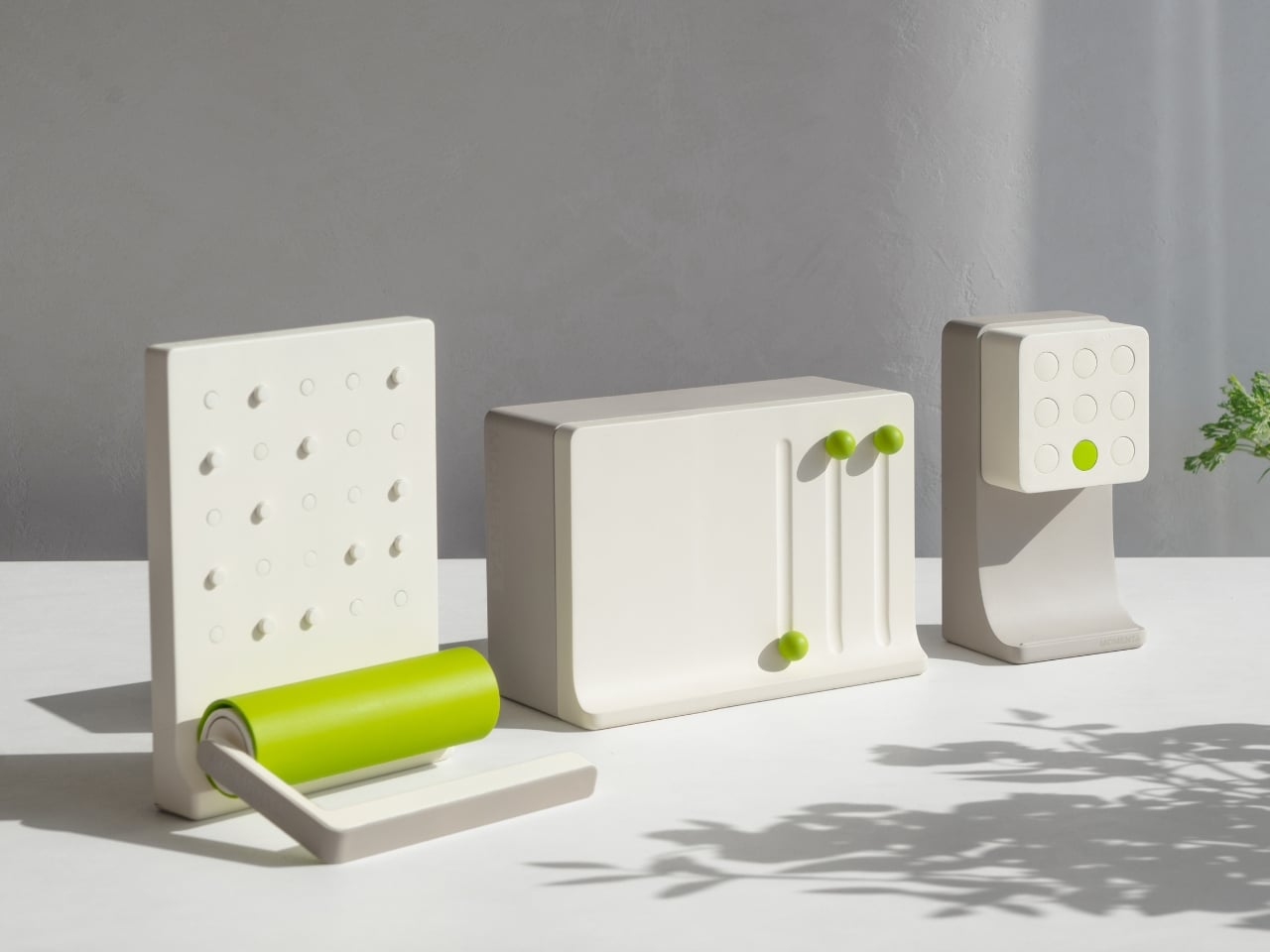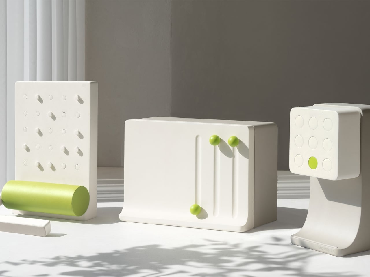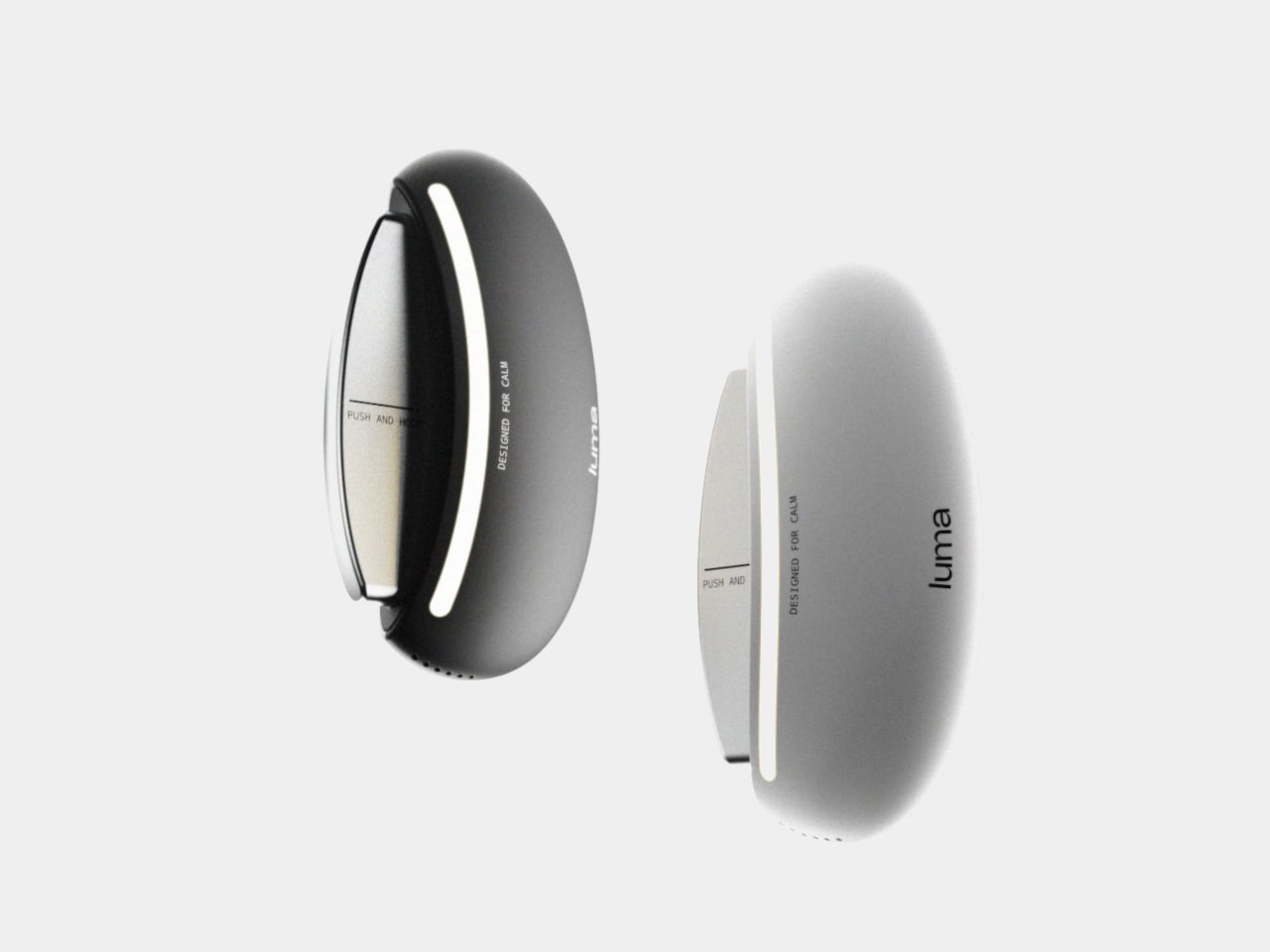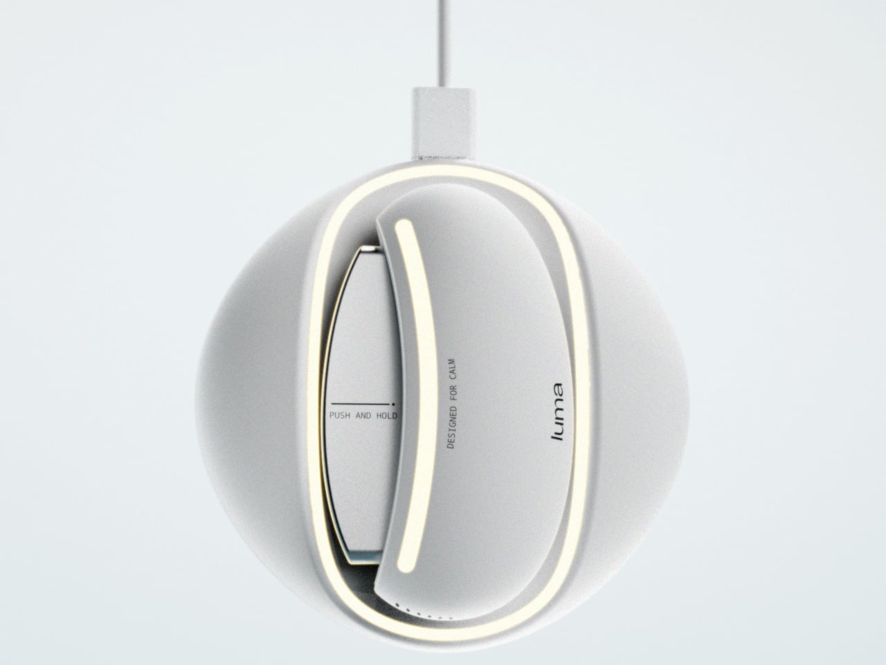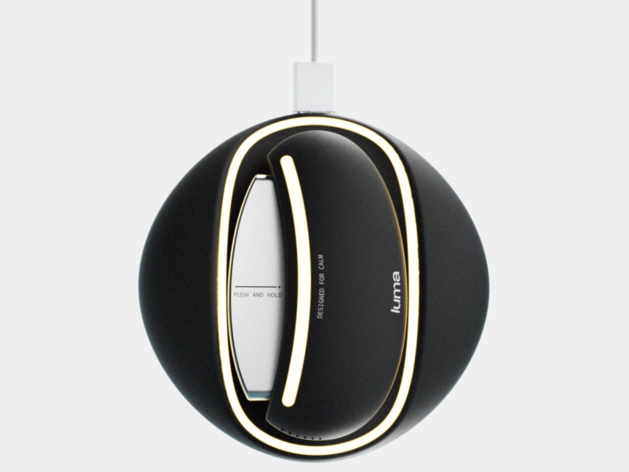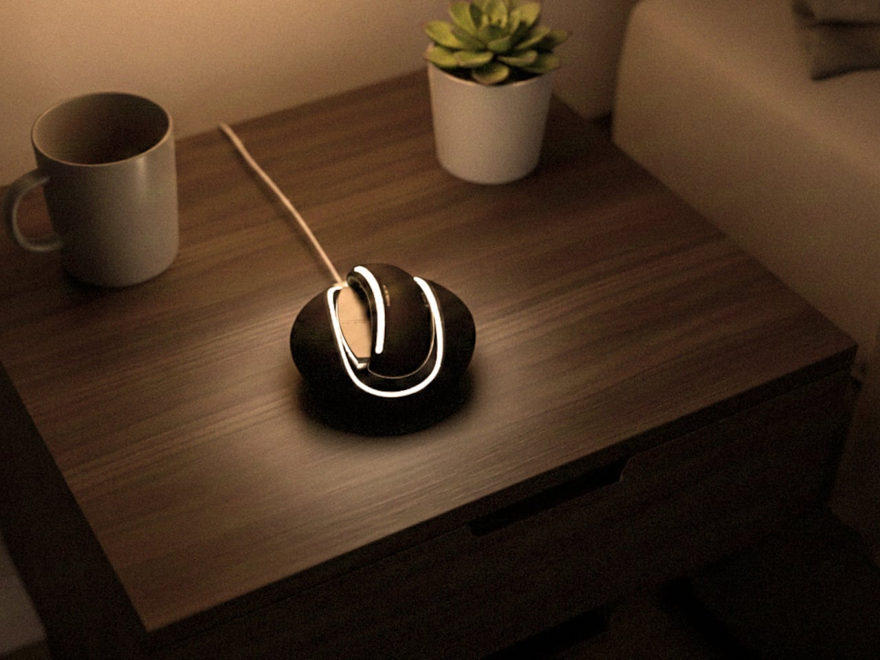
Google Next-inspired Omni Smart Speaker has integrated display to show what’s happening in real-time

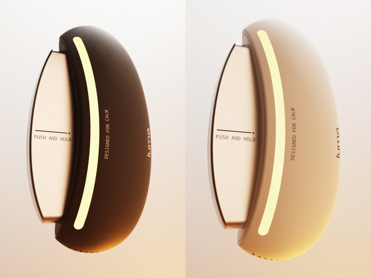
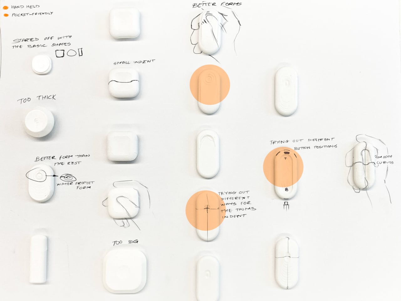
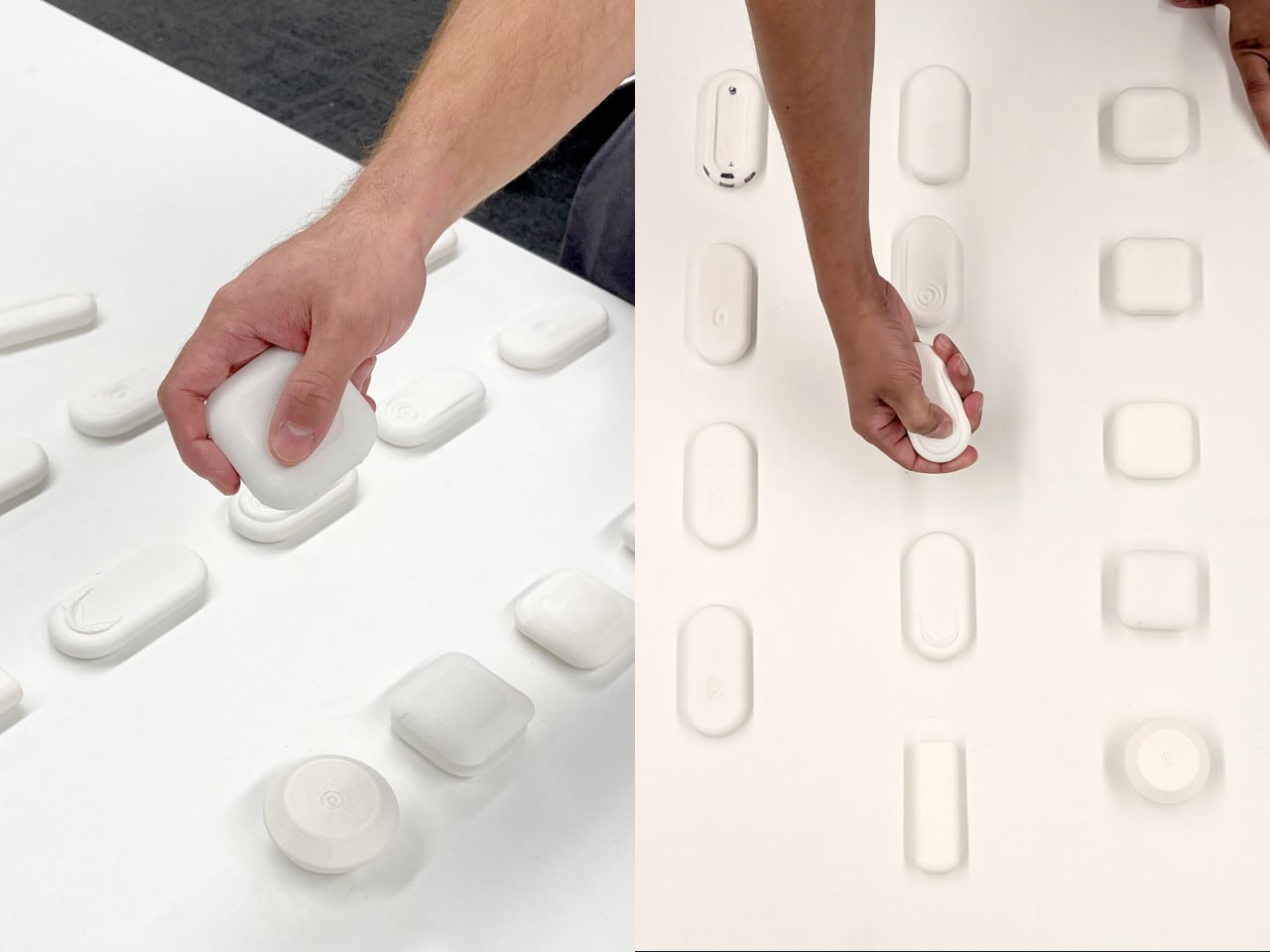
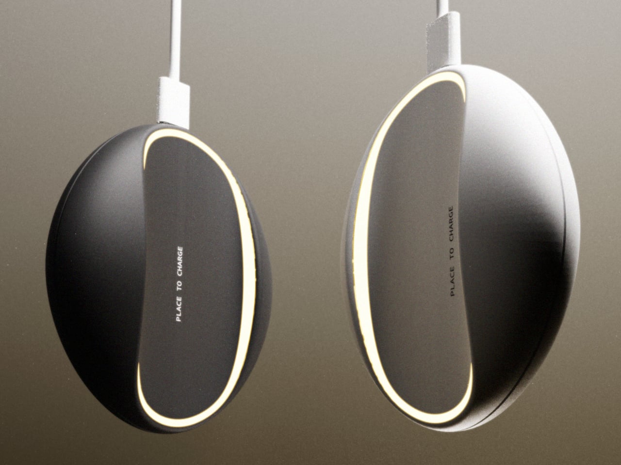
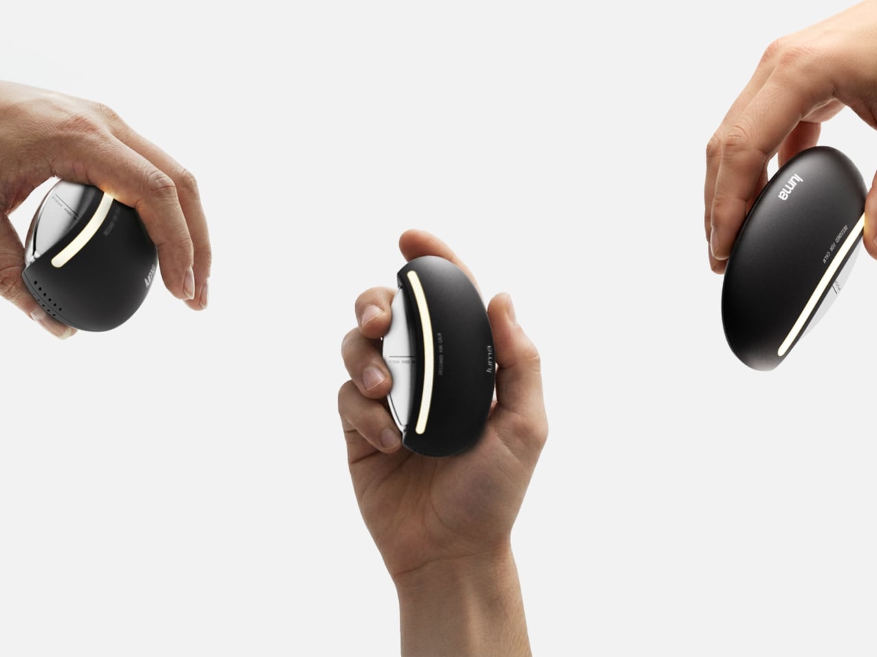
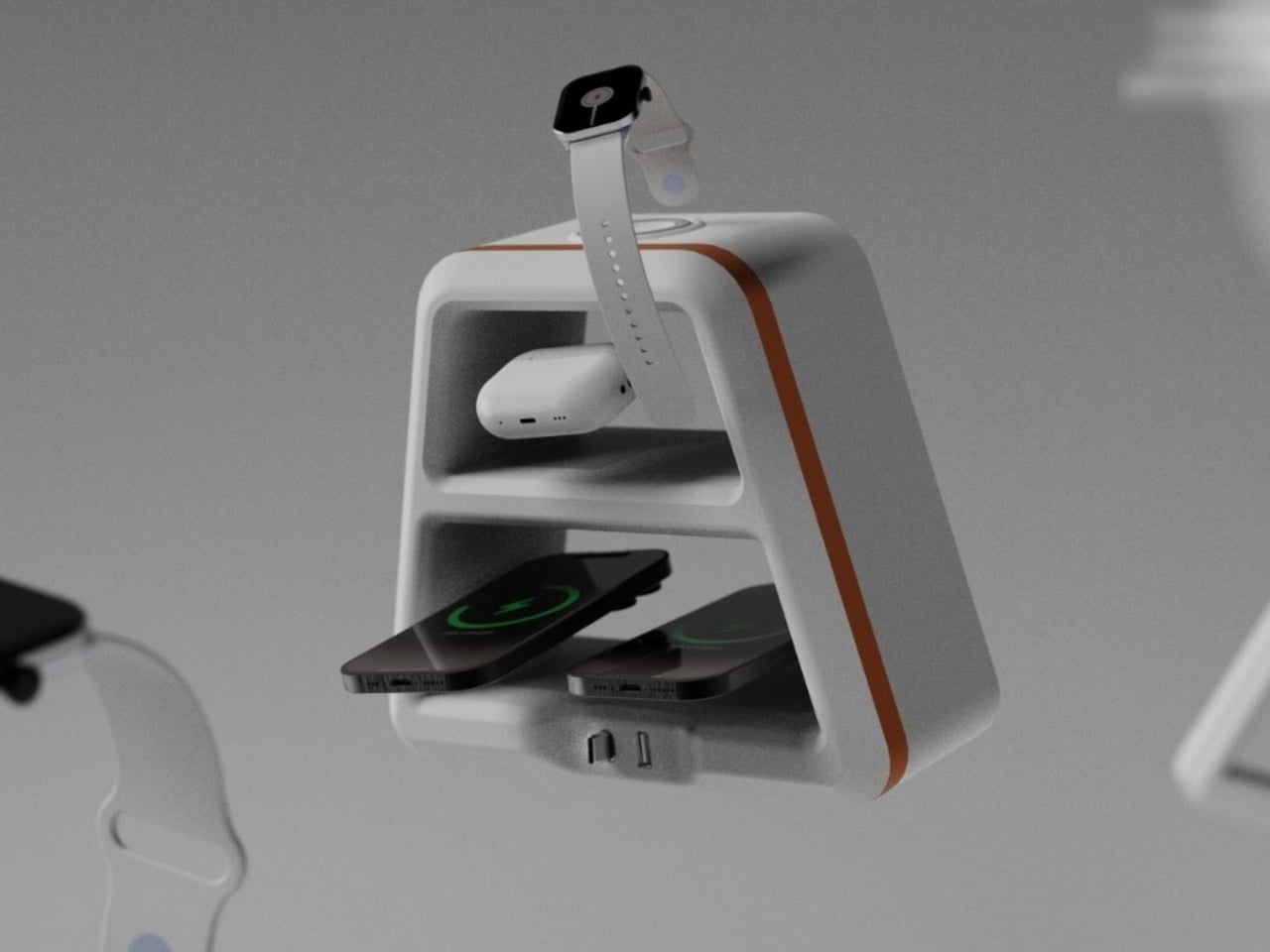
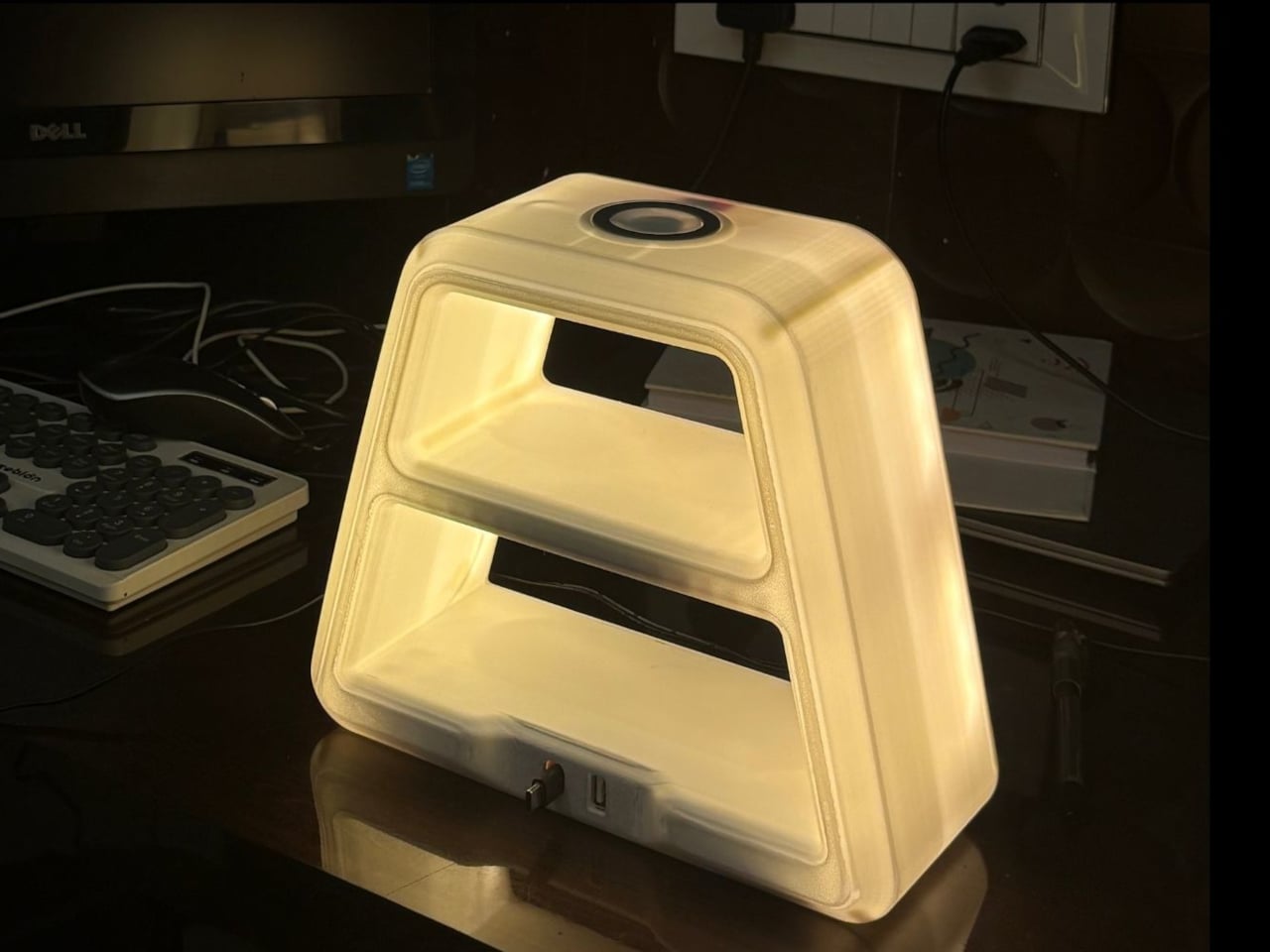
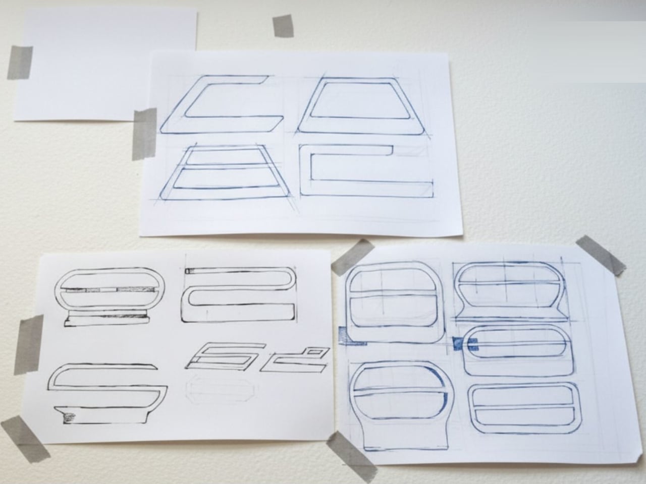
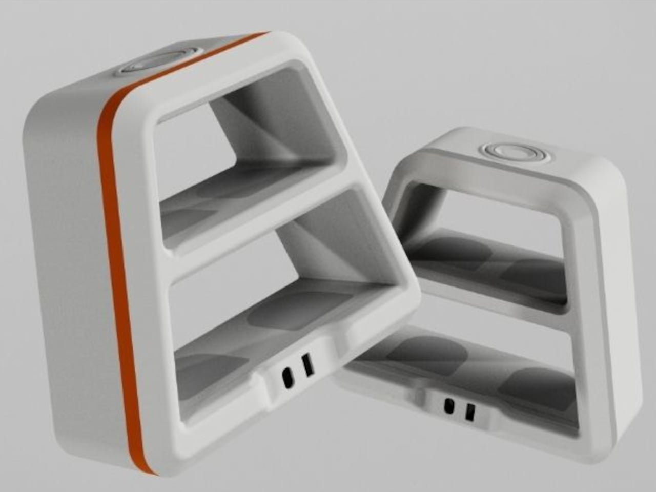
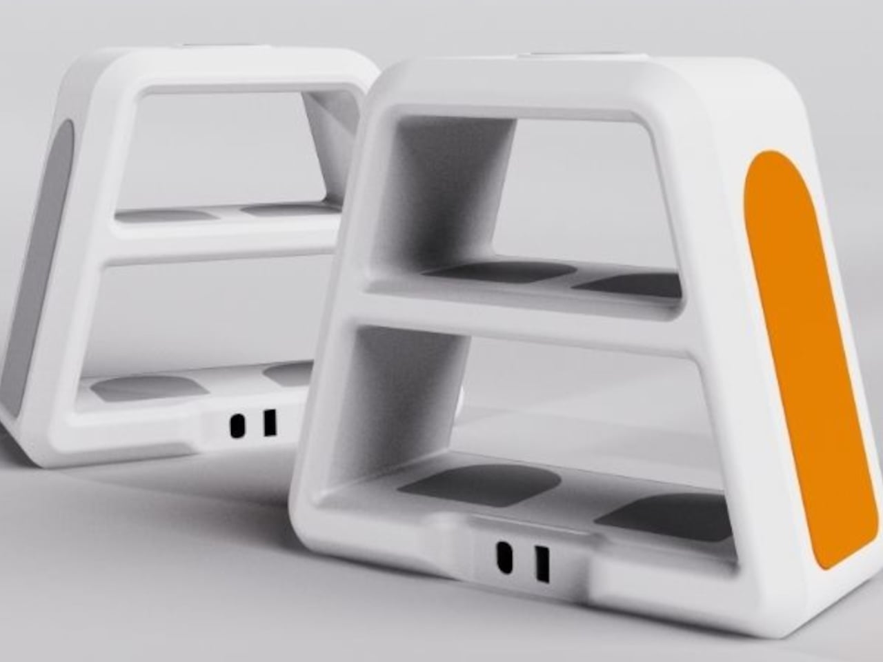
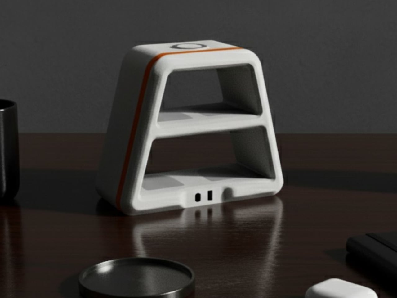
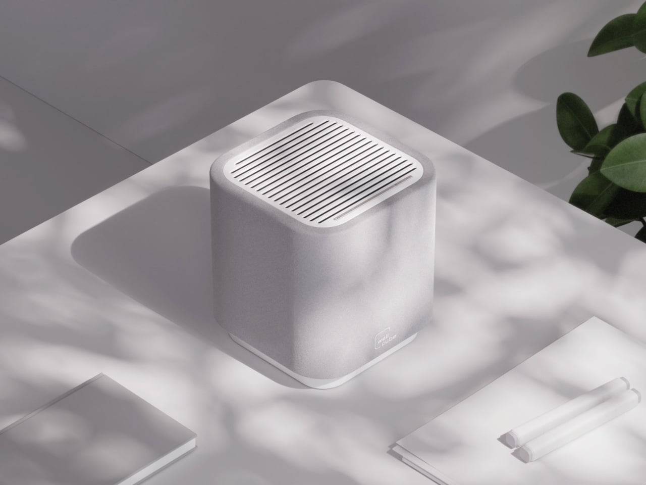
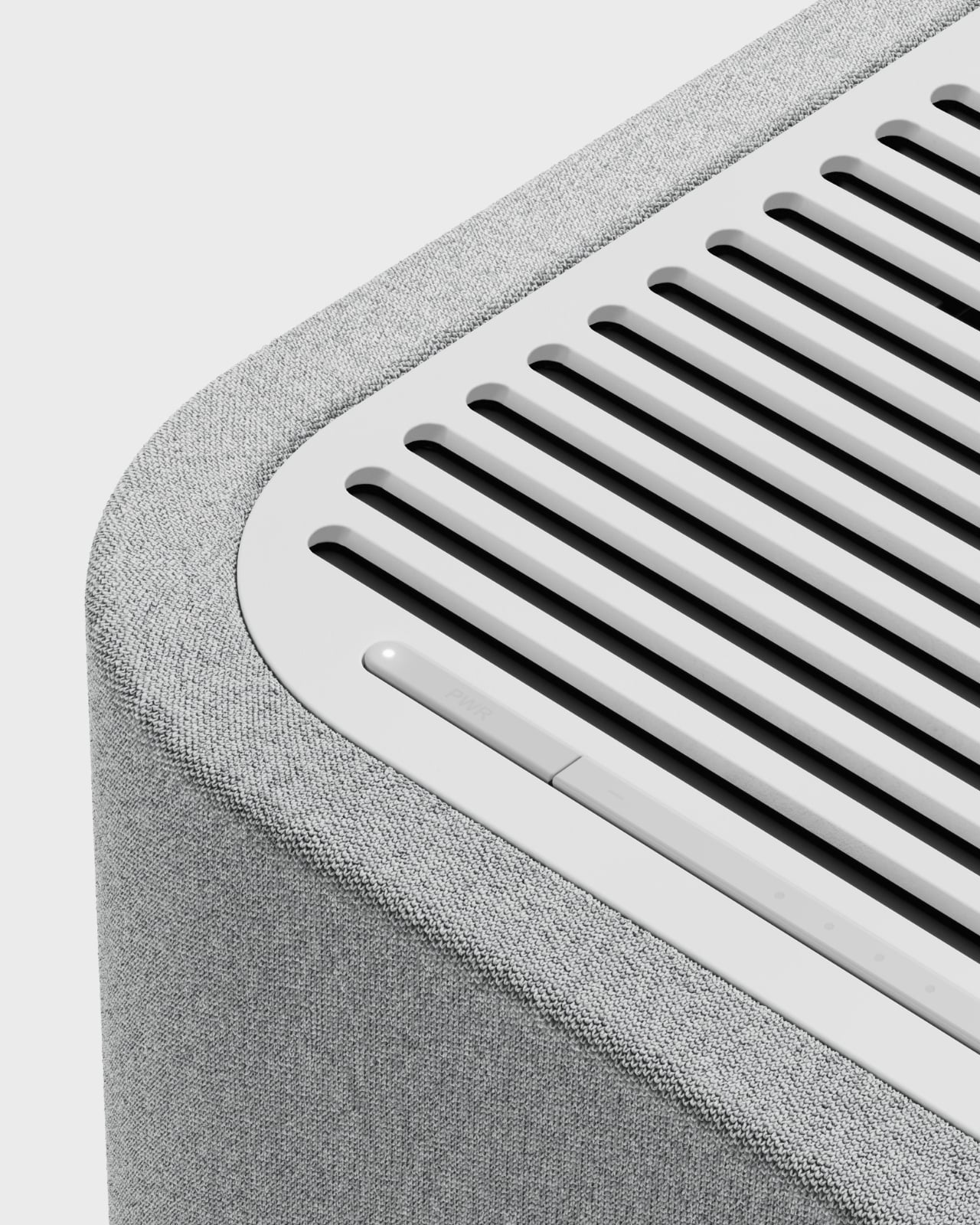
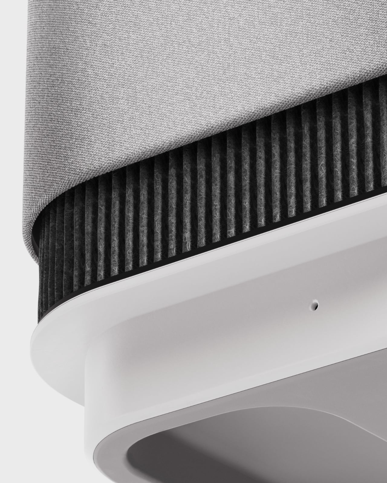
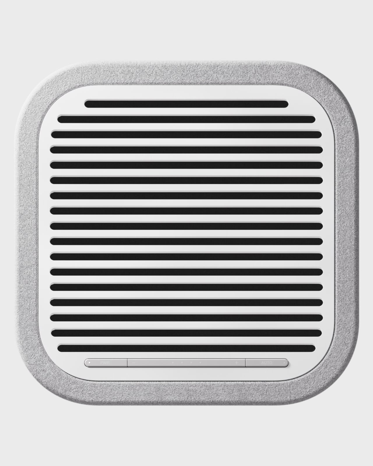
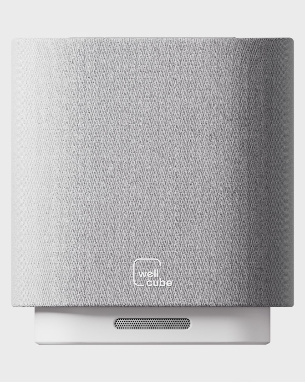
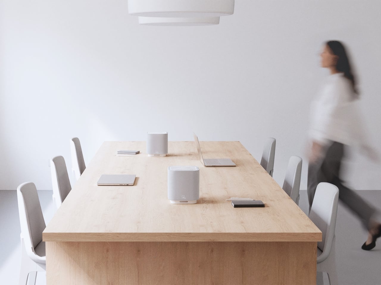
Google Nest has had a fair share of success thanks to its built-in Google Assistant capabilities. The capable speaker has been the first introduction to the world of smart speakers for many of us, and now it is inspiring the Omni Smart Speaker – which looks similar to the Google speaker – but adds an auxiliary screen to it that distinguishes it for the better.

So, if you’re looking to upgrade your smart speaker, you may have a new option, amid a plethora of choices already available from Google, Amazon, Apple and many other manufacturers. The Omni is far from the others with its novel display that shows real-time visual feedback of what’s happening, saving effort and confusion during voice commands.

Designer: One Object Design Studio

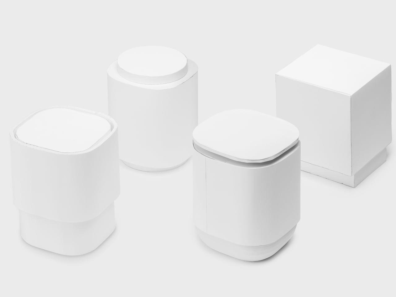
One Object is a Hong Kong-based design and innovation studio with an undwindling focus on creating mobility, smart home, and home furnishing designs. Fueled by passion, dedication, and curiosity for novelty, the designers at One Object have come up with the distinct design of the Omni, which looks pretty recognizable in both form factors, yet is starkly different with the interesting, integrated display.

Described as the “next-generation smart speaker concept” – the Omni is equipped with a voice-enabled assistant – not sure which one though – and allows the users to tap on the convenience of voice to control home appliances easily and more intuitively. Whether the speaker is splash-proof or not, we are uncertain, so we are guessing it is made for indoor use only, where it would allow you to listen to different music in any room of your house.

You should be able to connect multiple devices in different rooms across the house and control them from the Omni, without moving a stride. And when you think, the commands are going to get mixed, you can look up and see the sleek, modern speaker’s integrated auxiliary display and see what’s happening in real time. Whether you’re adjusting the thermostat, turning on the lights, or setting the music, the Omni smart speaker will make every voice command “straightforward and responsive.”

The post Google Next-inspired Omni Smart Speaker has integrated display to show what’s happening in real-time first appeared on Yanko Design.
Radio concept brings the aural and tactile nostalgia of using actual radios

One of my favorite parts of going on road trips when I was younger is listening to the radio in the car. You never know what you’re going to get when you switch through stations. And even at home, tuning in on to a physical radio is always a fun time, something that the new generation may never experience ever. But there are still some radios in the market and even more design concepts for those longing for the “good ole days”.

Designer: Gisung Han

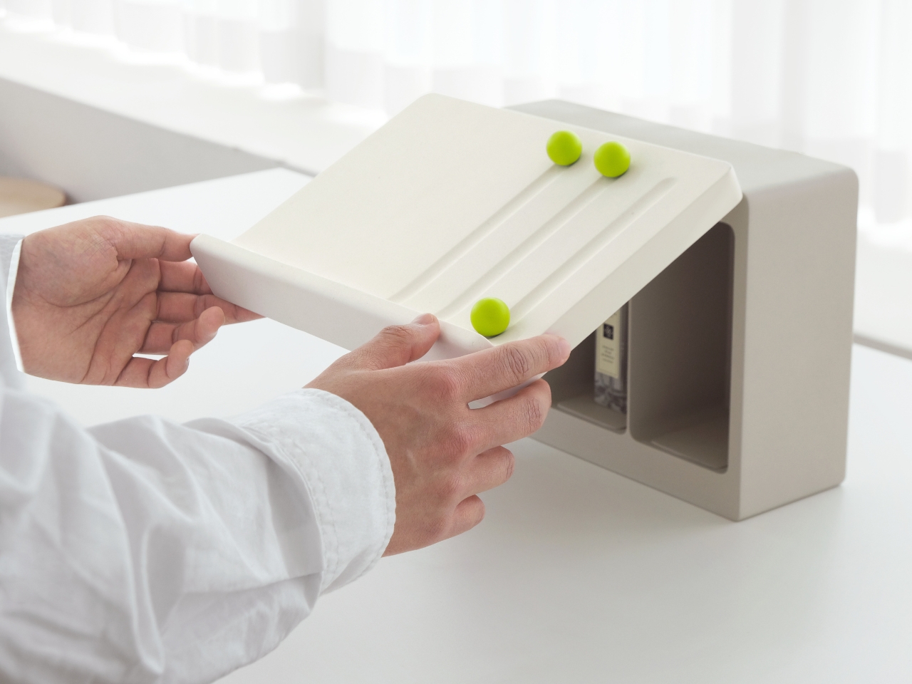
This concept for a radio is an interesting one as it doesn’t just play on the nostalgia of tuning in to the radio. The Calming Noise Radio also harps on both the aural and tactile experience that we had when we operated a physical radio back when people still tuned into it. Since the only tactile feel we get know from listening to music is tapping on our devices, this concept harps on the dials as we go from one radio station to another.

The designer made the dials to be “unusually large” so that visually and tactile-wise it stands out. It actually looks like the wheel in The Price Is Right (for those who actually know what that show is) and is meant to be both familiar and unique. The radio is in a familiar rectangular shape with the felt-like grills giving an interesting contrast with the round wheel of the dials.

The Calming Noise Radio, if it gets turned into an actual radio, will also probably play around with the “subtle static noise” that we get from old radios with the analog frequency adjustment sound. This will of course be pretty strange and unfamiliar for those who grew up in the age of MP3s and music streaming but will bring a nostalgic feeling for those who still get goosebumps from the sound of LPs and cassette tapes.

The post Radio concept brings the aural and tactile nostalgia of using actual radios first appeared on Yanko Design.
Nokia 7380 5G concept reimagines one of the quirkiest phones in history

At this point in time, the design of smartphones is pretty much set in stone, at least disregarding novel designs like foldables and rollables. The “candy bar” form factor emerged as the standard, displacing even the fashionable clamshell “flip phones” that are making a comeback through small foldables, mostly because they are practical, handy, and efficient. There was a time, however, when phone form factors were all over the map, with brands like Nokia boldly experimenting with different designs that were functional but also a bit unconventional. The Nokia 7280 and 7380 “lipstick” phones were two of the phone manufacturer’s oddest creations, and one creator is bringing that past design to the present, giving it a modern touch to fit today’s aesthetics.

Designer: AndroidLeo

The Nokia 7380 was, strangely enough, part of the company’s “Fashion Phone” line back in the early 2000s. At a time when people actually used mobile phones for phone calls more than anything else, it could easily get away with its stick-like design and tiny mirror-like screen. You can’t do much else with it, other than listen to music and take photos that were already high-quality during that era, which sounds like the perfect recipe for a distraction-free, minimalist phone today.

In that regard, the Nokia 7380 5G concept doesn’t sound that outlandish after all. The design updates the aesthetics to modern standards, making use of interesting geometric shapes like a trapezoidal prism instead of a rectangular box, and puts a slightly taller screen that covers the whole surface this time around. It will still be too small to do anything productive like texting or even browsing the web, so it will mostly be for controlling the phone and launching apps that have to be custom-designed for that screen aspect ratio.

There’s also a camera on the narrow side of the prism, hidden behind a sliding mechanism. Given today’s technologies and the fact that this phone won’t have much in the way of other components, there should be enough space for a 50MP or higher camera. The concept design, which is based on rumors, also puts a dual camera setup on the “front,” or rather where the screen is. It’s not clear what the use case would be for having two cameras there, though.

In a nutshell, this smartphone stick could be marketed as a device that’s oriented towards music and photos, at least taking photos. There are two headphone jacks on one end, perfect for sharing your music with a friend, and the handy shape of the device makes it easy to take photos and selfies. It’s like a fashionable action cam that can play music and make phone calls as well, though it also raises the question of who would want to buy such a curious but less usable smartphone in the first place.

The post Nokia 7380 5G concept reimagines one of the quirkiest phones in history first appeared on Yanko Design.
Foldable mouse concept takes inspiration from foldable phones

Laptops are designed to be used as complete, standalone portable computers that don’t need to connect to any external device to use. At least until you run out of battery and have to plug into a wall socket. That said, the design of laptops isn’t exactly great at ergonomics, whether it’s the cramped and flat keyboard or the centrally-positioned touchpad. That’s why some people still opt for at least a regular mouse, but those aren’t exactly portable especially the more common, bulky designs. This mouse design concept, however, prioritizes portability and compactness over anything else, and it takes a page out of the design of today’s foldable clamshell phones to pull off a rather intriguing yet also questionable design.

Designer: Antoine Brieux (NAK Studio)

Foldable computer mice do exist, but they’re really stretching the definition of the word. Perhaps the biggest example is Microsoft’s Arc Wireless mouse, which is basically just a flat box that you “fold” into a curve to use. It’s more than bending than actual folding, but that’s for a very good reason that we’ll see later.

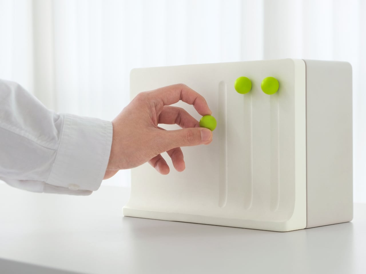
In stark contrast, this “Emergency Foldable Mouse” really does fold in half, not unlike the phones like the Samsung Galaxy Z Flip 6. In its “deactivated” form, it’s more like a square compact or pocket mirror, though its flat edges and sharp corners clearly mark it as some sort of gadget or tool. When closed like this, the mouse automatically turns off and then turns on again the moment you open it.

Unlike a foldable phone, however, this mouse doesn’t unfold completely flat and instead stays at a fixed obtuse angle. After all, this is a mouse and it would be difficult to use it if it laid completely flat on a desk. That said, even that configuration isn’t comfortable, as users of Microsoft’s own foldable mice will attest to. Yes, your hand arcs over the mouse for a more ergonomic hold, but unlike the gentle curve of the Foldable Arc Wireless, you have two edges potentially biting into your skin. Even the designer admits that the design is clearly not for ergonomics but for the object itself.

Admittedly, it carries an aesthetic that will probably appeal to many computer users, especially collectors. The clear plastic version will definitely catch people’s attention, but even an opaque aluminum object with such an angular bend will pique anyone’s curiosity. If anything, the Emergency Foldable Mouse challenges the standard mouse design with an eye toward portability, an area that isn’t as widely explored as ergonomic mouse designs.

The post Foldable mouse concept takes inspiration from foldable phones first appeared on Yanko Design.
Top 10 Caravan Design Concepts for Enriching Your Camping Adventure

Caravans, also termed travel trailers or RVs, are increasingly popular for their blend of comfort and style while exploring the world. These compact mobile homes offer the comforts of home while journeying to various destinations. A notable feature of owning a caravan is the ability to personalize the interior to match individual preferences and needs. Simple changes in decor ideas can help achieve your desired look by adjusting or adding elements like upholstery, window treatments, carpets, rugs, shower curtains, bedding, planters, foliage, art, buntings, and other decorative items.

Image courtesy of: XavierPardina

When choosing interior color schemes for your caravan, prioritize hues that create a sense of spaciousness and maintain longevity. Begin with a neutral base palette, allowing room for color accents through bedding, upholstery, and accessories. Consider earthy tones like blues, greys, greens, and whites, alongside pastel shades, with beige, cream, or your preferred neutrals seamlessly complementing wood paneling and visually expanding your space. Whether renovating an older caravan or adding personalized touches to a new one, here are some ideas to kickstart your design journey.

Image courtesy of: cookelma

1. Multifunctional and Compact Furniture

Image courtesy of: cookelma

Since a caravan comes with limited square footage, it’s important to make the most of every available inch. Therefore, it is important to opt for furniture items that serve multiple functions like a sofa bed can serve as seating during the day and easily convert into a bed at night. This not only optimizes space but also fosters a feeling of openness within the caravan, especially during daytime travel. Opting for a foldable table offers the flexibility of tucking it away when not needed, thereby liberating precious floor space. Consider seeking a table that can be mounted on the wall or ceiling for additional space-saving benefits. Modular furniture provides versatility to rearrange according to your requirements. Look for pieces that can be stacked or nested when not in use, enabling efficient space utilization and ensuring ample room for movement.

2. Enhance the Storage

Image courtesy of: Pressmaster

Storage is often a challenge when embarking on caravan trips, particularly during long journeys or in winter. With so many essentials to carry, space is always at a premium. In smaller caravans, it’s essential to invest in ingenious storage solutions. Consider utilizing under-bed storage boxes, over-door organizers, furniture with ample drawers, and hanging shelves. Make the most of every nook and cranny, including the space beneath seats and in the corners of the caravan.

3. Add Texture

Adding textured accents such as cushions, throws, and rugs is a simple yet effective method to elevate the appearance of a small caravan. These elements contribute warmth and personality to the interior. Furthermore, incorporating wall art can further enhance the aesthetic appeal of the space.

4. Coastal Influences

For coastal and beach enthusiasts, choose a caravan with nautical-inspired interiors and color schemes. Utilize white as the main color to keep the space fresh and airy, essential in small areas. Incorporate various shades of blue for a relaxing coastal feel, and opt for natural materials like wood furniture, decor accessories, and rattan baskets to maintain this style. Consider adding blue and white stripes, reminiscent of classic ship decor, to enhance the nautical theme.

Designers: Fabien Denis, Jean-Marie Reymond x Carapate

As luxury camping vehicles like teardrop caravans become increasingly popular, La Carapate from French manufacturer Carapate distinguishes itself with its innovative design. Sporting a trapezoidal shape and a unique flap door for shade and convenient access, it stands out in the market. Drawing inspiration from nautical themes, its blue and yellow color scheme captures the essence of maritime adventure. With eco-friendly features like a solar panel, La Carapate embodies sustainability and responsible travel. Its panoramic views and compact living space make it an appealing choice for camping enthusiasts seeking a connection with nature and alternative accommodation. Explore its hidden features, such as skylights and USB ports, for an unforgettable camping experience.

5. Rustic Vibes

Achieve a transitional style in your compact caravan by blending modern and rustic elements for a relaxed yet stylish interior. Opt for neutral tones like white or cream for the internal walls, and incorporate cream blinds for added texture. Keep decor accessories predominantly neutral, and integrate natural materials such as rattan lights, baskets, trays, and wooden furniture pieces for an organic touch.

6. Go for Natural Materials

Image courtesy of: Chris_Willemsen

Considering that the caravan will be utilized for exploring natural environments, why not incorporate natural materials into the interior decor? Embracing these materials, such as wood, rustic basins, wood flooring, and breathable fabrics, can enhance the renovation, creating a connection to the surrounding natural landscapes.

7. Bohemian Vibes

The Bohemian style complements the freedom and flexibility of small caravan living. With its adaptable nature, it easily suits most caravan spaces, focusing on a neutral color scheme with hints of green from foliage and natural browns from materials like seagrass and rattan. This achievable and timeless interior design starts with updating the cushions in the dining area, setting the tone for the entire caravan space.

8. Scandinavian Inspired Design

Designer: Hobby

Hobby’s Maxia caravan blends Scandinavian design with hygge living, offering a luxurious city apartment on wheels. Its exterior retains a traditional look with rounded edges and panoramic windows for expansive views. Inside, a focus on simplicity and comfort characterizes the layout, with an L-shaped kitchen featuring modern amenities and a versatile U-shaped sofa doubling as a dining area and bed. The open floor plan ensures ample living space, with a private sleeping area towards the back and smart appliances like Truma Combi heater/water heater and Hobby Connect touchscreen controls enhancing the experience. It’s a stylish and functional retreat for on-the-go travelers.

9. Introduce a Home Office

In the post-pandemic era, there’s a notable rise in camper and trailer demand, offering enhanced adventure experiences and cozy sleeping quarters. These vehicles not only provide ample space for gear but also feature full kitchens, bringing the comforts of home to natural settings. For professionals craving personal space amidst scenic landscapes, these mobile accommodations offer an escape from monotony, making work-life balance more attainable.

Designer: Nissan

The Nissan NV350 Caravan Office Pod Concept revolutionizes remote work by offering a mobile office in scenic locales. Controlled via smartphone, it extends outdoors with one-touch retractable motion, electric shades, and UV antibacterial lighting for hygiene. Featuring a Herman Miller Cosm chair on a polycarbonate floor and adjustable ambient lighting, it prioritizes ergonomic comfort. A rooftop deck provides a luxurious retreat, accessible from inside the vehicle for personal solitude. Unveiled at the Virtual Auto Salon 2021, this caravan exemplifies the future of electric vehicles, offering innovative opportunities for remote work while inspiring creativity in nature.

10. Invest in Luxury

Designer: Adria

Adria’s new Astella caravan epitomizes luxury mobile living reminiscent of 1950s airline opulence, akin to Pan Am, catering to travelers in pursuit of ever-changing dream vacations. Crafted as an inspired, deluxe rendition of the traditional holiday home on wheels, Astella embodies luxury through simplicity. Its open floor layout exudes sophistication with clean lines, amplifying the spacious interior housing living, kitchen, bathroom, and bedroom spaces. Astella seamlessly integrates indoor and outdoor living with panoramic glass doors, while its aerospace-grade exterior boasts a sleek glazed steel finish for efficient airflow during towing, promising a luxurious yet functional travel experience.

The post Top 10 Caravan Design Concepts for Enriching Your Camping Adventure first appeared on Yanko Design.
Tilting water cup concept gets you to drink more water by scaring you

We all know how important water is to our health, but simply knowing those facts doesn’t immediately translate to action. Most of us simply forgo drinking water until we feel thirsty or when it’s time to eat, even though we actually need to hydrate regularly throughout the day. It’s easy to forget to do that in during the busy day, and it’s also just as easy to snooze or skip alarms you set to remind you. You wouldn’t be so complacent, however, if your water cup or tumbler is fated to fall over unless you drink water at the right time, and that’s somewhat the kind of scare tactic that this concept device employs to try to get you to drink water more regularly.

Designers: Yuxiong Dong, Yaoxin Cai, Yongde Zhu, Kang Han

No, the cup thankfully doesn’t actually threaten to spill your water if you don’t rush to catch it, but it makes you think the tumbler will indeed tumble over if you don’t. It only tries to make you stand up and make the effort to walk to the device, presuming you put it far from your desk. The way this tilting water cup works is a mixture of simple mechanics and psychology, though some will probably have doubts about the efficacy of the latter.

The design is made up of two parts, the actual cup that holds the water and the base that does the mind trick. You simply put the cup of water on top of the base, turn the ring on the base to set the timer, and then go back to what you were doing. Once the timer runs out, an alarm presumably sounds and the surface of the base where the cup rests begins to tilt, forcing you to rush to its side and pick up the cup. And since you’re already there anyway, you might as well drink the water from it, which is the whole point of this rather odd system.

Of course, the cup won’t actually fall off since it’s magnetically attached to that base. The question is whether the contents will start spilling at that angle, so you might have to make sure not to fill it up in the first place. You might also wonder if it will be difficult to pick up the cup from the base considering it has to be held by strong magnets to prevent it from slipping when it tilts.

The biggest concern, however, will be whether the strategy actually works. It might be effective for the first few times, but once your mind has adjusted to it, it won’t be so easily tricked again. At that point, you might very well start ignoring it, too, just like those alarms and reminders, turning the titling water cup into an odd but pointless design.

The post Tilting water cup concept gets you to drink more water by scaring you first appeared on Yanko Design.

Office on wheels car concept lets you take your work anywhere

A large majority of future car concepts that we keep hearing about revolve around self-driving cars that seem to turn every ride into some sort of a party. You have people engaging with each other or at the very least kicking back to relax, idyllic situations that might not exactly match the priorities or needs. Rather than just chilling, some people might actually prefer to be able to work anywhere without having to race for an empty table or socket or, worse, bring a whole RV with them. This two-passenger car concept tries to envision a future where you can bring your office with you, including the comfortable furnishings that let you work productively. It even has room for a houseplant!

Designer: Amiparn Mudgal

This moving workspace is definitely not like any car concept you might have seen, even those that cater to having only two people inside. The body, or at least its bottom half, is more like an upside-down trapezoid and is very boxy and almost clinical in its shape. Of course, the chassis could be any form, including the smooth and sleek designs of luxury cars. That said, the core focus of the design is having enough space inside more than a fashionable style. After all, you are trying to fit an office inside.

The main mechanism that makes this possible is the sliding foldable seats. The passenger seat, for example, folds down and slides inside to get out of the way, while the driver’s seat can scoot over and turn around to face the front or the back of the car that are actually desks. This kind of design, unfortunately, means that only one person can actually be inside when the interior is in “office mode,” so your passenger might have to step out for a bit if they’re sticking around until after you’re done with your work.

Another key element to this rather unusual concept is the sliding tabletops that extend the working space that you have. There’s one in front on the opposite side of the steering wheel, while the one at the back transforms the rectangular desk into an L-shaped corner desk. Whichever way you turn, you’ll have all the table space you need for work, food, and maybe even playing.

One intriguing part of the concept is the idea of this moving workspace as a collaboration between a car manufacturer and a furniture company like IKEA, famed for its modular and flat-packed product. It applies accents and details that you’d rarely find in cars but are common in office furniture, like fabric-covered surfaces or wooden panels that act as tables. There will definitely be some who will scoff at the idea of bringing your work with you on your travels rather than taking a timeout, but there will also always be situations when you can’t afford that luxury and just need to park somewhere to get stuff done.

The post Office on wheels car concept lets you take your work anywhere first appeared on Yanko Design.
Eco-friendly tumbler uses thermoplastic made from unused wood byproducts

Coffee lovers have thankfully become more conscious of the harmful effect their drinking habit has, not on their bodies but on the planet. Plastic cups are the biggest culprits, of course, but even paper cups actually take a toll on the environment in the long run. Paper is sustainable and biodegradable, but the rate at which we manufacture the material is faster than we can grow trees to maturity. At the same time, normal wood isn’t exactly a good material for reusable cups or tumblers that are becoming the go-to solution for environment-conscious drinkers of coffee, tea, or water. This design concept tries to offer a middle ground with a seemingly magic thermoplastic tumbler that is actually made from unused wood.

Designer: Kim Jiwoo (Designer Dot)

Wood is a material well-loved by designers because of its innate beauty and sustainability. But while it does grow on trees, trees don’t grow overnight. And while there are alternatives that make use of recycled synthetic materials like plastic, these don’t easily decompose like wood, which can turn into material that nourishes the soil that trees grow on. In other words, wood is the perfect circular economy material, and it would be great if it could take on the beneficial properties of plastic as well.

CXP or Cellulose Cross-linked Polymer is that growing (no pun intended) solution that promises the best of both worlds. It’s made of wood, specifically the cellulose that is the building block of trees and plants, but it has also been plasticized through specific chemical processes that are fortunately easy to reproduce. Unlike bioplastics that need very specific conditions before they decompose, CXP behaves exactly like wood in this regard. In other words, once this tumbler has reached the end of its life, it can be even used to nourish the soil for other trees whose discarded wood will be used to make more thermoplastics.

LINK is the expression of this sustainability innovation, a tumbler that tries to signify the connection between humans and trees on multiple levels. Its handle is intentionally shaped like a branch sprouting from a tree trunk, sporting a length that is ergonomic for any hand size. The trunk, which is the main body of the tumbler, is also shaped with ridges that try to mimic the uneven surfaces of trees, while also adding to the grippiness of the container.

Unlike a regular wooden vessel, LINK can be used to hold hot beverages like coffee since it is also a conventional thermoplastic. Spills, leaks, and slips can be prevented by using eco-friendly silicone, perhaps the only concession to this design. And because of the very nature of such recycled materials, there will be very noticeable specks of color that give each tumbler a unique identity that represents its special link to all life on the planet through wood.

The post Eco-friendly tumbler uses thermoplastic made from unused wood byproducts first appeared on Yanko Design.

Self-driving pod helps mobility-impaired pedestrians cross dangerous roads

Plenty of new automotive technologies and concepts are naturally being made for the benefit of drivers and passengers, but they are supposed to also indirectly help pedestrians as well, at least in theory. With AI at the driver’s wheel, the promise of safer roads is being made, though we seem to still be far from achieving that ideal future. In the meantime, pedestrians crossing urban roads and highways are still at risk, especially the elderly, people with disabilities, and basically anyone who might not be able to cross fast enough before the light turns green again. Current solutions like footbridges are obviously not designed for these people as well, so this concept mobility device tries to take the fight to cars’ own turf by giving pedestrians their very own self-driving vehicle.

Designer: Jiseon Ju, Gawon Min

Roads are, of course, made for vehicles, and sidewalks and footbridges are for pedestrians. That said, there will always be places where these paths meet, appropriately called crosswalks, and people outside of vehicles are always at a disadvantage and at risk. Traffic lights seem to never give pedestrians enough time to cross safely, or make the presumption that everyone can walk at top speed, presuming they can walk at all. These systems are obviously not very accessible and alienate a large portion of the population, and it’s in dire need of a better and smarter solution.

Crosswalk Mobility is a concept for a cubicle on wheels that ferry people from one side of the street to another. It’s basically designed for people with mobility impairments, from the elderly to the injured. Given its enclosed design, it can also be used by parents with toddlers who are prone to suddenly running off while crossing streets. Of course, you can’t have a permanent driver for such a pod, so it naturally uses self-driving technologies to move.

What makes the concept even more interesting is that it works in conjunction with what should be a smart traffic system. In a nutshell, it communicates with traffic lights so that it can extend the red light duration until it safely reaches the other side. Ideally, traffic lights should allocate enough time for people to safely cross, but this system leaves nothing to chance.

The mobility device itself is designed to be powered using solar energy, ensuring its continued operations 24/7. Instead of regular wheels, it proposes using ball-type wheels that can turn more smoothly as needed. The boxy shape has spacious room even for people in wheelchairs and their companions, and the floor-to-ceiling glass panels increase visibility not only for drivers but also for the people inside. It’s definitely an interesting idea that will significantly increase pedestrian safety, but it unfortunately won’t work unless the traffic system on those roads is also upgraded to work with these self-driving boxes.

The post Self-driving pod helps mobility-impaired pedestrians cross dangerous roads first appeared on Yanko Design.
Hybrid watch concept puts a giant hole in the middle of a circular screen

Smartwatches are now a staple of the tech market14, but the departure of several high-profile brands and the arrival of smart rings are making some reevaluate the wearable device. Just like with paper notebooks, there is a strong and large culture around analog, mechanical watches that find smartwatches unappealing, except for some features that aren’t totally unique to smartwatches, namely, health sensors. Hybrid smartwatches exist for this reason, trying to have the best of both analog and digital worlds, but they are not exactly that common nor are their designs well-established. There’s still plenty of room for exploration and experimentation, like this rather peculiar concept that cuts out a whole in the middle of a circular screen to make room for an elegant analog watch.
Designer: Priyanshu Jaiswal

Inspired by the rather divisive notch or cutout on smartphone screens, the Lunar Eclipse hybrid smartwatch concept puts a mechanical watch in the middle of that hole instead of a camera. It might have been easier to have the display as an inset or restricted to a certain part of the watch face, but that presents some challenges as well, particularly when occluding the beauty of the analog timepiece itself. As weird as it may sound, this notch-based design actually has more benefits compared to a smartphone camera cutout.

Because it is technically still a complete screen, with just the middle part rendered practically unusable and invisible, it is theoretically easier to design the user interface of the “digital bezel” around the watch face. You can have icons and text that curve around the border, and you can even have them animated to add more natural-looking visual feedback, like how notification icons can appear like they’re flowing from the center of the watch rather than just appearing out of nowhere.

This gives Lunar Eclipse nearly the same benefits as having a smartwatch but with fewer opportunities for distractions. The bezel around the watch face is still just a small space that can only fit a few words and icons. You definitely won’t be using the watch to read those notifications or, worse, type out a response. You’ll be able to still see some of your health stats, presuming the watch has the sensors to track your steps, heart rate, and other biometrics.

One disadvantage that design has is that its battery life might not be that different from a regular smartwatch. The concept could use an E Ink screen, however, to help reduce that consumption, especially since the display won’t be changing as frequently as on a normal smartwatch. Another consideration is that with the electronics and battery inside, the room for the actual mechanical components would be very cramped, detracting from the inherent beauty of these timepieces that wristwatch fans are after in the first place.

The post Hybrid watch concept puts a giant hole in the middle of a circular screen first appeared on Yanko Design.