Japanese stationery has a reputation that precedes it, and it is earned. The paper is smoother, the mechanisms are more considered, and the objects themselves carry a material honesty that most Western equivalents don’t bother with. Japan has spent long enough treating stationery as a design discipline to have produced things that function noticeably better than what fills most pencil cases. The difference doesn’t announce itself loudly. You notice it the first time you sit down to write.
These seven picks are unique, intentional, and design-forward. Some cost less than a lunch. One requires a short search to track down. All of them share the quality that makes Japanese stationery worth paying attention to: a specific problem solved with enough elegance that the solution becomes the whole point of the object.
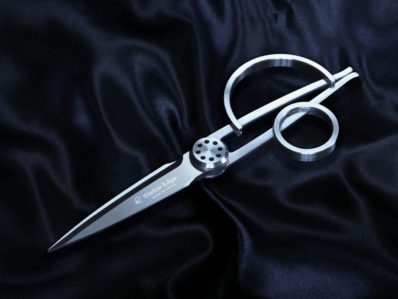
1. Stellar Edge Scissors
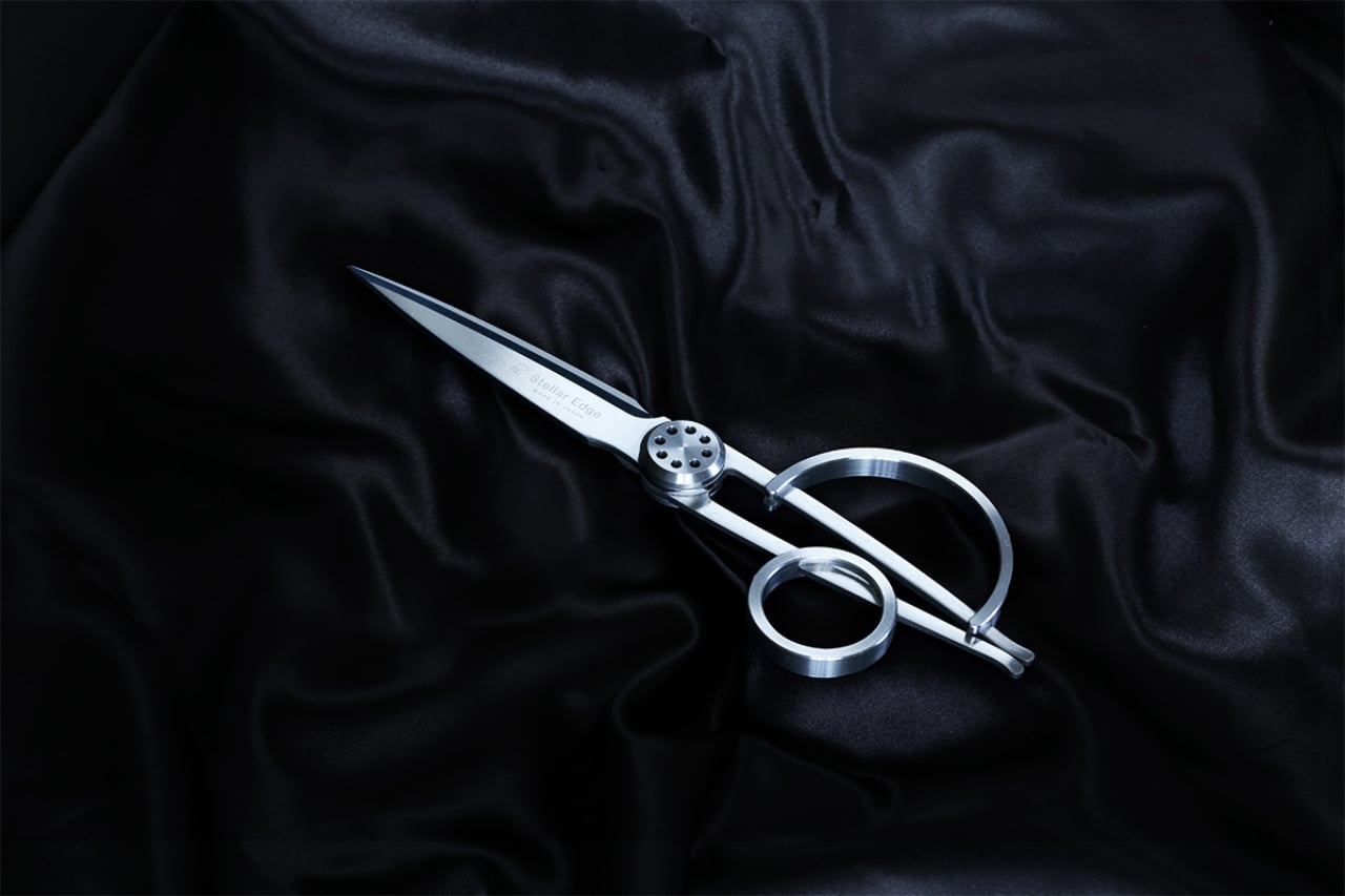
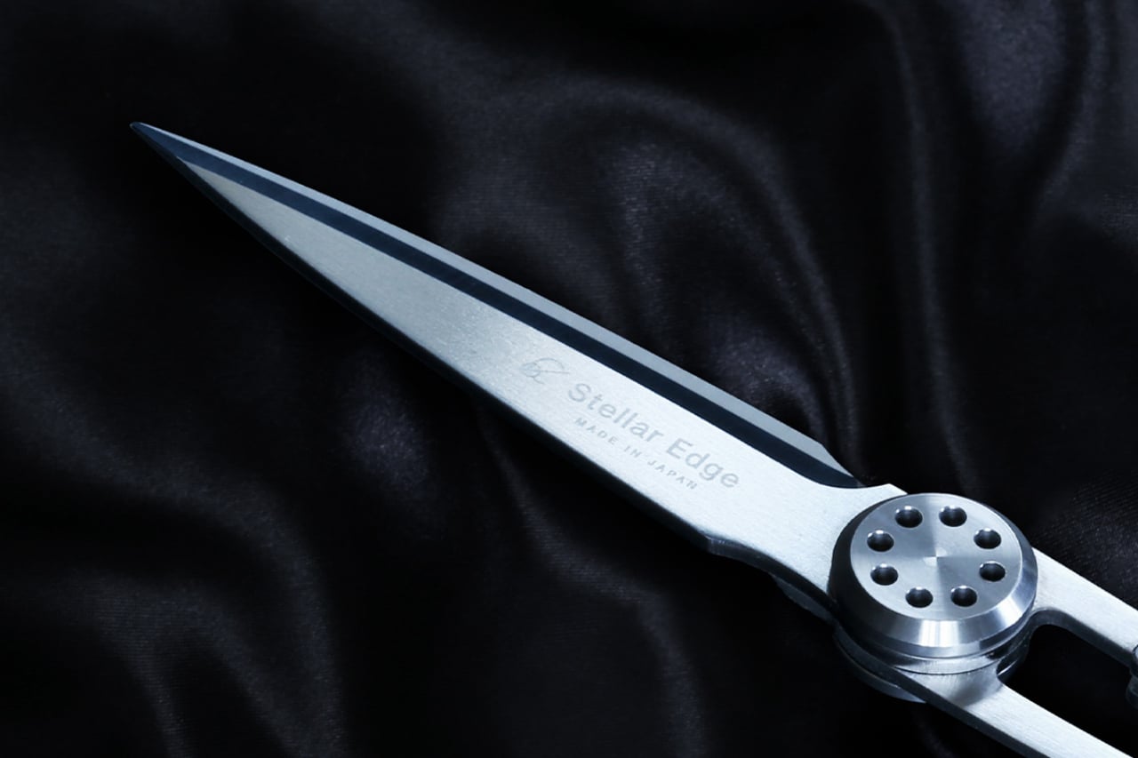
Scissors belong in a category of tools that most people replace when they break rather than choose with intention. The Stellar Edge Scissors suggest a different approach. Crafted from Japanese stainless steel, they arrive with gleaming, seamless handles and a weight distribution that makes the blade feel like an extension of the hand rather than something being held onto. Every curve and angle is deliberately considered. The result is a pair of scissors that earns a place on the desk rather than disappearing into a drawer.
Each snip registers cleanly, with the kind of resistance that confirms the blade is doing exactly what it was made to do. The polished finish across the handle elevates the tactile experience without making the scissors feel precious or fragile. Ergonomics were clearly a priority in the development: the grip sits naturally regardless of hand size, and extended cutting sessions don’t accumulate the fatigue that cheaper alternatives build across an afternoon. These are scissors for people who appreciate what happens when form and function are treated as the same brief.
What we like
- Japanese stainless steel construction holds its sharpness across sustained use rather than dulling after a few weeks
- The seamless handle design and polished finish make these genuinely display-worthy on a desk
What we dislike
- The premium material and manufacturing precision place these at a higher price point than standard scissors
- The minimalist form prioritizes aesthetics, so there are no rubber grip inserts for those who prefer a softer handle feel
2. Stalogy Editor’s Series 365-day Notebook (A6)
Stalogy’s 365 Days Notebook manages something most pocket notebooks don’t: 368 pages of ultra-thin paper in an A6 form factor that still fits in a coat pocket without bulging. Each page carries minimal printed detail, with dates, days, a faint grid, and time indicators that function as suggestions rather than structure. The paper itself is a genuine pleasure to write on, recalling Hobonichi’s Tomoe River stock in the way ink glides across the page without feathering or bleed-through.
What separates the 365 Days from most planners is what it refuses to do. It doesn’t impose a structure on your day or assume how your hours should be divided. Bullet journaling, daily planning, freeform sketching, and straight note-taking all work comfortably within its pages, and none of them feel like compromises. Most stationery at this level quietly pushes a method. Stalogy provides the space and steps aside, which turns out to be the more useful approach.
What we like
- Thin paper keeps 368 pages genuinely pocketable without adding bulk to a coat or bag
- Minimal page markings give it equal footing for structured planning and open-ended creative work
What we dislike
- Date and time markings are printed very small, making them difficult to read in low light
- Heavy fountain pen inks will ghost through the thin paper, limiting compatibility for serious pen users
3. Classiky Chestnut Postcard Case
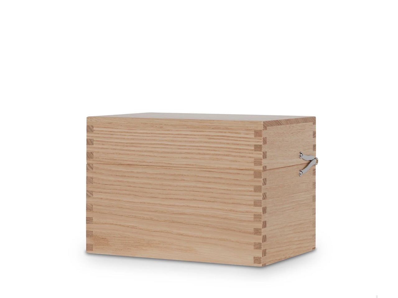
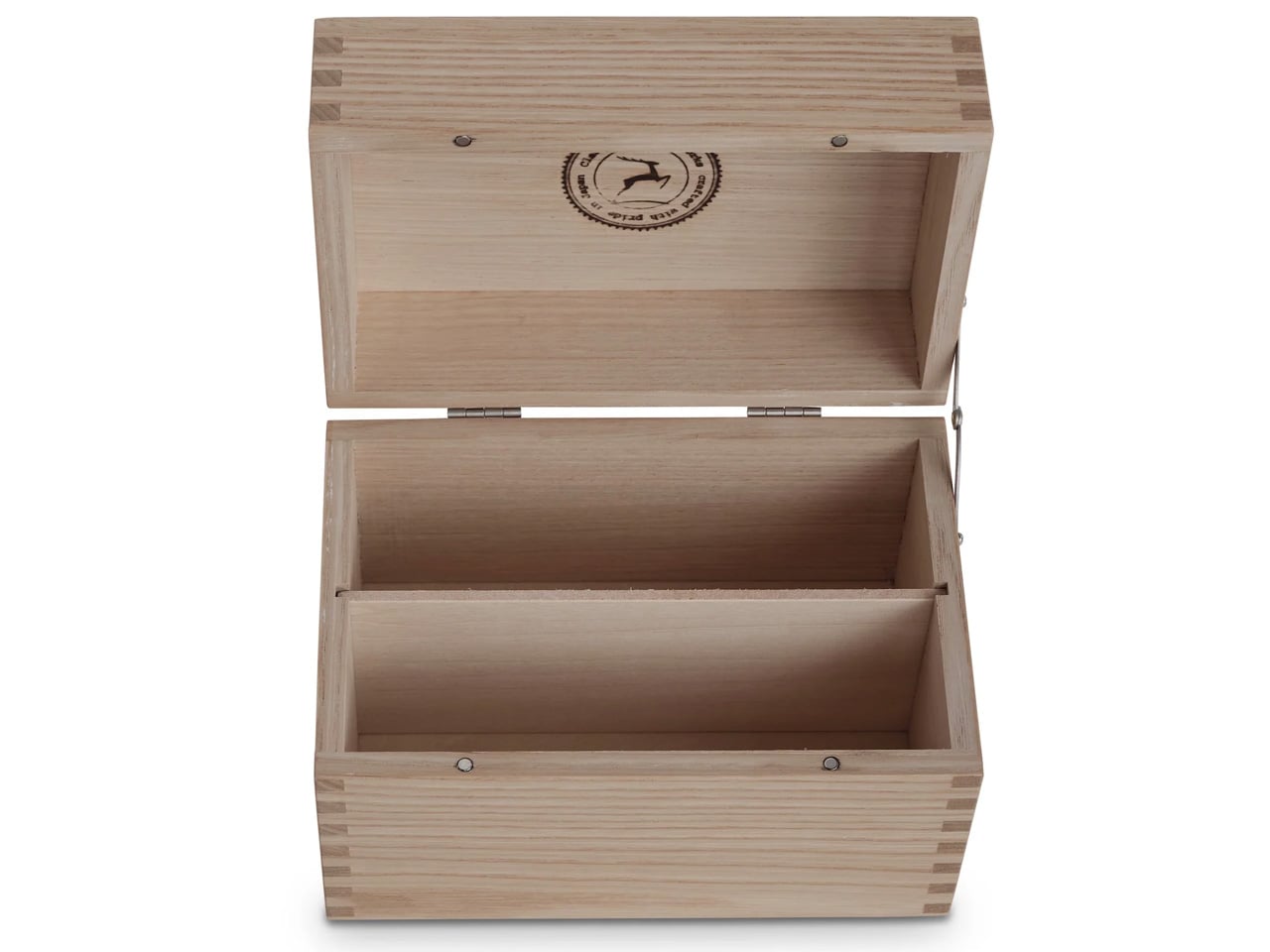
Classiky’s Chestnut Postcard Case takes its design cues from the wooden boxes Japanese craftsmen have long used to house precious ceramics. Varnished Japanese chestnut wood gives it a warmth and grain depth that plastic or metal storage simply cannot reach, and the proportions at 17.6 x 11.6 x 12.4 cm are calibrated precisely for standard postcards. Two removable separators sit inside, and a magnetic closure shuts with the kind of clean, weighted precision that makes opening and closing the thing quietly satisfying.
What makes it worth the attention is its relationship with time. Chestnut doesn’t fade with handling — it deepens, growing richer in tone the more it’s used, which means the case becomes more beautiful the longer it stays in rotation. The removable separators allow the internal configuration to shift as a collection grows or changes. For collectors, letter writers, or anyone who treats a postcard as a physical artifact worth keeping, this turns an act of storage into something closer to curation.
What we like
- Varnished Japanese chestnut deepens in tone over years of handling rather than wearing down
- Removable separators allow flexible internal configuration as collections grow or change
What we dislike
- Dimensions are postcard-specific, so larger formats like A5 prints won’t fit
- The material quality and craftsmanship place it at a premium that makes it a harder sell for casual buyers
4. Midori MD Notebook A5
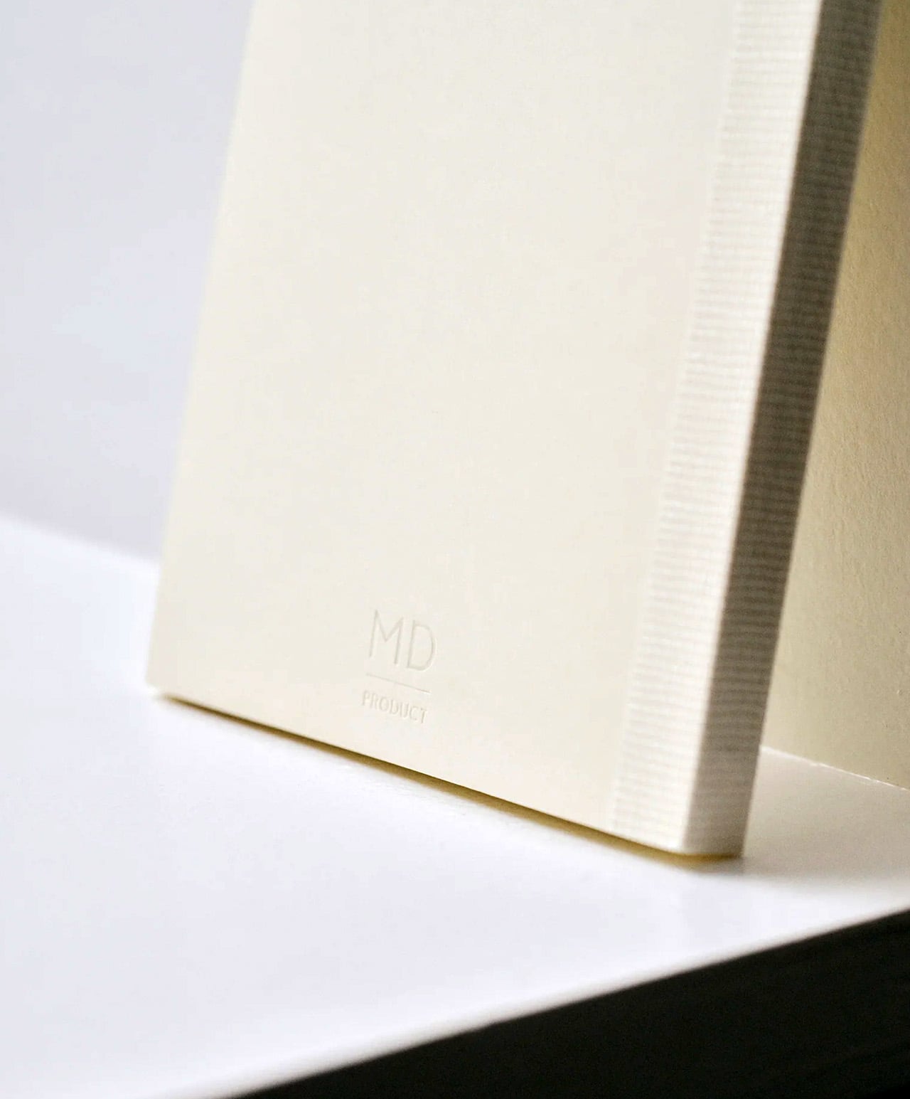
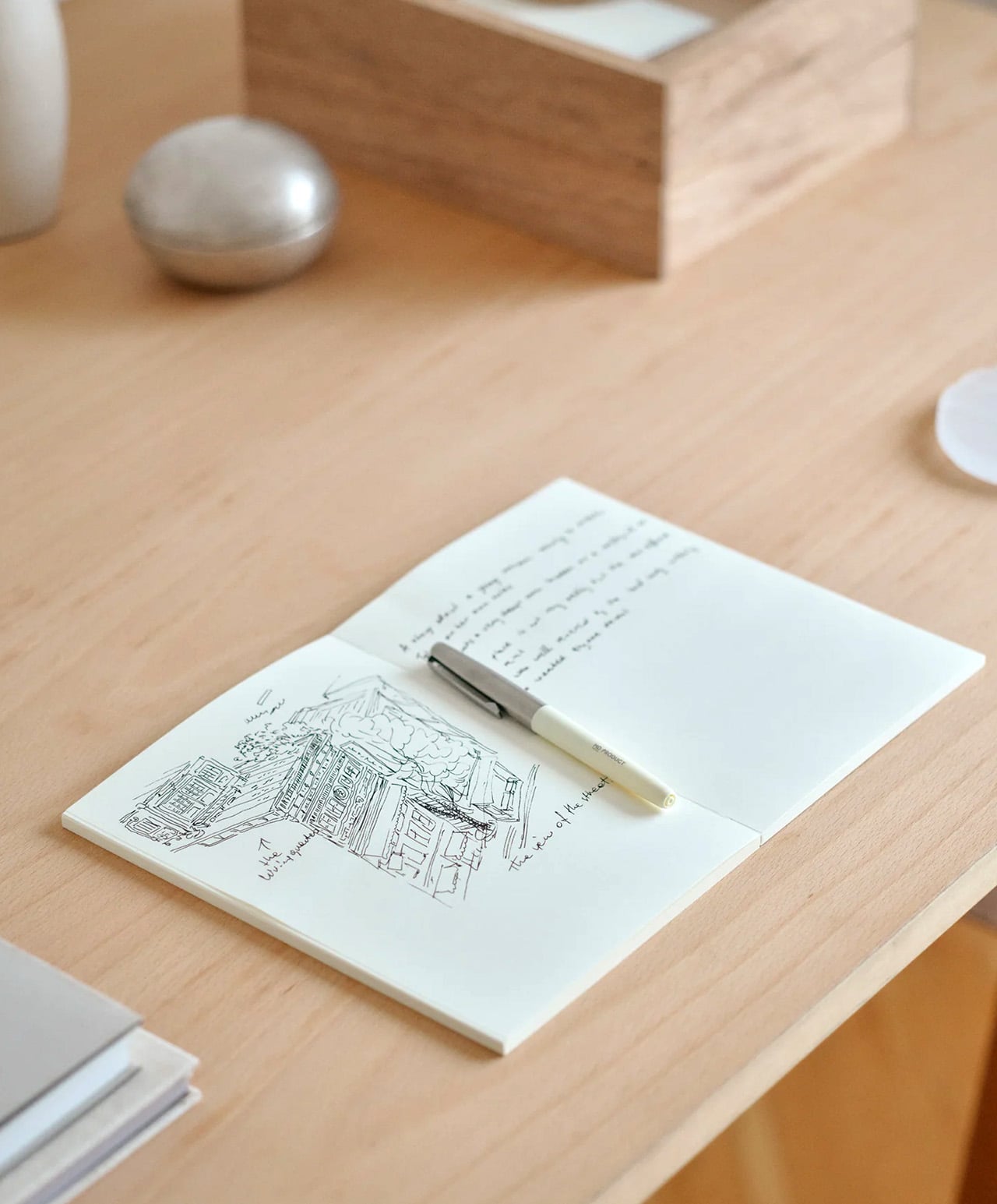
Midori developed MD Paper specifically for this notebook, and the difference is apparent within a few lines. Fountain pen ink sits on the surface without feathering into the fibers. Gel pens don’t bleed through to the reverse. Fine-liners retain their edge rather than spreading at the tip. The same paper runs across the cover, endpapers, and text pages, creating a material consistency that most notebooks don’t consider worth pursuing. Thread binding holds the quires together and allows the book to open completely flat from the first page to the last, with no resistance pulling the spread closed.
The exterior wraps in glassine paper, a translucent sheet that protects the cover and references the packaging of older books without being precious about it. Index stickers come included for navigation, and a silk ribbon bookmark sits at the spine with a color that varies by notebook type. Available in blank, lined, grid, and dot grid in A5, it is made in Japan and sold directly through md-product.com. Once you write in one, returning to a generic notebook starts to feel like a visible compromise rather than a neutral choice.
What we like
- MD Paper handles fountain pen ink and gel pens without feathering or bleed-through, which changes the writing experience measurably
- Thread binding allows the notebook to open 180 degrees flat, removing the resistance that glue-bound notebooks create mid-spread
What we dislike
- The cream-toned paper suits most writing but won’t work for illustrators who need a bright white surface for accurate color work
- The glassine cover wrapper is more delicate than synthetic covers and shows handling wear with heavy daily use
5. Kokuyo Harinacs Press
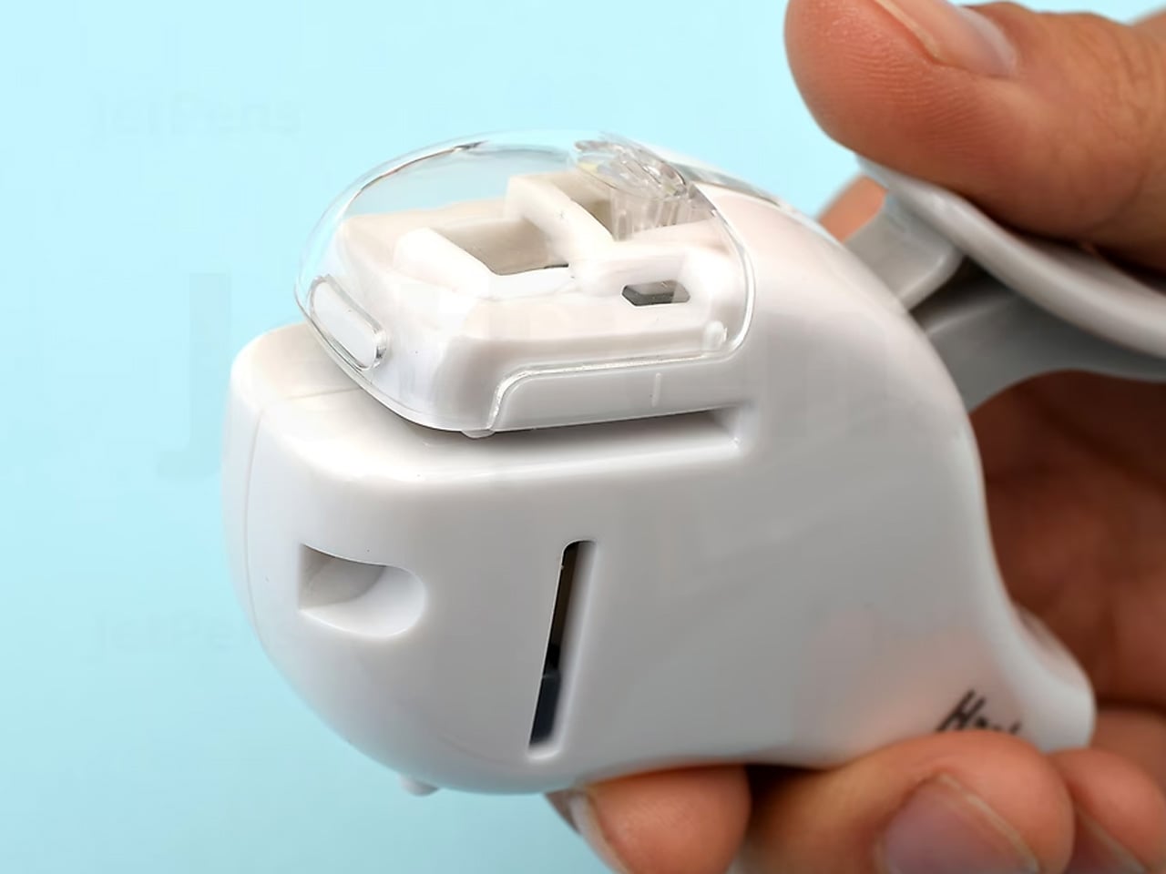
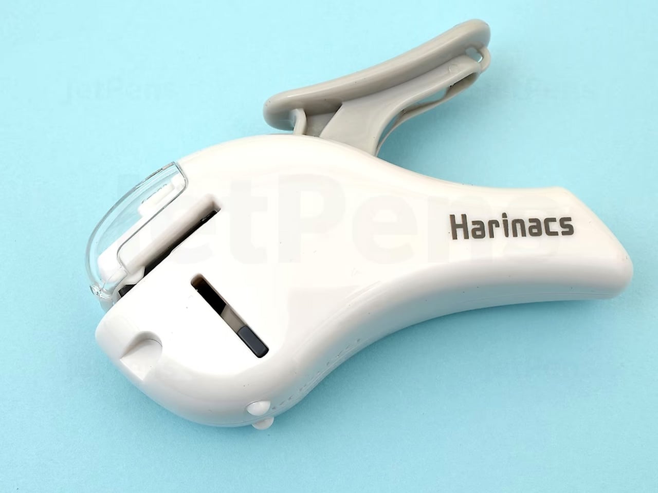
Staplers exist because paper needs to stay together, not because metal staples are the best way to achieve it. The Kokuyo Harinacs Press removes the staple entirely. A press-lock mechanism cuts a small tab directly from the sheets being bound, folds it through a matching slit, and locks the pages together without puncturing them with metal. Up to five sheets bind cleanly. The binding area stays flat so pages stack without a raised lump, and no staple removal is needed when the paper reaches a recycling bin at the end of its life.
Kokuyo has been making office products in Japan since 1905, and the Harinacs reflects the company’s long habit of questioning what the category accepts as fixed. The staple has existed long enough that challenging it feels strange, which is exactly why this product lands as well as it does. The body is compact at 34 by 95 by 85 millimeters, sits upright on a desk, and works without refills of any kind. Bindings are reversible by rubbing the lock area with a firm object.
What we like
- The press-lock mechanism requires no consumables, so the stapler functions indefinitely without replacement staples
- Binding is reversible using any firm object, allowing pages to separate cleanly without tearing
What we dislike
- The five-sheet maximum limits its use for thicker documents, making it a companion tool rather than a primary binding solution
- Very thin or coated paper may not lock as securely as standard copy-weight sheets
6. Kokuyo Hakoake Two-Way Cutter and Mini Scissors
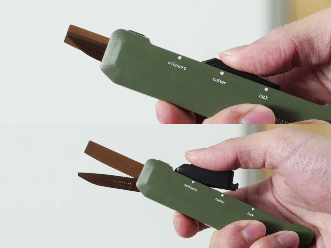
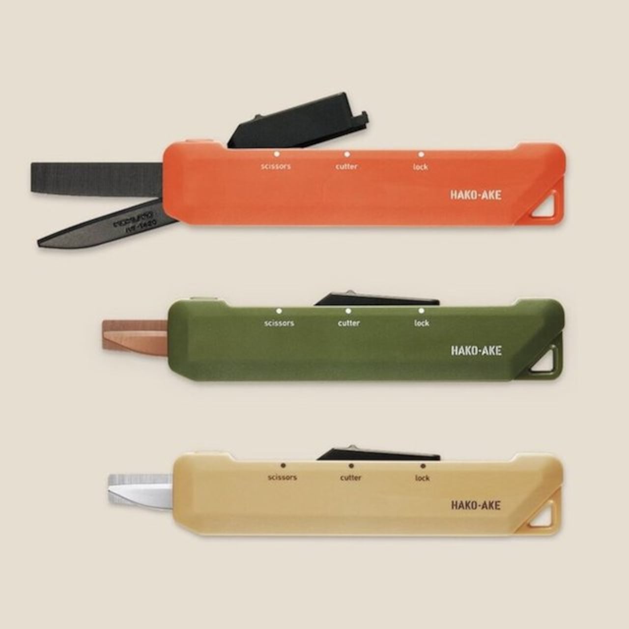
Kokuyo made one decision with the Hakoake that makes the whole product work: the switch between cutter and scissors happens with a single squeeze and slide, one hand, no covers or attachments to manage. The 3mm cutter blade is short enough to open packing tape cleanly without threatening the contents inside. Scissors mode engages by sliding the mechanism forward, and a built-in guide aligns the cut so the action is accurate without requiring careful positioning. It fits in a pencil pouch, clips to a lanyard via a strap hole, and disappears into a bag the way a good tool should.
Compact tools that try to do too many things usually fail at each of them. The Hakoake works because it only commits to two, and the two it chose are the ones that come up in the same moment. Opening a package almost always means also needing to cut a tag or trim a plastic band nearby. Having both in one slim object, without compromise to either mode, is the kind of product outcome that requires genuine engineering attention.
What we like
- The one-handed sliding switch between cutter and scissors is fast enough to use in the same motion as reaching for the tool
- The compact form and strap hole make this genuinely portable in a way that full-size scissors are not
What we dislike
- The 3mm blade is purposely short, so it is not suited to cutting through thicker materials or multiple layers at once
- The slim form factor means grip depth is minimal, which may feel less secure during heavier cutting tasks
7. Sonic Kakusta
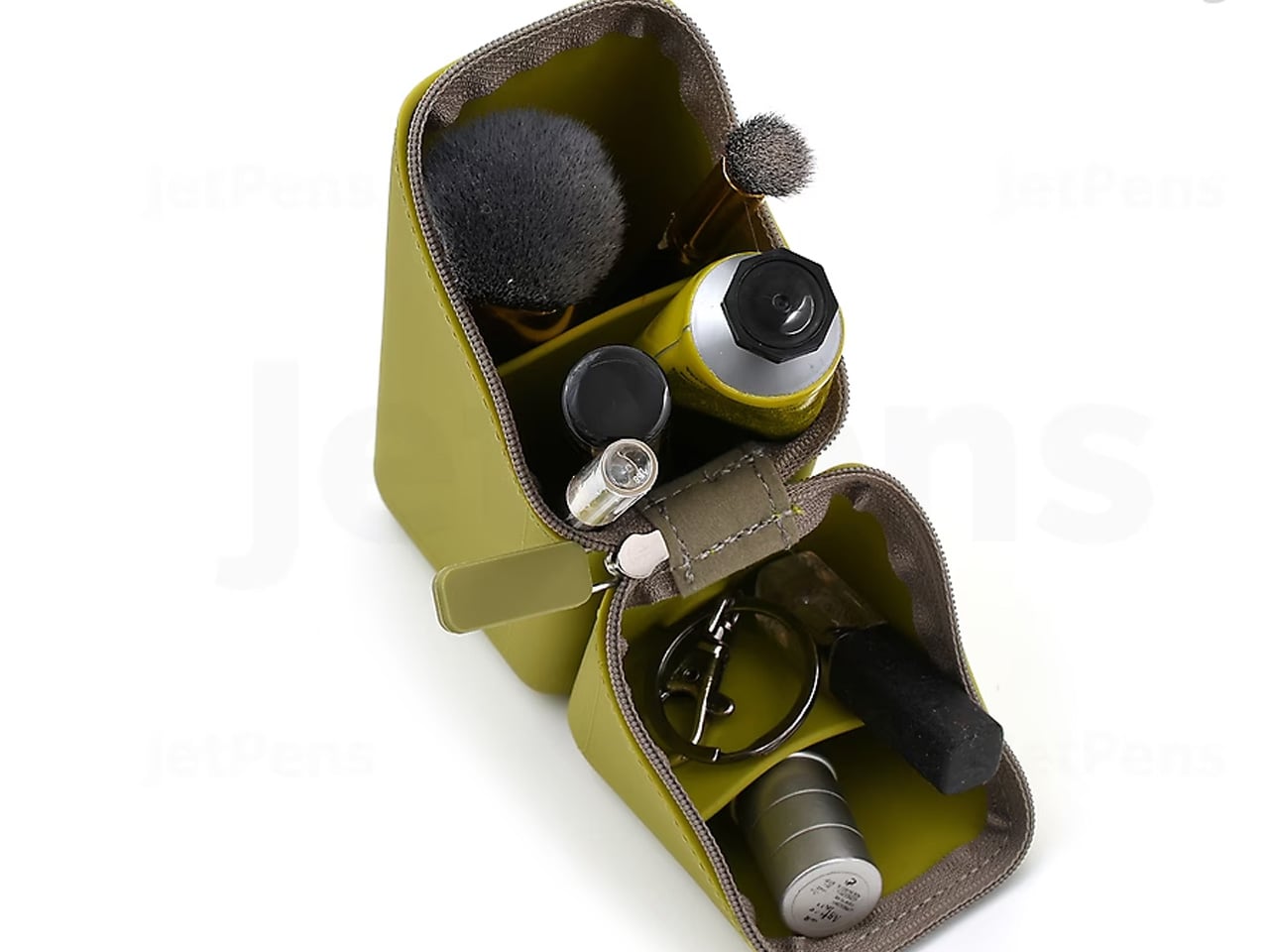
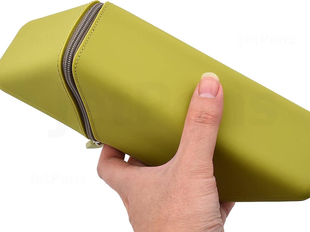
The Sonic Kakusta spends most of its life looking like a soft pen case. Unfold it and it becomes a triangular desk stand that props pens at a 60-degree angle, steep enough to display pen tops for quick identification, shallow enough that pulling one out doesn’t send the rest toppling. A built-in divider splits the interior into two sections, a second divider in the lid creates a small shelf for erasers and sticky notes, and strong magnets hold the folded shape in place so the stand doesn’t quietly collapse between uses.
The angle is the detail that earns it a second look, but the real argument is the one object doing two jobs cleanly. For anyone moving between a home desk, an office, and a library table, the Kakusta removes the logic of carrying both a pen case and a desk cup. Most products that try to collapse two functions into one end up feeling like a halfhearted version of each. This one doesn’t, and the soft exterior keeps the whole thing light enough that the trade-off barely registers until you’re already at your desk with your pens on display.
What we like
- Strong magnets hold the stand shape reliably, even on surfaces that aren’t perfectly level
- The lid divider doubles as a small shelf for erasers and sticky notes, a detail most pen cases overlook
What we dislike
- Soft material offers limited protection against crushing inside an overpacked bag
- The triangular footprint takes up more space than a flat pouch, which matters in tighter carries
This Is What a Well-Made Desk Looks Like
The objects that last on a desk tend to be the ones that earn their place through daily use rather than first impression. Each of these seven earns it the same way: by attending to the part of the tool that most manufacturers treat as already resolved. The paper that accepts ink without spreading. The clip that silences itself. The stapler that eliminates its own raw material. Every one of those decisions took longer than the obvious alternative would have.
A desk set up with tools this considered starts to function differently. Not because the objects are precious, but because they remove the small frictions that accumulate across a working day. Reaching for a pen that is always where it should be, writing on paper that responds the way paper should, cutting with scissors that feel like they were made for a specific hand. July is a reasonable time to replace what is merely functional with what is actually well made.
The post The 7 Best Japanese Stationery Picks Of July first appeared on Yanko Design.