Ovios and Studio F. A. Porsche Just Made Their First Furniture Collection Together

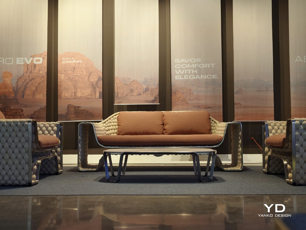
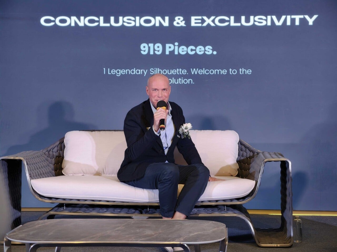
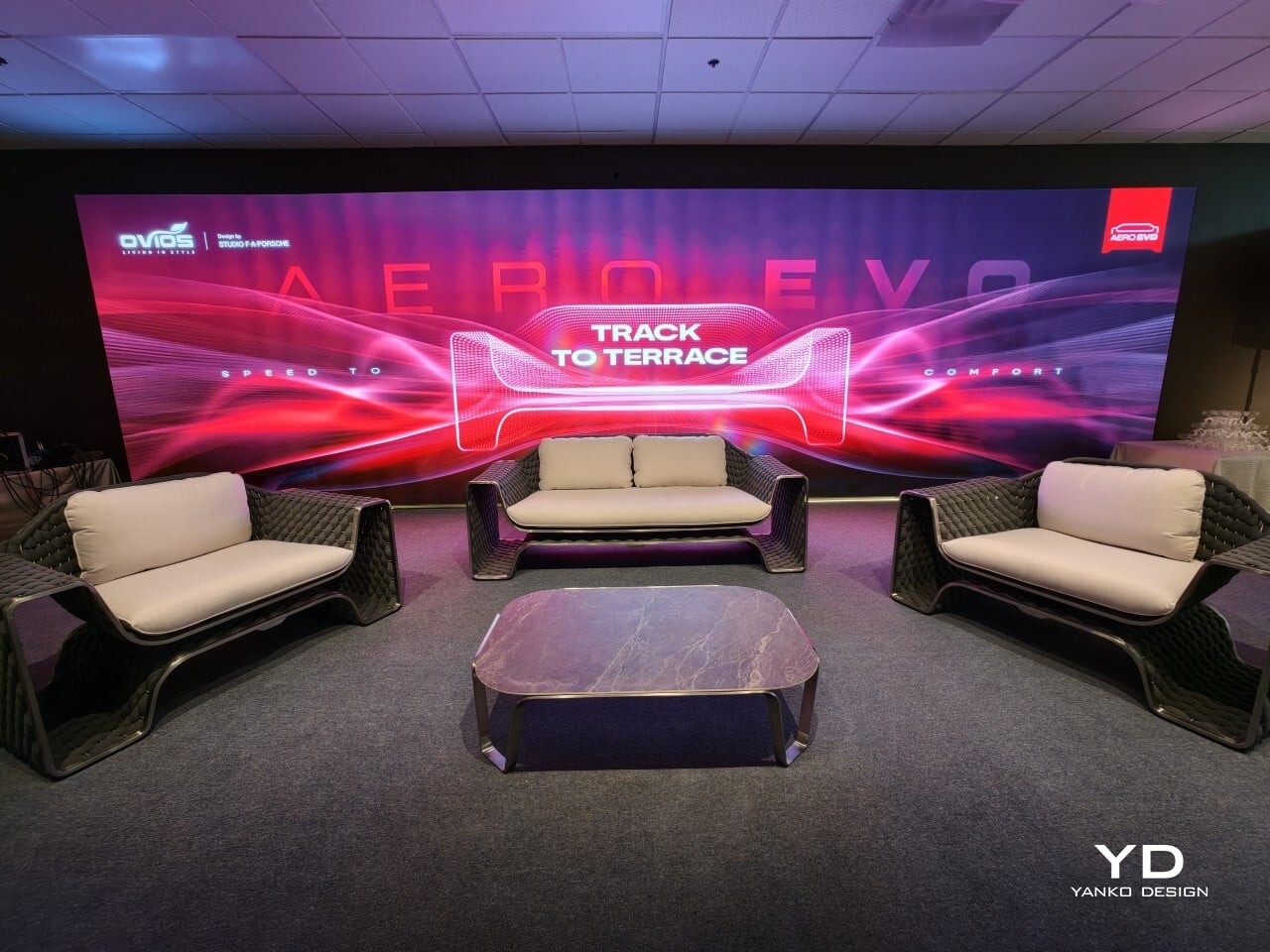
Ovios introduced Aero Evo at the launch event in California, a new outdoor furniture collection created with Studio F. A. Porsche. The line includes a sofa, lounge chairs, and a coffee table, and it marks the studio’s first outdoor furniture project. The collaboration brings together Ovios’s experience in premium furniture manufacturing and Studio F. A. Porsche’s minimalist, performance-led design approach, with comfort and function treated as part of the design rather than an afterthought.

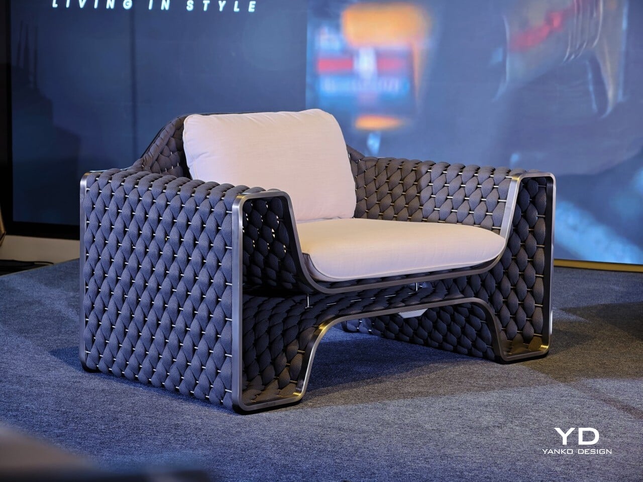
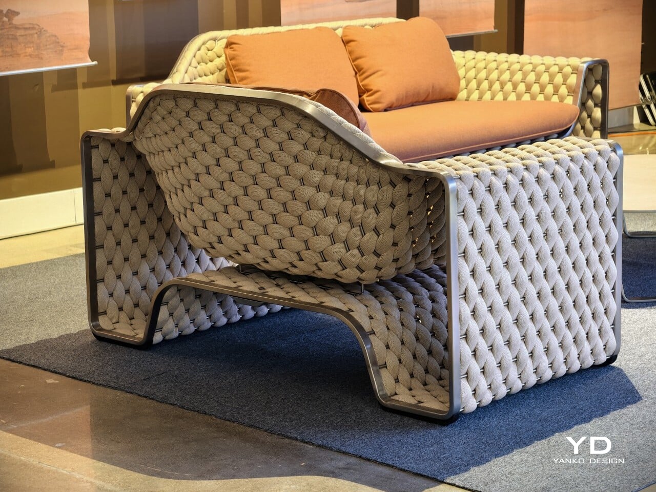
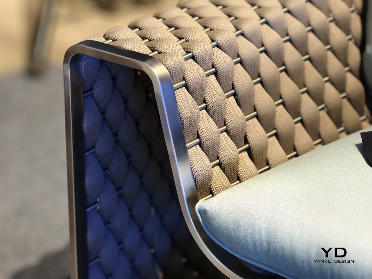
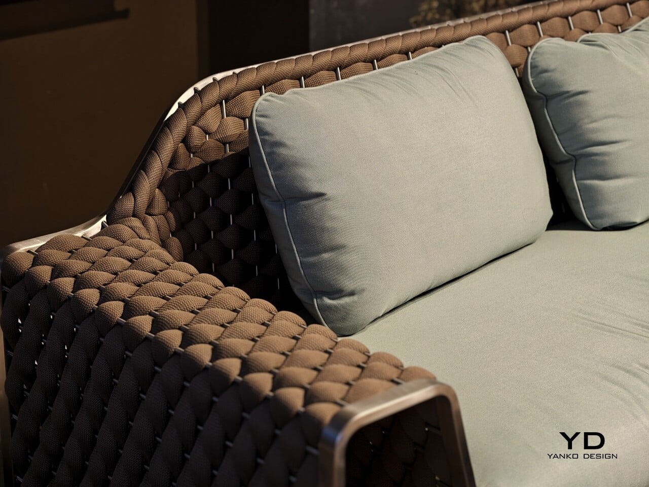
Seen in person, Aero Evo feels softer and more sculptural than the Porsche connection might suggest. The woven side and back panel give the pieces presence, while the exposed metal frame and open structure keeps them visually open. It does not read like furniture trying to imitate a car. The link is more understated than that, showing up in the control of the lines and the clarity of the structure.

Designer: Ovios x Studio F.A. Porsche

Henning Rieseler, Design Director at Studio F. A. Porsche, said the collection was developed with the American market in mind, particularly California. That lighter, more relaxed mood comes through, but the collection stops short of the usual resort furniture look. The forms are cleaner and more restrained, which gives the pieces a stronger identity.

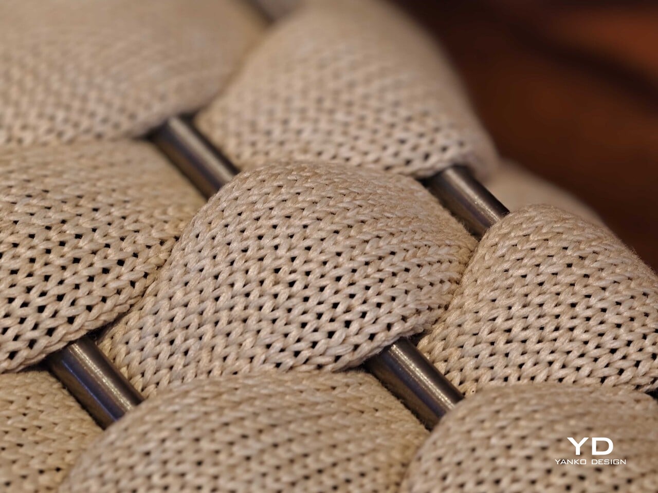
The woven rope is central to that. It is not there simply to soften the frame. It shapes the way the sofa and chairs are read, giving them texture and volume, while the visible frame keeps the overall profile open. That contrast is where much of the collection’s appeal lies.

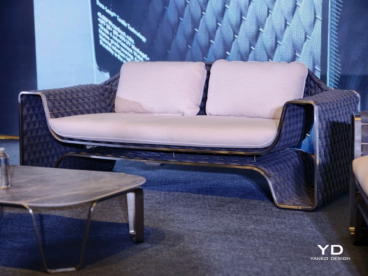
Aero Evo works best when the frame and weave are read together. The stainless steel frame gives the collection its outline and support, while the woven rope adds warmth and softness. The raised base and open structure create a sense of airflow that keeps the furniture from feeling too solid. The pieces have enough presence to anchor a space, but they do not feel heavy.

Rieseler said the collection went through several iterations, including adjustments to the height of the back panel and the size of the cushions. The goal was to keep the metal frame and woven back visible while maintaining comfort. That helps explain why the final proportions feel so controlled. The cushions are generous, but they do not cover up the structure or blur the silhouette.

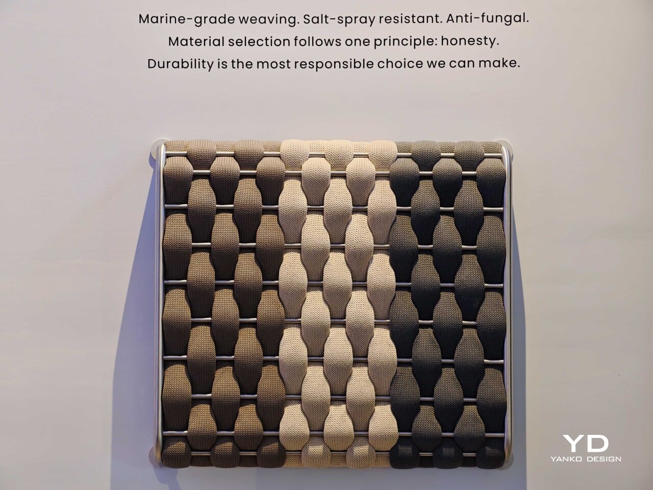
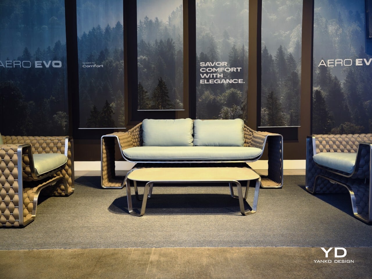
The collection comes in three woven rope colors, charcoal, brown, and beige, along with four cushion color options. The charcoal version brings out a more graphic side of the design, while the brown and beige versions feel warmer and more relaxed. The lighter combinations suit open terraces and poolside settings especially well, while the darker option gives the collection a sharper presence.

Seen together, the sofa, lounge chairs, and coffee table read as a complete outdoor setting rather than a group of separate products. The seating carries most of the visual identity, and the coffee table sits more quietly within the arrangement. That feels right for a collection aimed at terraces, patios, garden lounges, and hospitality spaces, where the atmosphere matters as much as the individual pieces.

Ovios is releasing Aero Evo as a limited collection of 919 pieces worldwide, a nod to the Porsche 919 Evo that informed the project. Even so, the most convincing part of the collection is not the automotive reference on its own. It is the way the design handles structure, texture, and comfort without pushing any one idea too hard. For Studio F. A. Porsche, it is a confident first move into furniture. For Ovios, it is a collaboration that feels well matched. The result is a collection that feels considered, distinctive, and easy to imagine in use.

Click Here to Know More!

The post Ovios and Studio F. A. Porsche Just Made Their First Furniture Collection Together first appeared on Yanko Design.

Scaffolding Was Never Meant to Be Beautiful, Estrade Disagrees.

Most furniture begins with a brief. A sketch. A mood board pulled from somewhere between a Scandinavian design blog and a decades-old auction catalog. French industrial designer Pierre Villez did something different. He started at the construction site.

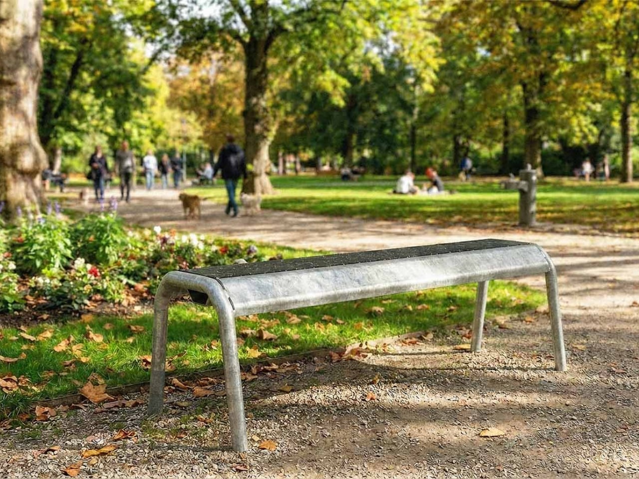
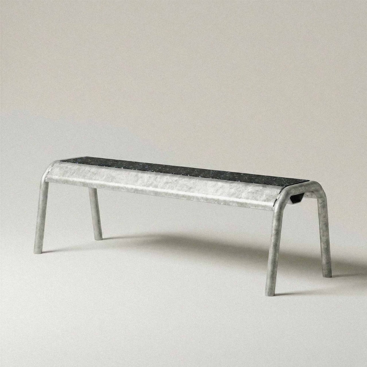
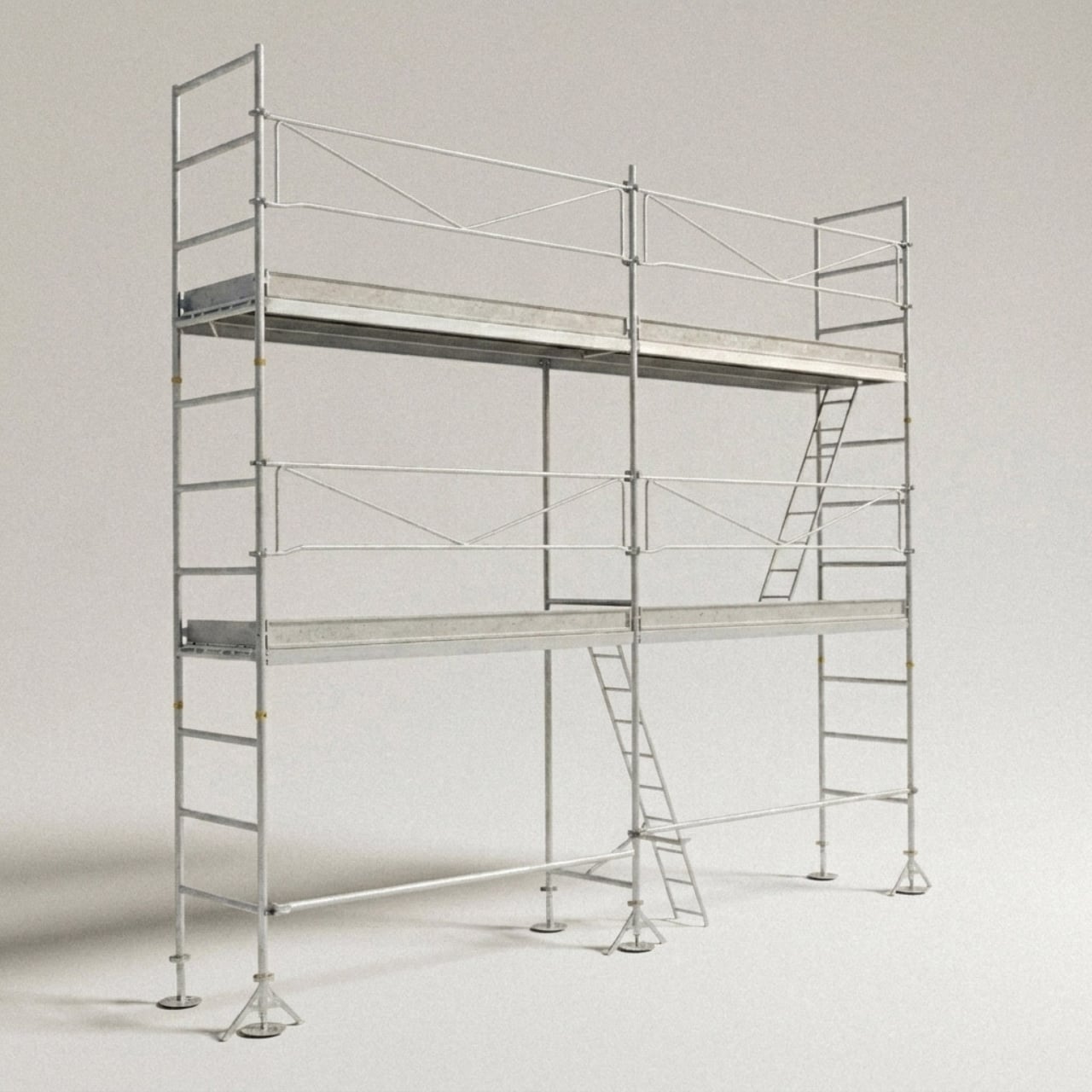
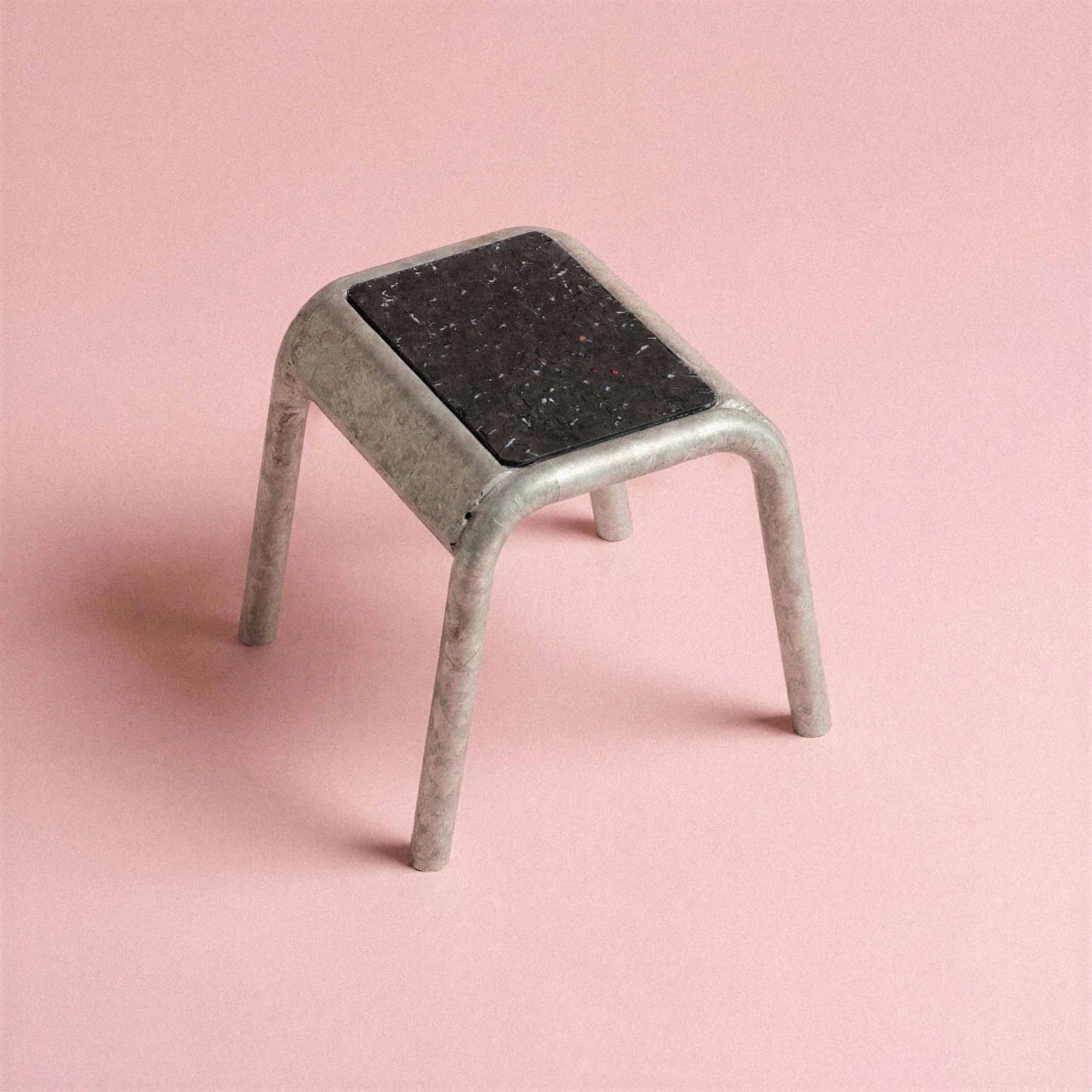
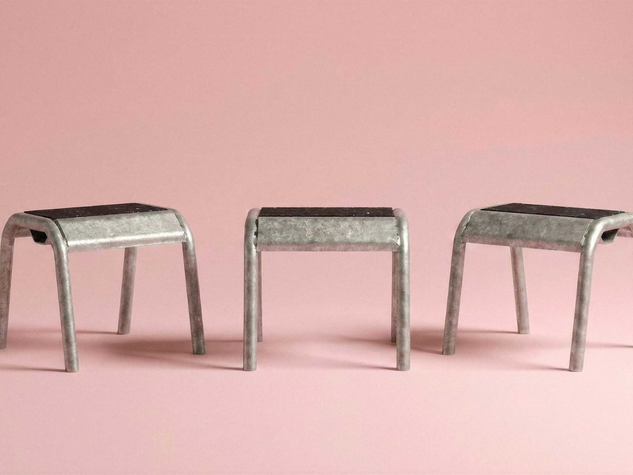
His project Estrade, which takes its name from the French word for a raised platform or stage, is exactly the kind of design that makes you pause and rethink what you assumed you knew about materials and their purpose. It takes scaffolding, one of the most utilitarian objects in the built environment, and repurposes it into furniture with a presence that feels both raw and considered. The idea isn’t complicated. What’s remarkable is how clearly it works.

Designer: Pierre Villez

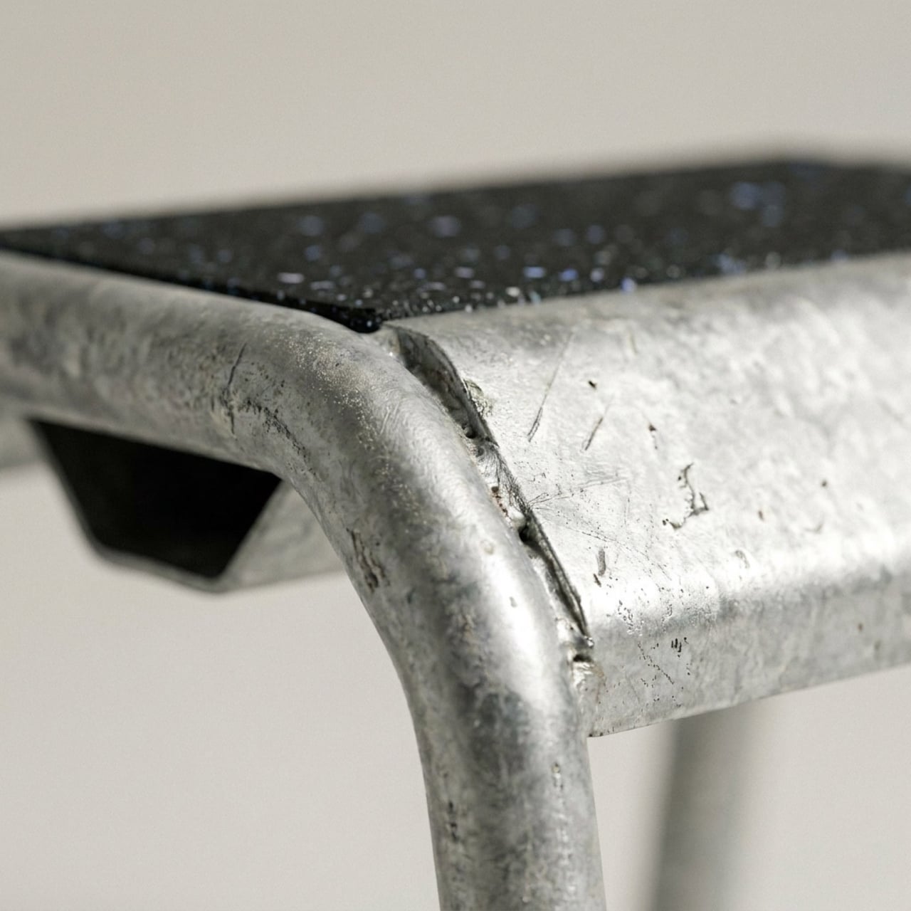
The execution is built around scaffolding tubes and components, the galvanized steel poles and fittings that temporarily hold up the facades of buildings under construction. These become the structural bones of a usable, liveable object. The material doesn’t get disguised or prettied up. It stays exactly as it is, marks and all, which is where the real honesty of the design lives. There’s no apology in it.

There’s a broader conversation happening right now in the design world about where materials come from and what happens to them once their original job is done. Construction materials sit at an interesting intersection: they’re industrial, abundant, and structurally engineered to last far longer than the projects that use them. Scaffolding in particular gets a rough deal in this sense. It does some of the most important work on a building site and then disappears entirely, either stacked away in a storage yard or eventually scrapped. Villez’s response is simply to ask whether disappearing is really necessary.

What makes Estrade worth paying attention to, beyond the sustainability angle, is that it doesn’t feel like it’s compensating for its origins. A lot of upcycled design falls into the trap of trying too hard to look polished, as if the designer was vaguely embarrassed by the material they started with. Estrade leans the other way. The scaffolding reads as scaffolding. The proportions are deliberately architectural, almost structural in feeling, and that industrial quality isn’t softened so much as it’s redirected. You’re not looking at furniture that happens to be made from scaffolding tubes. You’re looking at scaffolding that has decided to become furniture, on its own terms.

That kind of design thinking takes a real confidence in the material. It requires trusting that what you’re working with has enough inherent value to carry the work, without heavy intervention or stylistic decoration layered on top. Pierre Villez, who is based in Lille, France, clearly believes it does. His portfolio also includes ALAIN, a project that applies the same logic to crash barriers, which tells you this isn’t a one-off experiment. It’s a considered way of looking at the built world and asking what gets left behind, and why.

For anyone paying attention to where design is heading, Estrade feels like a meaningful signal. The sustainability conversation in design has been running for years and has sometimes drifted into the theoretical or the performative, becoming more about messaging than material reality. A project like this cuts through that. It’s grounded and specific. It takes one material, one context, and one question: can this be something else? The answer that comes back is yes, and it looks good while saying it.

The name is a small detail that rewards a second look. An estrade is a platform you stand on, a raised surface that offers a different vantage point. It’s a quietly clever choice for a project that asks us to look at a familiar, overlooked material from a completely different angle. Not everything in design needs to be precious or brand new. Some of the most interesting work happens when a designer takes what’s already there and asks a better question of it. Pierre Villez asked a good one.

Three metal stools with black seats lined up on a pink background.

The post Scaffolding Was Never Meant to Be Beautiful, Estrade Disagrees. first appeared on Yanko Design.

When F1 Engineering Becomes the Chair You Sit In

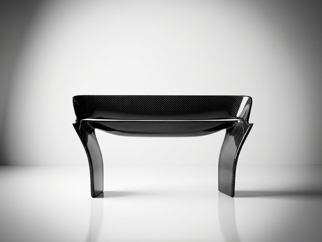
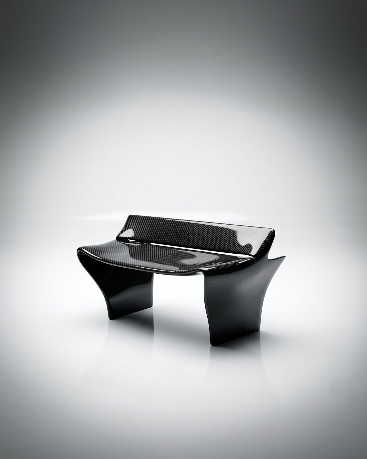
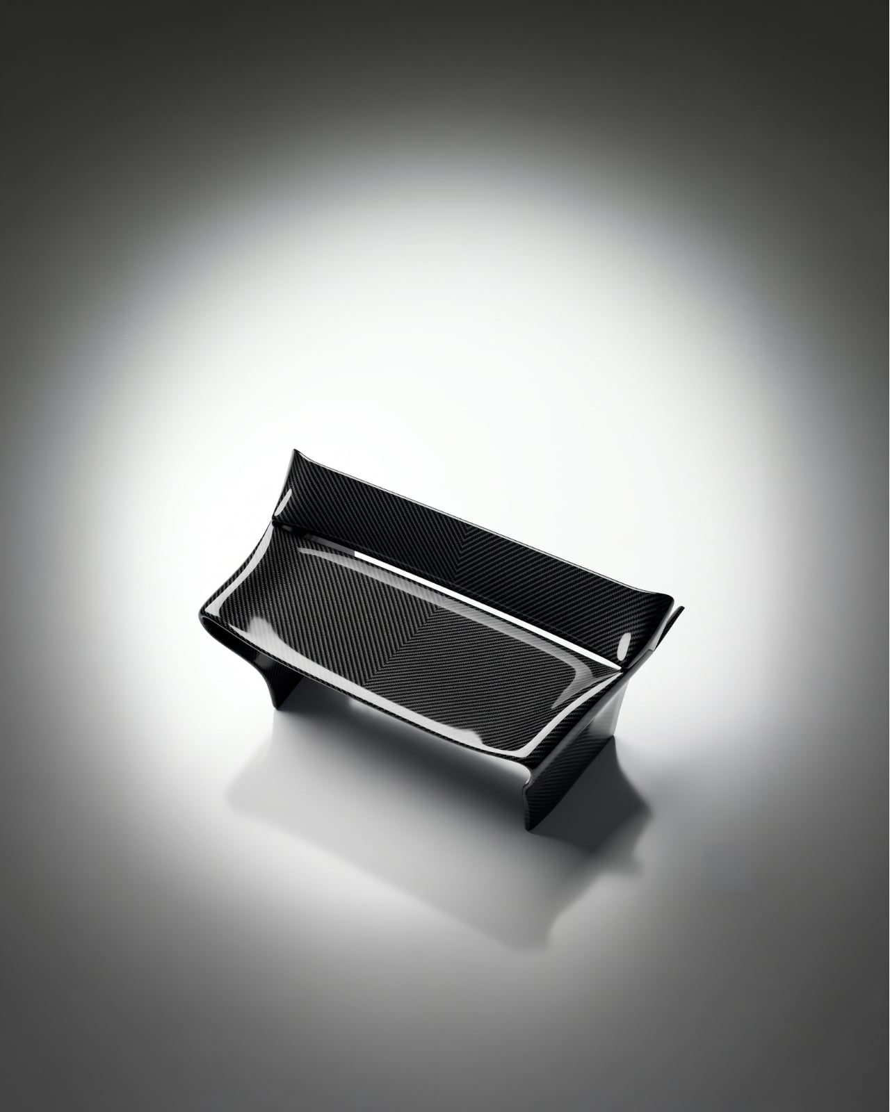
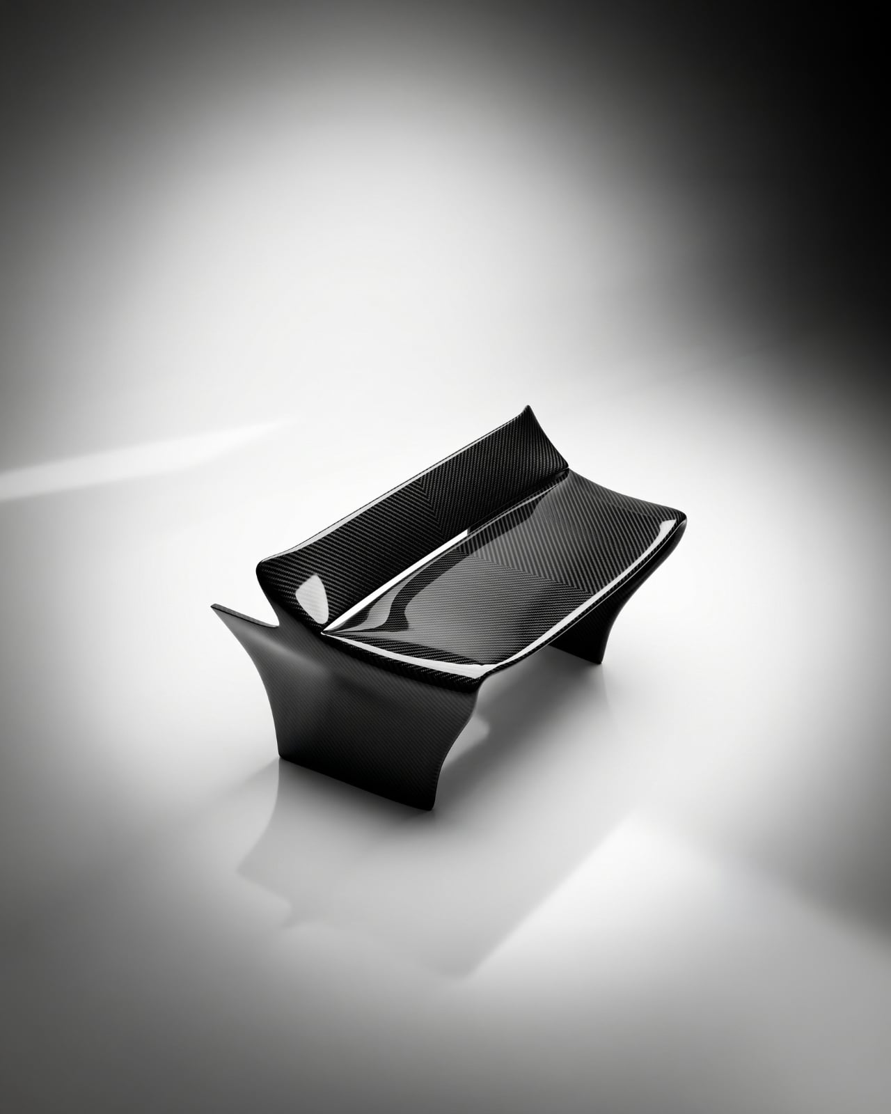
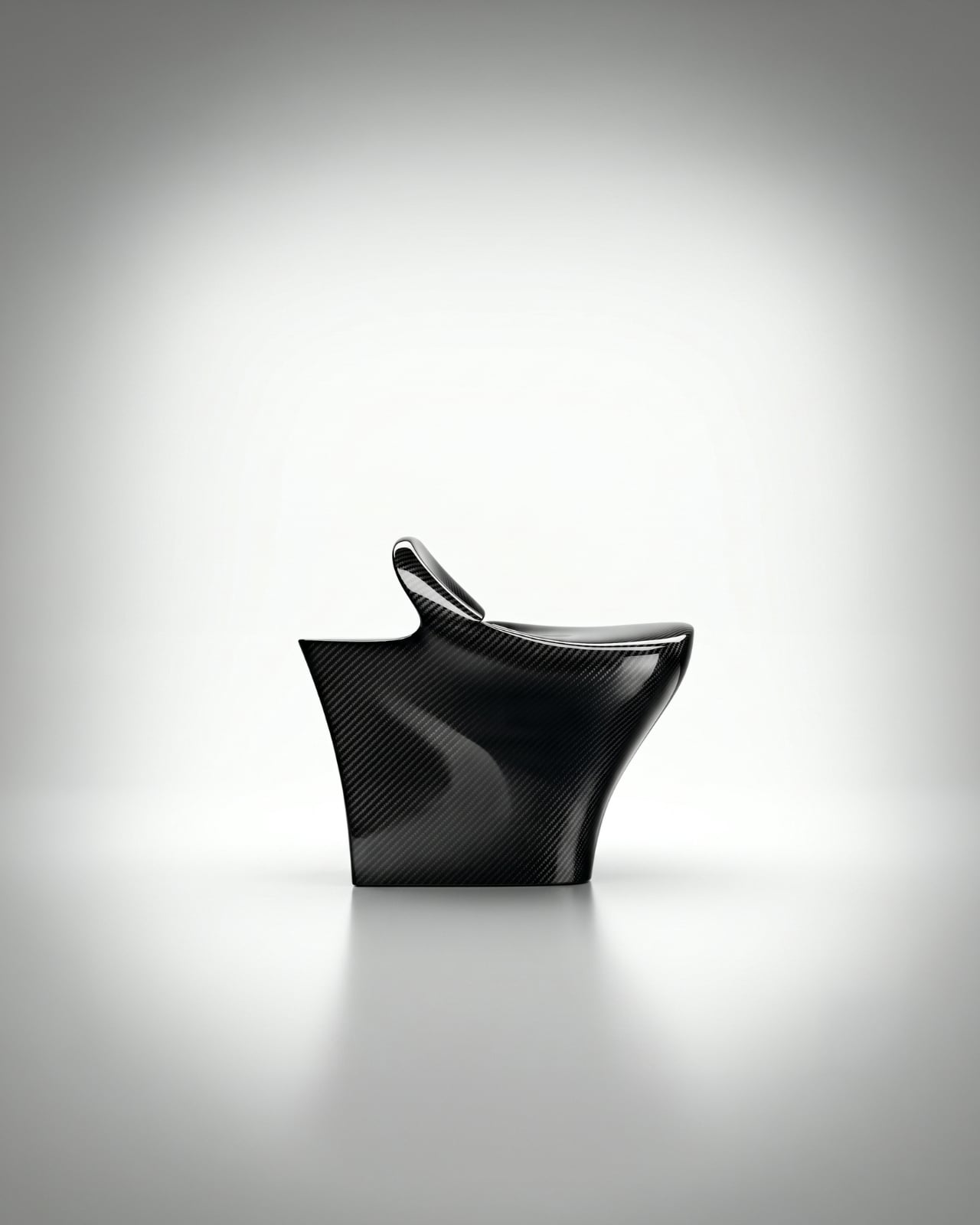
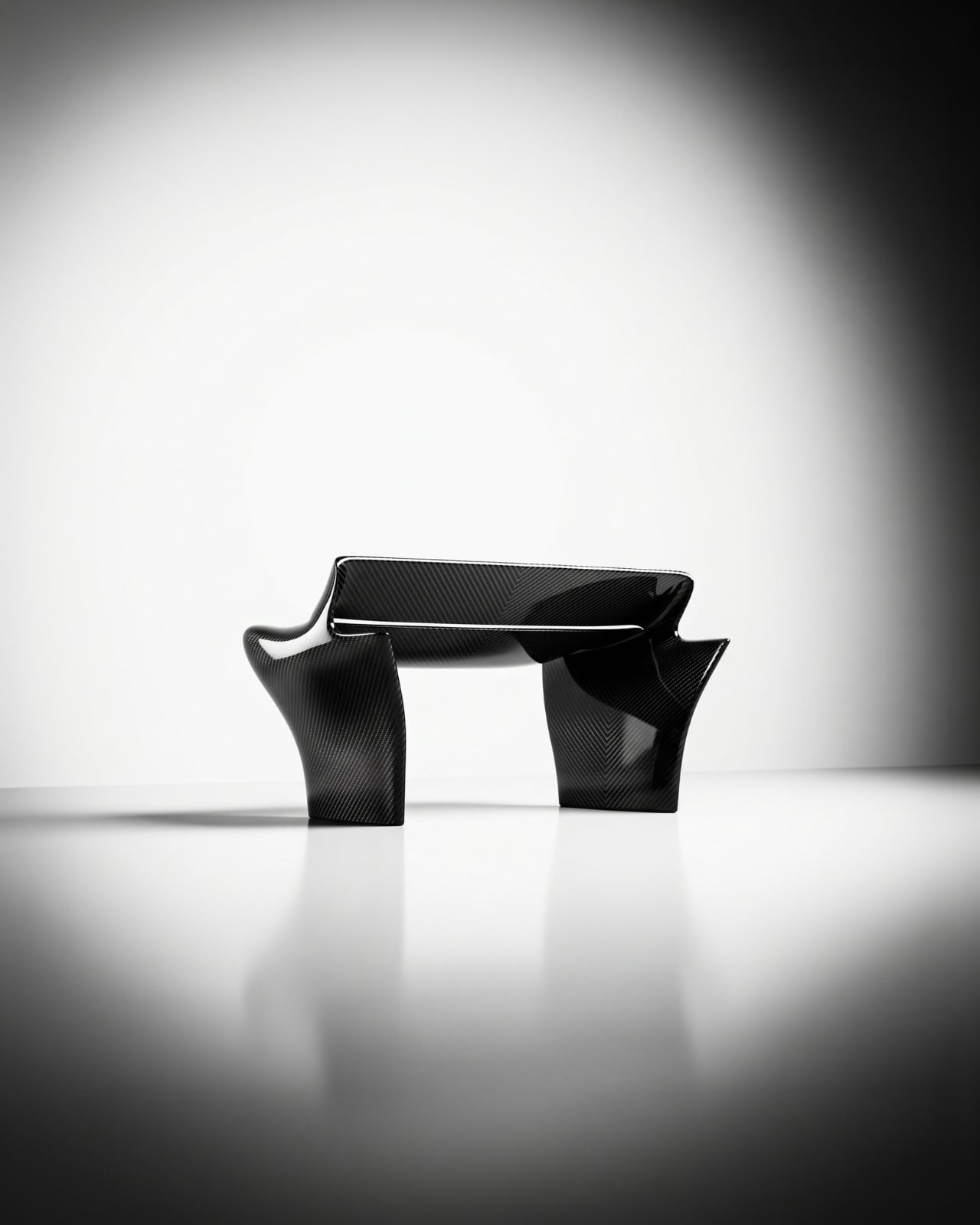
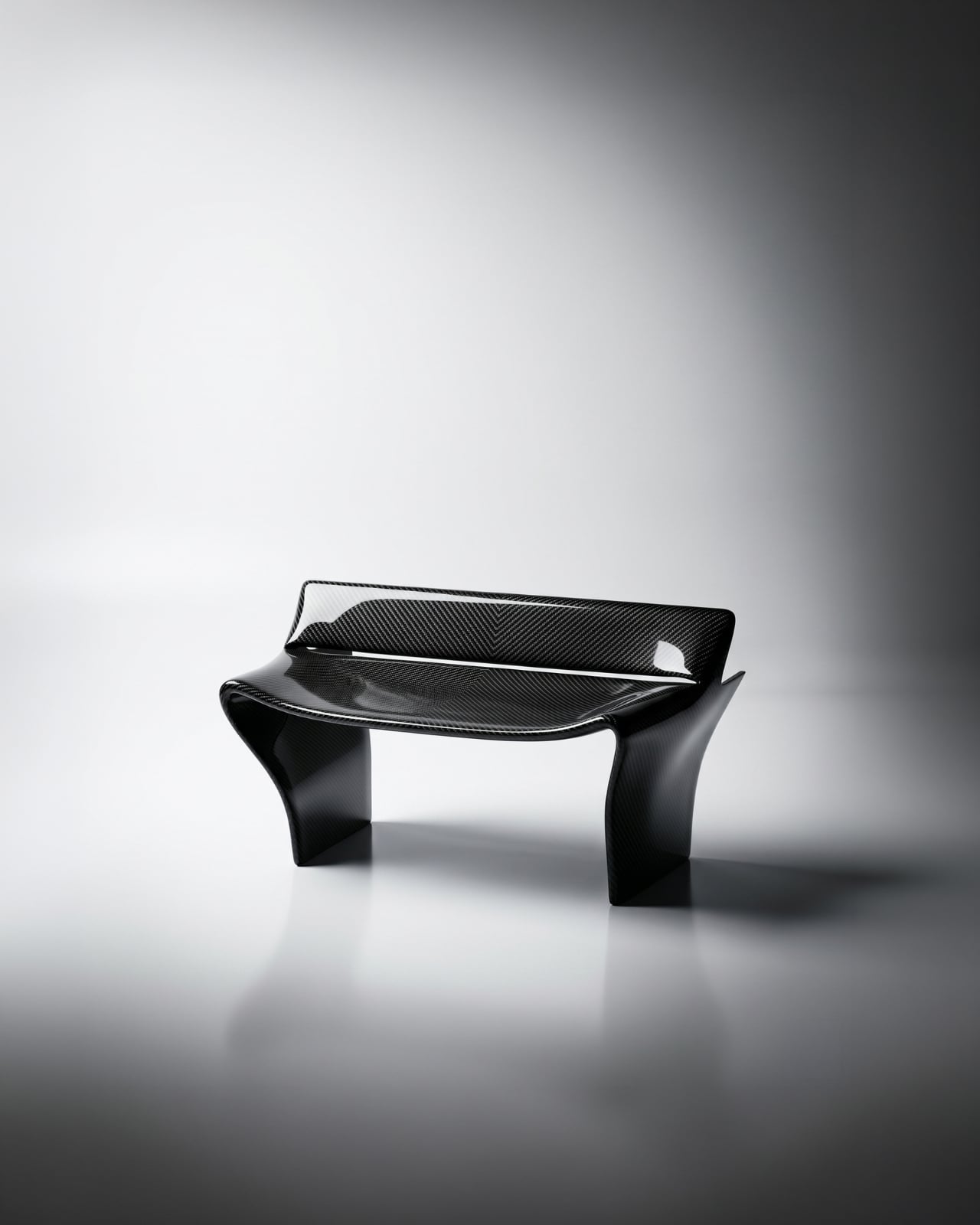
The first time I saw images of the Rear Wing Chair by Keon-Jo, I genuinely had to look twice. Not because it’s strange, but because it’s so precisely right that your brain takes a moment to catch up with what it’s actually looking at. That wide, sweeping profile. Those curved, grounded legs. The unmistakable geometry of an F1 rear wing, scaled and reoriented into something you can actually sit in.

And that’s the thing about this piece: it isn’t motorsport-themed furniture. It’s not a chair with a racing stripe or a decorative spoiler bolted on for effect. Designer Keon-Jo took the actual geometry of an F1 rear wing, the profile, the curvature, the aerodynamic structure, and translated every element with full fidelity into a functional object. The result is 100% carbon fibre, unmodified and unapologetic, with every surface showing the raw woven weave exactly as it comes. Nothing softened, nothing added.

Designer: Keon-Jo

I think that restraint is everything here. A lesser approach would have tried to make it more accessible, more livable, more palatable for people who might not know or care what a rear wing actually does. Keon-Jo didn’t do that, and the piece is stronger for it. The chair carries the authority of the original object because it commits to the original object, completely.

The question that started all of this was a good one: what would one of the most engineered components in motorsport look like if it stopped being a car part and became something you lived with? F1 rear wings are products of obsessive precision. Aerodynamicists and engineers spend entire seasons calculating the exact angles and curves that will shave fractions of a second off a lap time. Every millimetre is deliberate. Every surface has a reason. Keon-Jo took that same philosophy and asked what happens when you apply it to the home.

The answer is a chair that sits at the edge of sculpture and engineering in a way that very few objects manage. It doesn’t look like it’s trying to be art. It also doesn’t look like it’s trying to be furniture. It looks like what it is: an engineered object, repurposed through a specific creative lens, and built with a level of craft that the source material demands.

The launch timing is as considered as the chair itself. The Rear Wing Chair is debuting during Monaco Grand Prix weekend, June 6 to 8, 2026. Monaco is where engineering culture and design culture genuinely converge on the F1 calendar. The streets, the yachts, the paddock, all of it operates at a level of precision and detail that matches the ethos of this piece exactly. It’s a smart choice, and not an obvious one.

This is also only Keon-Jo’s second physical object. The first was the Front Wing Wall Art, a wall-mounted sculptural piece built from F1 front wing geometry, working from the same core idea: take what motorsport engineers obsess over and translate it into something people actually live with. Two pieces in, the studio already has a clear and convincing point of view. That’s harder than it sounds. A lot of design studios spend years finding their language. Keon-Jo arrived with theirs already formed.

At 1200 x 760 x 670mm, the Rear Wing Chair is a substantial presence in a space. This isn’t a subtle accent piece. It’s a statement, and it knows it. The kind of object that defines a room rather than decorates it. For anyone who grew up around motorsport, or who simply cares about the relationship between engineering and form, this is the piece that gives both equal weight.

Whether you follow F1 or not, the Rear Wing Chair makes an argument that precision has genuine aesthetic value, that the same thinking that wins races can produce something beautiful enough to own and live alongside. Keon-Jo is building a body of work around that idea, and with only two pieces, it already feels like a compelling one. See more at keon-jo.com.

The post When F1 Engineering Becomes the Chair You Sit In first appeared on Yanko Design.

A Chair With a Drawer, a Calendar, and a Point of View

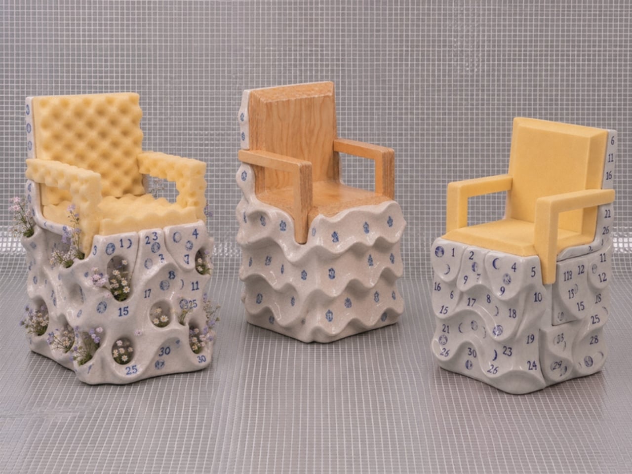
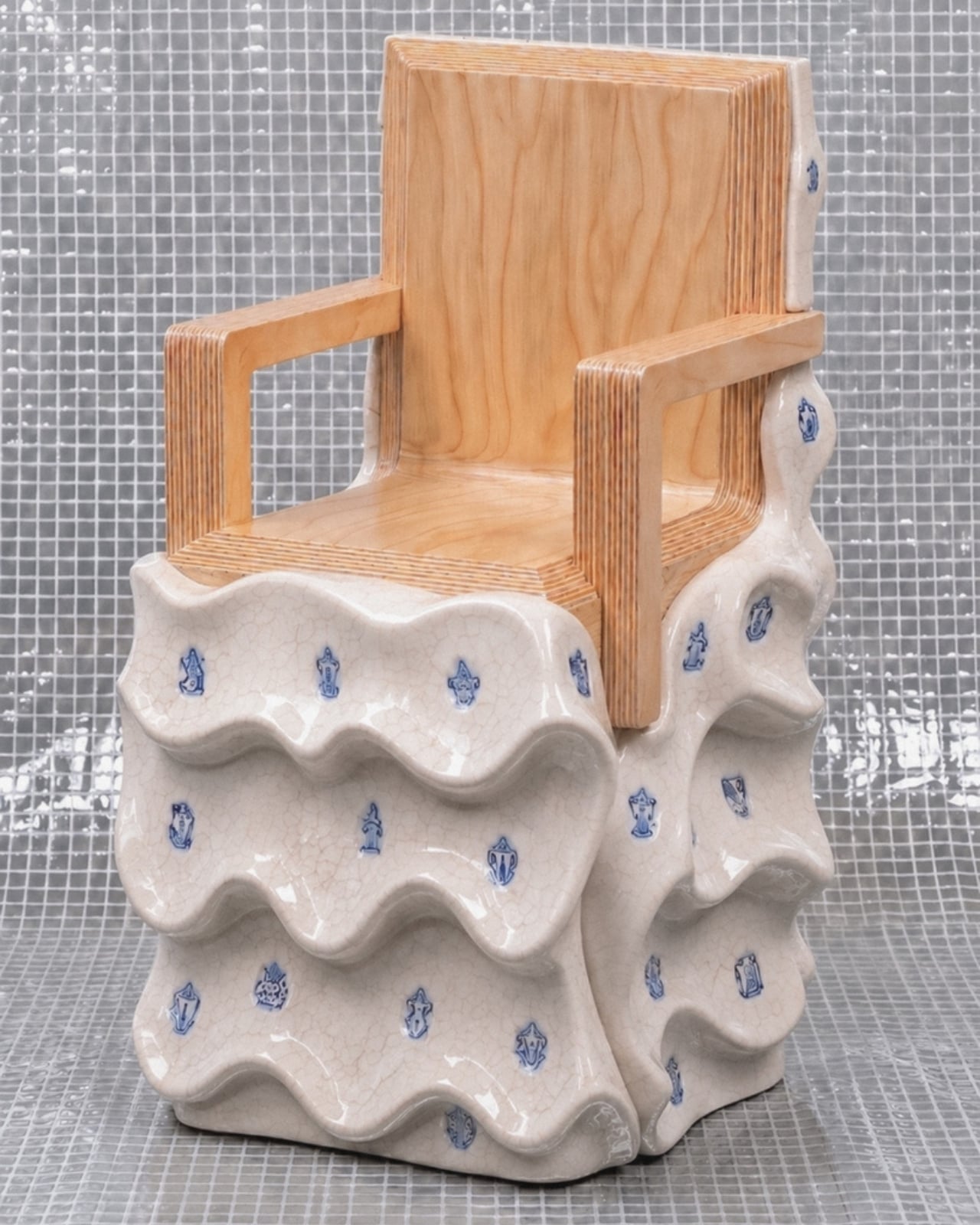
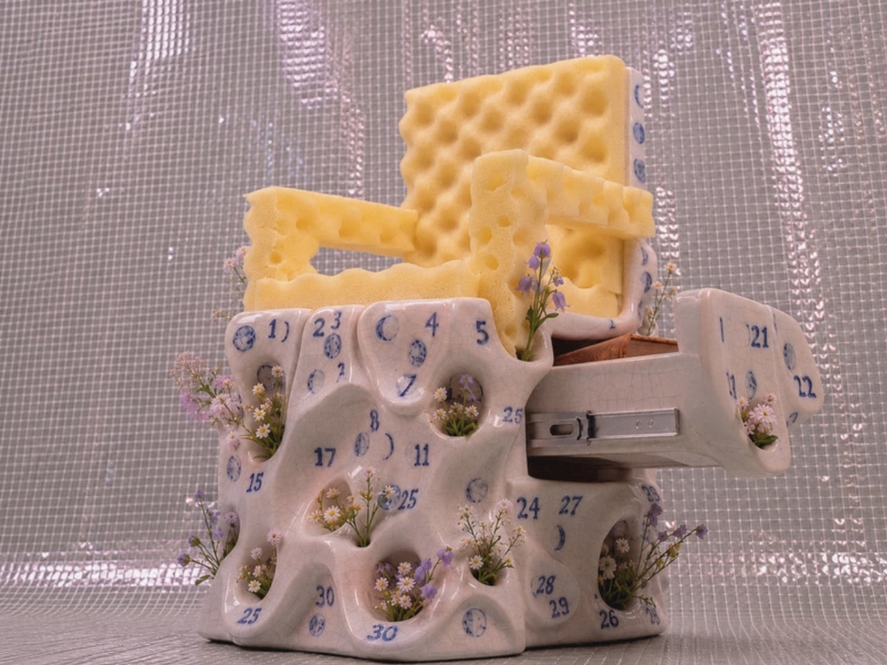
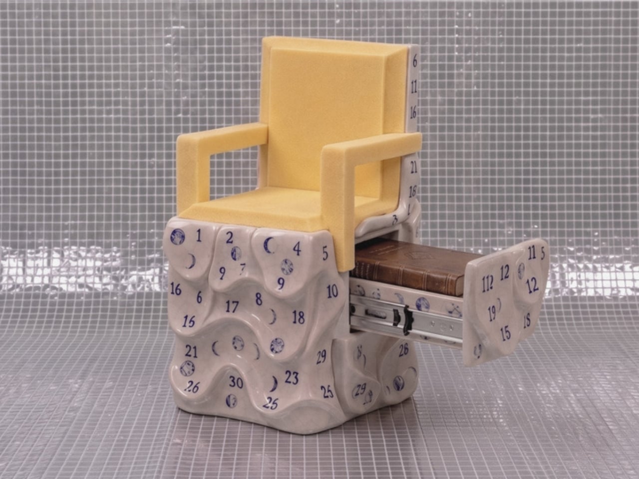
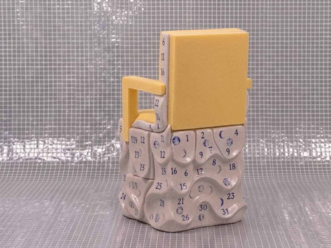
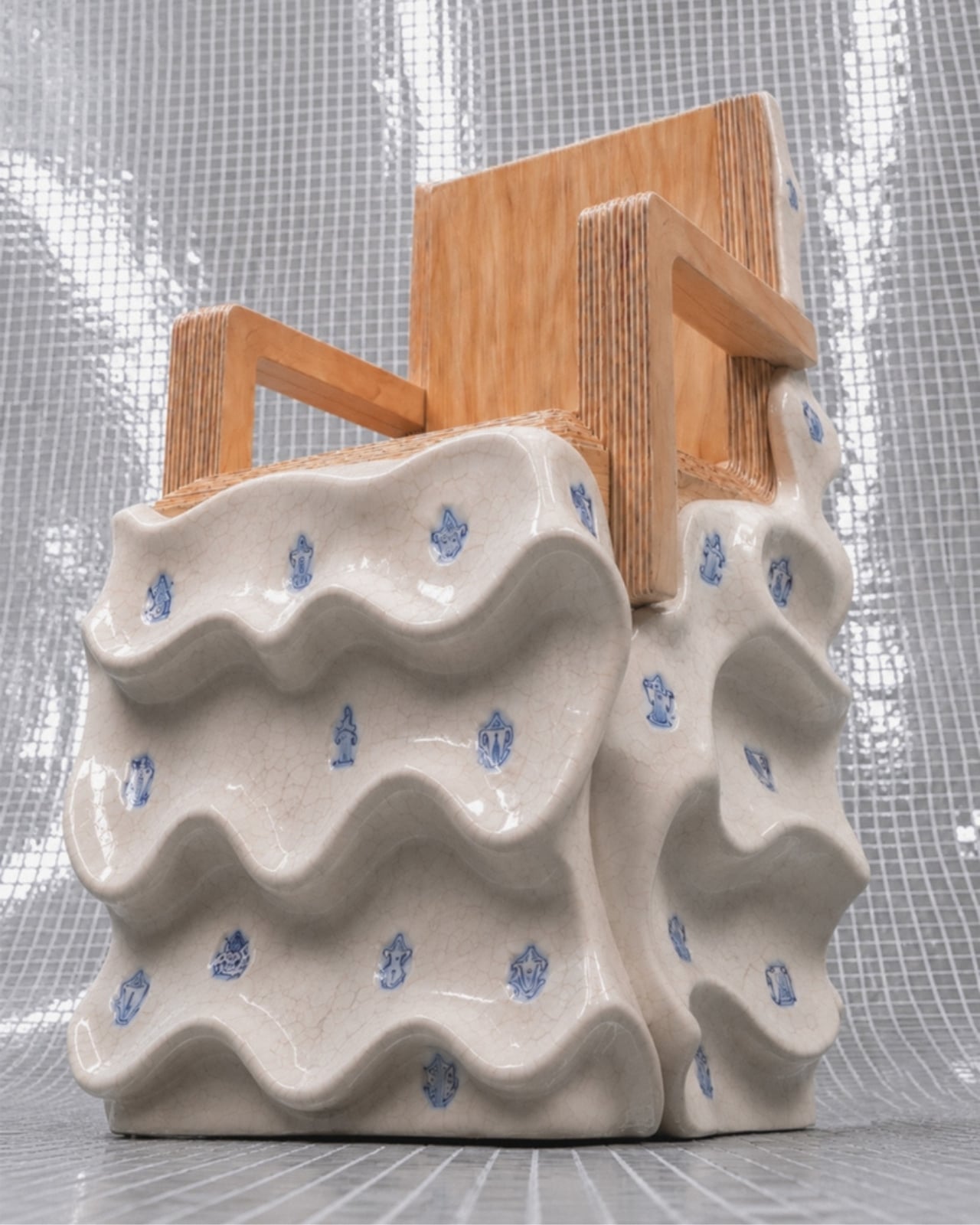
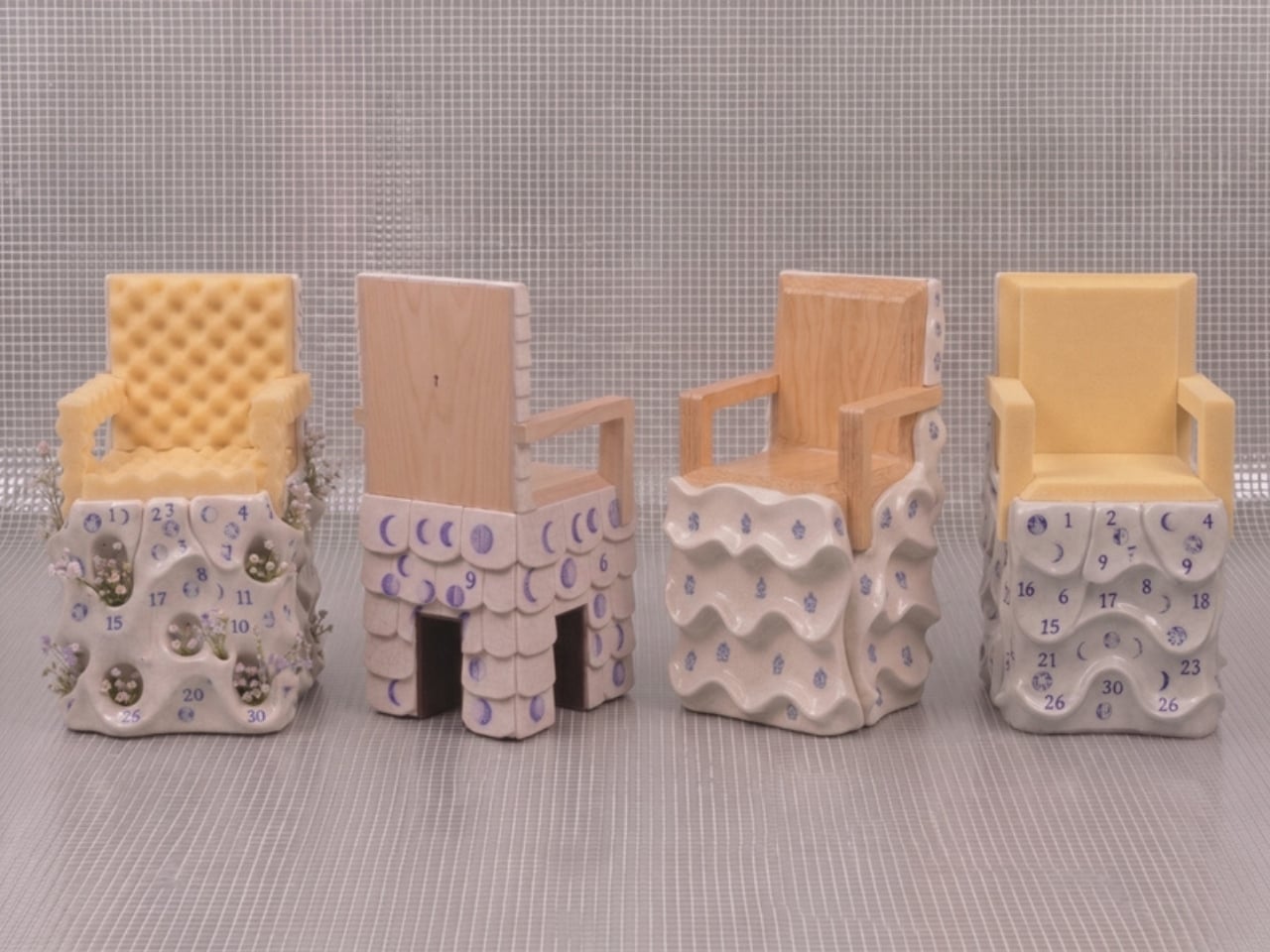
The first thing you notice about Massimiliano Malagò’s chairs is that the bottom half looks like it’s giving up. The ceramic bases appear to be softening, pooling, their surfaces undulating in slow waves as if the weight of everything sitting on top has finally gotten to them. The upper halves, either blond plywood cut with clean geometric precision or yellow foam dense as old mattress padding, hold their shape with complete indifference. The contrast is the whole conversation.

Malagò is an Italian architect based in New York who teaches at Columbia University’s Graduate School of Architecture and runs the practice HHMM with set designer Helene Helleu. His body of work has a recurring habit of using furniture as intellectual argument, treating each piece as a spatial essay. These chairs, created as part of On the Calculation of Volume for a Greenpoint apartment renovation he developed alongside client Kathleen Pongrace, are his most layered statement yet. Literally and figuratively.

Designer: Massimiliano Malagò

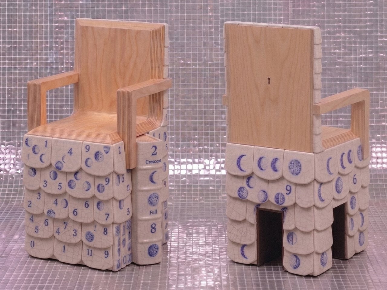
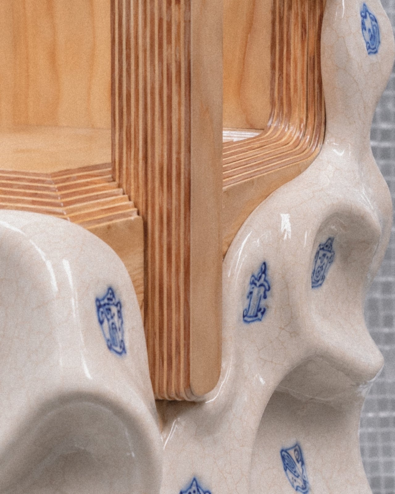
Each chair is essentially two objects in a standoff. The bases are hand-sculpted ceramic glazed in a crackled off-white, decorated with small blue motifs that range from heraldic figures and crests to lunar phase calendars marked with numbers from one to thirty. Depending on which chair you’re looking at, the surface texture shifts too. Some bases have a wavy, rippled undulation. Others are pocked with circular voids, perforations from which actual small flowers grow, as if nature has decided to quietly move in through whatever gaps the city left open.

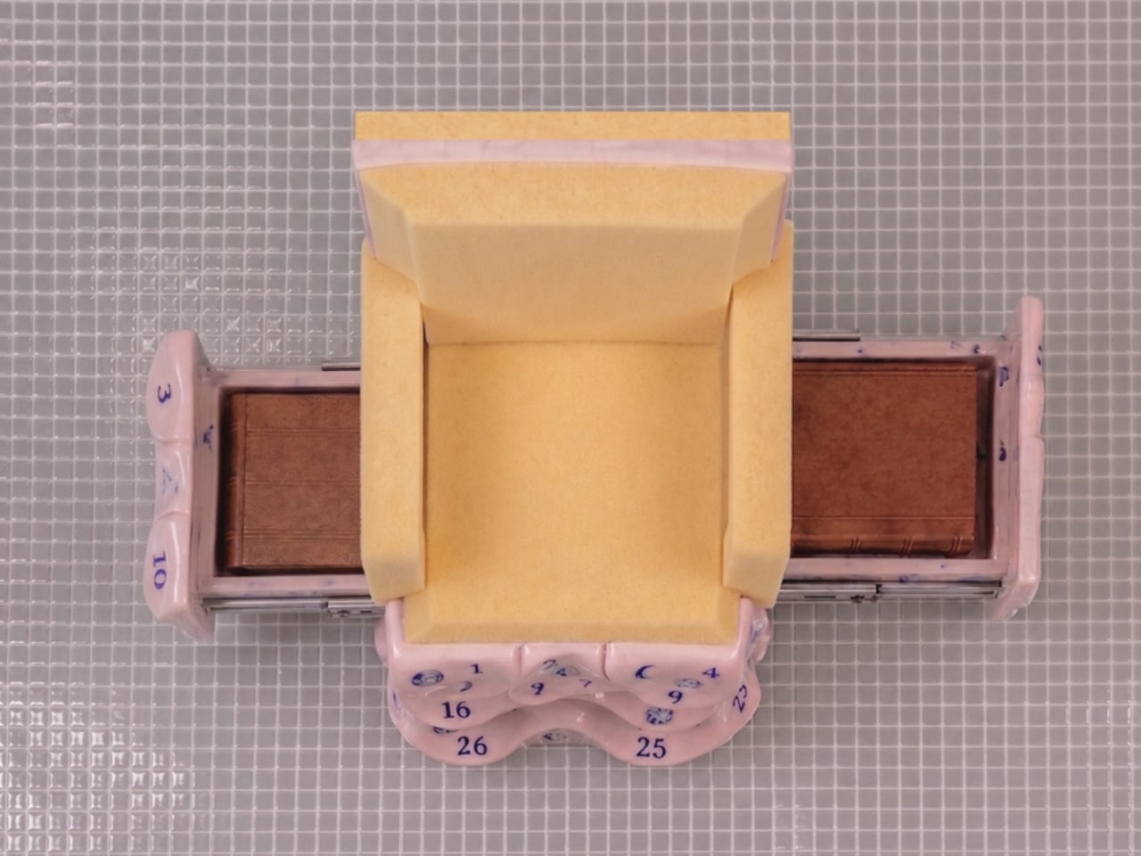
The upper chair structures sit on top of these organic, softened bases like they arrived from a different address entirely. The plywood versions are laminated and layered, their cut edges revealing the strata of material inside like a cross-section of something ancient, while the foam versions have a raw, utilitarian quality that reads somewhere between construction material and domestic comfort. Both feel deliberately unfinished in a way that is not careless but considered. Malagò is clearly not interested in making the perfect chair. He is interested in making a chair that has something to say about what living in New York actually costs you, in time, in money, and in compromises.

The storage element is where it gets genuinely clever. Pull open a drawer concealed within the ceramic base and you find a sliding metal mechanism holding books. The idea that a chair can house your library inside its own body, that seating and storage are so compressed in a small New York apartment that they must physically merge, is either a practical solution or a quiet diagnosis of how little room the city actually allows. I’d argue it’s both.

The lunar calendars printed across the ceramic surfaces in blue add another layer. Numbers arranged around moon phases suggest cycles, passing time, the rhythm of days that accumulate in a place where rent comes due whether you’re thriving or barely holding on. These aren’t decorative flourishes. They’re documentation. Malagò treats the surfaces of these chairs the way someone might treat the margins of a notebook, filling them with information that only makes full sense once you step back and read the whole thing together.

The material pairings are where the real honesty lives. Ceramic is permanent, archival, the kind of material you associate with objects meant to outlast the people who made them. Foam and plywood are impermanent, budget-conscious, the materials of first apartments and temporary solutions. Putting them together isn’t a design provocation for its own sake. It’s a portrait of how most people actually live, reaching for something lasting while working with whatever is available. The chair holds that tension without resolving it, which feels exactly right.

Design that tries to tell you something about city life usually does so at a comfortable, critical distance. These chairs plant themselves in the middle of it. They sit in a real apartment, used by a real person, and they carry the full weight of that reality in every surface.

The post A Chair With a Drawer, a Calendar, and a Point of View first appeared on Yanko Design.

PLANK Made a Folding Chair You’d Never Want to Put Away

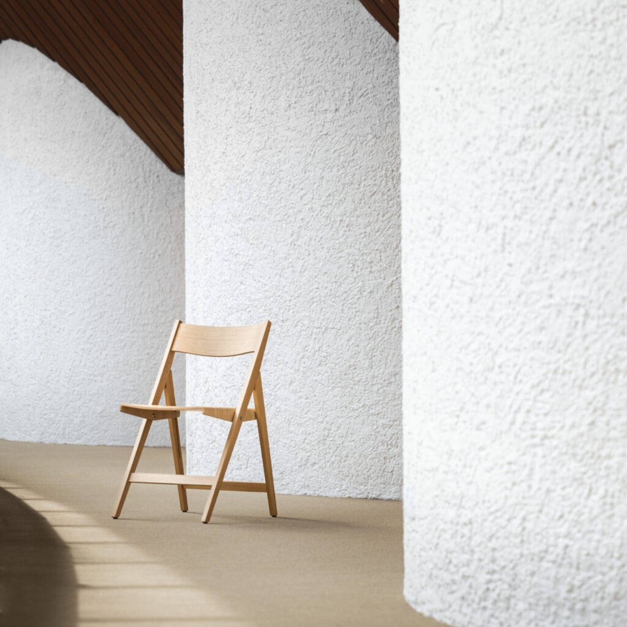
Folding chairs have a reputation problem. For most of us, they conjure up images of bare banquet halls, plastic legs scraping across gymnasium floors, or that wobbly stack in the back of a relative’s garage. They are furniture by necessity, not by choice. So when a design studio manages to make one that you’d genuinely want to keep out in your living room, it’s worth paying attention.

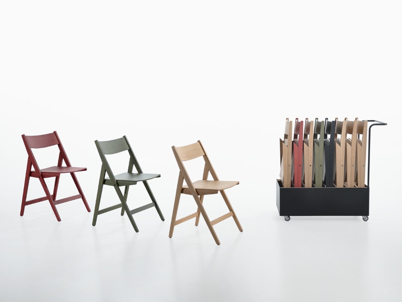
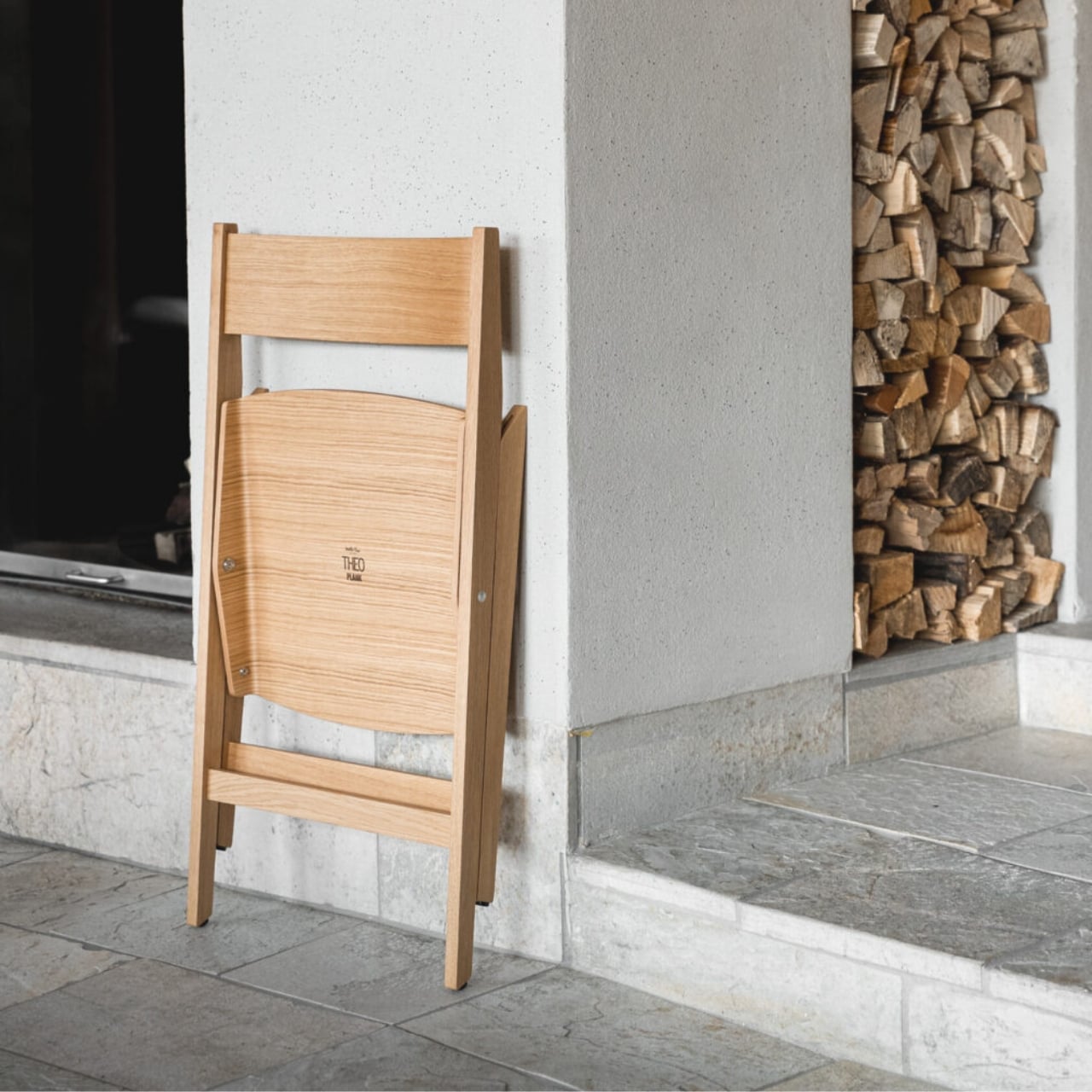
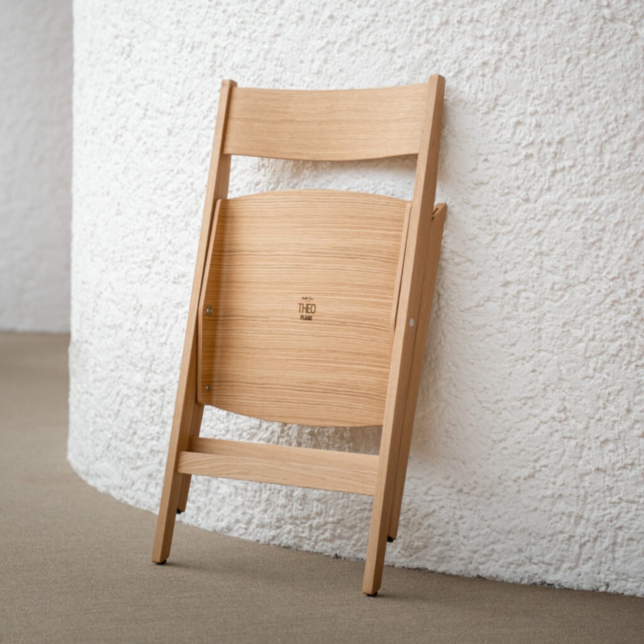
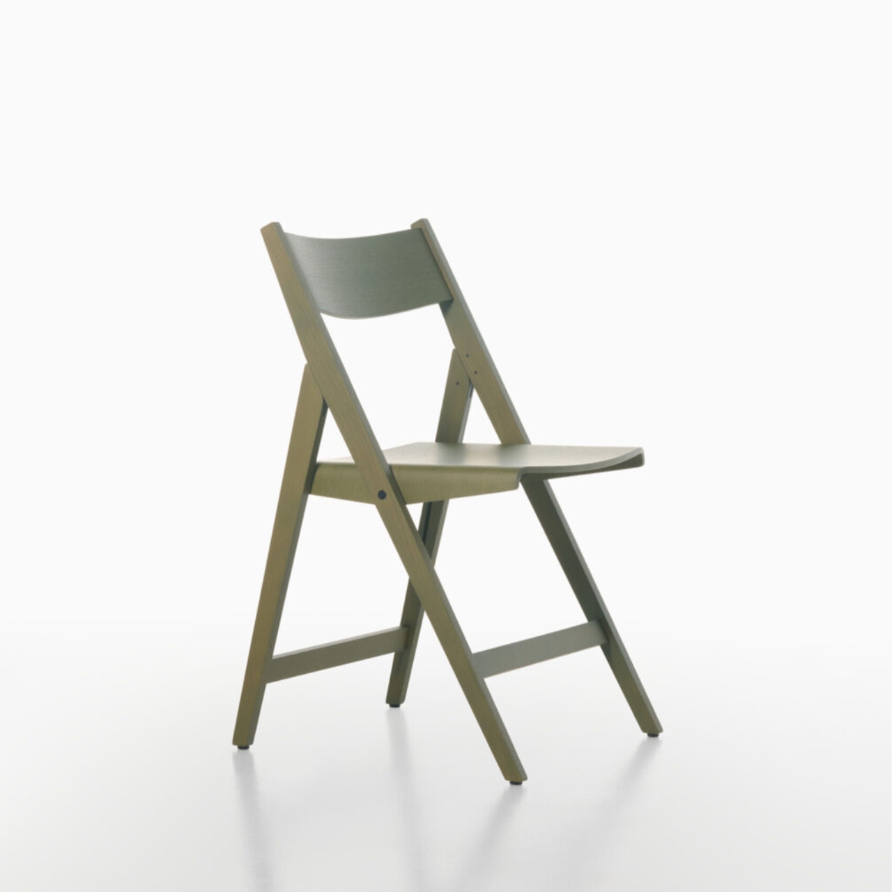
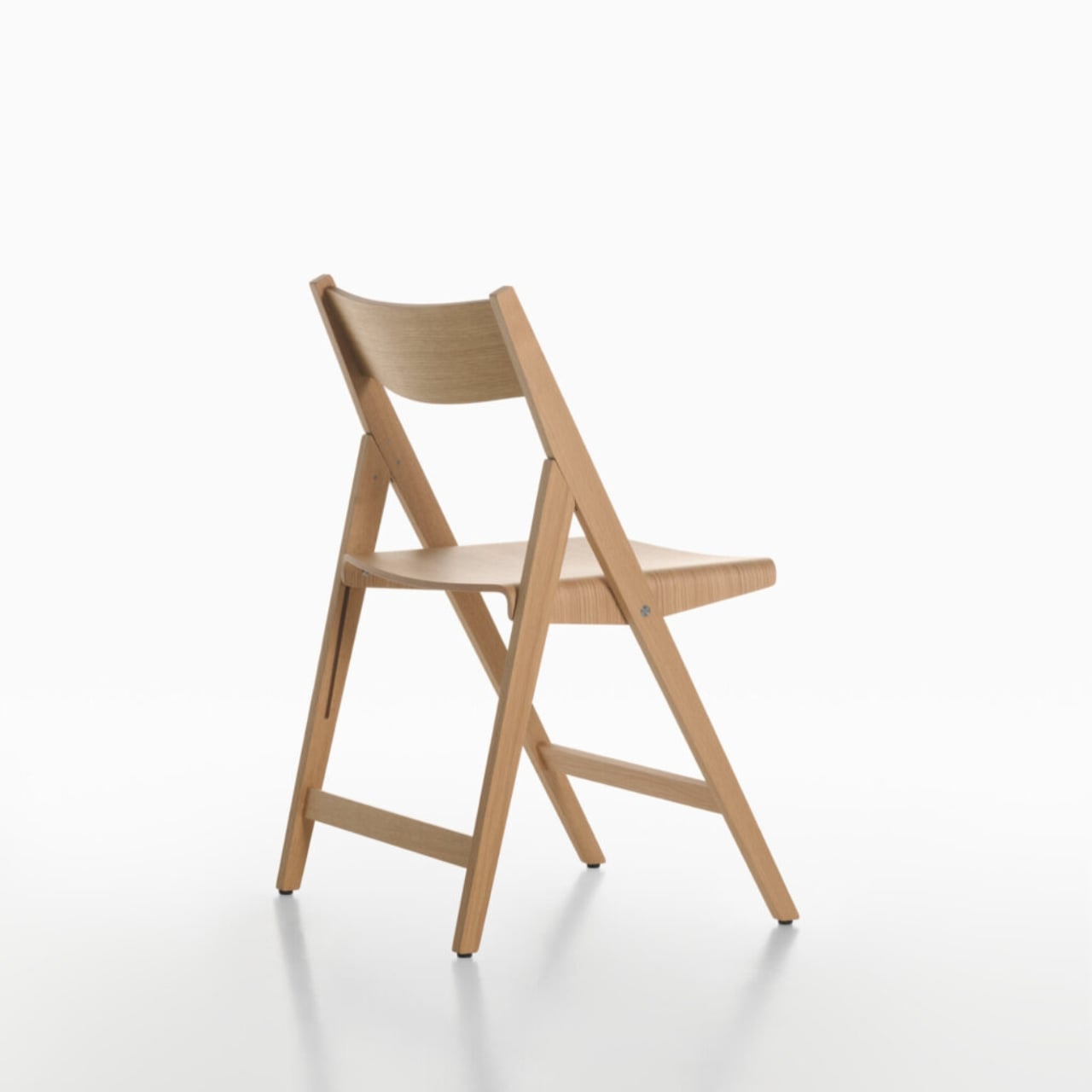
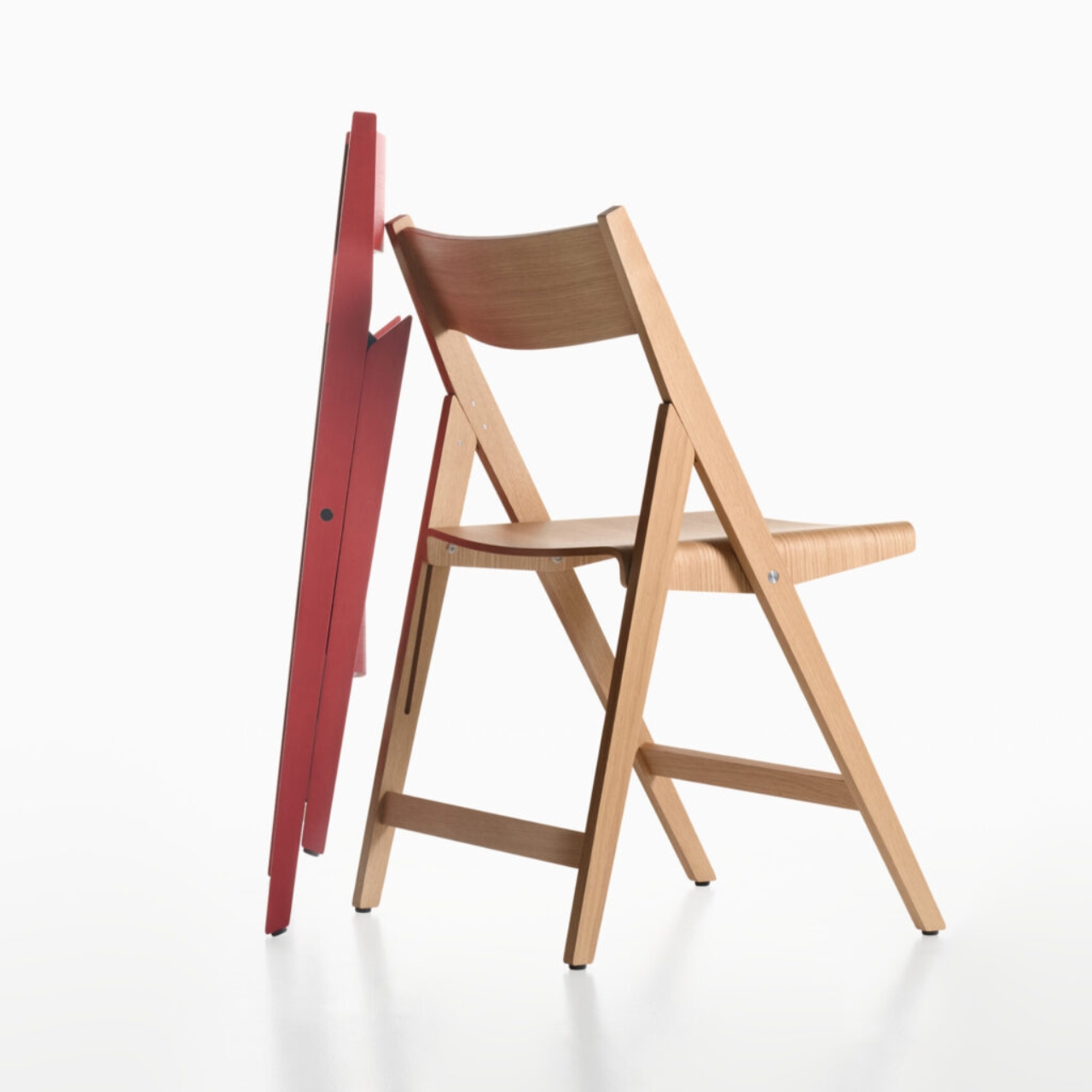
That’s exactly what PLANK and designers Matteo Thun and Benedetto Fasciana have done with the Theo folding chair, quietly one of the most interesting pieces to come out of Salone del Mobile Milano 2026 this past April. Not because it does something shocking or avant-garde, but because it does something much harder: it makes the utilitarian feel considered.

Designers: Matteo Thun and Benedetto Fasciana for PLANK

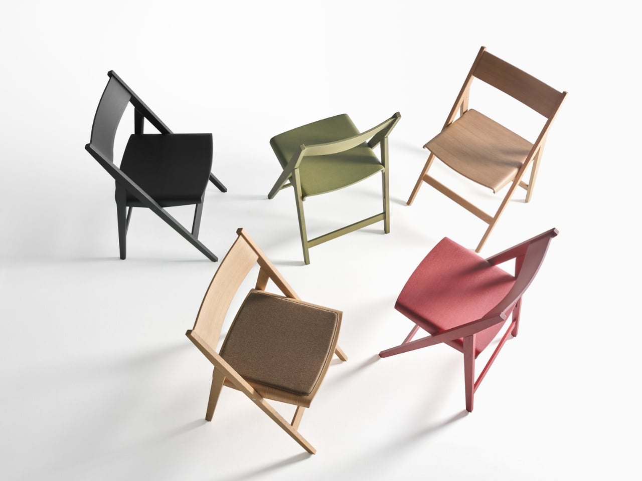
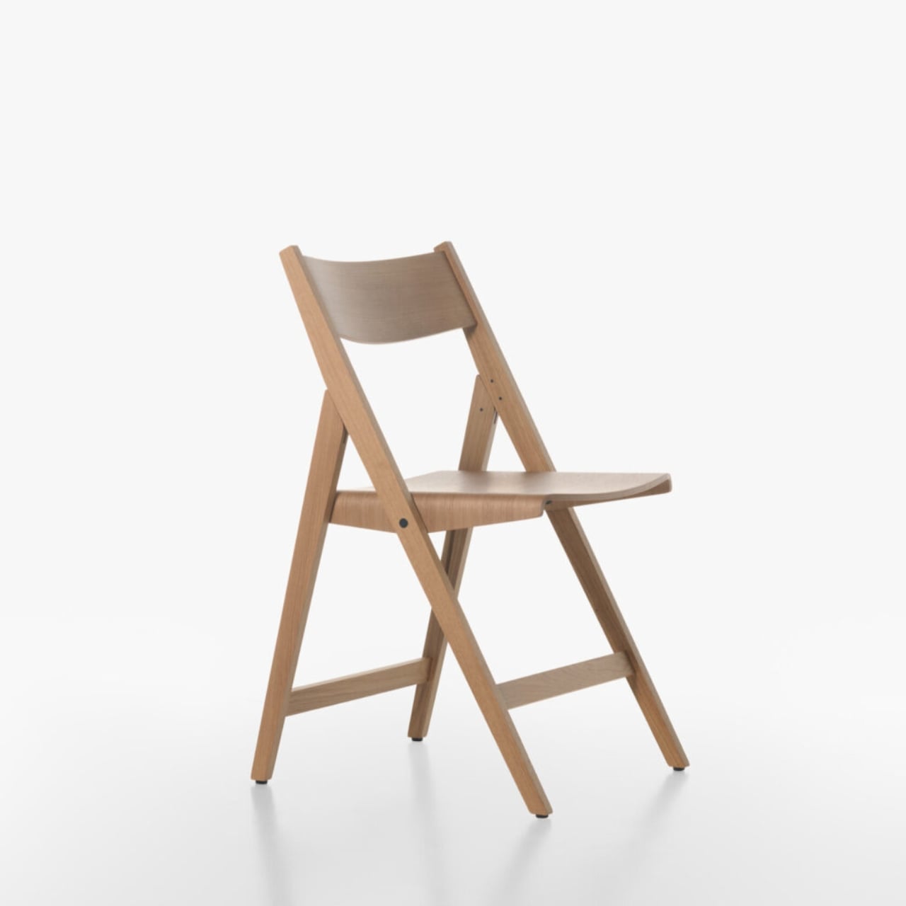
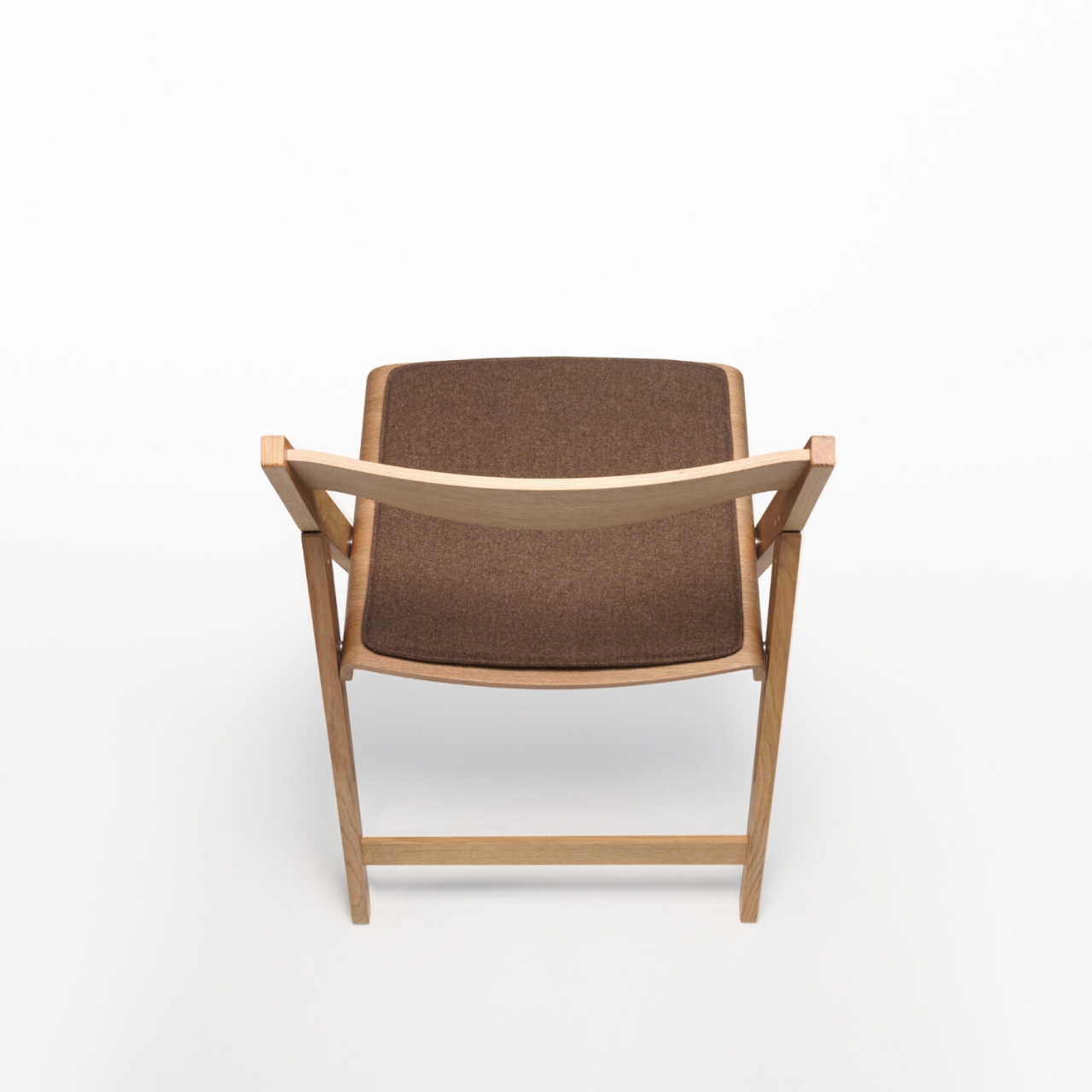
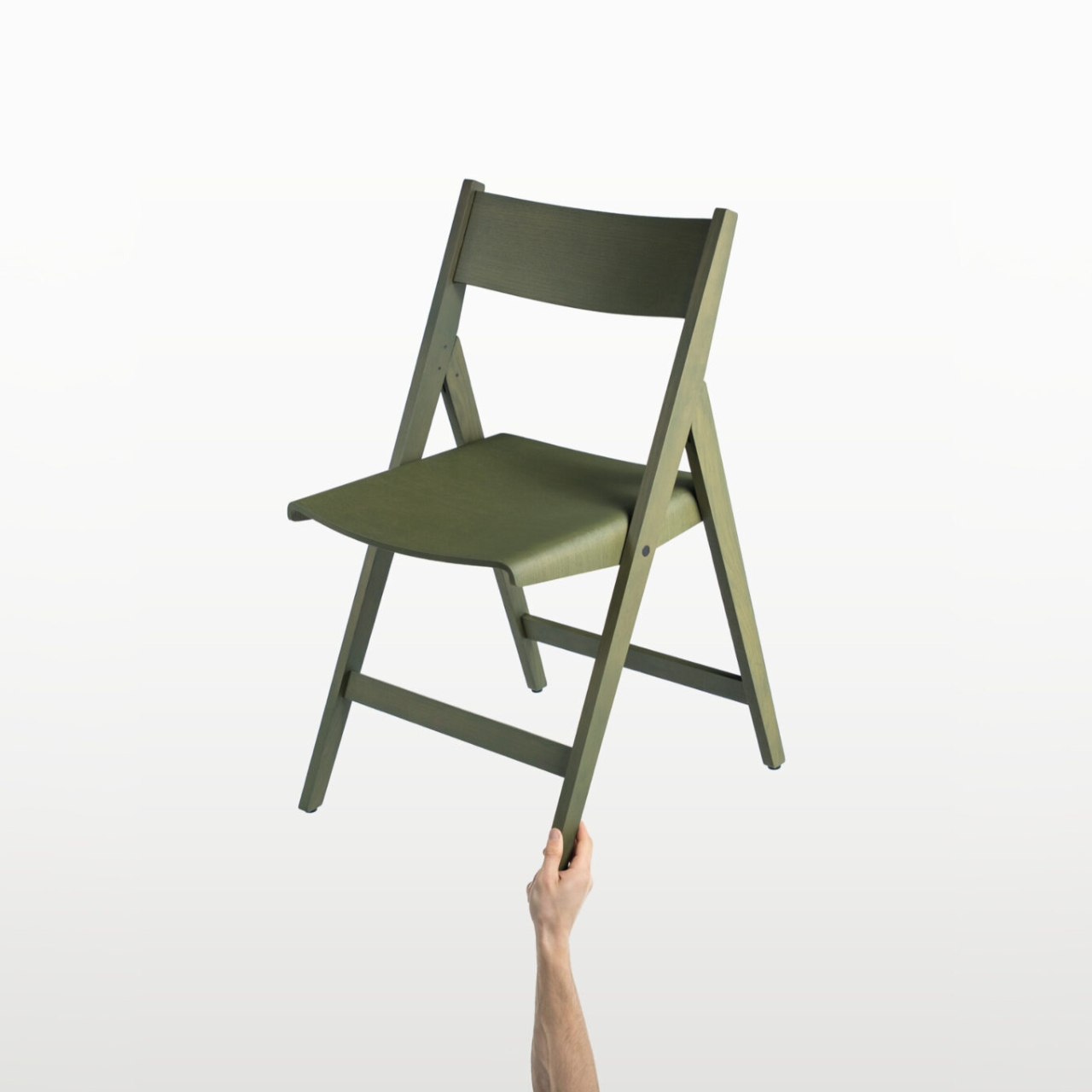
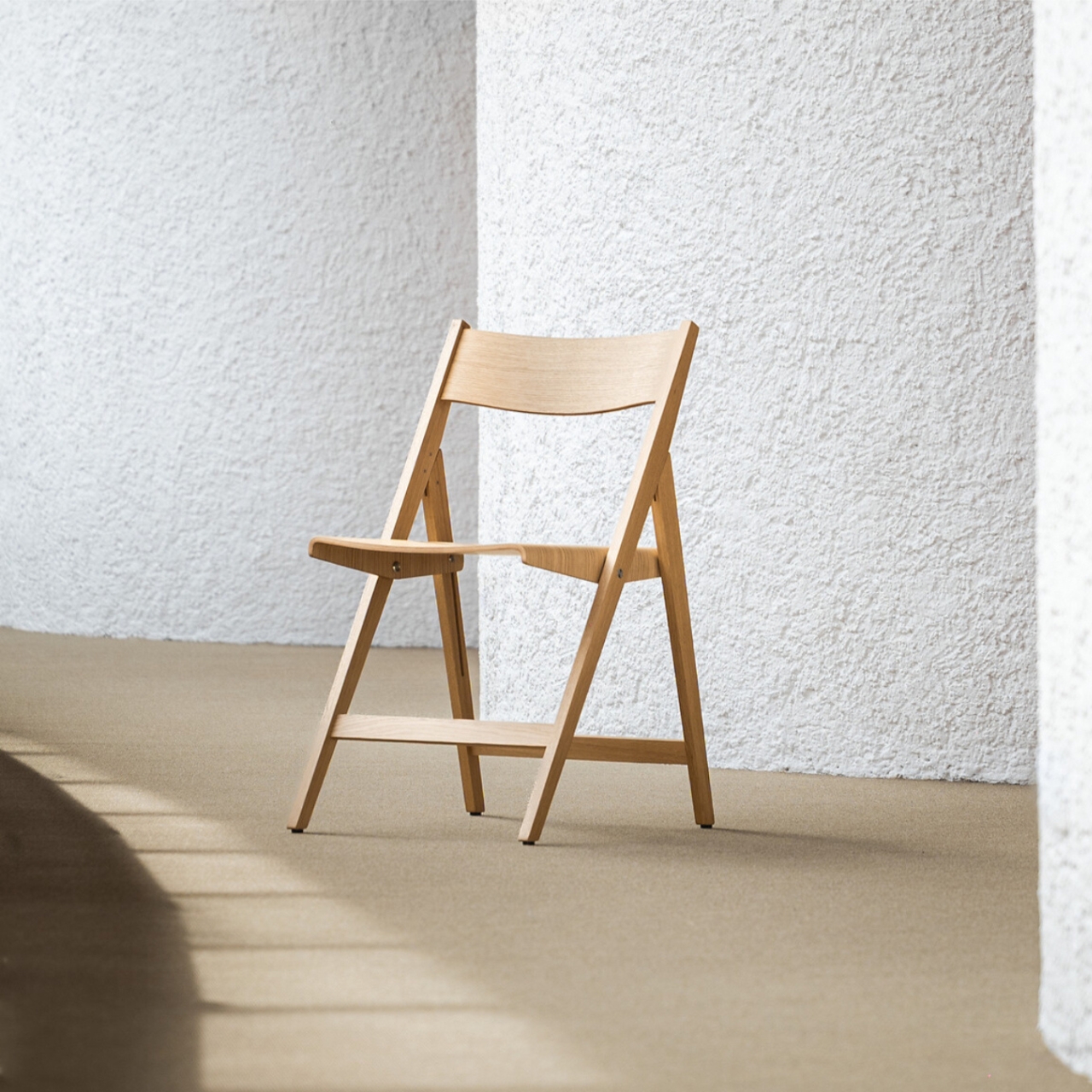
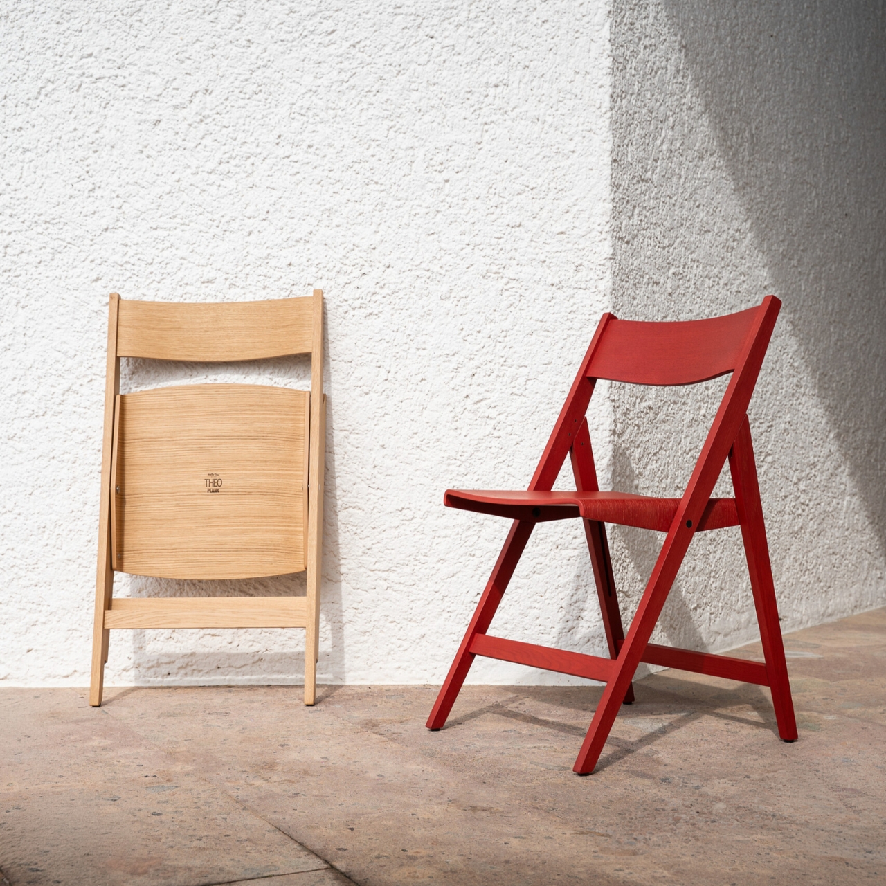
PLANK has been at this since 1953, and that legacy shows in how Theo is built. The frame is solid oak, which already puts it in a different category from the folding chairs most of us know. The seat and backrest are made from molded plywood, shaped with a gentle curve that reads as both ergonomic and graceful. The folding mechanism uses natural or black oxidized stainless steel, and it integrates into the structure so cleanly that you almost forget it’s a functional joint and not just a detail. The chair opens and closes without any of the awkward fuss you’d expect. It simply works, and it looks good doing it.

I’ve always believed that the real test of a design isn’t how it performs in ideal conditions but how well it disappears into a life that isn’t perfectly curated. Most furniture is designed with a room in mind. Theo was designed with reality in mind. It’s built for contract spaces, meaning restaurants, event venues, conference rooms, places where chairs get used hard and stored constantly. But the visual language doesn’t give that away. If you didn’t know, you’d assume it was a permanent resident of whatever room it happened to be in.

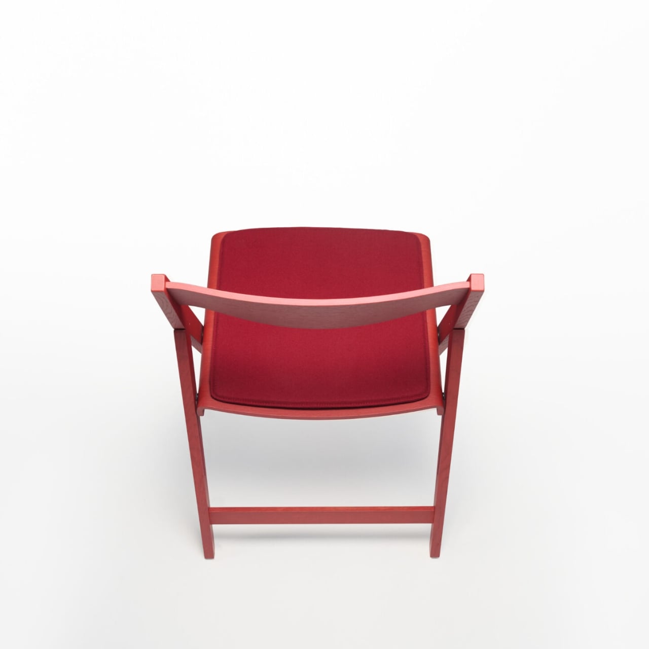
The finish options only add to that versatility. You can get Theo in natural or stained oak veneer, or in a matte open-pore lacquer in Walnut, Brown Red, Olive Green, or Black. Each feels deliberate rather than decorative. The seat cushion options go even further: a 100% wool Moessmer Dolo Loden fabric in four colors, or Dani Florida leather in 96 colors. That last number sounds excessive until you realize it’s actually kind of brilliant. It’s the difference between a chair that fits into a space and one that was made for it.

There’s also a companion Transport Trolley that was developed alongside Theo, designed to stack and move up to eight chairs at once. It’s a practical addition that rounds out the system nicely, especially for the hospitality and event sectors where Theo will likely see the most use. But even outside those contexts, the Trolley signals something important about how PLANK approaches design: everything has to work together, not just look good in isolation.

Matteo Thun is no stranger to pieces that carry a quiet authority. He’s had a long career built on the idea that good design should be sustainable, functional, and beautiful in equal measure, and Theo reflects all three. The fact that PLANK uses solid wood and always-recyclable materials isn’t incidental. It’s the whole point. Longevity is designed in from the start, not marketed as an afterthought.

What makes Theo genuinely compelling is how little it asks of you. It doesn’t demand a particular aesthetic or a specially styled room. It doesn’t need to be the centerpiece. It can be stacked in a closet and brought out for dinner parties, or it can live at the head of a table year-round, and it holds up either way. That’s a rare quality in furniture, and it’s even rarer in a folding chair.

The best designs tend to solve problems you didn’t realize had elegant solutions. Theo is a folding chair that looks like it was never trying to be anything else, and that, more than any other detail, is the thing that makes it worth talking about.

The post PLANK Made a Folding Chair You’d Never Want to Put Away first appeared on Yanko Design.

Why Does Every Kids Chair Feel Disposable? ROCCO Disagrees

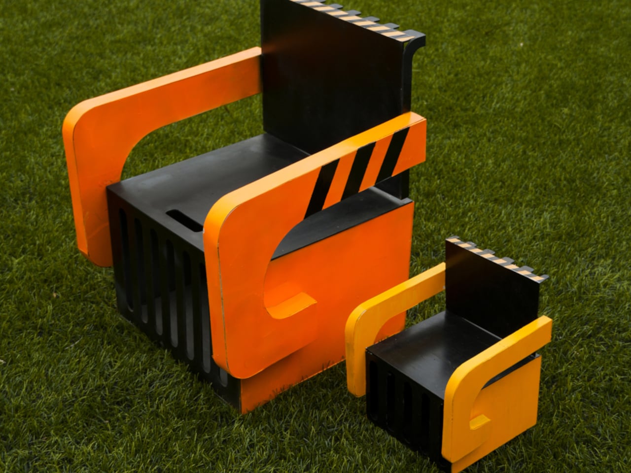
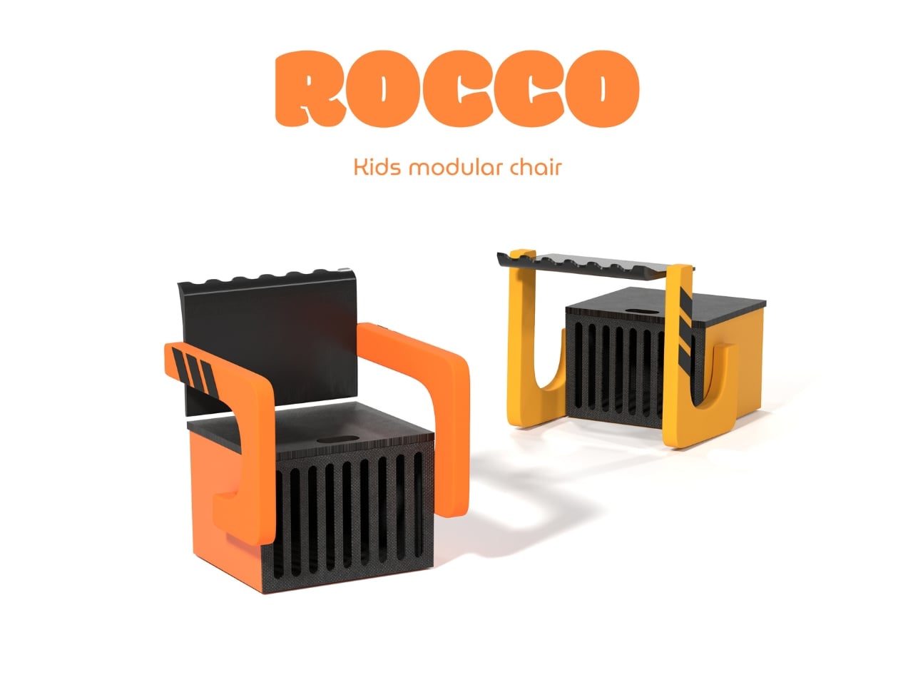
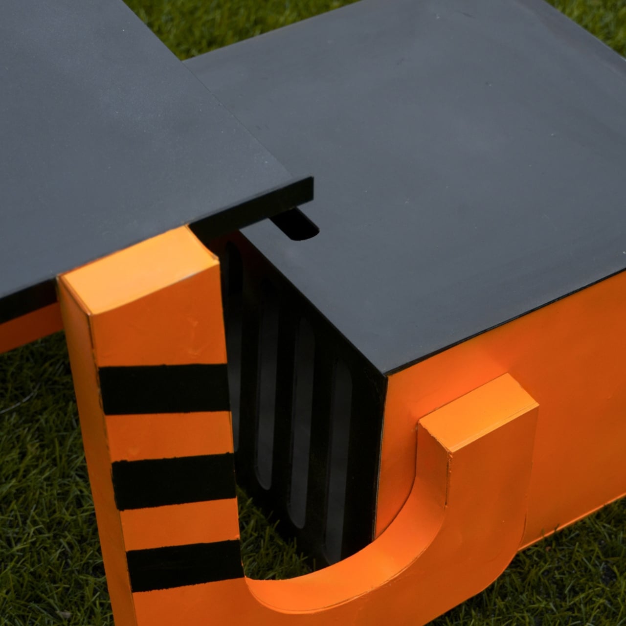
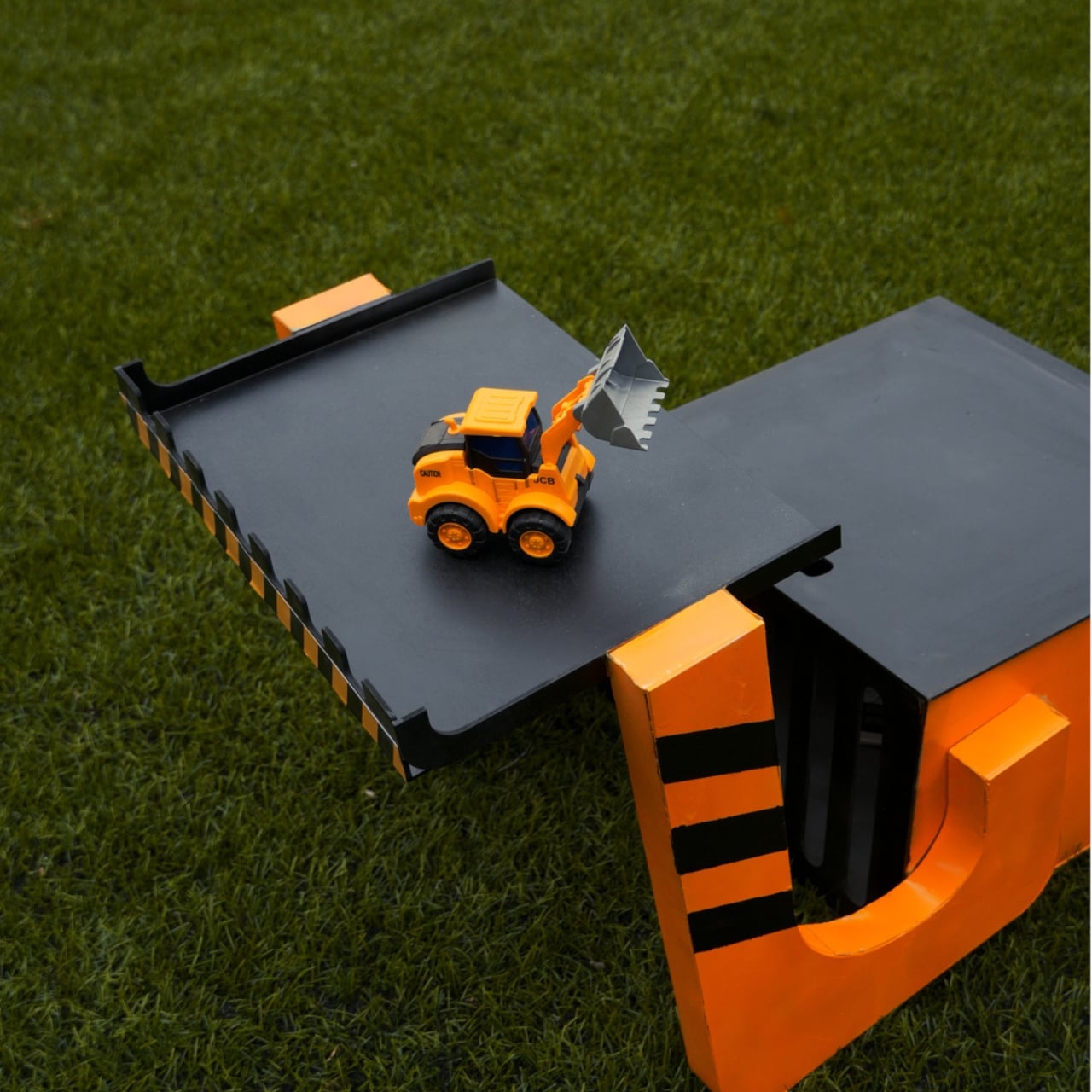
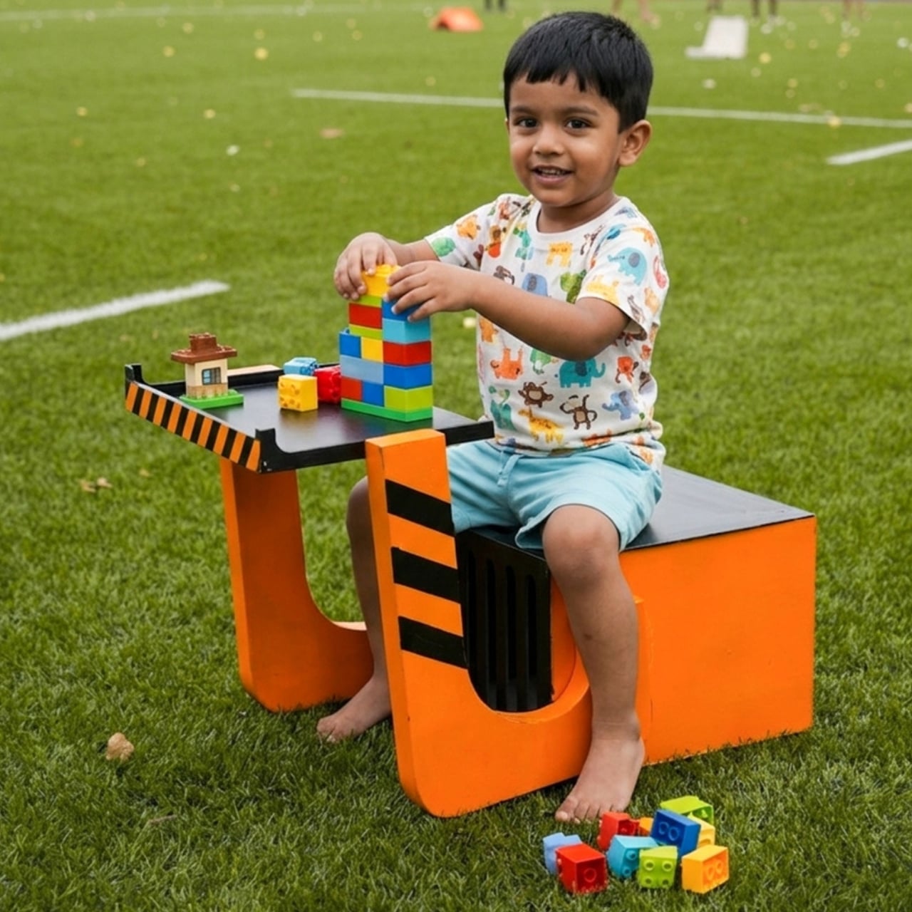
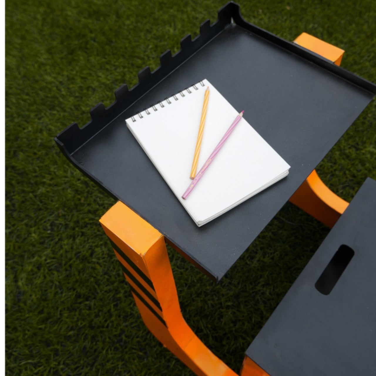
Kids furniture has a peculiar habit of lying about its usefulness. You buy it, your child loves it for roughly eight months, and then it either disappears into a donation pile or gets repurposed as a makeshift step stool. The furniture industry has been quietly trying to solve this problem for years, but designer Nidhun K M may have found an answer worth paying attention to. ROCCO is a modular chair concept for children that challenges the idea of a seat being a single, fixed thing.

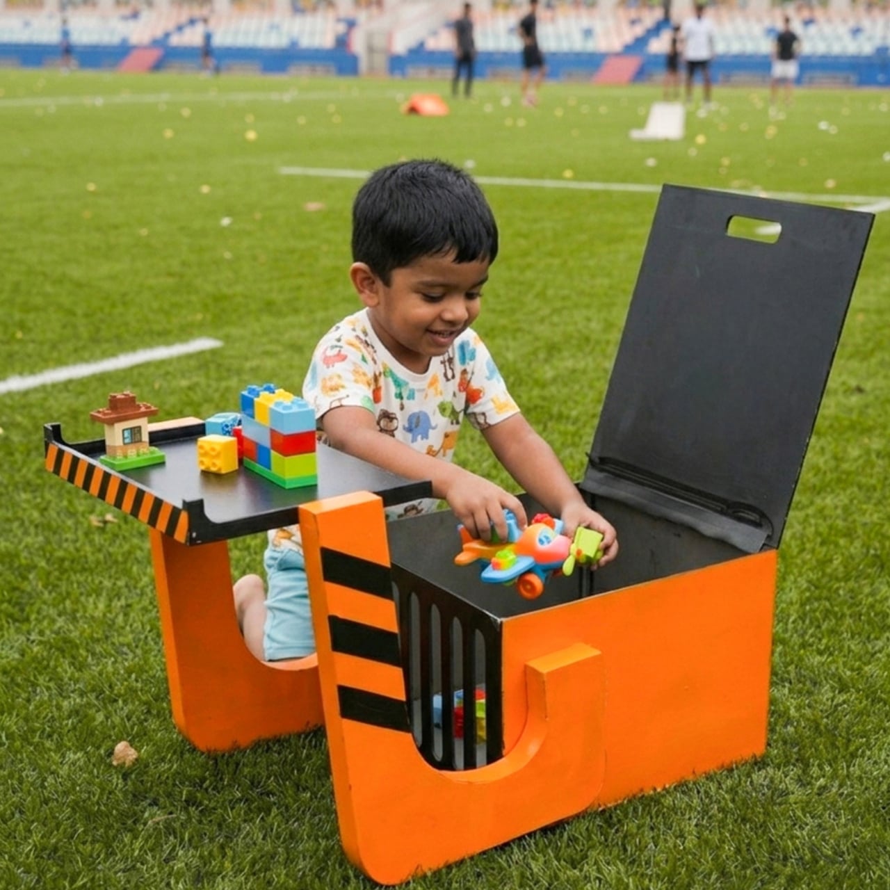
ROCCO isn’t just a small chair. It’s a modular system, which means its components can be reconfigured, reused, and adapted as a child grows and as the context around them changes. Shared on Behance, the concept has been picking up attention from the design community, and it’s easy to see why. The proposal isn’t flashy in the way that kids furniture often tries to be, with primary colors and cartoon motifs that scream “this is for children.” ROCCO looks like it was designed with a quieter kind of intelligence.

Designer: Nidhun K M

The modular approach to kids furniture is not a new idea, but it rarely gets executed with this kind of intention at the seating level. Most modular children’s furniture applies to beds, storage units, or room systems. A chair, by comparison, seems too small to bother with. And yet the chair is one of the most-used pieces of furniture in a child’s day. They sit to eat, to draw, to read, to play. A chair that could shift configuration as the child’s proportions change, or as the task at hand demands something different, is genuinely useful in a way that a novelty dinosaur sofa simply isn’t.

What makes ROCCO feel credible as a design concept is its commitment to the idea over pure aesthetics. The form is considered without being overdesigned. There’s no attempt to win the child’s attention through gimmick. Instead, the design seems to trust that a well-proportioned, adaptable piece of furniture is interesting enough on its own terms. That restraint is harder to achieve than it looks, especially in a market segment that tends to equate loudness with appeal.

The broader conversation that ROCCO fits into is one about sustainability and longevity in children’s product design. Parents who are thinking carefully about consumption are increasingly reluctant to replace furniture every two years. The global kids furniture market is projected to grow significantly over the next decade, with a meaningful portion of that demand driven by parents who want adaptive, durable pieces that don’t become obsolete. Modular systems address this directly. When you can reconfigure rather than replace, you reduce waste and, over time, potentially reduce cost.

There’s also a less practical dimension to this that I keep thinking about. Children learn by doing, by arranging, by making their environments their own. A modular chair invites a small but meaningful degree of participation. If a child can shift a piece, adjust a configuration, and see the result of that choice, the chair becomes part of how they understand space and autonomy. That might sound like a stretch for a piece of seating, but design has always had this double life: the functional and the formative.

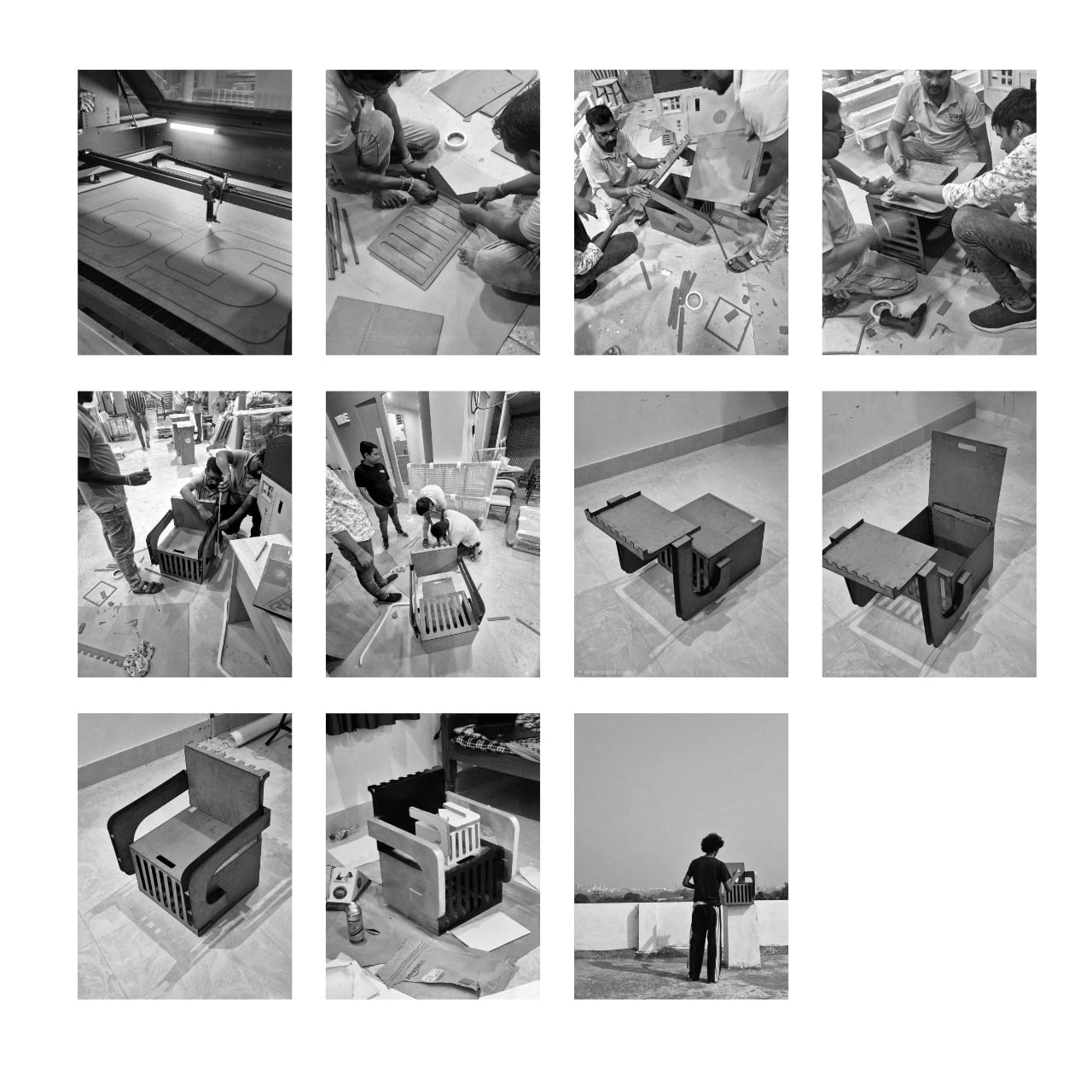
Nidhun K M’s work is currently a concept, which means ROCCO doesn’t yet exist in the way that you could order one and have it arrive at your door. That’s actually fine. The value of concept work in product design is that it forces a conversation before manufacturing decisions set in. It asks: what if we took this more seriously? What if a child’s chair were worthy of the same design thinking we apply to adult furniture? I think the answer is yes. And ROCCO, even at the concept stage, makes a decent case for it.

The post Why Does Every Kids Chair Feel Disposable? ROCCO Disagrees first appeared on Yanko Design.

Recycled Plastic Is 10x More Toxic, and This Chair Contains None

The furniture industry has been slow to reckon with its reliance on plastic. From injection-molded shells to synthetic fabrics, plastic finds its way into even the most design-forward pieces. Recycling has long been positioned as the answer, but the numbers don’t hold up. Only 19% of plastic produced globally actually gets recycled, and incineration, a practice that releases pollutants into the air, has surged 34% recently.

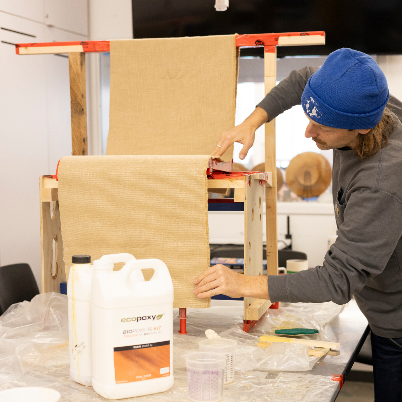
Matthew Whatley came to this problem not as a materials scientist, but as a furniture designer who’d spent a decade with his hands in the work. After years of carpentry and concrete formwork, he studied product design in Vancouver and Melbourne, and a trip through Southeast Asia, where plastic waste is impossible to ignore, pushed him toward a specific question: what if furniture didn’t need plastic?

Designer: Matthew Whatley

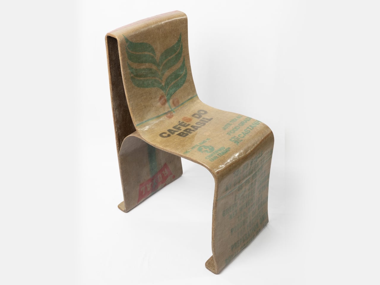
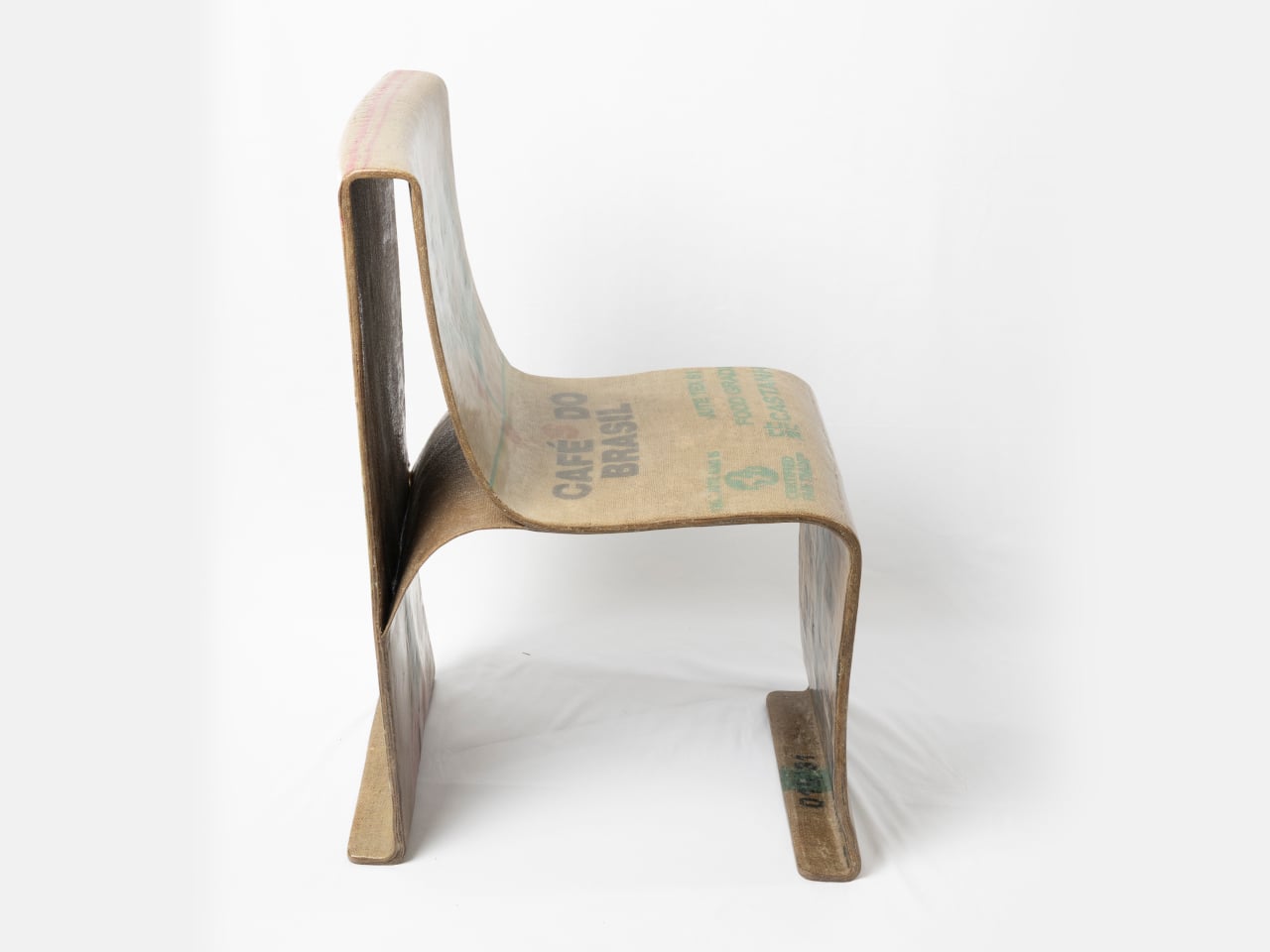
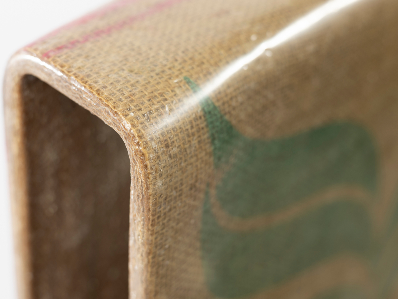
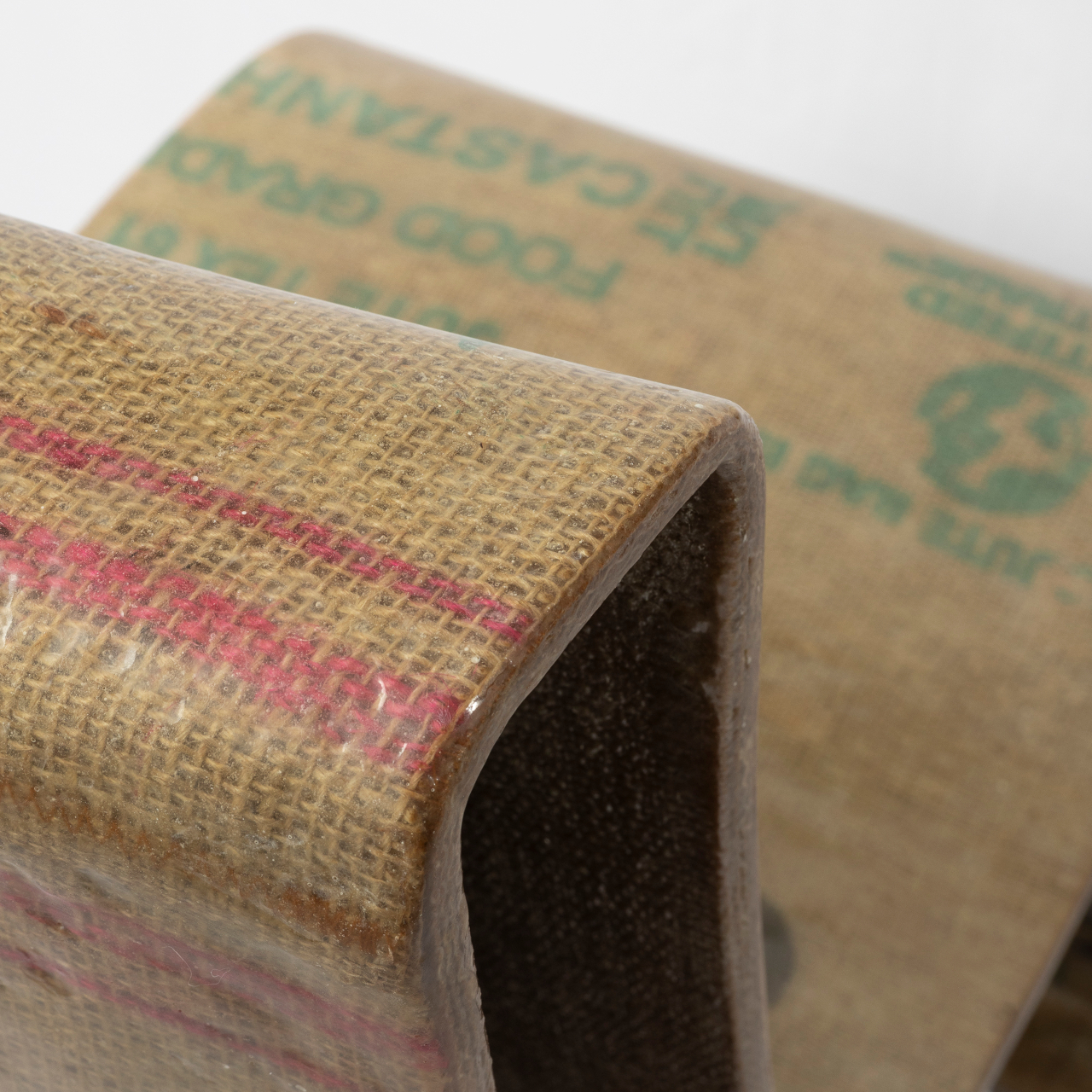
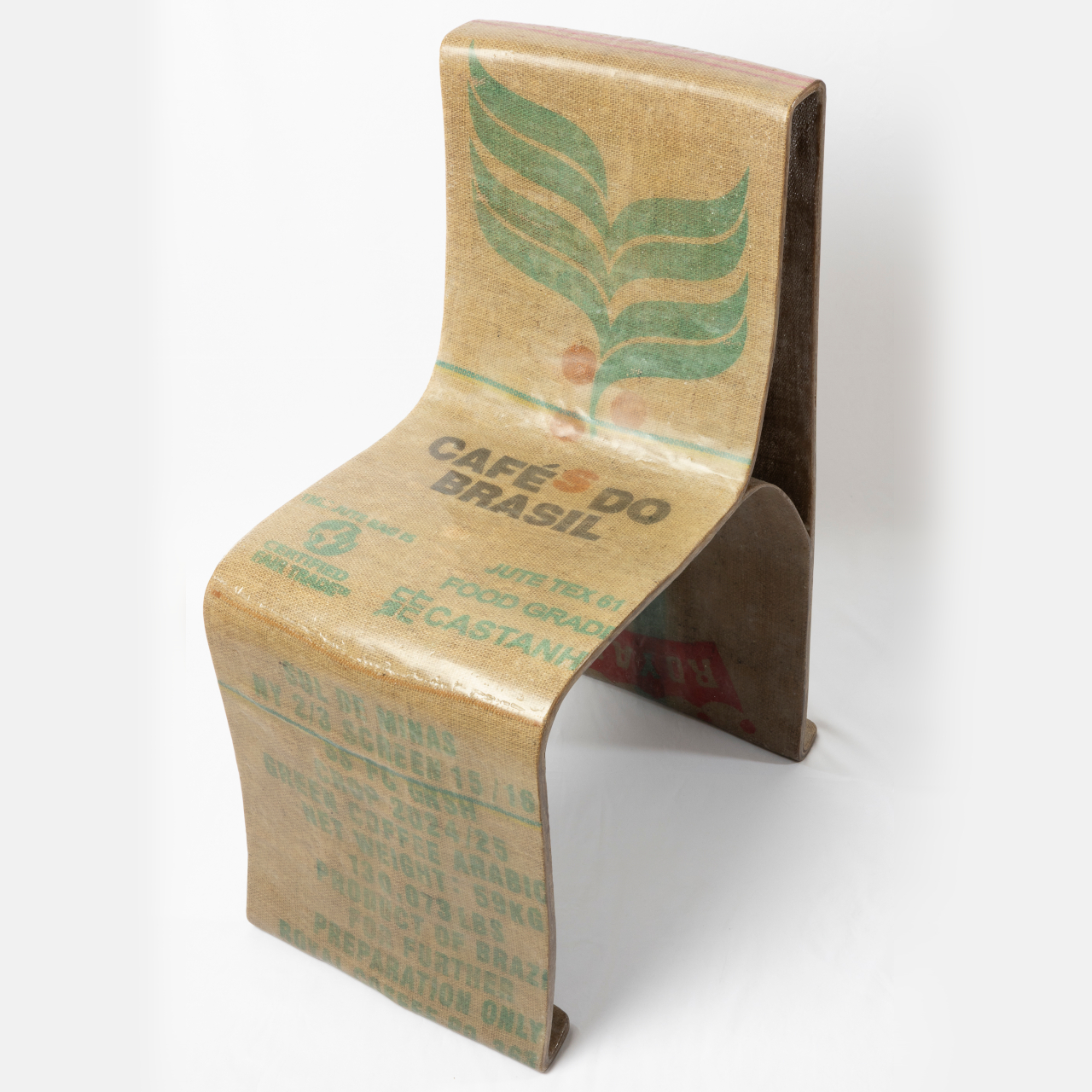
The Novum Chair is his answer, built from a combination of natural woven fiber and bio-based resin. The two materials form a composite: the fiber provides structure and texture, while the resin binds and hardens it into a rigid, load-bearing shell. It’s a relatively simple idea on paper, but getting it to actually hold a person’s weight required significant hands-on material testing.

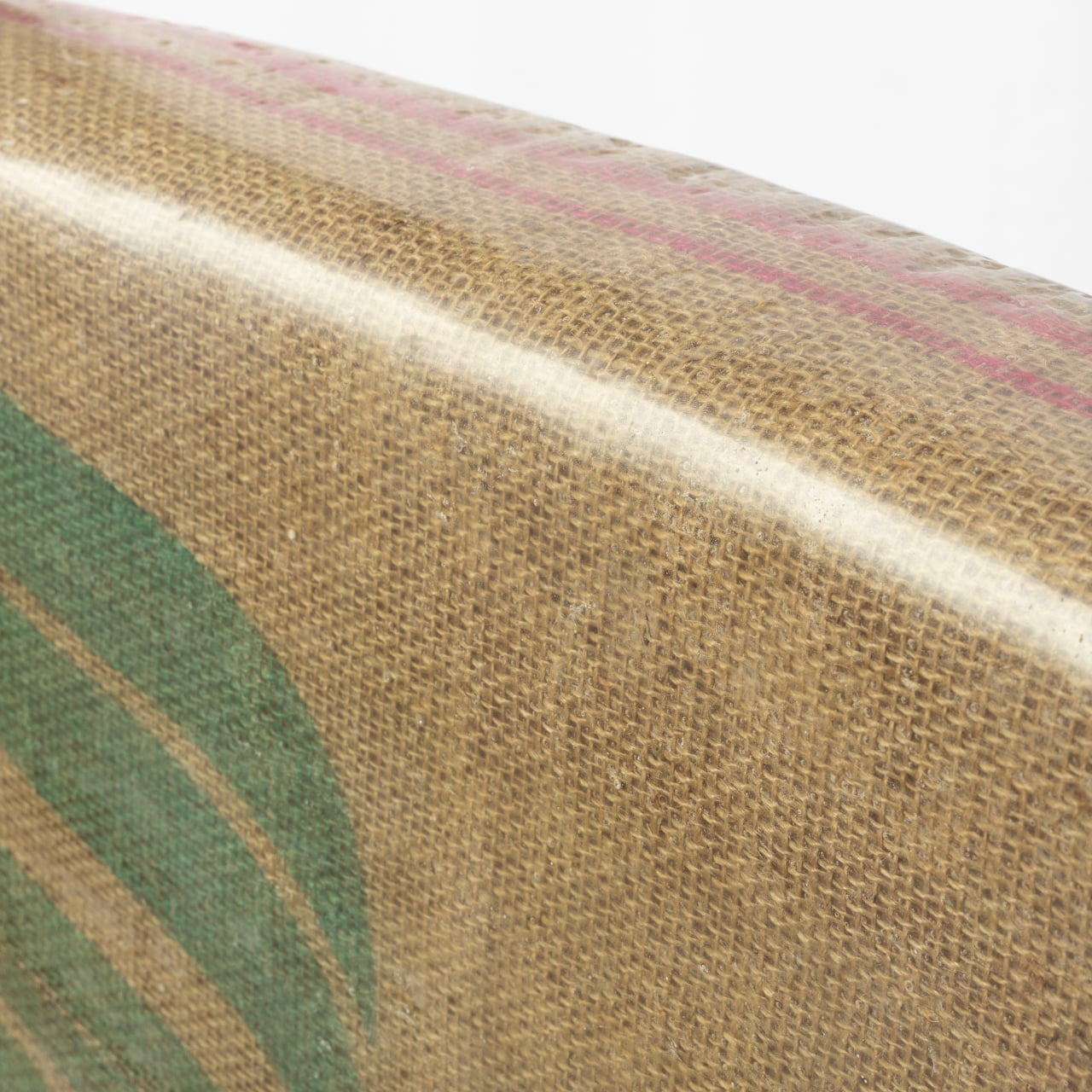
The result is a chair that doesn’t look like it’s making a statement about sustainability; it just looks good. Its form is a single, continuous shell that sweeps from the backrest down through the seat and curls beneath to cradle the sitter. The woven surface is visible through the resin coating, giving it a warm, textile-like quality that reads more like craft than manufacturing.

There’s something refreshing about a chair you could put in a design studio, a cafe, or a considered living space without it demanding attention. The Novum Chair has the kind of understated confidence that lets the material do the talking. The texture and warm amber of the resin-soaked fiber give it a character that shifts with the light, something molded plastic never manages.

Part of what makes this approach worth taking seriously is that it sidesteps one of the more uncomfortable truths about recycled plastics. Re-rendered recycled plastic isn’t the clean solution it’s often portrayed as; it can be roughly 10 times more toxic than the original material. Natural fibers and bio-based resins don’t carry that baggage, which makes this composite a genuinely different starting point.

Whatley is candid about the fact that bio-based resins aren’t perfect yet. They’re relatively expensive, not high enough in bio content, and not yet as accessible as conventional materials. But the Novum Chair isn’t presented as a finished product so much as a proof of concept that structurally sound, beautiful furniture can be built around materials that don’t depend on plastic.

What Whatley has done is take a material problem that feels overwhelming in scale and distill it into something you can sit in. That’s no small thing. The conversation around plastic alternatives tends to stay abstract, caught up in policy and data. A chair that you can actually inhabit, one that looks beautiful, pulls the conversation out of the theoretical and into the everyday.

The post Recycled Plastic Is 10x More Toxic, and This Chair Contains None first appeared on Yanko Design.

This Chair Looks Normal Until It Needs to Keep You Afloat in a Flood

Flooding has gone from a rare calamity to a recurring reality for millions of households. As climate patterns grow more unpredictable, the spaces people call home have become increasingly vulnerable to forces they were never designed to withstand. Most domestic objects offer no answer to this shift, and furniture has remained stubbornly indifferent to the idea that the room it sits in might one day be underwater.

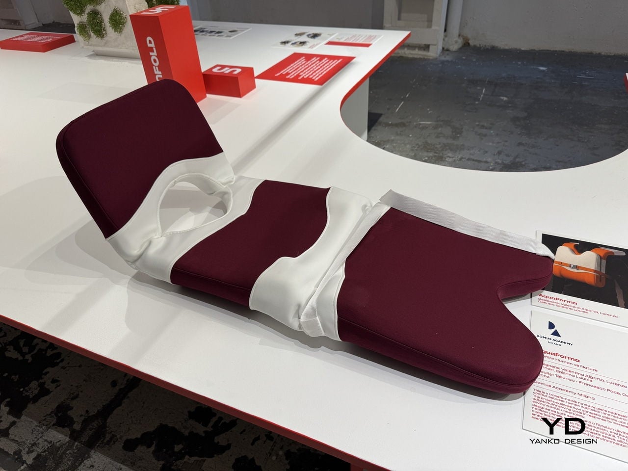
That’s the gap a team of Domus Academy Milano students decided to close. Exhibited at BASE Milano as part of the 2026 Milan Design Week, AquaForma is a transformable furniture piece designed under the theme “Conflict: Human vs Nature.” Created by Valentina Algorta, Lorenzo Gennari, and Sabrina Lounis under faculty guidance, it explores how an everyday domestic object can quietly hold the capacity to save a life.

Designers: Valentina Algorta, Lorenzo Gennari, Sabrina Lounis (Domus Academy Milano)

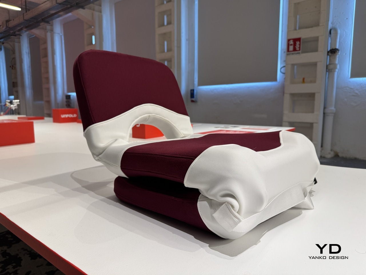
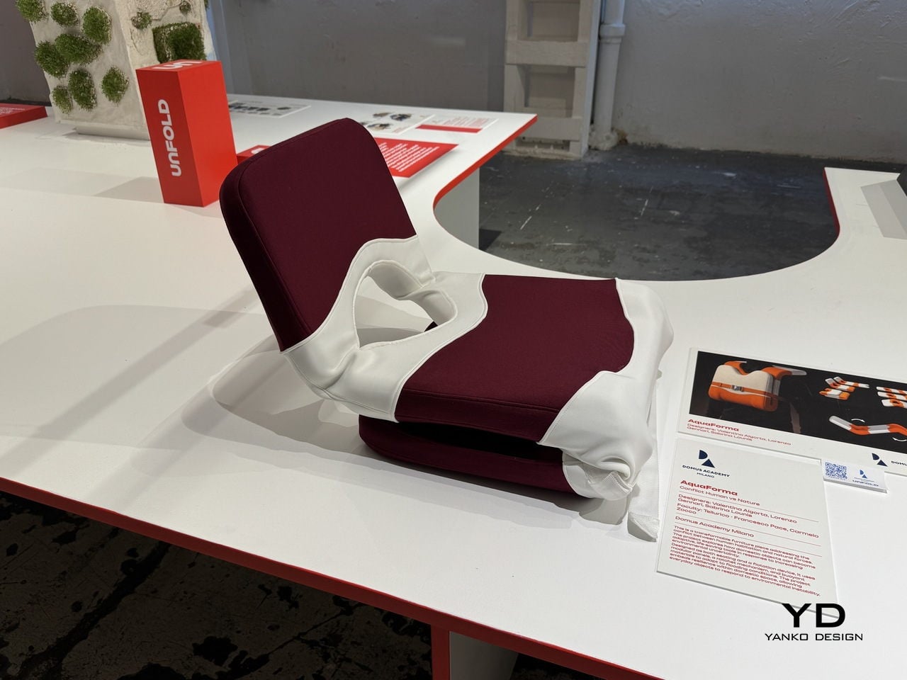
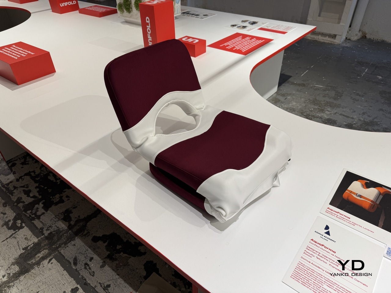
The starting point is a familiar one: a chair. In its default configuration, AquaForma functions as low-profile floor seating with a cushioned backrest and seat upholstered in deep burgundy fabric. A white structural shell wraps around the cushioned elements in flowing, organic curves, giving the piece a sculptural quality that sits comfortably within contemporary furniture design. Nothing about it announces its other purpose.

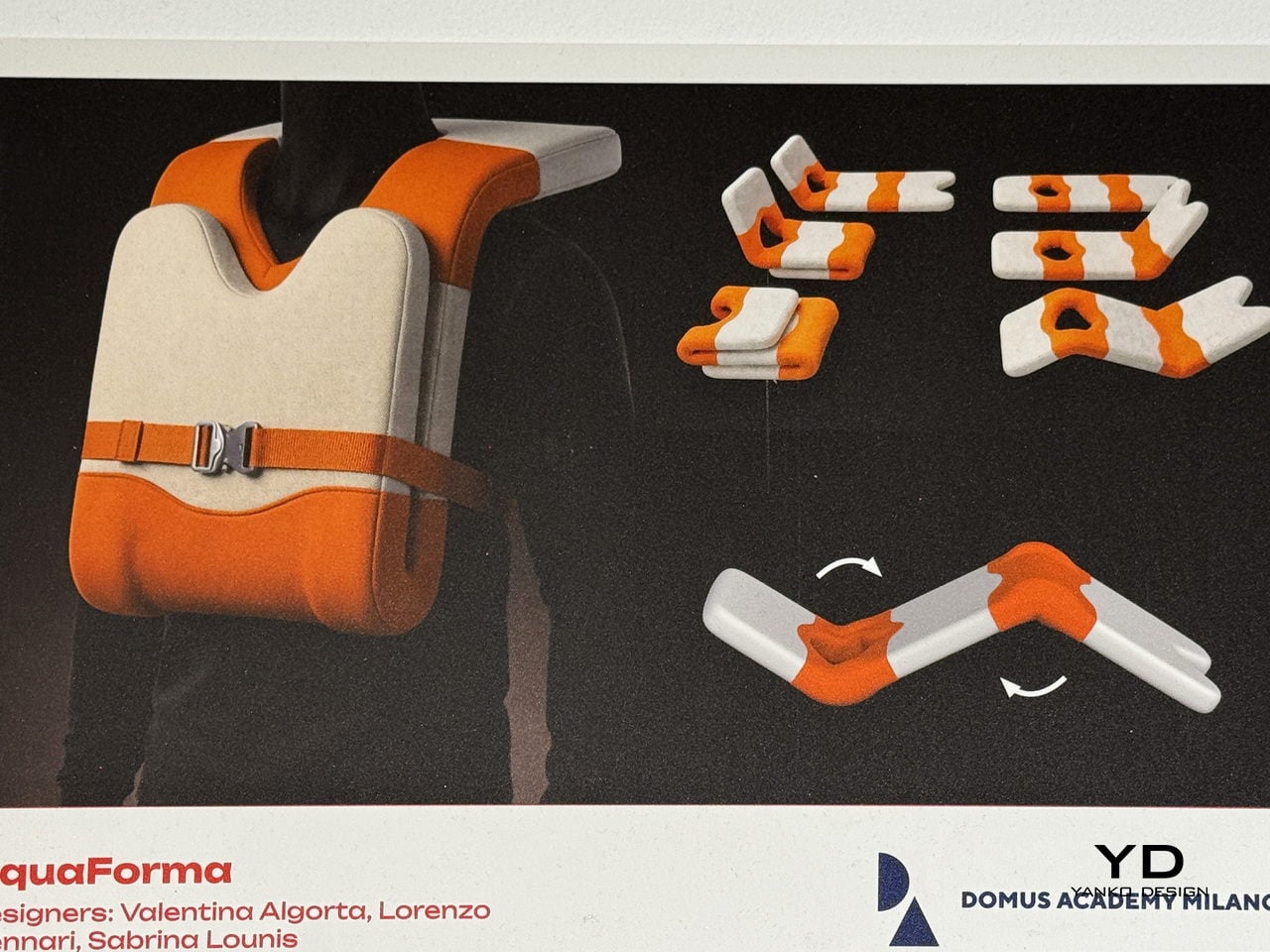
That other purpose becomes clear when flooding hits. The piece uses modular panels, a ratchet buckle mechanism, and buoyant materials that allow it to be reconfigured into a flotation device. The modules interlock and can be reoriented, with individual components separating and reassembling into a completely different arrangement. What sits quietly in a living room can, in theory, keep someone afloat.

The ratchet strap across the midsection does more than hold the piece together; it’s the key mechanism that allows components to be tightened, secured, and adjusted depending on the configuration the piece needs to take. This kind of dual-purpose hardware thinking keeps the design grounded in practicality. There’s no single feature here that’s gratuitous, with everything pulling double duty between the domestic and the emergency.

What makes AquaForma particularly compelling is how invisible its emergency function is in everyday life. You wouldn’t sit on it and think about rising water, and that’s precisely the point. Resilience embedded in ordinary objects doesn’t announce itself until it needs to, and that restraint is what separates a clever concept from a genuinely useful one. The designers didn’t design for a crisis; they designed around it.

AquaForma was shown as part of the UNFOLD exhibition at BASE Milano during Milan Design Week 2026, a student showcase that puts emerging design ideas at the center of one of the world’s most design-saturated weeks. It’s the kind of project that’s easy to underestimate at first glance. A chair that becomes a flotation device sounds like a design school exercise until you remember how often people need exactly that.

The post This Chair Looks Normal Until It Needs to Keep You Afloat in a Flood first appeared on Yanko Design.

Elanco Made Dog-Shaped Furniture Because Your Sofa Has a Flea Problem

Pet ownership and interior design have always had an uneasy relationship. You pick out a sofa carefully, and within months, it’s covered in fur, scratch marks, or the lingering evidence of a bad flea season. Design spaces rarely acknowledge the animal that shares the room, and pet health brands rarely think to communicate through furniture. Most of the time, these two worlds simply don’t talk to each other.

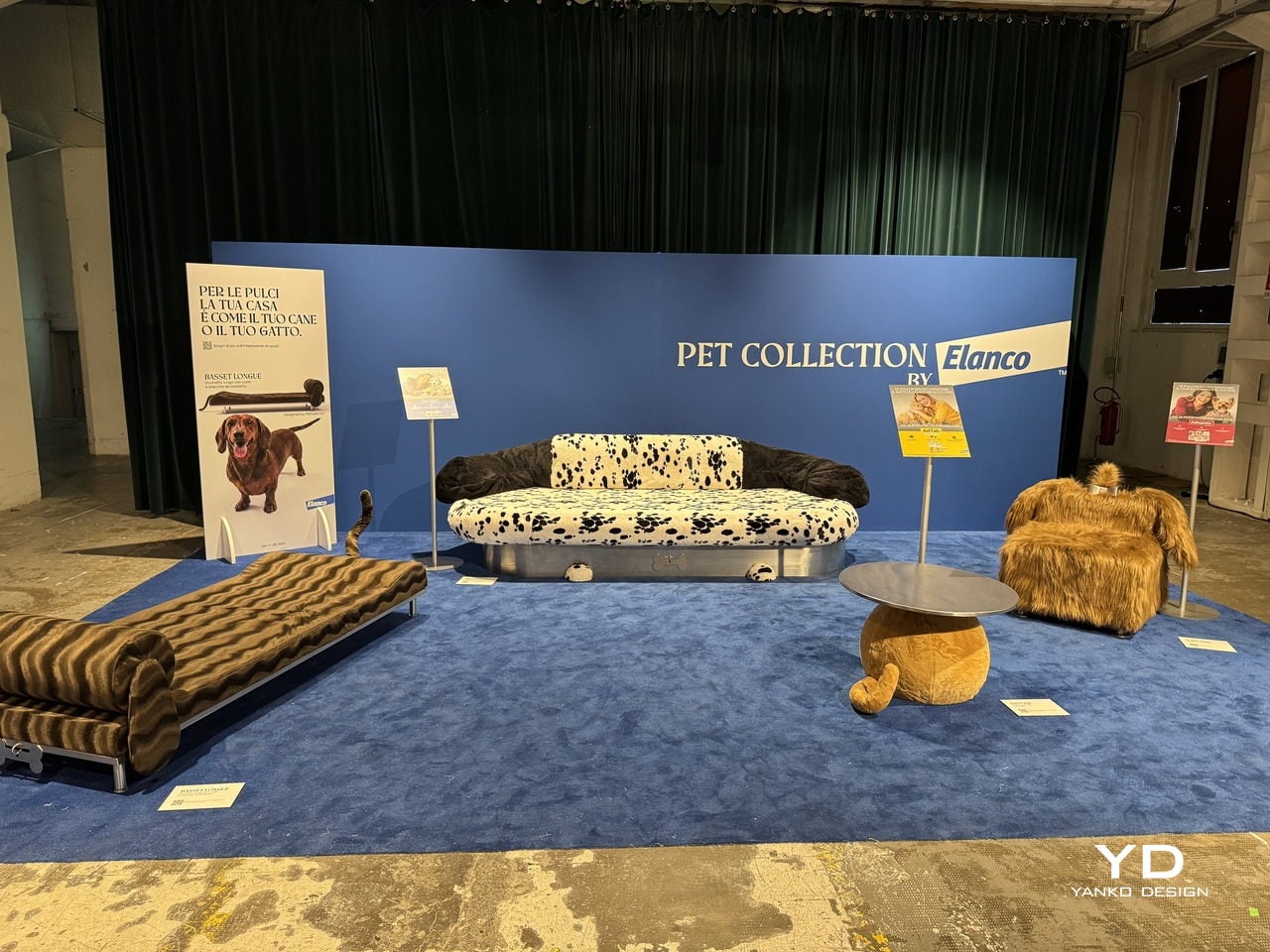
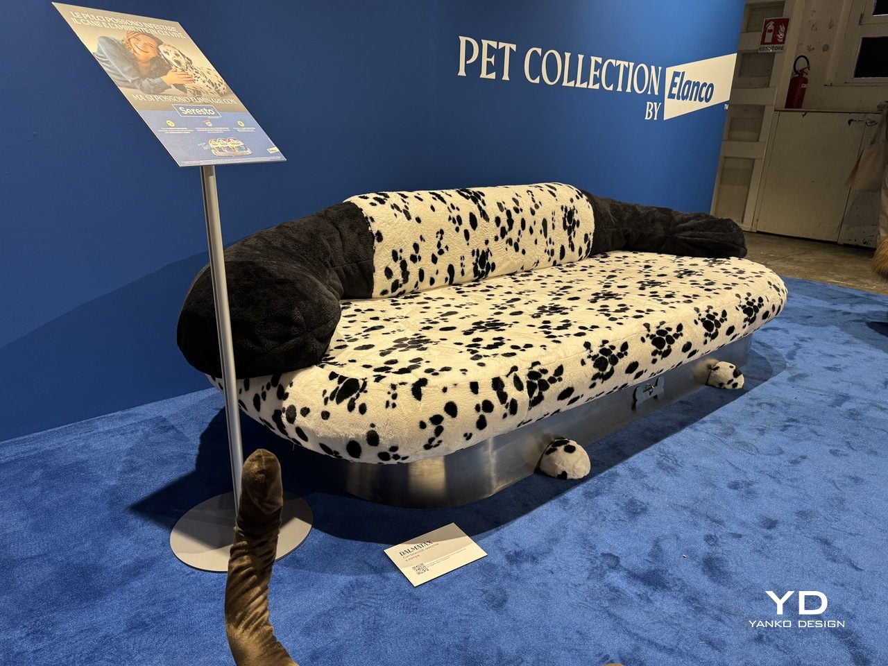
Elanco, a global animal health company, had other ideas. For the 2026 Fuorisalone, it partnered with Milan-based architecture and design studio Parasite 2.0 to bring the Pet Collection to BASE Milano. The result is a limited-edition series of four pet-inspired furniture pieces that are equal parts campaign, design statement, and visual joke, all presented at one of Milan’s most forward-thinking creative venues.

Designers: Elanco, Parasite 2.0

The whole thing starts from a simple but uncomfortable truth. Fleas don’t just live on pets; they infest homes too, spreading through the furniture and floors that pets and people share. Elanco’s point is that your sofa and your dog aren’t as different as you think, at least not from a flea’s perspective. The collection makes that idea impossible to ignore.

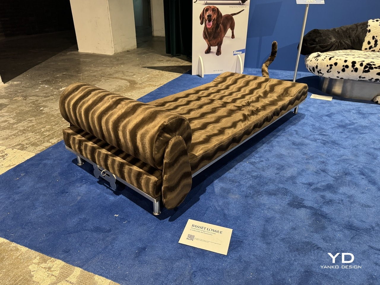
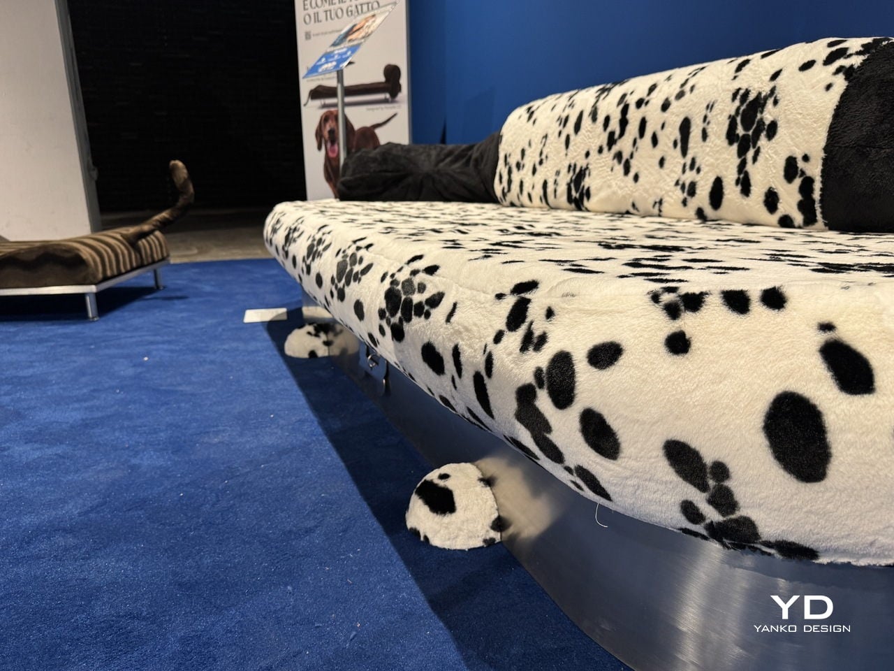
Each piece is a pun on both a breed and a furniture type. The Basset Longue is a chaise longue upholstered in wavy, brown-striped faux fur, shaped after a Basset Hound, and mounted on chrome legs with a tail detail at one end. The Dalmatian is a wide sofa in black-spotted white plush with dark, rounded backrests that look like a dog curled up in place.

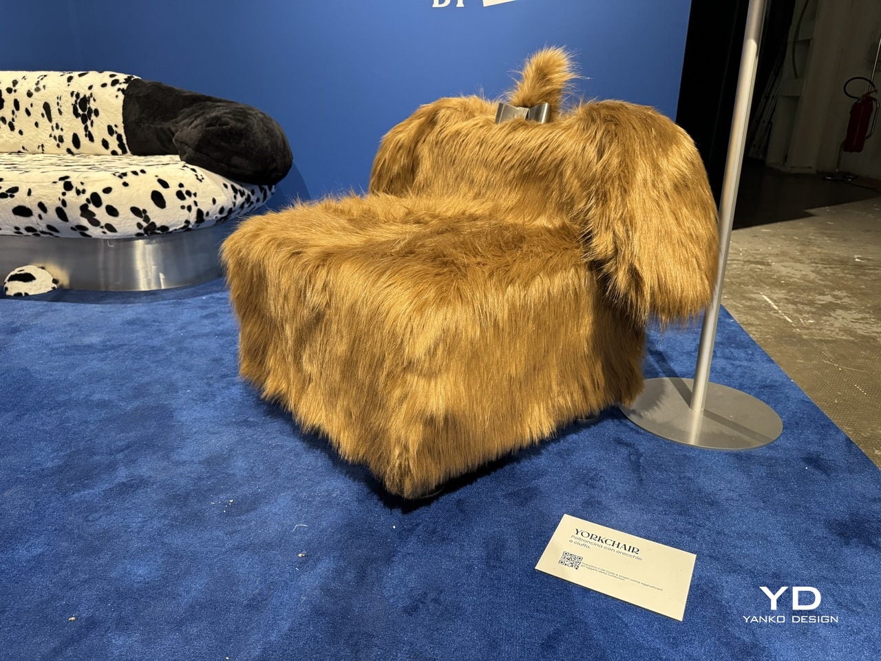
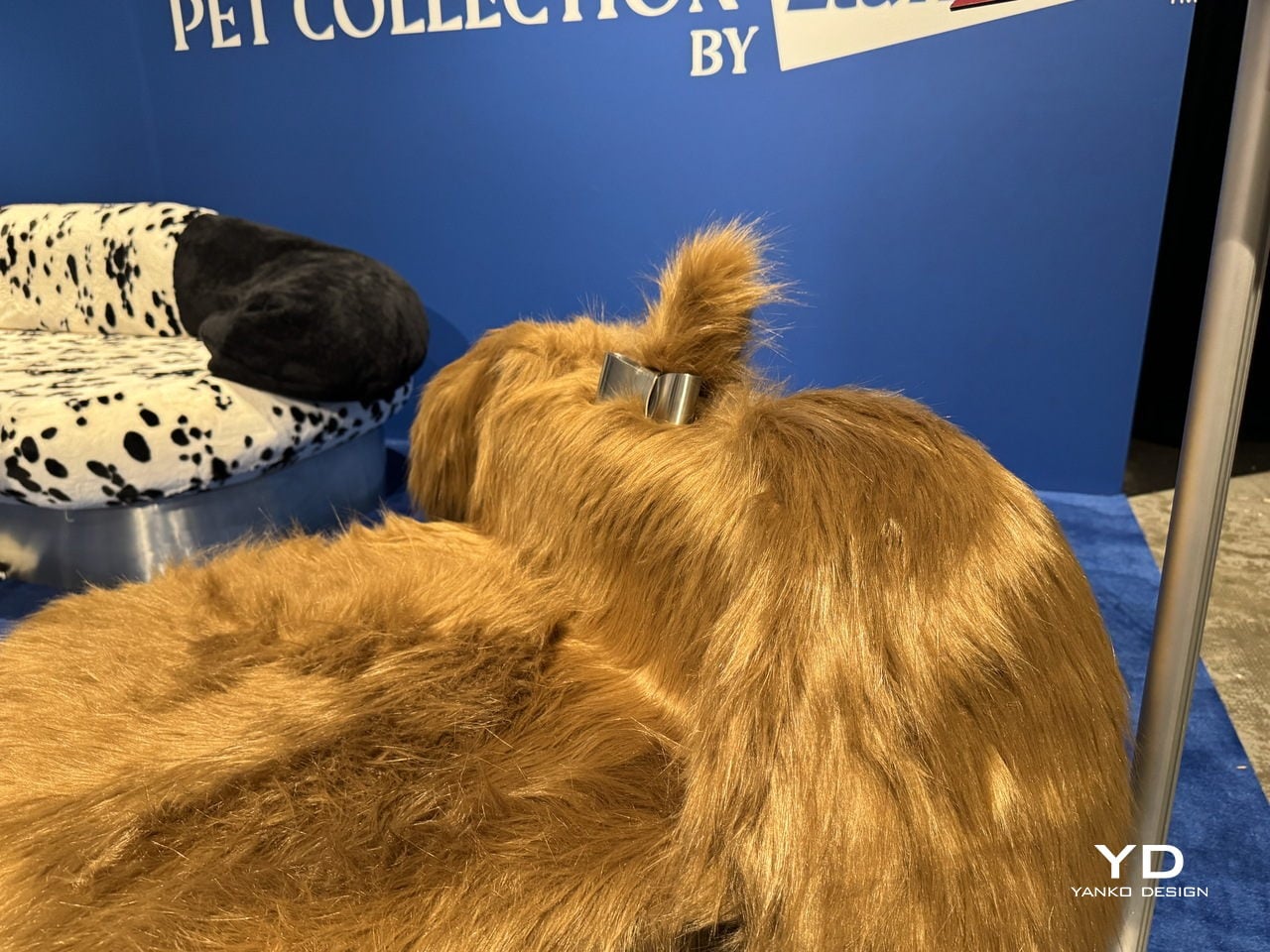
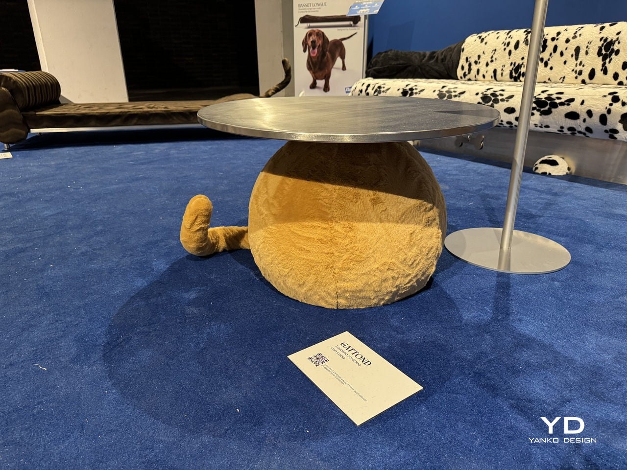
The Yorkchair is a chunky armchair draped entirely in long, golden faux fur with a small chrome detail on the back, very much like a Yorkshire Terrier wearing a collar. Then there’s the Gattond, which departs from the canine theme and becomes a feline-inspired coffee table, its polished metal top sitting on a rounded, fuzzy golden base with a tail sticking out from the side.

The Pet Collection is on view at BASE Milano as part of the 2026 Fuorisalone, and it’s the kind of exhibit that sticks with you long after you’ve left the room. Not because the furniture is particularly comfortable, mind you, but because the message is hard to unsee once you’ve seen it. Your sofa and your dog are, apparently, not so different after all.

The post Elanco Made Dog-Shaped Furniture Because Your Sofa Has a Flea Problem first appeared on Yanko Design.

These 5 Playful Everyday Objects Were Designed to Make You Feel Like a Kid Again

For decades, “form follows function” shaped how you designed and lived. Minimalism stripped objects down to pure utility, where functional products like a chair were only a chair, or a lamp was only a source of light. That clarity once felt essential, but now it feels incomplete. We are moving into an era of playful functional design, where everyday objects reclaim character, becoming whimsical, unexpected, and slightly strange.

This shift is not about excess but about emotional precision. Function no longer ends at performance, but it extends into experience. Objects are designed to engage, surprise, and evoke emotion. A well-designed piece does not simply serve a purpose; it leaves a lasting impression.

1. Interactive Furniture Design

The era of the static, rigid sofa is fading as furniture begins to take on a more expressive role. Pieces are no longer designed to sit quietly in the background, but they carry presence through bold forms and modular compositions. Soft, blobby silhouettes and subtle anthropomorphic details transform chairs and stools into objects that feel almost alive, inviting interaction.

The real transformation lies in how people engage with these designs. Materials like memory foam and recycled plastics allow furniture to adapt to the body, shifting from passive to responsive. As a result, furniture moves beyond function and begins to feel more like a companion within a space. This shift creates interiors that are more intimate, expressive, and dynamic, where everyday objects actively shape the playful atmosphere.
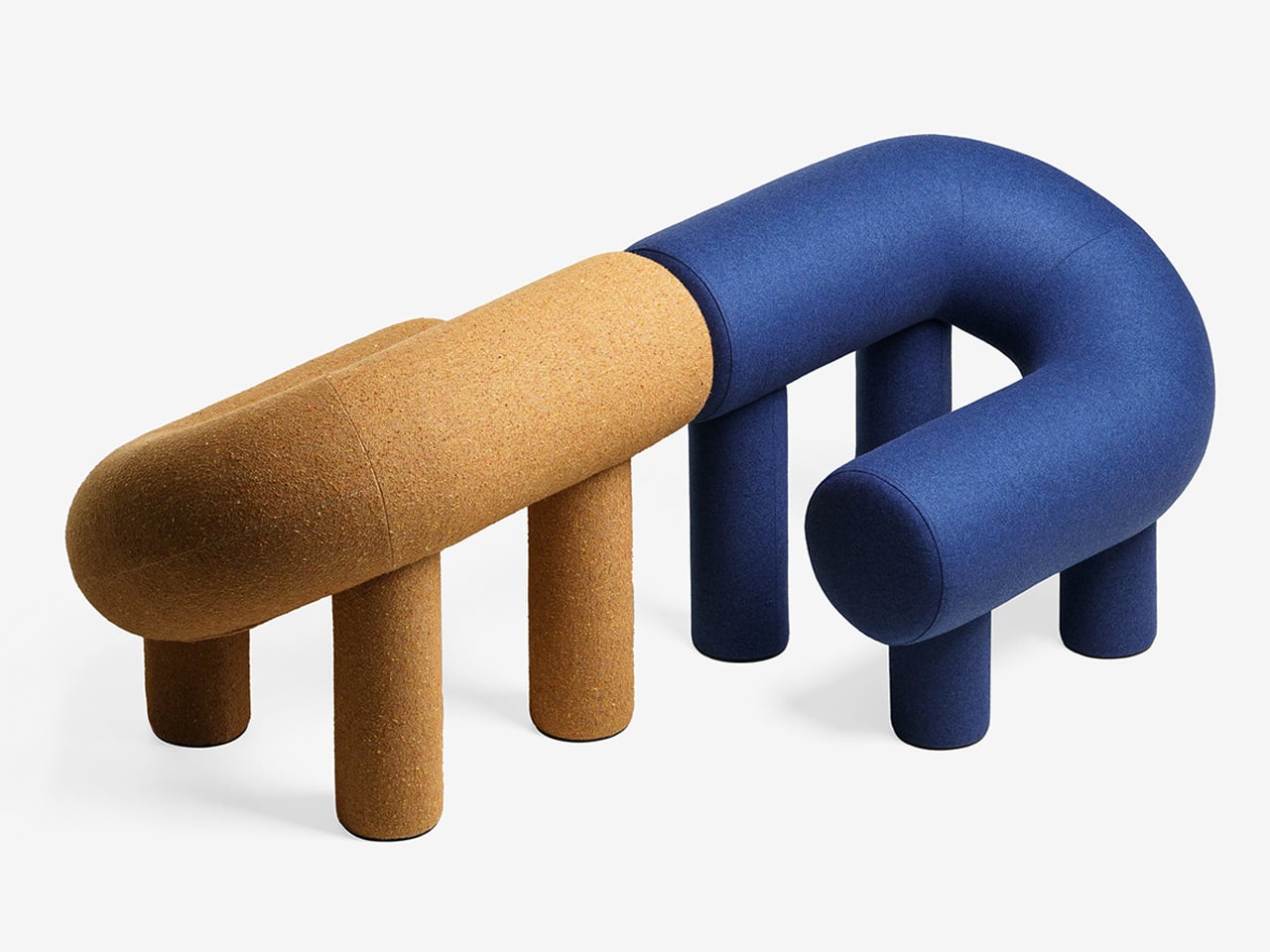
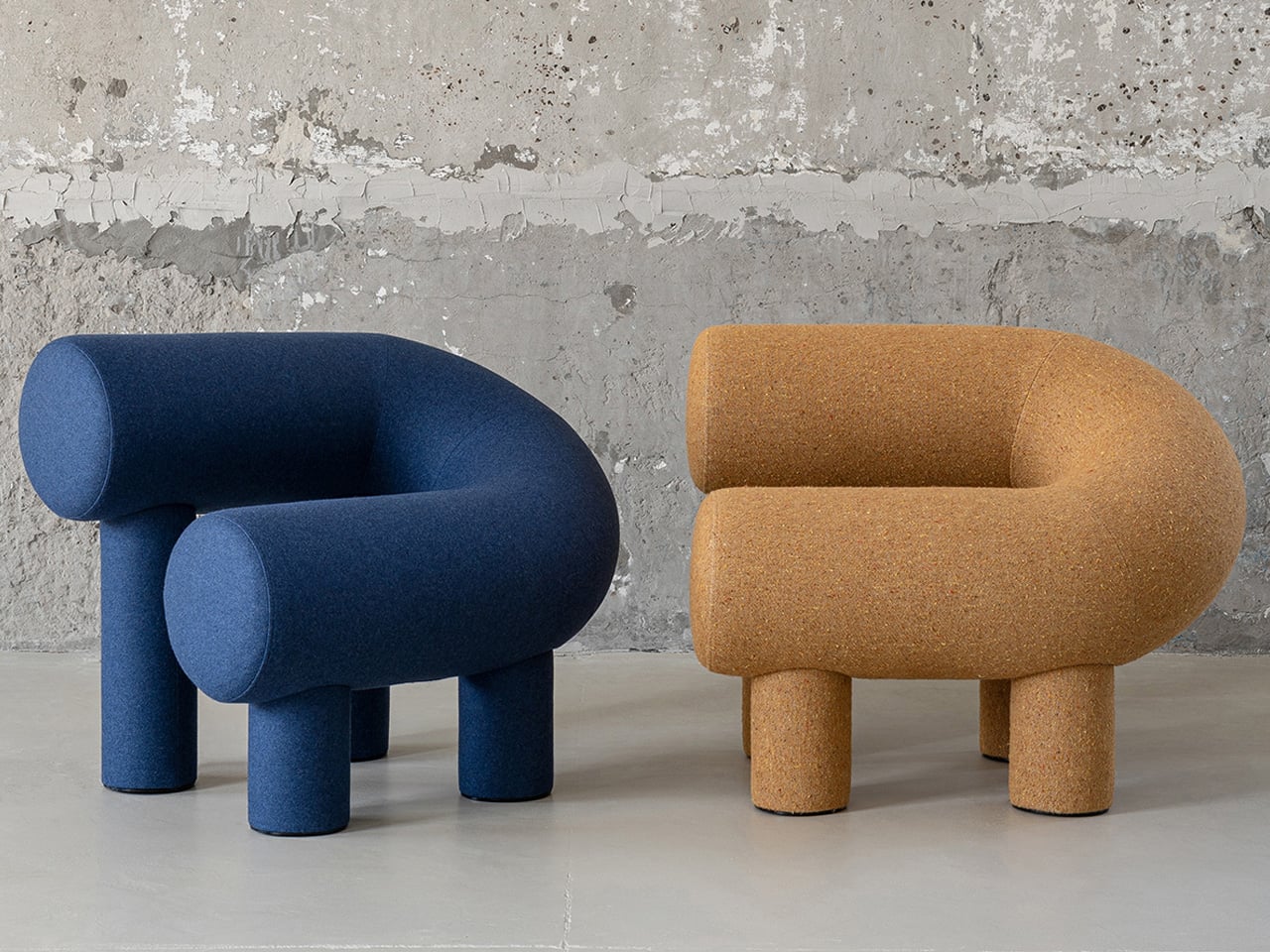
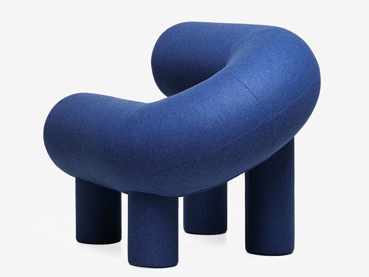
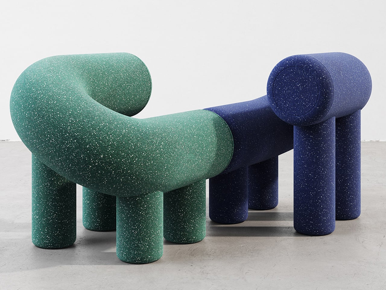
Playful furniture is reshaping everyday living, and the UMI Armchair by Rostislav Sorokovoy for Woo reflects this shift with ease. It moves beyond conventional seating, becoming an interactive object that sparks curiosity. Its bold, chunky form carries a soft, sculptural presence, giving it the character of a modern art piece. Designed to invite engagement, the chair encourages relaxed lounging and a more instinctive, almost childlike interaction.
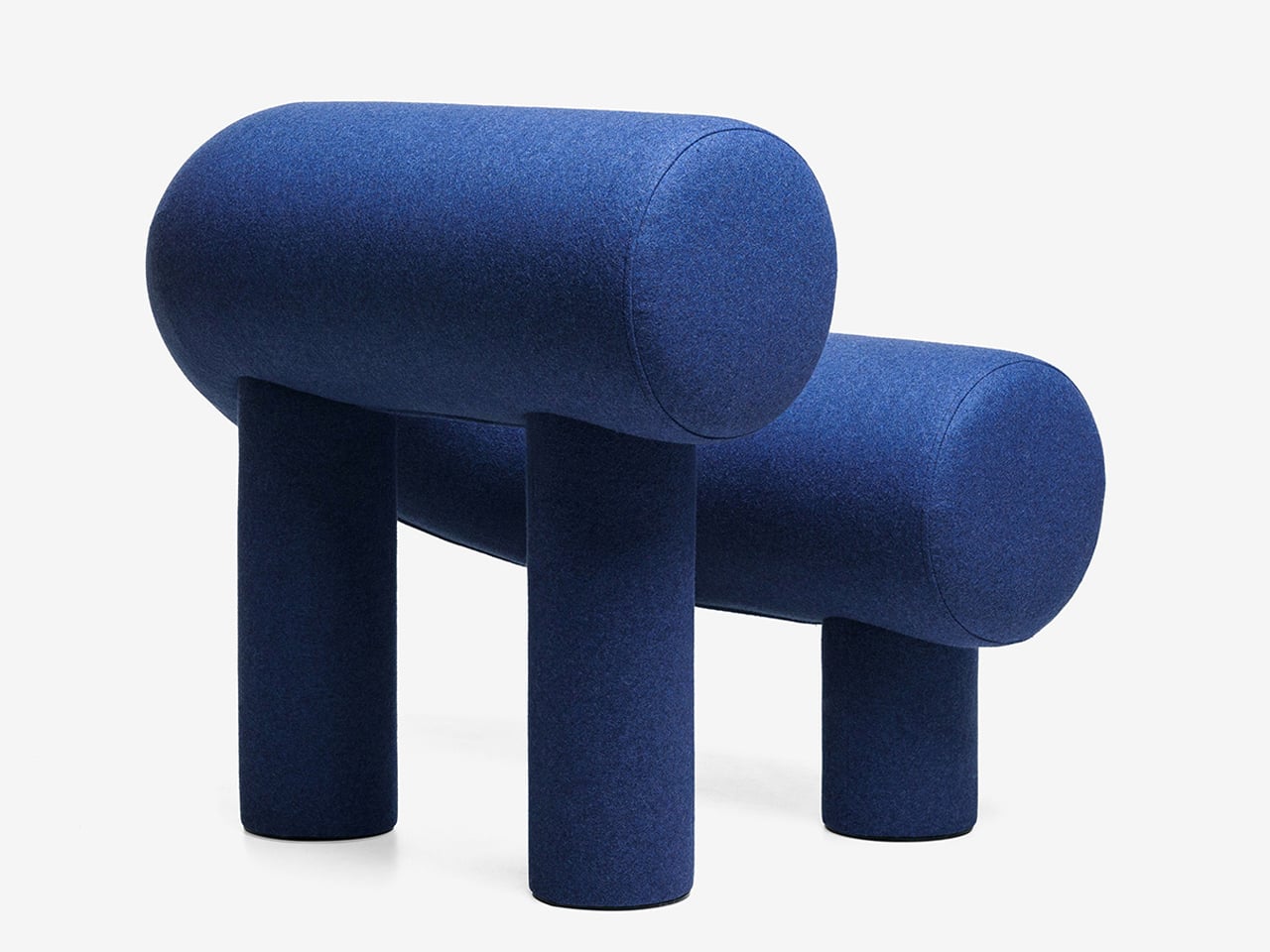
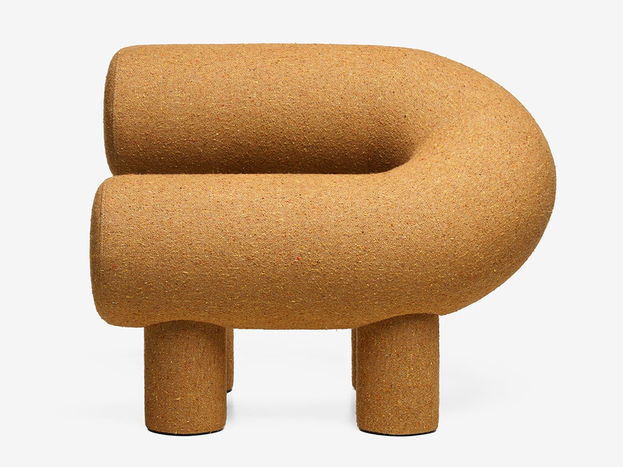
Its distinctive horseshoe shape is created using two cylindrical volumes, supported by four plush legs that provide both stability and visual charm. Constructed with a plywood frame, polyurethane foam, and textile upholstery, it delivers comfort alongside strong design appeal. While its scale may not suit compact interiors, it works effortlessly in larger spaces where its expressive form can stand out. Whether used alone or in pairs, it creates a seating arrangement that feels tactile, inviting, and visually dynamic.

2. Sculptural Light Design

Lighting has moved beyond pure function, evolving into something sculptural, immersive, and subtly performative. A fixture is no longer just a source of illumination as it becomes an object that encourages interaction. With hidden LEDs and responsive sensors, even the simple act of turning on a light feels more intentional, almost ritual-like.

The experience is defined by engagement. Some lamps require a physical gesture, like placing a glowing orb to activate them, while others shift form as they dim, echoing organic movement. When light is treated as a material to shape and experience, rather than just a utility, it transforms the mood of a space. Shadows gain depth, and dim corners turn into moments of intrigue, adding a layer of quiet wonder to everyday environments.
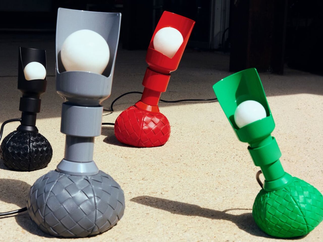
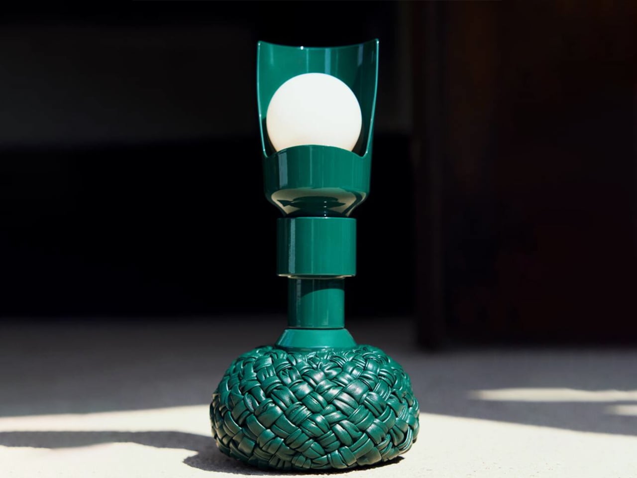
Lighting is often viewed as purely functional, designed to illuminate and enhance a space. Yet some designs move beyond utility, introducing interaction and character without feeling overly whimsical. The reimagined Model 600 by Bottega Veneta x Flos, created by Gino Sarfatti, captures this balance with ease. Its rounded base offers a soft, inviting presence, while the slender metal stem adds a refined contrast, resulting in a form that feels both approachable and sophisticated.
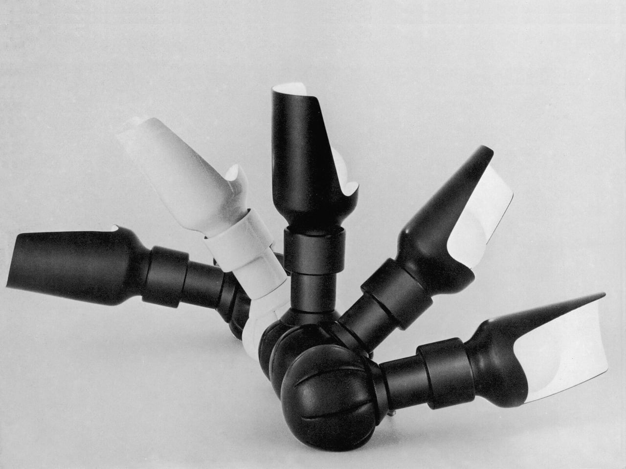
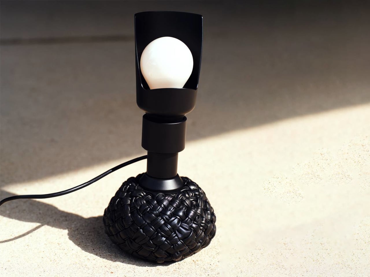
The original 1960s design embraced experimentation with a weighted leather base that could tilt without falling. The updated version retains this dynamic feature while introducing an interwoven leather texture that enhances its visual depth. Functionally versatile, it serves as a desk and floor lamp, with adjustable light direction through a curved reflector. Available in multiple sizes and colors, it merges structure with softness, creating a lighting piece that feels engaging, elegant, and enduring.

3. Playful Gadgets

Technology has long been defined by precision and restraint, often creating a sense of distance through its polished perfection. That gap is now narrowing, as a new generation of gadgets introduces softness, charm, and tactility. Drawing from “kawaii” influences and responsive design, these objects invite touch and emotional connection, from companion-like power banks to speakers that move and respond with sound.

The real shift is in how these devices are perceived and experienced. Tools once valued solely for efficiency are now designed as sensory interactions. A hard drive wrapped in soft silicone, yielding like a stress ball, blurs the line between utility and play. In this transition, technology becomes more personal and approachable, transforming everyday use into something warmer, lighter, and more human-centered.
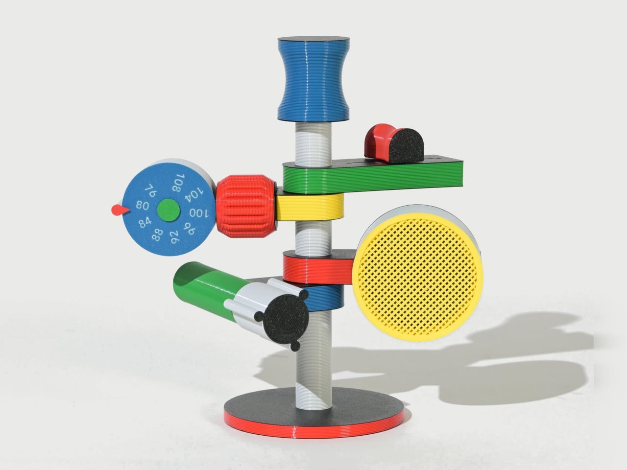
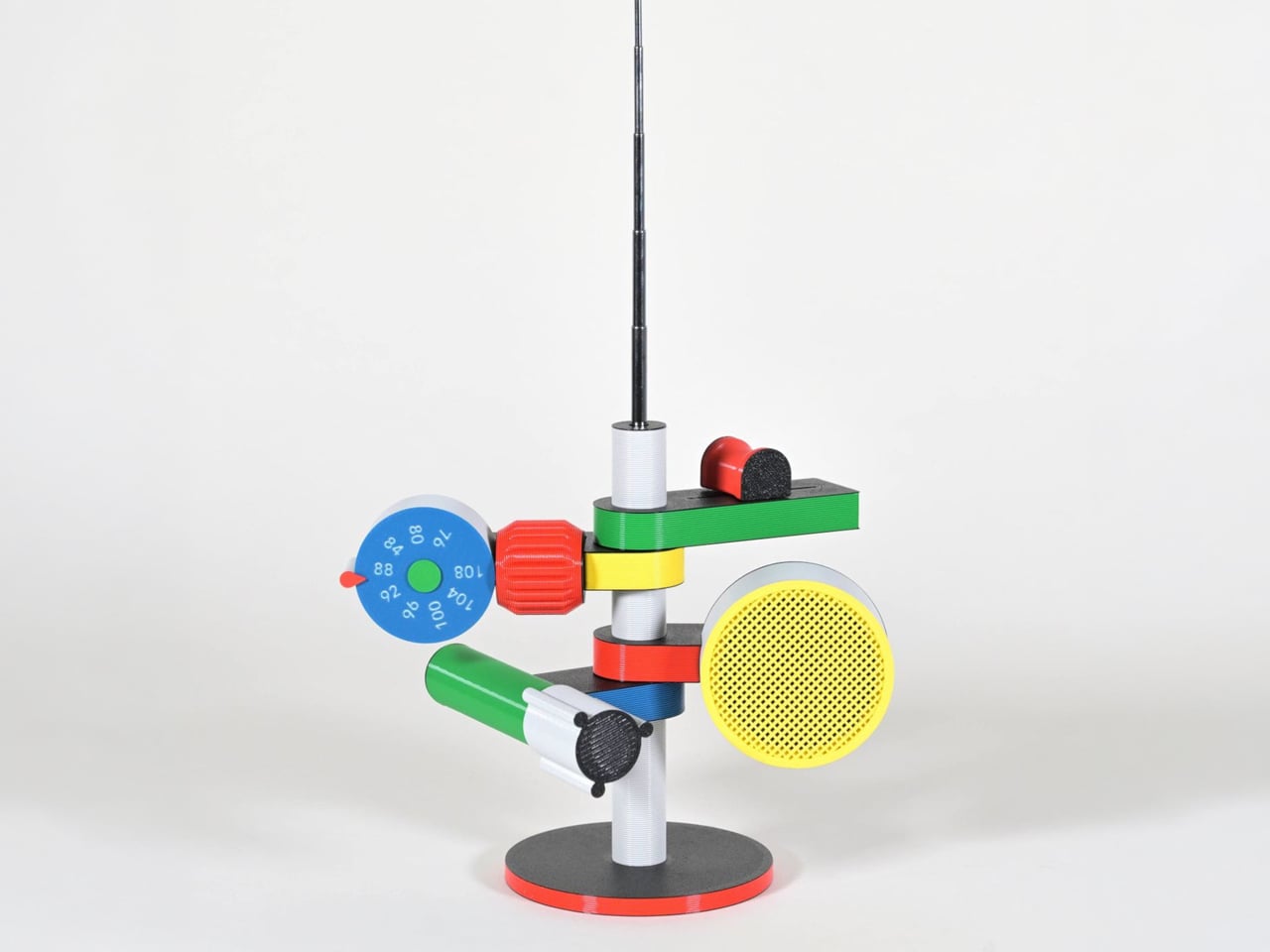
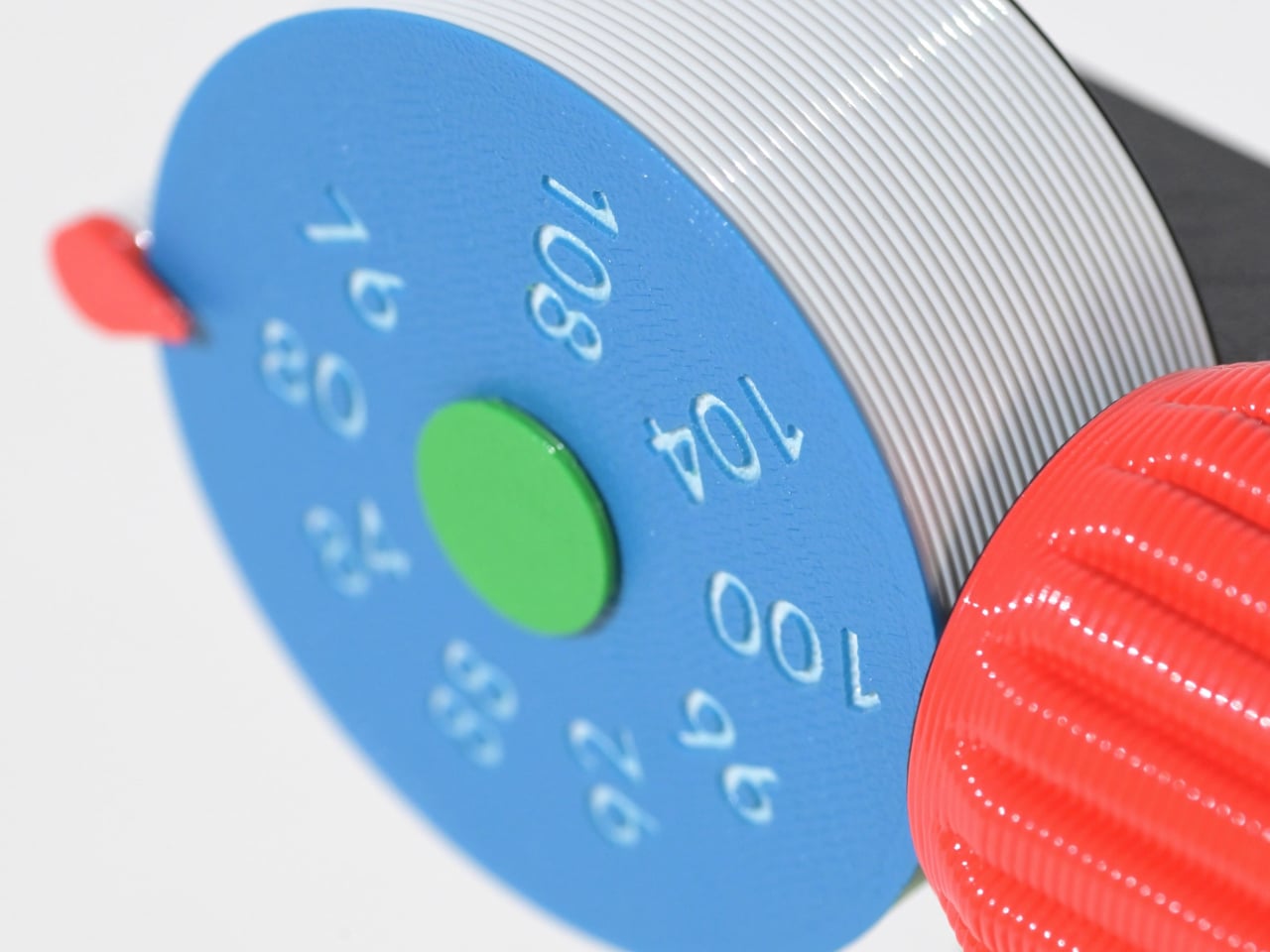
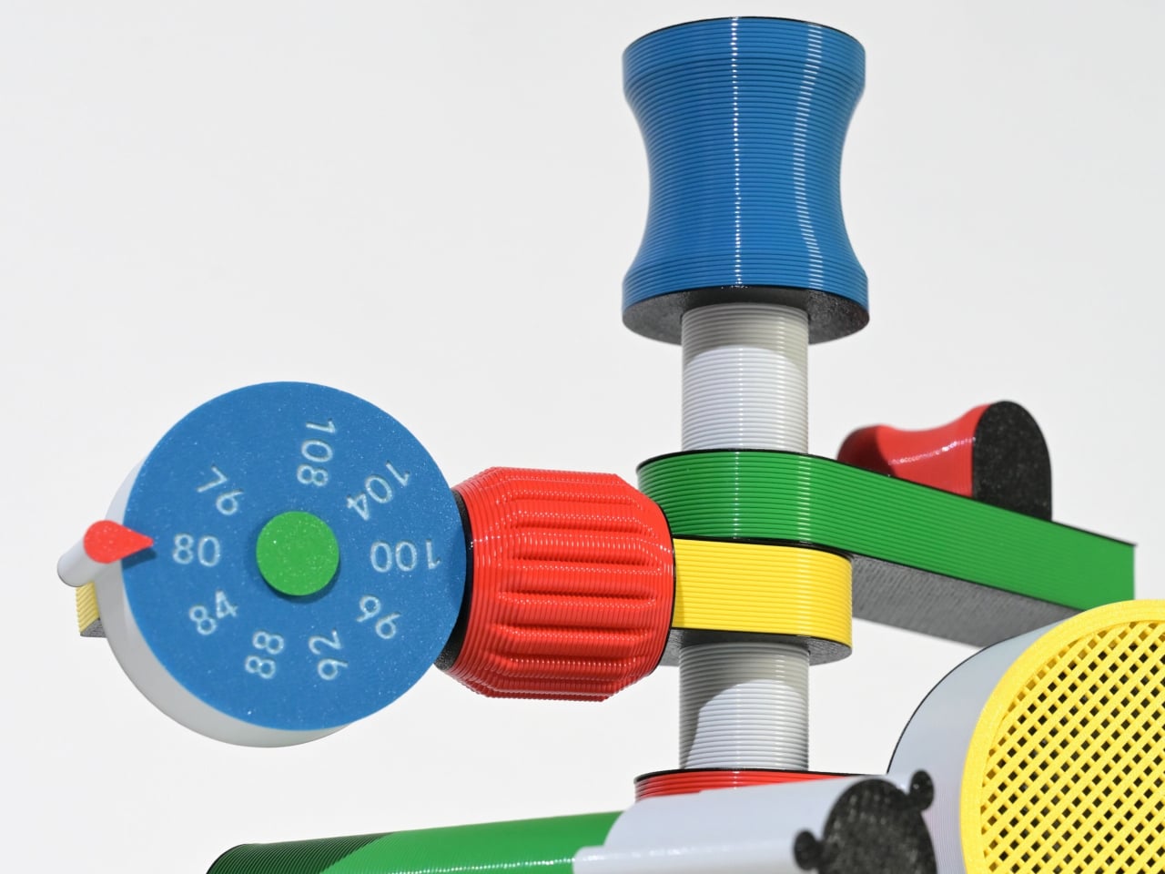
Some gadgets stand out not for precision or minimalism, but for their sense of character. The Anomalo FM radio by SHINKOGEISHA leans into this idea, presenting itself as an object that feels closer to a playful sculpture than a conventional device. With its bold colors and exaggerated form, it instantly grabs attention, sparking curiosity even before it’s switched on. The tall antenna anchors the design, while branching, limb-like extensions give it an almost animated presence.
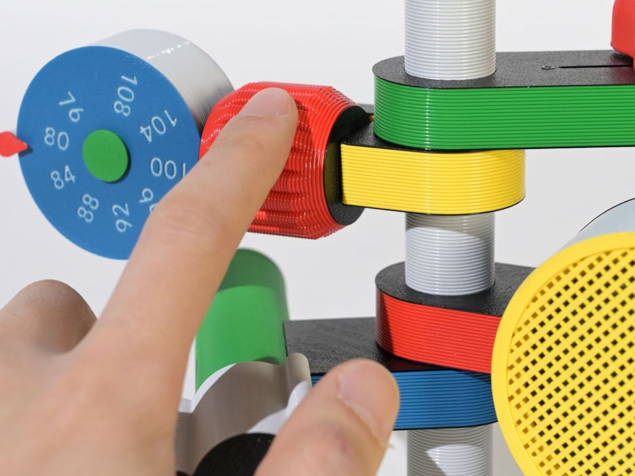
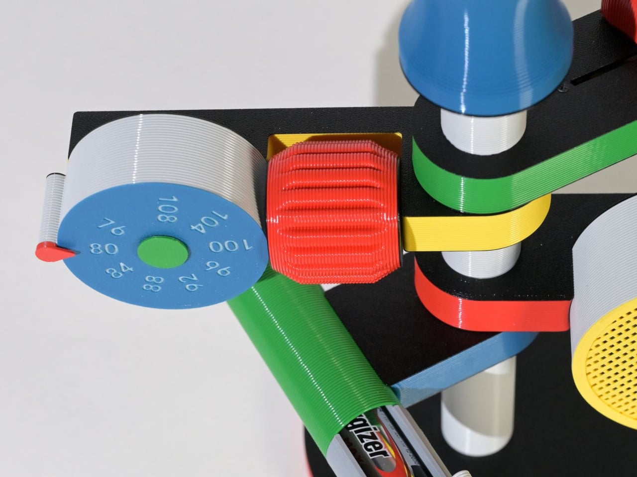
Each extension serves a clear function, creating a tactile, engaging experience. A roulette dial scans stations, a barrel controls volume, and a bold speaker projects sound, while exposed wiring enhances its expressive look. Made with PLA through digital fabrication, it favors creativity over polish, reflecting a shift toward more personal, experimental electronics.

4. The Joy of Stationery

Even in a digital world, the desk is becoming a space for quiet play. Stationery is no longer purely functional as it engages the senses. The focus has moved beyond simple aesthetics to how tools feel, respond, and enhance the act of making.

Erasable inks react to friction, washi tapes create layered compositions, and modular notebooks connect with magnetic precision. Writing no longer feels routine as it transforms into a small ritual, where thinking on paper feels intentional, creative, and deeply satisfying.
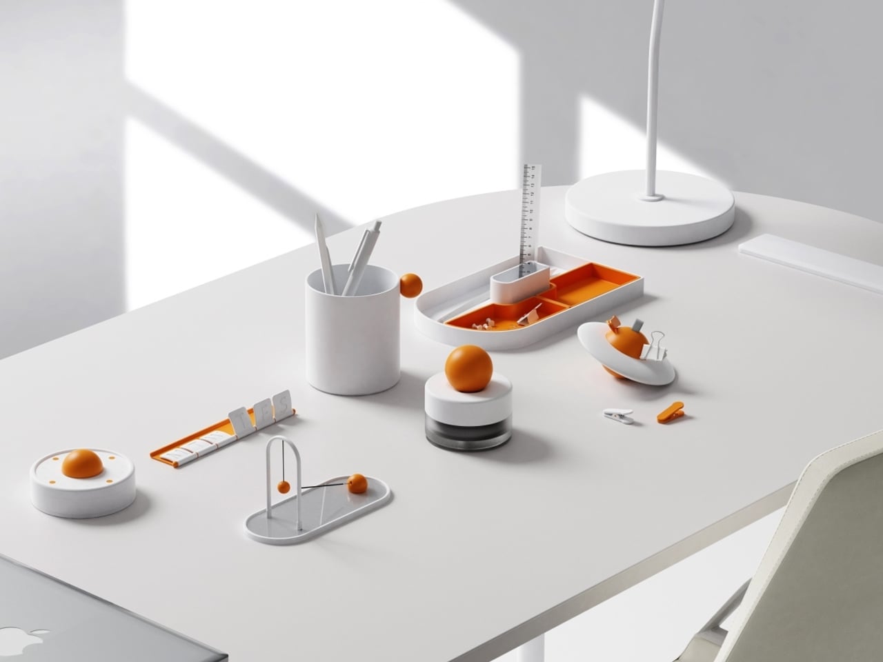
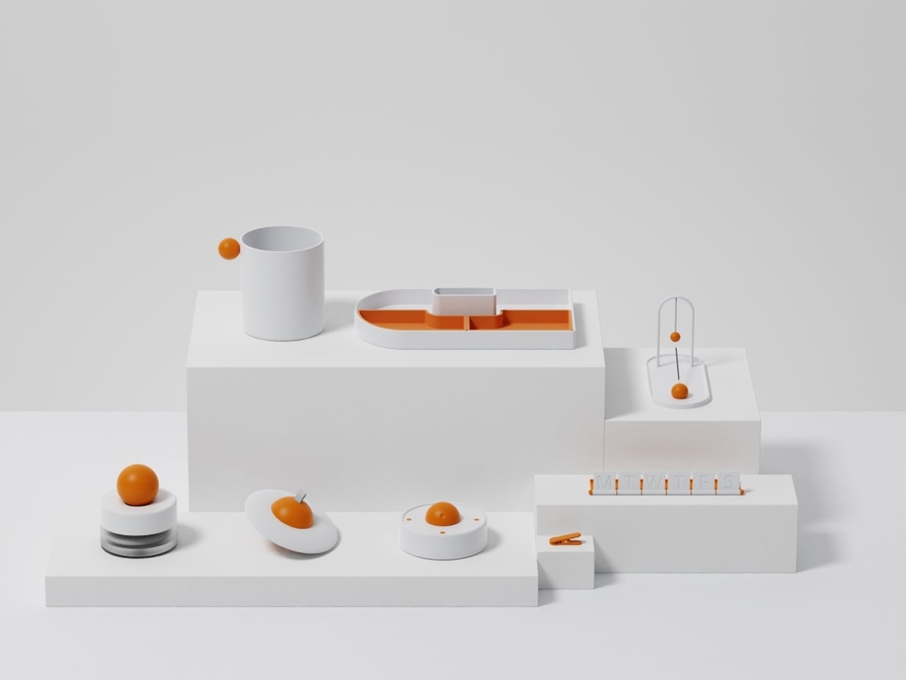
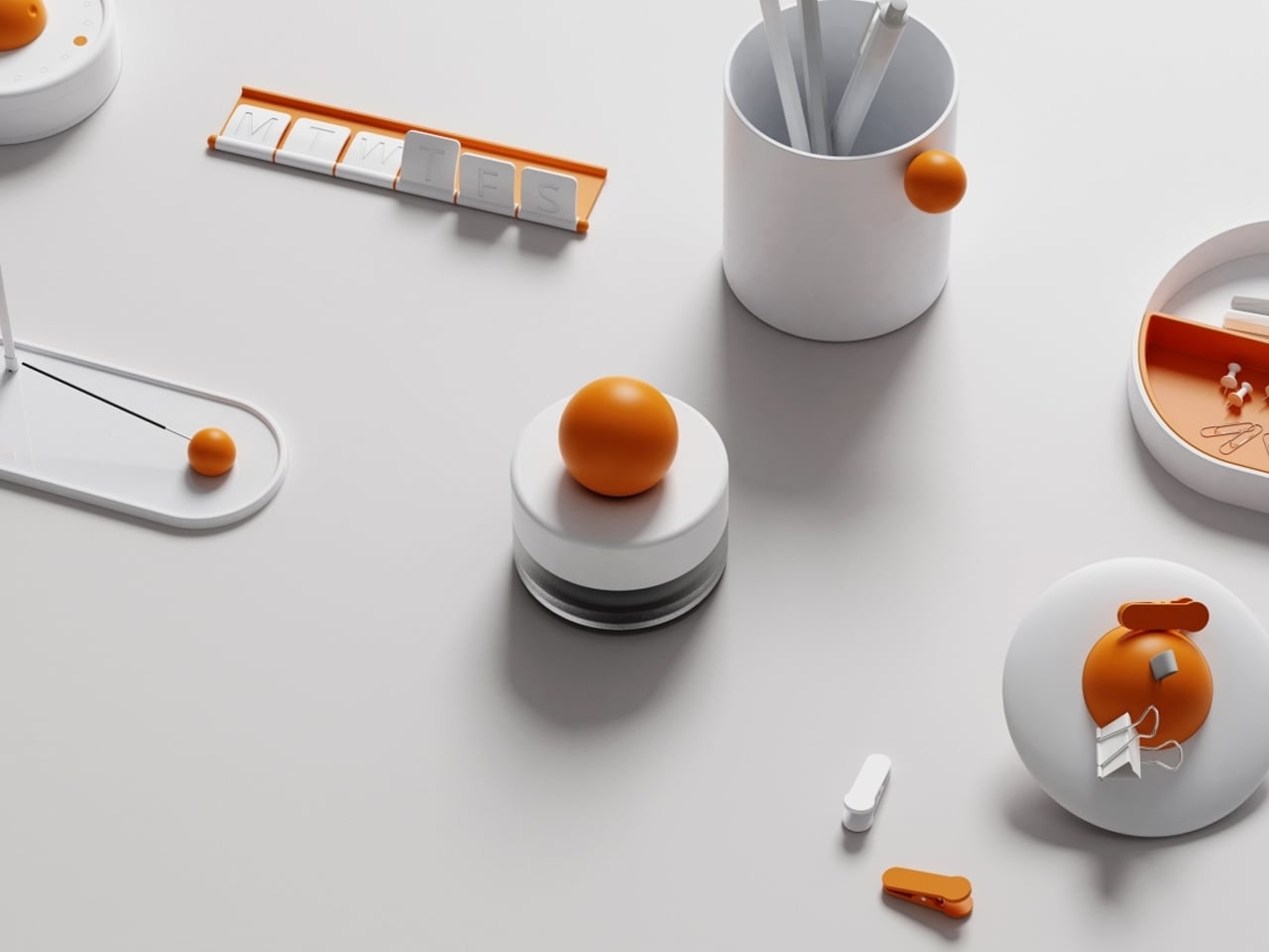
Objects on a desk quietly influence mood and thought throughout the day. While some environments lean toward minimal setups for clarity, others incorporate subtle moments of joy. The Madang collection by Jiung Yun, Siwook Lee, Jihyun Hong, and Junsu Lee brings these ideas together, balancing simplicity with a gentle sense of play inspired by traditional Korean childhood games.

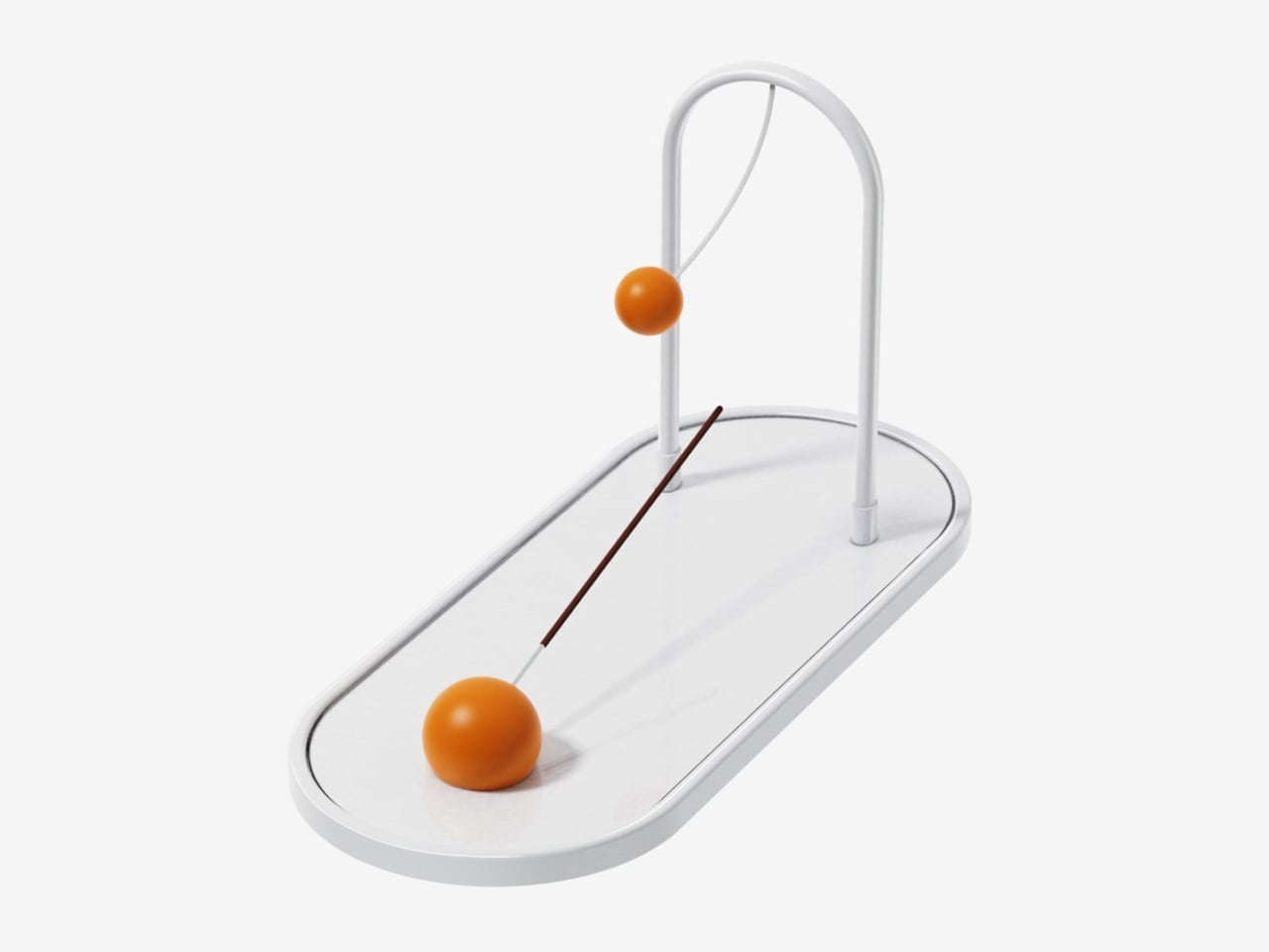
Each piece translates a familiar activity into a functional object. A wrist tool references tug-of-war, trays mirror playful ground layouts, and clips echo movement-based games, turning routine actions into engaging interactions. Even more abstract elements, like a circular timer or sculptural pen holder, carry narrative undertones. Finished in a soft white and orange palette, the collection remains visually calm yet expressive, adding character without clutter while making everyday work feel lighter and more thoughtful.

5. Joyful Building Design

Playful thinking is extending into architecture, reshaping how buildings and cities are experienced. The rigid “gray box” is gradually giving way to environments that encourage curiosity and movement. Designers are introducing spatial surprises into everyday settings, from slides integrated into workspaces to hidden gardens within facades and windows that break rigid grids to filter light in unexpected ways.

These interventions go beyond visual appeal. They disrupt routine and draw attention to the surroundings. A burst of color or an unconventional pathway shifts perception, encouraging awareness and engagement. As a result, architecture moves beyond shelter, becoming more interactive and expressive while transforming the built environment into something dynamic, human-centered, and quietly uplifting.
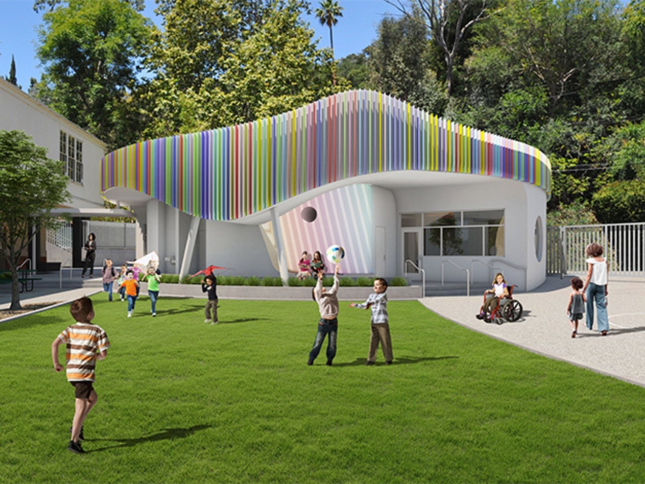
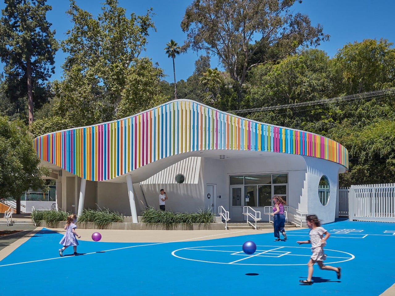
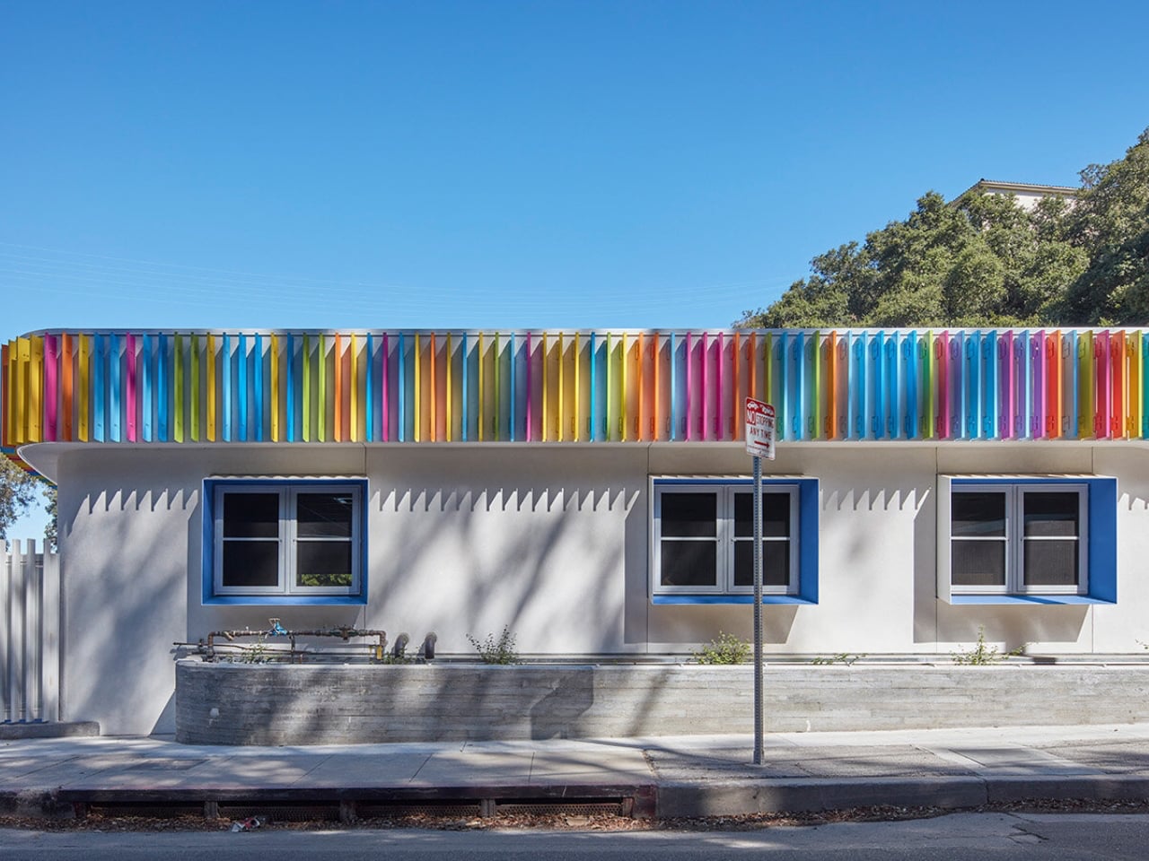
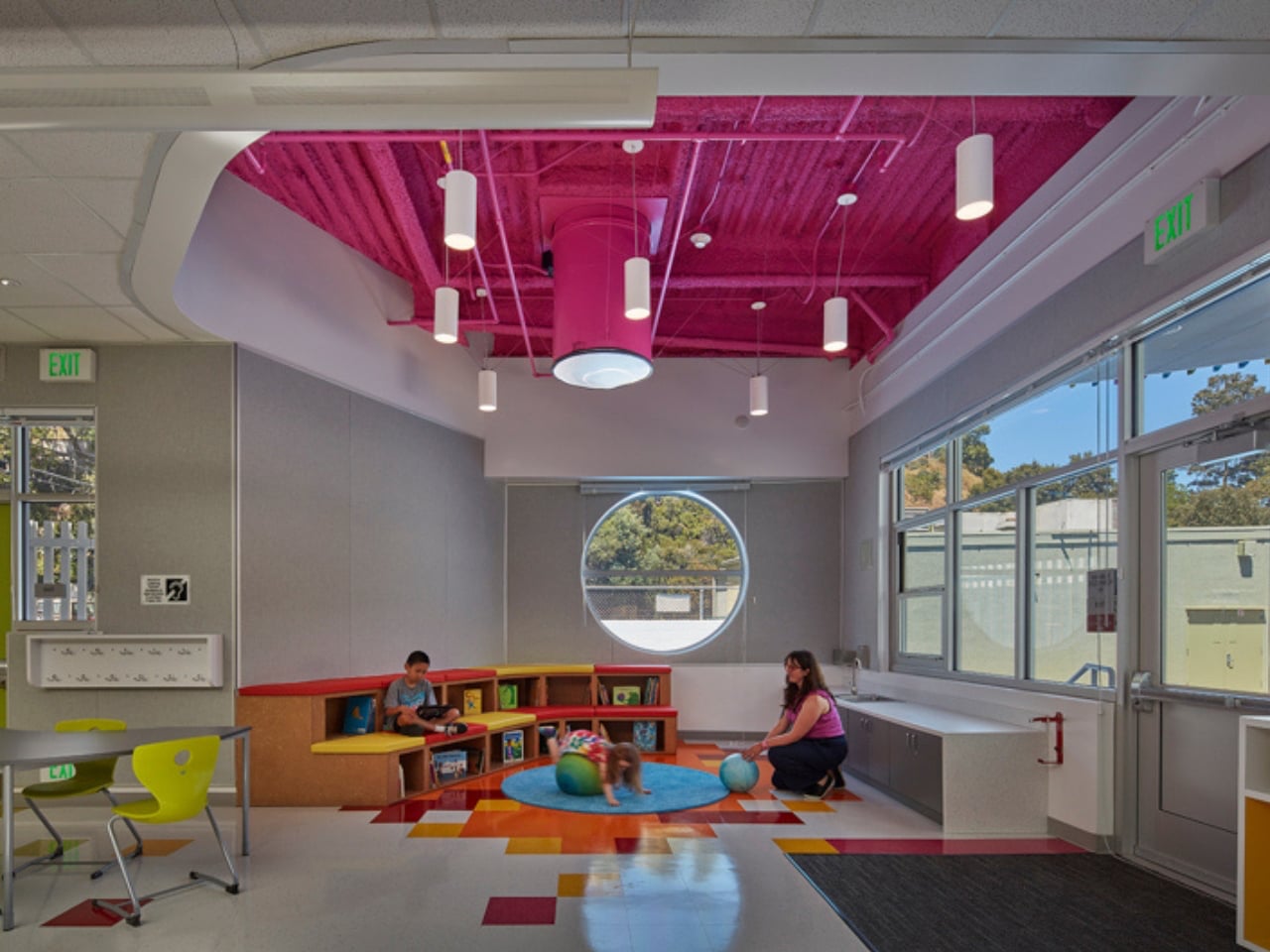
Most early school memories are tied to plain, boxy classrooms that felt more functional than inspiring. Spaces like these rarely encourage curiosity or creativity, making learning feel routine rather than exciting. In contrast, thoughtfully designed environments can shape how children engage with education. In Laurel Canyon, Los Angeles, Wonderland Elementary School’s new kindergarten building by John Friedman Alice Kimm Architects (JFAK) reimagines this experience through a design that feels open, engaging, and visually dynamic.
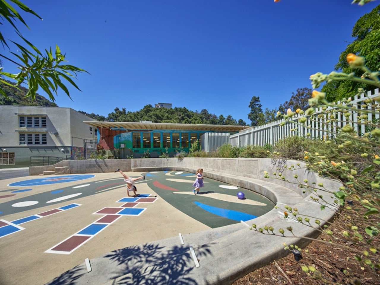
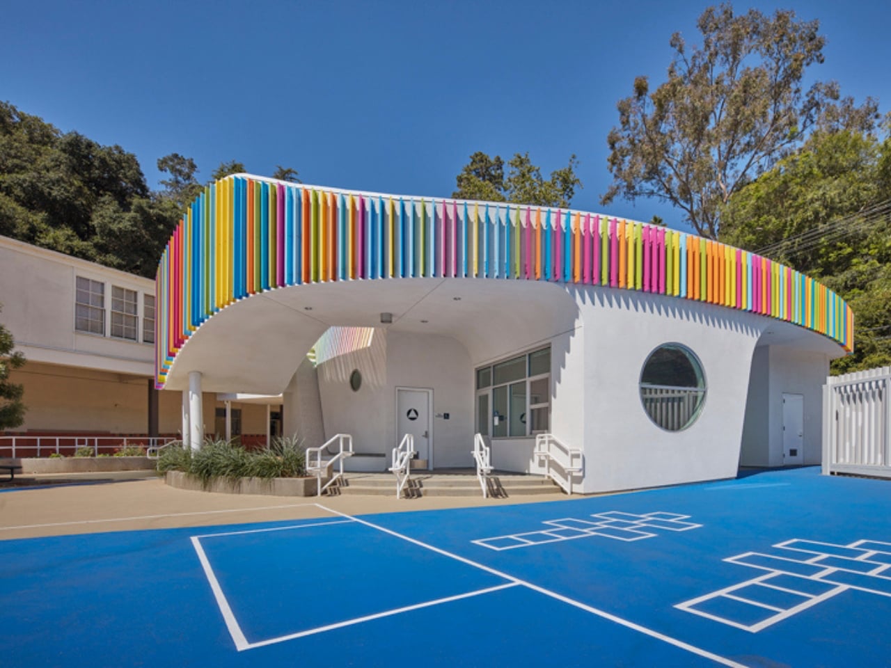
The structure stands out with its soft, curved form and colorful exterior louvers that filter sunlight into shifting patterns across the interiors. Inside, natural light pours in through skylights and solar tubes, creating a warm and welcoming atmosphere. Classrooms feature circular reading nooks, low seating, and accessible storage tailored for young learners. A semi-covered outdoor space encourages interaction and play, while exposed ceilings reveal structural elements, sparking curiosity. Designed with sustainability in mind, the building blends function with imagination, turning everyday learning into a more engaging and enriching experience.
Everyday objects still hold the power to surprise. When play enters function, design softens decision fatigue and digital burnout. Objects with wit and warmth transform spaces, turning routine into experience and making daily life feel more engaging, expressive, and alive.

The post These 5 Playful Everyday Objects Were Designed to Make You Feel Like a Kid Again first appeared on Yanko Design.