China’s New Coastal Installation Looks Like It Belongs in Space

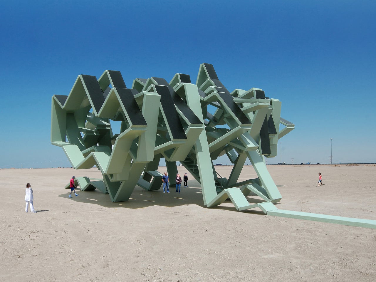
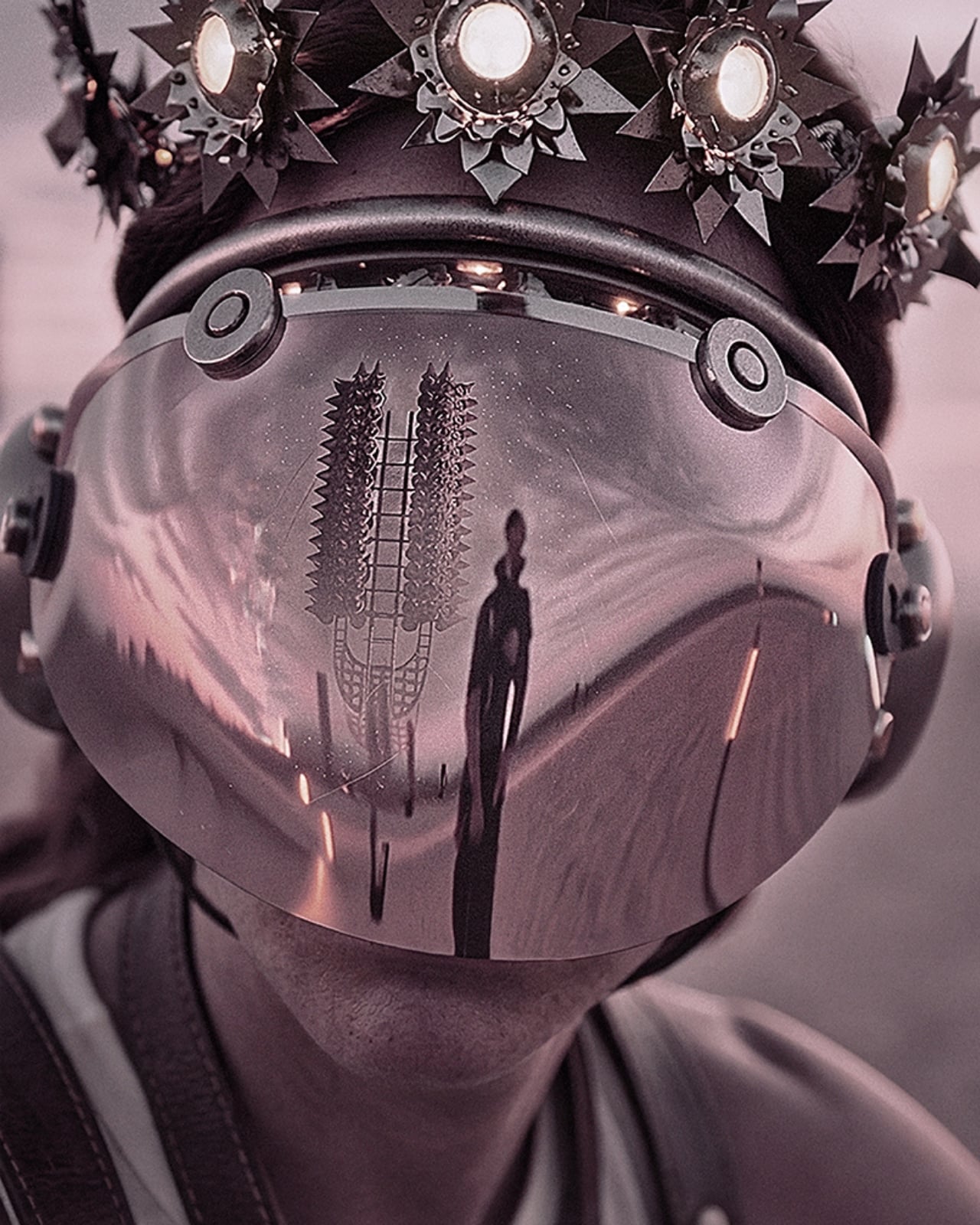
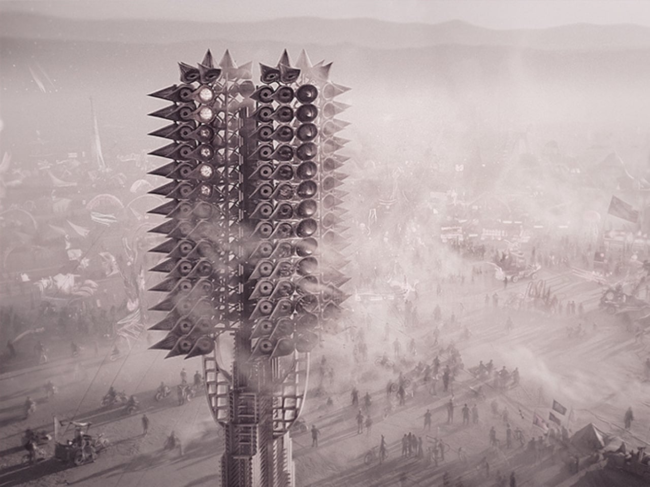
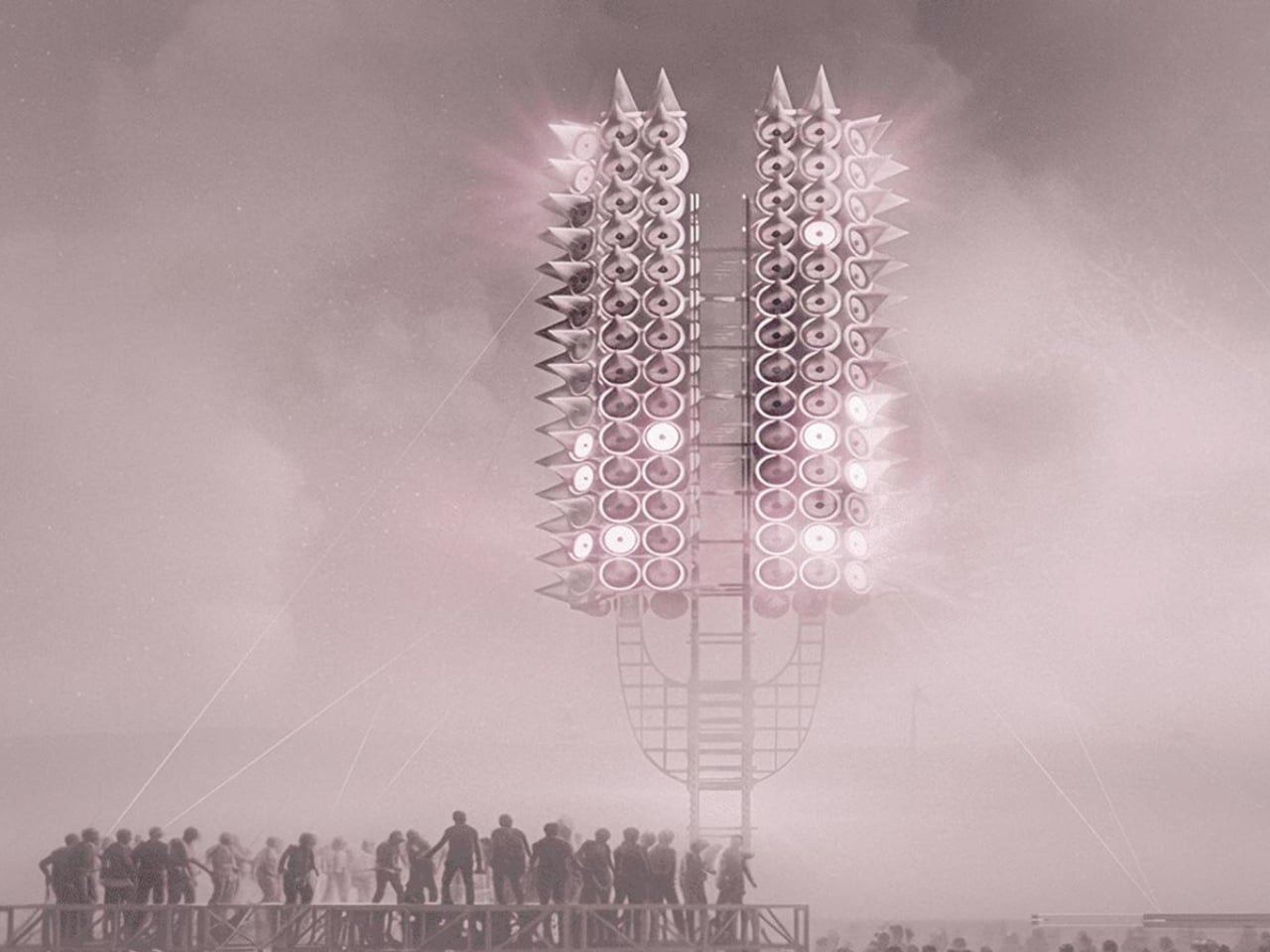
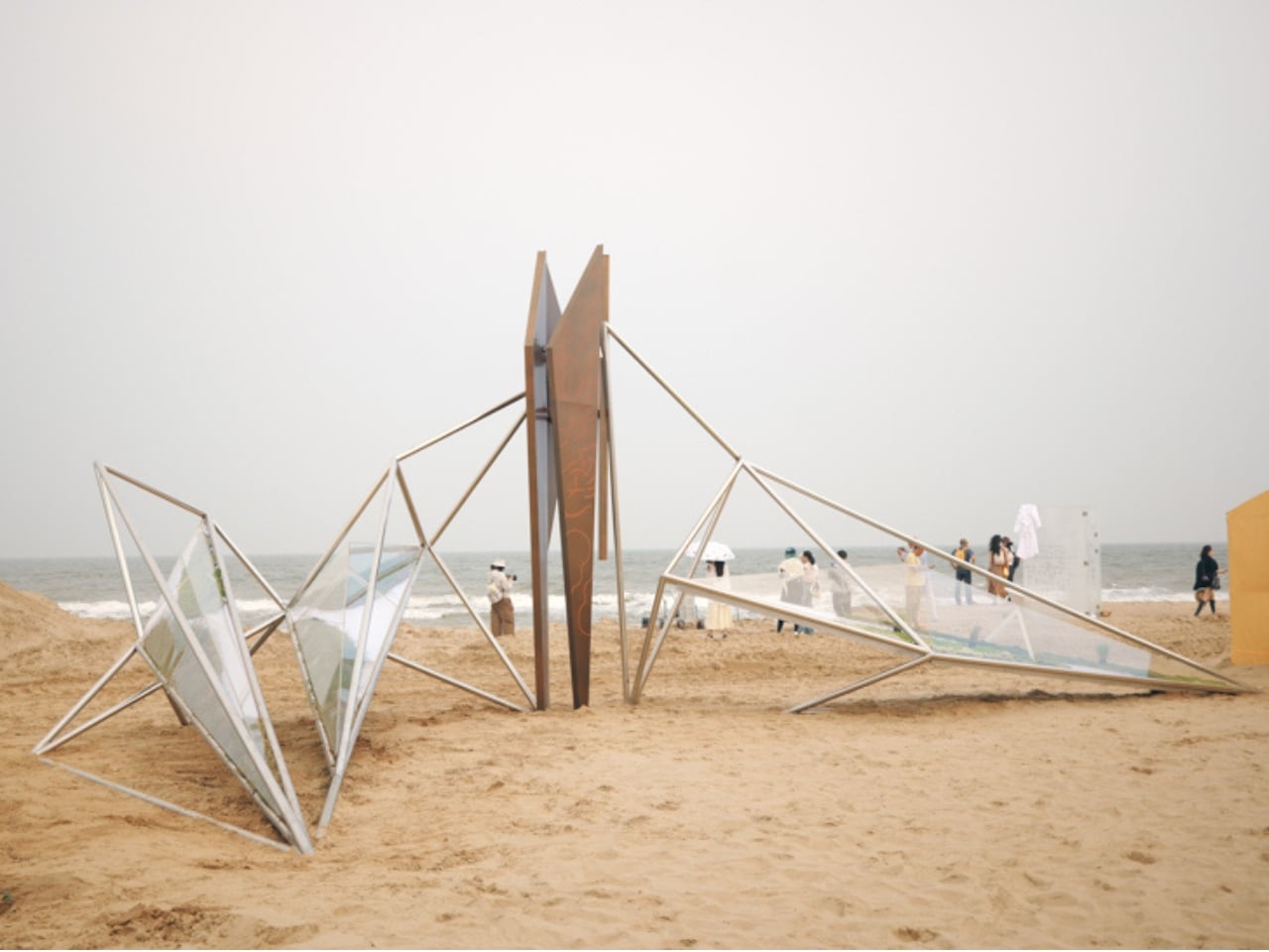
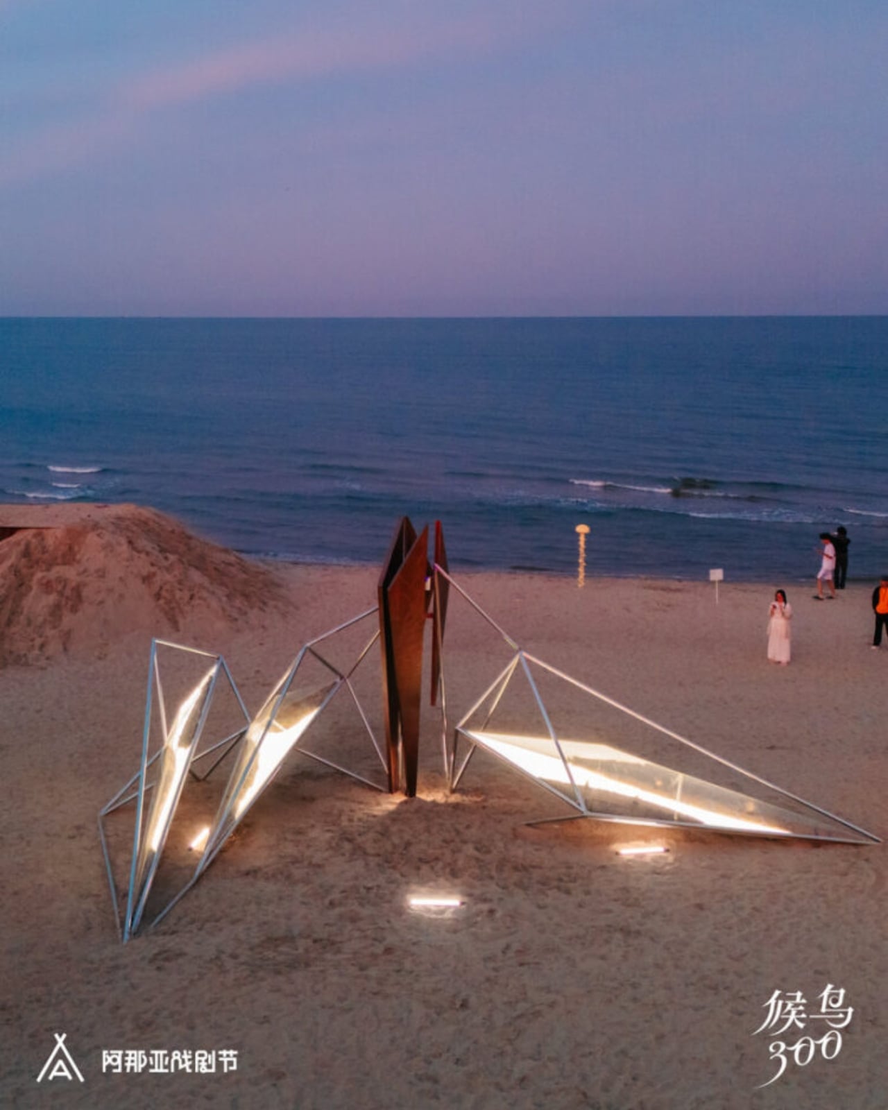
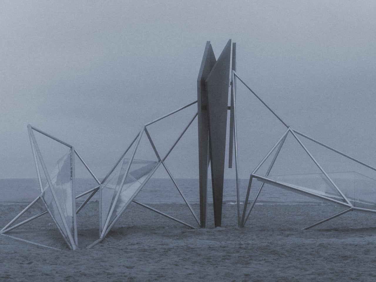
Not every art installation earns the right to exist in a landscape. Most feel like intrusions, objects dropped into nature rather than grown from it. OAS/S-AETHER, the latest work from Beijing-based Zhide Architectural Design Consulting (ZDC), is one of the rare exceptions. Standing on the sandy coastline of Aranya in Qinhuangdao, Hebei Province, this winged structure of interconnected metal rods and glowing acrylic lightboxes manages to feel both ancient and alien at the same time, and that tension is the whole point.

The installation was created for the “Migratory Birds 300” section of the 2026 Aranya Theater Festival, led by architects Zhengdong Li, Rubing Bai, and Xu Wen. The concept draws from “Aether,” the fifth element in classical philosophy, that invisible, luminous substance believed by the ancient Greeks to fill the heavens beyond the earthly realm. It’s a heady starting point, but ZDC pulls it off. The piece doesn’t just reference the idea of Aether. It actually makes you feel it.

Designer: Zhide Architectural Design Consulting (Beijing) Co., Ltd.
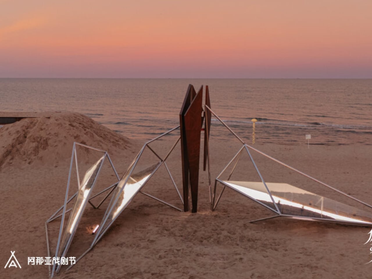
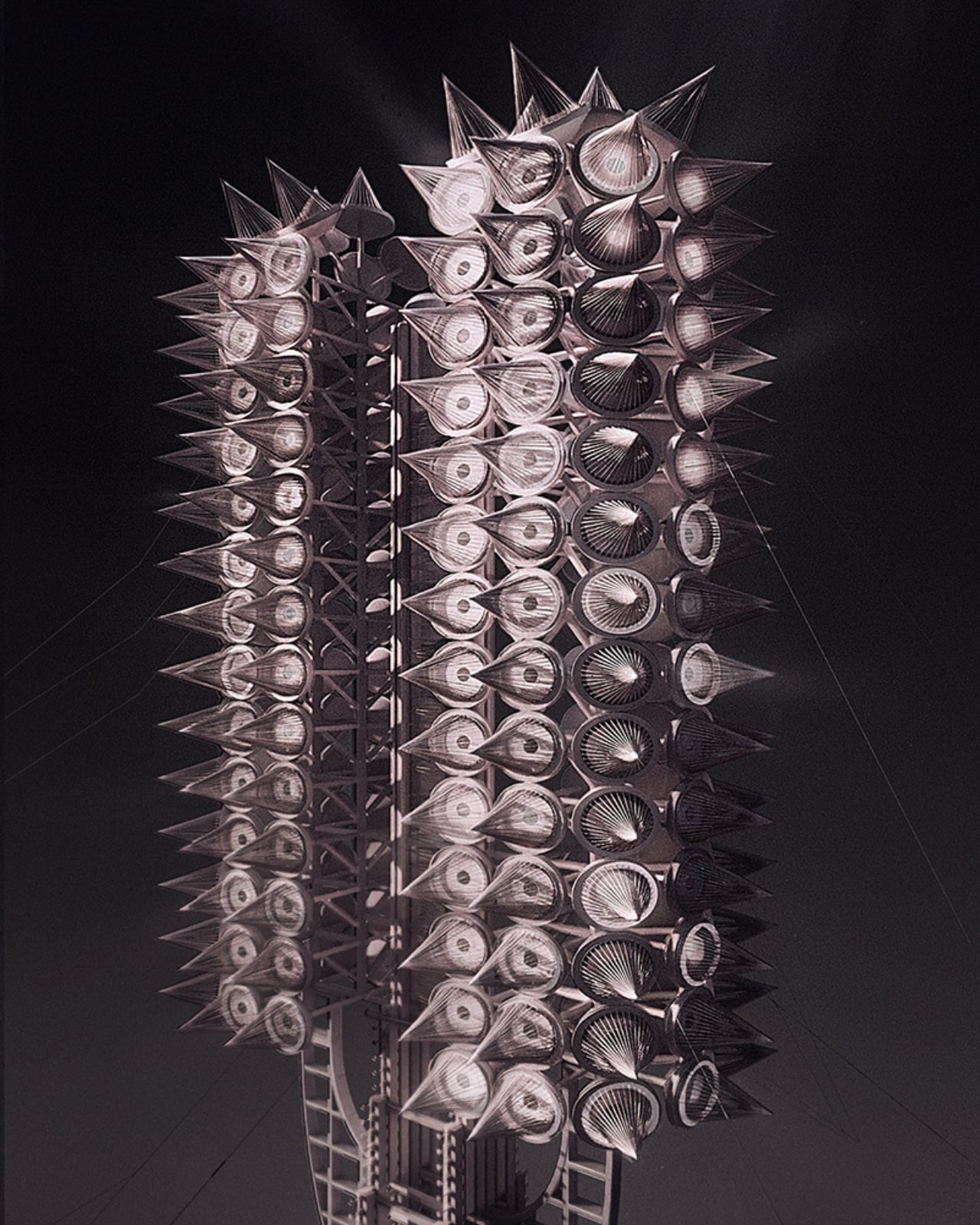
At first glance, OAS/S-AETHER reads as a geometric silhouette against the sky, a skeletal wing shape built from precisely arranged metal rods that catch light differently depending on the hour. Get closer, and the details reveal themselves. Embedded within the framework are acrylic lightboxes that glow from within, engraved copper plates that bring texture and a sense of history to the industrial structure, and, perhaps most surprisingly, living plants tucked inside the illuminated boxes. That last element is the one I keep turning over in my mind. Placing living, breathing vegetation inside a steel and acrylic structure is not a subtle gesture. It’s a declaration. Life and industry don’t just coexist here; they hold each other up.
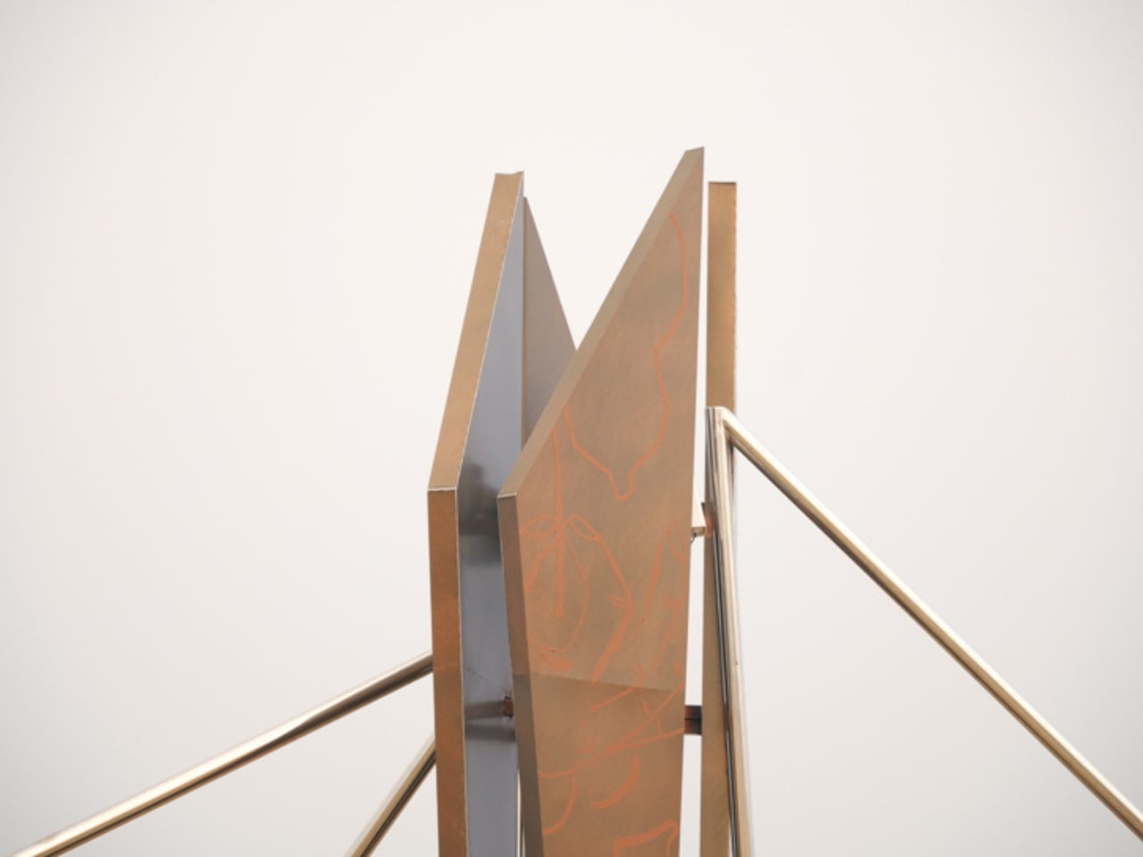
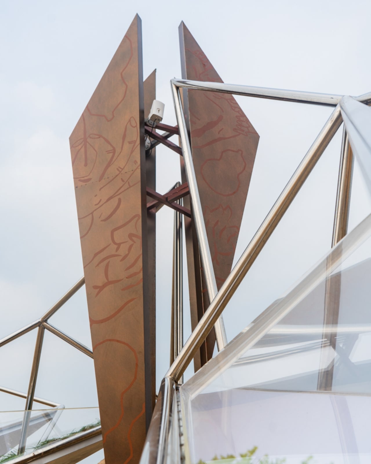
The choice of location matters too. Aranya is not just any beach town. The coastal community in Qinhuangdao has quietly become something of a pilgrimage site for design-conscious travelers and cultural tourists across China, recognized for its commitment to thoughtful architecture and carefully curated experiences. Placing a work of this ambition in that environment makes sense, but it also raises the stakes. When the bar is already high, every new installation has to work harder to justify itself.
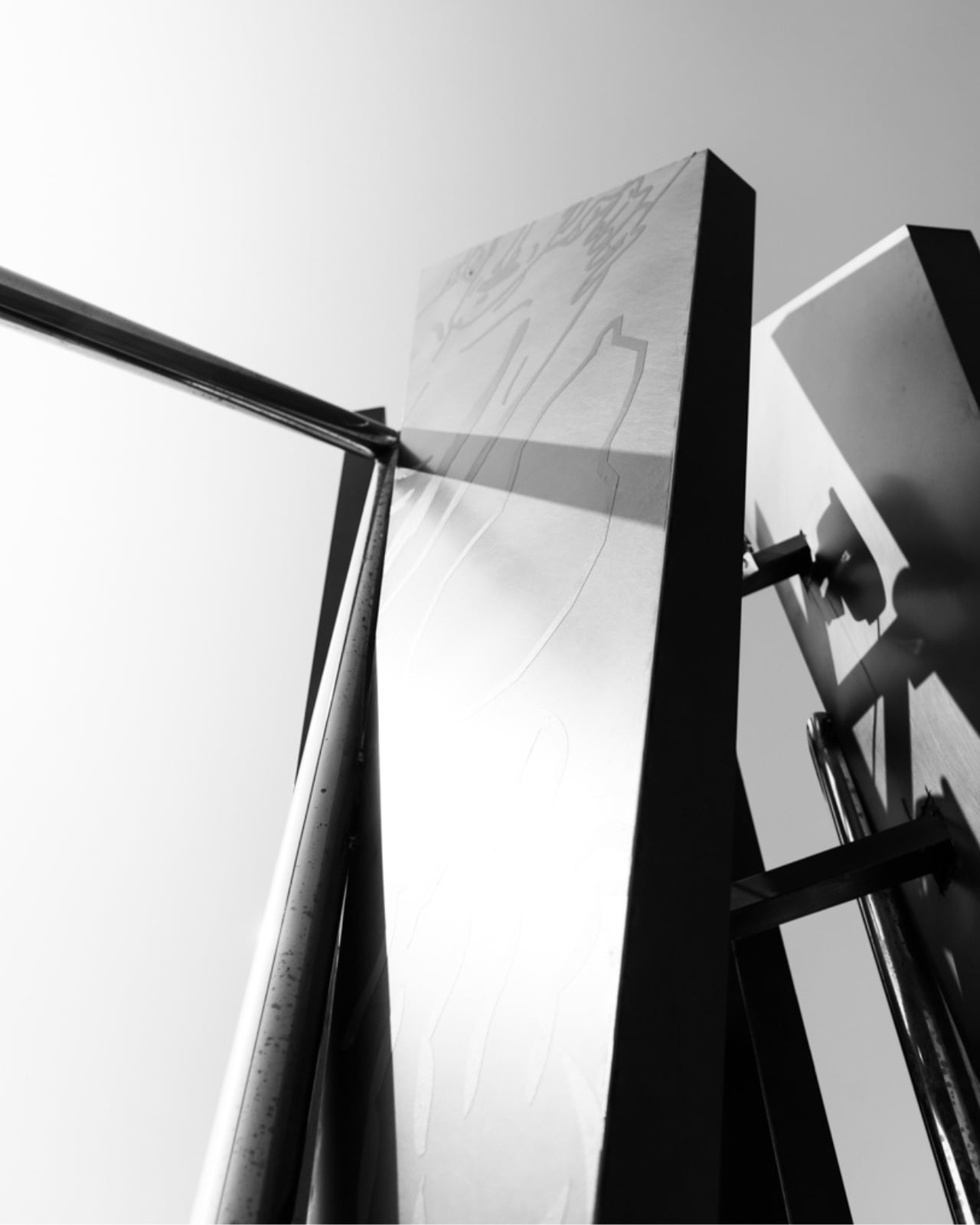
OAS/S-AETHER justifies itself. The way the piece interacts with its natural setting over the course of a single day is genuinely impressive. Sunlight shifts the shadows cast by the metal rods across the sand in slow, changing patterns. At night, the acrylic panels take over, turning the structure into something closer to a lantern than a sculpture. The piece never looks exactly the same twice, which keeps it from becoming the kind of static landmark that gets photographed once and forgotten.
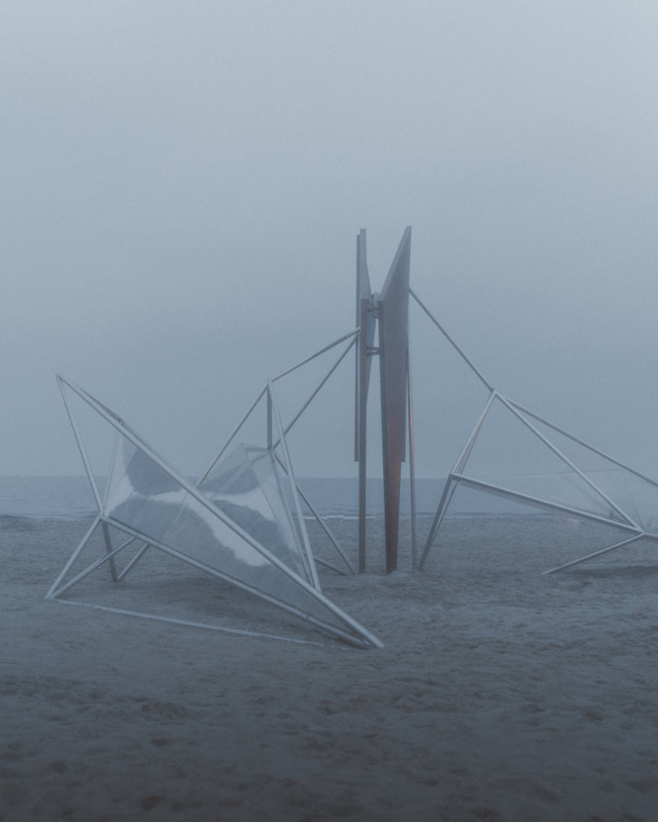
ZDC has been building this design vocabulary for a while now. Their OAS/S series, which also includes OAS/S-NEST in Qinhuangdao and OAS/S-NOMAD in Inner Mongolia, consistently explores what happens when temporary structures are made to feel permanent, and when materials that should clash somehow harmonize instead. AETHER is the most ambitious entry in that series so far, and it shows. There is a quiet confidence to the design that feels earned rather than assumed.
What makes all of this worth discussing beyond the architecture world is the broader question it raises. As public art becomes more globally visible through social media, the pressure on installations to be photogenic often overshadows the pressure to be meaningful. OAS/S-AETHER manages to be both, but the meaning clearly comes first. You can feel the thought behind it before you even see it in full. That is a harder thing to achieve than most people realize, and it is precisely why the work stands out.
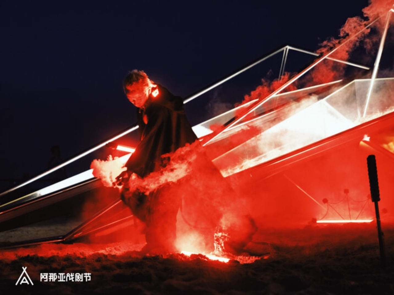
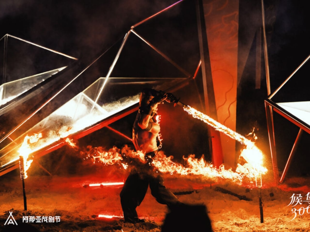
Whether you encounter it in person on that Hebei coastline or through photographs shared online, OAS/S-AETHER leaves an impression that is hard to shake. It asks what it means to exist between worlds, between the man-made and the natural, between the visible and the intangible. Most art asks questions. The best art makes you forget it is asking at all.
The post China’s New Coastal Installation Looks Like It Belongs in Space first appeared on Yanko Design.
The Fortune Teller Just Got an AI Upgrade and It Knows Too Much

Remember the movie Big? Tom Hanks, the carnival Zoltar machine, a kid who just wanted to grow up overnight. That film had a way of making wish-granting feel both magical and slightly unsettling, because the machine didn’t really know you. It just read the room and gave you what you asked for. Now, almost four decades later, Australian art and technology studio ENESS has built something that does the same thing but with significantly more data points, and the result is one of the more thought-provoking design pieces to come out of the 2026 festival circuit.

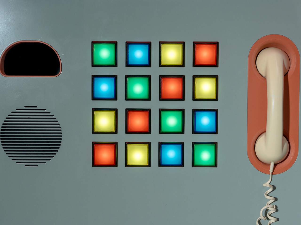
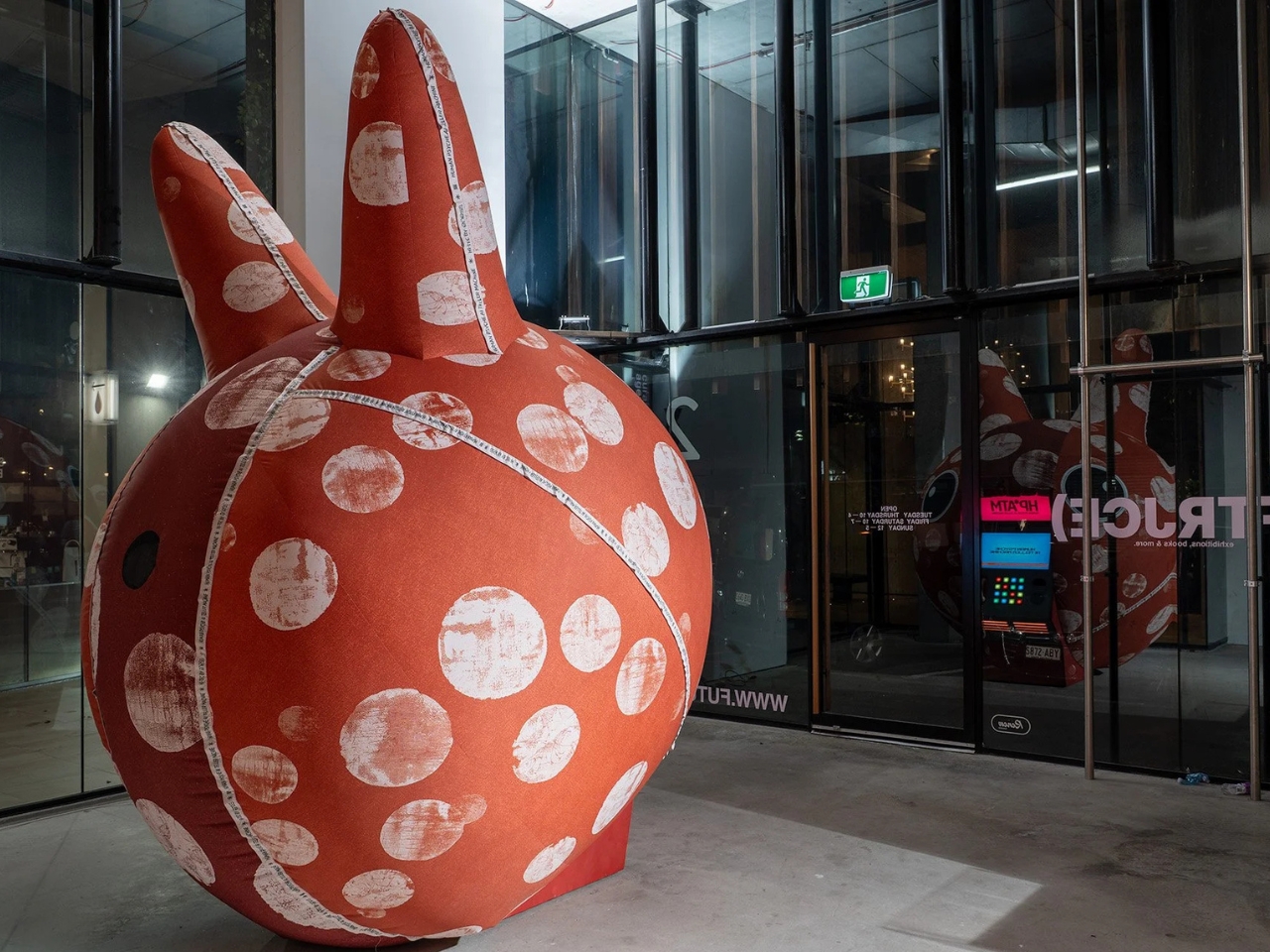
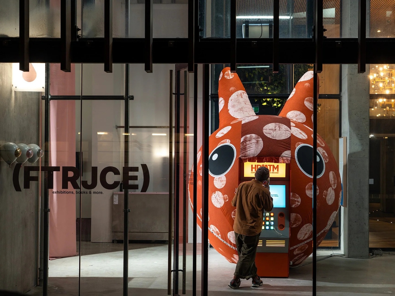
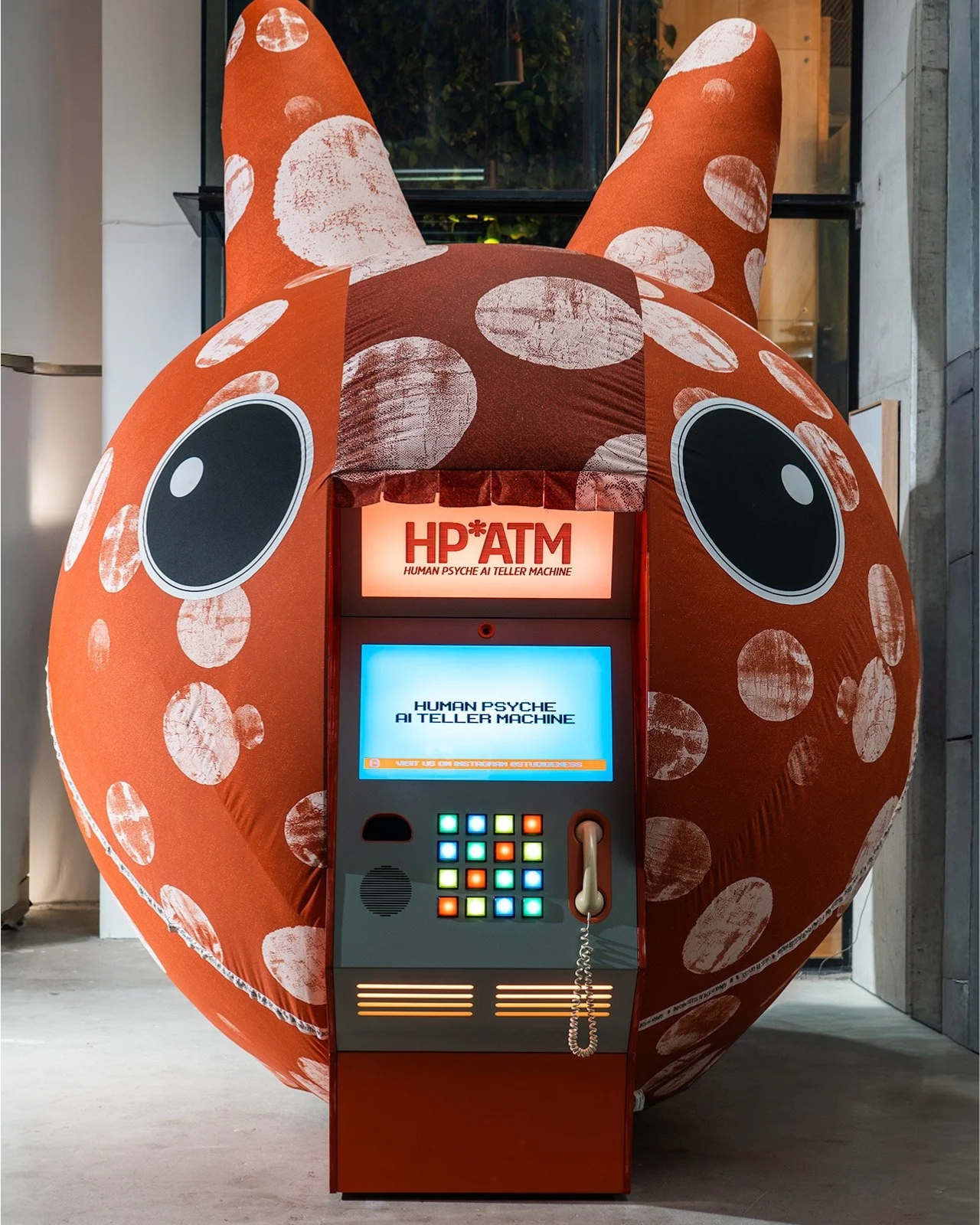
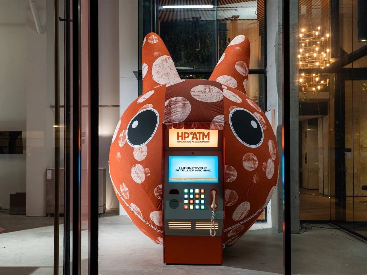
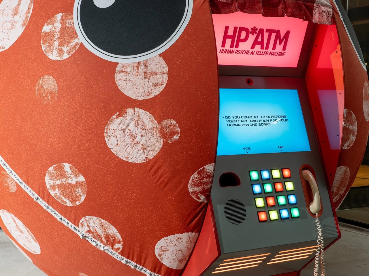
HP*ATM, which stands for Human Psyche AI Teller Machine, debuted at Illuminate Adelaide 2026 as part of an exhibition called Automation Bias. It looks exactly like what you’d expect from an old ATM, boxy and vintage, with colored buttons and a telephone handset forming part of the interface. But instead of dispensing cash, it dispenses something far more personal: a psychological reading based on your face, your palm, and a series of choices you make in the moment. ENESS founder Nimrod Weis drew direct inspiration from the Zoltar machine in Big, and the connection makes complete sense once you’re standing in front of it.

Designer: ENESS

The premise is deceptively simple. You walk up, you consent (the screen literally asks, which is already more than most apps do), and the machine reads you. It analyzes your face and your palm, processes your button selections, and produces what the studio calls a “lyrical psychological reading.” You get a portrait of yourself, filtered through AI. And maybe that portrait is accurate. Maybe it’s not. But the more interesting question is: does it even matter? The moment you step up and say yes, you’ve already told the machine something about yourself.

That’s exactly the territory ENESS is navigating here, and they do it in a way that feels playful rather than preachy. The installation isn’t trying to scare you about AI. It’s asking you to notice something you’re already doing in your daily life, handing over intimate data to systems that claim to understand you, often without the ceremony of a formal machine with colored buttons formally asking for your consent. The irony is that HP*ATM might be the most transparent AI interaction many people have ever had, because at least it’s honest about what it’s doing.

There’s a layer of humor baked into the whole thing, which is very much part of ENESS’ design language. The vintage ATM aesthetic is a deliberate choice. Weis has said the installation is meant to remind visitors that current AI systems might eventually look as dated as cash machines and landline phones. That’s a point worth sitting with. The technologies we currently regard with either reverence or a low-grade anxiety tend to look a lot less intimidating in hindsight, and ENESS is nudging you toward that perspective while you’re still in the middle of it all.

The act of not participating also becomes part of the artwork, and that’s where the piece gets genuinely interesting. If you walk up and decide not to engage, that choice still belongs to the installation. The machine doesn’t require you to perform for it, but it does invite you to think about why you’d hesitate. Why would you say no to an AI reading your face when you’ve already handed that same data to your phone, your laptop camera, and roughly half the apps you downloaded last year without bothering to read the terms? The answer probably says more about you than the machine ever could. The question isn’t rhetorical. It’s just honest.

HP*ATM runs through August 30, 2026, at FutureJuice in Adelaide, Australia. If you happen to be near it, stepping up to that machine and choosing yes or no is probably more thought-provoking than most things you’ll do on your phone that day. And if you’re not in Adelaide, the work still travels with you, because the questions it raises don’t stay in the gallery. They follow you home.

The post The Fortune Teller Just Got an AI Upgrade and It Knows Too Much first appeared on Yanko Design.
Public Art Stands Still, This Steel House Lets You Slide It Apart

Public art installations in parks have a familiar relationship with the people passing through them. They hold a fixed position, a fixed meaning, and a fixed form. You walk around them, read a plaque if there is one, and that’s usually the end of the conversation. The ones designed to provoke a genuine reaction tend to depend on scale or spectacle rather than something the visitor can actually change.

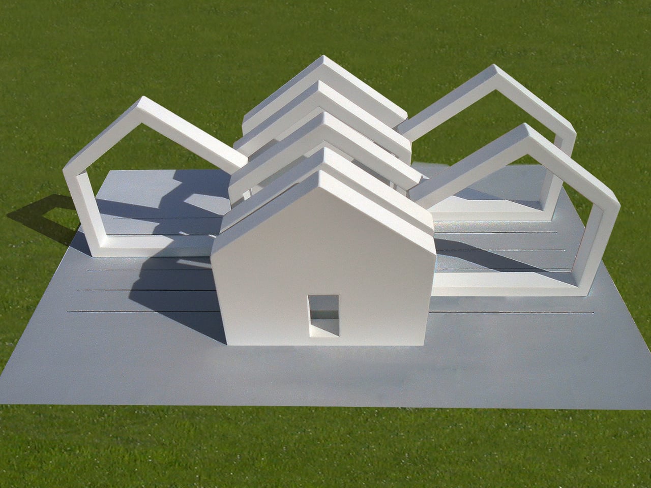
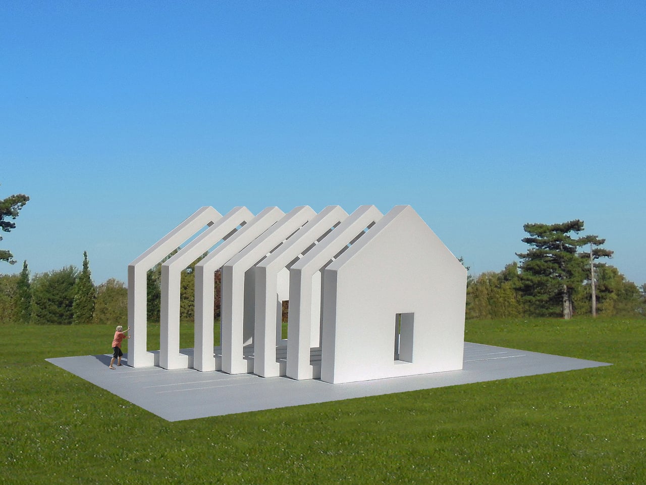
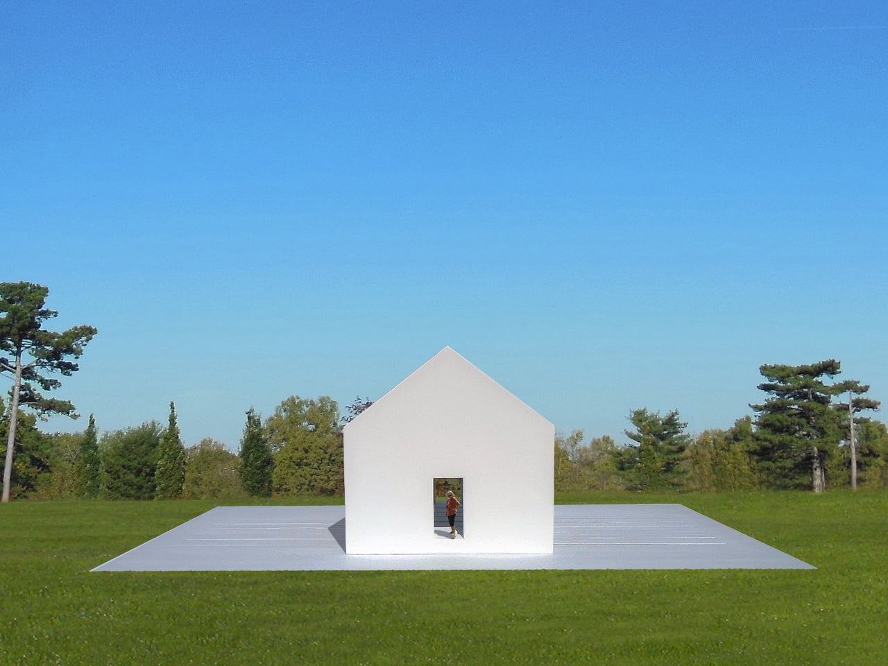
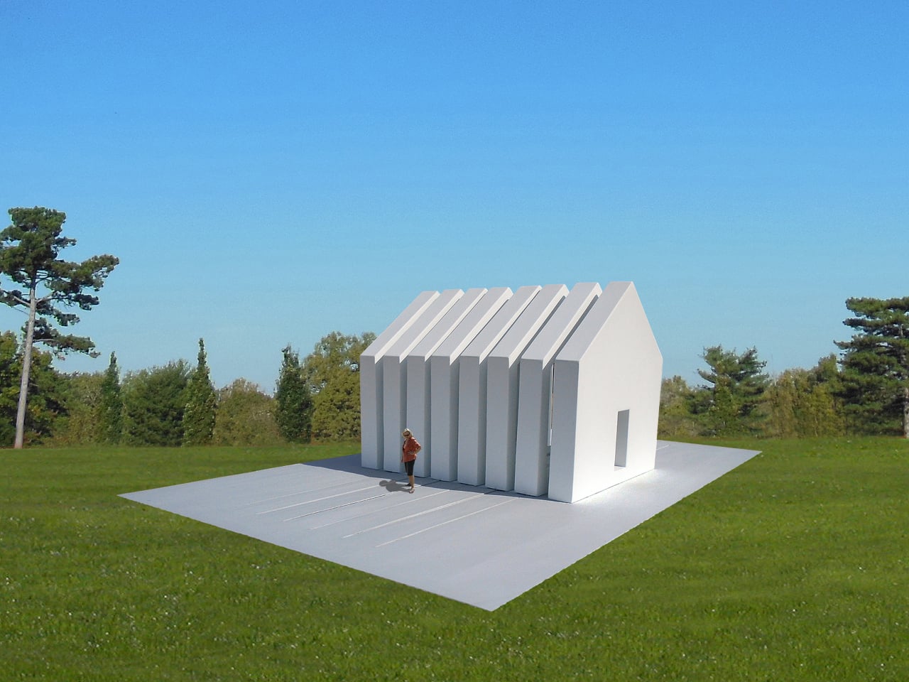
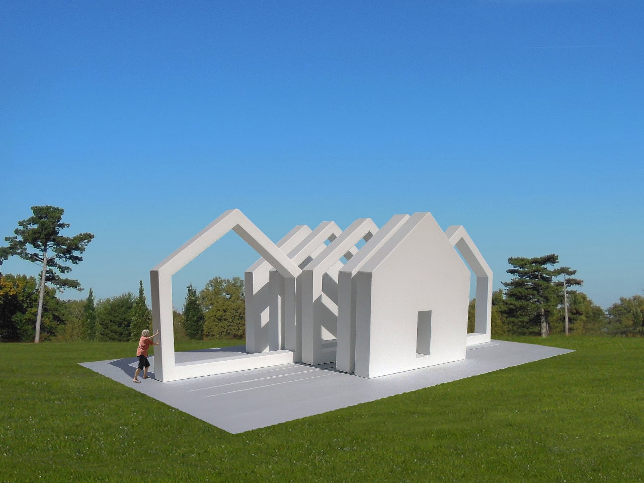
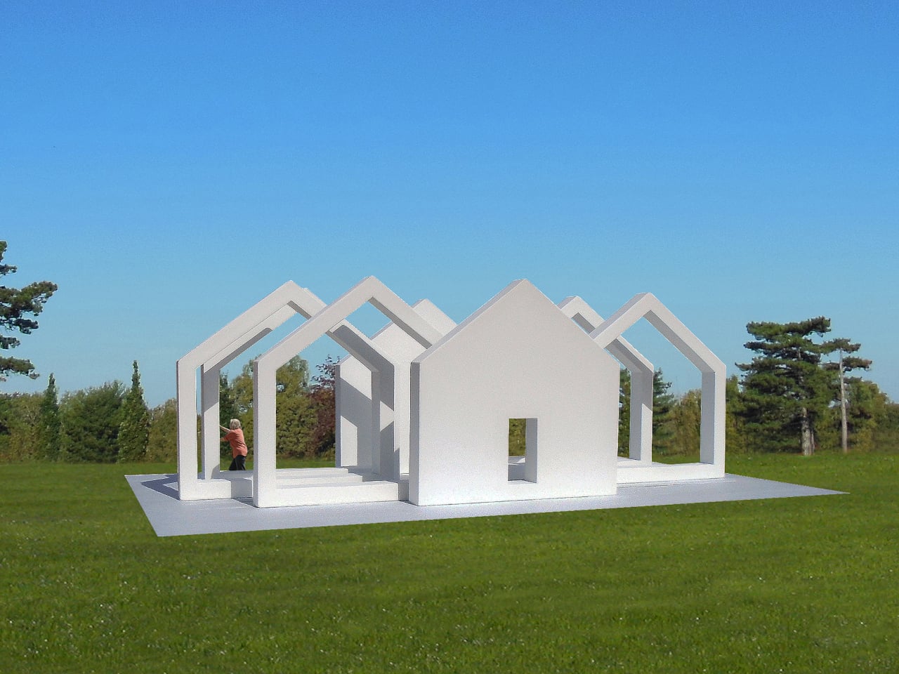
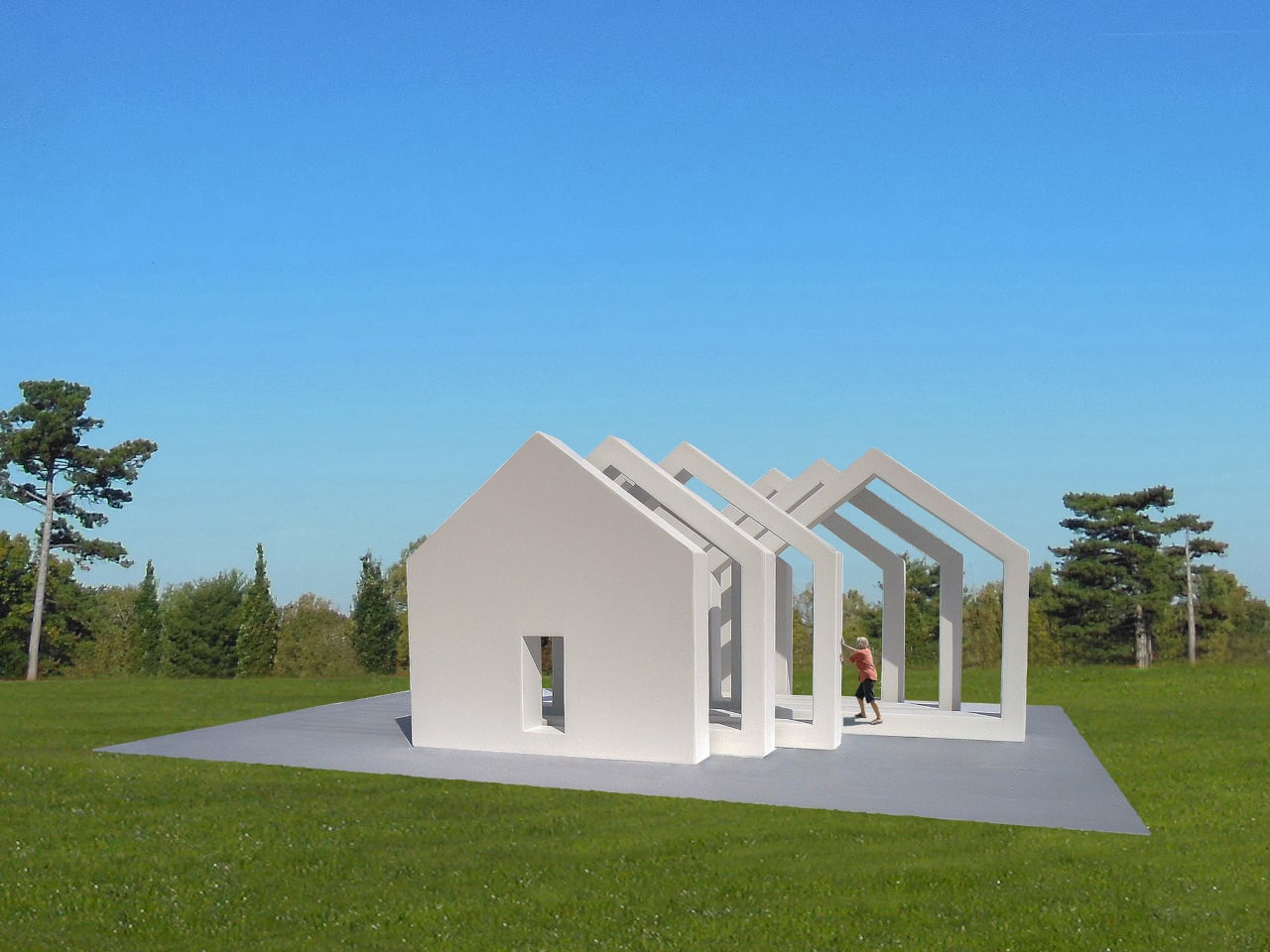
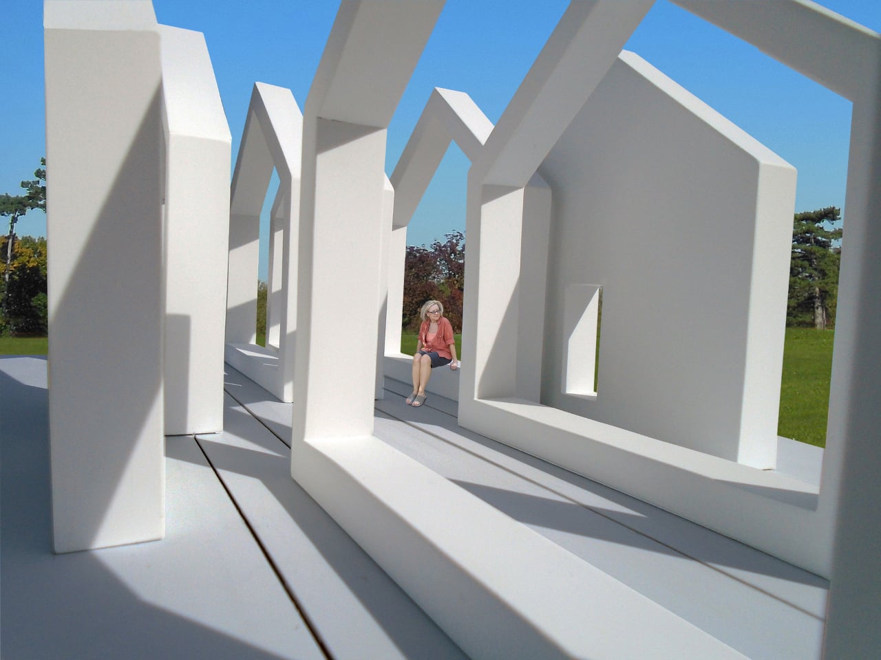
The Interactive Sliced House is part of a series that uses the most recognizable architectural shape there is as raw material. The house silhouette, walls, a pitched roof, and a doorway centered in front, is so deeply familiar that it functions almost like a word. This installation doesn’t just reference that shape. It cuts the whole thing into eight vertical slices and puts visitors in charge of what happens next.

Designer: Michael Jantzen

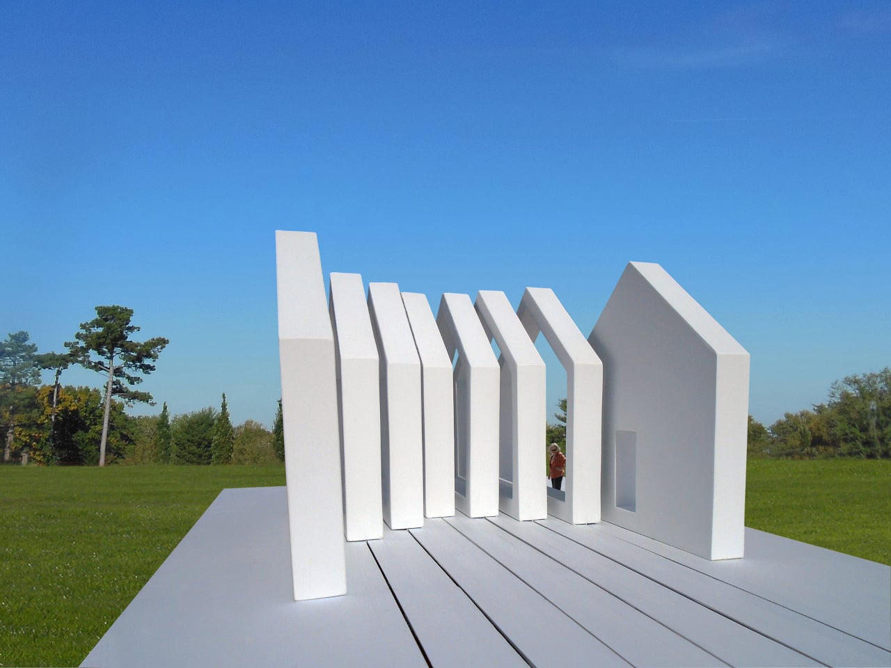
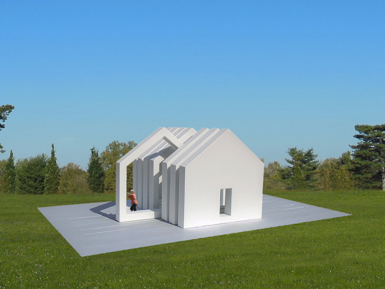
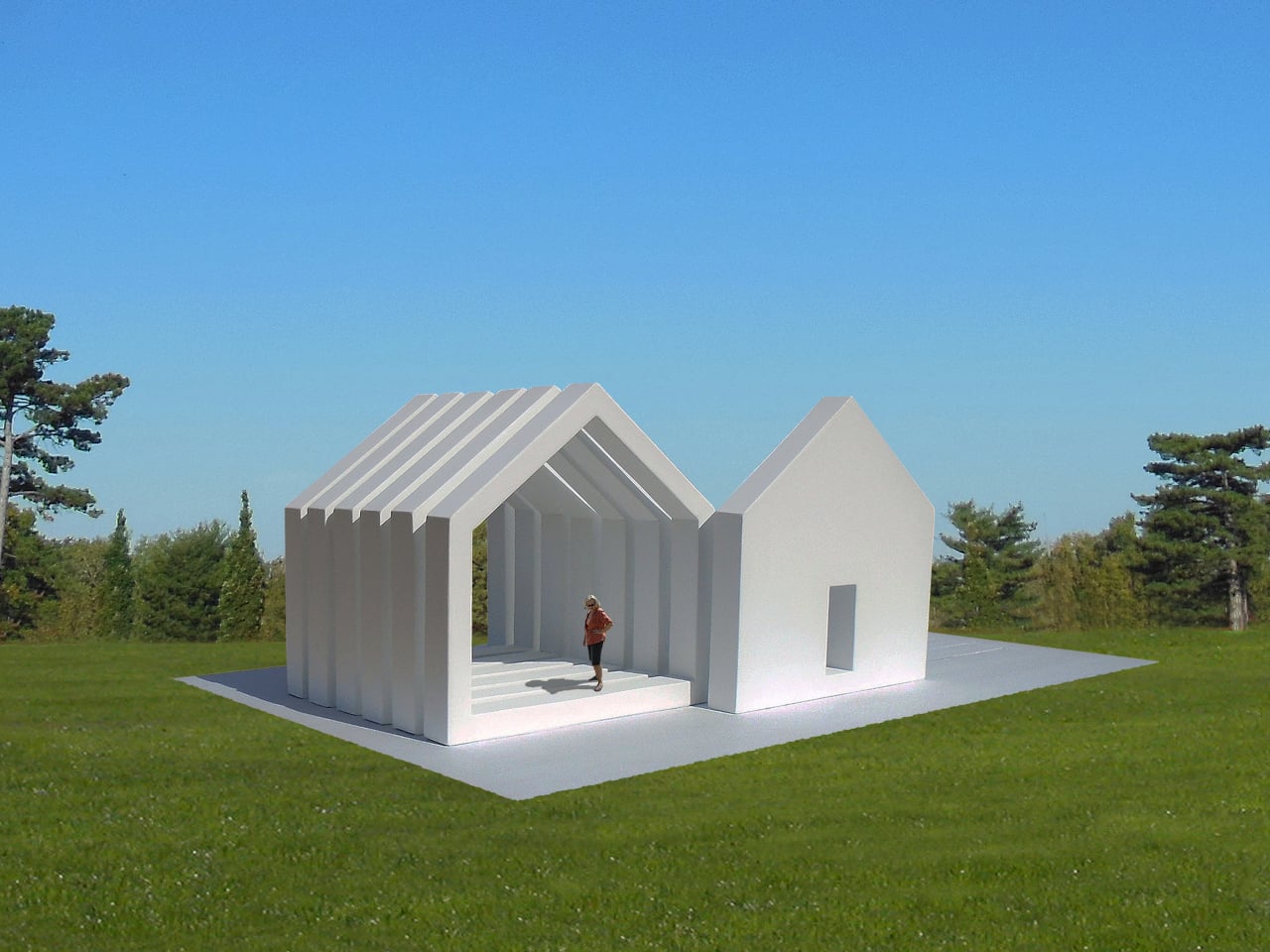
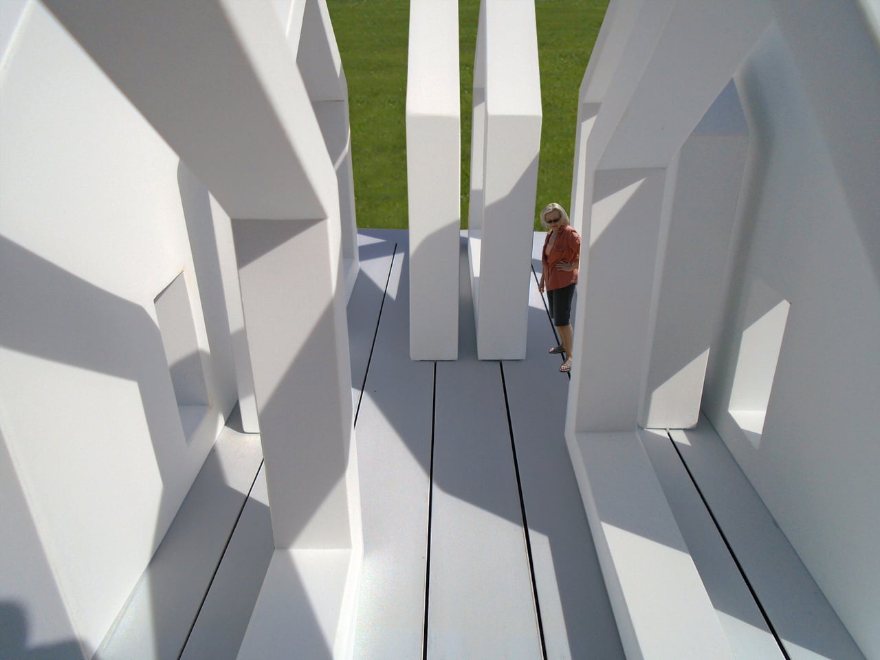
Two of the eight slices are solid white steel panels, one anchoring each end of the structure, both fixed permanently to a concrete pad on the ground. Each solid end has a doorway cut into its center. The six slices between them are open frames, the same house shape rendered as a hollow silhouette, and these slide freely along tracks set into the concrete beneath them.

Slide those six frames to one end, and the house snaps back into something close to its recognizable form, dense and legible from a distance. Pull them apart, and they scatter across the pad, creating a sequence of house-shaped thresholds that repeat across the concrete like the same word written over and over with increasing space between each letter. The structure stays the same; the space it makes changes completely.

Someone walking through the installation when the frames are spread out passes through threshold after threshold, each one framing a slightly different view of the park, the sky, and anyone else nearby. The frames create enclosed corridors between them when pushed together, and open, almost ceremonial passageways when pulled apart. Moving through the structure is different every visit, depending on how previous visitors left it.

The house shape is the installation’s real subject. It’s one of the first symbols children learn to draw, and one of the most loaded in the human symbolic vocabulary: shelter, family, belonging, property. Breaking it apart and handing the fragments to strangers in a public park is a way of asking what it means without having to say the question out loud, and without prescribing the answer.

The white painted steel keeps everything visually consistent regardless of how the slices are arranged, meaning no single configuration reads as more “correct” than another. There isn’t a right answer built into the materials. The installation can also be deployed as multiples, several units placed across a park at once, which would multiply its questions the same way the frames multiply the house shape when pulled apart.

The post Public Art Stands Still, This Steel House Lets You Slide It Apart first appeared on Yanko Design.
A Moss-Covered Payphone Just Became the Voice of 2147

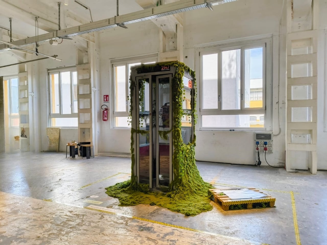
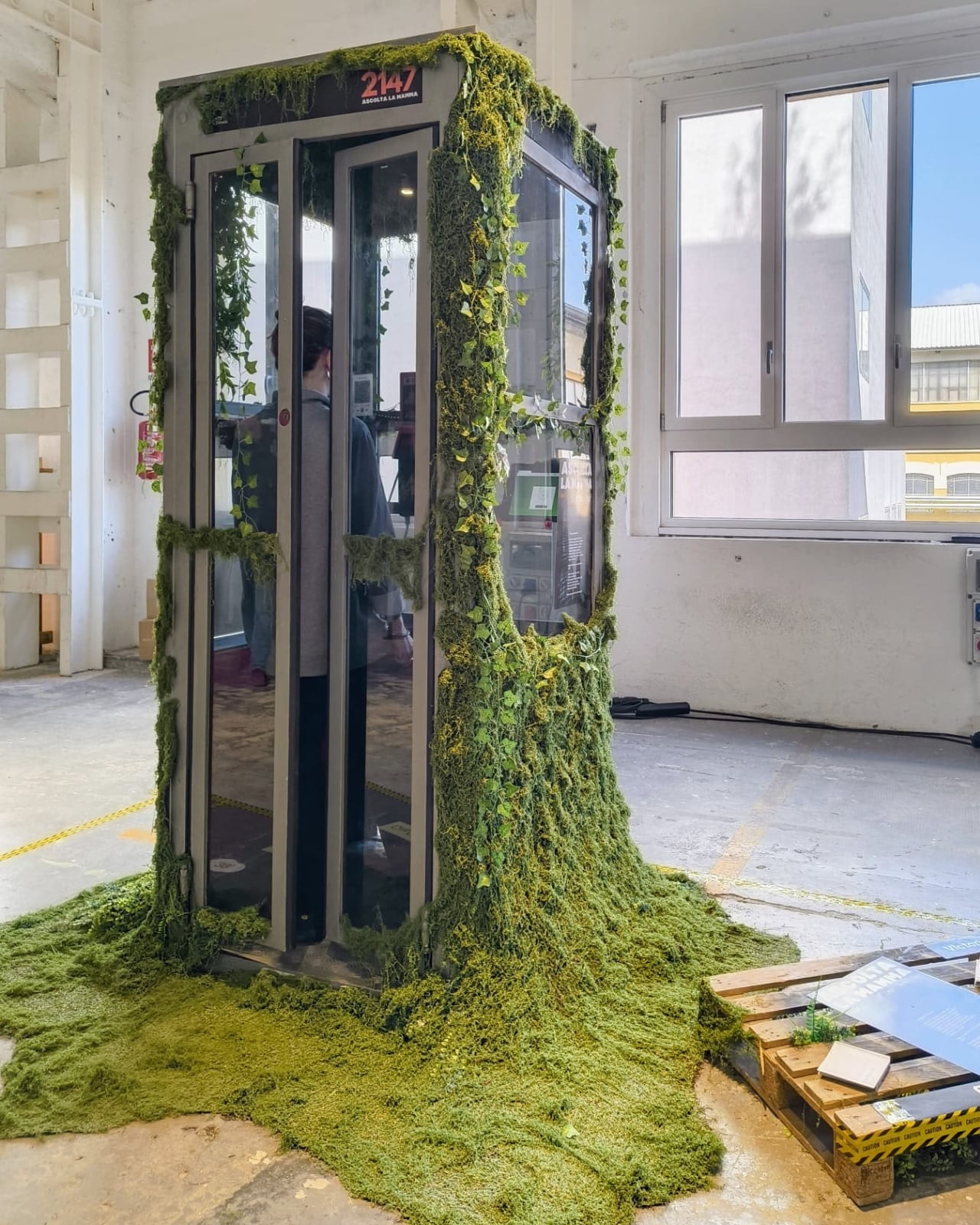
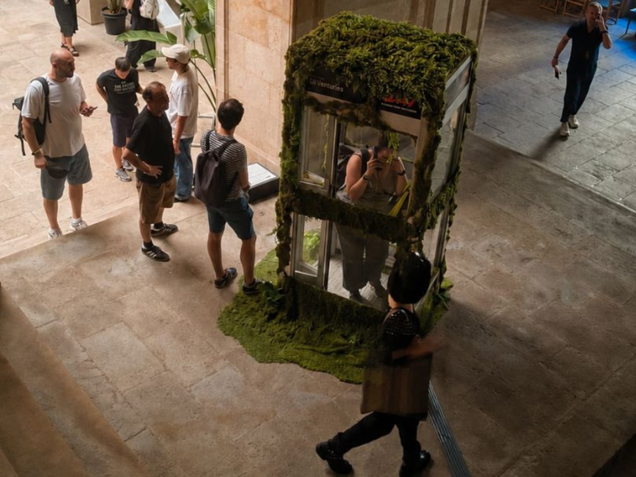
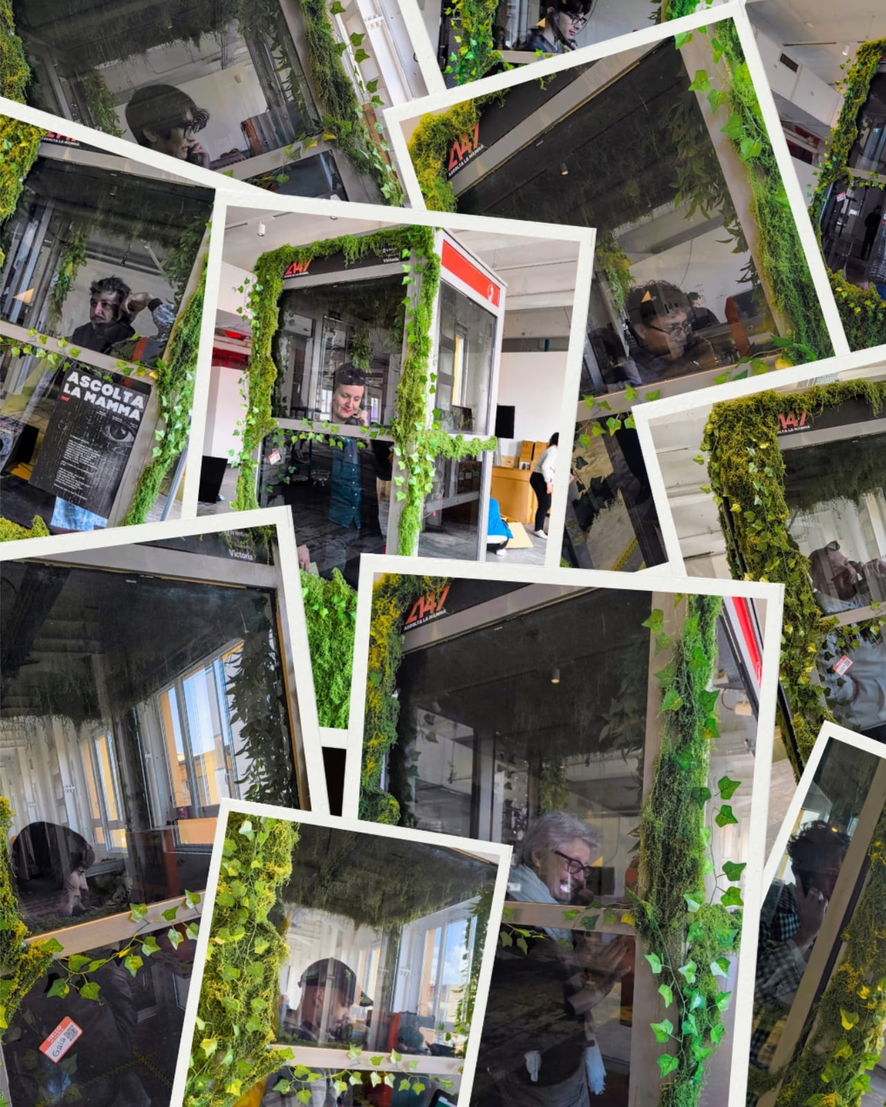
Picture a payphone. Not a sleek, reimagined version, just an actual, beat-up Telefónica booth, the kind you might walk past on a Barcelona street without a second glance. Except this one is overtaken by moss. And if you pick up the handset, the Earth answers.

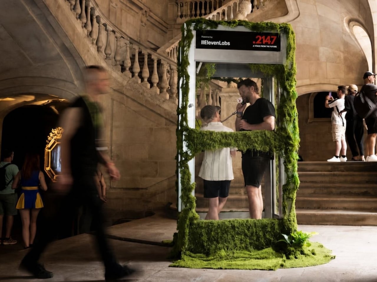
That’s the premise of 2147: A Voice from the Future, an interactive installation by Cris Olmedo of Divina Machina, the digital art branch of creative innovation studio QS Ventures. The piece was presented at Sónar+D, set against the medieval backdrop of the Llotja de Mar in Barcelona. That pairing alone says something: one of the oldest commercial buildings in the city, hosting an open-ended conversation with an AI that speaks on behalf of a future planet.

Designer: Cris Olmedo (Divina Machina)

The concept is disarmingly simple. You pick up the handset. The AI, voiced through an ElevenLabs system and powered by a Raspberry Pi 5 tucked inside the original booth, responds in real time as a fictional representation of the Earth. No scripts, no predefined dialogue paths, no multiple-choice menus. You take the conversation wherever you want, whether that’s climate, survival, memory, or grief. The Earth, imagined 121 years from now, has things to say. Whether you do is another matter.

What makes this work is the object itself. Olmedo didn’t design something new and purposefully futuristic. The booth kept its original Telefónica structure, its original signage, its unmistakably analog bones. Only what’s hidden inside changed. The moss slowly consuming the exterior reads like nature quietly reclaiming something that people gave up on. That tension between the obsolete and the alive does a lot of the emotional heavy lifting here, and it’s a smarter choice than any glowing interface could have been.

We tend to think of design as a forward-moving discipline, always chasing newer, faster, more capable. But 2147 asks a different question: what happens when you take something we’ve already discarded and give it a new reason to exist? The payphone is a perfect vessel for that question, precisely because it was once the most public, most democratic form of long-distance communication we had. You didn’t need an account, a plan, or a device you owned outright. Just a coin and a number to dial.

Now that infrastructure is largely gone. Olmedo took what’s left of it and filled it with something else entirely. That’s not just clever art direction. It’s a genuinely pointed observation about how we build things, discard them, and eventually recognize that the shell still has something to offer. The fact that this installation lives inside an actual retired Telefónica booth, rather than a replica, matters more than it might seem.

The year 2147 gives me pause, in the best way. It’s far enough to feel like science fiction, but close enough to feel like a countdown. It’s the kind of temporal framing that shakes you out of the comfortable haze of “we’ll deal with it later.” The Earth speaking through this installation isn’t a distant abstraction. It’s speaking through a receiver you’ve held before, in a language you already understand, about problems you’ve already heard about.

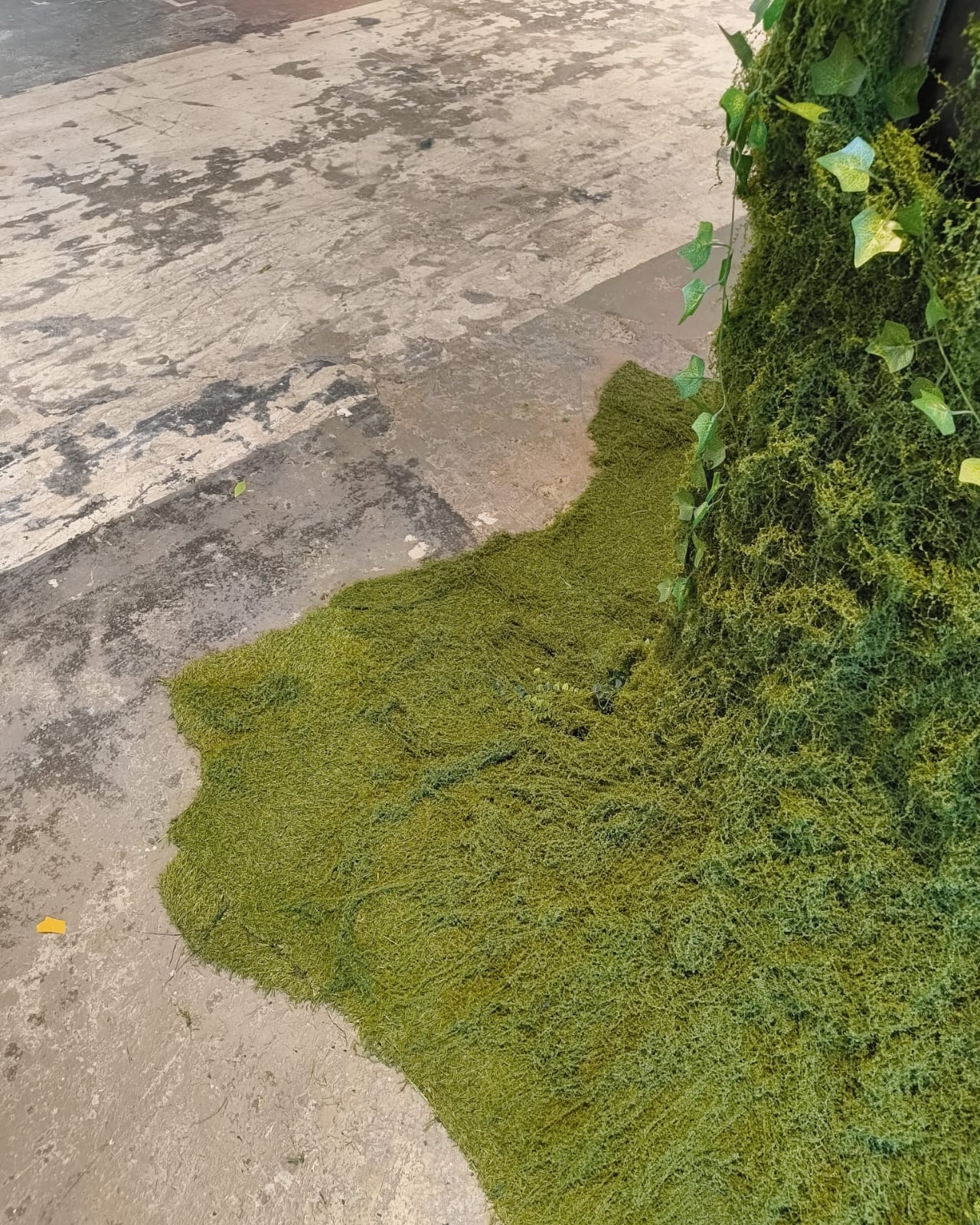
The moss is the detail I can’t stop thinking about. It reads as both beautiful and quietly alarming, the natural world slowly spreading over a structure that once represented human connection. As if the planet didn’t wait for us to sort things out. It also turns a mundane artifact into something you actually want to stop and stare at, which is half the job of any good installation. It communicates instantly and without explanation, which is exactly what good design is supposed to do.

2147: A Voice from the Future earns its concept. It’s not a payphone with AI bolted on. It’s a meditation on time, obsolescence, and the conversations we keep putting off. And the most compelling thing about it is that it asks you to start one, right now, handset in hand, with a planet that’s been waiting for you to pick up.

The post A Moss-Covered Payphone Just Became the Voice of 2147 first appeared on Yanko Design.
This Bright Yellow Kinetic Sculpture in London Is Meant to Be Walked Through

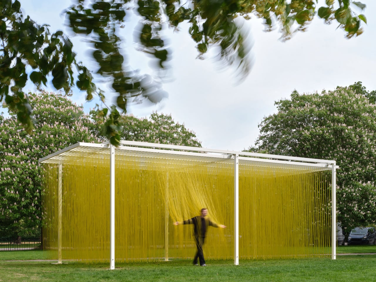
There are artworks you look at, and there are artworks you walk through. Jesús Rafael Soto understood the difference better than almost anyone. The Venezuelan kinetic artist spent his career dismantling the passive relationship between viewer and object, and nowhere is that ambition more fully realized than in his ‘Pénétrable’ series — sculptures built not to be observed, but to be entered. ‘Pénétrable BBL Jaune’, originally conceived in 1999, remains the purest expression of that idea.

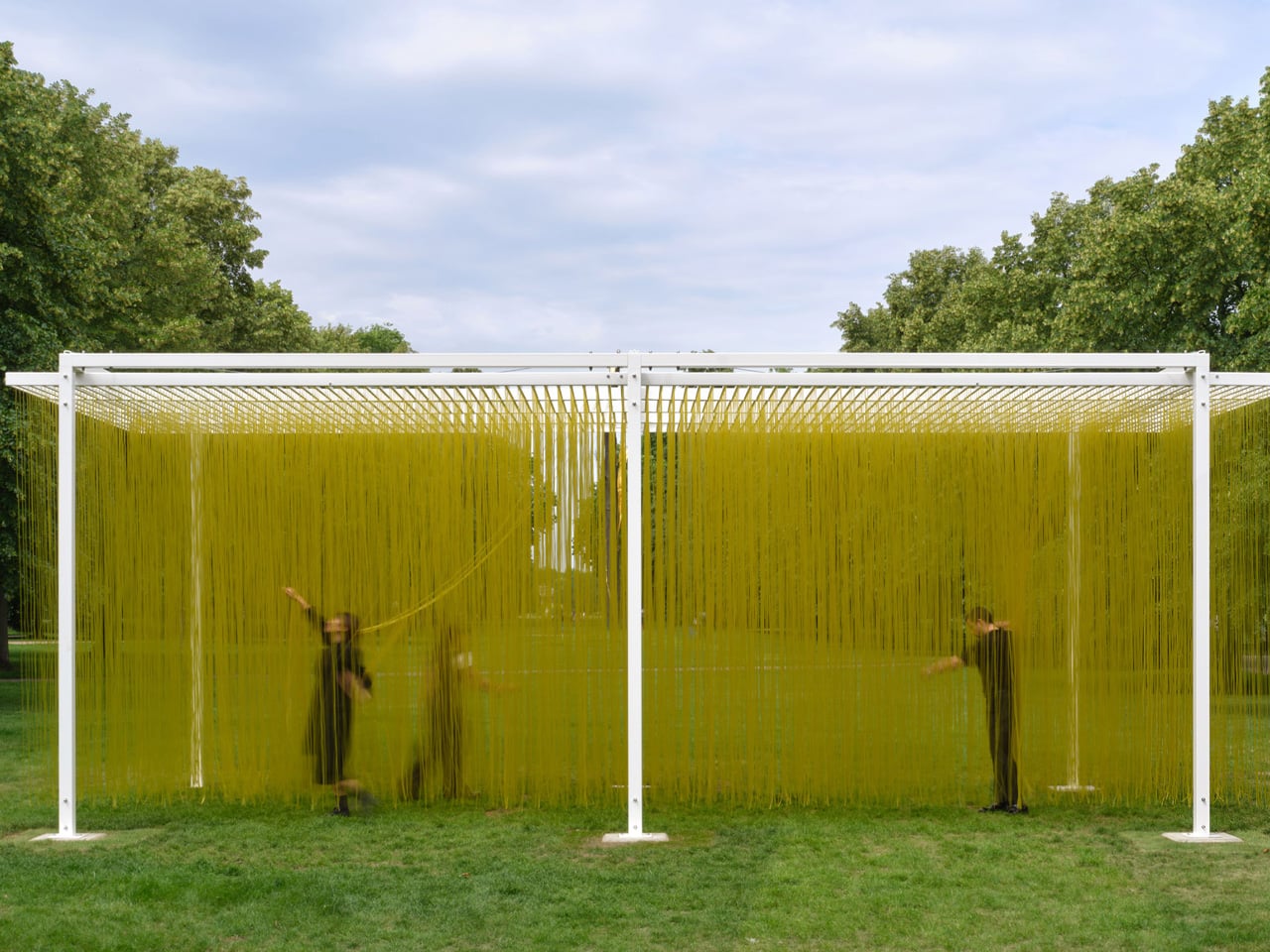
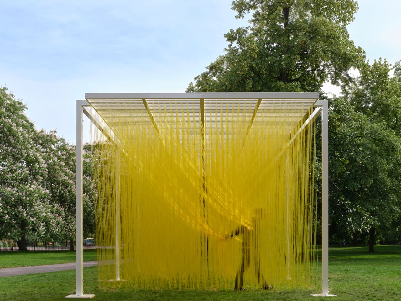
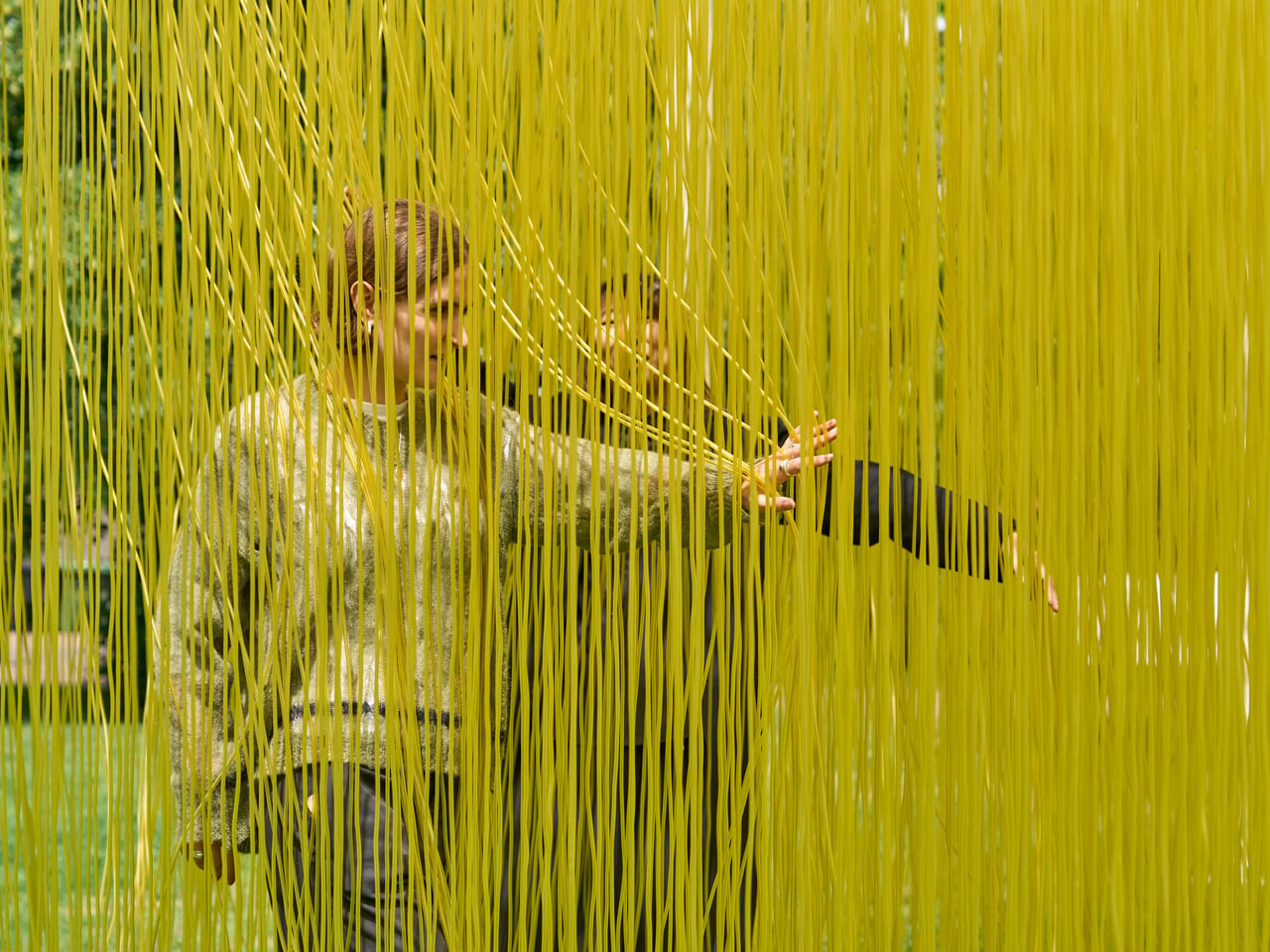
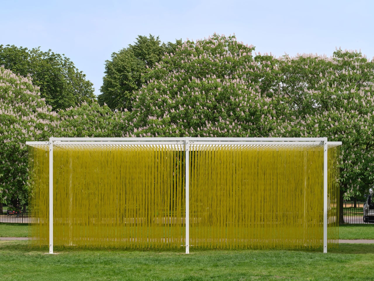
The work is deceptively simple in form. A white steel frame suspends thousands of yellow PVC tubes — around 4,000 in total — that hang in a dense, luminous field. At a distance, it reads almost like a monolithic block of color, a solid presence that the eye cannot immediately parse. Move closer, and the illusion shifts. Step inside, and it dissolves entirely. The tubes brush against your arms, your shoulders, your face. The sculpture is no longer in front of you — you are inside it, and it is responding to you. That exchange, that collapse of separation between the work and the person experiencing it, was Soto’s lifelong obsession.

Designer: Jesús Rafael Soto

Soto was born in Ciudad Bolívar, Venezuela, in 1923, and spent much of his career in Paris, where he became central to the kinetic and Op Art movements of the 1950s and 60s. He died in 2005, but his estate relaunched ‘Pénétrable BBL Jaune’ in 2023 to mark the centenary of his birth, ensuring the work would find new audiences in new contexts. In 2026, that context became London. The Serpentine Galleries installed the piece outside Serpentine South as part of their summer art programme — the first work by Soto ever shown outdoors in the UK.

Serpentine artistic director Hans Ulrich Obrist, who helped select the work, described Soto’s ‘Pénétrable’ as a genuine invention — a shift from object to relation. “It goes from an object to a relation,” Obrist noted, “and we felt that would be amazing as part of our public art projects.” That framing feels precise. The yellow tubes are not decorative. They are a mechanism for recalibrating how a body moves through space, how a crowd becomes a participant, how color becomes atmosphere rather than surface.

What makes ‘Pénétrable BBL Jaune’ endure is its refusal to age into mere spectacle. In a cultural moment saturated with immersive experiences engineered for the camera, Soto’s work asks something different — not that you photograph it, but that you feel it. The tubes sway. The light shifts. The boundary between you and the artwork, for a moment, disappears entirely.

The post This Bright Yellow Kinetic Sculpture in London Is Meant to Be Walked Through first appeared on Yanko Design.
What If City Monuments Generated Power Instead of Just Looking Good?

Public art has long served as a cultural mirror, reflecting what a society chooses to honor. As climate change intensifies and cities face mounting pressure to decarbonize, questions about what our monuments should stand for are getting harder to ignore. Most renewable energy infrastructure stays invisible, buried in utility corridors or mounted on rooftops, rarely acknowledged as something worth celebrating in public spaces.

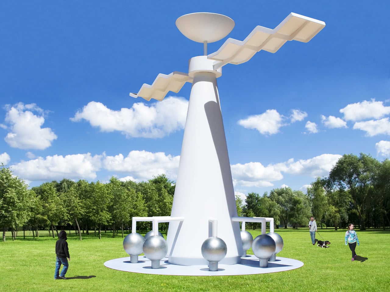
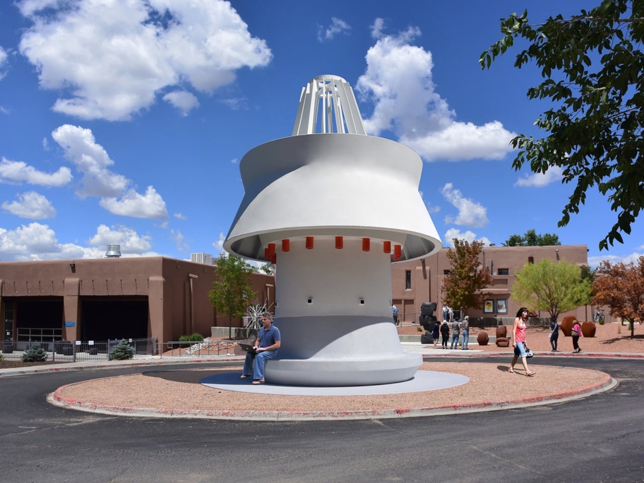
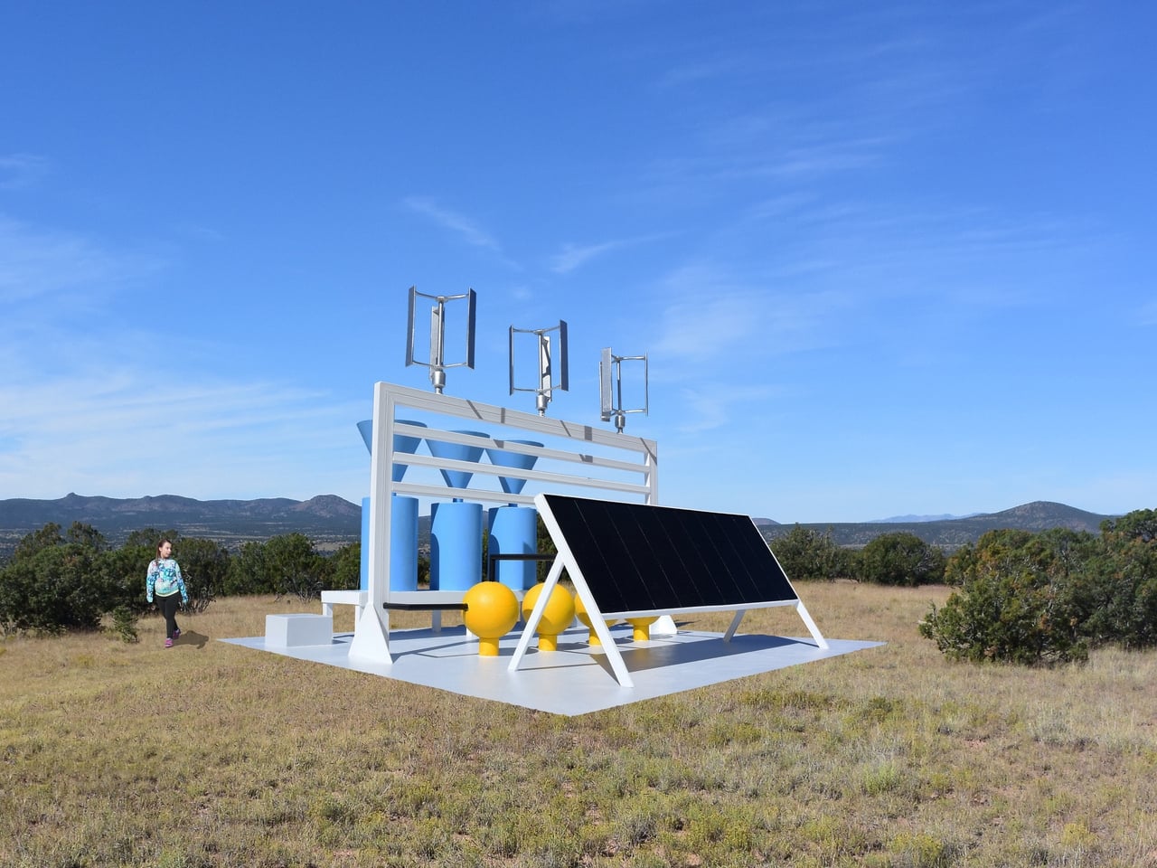
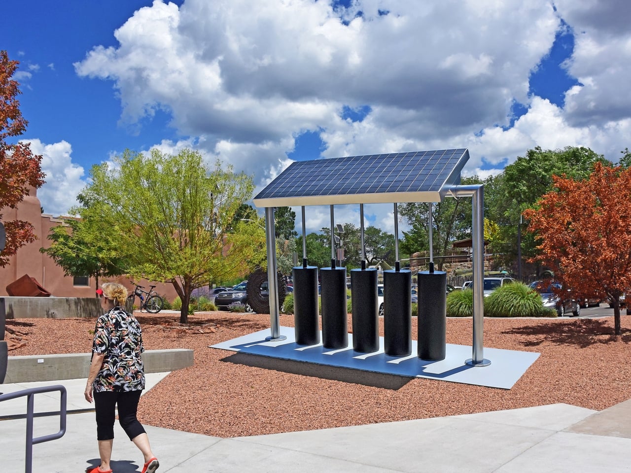
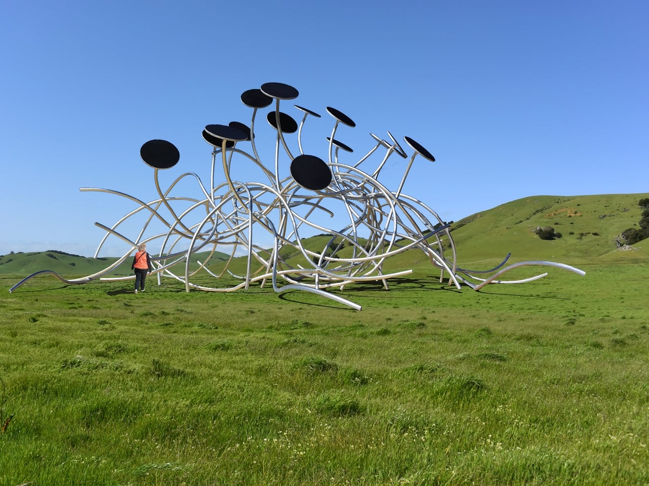
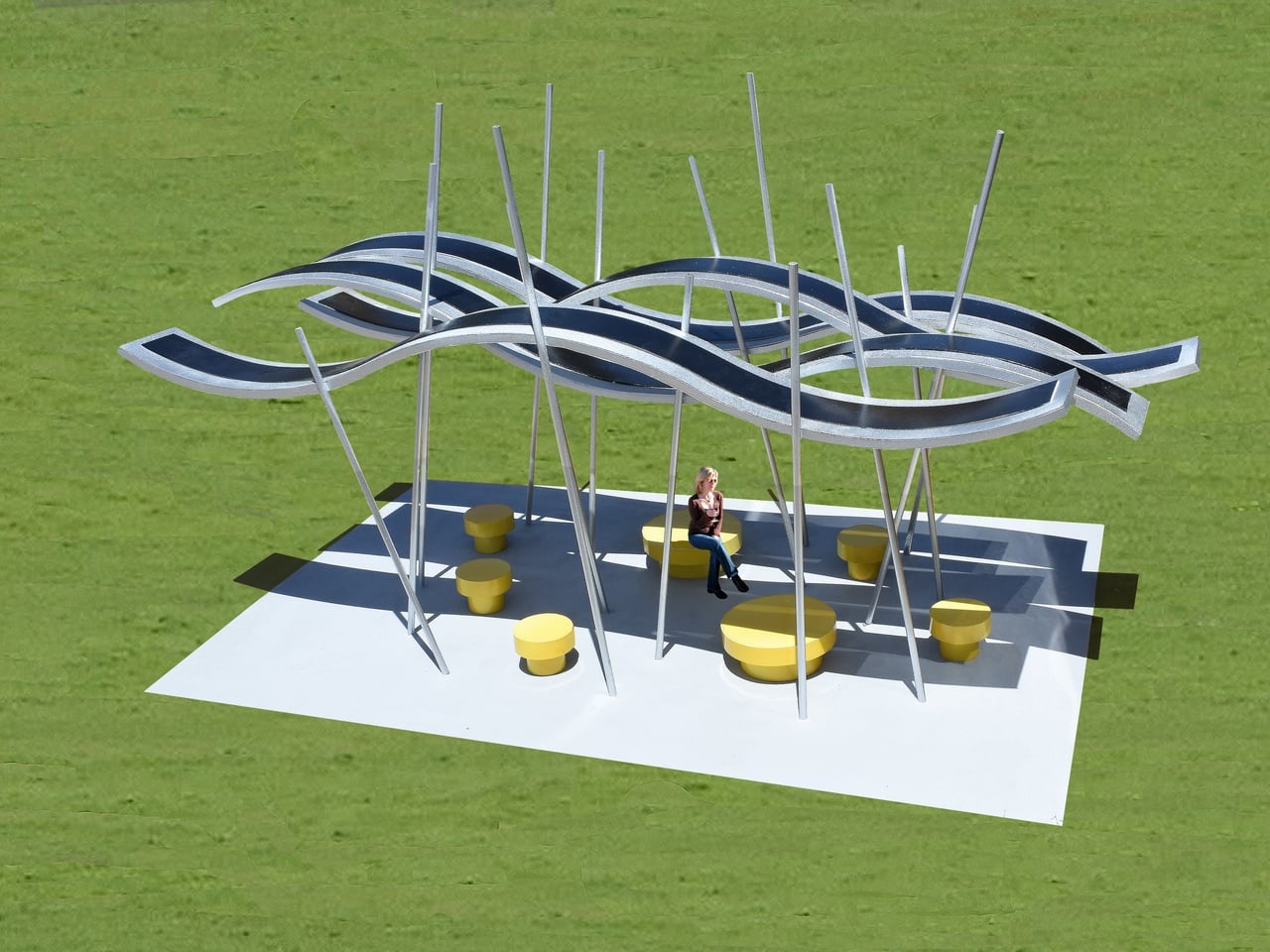
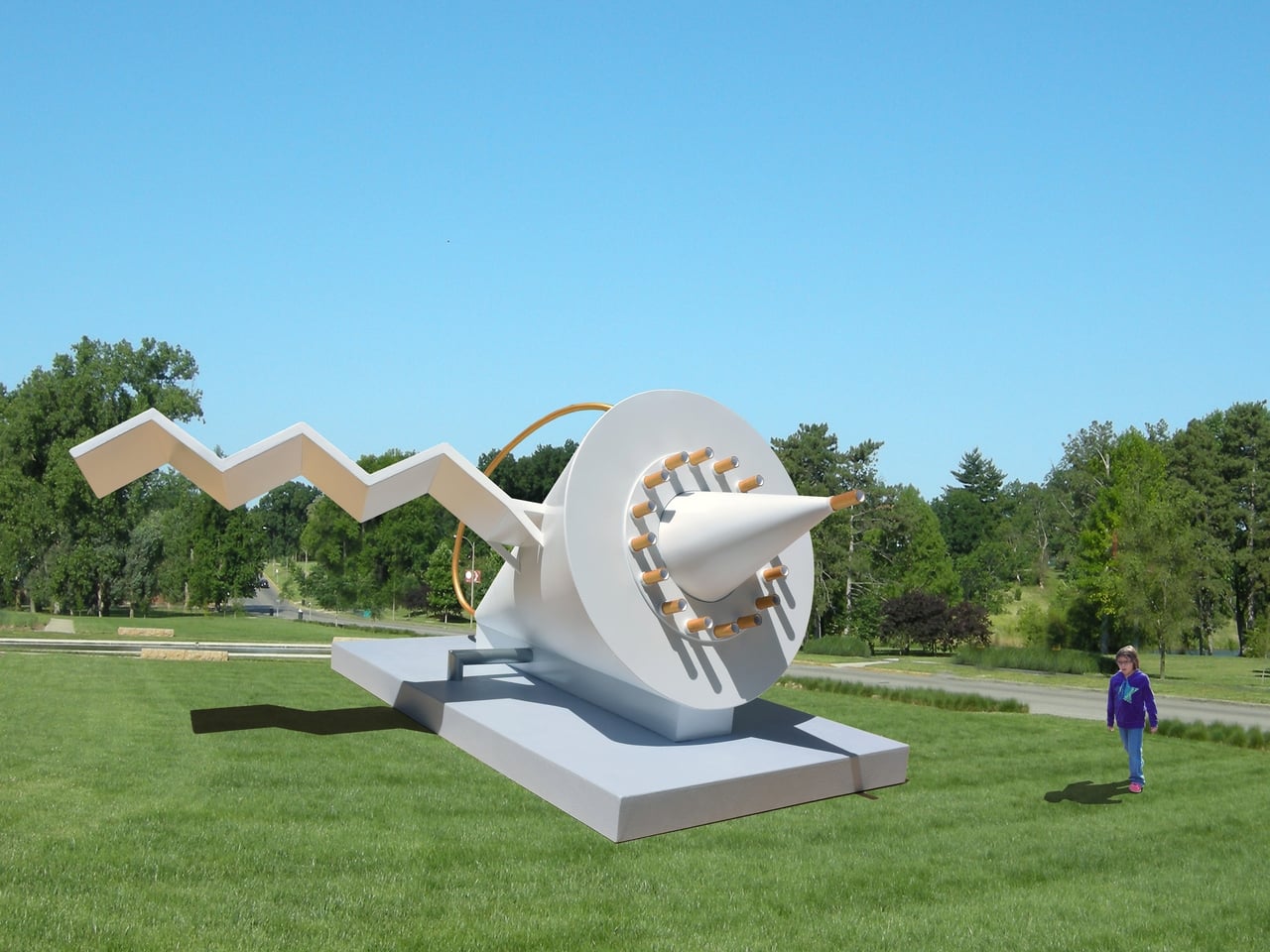
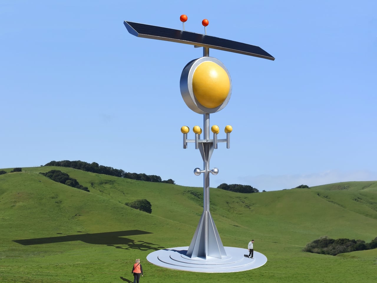
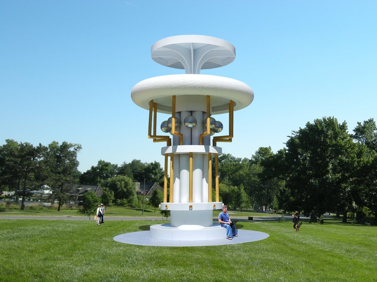
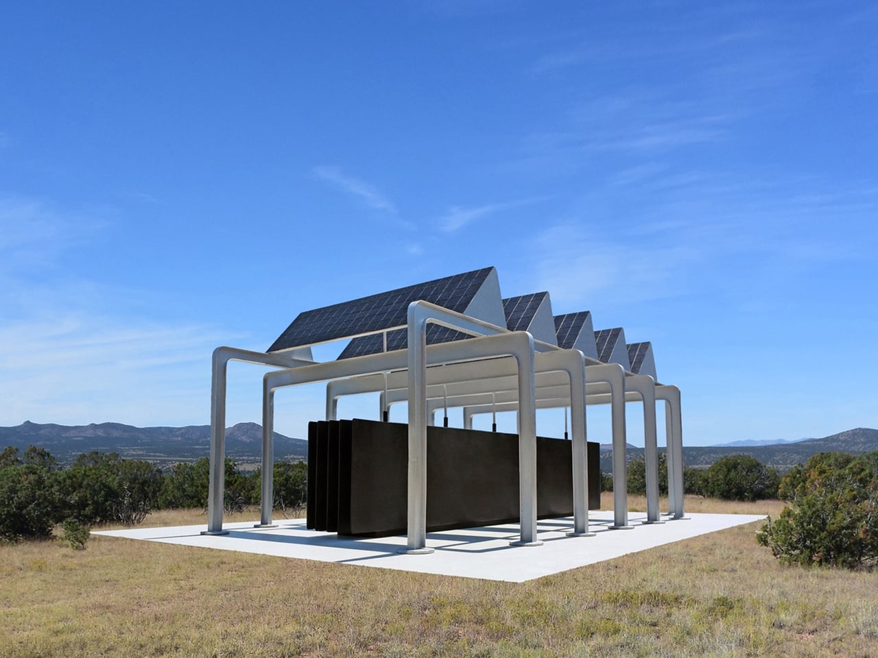
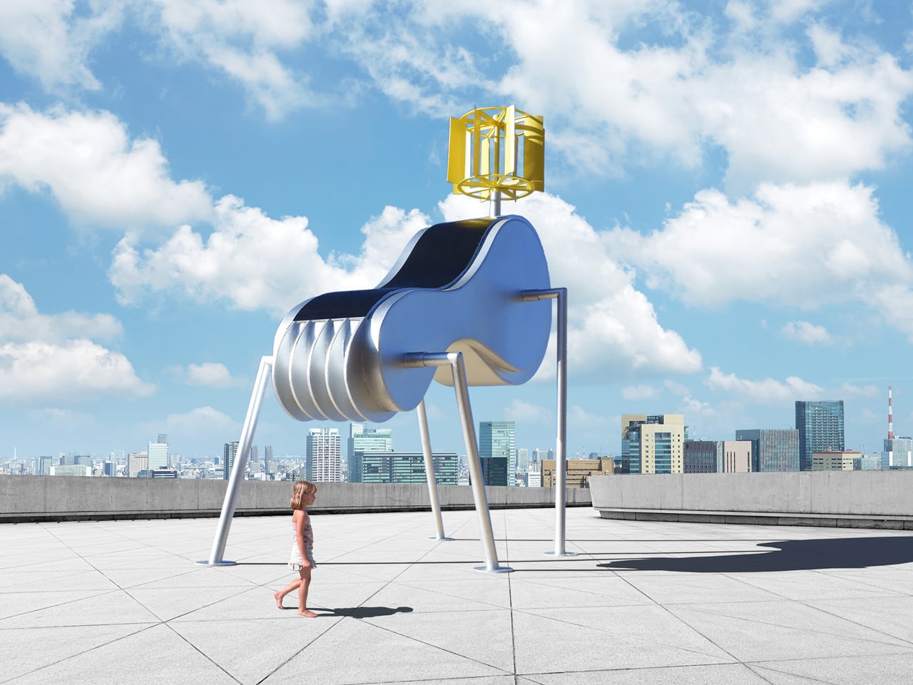
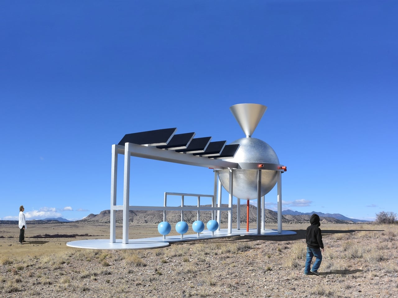
Santa Fe-based artist Michael Jantzen has spent years addressing exactly that through his Public Eco-Art Proposals. The series imagines a different kind of monument, one that doesn’t merely symbolize sustainability but actively practices it. Each proposal takes the form of a sculpture or pavilion that generates electricity from the sun or wind, collects rainwater, stores energy in batteries, and sometimes sends power into the local grid.

Designer: Michael Jantzen

Jantzen gives his work an aesthetic freedom that most utility-driven designs don’t have. Rather than concealing the mechanics, he treats solar panels, wind turbines, and structural frameworks as sculptural elements in their own right. The visual language is deliberately technological and mechanical, blurring the line between a functional energy structure and art worth stopping for.

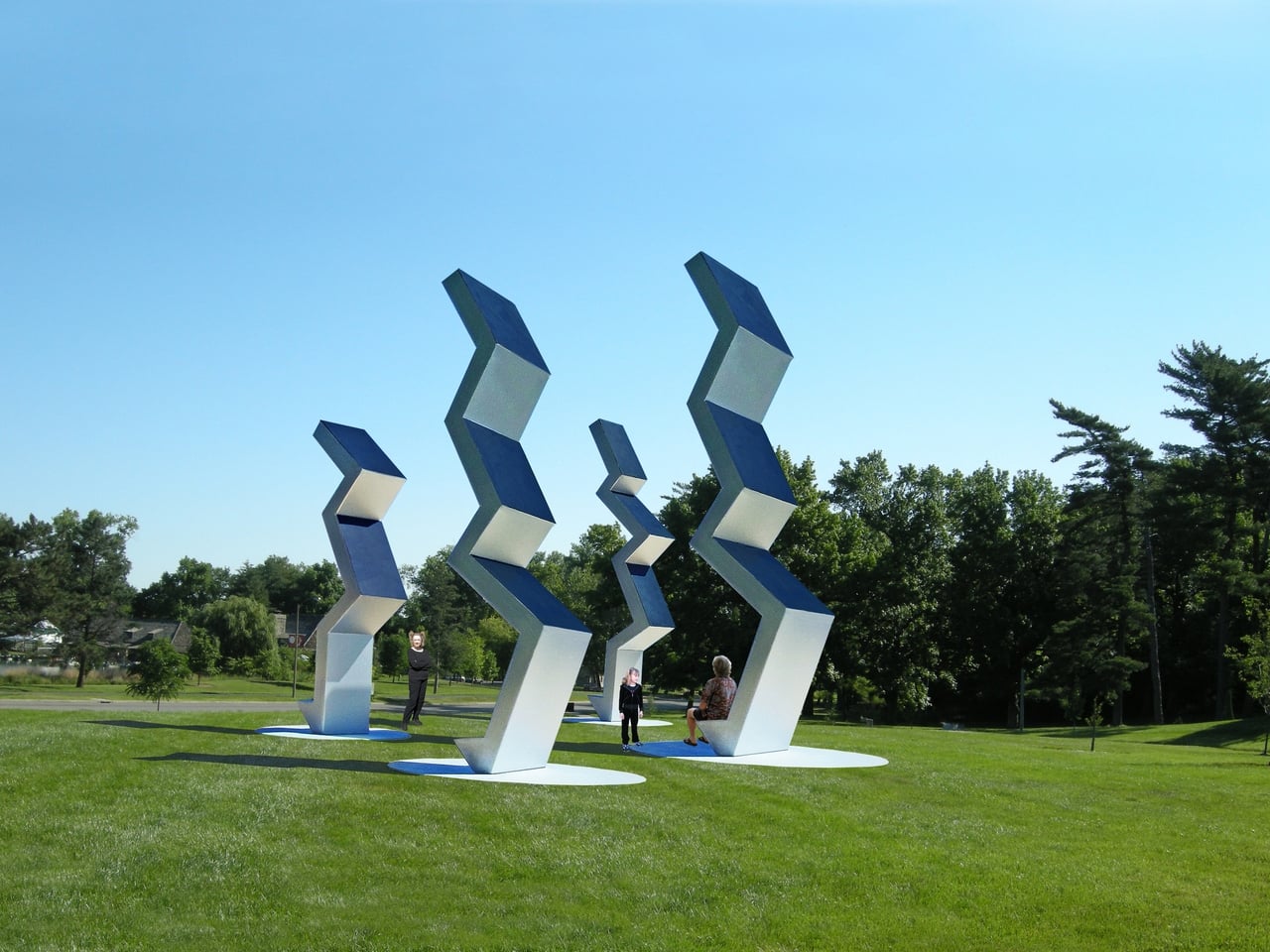
Walk through one of these proposed spaces, and you might find yourself beneath a pavilion whose curved solar canopy quietly feeds electricity back to the neighborhood. Or stop to look at a series of angular sculptures lined up across a park, their solar-panel tops tracking the light. What looks like a meditation on shape and form turns out to be a modest power station doing actual work.

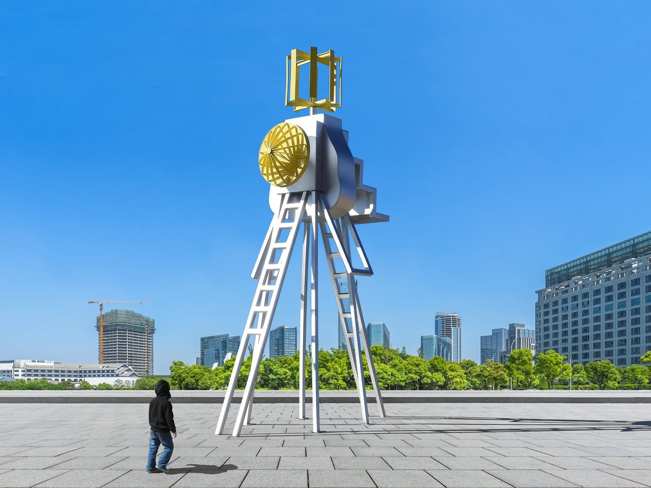
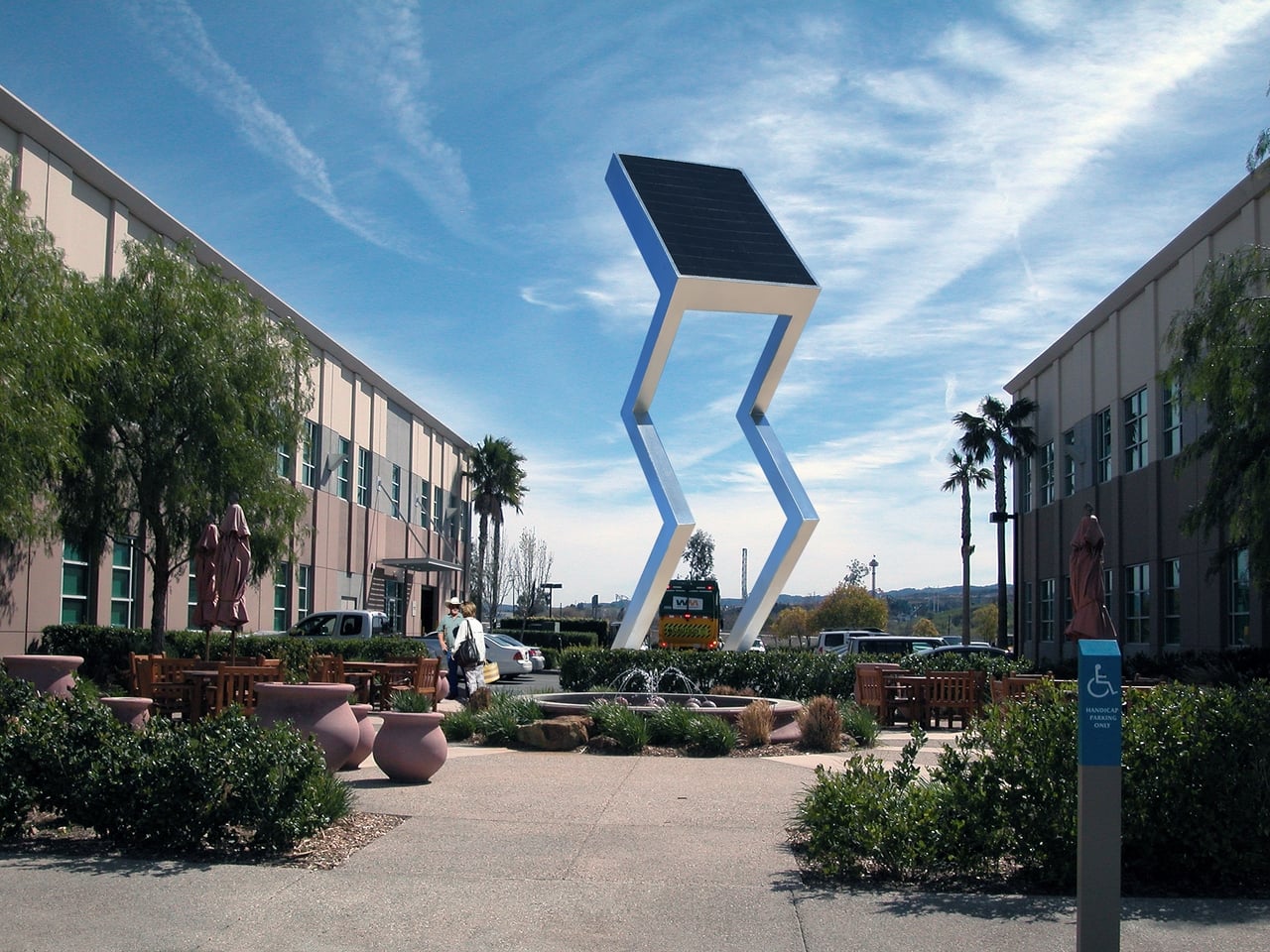
The proposals span a wide range of environments. Some are designed for open fields or public parks, while others imagine coastal settings with floating platforms supporting wind and water energy structures. A chevron-shaped sculpture with a solar panel at its angular peak stands in what appears to be a university courtyard. Another piece holds solar panels above cylindrical battery storage pods, blending the practical business of energy collection with an unexpectedly considered form.

This approach also reframes the relationship between art and urban infrastructure. Municipalities already commission sculptures for parks and plazas; so why shouldn’t those commissions do more? A solar-powered gathering space generates electricity, makes clean technology approachable, and sparks conversations among the millions of people who walk through it, most of whom would otherwise never engage with energy infrastructure at all.

Jantzen’s vision extends beyond any single installation. He imagines these structures placed in cities and parks worldwide, shifting how communities relate to the energy they consume by making that relationship visible and beautiful. For him, celebrating sustainability means building things worth caring about, giving clean energy a presence that people can gather around, the way they’ve always done with the landmarks that define a place.

The post What If City Monuments Generated Power Instead of Just Looking Good? first appeared on Yanko Design.
Burning Man 2026 Built a 300-Ring Light Tower You Have to Earn

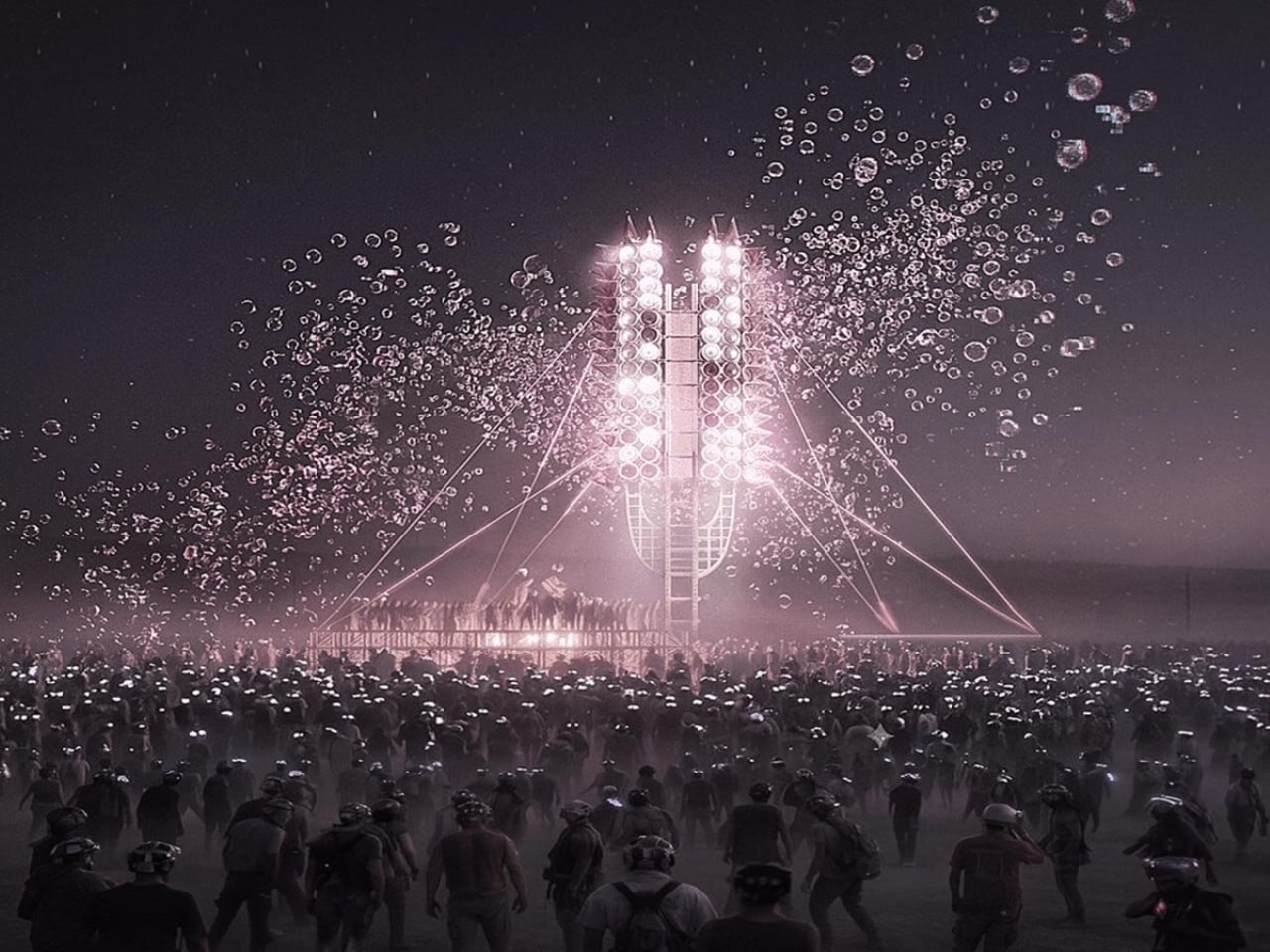
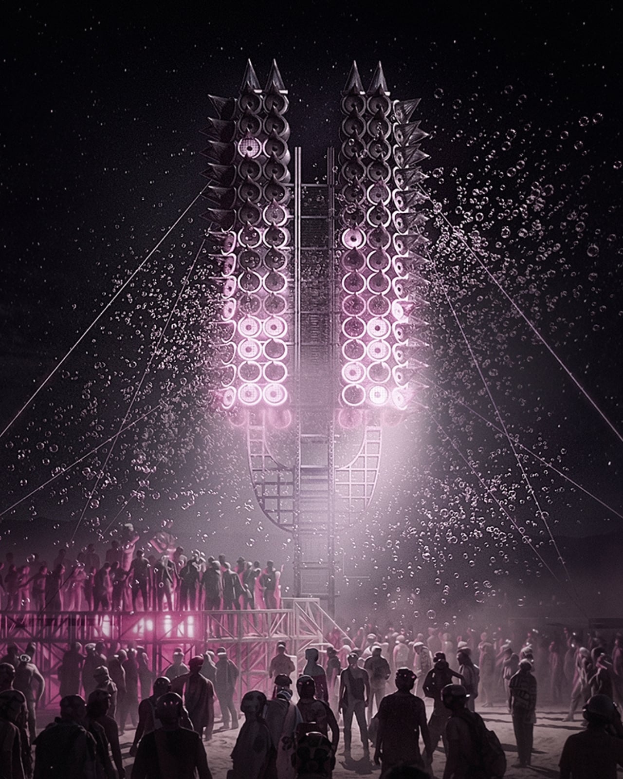
One person shouting into an empty desert doesn’t build much of anything. But what happens when thousands of voices gather around a 12-meter tower made of 300 programmable rings of light, and the structure itself begins to respond? That’s the premise behind Axis Mundi: Resonant Spire, Sergei Konchekov’s installation selected for the 2026 Burning Man Honoraria program, and it might be the most genuinely interesting piece of architecture to emerge this year. Not because it’s the biggest or the most technically complex, but because it actually has something to say.

The concept is both technically precise and philosophically loaded. Konchekov built the tower to translate human voice into a vertical system of light and sound. Speak toward it, and the rings light up. Walk away, and the activation fades. The structure doesn’t generate its own spectacle. It borrows yours. Which sounds like a gimmick when you type it out flat like that, but when you sit with it, it starts to feel like one of those rare design ideas that actually earns its concept.

Designer: Sergei Konchekov

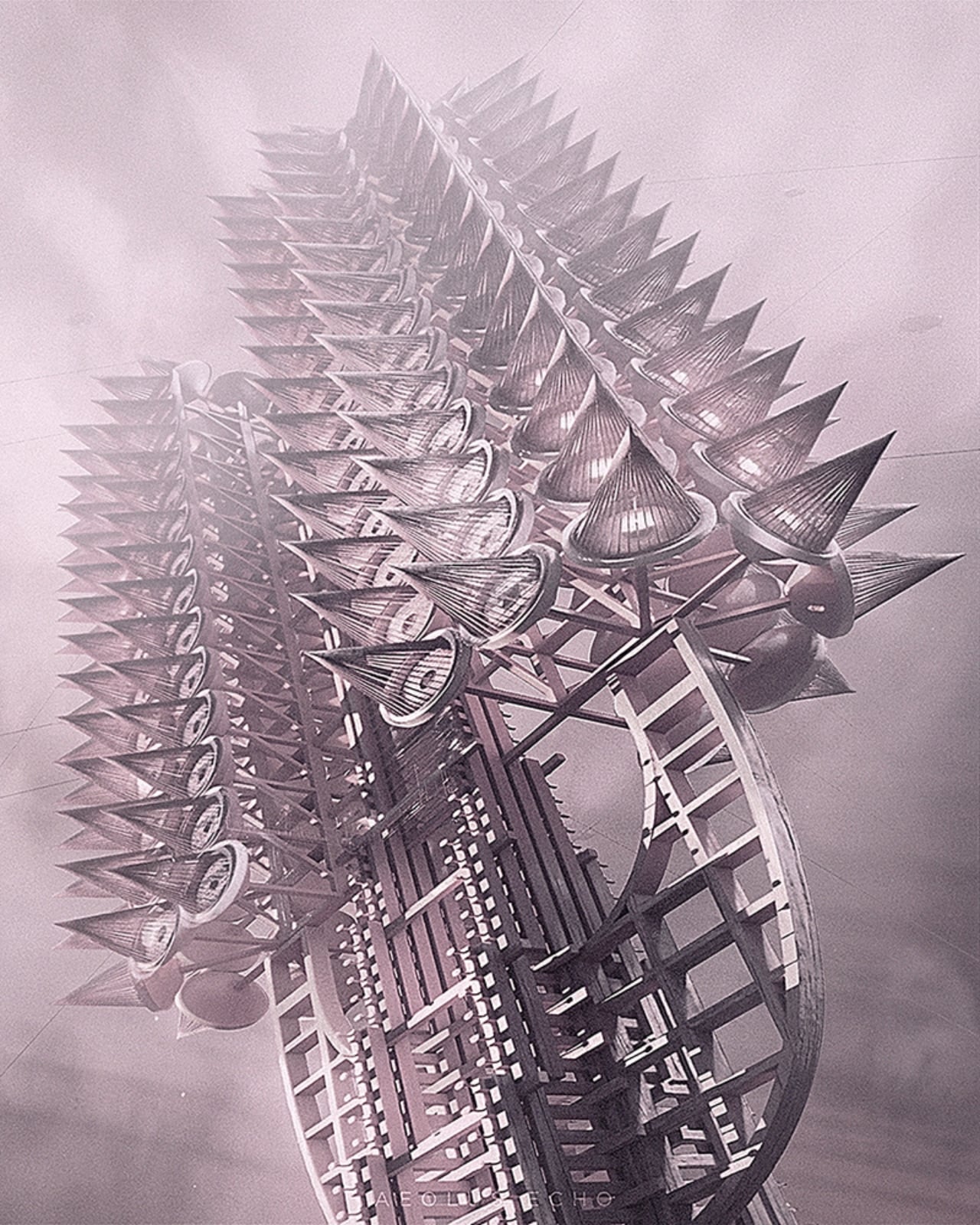
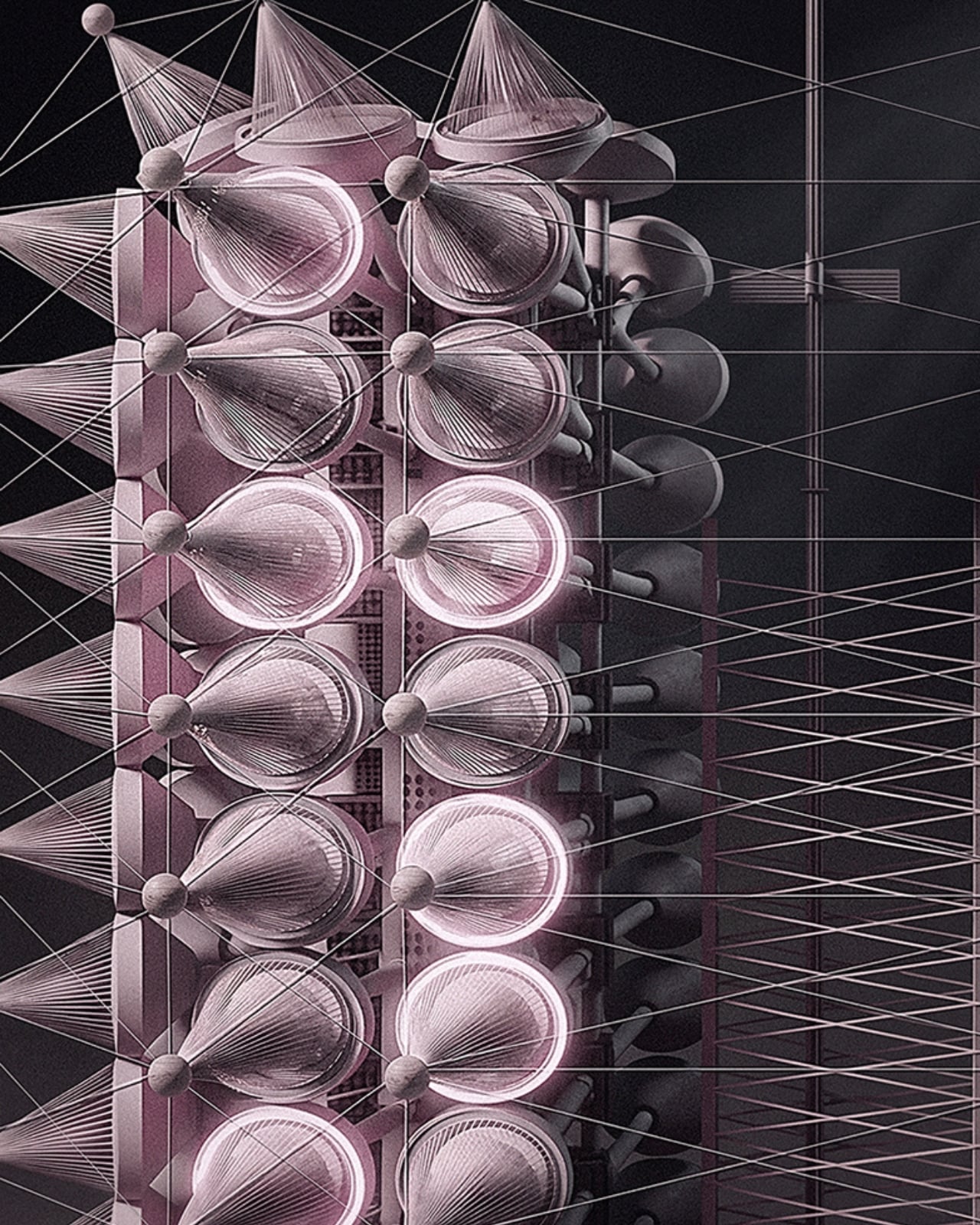
What makes it more than just an interactive light show is the accumulation logic built into its architecture. The 300 rings function as a kind of vertical archive. Lower rings hold stabilized states built up over time, while the upper rings stay live and reactive to current input. So the tower, in a real and structural sense, carries memory. What a crowd did an hour ago is still visible at the base, while what’s happening right now lives near the top. Light doesn’t disappear here. It accumulates. Time, quite literally, becomes physical form.

Konchekov developed the project through a methodology he calls COLLIZIUM, which frames architectural form through conflict-based computational processes and collective social input. That might sound like a design school thesis, but the output is something more immediate and tactile than the language around it suggests. The architecture doesn’t exist independently of its participants. It is generated through them. Without the crowd, there is no form. Burning Man’s own listings describe it as “neither monument nor machine, but a living signal,” and that description genuinely holds.

The broader conversation Konchekov is entering with this work feels particularly timely. Digital communication is at an all-time volume and an all-time low for meaning. We post, we broadcast, we react, and somehow the cumulative noise produces very little that resembles actual connection. Resonant Spire offers a different model: collective input that actually converges, that creates something legible and shared and visible. A crowd becomes a coherent structure only because they showed up together. That is not a small idea dressed in a large installation.

It’s also worth noting that Burning Man is arguably the right venue for this, not just for the obvious reasons of scale and spectacle, but because the event itself is predicated on temporary community. The playa is a place where the usual rules about permanence and individual credit get set aside. A tower that only works when people gather around it and offer their voices is not a metaphor at Burning Man. It’s just a description of what’s happening there already. Konchekov is, in some ways, building architecture that matches the culture it inhabits.

The visual language of the spire draws from ancient and spiritual references, the axis mundi being a cosmological concept found across many cultures, a central pillar connecting earth and sky. Konchekov takes that idea and routes it through a live data feed. The cone-stacked structure rises with phased waves of light traveling upward, in the project’s own words, “like a visible breath.” It is striking, undeniably, but the aesthetic isn’t really the point. The refusal to be passive is. Most architecture asks you to look at it. This one asks you to mean something together before it shows you what you’ve made.

The post Burning Man 2026 Built a 300-Ring Light Tower You Have to Earn first appeared on Yanko Design.
Bang & Olufsen Just Taught Stone to Sing at Milan 2026

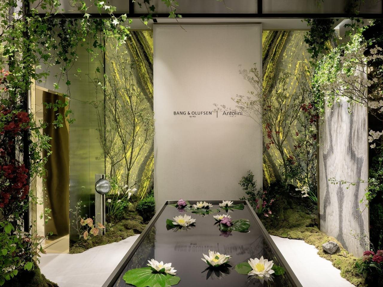
Every year, Milan Design Week raises the question of what design is actually for. Not in the abstract, philosophical sense that gets debated in panel discussions nobody remembers, but in the most immediate, physical way: you walk into a space, and either you feel it or you don’t. The Bang & Olufsen and Antolini installation this year, From Quarry to Garden: The Shape of Beautiful Sound, is the kind of experience that makes you feel it before you can even explain why.

The collaboration between Bang & Olufsen, the Danish audio luxury brand founded in 1925, and Antolini, the Verona-based natural stone company with 70 years of history, is one of those pairings that sounds unlikely on paper but makes complete sense once you see it. Both brands are obsessed with material. Both are deeply committed to the idea that an object should not only perform but move you. Putting them in the same room, or rather the same garden, was probably inevitable.

Designers: Antolini® with Bang & Olufsen

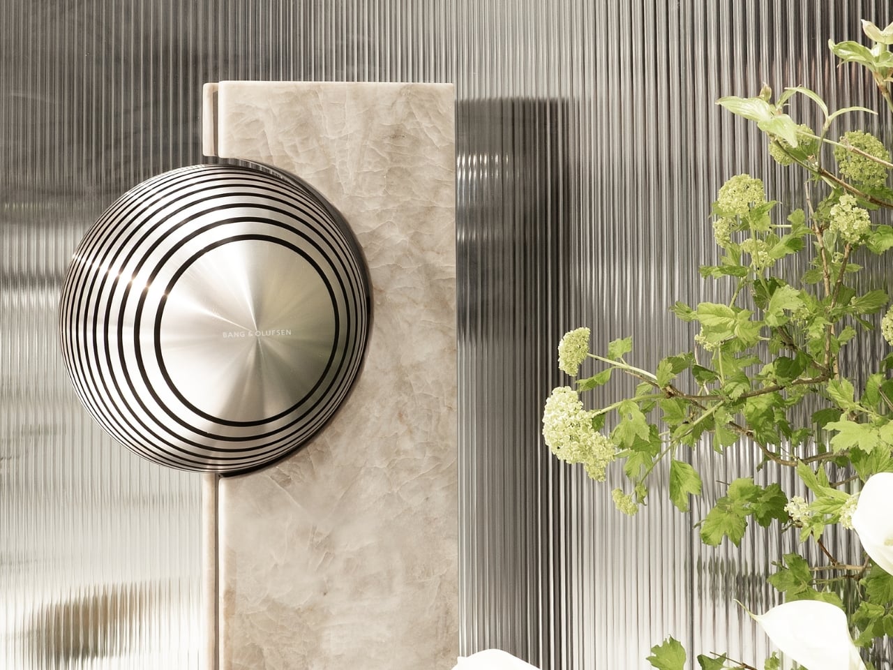
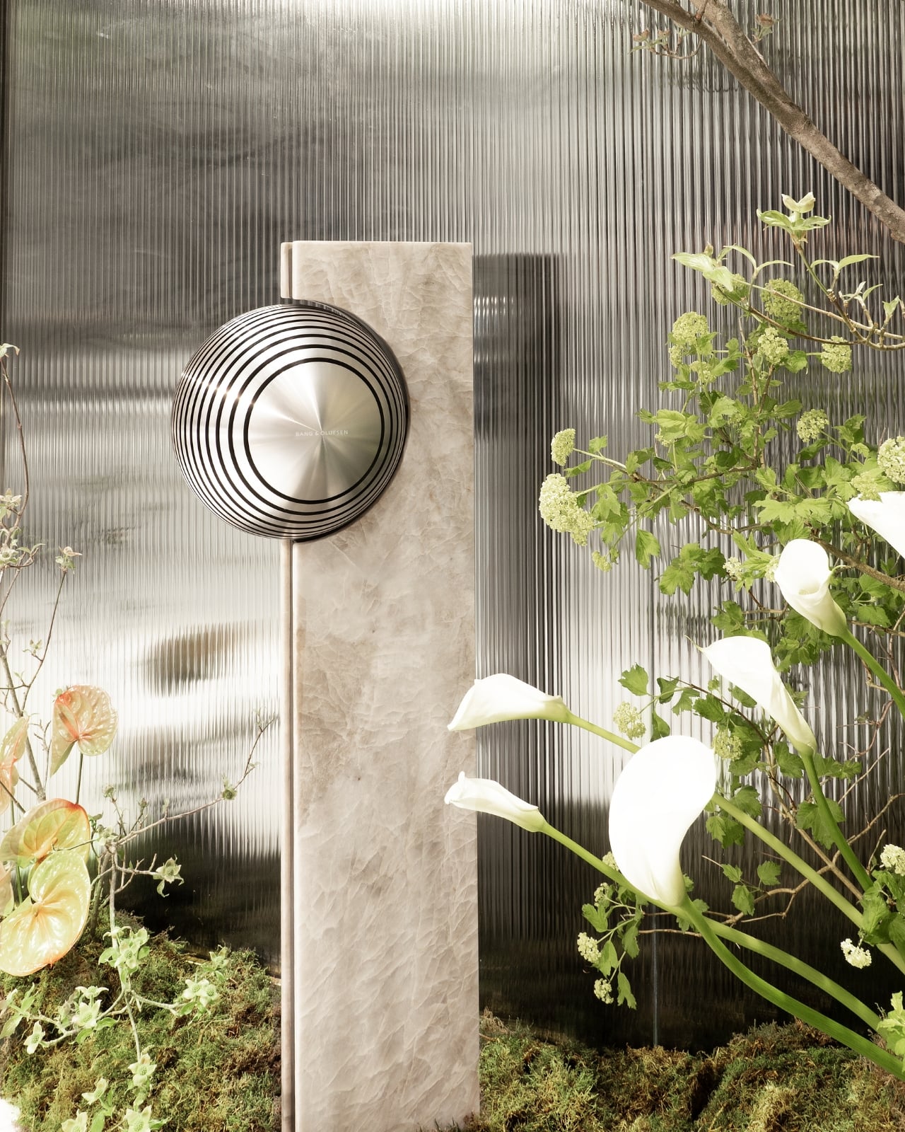
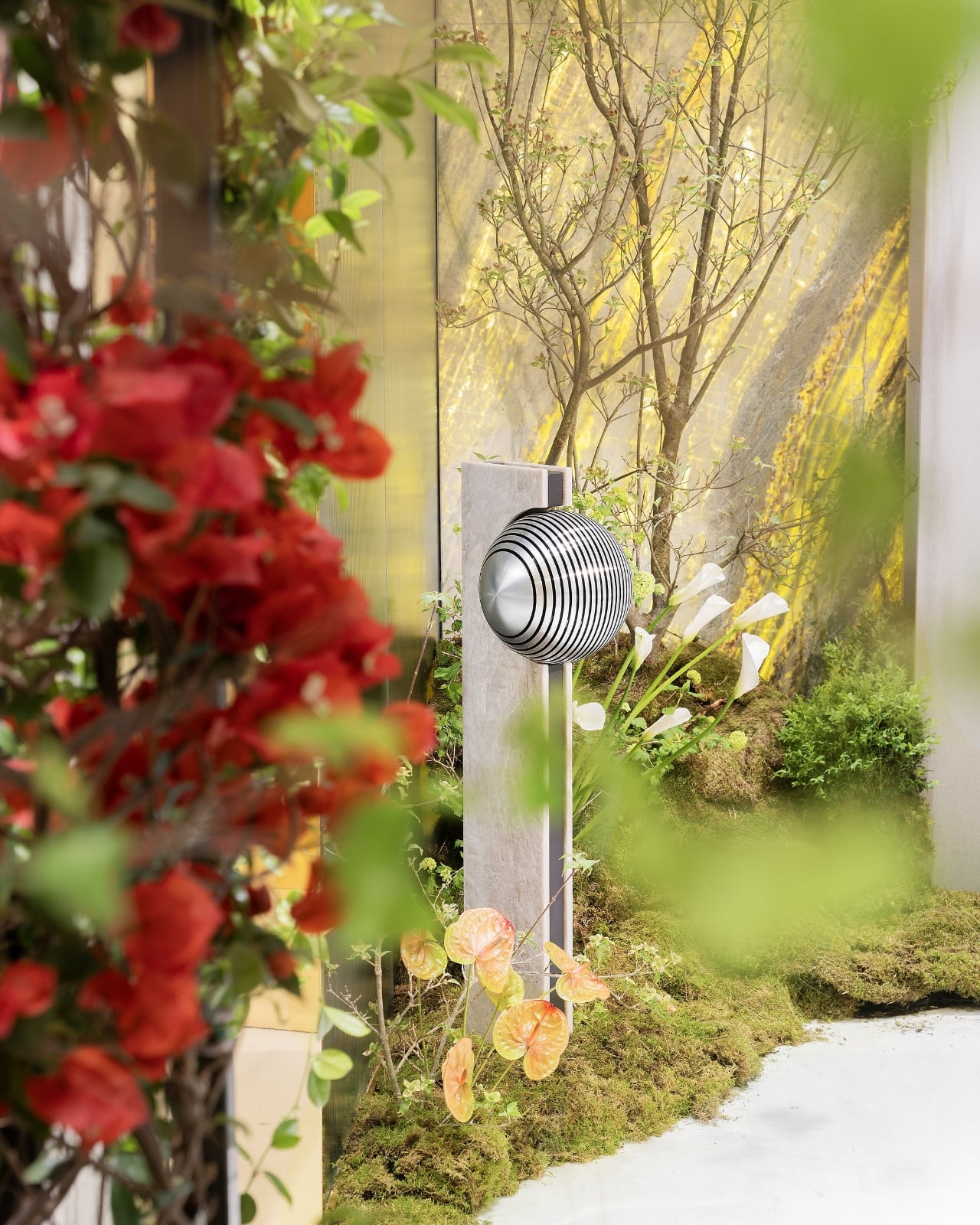
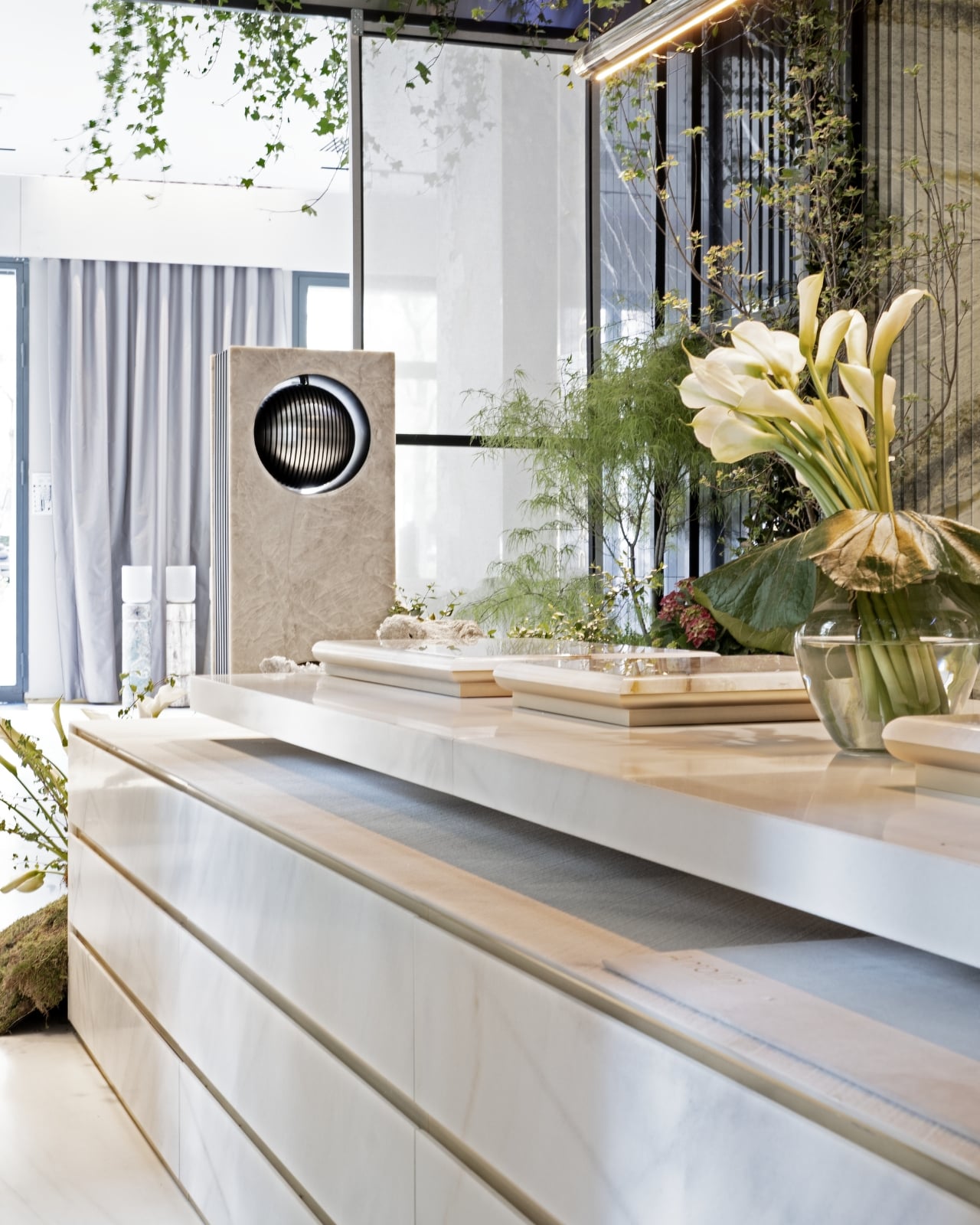
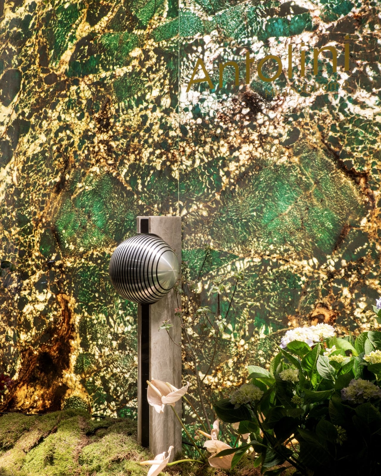
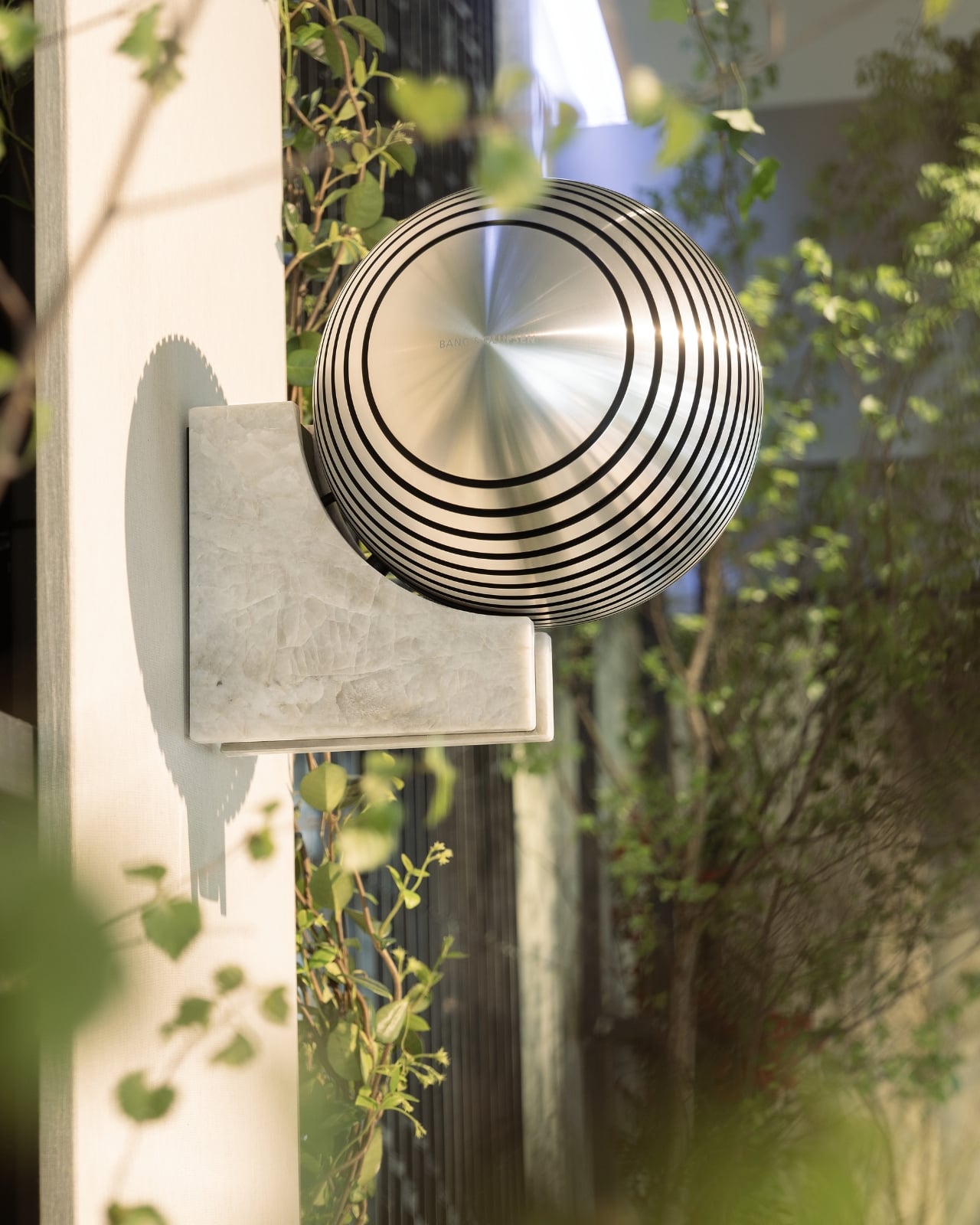
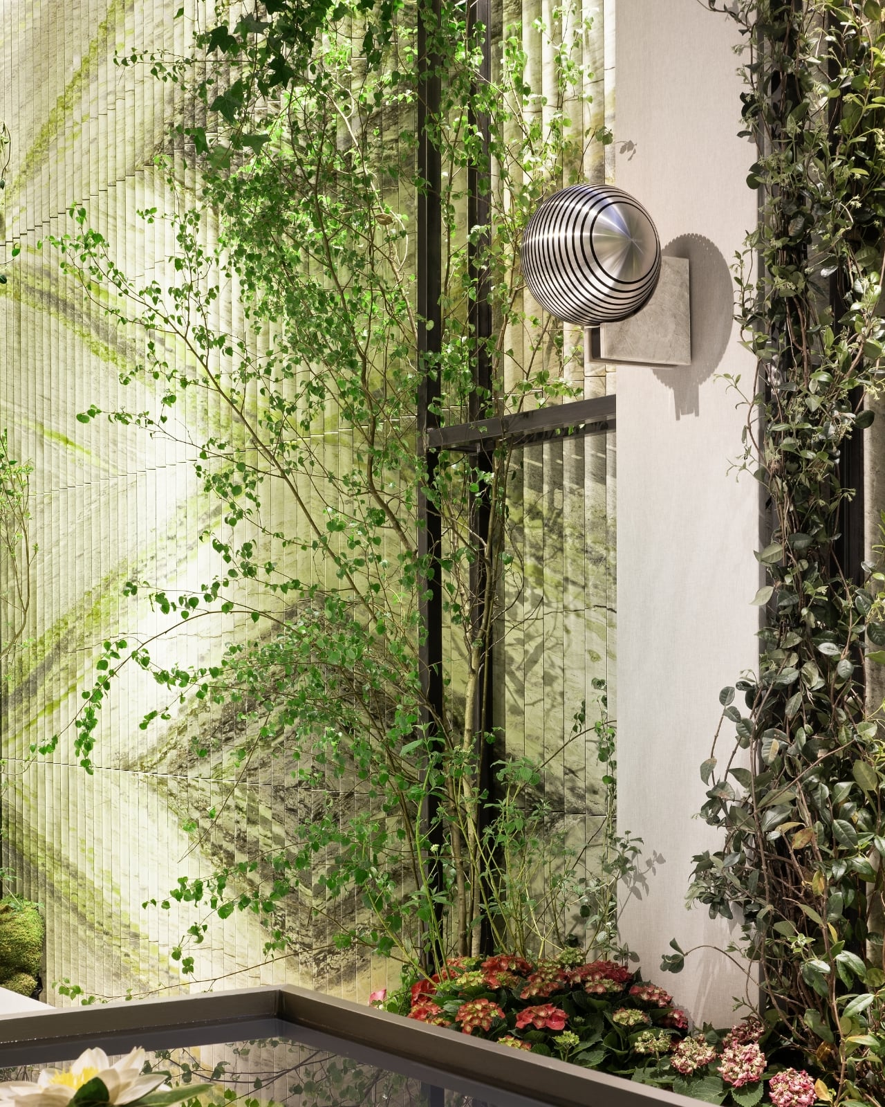
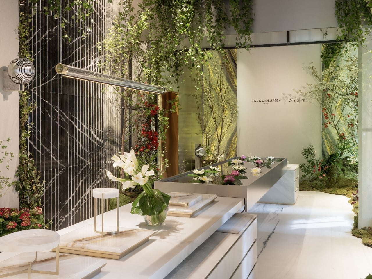
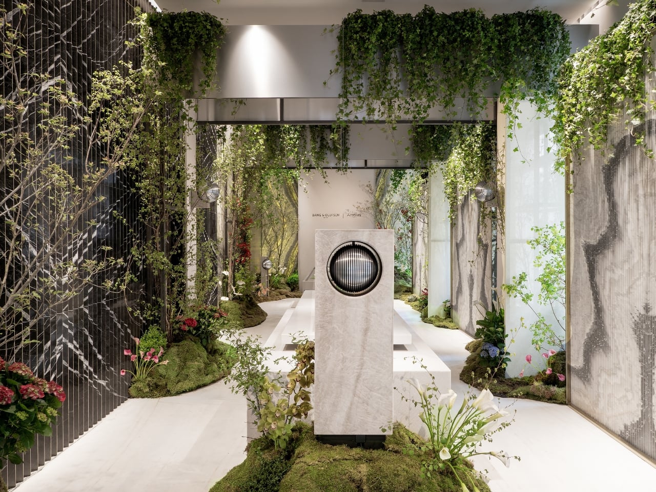
The installation, hosted at Antolini’s MilanoDuomo Stoneroom, centers on the preview of Beosound Haven, Bang & Olufsen’s forthcoming landscape speaker. It’s a sphere of precision-engineered aluminium that sits on a stone plinth, surrounded by living greenery, water lilies floating on a reflective table, and the kind of deliberate quiet that makes you lean in. Droplets fall onto the water surface and send out ripples, which is either a very beautiful metaphor for sound or just a very beautiful moment. I’m not sure it matters which.

The primary stone throughout the space is Antolini’s Taj Mahal quartzite in a matt finish, chosen for its soft, almost luminous tonality. It reads as both ancient and contemporary at once, exactly the kind of visual tension that great design installations live on. The stone doesn’t compete with the speaker; it contextualizes it. Beosound Haven looks like it belongs there, among the moss and the hydrangeas, in a way that speakers almost never manage to look like they belong anywhere outdoors.

That, to me, is the most interesting design question this collaboration raises: can sound be architectural? Not metaphorically, but literally, the way a wall or a window or a threshold is architectural? Bang & Olufsen’s Senior Director of Design, Kresten Bjørn Krab-Bjerre, speaks about sound as “an architectural language,” one that interacts with materials and forms atmosphere. It’s the kind of language that’s usually associated with interiors, with rooms and ceilings and acoustic panels. Translating it outdoors, into the open air, into a garden or a terrace, is a genuinely new proposition. And one worth taking seriously.

The collaboration also extends to a limited series of Beolab 18 speakers reinterpreted in Antolini stones: Amazonite, Retro Black Petrified Wood, Patagonia Original, Dalmata, Cipollino GreyWave, and Taj Mahal, each piece defined by the specific character of its material. No two are identical, which is exactly how it should be when you’re working with stone. Stone isn’t uniform and it was never meant to be. That unpredictability is part of the point.

This is the second chapter of the Bang & Olufsen and Antolini partnership, building on work introduced in 2025. It feels more confident this time around, more willing to make a statement. Carlo Alberto Antolini describes the result as “a dialogue between the elements,” and that framing feels right. It’s not a speaker placed in a garden. It’s a conversation between nature and craft, between sound and surface, between something ancient and something very, very deliberate.

Milan Design Week produces a lot of installations that photograph well and feel thin in person. This one seems to work differently, designed to be experienced with the body, not just processed with the eyes. The sound moves through the space. The stone holds light. The water catches everything. Whether you’re drawn in by the audio, the aesthetics, or simply the spectacle of a garden growing inside a Milan stoneroom, you’re likely to leave thinking about what it means to really listen to a space rather than just look at it.

The post Bang & Olufsen Just Taught Stone to Sing at Milan 2026 first appeared on Yanko Design.
Skoda’s Inflatable Car Installation at Milan Design Week Looks Like a Bouncy Castle Grew Wheels

Cars belong to the world of hard surfaces, precision tolerances, and engineering constraints measured in fractions of millimeters. Ulises Studio works in the opposite direction. The Barcelona-based spatial design practice has spent years creating immersive environments that transform architecture into something tactile and experiential, turning rigid spaces into soft, inviting landscapes. Their installations have activated cultural venues and public spaces across Europe, and their approach is immediately recognizable: inflatable forms, vibrant color palettes, and a commitment to making people rethink how they interact with the built environment. When Skoda asked them to collaborate on an installation for Milan Design Week 2025, they brought that same philosophy to something designers rarely get to touch: an actual production car.

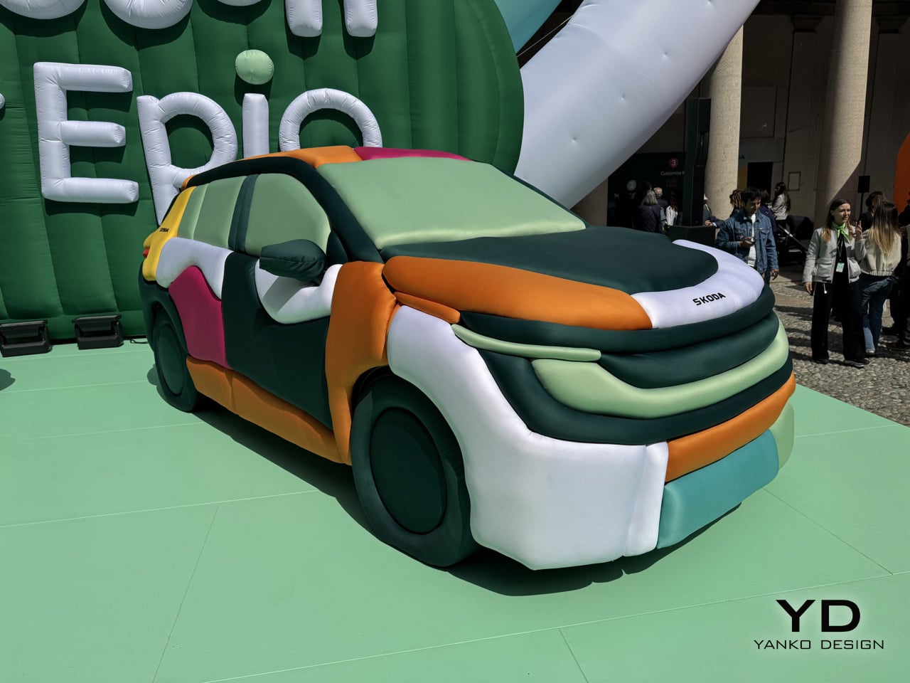
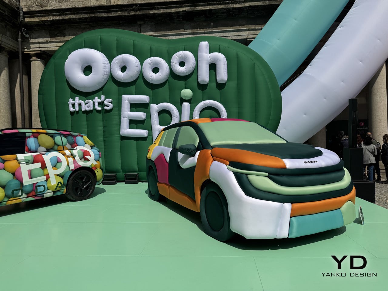
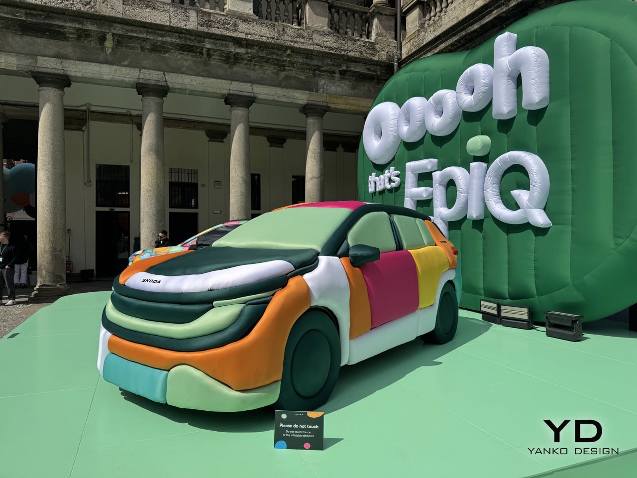
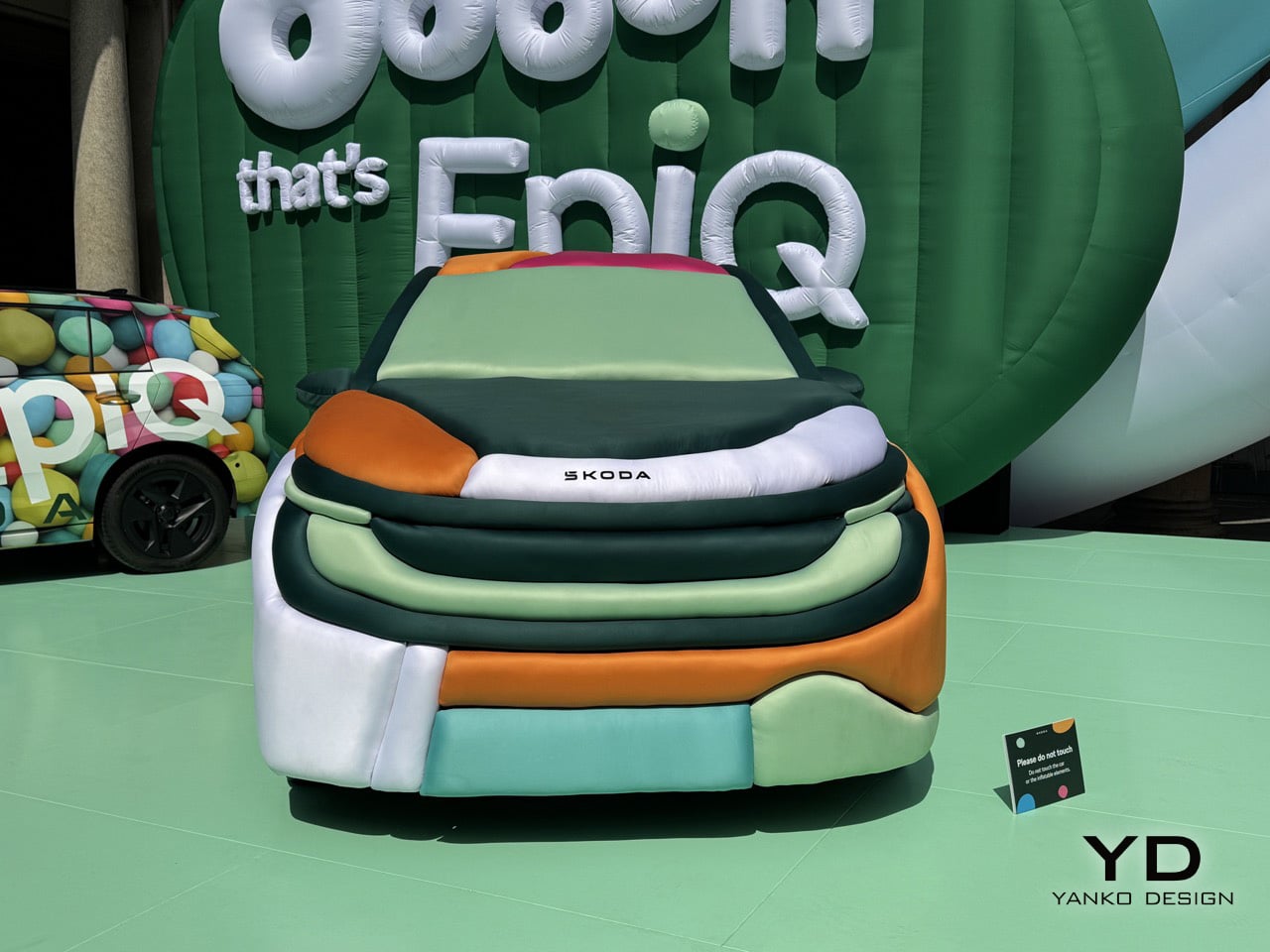
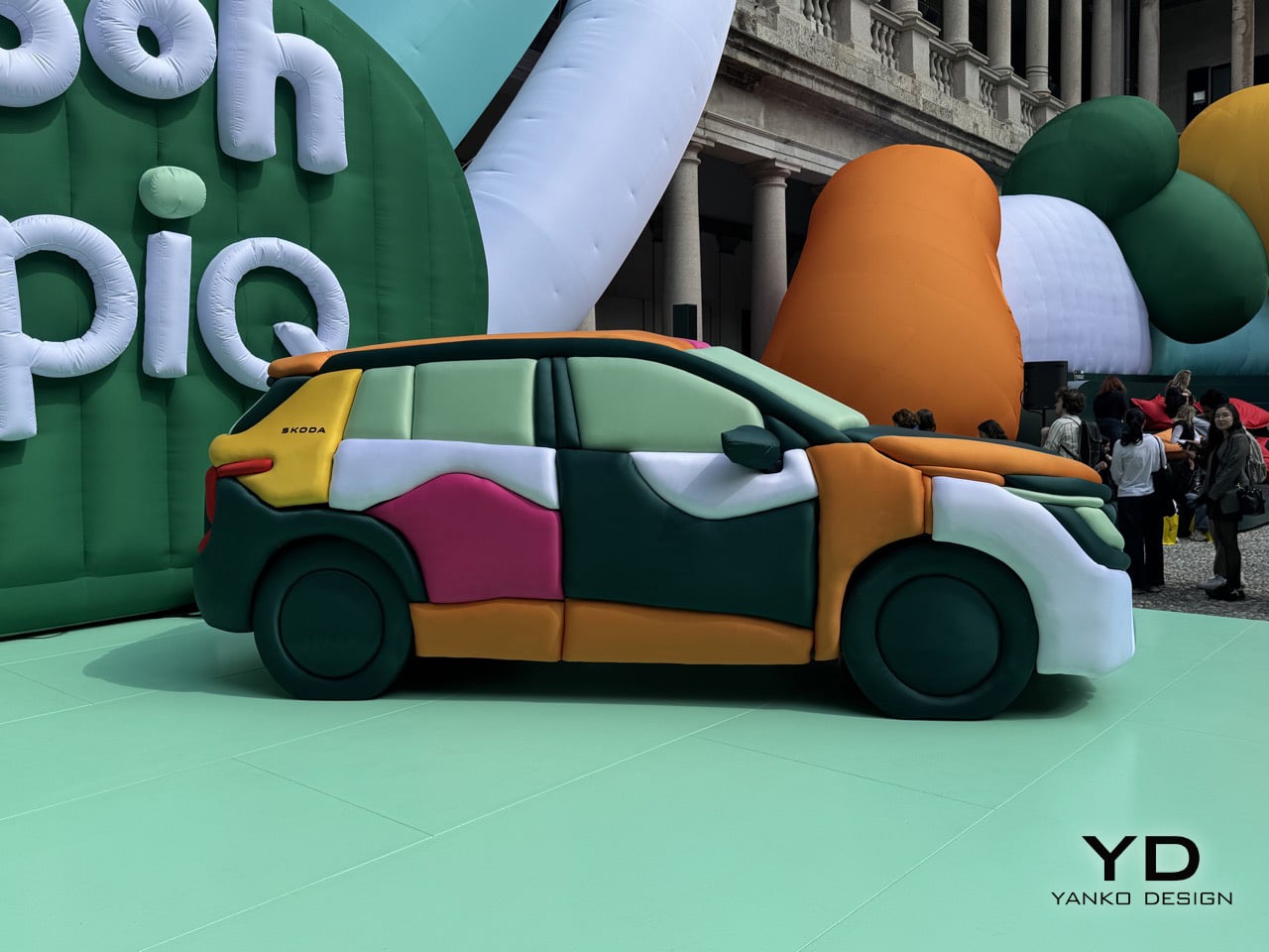
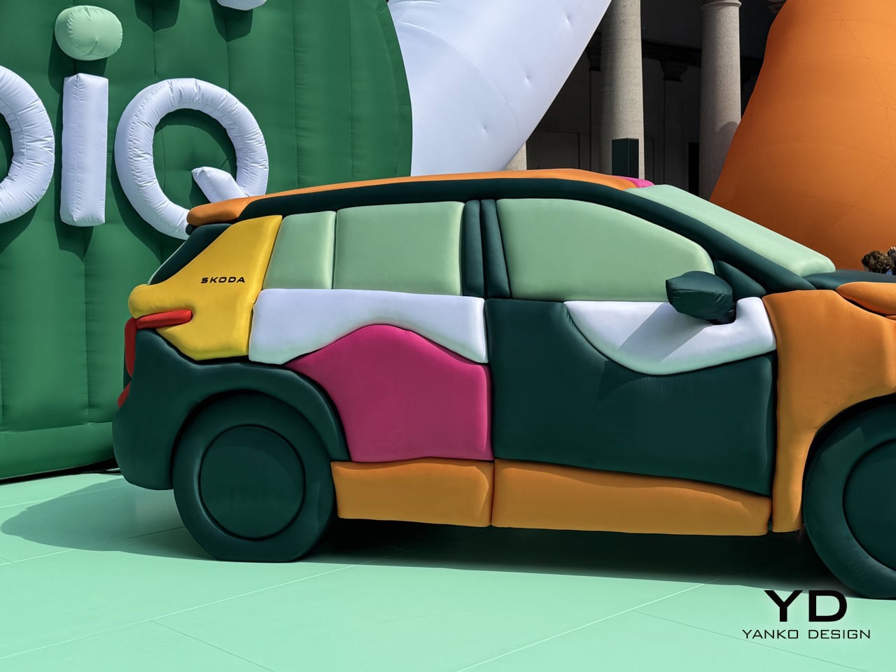
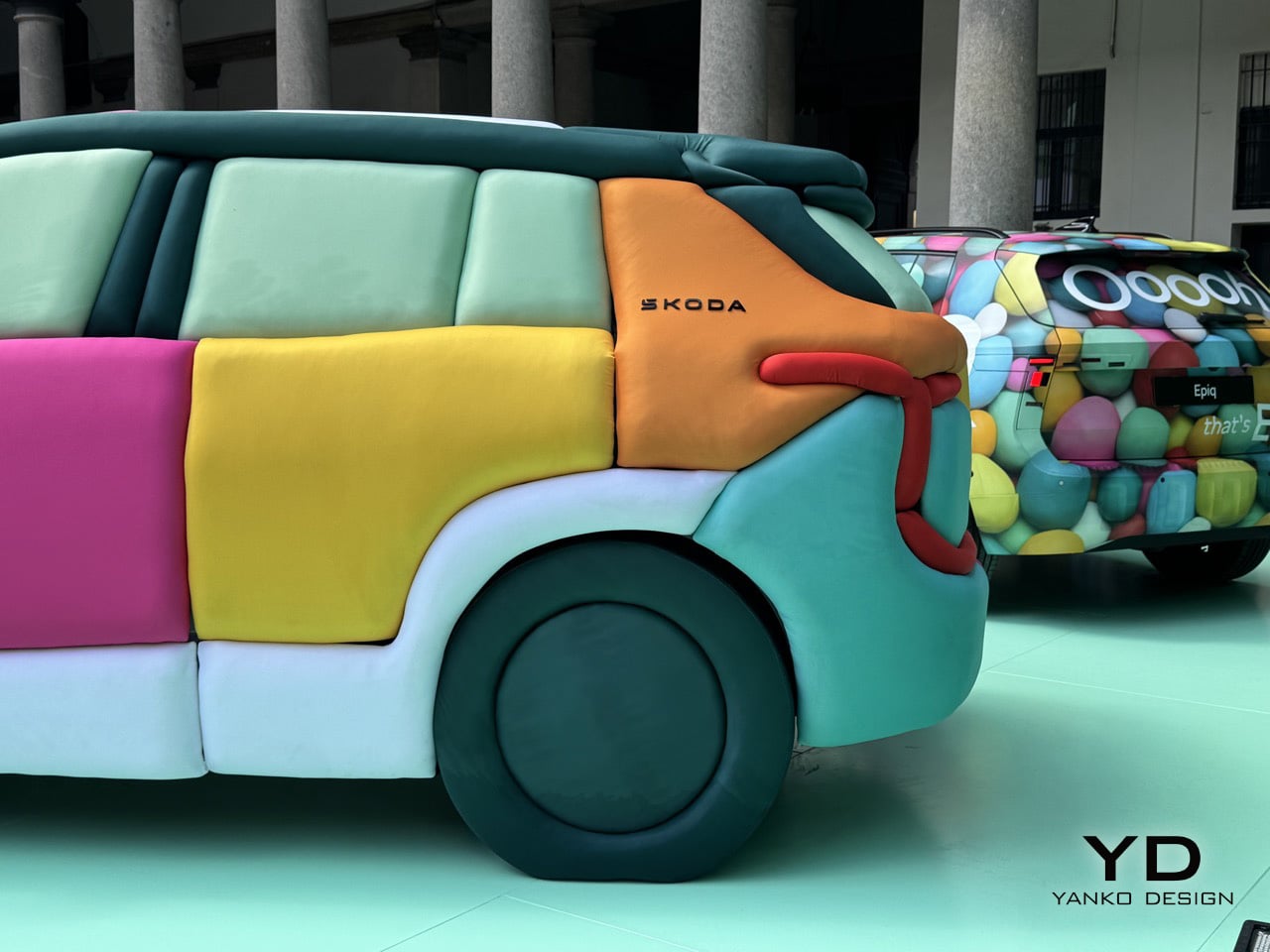
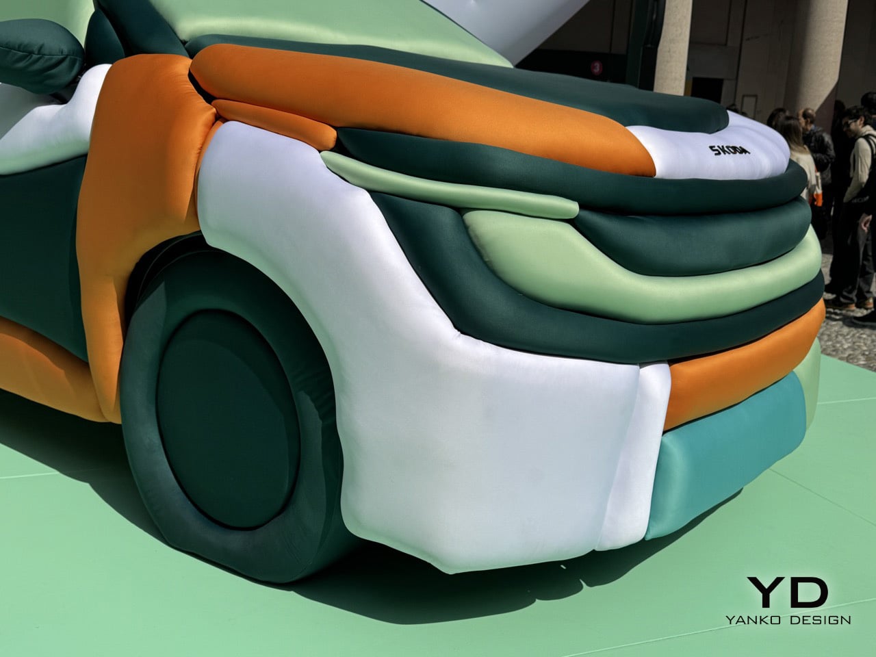
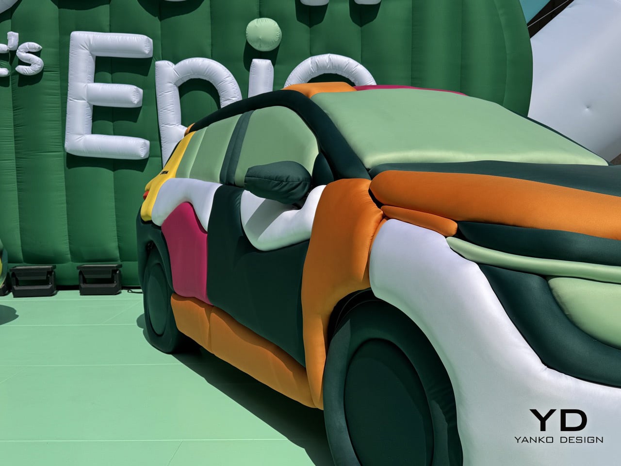
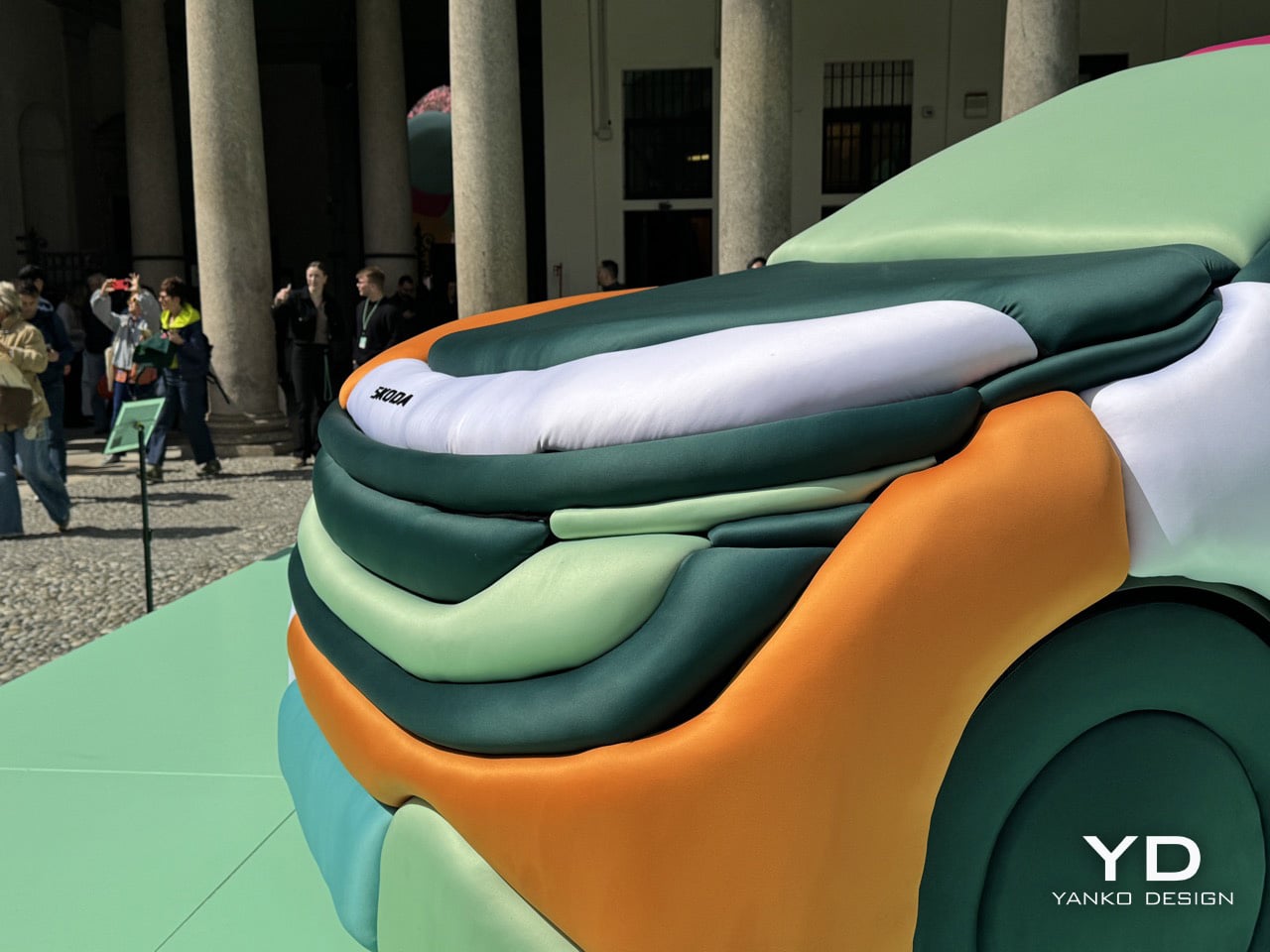
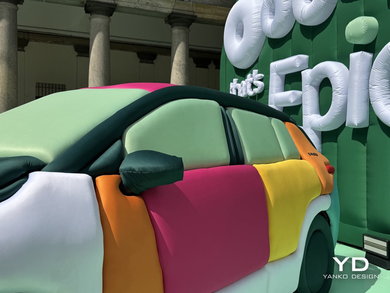
The Epiq, Skoda’s new electric SUV, became the canvas. Ulises Studio covered it entirely in inflatable fabric panels, each one a horizontal tube running across the body in a sequence of cheerful colors. Mint green, burnt orange, soft pink, butter yellow, pale turquoise. The effect is disarming. What should feel like a parked vehicle instead reads as a sculpture, a comment on automotive design language filtered through the lens of spatial intervention. Skoda staged it at Palazzo Senato with multiple Epiq vehicles, each wrapped in different inflatable treatments, creating a dialog between the engineered reality and Ulises Studio’s playful reinterpretation.

Designers: Ulises Studio & Skoda Design

The genius of the installation lies in how completely it transforms the car’s character without altering its underlying form. Every crease, every character line, every panel gap gets translated into soft, pillowy geometry. The horizontal tubes follow the Epiq’s actual contours, which means the inflatable version retains the proportions and stance of the real thing. You can still read it as a compact SUV, but now it feels approachable in a way sheet metal never could. The tactile quality is impossible to ignore. Your brain knows you’re looking at air-filled fabric wrapped around a vehicle, but your hands want to reach out and squeeze it anyway.

Ulises Studio didn’t stop at wrapping cars. They transformed the entire courtyard at Palazzo Senato into what they’re calling a “clay landscape,” an inflatable environment that extends the material language across the entire space. Oversized typography spelling out “Ooooh, that’s EpiQ” dominates one wall, each letter constructed from the same air-filled tubes. Smaller inflatable elements populate the courtyard like sculptural furniture, creating zones where visitors can pause and take in the installation from different angles. The floor itself gets treated to a matching mint-green surface that ties the whole environment together. This is spatial design at its most comprehensive, where every element reinforces the central idea.

What makes the collaboration work is that Ulises Studio treats the Epiq as part of a larger environmental narrative rather than the hero object that everything else orbits around. The cars are embedded in the landscape, surrounded by inflatable forms that share their material language and color palette. This creates a sense of cohesion that most automotive installations never achieve, where the vehicle feels like it genuinely belongs in the space rather than being awkwardly dropped into it. The studio’s background in creating immersive experiences shows in how they choreograph movement through the courtyard, using the placement of vehicles and sculptural elements to guide visitors through different zones of the installation. You don’t just look at the inflatable Epiq, you move around it, through the landscape it inhabits, encountering different perspectives and color relationships as you navigate the space.

Ulises Studio has always understood that spatial design is a form of storytelling. Their inflatable installations communicate ideas about accessibility, transformation, and how we experience objects in space. The Epiq installation applies that same thinking to automotive design. By swapping metal and glass for inflatable fabric, they strip away the aggression and seriousness that define most car launches and replace it with something genuinely delightful. The oversized inflatable typography spelling out “Ooooh, that’s EpiQ” reinforces the tone in a fairly Gen-Z coded way, allowing the brand to resonate with younger generations. This is design as spatial play, a reminder that objects can be functional and joyful simultaneously.

You’re an expert editor/blogger with a profound understanding of human psyche as well as Google SEO. Now generate 10 catchy, attention-grabbing, mildly provocative titles that are SEO-friendly too. Make your titles have natural language but craft them so they rank high on google News and Discover as of March 2026. Do your SEO research. Make them natural language, simple, yet captivating

The post Skoda’s Inflatable Car Installation at Milan Design Week Looks Like a Bouncy Castle Grew Wheels first appeared on Yanko Design.
The Inflatable Ocean That Knows When You’ve Gone Too Far

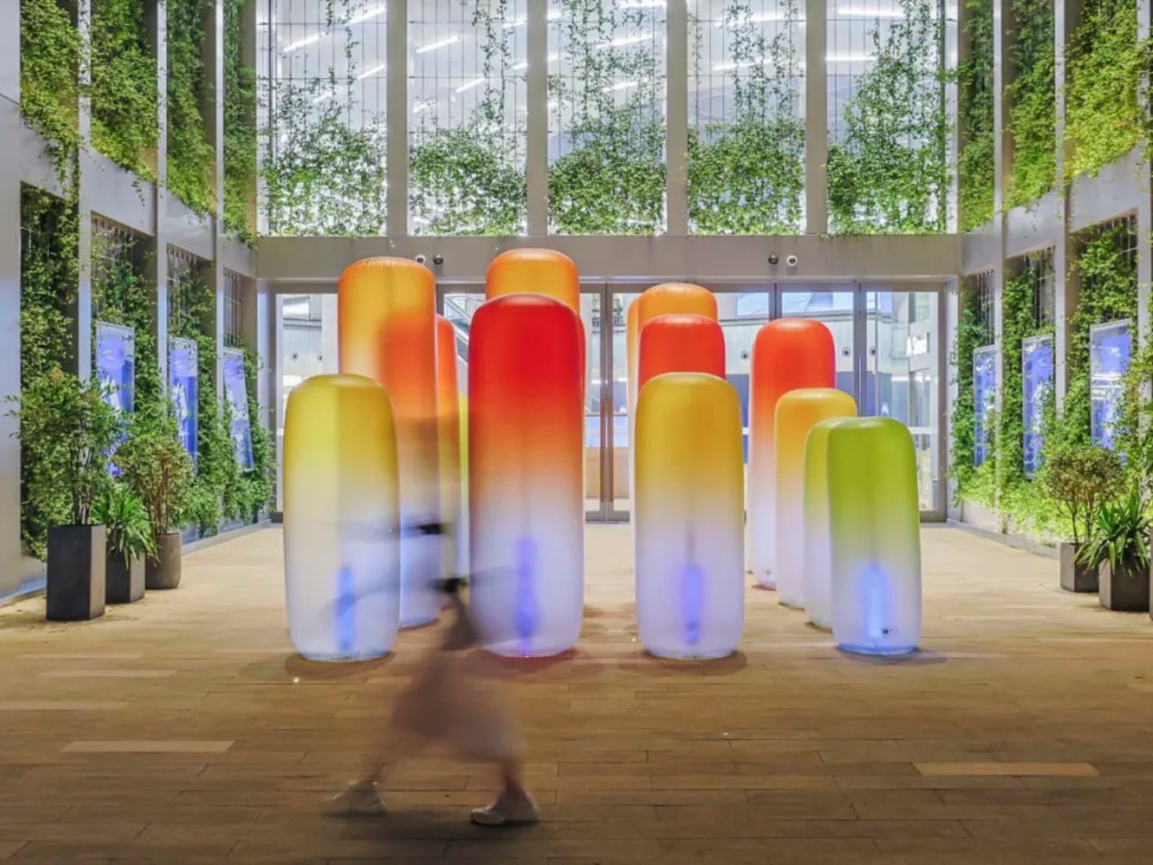
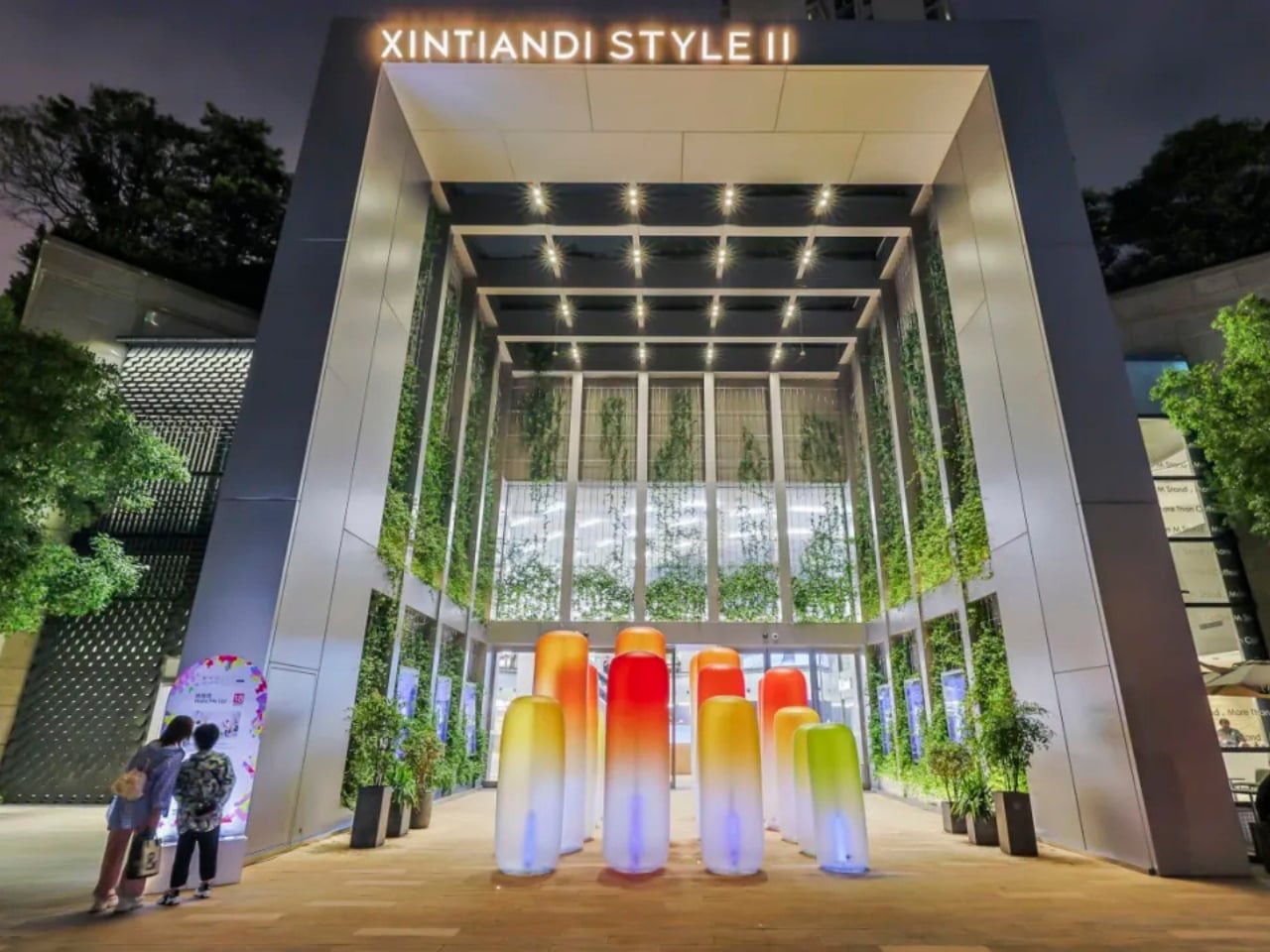
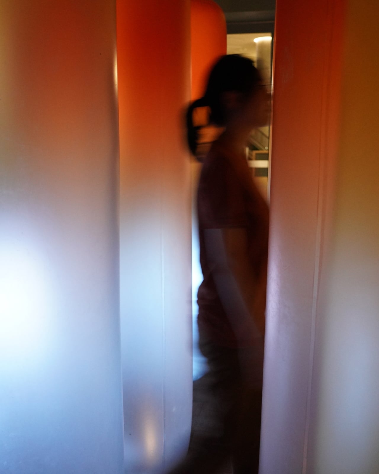
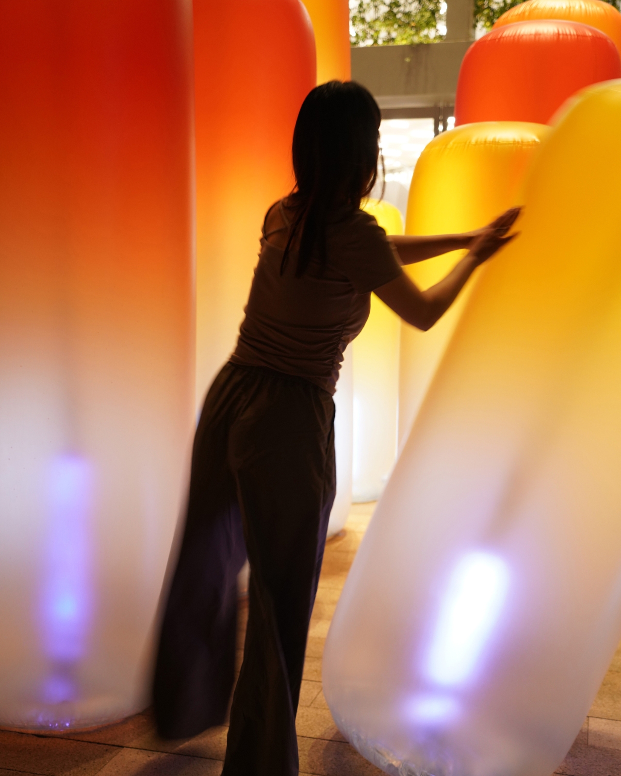
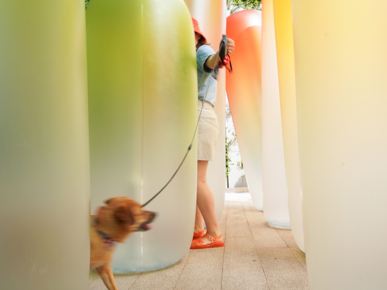
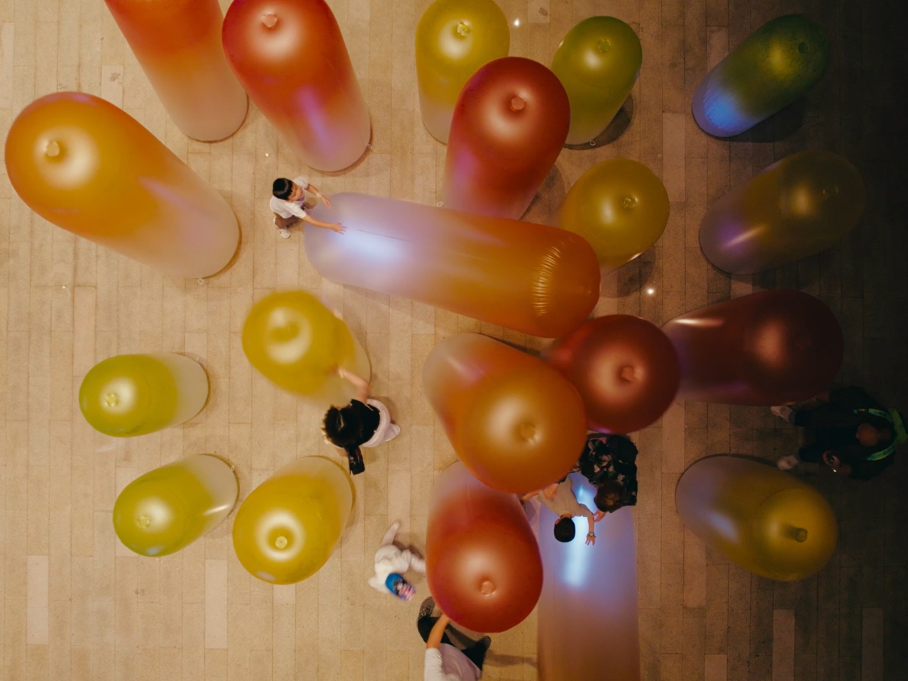
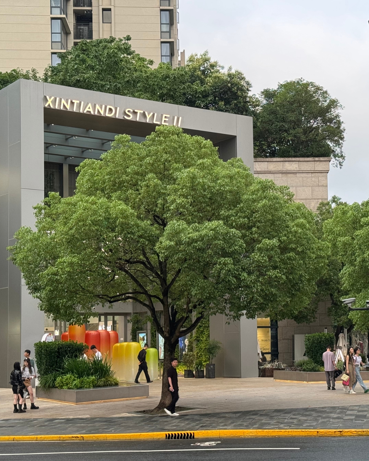
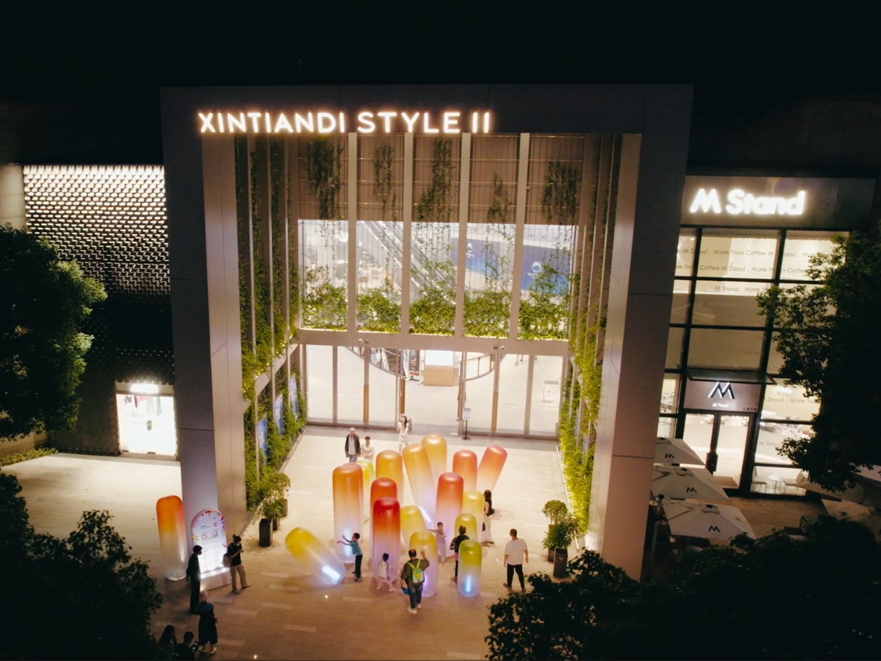
Not every design earns its attention. SHUOKE’s Light Me UP! is exactly the kind of work that makes you stop, look twice, and genuinely want to understand what you’re standing inside. And you are standing inside it. That’s the first thing to understand. Light Me UP! is not a sculpture you circle or a screen you observe from a polite distance. It is an enterable artificial seascape, a field of large inflatable forms installed at Xintiandi Style II in Shanghai, built at a scale that makes you feel genuinely small.

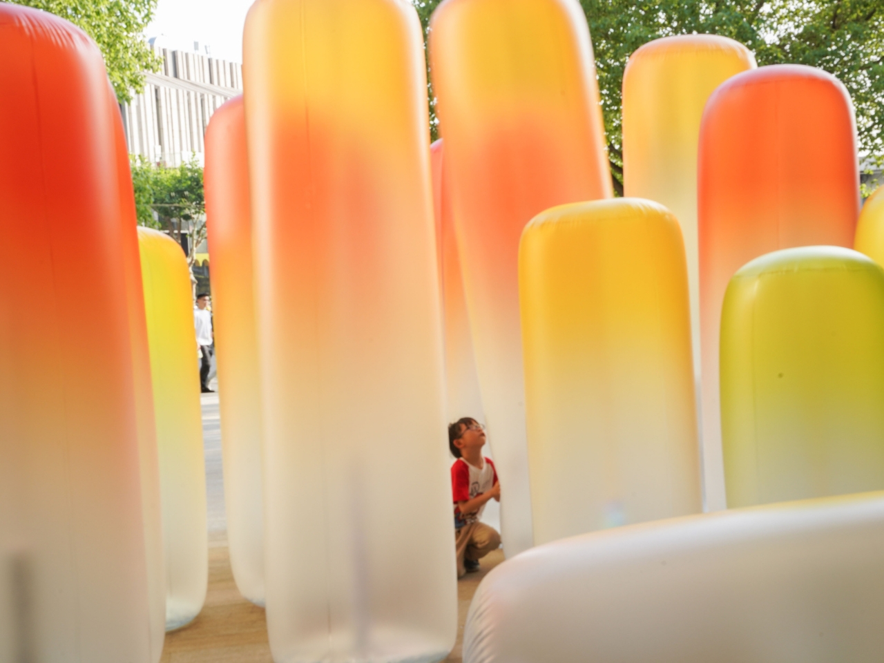
The columns are rounded and organic, their silhouettes somewhere between coral, sea anemone, and something you might find drifting in deep water. Their gradient coloring moves from deep orange and red at the crown down through warm yellow, then into a pale, almost translucent white at the base, where internal lights pool in cool blues and purples. During the day, they read as bold and almost playful. At night, they glow like living things. That quality, the sense that the installation is alive, is not accidental. It is the entire point.

Designer: Shuoke

Each form carries internal lighting that shifts in a breathing rhythm, expanding and contracting with a pulse that is slow enough to feel biological. The effect is subtle but deeply convincing. You stop noticing the material and start noticing the breath. When you touch one of the columns, or press through the narrow gaps between them, the light responds. The moment of contact produces a shimmer, a flicker of acknowledgment, that genuinely reads as reciprocal. SHUOKE described an earlier version of this logic as wanting the experience to feel more like interacting with a living thing than with a device, and Light Me UP! lands exactly there.

But here is where the design gets genuinely interesting, and where SHUOKE moves well beyond the usual boundaries of interactive installation work. The responsiveness has a limit, and that limit is intentional. Moderate interaction, a gentle touch, a slow movement through the space, draws the light out and activates the installation’s vitality. But push too hard, too aggressively, too much, and the light begins to fade. The structures appear to deteriorate. The environment dims and falls into stillness. The installation does not simply reward participation. It responds to the quality of it.

This is the marine ecology metaphor embedded directly into the interactive logic, and it is a clever and meaningful piece of design thinking. The ocean, like Light Me UP!, sustains and nurtures life up to a point. Past that point, it retreats. It diminishes. What SHUOKE has done is translate a genuinely complex environmental idea into a physical, embodied experience that anyone can feel without needing it explained. You don’t read the metaphor. You live it, in the span of a few minutes, with your hands and your body in a public space in Shanghai.

I think this matters more than it might initially seem. Environmental messaging in design has a tendency to stay on the surface: a recycled material here, a sustainability claim there. Light Me UP! goes somewhere different. It puts you in the position of the human who has the capacity to either nurture or exhaust the thing in front of them, and it gives you real-time feedback on which one you’re doing. That is a far more honest and demanding kind of design.
The forms themselves deserve more credit too. SHUOKE chose inflatable structures for a reason. They are soft, yielding, and slightly unpredictable. They move when pressed. They hold air the way living organisms hold breath. The choice of material reinforces the biological quality of the whole installation without ever having to announce it. The colors, warm and gradient and unmistakably aquatic at night, do the same work quietly.
Light Me UP! is the kind of design that operates on multiple registers at once: visually arresting from the street, physically immersive once you’re inside it, and conceptually coherent in a way that holds up the more you think about it. That combination is rarer than it should be, and when it shows up, it’s worth paying attention to.

The post The Inflatable Ocean That Knows When You’ve Gone Too Far first appeared on Yanko Design.