The 5 Home Upgrades Every Pet Parent Actually Uses (Not Just Buys)

Pet furniture & products have operated under a different standard than everything else in the home for too long. The scratchy beige tower. The plastic bowl by the radiator. The mat that looks like an afterthought. That gap between what owners expect from their own furniture and what they accept for their pets is closing, and the designs collected here are evidence of that shift. These are objects that take the animal’s life seriously without surrendering the room.

This is not a list for owners who want to spoil their pets. It is a list for owners who want their home to feel coherent, and who understand that coherence includes the animal living in it. A vacuum that maps your dog’s favourite spots. A bowl that keeps a fast eater honest. A table built around the fact that the cat is going to be there anyway. Five upgrades, and one shared premise.

1. Chunky Cat Tree

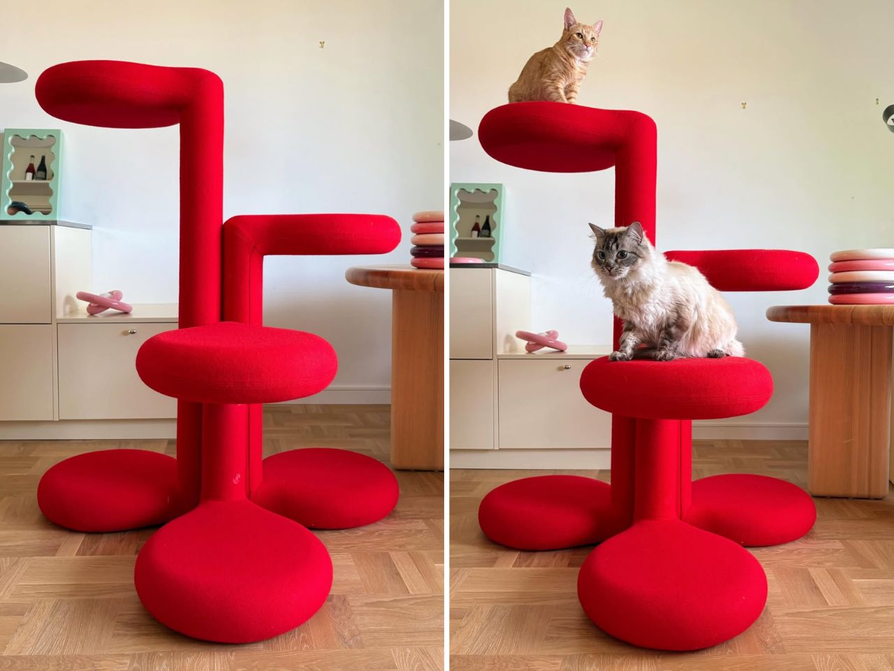
Cat trees solve a specific problem and fail at everything else. They anchor the room in exactly the wrong way, and most owners spend years working around them rather than with them. Gustaf Westman’s Chunky Cat Tree asks whether the category has to operate this way at all. The Swedish designer, known for his Chunky collection of ceramics, glassware, and home objects, has applied that same rounded vocabulary to a cat climbing structure. The result is a piece you place rather than hide.

The form carries all of Westman’s signatures: stacked volumes, inflated proportions, a material presence that reads as warm and deliberate. Made to order in Sweden, the tree is upholstered in wool across five colourways: red, yellow, purple, blue, and cobalt blue. Westman has said he designed it after years of seeing ugly cat trees and deciding the category deserved better. The comment captures the larger idea behind the object. Everything can be designed better, including the things we have come to accept as visually unpleasant.

What we like:

  • Treats cat furniture as a design category worth the same formal attention as any other home object
  • Wool upholstery and sculptural proportions earn placement in the room rather than tolerance of it

What we dislike:

  • Made to order in Sweden means lead times and pricing that will not suit everyone who falls for the visual
  • No confirmed US retail availability or price at time of writing

2. Narwal Flow 2 White
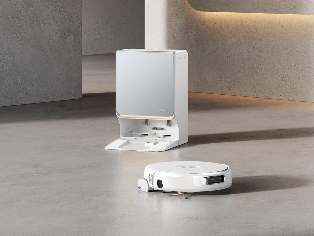
Robot vacuums and pet homes have always had a complicated relationship. Hair wraps around the brush, filters clog faster than the maintenance schedule allows, and the machine ends up parked in the corner half the time. The Narwal Flow 2 White addresses that at the hardware level before asking for any trust. A certified detangling system eliminates hair tangling. A 31,000 Pa motor handles the volume that stops most competitors mid-session. Pet Mode maps your animal’s active zones and adjusts cleaning paths accordingly.

The white colourway matters more than it sounds. Most robot vacuums read as appliances, objects you notice when working and ignore otherwise. The Flow 2 White sits closer to quiet luxury, a thing you leave in the room rather than hiding beneath furniture. Find My Pet uses the onboard camera to locate your animal from your phone on demand. A FlowWash mopping system heats water to 140 degrees for a result that goes well beyond what surface-level mop attachments typically deliver at any price.

Click Here to Buy Now: $1069.99 $1499.99 ($430 off, use coupon code “YDNARWAL”). Hurry, deal ends in 48-hours! Website Link Here.

What we like:

  • Pet Mode and the certified detangling system treat pet ownership as a design constraint rather than a marketing hook
  • Find My Pet and AI Floor Tag add genuine daily utility beyond the core cleaning function

What we dislike:

  • At $1,099.99 launch price, the commitment is significant for a category with a historically patchy reliability record

3. Sloddy
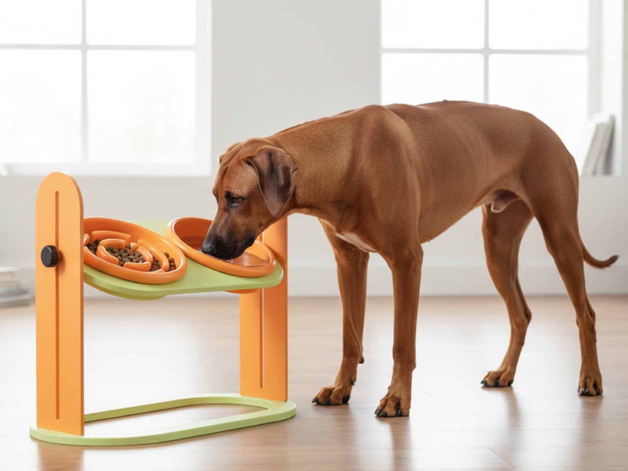
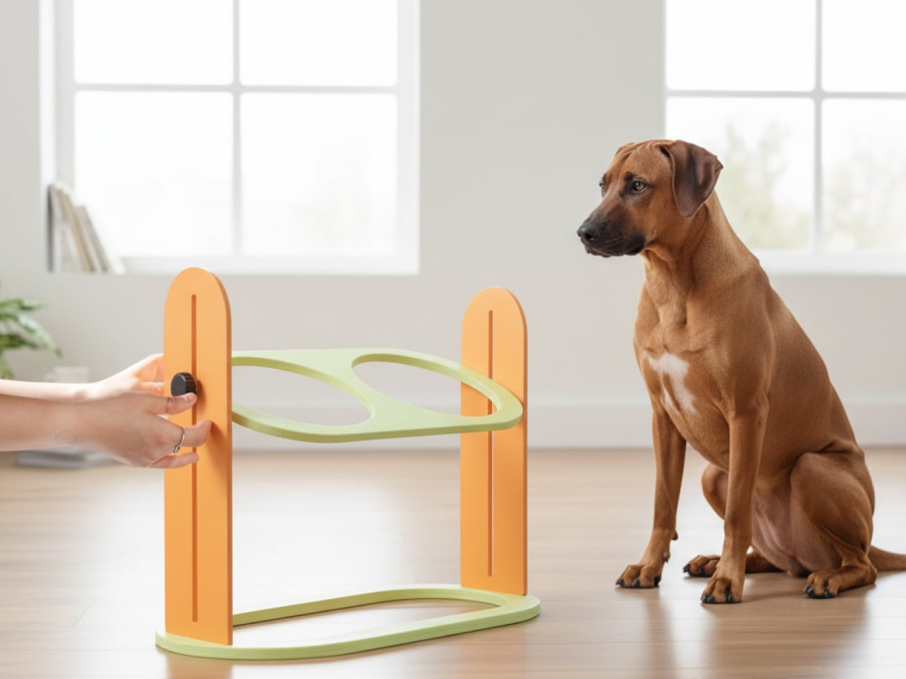
Slow feeders solve the problem once. Most dogs need about a week to learn the maze, and then mealtime returns to its previous five-second format. Designer Kyung-seo Yoo built Sloddy around that specific failure mode. The bowl ships with multiple interchangeable puzzle inserts at increasing difficulty levels, and you rotate them as the dog adapts. The challenge stays real. The eating pace stays controlled. It is a straightforward idea that the rest of the category never thought to try.

An adjustable MDF wood stand raises or lowers the bowl to match shoulder height, addressing a posture and digestion concern that most pet owners encounter long after they needed the fix. Every component disassembles fully for cleaning, with no corners that trap food beyond reach. The peachy-orange palette and warm wood base sit somewhere between kitchen object and design piece, and the recyclable cardboard packaging doubles as a storage shelf for the spare inserts once the box is opened.

What we like:

  • The modular difficulty system is the first meaningful update to the slow feeder format in years
  • Full disassembly for cleaning eliminates the trapped-food problem that makes most slow feeders a short-term purchase

What we dislike

  • The modular system only works if the owner actively manages the insert rotation — it requires consistent owner effort, and most households will default to leaving the same insert in indefinitely
  • The MDF wood stand, while visually warm, is vulnerable to water damage and splashing at feeding time, which is a daily reality with most dogs

 4. Pet Paws
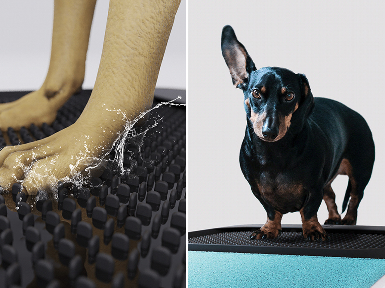
Paws are how the outdoors follows your dog into every room. Mud, grit, bacteria, and allergens come in with every return from outside, and a doormat or a towel handles it partially at best. This portable mat was designed to close that gap by combining three functions- cleaning, drying, and disinfecting- in a single object that sits where the problem actually begins. The all-in-one approach trades the multi-step routine by the door for something that takes seconds and requires nothing else.

The portability is part of the logic. A fixed solution only works at one entry point; a mat you can move adapts to wherever the animal actually comes in, which is rarely the same door every day. For households where paw hygiene connects directly to allergy management or general cleanliness standards, shortening the threshold routine without eliminating it offers something most door products never attempt: cleaning, drying, and treating in the same step, without a trip to the sink.

What we like:

  • Three-in-one functionality handles the most repetitive daily pet hygiene task without multiple products
  • Portable format adapts to wherever the animal actually enters, not just the main door

What we dislike:

  • The disinfecting function almost certainly requires a cleaning solution or refill, adding an ongoing cost and supply dependency that the headline promise of a single portable mat quietly glosses over
  • Dogs that resist paw handling or unfamiliar textures underfoot will need consistent training before the mat becomes a reliable part of the routine rather than something they walk around

5. Dinos Cat WFH Table

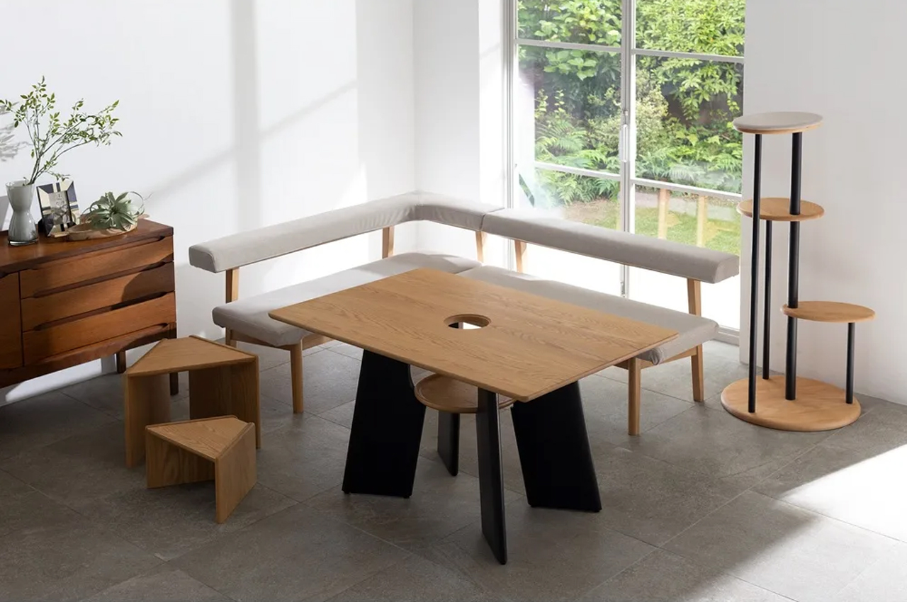
Anyone who works from home with a cat recognizes the pattern. The animal locates the warmest, most centrally placed surface in the room and treats it as its own. The desk. The keyboard. The notebook. Japanese furniture company Dinos designed a table that accepts this behavior as a given and builds around it rather than against it. A center cavity in the tabletop creates a through-hole, and a hidden perching shelf beneath gives the cat a settled spot at the same level as everything happening above.

The logic is quiet and functional. Rather than competing with the animal for desk space, the table distributes the surface so both uses fit without interrupting each other. The cat sits close enough to its owner to settle down, without walking across the keyboard to get there. For anyone who has rearranged a work setup around a cat’s habits anyway, this just makes the accommodation honest, building it into the object rather than improvising it daily with a cardboard box and a folded blanket.

What we like:

  • Treats the cat as a design parameter from the start rather than an inconvenience to be managed around
  • The hidden perching shelf reduces desk negotiation without requiring any behavioral change from the animal

What we dislike

  • The center cavity is sized and designed specifically for cats, making it a non-starter for dog owners and narrowing the audience of this roundup in a way worth flagging before recommending
  • The table assumes the cat will use the designated perch, and cats are reliably indifferent to designated anything, meaning the design works best for animals already inclined to settle rather than roam

Good Design Has No Exceptions

Pet ownership has changed faster than the objects designed around it. The animals have moved into bedrooms, onto sofas, into daily routines in ways the existing product categories have not kept pace with. What this list represents is a small group of designers who noticed that gap and decided to close it, not by producing novelties, but by applying real design thinking to objects that have been overlooked or tolerated for too long.

None of these are impulse purchases or quick fixes. They are considered responses to specific problems, and that distinction matters. A cat tree that earns its spot. A vacuum that accounts for hair before it becomes a problem. A bowl that stays challenging. A mat that completes the threshold routine in one step. A table that accepts the cat before it ever arrives. That is what good design looks like when it reaches the right problems.

The post The 5 Home Upgrades Every Pet Parent Actually Uses (Not Just Buys) first appeared on Yanko Design.

9 Desk Upgrades for a Fresh Semester, or Just a Fresh Start at Work

The desk is the one surface in your life that shows exactly where your head is. Cluttered means overwhelmed. Bare means uninspired. Getting it right is less about organizing what you already own and more about deciding what deserves to be there. These nine picks span the categories that matter most: what you type on, what lights the page, what holds your tools, and what the whole surface rests on.

None of them are here to fill space. Some solve a problem you have accepted as permanent. Some reframe a category you stopped thinking about years ago. Every one of them changes something specific about how a desk feels to sit at, which is a harder thing to achieve than it sounds, and the only standard worth holding a desk object to.

 1. Altar I Mechanical Keyboard

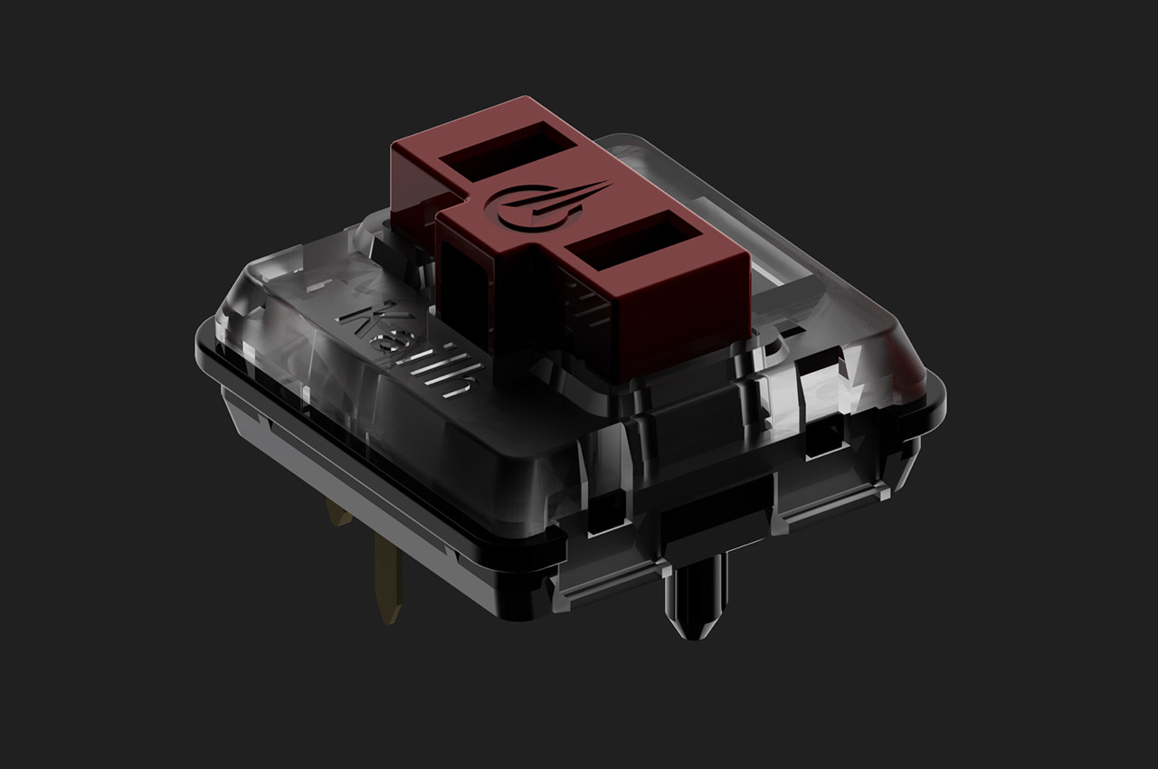
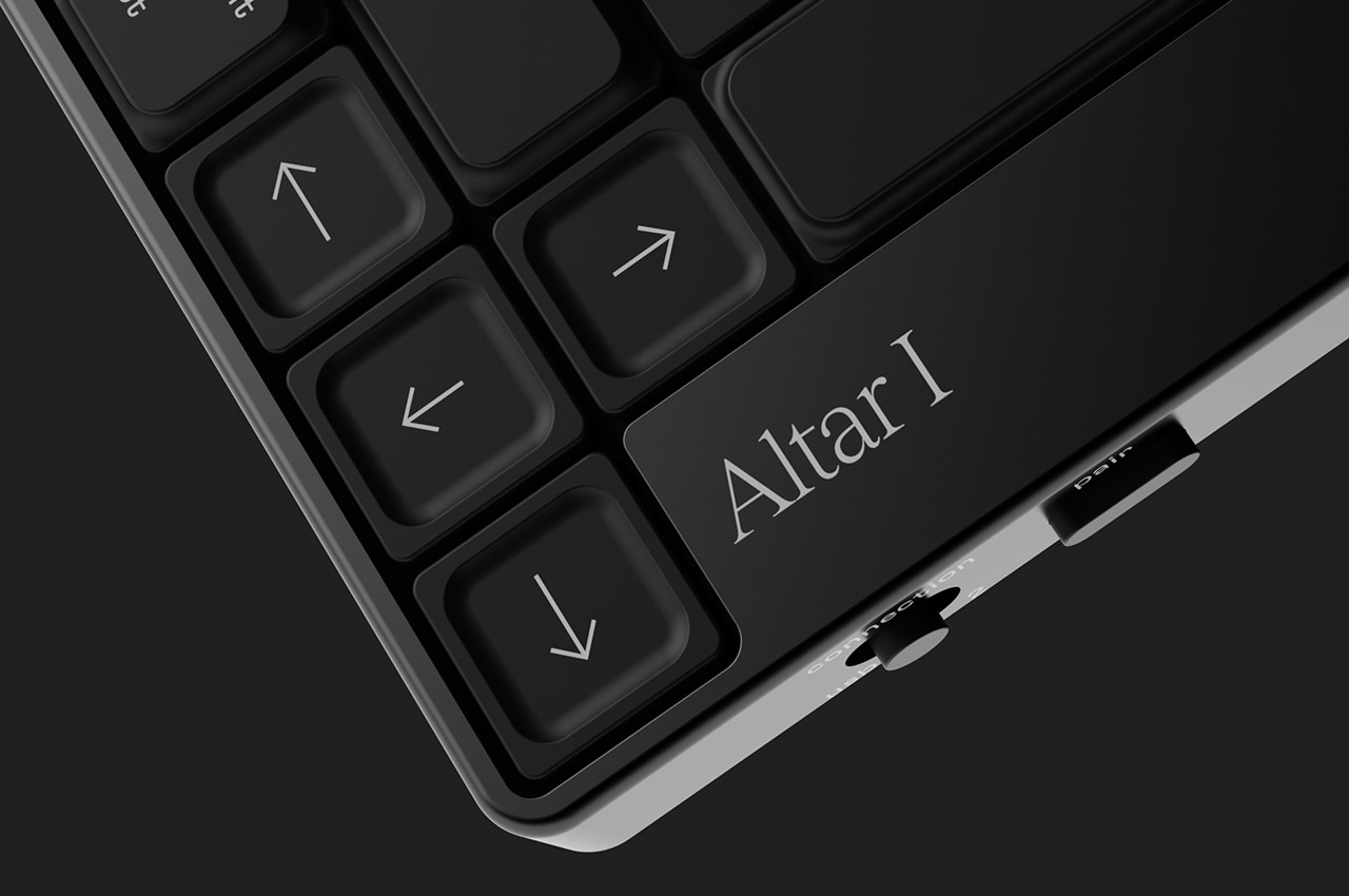
The keyboard is the piece of hardware your hands never leave, which makes it the most personal object on a desk and the one most people compromise on. Electronic Materials Office, a London startup, built the Altar I around one clear idea: sustainability should not mean sacrifice. The chassis is machined from aluminum. The plastic parts are made from post-consumer waste. The result is an ultra-low-profile mechanical keyboard as considered as anything from Teenage Engineering, without carrying that brand’s price tag.

What draws you in is the 75% layout and the rotary encoder knob at the top right, a dial that gives analogue control over whatever function you assign it. The switches are low-profile mechanical, the keycaps are doubleshot PBT, and the casing sits at 1.5 centimeters, thin enough to shift the geometry of typing without abandoning the feedback that makes mechanical keyboards worth owning. Compatible with Mac and Windows, and built around material convictions most keyboard manufacturers never bother to name.

What we like

  • The plastic chassis is built from post-consumer waste, making sustainability structural to the design rather than a label printed on the packaging
  • The rotary encoder knob gives analogue control over an assigned function, a detail that rewards daily use well beyond first setup

What we dislike

  • As a first product from a startup, long-term availability of keycap sets in compatible low-profile sizing is worth thinking about before committing
  • The 1.5 cm profile is built for a specific kind of typist; those who prefer more switch travel will find the adjustment takes time

2. Infinite Solas Lamp

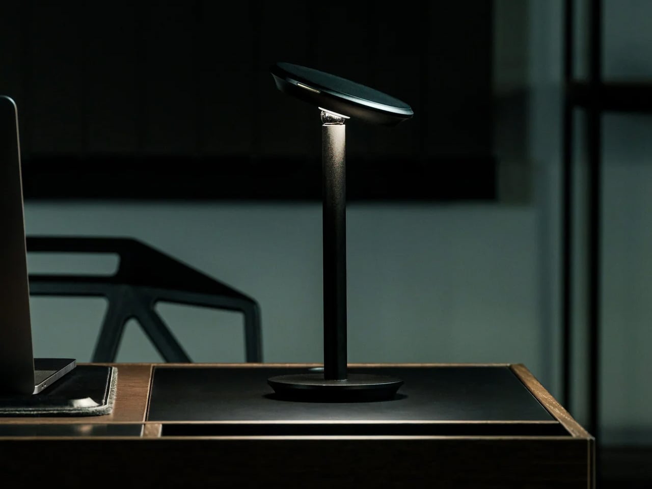
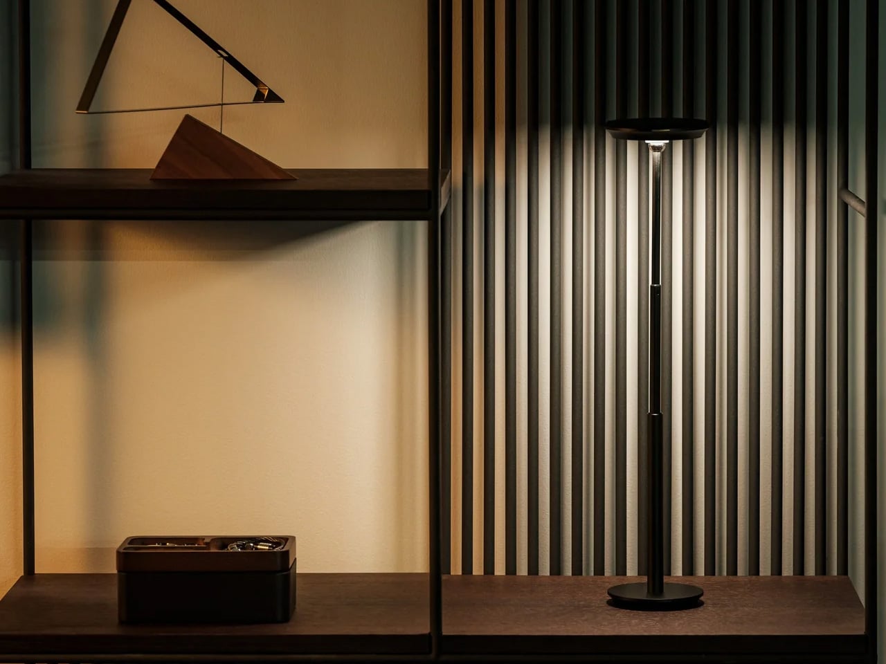
Most desk lamps are a wire, a bulb, and an arm you adjust once and never touch again. The Infinite Solas Lamp, designed by Koki Sato, is a different proposition entirely. It is wireless, machined from aluminum with an anodized finish, and adjustable in four directions: height, angle, brightness, and warmth. The magnetic ball-joint head moves freely and holds its position without tightening a knob. At $325, it earns its place not just as a light source but as the most considered object on the desk.

The two colorways, black and warm champagne, are finished to a standard that makes the lamp feel like a display object even when it is off. The absence of a cord changes the desk in a way that is difficult to articulate until you have lived with it – there is simply nothing to route, nothing to hide, and no outlet to negotiate with. A single charge lasts approximately three days of use, which means it travels as easily as it stays still. The light you work under is not a minor consideration.

Click Here to Buy Now: $325.00

What we like

  • The magnetic ball-joint head adjusts angle without repositioning the base, a detail that rewards repeated daily use rather than just an impressive first setup
  • Wireless construction with a multi-day battery removes the cord entirely, so the desk stops being organized around the nearest outlet

What we dislike

  • At $325 with limited units available, it is a committed purchase rather than a casual browse – there is no sleeping on this one
  • The anodized aluminum finish will show fingerprints with regular handling, particularly on the champagne colorway, which asks for occasional light maintenance

3. Mosaic AI Desk Organizer

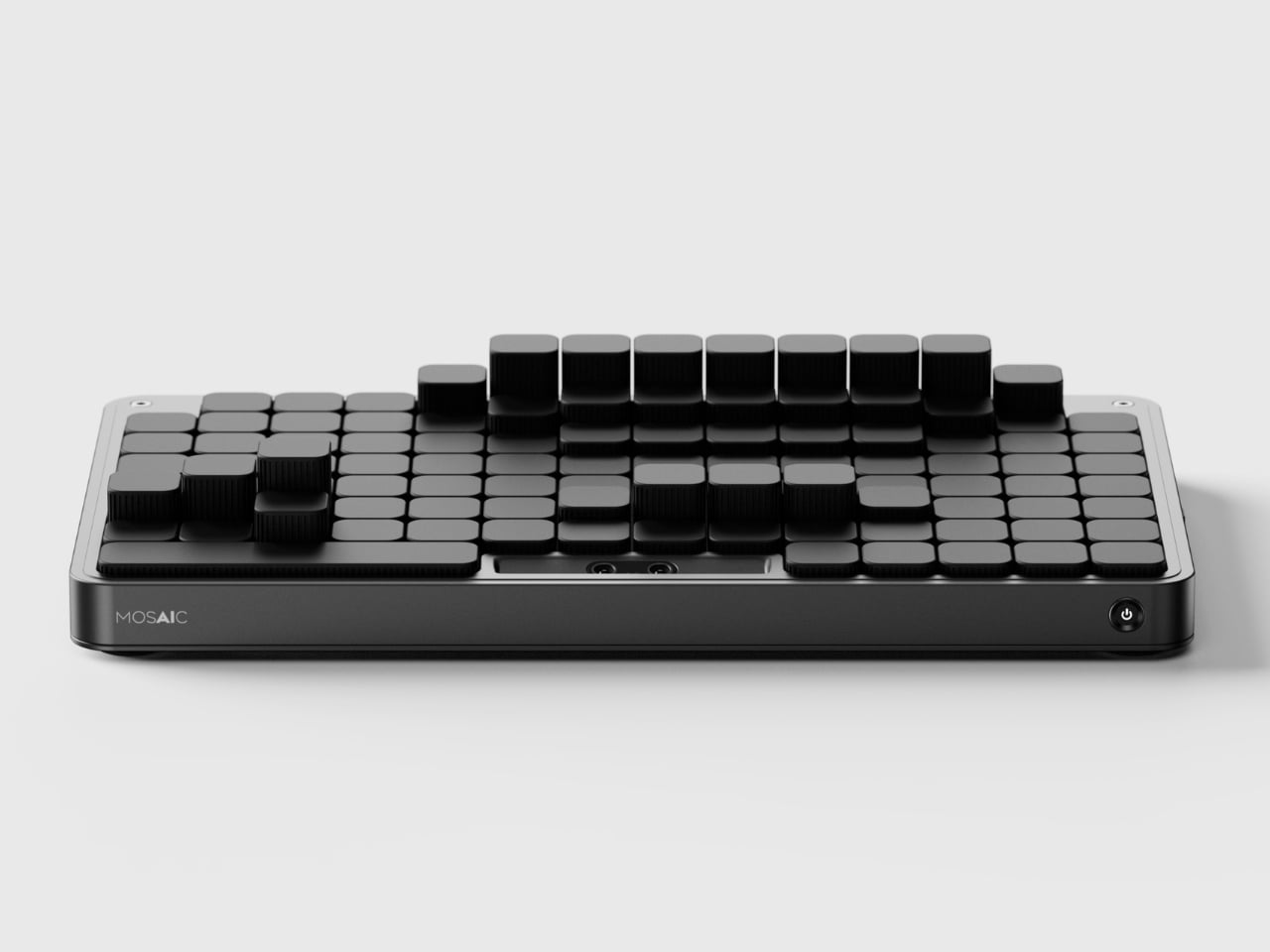
Most desk organizers ask you to adapt to them. You get a tray with fixed compartments, you shove your things in, and either it fits or it does not. The Mosaic takes the opposite approach, replacing fixed compartments with an AI-powered modular surface that shifts its configuration around whatever you place on it. The layout changes when your desk changes, which is something no standard tray has ever managed, and the reason most desk organizers stop being used within weeks of being bought.

The black, low-profile form reads closer to a keyboard deck than a conventional tray, which helps it disappear into the desk rather than announcing itself as the thing you added to manage the other things. The intelligence lives in the shifting surface beneath, not in any visible technology. For anyone who has bought and abandoned a desk organizer because it was designed for someone else’s setup and someone else’s habits, the Mosaic is the version of that object that was worth waiting for.

What we like

  • The AI-powered shifting surface reconfigures around your objects rather than asking you to adapt your habits to a layout someone else decided on
  • The flat, low-profile form reads as a desk surface object rather than a gadget, which means it does not disrupt the visual calm of a considered setup

What we dislike

  • As a concept, it is not currently available to purchase, which means the shifting surface remains to be tested against the friction of real daily use
  • The AI layer adds a dependency on software and power that a standard tray does not require, a trade-off worth naming before committing

4. FoldLine Pen Roll

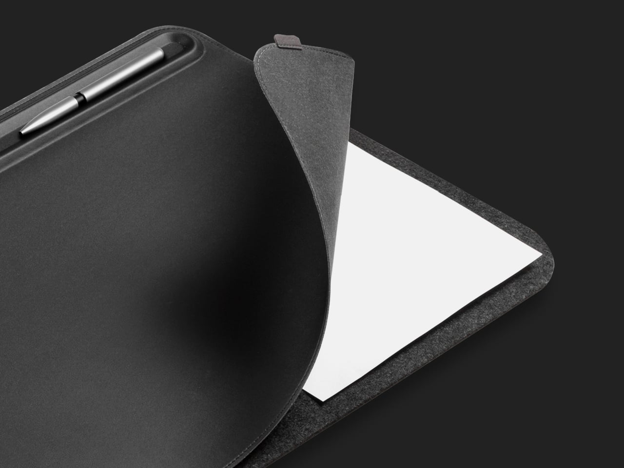
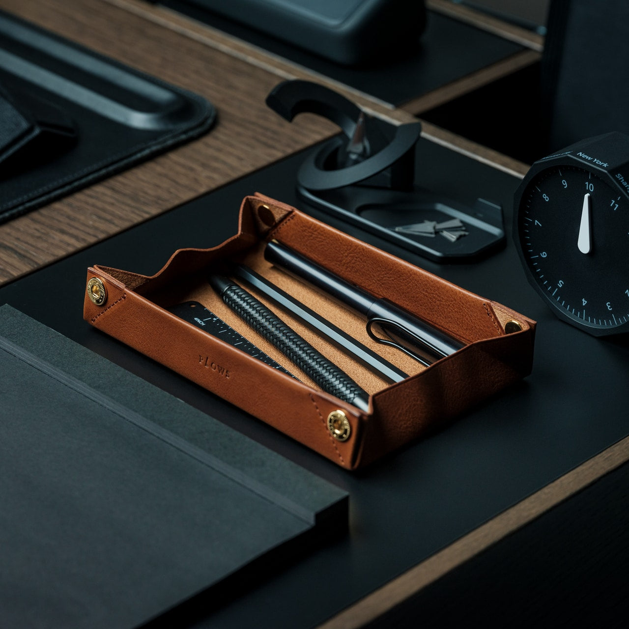
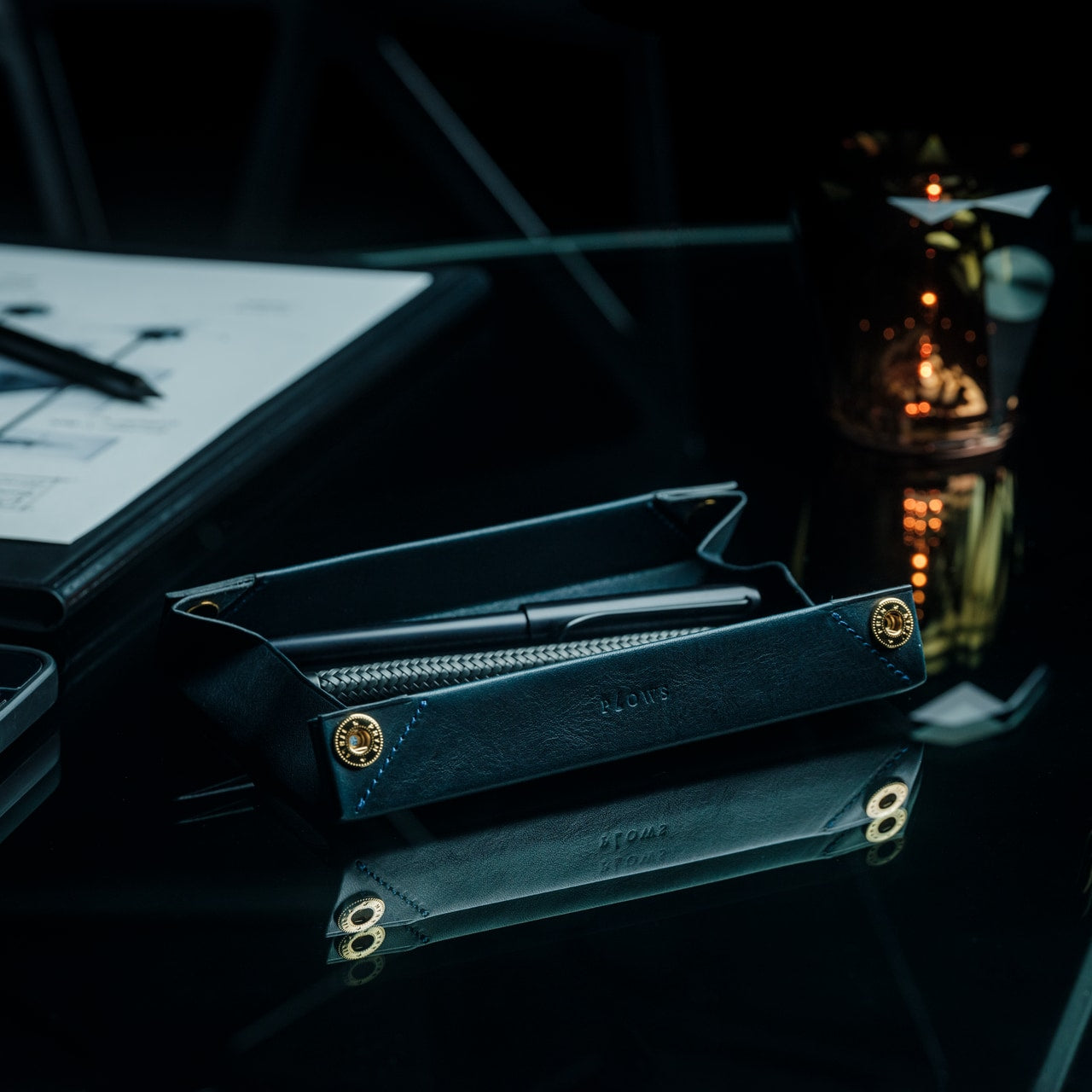
There is a version of the pen roll that is purely about storage – something you zip shut and throw in a bag. The FoldLine is not that. Cut from a single piece of Italian Minerva Box leather, it folds from a flat carrying case into a structured desk tray in under two seconds, using an origami-derived geometry that requires no buckles, no snaps, and no secondary parts to hold its form. At $135, it is one of those objects that photographs poorly and reads perfectly the moment you first use it.

The way it works changes how you relate to your pens and tools during a working day. They are no longer packed away in a case sitting somewhere to the side. They are visible, accessible, and arranged in a tray that earned its form through a single material decision. Minerva Box leather develops a patina over time, which means the object improves alongside the writing habit it is built to support. For anyone trying to give their desk a cleaner start, this is one of the few pen cases that actually stays on the surface.

Click Here to Buy Now: $135.00

What we like

  • The single-piece Minerva Box leather construction folds into a desk tray in under two seconds, replacing both a carrying case and a pen holder with one object
  • The leather develops a patina with use, meaning the piece improves over time rather than declining into the category of something you eventually replace

What we dislike

  • At $135, it is priced for the buyer who values material quality and craft, which rules out the impulse purchase
  • With only a few units available at any given time, it is not something you can return to comfortably once you have decided to think about it

5. Aya & Sfera

Ikigaiform began with full-size self-watering planters, and Aya and Sfera carry that thinking directly. Both pieces belong to a collection of organic-form pots built through parametric design, with intricate surface patterns brought to life through 3D printing. The desk versions are a scaled-down translation of that same thinking: compact cups that sit on a work surface with the surface detail and proportional precision of something designed for a gallery shelf rather than a pen holder. They hold what a pen cup holds, but the conversation they start is a different one entirely.

A desk that has one beautiful, considered object on it feels different to sit at than one that does not. Aya and Sfera are that object for the corner of the surface you were previously ignoring – the patch of desk where pens accumulate, or where a glass ends up, or where nothing particularly useful ever lives. Parametric design rarely produces something this quiet, and quiet, in the context of a desk with a lot going on, is exactly the quality worth seeking out.

What we like

  • The parametric surface patterns are executed at a level of precision only achievable through 3D printing, producing detail you would not find in a mass-produced desk object at this scale
  • The pieces work equally well as pen holders, small planters, or catch-all cups, which means they earn their footprint in more than one direction

What we dislike

  • The organic form and surface complexity make these presence objects rather than background ones; they draw the eye, which may not suit every working environment or every aesthetic
  • 3D-printed production at this level of surface detail typically carries longer lead times and fewer color options than injection-molded alternatives at a comparable price

6. Modular Monitor Stand

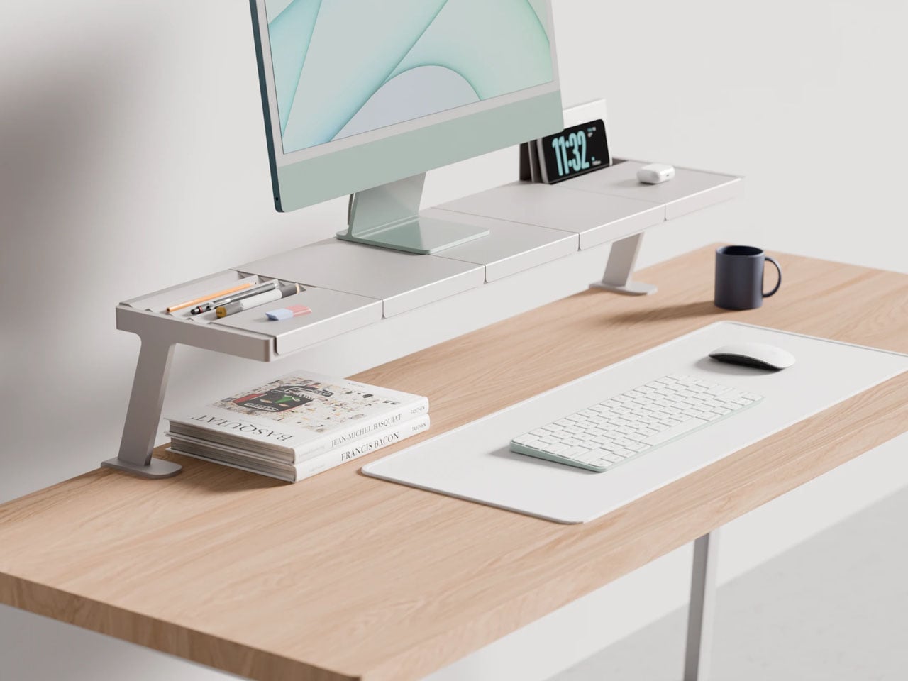
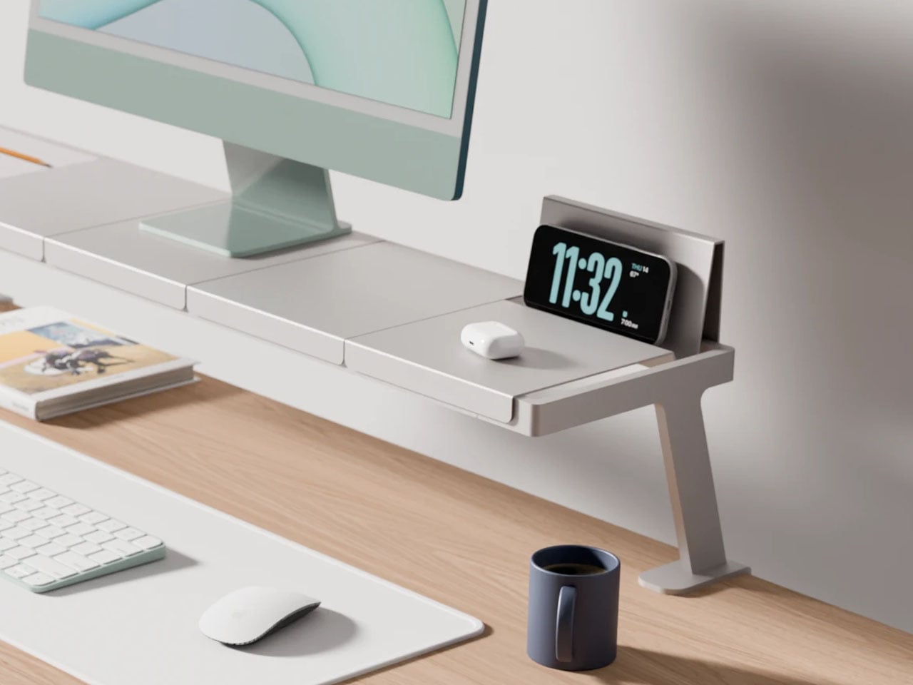
The problem with a multi-device desk is not the number of devices. It is the number of solutions – one arm for the monitor, one stand for the phone, one dock for the laptop, one tray for the cables, each from a different brand, in a different finish, at a different height. Lorenzo Vega’s Modular Monitor Stand is built around the idea that all of this should be one object: a single aluminum structure that manages the monitor, the devices around it, and the cable situation that follows, without requiring negotiation between three separate manufacturers.

The modular sectional tray system mounts to the desk edge rather than claiming space on the surface below the monitor, which means the desk opens up rather than getting more crowded. The aluminum construction gives it the material credibility to sit alongside considered objects rather than reading as a productivity accessory purchased out of necessity. For anyone running more than one screen, or a laptop alongside a tablet, this stand frames a useful question: what if all of it was the same thing?

What we like

  • The edge-mounted modular tray frees up the desk surface below the monitor rather than consuming it, which is exactly where most monitor stands go wrong
  • The aluminum construction gives it material weight that sits comfortably alongside design-forward desk objects without reading as the functional odd one out

What we dislike

  • It is a working concept at prototype stage, not a product available to purchase today – the idea is sound but no confirmed timeline exists yet
  • The modular configuration requires upfront thinking about which sections you need and in what arrangement, adding a planning layer before setup can begin

7. Upright Wireless Charging Stand

Wireless chargers tend to be either flat, which puts the phone face-down and invisible, or vertical, which makes them bulky, plasticky, and in the way. The Upright, designed by Aaron von Kreisler of Modhaus, takes the vertical format and rebuilds it from materials with no obvious business being inside a charging product: concrete and hardwood. The form is a tapered pyramid, weighted at the base so that docking a phone feels deliberate rather than fumbled. It delivers 25W Qi2 wireless charging and raised over $63,000 in backing.

Six finishes across three wood tones and two concrete colorways mean it integrates into most desk aesthetics without asking you to compromise in either direction. The desk charger has been an overlooked category for too long – most people accept a plastic puck because charging is a background task, and background tasks rarely earn beautiful objects. The Upright argues the opposite: that the thing you reach for most often on the desk is precisely the one most worth designing well.

What we like

  • The combination of concrete and hardwood in a charging object produces something display-worthy rather than something you push behind the monitor and try to forget
  • Six finish options span enough range to integrate with both warmer, wood-heavy setups and cooler, more minimal configurations without compromise

What we dislike

  • The material quality and precision place it above most wireless chargers in cost – that gap is the point, but it will not suit every budget or every desk context
  • The vertical format requires a specific phone orientation that flat chargers do not enforce, a small but real constraint worth knowing before purchasing

8. Orbitkey Desk Mat

The desk mat is the upgrade most people make last, after the keyboard and the lamp and the stand, which is the wrong order. Everything you own sits on the mat, which means the mat determines whether the setup reads as cohesive or assembled from whatever was nearby. The Orbitkey Desk Mat is built from premium vegan leather on top and 100% recycled PET felt underneath, making it water-repellent on the surface and stable on whatever desk it covers. It won both the Red Dot and iF Design Awards.

The magnetic cable holder built into the mat’s edge is a zinc alloy component that positions a cable exactly where you need it without coiling across the surface. At $99.90 for the large, it is the kind of purchase that is difficult to justify in the abstract and immediately obvious once it is in place. The desk stops looking like a collection of individual objects and starts reading as a setup. For a fresh start at work or at school, this is the piece that ties everything else together.

What we like

  • The magnetic cable holder is integrated into the mat’s edge rather than clipped on as an afterthought, which means it belongs there instead of merely tolerating its presence
  • The vegan leather surface is water-repellent and built to award-winning standards, a material choice that holds up to daily use rather than declining within the first season

What we dislike

  • The larger size is a commitment – once the mat is in place and the setup is organized around it, changing the configuration means starting the desk over from the beginning
  • The vegan leather colorway range may not suit every aesthetic, particularly setups leaning toward light-toned or raw wood surfaces where a dark mat reads as too heavy

9. PaperLock Stapler

The stapler is the desk object most people replace with the cheapest available option and never reconsider. PaperLock asks you to reconsider. Press the lever and a small cutting element punches through the stack, folding the paper back through itself to create an interlocked join. No metal passes through the page. No staple is added. The paper becomes its own fastener, which means nothing needs removing before a document reaches the recycling bin, and nothing can run out at the moment you most need it to work.

The transparent body puts the internal mechanism on full display, and pressing the lever becomes something closer to watching a small machine operate than completing a piece of office admin. A viewing window shows exactly where the joint will land before you commit. A corner guide keeps placement consistent across an entire stack. The lever works pressed against a surface or held in the palm, with no adjustment required between the two. At $35, it is the most affordable item on this list and the one most likely to change how you think about what a desk tool should be doing.

Click Here to Buy Now: $35.00

What we like

  • The staple-free mechanism means nothing to load, nothing to run out of, and nothing to remove before a document is recycled – the simplest version of the idea works completely
  • The transparent body shows the full mechanism with every press, turning a routine task into something worth watching rather than something done on autopilot

What we dislike

  • The interlocked paper join holds well for most uses but may not match the durability of a metal staple on thicker stacks or documents that will be handled repeatedly over time
  • The transparent construction shows fingerprints and marks from regular handling more visibly than a matte or opaque body would

The Desk Is Not Furniture

The desk is not furniture. It is the place where the things you are actually trying to do either happen or they do not. The objects you bring to it either support that or get in the way. None of the nine picks here earned their place by looking good in a photograph alone. Each one changes something specific about the experience of sitting down at the start of a day.

Start with one. The keyboard if your hands spend most of the day on it. The lamp if the light has been wrong for longer than you have admitted. The mat if the desk has never felt like a setup. A fresh semester or a fresh start does not require all nine at once. It requires one decision that signals to yourself that this time, you are taking the desk seriously.

The post 9 Desk Upgrades for a Fresh Semester, or Just a Fresh Start at Work first appeared on Yanko Design.
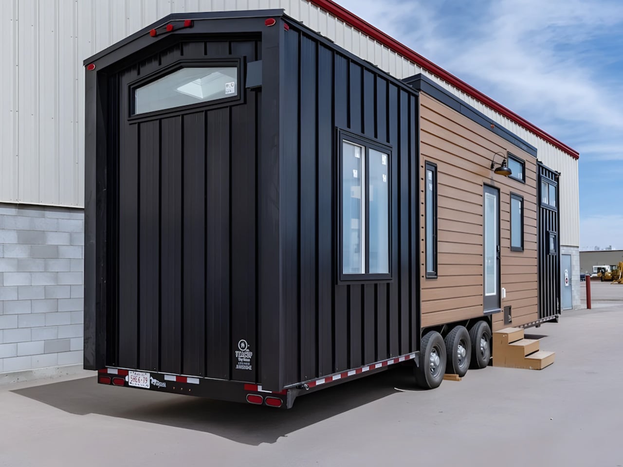
5 ADU Accessories That Make 400 Square Feet Feel Like 1,000

An accessory dwelling unit forces a kind of honesty most homes never require. Every object either earns its spot within days, or it becomes clutter nobody chose. Four hundred square feet leaves no room for anything that does only one job, so the objects that make it into an ADU need to work harder than furniture ever had in a house with room to spare. That pressure produces better design, not worse living.

We chose these five picks because each replaces more than one ordinary object with a single, considered choice. None of them try to shrink themselves to fit a small footprint. Instead, they consolidate, clearing counters, corners, and floor space that a compact home cannot spare. That consolidation is the real trick behind an ADU that lives twice its actual size, and it starts with getting sleep, sound, waste, space, and light right.

1. Divoom FlowToo

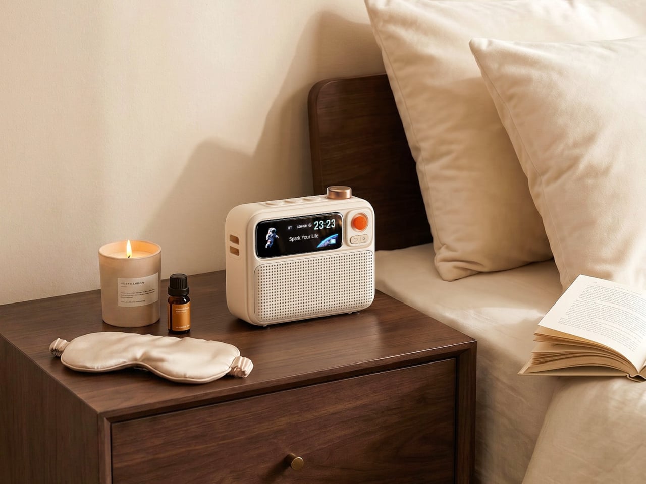
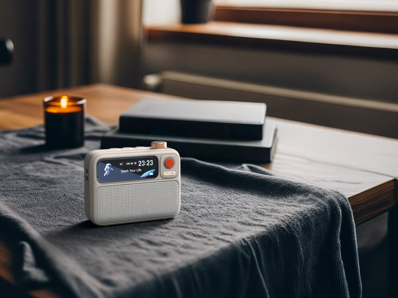
A nightstand in a compact ADU usually ends up carrying a phone charger, a white noise machine, and a separate alarm clock, each one stealing inches a small bedroom cannot spare. The FlowToo folds all three into a single rounded unit roughly the size of a coffee mug, running a genuine 10W amplifier and 45mm driver rather than the thin courtesy speaker most alarm clocks settle for. For you, that means one purchase clears an entire corner of your nightstand instead of three.

The 2.26-inch display cycles through clock faces, music visualizers, and sleep animations, while the wake system builds gradually with rising light and natural sound instead of a jarring tone. In a home where the bedroom and living area often share the same open air, consolidating that whole routine into one $99.99 object changes how the first minutes of your morning actually feel. More than 90 built-in soundscapes mean the same unit that wakes you can also help you fall asleep the night before.

What we like

  • Combining a speaker, white noise machine, and alarm clock into one unit clears real space off a small nightstand
  • The gradual wake sequence with rising sound and light noticeably improves the first minutes of the morning

What we dislike

  • Full customization depends on the Divoom app, which adds a step for anyone who prefers physical controls
  • At 10W, the sound fills a bedroom comfortably but will not carry through an open-plan layout

2. ClearFrame Speaker CD Player

Most audio gear tries to disappear into a room, quietly doing its job somewhere out of sight. The ClearFrame does the opposite, putting its transparent body and spinning disc on full display, which matters in a small space where every object carries visual weight. Slide your album art into the lyric card tray, and it becomes shelf art between plays, or leave it out and let the mechanism itself be the decoration. For you, one object now does the job of both a stereo and a piece of art.

The newer speaker version solves the one real limitation of the original by building a 40mm driver directly into the frame, so there is no separate Bluetooth speaker competing for counter space. At just over a pound and the size of a hardcover book, it moves easily from a shelf to a nightstand, giving you three ways to listen depending on what the room and the moment allow. That kind of flexibility matters more in 400 square feet than it ever would in a house with a dedicated media room.

Click Here to Buy Now: $240.00

What we like

  • The built-in speaker removes the need for a second audio device taking up counter space
  • Watching the disc and mechanism through the clear body turns a simple CD into a small piece of kinetic art

What we dislike

  • The transparent casing shows fingerprints easily and needs regular wiping to stay looking its best
  • Battery life through the built-in speaker runs shorter than through wired or Bluetooth output

3. Yamazaki Home Tower Step Trash Can

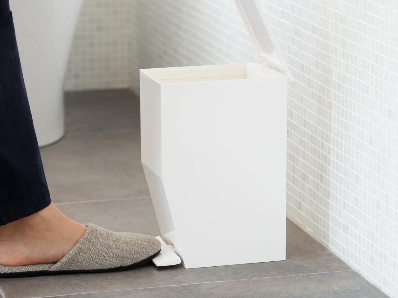
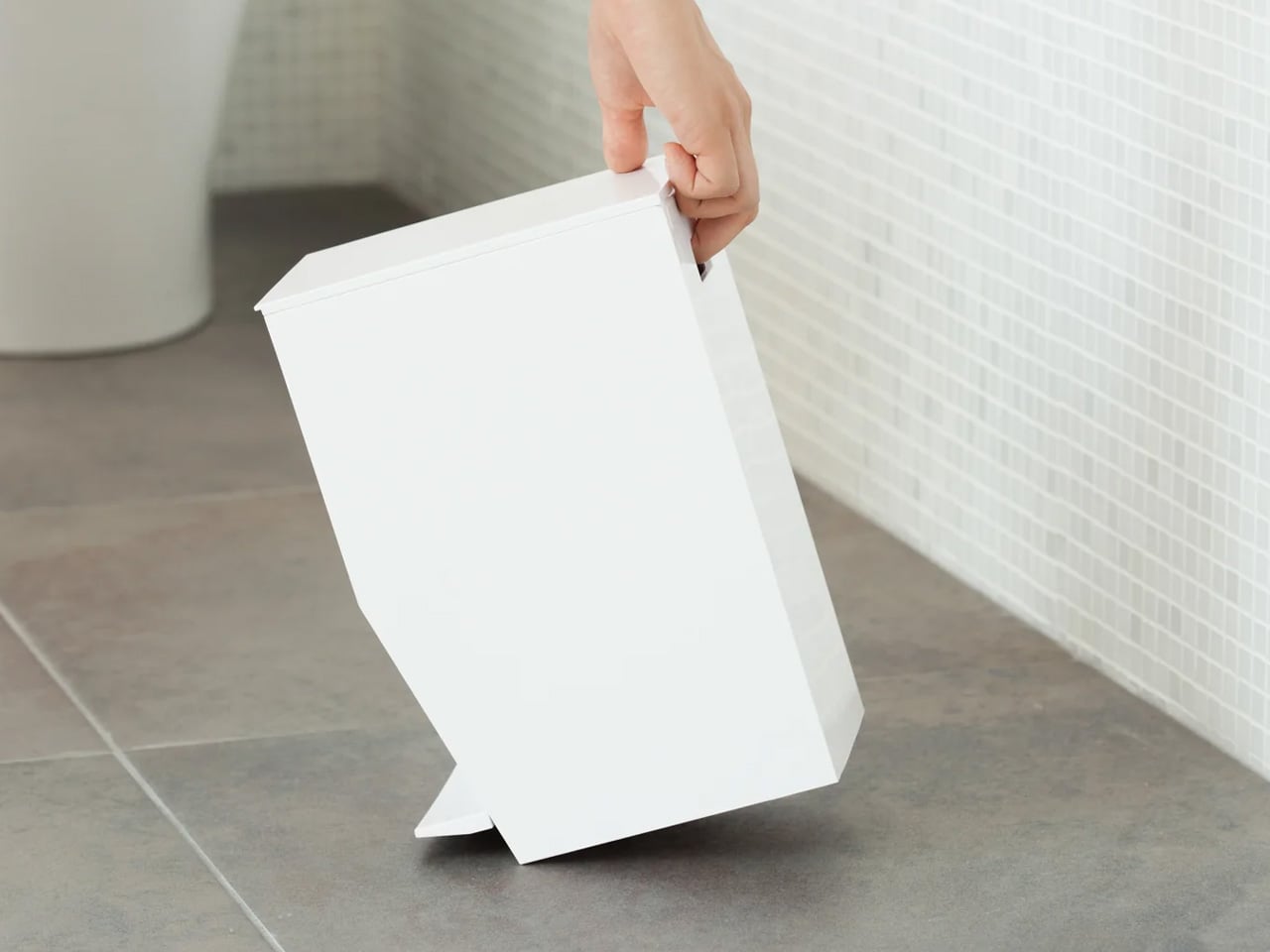
A trash can rarely gets design attention because it rarely needs any, except in an ADU, where it sits in full view beside the toilet or under a counter with nowhere to hide. This one solves that with a step-open lid that keeps your hands off the surface entirely and a one-gallon footprint slim enough to fit corners most bins would refuse. For you, that means the least glamorous object in the room stops looking like an afterthought and starts looking chosen.

An inner ring holds the liner in place without visible plastic showing at the rim, so even a mundane daily task feels considered rather than accumulated. A built-in handle at the back makes emptying it a single motion, and the matte resin body in white or black matches almost any interior without asking the room to accommodate it. In a floor plan with no spare inches to negotiate, that quiet consistency between form and function is worth more than it sounds.

What we like

  • The step-open lid means no touching a handle with dirty hands, a small but real hygiene upgrade
  • At just over 10 inches tall, it fits tight corners most trash cans are simply too wide for

What we dislike

  • The one-gallon capacity means more frequent emptying than a standard kitchen-sized bin
  • The liner ring requires a specific bag size to sit cleanly against the rim

4. Expand Furniture Expanse Inverse Murphy Bed

Nothing on this list reclaims more square footage than a bed that vanishes into the wall, and the Expanse Inverse solves the one complaint that has followed Murphy beds for decades. Instead of mounting near the ceiling and demanding a wall completely free of windows or art, it mounts at headboard height, which means it can go almost anywhere in your ADU without dictating the rest of the layout around it. For you, that means the room you sleep in tonight can become the room you work or host in tomorrow.

Left down, it reads as a normal wood bed rather than a folding mechanism trying to hide itself, and it fits a queen mattress up to 11 inches thick with five years of coverage on the hardware. Two people can install it in about five hours, and once it is mounted, the same 400 square feet that held a bedroom in the morning holds a living room by afternoon. That single transformation does more for how a small home feels than almost anything else you could buy.

What we like

  • Mounting at headboard height frees it from the window and wall clearance restrictions that limit traditional Murphy beds
  • It looks like a normal bed when lowered, with none of the visible mechanism that usually gives away a fold-away frame

What we dislike

  • The price point sits well above a standard bed frame, asking for real commitment upfront
  • Installation takes roughly five hours with two people, so this is not a same-day setup

5. Infinite Solas Lamp

Koki Sato built this lamp around a simple observation that most lighting ignores: the kind of light you need shifts constantly through the day, while almost no fixture adjusts with it. The column extends from 8.9 to 19.7 inches with no fixed stops, and a magnetic ball joint head swivels freely without ever moving the base. For you, that means one lamp does the job that would normally require two or three fixed fixtures scattered around a corner that has to serve as a reading nook, desk, and dinner table depending on the hour.

Because it runs cordless on a battery lasting up to 70 hours at low brightness, you are never chasing an outlet or routing a cable across a room that cannot spare the visual clutter. A single touch shifts the color temperature from a cool 4000K down to a warm 2500K, and the magnetic head detaches entirely to become its own portable light when the evening moves somewhere else. In a small home, that kind of range removes the need for a whole shelf of separate lamps.

Click Here to Buy Now: $325.00

What we like

  • The continuous height adjustment and detachable head mean one lamp genuinely replaces two or three fixed ones
  • Battery life stretching up to 70 hours at low brightness means it rarely needs to sit near a wall

What we dislike

  • At $325, it asks for real commitment rather than an impulse buy
  • It is not a smart lamp, so anyone wanting app control or scheduling will not find it here

Five Objects, One Honest Floor Plan

None of these five accessories try to make an ADU feel bigger through illusion or clever paint tricks. Each one works by removing something the room used to need three or four separate objects to accomplish, and that reduction is what actually changes how the square footage feels day to day. A considered nightstand, a display-worthy CD player, a trash can that disappears into its corner, a bed that gives back the whole floor, and a lamp that replaces the rest.

Put together, they cover sleep, sound, waste, space, and light, the five biggest demands a compact home makes of its owner. None of them ask the room to compromise on style to earn its function, and none of them were included because they simply fit the theme. Four hundred square feet starts to live like a thousand the moment every object inside it is doing real work, and that is exactly what this list was built to prove.

The post 5 ADU Accessories That Make 400 Square Feet Feel Like 1,000 first appeared on Yanko Design.
5 Tiny Gadgets & Gear That Are Better Than Anything on Your Keychain Right Now

Most keychains carry dead weight. A rubber tag from a hotel you forgot, a bottle opener you have used twice, a fob that only unlocks a car you no longer own. Meanwhile, the one piece of real estate you touch dozens of times a day sits completely underused, when it could be doing actual work.

The five gadgets below all fit that same small footprint but solve real problems, from finding your keys in the dark to surviving the emergency that pepper spray and good intentions cannot fix alone. Every pick here is either shipping through a verified campaign or purchasable directly, and every spec below comes straight from the maker.

1. NoxTi

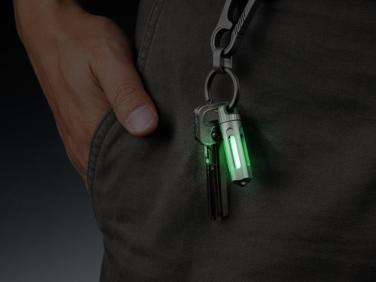
Tritium is a hydrogen isotope with a 12.3-year half-life, and as it decays, beta particles strike a phosphor coating to produce light with no electricity and no chemical reaction involved. It is the same physics behind emergency exit signs, military watches, and aviation instruments, chosen for one reason: nothing else in consumer lighting can promise 25 years of steady glow with zero maintenance. Xedge packaged that science into a 45mm titanium cylinder built specifically for keychain carry.

The tritium vial sits inside a precision quartz tube with 92 percent light transmission, wrapped in a CNC-machined Gr5 titanium body weighing just 10.7 grams. The whole thing is serviceable, so when brightness fades after two decades, you simply push the old tube out and slide a new one in. A ceramic-tipped glass breaker sits at one end for real emergencies, and the floating core glows visibly from every angle.

What we like:

  • Twenty-five years of glow powered entirely by material physics, with no battery to ever die on you
  • The tube is user-serviceable, meaning the titanium body outlives the glow and can be refreshed indefinitely

What we dislike:

  • The glow is genuinely faint next to an LED, which is the tradeoff for zero power draw

2. Analog Capsule Camera

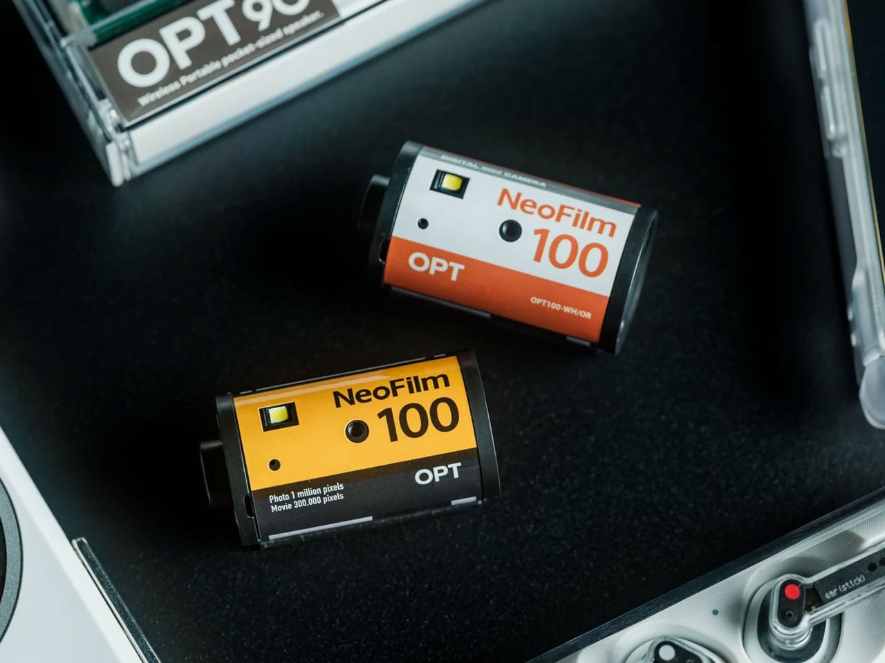
Pick up the Analog Capsule, and it looks exactly like a roll of 35mm film, right down to the box it ships in, except every part of that illusion hides a fully functional digital camera. Instead of chasing the technical perfection modern sensors are obsessed with, it leans into grain, softness, and blown highlights as features rather than flaws, giving every photo the unmistakable texture of something shot decades ago rather than seconds ago.

Its 1-megapixel CMOS sensor keeps the experience intentionally lo-fi, while built-in digital playback lets you review a shot the moment you take it. USB-C connectivity and microSD storage handle the archiving without ceremony. At just 25 grams and small enough to hang from a bag on its included strap, it is less a camera you pack and more a charm you happen to shoot with, priced at $55.

Click Here to Buy Now: $55.00

What we like:

  • The film-canister disguise makes it a genuine conversation piece before a single photo is taken
  • USB-C and microSD mean getting photos off the device is instant, unlike actual film

What we dislike:

  • A 1-megapixel sensor is a deliberate creative constraint, not a specs win for anyone wanting sharp images
  • Only four units were listed as available at last check, so stock moves fast

3. KeyMaster 3.0

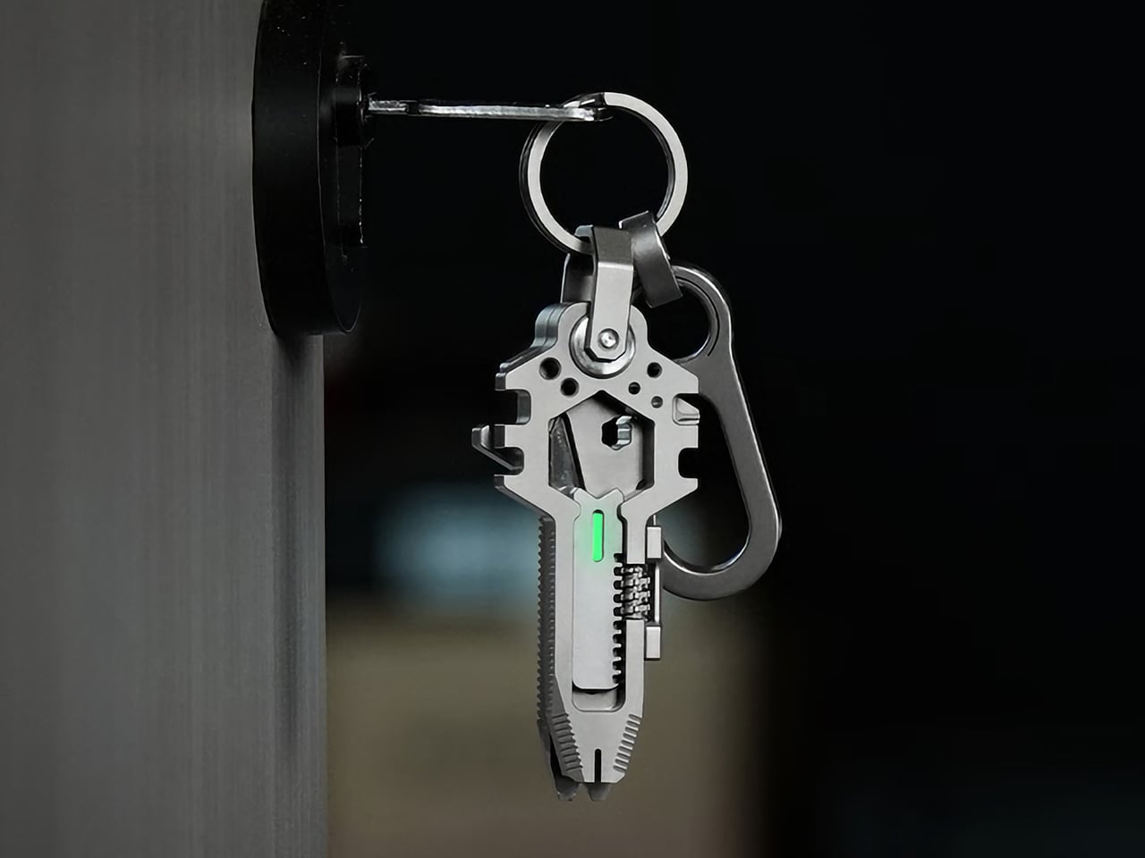
Keys are the one object nearly everyone carries with total consistency, which is exactly why EDC Monster built a multi-tool shaped like one. The original KeyMaster launched in 2023 as a 14-in-1 titanium tool; version two expanded the function count, and three years later, KeyMaster 3.0 rebuilds the concept around real adaptability rather than just adding more blades to a crowded body.

At 74.5mm and 53.7 grams of Grade 5 titanium, it sits flat on a keyring next to a car fob without adding bulk. The headline upgrade is an adjustable spanner covering 0 to 16mm, replacing six fixed wrenches with one that actually fits the bolt in front of you, paired with a magnetic bit driver that locks bits without slippage. A pry bar, screwdrivers, a mini saw, and a spoke wrench round out the twenty-plus tools.

What we like:

  • The adjustable 0 to 16mm spanner solves the actual failure point of every fixed-wrench multi-tool
  • Magnetic bit retention means real torque without the wobble that plagues smaller tools

What we dislike:

  • Twenty-plus tools on a keychain-sized body means most people will only ever reach for a handful of them
  • Kickstarter shipping is estimated for August 2026, so this is a preorder commitment, not instant gratification

4. Painless Key Ring

Putting a key onto a standard split ring means prying apart two tightly sprung layers with a fingernail, a tiny frustration repeated so often it barely registers anymore. Painless Key Ring exists because someone finally decided that reaction was unnecessary, changing the geometry itself so a continuous wave shape gives keys an easier point of entry, letting you slide one on without forcing anything.

The wave design was pulled from coiled wave springs used in aerospace and high-speed rail, applied here to one of the most mundane objects anyone owns. At just 3.0 grams, it weighs roughly half of a conventional ring, and its high-tension stainless spring steel carries a tensile strength of 1,750 MPa against roughly 800 MPa for a standard ring. It flexes to fit thicker keys, then snaps back to shape instead of staying stretched.

Click Here to Buy Now: $30.00

What we like:

  • The wave geometry genuinely removes the fingernail-prying step that every split ring demands
  • A 1,750 MPa tensile strength means it flexes for thick keys without permanently deforming

What we dislike:

  • It is a single component upgrade, so it will not organize a bulky keyring the way a full holder would
  • Stock was listed at only five units available at last check

5. Pebblebee Halo

Most people run through the same mental checklist before leaving the house: phone, wallet, keys. Pebblebee is making the case for adding a fourth item, a keychain-sized device called the Halo that tracks lost items, lights up a dark parking lot, and screams at 130 decibels if something actually goes wrong. That last function is the one that separates it from the standalone alarm keychains that came before it.

Pulling the device apart triggers a 130dB siren, a 150-lumen strobe, and real-time location sharing with up to five contacts in what Pebblebee calls a Safety Circle, all through one instinctive motion rather than an app you have to fumble with mid-emergency. Rapid presses of the side button send a silent alert instead, for situations that call for discretion over noise.

What we like:

  • The pull-apart trigger activates the siren, strobe, and location sharing simultaneously, with no app fumbling required
  • A silent alert option exists for situations where drawing attention would make things worse, not better

What we dislike:

  • Live location sharing requires the Alert Live subscription to continue past the included first year
  • At one ounce, it is light, but it is still one more object competing for space on a crowded ring

Your Keychain Was Never The Limit

None of these gadgets ask you to overhaul how you carry your keys; they simply ask your keychain to start pulling its weight. A glow tube that never needs charging, a camera disguised as film, a tool shaped like the key beside it, a ring that stops fighting your fingernails, and an alarm that activates faster than you can think. Each one replaces a specific moment of friction with something quietly better.

The real test for any of these is whether you would still reach for them a year from now, past the initial novelty of owning something small and clever. Every pick here earns its spot by solving a problem you already have rather than inventing one you did not, which is the only standard that actually matters for something destined to live in your pocket every single day.

The post 5 Tiny Gadgets & Gear That Are Better Than Anything on Your Keychain Right Now first appeared on Yanko Design.

The 8 Best Gadgets of September 2026

September always arrives with a different energy. The summer concept season wraps up, the shipping boxes start showing up, and the gadgets worth keeping finally separate from the ones that were only ever interesting in a render. This month’s lineup is unusually strong: a $2,000 iPhone that finally killed the foldable crease, a Dyson toothbrush with a camera inside the brush head, and a telescope that fits in a bag you could carry onto a plane.

What connects all eight is not a price bracket or a category. It is the feeling that the designers started with a known compromise and refused to accept it. Foldable phones have always had a crease. Astrophotography has always needed a trunk full of gear. CD players have always been opaque boxes. Each gadget below found that exact problem and built past it. September’s best gear does not update existing things. It quietly makes them look dated.

1. iPhone Ultra

Apple saved its most aggressive design argument for last. The iPhone Ultra lands September 18 at $2,000, and the headline detail is the one that sounds impossible until you hold it — the visible crease is gone. Foldable phones have carried that horizontal line across the display since the format began, and every manufacturer called it a reasonable engineering compromise. Apple did not agree. The crease is gone, which means either the engineering problem is finally solved or a new one was quietly created in its place.

At $2,000, it is the most expensive iPhone Apple has shipped, and the price will be the loudest objection for most people. That is fair. It is also a phone that, when unfolded, gives you a display large enough to genuinely replace a small tablet, without the crease that made every foldable feel like a prototype. Whether the price is justified depends on how much that line across the screen has bothered you. For a certain buyer, the number will feel completely reasonable.

What We Like

  • The visible crease is gone, a problem every other foldable has simply accepted as permanent
  • September 18 availability means no waiting on a vague launch window

What We Dislike

  • $2,000 is a significant ask even for the most committed Apple buyer
  • At that price, the upgrade calculus is genuinely difficult for anyone coming from a recent iPhone

2. Dyson CameraJet Toothbrush

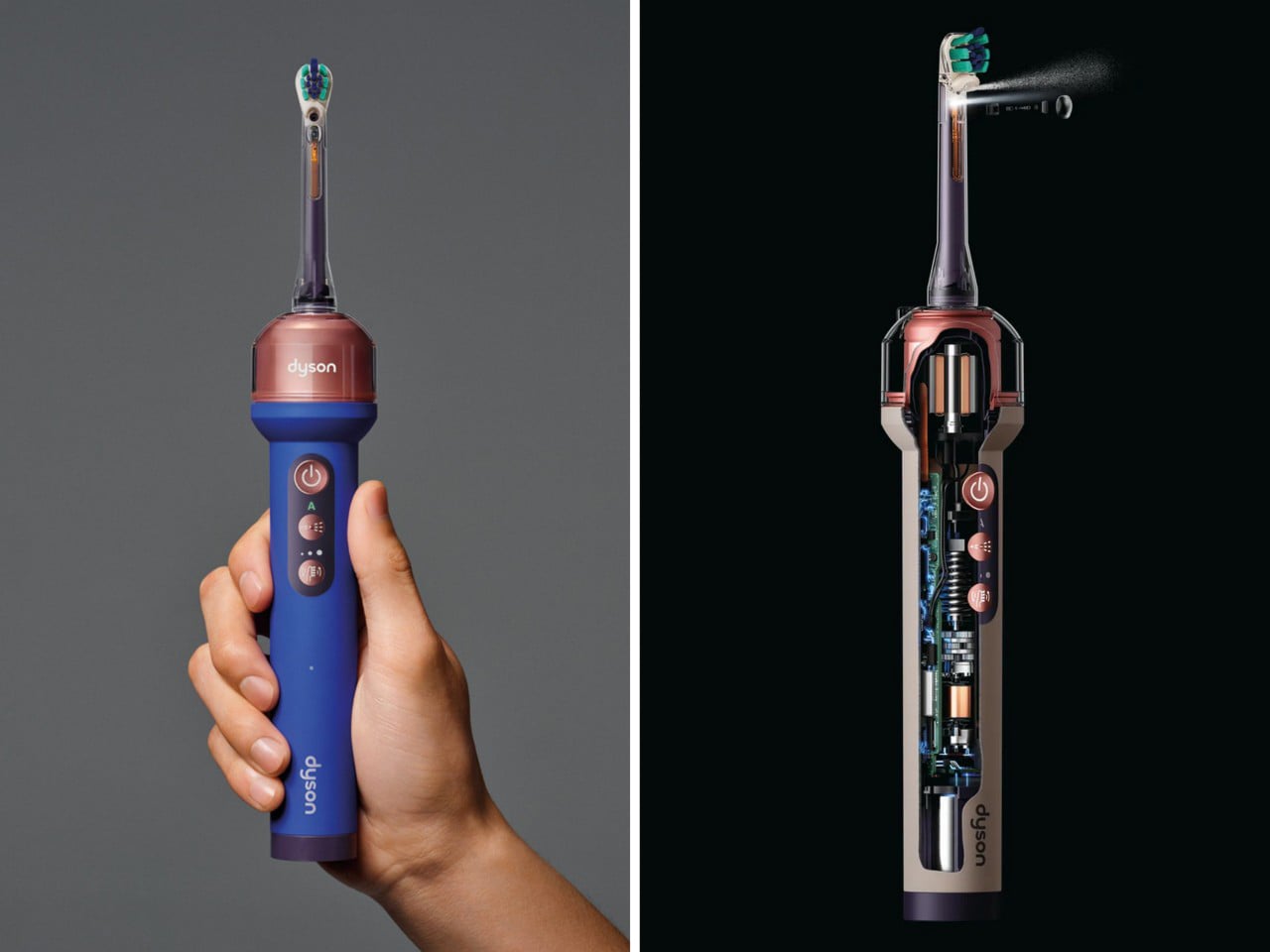
Dyson hid a 1mm camera directly under the brush head, and it reads 28 images a second while you brush. Within 100 milliseconds of detecting a gap in your coverage, the feedback loop kicks in. This is not an app that grades you on timing or buzzes when two minutes are up. It sees exactly where the bristles are not reaching and responds in real time, which is a fundamentally different answer to a problem the toothbrush industry has spent decades pretending does not exist.

The $499 price reads as absurd until you consider what it replaces. Most people spend years brushing the same spots and missing the same gaps, and no timer-based electric toothbrush has fixed that because timers do not know where your brush is. The camera does. Dyson also redesigned the toothpaste to work alongside the system, which suggests they understood that this product was not adding a feature to an existing object but rebuilding the assumptions around one entirely.

What We Like

  • A 1mm camera reading 28 frames per second gives real-time coverage feedback no other toothbrush can match
  • Dyson redesigned the toothpaste alongside the brush, showing the depth of thinking behind the product

What We Dislike

  • $499 is a difficult number for a toothbrush regardless of what it does
  • Proprietary toothpaste dependency is a meaningful lock-in that will frustrate buyers over time

3. ZWO Seestar S50 Pro

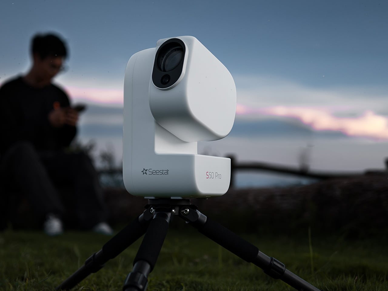
Astrophotography has always had a reputation problem. Getting a decent image of a nebula or galaxy traditionally meant a telescope, a tracking mount, a camera body, a set of filters, a laptop running capture software, and a location dark enough to make the whole trip worth it. The ZWO Seestar S50 Pro compresses that entire setup into something you could carry in a camera bag. That compression is not a minor convenience. It is the difference between astrophotography being a hobby you have and one you actually practice.

The S50 Pro is not a crowdfunded concept or a prototype. It is a shipping device sold through B&H, Amazon, and ZWO directly, part of a line that has been refining the smart telescope format for several years. For people who have wanted to try astrophotography without committing to a several-thousand-dollar hardware stack, it is the most credible entry point available right now, and the images it produces at this size are the kind that still feel surprising every time you see them.

What We Like

  • Compresses a full astrophotography rig into one bag without requiring a tracking mount or separate laptop
  • Sold through established US retailers with confirmed availability, not a waitlist product

What We Dislike

  • Smart telescopes in this class still need a reasonably dark sky to produce compelling results
  • The app-dependent workflow means the imaging experience is only as good as the software behind it

4. Camera With Digital Film


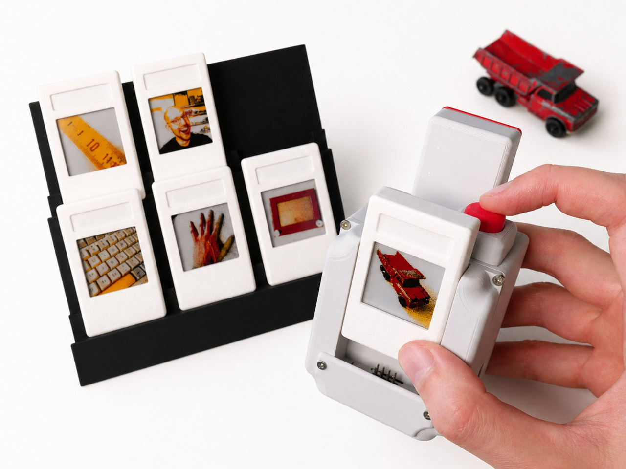
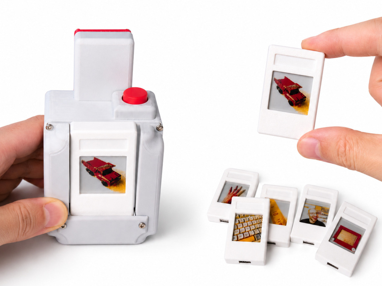
Every digital photo you have ever taken lives in a folder. Most of them stay there. The Camera with Digital Film changes the end of that process by ejecting a physical e-paper cartridge when you fire the shutter. Because e-paper holds its image without power, that small rectangle stays a picture permanently. You can lean it against a monitor, pin it to a wall, or hand it directly to the person you just photographed, and none of that requires a printer, an app, or a subscription to anything.

This is a personal maker build, not a retail product, which means you cannot order one. But the project is documented and open, which is its own kind of contribution. Instant cameras eject paper prints that fade over years. This ejects a display that does not. The object you walk away with is not a printout of a photo. It is the photo, held in a piece of hardware that draws no power to stay that way. The difference is not subtle once you hold one.

What We Like

  • E-paper holds the image without power indefinitely, making every shot a permanent physical object
  • The format lets you hand a photo to someone in the moment without a printer anywhere nearby

What We Dislike

  • This is a maker build with no purchase option — you build it, or you do not have it
  • E-paper’s limited color range means images read closer to a graphic print than a full-color photograph

5. ClearFrame Speaker + CD Player

The ClearFrame puts a CD player and a speaker into a frame you can see straight through, and the transparent design earns its place by making the mechanical parts of the player the visual feature rather than something hidden behind matte plastic. Watching a disc spin inside a clear housing is a different experience from staring at a closed box, and the ClearFrame is built around the idea that the hardware itself is worth looking at. The mechanism is the aesthetic. Nothing about that is accidental.

For anyone building a desk around objects that hold their own visually, the ClearFrame gives the CD player a reason to be out in the open rather than tucked away. The disc, the mechanism, the speaker housing: all of it visible, all of it intentional. It is not a nostalgia product. It is a design argument about what audio hardware looks like when it stops hiding its own workings.

Click Here to Buy Now: $240.00

What We Like

  • The transparent frame turns the mechanical components into the centerpiece rather than concealing them
  • Combines a CD player and speaker into one object with a coherent visual identity

What We Dislike

  • Listed under upcoming drops only, so exact pricing and shipping timeline are not yet confirmed
  • A clear housing will need regular cleaning to maintain the effect it is entirely built around

6. Cyberpunk 2077 x Commodore 64

The Commodore 64 launched in 1982. Cyberpunk 2077, the game, is set in 2077. The gap between those two years is roughly the entire history of consumer computing, and this collab leans into that distance rather than papering over it. The result sits at the intersection of two very specific aesthetics: the beige plastic of early home computing and the neon-drenched maximalism of Night City. Somehow they feel like they were always related. The Retro Games Ltd license makes it a real retail product, not a limited drop built on hype.

For people who grew up with a C64 or remember it as the machine that first felt like a home computer, this collab has a logic that is hard to argue with. Cyberpunk’s world is built on the idea that technology accumulates rather than replaces, and a computer from 1982 sitting alongside a game set in 2077 makes that point visually without needing to explain itself. It is the kind of object that earns its shelf space because it means something beyond what it does.

What We Like

  • The 95-year gap between the C64’s launch and the game’s setting is the entire premise, and the design commits to it
  • A real licensed retail product through Retro Games Ltd, not a concept or an event-exclusive run

What We Dislike

  • The appeal is almost entirely to people with an attachment to either the C64 or Cyberpunk 2077 specifically
  • As a niche collab object, it will be difficult to track down outside dedicated retro gaming retailers

7. OrigamiSwift Folding Mouse

Standard mice do not pack flat. They sit awkwardly in bags, take up more space than their function warrants, and feel like a compromise every time you travel with a laptop. The OrigamiSwift uses an origami-influenced folding structure that collapses the mouse into something genuinely flat: the kind of object you forget is in your bag until you need it.

Travel mice as a category have existed for a long time, but most of them solve portability by making the mouse physically smaller rather than foldable. Smaller mice are less comfortable to use for any extended session. The OrigamiSwift’s approach is different: it folds to pack and unfolds to a full grip, which means you are not choosing between portability and comfort every time you pull it out. For anyone who works from multiple locations, that trade-off has been the quiet frustration with every travel mouse that came before this one.

Click Here to Buy Now: $85.00

What We Like

  • Folds flat for packing without reducing grip size for use, a problem most travel mice simply ignore

What We Dislike

  • Folding mechanisms introduce hinge wear over time that rigid designs never have to account for
  • Travel-first positioning may mean trade-offs in sensor performance compared to a dedicated desk mouse

8. ROG Ally X Dual-Screen Mod

Dual-screen handhelds usually mean buying an entirely new device built around that feature from the ground up. This ROG Ally X mod skips that purchase. It snaps a 120Hz secondary display onto an existing Ally X using a mount system that removes just as easily, which means you get the dual-screen setup when you want it and a standard handheld when you do not. The engineering problem this solves is not new, but the solution here is additive rather than architectural, which makes it the more interesting answer.

It is a maker project, which means you build it rather than buy it, and the plans are documented and freely available. That limits its audience to people comfortable with a hobbyist build. Within that group, it is one of the more compelling uses of a gaming handheld’s form factor to surface this year. The 120Hz refresh rate on the secondary screen is not a placeholder spec either — it keeps up with the primary display rather than undercutting it, which has been the consistent weakness of every dual-screen attempt before this one.

What We Like

  • Snaps on and off without permanently modifying the Ally X itself
  • 120Hz on the secondary screen matches the primary display rather than being a visible step down

What We Dislike

  • No kit to order — you source and assemble the components yourself, or you do not have it
  • A second active display will draw additional power from the Ally X battery, which is already a known constraint on the device

September is not a month that usually swings this hard. Three products you can buy today, two from the YD shop, a maker build you can start this weekend, and an iPhone that lands in 16 days at a price that will generate more conversation than almost anything Apple has shipped in years. The range across eight picks is wider than usual, and that width is the point.

The through line is stubbornness. Every one of these objects exists because someone decided the accepted version of the thing was not good enough and built a different answer. A crease-free fold. A toothbrush that watches you brush in real time. A CD player you can see straight through. A photo that ejects itself from a camera. That kind of thinking does not happen every month. September had a good one.

The post The 8 Best Gadgets of September 2026 first appeared on Yanko Design.

3 Best Back-to-School Desk Gadgets & Tools for Men Who Actually Care What Their Setup Looks Like

Most back-to-school shopping ends at whatever ships fastest. The desk becomes an afterthought — a monitor propped on textbooks, a charger strip on the floor, a pen that runs dry in the first week. A desk setup communicates something about the person sitting at it. It tells you whether the space was put together with intention or assembled under pressure. These three objects belong to the first category.

None of them require justification after the fact. They earn their place through daily use — in lectures, at the library, at a desk that has to work for eight hours straight on a Tuesday. The question a well-designed desk setup answers is not how much it costs but whether it makes sitting down feel worth doing. These three answer that clearly.

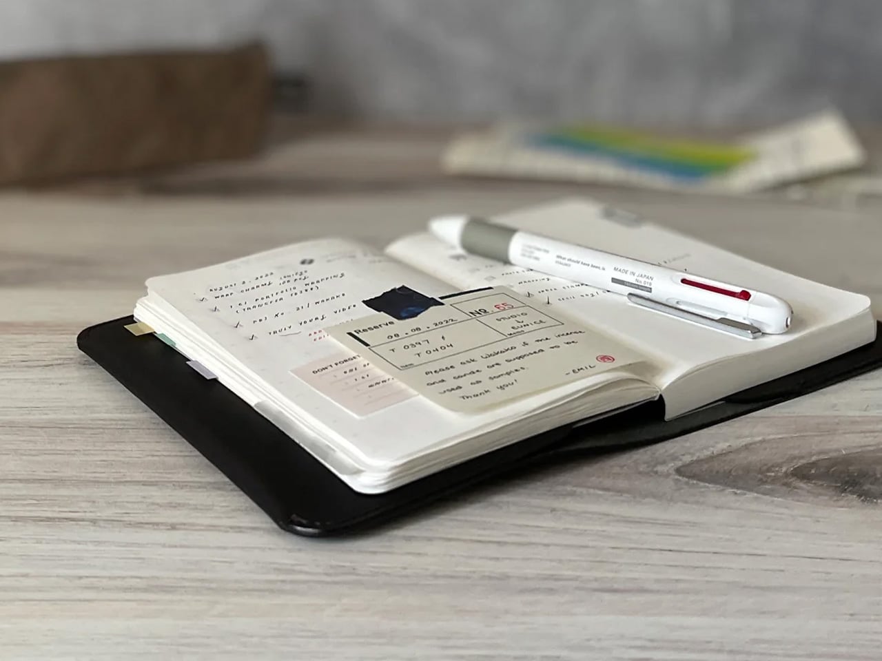
1. Inseparable Notebook Pen

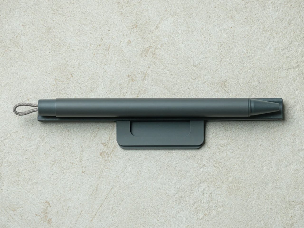
The moment you realize you are missing a pen is almost always the moment you need one most. The Inseparable is designed around that specific frustration. Its magnetic clip attaches to the spine of your notebook so both travel as a single object, and the built-in silencer means clipping and unclipping it produces no sound — a detail that matters in a quiet lecture hall when the smallest noise carries across the room.

The gel ink flows cleanly, which sounds like a baseline expectation until you spend a semester fighting a pen that skips on the first line of every page. The form is minimal without being precious, compact enough to live in a bag without taking up meaningful space, and refined enough to leave on your desk without looking like office supplies. At $19.95, it is the kind of object that quietly proves how much a good pen changes the experience of writing by hand.

Click Here to Buy Now: $19.95

What We Like

  • The magnetic clip keeps the pen and notebook together as one object, removing the most consistent daily frustration of analog note-taking
  • The silencer mechanism makes it genuinely usable in quiet settings without drawing attention to itself or the person reaching for it

What We Dislike

  • Stock is limited to a handful of units at current pricing, and restocking timelines are not guaranteed
  • The magnetic attachment works best with notebooks that have flat or standard spines; unusually thick or flexible bindings may not hold as securely

2. BALOLO Setup Cockpit

The Setup Cockpit by BALOLO begins with something obvious that most desk furniture ignores. Monitors are almost always too low, cables have nowhere organized to go, and the devices that need to stay within reach — phone, headphones, secondary screen — end up wherever they land. A solid walnut or oak shelf lifts your monitor to eye level, creates 3.9 inches of keyboard clearance underneath, and returns the rest of your desk surface to you.

What makes it more than a monitor riser is the patented mounting grid along its underside, a system of attachment points that lets you add accessories wherever your workflow needs them. Cable magnets hold charging lines in place. A MagSafe holder keeps your phone visible without occupying desk surface. A headphone hook keeps your cans within reach instead of draped over the monitor. Hand-finished in Germany, the shelf supports up to 50 pounds and adapts as your setup grows over the year.

What We Like

  • The modular mounting grid changes how the whole desk functions, not just how the monitor sits — it is a systems upgrade more than a piece of furniture
  • Real walnut or oak finish elevates the visual quality of the space in a way no black plastic accessory can match

What We Dislike

  • The full accessory ecosystem adds cost quickly; the base shelf is excellent on its own, but the real value compounds when you invest in the add-ons over time
  • At $237.92, it is a meaningful purchase — though the materials and build quality make the price feel earned rather than inflated

3. MODULO 8-in-1 Magnetic Desk Organizer

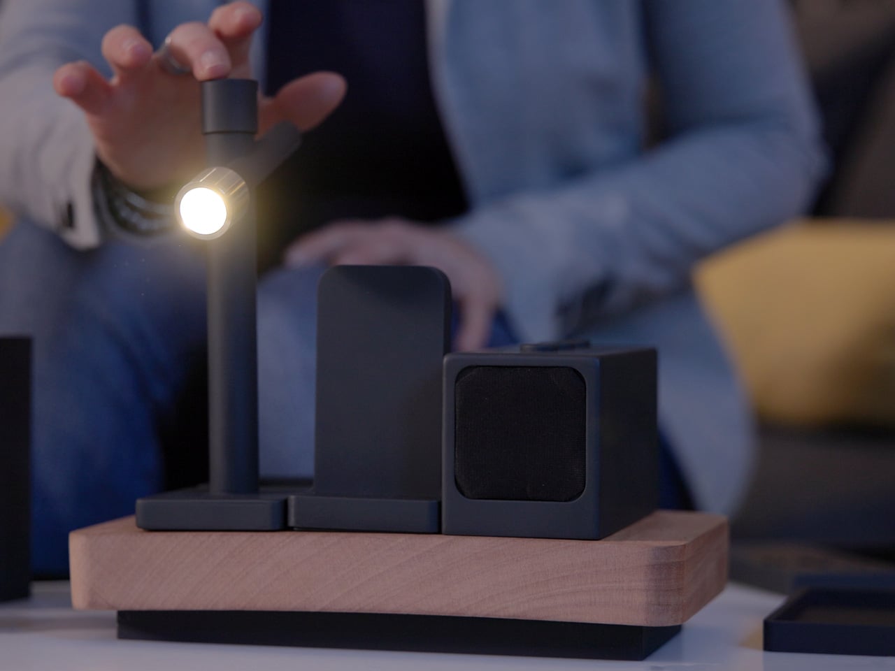
Cable clutter is not a problem most people solve. They manage it, relocate it, or stop noticing it. MODULO treats it as a systems problem and addresses it at the level of power distribution. A CNC-milled wood base, handcrafted in Italy, acts as a backplane for up to eight magnetic modules that each draw power and data through gold-plated connectors rated for 50,000 cycles. Swap a wireless charger for a Bluetooth speaker in three seconds. The app recognizes the change immediately.

The eight available modules — wireless charger, Bluetooth speaker, e-paper display, adjustable task light, USB-C charger, pen holder, and organizer trays — all share one wooden base and one power cable. The wireless charger handles up to 15 watts for compatible devices. The e-paper screen shows the time, calendar events, or a countdown timer. The speaker covers background audio without a separate pairing routine. One cable to a desk that used to need seven.

What We Like

  • The magnetic module system eliminates the multi-cable problem at the source rather than organizing around it, which is a genuinely different approach from everything else in this category
  • Italian-crafted CNC-milled wood brings furniture-grade material quality to a product type that almost always defaults to black injection-moulded plastic

What We Dislike

  • Building out the full eight-module configuration adds cost beyond the $144 entry price; the starter setup is more modest than the flagship spec suggests

The Setup That Makes Other People Ask Where You Got It

A desk that works and a desk that feels good to sit at are not the same thing. The gap between them is usually a few considered purchases. None of these three are dramatic. The pen is a pen. The monitor stand is a monitor stand. The organizer consolidates things you already own. The difference is that each was designed to be exactly what it is, rather than close enough.

Start with the pen if you want the fastest return. Pick up the BALOLO Cockpit when the semester is underway, and you realize how much the monitor height was affecting your posture. Add the MODULO system when the cable situation becomes the thing you stop tolerating. Each one earns its place independently, and the desk that results from all three is the kind that makes other people ask where you got it.

The post 3 Best Back-to-School Desk Gadgets & Tools for Men Who Actually Care What Their Setup Looks Like first appeared on Yanko Design.
The 5 Best LEGO Sets of September 2026

You cleared the display shelf in July and told yourself you were waiting for something worth the space. The shelf is still clear. You set the bar high, and September is here to meet it. LEGO is closing out the summer with five sets that cover more ground than any single month usually does, from a 1,608-piece Renaissance sculpture to the longest Star Wars set the company has ever produced. You are going to need to measure the wall.

This list is not ranked by piece count or complexity. It is ranked by which sets actually earn the time and space you are going to invest in them. If you have been waiting for something specific to pull you back into a serious build, September has delivered more than one answer. A British comedy classic, a Renaissance masterpiece, the Executor, a 70s sitcom apartment, and a fan-built album cover that belongs in the conversation with official releases. Here is where to start.

1. LEGO Monty Python: The Ministry of Silly Walks

The Ministry of Silly Walks is one of the most recognizable comedy bits in television history, and the fact that it took LEGO this long to build it is the kind of mystery that does not have a satisfying answer. This set puts John Cleese’s most famous character into brick form in a way that lands immediately for anyone who has seen the sketch and gradually for anyone who has not. You do not need to be a Monty Python devotee to recognize that something absurd and deliberate is going on here.

What LEGO has done is capture the physicality of the walk in a way that feels genuinely committed rather than broadly referenced. The set goes specifically for the exaggerated mid-stride posture that defined the bit, and the result sits on a desk and generates a specific reaction in everyone who walks past it. This is the set you buy for a friend, decide it is too good to give away, and order a second one. If you find yourself doing that, you already know it was the right call.

What we like:

  • The cultural recognition crosses generations. You do not need a Monty Python background to respond to this immediately
  • The desk footprint is manageable enough that it earns a visible spot without reorganizing your whole setup

What we dislike:

  • The appeal is almost entirely rooted in one specific sketch. Without that reference, this set loses most of what makes it interesting
  • Single-gag builds have a ceiling. The silly walk is a great gag. It is still one joke.

2. LEGO David

Michelangelo finished the David in 1504, and nobody put him in a LEGO set for over five hundred years. This 1,608-piece build finally corrects that, and LEGO has committed to the historically accurate detail that made the original sculpture famous enough to still require a separate conversation before school field trips. That is a confident call from a company that usually operates closer to the cautious side of cultural sensitivity, and the finished piece is better for it.

At 1,608 pieces, this is a serious weekend project. You are going to spend real time with it, and what comes out the other side is a display piece that holds up as something more than a toy. The sculptural curves that define the original are difficult to communicate in rectangular bricks, and LEGO’s team has found a solution that reads correctly at display distance. This is the set you buy for yourself and tell someone else it is a gift. Nobody questions it. You both already know.

What we like:

  • 1,608 pieces at this level of sculptural accuracy is a genuine technical achievement. The curves actually read as curves.
  • Committing fully to the historically accurate detail earns this set credibility as a display piece rather than a novelty

What we dislike:

  • This is a conversation piece that requires context. Some guests will get it immediately. Others are going to need an explanation.
  • Display requirements are specific. This is not a background item. It needs a dedicated spot where people actually look.

3. LEGO Executor Super Star Destroyer

Darth Vader’s flagship is the most threatening ship in the Star Wars universe, and every previous LEGO Star Destroyer has felt slightly too small to make that argument convincingly. The Executor fixes that. LEGO has produced the longest Star Wars set in the company’s history, and the scale finally matches what the Executor represented when it filled the entire screen in The Empire Strikes Back. That first shot was the moment the Rebellion stopped feeling invincible. This set captures it.

This is a cleared-table, long-weekend build. It does not fit in an afternoon, and it is not meant to. The Executor earns permanent wall space rather than coffee table rotation, and if you have a dedicated display and a Star Wars commitment that has survived multiple decades of content decisions, this is the flagship piece your collection has been missing since you started it. Do not rush the build. The scale you get at the end is proportional to the time you put in.

What we like:

  • The scale is finally correct. This is the first LEGO version that communicates the Executor’s size relative to everything around it
  • The longest Star Wars set in LEGO history is a milestone collectors track. The set holds its value on that basis alone.

What we dislike:

  • Measure your display space before you order, not after the box arrives. The footprint is significant.
  • This is a serious time commitment. If you are behind on current builds, add this to the back of the queue and be honest about the timeline.

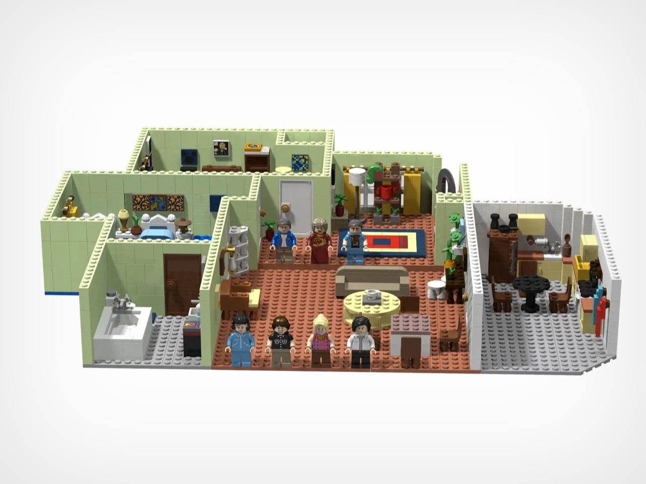
4. LEGO Three’s Company Apartment

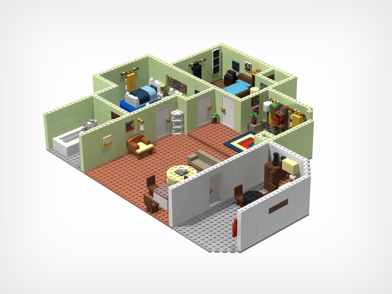
If you grew up watching Three’s Company in syndication on a Saturday afternoon, this build is going to hit somewhere specific. The apartment was always as much a character as anyone in the cast, and the recreation here captures the late-70s Los Angeles that existed on screen and nowhere else. The color palette, the furniture arrangement, the particular interior logic of a television apartment where misunderstandings were structurally built into the floorplan. You will recognize the living room before you read the label.

The set handles the generational gap better than most pop culture LEGO builds. People who watched the show will recognize the room immediately. Buyers who have never seen an episode will find a detailed interior build that holds up as a pure construction project regardless of what it is referencing. Sitcom apartment sets live and die on how accurately they rebuild the room, and this one gets the room right. That is harder than it looks, and the build earns the credit.

What we like:

  • The interior recreation works as a display piece even for buyers who have never watched a single episode of the show
  • The 70s color palette translates accurately into LEGO’s brick range, giving the finished set a period authenticity that pop culture builds often miss

What we dislike:

  • Three’s Company is a narrow generational window. This set means significantly more to one specific age group than to anyone who came after it.
  • Sitcom apartment builds are static displays once they are done. There is not much play functionality built into this one once it is on the shelf.

5. Linkin Park Meteora Fan Build

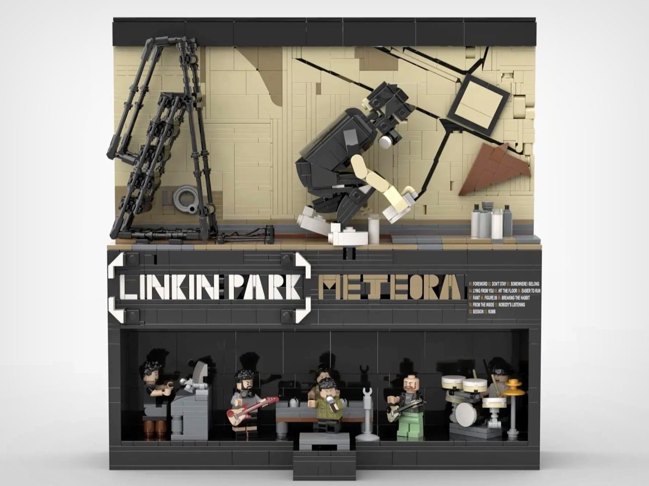
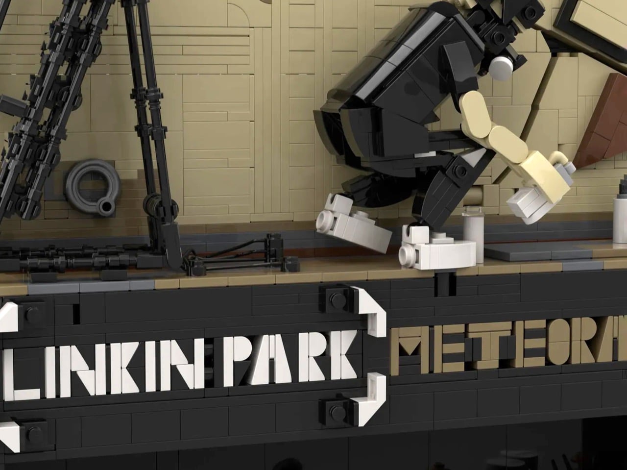
The Meteora album cover is one of the most recognizable pieces of album art from the early 2000s, and a LEGO fan has rebuilt it in bricks at a level of detail that most fan projects do not attempt. The weathered cliff face, the carved architectural elements, the texture that made the original feel ancient and urgent at the same time. Then the builder added the entire band as minifigures at the base of the structure. That single decision takes this from impressive to actually great.

The Meteora build is the kind of project that shows what the LEGO platform produces when someone cares more about the result than about how long it takes to get there. The minifigures at the base reward a second look. You can walk past this on a shelf and miss them entirely, stop, look again, and spend ten minutes with it. That layered discovery is rare in fan builds and rarer still in official releases. Whatever format this ends up in, the build earns every bit of the attention it is getting.

What we like:

  • Adding the full band as minifigures below the cliff face elevates this beyond a straight album recreation. That one decision makes it something original.
  • The texture work on the cliff face is the kind of detail that separates a serious build from a quick approximation

What we dislike:

  • Fan build availability is uncertain. If this has not cleared an official release pathway, getting one takes more effort than a standard LEGO order.
  • The Meteora reference is generational. This resonates most with the specific demographic that was around when the album dropped in 2003.

September Earned It

Five sets, five different reasons to build. The Executor is for the collector who has been waiting for a flagship piece that actually communicates scale. The David is for the person who wants something on the shelf that holds up as more than plastic. The Three’s Company apartment and the Monty Python build are for the person who has been waiting for LEGO to get specifically weird about the things they care about. September delivers on all of it at once.

The Meteora fan build is the wildcard on this list and probably the most interesting thing here for anyone paying attention to what the LEGO platform is capable of in creative terms. Pick the set that earns the dedicated spot you have in mind for it, clear the table, and build it properly. September is the month the catalog reminds you why you kept the table clear in the first place.

The post The 5 Best LEGO Sets of September 2026 first appeared on Yanko Design.
5 EDC Gadgets Built for Your First Tailgate of the Season, Not Your Desk Drawer

Your regular carry works fine at a desk, as it should. But it falls apart at a tailgate, where the lot is loud, the light is going, and someone just handed you a warm can with nothing to open it. The gear sitting in your drawer was designed for a controlled environment, and surprisingly, a parking lot in early September is not that. These five products fix the gap before it has a chance to ruin your afternoon.

This list is not for gear collectors or EDC forum regulars. It is for the person who wants to show up to a game-day tailgate with five things in their bag that actually earn their spot. A blade, a light, a radio, a screwdriver, and a can opener. Each one handles a specific moment that goes sideways without the right tool. Read this before Saturday, and you will be the person other people walk over to ask for help.

1. The Cubik

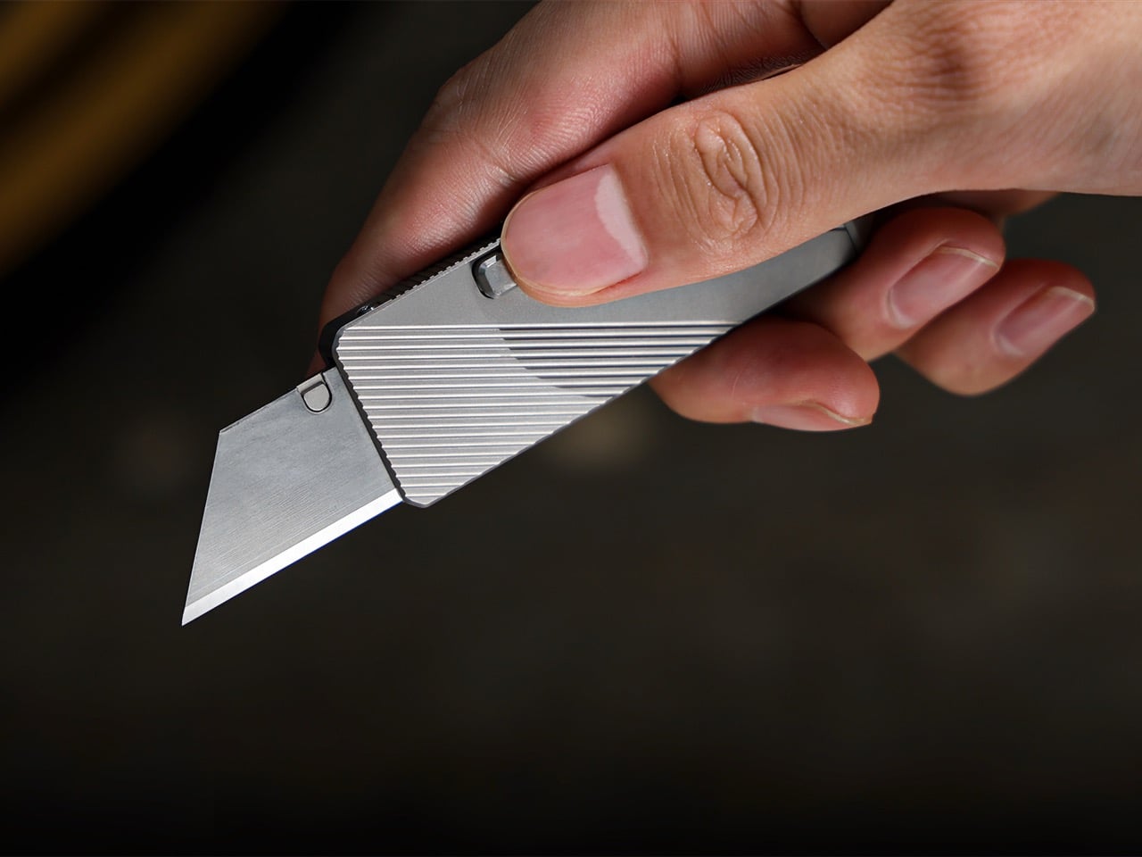
The most embarrassing tailgate moment nobody talks about is trying to open a bag of chips with a car key because your knife is buried somewhere in a bag. The Cubik removes that problem with a deployment mechanism you genuinely have not seen on a folding knife before. You tilt it, and gravity swings the blade out. No two-handed fumbling, no thumb stud digging into your nail, no moment of frustration while your other hand is already full.

At a tailgate, you are almost always holding something. A drink, a plate, your phone. The Cubik is built for exactly that situation. The blade deploys fast, locks securely, and the whole package stays compact enough to live in a front pocket without printing through your jeans. The gravity mechanism is clever design, not a gimmick, and IF has the industrial design credentials to back it up. This is the knife you reach for when the moment already counts.

What we like:

  • One-handed gravity deployment is faster and more natural than any thumb stud
  • The minimal form means you will actually carry it instead of leaving it in the bag

What we dislike:

  • Keep the lock engaged in a coat pocket. The same gravity activation that works for you will work against you if the knife is loose around other gear

2. Clip&Go Radio

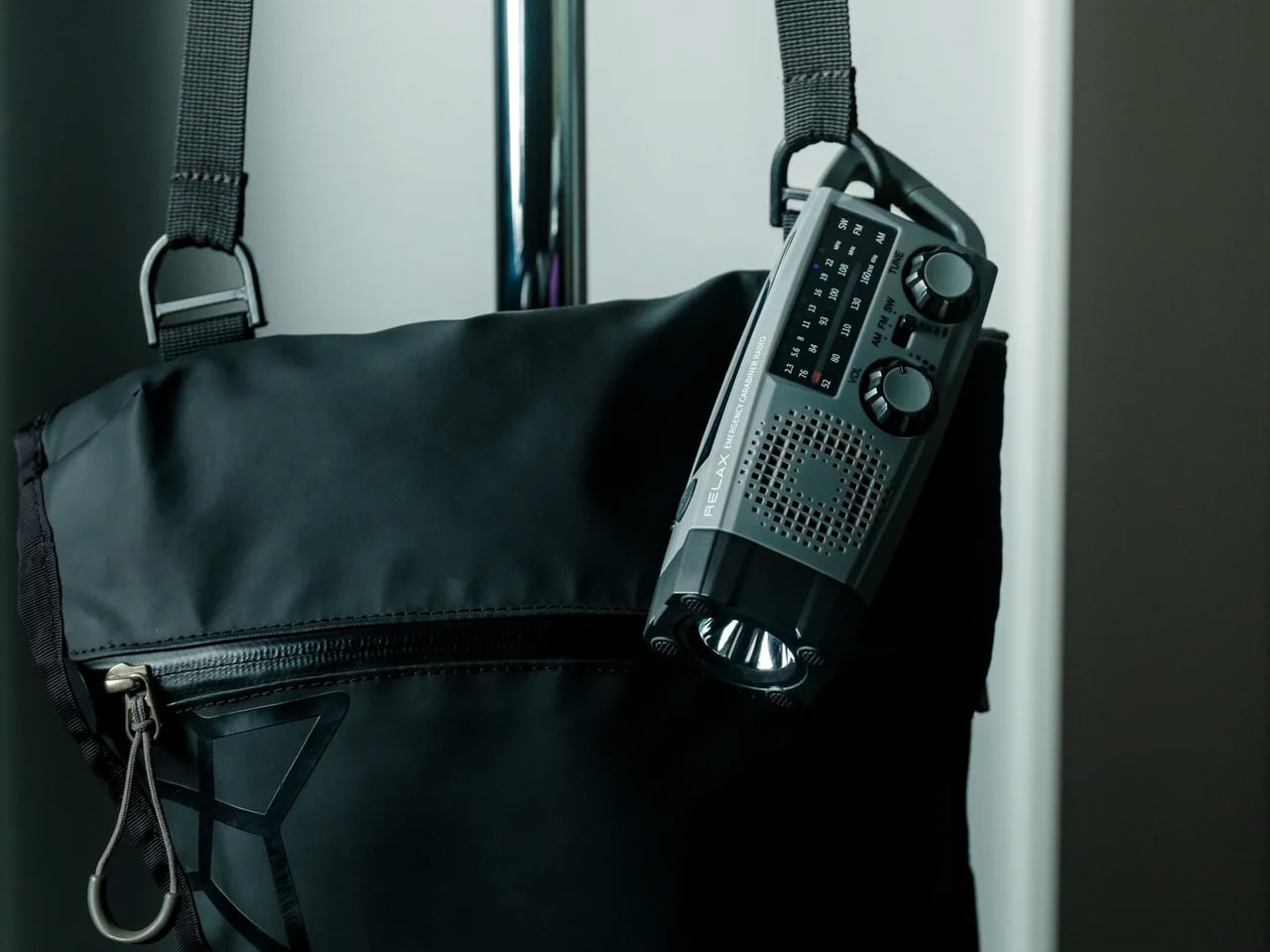
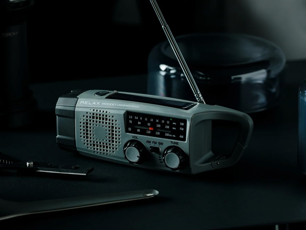
You have been to a tailgate where someone’s Bluetooth speaker died two hours before kickoff and took the whole energy of the group with it. The Clip&Go Radio is the fix that costs you nothing in phone battery. It clips to a bag strap, a belt loop, or a cooler handle, pulls in an FM signal, and runs on its own. No pairing, no app, no connection to babysit.

At a tailgate, radio matters in a way it does not anywhere else. You want the pregame show in the background while the playlist stays on the speaker. The Clip&Go lets you run both at once. It clips where you put it and stays there while you move around the lot. The form factor is the whole point here. It has no right to be this portable. It is the item on this list that the people around you will notice and immediately ask about.

Click Here to Buy Now: $60.00

What we like:

  • FM radio with zero drain on your phone
  • The clip mount keeps it on your person hands-free with nothing to set up

What we dislike:

  • FM signal depends entirely on your location. Dense urban lots with a lot of concrete and steel can break up reception

3. Titanium Multifunctional Magnetic Screwdriver

Nobody brings a screwdriver to a tailgate, and everybody eventually needs one. The folding table wobbles, the chair arm is loose, the grill leg will not sit flat on the asphalt. The Titanium Multifunctional Magnetic Screwdriver lives in your pocket like it is not there until exactly that moment arrives. Titanium keeps the weight down to the point where you forget you are carrying a screwdriver at all. The magnetic bit retention means a dropped bit stays findable rather than disappearing into the grass.

The multifunctional build covers the range of small fixes that come up in any outdoor group setting. You are not pulling out a toolkit. You are pulling out something that fits next to your keys and handles the job cleanly. Titanium construction is not marketing language here. It genuinely changes the weight-to-durability ratio in a way that makes you stop thinking of this as optional carry. That is the whole game with EDC tools. The best ones disappear until they matter.

What we like:

  • Titanium keeps it genuinely light in the pocket, not just marketed as slim
  • Magnetic bit retention eliminates a real frustration every time you use it outdoors

What we dislike:

  • The bit selection covers most standard fasteners but probably not every specialty head on older folding furniture

4. DraftPro Top Can Opener

You are standing in a parking lot with a can of beans, a can of corn, or a can of anything, and the pull tab just snapped flush with the lid. The DraftPro Top Can Opener was built for exactly this situation. The top-opening mechanism keeps the lid controlled rather than dropping it into your food, and it was designed for outdoor use from the start rather than borrowed from someone’s kitchen drawer. That difference shows up every single time you use it.

The DraftPro is small enough to sit in a bag pocket without taking up real estate, and it performs the same way on the tenth can as it did on the first. At a tailgate where you are opening multiple cans across an afternoon, that consistency matters more than you would expect. You do not muscle it through. The mechanism does the work. It is a single-function tool, and it does not pretend otherwise, which is a kind of honesty you appreciate when you are standing outside and just need the can open.

Click Here to Buy Now: $60.00

What we like:

  • The top-opening design keeps the lid contained and your food clean
  • Built specifically for outdoor use, and that intentionality shows in how reliably it performs

What we dislike:

  • It opens cans and nothing else. That is the right call, but know it earns exactly one slot in your kit

5. Nitecore EDC37

The moment a tailgate becomes a night tailgate, your phone flashlight reveals exactly what it is: a screen that pretends to be a light. The Nitecore EDC37 is an actual flashlight. It outputs 8,000 lumens from a body that fits in a jacket pocket and charges via USB-C, which means you top it up in the car on the way to the stadium. That combination makes it the right choice for a season that starts in daylight and ends in the dark parking lot an hour later.

You do not need 8,000 lumens to find something in a cooler. That is the point. The EDC37 runs on lower modes through most of the afternoon without touching the battery, and when the sun goes down, you dial it up. Signaling to your group across a dark lot, finding a dropped key in the grass, lighting up the tailgate table during setup. USB-C charging removes the last reasonable objection to carrying a real flashlight. At this point, you are out of excuses.

What we like:

  • 8,000 lumens in a genuinely pocket-sized body is a real achievement
  • USB-C charging means no proprietary cables to hunt down before the season opens

What we dislike:

  • Max brightness burns through the battery fast. Use the lower modes for most of the evening and save the top end for when it counts

Build Your Carry Before You Hit the Lot

These five products solve the specific problems that show up the moment you leave a controlled environment and spend an afternoon outside with a group. None of them need a special occasion to earn their spot in your bag. A blade, a light, a radio, a screwdriver, and a can opener. Five covered gaps, five fewer moments where you are the person asking around for something basic.

The DraftPro Top Can Opener is my personal favorite on this list because it solves the problem nobody plans for and solves it more cleanly than anything else in its category. The rest of the kit holds up across the board. Build your carry around what your tailgate actually demands, start before Saturday, and show up ready before kickoff.

The post 5 EDC Gadgets Built for Your First Tailgate of the Season, Not Your Desk Drawer first appeared on Yanko Design.
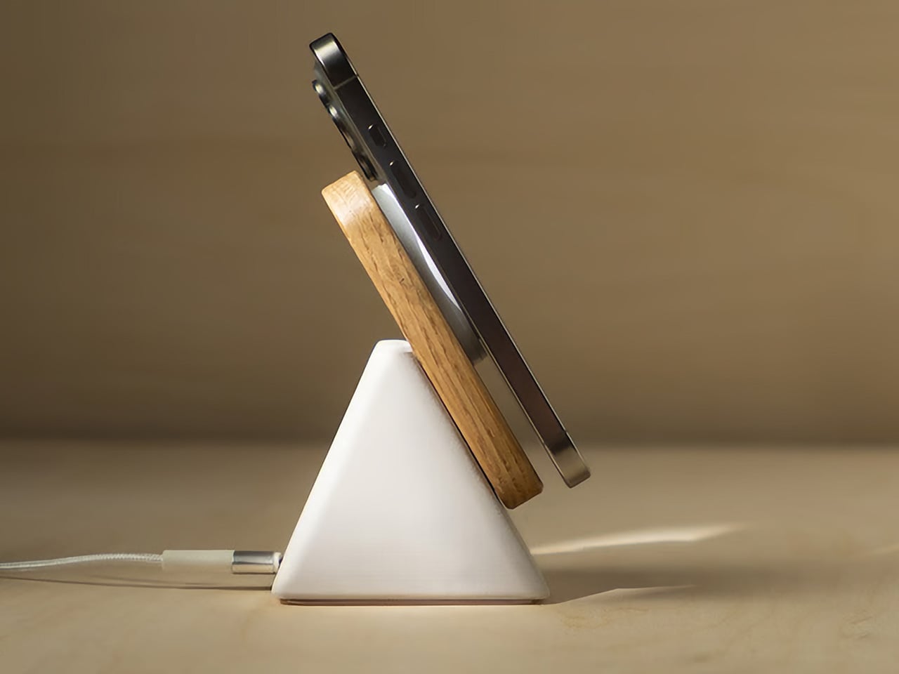
7 Best Tiny Homes of September 2026

The tiny home movement has been threatening to plateau for a few years now, and it keeps refusing to. September’s best builds make a compelling argument for why – not because they are novelties or lifestyle statements, but because they are genuinely well-designed homes that happen to be small. From a $33,700 single-floor build in the US to an award-winning off-grid retreat in the Australian bush, this month’s lineup is worth your full attention.

What separates these seven homes from the ones that cycle endlessly through social media is the discipline in their planning. Each one has resolved a real problem, whether that’s sleeping five people on a trailer, fitting a bathtub into 423 square feet, or running entirely off-grid without sacrificing a single luxury. That kind of specificity is harder to achieve than it looks, and it is increasingly what separates interesting tiny home design from forgettable compact architecture.

1. Fairfax 20

The Fairfax 20 is a 170-square-foot, single-floor tiny home from Dragon Tiny Homes that costs $33,700, a number that reframes the conversation entirely. Most compact builds in this category creep toward six figures before a single upgrade has been added. The Fairfax 20 lands at a price point closer to a mid-range car, and it makes the case for tiny living as an economic decision as much as an aesthetic one. The gray siding and metal roof give it a clean, photogenic exterior that reads as understated rather than budget.

Inside, the Fairfax 20 commits fully to simplicity. There is a lofted sleeping area, but the layout resists the urge to pack vertical inches with added function. It breathes instead, and feels more livable for it. The kitchen is properly fitted: an induction cooktop, a 7.1-cubic-foot refrigerator and freezer, and a washer and dryer unit. Six picture windows and two opening windows run throughout, and the bathroom is a full bathroom rather than a wet room compromise. That last detail matters considerably when you are evaluating whether a space can work long-term.

What we like:

  • The $33,700 price point puts genuine tiny home living within reach without sacrificing full-size appliances
  • A single-floor plan that prioritizes breathing room over cramming in features

What we dislike:

  • At 170 square feet, the footprint is tight for anything beyond solo or couple living
  • No mention of off-grid compatibility, which limits placement flexibility

2. Coolangatta 8.4

The Coolangatta 8.4 from Australian builder Removed Tiny Homes gets its name from its dimensions: 8.4 meters, or roughly 27.5 feet, sitting on a triple-axle trailer. The exterior wraps in Monument Colorbond steel cladding softened with natural textures, a combination that reads coastal and contemporary at once. It has presence in the late afternoon light without demanding attention. From the outside, the clean rooflines and tight material palette signal that what’s inside has been thought through rather than assembled.

What separates the Coolangatta 8.4 from comparable builds is the second loft. Floating above the main living space, it functions as a workspace, guest loft, or second bedroom depending on what the day needs. That programmatic flexibility is rare at this size and speaks to client-led design thinking rather than catalogue selection. The kitchen anchors the main living zone with a breakfast bar seating two, storage is woven into the architecture rather than bolted on as an afterthought, and generous glazing keeps the interior feeling open throughout.

What we like:

  • The second loft adds genuine spatial flexibility that multiplies how the home can be used day to day
  • Client-led customization means the layout reflects how you actually live rather than a prebuilt assumption

What we dislike:

  • Based in Gold Coast, Australia, which limits delivery options for buyers outside the region
  • Pricing is not publicly listed, requiring direct inquiry before budgeting

3. The Laurel

The Laurel is Teacup Tiny Homes’ take on fitting a real home into 423 square feet on a 34-foot triple-axle trailer. White vertical siding and a black metal roof give it a clean exterior that reads modern without announcing itself. Inside, white tongue-and-groove paneling lines the walls, dark blue cabinetry anchors the kitchen, and propane-powered underfloor heating keeps the lower level comfortable year-round. The living room holds a full sofa and electric fireplace with actual breathing room around both, which sounds unremarkable until you spend time in a compact build that got this wrong.

The Laurel earns its place on this list through two details that rarely coexist in a road-legal build: a dishwasher in the galley kitchen and a bathtub in the bathroom. The kitchen is four-burner capable with an oven, fridge, and freezer, and a microwave alongside it. A sliding barn door opens into a bathroom with an L-shaped vanity, flushing toilet, and a combined bathtub and shower. Two loft bedrooms handle sleeping for four, and the home starts at roughly US$121,000.

What we like:

  • A bathtub and dishwasher coexisting in a road-legal 34-foot home is genuinely uncommon
  • Sleeping four comfortably without the layout feeling like a dormitory is a real spatial achievement

What we dislike:

  • The second loft is accessed by a removable ladder, which is less practical for nightly use
  • At a US$121,000 base price, pricing sits at the premium end of the towable tiny home market

4. White Pine

The White Pine from Backcountry Tiny Homes runs 30 feet long and 10 feet wide, and that extra foot of width over a standard tiny house changes the interior feel considerably. It sits on a triple-axle trailer and pairs cedar tongue-and-groove cladding with metal paneling on the exterior, a combination that reads as considered rather than rustic. The interior continues in pine with whitewashed ceilings and vinyl flooring throughout, warm without being precious, the kind of finish that ages gracefully without demanding constant maintenance.

The rooftop terrace, reached via detachable stairs from outside, converts dead roof space into a genuine outdoor living area. In a home of this size, an additional hangout space above the treeline is a meaningful expansion of livable square footage rather than a novelty. The master bedroom sits on a lowered platform with full standing height, a detail that sounds minor until you have crouched in a tiny home loft at 7 a.m. A second loft and sofa bed bring the sleeping total to five people. The White Pine starts at $74,280 for a shell, with the fully furnished version at $140,010.

What we like:

  • The rooftop terrace meaningfully expands usable square footage without touching the trailer footprint
  • Full standing height in the master bedroom loft is a rare and genuinely practical detail

What we dislike:

  • The 10-foot width requires a transport permit, adding logistical complexity to any relocation
  • The two-burner kitchen stove is modest for a home that sleeps five people

5. The Amelia

The Amelia is 26 feet long and 8.5 feet wide, sitting on a double-axle trailer with 341 square feet of interior space. White board-and-batten siding, a maintenance-free steel base, and a snap-lock metal roof give it a clean and deliberate exterior. Inside, dual-pane low-E windows fill the living area with natural brightness, and a propane-powered underfloor heating system, mini-split air conditioning unit, and Lunos heat recovery ventilator point to a home engineered for year-round, full-time living rather than the occasional weekend use that many compact builds are quietly optimized for.

The kitchen is where the Amelia builds its case. A white apron-front farmhouse sink, a four-burner Furrion propane range, fridge and freezer, microwave, and a large pull-out pantry anchor the space. Waterfall-edge marble-like countertops run the perimeter, with an eating bar that doubles as a workstation. A sliding door connects to the bathroom, which holds a 30-by-30 stand-up shower, custom vanity, and an oversized round medicine cabinet. Two loft bedrooms sit above, one sized for a king and one for a queen, and the build starts at roughly US$102,000.

What we like:

  • The Lunos heat recovery ventilator and full HVAC suite signals serious engineering for full-time living in any climate
  • The eating bar doubling as a workstation is a genuinely useful dual-function detail for remote workers

What we dislike:

  • At 26 feet on a double-axle trailer, the Amelia is on the shorter end for a two-loft build
  • The 30-by-30 shower is functional but narrow for long-term daily use

6. The Florence

The Florence runs 36 feet on a triple-axle trailer, making it Teacup Tiny Homes’ most spacious build in this lineup at 355 square feet. White tongue-and-groove paneling, 11-foot vaulted ceilings, and generous windows push the interior further than its square footage suggests. A sofa and electric fireplace anchor the living area, with a large built-in storage unit near the entrance. It reads less like a compact home doing its best and more like a considered residence that happens to be moveable, which is the specific feeling this category spends most of its time chasing.

The Florence’s most useful detail is a dining nook that converts into a home office with an extending desk and integrated storage, a dual-function zone that remote workers will appreciate more than any feature wall. The master bedroom sits on the main floor with walking clearance on both sides and built-in storage that feels like a real room. A secondary sleeping loft above the kitchen adds a second bed. Customization options include a soaking tub in place of the glass-enclosed shower, and pricing starts at roughly US$122,000 with delivery across the US and Canada.

What we like:

  • The 11-foot vaulted ceilings and main-floor master bedroom make this feel closer to a cottage than a tiny home
  • The home office dining nook is one of the more thoughtfully resolved dual-function spaces in this category

What we dislike:

  • At US$122,000, it is the priciest entry from Teacup Tiny Homes in this roundup
  • The secondary loft is accessed by a removable ladder, better suited to occasional guests than daily use

7. SHAK

The SHAK won Best Weekender at the 2025 Tiny House Industry Awards, and once you see it, the reason is obvious. Built by Removed Tiny Homes as a bespoke commission for a site in the Grampians of Victoria, Australia, it runs entirely off-grid with no power line in sight. Dark vertical cladding, an angular stepped roofline, and a wraparound timber deck give it a sculptural exterior presence that most permanent homes never manage. It reads less like a transportable dwelling than a piece of architecture that grew from the landscape itself.

Inside, dark stone benchtops, timber cabinetry, a black herringbone-tile splashback, and wine plumbed directly to the bench set the register for the kitchen. A black wood-burning fireplace anchors the living space. The bathroom earns its own category: two brass rainfall heads over a dark marble-tiled double shower, with a full-height glass door that opens directly onto the bush for an open-air morning ritual. A queen bed sits beneath a timber-slat ceiling and a large skylight that pours daylight across the room throughout the day. It does not feel like a compromise. It feels like a deliberate choice.

What we like:

  • Wine on tap and a wood-burning fireplace in a fully off-grid build reframes what the word “tiny” can mean
  • The glass shower door opening directly onto the Australian bush is a genuinely extraordinary spatial experience

What we dislike:

  • Built as a bespoke one-off commission, so replication depends entirely on Removed Tiny Homes’ availability and capacity
  • The premium specification places it in a completely different price bracket from most builds on this list

The Takeaway

Each of these designs make a strong case for the tiny homes category. The camp is splitting in two directions, and both are producing work worth paying attention to. One lane is pure efficiency, the Fairfax 20 and the Amelia resolving what’s genuinely necessary and building it with precision. The other is experience-driven: the SHAK and the White Pine designing for feeling rather than floor area. Neither approach is wrong. Both are getting better at what they set out to do.

The thread running through all seven is resolution. Each build solved a specific problem rather than simply filling a footprint: a bathtub in a road-legal trailer, full standing height in a sleeping loft, wine on tap in an off-grid retreat. These are not incidental details. They are the decisions that separate a home from a box, and they are exactly why this category keeps producing work that is genuinely worth covering.

The post 7 Best Tiny Homes of September 2026 first appeared on Yanko Design.

3 Japanese Stationery Designs So Good You’ll Actually Enjoy Going Back to Your Desk

Late August has a particular texture. The mornings cool by a degree, the light shifts without announcing itself, and the desk that went mostly untouched all summer starts to look like a place worth returning to. Japanese stationery has always understood this moment. The objects it produces are not exciting in the way a gadget is. They are exciting in the way a good chair is — once you find the right one, everything before it starts to feel like a placeholder.

The three picks here share a quality that is easy to recognize once you know to look for it. Each attends to the part of the tool that most manufacturers have already decided is resolved. A pair of scissors built with the precision of a professional instrument. A stapler that removes the staple from the concept of stapling. A notebook that asks nothing of you beyond showing up. Together, they change what returning to a desk in late summer actually feels like.

1. Stellar Edge Scissors

Most scissors are bought once and forgotten. The Stellar Edge Scissors, crafted from Japanese stainless steel, propose a different relationship with the category. Seamless, polished handles and a weight distribution that shifts the blade toward the hand make cutting feel less like holding something and more like extending your reach across the page. Every angle in the design is considered. The result is a pair of scissors that earns a permanent place on the desk rather than disappearing into a drawer the week they arrive.
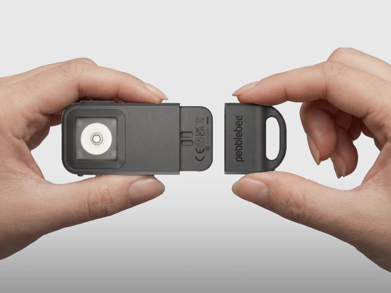

Each snip registers with the kind of clean resistance that confirms the blade is doing exactly what it was built for. The polished finish elevates the tactile experience without making the scissors feel fragile or precious. Extended cutting sessions don’t build the fatigue that cheaper alternatives accumulate across an afternoon, and the grip sits naturally regardless of hand size with no adjustment required. For anyone who works with paper regularly, these are the scissors that make the pair you owned before feel like it was never really doing the job.

What we like

  • Japanese stainless steel construction holds its edge through sustained use rather than dulling after a few weeks of regular cutting
  • The seamless, polished handles and considered weight distribution make these genuinely display-worthy objects on a desk surface

What we dislike

  • The precision manufacturing and material quality place these at a higher price point than most people are used to spending on scissors
  • No rubber grip inserts means those who prefer a softer handle feel on longer cutting sessions will notice the absence

2. PaperLock Stapler

The mechanism behind PaperLock is simple in the way good design is simple. Press the lever and a small cutting element punches through the stack, folding the paper back through itself to create an interlocked join. No metal passes through the page. No staple is added. The paper becomes its own fastener, which means nothing catches against other sheets in a stack, nothing needs removing before a document reaches the recycling bin, and nothing can run out at the moment you most need it to work.
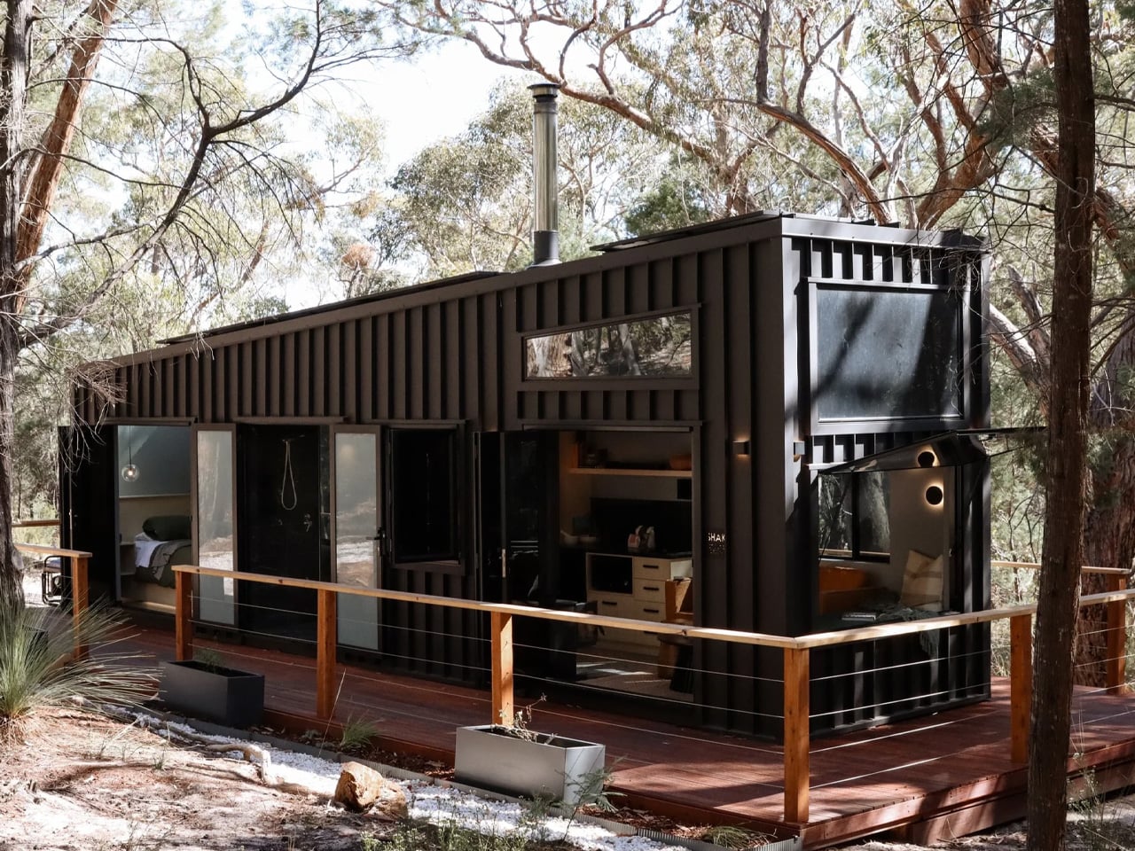
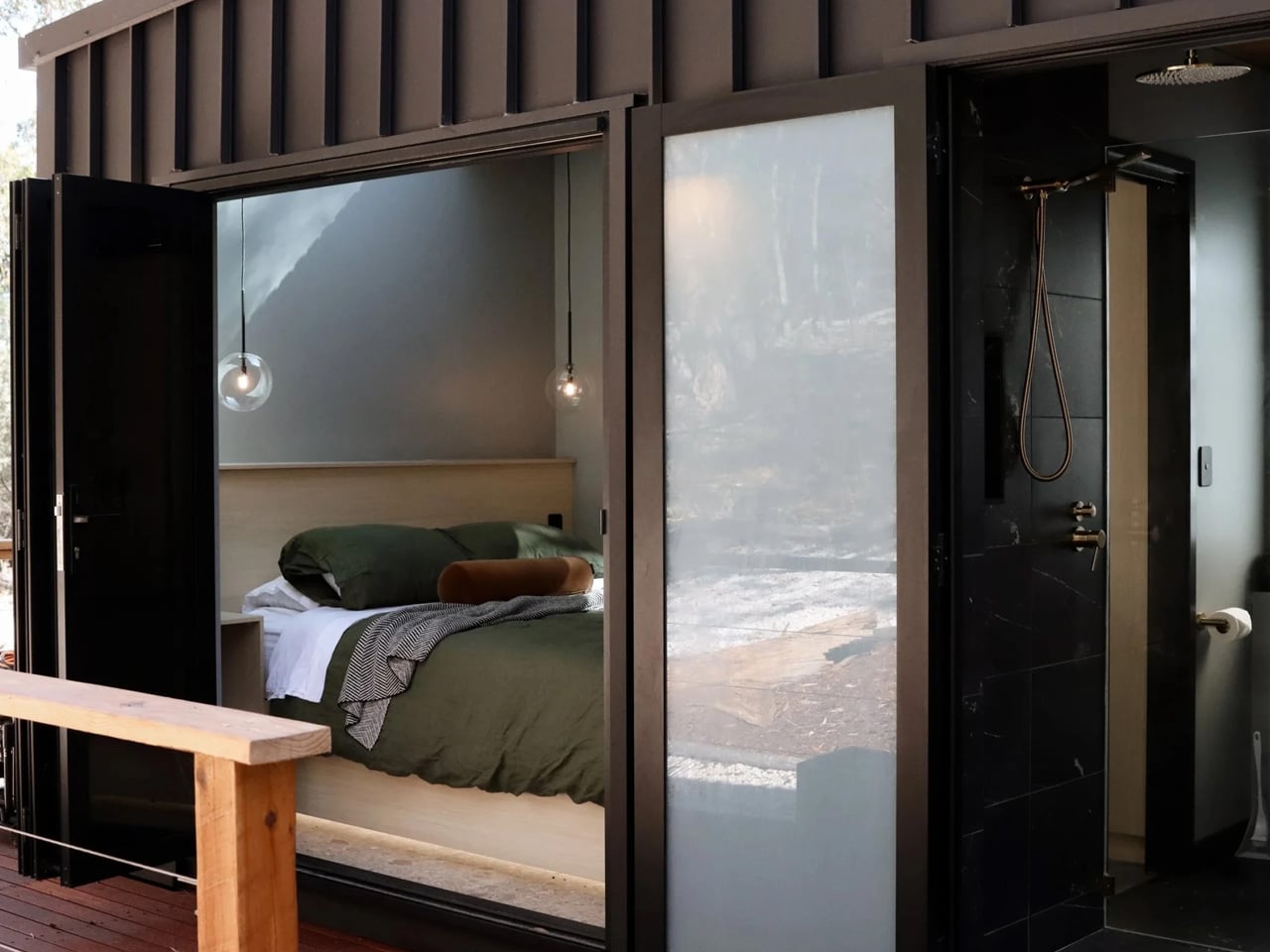
Most desk tools keep their mechanisms out of sight, usually because there is nothing worth showing. PaperLock does the opposite. The transparent body puts the internal parts on full display, and pressing the lever becomes something closer to watching a small machine operate than completing a piece of office admin. A viewing window shows exactly where the join will land before you commit, a corner guide keeps placement consistent across an entire stack, and the lever works pressed against a surface or squeezed in the palm with no adjustment required between the two.

Click Here to Buy Now: $35.00

What we like

  • The staple-free mechanism cuts and interlocks the paper itself, leaving nothing to load, manage, or run out of at an inconvenient moment
  • The transparent body puts the internal mechanism in full view with every press, turning a routine desk task into something worth watching

What we dislike

  • Five-sheet capacity handles everyday stacks cleanly, but anything thicker requires a different tool, which limits its range for larger document sets
  • Separating paper-locked sheets without tearing requires more care than pulling a metal staple free, which matters when a binding error needs to be corrected quickly

3. Stalogy Editor’s Series 365 Days Notebook A6

The Stalogy Editor’s Series 365 Days Notebook carries no branding on its exterior. That is a design decision, not an economy. Inside, 368 pages of cream-toned dot grid paper sit light enough that the notebook never feels precious, yet substantial enough to hold a full year of daily writing without any sense of running out. At A6, it fits a coat pocket without folding. The dot grid recedes under handwriting without disappearing, present enough to keep lines honest across a full page of notes.

Nothing about the Stalogy insists on a particular way of working. There are no monthly spreads pre-printed inside, no prompts in the margins, no year assigned to the cover before you open it. Bullet journaling, daily planning, freeform writing, and quick sketches all sit comfortably within its pages without any of those uses feeling like a compromise. Most stationery at this level quietly pushes a method. The Stalogy provides the space and steps aside, which turns out to be the more useful and respectful approach any notebook can take toward the person using it.

What we like

  • The bare cover carries no visual identity, making it entirely the user’s object from the moment it is opened rather than the manufacturer’s
  • 368 pages at A6 gives a full year of writing without adding meaningful bulk to a coat pocket or daily carry

What we dislike

  • Date and time markings are printed at a small scale, making them difficult to read in low light or at a glance during a busy session
  • Heavier fountain pen inks will ghost through the thin paper, which limits compatibility for dedicated nib users

The Right Objects Make Coming Back Feel Like a Choice

There is a version of returning to a desk in late August that feels like a small defeat. The difference between that version and the other one is almost always the objects on the desk. When the scissors cut cleanly and feel right in the hand, when the stapler is always ready without refills to think about, when the notebook asks nothing beyond showing up, the desk becomes a different kind of place. The tools stop being obstacles and start being part of the reason to sit down.

These three earn their place not because they are impressive to look at but because they are right to use. The Stellar Edge Scissors bring precision to a category most people never think to question. The PaperLock removes a material from a process that never needed it. The Stalogy removes every obstacle between writing and the page. None of them asks for your attention. That absence of noise is the design principle Japan has been working toward for the better part of a century, and it is why coming back to the desk in September can feel entirely different from the September before.

The post 3 Japanese Stationery Designs So Good You’ll Actually Enjoy Going Back to Your Desk first appeared on Yanko Design.