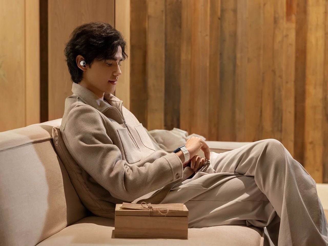
The headphone has become something it was never originally designed to be: a silhouette. Worn around the neck on a subway platform or draped over a chair at a coffee shop, a great pair of over-ears communicates taste in much the same way a watch or a well-chosen bag does. The best ones are now designed with that resting moment in mind, not as an afterthought, but as a deliberate part of the brief.
What separates a good headphone from a great one is increasingly less about frequency response and more about how the object behaves when it’s not in use. The five pairs on this list earn their place on both counts. Worn on the head, they deliver. Worn around the neck, they still look like they were built by people who thought carefully about that exact resting moment, collarbone and all.
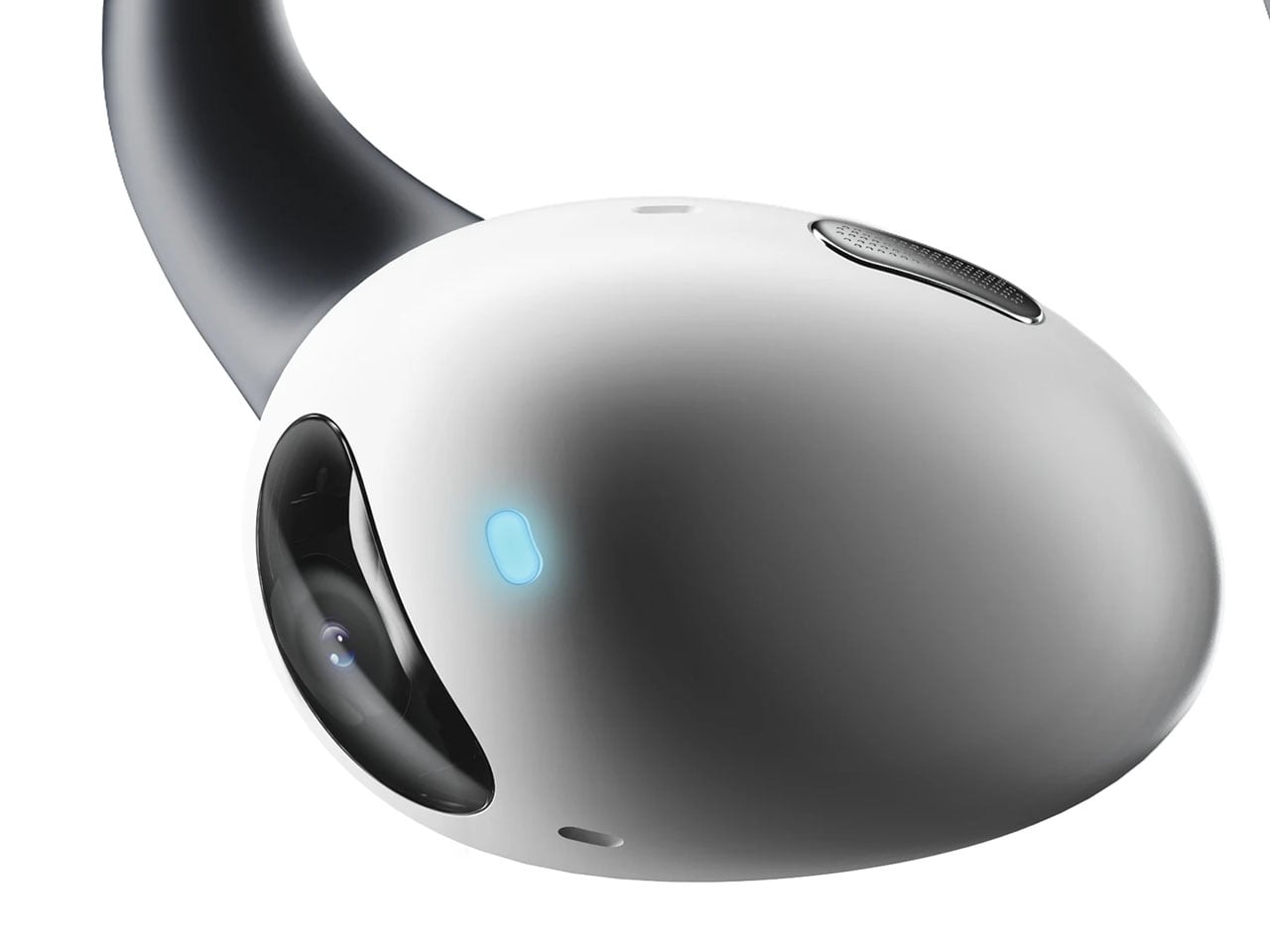
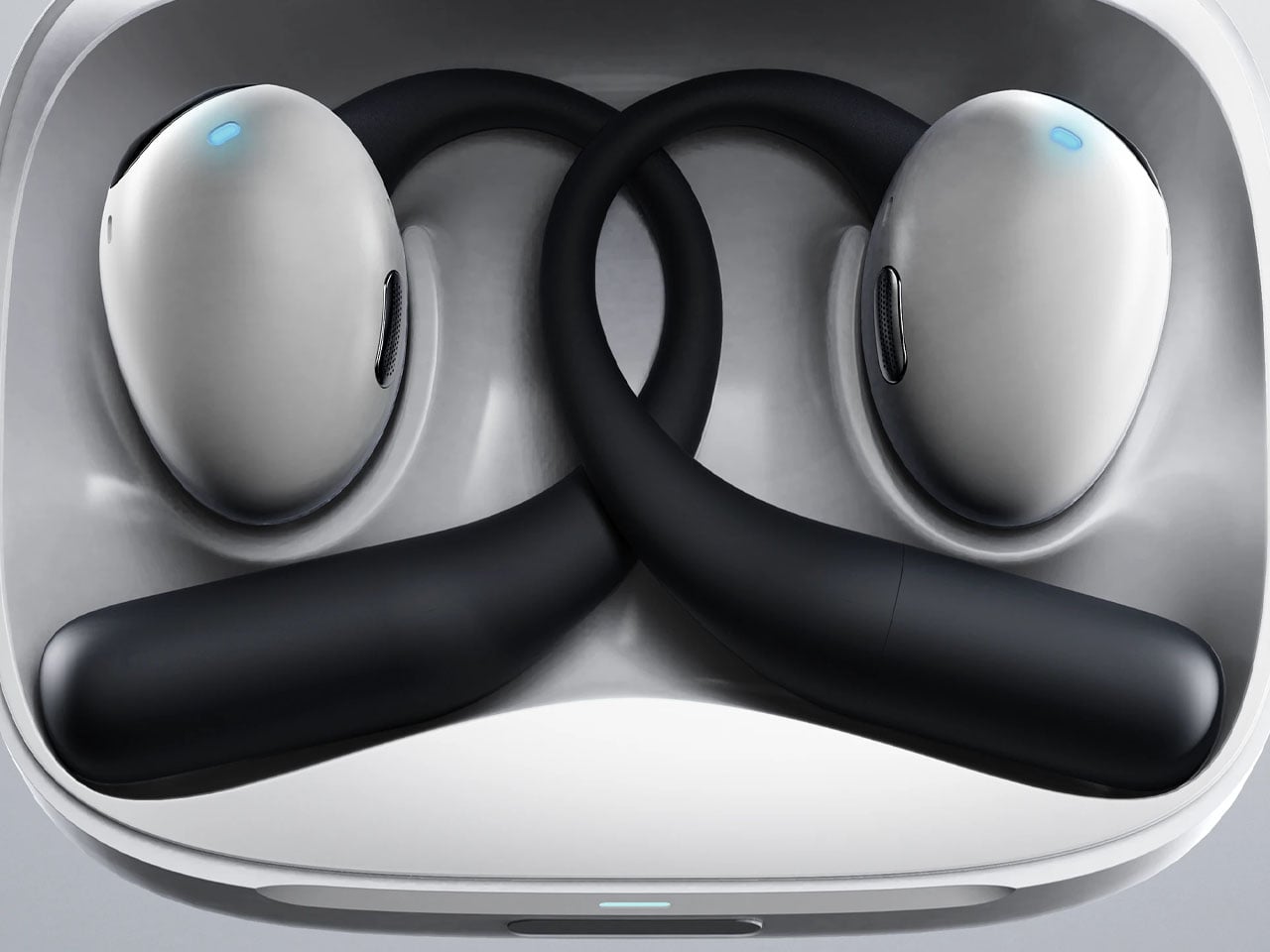
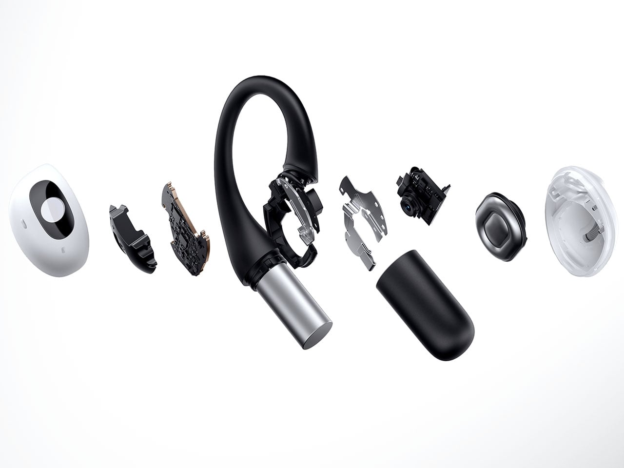
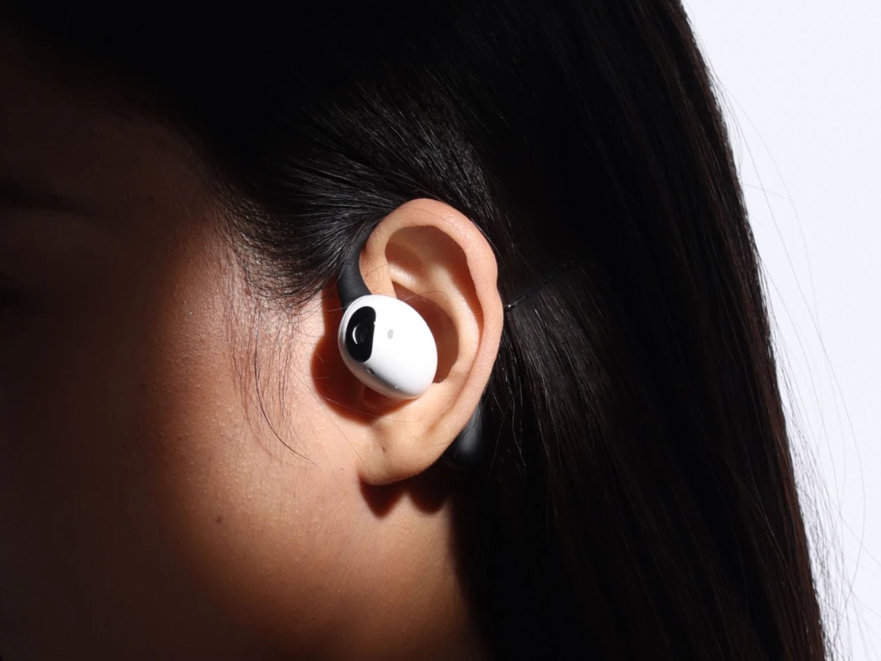
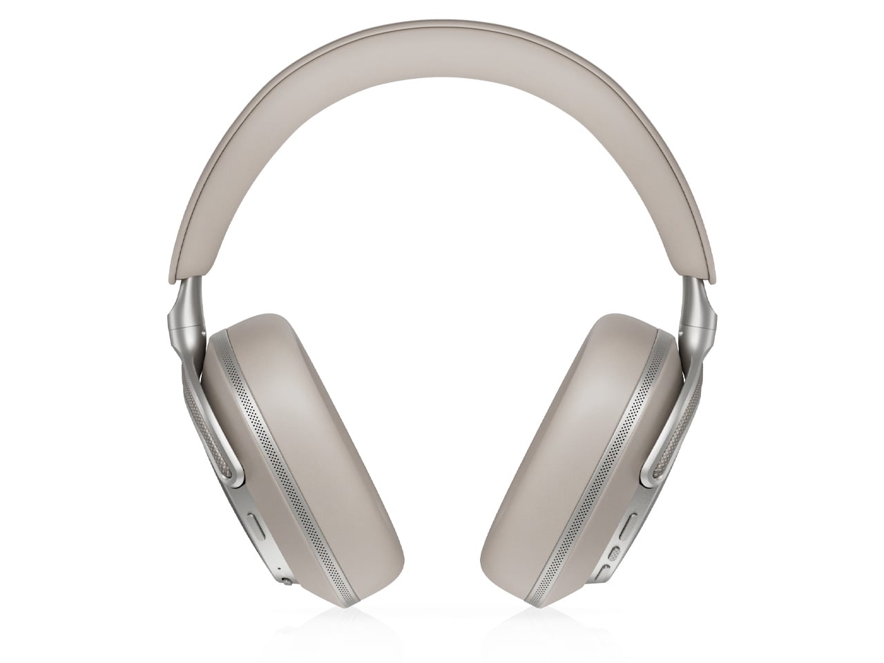
1. StillFrame Headphones

Most headphones achieve lightness by sacrificing material quality somewhere along the way. StillFrame achieves it by rethinking the entire structure from scratch. At 103 grams, it sits on your head with the kind of effortless presence most pairs spend an entire product page trying to claim. The ultra-minimal design, clean lines, no exposed hardware, and no decorative flourish anywhere on the frame is the kind of restraint that reads as confidence rather than budget constraint.
Around the neck, StillFrame does what minimal design always promises and rarely delivers: it disappears into your outfit rather than competing with it. The 24-hour battery means you’ll reach for these in the early morning and still have charge well into the evening without thinking about a cable. For anyone who wants headphones that age well, that look as right in three years as they do today, this is where the search ends.
Click Here to Buy Now: $245.00
What We Like
- At 103 grams, this is one of the lightest over-ear headphones available without any sacrifice in build integrity, and the weightlessness is felt the moment you put them on
- A 24-hour battery life means this pair genuinely runs from morning to night on a single charge, removing the low-battery anxiety that comes with most wireless headphones on the market
What We Dislike
- Minimal colorway options are a direct consequence of the same design restraint that makes the StillFrame look this considered, and that trade-off is real and visible
- With so little on the frame to grab visual attention, this pair asks you to commit fully to its design language, which rewards patience but does not suit every aesthetic
2. Meze Audio Strada
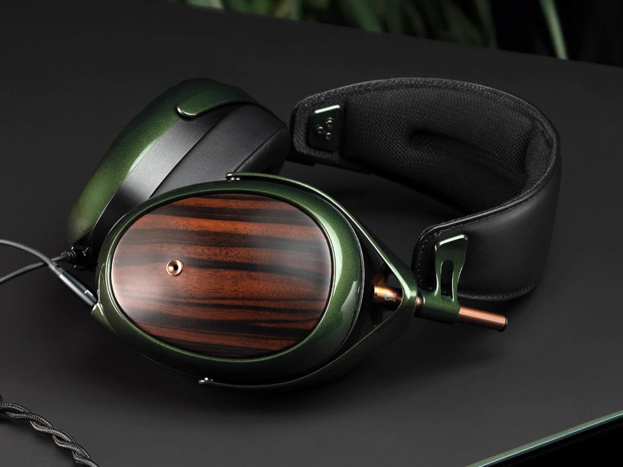
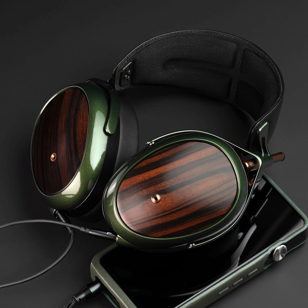
Romanian audio atelier Meze has spent two decades treating headphones as craft objects, and the Strada makes that philosophy fully explicit. Hand-carved walnut and ebony ear cups, each unique in grain and tone, sit alongside a magnetic ear pad system that snaps on and off cleanly, making them the first pair that genuinely anticipates its own aging. The leather headband drapes naturally against the collarbone. At $799, you’re investing in the idea that daily objects deserve this level of material care.
Worn around the neck, the Strada does something genuinely rare: it makes you look considered rather than plugged in. Those hand-carved wood cups catch light in a way that aluminum never quite manages, and the closed-back design delivers warmth and isolation without the clinical precision of most audiophile gear.
What We Like
- The hand-carved wood ear cups make every unit genuinely one-of-a-kind, an unusual distinction in a product category that typically prizes consistency and uniformity above everything else
- The magnetic ear pad system solves a real longevity problem that most headphone manufacturers still choose to ignore, making the Strada feel genuinely built for the long term from the start
What We Dislike
- The warm, closed-back tuning leans toward intimacy over accuracy, which won’t satisfy listeners who prefer a flat, analytical sound profile for critical or reference listening sessions
- No active noise cancellation at $799 is a deliberate aesthetic choice, but it will not suit everyone who regularly listens in open, noisy, or busy urban environments
3. Bang & Olufsen Beoplay H95
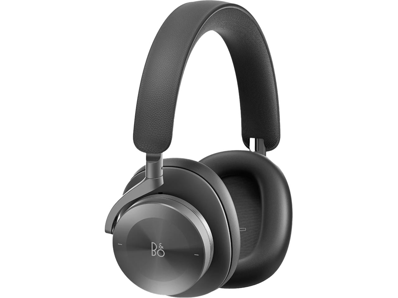
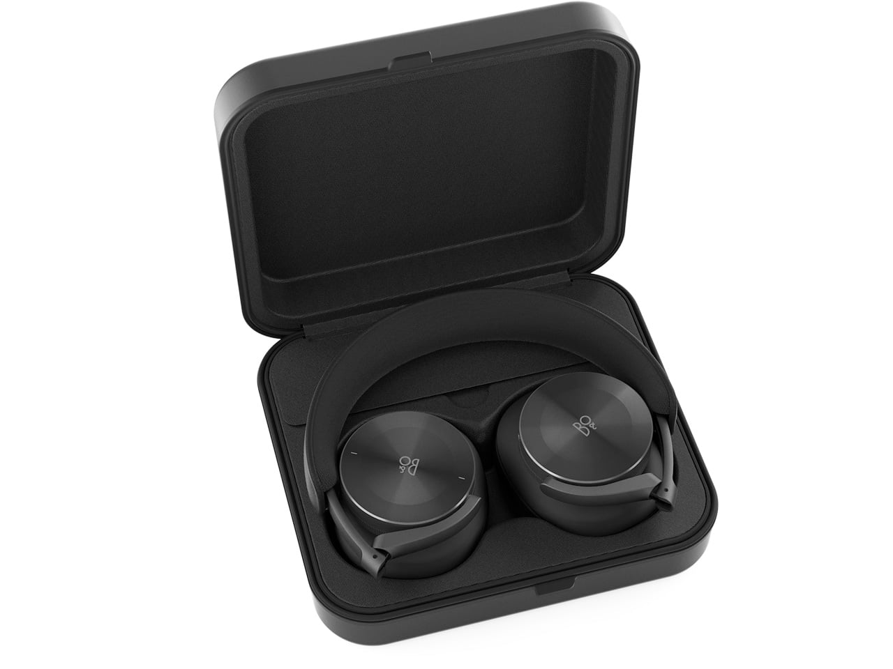 Bang & Olufsen has been designing objects that make a room better simply by existing in it since 1925. The Beoplay H95 carries that logic to your ears. Brushed aluminum arcs support lambskin ear cushions with the quiet authority of something that was never trying to impress anyone. Custom 40mm titanium drivers deliver an expansive, unhurried soundstage, and 38 hours of battery life with ANC active means you rarely need to think about charging. At $1,250, it reads as inevitable rather than expensive.
Around the neck, the H95 makes its strongest case. The slim profile rests cleanly against the collarbone, the aluminum catches light without glare, and the lambskin ages into something better than what you started with. Vogue Scandinavia named it the headphone that pairs best with the softest cashmere roll-neck and a cocooning wool coat, which is not exactly a mid-range endorsement. The tactile control dial and hard carrying case complete the picture of a brand that hasn’t needed to shout for a century.
What We Like
- Lambskin ear cushions and brushed aluminum give the H95 a material quality that makes every other pair on this list look like it is working a little harder to impress you
- 38-hour ANC battery life is class-leading and genuinely difficult to match at any price point, making this the pair most likely to outlast a long-haul journey without any hesitation
What We Dislike
- At $1,250, this is a significant investment for a product category where $400 already delivers very strong audio performance from multiple well-regarded and respected manufacturers
- The control dial is elegant but carries a subtle learning curve that takes several days of regular use to feel completely intuitive and second-nature in the hand
4. Bowers & Wilkins Px8 S2
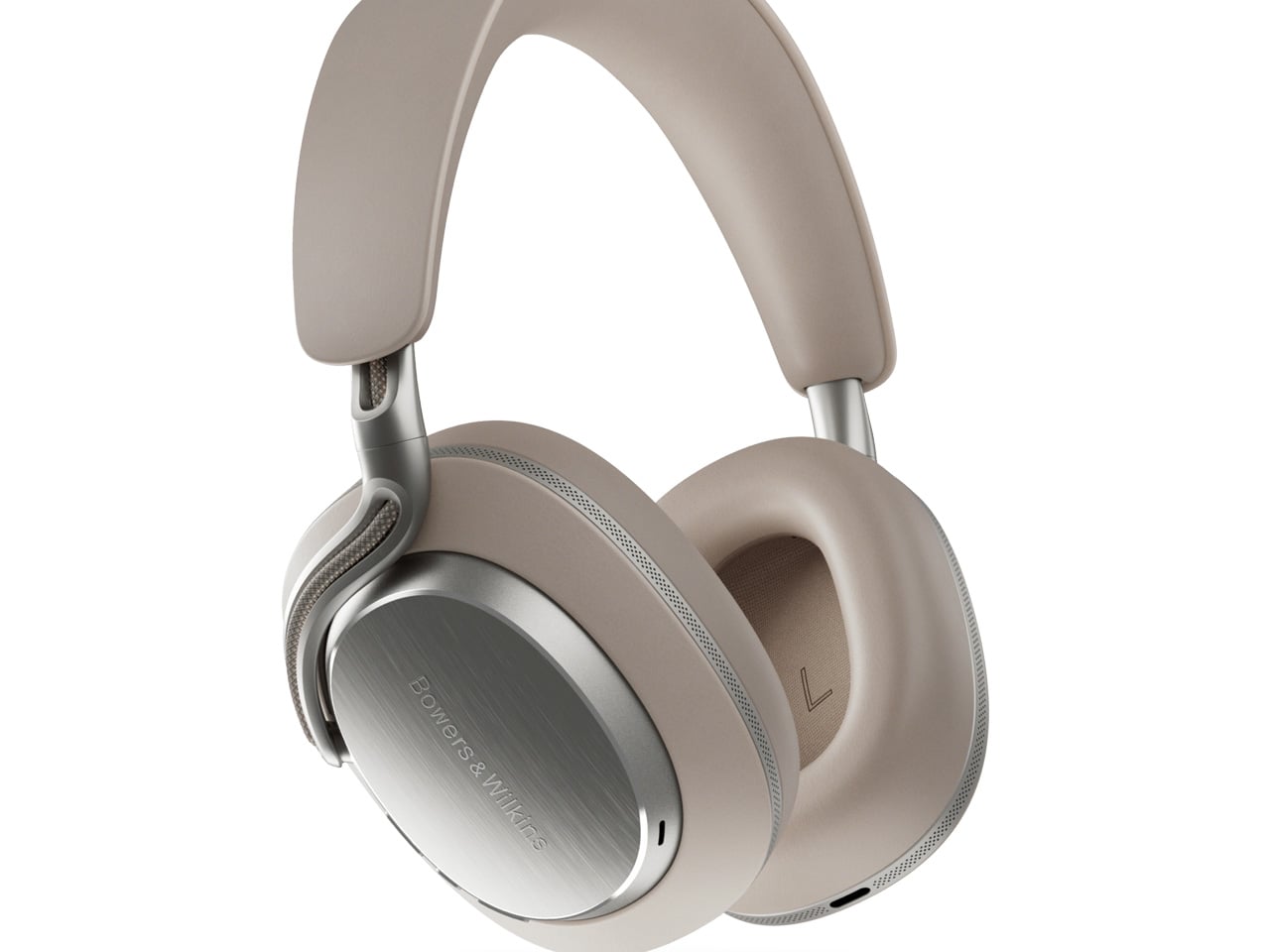
The Px8 S2 looks like it was designed by someone who spent too much time around luxury automobiles and not enough time worrying about what people thought. Diamond-quilted Nappa leather ear cups sit inside angular aluminum driver housings that don’t apologize for taking up space. Bowers & Wilkins built their reputation on speaker cabinets in British living rooms, and that obsession with material quality is fully present in the Px8 S2. At $799, it’s the most visually assertive pair on this entire list.
Worn on the head, the 40mm Carbon Cone drivers deliver a focused sound that rewards careful listening. Worn around the neck, the quilted leather and aluminum geometry create a silhouette that reads closer to jewelry than consumer electronics.
What We Like
- The diamond-quilted Nappa leather ear cups are a genuinely distinctive design move that no other headphone brand at this price point is executing with this level of craft and conviction
- 40mm Carbon Cone drivers bring the kind of focused sound detail that makes streaming audio feel like it might be holding something back, consistently rewarding attentive listeners on every session
What We Dislike
- The angular form does not fold into a compact carry position, making the included case noticeably bulkier than most direct competitors when packed into a bag for daily commuting use
- The firm clamping force is necessary for the acoustic seal, but it makes itself felt during extended listening sessions, which matters for anyone who wears headphones for several consecutive hours at a time
5. Sonos Ace
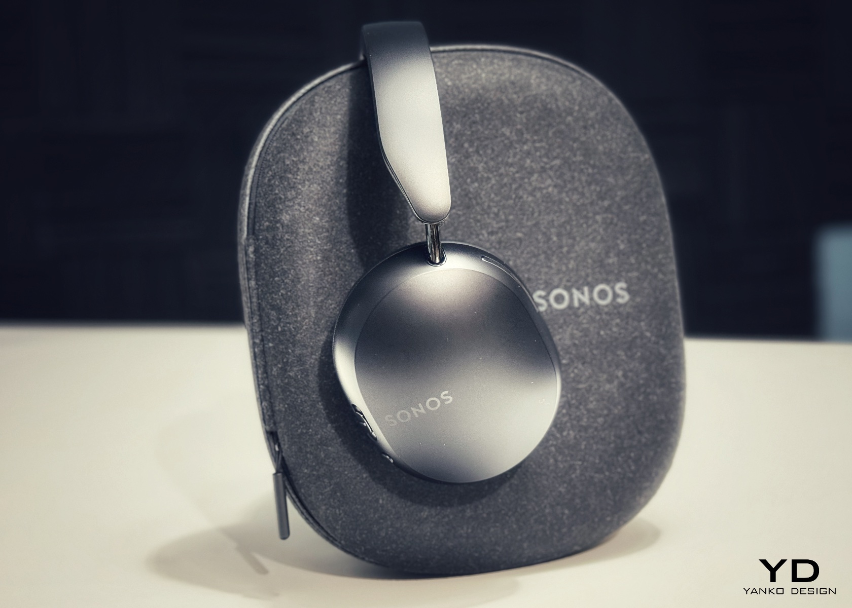
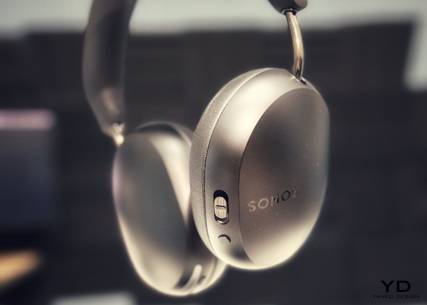
Sonos spent two decades being the most thoughtfully designed speaker company in the world before ever touching headphones. The Ace is what happens when a brand famous for restraint and material quality finally commits to an entirely new product category. Stainless steel arms, memory foam ear cushions, and a clean form in Midnight or White carry the same quiet authority as Sonos’s best home equipment. At $449, it sits below the B&O and B&W while fully matching them on design character and material coherence.
What makes the Ace genuinely stand out is what you don’t notice: no visible seams on the headband, no mismatched materials, no hardware that apologizes for itself. Active noise cancellation and a 30-hour battery complete a pair that wears as well around a neck as it sounds through the drivers, making it the most versatile pick on this list.
What We Like
- The material cohesion across every surface, every finish, and every seam speaks one consistent and considered design language, which is an unusually disciplined achievement at the $449 price point
- Active noise cancellation combined with a 30-hour battery puts the Ace ahead of most competitors on the two specifications that matter most for daily and travel listening
What We Dislike
- The body is predominantly high-quality plastic rather than metal, which is a material trade-off that some buyers will feel at this price point relative to the B&O and B&W alternatives
- Head-tracking spatial audio is most effective when paired with a Sonos home speaker system, limiting the feature’s full appeal for listeners who don’t already own Sonos hardware at home
The Best Headphones Are the Ones You Never Want to Take Off
What all five of these pairs share is a seriousness of intent that goes well beyond frequency response. They were built by companies that think about how objects live in the world, not just during a listening session, but on a train platform, at a desk, hanging around a neck. That’s a harder problem to solve than noise cancellation, and the brands that crack it tend to stay relevant far longer than those that don’t.
The range here runs from $449 to $1,250, but the price gaps matter less than they appear at first. What you’re really choosing between is design language: Romanian craft warmth, Scandinavian restraint, British precision, speaker-first material thinking, or clean minimalism that genuinely disappears. Any of these pairs earns the right to hang around your neck. The question is which one earns it in a way that feels made for how you actually move through the world/
The post 5 Over-Ear Headphones That Look as Good When They’re Around Your Neck as When They’re on Your Head first appeared on Yanko Design.