COMODO Entryway Stool Dries and Deodorizes Shoes While You Sit

Taking off your shoes after a long day often means being greeted by damp insoles and stale smells. Rain, sweat, and dust turn footwear into something you tolerate rather than enjoy wearing, and most people either ignore it or resort to stuffing newspaper inside them and hoping for the best. Drying racks clutter the hallway, and washing shoes every time they get wet is too much work for something you’ll just wear again tomorrow.

COMODO is a concept that treats shoe care as part of the entryway routine rather than an afterthought. It combines a small upholstered stool with a compact shoe care system inside, so the same object you sit on to put on your shoes also quietly dries, deodorizes, and refreshes them between outings. The name comes from the Spanish word for “comfortable” or “pleasant,” which pretty much sums up the whole idea.

Designer: Hyeona Cho

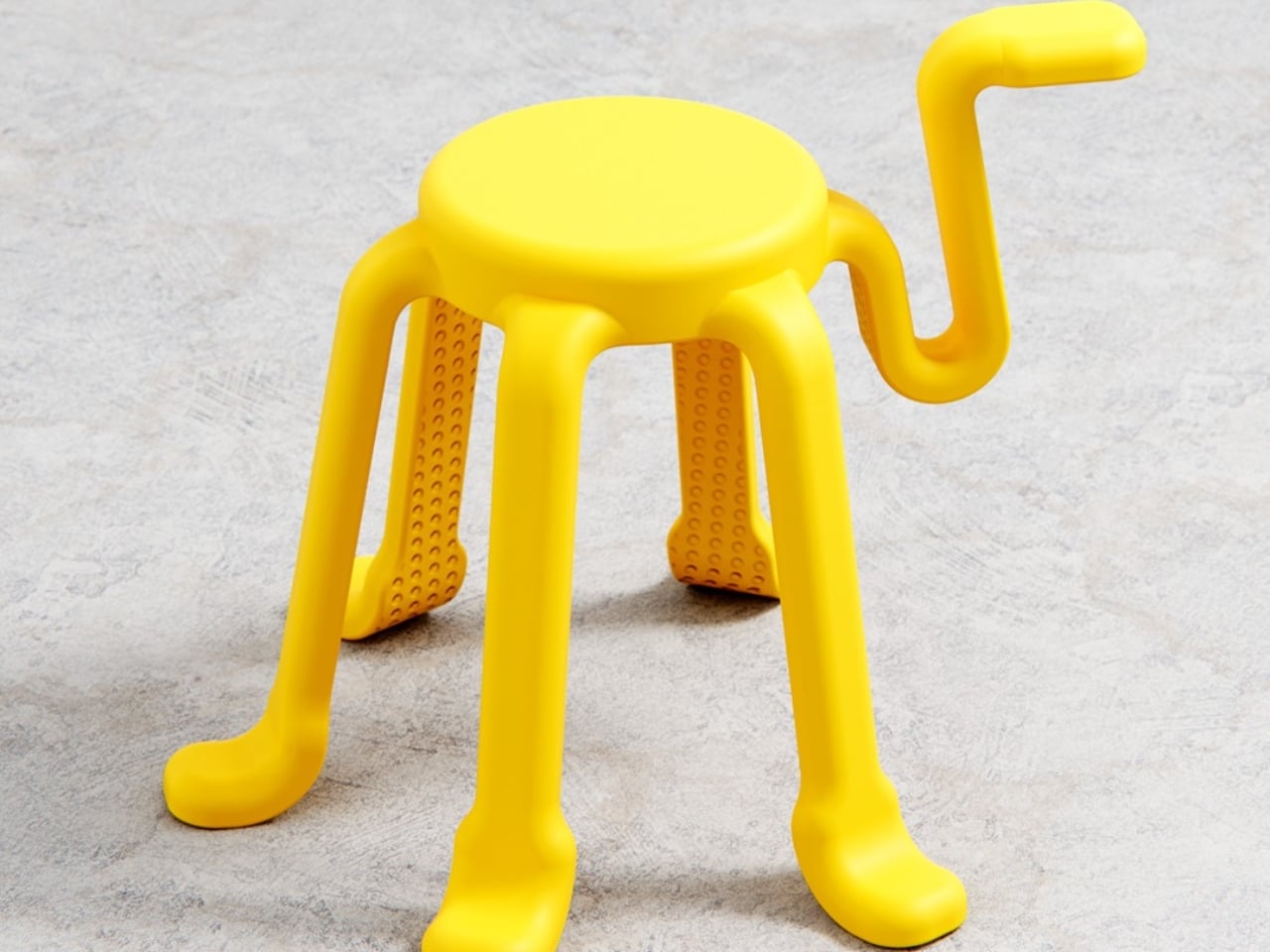
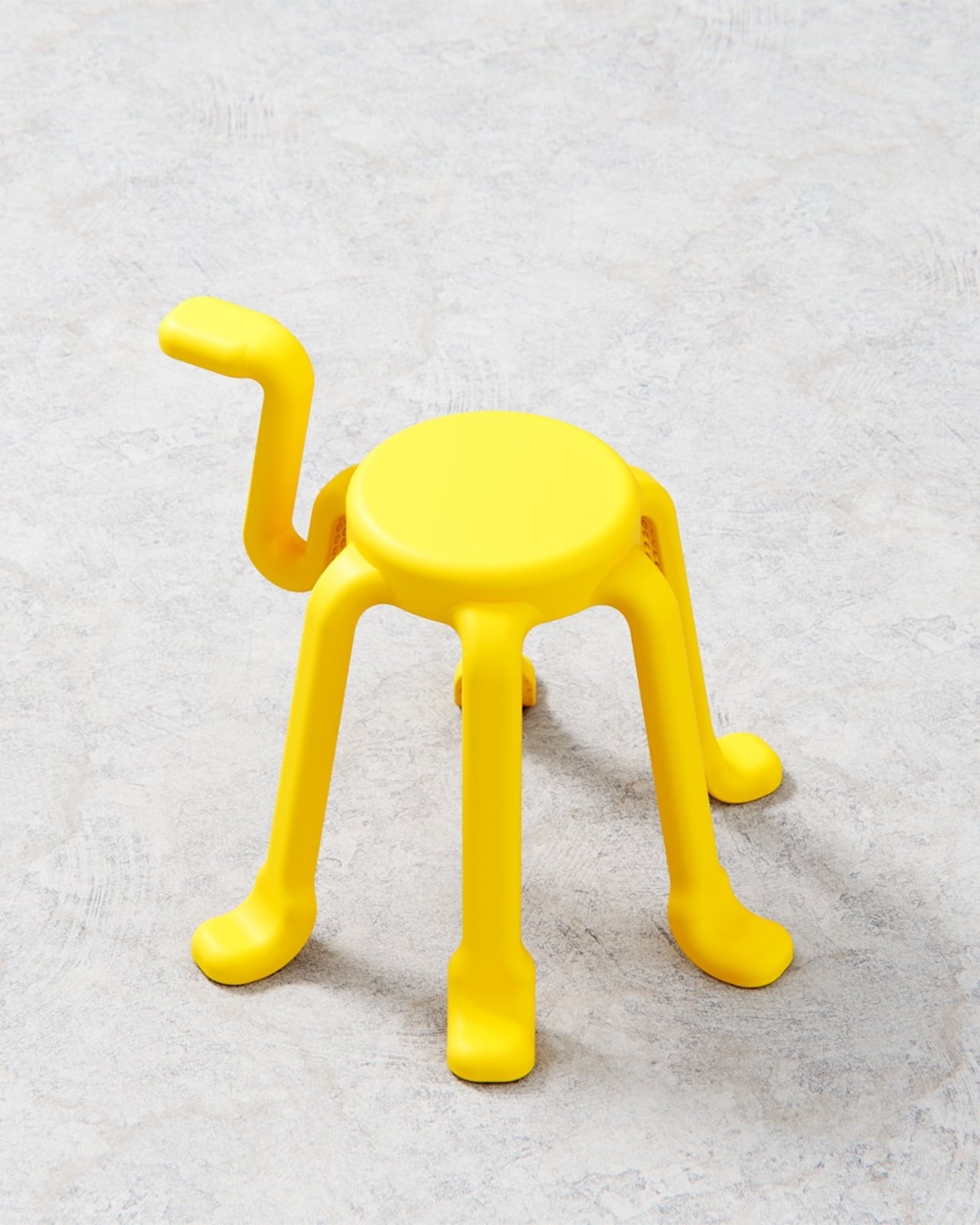
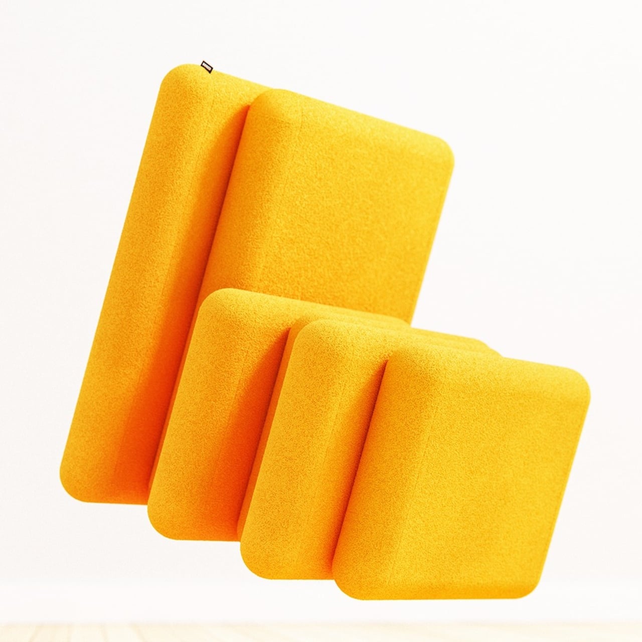
The form is a soft, rounded cube on four slender legs, available in muted colors like charcoal gray, mustard yellow, and sage green. The matte, slightly textured body and cushioned top make it read more like a piece of furniture than an appliance, allowing it to sit next to a shoe cabinet or mirror without looking out of place. It’s the kind of thing you could leave in the hallway without feeling like you’re displaying a gadget.

Open the small front door, and you find an interior chamber with what the designer calls an “air shoetree” and vents. Shoes can be placed on angled posts or directly on the floor of the chamber, where warm air circulates to dry them. A HEPA filter and scent filter work together to remove damp odors and add a gentle fragrance, while a UV lamp at the top targets germs on the surfaces.

The air shoetree offers some flexibility. Because you can either insert shoes onto the posts or rest them inside the chamber, COMODO can handle different shapes, from sneakers to ankle boots. The base plate slides forward like a shallow drawer, bringing the shoes closer to you and making it easier to place them or even use the raised platform while putting them on.

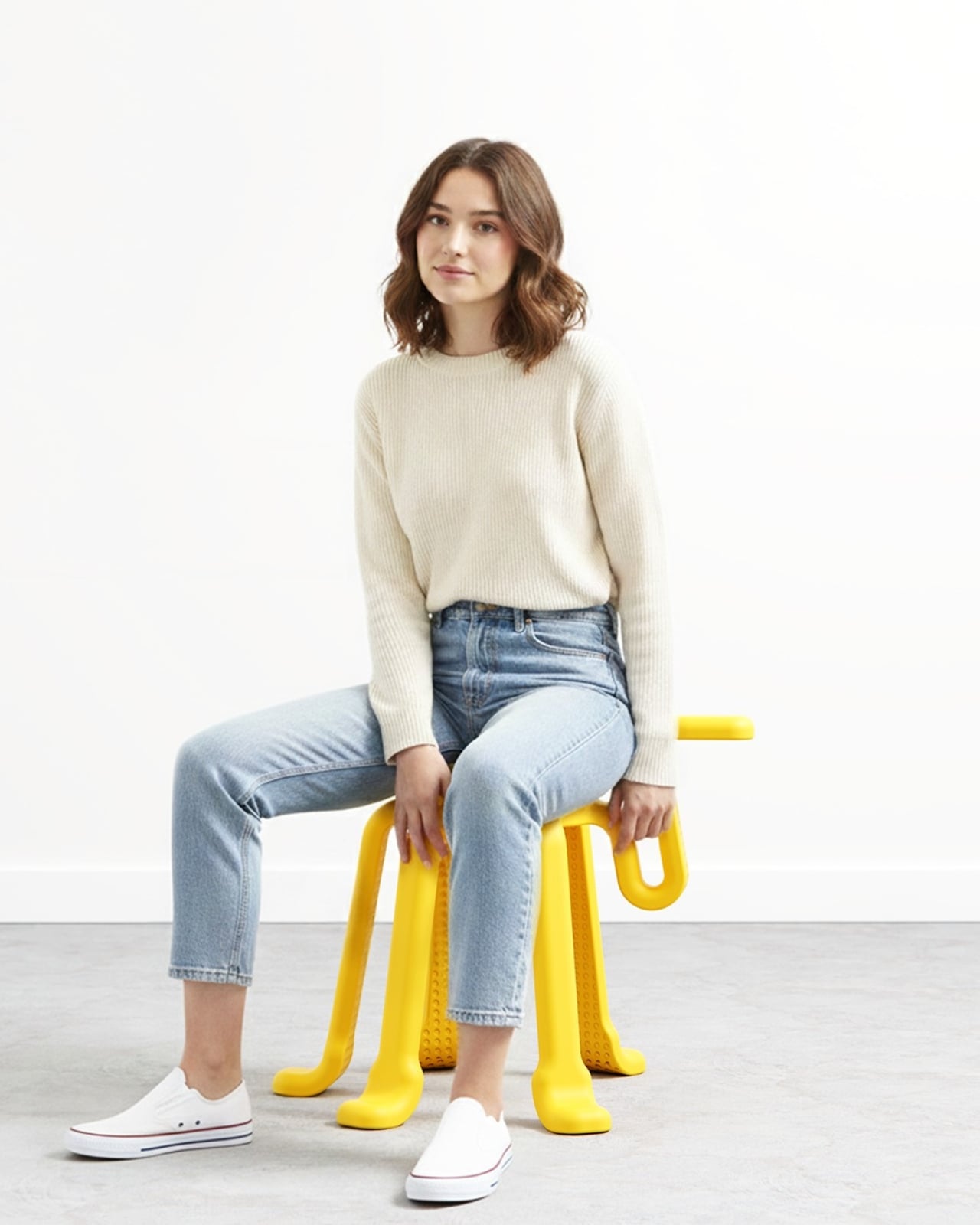
Of course, COMODO also doubles as a proper seat. Many people still sit on the floor to tie laces or wrestle with boots, which is uncomfortable and hard on the knees. The padded top gives you a seat at just the right height, so you can sit, open the door, pull out the sliding base, and deal with your shoes without crouching or balancing awkwardly.

COMODO imagines an entryway where shoes are not just stored but actively cared for, and where the object that helps you put them on also makes sure they’re dry, fresh, and ready for the next day. It’s a small but thoughtful intervention in the daily routine of leaving and returning home, a gentle reminder that even the most ordinary corners can benefit from a bit of design attention.

The post COMODO Entryway Stool Dries and Deodorizes Shoes While You Sit first appeared on Yanko Design.
Finally, a Lamp That Changes Shape as Often as Your Mood

There’s something about lighting that can completely transform a space, isn’t there? You walk into a room with harsh overhead fluorescents and immediately feel different than when you step into a warmly lit corner with just the right glow. But here’s the thing: most lamps are stuck being one thing forever. That sleek floor lamp you bought? It looks great, sure, but what happens when you rearrange your furniture or want to read in bed instead of on the couch?

Enter MOODI, a modular stand lamp designed by Taehyeong Kim that’s challenging everything we thought we knew about lighting. Instead of being locked into one configuration, MOODI is basically the LEGO set of lamps. You can snap together different components, swap out parts, adjust heights and angles, and completely reconfigure the whole thing whenever your space (or mood) changes.

Designer: Taehyeong Kim

Create your own Aesthetic Render: Download KeyShot Studio Right Now!

The design takes inspiration from telescopic mechanical structures, and honestly, it shows. Those exposed joints and metal textures give it this industrial, almost mechanical aesthetic that feels refreshingly honest. Nothing’s hidden away or disguised. You can see exactly how the lamp works, which joints pivot, how the pieces connect. It’s functional beauty at its finest.

What makes MOODI particularly clever is how it addresses something many of us don’t even realize we’re missing. Kim’s philosophy centers on the idea that our homes aren’t just places to crash at the end of the day anymore. For millennials and Gen-Z especially, our spaces have become extensions of our personalities, stages where we live out our daily narratives. We’re curating our environments the same way we curate our Instagram feeds, and lighting plays a massive role in setting those scenes.

The modularity goes way beyond just being able to tilt the lamp head up or down. You can actually build different types of lights from the same set of components. Need a tall floor lamp for your living room? Done. Want a compact desk light for focused work? Rearrange a few modules. Heading out for a camping trip? Reconfigure it into a flashlight. It’s wild how versatile the system becomes once you start thinking about all the possibilities.

The lamp comes in three elegant finishes: white, black, and a warm beige tone that adds just a touch of softness to the industrial vibe. Each version maintains those signature exposed joints and clean lines, but the color options let you match it to your existing decor or create intentional contrast.

What really resonates about MOODI is how it puts control back in your hands. We’re so used to products dictating how we use them, but this flips that relationship. You’re not adapting your life to fit the lamp; the lamp adapts to fit your life. Morning coffee at the kitchen table? Adjust it for soft ambient light. Late-night reading session? Reconfigure for focused task lighting. Video call with friends? Move it to create that perfect ring-light effect.

There’s also something refreshingly sustainable about the approach. Instead of buying multiple specialized lights for different purposes (and contributing to more waste), you invest in one versatile system that grows and changes with you. When you move apartments, redecorate, or just feel like mixing things up, MOODI moves right along with you. The design manages to walk that tricky line between being statement-worthy and genuinely functional. It’s sculptural enough to be interesting, but never so precious that you’re afraid to actually use it. Those mechanical joints beg to be adjusted and played with, turning the simple act of repositioning a light into something tactile and satisfying.

The post Finally, a Lamp That Changes Shape as Often as Your Mood first appeared on Yanko Design.
SPOT ON Charger Makes Wireless Charging Feel Like a Bullseye

Wireless chargers have become common, but most are anonymous black discs that disappear into the desk. They do the job, but rarely feel personal or satisfying to use beyond the first week you own them. SPOT ON is a concept that tries to make charging feel more deliberate and expressive, combining a magnetic pad with a small lamp so the whole interaction has a bit more presence on your nightstand or desk.

SPOT ON is a wireless charger and ambient lamp concept designed around a bow-and-target motif. The charging pad is a circular target that snaps magnetically to the front of a tilted cylindrical lamp body. You can dock the pad to use it as a stand charger, or pull it off and lay it flat as a separate wireless pad while the lamp continues to glow in the background.

Designer: SEUNG-A-LEE

Inside the pad is a magnet that aligns the phone with the charging coil, so when you bring your device close, it snaps into place with a satisfying click. The designer explicitly likens this to hitting the target, turning the usual hunt for the right charging spot into a more playful, bullseye moment. The subtle cross mark on the pad reinforces that visual cue every time you place your phone.

The lamp body is a tilted cylinder with vertical grooves, mounted on a simple rectangular base. When lit, the ribbed surface diffuses a warm, gentle glow, more mood light than task lamp. It’s the kind of object that can sit on a bedside table or shelf without screaming tech, giving you a bit of atmosphere while your phone charges upright in front of it.

Because the pad attaches magnetically, it can be pulled off in one motion and used as a flat wireless charger anywhere on the desk or nightstand. The lamp stays behind as a standalone light. That separation lets users adapt SPOT ON to different environments and habits, whether they prefer a stand for video calls or a low pad for casual overnight charging without the upright position.

SPOT ON comes in soft, desaturated tones like warm beige, blush pink, and muted teal, each with a matching pad. The palette leans more toward interior decor than gadgetry, making it easier to blend into different rooms. The combination of simple geometry, gentle colors, and the bow-and-target metaphor gives the charger a character that feels more like a small object you chose than a piece of infrastructure you tolerate.

SPOT ON is a reminder that even something as mundane as charging a phone can be turned into a small ritual. By adding a magnetic snap, a bit of ambient light, and a form that shifts between stand and pad, it nudges the interaction from purely functional to quietly satisfying. For anyone tired of generic charging pucks, this kind of concept hints at a more thoughtful future for everyday tech.

The post SPOT ON Charger Makes Wireless Charging Feel Like a Bullseye first appeared on Yanko Design.

Dinoosh Dispenses Dino Paw Print Soap, Changes Color When Done

Kids explore everything with their hands, but rarely wash them long enough, even when adults remind them. The recommended 20 seconds feels like forever to a child staring at a sink, which is why so many just rinse and run. Dinoosh is a concept that tries to solve this not with more nagging or countdown posters, but with a small dinosaur-themed object that makes the whole routine feel like a game.

Dinoosh is a palm-sized, dinosaur-inspired handwashing tool that combines a soap dispenser, scrubber, and color-changing timer. It looks like a soft, rounded dino paw with three spikes on top and a loop so kids can clip it to backpacks or bathroom hooks. The idea is to give children a friendly companion that turns washing away germs into something they actually want to do on their own.

Designers: Aarya Ghule, Tejas Vashishtha

Kids flip open a small lid at the bottom and squeeze Dinoosh, which dispenses thick soap gel in the shape of tiny dinosaur paw prints onto their hands. That simple detail turns soap into a character moment, giving a clear visual dose and an instant reason to look and laugh. It invites kids to start rubbing and playing instead of rushing straight to the rinse and calling it done.

Dinoosh stays involved once the soap is out. The back of the device has soft ridges that act like a gentle scrubber when kids rub their hands over it. The spikes on top help get between fingers, and the rounded body is easy to grip with wet hands. Instead of just lathering and standing there, children are encouraged to keep moving, squeezing, and scrubbing as part of the play.

The body is made from thermochromic plastic that slowly shifts color with warmth and friction. As kids scrub their hands and run warm water, they see the dinosaur paw gradually change hue. That becomes a built-in timer: they know they’re done when Dinoosh has fully changed color, which roughly matches the recommended 20 seconds without needing to count or sing a whole song.

A small loop at the top lets Dinoosh hang from backpacks, bathroom hooks, or stroller handles, keeping it in sight and within reach. Bright colorways like Sweet Sprout green, Coral Pop, and Soft Comet lavender make it feel collectible and personal. By living in kids’ everyday environments, it nudges them toward washing not just at home but at school and on the go.

Dinoosh shows how product design can tackle hygiene through play rather than guilt. By combining characterful form, tactile engagement, and a built-in color timer, it turns a forgettable chore into a small daily ritual kids can own. Whether or not this exact concept hits the market, the idea of a dinosaur paw that tells you when your hands are clean feels like a story most kids would happily wash along with.

The post Dinoosh Dispenses Dino Paw Print Soap, Changes Color When Done first appeared on Yanko Design.
This Smart Pen Just Turned a Poet’s Legacy Into Your Next EDC

Your everyday carry says something about you. Every item you slip into your pocket or bag is a choice, a reflection of what matters when you’re moving through your day. Nicolas Studio’s Poet smart pen understands this, which is why they designed something that’s not just functional tech, but a meaningful object worth carrying. It’s a tribute to Yun Dong-ju, one of Korea’s most beloved poets, and it might just earn a permanent spot in your rotation.

If you’re not familiar with Yun Dong-ju’s story, here’s why he matters. He wrote in Korean during Japanese colonial rule when doing so was an act of resistance. His poems were simple, everyday observations turned into quiet defiance, preserving language and culture through words until his death in a Japanese prison at 27. In a 1986 survey, Korean youth voted him their most popular poet, and that love hasn’t diminished. His work is about finding light in darkness, about self-reflection and hope, all expressed in language anyone could understand.

Designer: Nicolas Studio

That accessibility, that everyday poetry, became the design brief. Nicolas Studio didn’t want to create another aggressive tech gadget. They wanted something you’d actually want to carry every day, something that felt as natural in your hand as Yun’s words felt on the page. The result is a smart pen that proves EDC doesn’t have to sacrifice beauty for function.

The form language is all gentle curves and flowing lines, a direct translation of the softness in Yun’s poetry. The body is elegantly elongated with a subtle taper, finished in soft white that stays clean-looking without feeling clinical. It’s the kind of minimalism that works in real life, not just on a mood board. At a glance, it could be a premium fountain pen, but pull it out to sketch or take notes and the smart functionality reveals itself seamlessly.

The details make it. A warm gold band transitions between the body and writing tip, adding just enough visual interest without screaming for attention. The same brushed gold accent appears on the charging case, which doubles as a display stand for your desk. The word “poet” is etched vertically in lowercase letters, subtle enough that most people won’t notice, but meaningful when they do. It’s the kind of detail that rewards daily interaction.

Speaking of daily carry, the charging case is brilliantly designed. It’s cylindrical with a slightly undulating top edge that mirrors the pen’s curves, finished in matching white and gold. But here’s what matters for EDC: it’s compact enough to slip into a bag pocket without adding bulk, protective enough to keep your pen safe, and beautiful enough that you won’t mind leaving it on your desk between carries. It becomes a small sculptural moment in your workspace rather than tech clutter. Ergonomics were clearly a priority. The grip area has subtle contouring that makes extended use comfortable whether you’re sketching, annotating documents, or taking meeting notes. Smart pens can feel awkward, especially if designers prioritize tech over usability. The Poet feels like it was designed by someone who actually carries and uses a pen daily, not just renders it in CAD.

What elevates this beyond typical EDC gear is the story it carries. Yun Dong-ju used poetry to maintain humanity during Korea’s darkest period. Every time you pull out this pen, you’re connected to that legacy of using everyday tools for meaningful creation. It’s not just about capturing ideas or staying productive. It’s about the intentionality of choosing tools that mean something beyond their function. Most smart pens now look like they’re trying too hard to be futuristic but the Poet takes the opposite approach. It’s quiet. It’s refined. It earns its place in your carry through design restraint rather than feature overload. The tech serves the experience rather than defining it.

For the EDC enthusiast who appreciates when gear tells a story, or when design connects you to something larger than yourself, the Poet offers something rare. It’s proof that smart devices can have soul, that technology and poetry aren’t opposing forces. Sometimes the best addition to your everyday carry isn’t the thing with the most features, but the one that makes you think differently about why you carry anything at all. This is EDC with intention. This is carrying poetry in your pocket.

The post This Smart Pen Just Turned a Poet’s Legacy Into Your Next EDC first appeared on Yanko Design.
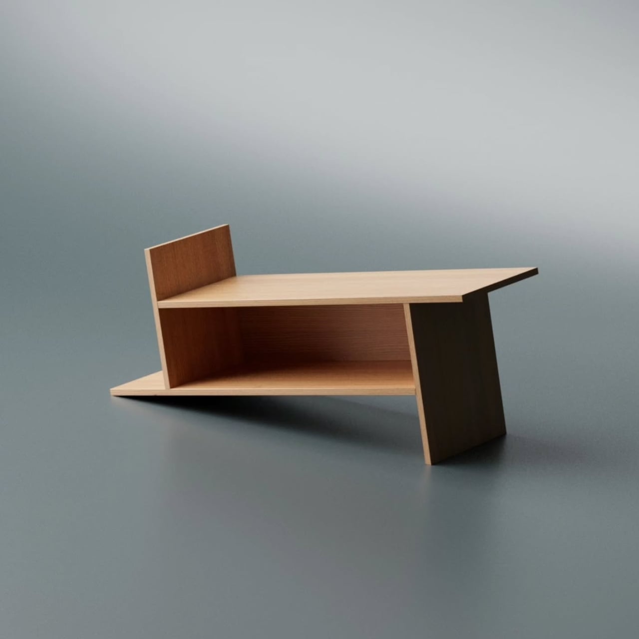
Tilt This Smart Clock, and It Triggers Your Entire Bedtime Routine

Most smart home routines now live inside apps and voice menus, which is powerful but often feels abstract and fiddly. Controlling physical things through layers of screens can feel backwards, especially for simple daily transitions like going to bed or waking up. This smart alarm clock concept treats day and night as a single, physical gesture instead, asking what would happen if your entire bedtime routine followed one tilt of a solid object.

The concept is a smart alarm clock that doubles as an IoT scene switcher. It’s a small wedge-shaped object with a square display on one face and fabric wrapping the rest of the body. Instead of tapping through modes, you literally tilt the clock like a seesaw to flip between day and night. The display follows, showing a bright sun or a dim moon depending on which way it rests.

Designer: Hojung Cha

In day orientation, the clock faces you with a bright UI, lights and music on, and your phone fully awake. Tilt it the other way into night mode, and the screen darkens, lights fade, music winds down, and your phone can automatically switch to Do Not Disturb while setting an alarm for the morning. One physical move triggers a whole bedtime routine without touching a single app or menu.

The form is a soft rectangular block with one angled face for the display, wrapped in fabric so it feels more like a piece of furniture than a gadget. The angled front makes it easy to read from bed, and the two stable resting positions are obvious at a glance. It looks comfortable on a nightstand next to a lamp and a book, not like a piece of lab equipment waiting to blink at you.

The clock inverts the typical IoT relationship. Instead of your phone being the remote for everything else, the clock becomes a physical remote for the phone. It can tell your smartphone when to be quiet, when to wake you, and when to leave you alone. At the same time, it coordinates with lights and speakers, acting as a simple, dedicated interface for the most common daily transition in the home.

The design borrows the familiar bedside clock silhouette but adds the tilt mechanic and a clean, modern display. The goal is technology that can be seen, touched, and held, making its function legible without an instruction manual. The two orientations and matching UIs turn a behavior we already do, such as getting up or going to bed, into something the object naturally understands and responds to.

The smart alarm clock concept is a small argument for more tangible IoT. It doesn’t try to solve every scenario with an app; it focuses on one moment and makes it physical, glanceable, and easy to understand. The idea of flipping a solid object to tell your home and your phone “day” or “night” feels like the kind of interaction our sleepy brains can actually live with.

The post Tilt This Smart Clock, and It Triggers Your Entire Bedtime Routine first appeared on Yanko Design.
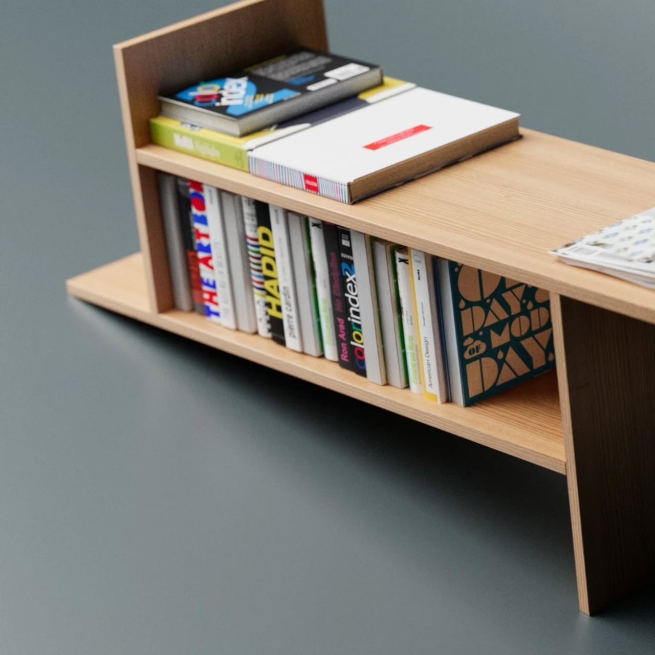
These 3 Desk Objects Make Shredding, Crushing Feel Like Design

Many of us already practice tiny acts of destruction when we’re stressed. Shredding receipts, crumpling paper, or picking at packaging feel oddly satisfying even though we usually hide them. They’re little releases that most designs ignore, treating them as guilty pleasures instead of real human behaviors. Art of Destruction is a concept that leans into those impulses and asks what happens if industrial design treats them as experiences worth designing.

The project is a trio of objects named Disintegrate, Compress, and Explosion. Each one takes a different destructive action and turns it into a deliberate, almost ceremonial interaction. They share a visual language of cool grey bodies, orange accents, clear panels, and exposed mechanisms that make them look more like hi-fi gear than office tools. Together, they feel like a small family of instruments for controlled chaos on your desk.

Designers: Meesol Park, JiHoon Park, MIN A Kim, Nahyeon Kwon, Dongkyun Kim, Taeyoon Kim

Create your own Aesthetic Render: Download KeySh2ot Studio Right Now!

Disintegrate is a reimagined paper shredder that puts the whole process on display. A rectangular frame with a large side window reveals gears, belts, and blades pulling paper into a cylindrical bin. A big orange dial and a row of circular buttons invite you to tune the experience. Shredding becomes less about security and more about watching documents get mechanically unmade in sound and motion.

Compress is a small cylindrical compactor that looks like a cross between a speaker and a sculptural vase. The top is a solid metal cap, while the lower half is a clear chamber showing a twisted vortex of ribs inside. Drop something in, press down, and the spiral structure crushes it into a neat puck. The act of compression becomes a slow, visual performance instead of a quick, guilty squeeze.

Explosion is a flat tabletop console built around a central well of magnetic fluid. A large knob and button sit on one corner, and a perforated grid hints at lights or sound. Press the control, and a pulse of magnetism sends the ferrofluid erupting into spikes before it settles back. It’s a safe, repeatable way to trigger miniature explosions, with the mess contained behind a clear top plate.

The three devices work together visually. In the group shots, they share proportions and detailing, so they could sit on a desk like a family of instruments. Transparent panels and exploded views reveal carefully layered internals, turning mechanisms into part of the aesthetic. They feel less like gadgets and more like props from a film about emotional regulation through designed objects.

Art of Destruction is a playful question about how we deal with tension and boredom. Instead of hiding our urge to tear, crush, or explode things, these concepts imagine channeling it through objects that are honest about what they do and beautiful while doing it. Whether or not they ever exist beyond renders, they make a strong case that even destruction can be a mindful ritual.

The post These 3 Desk Objects Make Shredding, Crushing Feel Like Design first appeared on Yanko Design.
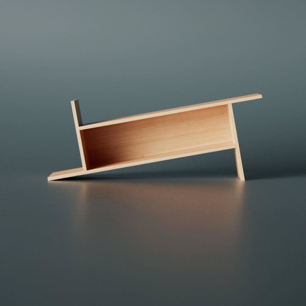
NOVA Cools PCs Without Fans or Spinning Blades, Uses Ion Wind

RGB fans have become the default way to make a PC build look custom, yet most of them look the same. Spinning blades, ring lights, and aggressive grilles dominate the category, visually loud but rarely distinctive. NOVA is a Red Dot-winning concept that asks what a cooler could look like if you removed the fan entirely and treated airflow as a sculpted, silent element instead of a spinning propeller.

NOVA is a fanless desktop cooler designed to sit where a case fan would normally go. Instead of blades, it uses a shaped intake, ion electrodes, and clever airflow to move air through a central opening. The frame reads more like a minimalist architectural vent than a traditional PC fan, with a form language closer to audio components or precision instruments than the usual gamer aesthetic.

Designers: Minhwan Kim, Gyuri Kim

Create your own Aesthetic Render: Download KeySh2ot Studio Right Now!

The front face is a square frame with rounded corners and four curved ribs that form a circular opening in the middle. The ribs flare from a wide outer edge to a narrower inner throat, guiding air and accelerating it toward the center. The metallic finish and subtle LED halo around the intake give it a calm, sculptural presence rather than the visual noise of rainbow patterns.

The airflow works through shaped channels and ion wind. The intake narrows the path, so air speeds up as it moves toward the center, like water through a nozzle. Ion electrodes arranged in a ring around the opening create a high-speed jet that clings to the curved surfaces and pulls surrounding air along with it. The result is a strong flow through the central hole without any visible blades or motor noise.

NOVA is designed to look finished from both sides. Opaque materials and careful detailing mean the cooler maintains its identity even when mounted at the rear of a case. A circular PCB carries both the ion electrodes and LEDs, arranged in a ring that simplifies assembly and gives a clean visual effect. The lighting is more like an architectural accent than a typical fan RGB, emphasizing form over flash.

The intake components are modular curved segments that assemble into a full ring. The circular layout minimizes unique parts and makes production more straightforward if the concept ever moves to market. Everything feels engineered with manufacturing in mind, not just designed to look good in a portfolio, with careful attention to how pieces fit together and how the whole unit mounts inside standard cases.

NOVA shows what PC cooling could look like once we stop assuming every solution needs spinning blades and RGB chaos. By combining ion wind, shaped channels, and a sculptural form, it turns a background component into a visible design element. Whether or not this exact concept ships, it makes a strong case that airflow inside a case deserves the same design attention as the hardware it keeps cool.

The post NOVA Cools PCs Without Fans or Spinning Blades, Uses Ion Wind first appeared on Yanko Design.
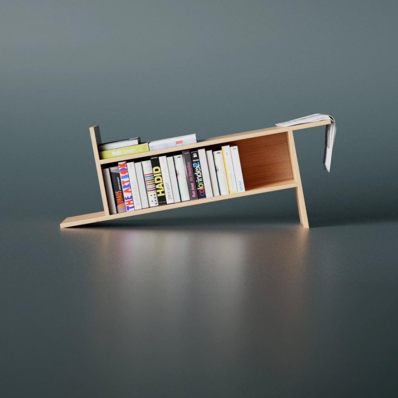
This MIDI Controller Just Solved Music’s Biggest Portability Problem

There’s something refreshing about a gadget that looks this good while solving real problems. Germain Verbrackel’s MIDI controller concept doesn’t try to reinvent the wheel, but it does ask an interesting question: what if our music-making tools were designed with the same care we give to the objects we use every day?

At first glance, this looks like a minimalist’s dream. The all-white palette and clean lines give it that “I belong on a designer’s desk” vibe. But look closer, and you’ll notice that every curve and angle here has a job to do. The chamfered base isn’t just there to look pretty. It creates a sense of groundedness, like the controller is planted firmly on your desk, ready to work. There’s a subtle confidence to it, the kind that comes from knowing exactly what it is and what it’s supposed to do.

Designer: Germain Verbrackel

Create your own Aesthetic Render: Download KeyShot Studio Right Now!

The keys tell an even better story. Each one features a chamfered edge that guides your fingers into position. It’s a small detail, but it’s the kind of thing that makes a huge difference when you’re actually using the device. Think about how many times you’ve fumbled with flat, generic buttons that all feel the same. These keys practically tell your fingertips where to go. That’s not just good design, that’s thoughtful design.

What really sets this controller apart, though, is the magnetic speaker attachment. This is where the concept shifts from “nice MIDI controller” to “oh, that’s clever.” Most MIDI controllers are tethered to computers or external speakers. They’re input devices, not standalone instruments. But snap that speaker module into place, and suddenly you’ve got a self-contained music-making tool. No laptop required. No cables snaking across your workspace. Just you and the music.

The magnetic connection is particularly smart because it maintains the device’s sleek profile when you don’t need the speaker, but transforms it into something more complete when you do. It’s modular design done right, not as a gimmick but as a genuine enhancement to functionality. The speaker itself has a textured grille that provides visual and tactile contrast to the smooth keys, giving the whole setup a more dynamic look when assembled.

There’s also something to be said for how portable this design appears. The compact form factor suggests this is meant to travel with you, to be the controller you throw in your bag when inspiration might strike at a coffee shop or a friend’s place. The chamfered base helps here too, because that angled edge makes it easier to pick up off a flat surface. Again, it’s a small thing, but these small things add up to create an object that feels like it was designed by someone who actually uses these tools.

The aesthetic choices matter here as well. In a market full of MIDI controllers that either try too hard to look “professional” with all-black industrial designs or go the opposite direction with RGB lighting and gaming-inspired looks, this one takes a different path. It’s contemporary without being trendy. It’s minimal without being cold. It could sit next to your laptop, your coffee maker, or your favorite design book and look equally at home.

What Verbrackel has created here is a case study in how industrial design can elevate everyday tools. This isn’t about adding features for the sake of features or making something look futuristic just because you can. It’s about understanding how people actually use these devices and designing accordingly. The chamfered edges, the magnetic speaker, the clean color palette, they all serve the same goal: making music creation more intuitive and more enjoyable.

The controller represents a broader shift we’re seeing in tech design, where the focus moves from pure functionality to thoughtful integration of form and function. It’s the same philosophy that’s made smartphones beautiful and kitchen appliances worthy of counter space. Why shouldn’t our creative tools receive the same level of design attention? Whether this concept makes it to production or remains a stunning portfolio piece, it’s already done its job. It’s made us think differently about what a MIDI controller can be. And that’s worth celebrating.

The post This MIDI Controller Just Solved Music’s Biggest Portability Problem first appeared on Yanko Design.
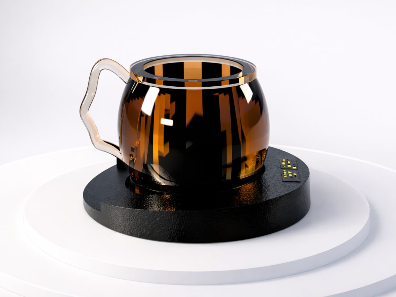
This Designer Just Solved Cold Coffee With One Candle

You know that moment when you’re deep into a project, finally hitting your flow state, and you reach for your coffee only to find it’s gone stone cold? It’s one of those tiny frustrations that can derail your entire momentum. But it’s also part of the workflow that you forget you have a warm cup waiting for you to wake you up since you’re engrossed with whatever it is you’re doing. So when you realize it’s gone cold, you either just slurp it down or you make a new cup.

Designer Germain Verbrackel clearly understands this universal struggle, because his new concept called Warmer tackles it with the kind of elegant simplicity that makes you wonder why it hasn’t been done before. Why not have something that will keep your coffee or any beverage warm so you won’t suffer through drinking something lukewarm?

Designer: Germain Verbrackel

Create your own Aesthetic Render: Download KeyShot Studio Right Now!

At first glance, Warmer looks like something that could sit comfortably on the desk of a minimalist tech enthusiast or grace the pages of a Scandinavian design magazine. Crafted from aluminum and brushed steel, it has that industrial-yet-refined aesthetic that never goes out of style. But what makes it particularly interesting is that it’s completely analog in our hyper-digital world. No USB cables, no app to download, no Bluetooth connectivity. Just a simple tea light candle providing gentle, sustained heat.

The design itself is brilliantly straightforward. A circular base houses the candle, and a vertical support structure rises up to hold your cup, bowl, or small pan at the perfect distance from the flame. That black geometric handle detail adds a nice visual contrast to all that brushed metal, giving it a touch of contemporary flair without feeling overdone. It’s functional sculpture, really.

1

What I love about this concept is how it challenges our default assumption that every solution needs to be high-tech. We’ve become so accustomed to electric mug warmers with their glowing LED indicators and temperature controls that we’ve forgotten about the simple physics of a candle flame. There’s something almost meditative about watching that tiny flame flicker while you work, knowing it’s quietly doing its job without demanding anything from your power strip or Wi-Fi network.

The versatility factor is pretty smart too. Sure, keeping your morning coffee at the perfect sipping temperature throughout those long Zoom meetings is great, but Verbrackel designed Warmer to accommodate different container types. Need to keep soup warm during lunch at your desk? Done. Want to gently heat something small in a bowl or pan? It can handle that. This multi-purpose approach gives it staying power beyond being a one-trick pony.

From a practical standpoint, there are some real advantages to this candle-powered approach. Tea lights are incredibly cheap, widely available, and burn for hours. There’s no complicated maintenance, no heating element to burn out, and no worrying about forgetting to turn it off (though obviously, you still need to be mindful of open flames). It’s the kind of product that would work just as well in a modern office as it would in a cabin without electricity. The material choice speaks to durability and heat conductivity. Aluminum and steel can handle constant exposure to heat without degrading, and that brushed finish will age gracefully rather than looking worn. It’s clearly designed to be something you’d keep on your desk as a permanent fixture rather than tucking it away in a drawer.
1

There’s also something quietly rebellious about Warmer in our current moment. While tech companies are racing to make everything “smart” and connected, this design deliberately goes the opposite direction. It’s almost making a statement about intentional simplicity and questioning whether we really need to digitize every aspect of our daily routines. In a world of planned obsolescence and constant software updates, a candle-powered warmer feels almost radical in its simplicity.

Of course, this is still a concept design showcased on Behance, so we don’t know yet if it will make it to production. But that’s part of what makes following industrial design so fascinating. These concepts give us a glimpse into how designers are thinking about everyday problems and push us to reconsider assumptions we didn’t even know we were making. Whether Warmer ever hits store shelves or not, it’s a beautiful reminder that good design doesn’t always mean more complexity. Sometimes the best solution is the one that strips away everything unnecessary and gets back to basics. And honestly, your coffee deserves to stay warm while you conquer your to-do list.

The post This Designer Just Solved Cold Coffee With One Candle first appeared on Yanko Design.