Most people check the date by glancing at a phone, a laptop corner, or a watch. There’s no shortage of ways to know what day it is, yet somehow that information rarely feels anchored to anything. It arrives in a notification, floats on a lock screen, and disappears the moment you look away. The calendar has become the most forgettable object in modern life.
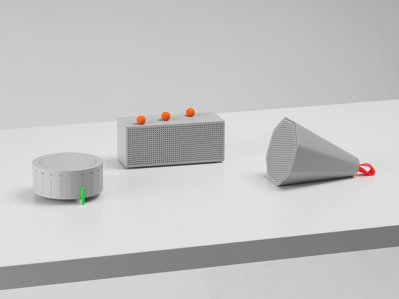
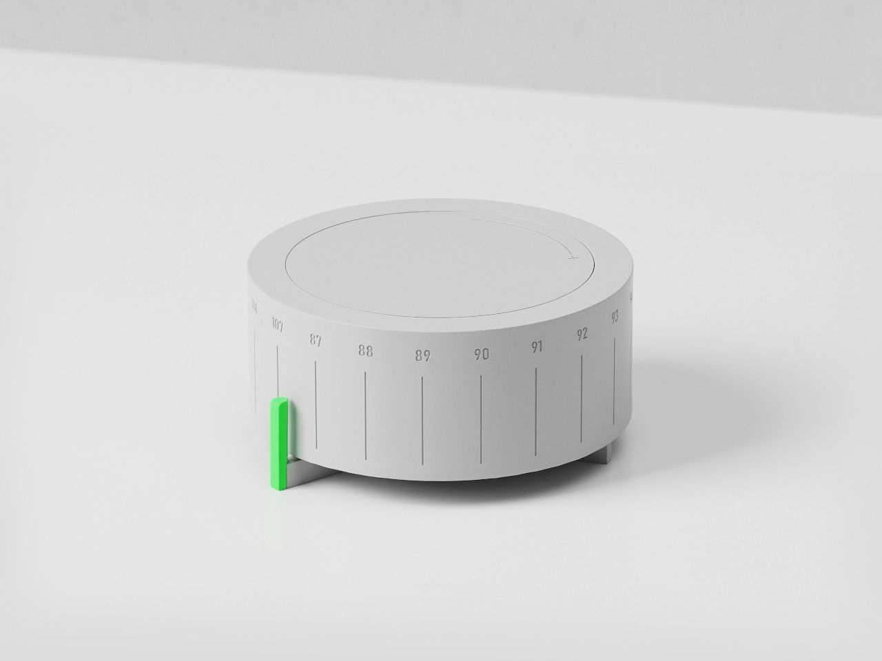
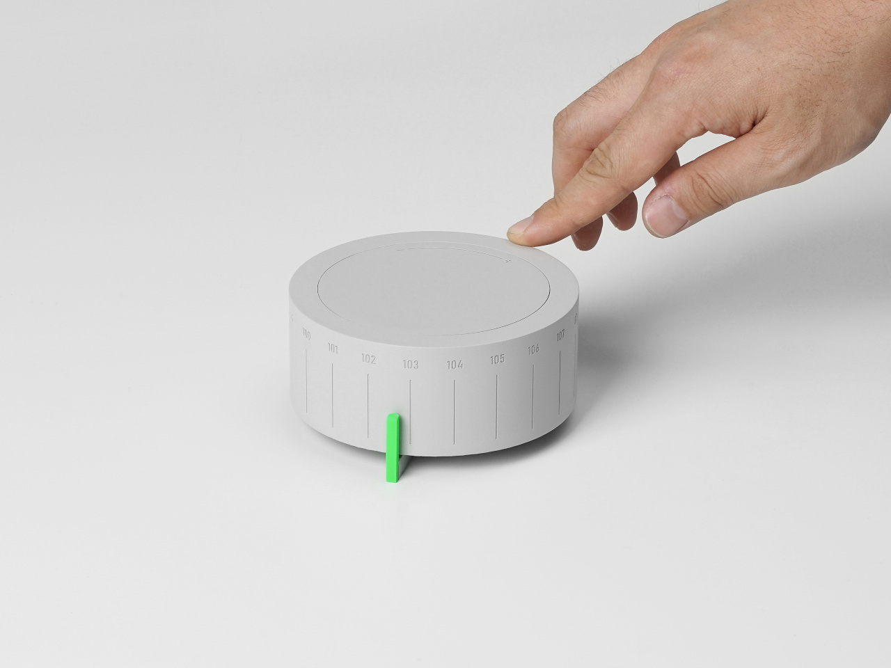
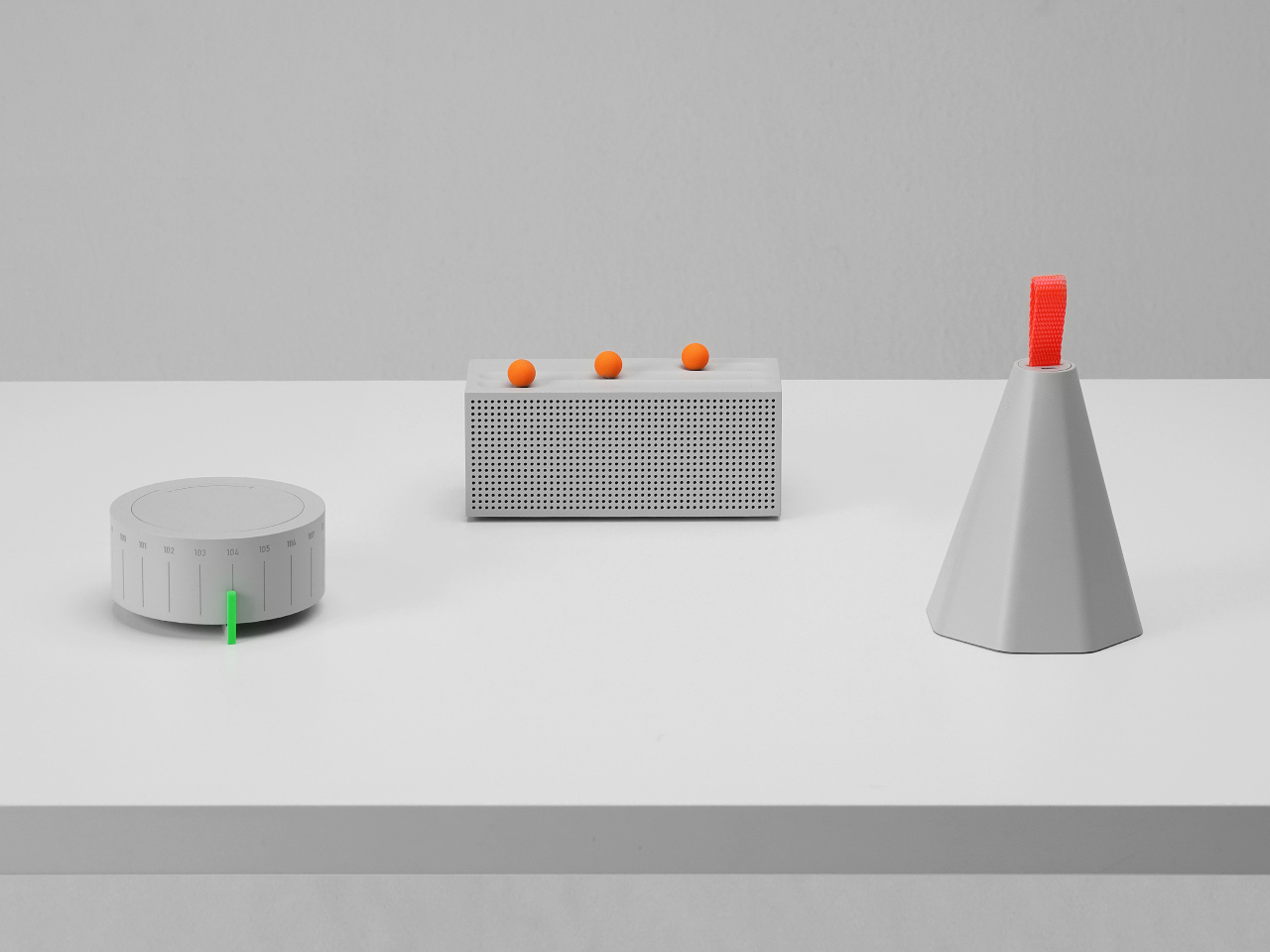
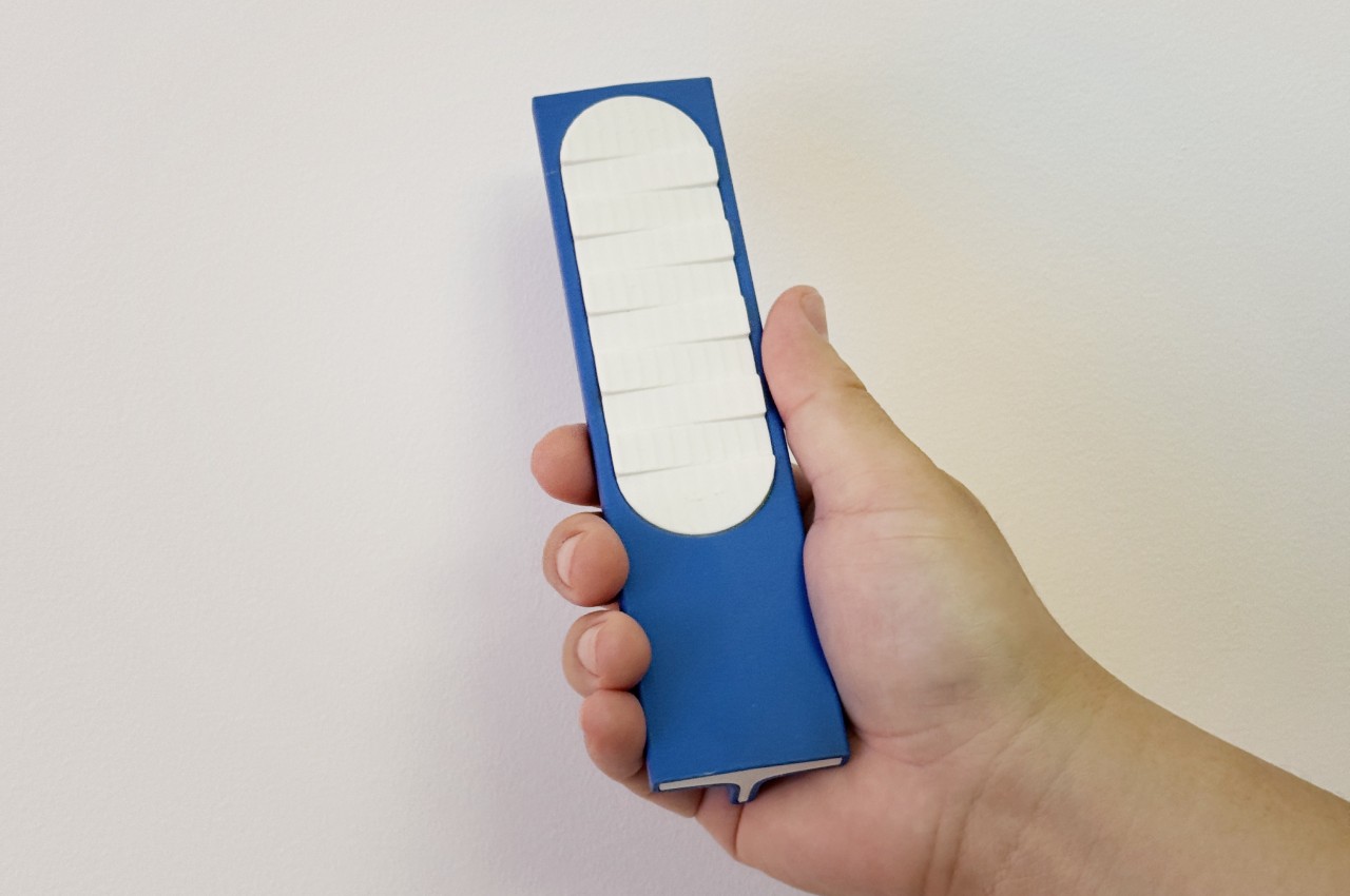
Momentum Studio, a German design firm, is treating that problem with a very physical antidote. The Momentum Calendar is the fifth object in the studio’s Object Collection, approaching timekeeping as a deliberate act rather than a passive glance. It’s a perpetual calendar machined from solid aerospace aluminum that requires you to move a marker by hand each morning, turning date-checking into something closer to a ritual.
Designer: Momentum Studio
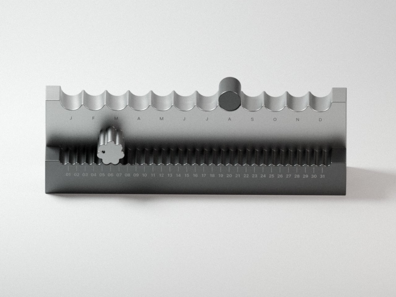
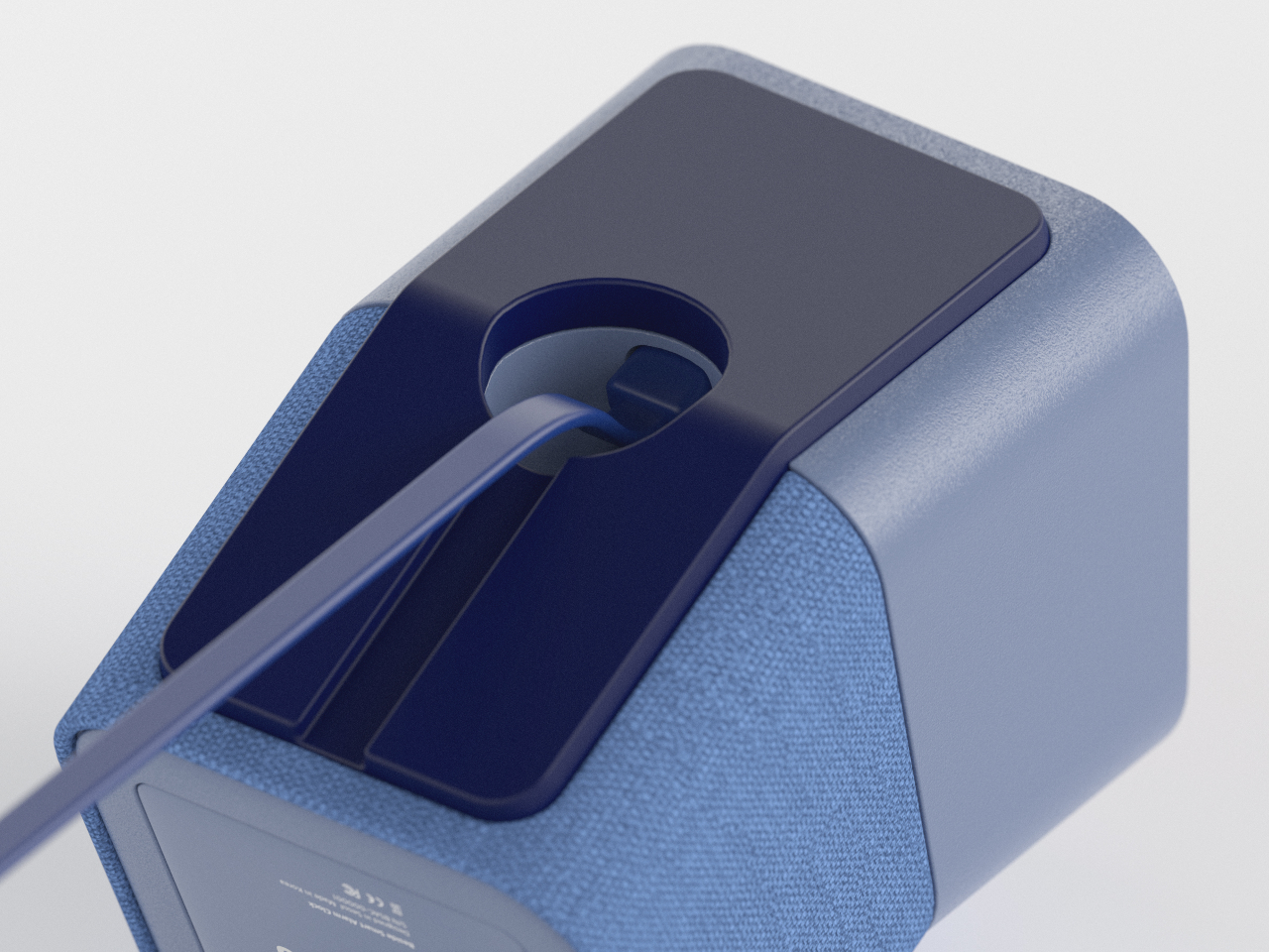
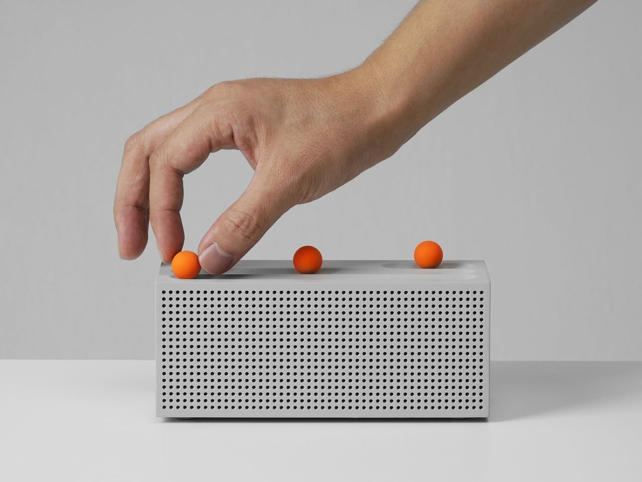
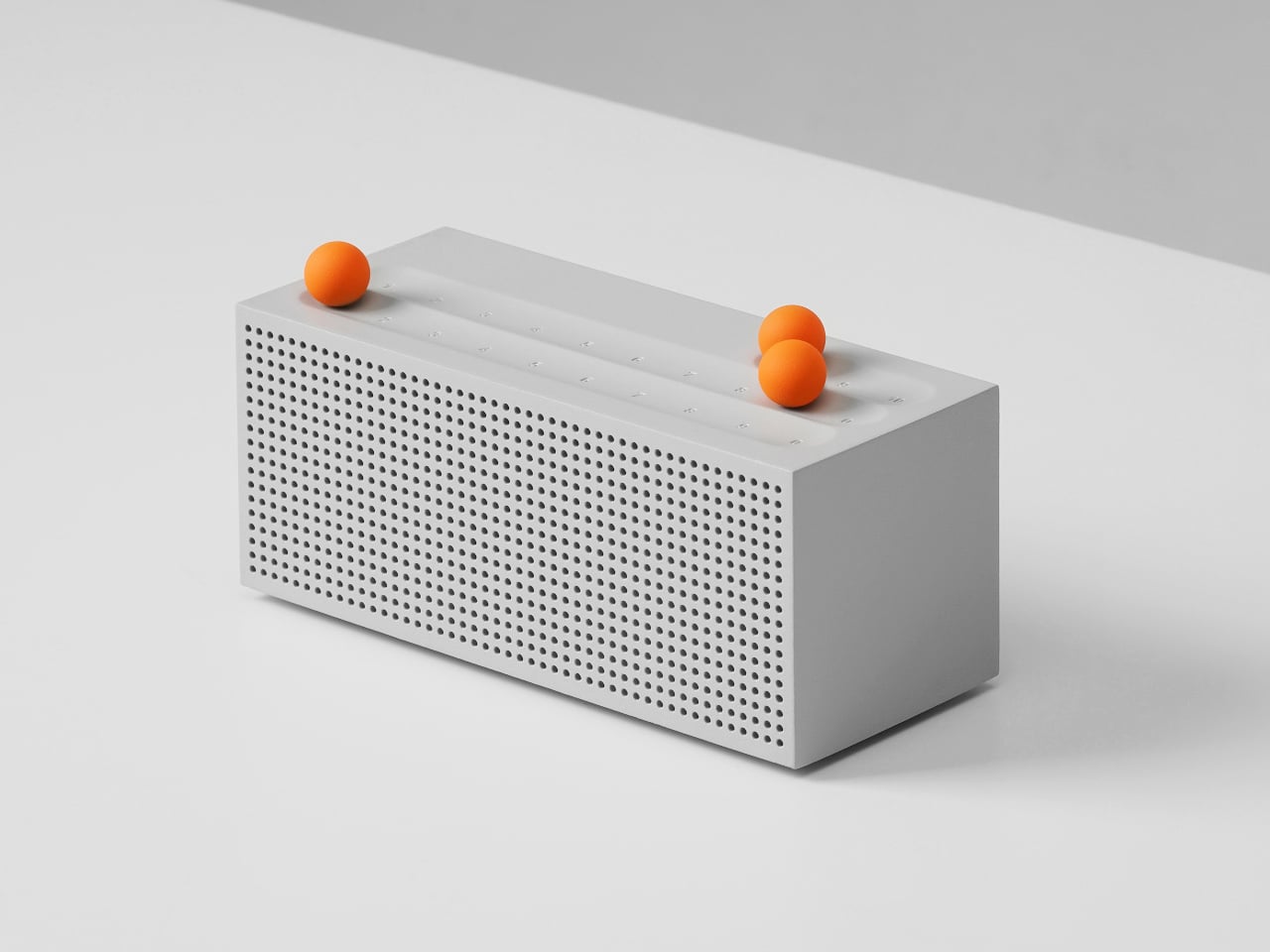
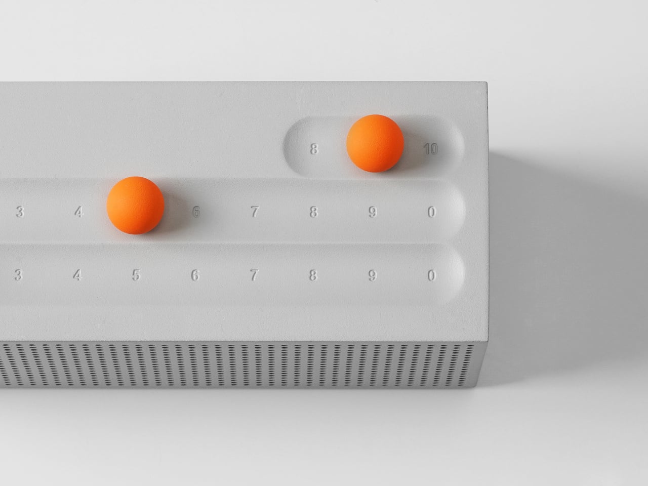
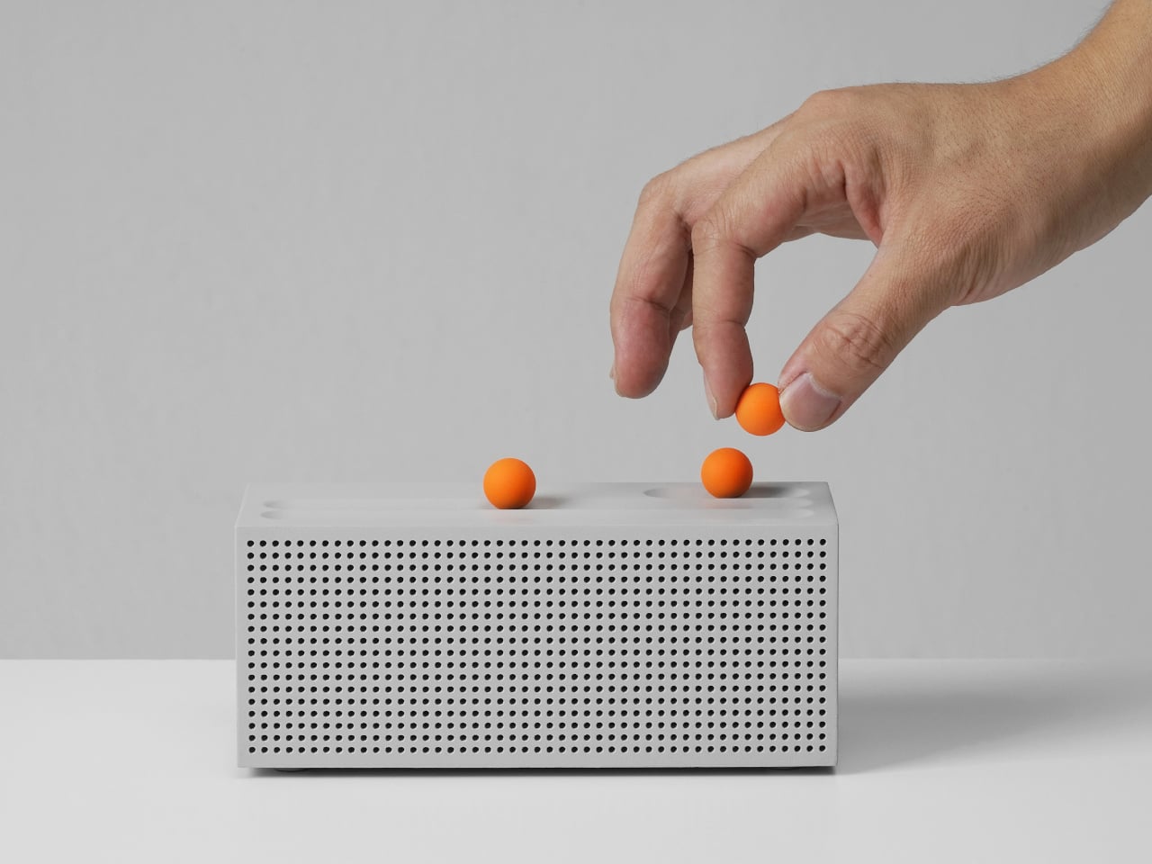
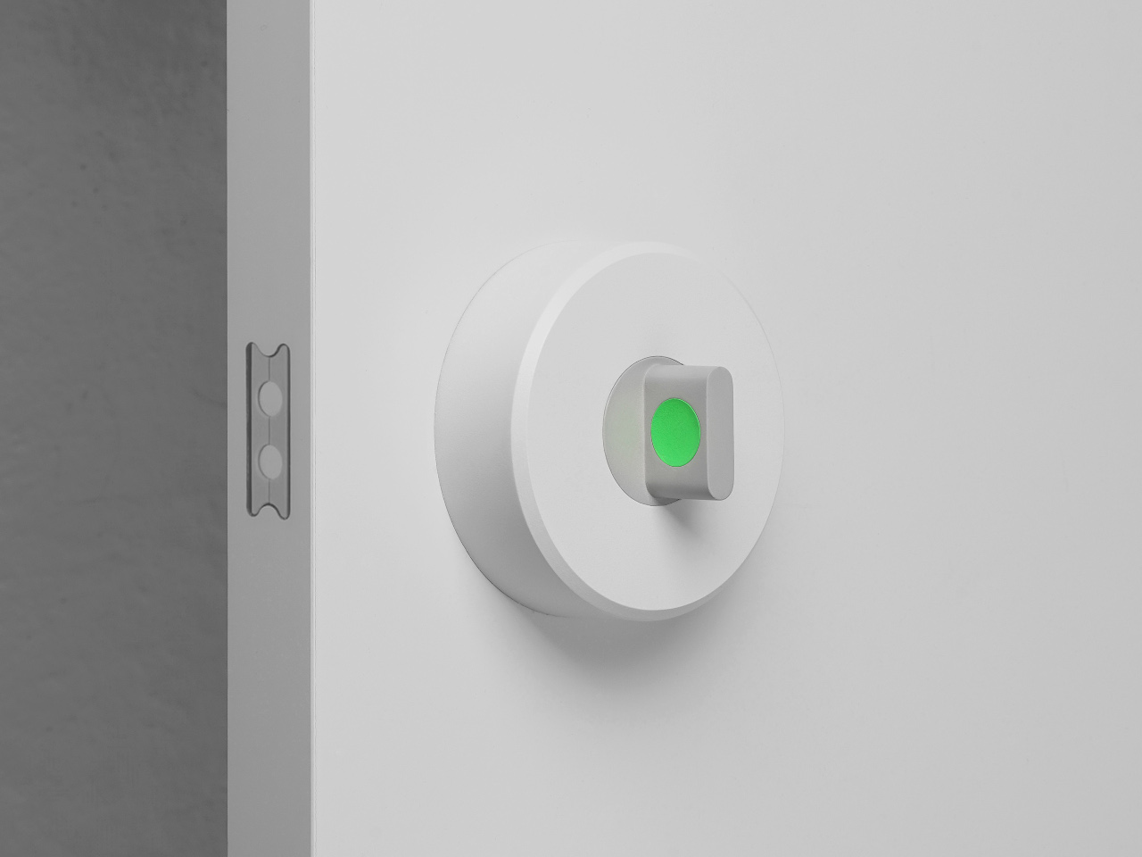
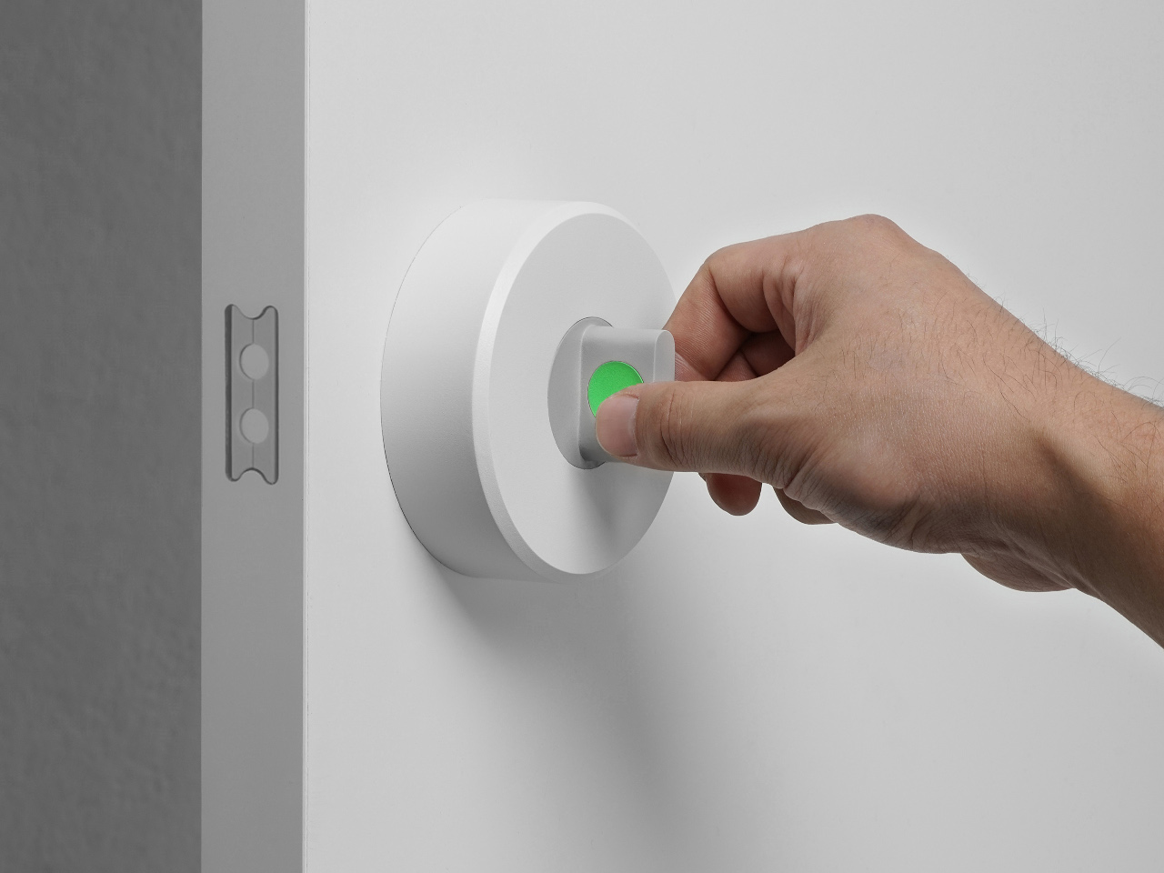
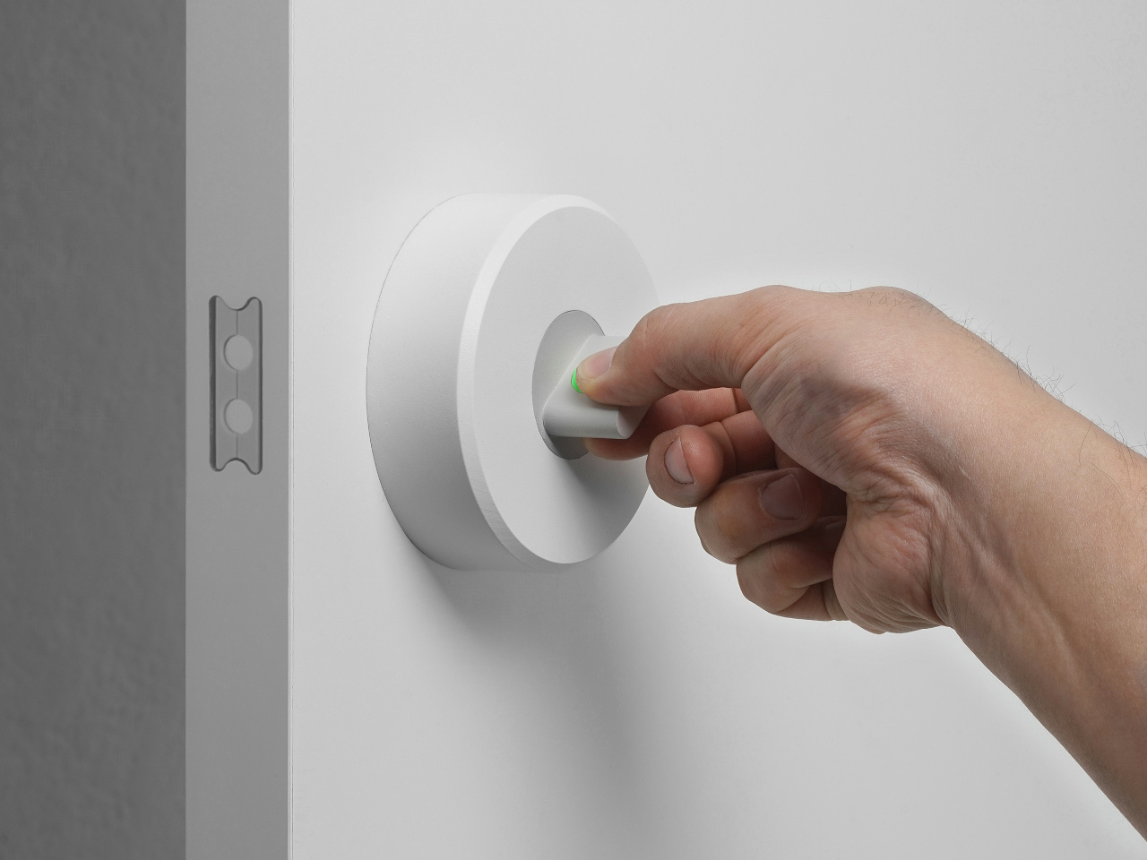
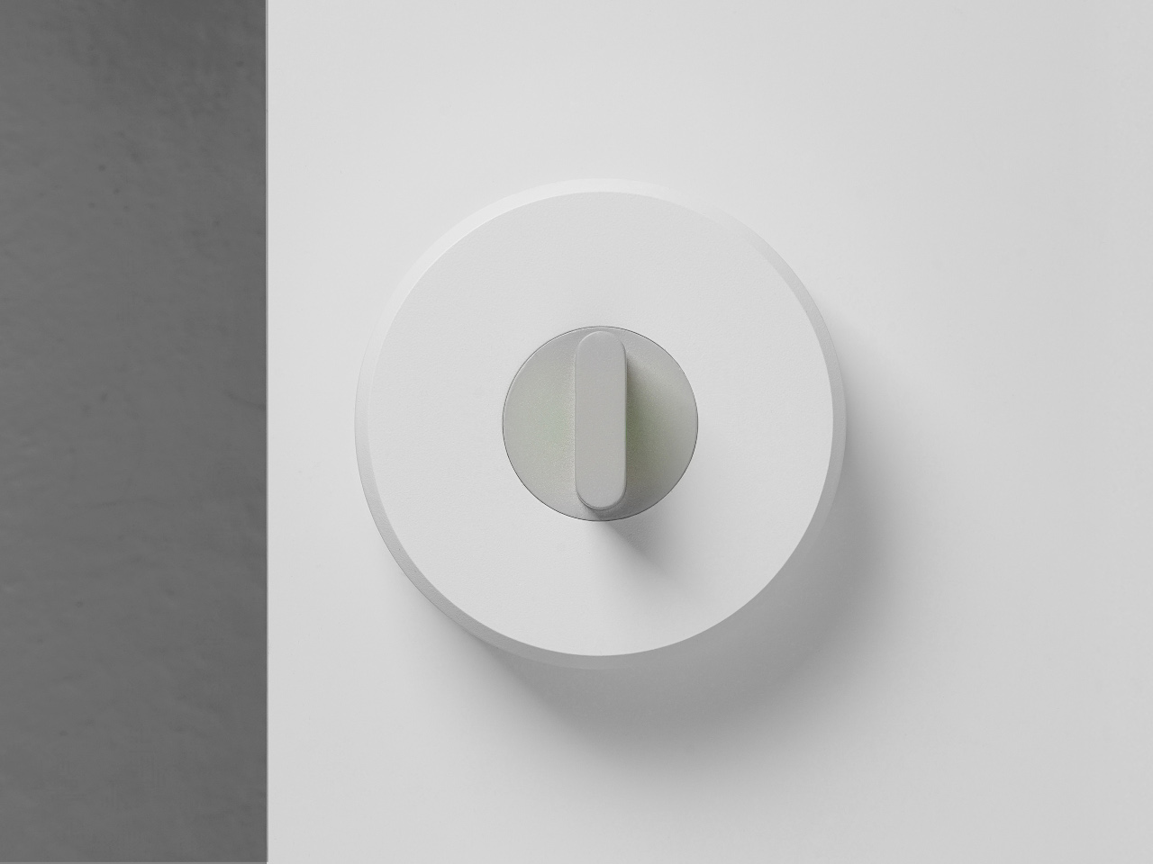
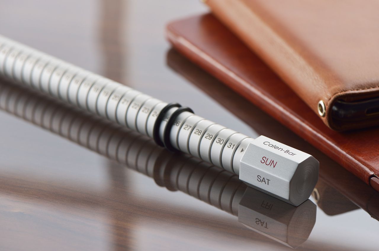
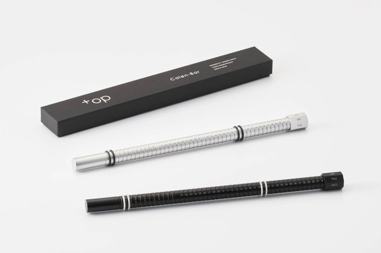
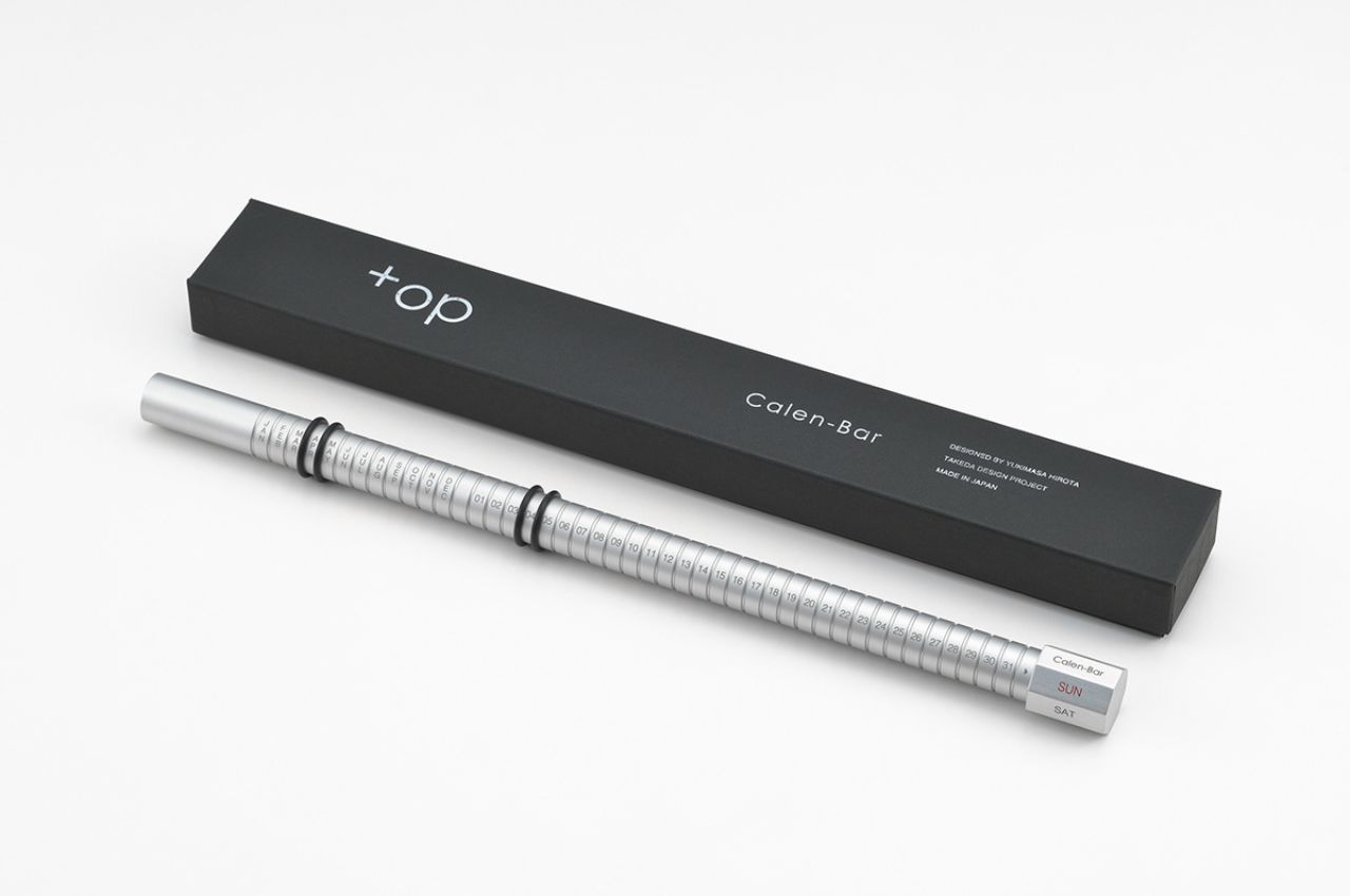
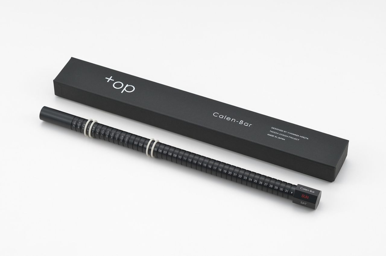
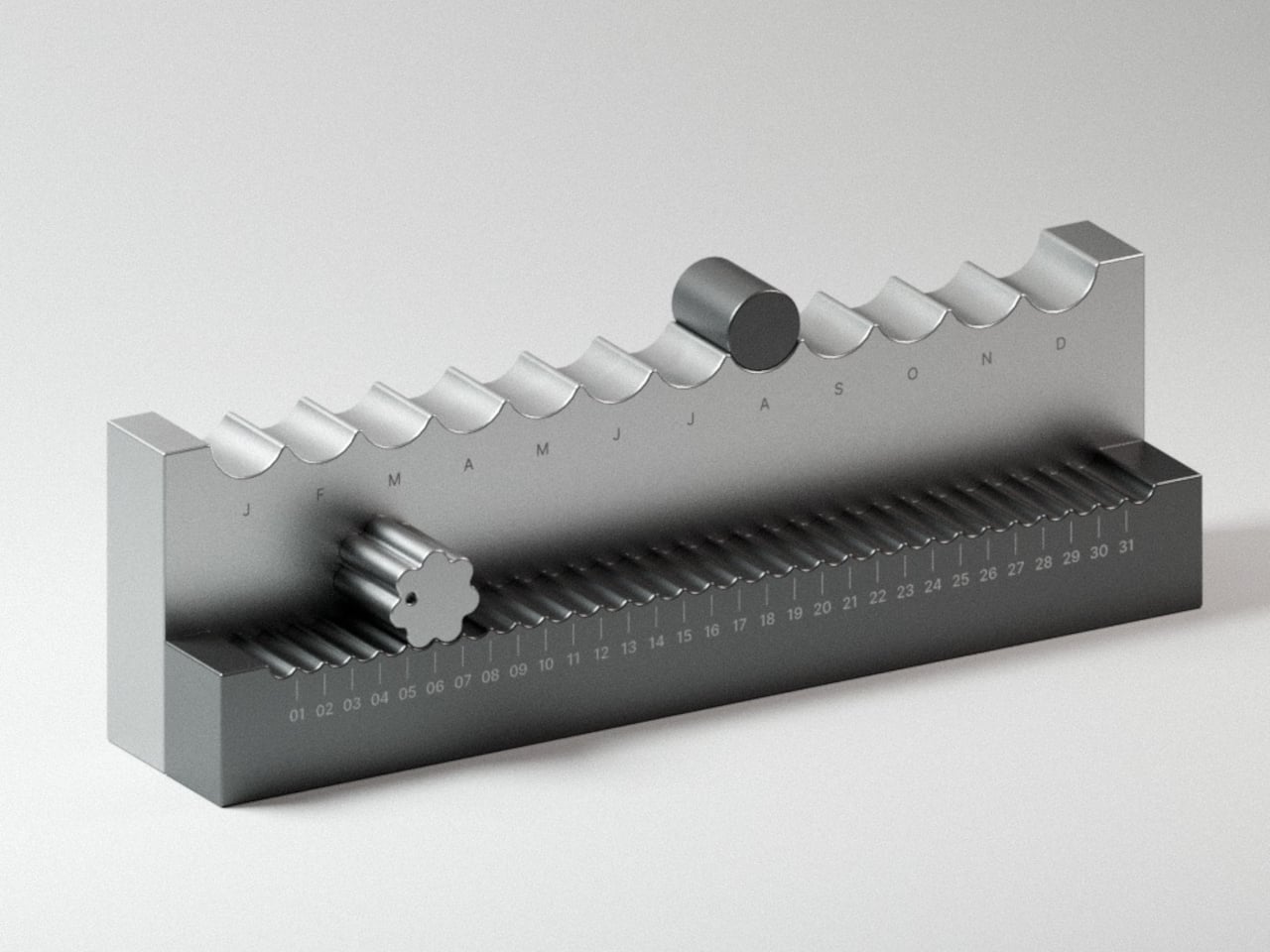
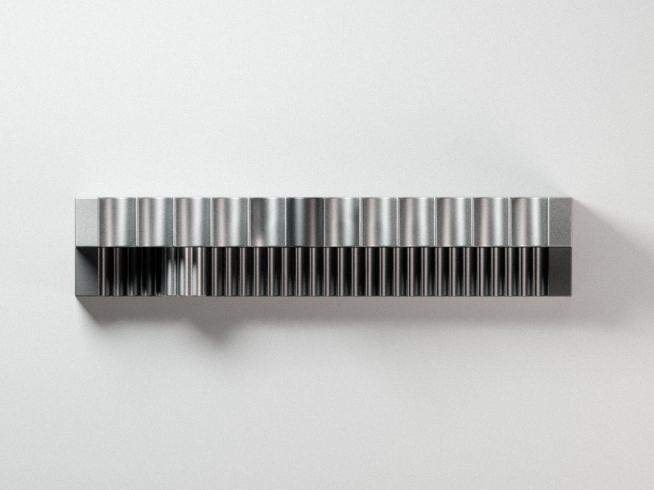
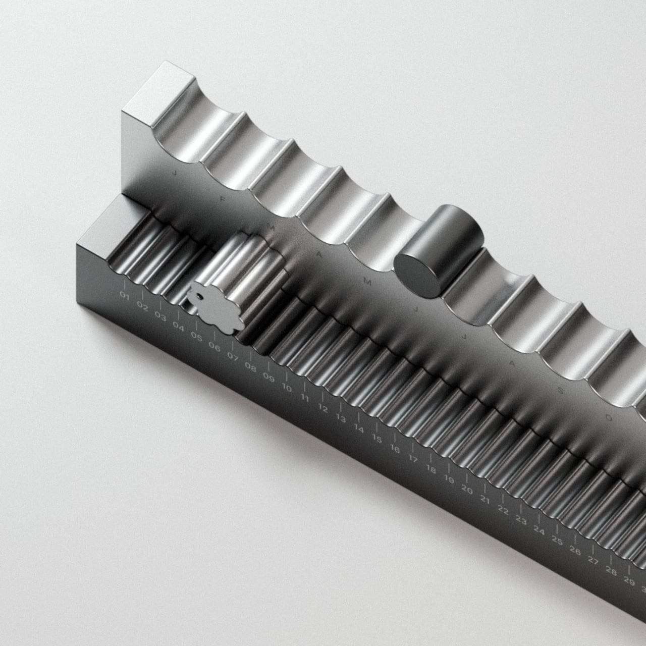
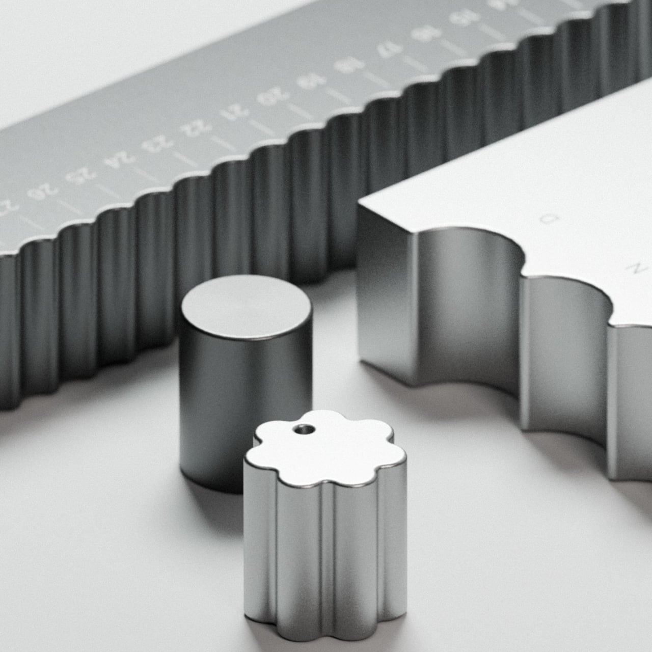
The calendar sits as a stepped aluminum block, angled so both tracks face you at once. The top holds 12 scalloped arches, one for each month, where a smooth cylindrical marker rests in a gentle depression. The front runs 31 ribbed channels numbered across the days, where a flower-shaped marker with corrugated edges clicks into each position like a gear finding its tooth.
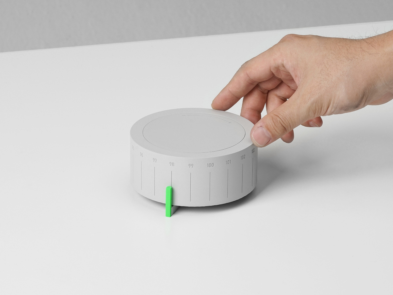
That’s where the haptic element matters, and it’s more meaningful than it sounds. There’s something grounding about reaching over each morning to nudge a metal marker one slot further, feeling the resistance as it settles into place. It takes two seconds, but those two seconds make the date something you’ve done rather than something you’ve simply glanced at from across the room.
The studio calls it “a physical manifestation of time,” which might read as a lofty claim until you consider how little physical presence calendars have anymore. The Momentum Calendar doesn’t tell you the date so much as invite you to acknowledge it. On a desk or a shelf, it works as both a functional object and a sculptural piece, without pretending to be anything else.
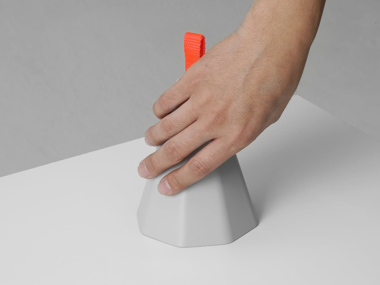
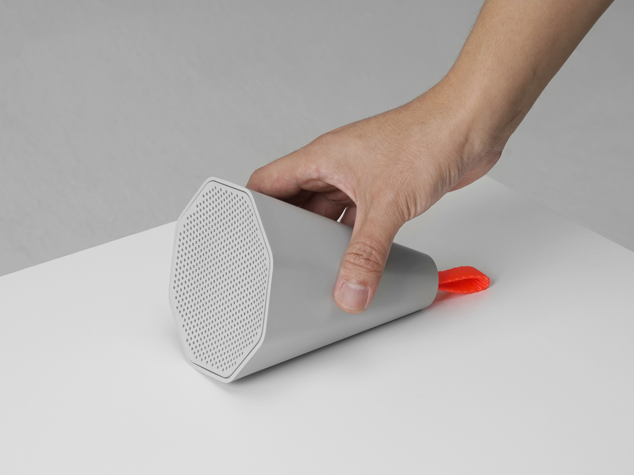
The aluminum body reinforces that sense of permanence. Momentum Studio describes all objects in the collection as milled from solid blocks of aerospace aluminum, and the Momentum Calendar carries that weight literally. It’s the kind of material that makes something feel like it belongs on a shelf for good, rather than something you’d swap out seasonally. The ridged texture adds depth without veering into decoration.
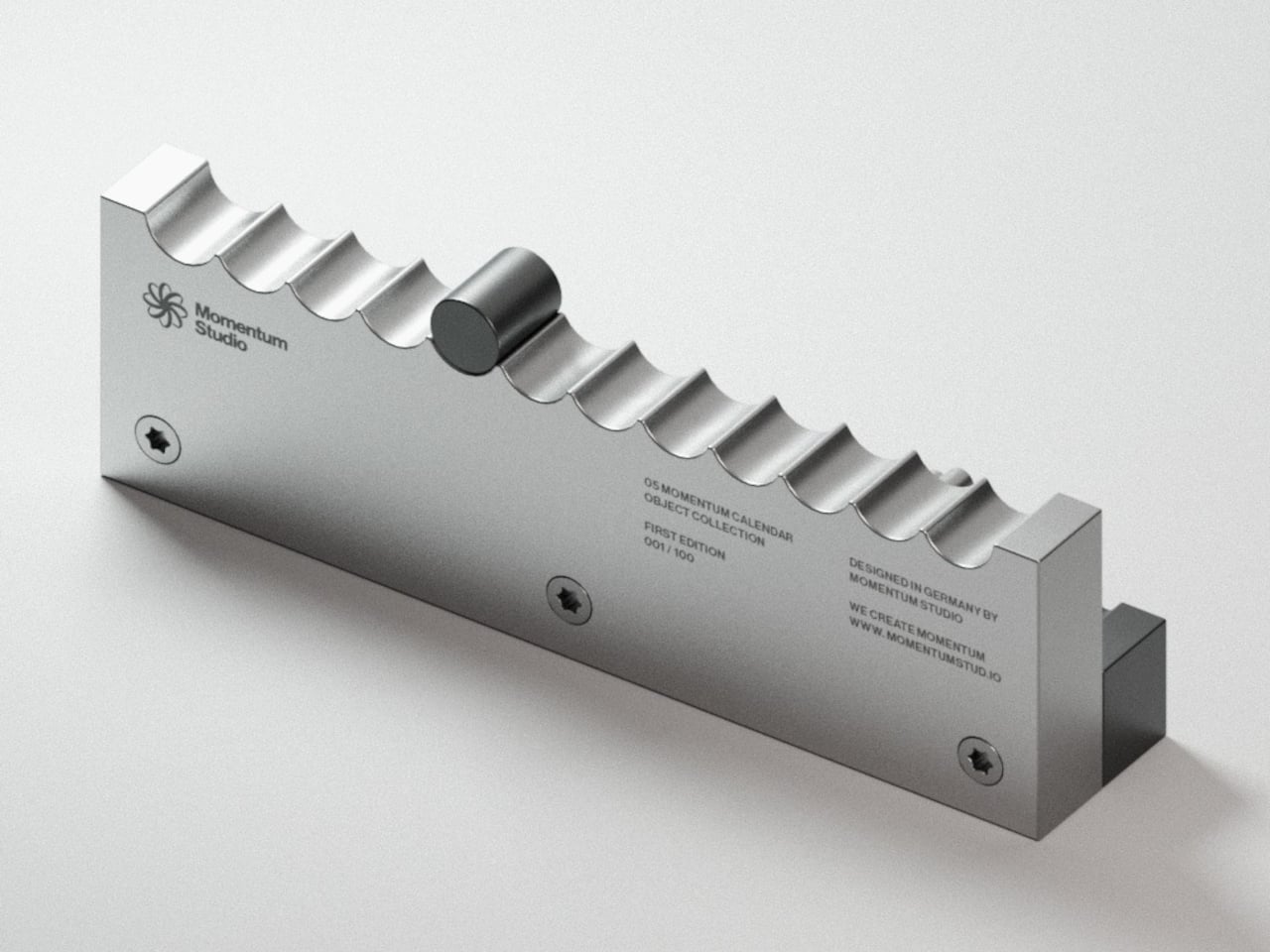
The First Edition is limited to 100 numbered pieces, with each unit’s position in the run engraved onto the back. What’s interesting is that the calendar’s entire premise depends on you showing up for it every single day. A phone calendar stays current because a server keeps it that way. This one is only accurate because you chose to make it so, which might be the most honest thing any calendar has attempted.
The post Momentum Studio’s Perpetual Calendar Clicks Into Each Day Like a Gear first appeared on Yanko Design.