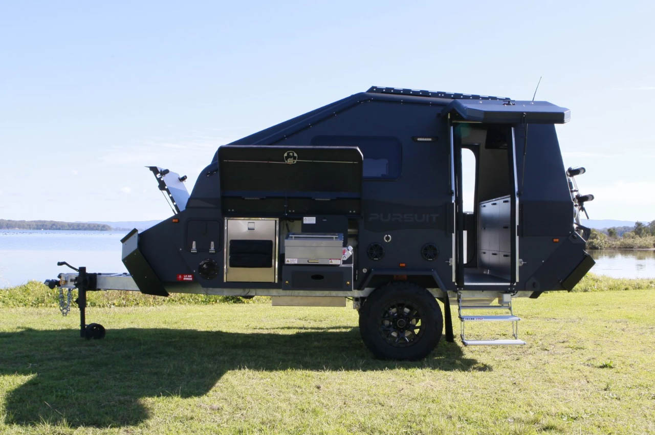
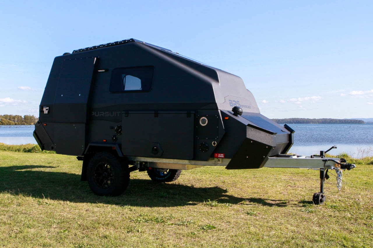
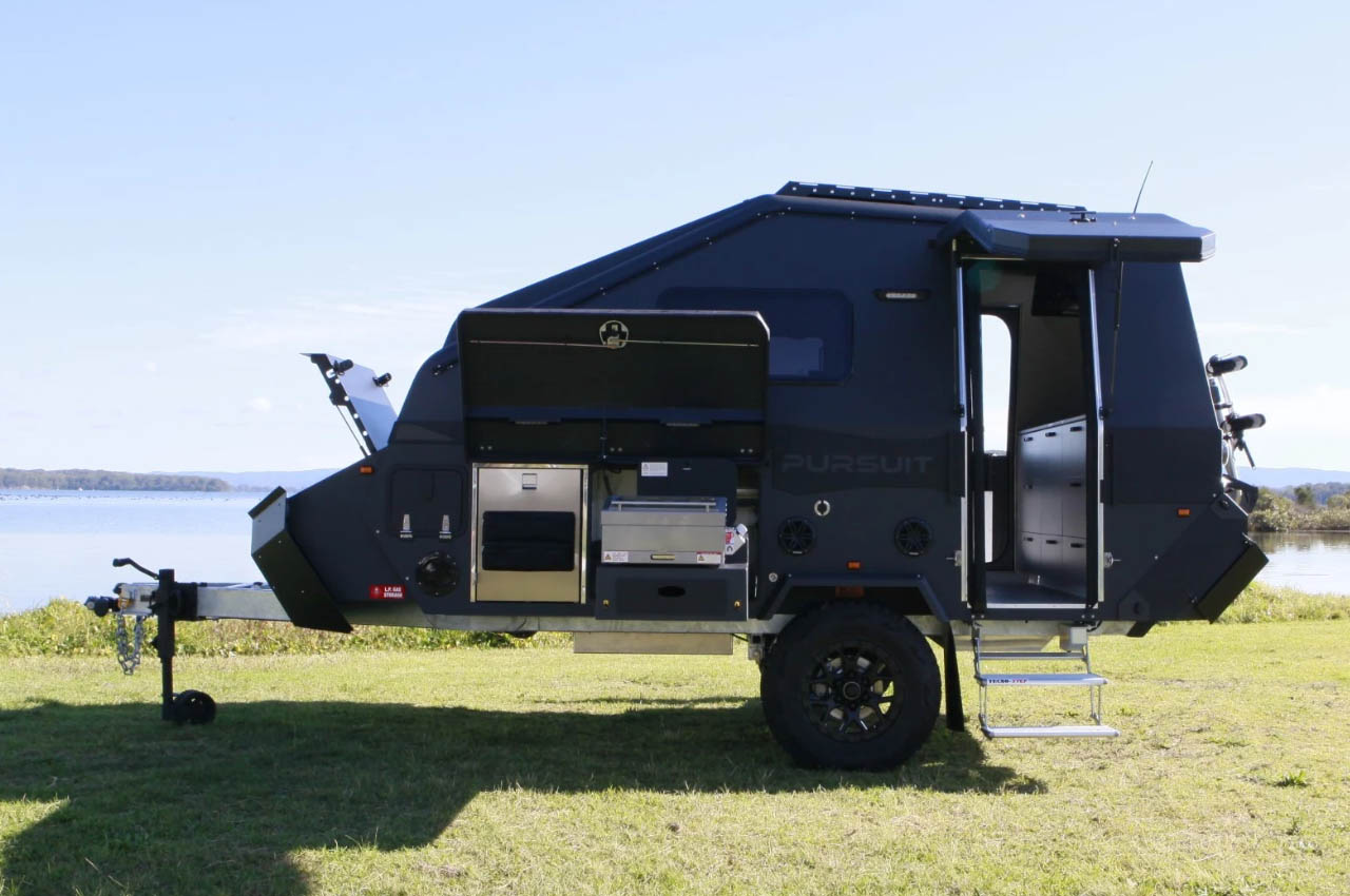
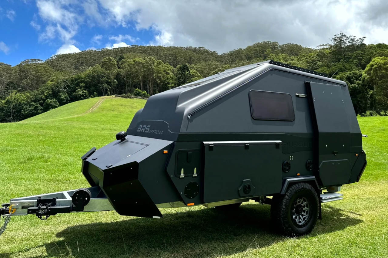
BRS Offroad has been going around on Australian adventures like no other in ‘pursuit’ for over a decade. But they are new to America, potentially walking their way through with ROA Off-Road. After the Sherpa and Pursuit in the past, BRS is back with another capable way for teardrop fans to go outdoors. More than that, go off the road and off the grid in the simple convenience of the fully-packed Pursuit Carbon.
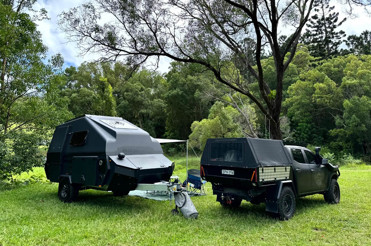
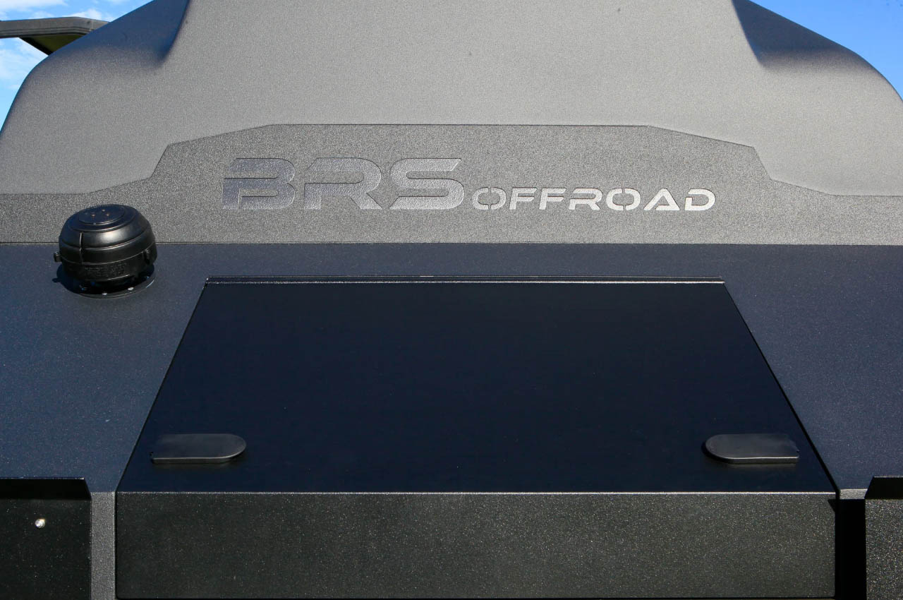
Do not be misled by the name. Carbon in the Pursuit is as oblivious of material as light in the darkness. Carbon in this camping trailer is defined by the black exterior sheen and not the use of carbon fiber in construction. It is made from marine grade aluminum and fiberglass, resulting in a top-tier lightweight composite shell camper made for awesome off-roading; capable of going where your 4WD takes you.
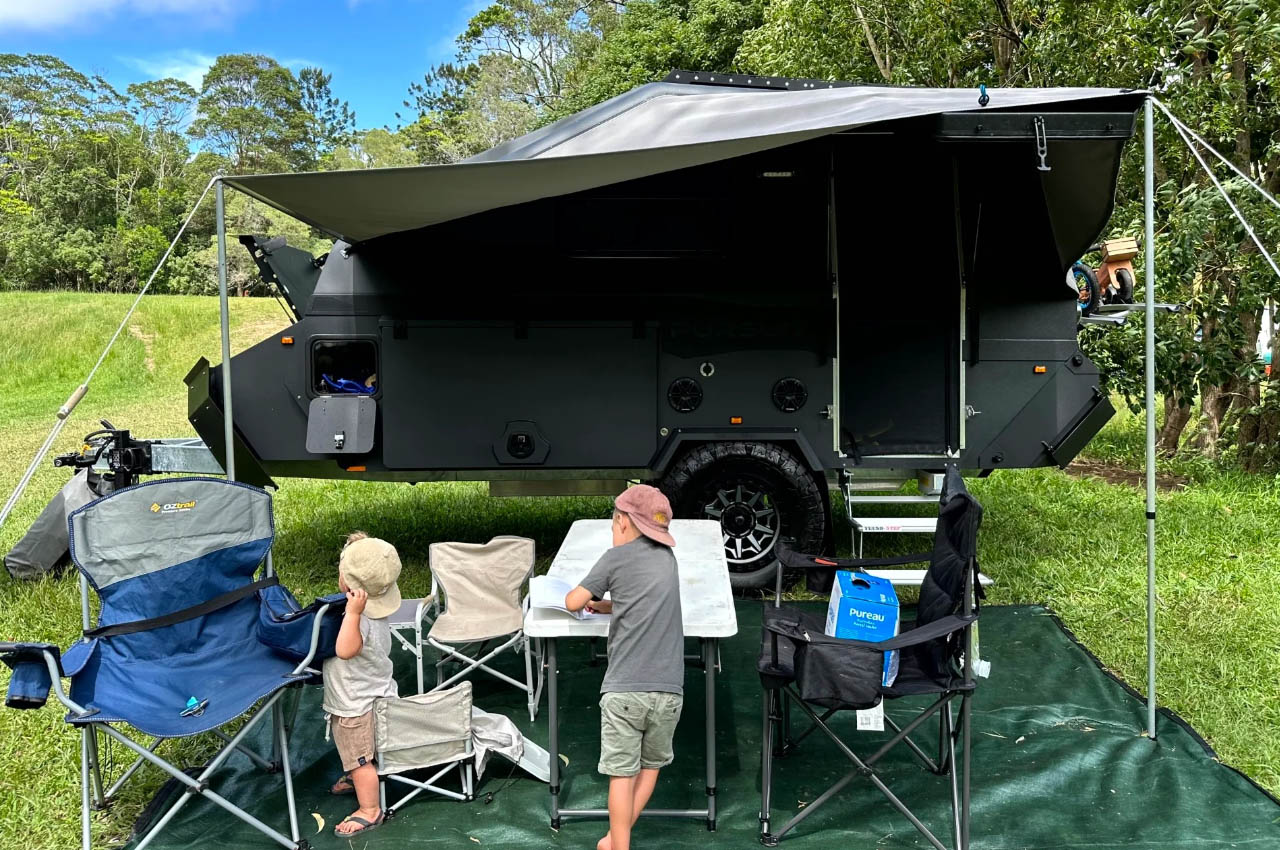
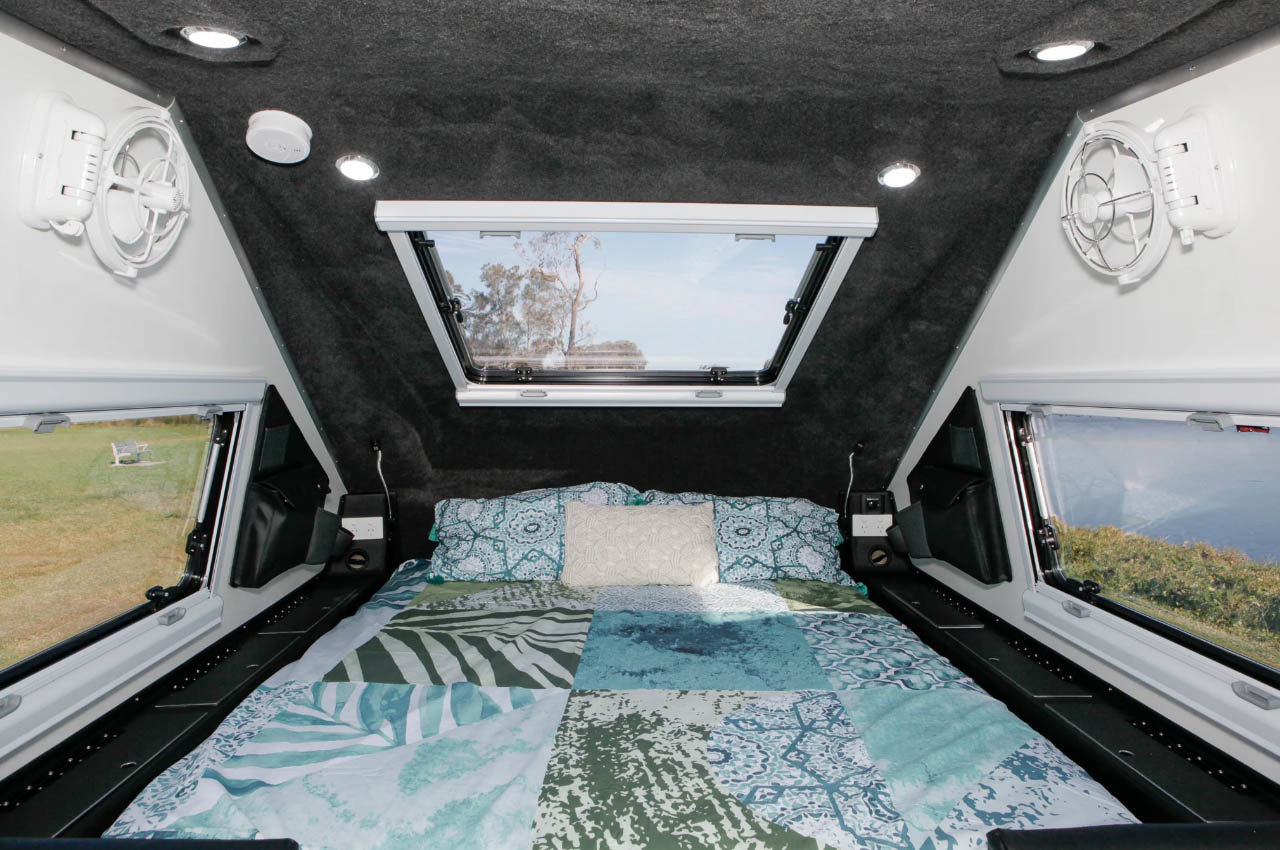
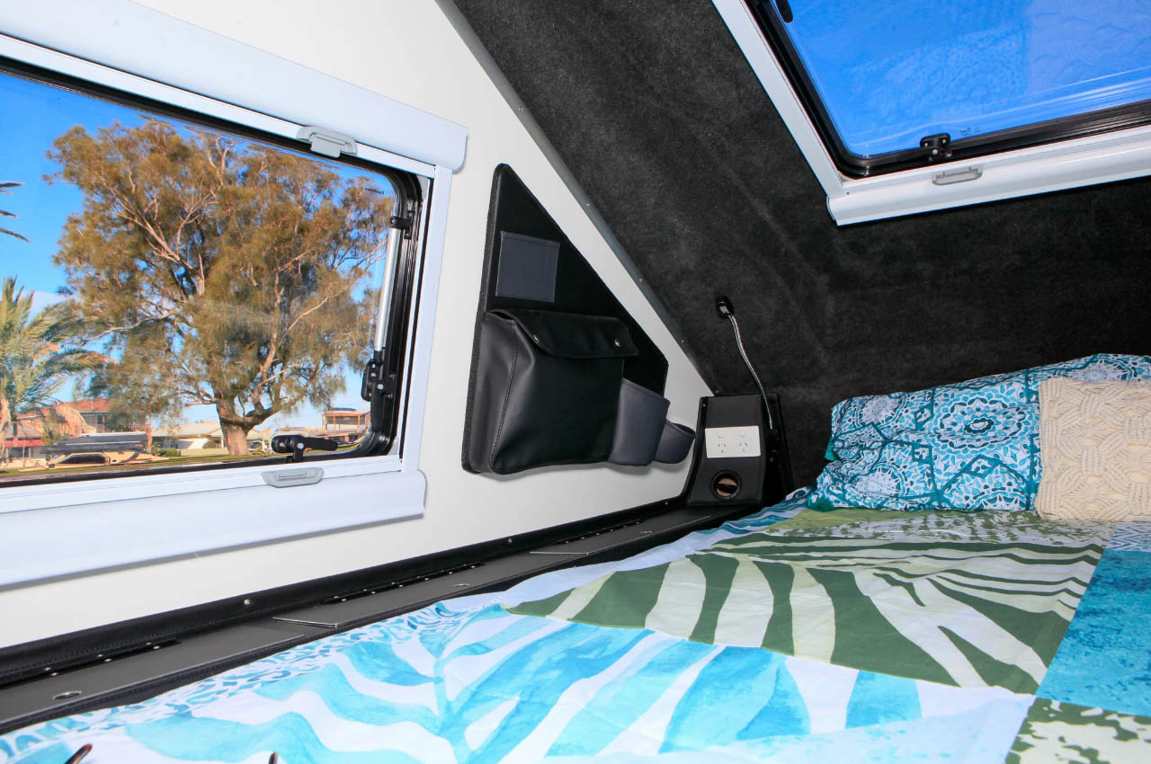
Bigger campers have idealized overlanding expeditions with jaw-dropping convenience and mind-boggling spaciousness. But Pursuit Carbon with two kitchens, extending above-ground bathroom, and a bedroom with a gapping skylight, intends to do that in a form factor not bigger than 19.7 feet long and 9.2 feet high. Alongside these highlighting features, the camper is also provided with a living area that converts into an extra sleeping section for one adult.
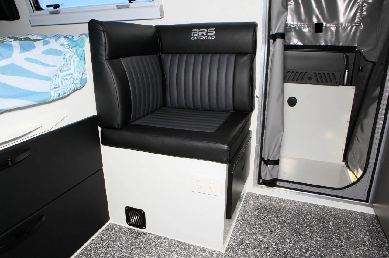
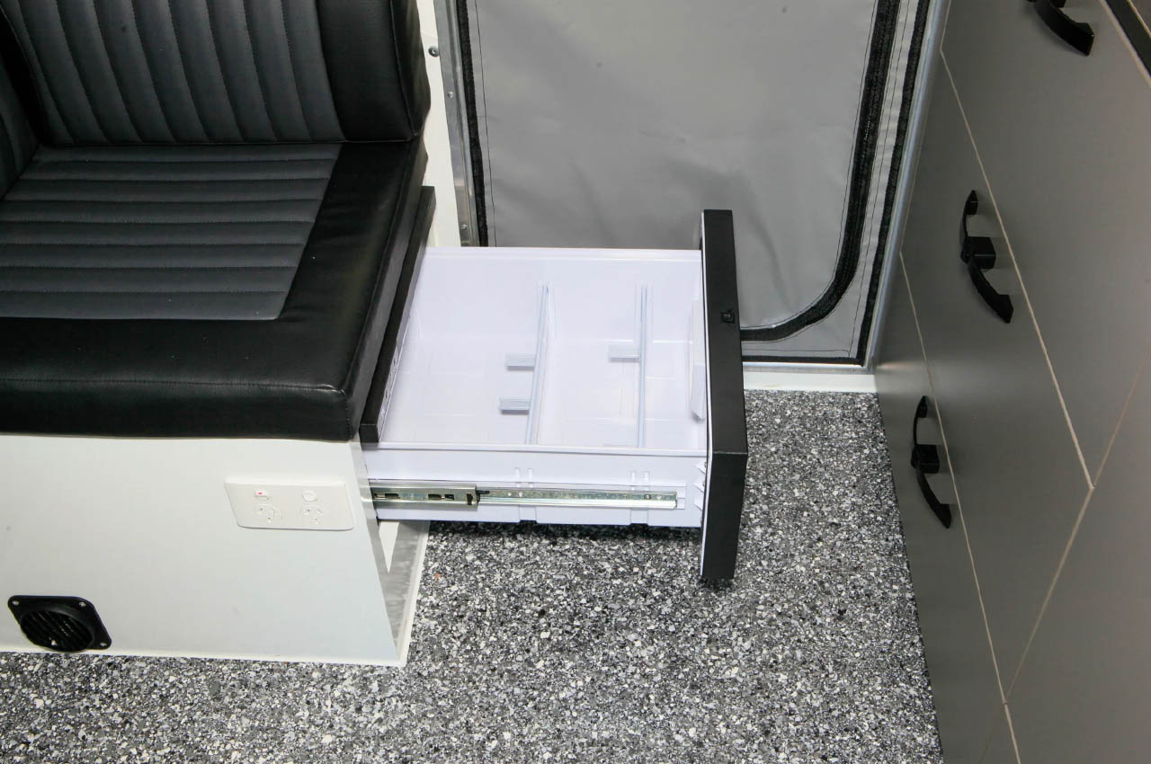
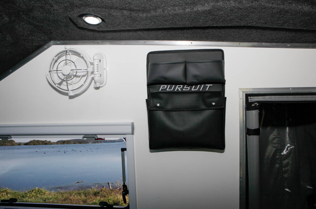
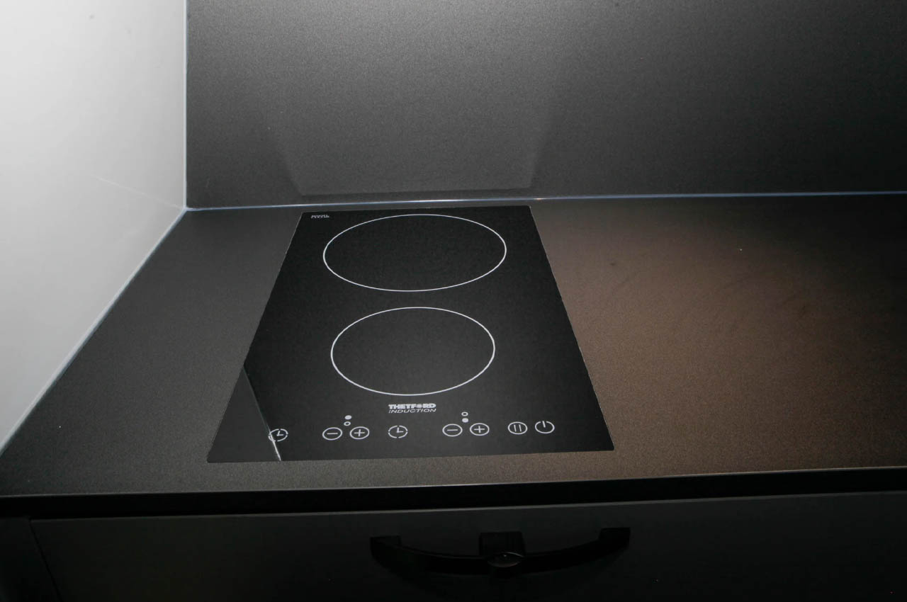
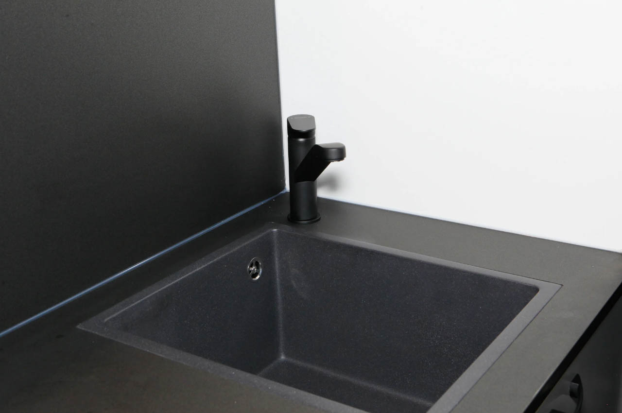
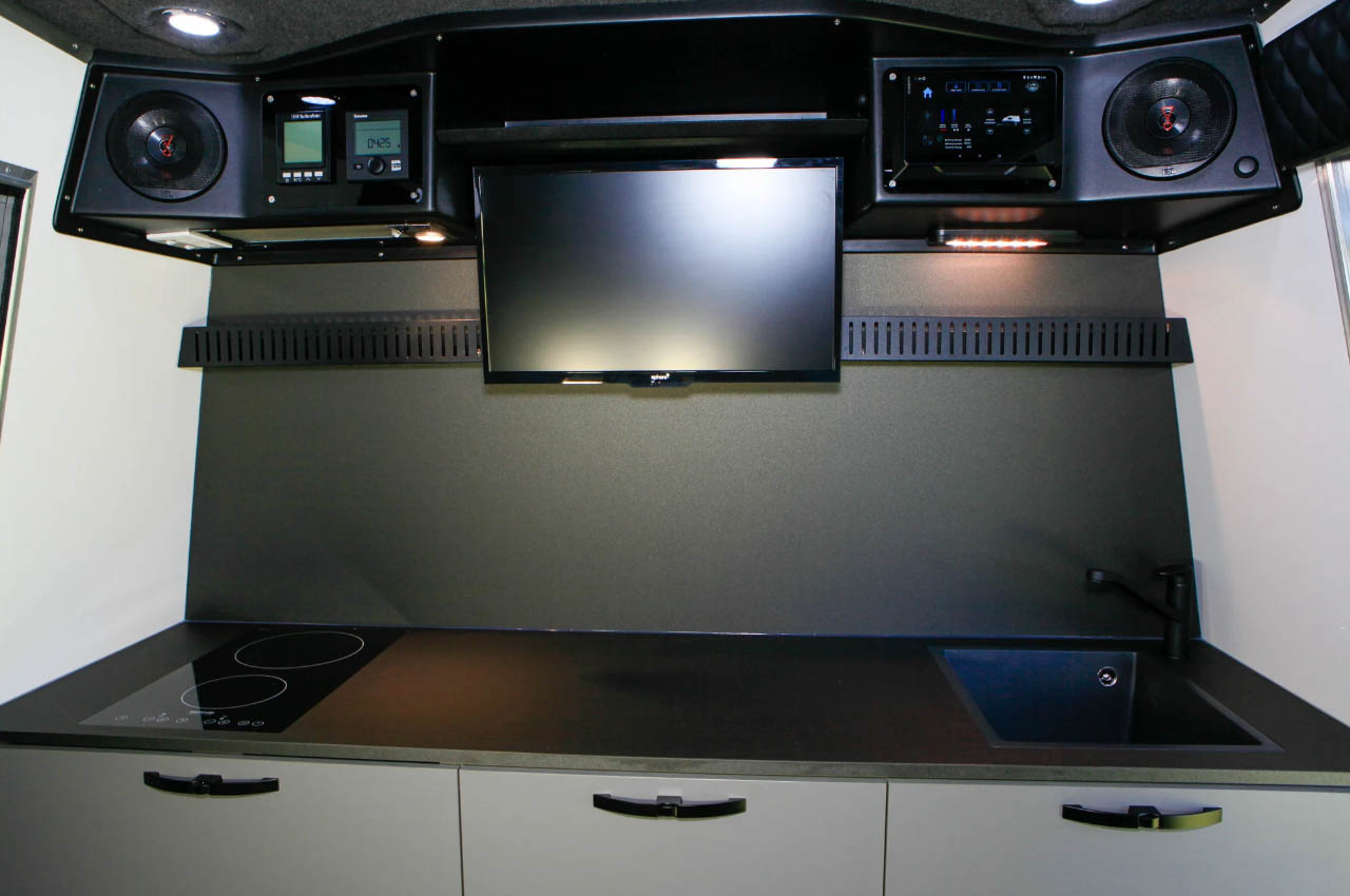
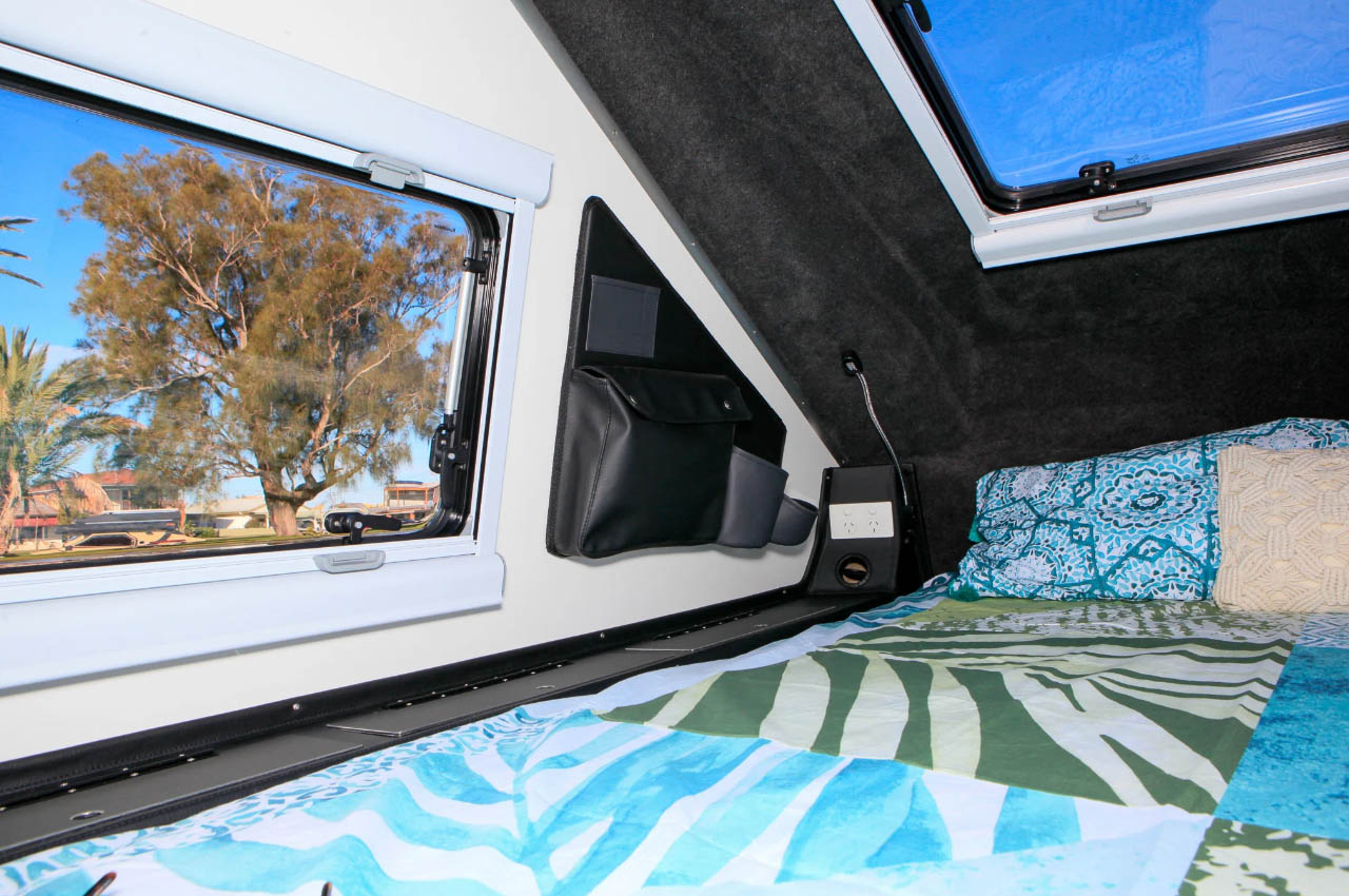
Good to accommodate up to three people on an extended off-road expedition, the Pursuit Carbon is entered through a hatch entry door on one side; the other side has a hatch drop that accommodates a fully enclosed hot shower (with privacy curtain). Upon entering through the door spacious and well-lit interior is bound to turn heads. The space is largely occupied by the bed under a large skylight and between two low panoramic windows, but it still has room for a pair of benches (with 30L drawers each) that function as a dinette or sleeping berth at will, alongside a functional kitchen featuring a cooktop and grill combo, sink, and prep area in the middle. Right above is the entertainment system comprising a TV, two Bose speakers on either side, and a portable Garmin tablet with all the home controls onboard.
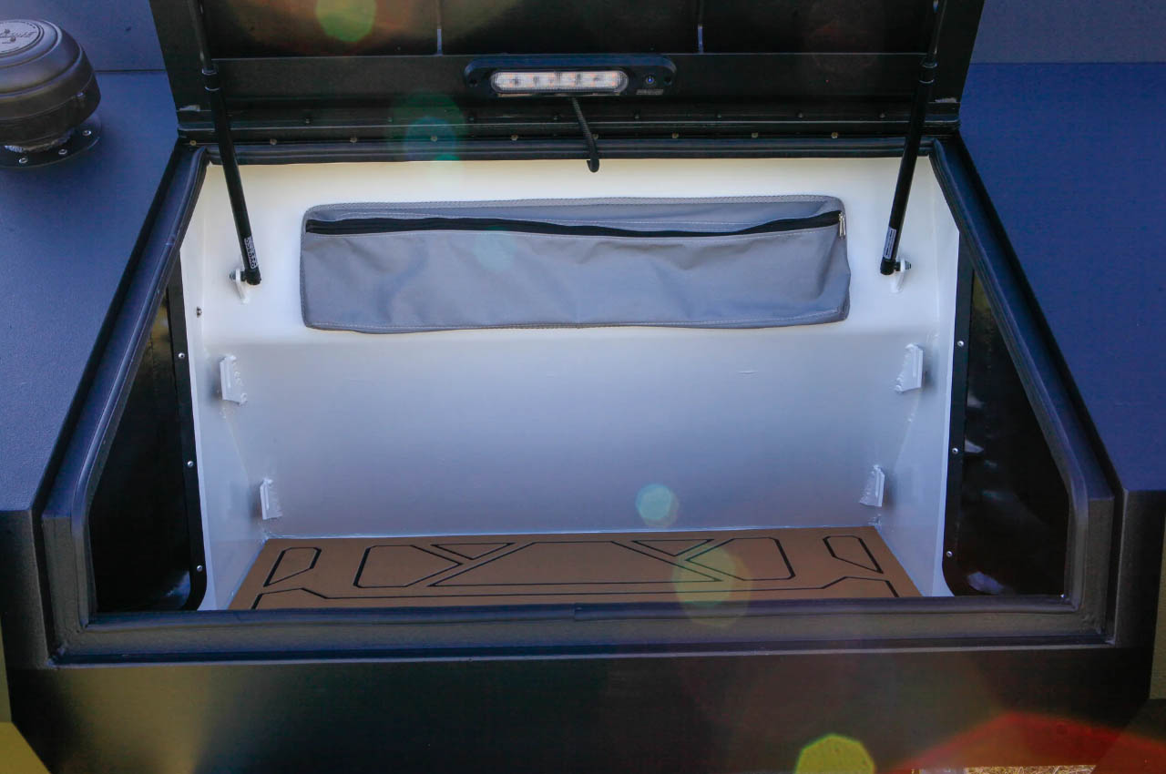
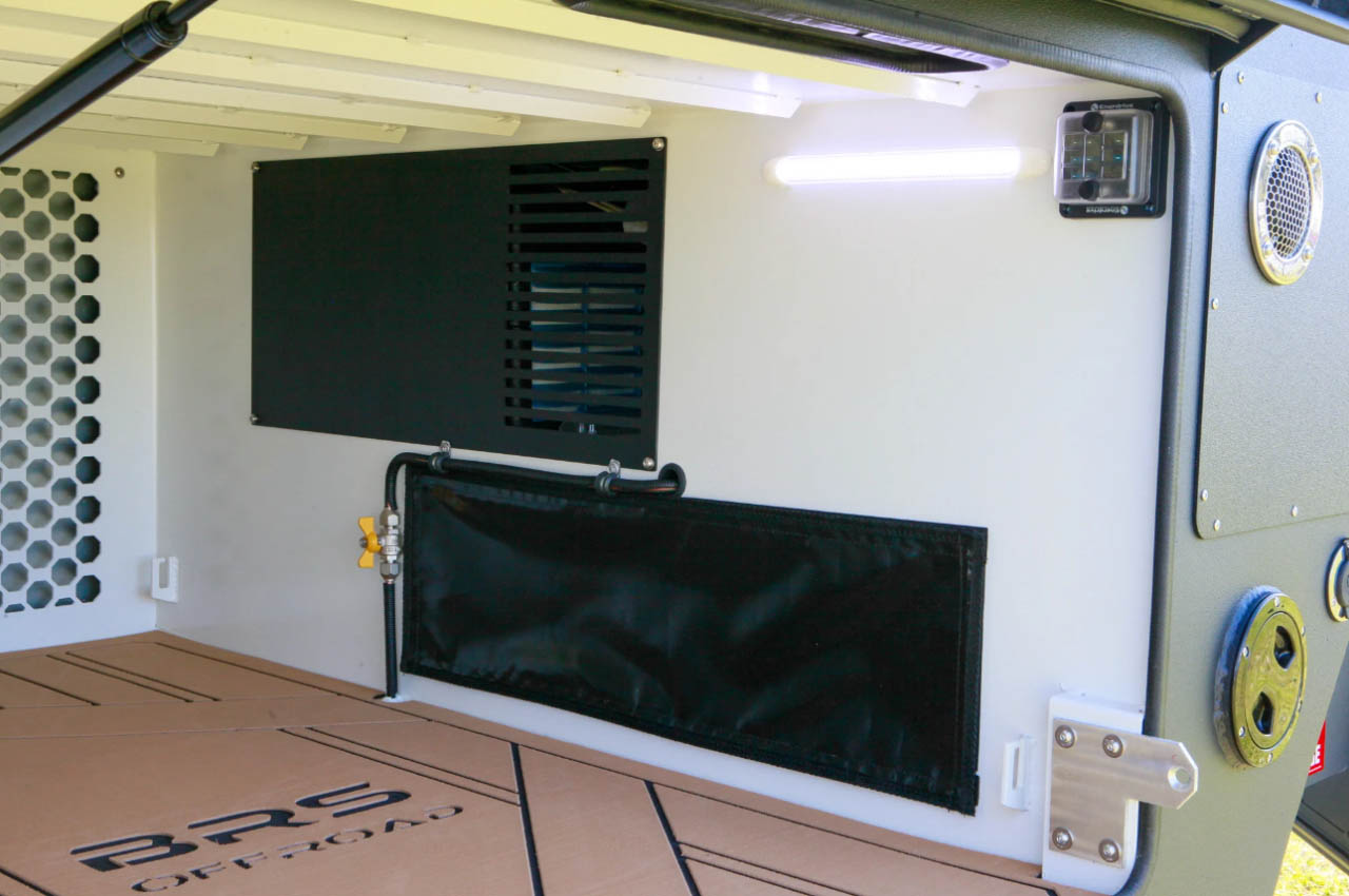
Making things exciting for those who love cooking under the sun; the hard-shell teardrop camper has a secondary pull-out outdoor kitchen. For toy haulers, a bike rack capable of handling up to three bikes on the rear. For the off-roaders, it has a galvanized steel chassis, all-terrain tires, and air suspension to keep things steady and rolling on rough terrains. For when you want to stick around in the wilderness a little longer, the Pursuit Carbon has been fashioned with 380-watt solar panels, an Enerdrive battery, and an inverter system. BRS Offroad does most of its business in Australia, so this trailer camper is for now only available down under for an asking price of AUD 136,990 (with all amenities. Customizations accepted). Possible North American release is still under the wraps.
You can pick up a specced-out version of last year’s MacBook Pro M3 for cheaper than ever right now, at $1,800. This is a discount of $200 for Apple’s flagship laptop with 1TB of SSD storage and 16GB of RAM. This deal is only available for the 14-inch Space Gray model. The silver model is also on sale, but with just an eight percent discount.
As for the computer itself, it’s the MacBook Pro M3. It’s one of the best laptops you can buy, particularly for people who do intensive creative work on a computer, like video editing and music-making. The 14-inch screen is gorgeous, the M3 chip is both fast and efficient and the keyboard and trackpad are excellent. It’s heavier and a bit bulkier than the just-released MacBook Air M3 models, but it also boasts more memory, a better selection of ports and a more efficient cooling system.
There are a couple of minor nitpicks here. Like all Apple MacBooks, you won’t be able to make adjustments to RAM or internal storage after the fact, so double-check before smashing that “buy” button. This model is also much more expensive than the Air, though today’s deal makes that a bit easier to swallow.
Speaking of the MacBook Air, there’s also a decent deal to be had for one of those via Amazon. The 2022 M2 model is available for $850, which is a 15 percent discount. This deal is for the 256GB model with 8GB of RAM. If you don’t work in the creative arts and use a laptop just to write, watch content or surf the web, this is a fantastic choice.
This article originally appeared on Engadget at https://www.engadget.com/the-1tb-14-inch-macbook-pro-m3-is-cheaper-than-ever-right-now-150822985.html?src=rss
South Korea is the latest country to support its local semiconductor industry in a significant fashion. It's trying to stay competitive with the likes of the US, China and Taiwan with the help of a 26 trillion won ($19 billion) support package. The country will extend tax breaks that were set to expire at the end of this year and provide financial support to chipmakers through the state-run Korea Development Bank, as The Wall Street Journal reports.
Amid large demand for chips to power AI systems and other computing needs, South Korea saw exports of semiconductors rise 56 percent in April compared with a year earlier. That's despite fierce competition from the likes of Intel and Taiwan Semiconductor Manufacturing Co. (TMSC). SK Hynix said it would bolster its AI chip manufacturing capacity in South Korea with an extra $14.6 billion investment, while Samsung replaced the leader of its semiconductor division to try and become more competitive.
South Korea's moves could help it keep pace with the US, which has been trying to ramp up domestic chip production to reduce its reliance on imports. Through the CHIPS Act, the US is subsidizing manufacturers such as Intel, GlobalFoundreies and TMSC. As it happens, one of the largest recipients of a CHIPS Act subsidy is Samsung, which is receiving up to $6.4 billion in federal funding for a new semiconductor plant in Texas.
This article originally appeared on Engadget at https://www.engadget.com/south-korea-aims-to-bolster-local-chip-production-with-19-billion-of-support-145043131.html?src=rss
With small and stylish compact cameras like Fujifilm's X100 VI all the rage for influencers, Leica has decided to jump back into the game. The German brand just unveiled the $1,595 D-Lux 8, a followup to the D-Lux 7 released way back in 2018. While substantially restyled compared to the last model, it carries the same 17-megapixel Micro Four Thirds sensor and 24-75mm (35mm equivalent) f/1.7-2.8 lens as before.
The original was effectively a rebadge of Panasonic's LX100 II, but it's not clear if the D-Lux 8 is using exactly the same sensor or an updated version. Other features, like video, autofocus and more have yet to be revealed.
From the images released, we can see some substantial differences from the previous model. It has an all-black finish and leather-style wrap, much like Leica's full-frame Q3 compact. The interface has also been simplified, with only a "play," "menu" and d-pad type control on the rear, along with two unlabeled buttons. On top, there's a power switch in place of the "4K" button. All of this is inspired by the Q lineup, the company said.
Leica
The new camera supports RAW file capture, which is a first for the D-lux lineup. Leica also unveiled new accessories including carrying straps, leather protectors, a flash and a hand grip. It also showed off a new app, without saying exactly what it does.
It would be a bit disappointing if the D-Lux 8 is just a spruced up version of the D-Lux 7, launched to take advantage of compact camera craze created by Fujifilm's X100 series. The old model was a solid camera for its time, but offers contrast-detect instead of phase-detect autofocus, along with tame photo and video specs by today's standards.
It certainly does look good, though, and that's been a key element in the compact camera renaissance —and the accessories may also tempt style-conscious shooters. For those attracted to the Leica's storied history and that iconic red dot, $1,595 is as low a price as you'll ever see for a new camera from the brand.
This article originally appeared on Engadget at https://www.engadget.com/leica-takes-on-fujifilm-with-the-compact-d-lux-8-143210473.html?src=rss
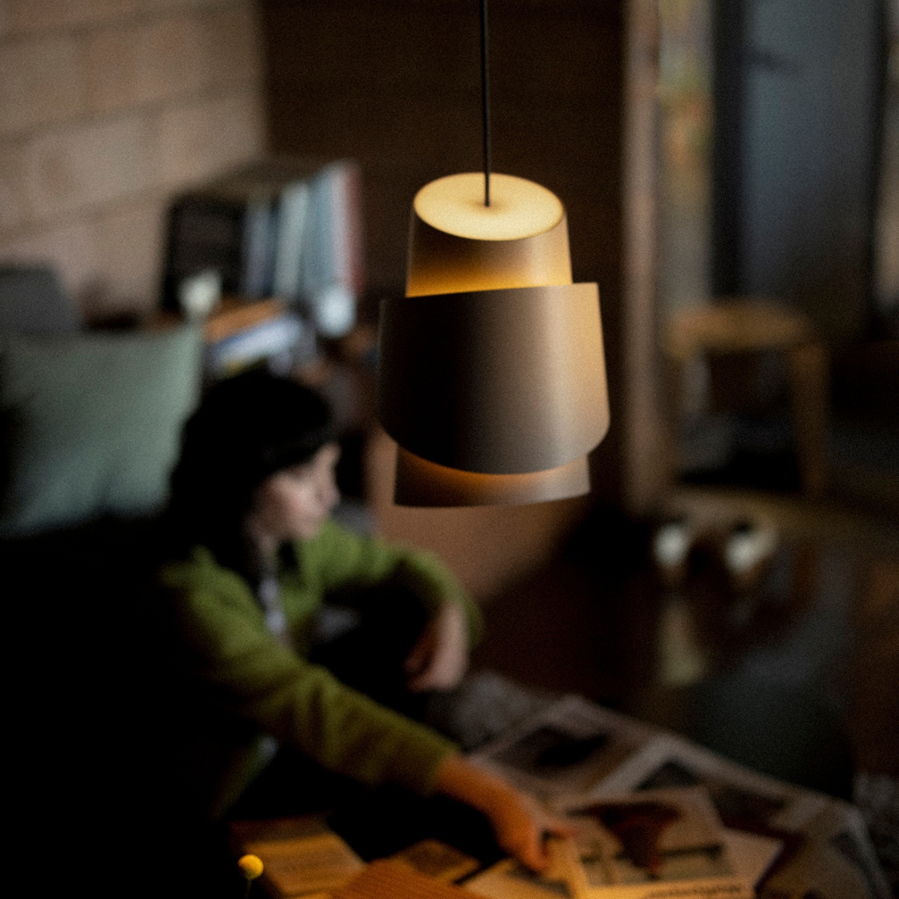
Normally, we don’t really associate food with lamp designs since they’re not really connected. But as we always say here, you can find design inspiration in the most unexpected places. We’ve seen several food-inspired accessories like fruit-shaped candles, food-decorated clocks, accessorised bottles, and a few fruit and vegetable inspired table lamps. But a bread-inspired pendant lamp may be a rarity but it is indeed interesting how you can get inspired by a piece of bread and apply the design principles to your product.
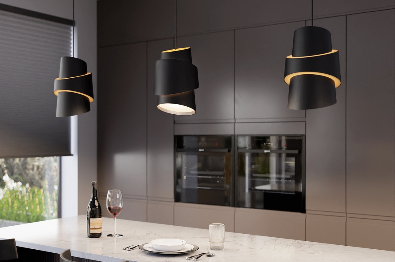
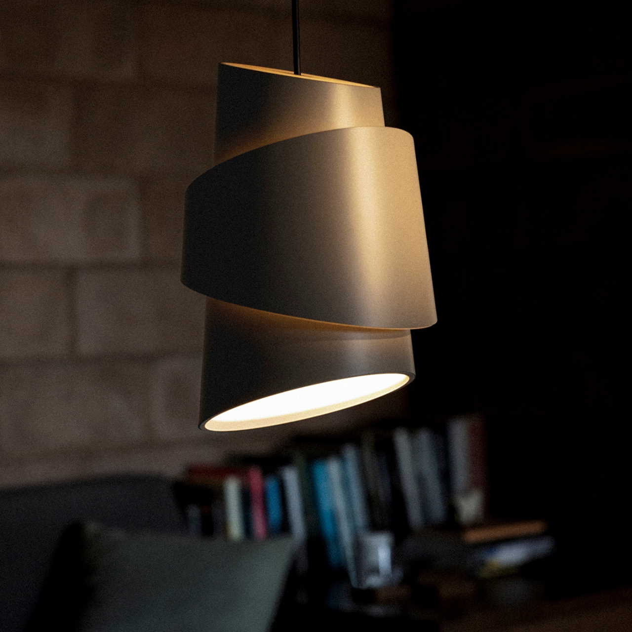
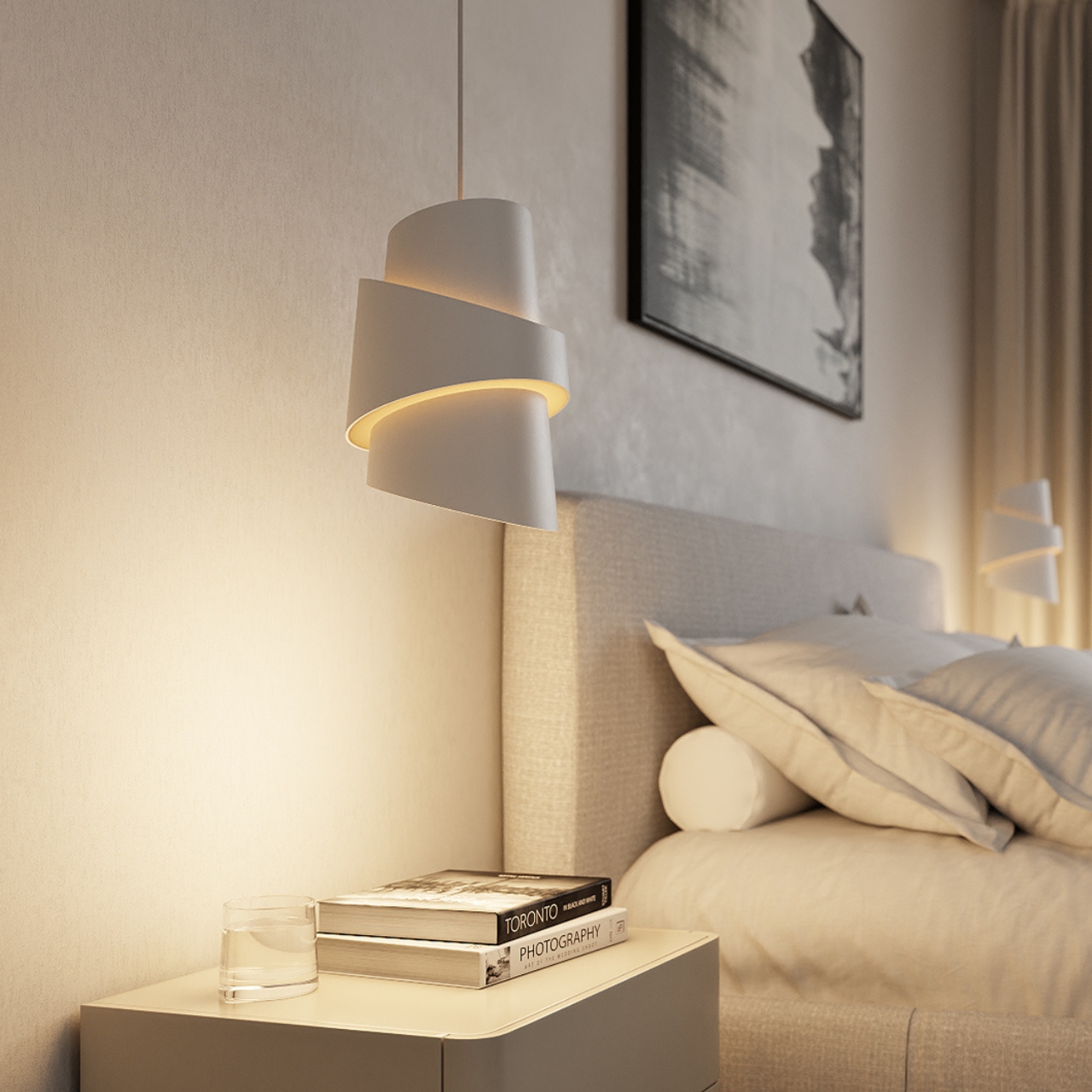
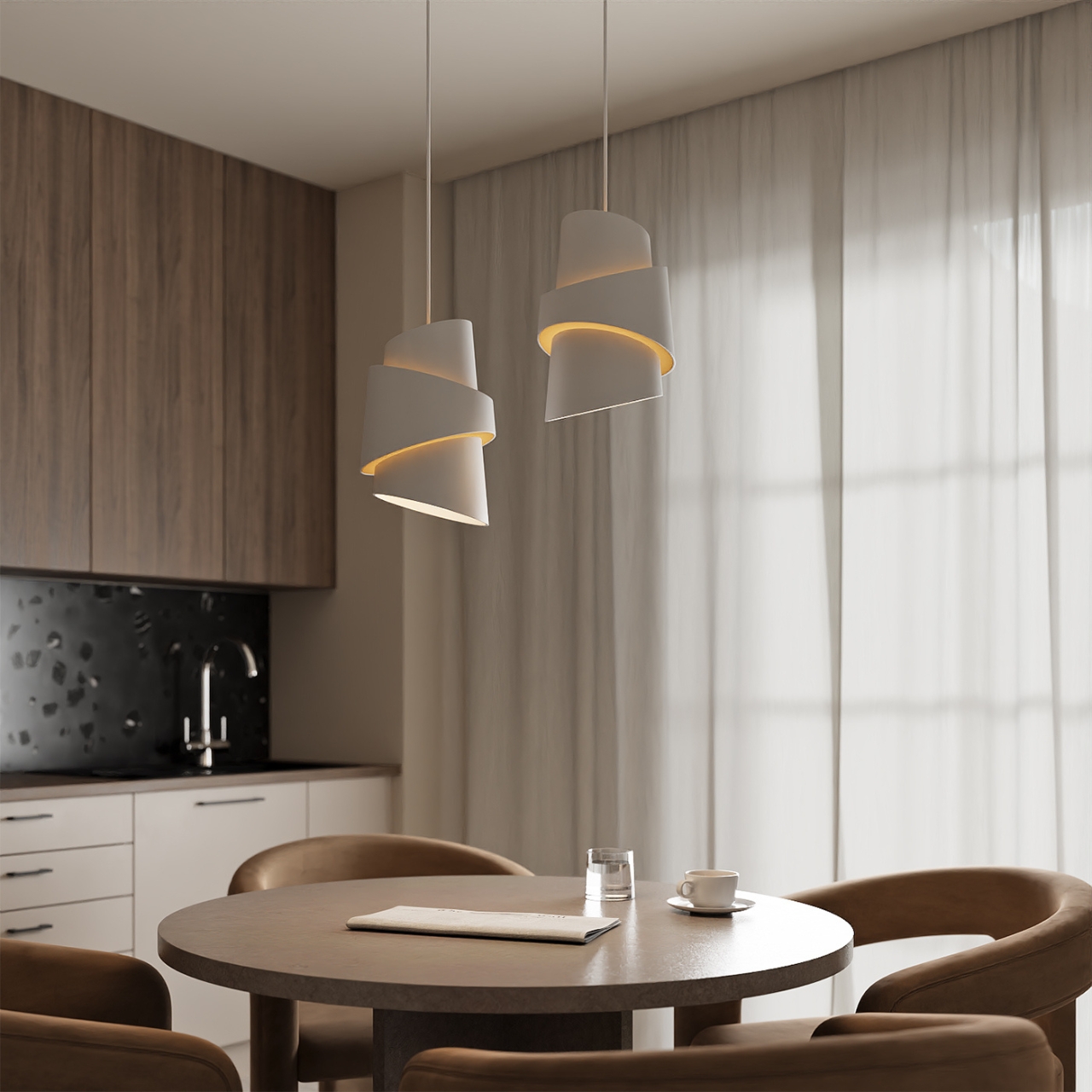
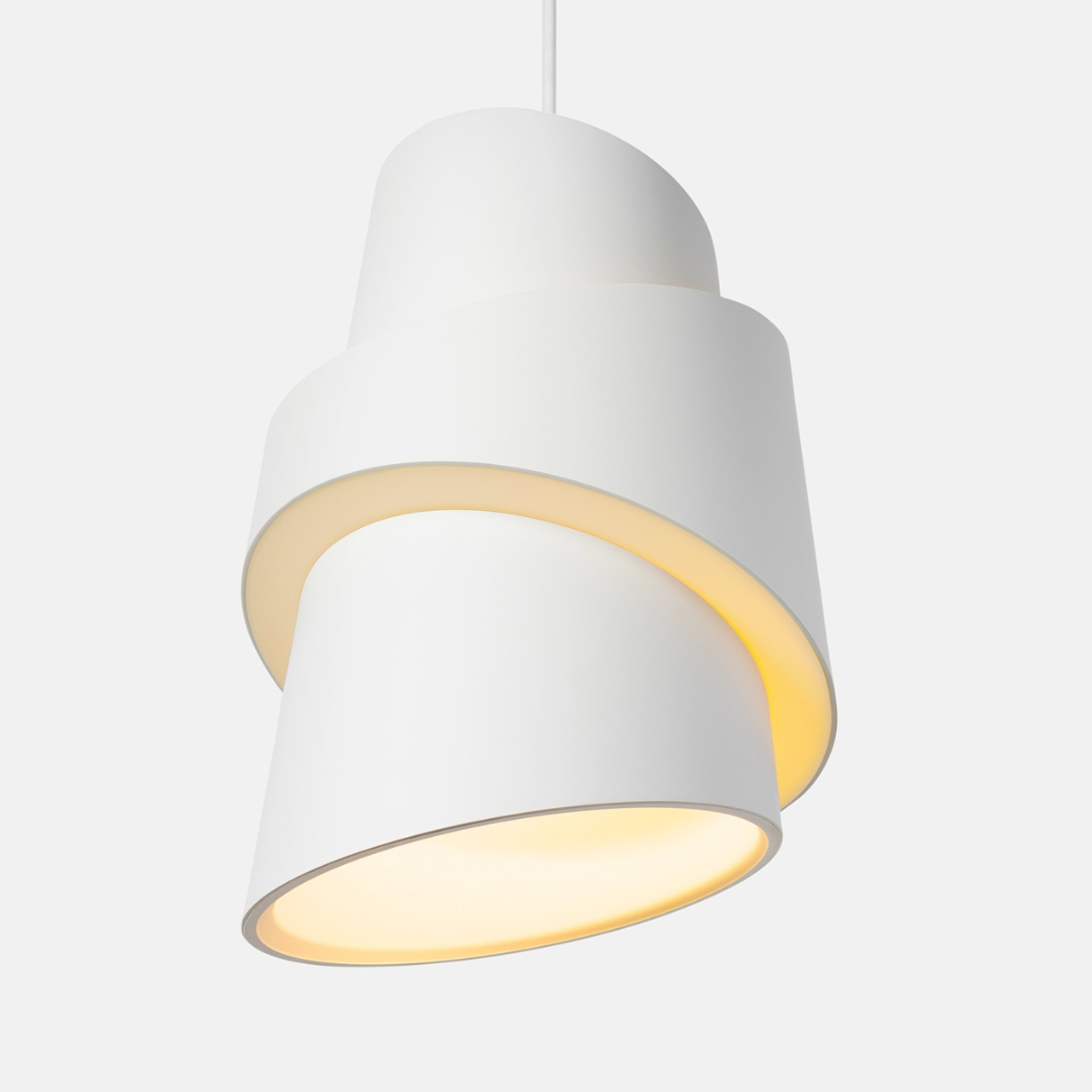
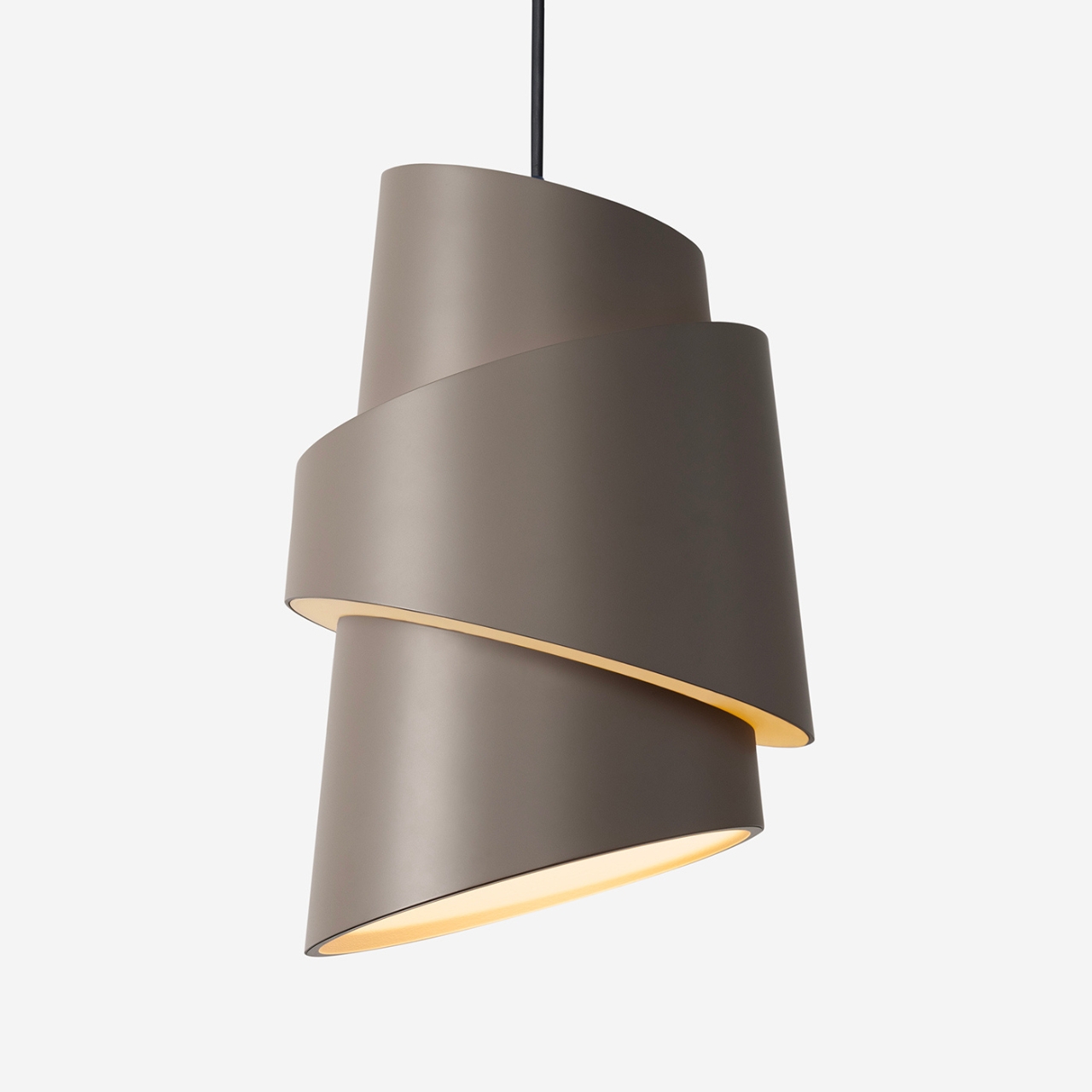
We’ve seen some cone-shaped lighting designs but the Croissant Pendant Light designed for Gantri takes it one step further by using the shape of the, you guessed it, croissant. But it’s not because they just want you to think of this savory pastry but because of the shape and the layers, the lamp is able to “cast a cozy, comforting glow” in different directions. It is created specifically for dining tables or kitchen islands but you can also use its “purposeful illumination” for other spaces in your home that may need it.
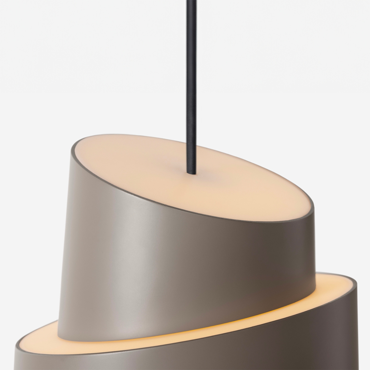
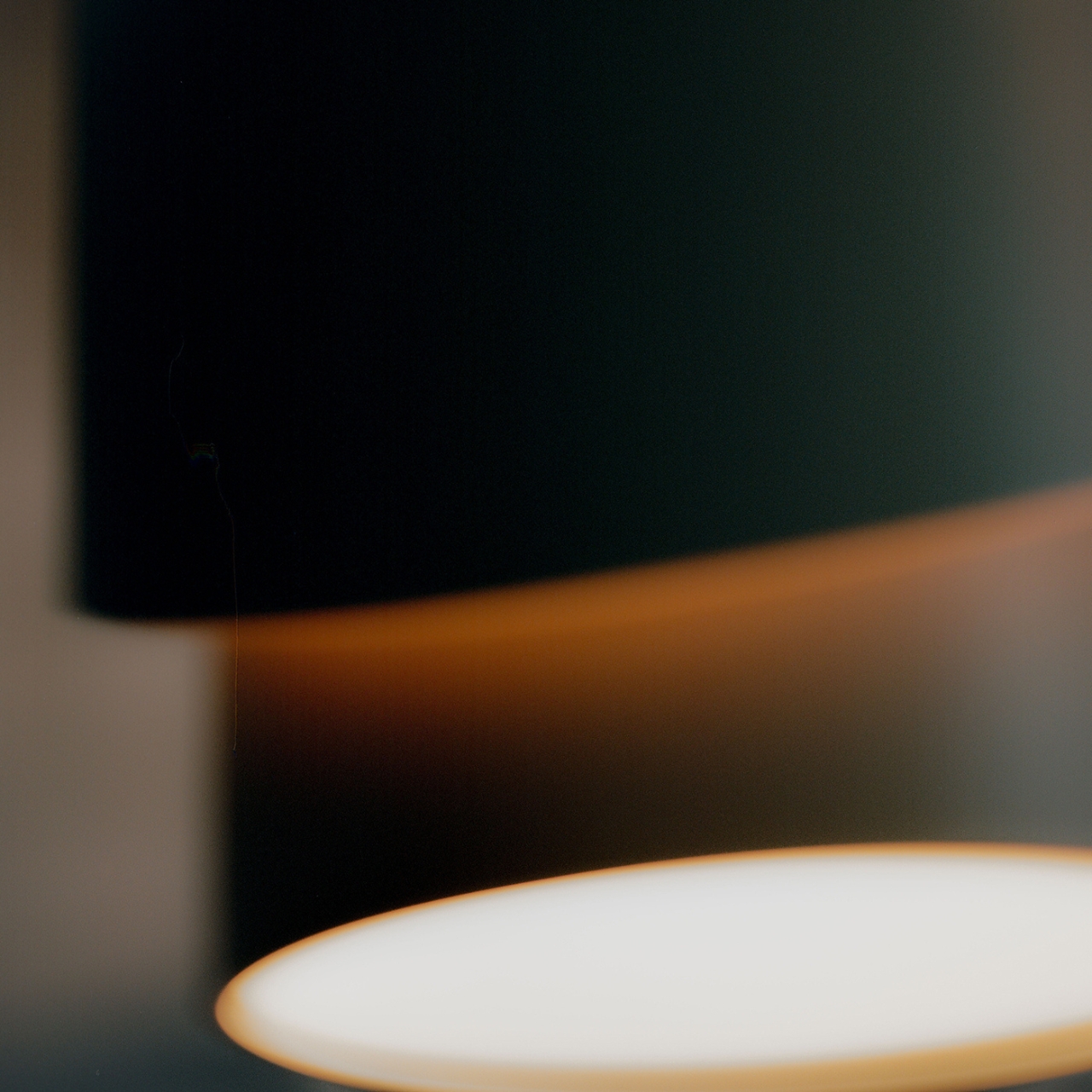
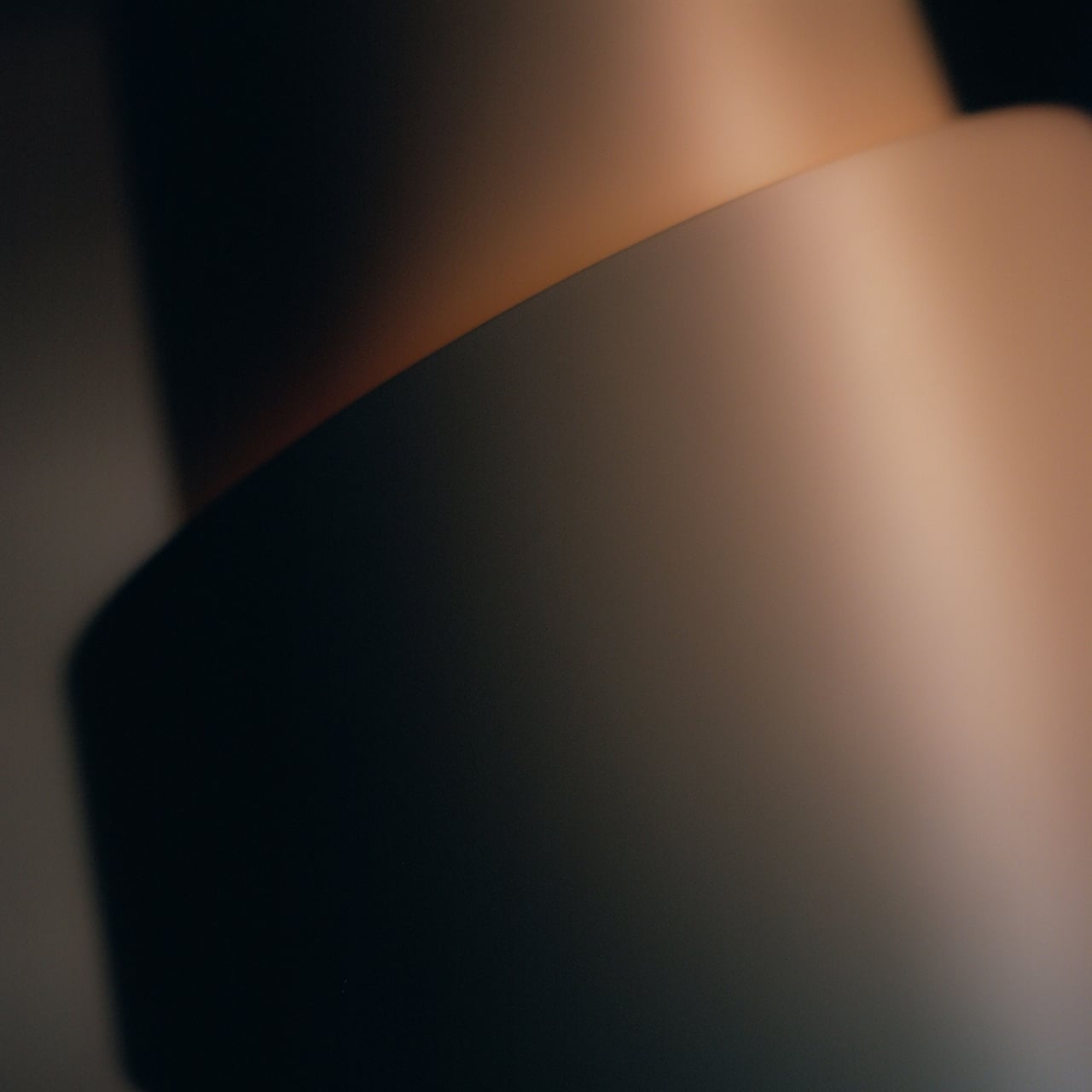
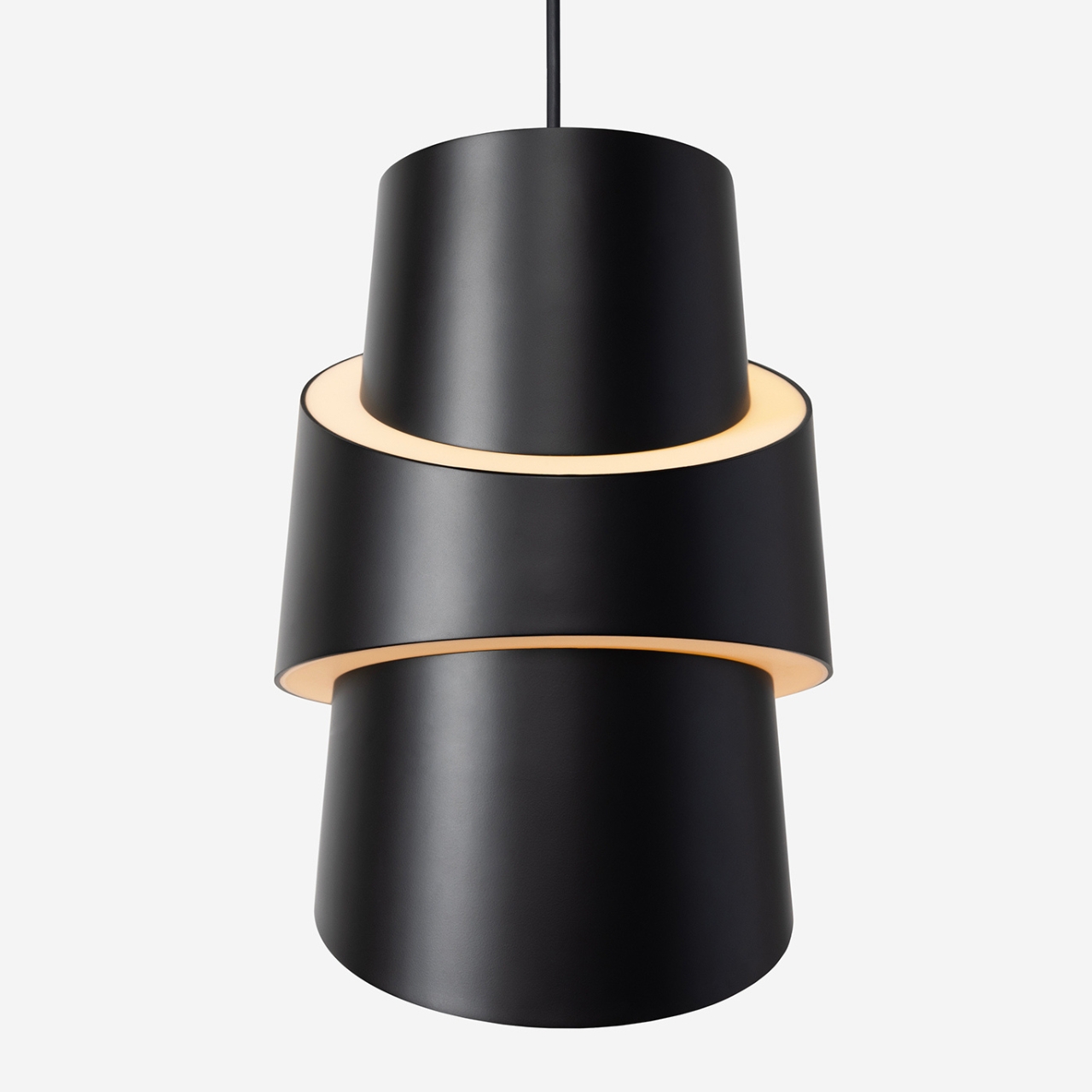
The angled shapes, sculptural layers, and lighter edges are all inspired by the croissant shape, even though we don’t really notice that when we eat the actual bread. The asymmetrical shape has two unique rings encircling the main shade, giving the lamp both a functional directed beam as well as a soft ambience in the other angles. There is an interplay of light and shadow as well because of its silhouette and the slices and curves.
The Croissant Pendant Light is available in three colors: Carbon (black), Snow (white), and Smoke (brown). There’s also an option for black or white cords so you can match it with your interiors. Because also of its unusual shape, the pendant lamp can also serve as an “art piece” of sorts for your space even when you’re not using it as a lamp. It is also pretty easy to install because of the Gantri-engineered mounting mechanism that it uses.
The Mercedes-AMG PureSpeed concept car is a revolutionary development in the realm of high-performance vehicles. This two-seater performance car, unveiled during the prestigious Formula 1™ Monaco Grand Prix, pays homage to the rich racing heritage of Mercedes-Benz. The PureSpeed’s radical design, innovative materials, and innovative technology make it a true collector’s item. Its unique features, […]
Truecaller, a caller ID app that can block and record calls, has teamed up with Microsoft to give its users a way to create an AI assistant that uses their own voice. The company originally introduced its AI assistant that can answer and screen calls for its users back in 2022. It already offers several voices to choose from, but the personal voice feature of Microsoft's Azure AI Speech gives users the capability to make a custom digital assistant that sounds like them.
Users will have to record themselves reading a sentence giving Truecaller consent to use their voice. They'll also have to read a training script that the technology will then use to capture their speaking style to be able to create a convincing digital audio replica. When someone calls them, the assistant will then screen it and introduce itself as the "digital" version of the user. In the product demo presented by Truecaller Product Director and General Manager Raphael Mimoun, for instance, his assistant answered a call with: "Hi there! I'm digital Raphael Mimoun! May I ask who's calling?" After the caller responds, the assistant then asks if the call is urgent or if it can wait before pushing it through.
"By integrating Microsoft Azure AI Speech’s personal voice capability into Truecaller, we've taken a significant step towards delivering a truly personalized and engaging communication experience," Mimoun said in a statement. That said, it could also feel unsettling, maybe even creepy, for callers to interact with a robotic version of their friend or colleague.
Microsoft demonstrated Azure AI Speech's personal voice at Build this year, where it also revealed that digital creativity company Wondershare is integrating the new feature into its video editing tools. That will also allow Wondershare users to create an AI assistant using their voice, which they can then use to create audiobooks and podcasts.
This article originally appeared on Engadget at https://www.engadget.com/microsofts-azure-ai-speech-lets-truecaller-users-create-an-ai-assistant-with-their-own-voice-133019270.html?src=rss
These days, having a phone stand is not just a want but actually a necessity. Aside from taking selfies or doing vlogs, it’s also needed for when you’re on online meetings, video calls, or even just watching videos in public. There are a lot of different kinds of phone stands available in the market but some are too bulky, some are not made from quality materials and some don’t adjust to the size of the device. It would be great if there are more truly portable stands available for both content creators and regular phone users.
PhoneCLIP MAX is a truly portable phone stand made through the CNC machine method and made from aluminum. What makes it different from most of the stands in the market is that it allows adjustable angles so you can move it around as needed. It also has a balancing mechanism that keeps the center of gravity and your phone is able to be repositioned when you adjust it to different angles. If you need to attach it to a stand or tripod, it also comes with 1/4″ and 3/8″ universal thread.
We assume that no matter the size of your phone, this small stand will be able to carry the weight and adjust accordingly according to the angle you need. They also have other models available for your budget or feature needs. The PhoneCLIP is a plastic model while the PhoneCLIP PRO is a “durable CNC machined model”. However, these two other models don’t have the built-in stand feature and is just a phone holder. All three models have the 1/4″ universal thread so you can mount it on any compatible stand or tripod. The PhoneCLIP MAX is the only one that has the 3/8″ universal thread option.
The fact that this is tiny enough to put in your pocket or small bag is a distinct advantage over the bulkier stands available in the market. Of course if you’re a vlogger, you still need to carry around other stands or tripods that you need but for those of that just to watch videos or do a quick video call while outside, this tiny phone stand will do.
Are you looking to boost your productivity on your iPhone? With the right tips and tricks, you can transform your device into a powerful tool that helps you work more efficiently and effectively. The video below from Proper Honest Tech, walks us through 12 essential productivity tips that every iPhone user should know. Harness the […]
Kobo isn’t the first on the color-ereader scene; Boox and Pocketbook have had color ereaders and tablets for years. Both of those companies make beautiful, premium devices that are highly capable and customizable — but they don’t offer the plug-and-play ereader experience of a Kindle or Kobo. Of all the ereaders I’ve tried over the past year, I’ve found Kobos do the best job of combining a user-friendly interface with quality hardware. And now that hardware has a new trick with a color screen on the Clara Colour.
It’s noteworthy that Kobo beat Kindle to the punch in getting a color ereader out the door. To be fair, Amazon is busy doing, well, everything, but it’s safe to bet that a color Kindle will be coming soon. For now, though, Kobo’s Clara Colour is the consumer-friendly color ereader to beat. A beefier processor makes it zippier than its already-fast predecessor, and the addition of color looks lovely, without detracting from the crisp and easy-to-read text. I’ll admit, I’m not an ereader diehard; I often return to my first love, print. But a few weeks with Kobo’s latest has me more excited than ever about reading on this cozy, effortless machine.
Design and display
Most e-paper devices rely on a display made by E Ink. The Clara Colour uses the company’s new Kaleido 3 panel, which adds a printed Color Filter Array (CFA) layer on top of the existing black-and-white microcapsule layer. The color layer can display around 4,000 colors, with a resolution of 150 dpi. To be clear, a full color page on the Clara Colour looks nothing like what you’d get from the most basic LED screen. E-paper colors are muted and saturated, reminiscent of ‘70s comic book covers. But, also unlike LED, E Ink color panels actually look better under bright light.
Comparing the two generations at the same settings. Kobo Clara Colour (left) is warmer and slightly dimmer at 100% than the Kobo Clara 2E (right).
Photo by Amy Skorheim / Engadget
The monochrome microcapsule layer creates sharp, 300 dpi text, same as the previous generation. But set side-by-side with the Clara 2E, the Clara Colour’s page does look less sharp. Get close to the screen and you’ll notice noise in the white parts of the page. The warm front light is more amber, too. That’s the nature of the color filter array: since it’s always there, any text you read is filtered through that layer. I have to stress that it’s only something I noticed because I’m writing this review and digging deep into the performance as compared to the previous generation. When it comes to actually reading, I found I preferred the softer, warmer effect of the Colour. It reminds me of the pulpy mass-market Stephen King and Anne Rice paperbacks I grew up reading.
Kobo’s customization options aren’t overly involved, but they grant enough control so you can change things like the typeface, font size, line spacing and margin width, as well as brightness and light warmth. On the outside, the Kobo Clara 2E and the Clara Colour look nearly identical. The screen is slightly more recessed on the Colour model and the soft-touch plastic is more textured, which is actually a benefit because it shows fewer fingerprints. The centimeter-wide bezels are just big enough for your thumb, which, along with the textured back, makes the reader easy to hold from different positions. It’s small enough I can grip it around the back, but I have larger hands, so that might not work for everyone.
With an IPX8 rating, the Clara Colour can handle full submersion in water. I haven’t gone that far with this review unit, but I did survive when I accidentally splashed water on it when washing my hands in the bathroom. Why was it in the bathroom? Because I stash my book near the toilet so I don’t sit there and stare at my phone. It’s the tactic that got me reading again after I had a kid and was temporarily convinced I’d never finish another book. I heartily recommend it, particularly with a reading device like this one that can handle the watery environment of a restroom.
Photo by Amy Skorheim / Engadget
Reading experience
The Clara Colour’s new chip makes loading menus, performing searches and flipping pages a touch faster than with the previous generation. The speed increase doesn’t amount to a drastically different experience, but quicker page turns keep the action going. Like if Murderbot is protecting its humans from HostileSecUnit1 and suddenly there’s another SecUnit at the bottom of the page, you need to know as fast as technologically possible what goes down next. Browsing for a new book and checking out previews is speedier, too, something I appreciate when everything on my dutifully curated TBR list looks like broccoli and I want ice cream.
The UX is the same as all Kobos that don’t support stylus input, with just four options along a bottom menu bar: Home, My Books, Discover and More. Discover takes you to the Kobo store, where you can look for ebooks, audiobooks and titles from KoboPlus, the company’s monthly subscription for unlimited access to a selection of books (aka Kobo’s answer to Amazon Unlimited).
Discover’s recommendation section has a running list of titles called Just for You and, under Related Reads, suggests books you might like based on works you’ve finished. The connective threads between the titles isn’t anything surprising, but they offer a good place to start if you’re noodling on what to read next.
Photo by Amy Skorheim / Engadget
Kobo’s deep integration with OverDrive lets you borrow any title your local library has available with just a few seconds of setup and a library card. Clicking the three dots near the Buy button on any book brings up the option to borrow (or place a hold on) the ebook from your library. I admire how deeply Kobo supports the feature, placing something free and public on par with paid books and subscriptions.
Other features are nice to have, like gathering your Pocket articles from the web so you can read them later in the more focused environment of your Kobo. There’s also a beta web browser that I used to look up the Wikipedia entry on the Mason-Dixon line when I read Percival Everett’s James and the one for rook (the bird) when reading Tana French’s The Hunter. The browser’s not equipped for heavy surfing, but that’s a good thing. The extra effort it takes to browse keeps me on target with my reading. At the same time, I’m happy to dig up a little background info without picking up my phone, where the distractions are plentiful and compulsive.
The competition (aka Kindle vs Kobo)
There’s no escaping the fact that a Kobo ereader is not a Kindle. But the advantages Kindle has over Kobo are mostly in the availability of titles, not in hardware. The Kobo Clara Colour is most directly comparable to the standard Kindle. They have the same basic shape, the same size screen with 300 dpi text and 16GB of storage. But the Kindle is $50 cheaper.
However! Amazon’s device will serve you ads on the lockscreen and it costs $20 extra to remove them. It’s also not waterproof and has no warm light. No Kindle has a color display yet, but there are plenty of rumors suggesting that move is (pretty obviously) on the horizon. For now, though, color is another point in Kobo’s favor.
That said, if you’ve spent the past decade amassing a small library on Amazon, you won’t be able to access it on a Kobo without some major, quasi-unlawful finagling. I only have a few Kindle titles from my past, so starting over with Kobo didn’t feel like a loss.
Amazon’s ebook store is larger than Kobo’s, boosted by Kindle Direct Publishing exclusives and self-published books. Kobo has its own self-publishing program, but it’s far smaller. That said, every in-print book from a major publisher will show up in both the Kindle and the Kobo store. Every title I’ve searched for in the Kobo store was readily available.
Photo by Amy Skorheim / Engadget
Amazon’s subscription program, Kindle Unlimited, is bigger too, with four million combined audio- and ebook titles available. Comparatively, Kobo Plus currently claims 1.5 million ebooks and 150,000 audiobooks. Kobo’s plan is a tad cheaper at $10 per month to both read and listen, or $8 for ebooks only. Kindle Unlimited is $12 monthly and gives you access to both formats. Neither subscription includes bestselling titles from major authors, but there’s still plenty to choose from.
However, Kobo’s ebook access does outmatch Kindle's in two ways: the ability to shop third-party outlets and an easier OverDrive experience. Amazon uses its own digital rights management (DRM) technology, whereas most everyone else relies on Adobe’s DRM. That means if you buy a book from most major publishers on a third-party site (like ebooks.com or Google Books), you won’t be able to read the ePub file on your Kindle. There are a few extra steps for reading those titles on a Kobo, but it's easy enough. As for OverDrive, reading public library books on a Kindle isn’t hard, but you have to first go to OverDrive’s or your library’s site, find your book and select “read on Kindle” as the delivery option. With a Kobo, you click the three dots next to Buy, select Borrow and start reading seconds later on the same device.
Wrap-up
The big question is whether the addition of color makes the Kobo Clara Colour better and worth the $10 over the previous generation. The faster processor alone makes up for the price hike and the waterproof build, warm front lights and lack of ads makes for a more premium ereader that justifies the $50 price disparity between the Clara Colour and the basic Kindle.
As for the color screen, it doesn’t make much difference when you’re reading a typical ebook. And the extra layer does add some noise to the whitespace and gives everything a warmer glow. But I didn’t mind the minute drop in clarity and actually preferred the softer, cozier appearance of the page. Colors look lovely on the book covers in my collection and recommended titles draw me to them with their muted blues and washed out reds.
You’ve probably heard of that trick where you switch your phone’s screen to grayscale to reduce its appeal. It seems to actually work, so I have to imagine the opposite is true, too. Anything that makes reading material more attractive — and better able to compete with the technicolor onslaught of digital distraction — is a win in my book.
This article originally appeared on Engadget at https://www.engadget.com/kobo-clara-colour-review-judging-books-by-their-covers-is-now-more-fun-130013382.html?src=rss