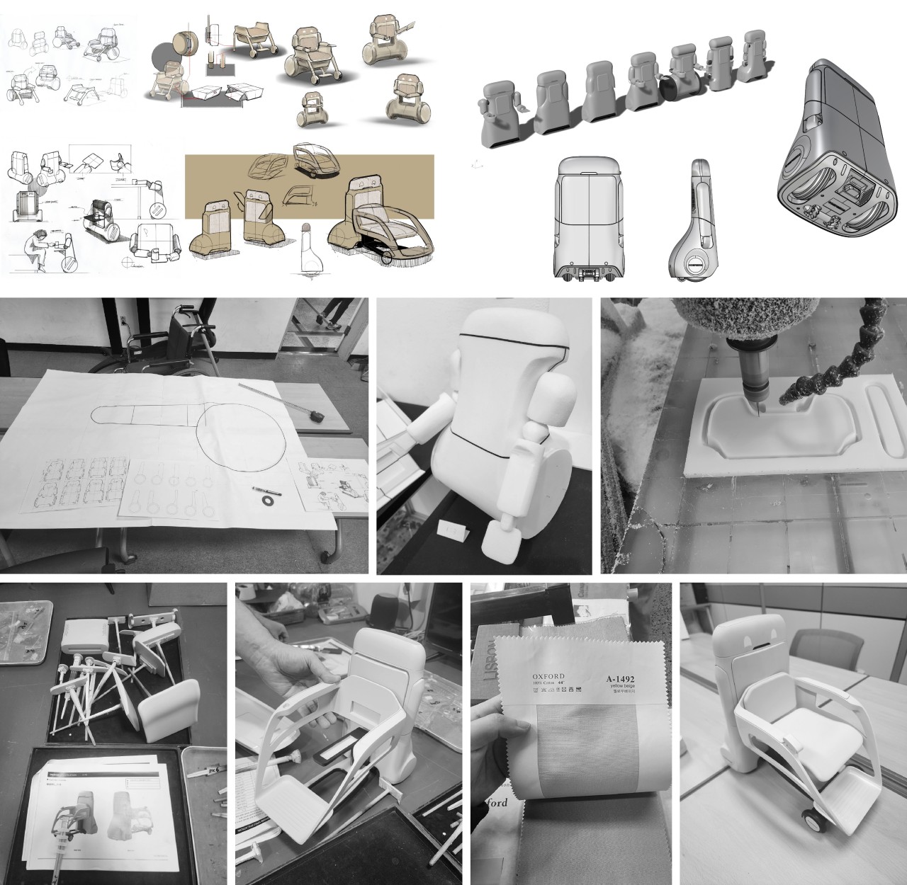
![]()
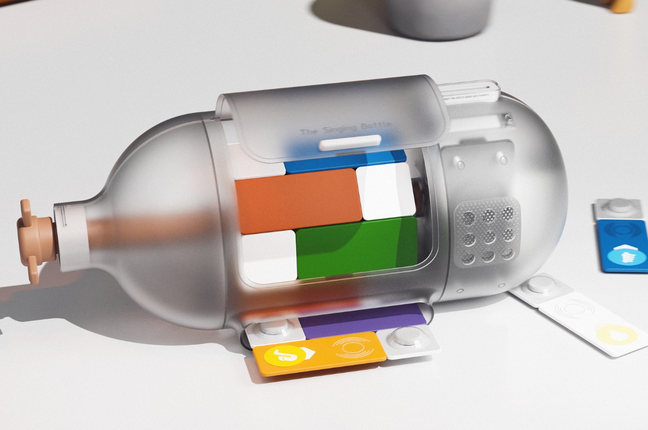
We have all these fancy hi-tech trackers today that monitor our health and our activities, ranging from simple fitness trackers to complex smartwatches. While these activities might be important on their own, they’re often made in some context like forming good habits. Unfortunately, these devices and their connected apps often simply log physical activities and states and file them under the category of healthy living. Trackers don’t take into account activities like reading a book, drinking water regularly, and things that a smartwatch can’t really monitor. That’s what this tracker design concept is trying to address, and it takes its inspiration from one of the most common things we attach to other objects: the classic paper clip.
Designer: Andrea Mangone
![]()
![]()
![]()
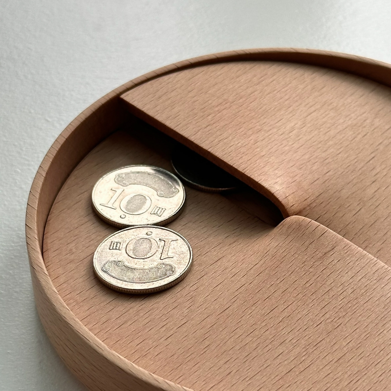
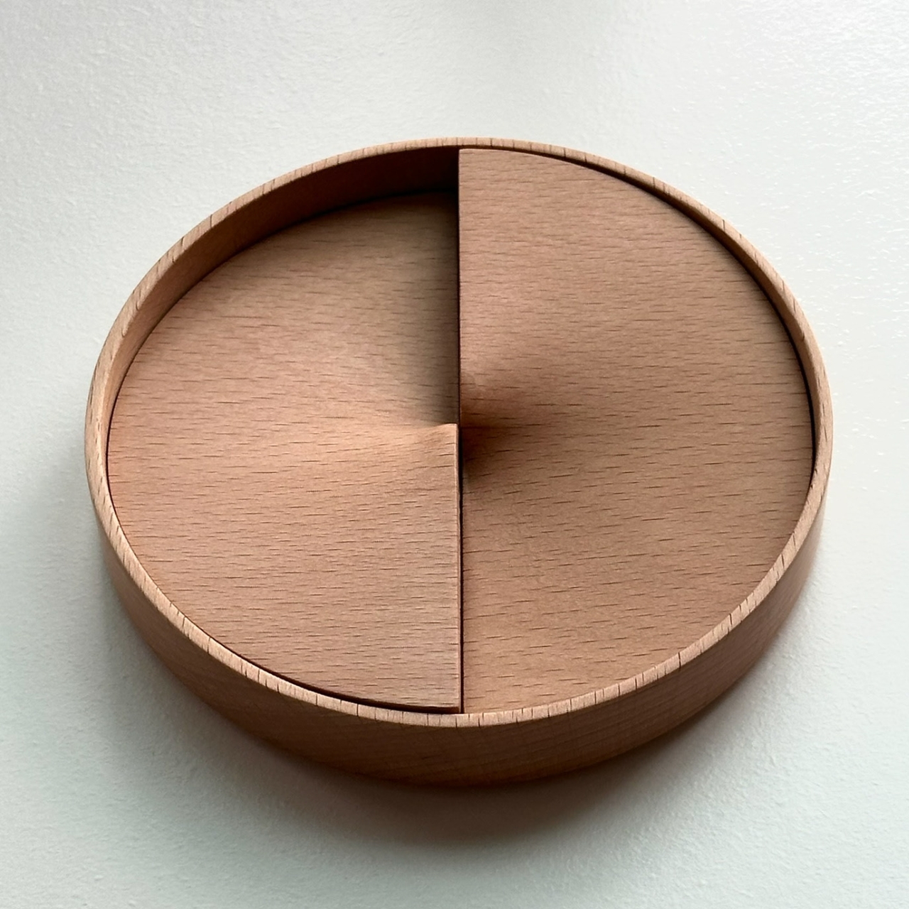
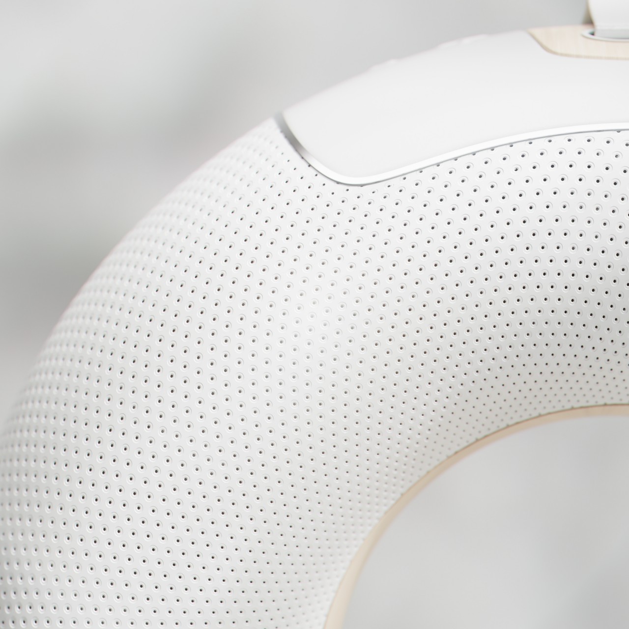
Although it does have “paper” on its name, we often see a paper clip attached to other objects, even those thick enough to bend the metal clip. The tool serves not only to put two things together but, more often than not, as a reminder to do something at a later time. Likewise, this activity tracker that takes the form of a large paper clip serves as a reminder to do the activity related to the object they’re attached to, and it actually tracks whether you did that or not automatically.
![]()
![]()
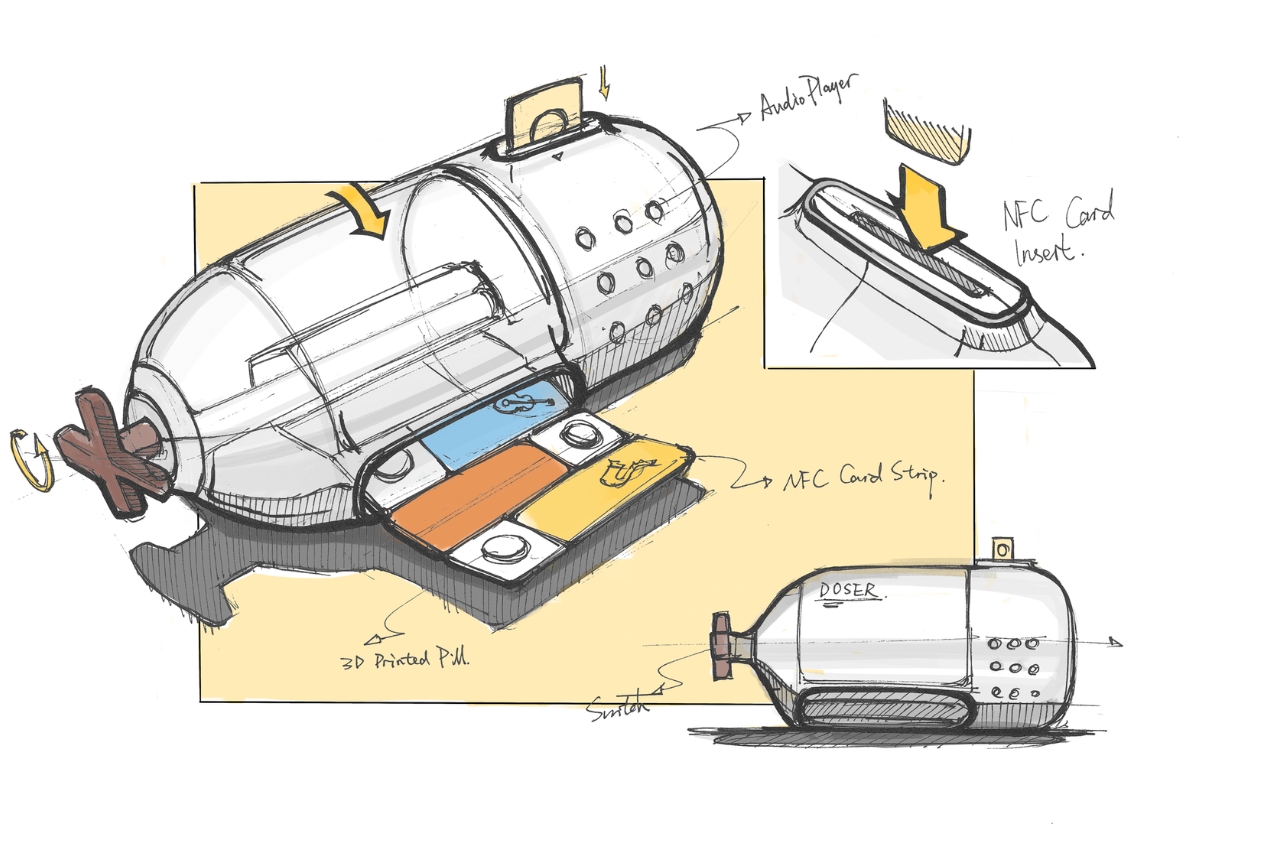
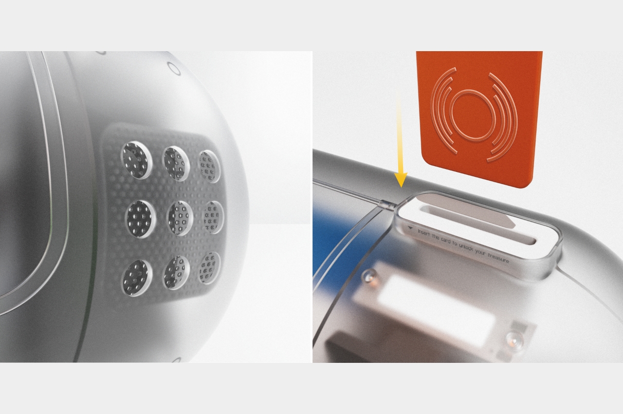
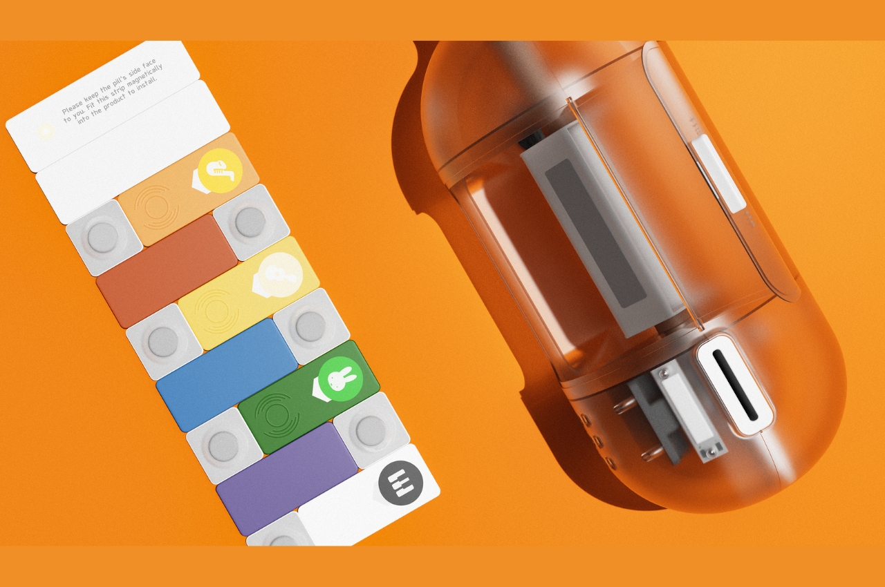
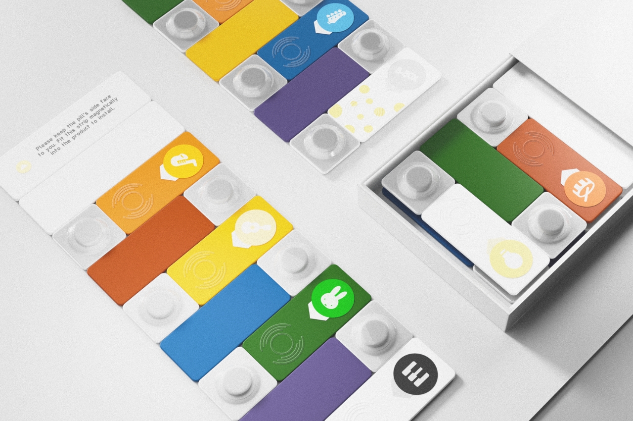
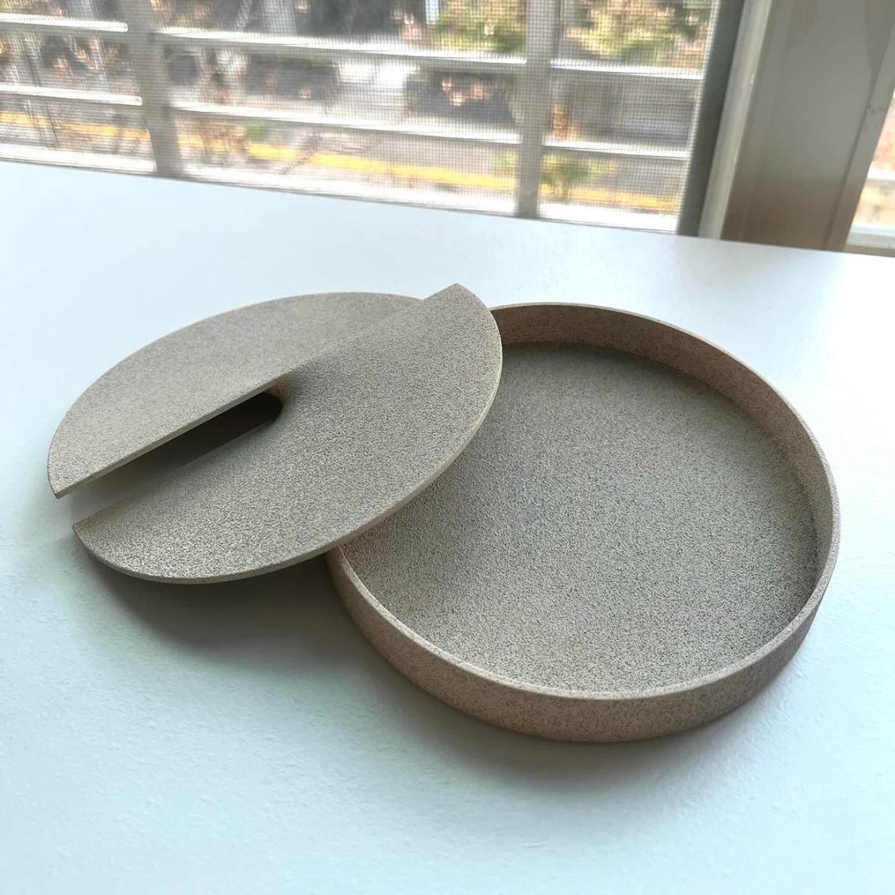
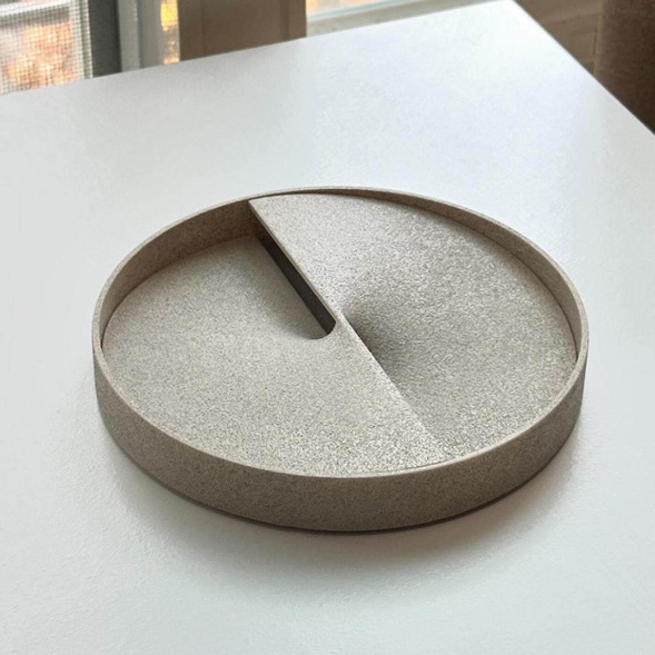
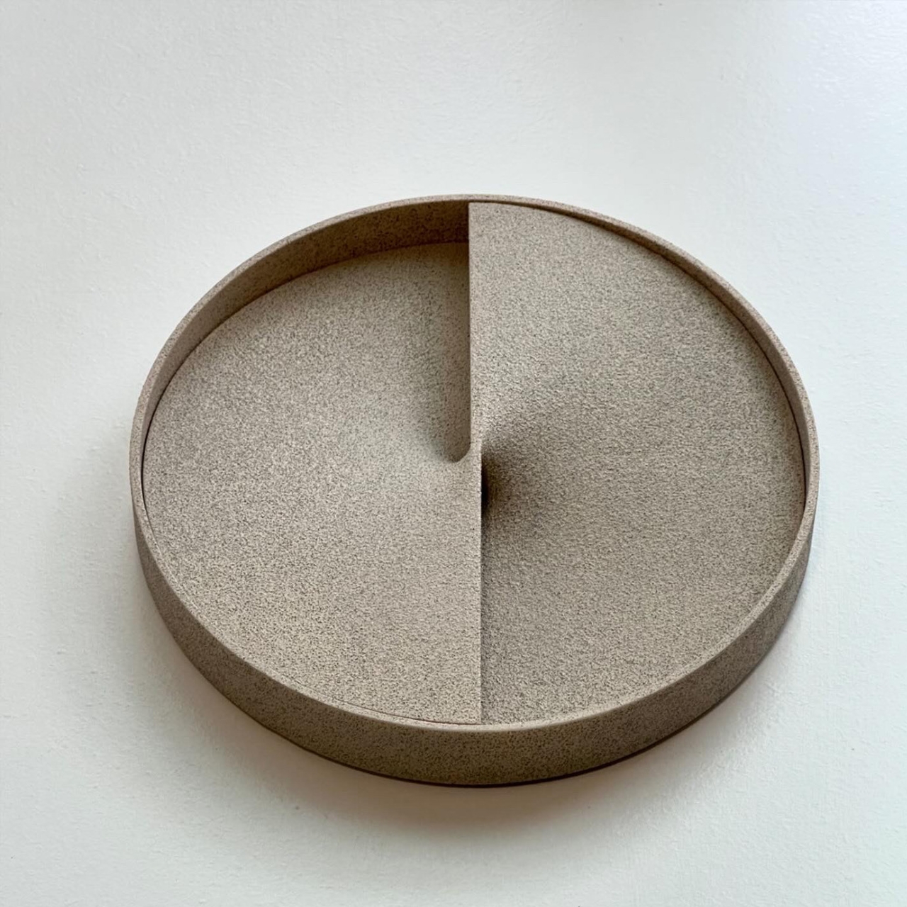
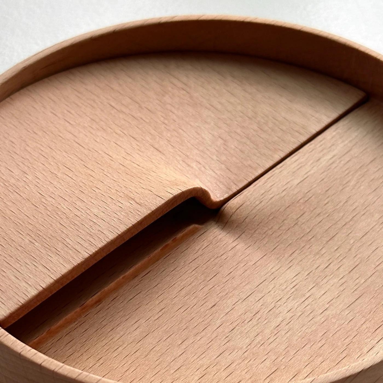
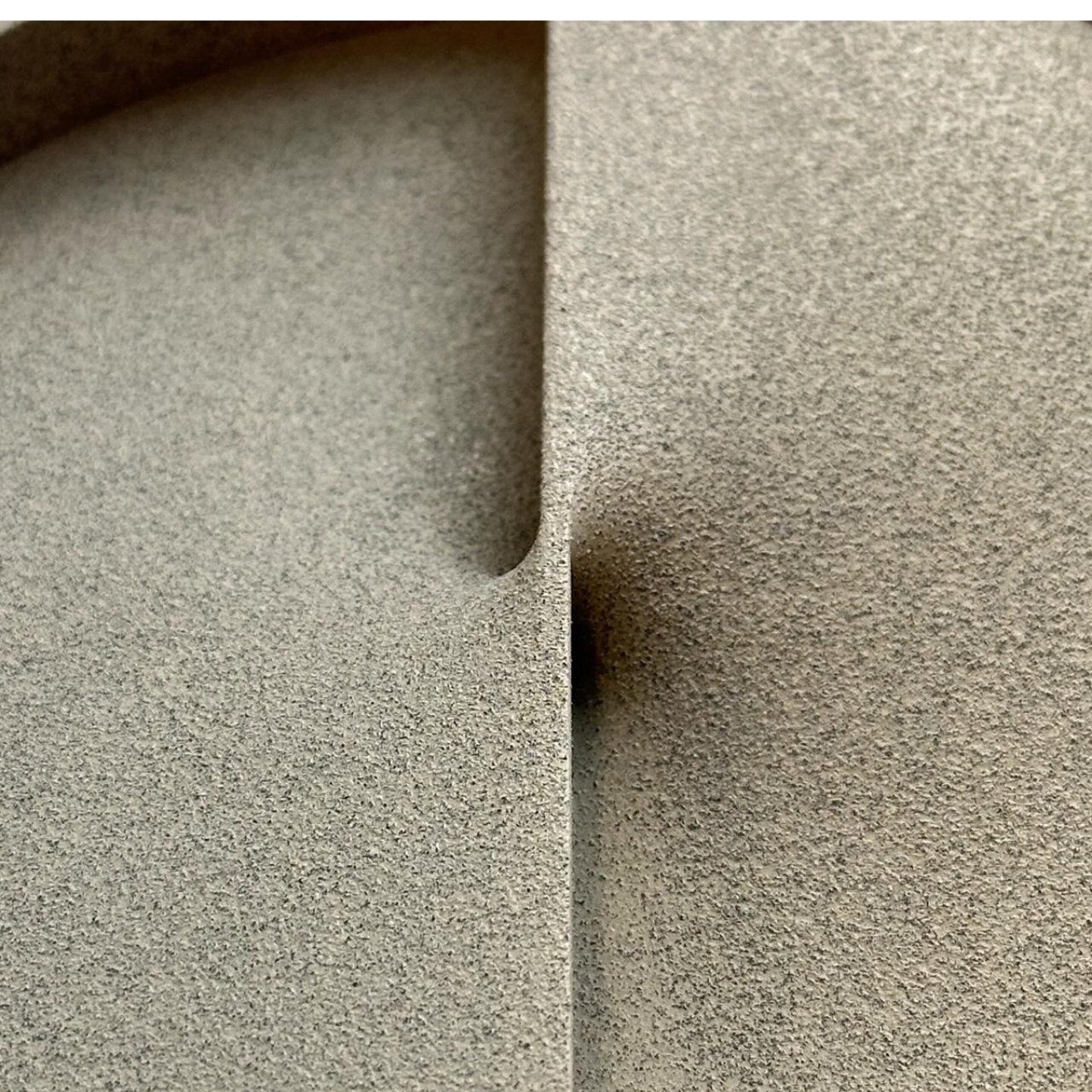
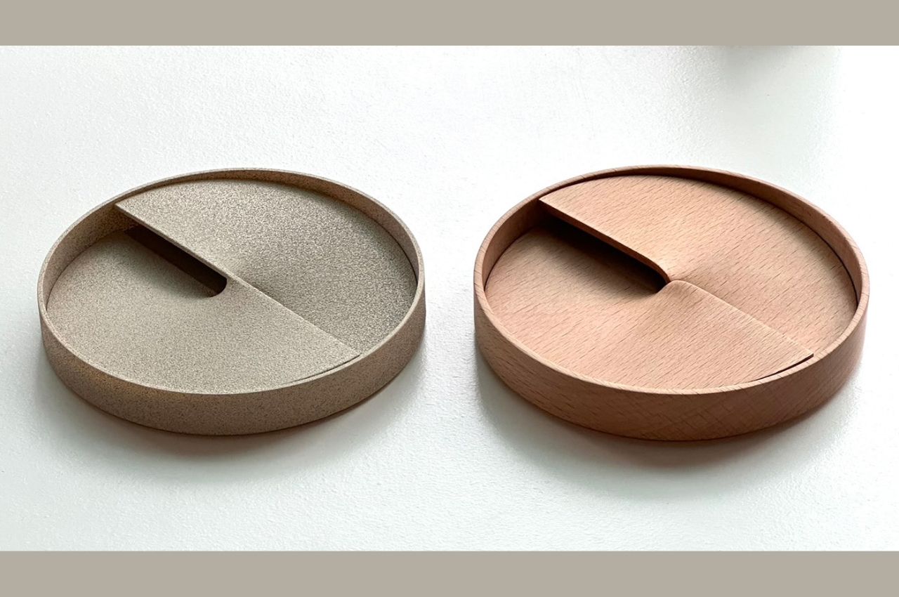
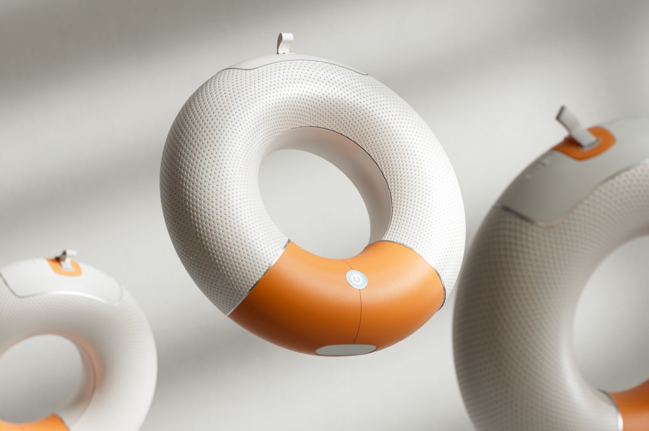
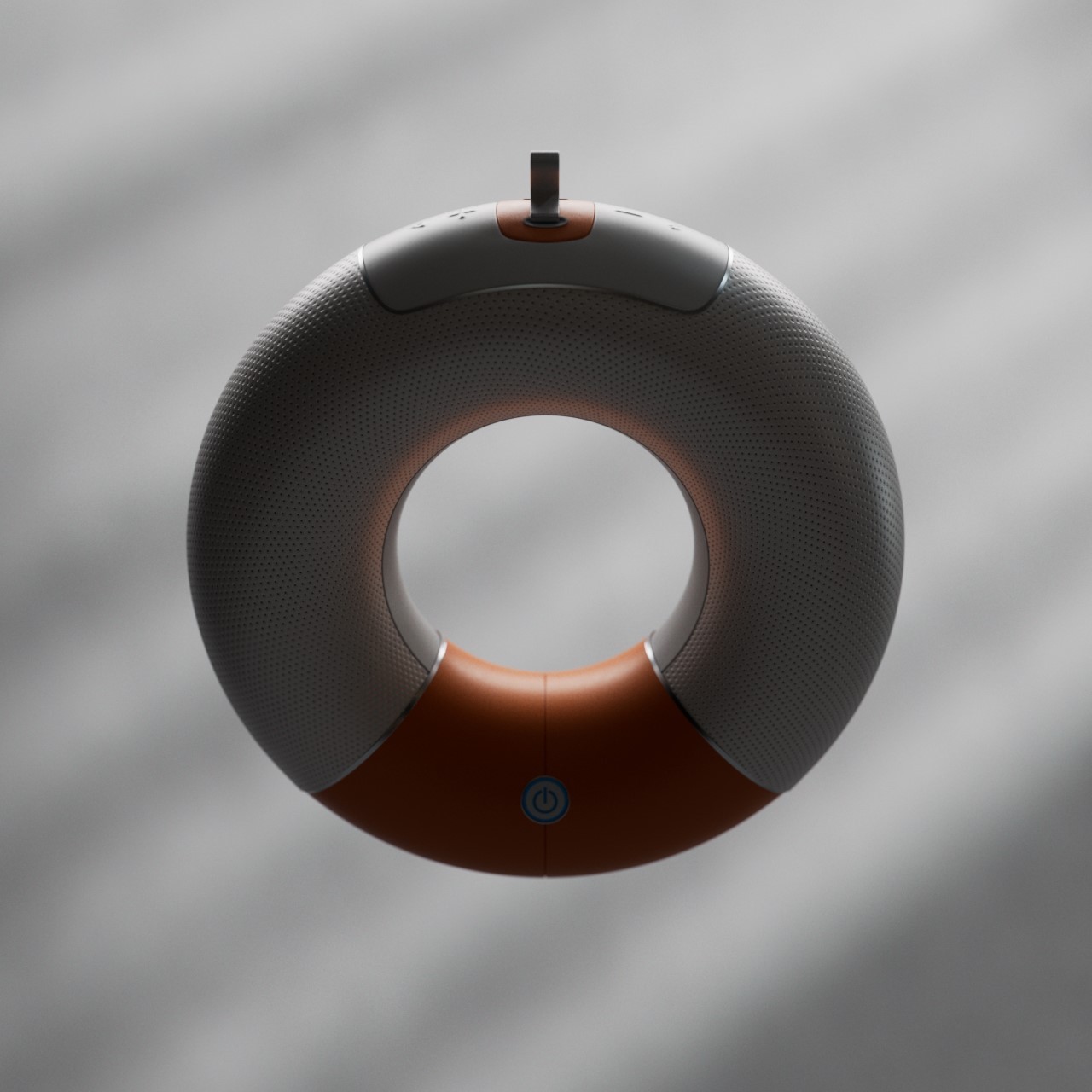
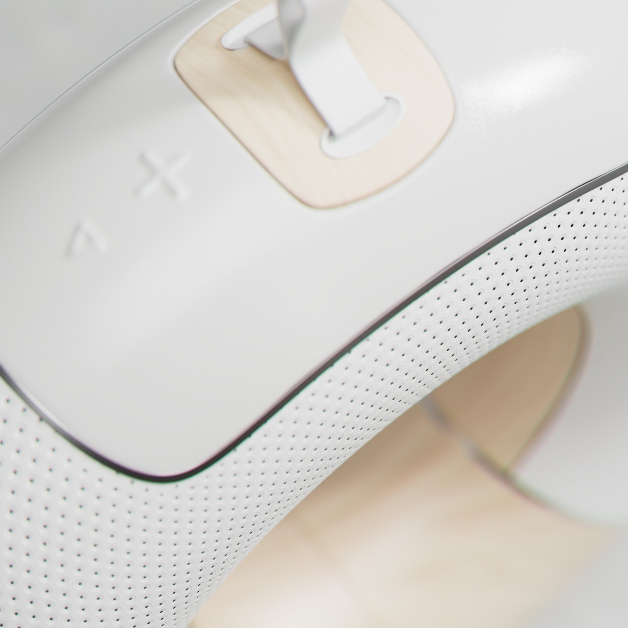
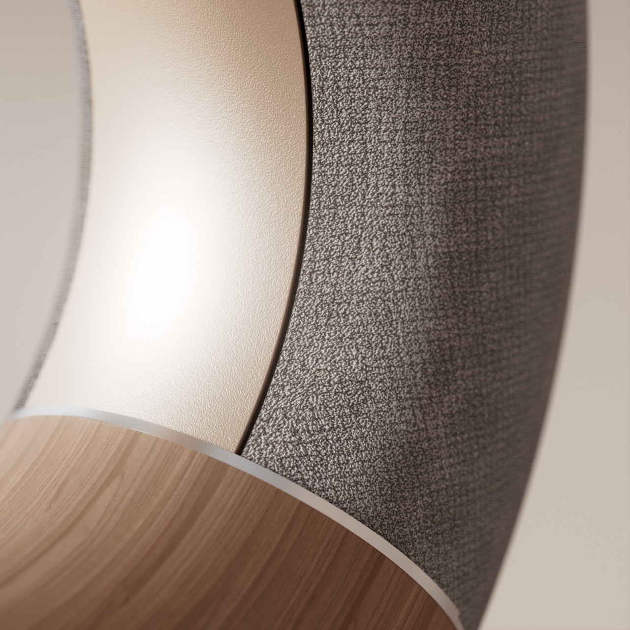
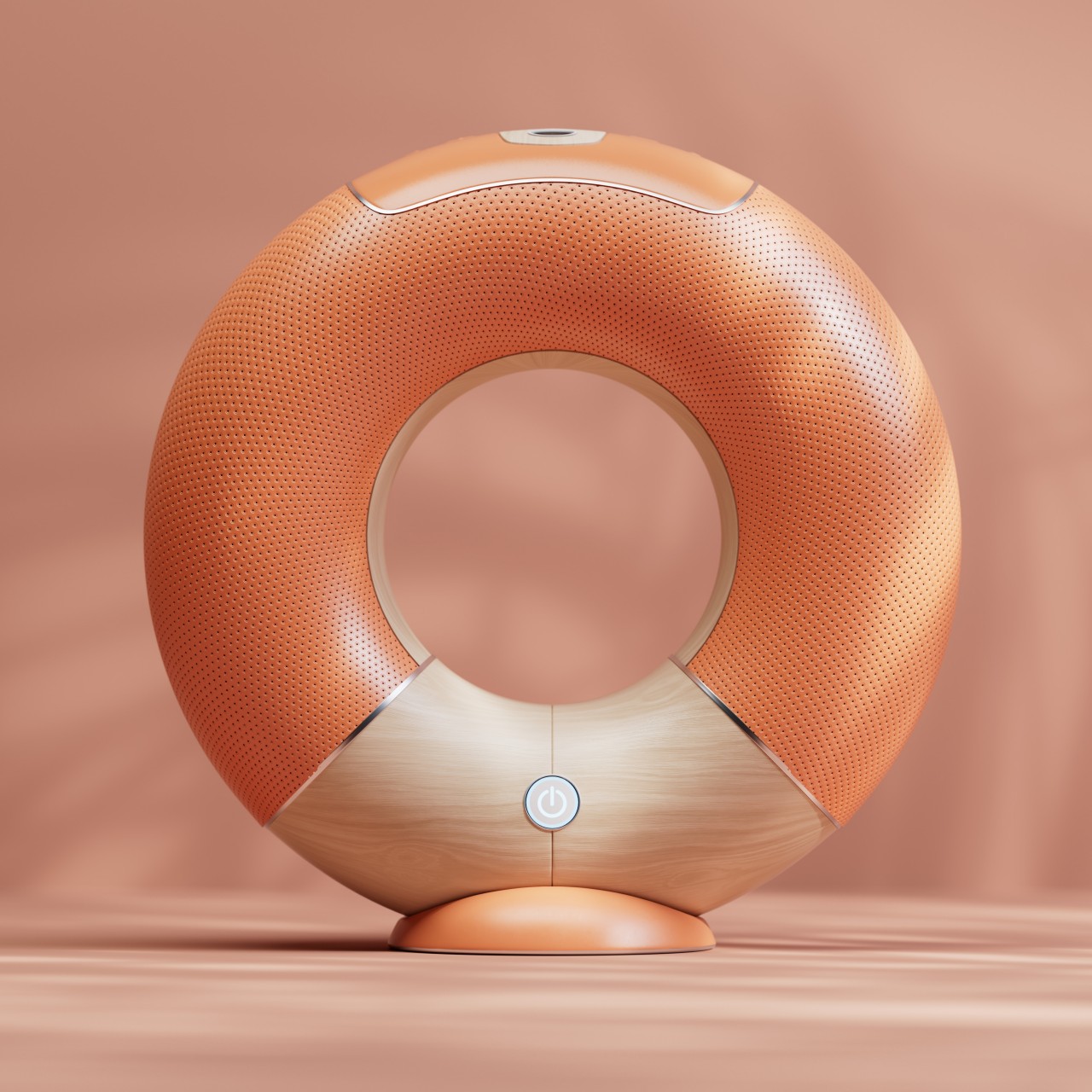
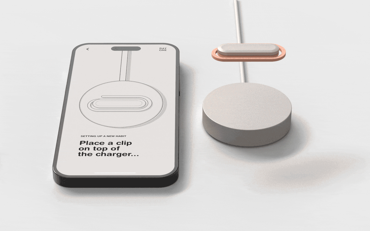
Named after a popular daily journaling app, the DAY ONE tracker combines the functionality of physical activity trackers with the behavior-forming features of habit-tracking apps in a simple yet pleasing design. In essence, you set one such clip-like tracker on a base accessory that’s connected to a smartphone, assign that tracker to a particular habit you want to build, and then attach it to the physical object associated with the habit, like running shoes, a book, or a water bottle. Whenever you pick up and use one of these items, their activity will be detected and registered on the app, sort of like checking a box to indicate that you’ve done that habit for the day.


![]()
![]()
The trick to ONE DAY is to clip it to objects that you use for that habit. This is where the paper clip design comes in handy as it allows the tracker to be attached to almost anything, regardless of the thickness. If it’s thin like a paper or a page of a book, you can simply slip it in like a regular paper clip. For something thicker like a tablet or a yoga mat, you use its longer side to attach to the object’s edge. Or you can simply hook it to a carabiner or loop, though that seems to also risk having it move around and drop accidentally.
![]()
![]()
![]()
DAY ONE is an interesting idea for giving more relevant contexts to activity trackers, making them relevant beyond exercise and physical activities. It still requires the person to exercise some willpower to actually put those into action, but the clips at least serve as a very visible reminder of what they need to pick up to develop the habit. That said, the paper clip design is a bit too bulky for something that might need to squeeze into tight spaces, and it could end up getting dislodged and lost somewhere along the way.
![]()
![]()
The post Paper clip-shaped device concept helps develop habits by tracking activities first appeared on Yanko Design.