This Building Is Designed to Look Like a Molecule Exploding at 100x Scale

Most cutting-edge science happens in anonymous lab buildings that could be anything from offices to data centers. Fields like protein folding, which quietly underpin medicine and biotech, rarely get a public face. Architecture could act as a billboard or sculpture for that work, making invisible processes more legible to everyone outside, but most research centers settle for glass boxes with vague names on the lobby wall.

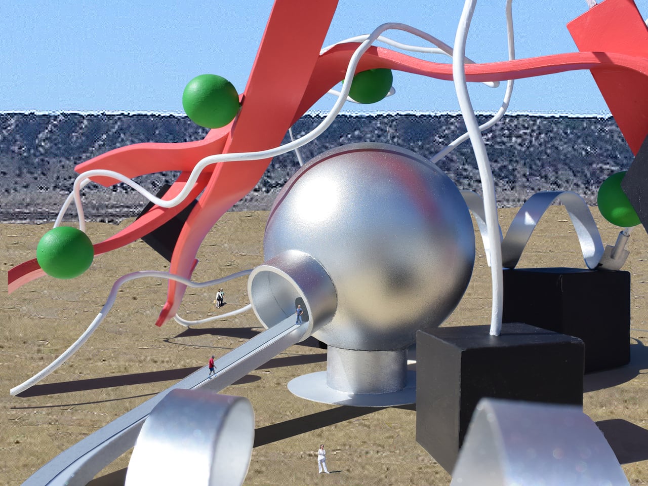
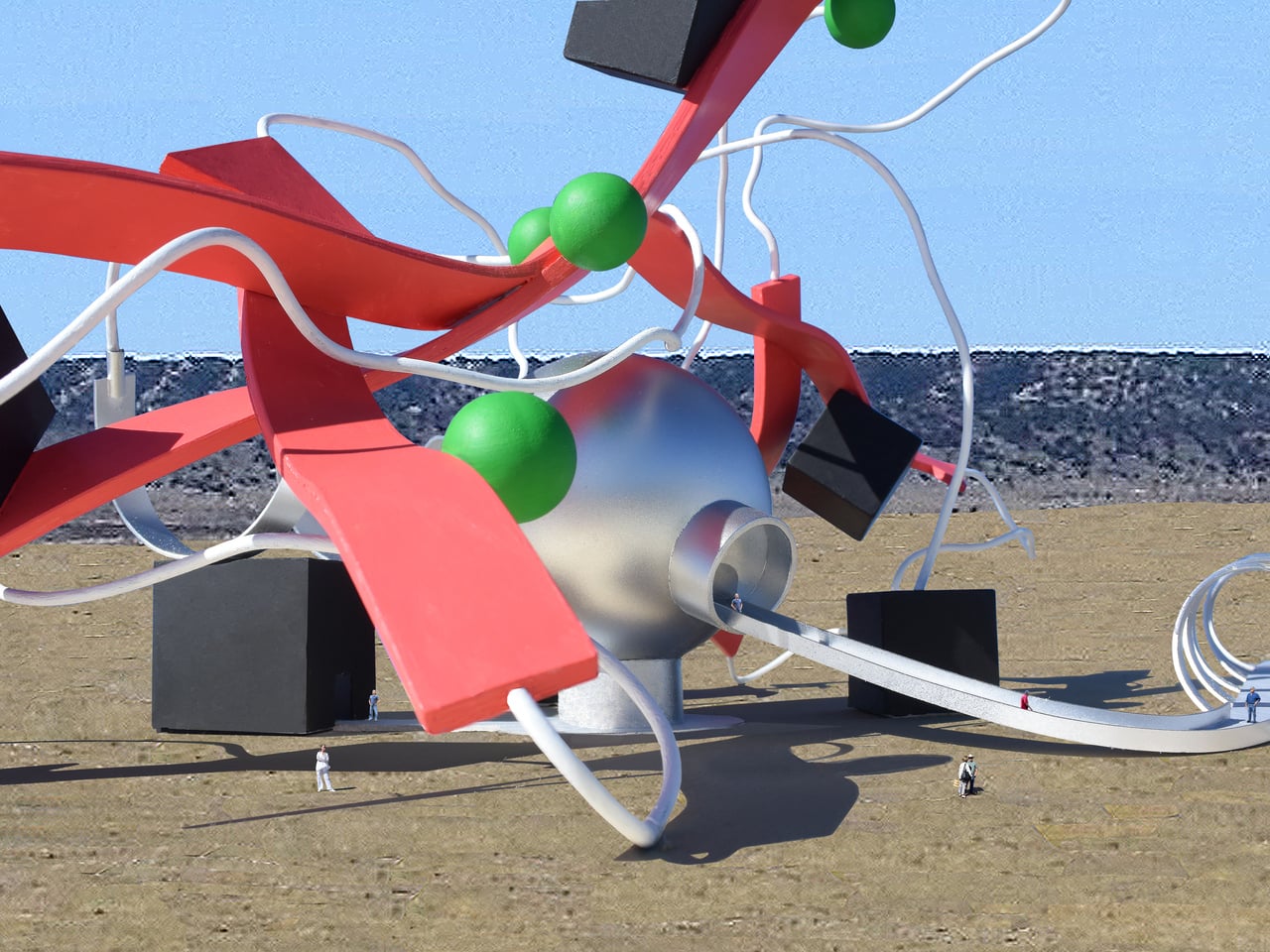
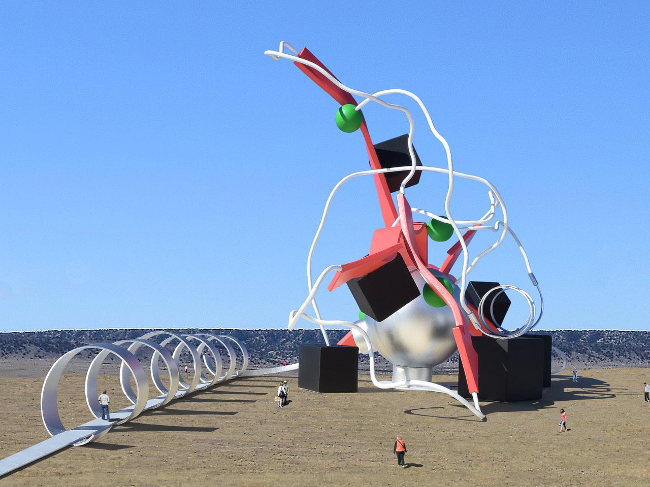
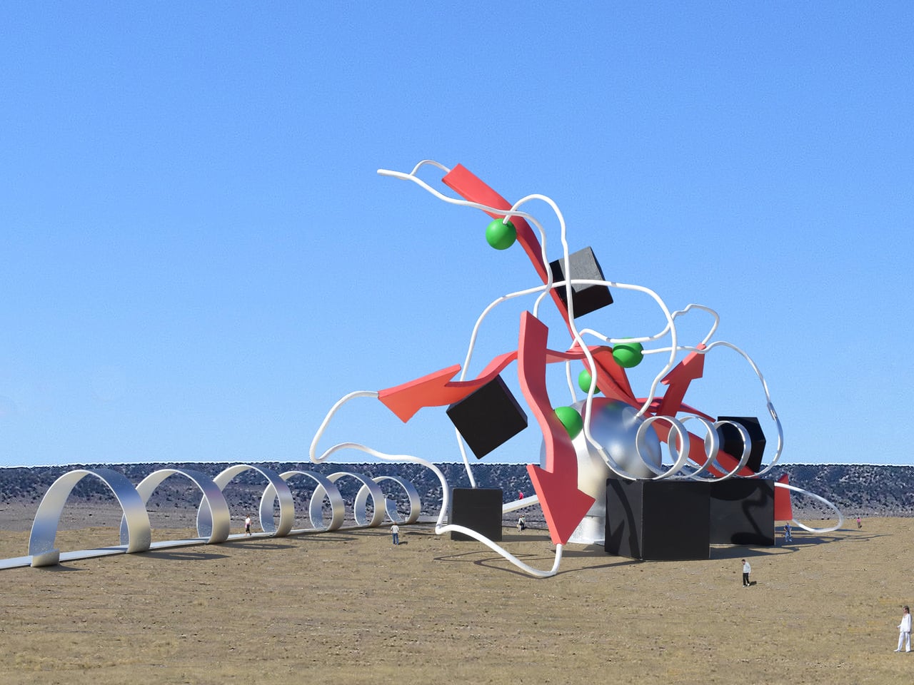
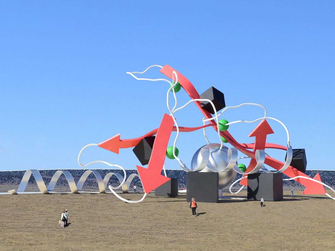
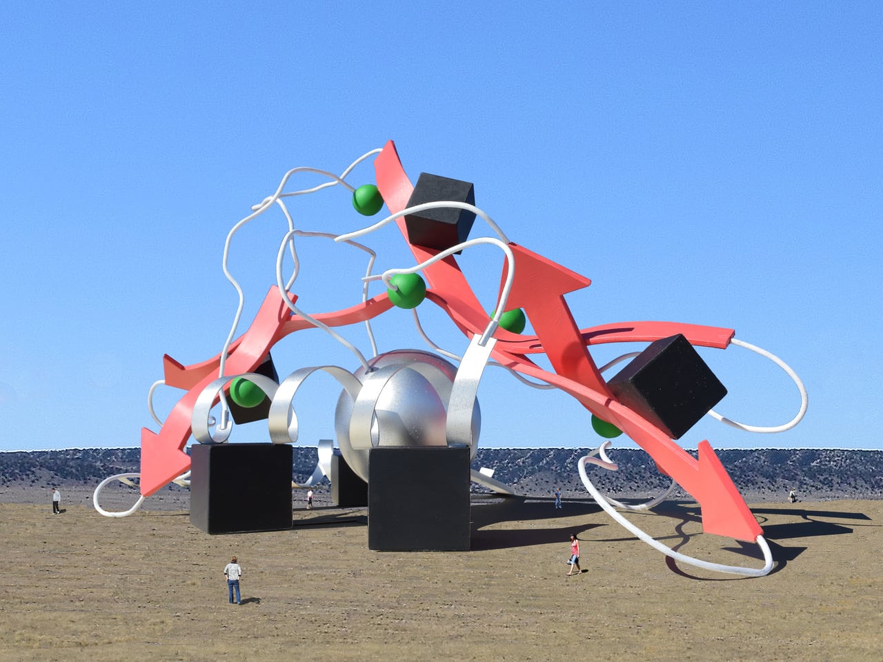
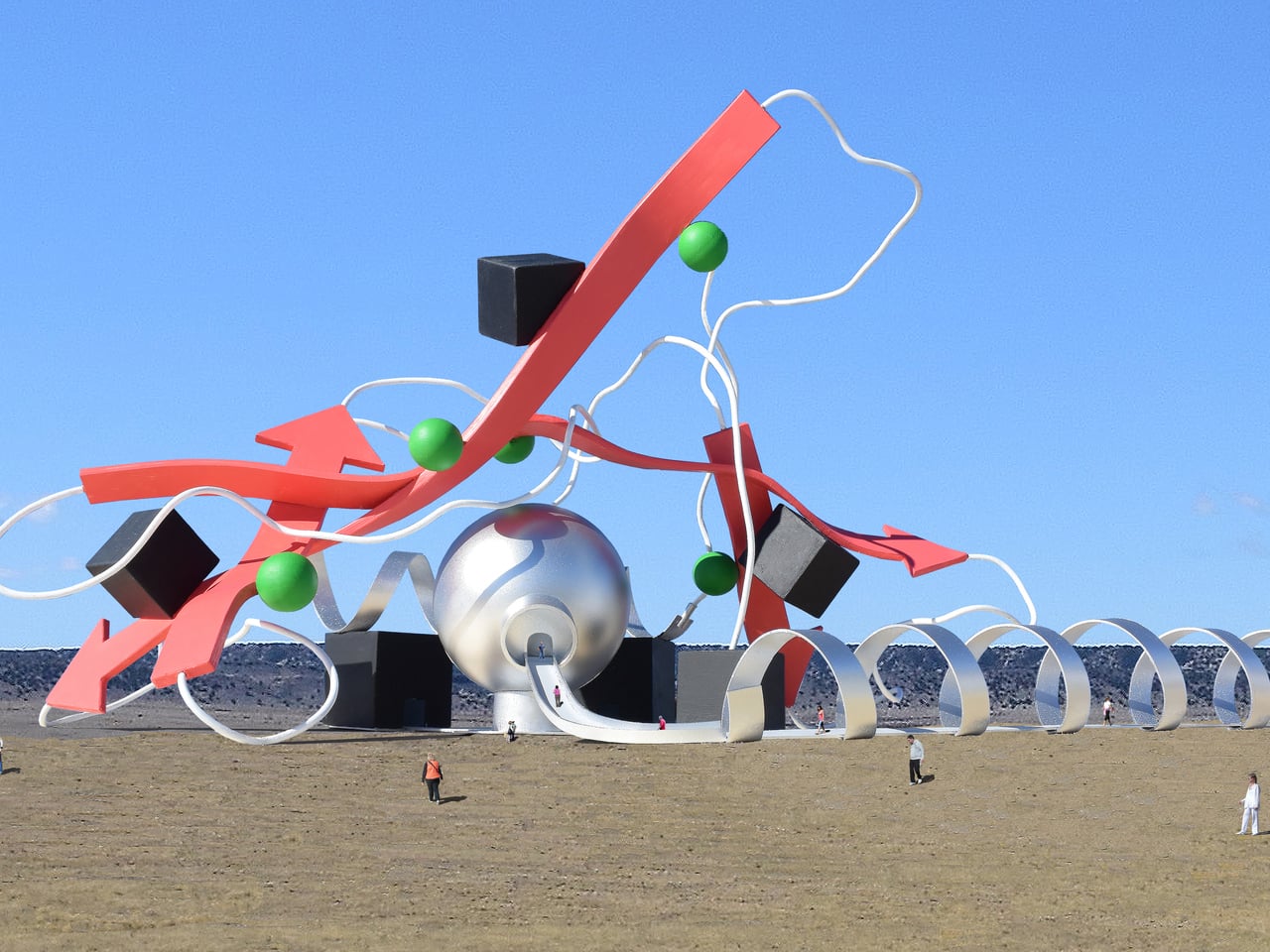
Michael Jantzen’s Folded Protein Molecule Research and Exhibition Center is part of his Fantasy Art, Architecture, Science series and proposes a facility where scientists researching protein folding could work and exhibit findings. The twist is that the entire complex is shaped like an exploded protein diagram, using the same coils, arrows, and rods that researchers use to visualize molecules. The building becomes its own subject matter, scaled up so you can walk through it.

Designer: Michael Jantzen

Protein folding is how a linear chain of amino acids twists into a three-dimensional structure that lets it function. Scientists represent these structures with bright symbols, coils for helices, arrows for sheets, bent rods for turns. Jantzen takes those flat symbols and imagines walking through them at architectural scale, turning abstract science into something you approach, enter, and move around inside instead of staring at on a screen.

The three black cubes house research spaces, and the large silver sphere forms the exhibition hall, but they sit entangled in bright red arrows, white coils, green spheres, and smaller cubes. The functional rooms are inside these solids while symbolic elements wrap around and pierce them, so the working building is literally knotted up in its own subject matter. You would approach across an open landscape and see a giant folded molecule rising from the ground.

The arrows and coils arch over the complex like a frozen moment in a folding process, creating a canopy you move under. A long ribbon-like path leads toward an opening at the sphere’s base, suggesting a main entrance that feels more like entering land art than a museum. Visitors experience protein folding as a spatial journey, wandering through loops and under arrows before reaching labs or galleries inside.

Portions of the black cubes and smaller cubes attached to arrows are clad in solar panels, helping to power the center. It ties a facility dedicated to molecular science to renewable energy in the landscape. The same surfaces that read as abstract protein domains also quietly collect sunlight, merging symbolism and function in one set of geometric volumes without needing separate infrastructure or signage.

This proposal blurs the line between research campus, sculpture park, and science museum. It is unlikely to be built exactly as shown, but the idea, that a research center could wear its subject matter on the outside and invite people to wander through a giant protein, is compelling. For a field as abstract and important as protein folding, architectural storytelling might be what pulls it out of the lab and into public imagination.

The post This Building Is Designed to Look Like a Molecule Exploding at 100x Scale first appeared on Yanko Design.

Dubai Gets World’s First Mercedes-Benz Branded City With 13,000 Apartments

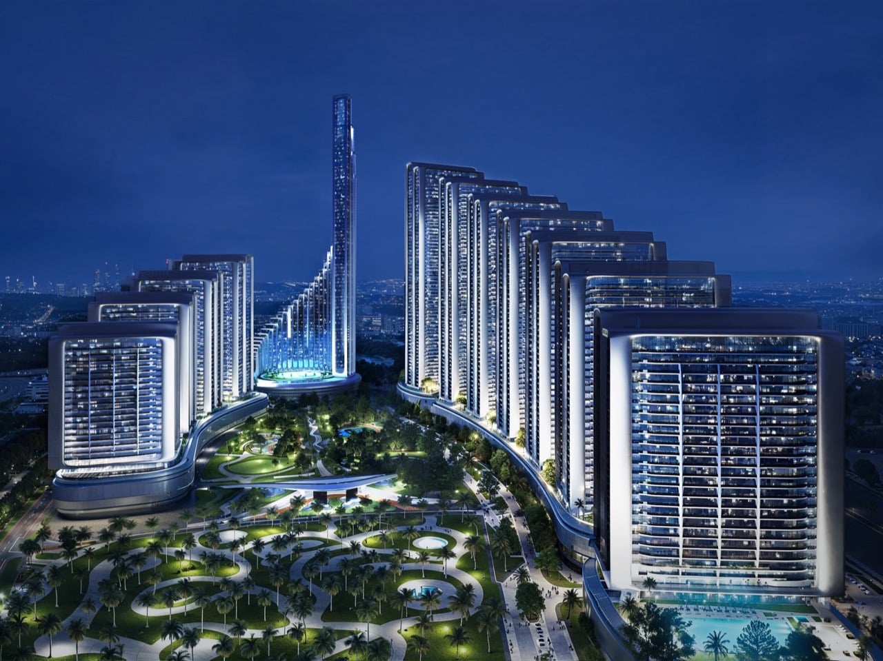
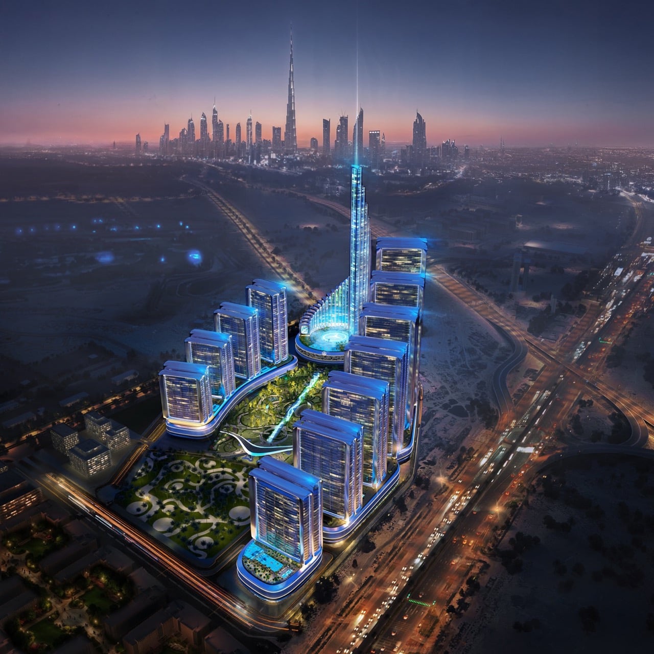
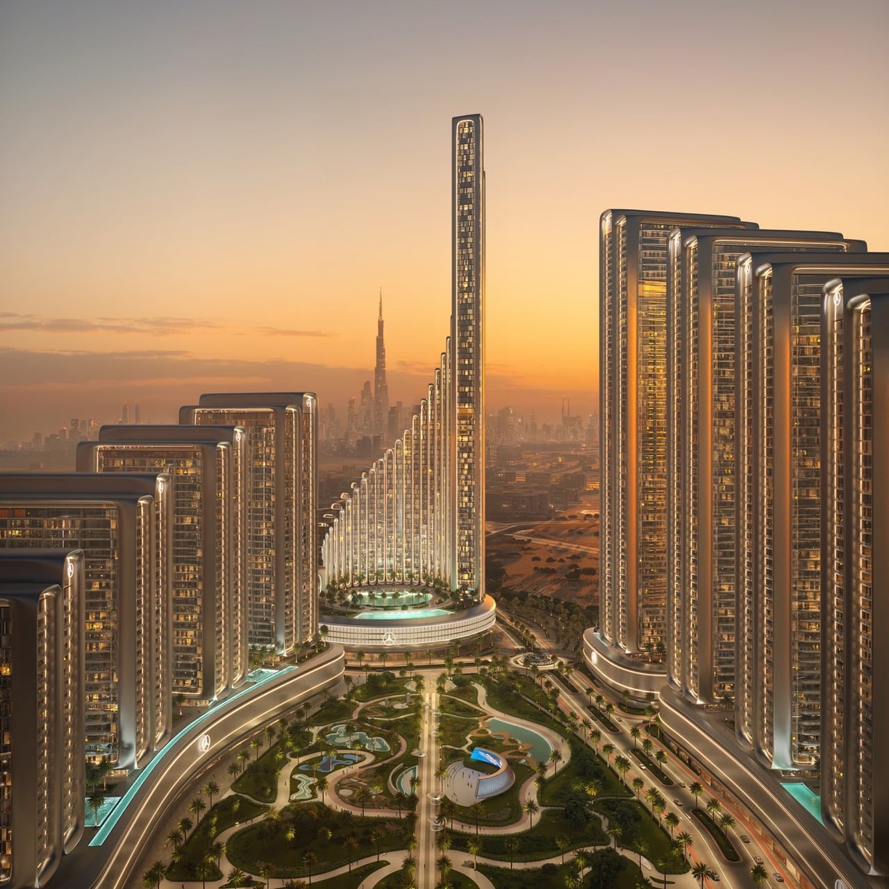
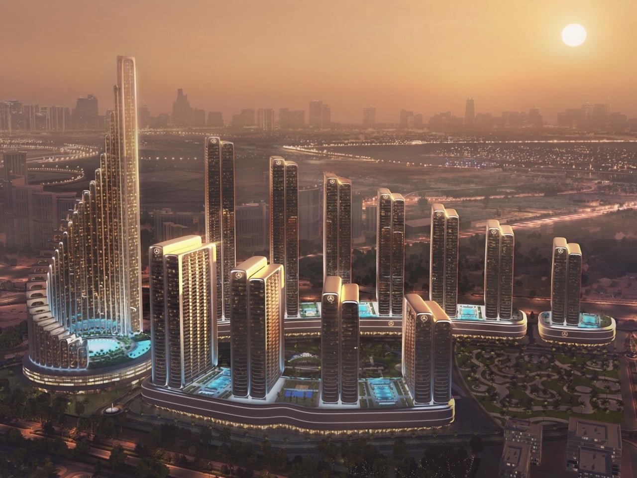
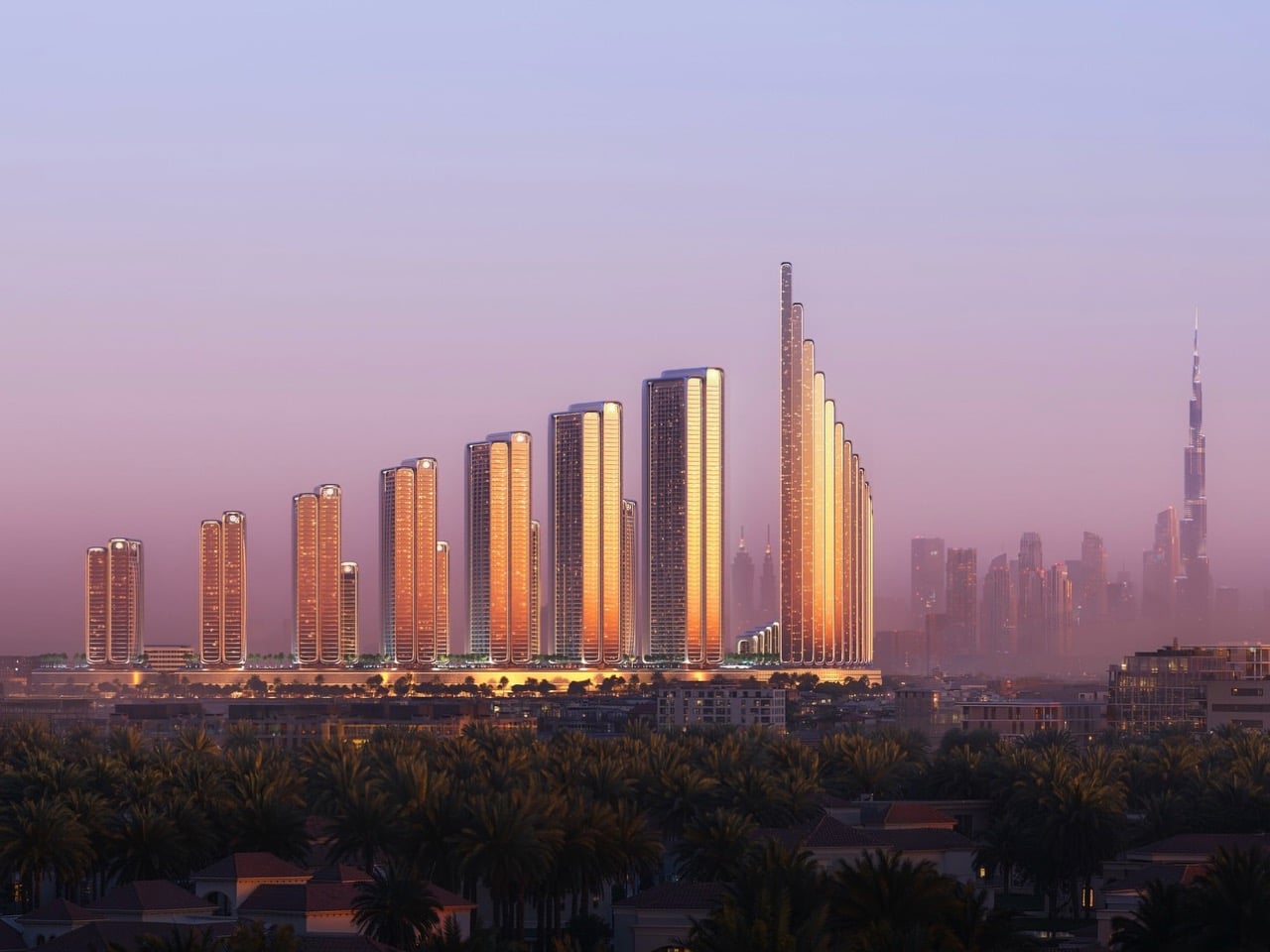
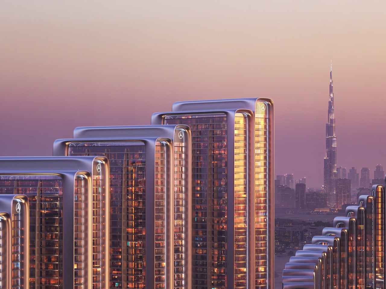
Luxury car brands moving into real estate isn’t exactly new anymore. Porsche kicked things off with its Design Tower Miami in 2017, followed by Aston Martin’s 66-story sail-shaped tower that opened in Miami in May 2024, and Bentley Residences expected to complete in 2026. Bugatti and Pagani both have projects underway in Miami and Dubai. But Mercedes-Benz and Binghatti just took it to another level with their newly launched Binghatti City project in Dubai. Instead of stopping at a single branded tower like most automotive companies do, they’re building an entire 10-million-square-foot district with 12 residential skyscrapers containing 13,000 apartments. The $8.2 billion development centers around a 341-meter tower called Vision Iconic, surrounded by 11 progressively shorter towers creating this cascading skyline in the Meydan area. This is their second collaboration after a 65-floor Mercedes tower in Downtown Dubai that’s nearly complete, proving the concept works well enough to scale up dramatically.

The architecture pulls heavily from Mercedes design DNA, incorporating elements like their signature grille pattern into horizontal podiums, plus generous use of chrome and silver accents throughout. Each tower carries the name of a Mercedes concept vehicle, and apartments feature the brand’s Sensual Purity design philosophy with black and silver palettes accented by wood and leather. They’re not just building housing though. The masterplan includes cultural districts, retail spaces, parks, mobility hubs, sports facilities and dining venues, essentially creating a walkable branded ecosystem. Units start at $435,600 for studios and top out around $5 million for three-bedrooms. Timeline calls for completion in three and a half years from the January 14, 2026 launch.

Designer: Binghatti for Mercedes-Benz

The luxe pricing structure here tells you everything about who Mercedes thinks will actually live in this thing. Studios at $435,600 might sound almost reasonable by Dubai standards until you remember that’s the entry point for literally the smallest unit available. One-bedroom units jump to $2.6 million, two-bedrooms hit $3 million, and three-bedrooms start at $5 million. They’re casting a wide net, sure, but even the “affordable” end of this spectrum requires the kind of disposable income that makes luxury car ownership look like a casual purchase decision. The real question is whether 13,000 apartments worth of wealthy people exist in Dubai’s orbit who specifically want to live in a Mercedes-branded environment. That’s a lot of units to fill, even in a city that treats superlatives like a competitive sport.

The design philosophy they keep mentioning, Sensual Purity, sounds like the kind of corporate branding speak that emerges from late-night brainstorming sessions, but it does translate into some specific material choices. Black and silver form the base palette because of course they do, you can’t have a Mercedes-branded space without channeling the aesthetic of a C-Class interior. The wood and leather accents are presumably there to soften all that chrome and convince people this is a home rather than an extremely expensive showroom. Each tower named after a concept car like Vision One-Eleven or Vision AVTR adds another layer of brand immersion that either sounds incredibly cool or slightly dystopian depending on your tolerance for corporate aesthetics in residential spaces.

The amenities list reads like someone took every luxury condo marketing brochure from the past decade and merged them into one. E-sport lounges, ballrooms, event halls, sporting clubs, water pools, fitness facilities, picnic groves. They’re promising this self-contained urban ecosystem where you theoretically never need to leave, which raises interesting questions about what happens when your entire residential community is tied to a single brand identity. Do you start identifying as a Mercedes person in ways that go beyond car ownership? Does living in Mercedes-Benz Places Binghatti City become part of your personal brand? These are the kinds of questions that sound absurd until you remember people absolutely do this with Apple products and Patagonia vests.

Binghatti’s track record with branded developments gives this project more credibility than if some random developer tried pulling it off. They’re simultaneously working on Bugatti residences and have that Jacob & Co collaboration, so they’ve figured out the formula for translating automotive brand language into architectural form. The three-and-a-half-year timeline feels optimistic but not wildly unrealistic for Dubai’s construction pace. Whether the market can actually absorb 13,000 Mercedes-branded units in Meydan while their first tower in Downtown Dubai is still finding buyers remains the real test of whether this brand extension strategy works at city scale or if they’ve dramatically overestimated the overlap between car enthusiasts and people who want their entire living environment wrapped in automotive branding.


The post Dubai Gets World’s First Mercedes-Benz Branded City With 13,000 Apartments first appeared on Yanko Design.

5 Interior Design Trends That Just Made Minimalism Obsolete in 2026

Architects today see the home as more than just a place to live. It is now understood as a space that affects how people think, feel, and live each day. By 2026, the field has clearly moved away from cold, uniform minimalism. Instead, design choices such as color, shape, and proportion are made with clear intent, helping to create spaces that support everyday life.

Many leading firms now describe the human-centered home as a biophilic cocoon. This means using honest materials along with natural light, balanced proportions, and thoughtful forms. Let’s decode how the goal is to create homes that do not just look well-designed but feel comfortable and meaningful, supporting emotional well-being rather than focusing only on appearance.

1. Bold Color Authority

In 2026, color is no longer decorative; it is treated as a structural design tool. Designers are increasingly using deep, confident shades such as rich pinks and earthy ochres to give spaces character and visual weight. These strong palettes help anchor interiors, making homes feel intentional, expressive, and memorable rather than neutral or generic.

Such colors also offer clear psychological value. They create a sense of stability, warmth, and emotional comfort, adding long-term value to a space. When applied to key architectural elements—like columns, niches, or feature walls—bold colors guide movement and define zones within the home, bringing clarity and purpose to the overall spatial experience.
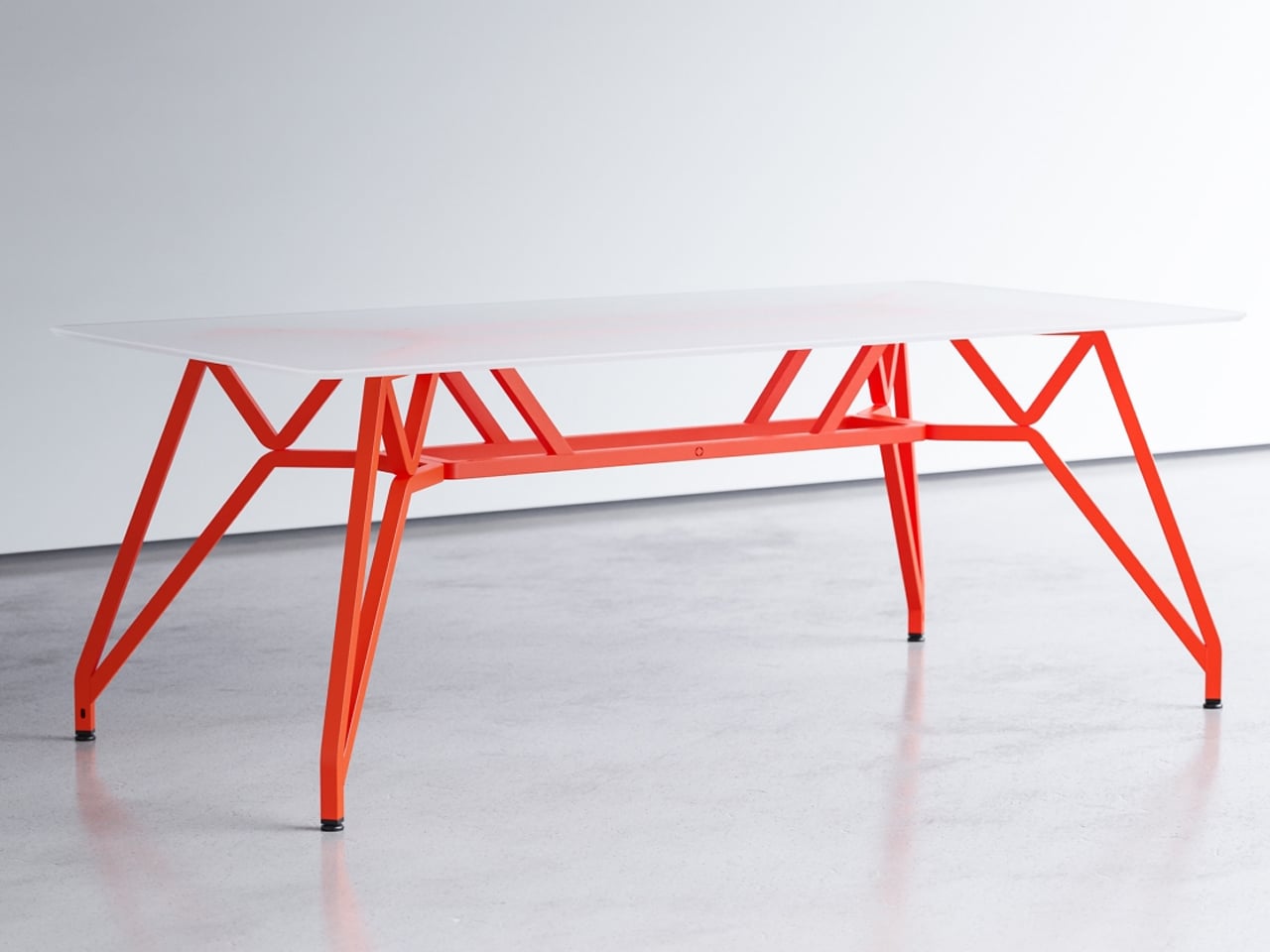
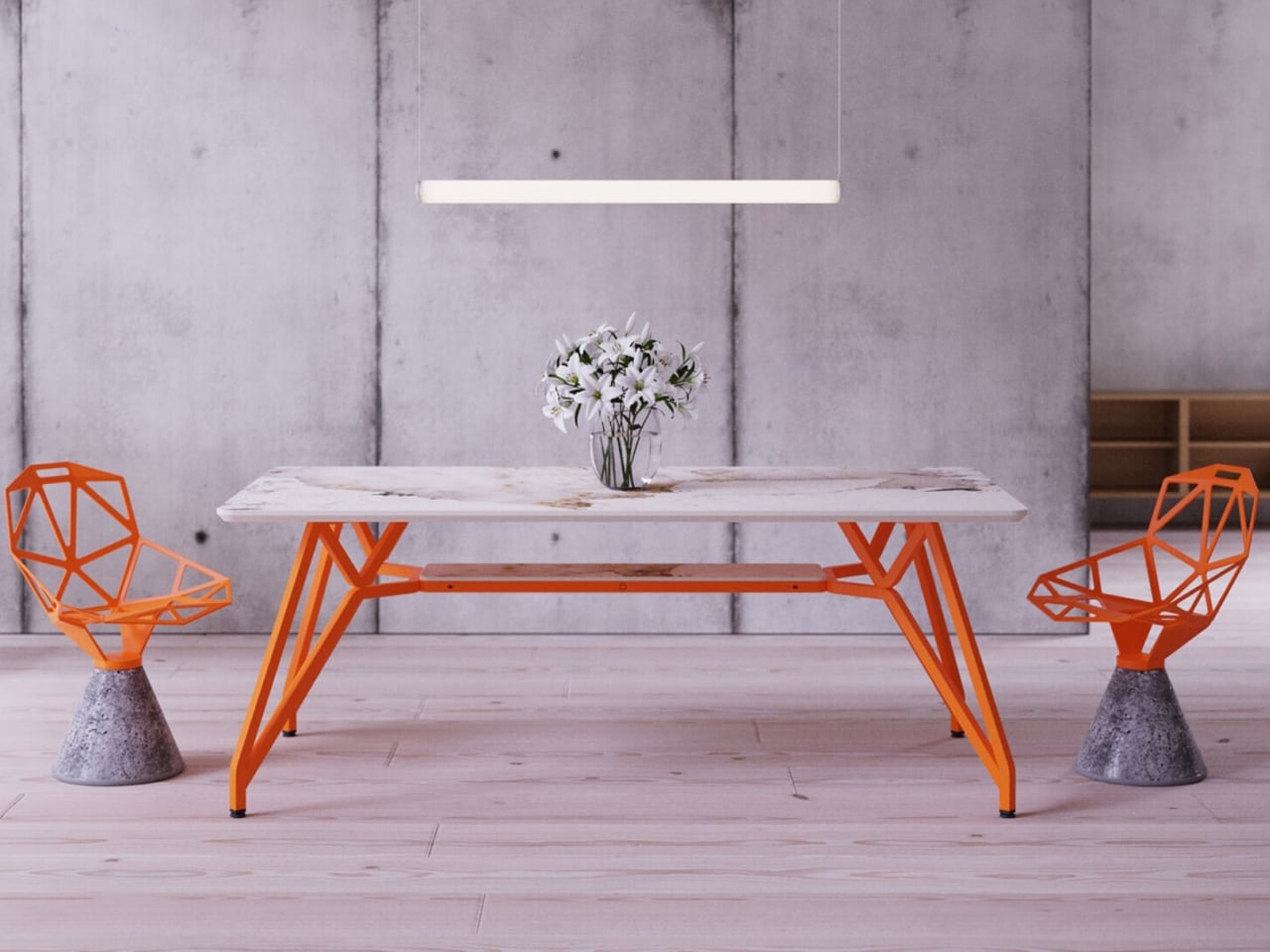
The Landr dining and conference table is engineered with a singular focus on strength, stability, and visual clarity. Designed to eliminate wobble, it offers a firm, unmoving surface suited for everyday use as well as more demanding tasks. Its modular construction is precise and robust, ensuring easy assembly without compromising structural integrity. The steel frame and intelligently engineered leg geometry distribute weight evenly, allowing the table to remain steady under pressure while maintaining a clean, confident presence in any setting.
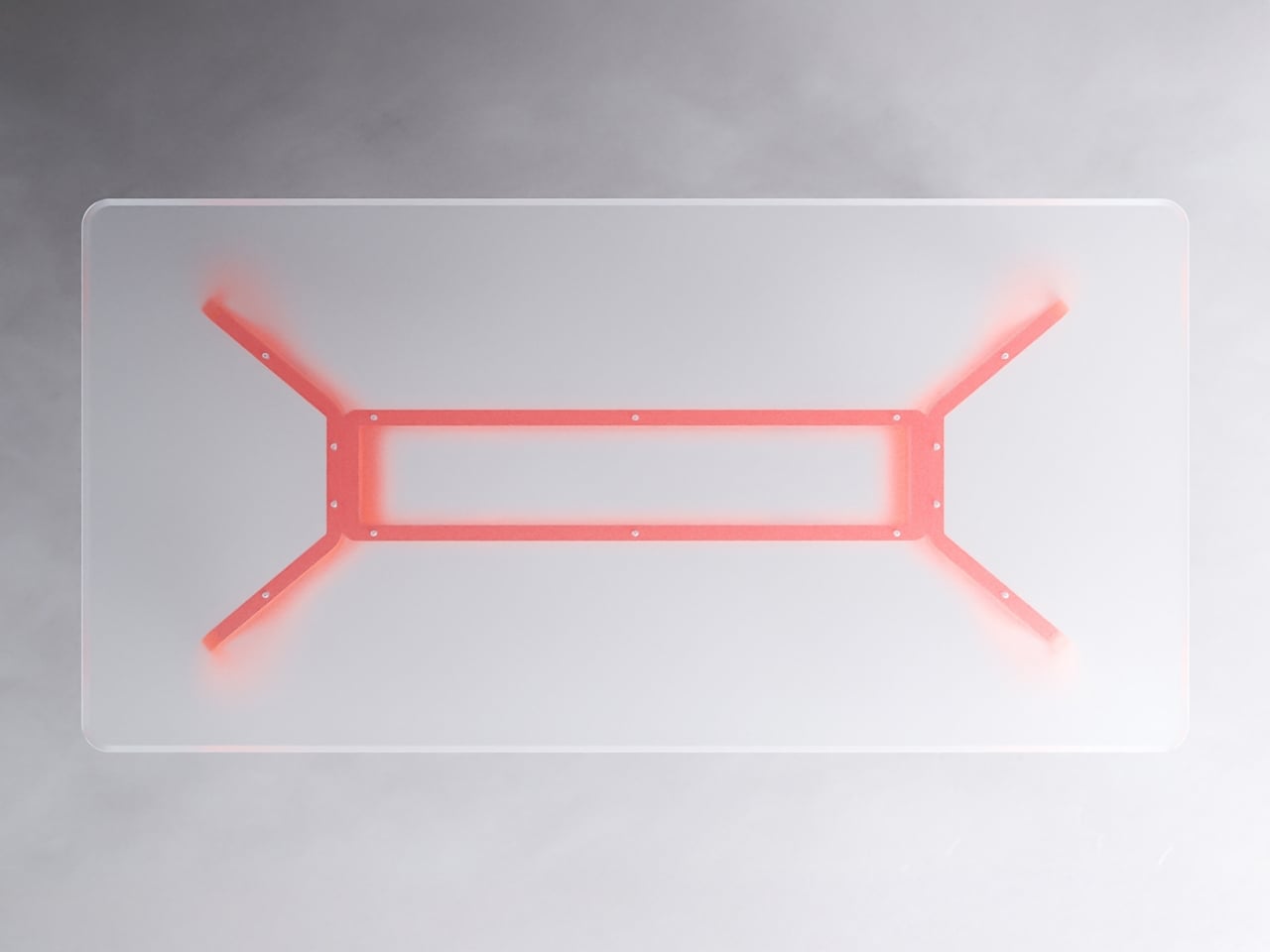
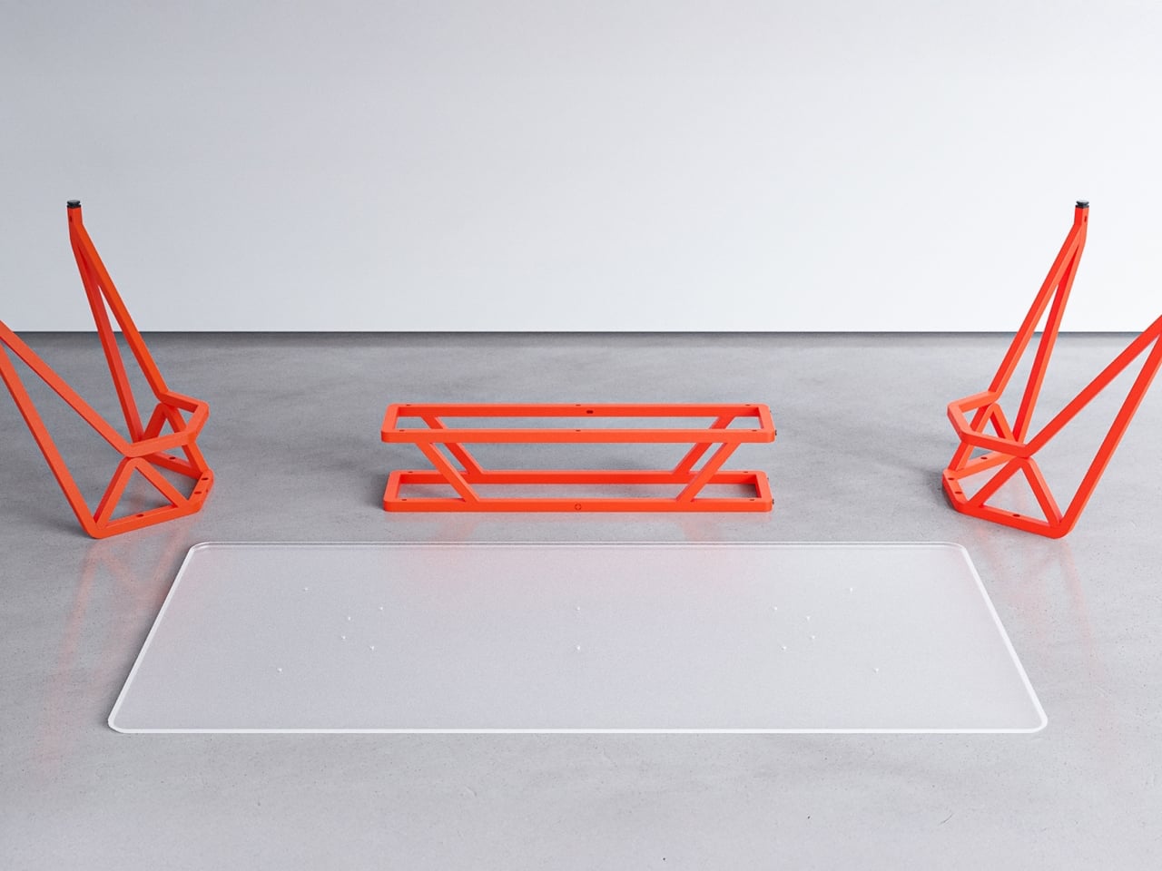
What sets Landr apart visually is its bold use of bright, contemporary color finishes applied through durable powder coating. These vivid tones enhance the table’s architectural form while adding energy and character to interiors that favor modern expression. Paired with tabletop options in ceramic, wood, or glass, the bright steel frame becomes a statement feature rather than a background element. Functional, expressive, and long-lasting, the Landr table balances performance with color-forward design.

2. Softened Minimal Geometry

Design has clearly shifted away from dramatic, exaggerated curves toward calm and disciplined forms. Instead of flamboyant sculptural shapes, architects now employ gentle arcs and controlled radii to soften the rigid edges of contemporary construction. Curved thresholds, joinery, and soffits introduce refinement while maintaining visual restraint.

At the center of this 2026 approach is improved spatial flow and comfort. Features such as double-height glazing framed by softly curved soffits guide the eye smoothly through the interior. This reduces the visual tension of strict rectilinear layouts, enhances the movement of diffused light, and creates spaces that feel balanced, composed, and naturally welcoming.
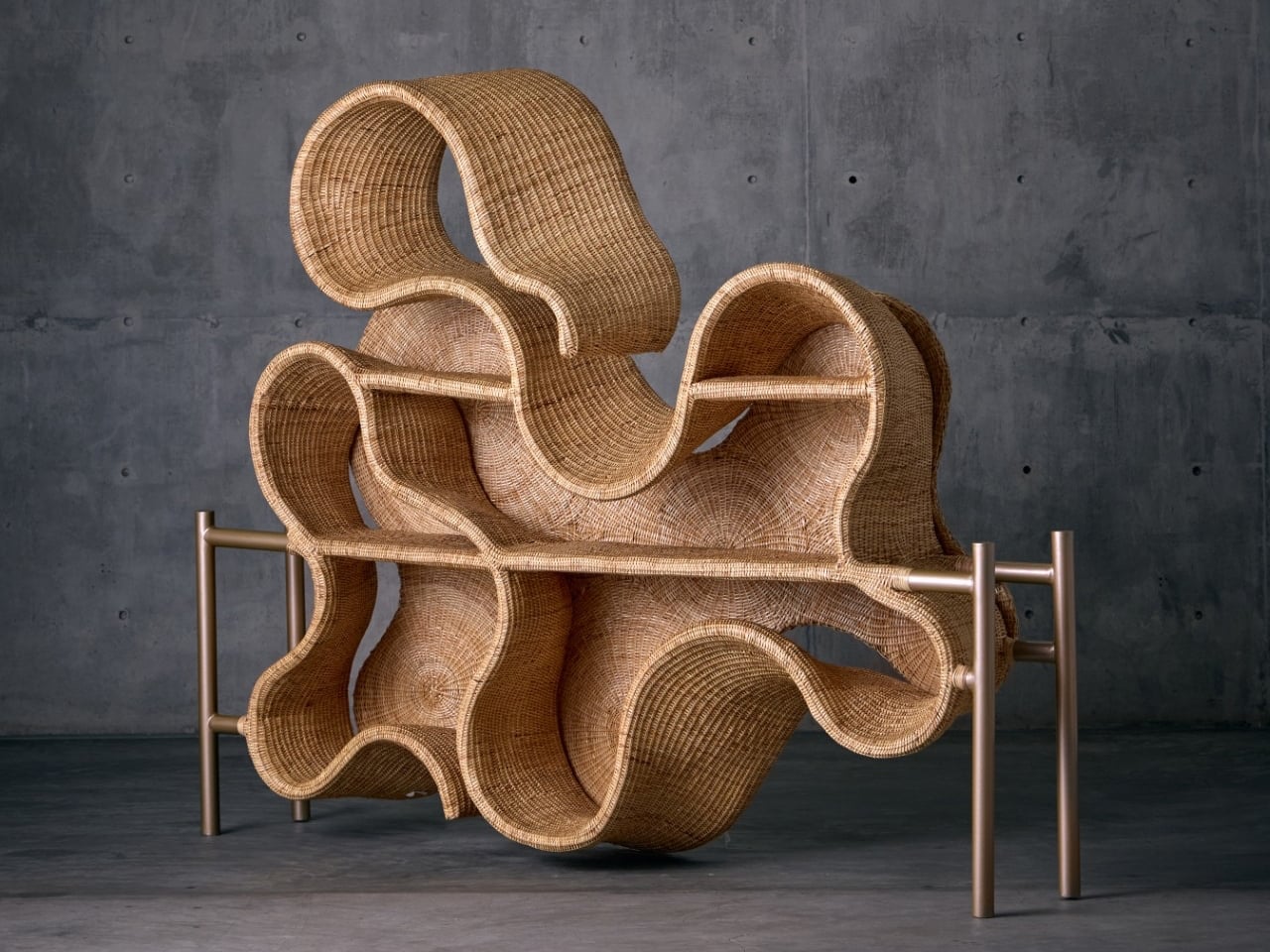
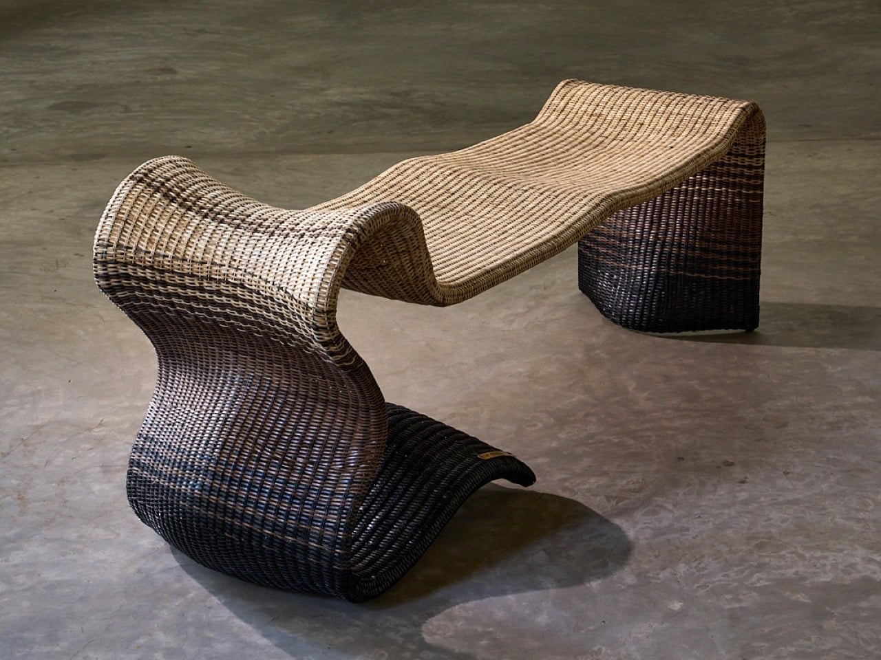
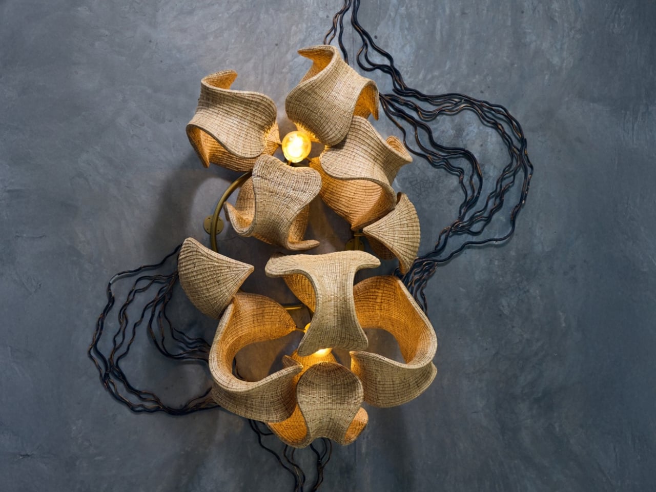
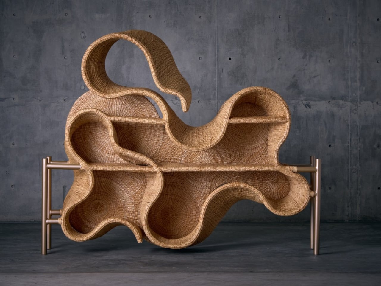
Whispers of the Wildwood is a contemporary wicker collection by Hyderabad-based design studio The Wicker Story, led by designer Priyanka Narula. Rooted in traditional Indian weaving techniques, the collection reinterprets wicker through a modern, sculptural lens. Drawing inspiration from natural landscapes such as forest canopies, flowing paths, and organic growth patterns, the pieces move beyond conventional furniture typologies to become refined design objects that balance function with artistic expression.
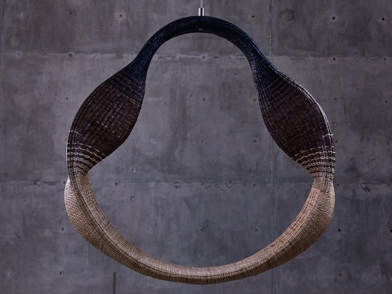
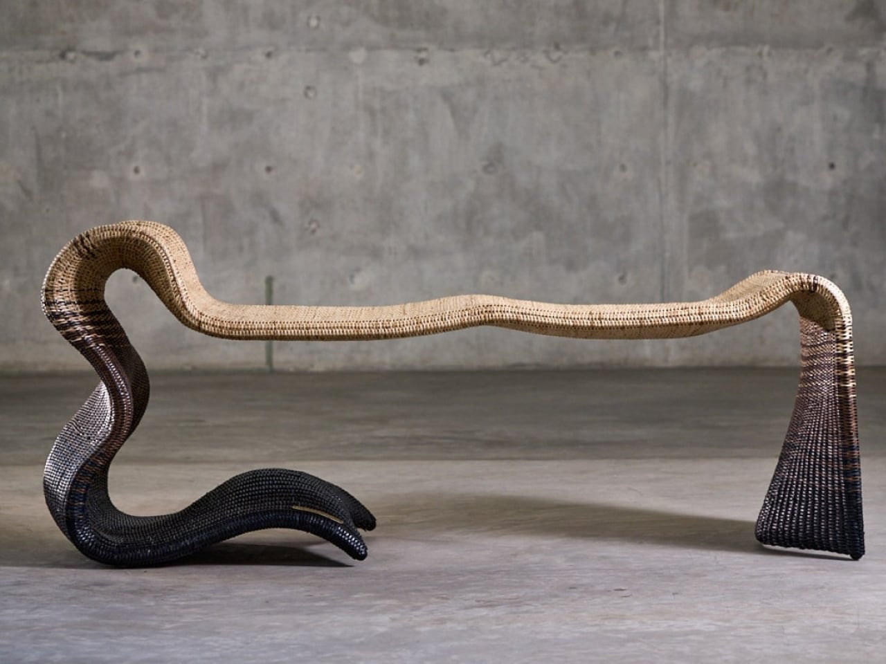
The collection is defined by fluid forms, intricate textures, and a restrained material palette that allows the natural warmth of wicker to take center stage. Designs such as the Pagdandi wall unit exemplify this approach, translating the irregular rhythm of nature into woven structures with visual lightness and depth. Research-driven and craft-focused, Whispers of the Wildwood demonstrates how traditional materials can evolve into sophisticated, contemporary forms while retaining their tactile and cultural authenticity.

3. Human-Centered Spatial Core

Spatial planning is being redefined to place human experience above rigid, formal layouts. At the center of this approach is performance-driven comfort. Successful floor plans now prioritize acoustic privacy and thermal efficiency, recognizing that true luxury lies in how well a space responds to the human body.

Homes are designed to adapt to daily rhythms, offering quiet, comfort, and environmental balance rather than relying solely on visual order.
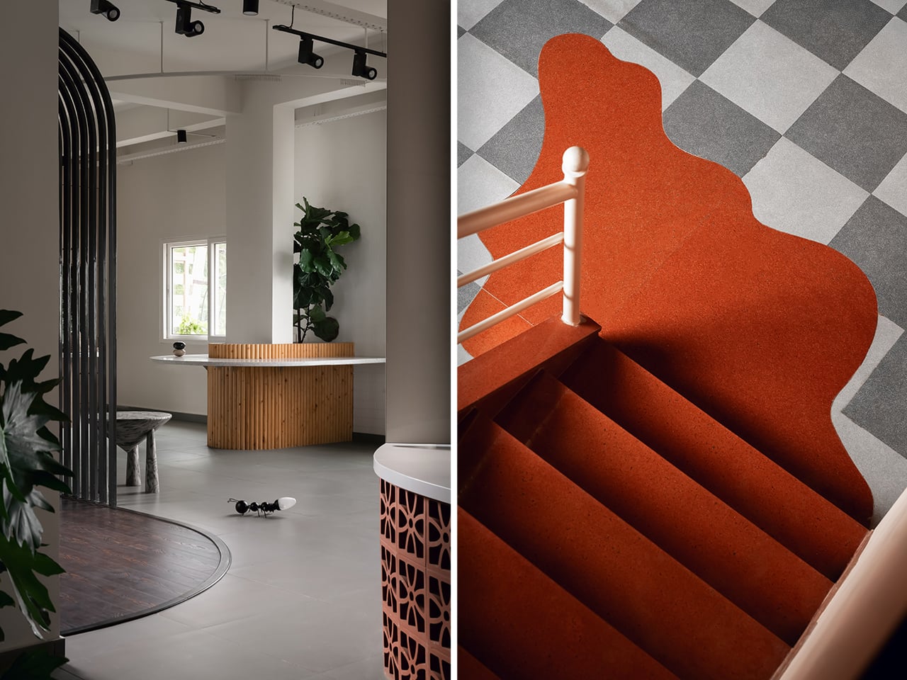
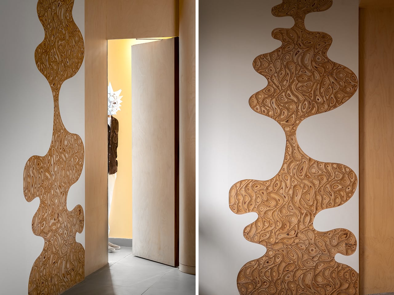
The planning strategy showed in this Warehouse Space transforms a conventional 2,500-square-foot warehouse into a carefully choreographed spatial sequence. Rather than relying on fixed walls, the layout is organized through visual cues, circulation paths, and deliberate zoning. Each area unfolds gradually, encouraging movement and discovery while maintaining spatial continuity. Color transitions, curved architectural elements, and material changes are used as planning tools to define functions without fragmenting the open volume.
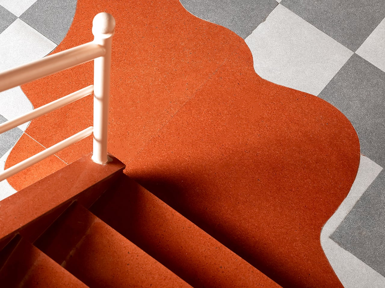
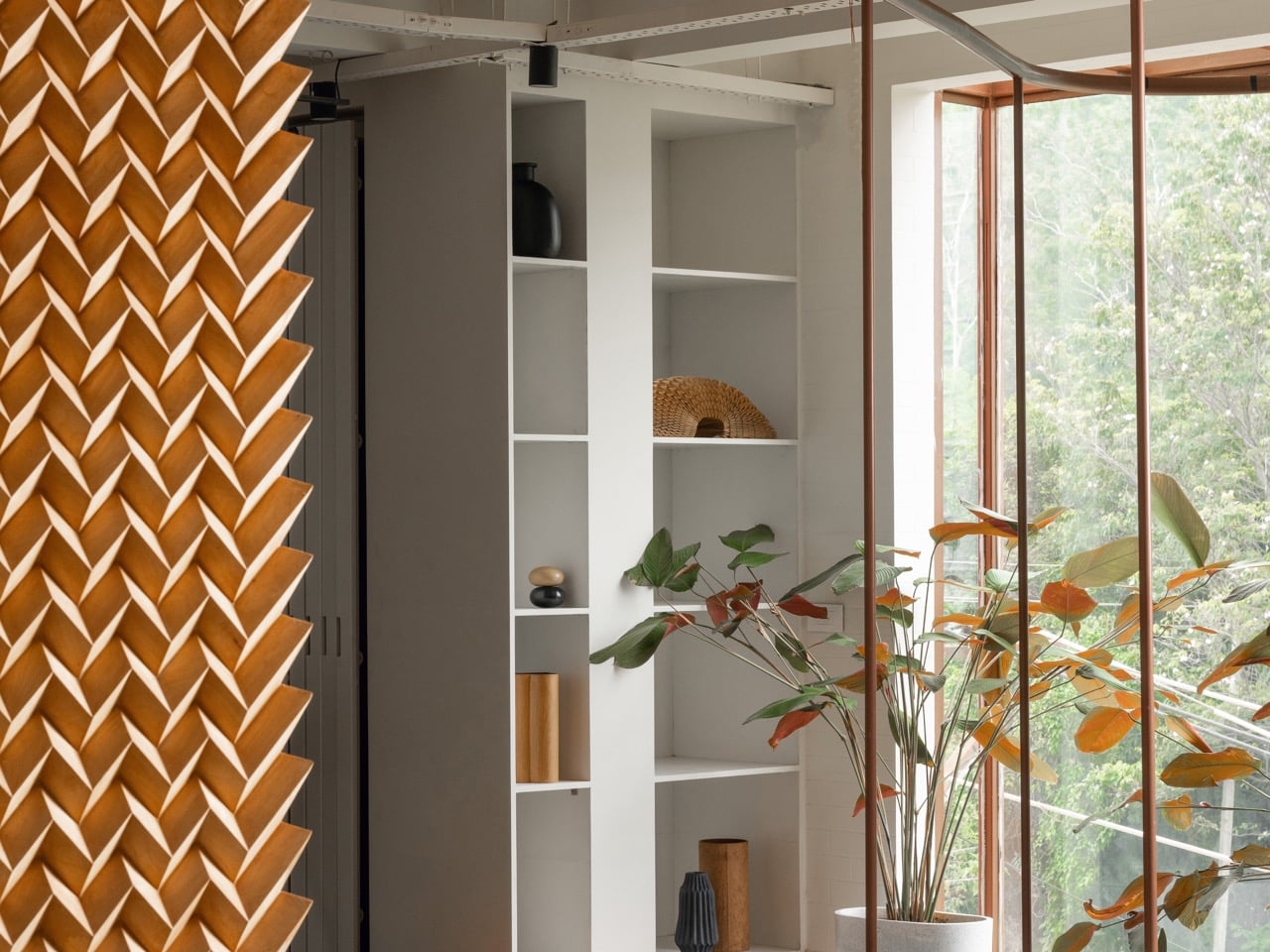
This approach allows the space to function as a cohesive whole while accommodating varied uses. Active zones are positioned to feel dynamic and engaging, while quieter areas are subtly set apart through restrained finishes and controlled visual breaks. Repeating motifs and aligned sightlines guide users intuitively, reinforcing orientation and flow. The planning balances structure with flexibility, ensuring clarity without rigidity. Through thoughtful sequencing and layered spatial relationships, the design demonstrates how strategic planning can redefine an industrial shell into an immersive, purpose-driven environment.

4. Raw Material Honesty

Design is witnessing a clear return to materials that express their true nature, moving away from artificial and imitation finishes. Elements such as hand-worked metal, lime-wash plaster, and natural stone are valued for the stories they carry and the sensory richness they offer. These materials bring depth, texture, and authenticity to interior spaces.

This approach also supports sustainability and longevity. Using materials in their natural or minimally processed state reduces manufacturing impact and improves durability over time. The tactile experience such as the feel of a raw timber handrail, adds a layer of quiet luxury, reflecting a growing preference for honest, lasting materials over polished superficiality.

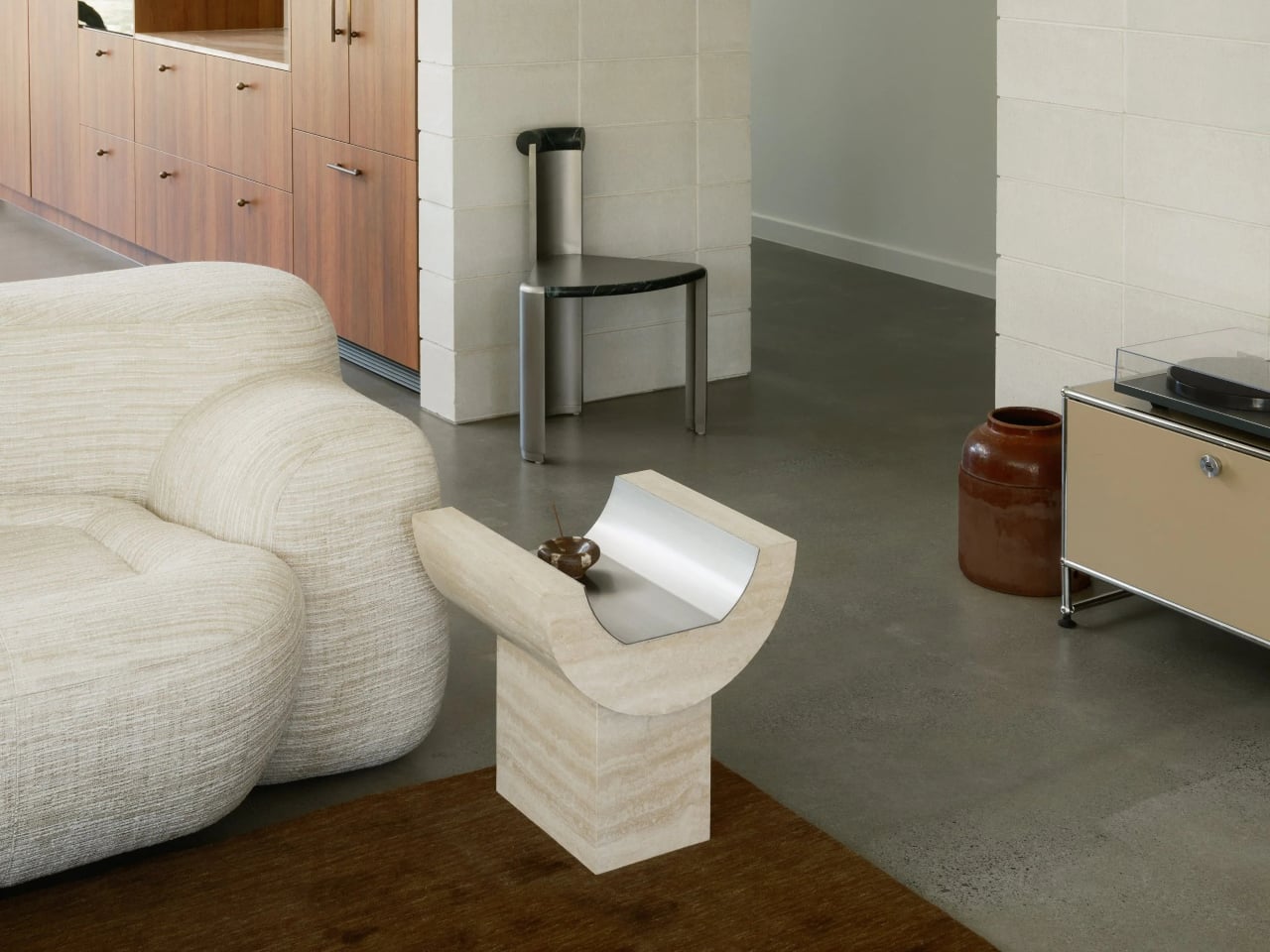
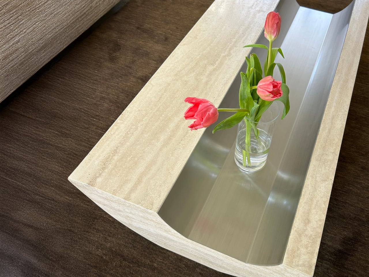
Stone coffee tables are often conceived as heavy, monolithic objects defined by mass rather than refinement. The Coffee Table and Side Table by Tom Black adopt a more considered approach, treating Italian travertine as a material to be carved, balanced, and visually lightened. A single curved gesture defines both pieces, creating an impression of elevation, while a contrasting brushed metal inlay introduces intentional voids within the stone. This dialogue between solid and negative space reframes stone as something sculptural rather than purely structural.
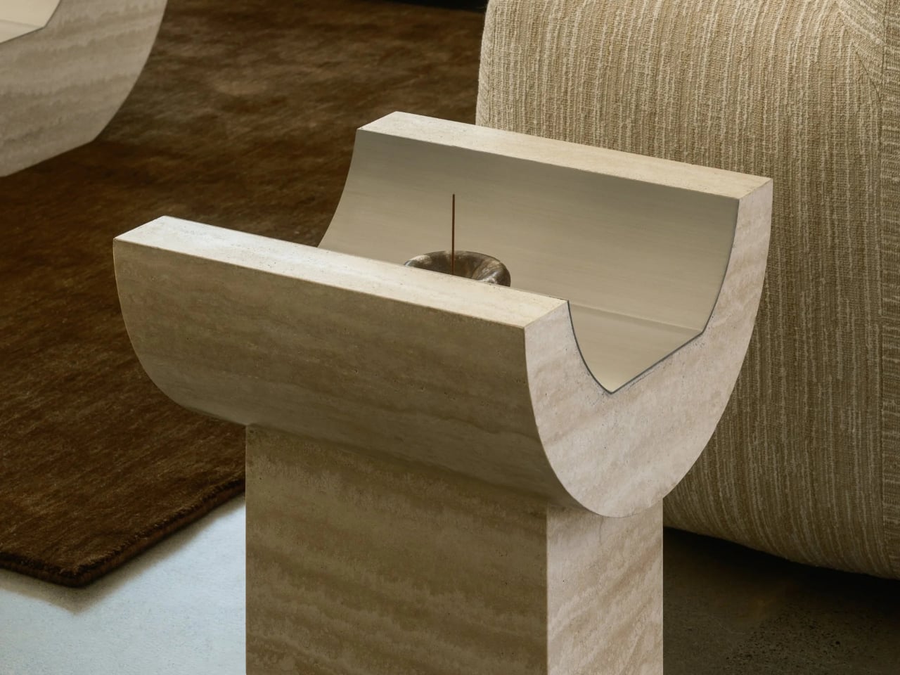
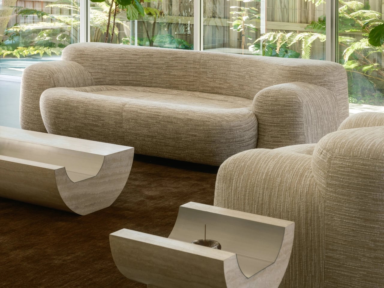
The Coffee Table features a softly curved underside that lifts the form from the floor, paired with a recessed metal-lined trough on the surface that mirrors this curvature. The Side Table translates the same language into a more vertical composition, combining a curved travertine element with a rectilinear base. Together, the two pieces function as architectural furniture, unified by material, proportion, and a restrained yet expressive formal clarity.

5. Built – Landscape Dialogue

Design is increasingly dissolving the boundary between inside and outside. Architects are creating transitional spaces such as semi-covered verandas, internal courtyards, glass walls and shaded thresholds that allow the landscape to flow into the heart of the home. These zones soften the built form and create a natural connection with light, air, and greenery.

Beyond aesthetics, design now focuses on lived experience—how materials, light, and climate affect comfort and emotion. The emphasis has shifted from glossy surfaces to meaningful, biophilic spaces that reduce environmental impact while supporting mental, emotional, and spiritual well-being.
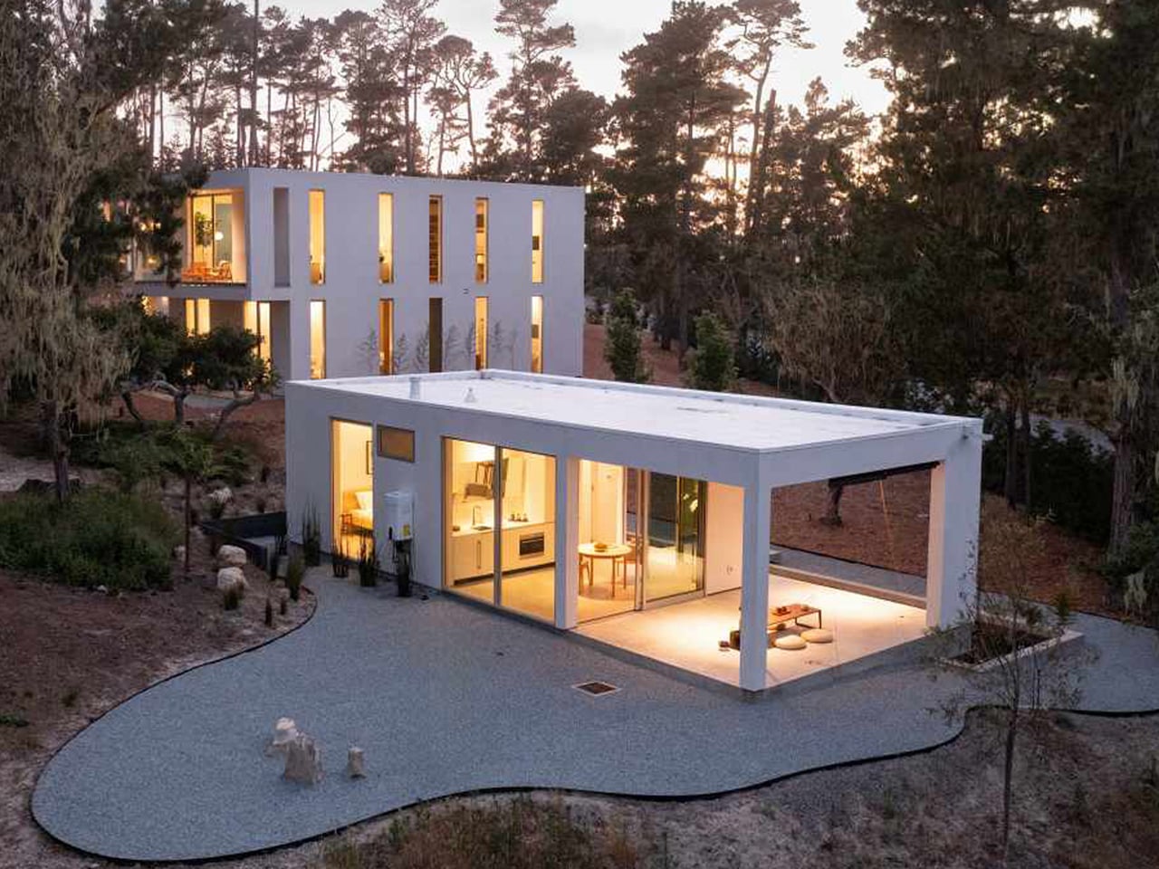
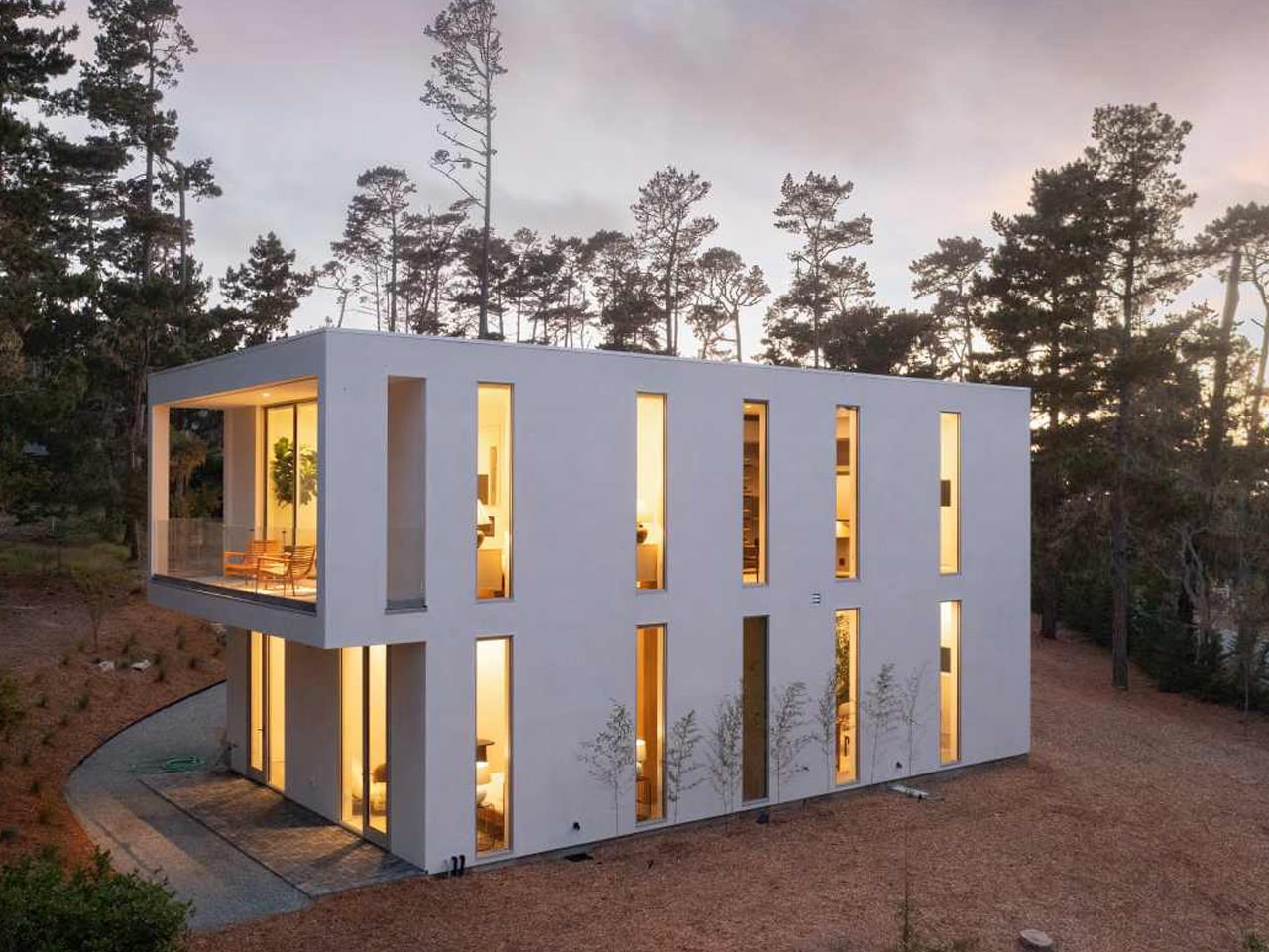
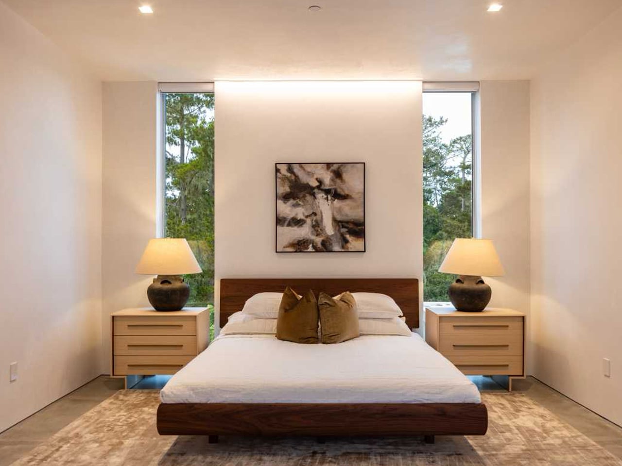
Waterbridge House is conceived as a seamless extension of its natural setting, balancing architectural clarity with a strong indoor–outdoor connection. Set among the pine trees of Pebble Beach, the glass-dominated structure appears to hover above the landscape, defined by clean lines and a restrained material palette. Influenced by Japandi principles, the design blends Japanese serenity with Scandinavian simplicity, resulting in spaces that feel calm, light-filled, and closely attuned to their surroundings.
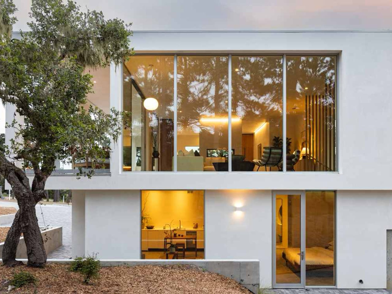
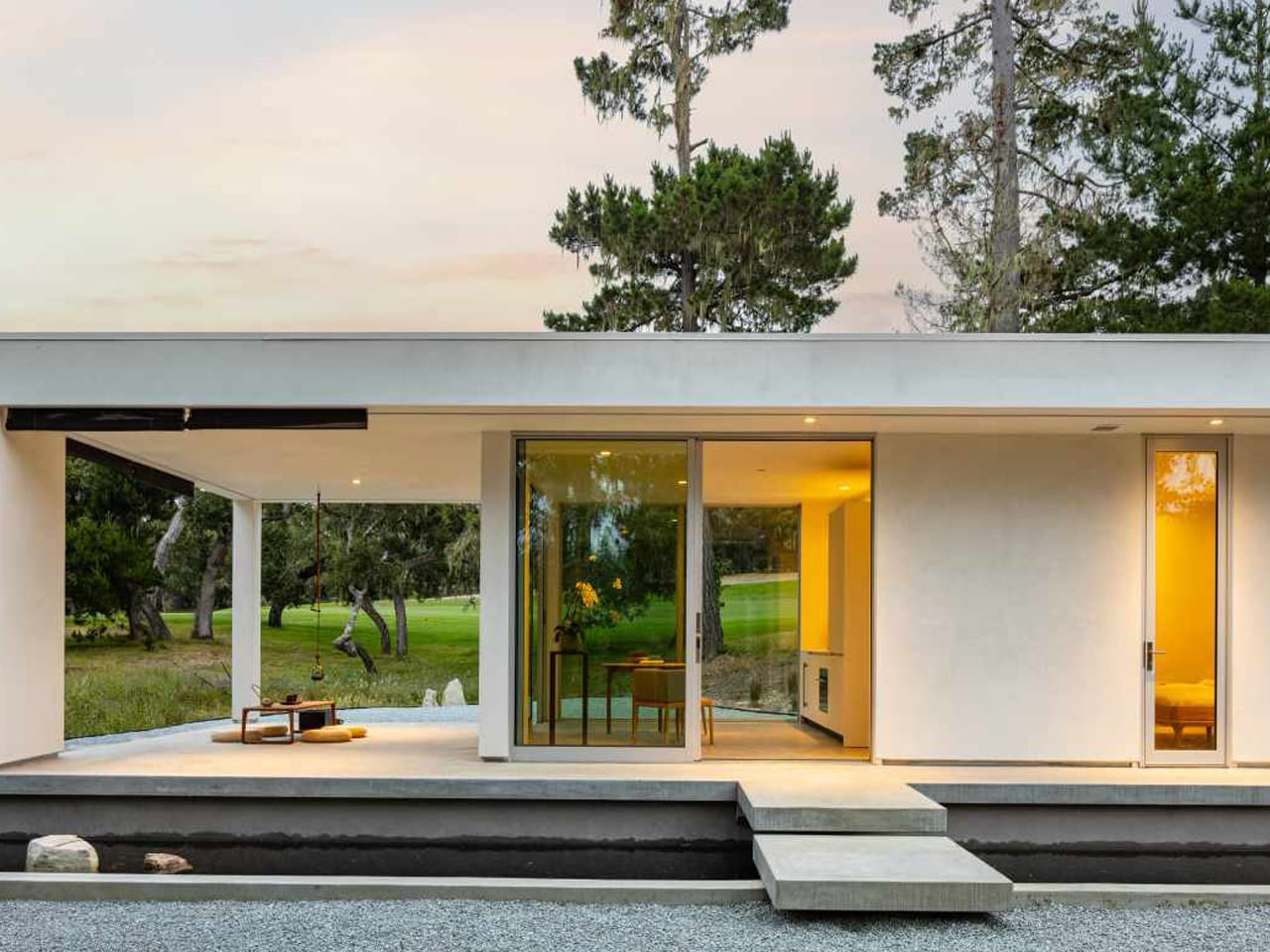
A defining planning element is the glass corridor that bridges a reflective pool, acting as both an entry sequence and a spatial pause. This transparent link connects two distinct wings: one dedicated to open-plan living and social interaction, the other organized around privacy with bedrooms and quiet retreats. Expansive glazing, sliding walls, and layered decks dissolve boundaries between interior and exterior, allowing light, water, and forest views to shape everyday experience.

Interior design now reflects a deeper focus on authenticity and human connection. Through confident color, softened geometry, and people-first planning, spaces move beyond decoration toward meaning. The true measure of architecture lies in its ability to create calm, light-filled sanctuaries that support emotional well-being while remaining visually refined and environmentally responsible.

The post 5 Interior Design Trends That Just Made Minimalism Obsolete in 2026 first appeared on Yanko Design.
This 39-Foot Tiny Home Trades Loft Ladders for Apartment-Style Living

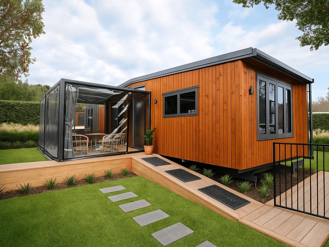
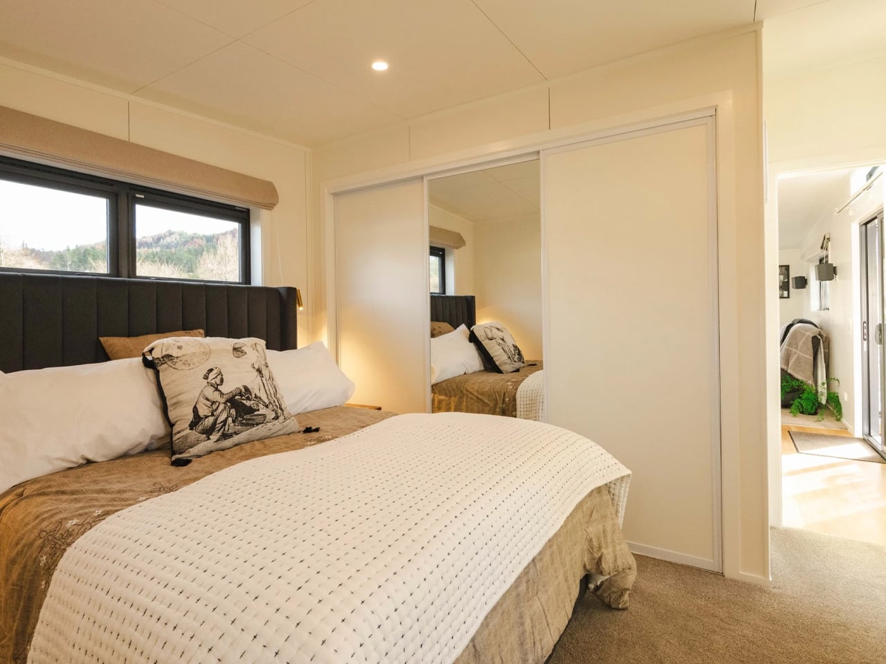
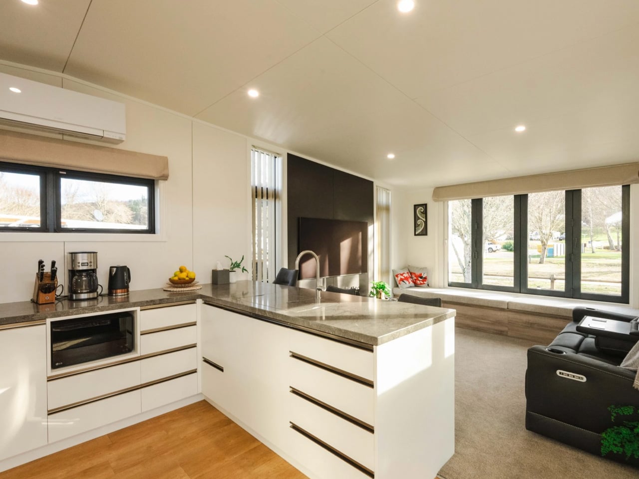
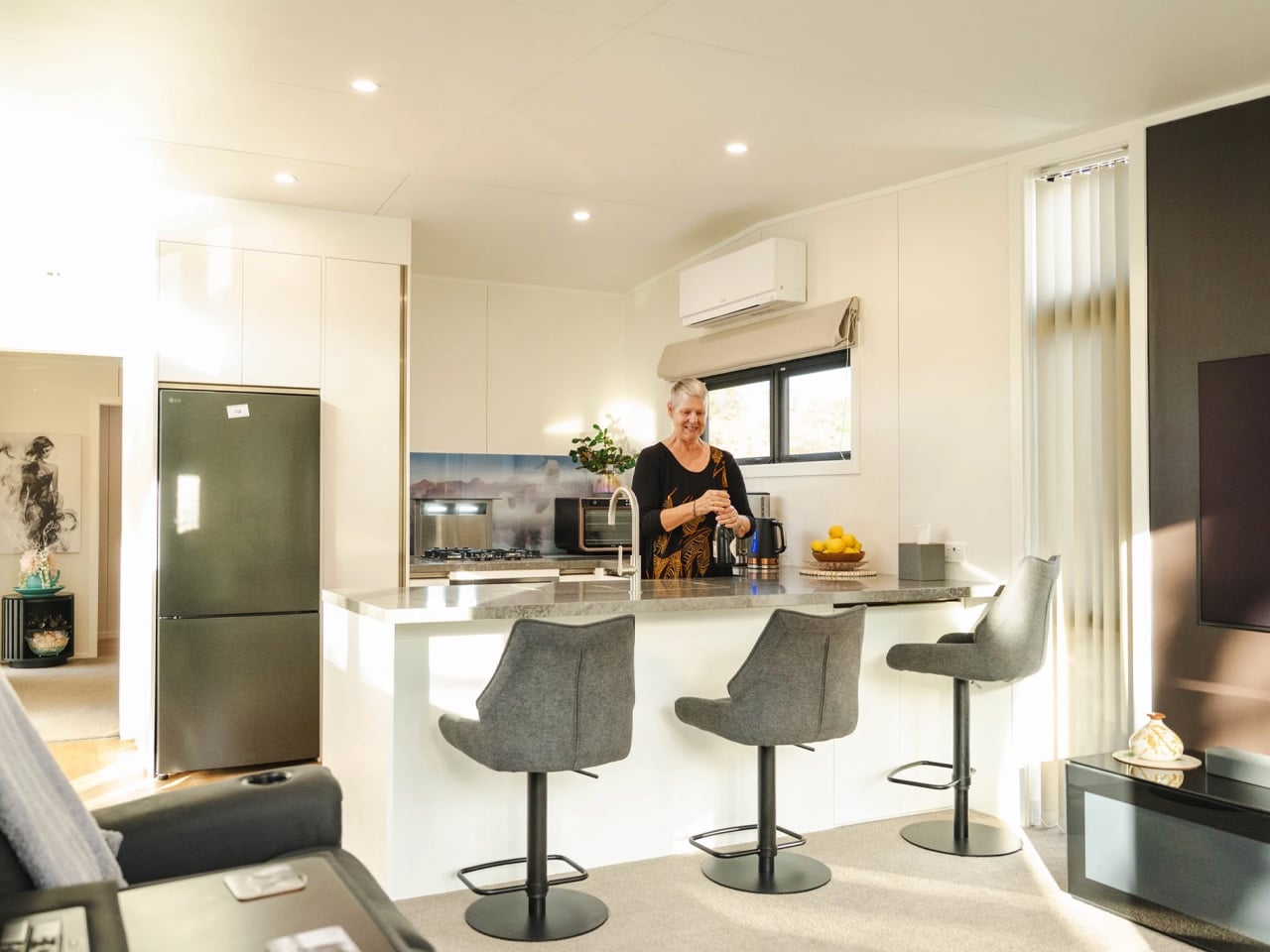
After seven years of exploring New Zealand’s open roads in an RV, a couple of travel enthusiasts decided it was time to plant roots. Their solution wasn’t a traditional house or even a typical tiny home. Working with South Base Homes and award-winning architect Chris Pyemont, they created the Bespoke Base, a 12-meter tiny house that challenges everything we think we know about compact living.

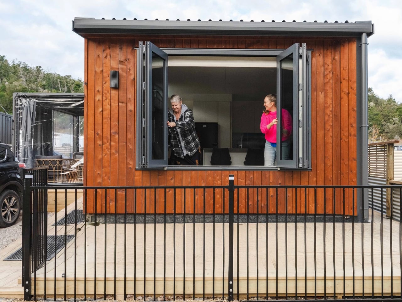
The Bespoke Base stretches 39 feet in length, placing it among the more generous tiny homes on the market. Where many tiny houses force occupants to navigate cramped quarters and vertical ladders, this design takes a different approach. The entire layout unfolds on a single level, creating an experience that feels less like downsizing and more like curating the perfect apartment. Wrapped in warm redwood cladding, the exterior hints at the thoughtful design within.

Designer: South Base Homes

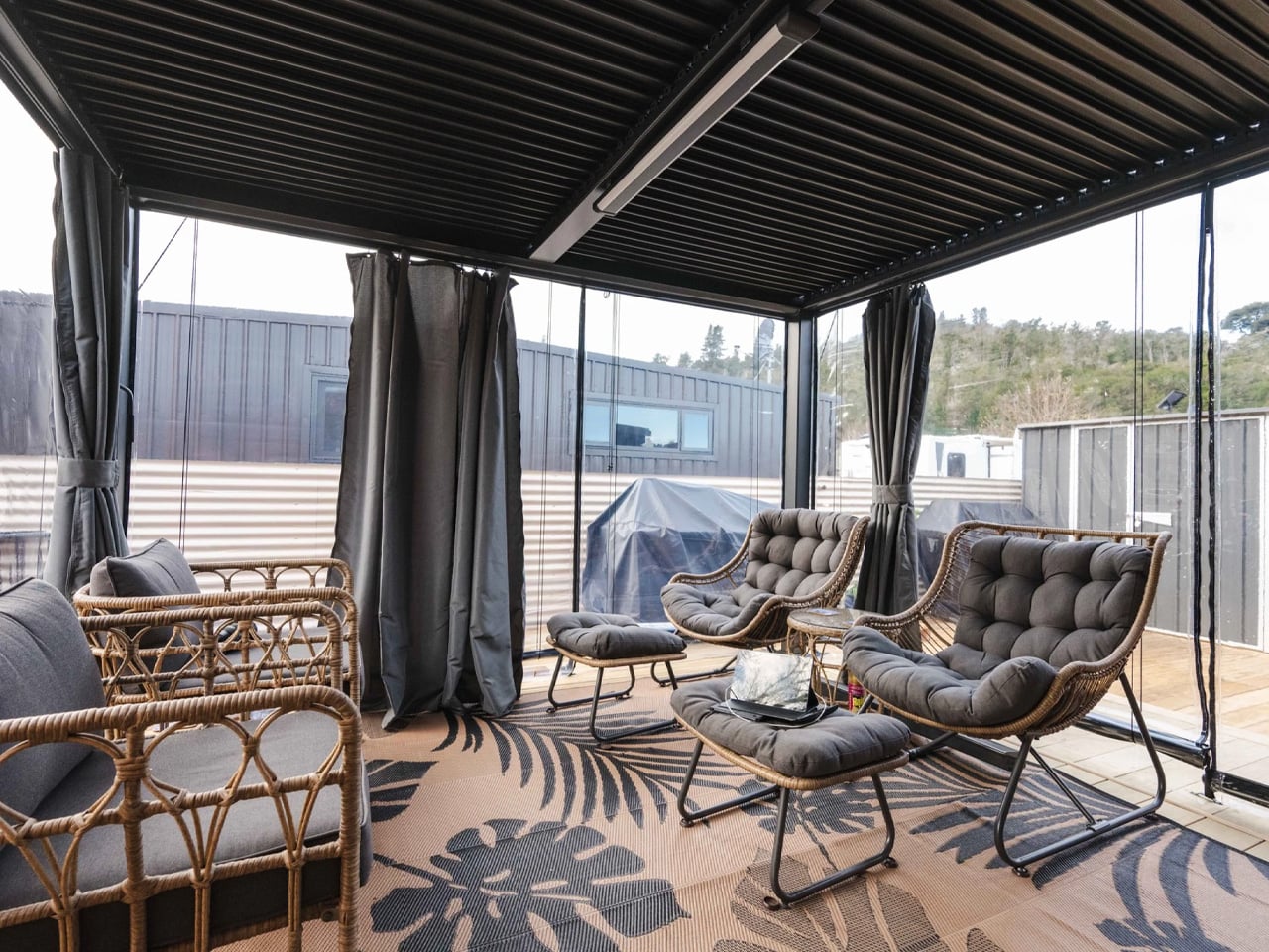
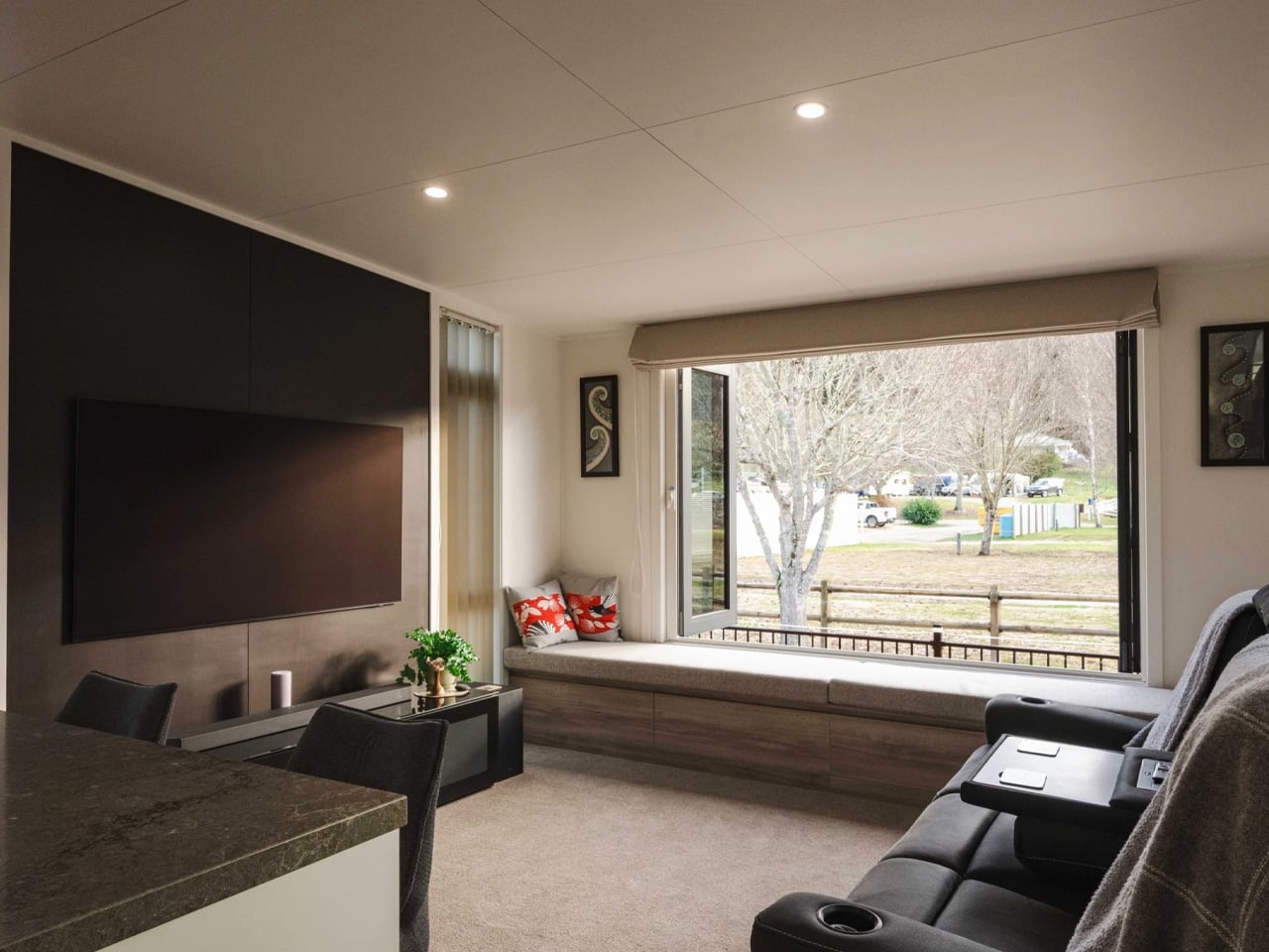
The single-story configuration means no climbing to a loft bedroom, no stooping under low ceilings, and no compromising on the fundamental comforts that make a house feel like home. For clients who spent years navigating the constraints of RV living, this accessibility was paramount. The spacious interior reads more like a compact apartment than a mobile dwelling, with room to breathe and space to truly settle in.

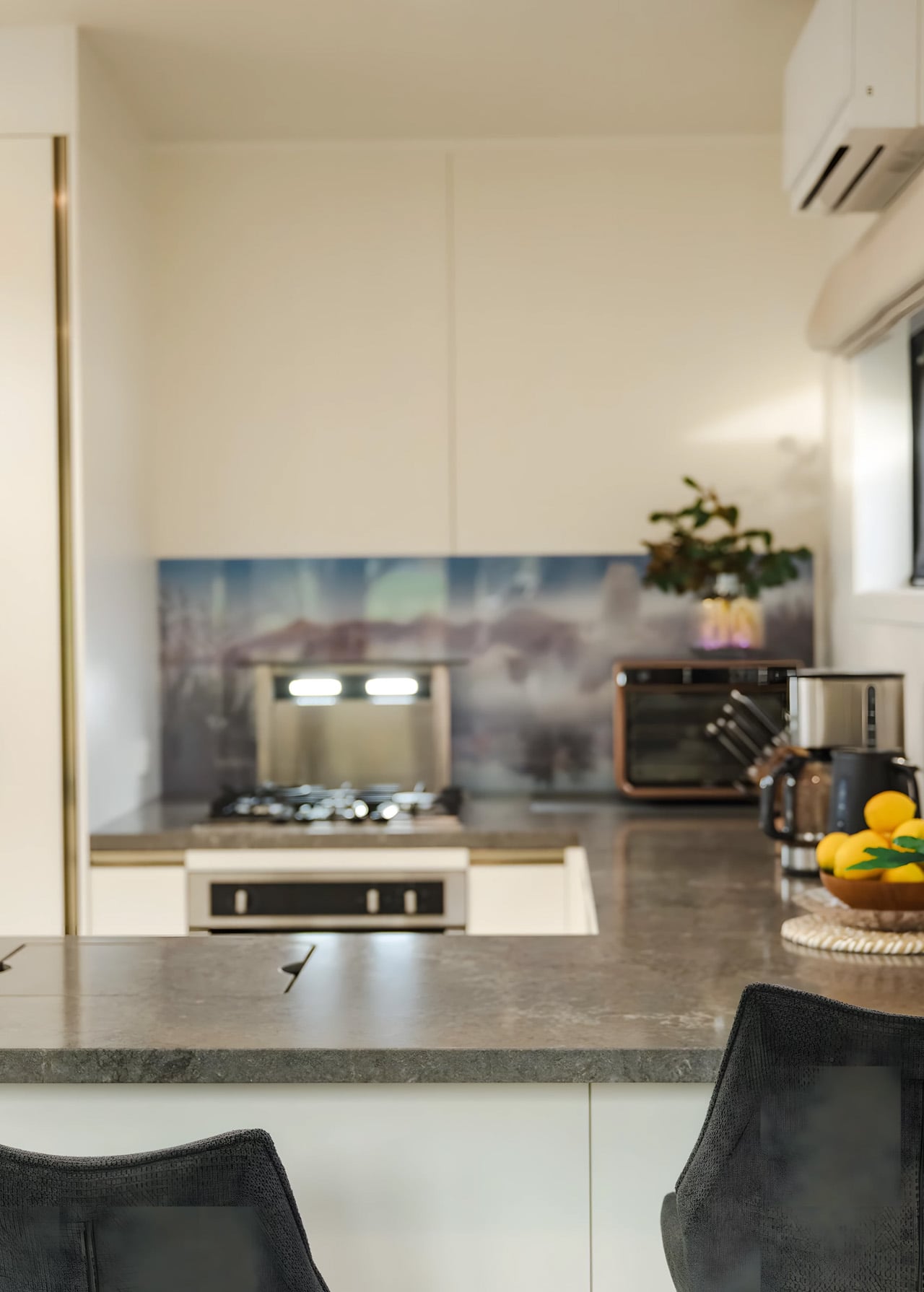
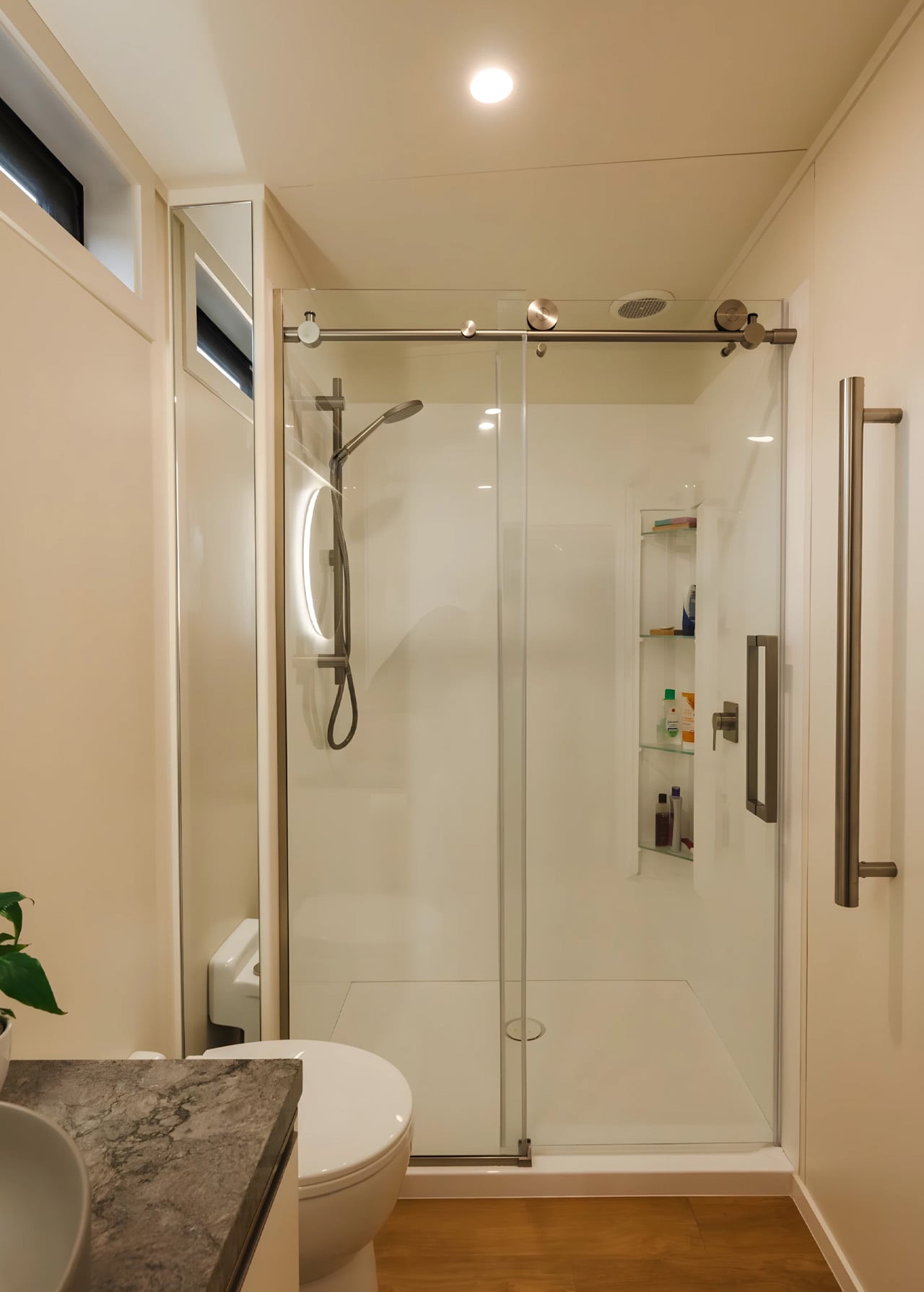
South Base Homes has built its reputation on creating bespoke tiny homes where luxury fittings come standard. Based in Tasman, New Zealand, the company earned recognition as the 2023 Tiny House Awards winner for Best Commercial Build. Their collaboration with Chris Pyemont brings architectural credibility to a sector often dominated by DIY builds and cookie-cutter designs. Pyemont’s expertise in coastal and high-wind zone construction ensures these homes can withstand New Zealand’s challenging weather conditions.

The Bespoke Base represents what happens when clients refuse to accept the usual tiny house trade-offs. Instead of squeezing life into a predetermined footprint, the design expands to accommodate how people actually want to live. This approach to tiny living isn’t cheap. South Base Homes’ models start at NZD 200,000, reflecting the premium materials and architectural design that go into each build. The price point positions these homes as permanent residences rather than temporary experiments in minimalism.

The Bespoke Base proves that tiny home living doesn’t require sacrificing comfort or style. For those ready to downsize without feeling diminished, it offers a compelling blueprint: thoughtful design, quality construction, and enough space to live generously within a modest footprint. The result is a home that honors both the tiny house movement’s ideals and its owners’ need for genuine, lasting comfort.

The post This 39-Foot Tiny Home Trades Loft Ladders for Apartment-Style Living first appeared on Yanko Design.
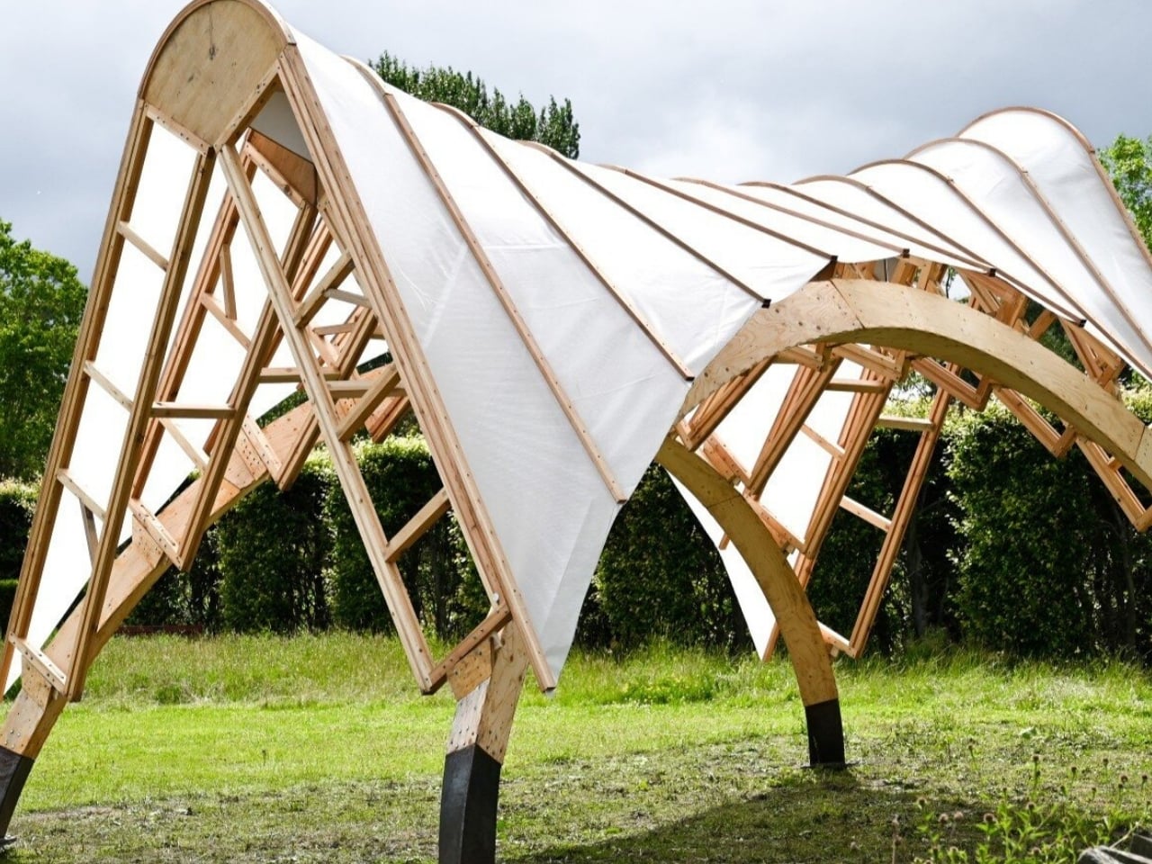
Students Just Built a Pavilion That Robots Can Rebuild Forever

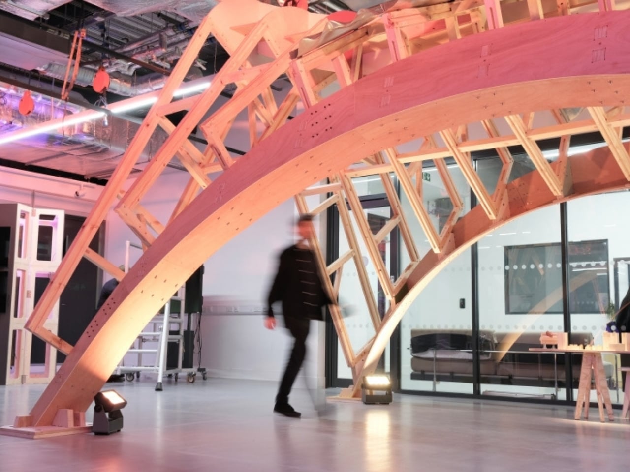
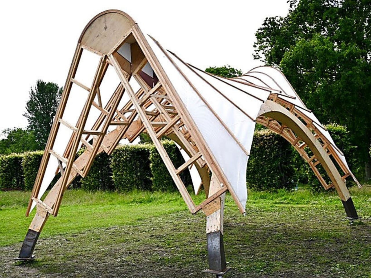
Here’s what I love about architecture that makes you stop and think: it’s not just about creating beautiful spaces anymore. It’s about imagining how we can build better, smarter, and in ways that don’t treat our planet like a disposable resource. That’s exactly what’s happening with Arkhive, a fascinating timber pavilion that’s part building project, part robotic experiment, and entirely rethinking how we approach construction.

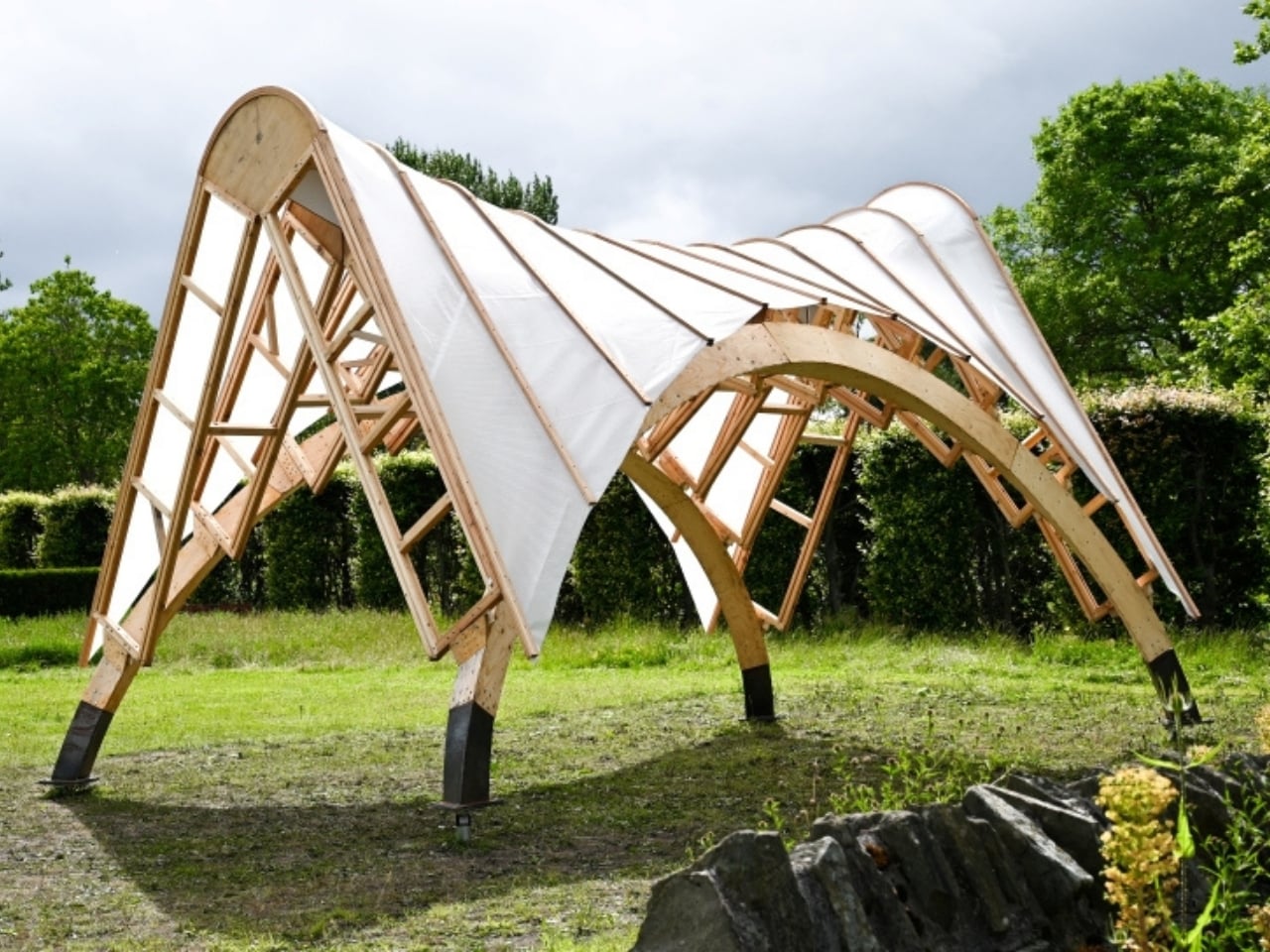
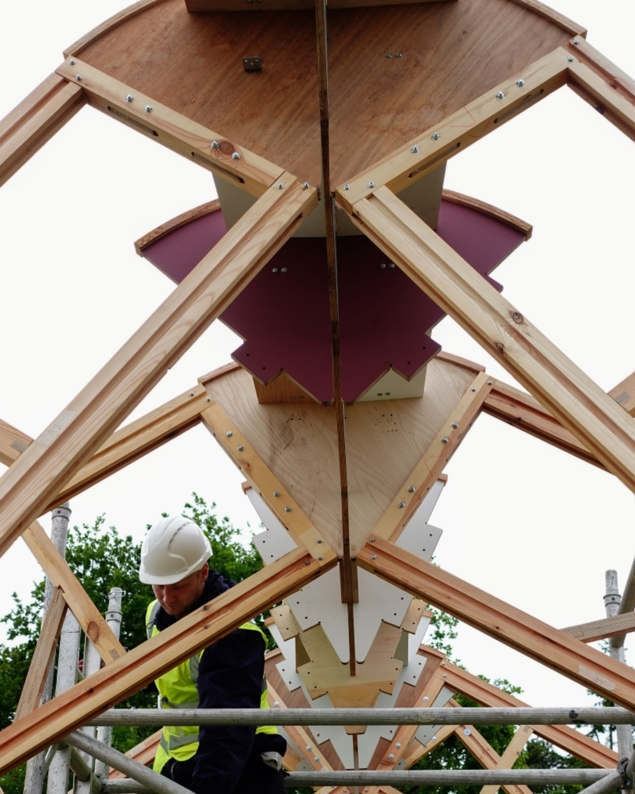
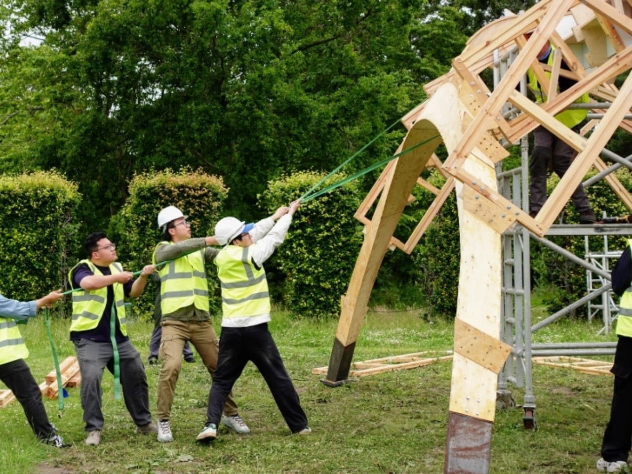
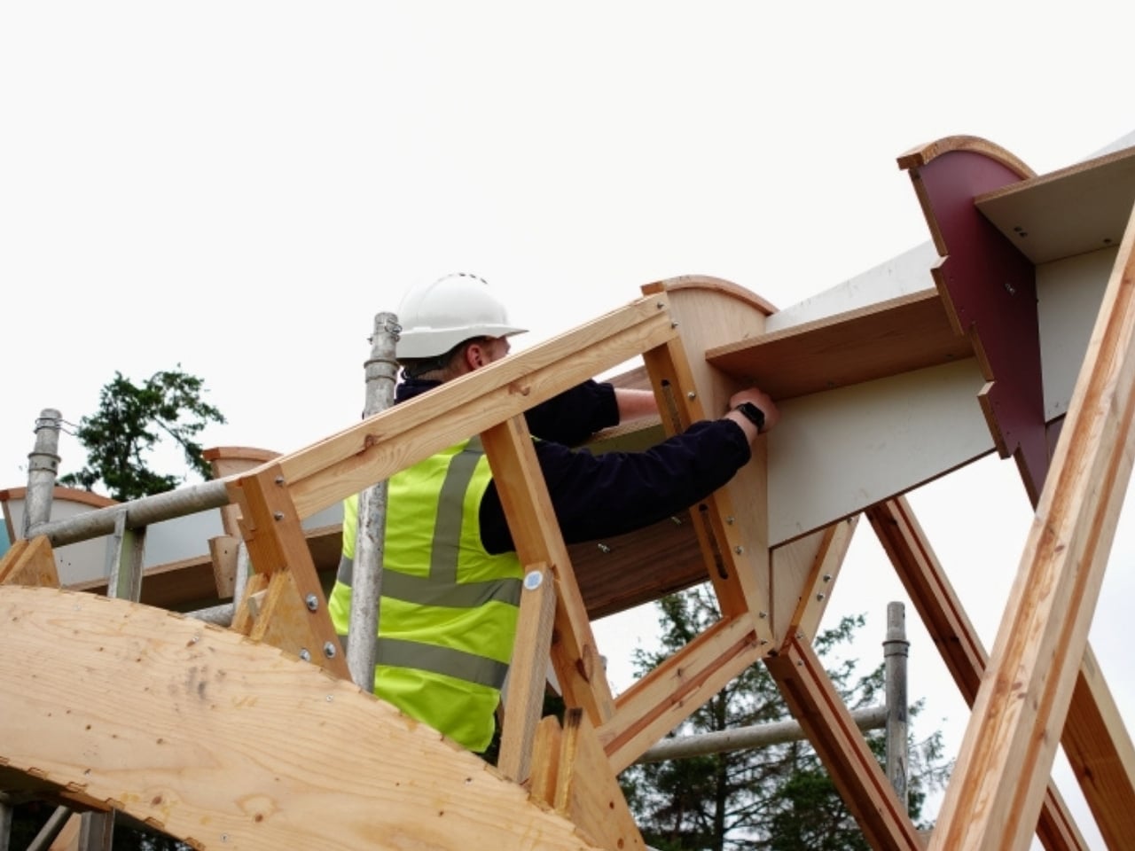
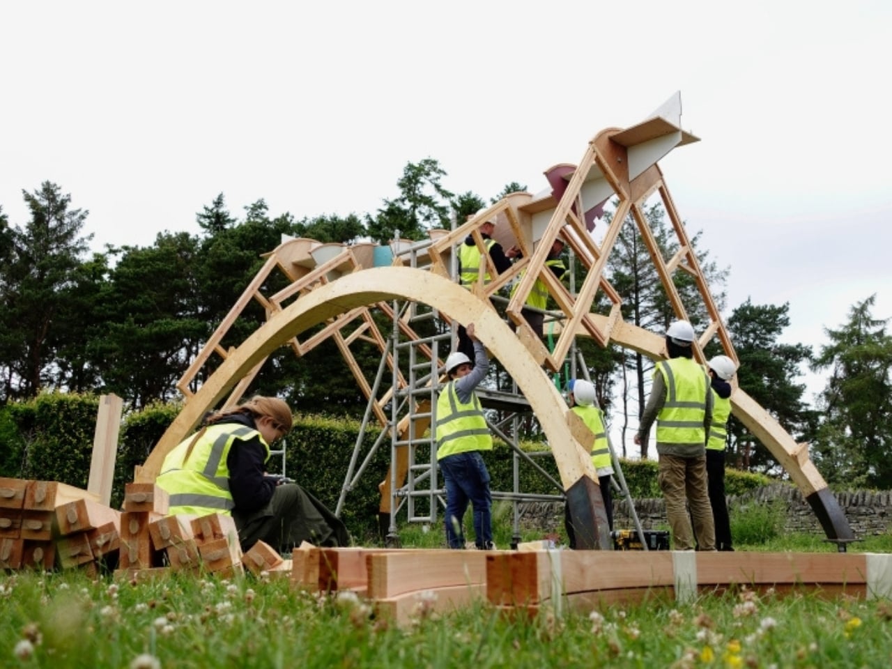
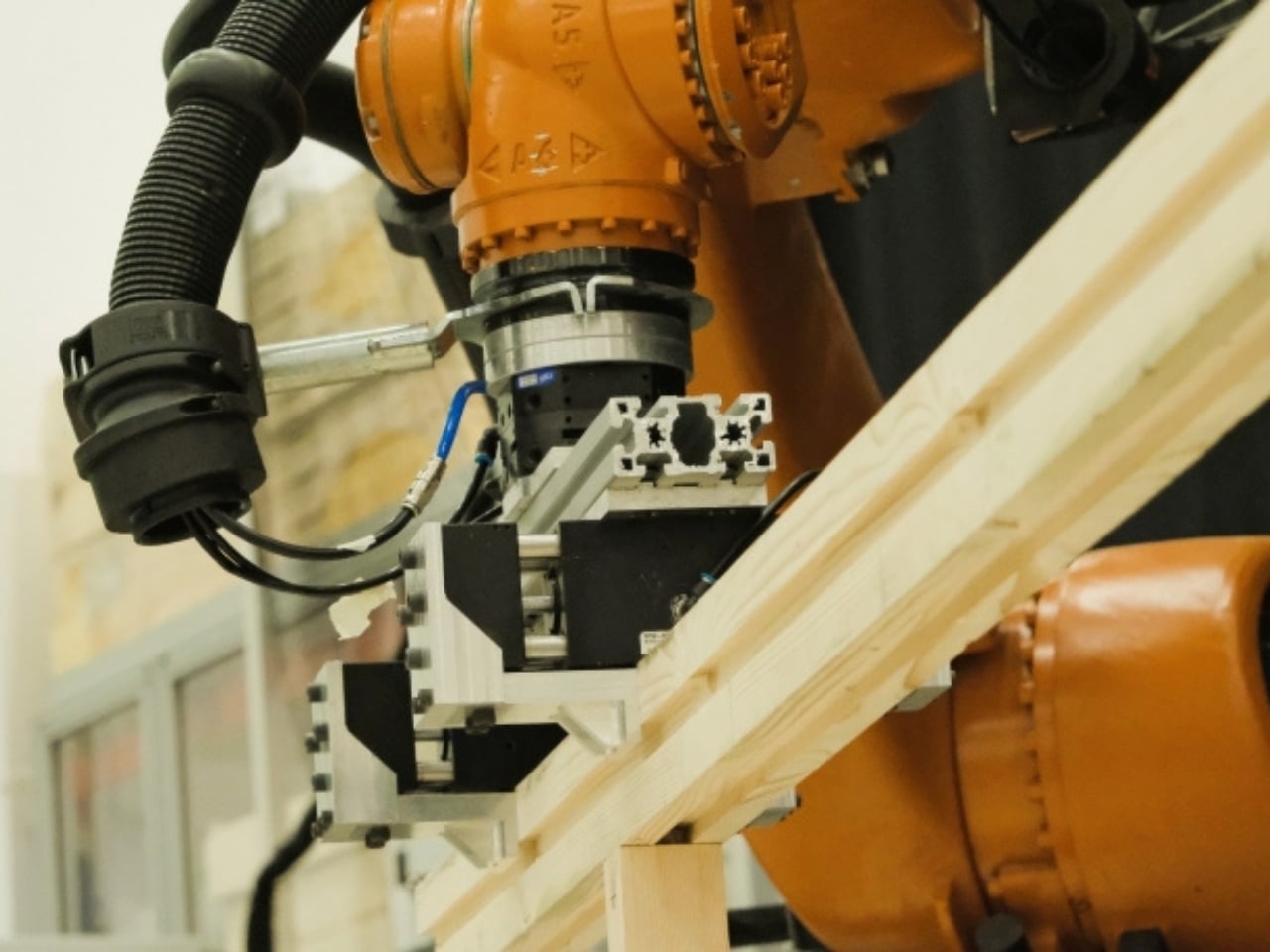
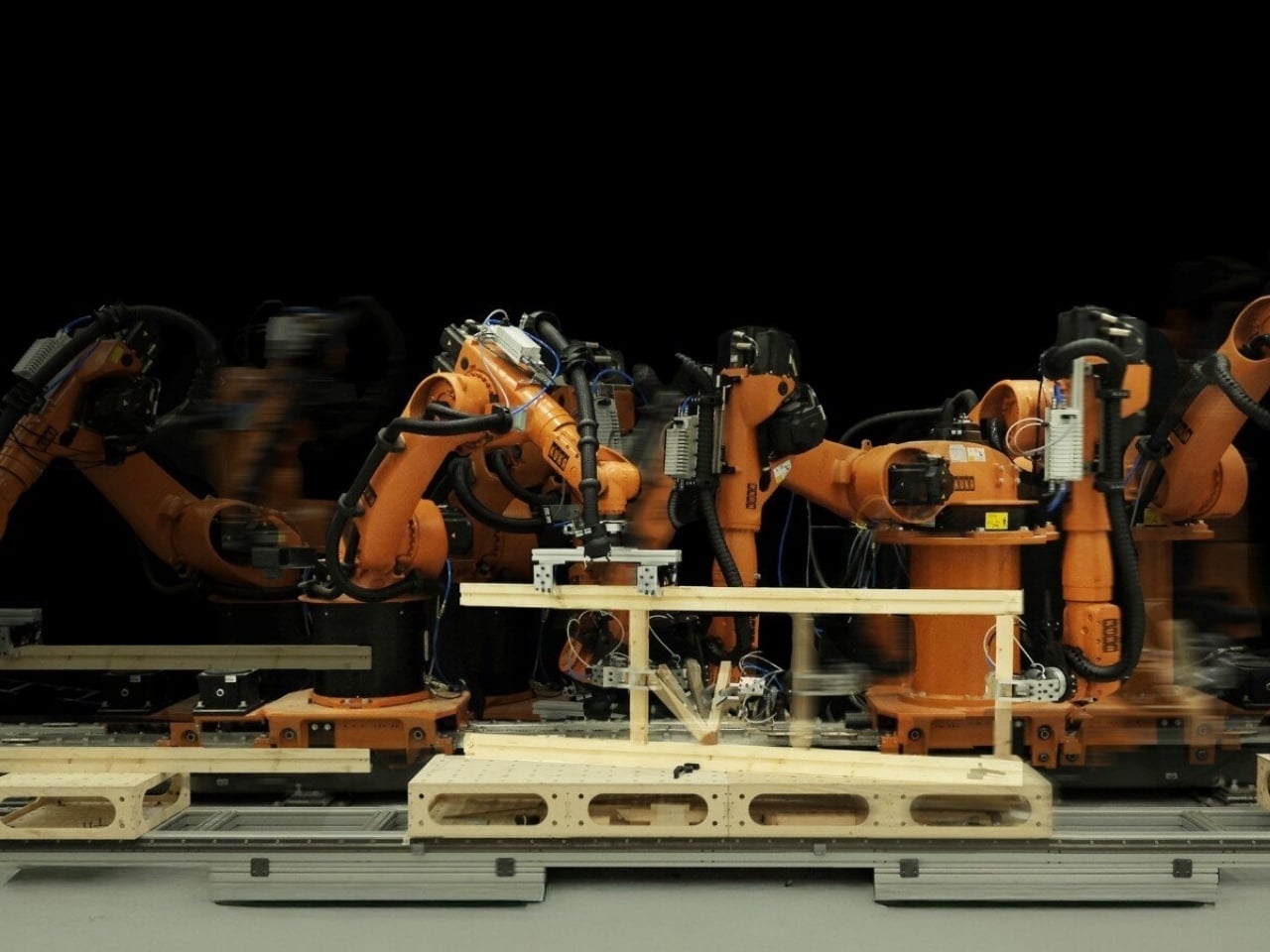
Picture this: a wooden structure that looks like it could be straight out of a sci-fi movie, assembled entirely by industrial robotic arms with precision that human hands simply can’t match. But here’s the kicker. This isn’t just another flashy tech demo. Arkhive was created by students from University College London’s Design for Manufacture program, and it’s tackling one of construction’s biggest problems: waste.

Designers: Design for Manufacture, Bartlett School of Architecture, University College London

Think about how we typically build things. We design them, construct them, use them for a while, and then when we’re done, we tear them down and haul the debris to a landfill. It’s a pretty wasteful cycle when you actually stop to consider it. Arkhive flips that script entirely. Every single component of this pavilion can be taken apart and reassembled into completely different configurations without losing any material. It’s like architectural Lego blocks, but way more sophisticated.

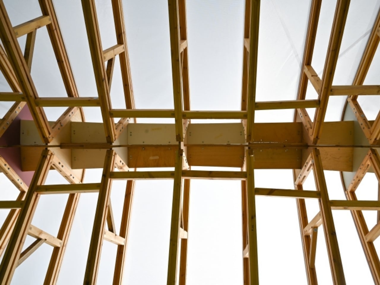
The magic happens through something called reversible joinery. Instead of nails, screws, or adhesives that permanently bind materials together, these connections can be undone and redone as many times as needed. The timber components fit together in a modular system that prioritizes adaptability over permanence. So when the structure has served its purpose in one location or configuration, it doesn’t become yesterday’s trash. It becomes tomorrow’s building material for something entirely new.

What really sets this project apart is the marriage of sustainable design thinking with cutting-edge robotics. UCL recently invested over £400,000 in developing robotics facilities specifically focused on low-carbon construction materials and innovative building practices. The Arkhive project is part of this larger movement where architecture schools aren’t just teaching students to draw pretty buildings. They’re teaching them to wrestle with real-world problems using technology that’s reshaping entire industries.

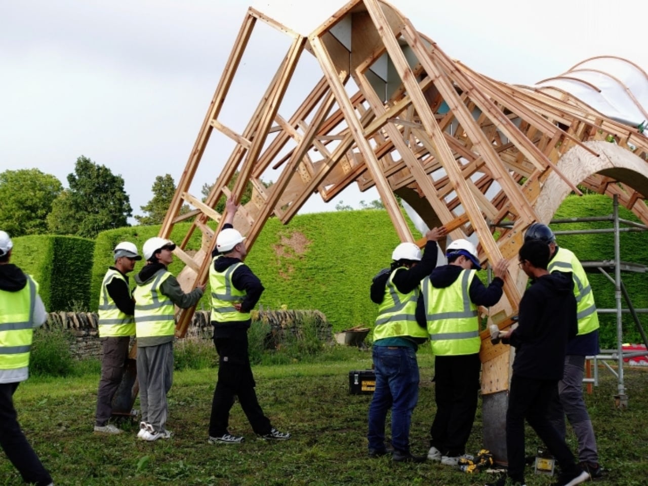
The pavilion itself was installed at St Andrews Botanic Garden in Scotland during summer 2025, where it served as a venue for public events. Imagine attending a lecture or community gathering inside a space that represents a fundamentally different approach to building. It’s not just a conversation starter; it’s a working prototype of what circular construction could look like at scale.

This kind of project matters because it addresses something crucial in our current moment. The construction industry is responsible for a massive chunk of global carbon emissions and waste production. If we’re serious about tackling climate change and resource depletion, we need to completely reimagine how we build. Not just what we build with, but how we think about the entire lifecycle of structures.

The students behind Arkhive aren’t just learning architectural theory in classrooms. They’re getting hands-on experience with industrial robotic systems, working through the messy reality of taking ambitious ideas from concept to full-scale construction. That’s the kind of education that actually prepares people to transform industries rather than just perpetuate existing practices.

What excites me most about projects like this is how they make sustainable construction feel less like sacrifice and more like innovation. We’re not talking about settling for less sophisticated buildings in the name of sustainability. We’re talking about using advanced technology to create structures that are more adaptable, more efficient, and ultimately more intelligent than what we’ve been building for centuries. The future Arkhive points toward is one where buildings aren’t static monuments but dynamic systems that can evolve alongside our changing needs.

The post Students Just Built a Pavilion That Robots Can Rebuild Forever first appeared on Yanko Design.
Swedish Design Transforms 290 Square Feet into a Multifunctional Sanctuary

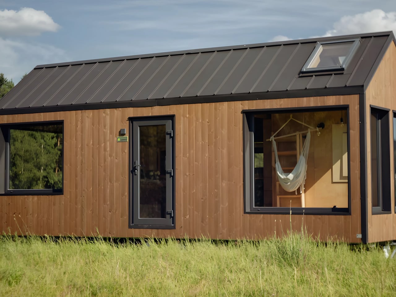
Swedish builder Vagabond Haven has unveiled Julia, a thoughtfully designed tiny home that proves downsizing doesn’t mean compromising on comfort or style. At 26 feet long and nearly 10 feet wide, this compact dwelling packs an impressive 290 square feet of living space into a layout that feels both spacious and intimate. Categorized as extra large in Vagabond Haven’s lineup, Julia represents the company’s latest innovation in creating homes that embrace the “slow life” philosophy while meeting the practical demands of modern living.

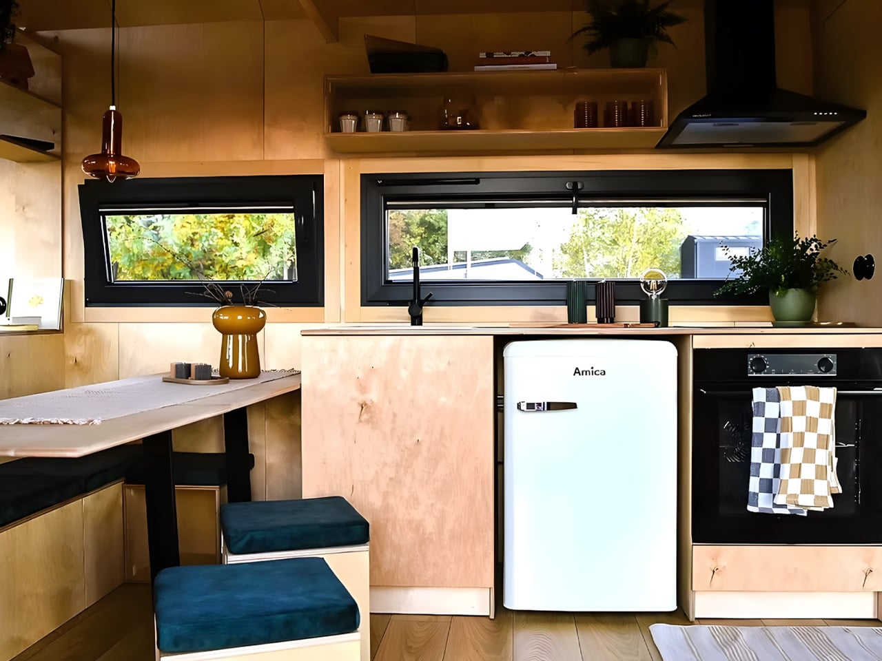
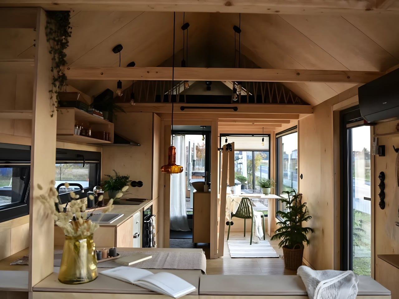
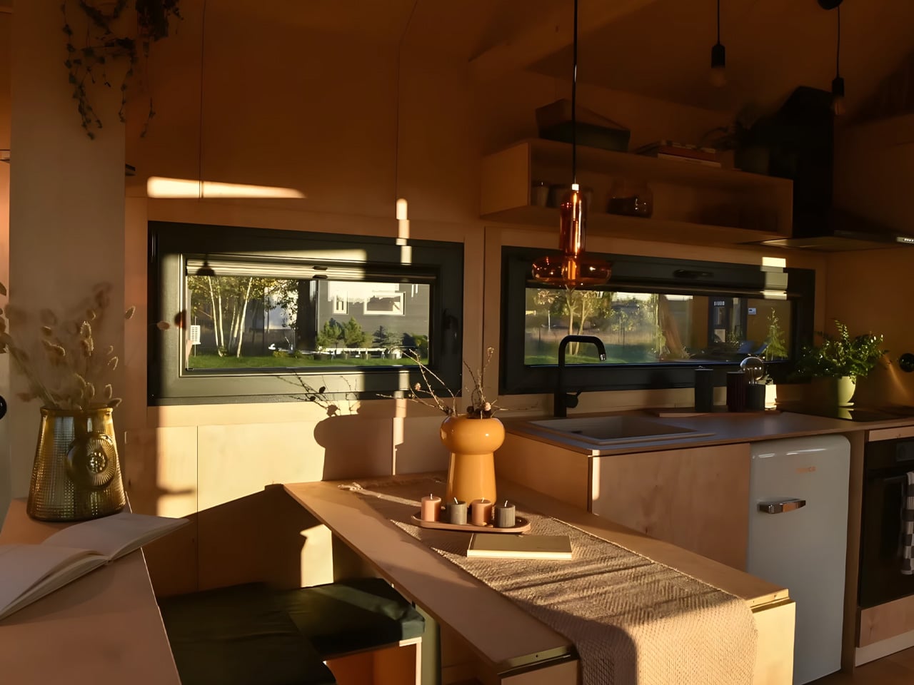
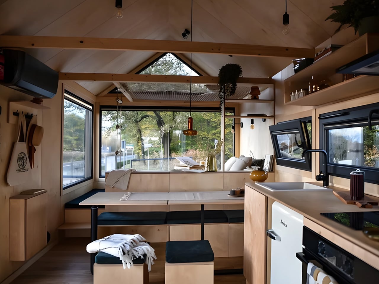
Julia’s design centers around a large open kitchen and dining area, anchored by generous glazing that floods the interior with natural light. The thoughtfully planned kitchen comes fully equipped with a sink, small fridge, oven, and induction cooktop, providing everything needed for preparing meals in a compact footprint. The dining space features a large table that can accommodate family and friends, complemented by integrated storage seating that maximizes every inch of available space. This open layout creates a welcoming atmosphere that makes the home feel larger than its modest square footage suggests.

Designer: Vagabond Haven

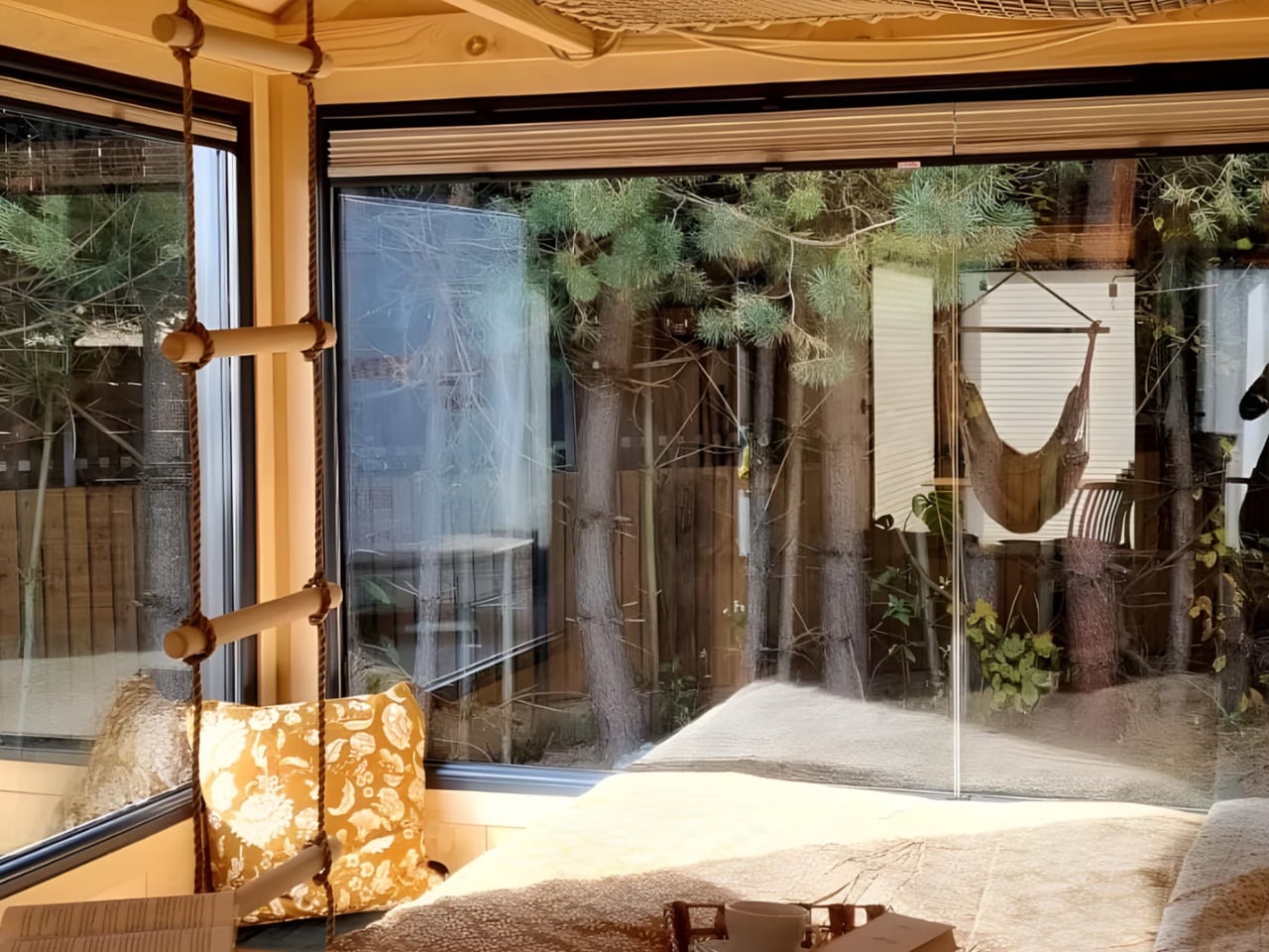
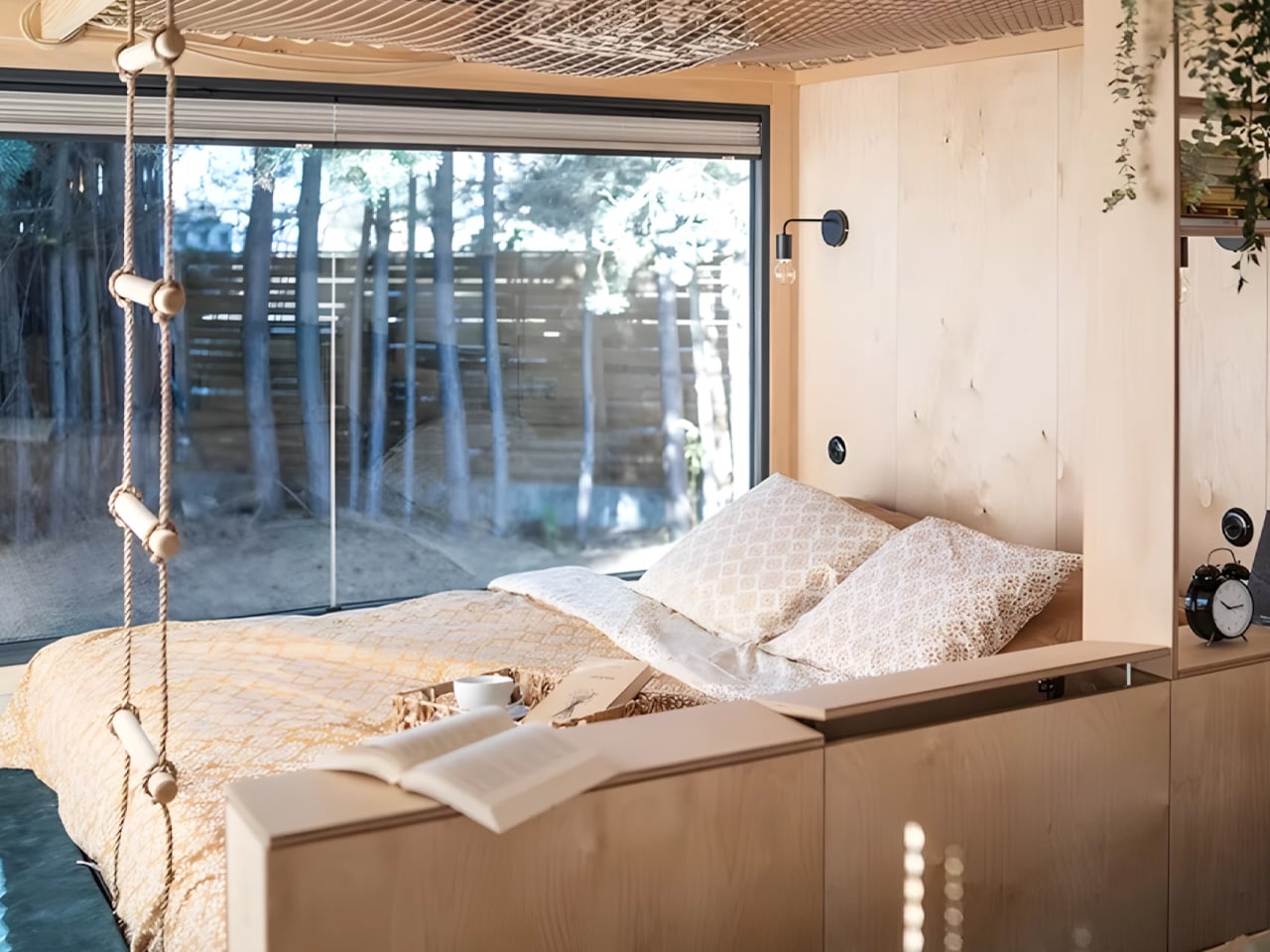
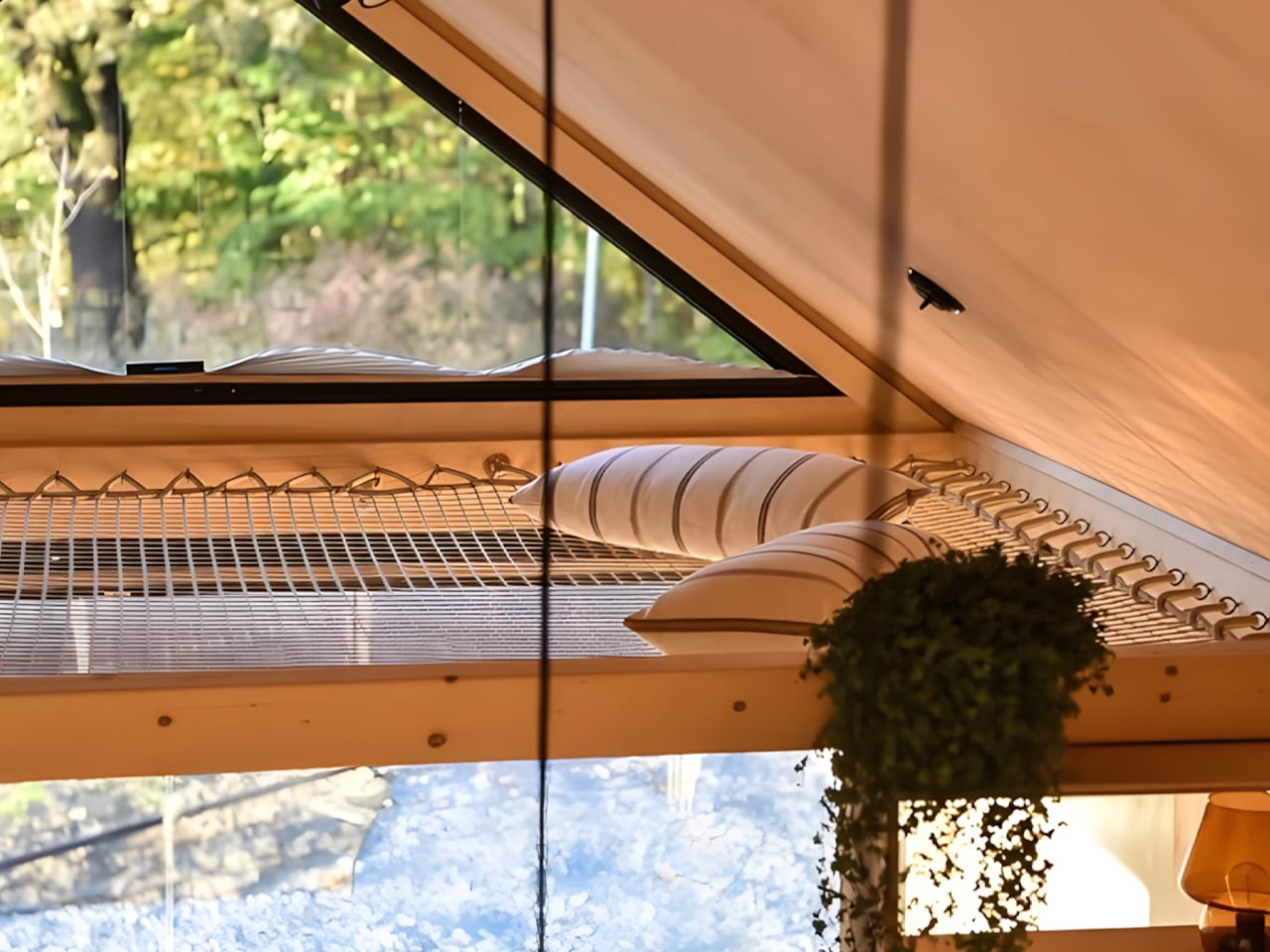
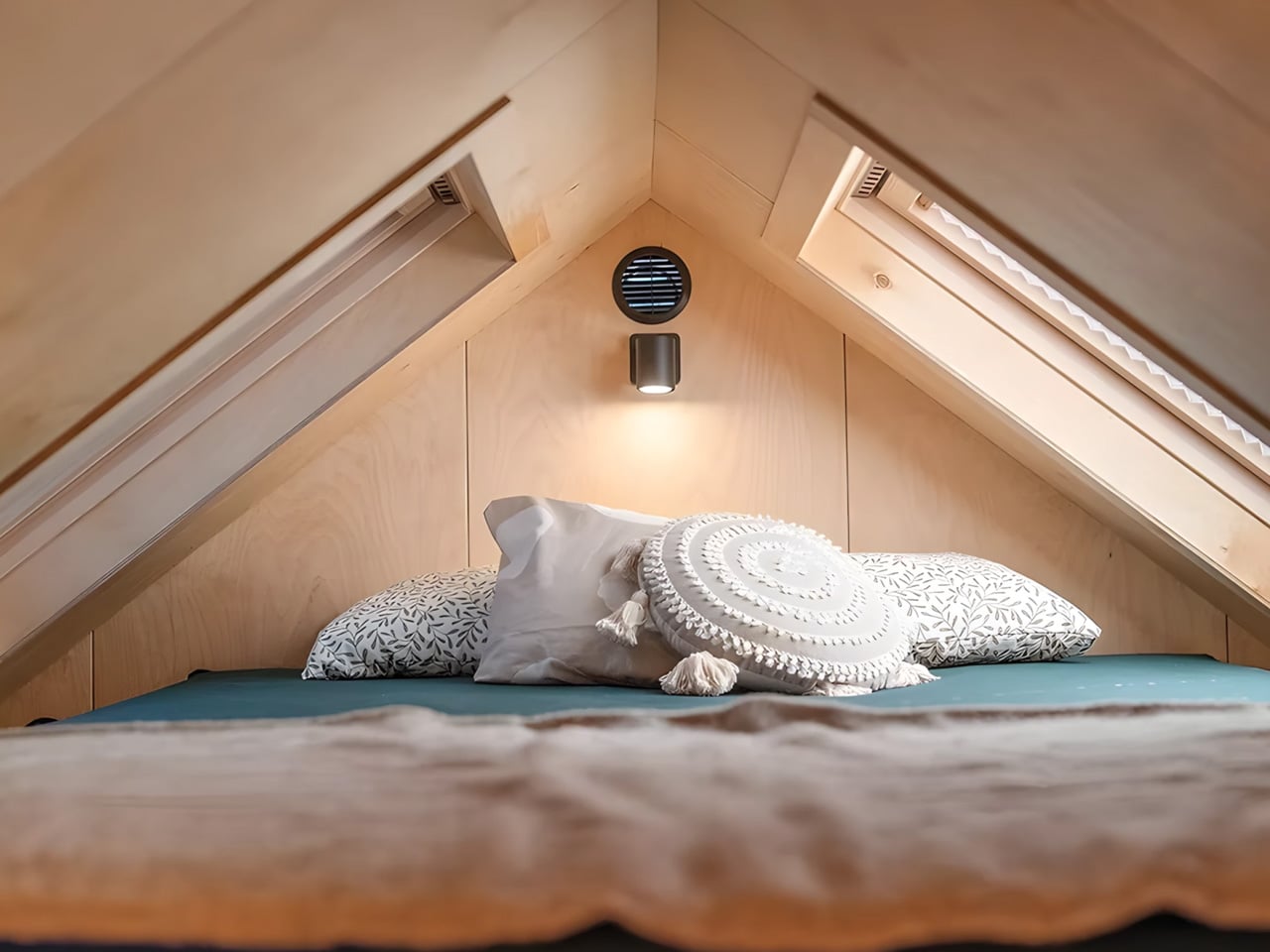
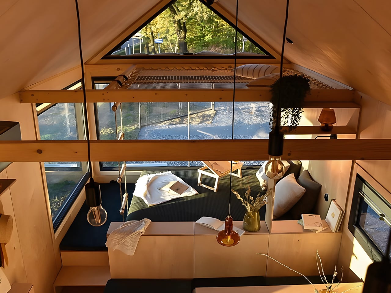
What sets Julia apart is its clever multifunctional design that adapts to different lifestyle needs throughout the day. The home includes a dedicated mini-office space that easily transforms into a relaxation nook with a hammock, perfect for those seeking a quick escape from daily routines. This flexibility makes the space ideal for remote workers who need a professional environment that can shift into leisure mode. The sleeping arrangements showcase equally practical thinking about modern family needs, with a spacious ground-floor bedroom that benefits from generous windows continuing the light-filled aesthetic throughout the home. Above, a sleeping loft provides a cozy retreat for guests or family members, offering enough room for a comfortable night’s sleep with optional skylights for stargazing.

Perhaps Julia’s most unique feature is its net-mezzanine, an innovative design element that adds an unexpected playful dimension to the space. The interior showcases elegant plywood walls that blend rustic charm with contemporary style, a finish that adds warmth to every corner, and has become so popular it’s now available across all Vagabond Haven models. Buyers can also choose spruce for the walls, paired with laminate flooring to complete the Scandinavian aesthetic that gives the home its distinctive character. These material choices create an environment that exudes rustic chalet vibes while maintaining a clean, modern sensibility.

Built for year-round living in harsh Scandinavian conditions, Julia features robust construction designed to last generations. The home sits on a steel frame for durability, with exterior cladding options of ThermoWood or spruce siding that provide both weather resistance and timeless visual appeal. The construction includes a lightweight aluminum roof, mineral wool insulation throughout the walls, well-insulated two-pane windows, and an entrance door with tempered glass. Vagabond Haven has equipped Julia with modern sustainable features, including ceiling-mounted LED lights with dimmers, solar system capability, an energy-saving water heater, freshwater tank and pump, rainwater harvesting system, and comprehensive ventilation throughout with a recuperator for energy efficiency.

The result is a tiny home that successfully bridges the gap between solitude and community, offering a serene retreat that welcomes family and friends while maintaining the intimate character that makes tiny living so appealing. Julia demonstrates that thoughtful design can create a peaceful sanctuary where work, relaxation, and social connection coexist harmoniously in a compact footprint, making it an ideal choice for those seeking to embrace a simpler, more intentional way of living.

The post Swedish Design Transforms 290 Square Feet into a Multifunctional Sanctuary first appeared on Yanko Design.
Louis Vuitton’s Beijing Flagship Turns Retail Into a Vertical, Immersive Journey

Retail and hospitality design is one of those rare territories where architecture gets to perform on multiple levels at once. It is not just about function or spectacle, but about storytelling, how materials, light, circulation, and atmosphere come together to momentarily detach visitors from the outside world and immerse them in a carefully choreographed experience. The newly opened Maison Louis Vuitton Sanlitun in Beijing is a compelling example of this ambition realized at an urban scale.

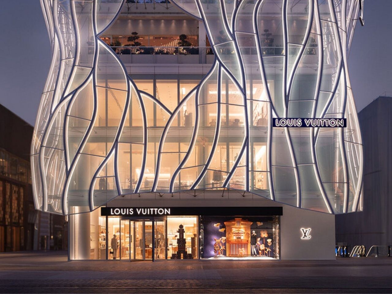
Designed by Jun Aoki for Louis Vuitton, the flagship is located in Beijing’s energetic Sanlitun district. The building brings together retail, hospitality, and exhibition spaces within a single vertically organized envelope, offering an experience that unfolds floor by floor rather than spreading outward. In doing so, it rethinks what a luxury flagship can be in one of the city’s most intense commercial neighborhoods.

Designer: Jun Aoki & Associates

The project continues Jun Aoki’s long-standing collaboration with the House, following earlier Louis Vuitton buildings in Tokyo and Osaka. In Beijing, however, his approach feels particularly attuned to context. Rather than competing with Sanlitun’s visual noise, the building introduces a sense of material depth and calibrated transparency. The architecture does not shout; it subtly absorbs and refracts the city around it.

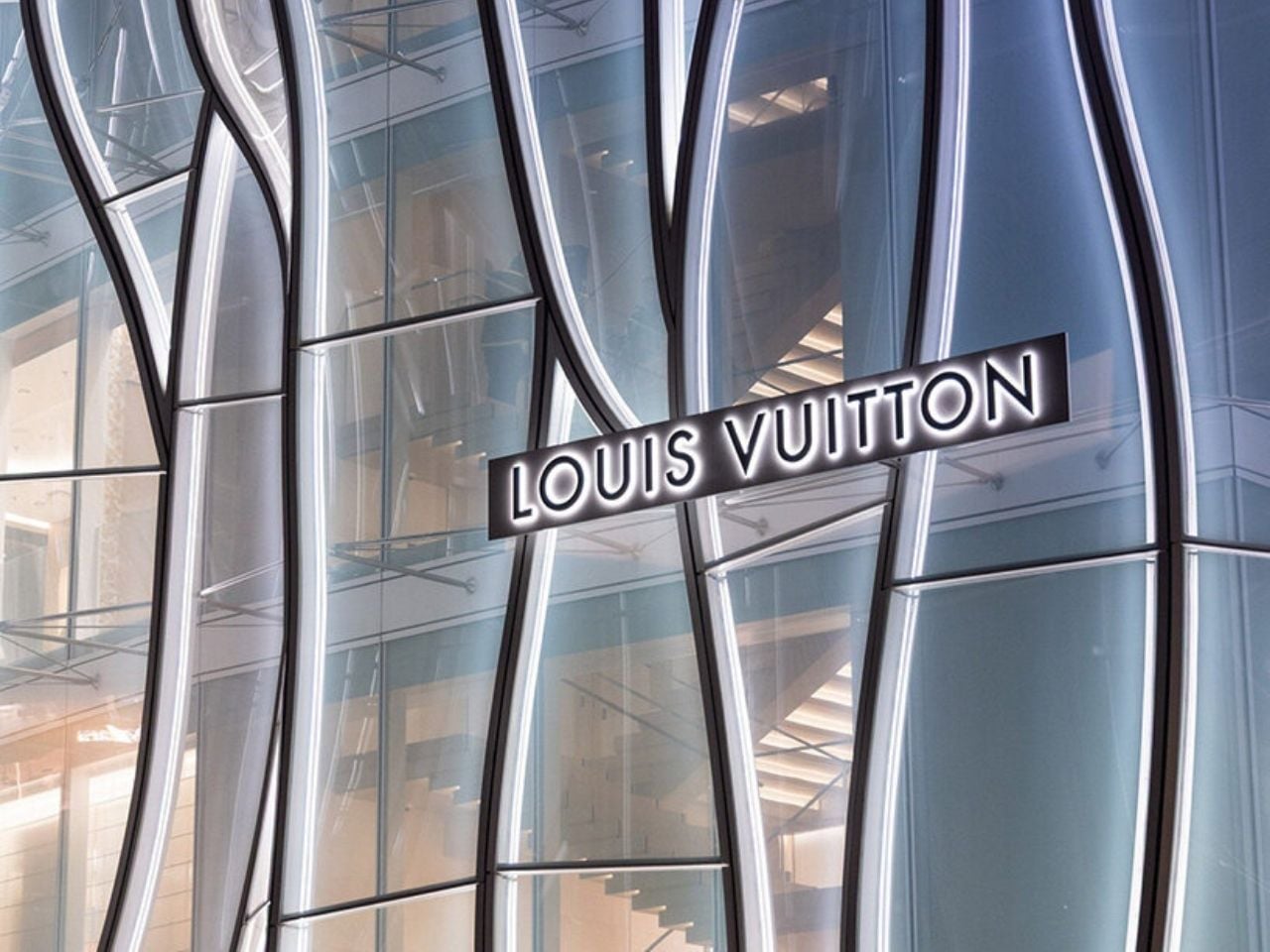
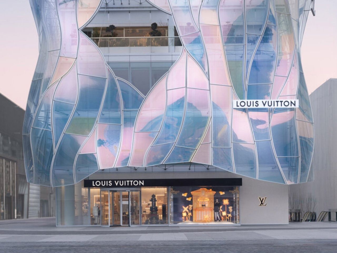
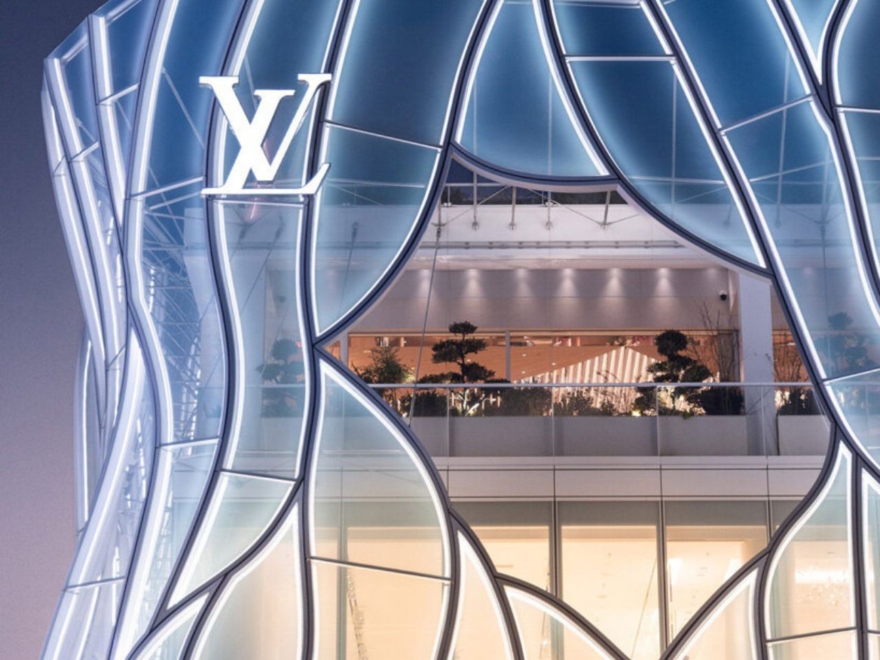
The most striking element is the facade. Drawing inspiration from Taihu stones, scholars’ rocks historically associated with classical Chinese gardens, Aoki translates their eroded, organic character into an outer skin of hand-curved glass panels. Each panel is individually shaped, creating irregular contours and a layered surface that reads differently as daylight shifts. The glass possesses translucent and dichroic qualities, producing chromatic changes that respond to sun angle, weather, and movement. From close range, the facade feels tactile and sculptural; from across the block, reflections stretch and compress, giving the building a constantly changing presence.

Behind this expressive outer layer sits a secondary envelope that handles thermal performance and weather protection. This dual-skin strategy allows the facade to operate simultaneously as cultural reference, environmental filter, and urban interface, an architectural device that balances symbolism with performance.

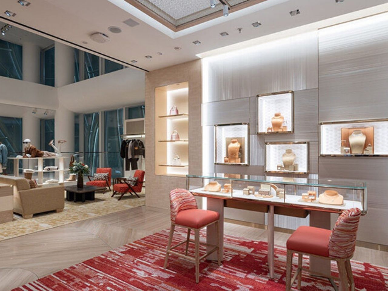
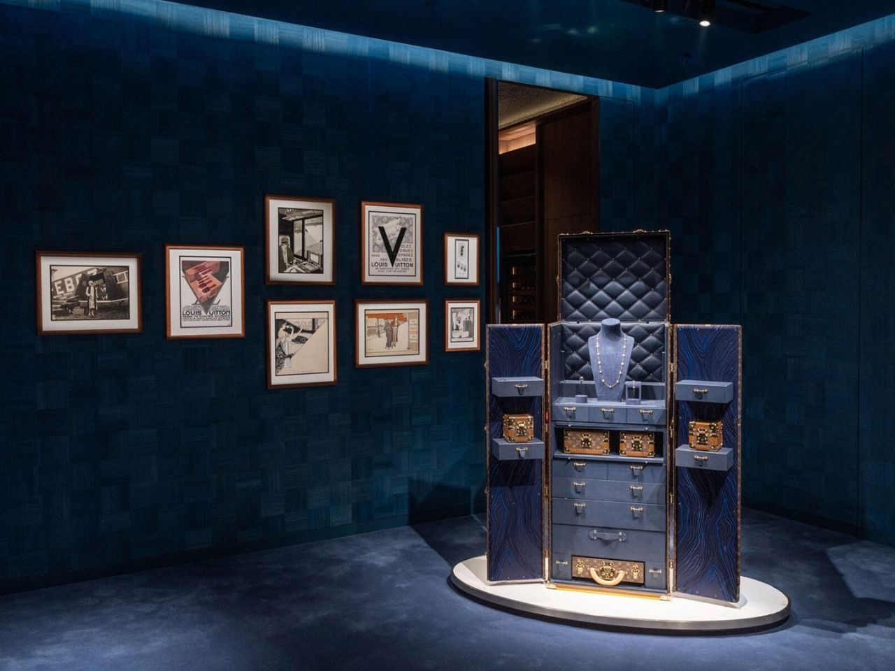
Inside, visitors enter directly into a central atrium that rises through three levels and organizes the Women’s collections. Daylight filters through the glass facade into this vertical void, animating floors, balustrades, and circulation cores. Retail programs are distributed across four levels, housing Women’s and Men’s Leather Goods, Ready-To-Wear, Shoes, Jewelry, Accessories, Perfumes, and Beauty. Movement remains clear and legible, with escalators and stairs positioned to preserve long sightlines through the atrium and back toward the city. More private client lounges are tucked into quieter zones, defined through subtle shifts in material and lighting rather than overt separation.

A distinct tonal shift occurs on the third floor, where the Louis Vuitton Home collection is presented. Furniture, textiles, and tableware by designers such as Patricia Urquiola and Cristian Mohaded are displayed in rooms scaled closer to domestic interiors, with softer finishes and calmer light, allowing the objects to breathe.

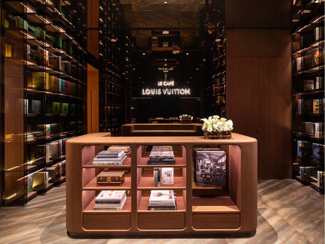
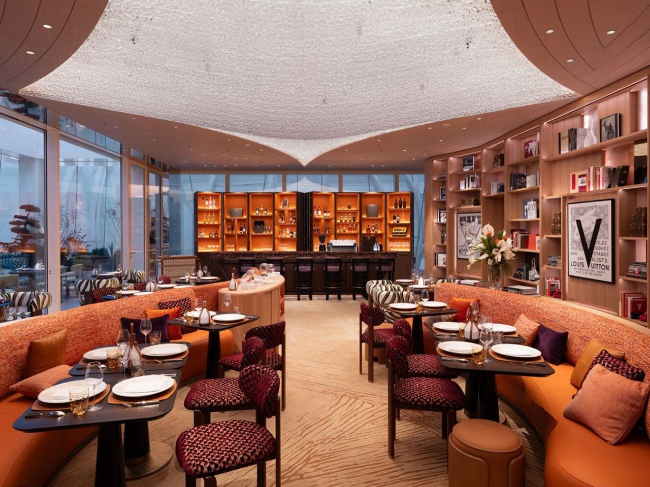
At the top, Le Café Louis Vuitton crowns the building, the brand’s first café in Beijing. Arrival begins with a mirrored vestibule that multiplies reflections before opening into a flowing dining space. The bar references the proportions and layered construction of Louis Vuitton trunks, while a terrace runs along the facade, partially screened by the glass skin and offering views across Sanlitun and the surrounding city.

By combining retail and hospitality within a single architectural envelope, Maison Louis Vuitton Sanlitun demonstrates how experiential design can transcend shopping alone. Through material storytelling, spatial sequencing, and a sensitive response to context, the building creates an immersive world, one that briefly pulls visitors away from Beijing’s relentless pace and invites them into a more deliberate, crafted experience.

The post Louis Vuitton’s Beijing Flagship Turns Retail Into a Vertical, Immersive Journey first appeared on Yanko Design.
This Off-Grid Australian Tiny House Returns to the Movement’s Rustic Cabin Roots

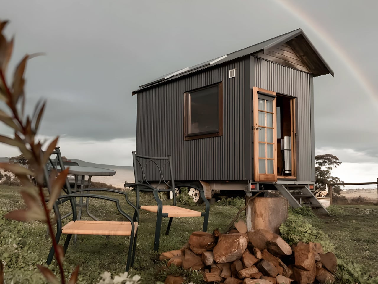
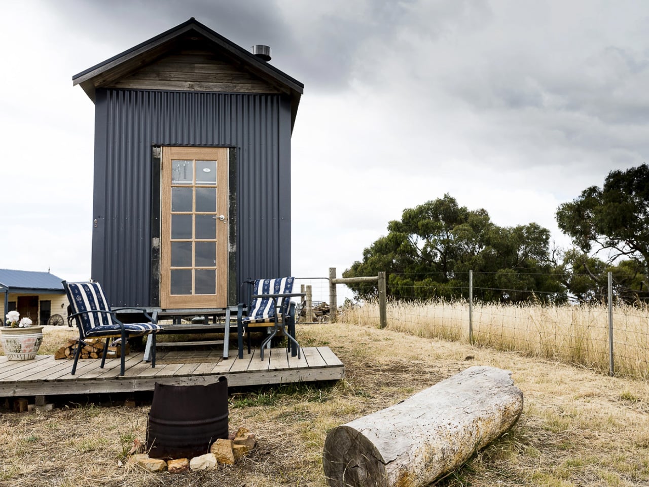
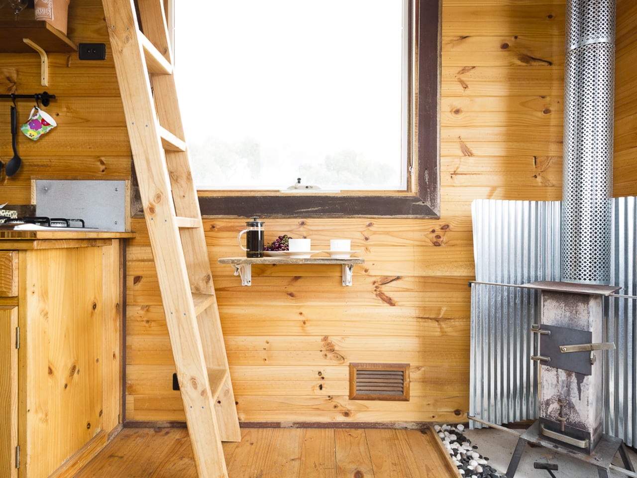
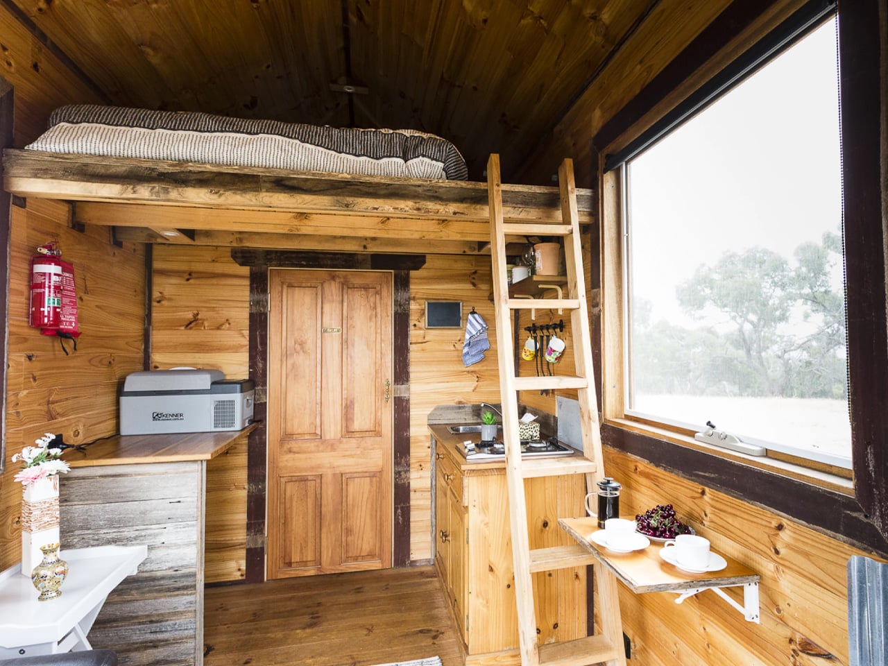
Australia’s Build Tiny has crafted a charming escape that proves small living doesn’t have to sacrifice character. The Tallarook Hilltop Tiny House 1 sits perched on a stunning hilltop in rural Victoria, offering sweeping views over Broadford and Kilmore while embracing the raw, unpretentious aesthetic of agricultural architecture. Built on a double-axle trailer, the home’s corrugated metal siding and matching roof create an almost utilitarian appearance that feels right at home against the backdrop of Mount Piper and the Tallarook State Forest. This design choice reflects a refreshing departure from the sleek, apartment-style tiny homes that dominate today’s market. Instead, Build Tiny has returned to the movement’s roots, celebrating the cabin-like simplicity that first inspired people to downsize.

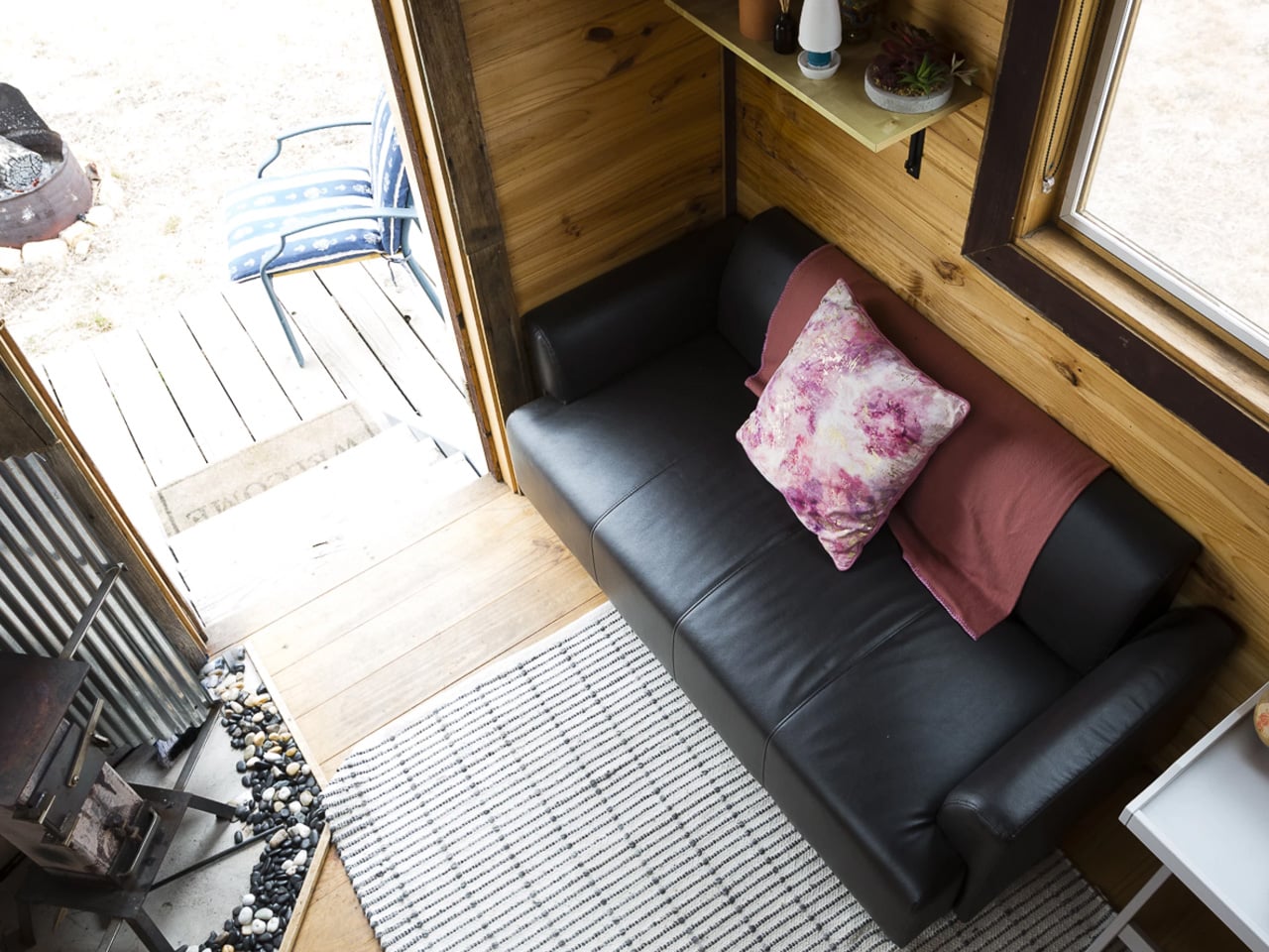
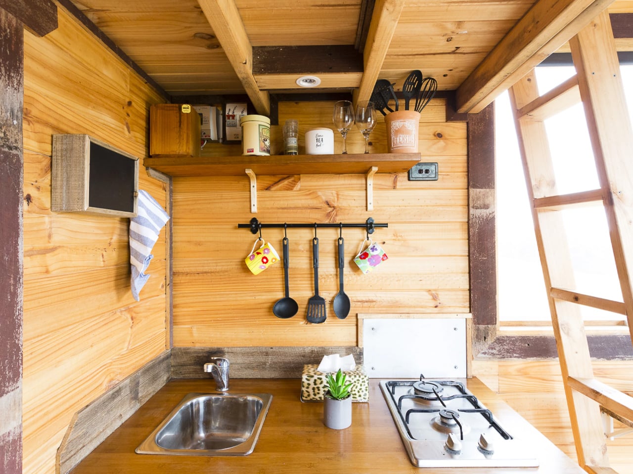
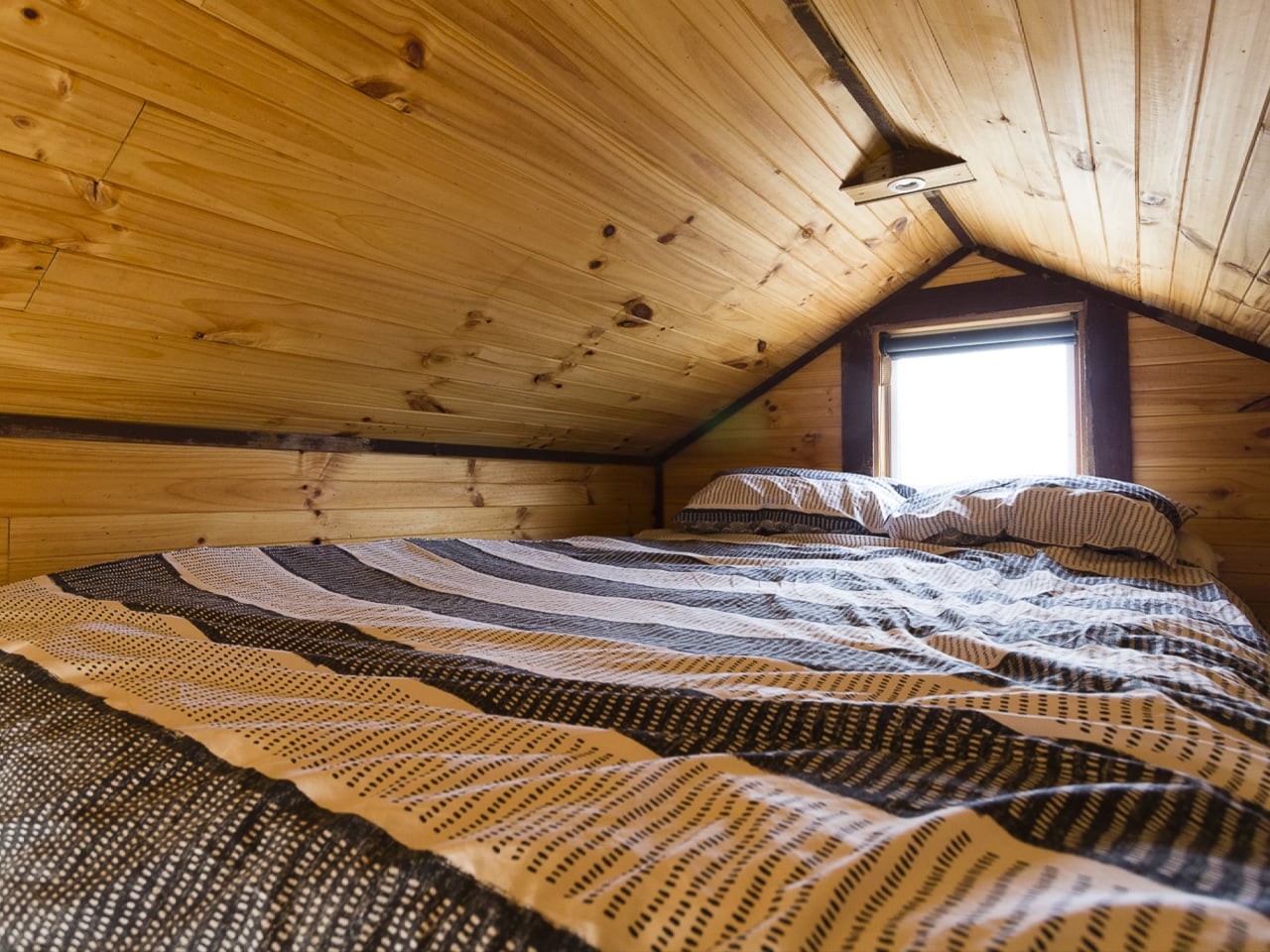
The 157-square-foot interior maximizes every inch through thoughtful spatial planning. A lofted queen-sized bed accessed by ladder keeps the sleeping area separate from the main living space, while the ground floor houses a compact kitchenette equipped with essential cooking equipment and bathroom facilities. The layout prioritizes function over frills, creating a cozy retreat that feels intimate rather than cramped.

Designer: Build Tiny

What truly sets this tiny house apart is its commitment to off-grid independence. Roof-mounted solar panels connect to battery storage, ensuring power flows consistently even when clouds roll in. This self-sufficiency aligns perfectly with the property’s rural location, where guests can disconnect from urban pressures and reconnect with the slower rhythms of farm life.

The setting itself deserves equal billing. Located just an hour’s drive from Melbourne, the property sits on 600 acres of working farmland at Seven Hills, Tallarook. The hilltop position provides unobstructed sightlines across the Goulburn Valley, making sunrise and sunset viewing an effortless daily ritual. Guests can explore nearby attractions like the Tallarook State Forest, Trawool Reservoir, and Mount Hickey, or venture to local spots such as Kilmore Piazza House and Rose Garden Cafe.

Build Tiny’s approach demonstrates that authentic tiny house living can be both practical and poetic. The corrugated metal exterior will age gracefully, developing a weathered patina that deepens its connection to the landscape. The compact footprint treads lightly on the land while the solar setup eliminates reliance on external power sources.

For travelers seeking respite from overstimulating modern life, the Tallarook Hilltop Tiny House offers something increasingly rare: genuine simplicity. There’s no pretense here, no Instagram-ready styling masking impractical design. Just honest materials, efficient use of space, and views that stretch toward the horizon. It’s tiny house living as it was meant to be.

The post This Off-Grid Australian Tiny House Returns to the Movement’s Rustic Cabin Roots first appeared on Yanko Design.
China Just Built a Rest Stop That Belongs in a Sci-Fi Movie

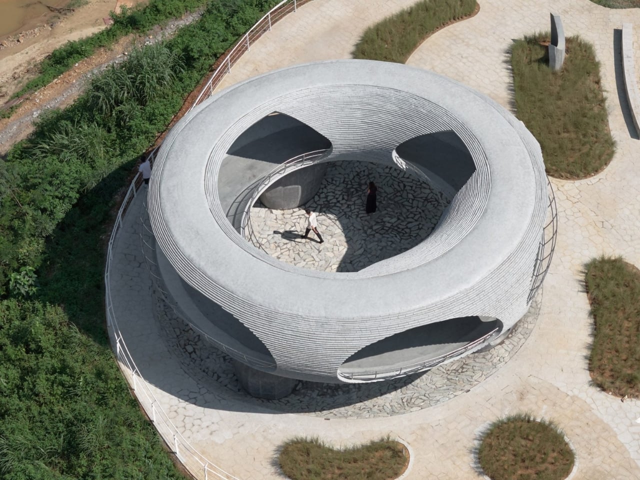
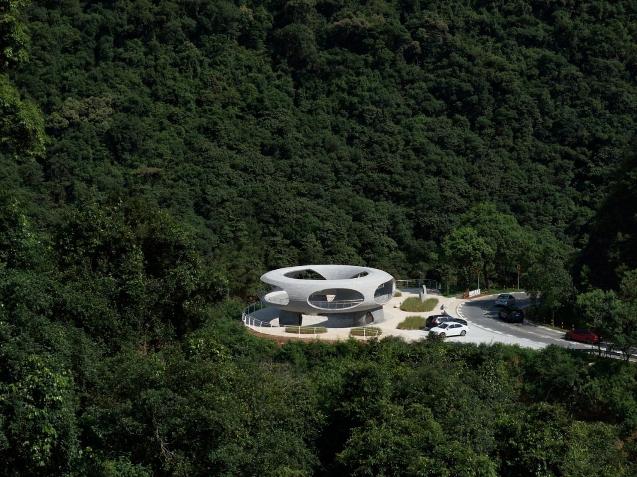
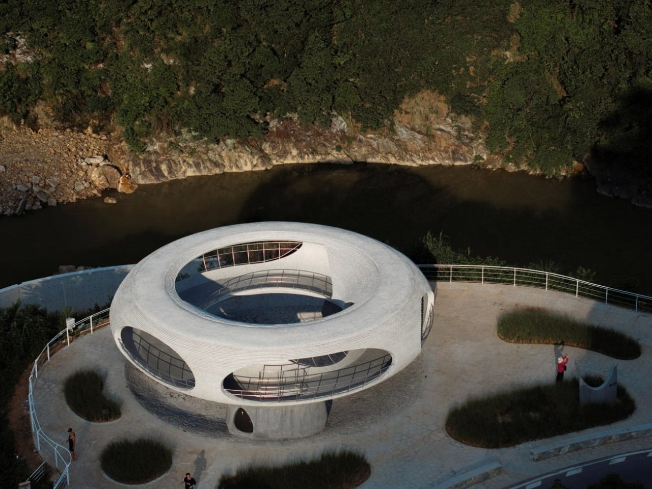
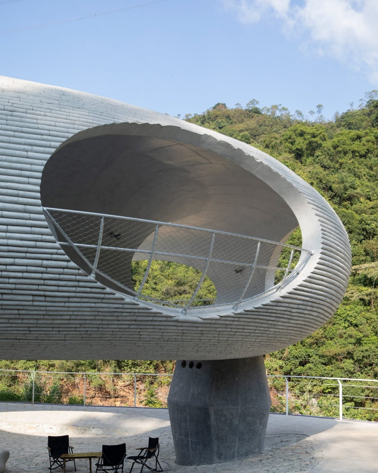
Sometimes the best architecture doesn’t shout for attention. It simply invites you to pause, breathe, and take in everything around you. That’s exactly what HCCH Studio accomplished with Resting Loop With Views, a captivating concrete pavilion perched on Mount Luofu in Huizhou, China.

Picture this: you’re cycling up a winding mountain road, legs burning, and suddenly you spot what looks like a futuristic donut hovering above the landscape. This isn’t some sci-fi movie set. It’s a real place designed for real people who need a moment to catch their breath and soak in the scenery.

Designer: HCCH Studio

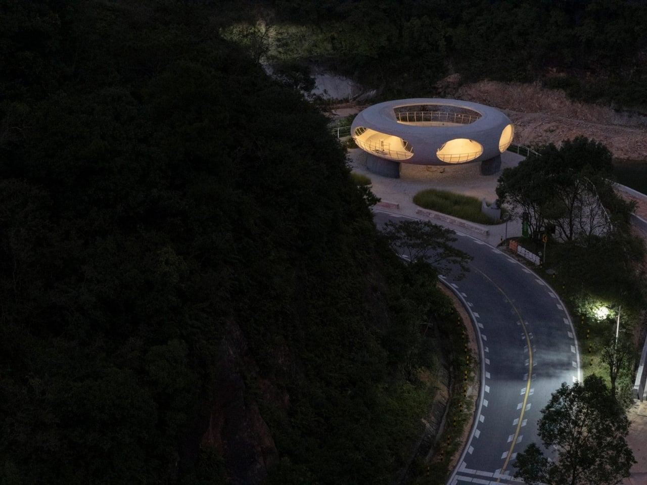
The pavilion sits on a platform wedged between a highway and a river, on a spot that used to be nothing more than an awkward parking area at a sharp curve. But HCCH Studio saw potential where others saw leftover space. They transformed this in-between zone into something genuinely special, a place where function and beauty loop together in the most literal sense.

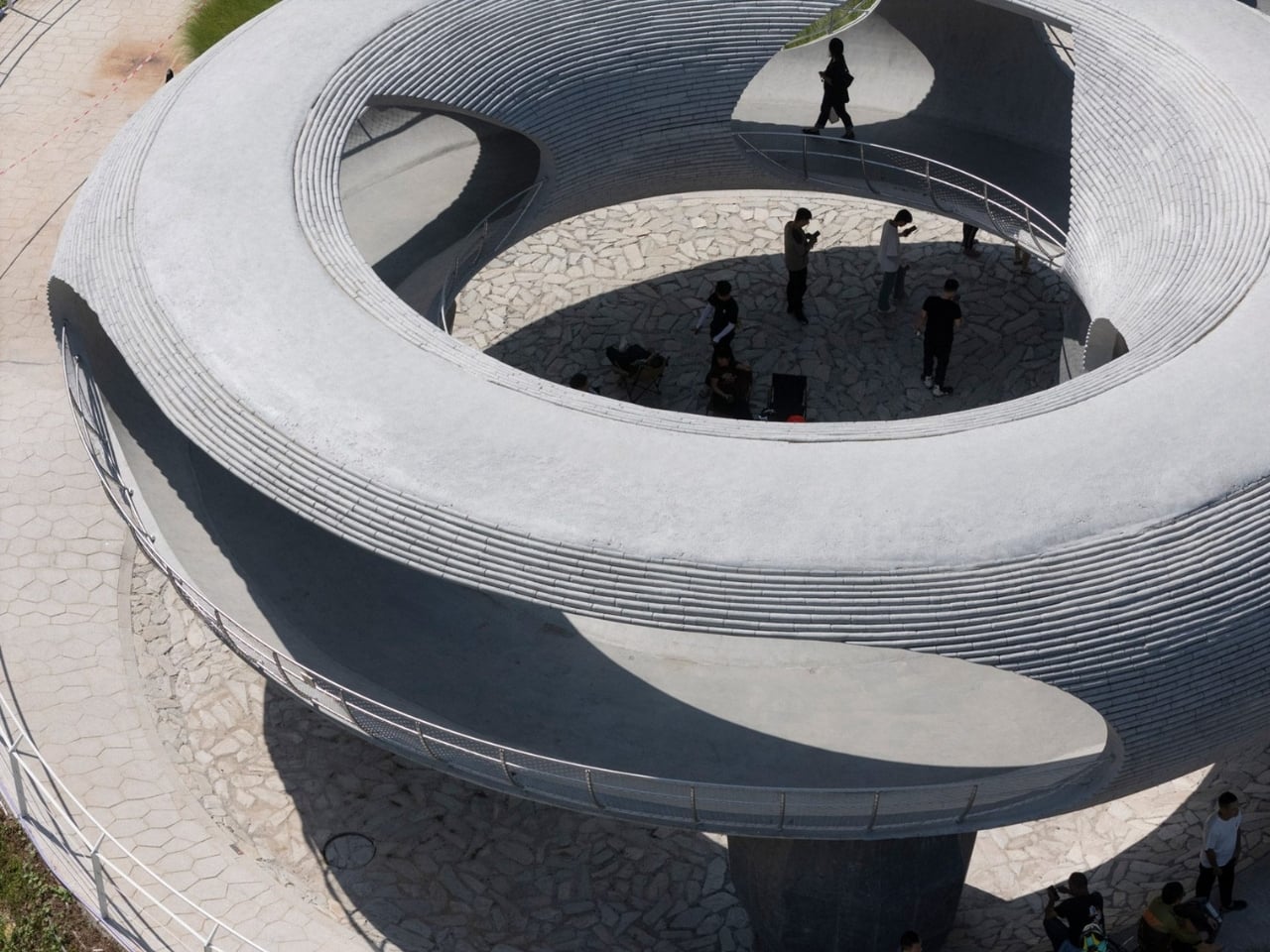
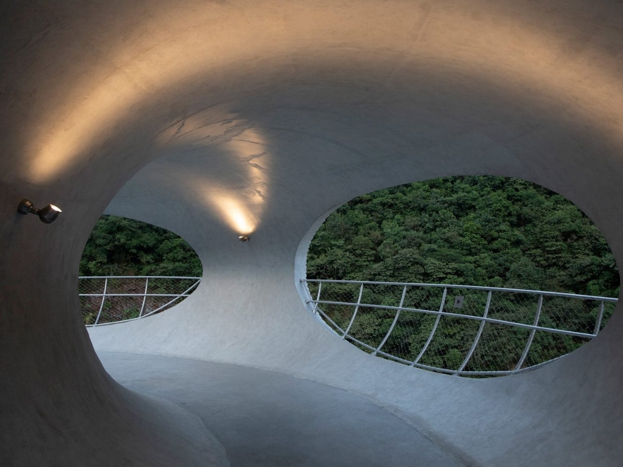
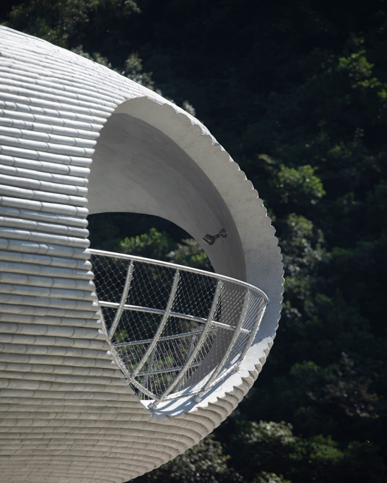
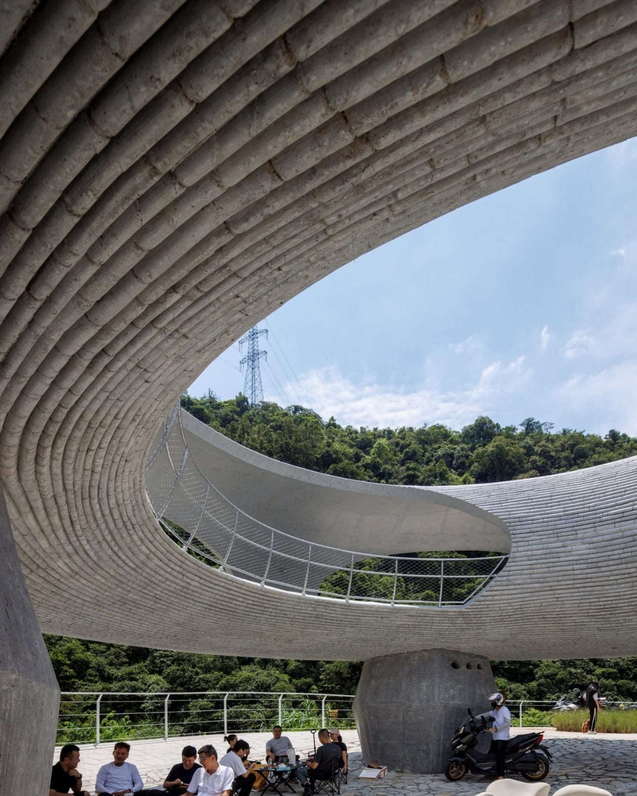
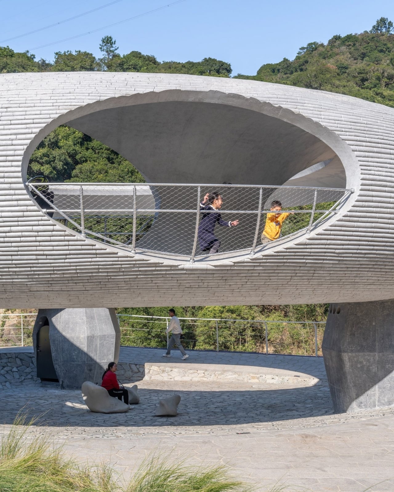
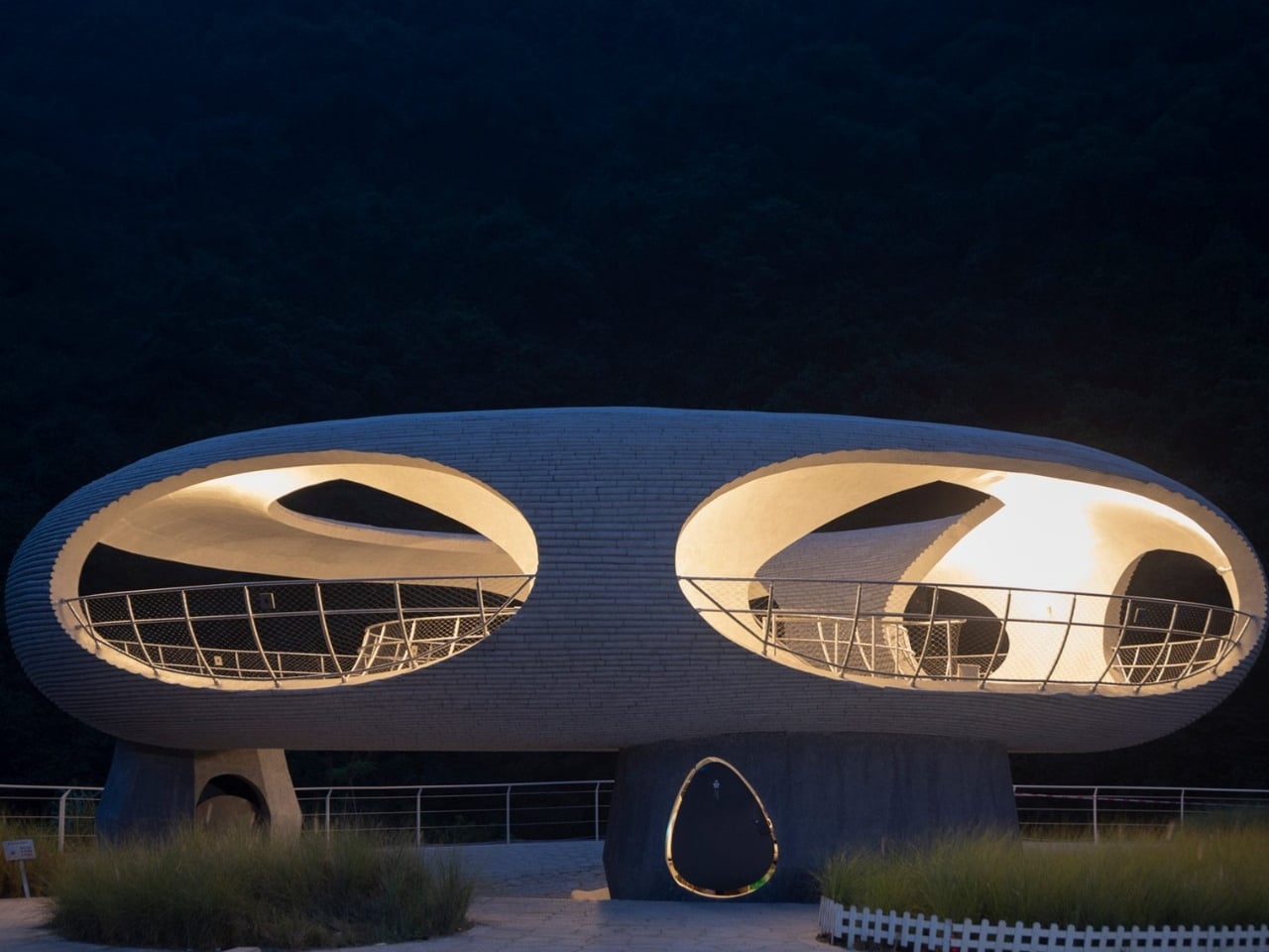
The structure itself is a continuous concrete ring, textured to mimic bamboo, that creates this mesmerizing circular journey. You enter, follow the curved path upward, and eventually circle back to where you started. But you’re not the same person who walked in. Because along the way, strategically placed oval openings frame the mountain ranges and river below like living paintings.

What makes this design so clever is how it treats views as an experience rather than a backdrop. The openings aren’t random. They’re carefully positioned to guide your eyes toward specific landscape features, turning the act of looking into something almost choreographed. Stand here and you see the river. Move there and suddenly mountains fill your vision. It’s architecture that understands how we actually experience places.

The concrete surface, with its bamboo-inspired texture, gives the structure an organic quality that helps it feel less like an alien spaceship and more like it grew from the mountain itself. At night, warm lighting glows through those oval openings, transforming the pavilion into a lantern floating in the darkness. It becomes a beacon for travelers on the winding road, marking rest, refreshment, and respite.

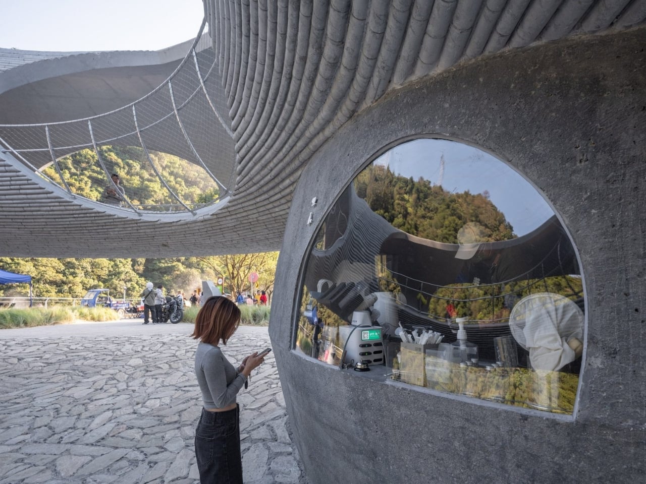
Inside, the design eliminates traditional furniture by integrating seating directly into the looped form. You can sit, lean, or stand wherever feels right. There’s no prescribed way to use the space. It adapts to you rather than forcing you to adapt to it. This flexibility makes it feel welcoming rather than imposing, a place that serves cyclists, hikers, and curious visitors equally well.

What strikes me most about Resting Loop With Views is how it redefines what a rest stop can be. We’re so used to utilitarian spaces that exist purely for function. But this pavilion proves that even simple, practical structures can spark wonder and delight. It respects both the landscape and the people moving through it, creating a moment of connection between the two.

The project serves as a cafe and viewing platform for cycling enthusiasts, but it transcends that basic purpose. It’s a space that makes you want to linger, to look, to really see the place you’re in. In our rush-through world, that feels almost radical.

HCCH Studio crafted something that feels both timeless and futuristic, grounded and otherworldly. The continuous loop becomes a metaphor for the journey itself, there’s no real beginning or end, just movement and moments of stillness punctuated by stunning views.

Architecture like this reminds us that good design doesn’t need to be complicated or expensive to make an impact. It just needs to understand people and place deeply enough to bring them together in meaningful ways. Resting Loop With Views does exactly that, one curved concrete section and one carefully framed vista at a time.

The post China Just Built a Rest Stop That Belongs in a Sci-Fi Movie first appeared on Yanko Design.
$239 Angry Miao Silent Keyboard Channels Tadao Ando’s Concrete Church

Cheap office keyboards sound like plastic rain, which becomes unbearable in open-plan offices or when working late while someone else is trying to sleep. Custom mechanical keyboards feel better, but they tend to be loud, visually aggressive, and often shrink to compact layouts that sacrifice the numpad. Most people end up compromising on sound, feel, or functionality, rarely getting all three at once.

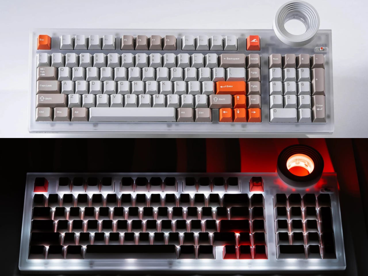
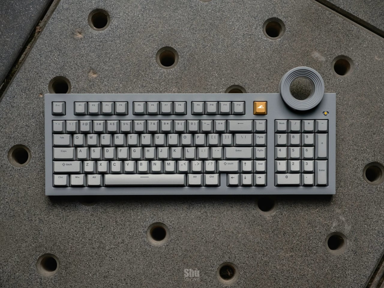
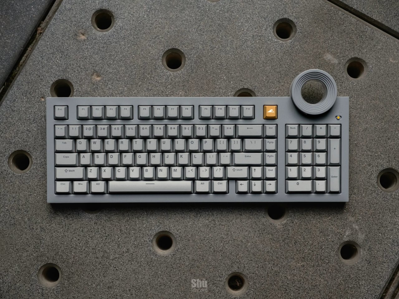
Angry Miao’s ATM 98 tries to bridge that gap with a silent-first philosophy. It keeps a full 98-key layout with a numpad and function row, wraps it in an aluminum shell that weighs around 2.6 kg, and centers a large Star Ring knob on the top right. The whole thing reads more like a desk sculpture than office equipment, built for people who type all day and want something that feels deliberate without announcing itself.

Designer: Angry Miao

The design references are specific. One version channels Tadao Ando’s Church of the Light with a matte concrete-gray shell and controlled RGB lighting, treating the keyboard like a minimalist architectural object. The translucent Frost Whisper and Night Ink editions take inspiration from Off-White x Rimowa’s see-through luggage, revealing the gold-plated PCB and mounts underneath. The structure and lighting become part of the composition, not just decoration.
What matters more on a Tuesday morning is how it feels to type all day. Angry Miao worked with Bsun to develop custom Light Sakura silent linear switches with an S-shaped damping stem and low-friction LY material that delivers smooth, crisp bottom-out without the mushy rebound typical of silent switches. Paired with an eight-layer gasket stack, the board kills hollowness, letting you type emails without sounding like you are auditioning for a contest.
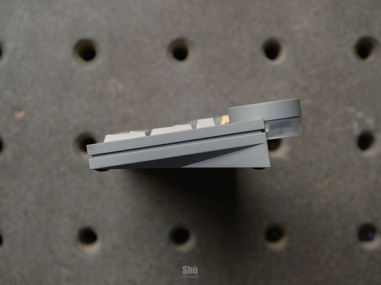
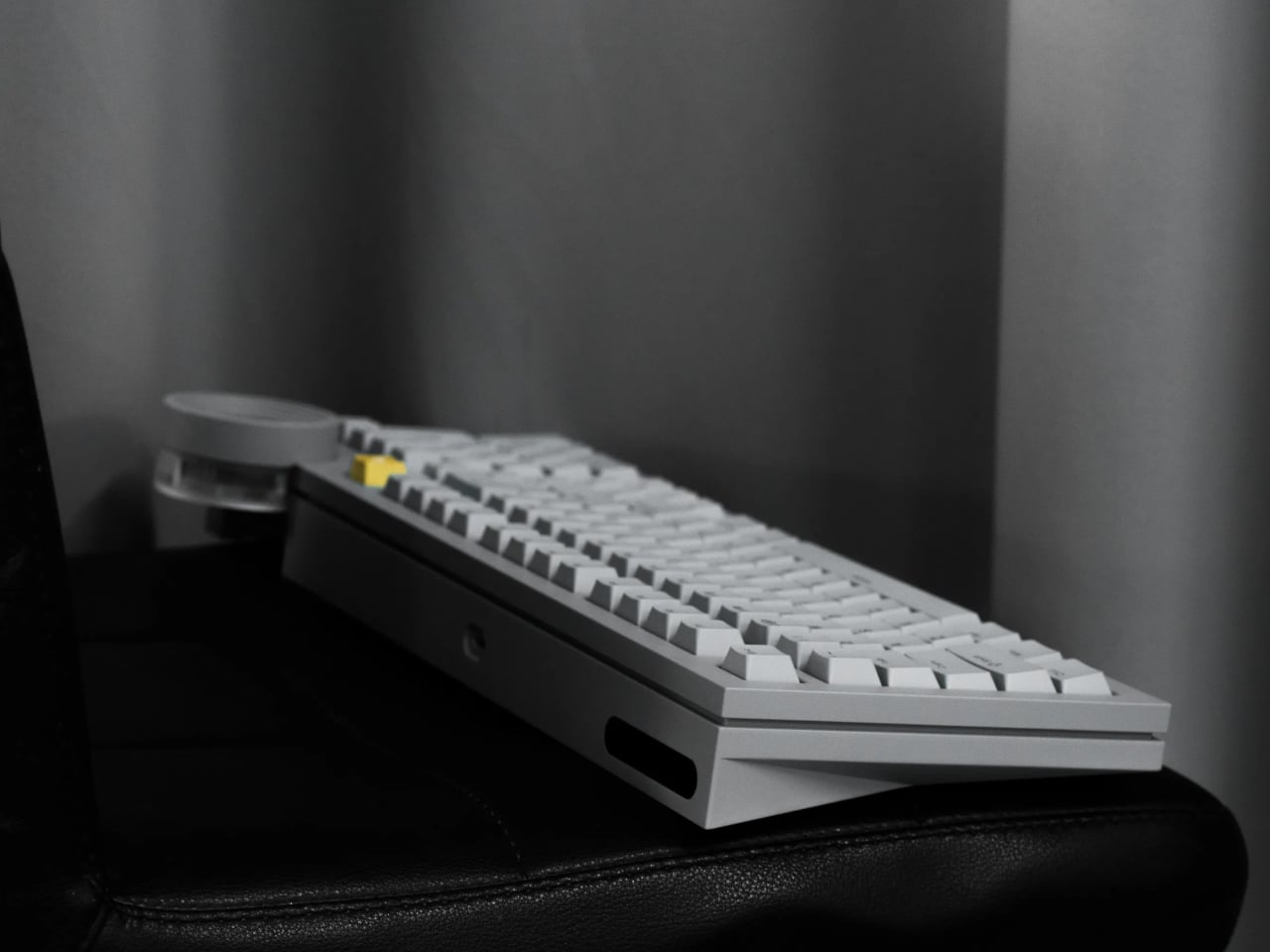
The 18.8mm front height and 8-degree typing angle let you skip a wrist rest without cramping by lunchtime. The 98% layout keeps the numpad for spreadsheets and shortcuts while fitting on a normal desk, and the Star Ring knob becomes a habit for volume, timelines, or switching layers. It is the kind of control you miss when you go back to a plain keyboard.

Tri-mode wireless with tuned 2.4GHz lets you jump from Bluetooth on a laptop to low-latency gaming on a PC without swapping dongles. The board runs QMK firmware for deep remapping, but Angry Miao also built a web-based configurator for people who just want to drag and drop keys and RGB effects without learning command-line tools, making it approachable even if this is your first custom board.

The Angry Miao ATM 98 treats quiet as a design material alongside aluminum and light. It is built for people who live at their keyboards and want something that feels deliberate under their fingers without turning every keystroke into a sound effect that echoes across the room. When loud gaming slabs and forgettable boards dominate the office space, that kind of architectural silence feels oddly refreshing, like finally getting a desk object that understands the difference between personality and noise.

The post $239 Angry Miao Silent Keyboard Channels Tadao Ando’s Concrete Church first appeared on Yanko Design.