Aquaponic gardening has been getting a lot of attention as a more sustainable way to grow food, especially in urban settings where arable land isn’t exactly plentiful. The concept pairs fish and plants in a closed-loop system where each supports the other, cutting out synthetic fertilizers and reducing water waste. Most implementations, though, tend to be utilitarian and aren’t built to handle seasonal changes without significant supplemental energy input.
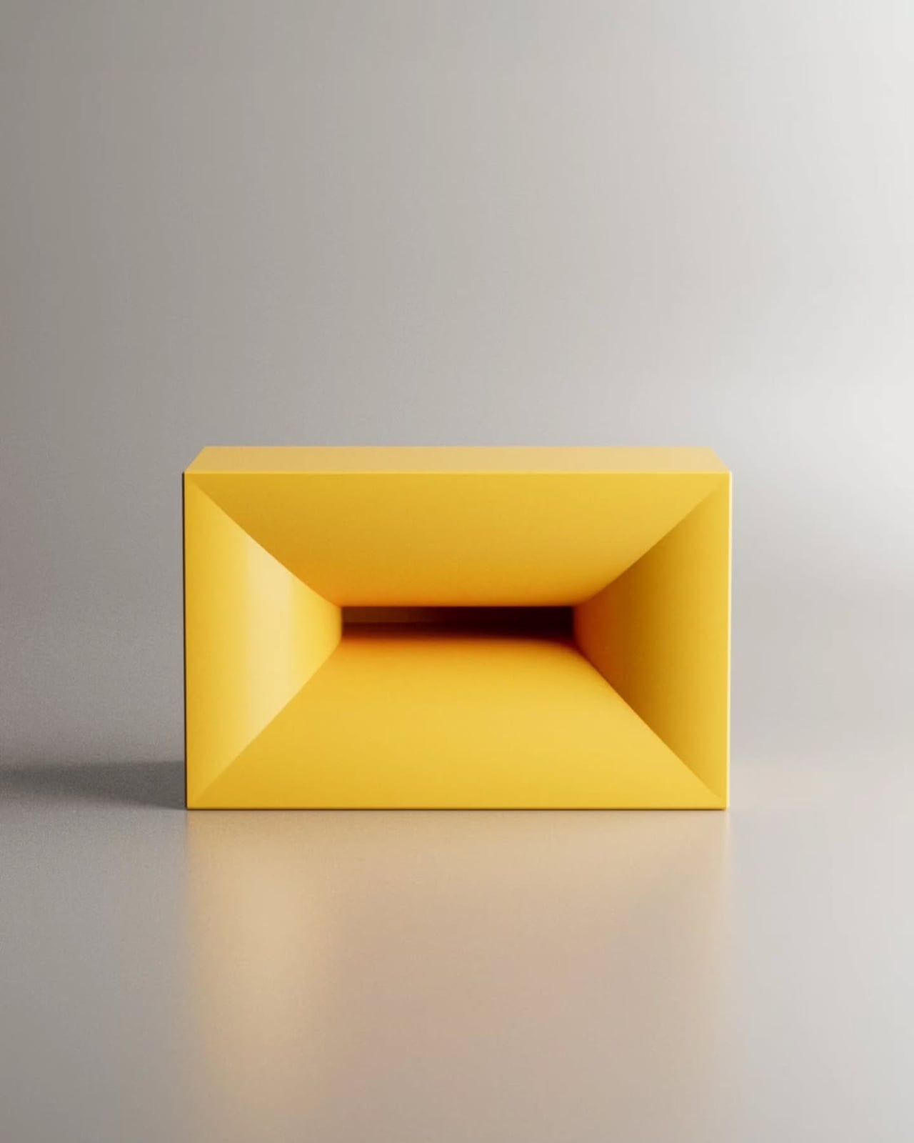
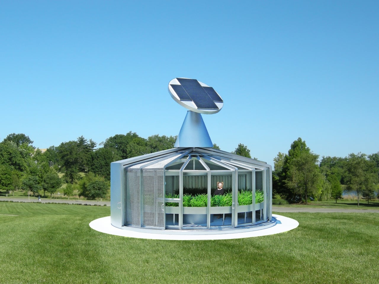
That’s the problem Michael Jantzen’s Eco-Aquaponic House was designed to tackle. Built as a public exhibit for a botanical garden, it functions more like a machine than a greenhouse, engineered to grow fish and plants together in an energy-efficient and largely self-sustaining way. Jantzen, whose work merges art, architecture, technology, and sustainable design, has been experimenting with this kind of thinking for over 50 years.
Designer: Michael Jantzen
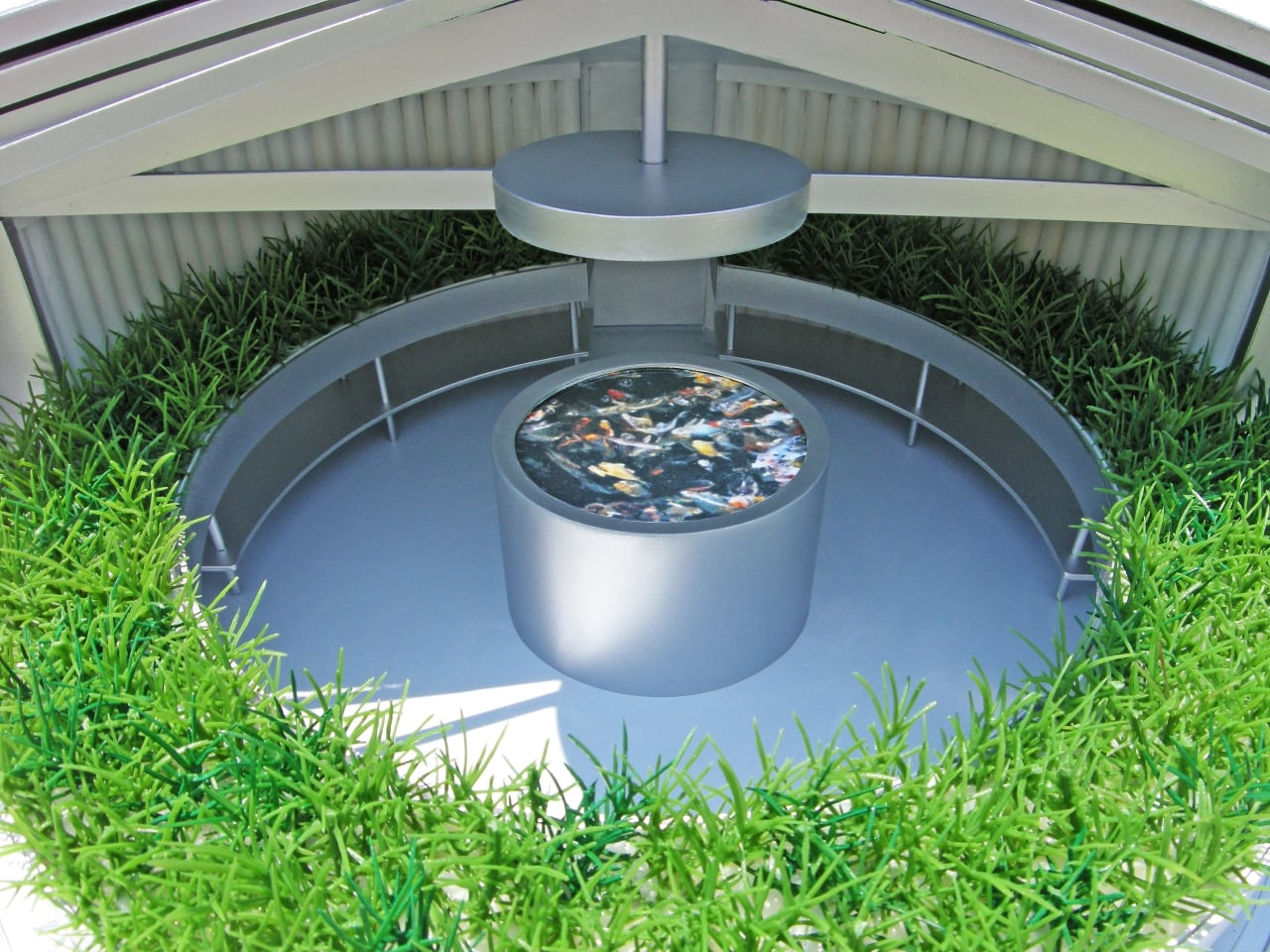
The system works on a simple but elegant biological loop. Fish waste is cycled through the roots of the surrounding plants as a natural fertilizer. The plants filter the water, which then returns to the fish tank. The cycle repeats continuously with minimal outside input, keeping both fish and plants alive. It’s the kind of closed-loop food production that makes conventional growing methods look rather wasteful by comparison.
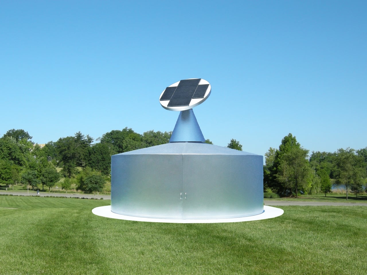
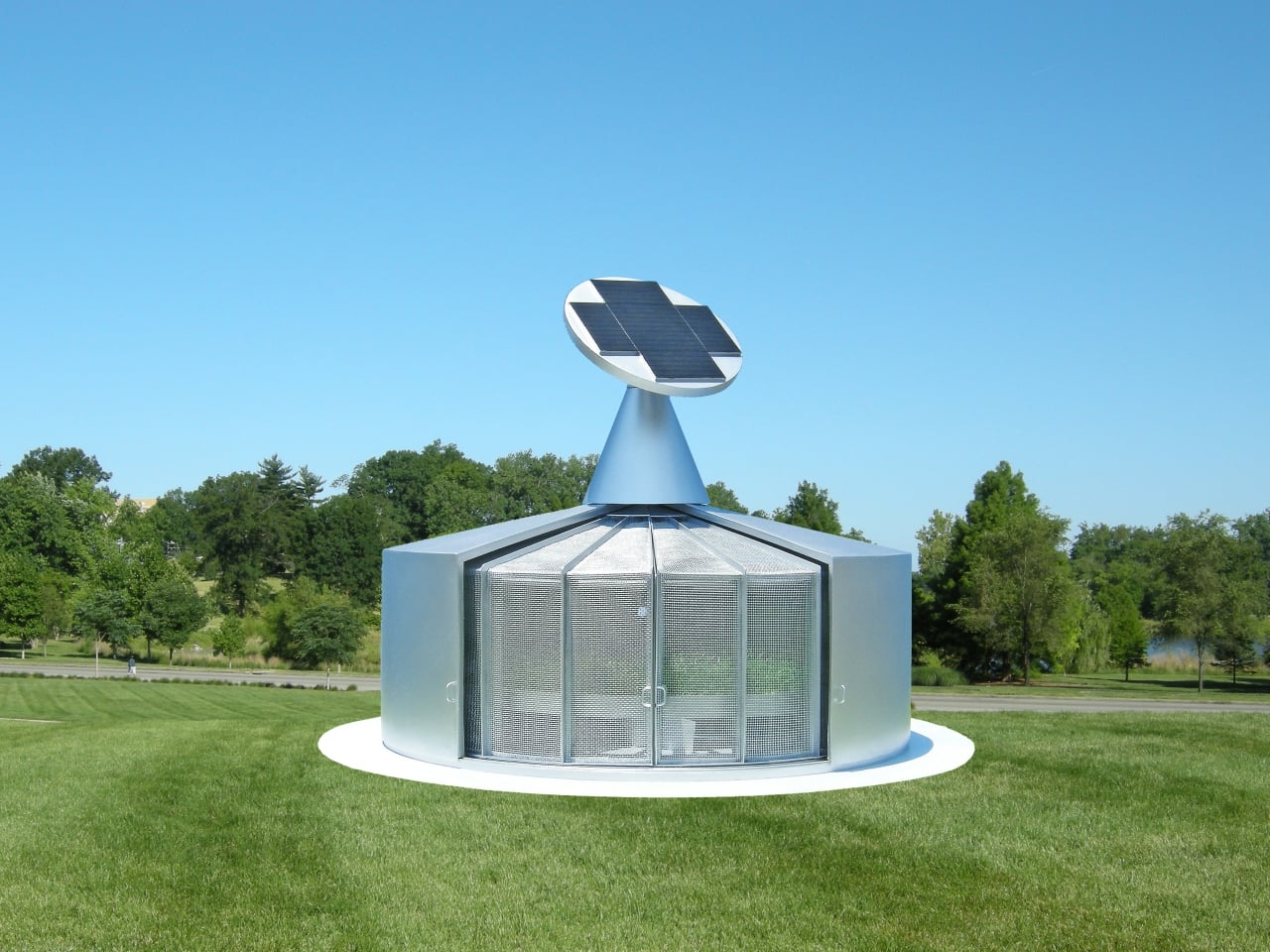
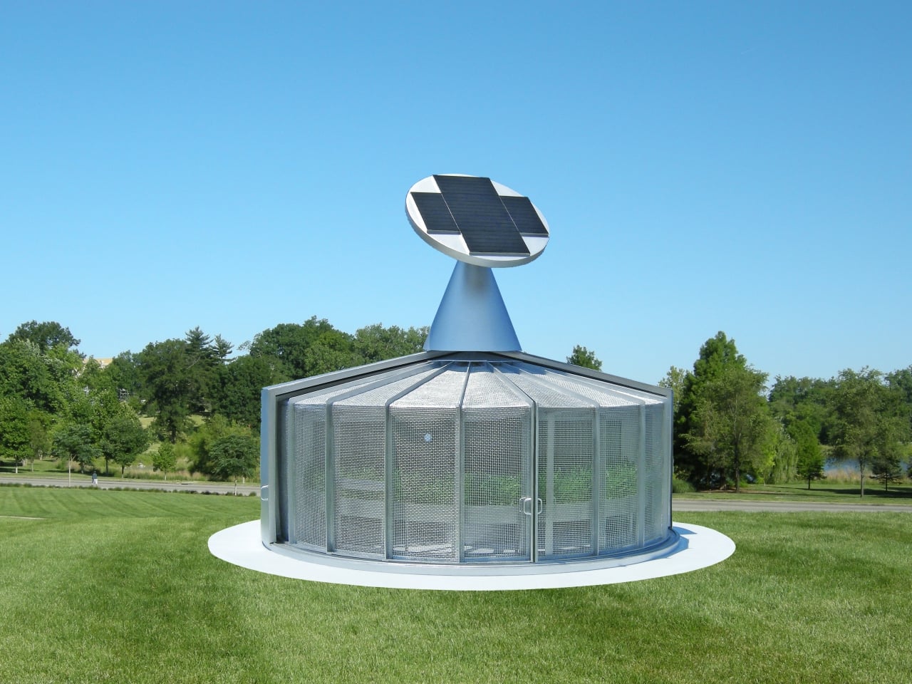
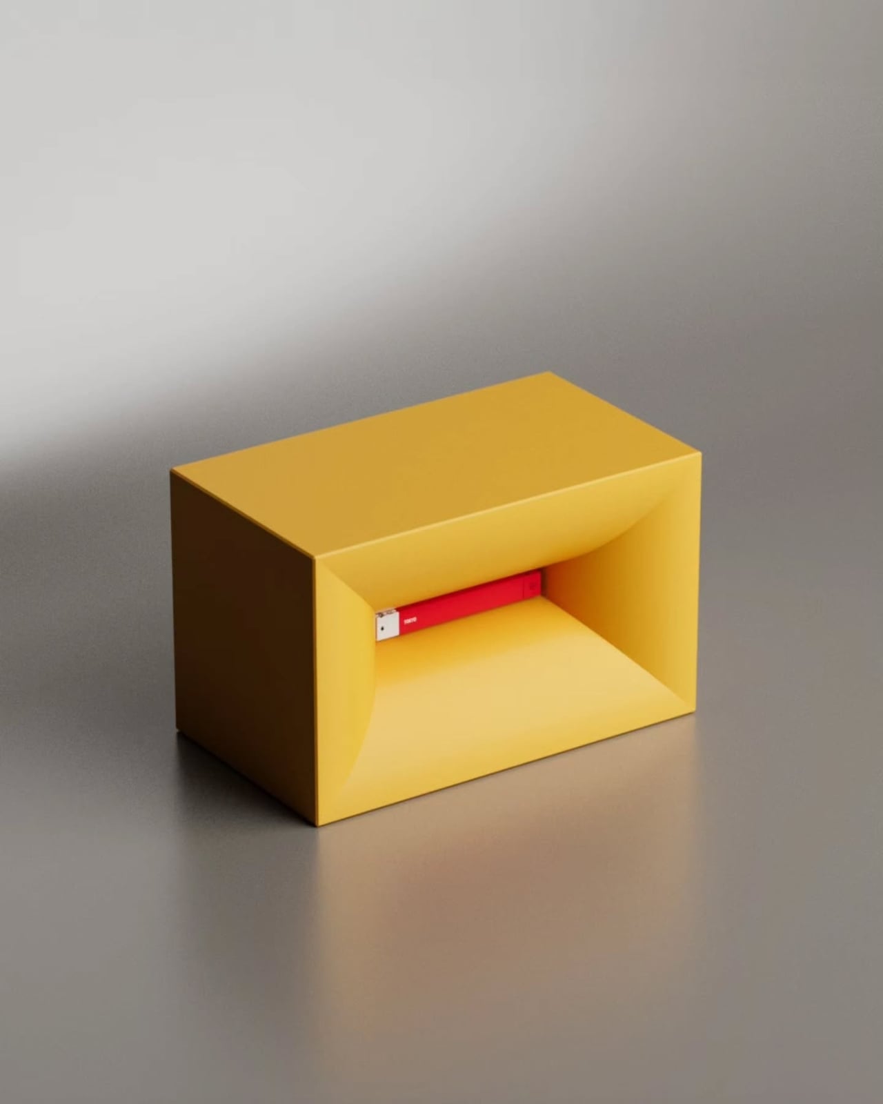
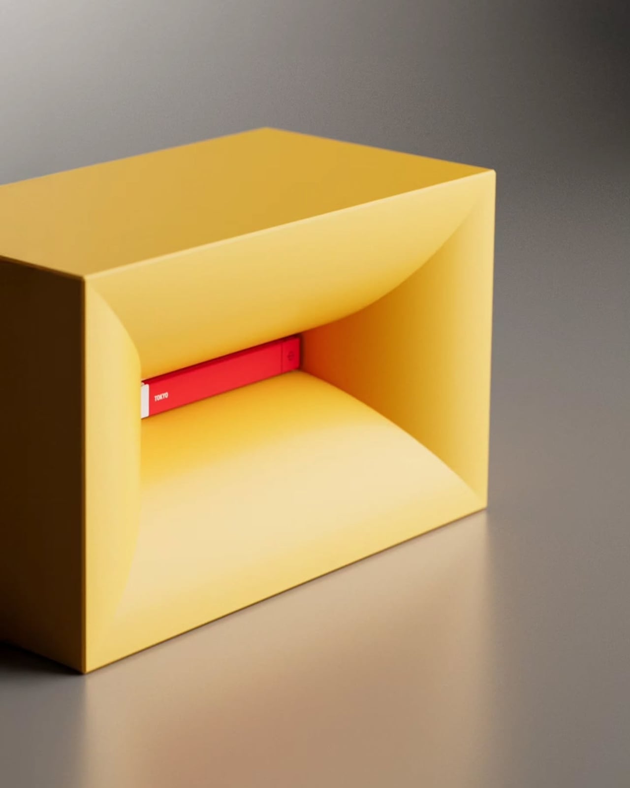
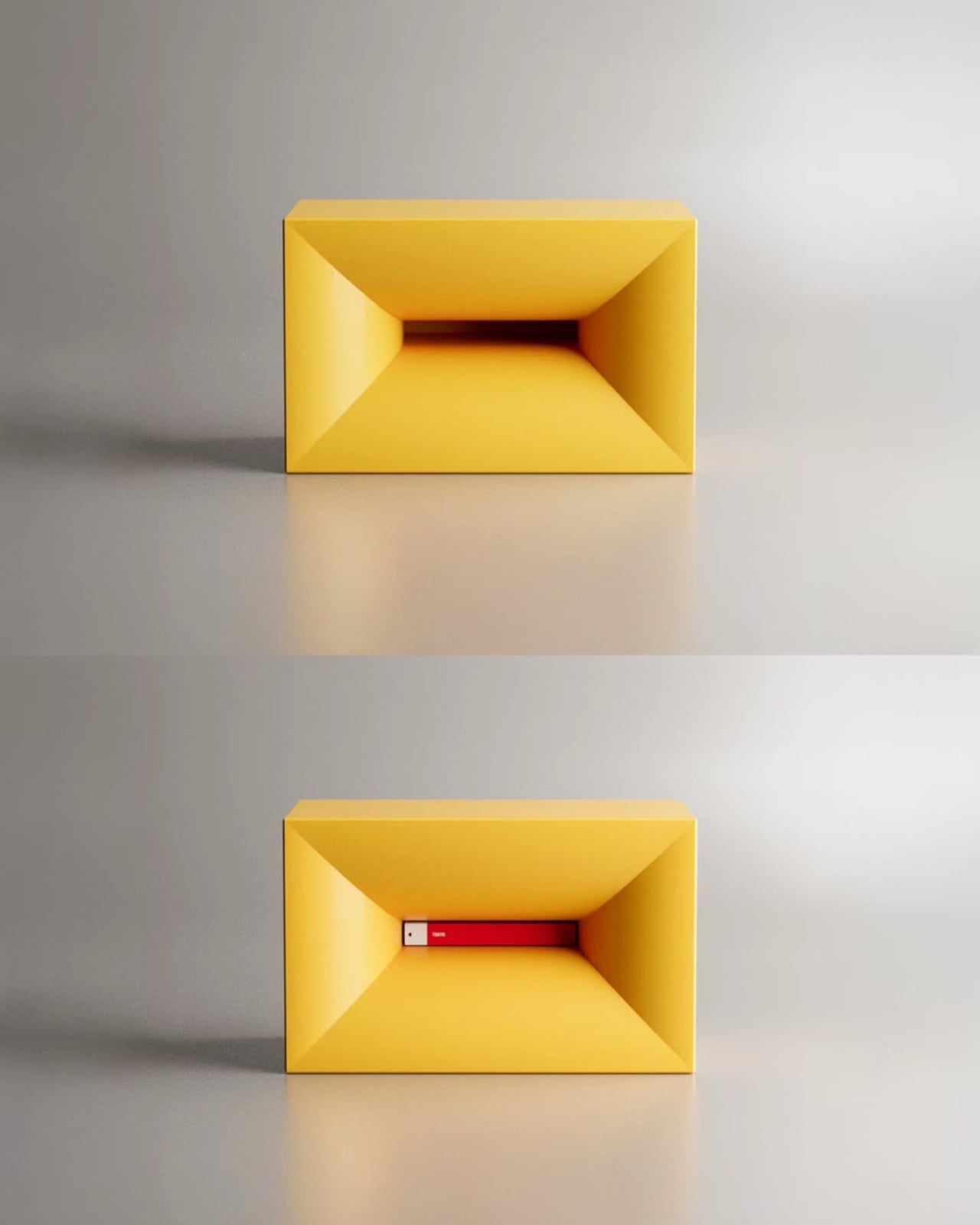
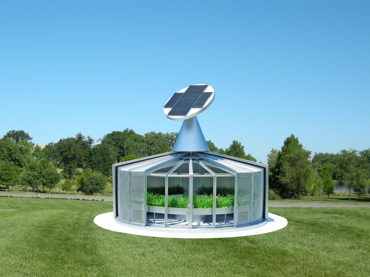
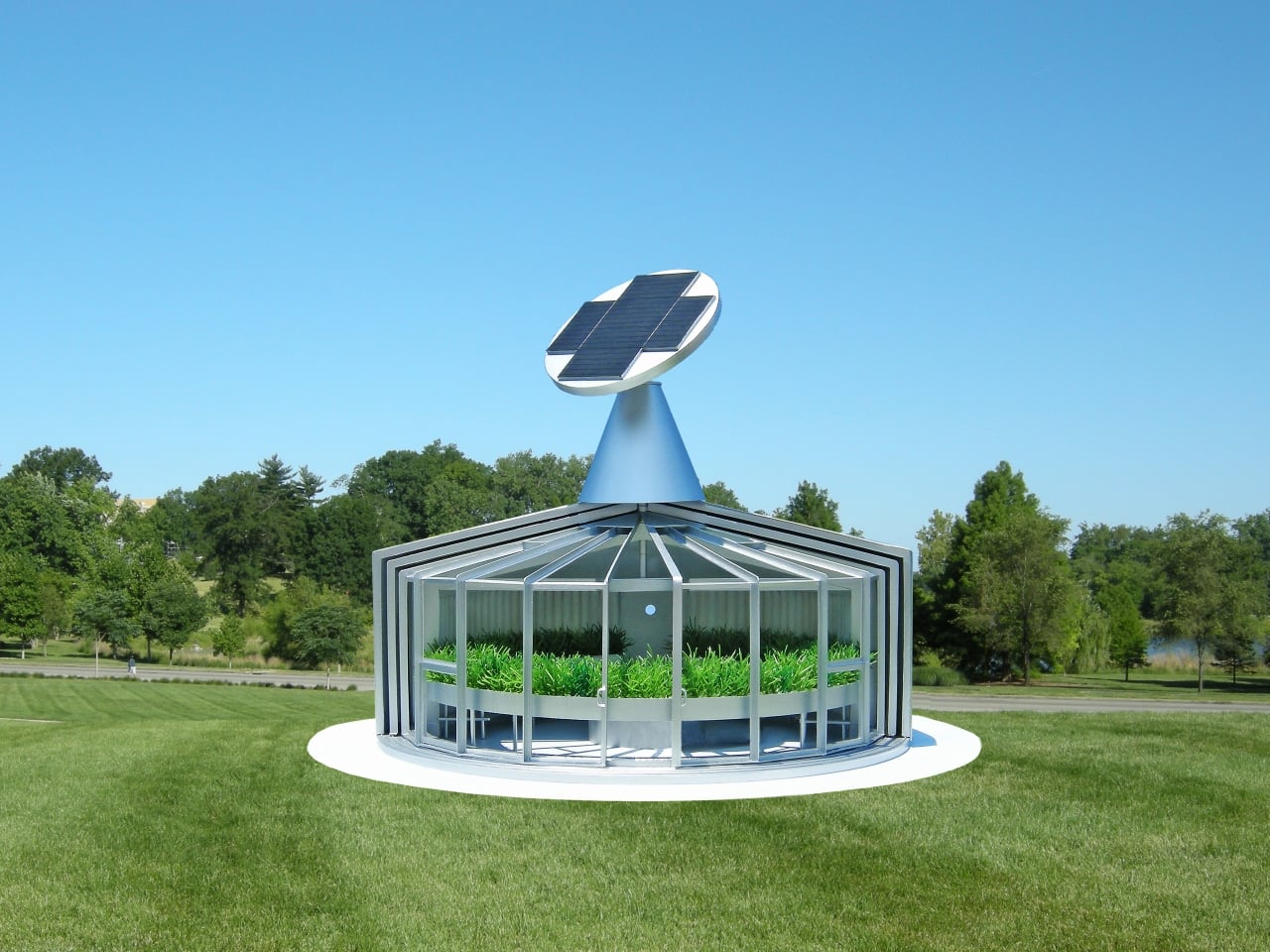
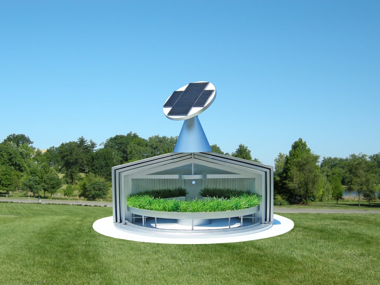
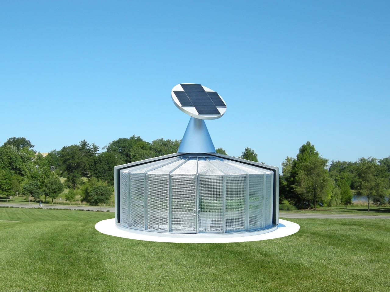
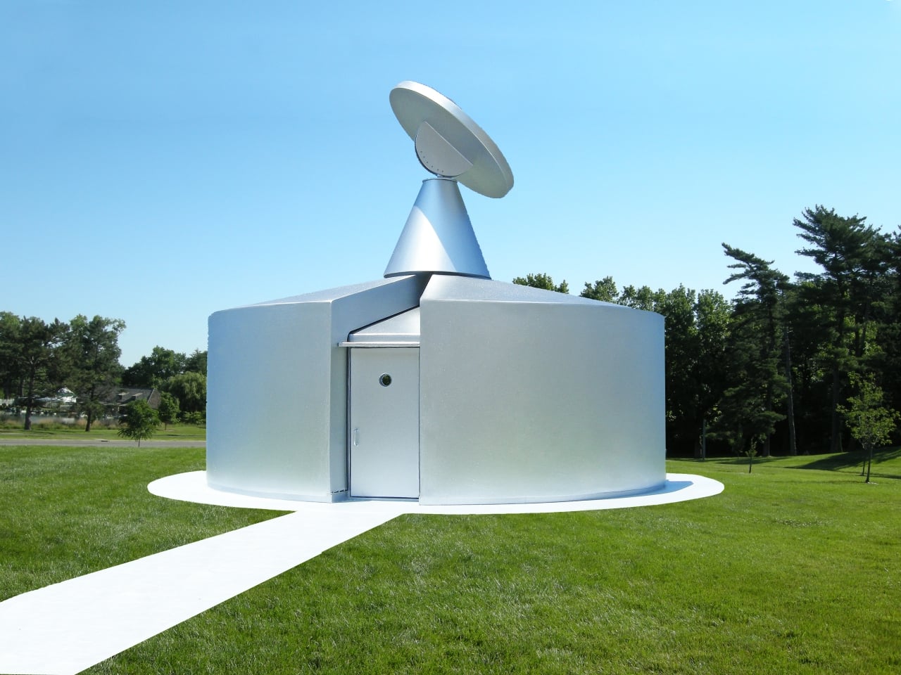
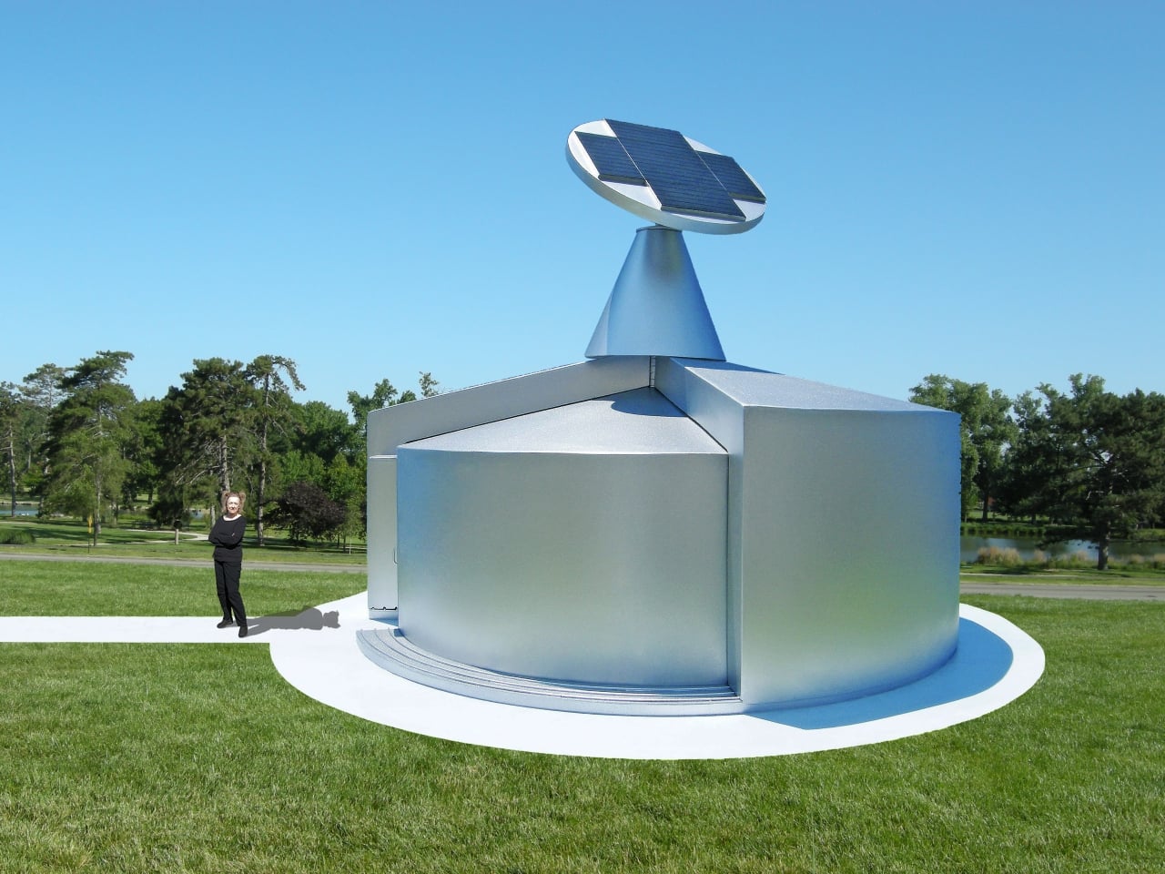
What makes the structure particularly clever is how it manages growing conditions year-round without demanding much energy. Six sections rotate around a central pivot point, each serving a different climate function. Two insulated panels wrap around the interior during cold nights to retain heat. Two shade screen sections shield the plants on hot days. Two glass sections open to let in outside air when conditions allow.
The passive thermal management doesn’t stop there. Built around the perimeter of the stationary base are large tubes filled with a heat-retention material that absorbs solar energy during the day and releases it slowly at night, helping keep the fish and plants warm through winter without relying on active heating systems. Those same tubes also moderate daytime temperatures, preventing the interior from overheating when the sun is strong.
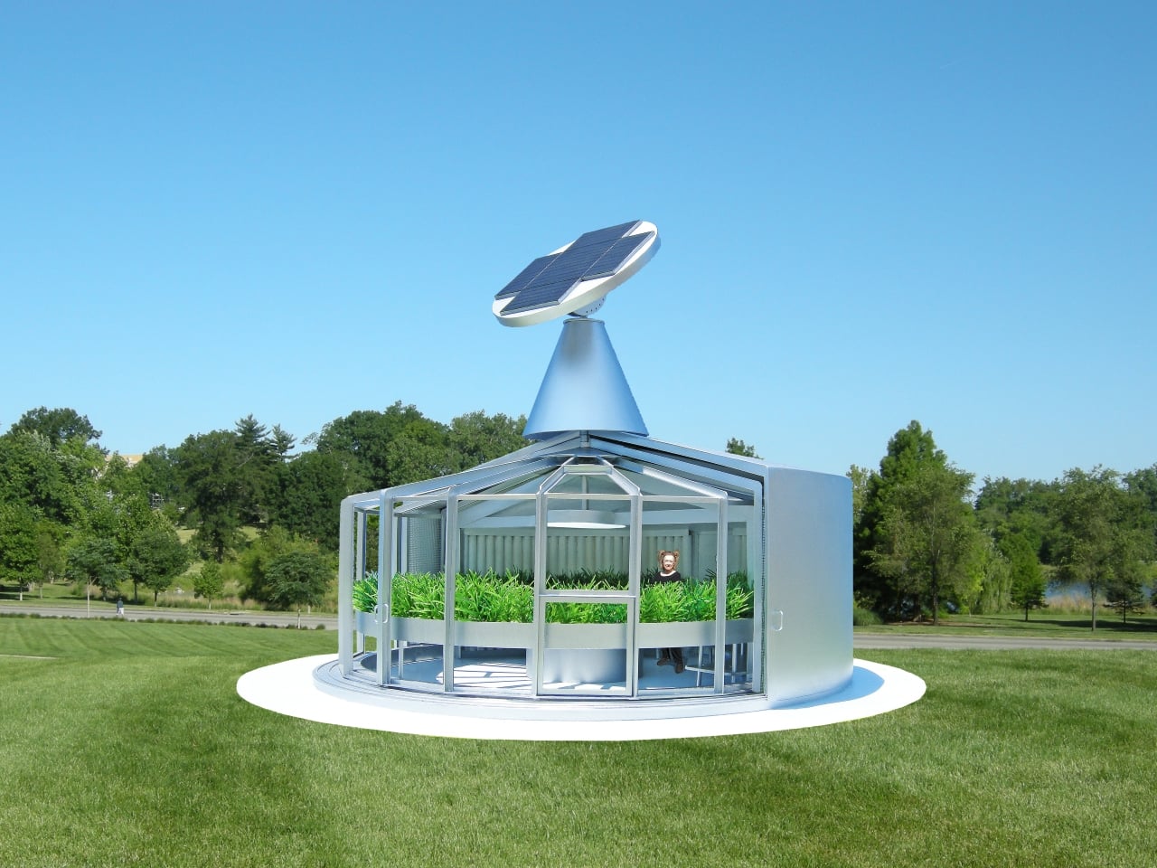
On top sits a sun-tracking solar cell array that follows the sun throughout the day, supplying most of the structure’s electrical needs, including the large lamp hung over the central fish tank. Small windows built into the glass sections allow for additional ventilation control when the glass is in the closed position, letting you fine-tune interior conditions depending on what the fish and plants need at any given time.
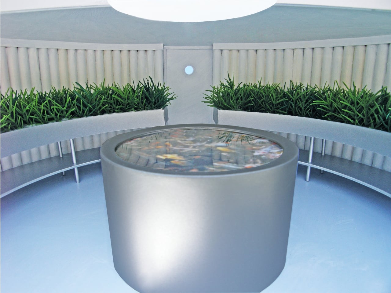
Inside, plant trays are built into the perimeter of the structure, forming a ring of greenery around the central cylindrical fish tank. Visitors to the botanical garden can get a sense of the system from the outside, or arrange private tours for a closer look from inside through the rear entry door. As a public exhibit, it’s designed as much to teach people about aquaponic gardening as it is to actually grow. It’s a growing facility that takes care of itself season after season, with very little outside intervention required.
The post This Rotating Solar House Grows Fish and Plants Entirely on Its Own first appeared on Yanko Design.