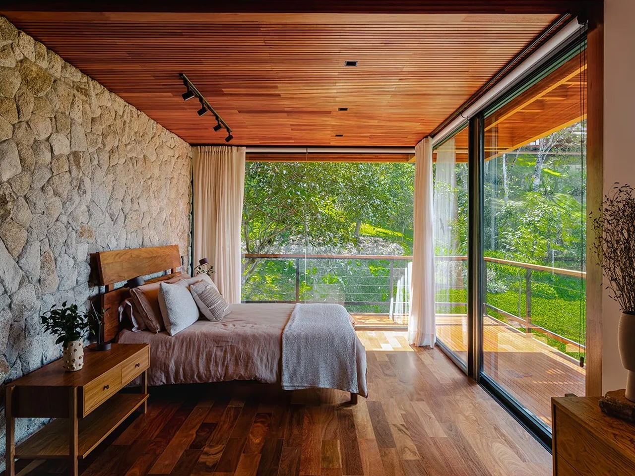
There is a rare, almost cinematic stillness found only in homes perched high above the world. At elevations ranging from 5,000 to over 10,000 feet, mountain residences occupy a space where clouds drift below terraces and horizons stretch endlessly. By contrast, most cities sit between sea level and roughly 1,500 feet, shaped by density, noise, and constant movement.
Life at altitude reshapes perception. The air feels sharper, the light more vivid, and architecture must respond with both resilience and sensitivity. Today’s mountain retreats move beyond the heavy, dark enclosures of the past, embracing openness, sustainability, and panoramic immersion. Here is how these homes are not just shelters but experiences designed around silence, scale, and awe.
1. A Natural Extension of the Landscape
The most refined mountain homes are conceived not as objects placed upon terrain, but as forms emerging from it. Architects study slope, wind, and geology, shaping structures that echo the lines of ridges and the layered patterns of exposed rock. Locally sourced stone, textured concrete, and weathered timber allow the residence to visually dissolve into its surroundings.
This approach softens the boundary between built space and wilderness. Walls appear to grow from the hillside, terraces align with natural contours, and expansive glazing draws the mountain indoors. The result is a dwelling that feels anchored, quiet, and inevitable, as though the landscape itself had composed the architecture.
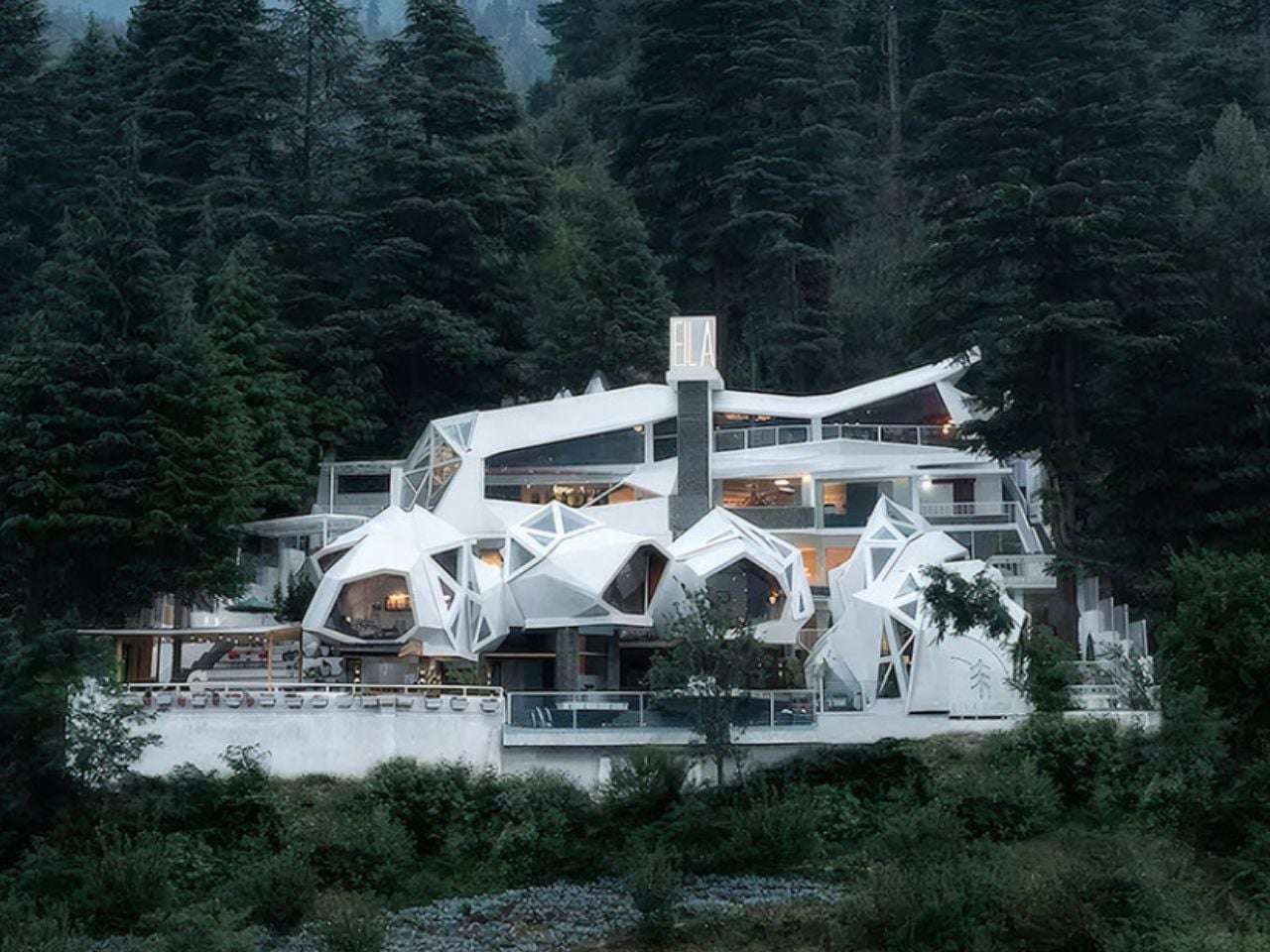
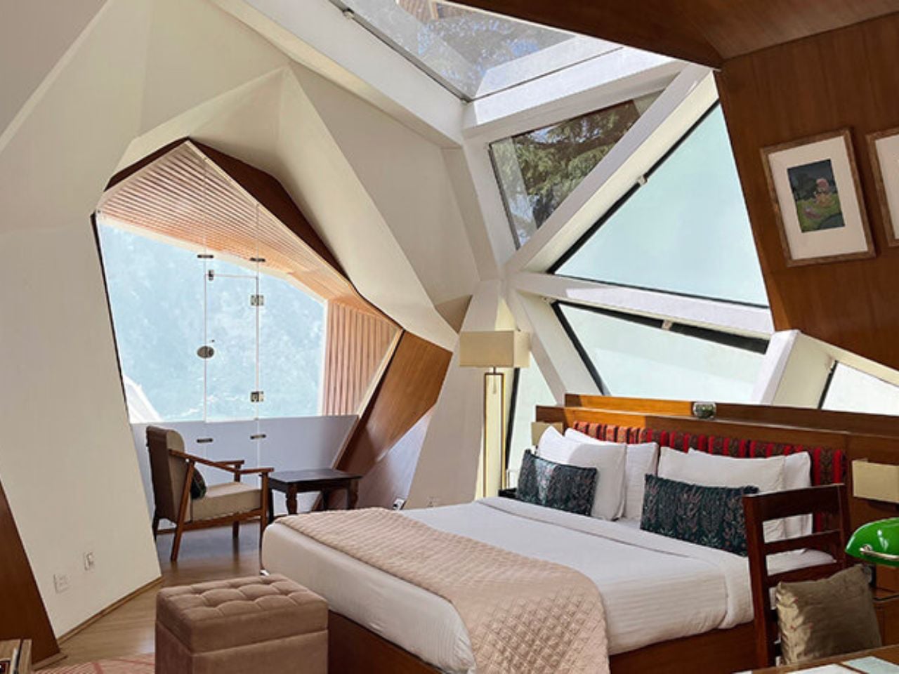
Perched high above the Naggar Valley in Himachal Pradesh, India, Eila emerges with quiet restraint rather than spectacle. Designed by MOFA Studio, the art retreat appears to rise organically from the mountainside, its fluid forms tracing the land’s natural contours instead of reshaping them. Developed through advanced computational processes, the cottages respond sensitively to slope, sunlight, and distant horizons, making the architecture feel discovered rather than imposed. A stepped masterplan descends gently along the steep terrain, preserving topsoil and natural rainwater channels while choreographing a gradual spatial experience. The journey begins at the Gate of Confluence, a stone pavilion marking the threshold into a contemplative environment where landscape, art, and structure unfold in quiet dialogue.
At Eila, artificial intelligence assists in refining structural and environmental performance, while human intuition guides final decisions. Biomorphic cottages formed from lightweight steel frames and thin concrete shells minimize energy use and visual impact, blending subtly into the Himalayan setting. Skylights and apertures frame the valley like living canvases, drawing light and scenery deep indoors. Locally sourced materials and vegetation-ready shells allow the retreat to evolve with its surroundings, ensuring it settles into the landscape rather than competing with it.
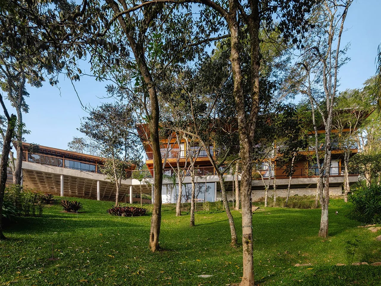
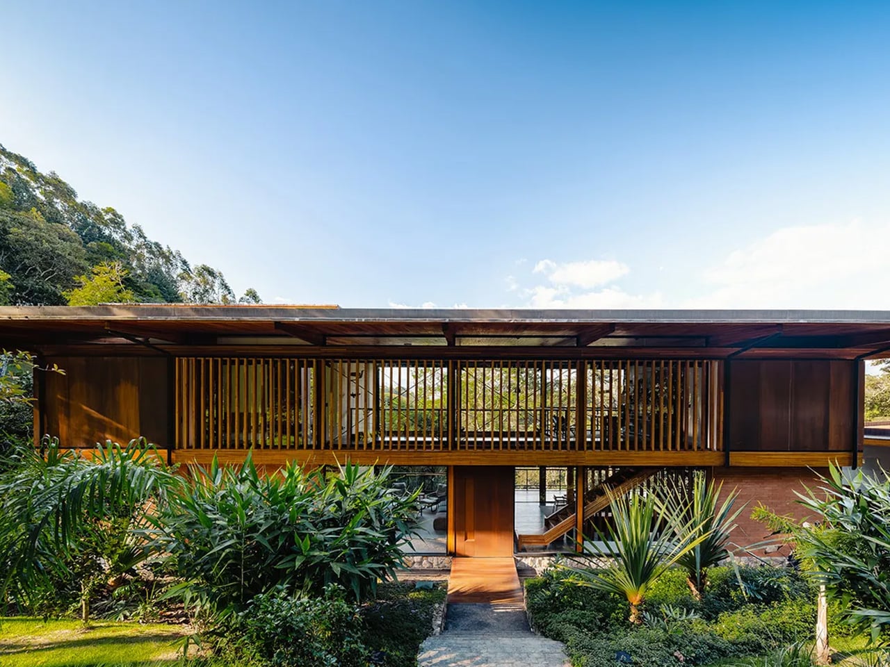
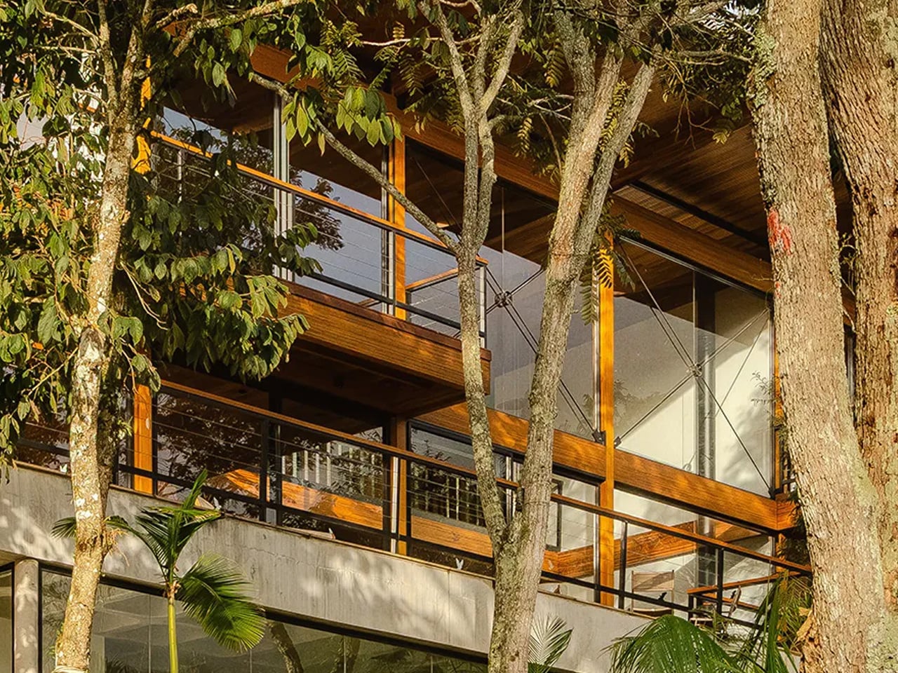
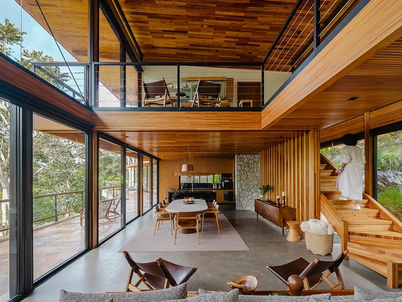
2. The Modern Mountain Home
The modern mountain home embraces a design language defined by clarity, restraint, and structural precision. Glass and steel replace heavy ornamentation, creating spaces that feel visually open and effortlessly connected to the outdoors. Expansive floor-to-ceiling windows dissolve traditional barriers, allowing shifting light, snow, and distant peaks to become part of the interior experience.
Beyond aesthetics, this approach is deeply functional. Industrial materials provide strength against wind, temperature swings, and heavy snowfall, while minimalist forms reduce visual weight. Clean lines, open-plan layouts, and a carefully edited palette produce a home that feels light, airy, and quietly dramatic against the rugged mountain backdrop.
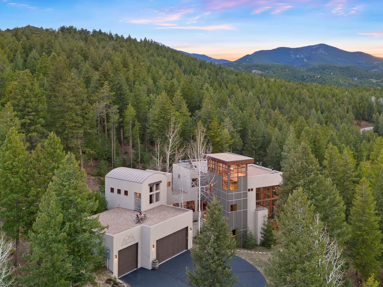
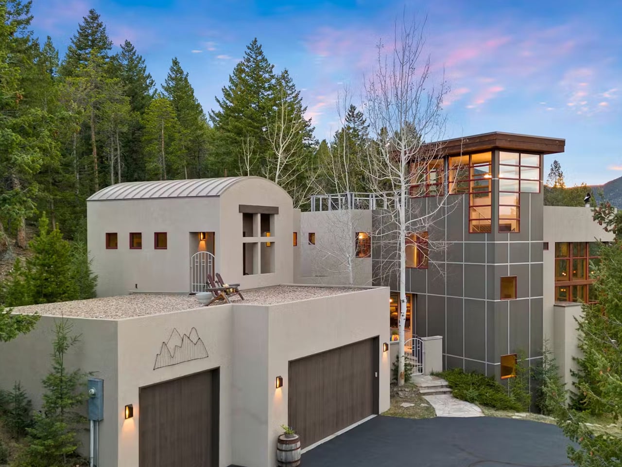
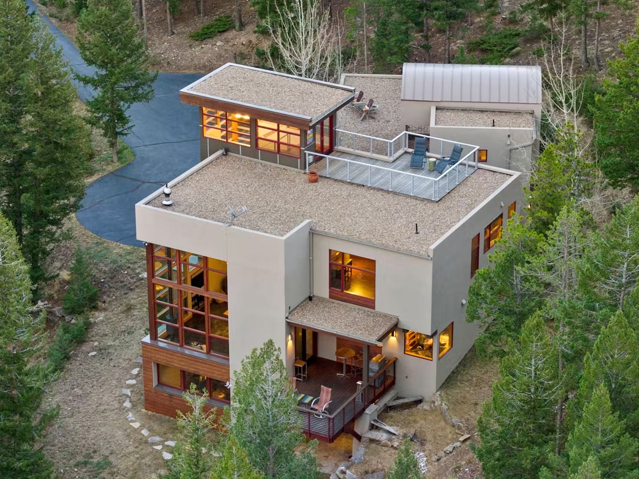
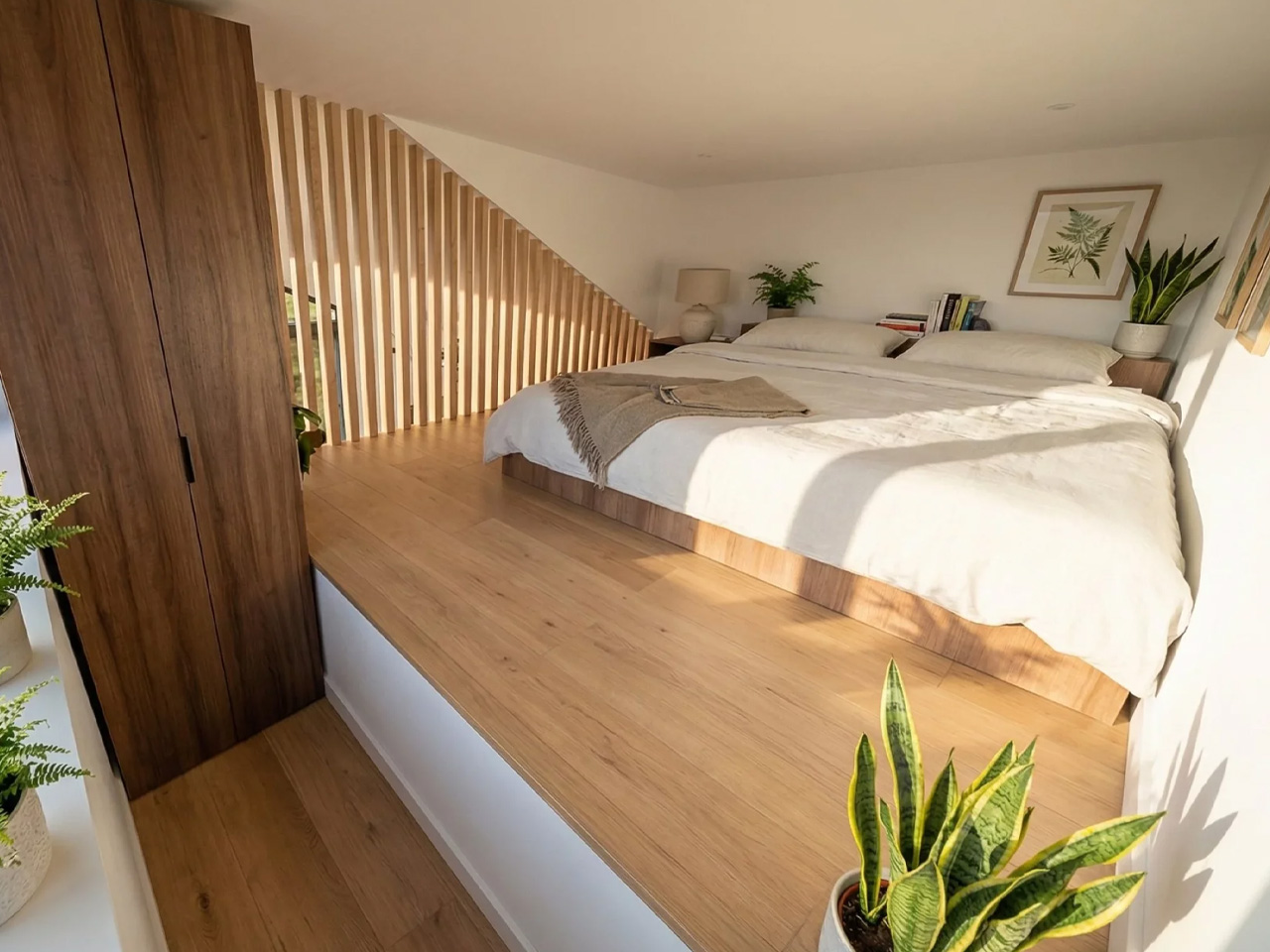
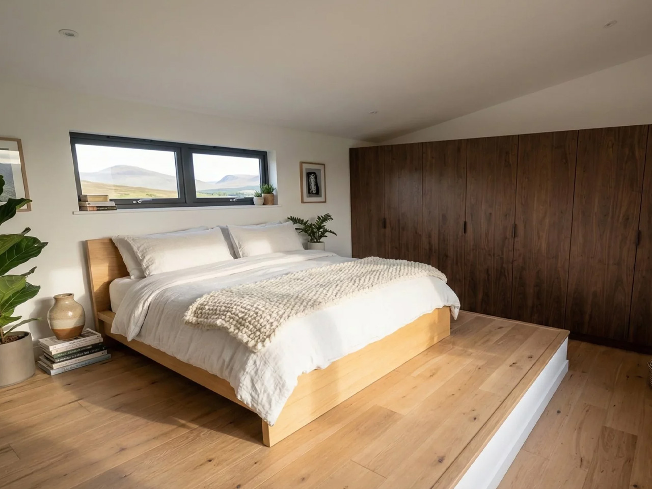
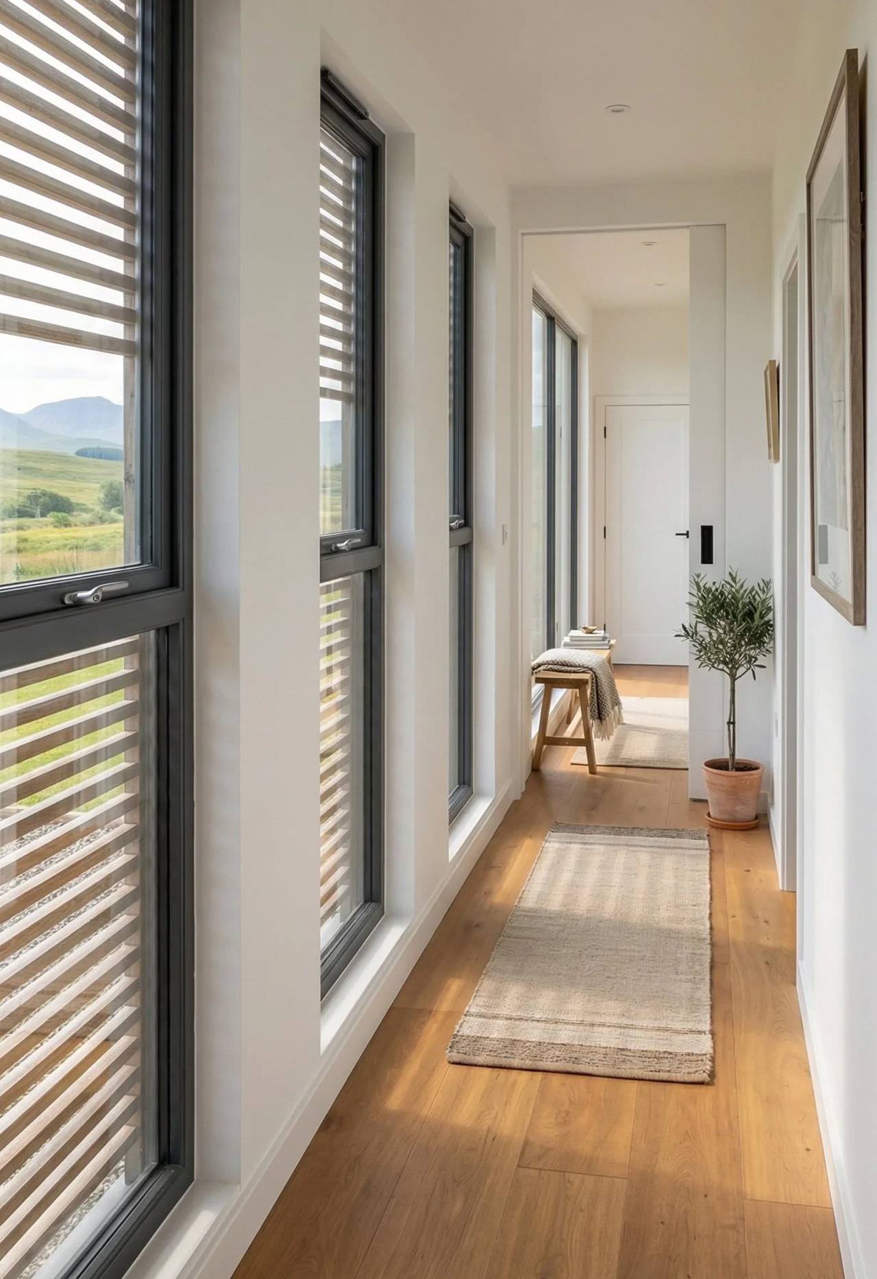
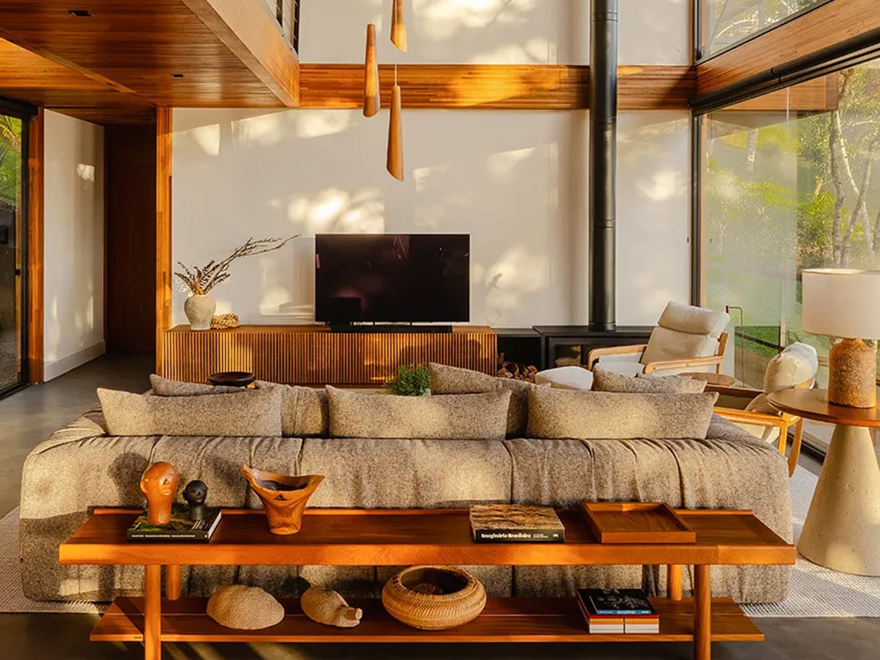
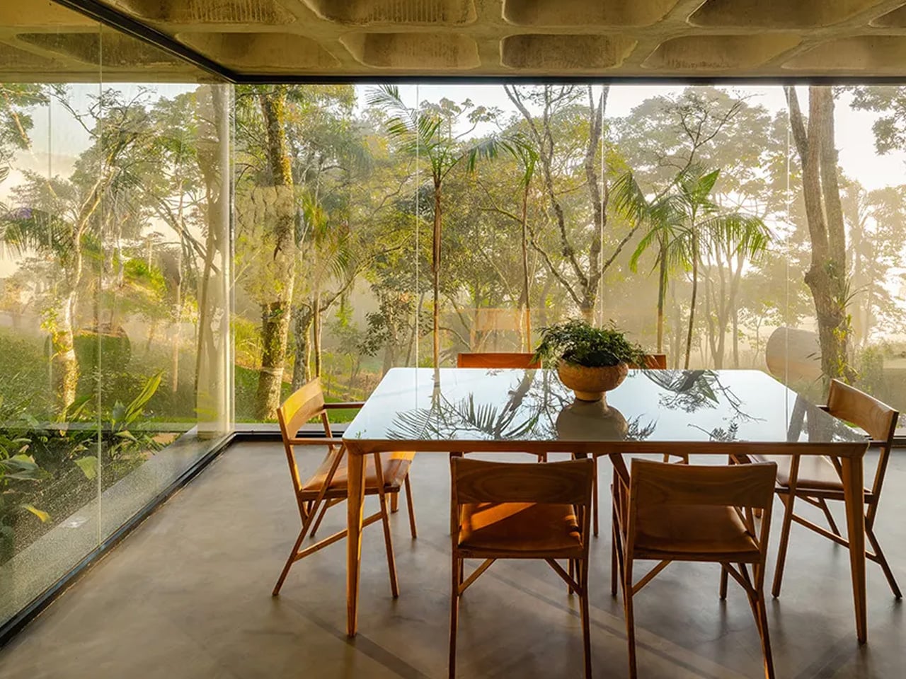
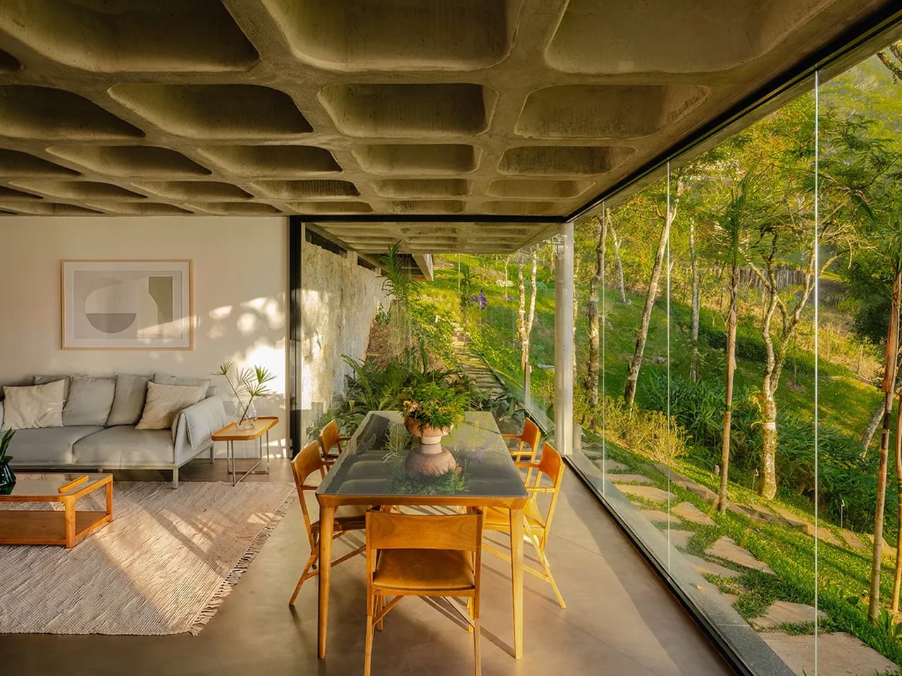
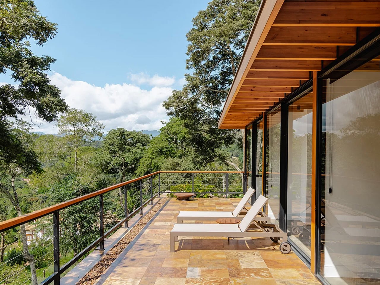
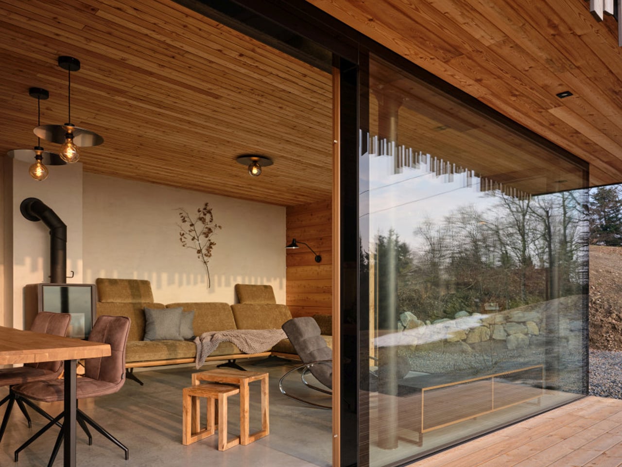
Set among the pines of Colorado and overlooking the protected expanse of Indian Peaks Wilderness, this residence by Robert Chisholm Architects embodies a grounded interpretation of mountain living. Each room is carefully oriented to frame the surrounding landscape, creating views that feel composed yet effortless. Organized around a central courtyard, the house draws daylight and mountain air deep into its core, establishing a quiet internal anchor. The spatial layout gently distinguishes communal and private zones, allowing moments of gathering and retreat to coexist without disruption. Expansive glazing pulls the horizon indoors, while walnut floors, solid fir doors, and a sculptural fireplace lend warmth and permanence to interiors defined by clarity and restraint.
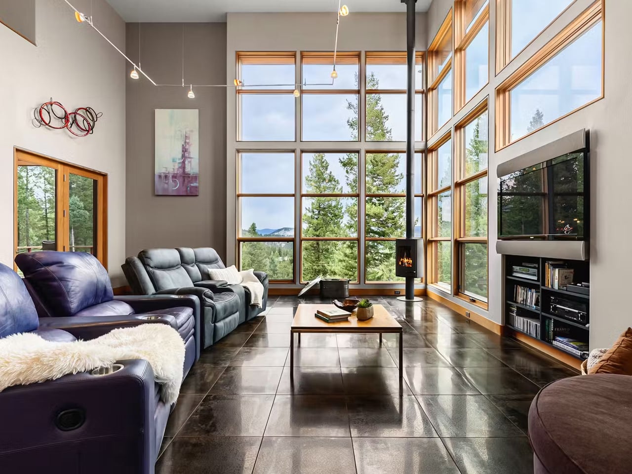
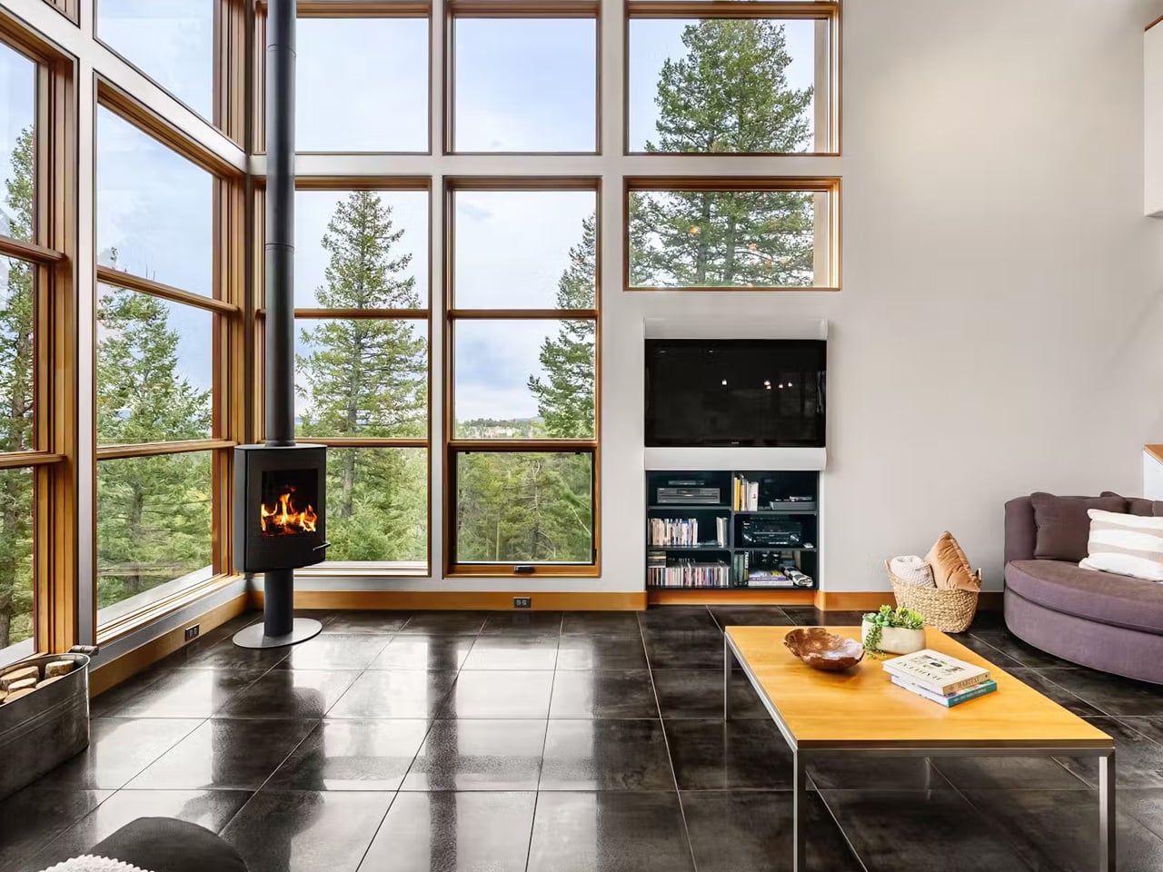
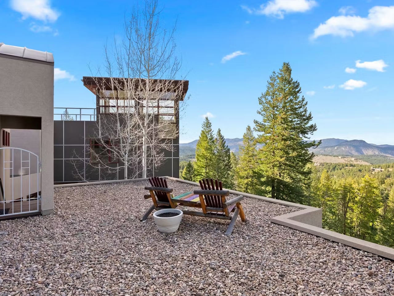
The kitchen balances durability with artistry, anchored by a deep blue granite island that subtly mirrors the shifting mountain sky. Ash cabinetry and integrated appliances support daily routines and larger gatherings, while a discreet butler’s pantry preserves visual calm. Outdoor living unfolds across a sheltered deck and open rooftop terraces, encouraging seamless movement between interior comfort and alpine air. Practical elements, including radiant floors, dual EV chargers, and a heated garage with built-in storage, reflect thoughtful foresight. Fire-mitigated forest edges and private trails extend the experience beyond the walls, reinforcing a life closely attuned to the land.
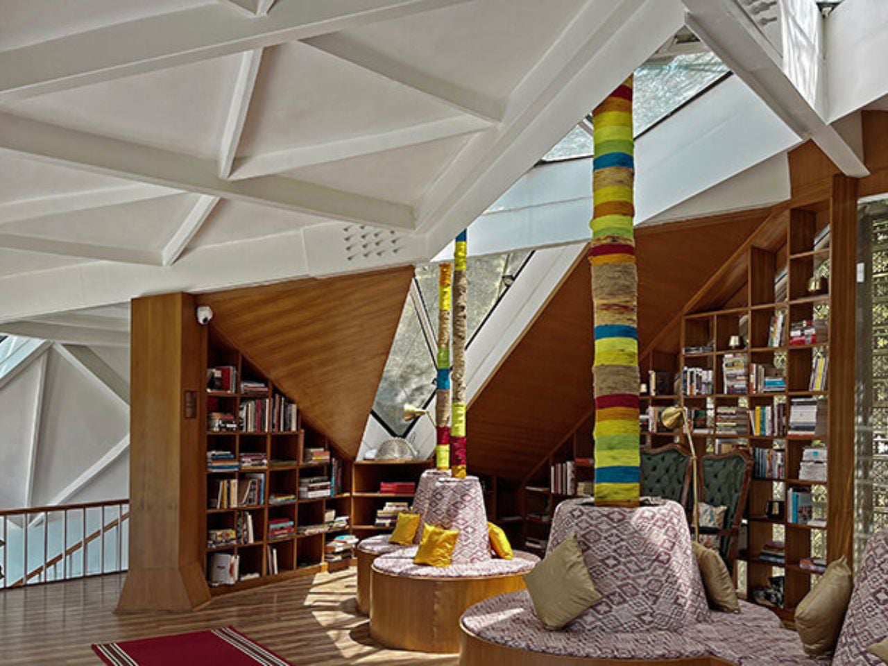
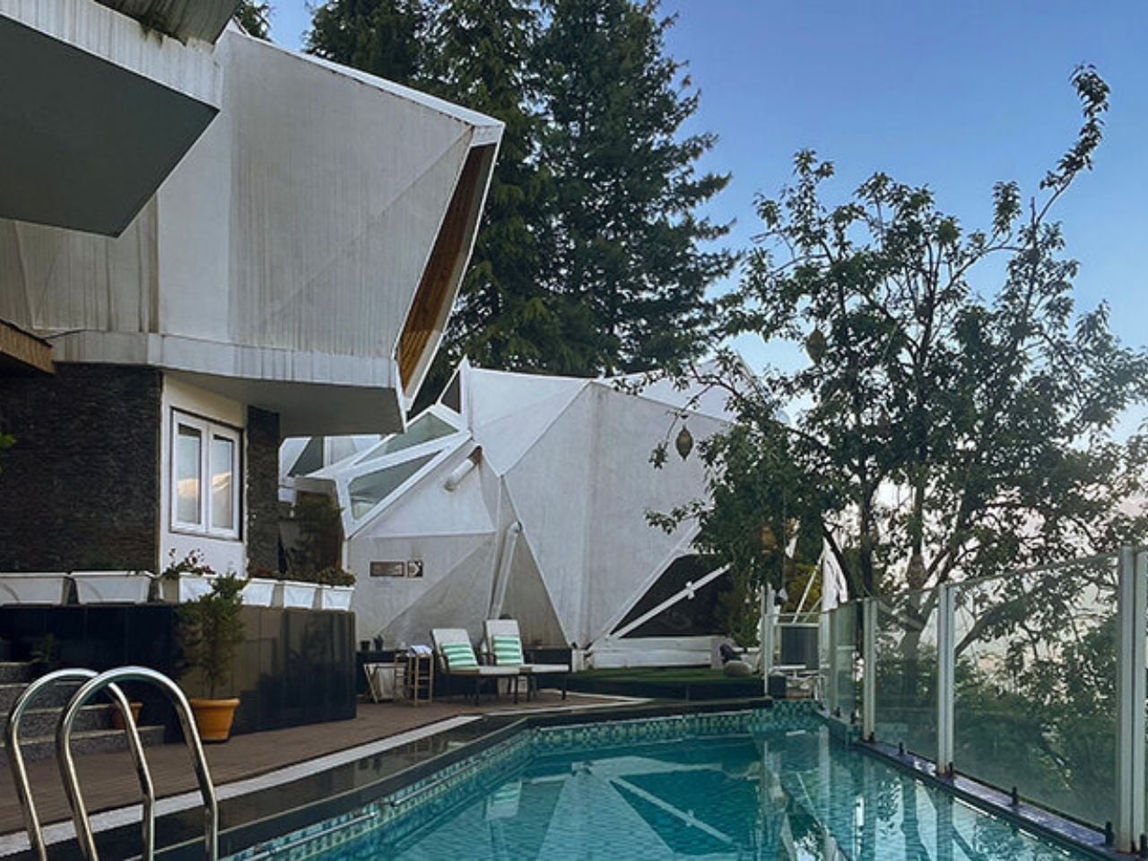
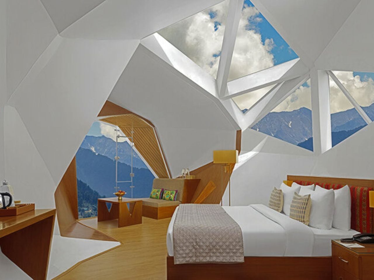
3. Bold Angled Geometry
Snow is a breathtaking presence, but its weight demands intelligent design. Contemporary mountain architecture responds with bold, angled geometry, where steeply pitched roofs and sharply defined lines transform necessity into visual drama. These dynamic forms efficiently shed heavy snowfall while giving the structure a sense of movement and tension against the landscape.
Inside, the impact is equally compelling. Angled rooflines generate soaring ceilings, unexpected volumes, and striking plays of light. Cantilevered decks and elevated viewpoints extend living spaces outward, framing valleys and ridges like curated vistas. The result is architecture that feels daring yet purposeful, balancing engineering logic with an unmistakable sculptural presence.
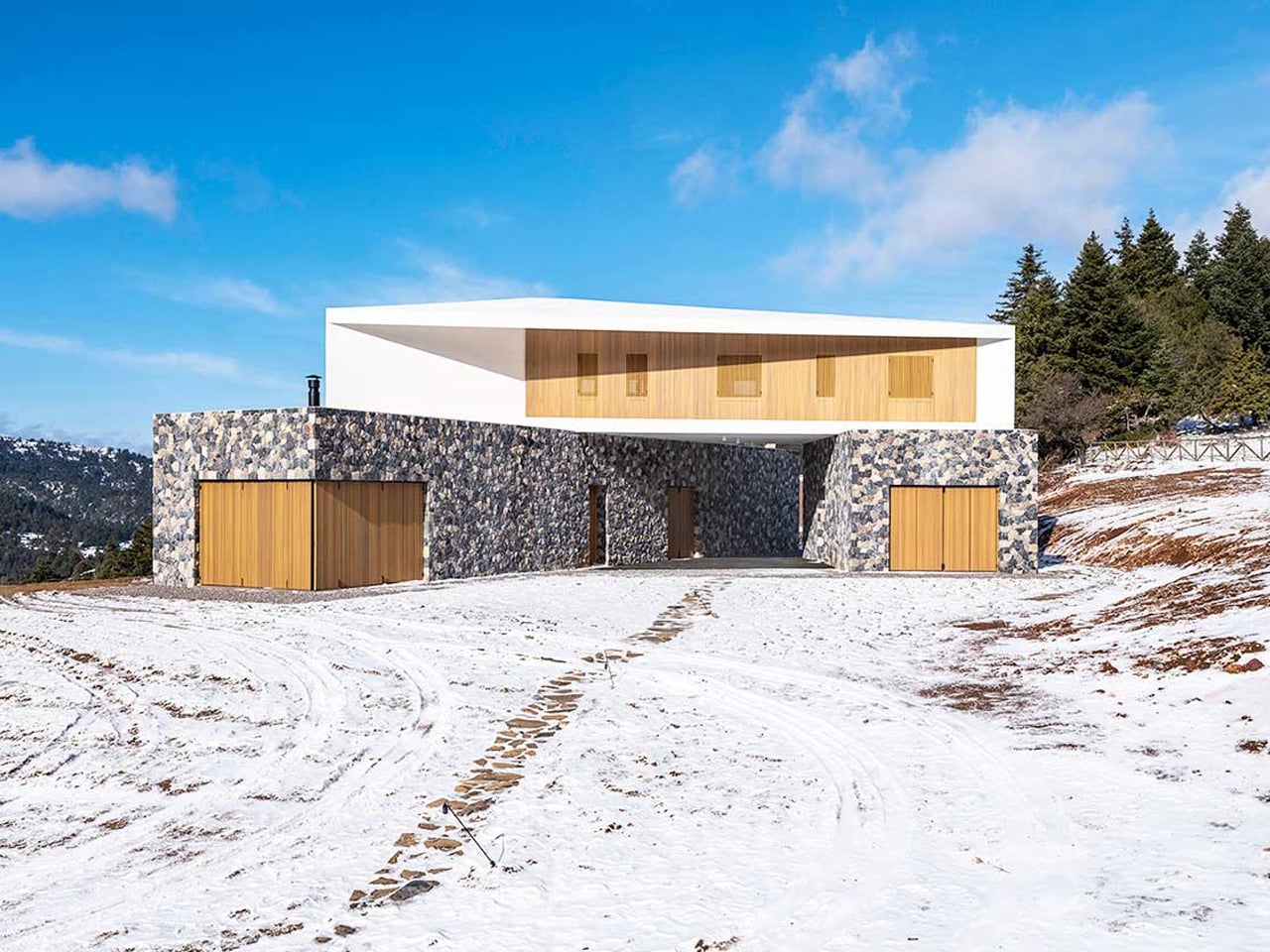
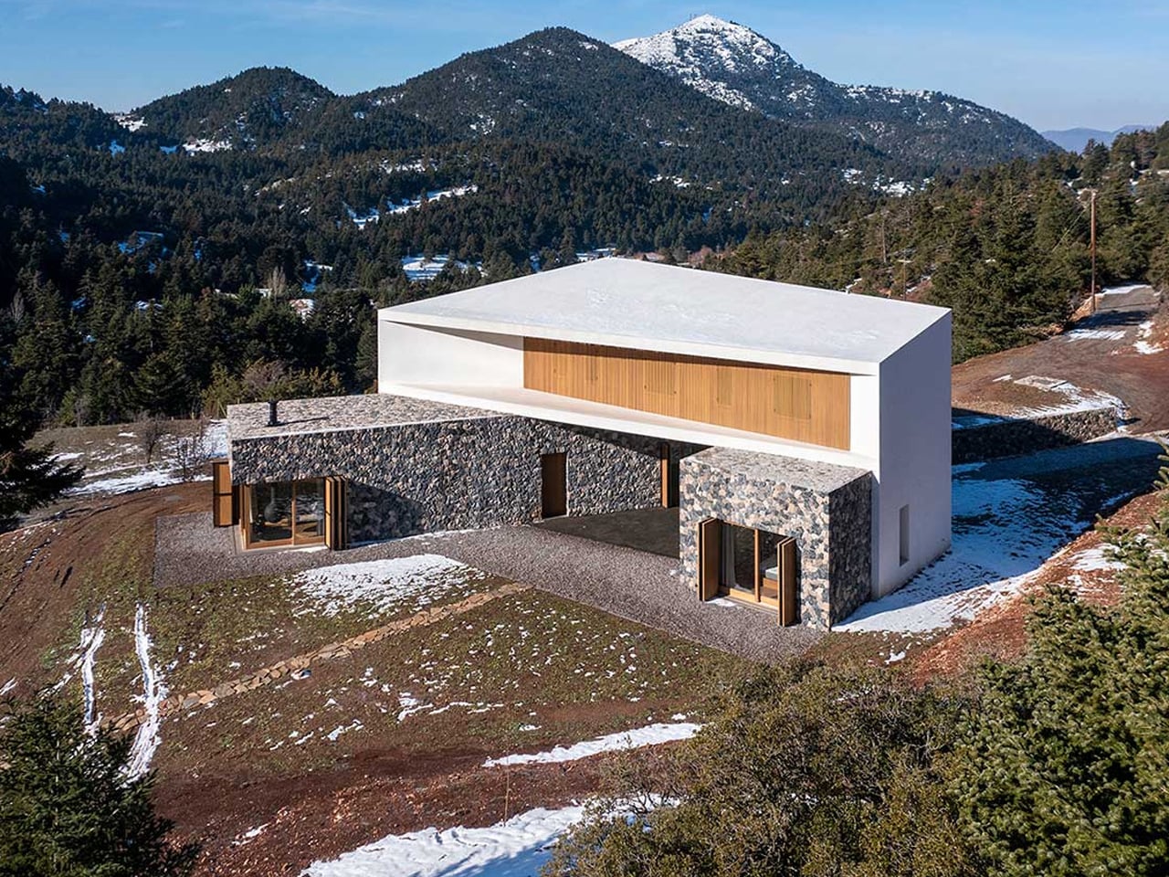
Nestled in the Helmos Mountains of Kalavryta, near the Kalavryta Ski Center, Snowfall House occupies a generous 4,000-square-metre site immersed in forested terrain. Designed by Design Over The Norms, the residence unfolds as three intersecting volumes that echo the geometry of the surrounding peaks. Two stone-clad base structures sit diagonally against the slope, anchoring the home firmly to the land, while a third white volume rests above them like a layer of settled snow. This sculptural composition allows natural light to stream through the interiors and frames uninterrupted views of the mountainous landscape throughout the day.
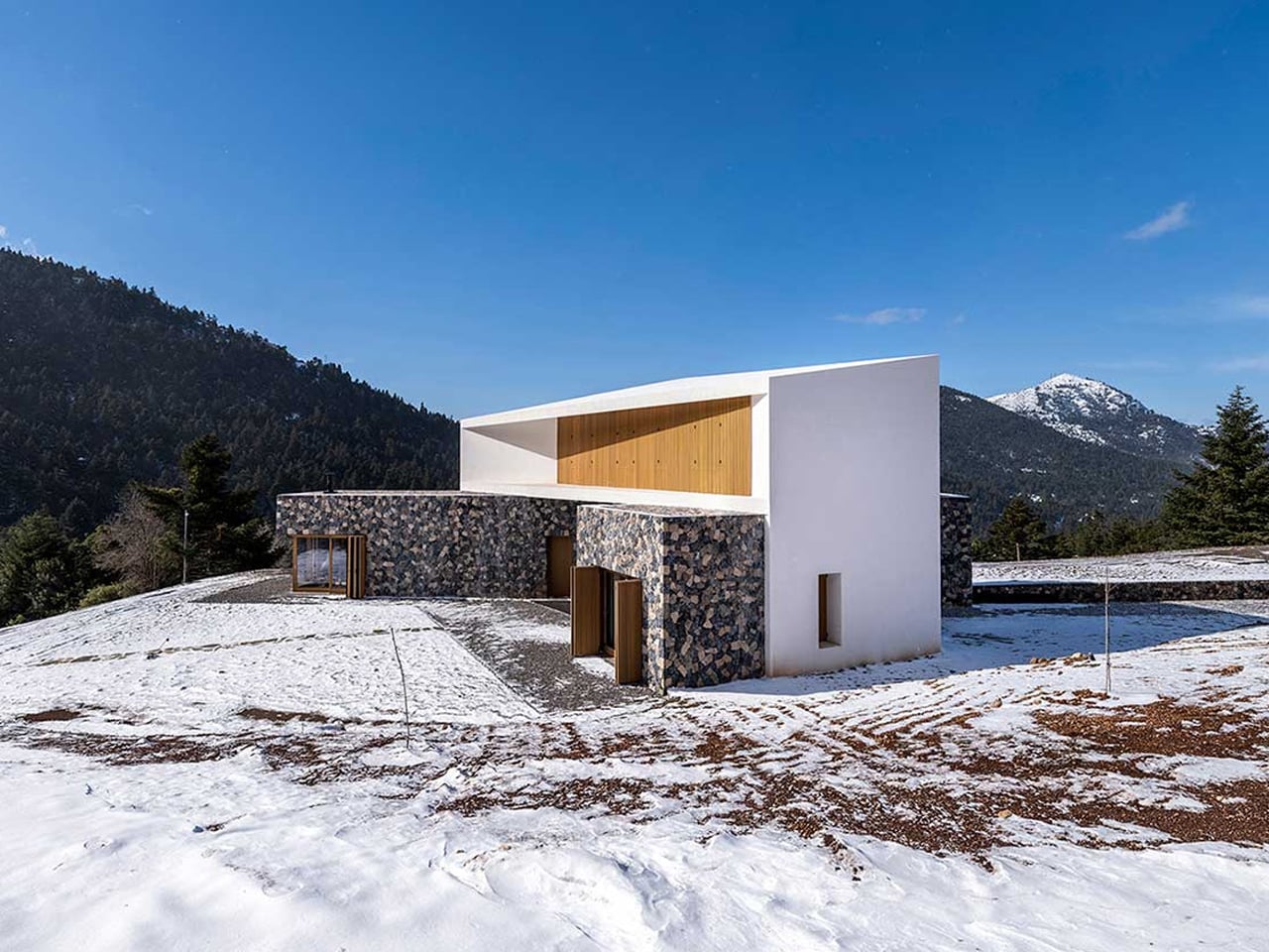
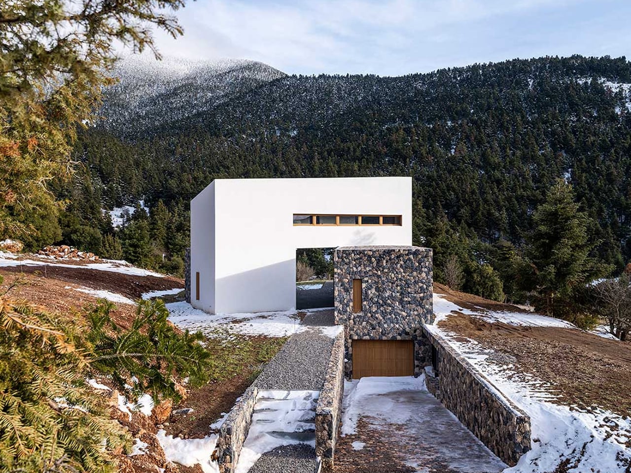
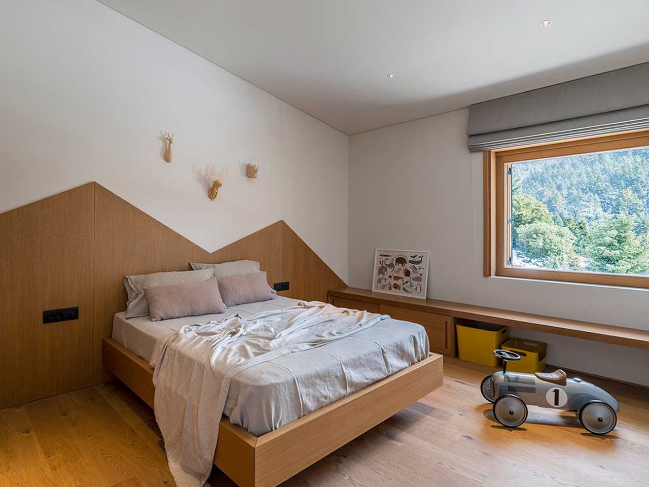
The primary rectangular volume accommodates the communal living spaces and master suite, while a smaller ground-level wing functions as a private guest suite. Additional bedrooms are housed within the elevated white structure, and an underground garage discreetly conceals vehicles to preserve the natural setting. Wood and stone define the material palette, capturing the rugged textures of the region. Where the volumes intersect, a sheltered courtyard emerges, offering year-round comfort from both summer sun and winter chill. Inside, clean white walls, herringbone wood floors, and understated furnishings create a calm, timeless retreat in the Greek mountains.
4. Refined Cottage Design
For those drawn to warmth and nostalgia, the mountain cottage offers a gentler architectural expression. Stone chimneys, gabled roofs, and carefully layered façades create a sense of familiarity that feels timeless rather than trendy. Every detail, right from the window proportions to handcrafted woodwork, contributes to an atmosphere of charm and shelter.
Though often modest in scale, cottage interiors deliver a rich emotional experience. Nested layouts, soft lighting, and tactile materials cultivate a deep sense of coziness. This intimate environment forms a comforting counterpoint to the vast, windswept landscape outside, making the retreat feel protective, inviting, and profoundly human.
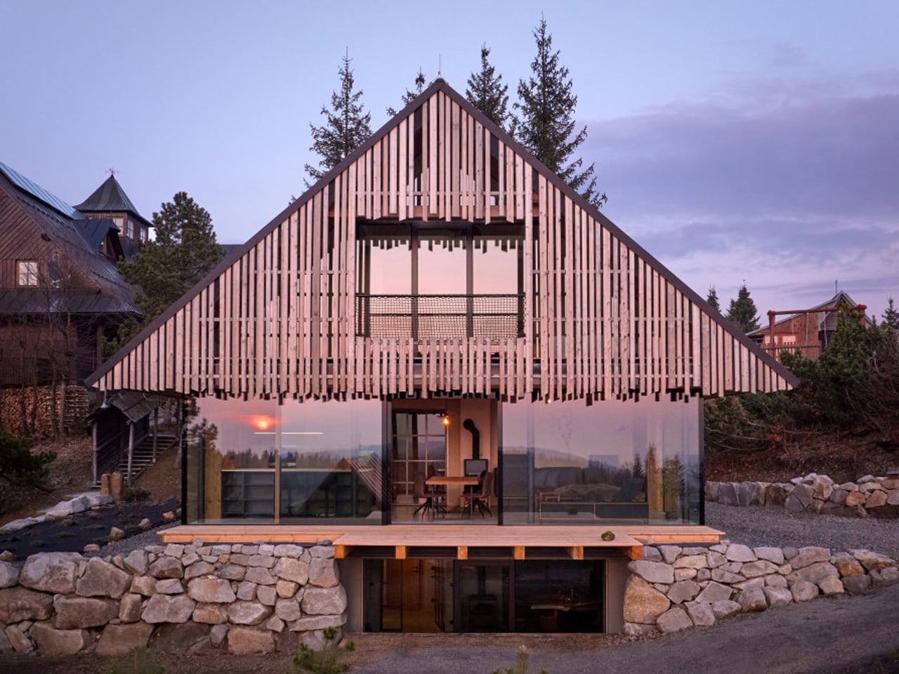
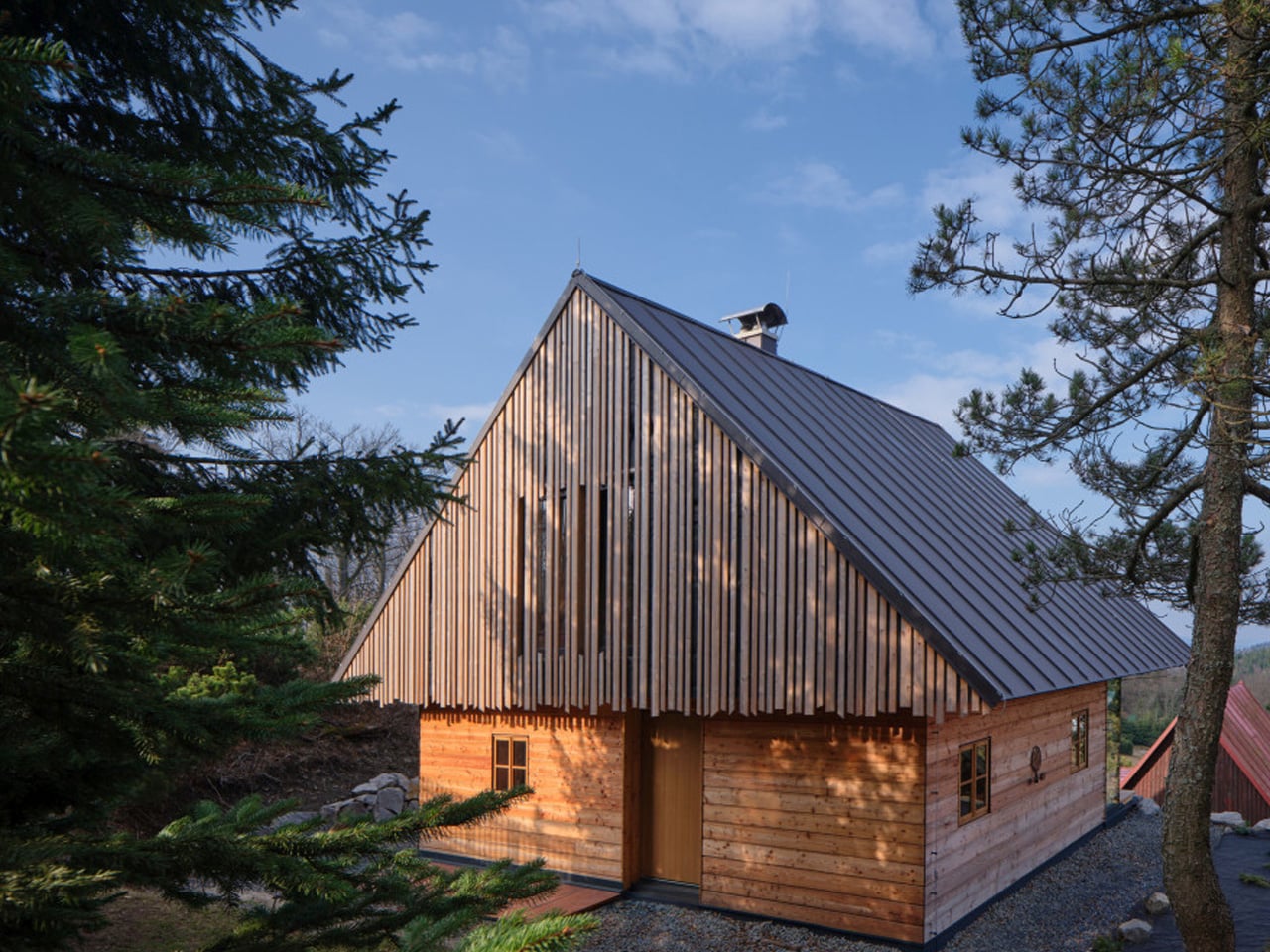
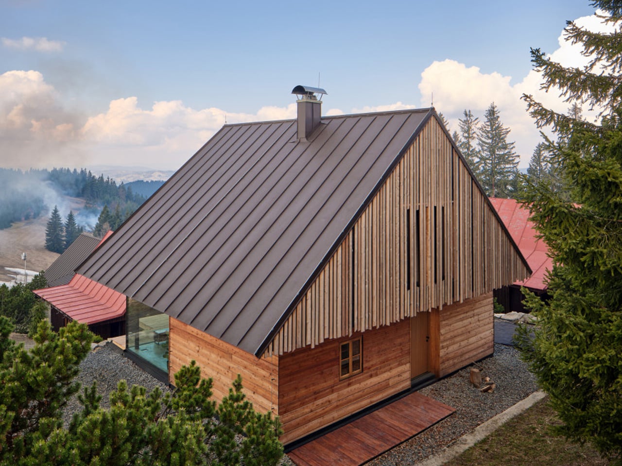
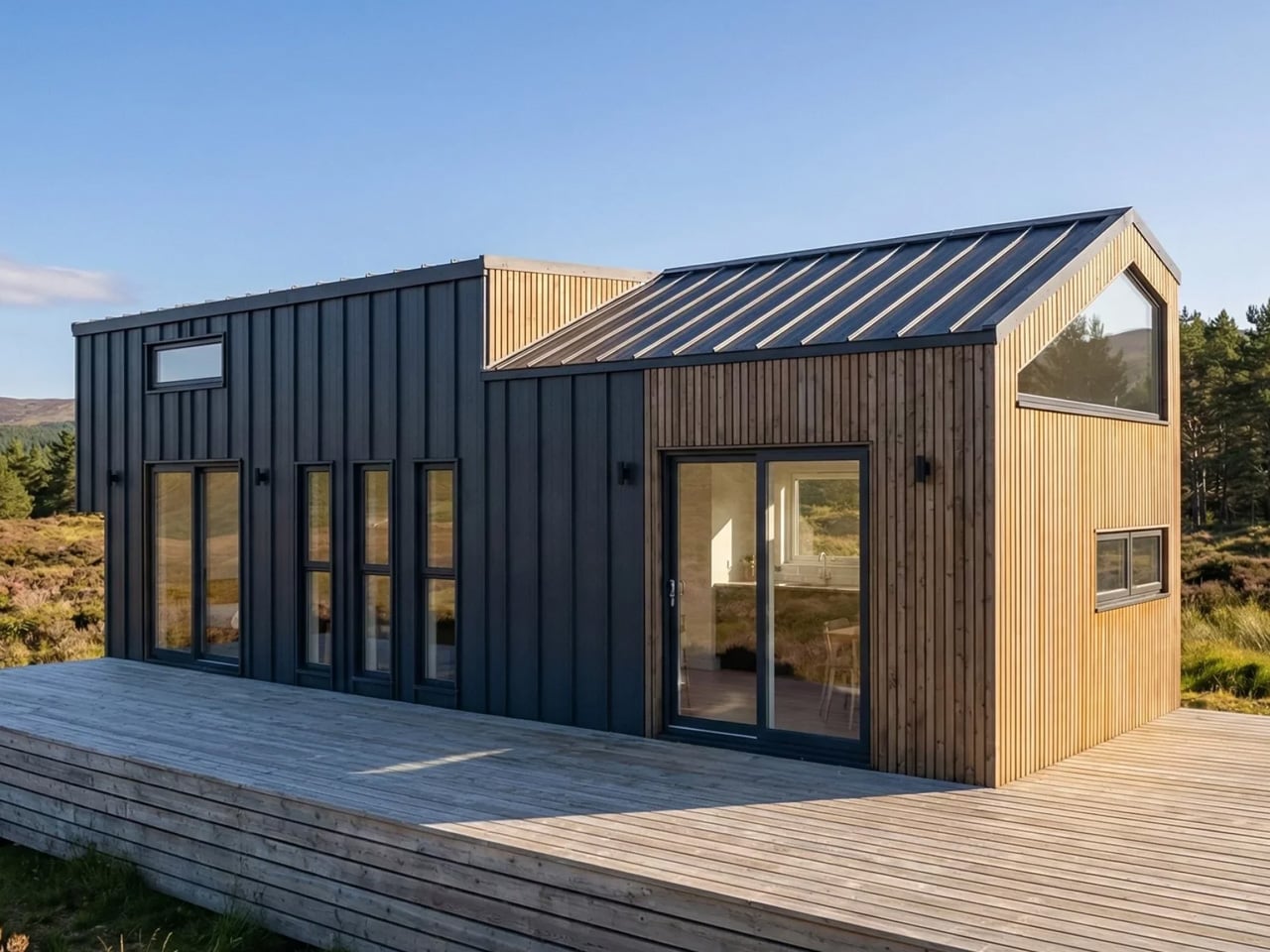
The Kohútka Cottage by SENAA architekti sits naturally within the Javorníky mountains in the Czech Republic, blending tradition with contemporary living. Designed by Jan Sedláček and Václav Navrátil, the retreat was envisioned for a local mountain complex seeking an authentic Wallachian character without compromising modern comfort. Approached from the east, the cottage reflects regional heritage through its compact windows, deep roof overhangs, and familiar log-cabin silhouette. Its steep roof and restrained detailing respond thoughtfully to the harsh mountain climate, embracing forms that have endured for generations while maintaining refined architectural clarity.
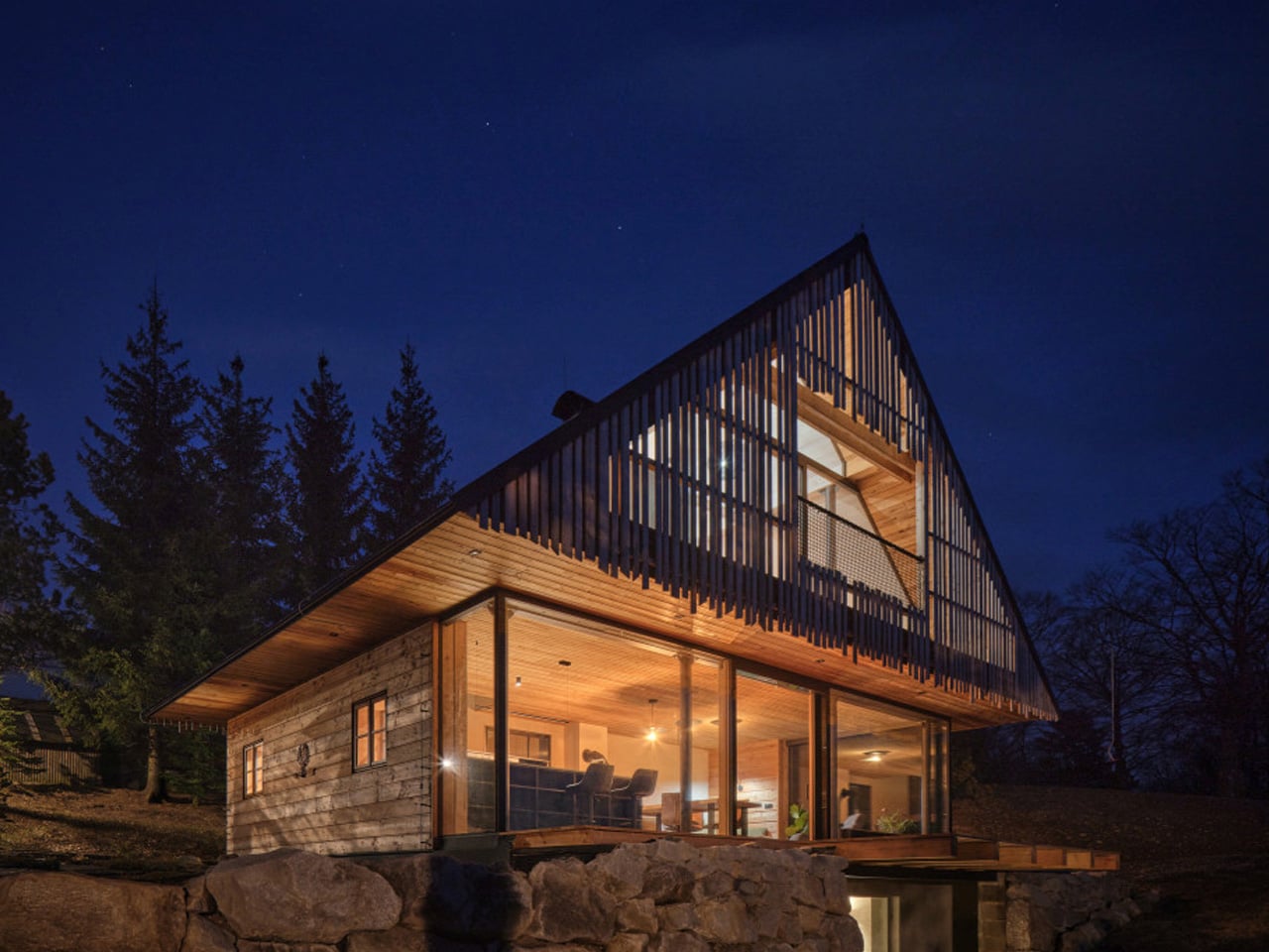
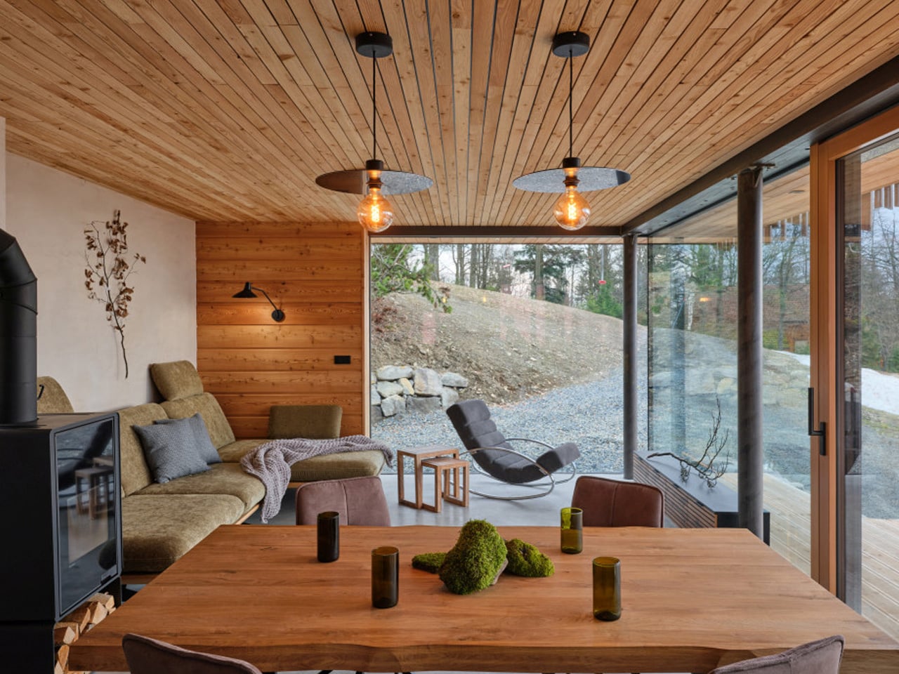
From the west, however, the home opens dramatically with expansive glazing that frames sweeping valley views, transforming the interior into a panoramic observatory. Constructed using prefabricated timber panels assembled in a single day, the structure minimised environmental impact while meeting low-energy standards. Inside, the sloping terrain accommodates a lower-level wellness zone with sauna and relaxation spaces, while mechanical functions remain discreetly tucked away. The result is a timeless mountain dwelling that balances sustainability, performance, and contextual sensitivity.
5. The Essential Cabin Design
The cabin remains the original archetype of mountain living, now reinterpreted through a contemporary lens. From classic A-frames to refined log structures, today’s cabins celebrate essentialism or a return to clarity, function, and honest materials. Designs emphasize compact footprints, efficient layouts, and craftsmanship that prioritizes durability over ornamentation.
At the heart of the cabin is simplicity with purpose. A central hearth anchors the space, natural textures create warmth, and every element serves a role. The aesthetic is unpretentious yet deeply intentional, fostering a direct connection to the surrounding forest. This modernized cabin embodies an off-grid spirit, where minimalism meets comfort and quiet retreat.
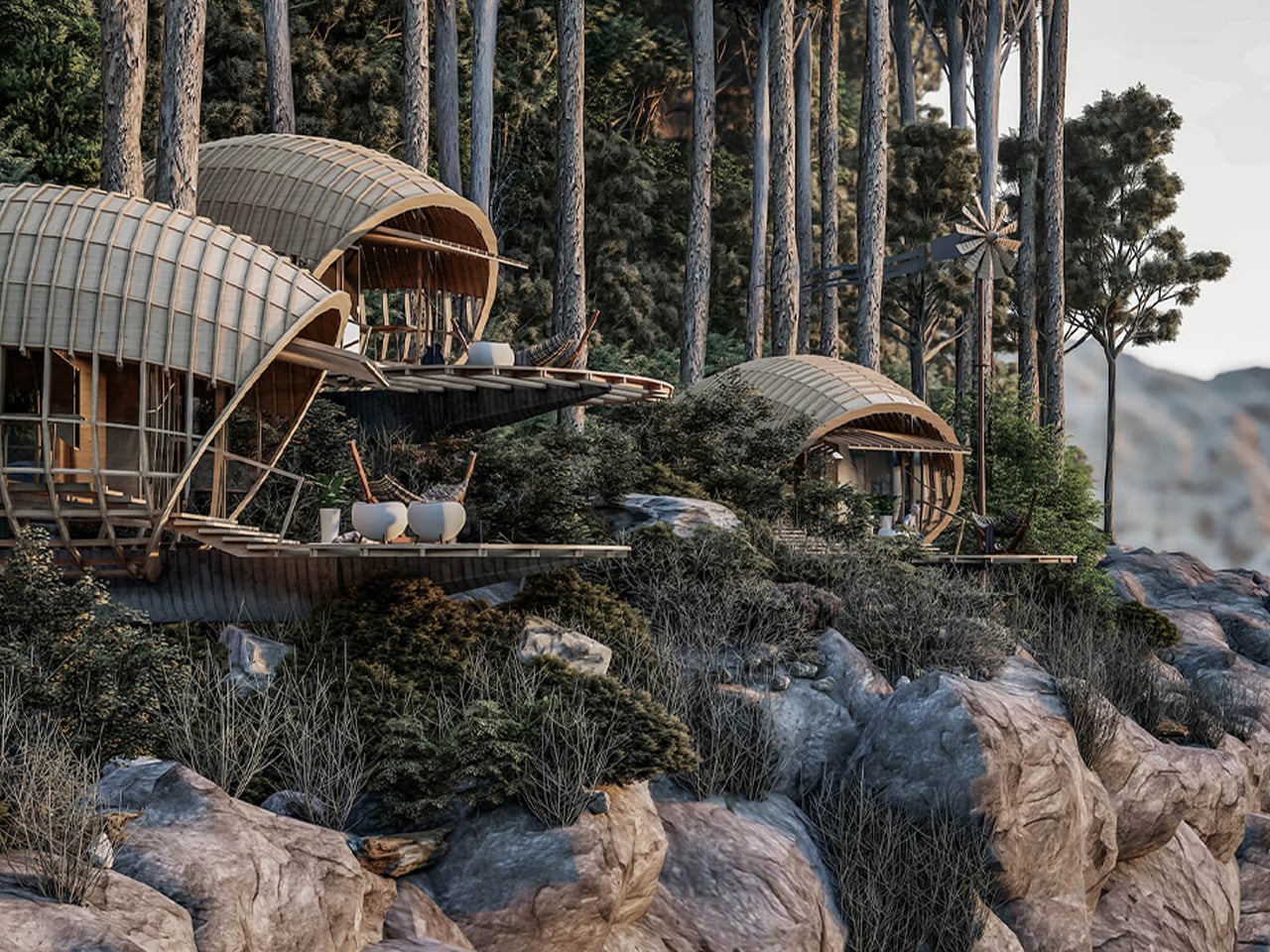
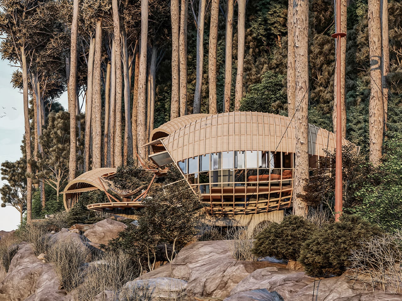
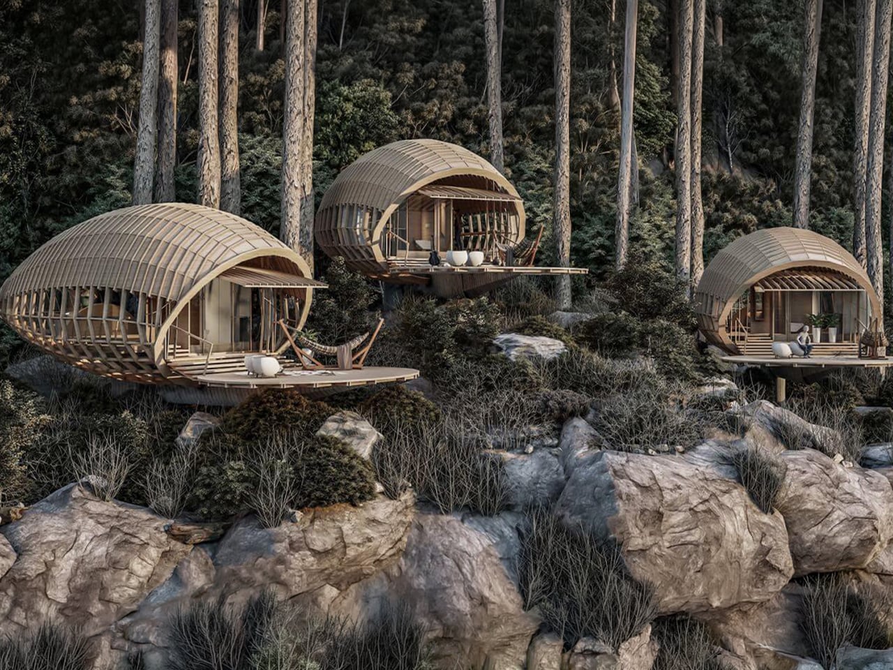
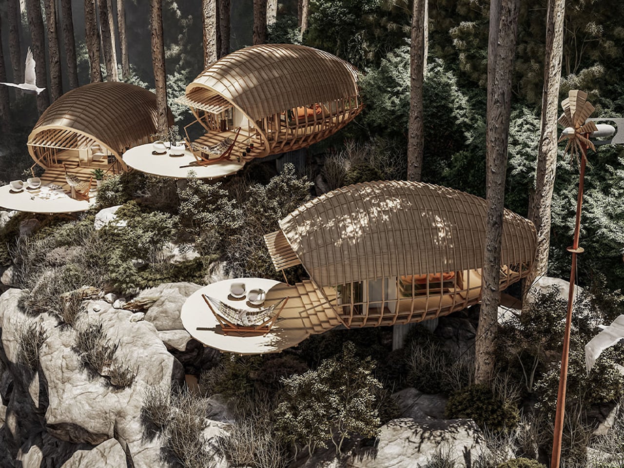
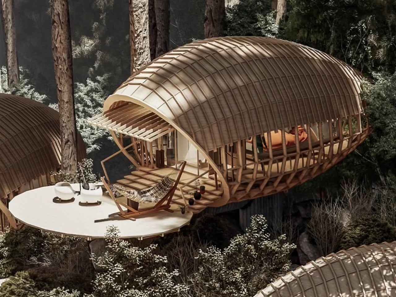
The mountain-edge cabin designed by Jorge Luis Veliz Quintana is defined by its organic geometry and strong contextual integration. Each 150 sqm unit adopts a cocoon-like form, positioned directly on large natural boulders to minimize ground intervention. The structural system combines curved timber lattices with concrete platforms that mirror the grey tonalities of the surrounding cliffs. This deliberate material, color, and finish strategy allows the architecture to visually dissolve into the rocky terrain. The sculptural envelope extends outward to form a generous terrace, reinforcing the linear relationship between interior spaces and the expansive mountain views.
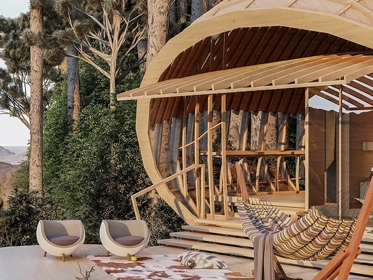
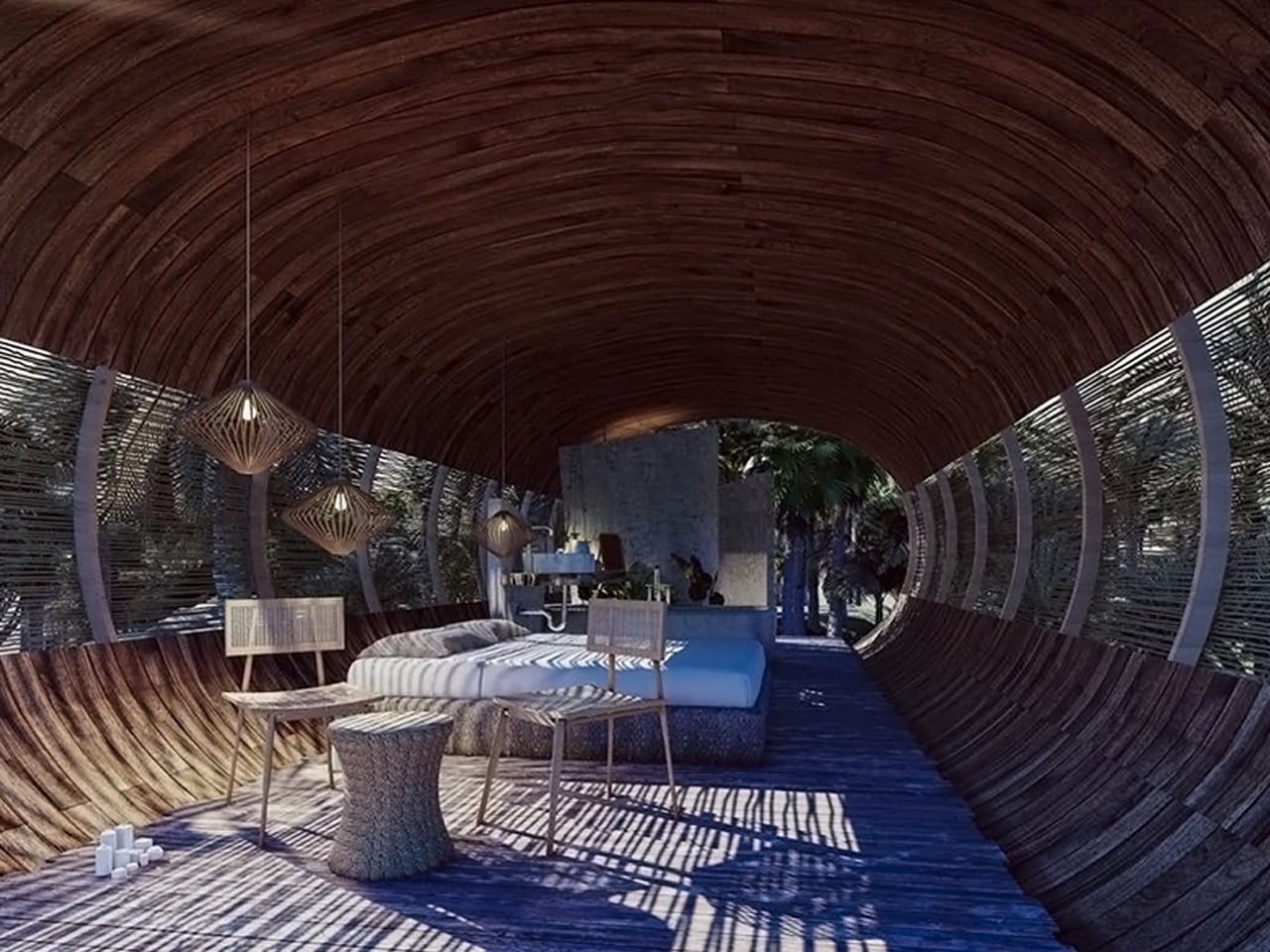
The layout is organized across two levels, responding to both topography and climate. An open-plan upper floor accommodates the bedroom and bathroom, oriented to maximize 360-degree panoramas through continuous glazing. A secondary semi-outdoor level enhances cross-ventilation and environmental responsiveness. The project was developed digitally using SketchUp for three-dimensional modelling, Lumion for rendering and environmental simulation, and Photoshop for final visual refinement, ensuring precision in form, texture, and lighting.
Modern mountain homes embody a delicate union of endurance and emotion. They stand resilient against climate yet remain visually light, open, and deeply connected to nature. Whether sculptural and modern or intimate and rustic, these retreats reveal a simple truth: at greater heights, architecture must anchor us, calm us, and elevate the experience.
The post 5 Mountain Homes That Look Carved From the Cliffs They Stand On first appeared on Yanko Design.