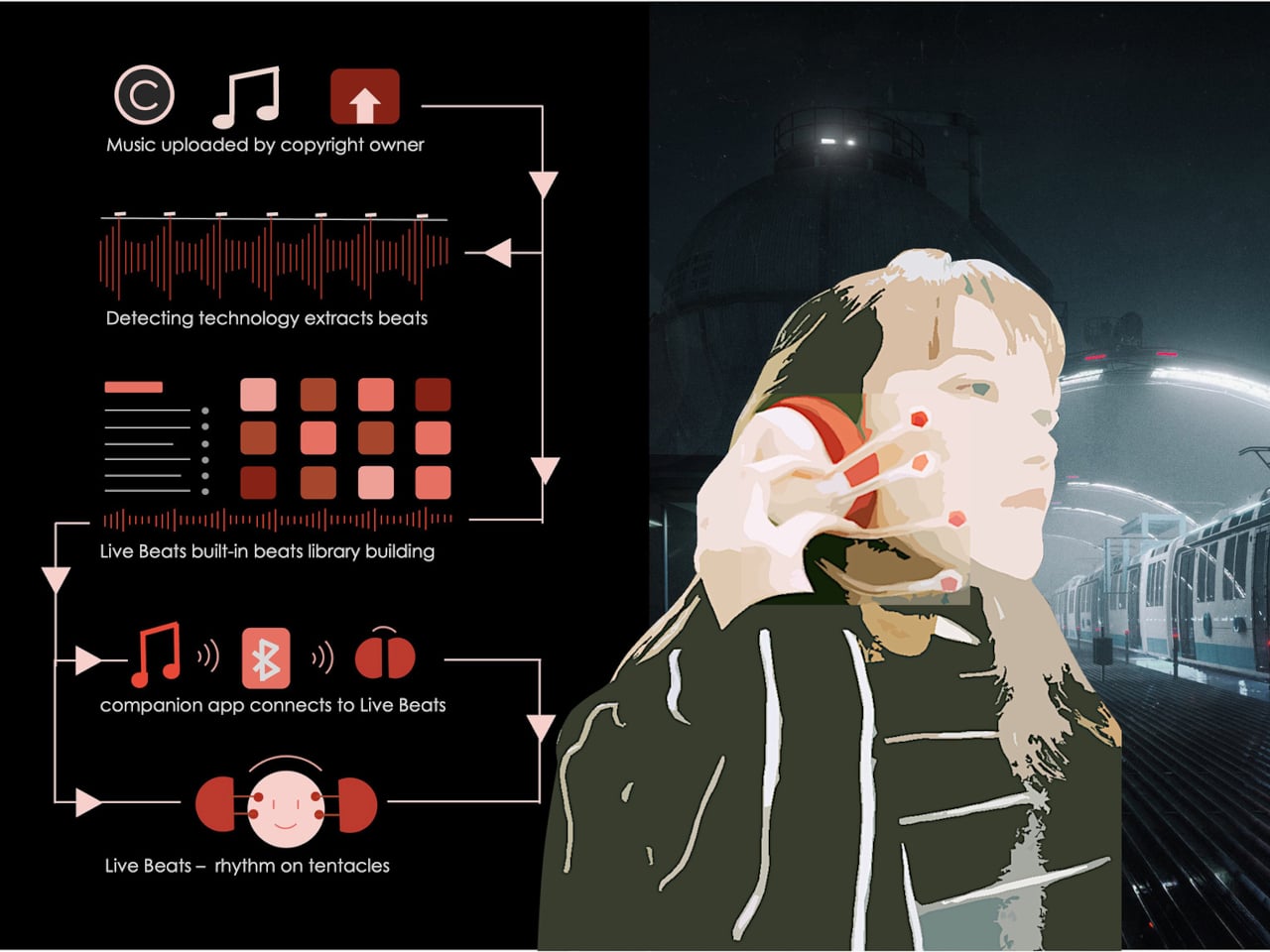
Most tiny homes solve the space problem by going vertical. Justine disagrees. Stack a loft above the kitchen, add a ladder, and call it a bedroom. Craft House took one look at that logic and went the other direction entirely.
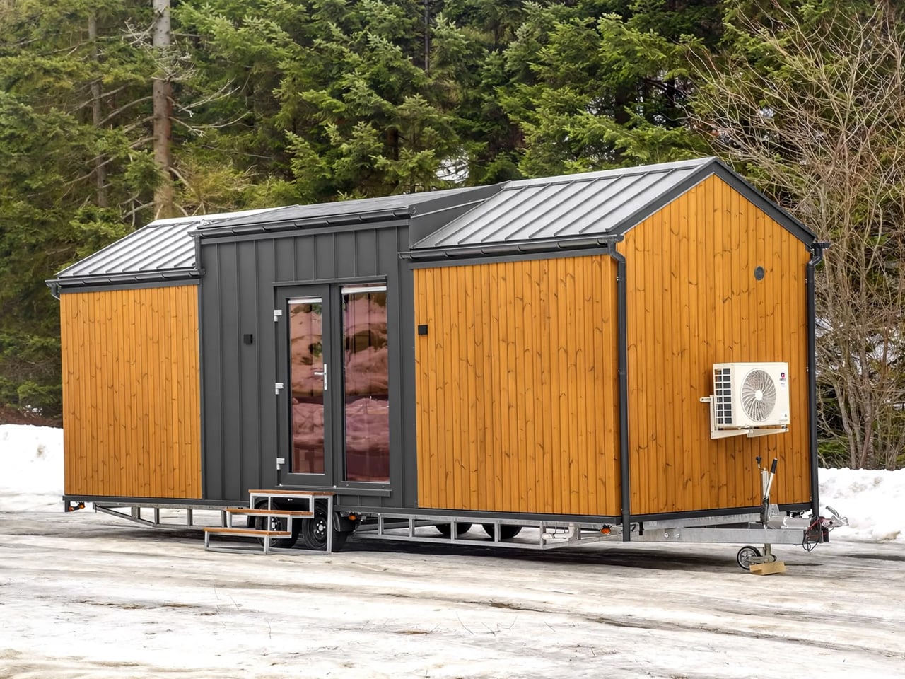
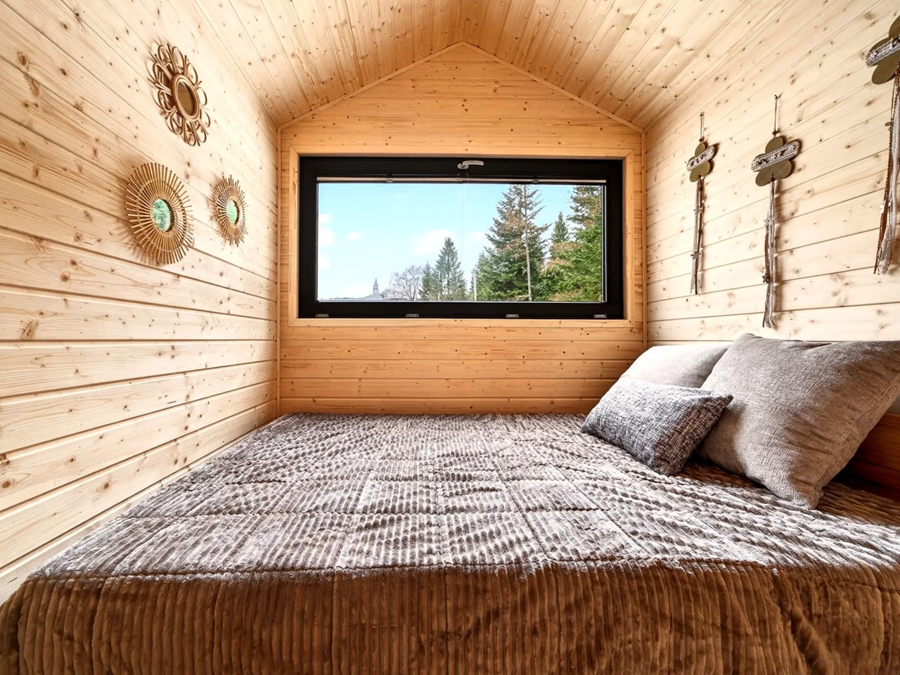
The Justine is a single-floor tiny home on wheels, and its refusal to go up is exactly what makes it stand out. Built on a double-axle SYMA trailer, it measures 8.4 meters long (27.5 ft) and 2.5 meters wide (8.2 ft), with a gable roof that peaks at 3.5 meters. That height isn’t wasted on a sleeping loft. It goes straight to the bedroom ceiling, giving you genuine, upright headroom in a room that actually functions like a bedroom.
Designer: Craft House
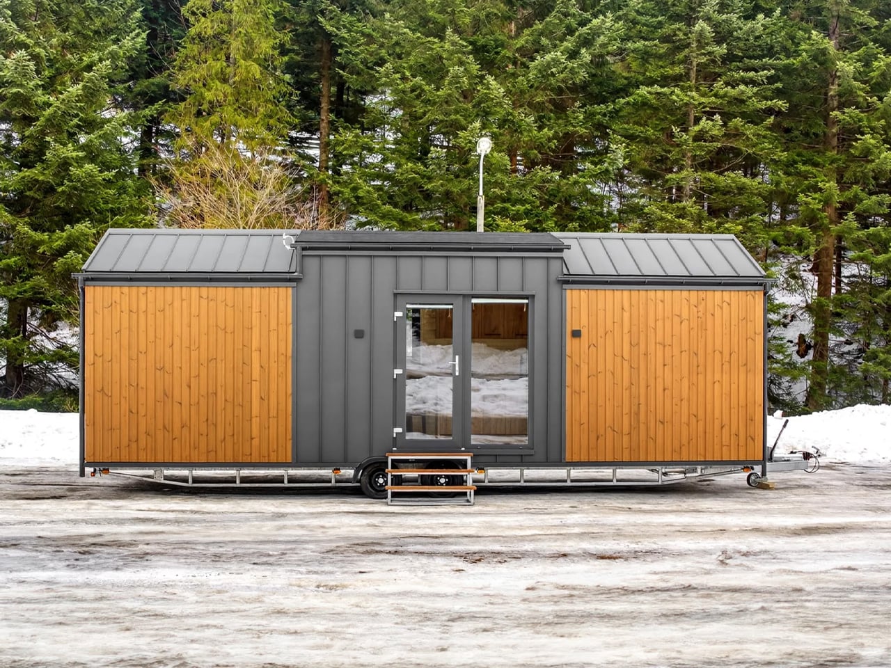
The exterior follows Craft House’s established design language — thermo-pine cladding paired with aluminum standing-seam sheet metal. It’s a combination that reads more Scandinavian cabin than trailer park, and the large double glass entry doors reinforce that impression from the moment you arrive.
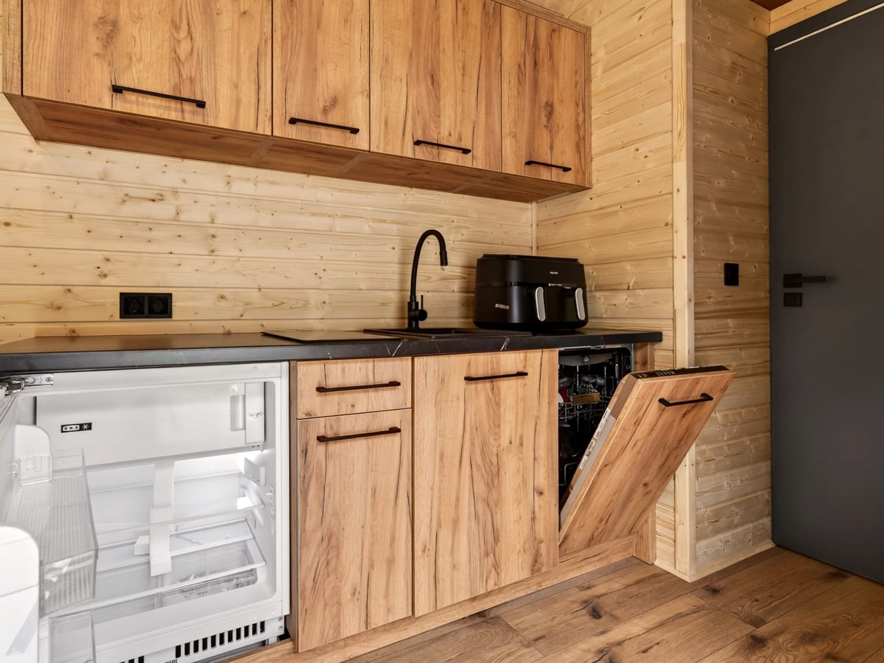
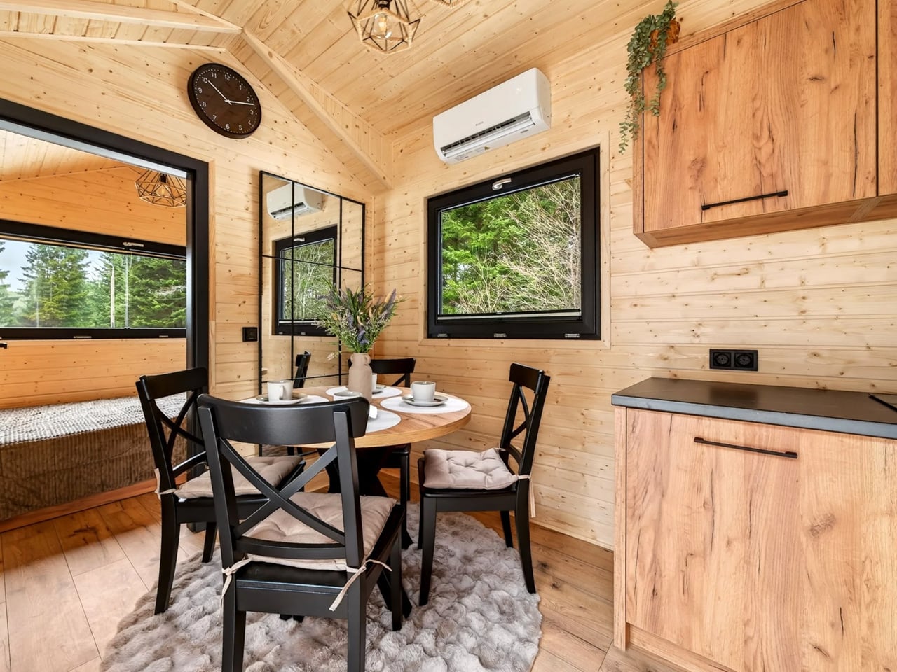
Inside, the surfaces are finished in Scandinavian spruce, warm and light without being fussy. The kitchen sits at the center of the floor plan and is where Craft House spent the most attention. There’s an induction cooktop, an oven, a fridge/freezer, upper and lower cabinetry, and a dishwasher — that last one being genuinely rare in a European tiny home at this price point. Underfloor heating and smart air conditioning round out a spec sheet that feels closer to a well-appointed studio apartment than a mobile structure.
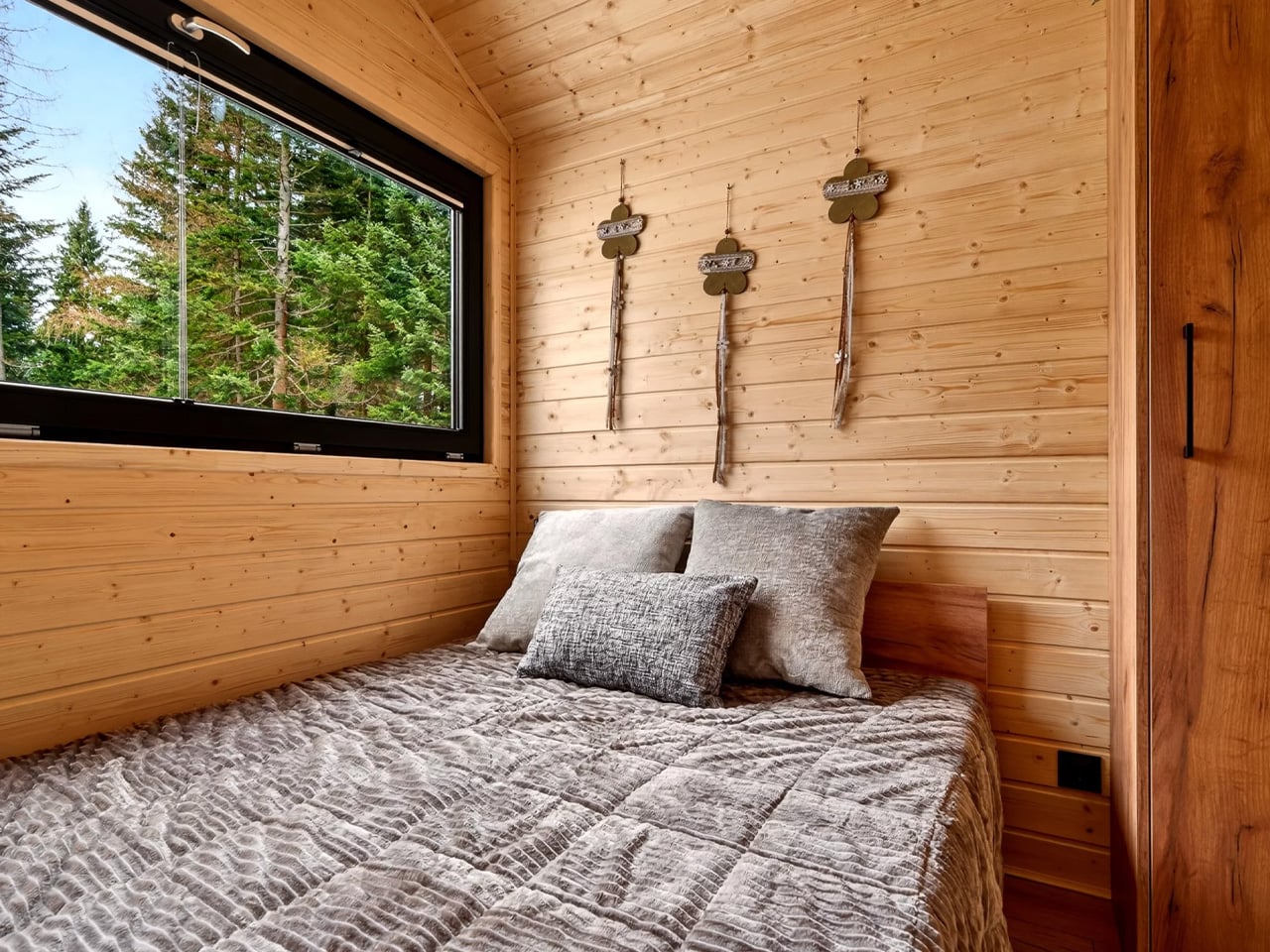
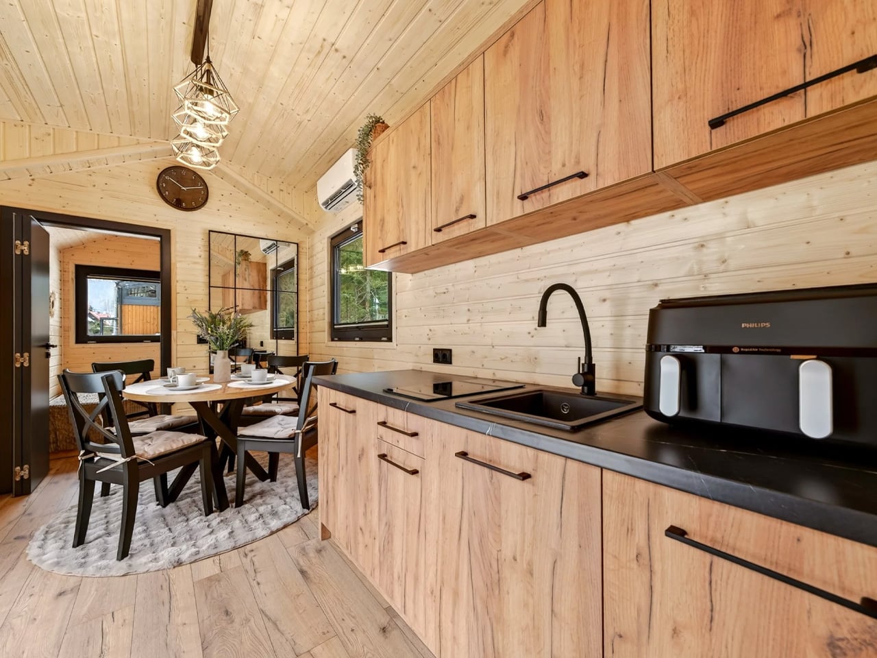
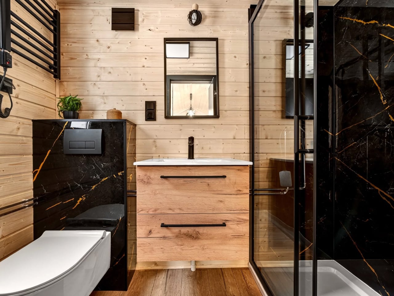
The bedroom holds a 160 x 200 cm double bed and a wardrobe. A small crawl space above offers overflow storage. The bathroom keeps things efficient: a glass-enclosed shower, flushing toilet, sink, and a cupboard that houses both a washer/dryer and the water heater. The living area includes a dining table with seating for four, though that configuration can be swapped for a sofa depending on how you use the space.
Power connects via a standard RV-style hookup, though Craft House offers a full off-grid configuration for buyers who want to move the Justine around regularly or park it somewhere remote. Every aspect of the build — layout, materials, finishes, energy setup — can be customized to order.
Pricing starts at around $52,500 USD at current exchange rates. That figure will climb with options, but for a fully finished, single-level home with a kitchen this complete and a bedroom this livable, it’s a reasonable entry point into full-time tiny living.
The post This Tiny Home Has No Loft, No Ladder, and No Compromises first appeared on Yanko Design.